Originaldokument
GPT Image 2 · en
Scene:
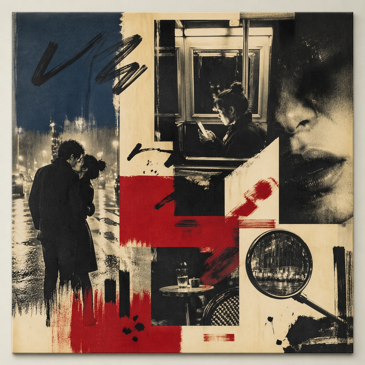
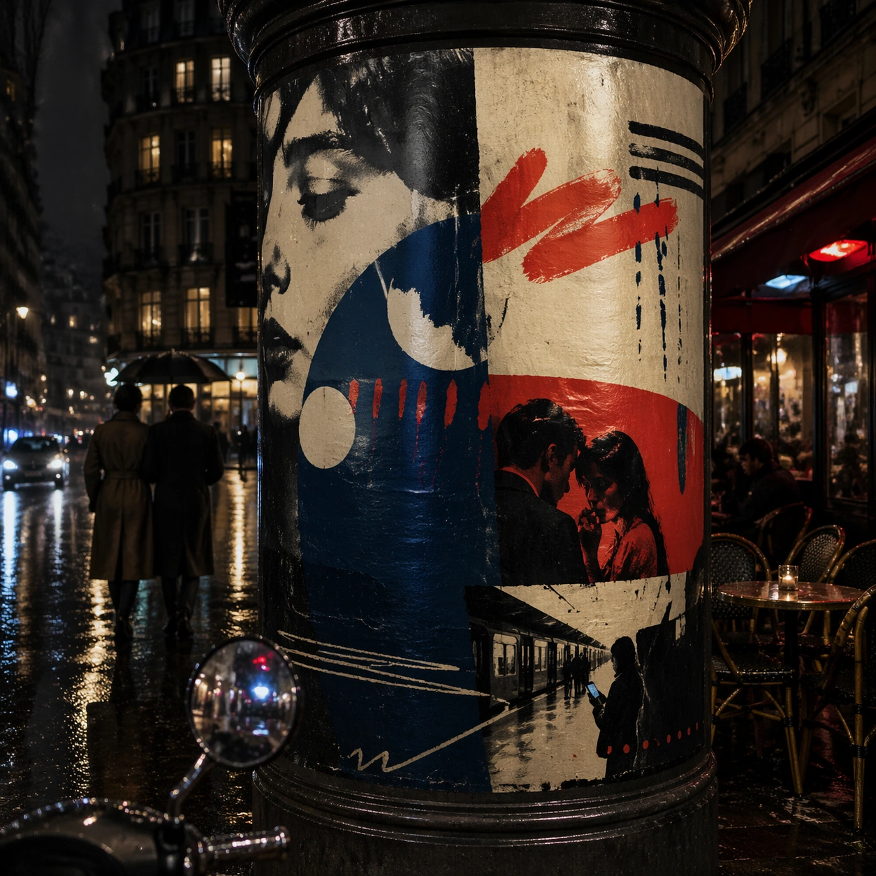
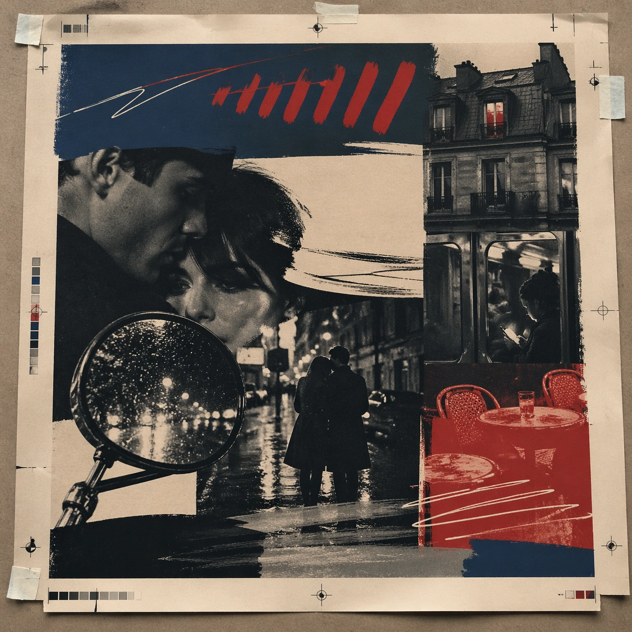
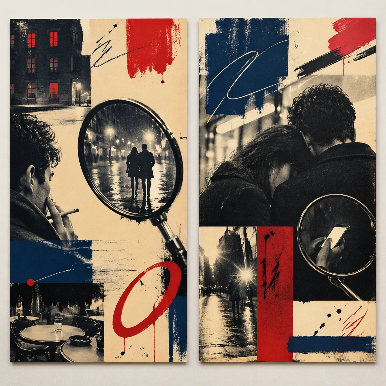
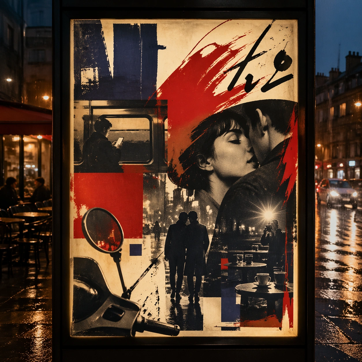
A square dusk street photograph of a backlit transit poster glowing inside glass, with faint rain reflections, soft city blur in the distance, and the poster remaining fully legible as a composition. The poster should express 1960s art-house poster grammar with radical photo crop, offset grain, hand-painted marks, and emotional empty space, using inky blue, carmine red, warm cream, charcoal, and cigarette-smoke gray and a tactile surface appropriate to the medium.

Subject:
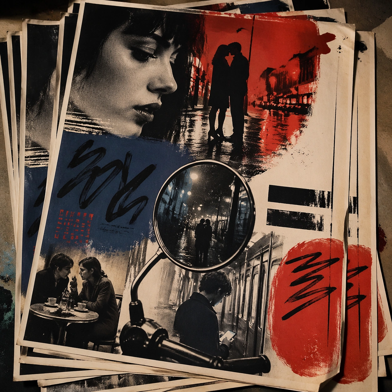
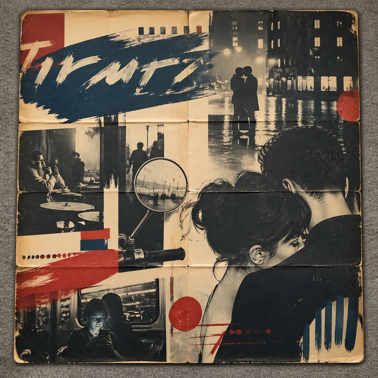
Adapt the poster into a public-facing lightbox version that still honors the original style grammar while feeling bold enough to stop a passerby from several meters away. Use street couples, scooter mirrors, apartment windows, rain-slick pavement, camera flash, and cafe tables as the main visual ingredients, and organize them with handwritten sweeps and sans blocks that feel gestural but stay non-readable. For the contemporary-subject axis, thread in a late-night metro ride and smartphone glow transformed into a melancholic art-house romance surface. The poster must feel like an original design object rather than a reproduction of any known work.

Important details:
Let the style survive the illumination test: color blocking, silhouette contrast, and abstract lettering should stay controlled under bright internal light and reflective glass. Preserve abrupt crop decisions, mood ambiguity, rough screen-print texture, and tension between photo and mark-making. Keep every letterform abstract and non-readable, as if it were a typographic texture rather than language. Make the style unmistakable through composition, palette, surface behavior, and symbolic compression. no blockbuster gloss, no readable credits, no hyper-polished skin retouching, no superhero spectacle.

Use case:
French New Wave single study 3/9, testing distance readability in public display.

Constraints:
No readable text, no watermark, no logos, preserve exact 1:1 aspect ratio, no copyrighted characters, no real brand marks, no QR codes, no interface chrome, no accidental gibberish lettering.
Verwendung
- Den vollständigen Original-Prompt einschließlich Parametern kopieren.
- Motiv, Text und Komposition an die eigenen Anforderungen anpassen.
- Ein kompatibles externes Werkzeug nutzen; Zugangsbedingungen und Ergebnis prüfen.
Vor dem Start
- Prüfen, ob ein Referenzbild nötig ist. Kompatibilität belegt nicht das tatsächlich verwendete Modell.
- Namen, Zahlen und Bildtexte prüfen; Modellversionen können andere Ergebnisse liefern.