Originaldokument
GPT Image 2 · en
Scene:
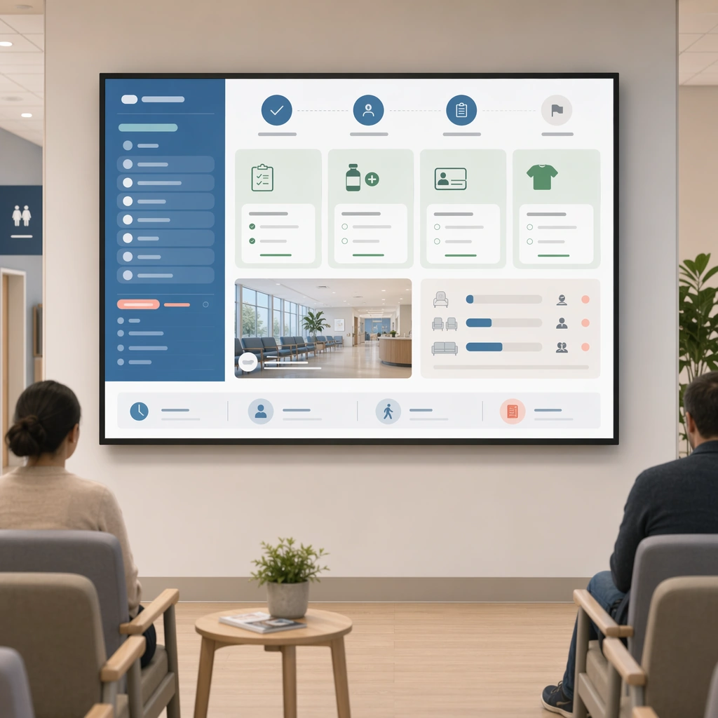
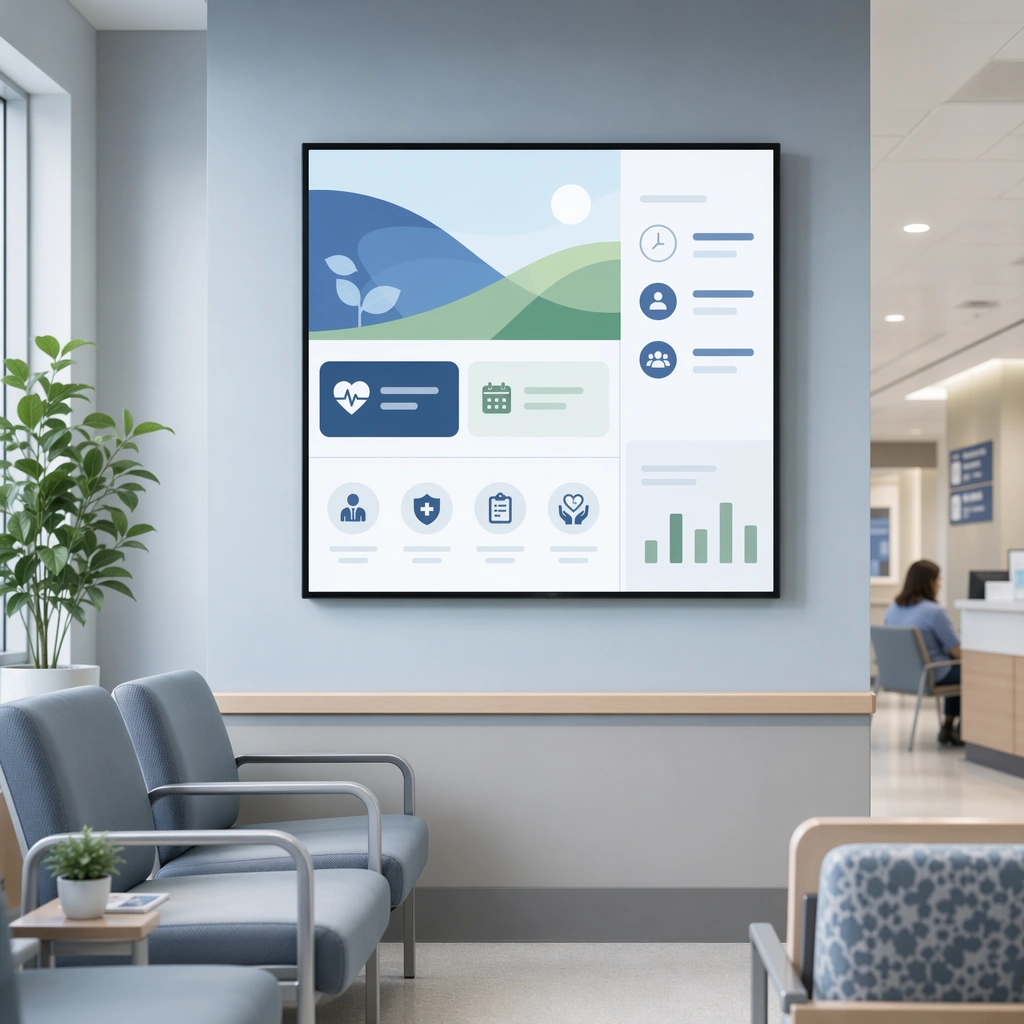
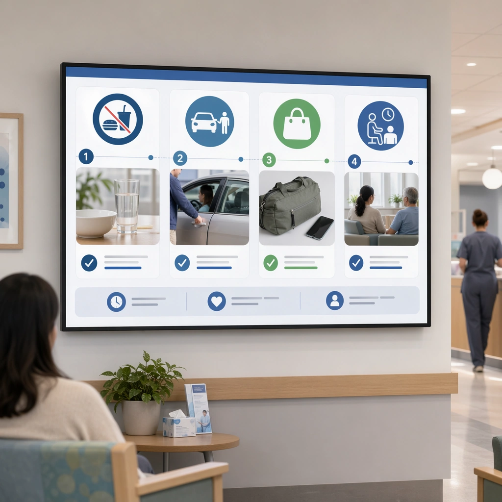
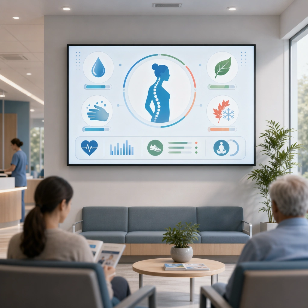
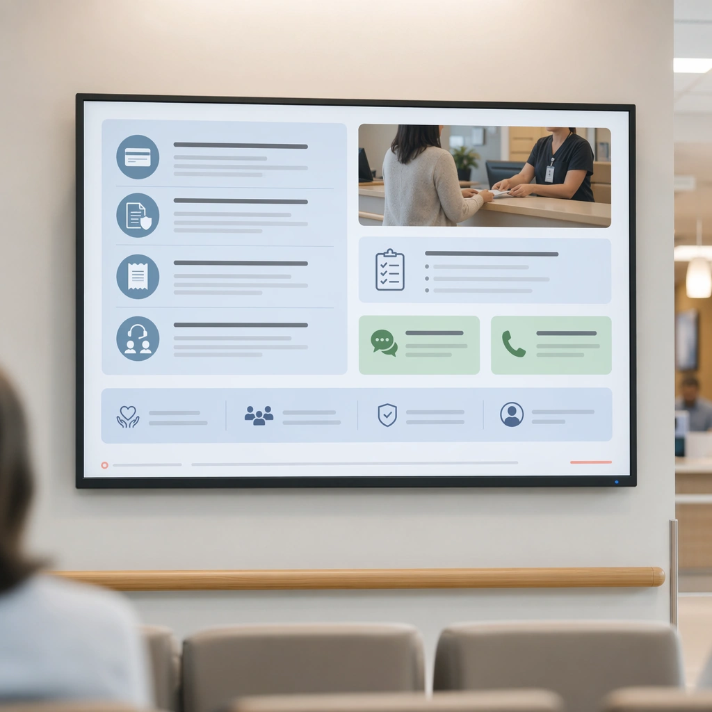
A square financial guidance display board for Waiting Room Screen and Patient Info Loop. Compose it as a clear administrative information surface with icon-led grouping and one service-desk photo. Use a palette of cool white, muted blue, soft green, warm gray, and occasional coral guidance accents, bright public-space lighting with clean screen glow, and a mood of useful, calm, and brand-consistent. The frame should feel like a real healthcare communication asset art-directed for professional delivery, not a stock photo, speculative concept render, or generic corporate template. Keep the camera distance, negative space, and depth cues disciplined so the image reads immediately even at thumbnail size.

Subject:
Center on a patient-info display for payment preparation, insurance documents, receipts, and assistance channels translated into distance-friendly modules. Show enough surrounding context that the viewer understands the intended service surface, user situation, and institutional setting. Every object, person, diagram, device crop, or spatial cue should support clarity, trust, and practical use. If people appear, keep them anonymous, natural, privacy-safe, and grounded in believable body language rather than promotional posing.

Important details:
Maintain waiting-room communication built from screen-safe hierarchy, ambient public display design, and reassuring information architecture that works from a distance. Administrative content should feel navigable and humane, not bureaucratic or intimidating. Use abstract icon shapes, color blocks, chart bars, interface modules, or non-legible placeholder microcopy whenever information structure is needed, but never readable text. Materials, spacing, lighting, and hierarchy should feel production-ready and healthcare-specific. Avoid generic lifestyle filler, decorative noise, or design gestures that do not reinforce the communication goal.

Use case:
Waiting Room Loop single study 6/9 for a billing and insurance waiting-room display.

Constraints:
No readable text, no watermark, no logos, preserve exact 1:1 aspect ratio, no TV-news chaos, no overbright advertising palette, no crowded ticker aesthetics, no unreadable micro-detail, no bank-lobby aesthetic, no cold bureaucratic severity.
Verwendung
- Den vollständigen Original-Prompt einschließlich Parametern kopieren.
- Motiv, Text und Komposition an die eigenen Anforderungen anpassen.
- Ein kompatibles externes Werkzeug nutzen; Zugangsbedingungen und Ergebnis prüfen.
Vor dem Start
- Prüfen, ob ein Referenzbild nötig ist. Kompatibilität belegt nicht das tatsächlich verwendete Modell.
- Namen, Zahlen und Bildtexte prüfen; Modellversionen können andere Ergebnisse liefern.