Originaldokument
GPT Image 2 · en
Scene:
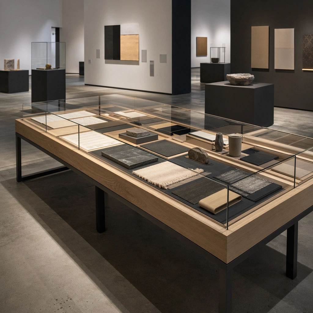
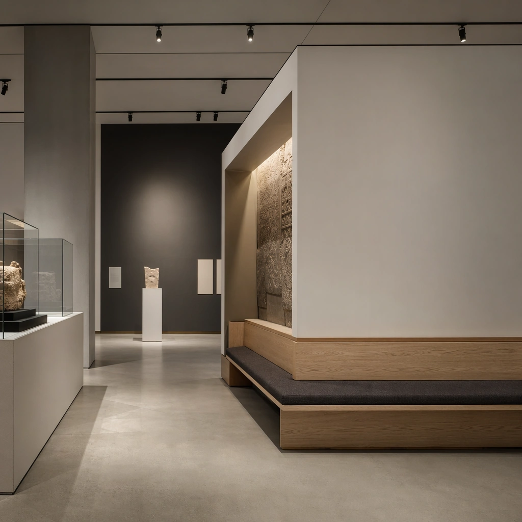
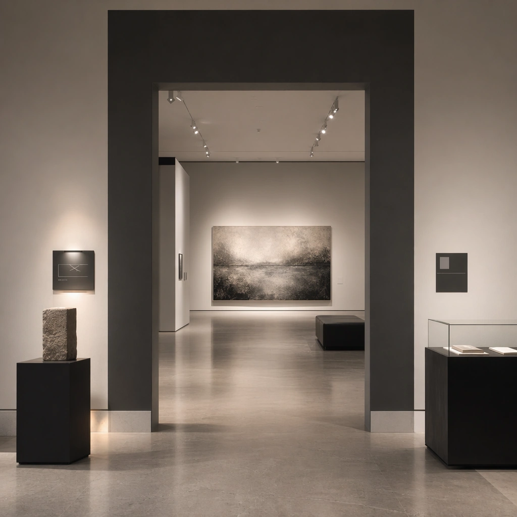
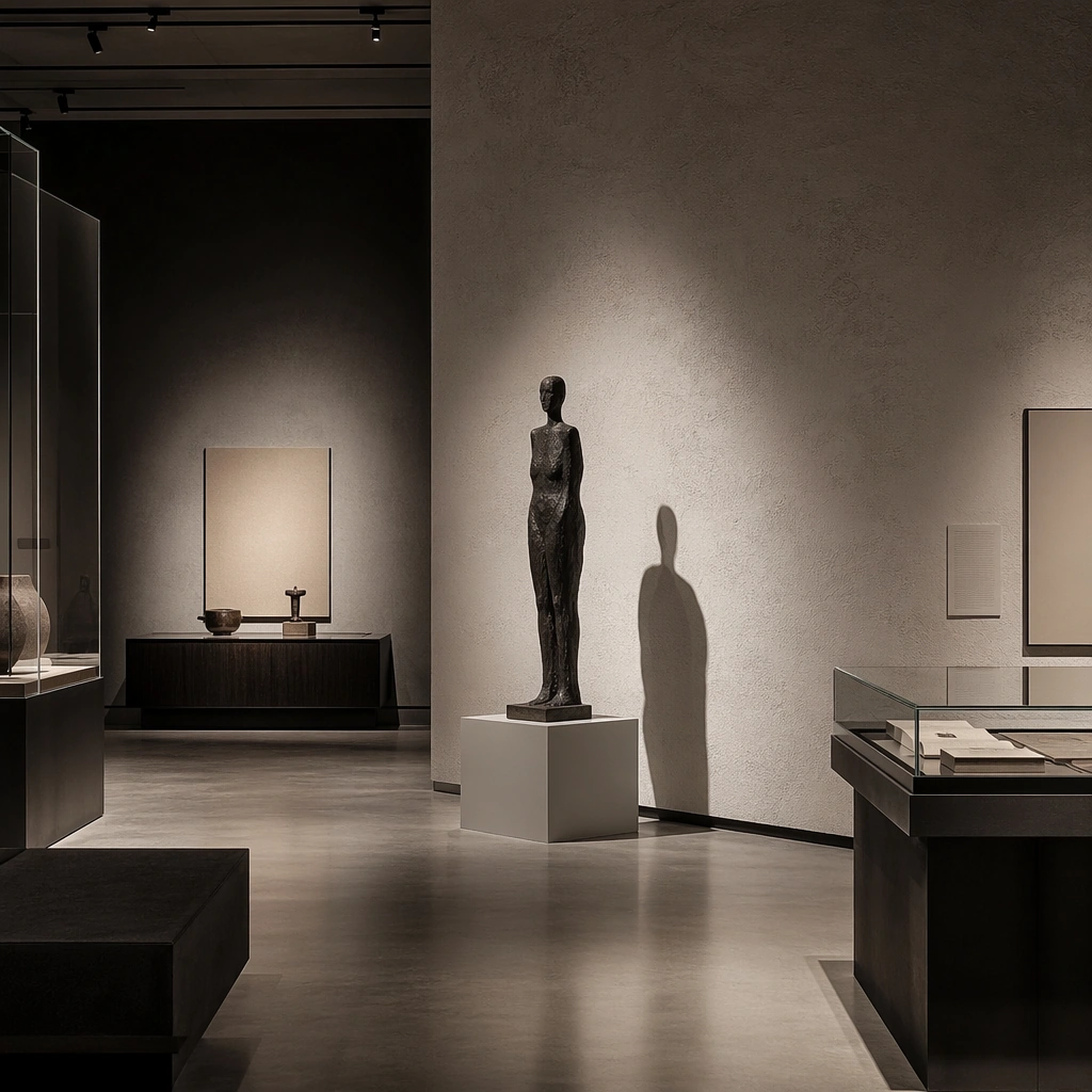
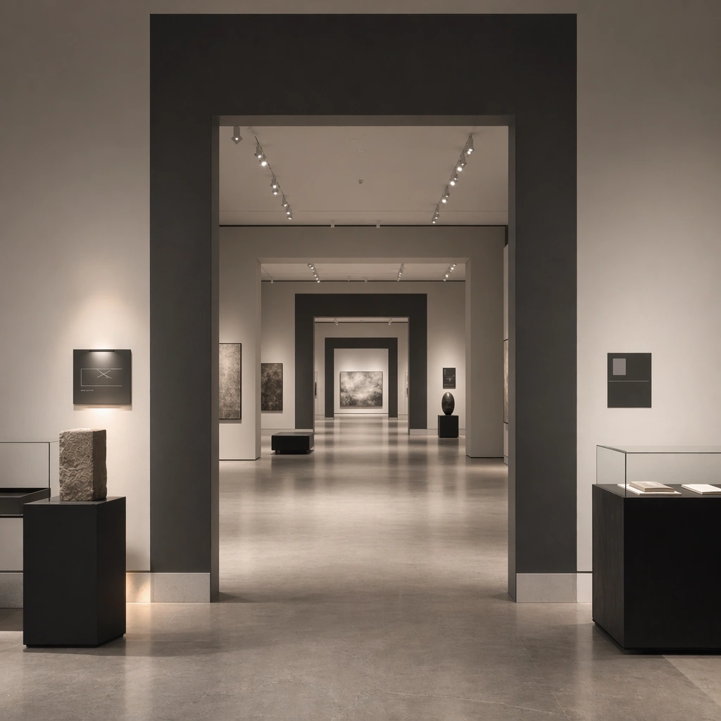
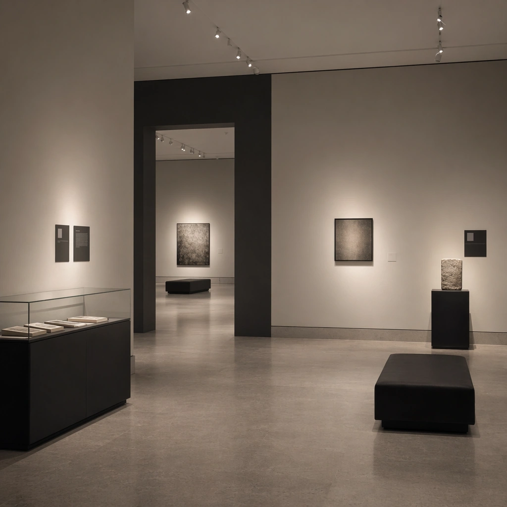
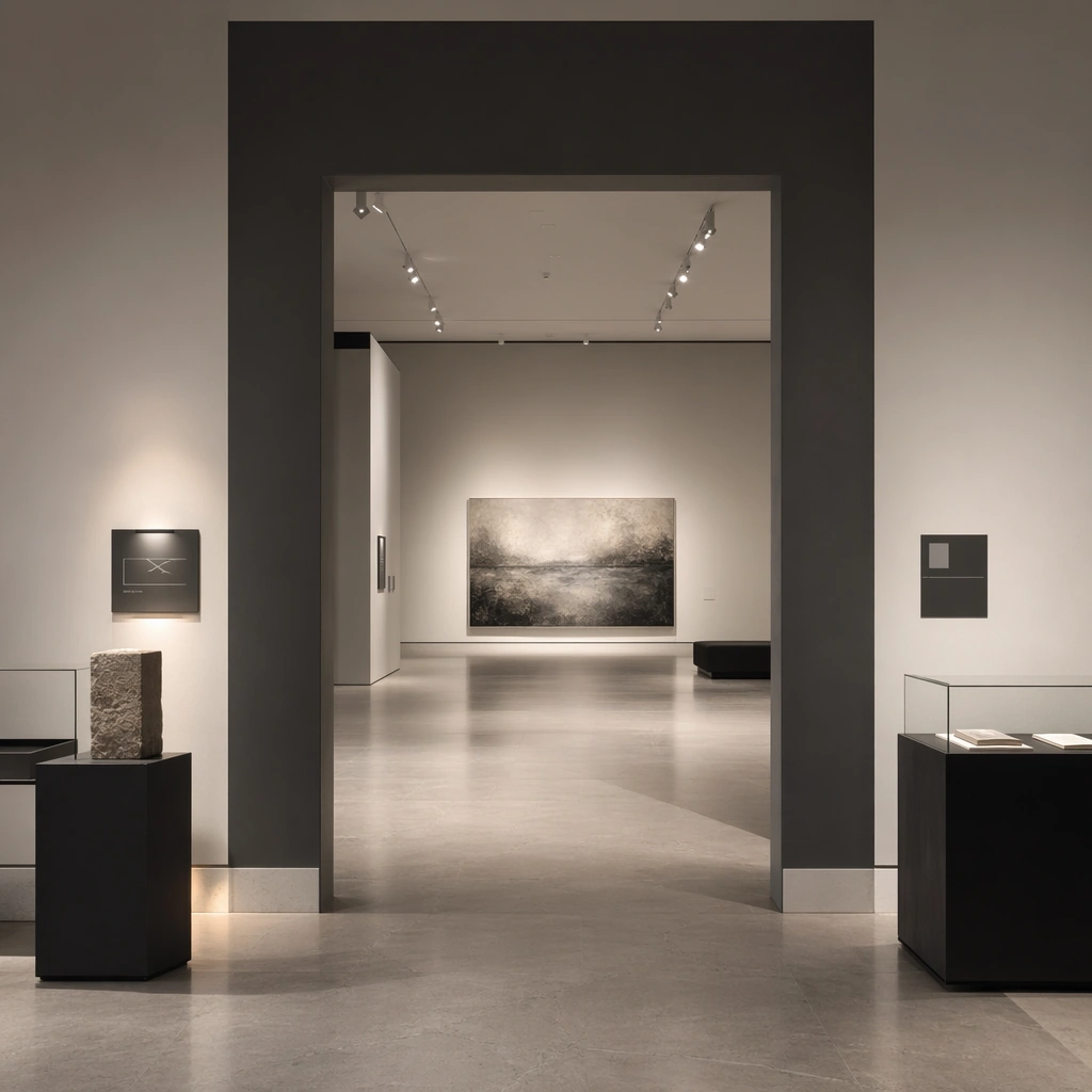
Create a square architectural reference still for Gallery Exhibition Spatial Sequence. Use a square entry view into the first exhibition room with one major work and caption zones and treat the frame like a premium interior or architecture editorial photograph with disciplined perspective, readable depth from foreground to background, and enough negative space for the spatial hierarchy to breathe. Light the scene so spatial pacing, wall-label logic, and non-generic exhibition atmosphere feel immediate, using chalk white, charcoal gray, pale concrete, soft shadow black, and controlled spotlight warmth as the governing tonal range. The composition must read as a high-end commercial image that could sit inside museum campaigns, exhibition proposals, cultural editorials, and spatial storytelling decks.

Subject:
Show a gallery and exhibition environment with disciplined white and charcoal volumes, precise spotlighting, plinths, archival display furniture, abstract wall-label zones, and carefully paced emptiness. Center the exhibition’s threshold pacing, light gradient, and curatorial calm. This is the canonical reference image for the package, so the major proportions, material transitions, fixture families, and circulation logic must feel highly specific and internally coherent rather than generic luxury styling. Let the viewer understand how the space is organized within a single glance, with foreground anchors, a clear middle zone, and a resolved background termination.

Important details:
Lock the wall-label rhythm, plinth geometry, spotlight language, floor material, and slow exhibition pacing. Surfaces should feel tactile and believable: stone veining must stay plausible, metals should have disciplined reflectance, fabrics should show natural weight, and concealed lighting should shape the volume instead of flattening it. Use abstract signage, menu, label, or caption zones only as unreadable graphic hints. The image should feel practical for downstream design reviews and polished enough for public-facing campaign use.

Use case:
Gallery Exhibition Spatial Sequence series study 1/9, establishing the canonical sequence identity for the package.

Constraints:
No readable text, no watermark, no logos, preserve exact 1:1 aspect ratio, no crowds, no readable wall text, no security barriers, no colorful trade-show clutter, no random gifts-shop products, no readable title wall.
Verwendung
- Den vollständigen Original-Prompt einschließlich Parametern kopieren.
- Motiv, Text und Komposition an die eigenen Anforderungen anpassen.
- Ein kompatibles externes Werkzeug nutzen; Zugangsbedingungen und Ergebnis prüfen.
Vor dem Start
- Prüfen, ob ein Referenzbild nötig ist. Kompatibilität belegt nicht das tatsächlich verwendete Modell.
- Namen, Zahlen und Bildtexte prüfen; Modellversionen können andere Ergebnisse liefern.