
Originaldokument
GPT Image 2 · en
Scene:
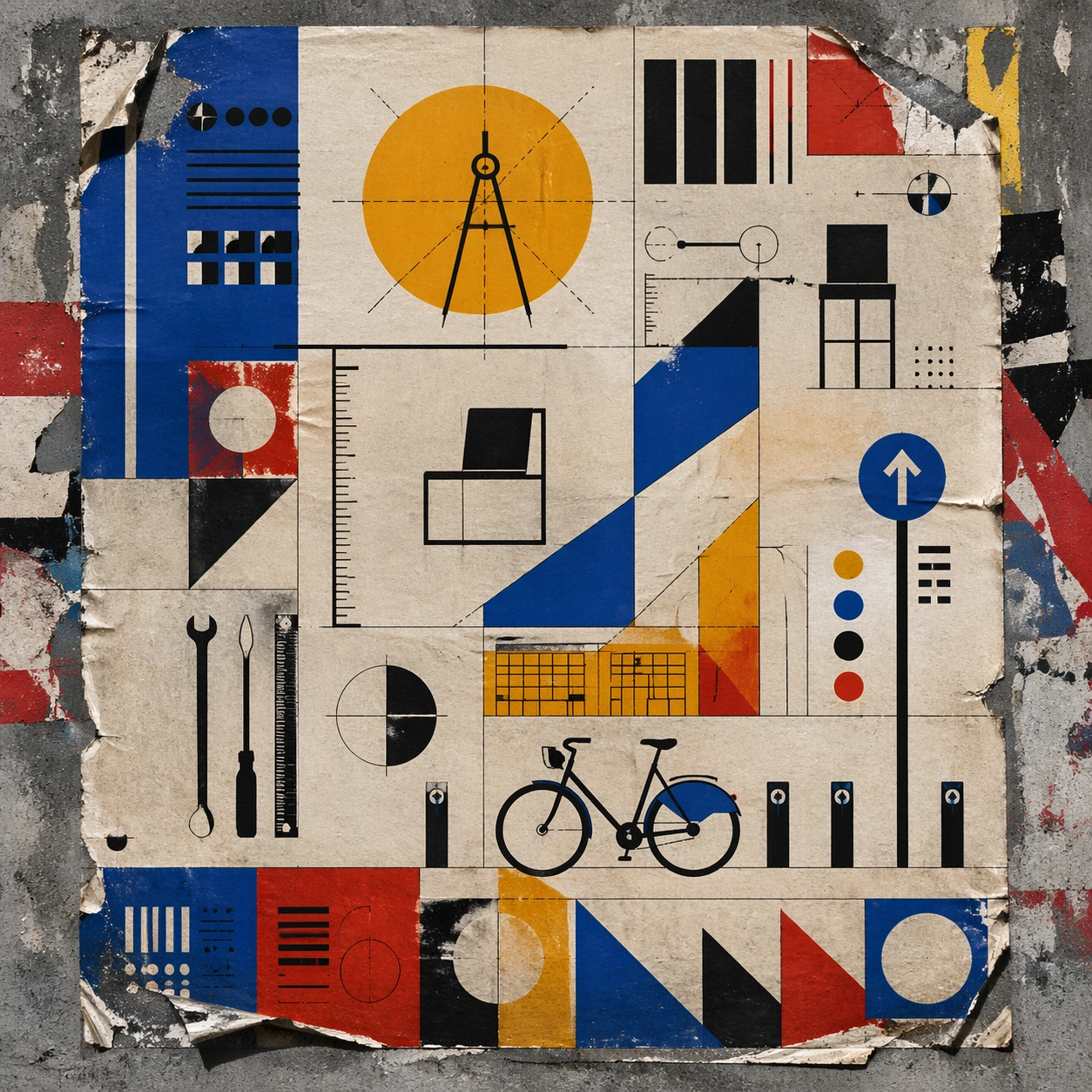
A square urban wall study with the poster pasted onto rough plaster among torn edges and older paper remnants, photographed in soft overcast light so texture, glue bubbles, and surface scars stay visible. The poster should express strict geometric modernism built from circles, bars, triangles, squares, and measured negative space, using cobalt blue, mustard yellow, cadmium red, black, and warm paper white and a tactile surface appropriate to the medium.

Subject:
Create a version that feels made for the street, with the poster carrying enough formal force to survive abrasion, layering, and imperfect placement without losing its visual identity. Use modular furniture silhouettes, workshop tools, compass arcs, ruler lines, and architecture-school diagrams as the main visual ingredients, and organize them with geometric sans-serif blocks and numerals treated purely as non-readable forms. For the contemporary-subject axis, thread in a bike-share docking station and urban wayfinding elements reduced into pure geometry. The poster must feel like an original design object rather than a reproduction of any known work.

Important details:
Keep the main design intact but let the environment add grit: lifted corners, tiny tears, wrinkled paper, and older color fragments around the perimeter should amplify the style rather than dilute it. Preserve mathematical spacing, flat planes, hard edges, exact weight distribution, and clean asymmetry. Keep every letterform abstract and non-readable, as if it were a typographic texture rather than language. Make the style unmistakable through composition, palette, surface behavior, and symbolic compression. no decorative flourishes, no gradients, no photoreal portraits, no soft painterly blending.

Use case:
Bauhaus Poster single study 4/9, testing street-life durability and layered context.

Constraints:
No readable text, no watermark, no logos, preserve exact 1:1 aspect ratio, no copyrighted characters, no real brand marks, no QR codes, no interface chrome, no accidental gibberish lettering.
Verwendung
- Den vollständigen Original-Prompt einschließlich Parametern kopieren.
- Motiv, Text und Komposition an die eigenen Anforderungen anpassen.
- Ein kompatibles externes Werkzeug nutzen; Zugangsbedingungen und Ergebnis prüfen.
Vor dem Start
- Prüfen, ob ein Referenzbild nötig ist. Kompatibilität belegt nicht das tatsächlich verwendete Modell.
- Namen, Zahlen und Bildtexte prüfen; Modellversionen können andere Ergebnisse liefern.