PROMPTS · KREATIV ENTDECKEN

Prompt-Galerie

Echte Prompts und erzeugte Beispiele erkunden. Inspiration für Ihre nächste kreative Mission finden und den vollständigen Prompt kostenlos kopieren.

Beispiele
10,974
Modelle
17
Quellen
1277
10.974 Prompt-Beispiele · Seite 57 von 229
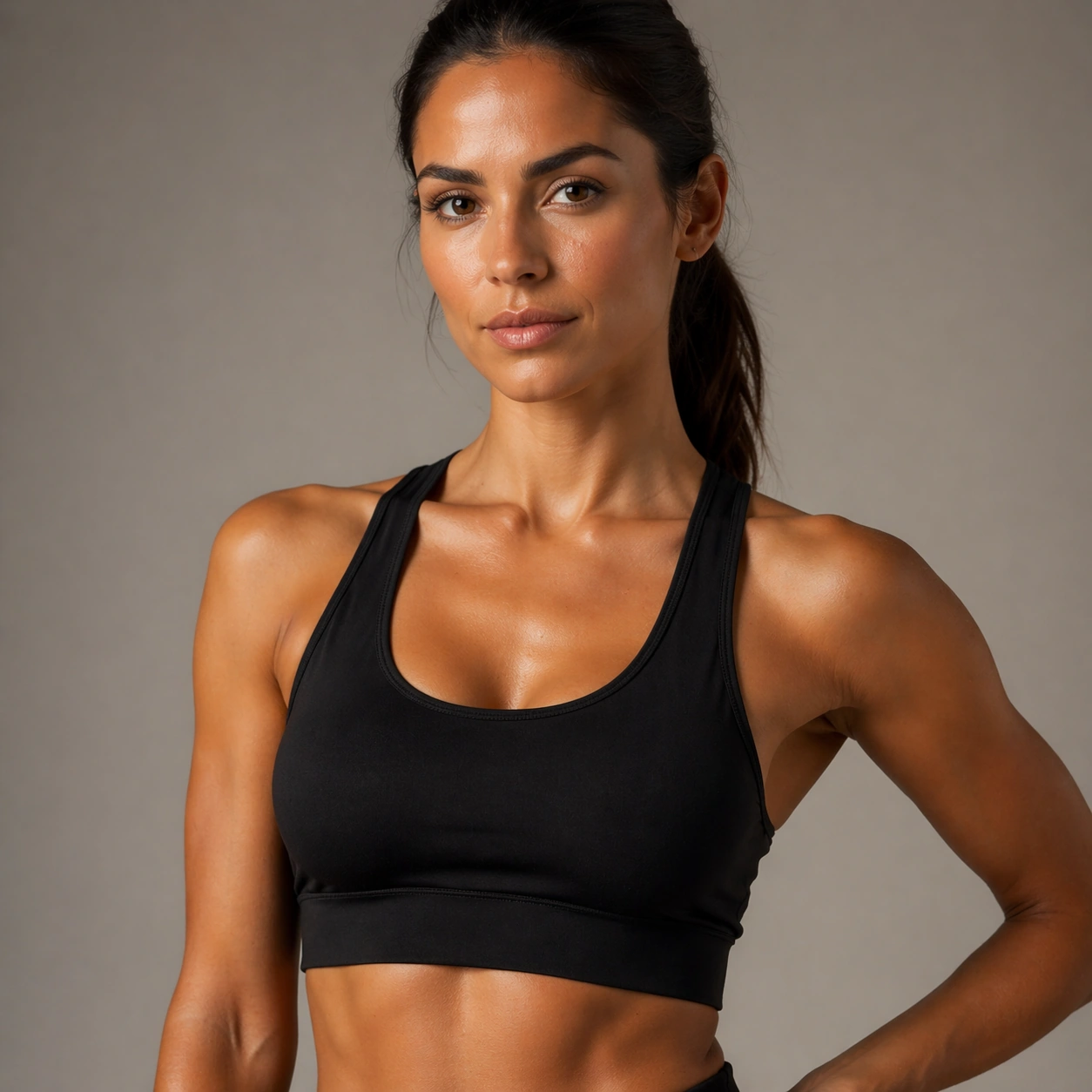
Example generated from “Fitness Wellness Brand Portraits — Close-Up Fabric Beauty”
GPT Image 2en

Scene: Use the reference image as the identity source for Fitness Wellness Brand Portraits. Build a closer crop that still preserves identity while revealing fabric texture, makeup finish, and styling detail Keep the camera logic commercially believable, with stable perspective, square-crop discipline, and light that supports facial recognition before style. The image should feel finished enough for client review, media rollout, or research comparison rather than like an unfinished test frame. Subject: Show the same fashion model as the reference, now wearing the same wardrobe family with more intimate emphasis on face, neckline, and textile texture. Preserve the exact recognisable face, haircut base, body read, and age impression from the anchor image while allowing the requested lighting, wardrobe, pose, or environment change to do the storytelling. The variation should clearly connect to the topic brief Produce athletic and wellness-driven portrait campaigns with realistic body proportions, clean skin texture, and premium studio-commercial lighting.. Important details: Preserve exact face / hair base / body proportions from the reference model. Preserve the face shape, body proportions, shoulder width, leg length impression, hair base, and skin-tone family while the wardrobe and mood shift. Keep the skin, hair, garment, and background rendering realistic and production-ready. This frame should feel like a true commissioned variation within one coherent portrait package, not like a new person or a disconnected mood board. Use case: Fitness Wellness Brand Portraits series study 7/9, close-detail fashion variation using the reference identity. Constraints: No readable text, no watermark, no logos, preserve exact 1:1 aspect ratio, no abstract fabric macro, no beauty-only crop, no hairline drift, no duplicate people, no extra fingers, no broken anatomy, no face drift, no oversmoothed skin, no unrelated props.
Example generated from “Fitness Wellness Brand Portraits — Lighting Shift Portrait”
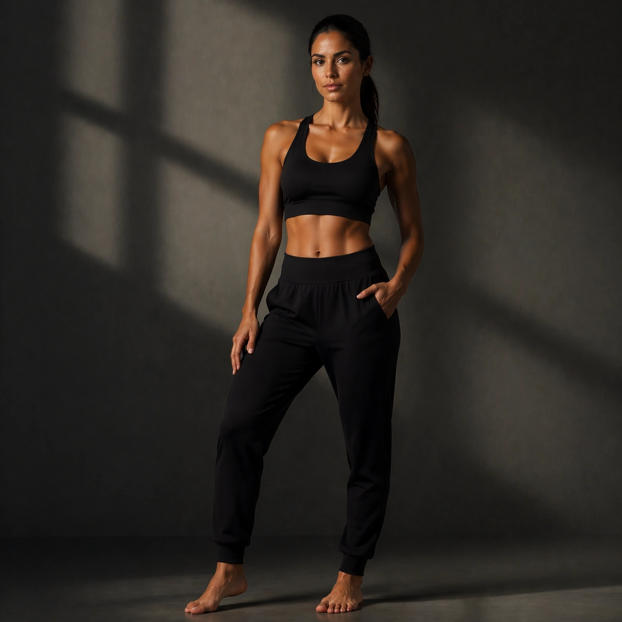
GPT Image 2en

Scene: Use the reference image as the identity source for Fitness Wellness Brand Portraits. Build a stronger mood-lighting portrait that tests the outfit under a second lighting logic Keep the camera logic commercially believable, with stable perspective, square-crop discipline, and light that supports facial recognition before style. The image should feel finished enough for client review, media rollout, or research comparison rather than like an unfinished test frame. Subject: Show the same fashion model as the reference, now wearing a dramatic but still commercial look under duskier, contrast-rich or spotlight-oriented light. Preserve the exact recognisable face, haircut base, body read, and age impression from the anchor image while allowing the requested lighting, wardrobe, pose, or environment change to do the storytelling. The variation should clearly connect to the topic brief Produce athletic and wellness-driven portrait campaigns with realistic body proportions, clean skin texture, and premium studio-commercial lighting.. Important details: Preserve exact face / hair base / body proportions from the reference model. Preserve the face shape, body proportions, shoulder width, leg length impression, hair base, and skin-tone family while the wardrobe and mood shift. Keep the skin, hair, garment, and background rendering realistic and production-ready. This frame should feel like a true commissioned variation within one coherent portrait package, not like a new person or a disconnected mood board. Use case: Fitness Wellness Brand Portraits series study 8/9, lighting-shift fashion variation using the reference identity. Constraints: No readable text, no watermark, no logos, preserve exact 1:1 aspect ratio, no nightclub cliché, no crushed detail, no fashion-week chaos, no duplicate people, no extra fingers, no broken anatomy, no face drift, no oversmoothed skin, no unrelated props.
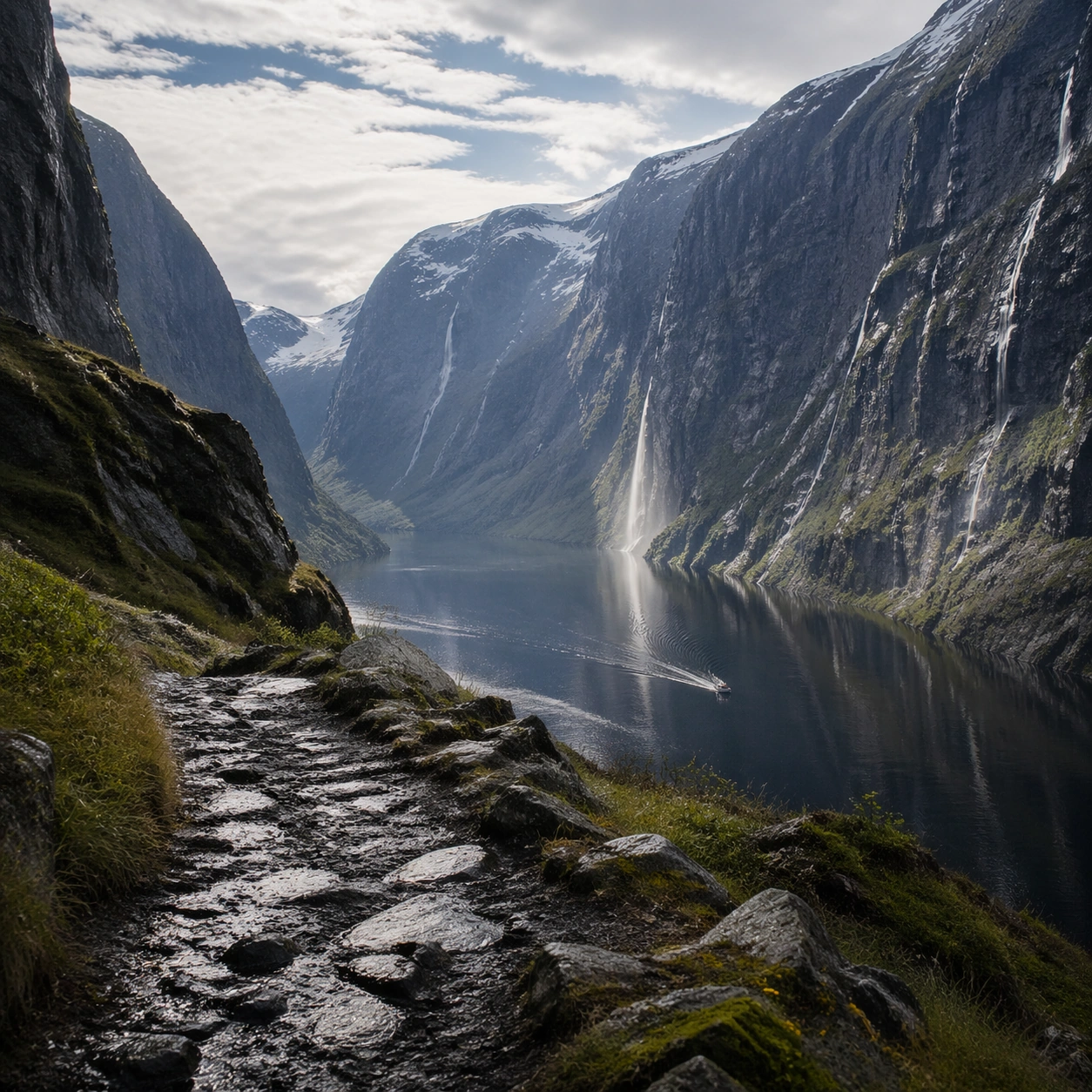
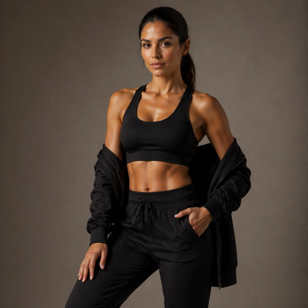
Example generated from “Fitness Wellness Brand Portraits — Finale Cover Portrait”
GPT Image 2en

Scene: Use the reference image as the identity source for Fitness Wellness Brand Portraits. Build a cover-worthy finale balancing strong styling, readable face, and campaign flexibility Keep the camera logic commercially believable, with stable perspective, square-crop discipline, and light that supports facial recognition before style. The image should feel finished enough for client review, media rollout, or research comparison rather than like an unfinished test frame. Subject: Show the same fashion model as the reference, now wearing the strongest final look with unmistakable identity and publication-ready polish. Preserve the exact recognisable face, haircut base, body read, and age impression from the anchor image while allowing the requested lighting, wardrobe, pose, or environment change to do the storytelling. The variation should clearly connect to the topic brief Produce athletic and wellness-driven portrait campaigns with realistic body proportions, clean skin texture, and premium studio-commercial lighting.. Important details: Preserve exact face / hair base / body proportions from the reference model. Preserve the face shape, body proportions, shoulder width, leg length impression, hair base, and skin-tone family while the wardrobe and mood shift. Keep the skin, hair, garment, and background rendering realistic and production-ready. This frame should feel like a true commissioned variation within one coherent portrait package, not like a new person or a disconnected mood board. Use case: Fitness Wellness Brand Portraits series study 9/9, finale fashion-cover variation using the reference identity. Constraints: No readable text, no watermark, no logos, preserve exact 1:1 aspect ratio, no random text space, no overstyled couture fantasy unless topic requires it, no face drift, no duplicate people, no extra fingers, no broken anatomy, no face drift, no oversmoothed skin, no unrelated props.
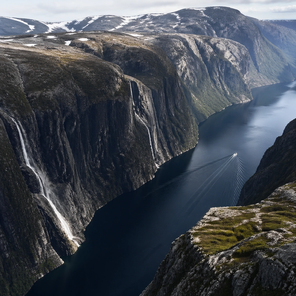
Example generated from “Fjord Norway Deep Cut — Foreground Path”
GPT Image 2en

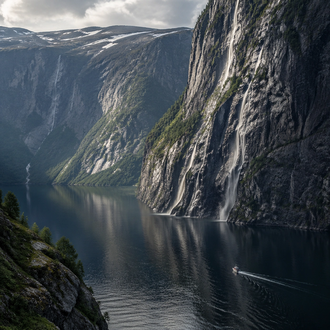
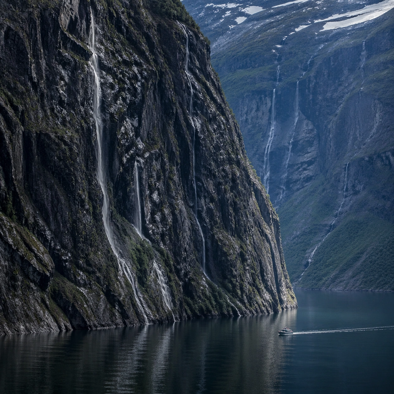
Scene: Create a square, photoreal landscape study of norwegian fjord deep cut. Compose it as a ground-level entry path that pulls the viewer into the terrain, using a lower vantage with a strong foreground element such as a ridge line, shoreline, stream, boot track, or wet surface leading inward. Let the foreground remain tactile and detailed while the distance opens gradually Keep the frame cinematic but disciplined, with a clear foreground, middle distance, and far mass so the viewer can measure real depth. The image should feel like a field photograph made with patience, precision, and sublime restraint rather than a fantasy matte painting. Subject: Show a Norwegian fjord in afternoon light, with thousand-meter cliffs dropping into mirror-still dark water, waterfall ribbons descending the rock faces, and a small fishing boat leaving a white wake. This variation should emphasize foreground-led composition. The main landform must dominate the composition, but secondary elements should quietly explain how the place works: water paths, sediment lines, snow bands, surf, ash, wind streaks, stars, or human traces where appropriate. Everything in the image should support the same idea of scale and climate, so the scene reads as one coherent environment rather than a stack of spectacular details. Important details: Preserve sheer vertical drop, dark reflective water, wet rock detail, mist from waterfalls, and the sensation of glacial erosion cutting a deep, precise corridor through the mountains. The image should reward close looking through layered depth cues rather than pure spectacle alone. Keep geology, weather, and atmosphere physically believable. Use subtle micro-texture, tonal separation, and air perspective to reinforce distance. If a human, vehicle, tent, caravan, bird, or boat appears, it must remain tiny and subordinate to the landscape, functioning only as a scale witness. The composition should feel original, severe, and elegant, with no decorative filler and no imitation of any copyrighted visual property. Use case: Norwegian Fjord Deep Cut single study 2/9, exploring the foreground-led composition variation. Constraints: No readable text, no watermark, no logos, preserve exact 1:1 aspect ratio, no cruise ship, no town skyline, no suspension bridge, no tropical water color, no blocked foreground, no random props, no awkward dead zone in the lower third, no kitsch color grading, no artificial border, no split-panel treatment.

Example generated from “Fjord Norway Deep Cut — Aerial Geometry”
GPT Image 2en

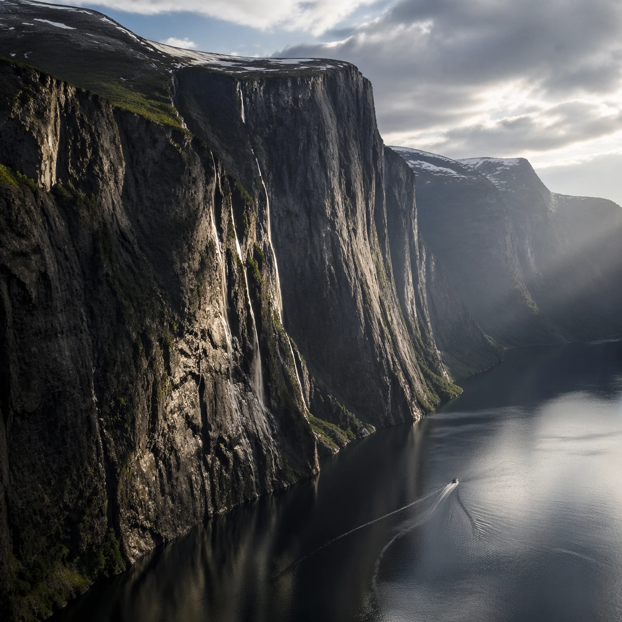
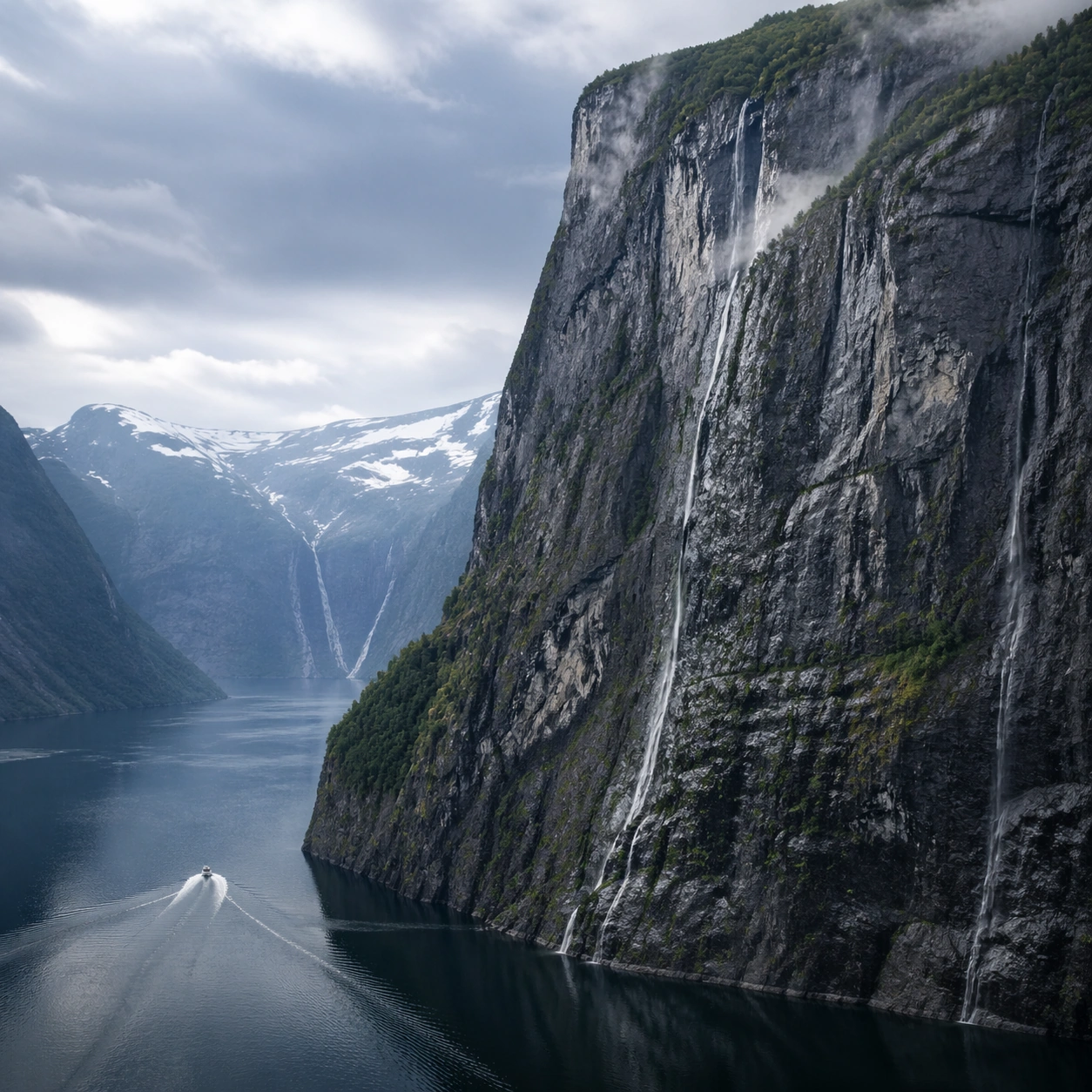
Scene: Create a square, photoreal landscape study of norwegian fjord deep cut. Compose it as the planform geometry and overall shape logic of the landscape, using an elevated oblique aerial view that still preserves believable scale and natural topography. Let light reveal contour, fracture, and pattern instead of flattening the terrain Keep the frame cinematic but disciplined, with a clear foreground, middle distance, and far mass so the viewer can measure real depth. The image should feel like a field photograph made with patience, precision, and sublime restraint rather than a fantasy matte painting. Subject: Show a Norwegian fjord in afternoon light, with thousand-meter cliffs dropping into mirror-still dark water, waterfall ribbons descending the rock faces, and a small fishing boat leaving a white wake. This variation should emphasize aerial scale read. The main landform must dominate the composition, but secondary elements should quietly explain how the place works: water paths, sediment lines, snow bands, surf, ash, wind streaks, stars, or human traces where appropriate. Everything in the image should support the same idea of scale and climate, so the scene reads as one coherent environment rather than a stack of spectacular details. Important details: Preserve sheer vertical drop, dark reflective water, wet rock detail, mist from waterfalls, and the sensation of glacial erosion cutting a deep, precise corridor through the mountains. Emphasize rhythm, repetition, and large-form geometry without losing physical realism. Keep geology, weather, and atmosphere physically believable. Use subtle micro-texture, tonal separation, and air perspective to reinforce distance. If a human, vehicle, tent, caravan, bird, or boat appears, it must remain tiny and subordinate to the landscape, functioning only as a scale witness. The composition should feel original, severe, and elegant, with no decorative filler and no imitation of any copyrighted visual property. Use case: Norwegian Fjord Deep Cut single study 3/9, exploring the aerial scale read variation. Constraints: No readable text, no watermark, no logos, preserve exact 1:1 aspect ratio, no cruise ship, no town skyline, no suspension bridge, no tropical water color, no map labels, no diagram arrows, no satellite-interface graphics, no kitsch color grading, no artificial border, no split-panel treatment.

Example generated from “Fjord Norway Deep Cut — Atmosphere Event”
GPT Image 2en

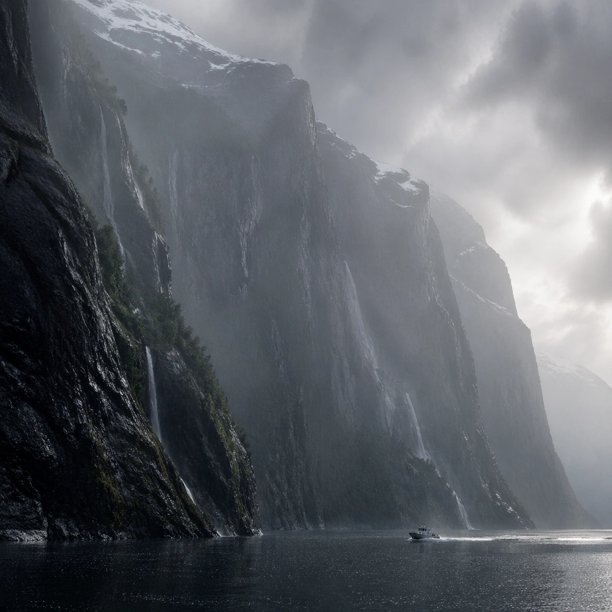
Scene: Create a square, photoreal landscape study of norwegian fjord deep cut. Compose it as the moment when weather, particles, or moving air become the main dramatic agent, using a stable documentary framing that lets the environmental event stay legible. Let the air itself carry visible density through haze, spray, ash, dust, snow, or storm structure Keep the frame cinematic but disciplined, with a clear foreground, middle distance, and far mass so the viewer can measure real depth. The image should feel like a field photograph made with patience, precision, and sublime restraint rather than a fantasy matte painting. Subject: Show a Norwegian fjord in afternoon light, with thousand-meter cliffs dropping into mirror-still dark water, waterfall ribbons descending the rock faces, and a small fishing boat leaving a white wake. This variation should emphasize weather-driven study. The main landform must dominate the composition, but secondary elements should quietly explain how the place works: water paths, sediment lines, snow bands, surf, ash, wind streaks, stars, or human traces where appropriate. Everything in the image should support the same idea of scale and climate, so the scene reads as one coherent environment rather than a stack of spectacular details. Important details: Preserve sheer vertical drop, dark reflective water, wet rock detail, mist from waterfalls, and the sensation of glacial erosion cutting a deep, precise corridor through the mountains. The atmosphere must feel physically plausible and tied to terrain, wind direction, temperature, and moisture. Keep geology, weather, and atmosphere physically believable. Use subtle micro-texture, tonal separation, and air perspective to reinforce distance. If a human, vehicle, tent, caravan, bird, or boat appears, it must remain tiny and subordinate to the landscape, functioning only as a scale witness. The composition should feel original, severe, and elegant, with no decorative filler and no imitation of any copyrighted visual property. Use case: Norwegian Fjord Deep Cut single study 4/9, exploring the weather-driven study variation. Constraints: No readable text, no watermark, no logos, preserve exact 1:1 aspect ratio, no cruise ship, no town skyline, no suspension bridge, no tropical water color, no disaster-movie excess, no impossible lightning clutter, no synthetic smoke plumes, no kitsch color grading, no artificial border, no split-panel treatment.

Example generated from “Fjord Norway Deep Cut — Light Contrast”
GPT Image 2en

Scene: Create a square, photoreal landscape study of norwegian fjord deep cut. Compose it as directional light carving sharp separation between illuminated and shadowed forms, using a composition built around light falloff, shadow shape, and reflective control rather than camera gimmicks. Let one strong light source create crisp hierarchy and believable color temperature shifts Keep the frame cinematic but disciplined, with a clear foreground, middle distance, and far mass so the viewer can measure real depth. The image should feel like a field photograph made with patience, precision, and sublime restraint rather than a fantasy matte painting. Subject: Show a Norwegian fjord in afternoon light, with thousand-meter cliffs dropping into mirror-still dark water, waterfall ribbons descending the rock faces, and a small fishing boat leaving a white wake. This variation should emphasize light-structure study. The main landform must dominate the composition, but secondary elements should quietly explain how the place works: water paths, sediment lines, snow bands, surf, ash, wind streaks, stars, or human traces where appropriate. Everything in the image should support the same idea of scale and climate, so the scene reads as one coherent environment rather than a stack of spectacular details. Important details: Preserve sheer vertical drop, dark reflective water, wet rock detail, mist from waterfalls, and the sensation of glacial erosion cutting a deep, precise corridor through the mountains. Surface brightness, shadow depth, and reflected light should all agree with the material and weather conditions. Keep geology, weather, and atmosphere physically believable. Use subtle micro-texture, tonal separation, and air perspective to reinforce distance. If a human, vehicle, tent, caravan, bird, or boat appears, it must remain tiny and subordinate to the landscape, functioning only as a scale witness. The composition should feel original, severe, and elegant, with no decorative filler and no imitation of any copyrighted visual property. Use case: Norwegian Fjord Deep Cut single study 5/9, exploring the light-structure study variation. Constraints: No readable text, no watermark, no logos, preserve exact 1:1 aspect ratio, no cruise ship, no town skyline, no suspension bridge, no tropical water color, no blown highlights, no muddy blacks, no theatrical stage lighting, no kitsch color grading, no artificial border, no split-panel treatment.

Example generated from “Fjord Norway Deep Cut — Material Close”
GPT Image 2en

Scene: Create a square, photoreal landscape study of norwegian fjord deep cut. Compose it as surface texture and material transitions while still keeping the full environment recognizable, using a tighter medium-wide crop that gives more area to texture, fracture, grain, water, ice, lava, salt, or stone. Let texture remain readable without making the scene feel like a macro shot Keep the frame cinematic but disciplined, with a clear foreground, middle distance, and far mass so the viewer can measure real depth. The image should feel like a field photograph made with patience, precision, and sublime restraint rather than a fantasy matte painting. Subject: Show a Norwegian fjord in afternoon light, with thousand-meter cliffs dropping into mirror-still dark water, waterfall ribbons descending the rock faces, and a small fishing boat leaving a white wake. This variation should emphasize material realism check. The main landform must dominate the composition, but secondary elements should quietly explain how the place works: water paths, sediment lines, snow bands, surf, ash, wind streaks, stars, or human traces where appropriate. Everything in the image should support the same idea of scale and climate, so the scene reads as one coherent environment rather than a stack of spectacular details. Important details: Preserve sheer vertical drop, dark reflective water, wet rock detail, mist from waterfalls, and the sensation of glacial erosion cutting a deep, precise corridor through the mountains. Micro-texture, edge wear, wetness, frost, dust, foam, or sediment should deepen realism rather than distract from scale. Keep geology, weather, and atmosphere physically believable. Use subtle micro-texture, tonal separation, and air perspective to reinforce distance. If a human, vehicle, tent, caravan, bird, or boat appears, it must remain tiny and subordinate to the landscape, functioning only as a scale witness. The composition should feel original, severe, and elegant, with no decorative filler and no imitation of any copyrighted visual property. Use case: Norwegian Fjord Deep Cut single study 6/9, exploring the material realism check variation. Constraints: No readable text, no watermark, no logos, preserve exact 1:1 aspect ratio, no cruise ship, no town skyline, no suspension bridge, no tropical water color, no extreme macro abstraction, no plastic-looking surfaces, no shallow depth-of-field blur, no kitsch color grading, no artificial border, no split-panel treatment.

Example generated from “Fjord Norway Deep Cut — Scale Witness”
GPT Image 2en

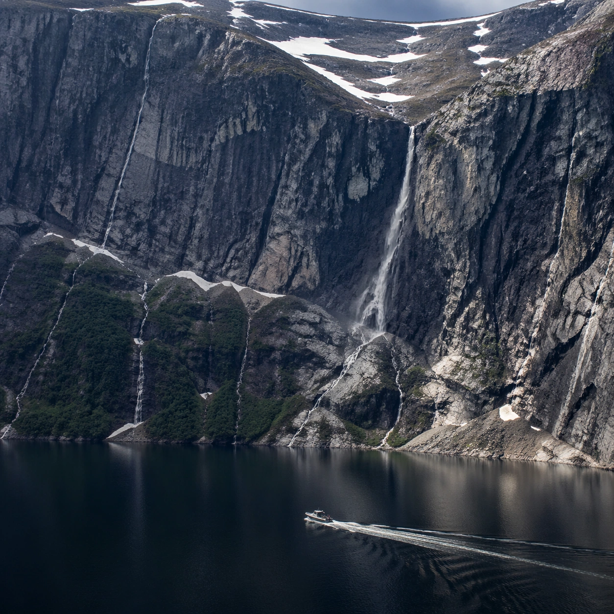
Scene: Create a square, photoreal landscape study of norwegian fjord deep cut. Compose it as a tiny human, animal, tent, vehicle, or craft that reveals the vastness of the environment, using a balanced frame where the witness remains small but unmistakable. Let the scale marker stay visible without becoming the true subject Keep the frame cinematic but disciplined, with a clear foreground, middle distance, and far mass so the viewer can measure real depth. The image should feel like a field photograph made with patience, precision, and sublime restraint rather than a fantasy matte painting. Subject: Show a Norwegian fjord in afternoon light, with thousand-meter cliffs dropping into mirror-still dark water, waterfall ribbons descending the rock faces, and a small fishing boat leaving a white wake. This variation should emphasize scale comparison. The main landform must dominate the composition, but secondary elements should quietly explain how the place works: water paths, sediment lines, snow bands, surf, ash, wind streaks, stars, or human traces where appropriate. Everything in the image should support the same idea of scale and climate, so the scene reads as one coherent environment rather than a stack of spectacular details. Important details: Preserve sheer vertical drop, dark reflective water, wet rock detail, mist from waterfalls, and the sensation of glacial erosion cutting a deep, precise corridor through the mountains. The viewer should understand the environment first and the witness second, with clean spatial separation between them. Keep geology, weather, and atmosphere physically believable. Use subtle micro-texture, tonal separation, and air perspective to reinforce distance. If a human, vehicle, tent, caravan, bird, or boat appears, it must remain tiny and subordinate to the landscape, functioning only as a scale witness. The composition should feel original, severe, and elegant, with no decorative filler and no imitation of any copyrighted visual property. Use case: Norwegian Fjord Deep Cut single study 7/9, exploring the scale comparison variation. Constraints: No readable text, no watermark, no logos, preserve exact 1:1 aspect ratio, no cruise ship, no town skyline, no suspension bridge, no tropical water color, no crowd scenes, no heroic close-up character framing, no busy gear pile, no kitsch color grading, no artificial border, no split-panel treatment.

Example generated from “Fjord Norway Deep Cut — Abstract Rhythm”
GPT Image 2en

Scene: Create a square, photoreal landscape study of norwegian fjord deep cut. Compose it as the near-abstract rhythm of repeated natural forms, lines, and tonal bands, using a disciplined crop that approaches abstraction while remaining unmistakably a real place. Let shape and tonal cadence dominate before small narrative details Keep the frame cinematic but disciplined, with a clear foreground, middle distance, and far mass so the viewer can measure real depth. The image should feel like a field photograph made with patience, precision, and sublime restraint rather than a fantasy matte painting. Subject: Show a Norwegian fjord in afternoon light, with thousand-meter cliffs dropping into mirror-still dark water, waterfall ribbons descending the rock faces, and a small fishing boat leaving a white wake. This variation should emphasize formal composition study. The main landform must dominate the composition, but secondary elements should quietly explain how the place works: water paths, sediment lines, snow bands, surf, ash, wind streaks, stars, or human traces where appropriate. Everything in the image should support the same idea of scale and climate, so the scene reads as one coherent environment rather than a stack of spectacular details. Important details: Preserve sheer vertical drop, dark reflective water, wet rock detail, mist from waterfalls, and the sensation of glacial erosion cutting a deep, precise corridor through the mountains. Pattern, repetition, and negative space should feel discovered in nature, not graphically imposed. Keep geology, weather, and atmosphere physically believable. Use subtle micro-texture, tonal separation, and air perspective to reinforce distance. If a human, vehicle, tent, caravan, bird, or boat appears, it must remain tiny and subordinate to the landscape, functioning only as a scale witness. The composition should feel original, severe, and elegant, with no decorative filler and no imitation of any copyrighted visual property. Use case: Norwegian Fjord Deep Cut single study 8/9, exploring the formal composition study variation. Constraints: No readable text, no watermark, no logos, preserve exact 1:1 aspect ratio, no cruise ship, no town skyline, no suspension bridge, no tropical water color, no graphic overlays, no surreal floating elements, no ornamental symmetry cheats, no kitsch color grading, no artificial border, no split-panel treatment.

Example generated from “Fjord Norway Deep Cut — Final Iconic”
GPT Image 2en

Scene: Create a square, photoreal landscape study of norwegian fjord deep cut. Compose it as the cleanest, most iconic summary of the whole landscape idea, using a distilled composition with one unforgettable silhouette or mass relationship and generous breathing room. Let the scene resolve into a memorable final image with strong legibility at thumbnail size Keep the frame cinematic but disciplined, with a clear foreground, middle distance, and far mass so the viewer can measure real depth. The image should feel like a field photograph made with patience, precision, and sublime restraint rather than a fantasy matte painting. Subject: Show a Norwegian fjord in afternoon light, with thousand-meter cliffs dropping into mirror-still dark water, waterfall ribbons descending the rock faces, and a small fishing boat leaving a white wake. This variation should emphasize iconic final plate. The main landform must dominate the composition, but secondary elements should quietly explain how the place works: water paths, sediment lines, snow bands, surf, ash, wind streaks, stars, or human traces where appropriate. Everything in the image should support the same idea of scale and climate, so the scene reads as one coherent environment rather than a stack of spectacular details. Important details: Preserve sheer vertical drop, dark reflective water, wet rock detail, mist from waterfalls, and the sensation of glacial erosion cutting a deep, precise corridor through the mountains. Keep the frame spare, confident, and monumental, with every element earning its place. Keep geology, weather, and atmosphere physically believable. Use subtle micro-texture, tonal separation, and air perspective to reinforce distance. If a human, vehicle, tent, caravan, bird, or boat appears, it must remain tiny and subordinate to the landscape, functioning only as a scale witness. The composition should feel original, severe, and elegant, with no decorative filler and no imitation of any copyrighted visual property. Use case: Norwegian Fjord Deep Cut single study 9/9, exploring the iconic final plate variation. Constraints: No readable text, no watermark, no logos, preserve exact 1:1 aspect ratio, no cruise ship, no town skyline, no suspension bridge, no tropical water color, no cluttered edges, no competing focal points, no visual noise in empty space, no kitsch color grading, no artificial border, no split-panel treatment.

Example generated from “Flavor Family Packaging Line — Reference Anchor”
GPT Image 2en

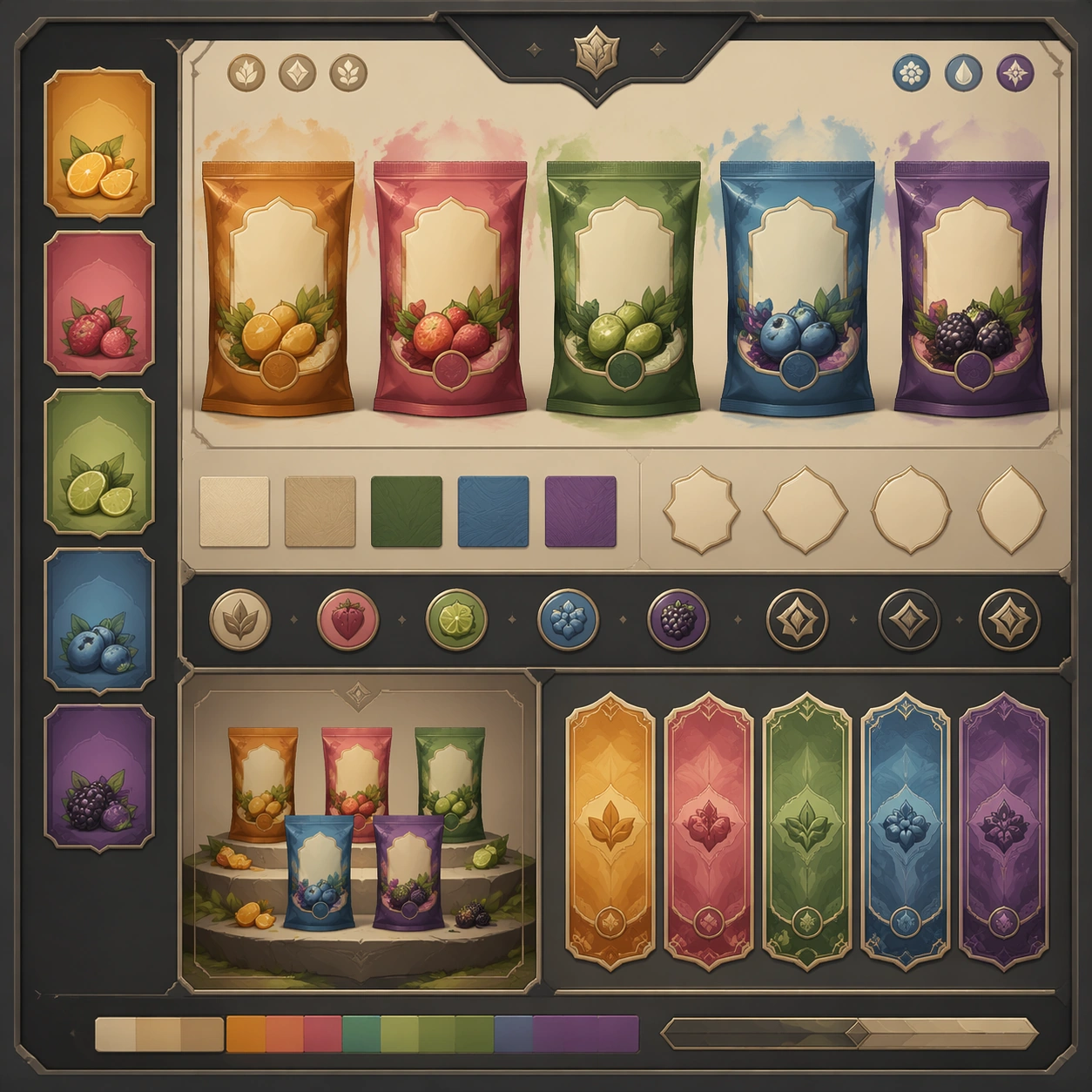
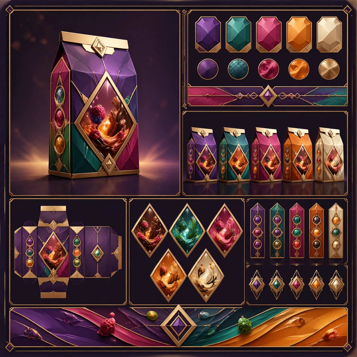
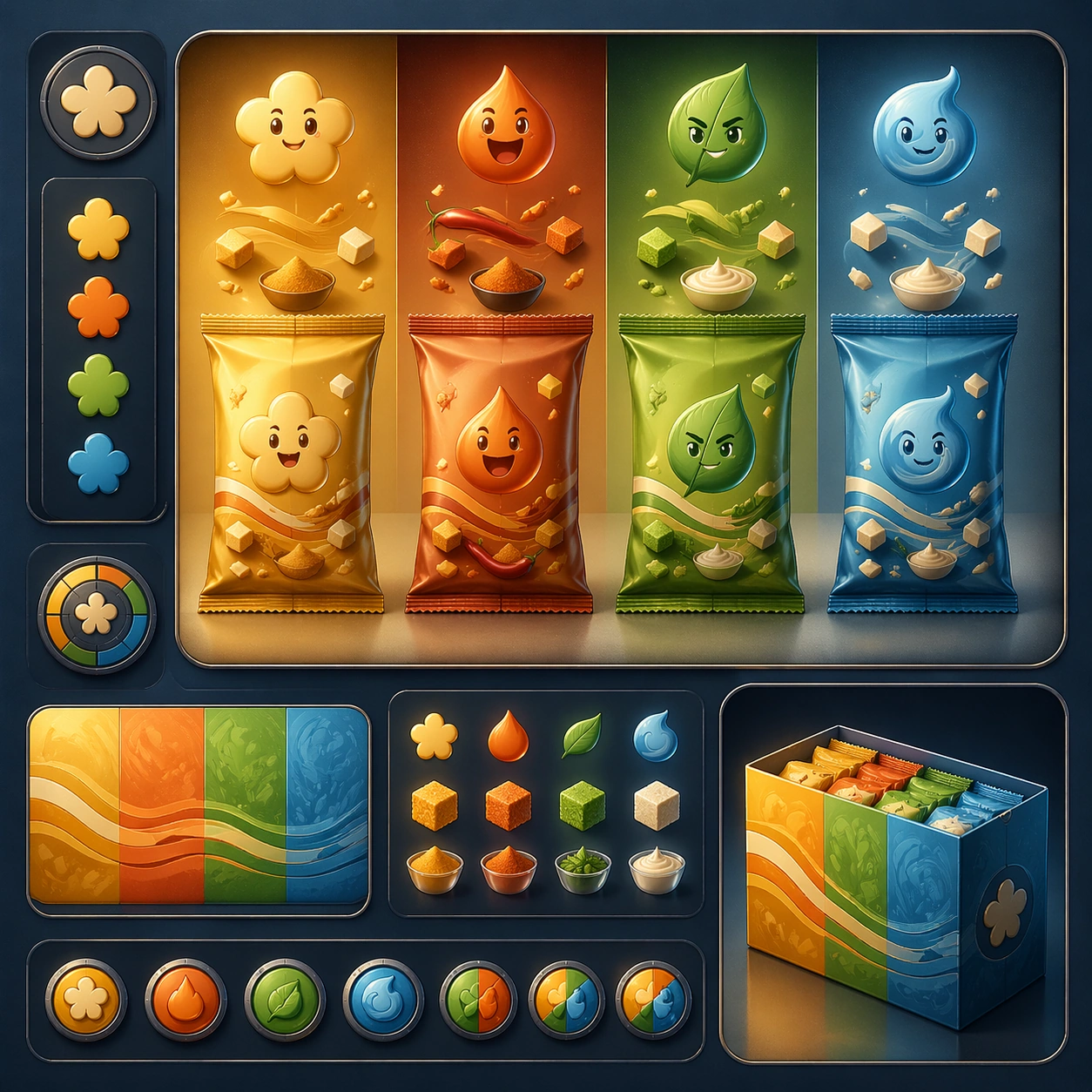
Scene: Create a square reference image for Flavor Family Packaging Line. Build a reference anchor establishing the core system with a premium, production-ready finish. Use a polished modular board or campaign surface with clean spacing, premium game-UI finish, and clear focal hierarchy. The composition should feel intentional, clean, and reusable for gallery, research, campaign, or internal handoff contexts. Lighting must support readability first, with the main forms clearly separated from the background and enough breathing room for the system to stay legible at both hero scale and thumbnail scale. Subject: Center a coherent original game-art system built for premium production and marketing surfaces. For this image, focus on reference anchor. Keep the same system logic stable across screenshots, cards, banners, and overview boards. This image is the canonical anchor that later series images must follow. The viewer should immediately understand what role this surface plays inside a cohesive game-production asset pack. Important details: Lock framing, icon grammar, palette blocking, and surface hierarchy so the kit feels production-ready and consistent. Preserve the core silhouette, framing language, and material logic from the reference image while each variation changes function. Keep materials believable, edge hierarchy disciplined, and the visual language consistent with Flavor Line. Use abstract interface blocks or diagram accents when helpful, but avoid any readable language. The final result should feel like a deliberate production asset rather than a random illustration. Use case: Flavor Family Packaging Line series study 1/9, designed as reference anchor within a cohesive asset pack. Constraints: No readable text, no watermark, no logos, preserve exact 1:1 aspect ratio, no unrelated objects, no broken visual hierarchy, no malformed anatomy or broken perspective, no random decorative clutter.

Example generated from “Flavor Family Packaging Line — Variant One”
GPT Image 2en

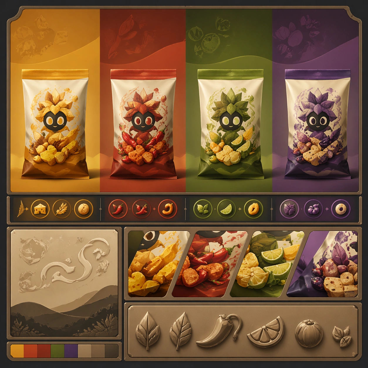
Scene: Create a square dependent image for Flavor Family Packaging Line. Build a first controlled variation in the same system with a premium, production-ready finish. Use a polished modular board or campaign surface with clean spacing, premium game-UI finish, and clear focal hierarchy. The composition should feel intentional, clean, and reusable for gallery, research, campaign, or internal handoff contexts. Lighting must support readability first, with the main forms clearly separated from the background and enough breathing room for the system to stay legible at both hero scale and thumbnail scale. Subject: Center a coherent original game-art system built for premium production and marketing surfaces. For this image, focus on the intended support surface. Keep the same system logic stable across screenshots, cards, banners, and overview boards. Preserve exact identity or system logic from the reference image while changing only the intended variation axis. The viewer should immediately understand what role this surface plays inside a cohesive game-production asset pack. Important details: Lock framing, icon grammar, palette blocking, and surface hierarchy so the kit feels production-ready and consistent. Preserve the core silhouette, framing language, and material logic from the reference image while each variation changes function. Keep materials believable, edge hierarchy disciplined, and the visual language consistent with Flavor Line. Use abstract interface blocks or diagram accents when helpful, but avoid any readable language. The final result should feel like a deliberate production asset rather than a random illustration. Use case: Flavor Family Packaging Line series study 2/9, designed as variant one within a cohesive asset pack. Constraints: No readable text, no watermark, no logos, preserve exact 1:1 aspect ratio, no unrelated objects, no broken visual hierarchy, no malformed anatomy or broken perspective, no random decorative clutter.

Example generated from “Flavor Family Packaging Line — Variant Two”
GPT Image 2en

Scene: Create a square dependent image for Flavor Family Packaging Line. Build a second controlled variation in the same system with a premium, production-ready finish. Use a polished modular board or campaign surface with clean spacing, premium game-UI finish, and clear focal hierarchy. The composition should feel intentional, clean, and reusable for gallery, research, campaign, or internal handoff contexts. Lighting must support readability first, with the main forms clearly separated from the background and enough breathing room for the system to stay legible at both hero scale and thumbnail scale. Subject: Center a coherent original game-art system built for premium production and marketing surfaces. For this image, focus on the intended support surface. Keep the same system logic stable across screenshots, cards, banners, and overview boards. Preserve exact identity or system logic from the reference image while changing only the intended variation axis. The viewer should immediately understand what role this surface plays inside a cohesive game-production asset pack. Important details: Lock framing, icon grammar, palette blocking, and surface hierarchy so the kit feels production-ready and consistent. Preserve the core silhouette, framing language, and material logic from the reference image while each variation changes function. Keep materials believable, edge hierarchy disciplined, and the visual language consistent with Flavor Line. Use abstract interface blocks or diagram accents when helpful, but avoid any readable language. The final result should feel like a deliberate production asset rather than a random illustration. Use case: Flavor Family Packaging Line series study 3/9, designed as variant two within a cohesive asset pack. Constraints: No readable text, no watermark, no logos, preserve exact 1:1 aspect ratio, no unrelated objects, no broken visual hierarchy, no malformed anatomy or broken perspective, no random decorative clutter.

Example generated from “Flavor Family Packaging Line — Variant Three”
GPT Image 2en

Scene: Create a square dependent image for Flavor Family Packaging Line. Build a third controlled variation in the same system with a premium, production-ready finish. Use a polished modular board or campaign surface with clean spacing, premium game-UI finish, and clear focal hierarchy. The composition should feel intentional, clean, and reusable for gallery, research, campaign, or internal handoff contexts. Lighting must support readability first, with the main forms clearly separated from the background and enough breathing room for the system to stay legible at both hero scale and thumbnail scale. Subject: Center a coherent original game-art system built for premium production and marketing surfaces. For this image, focus on the intended support surface. Keep the same system logic stable across screenshots, cards, banners, and overview boards. Preserve exact identity or system logic from the reference image while changing only the intended variation axis. The viewer should immediately understand what role this surface plays inside a cohesive game-production asset pack. Important details: Lock framing, icon grammar, palette blocking, and surface hierarchy so the kit feels production-ready and consistent. Preserve the core silhouette, framing language, and material logic from the reference image while each variation changes function. Keep materials believable, edge hierarchy disciplined, and the visual language consistent with Flavor Line. Use abstract interface blocks or diagram accents when helpful, but avoid any readable language. The final result should feel like a deliberate production asset rather than a random illustration. Use case: Flavor Family Packaging Line series study 4/9, designed as variant three within a cohesive asset pack. Constraints: No readable text, no watermark, no logos, preserve exact 1:1 aspect ratio, no unrelated objects, no broken visual hierarchy, no malformed anatomy or broken perspective, no random decorative clutter.

Example generated from “Flavor Family Packaging Line — Support One”
GPT Image 2en

Scene: Create a square standalone support image for Flavor Family Packaging Line. Build a support-surface study with a clear focal hierarchy and a finished professional surface. Use a polished modular board or campaign surface with clean spacing, premium game-UI finish, and clear focal hierarchy. The frame should feel self-contained and polished, with enough structure to explain the system even without the reference series, yet still obviously belonging to the same theme and production world. Subject: Show a coherent original game-art system built for premium production and marketing surfaces in a way that emphasizes the intended support surface. Keep the same system logic stable across screenshots, cards, banners, and overview boards. Even though this image is independent, the viewer should still recognize the same universe, same commercial logic, and same production intent as the core package. Important details: Lock framing, icon grammar, palette blocking, and surface hierarchy so the kit feels production-ready and consistent. Preserve the broader theme language through color, framing, material choices, and modular composition. Use clean panel rhythm, premium asset presentation, and believable detail density. The image should work equally well as a gallery study, research reference, and mock production deliverable. Use case: Flavor Family Packaging Line single study 5/9, exploring support one as a support surface. Constraints: No readable text, no watermark, no logos, preserve exact 1:1 aspect ratio, no unrelated objects, no broken visual hierarchy, no visual noise that obscures the main surface, no accidental brand resemblance.

Example generated from “Flavor Family Packaging Line — Support Two”
GPT Image 2en

Scene: Create a square standalone support image for Flavor Family Packaging Line. Build a second support-surface study with a clear focal hierarchy and a finished professional surface. Use a polished modular board or campaign surface with clean spacing, premium game-UI finish, and clear focal hierarchy. The frame should feel self-contained and polished, with enough structure to explain the system even without the reference series, yet still obviously belonging to the same theme and production world. Subject: Show a coherent original game-art system built for premium production and marketing surfaces in a way that emphasizes the intended support surface. Keep the same system logic stable across screenshots, cards, banners, and overview boards. Even though this image is independent, the viewer should still recognize the same universe, same commercial logic, and same production intent as the core package. Important details: Lock framing, icon grammar, palette blocking, and surface hierarchy so the kit feels production-ready and consistent. Preserve the broader theme language through color, framing, material choices, and modular composition. Use clean panel rhythm, premium asset presentation, and believable detail density. The image should work equally well as a gallery study, research reference, and mock production deliverable. Use case: Flavor Family Packaging Line single study 6/9, exploring support two as a support surface. Constraints: No readable text, no watermark, no logos, preserve exact 1:1 aspect ratio, no unrelated objects, no broken visual hierarchy, no visual noise that obscures the main surface, no accidental brand resemblance.

Example generated from “Flavor Family Packaging Line — Support Three”
GPT Image 2en

Scene: Create a square standalone support image for Flavor Family Packaging Line. Build a third support-surface study with a clear focal hierarchy and a finished professional surface. Use a polished modular board or campaign surface with clean spacing, premium game-UI finish, and clear focal hierarchy. The frame should feel self-contained and polished, with enough structure to explain the system even without the reference series, yet still obviously belonging to the same theme and production world. Subject: Show a coherent original game-art system built for premium production and marketing surfaces in a way that emphasizes the intended support surface. Keep the same system logic stable across screenshots, cards, banners, and overview boards. Even though this image is independent, the viewer should still recognize the same universe, same commercial logic, and same production intent as the core package. Important details: Lock framing, icon grammar, palette blocking, and surface hierarchy so the kit feels production-ready and consistent. Preserve the broader theme language through color, framing, material choices, and modular composition. Use clean panel rhythm, premium asset presentation, and believable detail density. The image should work equally well as a gallery study, research reference, and mock production deliverable. Use case: Flavor Family Packaging Line single study 7/9, exploring support three as a support surface. Constraints: No readable text, no watermark, no logos, preserve exact 1:1 aspect ratio, no unrelated objects, no broken visual hierarchy, no visual noise that obscures the main surface, no accidental brand resemblance.

Example generated from “Flavor Family Packaging Line — Support Four”
GPT Image 2en

Scene: Create a square standalone support image for Flavor Family Packaging Line. Build a fourth support-surface study with a clear focal hierarchy and a finished professional surface. Use a polished modular board or campaign surface with clean spacing, premium game-UI finish, and clear focal hierarchy. The frame should feel self-contained and polished, with enough structure to explain the system even without the reference series, yet still obviously belonging to the same theme and production world. Subject: Show a coherent original game-art system built for premium production and marketing surfaces in a way that emphasizes the intended support surface. Keep the same system logic stable across screenshots, cards, banners, and overview boards. Even though this image is independent, the viewer should still recognize the same universe, same commercial logic, and same production intent as the core package. Important details: Lock framing, icon grammar, palette blocking, and surface hierarchy so the kit feels production-ready and consistent. Preserve the broader theme language through color, framing, material choices, and modular composition. Use clean panel rhythm, premium asset presentation, and believable detail density. The image should work equally well as a gallery study, research reference, and mock production deliverable. Use case: Flavor Family Packaging Line single study 8/9, exploring support four as a support surface. Constraints: No readable text, no watermark, no logos, preserve exact 1:1 aspect ratio, no unrelated objects, no broken visual hierarchy, no visual noise that obscures the main surface, no accidental brand resemblance.

Example generated from “Flavor Family Packaging Line — Support Five”
GPT Image 2en

Scene: Create a square standalone support image for Flavor Family Packaging Line. Build a fifth support-surface study with a clear focal hierarchy and a finished professional surface. Use a polished modular board or campaign surface with clean spacing, premium game-UI finish, and clear focal hierarchy. The frame should feel self-contained and polished, with enough structure to explain the system even without the reference series, yet still obviously belonging to the same theme and production world. Subject: Show a coherent original game-art system built for premium production and marketing surfaces in a way that emphasizes the intended support surface. Keep the same system logic stable across screenshots, cards, banners, and overview boards. Even though this image is independent, the viewer should still recognize the same universe, same commercial logic, and same production intent as the core package. Important details: Lock framing, icon grammar, palette blocking, and surface hierarchy so the kit feels production-ready and consistent. Preserve the broader theme language through color, framing, material choices, and modular composition. Use clean panel rhythm, premium asset presentation, and believable detail density. The image should work equally well as a gallery study, research reference, and mock production deliverable. Use case: Flavor Family Packaging Line single study 9/9, exploring support five as a support surface. Constraints: No readable text, no watermark, no logos, preserve exact 1:1 aspect ratio, no unrelated objects, no broken visual hierarchy, no visual noise that obscures the main surface, no accidental brand resemblance.

Example generated from “Flower Of Life Quantum Field — Goldline Foundation”
GPT Image 2en

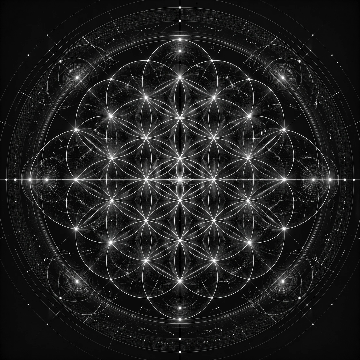
Scene: Create a square art-science plate that feels as if a sacred geometry diagram and a physics visualization were designed by the same meticulous hand. Keep the camera straight on, the layout centered, and the lighting or surface treatment chosen to preserve circle precision, waveform clarity, and the tension between symbolic elegance and laboratory rigor. Present it like a premium scientific print on matte black stock with disciplined metallic line work. Keep the square crop exact, the camera flat, and the tonal design disciplined enough that structure stays clear at poster scale and under close inspection. Subject: Use the Flower of Life as the primary scaffold, with exact circle overlap, stable center alignment, and clear petal intersections. Around and through that scaffold, weave particle trails, interference bands, resonance ripples, field lines, and pseudo-instrument markings so the image reads as one integrated cosmological system rather than separate layers pasted together. Focus this variation on a black-and-gold master plate where the Flower of Life is fused with orderly particle orbits and thin field contours. The composition should feel complete and singular, as though one finished artifact has been resolved with full conviction rather than one fragment pulled from a larger sheet. Important details: The circles must remain mathematically clean even when the composition becomes dense. Wave behavior should feel measured, not decorative. Keep contrast restrained, reserve the brightest accents for important intersections, and let secondary marks reinforce scale, rhythm, and implied physics without becoming literal textbook diagrams. Keep the circle intersections immaculate and let the particle tracks echo the flower geometry instead of fighting it. Preserve crisp edge behavior, stable hierarchy, and enough fine information that the image rewards slow viewing without losing the main read from a distance. Use case: Quantum Flower of Life single study 1/9, designed as a self-contained sacred-geometry image with a distinct material and compositional emphasis. Constraints: No readable text, no watermark, no logos, preserve exact 1:1 aspect ratio, no misaligned circle centers, no random waveform doodles, no classroom infographic style, no accidental graph labels, no broken overlap geometry, no generic tech UI panels, no sloppy concentric circles, no crowded margins, no cheap astrology aesthetic.

Example generated from “Flower Of Life Quantum Field — Cyan Interference Chamber”
GPT Image 2en

Scene: Create a square art-science plate that feels as if a sacred geometry diagram and a physics visualization were designed by the same meticulous hand. Keep the camera straight on, the layout centered, and the lighting or surface treatment chosen to preserve circle precision, waveform clarity, and the tension between symbolic elegance and laboratory rigor. Use deep navy and cyan light, as if the geometry were suspended inside a silent measurement chamber. Keep the square crop exact, the camera flat, and the tonal design disciplined enough that structure stays clear at poster scale and under close inspection. Subject: Use the Flower of Life as the primary scaffold, with exact circle overlap, stable center alignment, and clear petal intersections. Around and through that scaffold, weave particle trails, interference bands, resonance ripples, field lines, and pseudo-instrument markings so the image reads as one integrated cosmological system rather than separate layers pasted together. Focus this variation on a cooler chamber-like image where cyan wave bands pass through the floral lattice and reveal interference nodes. The composition should feel complete and singular, as though one finished artifact has been resolved with full conviction rather than one fragment pulled from a larger sheet. Important details: The circles must remain mathematically clean even when the composition becomes dense. Wave behavior should feel measured, not decorative. Keep contrast restrained, reserve the brightest accents for important intersections, and let secondary marks reinforce scale, rhythm, and implied physics without becoming literal textbook diagrams. Make the bright nodes appear exactly where circles and waves cross, and keep the spacing disciplined across the full square. Preserve crisp edge behavior, stable hierarchy, and enough fine information that the image rewards slow viewing without losing the main read from a distance. Use case: Quantum Flower of Life single study 2/9, designed as a self-contained sacred-geometry image with a distinct material and compositional emphasis. Constraints: No readable text, no watermark, no logos, preserve exact 1:1 aspect ratio, no misaligned circle centers, no random waveform doodles, no classroom infographic style, no accidental graph labels, no broken overlap geometry, no generic tech UI panels, no soft vapor clouds, no irregular wave spacing, no glowing edges detached from the grid.

Example generated from “Flower Of Life Quantum Field — Blackboard Energy Map”
GPT Image 2en

Scene: Create a square art-science plate that feels as if a sacred geometry diagram and a physics visualization were designed by the same meticulous hand. Keep the camera straight on, the layout centered, and the lighting or surface treatment chosen to preserve circle precision, waveform clarity, and the tension between symbolic elegance and laboratory rigor. Stage it like a pristine blackboard or slate plate photographed head on under even light. Keep the square crop exact, the camera flat, and the tonal design disciplined enough that structure stays clear at poster scale and under close inspection. Subject: Use the Flower of Life as the primary scaffold, with exact circle overlap, stable center alignment, and clear petal intersections. Around and through that scaffold, weave particle trails, interference bands, resonance ripples, field lines, and pseudo-instrument markings so the image reads as one integrated cosmological system rather than separate layers pasted together. Focus this variation on a chalky graphite interpretation that merges exact circles with precise energy traces and ratio marks. The composition should feel complete and singular, as though one finished artifact has been resolved with full conviction rather than one fragment pulled from a larger sheet. Important details: The circles must remain mathematically clean even when the composition becomes dense. Wave behavior should feel measured, not decorative. Keep contrast restrained, reserve the brightest accents for important intersections, and let secondary marks reinforce scale, rhythm, and implied physics without becoming literal textbook diagrams. Use pale chalk, brass accents, and faint dust only where it enhances structure; the geometry should still feel exact, not hand-wobbly. Preserve crisp edge behavior, stable hierarchy, and enough fine information that the image rewards slow viewing without losing the main read from a distance. Use case: Quantum Flower of Life single study 3/9, designed as a self-contained sacred-geometry image with a distinct material and compositional emphasis. Constraints: No readable text, no watermark, no logos, preserve exact 1:1 aspect ratio, no misaligned circle centers, no random waveform doodles, no classroom infographic style, no accidental graph labels, no broken overlap geometry, no generic tech UI panels, no classroom mess, no readable equations, no erased smudges obscuring intersections.

Example generated from “Flower Of Life Quantum Field — Glass Hologram Lab”
GPT Image 2en

Scene: Create a square art-science plate that feels as if a sacred geometry diagram and a physics visualization were designed by the same meticulous hand. Keep the camera straight on, the layout centered, and the lighting or surface treatment chosen to preserve circle precision, waveform clarity, and the tension between symbolic elegance and laboratory rigor. Keep the image frontal and symmetrical, like a research artifact displayed inside a glass case. Keep the square crop exact, the camera flat, and the tonal design disciplined enough that structure stays clear at poster scale and under close inspection. Subject: Use the Flower of Life as the primary scaffold, with exact circle overlap, stable center alignment, and clear petal intersections. Around and through that scaffold, weave particle trails, interference bands, resonance ripples, field lines, and pseudo-instrument markings so the image reads as one integrated cosmological system rather than separate layers pasted together. Focus this variation on a translucent glass interpretation with nested circles floating through layered field planes and refracted particle arcs. The composition should feel complete and singular, as though one finished artifact has been resolved with full conviction rather than one fragment pulled from a larger sheet. Important details: The circles must remain mathematically clean even when the composition becomes dense. Wave behavior should feel measured, not decorative. Keep contrast restrained, reserve the brightest accents for important intersections, and let secondary marks reinforce scale, rhythm, and implied physics without becoming literal textbook diagrams. Use subtle refraction and edge lighting to separate planes while preserving the exact overlap of every circle and petal. Preserve crisp edge behavior, stable hierarchy, and enough fine information that the image rewards slow viewing without losing the main read from a distance. Use case: Quantum Flower of Life single study 4/9, designed as a self-contained sacred-geometry image with a distinct material and compositional emphasis. Constraints: No readable text, no watermark, no logos, preserve exact 1:1 aspect ratio, no misaligned circle centers, no random waveform doodles, no classroom infographic style, no accidental graph labels, no broken overlap geometry, no generic tech UI panels, no perspective tilt, no hologram UI clutter, no rainbow glare chaos.

Example generated from “Flower Of Life Quantum Field — Aurora Oscillation Disc”
GPT Image 2en

Scene: Create a square art-science plate that feels as if a sacred geometry diagram and a physics visualization were designed by the same meticulous hand. Keep the camera straight on, the layout centered, and the lighting or surface treatment chosen to preserve circle precision, waveform clarity, and the tension between symbolic elegance and laboratory rigor. Treat it as a luminous night plate with cold atmospheric depth but no loss of geometric rigor. Keep the square crop exact, the camera flat, and the tonal design disciplined enough that structure stays clear at poster scale and under close inspection. Subject: Use the Flower of Life as the primary scaffold, with exact circle overlap, stable center alignment, and clear petal intersections. Around and through that scaffold, weave particle trails, interference bands, resonance ripples, field lines, and pseudo-instrument markings so the image reads as one integrated cosmological system rather than separate layers pasted together. Focus this variation on a nocturnal disc of green-blue oscillation waves wrapped around the flower geometry with measured pulse spacing. The composition should feel complete and singular, as though one finished artifact has been resolved with full conviction rather than one fragment pulled from a larger sheet. Important details: The circles must remain mathematically clean even when the composition becomes dense. Wave behavior should feel measured, not decorative. Keep contrast restrained, reserve the brightest accents for important intersections, and let secondary marks reinforce scale, rhythm, and implied physics without becoming literal textbook diagrams. The oscillation bands should feel periodic and physically plausible, and the flower scaffold must remain the governing geometry. Preserve crisp edge behavior, stable hierarchy, and enough fine information that the image rewards slow viewing without losing the main read from a distance. Use case: Quantum Flower of Life single study 5/9, designed as a self-contained sacred-geometry image with a distinct material and compositional emphasis. Constraints: No readable text, no watermark, no logos, preserve exact 1:1 aspect ratio, no misaligned circle centers, no random waveform doodles, no classroom infographic style, no accidental graph labels, no broken overlap geometry, no generic tech UI panels, no random aurora curtains, no blurry light leaks, no off-center pulses.

Example generated from “Flower Of Life Quantum Field — Copper Engraving Plate”
GPT Image 2en

Scene: Create a square art-science plate that feels as if a sacred geometry diagram and a physics visualization were designed by the same meticulous hand. Keep the camera straight on, the layout centered, and the lighting or surface treatment chosen to preserve circle precision, waveform clarity, and the tension between symbolic elegance and laboratory rigor. Render it like an antique scientific plate viewed directly from above with crisp etched shadows. Keep the square crop exact, the camera flat, and the tonal design disciplined enough that structure stays clear at poster scale and under close inspection. Subject: Use the Flower of Life as the primary scaffold, with exact circle overlap, stable center alignment, and clear petal intersections. Around and through that scaffold, weave particle trails, interference bands, resonance ripples, field lines, and pseudo-instrument markings so the image reads as one integrated cosmological system rather than separate layers pasted together. Focus this variation on a warm copper etching where the field logic becomes engraved channels, dotted energies, and precise circular cuts. The composition should feel complete and singular, as though one finished artifact has been resolved with full conviction rather than one fragment pulled from a larger sheet. Important details: The circles must remain mathematically clean even when the composition becomes dense. Wave behavior should feel measured, not decorative. Keep contrast restrained, reserve the brightest accents for important intersections, and let secondary marks reinforce scale, rhythm, and implied physics without becoming literal textbook diagrams. Use engraved depth, measured stippling, and careful wear at edges while preserving clean circle registration throughout. Preserve crisp edge behavior, stable hierarchy, and enough fine information that the image rewards slow viewing without losing the main read from a distance. Use case: Quantum Flower of Life single study 6/9, designed as a self-contained sacred-geometry image with a distinct material and compositional emphasis. Constraints: No readable text, no watermark, no logos, preserve exact 1:1 aspect ratio, no misaligned circle centers, no random waveform doodles, no classroom infographic style, no accidental graph labels, no broken overlap geometry, no generic tech UI panels, no rust damage, no steampunk clutter, no loose sketch lines.

Example generated from “Flower Of Life Quantum Field — Darkroom Particle Orbit”
GPT Image 2en

Scene: Create a square art-science plate that feels as if a sacred geometry diagram and a physics visualization were designed by the same meticulous hand. Keep the camera straight on, the layout centered, and the lighting or surface treatment chosen to preserve circle precision, waveform clarity, and the tension between symbolic elegance and laboratory rigor. Keep the mood quiet and technical, as if observed in a precision optics lab with no camera distortion. Keep the square crop exact, the camera flat, and the tonal design disciplined enough that structure stays clear at poster scale and under close inspection. Subject: Use the Flower of Life as the primary scaffold, with exact circle overlap, stable center alignment, and clear petal intersections. Around and through that scaffold, weave particle trails, interference bands, resonance ripples, field lines, and pseudo-instrument markings so the image reads as one integrated cosmological system rather than separate layers pasted together. Focus this variation on a dark photographic plate where tiny white particle traces and diffraction bands animate the flower lattice. The composition should feel complete and singular, as though one finished artifact has been resolved with full conviction rather than one fragment pulled from a larger sheet. Important details: The circles must remain mathematically clean even when the composition becomes dense. Wave behavior should feel measured, not decorative. Keep contrast restrained, reserve the brightest accents for important intersections, and let secondary marks reinforce scale, rhythm, and implied physics without becoming literal textbook diagrams. Make the particle trails crisp and purposeful, and reserve highlights for exact nodal crossings and ring intersections. Preserve crisp edge behavior, stable hierarchy, and enough fine information that the image rewards slow viewing without losing the main read from a distance. Use case: Quantum Flower of Life single study 7/9, designed as a self-contained sacred-geometry image with a distinct material and compositional emphasis. Constraints: No readable text, no watermark, no logos, preserve exact 1:1 aspect ratio, no misaligned circle centers, no random waveform doodles, no classroom infographic style, no accidental graph labels, no broken overlap geometry, no generic tech UI panels, no starfield randomness, no lens flare, no smoky long-exposure mess.

Example generated from “Flower Of Life Quantum Field — Parchment Ratio Study”
GPT Image 2en

Scene: Create a square art-science plate that feels as if a sacred geometry diagram and a physics visualization were designed by the same meticulous hand. Keep the camera straight on, the layout centered, and the lighting or surface treatment chosen to preserve circle precision, waveform clarity, and the tension between symbolic elegance and laboratory rigor. Present it as a historical scientific folio with soft paper grain and disciplined sepia contrast. Keep the square crop exact, the camera flat, and the tonal design disciplined enough that structure stays clear at poster scale and under close inspection. Subject: Use the Flower of Life as the primary scaffold, with exact circle overlap, stable center alignment, and clear petal intersections. Around and through that scaffold, weave particle trails, interference bands, resonance ripples, field lines, and pseudo-instrument markings so the image reads as one integrated cosmological system rather than separate layers pasted together. Focus this variation on an archival parchment version combining sacred circles, pseudo-annotation bands, and phi-inspired spacing cues. The composition should feel complete and singular, as though one finished artifact has been resolved with full conviction rather than one fragment pulled from a larger sheet. Important details: The circles must remain mathematically clean even when the composition becomes dense. Wave behavior should feel measured, not decorative. Keep contrast restrained, reserve the brightest accents for important intersections, and let secondary marks reinforce scale, rhythm, and implied physics without becoming literal textbook diagrams. Keep all annotation-like bands abstract and non-readable, and let the paper texture support rather than soften the geometry. Preserve crisp edge behavior, stable hierarchy, and enough fine information that the image rewards slow viewing without losing the main read from a distance. Use case: Quantum Flower of Life single study 8/9, designed as a self-contained sacred-geometry image with a distinct material and compositional emphasis. Constraints: No readable text, no watermark, no logos, preserve exact 1:1 aspect ratio, no misaligned circle centers, no random waveform doodles, no classroom infographic style, no accidental graph labels, no broken overlap geometry, no generic tech UI panels, no readable notes, no torn edges dominating the frame, no medieval cartooning.

Example generated from “Flower Of Life Quantum Field — Deep Ocean Field”
GPT Image 2en

Scene: Create a square art-science plate that feels as if a sacred geometry diagram and a physics visualization were designed by the same meticulous hand. Keep the camera straight on, the layout centered, and the lighting or surface treatment chosen to preserve circle precision, waveform clarity, and the tension between symbolic elegance and laboratory rigor. Use dark teal depth and sparse luminous accents, keeping the overall image measured and contemplative. Keep the square crop exact, the camera flat, and the tonal design disciplined enough that structure stays clear at poster scale and under close inspection. Subject: Use the Flower of Life as the primary scaffold, with exact circle overlap, stable center alignment, and clear petal intersections. Around and through that scaffold, weave particle trails, interference bands, resonance ripples, field lines, and pseudo-instrument markings so the image reads as one integrated cosmological system rather than separate layers pasted together. Focus this variation on a marine-toned study where pressure waves, bioluminescent points, and the flower lattice merge into one serene field diagram. The composition should feel complete and singular, as though one finished artifact has been resolved with full conviction rather than one fragment pulled from a larger sheet. Important details: The circles must remain mathematically clean even when the composition becomes dense. Wave behavior should feel measured, not decorative. Keep contrast restrained, reserve the brightest accents for important intersections, and let secondary marks reinforce scale, rhythm, and implied physics without becoming literal textbook diagrams. The wavefronts should curve with elegant discipline, and the flower intersections must remain exact even inside the atmospheric color field. Preserve crisp edge behavior, stable hierarchy, and enough fine information that the image rewards slow viewing without losing the main read from a distance. Use case: Quantum Flower of Life single study 9/9, designed as a self-contained sacred-geometry image with a distinct material and compositional emphasis. Constraints: No readable text, no watermark, no logos, preserve exact 1:1 aspect ratio, no misaligned circle centers, no random waveform doodles, no classroom infographic style, no accidental graph labels, no broken overlap geometry, no generic tech UI panels, no coral illustration, no fish imagery, no soft underwater haze hiding the geometry.

Example generated from “Fluid Smoke Explosion — Macro Study”
GPT Image 2en

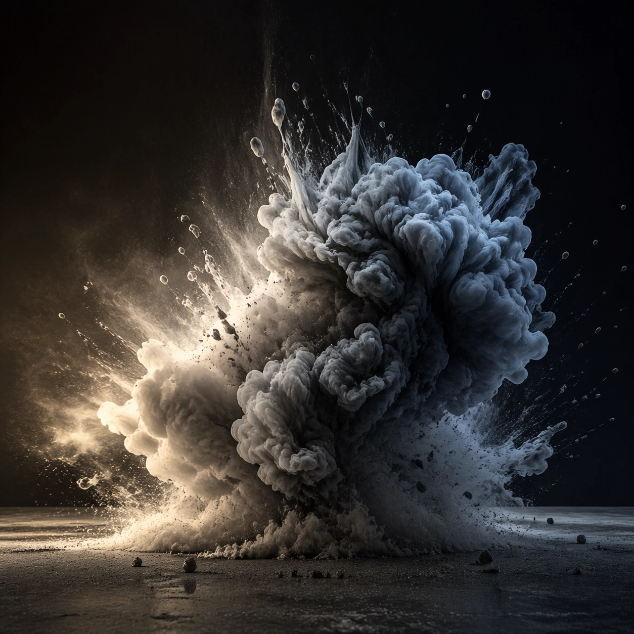
Scene: A square photographic image with intentional lens choice, coherent light, and a subject that feels observed rather than merely decorated. Build the frame around closer observation that reveals fine structure and optical behavior. Keep the lighting, camera distance, and spatial organization tuned for a high-signal research image rather than a casual snapshot. The image belongs to the Fluid Smoke Explosion theme and should feel immediately legible as a prompt atlas theme for fluid smoke explosion, testing physics-materials, commercial-mockup with gpt image 2.. Subject: Center the study on closer observation that reveals fine structure and optical behavior. Translate the theme into a concrete visual statement instead of an abstract mood board: the viewer should understand what kind of image this is, what is being tested, and why the composition is difficult. Use the slug idea of fluid smoke explosion as a literal guide for subject matter, materials, and staging. Important details: The realism should come from timing, optics, and material response: atmosphere, contrast, depth, motion, and tiny physical cues all need to agree. Preserve a disciplined square composition, clear focal hierarchy, and enough secondary information to make the image feel complete rather than underspecified. The image should look polished, novel, and exhibition-ready, with topic-specific credibility coming from the way surfaces, structure, and visual language reinforce Fluid Smoke Explosion. Avoid generic filler elements that do not serve the main concept. Use case: Fluid Smoke Explosion single study 2/8, testing physics-materials, commercial-mockup through the macro study variation. Constraints: No readable text, no watermark, no logos, preserve exact 1:1 aspect ratio, no watermark, no cheap HDR excess, no unreadable signage, no fake stock-photo posing, no compositing seams, no arbitrary lens flare.

Example generated from “Fluid Smoke Explosion — Side Light Study”
GPT Image 2en

Scene: A square photographic image with intentional lens choice, coherent light, and a subject that feels observed rather than merely decorated. Build the frame around a directional-light treatment that increases form and drama. Keep the lighting, camera distance, and spatial organization tuned for a high-signal research image rather than a casual snapshot. The image belongs to the Fluid Smoke Explosion theme and should feel immediately legible as a prompt atlas theme for fluid smoke explosion, testing physics-materials, commercial-mockup with gpt image 2.. Subject: Center the study on a directional-light treatment that increases form and drama. Translate the theme into a concrete visual statement instead of an abstract mood board: the viewer should understand what kind of image this is, what is being tested, and why the composition is difficult. Use the slug idea of fluid smoke explosion as a literal guide for subject matter, materials, and staging. Important details: The realism should come from timing, optics, and material response: atmosphere, contrast, depth, motion, and tiny physical cues all need to agree. Preserve a disciplined square composition, clear focal hierarchy, and enough secondary information to make the image feel complete rather than underspecified. The image should look polished, novel, and exhibition-ready, with topic-specific credibility coming from the way surfaces, structure, and visual language reinforce Fluid Smoke Explosion. Avoid generic filler elements that do not serve the main concept. Use case: Fluid Smoke Explosion single study 3/8, testing physics-materials, commercial-mockup through the side light study variation. Constraints: No readable text, no watermark, no logos, preserve exact 1:1 aspect ratio, no watermark, no cheap HDR excess, no unreadable signage, no fake stock-photo posing, no compositing seams, no arbitrary lens flare.

Example generated from “Fluid Smoke Explosion — Motion Moment”
GPT Image 2en

Scene: A square photographic image with intentional lens choice, coherent light, and a subject that feels observed rather than merely decorated. Build the frame around a time-sensitive or kinetic phenomenon captured at the right instant. Keep the lighting, camera distance, and spatial organization tuned for a high-signal research image rather than a casual snapshot. The image belongs to the Fluid Smoke Explosion theme and should feel immediately legible as a prompt atlas theme for fluid smoke explosion, testing physics-materials, commercial-mockup with gpt image 2.. Subject: Center the study on a time-sensitive or kinetic phenomenon captured at the right instant. Translate the theme into a concrete visual statement instead of an abstract mood board: the viewer should understand what kind of image this is, what is being tested, and why the composition is difficult. Use the slug idea of fluid smoke explosion as a literal guide for subject matter, materials, and staging. Important details: The realism should come from timing, optics, and material response: atmosphere, contrast, depth, motion, and tiny physical cues all need to agree. Preserve a disciplined square composition, clear focal hierarchy, and enough secondary information to make the image feel complete rather than underspecified. The image should look polished, novel, and exhibition-ready, with topic-specific credibility coming from the way surfaces, structure, and visual language reinforce Fluid Smoke Explosion. Avoid generic filler elements that do not serve the main concept. Use case: Fluid Smoke Explosion single study 4/8, testing physics-materials, commercial-mockup through the motion moment variation. Constraints: No readable text, no watermark, no logos, preserve exact 1:1 aspect ratio, no watermark, no cheap HDR excess, no unreadable signage, no fake stock-photo posing, no compositing seams, no arbitrary lens flare.

Example generated from “Fluid Smoke Explosion — Low-Light Atlas”
GPT Image 2en

Scene: A square photographic image with intentional lens choice, coherent light, and a subject that feels observed rather than merely decorated. Build the frame around a dusk, night, or low-light frame with disciplined exposure. Keep the lighting, camera distance, and spatial organization tuned for a high-signal research image rather than a casual snapshot. The image belongs to the Fluid Smoke Explosion theme and should feel immediately legible as a prompt atlas theme for fluid smoke explosion, testing physics-materials, commercial-mockup with gpt image 2.. Subject: Center the study on a dusk, night, or low-light frame with disciplined exposure. Translate the theme into a concrete visual statement instead of an abstract mood board: the viewer should understand what kind of image this is, what is being tested, and why the composition is difficult. Use the slug idea of fluid smoke explosion as a literal guide for subject matter, materials, and staging. Important details: The realism should come from timing, optics, and material response: atmosphere, contrast, depth, motion, and tiny physical cues all need to agree. Preserve a disciplined square composition, clear focal hierarchy, and enough secondary information to make the image feel complete rather than underspecified. The image should look polished, novel, and exhibition-ready, with topic-specific credibility coming from the way surfaces, structure, and visual language reinforce Fluid Smoke Explosion. Avoid generic filler elements that do not serve the main concept. Use case: Fluid Smoke Explosion single study 5/8, testing physics-materials, commercial-mockup through the low-light atlas variation. Constraints: No readable text, no watermark, no logos, preserve exact 1:1 aspect ratio, no watermark, no cheap HDR excess, no unreadable signage, no fake stock-photo posing, no compositing seams, no arbitrary lens flare.

Example generated from “Fluid Smoke Explosion — Specimen Table”
GPT Image 2en

Scene: A square photographic image with intentional lens choice, coherent light, and a subject that feels observed rather than merely decorated. Build the frame around a carefully arranged or comparative frame that still feels photographic. Keep the lighting, camera distance, and spatial organization tuned for a high-signal research image rather than a casual snapshot. The image belongs to the Fluid Smoke Explosion theme and should feel immediately legible as a prompt atlas theme for fluid smoke explosion, testing physics-materials, commercial-mockup with gpt image 2.. Subject: Center the study on a carefully arranged or comparative frame that still feels photographic. Translate the theme into a concrete visual statement instead of an abstract mood board: the viewer should understand what kind of image this is, what is being tested, and why the composition is difficult. Use the slug idea of fluid smoke explosion as a literal guide for subject matter, materials, and staging. Important details: The realism should come from timing, optics, and material response: atmosphere, contrast, depth, motion, and tiny physical cues all need to agree. Preserve a disciplined square composition, clear focal hierarchy, and enough secondary information to make the image feel complete rather than underspecified. The image should look polished, novel, and exhibition-ready, with topic-specific credibility coming from the way surfaces, structure, and visual language reinforce Fluid Smoke Explosion. Avoid generic filler elements that do not serve the main concept. Use case: Fluid Smoke Explosion single study 6/8, testing physics-materials, commercial-mockup through the specimen table variation. Constraints: No readable text, no watermark, no logos, preserve exact 1:1 aspect ratio, no watermark, no cheap HDR excess, no unreadable signage, no fake stock-photo posing, no compositing seams, no arbitrary lens flare.

Example generated from “Fluid Smoke Explosion — Atmospheric View”
GPT Image 2en

Scene: A square photographic image with intentional lens choice, coherent light, and a subject that feels observed rather than merely decorated. Build the frame around weather, haze, or volumetric light used to deepen realism. Keep the lighting, camera distance, and spatial organization tuned for a high-signal research image rather than a casual snapshot. The image belongs to the Fluid Smoke Explosion theme and should feel immediately legible as a prompt atlas theme for fluid smoke explosion, testing physics-materials, commercial-mockup with gpt image 2.. Subject: Center the study on weather, haze, or volumetric light used to deepen realism. Translate the theme into a concrete visual statement instead of an abstract mood board: the viewer should understand what kind of image this is, what is being tested, and why the composition is difficult. Use the slug idea of fluid smoke explosion as a literal guide for subject matter, materials, and staging. Important details: The realism should come from timing, optics, and material response: atmosphere, contrast, depth, motion, and tiny physical cues all need to agree. Preserve a disciplined square composition, clear focal hierarchy, and enough secondary information to make the image feel complete rather than underspecified. The image should look polished, novel, and exhibition-ready, with topic-specific credibility coming from the way surfaces, structure, and visual language reinforce Fluid Smoke Explosion. Avoid generic filler elements that do not serve the main concept. Use case: Fluid Smoke Explosion single study 7/8, testing physics-materials, commercial-mockup through the atmospheric view variation. Constraints: No readable text, no watermark, no logos, preserve exact 1:1 aspect ratio, no watermark, no cheap HDR excess, no unreadable signage, no fake stock-photo posing, no compositing seams, no arbitrary lens flare.

Example generated from “Fluid Smoke Explosion — Signature Frame”
GPT Image 2en

Scene: A square photographic image with intentional lens choice, coherent light, and a subject that feels observed rather than merely decorated. Build the frame around the most memorable final image for the topic. Keep the lighting, camera distance, and spatial organization tuned for a high-signal research image rather than a casual snapshot. The image belongs to the Fluid Smoke Explosion theme and should feel immediately legible as a prompt atlas theme for fluid smoke explosion, testing physics-materials, commercial-mockup with gpt image 2.. Subject: Center the study on the most memorable final image for the topic. Translate the theme into a concrete visual statement instead of an abstract mood board: the viewer should understand what kind of image this is, what is being tested, and why the composition is difficult. Use the slug idea of fluid smoke explosion as a literal guide for subject matter, materials, and staging. Important details: The realism should come from timing, optics, and material response: atmosphere, contrast, depth, motion, and tiny physical cues all need to agree. Preserve a disciplined square composition, clear focal hierarchy, and enough secondary information to make the image feel complete rather than underspecified. The image should look polished, novel, and exhibition-ready, with topic-specific credibility coming from the way surfaces, structure, and visual language reinforce Fluid Smoke Explosion. Avoid generic filler elements that do not serve the main concept. Use case: Fluid Smoke Explosion single study 8/8, testing physics-materials, commercial-mockup through the signature frame variation. Constraints: No readable text, no watermark, no logos, preserve exact 1:1 aspect ratio, no watermark, no cheap HDR excess, no unreadable signage, no fake stock-photo posing, no compositing seams, no arbitrary lens flare.

Example generated from “Food Cross Section Atlas — Macro Study”
GPT Image 2en

Scene: A square photographic image with intentional lens choice, coherent light, and a subject that feels observed rather than merely decorated. Build the frame around closer observation that reveals fine structure and optical behavior. Keep the lighting, camera distance, and spatial organization tuned for a high-signal research image rather than a casual snapshot. The image belongs to the Food Cross-Section Atlas theme and should feel immediately legible as a prompt atlas theme for food cross-section atlas, testing structured-layout, photorealism, technical-diagram, commercial-mockup with gpt image 2.. Subject: Center the study on closer observation that reveals fine structure and optical behavior. Translate the theme into a concrete visual statement instead of an abstract mood board: the viewer should understand what kind of image this is, what is being tested, and why the composition is difficult. Use the slug idea of food cross section atlas as a literal guide for subject matter, materials, and staging. Important details: The realism should come from timing, optics, and material response: atmosphere, contrast, depth, motion, and tiny physical cues all need to agree. Preserve a disciplined square composition, clear focal hierarchy, and enough secondary information to make the image feel complete rather than underspecified. The image should look polished, novel, and exhibition-ready, with topic-specific credibility coming from the way surfaces, structure, and visual language reinforce Food Cross-Section Atlas. Avoid generic filler elements that do not serve the main concept. Use case: Food Cross-Section Atlas single study 2/8, testing structured-layout, photorealism, technical-diagram, commercial-mockup through the macro study variation. Constraints: No readable text, no watermark, no logos, preserve exact 1:1 aspect ratio, no watermark, no cheap HDR excess, no unreadable signage, no fake stock-photo posing, no compositing seams, no arbitrary lens flare.

Example generated from “Food Cross Section Atlas — Side Light Study”
GPT Image 2en

Scene: A square photographic image with intentional lens choice, coherent light, and a subject that feels observed rather than merely decorated. Build the frame around a directional-light treatment that increases form and drama. Keep the lighting, camera distance, and spatial organization tuned for a high-signal research image rather than a casual snapshot. The image belongs to the Food Cross-Section Atlas theme and should feel immediately legible as a prompt atlas theme for food cross-section atlas, testing structured-layout, photorealism, technical-diagram, commercial-mockup with gpt image 2.. Subject: Center the study on a directional-light treatment that increases form and drama. Translate the theme into a concrete visual statement instead of an abstract mood board: the viewer should understand what kind of image this is, what is being tested, and why the composition is difficult. Use the slug idea of food cross section atlas as a literal guide for subject matter, materials, and staging. Important details: The realism should come from timing, optics, and material response: atmosphere, contrast, depth, motion, and tiny physical cues all need to agree. Preserve a disciplined square composition, clear focal hierarchy, and enough secondary information to make the image feel complete rather than underspecified. The image should look polished, novel, and exhibition-ready, with topic-specific credibility coming from the way surfaces, structure, and visual language reinforce Food Cross-Section Atlas. Avoid generic filler elements that do not serve the main concept. Use case: Food Cross-Section Atlas single study 3/8, testing structured-layout, photorealism, technical-diagram, commercial-mockup through the side light study variation. Constraints: No readable text, no watermark, no logos, preserve exact 1:1 aspect ratio, no watermark, no cheap HDR excess, no unreadable signage, no fake stock-photo posing, no compositing seams, no arbitrary lens flare.

Example generated from “Food Cross Section Atlas — Motion Moment”
GPT Image 2en

Scene: A square photographic image with intentional lens choice, coherent light, and a subject that feels observed rather than merely decorated. Build the frame around a time-sensitive or kinetic phenomenon captured at the right instant. Keep the lighting, camera distance, and spatial organization tuned for a high-signal research image rather than a casual snapshot. The image belongs to the Food Cross-Section Atlas theme and should feel immediately legible as a prompt atlas theme for food cross-section atlas, testing structured-layout, photorealism, technical-diagram, commercial-mockup with gpt image 2.. Subject: Center the study on a time-sensitive or kinetic phenomenon captured at the right instant. Translate the theme into a concrete visual statement instead of an abstract mood board: the viewer should understand what kind of image this is, what is being tested, and why the composition is difficult. Use the slug idea of food cross section atlas as a literal guide for subject matter, materials, and staging. Important details: The realism should come from timing, optics, and material response: atmosphere, contrast, depth, motion, and tiny physical cues all need to agree. Preserve a disciplined square composition, clear focal hierarchy, and enough secondary information to make the image feel complete rather than underspecified. The image should look polished, novel, and exhibition-ready, with topic-specific credibility coming from the way surfaces, structure, and visual language reinforce Food Cross-Section Atlas. Avoid generic filler elements that do not serve the main concept. Use case: Food Cross-Section Atlas single study 4/8, testing structured-layout, photorealism, technical-diagram, commercial-mockup through the motion moment variation. Constraints: No readable text, no watermark, no logos, preserve exact 1:1 aspect ratio, no watermark, no cheap HDR excess, no unreadable signage, no fake stock-photo posing, no compositing seams, no arbitrary lens flare.

Example generated from “Food Cross Section Atlas — Low-Light Atlas”
GPT Image 2en

Scene: A square photographic image with intentional lens choice, coherent light, and a subject that feels observed rather than merely decorated. Build the frame around a dusk, night, or low-light frame with disciplined exposure. Keep the lighting, camera distance, and spatial organization tuned for a high-signal research image rather than a casual snapshot. The image belongs to the Food Cross-Section Atlas theme and should feel immediately legible as a prompt atlas theme for food cross-section atlas, testing structured-layout, photorealism, technical-diagram, commercial-mockup with gpt image 2.. Subject: Center the study on a dusk, night, or low-light frame with disciplined exposure. Translate the theme into a concrete visual statement instead of an abstract mood board: the viewer should understand what kind of image this is, what is being tested, and why the composition is difficult. Use the slug idea of food cross section atlas as a literal guide for subject matter, materials, and staging. Important details: The realism should come from timing, optics, and material response: atmosphere, contrast, depth, motion, and tiny physical cues all need to agree. Preserve a disciplined square composition, clear focal hierarchy, and enough secondary information to make the image feel complete rather than underspecified. The image should look polished, novel, and exhibition-ready, with topic-specific credibility coming from the way surfaces, structure, and visual language reinforce Food Cross-Section Atlas. Avoid generic filler elements that do not serve the main concept. Use case: Food Cross-Section Atlas single study 5/8, testing structured-layout, photorealism, technical-diagram, commercial-mockup through the low-light atlas variation. Constraints: No readable text, no watermark, no logos, preserve exact 1:1 aspect ratio, no watermark, no cheap HDR excess, no unreadable signage, no fake stock-photo posing, no compositing seams, no arbitrary lens flare.

Example generated from “Food Cross Section Atlas — Specimen Table”
GPT Image 2en

Scene: A square photographic image with intentional lens choice, coherent light, and a subject that feels observed rather than merely decorated. Build the frame around a carefully arranged or comparative frame that still feels photographic. Keep the lighting, camera distance, and spatial organization tuned for a high-signal research image rather than a casual snapshot. The image belongs to the Food Cross-Section Atlas theme and should feel immediately legible as a prompt atlas theme for food cross-section atlas, testing structured-layout, photorealism, technical-diagram, commercial-mockup with gpt image 2.. Subject: Center the study on a carefully arranged or comparative frame that still feels photographic. Translate the theme into a concrete visual statement instead of an abstract mood board: the viewer should understand what kind of image this is, what is being tested, and why the composition is difficult. Use the slug idea of food cross section atlas as a literal guide for subject matter, materials, and staging. Important details: The realism should come from timing, optics, and material response: atmosphere, contrast, depth, motion, and tiny physical cues all need to agree. Preserve a disciplined square composition, clear focal hierarchy, and enough secondary information to make the image feel complete rather than underspecified. The image should look polished, novel, and exhibition-ready, with topic-specific credibility coming from the way surfaces, structure, and visual language reinforce Food Cross-Section Atlas. Avoid generic filler elements that do not serve the main concept. Use case: Food Cross-Section Atlas single study 6/8, testing structured-layout, photorealism, technical-diagram, commercial-mockup through the specimen table variation. Constraints: No readable text, no watermark, no logos, preserve exact 1:1 aspect ratio, no watermark, no cheap HDR excess, no unreadable signage, no fake stock-photo posing, no compositing seams, no arbitrary lens flare.

Example generated from “Food Cross Section Atlas — Atmospheric View”
GPT Image 2en

Scene: A square photographic image with intentional lens choice, coherent light, and a subject that feels observed rather than merely decorated. Build the frame around weather, haze, or volumetric light used to deepen realism. Keep the lighting, camera distance, and spatial organization tuned for a high-signal research image rather than a casual snapshot. The image belongs to the Food Cross-Section Atlas theme and should feel immediately legible as a prompt atlas theme for food cross-section atlas, testing structured-layout, photorealism, technical-diagram, commercial-mockup with gpt image 2.. Subject: Center the study on weather, haze, or volumetric light used to deepen realism. Translate the theme into a concrete visual statement instead of an abstract mood board: the viewer should understand what kind of image this is, what is being tested, and why the composition is difficult. Use the slug idea of food cross section atlas as a literal guide for subject matter, materials, and staging. Important details: The realism should come from timing, optics, and material response: atmosphere, contrast, depth, motion, and tiny physical cues all need to agree. Preserve a disciplined square composition, clear focal hierarchy, and enough secondary information to make the image feel complete rather than underspecified. The image should look polished, novel, and exhibition-ready, with topic-specific credibility coming from the way surfaces, structure, and visual language reinforce Food Cross-Section Atlas. Avoid generic filler elements that do not serve the main concept. Use case: Food Cross-Section Atlas single study 7/8, testing structured-layout, photorealism, technical-diagram, commercial-mockup through the atmospheric view variation. Constraints: No readable text, no watermark, no logos, preserve exact 1:1 aspect ratio, no watermark, no cheap HDR excess, no unreadable signage, no fake stock-photo posing, no compositing seams, no arbitrary lens flare.

Example generated from “Food Cross Section Atlas — Signature Frame”
GPT Image 2en

Scene: A square photographic image with intentional lens choice, coherent light, and a subject that feels observed rather than merely decorated. Build the frame around the most memorable final image for the topic. Keep the lighting, camera distance, and spatial organization tuned for a high-signal research image rather than a casual snapshot. The image belongs to the Food Cross-Section Atlas theme and should feel immediately legible as a prompt atlas theme for food cross-section atlas, testing structured-layout, photorealism, technical-diagram, commercial-mockup with gpt image 2.. Subject: Center the study on the most memorable final image for the topic. Translate the theme into a concrete visual statement instead of an abstract mood board: the viewer should understand what kind of image this is, what is being tested, and why the composition is difficult. Use the slug idea of food cross section atlas as a literal guide for subject matter, materials, and staging. Important details: The realism should come from timing, optics, and material response: atmosphere, contrast, depth, motion, and tiny physical cues all need to agree. Preserve a disciplined square composition, clear focal hierarchy, and enough secondary information to make the image feel complete rather than underspecified. The image should look polished, novel, and exhibition-ready, with topic-specific credibility coming from the way surfaces, structure, and visual language reinforce Food Cross-Section Atlas. Avoid generic filler elements that do not serve the main concept. Use case: Food Cross-Section Atlas single study 8/8, testing structured-layout, photorealism, technical-diagram, commercial-mockup through the signature frame variation. Constraints: No readable text, no watermark, no logos, preserve exact 1:1 aspect ratio, no watermark, no cheap HDR excess, no unreadable signage, no fake stock-photo posing, no compositing seams, no arbitrary lens flare.

Example generated from “Forensic Scene Reconstruction — Scene Overview”
GPT Image 2en

Scene: A square reconstruction image that feels evidence-based, spatially coherent, and controlled enough for analytical review. Build the frame around a complete spatial read of the reconstructed environment. Keep the lighting, camera distance, and spatial organization tuned for a high-signal research image rather than a casual snapshot. The image belongs to the Forensic Scene Reconstruction theme and should feel immediately legible as a prompt atlas theme for forensic scene reconstruction, testing physics-materials, reasoning-composition, style-transfer with gpt image 2.. Subject: Center the study on a complete spatial read of the reconstructed environment. Translate the theme into a concrete visual statement instead of an abstract mood board: the viewer should understand what kind of image this is, what is being tested, and why the composition is difficult. Use the slug idea of forensic scene reconstruction as a literal guide for subject matter, materials, and staging. Important details: The image should communicate inference and real-world knowledge through placement, materials, object relationships, and disciplined visual hierarchy. Preserve a disciplined square composition, clear focal hierarchy, and enough secondary information to make the image feel complete rather than underspecified. The image should look polished, novel, and exhibition-ready, with topic-specific credibility coming from the way surfaces, structure, and visual language reinforce Forensic Scene Reconstruction. Avoid generic filler elements that do not serve the main concept. Use case: Forensic Scene Reconstruction single study 1/8, testing physics-materials, reasoning-composition, style-transfer through the scene overview variation. Constraints: No readable text, no watermark, no logos, preserve exact 1:1 aspect ratio, no readable evidence tags, no police logos, no gore, no sensational crime-drama theatrics, no broken spatial logic, no arbitrary clutter.

Example generated from “Forensic Scene Reconstruction — Object Cluster”
GPT Image 2en

Scene: A square reconstruction image that feels evidence-based, spatially coherent, and controlled enough for analytical review. Build the frame around a tighter study of meaningful objects and their relationships. Keep the lighting, camera distance, and spatial organization tuned for a high-signal research image rather than a casual snapshot. The image belongs to the Forensic Scene Reconstruction theme and should feel immediately legible as a prompt atlas theme for forensic scene reconstruction, testing physics-materials, reasoning-composition, style-transfer with gpt image 2.. Subject: Center the study on a tighter study of meaningful objects and their relationships. Translate the theme into a concrete visual statement instead of an abstract mood board: the viewer should understand what kind of image this is, what is being tested, and why the composition is difficult. Use the slug idea of forensic scene reconstruction as a literal guide for subject matter, materials, and staging. Important details: The image should communicate inference and real-world knowledge through placement, materials, object relationships, and disciplined visual hierarchy. Preserve a disciplined square composition, clear focal hierarchy, and enough secondary information to make the image feel complete rather than underspecified. The image should look polished, novel, and exhibition-ready, with topic-specific credibility coming from the way surfaces, structure, and visual language reinforce Forensic Scene Reconstruction. Avoid generic filler elements that do not serve the main concept. Use case: Forensic Scene Reconstruction single study 2/8, testing physics-materials, reasoning-composition, style-transfer through the object cluster variation. Constraints: No readable text, no watermark, no logos, preserve exact 1:1 aspect ratio, no readable evidence tags, no police logos, no gore, no sensational crime-drama theatrics, no broken spatial logic, no arbitrary clutter.
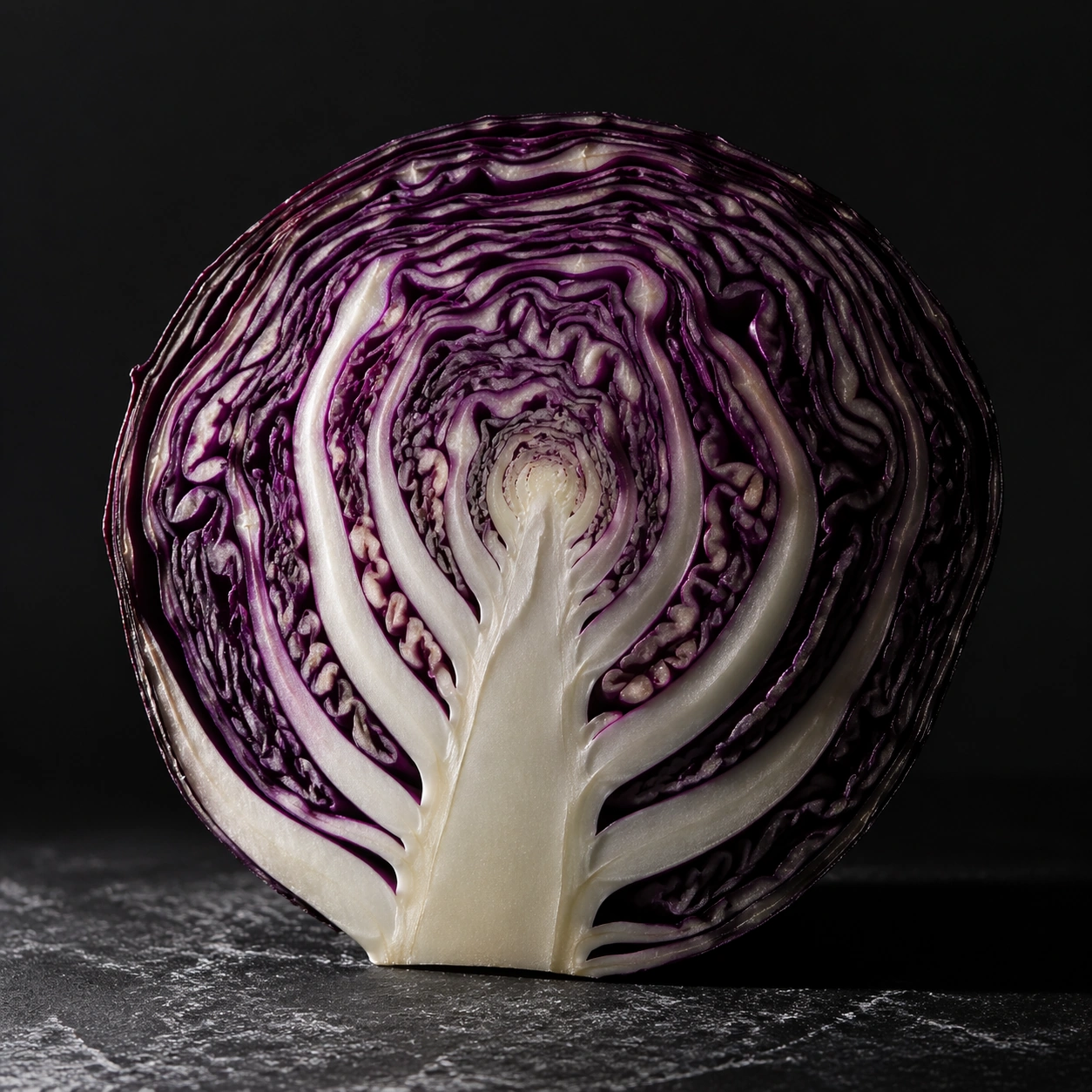
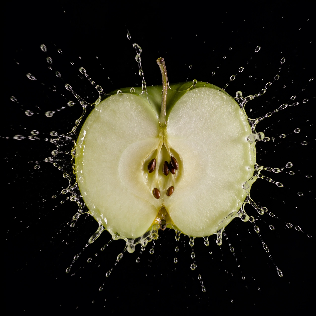

Example generated from “Forensic Scene Reconstruction — Timeline Board”
GPT Image 2en

Scene: A square reconstruction image that feels evidence-based, spatially coherent, and controlled enough for analytical review. Build the frame around visual sequencing or causality expressed through spatial arrangement. Keep the lighting, camera distance, and spatial organization tuned for a high-signal research image rather than a casual snapshot. The image belongs to the Forensic Scene Reconstruction theme and should feel immediately legible as a prompt atlas theme for forensic scene reconstruction, testing physics-materials, reasoning-composition, style-transfer with gpt image 2.. Subject: Center the study on visual sequencing or causality expressed through spatial arrangement. Translate the theme into a concrete visual statement instead of an abstract mood board: the viewer should understand what kind of image this is, what is being tested, and why the composition is difficult. Use the slug idea of forensic scene reconstruction as a literal guide for subject matter, materials, and staging. Important details: The image should communicate inference and real-world knowledge through placement, materials, object relationships, and disciplined visual hierarchy. Preserve a disciplined square composition, clear focal hierarchy, and enough secondary information to make the image feel complete rather than underspecified. The image should look polished, novel, and exhibition-ready, with topic-specific credibility coming from the way surfaces, structure, and visual language reinforce Forensic Scene Reconstruction. Avoid generic filler elements that do not serve the main concept. Use case: Forensic Scene Reconstruction single study 3/8, testing physics-materials, reasoning-composition, style-transfer through the timeline board variation. Constraints: No readable text, no watermark, no logos, preserve exact 1:1 aspect ratio, no readable evidence tags, no police logos, no gore, no sensational crime-drama theatrics, no broken spatial logic, no arbitrary clutter.

Example generated from “Forensic Scene Reconstruction — Entry Angle”
GPT Image 2en

Scene: A square reconstruction image that feels evidence-based, spatially coherent, and controlled enough for analytical review. Build the frame around a viewpoint that clarifies access, flow, and scene geometry. Keep the lighting, camera distance, and spatial organization tuned for a high-signal research image rather than a casual snapshot. The image belongs to the Forensic Scene Reconstruction theme and should feel immediately legible as a prompt atlas theme for forensic scene reconstruction, testing physics-materials, reasoning-composition, style-transfer with gpt image 2.. Subject: Center the study on a viewpoint that clarifies access, flow, and scene geometry. Translate the theme into a concrete visual statement instead of an abstract mood board: the viewer should understand what kind of image this is, what is being tested, and why the composition is difficult. Use the slug idea of forensic scene reconstruction as a literal guide for subject matter, materials, and staging. Important details: The image should communicate inference and real-world knowledge through placement, materials, object relationships, and disciplined visual hierarchy. Preserve a disciplined square composition, clear focal hierarchy, and enough secondary information to make the image feel complete rather than underspecified. The image should look polished, novel, and exhibition-ready, with topic-specific credibility coming from the way surfaces, structure, and visual language reinforce Forensic Scene Reconstruction. Avoid generic filler elements that do not serve the main concept. Use case: Forensic Scene Reconstruction single study 4/8, testing physics-materials, reasoning-composition, style-transfer through the entry angle variation. Constraints: No readable text, no watermark, no logos, preserve exact 1:1 aspect ratio, no readable evidence tags, no police logos, no gore, no sensational crime-drama theatrics, no broken spatial logic, no arbitrary clutter.

Example generated from “Forensic Scene Reconstruction — Evidence Table”
GPT Image 2en

Scene: A square reconstruction image that feels evidence-based, spatially coherent, and controlled enough for analytical review. Build the frame around organized comparative presentation without readable labels. Keep the lighting, camera distance, and spatial organization tuned for a high-signal research image rather than a casual snapshot. The image belongs to the Forensic Scene Reconstruction theme and should feel immediately legible as a prompt atlas theme for forensic scene reconstruction, testing physics-materials, reasoning-composition, style-transfer with gpt image 2.. Subject: Center the study on organized comparative presentation without readable labels. Translate the theme into a concrete visual statement instead of an abstract mood board: the viewer should understand what kind of image this is, what is being tested, and why the composition is difficult. Use the slug idea of forensic scene reconstruction as a literal guide for subject matter, materials, and staging. Important details: The image should communicate inference and real-world knowledge through placement, materials, object relationships, and disciplined visual hierarchy. Preserve a disciplined square composition, clear focal hierarchy, and enough secondary information to make the image feel complete rather than underspecified. The image should look polished, novel, and exhibition-ready, with topic-specific credibility coming from the way surfaces, structure, and visual language reinforce Forensic Scene Reconstruction. Avoid generic filler elements that do not serve the main concept. Use case: Forensic Scene Reconstruction single study 5/8, testing physics-materials, reasoning-composition, style-transfer through the evidence table variation. Constraints: No readable text, no watermark, no logos, preserve exact 1:1 aspect ratio, no readable evidence tags, no police logos, no gore, no sensational crime-drama theatrics, no broken spatial logic, no arbitrary clutter.