PROMPTS · KREATIV ENTDECKEN

Prompt-Galerie

Echte Prompts und erzeugte Beispiele erkunden. Inspiration für Ihre nächste kreative Mission finden und den vollständigen Prompt kostenlos kopieren.

Beispiele
10,974
Modelle
17
Quellen
1277
10.974 Prompt-Beispiele · Seite 59 von 229
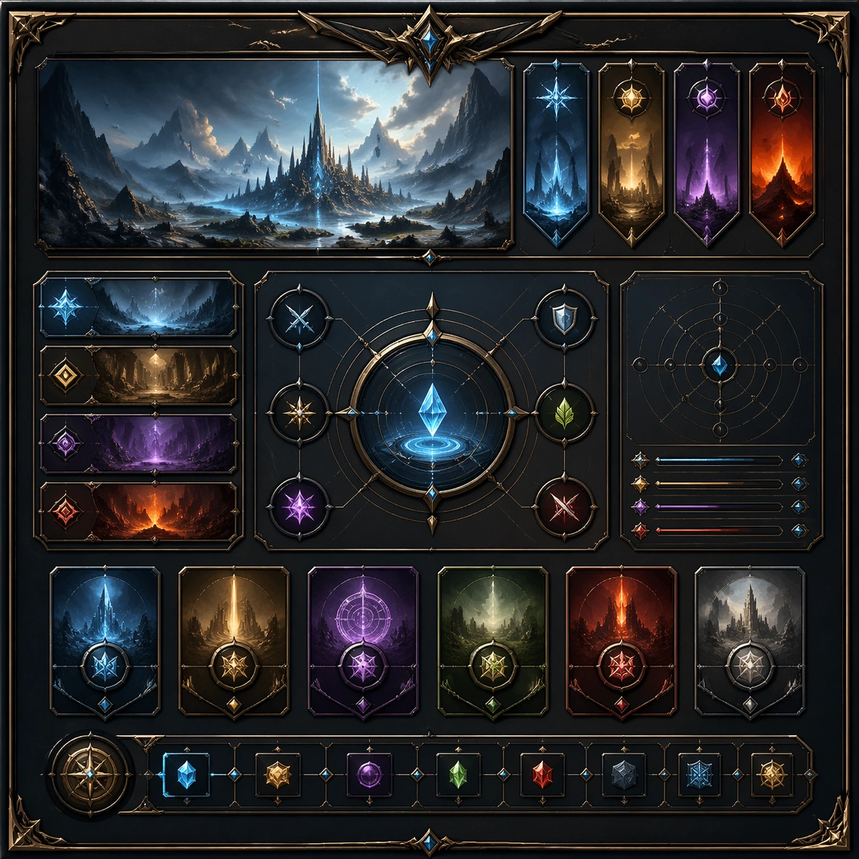
Example generated from “French Bistro Print And Table Culture — Variant One”
GPT Image 2en

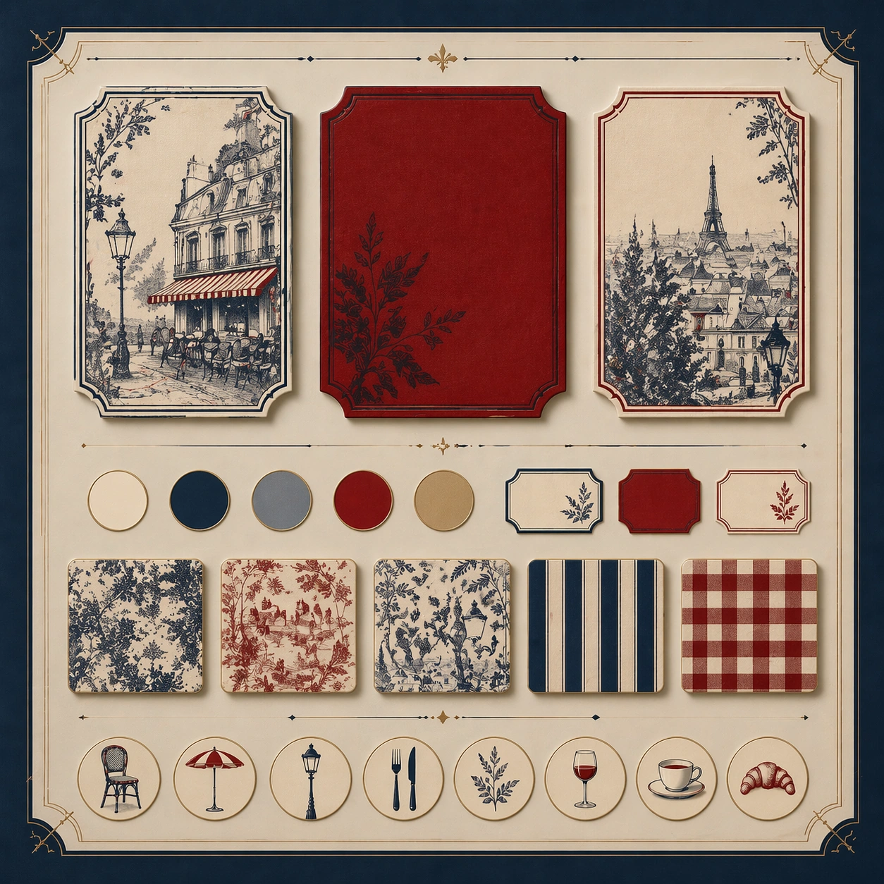
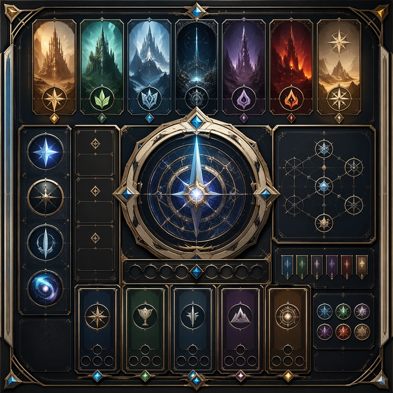
Scene: Create a square dependent image for French Bistro Print and Table Culture. Build a first controlled variation in the same system with a premium, production-ready finish. Use a polished modular board or campaign surface with clean spacing, premium game-UI finish, and clear focal hierarchy. The composition should feel intentional, clean, and reusable for gallery, research, campaign, or internal handoff contexts. Lighting must support readability first, with the main forms clearly separated from the background and enough breathing room for the system to stay legible at both hero scale and thumbnail scale. Subject: Center a coherent original game-art system built for premium production and marketing surfaces. For this image, focus on the intended support surface. Keep the same system logic stable across screenshots, cards, banners, and overview boards. Preserve exact identity or system logic from the reference image while changing only the intended variation axis. The viewer should immediately understand what role this surface plays inside a cohesive game-production asset pack. Important details: Lock framing, icon grammar, palette blocking, and surface hierarchy so the kit feels production-ready and consistent. Preserve the core silhouette, framing language, and material logic from the reference image while each variation changes function. Keep materials believable, edge hierarchy disciplined, and the visual language consistent with French Bistro. Use abstract interface blocks or diagram accents when helpful, but avoid any readable language. The final result should feel like a deliberate production asset rather than a random illustration. Use case: French Bistro Print and Table Culture series study 2/9, designed as variant one within a cohesive asset pack. Constraints: No readable text, no watermark, no logos, preserve exact 1:1 aspect ratio, no unrelated objects, no broken visual hierarchy, no malformed anatomy or broken perspective, no random decorative clutter.

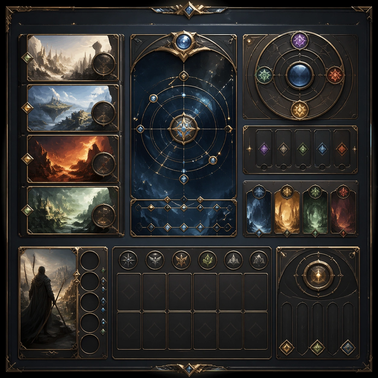
Example generated from “French Bistro Print And Table Culture — Variant Two”
GPT Image 2en

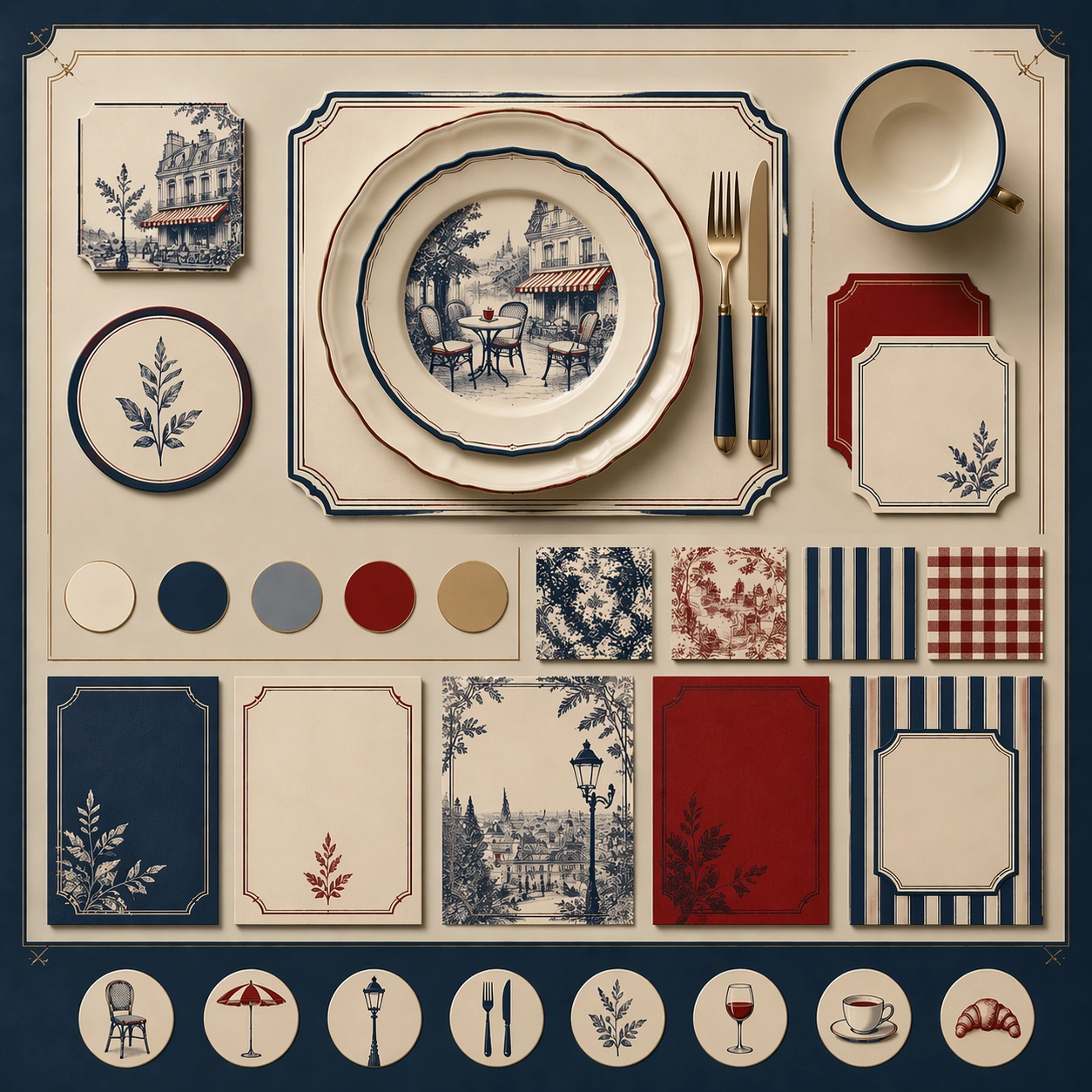
Scene: Create a square dependent image for French Bistro Print and Table Culture. Build a second controlled variation in the same system with a premium, production-ready finish. Use a polished modular board or campaign surface with clean spacing, premium game-UI finish, and clear focal hierarchy. The composition should feel intentional, clean, and reusable for gallery, research, campaign, or internal handoff contexts. Lighting must support readability first, with the main forms clearly separated from the background and enough breathing room for the system to stay legible at both hero scale and thumbnail scale. Subject: Center a coherent original game-art system built for premium production and marketing surfaces. For this image, focus on the intended support surface. Keep the same system logic stable across screenshots, cards, banners, and overview boards. Preserve exact identity or system logic from the reference image while changing only the intended variation axis. The viewer should immediately understand what role this surface plays inside a cohesive game-production asset pack. Important details: Lock framing, icon grammar, palette blocking, and surface hierarchy so the kit feels production-ready and consistent. Preserve the core silhouette, framing language, and material logic from the reference image while each variation changes function. Keep materials believable, edge hierarchy disciplined, and the visual language consistent with French Bistro. Use abstract interface blocks or diagram accents when helpful, but avoid any readable language. The final result should feel like a deliberate production asset rather than a random illustration. Use case: French Bistro Print and Table Culture series study 3/9, designed as variant two within a cohesive asset pack. Constraints: No readable text, no watermark, no logos, preserve exact 1:1 aspect ratio, no unrelated objects, no broken visual hierarchy, no malformed anatomy or broken perspective, no random decorative clutter.
Example generated from “French Bistro Print And Table Culture — Variant Three”
GPT Image 2en

Scene: Create a square dependent image for French Bistro Print and Table Culture. Build a third controlled variation in the same system with a premium, production-ready finish. Use a polished modular board or campaign surface with clean spacing, premium game-UI finish, and clear focal hierarchy. The composition should feel intentional, clean, and reusable for gallery, research, campaign, or internal handoff contexts. Lighting must support readability first, with the main forms clearly separated from the background and enough breathing room for the system to stay legible at both hero scale and thumbnail scale. Subject: Center a coherent original game-art system built for premium production and marketing surfaces. For this image, focus on the intended support surface. Keep the same system logic stable across screenshots, cards, banners, and overview boards. Preserve exact identity or system logic from the reference image while changing only the intended variation axis. The viewer should immediately understand what role this surface plays inside a cohesive game-production asset pack. Important details: Lock framing, icon grammar, palette blocking, and surface hierarchy so the kit feels production-ready and consistent. Preserve the core silhouette, framing language, and material logic from the reference image while each variation changes function. Keep materials believable, edge hierarchy disciplined, and the visual language consistent with French Bistro. Use abstract interface blocks or diagram accents when helpful, but avoid any readable language. The final result should feel like a deliberate production asset rather than a random illustration. Use case: French Bistro Print and Table Culture series study 4/9, designed as variant three within a cohesive asset pack. Constraints: No readable text, no watermark, no logos, preserve exact 1:1 aspect ratio, no unrelated objects, no broken visual hierarchy, no malformed anatomy or broken perspective, no random decorative clutter.
Example generated from “French Bistro Print And Table Culture — Support One”
GPT Image 2en

Scene: Create a square standalone support image for French Bistro Print and Table Culture. Build a support-surface study with a clear focal hierarchy and a finished professional surface. Use a polished modular board or campaign surface with clean spacing, premium game-UI finish, and clear focal hierarchy. The frame should feel self-contained and polished, with enough structure to explain the system even without the reference series, yet still obviously belonging to the same theme and production world. Subject: Show a coherent original game-art system built for premium production and marketing surfaces in a way that emphasizes the intended support surface. Keep the same system logic stable across screenshots, cards, banners, and overview boards. Even though this image is independent, the viewer should still recognize the same universe, same commercial logic, and same production intent as the core package. Important details: Lock framing, icon grammar, palette blocking, and surface hierarchy so the kit feels production-ready and consistent. Preserve the broader theme language through color, framing, material choices, and modular composition. Use clean panel rhythm, premium asset presentation, and believable detail density. The image should work equally well as a gallery study, research reference, and mock production deliverable. Use case: French Bistro Print and Table Culture single study 5/9, exploring support one as a support surface. Constraints: No readable text, no watermark, no logos, preserve exact 1:1 aspect ratio, no unrelated objects, no broken visual hierarchy, no visual noise that obscures the main surface, no accidental brand resemblance.

Example generated from “French Bistro Print And Table Culture — Support Two”
GPT Image 2en

Scene: Create a square standalone support image for French Bistro Print and Table Culture. Build a second support-surface study with a clear focal hierarchy and a finished professional surface. Use a polished modular board or campaign surface with clean spacing, premium game-UI finish, and clear focal hierarchy. The frame should feel self-contained and polished, with enough structure to explain the system even without the reference series, yet still obviously belonging to the same theme and production world. Subject: Show a coherent original game-art system built for premium production and marketing surfaces in a way that emphasizes the intended support surface. Keep the same system logic stable across screenshots, cards, banners, and overview boards. Even though this image is independent, the viewer should still recognize the same universe, same commercial logic, and same production intent as the core package. Important details: Lock framing, icon grammar, palette blocking, and surface hierarchy so the kit feels production-ready and consistent. Preserve the broader theme language through color, framing, material choices, and modular composition. Use clean panel rhythm, premium asset presentation, and believable detail density. The image should work equally well as a gallery study, research reference, and mock production deliverable. Use case: French Bistro Print and Table Culture single study 6/9, exploring support two as a support surface. Constraints: No readable text, no watermark, no logos, preserve exact 1:1 aspect ratio, no unrelated objects, no broken visual hierarchy, no visual noise that obscures the main surface, no accidental brand resemblance.

Example generated from “French Bistro Print And Table Culture — Support Three”
GPT Image 2en

Scene: Create a square standalone support image for French Bistro Print and Table Culture. Build a third support-surface study with a clear focal hierarchy and a finished professional surface. Use a polished modular board or campaign surface with clean spacing, premium game-UI finish, and clear focal hierarchy. The frame should feel self-contained and polished, with enough structure to explain the system even without the reference series, yet still obviously belonging to the same theme and production world. Subject: Show a coherent original game-art system built for premium production and marketing surfaces in a way that emphasizes the intended support surface. Keep the same system logic stable across screenshots, cards, banners, and overview boards. Even though this image is independent, the viewer should still recognize the same universe, same commercial logic, and same production intent as the core package. Important details: Lock framing, icon grammar, palette blocking, and surface hierarchy so the kit feels production-ready and consistent. Preserve the broader theme language through color, framing, material choices, and modular composition. Use clean panel rhythm, premium asset presentation, and believable detail density. The image should work equally well as a gallery study, research reference, and mock production deliverable. Use case: French Bistro Print and Table Culture single study 7/9, exploring support three as a support surface. Constraints: No readable text, no watermark, no logos, preserve exact 1:1 aspect ratio, no unrelated objects, no broken visual hierarchy, no visual noise that obscures the main surface, no accidental brand resemblance.

Example generated from “French Bistro Print And Table Culture — Support Four”
GPT Image 2en

Scene: Create a square standalone support image for French Bistro Print and Table Culture. Build a fourth support-surface study with a clear focal hierarchy and a finished professional surface. Use a polished modular board or campaign surface with clean spacing, premium game-UI finish, and clear focal hierarchy. The frame should feel self-contained and polished, with enough structure to explain the system even without the reference series, yet still obviously belonging to the same theme and production world. Subject: Show a coherent original game-art system built for premium production and marketing surfaces in a way that emphasizes the intended support surface. Keep the same system logic stable across screenshots, cards, banners, and overview boards. Even though this image is independent, the viewer should still recognize the same universe, same commercial logic, and same production intent as the core package. Important details: Lock framing, icon grammar, palette blocking, and surface hierarchy so the kit feels production-ready and consistent. Preserve the broader theme language through color, framing, material choices, and modular composition. Use clean panel rhythm, premium asset presentation, and believable detail density. The image should work equally well as a gallery study, research reference, and mock production deliverable. Use case: French Bistro Print and Table Culture single study 8/9, exploring support four as a support surface. Constraints: No readable text, no watermark, no logos, preserve exact 1:1 aspect ratio, no unrelated objects, no broken visual hierarchy, no visual noise that obscures the main surface, no accidental brand resemblance.

Example generated from “French Bistro Print And Table Culture — Support Five”
GPT Image 2en

Scene: Create a square standalone support image for French Bistro Print and Table Culture. Build a fifth support-surface study with a clear focal hierarchy and a finished professional surface. Use a polished modular board or campaign surface with clean spacing, premium game-UI finish, and clear focal hierarchy. The frame should feel self-contained and polished, with enough structure to explain the system even without the reference series, yet still obviously belonging to the same theme and production world. Subject: Show a coherent original game-art system built for premium production and marketing surfaces in a way that emphasizes the intended support surface. Keep the same system logic stable across screenshots, cards, banners, and overview boards. Even though this image is independent, the viewer should still recognize the same universe, same commercial logic, and same production intent as the core package. Important details: Lock framing, icon grammar, palette blocking, and surface hierarchy so the kit feels production-ready and consistent. Preserve the broader theme language through color, framing, material choices, and modular composition. Use clean panel rhythm, premium asset presentation, and believable detail density. The image should work equally well as a gallery study, research reference, and mock production deliverable. Use case: French Bistro Print and Table Culture single study 9/9, exploring support five as a support surface. Constraints: No readable text, no watermark, no logos, preserve exact 1:1 aspect ratio, no unrelated objects, no broken visual hierarchy, no visual noise that obscures the main surface, no accidental brand resemblance.

Example generated from “Awkward Social Realism Comedy Set — Reference Anchor”
GPT Image 2en

Scene: Create a square reference image for Awkward Social Realism Comedy Set. Build a reference anchor establishing the core system with a premium, production-ready finish. Use a polished modular board or campaign surface with clean spacing, premium game-UI finish, and clear focal hierarchy. The composition should feel intentional, clean, and reusable for gallery, research, campaign, or internal handoff contexts. Lighting must support readability first, with the main forms clearly separated from the background and enough breathing room for the system to stay legible at both hero scale and thumbnail scale. Subject: Center a coherent original game-art system built for premium production and marketing surfaces. For this image, focus on reference anchor. Keep the same system logic stable across screenshots, cards, banners, and overview boards. This image is the canonical anchor that later series images must follow. The viewer should immediately understand what role this surface plays inside a cohesive game-production asset pack. Important details: Lock framing, icon grammar, palette blocking, and surface hierarchy so the kit feels production-ready and consistent. Preserve the core silhouette, framing language, and material logic from the reference image while each variation changes function. Keep materials believable, edge hierarchy disciplined, and the visual language consistent with Awkward Realism. Use abstract interface blocks or diagram accents when helpful, but avoid any readable language. The final result should feel like a deliberate production asset rather than a random illustration. Use case: Awkward Social Realism Comedy Set series study 1/9, designed as reference anchor within a cohesive asset pack. Constraints: No readable text, no watermark, no logos, preserve exact 1:1 aspect ratio, no unrelated objects, no broken visual hierarchy, no malformed anatomy or broken perspective, no random decorative clutter.
Example generated from “Awkward Social Realism Comedy Set — Variant Three”
GPT Image 2en

Scene: Create a square dependent image for Awkward Social Realism Comedy Set. Build a third controlled variation in the same system with a premium, production-ready finish. Use a polished modular board or campaign surface with clean spacing, premium game-UI finish, and clear focal hierarchy. The composition should feel intentional, clean, and reusable for gallery, research, campaign, or internal handoff contexts. Lighting must support readability first, with the main forms clearly separated from the background and enough breathing room for the system to stay legible at both hero scale and thumbnail scale. Subject: Center a coherent original game-art system built for premium production and marketing surfaces. For this image, focus on the intended support surface. Keep the same system logic stable across screenshots, cards, banners, and overview boards. Preserve exact identity or system logic from the reference image while changing only the intended variation axis. The viewer should immediately understand what role this surface plays inside a cohesive game-production asset pack. Important details: Lock framing, icon grammar, palette blocking, and surface hierarchy so the kit feels production-ready and consistent. Preserve the core silhouette, framing language, and material logic from the reference image while each variation changes function. Keep materials believable, edge hierarchy disciplined, and the visual language consistent with Awkward Realism. Use abstract interface blocks or diagram accents when helpful, but avoid any readable language. The final result should feel like a deliberate production asset rather than a random illustration. Use case: Awkward Social Realism Comedy Set series study 4/9, designed as variant three within a cohesive asset pack. Constraints: No readable text, no watermark, no logos, preserve exact 1:1 aspect ratio, no unrelated objects, no broken visual hierarchy, no malformed anatomy or broken perspective, no random decorative clutter.
Example generated from “Awkward Social Realism Comedy Set — Support One”
GPT Image 2en

Scene: Create a square standalone support image for Awkward Social Realism Comedy Set. Build a support-surface study with a clear focal hierarchy and a finished professional surface. Use a polished modular board or campaign surface with clean spacing, premium game-UI finish, and clear focal hierarchy. The frame should feel self-contained and polished, with enough structure to explain the system even without the reference series, yet still obviously belonging to the same theme and production world. Subject: Show a coherent original game-art system built for premium production and marketing surfaces in a way that emphasizes the intended support surface. Keep the same system logic stable across screenshots, cards, banners, and overview boards. Even though this image is independent, the viewer should still recognize the same universe, same commercial logic, and same production intent as the core package. Important details: Lock framing, icon grammar, palette blocking, and surface hierarchy so the kit feels production-ready and consistent. Preserve the broader theme language through color, framing, material choices, and modular composition. Use clean panel rhythm, premium asset presentation, and believable detail density. The image should work equally well as a gallery study, research reference, and mock production deliverable. Use case: Awkward Social Realism Comedy Set single study 5/9, exploring support one as a support surface. Constraints: No readable text, no watermark, no logos, preserve exact 1:1 aspect ratio, no unrelated objects, no broken visual hierarchy, no visual noise that obscures the main surface, no accidental brand resemblance.

Example generated from “Awkward Social Realism Comedy Set — Support Two”
GPT Image 2en

Scene: Create a square standalone support image for Awkward Social Realism Comedy Set. Build a second support-surface study with a clear focal hierarchy and a finished professional surface. Use a polished modular board or campaign surface with clean spacing, premium game-UI finish, and clear focal hierarchy. The frame should feel self-contained and polished, with enough structure to explain the system even without the reference series, yet still obviously belonging to the same theme and production world. Subject: Show a coherent original game-art system built for premium production and marketing surfaces in a way that emphasizes the intended support surface. Keep the same system logic stable across screenshots, cards, banners, and overview boards. Even though this image is independent, the viewer should still recognize the same universe, same commercial logic, and same production intent as the core package. Important details: Lock framing, icon grammar, palette blocking, and surface hierarchy so the kit feels production-ready and consistent. Preserve the broader theme language through color, framing, material choices, and modular composition. Use clean panel rhythm, premium asset presentation, and believable detail density. The image should work equally well as a gallery study, research reference, and mock production deliverable. Use case: Awkward Social Realism Comedy Set single study 6/9, exploring support two as a support surface. Constraints: No readable text, no watermark, no logos, preserve exact 1:1 aspect ratio, no unrelated objects, no broken visual hierarchy, no visual noise that obscures the main surface, no accidental brand resemblance.

Example generated from “Awkward Social Realism Comedy Set — Support Three”
GPT Image 2en

Scene: Create a square standalone support image for Awkward Social Realism Comedy Set. Build a third support-surface study with a clear focal hierarchy and a finished professional surface. Use a polished modular board or campaign surface with clean spacing, premium game-UI finish, and clear focal hierarchy. The frame should feel self-contained and polished, with enough structure to explain the system even without the reference series, yet still obviously belonging to the same theme and production world. Subject: Show a coherent original game-art system built for premium production and marketing surfaces in a way that emphasizes the intended support surface. Keep the same system logic stable across screenshots, cards, banners, and overview boards. Even though this image is independent, the viewer should still recognize the same universe, same commercial logic, and same production intent as the core package. Important details: Lock framing, icon grammar, palette blocking, and surface hierarchy so the kit feels production-ready and consistent. Preserve the broader theme language through color, framing, material choices, and modular composition. Use clean panel rhythm, premium asset presentation, and believable detail density. The image should work equally well as a gallery study, research reference, and mock production deliverable. Use case: Awkward Social Realism Comedy Set single study 7/9, exploring support three as a support surface. Constraints: No readable text, no watermark, no logos, preserve exact 1:1 aspect ratio, no unrelated objects, no broken visual hierarchy, no visual noise that obscures the main surface, no accidental brand resemblance.

Example generated from “Awkward Social Realism Comedy Set — Support Four”
GPT Image 2en

Scene: Create a square standalone support image for Awkward Social Realism Comedy Set. Build a fourth support-surface study with a clear focal hierarchy and a finished professional surface. Use a polished modular board or campaign surface with clean spacing, premium game-UI finish, and clear focal hierarchy. The frame should feel self-contained and polished, with enough structure to explain the system even without the reference series, yet still obviously belonging to the same theme and production world. Subject: Show a coherent original game-art system built for premium production and marketing surfaces in a way that emphasizes the intended support surface. Keep the same system logic stable across screenshots, cards, banners, and overview boards. Even though this image is independent, the viewer should still recognize the same universe, same commercial logic, and same production intent as the core package. Important details: Lock framing, icon grammar, palette blocking, and surface hierarchy so the kit feels production-ready and consistent. Preserve the broader theme language through color, framing, material choices, and modular composition. Use clean panel rhythm, premium asset presentation, and believable detail density. The image should work equally well as a gallery study, research reference, and mock production deliverable. Use case: Awkward Social Realism Comedy Set single study 8/9, exploring support four as a support surface. Constraints: No readable text, no watermark, no logos, preserve exact 1:1 aspect ratio, no unrelated objects, no broken visual hierarchy, no visual noise that obscures the main surface, no accidental brand resemblance.

Example generated from “Awkward Social Realism Comedy Set — Support Five”
GPT Image 2en

Scene: Create a square standalone support image for Awkward Social Realism Comedy Set. Build a fifth support-surface study with a clear focal hierarchy and a finished professional surface. Use a polished modular board or campaign surface with clean spacing, premium game-UI finish, and clear focal hierarchy. The frame should feel self-contained and polished, with enough structure to explain the system even without the reference series, yet still obviously belonging to the same theme and production world. Subject: Show a coherent original game-art system built for premium production and marketing surfaces in a way that emphasizes the intended support surface. Keep the same system logic stable across screenshots, cards, banners, and overview boards. Even though this image is independent, the viewer should still recognize the same universe, same commercial logic, and same production intent as the core package. Important details: Lock framing, icon grammar, palette blocking, and surface hierarchy so the kit feels production-ready and consistent. Preserve the broader theme language through color, framing, material choices, and modular composition. Use clean panel rhythm, premium asset presentation, and believable detail density. The image should work equally well as a gallery study, research reference, and mock production deliverable. Use case: Awkward Social Realism Comedy Set single study 9/9, exploring support five as a support surface. Constraints: No readable text, no watermark, no logos, preserve exact 1:1 aspect ratio, no unrelated objects, no broken visual hierarchy, no visual noise that obscures the main surface, no accidental brand resemblance.

Example generated from “Awwwards Grade Launch Page Interface — Reference Anchor”
GPT Image 2en

Scene: Create a square reference image for award-grade Launch Page Interface. Build a reference anchor establishing the core system with a premium, production-ready finish. Use a polished modular board or campaign surface with clean spacing, premium game-UI finish, and clear focal hierarchy. The composition should feel intentional, clean, and reusable for gallery, research, campaign, or internal handoff contexts. Lighting must support readability first, with the main forms clearly separated from the background and enough breathing room for the system to stay legible at both hero scale and thumbnail scale. Subject: Center a coherent original game-art system built for premium production and marketing surfaces. For this image, focus on reference anchor. Keep the same system logic stable across screenshots, cards, banners, and overview boards. This image is the canonical anchor that later series images must follow. The viewer should immediately understand what role this surface plays inside a cohesive game-production asset pack. Important details: Lock framing, icon grammar, palette blocking, and surface hierarchy so the kit feels production-ready and consistent. Preserve the core silhouette, framing language, and material logic from the reference image while each variation changes function. Keep materials believable, edge hierarchy disciplined, and the visual language consistent with award-grade launch UI. Use abstract interface blocks or diagram accents when helpful, but avoid any readable language. The final result should feel like a deliberate production asset rather than a random illustration. Use case: award-grade Launch Page Interface series study 1/9, designed as reference anchor within a cohesive asset pack. Constraints: No readable text, no watermark, no logos, preserve exact 1:1 aspect ratio, no unrelated objects, no broken visual hierarchy, no malformed anatomy or broken perspective, no random decorative clutter.
Example generated from “Awwwards Grade Launch Page Interface — Variant One”
GPT Image 2en

Scene: Create a square dependent image for award-grade Launch Page Interface. Build a first controlled variation in the same system with a premium, production-ready finish. Use a polished modular board or campaign surface with clean spacing, premium game-UI finish, and clear focal hierarchy. The composition should feel intentional, clean, and reusable for gallery, research, campaign, or internal handoff contexts. Lighting must support readability first, with the main forms clearly separated from the background and enough breathing room for the system to stay legible at both hero scale and thumbnail scale. Subject: Center a coherent original game-art system built for premium production and marketing surfaces. For this image, focus on the intended support surface. Keep the same system logic stable across screenshots, cards, banners, and overview boards. Preserve exact identity or system logic from the reference image while changing only the intended variation axis. The viewer should immediately understand what role this surface plays inside a cohesive game-production asset pack. Important details: Lock framing, icon grammar, palette blocking, and surface hierarchy so the kit feels production-ready and consistent. Preserve the core silhouette, framing language, and material logic from the reference image while each variation changes function. Keep materials believable, edge hierarchy disciplined, and the visual language consistent with award-grade launch UI. Use abstract interface blocks or diagram accents when helpful, but avoid any readable language. The final result should feel like a deliberate production asset rather than a random illustration. Use case: award-grade Launch Page Interface series study 2/9, designed as variant one within a cohesive asset pack. Constraints: No readable text, no watermark, no logos, preserve exact 1:1 aspect ratio, no unrelated objects, no broken visual hierarchy, no malformed anatomy or broken perspective, no random decorative clutter.
Example generated from “Awwwards Grade Launch Page Interface — Variant Two”
GPT Image 2en

Scene: Create a square dependent image for award-grade Launch Page Interface. Build a second controlled variation in the same system with a premium, production-ready finish. Use a polished modular board or campaign surface with clean spacing, premium game-UI finish, and clear focal hierarchy. The composition should feel intentional, clean, and reusable for gallery, research, campaign, or internal handoff contexts. Lighting must support readability first, with the main forms clearly separated from the background and enough breathing room for the system to stay legible at both hero scale and thumbnail scale. Subject: Center a coherent original game-art system built for premium production and marketing surfaces. For this image, focus on the intended support surface. Keep the same system logic stable across screenshots, cards, banners, and overview boards. Preserve exact identity or system logic from the reference image while changing only the intended variation axis. The viewer should immediately understand what role this surface plays inside a cohesive game-production asset pack. Important details: Lock framing, icon grammar, palette blocking, and surface hierarchy so the kit feels production-ready and consistent. Preserve the core silhouette, framing language, and material logic from the reference image while each variation changes function. Keep materials believable, edge hierarchy disciplined, and the visual language consistent with award-grade launch UI. Use abstract interface blocks or diagram accents when helpful, but avoid any readable language. The final result should feel like a deliberate production asset rather than a random illustration. Use case: award-grade Launch Page Interface series study 3/9, designed as variant two within a cohesive asset pack. Constraints: No readable text, no watermark, no logos, preserve exact 1:1 aspect ratio, no unrelated objects, no broken visual hierarchy, no malformed anatomy or broken perspective, no random decorative clutter.
Example generated from “Awwwards Grade Launch Page Interface — Variant Three”
GPT Image 2en

Scene: Create a square dependent image for award-grade Launch Page Interface. Build a third controlled variation in the same system with a premium, production-ready finish. Use a polished modular board or campaign surface with clean spacing, premium game-UI finish, and clear focal hierarchy. The composition should feel intentional, clean, and reusable for gallery, research, campaign, or internal handoff contexts. Lighting must support readability first, with the main forms clearly separated from the background and enough breathing room for the system to stay legible at both hero scale and thumbnail scale. Subject: Center a coherent original game-art system built for premium production and marketing surfaces. For this image, focus on the intended support surface. Keep the same system logic stable across screenshots, cards, banners, and overview boards. Preserve exact identity or system logic from the reference image while changing only the intended variation axis. The viewer should immediately understand what role this surface plays inside a cohesive game-production asset pack. Important details: Lock framing, icon grammar, palette blocking, and surface hierarchy so the kit feels production-ready and consistent. Preserve the core silhouette, framing language, and material logic from the reference image while each variation changes function. Keep materials believable, edge hierarchy disciplined, and the visual language consistent with award-grade launch UI. Use abstract interface blocks or diagram accents when helpful, but avoid any readable language. The final result should feel like a deliberate production asset rather than a random illustration. Use case: award-grade Launch Page Interface series study 4/9, designed as variant three within a cohesive asset pack. Constraints: No readable text, no watermark, no logos, preserve exact 1:1 aspect ratio, no unrelated objects, no broken visual hierarchy, no malformed anatomy or broken perspective, no random decorative clutter.
Example generated from “Awwwards Grade Launch Page Interface — Support One”
GPT Image 2en

Scene: Create a square standalone support image for award-grade Launch Page Interface. Build a support-surface study with a clear focal hierarchy and a finished professional surface. Use a polished modular board or campaign surface with clean spacing, premium game-UI finish, and clear focal hierarchy. The frame should feel self-contained and polished, with enough structure to explain the system even without the reference series, yet still obviously belonging to the same theme and production world. Subject: Show a coherent original game-art system built for premium production and marketing surfaces in a way that emphasizes the intended support surface. Keep the same system logic stable across screenshots, cards, banners, and overview boards. Even though this image is independent, the viewer should still recognize the same universe, same commercial logic, and same production intent as the core package. Important details: Lock framing, icon grammar, palette blocking, and surface hierarchy so the kit feels production-ready and consistent. Preserve the broader theme language through color, framing, material choices, and modular composition. Use clean panel rhythm, premium asset presentation, and believable detail density. The image should work equally well as a gallery study, research reference, and mock production deliverable. Use case: award-grade Launch Page Interface single study 5/9, exploring support one as a support surface. Constraints: No readable text, no watermark, no logos, preserve exact 1:1 aspect ratio, no unrelated objects, no broken visual hierarchy, no visual noise that obscures the main surface, no accidental brand resemblance.

Example generated from “Awwwards Grade Launch Page Interface — Support Two”
GPT Image 2en

Scene: Create a square standalone support image for award-grade Launch Page Interface. Build a second support-surface study with a clear focal hierarchy and a finished professional surface. Use a polished modular board or campaign surface with clean spacing, premium game-UI finish, and clear focal hierarchy. The frame should feel self-contained and polished, with enough structure to explain the system even without the reference series, yet still obviously belonging to the same theme and production world. Subject: Show a coherent original game-art system built for premium production and marketing surfaces in a way that emphasizes the intended support surface. Keep the same system logic stable across screenshots, cards, banners, and overview boards. Even though this image is independent, the viewer should still recognize the same universe, same commercial logic, and same production intent as the core package. Important details: Lock framing, icon grammar, palette blocking, and surface hierarchy so the kit feels production-ready and consistent. Preserve the broader theme language through color, framing, material choices, and modular composition. Use clean panel rhythm, premium asset presentation, and believable detail density. The image should work equally well as a gallery study, research reference, and mock production deliverable. Use case: award-grade Launch Page Interface single study 6/9, exploring support two as a support surface. Constraints: No readable text, no watermark, no logos, preserve exact 1:1 aspect ratio, no unrelated objects, no broken visual hierarchy, no visual noise that obscures the main surface, no accidental brand resemblance.

Example generated from “Awwwards Grade Launch Page Interface — Support Three”
GPT Image 2en

Scene: Create a square standalone support image for award-grade Launch Page Interface. Build a third support-surface study with a clear focal hierarchy and a finished professional surface. Use a polished modular board or campaign surface with clean spacing, premium game-UI finish, and clear focal hierarchy. The frame should feel self-contained and polished, with enough structure to explain the system even without the reference series, yet still obviously belonging to the same theme and production world. Subject: Show a coherent original game-art system built for premium production and marketing surfaces in a way that emphasizes the intended support surface. Keep the same system logic stable across screenshots, cards, banners, and overview boards. Even though this image is independent, the viewer should still recognize the same universe, same commercial logic, and same production intent as the core package. Important details: Lock framing, icon grammar, palette blocking, and surface hierarchy so the kit feels production-ready and consistent. Preserve the broader theme language through color, framing, material choices, and modular composition. Use clean panel rhythm, premium asset presentation, and believable detail density. The image should work equally well as a gallery study, research reference, and mock production deliverable. Use case: award-grade Launch Page Interface single study 7/9, exploring support three as a support surface. Constraints: No readable text, no watermark, no logos, preserve exact 1:1 aspect ratio, no unrelated objects, no broken visual hierarchy, no visual noise that obscures the main surface, no accidental brand resemblance.

Example generated from “Awwwards Grade Launch Page Interface — Support Four”
GPT Image 2en

Scene: Create a square standalone support image for award-grade Launch Page Interface. Build a fourth support-surface study with a clear focal hierarchy and a finished professional surface. Use a polished modular board or campaign surface with clean spacing, premium game-UI finish, and clear focal hierarchy. The frame should feel self-contained and polished, with enough structure to explain the system even without the reference series, yet still obviously belonging to the same theme and production world. Subject: Show a coherent original game-art system built for premium production and marketing surfaces in a way that emphasizes the intended support surface. Keep the same system logic stable across screenshots, cards, banners, and overview boards. Even though this image is independent, the viewer should still recognize the same universe, same commercial logic, and same production intent as the core package. Important details: Lock framing, icon grammar, palette blocking, and surface hierarchy so the kit feels production-ready and consistent. Preserve the broader theme language through color, framing, material choices, and modular composition. Use clean panel rhythm, premium asset presentation, and believable detail density. The image should work equally well as a gallery study, research reference, and mock production deliverable. Use case: award-grade Launch Page Interface single study 8/9, exploring support four as a support surface. Constraints: No readable text, no watermark, no logos, preserve exact 1:1 aspect ratio, no unrelated objects, no broken visual hierarchy, no visual noise that obscures the main surface, no accidental brand resemblance.

Example generated from “Awwwards Grade Launch Page Interface — Support Five”
GPT Image 2en

Scene: Create a square standalone support image for award-grade Launch Page Interface. Build a fifth support-surface study with a clear focal hierarchy and a finished professional surface. Use a polished modular board or campaign surface with clean spacing, premium game-UI finish, and clear focal hierarchy. The frame should feel self-contained and polished, with enough structure to explain the system even without the reference series, yet still obviously belonging to the same theme and production world. Subject: Show a coherent original game-art system built for premium production and marketing surfaces in a way that emphasizes the intended support surface. Keep the same system logic stable across screenshots, cards, banners, and overview boards. Even though this image is independent, the viewer should still recognize the same universe, same commercial logic, and same production intent as the core package. Important details: Lock framing, icon grammar, palette blocking, and surface hierarchy so the kit feels production-ready and consistent. Preserve the broader theme language through color, framing, material choices, and modular composition. Use clean panel rhythm, premium asset presentation, and believable detail density. The image should work equally well as a gallery study, research reference, and mock production deliverable. Use case: award-grade Launch Page Interface single study 9/9, exploring support five as a support surface. Constraints: No readable text, no watermark, no logos, preserve exact 1:1 aspect ratio, no unrelated objects, no broken visual hierarchy, no visual noise that obscures the main surface, no accidental brand resemblance.

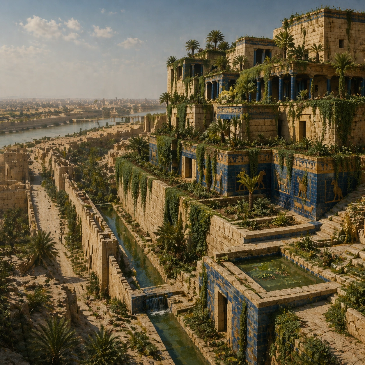
Example generated from “Babylon Hanging Gardens — Reference Anchor”
GPT Image 2en

Scene: A square documentary image composed like a premium archaeology magazine feature. Use sunlit buff stone, saturated vine green, glazed deep blue, and Euphrates river haze. Frame a terraced Babylonian garden complex rising in stacked levels with irrigation channels, hanging vegetation, and distant river atmosphere with crisp depth layering, restrained contrast, and subtle atmospheric depth so the scene feels excavated, observed, and historically grounded rather than theatrical or game-like. Keep the light directional but believable, as if captured during a careful field visit. Subject: Center the image on a terraced Babylonian garden complex rising in stacked levels with irrigation channels, hanging vegetation, and distant river atmosphere. Include culturally accurate surface logic, region-specific setting, and believable human-scale cues in stairs, doorways, cut blocks, relief edges, or water depth. Shapes, carvings, masonry joints, and site wear should feel studied from real archaeology, with no generic ancient-world mashup and no ornamental filler borrowed from another civilization. Important details: Keep the reconstruction architecturally disciplined, with Near Eastern massing, stepped terrace engineering, visible hydraulic logic, and planted abundance that feels maintained by ancient infrastructure rather than magical floating greenery. Emphasize sun-baked masonry, glazed brick details, irrigation water, trailing vines, palms, and engineered terrace retaining walls. Keep inscriptions, painted registers, symbolic motifs, or carved bands visually plausible but not readable. Preserve a museum-grade balance between beauty and evidence: light should reveal relief depth, edge wear, repairs, sediment traces, and excavation context without turning the site into fantasy spectacle. The composition should feel like a definitive reference frame that later variations can inherit exactly. Use case: Babylon Hanging Gardens series study 1/9. Constraints: No readable text, no watermark, no logos, preserve exact 1:1 aspect ratio, no fantasy dragons, no neon glow, no steel frameworks, no modern city skyline, no tourists, no anachronistic props, no collage layout, no exaggerated fantasy lighting.

Example generated from “Babylon Hanging Gardens — Human Scale Reveal”
GPT Image 2en

Scene: A square follow-up field image from the same site, slightly closer and lower than the reference anchor, with careful documentary framing and the same material palette. The camera should feel physically present inside the archaeological space, using natural light, soft depth separation, and one clear human figure to explain scale without turning the image into lifestyle photography. Subject: Show the same site identity established in the reference anchor, now with an archaeologist, conservator, or field researcher moving through the scene in practical neutral clothing. The person should be small relative to the monument and clearly secondary to the architecture, water, or painted wall system. Keep the main forms, structural rhythm, and civilizational markers unchanged. Important details: Preserve the exact site identity, base geometry, material behavior, and cultural signatures from the reference model. Only vary vantage, gesture, and scale cues. Keep the reconstruction architecturally disciplined, with Near Eastern massing, stepped terrace engineering, visible hydraulic logic, and planted abundance that feels maintained by ancient infrastructure rather than magical floating greenery. Human presence should clarify stair height, wall size, carving depth, or spatial compression while respecting conservation protocol and historical seriousness. Keep any tools understated and generic, with no readable labels. The image must still look like a rigorous archaeological record first and a dramatic scene second. Use case: Babylon Hanging Gardens series study 2/9. Constraints: No readable text, no watermark, no logos, preserve exact 1:1 aspect ratio, preserve exact site identity from the reference image, no fantasy dragons, no neon glow, no steel frameworks, no modern city skyline, no fashion editorial styling, no crowd, no cinematic props.

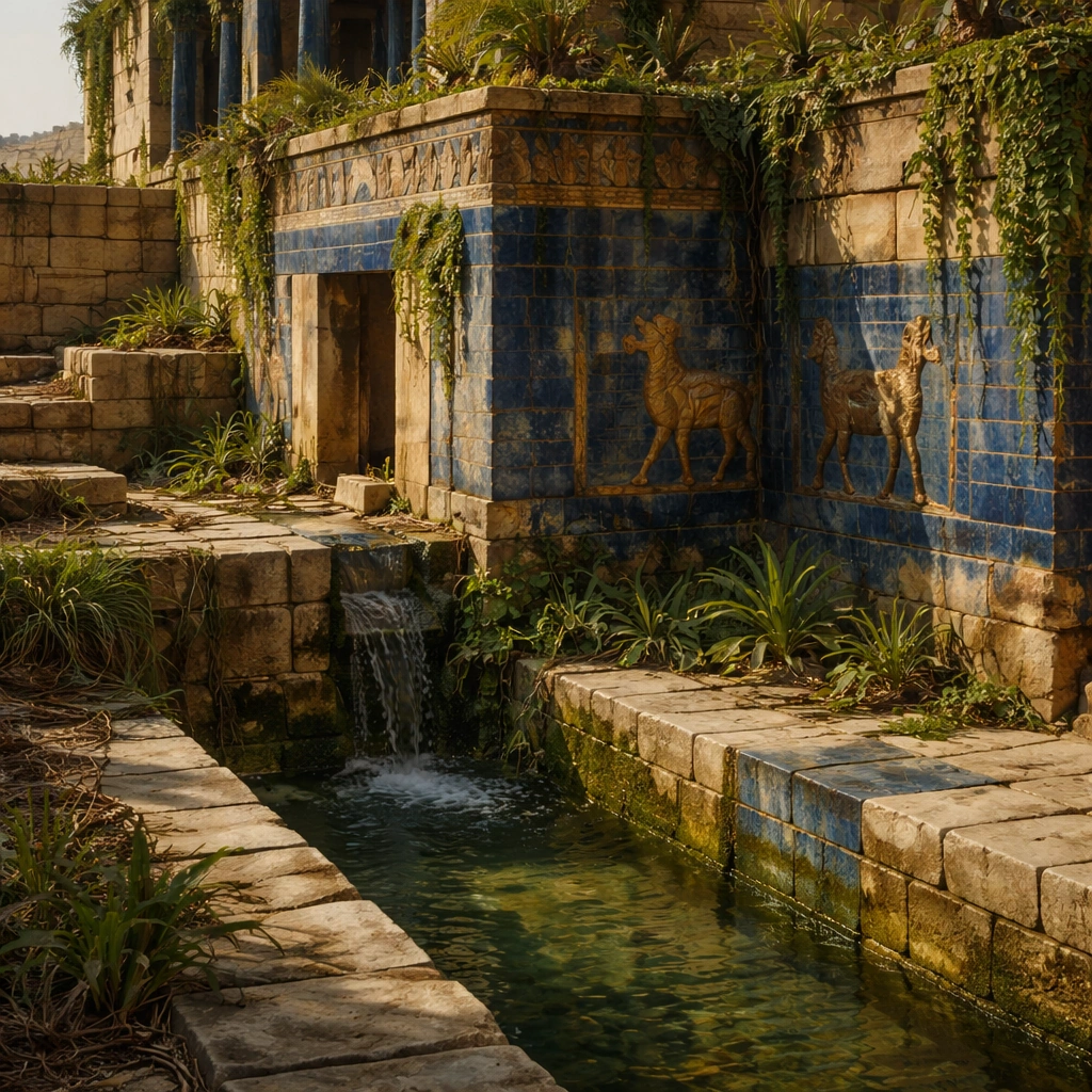
Example generated from “Babylon Hanging Gardens — Surface Close Study”
GPT Image 2en

Scene: A square close study framed within the same site established by the reference anchor. Use a tight crop, shallow but believable depth of field, and raking light that reveals tactile evidence in surface relief, pigment, tool marks, moisture, or marine wear. The image should feel like a museum conservation photograph elevated to gallery quality. Subject: Focus on a materially rich portion of the same site: carved edges, painted plaster, fitted stone, root-wrapped masonry, submerged paving, or quarry-cut facial planes depending on the civilization. The composition should remain anchored to the original location and show enough surrounding context that viewers still recognize the parent site rather than mistaking it for an unrelated artifact. Important details: Preserve the exact site identity from the reference model while shifting emphasis to forensic surface evidence. Keep the reconstruction architecturally disciplined, with Near Eastern massing, stepped terrace engineering, visible hydraulic logic, and planted abundance that feels maintained by ancient infrastructure rather than magical floating greenery. Make micro-texture, fracture lines, pigment retention, water wear, plant interaction, dust, or chisel traces visually persuasive. Avoid decorative clutter. Every mark should feel like evidence of making, weathering, excavation, or conservation. Keep any symbolic marks non-legible and historically appropriate, and make the light reveal depth without flattening the material richness. Use case: Babylon Hanging Gardens series study 3/9. Constraints: No readable text, no watermark, no logos, preserve exact 1:1 aspect ratio, preserve exact site identity from the reference image, no fantasy dragons, no neon glow, no steel frameworks, no modern city skyline, no isolated floating artifact, no studio backdrop, no fake macro abstraction.
Example generated from “Babylon Hanging Gardens — Atmospheric Wide Reveal”
GPT Image 2en

Scene: A square wide reveal of the same site under a slightly different environmental condition, with more surrounding geography or architecture visible while keeping the anchor landmark dominant. Use disciplined composition, atmospheric perspective, and natural light behavior so the image feels like a patient field photograph captured after the reference shot rather than a different fantasy set. Subject: Show the same site identity with broader context: approaches, terraces, ring walls, canyon slot, canopy volume, quarry slope, or chamber boundaries depending on the location. The anchor structure must remain instantly recognizable. Environmental scale should deepen understanding of why the site is placed here and how people, water, topography, or vegetation shape the experience of the monument. Important details: Preserve the exact landmark, materials, and civilizational cues from the reference model while allowing wider framing and a different atmospheric emphasis. Keep the reconstruction architecturally disciplined, with Near Eastern massing, stepped terrace engineering, visible hydraulic logic, and planted abundance that feels maintained by ancient infrastructure rather than magical floating greenery. Use geography and environmental systems to add meaning: drainage, mist, current, valley depth, roots, irrigation, or enclosure logic. The image should feel both beautiful and evidentiary, with no compositional tricks that break continuity with the established site. Use case: Babylon Hanging Gardens series study 4/9. Constraints: No readable text, no watermark, no logos, preserve exact 1:1 aspect ratio, preserve exact site identity from the reference image, no fantasy dragons, no neon glow, no steel frameworks, no modern city skyline, no unrelated landmarks, no speculative mashup architecture, no posterized grading.

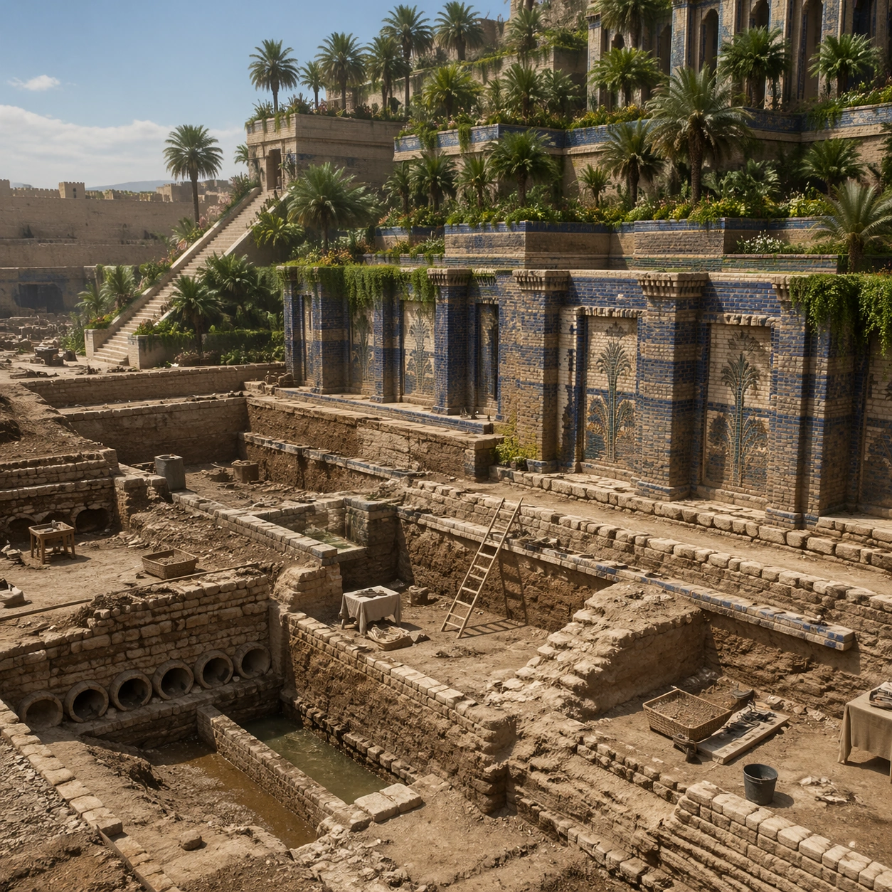
Example generated from “Babylon Hanging Gardens — Excavation Overview”
GPT Image 2en

Scene: A square independent archaeology study composed from a slightly elevated fieldwork viewpoint. Use balanced natural light, crisp evidence hierarchy, and practical site organization so the image feels publishable in a museum report and still visually strong enough for a gallery wall. The frame should explain where excavation is happening without relying on readable markers or diagrams. Subject: Show a ground-level archaeological interpretation view where foundations, channel remains, and reconstructed terrace relationships can be studied with technical clarity. Include grounded human traces such as ladders, trays, brushes, baskets, light rigs, or measuring tools only when they support archaeological realism and remain visually secondary. The site should stay culturally specific, with architecture, surface treatment, sediment, and environmental context all belonging to the correct civilization rather than a generic dig. Important details: Keep the reconstruction architecturally disciplined, with Near Eastern massing, stepped terrace engineering, visible hydraulic logic, and planted abundance that feels maintained by ancient infrastructure rather than magical floating greenery. Prioritize evidence relationships: exposed layers, cleaned edges, protected surfaces, loose fragments, and transitions between buried and revealed material. Let color, wear, and composition explain what has just been uncovered. The image must feel methodical rather than adventurous. Keep any site tags, notes, or markers abstract and unreadable. Avoid sensational treasure imagery and keep the atmosphere scholarly, patient, and materially convincing. Use case: Babylon Hanging Gardens single study 5/9. Constraints: No readable text, no watermark, no logos, preserve exact 1:1 aspect ratio, no fantasy dragons, no neon glow, no steel frameworks, no modern city skyline, no treasure-chest clichés, no action-movie posing, no arbitrary props, no infographic overlay.

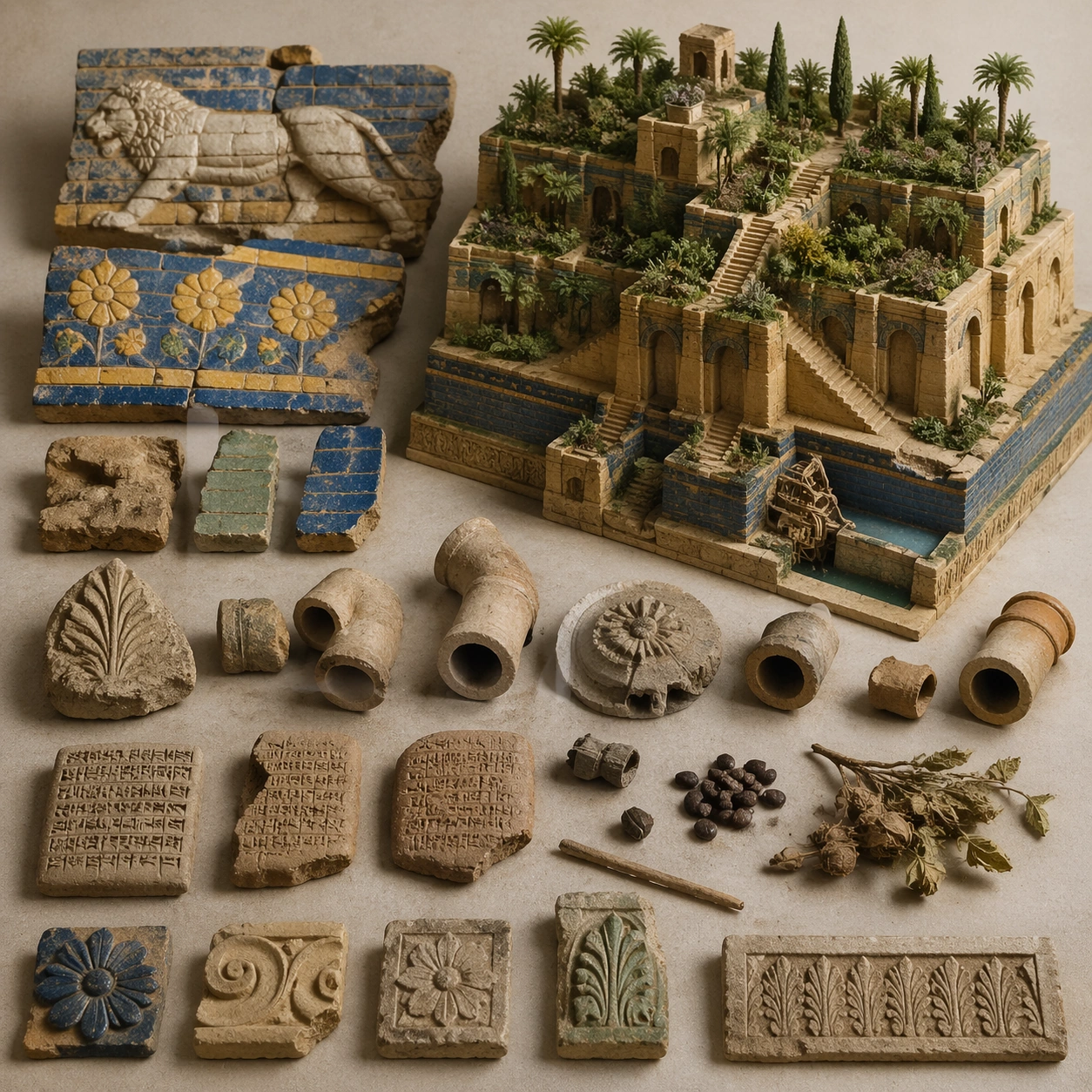
Example generated from “Babylon Hanging Gardens — Artifact Tableau”
GPT Image 2en

Scene: A square artifact and material study arranged like a high-end conservation photograph. Use soft directional light, controlled shadow falloff, and a neutral work surface so every fragment reads clearly. The image should feel intimate and scientific, but still rich enough to communicate the broader civilization through craft, wear, and material vocabulary alone. Subject: Present glazed brick fragments, cuneiform tablet pieces, irrigation fittings, botanical remains, and carved decorative elements on a study surface. Arrange the pieces with disciplined spacing and believable conservation handling. Include enough variation in scale, finish, and damage state to suggest excavation reality rather than a perfectly staged luxury still life. Nothing should look modern or decorative for its own sake; every object must feel like evidence tied to the same cultural world as the main topic. Important details: Emphasize tactile surfaces, honest aging, and historically grounded material behavior. Keep the reconstruction architecturally disciplined, with Near Eastern massing, stepped terrace engineering, visible hydraulic logic, and planted abundance that feels maintained by ancient infrastructure rather than magical floating greenery. Show abrasion, dust, corrosion, cracks, mineral bloom, pigment retention, or edge polish where appropriate. Keep the arrangement orderly but not sterile, as if prepared for a serious cataloging session. No readable labels, no museum placards, and no visual shortcuts that turn the study into product photography detached from archaeology. Use case: Babylon Hanging Gardens single study 6/9. Constraints: No readable text, no watermark, no logos, preserve exact 1:1 aspect ratio, no fantasy dragons, no neon glow, no steel frameworks, no modern city skyline, no luxury advertising gloss, no floating objects, no velvet jewelry styling, no unrelated tools.

Example generated from “Babylon Hanging Gardens — Light Shift Study”
GPT Image 2en

Scene: A square mood variation from the same civilization theme, built around late afternoon river haze that warms the stone, deepens garden shadow, and turns water channels more reflective. The image should stay grounded in field realism while testing how different illumination changes material reading, atmosphere, and emotional register. Keep the frame self-contained and coherent, as if photographed during a second visit under altered conditions. Subject: Show a culturally accurate site or interior connected to the same world as the main topic, but not as a direct dependency on the series reference. The focus should be on how light transforms relief, color, moisture, water, dust, or vegetation while preserving archaeological credibility. Architectural forms, objects, and setting must still belong to the same civilization with no cross-cultural contamination. Important details: Keep the reconstruction architecturally disciplined, with Near Eastern massing, stepped terrace engineering, visible hydraulic logic, and planted abundance that feels maintained by ancient infrastructure rather than magical floating greenery. Use the shift in light to reveal different evidence than the other studies: pigment glow, root sheen, caustics, wet stone, canyon shadow, marine haze, terrace depth, or quarry moisture. Keep the result serious and observational rather than romanticized. Non-readable motifs are acceptable, but there should be no signs, captions, or modern display devices. The image should feel like a rigorous visual experiment in historical atmosphere. Use case: Babylon Hanging Gardens single study 7/9. Constraints: No readable text, no watermark, no logos, preserve exact 1:1 aspect ratio, no fantasy dragons, no neon glow, no steel frameworks, no modern city skyline, no theatrical color filters, no supernatural effects, no montage composition, no glossy concept-art exaggeration.
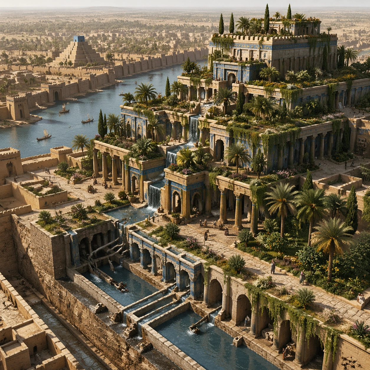
Example generated from “Babylon Hanging Gardens — Survey Perspective”
GPT Image 2en

Scene: A square survey-oriented image that explains spatial logic with the clarity of an expert field overview while still reading as a finished artwork. Use a stable elevated vantage, clean depth layering, and enough visible terrain or architecture to make relationships legible without turning the frame into a literal map. The scene should feel analytical and cinematic at the same time. Subject: Show an elevated survey perspective that explains terrace stacking, water movement, planted zones, and the garden relation to surrounding Babylonian urban fabric. Organize the composition so paths, terraces, walls, courtyards, chambers, canals, root systems, or quarry clusters can be read as a coherent system. The image should reveal how the civilization used land, water, elevation, enclosure, or monumentality. Keep all architecture, materials, and environmental details consistent with the correct place and period. Important details: Keep the reconstruction architecturally disciplined, with Near Eastern massing, stepped terrace engineering, visible hydraulic logic, and planted abundance that feels maintained by ancient infrastructure rather than magical floating greenery. This image should reward close looking by showing infrastructural logic: how stone courses align, how water moves, how rooms connect, how carved masses sit inside geology, or how vegetation interacts with built form. Avoid explicit annotation. Let composition, light, and scale cues do the explanatory work. Keep any measuring elements generic and unreadable, and make the image feel like serious research made visually elegant. Use case: Babylon Hanging Gardens single study 8/9. Constraints: No readable text, no watermark, no logos, preserve exact 1:1 aspect ratio, no fantasy dragons, no neon glow, no steel frameworks, no modern city skyline, no infographic arrows, no split-screen layout, no impossible aerial geometry, no unrelated settlements.

Example generated from “Babylon Hanging Gardens — Editorial Reconstruction”
GPT Image 2en

Scene: A square hero image designed for a museum wall graphic or flagship magazine cover, but without any actual typography. Use strong focal hierarchy, refined contrast, and a polished finish that still feels rooted in archaeological evidence. The frame should look complete on its own and communicate why this civilization remains visually unforgettable. Subject: Build the image around an editorial reconstruction that makes the wonder feel engineered, irrigated, and historically argued rather than purely mythical. Present architecture, artifacts, environment, and atmosphere as one coherent statement. The composition can be more distilled than a field snapshot, but it must remain culturally specific, materially persuasive, and free of fantasy shorthand. Nothing should feel like a movie poster or commercial franchise imitation. Important details: Keep the reconstruction architecturally disciplined, with Near Eastern massing, stepped terrace engineering, visible hydraulic logic, and planted abundance that feels maintained by ancient infrastructure rather than magical floating greenery. Distill the site or cultural world into one decisive visual argument: place, craft, weathering, engineering, and memory. Use the strongest material signatures from this civilization and let them sit in a believable environment with controlled dramatic weight. Keep any carved or painted symbols non-readable. The result should look like responsible high-end visual storytelling for research and public interpretation, not a spectacle-first matte painting. Use case: Babylon Hanging Gardens single study 9/9. Constraints: No readable text, no watermark, no logos, preserve exact 1:1 aspect ratio, no fantasy dragons, no neon glow, no steel frameworks, no modern city skyline, no movie-poster tropes, no overdesigned framing devices, no collage layout, no brand-like iconography.

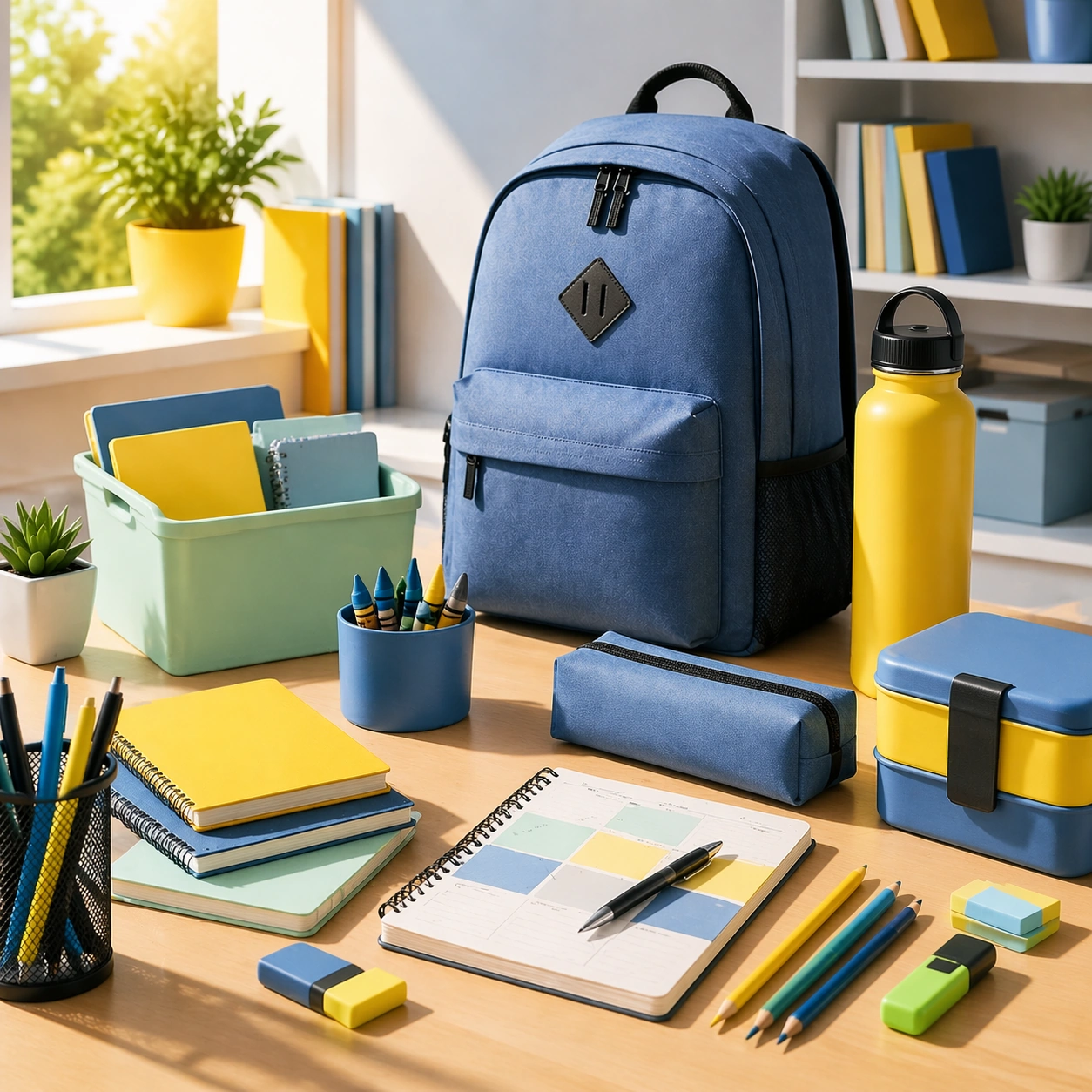
Example generated from “Back To School Enrollment And Retail Kit — Campus Desk Anchor”
GPT Image 2en

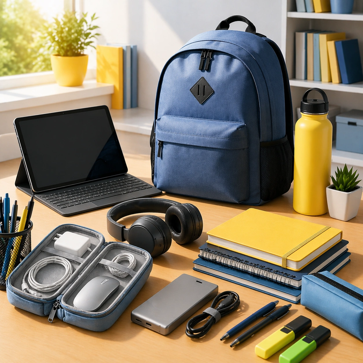
Scene: Create a square premium back-to-school campaign image with bright morning classroom-like light, crisp shadows, clean desk surfaces, and a palette of notebook neutrals, muted blue, warm yellow, and fresh green accents. The environment should feel energetic and organized, suitable for both education enrollment and retail campaign use. Build the scene as a polished academic reset world, not a generic stock classroom. Subject: Center an organized desk or campus-ready setup with stationery, backpack or bag, device-like object, planner forms without readable text, and one or two educational or family-retail cues integrated into a clear hierarchy. The subject should communicate readiness, momentum, and practical optimism. Keep it broad enough to support schools, electronics, stationery, or parent-facing retail campaigns under one coherent visual system. Important details: Lock the school-reset grammar here: crisp organization, bright functional light, clean product grouping, campus energy, and a balance between youthful optimism and practical structure. The anchor should feel reusable across enrollment, retail, and orientation materials while remaining clearly back-to-school and commercially useful. Use case: Back to School series study 1/9. Constraints: No readable text, no watermark, no logos, preserve exact 1:1 aspect ratio, no readable notebook text, no school logos, no visible grades or report cards, no mascot imagery, no chaotic messy desk, no brand device marks, no classroom chalkboard writing, no graduation cues.

Example generated from “Back To School Enrollment And Retail Kit — Starter Kit Variation”
GPT Image 2en

Scene: Create a square dependent campaign image in the exact same bright academic world, preserving the same morning light, desk materials, and crisp organization from the reference image, but shift the composition toward a starter kit or younger-school bundle. The scene should still feel obviously part of the same system while becoming slightly more object-forward and retail-kit oriented. Subject: Feature a starter bundle with notebooks, pencils, lunch or storage forms, backpack elements, and abstract planning cues arranged into a clear school-readiness composition. Preserve exact palette, light direction, and organizational language from the reference model while changing the age and bundle emphasis. The result should remain premium, original, and useful for retail or school promotion. Important details: Preserve exact campaign identity from the reference image. Readiness should come from grouping, cleanliness, and scale rather than readable labels. Make materials believable and tactile, from paper edges to zipper pulls and molded plastics. Avoid childish cartoon energy and keep the scene commercially sharp enough for modern education and retail rollout. Use case: Back to School series study 2/9. Constraints: No readable text, no watermark, no logos, preserve exact 1:1 aspect ratio, preserve exact campaign identity from the reference image, no readable labels, no mascot graphics, no cluttered stickers, no school logo, no messy art-room chaos, no cartoon lunchbox characters, no chalkboard text.

Example generated from “Back To School Enrollment And Retail Kit — Tech Bundle Variation”
GPT Image 2en

Scene: Create a square dependent image inside the same bright academic environment, preserving the exact light quality, palette, desk materials, and organized spacing from the reference image, but orient the composition toward a student-tech bundle. The frame should remain clearly part of the anchor campaign while becoming more device and accessory centered. Subject: Show device-like forms, headphones, charger or cable organization, notebook support, bag, and academic accessories arranged into a polished back-to-school technology scene. Preserve exact campaign identity from the reference model while shifting emphasis toward connected study tools. The setup should feel realistic and commercially suitable for electronics retail, campus bundles, or parent-focused promotions. Important details: Keep structure and optimism intact. Readability must come from layout and object hierarchy, never from screens or readable labels. Make metals, plastics, textiles, and paper all feel credible. The final image should serve as a modern back-to-school asset for tech and education brands without drifting into generic office or gaming aesthetics. Use case: Back to School series study 3/9. Constraints: No readable text, no watermark, no logos, preserve exact 1:1 aspect ratio, preserve exact campaign identity from the reference image, no readable screens, no logos, no gaming neon, no classroom chaos, no mascot visuals, no cluttered cables, no chalkboard text, no corporate office vibe.

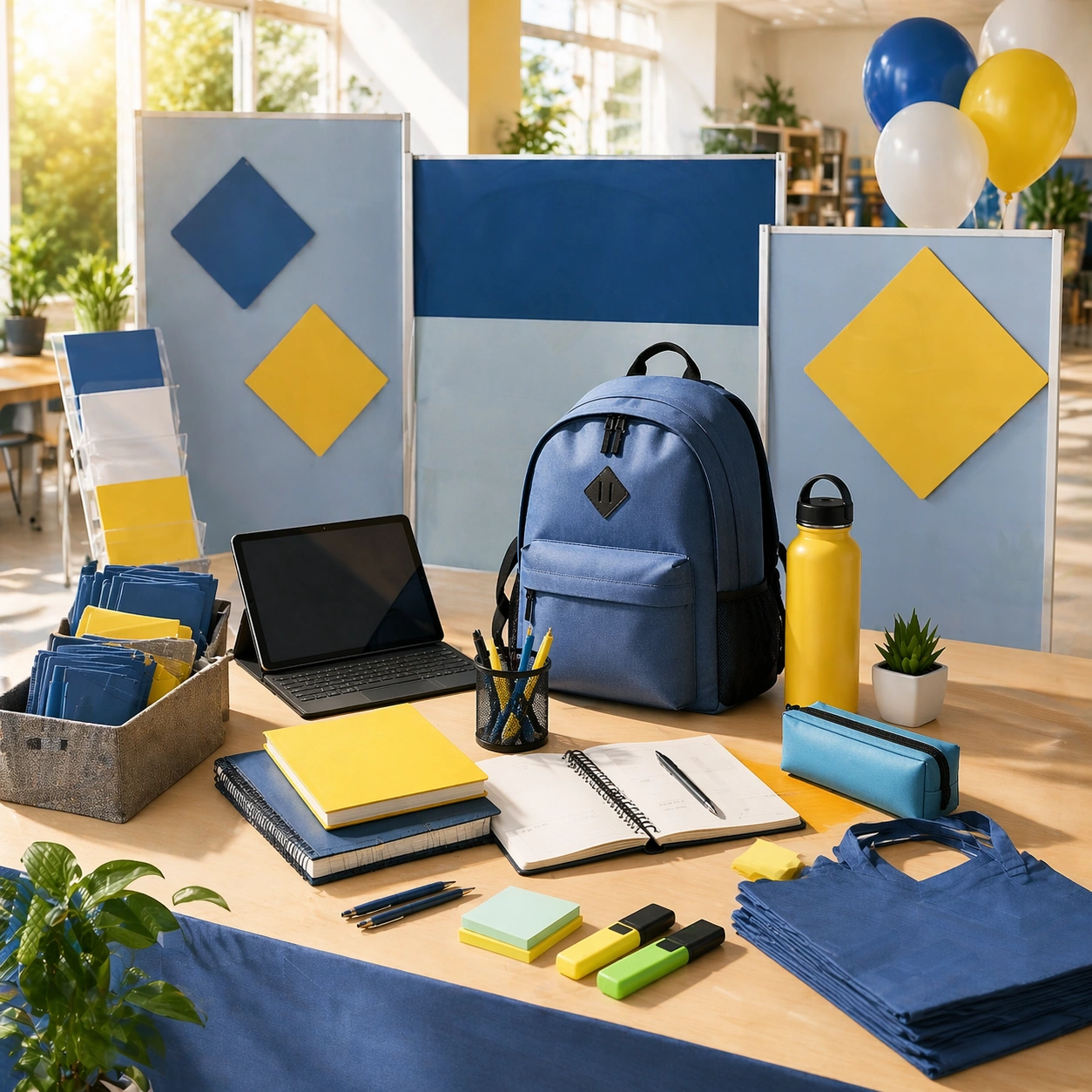
Example generated from “Back To School Enrollment And Retail Kit — Enrollment Fair Variation”
GPT Image 2en

Scene: Create a square dependent campaign image in the same bright school-reset environment, preserving the exact morning light, clean materials, and optimistic academic polish from the reference image, but widen the composition toward an enrollment-fair or orientation-display setting. The scene should remain visually continuous with the anchor while leaning more toward institutional promotion and wayfinding atmosphere. Subject: Feature a booth or display-like setup with boards that contain no readable text, organized stationery, welcome-pack objects, device support, and directional elements arranged into a premium enrollment presentation. Preserve exact campaign identity from the reference model while changing the use case toward student recruitment and orientation. The result should feel clean, inviting, and operationally useful. Important details: Keep the same visual grammar: bright clarity, youthfully optimistic energy, disciplined structure, and tactile credibility. The orientation-display cue should come from layout and object grouping rather than actual signage. Make it suitable for schools, education brands, or family-focused campaign surfaces during back-to-school season. Use case: Back to School series study 4/9. Constraints: No readable text, no watermark, no logos, preserve exact 1:1 aspect ratio, preserve exact campaign identity from the reference image, no readable signage, no school logos, no mascot banners, no crowded fair chaos, no graduation caps, no chalkboard text, no corporate tradeshow mood.

Example generated from “Back To School Enrollment And Retail Kit — Classroom Welcome Surface”
GPT Image 2en

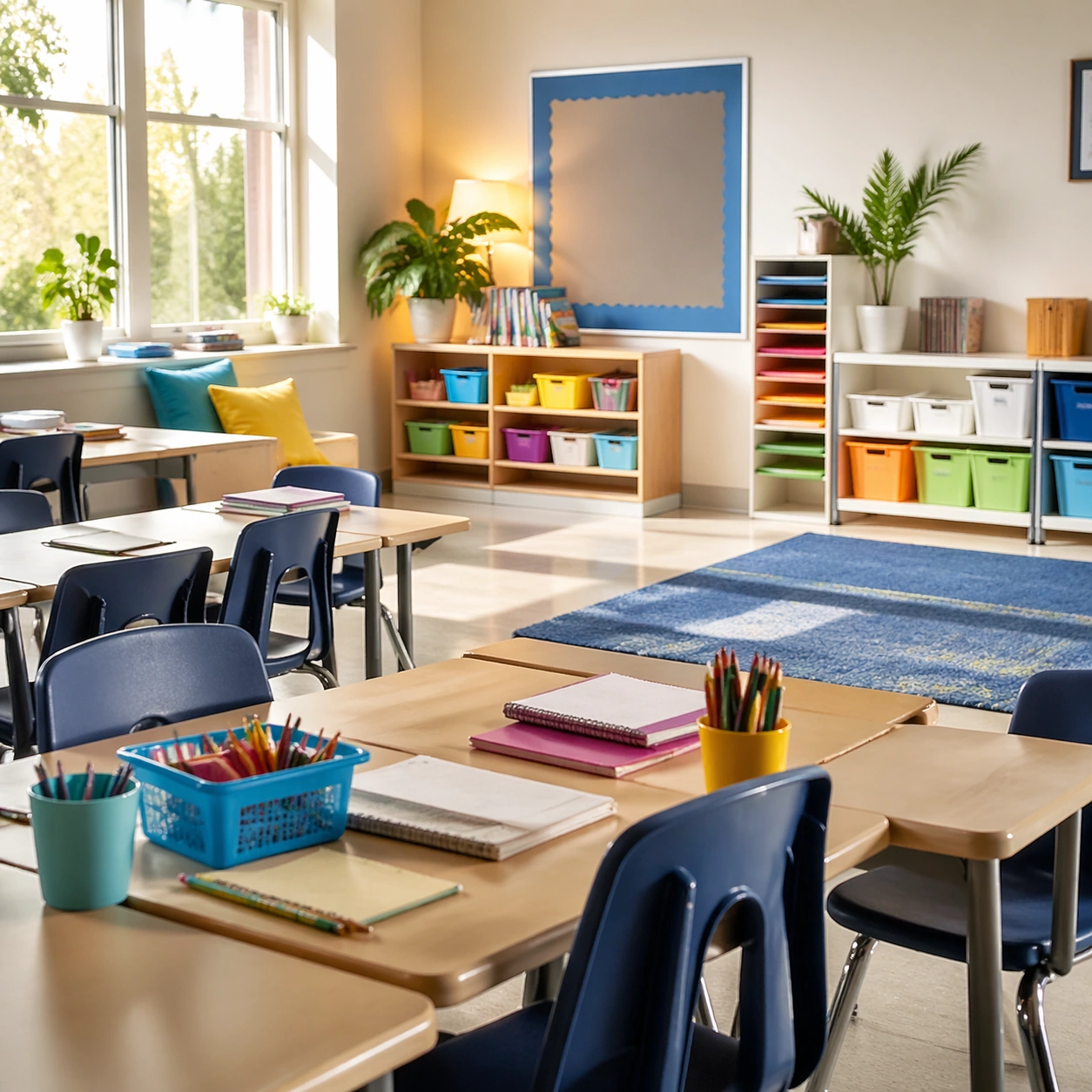
Scene: Create a square classroom environment image with bright morning light, colorful but disciplined educational materials, and a sense of readiness before students arrive. The frame should feel polished and optimistic, suitable for school marketing or enrollment support. Keep the setting real and inviting rather than theatrical or childish, with enough depth to read as a true environment. Subject: Show desks or tables, seating, supplies, display surfaces with no readable text, and a few personal comfort cues that make the classroom feel welcoming. The subject should communicate structure, care, and the start of a new term. Focus on material order and atmosphere rather than on people or slogans. Important details: The room should feel alive but not messy. Wood, plastic, paper, and daylight should all behave convincingly. Use color to support youthful energy without becoming loud. The result should work for school campaigns, enrollment pages, or retail partnerships around classroom readiness. Use case: Back to School single study 6/9. Constraints: No readable text, no watermark, no logos, preserve exact 1:1 aspect ratio, no readable posters, no school logo, no mascot decorations, no crowded student scene, no chalkboard text, no messy art project spill, no graduation cues, no cartoon classroom theme.

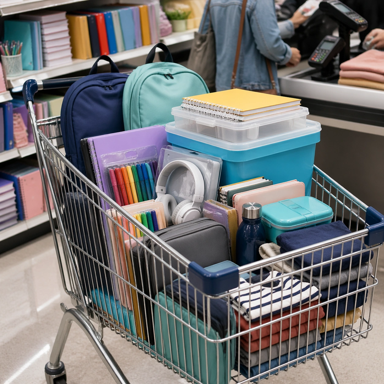
Example generated from “Back To School Enrollment And Retail Kit — Parent Checkout Cart”
GPT Image 2en

Scene: Create a square retail image with bright aisle or checkout light, organized product stacks, and a polished family-shopping atmosphere. The frame should feel like a campaign image for school-season purchasing rather than a supermarket snapshot. Use cart geometry, shelf rhythm, and clear object hierarchy to communicate efficient preparation and family-oriented buying behavior. Subject: Show a cart with school supplies, tech accessories, storage items, lunch or apparel forms, and a few checkout cues that remain non-legible. People can be implied or partly present, but the purchasing structure should stay central. The subject should communicate bulk preparation, care, and efficient decision-making for the new term. Important details: Retail clarity matters most. Make cart metal, packaging forms, plastic, paper, and polished floor reflections all feel real. Keep the scene commercially neat and useful for retail, education, or parent-targeted promotions. Avoid discount-chaos energy; this is organized, capable preparation. Keep the frame precise enough for gallery, research, and campaign reuse, with believable materials and a strong thumbnail read. Use case: Back to School single study 7/9. Constraints: No readable text, no watermark, no logos, preserve exact 1:1 aspect ratio, no readable price labels, no store logos, no chaotic crowd, no mascot packaging, no messy bargain-bin feel, no readable receipts, no neon promo signs, no graduation décor.
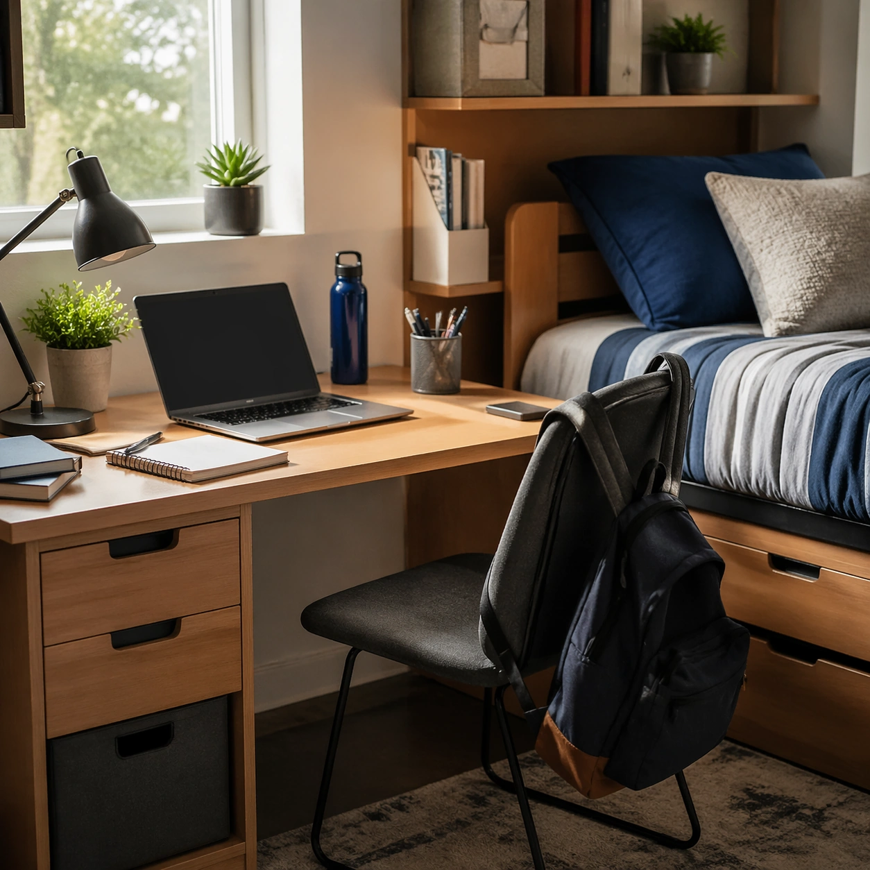
Example generated from “Back To School Enrollment And Retail Kit — Dorm Desk Setup”
GPT Image 2en

Scene: Create a square student-room or dorm-desk image with soft daylight, practical furniture, and a polished lived-in feel. The frame should feel contemporary and premium enough for campaign use while still grounded in real student life. Keep the composition clean and structured, with a balance of productivity, comfort, and compact space efficiency. Subject: Show a desk setup with laptop-like form, notebooks, lamp, bedding edge or textile, storage units, and one or two personal objects that suggest a new term beginning. The subject should communicate readiness, self-direction, and manageable independence. Keep everything brand-neutral and free of readable notes or posters. Important details: Texture and spatial logic are key. Fabric, wood, plastic, metal, and daylight should all feel believable. Avoid aspirational luxury that erases student reality, but keep enough polish that the scene works for education, furniture, tech, or retail campaigns tied to the school season. Keep the frame precise enough for gallery, research, and campaign reuse, with believable materials and a strong thumbnail read. Use case: Back to School single study 8/9. Constraints: No readable text, no watermark, no logos, preserve exact 1:1 aspect ratio, no readable posters, no logo laptop, no messy laundry pile, no mascot décor, no gaming neon, no food clutter, no chalkboard text, no graduation items.

Example generated from “Back To School Enrollment And Retail Kit — Bus Stop Morning Kit”
GPT Image 2en

Scene: Create a square morning transit image with crisp early light, cool air, and a feeling of purposeful movement into the day. The setting can suggest a bus stop, school entry path, or pickup zone, but it should remain polished and campaign-ready rather than documentary. Use strong directional light, grounded architecture, and a clear sense of readiness. Subject: Show a bag, jacket or outer layer, bottle, lunch form, notebook or folder silhouettes, and a few transit cues arranged into a scene of departure for school. Human presence can be implied but should not dominate. The subject should communicate routine, confidence, and the start of a new academic rhythm. Important details: Light and object texture carry the image. Fabric, asphalt or paving, metal rail, paper edges, and cool morning air should all feel real. The result should support transport, school, apparel, or retail campaign surfaces during back-to-school season. Keep the mood optimistic, structured, and forward-moving. Keep the frame precise enough for gallery, research, and campaign reuse, with believable materials and a strong thumbnail read. Use case: Back to School single study 9/9. Constraints: No readable text, no watermark, no logos, preserve exact 1:1 aspect ratio, no readable route signs, no school logos, no crowd, no mascot graphics, no traffic chaos, no graduation cues, no branded bus, no chalkboard props.

Example generated from “Banksy Street Satire — Reference Key Visual”
GPT Image 2en

Scene: A square campaign image designed for distribution, with bold focal hierarchy, strong color blocking, and cinematic energy. The framing should read instantly from a distance while still rewarding close inspection with layered secondary details and coherent scene logic. Subject: The subject is a campaign-ready visual system for anonymous stencil street satire. Build the frame from anonymous stencil street satire. A Prompt Atlas theme for anonymous stencil street satire Street Satire, testing reasoning- composition, style- transfer with GPT Image 2.. anonymous stencil street satire. Focus on concrete visual elements, believable material behavior, and layered subject hierarchy so the result feels authored instead of template-like. Core campaign poster or hero tile. Important details: This first image is the canonical anchor for the series. Establish the visual rules, palette logic, and shape language that later series images must preserve. Keep the concept specific to anonymous stencil street satire, with concrete forms and believable relationships between primary subject, support elements, and background structure. Avoid visual noise. Every secondary detail should reinforce the main idea instead of competing with it. The composition should feel immediately legible and impressive, with a self-explaining core idea and enough finish to work without heavy post-production. Use case: anonymous stencil street satire series study 1/9 for Prompt Atlas. Constraints: No readable text, no watermark, no logos, preserve exact 1:1 aspect ratio, no irrelevant brand marks, no generic clip-art simplification, no broken anatomy, no muddy lighting, no random collage fragments, no empty background without purpose.

Example generated from “Banksy Street Satire — Action Beat Expansion”
GPT Image 2en

Scene: A square campaign image designed for distribution, with bold focal hierarchy, strong color blocking, and cinematic energy. The framing should read instantly from a distance while still rewarding close inspection with layered secondary details and coherent scene logic. Subject: The subject is a campaign-ready visual system for anonymous stencil street satire. Build the frame from anonymous stencil street satire. A Prompt Atlas theme for anonymous stencil street satire Street Satire, testing reasoning- composition, style- transfer with GPT Image 2.. anonymous stencil street satire. Focus on concrete visual elements, believable material behavior, and layered subject hierarchy so the result feels authored instead of template-like. More kinetic campaign continuation. Important details: This image depends on the reference anchor and must preserve the same core subject logic, silhouette memory, palette family, and visual grammar from the reference result. Keep the concept specific to anonymous stencil street satire, with concrete forms and believable relationships between primary subject, support elements, and background structure. Avoid visual noise. Every secondary detail should reinforce the main idea instead of competing with it. The composition should feel immediately legible and impressive, with a self-explaining core idea and enough finish to work without heavy post-production. Use case: anonymous stencil street satire series study 2/9 for Prompt Atlas. Constraints: No readable text, no watermark, no logos, preserve exact 1:1 aspect ratio, no irrelevant brand marks, no generic clip-art simplification, no broken anatomy, no muddy lighting, no random collage fragments, no empty background without purpose.

Example generated from “Banksy Street Satire — Reveal Moment”
GPT Image 2en

Scene: A square campaign image designed for distribution, with bold focal hierarchy, strong color blocking, and cinematic energy. The framing should read instantly from a distance while still rewarding close inspection with layered secondary details and coherent scene logic. Subject: The subject is a campaign-ready visual system for anonymous stencil street satire. Build the frame from anonymous stencil street satire. A Prompt Atlas theme for anonymous stencil street satire Street Satire, testing reasoning- composition, style- transfer with GPT Image 2.. anonymous stencil street satire. Focus on concrete visual elements, believable material behavior, and layered subject hierarchy so the result feels authored instead of template-like. Revelatory or highlight frame in the same language. Important details: This image depends on the reference anchor and must preserve the same core subject logic, silhouette memory, palette family, and visual grammar from the reference result. Keep the concept specific to anonymous stencil street satire, with concrete forms and believable relationships between primary subject, support elements, and background structure. Avoid visual noise. Every secondary detail should reinforce the main idea instead of competing with it. The composition should feel immediately legible and impressive, with a self-explaining core idea and enough finish to work without heavy post-production. Use case: anonymous stencil street satire series study 3/9 for Prompt Atlas. Constraints: No readable text, no watermark, no logos, preserve exact 1:1 aspect ratio, no irrelevant brand marks, no generic clip-art simplification, no broken anatomy, no muddy lighting, no random collage fragments, no empty background without purpose.

Example generated from “Banksy Street Satire — Payoff Frame”
GPT Image 2en

Scene: A square campaign image designed for distribution, with bold focal hierarchy, strong color blocking, and cinematic energy. The framing should read instantly from a distance while still rewarding close inspection with layered secondary details and coherent scene logic. Subject: The subject is a campaign-ready visual system for anonymous stencil street satire. Build the frame from anonymous stencil street satire. A Prompt Atlas theme for anonymous stencil street satire Street Satire, testing reasoning- composition, style- transfer with GPT Image 2.. anonymous stencil street satire. Focus on concrete visual elements, believable material behavior, and layered subject hierarchy so the result feels authored instead of template-like. The strongest concluding campaign image. Important details: This image depends on the reference anchor and must preserve the same core subject logic, silhouette memory, palette family, and visual grammar from the reference result. Keep the concept specific to anonymous stencil street satire, with concrete forms and believable relationships between primary subject, support elements, and background structure. Avoid visual noise. Every secondary detail should reinforce the main idea instead of competing with it. The composition should feel immediately legible and impressive, with a self-explaining core idea and enough finish to work without heavy post-production. Use case: anonymous stencil street satire series study 4/9 for Prompt Atlas. Constraints: No readable text, no watermark, no logos, preserve exact 1:1 aspect ratio, no irrelevant brand marks, no generic clip-art simplification, no broken anatomy, no muddy lighting, no random collage fragments, no empty background without purpose.

Example generated from “Banksy Street Satire — Supporting Promo Tile”
GPT Image 2en

Scene: A square campaign image designed for distribution, with bold focal hierarchy, strong color blocking, and cinematic energy. The framing should read instantly from a distance while still rewarding close inspection with layered secondary details and coherent scene logic. Subject: The subject is a campaign-ready visual system for anonymous stencil street satire. Build the frame from anonymous stencil street satire. A Prompt Atlas theme for anonymous stencil street satire Street Satire, testing reasoning- composition, style- transfer with GPT Image 2.. anonymous stencil street satire. Focus on concrete visual elements, believable material behavior, and layered subject hierarchy so the result feels authored instead of template-like. Secondary campaign tile with clear focal hierarchy. Important details: This is an independent support study inside the same theme, so it should feel related in visual language without relying on a runtime reference image. Keep the concept specific to anonymous stencil street satire, with concrete forms and believable relationships between primary subject, support elements, and background structure. Avoid visual noise. Every secondary detail should reinforce the main idea instead of competing with it. The composition should feel immediately legible and impressive, with a self-explaining core idea and enough finish to work without heavy post-production. Use case: anonymous stencil street satire single study 5/9 for Prompt Atlas. Constraints: No readable text, no watermark, no logos, preserve exact 1:1 aspect ratio, no irrelevant brand marks, no generic clip-art simplification, no broken anatomy, no muddy lighting, no random collage fragments, no empty background without purpose.

Example generated from “Banksy Street Satire — Character or Prop Focus”
GPT Image 2en

Scene: A square campaign image designed for distribution, with bold focal hierarchy, strong color blocking, and cinematic energy. The framing should read instantly from a distance while still rewarding close inspection with layered secondary details and coherent scene logic. Subject: The subject is a campaign-ready visual system for anonymous stencil street satire. Build the frame from anonymous stencil street satire. A Prompt Atlas theme for anonymous stencil street satire Street Satire, testing reasoning- composition, style- transfer with GPT Image 2.. anonymous stencil street satire. Focus on concrete visual elements, believable material behavior, and layered subject hierarchy so the result feels authored instead of template-like. A focused support study built around one memorable element. Important details: This is an independent support study inside the same theme, so it should feel related in visual language without relying on a runtime reference image. Keep the concept specific to anonymous stencil street satire, with concrete forms and believable relationships between primary subject, support elements, and background structure. Avoid visual noise. Every secondary detail should reinforce the main idea instead of competing with it. The composition should feel immediately legible and impressive, with a self-explaining core idea and enough finish to work without heavy post-production. Use case: anonymous stencil street satire single study 6/9 for Prompt Atlas. Constraints: No readable text, no watermark, no logos, preserve exact 1:1 aspect ratio, no irrelevant brand marks, no generic clip-art simplification, no broken anatomy, no muddy lighting, no random collage fragments, no empty background without purpose.

Example generated from “Banksy Street Satire — Alternate Crop Poster”
GPT Image 2en

Scene: A square campaign image designed for distribution, with bold focal hierarchy, strong color blocking, and cinematic energy. The framing should read instantly from a distance while still rewarding close inspection with layered secondary details and coherent scene logic. Subject: The subject is a campaign-ready visual system for anonymous stencil street satire. Build the frame from anonymous stencil street satire. A Prompt Atlas theme for anonymous stencil street satire Street Satire, testing reasoning- composition, style- transfer with GPT Image 2.. anonymous stencil street satire. Focus on concrete visual elements, believable material behavior, and layered subject hierarchy so the result feels authored instead of template-like. Alternate poster crop in the same language. Important details: This is an independent support study inside the same theme, so it should feel related in visual language without relying on a runtime reference image. Keep the concept specific to anonymous stencil street satire, with concrete forms and believable relationships between primary subject, support elements, and background structure. Avoid visual noise. Every secondary detail should reinforce the main idea instead of competing with it. The composition should feel immediately legible and impressive, with a self-explaining core idea and enough finish to work without heavy post-production. Use case: anonymous stencil street satire single study 7/9 for Prompt Atlas. Constraints: No readable text, no watermark, no logos, preserve exact 1:1 aspect ratio, no irrelevant brand marks, no generic clip-art simplification, no broken anatomy, no muddy lighting, no random collage fragments, no empty background without purpose.