PROMPTS · KREATIV ENTDECKEN

Prompt-Galerie

Echte Prompts und erzeugte Beispiele erkunden. Inspiration für Ihre nächste kreative Mission finden und den vollständigen Prompt kostenlos kopieren.

Beispiele
10,974
Modelle
17
Quellen
1277
10.974 Prompt-Beispiele · Seite 62 von 229
Example generated from “Boss Arena Phase Keyframes — Final Burn Frame”
GPT Image 2en

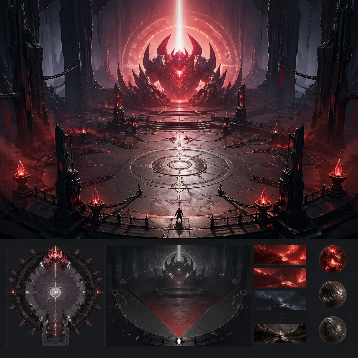
Scene: A square premium key-art frame built for a reference-dependent production series. Stage the same boss arena at a final burn moment with intense but readable endgame pressure with controlled lighting, clear silhouette separation, and a camera setup that feels deliberate enough for campaign reuse. The composition should carry strong focal hierarchy, believable depth, and polished surface behavior while still staying stable enough to support downstream dependent variations. Subject: Center the image on the same boss arena at a final burn moment with intense but readable endgame pressure. The result should feel like a concrete, shippable asset for Boss Arena Phase Keyframes, not a generic fantasy render. Build the subject with layered materials, stable anatomy or engineering logic, and enough specificity that later images can inherit the same underlying identity. Preserve the same arena layout, boss silhouette, hazard language, and traversal cover logic from the reference keyframe from the reference image while changing only what this variation needs. The viewer should immediately understand what is being preserved across the sequence and what is changing in this particular beat. Important details: push danger and spectacle while preserving route readability and encounter continuity. Make continuity explicit through repeatable shape language, proportion control, and a coherent palette system. Changes in pose, angle, mood, rarity, weather, or layout should still feel downstream of one stable source. Avoid clutter that would confuse reference use. Any interface-like blocks or graphic surfaces must remain abstract and unreadable. Keep the image polished, original, and suitable for both gallery display and production review. Use case: Boss Arena Phase Keyframes series study 4/4, focused on final burn frame. Constraints: No readable text, no watermark, no logos, preserve exact 1:1 aspect ratio, no unreadable firestorm, no cutscene-only framing, no broken continuity, no off-model redesign, no accidental franchise resemblance.
Example generated from “Boss Arena Phase Keyframes — Boss Intro Wide”
GPT Image 2en

Scene: A square production-ready image designed for a game-art review wall and a commercial gallery at the same time. Frame a wider promotional frame that sells the boss entrance and space scale to players with disciplined lighting, clean edge separation, and enough surrounding context to prove how the asset would behave in a real product surface. The camera, crop, and tonal balance should feel intentional rather than generic, with high readability at first glance and convincing material response under closer inspection. Subject: Center the study on a wider promotional frame that sells the boss entrance and space scale to players. Translate the topic into a concrete, shippable visual statement instead of a loose mood board. Build layered object relationships, believable surface finish, and strong silhouette grouping so the image reads immediately as part of Boss Arena Phase Keyframes. The subject should feel made for a live game pipeline: useful in store, UI, campaign, or art-review contexts, with visual hierarchy strong enough to survive aggressive cropping. Important details: the wide shot should still preserve actionable arena geography. Keep every supporting element subordinate to the main read, and make category separation obvious through form, color zoning, depth, and material logic rather than words. Where panels, cards, badges, or interface blocks appear, they must look professionally structured but remain unreadable. The visual language should feel premium, original, and coherent across this package, with no filler clutter and no accidental resemblance to a specific shipped game IP. Use case: Boss Arena Phase Keyframes single study 2/5, focused on boss intro wide. Constraints: No readable text, no watermark, no logos, preserve exact 1:1 aspect ratio, no trailer text, no logos, no broken hierarchy, no generic stock-photo staging, no accidental UI gibberish.

Example generated from “Boss Arena Phase Keyframes — Collapse Overhead”
GPT Image 2en

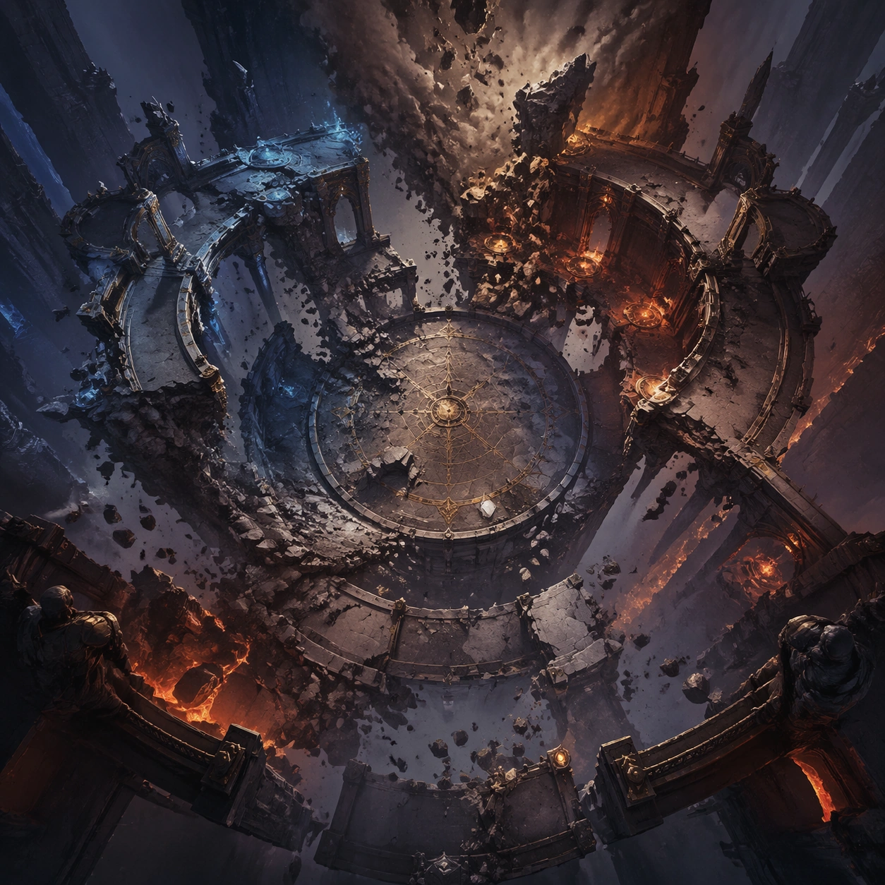
Scene: A square production-ready image designed for a game-art review wall and a commercial gallery at the same time. Frame an overhead or elevated view of the arena during structural collapse with disciplined lighting, clean edge separation, and enough surrounding context to prove how the asset would behave in a real product surface. The camera, crop, and tonal balance should feel intentional rather than generic, with high readability at first glance and convincing material response under closer inspection. Subject: Center the study on an overhead or elevated view of the arena during structural collapse. Translate the topic into a concrete, shippable visual statement instead of a loose mood board. Build layered object relationships, believable surface finish, and strong silhouette grouping so the image reads immediately as part of Boss Arena Phase Keyframes. The subject should feel made for a live game pipeline: useful in store, UI, campaign, or art-review contexts, with visual hierarchy strong enough to survive aggressive cropping. Important details: show route breakage and fallback spaces with strong spatial coherence. Keep every supporting element subordinate to the main read, and make category separation obvious through form, color zoning, depth, and material logic rather than words. Where panels, cards, badges, or interface blocks appear, they must look professionally structured but remain unreadable. The visual language should feel premium, original, and coherent across this package, with no filler clutter and no accidental resemblance to a specific shipped game IP. Use case: Boss Arena Phase Keyframes single study 3/5, focused on collapse overhead. Constraints: No readable text, no watermark, no logos, preserve exact 1:1 aspect ratio, no minimap styling, no labels, no broken hierarchy, no generic stock-photo staging, no accidental UI gibberish.

Example generated from “Boss Arena Phase Keyframes — Survivor Cover Shot”
GPT Image 2en

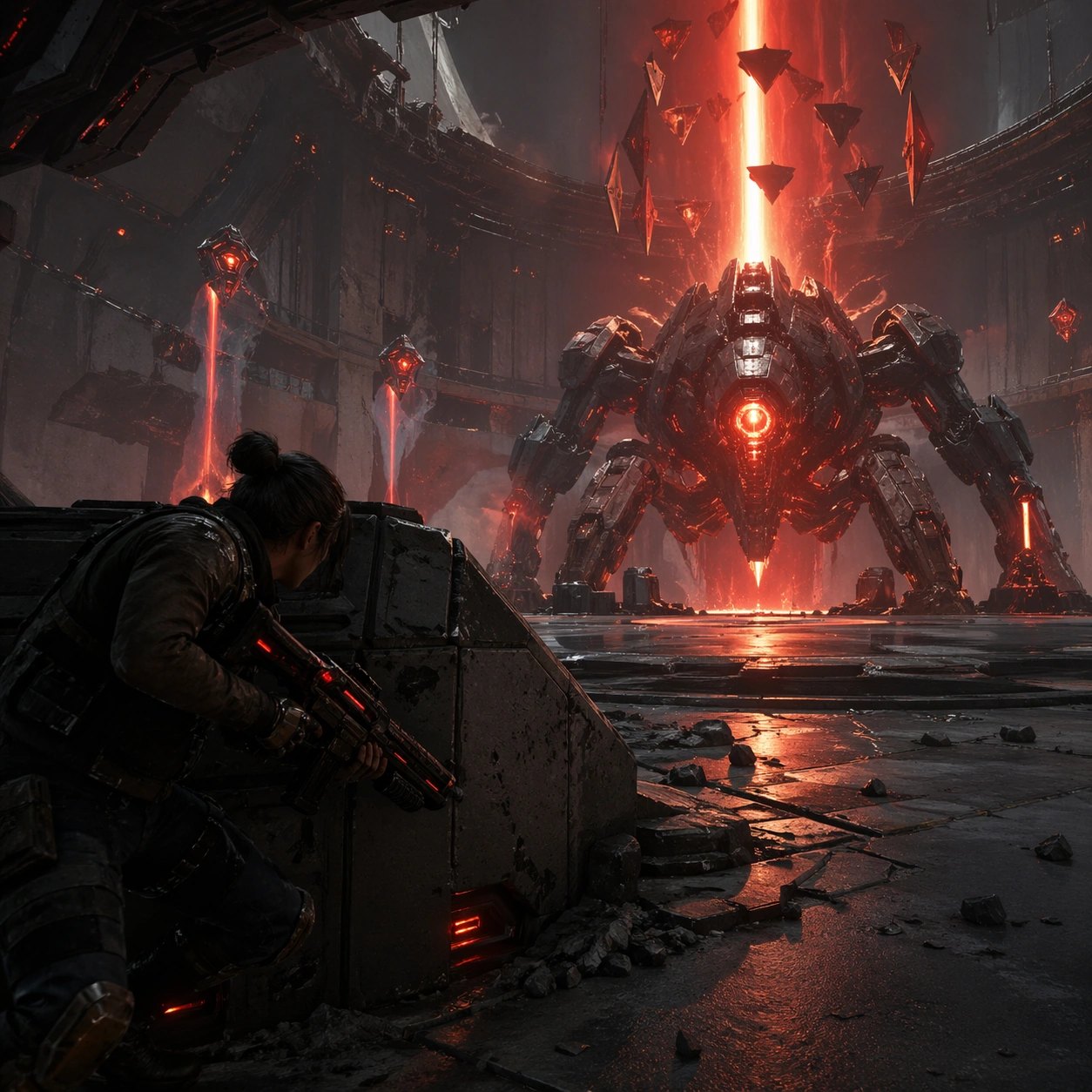
Scene: A square production-ready image designed for a game-art review wall and a commercial gallery at the same time. Frame a player-perspective adjacent frame that emphasizes cover, spacing, and survival pressure with disciplined lighting, clean edge separation, and enough surrounding context to prove how the asset would behave in a real product surface. The camera, crop, and tonal balance should feel intentional rather than generic, with high readability at first glance and convincing material response under closer inspection. Subject: Center the study on a player-perspective adjacent frame that emphasizes cover, spacing, and survival pressure. Translate the topic into a concrete, shippable visual statement instead of a loose mood board. Build layered object relationships, believable surface finish, and strong silhouette grouping so the image reads immediately as part of Boss Arena Phase Keyframes. The subject should feel made for a live game pipeline: useful in store, UI, campaign, or art-review contexts, with visual hierarchy strong enough to survive aggressive cropping. Important details: the image should feel like a real combat read rather than a poster in disguise. Keep every supporting element subordinate to the main read, and make category separation obvious through form, color zoning, depth, and material logic rather than words. Where panels, cards, badges, or interface blocks appear, they must look professionally structured but remain unreadable. The visual language should feel premium, original, and coherent across this package, with no filler clutter and no accidental resemblance to a specific shipped game IP. Use case: Boss Arena Phase Keyframes single study 4/5, focused on survivor cover shot. Constraints: No readable text, no watermark, no logos, preserve exact 1:1 aspect ratio, no weapon HUD text, no fake reticles, no broken hierarchy, no generic stock-photo staging, no accidental UI gibberish.

Example generated from “Boss Arena Phase Keyframes — Encounter Promo Poster”
GPT Image 2en

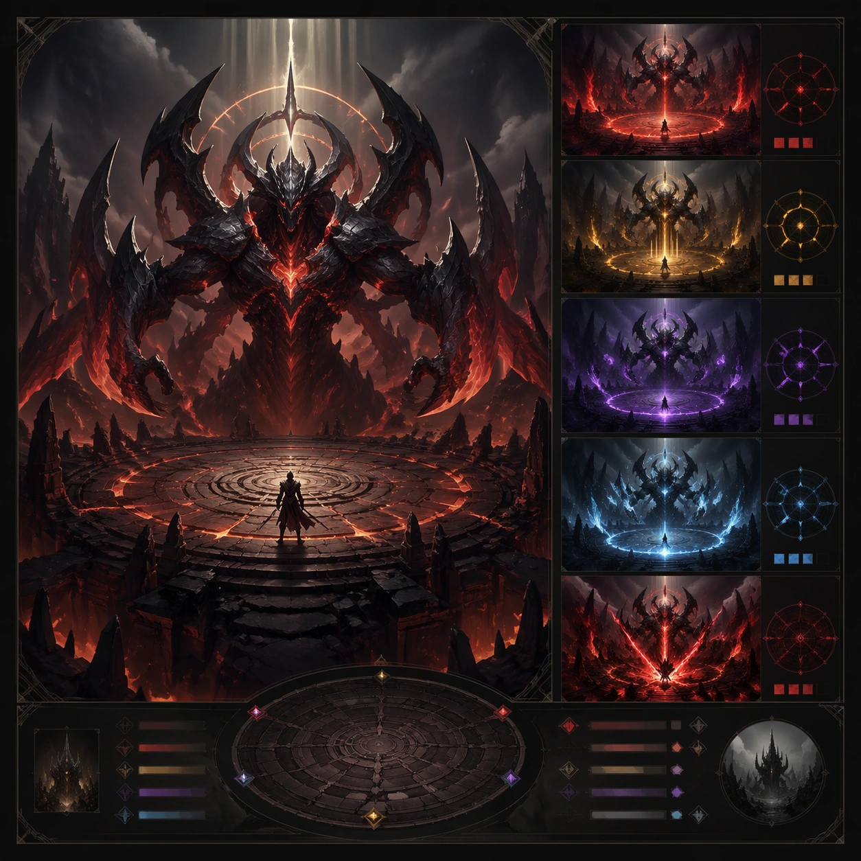
Scene: A square production-ready image designed for a game-art review wall and a commercial gallery at the same time. Frame a poster-like package for the boss encounter using the arena and phase cues as the core graphic system with disciplined lighting, clean edge separation, and enough surrounding context to prove how the asset would behave in a real product surface. The camera, crop, and tonal balance should feel intentional rather than generic, with high readability at first glance and convincing material response under closer inspection. Subject: Center the study on a poster-like package for the boss encounter using the arena and phase cues as the core graphic system. Translate the topic into a concrete, shippable visual statement instead of a loose mood board. Build layered object relationships, believable surface finish, and strong silhouette grouping so the image reads immediately as part of Boss Arena Phase Keyframes. The subject should feel made for a live game pipeline: useful in store, UI, campaign, or art-review contexts, with visual hierarchy strong enough to survive aggressive cropping. Important details: make it feel event-worthy and dangerous without sacrificing encounter readability. Keep every supporting element subordinate to the main read, and make category separation obvious through form, color zoning, depth, and material logic rather than words. Where panels, cards, badges, or interface blocks appear, they must look professionally structured but remain unreadable. The visual language should feel premium, original, and coherent across this package, with no filler clutter and no accidental resemblance to a specific shipped game IP. Use case: Boss Arena Phase Keyframes single study 5/5, focused on encounter promo poster. Constraints: No readable text, no watermark, no logos, preserve exact 1:1 aspect ratio, no slogan copy, no logo lockups, no broken hierarchy, no generic stock-photo staging, no accidental UI gibberish.

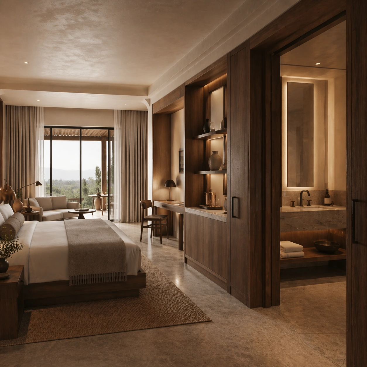
Example generated from “Boutique Guestroom Editorial Suite — Suite Overview Morning”
GPT Image 2en

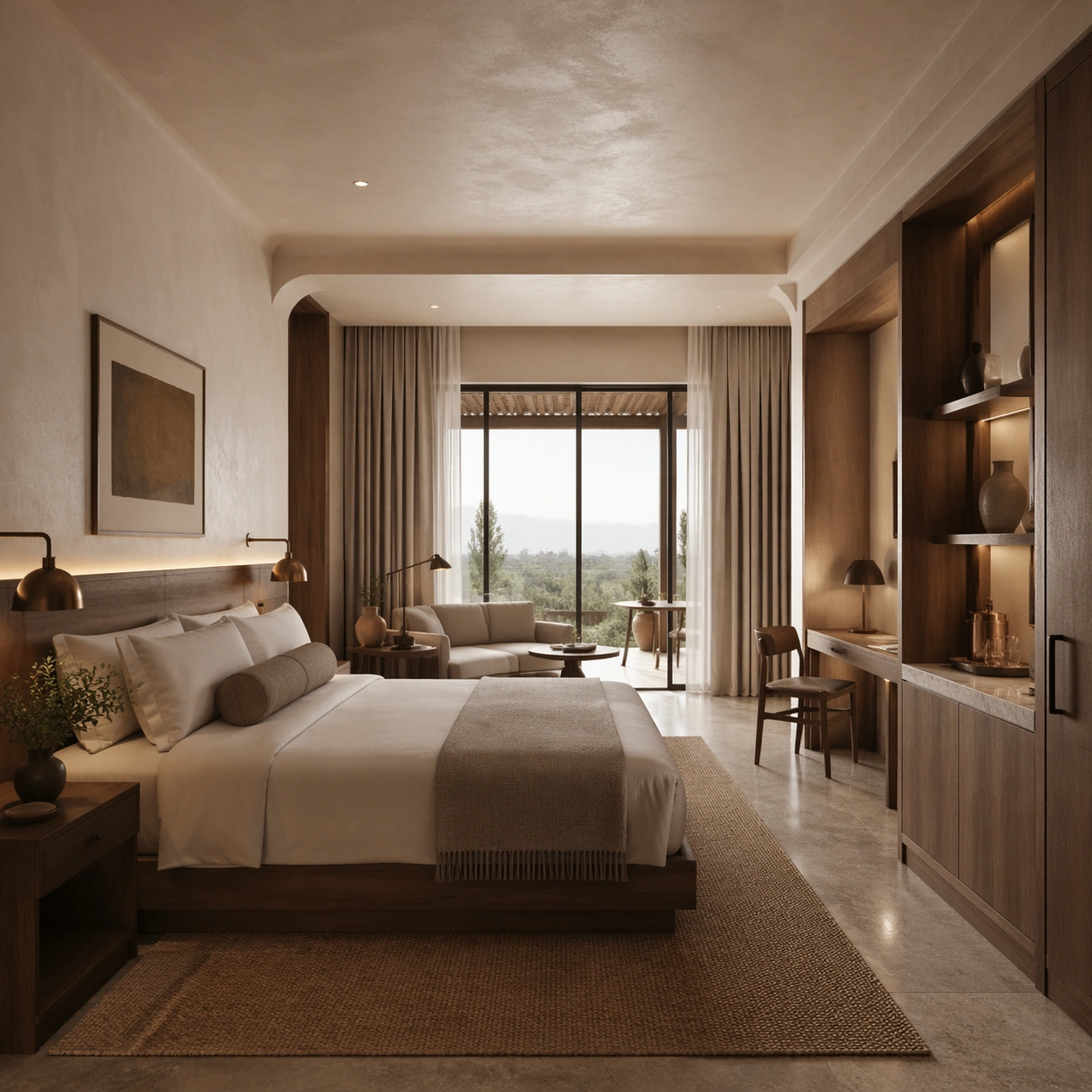
Scene: Create a square architectural reference still for Boutique Guestroom Editorial Suite. Use a wide morning view from the entry looking across bed, seating, and window layers and treat the frame like a premium interior or architecture editorial photograph with disciplined perspective, readable depth from foreground to background, and enough negative space for the spatial hierarchy to breathe. Light the scene so sleep experience, tactile detail, and editorial calm feel immediate, using warm plaster white, walnut brown, muted clay, brushed bronze, and soft morning gray as the governing tonal range. The composition must read as a high-end commercial image that could sit inside hospitality websites, travel editorials, booking campaigns, and room-style handoff decks. Subject: Show a boutique hotel suite with limewashed plaster walls, walnut millwork, tailored linen bedding, bronze reading lights, textured drapery, and a quietly lived-in premium mood. Center the full suite composition, window light, and premium but relaxed stay atmosphere. This is the canonical reference image for the package, so the major proportions, material transitions, fixture families, and circulation logic must feel highly specific and internally coherent rather than generic luxury styling. Let the viewer understand how the space is organized within a single glance, with foreground anchors, a clear middle zone, and a resolved background termination. Important details: Lock the bed proportions, walnut joinery, plaster texture, bronze hardware, linen styling, and restrained resort palette. Surfaces should feel tactile and believable: stone veining must stay plausible, metals should have disciplined reflectance, fabrics should show natural weight, and concealed lighting should shape the volume instead of flattening it. Use abstract signage, menu, label, or caption zones only as unreadable graphic hints. The image should feel practical for downstream design reviews and polished enough for public-facing campaign use. Use case: Boutique Guestroom Editorial Suite series study 1/9, establishing the canonical guestroom identity for the series. Constraints: No readable text, no watermark, no logos, preserve exact 1:1 aspect ratio, no people, no messy luggage spill, no cheap decor, no hard flash, no exaggerated luxury clichés, no breakfast tray in the center.

Example generated from “Boutique Guestroom Editorial Suite — Window Seat Reading”
GPT Image 2en

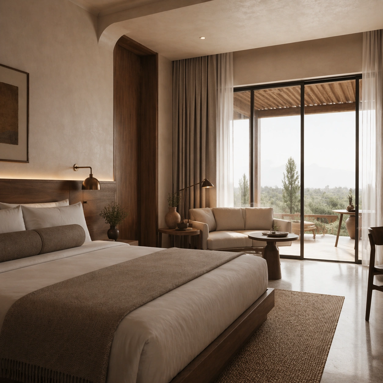
Scene: Create a square reference-dependent architecture still for Boutique Guestroom Editorial Suite. Use a side angle toward the window seat and bed edge while keeping the same lens discipline, editorial polish, and material believability established by the reference image. The lighting can shift to support the intended mood, but the space must still feel like the same authored project with a stable viewpoint logic, convincing depth separation, and clean commercial-photography finish. Keep warm plaster white, walnut brown, muted clay, brushed bronze, and soft morning gray as the governing tonal range even when the emphasis changes. Subject: Show a boutique hotel suite with limewashed plaster walls, walnut millwork, tailored linen bedding, bronze reading lights, textured drapery, and a quietly lived-in premium mood. Focus on the exact same suite from the reference image, now emphasizing drapery depth, seating fabric, and daylight softness. Preserve exact architectural identity, plan logic, material palette, fixture family, and circulation cues from the reference image while changing only the intended emphasis described here. The viewer should immediately recognize the same project, not a loose cousin, with matching silhouette logic, aligned detailing, and consistent brand atmosphere. Important details: Preserve the bed proportions, walnut joinery, plaster texture, bronze hardware, linen styling, and restrained resort palette. Any abstract wayfinding, menu, wall-label, or packaging zones must stay unreadable and subordinate to the spatial image. Joinery, edges, reflections, and lighting should remain realistic enough for an operator or design team to treat the image as a credible reference. The variation should feel deliberate and commercially useful, proving that one locked spatial language can flex across multiple campaign or editorial surfaces. Use case: Boutique Guestroom Editorial Suite series study 2/9, extending the suite lounge layer while preserving the same room identity. Constraints: No readable text, no watermark, no logos, preserve exact 1:1 aspect ratio, preserve exact architectural identity from the reference image, no people, no messy luggage spill, no cheap decor, no hard flash, no exaggerated luxury clichés, no city skyline dominating the frame.

Example generated from “Boutique Guestroom Editorial Suite — Bath Vanity Connection”
GPT Image 2en

Scene: Create a square reference-dependent architecture still for Boutique Guestroom Editorial Suite. Use a camera angle that links the bedroom threshold to the stone vanity zone while keeping the same lens discipline, editorial polish, and material believability established by the reference image. The lighting can shift to support the intended mood, but the space must still feel like the same authored project with a stable viewpoint logic, convincing depth separation, and clean commercial-photography finish. Keep warm plaster white, walnut brown, muted clay, brushed bronze, and soft morning gray as the governing tonal range even when the emphasis changes. Subject: Show a boutique hotel suite with limewashed plaster walls, walnut millwork, tailored linen bedding, bronze reading lights, textured drapery, and a quietly lived-in premium mood. Focus on the exact same suite from the reference image, now emphasizing vanity materials, mirror glow, and spatial continuity. Preserve exact architectural identity, plan logic, material palette, fixture family, and circulation cues from the reference image while changing only the intended emphasis described here. The viewer should immediately recognize the same project, not a loose cousin, with matching silhouette logic, aligned detailing, and consistent brand atmosphere. Important details: Preserve the bed proportions, walnut joinery, plaster texture, bronze hardware, linen styling, and restrained resort palette. Any abstract wayfinding, menu, wall-label, or packaging zones must stay unreadable and subordinate to the spatial image. Joinery, edges, reflections, and lighting should remain realistic enough for an operator or design team to treat the image as a credible reference. The variation should feel deliberate and commercially useful, proving that one locked spatial language can flex across multiple campaign or editorial surfaces. Use case: Boutique Guestroom Editorial Suite series study 3/9, extending the bath-to-bedroom transition in the same boutique language. Constraints: No readable text, no watermark, no logos, preserve exact 1:1 aspect ratio, preserve exact architectural identity from the reference image, no people, no messy luggage spill, no cheap decor, no hard flash, no exaggerated luxury clichés, no readable amenity labels.

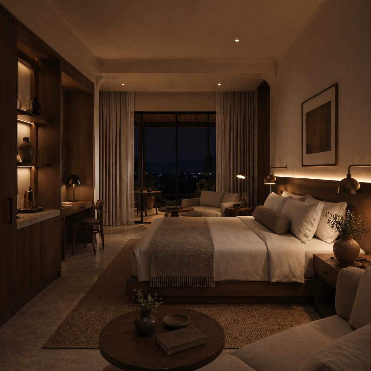
Example generated from “Boutique Guestroom Editorial Suite — Turndown Night Scene”
GPT Image 2en

Scene: Create a square reference-dependent architecture still for Boutique Guestroom Editorial Suite. Use a night composition from near the lounge chair back toward the bed while keeping the same lens discipline, editorial polish, and material believability established by the reference image. The lighting can shift to support the intended mood, but the space must still feel like the same authored project with a stable viewpoint logic, convincing depth separation, and clean commercial-photography finish. Keep warm plaster white, walnut brown, muted clay, brushed bronze, and soft morning gray as the governing tonal range even when the emphasis changes. Subject: Show a boutique hotel suite with limewashed plaster walls, walnut millwork, tailored linen bedding, bronze reading lights, textured drapery, and a quietly lived-in premium mood. Focus on the exact same suite from the reference image, now emphasizing lamp glow, turndown styling, and layered shadows. Preserve exact architectural identity, plan logic, material palette, fixture family, and circulation cues from the reference image while changing only the intended emphasis described here. The viewer should immediately recognize the same project, not a loose cousin, with matching silhouette logic, aligned detailing, and consistent brand atmosphere. Important details: Preserve the bed proportions, walnut joinery, plaster texture, bronze hardware, linen styling, and restrained resort palette. Any abstract wayfinding, menu, wall-label, or packaging zones must stay unreadable and subordinate to the spatial image. Joinery, edges, reflections, and lighting should remain realistic enough for an operator or design team to treat the image as a credible reference. The variation should feel deliberate and commercially useful, proving that one locked spatial language can flex across multiple campaign or editorial surfaces. Use case: Boutique Guestroom Editorial Suite series study 4/9, extending the evening stay mood without altering room geometry. Constraints: No readable text, no watermark, no logos, preserve exact 1:1 aspect ratio, preserve exact architectural identity from the reference image, no people, no messy luggage spill, no cheap decor, no hard flash, no exaggerated luxury clichés, no visible staff setup.

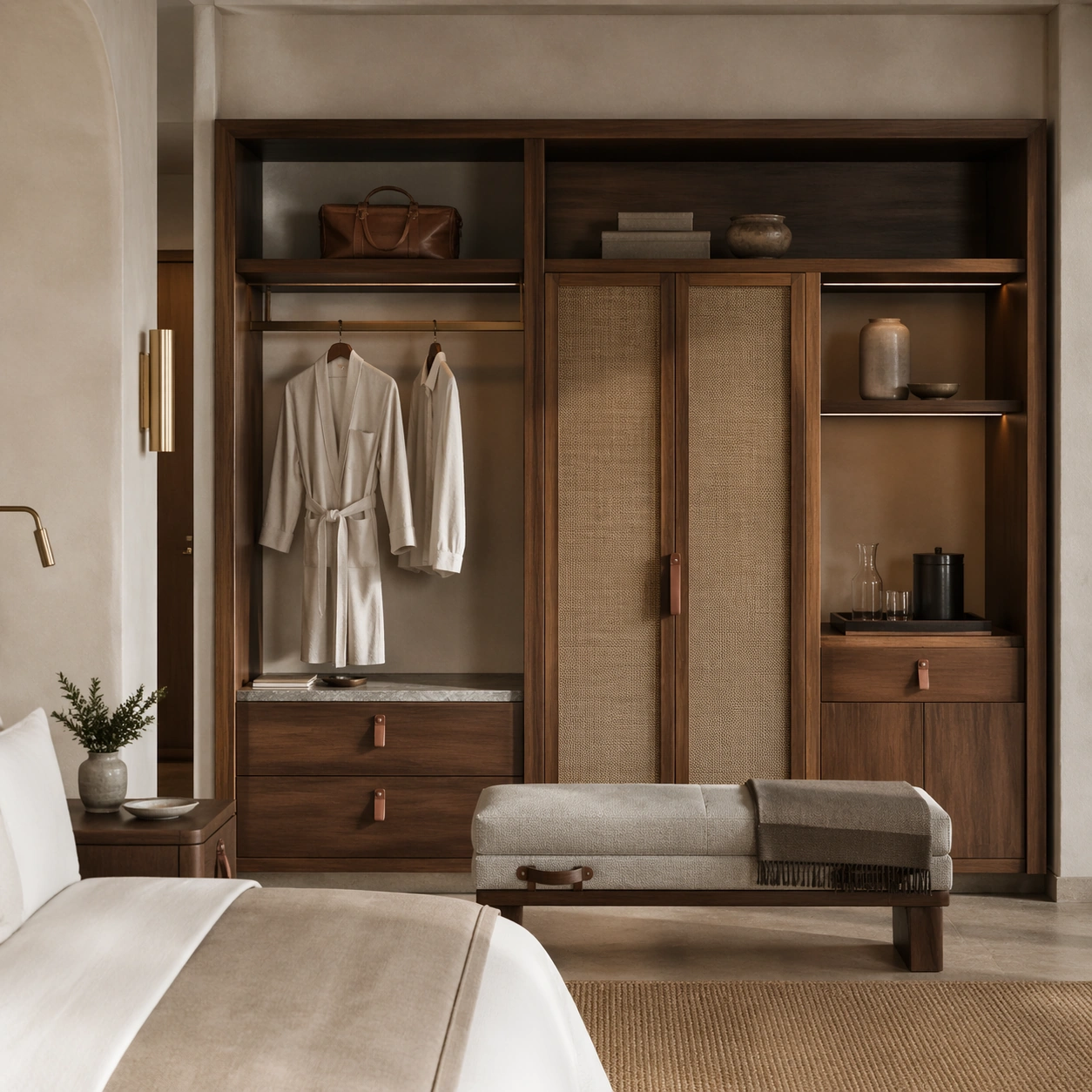
Example generated from “Boutique Guestroom Editorial Suite — Wardrobe and Packing Bench”
GPT Image 2en

Scene: Create a square standalone support study for Boutique Guestroom Editorial Suite. Use a front-on view of the open wardrobe wall and upholstered packing bench and frame it like a premium commercial still or design-editorial crop with clear focal hierarchy, disciplined perspective, and enough breathing room for the materials and objects to read at both thumbnail and full size. Keep warm plaster white, walnut brown, muted clay, brushed bronze, and soft morning gray as the tonal guide so the image still belongs to the same theme family, and light the scene in a controlled way that emphasizes texture, edge quality, and authored atmosphere over spectacle. Subject: Show a boutique hotel suite with limewashed plaster walls, walnut millwork, tailored linen bedding, bronze reading lights, textured drapery, and a quietly lived-in premium mood. In this support study, focus on joinery rhythm, concealed storage, robe presentation, and leather pull details. The image should work independently, yet it must still feel like it belongs to the same broader world of Guestroom Suite. Make the space, props, and detailing useful for real campaign, editorial, or design-review contexts rather than moodboard abstraction. Important details: Carry forward the broader language of the bed proportions, walnut joinery, plaster texture, bronze hardware, linen styling, and restrained resort palette, but let this image prove a new support surface or secondary deliverable. Material realism is essential: wood grain, metal sheen, glass edges, textiles, and stone should feel physically plausible and carefully art directed. Any graphic panels, labels, menus, packaging, or captions must stay abstract and unreadable. The overall result should feel reusable for hospitality websites, travel editorials, booking campaigns, and room-style handoff decks, with enough structure that a creative or operations team could build on it. Use case: Boutique Guestroom Editorial Suite single study 6/9, exploring wardrobe editorial detail for hotel room systems. Constraints: No readable text, no watermark, no logos, preserve exact 1:1 aspect ratio, no people, no messy luggage spill, no cheap decor, no hard flash, no exaggerated luxury clichés, no open cluttered suitcases.

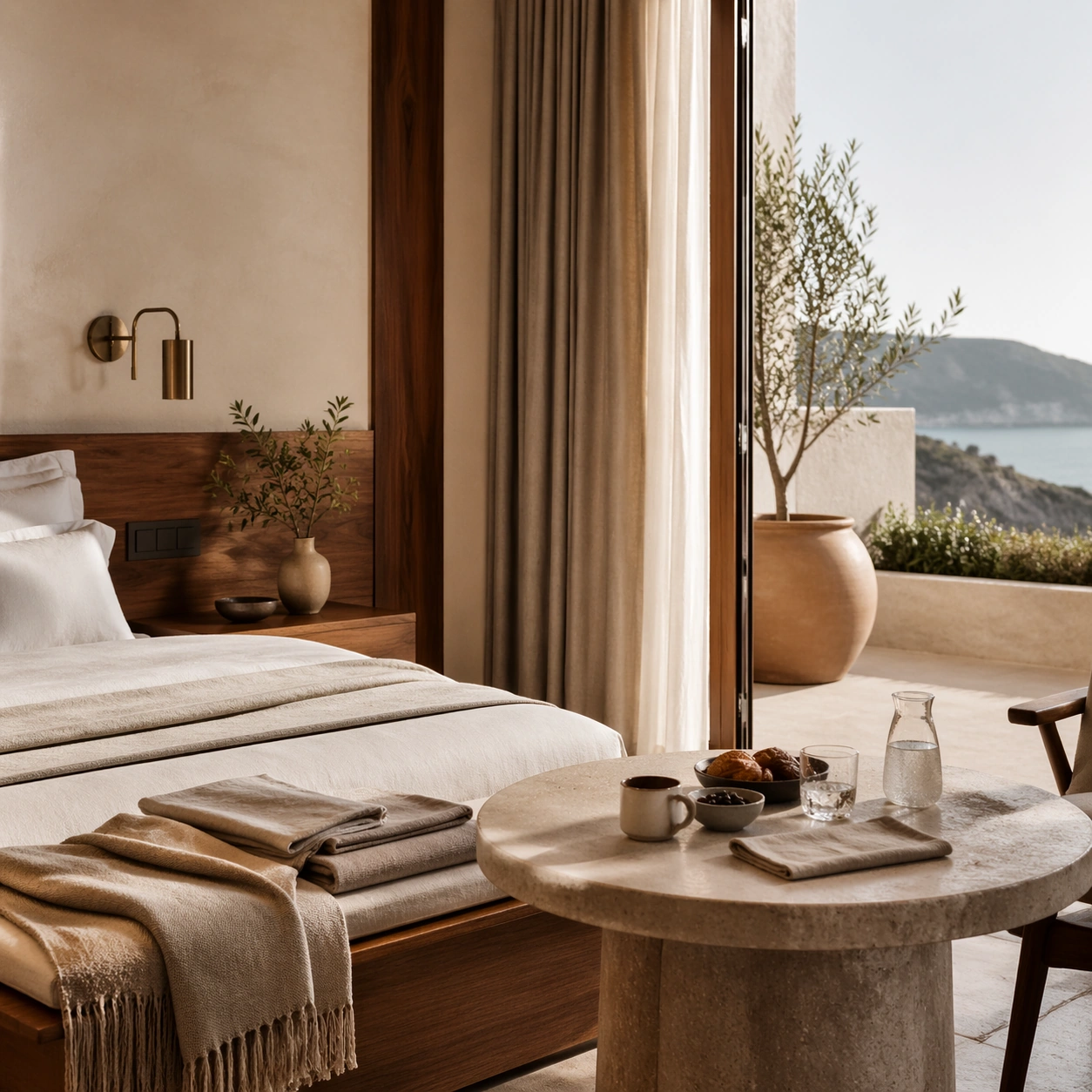
Example generated from “Boutique Guestroom Editorial Suite — Terrace Breakfast Corner”
GPT Image 2en

Scene: Create a square standalone support study for Boutique Guestroom Editorial Suite. Use a calm terrace corner with stone table and soft exterior light and frame it like a premium commercial still or design-editorial crop with clear focal hierarchy, disciplined perspective, and enough breathing room for the materials and objects to read at both thumbnail and full size. Keep warm plaster white, walnut brown, muted clay, brushed bronze, and soft morning gray as the tonal guide so the image still belongs to the same theme family, and light the scene in a controlled way that emphasizes texture, edge quality, and authored atmosphere over spectacle. Subject: Show a boutique hotel suite with limewashed plaster walls, walnut millwork, tailored linen bedding, bronze reading lights, textured drapery, and a quietly lived-in premium mood. In this support study, focus on folded textiles, small breakfast setup, and indoor-outdoor continuity. The image should work independently, yet it must still feel like it belongs to the same broader world of Guestroom Suite. Make the space, props, and detailing useful for real campaign, editorial, or design-review contexts rather than moodboard abstraction. Important details: Carry forward the broader language of the bed proportions, walnut joinery, plaster texture, bronze hardware, linen styling, and restrained resort palette, but let this image prove a new support surface or secondary deliverable. Material realism is essential: wood grain, metal sheen, glass edges, textiles, and stone should feel physically plausible and carefully art directed. Any graphic panels, labels, menus, packaging, or captions must stay abstract and unreadable. The overall result should feel reusable for hospitality websites, travel editorials, booking campaigns, and room-style handoff decks, with enough structure that a creative or operations team could build on it. Use case: Boutique Guestroom Editorial Suite single study 7/9, exploring suite terrace imagery for booking and editorial use. Constraints: No readable text, no watermark, no logos, preserve exact 1:1 aspect ratio, no people, no messy luggage spill, no cheap decor, no hard flash, no exaggerated luxury clichés, no readable menu card.

Example generated from “Boutique Guestroom Editorial Suite — Reading Chair Vignette”
GPT Image 2en

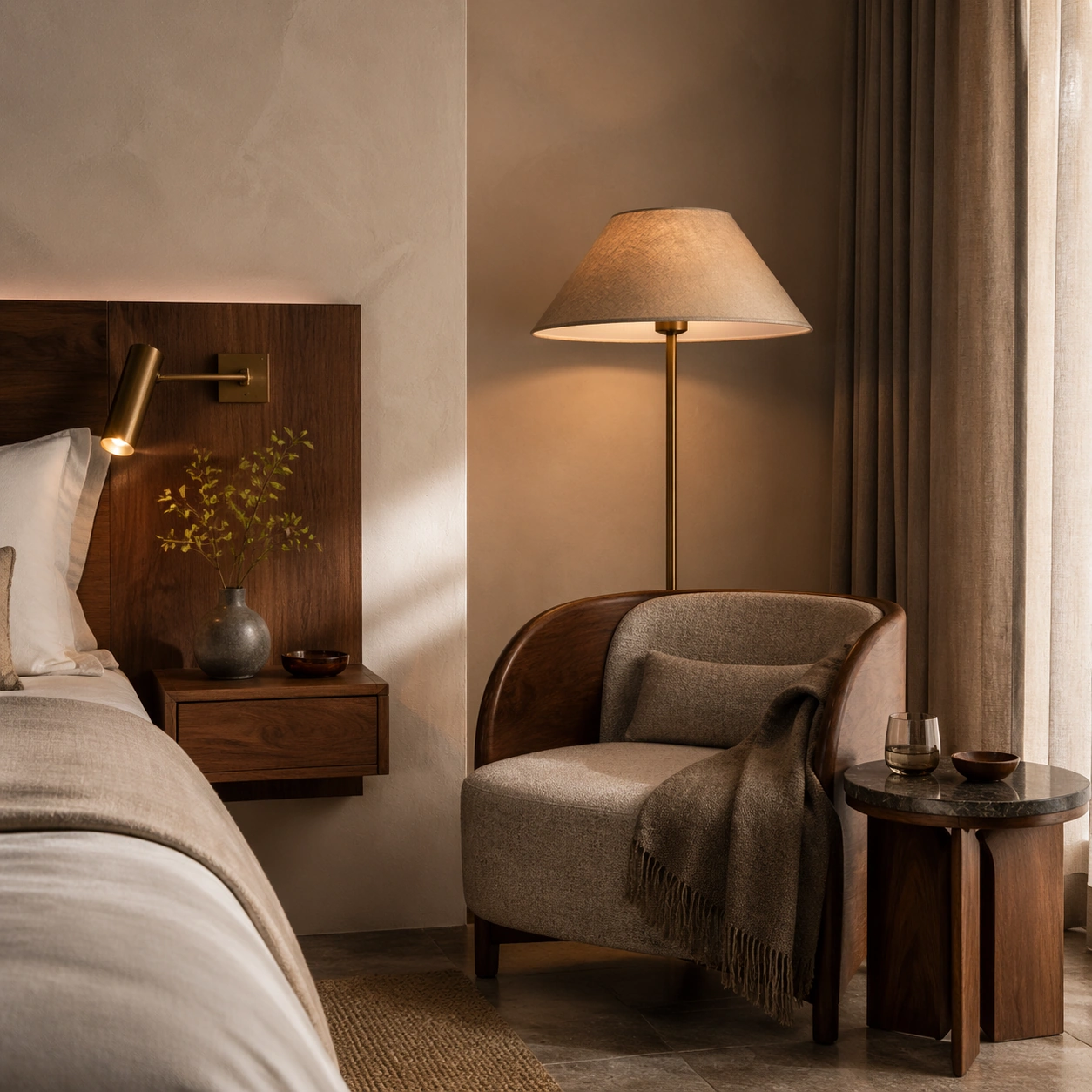
Scene: Create a square standalone support study for Boutique Guestroom Editorial Suite. Use an intimate corner study of a chair, lamp, side table, and curtain edge and frame it like a premium commercial still or design-editorial crop with clear focal hierarchy, disciplined perspective, and enough breathing room for the materials and objects to read at both thumbnail and full size. Keep warm plaster white, walnut brown, muted clay, brushed bronze, and soft morning gray as the tonal guide so the image still belongs to the same theme family, and light the scene in a controlled way that emphasizes texture, edge quality, and authored atmosphere over spectacle. Subject: Show a boutique hotel suite with limewashed plaster walls, walnut millwork, tailored linen bedding, bronze reading lights, textured drapery, and a quietly lived-in premium mood. In this support study, focus on textile tactility, lamp warmth, and quiet nighttime comfort. The image should work independently, yet it must still feel like it belongs to the same broader world of Guestroom Suite. Make the space, props, and detailing useful for real campaign, editorial, or design-review contexts rather than moodboard abstraction. Important details: Carry forward the broader language of the bed proportions, walnut joinery, plaster texture, bronze hardware, linen styling, and restrained resort palette, but let this image prove a new support surface or secondary deliverable. Material realism is essential: wood grain, metal sheen, glass edges, textiles, and stone should feel physically plausible and carefully art directed. Any graphic panels, labels, menus, packaging, or captions must stay abstract and unreadable. The overall result should feel reusable for hospitality websites, travel editorials, booking campaigns, and room-style handoff decks, with enough structure that a creative or operations team could build on it. Use case: Boutique Guestroom Editorial Suite single study 8/9, exploring emotional editorial support for the guestroom theme. Constraints: No readable text, no watermark, no logos, preserve exact 1:1 aspect ratio, no people, no messy luggage spill, no cheap decor, no hard flash, no exaggerated luxury clichés, no book titles.

Example generated from “Boutique Guestroom Editorial Suite — Amenity Still Life”
GPT Image 2en

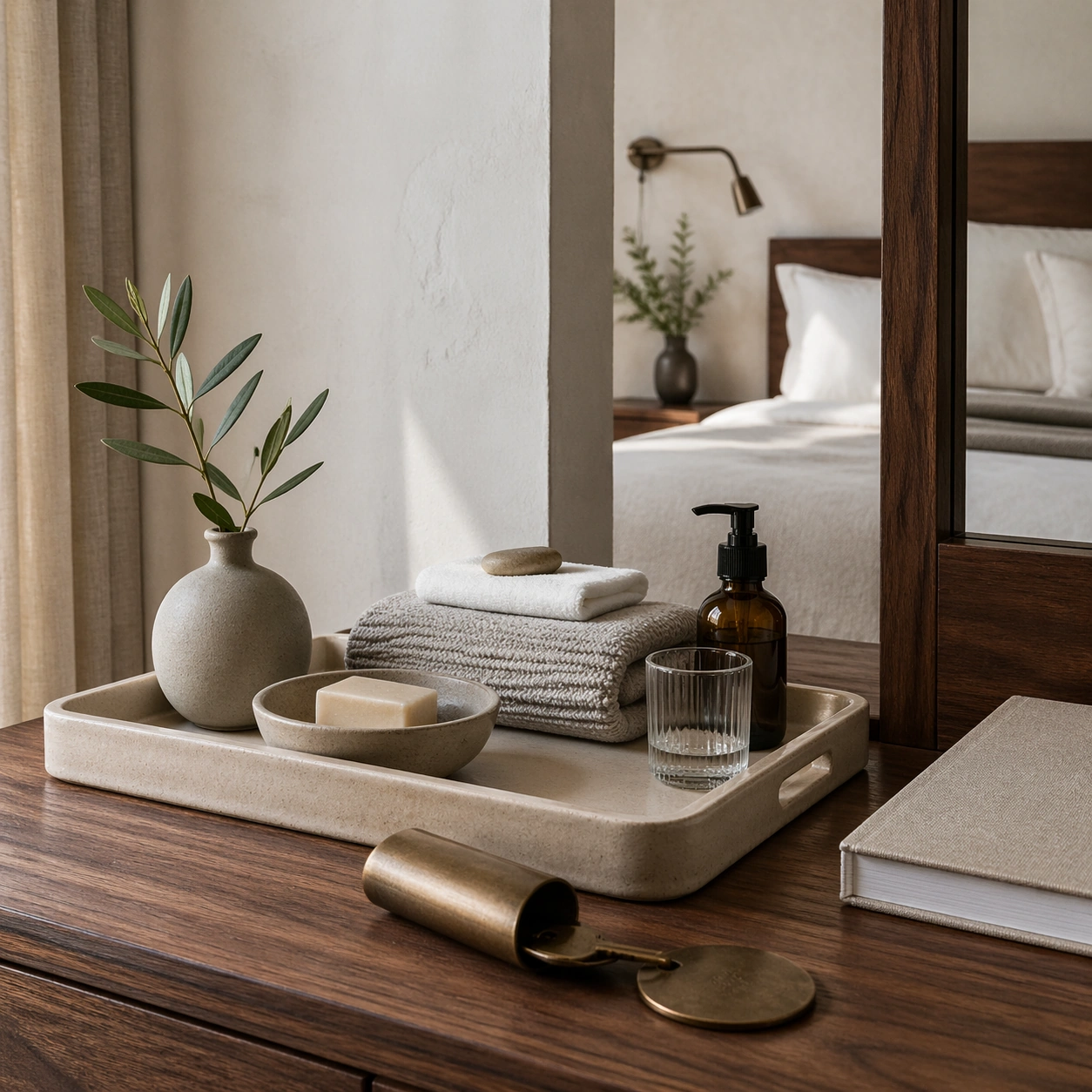
Scene: Create a square standalone support study for Boutique Guestroom Editorial Suite. Use a tabletop arrangement of folded linen, ceramic tray, brass key sleeve form, and bath objects and frame it like a premium commercial still or design-editorial crop with clear focal hierarchy, disciplined perspective, and enough breathing room for the materials and objects to read at both thumbnail and full size. Keep warm plaster white, walnut brown, muted clay, brushed bronze, and soft morning gray as the tonal guide so the image still belongs to the same theme family, and light the scene in a controlled way that emphasizes texture, edge quality, and authored atmosphere over spectacle. Subject: Show a boutique hotel suite with limewashed plaster walls, walnut millwork, tailored linen bedding, bronze reading lights, textured drapery, and a quietly lived-in premium mood. In this support study, focus on crafted hospitality details arranged like a premium room-service still life. The image should work independently, yet it must still feel like it belongs to the same broader world of Guestroom Suite. Make the space, props, and detailing useful for real campaign, editorial, or design-review contexts rather than moodboard abstraction. Important details: Carry forward the broader language of the bed proportions, walnut joinery, plaster texture, bronze hardware, linen styling, and restrained resort palette, but let this image prove a new support surface or secondary deliverable. Material realism is essential: wood grain, metal sheen, glass edges, textiles, and stone should feel physically plausible and carefully art directed. Any graphic panels, labels, menus, packaging, or captions must stay abstract and unreadable. The overall result should feel reusable for hospitality websites, travel editorials, booking campaigns, and room-style handoff decks, with enough structure that a creative or operations team could build on it. Use case: Boutique Guestroom Editorial Suite single study 9/9, exploring support imagery for amenity storytelling and room-brand communication. Constraints: No readable text, no watermark, no logos, preserve exact 1:1 aspect ratio, no people, no messy luggage spill, no cheap decor, no hard flash, no exaggerated luxury clichés, no readable packaging.

Example generated from “Brand Artist Collab Mockup — Soda Stencil Billboard”
GPT Image 2en

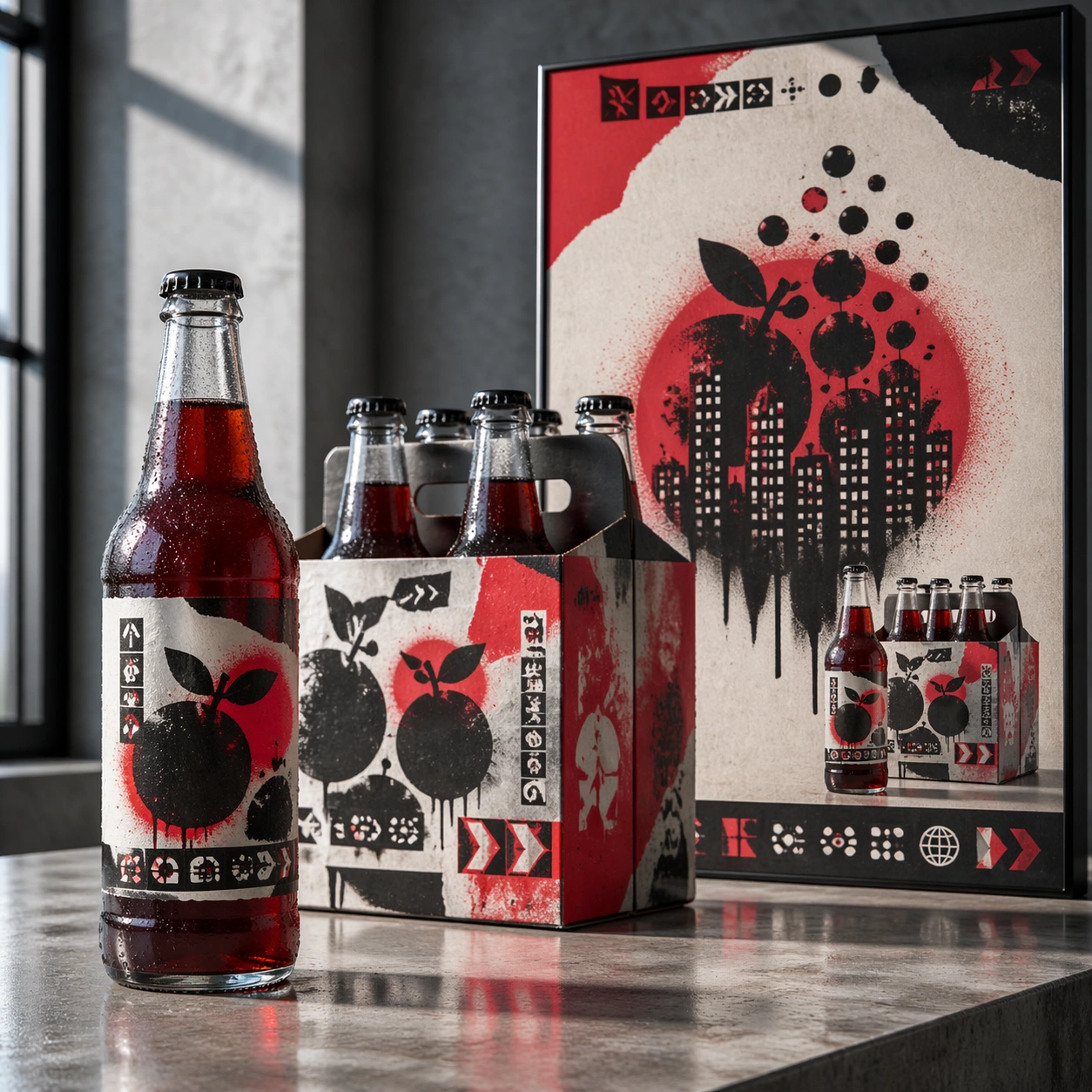
Scene: A square advertising mockup set on a polished concrete presentation table, lit like a late-afternoon creative agency review. The layout is a balanced commercial board with a glass beverage bottle in the foreground, a six-pack carton slightly behind it, and a vertical street-poster panel rising at the back. The color temperature is cool daylight with selective red highlights, sharp focus, and realistic reflections on glass and varnished cardboard. Subject: A fictional soda label collaboration with an anonymous street-stencil muralist language. The bottle is tall and transparent with deep crimson liquid, a torn-paper label shape, sprayed stencil fruit silhouettes, and small abstract warning-label glyph blocks. The carton uses repeated spray-mask shapes, overprinted arrows, and layered sticker textures. The poster shows a dramatic stencil composition of bubbles becoming city windows, with a bold but unreadable headline zone and a clear product packshot area. Important details: The art direction should fuse polished beverage marketing with controlled street-art roughness. Keep the same stencil motifs across bottle, carton, and poster so the collaboration reads instantly as one campaign. Make the glass thickness, bottle cap ridges, condensation beads, carton folds, matte spray paint, and pasted-paper edges physically convincing. Layout hierarchy must be clear: product first, packaging second, campaign poster third. Use abstract glyph rows only; no readable copy. Use case: Brand Artist Collab Mockup single study 2/8, focused on a beverage launch kit with street-stencil campaign language. Constraints: No readable text, no watermark, no logos, preserve exact 1:1 aspect ratio, no existing soda identity, no real street artist signature, no messy graffiti wall, no illegal poster clutter, no warped bottle label, no floating objects.

Example generated from “Brand Artist Collab Mockup — Phone Dot Gallery”
GPT Image 2en

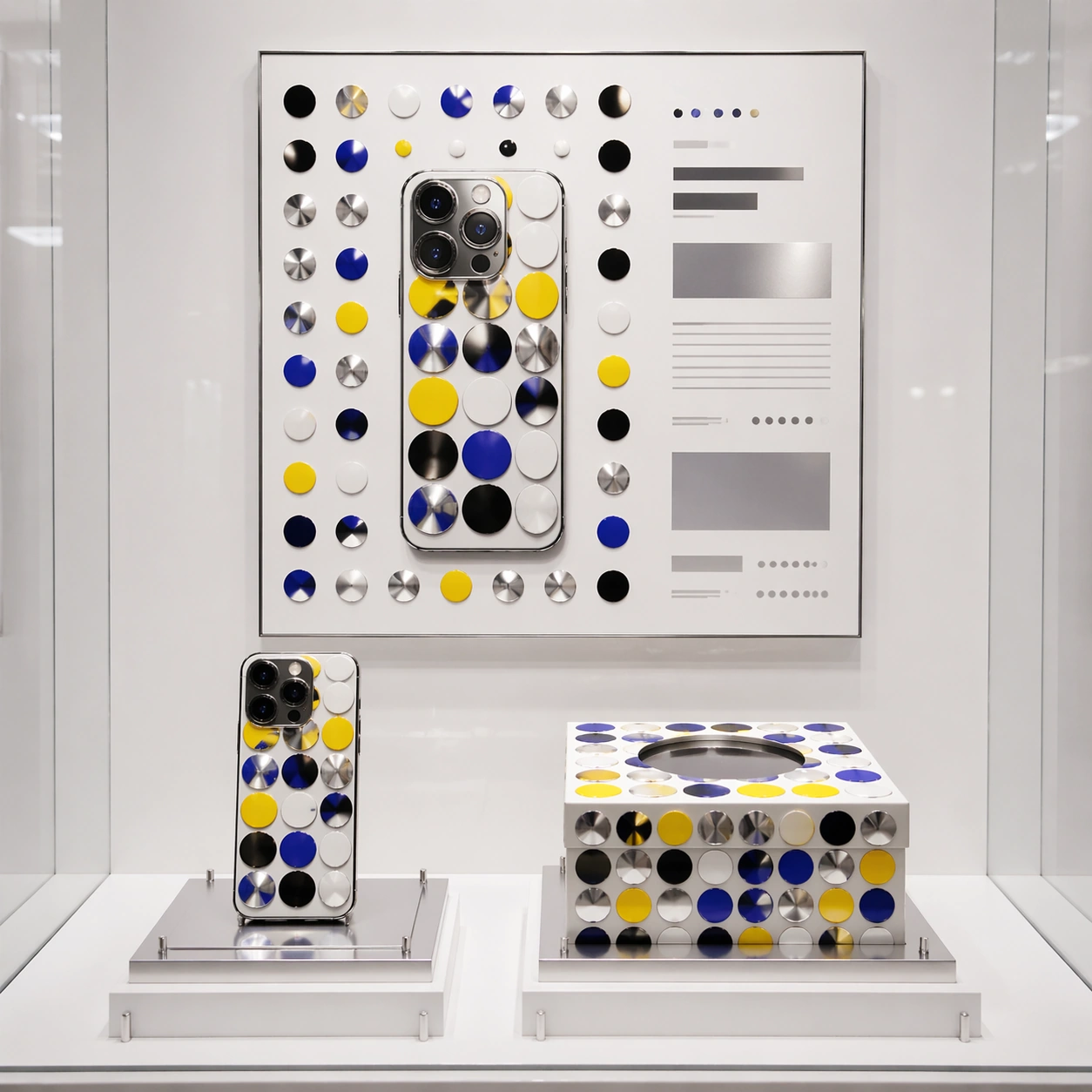
Scene: A square premium technology retail mockup displayed inside a minimal gallery case. The camera is frontal with a slight top-down angle, enough to show a smartphone, its rigid magnetic box, and a framed launch poster behind them. Lighting is bright white museum lighting with soft reflections, high key shadows, and immaculate spacing. The background is porcelain white with small chrome risers and clean grid alignment. Subject: A fictional smartphone capsule collaboration with an avant-garde dot-and-mirror installation artist language. The phone back uses glossy enamel dots in yellow, black, white, and electric blue, arranged around the camera island without hiding functional details. The box has a repeating dot field wrapping across the lid and sides, plus a circular die-cut insert. The poster is a disciplined product ad: phone silhouette centered in a field of dots, mirrored silver accents, and rectangular non-readable copy blocks placed like a luxury launch campaign. Important details: The mockup must prove layout control: product, packaging, and poster share the same dot system while each object remains distinct. Preserve realistic phone proportions, lens rings, glass reflections, box seams, printed ink registration, and gallery-case shadows. The dot pattern should feel intentionally composed, not random confetti. Avoid real operating system icons or interface screens; keep the screen dark and reflective. Typography must be implied by clean placeholder bars and tiny abstract glyph rows. Use case: Brand Artist Collab Mockup single study 3/8, focused on a technology product capsule with gallery-grade art direction. Constraints: No readable text, no watermark, no logos, preserve exact 1:1 aspect ratio, no real phone brand, no real artist signature, no app icons, no hands, no scattered accessories, no low-resolution poster edges.

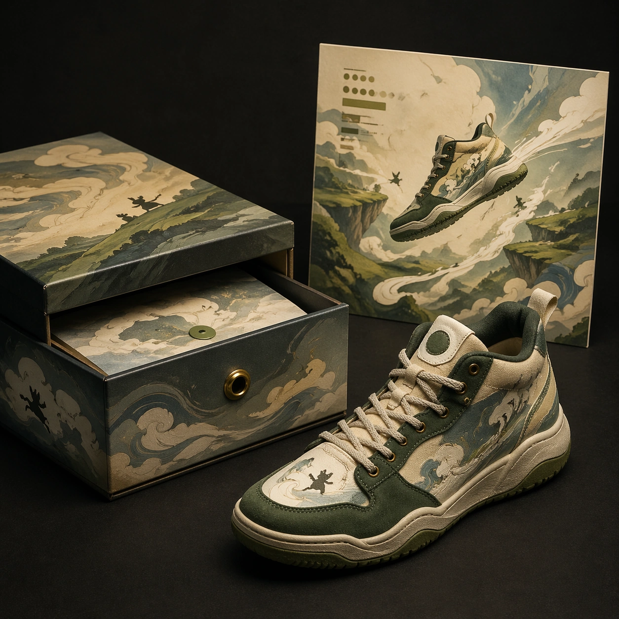
Example generated from “Brand Artist Collab Mockup — Sneaker Animation Case”
GPT Image 2en

Scene: A square collector release mockup on a matte black table with warm cinematic overhead lighting. The frame is organized like a high-end footwear campaign board: one sneaker at a three-quarter angle, a rigid drawer box opened beside it, and a square poster card standing upright in the rear. The scene should feel like a studio photograph prepared for a licensing pitch, with controlled shadows and no environmental clutter. Subject: A fictional basketball sneaker collaboration with a hand-painted animation background language. The sneaker combines cream canvas, forest-green suede, weathered brass eyelets, and painted wind-swirl panels that feel like moving storybook air. The drawer box has illustrated cloud bands, tiny creature silhouettes, and layered paper texture. The poster card shows the sneaker crossing a floating landscape of hills and sky paths, with a quiet cinematic composition and abstract subtitle-like blocks that remain non-readable. Important details: Keep the artwork influence broad and original: soft gouache landscapes, rounded hand-painted forms, and gentle motion lines, not a copy of any known film. Product realism is critical: laces thread through eyelets correctly, sole tread wraps around the shoe, box lid thickness is visible, and the poster card casts a real shadow. The three objects must share one palette of cream, moss, sky blue, charcoal, and brass. Use clean commercial hierarchy without legible copy. Use case: Brand Artist Collab Mockup single study 4/8, focused on a cinematic animated-language sneaker release board. Constraints: No readable text, no watermark, no logos, preserve exact 1:1 aspect ratio, no existing team marks, no known animation characters, no real studio references, no extra shoes, no impossible lacing, no poster floating without support.

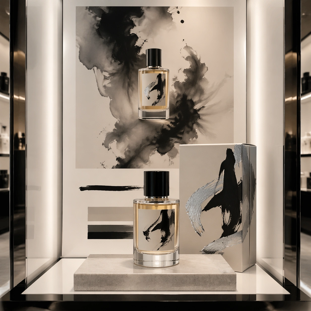
Example generated from “Brand Artist Collab Mockup — Perfume Calligraphy Counter”
GPT Image 2en

Scene: A square luxury fragrance counter mockup photographed in a quiet department-store light box. The setup is symmetrical but not rigid: a perfume bottle sits on a low stone plinth, its folding carton stands behind it, and a campaign poster panel forms the vertical backdrop. The lighting is soft pearl-white with deep ink-black accents, shallow shadows, and glossy reflections that make the glass and foil details feel premium. Subject: A fictional fragrance house collaboration with an experimental calligraphy painter language. The bottle is thick clear glass with pale amber liquid, a black lacquer cap, and a label made from sweeping abstract ink strokes rather than readable words. The carton uses embossed paper, brushed silver foil, and one large gestural calligraphy mark wrapping from front to side. The poster shows the bottle centered inside a storm of diluted ink wash, with disciplined blank space and non-readable caption blocks placed below the product. Important details: The image should balance luxury restraint with expressive art. Make the bottle geometry correct, glass base heavy, liquid meniscus visible, carton fold lines crisp, and foil catching light only on edges. The calligraphy must feel like original abstract marks, not copied characters or legible script. Maintain a clear hierarchy between object, package, and poster. The palette should stay controlled: ivory, ink black, pale amber, warm gray, and subtle silver. Use case: Brand Artist Collab Mockup single study 5/8, focused on a fragrance proposal where expressive mark-making becomes commercial packaging. Constraints: No readable text, no watermark, no logos, preserve exact 1:1 aspect ratio, no real fragrance brand, no real calligrapher signature, no readable Chinese or Latin characters, no messy ink splashes covering the bottle, no distorted glass.

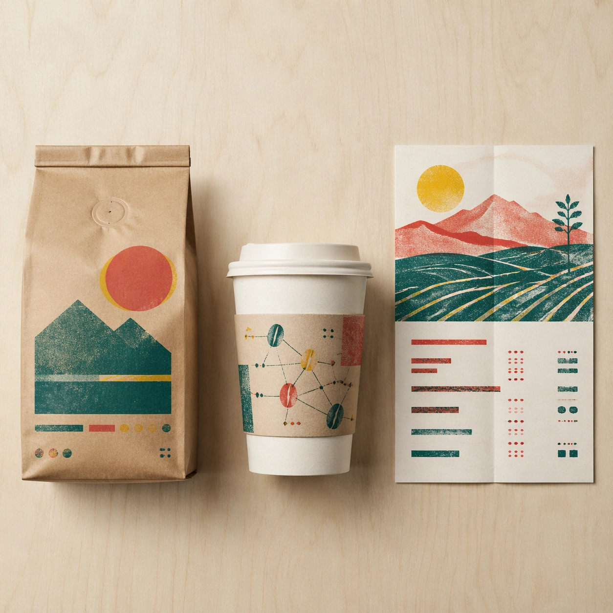
Example generated from “Brand Artist Collab Mockup — Coffee Riso Launch Kit”
GPT Image 2en

Scene: A square cafe retail launch mockup arranged on a pale birch tabletop, shot from a clean overhead-frontal hybrid angle. The layout feels like a design presentation spread: a standing coffee bag on the left, a takeaway cup and sleeve in the center, and a folded poster or menu card on the right. Lighting is clear morning daylight, with gentle paper shadows and visible print texture across every surface. Subject: A fictional specialty coffee brand collaboration with a risograph print artist language. The coffee bag is matte kraft paper with teal, tomato red, and soy-yellow overprint layers that are slightly misregistered on purpose. The cup sleeve carries abstract bean constellations and rough halftone blocks. The poster card shows a simplified mountain farm scene built from two-color riso shapes, overlaid with structured but non-readable menu bars and small glyph clusters. The products feel coordinated as a limited cafe drop. Important details: Make the commercial system believable: sealed bag gussets, valve circle, crimped top, cup rim thickness, sleeve seam, poster fold crease, and grainy ink absorption. Misregistration should be charming and controlled, never chaotic. The image must be legible as product plus packaging plus advertising, with clean negative space and a tight grid. Avoid readable labels while preserving the impression of professional package typography through abstract blocks. Use case: Brand Artist Collab Mockup single study 6/8, focused on an independent cafe launch kit with handmade print energy. Constraints: No readable text, no watermark, no logos, preserve exact 1:1 aspect ratio, no real cafe brand, no real artist signature, no spilled coffee, no food props, no unreadable clutter pretending to be copy, no distorted cup ellipse.

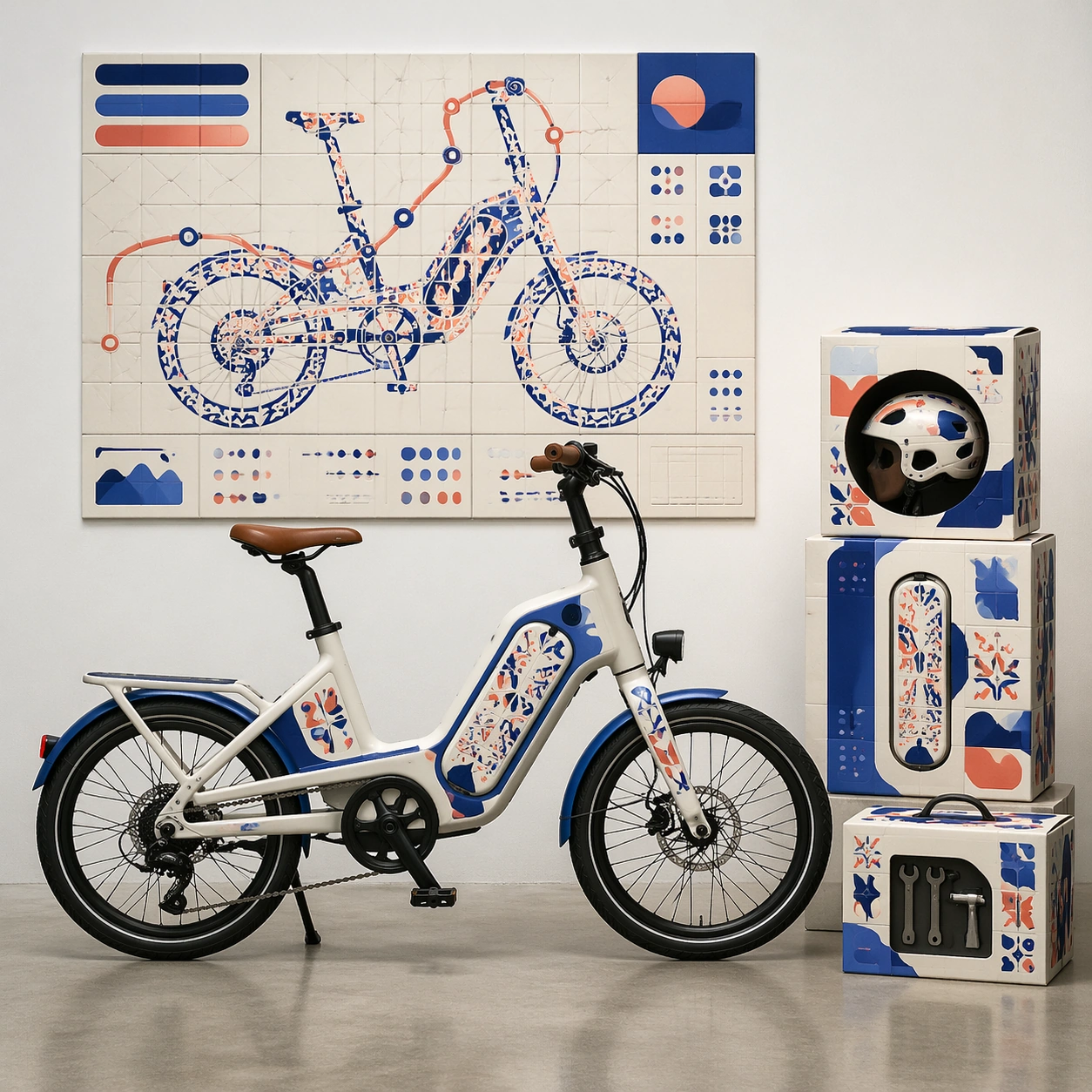
Example generated from “Brand Artist Collab Mockup — Bike Ceramic Pop”
GPT Image 2en

Scene: A square urban mobility showroom mockup with a compact electric bike displayed beside its shipping accessory kit and a wall-mounted campaign poster. The camera is straight-on at waist height, using a polished concrete floor, white wall, and crisp dealership lighting. The composition is structured as a product launch display: bike across the lower half, packaging modules stacked to one side, poster panel above and behind. Subject: A fictional electric bicycle collaboration with a ceramic-pop sculptor language. The bike frame is matte porcelain white with glossy cobalt and coral inlays, rounded modular battery casing, and hand-painted tile-like pattern panels. The accessory packaging consists of a helmet box, battery sleeve, and small toolkit carton with matching ceramic glaze motifs. The poster turns the bike silhouette into a tiled city route map, with abstract non-readable headline bars and small catalog glyphs arranged on a precise grid. Important details: The bicycle must be mechanically plausible: round wheels, aligned fork, visible chain or belt path, pedals, brakes, battery housing, and correct contact points on the floor. The ceramic-inspired art should look like glazed inlay and painted tile, not stickers slapped randomly on metal. Packaging must have believable flaps, seams, labels, and printed surface texture. Keep the layout clean enough for a mobility brand deck while showing a complete collaboration system. Use case: Brand Artist Collab Mockup single study 7/8, focused on a mobility product system with sculptural ceramic-pop surface design. Constraints: No readable text, no watermark, no logos, preserve exact 1:1 aspect ratio, no real bike brand, no real artist signature, no impossible wheel geometry, no floating bike, no showroom people, no overpacked accessory clutter.

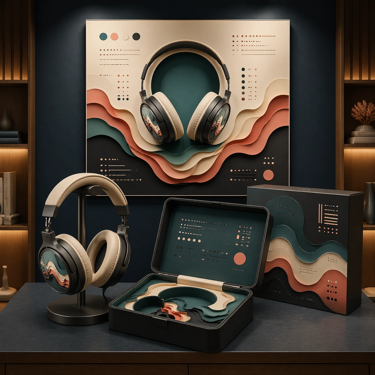
Example generated from “Brand Artist Collab Mockup — Headphones Paper Cut Display”
GPT Image 2en

Scene: A square audio retail display mockup inside a softly lit listening-room alcove. The camera faces a centered tabletop display with over-ear headphones on a low stand, a premium rigid case opened in front, and a square campaign poster mounted on the back wall. The lighting is moody but clear, with warm side highlights, matte navy shadows, and enough brightness to inspect textures and layout. Subject: A fictional headphone brand collaboration with a layered paper-cut installation artist language. The headphones have brushed graphite cups, warm ivory cushions, and delicate layered paper relief patterns under translucent outer discs. The rigid case contains nested paper-cut inserts shaped like sound waves, while the sleeve uses stacked color planes in teal, coral, cream, and charcoal. The poster shows sound waves as architectural paper layers around the product silhouette, with non-readable launch-copy blocks arranged like a high-end audio ad. Important details: The design must read as a complete collaboration system, not separate props. Preserve accurate headphone anatomy: headband curve, hinges, ear cup thickness, cushion softness, cable-free wireless design, and stable stand contact. Paper layers should cast tiny shadows and reveal thickness, while the case should show premium molded construction. The commercial layout must be structured and calm, with the poster, case, and product sharing one visual language. Use placeholder glyph systems only. Use case: Brand Artist Collab Mockup single study 8/8, focused on an audio product display where tactile paper-cut art becomes premium packaging and advertising. Constraints: No readable text, no watermark, no logos, preserve exact 1:1 aspect ratio, no real audio brand, no real artist signature, no tangled wires, no floating headphones, no excessive darkness, no illegible poster clutter, no extra retail signage.

Example generated from “Brand Carousel Post System — Reference Anchor”
GPT Image 2en

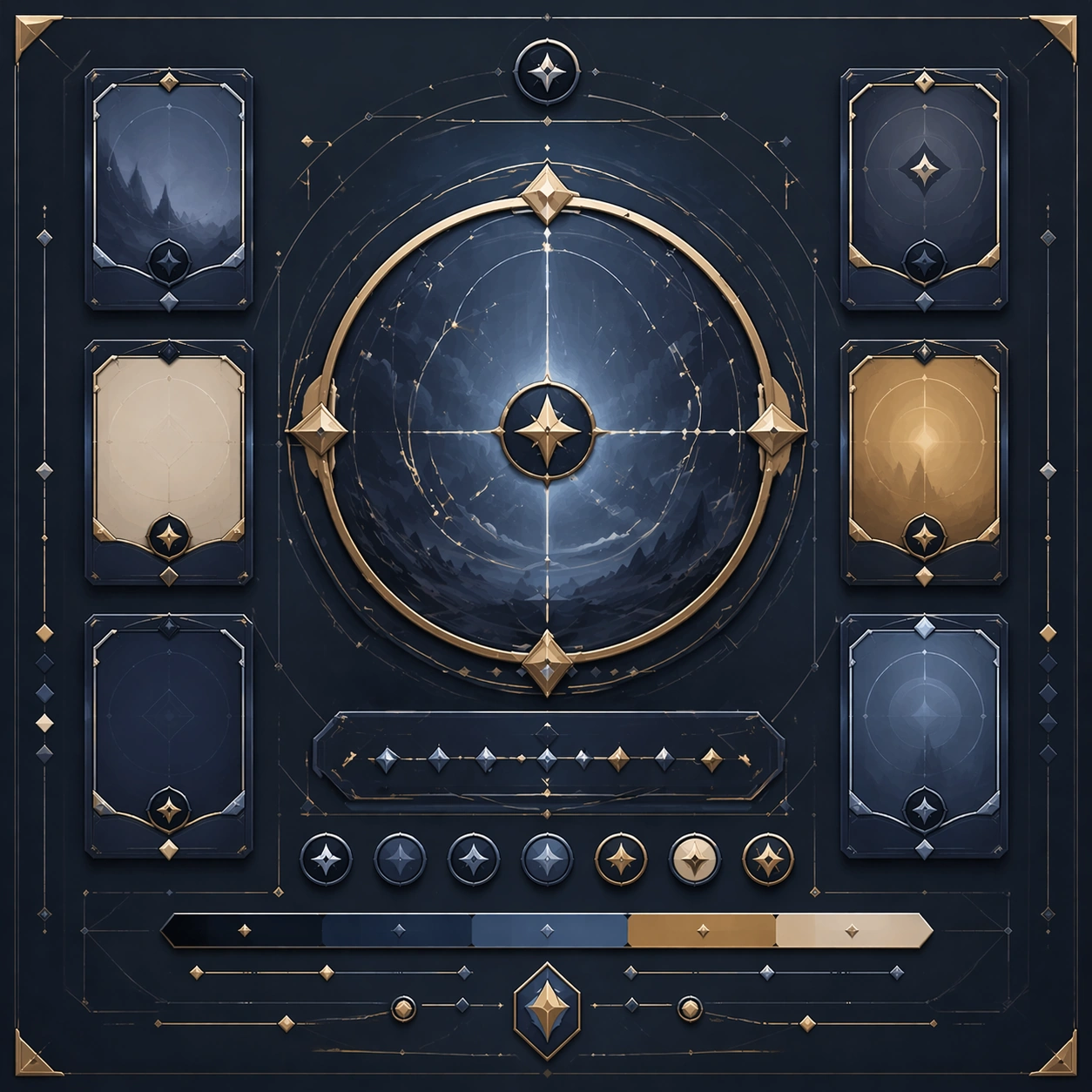
Scene: Create a square reference image for Brand Carousel Post System. Build a reference anchor establishing the core system with a premium, production-ready finish. Use a polished modular board or campaign surface with clean spacing, premium game-UI finish, and clear focal hierarchy. The composition should feel intentional, clean, and reusable for gallery, research, campaign, or internal handoff contexts. Lighting must support readability first, with the main forms clearly separated from the background and enough breathing room for the system to stay legible at both hero scale and thumbnail scale. Subject: Center a coherent original game-art system built for premium production and marketing surfaces. For this image, focus on reference anchor. Keep the same system logic stable across screenshots, cards, banners, and overview boards. This image is the canonical anchor that later series images must follow. The viewer should immediately understand what role this surface plays inside a cohesive game-production asset pack. Important details: Lock framing, icon grammar, palette blocking, and surface hierarchy so the kit feels production-ready and consistent. Preserve the core silhouette, framing language, and material logic from the reference image while each variation changes function. Keep materials believable, edge hierarchy disciplined, and the visual language consistent with Carousel System. Use abstract interface blocks or diagram accents when helpful, but avoid any readable language. The final result should feel like a deliberate production asset rather than a random illustration. Use case: Brand Carousel Post System series study 1/9, designed as reference anchor within a cohesive asset pack. Constraints: No readable text, no watermark, no logos, preserve exact 1:1 aspect ratio, no unrelated objects, no broken visual hierarchy, no malformed anatomy or broken perspective, no random decorative clutter.

Example generated from “Brand Carousel Post System — Variant One”
GPT Image 2en

Scene: Create a square dependent image for Brand Carousel Post System. Build a first controlled variation in the same system with a premium, production-ready finish. Use a polished modular board or campaign surface with clean spacing, premium game-UI finish, and clear focal hierarchy. The composition should feel intentional, clean, and reusable for gallery, research, campaign, or internal handoff contexts. Lighting must support readability first, with the main forms clearly separated from the background and enough breathing room for the system to stay legible at both hero scale and thumbnail scale. Subject: Center a coherent original game-art system built for premium production and marketing surfaces. For this image, focus on the intended support surface. Keep the same system logic stable across screenshots, cards, banners, and overview boards. Preserve exact identity or system logic from the reference image while changing only the intended variation axis. The viewer should immediately understand what role this surface plays inside a cohesive game-production asset pack. Important details: Lock framing, icon grammar, palette blocking, and surface hierarchy so the kit feels production-ready and consistent. Preserve the core silhouette, framing language, and material logic from the reference image while each variation changes function. Keep materials believable, edge hierarchy disciplined, and the visual language consistent with Carousel System. Use abstract interface blocks or diagram accents when helpful, but avoid any readable language. The final result should feel like a deliberate production asset rather than a random illustration. Use case: Brand Carousel Post System series study 2/9, designed as variant one within a cohesive asset pack. Constraints: No readable text, no watermark, no logos, preserve exact 1:1 aspect ratio, no unrelated objects, no broken visual hierarchy, no malformed anatomy or broken perspective, no random decorative clutter.

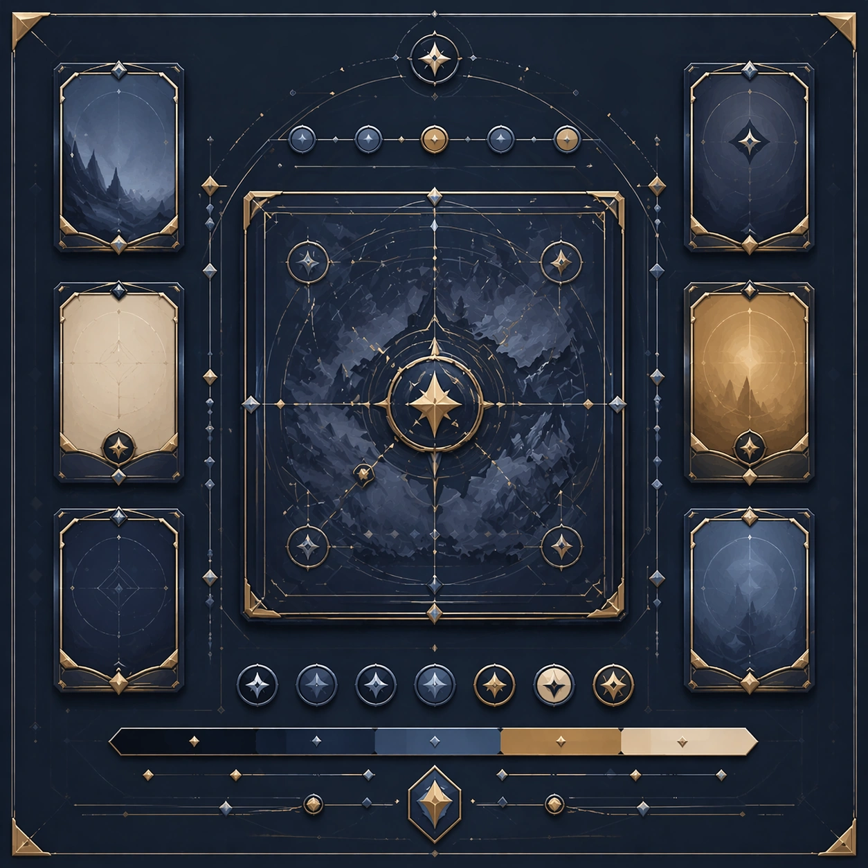
Example generated from “Brand Carousel Post System — Variant Two”
GPT Image 2en

Scene: Create a square dependent image for Brand Carousel Post System. Build a second controlled variation in the same system with a premium, production-ready finish. Use a polished modular board or campaign surface with clean spacing, premium game-UI finish, and clear focal hierarchy. The composition should feel intentional, clean, and reusable for gallery, research, campaign, or internal handoff contexts. Lighting must support readability first, with the main forms clearly separated from the background and enough breathing room for the system to stay legible at both hero scale and thumbnail scale. Subject: Center a coherent original game-art system built for premium production and marketing surfaces. For this image, focus on the intended support surface. Keep the same system logic stable across screenshots, cards, banners, and overview boards. Preserve exact identity or system logic from the reference image while changing only the intended variation axis. The viewer should immediately understand what role this surface plays inside a cohesive game-production asset pack. Important details: Lock framing, icon grammar, palette blocking, and surface hierarchy so the kit feels production-ready and consistent. Preserve the core silhouette, framing language, and material logic from the reference image while each variation changes function. Keep materials believable, edge hierarchy disciplined, and the visual language consistent with Carousel System. Use abstract interface blocks or diagram accents when helpful, but avoid any readable language. The final result should feel like a deliberate production asset rather than a random illustration. Use case: Brand Carousel Post System series study 3/9, designed as variant two within a cohesive asset pack. Constraints: No readable text, no watermark, no logos, preserve exact 1:1 aspect ratio, no unrelated objects, no broken visual hierarchy, no malformed anatomy or broken perspective, no random decorative clutter.

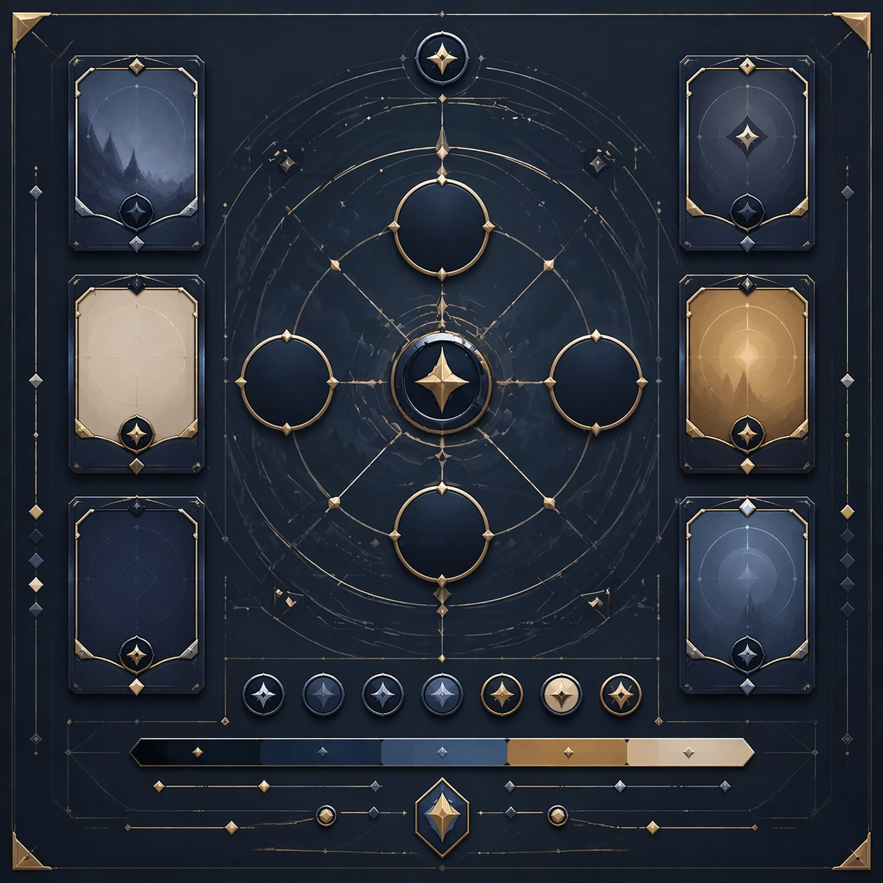
Example generated from “Brand Carousel Post System — Variant Three”
GPT Image 2en

Scene: Create a square dependent image for Brand Carousel Post System. Build a third controlled variation in the same system with a premium, production-ready finish. Use a polished modular board or campaign surface with clean spacing, premium game-UI finish, and clear focal hierarchy. The composition should feel intentional, clean, and reusable for gallery, research, campaign, or internal handoff contexts. Lighting must support readability first, with the main forms clearly separated from the background and enough breathing room for the system to stay legible at both hero scale and thumbnail scale. Subject: Center a coherent original game-art system built for premium production and marketing surfaces. For this image, focus on the intended support surface. Keep the same system logic stable across screenshots, cards, banners, and overview boards. Preserve exact identity or system logic from the reference image while changing only the intended variation axis. The viewer should immediately understand what role this surface plays inside a cohesive game-production asset pack. Important details: Lock framing, icon grammar, palette blocking, and surface hierarchy so the kit feels production-ready and consistent. Preserve the core silhouette, framing language, and material logic from the reference image while each variation changes function. Keep materials believable, edge hierarchy disciplined, and the visual language consistent with Carousel System. Use abstract interface blocks or diagram accents when helpful, but avoid any readable language. The final result should feel like a deliberate production asset rather than a random illustration. Use case: Brand Carousel Post System series study 4/9, designed as variant three within a cohesive asset pack. Constraints: No readable text, no watermark, no logos, preserve exact 1:1 aspect ratio, no unrelated objects, no broken visual hierarchy, no malformed anatomy or broken perspective, no random decorative clutter.

Example generated from “Brand Carousel Post System — Support One”
GPT Image 2en

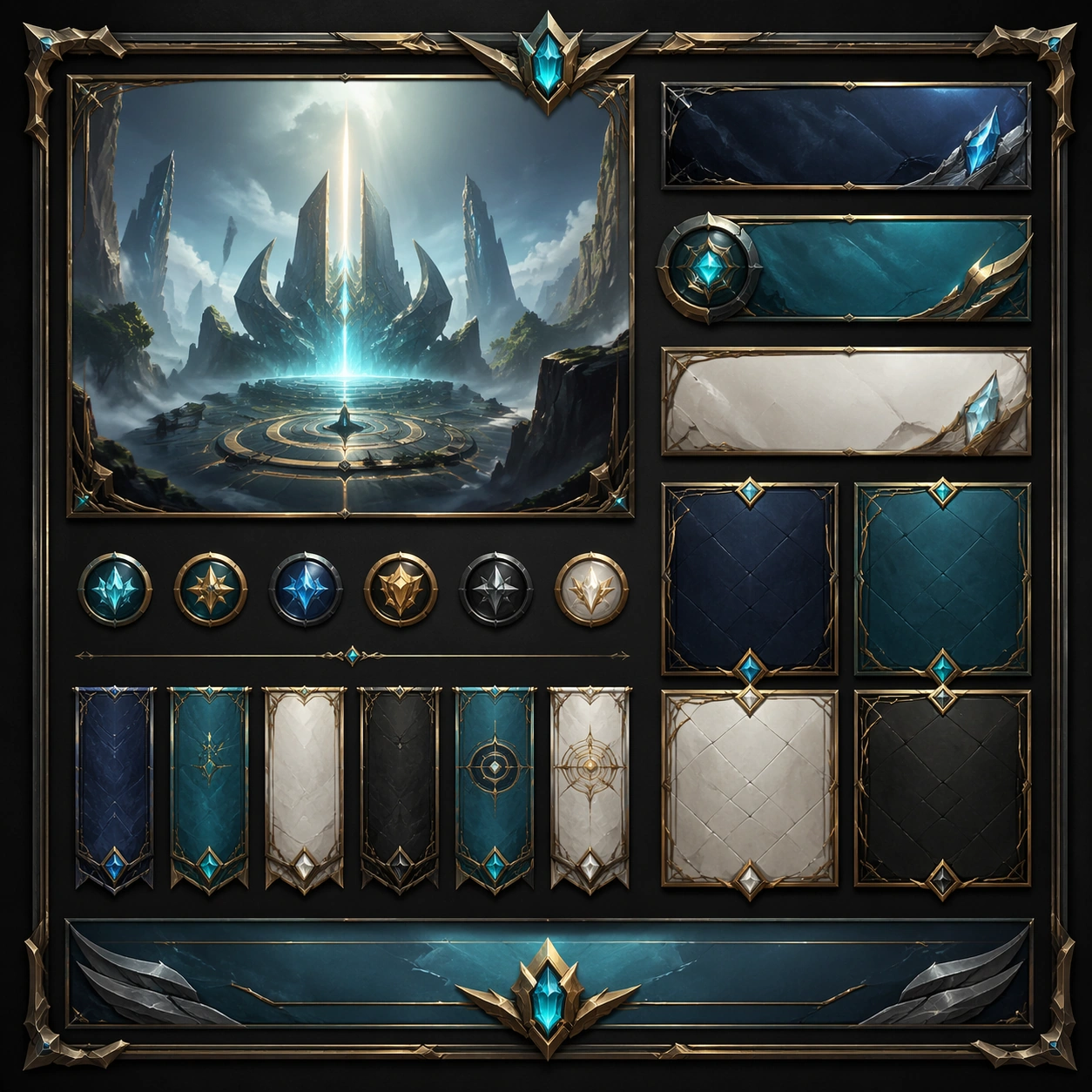
Scene: Create a square standalone support image for Brand Carousel Post System. Build a support-surface study with a clear focal hierarchy and a finished professional surface. Use a polished modular board or campaign surface with clean spacing, premium game-UI finish, and clear focal hierarchy. The frame should feel self-contained and polished, with enough structure to explain the system even without the reference series, yet still obviously belonging to the same theme and production world. Subject: Show a coherent original game-art system built for premium production and marketing surfaces in a way that emphasizes the intended support surface. Keep the same system logic stable across screenshots, cards, banners, and overview boards. Even though this image is independent, the viewer should still recognize the same universe, same commercial logic, and same production intent as the core package. Important details: Lock framing, icon grammar, palette blocking, and surface hierarchy so the kit feels production-ready and consistent. Preserve the broader theme language through color, framing, material choices, and modular composition. Use clean panel rhythm, premium asset presentation, and believable detail density. The image should work equally well as a gallery study, research reference, and mock production deliverable. Use case: Brand Carousel Post System single study 5/9, exploring support one as a support surface. Constraints: No readable text, no watermark, no logos, preserve exact 1:1 aspect ratio, no unrelated objects, no broken visual hierarchy, no visual noise that obscures the main surface, no accidental brand resemblance.
Example generated from “Brand Carousel Post System — Support Two”
GPT Image 2en

Scene: Create a square standalone support image for Brand Carousel Post System. Build a second support-surface study with a clear focal hierarchy and a finished professional surface. Use a polished modular board or campaign surface with clean spacing, premium game-UI finish, and clear focal hierarchy. The frame should feel self-contained and polished, with enough structure to explain the system even without the reference series, yet still obviously belonging to the same theme and production world. Subject: Show a coherent original game-art system built for premium production and marketing surfaces in a way that emphasizes the intended support surface. Keep the same system logic stable across screenshots, cards, banners, and overview boards. Even though this image is independent, the viewer should still recognize the same universe, same commercial logic, and same production intent as the core package. Important details: Lock framing, icon grammar, palette blocking, and surface hierarchy so the kit feels production-ready and consistent. Preserve the broader theme language through color, framing, material choices, and modular composition. Use clean panel rhythm, premium asset presentation, and believable detail density. The image should work equally well as a gallery study, research reference, and mock production deliverable. Use case: Brand Carousel Post System single study 6/9, exploring support two as a support surface. Constraints: No readable text, no watermark, no logos, preserve exact 1:1 aspect ratio, no unrelated objects, no broken visual hierarchy, no visual noise that obscures the main surface, no accidental brand resemblance.
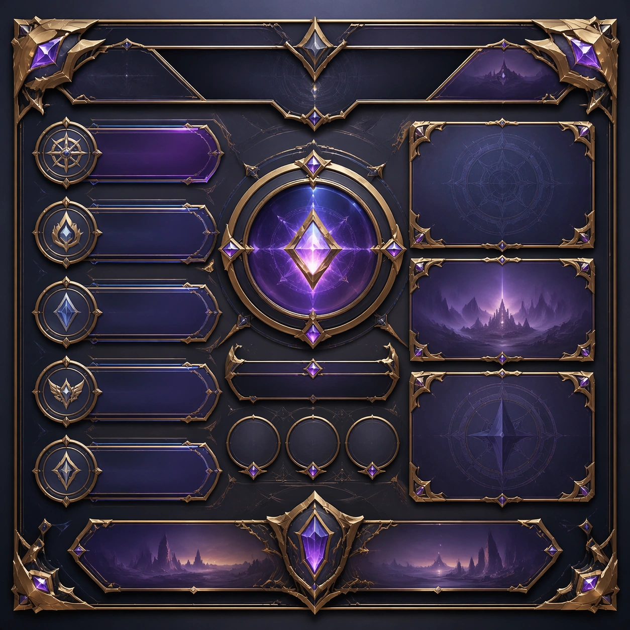
Example generated from “Brand Carousel Post System — Support Three”
GPT Image 2en

Scene: Create a square standalone support image for Brand Carousel Post System. Build a third support-surface study with a clear focal hierarchy and a finished professional surface. Use a polished modular board or campaign surface with clean spacing, premium game-UI finish, and clear focal hierarchy. The frame should feel self-contained and polished, with enough structure to explain the system even without the reference series, yet still obviously belonging to the same theme and production world. Subject: Show a coherent original game-art system built for premium production and marketing surfaces in a way that emphasizes the intended support surface. Keep the same system logic stable across screenshots, cards, banners, and overview boards. Even though this image is independent, the viewer should still recognize the same universe, same commercial logic, and same production intent as the core package. Important details: Lock framing, icon grammar, palette blocking, and surface hierarchy so the kit feels production-ready and consistent. Preserve the broader theme language through color, framing, material choices, and modular composition. Use clean panel rhythm, premium asset presentation, and believable detail density. The image should work equally well as a gallery study, research reference, and mock production deliverable. Use case: Brand Carousel Post System single study 7/9, exploring support three as a support surface. Constraints: No readable text, no watermark, no logos, preserve exact 1:1 aspect ratio, no unrelated objects, no broken visual hierarchy, no visual noise that obscures the main surface, no accidental brand resemblance.
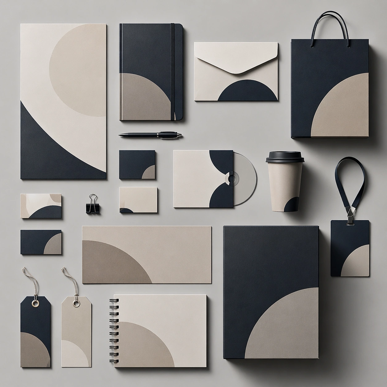
Example generated from “Brand Carousel Post System — Support Four”
GPT Image 2en

Scene: Create a square standalone support image for Brand Carousel Post System. Build a fourth support-surface study with a clear focal hierarchy and a finished professional surface. Use a polished modular board or campaign surface with clean spacing, premium game-UI finish, and clear focal hierarchy. The frame should feel self-contained and polished, with enough structure to explain the system even without the reference series, yet still obviously belonging to the same theme and production world. Subject: Show a coherent original game-art system built for premium production and marketing surfaces in a way that emphasizes the intended support surface. Keep the same system logic stable across screenshots, cards, banners, and overview boards. Even though this image is independent, the viewer should still recognize the same universe, same commercial logic, and same production intent as the core package. Important details: Lock framing, icon grammar, palette blocking, and surface hierarchy so the kit feels production-ready and consistent. Preserve the broader theme language through color, framing, material choices, and modular composition. Use clean panel rhythm, premium asset presentation, and believable detail density. The image should work equally well as a gallery study, research reference, and mock production deliverable. Use case: Brand Carousel Post System single study 8/9, exploring support four as a support surface. Constraints: No readable text, no watermark, no logos, preserve exact 1:1 aspect ratio, no unrelated objects, no broken visual hierarchy, no visual noise that obscures the main surface, no accidental brand resemblance.
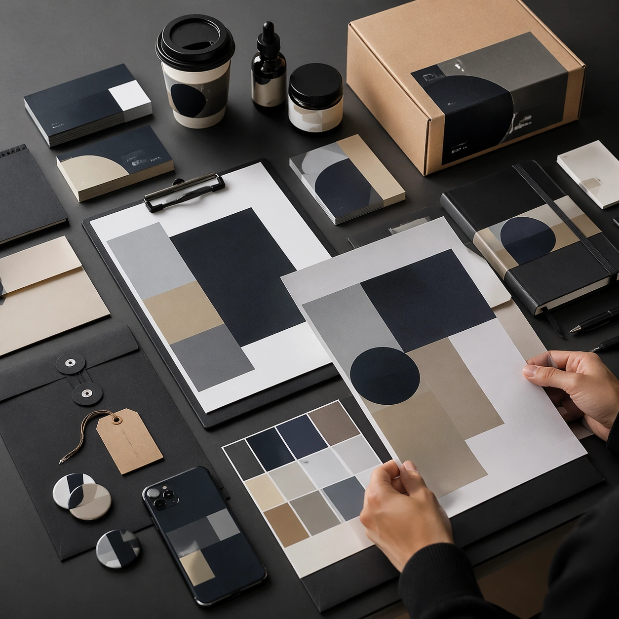
Example generated from “Brand Carousel Post System — Support Five”
GPT Image 2en

Scene: Create a square standalone support image for Brand Carousel Post System. Build a fifth support-surface study with a clear focal hierarchy and a finished professional surface. Use a polished modular board or campaign surface with clean spacing, premium game-UI finish, and clear focal hierarchy. The frame should feel self-contained and polished, with enough structure to explain the system even without the reference series, yet still obviously belonging to the same theme and production world. Subject: Show a coherent original game-art system built for premium production and marketing surfaces in a way that emphasizes the intended support surface. Keep the same system logic stable across screenshots, cards, banners, and overview boards. Even though this image is independent, the viewer should still recognize the same universe, same commercial logic, and same production intent as the core package. Important details: Lock framing, icon grammar, palette blocking, and surface hierarchy so the kit feels production-ready and consistent. Preserve the broader theme language through color, framing, material choices, and modular composition. Use clean panel rhythm, premium asset presentation, and believable detail density. The image should work equally well as a gallery study, research reference, and mock production deliverable. Use case: Brand Carousel Post System single study 9/9, exploring support five as a support surface. Constraints: No readable text, no watermark, no logos, preserve exact 1:1 aspect ratio, no unrelated objects, no broken visual hierarchy, no visual noise that obscures the main surface, no accidental brand resemblance.
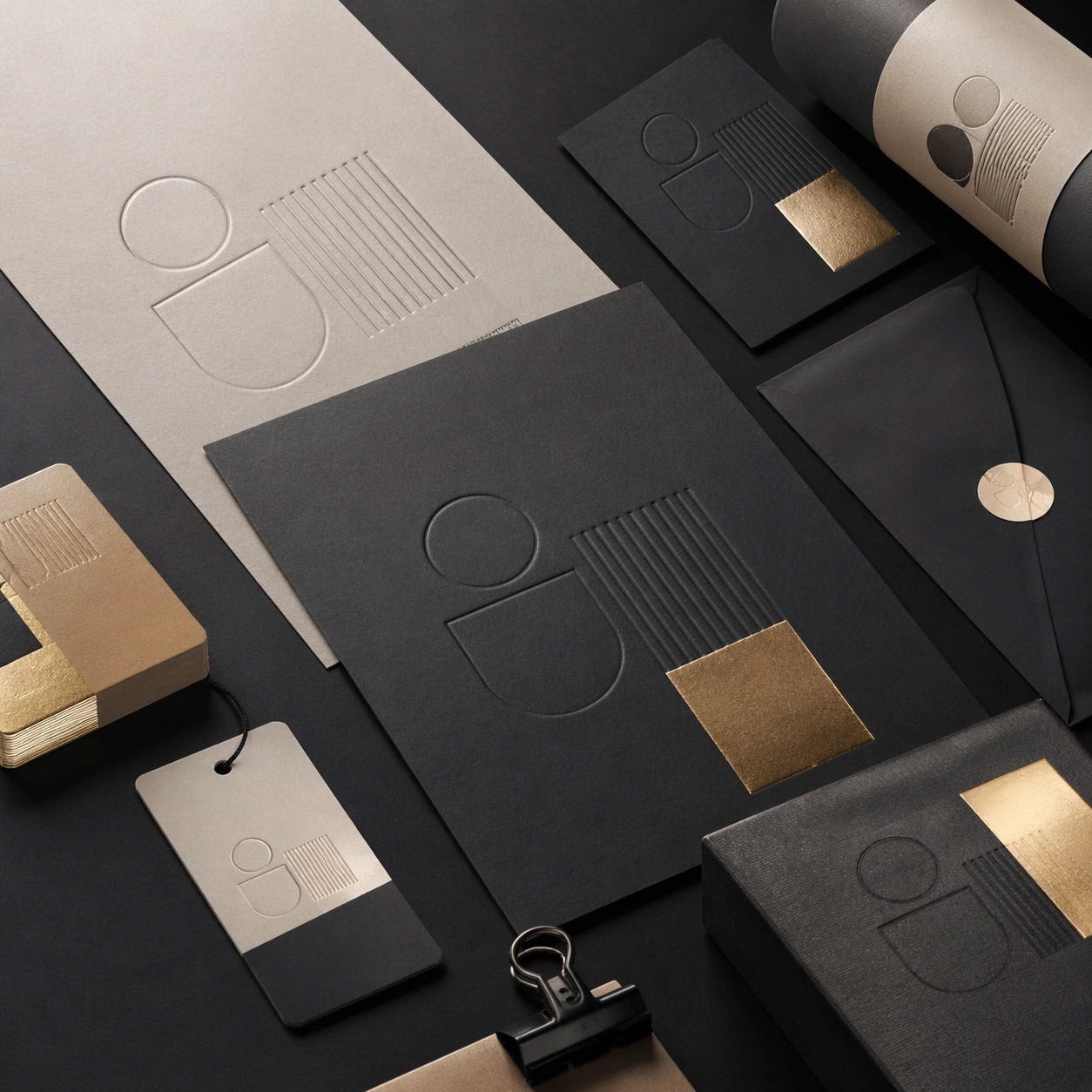
Example generated from “Brand Identity Mockup Set — Variant Grid”
GPT Image 2en

Scene: A square commercial presentation with realistic materials, clean staging, and believable product photography or retail lighting. Build the frame around a disciplined family of variants presented as one product language. Keep the lighting, camera distance, and spatial organization tuned for a high-signal research image rather than a casual snapshot. The image belongs to the Brand Identity Mockup Set theme and should feel immediately legible as a prompt atlas theme for brand identity mockup set, testing text-rendering, structured-layout, commercial-mockup with gpt image 2.. Subject: Center the study on a disciplined family of variants presented as one product language. Translate the theme into a concrete visual statement instead of an abstract mood board: the viewer should understand what kind of image this is, what is being tested, and why the composition is difficult. Use the slug idea of brand identity mockup set as a literal guide for subject matter, materials, and staging. If helpful, borrow the broad visual cues suggested by logo, but keep the result original and specific to this study. Important details: The mockup should feel saleable and design-ready: sharp edges, controlled reflections, credible paper or plastic behavior, and precise placement. Preserve a disciplined square composition, clear focal hierarchy, and enough secondary information to make the image feel complete rather than underspecified. The image should look polished, novel, and exhibition-ready, with topic-specific credibility coming from the way surfaces, structure, and visual language reinforce Brand Identity Mockup Set. Avoid generic filler elements that do not serve the main concept. Use case: Brand Identity Mockup Set single study 2/8, testing text-rendering, structured-layout, commercial-mockup through the variant grid variation. Constraints: No readable text, no watermark, no logos, preserve exact 1:1 aspect ratio, no real brand names, no cheap stock-photo styling, no broken perspective, no watermark, no accidental readable packaging copy, no cluttered retail shelf unless intended.
Example generated from “Brand Identity Mockup Set — Desk Review”
GPT Image 2en

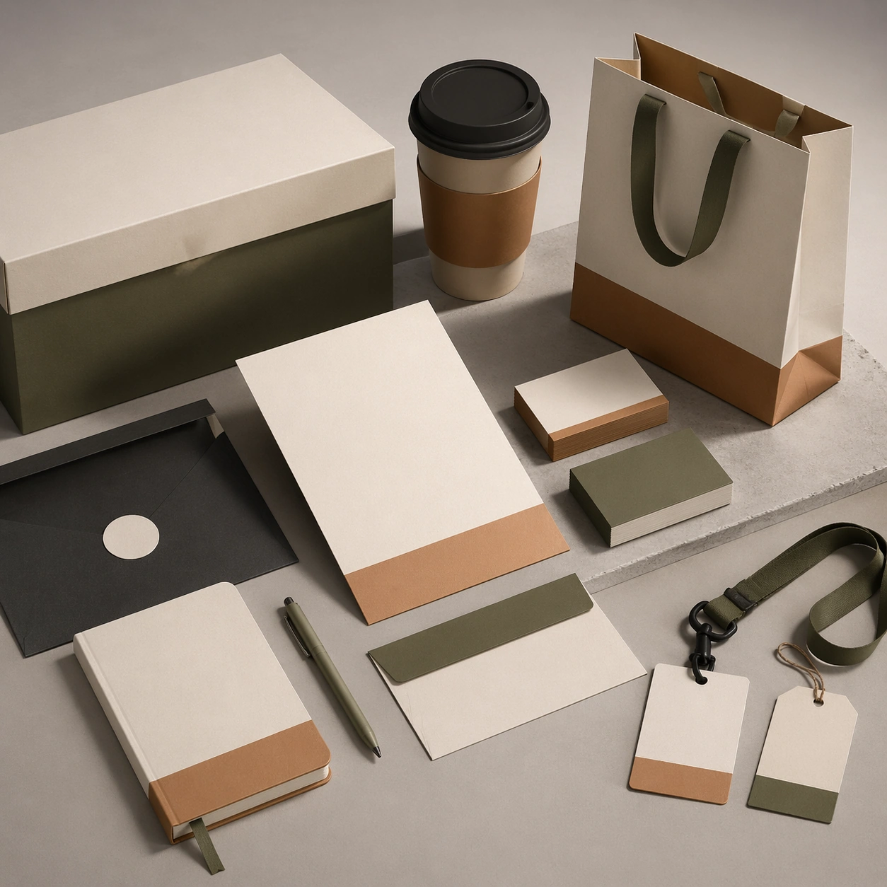
Scene: A square commercial presentation with realistic materials, clean staging, and believable product photography or retail lighting. Build the frame around the system reviewed on a designer’s table with believable supporting objects. Keep the lighting, camera distance, and spatial organization tuned for a high-signal research image rather than a casual snapshot. The image belongs to the Brand Identity Mockup Set theme and should feel immediately legible as a prompt atlas theme for brand identity mockup set, testing text-rendering, structured-layout, commercial-mockup with gpt image 2.. Subject: Center the study on the system reviewed on a designer’s table with believable supporting objects. Translate the theme into a concrete visual statement instead of an abstract mood board: the viewer should understand what kind of image this is, what is being tested, and why the composition is difficult. Use the slug idea of brand identity mockup set as a literal guide for subject matter, materials, and staging. If helpful, borrow the broad visual cues suggested by logo, but keep the result original and specific to this study. Important details: The mockup should feel saleable and design-ready: sharp edges, controlled reflections, credible paper or plastic behavior, and precise placement. Preserve a disciplined square composition, clear focal hierarchy, and enough secondary information to make the image feel complete rather than underspecified. The image should look polished, novel, and exhibition-ready, with topic-specific credibility coming from the way surfaces, structure, and visual language reinforce Brand Identity Mockup Set. Avoid generic filler elements that do not serve the main concept. Use case: Brand Identity Mockup Set single study 3/8, testing text-rendering, structured-layout, commercial-mockup through the desk review variation. Constraints: No readable text, no watermark, no logos, preserve exact 1:1 aspect ratio, no real brand names, no cheap stock-photo styling, no broken perspective, no watermark, no accidental readable packaging copy, no cluttered retail shelf unless intended.

Example generated from “Brand Identity Mockup Set — Material Closeup”
GPT Image 2en

Scene: A square commercial presentation with realistic materials, clean staging, and believable product photography or retail lighting. Build the frame around tactile finish, emboss, print, foil, or substrate behavior. Keep the lighting, camera distance, and spatial organization tuned for a high-signal research image rather than a casual snapshot. The image belongs to the Brand Identity Mockup Set theme and should feel immediately legible as a prompt atlas theme for brand identity mockup set, testing text-rendering, structured-layout, commercial-mockup with gpt image 2.. Subject: Center the study on tactile finish, emboss, print, foil, or substrate behavior. Translate the theme into a concrete visual statement instead of an abstract mood board: the viewer should understand what kind of image this is, what is being tested, and why the composition is difficult. Use the slug idea of brand identity mockup set as a literal guide for subject matter, materials, and staging. If helpful, borrow the broad visual cues suggested by logo, but keep the result original and specific to this study. Important details: The mockup should feel saleable and design-ready: sharp edges, controlled reflections, credible paper or plastic behavior, and precise placement. Preserve a disciplined square composition, clear focal hierarchy, and enough secondary information to make the image feel complete rather than underspecified. The image should look polished, novel, and exhibition-ready, with topic-specific credibility coming from the way surfaces, structure, and visual language reinforce Brand Identity Mockup Set. Avoid generic filler elements that do not serve the main concept. Use case: Brand Identity Mockup Set single study 4/8, testing text-rendering, structured-layout, commercial-mockup through the material closeup variation. Constraints: No readable text, no watermark, no logos, preserve exact 1:1 aspect ratio, no real brand names, no cheap stock-photo styling, no broken perspective, no watermark, no accidental readable packaging copy, no cluttered retail shelf unless intended.

Example generated from “Brand Identity Mockup Set — Archive Proof”
GPT Image 2en

Scene: A square commercial presentation with realistic materials, clean staging, and believable product photography or retail lighting. Build the frame around proof-like presentation that emphasizes production precision. Keep the lighting, camera distance, and spatial organization tuned for a high-signal research image rather than a casual snapshot. The image belongs to the Brand Identity Mockup Set theme and should feel immediately legible as a prompt atlas theme for brand identity mockup set, testing text-rendering, structured-layout, commercial-mockup with gpt image 2.. Subject: Center the study on proof-like presentation that emphasizes production precision. Translate the theme into a concrete visual statement instead of an abstract mood board: the viewer should understand what kind of image this is, what is being tested, and why the composition is difficult. Use the slug idea of brand identity mockup set as a literal guide for subject matter, materials, and staging. If helpful, borrow the broad visual cues suggested by logo, but keep the result original and specific to this study. Important details: The mockup should feel saleable and design-ready: sharp edges, controlled reflections, credible paper or plastic behavior, and precise placement. Preserve a disciplined square composition, clear focal hierarchy, and enough secondary information to make the image feel complete rather than underspecified. The image should look polished, novel, and exhibition-ready, with topic-specific credibility coming from the way surfaces, structure, and visual language reinforce Brand Identity Mockup Set. Avoid generic filler elements that do not serve the main concept. Use case: Brand Identity Mockup Set single study 5/8, testing text-rendering, structured-layout, commercial-mockup through the archive proof variation. Constraints: No readable text, no watermark, no logos, preserve exact 1:1 aspect ratio, no real brand names, no cheap stock-photo styling, no broken perspective, no watermark, no accidental readable packaging copy, no cluttered retail shelf unless intended.

Example generated from “Brand Identity Mockup Set — Retail Shelf”
GPT Image 2en

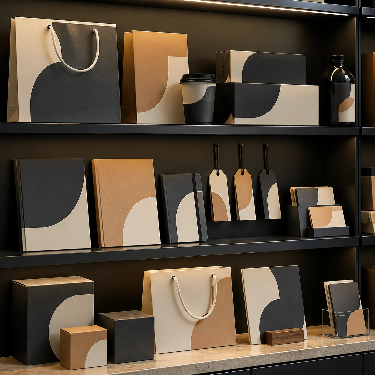
Scene: A square commercial presentation with realistic materials, clean staging, and believable product photography or retail lighting. Build the frame around a retail-context display that still keeps the product language primary. Keep the lighting, camera distance, and spatial organization tuned for a high-signal research image rather than a casual snapshot. The image belongs to the Brand Identity Mockup Set theme and should feel immediately legible as a prompt atlas theme for brand identity mockup set, testing text-rendering, structured-layout, commercial-mockup with gpt image 2.. Subject: Center the study on a retail-context display that still keeps the product language primary. Translate the theme into a concrete visual statement instead of an abstract mood board: the viewer should understand what kind of image this is, what is being tested, and why the composition is difficult. Use the slug idea of brand identity mockup set as a literal guide for subject matter, materials, and staging. If helpful, borrow the broad visual cues suggested by logo, but keep the result original and specific to this study. Important details: The mockup should feel saleable and design-ready: sharp edges, controlled reflections, credible paper or plastic behavior, and precise placement. Preserve a disciplined square composition, clear focal hierarchy, and enough secondary information to make the image feel complete rather than underspecified. The image should look polished, novel, and exhibition-ready, with topic-specific credibility coming from the way surfaces, structure, and visual language reinforce Brand Identity Mockup Set. Avoid generic filler elements that do not serve the main concept. Use case: Brand Identity Mockup Set single study 6/8, testing text-rendering, structured-layout, commercial-mockup through the retail shelf variation. Constraints: No readable text, no watermark, no logos, preserve exact 1:1 aspect ratio, no real brand names, no cheap stock-photo styling, no broken perspective, no watermark, no accidental readable packaging copy, no cluttered retail shelf unless intended.

Example generated from “Brand Identity Mockup Set — System Board”
GPT Image 2en

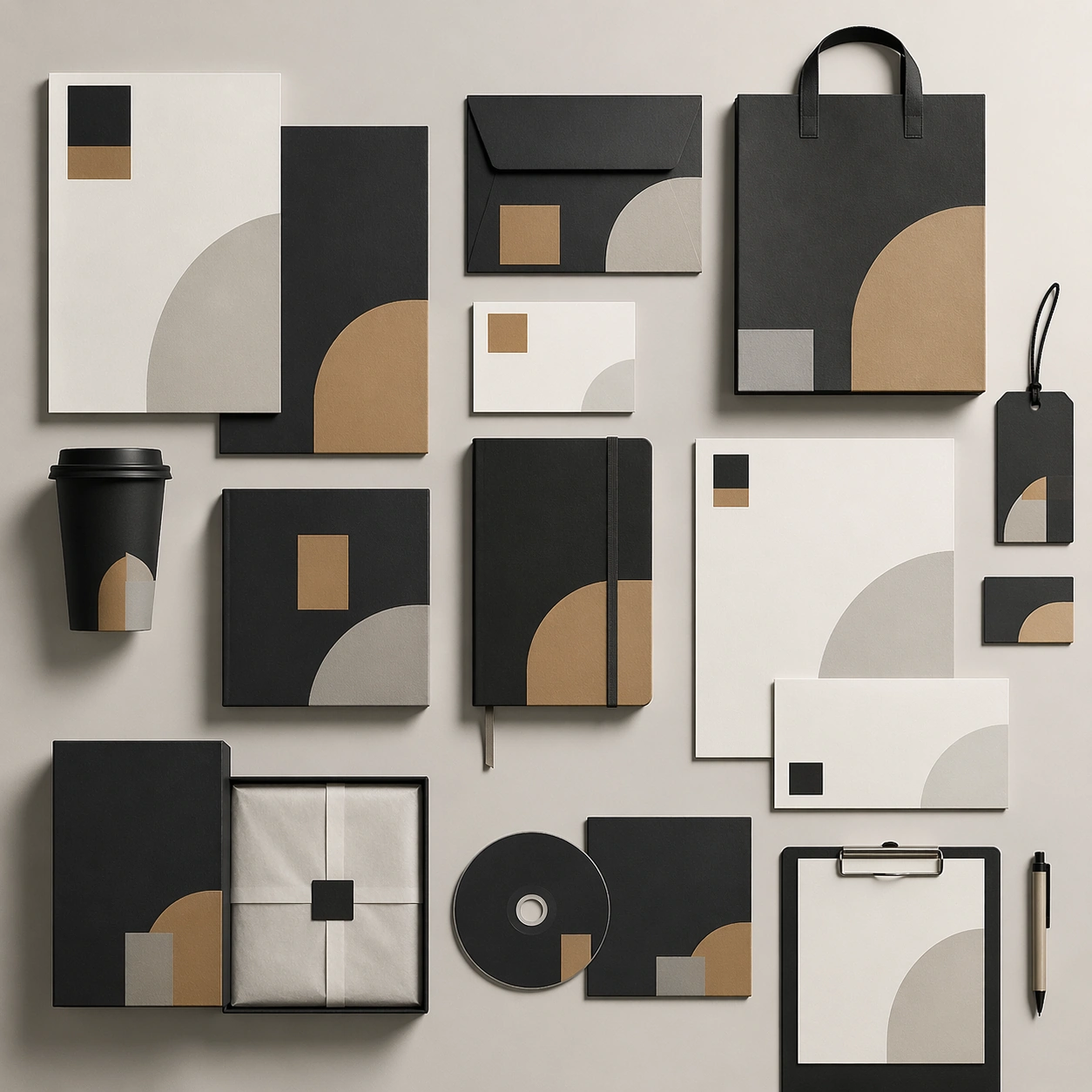
Scene: A square commercial presentation with realistic materials, clean staging, and believable product photography or retail lighting. Build the frame around multiple assets aligned into one coherent identity or packaging system. Keep the lighting, camera distance, and spatial organization tuned for a high-signal research image rather than a casual snapshot. The image belongs to the Brand Identity Mockup Set theme and should feel immediately legible as a prompt atlas theme for brand identity mockup set, testing text-rendering, structured-layout, commercial-mockup with gpt image 2.. Subject: Center the study on multiple assets aligned into one coherent identity or packaging system. Translate the theme into a concrete visual statement instead of an abstract mood board: the viewer should understand what kind of image this is, what is being tested, and why the composition is difficult. Use the slug idea of brand identity mockup set as a literal guide for subject matter, materials, and staging. If helpful, borrow the broad visual cues suggested by logo, but keep the result original and specific to this study. Important details: The mockup should feel saleable and design-ready: sharp edges, controlled reflections, credible paper or plastic behavior, and precise placement. Preserve a disciplined square composition, clear focal hierarchy, and enough secondary information to make the image feel complete rather than underspecified. The image should look polished, novel, and exhibition-ready, with topic-specific credibility coming from the way surfaces, structure, and visual language reinforce Brand Identity Mockup Set. Avoid generic filler elements that do not serve the main concept. Use case: Brand Identity Mockup Set single study 7/8, testing text-rendering, structured-layout, commercial-mockup through the system board variation. Constraints: No readable text, no watermark, no logos, preserve exact 1:1 aspect ratio, no real brand names, no cheap stock-photo styling, no broken perspective, no watermark, no accidental readable packaging copy, no cluttered retail shelf unless intended.

Example generated from “Brand Identity Mockup Set — Signature Mockup”
GPT Image 2en

Scene: A square commercial presentation with realistic materials, clean staging, and believable product photography or retail lighting. Build the frame around the strongest single commercial frame for the topic. Keep the lighting, camera distance, and spatial organization tuned for a high-signal research image rather than a casual snapshot. The image belongs to the Brand Identity Mockup Set theme and should feel immediately legible as a prompt atlas theme for brand identity mockup set, testing text-rendering, structured-layout, commercial-mockup with gpt image 2.. Subject: Center the study on the strongest single commercial frame for the topic. Translate the theme into a concrete visual statement instead of an abstract mood board: the viewer should understand what kind of image this is, what is being tested, and why the composition is difficult. Use the slug idea of brand identity mockup set as a literal guide for subject matter, materials, and staging. If helpful, borrow the broad visual cues suggested by logo, but keep the result original and specific to this study. Important details: The mockup should feel saleable and design-ready: sharp edges, controlled reflections, credible paper or plastic behavior, and precise placement. Preserve a disciplined square composition, clear focal hierarchy, and enough secondary information to make the image feel complete rather than underspecified. The image should look polished, novel, and exhibition-ready, with topic-specific credibility coming from the way surfaces, structure, and visual language reinforce Brand Identity Mockup Set. Avoid generic filler elements that do not serve the main concept. Use case: Brand Identity Mockup Set single study 8/8, testing text-rendering, structured-layout, commercial-mockup through the signature mockup variation. Constraints: No readable text, no watermark, no logos, preserve exact 1:1 aspect ratio, no real brand names, no cheap stock-photo styling, no broken perspective, no watermark, no accidental readable packaging copy, no cluttered retail shelf unless intended.

Example generated from “Breakfast Brunch Tabletop System — Weekend Table Anchor”
GPT Image 2en

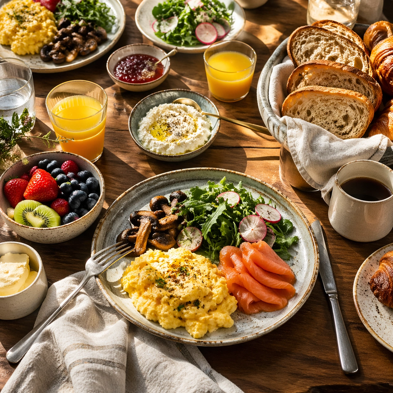
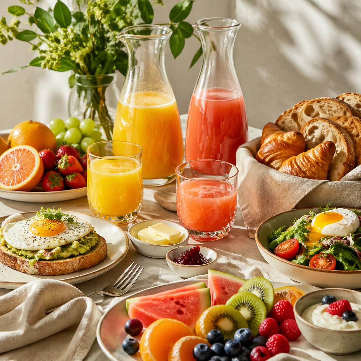
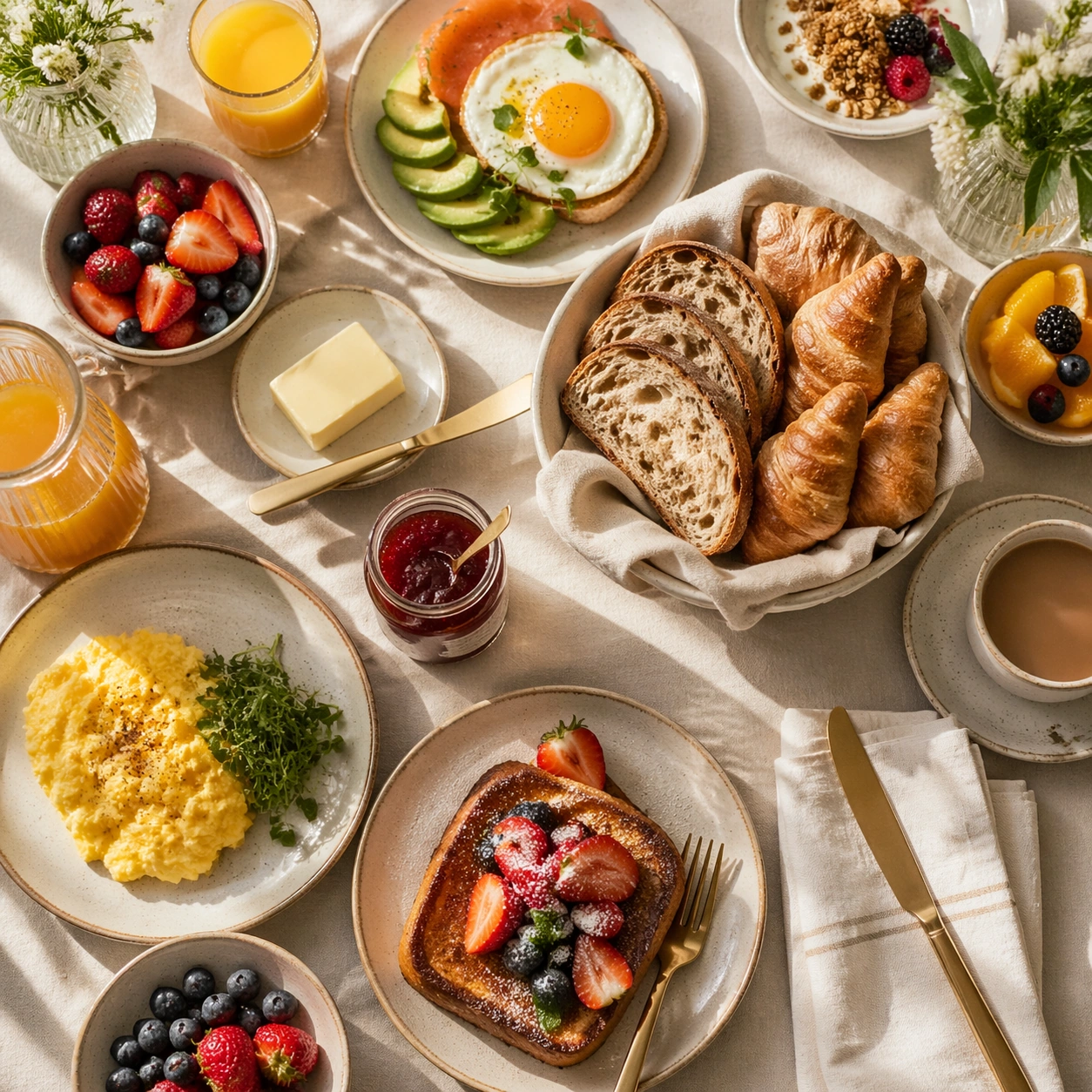
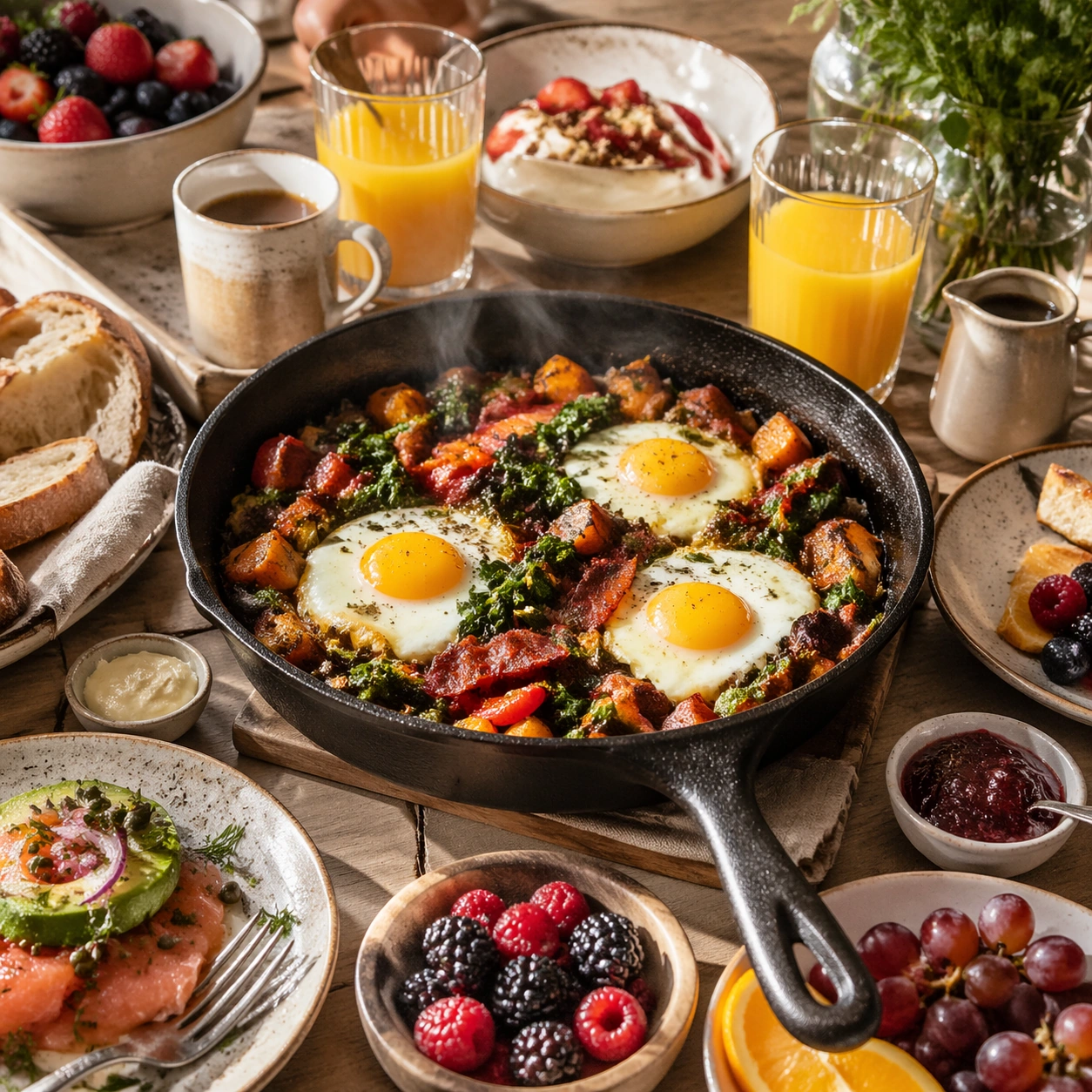
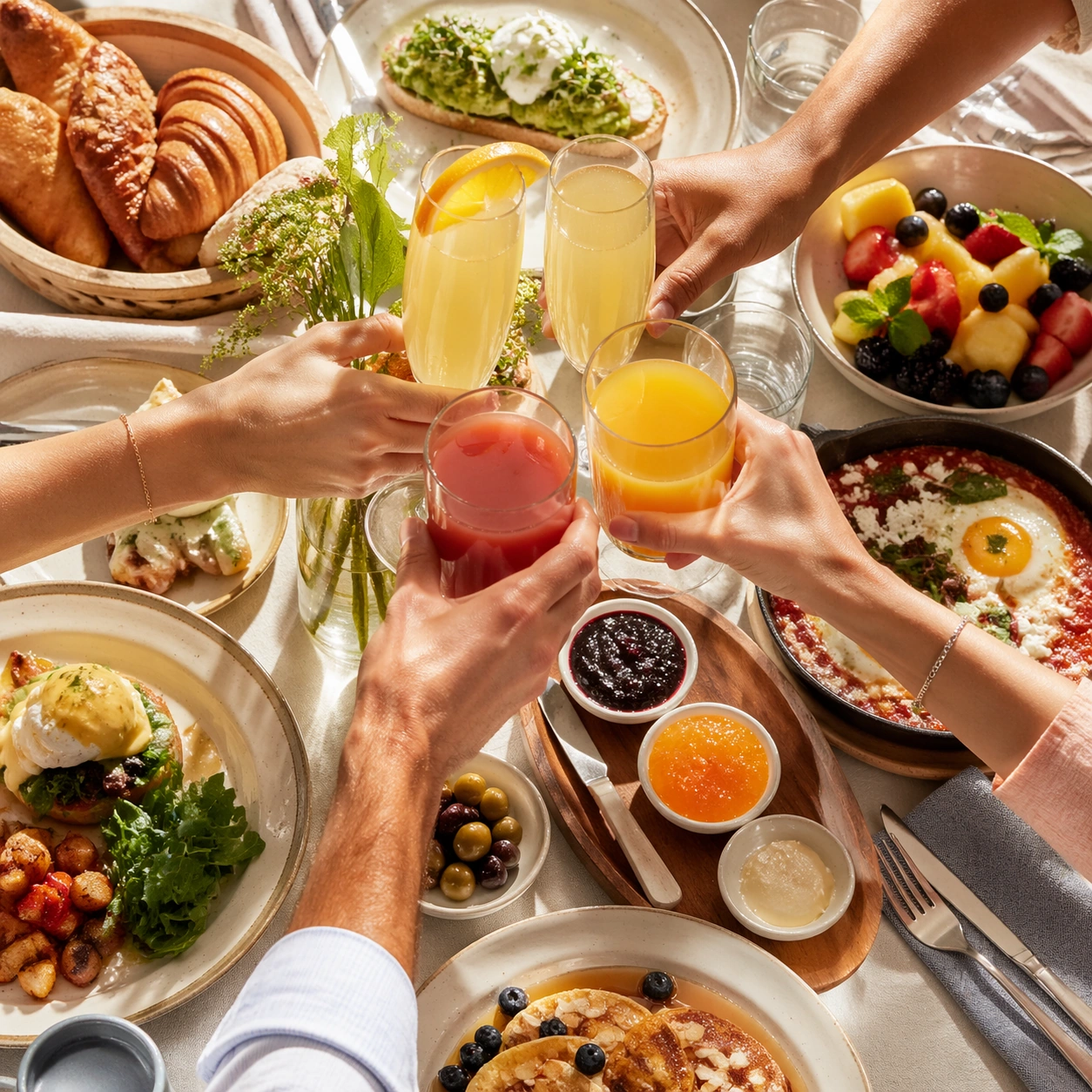
Scene: Compose a square brunch tabletop image with layered tableware, generous daylight, and a sense of weekend abundance that still feels organized enough for real hospitality and publishing use. The scene should balance multiple objects without losing the hero focal point, making table choreography and dish relationships a core part of the image. Use natural weekend daylight from the side, with a large table partially visible in square crop and soft shadows that keep the surface lively and dimensional. Subject: The food must look fresh, warm, and genuinely shareable: eggs, breads, fruit, spreads, juices, and plated brunch mains should feel cooked and plated for service, not arranged as fake prop food. Center one hero brunch plate surrounded by secondary glasses, bread, and fruit cues that suggest a shareable table without turning the frame into a buffet. Important details: Table logic matters. Plates, glasses, linens, and serving utensils need believable spacing, overlap, and hierarchy so the image can support menus, social assets, and campaign layouts. Make the abundance feel intentional rather than chaotic, with appetizing textures and natural daylight carrying the mood. This image establishes the reference system for the series, including camera height, tabletop discipline, prop family, and color control that later images must inherit. This image must establish the brunch system for the series: mixed ceramics, warm bread texture, polished cutlery restraint, and easy but intentional weekend hospitality. Use case: Brunch Tabletop series study 1/9, built for Prompt Atlas coverage of a food and beverage commercial visual system. Constraints: No readable text, no watermark, no logos, preserve exact 1:1 aspect ratio, no buffet chaos, no greasy diner styling unless specifically implied, no visible phone screens, no plastic takeaway packaging, no fake stock-family posing, no unreadable signage, no crowded people, no buffet hotel trays, no greasy fast-food look.

Example generated from “Breakfast Brunch Tabletop System — Juice Carafe Board”
GPT Image 2en

Scene: Compose a square brunch tabletop image with layered tableware, generous daylight, and a sense of weekend abundance that still feels organized enough for real hospitality and publishing use. The scene should balance multiple objects without losing the hero focal point, making table choreography and dish relationships a core part of the image. Compose a square still life around one or two glass carafes, juice glasses, sliced fruit, and a clean breakfast sideboard under bright daylight. Subject: The food must look fresh, warm, and genuinely shareable: eggs, breads, fruit, spreads, juices, and plated brunch mains should feel cooked and plated for service, not arranged as fake prop food. Let fresh juice color, glass transparency, and brunch service cues drive the image, supported by minimal food elements. Important details: Table logic matters. Plates, glasses, linens, and serving utensils need believable spacing, overlap, and hierarchy so the image can support menus, social assets, and campaign layouts. Make the abundance feel intentional rather than chaotic, with appetizing textures and natural daylight carrying the mood. This image should feel fully self-contained while still belonging to the same broader topic and commercial world. The frame should feel fresh and premium, with believable pulp, condensation, and glass thickness. It should support a brunch campaign without needing a full table scene. Use case: Brunch Tabletop single study 6/9, built for Prompt Atlas coverage of a food and beverage commercial visual system. Constraints: No readable text, no watermark, no logos, preserve exact 1:1 aspect ratio, no buffet chaos, no greasy diner styling unless specifically implied, no visible phone screens, no plastic takeaway packaging, no fake stock-family posing, no unreadable signage, no smoothie-bar branding, no plastic bottles, no breakfast-cereal clutter.

Example generated from “Breakfast Brunch Tabletop System — Skillet Hash Centerpiece”
GPT Image 2en

Scene: Compose a square brunch tabletop image with layered tableware, generous daylight, and a sense of weekend abundance that still feels organized enough for real hospitality and publishing use. The scene should balance multiple objects without losing the hero focal point, making table choreography and dish relationships a core part of the image. Shoot a cast-iron skillet at table center with surrounding side plates and daylight shadows, keeping the composition square and service-ready. Subject: The food must look fresh, warm, and genuinely shareable: eggs, breads, fruit, spreads, juices, and plated brunch mains should feel cooked and plated for service, not arranged as fake prop food. Show a brunch hash or comparable skillet preparation with eggs, herbs, crisp edges, and visible heat that feels fresh from the pass. Important details: Table logic matters. Plates, glasses, linens, and serving utensils need believable spacing, overlap, and hierarchy so the image can support menus, social assets, and campaign layouts. Make the abundance feel intentional rather than chaotic, with appetizing textures and natural daylight carrying the mood. This image should feel fully self-contained while still belonging to the same broader topic and commercial world. Balance abundance with discipline: the skillet should feel robust and communal, but the frame still needs elegant composition, credible steam, and appetizing color control. Use case: Brunch Tabletop single study 7/9, built for Prompt Atlas coverage of a food and beverage commercial visual system. Constraints: No readable text, no watermark, no logos, preserve exact 1:1 aspect ratio, no buffet chaos, no greasy diner styling unless specifically implied, no visible phone screens, no plastic takeaway packaging, no fake stock-family posing, no unreadable signage, no camping cues, no giant family platter, no visible stove top.

Example generated from “Breakfast Brunch Tabletop System — Group Toast Moment”
GPT Image 2en

Scene: Compose a square brunch tabletop image with layered tableware, generous daylight, and a sense of weekend abundance that still feels organized enough for real hospitality and publishing use. The scene should balance multiple objects without losing the hero focal point, making table choreography and dish relationships a core part of the image. Use a square crop of several hands raising juice or sparkling brunch drinks over a partly visible tabletop, backlit by soft daylight. Subject: The food must look fresh, warm, and genuinely shareable: eggs, breads, fruit, spreads, juices, and plated brunch mains should feel cooked and plated for service, not arranged as fake prop food. Keep the drinks and table beneath them crisp and inviting, using the hand gestures only to communicate social brunch energy. Important details: Table logic matters. Plates, glasses, linens, and serving utensils need believable spacing, overlap, and hierarchy so the image can support menus, social assets, and campaign layouts. Make the abundance feel intentional rather than chaotic, with appetizing textures and natural daylight carrying the mood. This image should feel fully self-contained while still belonging to the same broader topic and commercial world. Hands, glass reflections, and liquid levels must feel natural. The image should suggest togetherness without collapsing into generic lifestyle stock photography. Use case: Brunch Tabletop single study 8/9, built for Prompt Atlas coverage of a food and beverage commercial visual system. Constraints: No readable text, no watermark, no logos, preserve exact 1:1 aspect ratio, no buffet chaos, no greasy diner styling unless specifically implied, no visible phone screens, no plastic takeaway packaging, no fake stock-family posing, no unreadable signage, no faces, no wedding vibe, no confetti.

Example generated from “Breakfast Brunch Tabletop System — Jam Butter Flatlay”
GPT Image 2en

Scene: Compose a square brunch tabletop image with layered tableware, generous daylight, and a sense of weekend abundance that still feels organized enough for real hospitality and publishing use. The scene should balance multiple objects without losing the hero focal point, making table choreography and dish relationships a core part of the image. Use a strict top-down square composition with toast, butter dish, jam pot, knife, and folded napkin arranged with clean hospitality logic. Subject: The food must look fresh, warm, and genuinely shareable: eggs, breads, fruit, spreads, juices, and plated brunch mains should feel cooked and plated for service, not arranged as fake prop food. Treat simple breakfast components as premium objects through texture, spacing, and restraint rather than excess plating. Important details: Table logic matters. Plates, glasses, linens, and serving utensils need believable spacing, overlap, and hierarchy so the image can support menus, social assets, and campaign layouts. Make the abundance feel intentional rather than chaotic, with appetizing textures and natural daylight carrying the mood. This image should feel fully self-contained while still belonging to the same broader topic and commercial world. Crumb control, butter softness, preserve translucency, and table linen rhythm should make the frame feel elevated and editorial-ready. Use case: Brunch Tabletop single study 9/9, built for Prompt Atlas coverage of a food and beverage commercial visual system. Constraints: No readable text, no watermark, no logos, preserve exact 1:1 aspect ratio, no buffet chaos, no greasy diner styling unless specifically implied, no visible phone screens, no plastic takeaway packaging, no fake stock-family posing, no unreadable signage, no packaged jam labels, no breakfast cereal boxes, no cluttered newspaper props.

Example generated from “Bridal Couture Portrait Story — Reference Bridal Anchor”
GPT Image 2en

Scene: Create a square 1:1 portrait image for Bridal Couture Portrait Story. Use a luminous couture-studio or quiet suite setup with soft ivory light, visible fabric depth, and romantic restraint. The frame should feel like a finished professional deliverable rather than a casual snapshot, with clear lens discipline, believable light falloff, and a palette that directly supports Produce bridal and couture portrait stories with refined fabric rendering, emotional elegance, and premium magazine-level bridal photography cues.. Keep enough surrounding space and compositional control for gallery, research, campaign, or approval-board reuse while staying photoreal and human-scaled. Subject: Center one bridal couture model with warm olive skin, wavy dark hair, luminous eyes, refined posture, and graceful hands. Establish the bride identity, face, hair base, hand shape, and body proportions that all later variations must preserve. Use the example direction from the brief as grounding context: Produce bridal and couture portrait stories with refined fabric rendering, emotional elegance, and premium magazine-level bridal photography cues.. Wardrobe, lighting, environment, and pose may shift to serve this variation, but the viewer must immediately understand that the same reference identity is still in front of the camera. Important details: This backlog line is difficult because Produce bridal and couture portrait stories with refined fabric rendering, emotional elegance, and premium magazine-level bridal photography cues.. Preserve skin tone family, bone structure, eye spacing, nose shape, mouth shape, hairline logic, shoulder width, and overall body read across the entire series. preserve exact face / hair base / body proportions from the reference model. This anchor should feel elevated and couture, not cheap studio-template wedding photography. Avoid the common failure described in the brief: ordinary image models often lose likeness once styling, lighting, or layout changes enter the frame. Success should feel like the result should feel professionally usable, coherent, and clearly built around one stable human identity. Use case: Bridal Couture Portrait Story series study 1/9, the baseline bridal couture portrait. Constraints: No readable text, no watermark, no logos, preserve exact 1:1 aspect ratio, preserve exact face / hair base / body proportions from the reference model, no banquet hall clutter, no bouquet overload, no bridal party, no cheesy sparkle filter.

Example generated from “Bridal Couture Portrait Story — Cover Portrait”
GPT Image 2en

Scene: Create a square 1:1 portrait image for Bridal Couture Portrait Story. Use a premium front-facing fashion-wedding frame with veil, face, and neckline all clearly controlled. The frame should feel like a finished professional deliverable rather than a casual snapshot, with clear lens discipline, believable light falloff, and a palette that directly supports Produce bridal and couture portrait stories with refined fabric rendering, emotional elegance, and premium magazine-level bridal photography cues.. Keep enough surrounding space and compositional control for gallery, research, campaign, or approval-board reuse while staying photoreal and human-scaled. Subject: Center one bridal couture model with warm olive skin, wavy dark hair, luminous eyes, refined posture, and graceful hands. Keep the same bride exact while shaping the crop into a magazine-cover-ready hero portrait. Use the example direction from the brief as grounding context: Produce bridal and couture portrait stories with refined fabric rendering, emotional elegance, and premium magazine-level bridal photography cues.. Wardrobe, lighting, environment, and pose may shift to serve this variation, but the viewer must immediately understand that the same reference identity is still in front of the camera. Important details: This backlog line is difficult because Produce bridal and couture portrait stories with refined fabric rendering, emotional elegance, and premium magazine-level bridal photography cues.. Preserve skin tone family, bone structure, eye spacing, nose shape, mouth shape, hairline logic, shoulder width, and overall body read across the entire series. preserve exact face / hair base / body proportions from the reference model. Expression and framing may become more iconic, but likeness must not drift. Avoid the common failure described in the brief: ordinary image models often lose likeness once styling, lighting, or layout changes enter the frame. Success should feel like the result should feel professionally usable, coherent, and clearly built around one stable human identity. Use case: Bridal Couture Portrait Story series study 2/9, a bridal cover portrait. Constraints: No readable text, no watermark, no logos, preserve exact 1:1 aspect ratio, preserve exact face / hair base / body proportions from the reference model, no new face shape, no changed eyebrow arch, no fake logo masthead, no generic stock smile.

Example generated from “Bridal Couture Portrait Story — Veil Close-up”
GPT Image 2en

Scene: Create a square 1:1 portrait image for Bridal Couture Portrait Story. Use a close beauty-fashion crop where veil texture, eyelashes, and skin remain crisp and plausible. The frame should feel like a finished professional deliverable rather than a casual snapshot, with clear lens discipline, believable light falloff, and a palette that directly supports Produce bridal and couture portrait stories with refined fabric rendering, emotional elegance, and premium magazine-level bridal photography cues.. Keep enough surrounding space and compositional control for gallery, research, campaign, or approval-board reuse while staying photoreal and human-scaled. Subject: Center one bridal couture model with warm olive skin, wavy dark hair, luminous eyes, refined posture, and graceful hands. Push closer to the same face while adding veil texture and gentle fabric interaction. Preserve exact face / hair base / body proportions from the reference model. Use the example direction from the brief as grounding context: Produce bridal and couture portrait stories with refined fabric rendering, emotional elegance, and premium magazine-level bridal photography cues.. Wardrobe, lighting, environment, and pose may shift to serve this variation, but the viewer must immediately understand that the same reference identity is still in front of the camera. Important details: This backlog line is difficult because Produce bridal and couture portrait stories with refined fabric rendering, emotional elegance, and premium magazine-level bridal photography cues.. Preserve skin tone family, bone structure, eye spacing, nose shape, mouth shape, hairline logic, shoulder width, and overall body read across the entire series. preserve exact face / hair base / body proportions from the reference model. The veil should frame the likeness, not hide or change it. Avoid the common failure described in the brief: ordinary image models often lose likeness once styling, lighting, or layout changes enter the frame. Success should feel like the result should feel professionally usable, coherent, and clearly built around one stable human identity. Use case: Bridal Couture Portrait Story series study 3/9, a veil close-up. Constraints: No readable text, no watermark, no logos, preserve exact 1:1 aspect ratio, preserve exact face / hair base / body proportions from the reference model, no opaque veil blocking face, no altered nose bridge, no glitter overload, no extra hands.

Example generated from “Bridal Couture Portrait Story — Couture Full Body”
GPT Image 2en

Scene: Create a square 1:1 portrait image for Bridal Couture Portrait Story. Use a square fashion setup with enough room to show silhouette, train, and posture while keeping the face readable. The frame should feel like a finished professional deliverable rather than a casual snapshot, with clear lens discipline, believable light falloff, and a palette that directly supports Produce bridal and couture portrait stories with refined fabric rendering, emotional elegance, and premium magazine-level bridal photography cues.. Keep enough surrounding space and compositional control for gallery, research, campaign, or approval-board reuse while staying photoreal and human-scaled. Subject: Center one bridal couture model with warm olive skin, wavy dark hair, luminous eyes, refined posture, and graceful hands. Show the same bride in a full-length couture pose with stable body proportions and believable fabric volume. Use the example direction from the brief as grounding context: Produce bridal and couture portrait stories with refined fabric rendering, emotional elegance, and premium magazine-level bridal photography cues.. Wardrobe, lighting, environment, and pose may shift to serve this variation, but the viewer must immediately understand that the same reference identity is still in front of the camera. Important details: This backlog line is difficult because Produce bridal and couture portrait stories with refined fabric rendering, emotional elegance, and premium magazine-level bridal photography cues.. Preserve skin tone family, bone structure, eye spacing, nose shape, mouth shape, hairline logic, shoulder width, and overall body read across the entire series. preserve exact face / hair base / body proportions from the reference model. The dress can expand dramatically, but the human figure must stay exact. Avoid the common failure described in the brief: ordinary image models often lose likeness once styling, lighting, or layout changes enter the frame. Success should feel like the result should feel professionally usable, coherent, and clearly built around one stable human identity. Use case: Bridal Couture Portrait Story series study 4/9, a couture full-body portrait. Constraints: No readable text, no watermark, no logos, preserve exact 1:1 aspect ratio, preserve exact face / hair base / body proportions from the reference model, no giant ballgown distortion, no shortened legs, no floating hem, no background decor clutter.

Example generated from “Bridal Couture Portrait Story — Seated Atelier Portrait”
GPT Image 2en

Scene: Create a square 1:1 portrait image for Bridal Couture Portrait Story. Use a quieter couture setting with chair, fabric drape, and soft atelier light. The frame should feel like a finished professional deliverable rather than a casual snapshot, with clear lens discipline, believable light falloff, and a palette that directly supports Produce bridal and couture portrait stories with refined fabric rendering, emotional elegance, and premium magazine-level bridal photography cues.. Keep enough surrounding space and compositional control for gallery, research, campaign, or approval-board reuse while staying photoreal and human-scaled. Subject: Center one bridal couture model with warm olive skin, wavy dark hair, luminous eyes, refined posture, and graceful hands. Maintain the same identity while shifting into a more intimate seated pose that still feels editorial and elevated. Use the example direction from the brief as grounding context: Produce bridal and couture portrait stories with refined fabric rendering, emotional elegance, and premium magazine-level bridal photography cues.. Wardrobe, lighting, environment, and pose may shift to serve this variation, but the viewer must immediately understand that the same reference identity is still in front of the camera. Important details: This backlog line is difficult because Produce bridal and couture portrait stories with refined fabric rendering, emotional elegance, and premium magazine-level bridal photography cues.. Preserve skin tone family, bone structure, eye spacing, nose shape, mouth shape, hairline logic, shoulder width, and overall body read across the entire series. preserve exact face / hair base / body proportions from the reference model. Hands, shoulders, and face should remain consistent even in a different posture. Avoid the common failure described in the brief: ordinary image models often lose likeness once styling, lighting, or layout changes enter the frame. Success should feel like the result should feel professionally usable, coherent, and clearly built around one stable human identity. Use case: Bridal Couture Portrait Story series study 5/9, a seated atelier portrait. Constraints: No readable text, no watermark, no logos, preserve exact 1:1 aspect ratio, preserve exact face / hair base / body proportions from the reference model, no stiff mannequin pose, no different hairstyle, no extra stylist, no readable dress tags.

Example generated from “Bridal Couture Portrait Story — Romantic Window Profile”
GPT Image 2en

Scene: Create a square 1:1 portrait image for Bridal Couture Portrait Story. Use a profile or three-quarter portrait shaped by natural window light and pale architectural surroundings. The frame should feel like a finished professional deliverable rather than a casual snapshot, with clear lens discipline, believable light falloff, and a palette that directly supports Produce bridal and couture portrait stories with refined fabric rendering, emotional elegance, and premium magazine-level bridal photography cues.. Keep enough surrounding space and compositional control for gallery, research, campaign, or approval-board reuse while staying photoreal and human-scaled. Subject: Center one bridal couture model with warm olive skin, wavy dark hair, luminous eyes, refined posture, and graceful hands. Use softer daylight while preserving the same brow line, jawline, and hair base established in the anchor. Use the example direction from the brief as grounding context: Produce bridal and couture portrait stories with refined fabric rendering, emotional elegance, and premium magazine-level bridal photography cues.. Wardrobe, lighting, environment, and pose may shift to serve this variation, but the viewer must immediately understand that the same reference identity is still in front of the camera. Important details: This backlog line is difficult because Produce bridal and couture portrait stories with refined fabric rendering, emotional elegance, and premium magazine-level bridal photography cues.. Preserve skin tone family, bone structure, eye spacing, nose shape, mouth shape, hairline logic, shoulder width, and overall body read across the entire series. preserve exact face / hair base / body proportions from the reference model. This should sell quiet emotion and couture finish together. Avoid the common failure described in the brief: ordinary image models often lose likeness once styling, lighting, or layout changes enter the frame. Success should feel like the result should feel professionally usable, coherent, and clearly built around one stable human identity. Use case: Bridal Couture Portrait Story series study 6/9, a romantic profile by a window. Constraints: No readable text, no watermark, no logos, preserve exact 1:1 aspect ratio, preserve exact face / hair base / body proportions from the reference model, no melodramatic tears, no altered profile, no floral-wall overload, no different veil shape.

Example generated from “Bridal Couture Portrait Story — Monochrome Emotion Frame”
GPT Image 2en

Scene: Create a square 1:1 portrait image for Bridal Couture Portrait Story. Use a grayscale frame with rich bridal fabric texture, luminous skin, and emotionally restrained contrast. The frame should feel like a finished professional deliverable rather than a casual snapshot, with clear lens discipline, believable light falloff, and a palette that directly supports Produce bridal and couture portrait stories with refined fabric rendering, emotional elegance, and premium magazine-level bridal photography cues.. Keep enough surrounding space and compositional control for gallery, research, campaign, or approval-board reuse while staying photoreal and human-scaled. Subject: Center one bridal couture model with warm olive skin, wavy dark hair, luminous eyes, refined posture, and graceful hands. Translate the same bride into black and white without losing recognition, face structure, or material quality. Use the example direction from the brief as grounding context: Produce bridal and couture portrait stories with refined fabric rendering, emotional elegance, and premium magazine-level bridal photography cues.. Wardrobe, lighting, environment, and pose may shift to serve this variation, but the viewer must immediately understand that the same reference identity is still in front of the camera. Important details: This backlog line is difficult because Produce bridal and couture portrait stories with refined fabric rendering, emotional elegance, and premium magazine-level bridal photography cues.. Preserve skin tone family, bone structure, eye spacing, nose shape, mouth shape, hairline logic, shoulder width, and overall body read across the entire series. preserve exact face / hair base / body proportions from the reference model. The mood may deepen, but it cannot become a different era or different woman. Avoid the common failure described in the brief: ordinary image models often lose likeness once styling, lighting, or layout changes enter the frame. Success should feel like the result should feel professionally usable, coherent, and clearly built around one stable human identity. Use case: Bridal Couture Portrait Story series study 7/9, a monochrome romantic portrait. Constraints: No readable text, no watermark, no logos, preserve exact 1:1 aspect ratio, preserve exact face / hair base / body proportions from the reference model, no muddy grayscale, no vintage scratches, no blurred lace detail, no identity drift.