PROMPTS · KREATIV ENTDECKEN

Prompt-Galerie

Echte Prompts und erzeugte Beispiele erkunden. Inspiration für Ihre nächste kreative Mission finden und den vollständigen Prompt kostenlos kopieren.

Beispiele
10,974
Modelle
17
Quellen
1277
10.974 Prompt-Beispiele · Seite 73 von 229
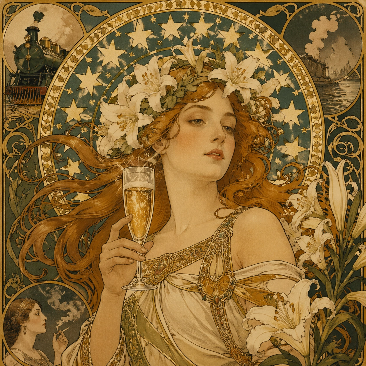
Example generated from “Art Nouveau Poster — Material Study”
GPT Image 2en

Scene: A square 1:1 composition designed as a premium Art Nouveau Poster study. Prioritize tactile evidence, surface transitions, print or object finish, and believable light response across the square frame. Use lighting, color, and spatial staging that make the core idea legible in one glance while still rewarding close inspection. The frame should feel display-ready rather than like a rough concept sheet, with balanced brightness, deliberate negative space, and clear separation of foreground, midground, and background layers. Subject: Interpret Art Nouveau Poster through 新艺术运动 · 19 世纪末. Draw from this visual direction: Alphonse Mucha 风 · 飘发女子 + 星形光环 + 百合藤蔓 + 书法 typography · 广告海报(香槟 / 火车 / 烟草). Focus on a material-focused interpretation where surface behavior and physical detail carry the theme. Build a primary focal subject, secondary support forms, and a coherent environmental envelope so the scene feels complete and specific. Treat this as an independent study with no continuity requirement beyond the shared theme language. Important details: Carry forward the theme's distinguishing value: 装饰艺术巅峰 · 石版印刷工艺黄金年代 · 现代品牌高级感挪用. Reflect the tested capabilities through visible decisions related to text-rendering, structured-layout, style-transfer, commercial-mockup. 更强图中文字渲染与版式跟随;复杂结构化视觉和多面板构图能力. Aim for these acceptance cues: 一眼能看出这是高难度炫技主题,不像普通模板图; 核心创意和画面结构无需解释即可成立. Keep the image controlled, elegant, and intentionally composed, with no accidental filler elements. Use case: Art Nouveau Poster single study 5/8, examining material and texture control inside the topic language. Constraints: No readable text, no watermark, no logos, preserve exact 1:1 aspect ratio, no muddy focal point, no duplicate main subject, no collage seams, no broken margin geometry, no accidental extra text blocks.

Example generated from “Art Nouveau Poster — Context Study”
GPT Image 2en

Scene: A square 1:1 composition designed as a premium Art Nouveau Poster study. Shift the environment and narrative setting while keeping the topic recognizable, with clear foreground and background relationships. Use lighting, color, and spatial staging that make the core idea legible in one glance while still rewarding close inspection. The frame should feel display-ready rather than like a rough concept sheet, with balanced brightness, deliberate negative space, and clear separation of foreground, midground, and background layers. Subject: Interpret Art Nouveau Poster through 新艺术运动 · 19 世纪末. Draw from this visual direction: Alphonse Mucha 风 · 飘发女子 + 星形光环 + 百合藤蔓 + 书法 typography · 广告海报(香槟 / 火车 / 烟草). Focus on a contextual interpretation that places the topic into a distinct scene or narrative situation. Build a primary focal subject, secondary support forms, and a coherent environmental envelope so the scene feels complete and specific. Treat this as an independent study with no continuity requirement beyond the shared theme language. Important details: Carry forward the theme's distinguishing value: 装饰艺术巅峰 · 石版印刷工艺黄金年代 · 现代品牌高级感挪用. Reflect the tested capabilities through visible decisions related to text-rendering, structured-layout, style-transfer, commercial-mockup. 更强图中文字渲染与版式跟随;复杂结构化视觉和多面板构图能力. Aim for these acceptance cues: 一眼能看出这是高难度炫技主题,不像普通模板图; 核心创意和画面结构无需解释即可成立. Keep the image controlled, elegant, and intentionally composed, with no accidental filler elements. Use case: Art Nouveau Poster single study 6/8, testing contextual variation without losing the theme identity. Constraints: No readable text, no watermark, no logos, preserve exact 1:1 aspect ratio, no muddy focal point, no duplicate main subject, no collage seams, no broken margin geometry, no accidental extra text blocks.

Example generated from “Art Nouveau Poster — Detail Study”
GPT Image 2en

Scene: A square 1:1 composition designed as a premium Art Nouveau Poster study. Use a closer, more inspectable presentation with crisp local details and restrained surrounding space. Use lighting, color, and spatial staging that make the core idea legible in one glance while still rewarding close inspection. The frame should feel display-ready rather than like a rough concept sheet, with balanced brightness, deliberate negative space, and clear separation of foreground, midground, and background layers. Subject: Interpret Art Nouveau Poster through 新艺术运动 · 19 世纪末. Draw from this visual direction: Alphonse Mucha 风 · 飘发女子 + 星形光环 + 百合藤蔓 + 书法 typography · 广告海报(香槟 / 火车 / 烟草). Focus on a detail-rich interpretation that reveals fine structure, ornament, small-scale logic, or craft evidence. Build a primary focal subject, secondary support forms, and a coherent environmental envelope so the scene feels complete and specific. Treat this as an independent study with no continuity requirement beyond the shared theme language. Important details: Carry forward the theme's distinguishing value: 装饰艺术巅峰 · 石版印刷工艺黄金年代 · 现代品牌高级感挪用. Reflect the tested capabilities through visible decisions related to text-rendering, structured-layout, style-transfer, commercial-mockup. 更强图中文字渲染与版式跟随;复杂结构化视觉和多面板构图能力. Aim for these acceptance cues: 一眼能看出这是高难度炫技主题,不像普通模板图; 核心创意和画面结构无需解释即可成立. Keep the image controlled, elegant, and intentionally composed, with no accidental filler elements. Use case: Art Nouveau Poster single study 7/8, testing fine-detail control and close inspection value. Constraints: No readable text, no watermark, no logos, preserve exact 1:1 aspect ratio, no muddy focal point, no duplicate main subject, no collage seams, no broken margin geometry, no accidental extra text blocks.
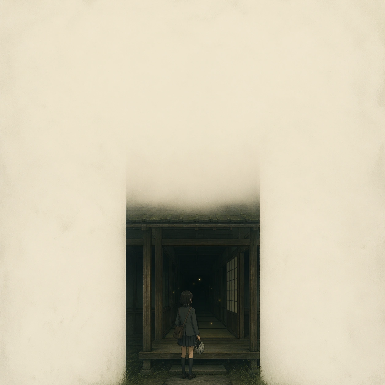
Example generated from “Art Nouveau Poster — Hero Study”
GPT Image 2en

Scene: A square 1:1 composition designed as a premium Art Nouveau Poster study. Use the cleanest, most polished version of the topic, with a slightly more dramatic but still controlled presentation. Use lighting, color, and spatial staging that make the core idea legible in one glance while still rewarding close inspection. The frame should feel display-ready rather than like a rough concept sheet, with balanced brightness, deliberate negative space, and clear separation of foreground, midground, and background layers. Subject: Interpret Art Nouveau Poster through 新艺术运动 · 19 世纪末. Draw from this visual direction: Alphonse Mucha 风 · 飘发女子 + 星形光环 + 百合藤蔓 + 书法 typography · 广告海报(香槟 / 火车 / 烟草). Focus on the most showcase-ready interpretation, refined into a decisive hero image for the topic. Build a primary focal subject, secondary support forms, and a coherent environmental envelope so the scene feels complete and specific. Treat this as an independent study with no continuity requirement beyond the shared theme language. Important details: Carry forward the theme's distinguishing value: 装饰艺术巅峰 · 石版印刷工艺黄金年代 · 现代品牌高级感挪用. Reflect the tested capabilities through visible decisions related to text-rendering, structured-layout, style-transfer, commercial-mockup. 更强图中文字渲染与版式跟随;复杂结构化视觉和多面板构图能力. Aim for these acceptance cues: 一眼能看出这是高难度炫技主题,不像普通模板图; 核心创意和画面结构无需解释即可成立. Keep the image controlled, elegant, and intentionally composed, with no accidental filler elements. Use case: Art Nouveau Poster single study 8/8, delivering the strongest finished single-image showcase. Constraints: No readable text, no watermark, no logos, preserve exact 1:1 aspect ratio, no muddy focal point, no duplicate main subject, no collage seams, no broken margin geometry, no accidental extra text blocks.
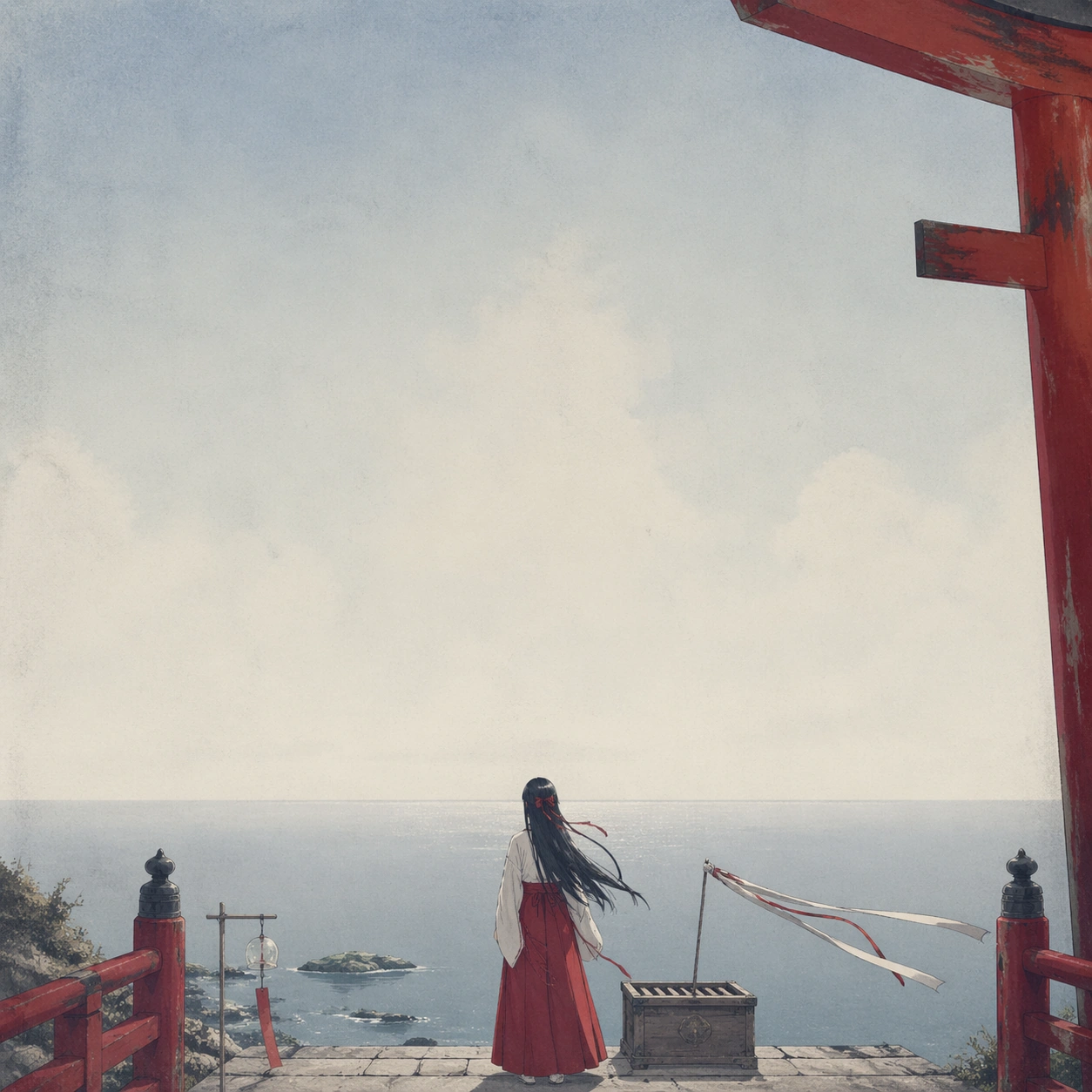
Example generated from “Arthouse One Sheet Anime Remake — Firefly Corridor”
GPT Image 2en

Scene: A square one-sheet with a dim rural corridor receding into darkness, viewed straight-on with strong symmetry but very soft contrast. The corridor occupies only the center strip of the frame, while the left and right edges fall into creamy off-white emptiness. The mood is humid summer night, with a few suspended firefly lights forming the only luminous accents. The poster should feel elegant, austere, and expensive, with a generous upper field left intentionally calm for implied title placement. Subject: At the corridor threshold stands an anime-coded teenage courier in a loose school blazer and pleated skirt, holding a bicycle helmet and a satchel. Her pose is paused, as if she has just stopped before stepping inside. The figure is small relative to the frame, but the gesture and silhouette must read clearly. Beyond her, the corridor contains tatami edges, wooden pillars, one open sliding door, and darkness layered with tiny floating fireflies. The scene suggests narrative promise and memory rather than overt action. Important details: Translate arthouse poster language into animation without slipping into glossy key art. Keep the palette to moss green, weathered wood brown, paper beige, and tiny yellow firefly sparks. Maintain a strict three-part hierarchy: blank negative space, corridor geometry, then the human figure. Any credit or laurel area should be represented only by faint modular line blocks or quiet spacing, never readable letters. The composition must feel emotionally precise and minimal, not decorative. Use case: Arthouse One-Sheet Anime Remake single study 2/9, testing whether a small anime figure can survive extreme emptiness and still carry the poster. Constraints: No readable text, no watermark, no logos, preserve exact 1:1 aspect ratio, no action pose, no neon cyberpunk effects, no cluttered background objects, no exaggerated facial expression.
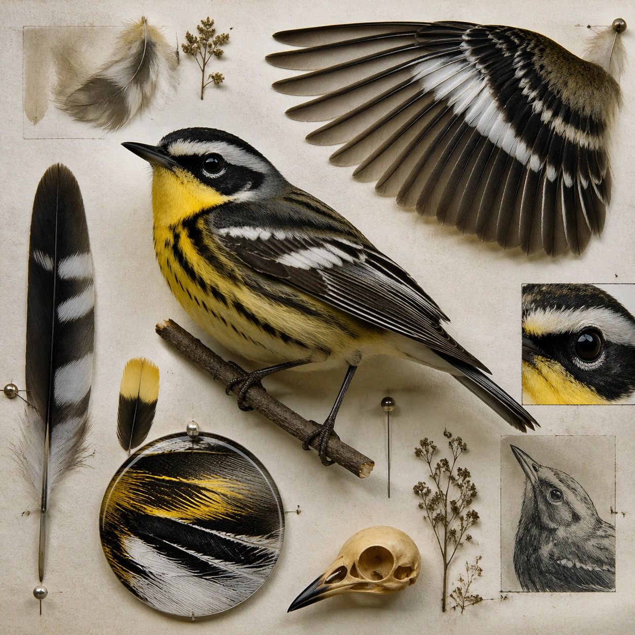

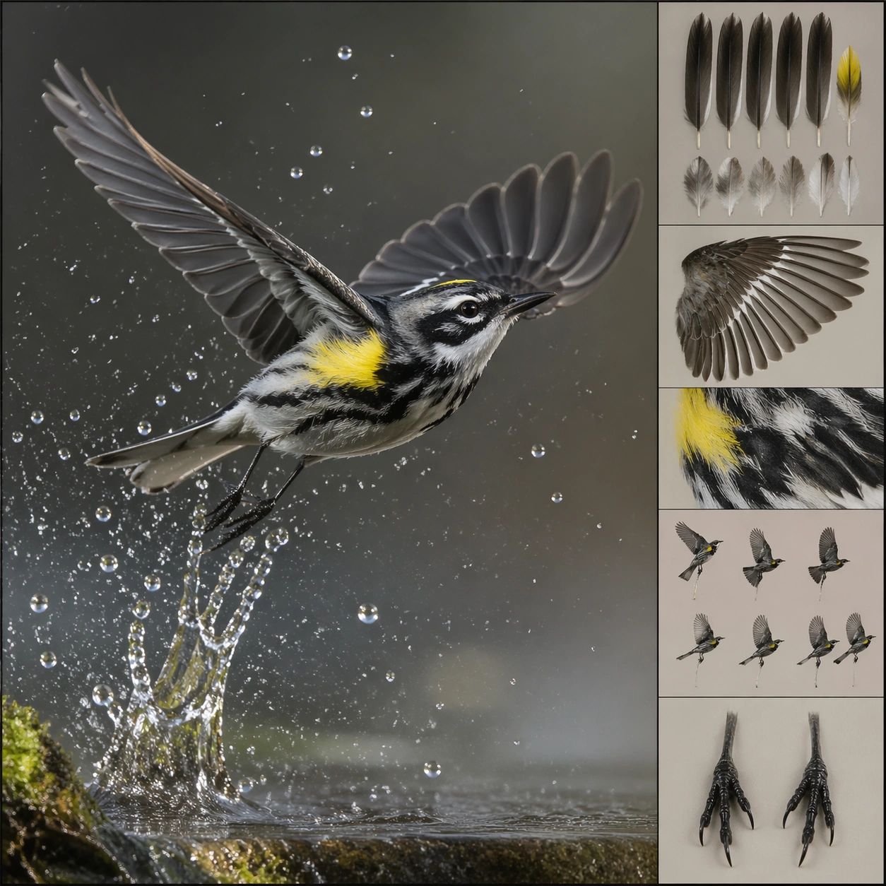
Example generated from “Arthouse One Sheet Anime Remake — Seaside Shrine Promise”
GPT Image 2en

Scene: A square poster framed like a high-end Japanese festival one-sheet: wide pale sky, a low horizon, and a tiny shrine stair descending toward a quiet sea. The composition should feel wind-washed and nearly empty, with the entire upper two-thirds reserved for atmosphere and implied typography space. Color is powder blue, faded vermilion, sea mist white, and a restrained note of charcoal. The image should read as contemplative, not mystical spectacle. Subject: A single anime-coded shrine maiden stands on the steps facing the ocean, seen from behind with long dark hair and a plain white-and-red robe rendered in a simplified, elegant manner. Near her feet are wind chimes, a weathered offering box, and one paper charm ribbon fluttering sideways. The sea is flat and distant. A red torii beam enters only partially from the top corner, giving the frame a strong poster anchor without overpowering the emptiness. The character must remain identifiable as an anime protagonist through shape language and styling, yet be subdued enough to belong in a prestige arthouse poster. Important details: The core challenge is balance: sacred seaside iconography, anime-coded character design, and severe layout restraint. Keep edges crisp, forms quiet, and the atmosphere airy. Use negative space as an active design element. Indicate possible title and credit zones through composition alone, not text. Avoid tourist-poster brightness; this should feel like a calm, serious festival selection sheet with subtle premium paper texture. Use case: Arthouse One-Sheet Anime Remake single study 3/9, centered on shrine iconography, horizon spacing, and a minimal protagonist silhouette. Constraints: No readable text, no watermark, no logos, preserve exact 1:1 aspect ratio, no dramatic explosion sky, no fantasy creatures, no excessive cherry blossoms, no glossy souvenir-poster styling.

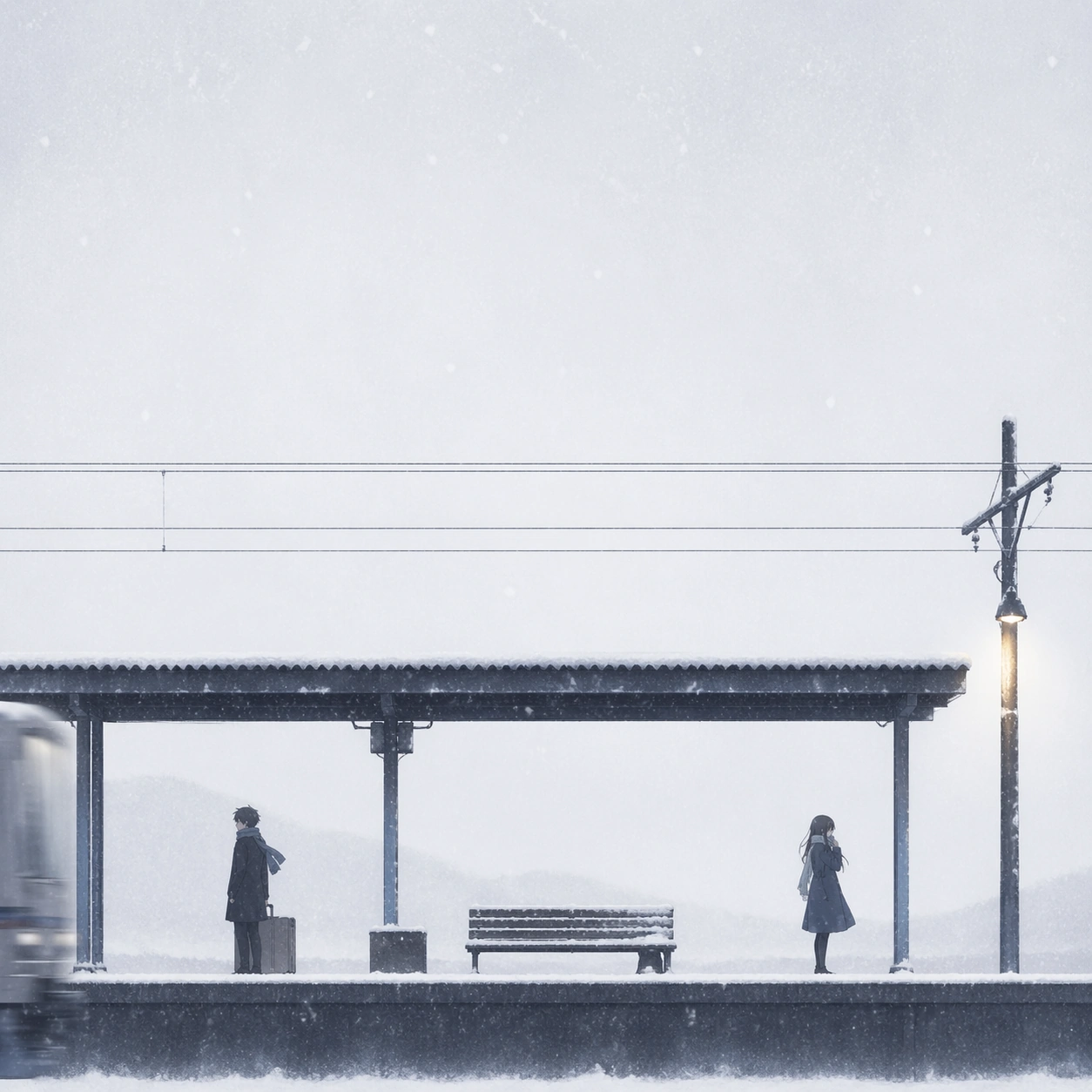
Example generated from “Arthouse One Sheet Anime Remake — Snow Platform Farewell”
GPT Image 2en

Scene: A square winter one-sheet with a nearly monochrome station platform cutting horizontally across the lower quarter of the image. Above it stretches a huge field of white snowfall and cold dusk haze, turning the poster into an exercise in quiet emptiness. The framing is slightly wide and distant, with thin utility wires and one platform lamp creating fine graphic lines. The overall look should resemble a prestigious farewell drama poster with almost absurdly careful restraint. Subject: Two anime-coded figures stand far apart on the platform, one carrying a suitcase and the other clutching a scarf near the mouth. They are small, understated, and separated by physical space rather than melodramatic gesture. A train is only implied by a blurred silver edge entering from one side, not fully visible. Snow gathers on the platform roof, the bench, and the characters' coats. Their silhouettes and hair shapes should remain distinct enough to suggest specific protagonists while keeping faces understated and emotionally internal. Important details: This image tests whether an anime farewell scene can be translated into the grammar of austere European festival posters. Keep the palette almost entirely white, silver-gray, faded navy, and one amber lamp. The negative space must feel intentional, not empty by accident. Suggest title and credit bands through alignment and spacing only. Use delicate falling snow, quiet grain, and premium paper finish. The emotional weight should come from distance and composition, not tears or dramatic posing. Use case: Arthouse One-Sheet Anime Remake single study 4/9, focused on separation, winter minimalism, and long-distance character readability. Constraints: No readable text, no watermark, no logos, preserve exact 1:1 aspect ratio, no full train dominating the frame, no bright saturated colors, no melodramatic crying pose, no dense crowd.

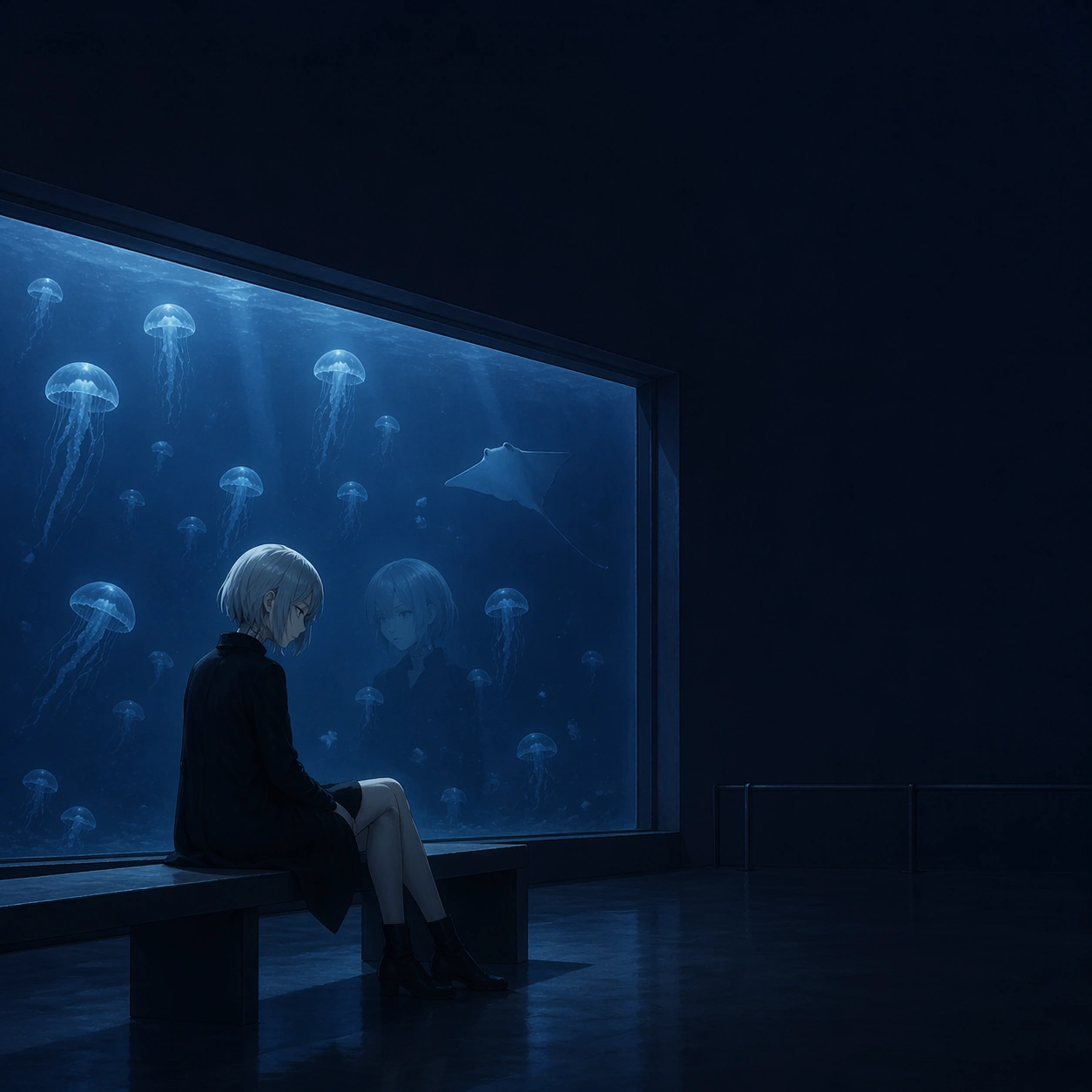
Example generated from “Arthouse One Sheet Anime Remake — Aquarium Midnight”
GPT Image 2en

Scene: A square midnight-blue one-sheet set in a public aquarium after closing hours. The scene is dominated by one large glass tank occupying the center-left of the frame, while the surrounding architecture fades into deep indigo shadow and generous negative space. The composition should be elegant and minimal, with a cool luminous rectangle acting as the poster's only major bright mass. Empty darkness above and to the right should feel intentionally reserved for a title block that never appears. Subject: In front of the tank sits an anime-coded android singer in a simple black coat, knees drawn slightly inward on a museum bench. Her silver hair catches the tank light, and a faint seam line at the neck hints at machine identity without turning the poster into science-fiction spectacle. Inside the tank drift jellyfish and one slow stingray, forming soft ghostly shapes around her reflection on the glass. The character should remain emotionally legible and iconic through posture and silhouette, but the image overall must feel like a contemplative festival drama poster rather than franchise key art. Important details: The visual discipline matters more than ornament. Use a tightly controlled palette of indigo, dim cyan, glass gray, and a tiny accent of pallid skin tone. Keep architecture simple, no crowded visitors, no product-design gadgets. Let the tank rectangle, bench line, and seated figure establish a calm poster geometry. Any space for copy or laurels should be implied as empty structure only. The tone should suggest loneliness, premium paper stock, and a slow-breathing art-film mood. Use case: Arthouse One-Sheet Anime Remake single study 5/9, testing sci-fi-coded identity inside a restrained museum-poster layout. Constraints: No readable text, no watermark, no logos, preserve exact 1:1 aspect ratio, no flashy holograms, no action effects, no bright neon palette, no crowded aquarium exhibits, no comedic expression.

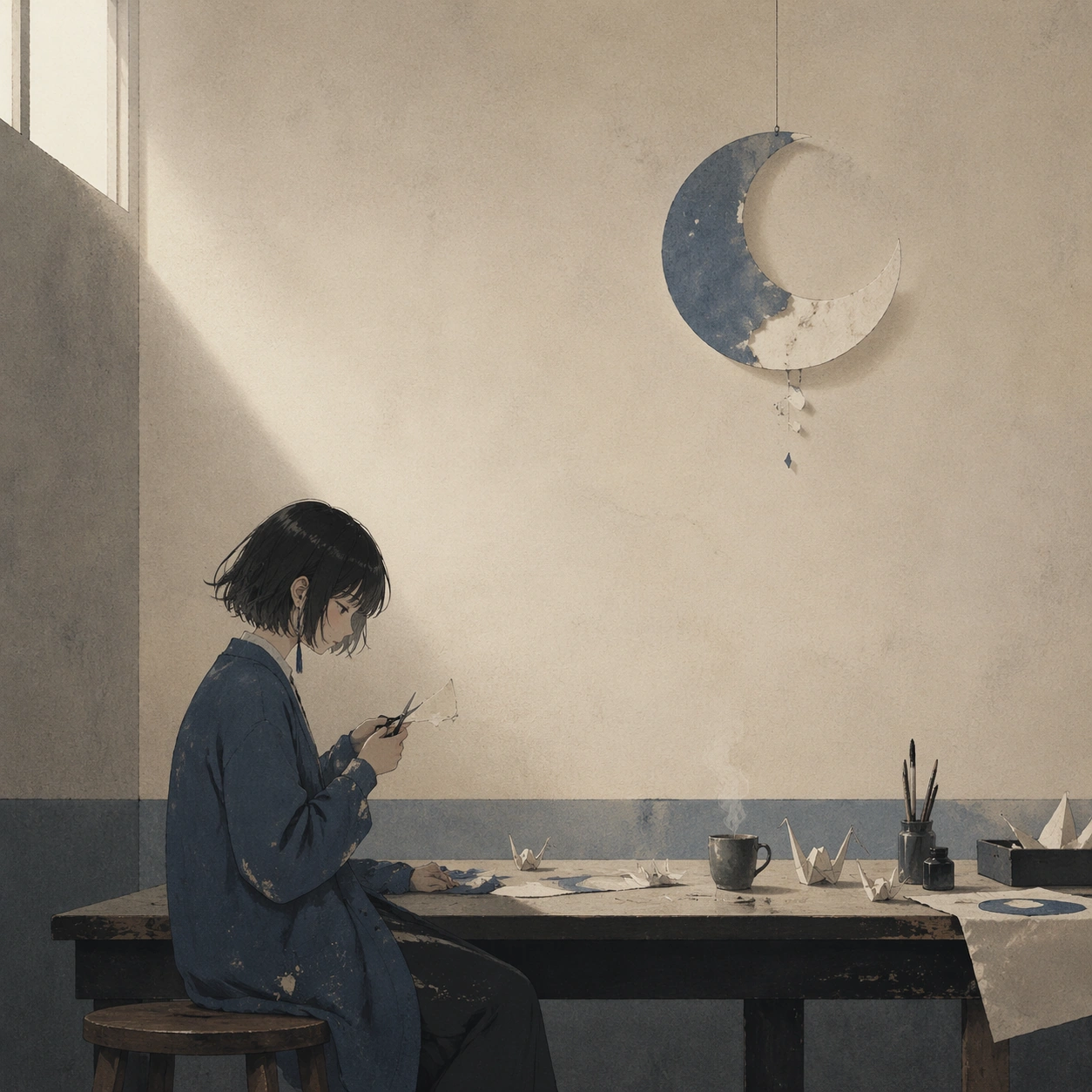
Example generated from “Arthouse One Sheet Anime Remake — Paper Moon Atelier”
GPT Image 2en

Scene: A square arthouse poster set in a dusty illustration studio at dawn, but composed with extreme restraint: one tall worktable, a cut-paper moon hanging near the ceiling, and soft pale light entering from a high window. The room is mostly muted beige and faded blue-gray, with broad empty wall space taking up nearly half of the frame. The geometry should feel editorial and still, as if designed for a gallery retrospective rather than a commercial anime release. Subject: An anime-coded young illustrator sits sideways on a wooden stool, cutting delicate paper shapes with tiny scissors. Around the table are unfinished paper cranes, moon fragments, ink brushes, and one cup of tea releasing a faint thread of steam. Her design should be memorable through haircut, cardigan silhouette, and careful hand gesture, but quiet enough to merge into the arthouse composition. The hanging paper moon becomes the symbolic anchor of the poster, balanced against the figure below and the blank wall above. Important details: The key is to translate hand-crafted anime whimsy into serious festival-poster discipline. Keep the palette subdued: cream paper, dusty ultramarine, soft graphite, tea brown, and a trace of warm morning light. Avoid a cute scrapbook feeling. Use one blank wall region, one table band, and one symbolic suspended shape to imply sophisticated layout structure. If any credits are suggested, they should appear only as abstract horizontal marks or empty reserved zones. Texture should feel tactile and premium, never busy. Use case: Arthouse One-Sheet Anime Remake single study 6/9, emphasizing handcrafted symbolism and measured poster balance. Constraints: No readable text, no watermark, no logos, preserve exact 1:1 aspect ratio, no whimsical clutter explosion, no saturated rainbow palette, no oversized props, no childish sticker aesthetic.

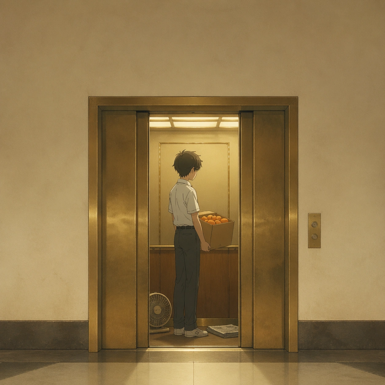
Example generated from “Arthouse One Sheet Anime Remake — Elevator to Summer”
GPT Image 2en

Scene: A square poster built around a single vintage elevator interior, doors half open, framed from directly outside so the cab becomes a clean luminous rectangle in the center. Outside the elevator is a quiet hotel corridor washed in pale cream shadow; inside the cab is warm late-summer gold. The composition should be simple and graphic, with a strong block of negative space above the doors and a thin band below, like a carefully art-directed festival one-sheet printed on matte paper. Subject: Inside the elevator stands an anime-coded boy in a summer uniform holding a cardboard box of oranges. He is turned slightly away, caught in an in-between moment before departure. At his feet sit a portable fan and a folded newspaper shape with no readable text. The figure should read instantly through posture, hair silhouette, and the orange box, while the box and the elevator create the main geometry. The corridor beyond remains empty, emphasizing the emotional pause. The image must hint at youth and memory without becoming sentimental advertising. Important details: Translate anime nostalgia into disciplined poster architecture. Keep the palette reduced to sun-faded cream, brass, muted citrus orange, and one cool gray shadow. Avoid cartoon brightness. The elevator opening should act like a stage within the poster, balancing the character and the box. Leave clear implied zones for title and billing without actual words. The final impression should be elegant, slightly melancholy, and suitable for a premium international film festival campaign. Use case: Arthouse One-Sheet Anime Remake single study 7/9, focused on architectural framing, youth memory, and object-led character recognition. Constraints: No readable text, no watermark, no logos, preserve exact 1:1 aspect ratio, no wide ensemble cast, no flashy lens flares, no comic exaggeration, no overdesigned corridor decor.

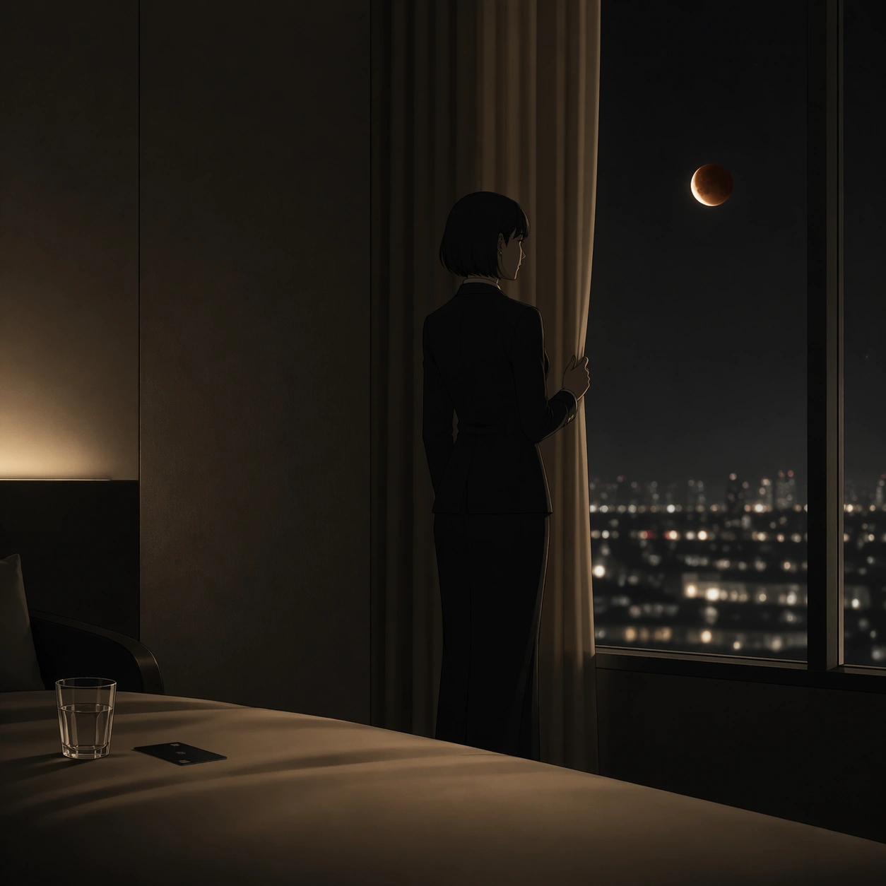
Example generated from “Arthouse One Sheet Anime Remake — Hotel Window Eclipse”
GPT Image 2en

Scene: A square nocturnal one-sheet set in a narrow hotel room overlooking a city during a lunar eclipse. The composition is mostly darkness and soft hotel beige, with the glowing window occupying the right third and a bed edge or chair barely defining the lower left. The poster should feel still, luxurious, and emotionally withheld, like a Venice competition drama campaign. The eclipse outside the window becomes a small but precise focal point suspended in wide negative darkness. Subject: An anime-coded concierge woman in a sharply tailored black uniform stands near the curtains, one hand touching the fabric while watching the eclipse. Her haircut is sleek, her posture controlled, and her presence elegant rather than theatrical. The city below is soft bokeh, not detailed skyline spectacle. Inside the room, only a glass tumbler, a single keycard, and the crease of immaculate sheets suggest narrative context. The figure must remain recognizable through silhouette and tailoring, yet the overall poster should privilege mood, spacing, and architectural calm over character fan-service. Important details: The challenge is premium composure. Use charcoal, champagne beige, faded moon gold, and muted city-light silver. Keep contrast smooth and the room nearly bare. Let the window rectangle, curtain line, and standing figure establish the whole layout. Any area for title or laurels must exist as measured blank zones or abstract placement guides only. Avoid thriller clichés; this is an adult, serious, international-festival visual language translated onto an anime-coded heroine. Use case: Arthouse One-Sheet Anime Remake single study 8/9, testing hotel-drama elegance and subtle lunar symbolism within strict poster restraint. Constraints: No readable text, no watermark, no logos, preserve exact 1:1 aspect ratio, no flashy skyline detail, no mirror collage, no overt detective props, no glossy fashion-ad glamour lighting.

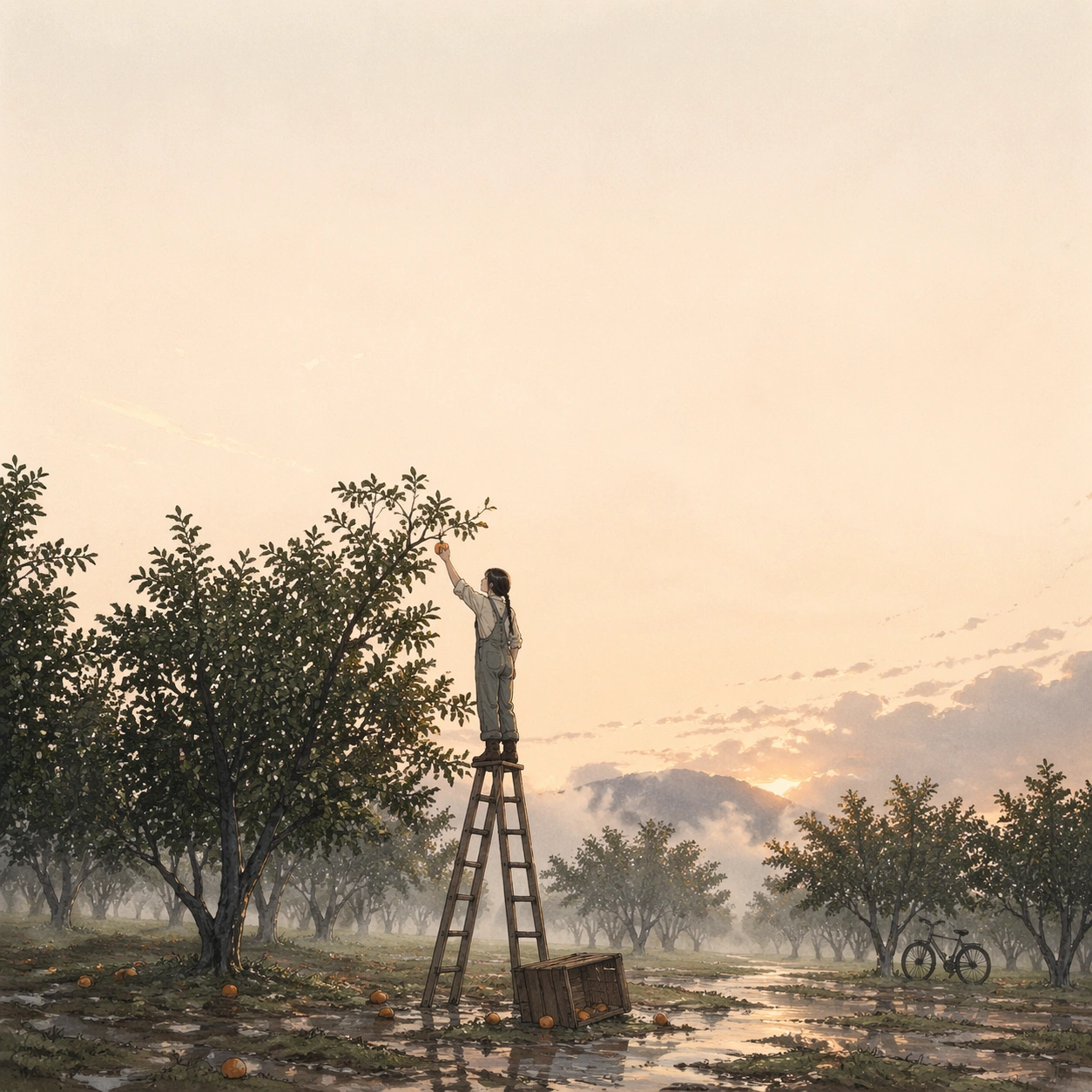
Example generated from “Arthouse One Sheet Anime Remake — Orchard After Credits”
GPT Image 2en

Scene: A square final one-sheet set in an orchard at first light after a storm. The composition is airy and sparse: rows of wet trees recede diagonally, but most of the image is pale dawn mist and open sky. In the lower center sits a simple ladder and overturned wooden crate, establishing a quiet geometric base. The look should feel like a premium postscript poster, calm and reflective, with soft matte texture and a large untouched upper field where a title could live without actually appearing. Subject: A lone anime-coded orchard keeper in work overalls stands on the ladder, one arm reaching to touch a single remaining orange caught in a branch. The figure is small and lightly stylized, with a clear braid silhouette and practical boots. Fallen fruit glistens on the ground, and a bicycle leans against one distant tree. The character should feel emotionally complete and recognizable through shape, but the orchard, ladder, and mist must together carry equal weight. The whole poster should imply the final quiet beat after a larger unseen story has ended. Important details: This image should close the package with serenity rather than climax. Use washed apricot dawn, leaf green darkened by rain, pale silver mist, and muted wood brown. Keep all elements cleanly spaced. The ladder should create a vertical accent that balances the broad horizontal orchard rows and the blank sky. Suggest credits or laurels only through compositional breathing room and thin abstract line placement, never readable text. Avoid postcard sweetness; aim for mature festival-poster calm with anime-coded tenderness. Use case: Arthouse One-Sheet Anime Remake single study 9/9, serving as a quiet epilogue built from orchard geometry, post-rain atmosphere, and restrained character presence. Constraints: No readable text, no watermark, no logos, preserve exact 1:1 aspect ratio, no busy harvest market, no oversaturated sunrise, no whimsical fantasy creatures, no sentimental collage treatment.

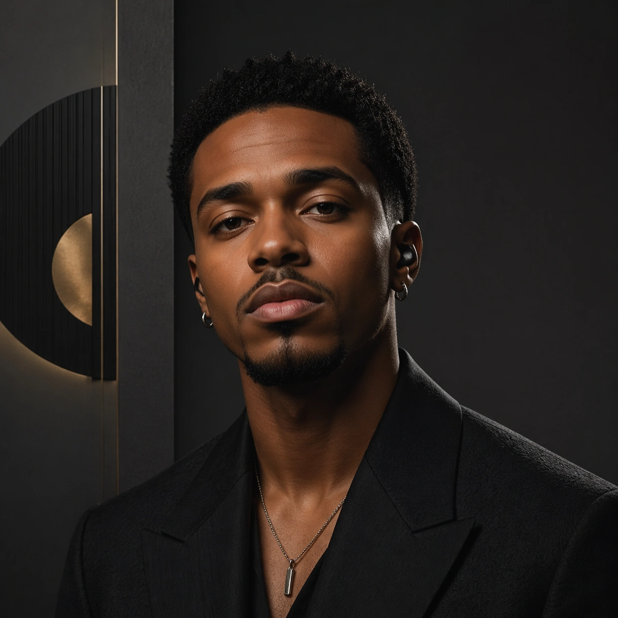
Example generated from “Artist Identity Portrait And Brand Kit — Reference Press Portrait”
GPT Image 2en

Scene: A square studio portrait composed like the lead image of a press kit, with neutral charcoal backdrop panels, one soft key light, one narrow rim light, and a controlled layout field that leaves room for future campaign overlays. The camera stays at eye level and slightly close, creating an image that feels intimate, expensive, and usable across editorial and promotional contexts. Subject: An invented recording artist faces the camera with relaxed authority, wearing a dark tailored jacket, short textured curls, subtle silver jewelry, and a minimal in-ear monitor. This first image must establish the exact face shape, hair base, skin tone, body proportions, and overall demeanor that later kit images will preserve without drift. Important details: The brand-kit language should feel mature and press-ready: abstract geometric emblem panels, muted metallic accents, and disciplined negative space rather than literal readable logos. Skin texture, fabric response, and lighting falloff should be photoreal and believable. The result should communicate a full artist identity system, not just a generic attractive portrait. Use case: Artist Kit series study 1/9 for the Artist Identity Portrait and Brand Kit Prompt Atlas theme. Constraints: No readable text, no watermark, no logos, preserve exact 1:1 aspect ratio, no microphone as hero prop, no stage crowd, no heavy makeup glamour excess, no wide smile, no busy background graphics, no fashion-brand cues

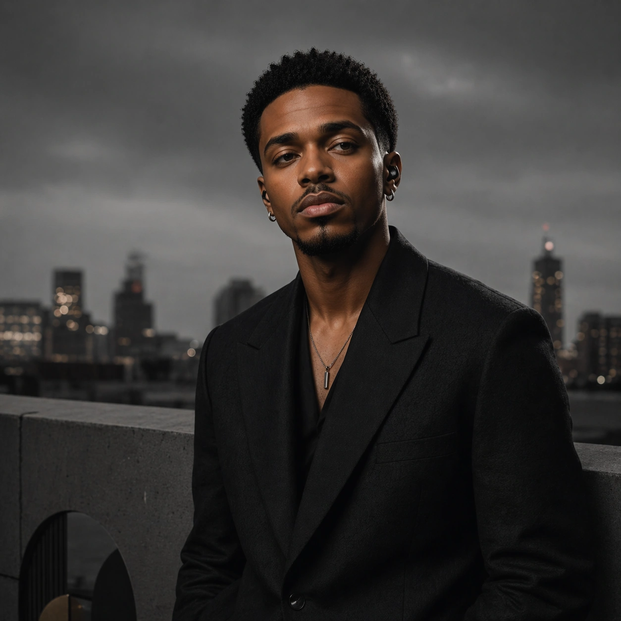
Example generated from “Artist Identity Portrait And Brand Kit — Monochrome Rooftop”
GPT Image 2en

Scene: A square rooftop portrait at overcast dusk, framed with clean city blur in the distance and a cooler, more editorial monochrome lighting scheme. The composition remains simple and press-usable, with enough empty edge space for later campaign use but a more atmospheric setting than the studio reference. Subject: Preserve the exact same artist from the reference image, including face shape, hair base, skin tone, and body proportions. The subject leans lightly against a concrete parapet in the same tailored jacket family, with the gaze turned slightly off-camera and the same calm authority carried into a more documentary urban setting. Important details: The image should widen the artist kit without breaking identity lock. Keep the portrait realistic, the geometry disciplined, and the palette nearly monochrome with only minimal metallic highlights. Abstract emblem cues can appear as architectural shadows or reflective inserts, but the artist must remain the undeniable center and must read as the exact same person from the reference portrait. Use case: Artist Kit series study 2/9 for the Artist Identity Portrait and Brand Kit Prompt Atlas theme. Constraints: No readable text, no watermark, no logos, preserve exact 1:1 aspect ratio, preserve the exact reference face, hair base, and body proportions; no sunset orange explosion, no rooftop party extras, no hats hiding the hair, no lens gimmicks, no streetwear brand graphics

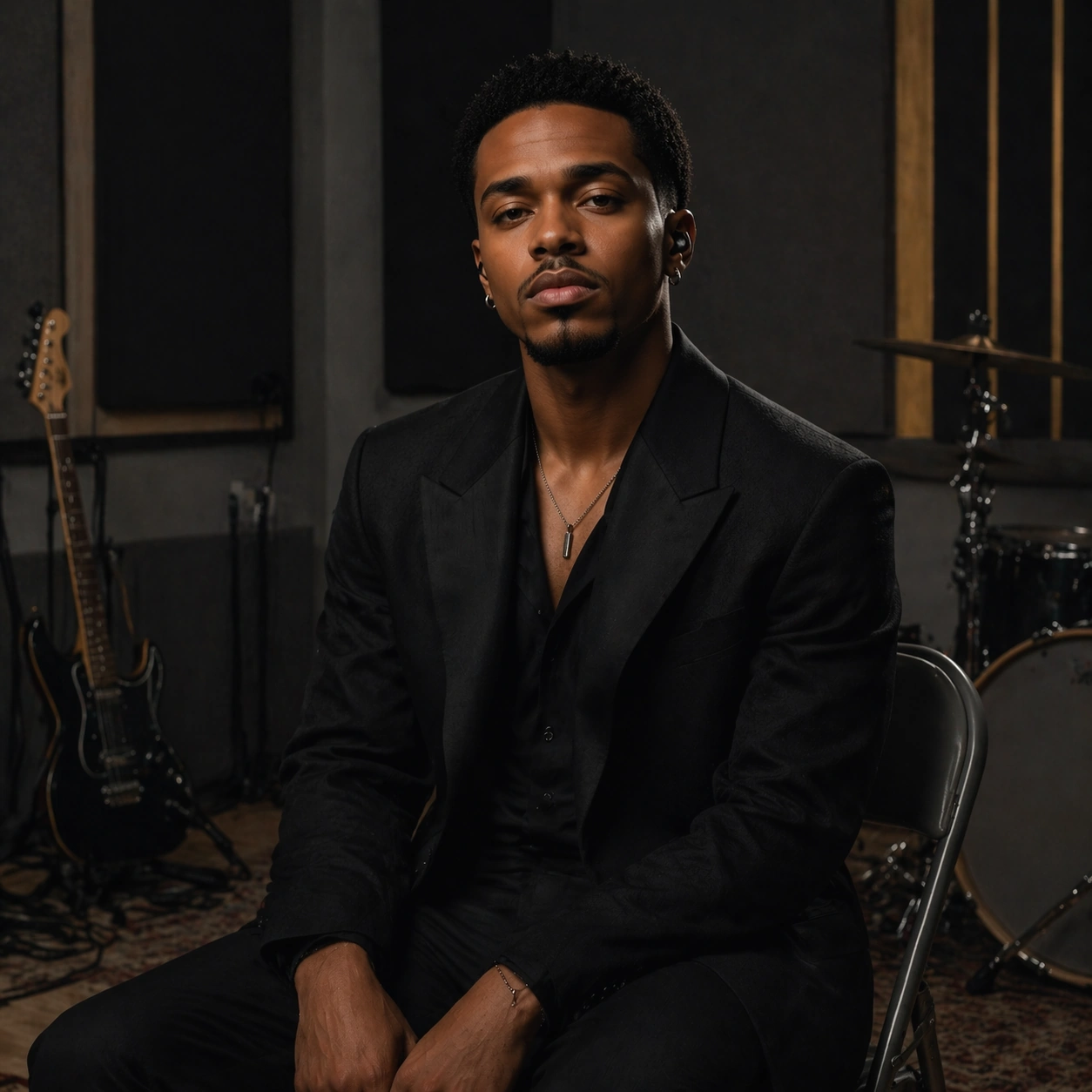
Example generated from “Artist Identity Portrait And Brand Kit — Rehearsal Chair Kit”
GPT Image 2en

Scene: A square rehearsal-space portrait shot in a clean room with acoustic panels, a folded chair, muted practical lighting, and shallow depth that hints at instruments without turning them into clutter. The image should feel grounded and human, like a credible press-kit portrait made during production downtime. Subject: Preserve the exact same artist from the reference image with identical face structure, hair base, skin tone, and body proportions. The artist sits on a simple chair with shoulders relaxed, hands resting naturally, and a tailored dark outfit that still matches the broader identity grammar established in the studio portrait. Important details: Use the room only to reinforce musician context, not to overwhelm the portrait. Subtle instrument silhouettes, cable loops, and acoustic textures are acceptable if they stay secondary. The true continuity comes from the artist face, grooming, wardrobe silhouette, and abstract emblem logic carried through lighting and layout. This should feel like a practical extension of a real artist brand kit. Use case: Artist Kit series study 3/9 for the Artist Identity Portrait and Brand Kit Prompt Atlas theme. Constraints: No readable text, no watermark, no logos, preserve exact 1:1 aspect ratio, preserve the exact reference face, hair base, and body proportions; no loud instrument performance pose, no cluttered gear stacks, no audience, no casual hoodie swap, no readable posters on the wall

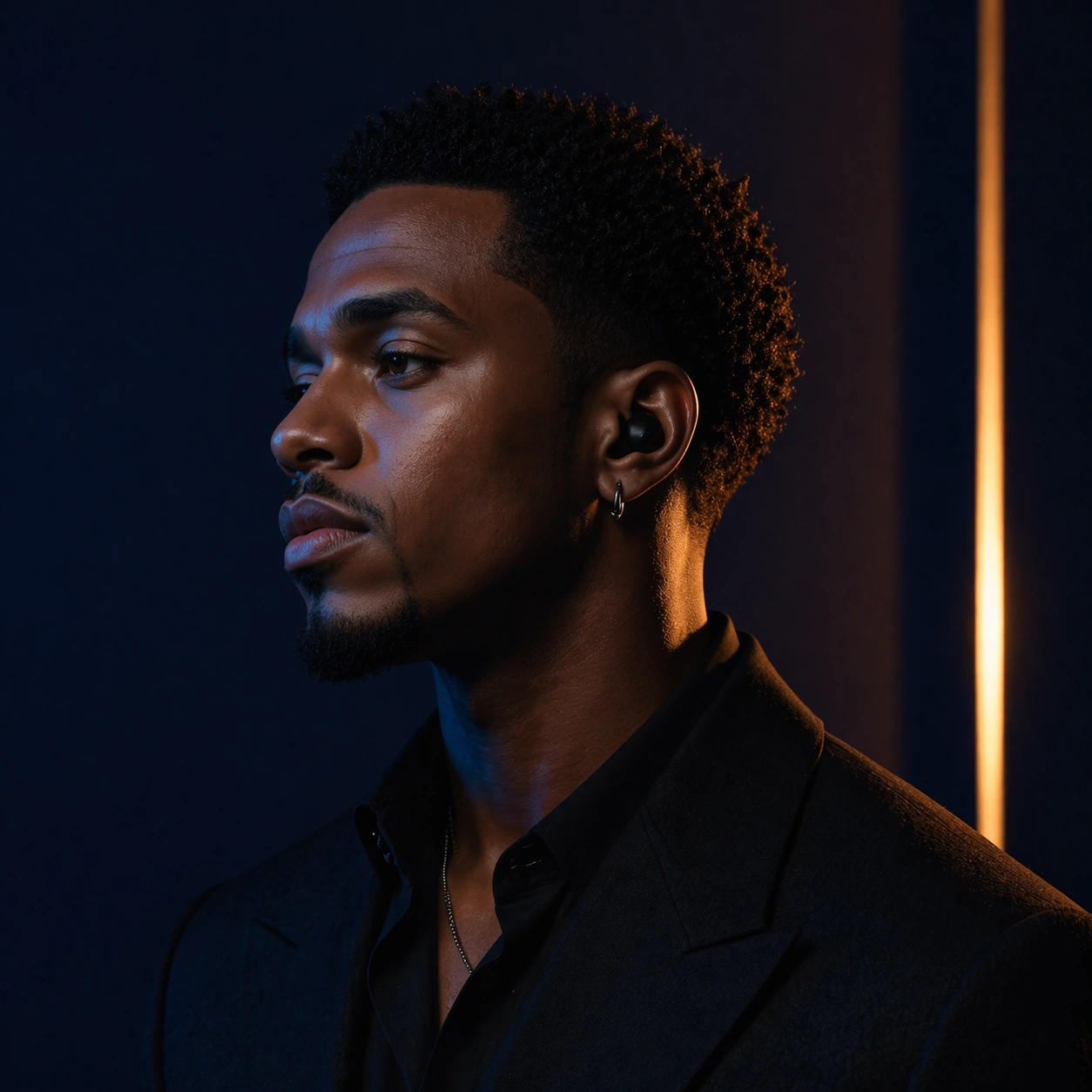
Example generated from “Artist Identity Portrait And Brand Kit — Gel Light Profile”
GPT Image 2en

Scene: A square profile portrait in a dark controlled studio, lit by one deep blue gel and one narrow amber edge light so the face contours feel sculptural and campaign-ready. The frame should feel like a social-campaign extension of the press kit, with dramatic color but still enough restraint to remain usable. Subject: Preserve the exact same artist from the reference image, keeping the identical face shape, hair base, skin tone, and body proportions. The subject turns into profile while staying recognizably the same person, wearing the same core tailoring language with only subtle styling shifts in collar and jewelry placement. Important details: This variation should add mood, not replace the brand system. Keep skin detail real, highlights controlled, and the background simple. Abstract emblem cues can appear as colored light bars or shadow panels, but there should be no literal logo. The primary test is whether the portrait still reads as the same artist while the campaign expands into a richer emotional register. Use case: Artist Kit series study 4/9 for the Artist Identity Portrait and Brand Kit Prompt Atlas theme. Constraints: No readable text, no watermark, no logos, preserve exact 1:1 aspect ratio, preserve the exact reference face, hair base, and body proportions; no hard beauty-retouch look, no smoky nightclub crowd, no costume-level wardrobe change, no extreme close crop, no colored text elements

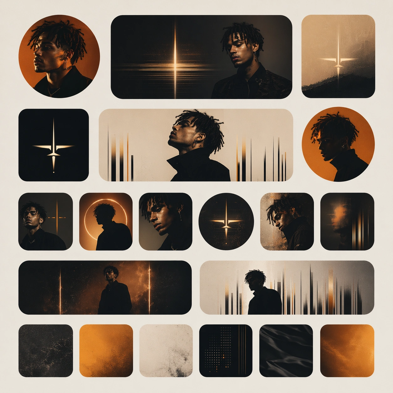
Example generated from “Artist Identity Portrait And Brand Kit — Social Avatar Grid”
GPT Image 2en

Scene: A square grid composition on a clean matte background, showing multiple circular and rounded-square profile crops, abstract cover headers, and muted accent tiles arranged as if they belong to one social identity rollout. The framing should feel like a polished campaign board rather than a software screenshot. Subject: Each tile contains a version of the same invented artist language: portrait fragments, emblem marks, abstract light bars, and gradient fields prepared for social surfaces. The grid should communicate small-format recognizability and consistency, not literal app interface branding. Important details: Prioritize compression clarity, facial memorability, and system logic. The board should look like a design presentation for a musician launch kit, with varied crop behavior but one shared visual ownership. Use disciplined spacing, clean edge alignment, and subtle texture changes to keep the image from feeling flat or generic. Use case: Artist Kit single study 6/9 for the Artist Identity Portrait and Brand Kit Prompt Atlas theme. Constraints: No readable text, no watermark, no logos, preserve exact 1:1 aspect ratio, no recognizable social-media UI, no readable follower numbers, no notification icons, no bright rainbow palette, no random unrelated photos

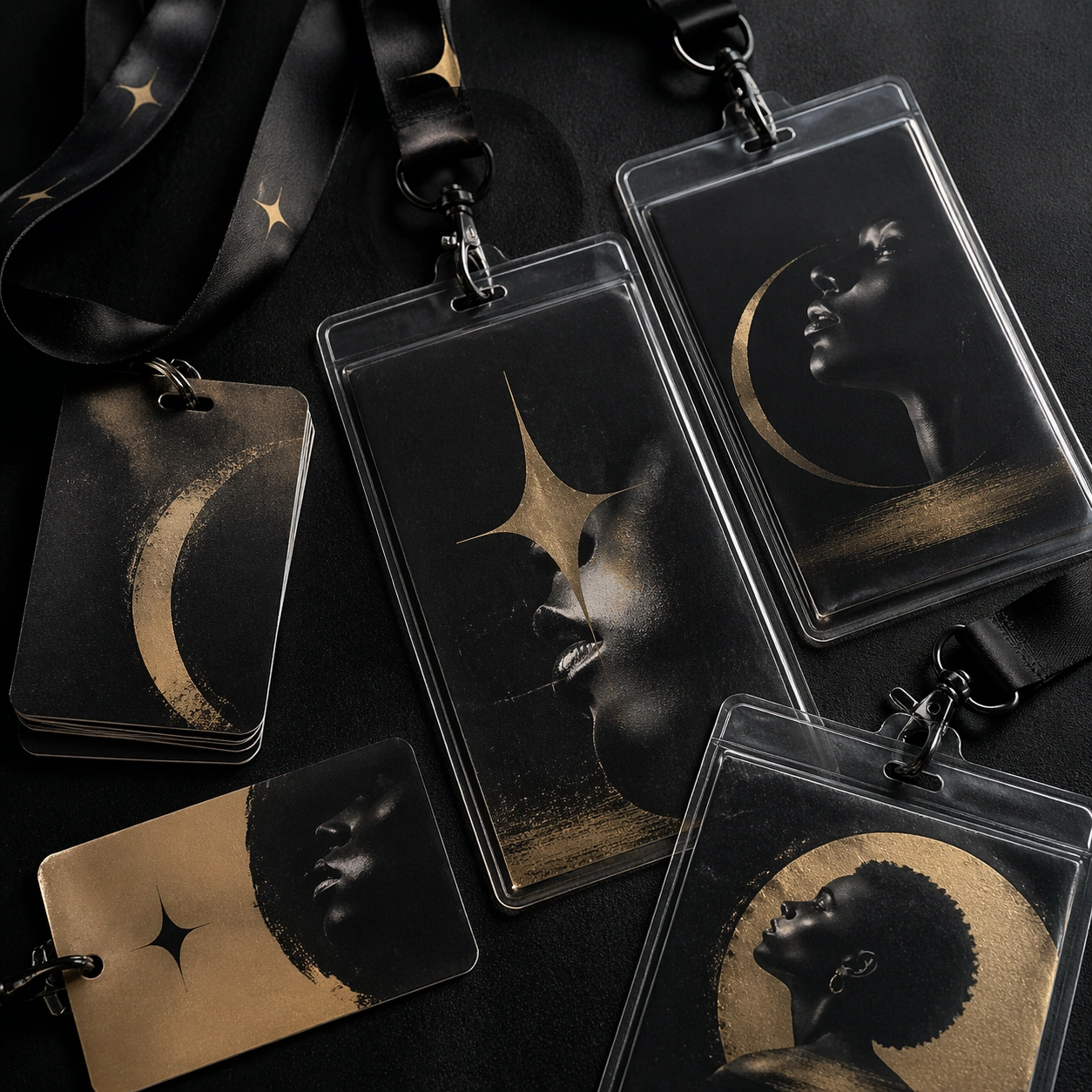
Example generated from “Artist Identity Portrait And Brand Kit — Credential Pass Study”
GPT Image 2en

Scene: A square tabletop product shot of layered backstage passes, satin lanyards, clear laminate sleeves, and clipped portrait inserts arranged with high-end object photography discipline. Light should skim the plastic edges and reveal subtle scuffs, gloss, and realistic material thickness. Subject: The composition centers on credential objects designed for an invented artist campaign: abstract portrait crops, emblem shapes, matte-black fields, and one muted metallic accent repeated across multiple passes. The objects should feel usable and event-realistic, but completely free of readable names or venue logos. Important details: This is a test of whether artist identity can survive on practical access objects. Keep the materials believable, the spacing tidy, and the brand language consistent. The passes should feel premium and music-industry specific rather than corporate conference badges or fashion guest lists. Use case: Artist Kit single study 7/9 for the Artist Identity Portrait and Brand Kit Prompt Atlas theme. Constraints: No readable text, no watermark, no logos, preserve exact 1:1 aspect ratio, no barcodes, no readable numbers, no event logo, no tabletop clutter beyond the credential set, no harsh direct flash look

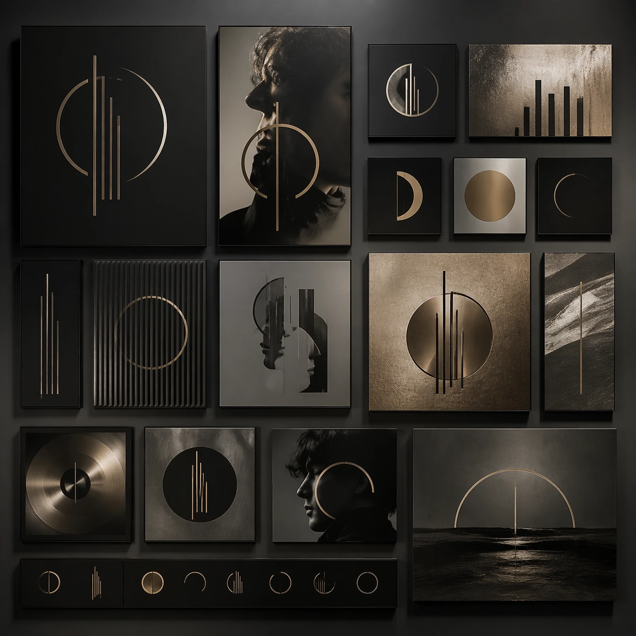
Example generated from “Artist Identity Portrait And Brand Kit — Emblem Wall Study”
GPT Image 2en

Scene: A square studio installation image showing a wall of mounted panels, each carrying an abstract emblem fragment, muted portrait crop, or textured metallic field. The camera is frontal and balanced so the wall reads like a serious campaign language board, not a gallery gimmick. Subject: The subject is the emblem system itself: circles, bars, profile fragments, and tonal fields arranged into a coherent non-verbal identity for a fictional musician. One or two portrait glimpses can appear, but the primary purpose is to show the ownership of a visual mark system without relying on typography. Important details: The installation should feel refined, presentable, and music-industry credible. Use material contrast such as brushed metal, matte board, smoked acrylic, and soft shadow. The panel arrangement must feel intentional and branded, suggesting how an artist identity could extend into sets, packaging, and publicity without needing literal words. Use case: Artist Kit single study 8/9 for the Artist Identity Portrait and Brand Kit Prompt Atlas theme. Constraints: No readable text, no watermark, no logos, preserve exact 1:1 aspect ratio, no museum labels, no visible screws dominating the frame, no random colors, no graffiti feel, no decorative flourishes unrelated to the emblem system

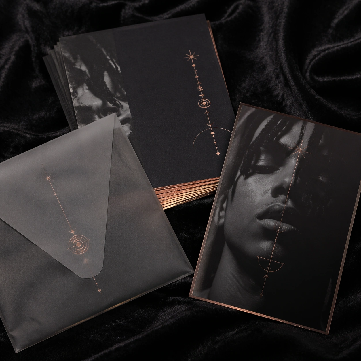
Example generated from “Artist Identity Portrait And Brand Kit — Listening Party Invite”
GPT Image 2en

Scene: A square close tabletop shot of stacked invite cards, a translucent envelope, metallic edge foil, and one portrait insert arranged on dark velvet. The lighting should feel intimate and premium, revealing card stock thickness, foil reflection, and the ritual atmosphere of a private music event invite. Subject: The cards carry an invented artist identity through portrait fragments, abstract symbols, and controlled layout zones intended for future event information. The package must read as exclusive music collateral, something for a listening party or press preview, without actually printing legible names or schedules. Important details: The visual test here is desirability through restraint. Use a muted palette, tactile materials, and a small set of repeating brand cues so the invite system feels connected to a larger artist kit. Keep everything elegant, not wedding-like or luxury-fashion generic. It should remain distinctly anchored in contemporary music publicity. Use case: Artist Kit single study 9/9 for the Artist Identity Portrait and Brand Kit Prompt Atlas theme. Constraints: No readable text, no watermark, no logos, preserve exact 1:1 aspect ratio, no wax seals, no floral styling, no handwritten calligraphy, no visible address fields, no extra props unrelated to the invite package

Example generated from “Athlete Spotlight And Profile Card Family — Reference Athlete Anchor”
GPT Image 2en

Scene: Create a square athlete spotlight hero card for Athlete Cards, using a premium arena-adjacent portrait world with charcoal backgrounds, cool blue edge light, and one vivid accent color. The frame should feel commercial, polished, and immediately useful for a real client deliverable rather than a one-off art experiment. Keep the composition readable at thumbnail scale while still rewarding a closer look with layered depth, clean negative space, and strong directional light. Build the image so it clearly supports sports communication, with enough modular structure to imply information architecture without relying on literal words. Subject: Center the image on one original elite athlete with a specific haircut, clear facial structure, realistic skin texture, and a brandless performance uniform, arranged as waist-up athlete portrait. Treat the subject as original and brandless, with believable apparel construction, realistic body proportions, and strong emotional legibility. Surround the subject with supporting environmental cues that reinforce the category but never overpower the main figure. All secondary objects, props, and background elements should strengthen the same professional sports or fitness context. Important details: This first image must establish the full reference system for later derivatives: profile-card modules, non-readable stat zones, and polished editorial-sports framing. The emotional tone should read as composed authority. Make the visual language reusable, disciplined, and commercially credible, with clean edges, coherent light behavior, and obvious hierarchy. Abstract panels, diagram bands, or stat-like modules are welcome, but they must remain non-readable and subordinate to the main visual message. The result should feel original, specific, and ready to anchor a larger package. Use case: Athlete Cards series study 1/9, the reference image for the package. Constraints: No readable text, no watermark, no logos, preserve exact 1:1 aspect ratio, no brand marks, no copied famous team or product identity, no generic stock-photo stiffness, no cluttered background noise, no celebrity likenesses.

Example generated from “Athlete Spotlight And Profile Card Family — Stat-dominant Card”
GPT Image 2en

Scene: Build a square stat-heavy player card derived from the reference image for Athlete Cards. Preserve the exact world established by the reference image, including the same palette family, lighting direction, environmental logic, and surface finish. The new frame should feel like a deliberate extension of one campaign system, not a separate concept. Shift the hierarchy to suit this use case, but keep the overall composition commercial, polished, and ready for real rollout. Subject: Use the same original subject identity and anchor cues introduced by the reference image, now organized as direct-facing athlete. Keep faces, hair logic, body proportions, apparel or product construction, and major supporting forms consistent with the reference. Allow only the layout emphasis, pose, crop, and contextual energy to change so the result clearly belongs to the same package. Important details: Continuity is the main challenge. Preserve the exact reference language for color, materials, framing rhythm, and overall brandless campaign grammar while steering the tone toward analytical confidence. Keep any stat blocks, schedule modules, arrows, badges, or callout panels non-readable. The derivative should prove that the same art direction can handle a different communication task without losing identity or utility. Make it credible for production use, with clean edges, intentional spacing, and no random decorative elements. Use case: Athlete Cards series study 2/9, a derivative surface linked to 01-reference-athlete-anchor. Constraints: No readable text, no watermark, no logos, preserve exact 1:1 aspect ratio, no new subject identity, no brand marks, no palette drift, no unrelated props, no collage chaos, no copied public-figure styling.

Example generated from “Athlete Spotlight And Profile Card Family — Action Burst Card”
GPT Image 2en

Scene: Build a square action burst athlete card derived from the reference image for Athlete Cards. Preserve the exact world established by the reference image, including the same palette family, lighting direction, environmental logic, and surface finish. The new frame should feel like a deliberate extension of one campaign system, not a separate concept. Shift the hierarchy to suit this use case, but keep the overall composition commercial, polished, and ready for real rollout. Subject: Use the same original subject identity and anchor cues introduced by the reference image, now organized as same athlete in controlled motion. Keep faces, hair logic, body proportions, apparel or product construction, and major supporting forms consistent with the reference. Allow only the layout emphasis, pose, crop, and contextual energy to change so the result clearly belongs to the same package. Important details: Continuity is the main challenge. Preserve the exact reference language for color, materials, framing rhythm, and overall brandless campaign grammar while steering the tone toward kinetic intensity. Keep any stat blocks, schedule modules, arrows, badges, or callout panels non-readable. The derivative should prove that the same art direction can handle a different communication task without losing identity or utility. Make it credible for production use, with clean edges, intentional spacing, and no random decorative elements. Use case: Athlete Cards series study 3/9, a derivative surface linked to 01-reference-athlete-anchor. Constraints: No readable text, no watermark, no logos, preserve exact 1:1 aspect ratio, no new subject identity, no brand marks, no palette drift, no unrelated props, no collage chaos, no copied public-figure styling.

Example generated from “Athlete Spotlight And Profile Card Family — Captain Editorial Card”
GPT Image 2en

Scene: Build a square captain editorial card derived from the reference image for Athlete Cards. Preserve the exact world established by the reference image, including the same palette family, lighting direction, environmental logic, and surface finish. The new frame should feel like a deliberate extension of one campaign system, not a separate concept. Shift the hierarchy to suit this use case, but keep the overall composition commercial, polished, and ready for real rollout. Subject: Use the same original subject identity and anchor cues introduced by the reference image, now organized as same athlete in three-quarter stance. Keep faces, hair logic, body proportions, apparel or product construction, and major supporting forms consistent with the reference. Allow only the layout emphasis, pose, crop, and contextual energy to change so the result clearly belongs to the same package. Important details: Continuity is the main challenge. Preserve the exact reference language for color, materials, framing rhythm, and overall brandless campaign grammar while steering the tone toward calm leadership. Keep any stat blocks, schedule modules, arrows, badges, or callout panels non-readable. The derivative should prove that the same art direction can handle a different communication task without losing identity or utility. Make it credible for production use, with clean edges, intentional spacing, and no random decorative elements. Use case: Athlete Cards series study 4/9, a derivative surface linked to 01-reference-athlete-anchor. Constraints: No readable text, no watermark, no logos, preserve exact 1:1 aspect ratio, no new subject identity, no brand marks, no palette drift, no unrelated props, no collage chaos, no copied public-figure styling.

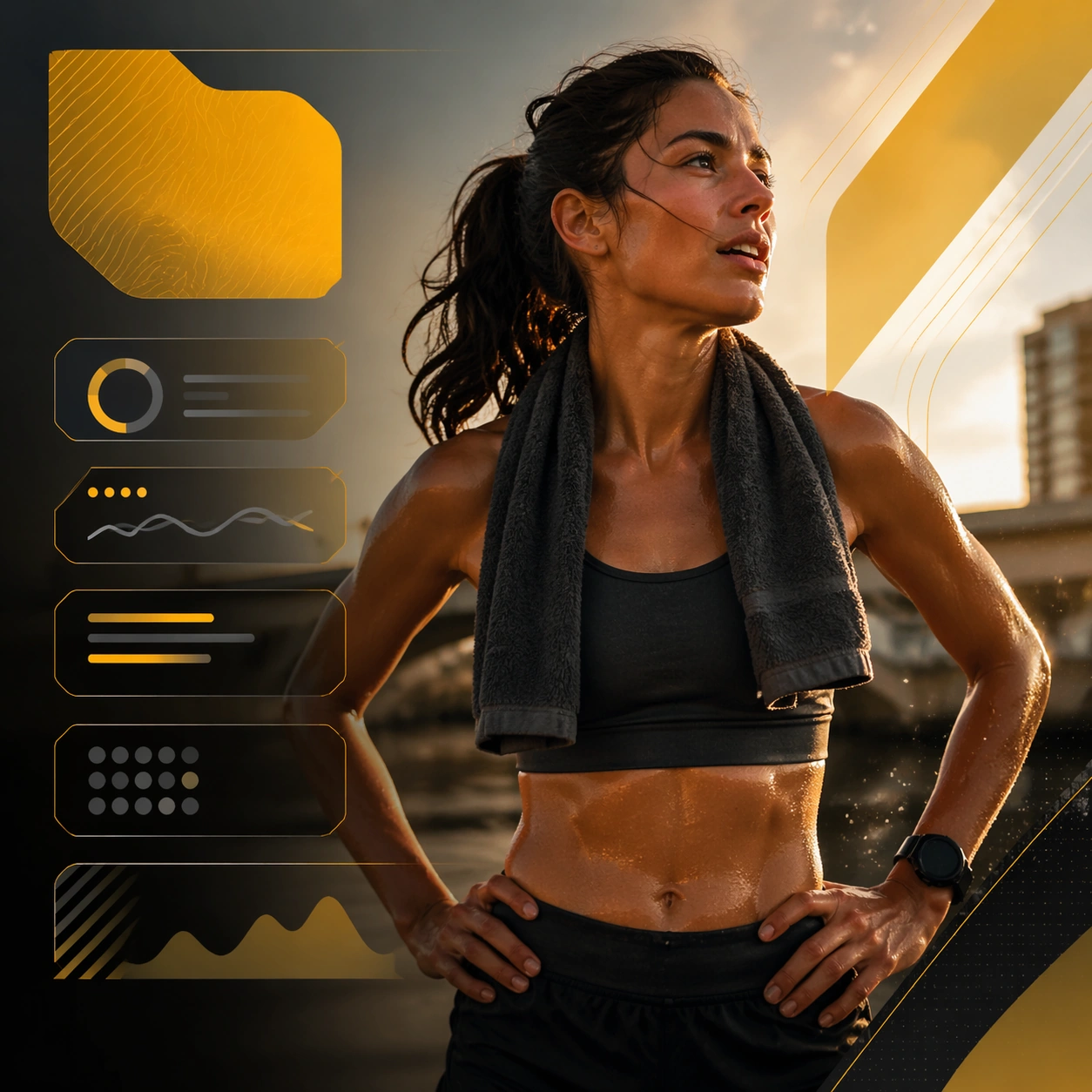
Example generated from “Athlete Spotlight And Profile Card Family — Runner Milestone Tile”
GPT Image 2en

Scene: Create a square runner milestone tile for Athlete Cards, using portrait-led sports communication with stat-panel discipline, premium lighting, and card-like hierarchy. The composition should read as a practical, production-ready sports or fitness surface with a clear hierarchy, premium lighting, and obvious commercial intent. Keep the environment specific enough to feel real, but leave enough control in the layout for non-readable information modules, campaign blocks, or visualized metrics. Aim for a finish that works for a brand, club, app, academy, or event operator. Subject: Build the image around endurance athlete after a run. The subject should be original, believable, and free of any real-brand or celebrity cues. Use realistic apparel, safe body mechanics when movement is visible, and environmental props that support the category without clutter. The subject must stay visually dominant so the design still works as a communication asset rather than a pure scene study. Important details: The mood should read as earned accomplishment. Treat layout, light, and supporting graphic structure as part of one polished delivery surface. Any schedule blocks, metric panels, quote zones, badges, or path diagrams must stay abstract and non-readable. Prioritize usefulness, clarity, and category truth over spectacle. The image should feel distinct from the series package while still belonging naturally to the same topic and business use case. Use case: Athlete Cards single study 6/9, an independent rollout surface for the topic. Constraints: No readable text, no watermark, no logos, preserve exact 1:1 aspect ratio, no brand marks, no public-figure resemblance, no generic stock layout, no cluttered UI imitation, no accidental copyrighted insignia.

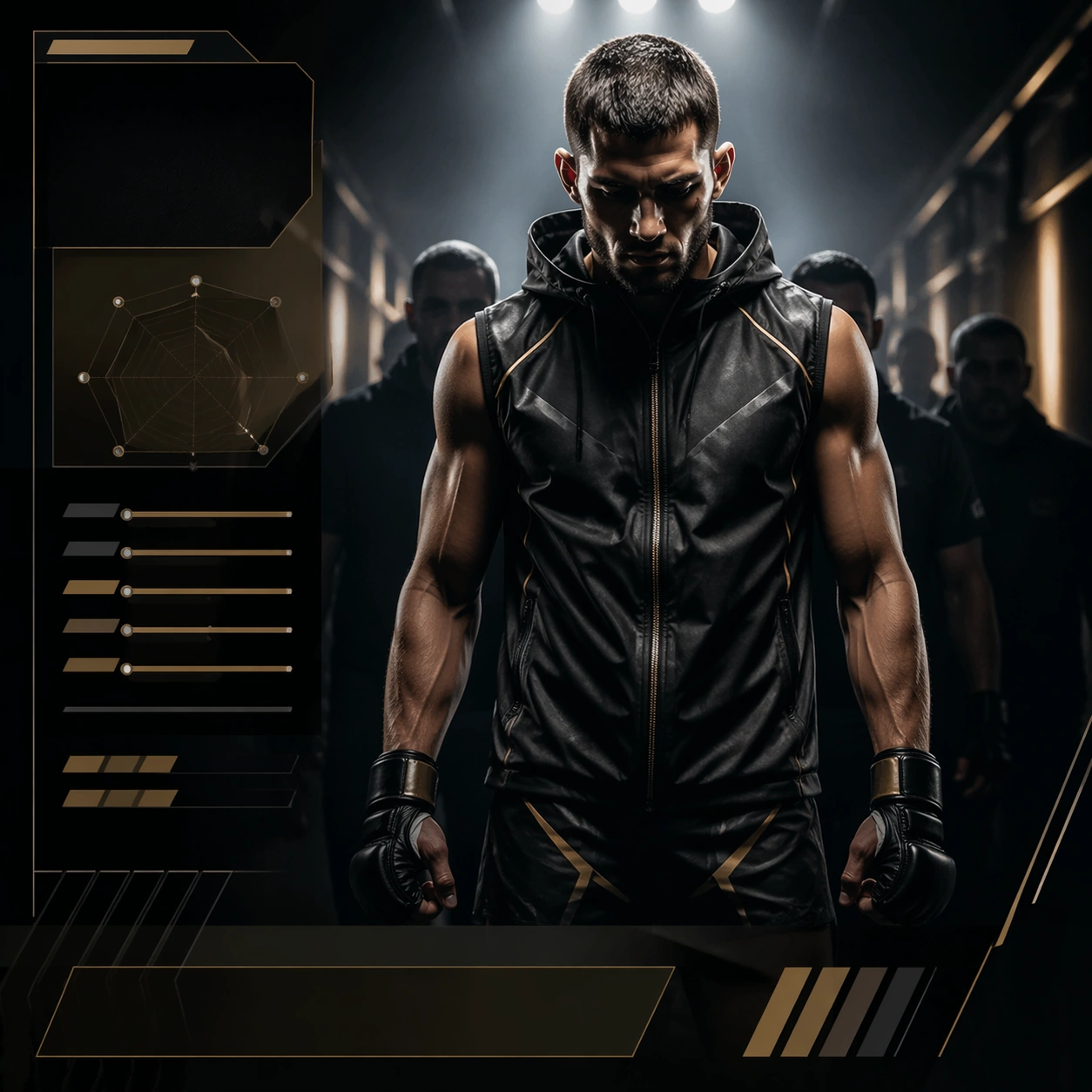
Example generated from “Athlete Spotlight And Profile Card Family — Fighter Walkout Card”
GPT Image 2en

Scene: Create a square combat walkout card for Athlete Cards, using portrait-led sports communication with stat-panel discipline, premium lighting, and card-like hierarchy. The composition should read as a practical, production-ready sports or fitness surface with a clear hierarchy, premium lighting, and obvious commercial intent. Keep the environment specific enough to feel real, but leave enough control in the layout for non-readable information modules, campaign blocks, or visualized metrics. Aim for a finish that works for a brand, club, app, academy, or event operator. Subject: Build the image around fighter in tunnel light. The subject should be original, believable, and free of any real-brand or celebrity cues. Use realistic apparel, safe body mechanics when movement is visible, and environmental props that support the category without clutter. The subject must stay visually dominant so the design still works as a communication asset rather than a pure scene study. Important details: The mood should read as focused intensity. Treat layout, light, and supporting graphic structure as part of one polished delivery surface. Any schedule blocks, metric panels, quote zones, badges, or path diagrams must stay abstract and non-readable. Prioritize usefulness, clarity, and category truth over spectacle. The image should feel distinct from the series package while still belonging naturally to the same topic and business use case. Use case: Athlete Cards single study 7/9, an independent rollout surface for the topic. Constraints: No readable text, no watermark, no logos, preserve exact 1:1 aspect ratio, no brand marks, no public-figure resemblance, no generic stock layout, no cluttered UI imitation, no accidental copyrighted insignia.

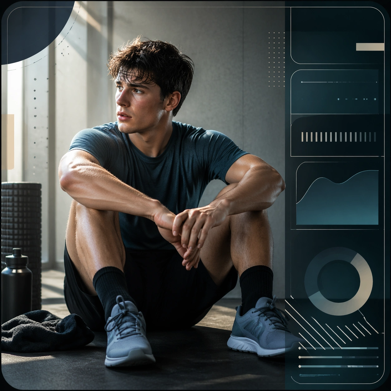
Example generated from “Athlete Spotlight And Profile Card Family — Recovery Day Portrait”
GPT Image 2en

Scene: Create a square recovery portrait card for Athlete Cards, using portrait-led sports communication with stat-panel discipline, premium lighting, and card-like hierarchy. The composition should read as a practical, production-ready sports or fitness surface with a clear hierarchy, premium lighting, and obvious commercial intent. Keep the environment specific enough to feel real, but leave enough control in the layout for non-readable information modules, campaign blocks, or visualized metrics. Aim for a finish that works for a brand, club, app, academy, or event operator. Subject: Build the image around athlete seated after training. The subject should be original, believable, and free of any real-brand or celebrity cues. Use realistic apparel, safe body mechanics when movement is visible, and environmental props that support the category without clutter. The subject must stay visually dominant so the design still works as a communication asset rather than a pure scene study. Important details: The mood should read as reflective calm. Treat layout, light, and supporting graphic structure as part of one polished delivery surface. Any schedule blocks, metric panels, quote zones, badges, or path diagrams must stay abstract and non-readable. Prioritize usefulness, clarity, and category truth over spectacle. The image should feel distinct from the series package while still belonging naturally to the same topic and business use case. Use case: Athlete Cards single study 8/9, an independent rollout surface for the topic. Constraints: No readable text, no watermark, no logos, preserve exact 1:1 aspect ratio, no brand marks, no public-figure resemblance, no generic stock layout, no cluttered UI imitation, no accidental copyrighted insignia.

Example generated from “Athlete Spotlight And Profile Card Family — Dual Athlete Comparison”
GPT Image 2en

Scene: Create a square dual-athlete comparison card for Athlete Cards, using portrait-led sports communication with stat-panel discipline, premium lighting, and card-like hierarchy. The composition should read as a practical, production-ready sports or fitness surface with a clear hierarchy, premium lighting, and obvious commercial intent. Keep the environment specific enough to feel real, but leave enough control in the layout for non-readable information modules, campaign blocks, or visualized metrics. Aim for a finish that works for a brand, club, app, academy, or event operator. Subject: Build the image around two inward-facing athletes. The subject should be original, believable, and free of any real-brand or celebrity cues. Use realistic apparel, safe body mechanics when movement is visible, and environmental props that support the category without clutter. The subject must stay visually dominant so the design still works as a communication asset rather than a pure scene study. Important details: The mood should read as balanced analysis. Treat layout, light, and supporting graphic structure as part of one polished delivery surface. Any schedule blocks, metric panels, quote zones, badges, or path diagrams must stay abstract and non-readable. Prioritize usefulness, clarity, and category truth over spectacle. The image should feel distinct from the series package while still belonging naturally to the same topic and business use case. Use case: Athlete Cards single study 9/9, an independent rollout surface for the topic. Constraints: No readable text, no watermark, no logos, preserve exact 1:1 aspect ratio, no brand marks, no public-figure resemblance, no generic stock layout, no cluttered UI imitation, no accidental copyrighted insignia.

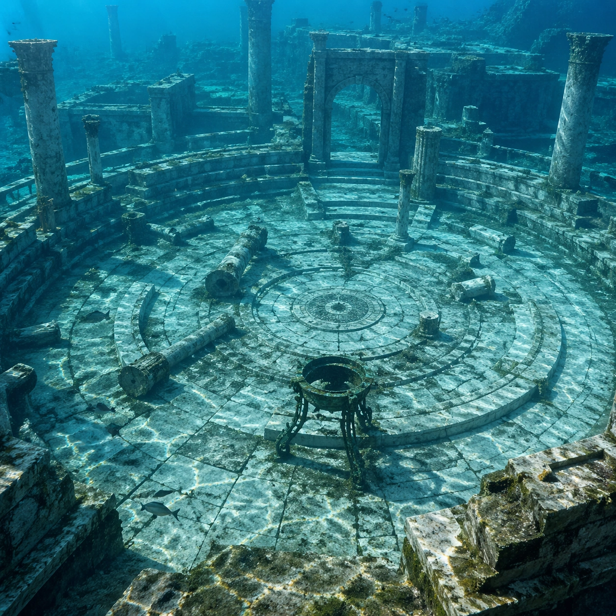
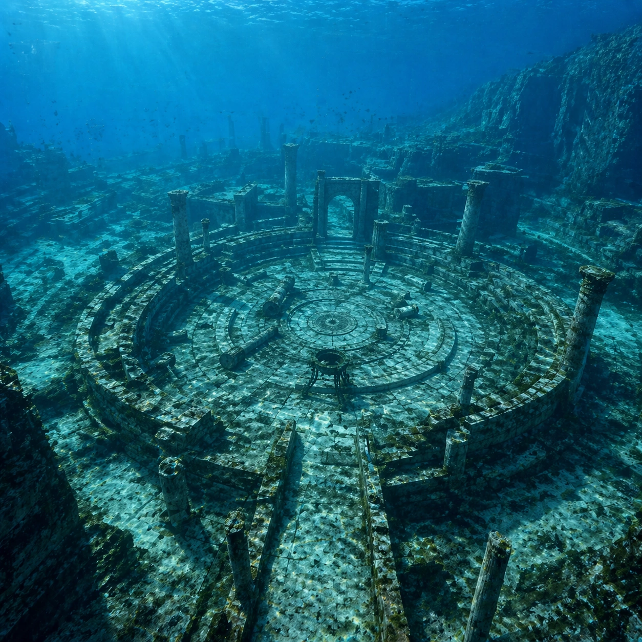
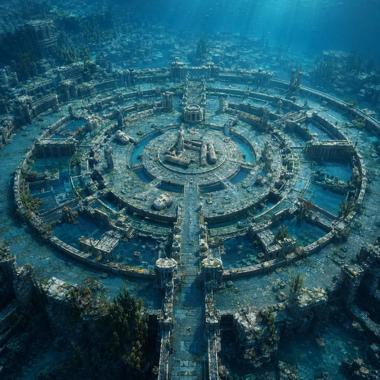
Example generated from “Atlantis Underwater Plaza — Reference Anchor”
GPT Image 2en

Scene: A square documentary image composed like a premium archaeology magazine feature. Use clear turquoise water, pale marble, oxidized bronze, and moving bands of sun caustics. Frame a submerged circular plaza with ring walls, fallen columns, bronze remnants, and fish moving through a drowned Atlantean civic center with crisp depth layering, restrained contrast, and subtle atmospheric depth so the scene feels excavated, observed, and historically grounded rather than theatrical or game-like. Keep the light directional but believable, as if captured during a careful field visit. Subject: Center the image on a submerged circular plaza with ring walls, fallen columns, bronze remnants, and fish moving through a drowned Atlantean civic center. Include culturally accurate surface logic, region-specific setting, and believable human-scale cues in stairs, doorways, cut blocks, relief edges, or water depth. Shapes, carvings, masonry joints, and site wear should feel studied from real archaeology, with no generic ancient-world mashup and no ornamental filler borrowed from another civilization. Important details: Keep the city logic disciplined and archaeological even though it is speculative: ring geometry, civic axes, hydrodynamic wear, and material aging should feel plausible rather than mythic excess. Emphasize marble paving, bronze tripod fragments, algae haze, suspended silt, carved stone rings, and refracted light patterns. Keep inscriptions, painted registers, symbolic motifs, or carved bands visually plausible but not readable. Preserve a museum-grade balance between beauty and evidence: light should reveal relief depth, edge wear, repairs, sediment traces, and excavation context without turning the site into fantasy spectacle. The composition should feel like a definitive reference frame that later variations can inherit exactly. Use case: Atlantis Underwater Plaza series study 1/9. Constraints: No readable text, no watermark, no logos, preserve exact 1:1 aspect ratio, no mermaids, no glowing crystals, no submarines, no futuristic domes, no tourists, no anachronistic props, no collage layout, no exaggerated fantasy lighting.

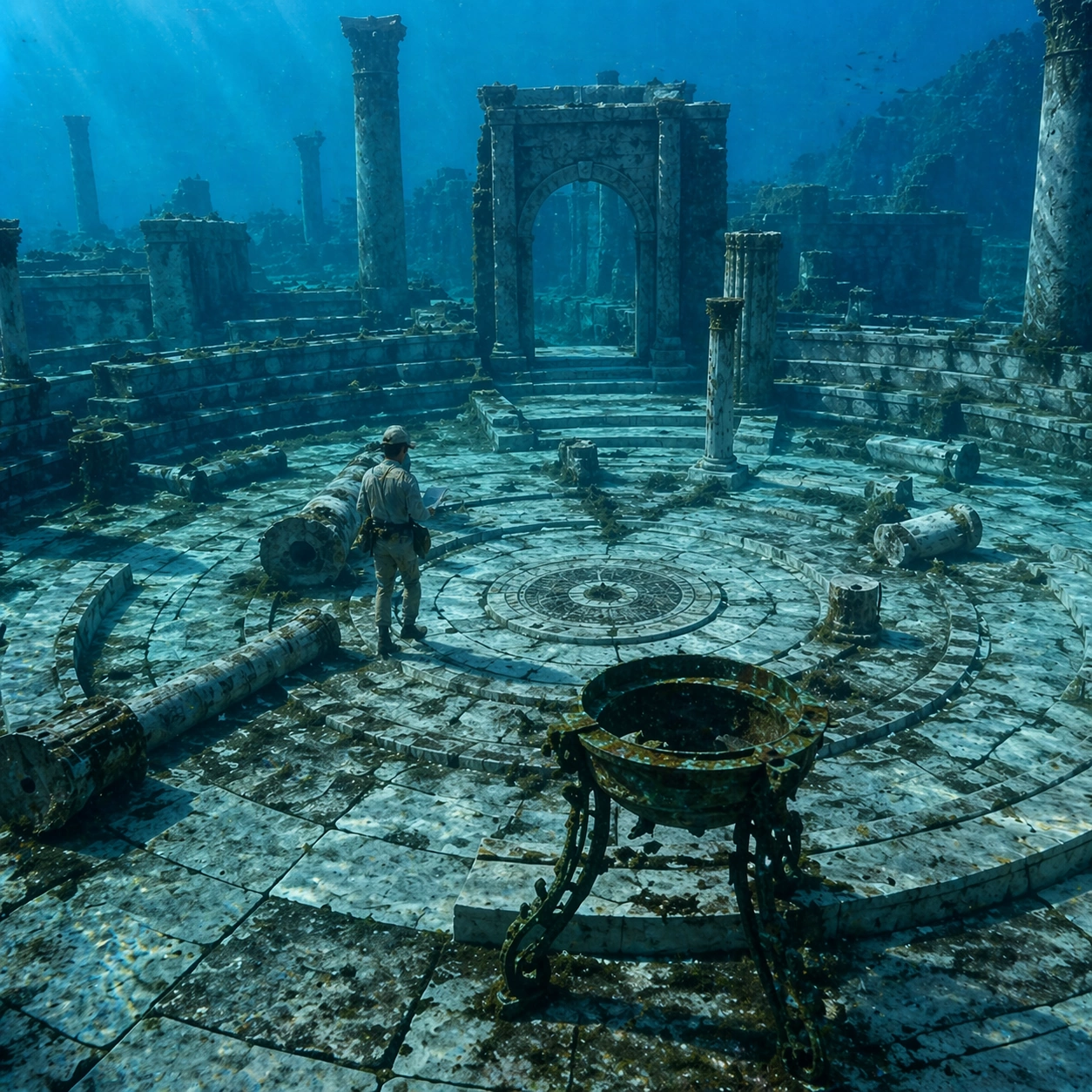
Example generated from “Atlantis Underwater Plaza — Human Scale Reveal”
GPT Image 2en

Scene: A square follow-up field image from the same site, slightly closer and lower than the reference anchor, with careful documentary framing and the same material palette. The camera should feel physically present inside the archaeological space, using natural light, soft depth separation, and one clear human figure to explain scale without turning the image into lifestyle photography. Subject: Show the same site identity established in the reference anchor, now with an archaeologist, conservator, or field researcher moving through the scene in practical neutral clothing. The person should be small relative to the monument and clearly secondary to the architecture, water, or painted wall system. Keep the main forms, structural rhythm, and civilizational markers unchanged. Important details: Preserve the exact site identity, base geometry, material behavior, and cultural signatures from the reference model. Only vary vantage, gesture, and scale cues. Keep the city logic disciplined and archaeological even though it is speculative: ring geometry, civic axes, hydrodynamic wear, and material aging should feel plausible rather than mythic excess. Human presence should clarify stair height, wall size, carving depth, or spatial compression while respecting conservation protocol and historical seriousness. Keep any tools understated and generic, with no readable labels. The image must still look like a rigorous archaeological record first and a dramatic scene second. Use case: Atlantis Underwater Plaza series study 2/9. Constraints: No readable text, no watermark, no logos, preserve exact 1:1 aspect ratio, preserve exact site identity from the reference image, no mermaids, no glowing crystals, no submarines, no futuristic domes, no fashion editorial styling, no crowd, no cinematic props.

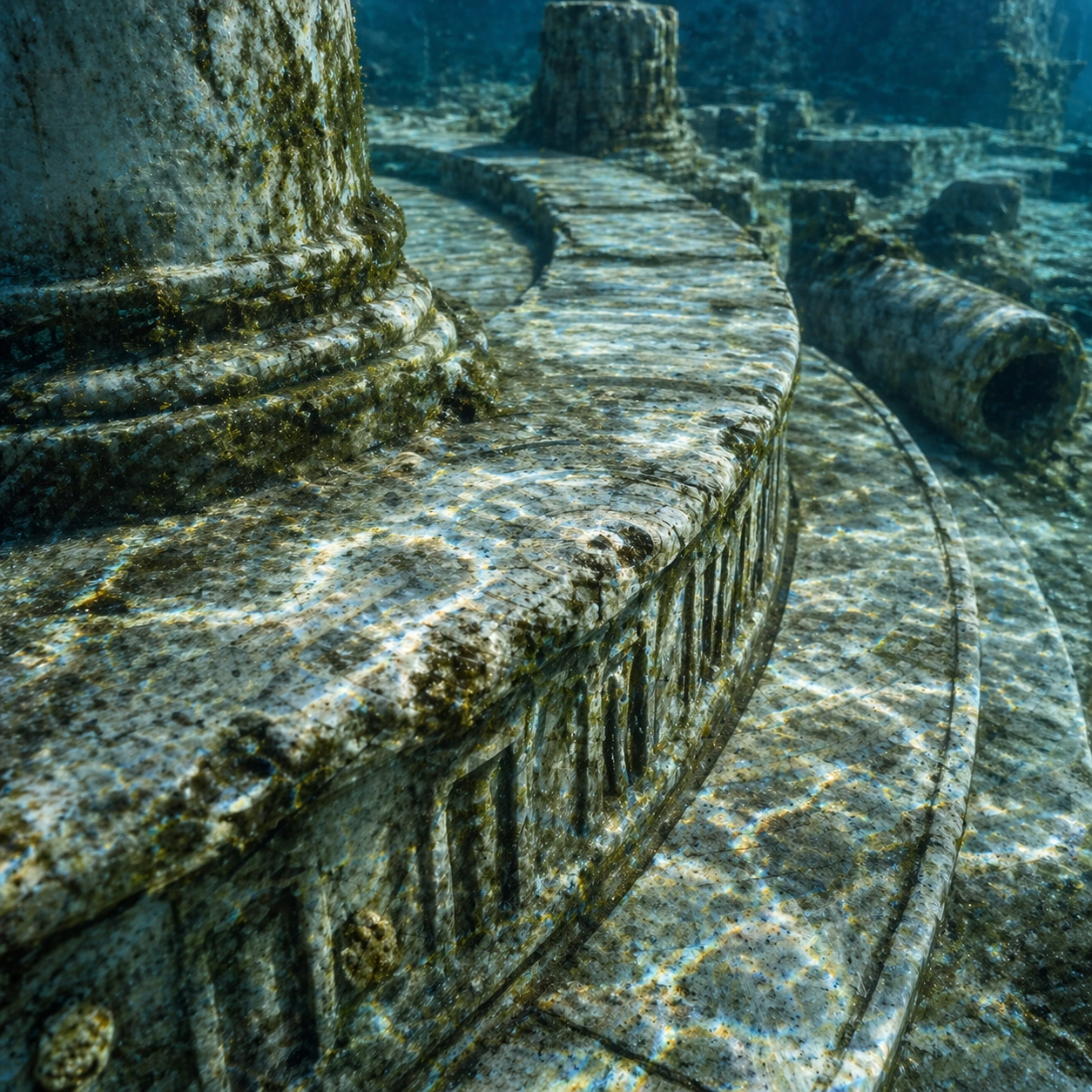
Example generated from “Atlantis Underwater Plaza — Surface Close Study”
GPT Image 2en

Scene: A square close study framed within the same site established by the reference anchor. Use a tight crop, shallow but believable depth of field, and raking light that reveals tactile evidence in surface relief, pigment, tool marks, moisture, or marine wear. The image should feel like a museum conservation photograph elevated to gallery quality. Subject: Focus on a materially rich portion of the same site: carved edges, painted plaster, fitted stone, root-wrapped masonry, submerged paving, or quarry-cut facial planes depending on the civilization. The composition should remain anchored to the original location and show enough surrounding context that viewers still recognize the parent site rather than mistaking it for an unrelated artifact. Important details: Preserve the exact site identity from the reference model while shifting emphasis to forensic surface evidence. Keep the city logic disciplined and archaeological even though it is speculative: ring geometry, civic axes, hydrodynamic wear, and material aging should feel plausible rather than mythic excess. Make micro-texture, fracture lines, pigment retention, water wear, plant interaction, dust, or chisel traces visually persuasive. Avoid decorative clutter. Every mark should feel like evidence of making, weathering, excavation, or conservation. Keep any symbolic marks non-legible and historically appropriate, and make the light reveal depth without flattening the material richness. Use case: Atlantis Underwater Plaza series study 3/9. Constraints: No readable text, no watermark, no logos, preserve exact 1:1 aspect ratio, preserve exact site identity from the reference image, no mermaids, no glowing crystals, no submarines, no futuristic domes, no isolated floating artifact, no studio backdrop, no fake macro abstraction.

Example generated from “Atlantis Underwater Plaza — Atmospheric Wide Reveal”
GPT Image 2en

Scene: A square wide reveal of the same site under a slightly different environmental condition, with more surrounding geography or architecture visible while keeping the anchor landmark dominant. Use disciplined composition, atmospheric perspective, and natural light behavior so the image feels like a patient field photograph captured after the reference shot rather than a different fantasy set. Subject: Show the same site identity with broader context: approaches, terraces, ring walls, canyon slot, canopy volume, quarry slope, or chamber boundaries depending on the location. The anchor structure must remain instantly recognizable. Environmental scale should deepen understanding of why the site is placed here and how people, water, topography, or vegetation shape the experience of the monument. Important details: Preserve the exact landmark, materials, and civilizational cues from the reference model while allowing wider framing and a different atmospheric emphasis. Keep the city logic disciplined and archaeological even though it is speculative: ring geometry, civic axes, hydrodynamic wear, and material aging should feel plausible rather than mythic excess. Use geography and environmental systems to add meaning: drainage, mist, current, valley depth, roots, irrigation, or enclosure logic. The image should feel both beautiful and evidentiary, with no compositional tricks that break continuity with the established site. Use case: Atlantis Underwater Plaza series study 4/9. Constraints: No readable text, no watermark, no logos, preserve exact 1:1 aspect ratio, preserve exact site identity from the reference image, no mermaids, no glowing crystals, no submarines, no futuristic domes, no unrelated landmarks, no speculative mashup architecture, no posterized grading.

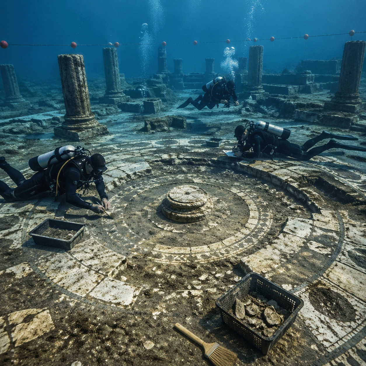
Example generated from “Atlantis Underwater Plaza — Excavation Overview”
GPT Image 2en

Scene: A square independent archaeology study composed from a slightly elevated fieldwork viewpoint. Use balanced natural light, crisp evidence hierarchy, and practical site organization so the image feels publishable in a museum report and still visually strong enough for a gallery wall. The frame should explain where excavation is happening without relying on readable markers or diagrams. Subject: Show an underwater survey lane with marker floats above, careful sediment disturbance, and divers documenting concentric masonry beneath clear water. Include grounded human traces such as ladders, trays, brushes, baskets, light rigs, or measuring tools only when they support archaeological realism and remain visually secondary. The site should stay culturally specific, with architecture, surface treatment, sediment, and environmental context all belonging to the correct civilization rather than a generic dig. Important details: Keep the city logic disciplined and archaeological even though it is speculative: ring geometry, civic axes, hydrodynamic wear, and material aging should feel plausible rather than mythic excess. Prioritize evidence relationships: exposed layers, cleaned edges, protected surfaces, loose fragments, and transitions between buried and revealed material. Let color, wear, and composition explain what has just been uncovered. The image must feel methodical rather than adventurous. Keep any site tags, notes, or markers abstract and unreadable. Avoid sensational treasure imagery and keep the atmosphere scholarly, patient, and materially convincing. Use case: Atlantis Underwater Plaza single study 5/9. Constraints: No readable text, no watermark, no logos, preserve exact 1:1 aspect ratio, no mermaids, no glowing crystals, no submarines, no futuristic domes, no treasure-chest clichés, no action-movie posing, no arbitrary props, no infographic overlay.

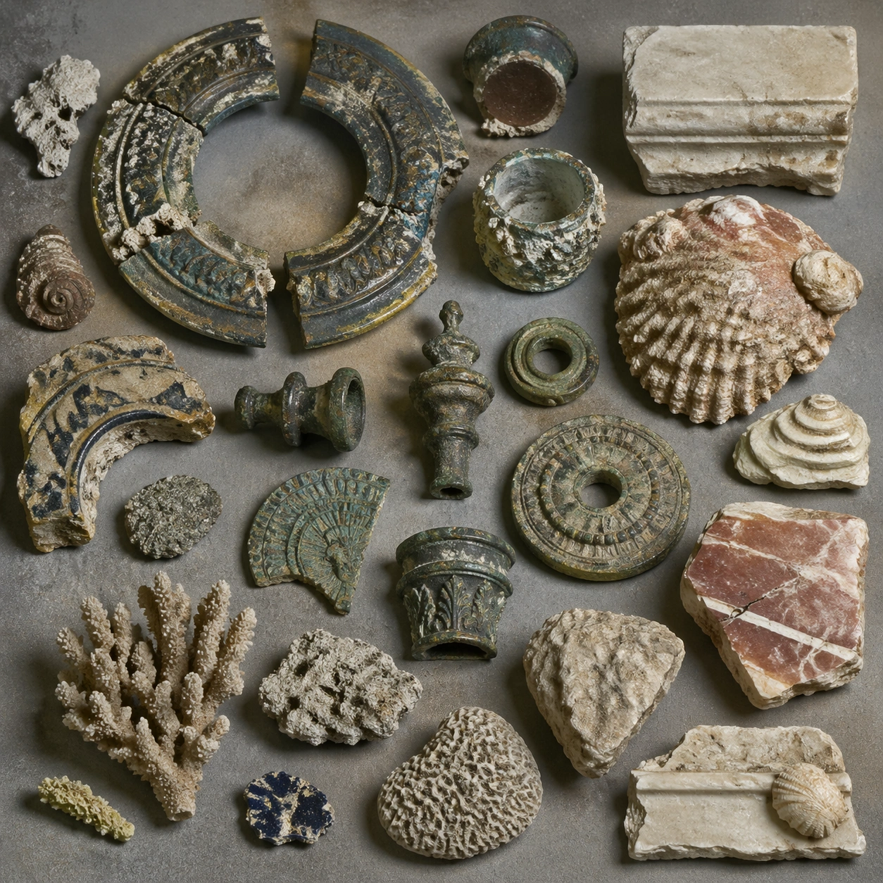
Example generated from “Atlantis Underwater Plaza — Artifact Tableau”
GPT Image 2en

Scene: A square artifact and material study arranged like a high-end conservation photograph. Use soft directional light, controlled shadow falloff, and a neutral work surface so every fragment reads clearly. The image should feel intimate and scientific, but still rich enough to communicate the broader civilization through craft, wear, and material vocabulary alone. Subject: Present bronze fittings, shell-encrusted fragments, marble chips, coral growth samples, and recovered ceremonial pieces on a marine archaeology platform. Arrange the pieces with disciplined spacing and believable conservation handling. Include enough variation in scale, finish, and damage state to suggest excavation reality rather than a perfectly staged luxury still life. Nothing should look modern or decorative for its own sake; every object must feel like evidence tied to the same cultural world as the main topic. Important details: Emphasize tactile surfaces, honest aging, and historically grounded material behavior. Keep the city logic disciplined and archaeological even though it is speculative: ring geometry, civic axes, hydrodynamic wear, and material aging should feel plausible rather than mythic excess. Show abrasion, dust, corrosion, cracks, mineral bloom, pigment retention, or edge polish where appropriate. Keep the arrangement orderly but not sterile, as if prepared for a serious cataloging session. No readable labels, no museum placards, and no visual shortcuts that turn the study into product photography detached from archaeology. Use case: Atlantis Underwater Plaza single study 6/9. Constraints: No readable text, no watermark, no logos, preserve exact 1:1 aspect ratio, no mermaids, no glowing crystals, no submarines, no futuristic domes, no luxury advertising gloss, no floating objects, no velvet jewelry styling, no unrelated tools.

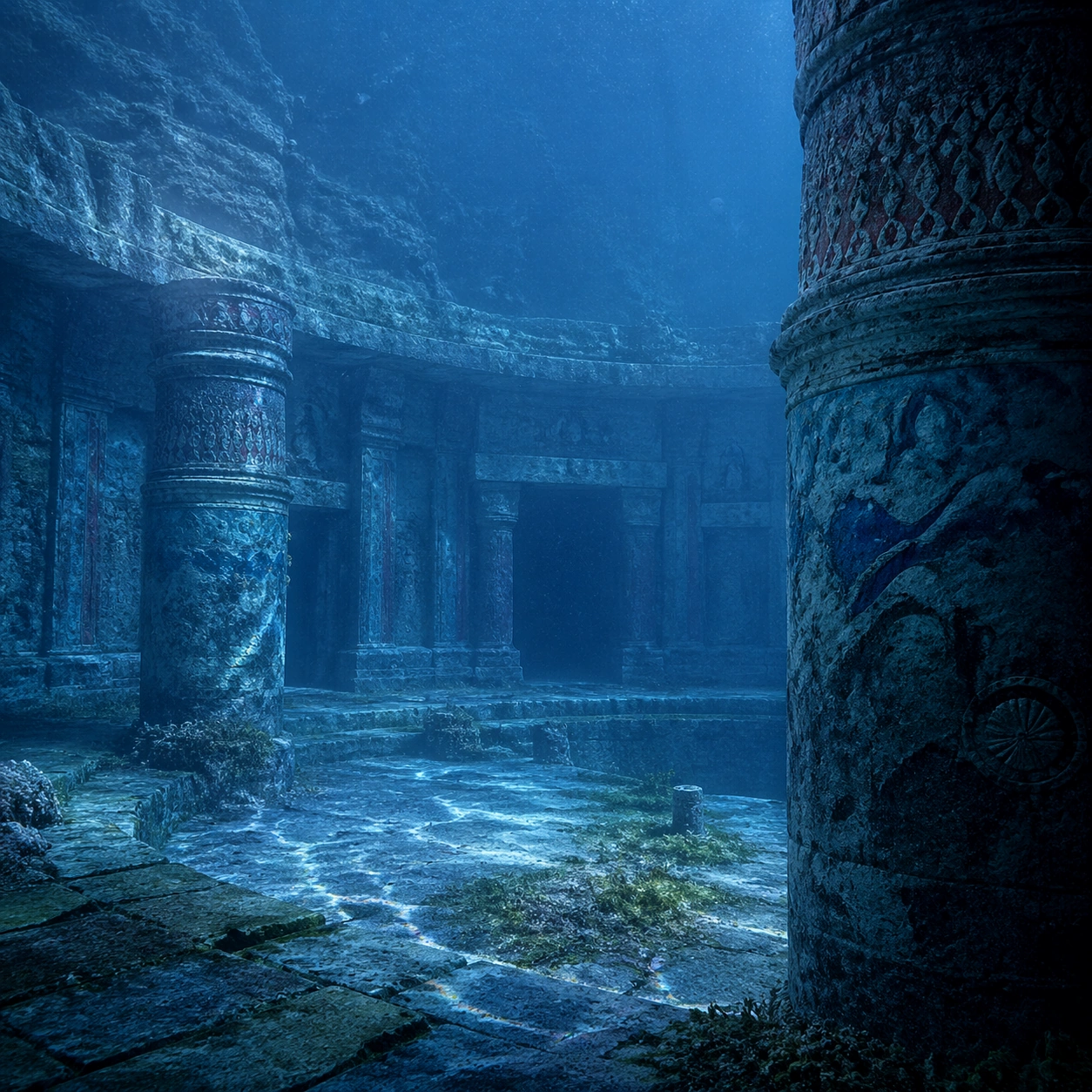
Example generated from “Atlantis Underwater Plaza — Light Shift Study”
GPT Image 2en

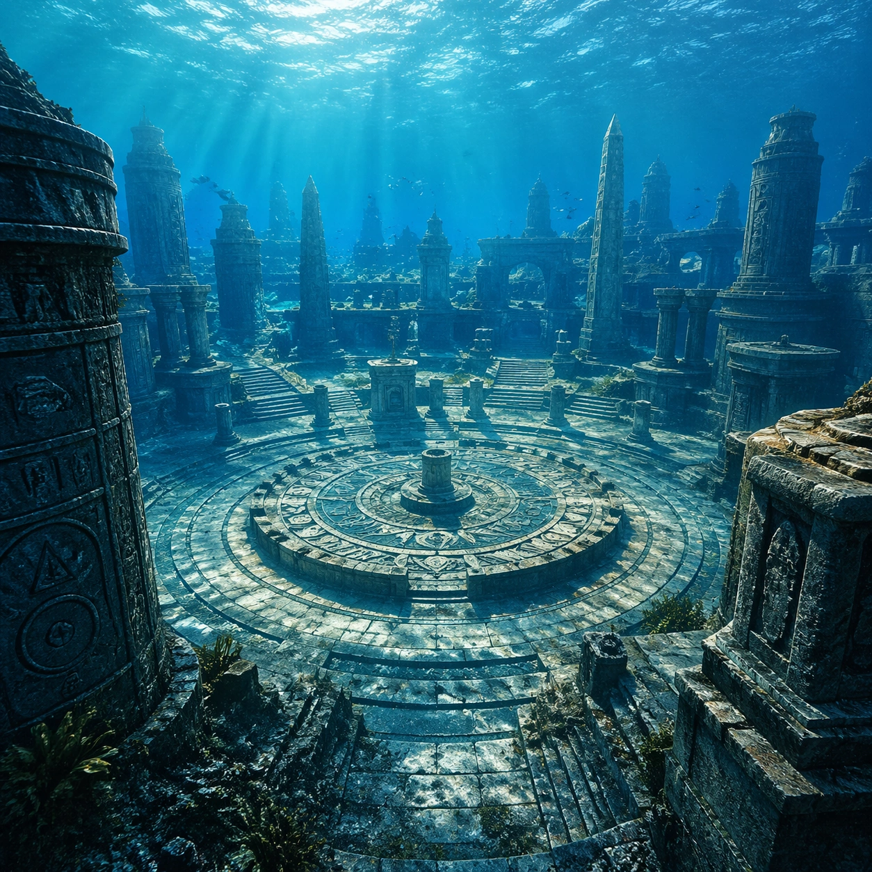
Scene: A square mood variation from the same civilization theme, built around deeper blue current conditions with softer visibility, denser suspended particles, and cooler caustic patterns across the same plaza. The image should stay grounded in field realism while testing how different illumination changes material reading, atmosphere, and emotional register. Keep the frame self-contained and coherent, as if photographed during a second visit under altered conditions. Subject: Show a culturally accurate site or interior connected to the same world as the main topic, but not as a direct dependency on the series reference. The focus should be on how light transforms relief, color, moisture, water, dust, or vegetation while preserving archaeological credibility. Architectural forms, objects, and setting must still belong to the same civilization with no cross-cultural contamination. Important details: Keep the city logic disciplined and archaeological even though it is speculative: ring geometry, civic axes, hydrodynamic wear, and material aging should feel plausible rather than mythic excess. Use the shift in light to reveal different evidence than the other studies: pigment glow, root sheen, caustics, wet stone, canyon shadow, marine haze, terrace depth, or quarry moisture. Keep the result serious and observational rather than romanticized. Non-readable motifs are acceptable, but there should be no signs, captions, or modern display devices. The image should feel like a rigorous visual experiment in historical atmosphere. Use case: Atlantis Underwater Plaza single study 7/9. Constraints: No readable text, no watermark, no logos, preserve exact 1:1 aspect ratio, no mermaids, no glowing crystals, no submarines, no futuristic domes, no theatrical color filters, no supernatural effects, no montage composition, no glossy concept-art exaggeration.

Example generated from “Atlantis Underwater Plaza — Survey Perspective”
GPT Image 2en

Scene: A square survey-oriented image that explains spatial logic with the clarity of an expert field overview while still reading as a finished artwork. Use a stable elevated vantage, clean depth layering, and enough visible terrain or architecture to make relationships legible without turning the frame into a literal map. The scene should feel analytical and cinematic at the same time. Subject: Show a high underwater perspective that reveals the circular plan, processional routes, broken statuary positions, and surrounding ring walls as one coherent urban diagram. Organize the composition so paths, terraces, walls, courtyards, chambers, canals, root systems, or quarry clusters can be read as a coherent system. The image should reveal how the civilization used land, water, elevation, enclosure, or monumentality. Keep all architecture, materials, and environmental details consistent with the correct place and period. Important details: Keep the city logic disciplined and archaeological even though it is speculative: ring geometry, civic axes, hydrodynamic wear, and material aging should feel plausible rather than mythic excess. This image should reward close looking by showing infrastructural logic: how stone courses align, how water moves, how rooms connect, how carved masses sit inside geology, or how vegetation interacts with built form. Avoid explicit annotation. Let composition, light, and scale cues do the explanatory work. Keep any measuring elements generic and unreadable, and make the image feel like serious research made visually elegant. Use case: Atlantis Underwater Plaza single study 8/9. Constraints: No readable text, no watermark, no logos, preserve exact 1:1 aspect ratio, no mermaids, no glowing crystals, no submarines, no futuristic domes, no infographic arrows, no split-screen layout, no impossible aerial geometry, no unrelated settlements.

Example generated from “Atlantis Underwater Plaza — Editorial Reconstruction”
GPT Image 2en

Scene: A square hero image designed for a museum wall graphic or flagship magazine cover, but without any actual typography. Use strong focal hierarchy, refined contrast, and a polished finish that still feels rooted in archaeological evidence. The frame should look complete on its own and communicate why this civilization remains visually unforgettable. Subject: Build the image around a premium speculative archaeology hero image that treats Atlantis as disciplined underwater evidence rather than fantasy adventure. Present architecture, artifacts, environment, and atmosphere as one coherent statement. The composition can be more distilled than a field snapshot, but it must remain culturally specific, materially persuasive, and free of fantasy shorthand. Nothing should feel like a movie poster or commercial franchise imitation. Important details: Keep the city logic disciplined and archaeological even though it is speculative: ring geometry, civic axes, hydrodynamic wear, and material aging should feel plausible rather than mythic excess. Distill the site or cultural world into one decisive visual argument: place, craft, weathering, engineering, and memory. Use the strongest material signatures from this civilization and let them sit in a believable environment with controlled dramatic weight. Keep any carved or painted symbols non-readable. The result should look like responsible high-end visual storytelling for research and public interpretation, not a spectacle-first matte painting. Use case: Atlantis Underwater Plaza single study 9/9. Constraints: No readable text, no watermark, no logos, preserve exact 1:1 aspect ratio, no mermaids, no glowing crystals, no submarines, no futuristic domes, no movie-poster tropes, no overdesigned framing devices, no collage layout, no brand-like iconography.

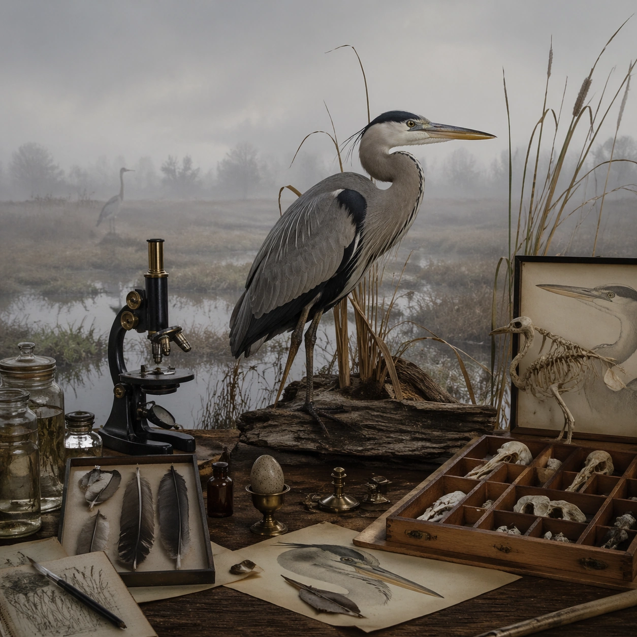
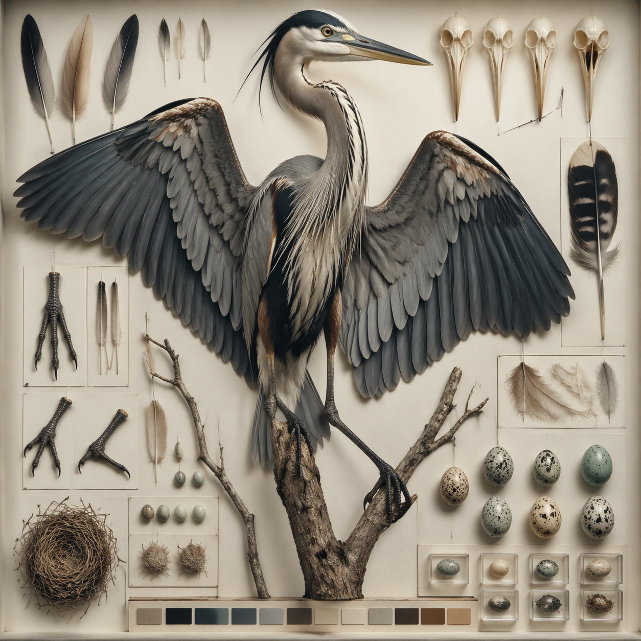
Example generated from “Audubon Specimen Atlas — Macro Study”
GPT Image 2en

Scene: A square photographic image with intentional lens choice, coherent light, and a subject that feels observed rather than merely decorated. Build the frame around closer observation that reveals fine structure and optical behavior. Keep the lighting, camera distance, and spatial organization tuned for a high-signal research image rather than a casual snapshot. The image belongs to the Audubon Specimen Atlas theme and should feel immediately legible as a prompt atlas theme for audubon specimen atlas, testing structured-layout, technical-diagram with gpt image 2.. Subject: Center the study on closer observation that reveals fine structure and optical behavior. Translate the theme into a concrete visual statement instead of an abstract mood board: the viewer should understand what kind of image this is, what is being tested, and why the composition is difficult. Use the slug idea of audubon specimen atlas as a literal guide for subject matter, materials, and staging. If helpful, borrow the broad visual cues suggested by John James Audubon, Maria Sibylla Merian, but keep the result original and specific to this study. Important details: The realism should come from timing, optics, and material response: atmosphere, contrast, depth, motion, and tiny physical cues all need to agree. Preserve a disciplined square composition, clear focal hierarchy, and enough secondary information to make the image feel complete rather than underspecified. The image should look polished, novel, and exhibition-ready, with topic-specific credibility coming from the way surfaces, structure, and visual language reinforce Audubon Specimen Atlas. Avoid generic filler elements that do not serve the main concept. Use case: Audubon Specimen Atlas single study 2/8, testing structured-layout, technical-diagram through the macro study variation. Constraints: No readable text, no watermark, no logos, preserve exact 1:1 aspect ratio, no watermark, no cheap HDR excess, no unreadable signage, no fake stock-photo posing, no compositing seams, no arbitrary lens flare.

Example generated from “Audubon Specimen Atlas — Side Light Study”
GPT Image 2en

Scene: A square photographic image with intentional lens choice, coherent light, and a subject that feels observed rather than merely decorated. Build the frame around a directional-light treatment that increases form and drama. Keep the lighting, camera distance, and spatial organization tuned for a high-signal research image rather than a casual snapshot. The image belongs to the Audubon Specimen Atlas theme and should feel immediately legible as a prompt atlas theme for audubon specimen atlas, testing structured-layout, technical-diagram with gpt image 2.. Subject: Center the study on a directional-light treatment that increases form and drama. Translate the theme into a concrete visual statement instead of an abstract mood board: the viewer should understand what kind of image this is, what is being tested, and why the composition is difficult. Use the slug idea of audubon specimen atlas as a literal guide for subject matter, materials, and staging. If helpful, borrow the broad visual cues suggested by John James Audubon, Maria Sibylla Merian, but keep the result original and specific to this study. Important details: The realism should come from timing, optics, and material response: atmosphere, contrast, depth, motion, and tiny physical cues all need to agree. Preserve a disciplined square composition, clear focal hierarchy, and enough secondary information to make the image feel complete rather than underspecified. The image should look polished, novel, and exhibition-ready, with topic-specific credibility coming from the way surfaces, structure, and visual language reinforce Audubon Specimen Atlas. Avoid generic filler elements that do not serve the main concept. Use case: Audubon Specimen Atlas single study 3/8, testing structured-layout, technical-diagram through the side light study variation. Constraints: No readable text, no watermark, no logos, preserve exact 1:1 aspect ratio, no watermark, no cheap HDR excess, no unreadable signage, no fake stock-photo posing, no compositing seams, no arbitrary lens flare.

Example generated from “Audubon Specimen Atlas — Motion Moment”
GPT Image 2en

Scene: A square photographic image with intentional lens choice, coherent light, and a subject that feels observed rather than merely decorated. Build the frame around a time-sensitive or kinetic phenomenon captured at the right instant. Keep the lighting, camera distance, and spatial organization tuned for a high-signal research image rather than a casual snapshot. The image belongs to the Audubon Specimen Atlas theme and should feel immediately legible as a prompt atlas theme for audubon specimen atlas, testing structured-layout, technical-diagram with gpt image 2.. Subject: Center the study on a time-sensitive or kinetic phenomenon captured at the right instant. Translate the theme into a concrete visual statement instead of an abstract mood board: the viewer should understand what kind of image this is, what is being tested, and why the composition is difficult. Use the slug idea of audubon specimen atlas as a literal guide for subject matter, materials, and staging. If helpful, borrow the broad visual cues suggested by John James Audubon, Maria Sibylla Merian, but keep the result original and specific to this study. Important details: The realism should come from timing, optics, and material response: atmosphere, contrast, depth, motion, and tiny physical cues all need to agree. Preserve a disciplined square composition, clear focal hierarchy, and enough secondary information to make the image feel complete rather than underspecified. The image should look polished, novel, and exhibition-ready, with topic-specific credibility coming from the way surfaces, structure, and visual language reinforce Audubon Specimen Atlas. Avoid generic filler elements that do not serve the main concept. Use case: Audubon Specimen Atlas single study 4/8, testing structured-layout, technical-diagram through the motion moment variation. Constraints: No readable text, no watermark, no logos, preserve exact 1:1 aspect ratio, no watermark, no cheap HDR excess, no unreadable signage, no fake stock-photo posing, no compositing seams, no arbitrary lens flare.

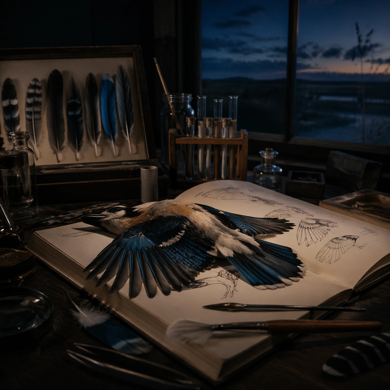
Example generated from “Audubon Specimen Atlas — Low-Light Atlas”
GPT Image 2en

Scene: A square photographic image with intentional lens choice, coherent light, and a subject that feels observed rather than merely decorated. Build the frame around a dusk, night, or low-light frame with disciplined exposure. Keep the lighting, camera distance, and spatial organization tuned for a high-signal research image rather than a casual snapshot. The image belongs to the Audubon Specimen Atlas theme and should feel immediately legible as a prompt atlas theme for audubon specimen atlas, testing structured-layout, technical-diagram with gpt image 2.. Subject: Center the study on a dusk, night, or low-light frame with disciplined exposure. Translate the theme into a concrete visual statement instead of an abstract mood board: the viewer should understand what kind of image this is, what is being tested, and why the composition is difficult. Use the slug idea of audubon specimen atlas as a literal guide for subject matter, materials, and staging. If helpful, borrow the broad visual cues suggested by John James Audubon, Maria Sibylla Merian, but keep the result original and specific to this study. Important details: The realism should come from timing, optics, and material response: atmosphere, contrast, depth, motion, and tiny physical cues all need to agree. Preserve a disciplined square composition, clear focal hierarchy, and enough secondary information to make the image feel complete rather than underspecified. The image should look polished, novel, and exhibition-ready, with topic-specific credibility coming from the way surfaces, structure, and visual language reinforce Audubon Specimen Atlas. Avoid generic filler elements that do not serve the main concept. Use case: Audubon Specimen Atlas single study 5/8, testing structured-layout, technical-diagram through the low-light atlas variation. Constraints: No readable text, no watermark, no logos, preserve exact 1:1 aspect ratio, no watermark, no cheap HDR excess, no unreadable signage, no fake stock-photo posing, no compositing seams, no arbitrary lens flare.

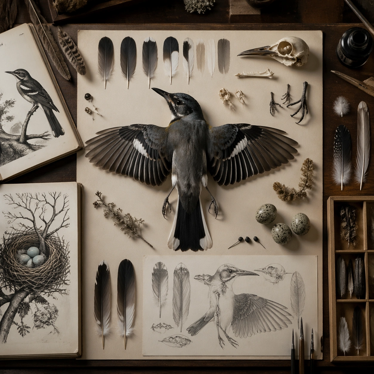
Example generated from “Audubon Specimen Atlas — Specimen Table”
GPT Image 2en

Scene: A square photographic image with intentional lens choice, coherent light, and a subject that feels observed rather than merely decorated. Build the frame around a carefully arranged or comparative frame that still feels photographic. Keep the lighting, camera distance, and spatial organization tuned for a high-signal research image rather than a casual snapshot. The image belongs to the Audubon Specimen Atlas theme and should feel immediately legible as a prompt atlas theme for audubon specimen atlas, testing structured-layout, technical-diagram with gpt image 2.. Subject: Center the study on a carefully arranged or comparative frame that still feels photographic. Translate the theme into a concrete visual statement instead of an abstract mood board: the viewer should understand what kind of image this is, what is being tested, and why the composition is difficult. Use the slug idea of audubon specimen atlas as a literal guide for subject matter, materials, and staging. If helpful, borrow the broad visual cues suggested by John James Audubon, Maria Sibylla Merian, but keep the result original and specific to this study. Important details: The realism should come from timing, optics, and material response: atmosphere, contrast, depth, motion, and tiny physical cues all need to agree. Preserve a disciplined square composition, clear focal hierarchy, and enough secondary information to make the image feel complete rather than underspecified. The image should look polished, novel, and exhibition-ready, with topic-specific credibility coming from the way surfaces, structure, and visual language reinforce Audubon Specimen Atlas. Avoid generic filler elements that do not serve the main concept. Use case: Audubon Specimen Atlas single study 6/8, testing structured-layout, technical-diagram through the specimen table variation. Constraints: No readable text, no watermark, no logos, preserve exact 1:1 aspect ratio, no watermark, no cheap HDR excess, no unreadable signage, no fake stock-photo posing, no compositing seams, no arbitrary lens flare.

Example generated from “Audubon Specimen Atlas — Atmospheric View”
GPT Image 2en

Scene: A square photographic image with intentional lens choice, coherent light, and a subject that feels observed rather than merely decorated. Build the frame around weather, haze, or volumetric light used to deepen realism. Keep the lighting, camera distance, and spatial organization tuned for a high-signal research image rather than a casual snapshot. The image belongs to the Audubon Specimen Atlas theme and should feel immediately legible as a prompt atlas theme for audubon specimen atlas, testing structured-layout, technical-diagram with gpt image 2.. Subject: Center the study on weather, haze, or volumetric light used to deepen realism. Translate the theme into a concrete visual statement instead of an abstract mood board: the viewer should understand what kind of image this is, what is being tested, and why the composition is difficult. Use the slug idea of audubon specimen atlas as a literal guide for subject matter, materials, and staging. If helpful, borrow the broad visual cues suggested by John James Audubon, Maria Sibylla Merian, but keep the result original and specific to this study. Important details: The realism should come from timing, optics, and material response: atmosphere, contrast, depth, motion, and tiny physical cues all need to agree. Preserve a disciplined square composition, clear focal hierarchy, and enough secondary information to make the image feel complete rather than underspecified. The image should look polished, novel, and exhibition-ready, with topic-specific credibility coming from the way surfaces, structure, and visual language reinforce Audubon Specimen Atlas. Avoid generic filler elements that do not serve the main concept. Use case: Audubon Specimen Atlas single study 7/8, testing structured-layout, technical-diagram through the atmospheric view variation. Constraints: No readable text, no watermark, no logos, preserve exact 1:1 aspect ratio, no watermark, no cheap HDR excess, no unreadable signage, no fake stock-photo posing, no compositing seams, no arbitrary lens flare.

Example generated from “Audubon Specimen Atlas — Signature Frame”
GPT Image 2en

Scene: A square photographic image with intentional lens choice, coherent light, and a subject that feels observed rather than merely decorated. Build the frame around the most memorable final image for the topic. Keep the lighting, camera distance, and spatial organization tuned for a high-signal research image rather than a casual snapshot. The image belongs to the Audubon Specimen Atlas theme and should feel immediately legible as a prompt atlas theme for audubon specimen atlas, testing structured-layout, technical-diagram with gpt image 2.. Subject: Center the study on the most memorable final image for the topic. Translate the theme into a concrete visual statement instead of an abstract mood board: the viewer should understand what kind of image this is, what is being tested, and why the composition is difficult. Use the slug idea of audubon specimen atlas as a literal guide for subject matter, materials, and staging. If helpful, borrow the broad visual cues suggested by John James Audubon, Maria Sibylla Merian, but keep the result original and specific to this study. Important details: The realism should come from timing, optics, and material response: atmosphere, contrast, depth, motion, and tiny physical cues all need to agree. Preserve a disciplined square composition, clear focal hierarchy, and enough secondary information to make the image feel complete rather than underspecified. The image should look polished, novel, and exhibition-ready, with topic-specific credibility coming from the way surfaces, structure, and visual language reinforce Audubon Specimen Atlas. Avoid generic filler elements that do not serve the main concept. Use case: Audubon Specimen Atlas single study 8/8, testing structured-layout, technical-diagram through the signature frame variation. Constraints: No readable text, no watermark, no logos, preserve exact 1:1 aspect ratio, no watermark, no cheap HDR excess, no unreadable signage, no fake stock-photo posing, no compositing seams, no arbitrary lens flare.

Example generated from “Aurora Glacier Silent Theatre — Reference Anchor”
GPT Image 2en

Scene: Create a square cinematic still for Aurora Glacier Silent Theatre. Use production-grade photoreal lighting, disciplined lens behavior, and a composition that feels like a finished key frame from an original film rather than a casual snapshot. An Arctic glacier plain opens under a sweeping aurora curtain, with deep night sky, luminous green and faint violet ribbons overhead, fractured ice catching reflected color, and a breath-frozen atmosphere that feels almost soundless. Keep the camera in a disciplined anchor position so the full lighting event and the main spatial structure are immediately legible from edge to edge. Subject: Build a coherent original scene whose emotional center comes from atmosphere, light physics, and spatial clarity. Avoid relying on celebrity likeness, franchise iconography, or stylized illustration shortcuts. A solitary human figure in a red parka should appear tiny against the glacier geometry, while crevasses, wind-scoured snow, and ice walls provide a strong sense of scale without cluttering the frame. This frame should lock the canonical arrangement, scale relationship, and emotional tone that the later dependent images inherit. Important details: Preserve a believable physical world with strong depth layering, careful color separation, and premium image discipline. Keep the aurora soft and physically plausible rather than graphic, with believable ice reflectance, low-angle moonless ambient light, and careful contrast so the red parka remains a scale marker rather than a fashion focal point. Use this image to establish the authoritative direction of light, atmospheric density, and structural silhouette for the package. Use case: Aurora Glacier series study 1/9. Constraints: No readable text, no watermark, no logos, preserve exact 1:1 aspect ratio, no tents, no readable expedition logos, no fantasy animals, no saturated nightclub colors, no fireworks effect.

Example generated from “Aurora Glacier Silent Theatre — Closer Frame”
GPT Image 2en

Scene: Create a square cinematic still for Aurora Glacier Silent Theatre. Use production-grade photoreal lighting, disciplined lens behavior, and a composition that feels like a finished key frame from an original film rather than a casual snapshot. An Arctic glacier plain opens under a sweeping aurora curtain, with deep night sky, luminous green and faint violet ribbons overhead, fractured ice catching reflected color, and a breath-frozen atmosphere that feels almost soundless. Move the camera closer or lower so the viewer feels more embedded inside the atmosphere while the same light direction and environment remain intact. Subject: Build a coherent original scene whose emotional center comes from atmosphere, light physics, and spatial clarity. Avoid relying on celebrity likeness, franchise iconography, or stylized illustration shortcuts. A solitary human figure in a red parka should appear tiny against the glacier geometry, while crevasses, wind-scoured snow, and ice walls provide a strong sense of scale without cluttering the frame. Preserve the same world logic from the reference and let one human-scale or material-scale element become more prominent without stealing focus from the atmosphere. Important details: Preserve a believable physical world with strong depth layering, careful color separation, and premium image discipline. Keep the aurora soft and physically plausible rather than graphic, with believable ice reflectance, low-angle moonless ambient light, and careful contrast so the red parka remains a scale marker rather than a fashion focal point. Keep the palette family, structural read, and light behavior from image 01 while increasing immediacy and tactile presence. Use case: Aurora Glacier series study 2/9. Constraints: No readable text, no watermark, no logos, preserve exact 1:1 aspect ratio, no tents, no readable expedition logos, no fantasy animals, no saturated nightclub colors, no fireworks effect.

Example generated from “Aurora Glacier Silent Theatre — Spatial Counterpoint”
GPT Image 2en

Scene: Create a square cinematic still for Aurora Glacier Silent Theatre. Use production-grade photoreal lighting, disciplined lens behavior, and a composition that feels like a finished key frame from an original film rather than a casual snapshot. An Arctic glacier plain opens under a sweeping aurora curtain, with deep night sky, luminous green and faint violet ribbons overhead, fractured ice catching reflected color, and a breath-frozen atmosphere that feels almost soundless. Shift to an oblique or lateral point of view that reveals different depth layers while staying inside the same place and the same atmospheric event. Subject: Build a coherent original scene whose emotional center comes from atmosphere, light physics, and spatial clarity. Avoid relying on celebrity likeness, franchise iconography, or stylized illustration shortcuts. A solitary human figure in a red parka should appear tiny against the glacier geometry, while crevasses, wind-scoured snow, and ice walls provide a strong sense of scale without cluttering the frame. Hold the reference structure, but use the new angle to show secondary planes, foreground interruption, or a changed distance relationship. Important details: Preserve a believable physical world with strong depth layering, careful color separation, and premium image discipline. Keep the aurora soft and physically plausible rather than graphic, with believable ice reflectance, low-angle moonless ambient light, and careful contrast so the red parka remains a scale marker rather than a fashion focal point. The success condition is continuity with the reference plus a richer sense of depth, not a new location or a new lighting system. Use case: Aurora Glacier series study 3/9. Constraints: No readable text, no watermark, no logos, preserve exact 1:1 aspect ratio, no tents, no readable expedition logos, no fantasy animals, no saturated nightclub colors, no fireworks effect.

Example generated from “Aurora Glacier Silent Theatre — Climax Frame”
GPT Image 2en

Scene: Create a square cinematic still for Aurora Glacier Silent Theatre. Use production-grade photoreal lighting, disciplined lens behavior, and a composition that feels like a finished key frame from an original film rather than a casual snapshot. An Arctic glacier plain opens under a sweeping aurora curtain, with deep night sky, luminous green and faint violet ribbons overhead, fractured ice catching reflected color, and a breath-frozen atmosphere that feels almost soundless. Push the composition toward the emotional peak of the same setup, with the most dramatic balance of brightness, shadow, or atmospheric density inside the established world. Subject: Build a coherent original scene whose emotional center comes from atmosphere, light physics, and spatial clarity. Avoid relying on celebrity likeness, franchise iconography, or stylized illustration shortcuts. A solitary human figure in a red parka should appear tiny against the glacier geometry, while crevasses, wind-scoured snow, and ice walls provide a strong sense of scale without cluttering the frame. Everything should still read as the same location and same event, but framed for maximum narrative force and visual closure. Important details: Preserve a believable physical world with strong depth layering, careful color separation, and premium image discipline. Keep the aurora soft and physically plausible rather than graphic, with believable ice reflectance, low-angle moonless ambient light, and careful contrast so the red parka remains a scale marker rather than a fashion focal point. Make it feel like the strongest hero frame of the sequence without breaking continuity or introducing a new design language. Use case: Aurora Glacier series study 4/9. Constraints: No readable text, no watermark, no logos, preserve exact 1:1 aspect ratio, no tents, no readable expedition logos, no fantasy animals, no saturated nightclub colors, no fireworks effect.