Documento original
GPT Image 2 · en
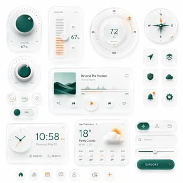
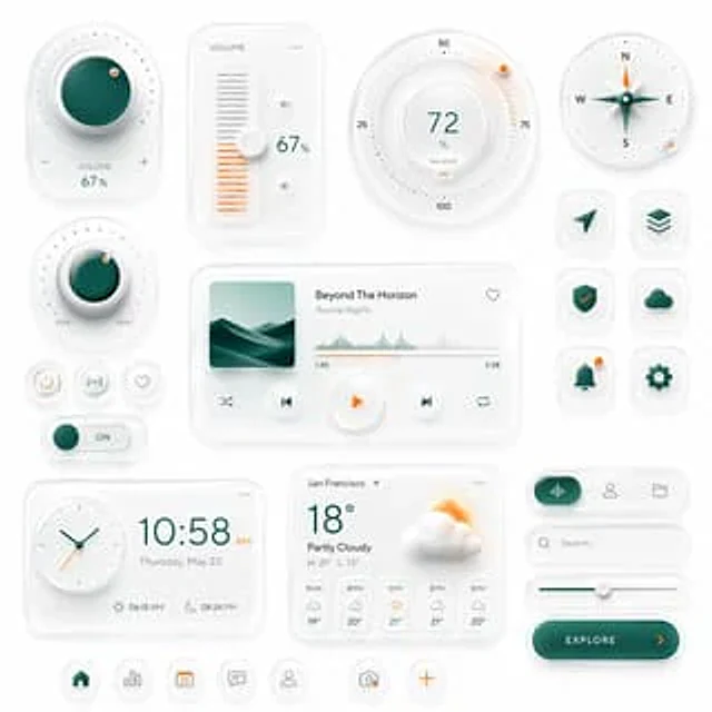
Create a premium neumorphic smart-home and media control UI kit on a clean light gray background, arranged as a balanced dashboard-style composition of floating rounded cards and circular controls with soft extruded shadows, subtle inner highlights, frosted white surfaces, and elegant teal-and-orange accents. The overall style is minimalist, futuristic, tactile, and highly polished, like a high-end mobile interface concept. Include exactly 18 discrete UI modules and icons: 1 large circular volume knob card in the upper left with a glossy deep teal center, dotted perimeter, plus and minus symbols, and the text “VOLUME 67%”; 1 vertical volume slider card with the label “VOLUME”, a white knob, orange level bars, small speaker icons, and “67%”; 1 large circular balance dial at the top center-right with numeric markings 25, 50, 75, 100, the central value “72%”, the label “BALANCE”, and a small orange indicator dot; 1 circular compass widget in the upper right with N, E, S, W labels, a metallic teal compass needle, and a small orange accent dot on the rim; 1 smaller circular min-max knob on the left middle with a teal center, textured white dial edge, orange indicator dot, and “MIN” and “MAX” labels; 3 small circular utility buttons beneath it in one row, showing a power symbol, a connectivity or wireless symbol, and a heart outline; 1 horizontal toggle switch below those buttons with a teal knob and the text “ON”; 1 large media player card in the center with a square album cover showing abstract layered teal dunes or waves, the track title “Beyond The Horizon”, the artist name “Aurora Nights”, a heart icon in the top right, a waveform progress display, timestamps “1:45” and “3:58”, and 4 playback controls along the bottom row: shuffle, previous, central orange play button, next, and repeat; 6 rounded-square app icons in two columns on the right side, arranged in 3 rows, showing exactly these symbols: paper plane arrow, stacked layers, shield with check mark, cloud, bell with a small orange notification dot, and gear; 1 rectangular clock card at the bottom left with a circular analog clock face, large digital time “10:58 AM”, the date line “Thursday, May 23”, and sunrise/sunset times “06:15 AM” and “08:24 PM”; 1 weather card at the bottom center with the location “San Francisco”, current temperature “18°”, condition “Partly Cloudy”, high/low “H: 21° L: 13°”, a large sun-behind-cloud illustration, and a 5-column hourly forecast labeled “11 AM”, “12 PM”, “1 PM”, “2 PM”, “3 PM”; 1 pill-shaped tab selector at the lower right with 3 tabs, where the left tab is active in teal with an audio waveform icon, and the other 2 tabs show a user icon and a folder icon; 1 search bar directly beneath it with a magnifying glass and placeholder text “Search...” ; 1 horizontal slider below the search bar with a teal progress line and a white knob; 1 large rounded CTA button at the bottom right reading “{argument name="button text" default="EXPLORE"}” with a right-facing orange arrow; and 5 circular bottom navigation icons centered along the bottom edge, showing home, bar chart, calendar with “23”, chat bubble, and user profile, plus 2 floating action buttons beside them: a camera icon and an orange plus sign. Use a restrained palette with white and very light gray surfaces, deep teal-green gradients for active states, and warm orange for highlights and notifications. Emphasize depth through soft ambient shadows, subtle bevels, glossy reflections, and realistic material rendering. Keep the layout spacious, symmetric but not rigid, and suitable for a luxury mobile app concept presentation.Cómo usar
- Copia el prompt original completo, incluidos los parámetros.
- Adapta el tema, el texto y la composición a tus necesidades.
- Usa una herramienta externa compatible; comprueba el acceso y el resultado.
Antes de empezar
- Comprueba si necesita una imagen de referencia. La compatibilidad no demuestra qué modelo generó el ejemplo.
- Revisa nombres, cifras y textos; el resultado puede variar entre versiones del modelo.