Documento original
GPT Image 2 · en
Scene:
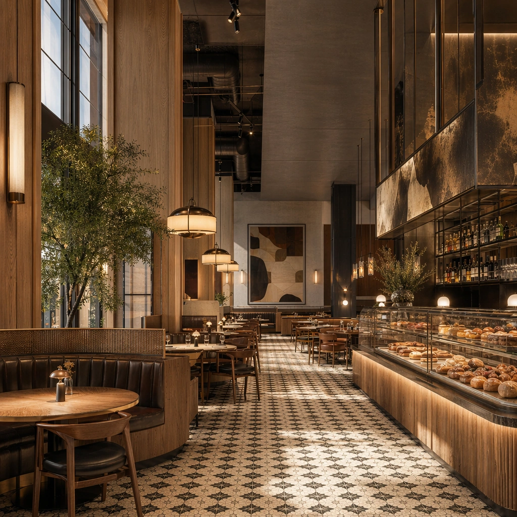
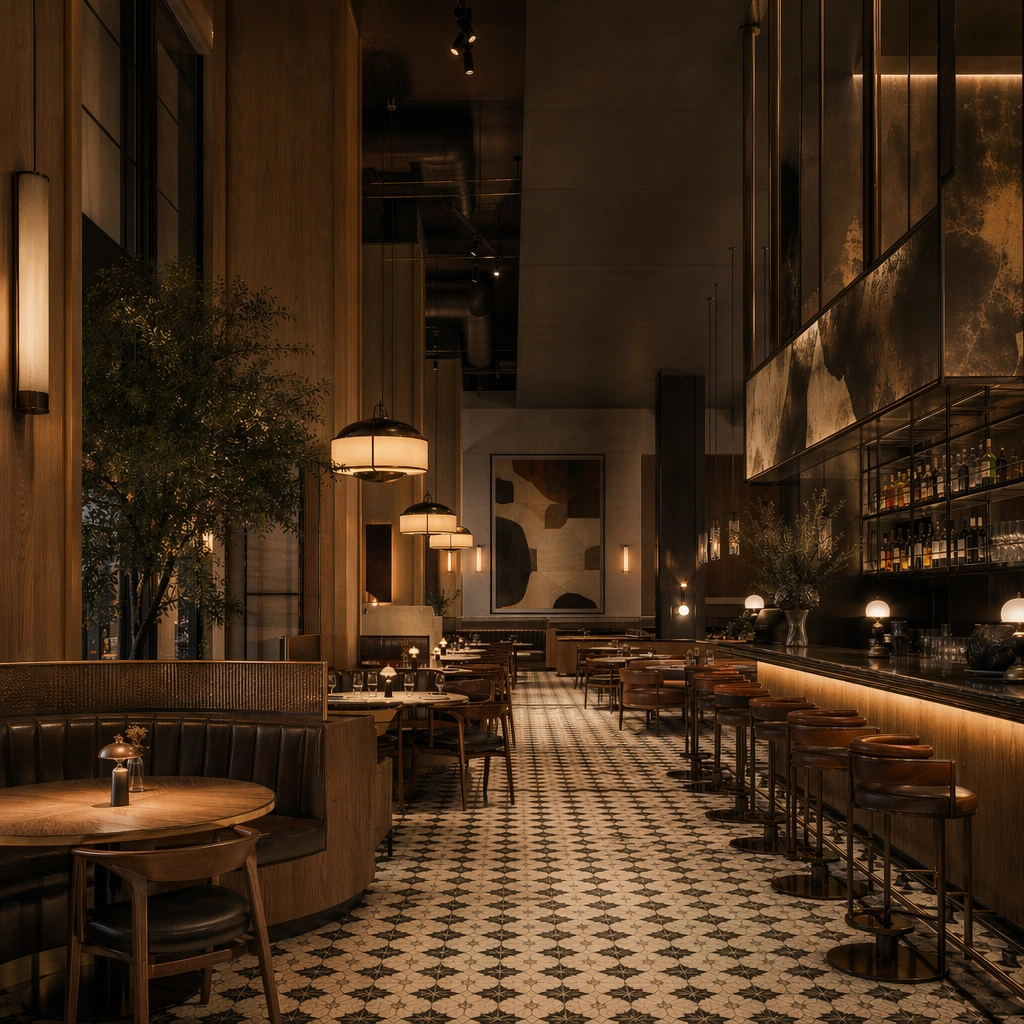
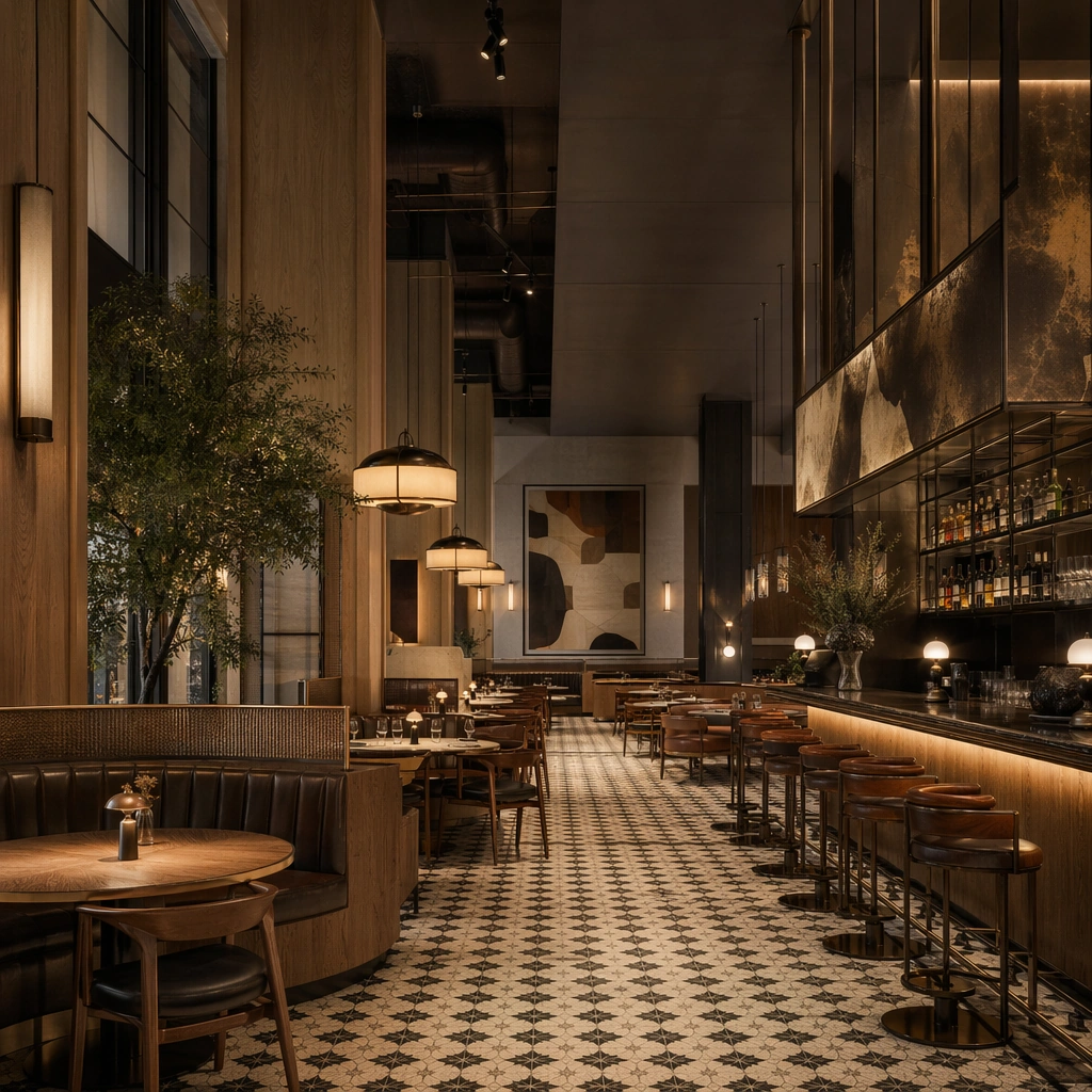
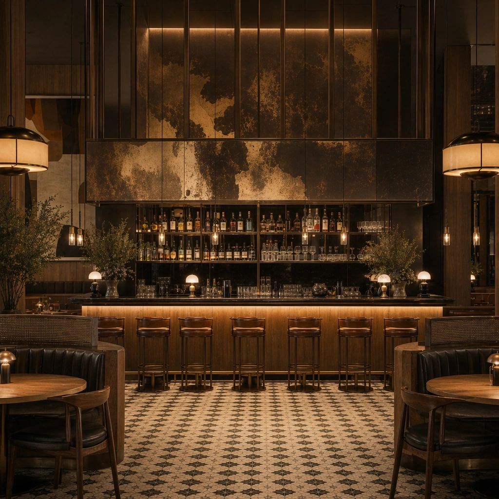
Create a square reference-dependent architecture still for Restaurant Cafe Space Brand Integration. Use a composition centered on the bar counter, back shelving, and seating edge while keeping the same lens discipline, editorial polish, and material believability established by the reference image. The lighting can shift to support the intended mood, but the space must still feel like the same authored project with a stable viewpoint logic, convincing depth separation, and clean commercial-photography finish. Keep toasted oak, espresso brown, muted cream, oxidized brass, and warm tungsten amber as the governing tonal range even when the emphasis changes.

Subject:
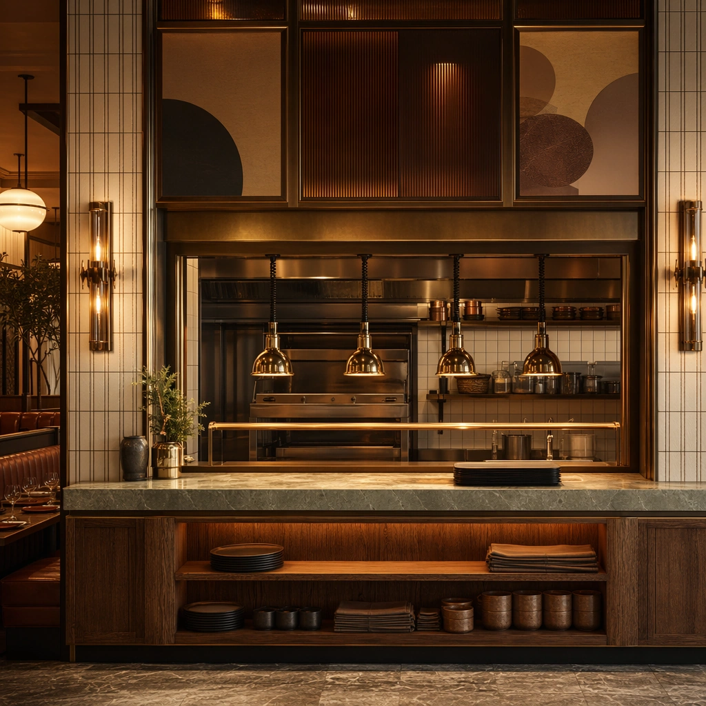
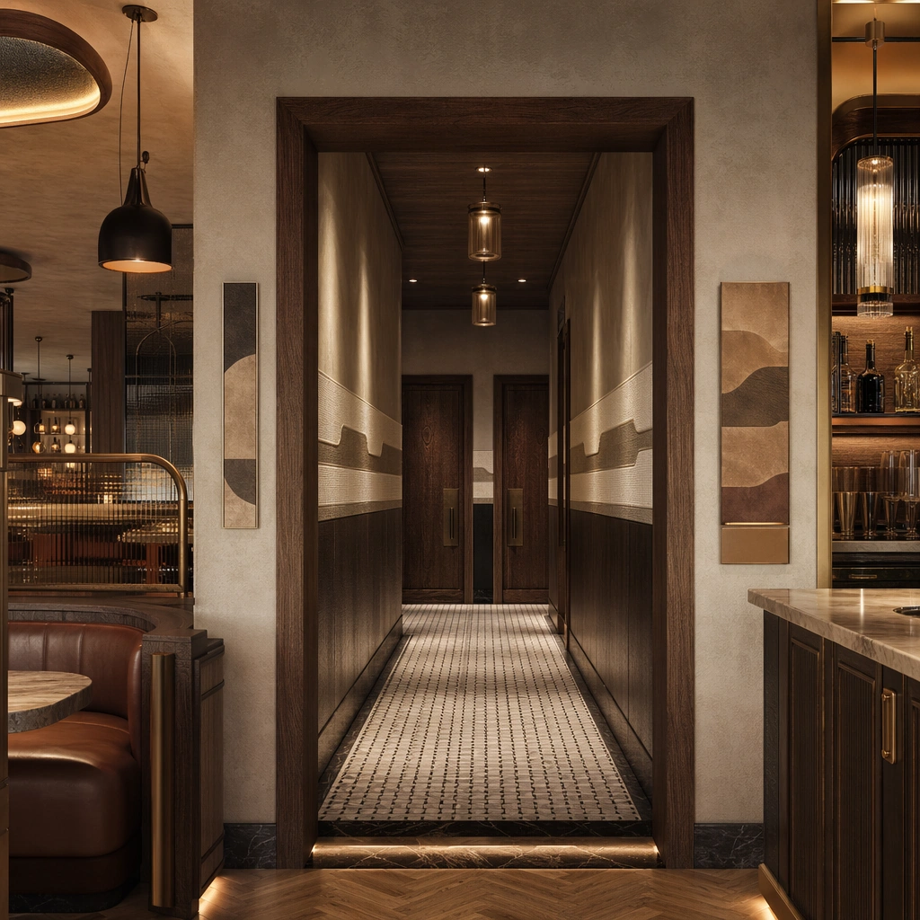
Show a restaurant and cafe interior where oak, oxidized metal, patterned tile, leather banquettes, softly glowing pendants, and abstract menu surfaces feel authored as one brand system. Focus on the exact same restaurant from the reference image, now emphasizing service theatre, backbar materials, and pendant rhythm. Preserve exact architectural identity, plan logic, material palette, fixture family, and circulation cues from the reference image while changing only the intended emphasis described here. The viewer should immediately recognize the same project, not a loose cousin, with matching silhouette logic, aligned detailing, and consistent brand atmosphere.

Important details:
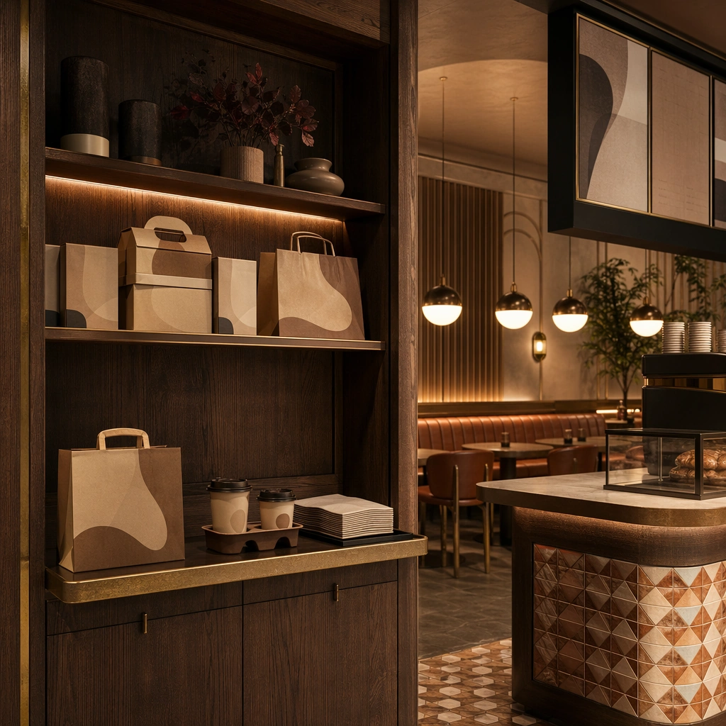
Preserve the tile language, oak-and-metal pairings, banquette shapes, bar geometry, pendant rhythm, and abstract menu-display zones. Any abstract wayfinding, menu, wall-label, or packaging zones must stay unreadable and subordinate to the spatial image. Joinery, edges, reflections, and lighting should remain realistic enough for an operator or design team to treat the image as a credible reference. The variation should feel deliberate and commercially useful, proving that one locked spatial language can flex across multiple campaign or editorial surfaces.

Use case:
Restaurant Cafe Space Brand Integration series study 2/9, extending the bar-as-brand center while preserving the same venue identity.

Constraints:
No readable text, no watermark, no logos, preserve exact 1:1 aspect ratio, preserve exact architectural identity from the reference image, no crowded diners, no readable menus, no food-delivery branding, no messy plates, no random neon slogans, no bottle labels.
Cómo usar
- Copia el prompt original completo, incluidos los parámetros.
- Adapta el tema, el texto y la composición a tus necesidades.
- Usa una herramienta externa compatible; comprueba el acceso y el resultado.
Antes de empezar
- Comprueba si necesita una imagen de referencia. La compatibilidad no demuestra qué modelo generó el ejemplo.
- Revisa nombres, cifras y textos; el resultado puede variar entre versiones del modelo.