Documento original
GPT Image 2 · en
Scene:
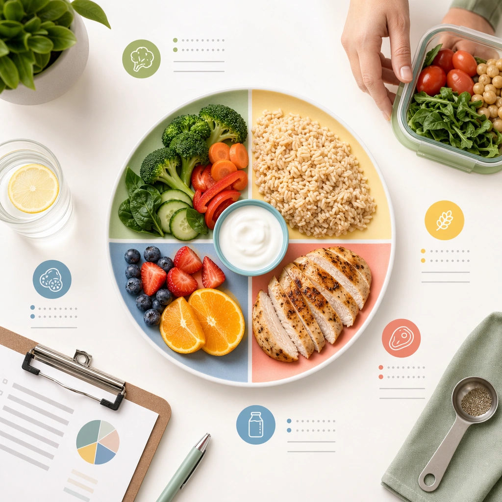
A square nutrition guidance card for Wellness and Prevention Education Cards. Compose it as a plate-centered educational tile with food groups, portion hints, and meal-prep objects. Use a palette of fresh white, sage green, butter yellow, muted coral, and soft denim blue, bright editorial lighting with cheerful softness, and a mood of uplifting, practical, and habit-forming. The frame should feel like a real healthcare communication asset art-directed for professional delivery, not a stock photo, speculative concept render, or generic corporate template. Keep the camera distance, negative space, and depth cues disciplined so the image reads immediately even at thumbnail size.

Subject:
Center on a prevention card translating balanced eating into an appealing but realistic home-meal visual system. Show enough surrounding context that the viewer understands the intended service surface, user situation, and institutional setting. Every object, person, diagram, device crop, or spatial cue should support clarity, trust, and practical use. If people appear, keep them anonymous, natural, privacy-safe, and grounded in believable body language rather than promotional posing.

Important details:
Maintain prevention education expressed through card-based compositions, small daily-life scenes, simple diagrams, and social-friendly rhythm without empty lifestyle fluff. Show ordinary foods, reasonable portions, and calm color coding rather than aspirational gourmet styling. Use abstract icon shapes, color blocks, chart bars, interface modules, or non-legible placeholder microcopy whenever information structure is needed, but never readable text. Materials, spacing, lighting, and hierarchy should feel production-ready and healthcare-specific. Avoid generic lifestyle filler, decorative noise, or design gestures that do not reinforce the communication goal.

Use case:
Wellness Cards single study 7/9 for a balanced meal education card.

Constraints:
No readable text, no watermark, no logos, preserve exact 1:1 aspect ratio, no influencer-product placement, no unrealistic body perfection, no childish clip-art tone, no information overload, no diet-culture messaging, no restaurant-ad plating.
Cómo usar
- Copia el prompt original completo, incluidos los parámetros.
- Adapta el tema, el texto y la composición a tus necesidades.
- Usa una herramienta externa compatible; comprueba el acceso y el resultado.
Antes de empezar
- Comprueba si necesita una imagen de referencia. La compatibilidad no demuestra qué modelo generó el ejemplo.
- Revisa nombres, cifras y textos; el resultado puede variar entre versiones del modelo.