Diseño de interfaces

Copia el prompt original completo, incluidos los parámetros. Adapta el tema, el texto y la composición a tus necesidades. Usa una herramienta externa compatible; comprueba el acceso y el resultado.

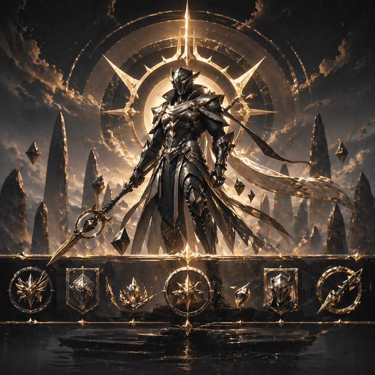
Season Kv Battle Pass Kit — Reference Season Hero KV
GPT Image 2en

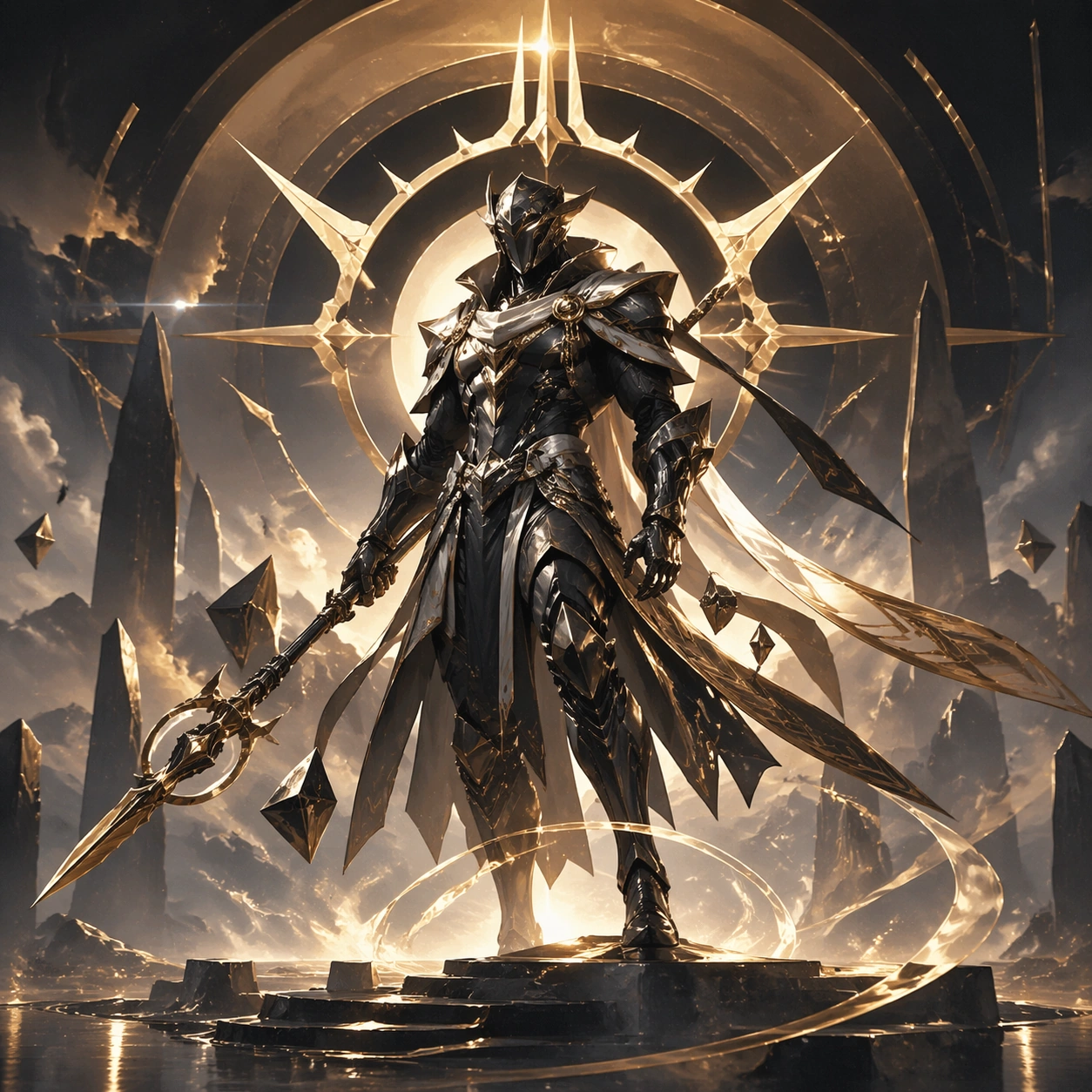
Scene: A square premium key-art frame built for a reference-dependent production series. Stage a flagship season key visual centered on one featured hero and a strong event theme with controlled lighting, clear silhouette separation, and a camera setup that feels deliberate enough for campaign reuse. The composition should carry strong focal hierarchy, believable depth, and polished surface behavior while still staying stable enough to support downstream dependent variations. Subject: Center the image on a flagship season key visual centered on one featured hero and a strong event theme. The result should feel like a concrete, shippable asset for Season KV Battle Pass Kit, not a generic fantasy render. Build the subject with layered materials, stable anatomy or engineering logic, and enough specificity that later images can inherit the same underlying identity. This image is the root reference that defines continuity for the rest of the series. The viewer should immediately understand what is being preserved across the sequence and what is changing in this particular beat. Important details: establish the seasonal palette, prop motifs, background atmosphere, and hero silhouette that all follow-up assets must inherit. Make continuity explicit through repeatable shape language, proportion control, and a coherent palette system. Changes in pose, angle, mood, rarity, weather, or layout should still feel downstream of one stable source. Avoid clutter that would confuse reference use. Any interface-like blocks or graphic surfaces must remain abstract and unreadable. Keep the image polished, original, and suitable for both gallery display and production review. Use case: Season KV Battle Pass Kit series study 1/4, focused on reference season hero kv. Constraints: No readable text, no watermark, no logos, preserve exact 1:1 aspect ratio, no title text, no brand logos, no broken continuity, no off-model redesign, no accidental franchise resemblance.
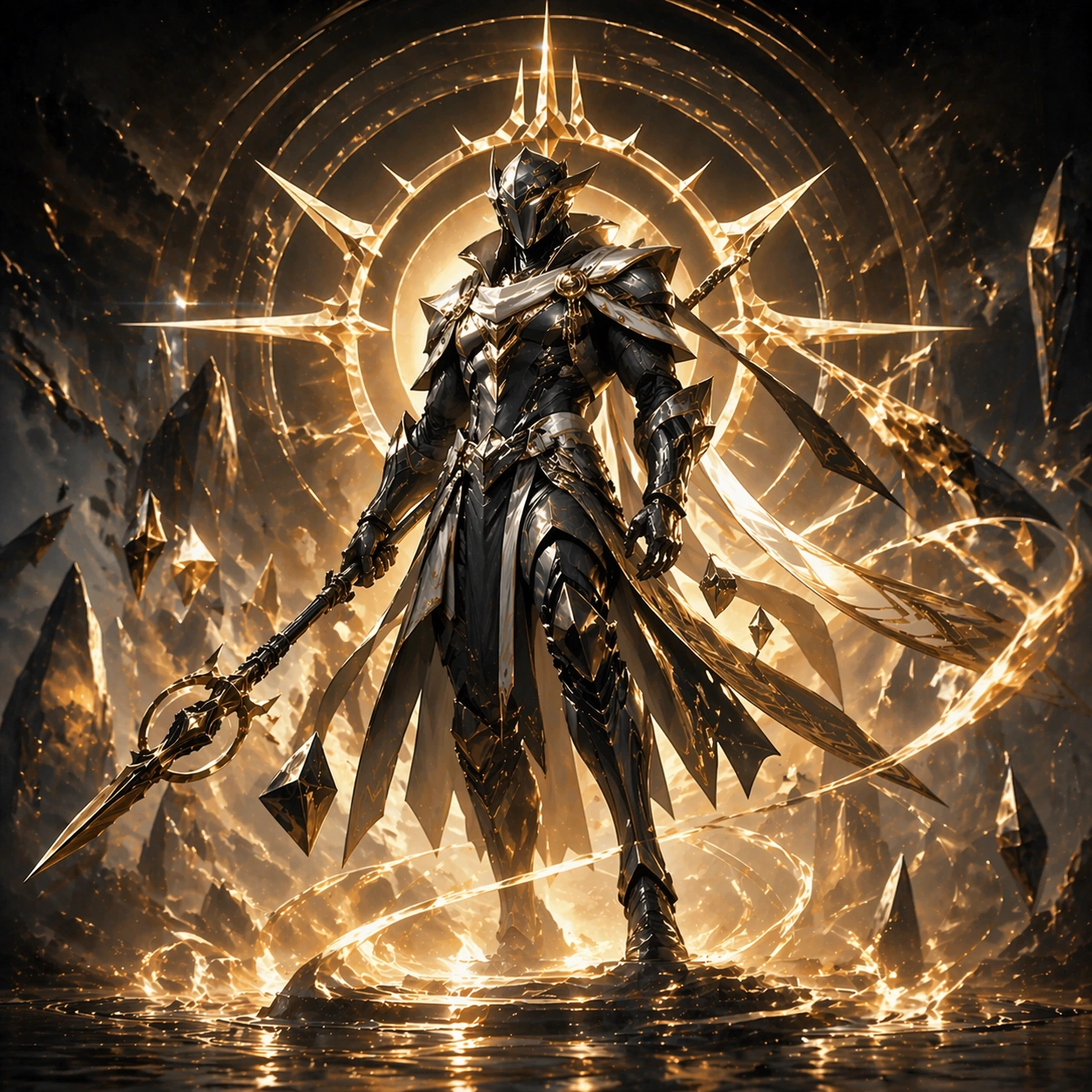
Season Kv Battle Pass Kit — Battle Pass Cover
GPT Image 2en

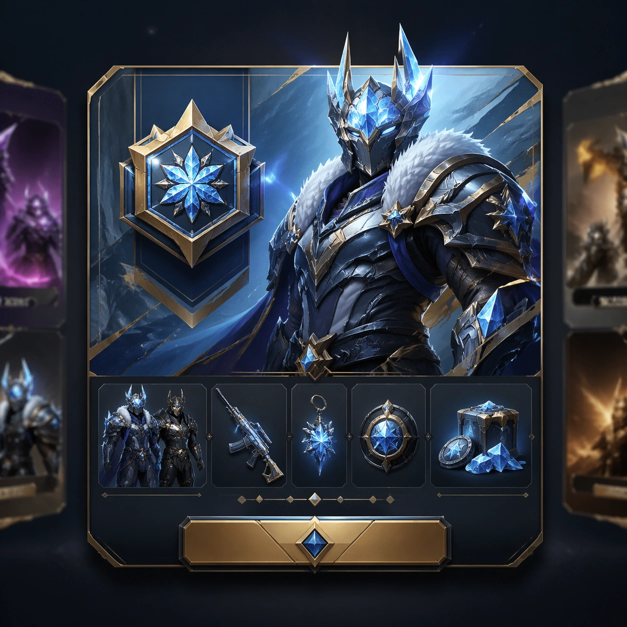
Scene: A square premium key-art frame built for a reference-dependent production series. Stage the same season translated into a battle pass cover with disciplined product hierarchy with controlled lighting, clear silhouette separation, and a camera setup that feels deliberate enough for campaign reuse. The composition should carry strong focal hierarchy, believable depth, and polished surface behavior while still staying stable enough to support downstream dependent variations. Subject: Center the image on the same season translated into a battle pass cover with disciplined product hierarchy. The result should feel like a concrete, shippable asset for Season KV Battle Pass Kit, not a generic fantasy render. Build the subject with layered materials, stable anatomy or engineering logic, and enough specificity that later images can inherit the same underlying identity. Preserve the same season theme, hero identity, color script, and event icon language from the reference key visual from the reference image while changing only what this variation needs. The viewer should immediately understand what is being preserved across the sequence and what is changing in this particular beat. Important details: preserve the same hero and event language while tightening the composition for a cover surface. Make continuity explicit through repeatable shape language, proportion control, and a coherent palette system. Changes in pose, angle, mood, rarity, weather, or layout should still feel downstream of one stable source. Avoid clutter that would confuse reference use. Any interface-like blocks or graphic surfaces must remain abstract and unreadable. Keep the image polished, original, and suitable for both gallery display and production review. Use case: Season KV Battle Pass Kit series study 2/4, focused on battle pass cover. Constraints: No readable text, no watermark, no logos, preserve exact 1:1 aspect ratio, no readable tier text, no currency numbers, no broken continuity, no off-model redesign, no accidental franchise resemblance.
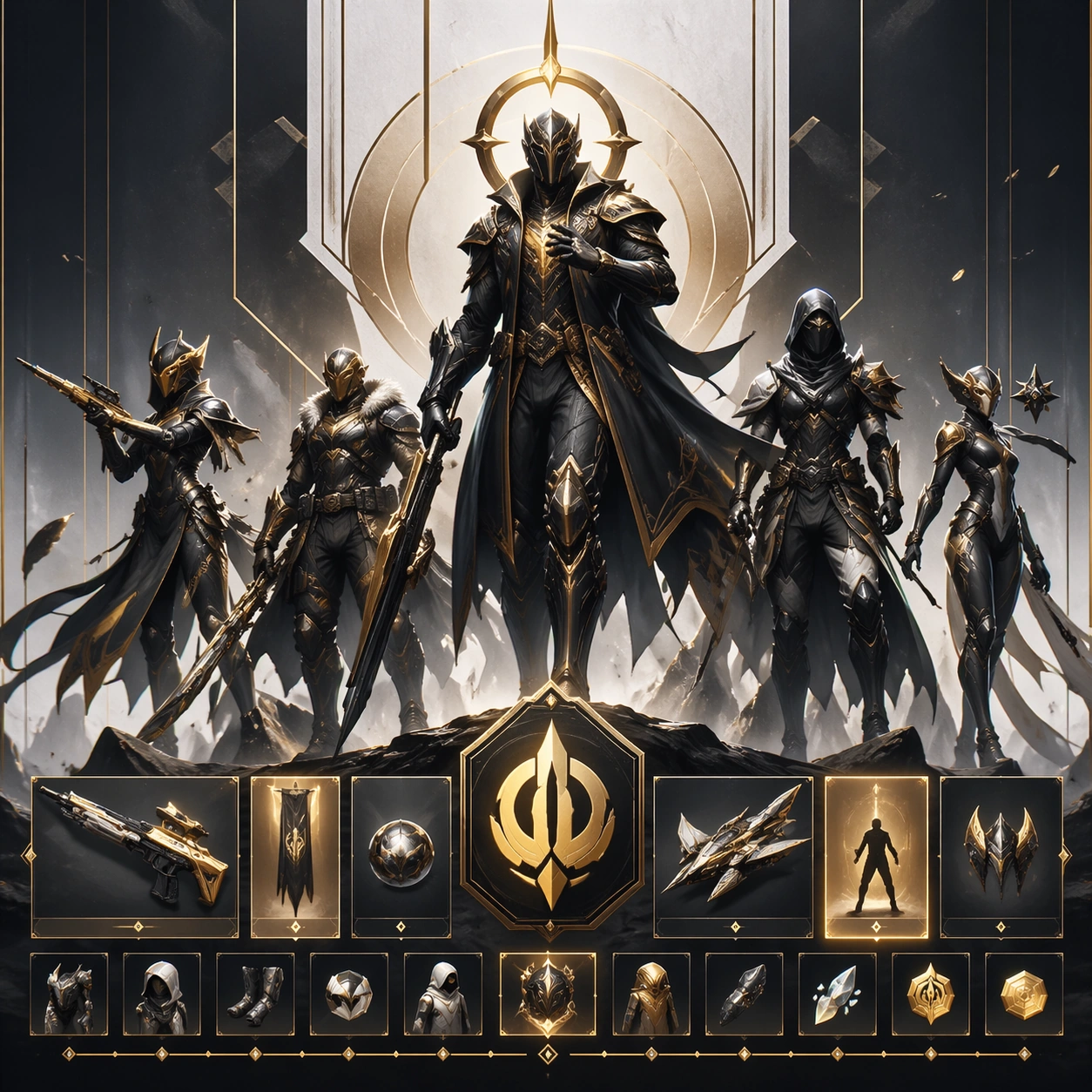
Season Kv Battle Pass Kit — Reward Track Header
GPT Image 2en

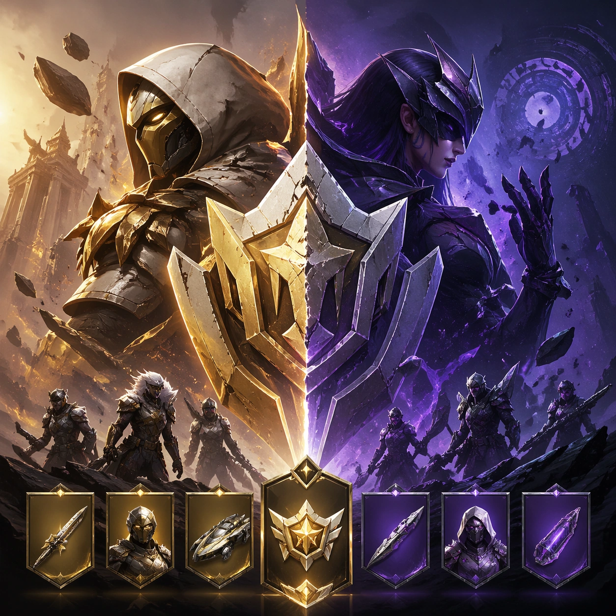
Scene: A square premium key-art frame built for a reference-dependent production series. Stage the same season visual system adapted into a reward-track header with wider horizontal logic inside a square crop with controlled lighting, clear silhouette separation, and a camera setup that feels deliberate enough for campaign reuse. The composition should carry strong focal hierarchy, believable depth, and polished surface behavior while still staying stable enough to support downstream dependent variations. Subject: Center the image on the same season visual system adapted into a reward-track header with wider horizontal logic inside a square crop. The result should feel like a concrete, shippable asset for Season KV Battle Pass Kit, not a generic fantasy render. Build the subject with layered materials, stable anatomy or engineering logic, and enough specificity that later images can inherit the same underlying identity. Preserve the same season theme, hero identity, color script, and event icon language from the reference key visual from the reference image while changing only what this variation needs. The viewer should immediately understand what is being preserved across the sequence and what is changing in this particular beat. Important details: keep the graphic family consistent while emphasizing progression and premium rewards. Make continuity explicit through repeatable shape language, proportion control, and a coherent palette system. Changes in pose, angle, mood, rarity, weather, or layout should still feel downstream of one stable source. Avoid clutter that would confuse reference use. Any interface-like blocks or graphic surfaces must remain abstract and unreadable. Keep the image polished, original, and suitable for both gallery display and production review. Use case: Season KV Battle Pass Kit series study 3/4, focused on reward track header. Constraints: No readable text, no watermark, no logos, preserve exact 1:1 aspect ratio, no labels, no arrows, no broken continuity, no off-model redesign, no accidental franchise resemblance.
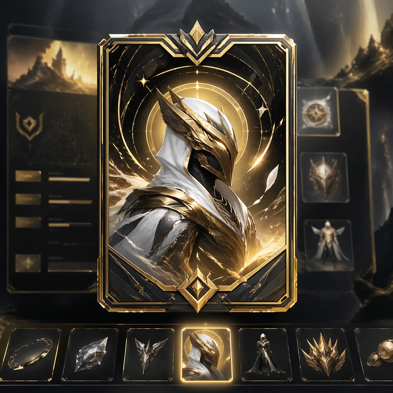
Season Kv Battle Pass Kit — Store Takeover Crop
GPT Image 2en

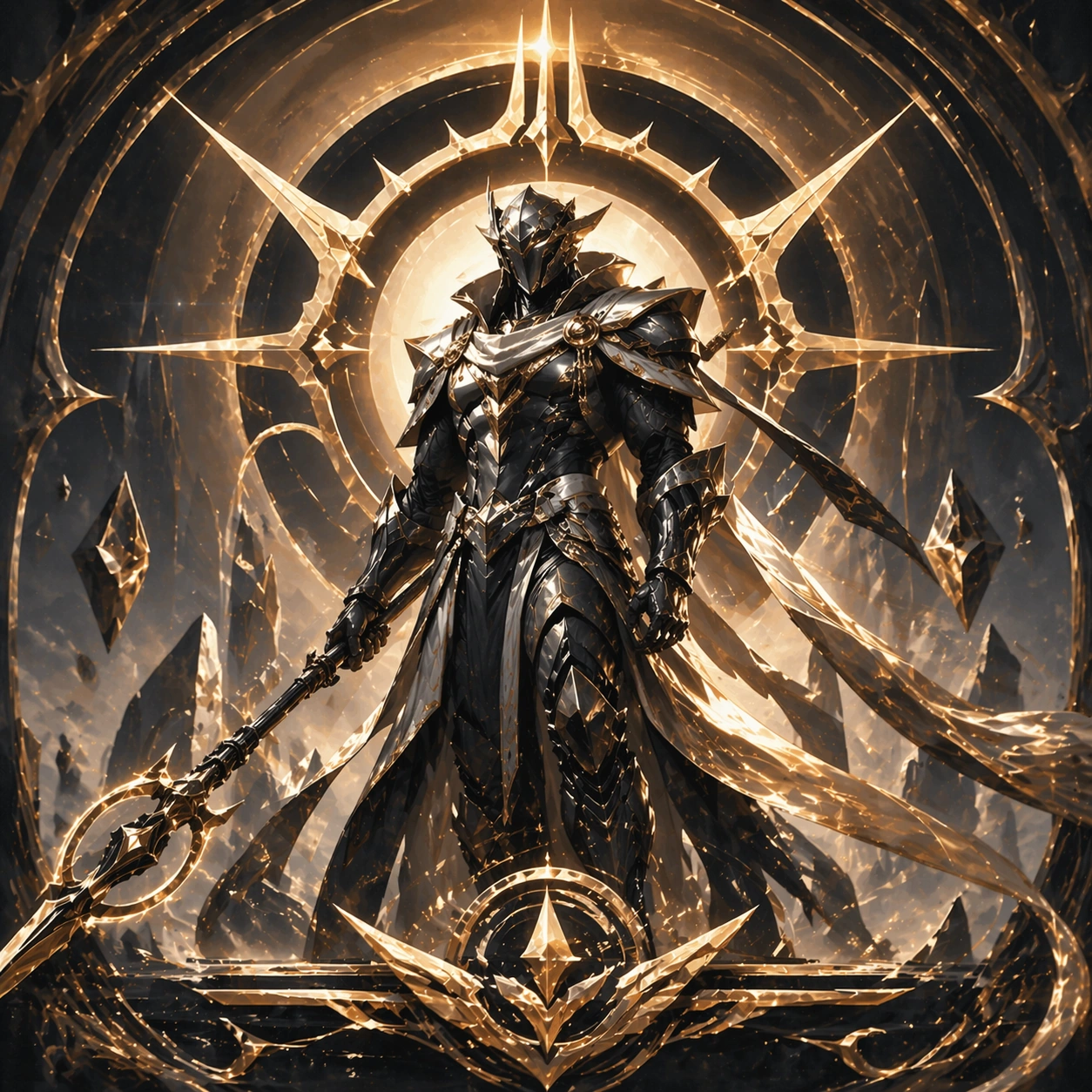
Scene: A square premium key-art frame built for a reference-dependent production series. Stage the same season repackaged as a high-impact store takeover crop for live-ops placement with controlled lighting, clear silhouette separation, and a camera setup that feels deliberate enough for campaign reuse. The composition should carry strong focal hierarchy, believable depth, and polished surface behavior while still staying stable enough to support downstream dependent variations. Subject: Center the image on the same season repackaged as a high-impact store takeover crop for live-ops placement. The result should feel like a concrete, shippable asset for Season KV Battle Pass Kit, not a generic fantasy render. Build the subject with layered materials, stable anatomy or engineering logic, and enough specificity that later images can inherit the same underlying identity. Preserve the same season theme, hero identity, color script, and event icon language from the reference key visual from the reference image while changing only what this variation needs. The viewer should immediately understand what is being preserved across the sequence and what is changing in this particular beat. Important details: conversion energy should rise while the same seasonal identity remains obvious. Make continuity explicit through repeatable shape language, proportion control, and a coherent palette system. Changes in pose, angle, mood, rarity, weather, or layout should still feel downstream of one stable source. Avoid clutter that would confuse reference use. Any interface-like blocks or graphic surfaces must remain abstract and unreadable. Keep the image polished, original, and suitable for both gallery display and production review. Use case: Season KV Battle Pass Kit series study 4/4, focused on store takeover crop. Constraints: No readable text, no watermark, no logos, preserve exact 1:1 aspect ratio, no sale text, no logos, no broken continuity, no off-model redesign, no accidental franchise resemblance.
Season Kv Battle Pass Kit — Season Launch Poster
GPT Image 2en

Scene: A square production-ready image designed for a game-art review wall and a commercial gallery at the same time. Frame a launch-poster composition that sells the season as a must-enter event with disciplined lighting, clean edge separation, and enough surrounding context to prove how the asset would behave in a real product surface. The camera, crop, and tonal balance should feel intentional rather than generic, with high readability at first glance and convincing material response under closer inspection. Subject: Center the study on a launch-poster composition that sells the season as a must-enter event. Translate the topic into a concrete, shippable visual statement instead of a loose mood board. Build layered object relationships, believable surface finish, and strong silhouette grouping so the image reads immediately as part of Season KV Battle Pass Kit. The subject should feel made for a live game pipeline: useful in store, UI, campaign, or art-review contexts, with visual hierarchy strong enough to survive aggressive cropping. Important details: the same thematic system should feel cinematic and campaign-worthy without relying on copy. Keep every supporting element subordinate to the main read, and make category separation obvious through form, color zoning, depth, and material logic rather than words. Where panels, cards, badges, or interface blocks appear, they must look professionally structured but remain unreadable. The visual language should feel premium, original, and coherent across this package, with no filler clutter and no accidental resemblance to a specific shipped game IP. Use case: Season KV Battle Pass Kit single study 1/5, focused on season launch poster. Constraints: No readable text, no watermark, no logos, preserve exact 1:1 aspect ratio, no slogans, no logos, no broken hierarchy, no generic stock-photo staging, no accidental UI gibberish.

Season Kv Battle Pass Kit — Premium Reward Card
GPT Image 2en

Scene: A square production-ready image designed for a game-art review wall and a commercial gallery at the same time. Frame a premium reward card surface built from the season’s hero and motif language with disciplined lighting, clean edge separation, and enough surrounding context to prove how the asset would behave in a real product surface. The camera, crop, and tonal balance should feel intentional rather than generic, with high readability at first glance and convincing material response under closer inspection. Subject: Center the study on a premium reward card surface built from the season’s hero and motif language. Translate the topic into a concrete, shippable visual statement instead of a loose mood board. Build layered object relationships, believable surface finish, and strong silhouette grouping so the image reads immediately as part of Season KV Battle Pass Kit. The subject should feel made for a live game pipeline: useful in store, UI, campaign, or art-review contexts, with visual hierarchy strong enough to survive aggressive cropping. Important details: the reward should feel aspirational and perfectly on-brand for the season. Keep every supporting element subordinate to the main read, and make category separation obvious through form, color zoning, depth, and material logic rather than words. Where panels, cards, badges, or interface blocks appear, they must look professionally structured but remain unreadable. The visual language should feel premium, original, and coherent across this package, with no filler clutter and no accidental resemblance to a specific shipped game IP. Use case: Season KV Battle Pass Kit single study 2/5, focused on premium reward card. Constraints: No readable text, no watermark, no logos, preserve exact 1:1 aspect ratio, no tier numbers, no text labels, no broken hierarchy, no generic stock-photo staging, no accidental UI gibberish.

Season Kv Battle Pass Kit — Seasonal Store Tile
GPT Image 2en

Scene: A square production-ready image designed for a game-art review wall and a commercial gallery at the same time. Frame a conversion-focused store tile for a featured seasonal bundle or offer with disciplined lighting, clean edge separation, and enough surrounding context to prove how the asset would behave in a real product surface. The camera, crop, and tonal balance should feel intentional rather than generic, with high readability at first glance and convincing material response under closer inspection. Subject: Center the study on a conversion-focused store tile for a featured seasonal bundle or offer. Translate the topic into a concrete, shippable visual statement instead of a loose mood board. Build layered object relationships, believable surface finish, and strong silhouette grouping so the image reads immediately as part of Season KV Battle Pass Kit. The subject should feel made for a live game pipeline: useful in store, UI, campaign, or art-review contexts, with visual hierarchy strong enough to survive aggressive cropping. Important details: make it feel expensive and coherent with the same seasonal art direction. Keep every supporting element subordinate to the main read, and make category separation obvious through form, color zoning, depth, and material logic rather than words. Where panels, cards, badges, or interface blocks appear, they must look professionally structured but remain unreadable. The visual language should feel premium, original, and coherent across this package, with no filler clutter and no accidental resemblance to a specific shipped game IP. Use case: Season KV Battle Pass Kit single study 3/5, focused on seasonal store tile. Constraints: No readable text, no watermark, no logos, preserve exact 1:1 aspect ratio, no prices, no coupons, no broken hierarchy, no generic stock-photo staging, no accidental UI gibberish.

Season Kv Battle Pass Kit — Social Announcement Crop
GPT Image 2en

Scene: A square production-ready image designed for a game-art review wall and a commercial gallery at the same time. Frame a social-ready square crop announcing the season through key art fragments and atmosphere with disciplined lighting, clean edge separation, and enough surrounding context to prove how the asset would behave in a real product surface. The camera, crop, and tonal balance should feel intentional rather than generic, with high readability at first glance and convincing material response under closer inspection. Subject: Center the study on a social-ready square crop announcing the season through key art fragments and atmosphere. Translate the topic into a concrete, shippable visual statement instead of a loose mood board. Build layered object relationships, believable surface finish, and strong silhouette grouping so the image reads immediately as part of Season KV Battle Pass Kit. The subject should feel made for a live game pipeline: useful in store, UI, campaign, or art-review contexts, with visual hierarchy strong enough to survive aggressive cropping. Important details: the crop should stay instantly legible even after mobile compression. Keep every supporting element subordinate to the main read, and make category separation obvious through form, color zoning, depth, and material logic rather than words. Where panels, cards, badges, or interface blocks appear, they must look professionally structured but remain unreadable. The visual language should feel premium, original, and coherent across this package, with no filler clutter and no accidental resemblance to a specific shipped game IP. Use case: Season KV Battle Pass Kit single study 4/5, focused on social announcement crop. Constraints: No readable text, no watermark, no logos, preserve exact 1:1 aspect ratio, no hashtags, no text, no broken hierarchy, no generic stock-photo staging, no accidental UI gibberish.

Cómo usar

  1. Copia el prompt original completo, incluidos los parámetros.
  2. Adapta el tema, el texto y la composición a tus necesidades.
  3. Usa una herramienta externa compatible; comprueba el acceso y el resultado.

Antes de empezar

  • Comprueba si necesita una imagen de referencia. La compatibilidad no demuestra qué modelo generó el ejemplo.
  • Revisa nombres, cifras y textos; el resultado puede variar entre versiones del modelo.

Colecciones seleccionadas