PROMPTS · EXPLORACIÓN CREATIVA

Galería de prompts

Explora prompts reales y ejemplos generados. Encuentra inspiración para tu próxima misión creativa y copia gratis el prompt completo.

Ejemplos
10,974
Modelos
17
Fuentes
1277
10.974 ejemplos de prompts · página 4 de 229
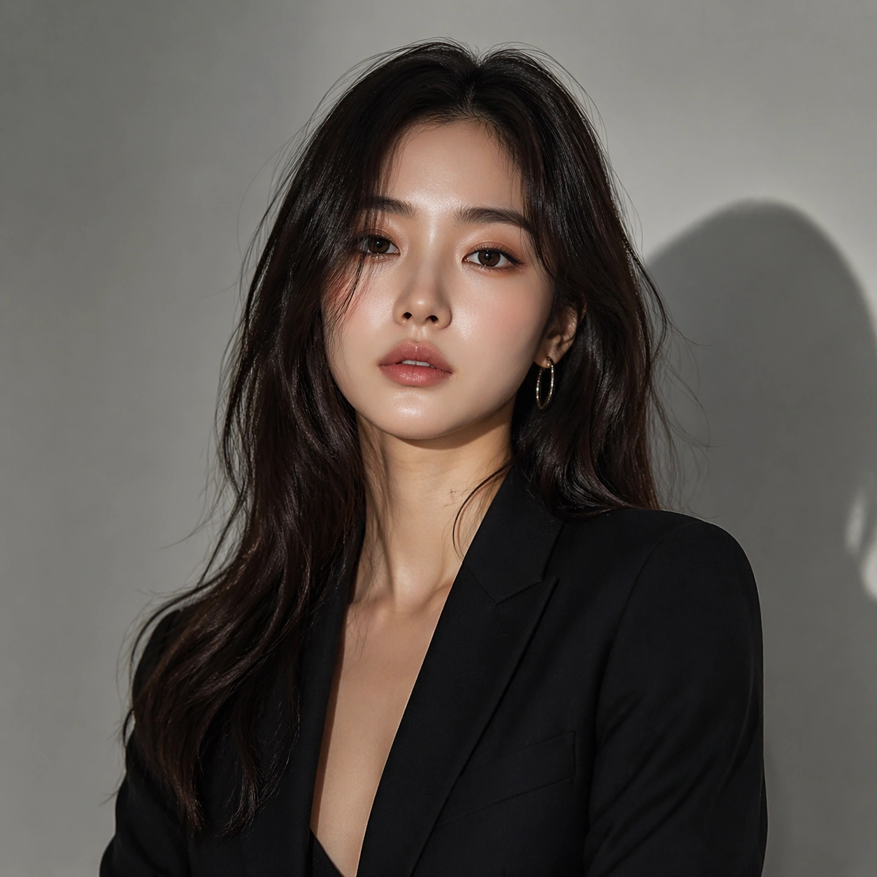
Example generated from “Single Talent Styling Journey — Anchor Portrait”
GPT Image 2en

Scene: A square commercial beauty-or-fashion image designed like a polished campaign proof for Single-Talent Styling Journey. Keep the camera discipline clear and believable: portrait-oriented within the square, premium studio light, controlled tonal contrast, and enough surrounding negative space to feel like an ad layout without relying on readable typography. The image should look production-ready, with realistic skin, hair, fabric, and makeup rendering that supports identity locking instead of distracting from it. Subject: Build the frame around one clearly recognizable person. Anchor Portrait should feel like a specific transformation step that defines the exact face, camera angle, skin texture, and model identity that later images must preserve. The face structure, age, body proportions, and general camera position must stay consistent with the same-person premise of Follow one talent through multiple styling directions such as airport look, red carpet, comeback concept, streetwear, and beauty close-up without losing identity.. Styling, wardrobe, grooming, makeup, hair, or pose can evolve, but the viewer must believe it is unquestionably the same subject across the whole theme. Use a premium editorial-commercial tone rather than a casual portrait session. Important details: The visual test is identity consistency under change. Preserve stable bone structure, eye spacing, nose shape, lip volume, skin tone family, and believable texture response. Let the transformation be visible through styling choices instead of facial drift. This theme studies multi-image-reference, editing-workflow, commercial-mockup, photorealism through a production-ready visual system. Make the composition clean enough for client review, with professional grooming fidelity and enough detail for salon, beauty, or fashion decision-making. Aim for clear hierarchy, polished craft, and immediately usable campaign logic. Use case: Single-Talent Styling Journey series study 1/4. Constraints: No readable text, no watermark, no logos, preserve exact 1:1 aspect ratio, no face drift, no inconsistent age shift, no extra limbs, no duplicate person, no asymmetric eye placement, no beauty-editorial chaos.
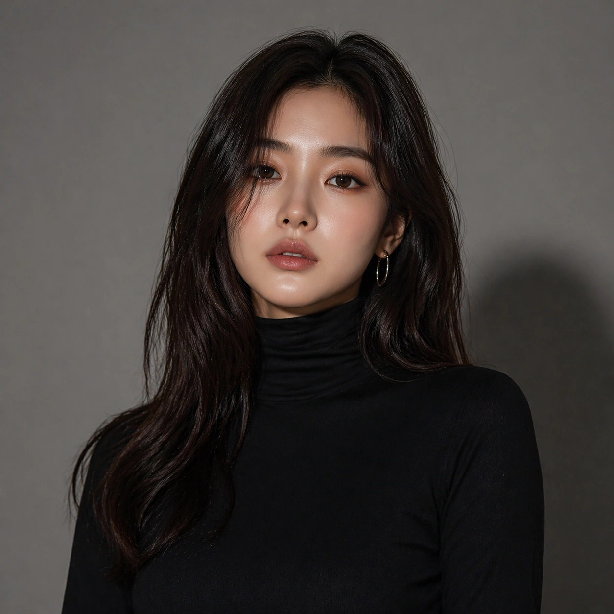
Example generated from “Single Talent Styling Journey — First Switch”
GPT Image 2en

Scene: A square commercial beauty-or-fashion image designed like a polished campaign proof for Single-Talent Styling Journey. Keep the camera discipline clear and believable: portrait-oriented within the square, premium studio light, controlled tonal contrast, and enough surrounding negative space to feel like an ad layout without relying on readable typography. The image should look production-ready, with realistic skin, hair, fabric, and makeup rendering that supports identity locking instead of distracting from it. Subject: Build the frame around one clearly recognizable person. First Switch should feel like a specific transformation step that keeps the same identity but changes the styling direction in a clear and controlled way. The face structure, age, body proportions, and general camera position must stay consistent with the same-person premise of Follow one talent through multiple styling directions such as airport look, red carpet, comeback concept, streetwear, and beauty close-up without losing identity.. Styling, wardrobe, grooming, makeup, hair, or pose can evolve, but the viewer must believe it is unquestionably the same subject across the whole theme. Use a premium editorial-commercial tone rather than a casual portrait session. Important details: The visual test is identity consistency under change. Preserve stable bone structure, eye spacing, nose shape, lip volume, skin tone family, and believable texture response. Let the transformation be visible through styling choices instead of facial drift. This theme studies multi-image-reference, editing-workflow, commercial-mockup, photorealism through a production-ready visual system. Make the composition clean enough for client review, with professional grooming fidelity and enough detail for salon, beauty, or fashion decision-making. Aim for clear hierarchy, polished craft, and immediately usable campaign logic. Use case: Single-Talent Styling Journey series study 2/4. Constraints: No readable text, no watermark, no logos, preserve exact 1:1 aspect ratio, no face drift, no inconsistent age shift, no extra limbs, no duplicate person, no asymmetric eye placement, no beauty-editorial chaos.
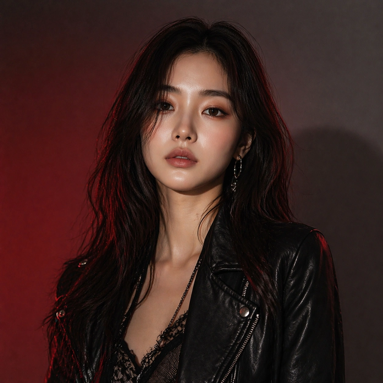
Example generated from “Single Talent Styling Journey — Second Switch”
GPT Image 2en

Scene: A square commercial beauty-or-fashion image designed like a polished campaign proof for Single-Talent Styling Journey. Keep the camera discipline clear and believable: portrait-oriented within the square, premium studio light, controlled tonal contrast, and enough surrounding negative space to feel like an ad layout without relying on readable typography. The image should look production-ready, with realistic skin, hair, fabric, and makeup rendering that supports identity locking instead of distracting from it. Subject: Build the frame around one clearly recognizable person. Second Switch should feel like a specific transformation step that pushes the same identity into a more dramatic transformation without face drift. The face structure, age, body proportions, and general camera position must stay consistent with the same-person premise of Follow one talent through multiple styling directions such as airport look, red carpet, comeback concept, streetwear, and beauty close-up without losing identity.. Styling, wardrobe, grooming, makeup, hair, or pose can evolve, but the viewer must believe it is unquestionably the same subject across the whole theme. Use a premium editorial-commercial tone rather than a casual portrait session. Important details: The visual test is identity consistency under change. Preserve stable bone structure, eye spacing, nose shape, lip volume, skin tone family, and believable texture response. Let the transformation be visible through styling choices instead of facial drift. This theme studies multi-image-reference, editing-workflow, commercial-mockup, photorealism through a production-ready visual system. Make the composition clean enough for client review, with professional grooming fidelity and enough detail for salon, beauty, or fashion decision-making. Aim for clear hierarchy, polished craft, and immediately usable campaign logic. Use case: Single-Talent Styling Journey series study 3/4. Constraints: No readable text, no watermark, no logos, preserve exact 1:1 aspect ratio, no face drift, no inconsistent age shift, no extra limbs, no duplicate person, no asymmetric eye placement, no beauty-editorial chaos.
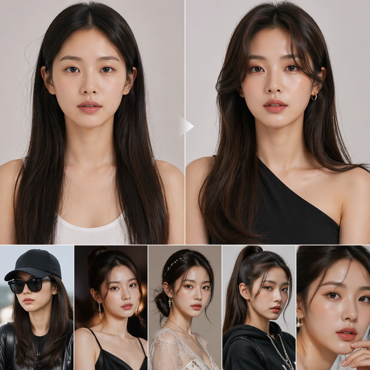
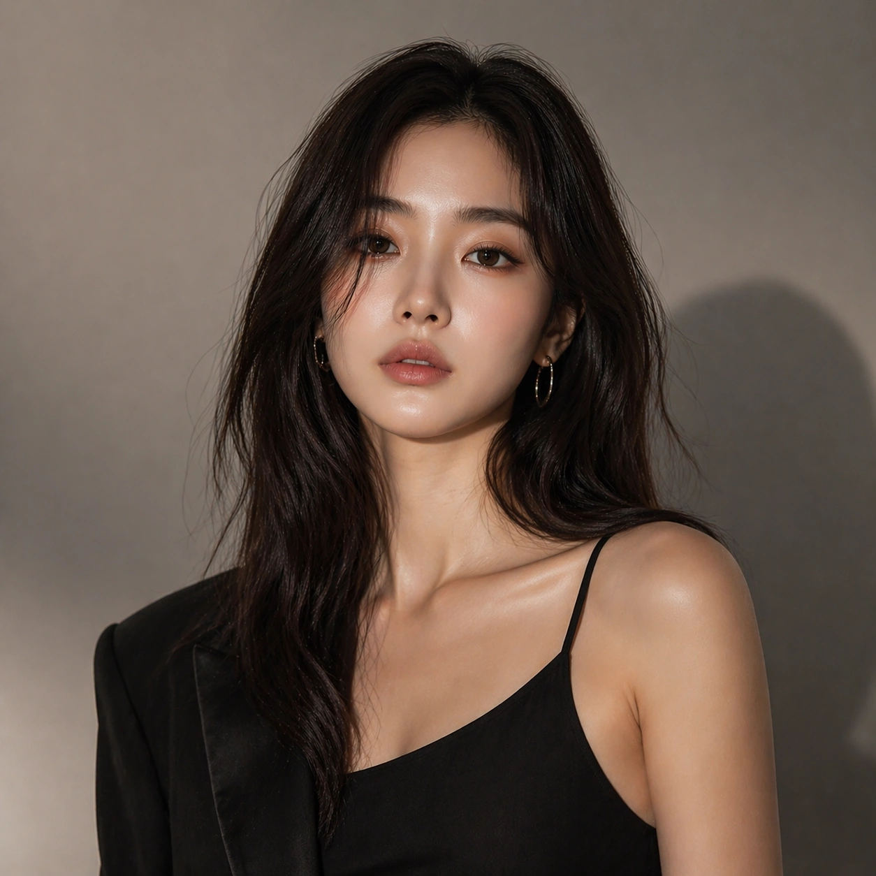
Example generated from “Single Talent Styling Journey — Campaign Finish”
GPT Image 2en

Scene: A square commercial beauty-or-fashion image designed like a polished campaign proof for Single-Talent Styling Journey. Keep the camera discipline clear and believable: portrait-oriented within the square, premium studio light, controlled tonal contrast, and enough surrounding negative space to feel like an ad layout without relying on readable typography. The image should look production-ready, with realistic skin, hair, fabric, and makeup rendering that supports identity locking instead of distracting from it. Subject: Build the frame around one clearly recognizable person. Campaign Finish should feel like a specific transformation step that turns the locked identity into a polished campaign-ready hero frame. The face structure, age, body proportions, and general camera position must stay consistent with the same-person premise of Follow one talent through multiple styling directions such as airport look, red carpet, comeback concept, streetwear, and beauty close-up without losing identity.. Styling, wardrobe, grooming, makeup, hair, or pose can evolve, but the viewer must believe it is unquestionably the same subject across the whole theme. Use a premium editorial-commercial tone rather than a casual portrait session. Important details: The visual test is identity consistency under change. Preserve stable bone structure, eye spacing, nose shape, lip volume, skin tone family, and believable texture response. Let the transformation be visible through styling choices instead of facial drift. This theme studies multi-image-reference, editing-workflow, commercial-mockup, photorealism through a production-ready visual system. Make the composition clean enough for client review, with professional grooming fidelity and enough detail for salon, beauty, or fashion decision-making. Aim for clear hierarchy, polished craft, and immediately usable campaign logic. Use case: Single-Talent Styling Journey series study 4/4. Constraints: No readable text, no watermark, no logos, preserve exact 1:1 aspect ratio, no face drift, no inconsistent age shift, no extra limbs, no duplicate person, no asymmetric eye placement, no beauty-editorial chaos.
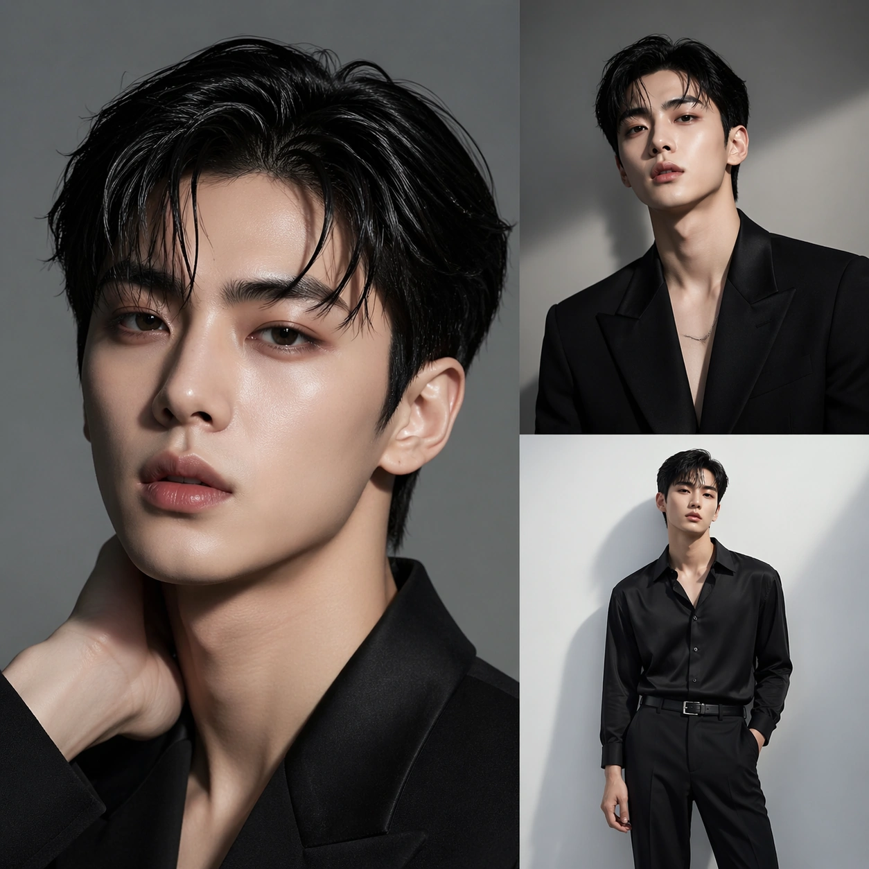
Example generated from “Single Talent Styling Journey — Before After Board”
GPT Image 2en

Scene: A square commercial beauty-or-fashion image designed like a polished campaign proof for Single-Talent Styling Journey. Keep the camera discipline clear and believable: portrait-oriented within the square, premium studio light, controlled tonal contrast, and enough surrounding negative space to feel like an ad layout without relying on readable typography. The image should look production-ready, with realistic skin, hair, fabric, and makeup rendering that supports identity locking instead of distracting from it. Subject: Build the frame around one clearly recognizable person. Before After Board should feel like a specific transformation step that a disciplined comparison layout making transformation logic instantly legible. The face structure, age, body proportions, and general camera position must stay consistent with the same-person premise of Follow one talent through multiple styling directions such as airport look, red carpet, comeback concept, streetwear, and beauty close-up without losing identity.. Styling, wardrobe, grooming, makeup, hair, or pose can evolve, but the viewer must believe it is unquestionably the same subject across the whole theme. Use a premium editorial-commercial tone rather than a casual portrait session. Important details: The visual test is identity consistency under change. Preserve stable bone structure, eye spacing, nose shape, lip volume, skin tone family, and believable texture response. Let the transformation be visible through styling choices instead of facial drift. This theme studies multi-image-reference, editing-workflow, commercial-mockup, photorealism through a production-ready visual system. Make the composition clean enough for client review, with professional grooming fidelity and enough detail for salon, beauty, or fashion decision-making. Aim for clear hierarchy, polished craft, and immediately usable campaign logic. Use case: Single-Talent Styling Journey single study 1/5. Constraints: No readable text, no watermark, no logos, preserve exact 1:1 aspect ratio, no face drift, no inconsistent age shift, no extra limbs, no duplicate person, no asymmetric eye placement, no beauty-editorial chaos.
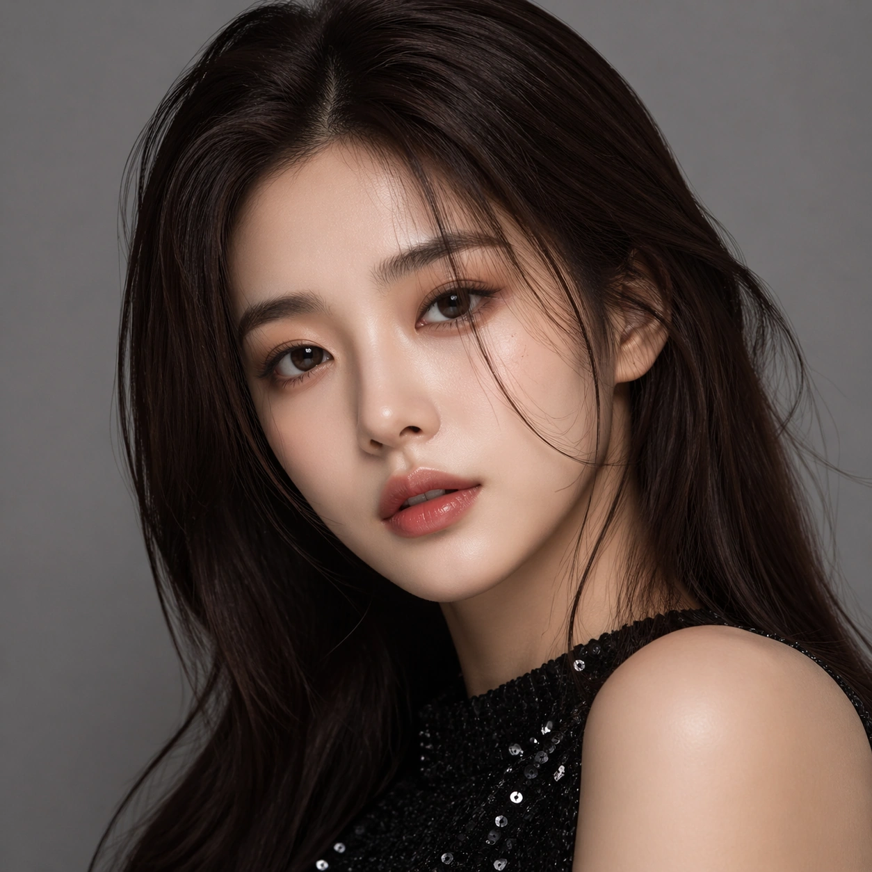
Example generated from “Single Talent Styling Journey — Lookbook Sheet”
GPT Image 2en

Scene: A square commercial beauty-or-fashion image designed like a polished campaign proof for Single-Talent Styling Journey. Keep the camera discipline clear and believable: portrait-oriented within the square, premium studio light, controlled tonal contrast, and enough surrounding negative space to feel like an ad layout without relying on readable typography. The image should look production-ready, with realistic skin, hair, fabric, and makeup rendering that supports identity locking instead of distracting from it. Subject: Build the frame around one clearly recognizable person. Lookbook Sheet should feel like a specific transformation step that a fashion or salon lookbook page using one consistent identity across multiple panels. The face structure, age, body proportions, and general camera position must stay consistent with the same-person premise of Follow one talent through multiple styling directions such as airport look, red carpet, comeback concept, streetwear, and beauty close-up without losing identity.. Styling, wardrobe, grooming, makeup, hair, or pose can evolve, but the viewer must believe it is unquestionably the same subject across the whole theme. Use a premium editorial-commercial tone rather than a casual portrait session. Important details: The visual test is identity consistency under change. Preserve stable bone structure, eye spacing, nose shape, lip volume, skin tone family, and believable texture response. Let the transformation be visible through styling choices instead of facial drift. This theme studies multi-image-reference, editing-workflow, commercial-mockup, photorealism through a production-ready visual system. Make the composition clean enough for client review, with professional grooming fidelity and enough detail for salon, beauty, or fashion decision-making. Aim for clear hierarchy, polished craft, and immediately usable campaign logic. Use case: Single-Talent Styling Journey single study 2/5. Constraints: No readable text, no watermark, no logos, preserve exact 1:1 aspect ratio, no face drift, no inconsistent age shift, no extra limbs, no duplicate person, no asymmetric eye placement, no beauty-editorial chaos.
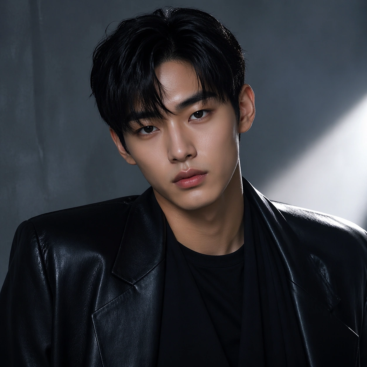
Example generated from “Single Talent Styling Journey — Detail Close-up”
GPT Image 2en

Scene: A square commercial beauty-or-fashion image designed like a polished campaign proof for Single-Talent Styling Journey. Keep the camera discipline clear and believable: portrait-oriented within the square, premium studio light, controlled tonal contrast, and enough surrounding negative space to feel like an ad layout without relying on readable typography. The image should look production-ready, with realistic skin, hair, fabric, and makeup rendering that supports identity locking instead of distracting from it. Subject: Build the frame around one clearly recognizable person. Detail Close-up should feel like a specific transformation step that a close-up study focusing on texture, finish, and precise beauty or garment details. The face structure, age, body proportions, and general camera position must stay consistent with the same-person premise of Follow one talent through multiple styling directions such as airport look, red carpet, comeback concept, streetwear, and beauty close-up without losing identity.. Styling, wardrobe, grooming, makeup, hair, or pose can evolve, but the viewer must believe it is unquestionably the same subject across the whole theme. Use a premium editorial-commercial tone rather than a casual portrait session. Important details: The visual test is identity consistency under change. Preserve stable bone structure, eye spacing, nose shape, lip volume, skin tone family, and believable texture response. Let the transformation be visible through styling choices instead of facial drift. This theme studies multi-image-reference, editing-workflow, commercial-mockup, photorealism through a production-ready visual system. Make the composition clean enough for client review, with professional grooming fidelity and enough detail for salon, beauty, or fashion decision-making. Aim for clear hierarchy, polished craft, and immediately usable campaign logic. Use case: Single-Talent Styling Journey single study 3/5. Constraints: No readable text, no watermark, no logos, preserve exact 1:1 aspect ratio, no face drift, no inconsistent age shift, no extra limbs, no duplicate person, no asymmetric eye placement, no beauty-editorial chaos.
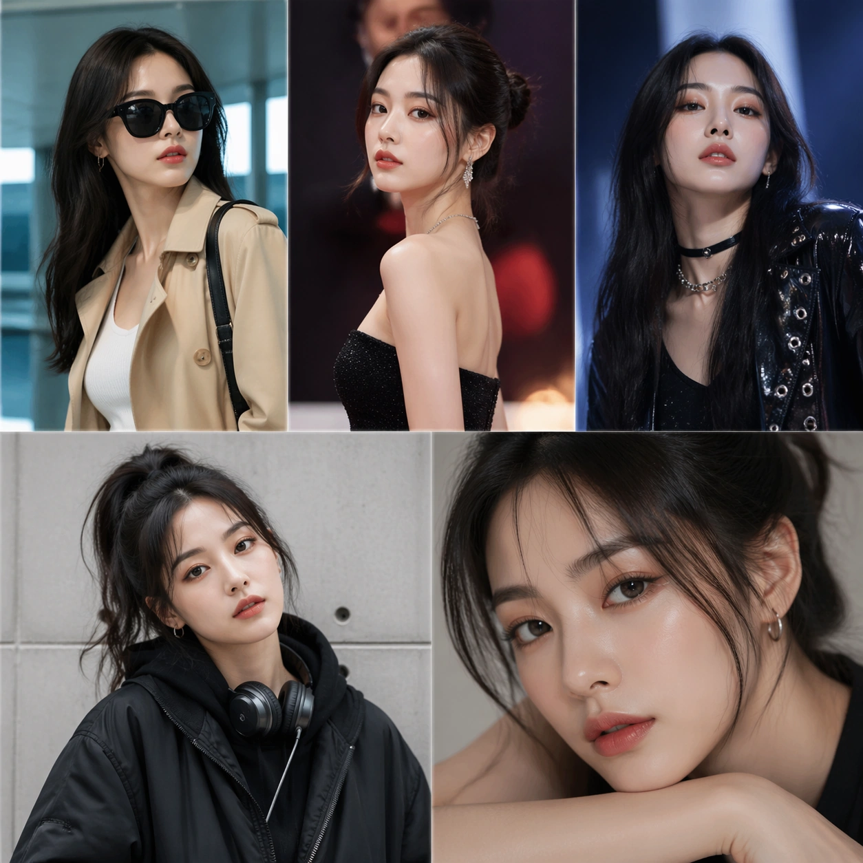
Example generated from “Single Talent Styling Journey — Promo Poster”
GPT Image 2en

Scene: A square commercial beauty-or-fashion image designed like a polished campaign proof for Single-Talent Styling Journey. Keep the camera discipline clear and believable: portrait-oriented within the square, premium studio light, controlled tonal contrast, and enough surrounding negative space to feel like an ad layout without relying on readable typography. The image should look production-ready, with realistic skin, hair, fabric, and makeup rendering that supports identity locking instead of distracting from it. Subject: Build the frame around one clearly recognizable person. Promo Poster should feel like a specific transformation step that a polished advertisement frame turning the same identity into a finished commercial visual. The face structure, age, body proportions, and general camera position must stay consistent with the same-person premise of Follow one talent through multiple styling directions such as airport look, red carpet, comeback concept, streetwear, and beauty close-up without losing identity.. Styling, wardrobe, grooming, makeup, hair, or pose can evolve, but the viewer must believe it is unquestionably the same subject across the whole theme. Use a premium editorial-commercial tone rather than a casual portrait session. Important details: The visual test is identity consistency under change. Preserve stable bone structure, eye spacing, nose shape, lip volume, skin tone family, and believable texture response. Let the transformation be visible through styling choices instead of facial drift. This theme studies multi-image-reference, editing-workflow, commercial-mockup, photorealism through a production-ready visual system. Make the composition clean enough for client review, with professional grooming fidelity and enough detail for salon, beauty, or fashion decision-making. Aim for clear hierarchy, polished craft, and immediately usable campaign logic. Use case: Single-Talent Styling Journey single study 4/5. Constraints: No readable text, no watermark, no logos, preserve exact 1:1 aspect ratio, no face drift, no inconsistent age shift, no extra limbs, no duplicate person, no asymmetric eye placement, no beauty-editorial chaos.
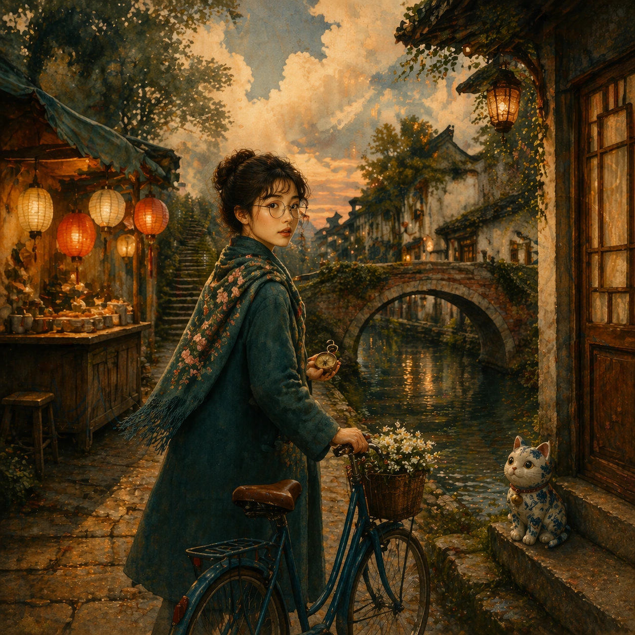
Example generated from “Single Talent Styling Journey — Campaign Grid”
GPT Image 2en

Scene: A square commercial beauty-or-fashion image designed like a polished campaign proof for Single-Talent Styling Journey. Keep the camera discipline clear and believable: portrait-oriented within the square, premium studio light, controlled tonal contrast, and enough surrounding negative space to feel like an ad layout without relying on readable typography. The image should look production-ready, with realistic skin, hair, fabric, and makeup rendering that supports identity locking instead of distracting from it. Subject: Build the frame around one clearly recognizable person. Campaign Grid should feel like a specific transformation step that a multi-panel rollout board proving catalog depth and consistent recognition. The face structure, age, body proportions, and general camera position must stay consistent with the same-person premise of Follow one talent through multiple styling directions such as airport look, red carpet, comeback concept, streetwear, and beauty close-up without losing identity.. Styling, wardrobe, grooming, makeup, hair, or pose can evolve, but the viewer must believe it is unquestionably the same subject across the whole theme. Use a premium editorial-commercial tone rather than a casual portrait session. Important details: The visual test is identity consistency under change. Preserve stable bone structure, eye spacing, nose shape, lip volume, skin tone family, and believable texture response. Let the transformation be visible through styling choices instead of facial drift. This theme studies multi-image-reference, editing-workflow, commercial-mockup, photorealism through a production-ready visual system. Make the composition clean enough for client review, with professional grooming fidelity and enough detail for salon, beauty, or fashion decision-making. Aim for clear hierarchy, polished craft, and immediately usable campaign logic. Use case: Single-Talent Styling Journey single study 5/5. Constraints: No readable text, no watermark, no logos, preserve exact 1:1 aspect ratio, no face drift, no inconsistent age shift, no extra limbs, no duplicate person, no asymmetric eye placement, no beauty-editorial chaos.
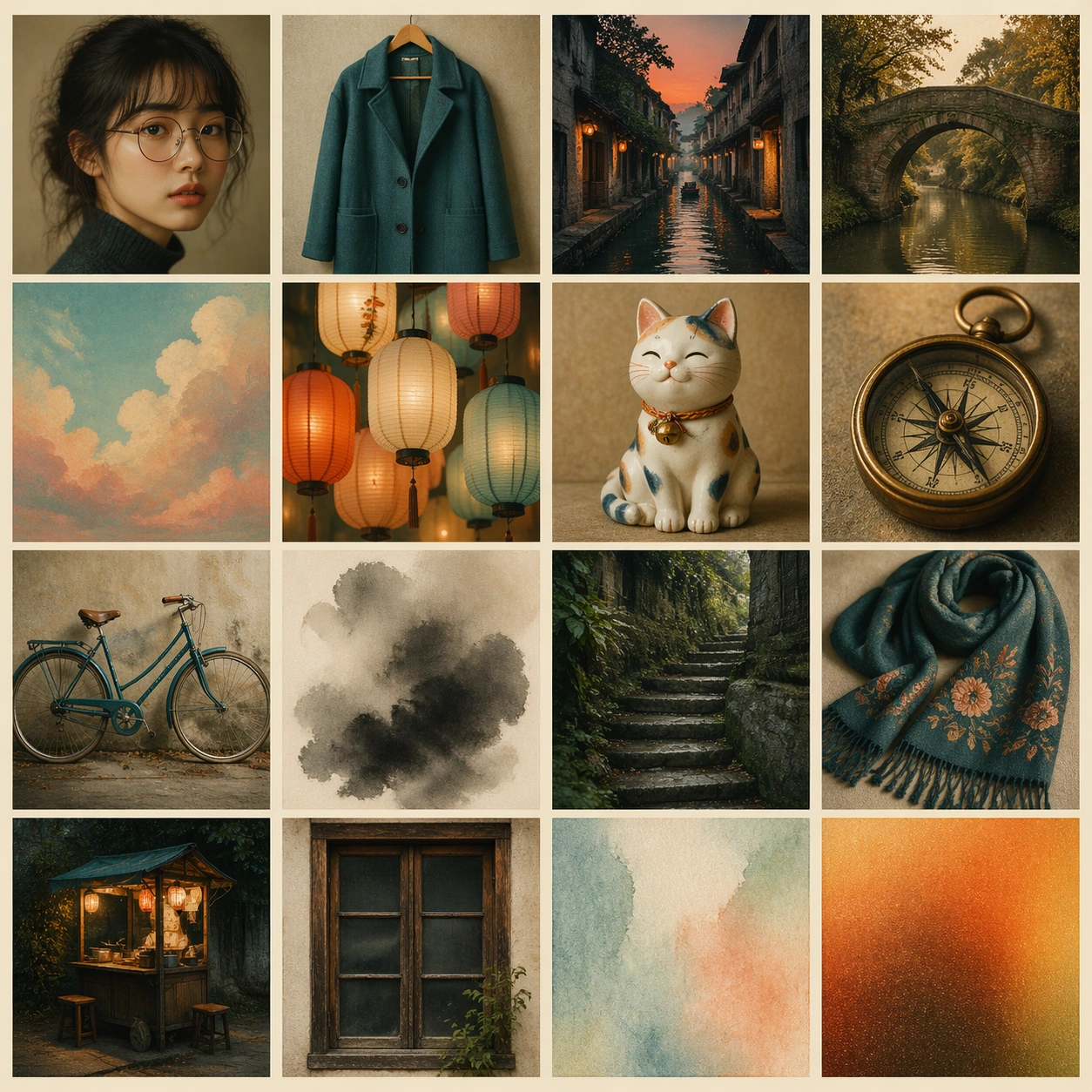
Example generated from “Sixteen Reference Fusion — Sixteen Source Board”
GPT Image 2en

Scene: A square synthetic reference board laid out as a precise 4 by 4 grid of sixteen image tiles on warm museum paper. Each tile is a distinct visual source cue, separated by thin cream gutters, photographed straight-on with even catalog lighting. The board feels like a curated mood atlas rather than a collage mess. Subject: Sixteen source tiles: one portrait face with round glasses, one teal wool coat, one canal alley at dusk, one old brick bridge, one hand-painted sky background, one paper lantern cluster, one ceramic cat figurine, one brass compass, one blue bicycle, one ink wash cloud, one mossy stone stair, one embroidered scarf, one tiny food stall, one wooden window frame, one soft watercolor texture, and one warm film-grain color swatch. No tile contains readable text. Important details: Every tile should be visually distinct and memorable, with consistent square tile size and clean gutters. The reference board must make the sixteen cues easy to reuse: identity, outfit, place, props, materials, palette, and illustration style. Use tasteful analog texture, gentle color harmony, and high visual clarity. Use case: Root reference board for a sixteen-reference fusion series. Later images should use this board as --ref and synthesize its cues into coherent scenes rather than copying the grid layout. Constraints: Exactly sixteen tiles in a 4 by 4 grid, no readable text, no logos, no watermark, no real brands, no random extra tiles, no overlapping collage scraps, preserve exact 1:1 aspect ratio.

Example generated from “Sixteen Reference Fusion — Canal Wanderer Fusion”
GPT Image 2en

Scene: Use the reference board as the source atlas, but do not repeat the grid. Create one coherent square illustration of a quiet canal alley at dusk, seen at walking height, with warm lantern light and soft hand-painted atmosphere. Subject: Fuse the reference cues into one character scene: the round-glasses protagonist wears the teal wool coat and embroidered scarf, walks beside an old brick canal bridge, pushes the blue bicycle, and carries the brass compass. A ceramic cat sits near the wooden window frame; a small food stall glows under paper lanterns. The image should feel like all sixteen cues became one believable world. Important details: Preserve identity, palette, props, and illustrated texture from the reference board. Use the watercolor texture, ink wash clouds, mossy stair, warm film grain, and hand-painted sky as environmental details. The fusion should be seamless, not a collage; the viewer should sense many references were combined into one place. Use case: Second image in a reference-dependent sixteen-reference fusion series, testing whether many source cues can become a coherent walking scene. Constraints: Use the reference image as source material, but no visible 4 by 4 grid. No readable text, no logos, no watermark, no duplicated protagonist, no random extra props, no photorealism, preserve exact 1:1 aspect ratio.

Example generated from “Sixteen Reference Fusion — Studio Creature Fusion”
GPT Image 2en

Scene: Use the reference board as the source atlas, but compose a single coherent square studio still life, not a grid. The setting is a small artist workshop with warm desk light, watercolor paper, and quiet analog texture. Subject: Fuse the source cues into a whimsical studio creature: the ceramic cat figurine becomes a small living guide wearing the teal coat texture as a cape, round glasses as tiny spectacles, and an embroidered scarf. Around it are the brass compass, blue bicycle wheel, paper lantern glow, mossy stone stair miniature, wooden window frame, and canal bridge model, all arranged as if the creature is building a memory map. Important details: Preserve the color palette, film grain, watercolor texture, and individual prop identities from the reference board. The fusion must be elegant and coherent: many references are integrated into one designed object-world, with no copied grid. Use shallow studio depth, tactile materials, and clear focal hierarchy. Use case: Third image in a reference-dependent sixteen-reference fusion series, testing object, material, and character-like cue fusion. Constraints: Use the reference image as source material, but no visible 4 by 4 grid. No readable text, no logos, no watermark, no extra unrelated props, no horror creature, no photorealism, preserve exact 1:1 aspect ratio.

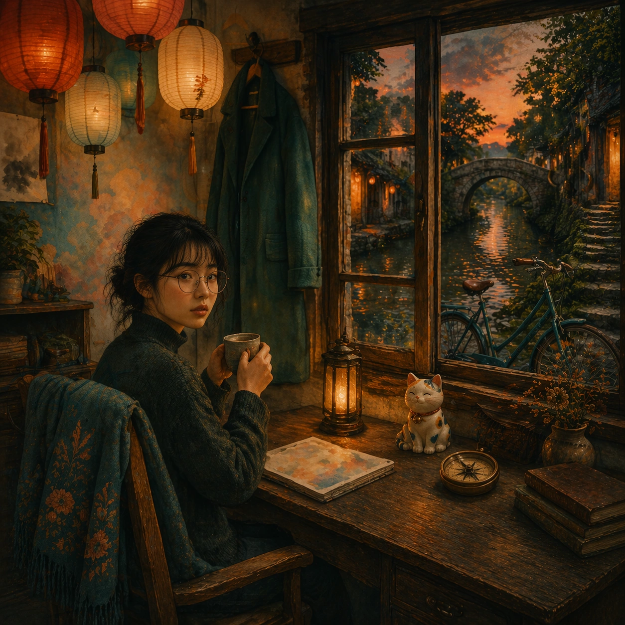
Example generated from “Sixteen Reference Fusion — Room Memory Fusion”
GPT Image 2en

Scene: Use the reference board as the source atlas, but create one coherent square interior scene. The setting is a compact memory room at dusk, with a canal window, paper lantern light, wooden frames, and soft illustrated texture. Subject: Fuse the sixteen cues into an inhabited room: the round-glasses protagonist's coat hangs by the window, the embroidered scarf drapes over a chair, the brass compass sits on a table beside a ceramic cat, the blue bicycle rests outside near a mossy stair, and the canal bridge appears through the window. The room should feel like a life assembled from many visual references. Important details: Keep the reference palette, warm film grain, watercolor softness, ink wash clouds, brick, wood, stone, lantern glow, and object identities. The fusion should be subtle and emotionally coherent rather than a checklist. Use layered foreground, middle ground, and window background while preserving visual clarity. Use case: Fourth image in a reference-dependent sixteen-reference fusion series, testing environmental fusion and memory-like continuity from a source atlas. Constraints: Use the reference image as source material, but no visible 4 by 4 grid. No readable text, no logos, no watermark, no unrelated props, no duplicate rooms, no photorealism, preserve exact 1:1 aspect ratio.

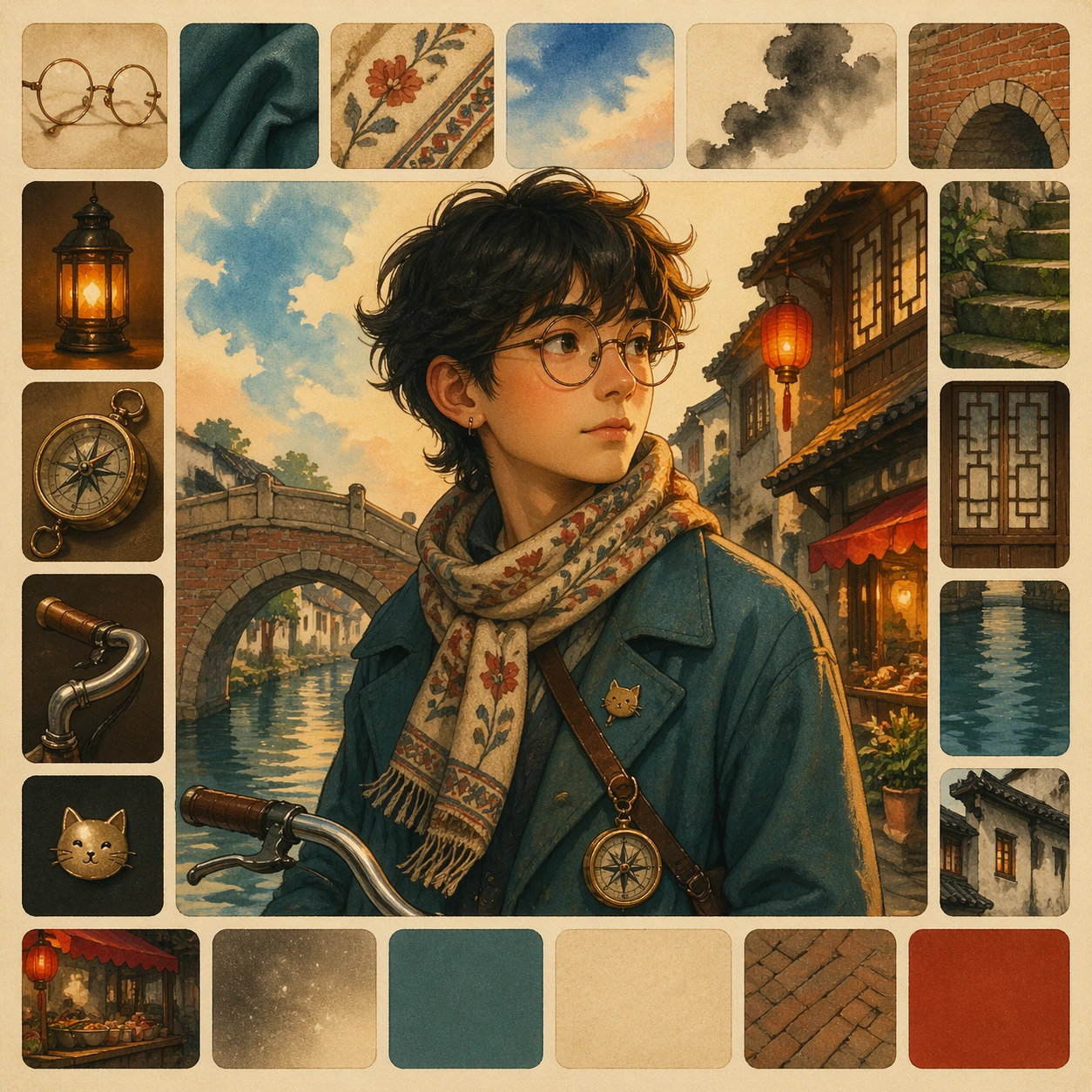
Example generated from “Sixteen Reference Fusion — Sixteen Swatch Portrait”
GPT Image 2en

Scene: A square illustrated portrait composition surrounded by sixteen small swatch-like source cues arranged as subtle border tiles, not a rigid reference grid. Warm paper texture, soft studio light, and refined editorial illustration quality. Subject: A single coherent portrait of an imagined traveler built from sixteen visual cues: round glasses, teal coat, embroidered scarf, canal-blue shadows, brick bridge texture, lantern warmth, compass motif, bicycle handlebar curve, cat-shaped pin, moss-green stair color, wooden window geometry, watercolor sky, ink cloud edge, food-stall red accent, film grain, and cream paper tone. The border swatches hint at the inputs while the central portrait is the fused result. Important details: The central character must feel unified, not like a patchwork costume. The sixteen cues should be discoverable through color, material, shape, and accessories. Use clean hierarchy, gentle texture, and clear silhouette. No readable labels are needed. Use case: Independent sixteen-reference fusion single image, showing many source cues merging into one character identity without external refs. Constraints: No readable text, no logos, no watermark, no real person likeness, no cluttered collage, no extra faces, no photorealism, preserve exact 1:1 aspect ratio.

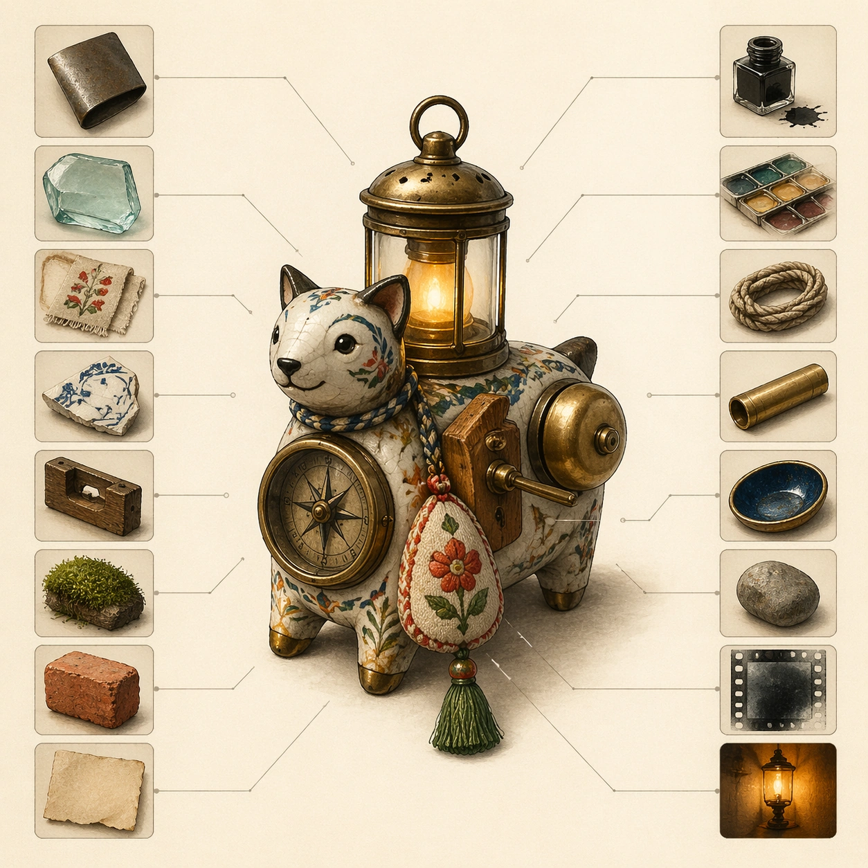
Example generated from “Sixteen Reference Fusion — Archive Object Hybrid”
GPT Image 2en

Scene: A square museum archive table photographed straight-on in an illustrated catalog style. Cream background, soft shadows, thin annotation lines without readable words, and a carefully balanced arrangement of objects. Subject: One hybrid archive object sits in the center: part compass, part lantern, part ceramic animal, part bicycle bell, part wooden window latch, part embroidered fabric charm. Around it are sixteen tiny unlabeled source fragments that visually explain the fusion: metal, glass, fabric, ceramic, wood, moss, brick, paper, ink, watercolor, rope, brass, enamel, stone, film grain, and warm light. Important details: The central object should feel designed and functional, not random. The sixteen input fragments should be small but legible as source cues. Use refined material rendering in an illustrated style, clear silhouette, and strong catalog composition. Use case: Independent sixteen-reference fusion single image, testing object-level synthesis from many material and prop references. Constraints: No readable text, no labels, no logos, no watermark, no scattered junk, no real brand artifacts, no photorealistic product mockup, preserve exact 1:1 aspect ratio.

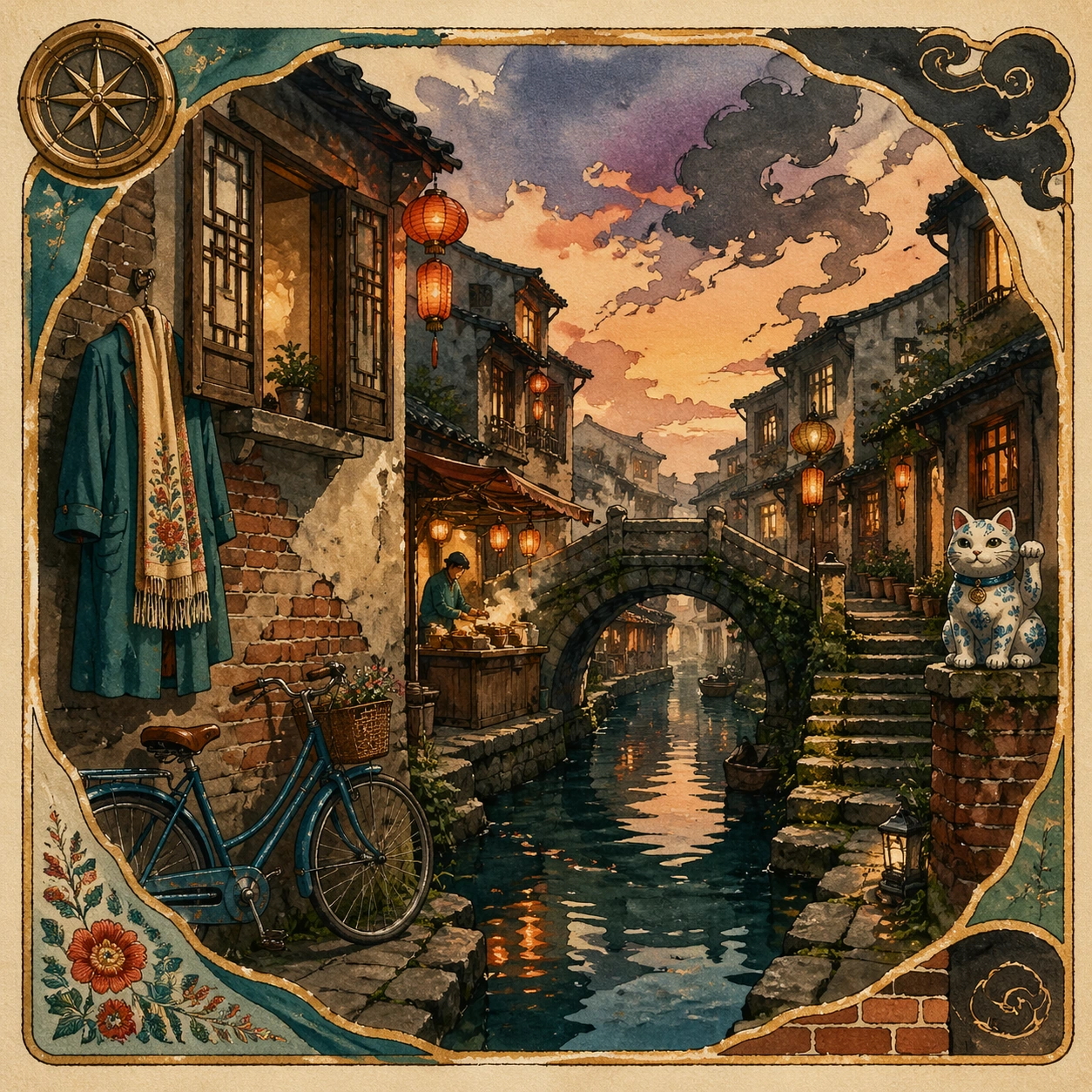
Example generated from “Sixteen Reference Fusion — Travel Poster Fusion”
GPT Image 2en

Scene: A square illustrated travel poster with a clean central composition and sixteen small source motifs woven into the border. The style is warm hand-painted poster art with watercolor grain, soft ink outlines, and cinematic dusk light. Subject: The poster depicts a fictional canal town made from sixteen fused cues: canal bridge, old alley, wooden window, paper lanterns, blue bicycle, food stall, moss stairs, ink clouds, warm film grain, embroidered scarf pattern, teal coat color, brass compass rose, ceramic cat statue, watercolor sky, brick texture, and cream paper border. The cues must become one believable destination scene. Important details: Clear poster hierarchy, one strong scenic focal point, harmonious palette, border motifs that hint at the sources, and no readable typography. The fusion should be coherent and atmospheric, with many discoverable details but no clutter. Use case: Independent sixteen-reference fusion single image, testing place-level synthesis from many source motifs. Constraints: No readable text, no real place names, no logos, no watermark, no random collage scraps, no photorealism, no overstuffed border, preserve exact 1:1 aspect ratio.

Example generated from “Sketch To Photoreal Render — Pencil Facade Reference”
GPT Image 2en

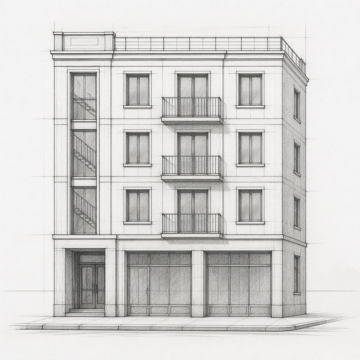
Scene: A square, straight-on architectural presentation image of a pencil facade sketch on clean white tracing paper. The crop is centered and evenly lit like a scan on a design studio desk, with soft graphite marks, faint construction lines, a visible horizon guide, and no perspective drama. The image should feel like the precise source drawing for a later photoreal render. Subject: A compact four-story corner apartment building sketched in graphite: ground-floor recessed entry at lower left, two shopfront bays at street level, three upper residential floors, a shallow roof terrace, and a narrow side return visible on the right. The facade has a regular window grid, slender balconies on the second and third floors, a vertical stairwell slot, and simple masonry panel divisions. Important details: Preserve strict architectural logic: stable horizon line, consistent floor heights, aligned window centers, believable balcony depth, clear street curb, and proportional columns. Use hand-drawn line weight variation without readable notes or labels. The drawing must be detailed enough to guide later rendering, but still unmistakably pencil, with no color fills, no collage materials, and no invented surrounding buildings. Use case: Sketch to Photoreal Render series study 1/8, serving as the structural reference for layout-faithful photoreal fanout renders. Constraints: No readable text, no watermark, no logos, preserve exact 1:1 aspect ratio, no blueprints, no ruler marks with numbers, no decorative frame, no extra floors, no exaggerated fantasy architecture, no people blocking the facade.

Example generated from “Sketch To Photoreal Render — Daylight Street Render”
GPT Image 2en

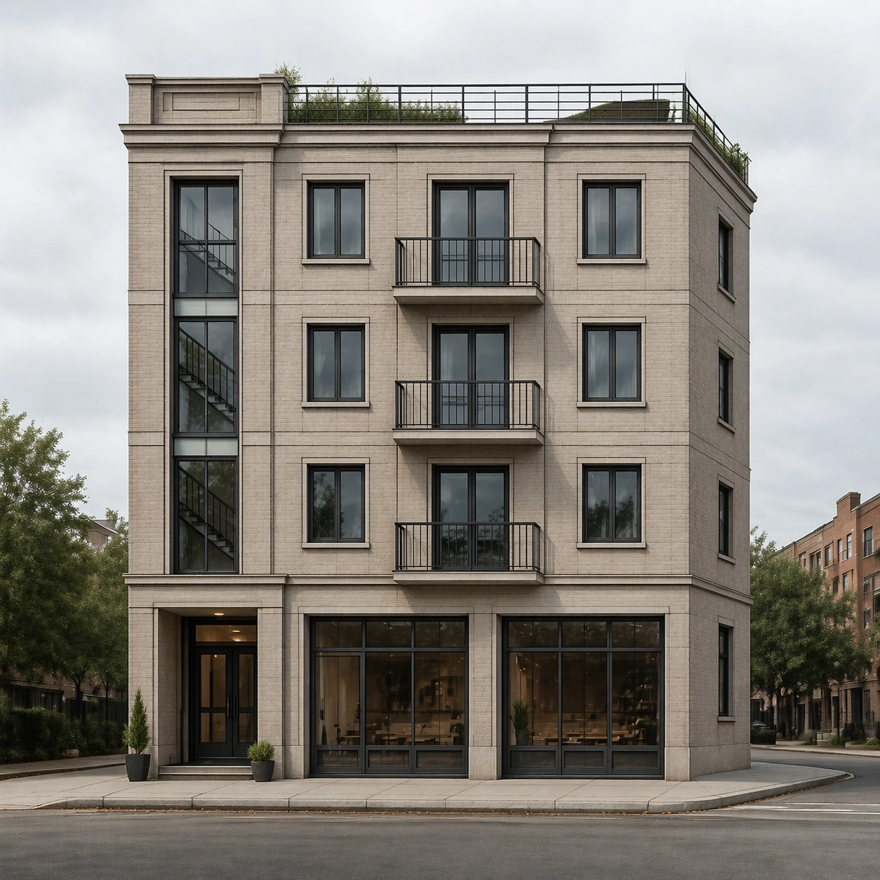
Scene: A square photoreal architectural render from street level in bright overcast daylight, using the provided pencil facade sketch as the primary layout reference. The camera is nearly straight-on with a slight corner angle, matching the sketch horizon and proportions. The mood is calm, contemporary, and plausible, with soft shadows, neutral color grading, and realistic lens behavior. Subject: Render the same compact four-story corner apartment building from the reference: recessed entry at lower left, two shopfront bays at street level, three upper residential floors, shallow roof terrace, narrow side return on the right, regular window grid, slender balconies, vertical stairwell slot, and masonry panel divisions. Materials should become real: light warm-gray brick, matte metal balcony rails, clear glass, concrete curb, subtle shopfront glazing, and a restrained planted roof edge. Important details: Layout fidelity is the core test. Keep floor count, roofline, horizon height, window rhythm, balcony positions, entry placement, and side return aligned with the reference sketch. Do not redesign the building into a different style. Add only ordinary real-world context: a sidewalk, curb, a few small planters, and distant street surface. Photorealism should come from material response, natural light, scale cues, and believable construction details rather than decorative additions. Use case: Sketch to Photoreal Render series study 2/8, converting the reference sketch into a daylight photoreal street render while preserving layout. Constraints: No readable text, no watermark, no logos, preserve exact 1:1 aspect ratio, no extra floors, no moved windows, no added towers, no dramatic signage, no crowds, no cars blocking the facade, no fantasy materials.

Example generated from “Sketch To Photoreal Render — Rain Night Render”
GPT Image 2en

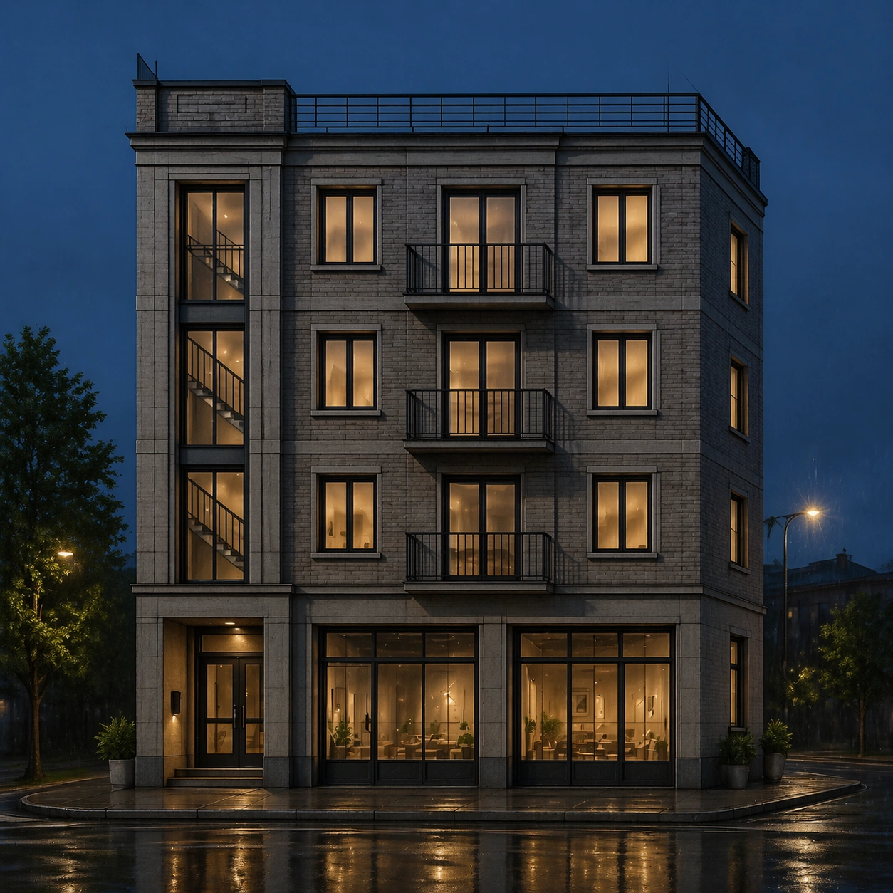
Scene: A square photoreal architectural render at rainy blue-hour night, generated from the provided pencil facade sketch as the primary reference. The camera remains near the original street-level horizon, with a controlled corner view and no wide-angle distortion. Wet pavement reflects window light and shopfront glow, but the composition stays clear enough to inspect the facade. Subject: The same compact four-story corner apartment building from the reference appears after rain. Keep the recessed lower-left entry, two ground-floor shopfront bays, three upper residential floors, shallow roof terrace, right-side return, regular window grid, slender balconies, vertical stairwell slot, and masonry panel rhythm. Render believable night materials: damp warm-gray brick, dark metal railings, softly lit interiors behind glass, subtle water streaks on sill edges, and shallow puddle reflections on the sidewalk. Important details: The hard part is preserving the sketch while changing lighting. Window centers, balcony edges, floor slab heights, roofline, stairwell slot, and shopfront bay widths must remain in the same relative positions as the reference. Night effects must not hide structural fidelity. Add only realistic context: rain sheen, muted streetlight spill, a curb, and sparse planters. Avoid cinematic overdecoration; the building should read like a real architectural visualization for review. Use case: Sketch to Photoreal Render series study 3/8, testing whether a reference sketch can become a rainy photoreal night render without layout drift. Constraints: No readable text, no watermark, no logos, preserve exact 1:1 aspect ratio, no neon signs, no extra windows, no changed floor count, no vehicles covering the facade, no crowds, no gothic or futuristic redesign.

Example generated from “Sketch To Photoreal Render — Interior Courtyard Render”
GPT Image 2en

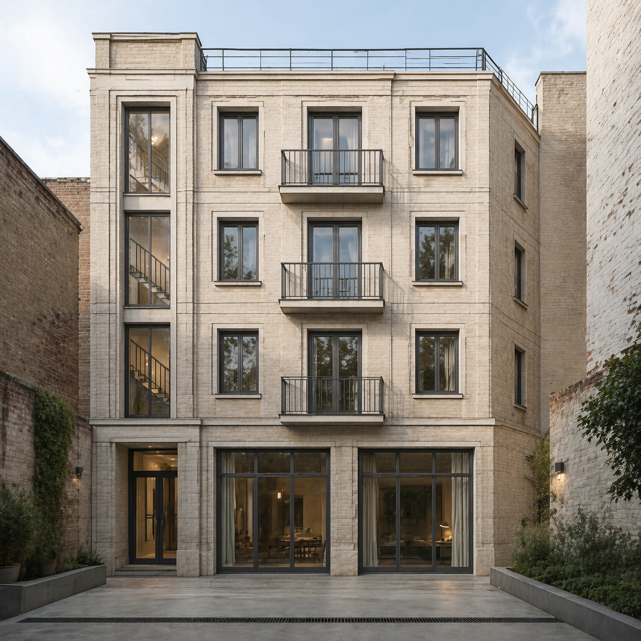
Scene: A square photoreal architectural render looking from a small interior courtyard toward the rear face of the same building, using the provided pencil facade sketch as the primary reference for proportions and opening rhythm. The camera is at human eye level, with soft afternoon light entering from above, quiet shadows, and realistic depth without dramatic distortion. Subject: Translate the sketched four-story facade into its courtyard-facing counterpart while preserving the core layout: four levels, consistent floor heights, aligned windows, slender balconies, vertical circulation slot, shallow roof terrace, and masonry panel divisions. The courtyard is modest and urban, with pale brick walls, concrete paving, slim planters, rainwater drain lines, and clear glass doors at ground level. It should feel like the same architectural project viewed from the private side, not a new building. Important details: This image tests structural reasoning from a sketch reference. Keep the building's proportions, window grid, balcony stacking, and roofline faithful to the reference, adapting only what is necessary for a courtyard side. No added wings, no extra stair towers, no random decorative facade changes. Photorealism should include believable material scale, weathered brick variation, glass reflections, soft interior shadows, and proper construction joints. Use case: Sketch to Photoreal Render series study 4/8, extending the referenced sketch into a photoreal courtyard view while maintaining architectural identity. Constraints: No readable text, no watermark, no logos, preserve exact 1:1 aspect ratio, no extra floors, no luxury resort redesign, no impossible cantilevers, no people in foreground, no signage, no plants covering key windows.

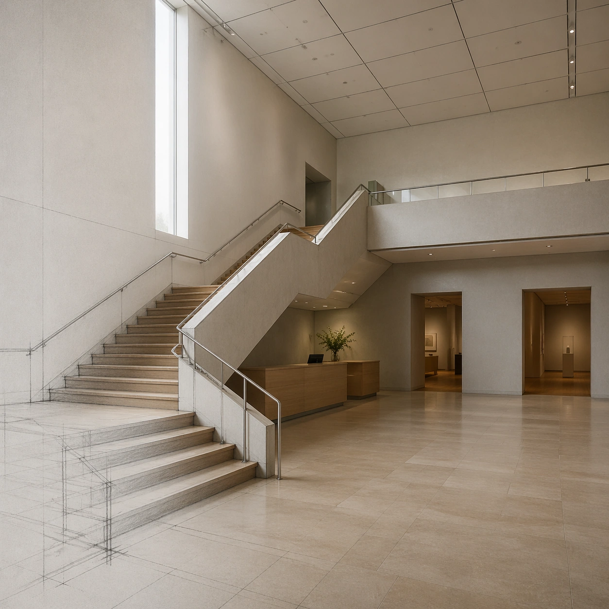
Example generated from “Sketch To Photoreal Render — Museum Stair Atrium”
GPT Image 2en

Scene: A square photoreal museum interior render derived from a visible architectural pencil sketch. The lower-left corner retains faint graphite guide lines and stair outlines, while the rest of the scene resolves into a realistic atrium. The camera looks diagonally across the ground floor toward a central stair, with high clerestory light, neutral museum tones, and clear spatial depth. Subject: A small contemporary museum atrium from a concept sketch: a broad switchback stair, a floating landing, a tall north-facing light slot, two gallery doorways on the back wall, a reception desk tucked under the stair, and a grid of acoustic ceiling panels. The photoreal version keeps the same stair geometry, landing height, doorway positions, wall openings, and ceiling grid. Materials include honed limestone floor, pale plaster walls, brushed metal handrails, oak stair treads, and diffuse daylight. Important details: The key challenge is geometric coherence. Stair risers must align, guardrails must connect properly, the landing must be structurally plausible, and the sketch's doorway positions must not drift. Use realistic museum scale, accessibility clearance, clean construction joints, and natural light behavior. Do not add large artwork with readable text, dramatic sculptures, or extra stairs. The final scene should look like a faithful one-step render from a design sketch, not a new interior concept. Use case: Sketch to Photoreal Render single study 7/8, testing whether an interior circulation sketch can become a photoreal museum atrium while preserving stair logic. Constraints: No readable text, no watermark, no logos, preserve exact 1:1 aspect ratio, no impossible stair connections, no floating railings, no extra gallery doors, no decorative text panels, no crowds, no fisheye distortion.

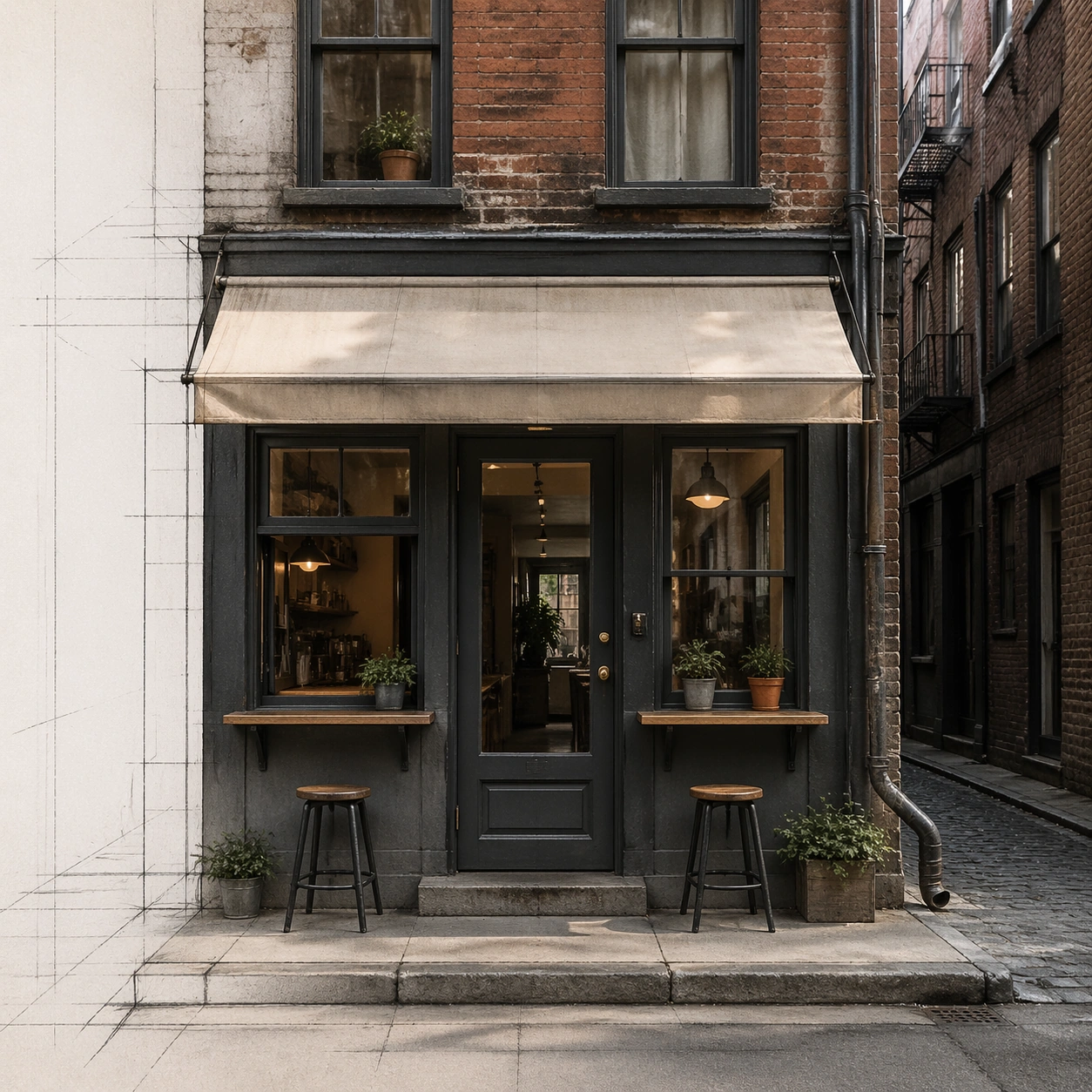
Example generated from “Sketch To Photoreal Render — Alley Cafe Facade”
GPT Image 2en

Scene: A square street-level photoreal render of a narrow alley cafe facade, visibly transformed from a simple pencil storefront sketch. Faint graphite guidelines remain along the left margin and pavement perspective lines, while the main facade is fully realistic. The lighting is soft late morning in a dense urban side street, with gentle reflections and clear facade inspection. Subject: A tiny cafe inserted into an old masonry alley building. The sketch defines a narrow frontage, centered glass door, two flanking windows, a shallow awning, a service hatch, upper residential windows, downspout, curb step, and compact outdoor ledge seating. The photoreal render keeps all these positions and proportions, translating them into aged brick, painted timber frames, translucent fabric awning without text, brass door hardware, stone threshold, rain pipe, and small planters that do not cover openings. Important details: Maintain strict storefront fidelity: door centered where drawn, window widths unchanged, awning height fixed, upper window alignment preserved, curb and alley perspective consistent. Use real-world urban details such as uneven brick, practical drainage, safety glass, threshold height, and modest weathering. Do not expand the cafe, add readable signs, invent a second storefront, or turn the alley into a tourist plaza. The image should prove that a modest hand sketch can become a production-quality photoreal facade without layout drift. Use case: Sketch to Photoreal Render single study 8/8, testing small-scale storefront rendering with exact sketch-to-photo placement. Constraints: No readable text, no watermark, no logos, preserve exact 1:1 aspect ratio, no added signage, no extra doors, no moved windows, no crowded pedestrians, no fantasy lighting, no oversized plants blocking the facade.

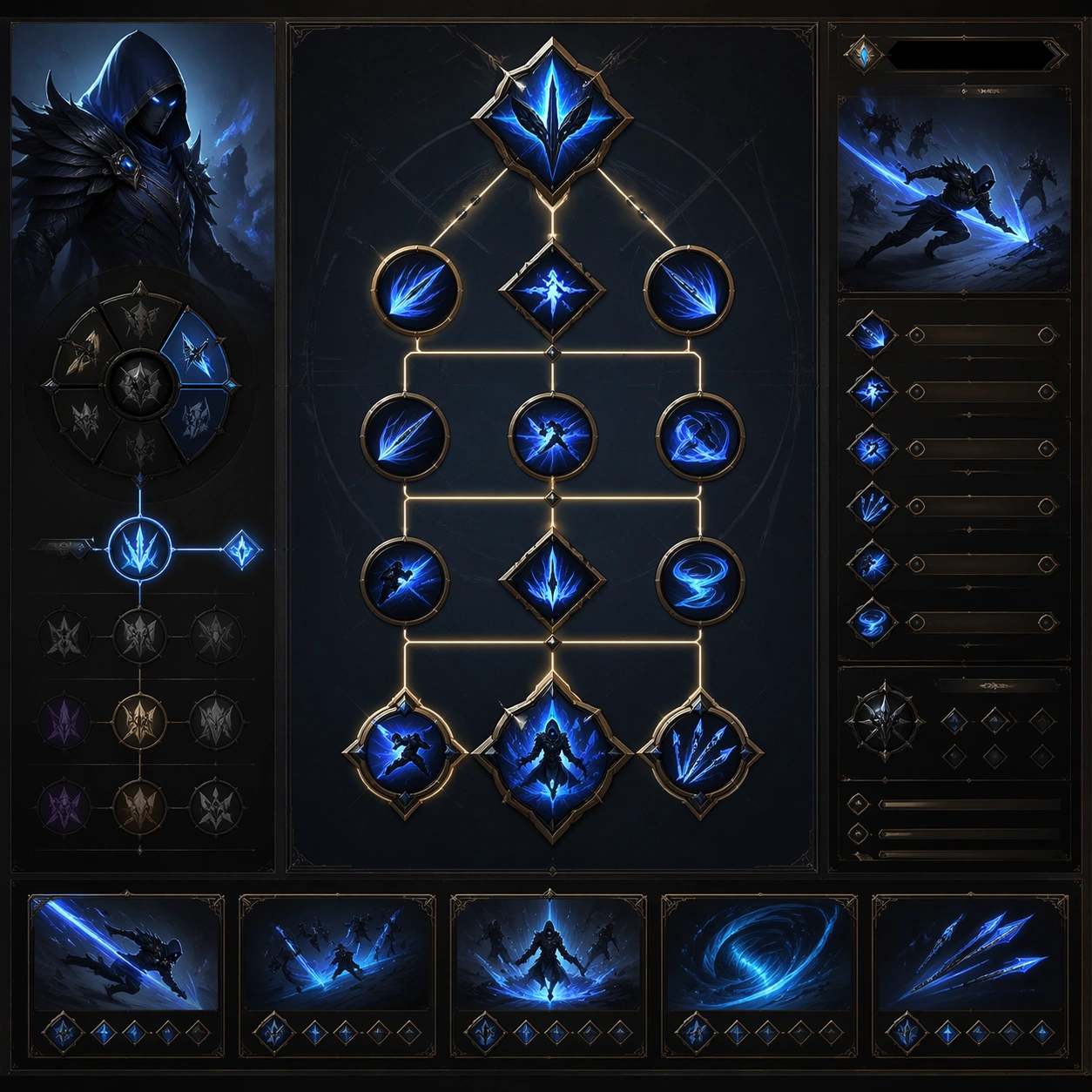
Example generated from “Skill Tree Progression Sheet — Branch Detail Board”
GPT Image 2en

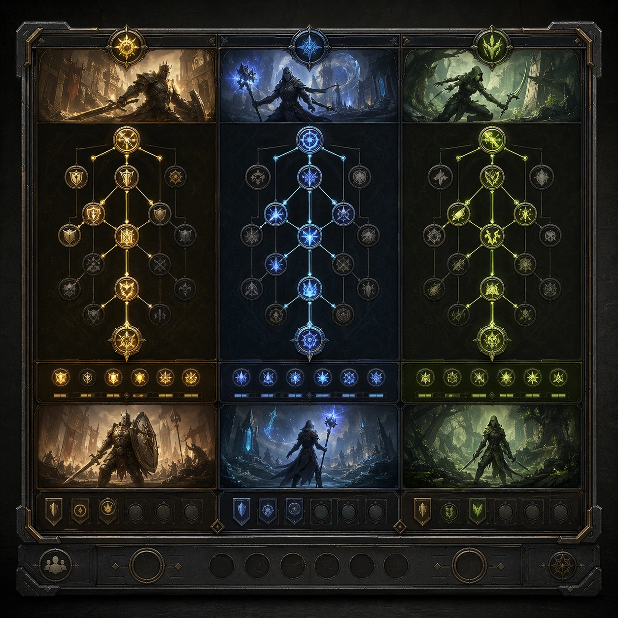
Scene: A square production-ready image designed for a game-art review wall and a commercial gallery at the same time. Frame a branch-detail board zooming into one specialization path and its internal progression with disciplined lighting, clean edge separation, and enough surrounding context to prove how the asset would behave in a real product surface. The camera, crop, and tonal balance should feel intentional rather than generic, with high readability at first glance and convincing material response under closer inspection. Subject: Center the study on a branch-detail board zooming into one specialization path and its internal progression. Translate the topic into a concrete, shippable visual statement instead of a loose mood board. Build layered object relationships, believable surface finish, and strong silhouette grouping so the image reads immediately as part of Skill Tree Progression Sheet. The subject should feel made for a live game pipeline: useful in store, UI, campaign, or art-review contexts, with visual hierarchy strong enough to survive aggressive cropping. Important details: show local dependency logic and gameplay fantasy clearly through node design. Keep every supporting element subordinate to the main read, and make category separation obvious through form, color zoning, depth, and material logic rather than words. Where panels, cards, badges, or interface blocks appear, they must look professionally structured but remain unreadable. The visual language should feel premium, original, and coherent across this package, with no filler clutter and no accidental resemblance to a specific shipped game IP. Use case: Skill Tree Progression Sheet single study 2/9, focused on branch detail board. Constraints: No readable text, no watermark, no logos, preserve exact 1:1 aspect ratio, no labels, no small text, no broken hierarchy, no generic stock-photo staging, no accidental UI gibberish.

Example generated from “Skill Tree Progression Sheet — Ultimate Unlock Panel”
GPT Image 2en

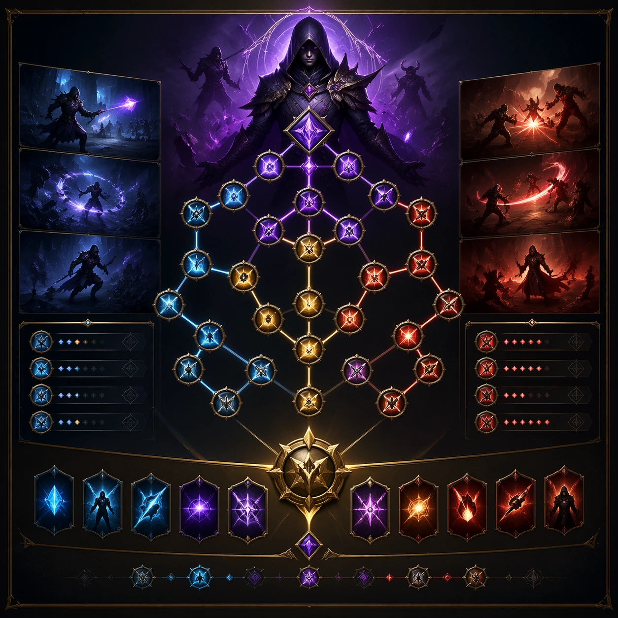
Scene: A square production-ready image designed for a game-art review wall and a commercial gallery at the same time. Frame a dramatic unlock panel for a top-tier ultimate skill presented as a key progression milestone with disciplined lighting, clean edge separation, and enough surrounding context to prove how the asset would behave in a real product surface. The camera, crop, and tonal balance should feel intentional rather than generic, with high readability at first glance and convincing material response under closer inspection. Subject: Center the study on a dramatic unlock panel for a top-tier ultimate skill presented as a key progression milestone. Translate the topic into a concrete, shippable visual statement instead of a loose mood board. Build layered object relationships, believable surface finish, and strong silhouette grouping so the image reads immediately as part of Skill Tree Progression Sheet. The subject should feel made for a live game pipeline: useful in store, UI, campaign, or art-review contexts, with visual hierarchy strong enough to survive aggressive cropping. Important details: the ultimate should feel aspirational yet integrated into the same tree system. Keep every supporting element subordinate to the main read, and make category separation obvious through form, color zoning, depth, and material logic rather than words. Where panels, cards, badges, or interface blocks appear, they must look professionally structured but remain unreadable. The visual language should feel premium, original, and coherent across this package, with no filler clutter and no accidental resemblance to a specific shipped game IP. Use case: Skill Tree Progression Sheet single study 3/9, focused on ultimate unlock panel. Constraints: No readable text, no watermark, no logos, preserve exact 1:1 aspect ratio, no readable skill names, no numerals, no broken hierarchy, no generic stock-photo staging, no accidental UI gibberish.

Example generated from “Skill Tree Progression Sheet — Leveling Summary Card”
GPT Image 2en

Scene: A square production-ready image designed for a game-art review wall and a commercial gallery at the same time. Frame a summary card that compresses recent level gains and branch choices into one compact visual with disciplined lighting, clean edge separation, and enough surrounding context to prove how the asset would behave in a real product surface. The camera, crop, and tonal balance should feel intentional rather than generic, with high readability at first glance and convincing material response under closer inspection. Subject: Center the study on a summary card that compresses recent level gains and branch choices into one compact visual. Translate the topic into a concrete, shippable visual statement instead of a loose mood board. Build layered object relationships, believable surface finish, and strong silhouette grouping so the image reads immediately as part of Skill Tree Progression Sheet. The subject should feel made for a live game pipeline: useful in store, UI, campaign, or art-review contexts, with visual hierarchy strong enough to survive aggressive cropping. Important details: the structure should feel instantly legible and shareable without actual text. Keep every supporting element subordinate to the main read, and make category separation obvious through form, color zoning, depth, and material logic rather than words. Where panels, cards, badges, or interface blocks appear, they must look professionally structured but remain unreadable. The visual language should feel premium, original, and coherent across this package, with no filler clutter and no accidental resemblance to a specific shipped game IP. Use case: Skill Tree Progression Sheet single study 4/9, focused on leveling summary card. Constraints: No readable text, no watermark, no logos, preserve exact 1:1 aspect ratio, no numbers, no charts with labels, no broken hierarchy, no generic stock-photo staging, no accidental UI gibberish.

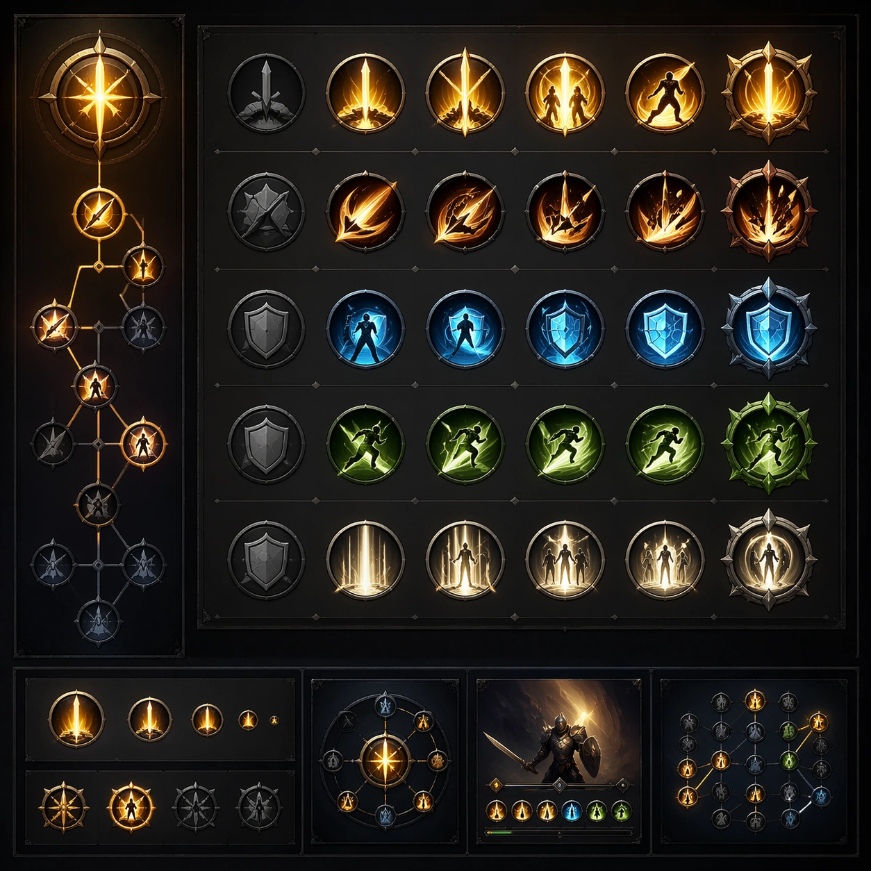
Example generated from “Skill Tree Progression Sheet — Icon Family Study”
GPT Image 2en

Scene: A square production-ready image designed for a game-art review wall and a commercial gallery at the same time. Frame an icon family board for the skills inside one progression tree with disciplined lighting, clean edge separation, and enough surrounding context to prove how the asset would behave in a real product surface. The camera, crop, and tonal balance should feel intentional rather than generic, with high readability at first glance and convincing material response under closer inspection. Subject: Center the study on an icon family board for the skills inside one progression tree. Translate the topic into a concrete, shippable visual statement instead of a loose mood board. Build layered object relationships, believable surface finish, and strong silhouette grouping so the image reads immediately as part of Skill Tree Progression Sheet. The subject should feel made for a live game pipeline: useful in store, UI, campaign, or art-review contexts, with visual hierarchy strong enough to survive aggressive cropping. Important details: icons should feel coherent, role-specific, and readable at both large and small scales. Keep every supporting element subordinate to the main read, and make category separation obvious through form, color zoning, depth, and material logic rather than words. Where panels, cards, badges, or interface blocks appear, they must look professionally structured but remain unreadable. The visual language should feel premium, original, and coherent across this package, with no filler clutter and no accidental resemblance to a specific shipped game IP. Use case: Skill Tree Progression Sheet single study 5/9, focused on icon family study. Constraints: No readable text, no watermark, no logos, preserve exact 1:1 aspect ratio, no labels, no duplicated glyphs, no broken hierarchy, no generic stock-photo staging, no accidental UI gibberish.

Example generated from “Skill Tree Progression Sheet — Pathing Comparison Board”
GPT Image 2en

Scene: A square production-ready image designed for a game-art review wall and a commercial gallery at the same time. Frame a comparison board showing two or three alternative build paths through the same skill tree with disciplined lighting, clean edge separation, and enough surrounding context to prove how the asset would behave in a real product surface. The camera, crop, and tonal balance should feel intentional rather than generic, with high readability at first glance and convincing material response under closer inspection. Subject: Center the study on a comparison board showing two or three alternative build paths through the same skill tree. Translate the topic into a concrete, shippable visual statement instead of a loose mood board. Build layered object relationships, believable surface finish, and strong silhouette grouping so the image reads immediately as part of Skill Tree Progression Sheet. The subject should feel made for a live game pipeline: useful in store, UI, campaign, or art-review contexts, with visual hierarchy strong enough to survive aggressive cropping. Important details: differences in style and payoff should read through visual structure alone. Keep every supporting element subordinate to the main read, and make category separation obvious through form, color zoning, depth, and material logic rather than words. Where panels, cards, badges, or interface blocks appear, they must look professionally structured but remain unreadable. The visual language should feel premium, original, and coherent across this package, with no filler clutter and no accidental resemblance to a specific shipped game IP. Use case: Skill Tree Progression Sheet single study 6/9, focused on pathing comparison board. Constraints: No readable text, no watermark, no logos, preserve exact 1:1 aspect ratio, no readable labels, no percentages, no broken hierarchy, no generic stock-photo staging, no accidental UI gibberish.

Example generated from “Skill Tree Progression Sheet — Locked Node Closeup”
GPT Image 2en

Scene: A square production-ready image designed for a game-art review wall and a commercial gallery at the same time. Frame a close-up study of locked nodes, chain links, fog, or energy barriers inside the tree with disciplined lighting, clean edge separation, and enough surrounding context to prove how the asset would behave in a real product surface. The camera, crop, and tonal balance should feel intentional rather than generic, with high readability at first glance and convincing material response under closer inspection. Subject: Center the study on a close-up study of locked nodes, chain links, fog, or energy barriers inside the tree. Translate the topic into a concrete, shippable visual statement instead of a loose mood board. Build layered object relationships, believable surface finish, and strong silhouette grouping so the image reads immediately as part of Skill Tree Progression Sheet. The subject should feel made for a live game pipeline: useful in store, UI, campaign, or art-review contexts, with visual hierarchy strong enough to survive aggressive cropping. Important details: micro detail should reinforce progression desire and gate readability. Keep every supporting element subordinate to the main read, and make category separation obvious through form, color zoning, depth, and material logic rather than words. Where panels, cards, badges, or interface blocks appear, they must look professionally structured but remain unreadable. The visual language should feel premium, original, and coherent across this package, with no filler clutter and no accidental resemblance to a specific shipped game IP. Use case: Skill Tree Progression Sheet single study 7/9, focused on locked node closeup. Constraints: No readable text, no watermark, no logos, preserve exact 1:1 aspect ratio, no lock text, no tiny labels, no broken hierarchy, no generic stock-photo staging, no accidental UI gibberish.

Example generated from “Skill Tree Progression Sheet — Mentor Guild Wall”
GPT Image 2en

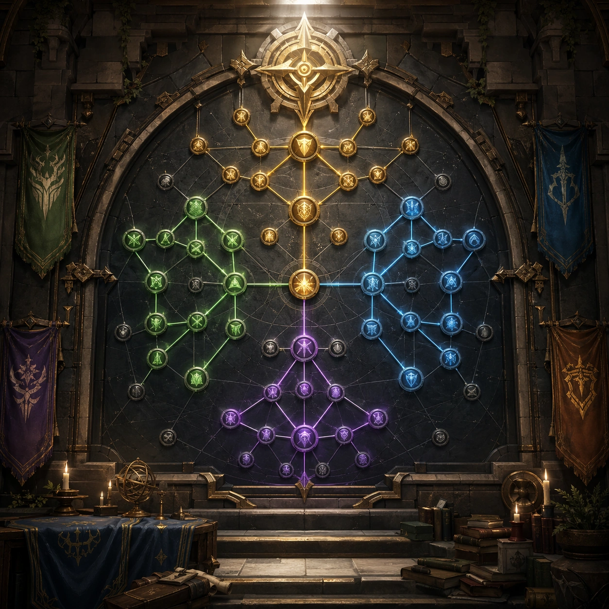
Scene: A square production-ready image designed for a game-art review wall and a commercial gallery at the same time. Frame an environmentalized presentation where the skill tree feels embedded into a guild wall, codex, or holographic shrine with disciplined lighting, clean edge separation, and enough surrounding context to prove how the asset would behave in a real product surface. The camera, crop, and tonal balance should feel intentional rather than generic, with high readability at first glance and convincing material response under closer inspection. Subject: Center the study on an environmentalized presentation where the skill tree feels embedded into a guild wall, codex, or holographic shrine. Translate the topic into a concrete, shippable visual statement instead of a loose mood board. Build layered object relationships, believable surface finish, and strong silhouette grouping so the image reads immediately as part of Skill Tree Progression Sheet. The subject should feel made for a live game pipeline: useful in store, UI, campaign, or art-review contexts, with visual hierarchy strong enough to survive aggressive cropping. Important details: keep navigation clarity even inside a more atmospheric presentation. Keep every supporting element subordinate to the main read, and make category separation obvious through form, color zoning, depth, and material logic rather than words. Where panels, cards, badges, or interface blocks appear, they must look professionally structured but remain unreadable. The visual language should feel premium, original, and coherent across this package, with no filler clutter and no accidental resemblance to a specific shipped game IP. Use case: Skill Tree Progression Sheet single study 8/9, focused on mentor guild wall. Constraints: No readable text, no watermark, no logos, preserve exact 1:1 aspect ratio, no readable inscriptions, no banner text, no broken hierarchy, no generic stock-photo staging, no accidental UI gibberish.

Example generated from “Skill Tree Progression Sheet — Build Share Poster”
GPT Image 2en

Scene: A square production-ready image designed for a game-art review wall and a commercial gallery at the same time. Frame a poster-like asset that packages one completed build path into a shareable progression story with disciplined lighting, clean edge separation, and enough surrounding context to prove how the asset would behave in a real product surface. The camera, crop, and tonal balance should feel intentional rather than generic, with high readability at first glance and convincing material response under closer inspection. Subject: Center the study on a poster-like asset that packages one completed build path into a shareable progression story. Translate the topic into a concrete, shippable visual statement instead of a loose mood board. Build layered object relationships, believable surface finish, and strong silhouette grouping so the image reads immediately as part of Skill Tree Progression Sheet. The subject should feel made for a live game pipeline: useful in store, UI, campaign, or art-review contexts, with visual hierarchy strong enough to survive aggressive cropping. Important details: make it feel social and aspirational while preserving clear build logic. Keep every supporting element subordinate to the main read, and make category separation obvious through form, color zoning, depth, and material logic rather than words. Where panels, cards, badges, or interface blocks appear, they must look professionally structured but remain unreadable. The visual language should feel premium, original, and coherent across this package, with no filler clutter and no accidental resemblance to a specific shipped game IP. Use case: Skill Tree Progression Sheet single study 9/9, focused on build share poster. Constraints: No readable text, no watermark, no logos, preserve exact 1:1 aspect ratio, no readable build names, no hashtags, no broken hierarchy, no generic stock-photo staging, no accidental UI gibberish.

Example generated from “Skinline Rarity Variant Suite — Base Hero Skin”
GPT Image 2en

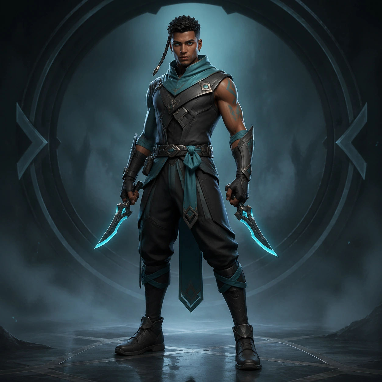
Scene: Use a character-poster frame with centered full-body readability, soft studio fog, restrained cyan-and-charcoal palette, and premium storefront polish. Build a polished game-art presentation for one original playable hero skinline, with premium lighting, clean silhouette read, and merchandising clarity. Keep the image square, polished, and intentionally staged like a production-ready game asset review or campaign module. The camera, lighting, and tonal range should help the subject stay readable at both thumbnail and full resolution, with clear hierarchy and no dependence on readable on-screen copy. Subject: Present the base rarity version with practical armor panels, matte fabric, compact energy blades at rest, and a calm ready stance that sells identity before spectacle. The recurring hero is a swift storm duelist with warm brown skin, a sharp oval face, close-cropped dark hair with one longer braided strand, teal eyes, and a lean athletic build. The subject should feel original, specific, and part of one coherent product system rather than a generic fantasy or sci-fi mashup. Preserve stable design anchors, clean shape language, and believable scale relationships across every visible object, character, card, or environment layer. Important details: Keep the face, haircut, proportions, and duelist silhouette unmistakable. Materials should feel entry-tier but still desirable, with limited glow accents and disciplined trim placement. The design language should show a believable rarity ladder instead of random costume swaps, keeping the same role fantasy while materials, trim density, glow treatment, and ceremonial value scale upward. Favor disciplined composition, premium material rendering, and obvious internal logic so the result feels useful for art direction, live-ops rollout, or product review. Abstract interface blocks, symbolic markers, or decorative framing are fine, but they must remain non-readable and subordinate to the main visual message. Use case: Skinline Suite single study 1/9, the baseline store-facing key visual. Constraints: No readable text, no watermark, no logos, preserve exact 1:1 aspect ratio, no weapon copied from known franchises, no floating price text, no random extra characters, no unreadable clutter, no excessive particle burst, no giant cape, no exaggerated rarity effects.

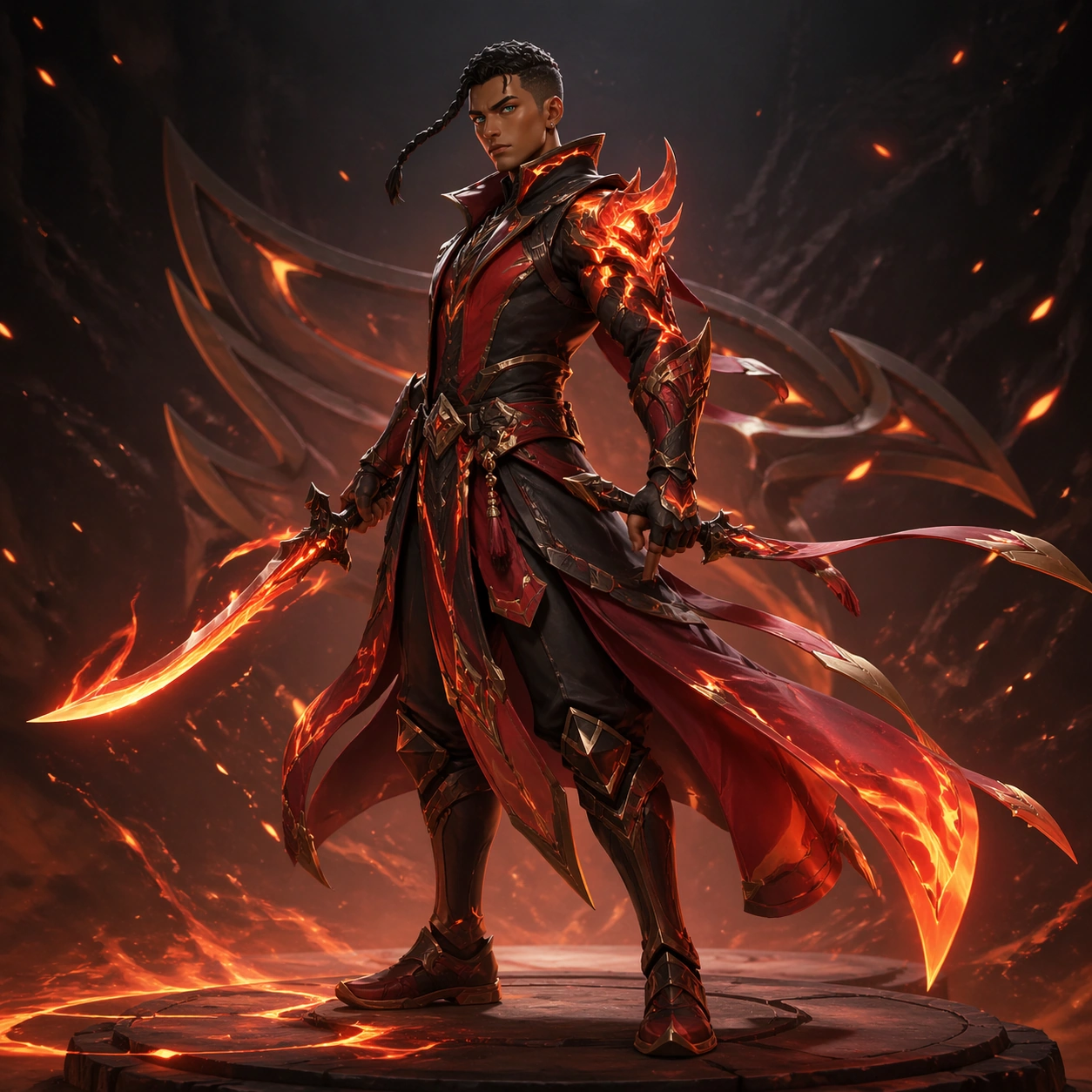
Example generated from “Skinline Rarity Variant Suite — Epic Ember Upgrade”
GPT Image 2en

Scene: Use a three-quarter hero angle with richer rim light, ember reflections, and controlled motion in the cloak tails while preserving a commerce-ready read. Build a polished game-art presentation for one original playable hero skinline, with premium lighting, clean silhouette read, and merchandising clarity. Keep the image square, polished, and intentionally staged like a production-ready game asset review or campaign module. The camera, lighting, and tonal range should help the subject stay readable at both thumbnail and full resolution, with clear hierarchy and no dependence on readable on-screen copy. Subject: Reinterpret the same duelist as an epic-tier ember variant: lacquered armor edges, deeper crimson secondary palette, brighter blade cores, and a more assertive stance. The recurring hero is a swift storm duelist with warm brown skin, a sharp oval face, close-cropped dark hair with one longer braided strand, teal eyes, and a lean athletic build. The subject should feel original, specific, and part of one coherent product system rather than a generic fantasy or sci-fi mashup. Preserve stable design anchors, clean shape language, and believable scale relationships across every visible object, character, card, or environment layer. Important details: The upgrade should feel earned through layered materials, carved trim, and stronger VFX intensity rather than anatomy drift. The same person must still read instantly. The design language should show a believable rarity ladder instead of random costume swaps, keeping the same role fantasy while materials, trim density, glow treatment, and ceremonial value scale upward. Favor disciplined composition, premium material rendering, and obvious internal logic so the result feels useful for art direction, live-ops rollout, or product review. Abstract interface blocks, symbolic markers, or decorative framing are fine, but they must remain non-readable and subordinate to the main visual message. Use case: Skinline Suite single study 2/9, a mid-tier rarity escalation study. Constraints: No readable text, no watermark, no logos, preserve exact 1:1 aspect ratio, no weapon copied from known franchises, no floating price text, no random extra characters, no unreadable clutter, no face change, no oversized fantasy armor, no background crowd.

Example generated from “Skinline Rarity Variant Suite — Legendary Celestial Finish”
GPT Image 2en

Scene: Create a dramatic full-body key art with radiant backlight, floating dust, and richer value contrast, but keep the composition readable like a launch poster. Build a polished game-art presentation for one original playable hero skinline, with premium lighting, clean silhouette read, and merchandising clarity. Keep the image square, polished, and intentionally staged like a production-ready game asset review or campaign module. The camera, lighting, and tonal range should help the subject stay readable at both thumbnail and full resolution, with clear hierarchy and no dependence on readable on-screen copy. Subject: Show the same duelist in a celestial high-rarity variant with luminous filigree, layered robe armor, crystalline energy rings, and a commanding yet elegant pose. The recurring hero is a swift storm duelist with warm brown skin, a sharp oval face, close-cropped dark hair with one longer braided strand, teal eyes, and a lean athletic build. The subject should feel original, specific, and part of one coherent product system rather than a generic fantasy or sci-fi mashup. Preserve stable design anchors, clean shape language, and believable scale relationships across every visible object, character, card, or environment layer. Important details: Luxury should come from refined hierarchy: brighter focal glow, rarer materials, and ceremonial detailing around shoulders, belt, and blade housing while core identity stays stable. The design language should show a believable rarity ladder instead of random costume swaps, keeping the same role fantasy while materials, trim density, glow treatment, and ceremonial value scale upward. Favor disciplined composition, premium material rendering, and obvious internal logic so the result feels useful for art direction, live-ops rollout, or product review. Abstract interface blocks, symbolic markers, or decorative framing are fine, but they must remain non-readable and subordinate to the main visual message. Use case: Skinline Suite single study 3/9, the aspirational top-rarity hero art. Constraints: No readable text, no watermark, no logos, preserve exact 1:1 aspect ratio, no weapon copied from known franchises, no floating price text, no random extra characters, no unreadable clutter, no wings, no floating text panels, no new hairstyle.

Example generated from “Skinline Rarity Variant Suite — Festival Night Variant”
GPT Image 2en

Scene: Set the hero against lantern-toned night atmosphere with crisp silhouette edges, controlled confetti-like particles, and a celebratory but premium campaign mood. Build a polished game-art presentation for one original playable hero skinline, with premium lighting, clean silhouette read, and merchandising clarity. Keep the image square, polished, and intentionally staged like a production-ready game asset review or campaign module. The camera, lighting, and tonal range should help the subject stay readable at both thumbnail and full resolution, with clear hierarchy and no dependence on readable on-screen copy. Subject: Translate the same duelist into a festive event variant with jewel-tone fabrics, lacquer red trims, warm gold glow, and subtle ceremonial accessories. The recurring hero is a swift storm duelist with warm brown skin, a sharp oval face, close-cropped dark hair with one longer braided strand, teal eyes, and a lean athletic build. The subject should feel original, specific, and part of one coherent product system rather than a generic fantasy or sci-fi mashup. Preserve stable design anchors, clean shape language, and believable scale relationships across every visible object, character, card, or environment layer. Important details: This should feel like an event branch built from the same base production kit. Preserve face, body read, and role fantasy while shifting mood, palette, and accessory story. The design language should show a believable rarity ladder instead of random costume swaps, keeping the same role fantasy while materials, trim density, glow treatment, and ceremonial value scale upward. Favor disciplined composition, premium material rendering, and obvious internal logic so the result feels useful for art direction, live-ops rollout, or product review. Abstract interface blocks, symbolic markers, or decorative framing are fine, but they must remain non-readable and subordinate to the main visual message. Use case: Skinline Suite single study 4/9, an event-timed cosmetic branch study. Constraints: No readable text, no watermark, no logos, preserve exact 1:1 aspect ratio, no weapon copied from known franchises, no floating price text, no random extra characters, no unreadable clutter, no costume comedy, no mascot companions, no carnival overload.

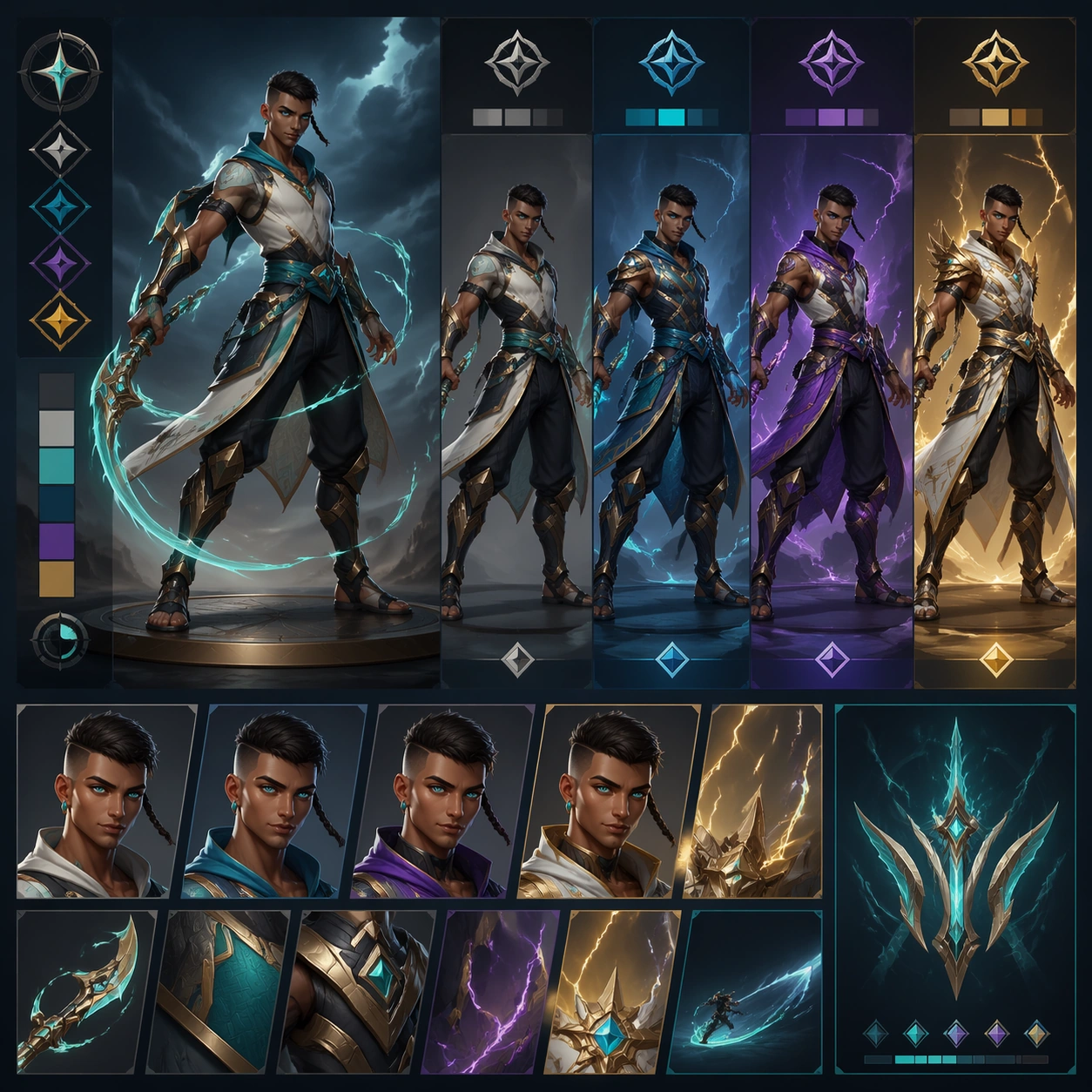
Example generated from “Skinline Rarity Variant Suite — Poster Lineup Sheet”
GPT Image 2en

Scene: Arrange a square lineup sheet with one dominant full-body figure and supporting tier crops around it, using abstract UI blocks with no readable copy. Build a polished game-art presentation for one original playable hero skinline, with premium lighting, clean silhouette read, and merchandising clarity. Keep the image square, polished, and intentionally staged like a production-ready game asset review or campaign module. The camera, lighting, and tonal range should help the subject stay readable at both thumbnail and full resolution, with clear hierarchy and no dependence on readable on-screen copy. Subject: Show the base, epic, legendary, and event variants as one family of the same hero, aligned by pose rhythm and color progression. The recurring hero is a swift storm duelist with warm brown skin, a sharp oval face, close-cropped dark hair with one longer braided strand, teal eyes, and a lean athletic build. The subject should feel original, specific, and part of one coherent product system rather than a generic fantasy or sci-fi mashup. Preserve stable design anchors, clean shape language, and believable scale relationships across every visible object, character, card, or environment layer. Important details: The board should communicate upgrade logic, value separation, and campaign consistency. Keep spacing deliberate so it feels like a real review deck or internal pitch board. The design language should show a believable rarity ladder instead of random costume swaps, keeping the same role fantasy while materials, trim density, glow treatment, and ceremonial value scale upward. Favor disciplined composition, premium material rendering, and obvious internal logic so the result feels useful for art direction, live-ops rollout, or product review. Abstract interface blocks, symbolic markers, or decorative framing are fine, but they must remain non-readable and subordinate to the main visual message. Use case: Skinline Suite single study 5/9, a system overview board for rarity communication. Constraints: No readable text, no watermark, no logos, preserve exact 1:1 aspect ratio, no weapon copied from known franchises, no floating price text, no random extra characters, no unreadable clutter, no readable labels, no distorted miniatures, no mismatched lighting families.

Example generated from “Skinline Rarity Variant Suite — Shop Feature Tile”
GPT Image 2en

Scene: Use a dense but clear square shop tile layout with one hero crop, secondary reward props, abstract tier markers, and high contrast focal placement. Build a polished game-art presentation for one original playable hero skinline, with premium lighting, clean silhouette read, and merchandising clarity. Keep the image square, polished, and intentionally staged like a production-ready game asset review or campaign module. The camera, lighting, and tonal range should help the subject stay readable at both thumbnail and full resolution, with clear hierarchy and no dependence on readable on-screen copy. Subject: Feature the same hero at near-bust scale with one premium rarity crop and supporting silhouettes of alternate tiers behind or beside the main figure. The recurring hero is a swift storm duelist with warm brown skin, a sharp oval face, close-cropped dark hair with one longer braided strand, teal eyes, and a lean athletic build. The subject should feel original, specific, and part of one coherent product system rather than a generic fantasy or sci-fi mashup. Preserve stable design anchors, clean shape language, and believable scale relationships across every visible object, character, card, or environment layer. Important details: This frame should prioritize conversion clarity at small size: strong hierarchy, bright focal accents, and immediately legible cosmetic desirability without literal pricing text. The design language should show a believable rarity ladder instead of random costume swaps, keeping the same role fantasy while materials, trim density, glow treatment, and ceremonial value scale upward. Favor disciplined composition, premium material rendering, and obvious internal logic so the result feels useful for art direction, live-ops rollout, or product review. Abstract interface blocks, symbolic markers, or decorative framing are fine, but they must remain non-readable and subordinate to the main visual message. Use case: Skinline Suite single study 6/9, the shop-grid conversion tile. Constraints: No readable text, no watermark, no logos, preserve exact 1:1 aspect ratio, no weapon copied from known franchises, no floating price text, no random extra characters, no unreadable clutter, no tiny unreadable symbols, no cluttered loot pile, no logo plates.

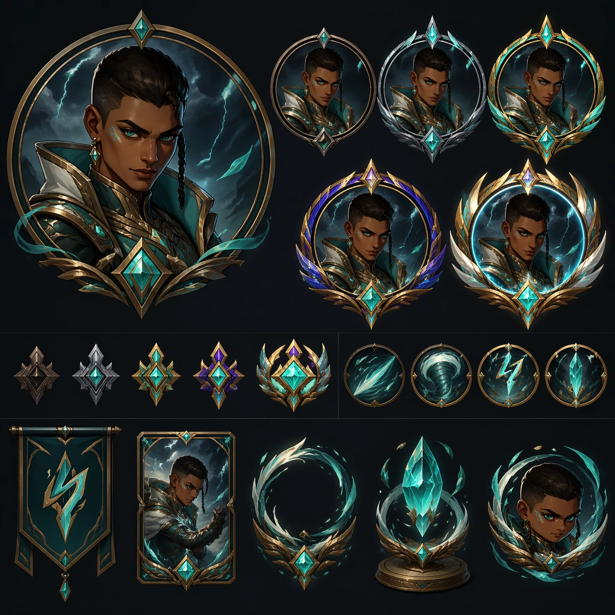
Example generated from “Skinline Rarity Variant Suite — Icon Frame Board”
GPT Image 2en

Scene: Compose a neat approval-board layout with circular or shield-like portrait crops, frame variations, and token-sized reward objects arranged on a clean dark field. Build a polished game-art presentation for one original playable hero skinline, with premium lighting, clean silhouette read, and merchandising clarity. Keep the image square, polished, and intentionally staged like a production-ready game asset review or campaign module. The camera, lighting, and tonal range should help the subject stay readable at both thumbnail and full resolution, with clear hierarchy and no dependence on readable on-screen copy. Subject: Use close portrait crops of the same hero plus a family of rarity frame treatments, small badge motifs, and cosmetic token art that all derive from the main skinline. The recurring hero is a swift storm duelist with warm brown skin, a sharp oval face, close-cropped dark hair with one longer braided strand, teal eyes, and a lean athletic build. The subject should feel original, specific, and part of one coherent product system rather than a generic fantasy or sci-fi mashup. Preserve stable design anchors, clean shape language, and believable scale relationships across every visible object, character, card, or environment layer. Important details: The image should bridge hero art and UI utility. Frame silhouettes, gem colors, and material accents must echo the costume system rather than feeling unrelated. The design language should show a believable rarity ladder instead of random costume swaps, keeping the same role fantasy while materials, trim density, glow treatment, and ceremonial value scale upward. Favor disciplined composition, premium material rendering, and obvious internal logic so the result feels useful for art direction, live-ops rollout, or product review. Abstract interface blocks, symbolic markers, or decorative framing are fine, but they must remain non-readable and subordinate to the main visual message. Use case: Skinline Suite single study 7/9, a portrait-frame and reward-support study. Constraints: No readable text, no watermark, no logos, preserve exact 1:1 aspect ratio, no weapon copied from known franchises, no floating price text, no random extra characters, no unreadable clutter, no readable badge numbers, no different face per crop, no generic mobile-game clutter.

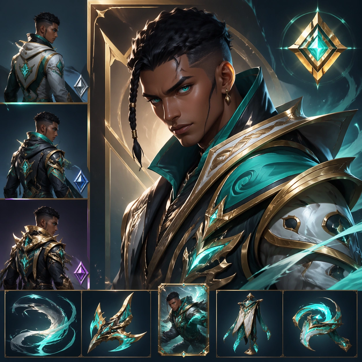
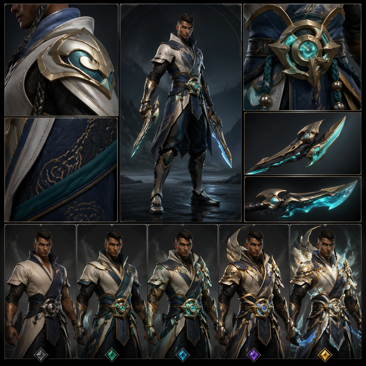
Example generated from “Skinline Rarity Variant Suite — Material Turntable Close-up”
GPT Image 2en

Scene: Use a clean review-board composition with enlarged shoulder, belt, fabric, and blade-housing crops surrounding one small full-body reference. Build a polished game-art presentation for one original playable hero skinline, with premium lighting, clean silhouette read, and merchandising clarity. Keep the image square, polished, and intentionally staged like a production-ready game asset review or campaign module. The camera, lighting, and tonal range should help the subject stay readable at both thumbnail and full resolution, with clear hierarchy and no dependence on readable on-screen copy. Subject: Focus on the same hero materials across tiers: matte base fabric, polished metal trim, translucent energy cores, stitched underlayers, and ceremonial embroidery upgrades. The recurring hero is a swift storm duelist with warm brown skin, a sharp oval face, close-cropped dark hair with one longer braided strand, teal eyes, and a lean athletic build. The subject should feel original, specific, and part of one coherent product system rather than a generic fantasy or sci-fi mashup. Preserve stable design anchors, clean shape language, and believable scale relationships across every visible object, character, card, or environment layer. Important details: The close-ups should feel premium and tactile, showing why the rarity ladder is believable in production terms and not only through broader color changes. The design language should show a believable rarity ladder instead of random costume swaps, keeping the same role fantasy while materials, trim density, glow treatment, and ceremonial value scale upward. Favor disciplined composition, premium material rendering, and obvious internal logic so the result feels useful for art direction, live-ops rollout, or product review. Abstract interface blocks, symbolic markers, or decorative framing are fine, but they must remain non-readable and subordinate to the main visual message. Use case: Skinline Suite single study 8/9, a material and craft validation board. Constraints: No readable text, no watermark, no logos, preserve exact 1:1 aspect ratio, no weapon copied from known franchises, no floating price text, no random extra characters, no unreadable clutter, no microscopic text annotations, no unrelated props, no photobash chaos.
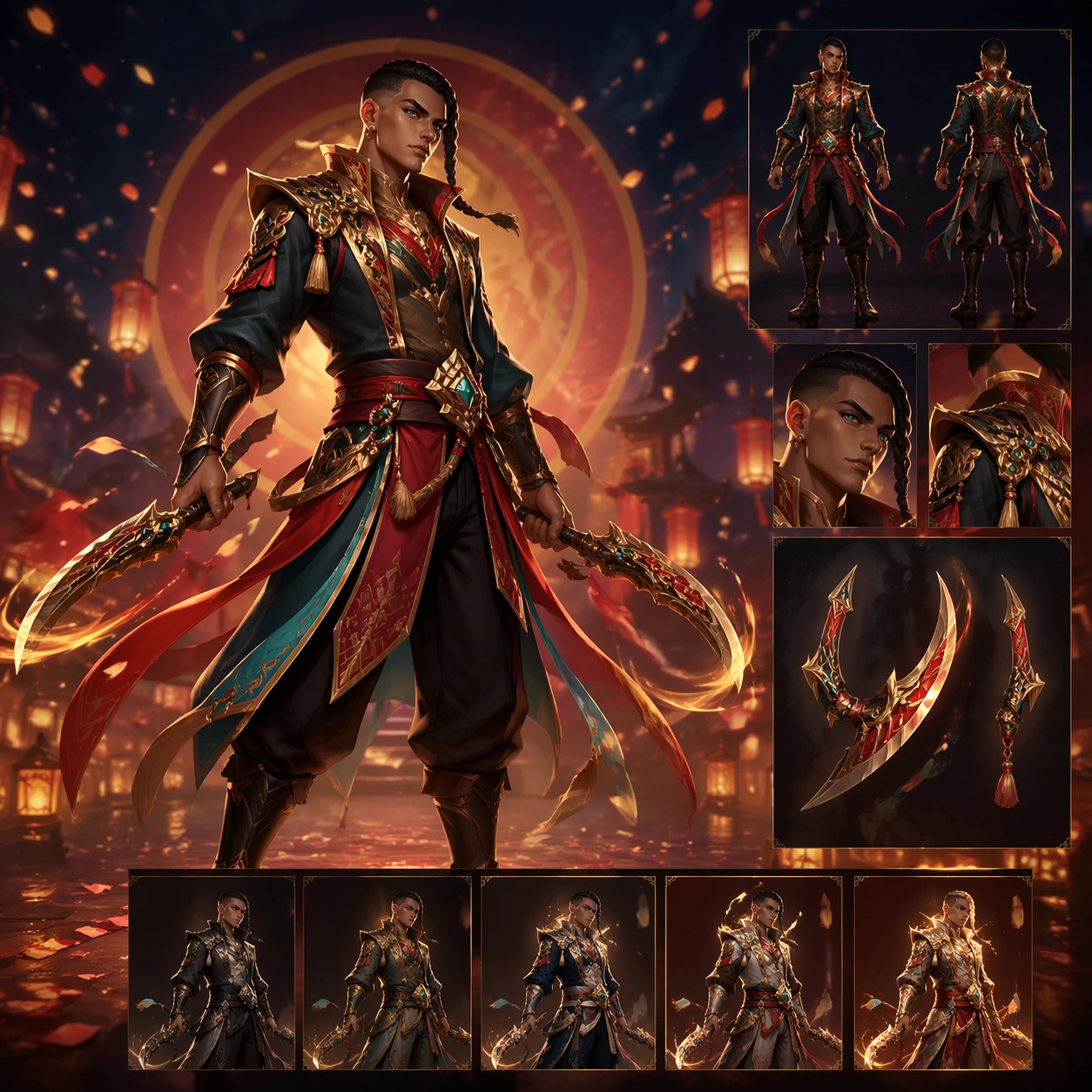
Example generated from “Skinline Rarity Variant Suite — Event Page Hero”
GPT Image 2en

Scene: Build a square crop from a wider campaign composition, with strong foreground figure placement, decorative environment motifs, and clean negative space for imaginary copy zones. Build a polished game-art presentation for one original playable hero skinline, with premium lighting, clean silhouette read, and merchandising clarity. Keep the image square, polished, and intentionally staged like a production-ready game asset review or campaign module. The camera, lighting, and tonal range should help the subject stay readable at both thumbnail and full resolution, with clear hierarchy and no dependence on readable on-screen copy. Subject: Lead with the same hero in the event branch while hinting at the wider skinline through background silhouettes, reward props, and a premium seasonal atmosphere. The recurring hero is a swift storm duelist with warm brown skin, a sharp oval face, close-cropped dark hair with one longer braided strand, teal eyes, and a lean athletic build. The subject should feel original, specific, and part of one coherent product system rather than a generic fantasy or sci-fi mashup. Preserve stable design anchors, clean shape language, and believable scale relationships across every visible object, character, card, or environment layer. Important details: The result should feel campaign-ready, not just another poster. Keep the hero dominant, maintain continuity, and leave orderly compositional zones where product teams could place messaging later. The design language should show a believable rarity ladder instead of random costume swaps, keeping the same role fantasy while materials, trim density, glow treatment, and ceremonial value scale upward. Favor disciplined composition, premium material rendering, and obvious internal logic so the result feels useful for art direction, live-ops rollout, or product review. Abstract interface blocks, symbolic markers, or decorative framing are fine, but they must remain non-readable and subordinate to the main visual message. Use case: Skinline Suite single study 9/9, the landing-page hero expansion image. Constraints: No readable text, no watermark, no logos, preserve exact 1:1 aspect ratio, no weapon copied from known franchises, no floating price text, no random extra characters, no unreadable clutter, no readable title text, no busy collage overload, no unrelated secondary protagonist.
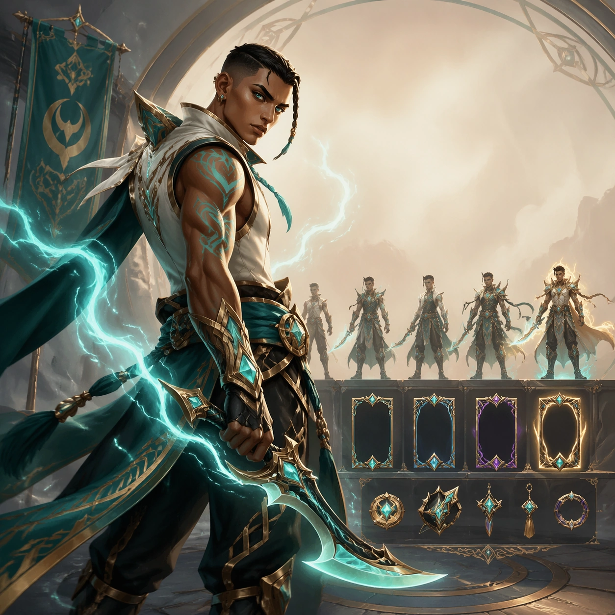
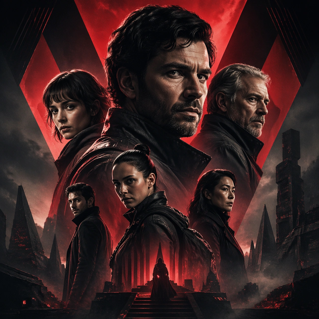
Example generated from “Social Teaser Promo Carousel — Reference Key Art”
GPT Image 2en

Scene: A square entertainment marketing key visual for Social Teaser Promo Carousel, designed like a polished campaign asset ready for posters, covers, feeds, or street placement. The composition should have immediate impact from a distance while still carrying layered detail up close. Keep the lighting dramatic, the hierarchy bold, and the framing tight enough to feel like real promotional art instead of a casual illustration. Subject: Center the piece on Reference Key Art, a frame that locks the cast hierarchy, focal rhythm, and signature sales composition for the series. Translate Design teaser carousels and social promo grids that work as standalone posts but also lock together into a larger release narrative. into a concrete campaign image with clear protagonist hierarchy, supporting world-building cues, and unmistakable promotional intent. The viewer should understand the genre, the ensemble relationships, and the commercial purpose at a glance without relying on readable text or existing brand marks. Important details: The challenge is disciplined hype. Preserve focal hierarchy, readable silhouette separation, strong foreground-background layering, and a convincing balance between character energy and structured layout. This theme studies structured-layout, editing-workflow, commercial-mockup, text-rendering through a production-ready visual system. Even if typography is unreadable, space for title blocks, badges, or platform framing should feel intentionally designed. Aim for clear hierarchy, polished craft, and immediately usable campaign logic. Use case: Social Teaser Promo Carousel series study 1/4. Constraints: No readable text, no watermark, no logos, preserve exact 1:1 aspect ratio, no broken anatomy, no unreadable hierarchy collapse, no muddy montage, no accidental real movie logos, no random filler characters, no off-topic props.

Example generated from “Social Teaser Promo Carousel — Character Surge”
GPT Image 2en

Scene: A square entertainment marketing key visual for Social Teaser Promo Carousel, designed like a polished campaign asset ready for posters, covers, feeds, or street placement. The composition should have immediate impact from a distance while still carrying layered detail up close. Keep the lighting dramatic, the hierarchy bold, and the framing tight enough to feel like real promotional art instead of a casual illustration. Subject: Center the piece on Character Surge, a frame that pushes the same poster language toward a more aggressive character-first emphasis. Translate Design teaser carousels and social promo grids that work as standalone posts but also lock together into a larger release narrative. into a concrete campaign image with clear protagonist hierarchy, supporting world-building cues, and unmistakable promotional intent. The viewer should understand the genre, the ensemble relationships, and the commercial purpose at a glance without relying on readable text or existing brand marks. Important details: The challenge is disciplined hype. Preserve focal hierarchy, readable silhouette separation, strong foreground-background layering, and a convincing balance between character energy and structured layout. This theme studies structured-layout, editing-workflow, commercial-mockup, text-rendering through a production-ready visual system. Even if typography is unreadable, space for title blocks, badges, or platform framing should feel intentionally designed. Aim for clear hierarchy, polished craft, and immediately usable campaign logic. Use case: Social Teaser Promo Carousel series study 2/4. Constraints: No readable text, no watermark, no logos, preserve exact 1:1 aspect ratio, no broken anatomy, no unreadable hierarchy collapse, no muddy montage, no accidental real movie logos, no random filler characters, no off-topic props.

Example generated from “Social Teaser Promo Carousel — Genre Pivot”
GPT Image 2en

Scene: A square entertainment marketing key visual for Social Teaser Promo Carousel, designed like a polished campaign asset ready for posters, covers, feeds, or street placement. The composition should have immediate impact from a distance while still carrying layered detail up close. Keep the lighting dramatic, the hierarchy bold, and the framing tight enough to feel like real promotional art instead of a casual illustration. Subject: Center the piece on Genre Pivot, a frame that keeps the hierarchy but bends color, props, and supporting scenes toward a different subgenre. Translate Design teaser carousels and social promo grids that work as standalone posts but also lock together into a larger release narrative. into a concrete campaign image with clear protagonist hierarchy, supporting world-building cues, and unmistakable promotional intent. The viewer should understand the genre, the ensemble relationships, and the commercial purpose at a glance without relying on readable text or existing brand marks. Important details: The challenge is disciplined hype. Preserve focal hierarchy, readable silhouette separation, strong foreground-background layering, and a convincing balance between character energy and structured layout. This theme studies structured-layout, editing-workflow, commercial-mockup, text-rendering through a production-ready visual system. Even if typography is unreadable, space for title blocks, badges, or platform framing should feel intentionally designed. Aim for clear hierarchy, polished craft, and immediately usable campaign logic. Use case: Social Teaser Promo Carousel series study 3/4. Constraints: No readable text, no watermark, no logos, preserve exact 1:1 aspect ratio, no broken anatomy, no unreadable hierarchy collapse, no muddy montage, no accidental real movie logos, no random filler characters, no off-topic props.

Example generated from “Social Teaser Promo Carousel — Teaser Card”
GPT Image 2en

Scene: A square entertainment marketing key visual for Social Teaser Promo Carousel, designed like a polished campaign asset ready for posters, covers, feeds, or street placement. The composition should have immediate impact from a distance while still carrying layered detail up close. Keep the lighting dramatic, the hierarchy bold, and the framing tight enough to feel like real promotional art instead of a casual illustration. Subject: Center the piece on Teaser Card, a frame that a compact mystery-first promo asset built for anticipation and visual tension. Translate Design teaser carousels and social promo grids that work as standalone posts but also lock together into a larger release narrative. into a concrete campaign image with clear protagonist hierarchy, supporting world-building cues, and unmistakable promotional intent. The viewer should understand the genre, the ensemble relationships, and the commercial purpose at a glance without relying on readable text or existing brand marks. Important details: The challenge is disciplined hype. Preserve focal hierarchy, readable silhouette separation, strong foreground-background layering, and a convincing balance between character energy and structured layout. This theme studies structured-layout, editing-workflow, commercial-mockup, text-rendering through a production-ready visual system. Even if typography is unreadable, space for title blocks, badges, or platform framing should feel intentionally designed. Aim for clear hierarchy, polished craft, and immediately usable campaign logic. Use case: Social Teaser Promo Carousel single study 1/5. Constraints: No readable text, no watermark, no logos, preserve exact 1:1 aspect ratio, no broken anatomy, no unreadable hierarchy collapse, no muddy montage, no accidental real movie logos, no random filler characters, no off-topic props.

Example generated from “Social Teaser Promo Carousel — Countdown Poster”
GPT Image 2en

Scene: A square entertainment marketing key visual for Social Teaser Promo Carousel, designed like a polished campaign asset ready for posters, covers, feeds, or street placement. The composition should have immediate impact from a distance while still carrying layered detail up close. Keep the lighting dramatic, the hierarchy bold, and the framing tight enough to feel like real promotional art instead of a casual illustration. Subject: Center the piece on Countdown Poster, a frame that a countdown-ready campaign poster with bold hierarchy and tight emotional framing. Translate Design teaser carousels and social promo grids that work as standalone posts but also lock together into a larger release narrative. into a concrete campaign image with clear protagonist hierarchy, supporting world-building cues, and unmistakable promotional intent. The viewer should understand the genre, the ensemble relationships, and the commercial purpose at a glance without relying on readable text or existing brand marks. Important details: The challenge is disciplined hype. Preserve focal hierarchy, readable silhouette separation, strong foreground-background layering, and a convincing balance between character energy and structured layout. This theme studies structured-layout, editing-workflow, commercial-mockup, text-rendering through a production-ready visual system. Even if typography is unreadable, space for title blocks, badges, or platform framing should feel intentionally designed. Aim for clear hierarchy, polished craft, and immediately usable campaign logic. Use case: Social Teaser Promo Carousel single study 2/5. Constraints: No readable text, no watermark, no logos, preserve exact 1:1 aspect ratio, no broken anatomy, no unreadable hierarchy collapse, no muddy montage, no accidental real movie logos, no random filler characters, no off-topic props.

Example generated from “Social Teaser Promo Carousel — Platform Crop Board”
GPT Image 2en

Scene: A square entertainment marketing key visual for Social Teaser Promo Carousel, designed like a polished campaign asset ready for posters, covers, feeds, or street placement. The composition should have immediate impact from a distance while still carrying layered detail up close. Keep the lighting dramatic, the hierarchy bold, and the framing tight enough to feel like real promotional art instead of a casual illustration. Subject: Center the piece on Platform Crop Board, a frame that a preview board showing how one campaign reads across multiple crop logics. Translate Design teaser carousels and social promo grids that work as standalone posts but also lock together into a larger release narrative. into a concrete campaign image with clear protagonist hierarchy, supporting world-building cues, and unmistakable promotional intent. The viewer should understand the genre, the ensemble relationships, and the commercial purpose at a glance without relying on readable text or existing brand marks. Important details: The challenge is disciplined hype. Preserve focal hierarchy, readable silhouette separation, strong foreground-background layering, and a convincing balance between character energy and structured layout. This theme studies structured-layout, editing-workflow, commercial-mockup, text-rendering through a production-ready visual system. Even if typography is unreadable, space for title blocks, badges, or platform framing should feel intentionally designed. Aim for clear hierarchy, polished craft, and immediately usable campaign logic. Use case: Social Teaser Promo Carousel single study 3/5. Constraints: No readable text, no watermark, no logos, preserve exact 1:1 aspect ratio, no broken anatomy, no unreadable hierarchy collapse, no muddy montage, no accidental real movie logos, no random filler characters, no off-topic props.

Example generated from “Social Teaser Promo Carousel — Street Proof”
GPT Image 2en

Scene: A square entertainment marketing key visual for Social Teaser Promo Carousel, designed like a polished campaign asset ready for posters, covers, feeds, or street placement. The composition should have immediate impact from a distance while still carrying layered detail up close. Keep the lighting dramatic, the hierarchy bold, and the framing tight enough to feel like real promotional art instead of a casual illustration. Subject: Center the piece on Street Proof, a frame that a public-facing proof image showing the campaign translated into a convincing real-world display. Translate Design teaser carousels and social promo grids that work as standalone posts but also lock together into a larger release narrative. into a concrete campaign image with clear protagonist hierarchy, supporting world-building cues, and unmistakable promotional intent. The viewer should understand the genre, the ensemble relationships, and the commercial purpose at a glance without relying on readable text or existing brand marks. Important details: The challenge is disciplined hype. Preserve focal hierarchy, readable silhouette separation, strong foreground-background layering, and a convincing balance between character energy and structured layout. This theme studies structured-layout, editing-workflow, commercial-mockup, text-rendering through a production-ready visual system. Even if typography is unreadable, space for title blocks, badges, or platform framing should feel intentionally designed. Aim for clear hierarchy, polished craft, and immediately usable campaign logic. Use case: Social Teaser Promo Carousel single study 4/5. Constraints: No readable text, no watermark, no logos, preserve exact 1:1 aspect ratio, no broken anatomy, no unreadable hierarchy collapse, no muddy montage, no accidental real movie logos, no random filler characters, no off-topic props.

Example generated from “Social Teaser Promo Carousel — Merch Sell Sheet”
GPT Image 2en

Scene: A square entertainment marketing key visual for Social Teaser Promo Carousel, designed like a polished campaign asset ready for posters, covers, feeds, or street placement. The composition should have immediate impact from a distance while still carrying layered detail up close. Keep the lighting dramatic, the hierarchy bold, and the framing tight enough to feel like real promotional art instead of a casual illustration. Subject: Center the piece on Merch Sell Sheet, a frame that a supporting sell-sheet style visual connecting the campaign to collectible or retail energy. Translate Design teaser carousels and social promo grids that work as standalone posts but also lock together into a larger release narrative. into a concrete campaign image with clear protagonist hierarchy, supporting world-building cues, and unmistakable promotional intent. The viewer should understand the genre, the ensemble relationships, and the commercial purpose at a glance without relying on readable text or existing brand marks. Important details: The challenge is disciplined hype. Preserve focal hierarchy, readable silhouette separation, strong foreground-background layering, and a convincing balance between character energy and structured layout. This theme studies structured-layout, editing-workflow, commercial-mockup, text-rendering through a production-ready visual system. Even if typography is unreadable, space for title blocks, badges, or platform framing should feel intentionally designed. Aim for clear hierarchy, polished craft, and immediately usable campaign logic. Use case: Social Teaser Promo Carousel single study 5/5. Constraints: No readable text, no watermark, no logos, preserve exact 1:1 aspect ratio, no broken anatomy, no unreadable hierarchy collapse, no muddy montage, no accidental real movie logos, no random filler characters, no off-topic props.

Example generated from “Soviet Propaganda Monumental — Canonical One-Sheet”
GPT Image 2en

Scene: A square straight-on studio view of a pristine poster mounted on a matte wall with even museum lighting, crisp corners, and enough breathing room around the sheet for the full composition to read as an intentional object. The poster should express heroic monumental realism with low-angle figures, sunrise shafts, sculptural drapery, and industrial optimism, using red, ochre, cream, steel blue, and warm industrial smoke gray and a tactile surface appropriate to the medium. Subject: Build the flagship poster statement for this style, with the strongest hierarchy, the clearest subject silhouette, and the most disciplined balance between image field, pseudo-typography, and empty space. Use workers, engineers, turbines, wheat, chimneys, steel beams, and raised-arm silhouettes as the main visual ingredients, and organize them with bold banner-like glyph panels used as abstract propaganda blocks without readable wording. For the contemporary-subject axis, thread in renewable-energy towers, metro construction, and logistics workers recast through monumental heroic framing. The poster must feel like an original design object rather than a reproduction of any known work. Important details: Treat this as the cleanest thesis image in the set: the paper should look fresh, the inks or paint should feel deliberate, and every formal rule of the style should be easy to study at a glance. Preserve upward gaze, idealized anatomy, broad light geometry, and poster clarity at large scale. Keep every letterform abstract and non-readable, as if it were a typographic texture rather than language. Make the style unmistakable through composition, palette, surface behavior, and symbolic compression. no specific leaders, no state emblems, no satire, no gritty collapse imagery. Use case: Soviet Monumental single study 1/9, establishing the cleanest museum-grade poster reading. Constraints: No readable text, no watermark, no logos, preserve exact 1:1 aspect ratio, no copyrighted characters, no real brand marks, no QR codes, no interface chrome, no accidental gibberish lettering.