PROMPTS · EXPLORACIÓN CREATIVA

Galería de prompts

Explora prompts reales y ejemplos generados. Encuentra inspiración para tu próxima misión creativa y copia gratis el prompt completo.

Ejemplos
10,974
Modelos
17
Fuentes
1277
10.974 ejemplos de prompts · página 51 de 229
Example generated from “Dim Sum Miniature Atlas — Har Gow Lantern”
GPT Image 2en

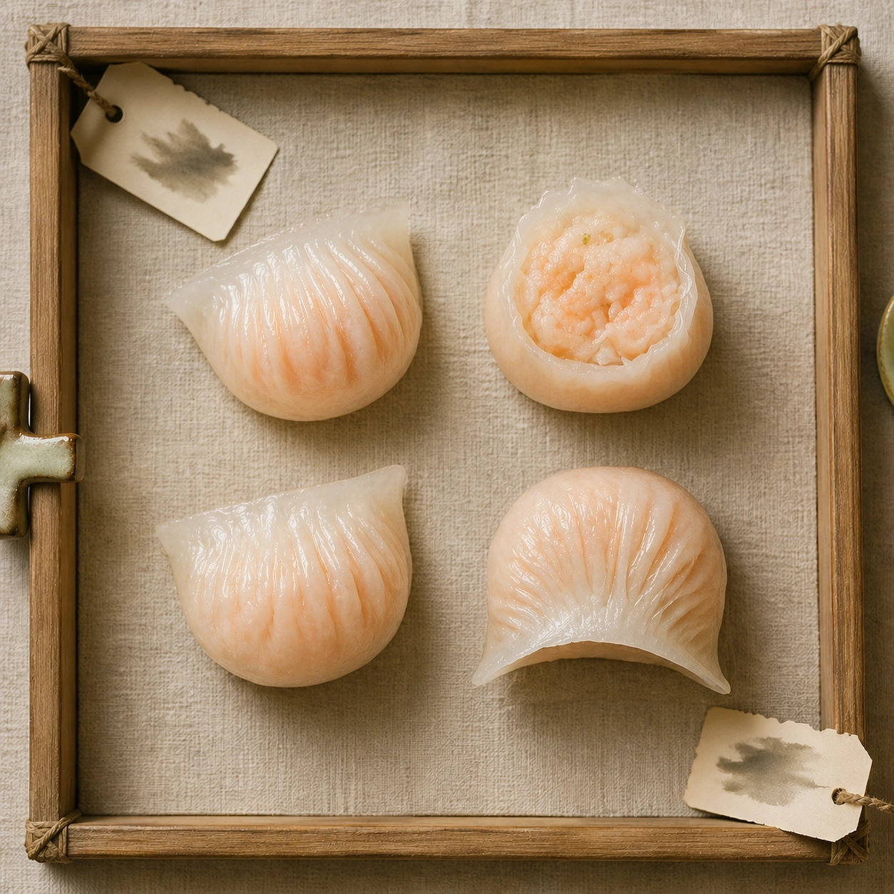
Scene: Create a square museum-atlas photograph of dim sum presented on natural linen or pale neutral textile, lit with calm daylight and restrained shadow. The composition should feel archival, specimen-like, and quietly luxurious rather than crowded or banquet-style. Blank museum tabs, bamboo details, and shallow steam are acceptable so long as no readable characters appear anywhere. Keep the exact overhead camera angle, linen field, daylight softness, and specimen spacing from the reference image so the atlas continuity remains obvious. The empty space around the dumpling should remain generous and calm. Subject: Feature a small family of shrimp dumplings with crisp pleats and semi-translucent skins that reveal a hint of pink filling beneath. One dumpling may be sliced or gently opened to show the interior texture, but the set should stay elegant and composed. Steam should hover faintly, not dramatically. Important details: Make the dumplings feel handcrafted and specific: pleat count, skin thickness, translucency, filling pressure, steam moisture, and wrapper folds all need to be believable. The museum treatment should elevate the food without turning it into abstraction. Every item should still look edible, warm, and tactile. Preserve exact specimen spacing, linen tone, and daylight behavior from the reference model while emphasizing translucency and pleat count. The wrapper should look delicate, elastic, and slightly glossy with heat, never plasticky. Use case: Dim sum miniature atlas series study 2/9, using the anchor system to study translucent shrimp dumplings. Constraints: No readable text, no watermark, no logos, preserve exact 1:1 aspect ratio, no banquet table clutter, no readable calligraphy, no sauce spills, no glossy menu styling, no plastic steamer look, no chili oil splashes, no glossy plastic sheen, no crowded bamboo steamer.
Example generated from “Dim Sum Miniature Atlas — Siu Mai Crown”
GPT Image 2en

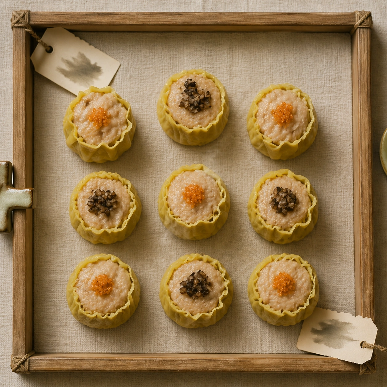
Scene: Create a square museum-atlas photograph of dim sum presented on natural linen or pale neutral textile, lit with calm daylight and restrained shadow. The composition should feel archival, specimen-like, and quietly luxurious rather than crowded or banquet-style. Blank museum tabs, bamboo details, and shallow steam are acceptable so long as no readable characters appear anywhere. Maintain the exact overhead museum framing, linen tone, and calm daylight established by the reference image so the series still reads as one archive sheet. Subtle steam and tiny shadows should keep the dumplings dimensional without breaking the quiet tone. Subject: Show several carefully formed open-crown dumplings with yellow wrappers, textured minced filling, and tiny decorative tops such as roe or mushroom dice. The forms should feel hand-made and consistent, with slight natural irregularity that proves they are real food. The image should celebrate repetition and craftsmanship. Important details: Make the dumplings feel handcrafted and specific: pleat count, skin thickness, translucency, filling pressure, steam moisture, and wrapper folds all need to be believable. The museum treatment should elevate the food without turning it into abstraction. Every item should still look edible, warm, and tactile. Preserve exact spacing, fabric atmosphere, and specimen-tab language from the reference model while shifting the focus to open wrapper structure and textured tops. Wrapper folds, filling granularity, and moisture need to remain highly believable. Use case: Dim sum miniature atlas series study 3/9, translating the anchor atlas into structured open-crown dumplings. Constraints: No readable text, no watermark, no logos, preserve exact 1:1 aspect ratio, no banquet table clutter, no readable calligraphy, no sauce spills, no glossy menu styling, no plastic steamer look, no buffet tray context, no plastic shine on wrappers, no readable tags.

Example generated from “Dim Sum Miniature Atlas — Char Siu Bao Dome”
GPT Image 2en

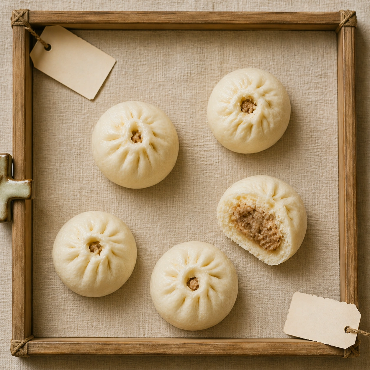
Scene: Create a square museum-atlas photograph of dim sum presented on natural linen or pale neutral textile, lit with calm daylight and restrained shadow. The composition should feel archival, specimen-like, and quietly luxurious rather than crowded or banquet-style. Blank museum tabs, bamboo details, and shallow steam are acceptable so long as no readable characters appear anywhere. Use the same overhead specimen framing, warm linen, and quiet daylight as the reference image, allowing the buns to sit with more breathing room so their rounded forms read clearly. The shadows should remain soft and minimal. Subject: Present several small steamed buns with soft matte dough and natural crown splits revealing a glimpse of the filling inside. One bun may be opened to show the interior meat texture and the layered softness of the bread. The arrangement should feel intimate and archival rather than commercial. Important details: Make the dumplings feel handcrafted and specific: pleat count, skin thickness, translucency, filling pressure, steam moisture, and wrapper folds all need to be believable. The museum treatment should elevate the food without turning it into abstraction. Every item should still look edible, warm, and tactile. Preserve exact spacing, linen field, and daylight calm from the reference model while shifting the material emphasis toward soft fermented dough and gentle structural cracking at the top. The buns should appear warm, plush, and edible, not like toy bread. Use case: Dim sum miniature atlas series study 4/9, completing the anchor tray with soft steamed bun specimens. Constraints: No readable text, no watermark, no logos, preserve exact 1:1 aspect ratio, no banquet table clutter, no readable calligraphy, no sauce spills, no glossy menu styling, no plastic steamer look, no bakery paper liners, no sugary dessert-bun styling, no crowded steam basket.

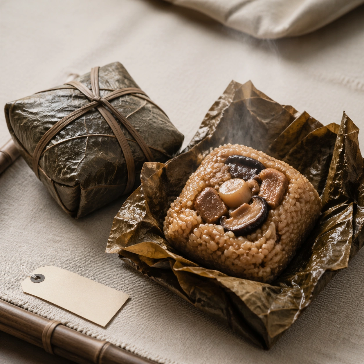
Example generated from “Dim Sum Miniature Atlas — Lotus Leaf Rice Bundle”
GPT Image 2en

Scene: Create a square museum-atlas photograph of dim sum presented on natural linen or pale neutral textile, lit with calm daylight and restrained shadow. The composition should feel archival, specimen-like, and quietly luxurious rather than crowded or banquet-style. Blank museum tabs, bamboo details, and shallow steam are acceptable so long as no readable characters appear anywhere. Use a square archival setup on linen with soft top light, allowing the wrapped leaf form and opened interior to share the frame without crowding. The background should stay calm and tactile. Subject: Present one tied lotus-leaf sticky-rice bundle beside another opened parcel revealing glistening rice, mushroom, and savory filling. The leaf should show natural veins, folds, and moisture from steaming. The scene should feel quiet and documentarian. Important details: Make the dumplings feel handcrafted and specific: pleat count, skin thickness, translucency, filling pressure, steam moisture, and wrapper folds all need to be believable. The museum treatment should elevate the food without turning it into abstraction. Every item should still look edible, warm, and tactile. Balance outer leaf texture with the richer interior ingredients, making both the wrapping logic and the filling structure immediately understandable. Steam must remain subtle and believable. Use case: Dim sum miniature atlas single study 6/9, documenting the outer and inner logic of a lotus-leaf parcel. Constraints: No readable text, no watermark, no logos, preserve exact 1:1 aspect ratio, no banquet table clutter, no readable calligraphy, no sauce spills, no glossy menu styling, no plastic steamer look, no plastic wrappers, no heavy sauce spill, no readable paper labels.

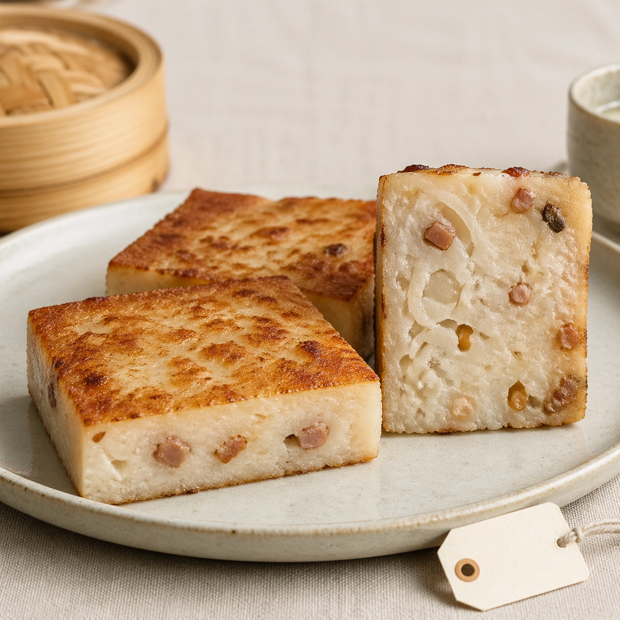
Example generated from “Dim Sum Miniature Atlas — Turnip Cake Cross-Section”
GPT Image 2en

Scene: Create a square museum-atlas photograph of dim sum presented on natural linen or pale neutral textile, lit with calm daylight and restrained shadow. The composition should feel archival, specimen-like, and quietly luxurious rather than crowded or banquet-style. Blank museum tabs, bamboo details, and shallow steam are acceptable so long as no readable characters appear anywhere. Create a square frontal specimen setup on pale linen or light ceramic under soft daylight, keeping the frame simple and almost taxonomic. Shadows should be minimal so the cut face stays fully readable. Subject: Show several thick slices of turnip cake, one lying flat and one standing on its cut face to reveal the internal matrix of radish strands, rice batter, and savory inclusions. The top surfaces should carry a crisp browned crust while the interior remains pale and tender. The arrangement should feel clean and deliberate. Important details: Make the dumplings feel handcrafted and specific: pleat count, skin thickness, translucency, filling pressure, steam moisture, and wrapper folds all need to be believable. The museum treatment should elevate the food without turning it into abstraction. Every item should still look edible, warm, and tactile. The success depends on clear contrast between seared crust and soft interior, with inclusions visible but not exaggerated. The cross-section should feel as legible as a pastry atlas specimen while staying recognizably savory. Use case: Dim sum miniature atlas single study 7/9, applying archive-style documentation to turnip cake structure. Constraints: No readable text, no watermark, no logos, preserve exact 1:1 aspect ratio, no banquet table clutter, no readable calligraphy, no sauce spills, no glossy menu styling, no plastic steamer look, no frying-pan context, no greasy tabletop, no garnish confetti.
Example generated from “Dim Sum Miniature Atlas — Sesame Ball Tearaway”
GPT Image 2en

Scene: Create a square museum-atlas photograph of dim sum presented on natural linen or pale neutral textile, lit with calm daylight and restrained shadow. The composition should feel archival, specimen-like, and quietly luxurious rather than crowded or banquet-style. Blank museum tabs, bamboo details, and shallow steam are acceptable so long as no readable characters appear anywhere. Use a square close still life on warm neutral fabric with soft side light that makes the sesame crust read clearly without harsh glare. The composition should feel intimate and archival. Subject: Show one intact sesame ball beside another gently torn open, exposing the thin chewy shell, airy cavity, and dense sweet filling at the center. Loose sesame seeds may appear near the tear line, but the scene should remain disciplined and quiet. The food must look warm, tactile, and freshly handled. Important details: Make the dumplings feel handcrafted and specific: pleat count, skin thickness, translucency, filling pressure, steam moisture, and wrapper folds all need to be believable. The museum treatment should elevate the food without turning it into abstraction. Every item should still look edible, warm, and tactile. Capture the contrast between toasted seed crust, elastic dough, and dense filling. The tear should feel natural and hand-made, not violently ripped for effect. Use case: Dim sum miniature atlas single study 8/9, documenting interior elasticity in a torn sesame ball. Constraints: No readable text, no watermark, no logos, preserve exact 1:1 aspect ratio, no banquet table clutter, no readable calligraphy, no sauce spills, no glossy menu styling, no plastic steamer look, no dessert-shop styling, no powdered sugar, no tea-service clutter.
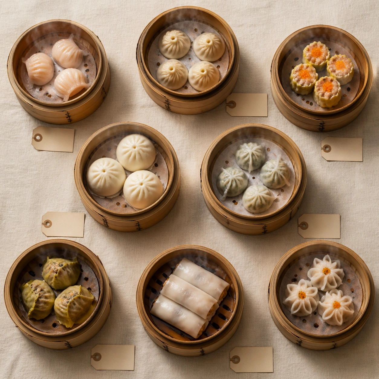
Example generated from “Dim Sum Miniature Atlas — Bamboo Steamer Constellation”
GPT Image 2en

Scene: Create a square museum-atlas photograph of dim sum presented on natural linen or pale neutral textile, lit with calm daylight and restrained shadow. The composition should feel archival, specimen-like, and quietly luxurious rather than crowded or banquet-style. Blank museum tabs, bamboo details, and shallow steam are acceptable so long as no readable characters appear anywhere. Create a square overhead composition of open bamboo steamers resting on linen, lit by soft daylight and arranged with generous spacing so each steamer becomes one module in a larger layout. The atmosphere should remain museum-like rather than banquet-like. Subject: Place a small selection of steamers containing different dim sum forms: translucent dumplings, buns, open-crown dumplings, and rolls. Each basket should feel intentionally curated, with steam rising lightly and no sauces or utensils competing for attention. The larger composition should read like a constellation of handcrafted forms. Important details: Make the dumplings feel handcrafted and specific: pleat count, skin thickness, translucency, filling pressure, steam moisture, and wrapper folds all need to be believable. The museum treatment should elevate the food without turning it into abstraction. Every item should still look edible, warm, and tactile. The image must balance overview clarity with close-up texture: bamboo grain, wrapper translucency, dough softness, and steam all need to remain legible. The spacing between baskets is as important as the food inside them. Use case: Dim sum miniature atlas single study 9/9, expanding the atlas into an overhead constellation of steamers. Constraints: No readable text, no watermark, no logos, preserve exact 1:1 aspect ratio, no banquet table clutter, no readable calligraphy, no sauce spills, no glossy menu styling, no plastic steamer look, no crowded banquet table, no readable menu slips, no plastic dim sum cart cues.

Example generated from “Doctor Profile And Service Page Kit — Lead Physician Portrait”
GPT Image 2en

Scene: A square lead-physician hero portrait for Doctor Profile and Service Page Kit. Compose it as a waist-up portrait with one side of the frame reserved for abstract service-page structure. Use a palette of soft ivory, steel blue, sage green, gentle charcoal, and warm skin tones, controlled studio-window lighting with soft falloff, and a mood of competent, human, and reassuring. The frame should feel like a real healthcare communication asset art-directed for professional delivery, not a stock photo, speculative concept render, or generic corporate template. Keep the camera distance, negative space, and depth cues disciplined so the image reads immediately even at thumbnail size. Subject: Center on an experienced physician in neutral scrubs or a white coat, posed with relaxed confidence against a softly branded clinic backdrop. Show enough surrounding context that the viewer understands the intended service surface, user situation, and institutional setting. Every object, person, diagram, device crop, or spatial cue should support clarity, trust, and practical use. If people appear, keep them anonymous, natural, privacy-safe, and grounded in believable body language rather than promotional posing. Important details: Maintain doctor-led service communication built from honest portraiture, clean layout structure, service cues, and restrained editorial polish. Preserve natural skin texture, grounded posture, and clear expertise cues rather than glamour photography or fashion posing. Use abstract icon shapes, color blocks, chart bars, interface modules, or non-legible placeholder microcopy whenever information structure is needed, but never readable text. Materials, spacing, lighting, and hierarchy should feel production-ready and healthcare-specific. Avoid generic lifestyle filler, decorative noise, or design gestures that do not reinforce the communication goal. Use case: Doctor Profile single study 1/9 for a doctor profile hero section. Constraints: No readable text, no watermark, no logos, preserve exact 1:1 aspect ratio, no celebrity likeness, no over-retouched beauty styling, no corporate stock-photo energy, no dramatic medical crisis scenes, no beauty-campaign makeup, no folded-arms cliche.

Example generated from “Doctor Profile And Service Page Kit — Team Grid Service Page”
GPT Image 2en

Scene: A square team profile layout board for Doctor Profile and Service Page Kit. Compose it as a square page mockup with multiple portrait tiles, hierarchy panels, and service blocks. Use a palette of soft ivory, steel blue, sage green, gentle charcoal, and warm skin tones, controlled studio-window lighting with soft falloff, and a mood of competent, human, and reassuring. The frame should feel like a real healthcare communication asset art-directed for professional delivery, not a stock photo, speculative concept render, or generic corporate template. Keep the camera distance, negative space, and depth cues disciplined so the image reads immediately even at thumbnail size. Subject: Center on a group of clinician headshots, expertise modules, appointment states, and supporting clinic imagery arranged into a coherent service page. Show enough surrounding context that the viewer understands the intended service surface, user situation, and institutional setting. Every object, person, diagram, device crop, or spatial cue should support clarity, trust, and practical use. If people appear, keep them anonymous, natural, privacy-safe, and grounded in believable body language rather than promotional posing. Important details: Maintain doctor-led service communication built from honest portraiture, clean layout structure, service cues, and restrained editorial polish. Use placeholder microcopy bars and icon slots to suggest web structure while keeping the layout human and credible. Use abstract icon shapes, color blocks, chart bars, interface modules, or non-legible placeholder microcopy whenever information structure is needed, but never readable text. Materials, spacing, lighting, and hierarchy should feel production-ready and healthcare-specific. Avoid generic lifestyle filler, decorative noise, or design gestures that do not reinforce the communication goal. Use case: Doctor Profile single study 2/9 for a multidisciplinary team service page. Constraints: No readable text, no watermark, no logos, preserve exact 1:1 aspect ratio, no celebrity likeness, no over-retouched beauty styling, no corporate stock-photo energy, no dramatic medical crisis scenes, no unreadable tiny faces, no startup-app look.

Example generated from “Doctor Profile And Service Page Kit — Specialty Expertise Card”
GPT Image 2en

Scene: A square expertise-card portrait system for Doctor Profile and Service Page Kit. Compose it as a card-based layout with one large portrait and smaller specialty detail panels. Use a palette of soft ivory, steel blue, sage green, gentle charcoal, and warm skin tones, controlled studio-window lighting with soft falloff, and a mood of competent, human, and reassuring. The frame should feel like a real healthcare communication asset art-directed for professional delivery, not a stock photo, speculative concept render, or generic corporate template. Keep the camera distance, negative space, and depth cues disciplined so the image reads immediately even at thumbnail size. Subject: Center on a specialist portrait paired with subtle anatomy or equipment cues, consultation-room crops, and soft accreditation motifs. Show enough surrounding context that the viewer understands the intended service surface, user situation, and institutional setting. Every object, person, diagram, device crop, or spatial cue should support clarity, trust, and practical use. If people appear, keep them anonymous, natural, privacy-safe, and grounded in believable body language rather than promotional posing. Important details: Maintain doctor-led service communication built from honest portraiture, clean layout structure, service cues, and restrained editorial polish. The image should show how portrait, specialty focus, and service clarity can coexist on one premium communication surface. Use abstract icon shapes, color blocks, chart bars, interface modules, or non-legible placeholder microcopy whenever information structure is needed, but never readable text. Materials, spacing, lighting, and hierarchy should feel production-ready and healthcare-specific. Avoid generic lifestyle filler, decorative noise, or design gestures that do not reinforce the communication goal. Use case: Doctor Profile single study 3/9 for a specialty doctor landing card. Constraints: No readable text, no watermark, no logos, preserve exact 1:1 aspect ratio, no celebrity likeness, no over-retouched beauty styling, no corporate stock-photo energy, no dramatic medical crisis scenes, no medal overload, no luxury editorial styling.

Example generated from “Doctor Profile And Service Page Kit — Consultation Room Profile”
GPT Image 2en

Scene: A square environmental doctor profile image for Doctor Profile and Service Page Kit. Compose it from inside a consultation room with the doctor seated naturally in context. Use a palette of soft ivory, steel blue, sage green, gentle charcoal, and warm skin tones, controlled studio-window lighting with soft falloff, and a mood of competent, human, and reassuring. The frame should feel like a real healthcare communication asset art-directed for professional delivery, not a stock photo, speculative concept render, or generic corporate template. Keep the camera distance, negative space, and depth cues disciplined so the image reads immediately even at thumbnail size. Subject: Center on a clinician in conversation posture beside a monitor, anatomical model, or tablet, with patient seating and branded room finishes visible. Show enough surrounding context that the viewer understands the intended service surface, user situation, and institutional setting. Every object, person, diagram, device crop, or spatial cue should support clarity, trust, and practical use. If people appear, keep them anonymous, natural, privacy-safe, and grounded in believable body language rather than promotional posing. Important details: Maintain doctor-led service communication built from honest portraiture, clean layout structure, service cues, and restrained editorial polish. Make the room part of the profile story so expertise feels embodied in a real care environment, not isolated in a backdrop studio. Use abstract icon shapes, color blocks, chart bars, interface modules, or non-legible placeholder microcopy whenever information structure is needed, but never readable text. Materials, spacing, lighting, and hierarchy should feel production-ready and healthcare-specific. Avoid generic lifestyle filler, decorative noise, or design gestures that do not reinforce the communication goal. Use case: Doctor Profile single study 4/9 for an about-the-doctor page section. Constraints: No readable text, no watermark, no logos, preserve exact 1:1 aspect ratio, no celebrity likeness, no over-retouched beauty styling, no corporate stock-photo energy, no dramatic medical crisis scenes, no patient face in focus, no invasive procedure scene.

Example generated from “Doctor Profile And Service Page Kit — Procedural Trust Banner”
GPT Image 2en

Scene: A square wide service-banner crop translated into a square board for Doctor Profile and Service Page Kit. Compose it with a strong portrait anchor plus layered procedure-prep cues and modular page elements. Use a palette of soft ivory, steel blue, sage green, gentle charcoal, and warm skin tones, controlled studio-window lighting with soft falloff, and a mood of competent, human, and reassuring. The frame should feel like a real healthcare communication asset art-directed for professional delivery, not a stock photo, speculative concept render, or generic corporate template. Keep the camera distance, negative space, and depth cues disciplined so the image reads immediately even at thumbnail size. Subject: Center on a doctor portrait combined with sterile room details, calm equipment, check-in icon blocks, and recovery reassurance imagery. Show enough surrounding context that the viewer understands the intended service surface, user situation, and institutional setting. Every object, person, diagram, device crop, or spatial cue should support clarity, trust, and practical use. If people appear, keep them anonymous, natural, privacy-safe, and grounded in believable body language rather than promotional posing. Important details: Maintain doctor-led service communication built from honest portraiture, clean layout structure, service cues, and restrained editorial polish. The message should be expertise plus emotional steadiness, avoiding fear-based medicine or exaggerated heroism. Use abstract icon shapes, color blocks, chart bars, interface modules, or non-legible placeholder microcopy whenever information structure is needed, but never readable text. Materials, spacing, lighting, and hierarchy should feel production-ready and healthcare-specific. Avoid generic lifestyle filler, decorative noise, or design gestures that do not reinforce the communication goal. Use case: Doctor Profile single study 5/9 for a procedure page trust banner. Constraints: No readable text, no watermark, no logos, preserve exact 1:1 aspect ratio, no celebrity likeness, no over-retouched beauty styling, no corporate stock-photo energy, no dramatic medical crisis scenes, no dramatic operating-room theatrics, no sharp horror lighting.

Example generated from “Doctor Profile And Service Page Kit — Telehealth Profile Layout”
GPT Image 2en

Scene: A square telehealth profile system board for Doctor Profile and Service Page Kit. Compose it as a device-led layout with portrait windows, scheduling modules, and remote-care interface cards. Use a palette of soft ivory, steel blue, sage green, gentle charcoal, and warm skin tones, controlled studio-window lighting with soft falloff, and a mood of competent, human, and reassuring. The frame should feel like a real healthcare communication asset art-directed for professional delivery, not a stock photo, speculative concept render, or generic corporate template. Keep the camera distance, negative space, and depth cues disciplined so the image reads immediately even at thumbnail size. Subject: Center on a physician on a secure-looking video consultation screen with supporting cards for appointment setup, notes, and follow-up touchpoints. Show enough surrounding context that the viewer understands the intended service surface, user situation, and institutional setting. Every object, person, diagram, device crop, or spatial cue should support clarity, trust, and practical use. If people appear, keep them anonymous, natural, privacy-safe, and grounded in believable body language rather than promotional posing. Important details: Maintain doctor-led service communication built from honest portraiture, clean layout structure, service cues, and restrained editorial polish. Keep the interface clinical and calm, with realistic consumer-device framing and professional home-office neutrality. Use abstract icon shapes, color blocks, chart bars, interface modules, or non-legible placeholder microcopy whenever information structure is needed, but never readable text. Materials, spacing, lighting, and hierarchy should feel production-ready and healthcare-specific. Avoid generic lifestyle filler, decorative noise, or design gestures that do not reinforce the communication goal. Use case: Doctor Profile single study 6/9 for a telehealth doctor profile kit. Constraints: No readable text, no watermark, no logos, preserve exact 1:1 aspect ratio, no celebrity likeness, no over-retouched beauty styling, no corporate stock-photo energy, no dramatic medical crisis scenes, no consumer influencer vibe, no flashy app gradients.

Example generated from “Doctor Profile And Service Page Kit — Credentials and Awards Board”
GPT Image 2en

Scene: A square credential summary board for Doctor Profile and Service Page Kit. Compose it as a grid of portrait, abstract certificate frames, badge motifs, and service highlights. Use a palette of soft ivory, steel blue, sage green, gentle charcoal, and warm skin tones, controlled studio-window lighting with soft falloff, and a mood of competent, human, and reassuring. The frame should feel like a real healthcare communication asset art-directed for professional delivery, not a stock photo, speculative concept render, or generic corporate template. Keep the camera distance, negative space, and depth cues disciplined so the image reads immediately even at thumbnail size. Subject: Center on one doctor portrait supported by non-legible certificate panels, achievement icons, department affiliations, and care philosophy blocks. Show enough surrounding context that the viewer understands the intended service surface, user situation, and institutional setting. Every object, person, diagram, device crop, or spatial cue should support clarity, trust, and practical use. If people appear, keep them anonymous, natural, privacy-safe, and grounded in believable body language rather than promotional posing. Important details: Maintain doctor-led service communication built from honest portraiture, clean layout structure, service cues, and restrained editorial polish. The board should convey expertise through structure and materiality, not through flashy trophy aesthetics. Use abstract icon shapes, color blocks, chart bars, interface modules, or non-legible placeholder microcopy whenever information structure is needed, but never readable text. Materials, spacing, lighting, and hierarchy should feel production-ready and healthcare-specific. Avoid generic lifestyle filler, decorative noise, or design gestures that do not reinforce the communication goal. Use case: Doctor Profile single study 7/9 for a trust-building credentials section. Constraints: No readable text, no watermark, no logos, preserve exact 1:1 aspect ratio, no celebrity likeness, no over-retouched beauty styling, no corporate stock-photo energy, no dramatic medical crisis scenes, no gilded luxury cues, no cluttered wallpaper of badges.

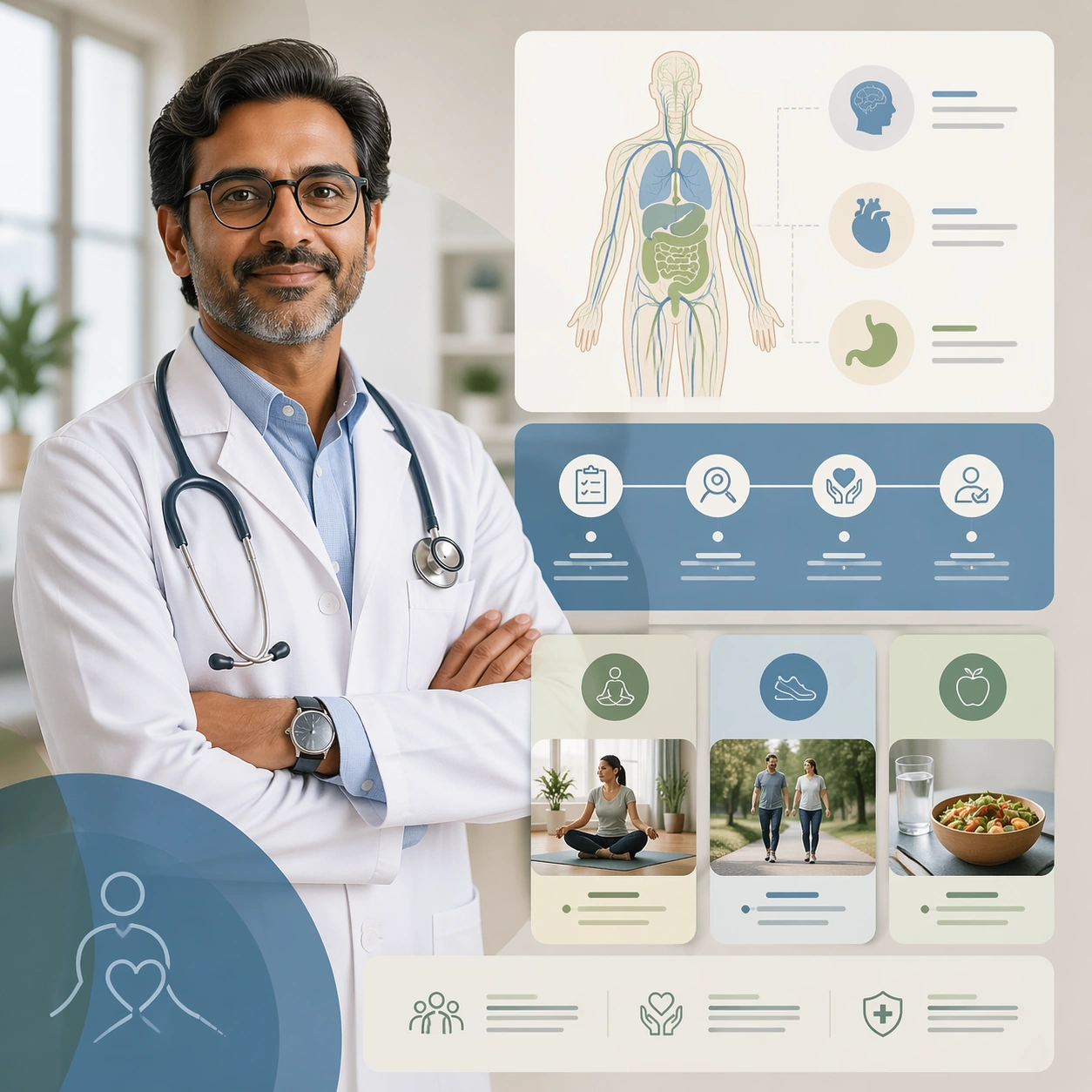
Example generated from “Doctor Profile And Service Page Kit — Patient Education Hero”
GPT Image 2en

Scene: A square patient-education hero tied to a doctor brand for Doctor Profile and Service Page Kit. Compose it with the physician offset to one side and educational modules balancing the frame. Use a palette of soft ivory, steel blue, sage green, gentle charcoal, and warm skin tones, controlled studio-window lighting with soft falloff, and a mood of competent, human, and reassuring. The frame should feel like a real healthcare communication asset art-directed for professional delivery, not a stock photo, speculative concept render, or generic corporate template. Keep the camera distance, negative space, and depth cues disciplined so the image reads immediately even at thumbnail size. Subject: Center on a doctor portrait integrated with simplified anatomical diagrams, process tiles, and accessible care illustrations. Show enough surrounding context that the viewer understands the intended service surface, user situation, and institutional setting. Every object, person, diagram, device crop, or spatial cue should support clarity, trust, and practical use. If people appear, keep them anonymous, natural, privacy-safe, and grounded in believable body language rather than promotional posing. Important details: Maintain doctor-led service communication built from honest portraiture, clean layout structure, service cues, and restrained editorial polish. Make it obvious that the physician is not just a portrait subject but the organizing face of a clear educational system. Use abstract icon shapes, color blocks, chart bars, interface modules, or non-legible placeholder microcopy whenever information structure is needed, but never readable text. Materials, spacing, lighting, and hierarchy should feel production-ready and healthcare-specific. Avoid generic lifestyle filler, decorative noise, or design gestures that do not reinforce the communication goal. Use case: Doctor Profile single study 8/9 for a patient-education service hub hero. Constraints: No readable text, no watermark, no logos, preserve exact 1:1 aspect ratio, no celebrity likeness, no over-retouched beauty styling, no corporate stock-photo energy, no dramatic medical crisis scenes, no textbook density, no aggressive sales tone.

Example generated from “Doctor Profile And Service Page Kit — Doctor Brand Asset Sheet”
GPT Image 2en

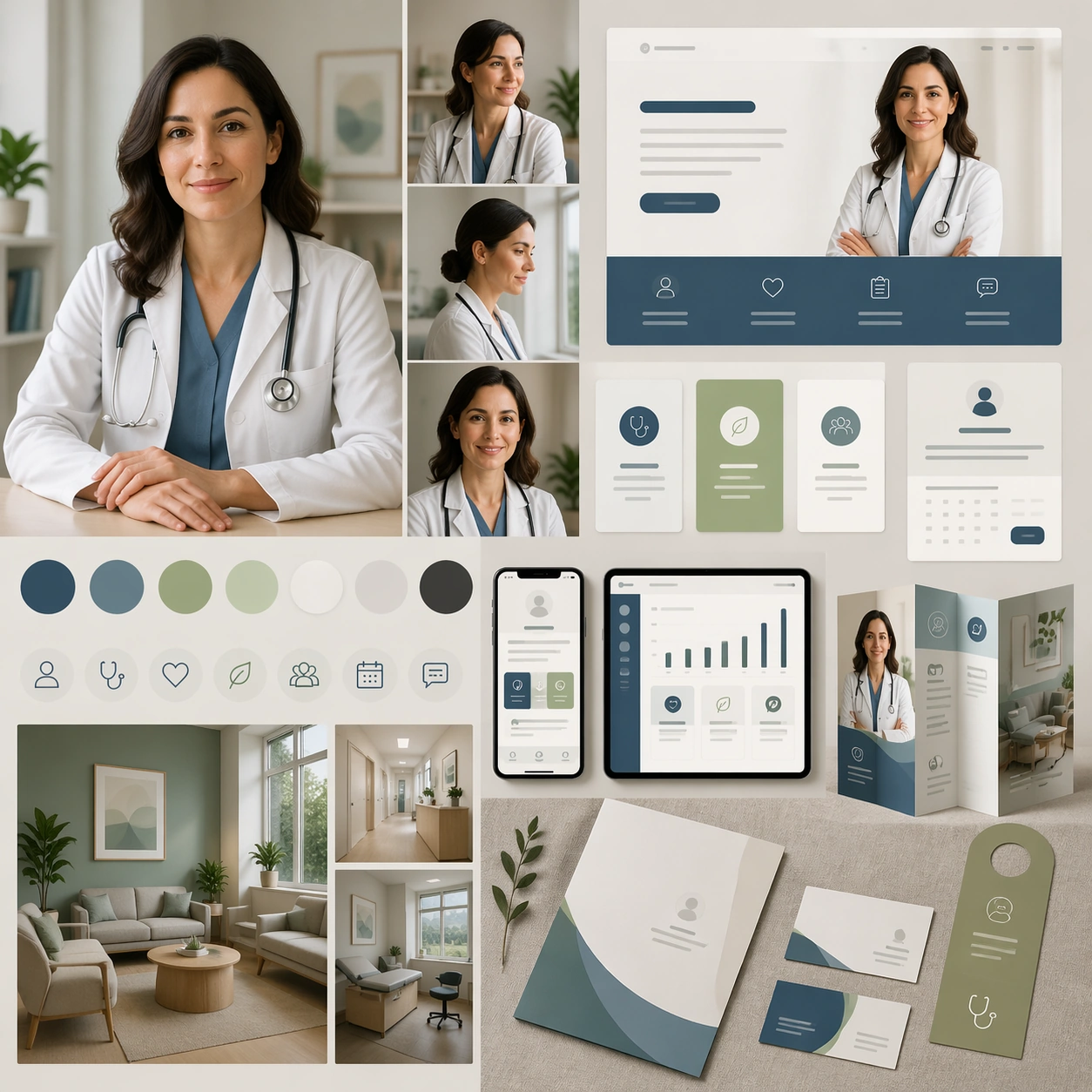
Scene: A square profile asset sheet for Doctor Profile and Service Page Kit. Compose it as a compact square toolkit showing portrait crops, signature colors, interface snippets, and print collateral together. Use a palette of soft ivory, steel blue, sage green, gentle charcoal, and warm skin tones, controlled studio-window lighting with soft falloff, and a mood of competent, human, and reassuring. The frame should feel like a real healthcare communication asset art-directed for professional delivery, not a stock photo, speculative concept render, or generic corporate template. Keep the camera distance, negative space, and depth cues disciplined so the image reads immediately even at thumbnail size. Subject: Center on multiple portrait crops, card layouts, appointment assets, brochure fragments, and room photos from one doctor-led communication system. Show enough surrounding context that the viewer understands the intended service surface, user situation, and institutional setting. Every object, person, diagram, device crop, or spatial cue should support clarity, trust, and practical use. If people appear, keep them anonymous, natural, privacy-safe, and grounded in believable body language rather than promotional posing. Important details: Maintain doctor-led service communication built from honest portraiture, clean layout structure, service cues, and restrained editorial polish. The sheet should feel ready for handoff to a real design or marketing team within healthcare. Use abstract icon shapes, color blocks, chart bars, interface modules, or non-legible placeholder microcopy whenever information structure is needed, but never readable text. Materials, spacing, lighting, and hierarchy should feel production-ready and healthcare-specific. Avoid generic lifestyle filler, decorative noise, or design gestures that do not reinforce the communication goal. Use case: Doctor Profile single study 9/9 for a complete doctor personal-brand toolkit summary. Constraints: No readable text, no watermark, no logos, preserve exact 1:1 aspect ratio, no celebrity likeness, no over-retouched beauty styling, no corporate stock-photo energy, no dramatic medical crisis scenes, no random mood-board scraps, no unrelated lifestyle imagery.

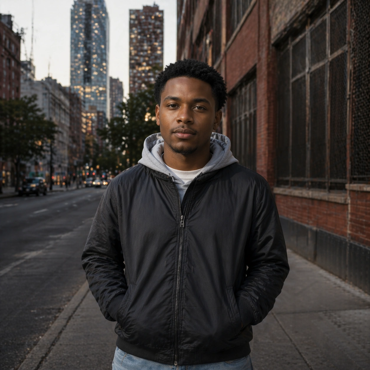
Example generated from “Documentary City Portrait Essay — Reference City Anchor”
GPT Image 2en

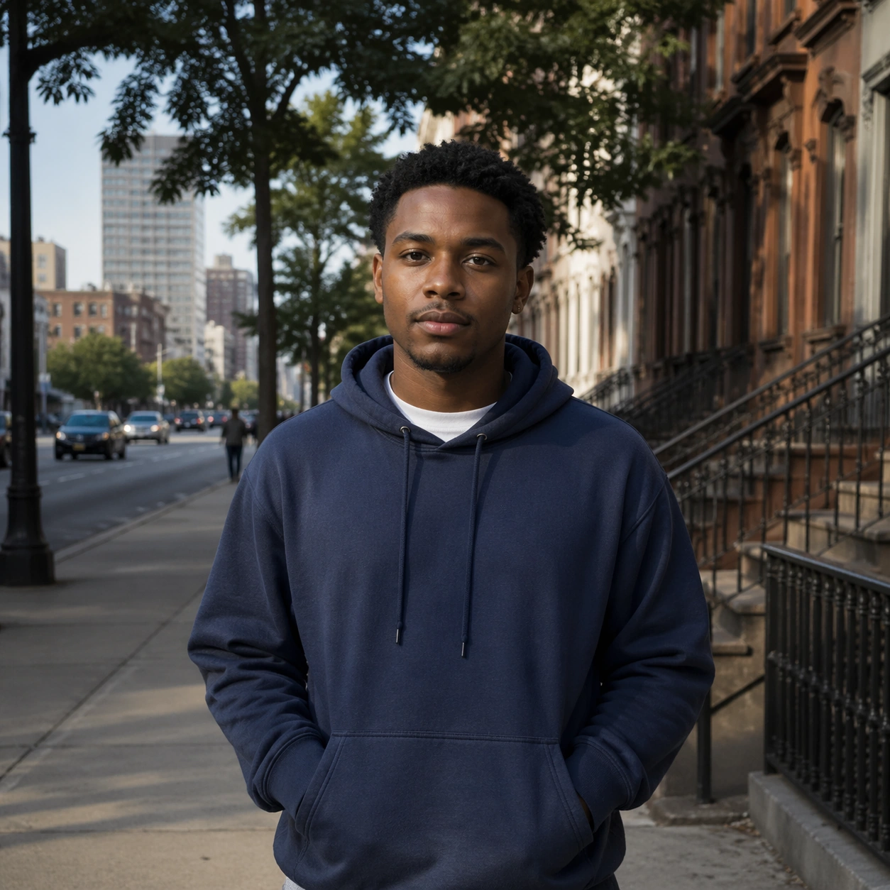
Scene: Create a square 1:1 portrait image for Documentary City Portrait Essay. Use a realistic city setting with calm morning or afternoon light, truthful texture, and a clear human subject embedded in place. The frame should feel like a finished professional deliverable rather than a casual snapshot, with clear lens discipline, believable light falloff, and a palette that directly supports Create documentary-style urban portrait essays with candid realism, environmental storytelling, and location-aware visual texture.. Keep enough surrounding space and compositional control for gallery, research, campaign, or approval-board reuse while staying photoreal and human-scaled. Subject: Center one city resident with medium brown skin, short natural curls, practical everyday wardrobe, and a quiet observant gaze. Establish the same person, wardrobe base, and body proportions that later city-life frames must preserve. Use the example direction from the brief as grounding context: Create documentary-style urban portrait essays with candid realism, environmental storytelling, and location-aware visual texture.. Wardrobe, lighting, environment, and pose may shift to serve this variation, but the viewer must immediately understand that the same reference identity is still in front of the camera. Important details: This backlog line is difficult because Create documentary-style urban portrait essays with candid realism, environmental storytelling, and location-aware visual texture.. Preserve skin tone family, bone structure, eye spacing, nose shape, mouth shape, hairline logic, shoulder width, and overall body read across the entire series. preserve exact face / hair base / body proportions from the reference model. This anchor should feel observational and believable, not fashion-editorial in disguise. Avoid the common failure described in the brief: ordinary image models often lose likeness once styling, lighting, or layout changes enter the frame. Success should feel like the result should feel professionally usable, coherent, and clearly built around one stable human identity. Use case: Documentary City Portrait Essay series study 1/9, the baseline environmental portrait. Constraints: No readable text, no watermark, no logos, preserve exact 1:1 aspect ratio, preserve exact face / hair base / body proportions from the reference model, no crowd heroics, no brand signage text, no cinematic haze, no fake posed glamour.

Example generated from “Documentary City Portrait Essay — Subway Entry”
GPT Image 2en

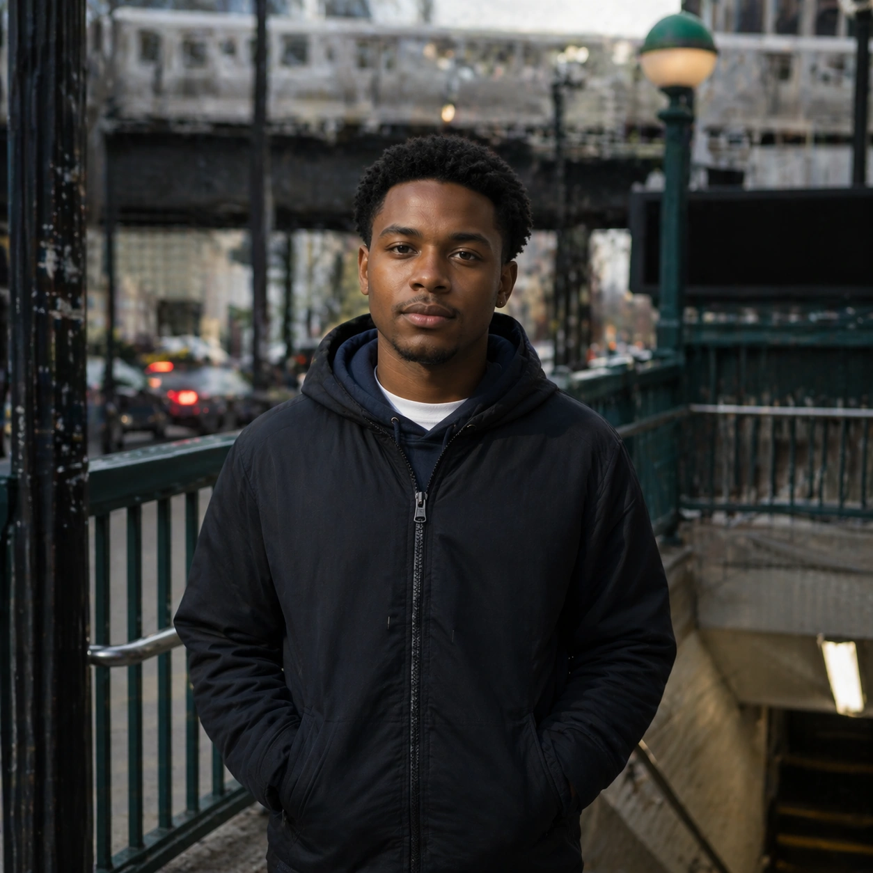
Scene: Create a square 1:1 portrait image for Documentary City Portrait Essay. Use a transit-adjacent city frame with railings, concrete, and moving urban energy kept secondary to the portrait. The frame should feel like a finished professional deliverable rather than a casual snapshot, with clear lens discipline, believable light falloff, and a palette that directly supports Create documentary-style urban portrait essays with candid realism, environmental storytelling, and location-aware visual texture.. Keep enough surrounding space and compositional control for gallery, research, campaign, or approval-board reuse while staying photoreal and human-scaled. Subject: Center one city resident with medium brown skin, short natural curls, practical everyday wardrobe, and a quiet observant gaze. Place the same person at a station entrance or transit threshold while preserving exact likeness and body read. Use the example direction from the brief as grounding context: Create documentary-style urban portrait essays with candid realism, environmental storytelling, and location-aware visual texture.. Wardrobe, lighting, environment, and pose may shift to serve this variation, but the viewer must immediately understand that the same reference identity is still in front of the camera. Important details: This backlog line is difficult because Create documentary-style urban portrait essays with candid realism, environmental storytelling, and location-aware visual texture.. Preserve skin tone family, bone structure, eye spacing, nose shape, mouth shape, hairline logic, shoulder width, and overall body read across the entire series. preserve exact face / hair base / body proportions from the reference model. Environment should support daily-life realism without overwhelming the subject. Avoid the common failure described in the brief: ordinary image models often lose likeness once styling, lighting, or layout changes enter the frame. Success should feel like the result should feel professionally usable, coherent, and clearly built around one stable human identity. Use case: Documentary City Portrait Essay series study 2/9, a subway-entry portrait. Constraints: No readable text, no watermark, no logos, preserve exact 1:1 aspect ratio, preserve exact face / hair base / body proportions from the reference model, no readable station names, no commuters dominating frame, no glossy fashion pose, no identity drift.

Example generated from “Documentary City Portrait Essay — Convenience Store Doorway”
GPT Image 2en

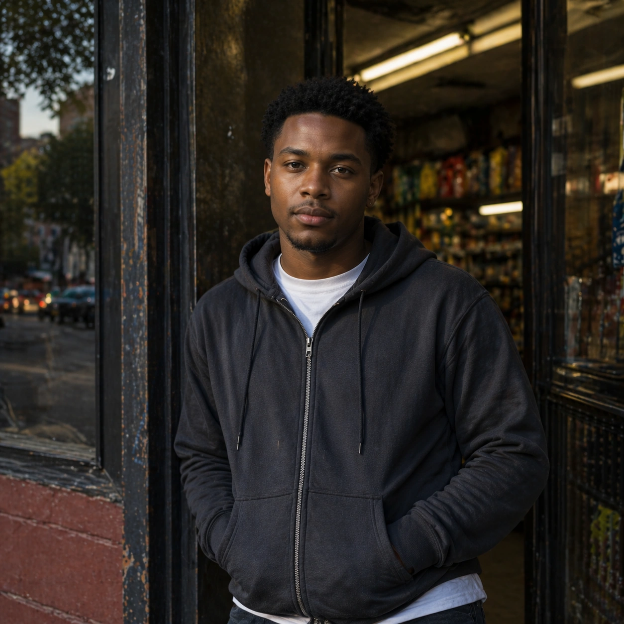
Scene: Create a square 1:1 portrait image for Documentary City Portrait Essay. Use a neighborhood storefront edge with practical light, glass reflections, and everyday object cues that remain non-textual. The frame should feel like a finished professional deliverable rather than a casual snapshot, with clear lens discipline, believable light falloff, and a palette that directly supports Create documentary-style urban portrait essays with candid realism, environmental storytelling, and location-aware visual texture.. Keep enough surrounding space and compositional control for gallery, research, campaign, or approval-board reuse while staying photoreal and human-scaled. Subject: Center one city resident with medium brown skin, short natural curls, practical everyday wardrobe, and a quiet observant gaze. Keep the same person exact while moving them into a more intimate everyday urban context. Use the example direction from the brief as grounding context: Create documentary-style urban portrait essays with candid realism, environmental storytelling, and location-aware visual texture.. Wardrobe, lighting, environment, and pose may shift to serve this variation, but the viewer must immediately understand that the same reference identity is still in front of the camera. Important details: This backlog line is difficult because Create documentary-style urban portrait essays with candid realism, environmental storytelling, and location-aware visual texture.. Preserve skin tone family, bone structure, eye spacing, nose shape, mouth shape, hairline logic, shoulder width, and overall body read across the entire series. preserve exact face / hair base / body proportions from the reference model. This should feel like part of one life trajectory, not an unrelated location stunt. Avoid the common failure described in the brief: ordinary image models often lose likeness once styling, lighting, or layout changes enter the frame. Success should feel like the result should feel professionally usable, coherent, and clearly built around one stable human identity. Use case: Documentary City Portrait Essay series study 3/9, a convenience-store doorway portrait. Constraints: No readable text, no watermark, no logos, preserve exact 1:1 aspect ratio, preserve exact face / hair base / body proportions from the reference model, no readable product packaging, no neon overload, no extra featured people, no body-scale change.

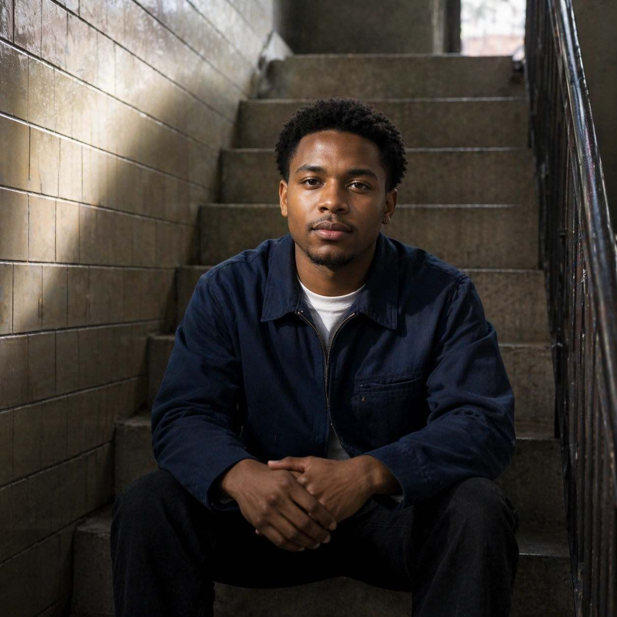
Example generated from “Documentary City Portrait Essay — Stairwell Pause”
GPT Image 2en

Scene: Create a square 1:1 portrait image for Documentary City Portrait Essay. Use a concrete or tiled stairwell with natural or fluorescent spill light and a restrained documentary mood. The frame should feel like a finished professional deliverable rather than a casual snapshot, with clear lens discipline, believable light falloff, and a palette that directly supports Create documentary-style urban portrait essays with candid realism, environmental storytelling, and location-aware visual texture.. Keep enough surrounding space and compositional control for gallery, research, campaign, or approval-board reuse while staying photoreal and human-scaled. Subject: Center one city resident with medium brown skin, short natural curls, practical everyday wardrobe, and a quiet observant gaze. Use a stairwell or landing to frame the same subject in a quieter pause while preserving face, hair base, and proportions. Use the example direction from the brief as grounding context: Create documentary-style urban portrait essays with candid realism, environmental storytelling, and location-aware visual texture.. Wardrobe, lighting, environment, and pose may shift to serve this variation, but the viewer must immediately understand that the same reference identity is still in front of the camera. Important details: This backlog line is difficult because Create documentary-style urban portrait essays with candid realism, environmental storytelling, and location-aware visual texture.. Preserve skin tone family, bone structure, eye spacing, nose shape, mouth shape, hairline logic, shoulder width, and overall body read across the entire series. preserve exact face / hair base / body proportions from the reference model. The likeness has to remain exact even in flatter, more difficult light. Avoid the common failure described in the brief: ordinary image models often lose likeness once styling, lighting, or layout changes enter the frame. Success should feel like the result should feel professionally usable, coherent, and clearly built around one stable human identity. Use case: Documentary City Portrait Essay series study 4/9, a stairwell pause portrait. Constraints: No readable text, no watermark, no logos, preserve exact 1:1 aspect ratio, preserve exact face / hair base / body proportions from the reference model, no dramatic movie pose, no graffiti text, no altered haircut, no warped stairs.

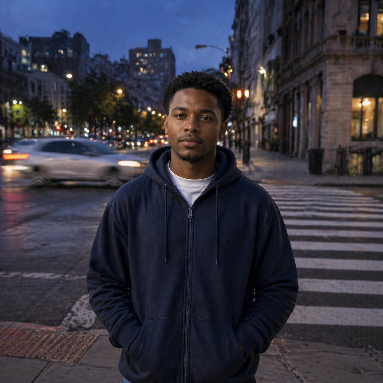
Example generated from “Documentary City Portrait Essay — Crosswalk Dusk”
GPT Image 2en

Scene: Create a square 1:1 portrait image for Documentary City Portrait Essay. Use a dusk city frame with believable street light, moving background hints, and still-clear portrait focus. The frame should feel like a finished professional deliverable rather than a casual snapshot, with clear lens discipline, believable light falloff, and a palette that directly supports Create documentary-style urban portrait essays with candid realism, environmental storytelling, and location-aware visual texture.. Keep enough surrounding space and compositional control for gallery, research, campaign, or approval-board reuse while staying photoreal and human-scaled. Subject: Center one city resident with medium brown skin, short natural curls, practical everyday wardrobe, and a quiet observant gaze. Keep the same identity exact while expanding to a broader environmental moment with more visible city activity. Use the example direction from the brief as grounding context: Create documentary-style urban portrait essays with candid realism, environmental storytelling, and location-aware visual texture.. Wardrobe, lighting, environment, and pose may shift to serve this variation, but the viewer must immediately understand that the same reference identity is still in front of the camera. Important details: This backlog line is difficult because Create documentary-style urban portrait essays with candid realism, environmental storytelling, and location-aware visual texture.. Preserve skin tone family, bone structure, eye spacing, nose shape, mouth shape, hairline logic, shoulder width, and overall body read across the entire series. preserve exact face / hair base / body proportions from the reference model. Urban complexity is allowed, but the same-person read must remain immediate. Avoid the common failure described in the brief: ordinary image models often lose likeness once styling, lighting, or layout changes enter the frame. Success should feel like the result should feel professionally usable, coherent, and clearly built around one stable human identity. Use case: Documentary City Portrait Essay series study 5/9, a crosswalk or curbside portrait at dusk. Constraints: No readable text, no watermark, no logos, preserve exact 1:1 aspect ratio, preserve exact face / hair base / body proportions from the reference model, no car-ad glamour, no blurred face, no crowd stealing focus, no different wardrobe family.

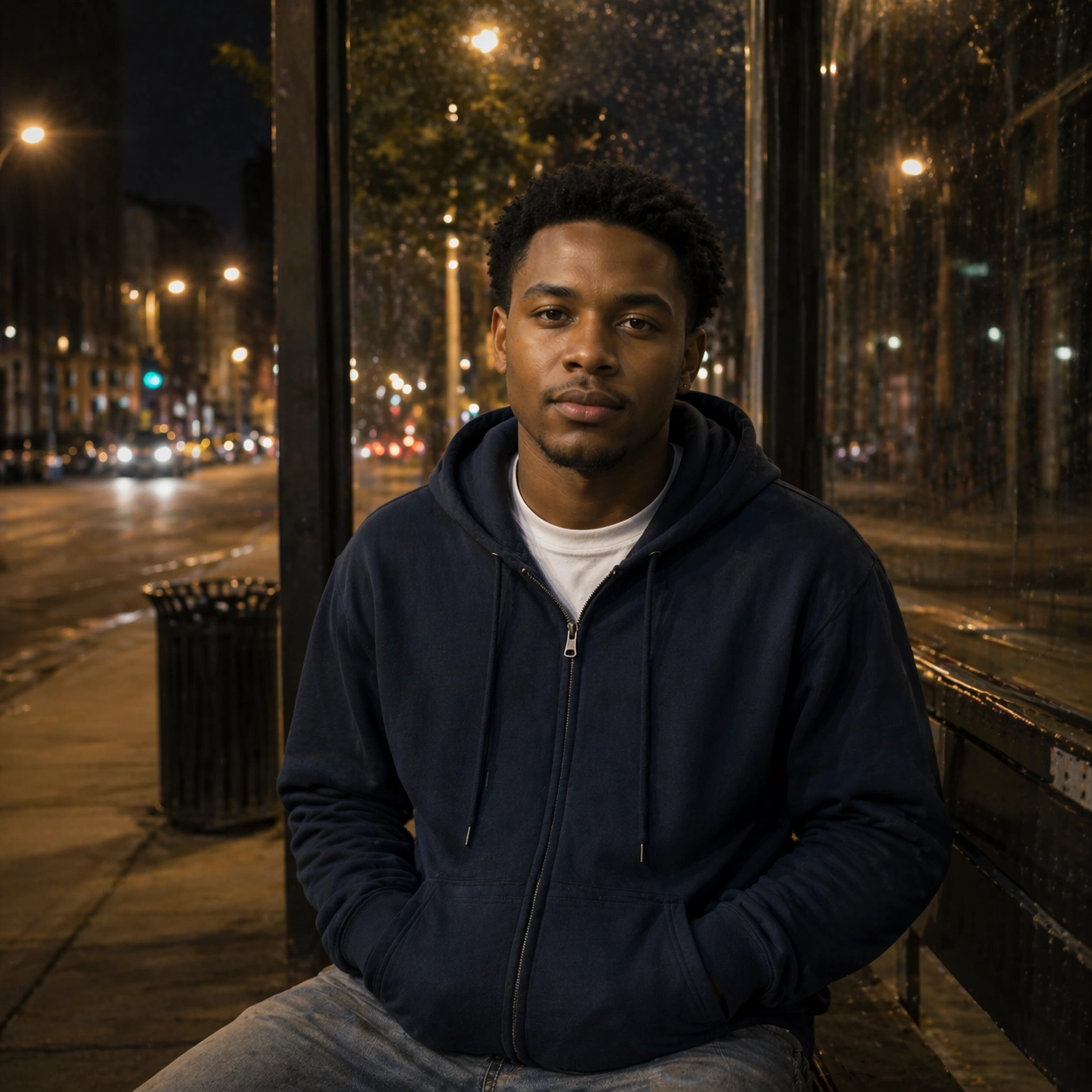
Example generated from “Documentary City Portrait Essay — Bus Stop Night”
GPT Image 2en

Scene: Create a square 1:1 portrait image for Documentary City Portrait Essay. Use a modest night transit frame with shelter glass, sodium light, and lived-in public-space realism. The frame should feel like a finished professional deliverable rather than a casual snapshot, with clear lens discipline, believable light falloff, and a palette that directly supports Create documentary-style urban portrait essays with candid realism, environmental storytelling, and location-aware visual texture.. Keep enough surrounding space and compositional control for gallery, research, campaign, or approval-board reuse while staying photoreal and human-scaled. Subject: Center one city resident with medium brown skin, short natural curls, practical everyday wardrobe, and a quiet observant gaze. Use lower light and public waiting-space mood while preserving exact face / hair base / body proportions from the reference model. Use the example direction from the brief as grounding context: Create documentary-style urban portrait essays with candid realism, environmental storytelling, and location-aware visual texture.. Wardrobe, lighting, environment, and pose may shift to serve this variation, but the viewer must immediately understand that the same reference identity is still in front of the camera. Important details: This backlog line is difficult because Create documentary-style urban portrait essays with candid realism, environmental storytelling, and location-aware visual texture.. Preserve skin tone family, bone structure, eye spacing, nose shape, mouth shape, hairline logic, shoulder width, and overall body read across the entire series. preserve exact face / hair base / body proportions from the reference model. Night should deepen observation, not flatten recognition. Avoid the common failure described in the brief: ordinary image models often lose likeness once styling, lighting, or layout changes enter the frame. Success should feel like the result should feel professionally usable, coherent, and clearly built around one stable human identity. Use case: Documentary City Portrait Essay series study 6/9, a night bus-stop portrait. Constraints: No readable text, no watermark, no logos, preserve exact 1:1 aspect ratio, preserve exact face / hair base / body proportions from the reference model, no readable route maps, no giant bus ads, no thriller-noir exaggeration, no identity shift.

Example generated from “Documentary City Portrait Essay — Close Detail Hands”
GPT Image 2en

Scene: Create a square 1:1 portrait image for Documentary City Portrait Essay. Use a tighter documentary crop that captures one object, garment, or gesture alongside the face. The frame should feel like a finished professional deliverable rather than a casual snapshot, with clear lens discipline, believable light falloff, and a palette that directly supports Create documentary-style urban portrait essays with candid realism, environmental storytelling, and location-aware visual texture.. Keep enough surrounding space and compositional control for gallery, research, campaign, or approval-board reuse while staying photoreal and human-scaled. Subject: Center one city resident with medium brown skin, short natural curls, practical everyday wardrobe, and a quiet observant gaze. Stay with the same subject while highlighting the small lived details that define routine and place. Use the example direction from the brief as grounding context: Create documentary-style urban portrait essays with candid realism, environmental storytelling, and location-aware visual texture.. Wardrobe, lighting, environment, and pose may shift to serve this variation, but the viewer must immediately understand that the same reference identity is still in front of the camera. Important details: This backlog line is difficult because Create documentary-style urban portrait essays with candid realism, environmental storytelling, and location-aware visual texture.. Preserve skin tone family, bone structure, eye spacing, nose shape, mouth shape, hairline logic, shoulder width, and overall body read across the entire series. preserve exact face / hair base / body proportions from the reference model. This frame should feel specific and humane, not styled like product advertising. Avoid the common failure described in the brief: ordinary image models often lose likeness once styling, lighting, or layout changes enter the frame. Success should feel like the result should feel professionally usable, coherent, and clearly built around one stable human identity. Use case: Documentary City Portrait Essay series study 7/9, a closer detail portrait with hands or personal object. Constraints: No readable text, no watermark, no logos, preserve exact 1:1 aspect ratio, preserve exact face / hair base / body proportions from the reference model, no branded object labels, no broken fingers, no fashion-mag glam light, no face drift.

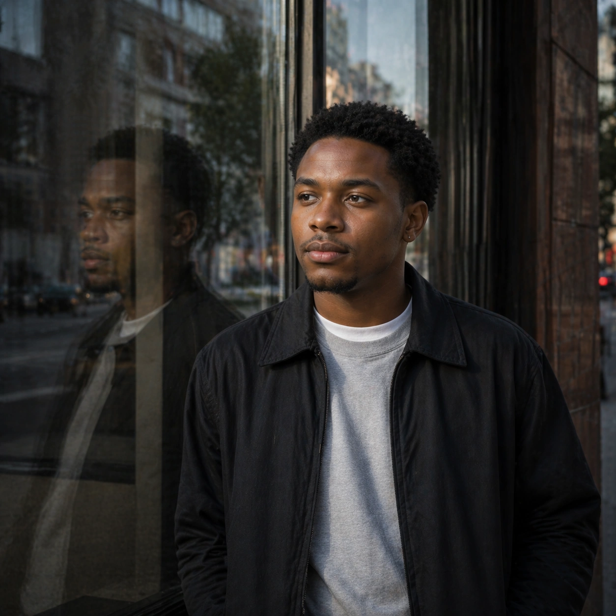
Example generated from “Documentary City Portrait Essay — Profile Window Reflection”
GPT Image 2en

Scene: Create a square 1:1 portrait image for Documentary City Portrait Essay. Use a subtle reflective city portrait using glass, passing light, and careful profile control. The frame should feel like a finished professional deliverable rather than a casual snapshot, with clear lens discipline, believable light falloff, and a palette that directly supports Create documentary-style urban portrait essays with candid realism, environmental storytelling, and location-aware visual texture.. Keep enough surrounding space and compositional control for gallery, research, campaign, or approval-board reuse while staying photoreal and human-scaled. Subject: Center one city resident with medium brown skin, short natural curls, practical everyday wardrobe, and a quiet observant gaze. Preserve the same profile structure and hair base while letting reflection and city residue add complexity. Use the example direction from the brief as grounding context: Create documentary-style urban portrait essays with candid realism, environmental storytelling, and location-aware visual texture.. Wardrobe, lighting, environment, and pose may shift to serve this variation, but the viewer must immediately understand that the same reference identity is still in front of the camera. Important details: This backlog line is difficult because Create documentary-style urban portrait essays with candid realism, environmental storytelling, and location-aware visual texture.. Preserve skin tone family, bone structure, eye spacing, nose shape, mouth shape, hairline logic, shoulder width, and overall body read across the entire series. preserve exact face / hair base / body proportions from the reference model. Reflections may multiply surfaces, but not identity. Avoid the common failure described in the brief: ordinary image models often lose likeness once styling, lighting, or layout changes enter the frame. Success should feel like the result should feel professionally usable, coherent, and clearly built around one stable human identity. Use case: Documentary City Portrait Essay series study 8/9, a profile with window reflection. Constraints: No readable text, no watermark, no logos, preserve exact 1:1 aspect ratio, preserve exact face / hair base / body proportions from the reference model, no double-face confusion, no readable storefront text, no melted reflection anatomy, no age drift.

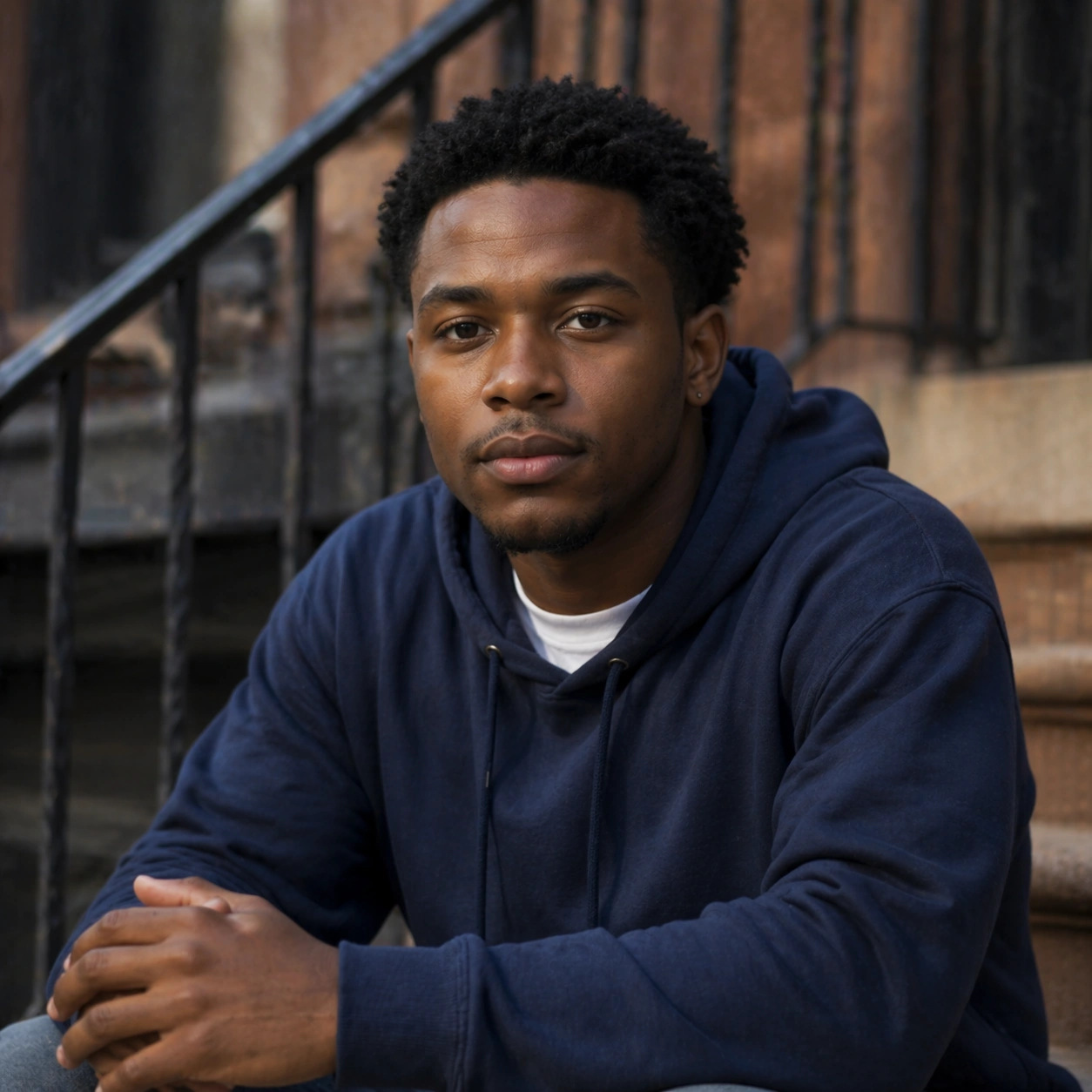
Example generated from “Documentary City Portrait Essay — Essay Cover Portrait”
GPT Image 2en

Scene: Create a square 1:1 portrait image for Documentary City Portrait Essay. Use a square editorial-documentary finish with measured space, strong place sense, and cover-worthy clarity. The frame should feel like a finished professional deliverable rather than a casual snapshot, with clear lens discipline, believable light falloff, and a palette that directly supports Create documentary-style urban portrait essays with candid realism, environmental storytelling, and location-aware visual texture.. Keep enough surrounding space and compositional control for gallery, research, campaign, or approval-board reuse while staying photoreal and human-scaled. Subject: Center one city resident with medium brown skin, short natural curls, practical everyday wardrobe, and a quiet observant gaze. Resolve the same person into a final city-essay portrait that feels ready for a photo story cover without any readable copy. Use the example direction from the brief as grounding context: Create documentary-style urban portrait essays with candid realism, environmental storytelling, and location-aware visual texture.. Wardrobe, lighting, environment, and pose may shift to serve this variation, but the viewer must immediately understand that the same reference identity is still in front of the camera. Important details: This backlog line is difficult because Create documentary-style urban portrait essays with candid realism, environmental storytelling, and location-aware visual texture.. Preserve skin tone family, bone structure, eye spacing, nose shape, mouth shape, hairline logic, shoulder width, and overall body read across the entire series. preserve exact face / hair base / body proportions from the reference model. The result should combine subject, place, and continuity into one convincing documentary finish. Avoid the common failure described in the brief: ordinary image models often lose likeness once styling, lighting, or layout changes enter the frame. Success should feel like the result should feel professionally usable, coherent, and clearly built around one stable human identity. Use case: Documentary City Portrait Essay series study 9/9, a final essay-cover portrait. Constraints: No readable text, no watermark, no logos, preserve exact 1:1 aspect ratio, preserve exact face / hair base / body proportions from the reference model, no fake magazine text, no posterized night color, no fashion-glam styling drift, no broken spatial logic.

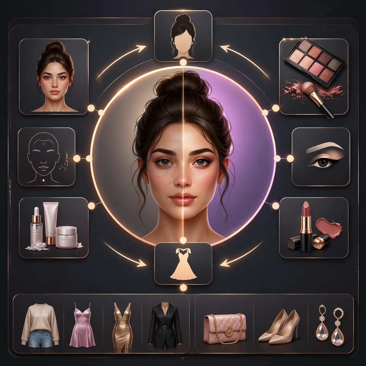
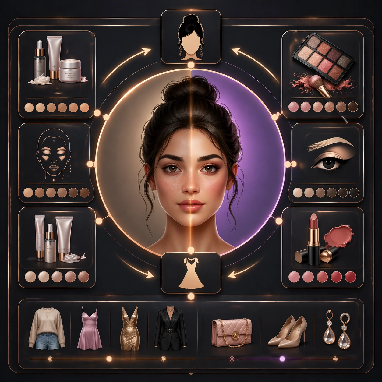
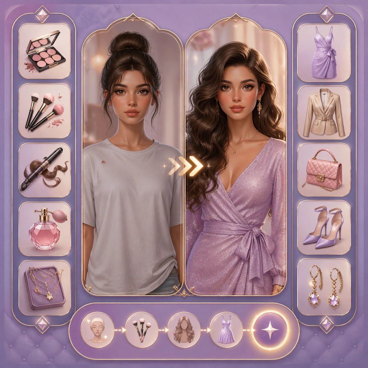
Example generated from “Douyin Before After Makeover Flow — Reference Anchor”
GPT Image 2en

Scene: Create a square reference image for short-form makeover flow. Build a reference anchor establishing the core system with a premium, production-ready finish. Use a polished modular board or campaign surface with clean spacing, premium game-UI finish, and clear focal hierarchy. The composition should feel intentional, clean, and reusable for gallery, research, campaign, or internal handoff contexts. Lighting must support readability first, with the main forms clearly separated from the background and enough breathing room for the system to stay legible at both hero scale and thumbnail scale. Subject: Center a coherent original game-art system built for premium production and marketing surfaces. For this image, focus on reference anchor. Keep the same system logic stable across screenshots, cards, banners, and overview boards. This image is the canonical anchor that later series images must follow. The viewer should immediately understand what role this surface plays inside a cohesive game-production asset pack. Important details: Lock framing, icon grammar, palette blocking, and surface hierarchy so the kit feels production-ready and consistent. Preserve the core silhouette, framing language, and material logic from the reference image while each variation changes function. Keep materials believable, edge hierarchy disciplined, and the visual language consistent with Makeover Flow. Use abstract interface blocks or diagram accents when helpful, but avoid any readable language. The final result should feel like a deliberate production asset rather than a random illustration. Use case: short-form makeover flow series study 1/9, designed as reference anchor within a cohesive asset pack. Constraints: No readable text, no watermark, no logos, preserve exact 1:1 aspect ratio, no unrelated objects, no broken visual hierarchy, no malformed anatomy or broken perspective, no random decorative clutter.

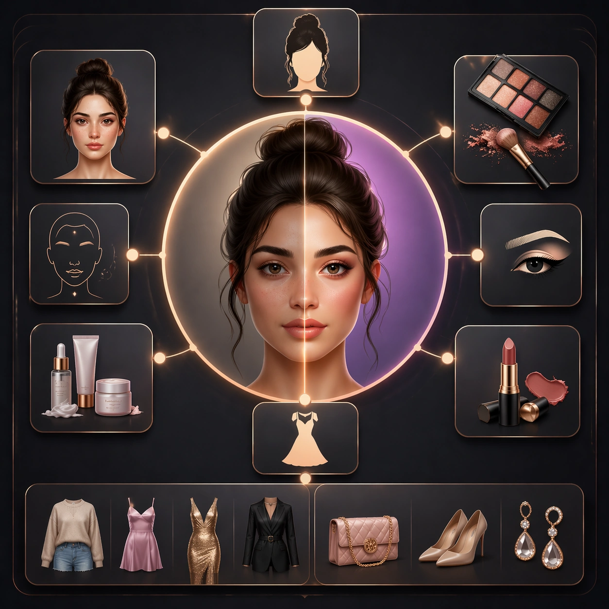
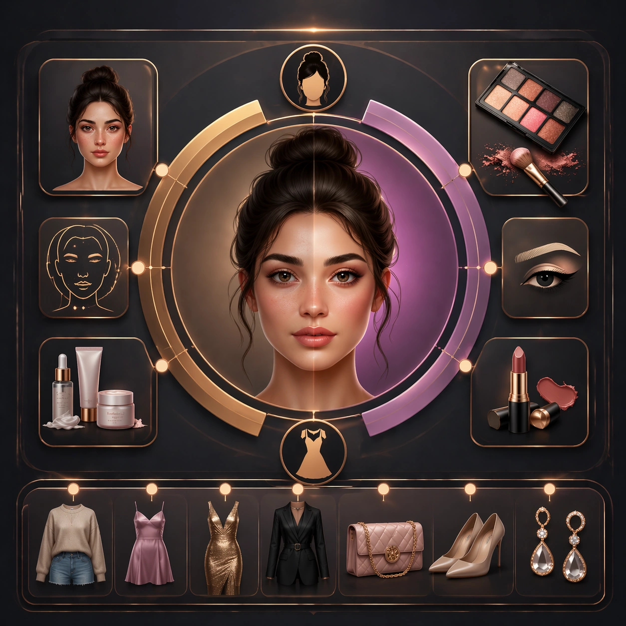
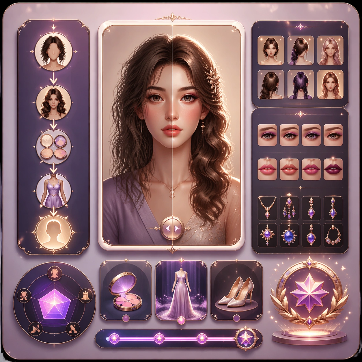
Example generated from “Douyin Before After Makeover Flow — Variant One”
GPT Image 2en

Scene: Create a square dependent image for short-form makeover flow. Build a first controlled variation in the same system with a premium, production-ready finish. Use a polished modular board or campaign surface with clean spacing, premium game-UI finish, and clear focal hierarchy. The composition should feel intentional, clean, and reusable for gallery, research, campaign, or internal handoff contexts. Lighting must support readability first, with the main forms clearly separated from the background and enough breathing room for the system to stay legible at both hero scale and thumbnail scale. Subject: Center a coherent original game-art system built for premium production and marketing surfaces. For this image, focus on the intended support surface. Keep the same system logic stable across screenshots, cards, banners, and overview boards. Preserve exact identity or system logic from the reference image while changing only the intended variation axis. The viewer should immediately understand what role this surface plays inside a cohesive game-production asset pack. Important details: Lock framing, icon grammar, palette blocking, and surface hierarchy so the kit feels production-ready and consistent. Preserve the core silhouette, framing language, and material logic from the reference image while each variation changes function. Keep materials believable, edge hierarchy disciplined, and the visual language consistent with Makeover Flow. Use abstract interface blocks or diagram accents when helpful, but avoid any readable language. The final result should feel like a deliberate production asset rather than a random illustration. Use case: short-form makeover flow series study 2/9, designed as variant one within a cohesive asset pack. Constraints: No readable text, no watermark, no logos, preserve exact 1:1 aspect ratio, no unrelated objects, no broken visual hierarchy, no malformed anatomy or broken perspective, no random decorative clutter.

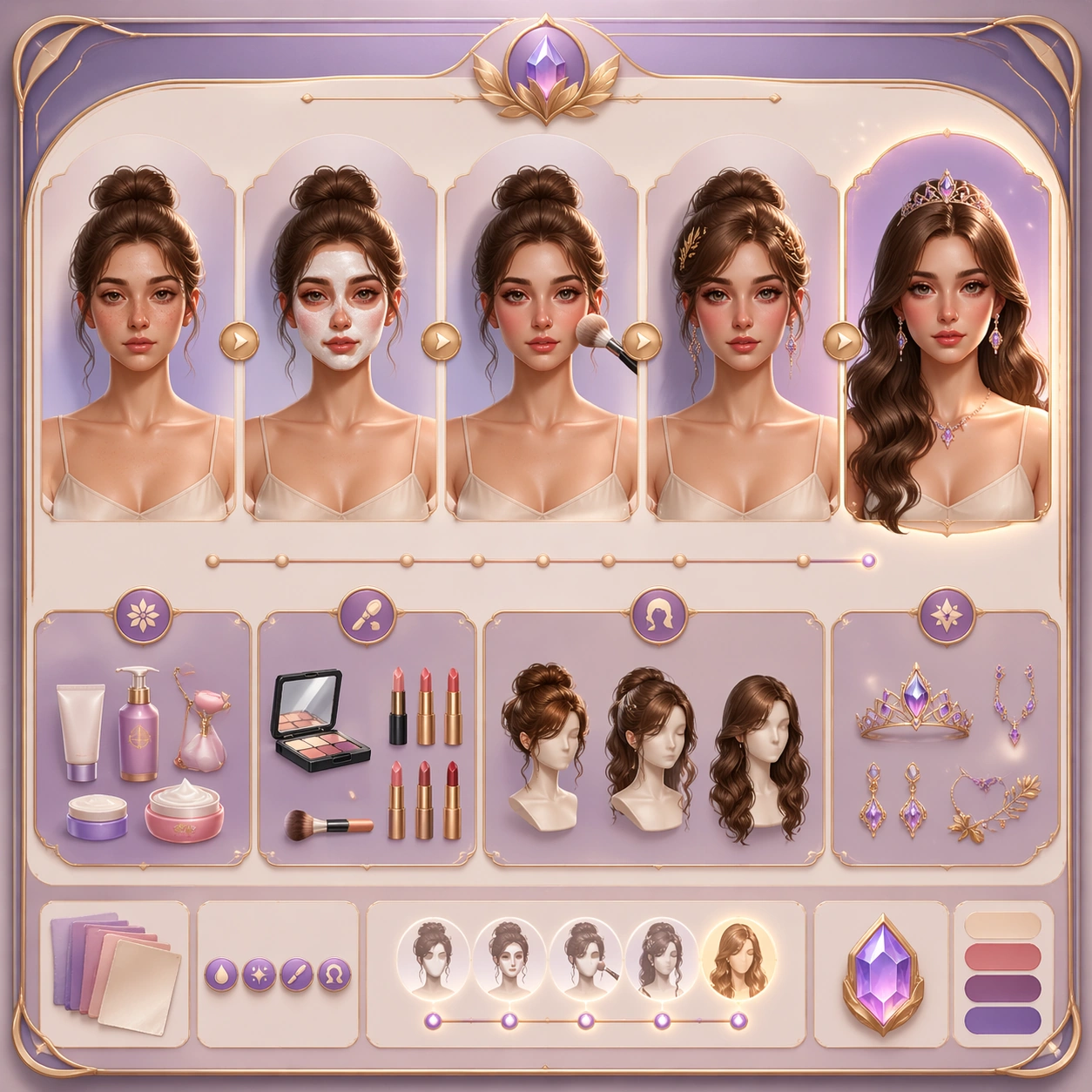
Example generated from “Douyin Before After Makeover Flow — Variant Two”
GPT Image 2en

Scene: Create a square dependent image for short-form makeover flow. Build a second controlled variation in the same system with a premium, production-ready finish. Use a polished modular board or campaign surface with clean spacing, premium game-UI finish, and clear focal hierarchy. The composition should feel intentional, clean, and reusable for gallery, research, campaign, or internal handoff contexts. Lighting must support readability first, with the main forms clearly separated from the background and enough breathing room for the system to stay legible at both hero scale and thumbnail scale. Subject: Center a coherent original game-art system built for premium production and marketing surfaces. For this image, focus on the intended support surface. Keep the same system logic stable across screenshots, cards, banners, and overview boards. Preserve exact identity or system logic from the reference image while changing only the intended variation axis. The viewer should immediately understand what role this surface plays inside a cohesive game-production asset pack. Important details: Lock framing, icon grammar, palette blocking, and surface hierarchy so the kit feels production-ready and consistent. Preserve the core silhouette, framing language, and material logic from the reference image while each variation changes function. Keep materials believable, edge hierarchy disciplined, and the visual language consistent with Makeover Flow. Use abstract interface blocks or diagram accents when helpful, but avoid any readable language. The final result should feel like a deliberate production asset rather than a random illustration. Use case: short-form makeover flow series study 3/9, designed as variant two within a cohesive asset pack. Constraints: No readable text, no watermark, no logos, preserve exact 1:1 aspect ratio, no unrelated objects, no broken visual hierarchy, no malformed anatomy or broken perspective, no random decorative clutter.

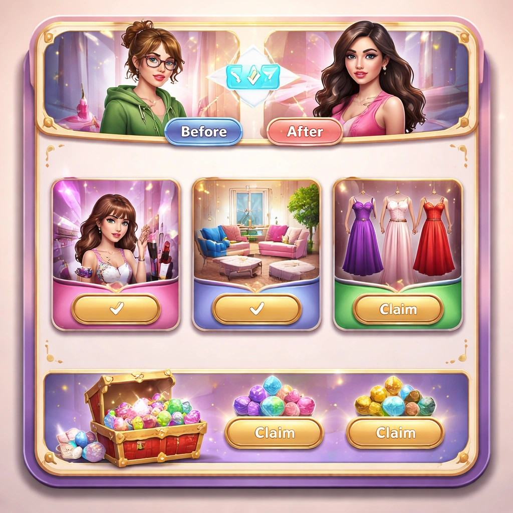
Example generated from “Douyin Before After Makeover Flow — Variant Three”
GPT Image 2en

Scene: Create a square dependent image for short-form makeover flow. Build a third controlled variation in the same system with a premium, production-ready finish. Use a polished modular board or campaign surface with clean spacing, premium game-UI finish, and clear focal hierarchy. The composition should feel intentional, clean, and reusable for gallery, research, campaign, or internal handoff contexts. Lighting must support readability first, with the main forms clearly separated from the background and enough breathing room for the system to stay legible at both hero scale and thumbnail scale. Subject: Center a coherent original game-art system built for premium production and marketing surfaces. For this image, focus on the intended support surface. Keep the same system logic stable across screenshots, cards, banners, and overview boards. Preserve exact identity or system logic from the reference image while changing only the intended variation axis. The viewer should immediately understand what role this surface plays inside a cohesive game-production asset pack. Important details: Lock framing, icon grammar, palette blocking, and surface hierarchy so the kit feels production-ready and consistent. Preserve the core silhouette, framing language, and material logic from the reference image while each variation changes function. Keep materials believable, edge hierarchy disciplined, and the visual language consistent with Makeover Flow. Use abstract interface blocks or diagram accents when helpful, but avoid any readable language. The final result should feel like a deliberate production asset rather than a random illustration. Use case: short-form makeover flow series study 4/9, designed as variant three within a cohesive asset pack. Constraints: No readable text, no watermark, no logos, preserve exact 1:1 aspect ratio, no unrelated objects, no broken visual hierarchy, no malformed anatomy or broken perspective, no random decorative clutter.

Example generated from “Douyin Before After Makeover Flow — Support One”
GPT Image 2en

Scene: Create a square standalone support image for short-form makeover flow. Build a support-surface study with a clear focal hierarchy and a finished professional surface. Use a polished modular board or campaign surface with clean spacing, premium game-UI finish, and clear focal hierarchy. The frame should feel self-contained and polished, with enough structure to explain the system even without the reference series, yet still obviously belonging to the same theme and production world. Subject: Show a coherent original game-art system built for premium production and marketing surfaces in a way that emphasizes the intended support surface. Keep the same system logic stable across screenshots, cards, banners, and overview boards. Even though this image is independent, the viewer should still recognize the same universe, same commercial logic, and same production intent as the core package. Important details: Lock framing, icon grammar, palette blocking, and surface hierarchy so the kit feels production-ready and consistent. Preserve the broader theme language through color, framing, material choices, and modular composition. Use clean panel rhythm, premium asset presentation, and believable detail density. The image should work equally well as a gallery study, research reference, and mock production deliverable. Use case: short-form makeover flow single study 5/9, exploring support one as a support surface. Constraints: No readable text, no watermark, no logos, preserve exact 1:1 aspect ratio, no unrelated objects, no broken visual hierarchy, no visual noise that obscures the main surface, no accidental brand resemblance.

Example generated from “Douyin Before After Makeover Flow — Support Two”
GPT Image 2en

Scene: Create a square standalone support image for short-form makeover flow. Build a second support-surface study with a clear focal hierarchy and a finished professional surface. Use a polished modular board or campaign surface with clean spacing, premium game-UI finish, and clear focal hierarchy. The frame should feel self-contained and polished, with enough structure to explain the system even without the reference series, yet still obviously belonging to the same theme and production world. Subject: Show a coherent original game-art system built for premium production and marketing surfaces in a way that emphasizes the intended support surface. Keep the same system logic stable across screenshots, cards, banners, and overview boards. Even though this image is independent, the viewer should still recognize the same universe, same commercial logic, and same production intent as the core package. Important details: Lock framing, icon grammar, palette blocking, and surface hierarchy so the kit feels production-ready and consistent. Preserve the broader theme language through color, framing, material choices, and modular composition. Use clean panel rhythm, premium asset presentation, and believable detail density. The image should work equally well as a gallery study, research reference, and mock production deliverable. Use case: short-form makeover flow single study 6/9, exploring support two as a support surface. Constraints: No readable text, no watermark, no logos, preserve exact 1:1 aspect ratio, no unrelated objects, no broken visual hierarchy, no visual noise that obscures the main surface, no accidental brand resemblance.

Example generated from “Douyin Before After Makeover Flow — Support Three”
GPT Image 2en

Scene: Create a square standalone support image for short-form makeover flow. Build a third support-surface study with a clear focal hierarchy and a finished professional surface. Use a polished modular board or campaign surface with clean spacing, premium game-UI finish, and clear focal hierarchy. The frame should feel self-contained and polished, with enough structure to explain the system even without the reference series, yet still obviously belonging to the same theme and production world. Subject: Show a coherent original game-art system built for premium production and marketing surfaces in a way that emphasizes the intended support surface. Keep the same system logic stable across screenshots, cards, banners, and overview boards. Even though this image is independent, the viewer should still recognize the same universe, same commercial logic, and same production intent as the core package. Important details: Lock framing, icon grammar, palette blocking, and surface hierarchy so the kit feels production-ready and consistent. Preserve the broader theme language through color, framing, material choices, and modular composition. Use clean panel rhythm, premium asset presentation, and believable detail density. The image should work equally well as a gallery study, research reference, and mock production deliverable. Use case: short-form makeover flow single study 7/9, exploring support three as a support surface. Constraints: No readable text, no watermark, no logos, preserve exact 1:1 aspect ratio, no unrelated objects, no broken visual hierarchy, no visual noise that obscures the main surface, no accidental brand resemblance.

Example generated from “Douyin Before After Makeover Flow — Support Four”
GPT Image 2en

Scene: Create a square standalone support image for short-form makeover flow. Build a fourth support-surface study with a clear focal hierarchy and a finished professional surface. Use a polished modular board or campaign surface with clean spacing, premium game-UI finish, and clear focal hierarchy. The frame should feel self-contained and polished, with enough structure to explain the system even without the reference series, yet still obviously belonging to the same theme and production world. Subject: Show a coherent original game-art system built for premium production and marketing surfaces in a way that emphasizes the intended support surface. Keep the same system logic stable across screenshots, cards, banners, and overview boards. Even though this image is independent, the viewer should still recognize the same universe, same commercial logic, and same production intent as the core package. Important details: Lock framing, icon grammar, palette blocking, and surface hierarchy so the kit feels production-ready and consistent. Preserve the broader theme language through color, framing, material choices, and modular composition. Use clean panel rhythm, premium asset presentation, and believable detail density. The image should work equally well as a gallery study, research reference, and mock production deliverable. Use case: short-form makeover flow single study 8/9, exploring support four as a support surface. Constraints: No readable text, no watermark, no logos, preserve exact 1:1 aspect ratio, no unrelated objects, no broken visual hierarchy, no visual noise that obscures the main surface, no accidental brand resemblance.

Example generated from “Douyin Before After Makeover Flow — Support Five”
GPT Image 2en

Scene: Create a square standalone support image for short-form makeover flow. Build a fifth support-surface study with a clear focal hierarchy and a finished professional surface. Use a polished modular board or campaign surface with clean spacing, premium game-UI finish, and clear focal hierarchy. The frame should feel self-contained and polished, with enough structure to explain the system even without the reference series, yet still obviously belonging to the same theme and production world. Subject: Show a coherent original game-art system built for premium production and marketing surfaces in a way that emphasizes the intended support surface. Keep the same system logic stable across screenshots, cards, banners, and overview boards. Even though this image is independent, the viewer should still recognize the same universe, same commercial logic, and same production intent as the core package. Important details: Lock framing, icon grammar, palette blocking, and surface hierarchy so the kit feels production-ready and consistent. Preserve the broader theme language through color, framing, material choices, and modular composition. Use clean panel rhythm, premium asset presentation, and believable detail density. The image should work equally well as a gallery study, research reference, and mock production deliverable. Use case: short-form makeover flow single study 9/9, exploring support five as a support surface. Constraints: No readable text, no watermark, no logos, preserve exact 1:1 aspect ratio, no unrelated objects, no broken visual hierarchy, no visual noise that obscures the main surface, no accidental brand resemblance.

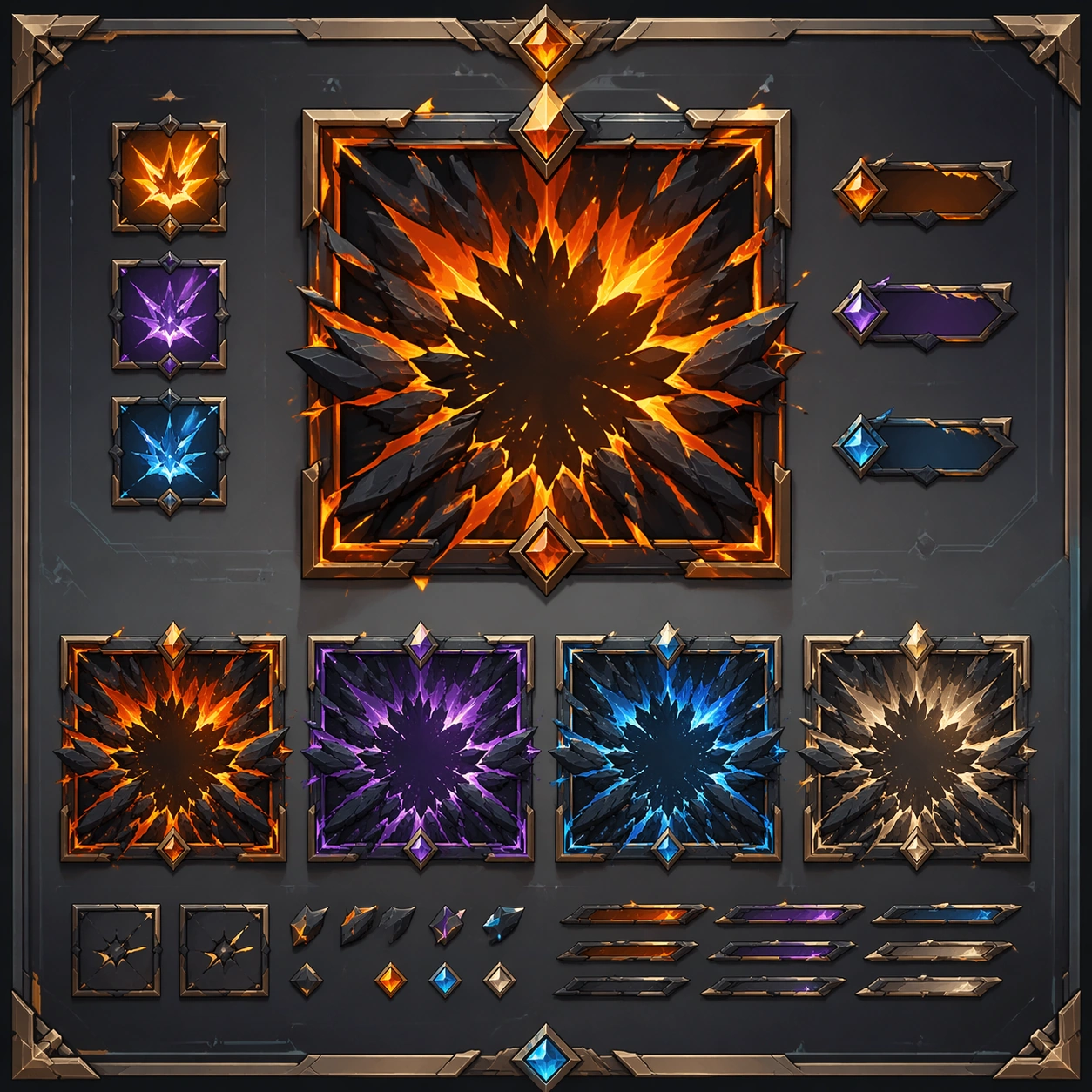
Example generated from “Douyin Fast Sell Product Burst Frames — Reference Anchor”
GPT Image 2en

Scene: Create a square reference image for short-form product burst frames. Build a reference anchor establishing the core system with a premium, production-ready finish. Use a polished modular board or campaign surface with clean spacing, premium game-UI finish, and clear focal hierarchy. The composition should feel intentional, clean, and reusable for gallery, research, campaign, or internal handoff contexts. Lighting must support readability first, with the main forms clearly separated from the background and enough breathing room for the system to stay legible at both hero scale and thumbnail scale. Subject: Center a coherent original game-art system built for premium production and marketing surfaces. For this image, focus on reference anchor. Keep the same system logic stable across screenshots, cards, banners, and overview boards. This image is the canonical anchor that later series images must follow. The viewer should immediately understand what role this surface plays inside a cohesive game-production asset pack. Important details: Lock framing, icon grammar, palette blocking, and surface hierarchy so the kit feels production-ready and consistent. Preserve the core silhouette, framing language, and material logic from the reference image while each variation changes function. Keep materials believable, edge hierarchy disciplined, and the visual language consistent with Burst Frames. Use abstract interface blocks or diagram accents when helpful, but avoid any readable language. The final result should feel like a deliberate production asset rather than a random illustration. Use case: short-form product burst frames series study 1/9, designed as reference anchor within a cohesive asset pack. Constraints: No readable text, no watermark, no logos, preserve exact 1:1 aspect ratio, no unrelated objects, no broken visual hierarchy, no malformed anatomy or broken perspective, no random decorative clutter.

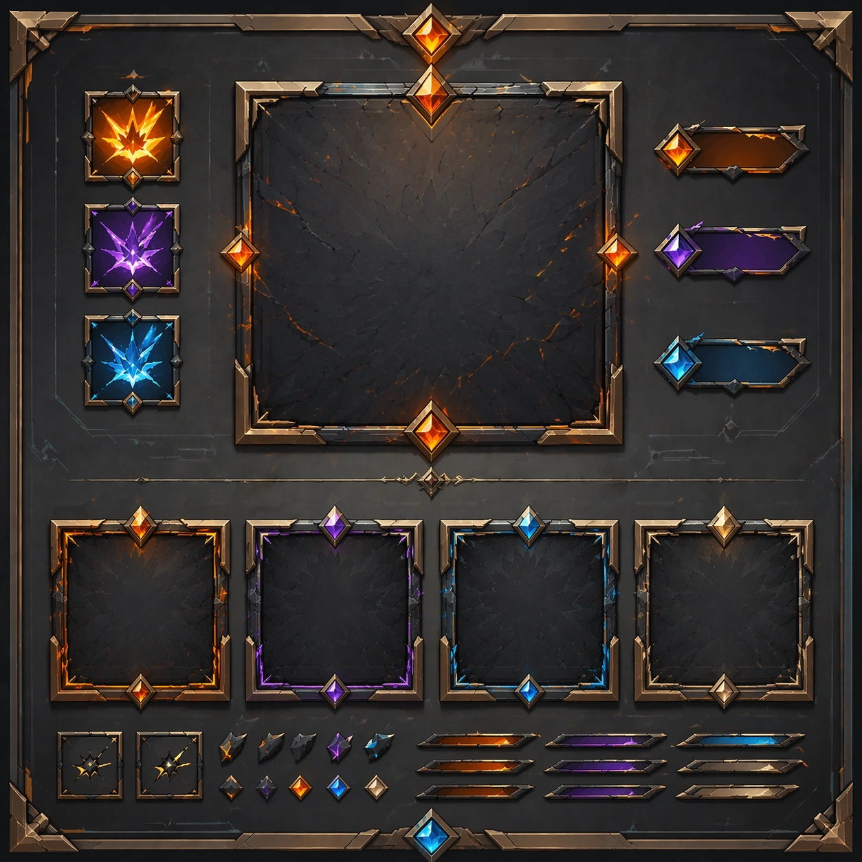
Example generated from “Douyin Fast Sell Product Burst Frames — Variant One”
GPT Image 2en

Scene: Create a square dependent image for short-form product burst frames. Build a first controlled variation in the same system with a premium, production-ready finish. Use a polished modular board or campaign surface with clean spacing, premium game-UI finish, and clear focal hierarchy. The composition should feel intentional, clean, and reusable for gallery, research, campaign, or internal handoff contexts. Lighting must support readability first, with the main forms clearly separated from the background and enough breathing room for the system to stay legible at both hero scale and thumbnail scale. Subject: Center a coherent original game-art system built for premium production and marketing surfaces. For this image, focus on the intended support surface. Keep the same system logic stable across screenshots, cards, banners, and overview boards. Preserve exact identity or system logic from the reference image while changing only the intended variation axis. The viewer should immediately understand what role this surface plays inside a cohesive game-production asset pack. Important details: Lock framing, icon grammar, palette blocking, and surface hierarchy so the kit feels production-ready and consistent. Preserve the core silhouette, framing language, and material logic from the reference image while each variation changes function. Keep materials believable, edge hierarchy disciplined, and the visual language consistent with Burst Frames. Use abstract interface blocks or diagram accents when helpful, but avoid any readable language. The final result should feel like a deliberate production asset rather than a random illustration. Use case: short-form product burst frames series study 2/9, designed as variant one within a cohesive asset pack. Constraints: No readable text, no watermark, no logos, preserve exact 1:1 aspect ratio, no unrelated objects, no broken visual hierarchy, no malformed anatomy or broken perspective, no random decorative clutter.

Example generated from “Douyin Fast Sell Product Burst Frames — Variant Two”
GPT Image 2en

Scene: Create a square dependent image for short-form product burst frames. Build a second controlled variation in the same system with a premium, production-ready finish. Use a polished modular board or campaign surface with clean spacing, premium game-UI finish, and clear focal hierarchy. The composition should feel intentional, clean, and reusable for gallery, research, campaign, or internal handoff contexts. Lighting must support readability first, with the main forms clearly separated from the background and enough breathing room for the system to stay legible at both hero scale and thumbnail scale. Subject: Center a coherent original game-art system built for premium production and marketing surfaces. For this image, focus on the intended support surface. Keep the same system logic stable across screenshots, cards, banners, and overview boards. Preserve exact identity or system logic from the reference image while changing only the intended variation axis. The viewer should immediately understand what role this surface plays inside a cohesive game-production asset pack. Important details: Lock framing, icon grammar, palette blocking, and surface hierarchy so the kit feels production-ready and consistent. Preserve the core silhouette, framing language, and material logic from the reference image while each variation changes function. Keep materials believable, edge hierarchy disciplined, and the visual language consistent with Burst Frames. Use abstract interface blocks or diagram accents when helpful, but avoid any readable language. The final result should feel like a deliberate production asset rather than a random illustration. Use case: short-form product burst frames series study 3/9, designed as variant two within a cohesive asset pack. Constraints: No readable text, no watermark, no logos, preserve exact 1:1 aspect ratio, no unrelated objects, no broken visual hierarchy, no malformed anatomy or broken perspective, no random decorative clutter.

Example generated from “Douyin Fast Sell Product Burst Frames — Variant Three”
GPT Image 2en

Scene: Create a square dependent image for short-form product burst frames. Build a third controlled variation in the same system with a premium, production-ready finish. Use a polished modular board or campaign surface with clean spacing, premium game-UI finish, and clear focal hierarchy. The composition should feel intentional, clean, and reusable for gallery, research, campaign, or internal handoff contexts. Lighting must support readability first, with the main forms clearly separated from the background and enough breathing room for the system to stay legible at both hero scale and thumbnail scale. Subject: Center a coherent original game-art system built for premium production and marketing surfaces. For this image, focus on the intended support surface. Keep the same system logic stable across screenshots, cards, banners, and overview boards. Preserve exact identity or system logic from the reference image while changing only the intended variation axis. The viewer should immediately understand what role this surface plays inside a cohesive game-production asset pack. Important details: Lock framing, icon grammar, palette blocking, and surface hierarchy so the kit feels production-ready and consistent. Preserve the core silhouette, framing language, and material logic from the reference image while each variation changes function. Keep materials believable, edge hierarchy disciplined, and the visual language consistent with Burst Frames. Use abstract interface blocks or diagram accents when helpful, but avoid any readable language. The final result should feel like a deliberate production asset rather than a random illustration. Use case: short-form product burst frames series study 4/9, designed as variant three within a cohesive asset pack. Constraints: No readable text, no watermark, no logos, preserve exact 1:1 aspect ratio, no unrelated objects, no broken visual hierarchy, no malformed anatomy or broken perspective, no random decorative clutter.

Example generated from “Douyin Fast Sell Product Burst Frames — Support One”
GPT Image 2en

Scene: Create a square standalone support image for short-form product burst frames. Build a support-surface study with a clear focal hierarchy and a finished professional surface. Use a polished modular board or campaign surface with clean spacing, premium game-UI finish, and clear focal hierarchy. The frame should feel self-contained and polished, with enough structure to explain the system even without the reference series, yet still obviously belonging to the same theme and production world. Subject: Show a coherent original game-art system built for premium production and marketing surfaces in a way that emphasizes the intended support surface. Keep the same system logic stable across screenshots, cards, banners, and overview boards. Even though this image is independent, the viewer should still recognize the same universe, same commercial logic, and same production intent as the core package. Important details: Lock framing, icon grammar, palette blocking, and surface hierarchy so the kit feels production-ready and consistent. Preserve the broader theme language through color, framing, material choices, and modular composition. Use clean panel rhythm, premium asset presentation, and believable detail density. The image should work equally well as a gallery study, research reference, and mock production deliverable. Use case: short-form product burst frames single study 5/9, exploring support one as a support surface. Constraints: No readable text, no watermark, no logos, preserve exact 1:1 aspect ratio, no unrelated objects, no broken visual hierarchy, no visual noise that obscures the main surface, no accidental brand resemblance.

Example generated from “Douyin Fast Sell Product Burst Frames — Support Two”
GPT Image 2en

Scene: Create a square standalone support image for short-form product burst frames. Build a second support-surface study with a clear focal hierarchy and a finished professional surface. Use a polished modular board or campaign surface with clean spacing, premium game-UI finish, and clear focal hierarchy. The frame should feel self-contained and polished, with enough structure to explain the system even without the reference series, yet still obviously belonging to the same theme and production world. Subject: Show a coherent original game-art system built for premium production and marketing surfaces in a way that emphasizes the intended support surface. Keep the same system logic stable across screenshots, cards, banners, and overview boards. Even though this image is independent, the viewer should still recognize the same universe, same commercial logic, and same production intent as the core package. Important details: Lock framing, icon grammar, palette blocking, and surface hierarchy so the kit feels production-ready and consistent. Preserve the broader theme language through color, framing, material choices, and modular composition. Use clean panel rhythm, premium asset presentation, and believable detail density. The image should work equally well as a gallery study, research reference, and mock production deliverable. Use case: short-form product burst frames single study 6/9, exploring support two as a support surface. Constraints: No readable text, no watermark, no logos, preserve exact 1:1 aspect ratio, no unrelated objects, no broken visual hierarchy, no visual noise that obscures the main surface, no accidental brand resemblance.

Example generated from “Douyin Fast Sell Product Burst Frames — Support Three”
GPT Image 2en

Scene: Create a square standalone support image for short-form product burst frames. Build a third support-surface study with a clear focal hierarchy and a finished professional surface. Use a polished modular board or campaign surface with clean spacing, premium game-UI finish, and clear focal hierarchy. The frame should feel self-contained and polished, with enough structure to explain the system even without the reference series, yet still obviously belonging to the same theme and production world. Subject: Show a coherent original game-art system built for premium production and marketing surfaces in a way that emphasizes the intended support surface. Keep the same system logic stable across screenshots, cards, banners, and overview boards. Even though this image is independent, the viewer should still recognize the same universe, same commercial logic, and same production intent as the core package. Important details: Lock framing, icon grammar, palette blocking, and surface hierarchy so the kit feels production-ready and consistent. Preserve the broader theme language through color, framing, material choices, and modular composition. Use clean panel rhythm, premium asset presentation, and believable detail density. The image should work equally well as a gallery study, research reference, and mock production deliverable. Use case: short-form product burst frames single study 7/9, exploring support three as a support surface. Constraints: No readable text, no watermark, no logos, preserve exact 1:1 aspect ratio, no unrelated objects, no broken visual hierarchy, no visual noise that obscures the main surface, no accidental brand resemblance.

Example generated from “Douyin Fast Sell Product Burst Frames — Support Four”
GPT Image 2en

Scene: Create a square standalone support image for short-form product burst frames. Build a fourth support-surface study with a clear focal hierarchy and a finished professional surface. Use a polished modular board or campaign surface with clean spacing, premium game-UI finish, and clear focal hierarchy. The frame should feel self-contained and polished, with enough structure to explain the system even without the reference series, yet still obviously belonging to the same theme and production world. Subject: Show a coherent original game-art system built for premium production and marketing surfaces in a way that emphasizes the intended support surface. Keep the same system logic stable across screenshots, cards, banners, and overview boards. Even though this image is independent, the viewer should still recognize the same universe, same commercial logic, and same production intent as the core package. Important details: Lock framing, icon grammar, palette blocking, and surface hierarchy so the kit feels production-ready and consistent. Preserve the broader theme language through color, framing, material choices, and modular composition. Use clean panel rhythm, premium asset presentation, and believable detail density. The image should work equally well as a gallery study, research reference, and mock production deliverable. Use case: short-form product burst frames single study 8/9, exploring support four as a support surface. Constraints: No readable text, no watermark, no logos, preserve exact 1:1 aspect ratio, no unrelated objects, no broken visual hierarchy, no visual noise that obscures the main surface, no accidental brand resemblance.

Example generated from “Douyin Fast Sell Product Burst Frames — Support Five”
GPT Image 2en

Scene: Create a square standalone support image for short-form product burst frames. Build a fifth support-surface study with a clear focal hierarchy and a finished professional surface. Use a polished modular board or campaign surface with clean spacing, premium game-UI finish, and clear focal hierarchy. The frame should feel self-contained and polished, with enough structure to explain the system even without the reference series, yet still obviously belonging to the same theme and production world. Subject: Show a coherent original game-art system built for premium production and marketing surfaces in a way that emphasizes the intended support surface. Keep the same system logic stable across screenshots, cards, banners, and overview boards. Even though this image is independent, the viewer should still recognize the same universe, same commercial logic, and same production intent as the core package. Important details: Lock framing, icon grammar, palette blocking, and surface hierarchy so the kit feels production-ready and consistent. Preserve the broader theme language through color, framing, material choices, and modular composition. Use clean panel rhythm, premium asset presentation, and believable detail density. The image should work equally well as a gallery study, research reference, and mock production deliverable. Use case: short-form product burst frames single study 9/9, exploring support five as a support surface. Constraints: No readable text, no watermark, no logos, preserve exact 1:1 aspect ratio, no unrelated objects, no broken visual hierarchy, no visual noise that obscures the main surface, no accidental brand resemblance.

Example generated from “Douyin Hook Cover Visuals — Reference Anchor”
GPT Image 2en

Scene: Create a square reference image for short-form hook cover visuals. Build a reference anchor establishing the core system with a premium, production-ready finish. Use a polished modular board or campaign surface with clean spacing, premium game-UI finish, and clear focal hierarchy. The composition should feel intentional, clean, and reusable for gallery, research, campaign, or internal handoff contexts. Lighting must support readability first, with the main forms clearly separated from the background and enough breathing room for the system to stay legible at both hero scale and thumbnail scale. Subject: Center a coherent original game-art system built for premium production and marketing surfaces. For this image, focus on reference anchor. Keep the same system logic stable across screenshots, cards, banners, and overview boards. This image is the canonical anchor that later series images must follow. The viewer should immediately understand what role this surface plays inside a cohesive game-production asset pack. Important details: Lock framing, icon grammar, palette blocking, and surface hierarchy so the kit feels production-ready and consistent. Preserve the core silhouette, framing language, and material logic from the reference image while each variation changes function. Keep materials believable, edge hierarchy disciplined, and the visual language consistent with short-form cover system. Use abstract interface blocks or diagram accents when helpful, but avoid any readable language. The final result should feel like a deliberate production asset rather than a random illustration. Use case: short-form hook cover visuals series study 1/9, designed as reference anchor within a cohesive asset pack. Constraints: No readable text, no watermark, no logos, preserve exact 1:1 aspect ratio, no unrelated objects, no broken visual hierarchy, no malformed anatomy or broken perspective, no random decorative clutter.

Example generated from “Douyin Hook Cover Visuals — Variant One”
GPT Image 2en

Scene: Create a square dependent image for short-form hook cover visuals. Build a first controlled variation in the same system with a premium, production-ready finish. Use a polished modular board or campaign surface with clean spacing, premium game-UI finish, and clear focal hierarchy. The composition should feel intentional, clean, and reusable for gallery, research, campaign, or internal handoff contexts. Lighting must support readability first, with the main forms clearly separated from the background and enough breathing room for the system to stay legible at both hero scale and thumbnail scale. Subject: Center a coherent original game-art system built for premium production and marketing surfaces. For this image, focus on the intended support surface. Keep the same system logic stable across screenshots, cards, banners, and overview boards. Preserve exact identity or system logic from the reference image while changing only the intended variation axis. The viewer should immediately understand what role this surface plays inside a cohesive game-production asset pack. Important details: Lock framing, icon grammar, palette blocking, and surface hierarchy so the kit feels production-ready and consistent. Preserve the core silhouette, framing language, and material logic from the reference image while each variation changes function. Keep materials believable, edge hierarchy disciplined, and the visual language consistent with short-form cover system. Use abstract interface blocks or diagram accents when helpful, but avoid any readable language. The final result should feel like a deliberate production asset rather than a random illustration. Use case: short-form hook cover visuals series study 2/9, designed as variant one within a cohesive asset pack. Constraints: No readable text, no watermark, no logos, preserve exact 1:1 aspect ratio, no unrelated objects, no broken visual hierarchy, no malformed anatomy or broken perspective, no random decorative clutter.

Example generated from “Douyin Hook Cover Visuals — Variant Two”
GPT Image 2en

Scene: Create a square dependent image for short-form hook cover visuals. Build a second controlled variation in the same system with a premium, production-ready finish. Use a polished modular board or campaign surface with clean spacing, premium game-UI finish, and clear focal hierarchy. The composition should feel intentional, clean, and reusable for gallery, research, campaign, or internal handoff contexts. Lighting must support readability first, with the main forms clearly separated from the background and enough breathing room for the system to stay legible at both hero scale and thumbnail scale. Subject: Center a coherent original game-art system built for premium production and marketing surfaces. For this image, focus on the intended support surface. Keep the same system logic stable across screenshots, cards, banners, and overview boards. Preserve exact identity or system logic from the reference image while changing only the intended variation axis. The viewer should immediately understand what role this surface plays inside a cohesive game-production asset pack. Important details: Lock framing, icon grammar, palette blocking, and surface hierarchy so the kit feels production-ready and consistent. Preserve the core silhouette, framing language, and material logic from the reference image while each variation changes function. Keep materials believable, edge hierarchy disciplined, and the visual language consistent with short-form cover system. Use abstract interface blocks or diagram accents when helpful, but avoid any readable language. The final result should feel like a deliberate production asset rather than a random illustration. Use case: short-form hook cover visuals series study 3/9, designed as variant two within a cohesive asset pack. Constraints: No readable text, no watermark, no logos, preserve exact 1:1 aspect ratio, no unrelated objects, no broken visual hierarchy, no malformed anatomy or broken perspective, no random decorative clutter.

Example generated from “Douyin Hook Cover Visuals — Variant Three”
GPT Image 2en

Scene: Create a square dependent image for short-form hook cover visuals. Build a third controlled variation in the same system with a premium, production-ready finish. Use a polished modular board or campaign surface with clean spacing, premium game-UI finish, and clear focal hierarchy. The composition should feel intentional, clean, and reusable for gallery, research, campaign, or internal handoff contexts. Lighting must support readability first, with the main forms clearly separated from the background and enough breathing room for the system to stay legible at both hero scale and thumbnail scale. Subject: Center a coherent original game-art system built for premium production and marketing surfaces. For this image, focus on the intended support surface. Keep the same system logic stable across screenshots, cards, banners, and overview boards. Preserve exact identity or system logic from the reference image while changing only the intended variation axis. The viewer should immediately understand what role this surface plays inside a cohesive game-production asset pack. Important details: Lock framing, icon grammar, palette blocking, and surface hierarchy so the kit feels production-ready and consistent. Preserve the core silhouette, framing language, and material logic from the reference image while each variation changes function. Keep materials believable, edge hierarchy disciplined, and the visual language consistent with short-form cover system. Use abstract interface blocks or diagram accents when helpful, but avoid any readable language. The final result should feel like a deliberate production asset rather than a random illustration. Use case: short-form hook cover visuals series study 4/9, designed as variant three within a cohesive asset pack. Constraints: No readable text, no watermark, no logos, preserve exact 1:1 aspect ratio, no unrelated objects, no broken visual hierarchy, no malformed anatomy or broken perspective, no random decorative clutter.

Example generated from “Douyin Hook Cover Visuals — Support One”
GPT Image 2en

Scene: Create a square standalone support image for short-form hook cover visuals. Build a support-surface study with a clear focal hierarchy and a finished professional surface. Use a polished modular board or campaign surface with clean spacing, premium game-UI finish, and clear focal hierarchy. The frame should feel self-contained and polished, with enough structure to explain the system even without the reference series, yet still obviously belonging to the same theme and production world. Subject: Show a coherent original game-art system built for premium production and marketing surfaces in a way that emphasizes the intended support surface. Keep the same system logic stable across screenshots, cards, banners, and overview boards. Even though this image is independent, the viewer should still recognize the same universe, same commercial logic, and same production intent as the core package. Important details: Lock framing, icon grammar, palette blocking, and surface hierarchy so the kit feels production-ready and consistent. Preserve the broader theme language through color, framing, material choices, and modular composition. Use clean panel rhythm, premium asset presentation, and believable detail density. The image should work equally well as a gallery study, research reference, and mock production deliverable. Use case: short-form hook cover visuals single study 5/9, exploring support one as a support surface. Constraints: No readable text, no watermark, no logos, preserve exact 1:1 aspect ratio, no unrelated objects, no broken visual hierarchy, no visual noise that obscures the main surface, no accidental brand resemblance.