PROMPTS · EXPLORACIÓN CREATIVA

Galería de prompts

Explora prompts reales y ejemplos generados. Encuentra inspiración para tu próxima misión creativa y copia gratis el prompt completo.

Ejemplos
10,974
Modelos
17
Fuentes
1277
10.974 ejemplos de prompts · página 54 de 229
Example generated from “Fake News Headline Comedy Graphic — Variant Two”
GPT Image 2en

Scene: Create a square dependent image for Fake News Headline Comedy Graphic. Build a second controlled variation in the same system with a premium, production-ready finish. Use a polished modular board or campaign surface with clean spacing, premium game-UI finish, and clear focal hierarchy. The composition should feel intentional, clean, and reusable for gallery, research, campaign, or internal handoff contexts. Lighting must support readability first, with the main forms clearly separated from the background and enough breathing room for the system to stay legible at both hero scale and thumbnail scale. Subject: Center a coherent original game-art system built for premium production and marketing surfaces. For this image, focus on the intended support surface. Keep the same system logic stable across screenshots, cards, banners, and overview boards. Preserve exact identity or system logic from the reference image while changing only the intended variation axis. The viewer should immediately understand what role this surface plays inside a cohesive game-production asset pack. Important details: Lock framing, icon grammar, palette blocking, and surface hierarchy so the kit feels production-ready and consistent. Preserve the core silhouette, framing language, and material logic from the reference image while each variation changes function. Keep materials believable, edge hierarchy disciplined, and the visual language consistent with Fake News Comedy. Use abstract interface blocks or diagram accents when helpful, but avoid any readable language. The final result should feel like a deliberate production asset rather than a random illustration. Use case: Fake News Headline Comedy Graphic series study 3/9, designed as variant two within a cohesive asset pack. Constraints: No readable text, no watermark, no logos, preserve exact 1:1 aspect ratio, no unrelated objects, no broken visual hierarchy, no malformed anatomy or broken perspective, no random decorative clutter.


Example generated from “Fake News Headline Comedy Graphic — Variant Three”
GPT Image 2en

Scene: Create a square dependent image for Fake News Headline Comedy Graphic. Build a third controlled variation in the same system with a premium, production-ready finish. Use a polished modular board or campaign surface with clean spacing, premium game-UI finish, and clear focal hierarchy. The composition should feel intentional, clean, and reusable for gallery, research, campaign, or internal handoff contexts. Lighting must support readability first, with the main forms clearly separated from the background and enough breathing room for the system to stay legible at both hero scale and thumbnail scale. Subject: Center a coherent original game-art system built for premium production and marketing surfaces. For this image, focus on the intended support surface. Keep the same system logic stable across screenshots, cards, banners, and overview boards. Preserve exact identity or system logic from the reference image while changing only the intended variation axis. The viewer should immediately understand what role this surface plays inside a cohesive game-production asset pack. Important details: Lock framing, icon grammar, palette blocking, and surface hierarchy so the kit feels production-ready and consistent. Preserve the core silhouette, framing language, and material logic from the reference image while each variation changes function. Keep materials believable, edge hierarchy disciplined, and the visual language consistent with Fake News Comedy. Use abstract interface blocks or diagram accents when helpful, but avoid any readable language. The final result should feel like a deliberate production asset rather than a random illustration. Use case: Fake News Headline Comedy Graphic series study 4/9, designed as variant three within a cohesive asset pack. Constraints: No readable text, no watermark, no logos, preserve exact 1:1 aspect ratio, no unrelated objects, no broken visual hierarchy, no malformed anatomy or broken perspective, no random decorative clutter.

Example generated from “Fake News Headline Comedy Graphic — Support One”
GPT Image 2en

Scene: Create a square standalone support image for Fake News Headline Comedy Graphic. Build a support-surface study with a clear focal hierarchy and a finished professional surface. Use a polished modular board or campaign surface with clean spacing, premium game-UI finish, and clear focal hierarchy. The frame should feel self-contained and polished, with enough structure to explain the system even without the reference series, yet still obviously belonging to the same theme and production world. Subject: Show a coherent original game-art system built for premium production and marketing surfaces in a way that emphasizes the intended support surface. Keep the same system logic stable across screenshots, cards, banners, and overview boards. Even though this image is independent, the viewer should still recognize the same universe, same commercial logic, and same production intent as the core package. Important details: Lock framing, icon grammar, palette blocking, and surface hierarchy so the kit feels production-ready and consistent. Preserve the broader theme language through color, framing, material choices, and modular composition. Use clean panel rhythm, premium asset presentation, and believable detail density. The image should work equally well as a gallery study, research reference, and mock production deliverable. Use case: Fake News Headline Comedy Graphic single study 5/9, exploring support one as a support surface. Constraints: No readable text, no watermark, no logos, preserve exact 1:1 aspect ratio, no unrelated objects, no broken visual hierarchy, no visual noise that obscures the main surface, no accidental brand resemblance.

Example generated from “Fake News Headline Comedy Graphic — Support Two”
GPT Image 2en

Scene: Create a square standalone support image for Fake News Headline Comedy Graphic. Build a second support-surface study with a clear focal hierarchy and a finished professional surface. Use a polished modular board or campaign surface with clean spacing, premium game-UI finish, and clear focal hierarchy. The frame should feel self-contained and polished, with enough structure to explain the system even without the reference series, yet still obviously belonging to the same theme and production world. Subject: Show a coherent original game-art system built for premium production and marketing surfaces in a way that emphasizes the intended support surface. Keep the same system logic stable across screenshots, cards, banners, and overview boards. Even though this image is independent, the viewer should still recognize the same universe, same commercial logic, and same production intent as the core package. Important details: Lock framing, icon grammar, palette blocking, and surface hierarchy so the kit feels production-ready and consistent. Preserve the broader theme language through color, framing, material choices, and modular composition. Use clean panel rhythm, premium asset presentation, and believable detail density. The image should work equally well as a gallery study, research reference, and mock production deliverable. Use case: Fake News Headline Comedy Graphic single study 6/9, exploring support two as a support surface. Constraints: No readable text, no watermark, no logos, preserve exact 1:1 aspect ratio, no unrelated objects, no broken visual hierarchy, no visual noise that obscures the main surface, no accidental brand resemblance.

Example generated from “Fake News Headline Comedy Graphic — Support Three”
GPT Image 2en

Scene: Create a square standalone support image for Fake News Headline Comedy Graphic. Build a third support-surface study with a clear focal hierarchy and a finished professional surface. Use a polished modular board or campaign surface with clean spacing, premium game-UI finish, and clear focal hierarchy. The frame should feel self-contained and polished, with enough structure to explain the system even without the reference series, yet still obviously belonging to the same theme and production world. Subject: Show a coherent original game-art system built for premium production and marketing surfaces in a way that emphasizes the intended support surface. Keep the same system logic stable across screenshots, cards, banners, and overview boards. Even though this image is independent, the viewer should still recognize the same universe, same commercial logic, and same production intent as the core package. Important details: Lock framing, icon grammar, palette blocking, and surface hierarchy so the kit feels production-ready and consistent. Preserve the broader theme language through color, framing, material choices, and modular composition. Use clean panel rhythm, premium asset presentation, and believable detail density. The image should work equally well as a gallery study, research reference, and mock production deliverable. Use case: Fake News Headline Comedy Graphic single study 7/9, exploring support three as a support surface. Constraints: No readable text, no watermark, no logos, preserve exact 1:1 aspect ratio, no unrelated objects, no broken visual hierarchy, no visual noise that obscures the main surface, no accidental brand resemblance.

Example generated from “Fake News Headline Comedy Graphic — Support Four”
GPT Image 2en

Scene: Create a square standalone support image for Fake News Headline Comedy Graphic. Build a fourth support-surface study with a clear focal hierarchy and a finished professional surface. Use a polished modular board or campaign surface with clean spacing, premium game-UI finish, and clear focal hierarchy. The frame should feel self-contained and polished, with enough structure to explain the system even without the reference series, yet still obviously belonging to the same theme and production world. Subject: Show a coherent original game-art system built for premium production and marketing surfaces in a way that emphasizes the intended support surface. Keep the same system logic stable across screenshots, cards, banners, and overview boards. Even though this image is independent, the viewer should still recognize the same universe, same commercial logic, and same production intent as the core package. Important details: Lock framing, icon grammar, palette blocking, and surface hierarchy so the kit feels production-ready and consistent. Preserve the broader theme language through color, framing, material choices, and modular composition. Use clean panel rhythm, premium asset presentation, and believable detail density. The image should work equally well as a gallery study, research reference, and mock production deliverable. Use case: Fake News Headline Comedy Graphic single study 8/9, exploring support four as a support surface. Constraints: No readable text, no watermark, no logos, preserve exact 1:1 aspect ratio, no unrelated objects, no broken visual hierarchy, no visual noise that obscures the main surface, no accidental brand resemblance.

Example generated from “Fake News Headline Comedy Graphic — Support Five”
GPT Image 2en

Scene: Create a square standalone support image for Fake News Headline Comedy Graphic. Build a fifth support-surface study with a clear focal hierarchy and a finished professional surface. Use a polished modular board or campaign surface with clean spacing, premium game-UI finish, and clear focal hierarchy. The frame should feel self-contained and polished, with enough structure to explain the system even without the reference series, yet still obviously belonging to the same theme and production world. Subject: Show a coherent original game-art system built for premium production and marketing surfaces in a way that emphasizes the intended support surface. Keep the same system logic stable across screenshots, cards, banners, and overview boards. Even though this image is independent, the viewer should still recognize the same universe, same commercial logic, and same production intent as the core package. Important details: Lock framing, icon grammar, palette blocking, and surface hierarchy so the kit feels production-ready and consistent. Preserve the broader theme language through color, framing, material choices, and modular composition. Use clean panel rhythm, premium asset presentation, and believable detail density. The image should work equally well as a gallery study, research reference, and mock production deliverable. Use case: Fake News Headline Comedy Graphic single study 9/9, exploring support five as a support surface. Constraints: No readable text, no watermark, no logos, preserve exact 1:1 aspect ratio, no unrelated objects, no broken visual hierarchy, no visual noise that obscures the main surface, no accidental brand resemblance.

Example generated from “Family Groupchat Chaos Visuals — Reference Anchor”
GPT Image 2en

Scene: Create a square reference image for Family Groupchat Chaos Visuals. Build a reference anchor establishing the core system with a premium, production-ready finish. Use a polished modular board or campaign surface with clean spacing, premium game-UI finish, and clear focal hierarchy. The composition should feel intentional, clean, and reusable for gallery, research, campaign, or internal handoff contexts. Lighting must support readability first, with the main forms clearly separated from the background and enough breathing room for the system to stay legible at both hero scale and thumbnail scale. Subject: Center a coherent original game-art system built for premium production and marketing surfaces. For this image, focus on reference anchor. Keep the same system logic stable across screenshots, cards, banners, and overview boards. This image is the canonical anchor that later series images must follow. The viewer should immediately understand what role this surface plays inside a cohesive game-production asset pack. Important details: Lock framing, icon grammar, palette blocking, and surface hierarchy so the kit feels production-ready and consistent. Preserve the core silhouette, framing language, and material logic from the reference image while each variation changes function. Keep materials believable, edge hierarchy disciplined, and the visual language consistent with Family Chaos. Use abstract interface blocks or diagram accents when helpful, but avoid any readable language. The final result should feel like a deliberate production asset rather than a random illustration. Use case: Family Groupchat Chaos Visuals series study 1/9, designed as reference anchor within a cohesive asset pack. Constraints: No readable text, no watermark, no logos, preserve exact 1:1 aspect ratio, no unrelated objects, no broken visual hierarchy, no malformed anatomy or broken perspective, no random decorative clutter.
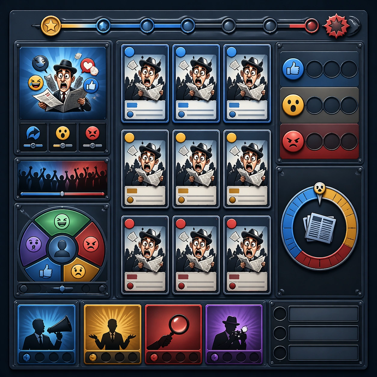
Example generated from “Family Groupchat Chaos Visuals — Variant One”
GPT Image 2en

Scene: Create a square dependent image for Family Groupchat Chaos Visuals. Build a first controlled variation in the same system with a premium, production-ready finish. Use a polished modular board or campaign surface with clean spacing, premium game-UI finish, and clear focal hierarchy. The composition should feel intentional, clean, and reusable for gallery, research, campaign, or internal handoff contexts. Lighting must support readability first, with the main forms clearly separated from the background and enough breathing room for the system to stay legible at both hero scale and thumbnail scale. Subject: Center a coherent original game-art system built for premium production and marketing surfaces. For this image, focus on the intended support surface. Keep the same system logic stable across screenshots, cards, banners, and overview boards. Preserve exact identity or system logic from the reference image while changing only the intended variation axis. The viewer should immediately understand what role this surface plays inside a cohesive game-production asset pack. Important details: Lock framing, icon grammar, palette blocking, and surface hierarchy so the kit feels production-ready and consistent. Preserve the core silhouette, framing language, and material logic from the reference image while each variation changes function. Keep materials believable, edge hierarchy disciplined, and the visual language consistent with Family Chaos. Use abstract interface blocks or diagram accents when helpful, but avoid any readable language. The final result should feel like a deliberate production asset rather than a random illustration. Use case: Family Groupchat Chaos Visuals series study 2/9, designed as variant one within a cohesive asset pack. Constraints: No readable text, no watermark, no logos, preserve exact 1:1 aspect ratio, no unrelated objects, no broken visual hierarchy, no malformed anatomy or broken perspective, no random decorative clutter.

Example generated from “Family Groupchat Chaos Visuals — Variant Two”
GPT Image 2en

Scene: Create a square dependent image for Family Groupchat Chaos Visuals. Build a second controlled variation in the same system with a premium, production-ready finish. Use a polished modular board or campaign surface with clean spacing, premium game-UI finish, and clear focal hierarchy. The composition should feel intentional, clean, and reusable for gallery, research, campaign, or internal handoff contexts. Lighting must support readability first, with the main forms clearly separated from the background and enough breathing room for the system to stay legible at both hero scale and thumbnail scale. Subject: Center a coherent original game-art system built for premium production and marketing surfaces. For this image, focus on the intended support surface. Keep the same system logic stable across screenshots, cards, banners, and overview boards. Preserve exact identity or system logic from the reference image while changing only the intended variation axis. The viewer should immediately understand what role this surface plays inside a cohesive game-production asset pack. Important details: Lock framing, icon grammar, palette blocking, and surface hierarchy so the kit feels production-ready and consistent. Preserve the core silhouette, framing language, and material logic from the reference image while each variation changes function. Keep materials believable, edge hierarchy disciplined, and the visual language consistent with Family Chaos. Use abstract interface blocks or diagram accents when helpful, but avoid any readable language. The final result should feel like a deliberate production asset rather than a random illustration. Use case: Family Groupchat Chaos Visuals series study 3/9, designed as variant two within a cohesive asset pack. Constraints: No readable text, no watermark, no logos, preserve exact 1:1 aspect ratio, no unrelated objects, no broken visual hierarchy, no malformed anatomy or broken perspective, no random decorative clutter.

Example generated from “Family Groupchat Chaos Visuals — Variant Three”
GPT Image 2en

Scene: Create a square dependent image for Family Groupchat Chaos Visuals. Build a third controlled variation in the same system with a premium, production-ready finish. Use a polished modular board or campaign surface with clean spacing, premium game-UI finish, and clear focal hierarchy. The composition should feel intentional, clean, and reusable for gallery, research, campaign, or internal handoff contexts. Lighting must support readability first, with the main forms clearly separated from the background and enough breathing room for the system to stay legible at both hero scale and thumbnail scale. Subject: Center a coherent original game-art system built for premium production and marketing surfaces. For this image, focus on the intended support surface. Keep the same system logic stable across screenshots, cards, banners, and overview boards. Preserve exact identity or system logic from the reference image while changing only the intended variation axis. The viewer should immediately understand what role this surface plays inside a cohesive game-production asset pack. Important details: Lock framing, icon grammar, palette blocking, and surface hierarchy so the kit feels production-ready and consistent. Preserve the core silhouette, framing language, and material logic from the reference image while each variation changes function. Keep materials believable, edge hierarchy disciplined, and the visual language consistent with Family Chaos. Use abstract interface blocks or diagram accents when helpful, but avoid any readable language. The final result should feel like a deliberate production asset rather than a random illustration. Use case: Family Groupchat Chaos Visuals series study 4/9, designed as variant three within a cohesive asset pack. Constraints: No readable text, no watermark, no logos, preserve exact 1:1 aspect ratio, no unrelated objects, no broken visual hierarchy, no malformed anatomy or broken perspective, no random decorative clutter.

Example generated from “Family Groupchat Chaos Visuals — Support One”
GPT Image 2en

Scene: Create a square standalone support image for Family Groupchat Chaos Visuals. Build a support-surface study with a clear focal hierarchy and a finished professional surface. Use a polished modular board or campaign surface with clean spacing, premium game-UI finish, and clear focal hierarchy. The frame should feel self-contained and polished, with enough structure to explain the system even without the reference series, yet still obviously belonging to the same theme and production world. Subject: Show a coherent original game-art system built for premium production and marketing surfaces in a way that emphasizes the intended support surface. Keep the same system logic stable across screenshots, cards, banners, and overview boards. Even though this image is independent, the viewer should still recognize the same universe, same commercial logic, and same production intent as the core package. Important details: Lock framing, icon grammar, palette blocking, and surface hierarchy so the kit feels production-ready and consistent. Preserve the broader theme language through color, framing, material choices, and modular composition. Use clean panel rhythm, premium asset presentation, and believable detail density. The image should work equally well as a gallery study, research reference, and mock production deliverable. Use case: Family Groupchat Chaos Visuals single study 5/9, exploring support one as a support surface. Constraints: No readable text, no watermark, no logos, preserve exact 1:1 aspect ratio, no unrelated objects, no broken visual hierarchy, no visual noise that obscures the main surface, no accidental brand resemblance.

Example generated from “Family Groupchat Chaos Visuals — Support Two”
GPT Image 2en

Scene: Create a square standalone support image for Family Groupchat Chaos Visuals. Build a second support-surface study with a clear focal hierarchy and a finished professional surface. Use a polished modular board or campaign surface with clean spacing, premium game-UI finish, and clear focal hierarchy. The frame should feel self-contained and polished, with enough structure to explain the system even without the reference series, yet still obviously belonging to the same theme and production world. Subject: Show a coherent original game-art system built for premium production and marketing surfaces in a way that emphasizes the intended support surface. Keep the same system logic stable across screenshots, cards, banners, and overview boards. Even though this image is independent, the viewer should still recognize the same universe, same commercial logic, and same production intent as the core package. Important details: Lock framing, icon grammar, palette blocking, and surface hierarchy so the kit feels production-ready and consistent. Preserve the broader theme language through color, framing, material choices, and modular composition. Use clean panel rhythm, premium asset presentation, and believable detail density. The image should work equally well as a gallery study, research reference, and mock production deliverable. Use case: Family Groupchat Chaos Visuals single study 6/9, exploring support two as a support surface. Constraints: No readable text, no watermark, no logos, preserve exact 1:1 aspect ratio, no unrelated objects, no broken visual hierarchy, no visual noise that obscures the main surface, no accidental brand resemblance.

Example generated from “Family Groupchat Chaos Visuals — Support Three”
GPT Image 2en

Scene: Create a square standalone support image for Family Groupchat Chaos Visuals. Build a third support-surface study with a clear focal hierarchy and a finished professional surface. Use a polished modular board or campaign surface with clean spacing, premium game-UI finish, and clear focal hierarchy. The frame should feel self-contained and polished, with enough structure to explain the system even without the reference series, yet still obviously belonging to the same theme and production world. Subject: Show a coherent original game-art system built for premium production and marketing surfaces in a way that emphasizes the intended support surface. Keep the same system logic stable across screenshots, cards, banners, and overview boards. Even though this image is independent, the viewer should still recognize the same universe, same commercial logic, and same production intent as the core package. Important details: Lock framing, icon grammar, palette blocking, and surface hierarchy so the kit feels production-ready and consistent. Preserve the broader theme language through color, framing, material choices, and modular composition. Use clean panel rhythm, premium asset presentation, and believable detail density. The image should work equally well as a gallery study, research reference, and mock production deliverable. Use case: Family Groupchat Chaos Visuals single study 7/9, exploring support three as a support surface. Constraints: No readable text, no watermark, no logos, preserve exact 1:1 aspect ratio, no unrelated objects, no broken visual hierarchy, no visual noise that obscures the main surface, no accidental brand resemblance.

Example generated from “Family Groupchat Chaos Visuals — Support Four”
GPT Image 2en

Scene: Create a square standalone support image for Family Groupchat Chaos Visuals. Build a fourth support-surface study with a clear focal hierarchy and a finished professional surface. Use a polished modular board or campaign surface with clean spacing, premium game-UI finish, and clear focal hierarchy. The frame should feel self-contained and polished, with enough structure to explain the system even without the reference series, yet still obviously belonging to the same theme and production world. Subject: Show a coherent original game-art system built for premium production and marketing surfaces in a way that emphasizes the intended support surface. Keep the same system logic stable across screenshots, cards, banners, and overview boards. Even though this image is independent, the viewer should still recognize the same universe, same commercial logic, and same production intent as the core package. Important details: Lock framing, icon grammar, palette blocking, and surface hierarchy so the kit feels production-ready and consistent. Preserve the broader theme language through color, framing, material choices, and modular composition. Use clean panel rhythm, premium asset presentation, and believable detail density. The image should work equally well as a gallery study, research reference, and mock production deliverable. Use case: Family Groupchat Chaos Visuals single study 8/9, exploring support four as a support surface. Constraints: No readable text, no watermark, no logos, preserve exact 1:1 aspect ratio, no unrelated objects, no broken visual hierarchy, no visual noise that obscures the main surface, no accidental brand resemblance.

Example generated from “Family Groupchat Chaos Visuals — Support Five”
GPT Image 2en

Scene: Create a square standalone support image for Family Groupchat Chaos Visuals. Build a fifth support-surface study with a clear focal hierarchy and a finished professional surface. Use a polished modular board or campaign surface with clean spacing, premium game-UI finish, and clear focal hierarchy. The frame should feel self-contained and polished, with enough structure to explain the system even without the reference series, yet still obviously belonging to the same theme and production world. Subject: Show a coherent original game-art system built for premium production and marketing surfaces in a way that emphasizes the intended support surface. Keep the same system logic stable across screenshots, cards, banners, and overview boards. Even though this image is independent, the viewer should still recognize the same universe, same commercial logic, and same production intent as the core package. Important details: Lock framing, icon grammar, palette blocking, and surface hierarchy so the kit feels production-ready and consistent. Preserve the broader theme language through color, framing, material choices, and modular composition. Use clean panel rhythm, premium asset presentation, and believable detail density. The image should work equally well as a gallery study, research reference, and mock production deliverable. Use case: Family Groupchat Chaos Visuals single study 9/9, exploring support five as a support surface. Constraints: No readable text, no watermark, no logos, preserve exact 1:1 aspect ratio, no unrelated objects, no broken visual hierarchy, no visual noise that obscures the main surface, no accidental brand resemblance.

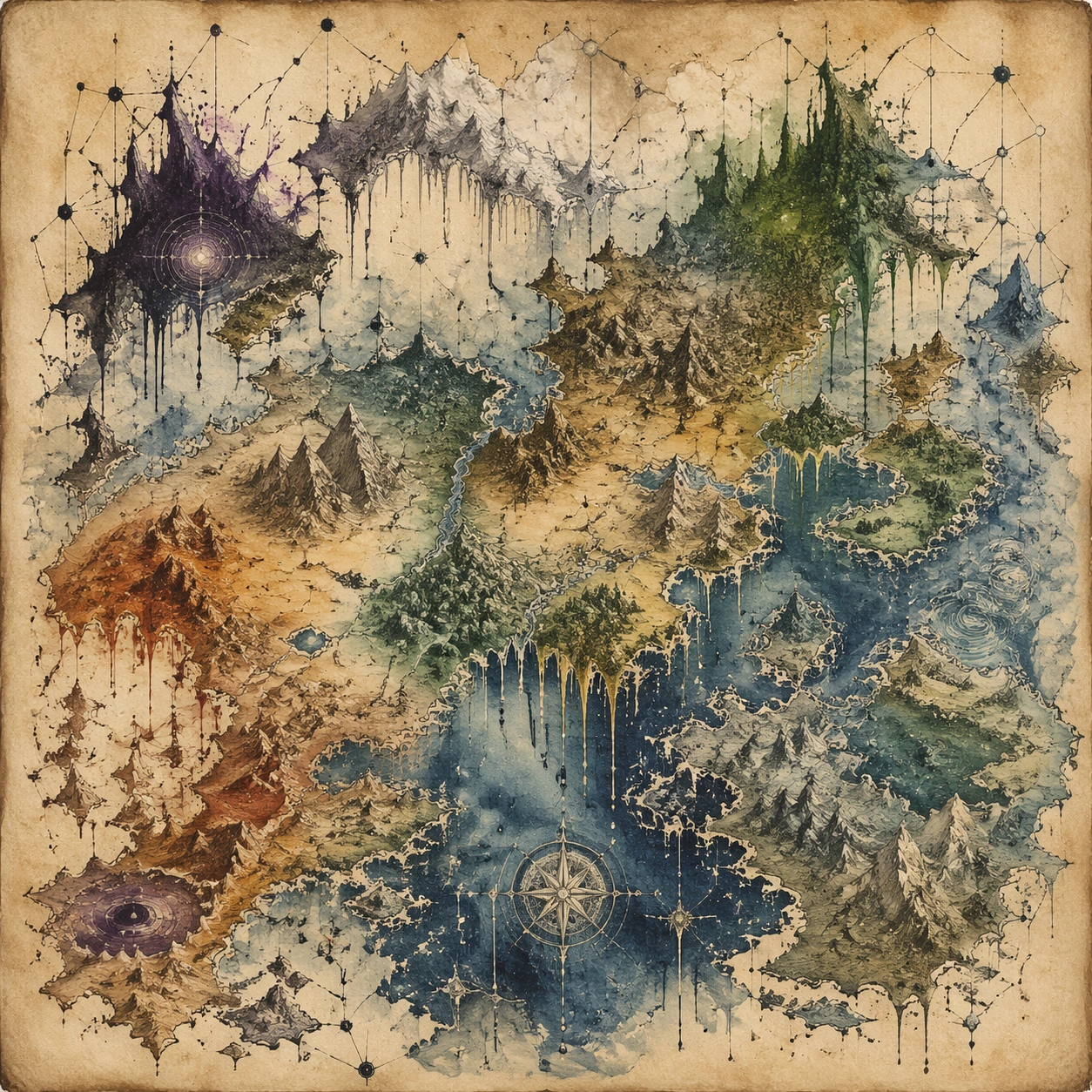
Example generated from “Fantasy Handdrawn Map — Drip Constellation”
GPT Image 2en

Scene: A square, gallery-ready composition with painterly surfaces, controlled negative space, and a deliberate fine-art presentation. Build the frame around a dense all-over field of marks that feels suspended between chaos and structure. Keep the lighting, camera distance, and spatial organization tuned for a high-signal research image rather than a casual snapshot. The image belongs to the Fantasy Handdrawn Map theme and should feel immediately legible as a prompt atlas theme for fantasy handdrawn map, testing structured-layout, photorealism, world-knowledge, reasoning-composition with gpt image 2.. Subject: Center the study on a dense all-over field of marks that feels suspended between chaos and structure. Translate the theme into a concrete visual statement instead of an abstract mood board: the viewer should understand what kind of image this is, what is being tested, and why the composition is difficult. Use the slug idea of fantasy handdrawn map as a literal guide for subject matter, materials, and staging. If helpful, borrow the broad visual cues suggested by Here Be Dragons, but keep the result original and specific to this study. Important details: Focus on authored mark-making, hierarchy, rhythm, and a visual idea that reads immediately before the viewer inspects the brushwork. Preserve a disciplined square composition, clear focal hierarchy, and enough secondary information to make the image feel complete rather than underspecified. The image should look polished, novel, and exhibition-ready, with topic-specific credibility coming from the way surfaces, structure, and visual language reinforce Fantasy Handdrawn Map. Avoid generic filler elements that do not serve the main concept. Use case: Fantasy Handdrawn Map single study 1/8, testing structured-layout, photorealism, world-knowledge, reasoning-composition through the drip constellation variation. Constraints: No readable text, no watermark, no logos, preserve exact 1:1 aspect ratio, no direct copy of a known artwork, no comic speech bubbles, no accidental typography, no low-effort doodle energy, no muddy center, no fake museum label.

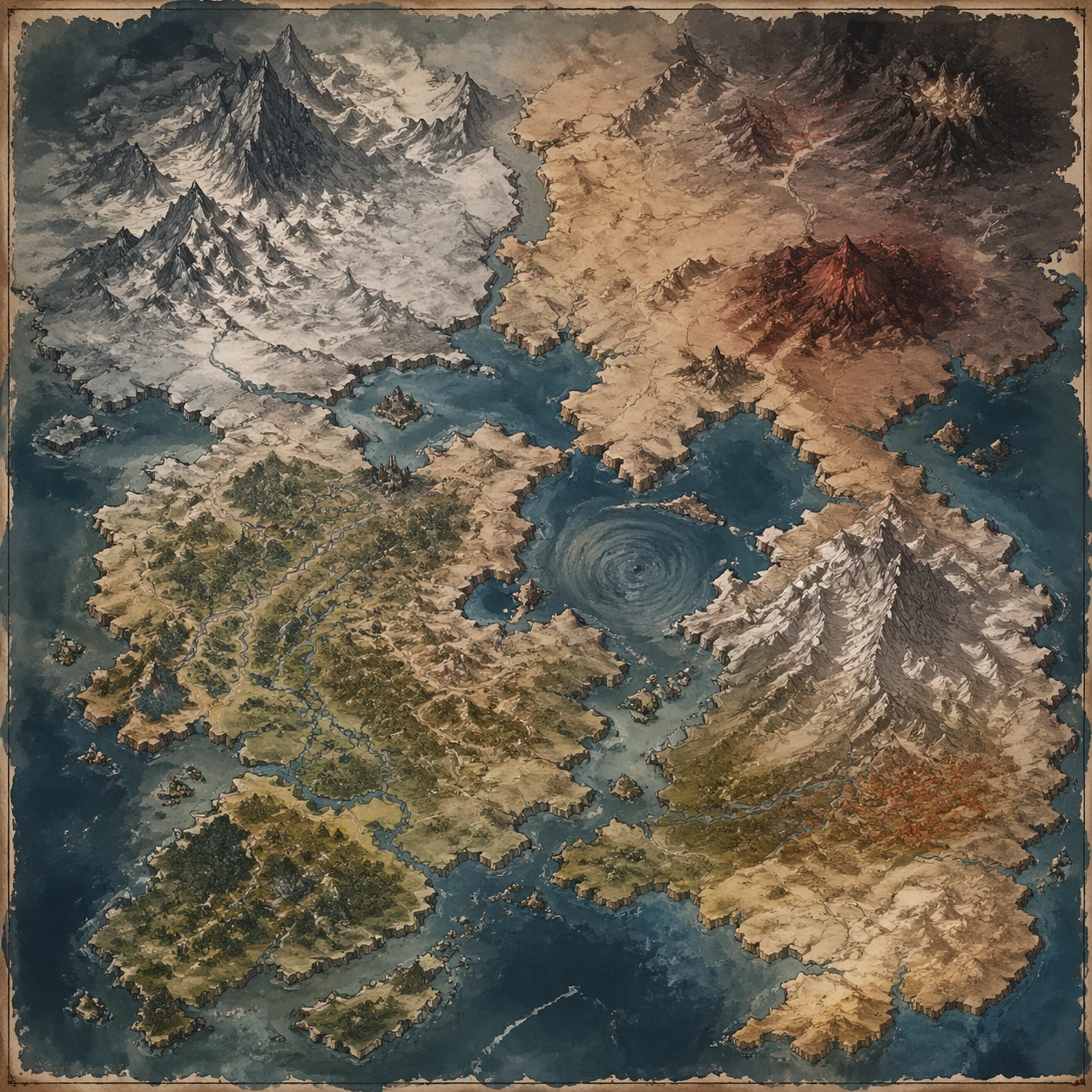
Example generated from “Fantasy Handdrawn Map — Color Field Threshold”
GPT Image 2en

Scene: A square, gallery-ready composition with painterly surfaces, controlled negative space, and a deliberate fine-art presentation. Build the frame around a few dominant blocks or atmospheres of color with slow transitions and emotional weight. Keep the lighting, camera distance, and spatial organization tuned for a high-signal research image rather than a casual snapshot. The image belongs to the Fantasy Handdrawn Map theme and should feel immediately legible as a prompt atlas theme for fantasy handdrawn map, testing structured-layout, photorealism, world-knowledge, reasoning-composition with gpt image 2.. Subject: Center the study on a few dominant blocks or atmospheres of color with slow transitions and emotional weight. Translate the theme into a concrete visual statement instead of an abstract mood board: the viewer should understand what kind of image this is, what is being tested, and why the composition is difficult. Use the slug idea of fantasy handdrawn map as a literal guide for subject matter, materials, and staging. If helpful, borrow the broad visual cues suggested by Here Be Dragons, but keep the result original and specific to this study. Important details: Focus on authored mark-making, hierarchy, rhythm, and a visual idea that reads immediately before the viewer inspects the brushwork. Preserve a disciplined square composition, clear focal hierarchy, and enough secondary information to make the image feel complete rather than underspecified. The image should look polished, novel, and exhibition-ready, with topic-specific credibility coming from the way surfaces, structure, and visual language reinforce Fantasy Handdrawn Map. Avoid generic filler elements that do not serve the main concept. Use case: Fantasy Handdrawn Map single study 2/8, testing structured-layout, photorealism, world-knowledge, reasoning-composition through the color field threshold variation. Constraints: No readable text, no watermark, no logos, preserve exact 1:1 aspect ratio, no direct copy of a known artwork, no comic speech bubbles, no accidental typography, no low-effort doodle energy, no muddy center, no fake museum label.

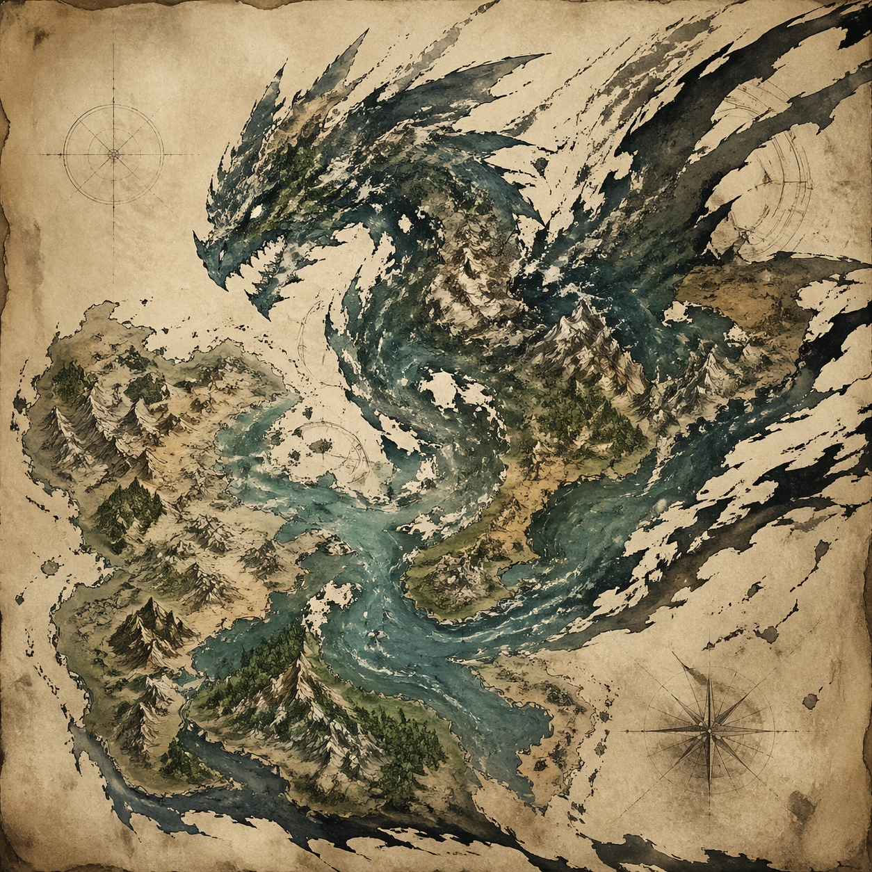
Example generated from “Fantasy Handdrawn Map — Fractured Figure Surge”
GPT Image 2en

Scene: A square, gallery-ready composition with painterly surfaces, controlled negative space, and a deliberate fine-art presentation. Build the frame around a figure-like presence that emerges and dissolves through broken strokes and unstable edges. Keep the lighting, camera distance, and spatial organization tuned for a high-signal research image rather than a casual snapshot. The image belongs to the Fantasy Handdrawn Map theme and should feel immediately legible as a prompt atlas theme for fantasy handdrawn map, testing structured-layout, photorealism, world-knowledge, reasoning-composition with gpt image 2.. Subject: Center the study on a figure-like presence that emerges and dissolves through broken strokes and unstable edges. Translate the theme into a concrete visual statement instead of an abstract mood board: the viewer should understand what kind of image this is, what is being tested, and why the composition is difficult. Use the slug idea of fantasy handdrawn map as a literal guide for subject matter, materials, and staging. If helpful, borrow the broad visual cues suggested by Here Be Dragons, but keep the result original and specific to this study. Important details: Focus on authored mark-making, hierarchy, rhythm, and a visual idea that reads immediately before the viewer inspects the brushwork. Preserve a disciplined square composition, clear focal hierarchy, and enough secondary information to make the image feel complete rather than underspecified. The image should look polished, novel, and exhibition-ready, with topic-specific credibility coming from the way surfaces, structure, and visual language reinforce Fantasy Handdrawn Map. Avoid generic filler elements that do not serve the main concept. Use case: Fantasy Handdrawn Map single study 3/8, testing structured-layout, photorealism, world-knowledge, reasoning-composition through the fractured figure surge variation. Constraints: No readable text, no watermark, no logos, preserve exact 1:1 aspect ratio, no direct copy of a known artwork, no comic speech bubbles, no accidental typography, no low-effort doodle energy, no muddy center, no fake museum label.

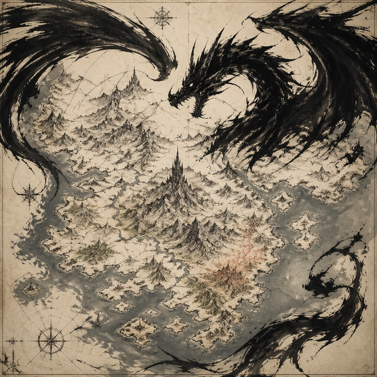
Example generated from “Fantasy Handdrawn Map — Black Brush Choir”
GPT Image 2en

Scene: A square, gallery-ready composition with painterly surfaces, controlled negative space, and a deliberate fine-art presentation. Build the frame around large decisive black gestures that create rhythm, tension, and architectural pressure. Keep the lighting, camera distance, and spatial organization tuned for a high-signal research image rather than a casual snapshot. The image belongs to the Fantasy Handdrawn Map theme and should feel immediately legible as a prompt atlas theme for fantasy handdrawn map, testing structured-layout, photorealism, world-knowledge, reasoning-composition with gpt image 2.. Subject: Center the study on large decisive black gestures that create rhythm, tension, and architectural pressure. Translate the theme into a concrete visual statement instead of an abstract mood board: the viewer should understand what kind of image this is, what is being tested, and why the composition is difficult. Use the slug idea of fantasy handdrawn map as a literal guide for subject matter, materials, and staging. If helpful, borrow the broad visual cues suggested by Here Be Dragons, but keep the result original and specific to this study. Important details: Focus on authored mark-making, hierarchy, rhythm, and a visual idea that reads immediately before the viewer inspects the brushwork. Preserve a disciplined square composition, clear focal hierarchy, and enough secondary information to make the image feel complete rather than underspecified. The image should look polished, novel, and exhibition-ready, with topic-specific credibility coming from the way surfaces, structure, and visual language reinforce Fantasy Handdrawn Map. Avoid generic filler elements that do not serve the main concept. Use case: Fantasy Handdrawn Map single study 4/8, testing structured-layout, photorealism, world-knowledge, reasoning-composition through the black brush choir variation. Constraints: No readable text, no watermark, no logos, preserve exact 1:1 aspect ratio, no direct copy of a known artwork, no comic speech bubbles, no accidental typography, no low-effort doodle energy, no muddy center, no fake museum label.

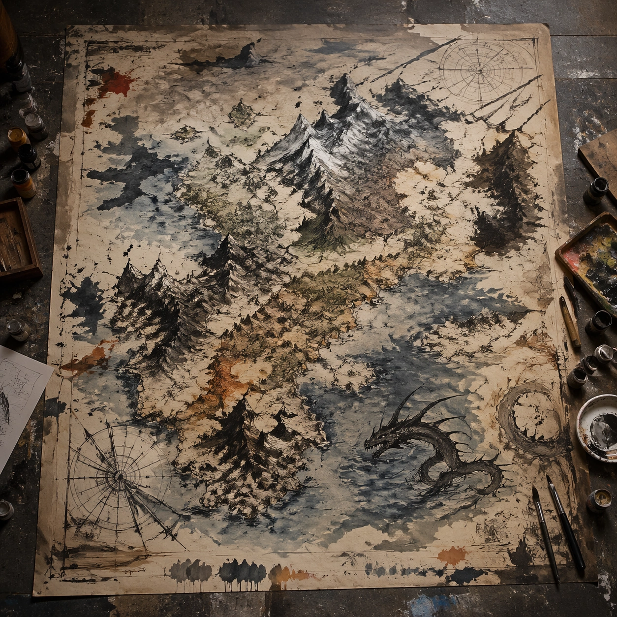
Example generated from “Fantasy Handdrawn Map — Studio Floor Afterimage”
GPT Image 2en

Scene: A square, gallery-ready composition with painterly surfaces, controlled negative space, and a deliberate fine-art presentation. Build the frame around evidence of process, splatter, drag, and layered correction without becoming documentary clutter. Keep the lighting, camera distance, and spatial organization tuned for a high-signal research image rather than a casual snapshot. The image belongs to the Fantasy Handdrawn Map theme and should feel immediately legible as a prompt atlas theme for fantasy handdrawn map, testing structured-layout, photorealism, world-knowledge, reasoning-composition with gpt image 2.. Subject: Center the study on evidence of process, splatter, drag, and layered correction without becoming documentary clutter. Translate the theme into a concrete visual statement instead of an abstract mood board: the viewer should understand what kind of image this is, what is being tested, and why the composition is difficult. Use the slug idea of fantasy handdrawn map as a literal guide for subject matter, materials, and staging. If helpful, borrow the broad visual cues suggested by Here Be Dragons, but keep the result original and specific to this study. Important details: Focus on authored mark-making, hierarchy, rhythm, and a visual idea that reads immediately before the viewer inspects the brushwork. Preserve a disciplined square composition, clear focal hierarchy, and enough secondary information to make the image feel complete rather than underspecified. The image should look polished, novel, and exhibition-ready, with topic-specific credibility coming from the way surfaces, structure, and visual language reinforce Fantasy Handdrawn Map. Avoid generic filler elements that do not serve the main concept. Use case: Fantasy Handdrawn Map single study 5/8, testing structured-layout, photorealism, world-knowledge, reasoning-composition through the studio floor afterimage variation. Constraints: No readable text, no watermark, no logos, preserve exact 1:1 aspect ratio, no direct copy of a known artwork, no comic speech bubbles, no accidental typography, no low-effort doodle energy, no muddy center, no fake museum label.

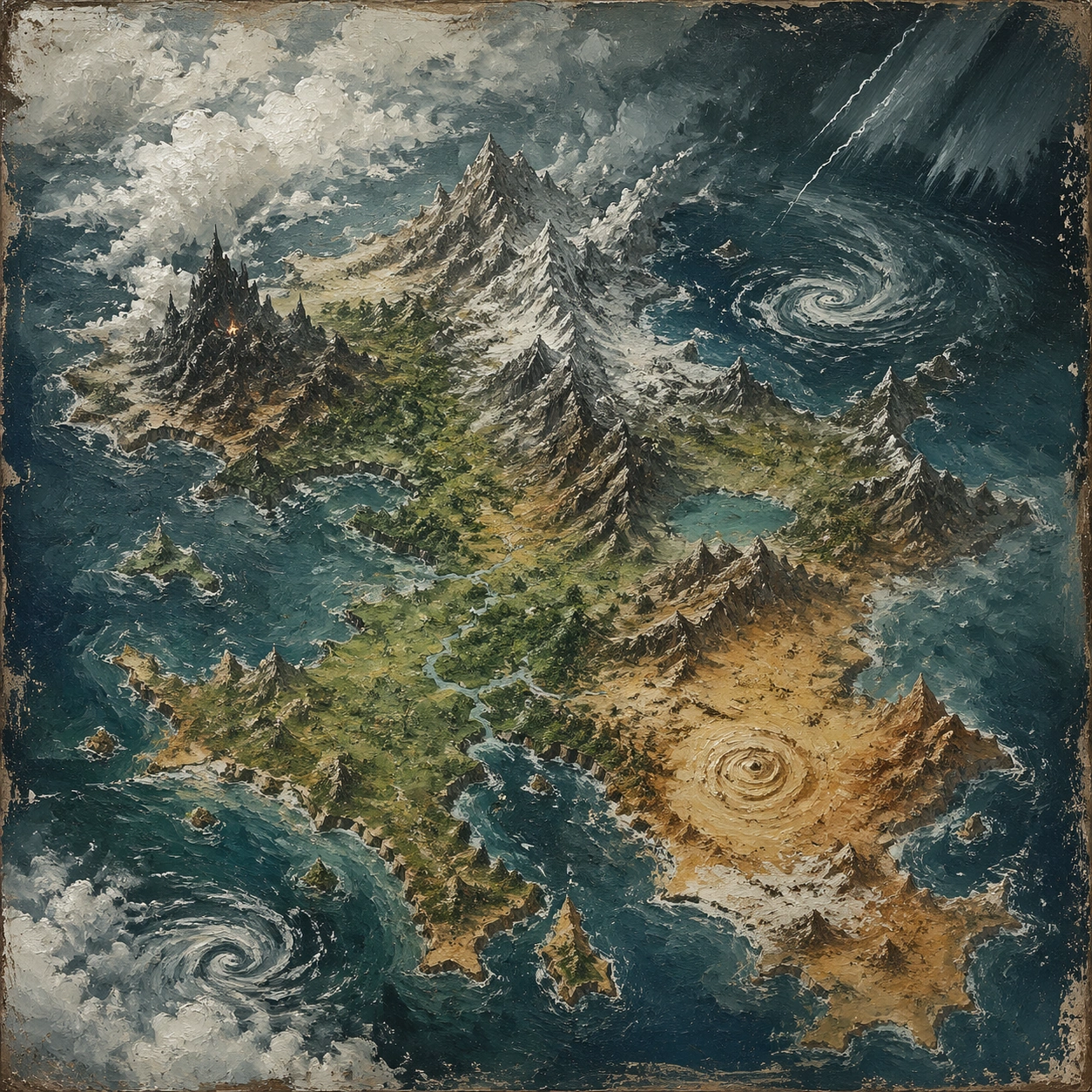
Example generated from “Fantasy Handdrawn Map — 厚涂天气”
GPT Image 2en

Scene: A square, gallery-ready composition with painterly surfaces, controlled negative space, and a deliberate fine-art presentation. Build the frame around surface build-up, scrape marks, and thick tactile passages that feel meteorological. Keep the lighting, camera distance, and spatial organization tuned for a high-signal research image rather than a casual snapshot. The image belongs to the Fantasy Handdrawn Map theme and should feel immediately legible as a prompt atlas theme for fantasy handdrawn map, testing structured-layout, photorealism, world-knowledge, reasoning-composition with gpt image 2.. Subject: Center the study on surface build-up, scrape marks, and thick tactile passages that feel meteorological. Translate the theme into a concrete visual statement instead of an abstract mood board: the viewer should understand what kind of image this is, what is being tested, and why the composition is difficult. Use the slug idea of fantasy handdrawn map as a literal guide for subject matter, materials, and staging. If helpful, borrow the broad visual cues suggested by Here Be Dragons, but keep the result original and specific to this study. Important details: Focus on authored mark-making, hierarchy, rhythm, and a visual idea that reads immediately before the viewer inspects the brushwork. Preserve a disciplined square composition, clear focal hierarchy, and enough secondary information to make the image feel complete rather than underspecified. The image should look polished, novel, and exhibition-ready, with topic-specific credibility coming from the way surfaces, structure, and visual language reinforce Fantasy Handdrawn Map. Avoid generic filler elements that do not serve the main concept. Use case: Fantasy Handdrawn Map single study 6/8, testing structured-layout, photorealism, world-knowledge, reasoning-composition through the 厚涂天气 variation. Constraints: No readable text, no watermark, no logos, preserve exact 1:1 aspect ratio, no direct copy of a known artwork, no comic speech bubbles, no accidental typography, no low-effort doodle energy, no muddy center, no fake museum label.

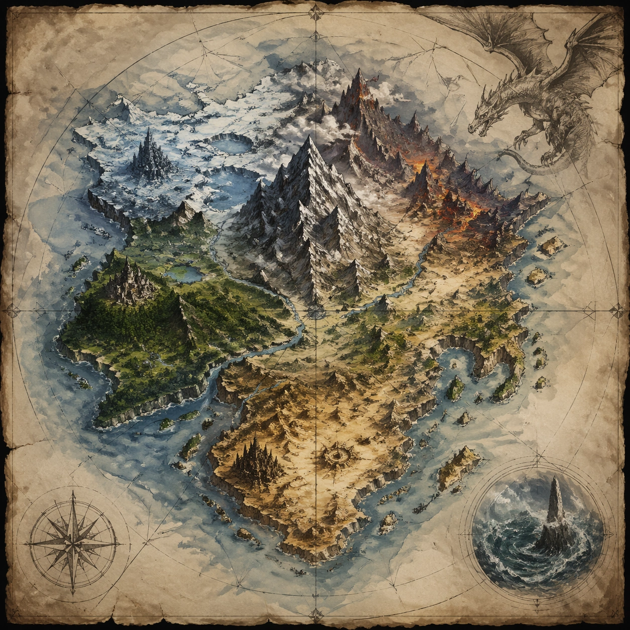
Example generated from “Fantasy Handdrawn Map — Gesture Architecture”
GPT Image 2en

Scene: A square, gallery-ready composition with painterly surfaces, controlled negative space, and a deliberate fine-art presentation. Build the frame around brush movement that locks into a hidden compositional scaffold rather than random motion. Keep the lighting, camera distance, and spatial organization tuned for a high-signal research image rather than a casual snapshot. The image belongs to the Fantasy Handdrawn Map theme and should feel immediately legible as a prompt atlas theme for fantasy handdrawn map, testing structured-layout, photorealism, world-knowledge, reasoning-composition with gpt image 2.. Subject: Center the study on brush movement that locks into a hidden compositional scaffold rather than random motion. Translate the theme into a concrete visual statement instead of an abstract mood board: the viewer should understand what kind of image this is, what is being tested, and why the composition is difficult. Use the slug idea of fantasy handdrawn map as a literal guide for subject matter, materials, and staging. If helpful, borrow the broad visual cues suggested by Here Be Dragons, but keep the result original and specific to this study. Important details: Focus on authored mark-making, hierarchy, rhythm, and a visual idea that reads immediately before the viewer inspects the brushwork. Preserve a disciplined square composition, clear focal hierarchy, and enough secondary information to make the image feel complete rather than underspecified. The image should look polished, novel, and exhibition-ready, with topic-specific credibility coming from the way surfaces, structure, and visual language reinforce Fantasy Handdrawn Map. Avoid generic filler elements that do not serve the main concept. Use case: Fantasy Handdrawn Map single study 7/8, testing structured-layout, photorealism, world-knowledge, reasoning-composition through the gesture architecture variation. Constraints: No readable text, no watermark, no logos, preserve exact 1:1 aspect ratio, no direct copy of a known artwork, no comic speech bubbles, no accidental typography, no low-effort doodle energy, no muddy center, no fake museum label.

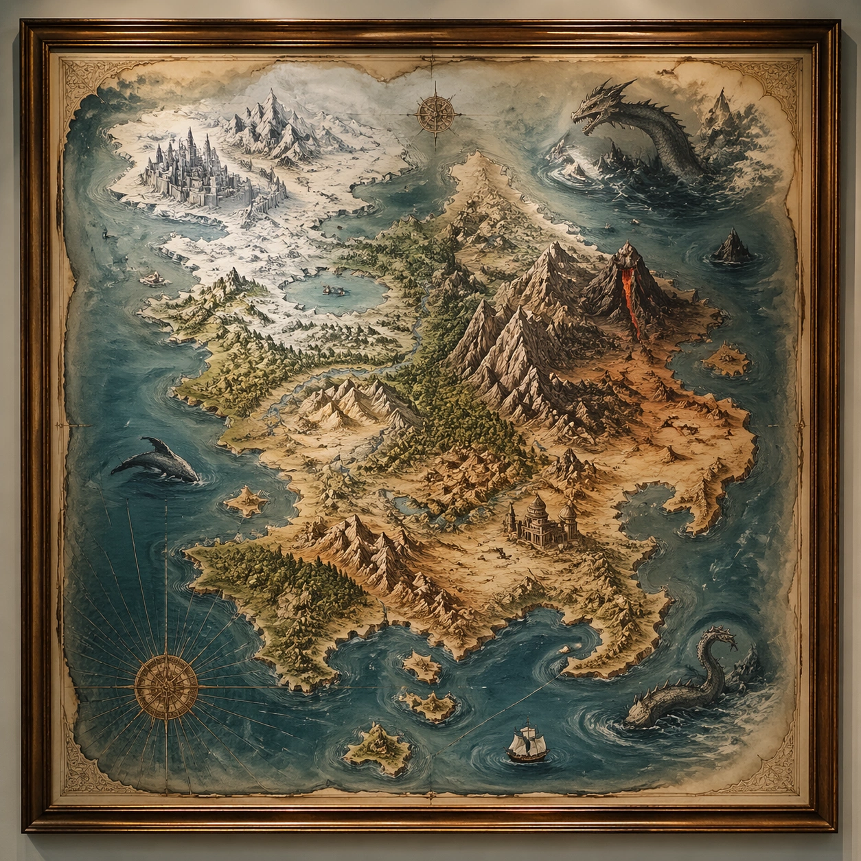
Example generated from “Fantasy Handdrawn Map — Museum Wall Hang”
GPT Image 2en

Scene: A square, gallery-ready composition with painterly surfaces, controlled negative space, and a deliberate fine-art presentation. Build the frame around a resolved exhibition-grade work whose internal balance feels complete and intentional. Keep the lighting, camera distance, and spatial organization tuned for a high-signal research image rather than a casual snapshot. The image belongs to the Fantasy Handdrawn Map theme and should feel immediately legible as a prompt atlas theme for fantasy handdrawn map, testing structured-layout, photorealism, world-knowledge, reasoning-composition with gpt image 2.. Subject: Center the study on a resolved exhibition-grade work whose internal balance feels complete and intentional. Translate the theme into a concrete visual statement instead of an abstract mood board: the viewer should understand what kind of image this is, what is being tested, and why the composition is difficult. Use the slug idea of fantasy handdrawn map as a literal guide for subject matter, materials, and staging. If helpful, borrow the broad visual cues suggested by Here Be Dragons, but keep the result original and specific to this study. Important details: Focus on authored mark-making, hierarchy, rhythm, and a visual idea that reads immediately before the viewer inspects the brushwork. Preserve a disciplined square composition, clear focal hierarchy, and enough secondary information to make the image feel complete rather than underspecified. The image should look polished, novel, and exhibition-ready, with topic-specific credibility coming from the way surfaces, structure, and visual language reinforce Fantasy Handdrawn Map. Avoid generic filler elements that do not serve the main concept. Use case: Fantasy Handdrawn Map single study 8/8, testing structured-layout, photorealism, world-knowledge, reasoning-composition through the museum wall hang variation. Constraints: No readable text, no watermark, no logos, preserve exact 1:1 aspect ratio, no direct copy of a known artwork, no comic speech bubbles, no accidental typography, no low-effort doodle energy, no muddy center, no fake museum label.

Example generated from “Fantasy Live Action Character Portraits — Reference Character Anchor”
GPT Image 2en

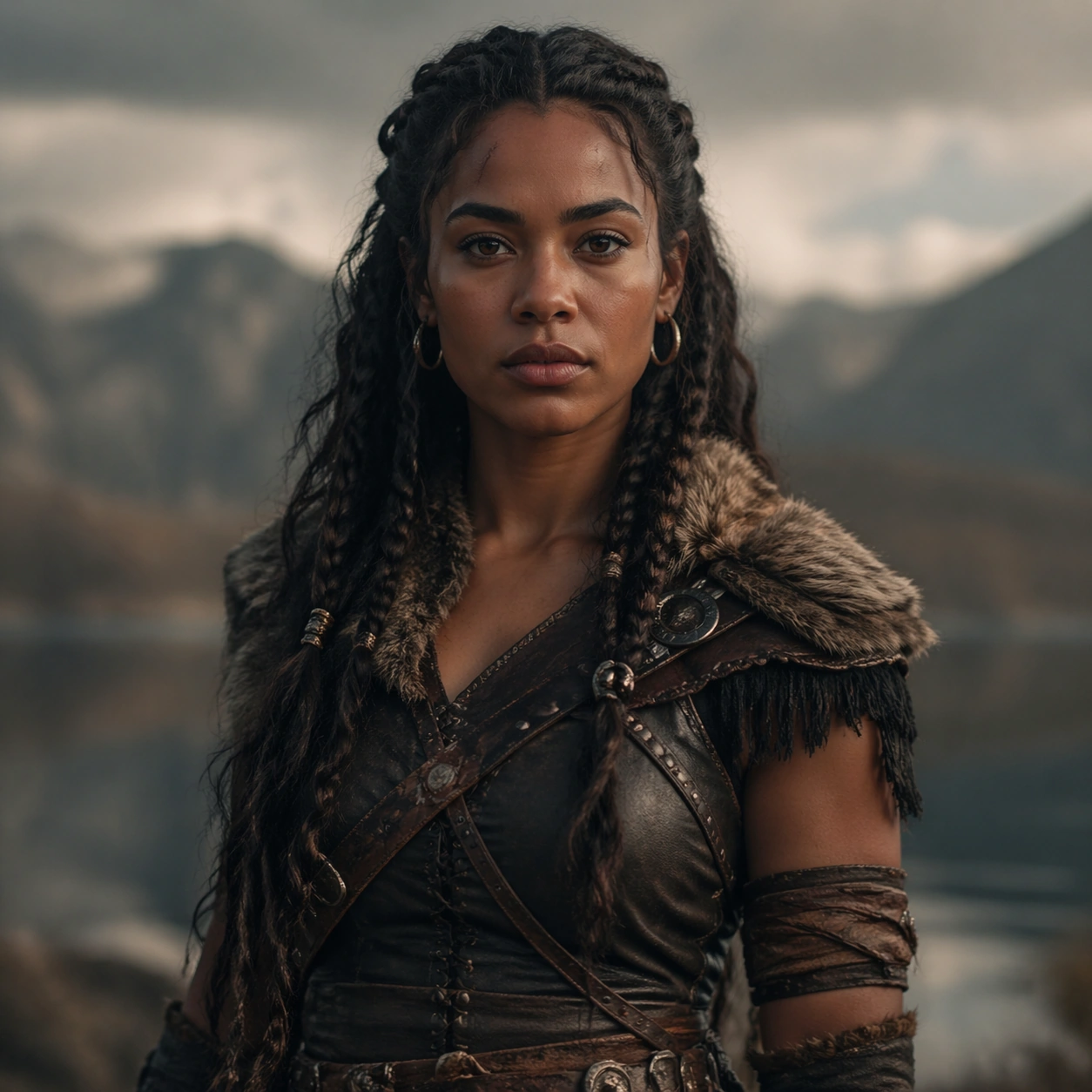
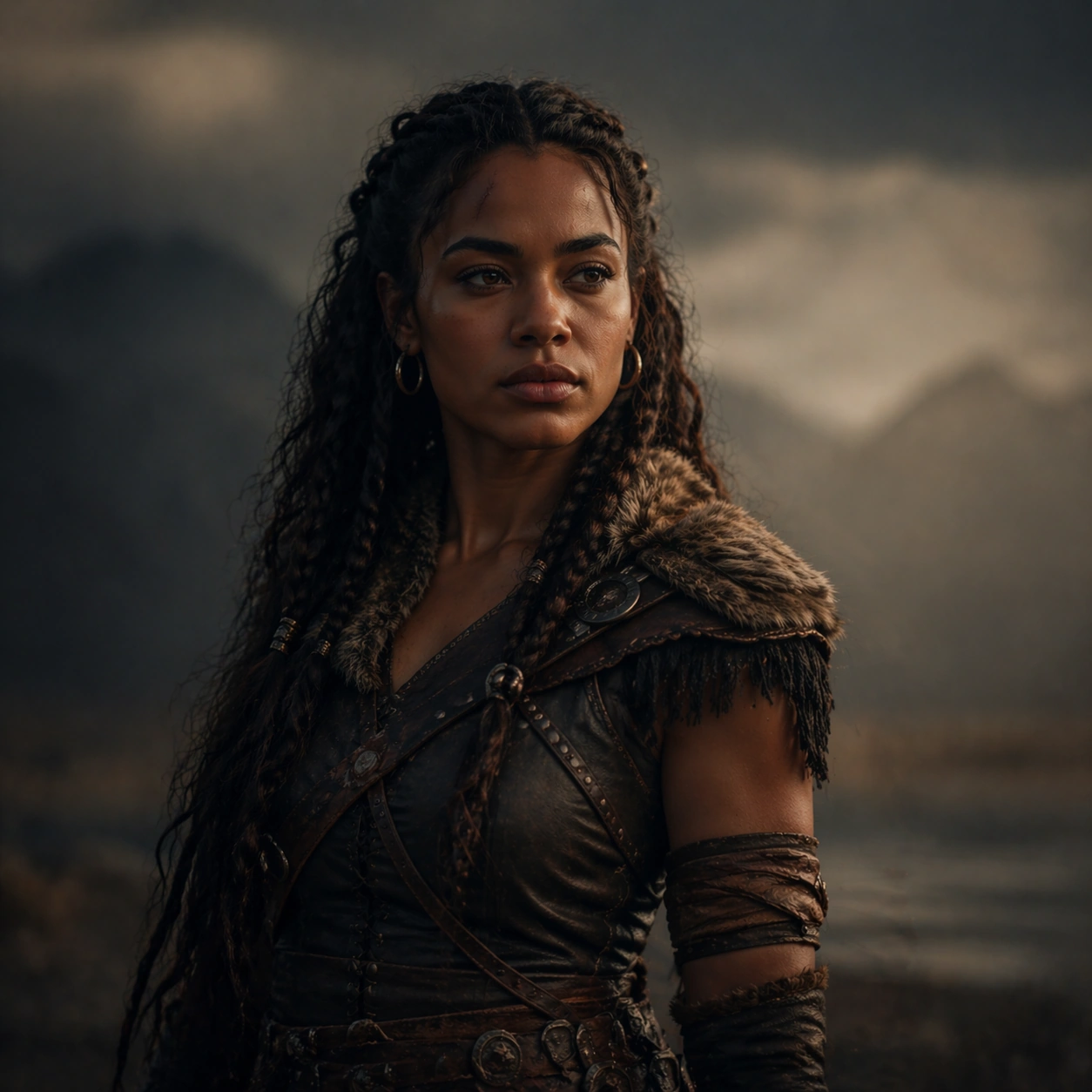
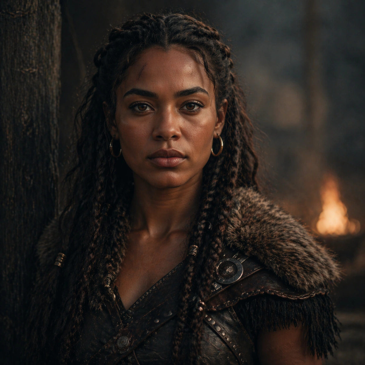
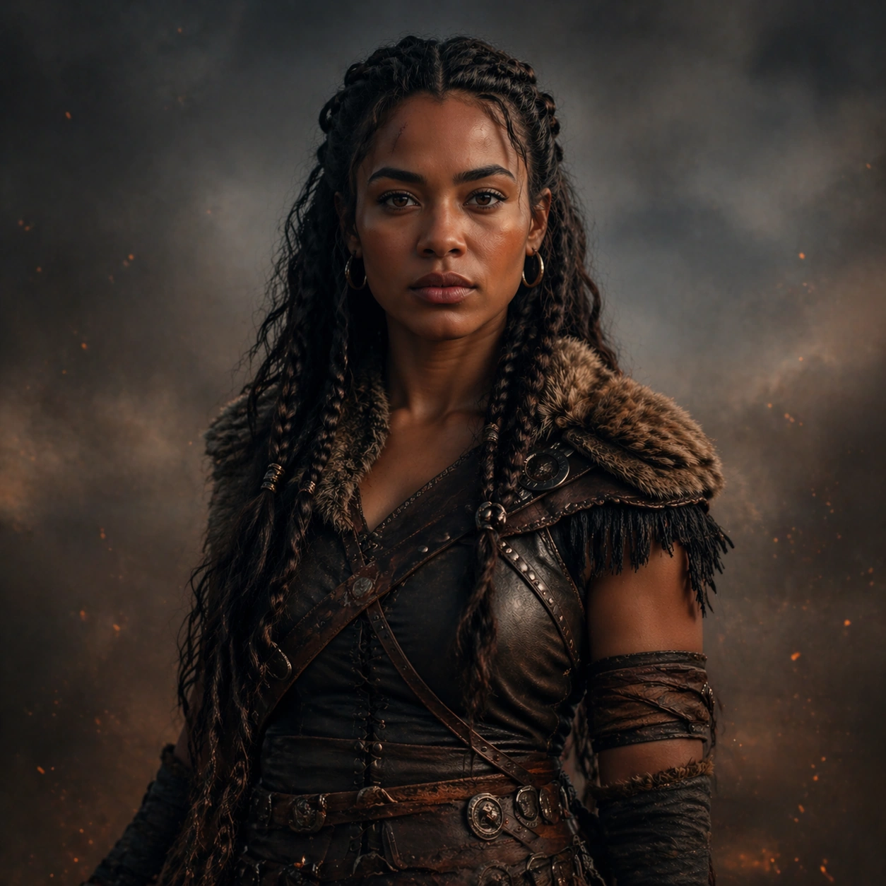
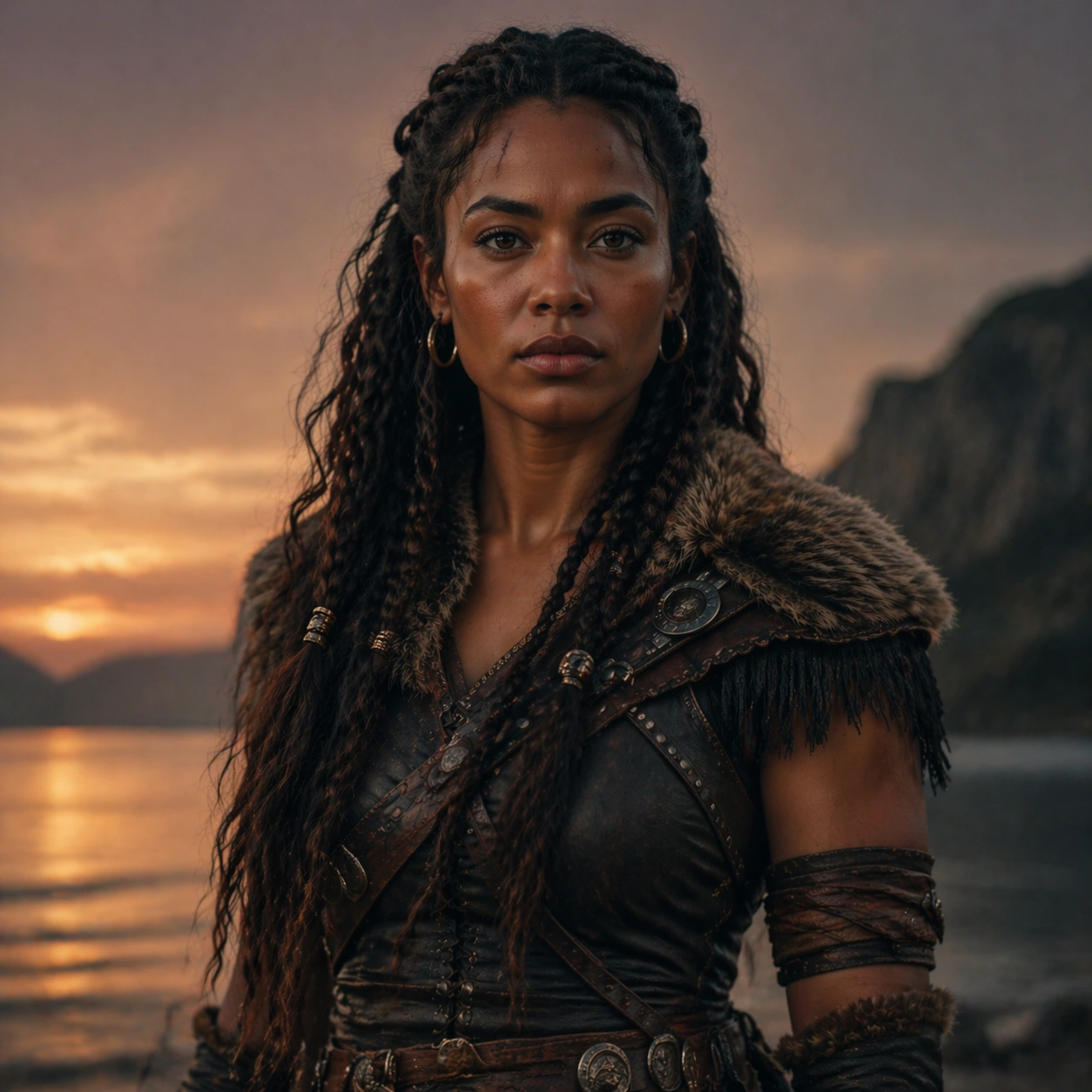
Scene: Create a square 1:1 portrait image for Fantasy Live-Action Character Portraits. Use a premium story-led portrait setup with calm atmosphere, cinematic light discipline, and enough detail to define the recurring character. The frame should feel like a finished professional deliverable rather than a casual snapshot, with clear lens discipline, believable light falloff, and a palette that directly supports Translate fictional or stylized characters into live-action portrait photography that still feels emotionally grounded and costume-realistic.. Keep enough surrounding space and compositional control for gallery, research, campaign, or approval-board reuse while staying photoreal and human-scaled. Subject: Center one live-action fantasy heroine with warm brown skin, long dark braided hair, a faint scar above the left brow, and grounded warrior posture. Establish the exact face, hair base, body proportions, and costume baseline that later story beats must preserve. Use the example direction from the brief as grounding context: Translate fictional or stylized characters into live-action portrait photography that still feels emotionally grounded and costume-realistic.. Wardrobe, lighting, environment, and pose may shift to serve this variation, but the viewer must immediately understand that the same reference identity is still in front of the camera. Important details: This backlog line is difficult because Translate fictional or stylized characters into live-action portrait photography that still feels emotionally grounded and costume-realistic.. Preserve skin tone family, bone structure, eye spacing, nose shape, mouth shape, hairline logic, shoulder width, and overall body read across the entire series. preserve exact face / hair base / body proportions from the reference model. This is the anchor portrait for a narrative sequence, so recognition matters more than spectacle. Avoid the common failure described in the brief: ordinary image models often lose likeness once styling, lighting, or layout changes enter the frame. Success should feel like the result should feel professionally usable, coherent, and clearly built around one stable human identity. Use case: Fantasy Live-Action Character Portraits series study 1/9, the baseline character portrait. Constraints: No readable text, no watermark, no logos, preserve exact 1:1 aspect ratio, preserve exact face / hair base / body proportions from the reference model, no crowd, no unreadable poster text, no genre clutter, no face ambiguity.

Example generated from “Fantasy Live Action Character Portraits — Interior Scene”
GPT Image 2en

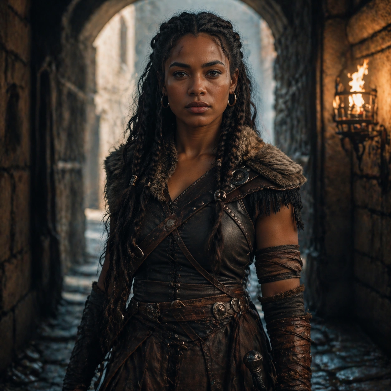
Scene: Create a square 1:1 portrait image for Fantasy Live-Action Character Portraits. Use a carefully staged room or interior with motivated light, layered depth, and one clear emotional focus. The frame should feel like a finished professional deliverable rather than a casual snapshot, with clear lens discipline, believable light falloff, and a palette that directly supports Translate fictional or stylized characters into live-action portrait photography that still feels emotionally grounded and costume-realistic.. Keep enough surrounding space and compositional control for gallery, research, campaign, or approval-board reuse while staying photoreal and human-scaled. Subject: Center one live-action fantasy heroine with warm brown skin, long dark braided hair, a faint scar above the left brow, and grounded warrior posture. Place the same character into a story situation without changing who they are. Preserve the anchor identity even as costume texture or environment becomes richer. Use the example direction from the brief as grounding context: Translate fictional or stylized characters into live-action portrait photography that still feels emotionally grounded and costume-realistic.. Wardrobe, lighting, environment, and pose may shift to serve this variation, but the viewer must immediately understand that the same reference identity is still in front of the camera. Important details: This backlog line is difficult because Translate fictional or stylized characters into live-action portrait photography that still feels emotionally grounded and costume-realistic.. Preserve skin tone family, bone structure, eye spacing, nose shape, mouth shape, hairline logic, shoulder width, and overall body read across the entire series. preserve exact face / hair base / body proportions from the reference model. The scene may feel cinematic, but likeness still outranks atmosphere. Avoid the common failure described in the brief: ordinary image models often lose likeness once styling, lighting, or layout changes enter the frame. Success should feel like the result should feel professionally usable, coherent, and clearly built around one stable human identity. Use case: Fantasy Live-Action Character Portraits series study 2/9, an interior story beat. Constraints: No readable text, no watermark, no logos, preserve exact 1:1 aspect ratio, preserve exact face / hair base / body proportions from the reference model, no extra protagonists, no busy set dressing, no drastic age shift, no unrelated props.

Example generated from “Fantasy Live Action Character Portraits — Transition Pause”
GPT Image 2en

Scene: Create a square 1:1 portrait image for Fantasy Live-Action Character Portraits. Use a hallway, alley, corridor, or threshold frame with directional light and clean silhouette control. The frame should feel like a finished professional deliverable rather than a casual snapshot, with clear lens discipline, believable light falloff, and a palette that directly supports Translate fictional or stylized characters into live-action portrait photography that still feels emotionally grounded and costume-realistic.. Keep enough surrounding space and compositional control for gallery, research, campaign, or approval-board reuse while staying photoreal and human-scaled. Subject: Center one live-action fantasy heroine with warm brown skin, long dark braided hair, a faint scar above the left brow, and grounded warrior posture. Use a transition space to show the same character in motion or pause while preserving exact face / hair base / body proportions from the reference model. Use the example direction from the brief as grounding context: Translate fictional or stylized characters into live-action portrait photography that still feels emotionally grounded and costume-realistic.. Wardrobe, lighting, environment, and pose may shift to serve this variation, but the viewer must immediately understand that the same reference identity is still in front of the camera. Important details: This backlog line is difficult because Translate fictional or stylized characters into live-action portrait photography that still feels emotionally grounded and costume-realistic.. Preserve skin tone family, bone structure, eye spacing, nose shape, mouth shape, hairline logic, shoulder width, and overall body read across the entire series. preserve exact face / hair base / body proportions from the reference model. This image should feel like the next shot in one film, not a new casting choice. Avoid the common failure described in the brief: ordinary image models often lose likeness once styling, lighting, or layout changes enter the frame. Success should feel like the result should feel professionally usable, coherent, and clearly built around one stable human identity. Use case: Fantasy Live-Action Character Portraits series study 3/9, a transitional pause portrait. Constraints: No readable text, no watermark, no logos, preserve exact 1:1 aspect ratio, preserve exact face / hair base / body proportions from the reference model, no hidden face, no body warp, no action blur, no background signage.

Example generated from “Fantasy Live Action Character Portraits — Close-up Emotion”
GPT Image 2en

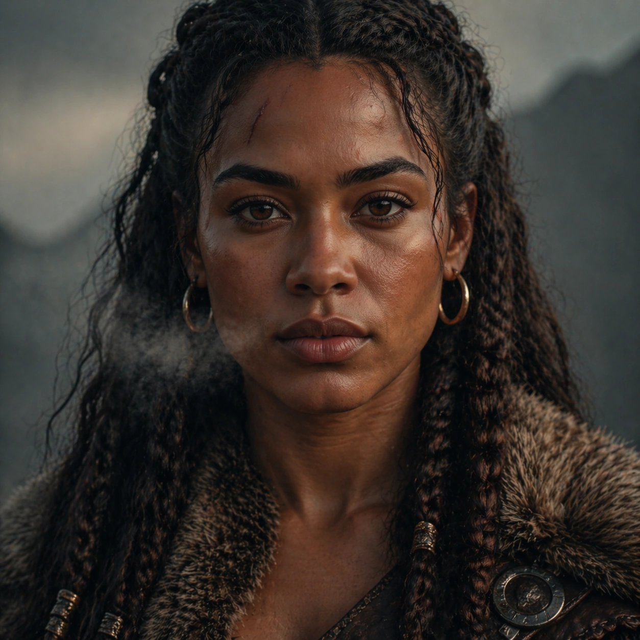
Scene: Create a square 1:1 portrait image for Fantasy Live-Action Character Portraits. Use a tighter crop with visible skin texture, lashes, breath, and emotional tension controlled by cinematic light. The frame should feel like a finished professional deliverable rather than a casual snapshot, with clear lens discipline, believable light falloff, and a palette that directly supports Translate fictional or stylized characters into live-action portrait photography that still feels emotionally grounded and costume-realistic.. Keep enough surrounding space and compositional control for gallery, research, campaign, or approval-board reuse while staying photoreal and human-scaled. Subject: Center one live-action fantasy heroine with warm brown skin, long dark braided hair, a faint scar above the left brow, and grounded warrior posture. Move closer to the same face to test emotional precision without any identity drift. Use the example direction from the brief as grounding context: Translate fictional or stylized characters into live-action portrait photography that still feels emotionally grounded and costume-realistic.. Wardrobe, lighting, environment, and pose may shift to serve this variation, but the viewer must immediately understand that the same reference identity is still in front of the camera. Important details: This backlog line is difficult because Translate fictional or stylized characters into live-action portrait photography that still feels emotionally grounded and costume-realistic.. Preserve skin tone family, bone structure, eye spacing, nose shape, mouth shape, hairline logic, shoulder width, and overall body read across the entire series. preserve exact face / hair base / body proportions from the reference model. Every small facial marker should still match the reference anchor. Avoid the common failure described in the brief: ordinary image models often lose likeness once styling, lighting, or layout changes enter the frame. Success should feel like the result should feel professionally usable, coherent, and clearly built around one stable human identity. Use case: Fantasy Live-Action Character Portraits series study 4/9, a close emotional portrait. Constraints: No readable text, no watermark, no logos, preserve exact 1:1 aspect ratio, preserve exact face / hair base / body proportions from the reference model, no tears that melt features, no face reshaping, no extreme beauty retouching, no second person.

Example generated from “Fantasy Live Action Character Portraits — Exterior Walk”
GPT Image 2en

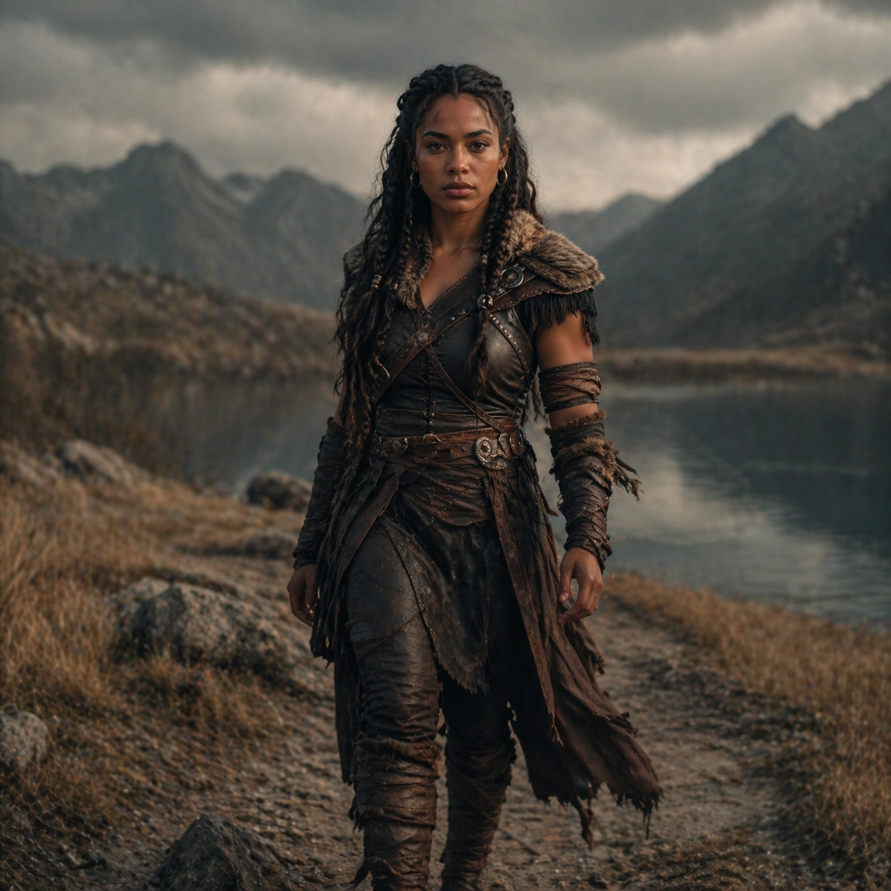
Scene: Create a square 1:1 portrait image for Fantasy Live-Action Character Portraits. Use a believable outdoor setup with motivated practical light and enough environment to imply story stakes. The frame should feel like a finished professional deliverable rather than a casual snapshot, with clear lens discipline, believable light falloff, and a palette that directly supports Translate fictional or stylized characters into live-action portrait photography that still feels emotionally grounded and costume-realistic.. Keep enough surrounding space and compositional control for gallery, research, campaign, or approval-board reuse while staying photoreal and human-scaled. Subject: Center one live-action fantasy heroine with warm brown skin, long dark braided hair, a faint scar above the left brow, and grounded warrior posture. Keep the same character exact while expanding to a wider frame that shows gait, shoulders, and costume silhouette in context. Use the example direction from the brief as grounding context: Translate fictional or stylized characters into live-action portrait photography that still feels emotionally grounded and costume-realistic.. Wardrobe, lighting, environment, and pose may shift to serve this variation, but the viewer must immediately understand that the same reference identity is still in front of the camera. Important details: This backlog line is difficult because Translate fictional or stylized characters into live-action portrait photography that still feels emotionally grounded and costume-realistic.. Preserve skin tone family, bone structure, eye spacing, nose shape, mouth shape, hairline logic, shoulder width, and overall body read across the entire series. preserve exact face / hair base / body proportions from the reference model. Body proportions must stay stable even in motion-aware framing. Avoid the common failure described in the brief: ordinary image models often lose likeness once styling, lighting, or layout changes enter the frame. Success should feel like the result should feel professionally usable, coherent, and clearly built around one stable human identity. Use case: Fantasy Live-Action Character Portraits series study 5/9, an exterior walk or movement frame. Constraints: No readable text, no watermark, no logos, preserve exact 1:1 aspect ratio, preserve exact face / hair base / body proportions from the reference model, no action-movie explosion cliche, no giant environment spectacle, no body elongation, no crowd confusion.

Example generated from “Fantasy Live Action Character Portraits — Profile Shadow”
GPT Image 2en

Scene: Create a square 1:1 portrait image for Fantasy Live-Action Character Portraits. Use a moody side-light frame with rich shadow design, clean negative space, and readable facial geometry. The frame should feel like a finished professional deliverable rather than a casual snapshot, with clear lens discipline, believable light falloff, and a palette that directly supports Translate fictional or stylized characters into live-action portrait photography that still feels emotionally grounded and costume-realistic.. Keep enough surrounding space and compositional control for gallery, research, campaign, or approval-board reuse while staying photoreal and human-scaled. Subject: Center one live-action fantasy heroine with warm brown skin, long dark braided hair, a faint scar above the left brow, and grounded warrior posture. Use profile and shadow to deepen mood, but preserve the exact nose bridge, jawline, ear shape, and hair base from the reference. Use the example direction from the brief as grounding context: Translate fictional or stylized characters into live-action portrait photography that still feels emotionally grounded and costume-realistic.. Wardrobe, lighting, environment, and pose may shift to serve this variation, but the viewer must immediately understand that the same reference identity is still in front of the camera. Important details: This backlog line is difficult because Translate fictional or stylized characters into live-action portrait photography that still feels emotionally grounded and costume-realistic.. Preserve skin tone family, bone structure, eye spacing, nose shape, mouth shape, hairline logic, shoulder width, and overall body read across the entire series. preserve exact face / hair base / body proportions from the reference model. This should feel psychologically sharper, not visually inconsistent. Avoid the common failure described in the brief: ordinary image models often lose likeness once styling, lighting, or layout changes enter the frame. Success should feel like the result should feel professionally usable, coherent, and clearly built around one stable human identity. Use case: Fantasy Live-Action Character Portraits series study 6/9, a profile or shadow-driven portrait. Constraints: No readable text, no watermark, no logos, preserve exact 1:1 aspect ratio, preserve exact face / hair base / body proportions from the reference model, no crushed shadow mush, no altered profile, no costume reset, no thriller poster text.

Example generated from “Fantasy Live Action Character Portraits — Detail Prop Frame”
GPT Image 2en

Scene: Create a square 1:1 portrait image for Fantasy Live-Action Character Portraits. Use a tighter narrative crop that lets one object, garment edge, or environmental clue support the portrait without stealing focus. The frame should feel like a finished professional deliverable rather than a casual snapshot, with clear lens discipline, believable light falloff, and a palette that directly supports Translate fictional or stylized characters into live-action portrait photography that still feels emotionally grounded and costume-realistic.. Keep enough surrounding space and compositional control for gallery, research, campaign, or approval-board reuse while staying photoreal and human-scaled. Subject: Center one live-action fantasy heroine with warm brown skin, long dark braided hair, a faint scar above the left brow, and grounded warrior posture. Keep the same character identity dominant while allowing one prop or costume detail to strengthen the story world. Use the example direction from the brief as grounding context: Translate fictional or stylized characters into live-action portrait photography that still feels emotionally grounded and costume-realistic.. Wardrobe, lighting, environment, and pose may shift to serve this variation, but the viewer must immediately understand that the same reference identity is still in front of the camera. Important details: This backlog line is difficult because Translate fictional or stylized characters into live-action portrait photography that still feels emotionally grounded and costume-realistic.. Preserve skin tone family, bone structure, eye spacing, nose shape, mouth shape, hairline logic, shoulder width, and overall body read across the entire series. preserve exact face / hair base / body proportions from the reference model. The prop exists to deepen narrative context, not to distract from likeness. Avoid the common failure described in the brief: ordinary image models often lose likeness once styling, lighting, or layout changes enter the frame. Success should feel like the result should feel professionally usable, coherent, and clearly built around one stable human identity. Use case: Fantasy Live-Action Character Portraits series study 7/9, a detail frame with one prop or costume clue. Constraints: No readable text, no watermark, no logos, preserve exact 1:1 aspect ratio, preserve exact face / hair base / body proportions from the reference model, no branded props, no unreadable newspaper text, no weapon overload, no broken hands.

Example generated from “Fantasy Live Action Character Portraits — Poster Crop”
GPT Image 2en

Scene: Create a square 1:1 portrait image for Fantasy Live-Action Character Portraits. Use a cleaner campaign or one-sheet style portrait with deliberate negative space and clear focal hierarchy. The frame should feel like a finished professional deliverable rather than a casual snapshot, with clear lens discipline, believable light falloff, and a palette that directly supports Translate fictional or stylized characters into live-action portrait photography that still feels emotionally grounded and costume-realistic.. Keep enough surrounding space and compositional control for gallery, research, campaign, or approval-board reuse while staying photoreal and human-scaled. Subject: Center one live-action fantasy heroine with warm brown skin, long dark braided hair, a faint scar above the left brow, and grounded warrior posture. Turn the same character into a poster-worthy portrait without readable text or identity drift. Use the example direction from the brief as grounding context: Translate fictional or stylized characters into live-action portrait photography that still feels emotionally grounded and costume-realistic.. Wardrobe, lighting, environment, and pose may shift to serve this variation, but the viewer must immediately understand that the same reference identity is still in front of the camera. Important details: This backlog line is difficult because Translate fictional or stylized characters into live-action portrait photography that still feels emotionally grounded and costume-realistic.. Preserve skin tone family, bone structure, eye spacing, nose shape, mouth shape, hairline logic, shoulder width, and overall body read across the entire series. preserve exact face / hair base / body proportions from the reference model. This frame should feel usable for key art while staying true to the reference model. Avoid the common failure described in the brief: ordinary image models often lose likeness once styling, lighting, or layout changes enter the frame. Success should feel like the result should feel professionally usable, coherent, and clearly built around one stable human identity. Use case: Fantasy Live-Action Character Portraits series study 8/9, a poster-like hero crop. Constraints: No readable text, no watermark, no logos, preserve exact 1:1 aspect ratio, preserve exact face / hair base / body proportions from the reference model, no fake title text, no logo marks, no giant montage collage, no alternate casting.

Example generated from “Fantasy Live Action Character Portraits — Finale Aftermath”
GPT Image 2en

Scene: Create a square 1:1 portrait image for Fantasy Live-Action Character Portraits. Use a quieter cinematic frame with residue, dusk, or emotional calm, still anchored by precise portrait craft. The frame should feel like a finished professional deliverable rather than a casual snapshot, with clear lens discipline, believable light falloff, and a palette that directly supports Translate fictional or stylized characters into live-action portrait photography that still feels emotionally grounded and costume-realistic.. Keep enough surrounding space and compositional control for gallery, research, campaign, or approval-board reuse while staying photoreal and human-scaled. Subject: Center one live-action fantasy heroine with warm brown skin, long dark braided hair, a faint scar above the left brow, and grounded warrior posture. Close the series on the same character, carrying all previous continuity into a final resolved image that still looks like part of the same story arc. Use the example direction from the brief as grounding context: Translate fictional or stylized characters into live-action portrait photography that still feels emotionally grounded and costume-realistic.. Wardrobe, lighting, environment, and pose may shift to serve this variation, but the viewer must immediately understand that the same reference identity is still in front of the camera. Important details: This backlog line is difficult because Translate fictional or stylized characters into live-action portrait photography that still feels emotionally grounded and costume-realistic.. Preserve skin tone family, bone structure, eye spacing, nose shape, mouth shape, hairline logic, shoulder width, and overall body read across the entire series. preserve exact face / hair base / body proportions from the reference model. Mood may soften or darken, but the same-person read cannot weaken. Avoid the common failure described in the brief: ordinary image models often lose likeness once styling, lighting, or layout changes enter the frame. Success should feel like the result should feel professionally usable, coherent, and clearly built around one stable human identity. Use case: Fantasy Live-Action Character Portraits series study 9/9, a resolved final aftermath portrait. Constraints: No readable text, no watermark, no logos, preserve exact 1:1 aspect ratio, preserve exact face / hair base / body proportions from the reference model, no sequel-bait crowd scene, no face drift, no genre jump, no decorative smoke overload.

Example generated from “Fantasy Megacity Meets Nature Vistas — Reference Anchor”
GPT Image 2en

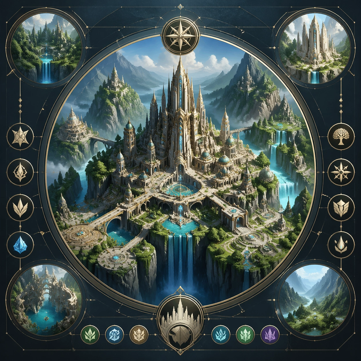
Scene: Create a square reference image for Fantasy Megacity Meets Nature Vistas. Build a reference anchor establishing the core system with a premium, production-ready finish. Use a polished modular board or campaign surface with clean spacing, premium game-UI finish, and clear focal hierarchy. The composition should feel intentional, clean, and reusable for gallery, research, campaign, or internal handoff contexts. Lighting must support readability first, with the main forms clearly separated from the background and enough breathing room for the system to stay legible at both hero scale and thumbnail scale. Subject: Center a coherent original game-art system built for premium production and marketing surfaces. For this image, focus on reference anchor. Keep the same system logic stable across screenshots, cards, banners, and overview boards. This image is the canonical anchor that later series images must follow. The viewer should immediately understand what role this surface plays inside a cohesive game-production asset pack. Important details: Lock framing, icon grammar, palette blocking, and surface hierarchy so the kit feels production-ready and consistent. Preserve the core silhouette, framing language, and material logic from the reference image while each variation changes function. Keep materials believable, edge hierarchy disciplined, and the visual language consistent with City-Nature Vistas. Use abstract interface blocks or diagram accents when helpful, but avoid any readable language. The final result should feel like a deliberate production asset rather than a random illustration. Use case: Fantasy Megacity Meets Nature Vistas series study 1/9, designed as reference anchor within a cohesive asset pack. Constraints: No readable text, no watermark, no logos, preserve exact 1:1 aspect ratio, no unrelated objects, no broken visual hierarchy, no malformed anatomy or broken perspective, no random decorative clutter.

Example generated from “Fantasy Megacity Meets Nature Vistas — Variant Two”
GPT Image 2en

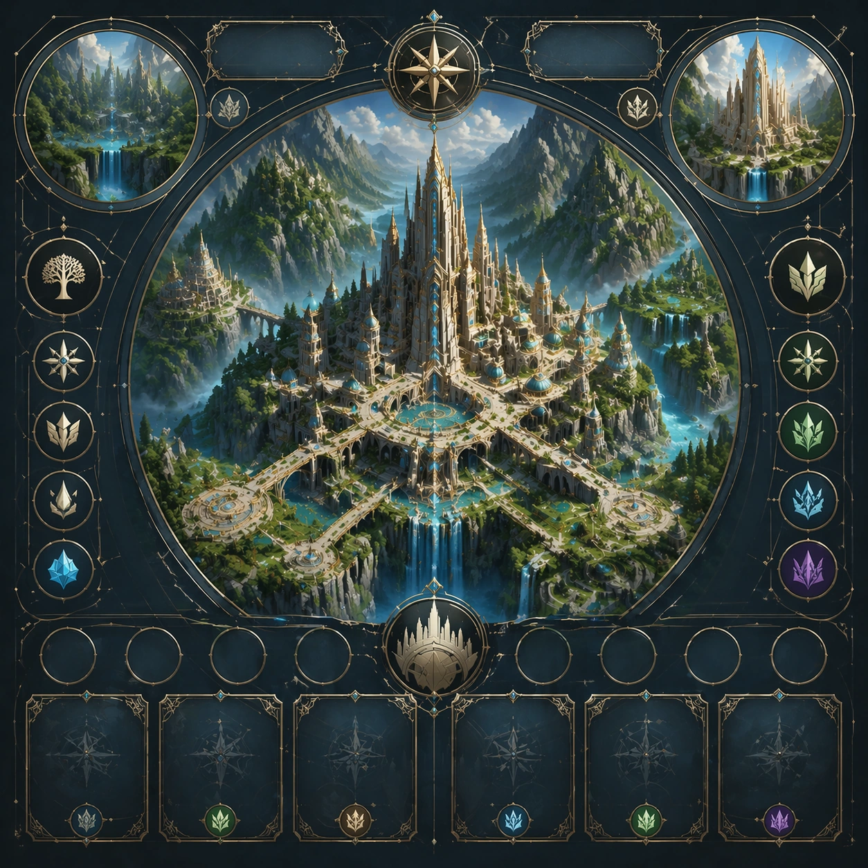
Scene: Create a square dependent image for Fantasy Megacity Meets Nature Vistas. Build a second controlled variation in the same system with a premium, production-ready finish. Use a polished modular board or campaign surface with clean spacing, premium game-UI finish, and clear focal hierarchy. The composition should feel intentional, clean, and reusable for gallery, research, campaign, or internal handoff contexts. Lighting must support readability first, with the main forms clearly separated from the background and enough breathing room for the system to stay legible at both hero scale and thumbnail scale. Subject: Center a coherent original game-art system built for premium production and marketing surfaces. For this image, focus on the intended support surface. Keep the same system logic stable across screenshots, cards, banners, and overview boards. Preserve exact identity or system logic from the reference image while changing only the intended variation axis. The viewer should immediately understand what role this surface plays inside a cohesive game-production asset pack. Important details: Lock framing, icon grammar, palette blocking, and surface hierarchy so the kit feels production-ready and consistent. Preserve the core silhouette, framing language, and material logic from the reference image while each variation changes function. Keep materials believable, edge hierarchy disciplined, and the visual language consistent with City-Nature Vistas. Use abstract interface blocks or diagram accents when helpful, but avoid any readable language. The final result should feel like a deliberate production asset rather than a random illustration. Use case: Fantasy Megacity Meets Nature Vistas series study 3/9, designed as variant two within a cohesive asset pack. Constraints: No readable text, no watermark, no logos, preserve exact 1:1 aspect ratio, no unrelated objects, no broken visual hierarchy, no malformed anatomy or broken perspective, no random decorative clutter.

Example generated from “Fantasy Megacity Meets Nature Vistas — Variant Three”
GPT Image 2en

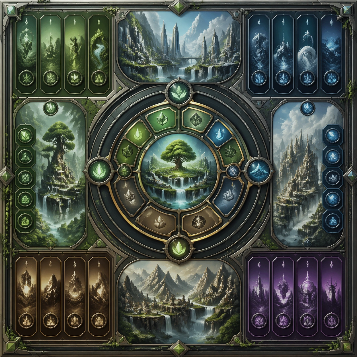
Scene: Create a square dependent image for Fantasy Megacity Meets Nature Vistas. Build a third controlled variation in the same system with a premium, production-ready finish. Use a polished modular board or campaign surface with clean spacing, premium game-UI finish, and clear focal hierarchy. The composition should feel intentional, clean, and reusable for gallery, research, campaign, or internal handoff contexts. Lighting must support readability first, with the main forms clearly separated from the background and enough breathing room for the system to stay legible at both hero scale and thumbnail scale. Subject: Center a coherent original game-art system built for premium production and marketing surfaces. For this image, focus on the intended support surface. Keep the same system logic stable across screenshots, cards, banners, and overview boards. Preserve exact identity or system logic from the reference image while changing only the intended variation axis. The viewer should immediately understand what role this surface plays inside a cohesive game-production asset pack. Important details: Lock framing, icon grammar, palette blocking, and surface hierarchy so the kit feels production-ready and consistent. Preserve the core silhouette, framing language, and material logic from the reference image while each variation changes function. Keep materials believable, edge hierarchy disciplined, and the visual language consistent with City-Nature Vistas. Use abstract interface blocks or diagram accents when helpful, but avoid any readable language. The final result should feel like a deliberate production asset rather than a random illustration. Use case: Fantasy Megacity Meets Nature Vistas series study 4/9, designed as variant three within a cohesive asset pack. Constraints: No readable text, no watermark, no logos, preserve exact 1:1 aspect ratio, no unrelated objects, no broken visual hierarchy, no malformed anatomy or broken perspective, no random decorative clutter.

Example generated from “Fantasy Megacity Meets Nature Vistas — Support One”
GPT Image 2en

Scene: Create a square standalone support image for Fantasy Megacity Meets Nature Vistas. Build a support-surface study with a clear focal hierarchy and a finished professional surface. Use a polished modular board or campaign surface with clean spacing, premium game-UI finish, and clear focal hierarchy. The frame should feel self-contained and polished, with enough structure to explain the system even without the reference series, yet still obviously belonging to the same theme and production world. Subject: Show a coherent original game-art system built for premium production and marketing surfaces in a way that emphasizes the intended support surface. Keep the same system logic stable across screenshots, cards, banners, and overview boards. Even though this image is independent, the viewer should still recognize the same universe, same commercial logic, and same production intent as the core package. Important details: Lock framing, icon grammar, palette blocking, and surface hierarchy so the kit feels production-ready and consistent. Preserve the broader theme language through color, framing, material choices, and modular composition. Use clean panel rhythm, premium asset presentation, and believable detail density. The image should work equally well as a gallery study, research reference, and mock production deliverable. Use case: Fantasy Megacity Meets Nature Vistas single study 5/9, exploring support one as a support surface. Constraints: No readable text, no watermark, no logos, preserve exact 1:1 aspect ratio, no unrelated objects, no broken visual hierarchy, no visual noise that obscures the main surface, no accidental brand resemblance.

Example generated from “Fantasy Megacity Meets Nature Vistas — Support Two”
GPT Image 2en

Scene: Create a square standalone support image for Fantasy Megacity Meets Nature Vistas. Build a second support-surface study with a clear focal hierarchy and a finished professional surface. Use a polished modular board or campaign surface with clean spacing, premium game-UI finish, and clear focal hierarchy. The frame should feel self-contained and polished, with enough structure to explain the system even without the reference series, yet still obviously belonging to the same theme and production world. Subject: Show a coherent original game-art system built for premium production and marketing surfaces in a way that emphasizes the intended support surface. Keep the same system logic stable across screenshots, cards, banners, and overview boards. Even though this image is independent, the viewer should still recognize the same universe, same commercial logic, and same production intent as the core package. Important details: Lock framing, icon grammar, palette blocking, and surface hierarchy so the kit feels production-ready and consistent. Preserve the broader theme language through color, framing, material choices, and modular composition. Use clean panel rhythm, premium asset presentation, and believable detail density. The image should work equally well as a gallery study, research reference, and mock production deliverable. Use case: Fantasy Megacity Meets Nature Vistas single study 6/9, exploring support two as a support surface. Constraints: No readable text, no watermark, no logos, preserve exact 1:1 aspect ratio, no unrelated objects, no broken visual hierarchy, no visual noise that obscures the main surface, no accidental brand resemblance.

Example generated from “Fantasy Megacity Meets Nature Vistas — Support Three”
GPT Image 2en

Scene: Create a square standalone support image for Fantasy Megacity Meets Nature Vistas. Build a third support-surface study with a clear focal hierarchy and a finished professional surface. Use a polished modular board or campaign surface with clean spacing, premium game-UI finish, and clear focal hierarchy. The frame should feel self-contained and polished, with enough structure to explain the system even without the reference series, yet still obviously belonging to the same theme and production world. Subject: Show a coherent original game-art system built for premium production and marketing surfaces in a way that emphasizes the intended support surface. Keep the same system logic stable across screenshots, cards, banners, and overview boards. Even though this image is independent, the viewer should still recognize the same universe, same commercial logic, and same production intent as the core package. Important details: Lock framing, icon grammar, palette blocking, and surface hierarchy so the kit feels production-ready and consistent. Preserve the broader theme language through color, framing, material choices, and modular composition. Use clean panel rhythm, premium asset presentation, and believable detail density. The image should work equally well as a gallery study, research reference, and mock production deliverable. Use case: Fantasy Megacity Meets Nature Vistas single study 7/9, exploring support three as a support surface. Constraints: No readable text, no watermark, no logos, preserve exact 1:1 aspect ratio, no unrelated objects, no broken visual hierarchy, no visual noise that obscures the main surface, no accidental brand resemblance.

Example generated from “Fantasy Megacity Meets Nature Vistas — Support Four”
GPT Image 2en

Scene: Create a square standalone support image for Fantasy Megacity Meets Nature Vistas. Build a fourth support-surface study with a clear focal hierarchy and a finished professional surface. Use a polished modular board or campaign surface with clean spacing, premium game-UI finish, and clear focal hierarchy. The frame should feel self-contained and polished, with enough structure to explain the system even without the reference series, yet still obviously belonging to the same theme and production world. Subject: Show a coherent original game-art system built for premium production and marketing surfaces in a way that emphasizes the intended support surface. Keep the same system logic stable across screenshots, cards, banners, and overview boards. Even though this image is independent, the viewer should still recognize the same universe, same commercial logic, and same production intent as the core package. Important details: Lock framing, icon grammar, palette blocking, and surface hierarchy so the kit feels production-ready and consistent. Preserve the broader theme language through color, framing, material choices, and modular composition. Use clean panel rhythm, premium asset presentation, and believable detail density. The image should work equally well as a gallery study, research reference, and mock production deliverable. Use case: Fantasy Megacity Meets Nature Vistas single study 8/9, exploring support four as a support surface. Constraints: No readable text, no watermark, no logos, preserve exact 1:1 aspect ratio, no unrelated objects, no broken visual hierarchy, no visual noise that obscures the main surface, no accidental brand resemblance.

Example generated from “Fermentation Sculpture Atlas — Vitrine Jar Anchor”
GPT Image 2en

Scene: Create a square museum-vitrine style photograph of fermentation vessels treated as natural-history specimens, with calm raking light, restrained reflections, and an atmosphere of patient observation. Glass, ceramic, cloth covers, and aged labels can appear, but any markings must stay unreadable. The mood should be archival, biological, and sculptural at once. Place one large glass jar on a neutral museum pedestal inside a dim vitrine-like space, using side light that reveals depth through the glass while keeping reflections controlled. The backdrop should stay soft and dark enough to let the jar glow quietly. Subject: Fill the jar with layered ferment components such as brine, vegetal matter, sediment, and a floating microbial sheet or cap, creating a rich biological stratigraphy. A small aged specimen card with abstract unreadable marks may rest at the base. The jar should feel venerable, patient, and carefully observed rather than trendy. Important details: Micro texture is essential: skins, bubbles, sediment, microbial mats, crusts, folds, and wet surfaces all need distinct tactile logic. The images should respect the beauty of slow transformation without sanitizing it into generic product photography. Fermentation must look alive, layered, and physically specific. This first image establishes the vitrine atmosphere, reflection behavior, pedestal framing, and slow-biological tone for the series. The viewer should immediately sense glass thickness, liquid depth, soft trapped bubbles, and the subtle irregularity of living fermented matter. Use case: Fermentation sculpture atlas series study 1/9, defining the anchor jar for the museum-like fermentation atlas. Constraints: No readable text, no watermark, no logos, preserve exact 1:1 aspect ratio, no readable dates or species names, no modern supermarket packaging, no laboratory sterility that kills the organic feel, no mold-horror sensationalism, no cartoon colors, no bright kitchen backdrop, no canning-jar branding, no sterile white studio.
Example generated from “Fermentation Sculpture Atlas — SCOBY Strata”
GPT Image 2en

Scene: Create a square museum-vitrine style photograph of fermentation vessels treated as natural-history specimens, with calm raking light, restrained reflections, and an atmosphere of patient observation. Glass, ceramic, cloth covers, and aged labels can appear, but any markings must stay unreadable. The mood should be archival, biological, and sculptural at once. Keep the exact pedestal height, vitrine mood, side-light angle, and reflection restraint from the reference image so the specimen system stays continuous. The background should remain dark and gentle, almost archival. Subject: Show a broad glass vessel filled with amber tea ferment and multiple layered microbial sheets suspended near the surface and drifting downward in uneven folds. Tiny bubbles and subtle color gradations should make the liquid feel active. The scene should turn fermentation into geology and biology at once. Important details: Micro texture is essential: skins, bubbles, sediment, microbial mats, crusts, folds, and wet surfaces all need distinct tactile logic. The images should respect the beauty of slow transformation without sanitizing it into generic product photography. Fermentation must look alive, layered, and physically specific. Preserve exact pedestal framing, glass behavior, and side-light logic from the reference model while focusing on translucent layered sheets and small bubble trails. The microbial strata should feel wet, elastic, and biologically plausible rather than decorative. Use case: Fermentation sculpture atlas series study 2/9, translating the anchor vitrine into layered kombucha strata. Constraints: No readable text, no watermark, no logos, preserve exact 1:1 aspect ratio, no readable dates or species names, no modern supermarket packaging, no laboratory sterility that kills the organic feel, no mold-horror sensationalism, no cartoon colors, no trendy wellness-product cues, no readable kombucha label, no cartoon slime look.

Example generated from “Fermentation Sculpture Atlas — Kimchi Sediment Column”
GPT Image 2en

Scene: Create a square museum-vitrine style photograph of fermentation vessels treated as natural-history specimens, with calm raking light, restrained reflections, and an atmosphere of patient observation. Glass, ceramic, cloth covers, and aged labels can appear, but any markings must stay unreadable. The mood should be archival, biological, and sculptural at once. Maintain the exact pedestal framing, vitrine darkness, and side-light behavior from the reference image so the series still reads as one archive display. Reflections should stay minimal and directional. Subject: Present a tall jar packed with napa cabbage folds, radish pieces, chili-bright brine, seeds, and fine trapped gas, creating a dense vertical column of fermenting vegetable matter. The compression of the ingredients should feel real, with pressure, weight, and irregular gaps. The vessel should read like a preserved specimen with life still inside it. Important details: Micro texture is essential: skins, bubbles, sediment, microbial mats, crusts, folds, and wet surfaces all need distinct tactile logic. The images should respect the beauty of slow transformation without sanitizing it into generic product photography. Fermentation must look alive, layered, and physically specific. Preserve exact display language, glass thickness, and light angle from the reference model while shifting the emphasis toward particulate density, folded leaves, and sediment suspended in brine. The red-orange color should feel organic and not oversaturated. Use case: Fermentation sculpture atlas series study 3/9, adapting the anchor vitrine to a dense kimchi sediment column. Constraints: No readable text, no watermark, no logos, preserve exact 1:1 aspect ratio, no readable dates or species names, no modern supermarket packaging, no laboratory sterility that kills the organic feel, no mold-horror sensationalism, no cartoon colors, no kitchen countertop context, no branded jar lid, no food-styling glamour gloss.
Example generated from “Fermentation Sculpture Atlas — Miso Geology Block”
GPT Image 2en

Scene: Create a square museum-vitrine style photograph of fermentation vessels treated as natural-history specimens, with calm raking light, restrained reflections, and an atmosphere of patient observation. Glass, ceramic, cloth covers, and aged labels can appear, but any markings must stay unreadable. The mood should be archival, biological, and sculptural at once. Use the same pedestal, vitrine mood, and raking side light established by the reference image, but let the vessel or cut block become more opaque and sculptural. The background should remain subdued so texture becomes the main event. Subject: Show a dense block or vessel section of fermenting soybean paste with fissures, moisture seams, and subtle crust formation, as if documenting a geological sample from a cheese cave or cellar. Small ceramic or wooden containment edges can appear, but the paste body is the hero. The subject should feel ancient, biological, and tactile. Important details: Micro texture is essential: skins, bubbles, sediment, microbial mats, crusts, folds, and wet surfaces all need distinct tactile logic. The images should respect the beauty of slow transformation without sanitizing it into generic product photography. Fermentation must look alive, layered, and physically specific. Preserve exact display discipline and lighting family from the reference model while shifting into thicker opaque material with micro cracks and wet seams. The viewer should be able to imagine both aroma and time from the surface texture alone. Use case: Fermentation sculpture atlas series study 4/9, concluding the anchor system with a dense miso-geology specimen. Constraints: No readable text, no watermark, no logos, preserve exact 1:1 aspect ratio, no readable dates or species names, no modern supermarket packaging, no laboratory sterility that kills the organic feel, no mold-horror sensationalism, no cartoon colors, no modern packaging, no cute artisan-shop styling, no readable labels.

Example generated from “Fermentation Sculpture Atlas — Sourdough Starter Bloom”
GPT Image 2en

Scene: Create a square museum-vitrine style photograph of fermentation vessels treated as natural-history specimens, with calm raking light, restrained reflections, and an atmosphere of patient observation. Glass, ceramic, cloth covers, and aged labels can appear, but any markings must stay unreadable. The mood should be archival, biological, and sculptural at once. Use a square archival still life on a muted pedestal or shelf with daylight from one side and soft shadow on the other. The glass crock should feel domestic in origin but elevated to specimen status. Subject: Show a mature starter risen high inside a thick glass vessel, with bubble columns, a domed top, and traces along the inner walls marking previous expansion. A cloth cover or wooden lid can sit nearby as context. The subject should feel calm yet visibly alive. Important details: Micro texture is essential: skins, bubbles, sediment, microbial mats, crusts, folds, and wet surfaces all need distinct tactile logic. The images should respect the beauty of slow transformation without sanitizing it into generic product photography. Fermentation must look alive, layered, and physically specific. Bubble size variation, wet sheen, and the elasticity of the top surface must feel real. The viewer should understand fermentation dynamics from the vessel markings and internal structure alone. Use case: Fermentation sculpture atlas single study 6/9, presenting a mature sourdough starter as a live archival object. Constraints: No readable text, no watermark, no logos, preserve exact 1:1 aspect ratio, no readable dates or species names, no modern supermarket packaging, no laboratory sterility that kills the organic feel, no mold-horror sensationalism, no cartoon colors, no kitchen counter clutter, no readable measurement marks, no bakery branding.
Example generated from “Fermentation Sculpture Atlas — Pickled Citrus Amber Jar”
GPT Image 2en

Scene: Create a square museum-vitrine style photograph of fermentation vessels treated as natural-history specimens, with calm raking light, restrained reflections, and an atmosphere of patient observation. Glass, ceramic, cloth covers, and aged labels can appear, but any markings must stay unreadable. The mood should be archival, biological, and sculptural at once. Create a square museum-style jar portrait with warm side light passing through amber brine and translucent citrus slices. The pedestal and background should remain subdued and dignified. Subject: Fill a glass vessel with halved or sliced preserved citrus fruits suspended in deep amber brine, with softened rinds, seeds, and peel layers visible through the liquid. A few sediment traces and glass imperfections should reinforce age. The jar should feel like both pantry artifact and scientific sample. Important details: Micro texture is essential: skins, bubbles, sediment, microbial mats, crusts, folds, and wet surfaces all need distinct tactile logic. The images should respect the beauty of slow transformation without sanitizing it into generic product photography. Fermentation must look alive, layered, and physically specific. The beauty lies in translucency and time: make rind thickness, softened pulp, suspended seeds, and aged liquid all distinct. The brine should not look like syrup or juice. Use case: Fermentation sculpture atlas single study 7/9, turning preserved citrus into an amber archival specimen. Constraints: No readable text, no watermark, no logos, preserve exact 1:1 aspect ratio, no readable dates or species names, no modern supermarket packaging, no laboratory sterility that kills the organic feel, no mold-horror sensationalism, no cartoon colors, no summer-drink styling, no cocktail props, no readable canning label.

Example generated from “Fermentation Sculpture Atlas — Koji Rice Topography”
GPT Image 2en

Scene: Create a square museum-vitrine style photograph of fermentation vessels treated as natural-history specimens, with calm raking light, restrained reflections, and an atmosphere of patient observation. Glass, ceramic, cloth covers, and aged labels can appear, but any markings must stay unreadable. The mood should be archival, biological, and sculptural at once. Use a square macro-leaning specimen setup on a dark neutral surface under raking light that turns small grains into a landscape of ridges and shadows. The environment should remain quiet and analytical. Subject: Show a shallow tray or mound of inoculated rice covered in fine white growth, subtle moisture, and uneven topography. A scoop mark or cutaway edge can reveal depth and density variation. The subject should feel agricultural, biological, and strangely monumental. Important details: Micro texture is essential: skins, bubbles, sediment, microbial mats, crusts, folds, and wet surfaces all need distinct tactile logic. The images should respect the beauty of slow transformation without sanitizing it into generic product photography. Fermentation must look alive, layered, and physically specific. The main challenge is scale transformation: every rice grain, filament, and damp cluster should remain identifiable while the whole surface reads as a terrain. The growth must feel alive, not dusty. Use case: Fermentation sculpture atlas single study 8/9, examining inoculated rice as a micro-texture landscape. Constraints: No readable text, no watermark, no logos, preserve exact 1:1 aspect ratio, no readable dates or species names, no modern supermarket packaging, no laboratory sterility that kills the organic feel, no mold-horror sensationalism, no cartoon colors, no powdery chalk look, no modern food-packaging context, no readable tags.

Example generated from “Fermentation Sculpture Atlas — Vinegar Mother Medallion”
GPT Image 2en

Scene: Create a square museum-vitrine style photograph of fermentation vessels treated as natural-history specimens, with calm raking light, restrained reflections, and an atmosphere of patient observation. Glass, ceramic, cloth covers, and aged labels can appear, but any markings must stay unreadable. The mood should be archival, biological, and sculptural at once. Create a square vitrine-like close portrait of a clear glass vessel under cool side light, with the background dark enough to make the floating membrane visible. Reflections should remain minimal and museum-like. Subject: Show a pale translucent vinegar mother floating or folding within a liquid-filled vessel, with delicate layers, wrinkles, and suspended depth. Tiny bubbles and subtle turbidity can add realism, but the membrane should remain the main sculptural event. The image should feel biological and unexpectedly elegant. Important details: Micro texture is essential: skins, bubbles, sediment, microbial mats, crusts, folds, and wet surfaces all need distinct tactile logic. The images should respect the beauty of slow transformation without sanitizing it into generic product photography. Fermentation must look alive, layered, and physically specific. The membrane needs believable translucency, thickness variation, and soft folded geometry, almost like a marine organism. The liquid should support the form without turning cloudy or opaque. Use case: Fermentation sculpture atlas single study 9/9, documenting a floating vinegar mother as a translucent living sculpture. Constraints: No readable text, no watermark, no logos, preserve exact 1:1 aspect ratio, no readable dates or species names, no modern supermarket packaging, no laboratory sterility that kills the organic feel, no mold-horror sensationalism, no cartoon colors, no wellness-brand styling, no readable bottle marks, no aquarium gimmick.