Document original
GPT Image 2 · en
Scene:
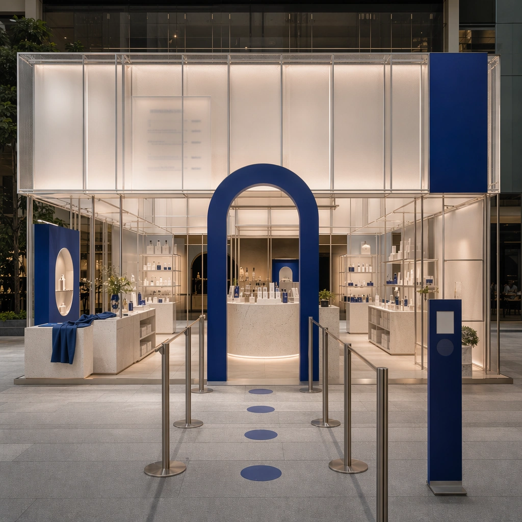
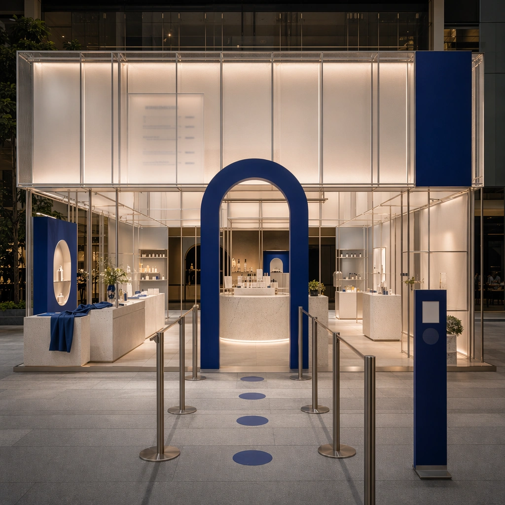
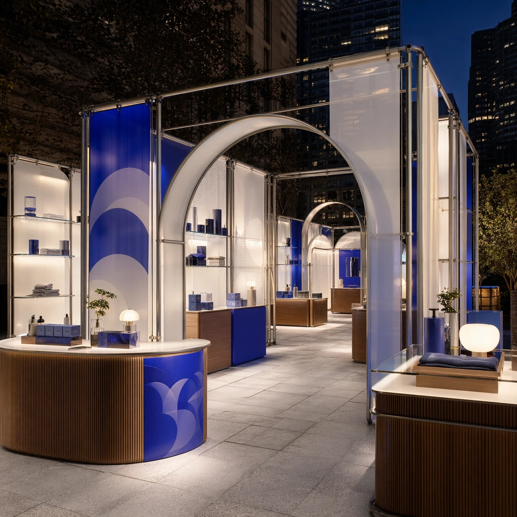
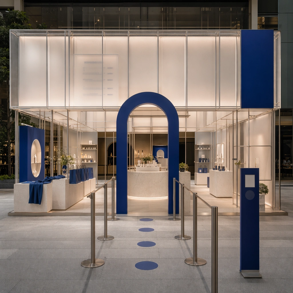
Create a square reference-dependent architecture still for Pop-up Shop and Event Installation Kit. Use a final sequence near the exit with tote forms, shelving, and closing visual rhythm while keeping the same lens discipline, editorial polish, and material believability established by the reference image. The lighting can shift to support the intended mood, but the space must still feel like the same authored project with a stable viewpoint logic, convincing depth separation, and clean commercial-photography finish. Keep soft neutral base with one strong accent color, translucent whites, brushed metal, and controlled event lighting as the governing tonal range even when the emphasis changes.

Subject:
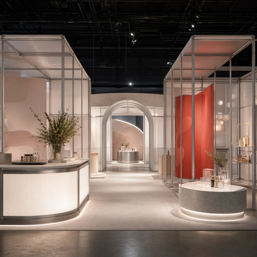
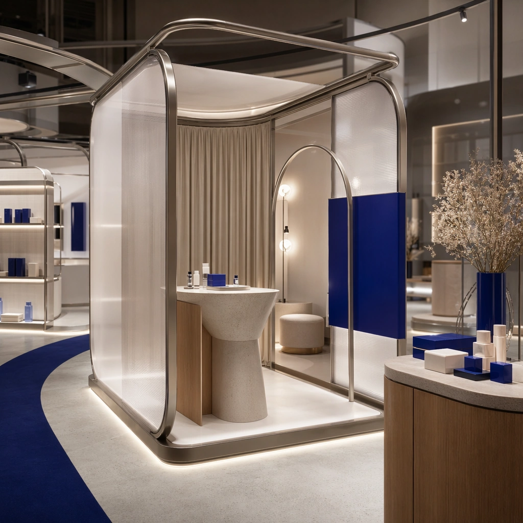
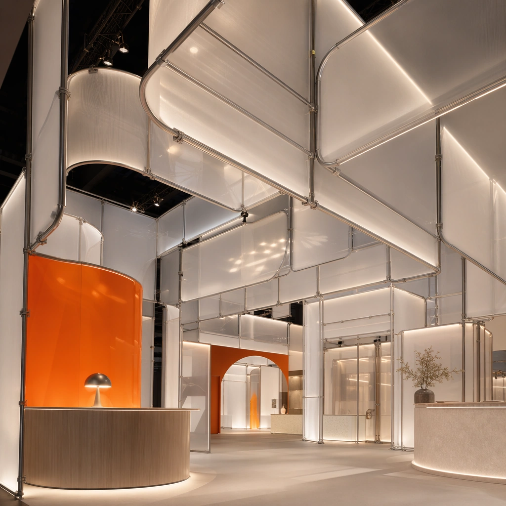
Show a modular pop-up and event installation built from tubular frames, translucent panels, bold but refined color blocks, sculpted counters, photo-op arches, and a circulation path designed for sharing and recall. Focus on the exact same pop-up from the reference image, now emphasizing memory objects and a clean departure experience. Preserve exact architectural identity, plan logic, material palette, fixture family, and circulation cues from the reference image while changing only the intended emphasis described here. The viewer should immediately recognize the same project, not a loose cousin, with matching silhouette logic, aligned detailing, and consistent brand atmosphere.

Important details:
Preserve the tubular frame language, translucent panel system, accent-color blocking, modular counters, and camera-friendly circulation. Any abstract wayfinding, menu, wall-label, or packaging zones must stay unreadable and subordinate to the spatial image. Joinery, edges, reflections, and lighting should remain realistic enough for an operator or design team to treat the image as a credible reference. The variation should feel deliberate and commercially useful, proving that one locked spatial language can flex across multiple campaign or editorial surfaces.

Use case:
Pop-up Shop and Event Installation Kit series study 4/9, extending the closing activation beat inside the same system.

Constraints:
No readable text, no watermark, no logos, preserve exact 1:1 aspect ratio, preserve exact architectural identity from the reference image, no crowds, no branded slogans, no cheap balloon decor, no stage truss overload, no festival chaos, no readable tote text.
Mode d’emploi
- Copiez le prompt original complet, paramètres compris.
- Adaptez le sujet, le texte et la composition à vos besoins.
- Utilisez un outil externe compatible ; vérifiez l’accès et le résultat.
Avant de commencer
- Vérifiez si une image de référence est nécessaire. La compatibilité ne prouve pas le modèle utilisé pour cet exemple.
- Vérifiez noms, chiffres et textes ; les versions du modèle peuvent produire des résultats différents.