
Document original
GPT Image 2 · en
Scene:
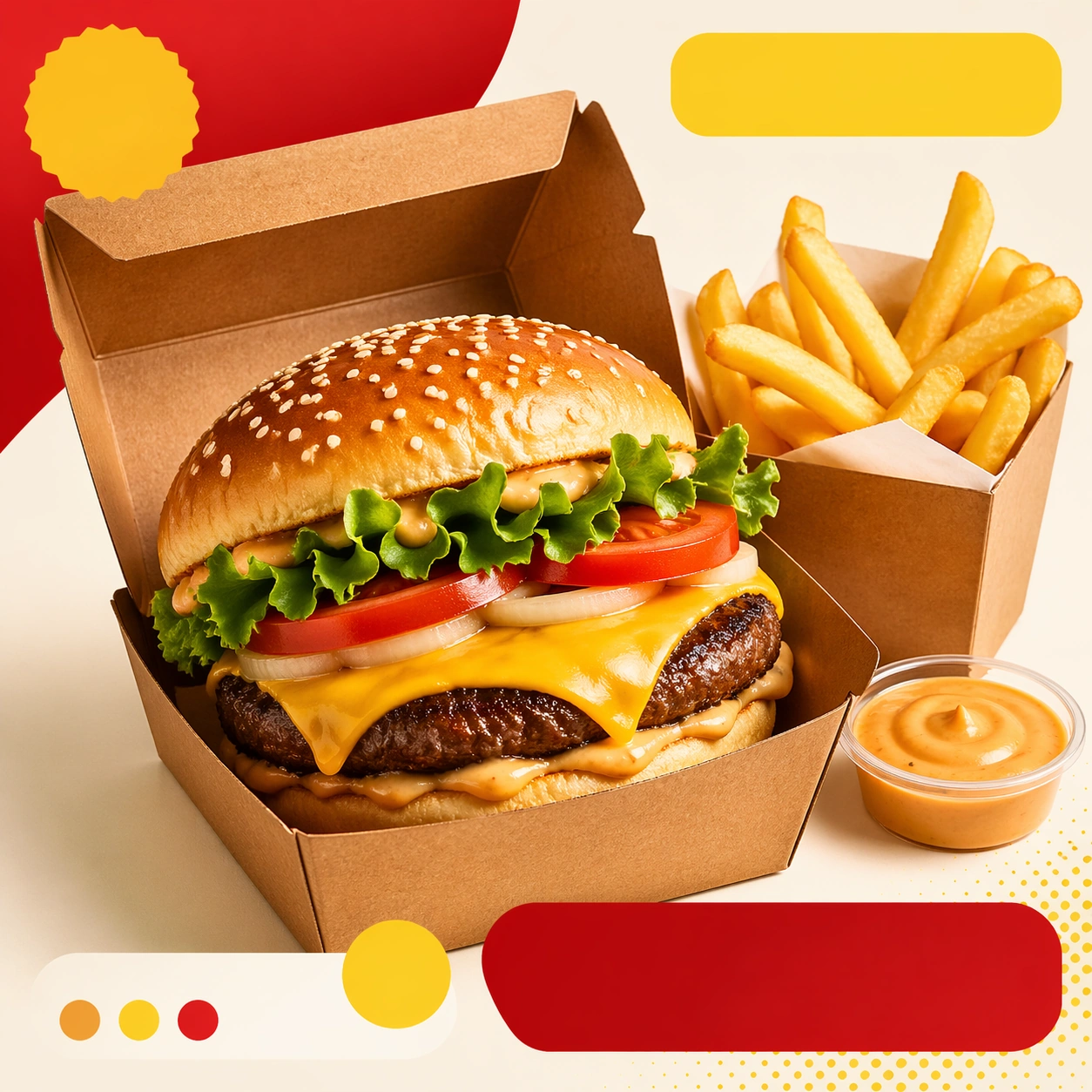
Compose a square food-commerce image optimized for instant readability in app tiles, promo cards, or delivery grids. The image should emphasize appetizing clarity, strong hierarchy, and modular layout zones while staying photorealistic and commercially grounded. Packaging, dish crop, and badge-like design shapes can appear, but all text must remain unreadable. Use a bright, clean square card composition with one hero meal in delivery packaging, a secondary side item, and structured placeholder zones around the food.

Subject:
The food should look craveable at thumbnail scale, with clear portion logic, supporting side items when relevant, and delivery-aware presentation that prioritizes speed, legibility, and conversion. Show a craveable meal combo arranged so the hero item dominates, the side clarifies the offer, and the overall tile reads instantly at small size.

Important details:
This theme is about commerce reasoning. Preserve sharp hero food silhouettes, obvious combo structure, and clean tile-safe framing so the assets can survive small screens. Abstract text areas, CTA-like shapes, and offer badges are allowed only as non-legible design modules. Keep everything polished, modern, and immediately useful for ordering surfaces. This image establishes the reference system for the series, including camera height, tabletop discipline, prop family, and color control that later images must inherit. This image must define the tile system for the series: generous margin, bold silhouette separation, clean packaging edges, and unreadable but designed commerce shapes.

Use case:
Delivery Tiles series study 1/9, built for Prompt Atlas coverage of a food and beverage commercial visual system.

Constraints:
No readable text, no watermark, no logos, preserve exact 1:1 aspect ratio, no readable text, no logos, no app UI chrome, no fake prices, no delivery-bag chaos, no greasy blur, no clutter that hurts thumbnail legibility, no readable labels, no checkout UI, no courier person.
Mode d’emploi
- Copiez le prompt original complet, paramètres compris.
- Adaptez le sujet, le texte et la composition à vos besoins.
- Utilisez un outil externe compatible ; vérifiez l’accès et le résultat.
Avant de commencer
- Vérifiez si une image de référence est nécessaire. La compatibilité ne prouve pas le modèle utilisé pour cet exemple.
- Vérifiez noms, chiffres et textes ; les versions du modèle peuvent produire des résultats différents.