Document original
GPT Image 2 · en
Scene:
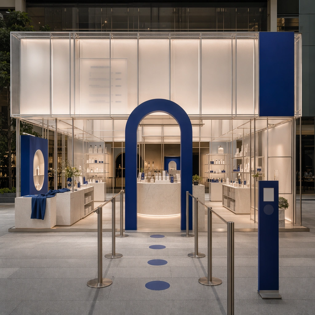
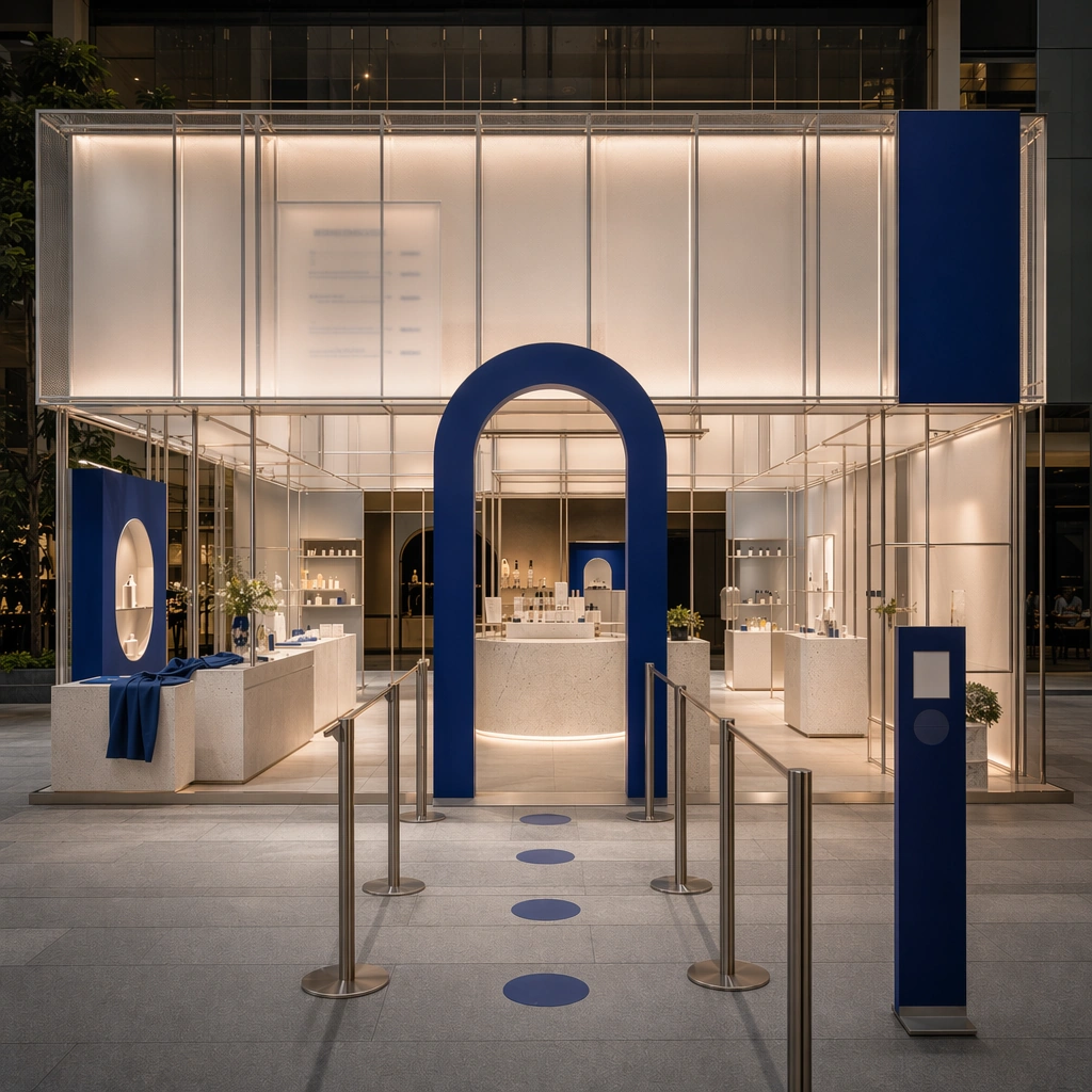
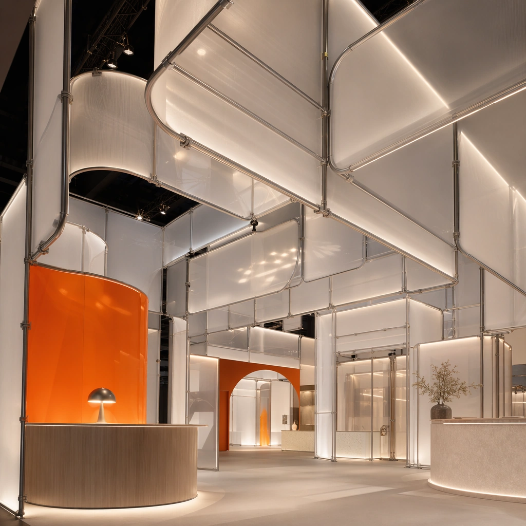
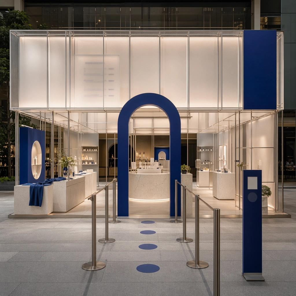
Create a square architectural reference still for Pop-up Shop and Event Installation Kit. Use a square streetfront hero still showing the full pop-up envelope and entry queue logic and treat the frame like a premium interior or architecture editorial photograph with disciplined perspective, readable depth from foreground to background, and enough negative space for the spatial hierarchy to breathe. Light the scene so photo moments, modular display, and high-recall activation design feel immediate, using soft neutral base with one strong accent color, translucent whites, brushed metal, and controlled event lighting as the governing tonal range. The composition must read as a high-end commercial image that could sit inside brand activations, launch events, campaign recaps, and experiential pitch decks.

Subject:
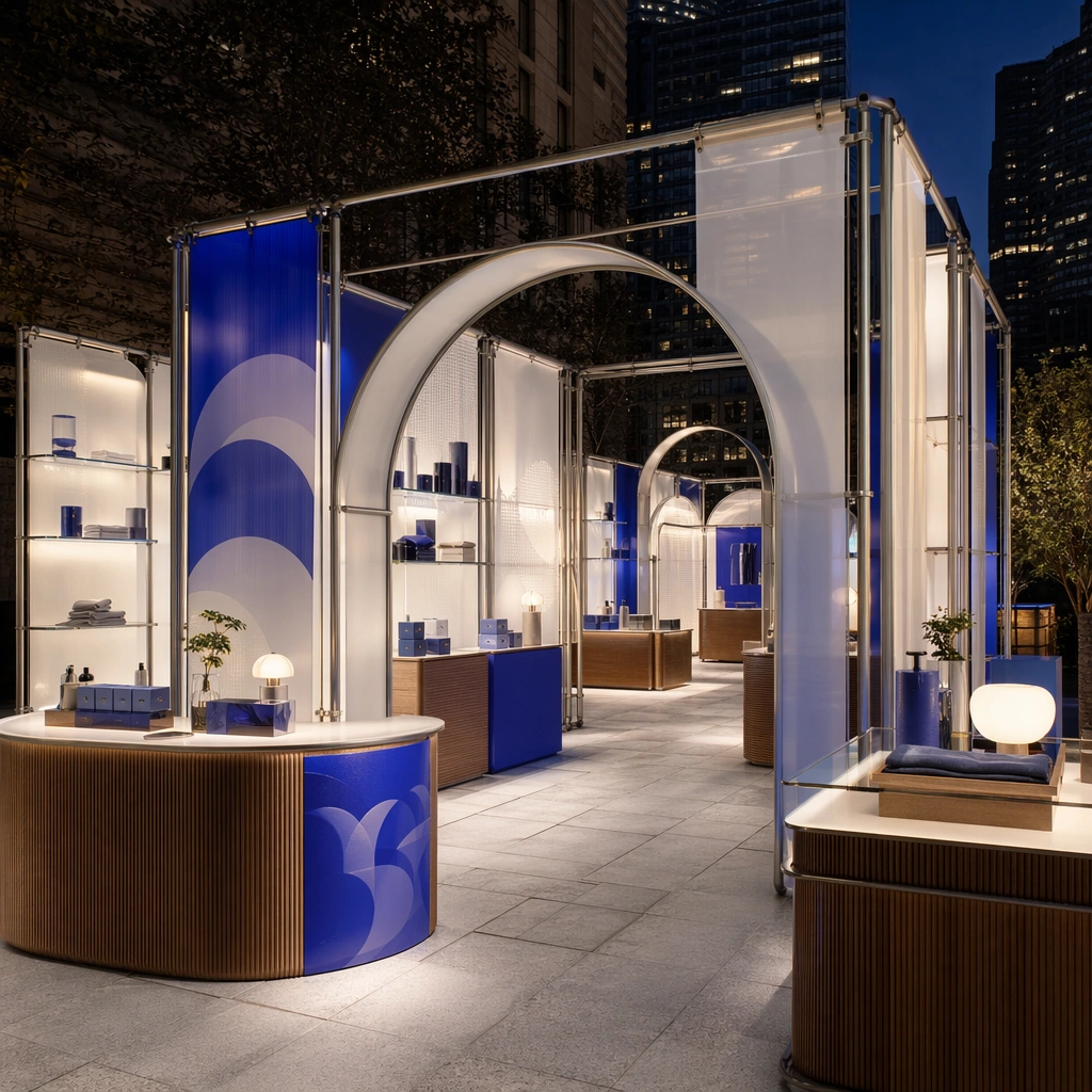
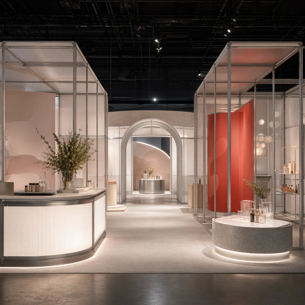
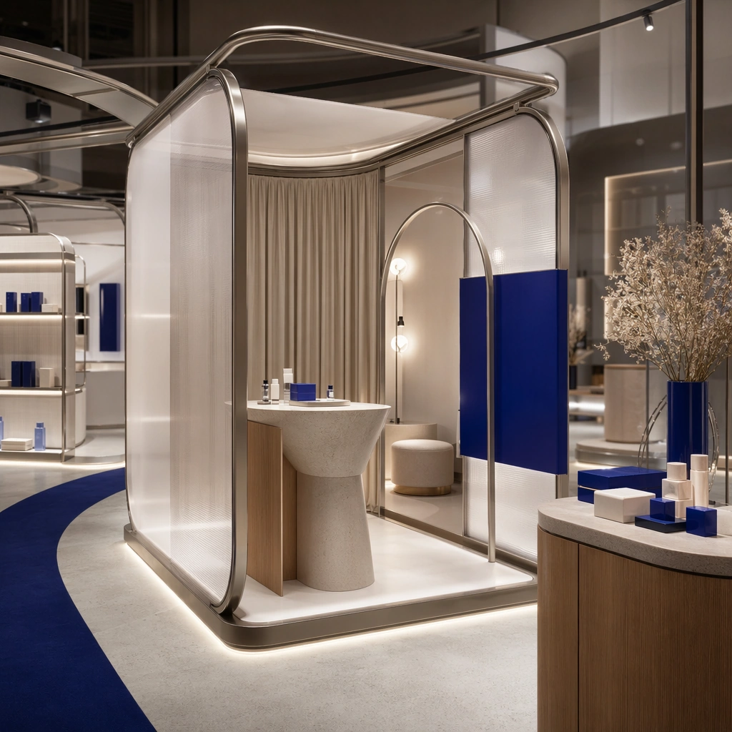
Show a modular pop-up and event installation built from tubular frames, translucent panels, bold but refined color blocks, sculpted counters, photo-op arches, and a circulation path designed for sharing and recall. Center the activation’s main recognizability, photo-op shape, and circulation invitation. This is the canonical reference image for the package, so the major proportions, material transitions, fixture families, and circulation logic must feel highly specific and internally coherent rather than generic luxury styling. Let the viewer understand how the space is organized within a single glance, with foreground anchors, a clear middle zone, and a resolved background termination.

Important details:
Lock the tubular frame language, translucent panel system, accent-color blocking, modular counters, and camera-friendly circulation. Surfaces should feel tactile and believable: stone veining must stay plausible, metals should have disciplined reflectance, fabrics should show natural weight, and concealed lighting should shape the volume instead of flattening it. Use abstract signage, menu, label, or caption zones only as unreadable graphic hints. The image should feel practical for downstream design reviews and polished enough for public-facing campaign use.

Use case:
Pop-up Shop and Event Installation Kit series study 1/9, establishing the canonical pop-up identity for the package.

Constraints:
No readable text, no watermark, no logos, preserve exact 1:1 aspect ratio, no crowds, no branded slogans, no cheap balloon decor, no stage truss overload, no festival chaos, no city ads stealing focus.
Mode d’emploi
- Copiez le prompt original complet, paramètres compris.
- Adaptez le sujet, le texte et la composition à vos besoins.
- Utilisez un outil externe compatible ; vérifiez l’accès et le résultat.
Avant de commencer
- Vérifiez si une image de référence est nécessaire. La compatibilité ne prouve pas le modèle utilisé pour cet exemple.
- Vérifiez noms, chiffres et textes ; les versions du modèle peuvent produire des résultats différents.