PROMPTS · EXPLORATION CRÉATIVE

Galerie de prompts

Explorez des prompts réels et leurs exemples générés. Trouvez l’inspiration pour votre prochaine mission créative et copiez le texte intégral gratuitement.

Exemples
10,974
Modèles
17
Sources
1277
10 974 exemples de prompts · page 37 sur 229
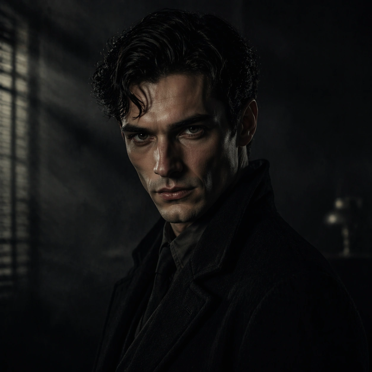
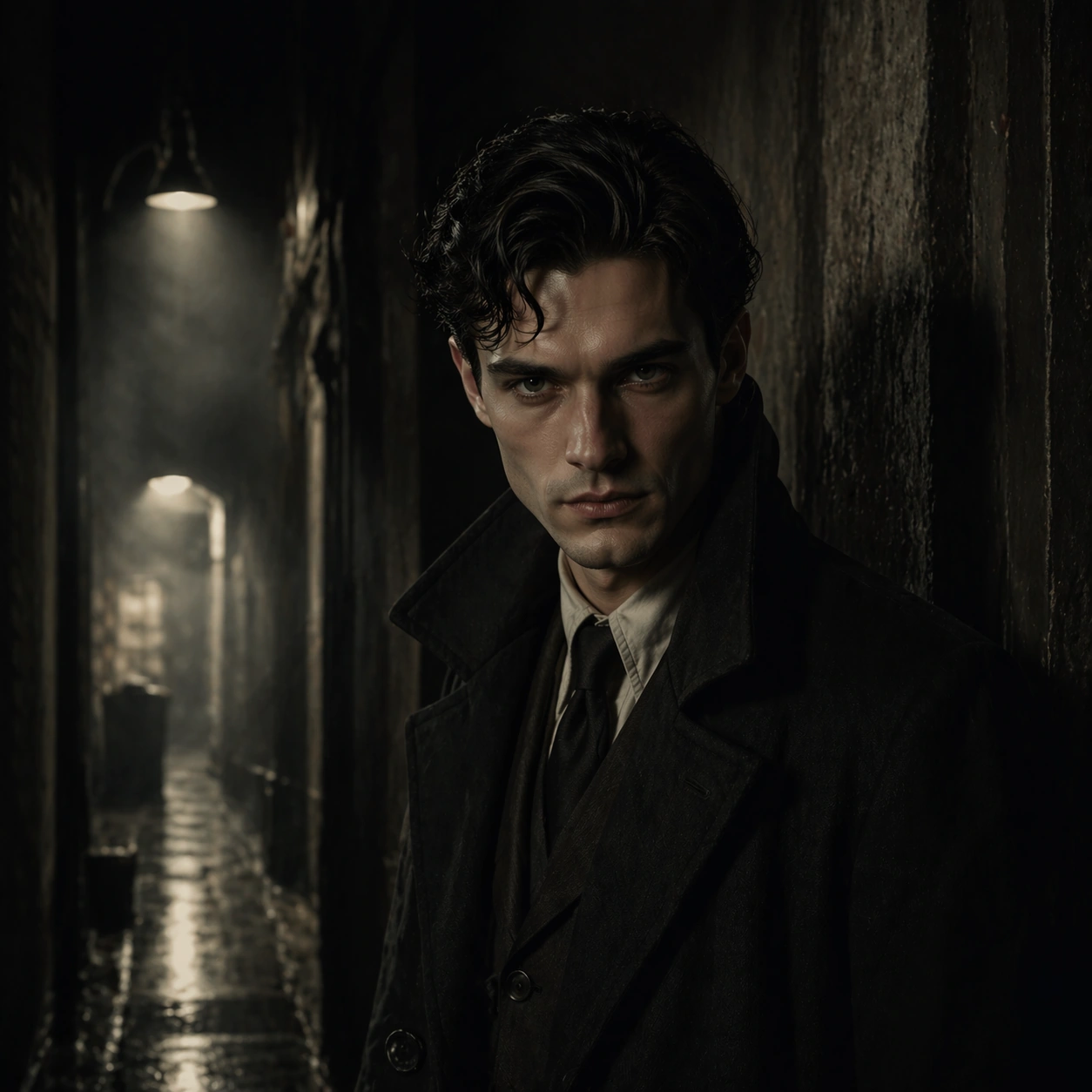
Example generated from “Noir Character Poster Portraits — Transition Pause”
GPT Image 2en

Scene: Create a square 1:1 portrait image for Noir Character Poster Portraits. Use a hallway, alley, corridor, or threshold frame with directional light and clean silhouette control. The frame should feel like a finished professional deliverable rather than a casual snapshot, with clear lens discipline, believable light falloff, and a palette that directly supports Create moody noir-style character portraits that sit between still photography and key art, with shadow-led lighting and strong psychological framing.. Keep enough surrounding space and compositional control for gallery, research, campaign, or approval-board reuse while staying photoreal and human-scaled. Subject: Center one noir lead with pale skin, dark wavy hair, sharp cheekbones, and guarded eyes. Use a transition space to show the same character in motion or pause while preserving exact face / hair base / body proportions from the reference model. Use the example direction from the brief as grounding context: Create moody noir-style character portraits that sit between still photography and key art, with shadow-led lighting and strong psychological framing.. Wardrobe, lighting, environment, and pose may shift to serve this variation, but the viewer must immediately understand that the same reference identity is still in front of the camera. Important details: This backlog line is difficult because Create moody noir-style character portraits that sit between still photography and key art, with shadow-led lighting and strong psychological framing.. Preserve skin tone family, bone structure, eye spacing, nose shape, mouth shape, hairline logic, shoulder width, and overall body read across the entire series. preserve exact face / hair base / body proportions from the reference model. This image should feel like the next shot in one film, not a new casting choice. Avoid the common failure described in the brief: ordinary image models often lose likeness once styling, lighting, or layout changes enter the frame. Success should feel like the result should feel professionally usable, coherent, and clearly built around one stable human identity. Use case: Noir Character Poster Portraits series study 3/9, a transitional pause portrait. Constraints: No readable text, no watermark, no logos, preserve exact 1:1 aspect ratio, preserve exact face / hair base / body proportions from the reference model, no hidden face, no body warp, no action blur, no background signage.
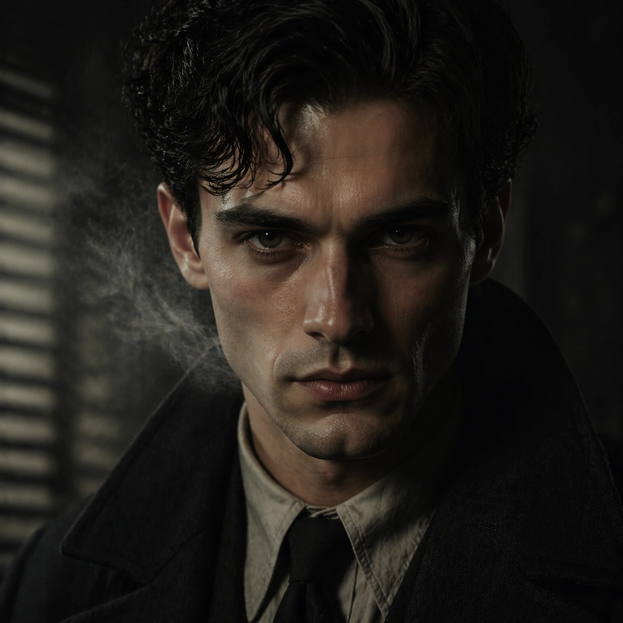
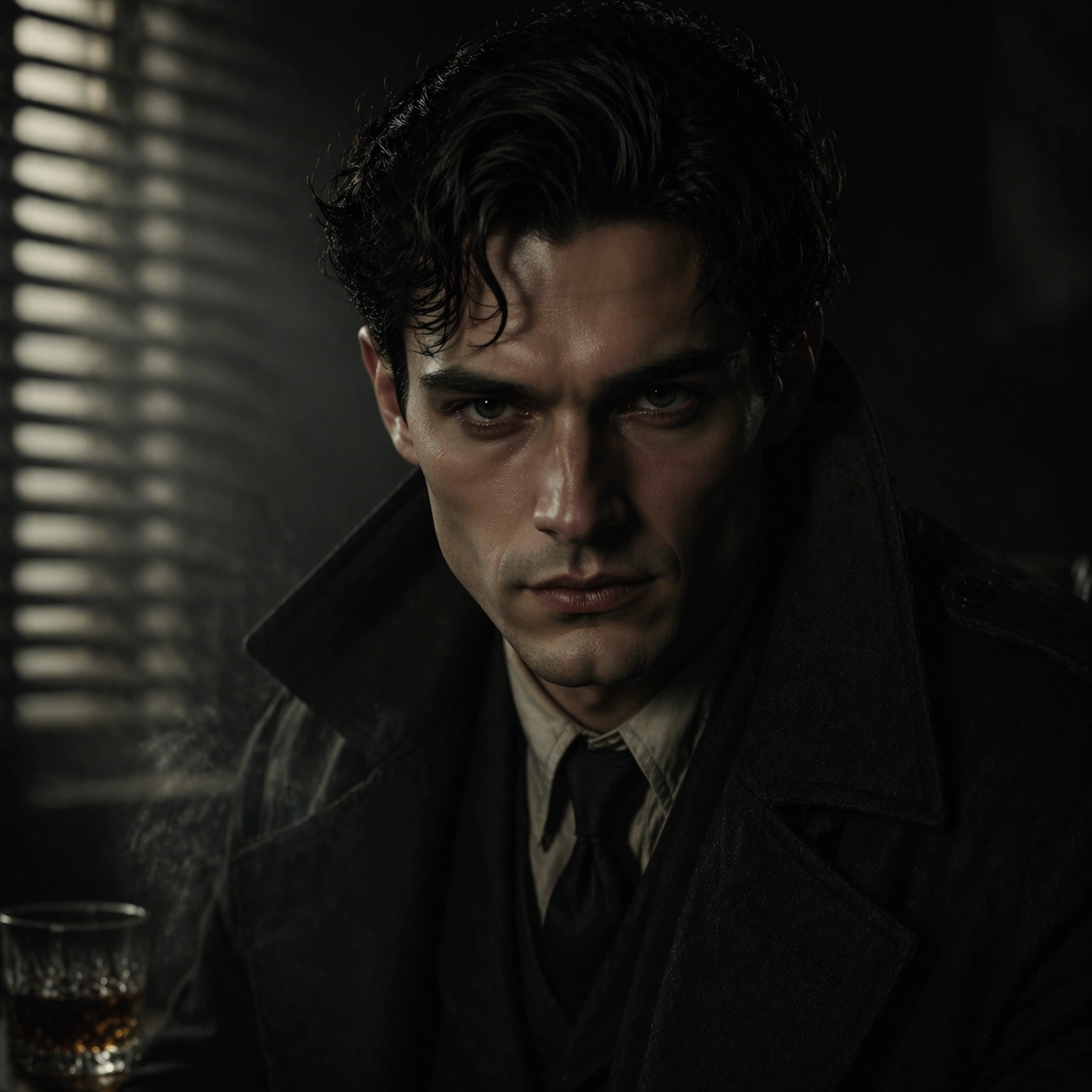
Example generated from “Noir Character Poster Portraits — Close-up Emotion”
GPT Image 2en

Scene: Create a square 1:1 portrait image for Noir Character Poster Portraits. Use a tighter crop with visible skin texture, lashes, breath, and emotional tension controlled by cinematic light. The frame should feel like a finished professional deliverable rather than a casual snapshot, with clear lens discipline, believable light falloff, and a palette that directly supports Create moody noir-style character portraits that sit between still photography and key art, with shadow-led lighting and strong psychological framing.. Keep enough surrounding space and compositional control for gallery, research, campaign, or approval-board reuse while staying photoreal and human-scaled. Subject: Center one noir lead with pale skin, dark wavy hair, sharp cheekbones, and guarded eyes. Move closer to the same face to test emotional precision without any identity drift. Use the example direction from the brief as grounding context: Create moody noir-style character portraits that sit between still photography and key art, with shadow-led lighting and strong psychological framing.. Wardrobe, lighting, environment, and pose may shift to serve this variation, but the viewer must immediately understand that the same reference identity is still in front of the camera. Important details: This backlog line is difficult because Create moody noir-style character portraits that sit between still photography and key art, with shadow-led lighting and strong psychological framing.. Preserve skin tone family, bone structure, eye spacing, nose shape, mouth shape, hairline logic, shoulder width, and overall body read across the entire series. preserve exact face / hair base / body proportions from the reference model. Every small facial marker should still match the reference anchor. Avoid the common failure described in the brief: ordinary image models often lose likeness once styling, lighting, or layout changes enter the frame. Success should feel like the result should feel professionally usable, coherent, and clearly built around one stable human identity. Use case: Noir Character Poster Portraits series study 4/9, a close emotional portrait. Constraints: No readable text, no watermark, no logos, preserve exact 1:1 aspect ratio, preserve exact face / hair base / body proportions from the reference model, no tears that melt features, no face reshaping, no extreme beauty retouching, no second person.

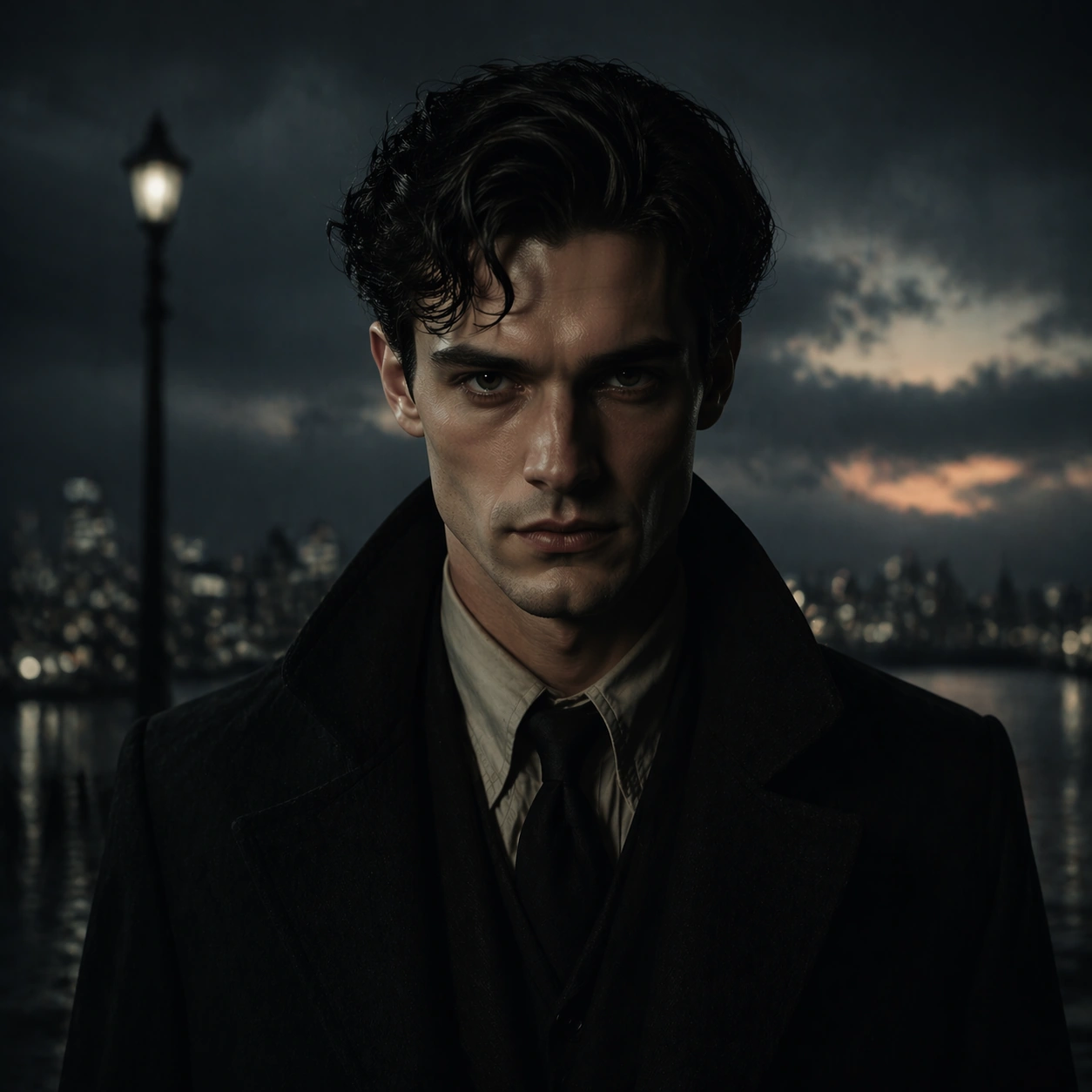
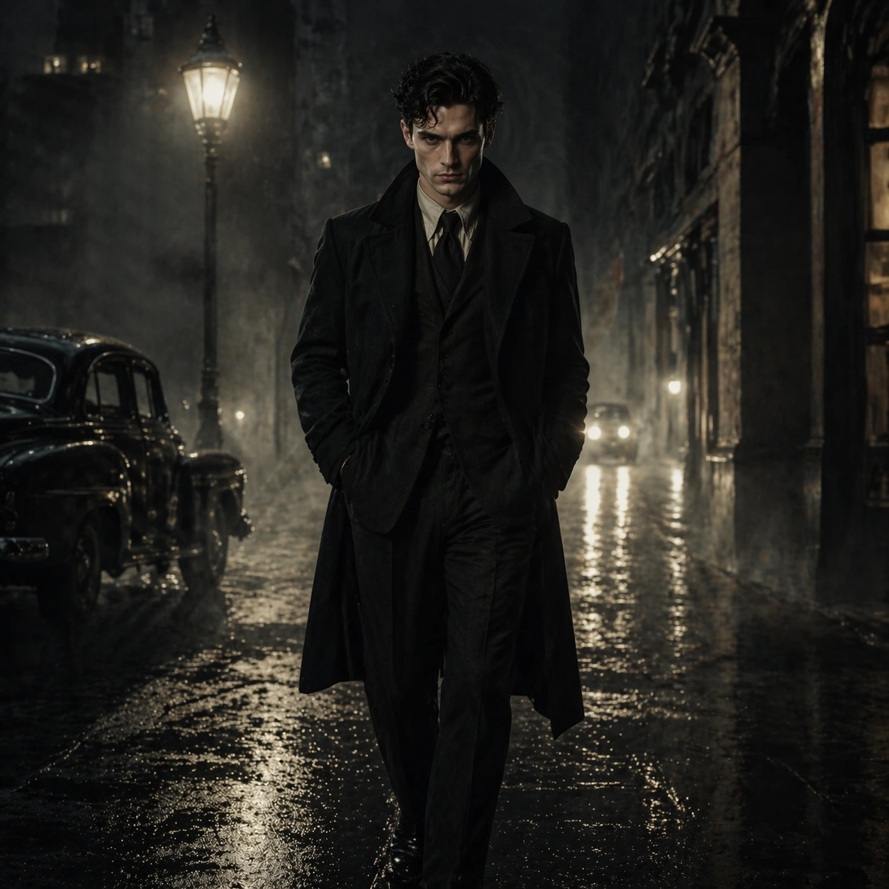
Example generated from “Noir Character Poster Portraits — Exterior Walk”
GPT Image 2en

Scene: Create a square 1:1 portrait image for Noir Character Poster Portraits. Use a believable outdoor setup with motivated practical light and enough environment to imply story stakes. The frame should feel like a finished professional deliverable rather than a casual snapshot, with clear lens discipline, believable light falloff, and a palette that directly supports Create moody noir-style character portraits that sit between still photography and key art, with shadow-led lighting and strong psychological framing.. Keep enough surrounding space and compositional control for gallery, research, campaign, or approval-board reuse while staying photoreal and human-scaled. Subject: Center one noir lead with pale skin, dark wavy hair, sharp cheekbones, and guarded eyes. Keep the same character exact while expanding to a wider frame that shows gait, shoulders, and costume silhouette in context. Use the example direction from the brief as grounding context: Create moody noir-style character portraits that sit between still photography and key art, with shadow-led lighting and strong psychological framing.. Wardrobe, lighting, environment, and pose may shift to serve this variation, but the viewer must immediately understand that the same reference identity is still in front of the camera. Important details: This backlog line is difficult because Create moody noir-style character portraits that sit between still photography and key art, with shadow-led lighting and strong psychological framing.. Preserve skin tone family, bone structure, eye spacing, nose shape, mouth shape, hairline logic, shoulder width, and overall body read across the entire series. preserve exact face / hair base / body proportions from the reference model. Body proportions must stay stable even in motion-aware framing. Avoid the common failure described in the brief: ordinary image models often lose likeness once styling, lighting, or layout changes enter the frame. Success should feel like the result should feel professionally usable, coherent, and clearly built around one stable human identity. Use case: Noir Character Poster Portraits series study 5/9, an exterior walk or movement frame. Constraints: No readable text, no watermark, no logos, preserve exact 1:1 aspect ratio, preserve exact face / hair base / body proportions from the reference model, no action-movie explosion cliche, no giant environment spectacle, no body elongation, no crowd confusion.

Example generated from “Noir Character Poster Portraits — Profile Shadow”
GPT Image 2en

Scene: Create a square 1:1 portrait image for Noir Character Poster Portraits. Use a moody side-light frame with rich shadow design, clean negative space, and readable facial geometry. The frame should feel like a finished professional deliverable rather than a casual snapshot, with clear lens discipline, believable light falloff, and a palette that directly supports Create moody noir-style character portraits that sit between still photography and key art, with shadow-led lighting and strong psychological framing.. Keep enough surrounding space and compositional control for gallery, research, campaign, or approval-board reuse while staying photoreal and human-scaled. Subject: Center one noir lead with pale skin, dark wavy hair, sharp cheekbones, and guarded eyes. Use profile and shadow to deepen mood, but preserve the exact nose bridge, jawline, ear shape, and hair base from the reference. Use the example direction from the brief as grounding context: Create moody noir-style character portraits that sit between still photography and key art, with shadow-led lighting and strong psychological framing.. Wardrobe, lighting, environment, and pose may shift to serve this variation, but the viewer must immediately understand that the same reference identity is still in front of the camera. Important details: This backlog line is difficult because Create moody noir-style character portraits that sit between still photography and key art, with shadow-led lighting and strong psychological framing.. Preserve skin tone family, bone structure, eye spacing, nose shape, mouth shape, hairline logic, shoulder width, and overall body read across the entire series. preserve exact face / hair base / body proportions from the reference model. This should feel psychologically sharper, not visually inconsistent. Avoid the common failure described in the brief: ordinary image models often lose likeness once styling, lighting, or layout changes enter the frame. Success should feel like the result should feel professionally usable, coherent, and clearly built around one stable human identity. Use case: Noir Character Poster Portraits series study 6/9, a profile or shadow-driven portrait. Constraints: No readable text, no watermark, no logos, preserve exact 1:1 aspect ratio, preserve exact face / hair base / body proportions from the reference model, no crushed shadow mush, no altered profile, no costume reset, no thriller poster text.

Example generated from “Noir Character Poster Portraits — Detail Prop Frame”
GPT Image 2en

Scene: Create a square 1:1 portrait image for Noir Character Poster Portraits. Use a tighter narrative crop that lets one object, garment edge, or environmental clue support the portrait without stealing focus. The frame should feel like a finished professional deliverable rather than a casual snapshot, with clear lens discipline, believable light falloff, and a palette that directly supports Create moody noir-style character portraits that sit between still photography and key art, with shadow-led lighting and strong psychological framing.. Keep enough surrounding space and compositional control for gallery, research, campaign, or approval-board reuse while staying photoreal and human-scaled. Subject: Center one noir lead with pale skin, dark wavy hair, sharp cheekbones, and guarded eyes. Keep the same character identity dominant while allowing one prop or costume detail to strengthen the story world. Use the example direction from the brief as grounding context: Create moody noir-style character portraits that sit between still photography and key art, with shadow-led lighting and strong psychological framing.. Wardrobe, lighting, environment, and pose may shift to serve this variation, but the viewer must immediately understand that the same reference identity is still in front of the camera. Important details: This backlog line is difficult because Create moody noir-style character portraits that sit between still photography and key art, with shadow-led lighting and strong psychological framing.. Preserve skin tone family, bone structure, eye spacing, nose shape, mouth shape, hairline logic, shoulder width, and overall body read across the entire series. preserve exact face / hair base / body proportions from the reference model. The prop exists to deepen narrative context, not to distract from likeness. Avoid the common failure described in the brief: ordinary image models often lose likeness once styling, lighting, or layout changes enter the frame. Success should feel like the result should feel professionally usable, coherent, and clearly built around one stable human identity. Use case: Noir Character Poster Portraits series study 7/9, a detail frame with one prop or costume clue. Constraints: No readable text, no watermark, no logos, preserve exact 1:1 aspect ratio, preserve exact face / hair base / body proportions from the reference model, no branded props, no unreadable newspaper text, no weapon overload, no broken hands.

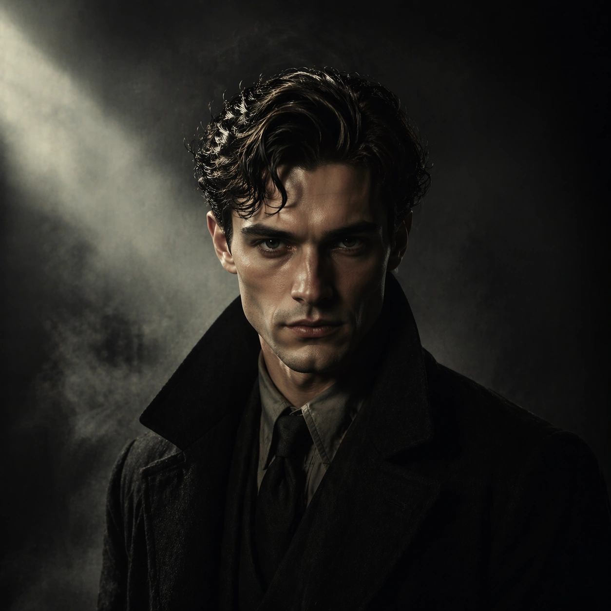
Example generated from “Noir Character Poster Portraits — Poster Crop”
GPT Image 2en

Scene: Create a square 1:1 portrait image for Noir Character Poster Portraits. Use a cleaner campaign or one-sheet style portrait with deliberate negative space and clear focal hierarchy. The frame should feel like a finished professional deliverable rather than a casual snapshot, with clear lens discipline, believable light falloff, and a palette that directly supports Create moody noir-style character portraits that sit between still photography and key art, with shadow-led lighting and strong psychological framing.. Keep enough surrounding space and compositional control for gallery, research, campaign, or approval-board reuse while staying photoreal and human-scaled. Subject: Center one noir lead with pale skin, dark wavy hair, sharp cheekbones, and guarded eyes. Turn the same character into a poster-worthy portrait without readable text or identity drift. Use the example direction from the brief as grounding context: Create moody noir-style character portraits that sit between still photography and key art, with shadow-led lighting and strong psychological framing.. Wardrobe, lighting, environment, and pose may shift to serve this variation, but the viewer must immediately understand that the same reference identity is still in front of the camera. Important details: This backlog line is difficult because Create moody noir-style character portraits that sit between still photography and key art, with shadow-led lighting and strong psychological framing.. Preserve skin tone family, bone structure, eye spacing, nose shape, mouth shape, hairline logic, shoulder width, and overall body read across the entire series. preserve exact face / hair base / body proportions from the reference model. This frame should feel usable for key art while staying true to the reference model. Avoid the common failure described in the brief: ordinary image models often lose likeness once styling, lighting, or layout changes enter the frame. Success should feel like the result should feel professionally usable, coherent, and clearly built around one stable human identity. Use case: Noir Character Poster Portraits series study 8/9, a poster-like hero crop. Constraints: No readable text, no watermark, no logos, preserve exact 1:1 aspect ratio, preserve exact face / hair base / body proportions from the reference model, no fake title text, no logo marks, no giant montage collage, no alternate casting.

Example generated from “Noir Character Poster Portraits — Finale Aftermath”
GPT Image 2en

Scene: Create a square 1:1 portrait image for Noir Character Poster Portraits. Use a quieter cinematic frame with residue, dusk, or emotional calm, still anchored by precise portrait craft. The frame should feel like a finished professional deliverable rather than a casual snapshot, with clear lens discipline, believable light falloff, and a palette that directly supports Create moody noir-style character portraits that sit between still photography and key art, with shadow-led lighting and strong psychological framing.. Keep enough surrounding space and compositional control for gallery, research, campaign, or approval-board reuse while staying photoreal and human-scaled. Subject: Center one noir lead with pale skin, dark wavy hair, sharp cheekbones, and guarded eyes. Close the series on the same character, carrying all previous continuity into a final resolved image that still looks like part of the same story arc. Use the example direction from the brief as grounding context: Create moody noir-style character portraits that sit between still photography and key art, with shadow-led lighting and strong psychological framing.. Wardrobe, lighting, environment, and pose may shift to serve this variation, but the viewer must immediately understand that the same reference identity is still in front of the camera. Important details: This backlog line is difficult because Create moody noir-style character portraits that sit between still photography and key art, with shadow-led lighting and strong psychological framing.. Preserve skin tone family, bone structure, eye spacing, nose shape, mouth shape, hairline logic, shoulder width, and overall body read across the entire series. preserve exact face / hair base / body proportions from the reference model. Mood may soften or darken, but the same-person read cannot weaken. Avoid the common failure described in the brief: ordinary image models often lose likeness once styling, lighting, or layout changes enter the frame. Success should feel like the result should feel professionally usable, coherent, and clearly built around one stable human identity. Use case: Noir Character Poster Portraits series study 9/9, a resolved final aftermath portrait. Constraints: No readable text, no watermark, no logos, preserve exact 1:1 aspect ratio, preserve exact face / hair base / body proportions from the reference model, no sequel-bait crowd scene, no face drift, no genre jump, no decorative smoke overload.

Example generated from “Npc Faction Casting Sheet — Reference Faction Overview”
GPT Image 2en

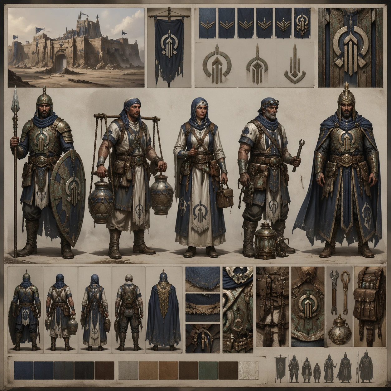
Scene: Build a square casting-board hero image viewed like a premium concept bible page pinned on a neutral studio wall, with structured compartments, clean margins, and strong central hierarchy. Keep the overall frame square, polished, and production-ready game art bible presentation with crisp panel rhythm, believable costume construction, and enough visual hierarchy for downstream UI or documentation reuse. Let materials, lighting, and spacing feel intentional enough for gallery, research, campaign, or approval-board reuse without depending on readable text. Subject: Present five archetypes from the same citadel faction in one frame: a gate guard, a water merchant, a field medic, a machine tender, and an elite captain. Ground the image inside a wind-carved desert citadel faction with oxidized bronze, indigo cloth, pale bone accents, practical leather, and a sun-faded military-monastic attitude. Use multiple adult NPC archetypes such as guard, quartermaster, medic, machinist, scout, priest, and captain, but keep them visually linked through the same regional craft language and social hierarchy. Important details: Keep insignia geometry, rank markers, cloth layering, tool silhouettes, and color hierarchy coherent across every role so the cast reads like one population rather than unrelated hero concepts. Make the captain visibly higher rank without turning the others into extras. Every figure should feel game-usable, grounded, and distinct in job function. Use this frame to establish the reference system that later dependent images must preserve. Favor believable production craft, clean hierarchy, and reusable visual logic over empty spectacle or random decoration. Use case: NPC Faction Casting Sheet series study 1/9, the anchor board that defines the faction casting language. Constraints: No readable text, no watermark, no logos, preserve exact 1:1 aspect ratio, no unrelated fantasy races, no random neon tech, no comic exaggeration, no costume drift between roles.
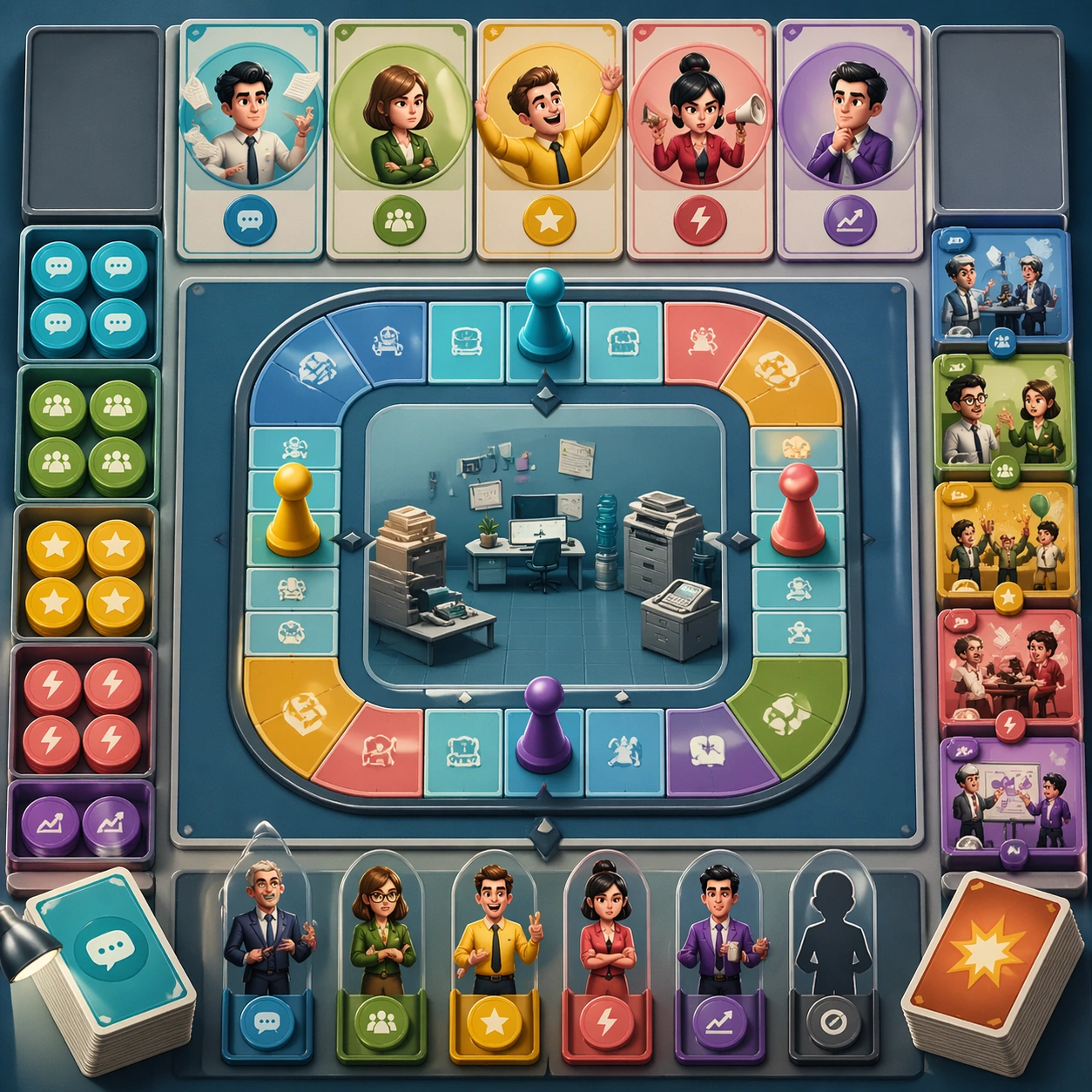
Example generated from “Npc Faction Casting Sheet — Guard and Vendor Roster”
GPT Image 2en

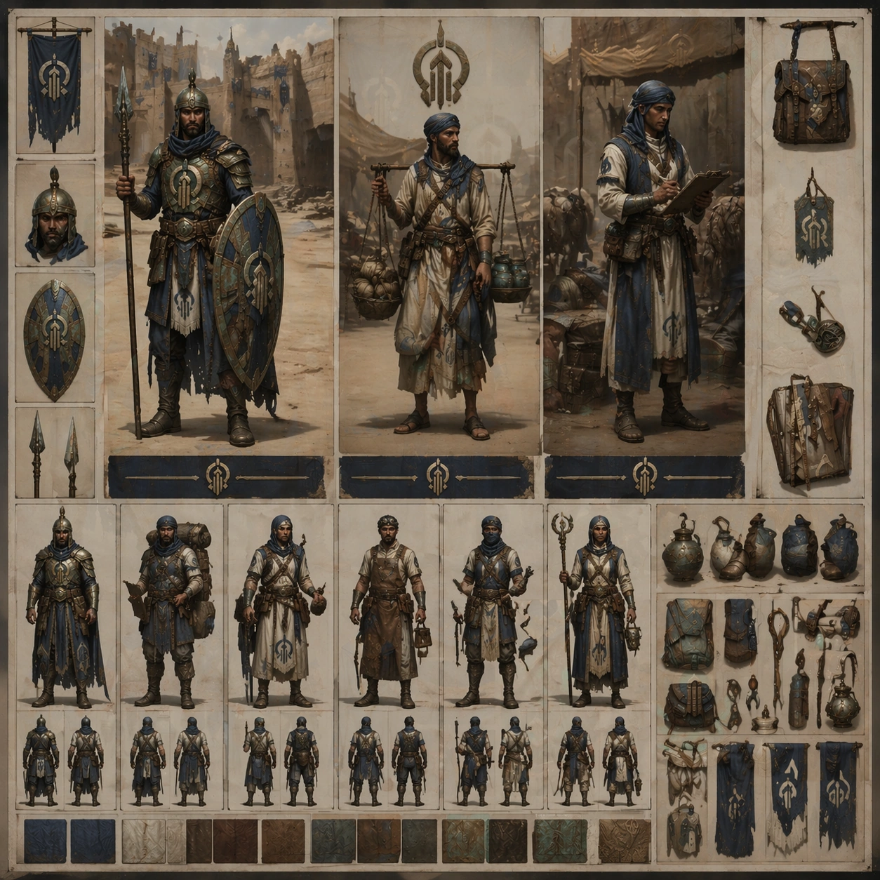
Scene: Compose a square roster plate with two tall character columns and smaller accessory callouts, like a studio-approved sheet for side-cast implementation. Keep the overall frame square, polished, and production-ready game art bible presentation with crisp panel rhythm, believable costume construction, and enough visual hierarchy for downstream UI or documentation reuse. Let materials, lighting, and spacing feel intentional enough for gallery, research, campaign, or approval-board reuse without depending on readable text. Subject: Focus on a gate guard, a market vendor, and a caravan clerk from the same faction, showing how civilian roles inherit the same insignia and materials with softer protection levels. Ground the image inside a wind-carved desert citadel faction with oxidized bronze, indigo cloth, pale bone accents, practical leather, and a sun-faded military-monastic attitude. Use multiple adult NPC archetypes such as guard, quartermaster, medic, machinist, scout, priest, and captain, but keep them visually linked through the same regional craft language and social hierarchy. Important details: Keep insignia geometry, rank markers, cloth layering, tool silhouettes, and color hierarchy coherent across every role so the cast reads like one population rather than unrelated hero concepts. The sheet should prove that noncombat NPCs still belong to the same world. Use subtle prop logic such as ration satchels, water seals, and stamped cloth tabs. Treat this frame as reference-dependent on image 01 and preserve the same core system, hierarchy, and visual language. Favor believable production craft, clean hierarchy, and reusable visual logic over empty spectacle or random decoration. Use case: NPC Faction Casting Sheet series study 2/9, a civilian-versus-military roster comparison within one faction. Constraints: No readable text, no watermark, no logos, preserve exact 1:1 aspect ratio, no modern storefront cues, no unrelated luxury styling, no duplicate poses, no broken accessory scale.
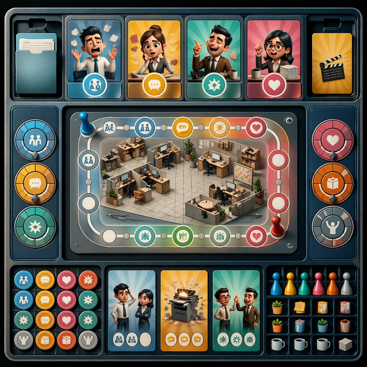
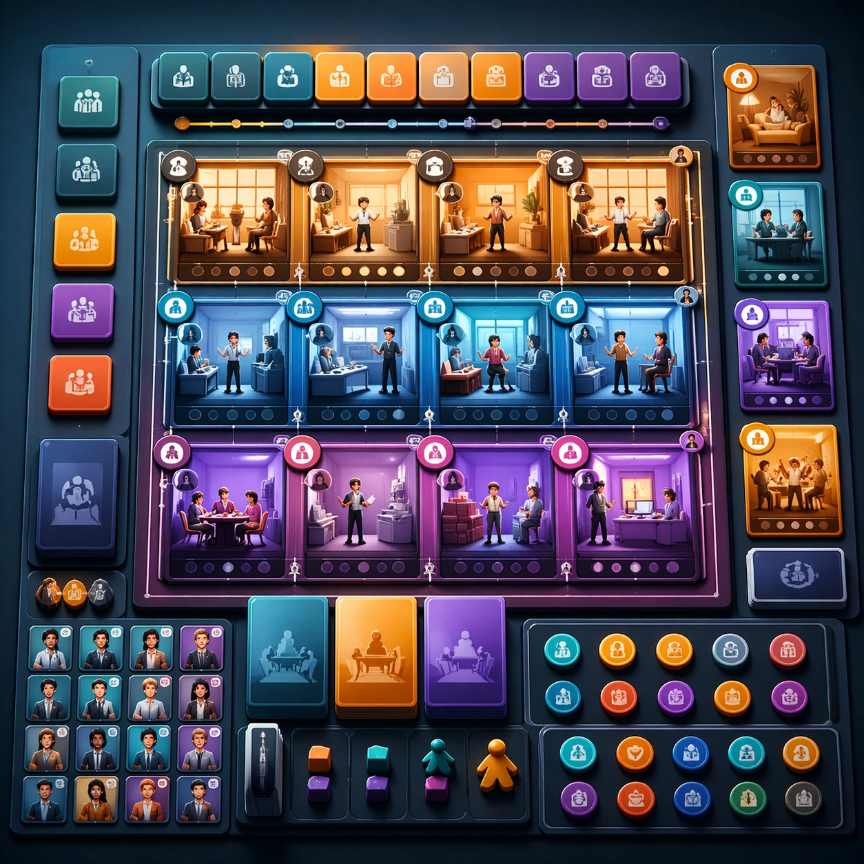
Example generated from “Npc Faction Casting Sheet — Medic and Engineer Pairing”
GPT Image 2en

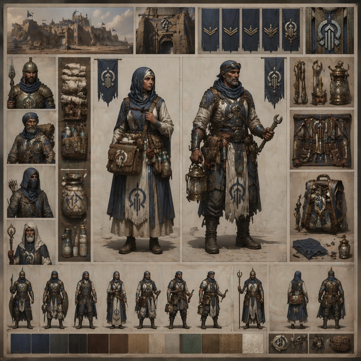
Scene: Create a square pairing board with one medic and one engineer framed by modular equipment panels, soft shadowed paper layers, and tidy concept-art organization. Keep the overall frame square, polished, and production-ready game art bible presentation with crisp panel rhythm, believable costume construction, and enough visual hierarchy for downstream UI or documentation reuse. Let materials, lighting, and spacing feel intentional enough for gallery, research, campaign, or approval-board reuse without depending on readable text. Subject: Show how healing and repair roles diverge in tools and posture while still sharing the same citadel identity, cloth palette, rank notation, and survival pragmatism. Ground the image inside a wind-carved desert citadel faction with oxidized bronze, indigo cloth, pale bone accents, practical leather, and a sun-faded military-monastic attitude. Use multiple adult NPC archetypes such as guard, quartermaster, medic, machinist, scout, priest, and captain, but keep them visually linked through the same regional craft language and social hierarchy. Important details: Keep insignia geometry, rank markers, cloth layering, tool silhouettes, and color hierarchy coherent across every role so the cast reads like one population rather than unrelated hero concepts. Let the medic carry field bandage gear and distilled-water pouches, while the engineer carries brass repair arms, lantern tools, and sand-resistant mechanics. Treat this frame as reference-dependent on image 01 and preserve the same core system, hierarchy, and visual language. Favor believable production craft, clean hierarchy, and reusable visual logic over empty spectacle or random decoration. Use case: NPC Faction Casting Sheet series study 3/9, a support-role pairing sheet for production alignment. Constraints: No readable text, no watermark, no logos, preserve exact 1:1 aspect ratio, no sci-fi holograms, no glossy superhero armor, no cute mascot styling, no chaotic diagram clutter.
Example generated from “Npc Faction Casting Sheet — Elite Captain Command Board”
GPT Image 2en

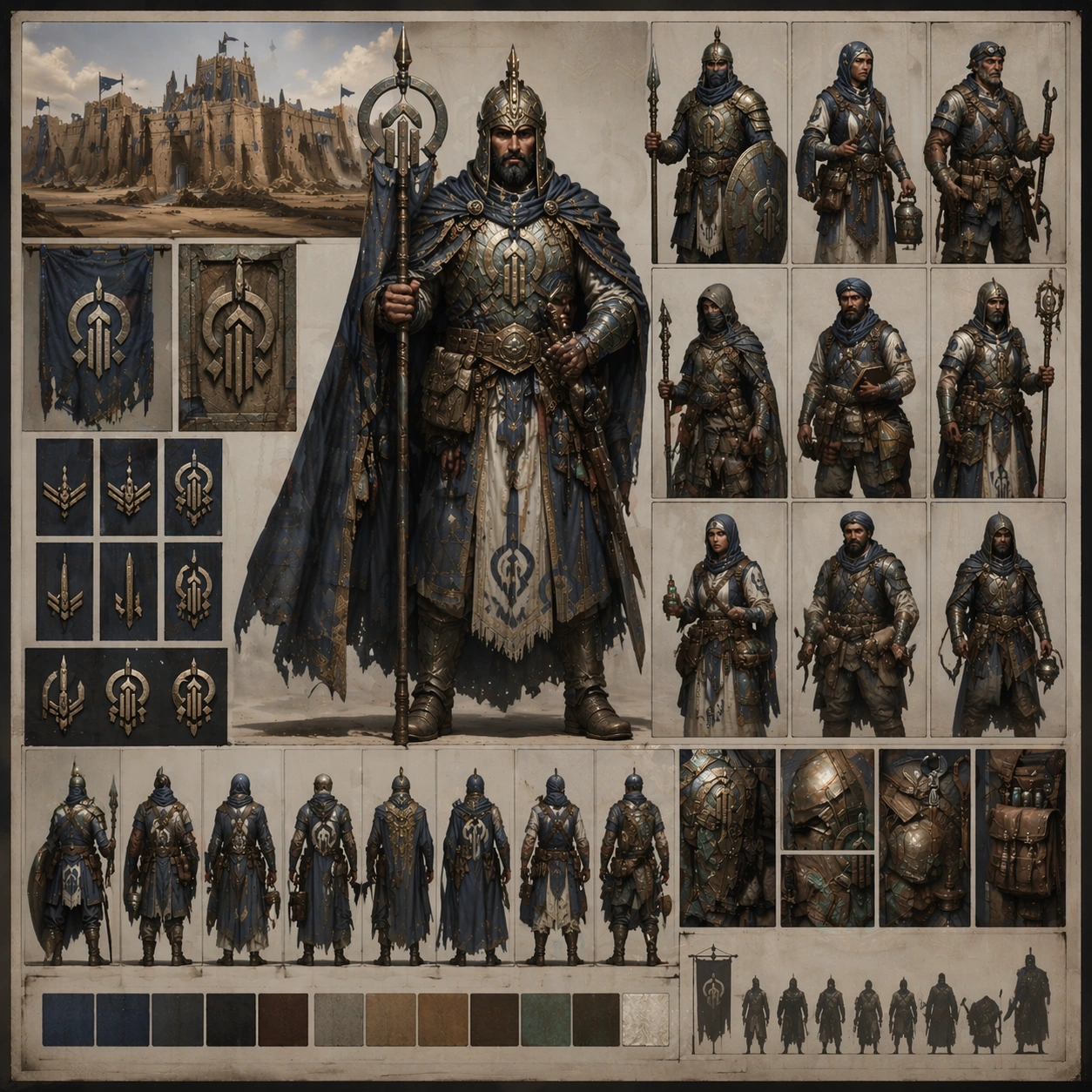
Scene: Design a square command-board finale with the elite captain dominant in frame, supported by smaller subordinate silhouettes and rank-emblem panels. Keep the overall frame square, polished, and production-ready game art bible presentation with crisp panel rhythm, believable costume construction, and enough visual hierarchy for downstream UI or documentation reuse. Let materials, lighting, and spacing feel intentional enough for gallery, research, campaign, or approval-board reuse without depending on readable text. Subject: Turn the elite captain into the highest-authority NPC of the same faction, with heavier ceremonial layers, tighter insignia, and command presence rather than monster-boss spectacle. Ground the image inside a wind-carved desert citadel faction with oxidized bronze, indigo cloth, pale bone accents, practical leather, and a sun-faded military-monastic attitude. Use multiple adult NPC archetypes such as guard, quartermaster, medic, machinist, scout, priest, and captain, but keep them visually linked through the same regional craft language and social hierarchy. Important details: Keep insignia geometry, rank markers, cloth layering, tool silhouettes, and color hierarchy coherent across every role so the cast reads like one population rather than unrelated hero concepts. The hierarchy should feel clear enough for quest-giver, region-leader, or late-game ally use, while still matching the clothing logic and field-worn surfaces from image 01. Treat this frame as reference-dependent on image 01 and preserve the same core system, hierarchy, and visual language. Favor believable production craft, clean hierarchy, and reusable visual logic over empty spectacle or random decoration. Use case: NPC Faction Casting Sheet series study 4/9, the high-rank command variant for the same faction system. Constraints: No readable text, no watermark, no logos, preserve exact 1:1 aspect ratio, no throne-room excess, no villain parody, no floating magic overload, no off-theme luxury metals.

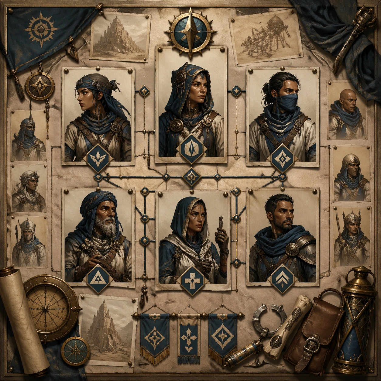
Example generated from “Npc Faction Casting Sheet — Quest Board Cast”
GPT Image 2en

Scene: Build a square quest-board casting sheet with pinned portrait cards, route markers, object evidence, and production-bible polish but no readable labels. Keep the overall frame square, polished, and production-ready game art bible presentation with crisp panel rhythm, believable costume construction, and enough visual hierarchy for downstream UI or documentation reuse. Let materials, lighting, and spacing feel intentional enough for gallery, research, campaign, or approval-board reuse without depending on readable text. Subject: Map out the faction's quest-facing cast: dispatcher, scout, medic, smuggler informant, and captain liaison. Ground the image inside a wind-carved desert citadel faction with oxidized bronze, indigo cloth, pale bone accents, practical leather, and a sun-faded military-monastic attitude. Use multiple adult NPC archetypes such as guard, quartermaster, medic, machinist, scout, priest, and captain, but keep them visually linked through the same regional craft language and social hierarchy. Important details: Keep insignia geometry, rank markers, cloth layering, tool silhouettes, and color hierarchy coherent across every role so the cast reads like one population rather than unrelated hero concepts. The sheet should imply narrative relationships and gameplay handoff points without becoming a detective corkboard parody. Treat this frame as an independent study that still honors the same overall theme and production logic. Favor believable production craft, clean hierarchy, and reusable visual logic over empty spectacle or random decoration. Use case: NPC Faction Casting Sheet single study 6/9, a quest-facing cast relationship board. Constraints: No readable text, no watermark, no logos, preserve exact 1:1 aspect ratio, no readable mission text, no red string cliché overload, no horror crime tone, no unrelated civilians.

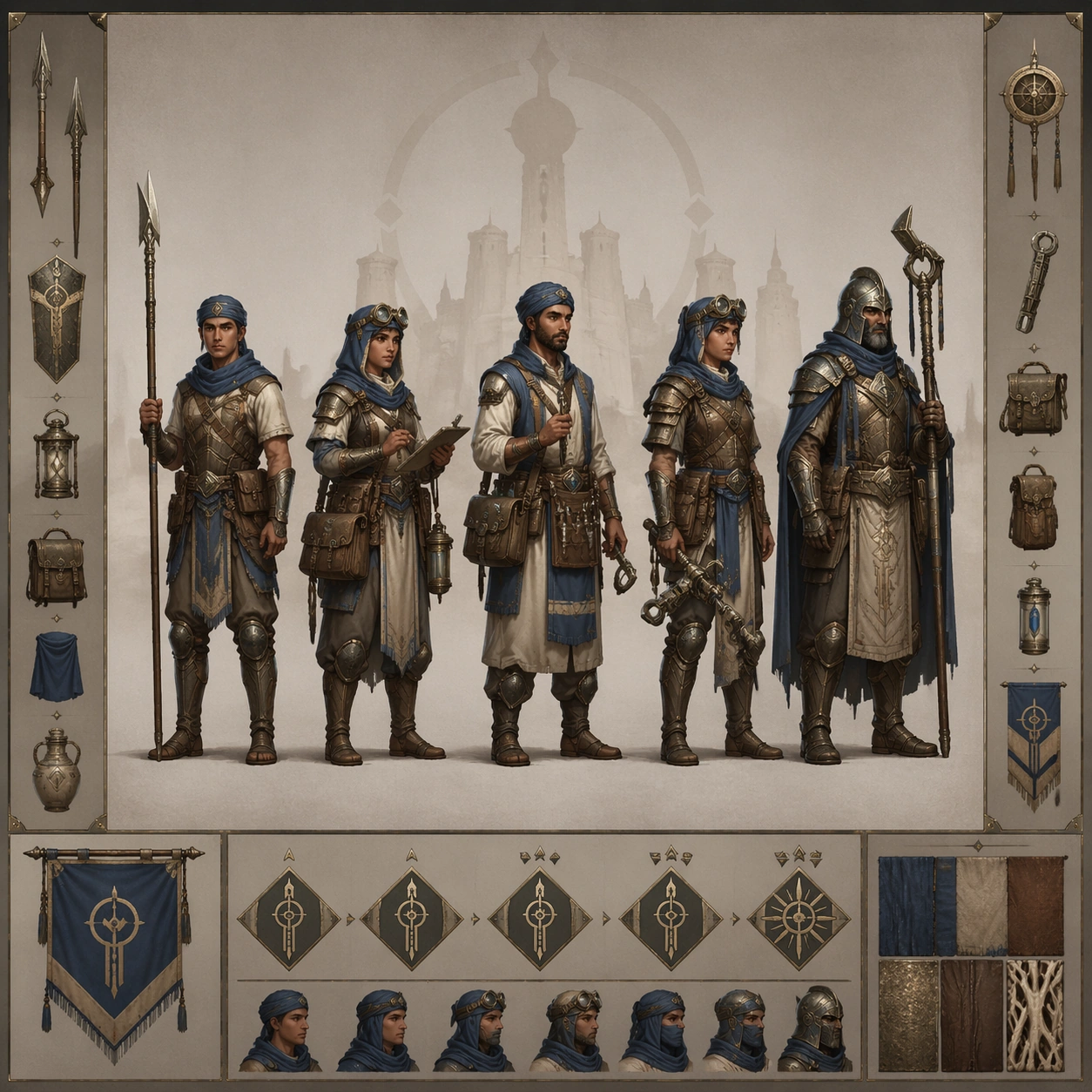
Example generated from “Npc Faction Casting Sheet — Patrol Lineup”
GPT Image 2en

Scene: Compose a square lineup board with five full-body NPCs in even spacing, neutral ground shadow, and side accessory strips like a shipping-ready art sheet. Keep the overall frame square, polished, and production-ready game art bible presentation with crisp panel rhythm, believable costume construction, and enough visual hierarchy for downstream UI or documentation reuse. Let materials, lighting, and spacing feel intentional enough for gallery, research, campaign, or approval-board reuse without depending on readable text. Subject: Show a patrol group from rookie to veteran, making armor density, carried tools, and posture clearly tiered. Ground the image inside a wind-carved desert citadel faction with oxidized bronze, indigo cloth, pale bone accents, practical leather, and a sun-faded military-monastic attitude. Use multiple adult NPC archetypes such as guard, quartermaster, medic, machinist, scout, priest, and captain, but keep them visually linked through the same regional craft language and social hierarchy. Important details: Keep insignia geometry, rank markers, cloth layering, tool silhouettes, and color hierarchy coherent across every role so the cast reads like one population rather than unrelated hero concepts. Keep role readability strong enough for encounter design and side-quest casting while preserving one faction identity. Treat this frame as an independent study that still honors the same overall theme and production logic. Favor believable production craft, clean hierarchy, and reusable visual logic over empty spectacle or random decoration. Use case: NPC Faction Casting Sheet single study 7/9, patrol-tier lineup planning for encounter casting. Constraints: No readable text, no watermark, no logos, preserve exact 1:1 aspect ratio, no identical silhouettes, no extra monsters, no cinematic explosion backdrop, no broken spacing.

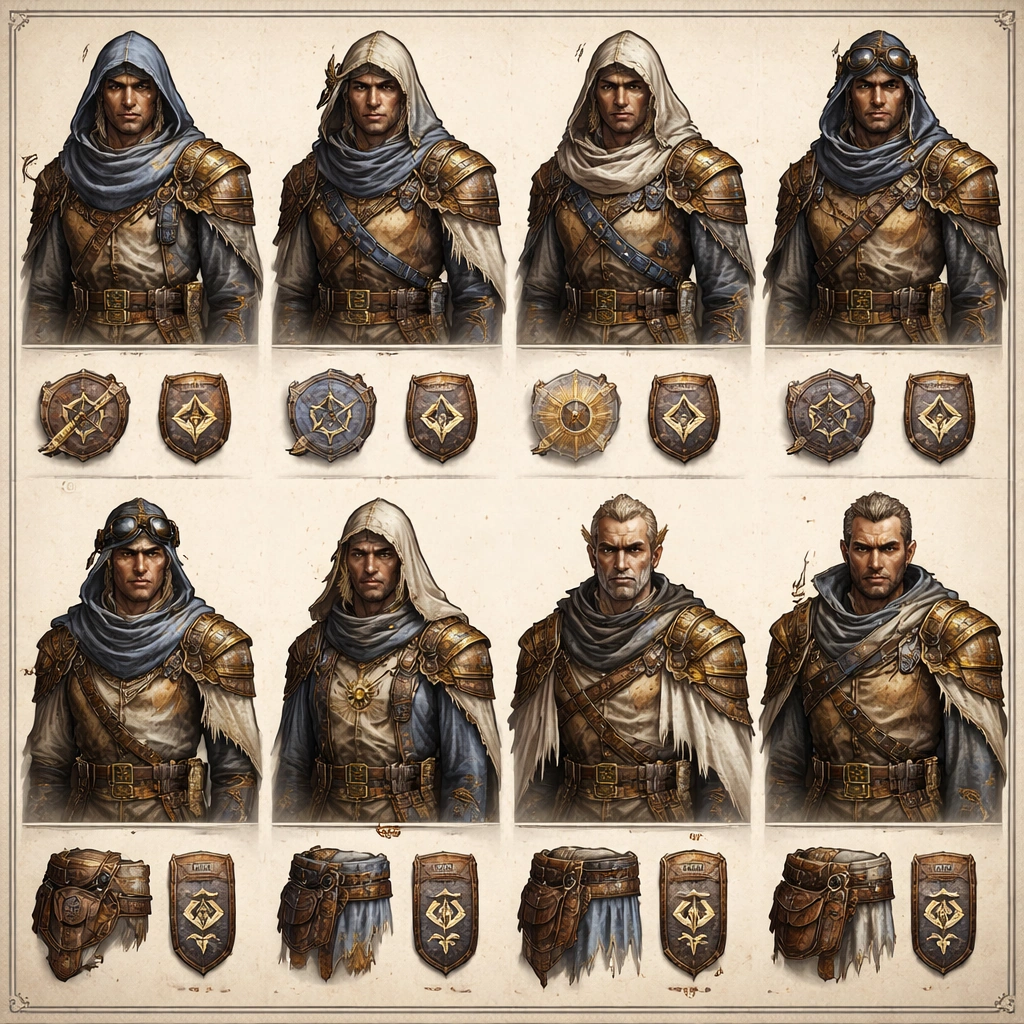
Example generated from “Npc Faction Casting Sheet — Rank Insignia Comparison”
GPT Image 2en

Scene: Design a square comparison board with busts, shoulder details, stitched insignia patches, and belt or scarf callouts arranged like a practical approval page. Keep the overall frame square, polished, and production-ready game art bible presentation with crisp panel rhythm, believable costume construction, and enough visual hierarchy for downstream UI or documentation reuse. Let materials, lighting, and spacing feel intentional enough for gallery, research, campaign, or approval-board reuse without depending on readable text. Subject: Explain how rank is communicated across the same faction through cloth trims, metallic pins, collar patterns, and weathered ceremonial accents. Ground the image inside a wind-carved desert citadel faction with oxidized bronze, indigo cloth, pale bone accents, practical leather, and a sun-faded military-monastic attitude. Use multiple adult NPC archetypes such as guard, quartermaster, medic, machinist, scout, priest, and captain, but keep them visually linked through the same regional craft language and social hierarchy. Important details: Keep insignia geometry, rank markers, cloth layering, tool silhouettes, and color hierarchy coherent across every role so the cast reads like one population rather than unrelated hero concepts. Human figures must remain the focus, with insignia closeups acting as support evidence rather than replacing character design. Treat this frame as an independent study that still honors the same overall theme and production logic. Favor believable production craft, clean hierarchy, and reusable visual logic over empty spectacle or random decoration. Use case: NPC Faction Casting Sheet single study 8/9, rank communication reference for implementation teams. Constraints: No readable text, no watermark, no logos, preserve exact 1:1 aspect ratio, no abstract symbol-only poster, no unreadable tiny clutter, no glowing fantasy sigils everywhere, no modern medals.

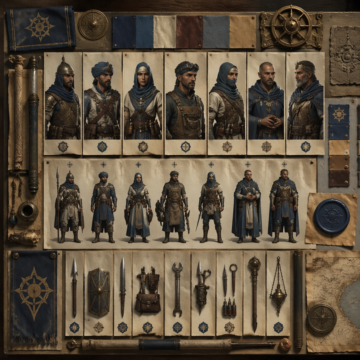
Example generated from “Npc Faction Casting Sheet — Field Dossier Table”
GPT Image 2en

Scene: Create a square tabletop dossier image with printed portrait cards, equipment strips, wax seals, map scraps, and orderly document layering photographed from above. Keep the overall frame square, polished, and production-ready game art bible presentation with crisp panel rhythm, believable costume construction, and enough visual hierarchy for downstream UI or documentation reuse. Let materials, lighting, and spacing feel intentional enough for gallery, research, campaign, or approval-board reuse without depending on readable text. Subject: The same faction appears through dossier fragments, selection portraits, and gear evidence, giving producers a believable documentation asset. Ground the image inside a wind-carved desert citadel faction with oxidized bronze, indigo cloth, pale bone accents, practical leather, and a sun-faded military-monastic attitude. Use multiple adult NPC archetypes such as guard, quartermaster, medic, machinist, scout, priest, and captain, but keep them visually linked through the same regional craft language and social hierarchy. Important details: Keep insignia geometry, rank markers, cloth layering, tool silhouettes, and color hierarchy coherent across every role so the cast reads like one population rather than unrelated hero concepts. Everything should feel like one organized worldbuilding table, not a chaotic scrapbook. Surface wear and craft should stay grounded and tactile. Treat this frame as an independent study that still honors the same overall theme and production logic. Favor believable production craft, clean hierarchy, and reusable visual logic over empty spectacle or random decoration. Use case: NPC Faction Casting Sheet single study 9/9, field documentation support for faction worldbuilding. Constraints: No readable text, no watermark, no logos, preserve exact 1:1 aspect ratio, no readable paragraphs, no real-world passports, no brand stationery, no messy desk clutter.

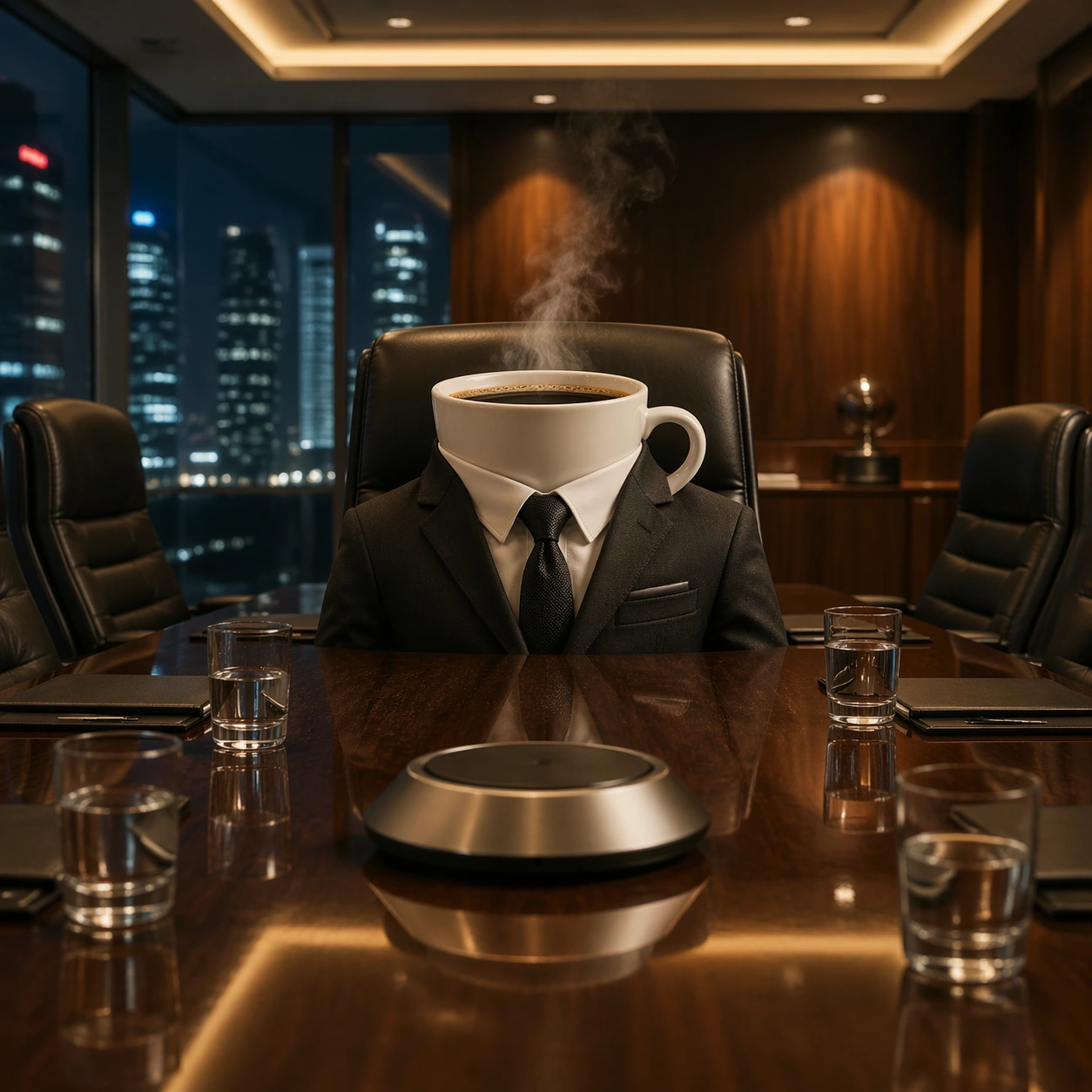
Example generated from “Object Boardroom — Coffee Chair”
GPT Image 2en

Scene: A square photorealistic commercial photograph inside a luxury walnut boardroom at evening, camera at seated eye level across a polished table. Warm recessed ceiling lights and a cool city skyline through glass walls create precise reflections on wood, leather, porcelain, and metal. The room feels expensive and serious, with shallow depth of field but enough clarity to read the full meeting setup. Subject: At the head chair sits a porcelain coffee cup as the executive, wearing a perfectly tailored charcoal suit jacket built around the cup body. Steam rises naturally from the dark coffee surface like measured breath during a tense meeting. Cuff sleeves, lapels, and tie knot fit the cup without turning it into a cartoon body. Around the table, blurred empty executive chairs, folders without readable text, water glasses, and a silver conference speaker reinforce the boardroom scale. Important details: The cup must remain an actual porcelain cup with real thickness, handle, rim, liquid surface, condensation, and gravity. Anthropomorphism comes only from suit tailoring, chair placement, posture implied by composition, and executive staging. Keep hands, eyes, mouth, and facial features absent. Reflections on the table should mirror the cup, suit fabric, and ceiling lights believably. The humor should feel like a premium magazine advertisement, not a mascot illustration. Use case: Object Boardroom series study 1/8, establishing the reference boardroom, tailoring logic, camera height, and photoreal material standard for the series. Constraints: No readable text, no watermark, no logos, preserve exact 1:1 aspect ratio, no cartoon face, no human arms, no floating object, no impossible fabric clipping, no messy table clutter.

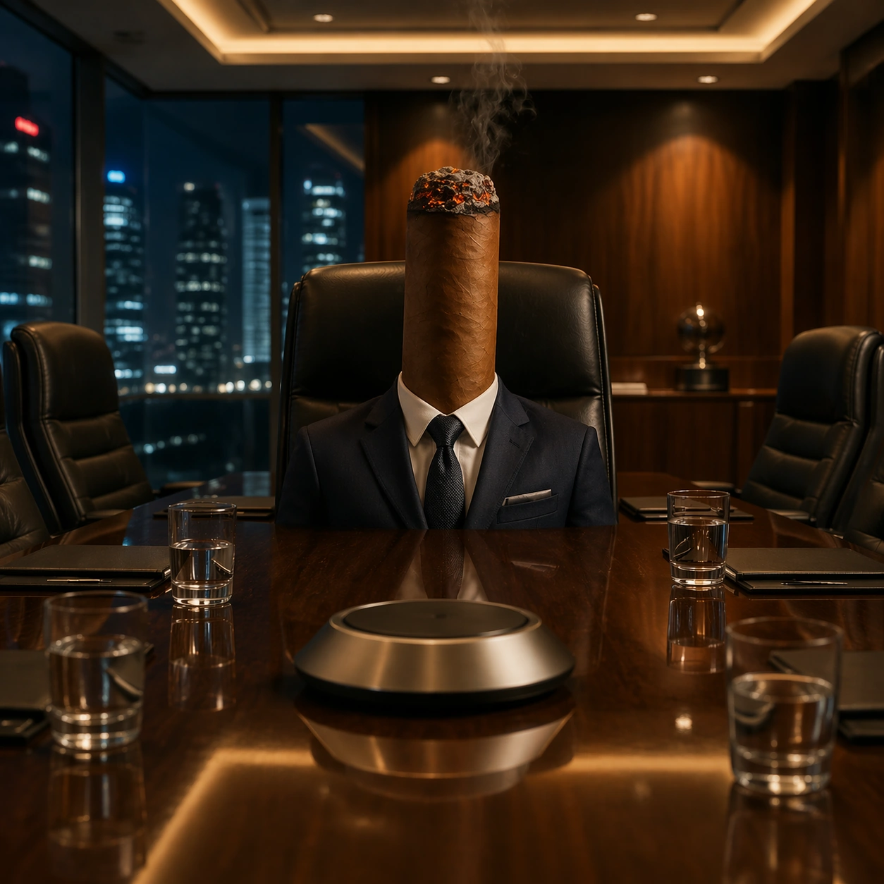
Example generated from “Object Boardroom — Cigar Chair”
GPT Image 2en

Scene: A square photorealistic commercial photograph in the same luxury walnut boardroom as the reference image, preserving the seated eye-level camera, polished table reflections, warm ceiling light, and cool city skyline beyond the glass. The mood is late-evening executive drama, with controlled highlights on leather, metal trim, smoke, and glossy wood. The composition should clearly match the reference room while shifting the chair occupant. Subject: At the head chair sits a premium brown cigar as the executive, dressed in a tailored deep navy suit jacket scaled around the cigar body. The cigar rests upright in the chair with one end faintly glowing and a thin ribbon of smoke rising toward the ceiling, behaving like real smoke in still air. Its wrapper texture, band-free surface, ash edge, and cylindrical shape must stay physically credible. The suit collar and tie imply authority without adding a face or limbs. Important details: Use the reference boardroom geometry, table position, chair style, lighting direction, and premium advertising finish. The cigar must remain an actual cigar: veined tobacco wrapper, fragile ash, ember glow, smoke translucency, and grounded contact with the chair. Anthropomorphism comes from executive wardrobe and boardroom placement only. Avoid comedy props; the joke should be dry, elegant, and instantly legible. Table reflections should catch both the cigar silhouette and smoke softness. Use case: Object Boardroom series study 2/8, using the first image as continuity reference while testing smoke, ember light, tobacco texture, and suit integration. Constraints: No readable text, no watermark, no logos, preserve exact 1:1 aspect ratio, no cartoon face, no human arms, no floating cigar, no exaggerated smoke cloud, no brand band, no unsafe open flame beyond a small ember.

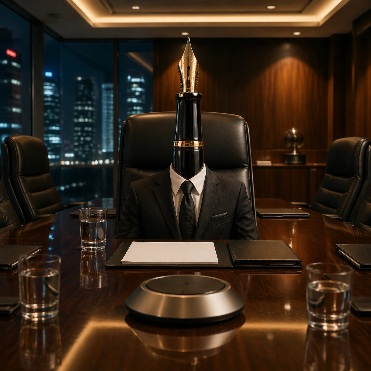
Example generated from “Object Boardroom — Pen Chair”
GPT Image 2en

Scene: A square photorealistic commercial photograph set in the same walnut executive boardroom as the reference image. Keep the same eye-level boardroom perspective, polished table, glass skyline, warm overhead lighting, dark leather chairs, and premium corporate atmosphere. The lighting should create crisp specular highlights on lacquer, gold trim, polished wood, and suit fabric without making the scene look staged like a toy set. Subject: At the head chair sits a black lacquer fountain pen as the executive, dressed in a sharply tailored black suit with a narrow silk tie. The pen stands upright through the jacket as if seated in the chair, its gold nib angled slightly forward like a person leaning into negotiations. The cap, clip, nib slit, feed ribs, lacquer barrel, and tiny metal reflections must be clear and physically plausible. A closed folder, blank paper sheets, and water glass sit nearby without readable text. Important details: Use the reference image as the boardroom continuity anchor: same table scale, chair shape, reflective surface, and serious meeting mood. The pen must not become a humanoid; it remains a real fountain pen with accurate material transitions from lacquer to metal nib. Anthropomorphic authority is created by composition, wardrobe fit, upright posture, and the direction of the nib. The suit should wrap believably around a long cylindrical object without sleeves or hands. Use case: Object Boardroom series study 3/8, extending the reference boardroom while testing glossy lacquer, metal nib detail, and restrained executive anthropomorphism. Constraints: No readable text, no watermark, no logos, preserve exact 1:1 aspect ratio, no cartoon face, no human arms, no extra human figure, no leaking ink, no brand marks, no impossible bent pen.

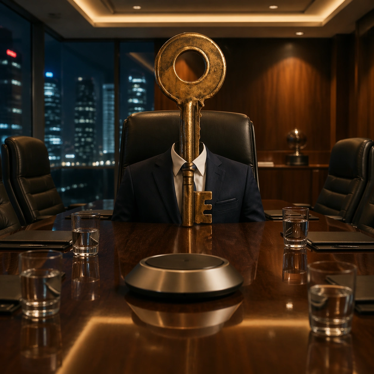
Example generated from “Object Boardroom — Key Chair”
GPT Image 2en

Scene: A square photorealistic commercial photograph in the same luxury boardroom established by the reference image. Maintain the eye-level composition across the polished walnut table, warm downlights, glass wall with cool city bokeh, dark leather executive chairs, and controlled premium contrast. The scene should feel like a real photographed advertising concept with believable reflections and scale. Subject: At the head chair sits a heavy brass door key as the executive, wearing a tailored midnight blue suit jacket and understated tie. The key is upright, with the bow acting like a head-height silhouette but without any face, and the toothed bit grounded near the chair seat. Its brass surface shows scratches, worn edges, darker patina in recessed grooves, and warm highlights from the ceiling lights. The suit fits around the metal object as a bespoke costume rather than a cartoon body. Important details: Use the first image as the reference for room continuity, table geometry, lens height, chair placement, and serious boardroom mood. The key must retain actual metal weight and geometry: flat shaft, circular bow, cut teeth, worn brass, real contact shadows, and mirror-like table reflection. Anthropomorphism is implied through executive seating, suit tailoring, and negotiation posture. The visual joke should read as boardroom power and access control, not fantasy animation. Use case: Object Boardroom series study 4/8, preserving the reference boardroom while testing tarnished metal, hard reflections, scale control, and object-as-executive staging. Constraints: No readable text, no watermark, no logos, preserve exact 1:1 aspect ratio, no cartoon face, no human arms, no floating key, no extra keychain, no impossible soft metal bending, no cluttered documents.

Example generated from “Object Boardroom — Glass CEO Vote”
GPT Image 2en

Scene: A square photorealistic commercial image in a bright modern boardroom with pale stone walls, a long white conference table, and morning sunlight cutting through vertical blinds. The camera looks diagonally across the table at chair height, creating a clean luxury consulting-firm atmosphere. Reflections on glass, chrome, and polished stone should be sharp enough to sell the physical set. Subject: A clear water glass is seated like a chief executive at the near end of the table, wearing a tailored light gray suit jacket shaped around the cylindrical glass. Water inside the glass bends the background through realistic refraction, and a meniscus catches the sun along the rim. Small condensation beads and caustic highlights fall onto the table. Other chairs are empty, but voting cards, blank paper stacks, and capped pens are arranged around the table like a high-stakes decision has just occurred. Important details: The glass must stay transparent and materially accurate: real rim thickness, waterline distortion, refraction through the suit edges, tabletop caustics, and gravity-consistent condensation. Anthropomorphism should be understated, created through executive seating, fitted tailoring, and the implied vote around it. Keep the image clean and premium, like a financial magazine cover or brand strategy campaign. No eyes, mouth, arms, or cartoon expression should appear. Use case: Object Boardroom single study 5/8, testing transparent material physics, refraction, and commercial boardroom storytelling without reference dependencies. Constraints: No readable text, no watermark, no logos, preserve exact 1:1 aspect ratio, no cartoon face, no human arms, no liquid spill, no branded stationery, no impossible glass deformation, no cluttered background.

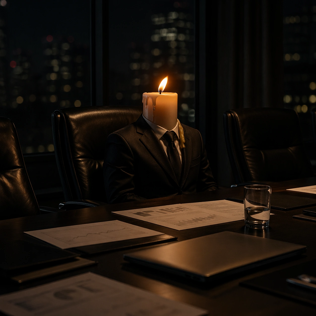
Example generated from “Object Boardroom — Candle Risk Briefing”
GPT Image 2en

Scene: A square photorealistic commercial photograph in a dark risk committee room, lit mostly by a single warm flame and soft overhead spill. The camera is close to table level, with a matte black conference surface, leather chairs fading into shadow, and faint city lights behind tinted glass. The image should feel cinematic, expensive, and physically believable rather than theatrical. Subject: A short ivory candle sits in the central executive chair, dressed in a black suit jacket tailored around the wax cylinder. Its small flame leans slightly as if air conditioning moves through the room, while melted wax pools down one side and hardens at the jacket edge without looking impossible. The candle is surrounded by blank charts, a closed laptop with no logo, a water glass, and a few dark folders, suggesting an emergency risk briefing after hours. Important details: The candle must remain a real burning candle with wax translucency, wick detail, flame core, orange glow, soot-soft shadows, and credible heat light on nearby table objects. Anthropomorphism is limited to boardroom seating, suit fit, and scene staging. The flame should cast a believable warm gradient across the wax, lapels, table, and surrounding chairs. The high-concept joke should feel like a premium campaign about pressure, burnout, or crisis management. Use case: Object Boardroom single study 6/8, testing flame light, wax material, shadow physics, and non-cartoon object anthropomorphism. Constraints: No readable text, no watermark, no logos, preserve exact 1:1 aspect ratio, no cartoon face, no human arms, no spreading fire, no melted suit fabric, no branded laptop, no fantasy glow, no messy props.

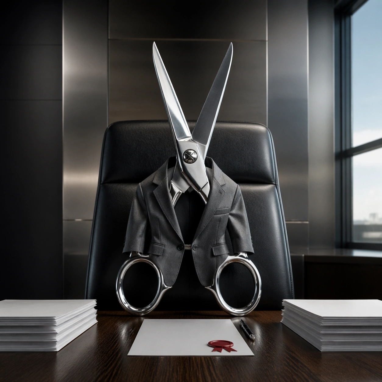
Example generated from “Object Boardroom — Scissors Merger Table”
GPT Image 2en

Scene: A square photorealistic advertising photograph in a sleek merger negotiation room with brushed steel trim, a dark oak table, and cool afternoon light from a high window. The camera is centered across the table, slightly low, giving the object an imposing executive presence. The palette is disciplined: graphite, steel, white paper, dark wood, and one precise red accent from a wax seal without readable markings. Subject: A pair of polished tailor's scissors sits upright in the executive chair, wearing a narrow charcoal suit jacket fitted around the crossing handles and blades. The blades are partially open like a measured negotiation stance, but they remain grounded and safe on the chair and table edge. Reflections run along the sharpened metal, screws, bevels, and finger holes. Blank contract pages lie in two neat stacks on either side, suggesting a merger that may be cut, joined, or renegotiated. Important details: The scissors must stay physically real: metal thickness, hinge screw, bevel geometry, sharp blade edges, accurate contact shadows, and hard specular reflections. Anthropomorphism comes from the suit, chair position, symmetry, and business context, not from facial features or limbs. The image should communicate sophisticated corporate humor with a clean premium campaign finish. The jacket should not obscure the functional scissor anatomy; the tool must remain instantly recognizable. Use case: Object Boardroom single study 7/8, testing hard metal reflections, tool geometry, business symbolism, and photoreal object staging. Constraints: No readable text, no watermark, no logos, preserve exact 1:1 aspect ratio, no cartoon face, no human arms, no blood, no violence, no floating blades, no warped hinge, no brand marks, no cluttered paperwork.

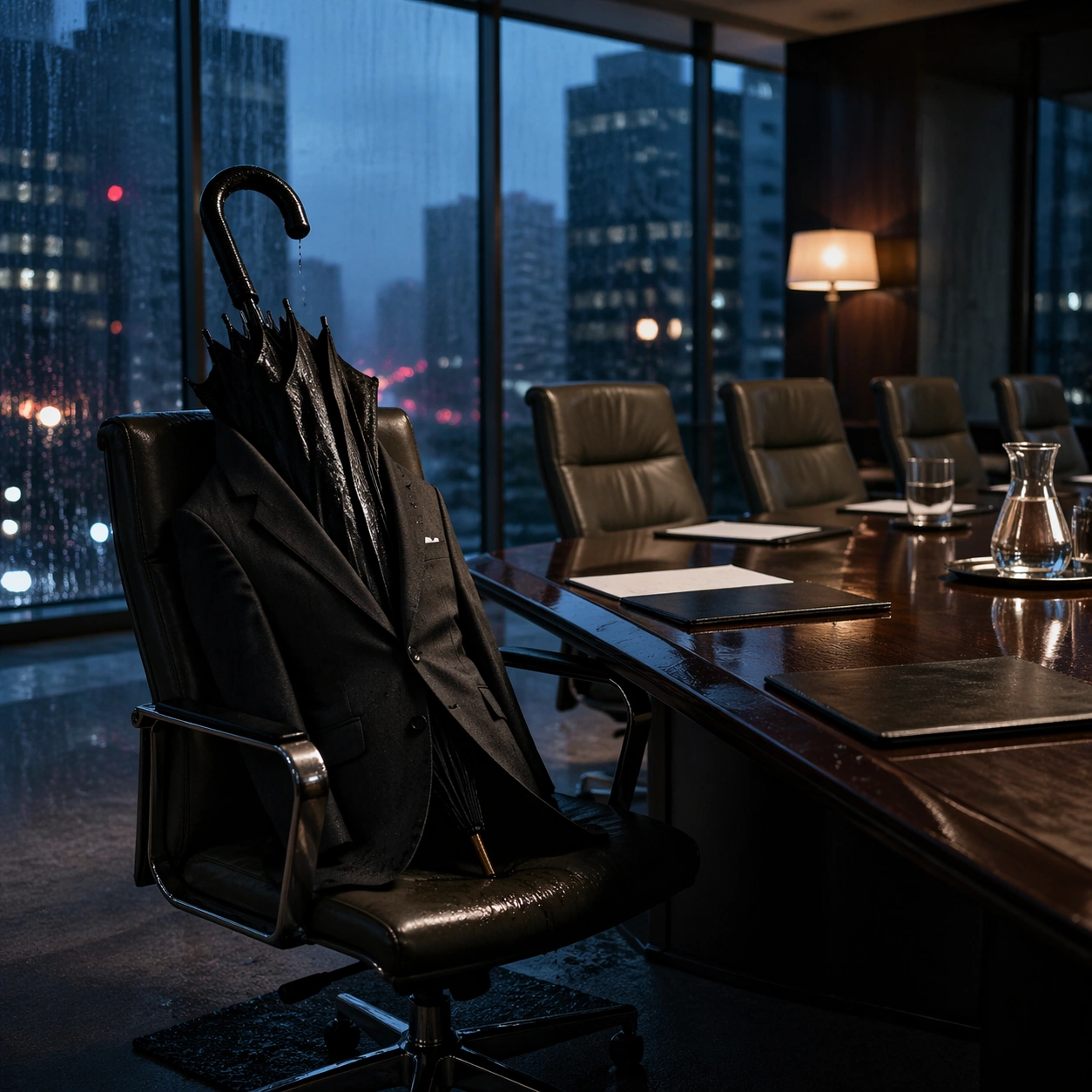
Example generated from “Object Boardroom — Umbrella Crisis Seat”
GPT Image 2en

Scene: A square photorealistic commercial image in a rainy glass-walled boardroom at dusk. City lights smear through wet windows, and cool blue ambient light mixes with warm table lamps. The camera is placed at chair height across a dark polished table, with subtle rain reflections and a serious corporate crisis atmosphere. The room should feel real, expensive, and quiet. Subject: A closed black umbrella sits in the lead executive chair, wearing a tailored dark suit jacket that wraps around the folded canopy and central shaft. The curved handle rests near the chair edge like a restrained gesture, while tiny raindrops bead on the waterproof fabric and drip onto a small floor mat below. Around the table are empty chairs, blank briefing sheets, a glass carafe, and a few closed folders, suggesting storm management without literal human participants. Important details: The umbrella must remain a real object with folded ribs, fabric seams, metal tip, curved handle, water beads, and credible contact shadows. Anthropomorphism comes only from suit fit, seated placement, and executive staging. The wet fabric should catch soft highlights; droplets should follow gravity along the folds rather than float randomly. Reflections on the table and windows should reinforce the rainy boardroom mood. The concept should read as crisis leadership, not a whimsical cartoon. Use case: Object Boardroom single study 8/8, testing waterproof fabric, rain reflections, folded object geometry, and high-concept commercial staging. Constraints: No readable text, no watermark, no logos, preserve exact 1:1 aspect ratio, no cartoon face, no human arms, no open umbrella indoors, no floating droplets, no puddle flood, no branded folders, no surreal storm inside the room.

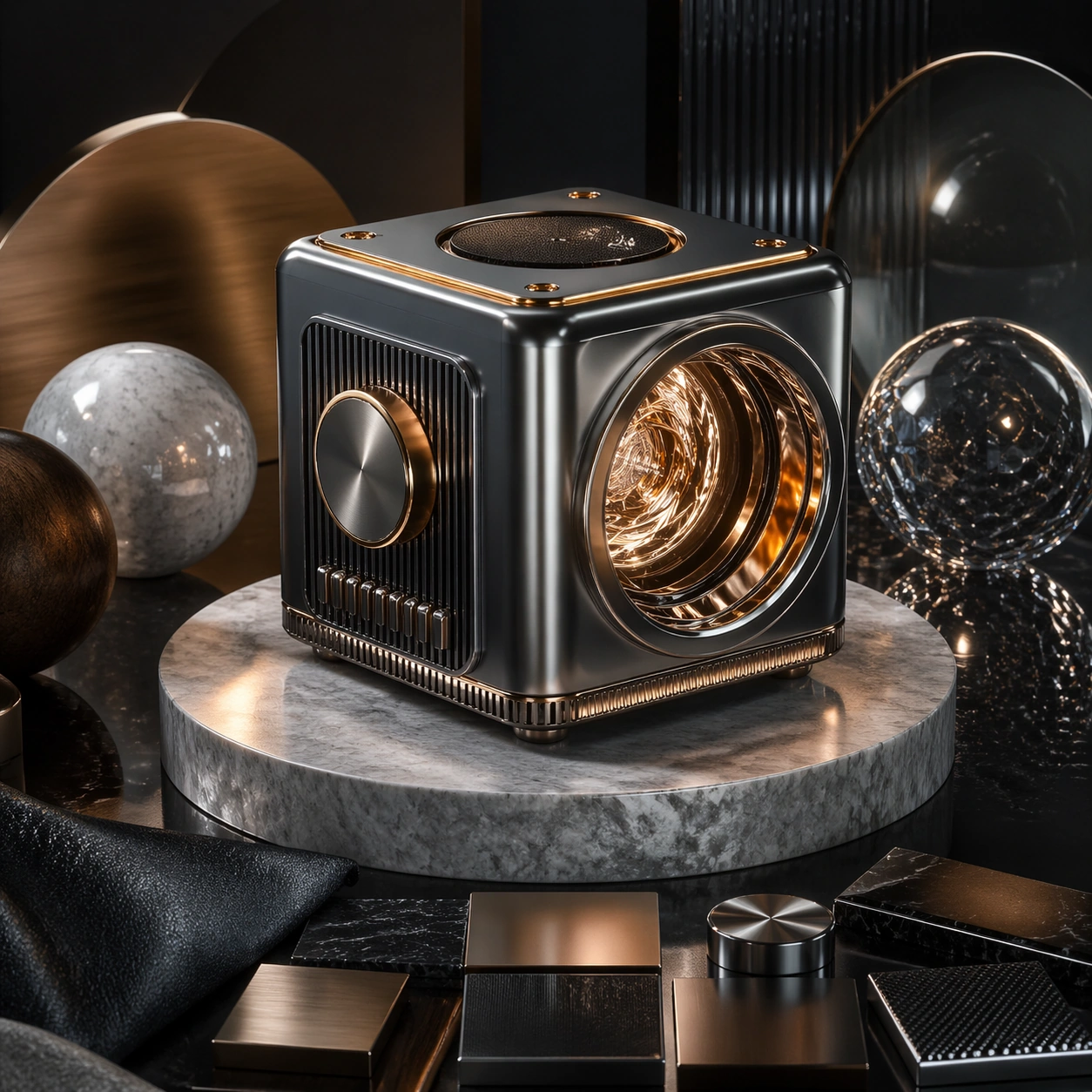
Example generated from “Octane Keyshot Render — Hero Model”
GPT Image 2en

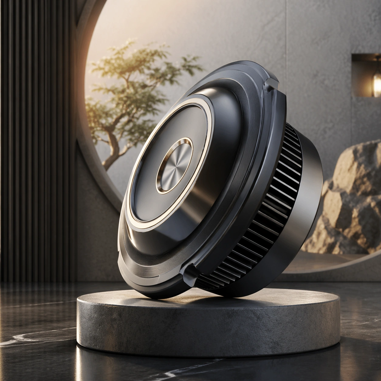
Scene: A square CGI or design-visualization frame with calibrated lighting, intentional composition, and premium material rendering. Build the frame around a flagship render that establishes form, stance, and material identity. Keep the lighting, camera distance, and spatial organization tuned for a high-signal research image rather than a casual snapshot. The image belongs to the Octane KeyShot Render theme and should feel immediately legible as a prompt atlas theme for octane keyshot render, testing photorealism, physics-materials, editing-workflow, commercial-mockup with gpt image 2.. Subject: Center the study on a flagship render that establishes form, stance, and material identity. Translate the theme into a concrete visual statement instead of an abstract mood board: the viewer should understand what kind of image this is, what is being tested, and why the composition is difficult. Use the slug idea of octane keyshot render as a literal guide for subject matter, materials, and staging. Important details: The model must feel engineered or art-directed rather than merely stylized: edges, seams, translucency, reflections, and scale cues should all hold up. Preserve a disciplined square composition, clear focal hierarchy, and enough secondary information to make the image feel complete rather than underspecified. The image should look polished, novel, and exhibition-ready, with topic-specific credibility coming from the way surfaces, structure, and visual language reinforce Octane KeyShot Render. Avoid generic filler elements that do not serve the main concept. Use case: Octane KeyShot Render single study 1/8, testing photorealism, physics-materials, editing-workflow, commercial-mockup through the hero model variation. Constraints: No readable text, no watermark, no logos, preserve exact 1:1 aspect ratio, no real brand logos, no low-poly shortcuts, no broken reflections, no muddy materials, no generic showroom clutter, no unreadable UI overlays.

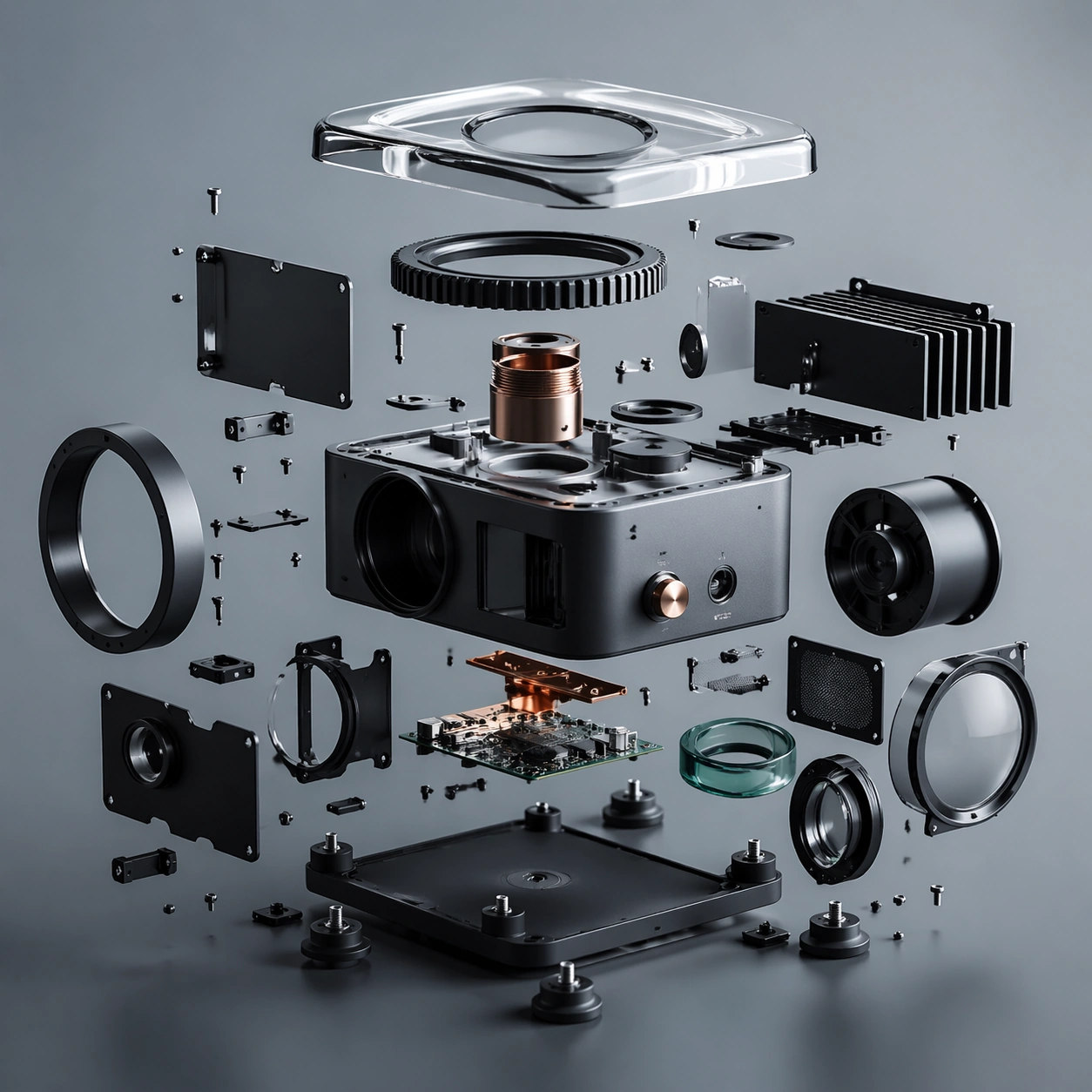
Example generated from “Octane Keyshot Render — Exploded Arrangement”
GPT Image 2en

Scene: A square CGI or design-visualization frame with calibrated lighting, intentional composition, and premium material rendering. Build the frame around components or accessories separated with clean studio logic. Keep the lighting, camera distance, and spatial organization tuned for a high-signal research image rather than a casual snapshot. The image belongs to the Octane KeyShot Render theme and should feel immediately legible as a prompt atlas theme for octane keyshot render, testing photorealism, physics-materials, editing-workflow, commercial-mockup with gpt image 2.. Subject: Center the study on components or accessories separated with clean studio logic. Translate the theme into a concrete visual statement instead of an abstract mood board: the viewer should understand what kind of image this is, what is being tested, and why the composition is difficult. Use the slug idea of octane keyshot render as a literal guide for subject matter, materials, and staging. Important details: The model must feel engineered or art-directed rather than merely stylized: edges, seams, translucency, reflections, and scale cues should all hold up. Preserve a disciplined square composition, clear focal hierarchy, and enough secondary information to make the image feel complete rather than underspecified. The image should look polished, novel, and exhibition-ready, with topic-specific credibility coming from the way surfaces, structure, and visual language reinforce Octane KeyShot Render. Avoid generic filler elements that do not serve the main concept. Use case: Octane KeyShot Render single study 2/8, testing photorealism, physics-materials, editing-workflow, commercial-mockup through the exploded arrangement variation. Constraints: No readable text, no watermark, no logos, preserve exact 1:1 aspect ratio, no real brand logos, no low-poly shortcuts, no broken reflections, no muddy materials, no generic showroom clutter, no unreadable UI overlays.

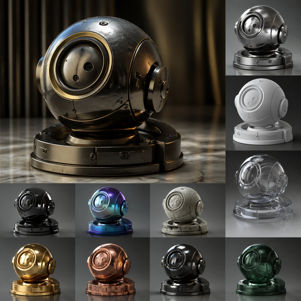
Example generated from “Octane Keyshot Render — Material Pass”
GPT Image 2en

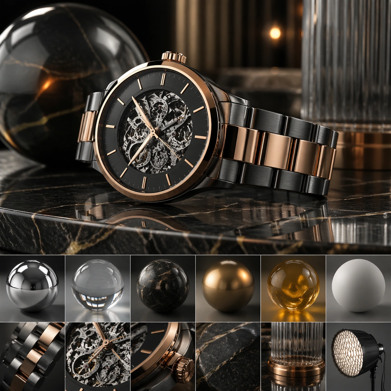
Scene: A square CGI or design-visualization frame with calibrated lighting, intentional composition, and premium material rendering. Build the frame around the same design idea pushed through surface richness and shader control. Keep the lighting, camera distance, and spatial organization tuned for a high-signal research image rather than a casual snapshot. The image belongs to the Octane KeyShot Render theme and should feel immediately legible as a prompt atlas theme for octane keyshot render, testing photorealism, physics-materials, editing-workflow, commercial-mockup with gpt image 2.. Subject: Center the study on the same design idea pushed through surface richness and shader control. Translate the theme into a concrete visual statement instead of an abstract mood board: the viewer should understand what kind of image this is, what is being tested, and why the composition is difficult. Use the slug idea of octane keyshot render as a literal guide for subject matter, materials, and staging. Important details: The model must feel engineered or art-directed rather than merely stylized: edges, seams, translucency, reflections, and scale cues should all hold up. Preserve a disciplined square composition, clear focal hierarchy, and enough secondary information to make the image feel complete rather than underspecified. The image should look polished, novel, and exhibition-ready, with topic-specific credibility coming from the way surfaces, structure, and visual language reinforce Octane KeyShot Render. Avoid generic filler elements that do not serve the main concept. Use case: Octane KeyShot Render single study 3/8, testing photorealism, physics-materials, editing-workflow, commercial-mockup through the material pass variation. Constraints: No readable text, no watermark, no logos, preserve exact 1:1 aspect ratio, no real brand logos, no low-poly shortcuts, no broken reflections, no muddy materials, no generic showroom clutter, no unreadable UI overlays.

Example generated from “Octane Keyshot Render — Studio Turn”
GPT Image 2en

Scene: A square CGI or design-visualization frame with calibrated lighting, intentional composition, and premium material rendering. Build the frame around a presentation angle that reveals volume and silhouette clearly. Keep the lighting, camera distance, and spatial organization tuned for a high-signal research image rather than a casual snapshot. The image belongs to the Octane KeyShot Render theme and should feel immediately legible as a prompt atlas theme for octane keyshot render, testing photorealism, physics-materials, editing-workflow, commercial-mockup with gpt image 2.. Subject: Center the study on a presentation angle that reveals volume and silhouette clearly. Translate the theme into a concrete visual statement instead of an abstract mood board: the viewer should understand what kind of image this is, what is being tested, and why the composition is difficult. Use the slug idea of octane keyshot render as a literal guide for subject matter, materials, and staging. Important details: The model must feel engineered or art-directed rather than merely stylized: edges, seams, translucency, reflections, and scale cues should all hold up. Preserve a disciplined square composition, clear focal hierarchy, and enough secondary information to make the image feel complete rather than underspecified. The image should look polished, novel, and exhibition-ready, with topic-specific credibility coming from the way surfaces, structure, and visual language reinforce Octane KeyShot Render. Avoid generic filler elements that do not serve the main concept. Use case: Octane KeyShot Render single study 4/8, testing photorealism, physics-materials, editing-workflow, commercial-mockup through the studio turn variation. Constraints: No readable text, no watermark, no logos, preserve exact 1:1 aspect ratio, no real brand logos, no low-poly shortcuts, no broken reflections, no muddy materials, no generic showroom clutter, no unreadable UI overlays.

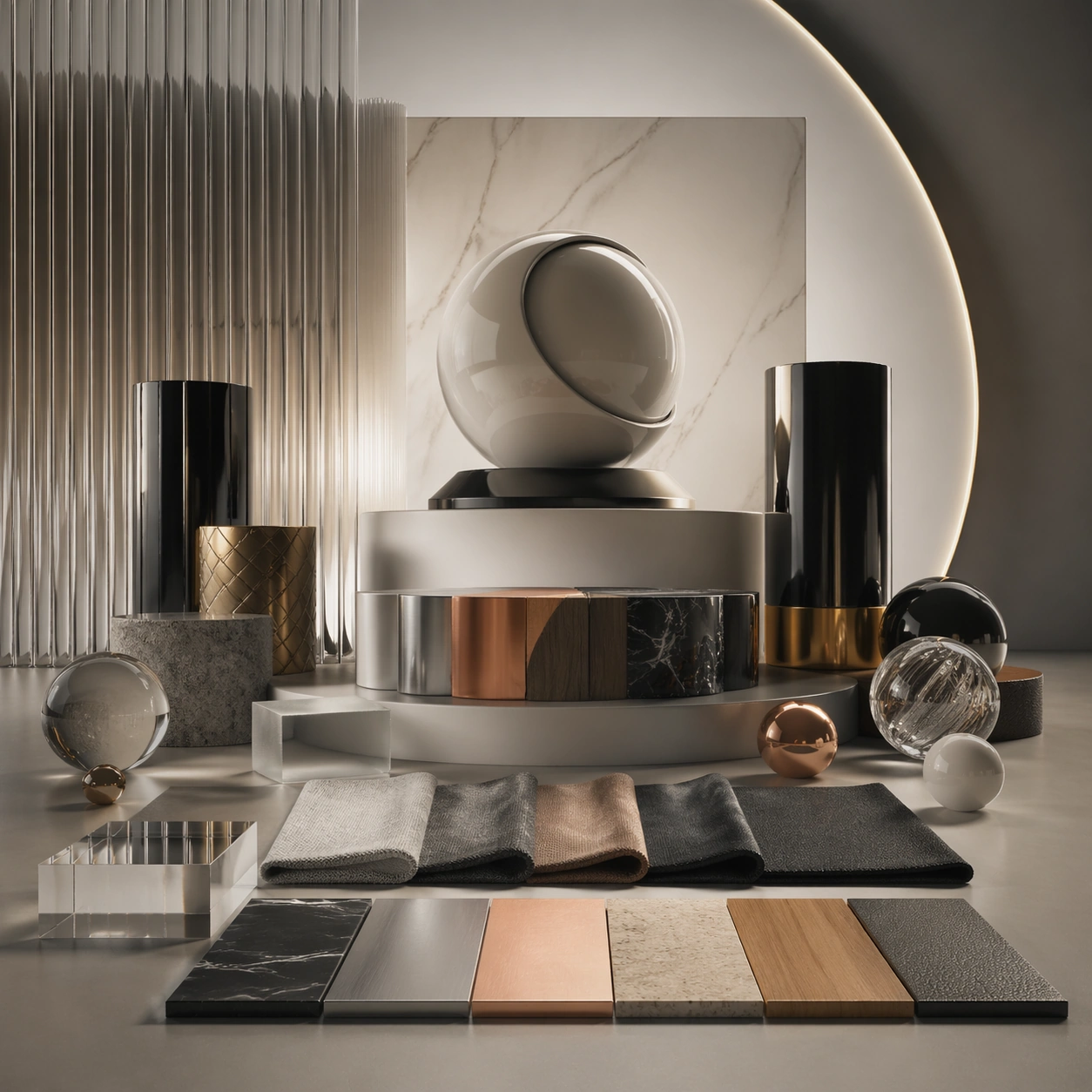
Example generated from “Octane Keyshot Render — Scale Comparison”
GPT Image 2en

Scene: A square CGI or design-visualization frame with calibrated lighting, intentional composition, and premium material rendering. Build the frame around supporting context that clarifies proportion and use without becoming literal advertising. Keep the lighting, camera distance, and spatial organization tuned for a high-signal research image rather than a casual snapshot. The image belongs to the Octane KeyShot Render theme and should feel immediately legible as a prompt atlas theme for octane keyshot render, testing photorealism, physics-materials, editing-workflow, commercial-mockup with gpt image 2.. Subject: Center the study on supporting context that clarifies proportion and use without becoming literal advertising. Translate the theme into a concrete visual statement instead of an abstract mood board: the viewer should understand what kind of image this is, what is being tested, and why the composition is difficult. Use the slug idea of octane keyshot render as a literal guide for subject matter, materials, and staging. Important details: The model must feel engineered or art-directed rather than merely stylized: edges, seams, translucency, reflections, and scale cues should all hold up. Preserve a disciplined square composition, clear focal hierarchy, and enough secondary information to make the image feel complete rather than underspecified. The image should look polished, novel, and exhibition-ready, with topic-specific credibility coming from the way surfaces, structure, and visual language reinforce Octane KeyShot Render. Avoid generic filler elements that do not serve the main concept. Use case: Octane KeyShot Render single study 5/8, testing photorealism, physics-materials, editing-workflow, commercial-mockup through the scale comparison variation. Constraints: No readable text, no watermark, no logos, preserve exact 1:1 aspect ratio, no real brand logos, no low-poly shortcuts, no broken reflections, no muddy materials, no generic showroom clutter, no unreadable UI overlays.

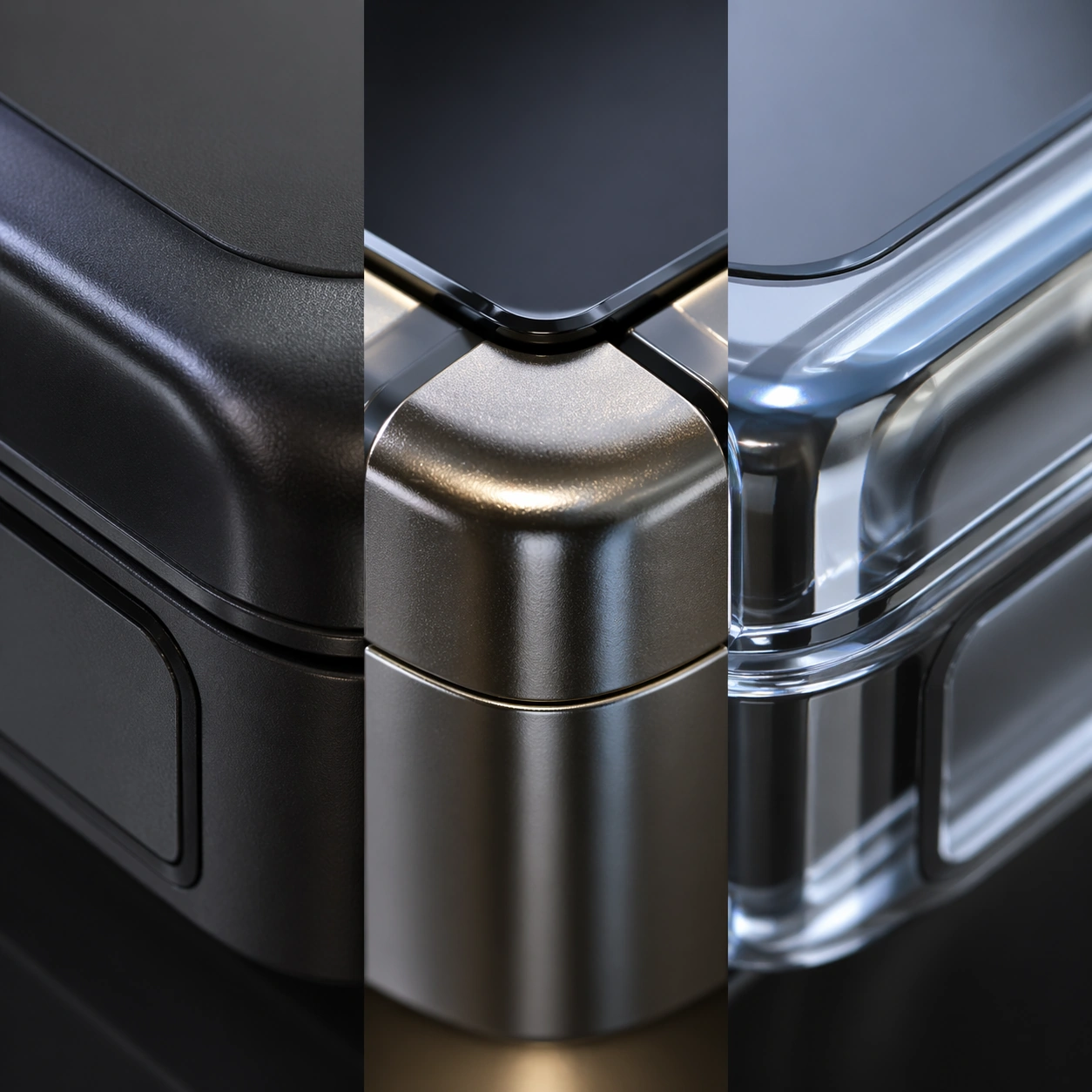
Example generated from “Octane Keyshot Render — Detail Closeup”
GPT Image 2en

Scene: A square CGI or design-visualization frame with calibrated lighting, intentional composition, and premium material rendering. Build the frame around macro rendering of joints, textures, or finish transitions. Keep the lighting, camera distance, and spatial organization tuned for a high-signal research image rather than a casual snapshot. The image belongs to the Octane KeyShot Render theme and should feel immediately legible as a prompt atlas theme for octane keyshot render, testing photorealism, physics-materials, editing-workflow, commercial-mockup with gpt image 2.. Subject: Center the study on macro rendering of joints, textures, or finish transitions. Translate the theme into a concrete visual statement instead of an abstract mood board: the viewer should understand what kind of image this is, what is being tested, and why the composition is difficult. Use the slug idea of octane keyshot render as a literal guide for subject matter, materials, and staging. Important details: The model must feel engineered or art-directed rather than merely stylized: edges, seams, translucency, reflections, and scale cues should all hold up. Preserve a disciplined square composition, clear focal hierarchy, and enough secondary information to make the image feel complete rather than underspecified. The image should look polished, novel, and exhibition-ready, with topic-specific credibility coming from the way surfaces, structure, and visual language reinforce Octane KeyShot Render. Avoid generic filler elements that do not serve the main concept. Use case: Octane KeyShot Render single study 6/8, testing photorealism, physics-materials, editing-workflow, commercial-mockup through the detail closeup variation. Constraints: No readable text, no watermark, no logos, preserve exact 1:1 aspect ratio, no real brand logos, no low-poly shortcuts, no broken reflections, no muddy materials, no generic showroom clutter, no unreadable UI overlays.

Example generated from “Octane Keyshot Render — 环境展示”
GPT Image 2en

Scene: A square CGI or design-visualization frame with calibrated lighting, intentional composition, and premium material rendering. Build the frame around the design placed into a context that tests realism and narrative. Keep the lighting, camera distance, and spatial organization tuned for a high-signal research image rather than a casual snapshot. The image belongs to the Octane KeyShot Render theme and should feel immediately legible as a prompt atlas theme for octane keyshot render, testing photorealism, physics-materials, editing-workflow, commercial-mockup with gpt image 2.. Subject: Center the study on the design placed into a context that tests realism and narrative. Translate the theme into a concrete visual statement instead of an abstract mood board: the viewer should understand what kind of image this is, what is being tested, and why the composition is difficult. Use the slug idea of octane keyshot render as a literal guide for subject matter, materials, and staging. Important details: The model must feel engineered or art-directed rather than merely stylized: edges, seams, translucency, reflections, and scale cues should all hold up. Preserve a disciplined square composition, clear focal hierarchy, and enough secondary information to make the image feel complete rather than underspecified. The image should look polished, novel, and exhibition-ready, with topic-specific credibility coming from the way surfaces, structure, and visual language reinforce Octane KeyShot Render. Avoid generic filler elements that do not serve the main concept. Use case: Octane KeyShot Render single study 7/8, testing photorealism, physics-materials, editing-workflow, commercial-mockup through the 环境展示 variation. Constraints: No readable text, no watermark, no logos, preserve exact 1:1 aspect ratio, no real brand logos, no low-poly shortcuts, no broken reflections, no muddy materials, no generic showroom clutter, no unreadable UI overlays.

Example generated from “Octane Keyshot Render — Signature Render”
GPT Image 2en

Scene: A square CGI or design-visualization frame with calibrated lighting, intentional composition, and premium material rendering. Build the frame around the most complete and persuasive final render for the theme. Keep the lighting, camera distance, and spatial organization tuned for a high-signal research image rather than a casual snapshot. The image belongs to the Octane KeyShot Render theme and should feel immediately legible as a prompt atlas theme for octane keyshot render, testing photorealism, physics-materials, editing-workflow, commercial-mockup with gpt image 2.. Subject: Center the study on the most complete and persuasive final render for the theme. Translate the theme into a concrete visual statement instead of an abstract mood board: the viewer should understand what kind of image this is, what is being tested, and why the composition is difficult. Use the slug idea of octane keyshot render as a literal guide for subject matter, materials, and staging. Important details: The model must feel engineered or art-directed rather than merely stylized: edges, seams, translucency, reflections, and scale cues should all hold up. Preserve a disciplined square composition, clear focal hierarchy, and enough secondary information to make the image feel complete rather than underspecified. The image should look polished, novel, and exhibition-ready, with topic-specific credibility coming from the way surfaces, structure, and visual language reinforce Octane KeyShot Render. Avoid generic filler elements that do not serve the main concept. Use case: Octane KeyShot Render single study 8/8, testing photorealism, physics-materials, editing-workflow, commercial-mockup through the signature render variation. Constraints: No readable text, no watermark, no logos, preserve exact 1:1 aspect ratio, no real brand logos, no low-poly shortcuts, no broken reflections, no muddy materials, no generic showroom clutter, no unreadable UI overlays.

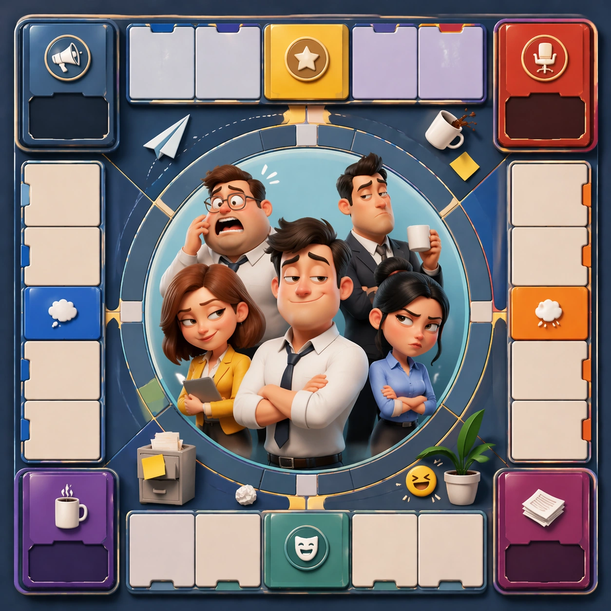
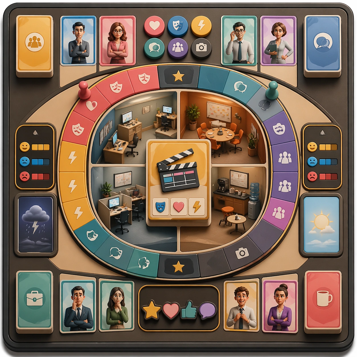
Example generated from “Office Microdrama Comedy Board — Reference Anchor”
GPT Image 2en

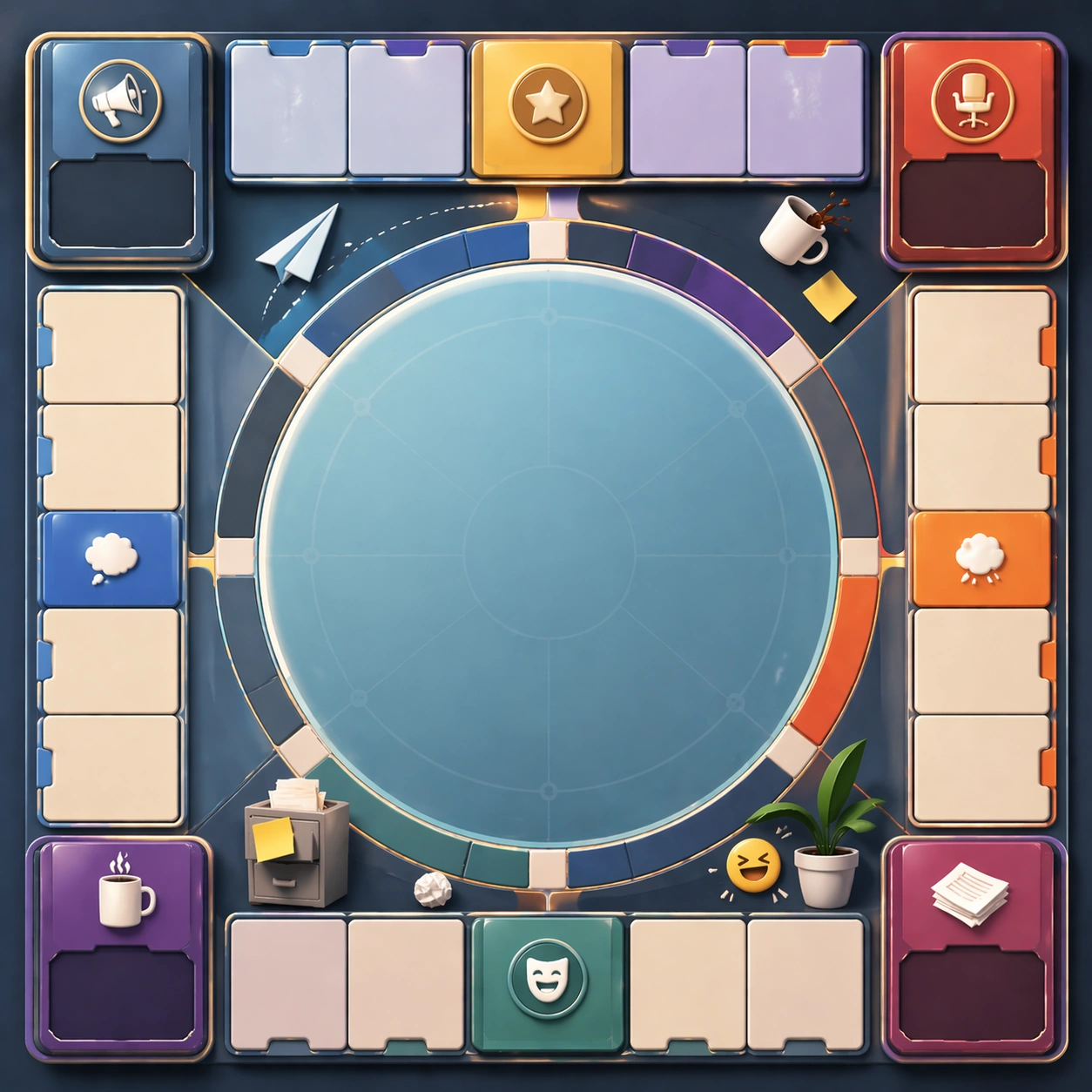
Scene: Create a square reference image for Office Microdrama Comedy Board. Build a reference anchor establishing the core system with a premium, production-ready finish. Use a polished modular board or campaign surface with clean spacing, premium game-UI finish, and clear focal hierarchy. The composition should feel intentional, clean, and reusable for gallery, research, campaign, or internal handoff contexts. Lighting must support readability first, with the main forms clearly separated from the background and enough breathing room for the system to stay legible at both hero scale and thumbnail scale. Subject: Center a coherent original game-art system built for premium production and marketing surfaces. For this image, focus on reference anchor. Keep the same system logic stable across screenshots, cards, banners, and overview boards. This image is the canonical anchor that later series images must follow. The viewer should immediately understand what role this surface plays inside a cohesive game-production asset pack. Important details: Lock framing, icon grammar, palette blocking, and surface hierarchy so the kit feels production-ready and consistent. Preserve the core silhouette, framing language, and material logic from the reference image while each variation changes function. Keep materials believable, edge hierarchy disciplined, and the visual language consistent with Office Comedy. Use abstract interface blocks or diagram accents when helpful, but avoid any readable language. The final result should feel like a deliberate production asset rather than a random illustration. Use case: Office Microdrama Comedy Board series study 1/9, designed as reference anchor within a cohesive asset pack. Constraints: No readable text, no watermark, no logos, preserve exact 1:1 aspect ratio, no unrelated objects, no broken visual hierarchy, no malformed anatomy or broken perspective, no random decorative clutter.

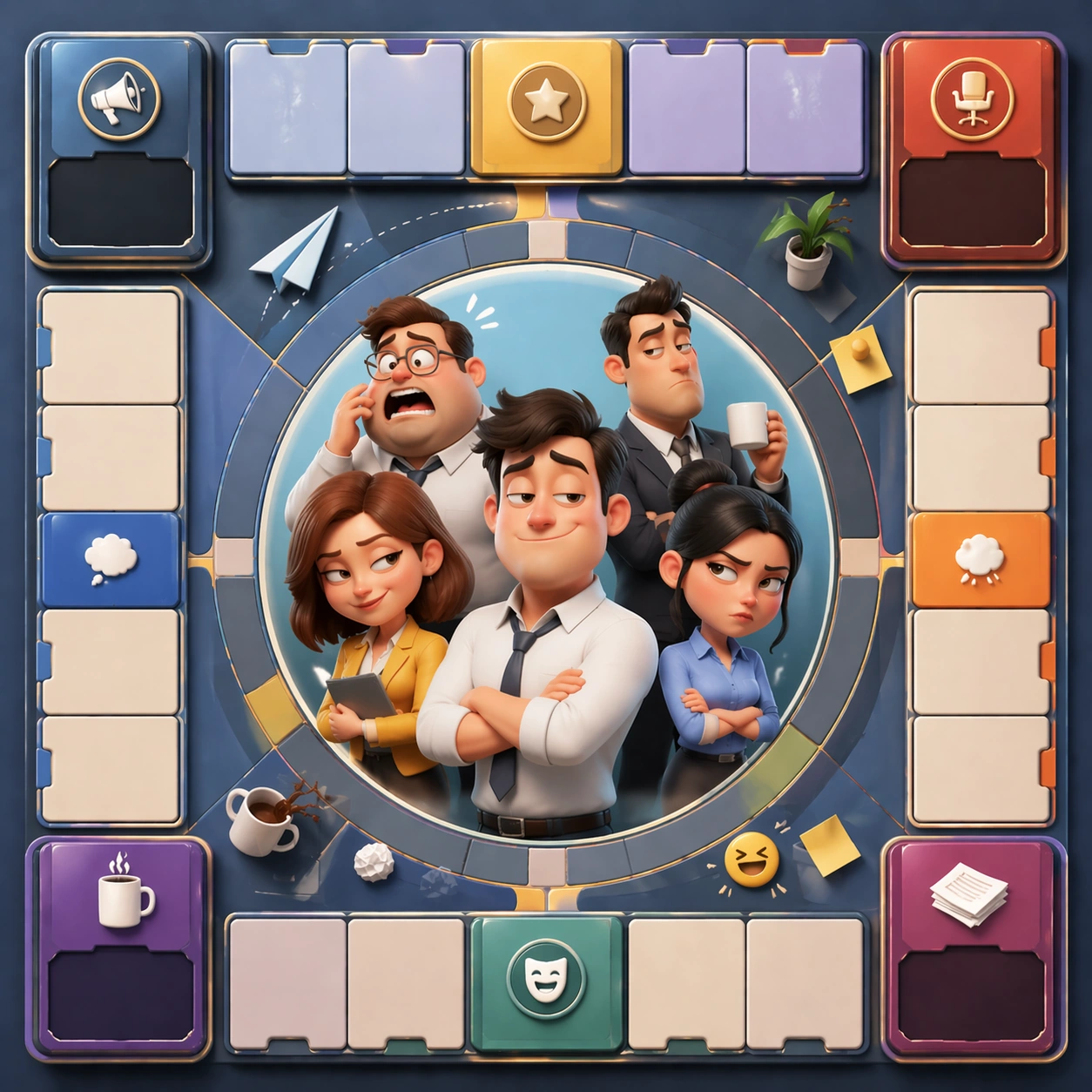
Example generated from “Office Microdrama Comedy Board — Variant One”
GPT Image 2en

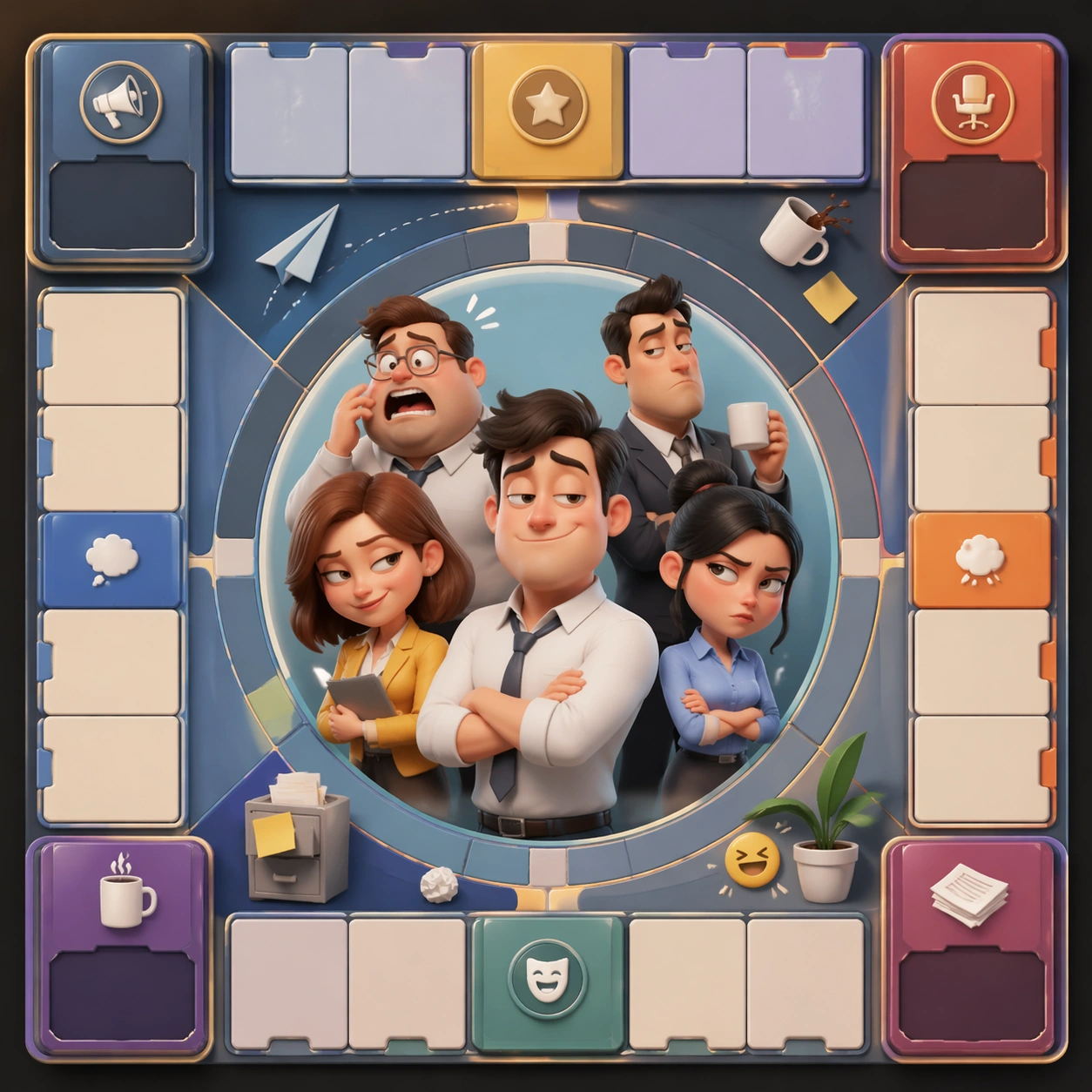
Scene: Create a square dependent image for Office Microdrama Comedy Board. Build a first controlled variation in the same system with a premium, production-ready finish. Use a polished modular board or campaign surface with clean spacing, premium game-UI finish, and clear focal hierarchy. The composition should feel intentional, clean, and reusable for gallery, research, campaign, or internal handoff contexts. Lighting must support readability first, with the main forms clearly separated from the background and enough breathing room for the system to stay legible at both hero scale and thumbnail scale. Subject: Center a coherent original game-art system built for premium production and marketing surfaces. For this image, focus on the intended support surface. Keep the same system logic stable across screenshots, cards, banners, and overview boards. Preserve exact identity or system logic from the reference image while changing only the intended variation axis. The viewer should immediately understand what role this surface plays inside a cohesive game-production asset pack. Important details: Lock framing, icon grammar, palette blocking, and surface hierarchy so the kit feels production-ready and consistent. Preserve the core silhouette, framing language, and material logic from the reference image while each variation changes function. Keep materials believable, edge hierarchy disciplined, and the visual language consistent with Office Comedy. Use abstract interface blocks or diagram accents when helpful, but avoid any readable language. The final result should feel like a deliberate production asset rather than a random illustration. Use case: Office Microdrama Comedy Board series study 2/9, designed as variant one within a cohesive asset pack. Constraints: No readable text, no watermark, no logos, preserve exact 1:1 aspect ratio, no unrelated objects, no broken visual hierarchy, no malformed anatomy or broken perspective, no random decorative clutter.

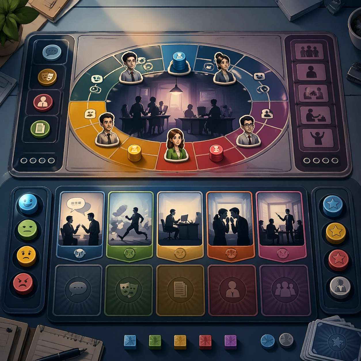
Example generated from “Office Microdrama Comedy Board — Variant Two”
GPT Image 2en

Scene: Create a square dependent image for Office Microdrama Comedy Board. Build a second controlled variation in the same system with a premium, production-ready finish. Use a polished modular board or campaign surface with clean spacing, premium game-UI finish, and clear focal hierarchy. The composition should feel intentional, clean, and reusable for gallery, research, campaign, or internal handoff contexts. Lighting must support readability first, with the main forms clearly separated from the background and enough breathing room for the system to stay legible at both hero scale and thumbnail scale. Subject: Center a coherent original game-art system built for premium production and marketing surfaces. For this image, focus on the intended support surface. Keep the same system logic stable across screenshots, cards, banners, and overview boards. Preserve exact identity or system logic from the reference image while changing only the intended variation axis. The viewer should immediately understand what role this surface plays inside a cohesive game-production asset pack. Important details: Lock framing, icon grammar, palette blocking, and surface hierarchy so the kit feels production-ready and consistent. Preserve the core silhouette, framing language, and material logic from the reference image while each variation changes function. Keep materials believable, edge hierarchy disciplined, and the visual language consistent with Office Comedy. Use abstract interface blocks or diagram accents when helpful, but avoid any readable language. The final result should feel like a deliberate production asset rather than a random illustration. Use case: Office Microdrama Comedy Board series study 3/9, designed as variant two within a cohesive asset pack. Constraints: No readable text, no watermark, no logos, preserve exact 1:1 aspect ratio, no unrelated objects, no broken visual hierarchy, no malformed anatomy or broken perspective, no random decorative clutter.

Example generated from “Office Microdrama Comedy Board — Variant Three”
GPT Image 2en

Scene: Create a square dependent image for Office Microdrama Comedy Board. Build a third controlled variation in the same system with a premium, production-ready finish. Use a polished modular board or campaign surface with clean spacing, premium game-UI finish, and clear focal hierarchy. The composition should feel intentional, clean, and reusable for gallery, research, campaign, or internal handoff contexts. Lighting must support readability first, with the main forms clearly separated from the background and enough breathing room for the system to stay legible at both hero scale and thumbnail scale. Subject: Center a coherent original game-art system built for premium production and marketing surfaces. For this image, focus on the intended support surface. Keep the same system logic stable across screenshots, cards, banners, and overview boards. Preserve exact identity or system logic from the reference image while changing only the intended variation axis. The viewer should immediately understand what role this surface plays inside a cohesive game-production asset pack. Important details: Lock framing, icon grammar, palette blocking, and surface hierarchy so the kit feels production-ready and consistent. Preserve the core silhouette, framing language, and material logic from the reference image while each variation changes function. Keep materials believable, edge hierarchy disciplined, and the visual language consistent with Office Comedy. Use abstract interface blocks or diagram accents when helpful, but avoid any readable language. The final result should feel like a deliberate production asset rather than a random illustration. Use case: Office Microdrama Comedy Board series study 4/9, designed as variant three within a cohesive asset pack. Constraints: No readable text, no watermark, no logos, preserve exact 1:1 aspect ratio, no unrelated objects, no broken visual hierarchy, no malformed anatomy or broken perspective, no random decorative clutter.

Example generated from “Office Microdrama Comedy Board — Support One”
GPT Image 2en

Scene: Create a square standalone support image for Office Microdrama Comedy Board. Build a support-surface study with a clear focal hierarchy and a finished professional surface. Use a polished modular board or campaign surface with clean spacing, premium game-UI finish, and clear focal hierarchy. The frame should feel self-contained and polished, with enough structure to explain the system even without the reference series, yet still obviously belonging to the same theme and production world. Subject: Show a coherent original game-art system built for premium production and marketing surfaces in a way that emphasizes the intended support surface. Keep the same system logic stable across screenshots, cards, banners, and overview boards. Even though this image is independent, the viewer should still recognize the same universe, same commercial logic, and same production intent as the core package. Important details: Lock framing, icon grammar, palette blocking, and surface hierarchy so the kit feels production-ready and consistent. Preserve the broader theme language through color, framing, material choices, and modular composition. Use clean panel rhythm, premium asset presentation, and believable detail density. The image should work equally well as a gallery study, research reference, and mock production deliverable. Use case: Office Microdrama Comedy Board single study 5/9, exploring support one as a support surface. Constraints: No readable text, no watermark, no logos, preserve exact 1:1 aspect ratio, no unrelated objects, no broken visual hierarchy, no visual noise that obscures the main surface, no accidental brand resemblance.

Example generated from “Office Microdrama Comedy Board — Support Two”
GPT Image 2en

Scene: Create a square standalone support image for Office Microdrama Comedy Board. Build a second support-surface study with a clear focal hierarchy and a finished professional surface. Use a polished modular board or campaign surface with clean spacing, premium game-UI finish, and clear focal hierarchy. The frame should feel self-contained and polished, with enough structure to explain the system even without the reference series, yet still obviously belonging to the same theme and production world. Subject: Show a coherent original game-art system built for premium production and marketing surfaces in a way that emphasizes the intended support surface. Keep the same system logic stable across screenshots, cards, banners, and overview boards. Even though this image is independent, the viewer should still recognize the same universe, same commercial logic, and same production intent as the core package. Important details: Lock framing, icon grammar, palette blocking, and surface hierarchy so the kit feels production-ready and consistent. Preserve the broader theme language through color, framing, material choices, and modular composition. Use clean panel rhythm, premium asset presentation, and believable detail density. The image should work equally well as a gallery study, research reference, and mock production deliverable. Use case: Office Microdrama Comedy Board single study 6/9, exploring support two as a support surface. Constraints: No readable text, no watermark, no logos, preserve exact 1:1 aspect ratio, no unrelated objects, no broken visual hierarchy, no visual noise that obscures the main surface, no accidental brand resemblance.

Example generated from “Office Microdrama Comedy Board — Support Three”
GPT Image 2en

Scene: Create a square standalone support image for Office Microdrama Comedy Board. Build a third support-surface study with a clear focal hierarchy and a finished professional surface. Use a polished modular board or campaign surface with clean spacing, premium game-UI finish, and clear focal hierarchy. The frame should feel self-contained and polished, with enough structure to explain the system even without the reference series, yet still obviously belonging to the same theme and production world. Subject: Show a coherent original game-art system built for premium production and marketing surfaces in a way that emphasizes the intended support surface. Keep the same system logic stable across screenshots, cards, banners, and overview boards. Even though this image is independent, the viewer should still recognize the same universe, same commercial logic, and same production intent as the core package. Important details: Lock framing, icon grammar, palette blocking, and surface hierarchy so the kit feels production-ready and consistent. Preserve the broader theme language through color, framing, material choices, and modular composition. Use clean panel rhythm, premium asset presentation, and believable detail density. The image should work equally well as a gallery study, research reference, and mock production deliverable. Use case: Office Microdrama Comedy Board single study 7/9, exploring support three as a support surface. Constraints: No readable text, no watermark, no logos, preserve exact 1:1 aspect ratio, no unrelated objects, no broken visual hierarchy, no visual noise that obscures the main surface, no accidental brand resemblance.

Example generated from “Office Microdrama Comedy Board — Support Four”
GPT Image 2en

Scene: Create a square standalone support image for Office Microdrama Comedy Board. Build a fourth support-surface study with a clear focal hierarchy and a finished professional surface. Use a polished modular board or campaign surface with clean spacing, premium game-UI finish, and clear focal hierarchy. The frame should feel self-contained and polished, with enough structure to explain the system even without the reference series, yet still obviously belonging to the same theme and production world. Subject: Show a coherent original game-art system built for premium production and marketing surfaces in a way that emphasizes the intended support surface. Keep the same system logic stable across screenshots, cards, banners, and overview boards. Even though this image is independent, the viewer should still recognize the same universe, same commercial logic, and same production intent as the core package. Important details: Lock framing, icon grammar, palette blocking, and surface hierarchy so the kit feels production-ready and consistent. Preserve the broader theme language through color, framing, material choices, and modular composition. Use clean panel rhythm, premium asset presentation, and believable detail density. The image should work equally well as a gallery study, research reference, and mock production deliverable. Use case: Office Microdrama Comedy Board single study 8/9, exploring support four as a support surface. Constraints: No readable text, no watermark, no logos, preserve exact 1:1 aspect ratio, no unrelated objects, no broken visual hierarchy, no visual noise that obscures the main surface, no accidental brand resemblance.

Example generated from “Office Microdrama Comedy Board — Support Five”
GPT Image 2en

Scene: Create a square standalone support image for Office Microdrama Comedy Board. Build a fifth support-surface study with a clear focal hierarchy and a finished professional surface. Use a polished modular board or campaign surface with clean spacing, premium game-UI finish, and clear focal hierarchy. The frame should feel self-contained and polished, with enough structure to explain the system even without the reference series, yet still obviously belonging to the same theme and production world. Subject: Show a coherent original game-art system built for premium production and marketing surfaces in a way that emphasizes the intended support surface. Keep the same system logic stable across screenshots, cards, banners, and overview boards. Even though this image is independent, the viewer should still recognize the same universe, same commercial logic, and same production intent as the core package. Important details: Lock framing, icon grammar, palette blocking, and surface hierarchy so the kit feels production-ready and consistent. Preserve the broader theme language through color, framing, material choices, and modular composition. Use clean panel rhythm, premium asset presentation, and believable detail density. The image should work equally well as a gallery study, research reference, and mock production deliverable. Use case: Office Microdrama Comedy Board single study 9/9, exploring support five as a support surface. Constraints: No readable text, no watermark, no logos, preserve exact 1:1 aspect ratio, no unrelated objects, no broken visual hierarchy, no visual noise that obscures the main surface, no accidental brand resemblance.

Example generated from “Old Newspaper Front Page — Variant Grid”
GPT Image 2en

Scene: A square editorial or interface layout study with exact margins, confident grid structure, and premium print or screen presentation. Build the frame around multiple aligned variations sharing one disciplined layout system. Keep the lighting, camera distance, and spatial organization tuned for a high-signal research image rather than a casual snapshot. The image belongs to the Old Newspaper Front Page theme and should feel immediately legible as a prompt atlas theme for old newspaper front page, testing text-rendering, structured-layout, commercial-mockup with gpt image 2.. Subject: Center the study on multiple aligned variations sharing one disciplined layout system. Translate the theme into a concrete visual statement instead of an abstract mood board: the viewer should understand what kind of image this is, what is being tested, and why the composition is difficult. Use the slug idea of old newspaper front page as a literal guide for subject matter, materials, and staging. Important details: Typography fields must stay unreadable, but hierarchy, rhythm, and page architecture should feel convincing enough for design review. Preserve a disciplined square composition, clear focal hierarchy, and enough secondary information to make the image feel complete rather than underspecified. The image should look polished, novel, and exhibition-ready, with topic-specific credibility coming from the way surfaces, structure, and visual language reinforce Old Newspaper Front Page. Avoid generic filler elements that do not serve the main concept. Use case: Old Newspaper Front Page single study 2/8, testing text-rendering, structured-layout, commercial-mockup through the variant grid variation. Constraints: No readable text, no watermark, no logos, preserve exact 1:1 aspect ratio, no readable text, no logo lockups from real brands, no broken grid, no arbitrary poster clutter, no malformed columns, no accidental lorem ipsum.

Example generated from “Old Newspaper Front Page — Desk Review”
GPT Image 2en

Scene: A square editorial or interface layout study with exact margins, confident grid structure, and premium print or screen presentation. Build the frame around a presentation context that shows the layout as a reviewed design object. Keep the lighting, camera distance, and spatial organization tuned for a high-signal research image rather than a casual snapshot. The image belongs to the Old Newspaper Front Page theme and should feel immediately legible as a prompt atlas theme for old newspaper front page, testing text-rendering, structured-layout, commercial-mockup with gpt image 2.. Subject: Center the study on a presentation context that shows the layout as a reviewed design object. Translate the theme into a concrete visual statement instead of an abstract mood board: the viewer should understand what kind of image this is, what is being tested, and why the composition is difficult. Use the slug idea of old newspaper front page as a literal guide for subject matter, materials, and staging. Important details: Typography fields must stay unreadable, but hierarchy, rhythm, and page architecture should feel convincing enough for design review. Preserve a disciplined square composition, clear focal hierarchy, and enough secondary information to make the image feel complete rather than underspecified. The image should look polished, novel, and exhibition-ready, with topic-specific credibility coming from the way surfaces, structure, and visual language reinforce Old Newspaper Front Page. Avoid generic filler elements that do not serve the main concept. Use case: Old Newspaper Front Page single study 3/8, testing text-rendering, structured-layout, commercial-mockup through the desk review variation. Constraints: No readable text, no watermark, no logos, preserve exact 1:1 aspect ratio, no readable text, no logo lockups from real brands, no broken grid, no arbitrary poster clutter, no malformed columns, no accidental lorem ipsum.

Example generated from “Old Newspaper Front Page — Material Closeup”
GPT Image 2en

Scene: A square editorial or interface layout study with exact margins, confident grid structure, and premium print or screen presentation. Build the frame around print grain, paper, or screen detail without losing overall composition. Keep the lighting, camera distance, and spatial organization tuned for a high-signal research image rather than a casual snapshot. The image belongs to the Old Newspaper Front Page theme and should feel immediately legible as a prompt atlas theme for old newspaper front page, testing text-rendering, structured-layout, commercial-mockup with gpt image 2.. Subject: Center the study on print grain, paper, or screen detail without losing overall composition. Translate the theme into a concrete visual statement instead of an abstract mood board: the viewer should understand what kind of image this is, what is being tested, and why the composition is difficult. Use the slug idea of old newspaper front page as a literal guide for subject matter, materials, and staging. Important details: Typography fields must stay unreadable, but hierarchy, rhythm, and page architecture should feel convincing enough for design review. Preserve a disciplined square composition, clear focal hierarchy, and enough secondary information to make the image feel complete rather than underspecified. The image should look polished, novel, and exhibition-ready, with topic-specific credibility coming from the way surfaces, structure, and visual language reinforce Old Newspaper Front Page. Avoid generic filler elements that do not serve the main concept. Use case: Old Newspaper Front Page single study 4/8, testing text-rendering, structured-layout, commercial-mockup through the material closeup variation. Constraints: No readable text, no watermark, no logos, preserve exact 1:1 aspect ratio, no readable text, no logo lockups from real brands, no broken grid, no arbitrary poster clutter, no malformed columns, no accidental lorem ipsum.

Example generated from “Old Newspaper Front Page — Archive Sheet”
GPT Image 2en

Scene: A square editorial or interface layout study with exact margins, confident grid structure, and premium print or screen presentation. Build the frame around a flat archival or proof-like sheet with modular content blocks. Keep the lighting, camera distance, and spatial organization tuned for a high-signal research image rather than a casual snapshot. The image belongs to the Old Newspaper Front Page theme and should feel immediately legible as a prompt atlas theme for old newspaper front page, testing text-rendering, structured-layout, commercial-mockup with gpt image 2.. Subject: Center the study on a flat archival or proof-like sheet with modular content blocks. Translate the theme into a concrete visual statement instead of an abstract mood board: the viewer should understand what kind of image this is, what is being tested, and why the composition is difficult. Use the slug idea of old newspaper front page as a literal guide for subject matter, materials, and staging. Important details: Typography fields must stay unreadable, but hierarchy, rhythm, and page architecture should feel convincing enough for design review. Preserve a disciplined square composition, clear focal hierarchy, and enough secondary information to make the image feel complete rather than underspecified. The image should look polished, novel, and exhibition-ready, with topic-specific credibility coming from the way surfaces, structure, and visual language reinforce Old Newspaper Front Page. Avoid generic filler elements that do not serve the main concept. Use case: Old Newspaper Front Page single study 5/8, testing text-rendering, structured-layout, commercial-mockup through the archive sheet variation. Constraints: No readable text, no watermark, no logos, preserve exact 1:1 aspect ratio, no readable text, no logo lockups from real brands, no broken grid, no arbitrary poster clutter, no malformed columns, no accidental lorem ipsum.

Example generated from “Old Newspaper Front Page — 陈列展示”
GPT Image 2en

Scene: A square editorial or interface layout study with exact margins, confident grid structure, and premium print or screen presentation. Build the frame around a polished display context that still preserves layout logic. Keep the lighting, camera distance, and spatial organization tuned for a high-signal research image rather than a casual snapshot. The image belongs to the Old Newspaper Front Page theme and should feel immediately legible as a prompt atlas theme for old newspaper front page, testing text-rendering, structured-layout, commercial-mockup with gpt image 2.. Subject: Center the study on a polished display context that still preserves layout logic. Translate the theme into a concrete visual statement instead of an abstract mood board: the viewer should understand what kind of image this is, what is being tested, and why the composition is difficult. Use the slug idea of old newspaper front page as a literal guide for subject matter, materials, and staging. Important details: Typography fields must stay unreadable, but hierarchy, rhythm, and page architecture should feel convincing enough for design review. Preserve a disciplined square composition, clear focal hierarchy, and enough secondary information to make the image feel complete rather than underspecified. The image should look polished, novel, and exhibition-ready, with topic-specific credibility coming from the way surfaces, structure, and visual language reinforce Old Newspaper Front Page. Avoid generic filler elements that do not serve the main concept. Use case: Old Newspaper Front Page single study 6/8, testing text-rendering, structured-layout, commercial-mockup through the 陈列展示 variation. Constraints: No readable text, no watermark, no logos, preserve exact 1:1 aspect ratio, no readable text, no logo lockups from real brands, no broken grid, no arbitrary poster clutter, no malformed columns, no accidental lorem ipsum.

Example generated from “Old Newspaper Front Page — System Board”
GPT Image 2en

Scene: A square editorial or interface layout study with exact margins, confident grid structure, and premium print or screen presentation. Build the frame around a family of elements organized into a coherent visual language. Keep the lighting, camera distance, and spatial organization tuned for a high-signal research image rather than a casual snapshot. The image belongs to the Old Newspaper Front Page theme and should feel immediately legible as a prompt atlas theme for old newspaper front page, testing text-rendering, structured-layout, commercial-mockup with gpt image 2.. Subject: Center the study on a family of elements organized into a coherent visual language. Translate the theme into a concrete visual statement instead of an abstract mood board: the viewer should understand what kind of image this is, what is being tested, and why the composition is difficult. Use the slug idea of old newspaper front page as a literal guide for subject matter, materials, and staging. Important details: Typography fields must stay unreadable, but hierarchy, rhythm, and page architecture should feel convincing enough for design review. Preserve a disciplined square composition, clear focal hierarchy, and enough secondary information to make the image feel complete rather than underspecified. The image should look polished, novel, and exhibition-ready, with topic-specific credibility coming from the way surfaces, structure, and visual language reinforce Old Newspaper Front Page. Avoid generic filler elements that do not serve the main concept. Use case: Old Newspaper Front Page single study 7/8, testing text-rendering, structured-layout, commercial-mockup through the system board variation. Constraints: No readable text, no watermark, no logos, preserve exact 1:1 aspect ratio, no readable text, no logo lockups from real brands, no broken grid, no arbitrary poster clutter, no malformed columns, no accidental lorem ipsum.

Example generated from “Old Newspaper Front Page — Signature Layout”
GPT Image 2en

Scene: A square editorial or interface layout study with exact margins, confident grid structure, and premium print or screen presentation. Build the frame around the most distilled expression of the topic’s layout identity. Keep the lighting, camera distance, and spatial organization tuned for a high-signal research image rather than a casual snapshot. The image belongs to the Old Newspaper Front Page theme and should feel immediately legible as a prompt atlas theme for old newspaper front page, testing text-rendering, structured-layout, commercial-mockup with gpt image 2.. Subject: Center the study on the most distilled expression of the topic’s layout identity. Translate the theme into a concrete visual statement instead of an abstract mood board: the viewer should understand what kind of image this is, what is being tested, and why the composition is difficult. Use the slug idea of old newspaper front page as a literal guide for subject matter, materials, and staging. Important details: Typography fields must stay unreadable, but hierarchy, rhythm, and page architecture should feel convincing enough for design review. Preserve a disciplined square composition, clear focal hierarchy, and enough secondary information to make the image feel complete rather than underspecified. The image should look polished, novel, and exhibition-ready, with topic-specific credibility coming from the way surfaces, structure, and visual language reinforce Old Newspaper Front Page. Avoid generic filler elements that do not serve the main concept. Use case: Old Newspaper Front Page single study 8/8, testing text-rendering, structured-layout, commercial-mockup through the signature layout variation. Constraints: No readable text, no watermark, no logos, preserve exact 1:1 aspect ratio, no readable text, no logo lockups from real brands, no broken grid, no arbitrary poster clutter, no malformed columns, no accidental lorem ipsum.

Example generated from “Onboarding Empty State Premium Kit — Reference Anchor”
GPT Image 2en

Scene: Create a square reference image for Onboarding Empty State Premium Kit. Build a reference anchor establishing the core system with a premium, production-ready finish. Use a polished modular board or campaign surface with clean spacing, premium game-UI finish, and clear focal hierarchy. The composition should feel intentional, clean, and reusable for gallery, research, campaign, or internal handoff contexts. Lighting must support readability first, with the main forms clearly separated from the background and enough breathing room for the system to stay legible at both hero scale and thumbnail scale. Subject: Center a coherent original game-art system built for premium production and marketing surfaces. For this image, focus on reference anchor. Keep the same system logic stable across screenshots, cards, banners, and overview boards. This image is the canonical anchor that later series images must follow. The viewer should immediately understand what role this surface plays inside a cohesive game-production asset pack. Important details: Lock framing, icon grammar, palette blocking, and surface hierarchy so the kit feels production-ready and consistent. Preserve the core silhouette, framing language, and material logic from the reference image while each variation changes function. Keep materials believable, edge hierarchy disciplined, and the visual language consistent with Onboarding Kit. Use abstract interface blocks or diagram accents when helpful, but avoid any readable language. The final result should feel like a deliberate production asset rather than a random illustration. Use case: Onboarding Empty State Premium Kit series study 1/9, designed as reference anchor within a cohesive asset pack. Constraints: No readable text, no watermark, no logos, preserve exact 1:1 aspect ratio, no unrelated objects, no broken visual hierarchy, no malformed anatomy or broken perspective, no random decorative clutter.