PROMPTS · EXPLORATION CRÉATIVE

Galerie de prompts

Explorez des prompts réels et leurs exemples générés. Trouvez l’inspiration pour votre prochaine mission créative et copiez le texte intégral gratuitement.

Exemples
10,974
Modèles
17
Sources
1277
10 974 exemples de prompts · page 41 sur 229
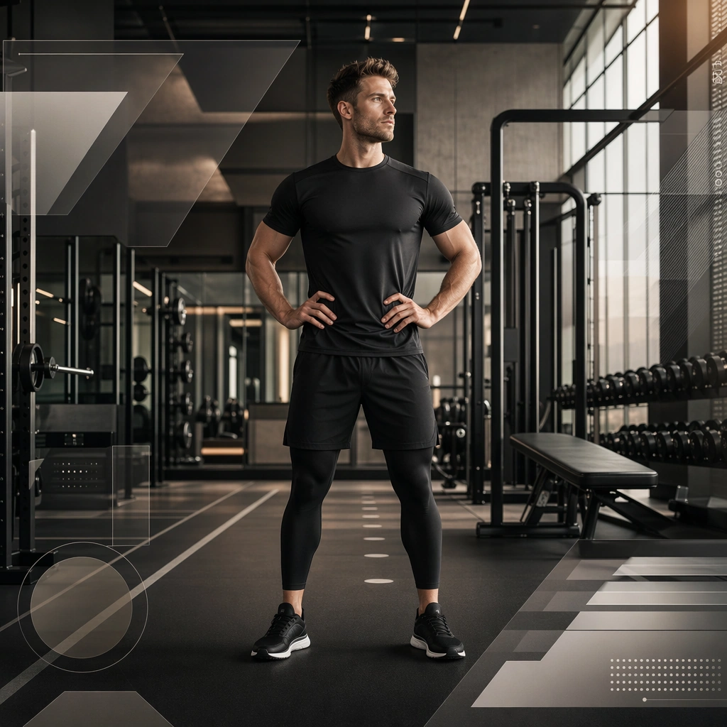
Example generated from “Gym Brand Poster And Membership System — Reference Gym Brand Anchor”
GPT Image 2en

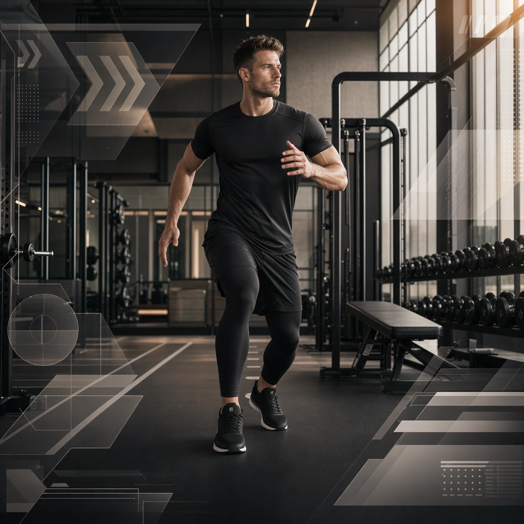
Scene: Create a square gym brand hero poster for Gym Brand, using a fictional high-end gym interior with crisp architectural lines, mirrored depth, and urban premium lighting. The frame should feel commercial, polished, and immediately useful for a real client deliverable rather than a one-off art experiment. Keep the composition readable at thumbnail scale while still rewarding a closer look with layered depth, clean negative space, and strong directional light. Build the image so it clearly supports sports communication, with enough modular structure to imply information architecture without relying on literal words. Subject: Center the image on one original gym member or trainer with confident posture, brandless apparel, and strong spatial connection to the facility, arranged as member in premium facility. Treat the subject as original and brandless, with believable apparel construction, realistic body proportions, and strong emotional legibility. Surround the subject with supporting environmental cues that reinforce the category but never overpower the main figure. All secondary objects, props, and background elements should strengthen the same professional sports or fitness context. Important details: This first image must establish the full reference system for later derivatives: membership-ready poster geometry, badge-like modules, and environmental graphic rhythm. The emotional tone should read as aspirational confidence. Make the visual language reusable, disciplined, and commercially credible, with clean edges, coherent light behavior, and obvious hierarchy. Abstract panels, diagram bands, or stat-like modules are welcome, but they must remain non-readable and subordinate to the main visual message. The result should feel original, specific, and ready to anchor a larger package. Use case: Gym Brand series study 1/9, the reference image for the package. Constraints: No readable text, no watermark, no logos, preserve exact 1:1 aspect ratio, no brand marks, no copied famous team or product identity, no generic stock-photo stiffness, no cluttered background noise, no celebrity likenesses.
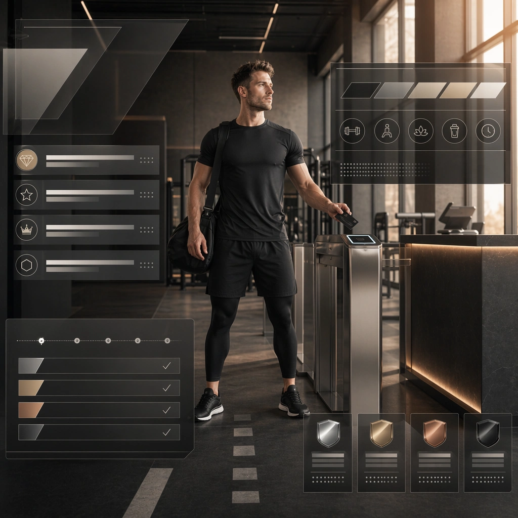
Example generated from “Gym Brand Poster And Membership System — Membership Tier Poster”
GPT Image 2en

Scene: Build a square membership tier poster derived from the reference image for Gym Brand. Preserve the exact world established by the reference image, including the same palette family, lighting direction, environmental logic, and surface finish. The new frame should feel like a deliberate extension of one campaign system, not a separate concept. Shift the hierarchy to suit this use case, but keep the overall composition commercial, polished, and ready for real rollout. Subject: Use the same original subject identity and anchor cues introduced by the reference image, now organized as same member near access zone. Keep faces, hair logic, body proportions, apparel or product construction, and major supporting forms consistent with the reference. Allow only the layout emphasis, pose, crop, and contextual energy to change so the result clearly belongs to the same package. Important details: Continuity is the main challenge. Preserve the exact reference language for color, materials, framing rhythm, and overall brandless campaign grammar while steering the tone toward welcoming structure. Keep any stat blocks, schedule modules, arrows, badges, or callout panels non-readable. The derivative should prove that the same art direction can handle a different communication task without losing identity or utility. Make it credible for production use, with clean edges, intentional spacing, and no random decorative elements. Use case: Gym Brand series study 2/9, a derivative surface linked to 01-reference-gym-brand-anchor. Constraints: No readable text, no watermark, no logos, preserve exact 1:1 aspect ratio, no new subject identity, no brand marks, no palette drift, no unrelated props, no collage chaos, no copied public-figure styling.

Example generated from “Gym Brand Poster And Membership System — Wall Mural Visual”
GPT Image 2en

Scene: Build a square wall mural visual derived from the reference image for Gym Brand. Preserve the exact world established by the reference image, including the same palette family, lighting direction, environmental logic, and surface finish. The new frame should feel like a deliberate extension of one campaign system, not a separate concept. Shift the hierarchy to suit this use case, but keep the overall composition commercial, polished, and ready for real rollout. Subject: Use the same original subject identity and anchor cues introduced by the reference image, now organized as same member integrated with interior lines. Keep faces, hair logic, body proportions, apparel or product construction, and major supporting forms consistent with the reference. Allow only the layout emphasis, pose, crop, and contextual energy to change so the result clearly belongs to the same package. Important details: Continuity is the main challenge. Preserve the exact reference language for color, materials, framing rhythm, and overall brandless campaign grammar while steering the tone toward architectural scale. Keep any stat blocks, schedule modules, arrows, badges, or callout panels non-readable. The derivative should prove that the same art direction can handle a different communication task without losing identity or utility. Make it credible for production use, with clean edges, intentional spacing, and no random decorative elements. Use case: Gym Brand series study 3/9, a derivative surface linked to 01-reference-gym-brand-anchor. Constraints: No readable text, no watermark, no logos, preserve exact 1:1 aspect ratio, no new subject identity, no brand marks, no palette drift, no unrelated props, no collage chaos, no copied public-figure styling.
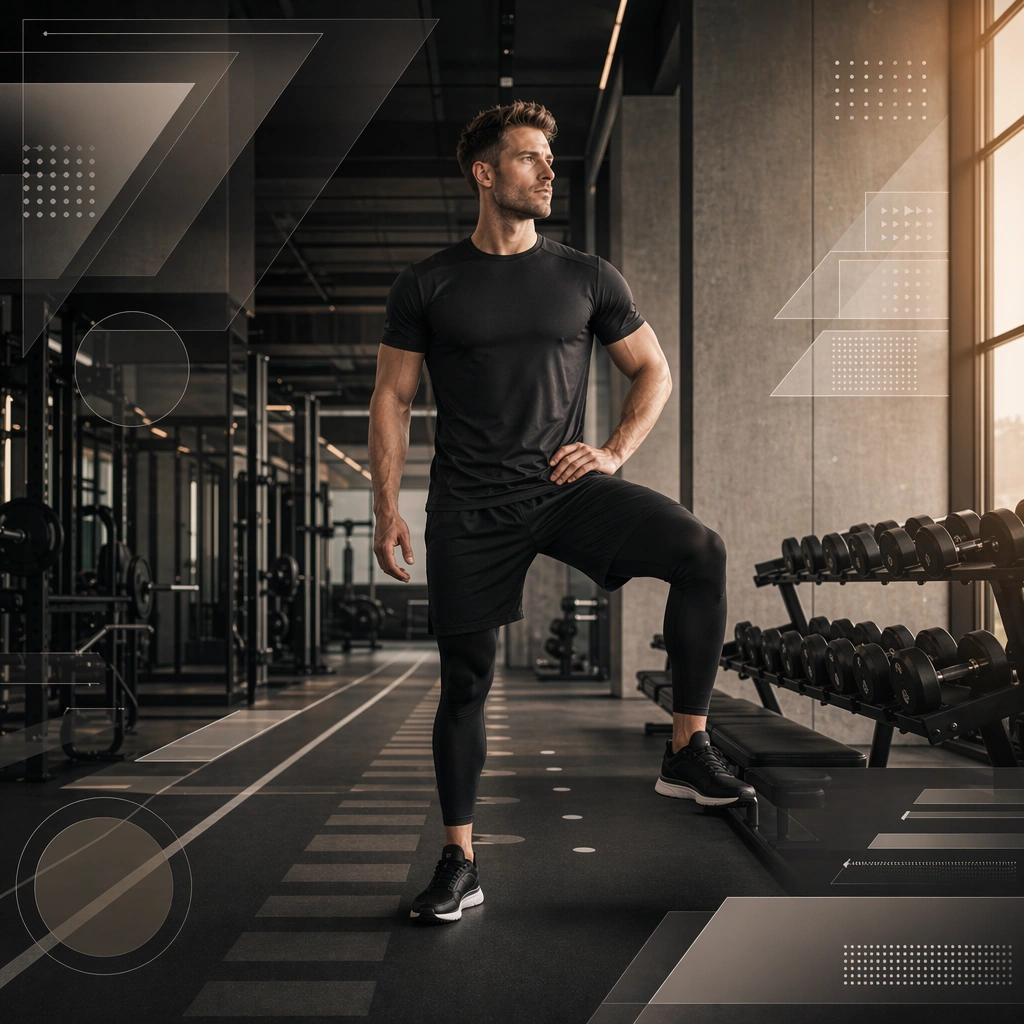
Example generated from “Gym Brand Poster And Membership System — Challenge Week Variant”
GPT Image 2en

Scene: Build a square challenge-week variant derived from the reference image for Gym Brand. Preserve the exact world established by the reference image, including the same palette family, lighting direction, environmental logic, and surface finish. The new frame should feel like a deliberate extension of one campaign system, not a separate concept. Shift the hierarchy to suit this use case, but keep the overall composition commercial, polished, and ready for real rollout. Subject: Use the same original subject identity and anchor cues introduced by the reference image, now organized as same member in active stance. Keep faces, hair logic, body proportions, apparel or product construction, and major supporting forms consistent with the reference. Allow only the layout emphasis, pose, crop, and contextual energy to change so the result clearly belongs to the same package. Important details: Continuity is the main challenge. Preserve the exact reference language for color, materials, framing rhythm, and overall brandless campaign grammar while steering the tone toward motivating urgency. Keep any stat blocks, schedule modules, arrows, badges, or callout panels non-readable. The derivative should prove that the same art direction can handle a different communication task without losing identity or utility. Make it credible for production use, with clean edges, intentional spacing, and no random decorative elements. Use case: Gym Brand series study 4/9, a derivative surface linked to 01-reference-gym-brand-anchor. Constraints: No readable text, no watermark, no logos, preserve exact 1:1 aspect ratio, no new subject identity, no brand marks, no palette drift, no unrelated props, no collage chaos, no copied public-figure styling.

Example generated from “Gym Brand Poster And Membership System — Recovery Zone Promo”
GPT Image 2en

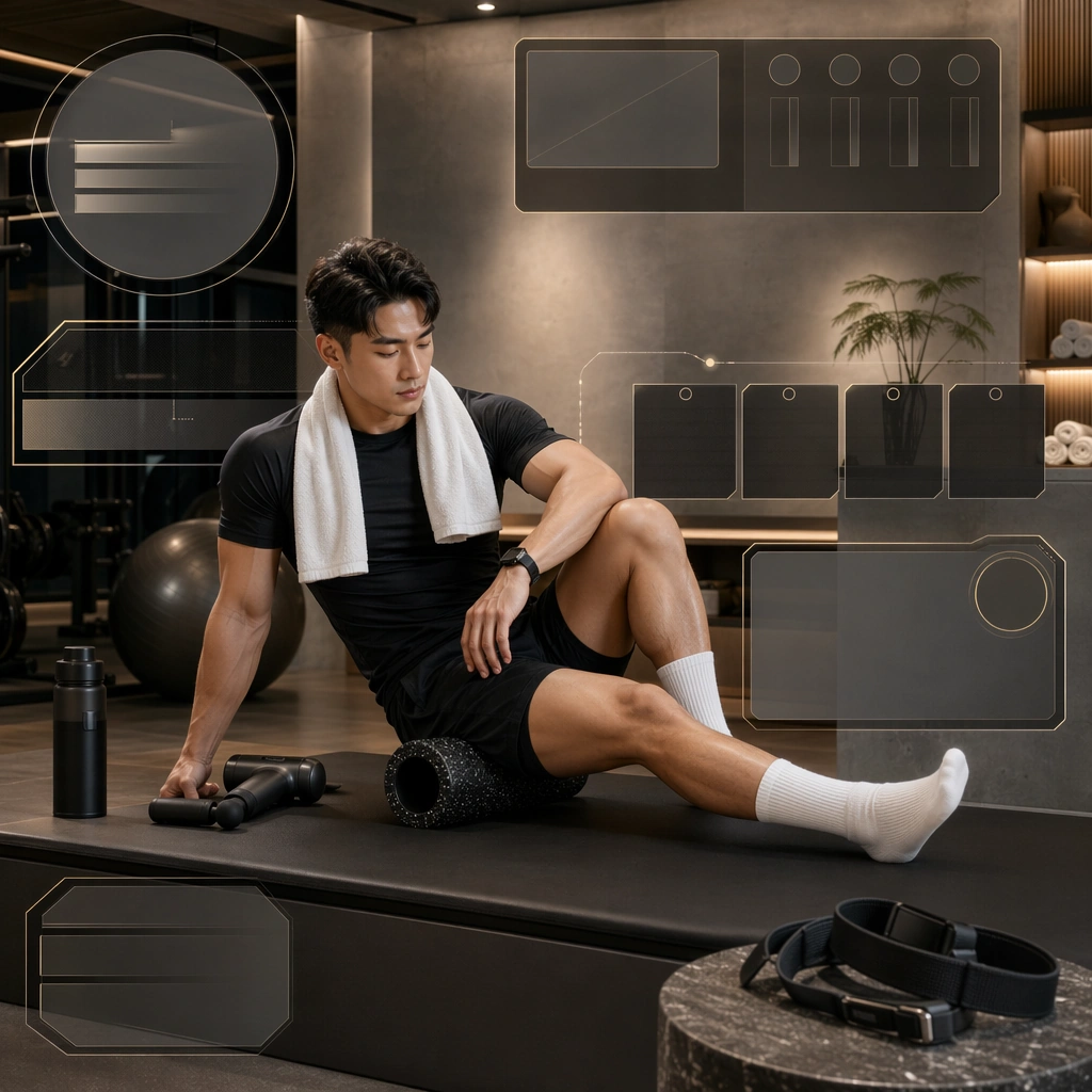
Scene: Create a square recovery zone promo for Gym Brand, using gym-brand communication with clean architecture, membership-friendly structure, and premium local-acquisition polish. The composition should read as a practical, production-ready sports or fitness surface with a clear hierarchy, premium lighting, and obvious commercial intent. Keep the environment specific enough to feel real, but leave enough control in the layout for non-readable information modules, campaign blocks, or visualized metrics. Aim for a finish that works for a brand, club, app, academy, or event operator. Subject: Build the image around member in recovery area. The subject should be original, believable, and free of any real-brand or celebrity cues. Use realistic apparel, safe body mechanics when movement is visible, and environmental props that support the category without clutter. The subject must stay visually dominant so the design still works as a communication asset rather than a pure scene study. Important details: The mood should read as calm premium comfort. Treat layout, light, and supporting graphic structure as part of one polished delivery surface. Any schedule blocks, metric panels, quote zones, badges, or path diagrams must stay abstract and non-readable. Prioritize usefulness, clarity, and category truth over spectacle. The image should feel distinct from the series package while still belonging naturally to the same topic and business use case. Use case: Gym Brand single study 6/9, an independent rollout surface for the topic. Constraints: No readable text, no watermark, no logos, preserve exact 1:1 aspect ratio, no brand marks, no public-figure resemblance, no generic stock layout, no cluttered UI imitation, no accidental copyrighted insignia.

Example generated from “Gym Brand Poster And Membership System — Boxing Night Gym Card”
GPT Image 2en

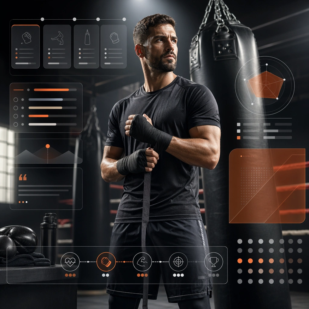
Scene: Create a square boxing-class support card for Gym Brand, using gym-brand communication with clean architecture, membership-friendly structure, and premium local-acquisition polish. The composition should read as a practical, production-ready sports or fitness surface with a clear hierarchy, premium lighting, and obvious commercial intent. Keep the environment specific enough to feel real, but leave enough control in the layout for non-readable information modules, campaign blocks, or visualized metrics. Aim for a finish that works for a brand, club, app, academy, or event operator. Subject: Build the image around trainer near heavy bags. The subject should be original, believable, and free of any real-brand or celebrity cues. Use realistic apparel, safe body mechanics when movement is visible, and environmental props that support the category without clutter. The subject must stay visually dominant so the design still works as a communication asset rather than a pure scene study. Important details: The mood should read as contained intensity. Treat layout, light, and supporting graphic structure as part of one polished delivery surface. Any schedule blocks, metric panels, quote zones, badges, or path diagrams must stay abstract and non-readable. Prioritize usefulness, clarity, and category truth over spectacle. The image should feel distinct from the series package while still belonging naturally to the same topic and business use case. Use case: Gym Brand single study 7/9, an independent rollout surface for the topic. Constraints: No readable text, no watermark, no logos, preserve exact 1:1 aspect ratio, no brand marks, no public-figure resemblance, no generic stock layout, no cluttered UI imitation, no accidental copyrighted insignia.

Example generated from “Gym Brand Poster And Membership System — Member Welcome Pack”
GPT Image 2en

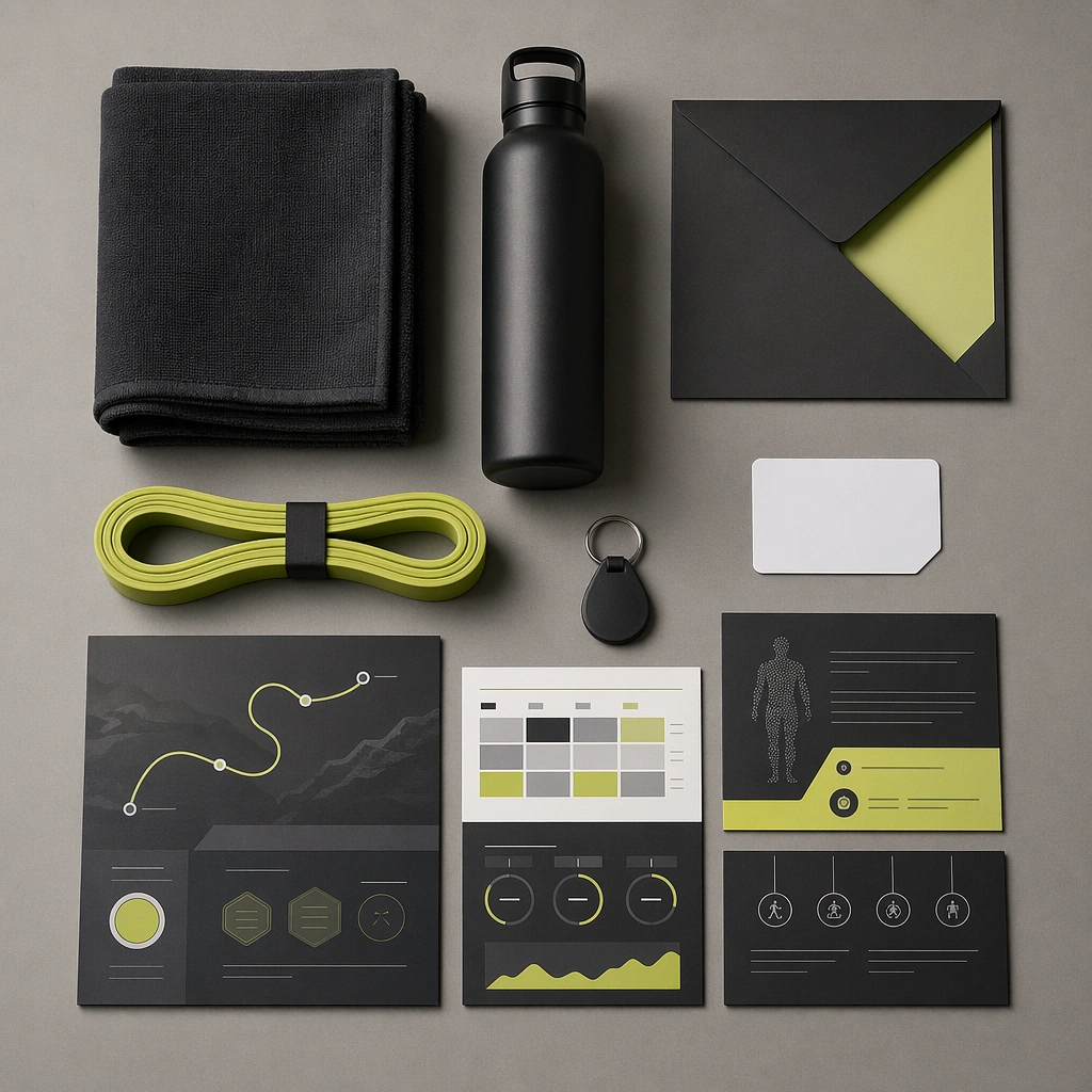
Scene: Create a square member welcome-pack board for Gym Brand, using gym-brand communication with clean architecture, membership-friendly structure, and premium local-acquisition polish. The composition should read as a practical, production-ready sports or fitness surface with a clear hierarchy, premium lighting, and obvious commercial intent. Keep the environment specific enough to feel real, but leave enough control in the layout for non-readable information modules, campaign blocks, or visualized metrics. Aim for a finish that works for a brand, club, app, academy, or event operator. Subject: Build the image around flat-lay onboarding objects. The subject should be original, believable, and free of any real-brand or celebrity cues. Use realistic apparel, safe body mechanics when movement is visible, and environmental props that support the category without clutter. The subject must stay visually dominant so the design still works as a communication asset rather than a pure scene study. Important details: The mood should read as operational polish. Treat layout, light, and supporting graphic structure as part of one polished delivery surface. Any schedule blocks, metric panels, quote zones, badges, or path diagrams must stay abstract and non-readable. Prioritize usefulness, clarity, and category truth over spectacle. The image should feel distinct from the series package while still belonging naturally to the same topic and business use case. Use case: Gym Brand single study 8/9, an independent rollout surface for the topic. Constraints: No readable text, no watermark, no logos, preserve exact 1:1 aspect ratio, no brand marks, no public-figure resemblance, no generic stock layout, no cluttered UI imitation, no accidental copyrighted insignia.

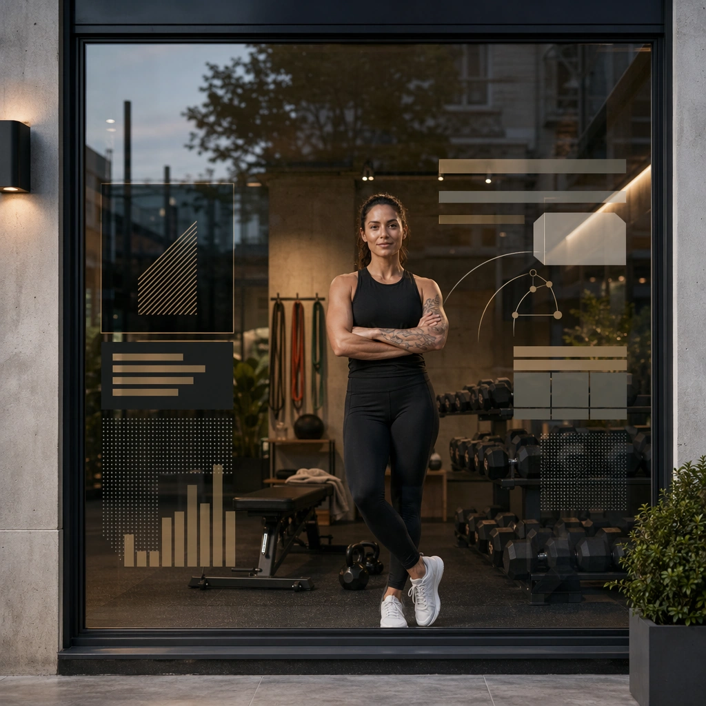
Example generated from “Gym Brand Poster And Membership System — Storefront Window Poster”
GPT Image 2en

Scene: Create a square storefront window poster for Gym Brand, using gym-brand communication with clean architecture, membership-friendly structure, and premium local-acquisition polish. The composition should read as a practical, production-ready sports or fitness surface with a clear hierarchy, premium lighting, and obvious commercial intent. Keep the environment specific enough to feel real, but leave enough control in the layout for non-readable information modules, campaign blocks, or visualized metrics. Aim for a finish that works for a brand, club, app, academy, or event operator. Subject: Build the image around coach or member behind glass facade. The subject should be original, believable, and free of any real-brand or celebrity cues. Use realistic apparel, safe body mechanics when movement is visible, and environmental props that support the category without clutter. The subject must stay visually dominant so the design still works as a communication asset rather than a pure scene study. Important details: The mood should read as local acquisition clarity. Treat layout, light, and supporting graphic structure as part of one polished delivery surface. Any schedule blocks, metric panels, quote zones, badges, or path diagrams must stay abstract and non-readable. Prioritize usefulness, clarity, and category truth over spectacle. The image should feel distinct from the series package while still belonging naturally to the same topic and business use case. Use case: Gym Brand single study 9/9, an independent rollout surface for the topic. Constraints: No readable text, no watermark, no logos, preserve exact 1:1 aspect ratio, no brand marks, no public-figure resemblance, no generic stock layout, no cluttered UI imitation, no accidental copyrighted insignia.

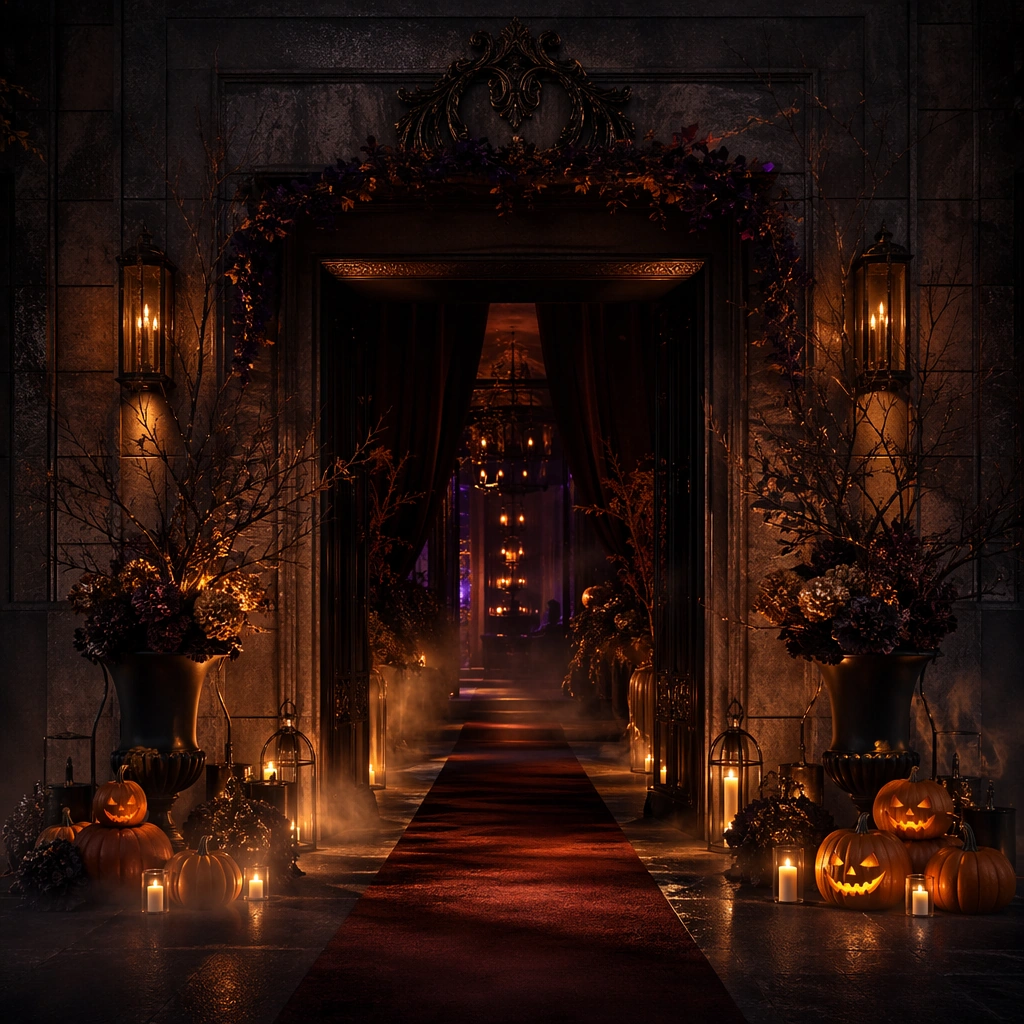
Example generated from “Halloween Night Event Promo Set — Midnight Entry Anchor”
GPT Image 2en

Scene: Create a square premium Halloween event campaign image at night with deep charcoal shadows, ember-orange highlights, restrained purple-black undertones, and theatrical spot lighting. The environment should feel like a high-end nightlife or immersive event venue rather than a haunted-house cliché. Build suspense through thresholds, smoke traces, and layered set dressing, with enough realism that the scene could advertise a real event, hotel activation, or entertainment launch. Subject: Center an event-entry composition with carved pumpkins used sparingly, candle or lantern glow, textured stone or metal, atmospheric props, and an implied invitation into a night experience. The set dressing should feel elegant and slightly dangerous, balancing fun with premium polish. Keep the subject original and commercially usable, with no copyrighted monsters or generic party-store clutter. Important details: Lock the Halloween grammar here: darkness with controlled light, premium materials, ember accents, subtle fog, and a feeling of suspenseful access. The image must feel event-ready and upscale, suitable for posters, social teasers, or hospitality promotions. Avoid campy costume-shop styling. Make every object and light source contribute to one coherent atmosphere of playful threat and night-time excitement. Use case: Halloween Promo series study 1/9. Constraints: No readable text, no watermark, no logos, preserve exact 1:1 aspect ratio, no readable event text, no gore, no horror-film character references, no cheap plastic skeleton overload, no logo signage, no cartoon bats everywhere, no fake blood, no carnival mess.

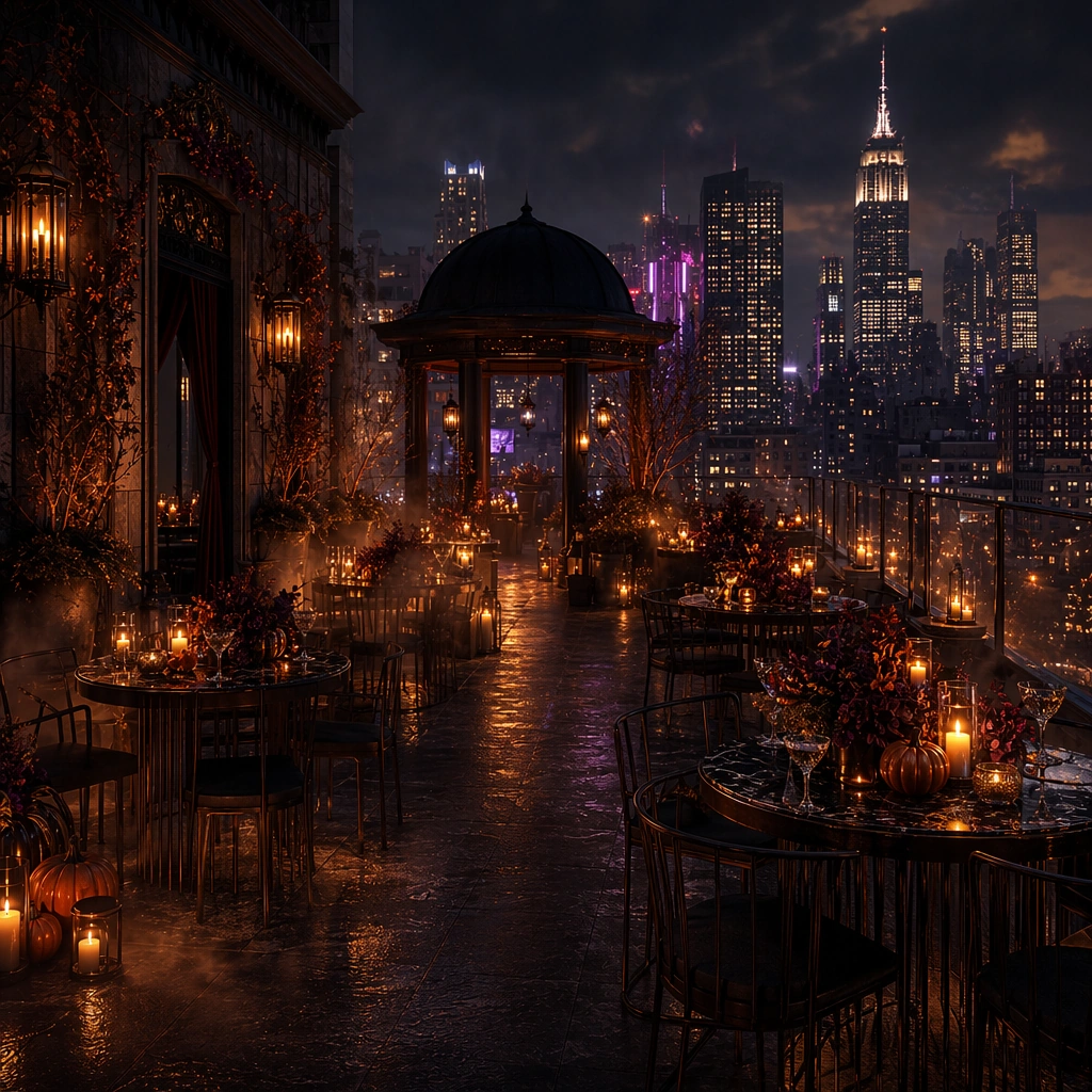
Example generated from “Halloween Night Event Promo Set — Rooftop Party Variation”
GPT Image 2en

Scene: Create a square dependent event image in the exact same Halloween night world, preserving the same ember lighting, charcoal depth, restrained fog, and premium suspense from the reference image, but open the scene toward a rooftop party environment. The frame should still feel like the same campaign family, with continuity obvious in light, materials, and threat level, while shifting into a more social nightlife surface. Subject: Feature a rooftop setup with candlelit tables, elegant drinks, pumpkins or seasonal props used with restraint, and city-night depth in the background. Preserve exact campaign identity from the reference model while changing the venue emphasis toward elevated nightlife. The scene should feel polished, seductive, and event-promotional, never comedic or bargain-party themed. Important details: Keep the same premium Halloween grammar: controlled menace, sharp pools of light, dark surfaces, and one coherent invitation to the night. The rooftop setting should add exclusivity, not spectacle overload. Glass, metal, smoke, and weather cues should all feel real. The result should work as a hero asset for rooftop events, hospitality activations, or nightlife campaign rollout. Use case: Halloween Promo series study 2/9. Constraints: No readable text, no watermark, no logos, preserve exact 1:1 aspect ratio, preserve exact campaign identity from the reference image, no readable menu signs, no costume crowd, no gore, no giant spider-web cliché, no logo glassware, no fireworks, no cheesy neon, no copyrighted creatures.

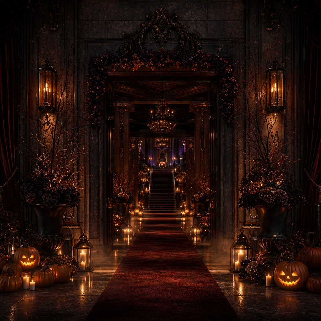
Example generated from “Halloween Night Event Promo Set — Haunted Hotel Variation”
GPT Image 2en

Scene: Create a square dependent campaign image in the same Halloween world, with the identical charcoal shadow, ember glow, and polished threat from the reference image, but shift the setting into a dramatic hotel corridor or lobby threshold. Preserve the same light behavior and material identity while increasing spatial mystery and hospitality cues, as though the same campaign has expanded into a haunted-luxury venue activation. Subject: Show an elegant corridor or lobby with moody lamps, shadows, controlled fog, a few carefully placed seasonal props, and an implied invitation deeper into the space. Preserve exact campaign identity from the reference model while making the hospitality environment central. The scene should feel cinematic and event-ready, but still physically plausible and premium. Important details: Continuity must remain exact. Keep the same color discipline, same suspense level, and same upscale production value. Let the haunted quality come from architecture, light falloff, and silence rather than from monsters or gore. The final image should fit hotel activations, event venues, or premium Halloween poster systems. Use case: Halloween Promo series study 3/9. Constraints: No readable text, no watermark, no logos, preserve exact 1:1 aspect ratio, preserve exact campaign identity from the reference image, no readable room numbers, no gore, no ghost cliché, no logo signage, no cheap cobweb decor, no zombie references, no bright carnival colors, no jump-scare figure.

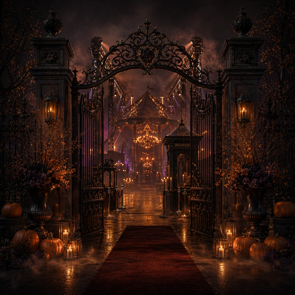
Example generated from “Halloween Night Event Promo Set — Carnival Gate Variation”
GPT Image 2en

Scene: Create a square dependent Halloween campaign image inside the same moody event world, preserving the exact ember-orange highlights, charcoal depth, and refined sense of danger from the reference image, but orient the composition toward an entertainment-gate or fairground entry. The scene should remain premium and suspenseful rather than childish, with clear continuity to the anchor image. Subject: Feature a stylized gate, ticketing threshold without readable text, lantern light, sculptural props, and controlled seasonal detail that suggests a premium Halloween carnival or immersive event. Preserve exact campaign identity from the reference model while changing the venue emphasis. The subject must feel original, promotional, and suitable for nightlife or entertainment rollout. Important details: Keep the same high-end Halloween language: suspense first, novelty second. Metalwork, wood, haze, and lighting rigs should all feel believable. The gate should imply event access and anticipation, not a theme-park parody. The final image should work as campaign key art for entertainment venues and seasonal event promotions. Use case: Halloween Promo series study 4/9. Constraints: No readable text, no watermark, no logos, preserve exact 1:1 aspect ratio, preserve exact campaign identity from the reference image, no readable ticket text, no gore, no clown-horror cliché, no logo banners, no theme-park mascots, no circus overload, no rainbow carnival lights, no crowd crush.

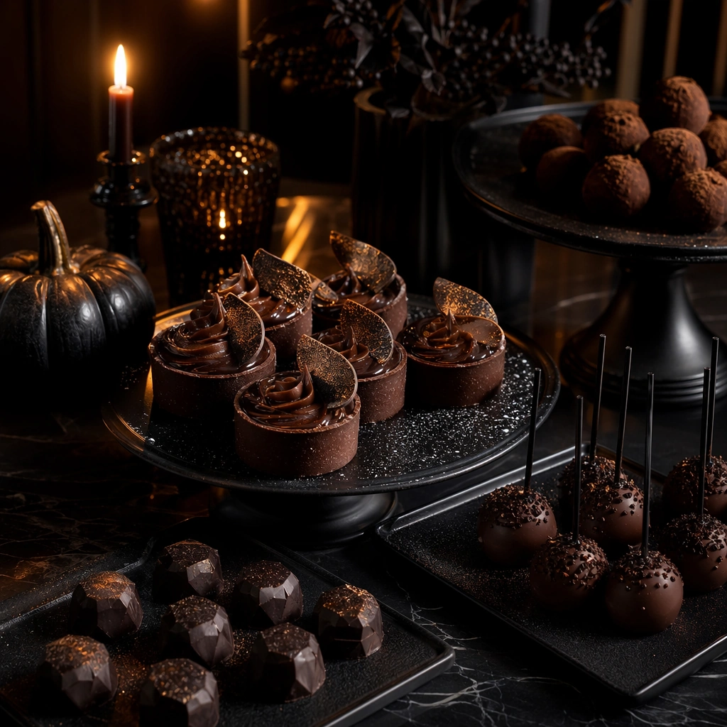
Example generated from “Halloween Night Event Promo Set — Candy Bar Still Life”
GPT Image 2en

Scene: Create a square tabletop confectionery image at night with low warm light, charcoal shadows, and controlled orange highlights. The scene should feel like a premium event dessert station rather than a children's candy spread. Keep the composition art-directed, atmospheric, and commercially clear, with enough depth and texture that it could support hospitality, nightlife, or event-promo use. Subject: Show crafted sweets, dark chocolate tones, matte-black serving pieces, candle glow, and one or two restrained seasonal props integrated into a Halloween dessert setup. The subject should communicate indulgence, mystery, and nightlife sophistication without drifting into gore or cartoon party-store energy. Focus on plating, material finish, and mood. Important details: Keep the palette tight and premium. Chocolate sheen, sugar dust, ceramic texture, wax glow, and dark shadows should all feel real. The image should behave like a hospitality support asset for October promotions, cocktail bars, or event venues. It needs to feel desirable and eerie at once, with no cheap novelty cues. Use case: Halloween Promo single study 5/9. Constraints: No readable text, no watermark, no logos, preserve exact 1:1 aspect ratio, no readable menu labels, no fake blood desserts, no cartoon candy wrappers, no logos, no child-party props, no rainbow colors, no horror-movie references, no cluttered buffet.

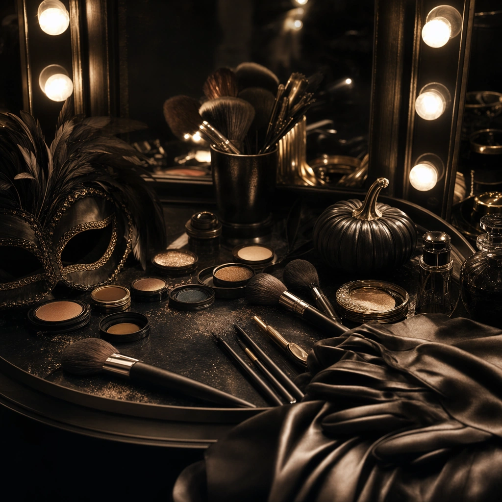
Example generated from “Halloween Night Event Promo Set — Makeup Mirror Prep”
GPT Image 2en

Scene: Create a square backstage vanity image with warm mirror bulbs, dark surrounding space, and an atmosphere of elegant transformation. The scene should feel like part of a premium event campaign rather than beauty content. Use reflective surfaces, arranged tools, and controlled shadow to suggest pre-night anticipation without needing a central face or readable packaging. Subject: Show a vanity setup with brushes, compact-like forms, pigment pans without readable marks, gloves or fabric, and one or two seasonal accessories hinting at costume or transformation. Keep the subject centered on preparation, ritual, and suspense. The composition should feel polished and campaign-ready, suitable for nightlife, entertainment, or hospitality promotion. Important details: Texture and light are the focus: mirror glow, brushed metal, powder residue, leather or satin detail, and the quiet tension before an event begins. Avoid beauty-brand cliché and avoid exaggerated gore or theatrical prosthetics. The result should feel atmospheric, premium, and narratively suggestive while staying commercially usable. Use case: Halloween Promo single study 6/9. Constraints: No readable text, no watermark, no logos, preserve exact 1:1 aspect ratio, no readable labels, no visible celebrity face, no fake blood, no horror character references, no cheap costume clutter, no logos, no neon overload, no crowded dressing room.

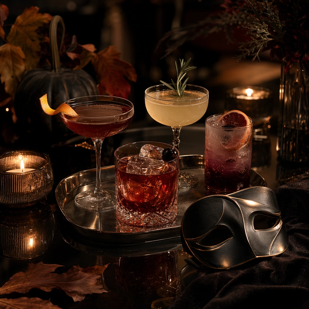
Example generated from “Halloween Night Event Promo Set — Masquerade Drinks Table”
GPT Image 2en

Scene: Create a square drinks-table campaign image at night with low amber light, dark glass reflections, and velvet-shadow atmosphere. The frame should feel like a premium hospitality or bar campaign for Halloween, not a casual party snapshot. Use strong styling, clean spacing, and enough visual hierarchy that the drinks, tableware, and seasonal cues read immediately. Subject: Show crafted cocktails or mocktails, glassware, a mask-like object or accessory, candlelight, and restrained seasonal props arranged into an elegant Halloween hospitality scene. The subject should communicate social intrigue and event readiness rather than horror or costume comedy. Keep the objects tactile, polished, and original. Important details: Let menace remain playful and upscale. Glass refraction, ice, garnish, velvet cloth, metal trays, and candlelight should all feel believable. The final image should support bar, hotel, or event promotions during Halloween. Avoid generic nightclub clutter or gaudy mixology theatrics. This is about polished suspense and selective seasonal coding. Keep the frame precise enough for gallery, research, and campaign reuse, with believable materials and a strong thumbnail read. Use case: Halloween Promo single study 7/9. Constraints: No readable text, no watermark, no logos, preserve exact 1:1 aspect ratio, no readable drink menu, no branded bottles, no gore, no cartoon skull cups, no cigarette clutter, no rainbow LEDs, no crowd, no movie-character masks.

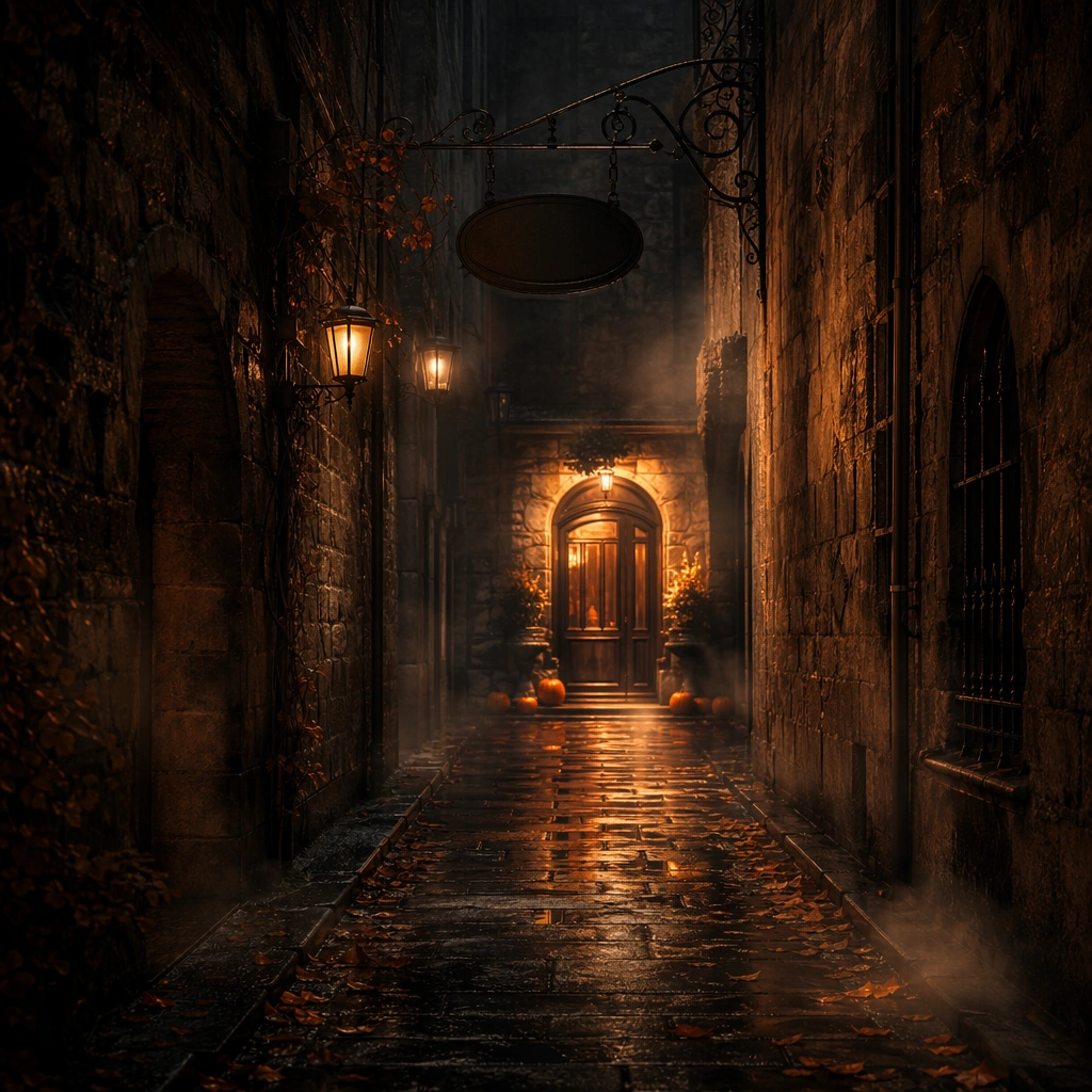
Example generated from “Halloween Night Event Promo Set — Foggy Alley Teaser”
GPT Image 2en

Scene: Create a square urban alley image at night with pockets of amber light, drifting fog, damp stone, and deep shadow. The frame should feel like a campaign teaser for an event or venue, not a crime scene or a horror still. Use strong perspective, controlled mystery, and a premium sense of atmosphere so the image can function as suspenseful promotional art. Subject: Show an empty or nearly empty alley with one strong destination cue such as a lit doorway, sign shape without readable text, or glowing threshold, plus restrained seasonal details that suggest Halloween night. The subject should communicate invitation, danger, and curiosity through environment rather than through monsters or graphic scare tactics. Important details: Atmosphere carries the image. Fog density, wet reflections, masonry texture, and light falloff should all be convincing. Keep the palette narrow and the composition elegant. The final asset should feel suitable for nightlife or entertainment teaser campaigns that want suspense without losing premium credibility. Use case: Halloween Promo single study 8/9. Constraints: No readable text, no watermark, no logos, preserve exact 1:1 aspect ratio, no readable signs, no gore, no horror-film villain silhouette, no police lights, no trash clutter, no graffiti text, no logo posters, no jump-scare figure.

Example generated from “Halloween Night Event Promo Set — Amusement Gate Silhouette”
GPT Image 2en

Scene: Create a square event-gate image at night with smoke layers, warm backlight, and a strong silhouetted structure. The composition should feel like a promotional support asset for a premium Halloween entertainment venue. Keep the frame dramatic and readable, with controlled contrast and enough surrounding atmosphere that the gate feels like a destination instead of an isolated prop. Subject: Show a stylized gate, subtle lighting hardware, sculptural seasonal details, and a clear path inward that suggests anticipation. The subject should communicate premium event access and atmospheric thrill without readable text or overtly childish decoration. Build the image around shape language, smoke, and light more than on prop quantity. Important details: Silhouette clarity and material realism matter equally. Wood, metal, fog, and stone should all feel grounded. The gate should be iconic without borrowing from any known theme park or horror franchise. The final image should support posters, countdown tiles, and venue-promo campaigns for Halloween night events. Use case: Halloween Promo single study 9/9. Constraints: No readable text, no watermark, no logos, preserve exact 1:1 aspect ratio, no readable ticket text, no gore, no clown-horror cliché, no logo banners, no mascot costumes, no rainbow funfair lights, no crowding, no movie-franchise references.

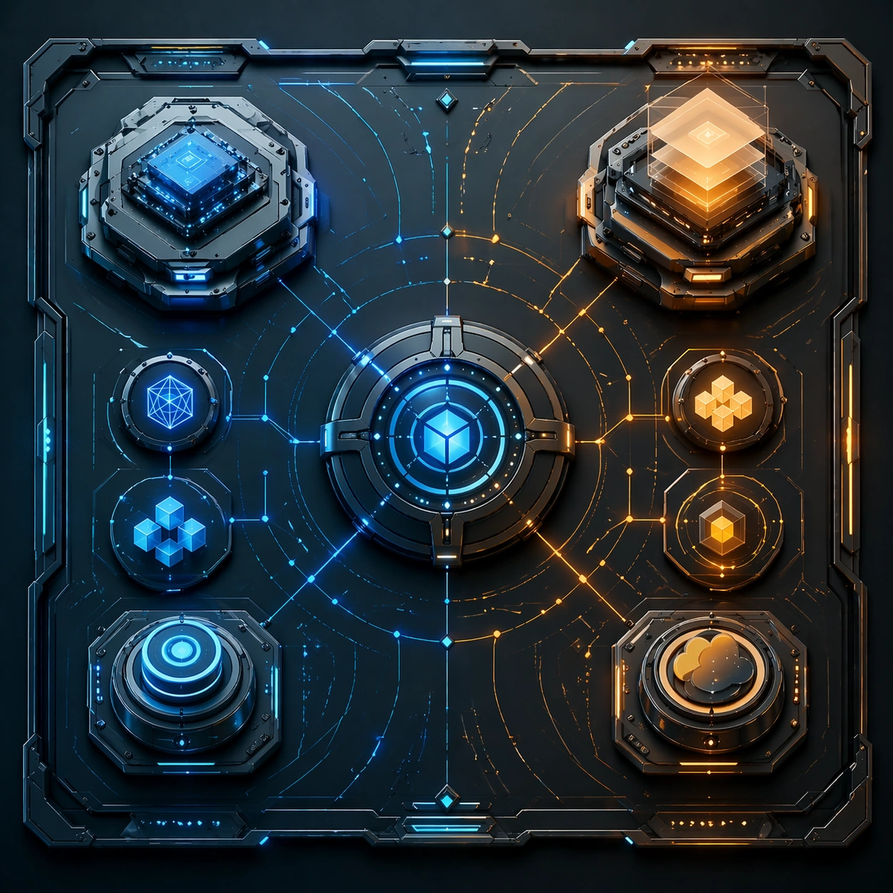
Example generated from “Hardware Software Companion Ui Hero — Reference Anchor”
GPT Image 2en

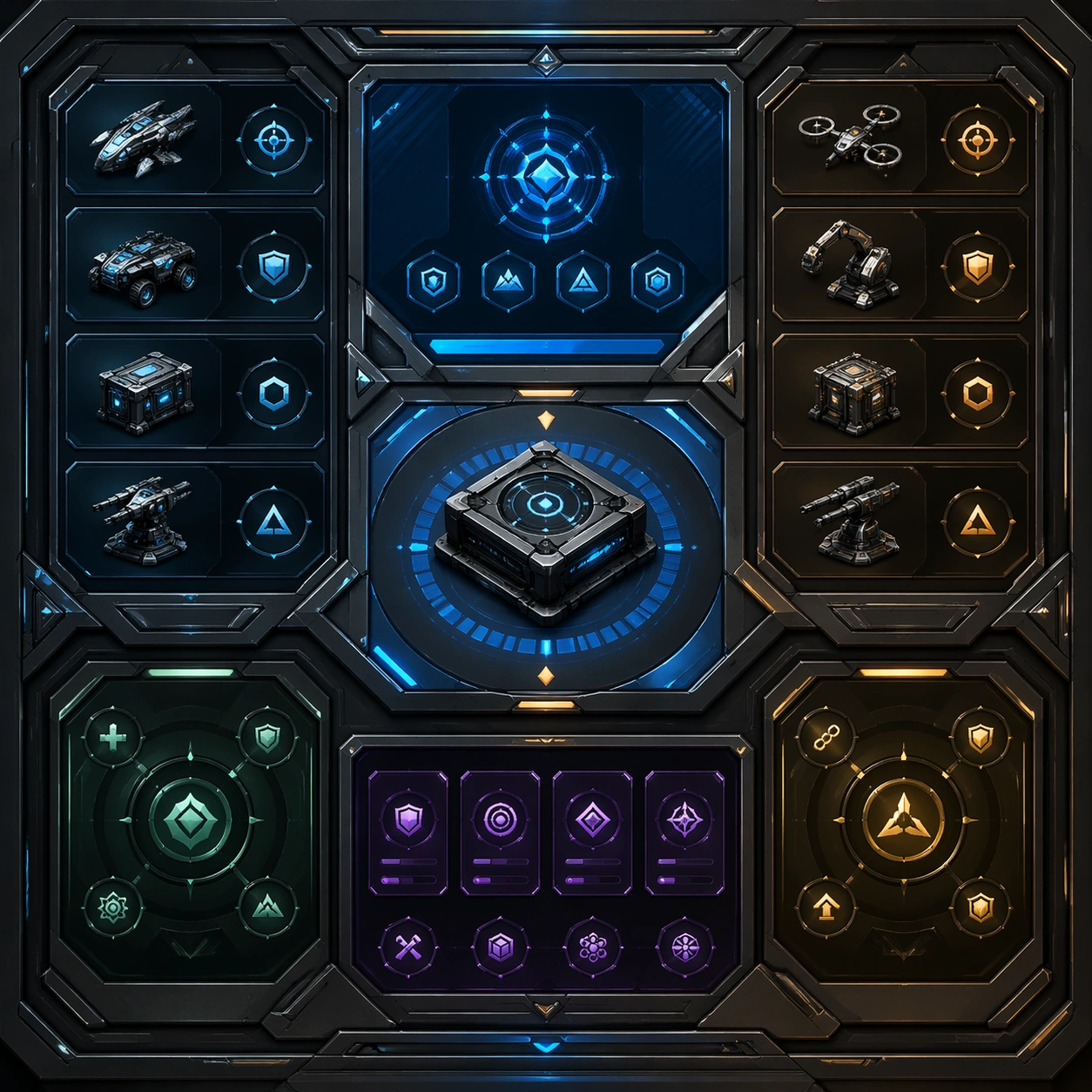
Scene: Create a square reference image for Hardware Software Companion UI Hero. Build a reference anchor establishing the core system with a premium, production-ready finish. Use a polished modular board or campaign surface with clean spacing, premium game-UI finish, and clear focal hierarchy. The composition should feel intentional, clean, and reusable for gallery, research, campaign, or internal handoff contexts. Lighting must support readability first, with the main forms clearly separated from the background and enough breathing room for the system to stay legible at both hero scale and thumbnail scale. Subject: Center a coherent original game-art system built for premium production and marketing surfaces. For this image, focus on reference anchor. Keep the same system logic stable across screenshots, cards, banners, and overview boards. This image is the canonical anchor that later series images must follow. The viewer should immediately understand what role this surface plays inside a cohesive game-production asset pack. Important details: Lock framing, icon grammar, palette blocking, and surface hierarchy so the kit feels production-ready and consistent. Preserve the core silhouette, framing language, and material logic from the reference image while each variation changes function. Keep materials believable, edge hierarchy disciplined, and the visual language consistent with Companion UI. Use abstract interface blocks or diagram accents when helpful, but avoid any readable language. The final result should feel like a deliberate production asset rather than a random illustration. Use case: Hardware Software Companion UI Hero series study 1/9, designed as reference anchor within a cohesive asset pack. Constraints: No readable text, no watermark, no logos, preserve exact 1:1 aspect ratio, no unrelated objects, no broken visual hierarchy, no malformed anatomy or broken perspective, no random decorative clutter.

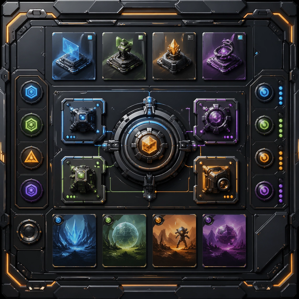
Example generated from “Hardware Software Companion Ui Hero — Variant One”
GPT Image 2en

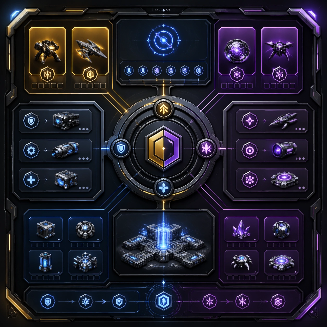
Scene: Create a square dependent image for Hardware Software Companion UI Hero. Build a first controlled variation in the same system with a premium, production-ready finish. Use a polished modular board or campaign surface with clean spacing, premium game-UI finish, and clear focal hierarchy. The composition should feel intentional, clean, and reusable for gallery, research, campaign, or internal handoff contexts. Lighting must support readability first, with the main forms clearly separated from the background and enough breathing room for the system to stay legible at both hero scale and thumbnail scale. Subject: Center a coherent original game-art system built for premium production and marketing surfaces. For this image, focus on the intended support surface. Keep the same system logic stable across screenshots, cards, banners, and overview boards. Preserve exact identity or system logic from the reference image while changing only the intended variation axis. The viewer should immediately understand what role this surface plays inside a cohesive game-production asset pack. Important details: Lock framing, icon grammar, palette blocking, and surface hierarchy so the kit feels production-ready and consistent. Preserve the core silhouette, framing language, and material logic from the reference image while each variation changes function. Keep materials believable, edge hierarchy disciplined, and the visual language consistent with Companion UI. Use abstract interface blocks or diagram accents when helpful, but avoid any readable language. The final result should feel like a deliberate production asset rather than a random illustration. Use case: Hardware Software Companion UI Hero series study 2/9, designed as variant one within a cohesive asset pack. Constraints: No readable text, no watermark, no logos, preserve exact 1:1 aspect ratio, no unrelated objects, no broken visual hierarchy, no malformed anatomy or broken perspective, no random decorative clutter.

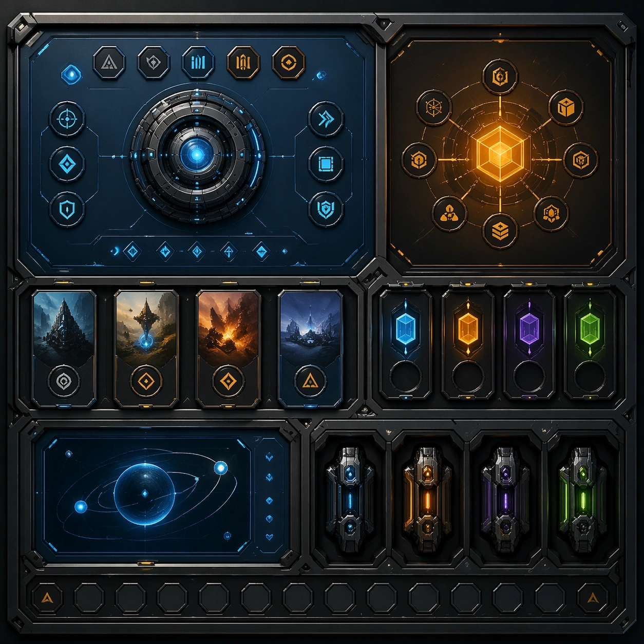
Example generated from “Hardware Software Companion Ui Hero — Variant Two”
GPT Image 2en

Scene: Create a square dependent image for Hardware Software Companion UI Hero. Build a second controlled variation in the same system with a premium, production-ready finish. Use a polished modular board or campaign surface with clean spacing, premium game-UI finish, and clear focal hierarchy. The composition should feel intentional, clean, and reusable for gallery, research, campaign, or internal handoff contexts. Lighting must support readability first, with the main forms clearly separated from the background and enough breathing room for the system to stay legible at both hero scale and thumbnail scale. Subject: Center a coherent original game-art system built for premium production and marketing surfaces. For this image, focus on the intended support surface. Keep the same system logic stable across screenshots, cards, banners, and overview boards. Preserve exact identity or system logic from the reference image while changing only the intended variation axis. The viewer should immediately understand what role this surface plays inside a cohesive game-production asset pack. Important details: Lock framing, icon grammar, palette blocking, and surface hierarchy so the kit feels production-ready and consistent. Preserve the core silhouette, framing language, and material logic from the reference image while each variation changes function. Keep materials believable, edge hierarchy disciplined, and the visual language consistent with Companion UI. Use abstract interface blocks or diagram accents when helpful, but avoid any readable language. The final result should feel like a deliberate production asset rather than a random illustration. Use case: Hardware Software Companion UI Hero series study 3/9, designed as variant two within a cohesive asset pack. Constraints: No readable text, no watermark, no logos, preserve exact 1:1 aspect ratio, no unrelated objects, no broken visual hierarchy, no malformed anatomy or broken perspective, no random decorative clutter.

Example generated from “Hardware Software Companion Ui Hero — Variant Three”
GPT Image 2en

Scene: Create a square dependent image for Hardware Software Companion UI Hero. Build a third controlled variation in the same system with a premium, production-ready finish. Use a polished modular board or campaign surface with clean spacing, premium game-UI finish, and clear focal hierarchy. The composition should feel intentional, clean, and reusable for gallery, research, campaign, or internal handoff contexts. Lighting must support readability first, with the main forms clearly separated from the background and enough breathing room for the system to stay legible at both hero scale and thumbnail scale. Subject: Center a coherent original game-art system built for premium production and marketing surfaces. For this image, focus on the intended support surface. Keep the same system logic stable across screenshots, cards, banners, and overview boards. Preserve exact identity or system logic from the reference image while changing only the intended variation axis. The viewer should immediately understand what role this surface plays inside a cohesive game-production asset pack. Important details: Lock framing, icon grammar, palette blocking, and surface hierarchy so the kit feels production-ready and consistent. Preserve the core silhouette, framing language, and material logic from the reference image while each variation changes function. Keep materials believable, edge hierarchy disciplined, and the visual language consistent with Companion UI. Use abstract interface blocks or diagram accents when helpful, but avoid any readable language. The final result should feel like a deliberate production asset rather than a random illustration. Use case: Hardware Software Companion UI Hero series study 4/9, designed as variant three within a cohesive asset pack. Constraints: No readable text, no watermark, no logos, preserve exact 1:1 aspect ratio, no unrelated objects, no broken visual hierarchy, no malformed anatomy or broken perspective, no random decorative clutter.

Example generated from “Hardware Software Companion Ui Hero — Support One”
GPT Image 2en

Scene: Create a square standalone support image for Hardware Software Companion UI Hero. Build a support-surface study with a clear focal hierarchy and a finished professional surface. Use a polished modular board or campaign surface with clean spacing, premium game-UI finish, and clear focal hierarchy. The frame should feel self-contained and polished, with enough structure to explain the system even without the reference series, yet still obviously belonging to the same theme and production world. Subject: Show a coherent original game-art system built for premium production and marketing surfaces in a way that emphasizes the intended support surface. Keep the same system logic stable across screenshots, cards, banners, and overview boards. Even though this image is independent, the viewer should still recognize the same universe, same commercial logic, and same production intent as the core package. Important details: Lock framing, icon grammar, palette blocking, and surface hierarchy so the kit feels production-ready and consistent. Preserve the broader theme language through color, framing, material choices, and modular composition. Use clean panel rhythm, premium asset presentation, and believable detail density. The image should work equally well as a gallery study, research reference, and mock production deliverable. Use case: Hardware Software Companion UI Hero single study 5/9, exploring support one as a support surface. Constraints: No readable text, no watermark, no logos, preserve exact 1:1 aspect ratio, no unrelated objects, no broken visual hierarchy, no visual noise that obscures the main surface, no accidental brand resemblance.

Example generated from “Hardware Software Companion Ui Hero — Support Two”
GPT Image 2en

Scene: Create a square standalone support image for Hardware Software Companion UI Hero. Build a second support-surface study with a clear focal hierarchy and a finished professional surface. Use a polished modular board or campaign surface with clean spacing, premium game-UI finish, and clear focal hierarchy. The frame should feel self-contained and polished, with enough structure to explain the system even without the reference series, yet still obviously belonging to the same theme and production world. Subject: Show a coherent original game-art system built for premium production and marketing surfaces in a way that emphasizes the intended support surface. Keep the same system logic stable across screenshots, cards, banners, and overview boards. Even though this image is independent, the viewer should still recognize the same universe, same commercial logic, and same production intent as the core package. Important details: Lock framing, icon grammar, palette blocking, and surface hierarchy so the kit feels production-ready and consistent. Preserve the broader theme language through color, framing, material choices, and modular composition. Use clean panel rhythm, premium asset presentation, and believable detail density. The image should work equally well as a gallery study, research reference, and mock production deliverable. Use case: Hardware Software Companion UI Hero single study 6/9, exploring support two as a support surface. Constraints: No readable text, no watermark, no logos, preserve exact 1:1 aspect ratio, no unrelated objects, no broken visual hierarchy, no visual noise that obscures the main surface, no accidental brand resemblance.

Example generated from “Hardware Software Companion Ui Hero — Support Three”
GPT Image 2en

Scene: Create a square standalone support image for Hardware Software Companion UI Hero. Build a third support-surface study with a clear focal hierarchy and a finished professional surface. Use a polished modular board or campaign surface with clean spacing, premium game-UI finish, and clear focal hierarchy. The frame should feel self-contained and polished, with enough structure to explain the system even without the reference series, yet still obviously belonging to the same theme and production world. Subject: Show a coherent original game-art system built for premium production and marketing surfaces in a way that emphasizes the intended support surface. Keep the same system logic stable across screenshots, cards, banners, and overview boards. Even though this image is independent, the viewer should still recognize the same universe, same commercial logic, and same production intent as the core package. Important details: Lock framing, icon grammar, palette blocking, and surface hierarchy so the kit feels production-ready and consistent. Preserve the broader theme language through color, framing, material choices, and modular composition. Use clean panel rhythm, premium asset presentation, and believable detail density. The image should work equally well as a gallery study, research reference, and mock production deliverable. Use case: Hardware Software Companion UI Hero single study 7/9, exploring support three as a support surface. Constraints: No readable text, no watermark, no logos, preserve exact 1:1 aspect ratio, no unrelated objects, no broken visual hierarchy, no visual noise that obscures the main surface, no accidental brand resemblance.

Example generated from “Hardware Software Companion Ui Hero — Support Four”
GPT Image 2en

Scene: Create a square standalone support image for Hardware Software Companion UI Hero. Build a fourth support-surface study with a clear focal hierarchy and a finished professional surface. Use a polished modular board or campaign surface with clean spacing, premium game-UI finish, and clear focal hierarchy. The frame should feel self-contained and polished, with enough structure to explain the system even without the reference series, yet still obviously belonging to the same theme and production world. Subject: Show a coherent original game-art system built for premium production and marketing surfaces in a way that emphasizes the intended support surface. Keep the same system logic stable across screenshots, cards, banners, and overview boards. Even though this image is independent, the viewer should still recognize the same universe, same commercial logic, and same production intent as the core package. Important details: Lock framing, icon grammar, palette blocking, and surface hierarchy so the kit feels production-ready and consistent. Preserve the broader theme language through color, framing, material choices, and modular composition. Use clean panel rhythm, premium asset presentation, and believable detail density. The image should work equally well as a gallery study, research reference, and mock production deliverable. Use case: Hardware Software Companion UI Hero single study 8/9, exploring support four as a support surface. Constraints: No readable text, no watermark, no logos, preserve exact 1:1 aspect ratio, no unrelated objects, no broken visual hierarchy, no visual noise that obscures the main surface, no accidental brand resemblance.

Example generated from “Hardware Software Companion Ui Hero — Support Five”
GPT Image 2en

Scene: Create a square standalone support image for Hardware Software Companion UI Hero. Build a fifth support-surface study with a clear focal hierarchy and a finished professional surface. Use a polished modular board or campaign surface with clean spacing, premium game-UI finish, and clear focal hierarchy. The frame should feel self-contained and polished, with enough structure to explain the system even without the reference series, yet still obviously belonging to the same theme and production world. Subject: Show a coherent original game-art system built for premium production and marketing surfaces in a way that emphasizes the intended support surface. Keep the same system logic stable across screenshots, cards, banners, and overview boards. Even though this image is independent, the viewer should still recognize the same universe, same commercial logic, and same production intent as the core package. Important details: Lock framing, icon grammar, palette blocking, and surface hierarchy so the kit feels production-ready and consistent. Preserve the broader theme language through color, framing, material choices, and modular composition. Use clean panel rhythm, premium asset presentation, and believable detail density. The image should work equally well as a gallery study, research reference, and mock production deliverable. Use case: Hardware Software Companion UI Hero single study 9/9, exploring support five as a support surface. Constraints: No readable text, no watermark, no logos, preserve exact 1:1 aspect ratio, no unrelated objects, no broken visual hierarchy, no visual noise that obscures the main surface, no accidental brand resemblance.

Example generated from “Hero Reveal Turnaround Pack — Reference Hero Anchor”
GPT Image 2en

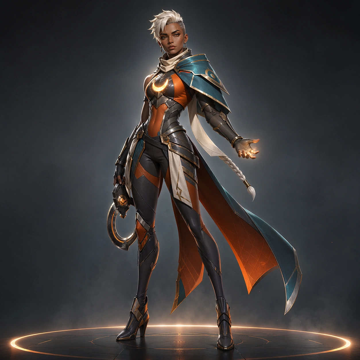
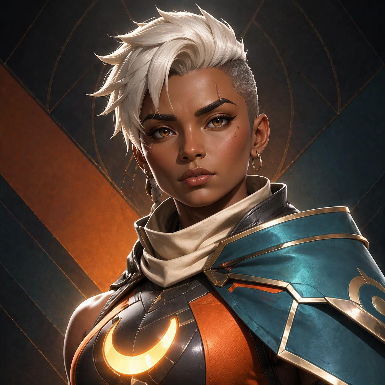
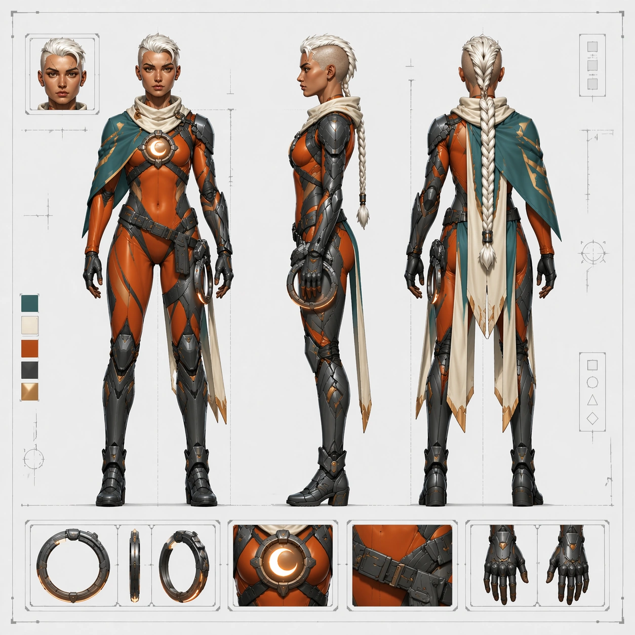
Scene: Create a polished square hero-introduction frame with a controlled studio-cinematic hybrid setup. The camera sits at a three-quarter full-body distance, slightly below eye level so the figure feels playable and aspirational without becoming exaggerated poster fantasy. Use a soft storm-gray gradient background, a faint illuminated floor ring, and crisp rim light that separates the character silhouette from the backdrop. Brightness should be concentrated on the face, chest reactor, and shoulder mantle, while the corners stay quiet and clean for downstream marketing reuse. The overall image must feel like a finished launch anchor that can guide later references across poster, bust crop, banner, and production-sheet outputs. Subject: Center an original playable heroine with warm umber skin, an angular heart-shaped face, high cheekbones, a slim slash scar through the left eyebrow, alert amber-brown eyes, and short ivory-white hair cut into an undercut with one long braided tail. Preserve athletic dancer-sprinter build with long legs, narrow waist, and confident upright posture. Her costume language is fixed: asymmetrical teal shoulder mantle, ember-orange bodysuit, graphite segmented armor, ivory scarf tabs, crescent chest reactor, slim ring-blade sidearm, and split cape panels. Keep the body turned slightly off-axis with one foot forward, one hand relaxed near the ring-blade holster, and the other hand open in a calm charge-ready gesture. The expression should be focused, composed, and unmistakably heroic rather than aggressive. The face must be highly legible and repeatable, with the same eyebrow scar, hairline, braid length, cheekbone shape, nose bridge, lip shape, and eye spacing that all later images will preserve. Important details: The visual language must balance promo polish with production clarity. Lock the faction palette to teal, ember orange, gunmetal, and soft ivory, keep armor seams believable, and let the chest reactor read as a crescent motif that can recur in every asset. Do not overfill the background. The silhouette should stay readable from thumbnail distance: angular shoulder mantle on one side, narrow waist, long legs, and split cape panels. Materials should feel like premium stylized game rendering, with matte armor, satin fabric, soft skin texture, and controlled emissive accents. Use case: Hero Reveal Turnaround Pack series study 1/9, establishing the canonical hero identity for all launch and turnaround assets. Constraints: No readable text, no watermark, no logos, preserve exact 1:1 aspect ratio, no extra characters, no oversized weapon swing, no chaotic background scenery, no costume redesign, no face drift, no inaccurate anatomy.

Example generated from “Hero Reveal Turnaround Pack — Splash Launch Poster”
GPT Image 2en

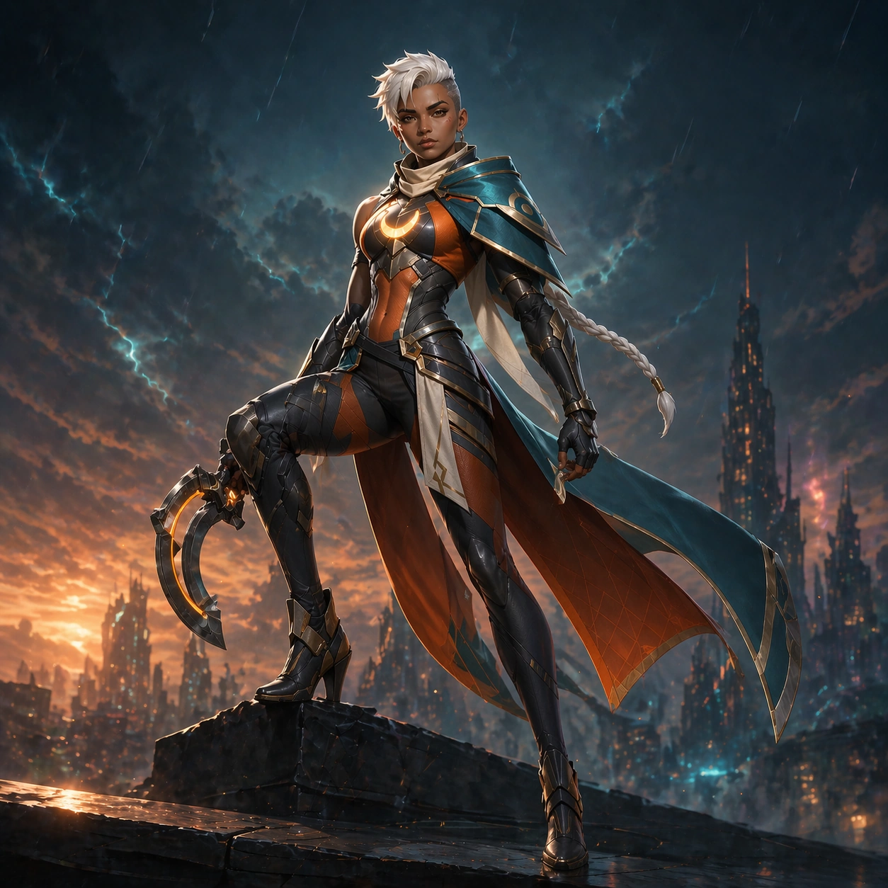
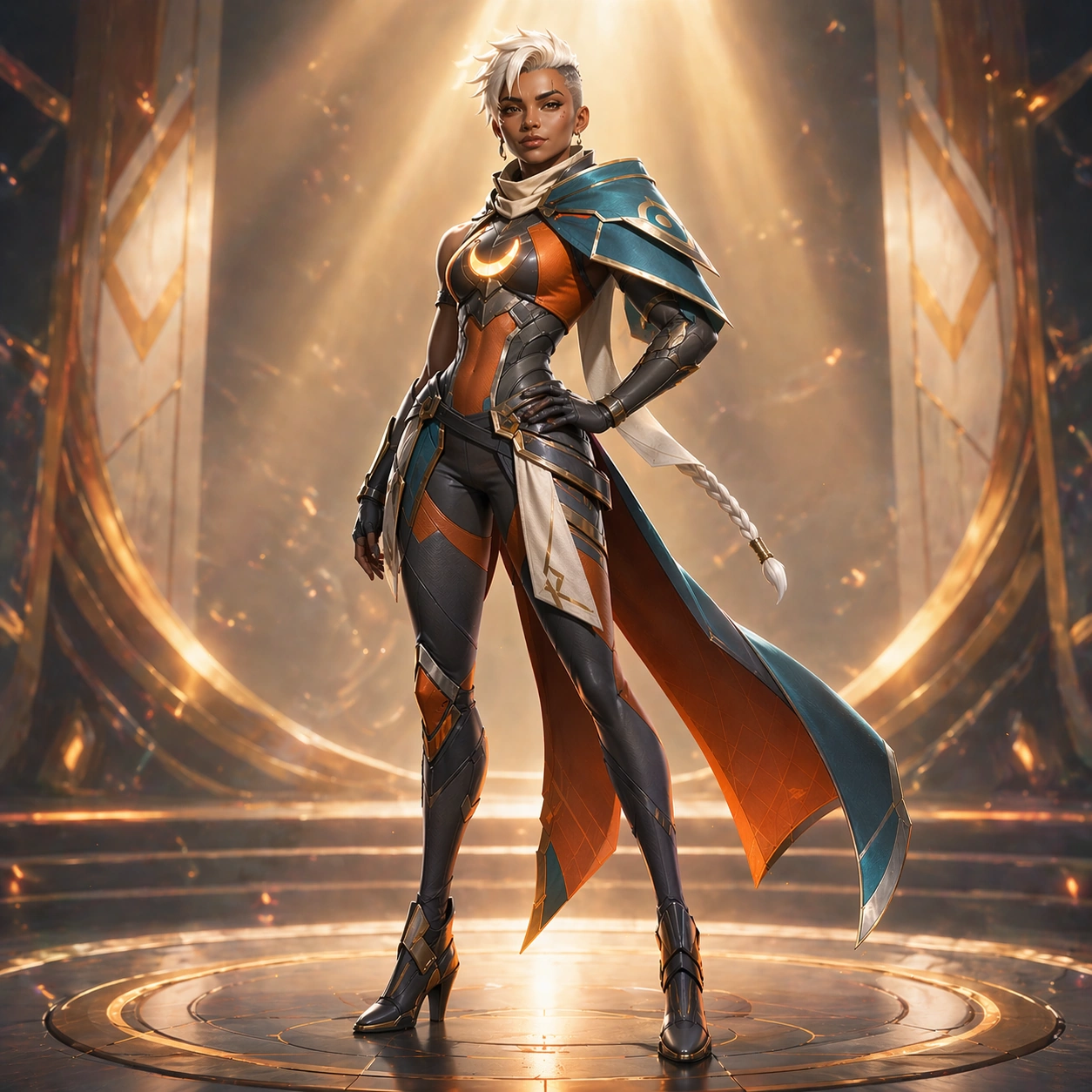
Scene: Build a square splash-art poster scene on a wind-cut rooftop above a futuristic city at dusk. The camera is wider and lower than the reference image, pushing the heroine into a launch-ready stance against layered clouds, distant towers, and streaks of teal electrical atmosphere. Keep the background simplified enough for a poster surface, with light concentrated around the figure and the skyline falling into soft depth haze. Motion should come from cape panels, sparks, and angled rain trails rather than from clutter. The frame should feel premium, commercial, and immediately legible as a hero reveal asset. Subject: Use the exact same heroine from the reference model: an original playable heroine with warm umber skin, an angular heart-shaped face, high cheekbones, a slim slash scar through the left eyebrow, alert amber-brown eyes, and short ivory-white hair cut into an undercut with one long braided tail, athletic dancer-sprinter build with long legs, narrow waist, and confident upright posture, and the same fixed costume system of asymmetrical teal shoulder mantle, ember-orange bodysuit, graphite segmented armor, ivory scarf tabs, crescent chest reactor, slim ring-blade sidearm, and split cape panels. She stands on a rooftop ledge with one knee bent and the ring-blade partially unfolded, not fully swung. Her expression remains composed and strategic. Preserve exact face, hair base, body proportions, armor placement, and palette from the reference model while shifting only the scene energy and pose intensity. The viewer must instantly recognize that the poster and the anchor image feature the same playable hero. Important details: Keep the chest reactor, eyebrow scar, undercut braid, asymmetrical mantle, and split cape panels visibly consistent. The poster can amplify atmosphere with electric arcs and rain glow, but it must not mutate the costume or body plan. Use bold negative space around the upper body so the image can later support title-safe crops. Materials should stay within stylized premium game-art rendering: satin cloth, brushed gunmetal, subtle skin texture, and disciplined emissive cyan highlights. Use case: Hero Reveal Turnaround Pack series study 2/9, testing locked-identity splash poster execution for launch marketing. Constraints: No readable text, no watermark, no logos, preserve exact 1:1 aspect ratio, preserve exact face and costume logic from the reference model, no flying debris wall, no extra squad members, no impossible weapon scale, no off-palette VFX.

Example generated from “Hero Reveal Turnaround Pack — Character Select Bust”
GPT Image 2en

Scene: Create a square bust-focused crop designed like a premium character-select portrait. The camera should frame from upper chest to just above the head, with slight three-quarter rotation, controlled studio lighting, and a background made of layered color blocks, subtle faction geometry, and soft atmospheric glow. Brightness needs to favor the eyes, cheekbones, reactor edge, and shoulder mantle so the face remains readable at small UI sizes. The composition should be clean, centered, and compact, leaving enough breathing room around the silhouette for future card-frame use. Subject: Show the exact same heroine from the reference model with no face drift: an original playable heroine with warm umber skin, an angular heart-shaped face, high cheekbones, a slim slash scar through the left eyebrow, alert amber-brown eyes, and short ivory-white hair cut into an undercut with one long braided tail. Preserve the undercut, braided tail origin, eyebrow scar, cheekbone structure, nose bridge, lip shape, neck length, and athletic upper-body read. Keep only the upper costume zones visible, especially the teal mantle, ember-orange underlayer, crescent reactor, and graphite collar hardware. The expression should be calm, alert, slightly challenging, and suitable for a player selection screen rather than a cinematic battle scream. Important details: This image must optimize identity recognition at smaller scale. Eye direction, facial landmarks, palette blocking, and edge lighting should all support instant recognition. Avoid dramatic depth blur that would soften the face. Keep the background abstract and non-narrative, using restrained geometric layering instead of scenery. Skin texture should stay believable, hair fibers should remain stylized but not waxy, and costume material separation must still be clear even in the tighter crop. Use case: Hero Reveal Turnaround Pack series study 3/9, building a locked-identity bust crop for select-card and profile surfaces. Constraints: No readable text, no watermark, no logos, preserve exact 1:1 aspect ratio, preserve exact face and hair base from the reference model, no extreme lens distortion, no screaming expression, no cropped-off chin, no random UI text blocks.

Example generated from “Hero Reveal Turnaround Pack — Victory Banner Pose”
GPT Image 2en

Scene: Compose a square banner-style hero shot intended for victory screens and campaign surfaces. Use a bright, polished environment with angled spotlight beams, floating embers, and a simplified arena backdrop that fades into soft depth. The camera should sit at mid-to-full body distance with a slightly elevated framing that feels triumphant without losing the body silhouette. The lighting is cleaner and more celebratory than the launch poster: crisp highlights, subtle bloom, and a controlled glow that makes the hero feel premium and collectible. Subject: Present the same heroine from the reference model, preserving exact face, hair base, body proportions, and costume logic. She shifts into a confident post-match pose: one hip relaxed, shoulders squared, ring-blade folded, chin slightly raised, and a restrained victorious smile. Keep the eyebrow scar, amber-brown eyes, ivory undercut braid, chest reactor, teal mantle, ember-orange suit panels, and graphite armor placement unchanged. The image should read as the identical hero after a successful match, not as a redesigned variant. Important details: Focus on strong silhouette readability and celebratory polish. The split cape panels may flare slightly, but their shape must remain consistent. Emissive accents should stay elegant and limited to reactor and subtle edge lighting. Use a premium game-banner finish with clean gradients and material clarity rather than noisy battle effects. The costume seams, holster placement, boot structure, and shoulder asymmetry must remain locked for downstream marketing coherence. Use case: Hero Reveal Turnaround Pack series study 4/9, testing a victory-banner crop that still preserves the canonical launch identity. Constraints: No readable text, no watermark, no logos, preserve exact 1:1 aspect ratio, preserve exact face and body proportions from the reference model, no trophy props, no crowd, no confetti overload, no costume recolor, no exaggerated grin.

Example generated from “Hero Reveal Turnaround Pack — Ability Showcase Triptych”
GPT Image 2en

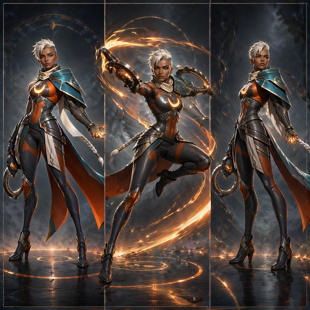
Scene: Design a square triptych-style promotional board divided into three vertical action windows within one coherent composition. Each panel should feel like a different beat of the same ability showcase, using a restrained storm-tech environment, soft atmospheric haze, and clean panel spacing. Keep the overall board bright and premium, with controlled motion streaks and energy arcs that guide the eye from left to right. Even though three moments appear in one image, the board should stay organized, readable, and market-ready rather than chaotic. Subject: In all three windows, depict the exact same heroine from the reference model: an original playable heroine with warm umber skin, an angular heart-shaped face, high cheekbones, a slim slash scar through the left eyebrow, alert amber-brown eyes, and short ivory-white hair cut into an undercut with one long braided tail, athletic dancer-sprinter build with long legs, narrow waist, and confident upright posture, and the fixed costume system of asymmetrical teal shoulder mantle, ember-orange bodysuit, graphite segmented armor, ivory scarf tabs, crescent chest reactor, slim ring-blade sidearm, and split cape panels. Panel one can show a ready stance, panel two a mid-cast energy sweep, and panel three a settled recovery pose, but every panel must preserve the same face, hair base, body proportions, and costume logic. The chest reactor and ring-blade should visually connect the sequence, making the board read as one coherent hero ability showcase rather than three different characters. Important details: The critical challenge is continuity across multiple poses inside one image. Keep facial features stable even when the head angle changes. Preserve mantle shape, braid length, boot height, armor segmentation, and faction palette. Use motion and energy only to emphasize the ability rhythm, not to hide design inconsistency. The background geometry should remain abstract and supportive, with enough structure to feel like a commercial campaign board. Use case: Hero Reveal Turnaround Pack series study 5/9, testing multi-pose ability marketing while keeping the heroine identity locked. Constraints: No readable text, no watermark, no logos, preserve exact 1:1 aspect ratio, preserve exact face and costume logic from the reference model, no extra ally or enemy characters, no panel text labels, no random color swaps, no broken anatomy in motion.

Example generated from “Hero Reveal Turnaround Pack — Reference Turnaround Sheet”
GPT Image 2en

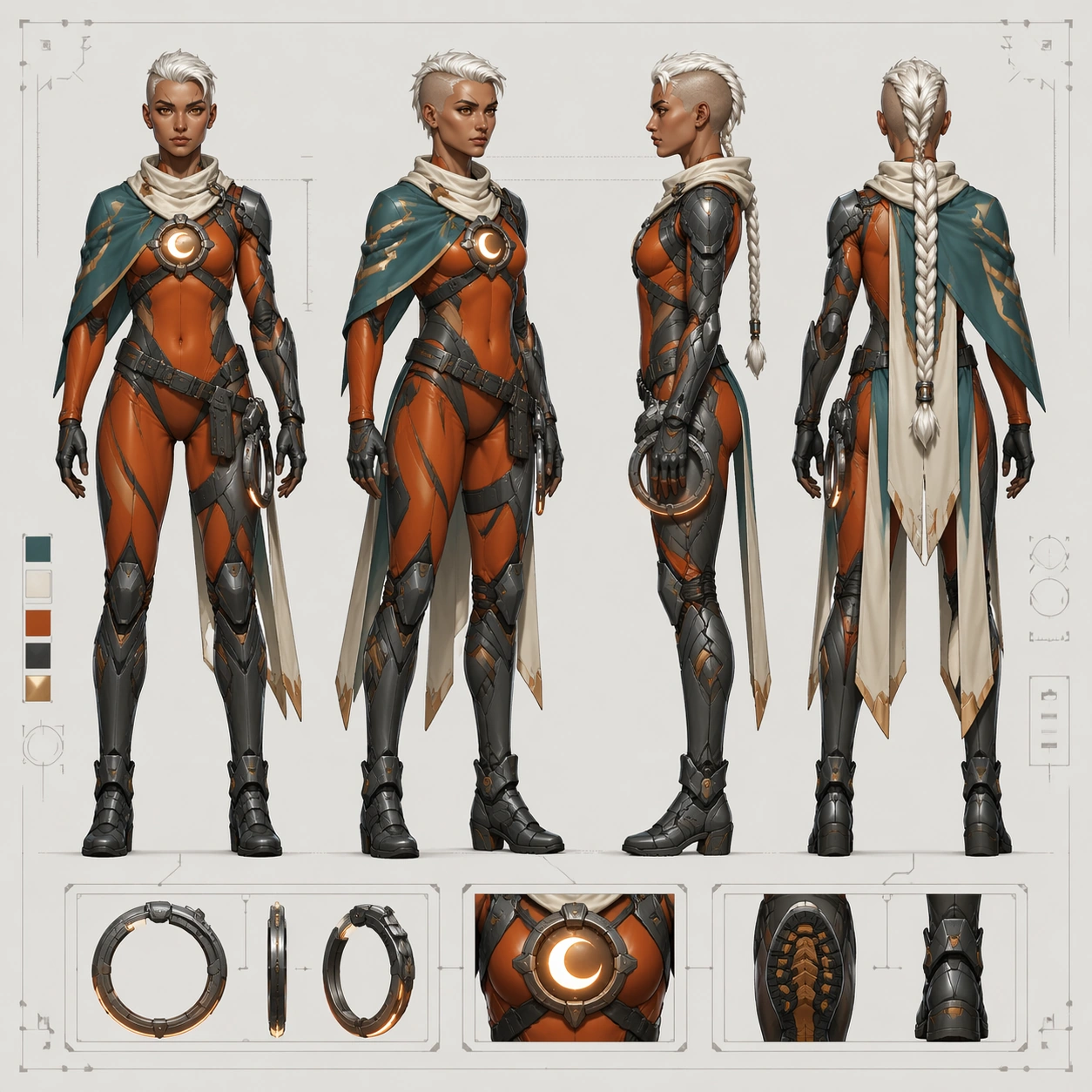
Scene: Create a square concept-art turnaround sheet presented like a polished internal production document. The sheet sits perfectly front-facing on a pale neutral background with soft overhead lighting, precise margins, faint alignment guides, and enough breathing room for four body views plus a few accessory insets. The image must feel technical and studio-ready rather than cinematic, with a measured rhythm of negative space and controlled contrast. Keep the brightness even across the sheet so costume seams, silhouette breaks, and material transitions remain readable at a glance. Subject: Render the same heroine established in the launch package: an original playable heroine with warm umber skin, an angular heart-shaped face, high cheekbones, a slim slash scar through the left eyebrow, alert amber-brown eyes, and short ivory-white hair cut into an undercut with one long braided tail, athletic dancer-sprinter build with long legs, narrow waist, and confident upright posture, and the exact costume system of asymmetrical teal shoulder mantle, ember-orange bodysuit, graphite segmented armor, ivory scarf tabs, crescent chest reactor, slim ring-blade sidearm, and split cape panels. Show her in four aligned full-body views on one sheet: front, three-quarter, ninety-degree side, and back. Each view must preserve the same head size, body proportions, facial structure, braid origin, eyebrow scar placement, chest reactor position, shoulder mantle asymmetry, holster placement, cape split, boot height, and armor segmentation. Include a few small accessory insets for the ring-blade, reactor motif, and boot sole tread, but keep the main figure views dominant. Important details: Treat this as industrial character design. Keep line hierarchy clean, materials believable, and layout structure intentional. Use thin abstract callout boxes and measurement ticks without readable language. The sheet should clearly translate the promo hero into a production-ready deliverable without inventing new costume parts. All four figures must feel like the exact same person viewed from different angles, not like siblings or skin variants. Use case: Hero Reveal Turnaround Pack series study 6/9, establishing the technical turnaround grammar for the same launch heroine. Constraints: No readable text, no watermark, no logos, preserve exact 1:1 aspect ratio, no extra fifth view, no dramatic action pose, no scenery background, no costume redesign, no facial inconsistency between views, no malformed hands.

Example generated from “Hero Reveal Turnaround Pack — Front Side Back Sheet”
GPT Image 2en

Scene: Produce a square orthographic character-sheet image with a bright neutral board, strict spacing, and an even more diagrammatic tone than the reference sheet. The page should emphasize clarity over spectacle, using front, side, and back placements with clean vertical alignment, a faint floor baseline, restrained crop marks, and discreet shape blocks that imply production annotations without readable text. Keep the overall lighting flat enough for technical evaluation while preserving enough material separation to distinguish cloth, armor, and emissive parts. Subject: Use the exact same heroine from the turnaround reference model. Preserve exact face, hair base, body proportions, eyebrow scar, braid length, chest reactor, asymmetrical shoulder mantle, bodysuit seam map, belt and holster logic, cape split, glove shapes, and boot construction. Show front, side, and back views as the dominant content, with one tiny head close-up inset if needed for face clarity. The image should read like a reliable orthographic handoff for modeling or wiki documentation, not like a new concept. Important details: Consistency is the whole point. Do not beautify away the production logic. Keep silhouette breakpoints measurable and aligned, especially shoulder width, knee height, cape length, and reactor placement. Use a restrained palette of teal, ember orange, gunmetal, and ivory exactly as established in the reference model. Small inset blocks may show belt buckle or gauntlet details, but the main layout must remain clean and orthographic. Use case: Hero Reveal Turnaround Pack series study 7/9, translating the same heroine into a stricter front-side-back production sheet. Constraints: No readable text, no watermark, no logos, preserve exact 1:1 aspect ratio, preserve exact face and body proportions from the reference model, no dramatic perspective, no extra prop clutter, no colorway change, no anatomy drift, no floating UI panels.

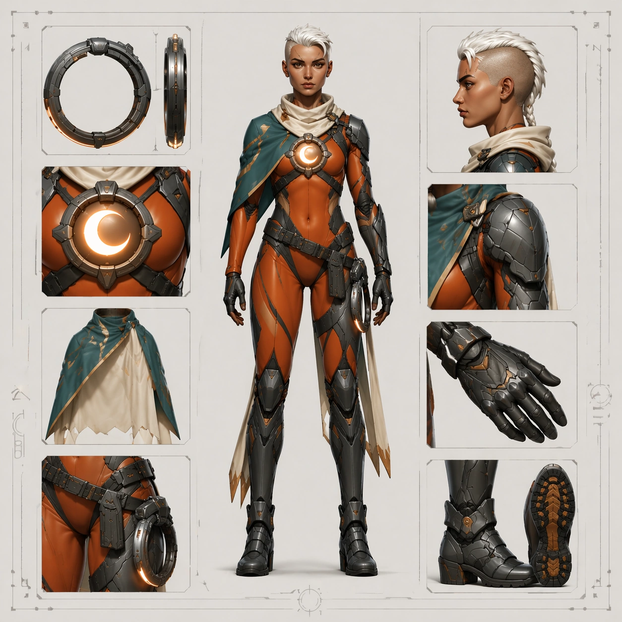
Example generated from “Hero Reveal Turnaround Pack — Equipment Callout Sheet”
GPT Image 2en

Scene: Compose a square equipment-callout board that mixes one full-body hero view with organized detail insets on a pale production background. The layout should feel like a studio approval sheet: one dominant standing figure slightly off center, surrounded by smaller callout windows for the ring-blade, chest reactor motif, mantle interior, belt hardware, glove surface, and boot tread. Use soft overhead light, crisp edge definition, and enough spacing so every inset remains readable without any text. The board must feel orderly, technical, and ready for wiki or team review use. Subject: Feature the exact same heroine from the turnaround reference model with no identity drift. Preserve face, hair base, body proportions, eyebrow scar, and the full costume architecture of asymmetrical teal shoulder mantle, ember-orange bodysuit, graphite segmented armor, ivory scarf tabs, crescent chest reactor, slim ring-blade sidearm, and split cape panels. The standing figure can be front-facing or slight three-quarter, but the callout insets must match the same materials and geometry seen on the body. Each inset should reinforce the costume logic rather than invent alternate details. The ring-blade must keep the same crescent language, and the reactor should echo the same motif seen on the chest. Important details: This sheet should make production logic legible. Separate matte armor, satin fabric, brushed metal, and soft emissive surfaces clearly. Maintain the same palette and edge hierarchy established earlier. Abstract panel frames and alignment marks are welcome, but there should be no readable labels. The goal is to prove that the hero can survive transition from splash-art charisma into practical asset breakdown without losing recognizability. Use case: Hero Reveal Turnaround Pack series study 8/9, testing equipment and material callouts for the same locked-identity heroine. Constraints: No readable text, no watermark, no logos, preserve exact 1:1 aspect ratio, preserve exact face and costume logic from the reference model, no extra costume variants, no exploded parts floating chaotically, no heavy shadows hiding details, no unrelated props.

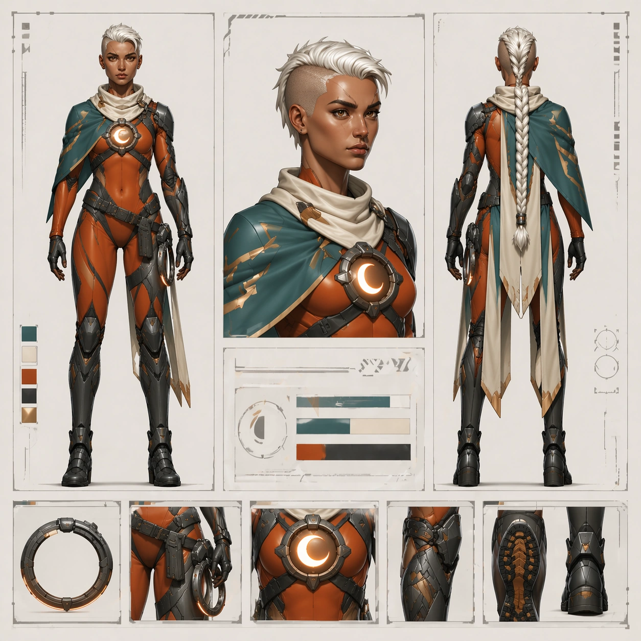
Example generated from “Hero Reveal Turnaround Pack — Wiki Approval Layout”
GPT Image 2en

Scene: Design a square approval-board layout that feels halfway between a production sheet and a polished wiki deliverable. Use a clean off-white page, modular panel divisions, one prominent full-body figure, one bust crop, one back view, and a row of small costume-detail tiles arranged with precise spacing. Lighting should remain neutral and clear, but the page can feel slightly more polished than a raw turnaround sheet, suitable for publishing to a character encyclopedia or internal presentation deck. Keep the composition balanced, with confident white space and strong grid discipline. Subject: Adapt the exact same heroine from the turnaround reference model into this modular approval layout. Preserve exact face, hair base, body proportions, eyebrow scar, chest reactor, shoulder mantle asymmetry, suit seam logic, holster placement, cape split, glove shapes, and boot structure. Every panel must read as the same person and the same costume family, even though the crop scale varies across full-body, bust, and detail tiles. The bust crop should echo the launch assets while the full-body and back view keep the production clarity. Important details: The success condition is coherence across publication and production surfaces. Keep panel spacing orderly, geometry simple, and material rendering believable. Use abstract non-readable bars, ticks, and diagram blocks instead of language. The page should feel ready for a game wiki, approval deck, or internal style guide. Do not let the polished layout introduce new styling drift or decorative clutter. Use case: Hero Reveal Turnaround Pack series study 9/9, merging launch polish and production clarity in one wiki-ready approval layout. Constraints: No readable text, no watermark, no logos, preserve exact 1:1 aspect ratio, preserve exact face and body proportions from the reference model, no off-model bust crop, no random new accessories, no noisy background pattern, no perspective distortion in the sheet.

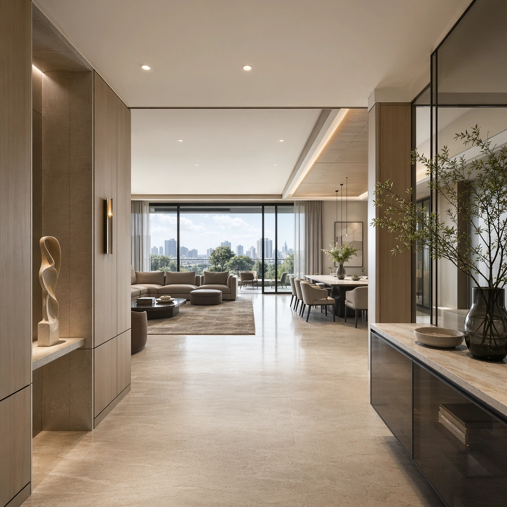
Example generated from “High End Residential Showflat System — Living Dining Anchor”
GPT Image 2en

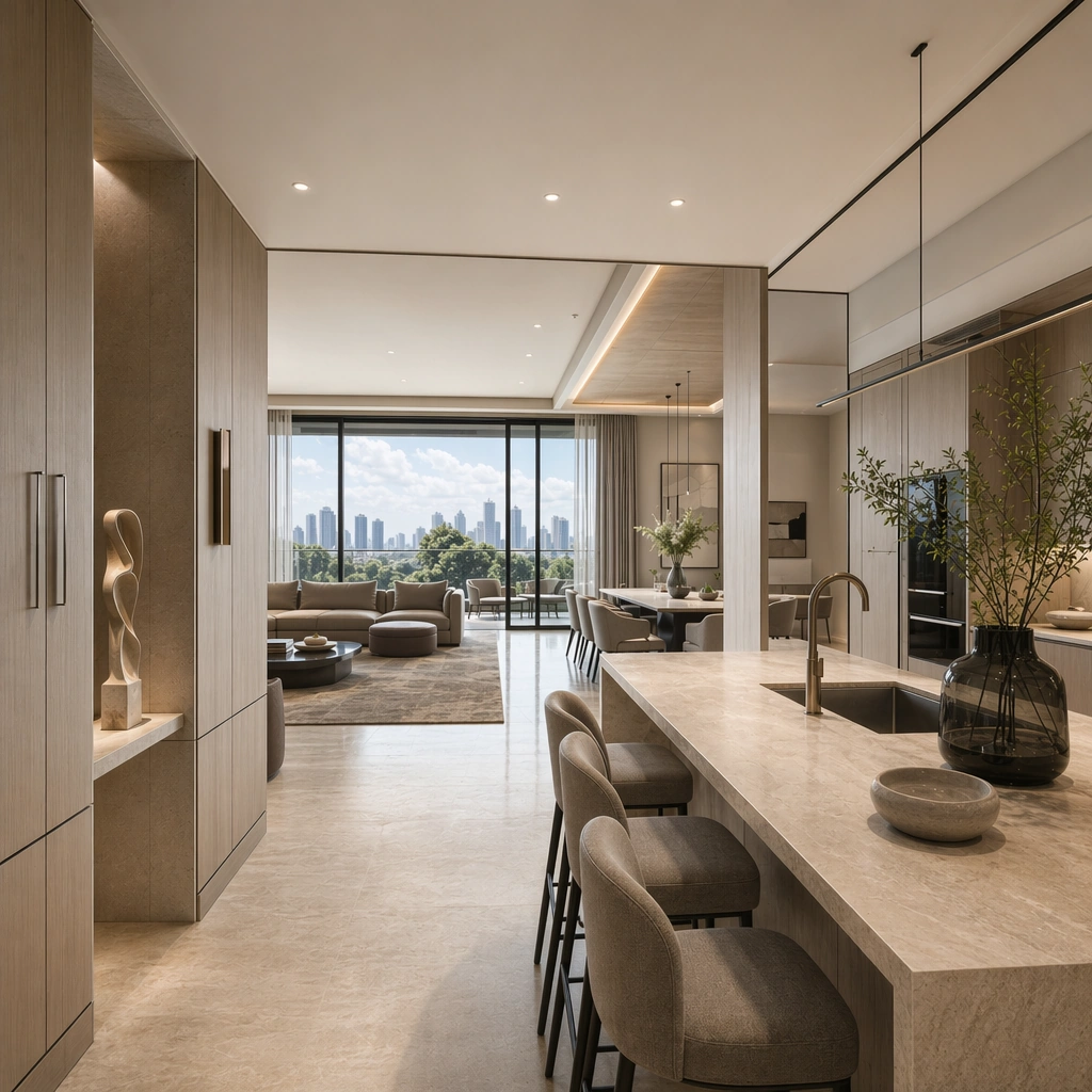
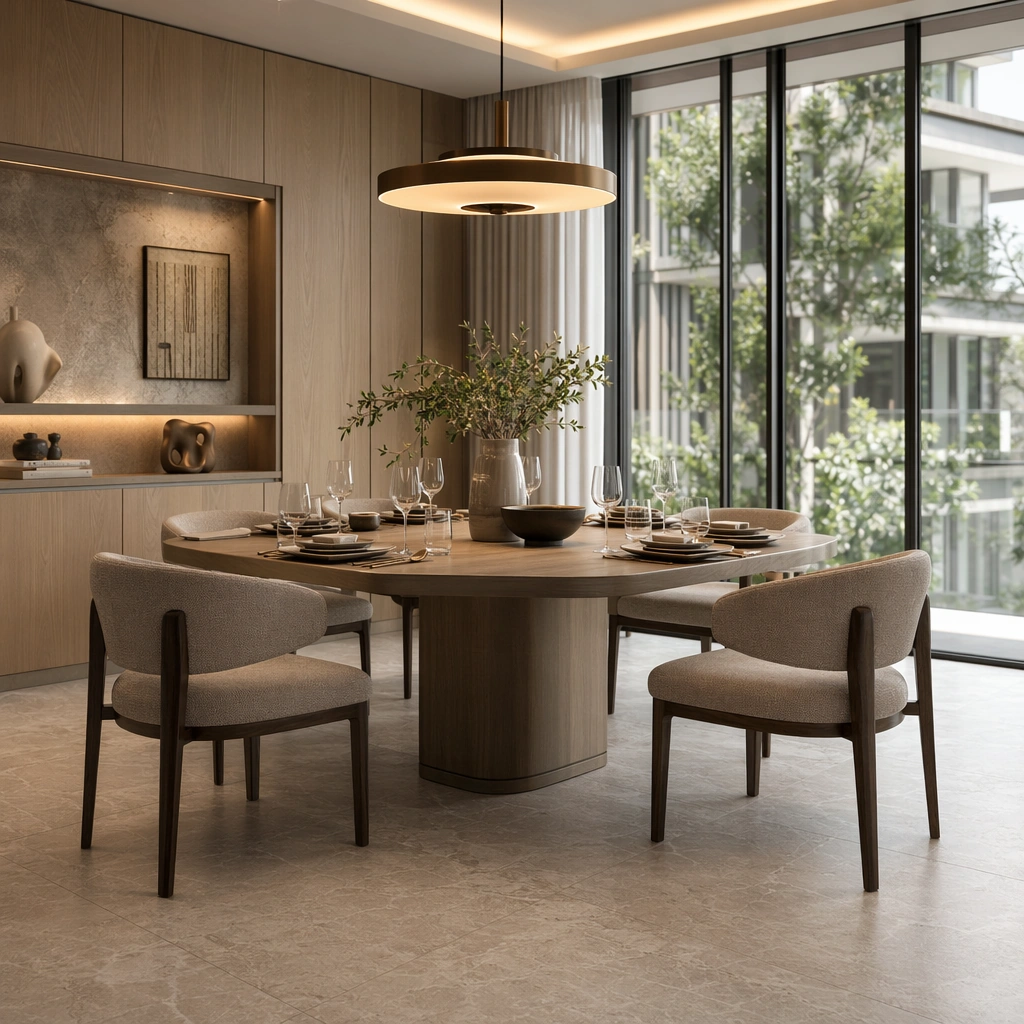
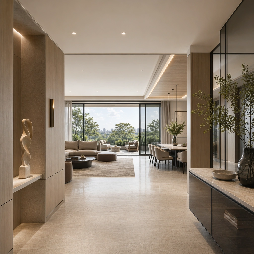
Scene: Create a square architectural reference still for High-End Residential Showflat System. Use a wide hero view from the foyer into the living and dining zone and treat the frame like a premium interior or architecture editorial photograph with disciplined perspective, readable depth from foreground to background, and enough negative space for the spatial hierarchy to breathe. Light the scene so residential aspiration, furniture harmony, and sales-gallery polish feel immediate, using pale oak, soft taupe, creamy travertine, smoke gray glass, and gentle daylight silver as the governing tonal range. The composition must read as a high-end commercial image that could sit inside property launches, brochure stills, sales-gallery walls, and premium listing presentations. Subject: Show a high-end residential showflat with full-height glazing, pale oak wall panels, creamy stone flooring, sculptural furniture, restrained art objects, and polished property-marketing clarity. Center the full showflat composition with glazing, sofa grouping, dining table, and soft daylight flow. This is the canonical reference image for the package, so the major proportions, material transitions, fixture families, and circulation logic must feel highly specific and internally coherent rather than generic luxury styling. Let the viewer understand how the space is organized within a single glance, with foreground anchors, a clear middle zone, and a resolved background termination. Important details: Lock the glazing rhythm, oak panel detailing, stone floor tone, furniture silhouettes, softly styled decor, and real-estate presentation polish. Surfaces should feel tactile and believable: stone veining must stay plausible, metals should have disciplined reflectance, fabrics should show natural weight, and concealed lighting should shape the volume instead of flattening it. Use abstract signage, menu, label, or caption zones only as unreadable graphic hints. The image should feel practical for downstream design reviews and polished enough for public-facing campaign use. Use case: High-End Residential Showflat System series study 1/9, establishing the canonical living-dining identity for the package. Constraints: No readable text, no watermark, no logos, preserve exact 1:1 aspect ratio, no family photos, no clutter, no toy-like decor, no messy cables, no cheap staging tricks, no giant TV glare.

Example generated from “High End Residential Showflat System — Kitchen Island View”
GPT Image 2en

Scene: Create a square reference-dependent architecture still for High-End Residential Showflat System. Use a camera angle pivoted toward the stone island and tall storage wall while keeping the same lens discipline, editorial polish, and material believability established by the reference image. The lighting can shift to support the intended mood, but the space must still feel like the same authored project with a stable viewpoint logic, convincing depth separation, and clean commercial-photography finish. Keep pale oak, soft taupe, creamy travertine, smoke gray glass, and gentle daylight silver as the governing tonal range even when the emphasis changes. Subject: Show a high-end residential showflat with full-height glazing, pale oak wall panels, creamy stone flooring, sculptural furniture, restrained art objects, and polished property-marketing clarity. Focus on the exact same showflat from the reference image, now emphasizing the kitchen material language and apartment planning logic. Preserve exact architectural identity, plan logic, material palette, fixture family, and circulation cues from the reference image while changing only the intended emphasis described here. The viewer should immediately recognize the same project, not a loose cousin, with matching silhouette logic, aligned detailing, and consistent brand atmosphere. Important details: Preserve the glazing rhythm, oak panel detailing, stone floor tone, furniture silhouettes, softly styled decor, and real-estate presentation polish. Any abstract wayfinding, menu, wall-label, or packaging zones must stay unreadable and subordinate to the spatial image. Joinery, edges, reflections, and lighting should remain realistic enough for an operator or design team to treat the image as a credible reference. The variation should feel deliberate and commercially useful, proving that one locked spatial language can flex across multiple campaign or editorial surfaces. Use case: High-End Residential Showflat System series study 2/9, extending kitchen polish while preserving the same home identity. Constraints: No readable text, no watermark, no logos, preserve exact 1:1 aspect ratio, preserve exact architectural identity from the reference image, no family photos, no clutter, no toy-like decor, no messy cables, no cheap staging tricks, no visible appliances clutter.

Example generated from “High End Residential Showflat System — Primary Bedroom Suite”
GPT Image 2en

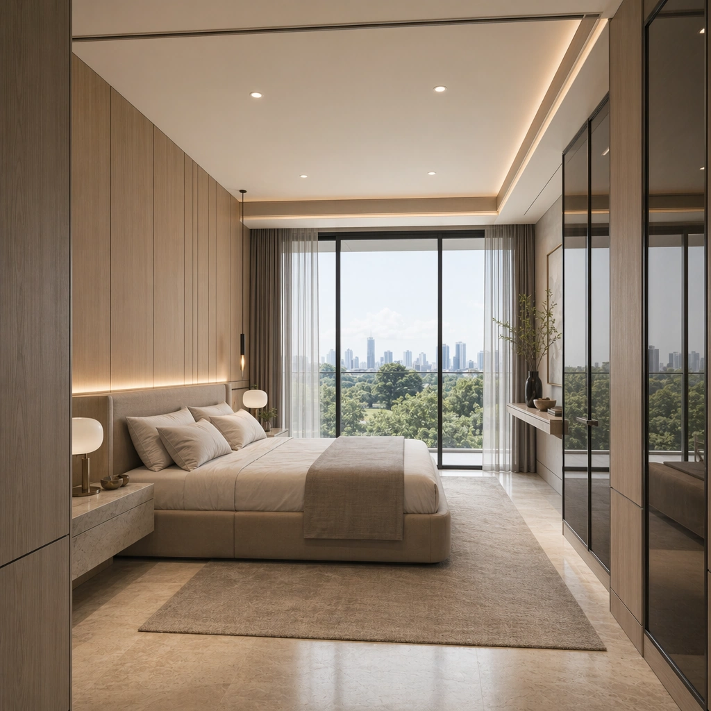
Scene: Create a square reference-dependent architecture still for High-End Residential Showflat System. Use a calm angle from the bedroom threshold toward the bed wall and glazing while keeping the same lens discipline, editorial polish, and material believability established by the reference image. The lighting can shift to support the intended mood, but the space must still feel like the same authored project with a stable viewpoint logic, convincing depth separation, and clean commercial-photography finish. Keep pale oak, soft taupe, creamy travertine, smoke gray glass, and gentle daylight silver as the governing tonal range even when the emphasis changes. Subject: Show a high-end residential showflat with full-height glazing, pale oak wall panels, creamy stone flooring, sculptural furniture, restrained art objects, and polished property-marketing clarity. Focus on the exact same showflat from the reference image, now emphasizing the bedroom palette, soft textiles, and continuity with the main living areas. Preserve exact architectural identity, plan logic, material palette, fixture family, and circulation cues from the reference image while changing only the intended emphasis described here. The viewer should immediately recognize the same project, not a loose cousin, with matching silhouette logic, aligned detailing, and consistent brand atmosphere. Important details: Preserve the glazing rhythm, oak panel detailing, stone floor tone, furniture silhouettes, softly styled decor, and real-estate presentation polish. Any abstract wayfinding, menu, wall-label, or packaging zones must stay unreadable and subordinate to the spatial image. Joinery, edges, reflections, and lighting should remain realistic enough for an operator or design team to treat the image as a credible reference. The variation should feel deliberate and commercially useful, proving that one locked spatial language can flex across multiple campaign or editorial surfaces. Use case: High-End Residential Showflat System series study 3/9, extending the private suite while keeping the same development language. Constraints: No readable text, no watermark, no logos, preserve exact 1:1 aspect ratio, preserve exact architectural identity from the reference image, no family photos, no clutter, no toy-like decor, no messy cables, no cheap staging tricks, no personal photos.

Example generated from “High End Residential Showflat System — Terrace Lounge Extension”
GPT Image 2en

Scene: Create a square reference-dependent architecture still for High-End Residential Showflat System. Use a square composition that links the interior lounge to the outdoor terrace seating while keeping the same lens discipline, editorial polish, and material believability established by the reference image. The lighting can shift to support the intended mood, but the space must still feel like the same authored project with a stable viewpoint logic, convincing depth separation, and clean commercial-photography finish. Keep pale oak, soft taupe, creamy travertine, smoke gray glass, and gentle daylight silver as the governing tonal range even when the emphasis changes. Subject: Show a high-end residential showflat with full-height glazing, pale oak wall panels, creamy stone flooring, sculptural furniture, restrained art objects, and polished property-marketing clarity. Focus on the exact same showflat from the reference image, now emphasizing indoor-outdoor marketing appeal and facade framing. Preserve exact architectural identity, plan logic, material palette, fixture family, and circulation cues from the reference image while changing only the intended emphasis described here. The viewer should immediately recognize the same project, not a loose cousin, with matching silhouette logic, aligned detailing, and consistent brand atmosphere. Important details: Preserve the glazing rhythm, oak panel detailing, stone floor tone, furniture silhouettes, softly styled decor, and real-estate presentation polish. Any abstract wayfinding, menu, wall-label, or packaging zones must stay unreadable and subordinate to the spatial image. Joinery, edges, reflections, and lighting should remain realistic enough for an operator or design team to treat the image as a credible reference. The variation should feel deliberate and commercially useful, proving that one locked spatial language can flex across multiple campaign or editorial surfaces. Use case: High-End Residential Showflat System series study 4/9, extending lifestyle extension of the same residential system. Constraints: No readable text, no watermark, no logos, preserve exact 1:1 aspect ratio, preserve exact architectural identity from the reference image, no family photos, no clutter, no toy-like decor, no messy cables, no cheap staging tricks, no skyline overload.

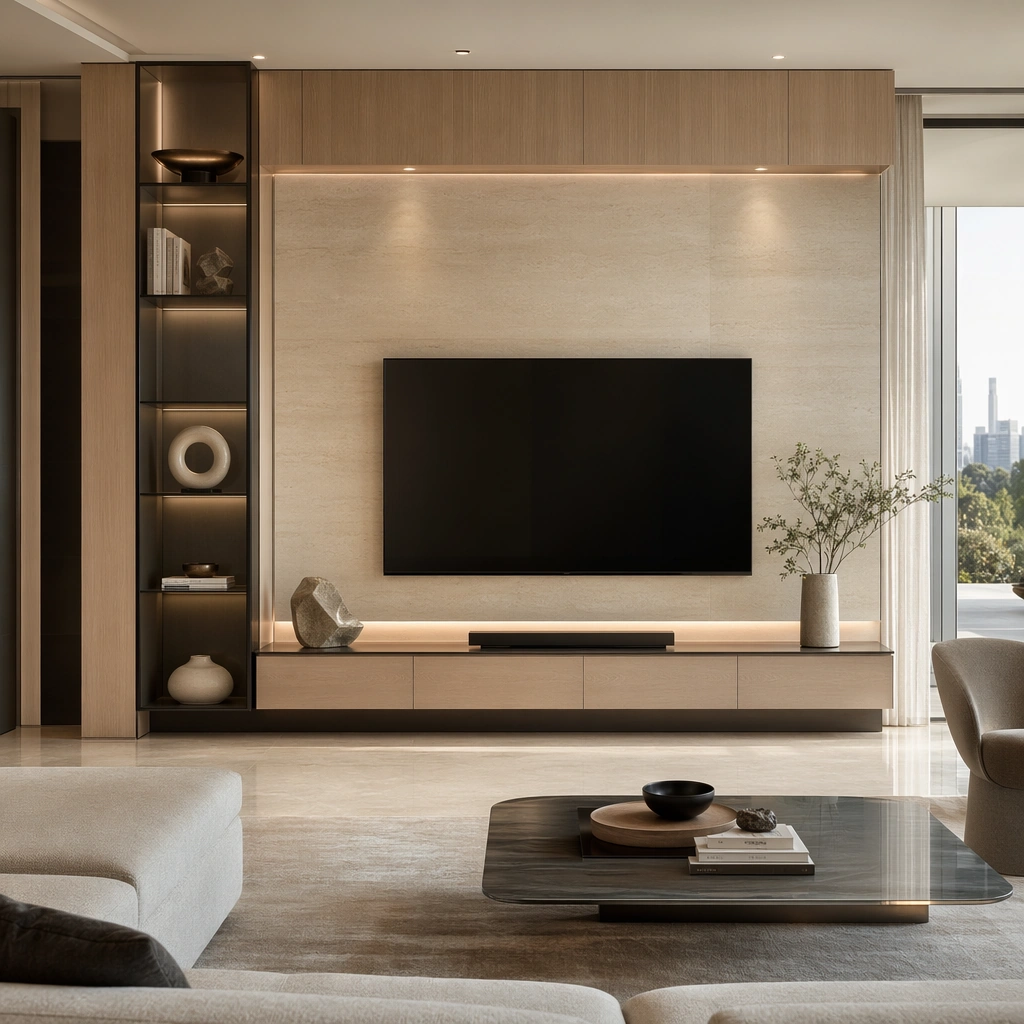
Example generated from “High End Residential Showflat System — Media Wall Composition”
GPT Image 2en

Scene: Create a square standalone support study for High-End Residential Showflat System. Use a composed media wall still with low cabinet, stone backdrop, and sculptural decor and frame it like a premium commercial still or design-editorial crop with clear focal hierarchy, disciplined perspective, and enough breathing room for the materials and objects to read at both thumbnail and full size. Keep pale oak, soft taupe, creamy travertine, smoke gray glass, and gentle daylight silver as the tonal guide so the image still belongs to the same theme family, and light the scene in a controlled way that emphasizes texture, edge quality, and authored atmosphere over spectacle. Subject: Show a high-end residential showflat with full-height glazing, pale oak wall panels, creamy stone flooring, sculptural furniture, restrained art objects, and polished property-marketing clarity. In this support study, focus on cabinet detailing, shadow gaps, and refined residential tech integration. The image should work independently, yet it must still feel like it belongs to the same broader world of Showflat System. Make the space, props, and detailing useful for real campaign, editorial, or design-review contexts rather than moodboard abstraction. Important details: Carry forward the broader language of the glazing rhythm, oak panel detailing, stone floor tone, furniture silhouettes, softly styled decor, and real-estate presentation polish, but let this image prove a new support surface or secondary deliverable. Material realism is essential: wood grain, metal sheen, glass edges, textiles, and stone should feel physically plausible and carefully art directed. Any graphic panels, labels, menus, packaging, or captions must stay abstract and unreadable. The overall result should feel reusable for property launches, brochure stills, sales-gallery walls, and premium listing presentations, with enough structure that a creative or operations team could build on it. Use case: High-End Residential Showflat System single study 6/9, exploring support imagery for living-room specification boards. Constraints: No readable text, no watermark, no logos, preserve exact 1:1 aspect ratio, no family photos, no clutter, no toy-like decor, no messy cables, no cheap staging tricks, no readable screen content.

Example generated from “High End Residential Showflat System — Dining Table Styling”
GPT Image 2en

Scene: Create a square standalone support study for High-End Residential Showflat System. Use a square dining-table still with tableware, pendant glow, and nearby glazing and frame it like a premium commercial still or design-editorial crop with clear focal hierarchy, disciplined perspective, and enough breathing room for the materials and objects to read at both thumbnail and full size. Keep pale oak, soft taupe, creamy travertine, smoke gray glass, and gentle daylight silver as the tonal guide so the image still belongs to the same theme family, and light the scene in a controlled way that emphasizes texture, edge quality, and authored atmosphere over spectacle. Subject: Show a high-end residential showflat with full-height glazing, pale oak wall panels, creamy stone flooring, sculptural furniture, restrained art objects, and polished property-marketing clarity. In this support study, focus on table proportions, chair silhouettes, and premium entertaining mood. The image should work independently, yet it must still feel like it belongs to the same broader world of Showflat System. Make the space, props, and detailing useful for real campaign, editorial, or design-review contexts rather than moodboard abstraction. Important details: Carry forward the broader language of the glazing rhythm, oak panel detailing, stone floor tone, furniture silhouettes, softly styled decor, and real-estate presentation polish, but let this image prove a new support surface or secondary deliverable. Material realism is essential: wood grain, metal sheen, glass edges, textiles, and stone should feel physically plausible and carefully art directed. Any graphic panels, labels, menus, packaging, or captions must stay abstract and unreadable. The overall result should feel reusable for property launches, brochure stills, sales-gallery walls, and premium listing presentations, with enough structure that a creative or operations team could build on it. Use case: High-End Residential Showflat System single study 7/9, exploring brochure support image for dining experience. Constraints: No readable text, no watermark, no logos, preserve exact 1:1 aspect ratio, no family photos, no clutter, no toy-like decor, no messy cables, no cheap staging tricks, no food brand packaging.

Example generated from “High End Residential Showflat System — Bathroom Mirror Suite”
GPT Image 2en

Scene: Create a square standalone support study for High-End Residential Showflat System. Use a bathroom vanity composition with large mirror, stone basin, and ambient side light and frame it like a premium commercial still or design-editorial crop with clear focal hierarchy, disciplined perspective, and enough breathing room for the materials and objects to read at both thumbnail and full size. Keep pale oak, soft taupe, creamy travertine, smoke gray glass, and gentle daylight silver as the tonal guide so the image still belongs to the same theme family, and light the scene in a controlled way that emphasizes texture, edge quality, and authored atmosphere over spectacle. Subject: Show a high-end residential showflat with full-height glazing, pale oak wall panels, creamy stone flooring, sculptural furniture, restrained art objects, and polished property-marketing clarity. In this support study, focus on mirror edge detail, stone veining, hardware finish, and hotel-grade cleanliness. The image should work independently, yet it must still feel like it belongs to the same broader world of Showflat System. Make the space, props, and detailing useful for real campaign, editorial, or design-review contexts rather than moodboard abstraction. Important details: Carry forward the broader language of the glazing rhythm, oak panel detailing, stone floor tone, furniture silhouettes, softly styled decor, and real-estate presentation polish, but let this image prove a new support surface or secondary deliverable. Material realism is essential: wood grain, metal sheen, glass edges, textiles, and stone should feel physically plausible and carefully art directed. Any graphic panels, labels, menus, packaging, or captions must stay abstract and unreadable. The overall result should feel reusable for property launches, brochure stills, sales-gallery walls, and premium listing presentations, with enough structure that a creative or operations team could build on it. Use case: High-End Residential Showflat System single study 8/9, exploring bathroom support still for sales materials. Constraints: No readable text, no watermark, no logos, preserve exact 1:1 aspect ratio, no family photos, no clutter, no toy-like decor, no messy cables, no cheap staging tricks, no readable product labels.

Example generated from “High End Residential Showflat System — Scale Model Corner”
GPT Image 2en

Scene: Create a square standalone support study for High-End Residential Showflat System. Use a sales-gallery corner where a material board and abstract architectural massing model sit near lounge seating and frame it like a premium commercial still or design-editorial crop with clear focal hierarchy, disciplined perspective, and enough breathing room for the materials and objects to read at both thumbnail and full size. Keep pale oak, soft taupe, creamy travertine, smoke gray glass, and gentle daylight silver as the tonal guide so the image still belongs to the same theme family, and light the scene in a controlled way that emphasizes texture, edge quality, and authored atmosphere over spectacle. Subject: Show a high-end residential showflat with full-height glazing, pale oak wall panels, creamy stone flooring, sculptural furniture, restrained art objects, and polished property-marketing clarity. In this support study, focus on developer presentation atmosphere, model craftsmanship, and interior-brand continuity. The image should work independently, yet it must still feel like it belongs to the same broader world of Showflat System. Make the space, props, and detailing useful for real campaign, editorial, or design-review contexts rather than moodboard abstraction. Important details: Carry forward the broader language of the glazing rhythm, oak panel detailing, stone floor tone, furniture silhouettes, softly styled decor, and real-estate presentation polish, but let this image prove a new support surface or secondary deliverable. Material realism is essential: wood grain, metal sheen, glass edges, textiles, and stone should feel physically plausible and carefully art directed. Any graphic panels, labels, menus, packaging, or captions must stay abstract and unreadable. The overall result should feel reusable for property launches, brochure stills, sales-gallery walls, and premium listing presentations, with enough structure that a creative or operations team could build on it. Use case: High-End Residential Showflat System single study 9/9, exploring cross-over support surface between sales gallery and showflat language. Constraints: No readable text, no watermark, no logos, preserve exact 1:1 aspect ratio, no family photos, no clutter, no toy-like decor, no messy cables, no cheap staging tricks, no readable floorplan text.

Example generated from “High Fashion Lookbook Grid — Reference Look Anchor”
GPT Image 2en

Scene: Create a square 1:1 portrait image for High Fashion Lookbook Grid. Use a clean lookbook studio with seamless backdrop, even fashion light, and enough room to read full proportions. The frame should feel like a finished professional deliverable rather than a casual snapshot, with clear lens discipline, believable light falloff, and a palette that directly supports Build editorial lookbook grids that keep the same model identity stable across multiple outfits, poses, and page compositions.. Keep enough surrounding space and compositional control for gallery, research, campaign, or approval-board reuse while staying photoreal and human-scaled. Subject: Center one high-fashion model with deep espresso skin, sharp editorial bone structure, long neck, stable lean proportions, and an unwavering runway stare. Establish the exact face, body read, and one anchor look that all later styling changes must preserve across the same model. Use the example direction from the brief as grounding context: Build editorial lookbook grids that keep the same model identity stable across multiple outfits, poses, and page compositions.. Wardrobe, lighting, environment, and pose may shift to serve this variation, but the viewer must immediately understand that the same reference identity is still in front of the camera. Important details: This backlog line is difficult because Build editorial lookbook grids that keep the same model identity stable across multiple outfits, poses, and page compositions.. Preserve skin tone family, bone structure, eye spacing, nose shape, mouth shape, hairline logic, shoulder width, and overall body read across the entire series. preserve exact face / hair base / body proportions from the reference model. This image defines the model identity before wardrobe fanout begins. Avoid the common failure described in the brief: ordinary image models often lose likeness once styling, lighting, or layout changes enter the frame. Success should feel like the result should feel professionally usable, coherent, and clearly built around one stable human identity. Use case: High Fashion Lookbook Grid series study 1/9, the baseline fashion look. Constraints: No readable text, no watermark, no logos, preserve exact 1:1 aspect ratio, preserve exact face / hair base / body proportions from the reference model, no body reshaping, no runway crowd, no logos, no distorted hands.

Example generated from “High Fashion Lookbook Grid — Tailored Look One”
GPT Image 2en

Scene: Create a square 1:1 portrait image for High Fashion Lookbook Grid. Use a premium lookbook frame with crisp textiles, measured contrast, and full-length readability. The frame should feel like a finished professional deliverable rather than a casual snapshot, with clear lens discipline, believable light falloff, and a palette that directly supports Build editorial lookbook grids that keep the same model identity stable across multiple outfits, poses, and page compositions.. Keep enough surrounding space and compositional control for gallery, research, campaign, or approval-board reuse while staying photoreal and human-scaled. Subject: Center one high-fashion model with deep espresso skin, sharp editorial bone structure, long neck, stable lean proportions, and an unwavering runway stare. Change the outfit decisively while preserving exact face, hair base, and body proportions from the reference model. Use the example direction from the brief as grounding context: Build editorial lookbook grids that keep the same model identity stable across multiple outfits, poses, and page compositions.. Wardrobe, lighting, environment, and pose may shift to serve this variation, but the viewer must immediately understand that the same reference identity is still in front of the camera. Important details: This backlog line is difficult because Build editorial lookbook grids that keep the same model identity stable across multiple outfits, poses, and page compositions.. Preserve skin tone family, bone structure, eye spacing, nose shape, mouth shape, hairline logic, shoulder width, and overall body read across the entire series. preserve exact face / hair base / body proportions from the reference model. The garment can change a lot; the person cannot. Avoid the common failure described in the brief: ordinary image models often lose likeness once styling, lighting, or layout changes enter the frame. Success should feel like the result should feel professionally usable, coherent, and clearly built around one stable human identity. Use case: High Fashion Lookbook Grid series study 2/9, a sharply tailored fashion look. Constraints: No readable text, no watermark, no logos, preserve exact 1:1 aspect ratio, preserve exact face / hair base / body proportions from the reference model, no altered height, no new face, no giant accessories, no broken seams.

Example generated from “High Fashion Lookbook Grid — Sculptural Look Two”
GPT Image 2en

Scene: Create a square 1:1 portrait image for High Fashion Lookbook Grid. Use a studio fashion composition that emphasizes silhouette, fabric volume, and strong negative space. The frame should feel like a finished professional deliverable rather than a casual snapshot, with clear lens discipline, believable light falloff, and a palette that directly supports Build editorial lookbook grids that keep the same model identity stable across multiple outfits, poses, and page compositions.. Keep enough surrounding space and compositional control for gallery, research, campaign, or approval-board reuse while staying photoreal and human-scaled. Subject: Center one high-fashion model with deep espresso skin, sharp editorial bone structure, long neck, stable lean proportions, and an unwavering runway stare. Keep the same model and same recognizability while leaning into a more dramatic garment architecture. Use the example direction from the brief as grounding context: Build editorial lookbook grids that keep the same model identity stable across multiple outfits, poses, and page compositions.. Wardrobe, lighting, environment, and pose may shift to serve this variation, but the viewer must immediately understand that the same reference identity is still in front of the camera. Important details: This backlog line is difficult because Build editorial lookbook grids that keep the same model identity stable across multiple outfits, poses, and page compositions.. Preserve skin tone family, bone structure, eye spacing, nose shape, mouth shape, hairline logic, shoulder width, and overall body read across the entire series. preserve exact face / hair base / body proportions from the reference model. The silhouette should challenge styling, not identity consistency. Avoid the common failure described in the brief: ordinary image models often lose likeness once styling, lighting, or layout changes enter the frame. Success should feel like the result should feel professionally usable, coherent, and clearly built around one stable human identity. Use case: High Fashion Lookbook Grid series study 3/9, a sculptural editorial look. Constraints: No readable text, no watermark, no logos, preserve exact 1:1 aspect ratio, preserve exact face / hair base / body proportions from the reference model, no costume drift into fantasy, no warped limbs, no hidden face, no prop overload.

Example generated from “High Fashion Lookbook Grid — Monochrome Look Three”
GPT Image 2en

Scene: Create a square 1:1 portrait image for High Fashion Lookbook Grid. Use a quiet fashion set with disciplined tonal range and restrained editorial polish. The frame should feel like a finished professional deliverable rather than a casual snapshot, with clear lens discipline, believable light falloff, and a palette that directly supports Build editorial lookbook grids that keep the same model identity stable across multiple outfits, poses, and page compositions.. Keep enough surrounding space and compositional control for gallery, research, campaign, or approval-board reuse while staying photoreal and human-scaled. Subject: Center one high-fashion model with deep espresso skin, sharp editorial bone structure, long neck, stable lean proportions, and an unwavering runway stare. Present the same model in a monochrome outfit family that changes styling direction but not the person. Use the example direction from the brief as grounding context: Build editorial lookbook grids that keep the same model identity stable across multiple outfits, poses, and page compositions.. Wardrobe, lighting, environment, and pose may shift to serve this variation, but the viewer must immediately understand that the same reference identity is still in front of the camera. Important details: This backlog line is difficult because Build editorial lookbook grids that keep the same model identity stable across multiple outfits, poses, and page compositions.. Preserve skin tone family, bone structure, eye spacing, nose shape, mouth shape, hairline logic, shoulder width, and overall body read across the entire series. preserve exact face / hair base / body proportions from the reference model. Hair base, posture family, and body proportions must remain exact. Avoid the common failure described in the brief: ordinary image models often lose likeness once styling, lighting, or layout changes enter the frame. Success should feel like the result should feel professionally usable, coherent, and clearly built around one stable human identity. Use case: High Fashion Lookbook Grid series study 4/9, a monochrome styling direction. Constraints: No readable text, no watermark, no logos, preserve exact 1:1 aspect ratio, preserve exact face / hair base / body proportions from the reference model, no washed-out textiles, no changed haircut, no different body mass, no retail catalog clutter.

Example generated from “High Fashion Lookbook Grid — Metallic Look Four”
GPT Image 2en

Scene: Create a square 1:1 portrait image for High Fashion Lookbook Grid. Use a fashion light plan that reveals reflective fabric without blowing detail. The frame should feel like a finished professional deliverable rather than a casual snapshot, with clear lens discipline, believable light falloff, and a palette that directly supports Build editorial lookbook grids that keep the same model identity stable across multiple outfits, poses, and page compositions.. Keep enough surrounding space and compositional control for gallery, research, campaign, or approval-board reuse while staying photoreal and human-scaled. Subject: Center one high-fashion model with deep espresso skin, sharp editorial bone structure, long neck, stable lean proportions, and an unwavering runway stare. Hold the same identity while introducing stronger surface drama through metallic or high-sheen material. Use the example direction from the brief as grounding context: Build editorial lookbook grids that keep the same model identity stable across multiple outfits, poses, and page compositions.. Wardrobe, lighting, environment, and pose may shift to serve this variation, but the viewer must immediately understand that the same reference identity is still in front of the camera. Important details: This backlog line is difficult because Build editorial lookbook grids that keep the same model identity stable across multiple outfits, poses, and page compositions.. Preserve skin tone family, bone structure, eye spacing, nose shape, mouth shape, hairline logic, shoulder width, and overall body read across the entire series. preserve exact face / hair base / body proportions from the reference model. The model should still read instantly despite more aggressive garment finish. Avoid the common failure described in the brief: ordinary image models often lose likeness once styling, lighting, or layout changes enter the frame. Success should feel like the result should feel professionally usable, coherent, and clearly built around one stable human identity. Use case: High Fashion Lookbook Grid series study 5/9, a metallic or sheen-driven look. Constraints: No readable text, no watermark, no logos, preserve exact 1:1 aspect ratio, preserve exact face / hair base / body proportions from the reference model, no chrome costume fantasy, no hard clipping highlights, no makeup drift, no extra models.