PROMPTS · EXPLORATION CRÉATIVE

Galerie de prompts

Explorez des prompts réels et leurs exemples générés. Trouvez l’inspiration pour votre prochaine mission créative et copiez le texte intégral gratuitement.

Exemples
10,974
Modèles
17
Sources
1277
10 974 exemples de prompts · page 43 sur 229
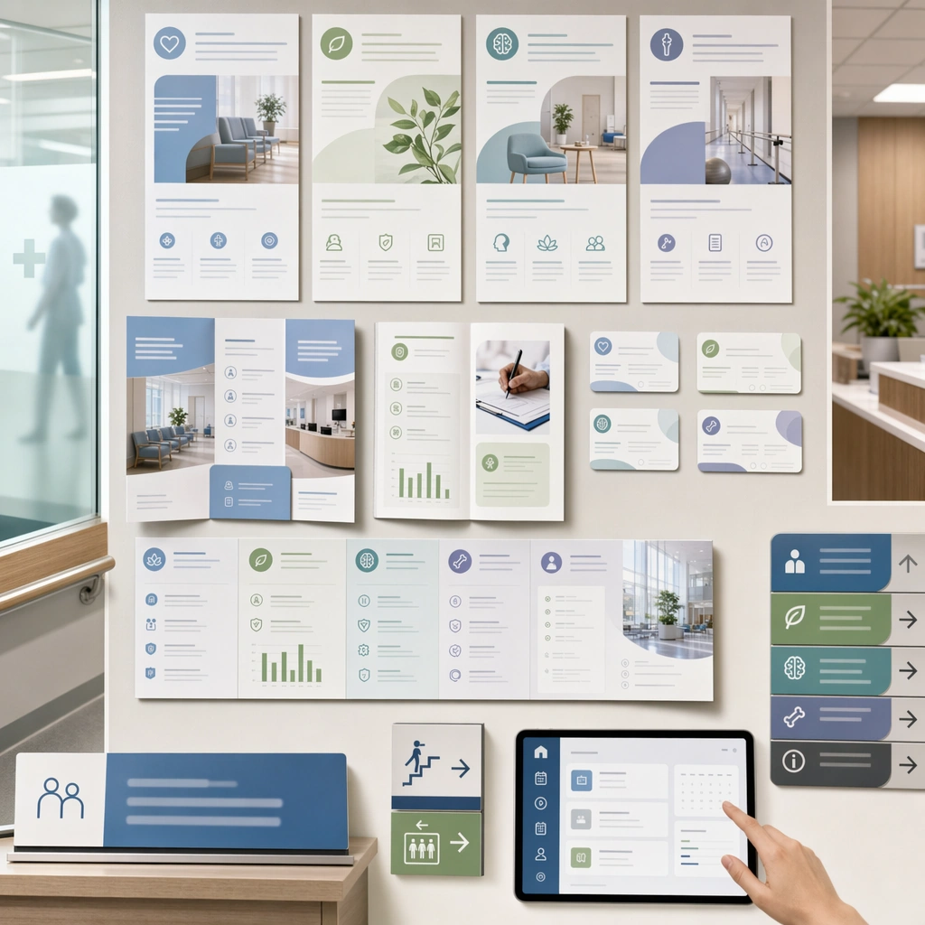
Example generated from “Hospital Department Promo Visuals — Department Campaign Board”
GPT Image 2en

Scene: A square cross-department campaign summary board for Hospital Department Promo Visuals. Compose it as a square presentation grid of posters, pages, signage, and screen crops from one hospital promo system. Use a palette of hospital white, powder blue, eucalyptus green, slate gray, and warm daylight neutrals, bright soft institutional lighting balanced with gentle natural highlights, and a mood of public trust, clarity, and inclusive reassurance. The frame should feel like a real healthcare communication asset art-directed for professional delivery, not a stock photo, speculative concept render, or generic corporate template. Keep the camera distance, negative space, and depth cues disciplined so the image reads immediately even at thumbnail size. Subject: Center on multiple department communication assets unified by one institutional identity, showing flexible imagery and repeated structural rules. Show enough surrounding context that the viewer understands the intended service surface, user situation, and institutional setting. Every object, person, diagram, device crop, or spatial cue should support clarity, trust, and practical use. If people appear, keep them anonymous, natural, privacy-safe, and grounded in believable body language rather than promotional posing. Important details: Maintain department-level promotion expressed through clear service scope, accessible hierarchy, calm human presence, and institutionally grounded visual discipline. The board should clearly prove that the hospital can scale department promotion without losing trust or consistency. Use abstract icon shapes, color blocks, chart bars, interface modules, or non-legible placeholder microcopy whenever information structure is needed, but never readable text. Materials, spacing, lighting, and hierarchy should feel production-ready and healthcare-specific. Avoid generic lifestyle filler, decorative noise, or design gestures that do not reinforce the communication goal. Use case: Department Promo single study 9/9 for a hospital-wide department promo system board. Constraints: No readable text, no watermark, no logos, preserve exact 1:1 aspect ratio, no emergency panic, no sensational disease imagery, no overdesigned advertising theatrics, no cluttered waiting crowds, no inconsistent styles, no random marketing collage.
Example generated from “Hyperreal Diorama Cube — Rainforest Canopy Core”
GPT Image 2en

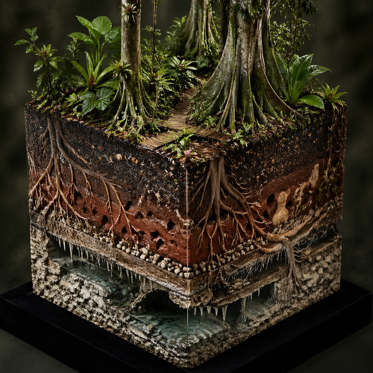
Scene: A square hyperreal product photograph of a rainforest diorama cube on a black velvet display base. Use humid atmospheric light, tiny water droplets, and a clean three-quarter angle that reveals the top canopy and three strong side faces. The background is dark green-gray and softly blurred, making the cube look like a rare scientific collectible. Subject: The top face shows a dense rainforest canopy with giant leaves, bromeliads, small flowering vines, and a winding boardwalk barely visible between trees. The cube sides reveal stacked ecological systems: dark leaf litter, red clay soil, pale fungal threads, thick buttress roots, termite tunnels, a buried stream, mineral seams, and a hidden limestone cave with clear water. Include tiny insects, seed pods, root hairs, and moisture beads where they belong, all at believable scale. Important details: The visual rule is continuous ecology across every visible face. Roots must start from real trunks on the top and continue down into the soil layers. Water should pool in low cavities and glisten along clay seams. The side faces need crisp material transitions rather than random brown bands. The cube should have sharp cut edges, detailed micro-texture, and an understandable vertical hierarchy from canopy to cave. Use case: Hyperreal Diorama Cube single study 2/8, testing a rainforest ecosystem compressed into a collectible cube with coherent roots, soil, tunnels, and groundwater. Constraints: No readable text, no watermark, no logos, preserve exact 1:1 aspect ratio, no floating labels, no fantasy plants, no giant insects, no muddy texture soup, no disconnected root fragments, no flat wallpaper side faces, no cropped top canopy.

Example generated from “Hyperreal Diorama Cube — Arctic Research Core”
GPT Image 2en

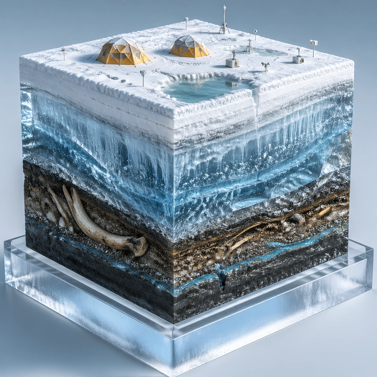
Scene: A square high-resolution studio render of an arctic diorama cube sitting on a frosted acrylic plinth. The lighting is cold, bright, and clean, with pale blue reflections and fine crystalline sparkle. Show the cube from a slightly elevated three-quarter view so the snow-covered top and the transparent ice-rich side faces are equally readable. Subject: The top face contains a tiny polar research camp with two dome tents, snow tracks, wind-carved drifts, a frozen melt pond, and low scientific instruments without visible labels. The cutaway sides reveal compacted snow, blue glacier ice, trapped air bubbles, dark permafrost soil, fossilized plant matter, an old mammoth bone fragment, brine channels, and a narrow subglacial stream. Include delicate frost crystals and sediment bands along the edges. Important details: The structure must show cold-region science rather than generic ice fantasy. Snow, firn, glacier ice, permafrost, organic matter, and buried bone should have distinct textures and plausible vertical ordering. The research camp should sit physically on the top surface, with stakes and tracks pressing into snow. Blue ice should be translucent but not opaque enough to hide the layers. Keep all four cube faces aligned and the cut edges sharp. Use case: Hyperreal Diorama Cube single study 3/8, testing an arctic research scene with transparent ice, permafrost stratigraphy, fossils, and subglacial water. Constraints: No readable text, no watermark, no logos, preserve exact 1:1 aspect ratio, no polar bear mascot, no flags, no labels, no floating instruments, no melted cube edges, no impossible glowing ice, no random bone piles, no cropped side faces.

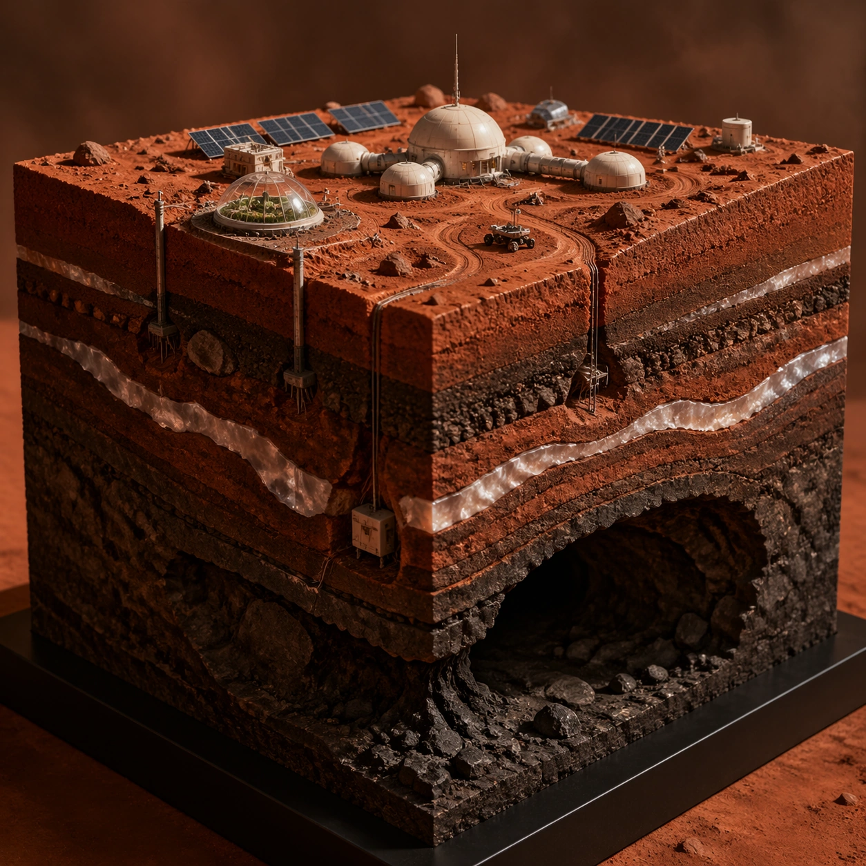
Example generated from “Hyperreal Diorama Cube — Mars Habitat Core”
GPT Image 2en

Scene: A square cinematic studio photograph of a Mars habitat diorama cube under warm directional light. The cube rests on a minimal black base, with a rust-red dust haze and a dark neutral background. Use a sharp three-quarter view that shows the top habitat surface and multiple cutaway sides with clean, physically convincing edges. Subject: The top face shows a tiny modular Mars research outpost: pressurized domes, solar arrays, rover tracks, dust-covered equipment, regolith berms, and a small greenhouse bubble. The vertical cut faces expose layered red regolith, basalt fragments, buried ice lenses, cable trenches, habitat foundation pylons, a sealed lava tube chamber, and older impact breccia. Include fine dust, compacted tire marks, small rocks, and realistic scale cues. Important details: The cube should feel like a future planetary science exhibit. All infrastructure must connect logically: cables should run from the surface into trenches, foundations should enter the regolith, and the greenhouse should sit on a stable pad. Subsurface ice must appear as pale translucent seams, not blue fantasy crystal. The lava tube should be a dark hollow space below the habitat, with rough basalt walls and no magical glow. Use case: Hyperreal Diorama Cube single study 4/8, testing a Mars habitat surface with regolith structure, buried ice, infrastructure, and a lava-tube void. Constraints: No readable text, no watermark, no logos, preserve exact 1:1 aspect ratio, no real space agency marks, no astronauts posing, no flags, no floating labels, no oversized rover, no glowing alien artifacts, no disconnected underground cables, no blurry side strata.

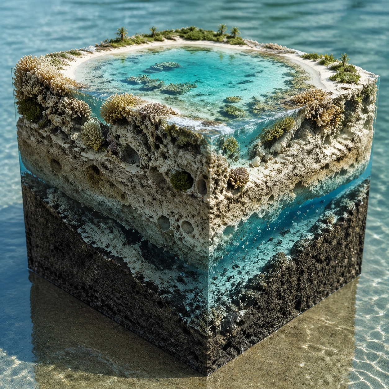
Example generated from “Hyperreal Diorama Cube — Coral Atoll Core”
GPT Image 2en

Scene: A square hyperreal diorama cube photographed like a luxury natural-history specimen. The cube sits partly on a shallow reflective water surface, with bright tropical light from above and soft caustic patterns on the sides. The view is three-quarter and slightly elevated, revealing the turquoise top lagoon and the vertical coral-limestone cross sections. Subject: The top face is a miniature coral atoll with a ring of white sand, shallow lagoon water, branching coral heads, seagrass patches, and tiny wavelets. The cutaway sides reveal living coral growth, older dead coral skeleton, porous limestone, sand channels, freshwater lens, saltwater intrusion, small reef fish in cavities, and a deeper volcanic seamount base. Include shells, algae films, sponge pockets, and suspended grains where the water meets the cut face. Important details: The image must show a clear relationship between surface reef and subsurface geology. The freshwater lens should be a subtle clear layer floating above denser blue saltwater, not a random stripe. Coral heads must attach to real substrate. Limestone pores, reef rubble, and volcanic base should have different materials. Keep water transparent enough to reveal depth while preserving realistic reflections and refraction. Use case: Hyperreal Diorama Cube single study 5/8, testing a coral atoll cube with reef ecology, porous limestone, water lenses, and volcanic foundation layers. Constraints: No readable text, no watermark, no logos, preserve exact 1:1 aspect ratio, no cartoon fish, no fantasy coral colors, no disconnected water layer, no plastic aquarium look, no cloudy side faces, no impossible wave scale, no cropped lagoon rim.

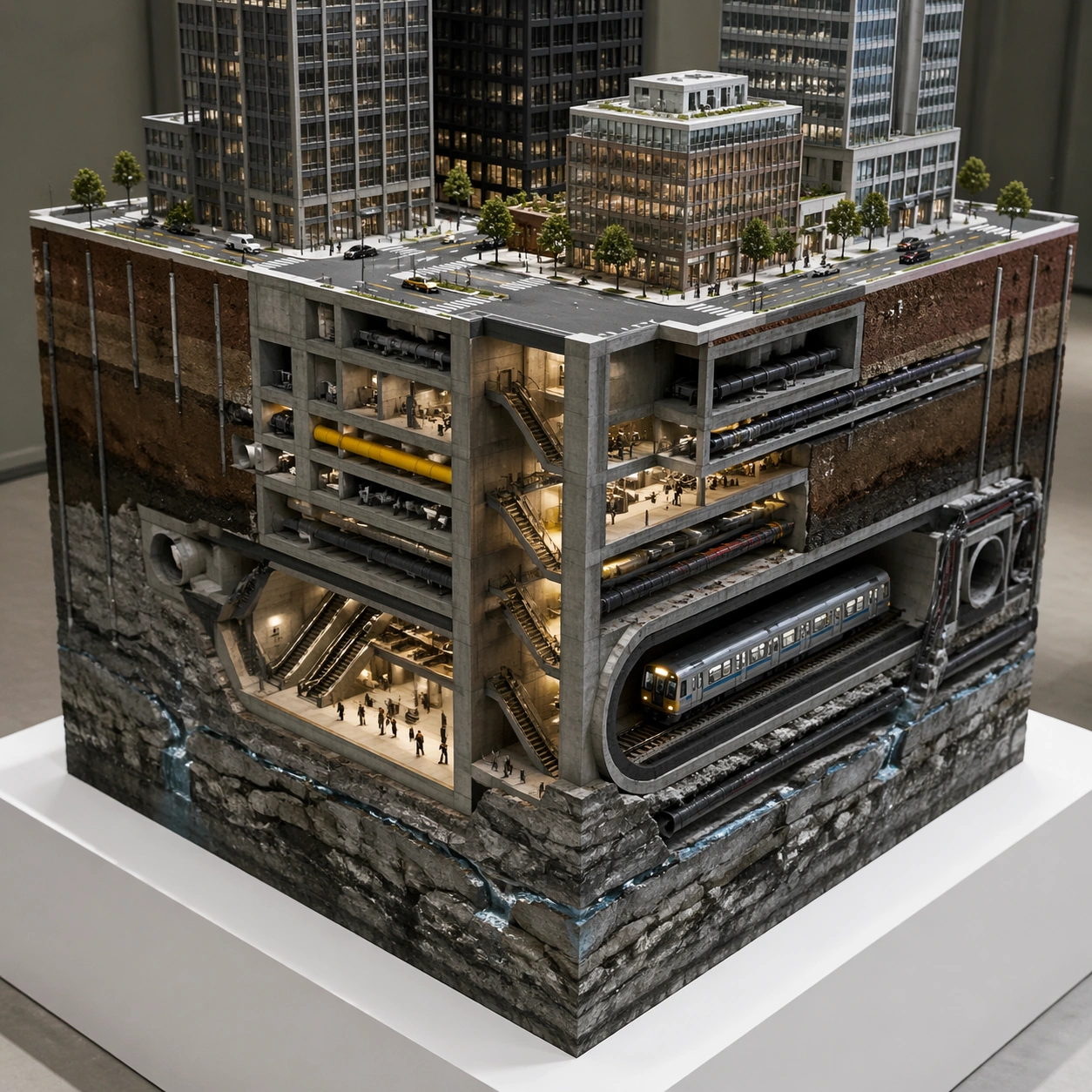
Example generated from “Hyperreal Diorama Cube — Megacity Subway Core”
GPT Image 2en

Scene: A square hyperreal cutaway cube displayed under clean architectural model lighting. The cube floats above a white plinth in a quiet design studio, with a three-quarter view and strong edge definition. Use cool concrete grays, asphalt black, signal yellow accents, and warm underground station light. The top and side faces must all be visible and sharply detailed. Subject: The top face shows a miniature dense city block with towers, sidewalks, trees, rooftop equipment, crosswalks without readable markings, and small cars at realistic scale. The side faces reveal basement levels, utility conduits, storm drains, subway tunnels, platforms, escalator shafts, bedrock, groundwater seepage, and older buried foundations. Include train cars inside one tunnel, pipe bundles, cable trays, retaining walls, and soil nails that connect logically to surface structures. Important details: The cube is a structured urban x-ray, not a chaotic city collage. Each layer should have a distinct purpose: street surface, building foundations, service corridors, transit tube, drainage, bedrock, and water. Vertical shafts must connect from street entrances down to platforms. Keep architectural scale consistent and avoid impossible overlaps. The cutaway faces should feel like a physical model made from concrete, soil, metal, glass, and stone. Use case: Hyperreal Diorama Cube single study 6/8, testing a megacity block cube with surface urban detail and organized underground infrastructure. Constraints: No readable text, no watermark, no logos, preserve exact 1:1 aspect ratio, no brand signs, no route maps, no station names, no floating labels, no impossible tunnel intersections, no toy-like cars, no muddy utility spaghetti, no cropped cube edges.
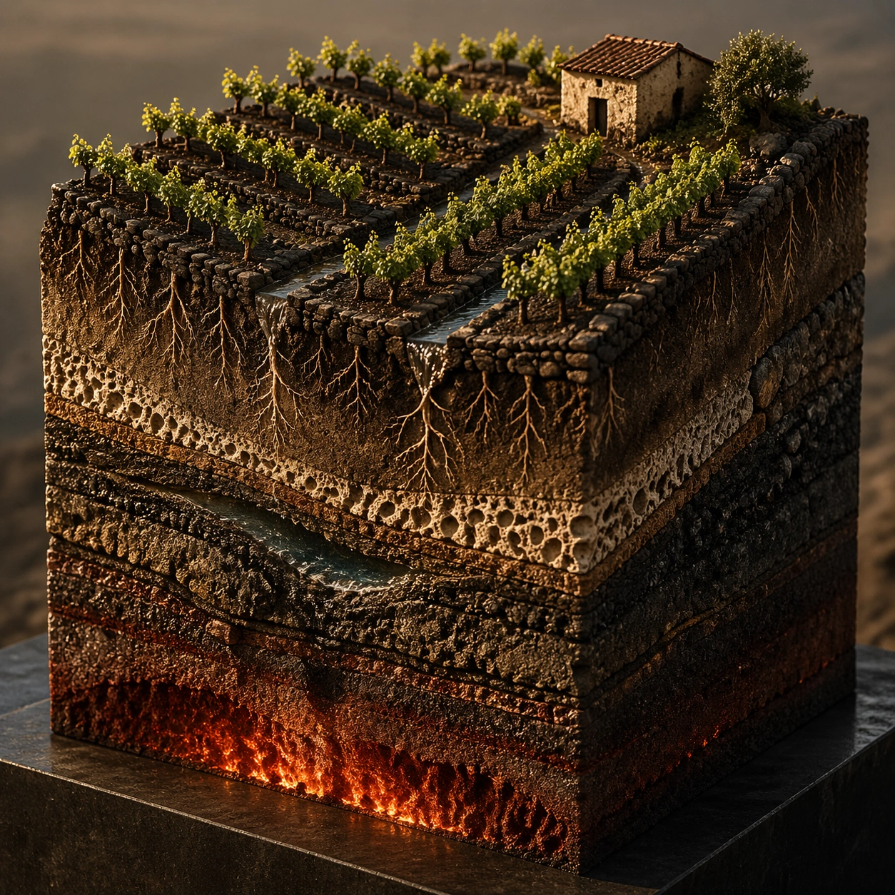
Example generated from “Hyperreal Diorama Cube — Volcanic Vineyard Core”
GPT Image 2en

Scene: A square fine-art product photograph of a volcanic vineyard diorama cube on a dark stone pedestal. Use golden-hour side light, sharp macro detail, and a warm earthy palette of vine green, black basalt, ochre soil, and ember red. The view should show the top vineyard rows and the cutaway side faces as one continuous specimen. Subject: The top face shows terraced grape vines on a volcanic slope, with dry stone walls, small irrigation channels, dark gravel mulch, and a tiny farmhouse without signage. The cube sides reveal vine roots penetrating ash-rich soil, basalt fragments, pumice layers, mineral veins, an underground water pocket, old lava flow bands, and a glowing but deep magma chamber far below. Include root hairs, cracked scoria, moisture stains, and tiny pebbles along the cut edges. Important details: The challenge is material realism and continuity. Vine rows must align with visible root systems, terrace walls must continue into foundations, and volcanic layers must remain ordered rather than random stripes. The magma chamber should provide subtle warm light from below without turning the cube into fantasy. Soil, pumice, basalt, roots, and water all need distinct textures. The result should feel like a scientific luxury object and a landscape miniature at once. Use case: Hyperreal Diorama Cube single study 7/8, testing a volcanic vineyard cube with agricultural surface detail, roots, minerals, aquifer pockets, and lava layers. Constraints: No readable text, no watermark, no logos, preserve exact 1:1 aspect ratio, no wine labels, no branded farmhouse, no floating labels, no fantasy lava fountains, no giant grapes, no disconnected root systems, no smeared basalt texture, no cropped terrace walls.

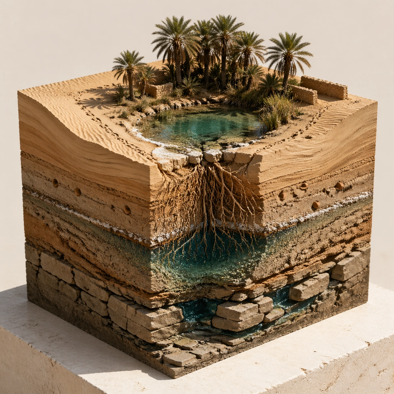
Example generated from “Hyperreal Diorama Cube — Desert Oasis Core”
GPT Image 2en

Scene: A square hyperreal museum-display photograph of a desert oasis diorama cube on a pale limestone base. Use high, dry sunlight with crisp shadows, a clean cream background, and a three-quarter camera angle that shows the palm-covered top surface and exposed sides. The cube should feel tactile, dusty, and precisely cut. Subject: The top face shows a small oasis with date palms, a shallow turquoise pool, reed patches, wind ripples in sand, camel tracks without animals, and a few mudbrick walls without signage. The cutaway sides reveal dune cross-bedding, compacted ancient lakebed clay, palm roots, a freshwater lens, salt crust, buried pottery fragments, beetle burrows, and a deeper fractured sandstone aquifer. Include capillary moisture gradients, root hairs touching wet sand, and mineral rings around the pool. Important details: The whole object must communicate how an oasis works. Surface water should connect visibly to groundwater, palm roots should reach toward the wet lens, and sand layers should show wind-driven structure. Pottery fragments and burrows should be sparse and embedded, not scattered decoration. Keep the cube edges sharp, the materials dry except at the wet zones, and the top oasis small enough to preserve the sense of a specimen block. Use case: Hyperreal Diorama Cube single study 8/8, testing a desert oasis cube with groundwater logic, dune stratigraphy, roots, salt, artifacts, and aquifer layers. Constraints: No readable text, no watermark, no logos, preserve exact 1:1 aspect ratio, no floating labels, no fantasy temple ruins, no oversized animals, no random treasure, no muddy blue water stripe, no disconnected pool, no soft rounded cube edges, no cropped palm crowns.

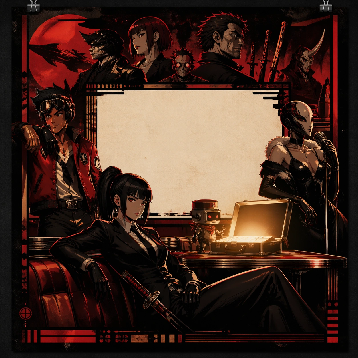
Example generated from “Iconic Poster Cast Remix — Red Noir Suitcase”
GPT Image 2en

Scene: A square campaign poster built around a bold red-and-black crime palette, photographed and lit like a premium printed one-sheet pinned to a gallery wall. The frame should feel flat and graphic rather than cinematic realism, with a strong central rectangle of empty negative space reserved for an abstract title block. Use crisp directional light, lacquered highlights, and smoky shadows to make the composition feel expensive and instantly legible from a distance. Subject: Remix the famous grammar of a rebellious ensemble poster into a new cast drawn from unrelated fictional worlds: a composed anime swordswoman in a black suit reclining diagonally across the lower half, a retro arcade pilot leaning against the frame edge, a masked lounge singer with a chrome microphone, and a tiny robot courier guarding an open glowing briefcase on a diner table. The briefcase becomes the brightest object in the composition and drives the eye upward toward a band of supporting faces, weapon silhouettes, and diner props hovering in carefully ranked layers. Important details: The poster must read as an iconic cast remix, not a collage. Preserve ad-poster hierarchy with one dominant figure, one anchor prop, and a stepped pyramid of secondary characters above. Use exacting negative space, controlled crop lines, and believable print-finish polish. Include abstract zones for cast names, tagline, and credits as graphic bars or ornamental glyph textures only, never readable lettering. The image should feel like a pitch-ready entertainment campaign that clearly borrows legendary poster logic while fully replacing the characters and world. Use case: Iconic Poster Cast Remix single study 1/9, testing whether GPT Image 2 can preserve a legendary crime-poster composition while swapping the entire cast and object language. Constraints: No readable text, no watermark, no logos, preserve exact 1:1 aspect ratio, no celebrity likenesses, no direct costume copies from known films, no face-swap look, no messy collage seams, no tiny illegible fake billing block, no extra props outside the main hierarchy.
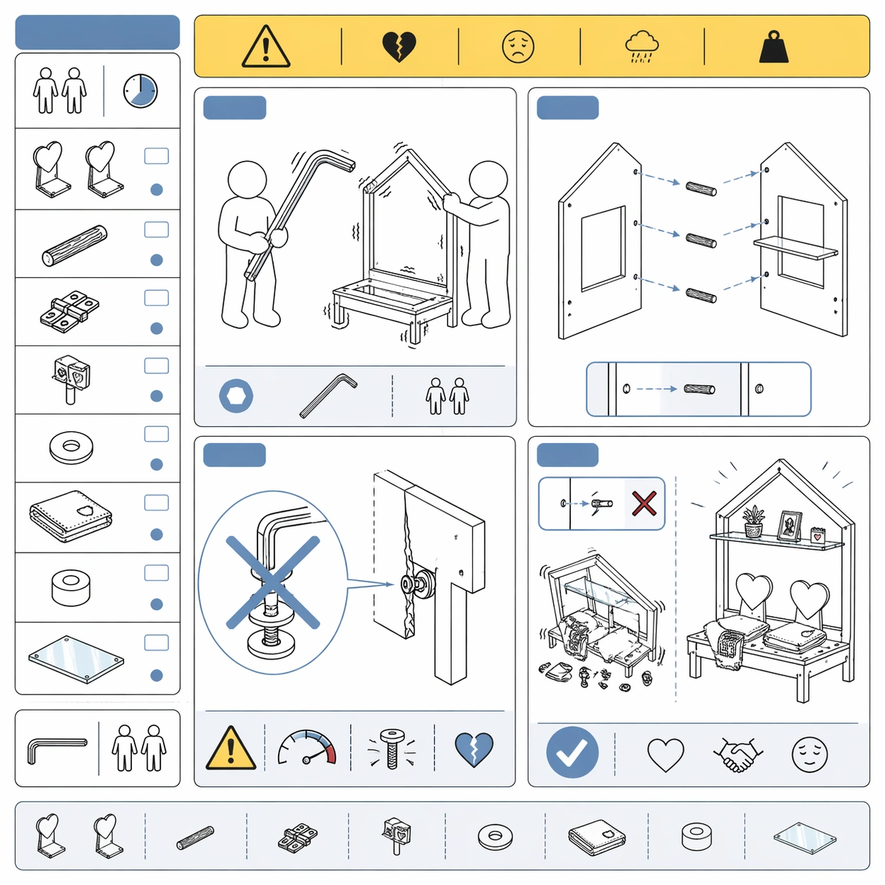
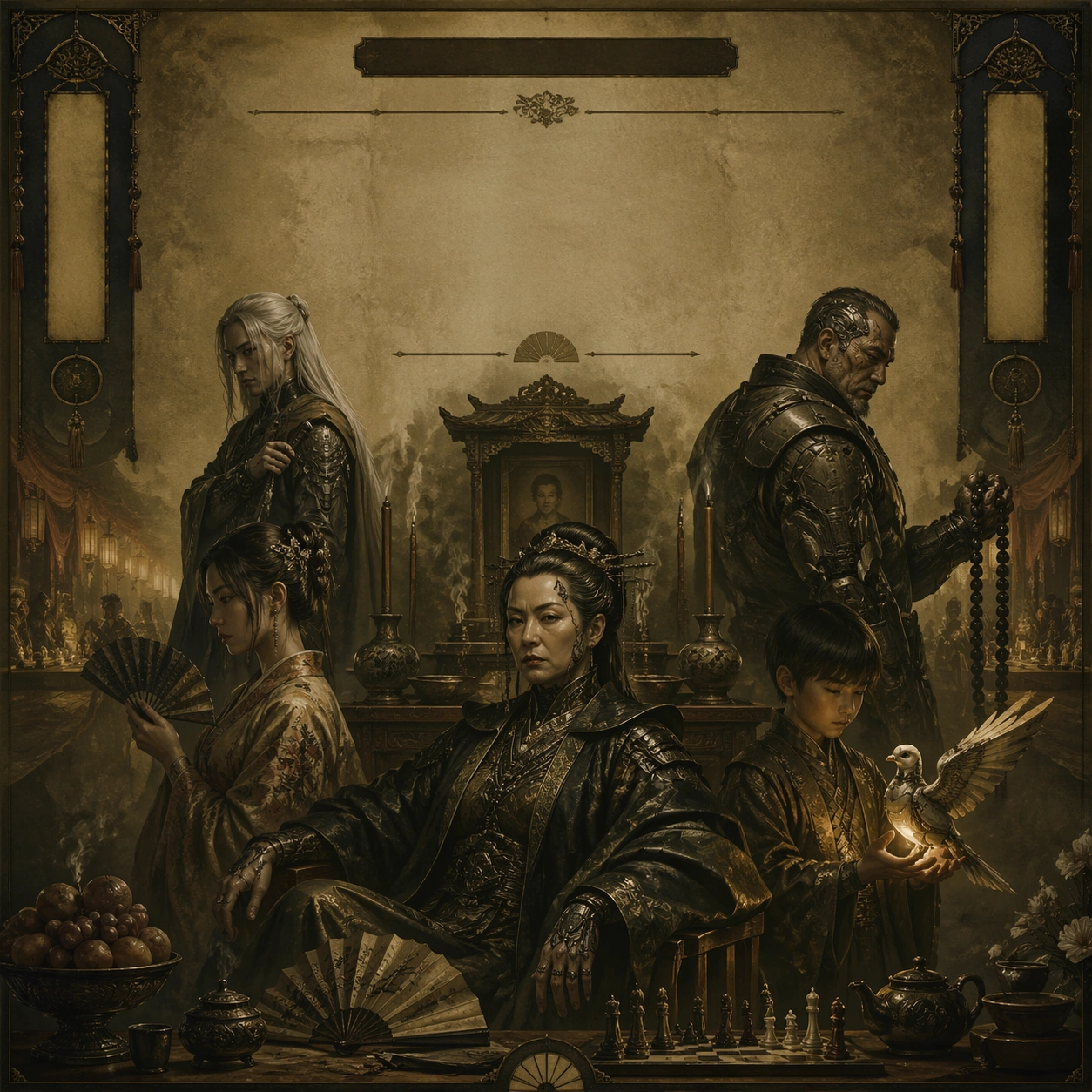
Example generated from “Iconic Poster Cast Remix — Sepia Dynasty Altar”
GPT Image 2en

Scene: A square sepia-and-olive prestige poster, lit like aged varnished paper with soft falloff, deep shadows, and a solemn museum-grade finish. The composition should be almost architectural: a central seated figure near the bottom, large areas of quiet negative space above, and a disciplined arrangement of supporting portraits and ceremonial objects around the edges. Keep the palette restrained, tactile, and formal, like a legacy family empire advertisement. Subject: Create a cast-remix poster built on the grammar of a revered dynasty drama one-sheet. Replace the expected crime family with an entirely different ensemble: a stern cyberpunk matriarch seated beside an ancestral altar, a pale-haired fantasy tactician standing behind her, a river-merchant daughter in embroidered silk, a scarred mecha veteran holding prayer beads, and a child prodigy with a glowing mechanical dove. Around them, arrange incense smoke, folded fans, lacquered fruit, chess pieces, and a dim wedding banquet corridor. The matriarch must dominate the lower center while all other figures orbit in descending visual importance. Important details: The image needs to feel unmistakably poster-authored, with heirloom gravity and classic ad spacing. Preserve the iconic hierarchy of a single seated ruler, surrounding heirs, and ceremonial emptiness above for an abstract title field. Use painterly sepia depth, subtle paper grain, and disciplined symmetry without becoming static. Indicate actor-name bands, critic quotes, and billing-space as elegant horizontal ornaments, carved shapes, or muted plaques that do not resolve into text. The cast swap should feel seamless and intentional, as if a major franchise was reinterpreted by a new studio art department. Use case: Iconic Poster Cast Remix single study 2/9, testing whether a classic dynasty-poster composition remains recognizable after a total character-world replacement. Constraints: No readable text, no watermark, no logos, preserve exact 1:1 aspect ratio, no direct imitation of any real actor portrait, no modern neon clutter, no comedic tone, no random extra faces, no sloppy montage edges, no visible real-world trademarks.

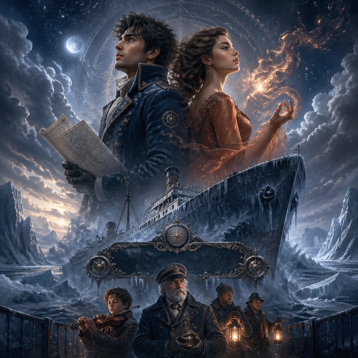
Example generated from “Iconic Poster Cast Remix — Iceberg Romance Recast”
GPT Image 2en

Scene: A square romantic disaster poster with icy blue, charcoal, and moonlit silver tones, designed like a glossy theatrical campaign print. The composition should rise vertically from intimate foreground figures to an overwhelming environmental backdrop, with fog, ocean mist, and star-diffused light blending into soft painterly gradients. Keep the atmosphere grand, sentimental, and immaculate, as if meant for a multiplex lobby display. Subject: Remix the grammar of a legendary doomed-romance poster using a completely new pair of leads: a young cloud-cartographer in a navy expedition coat and a fire magician in a copper gown standing back-to-back above a fractured glacier ship. Beneath them, show a small lower register of supporting characters including a child violinist, an elderly captain with a brass compass, and a pair of deck workers holding lanterns. The giant vessel should angle upward through the center of the image while the romantic leads remain the largest human forms, suspended in a dreamy montage above the disaster. Important details: This must read as a recognizable prestige-romance one-sheet structure: oversized lovers, a tilted vessel, and a sentimental fade from close portraiture to catastrophic scale. Preserve the eye path from the couple to the ship to the icy horizon. Let the supporting cast occupy a narrower strip near the bottom so the title zone can sit between the romance and the deck without becoming literal text. Use abstract ornamental shapes where a title, actor names, and release line would normally sit. The cast replacement should feel elegant and inevitable, never like a parody or fan edit. Use case: Iconic Poster Cast Remix single study 3/9, testing whether an instantly known romance-disaster poster hierarchy survives a complete fantasy-cast replacement. Constraints: No readable text, no watermark, no logos, preserve exact 1:1 aspect ratio, no direct ship recreation from any known film, no photobashed faces, no modern typography, no extra floating heads beyond the planned hierarchy, no muddy background clutter, no obvious parody expression.

Example generated from “Iconic Poster Cast Remix — Arcane Ring Ensemble”
GPT Image 2en

Scene: A square fantasy adventure ensemble poster with stormy bronze, moss green, candle gold, and volcanic ember accents. The frame should feel dense but carefully organized, like a high-budget quest-film one-sheet packed with narrative promise. Use mist, map-like texture, and a halo of circular light around the center so the composition reads as mythic and collectible rather than chaotic. Subject: Build a cast-remix poster from the grammar of a beloved epic quest ensemble. At the center, place an unassuming courier holding a luminous ring-shaped relic; surrounding the courier in a circular orbit are a wolf-armored archer, a scholar-mage carrying scrolls, a stone-skinned giant with cracked runes, a stealthy thief in red silk, a swamp alchemist with jars, and a hawk rider banking across the top edge. The lower band should show a long caravan crossing a cliff path, while the upper corners hold towering mountain silhouettes and a distant dark citadel. Important details: The poster must preserve the unmistakable structure of a mythic ensemble campaign: one innocent focal character, concentric supporting faces and figures, and a journey landscape compressed into the lower strip. Keep each character visually distinct yet unified by the same lighting and art direction. The central circular glow should suggest where a title medallion would live, but render it as an abstract emblem or weathered metal form rather than legible typography. Use empty atmospheric pockets for cast lines and release area while maintaining premium adventure-poster balance. The viewer should instantly sense iconic franchise-poster logic despite the entirely original cast. Use case: Iconic Poster Cast Remix single study 4/9, testing whether an epic fantasy ensemble poster can keep its recognizable hierarchy after a full cast and world redesign. Constraints: No readable text, no watermark, no logos, preserve exact 1:1 aspect ratio, no direct costume duplication from known fantasy films, no overloaded face montage, no modern weapons, no goofy expressions, no flat collage stacking, no title lettering hidden in the ring glow.
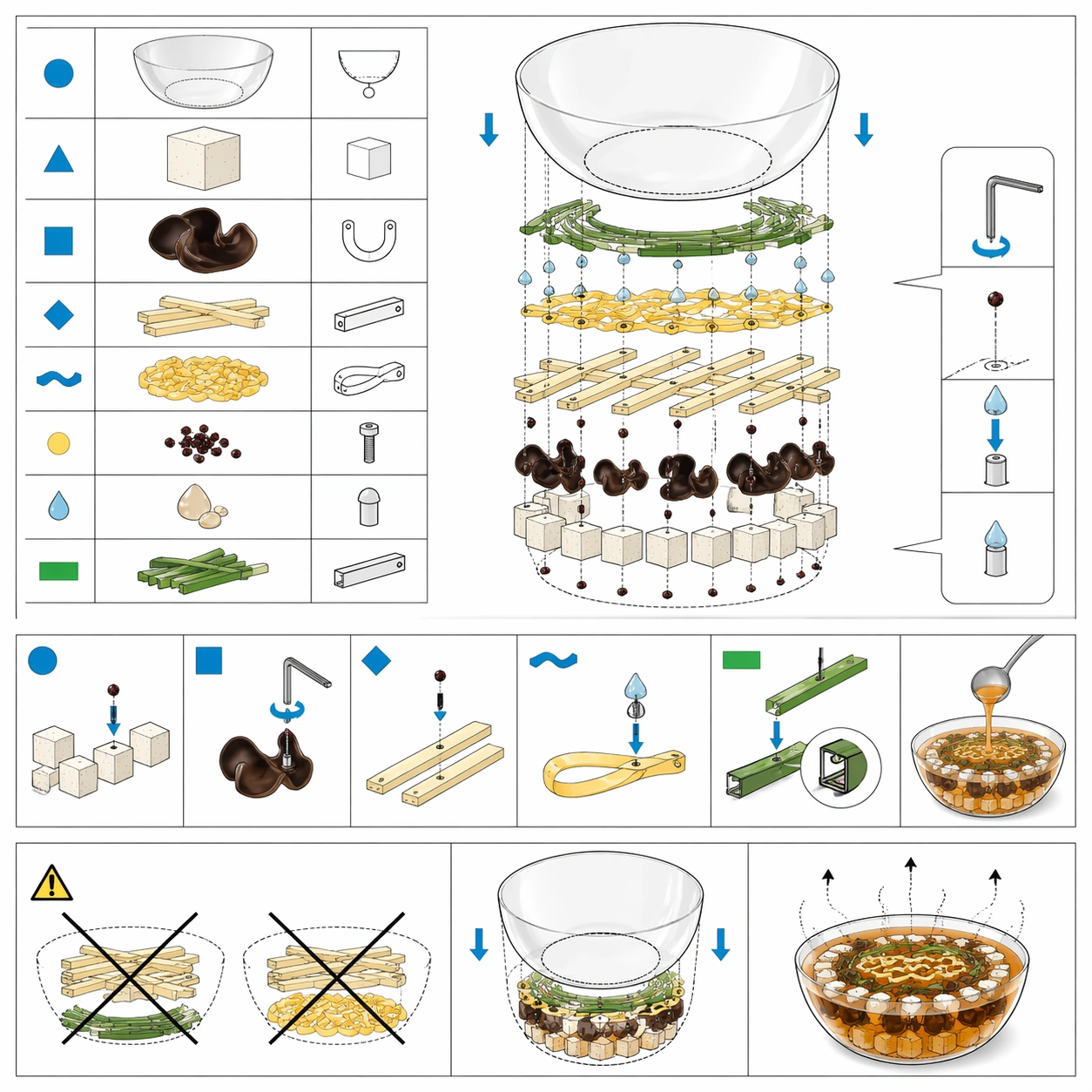
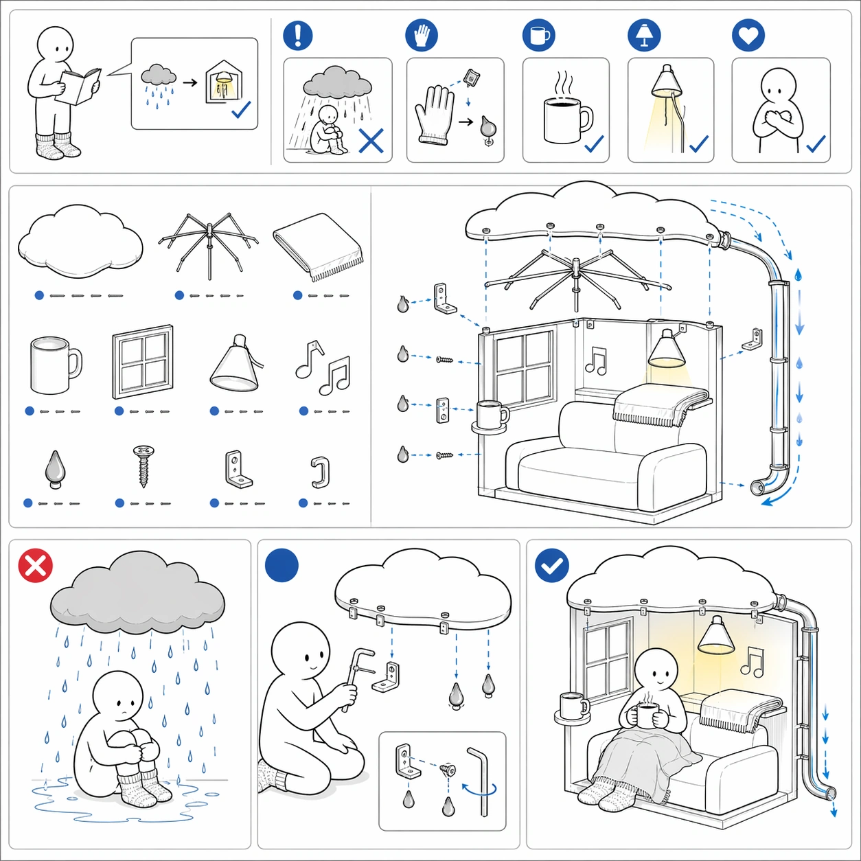
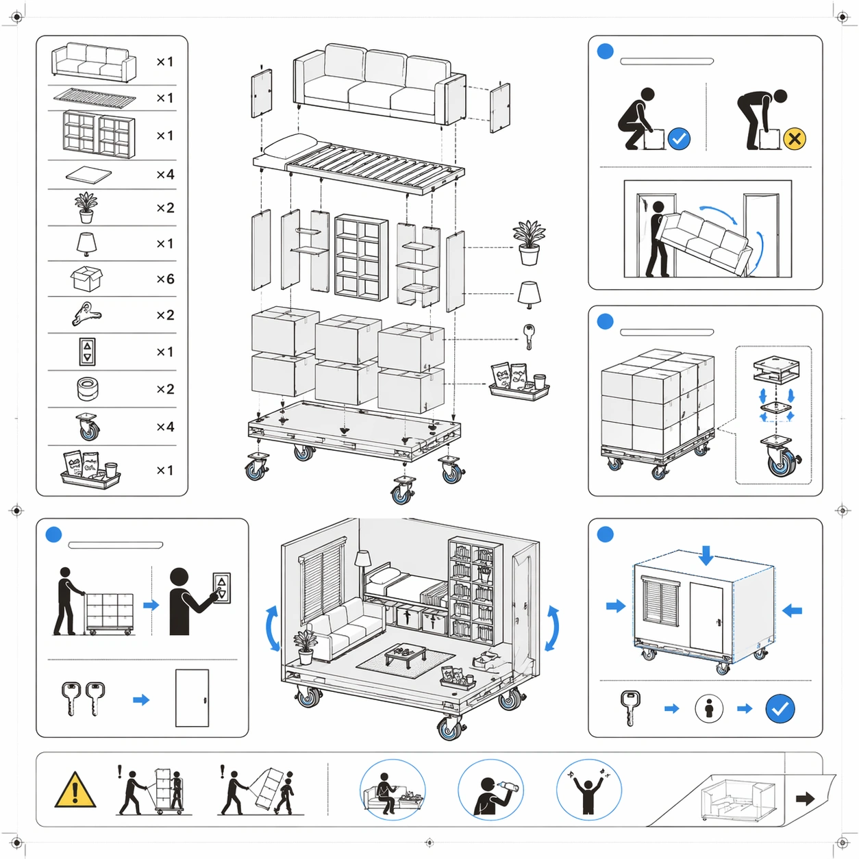
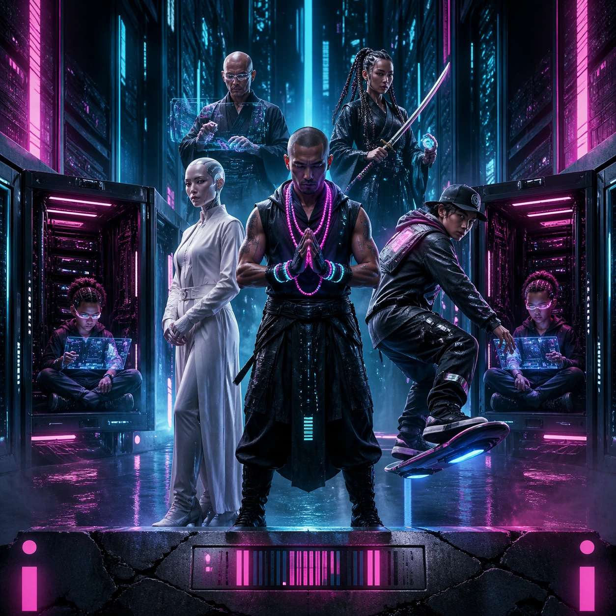
Example generated from “Iconic Poster Cast Remix — Neon Hacker Corridor”
GPT Image 2en

Scene: A square sci-fi action poster soaked in cyan, magenta, black, and chrome, with a glossy wall-poster finish and razor-clean geometric lighting. The image should feel like a premium urban-thriller campaign: highly graphic, high contrast, and arranged around a strong central vanishing corridor. Let reflective surfaces, rain mist, and monitor glow carve hard shapes through the darkness. Subject: Create a cast-remix poster using the grammar of an iconic cyber-action one-sheet. In the center stands a sleeveless hacker monk wearing luminous prayer-cables, flanked by a white-coated android diplomat and a skater courier balancing on a levitating board. Slightly behind them, stack a bald engineer with transparent interface lenses, a woman with mirrored braids holding a katana, and twin child coders seated cross-legged inside open server racks. The corridor behind the cast recedes into impossible depth, filled with vertical light panels and drifting data shards. Near the bottom, place a cracked concrete floor and a narrow space where a title slab would normally sit. Important details: The poster must preserve the clean, iconic grammar of a lineup-in-a-corridor campaign: central hero, flanking allies, vertically ranked antagonistic silhouettes, and a disciplined neon path pulling the eye inward. Avoid random clutter; every prop should reinforce the ad composition. Use abstract rectangular forms, barcode-like ornaments, or glowing geometric seals where taglines and billing areas would live, but keep them nonverbal. The cast should look fully reimagined, as if an entirely new franchise inherited the compositional DNA of a legendary cyber poster without borrowing any exact costume or face. Use case: Iconic Poster Cast Remix single study 5/9, testing whether a famous cyber-action poster structure can survive total cast replacement while retaining its instantly legible corridor hierarchy. Constraints: No readable text, no watermark, no logos, preserve exact 1:1 aspect ratio, no direct imitation of known cyberpunk characters, no guns dominating the frame, no incoherent neon graffiti, no duplicated faces, no random city skyline outside the corridor logic, no typography hidden in the light panels.

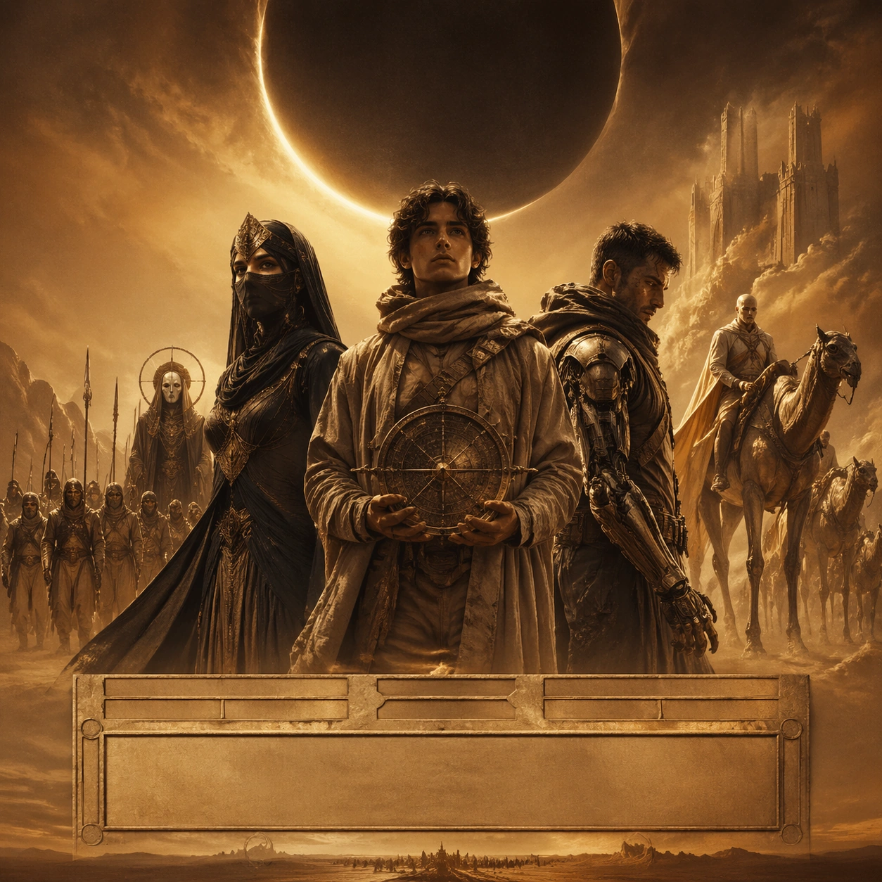
Example generated from “Iconic Poster Cast Remix — Desert Prophecy Procession”
GPT Image 2en

Scene: A square desert epic poster with ochre, bronze, moon-ivory, and shadow-black tones, presented like an ultra-premium theatrical key art print. The composition should feel monumental and solemn, with windblown sand, colossal scale, and carefully shaped emptiness. Use side lighting that sculpts robes, dunes, and metallic surfaces while leaving deep central shadows for ad-poster gravity. Subject: Remix the grammar of a celebrated desert prophecy poster into a new cast. At the center, place a youthful astronomer wrapped in layered linen and carrying a star compass, slightly forward from two opposing power figures: a masked desert empress in obsidian silk and a rebel mechanic with a weathered exoskeleton sleeve. Behind them, arrange a procession of nomad fighters, a veiled oracle, and a pale synthetic prince riding long-legged sand beasts across the midground. Above the ensemble, show a huge crescent-shaped eclipse and distant fortress towers partially swallowed by dust. The bottom edge should compress into a narrow landscape strip, like a campaign poster preparing space for a title monolith. Important details: Preserve the instantly recognizable epic-poster hierarchy of central prophet figure, flanking rivals, and an immense celestial symbol dominating the sky. The image must look art-directed, not like random fantasy illustration. Keep the cast placement disciplined, the palette restrained, and the environmental scale overpowering. Indicate title, actor names, and billing as monumental stone slabs, embossed bands, or sand-carved rectangles that remain entirely unreadable. The sense of classical poster authorship matters more than literal references; the viewer should feel the memory of an iconic desert saga without any direct duplication. Use case: Iconic Poster Cast Remix single study 6/9, testing whether epic prophetic-poster composition can remain recognizable after a complete recast into a different sci-fantasy world. Constraints: No readable text, no watermark, no logos, preserve exact 1:1 aspect ratio, no direct sandworm imitation, no copied costumes from known franchises, no extra spaceships crowding the sky, no parody expressions, no soft shapeless montage, no hidden letters in dunes or eclipse.

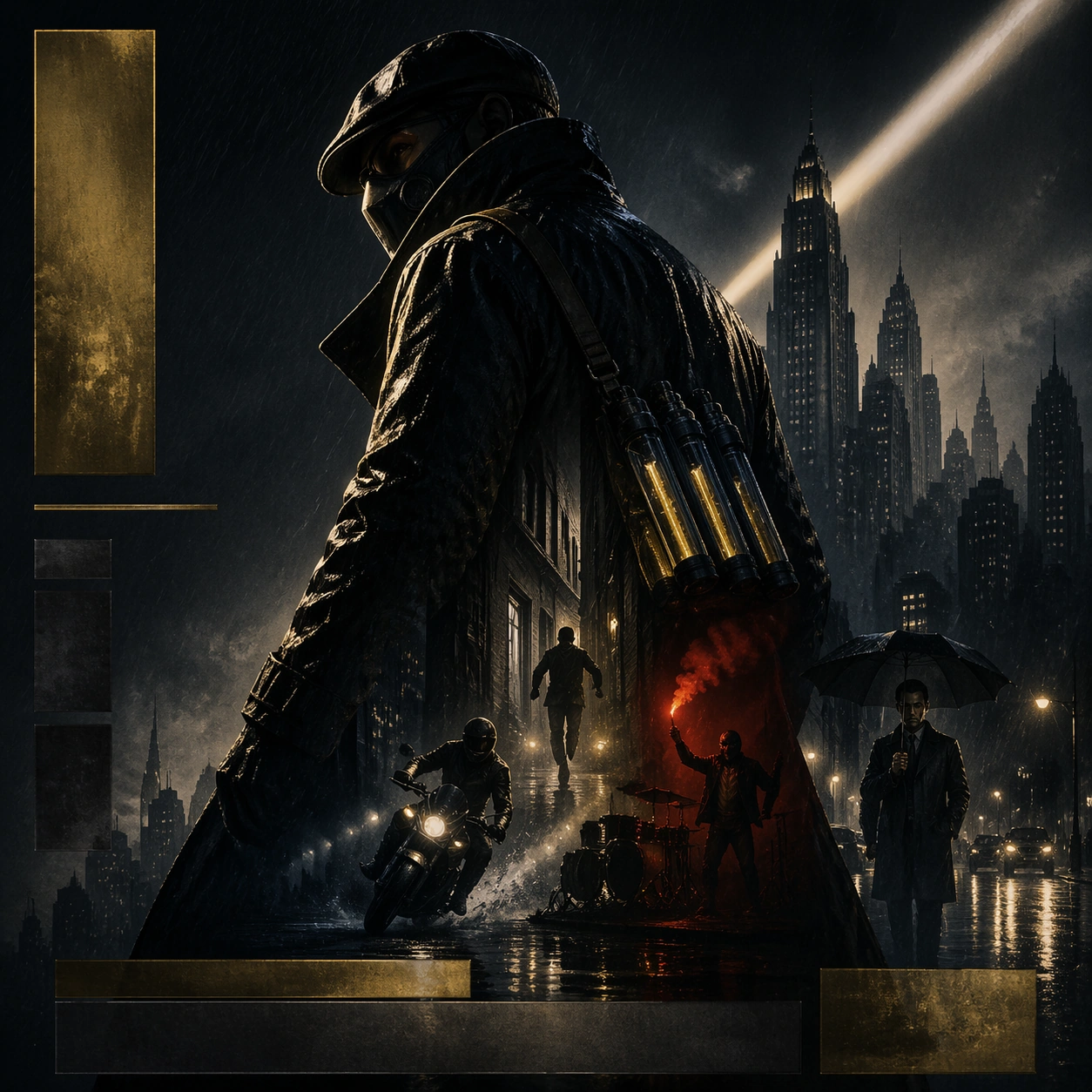
Example generated from “Iconic Poster Cast Remix — Rain Vigilante Profile”
GPT Image 2en

Scene: A square night-action poster in graphite, sodium gold, and wet cobalt, rendered like a premium offset print with rain streaks and subtle paper tooth. The frame should be dominated by one giant shadowy profile or torso silhouette, leaving sculpted empty space across the top and one side. Urban haze, lens bloom, and reflected streetlight should create a moody metropolitan atmosphere without overwhelming the clean poster read. Subject: Remix the grammar of an iconic brooding vigilante poster with an entirely different hero. Show a masked rooftop archivist wearing a long weatherproof coat and carrying illuminated evidence capsules, framed in three-quarter profile so the body becomes the main graphic shape. Inside and around that silhouette, layer a narrow alley chase, a motorcycle spray turn, a red flare held by an undercover drummer, and a stern municipal investigator standing under an umbrella. Let a towering art-deco skyline rise behind the archivist, with one searchlight beam cutting diagonally across the composition and a puddled street running along the bottom. Important details: The poster must preserve the classic one-hero dominance, rain-soaked melancholy, and clean ad spacing of a prestige vigilante campaign. The supporting story beats should remain secondary, almost embedded into the giant silhouette rather than competing with it. Use abstract metallic slabs, embossed rectangles, and moody light bands where title, cast names, and studio marks would normally live, but keep every mark unreadable. The composition should feel serious, sleek, and instantly marketable, with a fully reimagined protagonist instead of a familiar bat-eared figure. Use case: Iconic Poster Cast Remix single study 7/9, testing whether a brooding vigilante-poster silhouette can retain iconic readability after total hero and narrative replacement. Constraints: No readable text, no watermark, no logos, preserve exact 1:1 aspect ratio, no bat symbols, no copied superhero suits, no comic-panel fragmentation, no excessive lightning effects, no cluttered crowd scenes, no hidden letters in the searchlight beam.

Example generated from “Iconic Poster Cast Remix — Jungle Relic Expedition”
GPT Image 2en

Scene: A square adventure poster with tropical emerald, sandstone, brass, and torch-gold tones, finished like glossy theatrical key art. The composition should feel energetic and readable, with one dominant explorer in the foreground, supporting companions arranged on diagonals, and an exotic ruin opening toward the viewer. Use warm directional light, drifting dust, and leafy silhouettes that frame rather than clutter the scene. Subject: Create a cast-remix poster based on the grammar of a beloved relic-hunt action one-sheet. The lead is a one-eyed museum conservator wearing climbing gear and carrying a rolled star map; beside and behind them place a sarcastic jungle botanist, a teenage parkour messenger, an armored river guide with a jade spear, and a monkey-like clockwork companion holding a gemstone idol. The background should feature a collapsing vine-covered arch, a waterfall cave, rope bridges, and an approaching storm. The lead explorer remains the largest figure, stepping slightly toward the viewer while the ensemble cascades outward in clear descending importance. Important details: The image must preserve the breezy, iconic hierarchy of an expedition poster: charismatic lead, adventurous secondary cast, relic at the center of desire, and an environment promising traps and motion. Keep the ad composition tight, with obvious space for an abstract title block near the lower center and ornamental strips for cast names higher up. Use shape language, carved plaques, or painted banner blocks instead of actual words. The overall feeling should be polished and theatrical, never like a random fantasy scene or a literal recreation of any fedora-wearing archaeologist brand. Use case: Iconic Poster Cast Remix single study 8/9, testing whether expedition-poster composition stays instantly legible when its characters and relic mythology are fully replaced. Constraints: No readable text, no watermark, no logos, preserve exact 1:1 aspect ratio, no fedora iconography, no copied whip pose, no chaotic overpopulation, no fake map labels, no direct franchise costume echoes, no hidden letters in vines or stone carvings.

Example generated from “Iconic Poster Cast Remix — Rebel Skyline Uprising”
GPT Image 2en

Scene: A square space-opera rebellion poster with midnight blue, engine white, rust red, and amber flare colors, finished like a collector's one-sheet with luminous ink and subtle paper grain. The composition should rise from a grounded lower strip of machinery and troops to an open heroic sky, maintaining strong diagonal movement and clean negative space for campaign elements. Let smoke, sparks, and star haze create drama without obscuring the structure. Subject: Remix the grammar of a legendary uprising poster into a new cast of original characters. The central hero is a young signal engineer lifting a radiant antenna staff toward the sky. Behind and around the hero, arrange a silver-haired star smuggler, a broad-shouldered android defector, a masked pilot with a cracked visor, and a grandmother tactician gripping folded battle maps. Near the bottom, show a narrow line of insurgent bikes and a grounded shuttle bursting through smoke. Above them, place two colossal moons and the silhouette of a floating citadel, with one bright diagonal beam connecting the raised staff to the upper sky. Important details: The poster must preserve the instantly readable uprising hierarchy of one raised heroic gesture, ranked companions, vehicle strip at the bottom, and celestial backdrop above. Use deliberate campaign spacing so the eye travels from the staff to the cast to the lower action band. Replace title, cast names, and studio marks with abstract illuminated panels, embossed metal plates, or painted blocks that suggest ad layout without resolving into words. The image should feel like a sincere blockbuster key art remix, not satire, with an entirely original cast inhabiting the composition of an unforgettable rebellion poster. Use case: Iconic Poster Cast Remix single study 9/9, testing whether a classic uprising-poster silhouette can stay recognizable after the cast, props, and world mythology are completely rebuilt. Constraints: No readable text, no watermark, no logos, preserve exact 1:1 aspect ratio, no lightsabers, no stormtrooper analogs, no copied spaceship designs from known franchises, no overcrowded dogfight sky, no comic-book exaggeration, no letters hidden in smoke or moon glow.

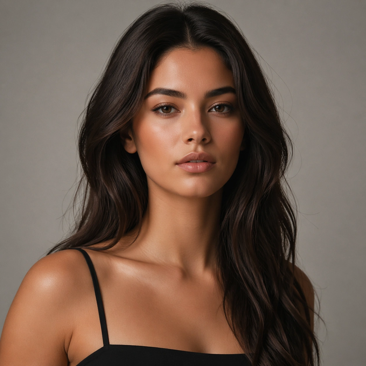
Example generated from “Identity Locked Hair Swap Series — Anchor Portrait”
GPT Image 2en

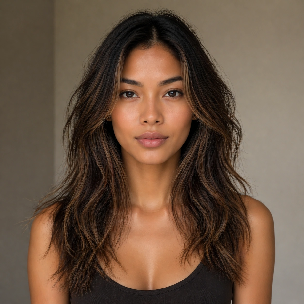
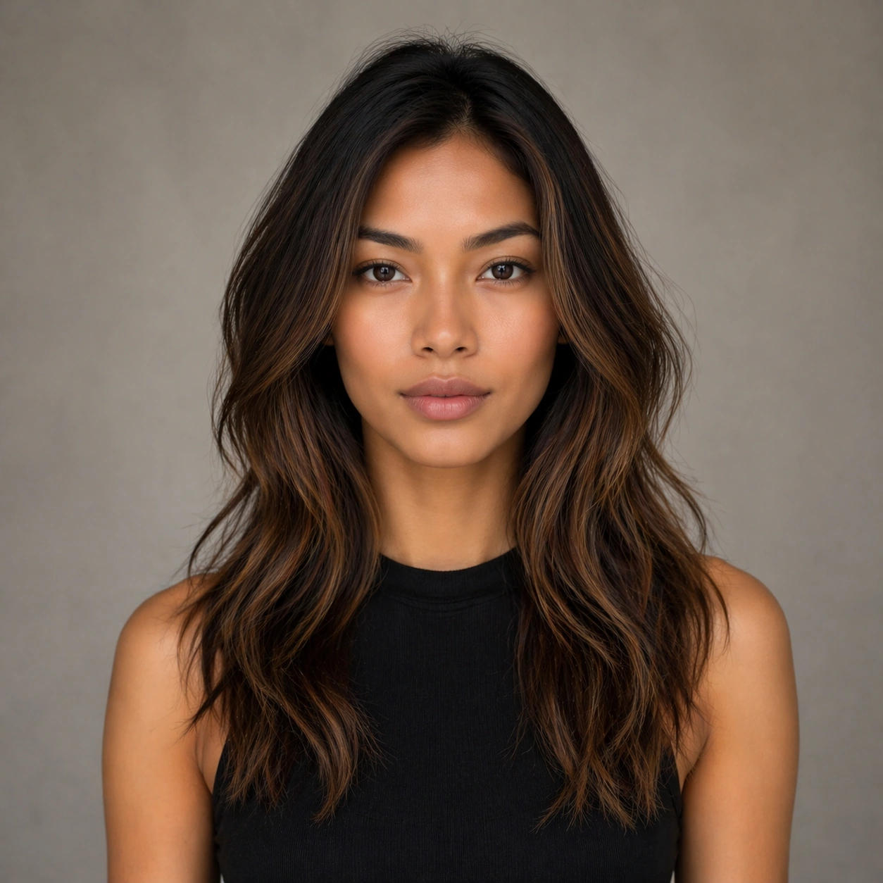
Scene: A square commercial beauty-or-fashion image designed like a polished campaign proof for Identity-Locked Hair Swap Series. Keep the camera discipline clear and believable: portrait-oriented within the square, premium studio light, controlled tonal contrast, and enough surrounding negative space to feel like an ad layout without relying on readable typography. The image should look production-ready, with realistic skin, hair, fabric, and makeup rendering that supports identity locking instead of distracting from it. Subject: Build the frame around one clearly recognizable person. Anchor Portrait should feel like a specific transformation step that defines the exact face, camera angle, skin texture, and model identity that later images must preserve. The face structure, age, body proportions, and general camera position must stay consistent with the same-person premise of Keep one person's identity stable while cycling through highly varied hairstyles, lengths, textures, and color treatments for salon, beauty, and fashion campaigns.. Styling, wardrobe, grooming, makeup, hair, or pose can evolve, but the viewer must believe it is unquestionably the same subject across the whole theme. Use a premium editorial-commercial tone rather than a casual portrait session. Important details: The visual test is identity consistency under change. Preserve stable bone structure, eye spacing, nose shape, lip volume, skin tone family, and believable texture response. Let the transformation be visible through styling choices instead of facial drift. This theme studies multi-image-reference, editing-workflow, photorealism, commercial-mockup through a production-ready visual system. Make the composition clean enough for client review, with professional grooming fidelity and enough detail for salon, beauty, or fashion decision-making. Aim for clear hierarchy, polished craft, and immediately usable campaign logic. Use case: Identity-Locked Hair Swap Series series study 1/4. Constraints: No readable text, no watermark, no logos, preserve exact 1:1 aspect ratio, no face drift, no inconsistent age shift, no extra limbs, no duplicate person, no asymmetric eye placement, no beauty-editorial chaos.

Example generated from “Identity Locked Hair Swap Series — First Switch”
GPT Image 2en

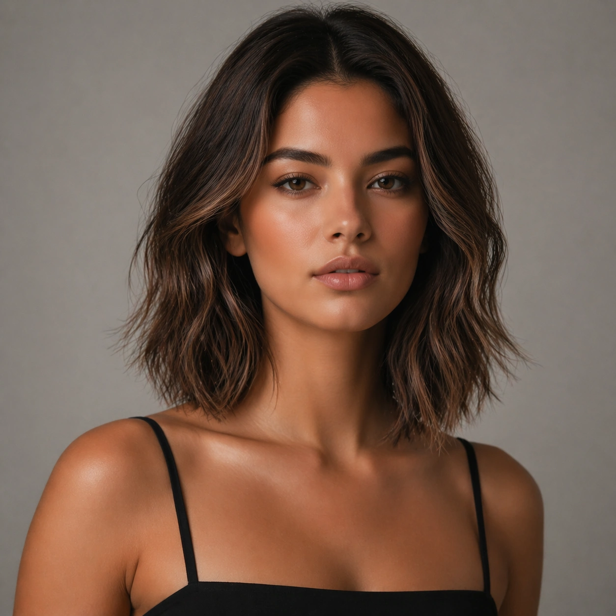
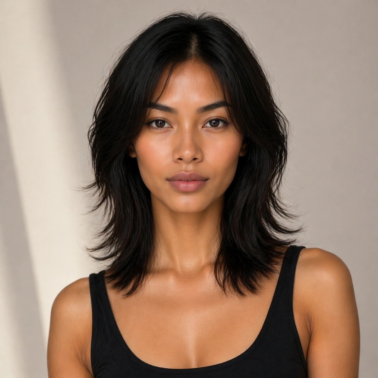
Scene: A square commercial beauty-or-fashion image designed like a polished campaign proof for Identity-Locked Hair Swap Series. Keep the camera discipline clear and believable: portrait-oriented within the square, premium studio light, controlled tonal contrast, and enough surrounding negative space to feel like an ad layout without relying on readable typography. The image should look production-ready, with realistic skin, hair, fabric, and makeup rendering that supports identity locking instead of distracting from it. Subject: Build the frame around one clearly recognizable person. First Switch should feel like a specific transformation step that keeps the same identity but changes the styling direction in a clear and controlled way. The face structure, age, body proportions, and general camera position must stay consistent with the same-person premise of Keep one person's identity stable while cycling through highly varied hairstyles, lengths, textures, and color treatments for salon, beauty, and fashion campaigns.. Styling, wardrobe, grooming, makeup, hair, or pose can evolve, but the viewer must believe it is unquestionably the same subject across the whole theme. Use a premium editorial-commercial tone rather than a casual portrait session. Important details: The visual test is identity consistency under change. Preserve stable bone structure, eye spacing, nose shape, lip volume, skin tone family, and believable texture response. Let the transformation be visible through styling choices instead of facial drift. This theme studies multi-image-reference, editing-workflow, photorealism, commercial-mockup through a production-ready visual system. Make the composition clean enough for client review, with professional grooming fidelity and enough detail for salon, beauty, or fashion decision-making. Aim for clear hierarchy, polished craft, and immediately usable campaign logic. Use case: Identity-Locked Hair Swap Series series study 2/4. Constraints: No readable text, no watermark, no logos, preserve exact 1:1 aspect ratio, no face drift, no inconsistent age shift, no extra limbs, no duplicate person, no asymmetric eye placement, no beauty-editorial chaos.

Example generated from “Identity Locked Hair Swap Series — Second Switch”
GPT Image 2en

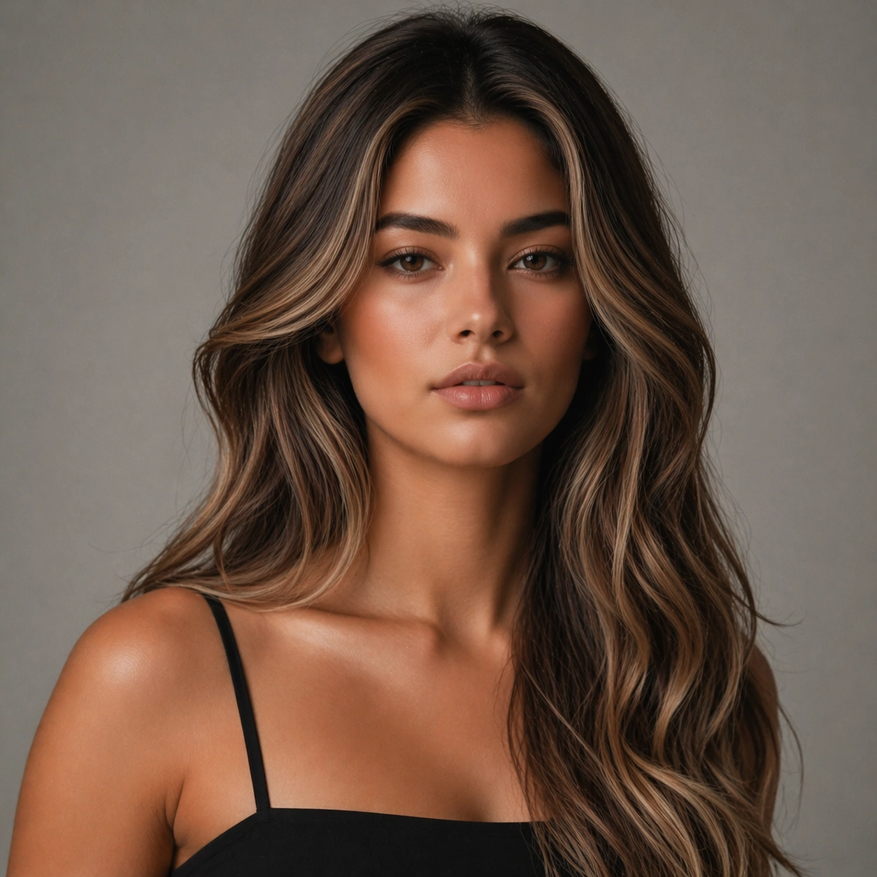
Scene: A square commercial beauty-or-fashion image designed like a polished campaign proof for Identity-Locked Hair Swap Series. Keep the camera discipline clear and believable: portrait-oriented within the square, premium studio light, controlled tonal contrast, and enough surrounding negative space to feel like an ad layout without relying on readable typography. The image should look production-ready, with realistic skin, hair, fabric, and makeup rendering that supports identity locking instead of distracting from it. Subject: Build the frame around one clearly recognizable person. Second Switch should feel like a specific transformation step that pushes the same identity into a more dramatic transformation without face drift. The face structure, age, body proportions, and general camera position must stay consistent with the same-person premise of Keep one person's identity stable while cycling through highly varied hairstyles, lengths, textures, and color treatments for salon, beauty, and fashion campaigns.. Styling, wardrobe, grooming, makeup, hair, or pose can evolve, but the viewer must believe it is unquestionably the same subject across the whole theme. Use a premium editorial-commercial tone rather than a casual portrait session. Important details: The visual test is identity consistency under change. Preserve stable bone structure, eye spacing, nose shape, lip volume, skin tone family, and believable texture response. Let the transformation be visible through styling choices instead of facial drift. This theme studies multi-image-reference, editing-workflow, photorealism, commercial-mockup through a production-ready visual system. Make the composition clean enough for client review, with professional grooming fidelity and enough detail for salon, beauty, or fashion decision-making. Aim for clear hierarchy, polished craft, and immediately usable campaign logic. Use case: Identity-Locked Hair Swap Series series study 3/4. Constraints: No readable text, no watermark, no logos, preserve exact 1:1 aspect ratio, no face drift, no inconsistent age shift, no extra limbs, no duplicate person, no asymmetric eye placement, no beauty-editorial chaos.

Example generated from “Identity Locked Hair Swap Series — Campaign Finish”
GPT Image 2en

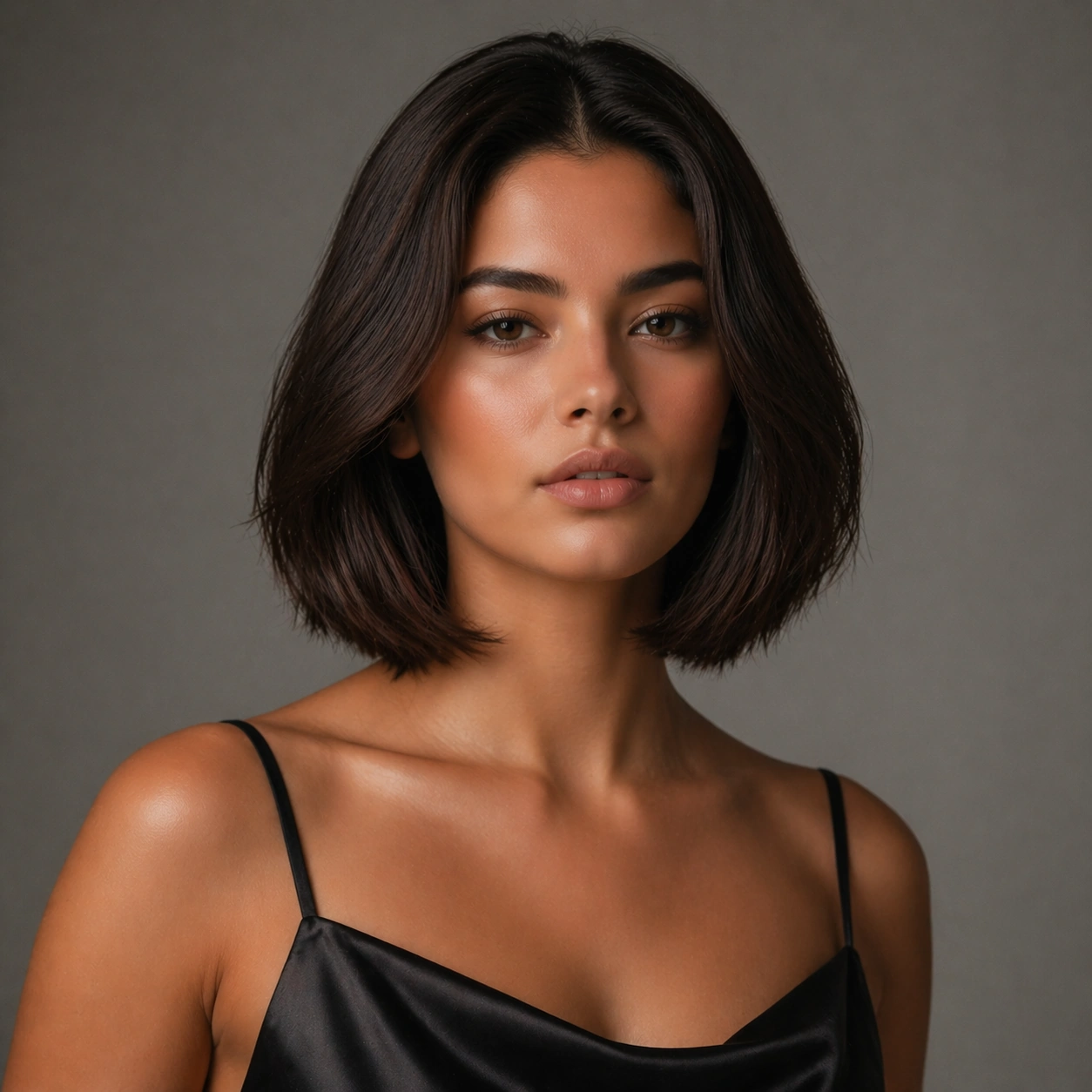
Scene: A square commercial beauty-or-fashion image designed like a polished campaign proof for Identity-Locked Hair Swap Series. Keep the camera discipline clear and believable: portrait-oriented within the square, premium studio light, controlled tonal contrast, and enough surrounding negative space to feel like an ad layout without relying on readable typography. The image should look production-ready, with realistic skin, hair, fabric, and makeup rendering that supports identity locking instead of distracting from it. Subject: Build the frame around one clearly recognizable person. Campaign Finish should feel like a specific transformation step that turns the locked identity into a polished campaign-ready hero frame. The face structure, age, body proportions, and general camera position must stay consistent with the same-person premise of Keep one person's identity stable while cycling through highly varied hairstyles, lengths, textures, and color treatments for salon, beauty, and fashion campaigns.. Styling, wardrobe, grooming, makeup, hair, or pose can evolve, but the viewer must believe it is unquestionably the same subject across the whole theme. Use a premium editorial-commercial tone rather than a casual portrait session. Important details: The visual test is identity consistency under change. Preserve stable bone structure, eye spacing, nose shape, lip volume, skin tone family, and believable texture response. Let the transformation be visible through styling choices instead of facial drift. This theme studies multi-image-reference, editing-workflow, photorealism, commercial-mockup through a production-ready visual system. Make the composition clean enough for client review, with professional grooming fidelity and enough detail for salon, beauty, or fashion decision-making. Aim for clear hierarchy, polished craft, and immediately usable campaign logic. Use case: Identity-Locked Hair Swap Series series study 4/4. Constraints: No readable text, no watermark, no logos, preserve exact 1:1 aspect ratio, no face drift, no inconsistent age shift, no extra limbs, no duplicate person, no asymmetric eye placement, no beauty-editorial chaos.

Example generated from “Identity Locked Hair Swap Series — Before After Board”
GPT Image 2en

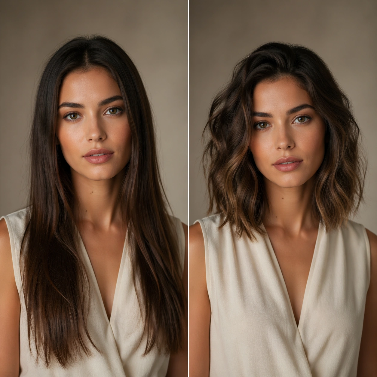
Scene: A square commercial beauty-or-fashion image designed like a polished campaign proof for Identity-Locked Hair Swap Series. Keep the camera discipline clear and believable: portrait-oriented within the square, premium studio light, controlled tonal contrast, and enough surrounding negative space to feel like an ad layout without relying on readable typography. The image should look production-ready, with realistic skin, hair, fabric, and makeup rendering that supports identity locking instead of distracting from it. Subject: Build the frame around one clearly recognizable person. Before After Board should feel like a specific transformation step that a disciplined comparison layout making transformation logic instantly legible. The face structure, age, body proportions, and general camera position must stay consistent with the same-person premise of Keep one person's identity stable while cycling through highly varied hairstyles, lengths, textures, and color treatments for salon, beauty, and fashion campaigns.. Styling, wardrobe, grooming, makeup, hair, or pose can evolve, but the viewer must believe it is unquestionably the same subject across the whole theme. Use a premium editorial-commercial tone rather than a casual portrait session. Important details: The visual test is identity consistency under change. Preserve stable bone structure, eye spacing, nose shape, lip volume, skin tone family, and believable texture response. Let the transformation be visible through styling choices instead of facial drift. This theme studies multi-image-reference, editing-workflow, photorealism, commercial-mockup through a production-ready visual system. Make the composition clean enough for client review, with professional grooming fidelity and enough detail for salon, beauty, or fashion decision-making. Aim for clear hierarchy, polished craft, and immediately usable campaign logic. Use case: Identity-Locked Hair Swap Series single study 1/5. Constraints: No readable text, no watermark, no logos, preserve exact 1:1 aspect ratio, no face drift, no inconsistent age shift, no extra limbs, no duplicate person, no asymmetric eye placement, no beauty-editorial chaos.

Example generated from “Identity Locked Hair Swap Series — Lookbook Sheet”
GPT Image 2en

Scene: A square commercial beauty-or-fashion image designed like a polished campaign proof for Identity-Locked Hair Swap Series. Keep the camera discipline clear and believable: portrait-oriented within the square, premium studio light, controlled tonal contrast, and enough surrounding negative space to feel like an ad layout without relying on readable typography. The image should look production-ready, with realistic skin, hair, fabric, and makeup rendering that supports identity locking instead of distracting from it. Subject: Build the frame around one clearly recognizable person. Lookbook Sheet should feel like a specific transformation step that a fashion or salon lookbook page using one consistent identity across multiple panels. The face structure, age, body proportions, and general camera position must stay consistent with the same-person premise of Keep one person's identity stable while cycling through highly varied hairstyles, lengths, textures, and color treatments for salon, beauty, and fashion campaigns.. Styling, wardrobe, grooming, makeup, hair, or pose can evolve, but the viewer must believe it is unquestionably the same subject across the whole theme. Use a premium editorial-commercial tone rather than a casual portrait session. Important details: The visual test is identity consistency under change. Preserve stable bone structure, eye spacing, nose shape, lip volume, skin tone family, and believable texture response. Let the transformation be visible through styling choices instead of facial drift. This theme studies multi-image-reference, editing-workflow, photorealism, commercial-mockup through a production-ready visual system. Make the composition clean enough for client review, with professional grooming fidelity and enough detail for salon, beauty, or fashion decision-making. Aim for clear hierarchy, polished craft, and immediately usable campaign logic. Use case: Identity-Locked Hair Swap Series single study 2/5. Constraints: No readable text, no watermark, no logos, preserve exact 1:1 aspect ratio, no face drift, no inconsistent age shift, no extra limbs, no duplicate person, no asymmetric eye placement, no beauty-editorial chaos.

Example generated from “Identity Locked Hair Swap Series — Detail Close-up”
GPT Image 2en

Scene: A square commercial beauty-or-fashion image designed like a polished campaign proof for Identity-Locked Hair Swap Series. Keep the camera discipline clear and believable: portrait-oriented within the square, premium studio light, controlled tonal contrast, and enough surrounding negative space to feel like an ad layout without relying on readable typography. The image should look production-ready, with realistic skin, hair, fabric, and makeup rendering that supports identity locking instead of distracting from it. Subject: Build the frame around one clearly recognizable person. Detail Close-up should feel like a specific transformation step that a close-up study focusing on texture, finish, and precise beauty or garment details. The face structure, age, body proportions, and general camera position must stay consistent with the same-person premise of Keep one person's identity stable while cycling through highly varied hairstyles, lengths, textures, and color treatments for salon, beauty, and fashion campaigns.. Styling, wardrobe, grooming, makeup, hair, or pose can evolve, but the viewer must believe it is unquestionably the same subject across the whole theme. Use a premium editorial-commercial tone rather than a casual portrait session. Important details: The visual test is identity consistency under change. Preserve stable bone structure, eye spacing, nose shape, lip volume, skin tone family, and believable texture response. Let the transformation be visible through styling choices instead of facial drift. This theme studies multi-image-reference, editing-workflow, photorealism, commercial-mockup through a production-ready visual system. Make the composition clean enough for client review, with professional grooming fidelity and enough detail for salon, beauty, or fashion decision-making. Aim for clear hierarchy, polished craft, and immediately usable campaign logic. Use case: Identity-Locked Hair Swap Series single study 3/5. Constraints: No readable text, no watermark, no logos, preserve exact 1:1 aspect ratio, no face drift, no inconsistent age shift, no extra limbs, no duplicate person, no asymmetric eye placement, no beauty-editorial chaos.

Example generated from “Identity Locked Hair Swap Series — Promo Poster”
GPT Image 2en

Scene: A square commercial beauty-or-fashion image designed like a polished campaign proof for Identity-Locked Hair Swap Series. Keep the camera discipline clear and believable: portrait-oriented within the square, premium studio light, controlled tonal contrast, and enough surrounding negative space to feel like an ad layout without relying on readable typography. The image should look production-ready, with realistic skin, hair, fabric, and makeup rendering that supports identity locking instead of distracting from it. Subject: Build the frame around one clearly recognizable person. Promo Poster should feel like a specific transformation step that a polished advertisement frame turning the same identity into a finished commercial visual. The face structure, age, body proportions, and general camera position must stay consistent with the same-person premise of Keep one person's identity stable while cycling through highly varied hairstyles, lengths, textures, and color treatments for salon, beauty, and fashion campaigns.. Styling, wardrobe, grooming, makeup, hair, or pose can evolve, but the viewer must believe it is unquestionably the same subject across the whole theme. Use a premium editorial-commercial tone rather than a casual portrait session. Important details: The visual test is identity consistency under change. Preserve stable bone structure, eye spacing, nose shape, lip volume, skin tone family, and believable texture response. Let the transformation be visible through styling choices instead of facial drift. This theme studies multi-image-reference, editing-workflow, photorealism, commercial-mockup through a production-ready visual system. Make the composition clean enough for client review, with professional grooming fidelity and enough detail for salon, beauty, or fashion decision-making. Aim for clear hierarchy, polished craft, and immediately usable campaign logic. Use case: Identity-Locked Hair Swap Series single study 4/5. Constraints: No readable text, no watermark, no logos, preserve exact 1:1 aspect ratio, no face drift, no inconsistent age shift, no extra limbs, no duplicate person, no asymmetric eye placement, no beauty-editorial chaos.

Example generated from “Identity Locked Hair Swap Series — Campaign Grid”
GPT Image 2en

Scene: A square commercial beauty-or-fashion image designed like a polished campaign proof for Identity-Locked Hair Swap Series. Keep the camera discipline clear and believable: portrait-oriented within the square, premium studio light, controlled tonal contrast, and enough surrounding negative space to feel like an ad layout without relying on readable typography. The image should look production-ready, with realistic skin, hair, fabric, and makeup rendering that supports identity locking instead of distracting from it. Subject: Build the frame around one clearly recognizable person. Campaign Grid should feel like a specific transformation step that a multi-panel rollout board proving catalog depth and consistent recognition. The face structure, age, body proportions, and general camera position must stay consistent with the same-person premise of Keep one person's identity stable while cycling through highly varied hairstyles, lengths, textures, and color treatments for salon, beauty, and fashion campaigns.. Styling, wardrobe, grooming, makeup, hair, or pose can evolve, but the viewer must believe it is unquestionably the same subject across the whole theme. Use a premium editorial-commercial tone rather than a casual portrait session. Important details: The visual test is identity consistency under change. Preserve stable bone structure, eye spacing, nose shape, lip volume, skin tone family, and believable texture response. Let the transformation be visible through styling choices instead of facial drift. This theme studies multi-image-reference, editing-workflow, photorealism, commercial-mockup through a production-ready visual system. Make the composition clean enough for client review, with professional grooming fidelity and enough detail for salon, beauty, or fashion decision-making. Aim for clear hierarchy, polished craft, and immediately usable campaign logic. Use case: Identity-Locked Hair Swap Series single study 5/5. Constraints: No readable text, no watermark, no logos, preserve exact 1:1 aspect ratio, no face drift, no inconsistent age shift, no extra limbs, no duplicate person, no asymmetric eye placement, no beauty-editorial chaos.

Example generated from “Identity Locked Hairstyle Switchboard — Reference Natural Base”
GPT Image 2en

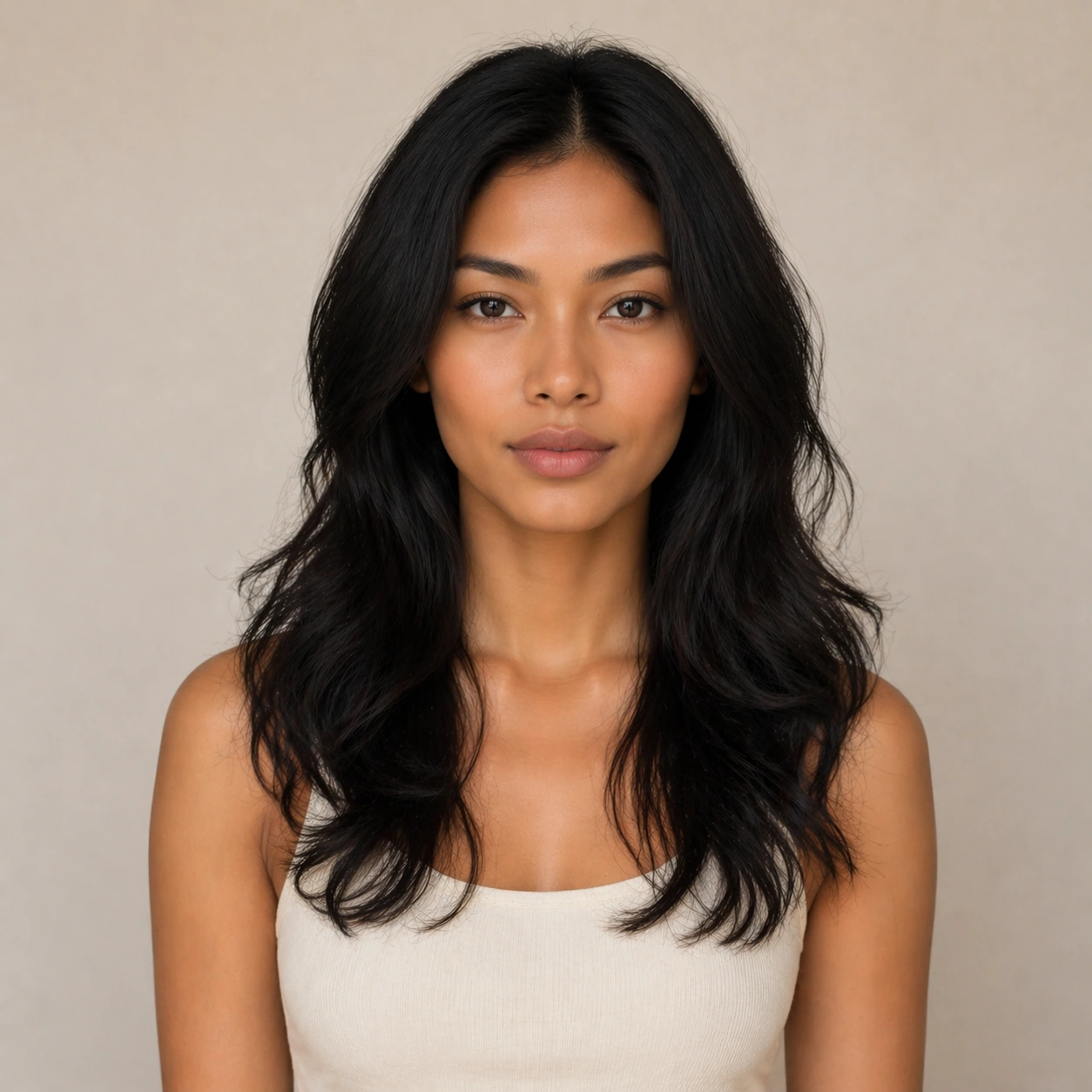
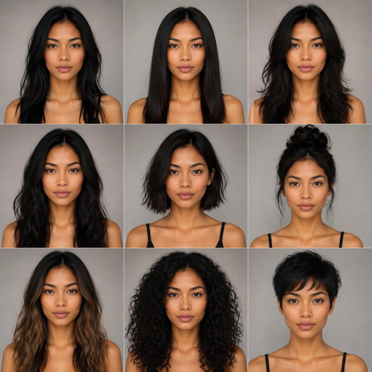
Scene: Create a square 1:1 portrait image for Identity-Locked Hairstyle Switchboard. Use a clean approval-style studio portrait with neutral light, simple wardrobe, and enough facial visibility to lock identity perfectly. The frame should feel like a finished professional deliverable rather than a casual snapshot, with clear lens discipline, believable light falloff, and a palette that directly supports Keep one face locked while exploring a broad hairstyle board across length, texture, color, and styling direction with salon-grade clarity.. Keep enough surrounding space and compositional control for gallery, research, campaign, or approval-board reuse while staying photoreal and human-scaled. Subject: Center one face-locked model with neutral tan skin, almond eyes, high cheekbones, and a clean hairline that can support dramatic restyling. Establish the exact same face, hair base, skin tone family, and body proportions that every transformation image must preserve. Use the example direction from the brief as grounding context: Keep one face locked while exploring a broad hairstyle board across length, texture, color, and styling direction with salon-grade clarity.. Wardrobe, lighting, environment, and pose may shift to serve this variation, but the viewer must immediately understand that the same reference identity is still in front of the camera. Important details: This backlog line is difficult because Keep one face locked while exploring a broad hairstyle board across length, texture, color, and styling direction with salon-grade clarity.. Preserve skin tone family, bone structure, eye spacing, nose shape, mouth shape, hairline logic, shoulder width, and overall body read across the entire series. preserve exact face / hair base / body proportions from the reference model. This baseline must read like the trustworthy approval frame before switching anything. Avoid the common failure described in the brief: ordinary image models often lose likeness once styling, lighting, or layout changes enter the frame. Success should feel like the result should feel professionally usable, coherent, and clearly built around one stable human identity. Use case: Identity-Locked Hairstyle Switchboard series study 1/9, the natural baseline look. Constraints: No readable text, no watermark, no logos, preserve exact 1:1 aspect ratio, preserve exact face / hair base / body proportions from the reference model, no heavy styling, no logo wardrobe, no beauty filter, no extra subjects.

Example generated from “Identity Locked Hairstyle Switchboard — Look Switch One”
GPT Image 2en

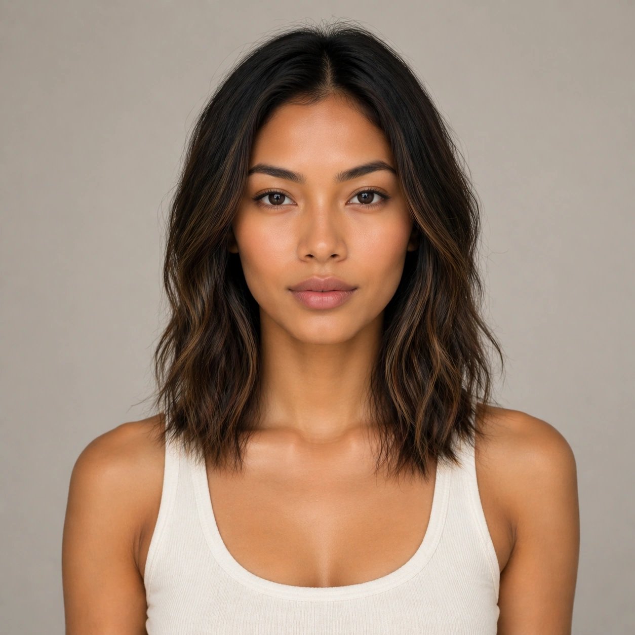
Scene: Create a square 1:1 portrait image for Identity-Locked Hairstyle Switchboard. Use a premium portrait frame with one clear change direction and enough negative space to judge styling cleanly. The frame should feel like a finished professional deliverable rather than a casual snapshot, with clear lens discipline, believable light falloff, and a palette that directly supports Keep one face locked while exploring a broad hairstyle board across length, texture, color, and styling direction with salon-grade clarity.. Keep enough surrounding space and compositional control for gallery, research, campaign, or approval-board reuse while staying photoreal and human-scaled. Subject: Center one face-locked model with neutral tan skin, almond eyes, high cheekbones, and a clean hairline that can support dramatic restyling. Keep the exact same person from the reference while executing the first major change requested by the topic, whether hair, makeup, wardrobe, grooming, or professional read. Use the example direction from the brief as grounding context: Keep one face locked while exploring a broad hairstyle board across length, texture, color, and styling direction with salon-grade clarity.. Wardrobe, lighting, environment, and pose may shift to serve this variation, but the viewer must immediately understand that the same reference identity is still in front of the camera. Important details: This backlog line is difficult because Keep one face locked while exploring a broad hairstyle board across length, texture, color, and styling direction with salon-grade clarity.. Preserve skin tone family, bone structure, eye spacing, nose shape, mouth shape, hairline logic, shoulder width, and overall body read across the entire series. preserve exact face / hair base / body proportions from the reference model. The switch must be obvious, but the identity must remain stronger than the styling change. Avoid the common failure described in the brief: ordinary image models often lose likeness once styling, lighting, or layout changes enter the frame. Success should feel like the result should feel professionally usable, coherent, and clearly built around one stable human identity. Use case: Identity-Locked Hairstyle Switchboard series study 2/9, the first controlled transformation. Constraints: No readable text, no watermark, no logos, preserve exact 1:1 aspect ratio, preserve exact face / hair base / body proportions from the reference model, no face redraw, no changed age unless explicitly asked, no costume-party exaggeration, no new body shape.

Example generated from “Identity Locked Hairstyle Switchboard — Look Switch Two”
GPT Image 2en

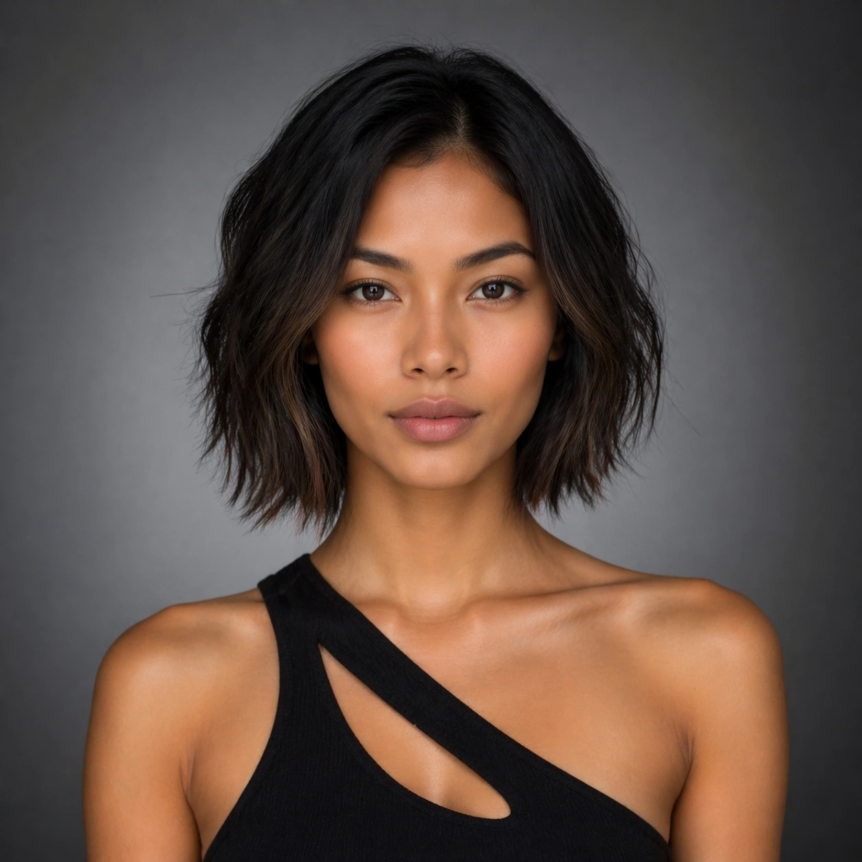
Scene: Create a square 1:1 portrait image for Identity-Locked Hairstyle Switchboard. Use a square commercial portrait proof with similar camera logic and controlled light. The frame should feel like a finished professional deliverable rather than a casual snapshot, with clear lens discipline, believable light falloff, and a palette that directly supports Keep one face locked while exploring a broad hairstyle board across length, texture, color, and styling direction with salon-grade clarity.. Keep enough surrounding space and compositional control for gallery, research, campaign, or approval-board reuse while staying photoreal and human-scaled. Subject: Center one face-locked model with neutral tan skin, almond eyes, high cheekbones, and a clean hairline that can support dramatic restyling. Preserve the same face and body while moving to a second transformation state that still feels plausible for the same person. Use the example direction from the brief as grounding context: Keep one face locked while exploring a broad hairstyle board across length, texture, color, and styling direction with salon-grade clarity.. Wardrobe, lighting, environment, and pose may shift to serve this variation, but the viewer must immediately understand that the same reference identity is still in front of the camera. Important details: This backlog line is difficult because Keep one face locked while exploring a broad hairstyle board across length, texture, color, and styling direction with salon-grade clarity.. Preserve skin tone family, bone structure, eye spacing, nose shape, mouth shape, hairline logic, shoulder width, and overall body read across the entire series. preserve exact face / hair base / body proportions from the reference model. Hairline logic, eye spacing, lip shape, and shoulder width must remain exact. Avoid the common failure described in the brief: ordinary image models often lose likeness once styling, lighting, or layout changes enter the frame. Success should feel like the result should feel professionally usable, coherent, and clearly built around one stable human identity. Use case: Identity-Locked Hairstyle Switchboard series study 3/9, the second controlled transformation. Constraints: No readable text, no watermark, no logos, preserve exact 1:1 aspect ratio, preserve exact face / hair base / body proportions from the reference model, no hairstyle that changes skull shape, no enlarged eyes, no body morphing, no logo props.

Example generated from “Identity Locked Hairstyle Switchboard — Look Switch Three”
GPT Image 2en

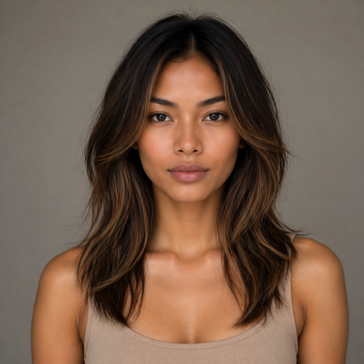
Scene: Create a square 1:1 portrait image for Identity-Locked Hairstyle Switchboard. Use a slightly bolder campaign-like frame with disciplined crop and clean light falloff. The frame should feel like a finished professional deliverable rather than a casual snapshot, with clear lens discipline, believable light falloff, and a palette that directly supports Keep one face locked while exploring a broad hairstyle board across length, texture, color, and styling direction with salon-grade clarity.. Keep enough surrounding space and compositional control for gallery, research, campaign, or approval-board reuse while staying photoreal and human-scaled. Subject: Center one face-locked model with neutral tan skin, almond eyes, high cheekbones, and a clean hairline that can support dramatic restyling. Apply a third styling direction while holding the same reference identity with no drift in age, ethnicity, or face structure. Use the example direction from the brief as grounding context: Keep one face locked while exploring a broad hairstyle board across length, texture, color, and styling direction with salon-grade clarity.. Wardrobe, lighting, environment, and pose may shift to serve this variation, but the viewer must immediately understand that the same reference identity is still in front of the camera. Important details: This backlog line is difficult because Keep one face locked while exploring a broad hairstyle board across length, texture, color, and styling direction with salon-grade clarity.. Preserve skin tone family, bone structure, eye spacing, nose shape, mouth shape, hairline logic, shoulder width, and overall body read across the entire series. preserve exact face / hair base / body proportions from the reference model. The image should prove range under control rather than spectacle for spectacle alone. Avoid the common failure described in the brief: ordinary image models often lose likeness once styling, lighting, or layout changes enter the frame. Success should feel like the result should feel professionally usable, coherent, and clearly built around one stable human identity. Use case: Identity-Locked Hairstyle Switchboard series study 4/9, the third controlled transformation. Constraints: No readable text, no watermark, no logos, preserve exact 1:1 aspect ratio, preserve exact face / hair base / body proportions from the reference model, no gimmick costume, no false lashes that change eye shape, no surreal hair physics, no second person.

Example generated from “Identity Locked Hairstyle Switchboard — Look Switch Four”
GPT Image 2en

Scene: Create a square 1:1 portrait image for Identity-Locked Hairstyle Switchboard. Use a close or mid-shot portrait that privileges detail and approval clarity over background storytelling. The frame should feel like a finished professional deliverable rather than a casual snapshot, with clear lens discipline, believable light falloff, and a palette that directly supports Keep one face locked while exploring a broad hairstyle board across length, texture, color, and styling direction with salon-grade clarity.. Keep enough surrounding space and compositional control for gallery, research, campaign, or approval-board reuse while staying photoreal and human-scaled. Subject: Center one face-locked model with neutral tan skin, almond eyes, high cheekbones, and a clean hairline that can support dramatic restyling. Keep the same exact subject while introducing another visible shift in style language, finish, or mood tied directly to the topic brief. Use the example direction from the brief as grounding context: Keep one face locked while exploring a broad hairstyle board across length, texture, color, and styling direction with salon-grade clarity.. Wardrobe, lighting, environment, and pose may shift to serve this variation, but the viewer must immediately understand that the same reference identity is still in front of the camera. Important details: This backlog line is difficult because Keep one face locked while exploring a broad hairstyle board across length, texture, color, and styling direction with salon-grade clarity.. Preserve skin tone family, bone structure, eye spacing, nose shape, mouth shape, hairline logic, shoulder width, and overall body read across the entire series. preserve exact face / hair base / body proportions from the reference model. Micro-details may change, but likeness, skin tone family, and body read cannot. Avoid the common failure described in the brief: ordinary image models often lose likeness once styling, lighting, or layout changes enter the frame. Success should feel like the result should feel professionally usable, coherent, and clearly built around one stable human identity. Use case: Identity-Locked Hairstyle Switchboard series study 5/9, the fourth controlled transformation. Constraints: No readable text, no watermark, no logos, preserve exact 1:1 aspect ratio, preserve exact face / hair base / body proportions from the reference model, no retouch blur, no facial asymmetry drift, no extra accessories noise, no unreadable product text.

Example generated from “Identity Locked Hairstyle Switchboard — Look Switch Five”
GPT Image 2en

Scene: Create a square 1:1 portrait image for Identity-Locked Hairstyle Switchboard. Use a square portrait with polished commercial finish and enough room to see styling structure clearly. The frame should feel like a finished professional deliverable rather than a casual snapshot, with clear lens discipline, believable light falloff, and a palette that directly supports Keep one face locked while exploring a broad hairstyle board across length, texture, color, and styling direction with salon-grade clarity.. Keep enough surrounding space and compositional control for gallery, research, campaign, or approval-board reuse while staying photoreal and human-scaled. Subject: Center one face-locked model with neutral tan skin, almond eyes, high cheekbones, and a clean hairline that can support dramatic restyling. Push to a fifth variation while preserving exact face / hair base / body proportions from the reference model. This should still feel like one person being art-directed, not re-generated from scratch. Use the example direction from the brief as grounding context: Keep one face locked while exploring a broad hairstyle board across length, texture, color, and styling direction with salon-grade clarity.. Wardrobe, lighting, environment, and pose may shift to serve this variation, but the viewer must immediately understand that the same reference identity is still in front of the camera. Important details: This backlog line is difficult because Keep one face locked while exploring a broad hairstyle board across length, texture, color, and styling direction with salon-grade clarity.. Preserve skin tone family, bone structure, eye spacing, nose shape, mouth shape, hairline logic, shoulder width, and overall body read across the entire series. preserve exact face / hair base / body proportions from the reference model. Keep continuity stronger than novelty. Avoid the common failure described in the brief: ordinary image models often lose likeness once styling, lighting, or layout changes enter the frame. Success should feel like the result should feel professionally usable, coherent, and clearly built around one stable human identity. Use case: Identity-Locked Hairstyle Switchboard series study 6/9, the fifth controlled transformation. Constraints: No readable text, no watermark, no logos, preserve exact 1:1 aspect ratio, preserve exact face / hair base / body proportions from the reference model, no gender drift unless explicitly relevant, no unrelated props, no costume confusion, no body-scale jump.

Example generated from “Identity Locked Hairstyle Switchboard — Look Switch Six”
GPT Image 2en

Scene: Create a square 1:1 portrait image for Identity-Locked Hairstyle Switchboard. Use a final single-look variation with confident but restrained campaign polish. The frame should feel like a finished professional deliverable rather than a casual snapshot, with clear lens discipline, believable light falloff, and a palette that directly supports Keep one face locked while exploring a broad hairstyle board across length, texture, color, and styling direction with salon-grade clarity.. Keep enough surrounding space and compositional control for gallery, research, campaign, or approval-board reuse while staying photoreal and human-scaled. Subject: Center one face-locked model with neutral tan skin, almond eyes, high cheekbones, and a clean hairline that can support dramatic restyling. Use the same person again in a sixth styling state, making sure recognition is instant before the viewer notices what changed. Use the example direction from the brief as grounding context: Keep one face locked while exploring a broad hairstyle board across length, texture, color, and styling direction with salon-grade clarity.. Wardrobe, lighting, environment, and pose may shift to serve this variation, but the viewer must immediately understand that the same reference identity is still in front of the camera. Important details: This backlog line is difficult because Keep one face locked while exploring a broad hairstyle board across length, texture, color, and styling direction with salon-grade clarity.. Preserve skin tone family, bone structure, eye spacing, nose shape, mouth shape, hairline logic, shoulder width, and overall body read across the entire series. preserve exact face / hair base / body proportions from the reference model. The transformation should feel deliberate, premium, and usable in a real salon, beauty, fashion, or casting workflow. Avoid the common failure described in the brief: ordinary image models often lose likeness once styling, lighting, or layout changes enter the frame. Success should feel like the result should feel professionally usable, coherent, and clearly built around one stable human identity. Use case: Identity-Locked Hairstyle Switchboard series study 7/9, the sixth controlled transformation. Constraints: No readable text, no watermark, no logos, preserve exact 1:1 aspect ratio, preserve exact face / hair base / body proportions from the reference model, no hidden face, no perspective warp, no dramatic environment change, no AI-gloss artifacts.

Example generated from “Identity Locked Hairstyle Switchboard — Detail Proof Board”
GPT Image 2en

Scene: Create a square 1:1 portrait image for Identity-Locked Hairstyle Switchboard. Use a square composition that can include multiple tight crops or one richer close-up, but still reads as one coherent portrait asset. The frame should feel like a finished professional deliverable rather than a casual snapshot, with clear lens discipline, believable light falloff, and a palette that directly supports Keep one face locked while exploring a broad hairstyle board across length, texture, color, and styling direction with salon-grade clarity.. Keep enough surrounding space and compositional control for gallery, research, campaign, or approval-board reuse while staying photoreal and human-scaled. Subject: Center one face-locked model with neutral tan skin, almond eyes, high cheekbones, and a clean hairline that can support dramatic restyling. Stay locked to the same identity while emphasizing the evidence of the switch: hair texture, makeup finish, beard line, garment detail, or aging cues depending on the topic. Use the example direction from the brief as grounding context: Keep one face locked while exploring a broad hairstyle board across length, texture, color, and styling direction with salon-grade clarity.. Wardrobe, lighting, environment, and pose may shift to serve this variation, but the viewer must immediately understand that the same reference identity is still in front of the camera. Important details: This backlog line is difficult because Keep one face locked while exploring a broad hairstyle board across length, texture, color, and styling direction with salon-grade clarity.. Preserve skin tone family, bone structure, eye spacing, nose shape, mouth shape, hairline logic, shoulder width, and overall body read across the entire series. preserve exact face / hair base / body proportions from the reference model. This frame should support professional review and decision making without readable text. Avoid the common failure described in the brief: ordinary image models often lose likeness once styling, lighting, or layout changes enter the frame. Success should feel like the result should feel professionally usable, coherent, and clearly built around one stable human identity. Use case: Identity-Locked Hairstyle Switchboard series study 8/9, a detail-proof or comparison board. Constraints: No readable text, no watermark, no logos, preserve exact 1:1 aspect ratio, preserve exact face / hair base / body proportions from the reference model, no readable labels, no broken panel alignment, no detached close-up fragments, no face drift.

Example generated from “Identity Locked Hairstyle Switchboard — Campaign Finale”
GPT Image 2en

Scene: Create a square 1:1 portrait image for Identity-Locked Hairstyle Switchboard. Use a square commercial finish with strong portrait presence, premium negative space, and final-asset confidence. The frame should feel like a finished professional deliverable rather than a casual snapshot, with clear lens discipline, believable light falloff, and a palette that directly supports Keep one face locked while exploring a broad hairstyle board across length, texture, color, and styling direction with salon-grade clarity.. Keep enough surrounding space and compositional control for gallery, research, campaign, or approval-board reuse while staying photoreal and human-scaled. Subject: Center one face-locked model with neutral tan skin, almond eyes, high cheekbones, and a clean hairline that can support dramatic restyling. Resolve the same identity into a final hero image that proves the transformation line can ship as a real campaign, promo board, or salon approval visual. Use the example direction from the brief as grounding context: Keep one face locked while exploring a broad hairstyle board across length, texture, color, and styling direction with salon-grade clarity.. Wardrobe, lighting, environment, and pose may shift to serve this variation, but the viewer must immediately understand that the same reference identity is still in front of the camera. Important details: This backlog line is difficult because Keep one face locked while exploring a broad hairstyle board across length, texture, color, and styling direction with salon-grade clarity.. Preserve skin tone family, bone structure, eye spacing, nose shape, mouth shape, hairline logic, shoulder width, and overall body read across the entire series. preserve exact face / hair base / body proportions from the reference model. The final degree of polish cannot erase the exact same-person read established in image 01. Avoid the common failure described in the brief: ordinary image models often lose likeness once styling, lighting, or layout changes enter the frame. Success should feel like the result should feel professionally usable, coherent, and clearly built around one stable human identity. Use case: Identity-Locked Hairstyle Switchboard series study 9/9, a polished campaign finale. Constraints: No readable text, no watermark, no logos, preserve exact 1:1 aspect ratio, preserve exact face / hair base / body proportions from the reference model, no readable copy, no logos, no poster clutter, no identity reset.

Example generated from “Ikea Instruction World — Assemble a Life”
GPT Image 2en

Scene: A square flat-pack instruction manual page on clean white paper, viewed straight-on like a commercial product insert. The style is precise black vector-like technical line art with sparse blue and yellow accent blocks, thin gray construction lines, and generous margins. The page is divided into a clear cover band, a parts inventory, and six diagram panels, but all labels are blank blocks or pseudo marks rather than readable words. Subject: An imaginary kit for assembling a human life across fifty years. The parts inventory shows a crib panel, school desk, bicycle wheel, apartment key, work lamp, travel suitcase, family table, medical chart shape, rocking chair, memory boxes, and many tiny connector pegs. Small faceless instruction figures use hex keys, arrows, and puzzled expressions to assemble these parts into a winding timeline shelf. The final panel shows the life structure standing like a modular bookcase with rooms, doors, and keepsakes. Important details: The humor must come from treating life milestones as furniture hardware. Use exploded diagrams, numbered-looking step circles without readable numerals, warning icons with expressive little figures, twist arrows, check marks, X marks, and one oversized hex key. Keep the layout professionally balanced: every panel should be legible, aligned, and clean enough to pass as a real assembly sheet. Use case: IKEA Instruction World single study 1/8, translating a fifty-year life into a flat-pack technical instruction diagram. Constraints: No readable text, no watermark, no logos, preserve exact 1:1 aspect ratio, no real brand marks, no actual product names, no messy comic page, no photorealistic furniture showroom, no dense illegible labels, no broken arrows.

Example generated from “Ikea Instruction World — Relationship Flat-Pack”
GPT Image 2en

Scene: A square instruction leaflet laid out on white paper, straight-on, with crisp black technical drawing, sparse blue-yellow accents, gray fold marks, and a disciplined grid. The page has a parts list on the left, a caution strip at the top, and four large assembly panels in a two-by-two arrangement. Use blank label bars and symbolic glyphs only, so the design reads as a manual without readable language. Subject: A flat-pack kit for assembling a relationship. The parts include two chair-like heart brackets, trust dowels, tiny conversation hinges, calendar pegs, apology washers, shared-blanket panels, boundary spacers, and a fragile glass patience shelf. Two simple instruction figures work together: one holds an oversized hex key, the other steadies a wobbling emotional frame. The final assembly is a small two-seat bench-house hybrid with balanced legs, cushions, shelves, and open windows. Important details: Show the relationship as a technical system that fails if parts are forced: one panel shows crossed-out over-tightening, another shows alignment arrows between two separate panels, another shows missing washer chaos, and the final panel shows a clean check-marked structure. Keep the humor dry and diagrammatic. The layout must be orderly, with consistent stroke weight, no crowded labels, and clear visual hierarchy from inventory to steps to final object. Use case: IKEA Instruction World single study 2/8, turning a relationship into a structured flat-pack assembly diagram. Constraints: No readable text, no watermark, no logos, preserve exact 1:1 aspect ratio, no real brand identity, no romance-card lettering, no photorealism, no cluttered scrapbook, no actual numbered text, no broken panel grid.

Example generated from “Ikea Instruction World — Hot Sour Soup Kit”
GPT Image 2en

Scene: A square flat-pack food instruction sheet in the language of furniture assembly: white background, black technical line art, clean grid, small blue and yellow accent shapes, and precise exploded diagrams. The page is viewed perfectly straight-on. It includes a large bowl assembly diagram, ingredient hardware inventory, directional arrows, and warning icons, but every label area is blank or filled with non-readable pseudo strokes. Subject: A kit for assembling a bowl of hot and sour soup as if it were a modular cabinet. The parts inventory includes tofu cubes as shelf blocks, wood ear mushrooms as curved brackets, bamboo shoots as slats, egg ribbons as flexible straps, pepper dots as tiny screws, vinegar droplets as connector caps, scallions as trim rails, and broth as a transparent bowl shell. Small instruction figures use a hex key, ladle, and alignment arrows to insert ingredients in the correct order. Important details: Make the soup visually delicious while preserving the absurd manual logic. Show an exploded bowl cross-section, one panel with crossed-out incorrect layering, one panel where the broth shell lowers over the ingredients, and one final assembled bowl with steam drawn as technical airflow lines. Keep the linework clean and the parts identifiable. The humor should be instantly clear without readable captions. Use case: IKEA Instruction World single study 3/8, converting a bowl of hot and sour soup into a technical flat-pack assembly sheet. Constraints: No readable text, no watermark, no logos, preserve exact 1:1 aspect ratio, no real restaurant branding, no messy recipe typography, no photorealistic food photo, no illegible dense labels, no extra decorative border, no actual product codes.

Example generated from “Ikea Instruction World — Rainy Day Mood Kit”
GPT Image 2en

Scene: A square commercial instruction manual page with clean white space, black technical linework, pale gray panel dividers, and restrained blue-yellow accent symbols. The viewpoint is straight-on and flat, like a scanned product insert. The layout contains a top safety row, a central exploded diagram, and three lower step panels. All text zones are reduced to blank blocks or unreadable miniature strokes. Subject: A rainy-day mood kit assembled from emotional and domestic parts. The inventory shows a cloud canopy, umbrella ribs, blanket panel, mug cylinder, window frame, lamp cone, music-note-shaped silent glyphs, tiny raindrop fasteners, and a couch base. A small instruction figure wearing socks uses a hex key to attach comfort brackets to a gloomy cloud while another figure tests the completed cozy corner. The final object is a compact shelter: cloud outside, warm lamp inside, blanket shelf, mug holder, and rain neatly diverted into a side gutter. Important details: The manual should clearly explain mood repair through assembly logic. Include arrows showing rain routed away, a crossed-out panel where the figure sits under an unsupported cloud, and a check-mark panel where the lamp, blanket, and mug align correctly. Keep the figure expressions simple and iconic. The diagram must look functional and polished, not like a loose cartoon. Use case: IKEA Instruction World single study 4/8, making a rainy-day emotional state into a clean flat-pack comfort system. Constraints: No readable text, no watermark, no logos, preserve exact 1:1 aspect ratio, no real brand design, no readable step numbers, no cluttered cozy illustration, no photorealistic room, no chaotic weather, no broken instruction arrows.

Example generated from “Ikea Instruction World — Apartment Move Cart”
GPT Image 2en

Scene: A square flat-pack moving manual on a bright white page, laid out with strict information-design hierarchy, black technical line art, small blue and yellow accents, and light gray registration marks. The page looks like a folded instruction insert for a modular cart system. It has a large exploded diagram in the center, a parts checklist at the side, and four small step panels around it with blank label strips only. Subject: A kit for moving into a new apartment. The parts inventory shows sofa panels, bed slats, bookshelf boards, plant pots, lamp shades, cardboard boxes, door keys, elevator buttons as abstract icons, tape rolls, wheels, and a small emotional-support snack tray. Tiny instruction figures push, lift, rotate, and align the pieces into a single impossible moving cart that unfolds into a furnished studio apartment. Important details: The main visual joke is that the entire stressful move is treated as one furniture assembly. Show correct and incorrect lifting posture icons, arrows that rotate a sofa through a doorway, caster wheels attaching to a cardboard box stack, and a final check panel where the apartment locks into place. Keep the diagrams plausible, clean, and mechanically satisfying. Avoid real labels; rely on icons and silhouettes for meaning. Use case: IKEA Instruction World single study 5/8, turning an apartment move into a modular assembly-cart instruction sheet. Constraints: No readable text, no watermark, no logos, preserve exact 1:1 aspect ratio, no real store branding, no actual street address, no cluttered moving-photo scene, no unreadable typography, no chaotic piles hiding the diagram, no broken technical perspective.

Example generated from “Ikea Instruction World — Creative Burnout Repair”
GPT Image 2en

Scene: A square repair instruction page in a minimal flat-pack manual style, straight-on on white paper. The drawing language is black technical line art with thin gray alignment guides, blue safety arrows, yellow caution shapes, and tidy modular panels. The layout includes a diagnosis strip, an exploded repair diagram, and three lower reassembly steps. All labels are non-readable pseudo marks or empty bars. Subject: A kit for repairing creative burnout as if it were a malfunctioning desk lamp and workbench. The inventory contains a dim idea bulb, tangled cable, empty battery pack, calendar pressure plate, coffee mug cylinder, rest cushion, walk-outside wheel, sketchbook panel, and small patience screws. A tired instruction figure removes the overloaded pressure plate with a hex key, replaces it with a rest spacer, untangles the cable, and reattaches the idea bulb. Important details: Keep the diagram funny but precise. One panel should show a crossed-out setup where the calendar plate crushes the bulb. Another should show correct spacing between work, sleep, and play modules. The final panel shows a clean glowing workbench with the figure standing calmly. Use assembly arrows, dashed alignment paths, warning triangles, and check marks, but no readable instructions. Make the emotional metaphor readable through objects alone. Use case: IKEA Instruction World single study 6/8, presenting creative burnout recovery as a flat-pack repair procedure. Constraints: No readable text, no watermark, no logos, preserve exact 1:1 aspect ratio, no real brand marks, no therapy poster lettering, no messy notebook collage, no photorealistic office, no doom mood, no illegible instruction clutter.

Example generated from “Ikea Instruction World — Friendship Shelf System”
GPT Image 2en

Scene: A square modular instruction manual page on white paper, with crisp black technical drawing, pale gray panel gutters, and small blue-yellow accent symbols. The page is organized like a real flat-pack shelf assembly sheet: hardware inventory at top, exploded structure in the middle, and final-use icons along the bottom. All written zones are blank blocks or pseudo strokes, with no readable language. Subject: A friendship shelf system assembled from shared-memory boards, message pegs, time brackets, listening hinges, joke drawers, tea cups, spare chairs, and repair patches. Two small instruction figures cooperate from opposite sides of the shelf: one holds a board steady, one tightens a hex bolt, and a third tiny figure arrives later with an extra connector. The final shelf is asymmetrical but balanced, holding keepsakes, plants, mugs, and open space for future parts. Important details: The instruction logic should show friendship as maintenance, not instant assembly. Include one panel with crossed-out overloading, one panel showing equal tightening from both sides, one panel with a replacement patch for a cracked board, and one panel showing optional expansion modules. Keep all arrows clear, all parts separated in exploded view, and all figure expressions simple. The manual should feel commercial and technical while carrying a warm conceptual joke. Use case: IKEA Instruction World single study 7/8, turning friendship into a modular shelf assembly and maintenance diagram. Constraints: No readable text, no watermark, no logos, preserve exact 1:1 aspect ratio, no real brand marks, no sentimental typography, no cluttered gift collage, no photorealistic shelf photo, no hard-to-follow arrows, no actual numbered labels.

Example generated from “Ikea Instruction World — Weekend Camping Module”
GPT Image 2en

Scene: A square flat-pack outdoor instruction sheet with clean white background, black technical line art, light gray layout grid, and restrained blue-yellow accent marks. The page is viewed straight-on and divided into a parts inventory, a large exploded campsite diagram, and four compact step panels. Text areas are deliberately blank or filled with unreadable pseudo marks so the image relies on diagram structure. Subject: A weekend camping module treated like a furniture kit. The parts include tent panels, sleeping bag rolls, camp stove cylinder, lantern cone, pine-tree brackets, river strip, folding chair slats, marshmallow pegs, cloud cover panel, and a tiny crescent moon hook. Small instruction figures use a hex key and mallet to attach nature to a portable base platform, then unfold a complete campsite with tent, fire ring, chairs, and weather shield. Important details: Show the landscape as assembled hardware: trees slot into base holes, the river strip snaps around the platform edge, the tent frame folds up from numbered-looking but unreadable icons, and a warning panel shows crossed-out campfire too close to the tent. The final panel should be charming but still technical. Maintain precise alignment, consistent stroke weight, clean arrows, and strong separation between inventory, process, and finished module. Use case: IKEA Instruction World single study 8/8, converting a weekend camping trip into a modular outdoor assembly manual. Constraints: No readable text, no watermark, no logos, preserve exact 1:1 aspect ratio, no real outdoor brand names, no photorealistic campsite, no cluttered travel poster, no actual step numbers, no unsafe fire detail, no broken grid layout.

Example generated from “Impossible Candy Architecture — Sugar Cathedral Anchor”
GPT Image 2en

Scene: Create a square architectural photograph of an edible miniature city built from sugar and chocolate, lit like a serious built-environment hero shot rather than a whimsical craft display. The composition should imply scale through streets, openings, and tiny pathways while keeping the material identity unmistakably confectionary. Light must reveal translucency, lacework, caramel tension, and crystal sparkle without flattening the forms. Frame the city like a serious twilight architectural photograph, with the hero structure occupying the central skyline and secondary streets receding around it. Warm internal glow should pass through translucent sugar walls and rose-window-like crystal geometry, while the surrounding ground plane remains dark and dignified. Subject: Construct a miniature cathedral from blown sugar buttresses, spun-sugar tracery, and rock-candy window insets, all rising above tiny confectionary streets. Bridges of pulled caramel may connect adjacent annexes, and dark chocolate paving can define the plaza below. The city should feel majestic and meticulously engineered, not merely decorative. Important details: Treat the city as structurally plausible even when the materials are fantastical. Blown sugar should refract like fragile glass, pulled caramel should show tension and stretch, and dark chocolate should carry matte-to-satin variation where appropriate. The image should balance wonder with discipline, as if photographed for an architecture journal about impossible edible construction. This first image establishes the architectural camera height, dusk atmosphere, and edible-material logic for the series, so scale cues, skyline rhythm, and glow behavior must feel stable and repeatable. Sugar translucency should read as fragile yet structural, and no single element should betray gravity entirely. Use case: Candy architecture series study 1/9, establishing the skyline anchor for the edible city. Constraints: No readable text, no watermark, no logos, preserve exact 1:1 aspect ratio, no candy wrappers, no toy-town props, no gingerbread-house cliches, no cartoon palette overload, no readable signage, no gingerbread ornaments, no rainbow candy canes, no fantasy text banners.

Example generated from “Impossible Candy Architecture — Caramel Bridge Quarter”
GPT Image 2en

Scene: Create a square architectural photograph of an edible miniature city built from sugar and chocolate, lit like a serious built-environment hero shot rather than a whimsical craft display. The composition should imply scale through streets, openings, and tiny pathways while keeping the material identity unmistakably confectionary. Light must reveal translucency, lacework, caramel tension, and crystal sparkle without flattening the forms. Keep the exact camera height, twilight mood, and city-scale framing from the reference image so the edible metropolis still feels like one coherent place. The light should rake across stretched caramel members and make them glow amber against the darker urban base. Subject: Feature a district dominated by elegant pulled-caramel suspension bridges spanning dark chocolate canals, with sugar towers and crystal pylons anchoring the structure. Small confectionary streets and glazed courtyards should support the bridge network without stealing focus. The whole quarter should feel plausible enough to imagine walking through, despite the impossible materials. Important details: Treat the city as structurally plausible even when the materials are fantastical. Blown sugar should refract like fragile glass, pulled caramel should show tension and stretch, and dark chocolate should carry matte-to-satin variation where appropriate. The image should balance wonder with discipline, as if photographed for an architecture journal about impossible edible construction. Preserve exact skyline rhythm, camera logic, and dusk lighting family from the reference model while shifting the structural emphasis toward tension members and span design. Caramel should look stretched, glossy, and load-bearing, with believable thickness changes near anchor points. Use case: Candy architecture series study 2/9, translating the anchor skyline into a bridge-heavy caramel quarter. Constraints: No readable text, no watermark, no logos, preserve exact 1:1 aspect ratio, no candy wrappers, no toy-town props, no gingerbread-house cliches, no cartoon palette overload, no readable signage, no gummy-bear motifs, no carnival lighting, no random candy sprinkles.

Example generated from “Impossible Candy Architecture — Chocolate Lace Hotel”
GPT Image 2en

Scene: Create a square architectural photograph of an edible miniature city built from sugar and chocolate, lit like a serious built-environment hero shot rather than a whimsical craft display. The composition should imply scale through streets, openings, and tiny pathways while keeping the material identity unmistakably confectionary. Light must reveal translucency, lacework, caramel tension, and crystal sparkle without flattening the forms. Maintain the same architectural camera height, dusk exposure, and disciplined urban framing from the reference image so the district reads as part of the same city. Let the light skim across intricate chocolate lace facades and reveal hollow depth behind the pattern. Subject: Show a grand hotel block built from dark and milk chocolate lattice panels, supported by glossy ganache columns and sugar-glass atrium roofs. Fine chocolate filigree balconies, edible-metallic trim, and crystalline awnings can add richness, but the building must remain structurally legible. The district should feel luxurious and slightly surreal, not whimsical. Important details: Treat the city as structurally plausible even when the materials are fantastical. Blown sugar should refract like fragile glass, pulled caramel should show tension and stretch, and dark chocolate should carry matte-to-satin variation where appropriate. The image should balance wonder with discipline, as if photographed for an architecture journal about impossible edible construction. Preserve exact skyline discipline, twilight color family, and street-scale logic from the reference model while shifting the hero material toward chocolate lace and ganache surfaces. The lacework needs enough thickness and support points to feel believable even in fantasy. Use case: Candy architecture series study 3/9, adapting the anchor metropolis into a chocolate-lace hotel district. Constraints: No readable text, no watermark, no logos, preserve exact 1:1 aspect ratio, no candy wrappers, no toy-town props, no gingerbread-house cliches, no cartoon palette overload, no readable signage, no molded candy figurines, no pastry-shop display tray vibe, no readable marquee.

Example generated from “Impossible Candy Architecture — Rock Candy Transit Hall”
GPT Image 2en

Scene: Create a square architectural photograph of an edible miniature city built from sugar and chocolate, lit like a serious built-environment hero shot rather than a whimsical craft display. The composition should imply scale through streets, openings, and tiny pathways while keeping the material identity unmistakably confectionary. Light must reveal translucency, lacework, caramel tension, and crystal sparkle without flattening the forms. Use the same city-scale viewpoint, dusk lighting, and urban framing established by the reference image, but center the composition around a broad station-like hall and converging edible streets. The atmosphere should remain cinematic and architectural rather than playful. Subject: Build a transit hall from sugar-glass vaults, rock-candy columns, and dark chocolate platforms linked by caramel canopies. The hall should feel like a public infrastructure node within the edible city, with clear circulation paths, layered entrances, and believable roof spans. Tiny glowing interiors can hint at life without introducing figures. Important details: Treat the city as structurally plausible even when the materials are fantastical. Blown sugar should refract like fragile glass, pulled caramel should show tension and stretch, and dark chocolate should carry matte-to-satin variation where appropriate. The image should balance wonder with discipline, as if photographed for an architecture journal about impossible edible construction. Preserve exact city perspective, skyline rhythm, and dusk material behavior from the reference model while moving the focus toward circulation space and crystalline interiors. Rock-candy columns should sparkle with faceted realism, and the roof spans must feel engineered, not arbitrary. Use case: Candy architecture series study 4/9, completing the anchor city with a crystal transit hall district. Constraints: No readable text, no watermark, no logos, preserve exact 1:1 aspect ratio, no candy wrappers, no toy-town props, no gingerbread-house cliches, no cartoon palette overload, no readable signage, no toy train props, no fairground mood, no signage text.

Example generated from “Impossible Candy Architecture — Atrium Cross-Section”
GPT Image 2en

Scene: Create a square architectural photograph of an edible miniature city built from sugar and chocolate, lit like a serious built-environment hero shot rather than a whimsical craft display. The composition should imply scale through streets, openings, and tiny pathways while keeping the material identity unmistakably confectionary. Light must reveal translucency, lacework, caramel tension, and crystal sparkle without flattening the forms. Use a square frontal architectural cutaway view against a dark background, with enough lighting to reveal both outer facade and inner atrium depth. The scene should feel analytical and luxurious at the same time. Subject: Slice through a grand hotel built from chocolate lattice, sugar-glass skylights, and caramel stairways so the viewer can see lobby voids, balcony tiers, and inner circulation. Interior spaces should glow warmly through translucent sugar surfaces, while darker chocolate structure frames the void. The cutaway should feel plausible as architecture despite the impossible materials. Important details: Treat the city as structurally plausible even when the materials are fantastical. Blown sugar should refract like fragile glass, pulled caramel should show tension and stretch, and dark chocolate should carry matte-to-satin variation where appropriate. The image should balance wonder with discipline, as if photographed for an architecture journal about impossible edible construction. Balance section clarity with material realism: every beam, stair, and facade skin needs structural logic, while the confection textures remain unmistakable. The image should read like a serious architectural section plate made from dessert materials. Use case: Candy architecture single study 6/9, examining edible structure through a grand atrium cutaway. Constraints: No readable text, no watermark, no logos, preserve exact 1:1 aspect ratio, no candy wrappers, no toy-town props, no gingerbread-house cliches, no cartoon palette overload, no readable signage, no toy miniatures, no readable room labels, no collapsed section edges.