PROMPTS · EXPLORATION CRÉATIVE

Galerie de prompts

Explorez des prompts réels et leurs exemples générés. Trouvez l’inspiration pour votre prochaine mission créative et copiez le texte intégral gratuitement.

Exemples
10,974
Modèles
17
Sources
1277
10 974 exemples de prompts · page 45 sur 229
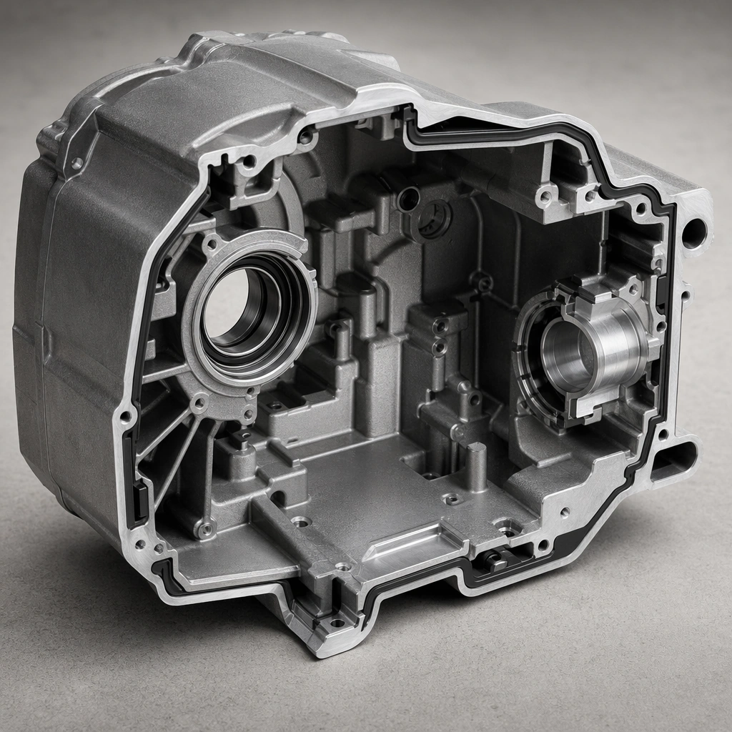
Example generated from “Industrial Product Exploded View Suite — Sectioned Housing”
GPT Image 2en

Scene: A square close technical composition with an angled cut plane, crisp neutral lighting, and dark-free material honesty. Compose the frame as a square key visual with disciplined camera placement, premium lighting control, and believable real-world scale. The tonal range should feel polished and intentional, with enough atmosphere to create depth without obscuring form. Keep contrast calibrated for launch, catalog, or research presentation use rather than casual snapshot aesthetics. Subject: Center an original industrial housing split open to reveal ribs, mounts, seals, and internal volume organization. Make the subject feel original, production-aware, and clearly grounded in Industrial Product Exploded View Suite. Treat this as an independent study that must feel complete and coherent without relying on any external reference image. The focal hierarchy should be immediate: primary form first, then material behavior, then supporting environmental cues that clarify use context and difficulty. Important details: The cut plane should feel engineered and exact, not torn or decorative. Structural decisions must read as plausible and purposeful. The visual language should still feel native to Industrial Product Exploded View Suite, using disciplined industrial or campaign composition instead of generic stock photography. Use believable materials, engineering logic, and professional composition discipline. Reflections, shadows, edge breaks, texture scale, interface density, and small physical joints must all support realism. Avoid filler props, vague mood-board clutter, or any element that weakens the sense of a purpose-built industrial or automotive image. Use case: Exploded Views single study 6/9 for Industrial Product Exploded View Suite, built as image support-two. Constraints: No readable text, no watermark, no logos, preserve exact 1:1 aspect ratio, no readable labels, no logos, no fantasy glowing cores, no chaotic wire nests, no meaningless arrows, no decorative clutter.
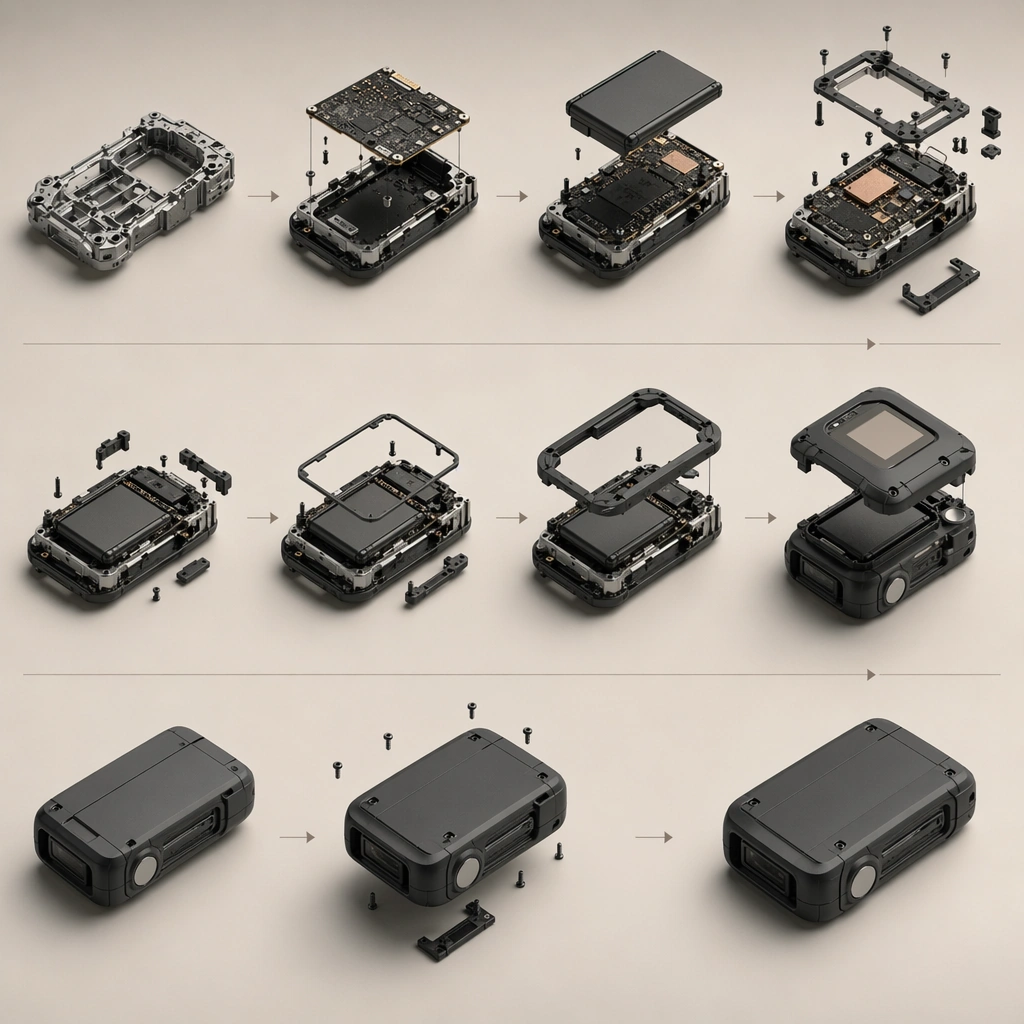
Example generated from “Industrial Product Exploded View Suite — Assembly Sequence”
GPT Image 2en

Scene: A square sequence board with repeated product states, subtle arrows, even lighting, and carefully staged hierarchy. Compose the frame as a square key visual with disciplined camera placement, premium lighting control, and believable real-world scale. The tonal range should feel polished and intentional, with enough atmosphere to create depth without obscuring form. Keep contrast calibrated for launch, catalog, or research presentation use rather than casual snapshot aesthetics. Subject: Center original device states progressing from frame to electronics to shell closure in a coherent assembly order. Make the subject feel original, production-aware, and clearly grounded in Industrial Product Exploded View Suite. Treat this as an independent study that must feel complete and coherent without relying on any external reference image. The focal hierarchy should be immediate: primary form first, then material behavior, then supporting environmental cues that clarify use context and difficulty. Important details: Keep graphics abstract and non-readable while the process order remains obvious. The board should feel like an approved manufacturing communication aid. The visual language should still feel native to Industrial Product Exploded View Suite, using disciplined industrial or campaign composition instead of generic stock photography. Use believable materials, engineering logic, and professional composition discipline. Reflections, shadows, edge breaks, texture scale, interface density, and small physical joints must all support realism. Avoid filler props, vague mood-board clutter, or any element that weakens the sense of a purpose-built industrial or automotive image. Use case: Exploded Views single study 7/9 for Industrial Product Exploded View Suite, built as image support-three. Constraints: No readable text, no watermark, no logos, preserve exact 1:1 aspect ratio, no readable labels, no logos, no fantasy glowing cores, no chaotic wire nests, no meaningless arrows, no decorative clutter.
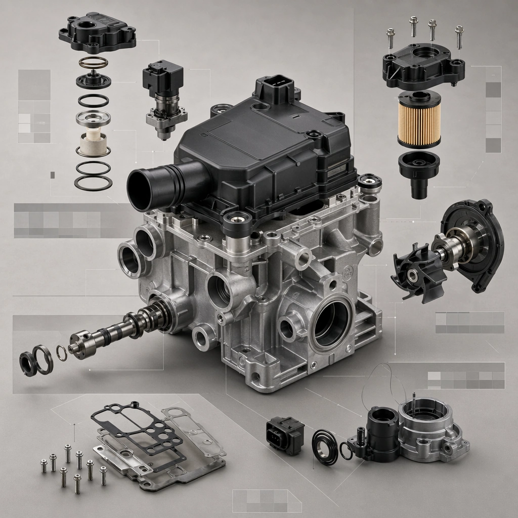
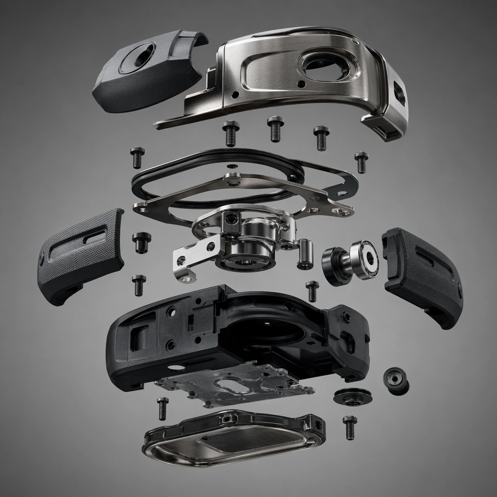
Example generated from “Industrial Product Exploded View Suite — Material Fastener Macro”
GPT Image 2en

Scene: A square macro setup with grazing light and strong texture contrast over metal, polymer, and rubber surfaces. Compose the frame as a square key visual with disciplined camera placement, premium lighting control, and believable real-world scale. The tonal range should feel polished and intentional, with enough atmosphere to create depth without obscuring form. Keep contrast calibrated for launch, catalog, or research presentation use rather than casual snapshot aesthetics. Subject: Center original fasteners, gasket edges, metal shell fragments, and rubber overmold zones viewed at close range. Make the subject feel original, production-aware, and clearly grounded in Industrial Product Exploded View Suite. Treat this as an independent study that must feel complete and coherent without relying on any external reference image. The focal hierarchy should be immediate: primary form first, then material behavior, then supporting environmental cues that clarify use context and difficulty. Important details: Stress believable tolerances, production finish, and purposeful engineering contact points instead of dramatic cinematic stylization. The visual language should still feel native to Industrial Product Exploded View Suite, using disciplined industrial or campaign composition instead of generic stock photography. Use believable materials, engineering logic, and professional composition discipline. Reflections, shadows, edge breaks, texture scale, interface density, and small physical joints must all support realism. Avoid filler props, vague mood-board clutter, or any element that weakens the sense of a purpose-built industrial or automotive image. Use case: Exploded Views single study 8/9 for Industrial Product Exploded View Suite, built as image support-four. Constraints: No readable text, no watermark, no logos, preserve exact 1:1 aspect ratio, no readable labels, no logos, no fantasy glowing cores, no chaotic wire nests, no meaningless arrows, no decorative clutter.
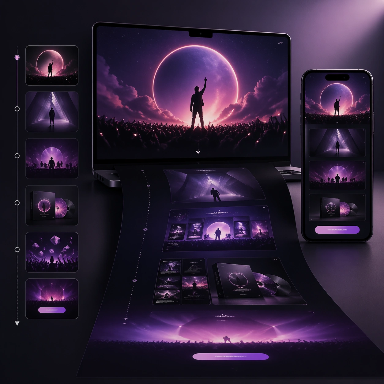
Example generated from “Industrial Product Exploded View Suite — Catalog Hero Sheet”
GPT Image 2en

Scene: A square catalog board with clear zoning, premium lighting, and one hero product angle supported by smaller technical fragments. Compose the frame as a square key visual with disciplined camera placement, premium lighting control, and believable real-world scale. The tonal range should feel polished and intentional, with enough atmosphere to create depth without obscuring form. Keep contrast calibrated for launch, catalog, or research presentation use rather than casual snapshot aesthetics. Subject: Center an original industrial product system presented as if for a professional catalog spread with no readable copy. Make the subject feel original, production-aware, and clearly grounded in Industrial Product Exploded View Suite. Treat this as an independent study that must feel complete and coherent without relying on any external reference image. The focal hierarchy should be immediate: primary form first, then material behavior, then supporting environmental cues that clarify use context and difficulty. Important details: Keep all graphic areas abstract and text-free while the overall page feels sellable, technical, and completely intentional. The visual language should still feel native to Industrial Product Exploded View Suite, using disciplined industrial or campaign composition instead of generic stock photography. Use believable materials, engineering logic, and professional composition discipline. Reflections, shadows, edge breaks, texture scale, interface density, and small physical joints must all support realism. Avoid filler props, vague mood-board clutter, or any element that weakens the sense of a purpose-built industrial or automotive image. Use case: Exploded Views single study 9/9 for Industrial Product Exploded View Suite, built as image support-five. Constraints: No readable text, no watermark, no logos, preserve exact 1:1 aspect ratio, no readable labels, no logos, no fantasy glowing cores, no chaotic wire nests, no meaningless arrows, no decorative clutter.
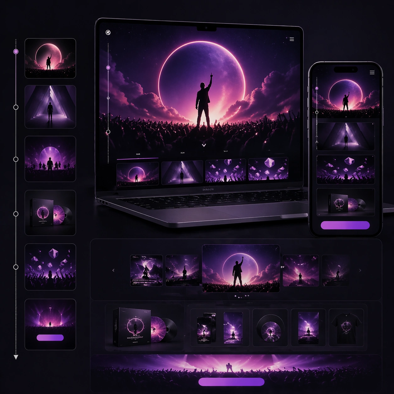
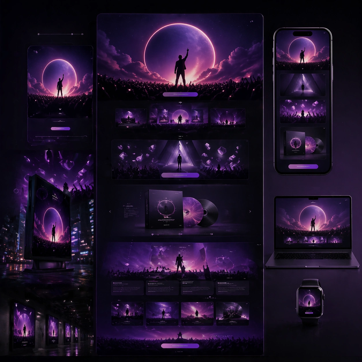
Example generated from “Interactive Web Campaign Mockup — Anchor Visual”
GPT Image 2en

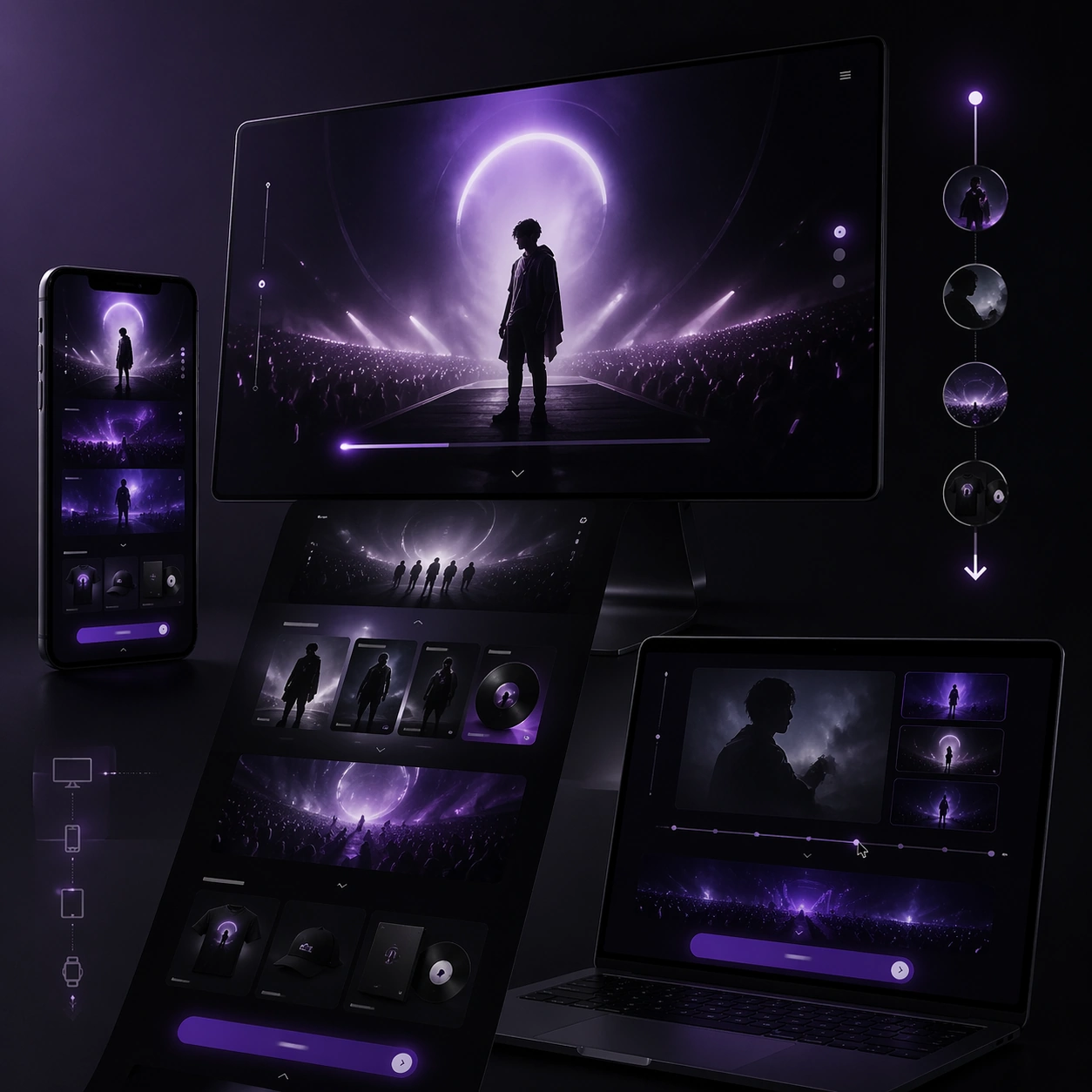
Scene: A square premium campaign composition with strong negative space, crisp hierarchy, and a polished presentation surface appropriate for Interactive Web Campaign Mockup. The image should feel like a proposal-ready marketing asset rather than a casual mockup, with deliberate pacing across foreground, midground, and background. Build the frame around 多设备 mockup + 滚动叙事 + 转化区, using lighting, device or media framing, and environment cues that suggest a real rollout system. Reference the spirit of 品牌联名、限定发售、演唱会巡演或电影宣发活动页的多屏宣传网页提案。 while keeping the result original and commercially plausible. Subject: Create the anchor asset that establishes the campaign hierarchy, pacing, and premium surface logic. for the Interactive Web Campaign Mockup theme. The central visual system should read immediately, with a clear lead element, credible secondary support, and enough structural discipline to feel ready for a pitch deck, landing page, platform slot, poster wall, or social rollout. Use scale, spacing, and controlled perspective to imply a complete campaign logic instead of a single disconnected image. Where multiple surfaces or modules appear, keep them unified through one visual language. Important details: This topic is specifically about 多设备 mockup + 滚动叙事 + 转化区. 不仅要像静态网页,还要让人感觉得到滚动、悬停、切换等交互节奏。 更适合在一张图里表达多设备系统和网页叙事节奏。. Keep the composition believable as commercial art: premium lighting, consistent styling, modular hierarchy, and clear narrative emphasis. Success should align with these criteria: 桌面端和移动端在视觉语言上统一; 能感受到页面是有滚动层次和交互暗示的; hero、内容区、CTA 区不打架; 适合直接放进客户 pitch deck 或案例页. Capabilities in scope include structured-layout, commercial-mockup, text-rendering, world-knowledge. The image must feel designed for downstream rollout across formats even though it remains a single square study. Use case: Interactive Web Campaign Mockup series study 1/9. Constraints: No readable text, no watermark, no logos, preserve exact 1:1 aspect ratio, no random collage chaos, no broken perspective between surfaces, no muddy hierarchy, no generic template look, no low-resolution screen artifacts, no extraneous props.

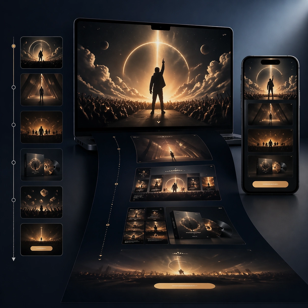
Example generated from “Interactive Web Campaign Mockup — Tight Hierarchy”
GPT Image 2en

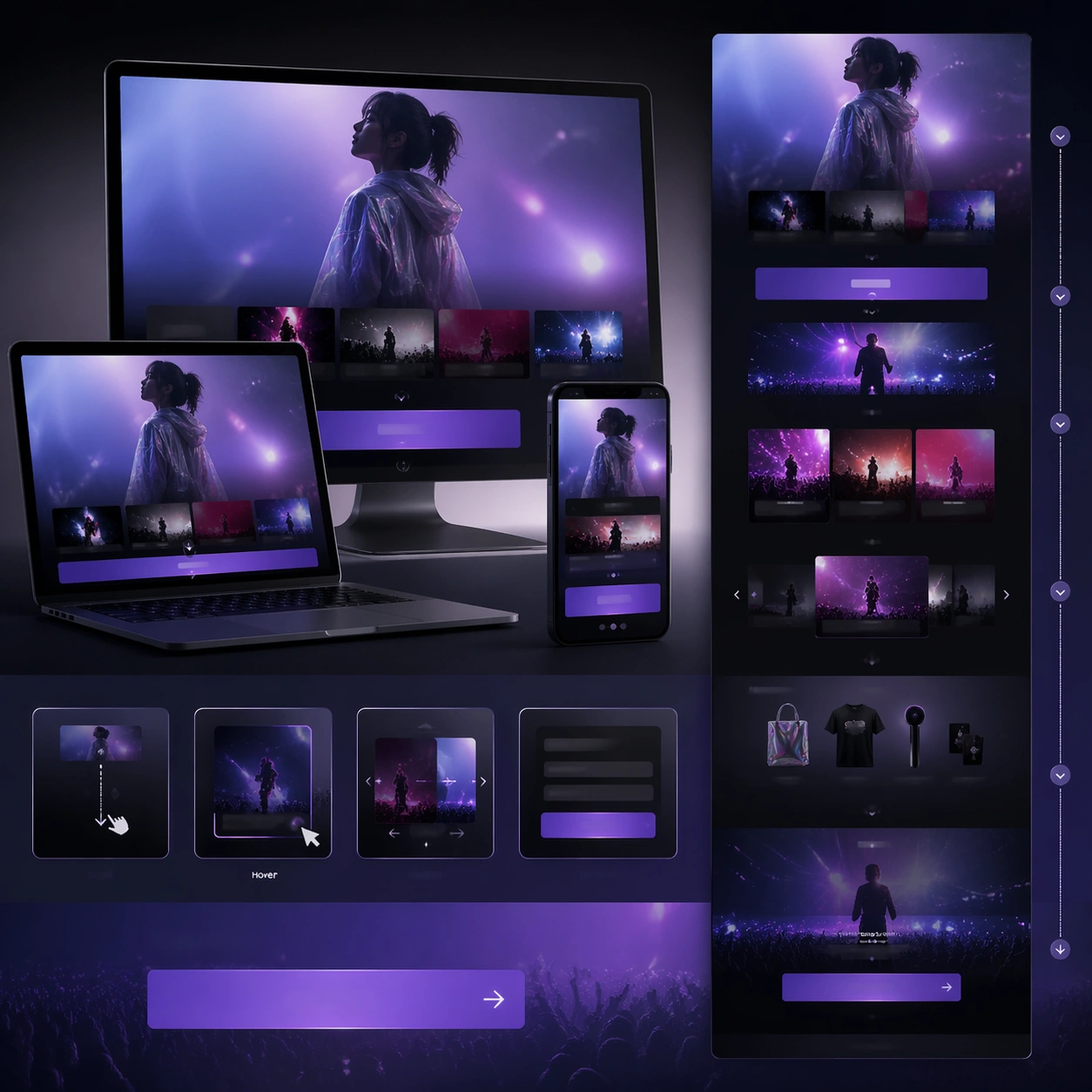
Scene: A square premium campaign composition with strong negative space, crisp hierarchy, and a polished presentation surface appropriate for Interactive Web Campaign Mockup. The image should feel like a proposal-ready marketing asset rather than a casual mockup, with deliberate pacing across foreground, midground, and background. Build the frame around 多设备 mockup + 滚动叙事 + 转化区, using lighting, device or media framing, and environment cues that suggest a real rollout system. Reference the spirit of 品牌联名、限定发售、演唱会巡演或电影宣发活动页的多屏宣传网页提案。 while keeping the result original and commercially plausible. Subject: Create a tighter adaptation that preserves hierarchy while changing crop and emphasis. for the Interactive Web Campaign Mockup theme. The central visual system should read immediately, with a clear lead element, credible secondary support, and enough structural discipline to feel ready for a pitch deck, landing page, platform slot, poster wall, or social rollout. Use scale, spacing, and controlled perspective to imply a complete campaign logic instead of a single disconnected image. Where multiple surfaces or modules appear, keep them unified through one visual language. Important details: This topic is specifically about 多设备 mockup + 滚动叙事 + 转化区. 不仅要像静态网页,还要让人感觉得到滚动、悬停、切换等交互节奏。 更适合在一张图里表达多设备系统和网页叙事节奏。. Keep the composition believable as commercial art: premium lighting, consistent styling, modular hierarchy, and clear narrative emphasis. Success should align with these criteria: 桌面端和移动端在视觉语言上统一; 能感受到页面是有滚动层次和交互暗示的; hero、内容区、CTA 区不打架; 适合直接放进客户 pitch deck 或案例页. Capabilities in scope include structured-layout, commercial-mockup, text-rendering, world-knowledge. The image must feel designed for downstream rollout across formats even though it remains a single square study. Use case: Interactive Web Campaign Mockup series study 2/9. Constraints: No readable text, no watermark, no logos, preserve exact 1:1 aspect ratio, no random collage chaos, no broken perspective between surfaces, no muddy hierarchy, no generic template look, no low-resolution screen artifacts, no extraneous props.

Example generated from “Interactive Web Campaign Mockup — Environment Rollout”
GPT Image 2en

Scene: A square premium campaign composition with strong negative space, crisp hierarchy, and a polished presentation surface appropriate for Interactive Web Campaign Mockup. The image should feel like a proposal-ready marketing asset rather than a casual mockup, with deliberate pacing across foreground, midground, and background. Build the frame around 多设备 mockup + 滚动叙事 + 转化区, using lighting, device or media framing, and environment cues that suggest a real rollout system. Reference the spirit of 品牌联名、限定发售、演唱会巡演或电影宣发活动页的多屏宣传网页提案。 while keeping the result original and commercially plausible. Subject: Create the same campaign language deployed into a broader environmental rollout context. for the Interactive Web Campaign Mockup theme. The central visual system should read immediately, with a clear lead element, credible secondary support, and enough structural discipline to feel ready for a pitch deck, landing page, platform slot, poster wall, or social rollout. Use scale, spacing, and controlled perspective to imply a complete campaign logic instead of a single disconnected image. Where multiple surfaces or modules appear, keep them unified through one visual language. Important details: This topic is specifically about 多设备 mockup + 滚动叙事 + 转化区. 不仅要像静态网页,还要让人感觉得到滚动、悬停、切换等交互节奏。 更适合在一张图里表达多设备系统和网页叙事节奏。. Keep the composition believable as commercial art: premium lighting, consistent styling, modular hierarchy, and clear narrative emphasis. Success should align with these criteria: 桌面端和移动端在视觉语言上统一; 能感受到页面是有滚动层次和交互暗示的; hero、内容区、CTA 区不打架; 适合直接放进客户 pitch deck 或案例页. Capabilities in scope include structured-layout, commercial-mockup, text-rendering, world-knowledge. The image must feel designed for downstream rollout across formats even though it remains a single square study. Use case: Interactive Web Campaign Mockup series study 3/9. Constraints: No readable text, no watermark, no logos, preserve exact 1:1 aspect ratio, no random collage chaos, no broken perspective between surfaces, no muddy hierarchy, no generic template look, no low-resolution screen artifacts, no extraneous props.

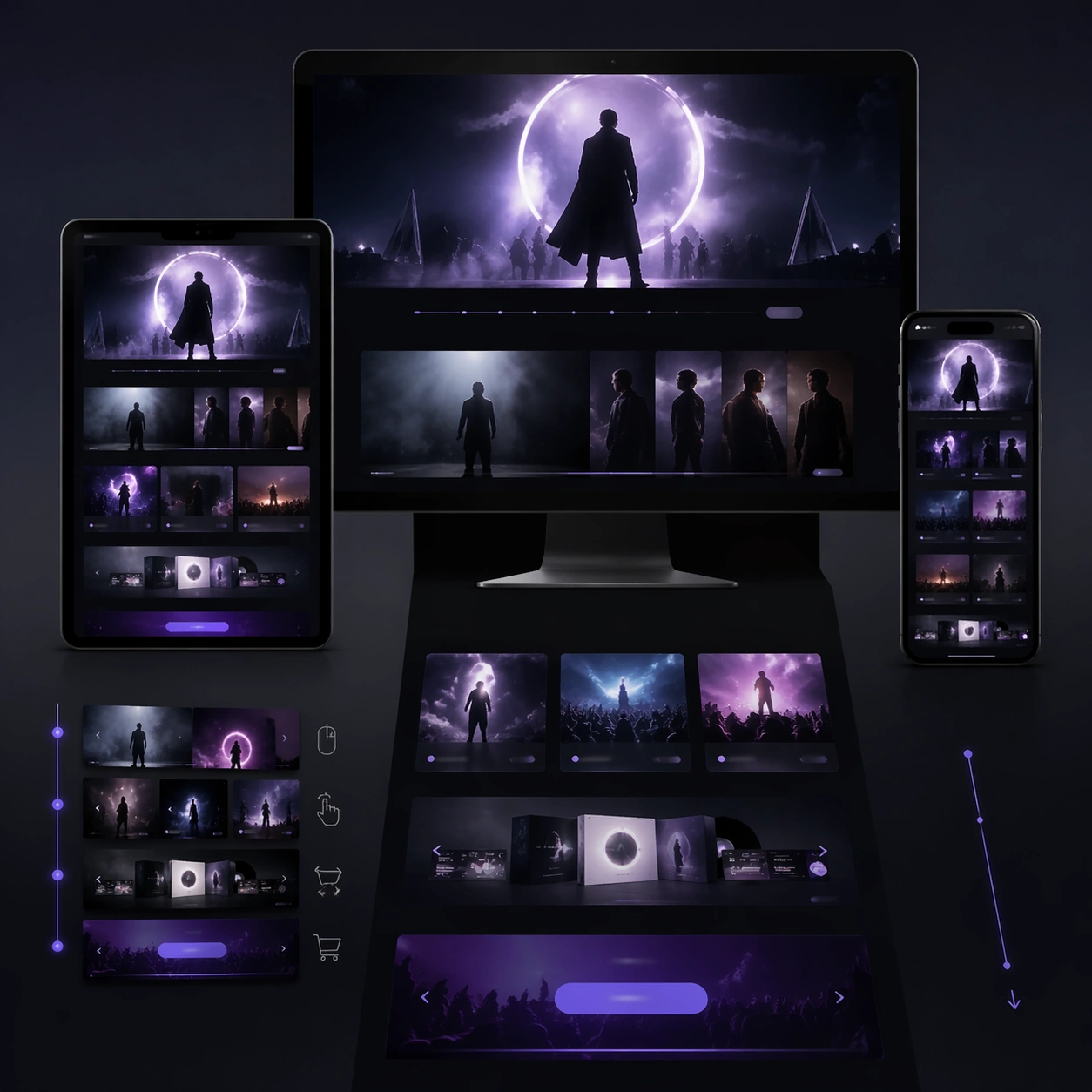
Example generated from “Interactive Web Campaign Mockup — Mood Shift Variant”
GPT Image 2en

Scene: A square premium campaign composition with strong negative space, crisp hierarchy, and a polished presentation surface appropriate for Interactive Web Campaign Mockup. The image should feel like a proposal-ready marketing asset rather than a casual mockup, with deliberate pacing across foreground, midground, and background. Build the frame around 多设备 mockup + 滚动叙事 + 转化区, using lighting, device or media framing, and environment cues that suggest a real rollout system. Reference the spirit of 品牌联名、限定发售、演唱会巡演或电影宣发活动页的多屏宣传网页提案。 while keeping the result original and commercially plausible. Subject: Create a final variant that preserves the system but shifts color temperature and emotional tone. for the Interactive Web Campaign Mockup theme. The central visual system should read immediately, with a clear lead element, credible secondary support, and enough structural discipline to feel ready for a pitch deck, landing page, platform slot, poster wall, or social rollout. Use scale, spacing, and controlled perspective to imply a complete campaign logic instead of a single disconnected image. Where multiple surfaces or modules appear, keep them unified through one visual language. Important details: This topic is specifically about 多设备 mockup + 滚动叙事 + 转化区. 不仅要像静态网页,还要让人感觉得到滚动、悬停、切换等交互节奏。 更适合在一张图里表达多设备系统和网页叙事节奏。. Keep the composition believable as commercial art: premium lighting, consistent styling, modular hierarchy, and clear narrative emphasis. Success should align with these criteria: 桌面端和移动端在视觉语言上统一; 能感受到页面是有滚动层次和交互暗示的; hero、内容区、CTA 区不打架; 适合直接放进客户 pitch deck 或案例页. Capabilities in scope include structured-layout, commercial-mockup, text-rendering, world-knowledge. The image must feel designed for downstream rollout across formats even though it remains a single square study. Use case: Interactive Web Campaign Mockup series study 4/9. Constraints: No readable text, no watermark, no logos, preserve exact 1:1 aspect ratio, no random collage chaos, no broken perspective between surfaces, no muddy hierarchy, no generic template look, no low-resolution screen artifacts, no extraneous props.

Example generated from “Interactive Web Campaign Mockup — Ensemble Study”
GPT Image 2en

Scene: A square premium campaign composition with strong negative space, crisp hierarchy, and a polished presentation surface appropriate for Interactive Web Campaign Mockup. The image should feel like a proposal-ready marketing asset rather than a casual mockup, with deliberate pacing across foreground, midground, and background. Build the frame around 多设备 mockup + 滚动叙事 + 转化区, using lighting, device or media framing, and environment cues that suggest a real rollout system. Reference the spirit of 品牌联名、限定发售、演唱会巡演或电影宣发活动页的多屏宣传网页提案。 while keeping the result original and commercially plausible. Subject: Create a multi-element or ensemble study with controlled spacing and narrative grouping. for the Interactive Web Campaign Mockup theme. The central visual system should read immediately, with a clear lead element, credible secondary support, and enough structural discipline to feel ready for a pitch deck, landing page, platform slot, poster wall, or social rollout. Use scale, spacing, and controlled perspective to imply a complete campaign logic instead of a single disconnected image. Where multiple surfaces or modules appear, keep them unified through one visual language. Important details: This topic is specifically about 多设备 mockup + 滚动叙事 + 转化区. 不仅要像静态网页,还要让人感觉得到滚动、悬停、切换等交互节奏。 更适合在一张图里表达多设备系统和网页叙事节奏。. Keep the composition believable as commercial art: premium lighting, consistent styling, modular hierarchy, and clear narrative emphasis. Success should align with these criteria: 桌面端和移动端在视觉语言上统一; 能感受到页面是有滚动层次和交互暗示的; hero、内容区、CTA 区不打架; 适合直接放进客户 pitch deck 或案例页. Capabilities in scope include structured-layout, commercial-mockup, text-rendering, world-knowledge. The image must feel designed for downstream rollout across formats even though it remains a single square study. Use case: Interactive Web Campaign Mockup single study 6/9. Constraints: No readable text, no watermark, no logos, preserve exact 1:1 aspect ratio, no random collage chaos, no broken perspective between surfaces, no muddy hierarchy, no generic template look, no low-resolution screen artifacts, no extraneous props.

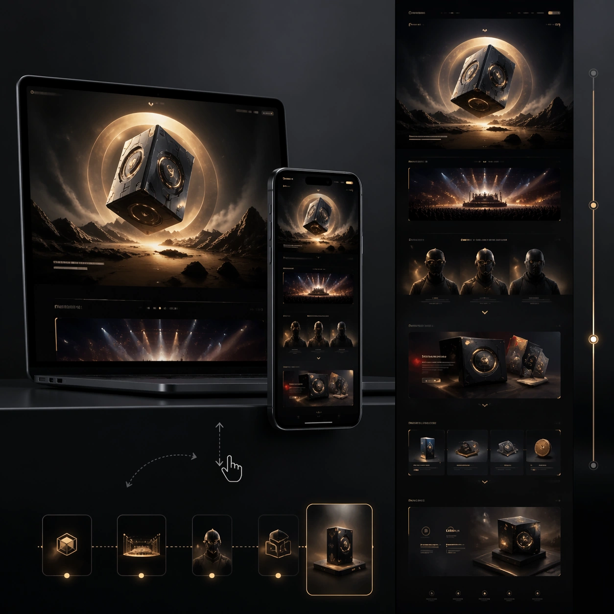
Example generated from “Interactive Web Campaign Mockup — Product Study”
GPT Image 2en

Scene: A square premium campaign composition with strong negative space, crisp hierarchy, and a polished presentation surface appropriate for Interactive Web Campaign Mockup. The image should feel like a proposal-ready marketing asset rather than a casual mockup, with deliberate pacing across foreground, midground, and background. Build the frame around 多设备 mockup + 滚动叙事 + 转化区, using lighting, device or media framing, and environment cues that suggest a real rollout system. Reference the spirit of 品牌联名、限定发售、演唱会巡演或电影宣发活动页的多屏宣传网页提案。 while keeping the result original and commercially plausible. Subject: Create a product or object-led study with premium presentation logic. for the Interactive Web Campaign Mockup theme. The central visual system should read immediately, with a clear lead element, credible secondary support, and enough structural discipline to feel ready for a pitch deck, landing page, platform slot, poster wall, or social rollout. Use scale, spacing, and controlled perspective to imply a complete campaign logic instead of a single disconnected image. Where multiple surfaces or modules appear, keep them unified through one visual language. Important details: This topic is specifically about 多设备 mockup + 滚动叙事 + 转化区. 不仅要像静态网页,还要让人感觉得到滚动、悬停、切换等交互节奏。 更适合在一张图里表达多设备系统和网页叙事节奏。. Keep the composition believable as commercial art: premium lighting, consistent styling, modular hierarchy, and clear narrative emphasis. Success should align with these criteria: 桌面端和移动端在视觉语言上统一; 能感受到页面是有滚动层次和交互暗示的; hero、内容区、CTA 区不打架; 适合直接放进客户 pitch deck 或案例页. Capabilities in scope include structured-layout, commercial-mockup, text-rendering, world-knowledge. The image must feel designed for downstream rollout across formats even though it remains a single square study. Use case: Interactive Web Campaign Mockup single study 7/9. Constraints: No readable text, no watermark, no logos, preserve exact 1:1 aspect ratio, no random collage chaos, no broken perspective between surfaces, no muddy hierarchy, no generic template look, no low-resolution screen artifacts, no extraneous props.

Example generated from “Interactive Web Campaign Mockup — Narrative Study”
GPT Image 2en

Scene: A square premium campaign composition with strong negative space, crisp hierarchy, and a polished presentation surface appropriate for Interactive Web Campaign Mockup. The image should feel like a proposal-ready marketing asset rather than a casual mockup, with deliberate pacing across foreground, midground, and background. Build the frame around 多设备 mockup + 滚动叙事 + 转化区, using lighting, device or media framing, and environment cues that suggest a real rollout system. Reference the spirit of 品牌联名、限定发售、演唱会巡演或电影宣发活动页的多屏宣传网页提案。 while keeping the result original and commercially plausible. Subject: Create a more atmospheric narrative study that still reads as campaign art rather than concept art. for the Interactive Web Campaign Mockup theme. The central visual system should read immediately, with a clear lead element, credible secondary support, and enough structural discipline to feel ready for a pitch deck, landing page, platform slot, poster wall, or social rollout. Use scale, spacing, and controlled perspective to imply a complete campaign logic instead of a single disconnected image. Where multiple surfaces or modules appear, keep them unified through one visual language. Important details: This topic is specifically about 多设备 mockup + 滚动叙事 + 转化区. 不仅要像静态网页,还要让人感觉得到滚动、悬停、切换等交互节奏。 更适合在一张图里表达多设备系统和网页叙事节奏。. Keep the composition believable as commercial art: premium lighting, consistent styling, modular hierarchy, and clear narrative emphasis. Success should align with these criteria: 桌面端和移动端在视觉语言上统一; 能感受到页面是有滚动层次和交互暗示的; hero、内容区、CTA 区不打架; 适合直接放进客户 pitch deck 或案例页. Capabilities in scope include structured-layout, commercial-mockup, text-rendering, world-knowledge. The image must feel designed for downstream rollout across formats even though it remains a single square study. Use case: Interactive Web Campaign Mockup single study 8/9. Constraints: No readable text, no watermark, no logos, preserve exact 1:1 aspect ratio, no random collage chaos, no broken perspective between surfaces, no muddy hierarchy, no generic template look, no low-resolution screen artifacts, no extraneous props.

Example generated from “Interactive Web Campaign Mockup — Conversion Study”
GPT Image 2en

Scene: A square premium campaign composition with strong negative space, crisp hierarchy, and a polished presentation surface appropriate for Interactive Web Campaign Mockup. The image should feel like a proposal-ready marketing asset rather than a casual mockup, with deliberate pacing across foreground, midground, and background. Build the frame around 多设备 mockup + 滚动叙事 + 转化区, using lighting, device or media framing, and environment cues that suggest a real rollout system. Reference the spirit of 品牌联名、限定发售、演唱会巡演或电影宣发活动页的多屏宣传网页提案。 while keeping the result original and commercially plausible. Subject: Create a polished layout study built around clarity, pacing, and conversion-ready focus. for the Interactive Web Campaign Mockup theme. The central visual system should read immediately, with a clear lead element, credible secondary support, and enough structural discipline to feel ready for a pitch deck, landing page, platform slot, poster wall, or social rollout. Use scale, spacing, and controlled perspective to imply a complete campaign logic instead of a single disconnected image. Where multiple surfaces or modules appear, keep them unified through one visual language. Important details: This topic is specifically about 多设备 mockup + 滚动叙事 + 转化区. 不仅要像静态网页,还要让人感觉得到滚动、悬停、切换等交互节奏。 更适合在一张图里表达多设备系统和网页叙事节奏。. Keep the composition believable as commercial art: premium lighting, consistent styling, modular hierarchy, and clear narrative emphasis. Success should align with these criteria: 桌面端和移动端在视觉语言上统一; 能感受到页面是有滚动层次和交互暗示的; hero、内容区、CTA 区不打架; 适合直接放进客户 pitch deck 或案例页. Capabilities in scope include structured-layout, commercial-mockup, text-rendering, world-knowledge. The image must feel designed for downstream rollout across formats even though it remains a single square study. Use case: Interactive Web Campaign Mockup single study 9/9. Constraints: No readable text, no watermark, no logos, preserve exact 1:1 aspect ratio, no random collage chaos, no broken perspective between surfaces, no muddy hierarchy, no generic template look, no low-resolution screen artifacts, no extraneous props.

Example generated from “Inventory Tooltip Comparison Board — Set Bonus Card”
GPT Image 2en

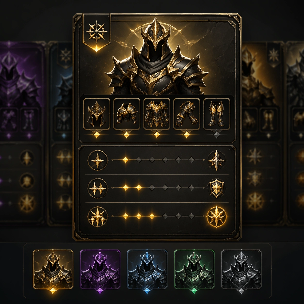
Scene: A square production-ready image designed for a game-art review wall and a commercial gallery at the same time. Frame a set bonus card visualizing a multi-piece equipment set and its layered payoff with disciplined lighting, clean edge separation, and enough surrounding context to prove how the asset would behave in a real product surface. The camera, crop, and tonal balance should feel intentional rather than generic, with high readability at first glance and convincing material response under closer inspection. Subject: Center the study on a set bonus card visualizing a multi-piece equipment set and its layered payoff. Translate the topic into a concrete, shippable visual statement instead of a loose mood board. Build layered object relationships, believable surface finish, and strong silhouette grouping so the image reads immediately as part of Inventory Tooltip Comparison Board. The subject should feel made for a live game pipeline: useful in store, UI, campaign, or art-review contexts, with visual hierarchy strong enough to survive aggressive cropping. Important details: treat the set as a coherent product family with distinct tier cues. Keep every supporting element subordinate to the main read, and make category separation obvious through form, color zoning, depth, and material logic rather than words. Where panels, cards, badges, or interface blocks appear, they must look professionally structured but remain unreadable. The visual language should feel premium, original, and coherent across this package, with no filler clutter and no accidental resemblance to a specific shipped game IP. Use case: Inventory Tooltip Comparison Board single study 2/9, focused on set bonus card. Constraints: No readable text, no watermark, no logos, preserve exact 1:1 aspect ratio, no readable set names, no bullet text, no broken hierarchy, no generic stock-photo staging, no accidental UI gibberish.

Example generated from “Inventory Tooltip Comparison Board — Rarity Badge Study”
GPT Image 2en

Scene: A square production-ready image designed for a game-art review wall and a commercial gallery at the same time. Frame a badge study isolating rarity frames, medallions, and trim treatments used across inventory panels with disciplined lighting, clean edge separation, and enough surrounding context to prove how the asset would behave in a real product surface. The camera, crop, and tonal balance should feel intentional rather than generic, with high readability at first glance and convincing material response under closer inspection. Subject: Center the study on a badge study isolating rarity frames, medallions, and trim treatments used across inventory panels. Translate the topic into a concrete, shippable visual statement instead of a loose mood board. Build layered object relationships, believable surface finish, and strong silhouette grouping so the image reads immediately as part of Inventory Tooltip Comparison Board. The subject should feel made for a live game pipeline: useful in store, UI, campaign, or art-review contexts, with visual hierarchy strong enough to survive aggressive cropping. Important details: make the badge family feel premium and instantly sortable. Keep every supporting element subordinate to the main read, and make category separation obvious through form, color zoning, depth, and material logic rather than words. Where panels, cards, badges, or interface blocks appear, they must look professionally structured but remain unreadable. The visual language should feel premium, original, and coherent across this package, with no filler clutter and no accidental resemblance to a specific shipped game IP. Use case: Inventory Tooltip Comparison Board single study 3/9, focused on rarity badge study. Constraints: No readable text, no watermark, no logos, preserve exact 1:1 aspect ratio, no letters, no numbers, no broken hierarchy, no generic stock-photo staging, no accidental UI gibberish.

Example generated from “Inventory Tooltip Comparison Board — Item Detail Zoom”
GPT Image 2en

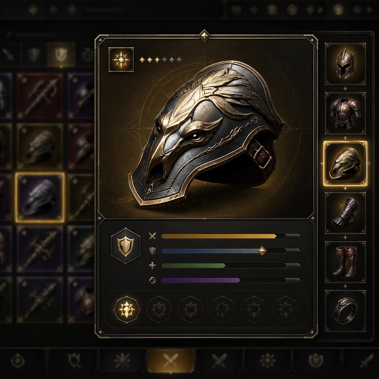
Scene: A square production-ready image designed for a game-art review wall and a commercial gallery at the same time. Frame a detail zoom focused on one equipment item and the tight tooltip panel surrounding it with disciplined lighting, clean edge separation, and enough surrounding context to prove how the asset would behave in a real product surface. The camera, crop, and tonal balance should feel intentional rather than generic, with high readability at first glance and convincing material response under closer inspection. Subject: Center the study on a detail zoom focused on one equipment item and the tight tooltip panel surrounding it. Translate the topic into a concrete, shippable visual statement instead of a loose mood board. Build layered object relationships, believable surface finish, and strong silhouette grouping so the image reads immediately as part of Inventory Tooltip Comparison Board. The subject should feel made for a live game pipeline: useful in store, UI, campaign, or art-review contexts, with visual hierarchy strong enough to survive aggressive cropping. Important details: materials, iconography, and panel layering should feel game-real and decision-oriented. Keep every supporting element subordinate to the main read, and make category separation obvious through form, color zoning, depth, and material logic rather than words. Where panels, cards, badges, or interface blocks appear, they must look professionally structured but remain unreadable. The visual language should feel premium, original, and coherent across this package, with no filler clutter and no accidental resemblance to a specific shipped game IP. Use case: Inventory Tooltip Comparison Board single study 4/9, focused on item detail zoom. Constraints: No readable text, no watermark, no logos, preserve exact 1:1 aspect ratio, no readable tooltips, no lorem ipsum, no broken hierarchy, no generic stock-photo staging, no accidental UI gibberish.

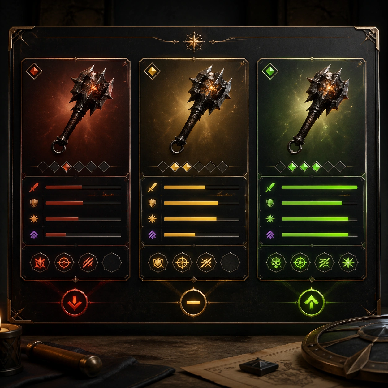
Example generated from “Inventory Tooltip Comparison Board — Compare Roll Board”
GPT Image 2en

Scene: A square production-ready image designed for a game-art review wall and a commercial gallery at the same time. Frame a comparison board showing alternate item rolls or perk combinations in parallel panels with disciplined lighting, clean edge separation, and enough surrounding context to prove how the asset would behave in a real product surface. The camera, crop, and tonal balance should feel intentional rather than generic, with high readability at first glance and convincing material response under closer inspection. Subject: Center the study on a comparison board showing alternate item rolls or perk combinations in parallel panels. Translate the topic into a concrete, shippable visual statement instead of a loose mood board. Build layered object relationships, believable surface finish, and strong silhouette grouping so the image reads immediately as part of Inventory Tooltip Comparison Board. The subject should feel made for a live game pipeline: useful in store, UI, campaign, or art-review contexts, with visual hierarchy strong enough to survive aggressive cropping. Important details: structure alone should communicate better-versus-worse outcomes without explicit text. Keep every supporting element subordinate to the main read, and make category separation obvious through form, color zoning, depth, and material logic rather than words. Where panels, cards, badges, or interface blocks appear, they must look professionally structured but remain unreadable. The visual language should feel premium, original, and coherent across this package, with no filler clutter and no accidental resemblance to a specific shipped game IP. Use case: Inventory Tooltip Comparison Board single study 5/9, focused on compare roll board. Constraints: No readable text, no watermark, no logos, preserve exact 1:1 aspect ratio, no percentages, no labels, no broken hierarchy, no generic stock-photo staging, no accidental UI gibberish.

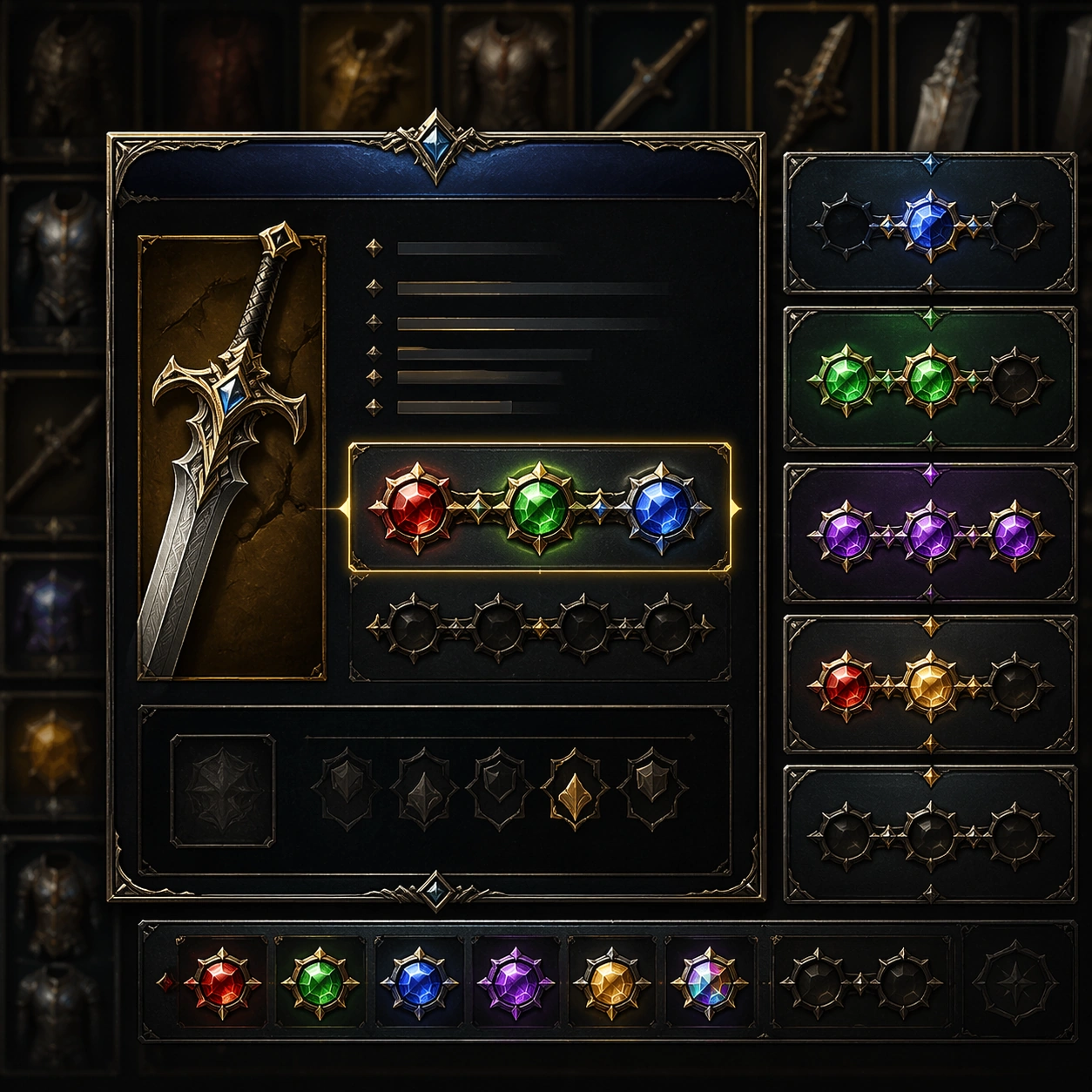
Example generated from “Inventory Tooltip Comparison Board — Socket Gem Inset”
GPT Image 2en

Scene: A square production-ready image designed for a game-art review wall and a commercial gallery at the same time. Frame a focused inset on sockets, gems, or enhancement slots inside a tooltip surface with disciplined lighting, clean edge separation, and enough surrounding context to prove how the asset would behave in a real product surface. The camera, crop, and tonal balance should feel intentional rather than generic, with high readability at first glance and convincing material response under closer inspection. Subject: Center the study on a focused inset on sockets, gems, or enhancement slots inside a tooltip surface. Translate the topic into a concrete, shippable visual statement instead of a loose mood board. Build layered object relationships, believable surface finish, and strong silhouette grouping so the image reads immediately as part of Inventory Tooltip Comparison Board. The subject should feel made for a live game pipeline: useful in store, UI, campaign, or art-review contexts, with visual hierarchy strong enough to survive aggressive cropping. Important details: tiny shapes and color coding should remain readable and premium. Keep every supporting element subordinate to the main read, and make category separation obvious through form, color zoning, depth, and material logic rather than words. Where panels, cards, badges, or interface blocks appear, they must look professionally structured but remain unreadable. The visual language should feel premium, original, and coherent across this package, with no filler clutter and no accidental resemblance to a specific shipped game IP. Use case: Inventory Tooltip Comparison Board single study 6/9, focused on socket gem inset. Constraints: No readable text, no watermark, no logos, preserve exact 1:1 aspect ratio, no numbers, no text, no broken hierarchy, no generic stock-photo staging, no accidental UI gibberish.

Example generated from “Inventory Tooltip Comparison Board — Inventory Hover Scene”
GPT Image 2en

Scene: A square production-ready image designed for a game-art review wall and a commercial gallery at the same time. Frame a player-inventory hover scene where one item tooltip takes center stage over an organized background grid with disciplined lighting, clean edge separation, and enough surrounding context to prove how the asset would behave in a real product surface. The camera, crop, and tonal balance should feel intentional rather than generic, with high readability at first glance and convincing material response under closer inspection. Subject: Center the study on a player-inventory hover scene where one item tooltip takes center stage over an organized background grid. Translate the topic into a concrete, shippable visual statement instead of a loose mood board. Build layered object relationships, believable surface finish, and strong silhouette grouping so the image reads immediately as part of Inventory Tooltip Comparison Board. The subject should feel made for a live game pipeline: useful in store, UI, campaign, or art-review contexts, with visual hierarchy strong enough to survive aggressive cropping. Important details: the panel should feel responsive and polished without becoming a literal screenshot. Keep every supporting element subordinate to the main read, and make category separation obvious through form, color zoning, depth, and material logic rather than words. Where panels, cards, badges, or interface blocks appear, they must look professionally structured but remain unreadable. The visual language should feel premium, original, and coherent across this package, with no filler clutter and no accidental resemblance to a specific shipped game IP. Use case: Inventory Tooltip Comparison Board single study 7/9, focused on inventory hover scene. Constraints: No readable text, no watermark, no logos, preserve exact 1:1 aspect ratio, no readable tabs, no labels, no broken hierarchy, no generic stock-photo staging, no accidental UI gibberish.

Example generated from “Inventory Tooltip Comparison Board — Upgrade Path Card”
GPT Image 2en

Scene: A square production-ready image designed for a game-art review wall and a commercial gallery at the same time. Frame an upgrade-path card that maps one item into higher rarity or enhanced versions with disciplined lighting, clean edge separation, and enough surrounding context to prove how the asset would behave in a real product surface. The camera, crop, and tonal balance should feel intentional rather than generic, with high readability at first glance and convincing material response under closer inspection. Subject: Center the study on an upgrade-path card that maps one item into higher rarity or enhanced versions. Translate the topic into a concrete, shippable visual statement instead of a loose mood board. Build layered object relationships, believable surface finish, and strong silhouette grouping so the image reads immediately as part of Inventory Tooltip Comparison Board. The subject should feel made for a live game pipeline: useful in store, UI, campaign, or art-review contexts, with visual hierarchy strong enough to survive aggressive cropping. Important details: show progression desire and technical clarity together through clean panel logic. Keep every supporting element subordinate to the main read, and make category separation obvious through form, color zoning, depth, and material logic rather than words. Where panels, cards, badges, or interface blocks appear, they must look professionally structured but remain unreadable. The visual language should feel premium, original, and coherent across this package, with no filler clutter and no accidental resemblance to a specific shipped game IP. Use case: Inventory Tooltip Comparison Board single study 8/9, focused on upgrade path card. Constraints: No readable text, no watermark, no logos, preserve exact 1:1 aspect ratio, no arrows with text, no numerals, no broken hierarchy, no generic stock-photo staging, no accidental UI gibberish.

Example generated from “Inventory Tooltip Comparison Board — Loot Decision Poster”
GPT Image 2en

Scene: A square production-ready image designed for a game-art review wall and a commercial gallery at the same time. Frame a poster-like asset that dramatizes a meaningful equipment choice using tooltip language as graphic structure with disciplined lighting, clean edge separation, and enough surrounding context to prove how the asset would behave in a real product surface. The camera, crop, and tonal balance should feel intentional rather than generic, with high readability at first glance and convincing material response under closer inspection. Subject: Center the study on a poster-like asset that dramatizes a meaningful equipment choice using tooltip language as graphic structure. Translate the topic into a concrete, shippable visual statement instead of a loose mood board. Build layered object relationships, believable surface finish, and strong silhouette grouping so the image reads immediately as part of Inventory Tooltip Comparison Board. The subject should feel made for a live game pipeline: useful in store, UI, campaign, or art-review contexts, with visual hierarchy strong enough to survive aggressive cropping. Important details: the result should feel shareable while remaining grounded in actual inventory logic. Keep every supporting element subordinate to the main read, and make category separation obvious through form, color zoning, depth, and material logic rather than words. Where panels, cards, badges, or interface blocks appear, they must look professionally structured but remain unreadable. The visual language should feel premium, original, and coherent across this package, with no filler clutter and no accidental resemblance to a specific shipped game IP. Use case: Inventory Tooltip Comparison Board single study 9/9, focused on loot decision poster. Constraints: No readable text, no watermark, no logos, preserve exact 1:1 aspect ratio, no slogans, no logos, no broken hierarchy, no generic stock-photo staging, no accidental UI gibberish.

Example generated from “Island Coastline Dreamscape System — Reference Anchor”
GPT Image 2en

Scene: Create a square reference image for Island Coastline Dreamscape System. Build a reference anchor establishing the core system with a premium, production-ready finish. Use a polished modular board or campaign surface with clean spacing, premium game-UI finish, and clear focal hierarchy. The composition should feel intentional, clean, and reusable for gallery, research, campaign, or internal handoff contexts. Lighting must support readability first, with the main forms clearly separated from the background and enough breathing room for the system to stay legible at both hero scale and thumbnail scale. Subject: Center a coherent original game-art system built for premium production and marketing surfaces. For this image, focus on reference anchor. Keep the same system logic stable across screenshots, cards, banners, and overview boards. This image is the canonical anchor that later series images must follow. The viewer should immediately understand what role this surface plays inside a cohesive game-production asset pack. Important details: Lock framing, icon grammar, palette blocking, and surface hierarchy so the kit feels production-ready and consistent. Preserve the core silhouette, framing language, and material logic from the reference image while each variation changes function. Keep materials believable, edge hierarchy disciplined, and the visual language consistent with Island Dreamscapes. Use abstract interface blocks or diagram accents when helpful, but avoid any readable language. The final result should feel like a deliberate production asset rather than a random illustration. Use case: Island Coastline Dreamscape System series study 1/9, designed as reference anchor within a cohesive asset pack. Constraints: No readable text, no watermark, no logos, preserve exact 1:1 aspect ratio, no unrelated objects, no broken visual hierarchy, no malformed anatomy or broken perspective, no random decorative clutter.
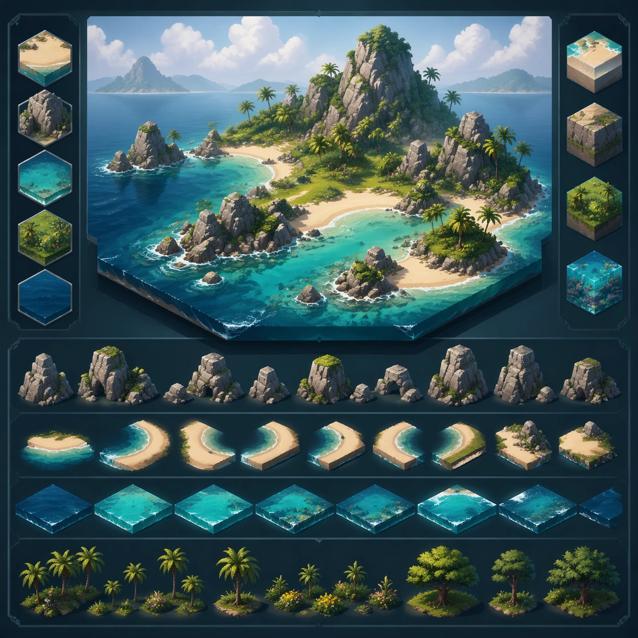
Example generated from “Island Coastline Dreamscape System — Variant One”
GPT Image 2en

Scene: Create a square dependent image for Island Coastline Dreamscape System. Build a first controlled variation in the same system with a premium, production-ready finish. Use a polished modular board or campaign surface with clean spacing, premium game-UI finish, and clear focal hierarchy. The composition should feel intentional, clean, and reusable for gallery, research, campaign, or internal handoff contexts. Lighting must support readability first, with the main forms clearly separated from the background and enough breathing room for the system to stay legible at both hero scale and thumbnail scale. Subject: Center a coherent original game-art system built for premium production and marketing surfaces. For this image, focus on the intended support surface. Keep the same system logic stable across screenshots, cards, banners, and overview boards. Preserve exact identity or system logic from the reference image while changing only the intended variation axis. The viewer should immediately understand what role this surface plays inside a cohesive game-production asset pack. Important details: Lock framing, icon grammar, palette blocking, and surface hierarchy so the kit feels production-ready and consistent. Preserve the core silhouette, framing language, and material logic from the reference image while each variation changes function. Keep materials believable, edge hierarchy disciplined, and the visual language consistent with Island Dreamscapes. Use abstract interface blocks or diagram accents when helpful, but avoid any readable language. The final result should feel like a deliberate production asset rather than a random illustration. Use case: Island Coastline Dreamscape System series study 2/9, designed as variant one within a cohesive asset pack. Constraints: No readable text, no watermark, no logos, preserve exact 1:1 aspect ratio, no unrelated objects, no broken visual hierarchy, no malformed anatomy or broken perspective, no random decorative clutter.
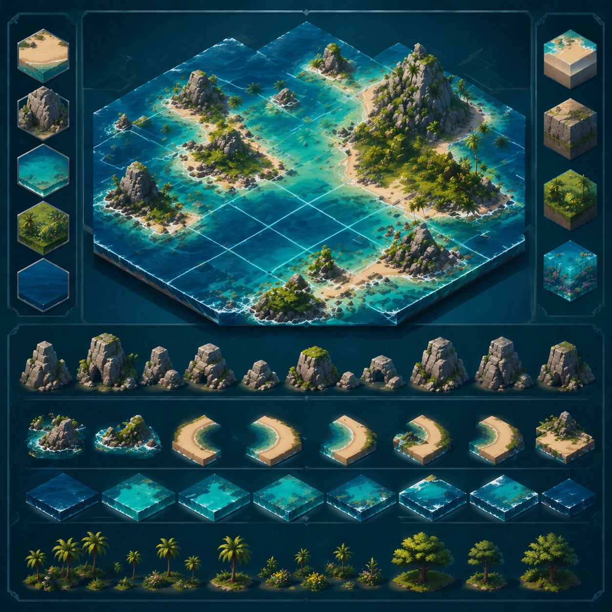
Example generated from “Island Coastline Dreamscape System — Variant Two”
GPT Image 2en

Scene: Create a square dependent image for Island Coastline Dreamscape System. Build a second controlled variation in the same system with a premium, production-ready finish. Use a polished modular board or campaign surface with clean spacing, premium game-UI finish, and clear focal hierarchy. The composition should feel intentional, clean, and reusable for gallery, research, campaign, or internal handoff contexts. Lighting must support readability first, with the main forms clearly separated from the background and enough breathing room for the system to stay legible at both hero scale and thumbnail scale. Subject: Center a coherent original game-art system built for premium production and marketing surfaces. For this image, focus on the intended support surface. Keep the same system logic stable across screenshots, cards, banners, and overview boards. Preserve exact identity or system logic from the reference image while changing only the intended variation axis. The viewer should immediately understand what role this surface plays inside a cohesive game-production asset pack. Important details: Lock framing, icon grammar, palette blocking, and surface hierarchy so the kit feels production-ready and consistent. Preserve the core silhouette, framing language, and material logic from the reference image while each variation changes function. Keep materials believable, edge hierarchy disciplined, and the visual language consistent with Island Dreamscapes. Use abstract interface blocks or diagram accents when helpful, but avoid any readable language. The final result should feel like a deliberate production asset rather than a random illustration. Use case: Island Coastline Dreamscape System series study 3/9, designed as variant two within a cohesive asset pack. Constraints: No readable text, no watermark, no logos, preserve exact 1:1 aspect ratio, no unrelated objects, no broken visual hierarchy, no malformed anatomy or broken perspective, no random decorative clutter.
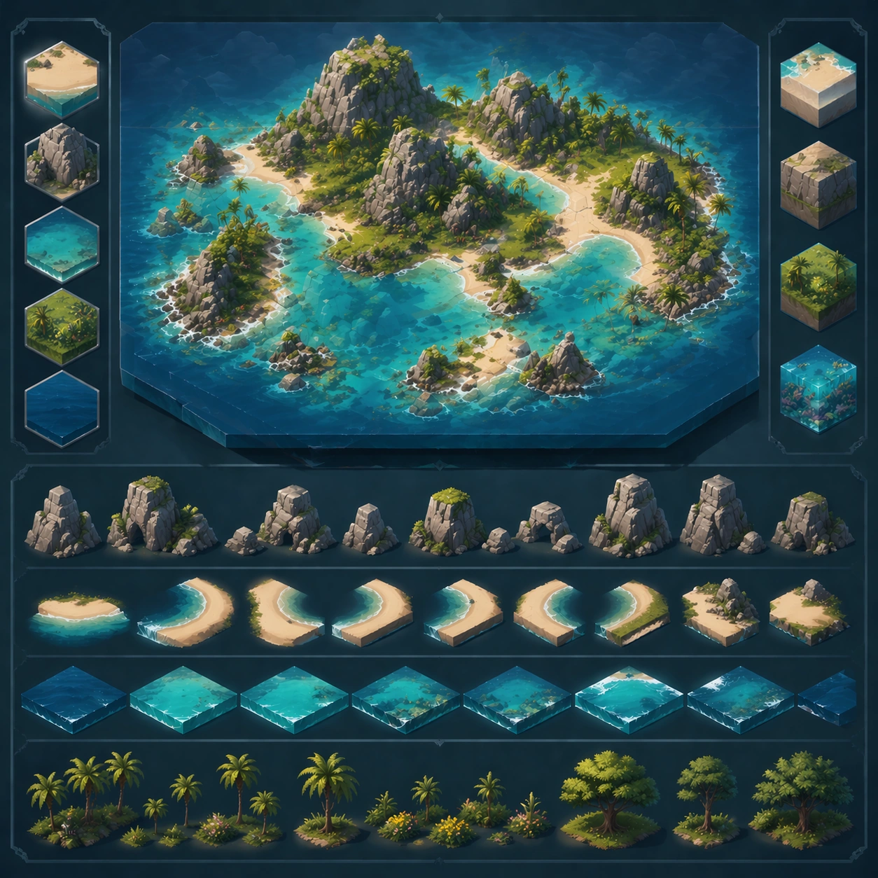
Example generated from “Island Coastline Dreamscape System — Variant Three”
GPT Image 2en

Scene: Create a square dependent image for Island Coastline Dreamscape System. Build a third controlled variation in the same system with a premium, production-ready finish. Use a polished modular board or campaign surface with clean spacing, premium game-UI finish, and clear focal hierarchy. The composition should feel intentional, clean, and reusable for gallery, research, campaign, or internal handoff contexts. Lighting must support readability first, with the main forms clearly separated from the background and enough breathing room for the system to stay legible at both hero scale and thumbnail scale. Subject: Center a coherent original game-art system built for premium production and marketing surfaces. For this image, focus on the intended support surface. Keep the same system logic stable across screenshots, cards, banners, and overview boards. Preserve exact identity or system logic from the reference image while changing only the intended variation axis. The viewer should immediately understand what role this surface plays inside a cohesive game-production asset pack. Important details: Lock framing, icon grammar, palette blocking, and surface hierarchy so the kit feels production-ready and consistent. Preserve the core silhouette, framing language, and material logic from the reference image while each variation changes function. Keep materials believable, edge hierarchy disciplined, and the visual language consistent with Island Dreamscapes. Use abstract interface blocks or diagram accents when helpful, but avoid any readable language. The final result should feel like a deliberate production asset rather than a random illustration. Use case: Island Coastline Dreamscape System series study 4/9, designed as variant three within a cohesive asset pack. Constraints: No readable text, no watermark, no logos, preserve exact 1:1 aspect ratio, no unrelated objects, no broken visual hierarchy, no malformed anatomy or broken perspective, no random decorative clutter.
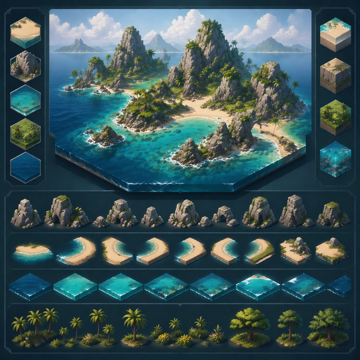
Example generated from “Island Coastline Dreamscape System — Support One”
GPT Image 2en

Scene: Create a square standalone support image for Island Coastline Dreamscape System. Build a support-surface study with a clear focal hierarchy and a finished professional surface. Use a polished modular board or campaign surface with clean spacing, premium game-UI finish, and clear focal hierarchy. The frame should feel self-contained and polished, with enough structure to explain the system even without the reference series, yet still obviously belonging to the same theme and production world. Subject: Show a coherent original game-art system built for premium production and marketing surfaces in a way that emphasizes the intended support surface. Keep the same system logic stable across screenshots, cards, banners, and overview boards. Even though this image is independent, the viewer should still recognize the same universe, same commercial logic, and same production intent as the core package. Important details: Lock framing, icon grammar, palette blocking, and surface hierarchy so the kit feels production-ready and consistent. Preserve the broader theme language through color, framing, material choices, and modular composition. Use clean panel rhythm, premium asset presentation, and believable detail density. The image should work equally well as a gallery study, research reference, and mock production deliverable. Use case: Island Coastline Dreamscape System single study 5/9, exploring support one as a support surface. Constraints: No readable text, no watermark, no logos, preserve exact 1:1 aspect ratio, no unrelated objects, no broken visual hierarchy, no visual noise that obscures the main surface, no accidental brand resemblance.

Example generated from “Island Coastline Dreamscape System — Support Two”
GPT Image 2en

Scene: Create a square standalone support image for Island Coastline Dreamscape System. Build a second support-surface study with a clear focal hierarchy and a finished professional surface. Use a polished modular board or campaign surface with clean spacing, premium game-UI finish, and clear focal hierarchy. The frame should feel self-contained and polished, with enough structure to explain the system even without the reference series, yet still obviously belonging to the same theme and production world. Subject: Show a coherent original game-art system built for premium production and marketing surfaces in a way that emphasizes the intended support surface. Keep the same system logic stable across screenshots, cards, banners, and overview boards. Even though this image is independent, the viewer should still recognize the same universe, same commercial logic, and same production intent as the core package. Important details: Lock framing, icon grammar, palette blocking, and surface hierarchy so the kit feels production-ready and consistent. Preserve the broader theme language through color, framing, material choices, and modular composition. Use clean panel rhythm, premium asset presentation, and believable detail density. The image should work equally well as a gallery study, research reference, and mock production deliverable. Use case: Island Coastline Dreamscape System single study 6/9, exploring support two as a support surface. Constraints: No readable text, no watermark, no logos, preserve exact 1:1 aspect ratio, no unrelated objects, no broken visual hierarchy, no visual noise that obscures the main surface, no accidental brand resemblance.

Example generated from “Island Coastline Dreamscape System — Support Three”
GPT Image 2en

Scene: Create a square standalone support image for Island Coastline Dreamscape System. Build a third support-surface study with a clear focal hierarchy and a finished professional surface. Use a polished modular board or campaign surface with clean spacing, premium game-UI finish, and clear focal hierarchy. The frame should feel self-contained and polished, with enough structure to explain the system even without the reference series, yet still obviously belonging to the same theme and production world. Subject: Show a coherent original game-art system built for premium production and marketing surfaces in a way that emphasizes the intended support surface. Keep the same system logic stable across screenshots, cards, banners, and overview boards. Even though this image is independent, the viewer should still recognize the same universe, same commercial logic, and same production intent as the core package. Important details: Lock framing, icon grammar, palette blocking, and surface hierarchy so the kit feels production-ready and consistent. Preserve the broader theme language through color, framing, material choices, and modular composition. Use clean panel rhythm, premium asset presentation, and believable detail density. The image should work equally well as a gallery study, research reference, and mock production deliverable. Use case: Island Coastline Dreamscape System single study 7/9, exploring support three as a support surface. Constraints: No readable text, no watermark, no logos, preserve exact 1:1 aspect ratio, no unrelated objects, no broken visual hierarchy, no visual noise that obscures the main surface, no accidental brand resemblance.

Example generated from “Island Coastline Dreamscape System — Support Four”
GPT Image 2en

Scene: Create a square standalone support image for Island Coastline Dreamscape System. Build a fourth support-surface study with a clear focal hierarchy and a finished professional surface. Use a polished modular board or campaign surface with clean spacing, premium game-UI finish, and clear focal hierarchy. The frame should feel self-contained and polished, with enough structure to explain the system even without the reference series, yet still obviously belonging to the same theme and production world. Subject: Show a coherent original game-art system built for premium production and marketing surfaces in a way that emphasizes the intended support surface. Keep the same system logic stable across screenshots, cards, banners, and overview boards. Even though this image is independent, the viewer should still recognize the same universe, same commercial logic, and same production intent as the core package. Important details: Lock framing, icon grammar, palette blocking, and surface hierarchy so the kit feels production-ready and consistent. Preserve the broader theme language through color, framing, material choices, and modular composition. Use clean panel rhythm, premium asset presentation, and believable detail density. The image should work equally well as a gallery study, research reference, and mock production deliverable. Use case: Island Coastline Dreamscape System single study 8/9, exploring support four as a support surface. Constraints: No readable text, no watermark, no logos, preserve exact 1:1 aspect ratio, no unrelated objects, no broken visual hierarchy, no visual noise that obscures the main surface, no accidental brand resemblance.

Example generated from “Island Coastline Dreamscape System — Support Five”
GPT Image 2en

Scene: Create a square standalone support image for Island Coastline Dreamscape System. Build a fifth support-surface study with a clear focal hierarchy and a finished professional surface. Use a polished modular board or campaign surface with clean spacing, premium game-UI finish, and clear focal hierarchy. The frame should feel self-contained and polished, with enough structure to explain the system even without the reference series, yet still obviously belonging to the same theme and production world. Subject: Show a coherent original game-art system built for premium production and marketing surfaces in a way that emphasizes the intended support surface. Keep the same system logic stable across screenshots, cards, banners, and overview boards. Even though this image is independent, the viewer should still recognize the same universe, same commercial logic, and same production intent as the core package. Important details: Lock framing, icon grammar, palette blocking, and surface hierarchy so the kit feels production-ready and consistent. Preserve the broader theme language through color, framing, material choices, and modular composition. Use clean panel rhythm, premium asset presentation, and believable detail density. The image should work equally well as a gallery study, research reference, and mock production deliverable. Use case: Island Coastline Dreamscape System single study 9/9, exploring support five as a support surface. Constraints: No readable text, no watermark, no logos, preserve exact 1:1 aspect ratio, no unrelated objects, no broken visual hierarchy, no visual noise that obscures the main surface, no accidental brand resemblance.

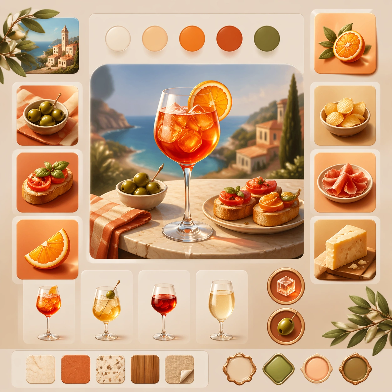
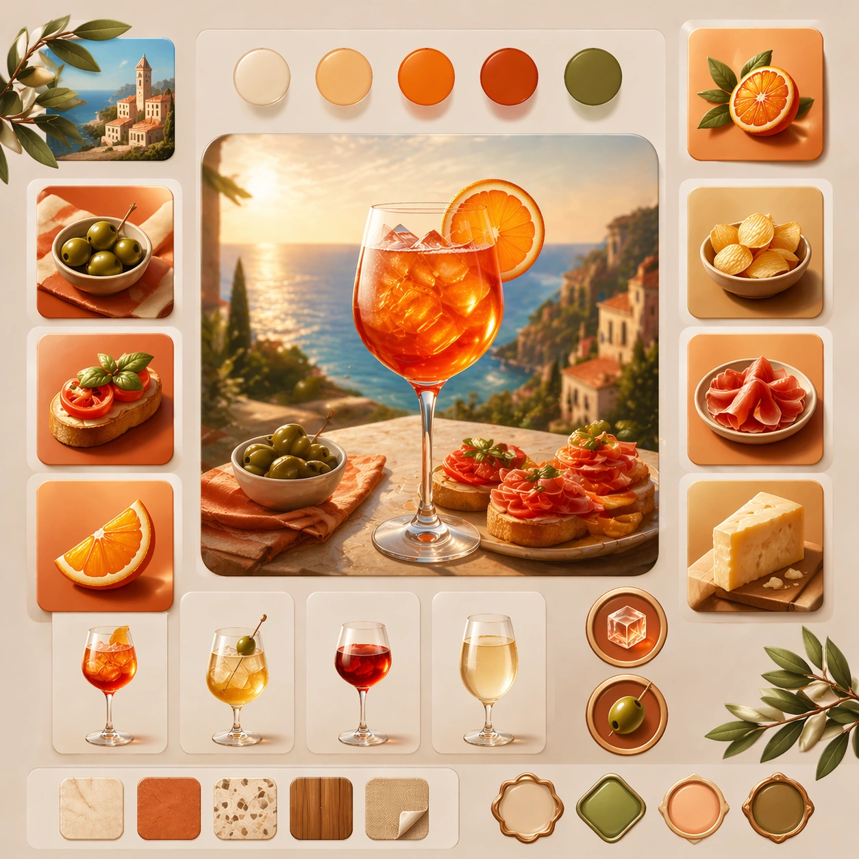
Example generated from “Italian Aperitivo Summer Lifestyle — Reference Anchor”
GPT Image 2en

Scene: Create a square reference image for Italian Aperitivo Summer Lifestyle. Build a reference anchor establishing the core system with a premium, production-ready finish. Use a polished modular board or campaign surface with clean spacing, premium game-UI finish, and clear focal hierarchy. The composition should feel intentional, clean, and reusable for gallery, research, campaign, or internal handoff contexts. Lighting must support readability first, with the main forms clearly separated from the background and enough breathing room for the system to stay legible at both hero scale and thumbnail scale. Subject: Center a coherent original game-art system built for premium production and marketing surfaces. For this image, focus on reference anchor. Keep the same system logic stable across screenshots, cards, banners, and overview boards. This image is the canonical anchor that later series images must follow. The viewer should immediately understand what role this surface plays inside a cohesive game-production asset pack. Important details: Lock framing, icon grammar, palette blocking, and surface hierarchy so the kit feels production-ready and consistent. Preserve the core silhouette, framing language, and material logic from the reference image while each variation changes function. Keep materials believable, edge hierarchy disciplined, and the visual language consistent with Aperitivo. Use abstract interface blocks or diagram accents when helpful, but avoid any readable language. The final result should feel like a deliberate production asset rather than a random illustration. Use case: Italian Aperitivo Summer Lifestyle series study 1/9, designed as reference anchor within a cohesive asset pack. Constraints: No readable text, no watermark, no logos, preserve exact 1:1 aspect ratio, no unrelated objects, no broken visual hierarchy, no malformed anatomy or broken perspective, no random decorative clutter.
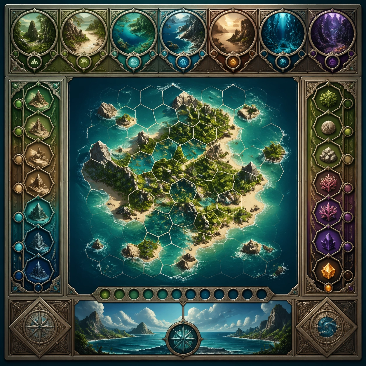
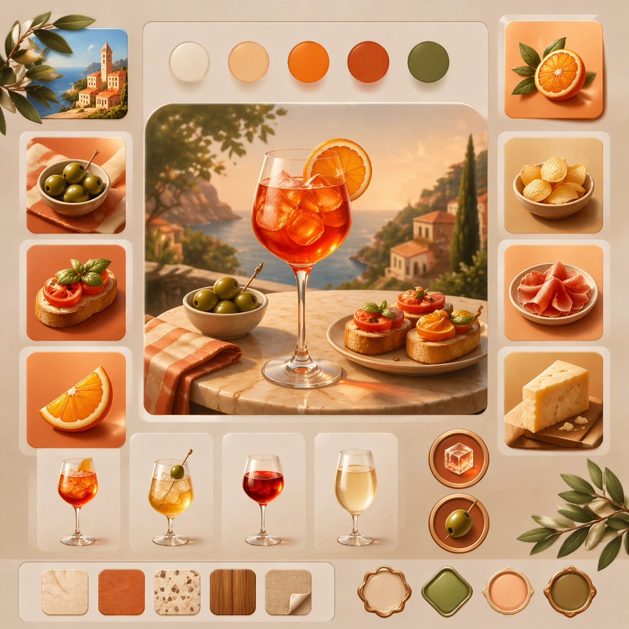
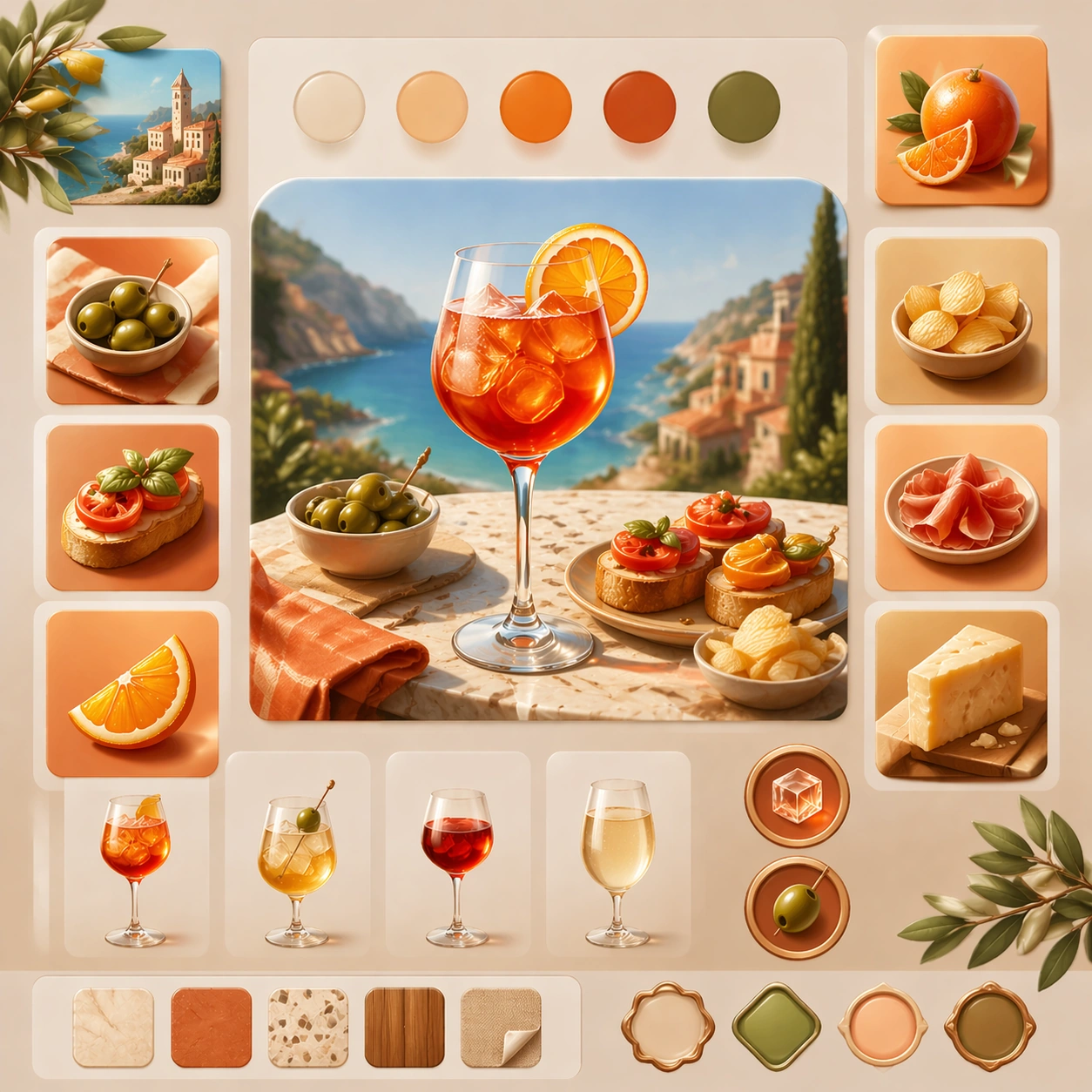
Example generated from “Italian Aperitivo Summer Lifestyle — Variant One”
GPT Image 2en

Scene: Create a square dependent image for Italian Aperitivo Summer Lifestyle. Build a first controlled variation in the same system with a premium, production-ready finish. Use a polished modular board or campaign surface with clean spacing, premium game-UI finish, and clear focal hierarchy. The composition should feel intentional, clean, and reusable for gallery, research, campaign, or internal handoff contexts. Lighting must support readability first, with the main forms clearly separated from the background and enough breathing room for the system to stay legible at both hero scale and thumbnail scale. Subject: Center a coherent original game-art system built for premium production and marketing surfaces. For this image, focus on the intended support surface. Keep the same system logic stable across screenshots, cards, banners, and overview boards. Preserve exact identity or system logic from the reference image while changing only the intended variation axis. The viewer should immediately understand what role this surface plays inside a cohesive game-production asset pack. Important details: Lock framing, icon grammar, palette blocking, and surface hierarchy so the kit feels production-ready and consistent. Preserve the core silhouette, framing language, and material logic from the reference image while each variation changes function. Keep materials believable, edge hierarchy disciplined, and the visual language consistent with Aperitivo. Use abstract interface blocks or diagram accents when helpful, but avoid any readable language. The final result should feel like a deliberate production asset rather than a random illustration. Use case: Italian Aperitivo Summer Lifestyle series study 2/9, designed as variant one within a cohesive asset pack. Constraints: No readable text, no watermark, no logos, preserve exact 1:1 aspect ratio, no unrelated objects, no broken visual hierarchy, no malformed anatomy or broken perspective, no random decorative clutter.
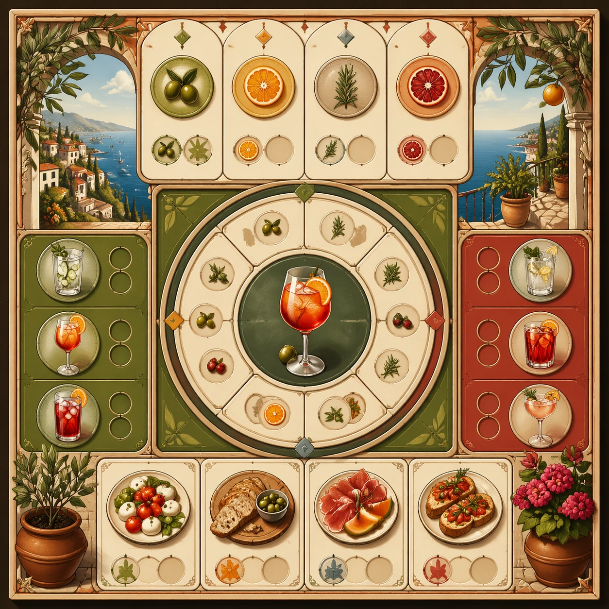
Example generated from “Italian Aperitivo Summer Lifestyle — Variant Two”
GPT Image 2en

Scene: Create a square dependent image for Italian Aperitivo Summer Lifestyle. Build a second controlled variation in the same system with a premium, production-ready finish. Use a polished modular board or campaign surface with clean spacing, premium game-UI finish, and clear focal hierarchy. The composition should feel intentional, clean, and reusable for gallery, research, campaign, or internal handoff contexts. Lighting must support readability first, with the main forms clearly separated from the background and enough breathing room for the system to stay legible at both hero scale and thumbnail scale. Subject: Center a coherent original game-art system built for premium production and marketing surfaces. For this image, focus on the intended support surface. Keep the same system logic stable across screenshots, cards, banners, and overview boards. Preserve exact identity or system logic from the reference image while changing only the intended variation axis. The viewer should immediately understand what role this surface plays inside a cohesive game-production asset pack. Important details: Lock framing, icon grammar, palette blocking, and surface hierarchy so the kit feels production-ready and consistent. Preserve the core silhouette, framing language, and material logic from the reference image while each variation changes function. Keep materials believable, edge hierarchy disciplined, and the visual language consistent with Aperitivo. Use abstract interface blocks or diagram accents when helpful, but avoid any readable language. The final result should feel like a deliberate production asset rather than a random illustration. Use case: Italian Aperitivo Summer Lifestyle series study 3/9, designed as variant two within a cohesive asset pack. Constraints: No readable text, no watermark, no logos, preserve exact 1:1 aspect ratio, no unrelated objects, no broken visual hierarchy, no malformed anatomy or broken perspective, no random decorative clutter.
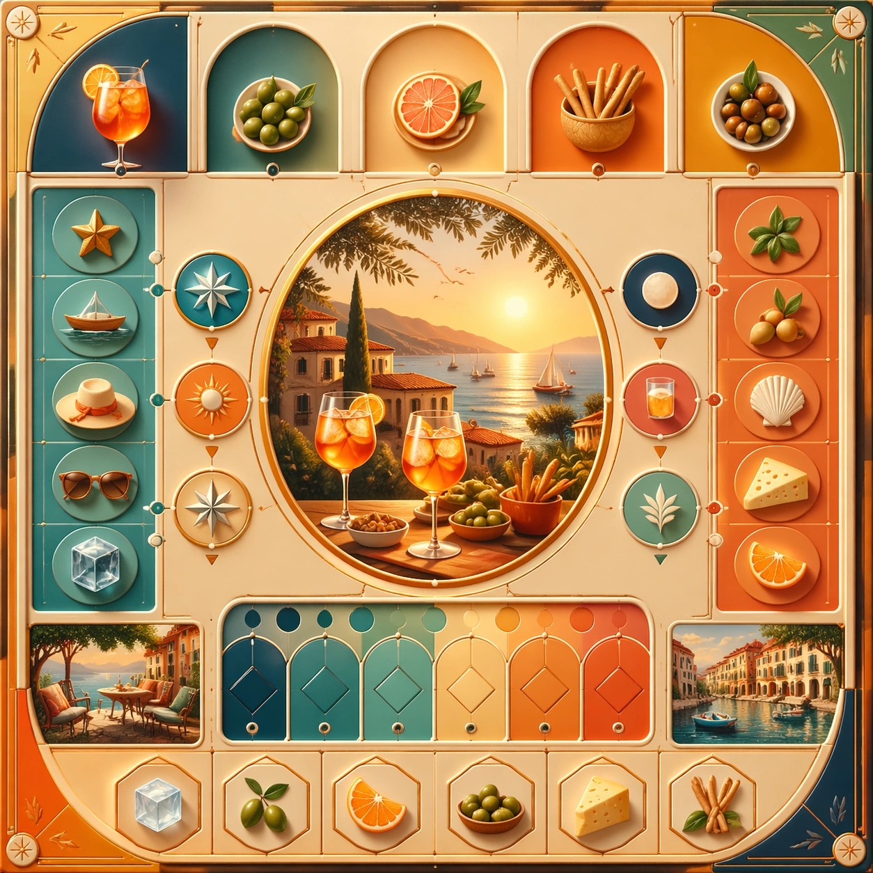
Example generated from “Italian Aperitivo Summer Lifestyle — Variant Three”
GPT Image 2en

Scene: Create a square dependent image for Italian Aperitivo Summer Lifestyle. Build a third controlled variation in the same system with a premium, production-ready finish. Use a polished modular board or campaign surface with clean spacing, premium game-UI finish, and clear focal hierarchy. The composition should feel intentional, clean, and reusable for gallery, research, campaign, or internal handoff contexts. Lighting must support readability first, with the main forms clearly separated from the background and enough breathing room for the system to stay legible at both hero scale and thumbnail scale. Subject: Center a coherent original game-art system built for premium production and marketing surfaces. For this image, focus on the intended support surface. Keep the same system logic stable across screenshots, cards, banners, and overview boards. Preserve exact identity or system logic from the reference image while changing only the intended variation axis. The viewer should immediately understand what role this surface plays inside a cohesive game-production asset pack. Important details: Lock framing, icon grammar, palette blocking, and surface hierarchy so the kit feels production-ready and consistent. Preserve the core silhouette, framing language, and material logic from the reference image while each variation changes function. Keep materials believable, edge hierarchy disciplined, and the visual language consistent with Aperitivo. Use abstract interface blocks or diagram accents when helpful, but avoid any readable language. The final result should feel like a deliberate production asset rather than a random illustration. Use case: Italian Aperitivo Summer Lifestyle series study 4/9, designed as variant three within a cohesive asset pack. Constraints: No readable text, no watermark, no logos, preserve exact 1:1 aspect ratio, no unrelated objects, no broken visual hierarchy, no malformed anatomy or broken perspective, no random decorative clutter.
Example generated from “Italian Aperitivo Summer Lifestyle — Support One”
GPT Image 2en

Scene: Create a square standalone support image for Italian Aperitivo Summer Lifestyle. Build a support-surface study with a clear focal hierarchy and a finished professional surface. Use a polished modular board or campaign surface with clean spacing, premium game-UI finish, and clear focal hierarchy. The frame should feel self-contained and polished, with enough structure to explain the system even without the reference series, yet still obviously belonging to the same theme and production world. Subject: Show a coherent original game-art system built for premium production and marketing surfaces in a way that emphasizes the intended support surface. Keep the same system logic stable across screenshots, cards, banners, and overview boards. Even though this image is independent, the viewer should still recognize the same universe, same commercial logic, and same production intent as the core package. Important details: Lock framing, icon grammar, palette blocking, and surface hierarchy so the kit feels production-ready and consistent. Preserve the broader theme language through color, framing, material choices, and modular composition. Use clean panel rhythm, premium asset presentation, and believable detail density. The image should work equally well as a gallery study, research reference, and mock production deliverable. Use case: Italian Aperitivo Summer Lifestyle single study 5/9, exploring support one as a support surface. Constraints: No readable text, no watermark, no logos, preserve exact 1:1 aspect ratio, no unrelated objects, no broken visual hierarchy, no visual noise that obscures the main surface, no accidental brand resemblance.

Example generated from “Italian Aperitivo Summer Lifestyle — Support Two”
GPT Image 2en

Scene: Create a square standalone support image for Italian Aperitivo Summer Lifestyle. Build a second support-surface study with a clear focal hierarchy and a finished professional surface. Use a polished modular board or campaign surface with clean spacing, premium game-UI finish, and clear focal hierarchy. The frame should feel self-contained and polished, with enough structure to explain the system even without the reference series, yet still obviously belonging to the same theme and production world. Subject: Show a coherent original game-art system built for premium production and marketing surfaces in a way that emphasizes the intended support surface. Keep the same system logic stable across screenshots, cards, banners, and overview boards. Even though this image is independent, the viewer should still recognize the same universe, same commercial logic, and same production intent as the core package. Important details: Lock framing, icon grammar, palette blocking, and surface hierarchy so the kit feels production-ready and consistent. Preserve the broader theme language through color, framing, material choices, and modular composition. Use clean panel rhythm, premium asset presentation, and believable detail density. The image should work equally well as a gallery study, research reference, and mock production deliverable. Use case: Italian Aperitivo Summer Lifestyle single study 6/9, exploring support two as a support surface. Constraints: No readable text, no watermark, no logos, preserve exact 1:1 aspect ratio, no unrelated objects, no broken visual hierarchy, no visual noise that obscures the main surface, no accidental brand resemblance.

Example generated from “Italian Aperitivo Summer Lifestyle — Support Three”
GPT Image 2en

Scene: Create a square standalone support image for Italian Aperitivo Summer Lifestyle. Build a third support-surface study with a clear focal hierarchy and a finished professional surface. Use a polished modular board or campaign surface with clean spacing, premium game-UI finish, and clear focal hierarchy. The frame should feel self-contained and polished, with enough structure to explain the system even without the reference series, yet still obviously belonging to the same theme and production world. Subject: Show a coherent original game-art system built for premium production and marketing surfaces in a way that emphasizes the intended support surface. Keep the same system logic stable across screenshots, cards, banners, and overview boards. Even though this image is independent, the viewer should still recognize the same universe, same commercial logic, and same production intent as the core package. Important details: Lock framing, icon grammar, palette blocking, and surface hierarchy so the kit feels production-ready and consistent. Preserve the broader theme language through color, framing, material choices, and modular composition. Use clean panel rhythm, premium asset presentation, and believable detail density. The image should work equally well as a gallery study, research reference, and mock production deliverable. Use case: Italian Aperitivo Summer Lifestyle single study 7/9, exploring support three as a support surface. Constraints: No readable text, no watermark, no logos, preserve exact 1:1 aspect ratio, no unrelated objects, no broken visual hierarchy, no visual noise that obscures the main surface, no accidental brand resemblance.

Example generated from “Italian Aperitivo Summer Lifestyle — Support Four”
GPT Image 2en

Scene: Create a square standalone support image for Italian Aperitivo Summer Lifestyle. Build a fourth support-surface study with a clear focal hierarchy and a finished professional surface. Use a polished modular board or campaign surface with clean spacing, premium game-UI finish, and clear focal hierarchy. The frame should feel self-contained and polished, with enough structure to explain the system even without the reference series, yet still obviously belonging to the same theme and production world. Subject: Show a coherent original game-art system built for premium production and marketing surfaces in a way that emphasizes the intended support surface. Keep the same system logic stable across screenshots, cards, banners, and overview boards. Even though this image is independent, the viewer should still recognize the same universe, same commercial logic, and same production intent as the core package. Important details: Lock framing, icon grammar, palette blocking, and surface hierarchy so the kit feels production-ready and consistent. Preserve the broader theme language through color, framing, material choices, and modular composition. Use clean panel rhythm, premium asset presentation, and believable detail density. The image should work equally well as a gallery study, research reference, and mock production deliverable. Use case: Italian Aperitivo Summer Lifestyle single study 8/9, exploring support four as a support surface. Constraints: No readable text, no watermark, no logos, preserve exact 1:1 aspect ratio, no unrelated objects, no broken visual hierarchy, no visual noise that obscures the main surface, no accidental brand resemblance.

Example generated from “Italian Aperitivo Summer Lifestyle — Support Five”
GPT Image 2en

Scene: Create a square standalone support image for Italian Aperitivo Summer Lifestyle. Build a fifth support-surface study with a clear focal hierarchy and a finished professional surface. Use a polished modular board or campaign surface with clean spacing, premium game-UI finish, and clear focal hierarchy. The frame should feel self-contained and polished, with enough structure to explain the system even without the reference series, yet still obviously belonging to the same theme and production world. Subject: Show a coherent original game-art system built for premium production and marketing surfaces in a way that emphasizes the intended support surface. Keep the same system logic stable across screenshots, cards, banners, and overview boards. Even though this image is independent, the viewer should still recognize the same universe, same commercial logic, and same production intent as the core package. Important details: Lock framing, icon grammar, palette blocking, and surface hierarchy so the kit feels production-ready and consistent. Preserve the broader theme language through color, framing, material choices, and modular composition. Use clean panel rhythm, premium asset presentation, and believable detail density. The image should work equally well as a gallery study, research reference, and mock production deliverable. Use case: Italian Aperitivo Summer Lifestyle single study 9/9, exploring support five as a support surface. Constraints: No readable text, no watermark, no logos, preserve exact 1:1 aspect ratio, no unrelated objects, no broken visual hierarchy, no visual noise that obscures the main surface, no accidental brand resemblance.

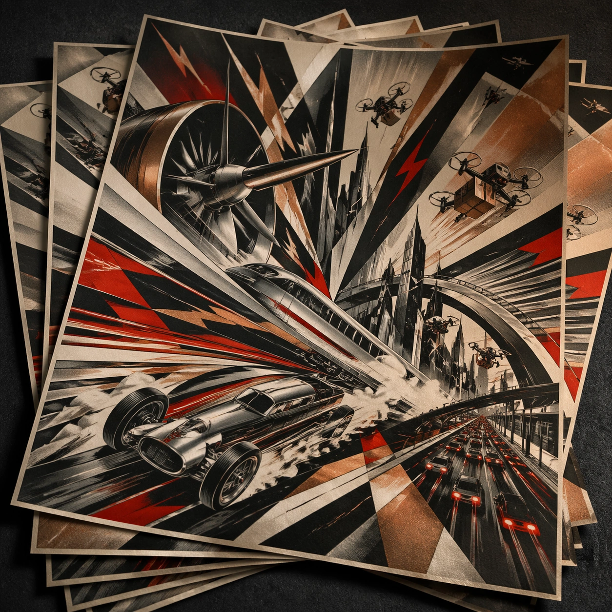
Example generated from “Italian Futurism Velocity — Print Proof Flatlay”
GPT Image 2en

Scene: A square overhead tabletop photograph of a fresh poster proof on neutral worktable paper, lit by cool daylight, with crop marks, tape tabs, and slight paper bow visible around the sheet. The poster should express machine-age futurist poster language with fractured motion, metallic planes, angular overlaps, and speed-worshiping thrust, using gunmetal silver, copper, cream, black, and electric red accents and a tactile surface appropriate to the medium. Subject: Design the poster as a print-shop proof, preserving the same poster language while allowing production clues such as edge trims, registration targets, and process marks to frame the composition. Use trains, propellers, racing cars, turbines, smoke trails, city arcs, and explosive speed lines as the main visual ingredients, and organize them with chopped angular typographic shards used as non-readable motion accents. For the contemporary-subject axis, thread in high-speed rail, delivery drones, and urban night traffic translated into ecstatic machine momentum. The poster must feel like an original design object rather than a reproduction of any known work. Important details: The image must still read as a finished poster concept, but it should carry believable print-process evidence and material tactility instead of gallery-wall perfection. Preserve dynamic rotation, vector thrust, hard overlaps, metallic sheen restraint, and aggressive directional rhythm. Keep every letterform abstract and non-readable, as if it were a typographic texture rather than language. Make the style unmistakable through composition, palette, surface behavior, and symbolic compression. no static composition, no soft nostalgic brushwork, no pastoral calm, no rounded playful forms. Use case: Italian Futurism single study 2/9, testing production realism and process evidence. Constraints: No readable text, no watermark, no logos, preserve exact 1:1 aspect ratio, no copyrighted characters, no real brand marks, no QR codes, no interface chrome, no accidental gibberish lettering.

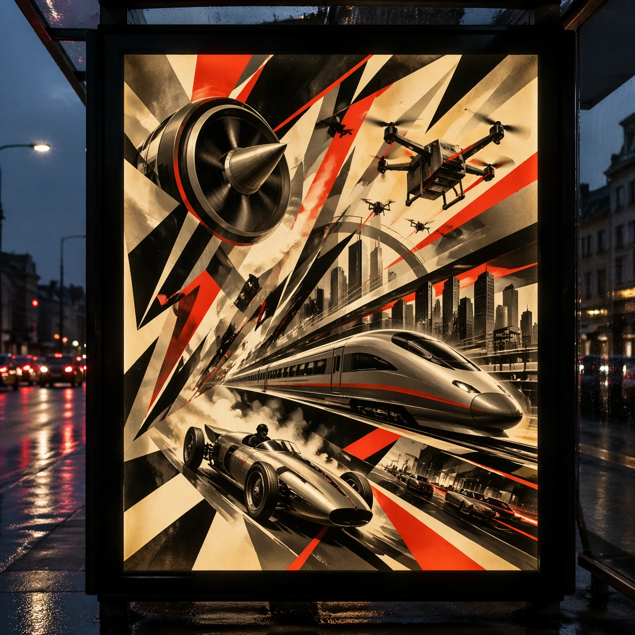
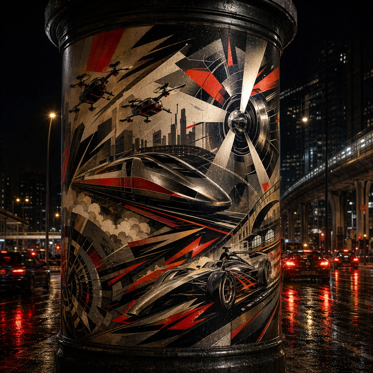
Example generated from “Italian Futurism Velocity — Transit Lightbox”
GPT Image 2en

Scene: A square dusk street photograph of a backlit transit poster glowing inside glass, with faint rain reflections, soft city blur in the distance, and the poster remaining fully legible as a composition. The poster should express machine-age futurist poster language with fractured motion, metallic planes, angular overlaps, and speed-worshiping thrust, using gunmetal silver, copper, cream, black, and electric red accents and a tactile surface appropriate to the medium. Subject: Adapt the poster into a public-facing lightbox version that still honors the original style grammar while feeling bold enough to stop a passerby from several meters away. Use trains, propellers, racing cars, turbines, smoke trails, city arcs, and explosive speed lines as the main visual ingredients, and organize them with chopped angular typographic shards used as non-readable motion accents. For the contemporary-subject axis, thread in high-speed rail, delivery drones, and urban night traffic translated into ecstatic machine momentum. The poster must feel like an original design object rather than a reproduction of any known work. Important details: Let the style survive the illumination test: color blocking, silhouette contrast, and abstract lettering should stay controlled under bright internal light and reflective glass. Preserve dynamic rotation, vector thrust, hard overlaps, metallic sheen restraint, and aggressive directional rhythm. Keep every letterform abstract and non-readable, as if it were a typographic texture rather than language. Make the style unmistakable through composition, palette, surface behavior, and symbolic compression. no static composition, no soft nostalgic brushwork, no pastoral calm, no rounded playful forms. Use case: Italian Futurism single study 3/9, testing distance readability in public display. Constraints: No readable text, no watermark, no logos, preserve exact 1:1 aspect ratio, no copyrighted characters, no real brand marks, no QR codes, no interface chrome, no accidental gibberish lettering.

Example generated from “Italian Futurism Velocity — Wheatpaste Wall Layer”
GPT Image 2en

Scene: A square urban wall study with the poster pasted onto rough plaster among torn edges and older paper remnants, photographed in soft overcast light so texture, glue bubbles, and surface scars stay visible. The poster should express machine-age futurist poster language with fractured motion, metallic planes, angular overlaps, and speed-worshiping thrust, using gunmetal silver, copper, cream, black, and electric red accents and a tactile surface appropriate to the medium. Subject: Create a version that feels made for the street, with the poster carrying enough formal force to survive abrasion, layering, and imperfect placement without losing its visual identity. Use trains, propellers, racing cars, turbines, smoke trails, city arcs, and explosive speed lines as the main visual ingredients, and organize them with chopped angular typographic shards used as non-readable motion accents. For the contemporary-subject axis, thread in high-speed rail, delivery drones, and urban night traffic translated into ecstatic machine momentum. The poster must feel like an original design object rather than a reproduction of any known work. Important details: Keep the main design intact but let the environment add grit: lifted corners, tiny tears, wrinkled paper, and older color fragments around the perimeter should amplify the style rather than dilute it. Preserve dynamic rotation, vector thrust, hard overlaps, metallic sheen restraint, and aggressive directional rhythm. Keep every letterform abstract and non-readable, as if it were a typographic texture rather than language. Make the style unmistakable through composition, palette, surface behavior, and symbolic compression. no static composition, no soft nostalgic brushwork, no pastoral calm, no rounded playful forms. Use case: Italian Futurism single study 4/9, testing street-life durability and layered context. Constraints: No readable text, no watermark, no logos, preserve exact 1:1 aspect ratio, no copyrighted characters, no real brand marks, no QR codes, no interface chrome, no accidental gibberish lettering.

Example generated from “Italian Futurism Velocity — Folded Archive Copy”
GPT Image 2en

Scene: A square conservation-table view of a vintage poster laid on gray felt under raking light, with visible fold lines, softened corners, and subtle aging that still preserves the integrity of the image. The poster should express machine-age futurist poster language with fractured motion, metallic planes, angular overlaps, and speed-worshiping thrust, using gunmetal silver, copper, cream, black, and electric red accents and a tactile surface appropriate to the medium. Subject: Present the poster as an archive copy that has been stored, unfolded, and carefully documented, letting age and handling reveal how the design holds up across time. Use trains, propellers, racing cars, turbines, smoke trails, city arcs, and explosive speed lines as the main visual ingredients, and organize them with chopped angular typographic shards used as non-readable motion accents. For the contemporary-subject axis, thread in high-speed rail, delivery drones, and urban night traffic translated into ecstatic machine momentum. The poster must feel like an original design object rather than a reproduction of any known work. Important details: Aging must stay believable rather than theatrical: slight yellowing, fold memory, edge wear, and pigment variation should support the historical or crafted feeling of the style. Preserve dynamic rotation, vector thrust, hard overlaps, metallic sheen restraint, and aggressive directional rhythm. Keep every letterform abstract and non-readable, as if it were a typographic texture rather than language. Make the style unmistakable through composition, palette, surface behavior, and symbolic compression. no static composition, no soft nostalgic brushwork, no pastoral calm, no rounded playful forms. Use case: Italian Futurism single study 5/9, testing archival endurance and age character. Constraints: No readable text, no watermark, no logos, preserve exact 1:1 aspect ratio, no copyrighted characters, no real brand marks, no QR codes, no interface chrome, no accidental gibberish lettering.

Example generated from “Italian Futurism Velocity — Twin Poster Diptych”
GPT Image 2en

Scene: A square white-wall installation showing two companion posters hung side by side with equal spacing, photographed frontally so the pair reads as a designed conversation rather than two unrelated sheets. The poster should express machine-age futurist poster language with fractured motion, metallic planes, angular overlaps, and speed-worshiping thrust, using gunmetal silver, copper, cream, black, and electric red accents and a tactile surface appropriate to the medium. Subject: Compose a matched diptych: two posters sharing one style system while splitting the narrative across paired motifs, mirrored masses, or complementary color emphasis. Use trains, propellers, racing cars, turbines, smoke trails, city arcs, and explosive speed lines as the main visual ingredients, and organize them with chopped angular typographic shards used as non-readable motion accents. For the contemporary-subject axis, thread in high-speed rail, delivery drones, and urban night traffic translated into ecstatic machine momentum. The poster must feel like an original design object rather than a reproduction of any known work. Important details: Both halves should feel distinct yet inseparable. Preserve one coherent visual language, but let each sheet carry its own focal symbol and rhythm without readable wording. Preserve dynamic rotation, vector thrust, hard overlaps, metallic sheen restraint, and aggressive directional rhythm. Keep every letterform abstract and non-readable, as if it were a typographic texture rather than language. Make the style unmistakable through composition, palette, surface behavior, and symbolic compression. no static composition, no soft nostalgic brushwork, no pastoral calm, no rounded playful forms. Use case: Italian Futurism single study 6/9, testing system flexibility across a paired set. Constraints: No readable text, no watermark, no logos, preserve exact 1:1 aspect ratio, no copyrighted characters, no real brand marks, no QR codes, no interface chrome, no accidental gibberish lettering.

Example generated from “Italian Futurism Velocity — Stacked Print Bundle”
GPT Image 2en

Scene: A square tabletop shot of several poster prints stacked and slightly fanned, with curled corners, offset edges, and soft directional light revealing paper thickness and ink behavior. The poster should express machine-age futurist poster language with fractured motion, metallic planes, angular overlaps, and speed-worshiping thrust, using gunmetal silver, copper, cream, black, and electric red accents and a tactile surface appropriate to the medium. Subject: Design the top poster to dominate while nearby duplicate sheets echo the same composition, creating a tactile print-run scene rather than a single isolated sheet. Use trains, propellers, racing cars, turbines, smoke trails, city arcs, and explosive speed lines as the main visual ingredients, and organize them with chopped angular typographic shards used as non-readable motion accents. For the contemporary-subject axis, thread in high-speed rail, delivery drones, and urban night traffic translated into ecstatic machine momentum. The poster must feel like an original design object rather than a reproduction of any known work. Important details: Use the stack to emphasize production character: edge shadows, repeated motifs peeking from beneath, and subtle misalignment should enrich the material reading without changing the core design. Preserve dynamic rotation, vector thrust, hard overlaps, metallic sheen restraint, and aggressive directional rhythm. Keep every letterform abstract and non-readable, as if it were a typographic texture rather than language. Make the style unmistakable through composition, palette, surface behavior, and symbolic compression. no static composition, no soft nostalgic brushwork, no pastoral calm, no rounded playful forms. Use case: Italian Futurism single study 7/9, testing print-run tactility and repeat presence. Constraints: No readable text, no watermark, no logos, preserve exact 1:1 aspect ratio, no copyrighted characters, no real brand marks, no QR codes, no interface chrome, no accidental gibberish lettering.

Example generated from “Italian Futurism Velocity — Kiosk Night Glow”
GPT Image 2en

Scene: A square nighttime city view with the poster wrapping part of a cylindrical kiosk, wet pavement reflecting nearby light, and the composition holding together under moody urban illumination. The poster should express machine-age futurist poster language with fractured motion, metallic planes, angular overlaps, and speed-worshiping thrust, using gunmetal silver, copper, cream, black, and electric red accents and a tactile surface appropriate to the medium. Subject: Reframe the design for a dramatic street-placement context, where the poster has to project style and mood through reflection, curvature, and surrounding darkness. Use trains, propellers, racing cars, turbines, smoke trails, city arcs, and explosive speed lines as the main visual ingredients, and organize them with chopped angular typographic shards used as non-readable motion accents. For the contemporary-subject axis, thread in high-speed rail, delivery drones, and urban night traffic translated into ecstatic machine momentum. The poster must feel like an original design object rather than a reproduction of any known work. Important details: The design should remain instantly recognizable despite the cylindrical wrap. Preserve major blocks, symbolic shapes, and abstract title forms so the style still feels authoritative at night. Preserve dynamic rotation, vector thrust, hard overlaps, metallic sheen restraint, and aggressive directional rhythm. Keep every letterform abstract and non-readable, as if it were a typographic texture rather than language. Make the style unmistakable through composition, palette, surface behavior, and symbolic compression. no static composition, no soft nostalgic brushwork, no pastoral calm, no rounded playful forms. Use case: Italian Futurism single study 8/9, testing atmospheric display under rain and glow. Constraints: No readable text, no watermark, no logos, preserve exact 1:1 aspect ratio, no copyrighted characters, no real brand marks, no QR codes, no interface chrome, no accidental gibberish lettering.

Example generated from “Italian Futurism Velocity — Contemporary Remix”
GPT Image 2en

Scene: A square front-facing poster presentation on a clean neutral wall, lit like a premium print test, with crisp edges and a polished but still tactile finish appropriate to the style. The poster should express machine-age futurist poster language with fractured motion, metallic planes, angular overlaps, and speed-worshiping thrust, using gunmetal silver, copper, cream, black, and electric red accents and a tactile surface appropriate to the medium. Subject: Apply the historical poster language to a contemporary urban subject so the old visual grammar proves it can carry present-day themes without losing authenticity or formal discipline. Use trains, propellers, racing cars, turbines, smoke trails, city arcs, and explosive speed lines as the main visual ingredients, and organize them with chopped angular typographic shards used as non-readable motion accents. For the contemporary-subject axis, thread in high-speed rail, delivery drones, and urban night traffic translated into ecstatic machine momentum. The poster must feel like an original design object rather than a reproduction of any known work. Important details: This is not parody. The contemporary subject should feel genuinely absorbed into the style through palette, composition, symbolic compression, and non-readable lettering treatment. Preserve dynamic rotation, vector thrust, hard overlaps, metallic sheen restraint, and aggressive directional rhythm. Keep every letterform abstract and non-readable, as if it were a typographic texture rather than language. Make the style unmistakable through composition, palette, surface behavior, and symbolic compression. no static composition, no soft nostalgic brushwork, no pastoral calm, no rounded playful forms. Use case: Italian Futurism single study 9/9, testing historical grammar on a present-day subject. Constraints: No readable text, no watermark, no logos, preserve exact 1:1 aspect ratio, no copyrighted characters, no real brand marks, no QR codes, no interface chrome, no accidental gibberish lettering.

Example generated from “Japanese Kissaten Retro Editorial — Reference Anchor”
GPT Image 2en

Scene: Create a square reference image for Japanese Kissaten Retro Editorial. Build a reference anchor establishing the core system with a premium, production-ready finish. Use a polished modular board or campaign surface with clean spacing, premium game-UI finish, and clear focal hierarchy. The composition should feel intentional, clean, and reusable for gallery, research, campaign, or internal handoff contexts. Lighting must support readability first, with the main forms clearly separated from the background and enough breathing room for the system to stay legible at both hero scale and thumbnail scale. Subject: Center a coherent original game-art system built for premium production and marketing surfaces. For this image, focus on reference anchor. Keep the same system logic stable across screenshots, cards, banners, and overview boards. This image is the canonical anchor that later series images must follow. The viewer should immediately understand what role this surface plays inside a cohesive game-production asset pack. Important details: Lock framing, icon grammar, palette blocking, and surface hierarchy so the kit feels production-ready and consistent. Preserve the core silhouette, framing language, and material logic from the reference image while each variation changes function. Keep materials believable, edge hierarchy disciplined, and the visual language consistent with Kissaten. Use abstract interface blocks or diagram accents when helpful, but avoid any readable language. The final result should feel like a deliberate production asset rather than a random illustration. Use case: Japanese Kissaten Retro Editorial series study 1/9, designed as reference anchor within a cohesive asset pack. Constraints: No readable text, no watermark, no logos, preserve exact 1:1 aspect ratio, no unrelated objects, no broken visual hierarchy, no malformed anatomy or broken perspective, no random decorative clutter.
Example generated from “Japanese Kissaten Retro Editorial — Variant One”
GPT Image 2en

Scene: Create a square dependent image for Japanese Kissaten Retro Editorial. Build a first controlled variation in the same system with a premium, production-ready finish. Use a polished modular board or campaign surface with clean spacing, premium game-UI finish, and clear focal hierarchy. The composition should feel intentional, clean, and reusable for gallery, research, campaign, or internal handoff contexts. Lighting must support readability first, with the main forms clearly separated from the background and enough breathing room for the system to stay legible at both hero scale and thumbnail scale. Subject: Center a coherent original game-art system built for premium production and marketing surfaces. For this image, focus on the intended support surface. Keep the same system logic stable across screenshots, cards, banners, and overview boards. Preserve exact identity or system logic from the reference image while changing only the intended variation axis. The viewer should immediately understand what role this surface plays inside a cohesive game-production asset pack. Important details: Lock framing, icon grammar, palette blocking, and surface hierarchy so the kit feels production-ready and consistent. Preserve the core silhouette, framing language, and material logic from the reference image while each variation changes function. Keep materials believable, edge hierarchy disciplined, and the visual language consistent with Kissaten. Use abstract interface blocks or diagram accents when helpful, but avoid any readable language. The final result should feel like a deliberate production asset rather than a random illustration. Use case: Japanese Kissaten Retro Editorial series study 2/9, designed as variant one within a cohesive asset pack. Constraints: No readable text, no watermark, no logos, preserve exact 1:1 aspect ratio, no unrelated objects, no broken visual hierarchy, no malformed anatomy or broken perspective, no random decorative clutter.