PROMPTS · EXPLORATION CRÉATIVE

Galerie de prompts

Explorez des prompts réels et leurs exemples générés. Trouvez l’inspiration pour votre prochaine mission créative et copiez le texte intégral gratuitement.

Exemples
10,974
Modèles
17
Sources
1277
10 974 exemples de prompts · page 69 sur 229
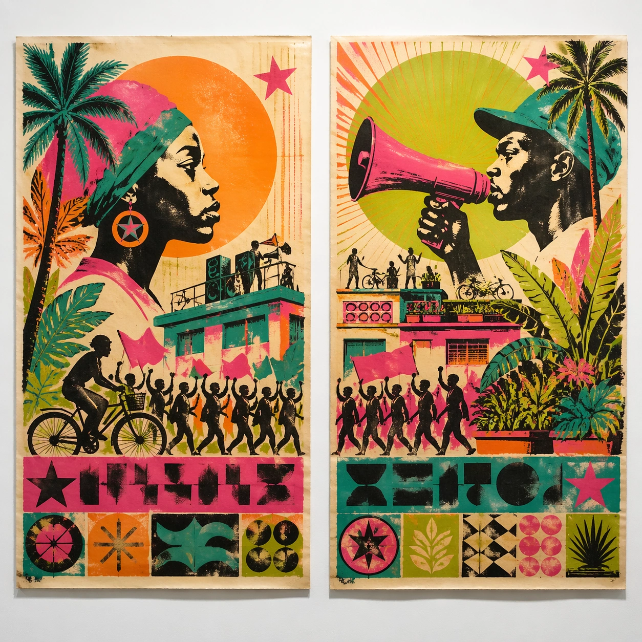
Example generated from “Cuban 70S Revolution Print — Twin Poster Diptych”
GPT Image 2en

Scene: A square white-wall installation showing two companion posters hung side by side with equal spacing, photographed frontally so the pair reads as a designed conversation rather than two unrelated sheets. The poster should express 1970s Caribbean solidarity silkscreen with fluorescent flat planes, stencil edges, posterized faces, and lively registration drift, using hot pink, turquoise, lime, orange, black, and warm off-white paper and a tactile surface appropriate to the medium. Subject: Compose a matched diptych: two posters sharing one style system while splitting the narrative across paired motifs, mirrored masses, or complementary color emphasis. Use profiles, palms, sun discs, megaphones, marching silhouettes, stars, and tropical botanical shapes as the main visual ingredients, and organize them with blocky title slabs and seal-like shapes rendered as non-readable silkscreen graphics. For the contemporary-subject axis, thread in community gardens, rooftop speakers, and neighborhood bicycles absorbed into a solidarity poster language. The poster must feel like an original design object rather than a reproduction of any known work. Important details: Both halves should feel distinct yet inseparable. Preserve one coherent visual language, but let each sheet carry its own focal symbol and rhythm without readable wording. Preserve flat color stacking, visible plate misalignment, rough fibers, and heated tropical energy without realism. Keep every letterform abstract and non-readable, as if it were a typographic texture rather than language. Make the style unmistakable through composition, palette, surface behavior, and symbolic compression. no airbrushed realism, no corporate polish, no clean luxury gradients, no literal readable slogans. Use case: Cuban Silkscreen single study 6/9, testing system flexibility across a paired set. Constraints: No readable text, no watermark, no logos, preserve exact 1:1 aspect ratio, no copyrighted characters, no real brand marks, no QR codes, no interface chrome, no accidental gibberish lettering.
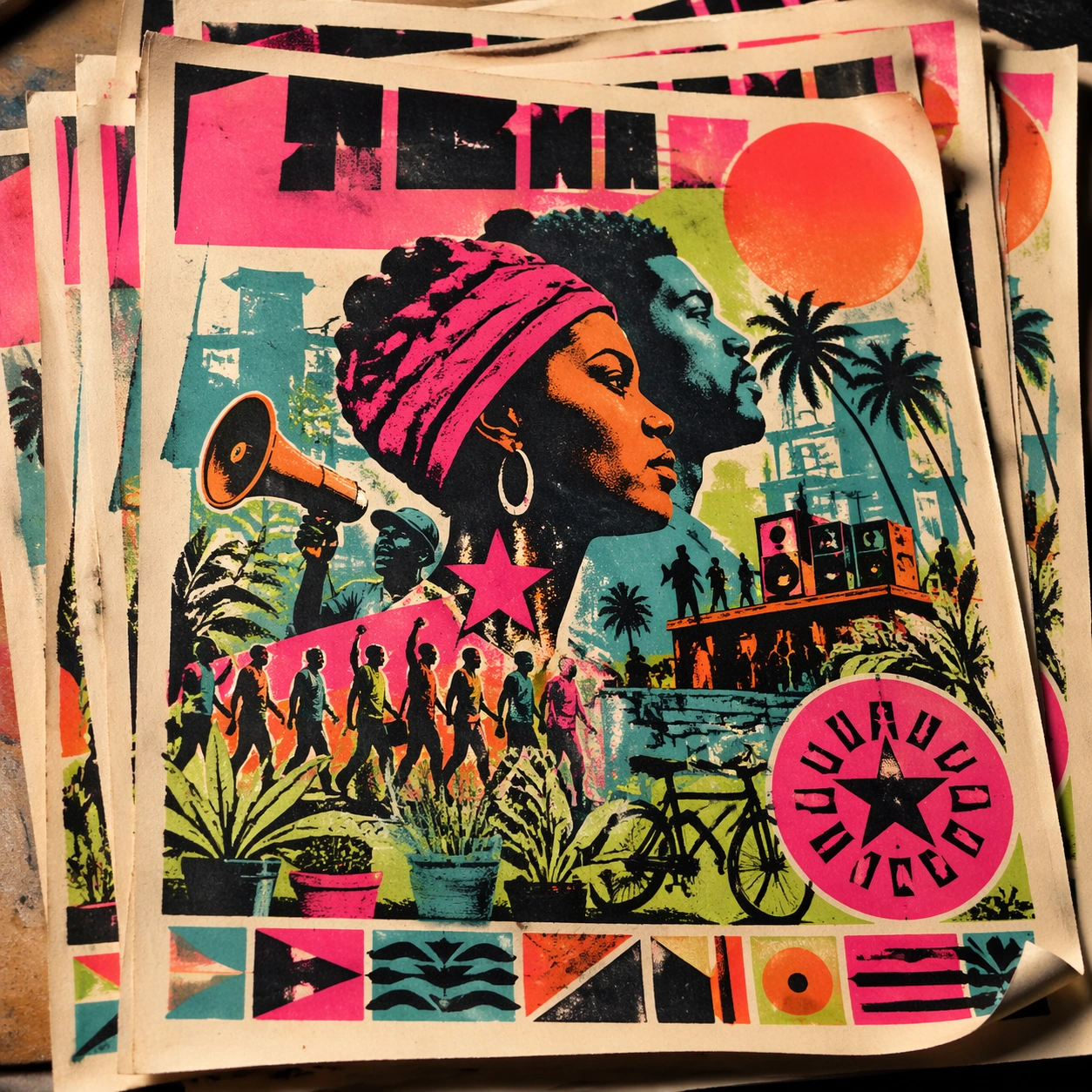
Example generated from “Cuban 70S Revolution Print — Stacked Print Bundle”
GPT Image 2en

Scene: A square tabletop shot of several poster prints stacked and slightly fanned, with curled corners, offset edges, and soft directional light revealing paper thickness and ink behavior. The poster should express 1970s Caribbean solidarity silkscreen with fluorescent flat planes, stencil edges, posterized faces, and lively registration drift, using hot pink, turquoise, lime, orange, black, and warm off-white paper and a tactile surface appropriate to the medium. Subject: Design the top poster to dominate while nearby duplicate sheets echo the same composition, creating a tactile print-run scene rather than a single isolated sheet. Use profiles, palms, sun discs, megaphones, marching silhouettes, stars, and tropical botanical shapes as the main visual ingredients, and organize them with blocky title slabs and seal-like shapes rendered as non-readable silkscreen graphics. For the contemporary-subject axis, thread in community gardens, rooftop speakers, and neighborhood bicycles absorbed into a solidarity poster language. The poster must feel like an original design object rather than a reproduction of any known work. Important details: Use the stack to emphasize production character: edge shadows, repeated motifs peeking from beneath, and subtle misalignment should enrich the material reading without changing the core design. Preserve flat color stacking, visible plate misalignment, rough fibers, and heated tropical energy without realism. Keep every letterform abstract and non-readable, as if it were a typographic texture rather than language. Make the style unmistakable through composition, palette, surface behavior, and symbolic compression. no airbrushed realism, no corporate polish, no clean luxury gradients, no literal readable slogans. Use case: Cuban Silkscreen single study 7/9, testing print-run tactility and repeat presence. Constraints: No readable text, no watermark, no logos, preserve exact 1:1 aspect ratio, no copyrighted characters, no real brand marks, no QR codes, no interface chrome, no accidental gibberish lettering.
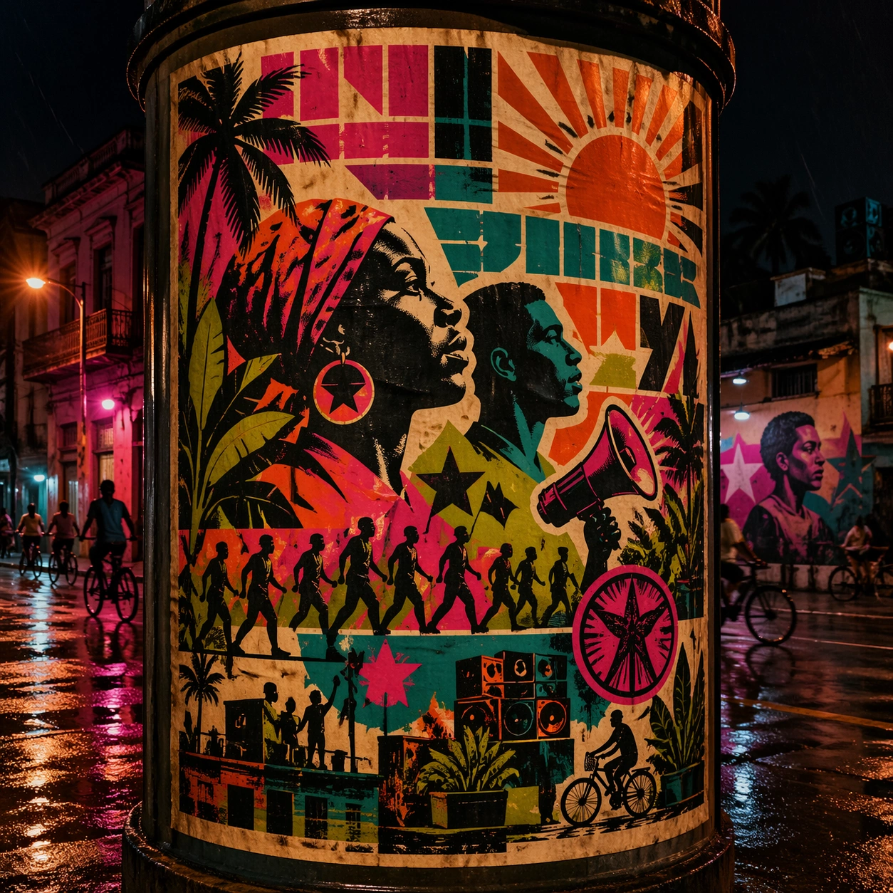
Example generated from “Cuban 70S Revolution Print — Kiosk Night Glow”
GPT Image 2en

Scene: A square nighttime city view with the poster wrapping part of a cylindrical kiosk, wet pavement reflecting nearby light, and the composition holding together under moody urban illumination. The poster should express 1970s Caribbean solidarity silkscreen with fluorescent flat planes, stencil edges, posterized faces, and lively registration drift, using hot pink, turquoise, lime, orange, black, and warm off-white paper and a tactile surface appropriate to the medium. Subject: Reframe the design for a dramatic street-placement context, where the poster has to project style and mood through reflection, curvature, and surrounding darkness. Use profiles, palms, sun discs, megaphones, marching silhouettes, stars, and tropical botanical shapes as the main visual ingredients, and organize them with blocky title slabs and seal-like shapes rendered as non-readable silkscreen graphics. For the contemporary-subject axis, thread in community gardens, rooftop speakers, and neighborhood bicycles absorbed into a solidarity poster language. The poster must feel like an original design object rather than a reproduction of any known work. Important details: The design should remain instantly recognizable despite the cylindrical wrap. Preserve major blocks, symbolic shapes, and abstract title forms so the style still feels authoritative at night. Preserve flat color stacking, visible plate misalignment, rough fibers, and heated tropical energy without realism. Keep every letterform abstract and non-readable, as if it were a typographic texture rather than language. Make the style unmistakable through composition, palette, surface behavior, and symbolic compression. no airbrushed realism, no corporate polish, no clean luxury gradients, no literal readable slogans. Use case: Cuban Silkscreen single study 8/9, testing atmospheric display under rain and glow. Constraints: No readable text, no watermark, no logos, preserve exact 1:1 aspect ratio, no copyrighted characters, no real brand marks, no QR codes, no interface chrome, no accidental gibberish lettering.
Example generated from “Cuban 70S Revolution Print — Contemporary Remix”
GPT Image 2en

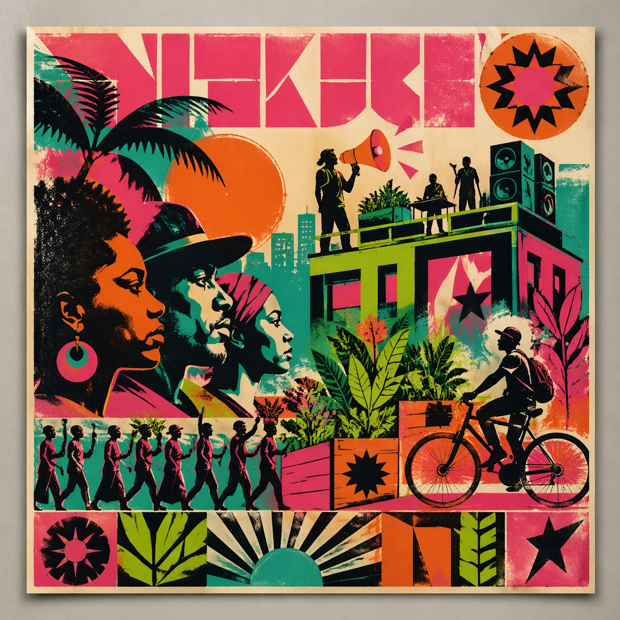
Scene: A square front-facing poster presentation on a clean neutral wall, lit like a premium print test, with crisp edges and a polished but still tactile finish appropriate to the style. The poster should express 1970s Caribbean solidarity silkscreen with fluorescent flat planes, stencil edges, posterized faces, and lively registration drift, using hot pink, turquoise, lime, orange, black, and warm off-white paper and a tactile surface appropriate to the medium. Subject: Apply the historical poster language to a contemporary urban subject so the old visual grammar proves it can carry present-day themes without losing authenticity or formal discipline. Use profiles, palms, sun discs, megaphones, marching silhouettes, stars, and tropical botanical shapes as the main visual ingredients, and organize them with blocky title slabs and seal-like shapes rendered as non-readable silkscreen graphics. For the contemporary-subject axis, thread in community gardens, rooftop speakers, and neighborhood bicycles absorbed into a solidarity poster language. The poster must feel like an original design object rather than a reproduction of any known work. Important details: This is not parody. The contemporary subject should feel genuinely absorbed into the style through palette, composition, symbolic compression, and non-readable lettering treatment. Preserve flat color stacking, visible plate misalignment, rough fibers, and heated tropical energy without realism. Keep every letterform abstract and non-readable, as if it were a typographic texture rather than language. Make the style unmistakable through composition, palette, surface behavior, and symbolic compression. no airbrushed realism, no corporate polish, no clean luxury gradients, no literal readable slogans. Use case: Cuban Silkscreen single study 9/9, testing historical grammar on a present-day subject. Constraints: No readable text, no watermark, no logos, preserve exact 1:1 aspect ratio, no copyrighted characters, no real brand marks, no QR codes, no interface chrome, no accidental gibberish lettering.
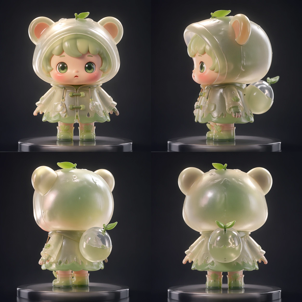
Example generated from “Cute Blind Box Figurine — Exploded Arrangement”
GPT Image 2en

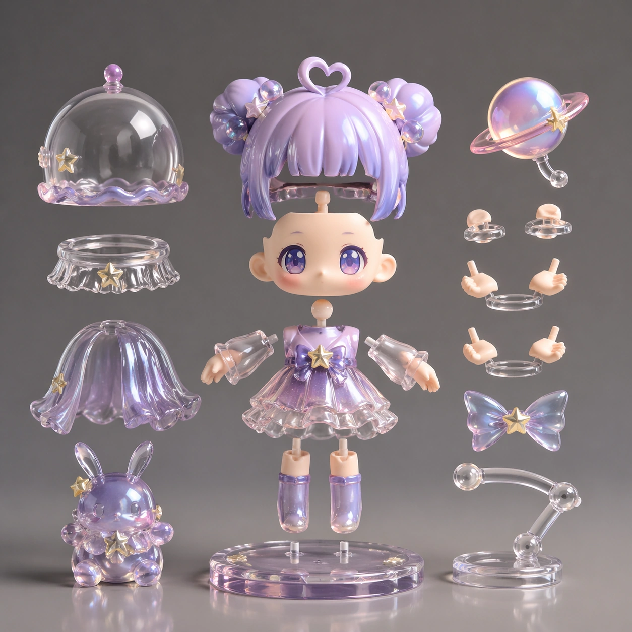
Scene: A square CGI or design-visualization frame with calibrated lighting, intentional composition, and premium material rendering. Build the frame around components or accessories separated with clean studio logic. Keep the lighting, camera distance, and spatial organization tuned for a high-signal research image rather than a casual snapshot. The image belongs to the Cute Blind Box Figurine theme and should feel immediately legible as a prompt atlas theme for cute blind box figurine, testing physics-materials, style-transfer with gpt image 2.. Subject: Center the study on components or accessories separated with clean studio logic. Translate the theme into a concrete visual statement instead of an abstract mood board: the viewer should understand what kind of image this is, what is being tested, and why the composition is difficult. Use the slug idea of cute blind box figurine as a literal guide for subject matter, materials, and staging. If helpful, borrow the broad visual cues suggested by POP MART, PVC, studio, but keep the result original and specific to this study. Important details: The model must feel engineered or art-directed rather than merely stylized: edges, seams, translucency, reflections, and scale cues should all hold up. Preserve a disciplined square composition, clear focal hierarchy, and enough secondary information to make the image feel complete rather than underspecified. The image should look polished, novel, and exhibition-ready, with topic-specific credibility coming from the way surfaces, structure, and visual language reinforce Cute Blind Box Figurine. Avoid generic filler elements that do not serve the main concept. Use case: Cute Blind Box Figurine single study 2/8, testing physics-materials, style-transfer through the exploded arrangement variation. Constraints: No readable text, no watermark, no logos, preserve exact 1:1 aspect ratio, no real brand logos, no low-poly shortcuts, no broken reflections, no muddy materials, no generic showroom clutter, no unreadable UI overlays.
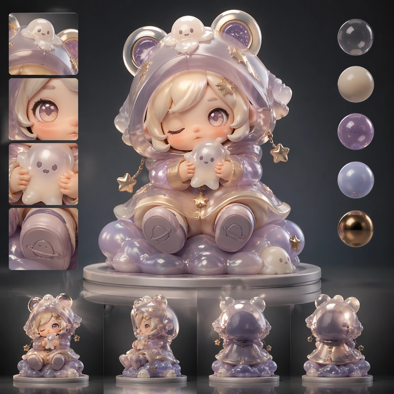
Example generated from “Cute Blind Box Figurine — Material Pass”
GPT Image 2en

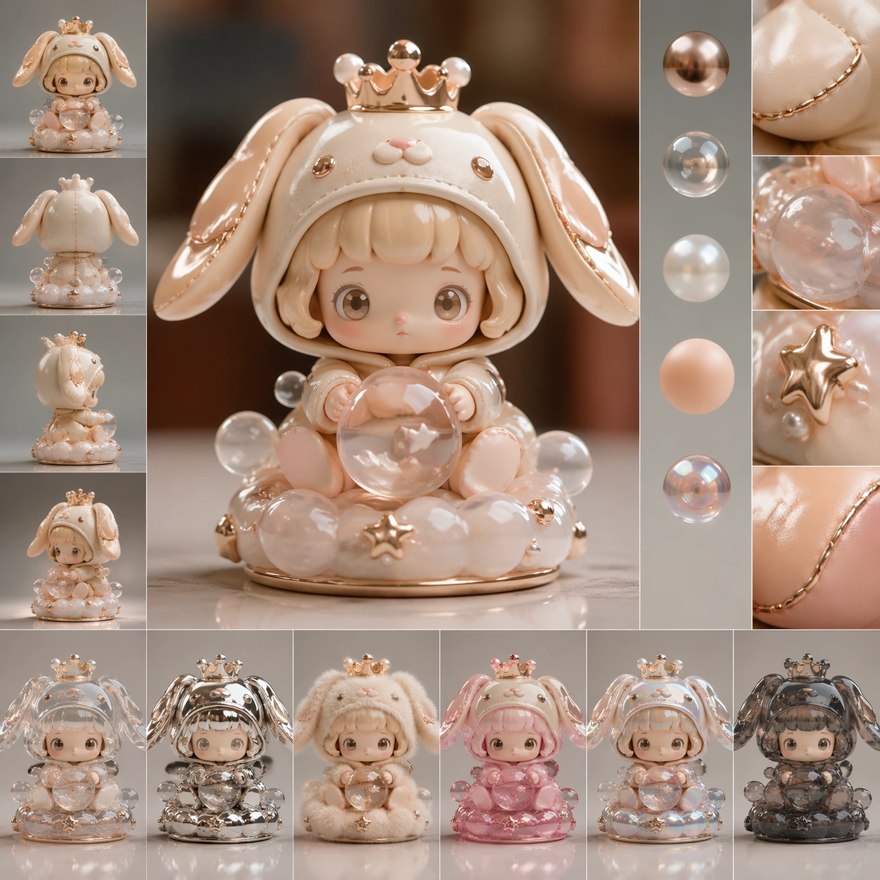
Scene: A square CGI or design-visualization frame with calibrated lighting, intentional composition, and premium material rendering. Build the frame around the same design idea pushed through surface richness and shader control. Keep the lighting, camera distance, and spatial organization tuned for a high-signal research image rather than a casual snapshot. The image belongs to the Cute Blind Box Figurine theme and should feel immediately legible as a prompt atlas theme for cute blind box figurine, testing physics-materials, style-transfer with gpt image 2.. Subject: Center the study on the same design idea pushed through surface richness and shader control. Translate the theme into a concrete visual statement instead of an abstract mood board: the viewer should understand what kind of image this is, what is being tested, and why the composition is difficult. Use the slug idea of cute blind box figurine as a literal guide for subject matter, materials, and staging. If helpful, borrow the broad visual cues suggested by POP MART, PVC, studio, but keep the result original and specific to this study. Important details: The model must feel engineered or art-directed rather than merely stylized: edges, seams, translucency, reflections, and scale cues should all hold up. Preserve a disciplined square composition, clear focal hierarchy, and enough secondary information to make the image feel complete rather than underspecified. The image should look polished, novel, and exhibition-ready, with topic-specific credibility coming from the way surfaces, structure, and visual language reinforce Cute Blind Box Figurine. Avoid generic filler elements that do not serve the main concept. Use case: Cute Blind Box Figurine single study 3/8, testing physics-materials, style-transfer through the material pass variation. Constraints: No readable text, no watermark, no logos, preserve exact 1:1 aspect ratio, no real brand logos, no low-poly shortcuts, no broken reflections, no muddy materials, no generic showroom clutter, no unreadable UI overlays.
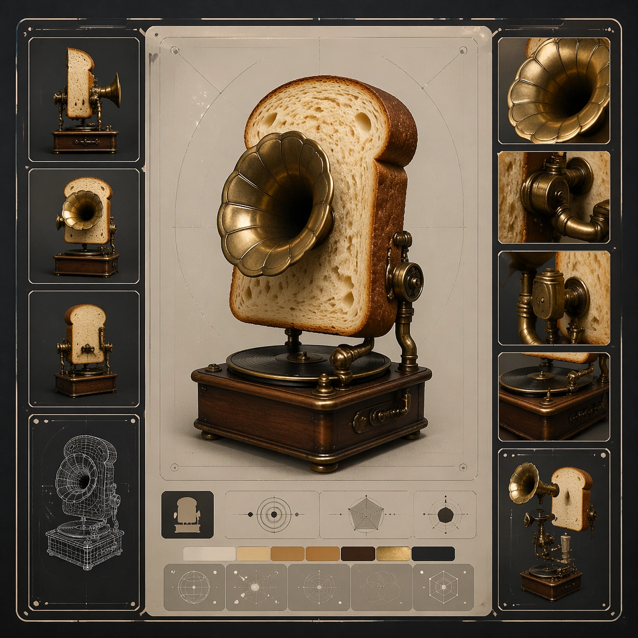
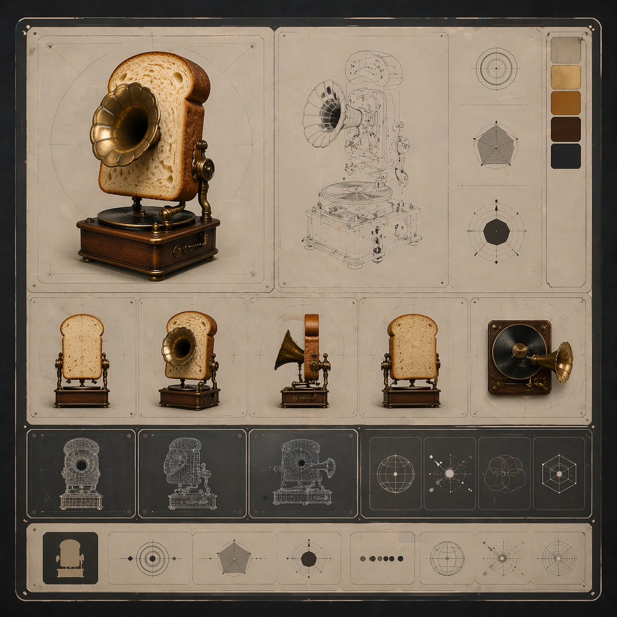
Example generated from “Cute Blind Box Figurine — Studio Turn”
GPT Image 2en

Scene: A square CGI or design-visualization frame with calibrated lighting, intentional composition, and premium material rendering. Build the frame around a presentation angle that reveals volume and silhouette clearly. Keep the lighting, camera distance, and spatial organization tuned for a high-signal research image rather than a casual snapshot. The image belongs to the Cute Blind Box Figurine theme and should feel immediately legible as a prompt atlas theme for cute blind box figurine, testing physics-materials, style-transfer with gpt image 2.. Subject: Center the study on a presentation angle that reveals volume and silhouette clearly. Translate the theme into a concrete visual statement instead of an abstract mood board: the viewer should understand what kind of image this is, what is being tested, and why the composition is difficult. Use the slug idea of cute blind box figurine as a literal guide for subject matter, materials, and staging. If helpful, borrow the broad visual cues suggested by POP MART, PVC, studio, but keep the result original and specific to this study. Important details: The model must feel engineered or art-directed rather than merely stylized: edges, seams, translucency, reflections, and scale cues should all hold up. Preserve a disciplined square composition, clear focal hierarchy, and enough secondary information to make the image feel complete rather than underspecified. The image should look polished, novel, and exhibition-ready, with topic-specific credibility coming from the way surfaces, structure, and visual language reinforce Cute Blind Box Figurine. Avoid generic filler elements that do not serve the main concept. Use case: Cute Blind Box Figurine single study 4/8, testing physics-materials, style-transfer through the studio turn variation. Constraints: No readable text, no watermark, no logos, preserve exact 1:1 aspect ratio, no real brand logos, no low-poly shortcuts, no broken reflections, no muddy materials, no generic showroom clutter, no unreadable UI overlays.
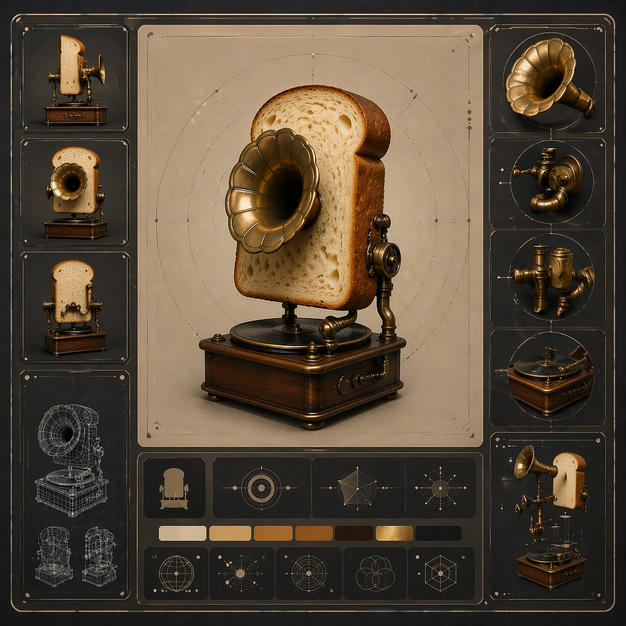
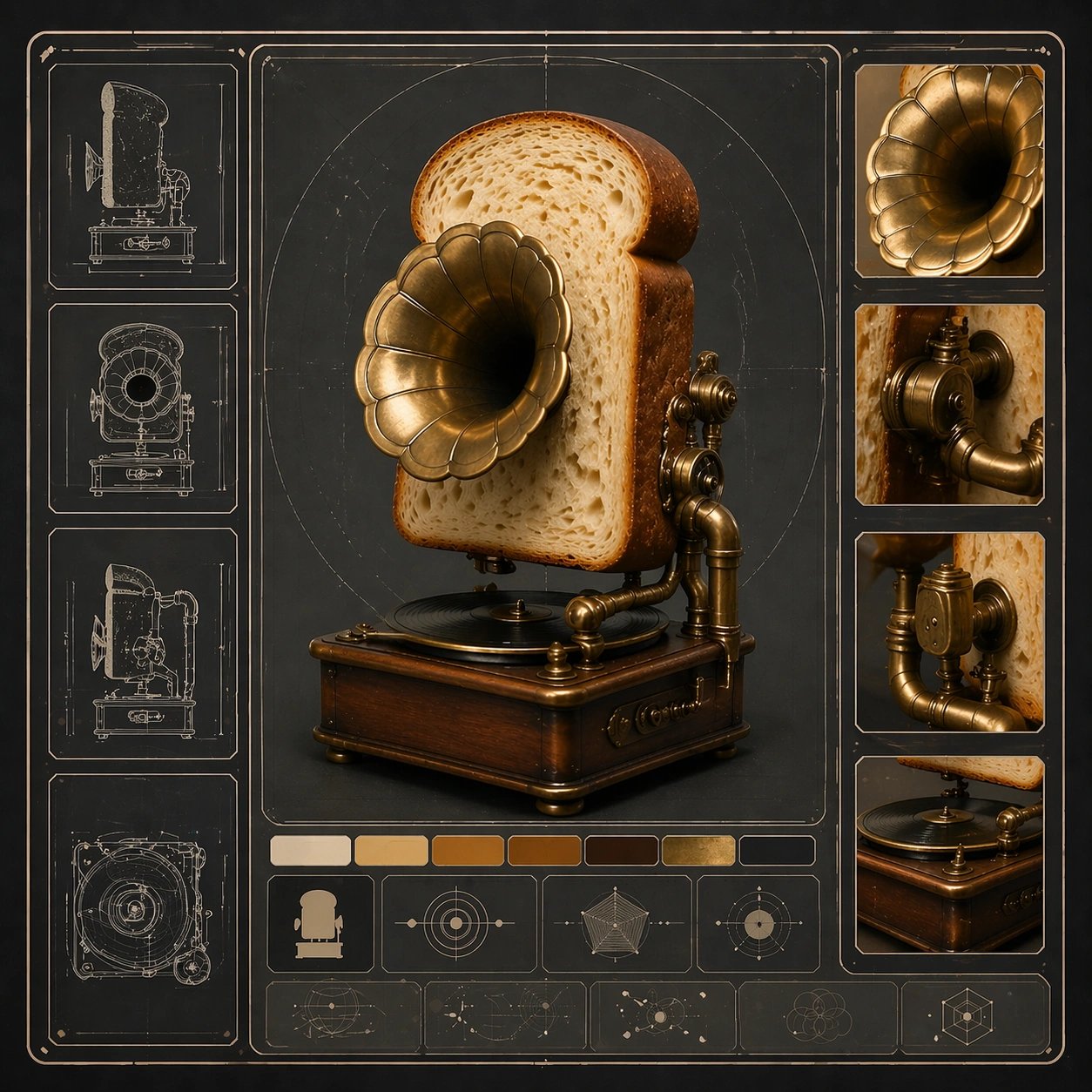
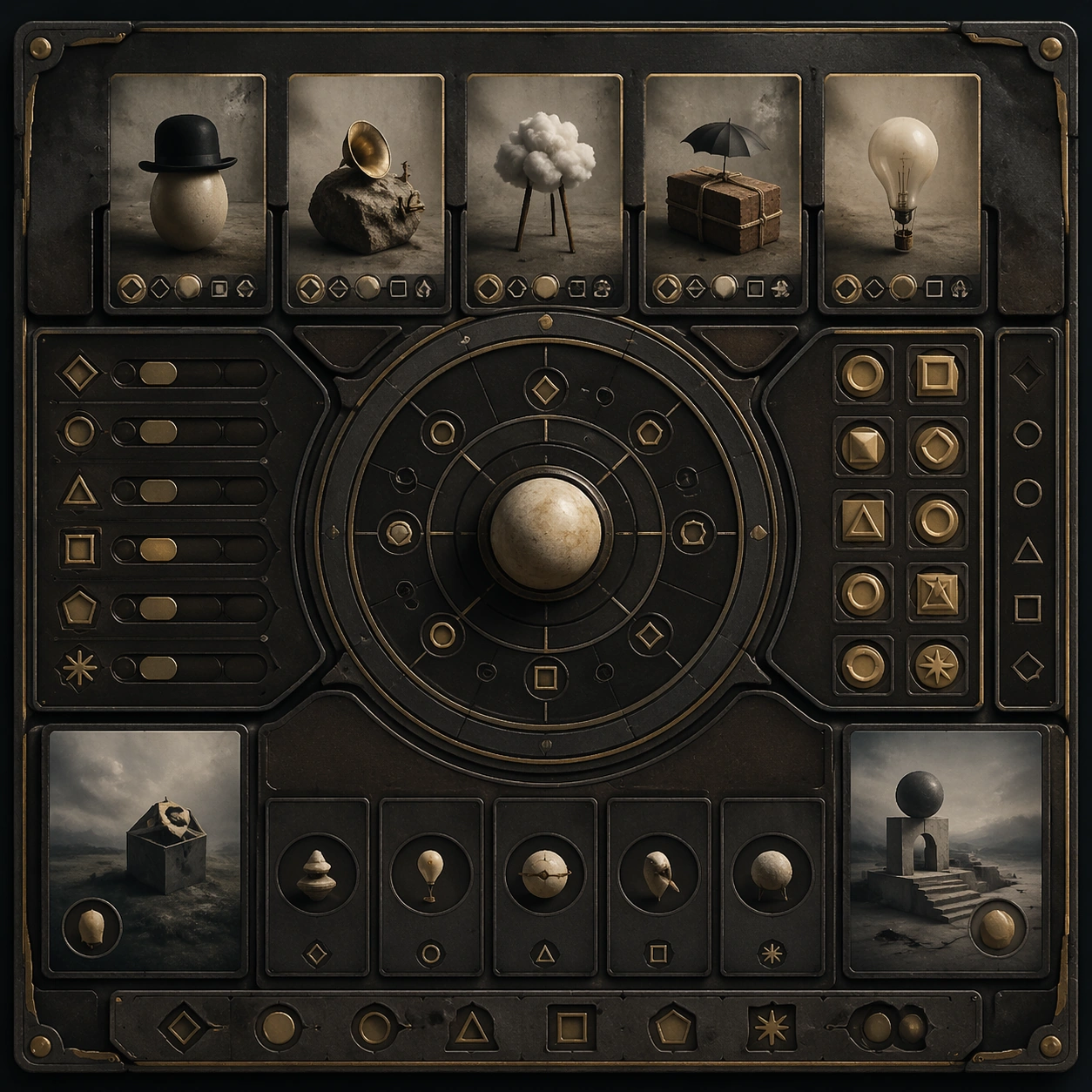
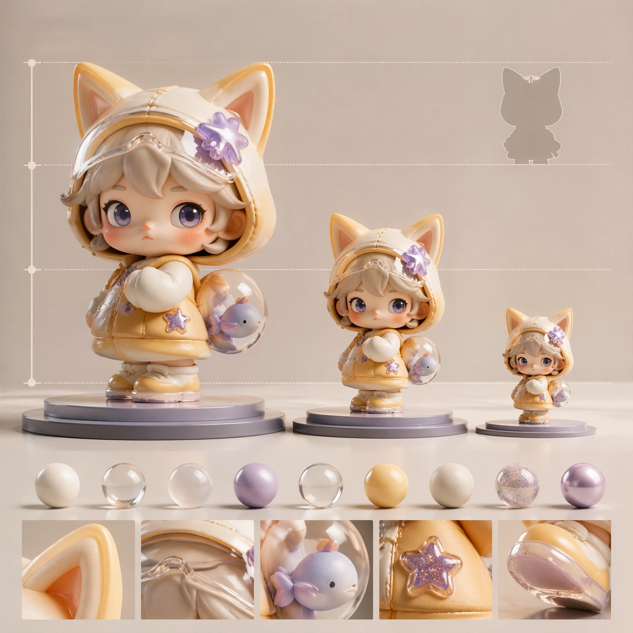
Example generated from “Cute Blind Box Figurine — Scale Comparison”
GPT Image 2en

Scene: A square CGI or design-visualization frame with calibrated lighting, intentional composition, and premium material rendering. Build the frame around supporting context that clarifies proportion and use without becoming literal advertising. Keep the lighting, camera distance, and spatial organization tuned for a high-signal research image rather than a casual snapshot. The image belongs to the Cute Blind Box Figurine theme and should feel immediately legible as a prompt atlas theme for cute blind box figurine, testing physics-materials, style-transfer with gpt image 2.. Subject: Center the study on supporting context that clarifies proportion and use without becoming literal advertising. Translate the theme into a concrete visual statement instead of an abstract mood board: the viewer should understand what kind of image this is, what is being tested, and why the composition is difficult. Use the slug idea of cute blind box figurine as a literal guide for subject matter, materials, and staging. If helpful, borrow the broad visual cues suggested by POP MART, PVC, studio, but keep the result original and specific to this study. Important details: The model must feel engineered or art-directed rather than merely stylized: edges, seams, translucency, reflections, and scale cues should all hold up. Preserve a disciplined square composition, clear focal hierarchy, and enough secondary information to make the image feel complete rather than underspecified. The image should look polished, novel, and exhibition-ready, with topic-specific credibility coming from the way surfaces, structure, and visual language reinforce Cute Blind Box Figurine. Avoid generic filler elements that do not serve the main concept. Use case: Cute Blind Box Figurine single study 5/8, testing physics-materials, style-transfer through the scale comparison variation. Constraints: No readable text, no watermark, no logos, preserve exact 1:1 aspect ratio, no real brand logos, no low-poly shortcuts, no broken reflections, no muddy materials, no generic showroom clutter, no unreadable UI overlays.

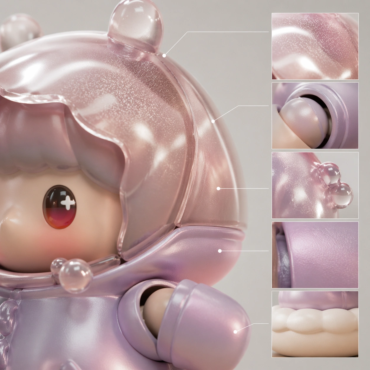
Example generated from “Cute Blind Box Figurine — Detail Closeup”
GPT Image 2en

Scene: A square CGI or design-visualization frame with calibrated lighting, intentional composition, and premium material rendering. Build the frame around macro rendering of joints, textures, or finish transitions. Keep the lighting, camera distance, and spatial organization tuned for a high-signal research image rather than a casual snapshot. The image belongs to the Cute Blind Box Figurine theme and should feel immediately legible as a prompt atlas theme for cute blind box figurine, testing physics-materials, style-transfer with gpt image 2.. Subject: Center the study on macro rendering of joints, textures, or finish transitions. Translate the theme into a concrete visual statement instead of an abstract mood board: the viewer should understand what kind of image this is, what is being tested, and why the composition is difficult. Use the slug idea of cute blind box figurine as a literal guide for subject matter, materials, and staging. If helpful, borrow the broad visual cues suggested by POP MART, PVC, studio, but keep the result original and specific to this study. Important details: The model must feel engineered or art-directed rather than merely stylized: edges, seams, translucency, reflections, and scale cues should all hold up. Preserve a disciplined square composition, clear focal hierarchy, and enough secondary information to make the image feel complete rather than underspecified. The image should look polished, novel, and exhibition-ready, with topic-specific credibility coming from the way surfaces, structure, and visual language reinforce Cute Blind Box Figurine. Avoid generic filler elements that do not serve the main concept. Use case: Cute Blind Box Figurine single study 6/8, testing physics-materials, style-transfer through the detail closeup variation. Constraints: No readable text, no watermark, no logos, preserve exact 1:1 aspect ratio, no real brand logos, no low-poly shortcuts, no broken reflections, no muddy materials, no generic showroom clutter, no unreadable UI overlays.

Example generated from “Cute Blind Box Figurine — 环境展示”
GPT Image 2en

Scene: A square CGI or design-visualization frame with calibrated lighting, intentional composition, and premium material rendering. Build the frame around the design placed into a context that tests realism and narrative. Keep the lighting, camera distance, and spatial organization tuned for a high-signal research image rather than a casual snapshot. The image belongs to the Cute Blind Box Figurine theme and should feel immediately legible as a prompt atlas theme for cute blind box figurine, testing physics-materials, style-transfer with gpt image 2.. Subject: Center the study on the design placed into a context that tests realism and narrative. Translate the theme into a concrete visual statement instead of an abstract mood board: the viewer should understand what kind of image this is, what is being tested, and why the composition is difficult. Use the slug idea of cute blind box figurine as a literal guide for subject matter, materials, and staging. If helpful, borrow the broad visual cues suggested by POP MART, PVC, studio, but keep the result original and specific to this study. Important details: The model must feel engineered or art-directed rather than merely stylized: edges, seams, translucency, reflections, and scale cues should all hold up. Preserve a disciplined square composition, clear focal hierarchy, and enough secondary information to make the image feel complete rather than underspecified. The image should look polished, novel, and exhibition-ready, with topic-specific credibility coming from the way surfaces, structure, and visual language reinforce Cute Blind Box Figurine. Avoid generic filler elements that do not serve the main concept. Use case: Cute Blind Box Figurine single study 7/8, testing physics-materials, style-transfer through the 环境展示 variation. Constraints: No readable text, no watermark, no logos, preserve exact 1:1 aspect ratio, no real brand logos, no low-poly shortcuts, no broken reflections, no muddy materials, no generic showroom clutter, no unreadable UI overlays.

Example generated from “Cute Blind Box Figurine — Signature Render”
GPT Image 2en

Scene: A square CGI or design-visualization frame with calibrated lighting, intentional composition, and premium material rendering. Build the frame around the most complete and persuasive final render for the theme. Keep the lighting, camera distance, and spatial organization tuned for a high-signal research image rather than a casual snapshot. The image belongs to the Cute Blind Box Figurine theme and should feel immediately legible as a prompt atlas theme for cute blind box figurine, testing physics-materials, style-transfer with gpt image 2.. Subject: Center the study on the most complete and persuasive final render for the theme. Translate the theme into a concrete visual statement instead of an abstract mood board: the viewer should understand what kind of image this is, what is being tested, and why the composition is difficult. Use the slug idea of cute blind box figurine as a literal guide for subject matter, materials, and staging. If helpful, borrow the broad visual cues suggested by POP MART, PVC, studio, but keep the result original and specific to this study. Important details: The model must feel engineered or art-directed rather than merely stylized: edges, seams, translucency, reflections, and scale cues should all hold up. Preserve a disciplined square composition, clear focal hierarchy, and enough secondary information to make the image feel complete rather than underspecified. The image should look polished, novel, and exhibition-ready, with topic-specific credibility coming from the way surfaces, structure, and visual language reinforce Cute Blind Box Figurine. Avoid generic filler elements that do not serve the main concept. Use case: Cute Blind Box Figurine single study 8/8, testing physics-materials, style-transfer through the signature render variation. Constraints: No readable text, no watermark, no logos, preserve exact 1:1 aspect ratio, no real brand logos, no low-poly shortcuts, no broken reflections, no muddy materials, no generic showroom clutter, no unreadable UI overlays.

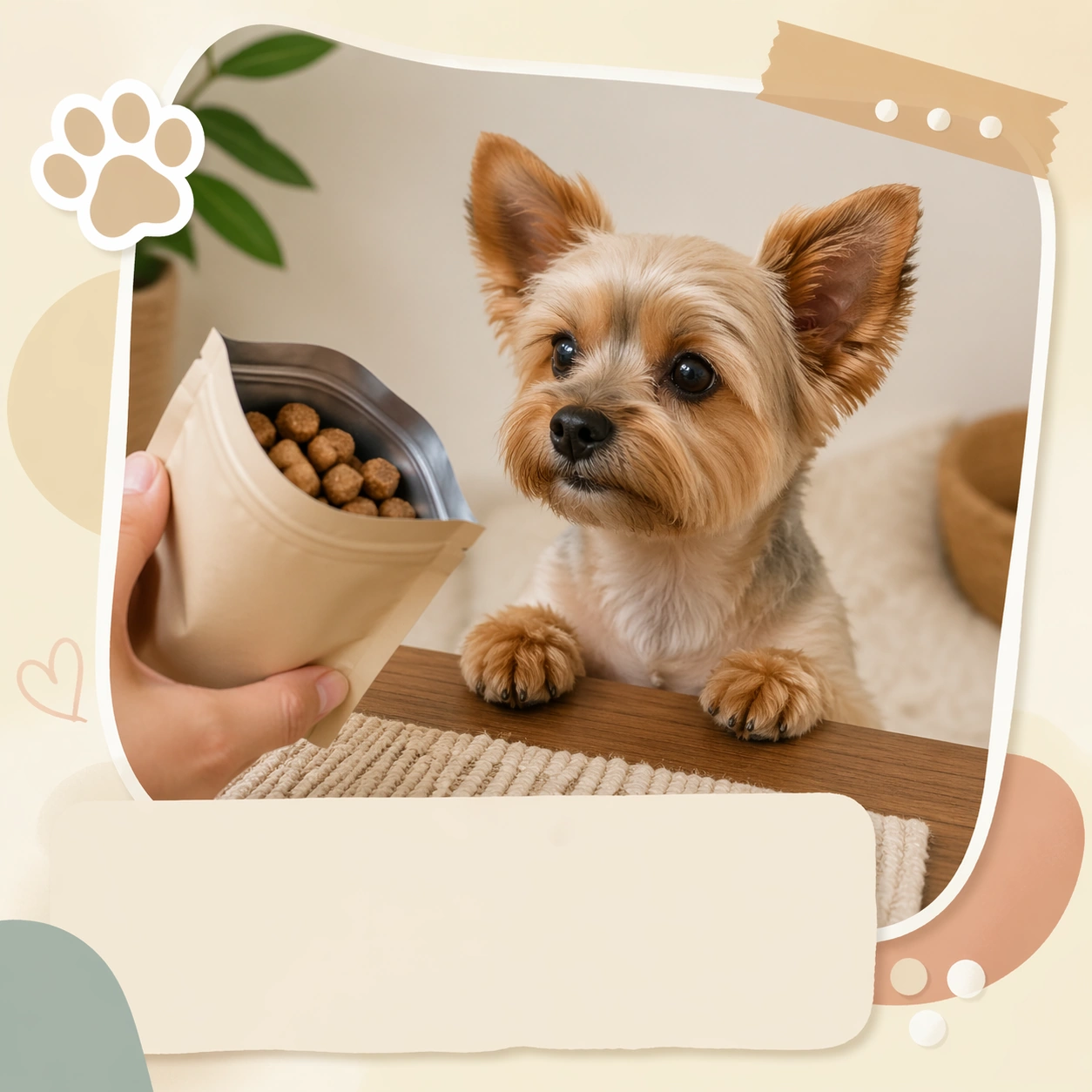
Example generated from “Cute Pet Social Carousel Family — Treat Unboxing Reaction Card”
GPT Image 2en

Scene: A square social carousel card for a pet focused lifestyle account, combining believable photography with polished graphic framing, soft color blocks, and elegant placeholder caption zones. The image should feel feed native and instantly shareable, but still clean enough for a brand team to reuse in campaign planning. Keep the composition legible at thumbnail size and strong enough to function as one panel in a larger carousel sequence. Stage a tabletop scene with a neutral package silhouette, soft cream background, and graphic sticker shadows that frame the pet as the reaction hero. Subject: Anchor the card around one clear pet behavior or daily ritual. The animal should stay realistic and expressive, with posture, paws, ears, and eye direction doing most of the emotional work. The framing can include props, bedding, or environment cues, but only when they support the story and help the card read quickly in a busy feed. Feature a small dog sitting with ears lifted, eyes locked on an opened treat pouch shape, and restrained excited posture instead of chaotic jumping. Important details: Treat layout as part of the concept: use layered paper blocks, soft borders, icon like dots, or sticker style cutout shadows without introducing readable copy. The mood should remain warm, useful, and commercially organized rather than chaotic influencer clutter. Each card must feel distinct, yet part of the same family of pet content systems for social scheduling, seasonal batches, and brand feeds. Let anticipation drive the card; the viewer should feel the beat before the snack rather than seeing a product ad with text. Use case: Cute Pet Social Carousel Family single study 2/9, treat unboxing reaction card for a commercially reusable prompt atlas example. Constraints: No readable text, no watermark, no logos, preserve exact 1:1 aspect ratio, no readable captions, no meme screenshot aesthetic, no chaotic collage overload, no warped anatomy, no generic stock photo stiffness, no intrusive human faces, no readable packaging, no flying crumbs, no product logo imitation.

Example generated from “Cute Pet Social Carousel Family — Rainy Window Nap Panel”
GPT Image 2en

Scene: A square social carousel card for a pet focused lifestyle account, combining believable photography with polished graphic framing, soft color blocks, and elegant placeholder caption zones. The image should feel feed native and instantly shareable, but still clean enough for a brand team to reuse in campaign planning. Keep the composition legible at thumbnail size and strong enough to function as one panel in a larger carousel sequence. Use cool gray daylight, visible raindrop blur on the window, and a tidy cushion nook with desaturated blue layout accents around the edges. Subject: Anchor the card around one clear pet behavior or daily ritual. The animal should stay realistic and expressive, with posture, paws, ears, and eye direction doing most of the emotional work. The framing can include props, bedding, or environment cues, but only when they support the story and help the card read quickly in a busy feed. Show a curled up dog asleep by the window, paws tucked in, with subtle breathing softness and rain lit fur texture. Important details: Treat layout as part of the concept: use layered paper blocks, soft borders, icon like dots, or sticker style cutout shadows without introducing readable copy. The mood should remain warm, useful, and commercially organized rather than chaotic influencer clutter. Each card must feel distinct, yet part of the same family of pet content systems for social scheduling, seasonal batches, and brand feeds. The scene should feel soothing and shareable, like a mood reset post inside a weekly carousel, without tipping into cluttered home decor content. Use case: Cute Pet Social Carousel Family single study 3/9, rainy window nap panel for a commercially reusable prompt atlas example. Constraints: No readable text, no watermark, no logos, preserve exact 1:1 aspect ratio, no readable captions, no meme screenshot aesthetic, no chaotic collage overload, no warped anatomy, no generic stock photo stiffness, no intrusive human faces, no dramatic storm danger, no messy room, no cinematic thunder effects.

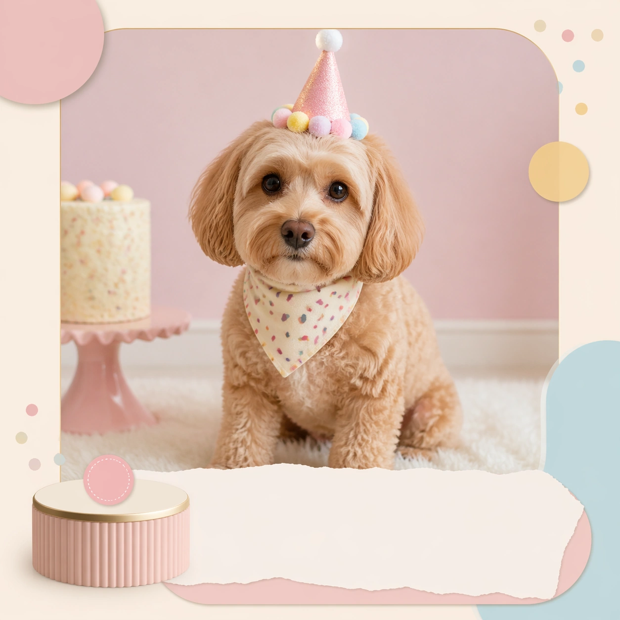
Example generated from “Cute Pet Social Carousel Family — Birthday Hat Routine Board”
GPT Image 2en

Scene: A square social carousel card for a pet focused lifestyle account, combining believable photography with polished graphic framing, soft color blocks, and elegant placeholder caption zones. The image should feel feed native and instantly shareable, but still clean enough for a brand team to reuse in campaign planning. Keep the composition legible at thumbnail size and strong enough to function as one panel in a larger carousel sequence. Create a pale pastel studio setup with cake color hints, rounded confetti shapes in the layout, and one small pedestal that keeps the feed card structured. Subject: Anchor the card around one clear pet behavior or daily ritual. The animal should stay realistic and expressive, with posture, paws, ears, and eye direction doing most of the emotional work. The framing can include props, bedding, or environment cues, but only when they support the story and help the card read quickly in a busy feed. Feature a pet wearing a tiny well fitted birthday hat, seated calmly with patient eye contact and a groomed coat that still feels real. Important details: Treat layout as part of the concept: use layered paper blocks, soft borders, icon like dots, or sticker style cutout shadows without introducing readable copy. The mood should remain warm, useful, and commercially organized rather than chaotic influencer clutter. Each card must feel distinct, yet part of the same family of pet content systems for social scheduling, seasonal batches, and brand feeds. Keep the celebration restrained, polished, and highly reusable for birthdays, milestones, and subscriber social content packs. Use case: Cute Pet Social Carousel Family single study 4/9, birthday hat routine board for a commercially reusable prompt atlas example. Constraints: No readable text, no watermark, no logos, preserve exact 1:1 aspect ratio, no readable captions, no meme screenshot aesthetic, no chaotic collage overload, no warped anatomy, no generic stock photo stiffness, no intrusive human faces, no sugar mess, no giant balloons, no clown party styling.

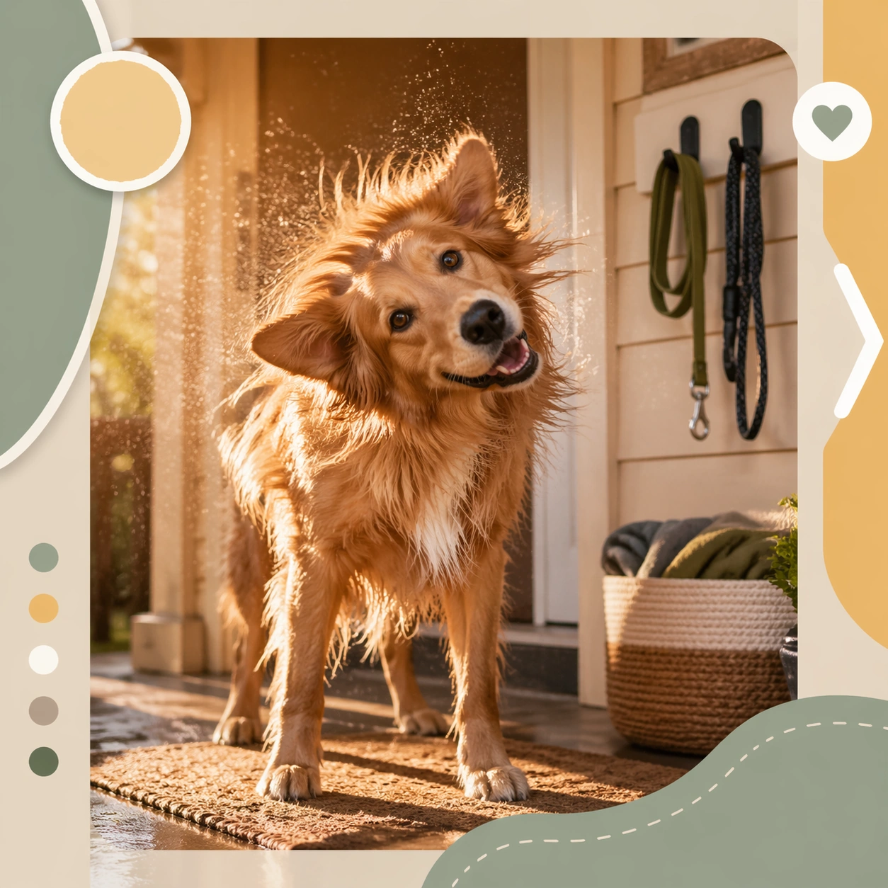
Example generated from “Cute Pet Social Carousel Family — Park Return Happy Shake”
GPT Image 2en

Scene: A square social carousel card for a pet focused lifestyle account, combining believable photography with polished graphic framing, soft color blocks, and elegant placeholder caption zones. The image should feel feed native and instantly shareable, but still clean enough for a brand team to reuse in campaign planning. Keep the composition legible at thumbnail size and strong enough to function as one panel in a larger carousel sequence. Use an entryway or porch scene with late afternoon light, tidy leash hook cues, and graphic side panels that imply a carousel progression. Subject: Anchor the card around one clear pet behavior or daily ritual. The animal should stay realistic and expressive, with posture, paws, ears, and eye direction doing most of the emotional work. The framing can include props, bedding, or environment cues, but only when they support the story and help the card read quickly in a busy feed. Show a medium dog mid shake recovery or standing just after the shake, with bright eyes, healthy coat movement, and pleased post walk energy. Important details: Treat layout as part of the concept: use layered paper blocks, soft borders, icon like dots, or sticker style cutout shadows without introducing readable copy. The mood should remain warm, useful, and commercially organized rather than chaotic influencer clutter. Each card must feel distinct, yet part of the same family of pet content systems for social scheduling, seasonal batches, and brand feeds. The card should suggest routine, care, and companionship rather than action photography chaos; maintain a clean feed ready layout. Use case: Cute Pet Social Carousel Family single study 5/9, park return happy shake for a commercially reusable prompt atlas example. Constraints: No readable text, no watermark, no logos, preserve exact 1:1 aspect ratio, no readable captions, no meme screenshot aesthetic, no chaotic collage overload, no warped anatomy, no generic stock photo stiffness, no intrusive human faces, no muddy splash, no motion blur overload, no crowded outdoor background.

Example generated from “Cute Pet Social Carousel Family — Bath Time Towel Squeeze Card”
GPT Image 2en

Scene: A square social carousel card for a pet focused lifestyle account, combining believable photography with polished graphic framing, soft color blocks, and elegant placeholder caption zones. The image should feel feed native and instantly shareable, but still clean enough for a brand team to reuse in campaign planning. Keep the composition legible at thumbnail size and strong enough to function as one panel in a larger carousel sequence. Frame a bathroom or grooming nook with soft tile, bright diffused light, and minimal color blocks echoing clean care content. Subject: Anchor the card around one clear pet behavior or daily ritual. The animal should stay realistic and expressive, with posture, paws, ears, and eye direction doing most of the emotional work. The framing can include props, bedding, or environment cues, but only when they support the story and help the card read quickly in a busy feed. Show a small dog wrapped in a towel after a bath, damp but tidy, with slightly surprised eyes and a compact seated posture. Important details: Treat layout as part of the concept: use layered paper blocks, soft borders, icon like dots, or sticker style cutout shadows without introducing readable copy. The mood should remain warm, useful, and commercially organized rather than chaotic influencer clutter. Each card must feel distinct, yet part of the same family of pet content systems for social scheduling, seasonal batches, and brand feeds. The humor should come from recognizable routine, not humiliation. Preserve dignity and softness so the card feels lovable and safe for brands. Use case: Cute Pet Social Carousel Family single study 6/9, bath time towel squeeze card for a commercially reusable prompt atlas example. Constraints: No readable text, no watermark, no logos, preserve exact 1:1 aspect ratio, no readable captions, no meme screenshot aesthetic, no chaotic collage overload, no warped anatomy, no generic stock photo stiffness, no intrusive human faces, no soaked mess, no shampoo bottle branding, no comedic exaggeration.

Example generated from “Cute Pet Social Carousel Family — Sweater Weather Couch Check-In”
GPT Image 2en

Scene: A square social carousel card for a pet focused lifestyle account, combining believable photography with polished graphic framing, soft color blocks, and elegant placeholder caption zones. The image should feel feed native and instantly shareable, but still clean enough for a brand team to reuse in campaign planning. Keep the composition legible at thumbnail size and strong enough to function as one panel in a larger carousel sequence. Use an orderly sofa corner with autumn light, muted rust and cream graphics, and a structured border treatment like a carousel middle panel. Subject: Anchor the card around one clear pet behavior or daily ritual. The animal should stay realistic and expressive, with posture, paws, ears, and eye direction doing most of the emotional work. The framing can include props, bedding, or environment cues, but only when they support the story and help the card read quickly in a busy feed. Feature a dog in a simple knit sweater, relaxed on the couch with direct but gentle eye contact and composed body language. Important details: Treat layout as part of the concept: use layered paper blocks, soft borders, icon like dots, or sticker style cutout shadows without introducing readable copy. The mood should remain warm, useful, and commercially organized rather than chaotic influencer clutter. Each card must feel distinct, yet part of the same family of pet content systems for social scheduling, seasonal batches, and brand feeds. Keep the styling tasteful and believable, with garment texture and pet comfort treated seriously rather than as costume comedy. Use case: Cute Pet Social Carousel Family single study 7/9, sweater weather couch check-in for a commercially reusable prompt atlas example. Constraints: No readable text, no watermark, no logos, preserve exact 1:1 aspect ratio, no readable captions, no meme screenshot aesthetic, no chaotic collage overload, no warped anatomy, no generic stock photo stiffness, no intrusive human faces, no oversized fashion show styling, no tangled blankets, no novelty slogans.

Example generated from “Cute Pet Social Carousel Family — Desk Companion Workday Post”
GPT Image 2en

Scene: A square social carousel card for a pet focused lifestyle account, combining believable photography with polished graphic framing, soft color blocks, and elegant placeholder caption zones. The image should feel feed native and instantly shareable, but still clean enough for a brand team to reuse in campaign planning. Keep the composition legible at thumbnail size and strong enough to function as one panel in a larger carousel sequence. Build a bright desk corner with stationery shapes, laptop edges, and calm neutral daylight, framed by editorial blocks that suggest organized carousel storytelling. Subject: Anchor the card around one clear pet behavior or daily ritual. The animal should stay realistic and expressive, with posture, paws, ears, and eye direction doing most of the emotional work. The framing can include props, bedding, or environment cues, but only when they support the story and help the card read quickly in a busy feed. Show a cat or small dog perched beside the workspace, attentive but calm, with paws tucked or neatly placed near the edge of the desk. Important details: Treat layout as part of the concept: use layered paper blocks, soft borders, icon like dots, or sticker style cutout shadows without introducing readable copy. The mood should remain warm, useful, and commercially organized rather than chaotic influencer clutter. Each card must feel distinct, yet part of the same family of pet content systems for social scheduling, seasonal batches, and brand feeds. Balance cuteness with adult lifestyle polish; the image should feel useful for creator accounts, stationery brands, and pet-friendly work culture posts. Use case: Cute Pet Social Carousel Family single study 8/9, desk companion workday post for a commercially reusable prompt atlas example. Constraints: No readable text, no watermark, no logos, preserve exact 1:1 aspect ratio, no readable captions, no meme screenshot aesthetic, no chaotic collage overload, no warped anatomy, no generic stock photo stiffness, no intrusive human faces, no visible readable screens, no coffee spill chaos, no office mess piles.

Example generated from “Cute Pet Social Carousel Family — Bedtime Paws Out Finale”
GPT Image 2en

Scene: A square social carousel card for a pet focused lifestyle account, combining believable photography with polished graphic framing, soft color blocks, and elegant placeholder caption zones. The image should feel feed native and instantly shareable, but still clean enough for a brand team to reuse in campaign planning. Keep the composition legible at thumbnail size and strong enough to function as one panel in a larger carousel sequence. Use dim warm evening light, a tidy bed scene, and dark cream layout bands that signal the final slide of a gentle social series. Subject: Anchor the card around one clear pet behavior or daily ritual. The animal should stay realistic and expressive, with posture, paws, ears, and eye direction doing most of the emotional work. The framing can include props, bedding, or environment cues, but only when they support the story and help the card read quickly in a busy feed. Show a pet lying on its side or chest with front paws stretched forward, sleepy eyes, and relaxed body weight settling into the bedding. Important details: Treat layout as part of the concept: use layered paper blocks, soft borders, icon like dots, or sticker style cutout shadows without introducing readable copy. The mood should remain warm, useful, and commercially organized rather than chaotic influencer clutter. Each card must feel distinct, yet part of the same family of pet content systems for social scheduling, seasonal batches, and brand feeds. Let softness and closure drive the image. It should feel like a satisfying ending card that invites saves and shares without needing text. Use case: Cute Pet Social Carousel Family single study 9/9, bedtime paws out finale for a commercially reusable prompt atlas example. Constraints: No readable text, no watermark, no logos, preserve exact 1:1 aspect ratio, no readable captions, no meme screenshot aesthetic, no chaotic collage overload, no warped anatomy, no generic stock photo stiffness, no intrusive human faces, no dramatic darkness, no messy sheets, no human body dominating the frame.

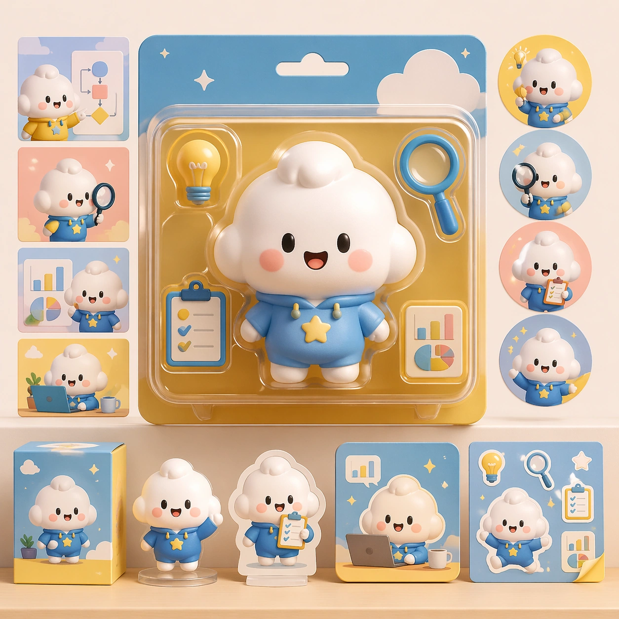
Example generated from “Cute Product Explainer Poster — Reference Mascot Pack”
GPT Image 2en

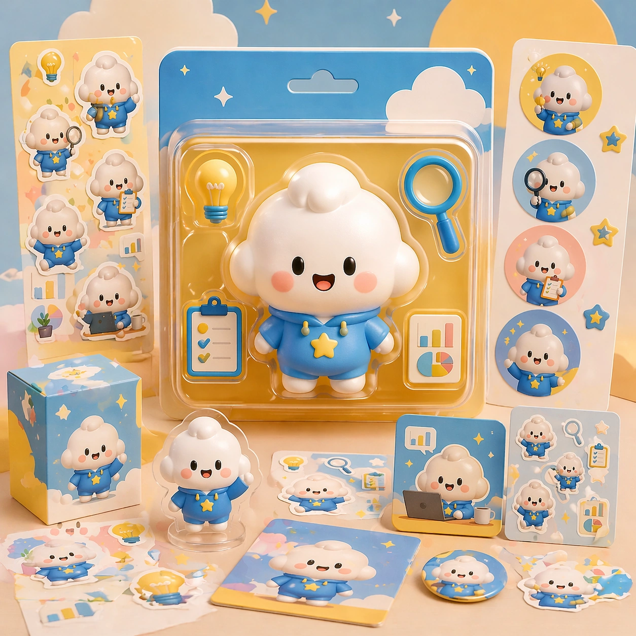
Scene: A square retail-ready campaign visual for Cute Product Explainer Poster, combining cute character appeal with polished commercial presentation. The composition should feel like a high-finish launch board: crisp packaging edges, collectible object staging, clean shelf or poster context, and vivid but controlled color. It should be immediately legible from far away, but still dense with charming small details that reward closer inspection. Subject: Build the image around Reference Mascot Pack, a frame that defines the cute character silhouette, packaging shell, and retail color logic. Translate Use chibi or mascot characters to explain complex products, workflows, or features through playful yet commercially clear explainer posters. into one lovable mascot, figure, or product system that feels ready for posters, boxes, stickers, inserts, or point-of-sale material. The result should feel like a fresh research image with clear commercial focus rather than random fan art. The main subject must remain unmistakable even when surrounded by accessories and display pieces. Important details: Charm alone is not enough. Preserve clean silhouette recognition, convincing package construction, reliable prop scale, and structured layout logic so the image feels sellable. This theme studies structured-layout, text-rendering, commercial-mockup, style-transfer through a production-ready visual system. Avoid noisy clutter; every secondary element should reinforce collectibility, retail desirability, or explainer clarity. Aim for clear hierarchy, polished craft, and immediately usable campaign logic. Use case: Cute Product Explainer Poster series study 1/4. Constraints: No readable text, no watermark, no logos, preserve exact 1:1 aspect ratio, no horror elements, no brand theft, no malformed packaging edges, no muddy mascot silhouette, no messy retail shelf, no chaotic prop overload.

Example generated from “Cute Product Explainer Poster — Sticker Burst Variant”
GPT Image 2en

Scene: A square retail-ready campaign visual for Cute Product Explainer Poster, combining cute character appeal with polished commercial presentation. The composition should feel like a high-finish launch board: crisp packaging edges, collectible object staging, clean shelf or poster context, and vivid but controlled color. It should be immediately legible from far away, but still dense with charming small details that reward closer inspection. Subject: Build the image around Sticker Burst Variant, a frame that keeps the same character and package identity while adding collectible sticker energy. Translate Use chibi or mascot characters to explain complex products, workflows, or features through playful yet commercially clear explainer posters. into one lovable mascot, figure, or product system that feels ready for posters, boxes, stickers, inserts, or point-of-sale material. The result should feel like a fresh research image with clear commercial focus rather than random fan art. The main subject must remain unmistakable even when surrounded by accessories and display pieces. Important details: Charm alone is not enough. Preserve clean silhouette recognition, convincing package construction, reliable prop scale, and structured layout logic so the image feels sellable. This theme studies structured-layout, text-rendering, commercial-mockup, style-transfer through a production-ready visual system. Avoid noisy clutter; every secondary element should reinforce collectibility, retail desirability, or explainer clarity. Aim for clear hierarchy, polished craft, and immediately usable campaign logic. Use case: Cute Product Explainer Poster series study 2/4. Constraints: No readable text, no watermark, no logos, preserve exact 1:1 aspect ratio, no horror elements, no brand theft, no malformed packaging edges, no muddy mascot silhouette, no messy retail shelf, no chaotic prop overload.

Example generated from “2D 3D Medium Collision — Paper Figure Reference”
GPT Image 2en

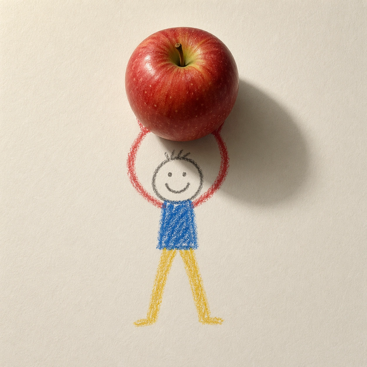
Scene: A square overhead photograph of a slightly warm white sheet of drawing paper on a quiet tabletop. The camera is perfectly perpendicular to the page, with soft daylight entering from the upper left and a faint paper fiber texture visible across the surface. The palette is simple: waxy red, blue, yellow, graphite gray, and the natural off-white of the paper. The lighting must make the page feel real, but the drawn marks must remain unmistakably flat crayon. Subject: A childlike crayon stick figure stands near the center of the paper, drawn with uneven wax pressure, round head, simple smile, blue torso, red arms, and yellow legs. The figure holds an 8K photoreal red apple above its head. The apple is not drawn; it is a glossy real object resting on the paper plane, with small pores, a short brown stem, a green highlight, and believable volume. Important details: Keep the 2D and 3D layers sharply separated. Crayon lines must sit on the paper with no thickness except wax texture, while the apple must cast a true elliptical shadow across the paper and over parts of the drawn arms. The drawn hands may touch the apple visually, but they should not become 3D fingers. Preserve the same simple crayon character for later references. Use case: 2D and 3D Medium Collision series study 1/8, establishing the reference character, paper surface, lighting direction, and mixed-medium physics. Constraints: No readable text, no watermark, no logos, preserve exact 1:1 aspect ratio, no extra props, no realistic human hands, no cartoon apple, no floating object without shadow, no frame, no perspective tilt.

Example generated from “2D 3D Medium Collision — Glass Marble Lift”
GPT Image 2en

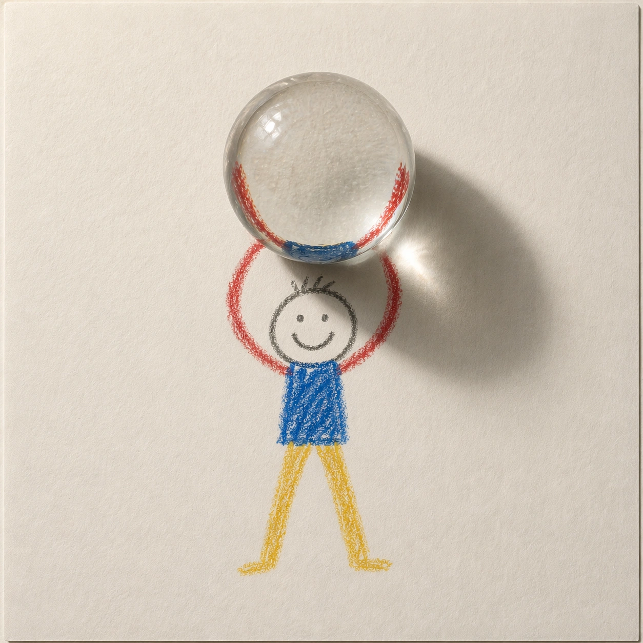
Scene: A square overhead photograph on the same warm white drawing paper as the reference image. Keep the camera perpendicular to the page, the tabletop invisible except for a narrow paper edge hint, and the light coming from the upper left. The image should feel like a small studio test of physical contact between handmade marks and a real object, with quiet shadows and high detail rather than dramatic scenery. Subject: Use the same childlike crayon stick figure from the reference: round head, simple smile, blue torso, red arms, yellow legs, uneven waxy crayon strokes, and the same pose of lifting an object above the head. Replace the apple with one large photoreal transparent glass marble. The marble is spherical, heavy, clear, and polished, with distorted paper fibers, inverted crayon colors, bright highlights, and a dense contact shadow below it. Important details: The figure must remain purely flat 2D crayon, never gaining real fingers, skin, or dimensional limbs. The marble must behave as real glass on paper: it refracts and magnifies the crayon arms beneath it, bends the blue torso color at its lower edge, and creates a small caustic glow beside the shadow. Preserve the reference character identity and lighting direction while changing only the held object and its material behavior. Use case: 2D and 3D Medium Collision series study 2/8, testing whether a referenced 2D character can support a transparent 3D material with plausible optics. Constraints: No readable text, no watermark, no logos, preserve exact 1:1 aspect ratio, no extra characters, no gemstone facets, no cartoon bubble, no floating marble, no painted glass outline, no change to the crayon figure identity.

Example generated from “2D 3D Medium Collision — Metal Cube Balance”
GPT Image 2en

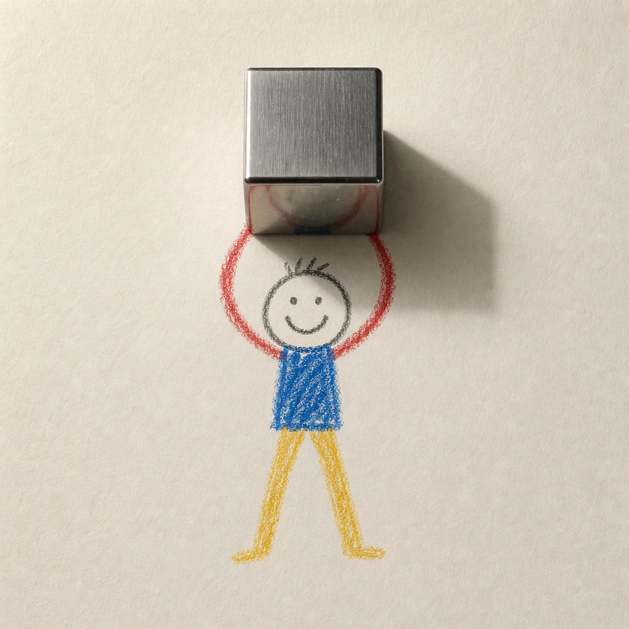
Scene: A square top-down studio photograph of the same sheet of off-white drawing paper, using the same upper-left soft daylight and calm tabletop setting established by the reference. The page should show subtle dents, fibers, and wax drag marks, but it must remain uncluttered. The composition is centered and still, like a controlled research sample for mixed rendering layers. Subject: Use the same childlike crayon stick figure from the reference image, preserving the round head, simple smile, blue torso, red arms, yellow legs, scale, and lifted-arm pose. Replace the apple with a small brushed stainless-steel cube balanced above the drawn hands. The cube is photoreal, heavy, sharply edged, and reflective, with slightly rounded machined bevels, cool gray highlights, and distorted reflections of the warm paper and colored crayon strokes. Important details: The 3D cube must visibly weigh on the paper-world illusion without turning the crayon figure into a sculpture. Its shadow should be darker and more geometric than the apple shadow, crossing the red crayon arms and part of the face. The cube should occlude portions of the drawn hands cleanly, showing exact layer ordering: paper first, crayon marks second, real cube third, shadow over both. Keep the character identity and camera position stable from the reference. Use case: 2D and 3D Medium Collision series study 3/8, testing consistent 2D character identity against a reflective hard-surface 3D material. Constraints: No readable text, no watermark, no logos, preserve exact 1:1 aspect ratio, no extra objects, no toy block colors, no engraved markings, no soft pillow cube, no realistic arm anatomy, no change to the reference crayon figure.

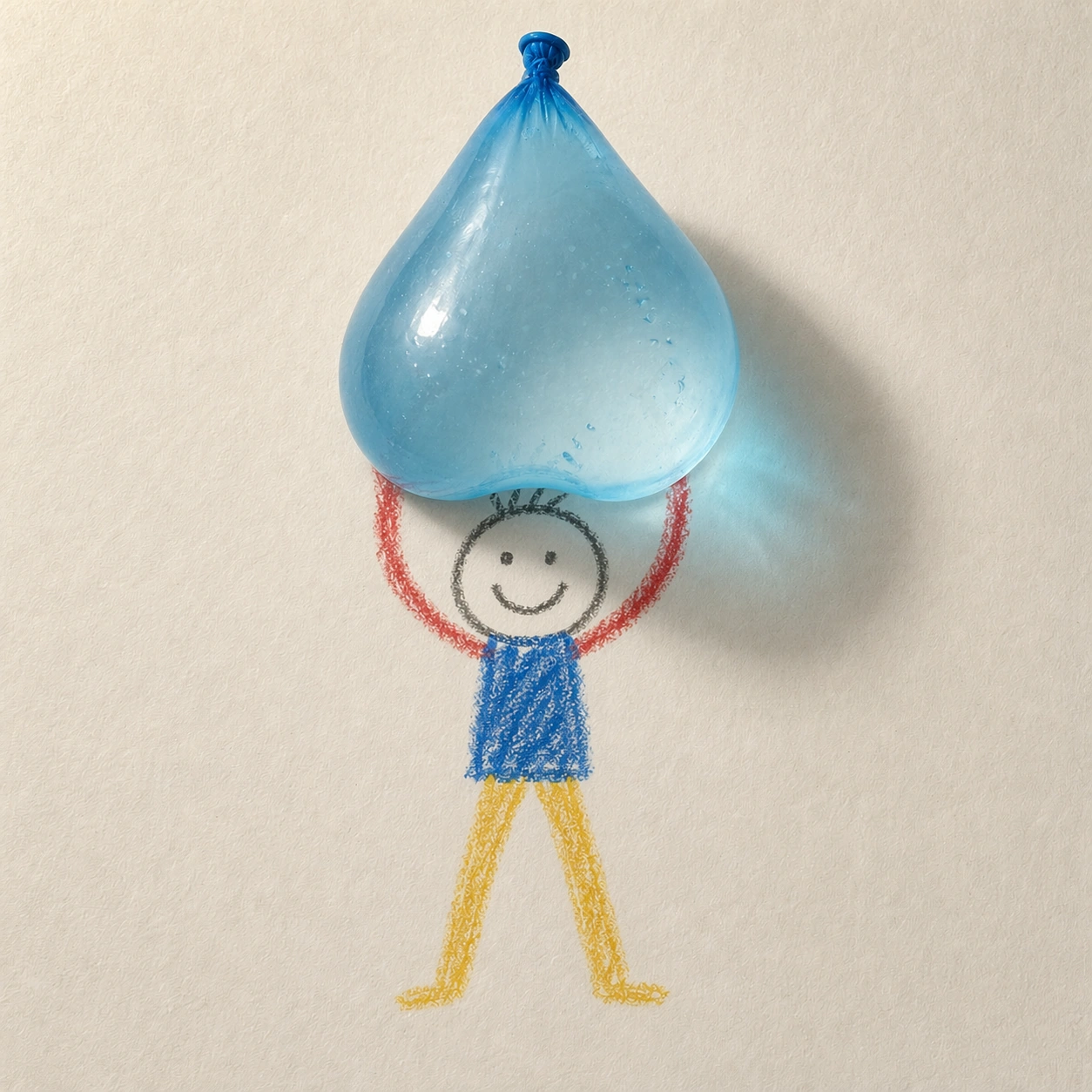
Example generated from “2D 3D Medium Collision — Water Balloon Strain”
GPT Image 2en

Scene: A square overhead photograph of the same warm off-white drawing paper and controlled upper-left daylight used in the reference image. The camera remains perpendicular, the background remains minimal, and the paper fibers remain visible enough to prove the object is sitting in the same real environment. The mood is playful but physically precise, with restrained color and no surrounding clutter. Subject: Use the same childlike crayon stick figure from the reference, preserving its round head, simple smile, blue torso, red arms, yellow legs, waxy uneven line quality, size, and central lifted pose. Replace the apple with a translucent blue water balloon drooping between the drawn hands. The balloon is a photoreal 3D object with stretched latex, a tied knot, small trapped air bubbles, glossy highlights, and visible water mass pulling it downward. Important details: The balloon must demonstrate gravity and material softness while the figure stays flat. Its lower curve should sag over the crayon arms, slightly occluding them, and its shadow should be soft-edged with a faint blue tint on the paper. The crayon hands may appear to touch the balloon, but they must remain simple lines drawn underneath the real object. Keep the original lighting, paper texture, and character identity; do not redraw the figure in a different style. Use case: 2D and 3D Medium Collision series study 4/8, testing a consistent 2D reference character against a soft transparent 3D object with believable weight. Constraints: No readable text, no watermark, no logos, preserve exact 1:1 aspect ratio, no splash, no burst balloon, no extra toys, no realistic child body, no floating object, no change to the reference crayon figure.

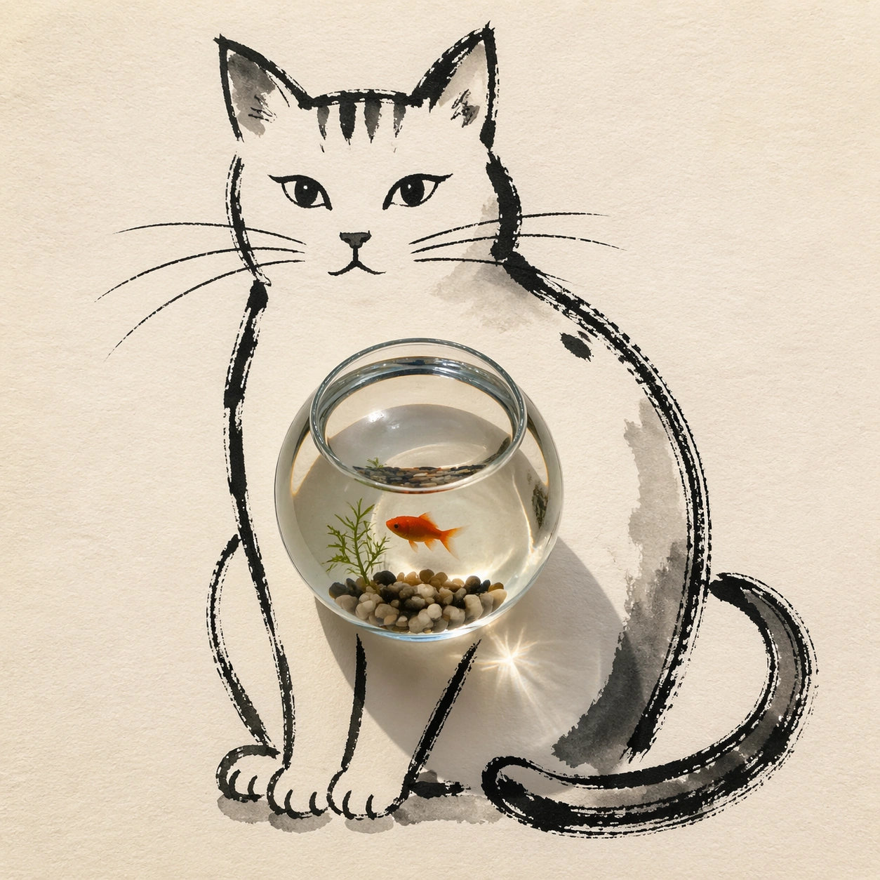
Example generated from “2D 3D Medium Collision — Ink Cat Fishbowl”
GPT Image 2en

Scene: A square top-down studio photograph of thick cream drawing paper under soft window light. The paper is clean, slightly textured, and warm in tone, with the camera held perfectly overhead. The scene should look minimal and tactile, like an artist placed one real object onto an ink sketch and photographed the collision before the ink fully dried. Subject: A loose black ink drawing of a sitting cat fills the page, made from expressive brush lines, dry-brush gaps, and a few gray wash shadows. The cat is strictly flat and graphic: almond eyes, whiskers, arched back, curled tail, and simple paws. Resting on the drawn belly is a photoreal round glass fishbowl filled with clear water, a small orange fish, pebbles, and a tiny aquatic plant. The bowl is a real transparent 3D object, not a drawn circle. Important details: The fishbowl must magnify and distort the ink strokes underneath it, bending the cat's belly line through the water and glass. It should cast a soft circular shadow and a faint caustic highlight onto the cream paper. The cat's ink whiskers and paws must remain flat, with no fur rendering or sculpted body. Layer order is essential: paper texture below, ink marks on paper, glass bowl sitting above, refraction modifying what is seen through it. Use case: 2D and 3D Medium Collision single study 6/8, testing ink drawing and transparent water-glass optics in one controlled composition. Constraints: No readable text, no watermark, no logos, preserve exact 1:1 aspect ratio, no extra labels, no cartoon fishbowl, no realistic 3D cat, no room background, no spilled water, no hands, no frame.

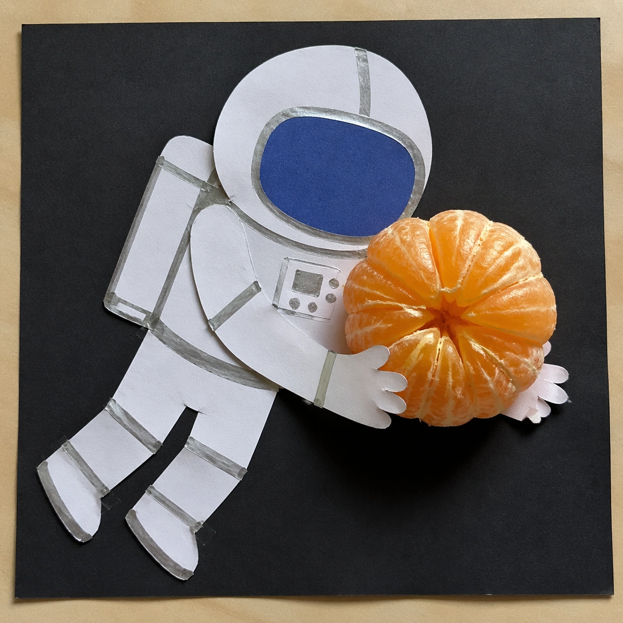
Example generated from “2D 3D Medium Collision — Collage Astronaut Orange”
GPT Image 2en

Scene: A square overhead photograph of a handmade paper collage on a neutral studio table. The lighting is bright but soft, coming from the upper left, so paper edges, torn fibers, and one real object shadow are easy to read. The composition should feel like a school craft project suddenly sharing space with a high-resolution photographed object. Subject: A flat paper-cut astronaut floats diagonally across the page. The astronaut is built from simple white construction paper shapes, silver marker outlines, blue paper visor, taped seams, and visible scissor imperfections. It remains completely two-dimensional, like a collage glued to the page. In front of the astronaut's flat hands is a photoreal peeled orange segment cluster, glossy with juice sacs, tiny pith threads, translucent pulp, and a rounded mound shape. Important details: The orange must be the only real 3D object. It should cast a warm shadow onto the paper astronaut's suit and cover part of the flat hands, while its wet surface catches small highlights that do not appear on the paper collage. The astronaut should not become a realistic 3D figure or spacesuit. The challenge is precise layer separation: table surface, glued paper collage, real citrus above it, believable shadow and contact. Keep the scene playful but physically credible. Use case: 2D and 3D Medium Collision single study 7/8, testing collage flatness against photoreal organic translucency and sticky material detail. Constraints: No readable text, no watermark, no logos, preserve exact 1:1 aspect ratio, no space background, no real astronaut body, no package branding, no extra fruit, no cartoon orange, no floating shadowless object.

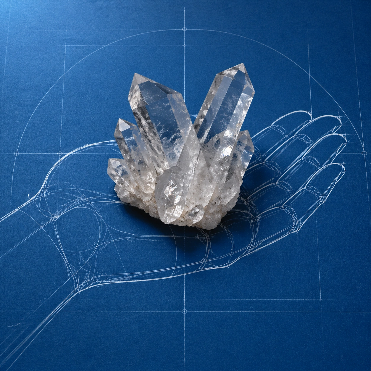
Example generated from “2D 3D Medium Collision — Blueprint Hand Crystal”
GPT Image 2en

Scene: A square overhead photograph of deep cyan blueprint paper on a flat desk, evenly lit with a cooler upper-left light. The page surface is matte, with faint fiber grain and pale construction-line marks, but there must be no readable labels or numbers. The composition should resemble a technical drawing that has been interrupted by a real mineral specimen placed exactly where the drawn hand would hold it. Subject: A flat white blueprint-style line drawing of a human hand spans the page, palm up, with clean contour lines, ghosted joint arcs, and simple construction circles. The hand is purely 2D linework, not shaded anatomy. Resting in the drawn palm is a photoreal clear quartz crystal cluster, angular and heavy, with sharp facets, cloudy inclusions, small chips, prismatic highlights, and a hard contact shadow. Important details: The crystal must sit above the blueprint hand and hide parts of the white linework under its base. Facets should refract fragments of the palm lines, producing broken white streaks inside the transparent mineral while nearby shadow falls across the cyan paper. Keep the technical drawing flat and diagrammatic, with no readable text, arrows, or measurement labels. The image should make the viewer instantly understand that a drawn schematic hand is physically supporting a real crystalline object. Use case: 2D and 3D Medium Collision single study 8/8, testing diagrammatic 2D linework against transparent faceted 3D mineral physics. Constraints: No readable text, no watermark, no logos, preserve exact 1:1 aspect ratio, no labels, no numbers, no realistic flesh hand, no glowing magic crystal, no jewelry setting, no extra tools, no tilted perspective.

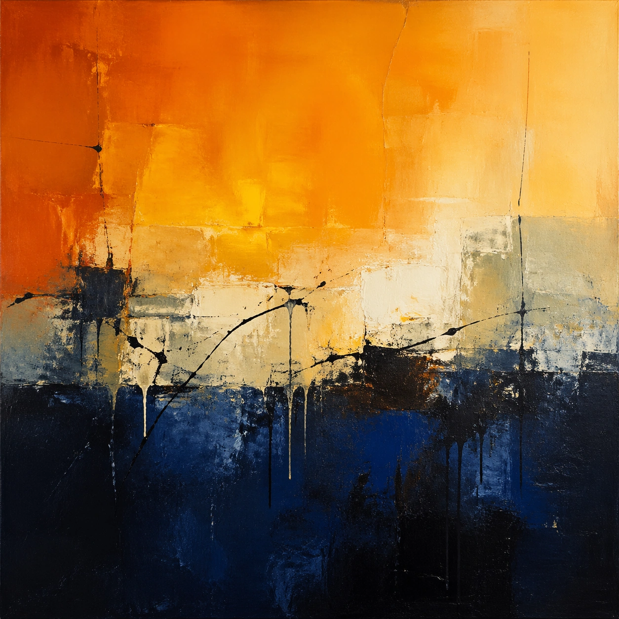
Example generated from “Abstract Expressionism Study — Color Field Threshold”
GPT Image 2en

Scene: A square, gallery-ready composition with painterly surfaces, controlled negative space, and a deliberate fine-art presentation. Build the frame around a few dominant blocks or atmospheres of color with slow transitions and emotional weight. Keep the lighting, camera distance, and spatial organization tuned for a high-signal research image rather than a casual snapshot. The image belongs to the Abstract Expressionism Study theme and should feel immediately legible as a prompt atlas theme for abstract expressionism study, testing style-transfer with gpt image 2.. Subject: Center the study on a few dominant blocks or atmospheres of color with slow transitions and emotional weight. Translate the theme into a concrete visual statement instead of an abstract mood board: the viewer should understand what kind of image this is, what is being tested, and why the composition is difficult. Use the slug idea of abstract expressionism study as a literal guide for subject matter, materials, and staging. If helpful, borrow the broad visual cues suggested by Pollock, Rothko, de Kooning, Kline, but keep the result original and specific to this study. Important details: Focus on authored mark-making, hierarchy, rhythm, and a visual idea that reads immediately before the viewer inspects the brushwork. Preserve a disciplined square composition, clear focal hierarchy, and enough secondary information to make the image feel complete rather than underspecified. The image should look polished, novel, and exhibition-ready, with topic-specific credibility coming from the way surfaces, structure, and visual language reinforce Abstract Expressionism Study. Avoid generic filler elements that do not serve the main concept. Use case: Abstract Expressionism Study single study 2/8, testing style-transfer through the color field threshold variation. Constraints: No readable text, no watermark, no logos, preserve exact 1:1 aspect ratio, no direct copy of a known artwork, no comic speech bubbles, no accidental typography, no low-effort doodle energy, no muddy center, no fake museum label.

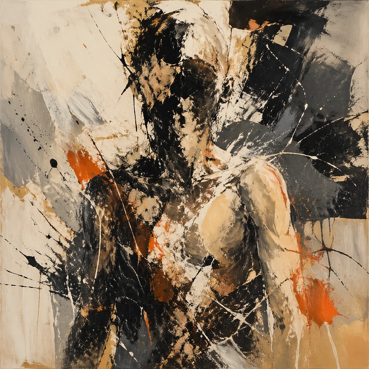
Example generated from “Abstract Expressionism Study — Fractured Figure Surge”
GPT Image 2en

Scene: A square, gallery-ready composition with painterly surfaces, controlled negative space, and a deliberate fine-art presentation. Build the frame around a figure-like presence that emerges and dissolves through broken strokes and unstable edges. Keep the lighting, camera distance, and spatial organization tuned for a high-signal research image rather than a casual snapshot. The image belongs to the Abstract Expressionism Study theme and should feel immediately legible as a prompt atlas theme for abstract expressionism study, testing style-transfer with gpt image 2.. Subject: Center the study on a figure-like presence that emerges and dissolves through broken strokes and unstable edges. Translate the theme into a concrete visual statement instead of an abstract mood board: the viewer should understand what kind of image this is, what is being tested, and why the composition is difficult. Use the slug idea of abstract expressionism study as a literal guide for subject matter, materials, and staging. If helpful, borrow the broad visual cues suggested by Pollock, Rothko, de Kooning, Kline, but keep the result original and specific to this study. Important details: Focus on authored mark-making, hierarchy, rhythm, and a visual idea that reads immediately before the viewer inspects the brushwork. Preserve a disciplined square composition, clear focal hierarchy, and enough secondary information to make the image feel complete rather than underspecified. The image should look polished, novel, and exhibition-ready, with topic-specific credibility coming from the way surfaces, structure, and visual language reinforce Abstract Expressionism Study. Avoid generic filler elements that do not serve the main concept. Use case: Abstract Expressionism Study single study 3/8, testing style-transfer through the fractured figure surge variation. Constraints: No readable text, no watermark, no logos, preserve exact 1:1 aspect ratio, no direct copy of a known artwork, no comic speech bubbles, no accidental typography, no low-effort doodle energy, no muddy center, no fake museum label.

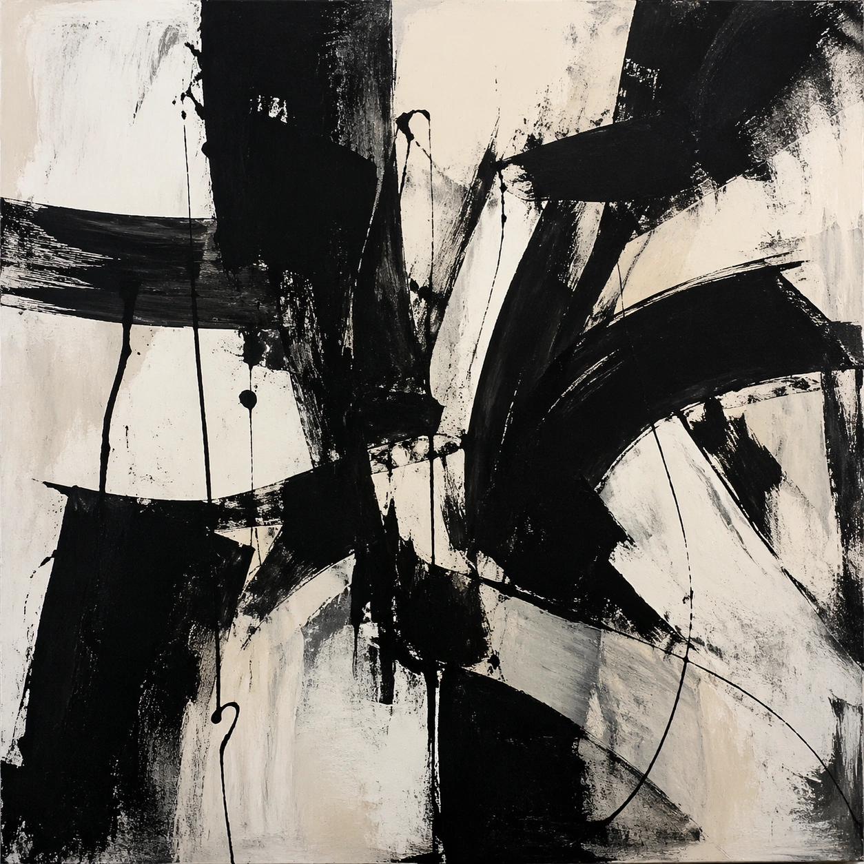
Example generated from “Abstract Expressionism Study — Black Brush Choir”
GPT Image 2en

Scene: A square, gallery-ready composition with painterly surfaces, controlled negative space, and a deliberate fine-art presentation. Build the frame around large decisive black gestures that create rhythm, tension, and architectural pressure. Keep the lighting, camera distance, and spatial organization tuned for a high-signal research image rather than a casual snapshot. The image belongs to the Abstract Expressionism Study theme and should feel immediately legible as a prompt atlas theme for abstract expressionism study, testing style-transfer with gpt image 2.. Subject: Center the study on large decisive black gestures that create rhythm, tension, and architectural pressure. Translate the theme into a concrete visual statement instead of an abstract mood board: the viewer should understand what kind of image this is, what is being tested, and why the composition is difficult. Use the slug idea of abstract expressionism study as a literal guide for subject matter, materials, and staging. If helpful, borrow the broad visual cues suggested by Pollock, Rothko, de Kooning, Kline, but keep the result original and specific to this study. Important details: Focus on authored mark-making, hierarchy, rhythm, and a visual idea that reads immediately before the viewer inspects the brushwork. Preserve a disciplined square composition, clear focal hierarchy, and enough secondary information to make the image feel complete rather than underspecified. The image should look polished, novel, and exhibition-ready, with topic-specific credibility coming from the way surfaces, structure, and visual language reinforce Abstract Expressionism Study. Avoid generic filler elements that do not serve the main concept. Use case: Abstract Expressionism Study single study 4/8, testing style-transfer through the black brush choir variation. Constraints: No readable text, no watermark, no logos, preserve exact 1:1 aspect ratio, no direct copy of a known artwork, no comic speech bubbles, no accidental typography, no low-effort doodle energy, no muddy center, no fake museum label.

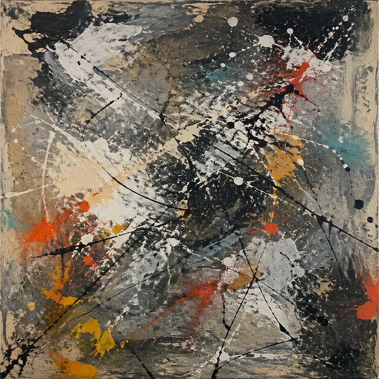
Example generated from “Abstract Expressionism Study — Studio Floor Afterimage”
GPT Image 2en

Scene: A square, gallery-ready composition with painterly surfaces, controlled negative space, and a deliberate fine-art presentation. Build the frame around evidence of process, splatter, drag, and layered correction without becoming documentary clutter. Keep the lighting, camera distance, and spatial organization tuned for a high-signal research image rather than a casual snapshot. The image belongs to the Abstract Expressionism Study theme and should feel immediately legible as a prompt atlas theme for abstract expressionism study, testing style-transfer with gpt image 2.. Subject: Center the study on evidence of process, splatter, drag, and layered correction without becoming documentary clutter. Translate the theme into a concrete visual statement instead of an abstract mood board: the viewer should understand what kind of image this is, what is being tested, and why the composition is difficult. Use the slug idea of abstract expressionism study as a literal guide for subject matter, materials, and staging. If helpful, borrow the broad visual cues suggested by Pollock, Rothko, de Kooning, Kline, but keep the result original and specific to this study. Important details: Focus on authored mark-making, hierarchy, rhythm, and a visual idea that reads immediately before the viewer inspects the brushwork. Preserve a disciplined square composition, clear focal hierarchy, and enough secondary information to make the image feel complete rather than underspecified. The image should look polished, novel, and exhibition-ready, with topic-specific credibility coming from the way surfaces, structure, and visual language reinforce Abstract Expressionism Study. Avoid generic filler elements that do not serve the main concept. Use case: Abstract Expressionism Study single study 5/8, testing style-transfer through the studio floor afterimage variation. Constraints: No readable text, no watermark, no logos, preserve exact 1:1 aspect ratio, no direct copy of a known artwork, no comic speech bubbles, no accidental typography, no low-effort doodle energy, no muddy center, no fake museum label.

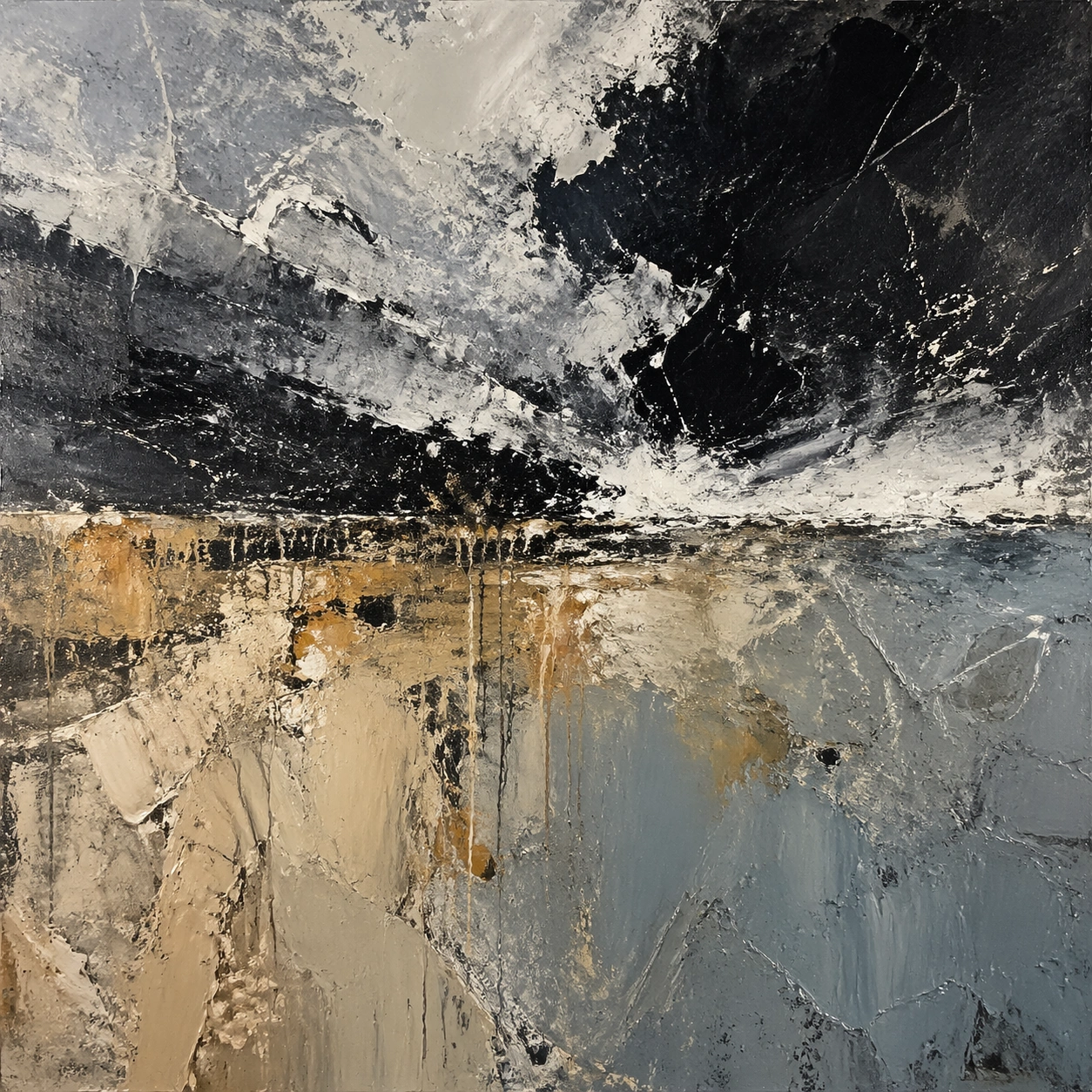
Example generated from “Abstract Expressionism Study — 厚涂天气”
GPT Image 2en

Scene: A square, gallery-ready composition with painterly surfaces, controlled negative space, and a deliberate fine-art presentation. Build the frame around surface build-up, scrape marks, and thick tactile passages that feel meteorological. Keep the lighting, camera distance, and spatial organization tuned for a high-signal research image rather than a casual snapshot. The image belongs to the Abstract Expressionism Study theme and should feel immediately legible as a prompt atlas theme for abstract expressionism study, testing style-transfer with gpt image 2.. Subject: Center the study on surface build-up, scrape marks, and thick tactile passages that feel meteorological. Translate the theme into a concrete visual statement instead of an abstract mood board: the viewer should understand what kind of image this is, what is being tested, and why the composition is difficult. Use the slug idea of abstract expressionism study as a literal guide for subject matter, materials, and staging. If helpful, borrow the broad visual cues suggested by Pollock, Rothko, de Kooning, Kline, but keep the result original and specific to this study. Important details: Focus on authored mark-making, hierarchy, rhythm, and a visual idea that reads immediately before the viewer inspects the brushwork. Preserve a disciplined square composition, clear focal hierarchy, and enough secondary information to make the image feel complete rather than underspecified. The image should look polished, novel, and exhibition-ready, with topic-specific credibility coming from the way surfaces, structure, and visual language reinforce Abstract Expressionism Study. Avoid generic filler elements that do not serve the main concept. Use case: Abstract Expressionism Study single study 6/8, testing style-transfer through the 厚涂天气 variation. Constraints: No readable text, no watermark, no logos, preserve exact 1:1 aspect ratio, no direct copy of a known artwork, no comic speech bubbles, no accidental typography, no low-effort doodle energy, no muddy center, no fake museum label.

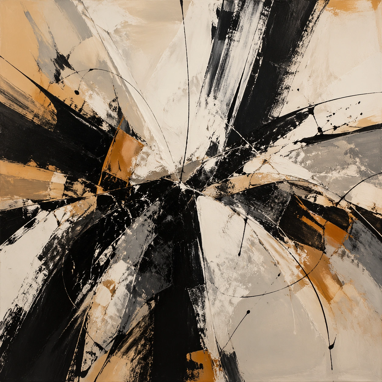
Example generated from “Abstract Expressionism Study — Gesture Architecture”
GPT Image 2en

Scene: A square, gallery-ready composition with painterly surfaces, controlled negative space, and a deliberate fine-art presentation. Build the frame around brush movement that locks into a hidden compositional scaffold rather than random motion. Keep the lighting, camera distance, and spatial organization tuned for a high-signal research image rather than a casual snapshot. The image belongs to the Abstract Expressionism Study theme and should feel immediately legible as a prompt atlas theme for abstract expressionism study, testing style-transfer with gpt image 2.. Subject: Center the study on brush movement that locks into a hidden compositional scaffold rather than random motion. Translate the theme into a concrete visual statement instead of an abstract mood board: the viewer should understand what kind of image this is, what is being tested, and why the composition is difficult. Use the slug idea of abstract expressionism study as a literal guide for subject matter, materials, and staging. If helpful, borrow the broad visual cues suggested by Pollock, Rothko, de Kooning, Kline, but keep the result original and specific to this study. Important details: Focus on authored mark-making, hierarchy, rhythm, and a visual idea that reads immediately before the viewer inspects the brushwork. Preserve a disciplined square composition, clear focal hierarchy, and enough secondary information to make the image feel complete rather than underspecified. The image should look polished, novel, and exhibition-ready, with topic-specific credibility coming from the way surfaces, structure, and visual language reinforce Abstract Expressionism Study. Avoid generic filler elements that do not serve the main concept. Use case: Abstract Expressionism Study single study 7/8, testing style-transfer through the gesture architecture variation. Constraints: No readable text, no watermark, no logos, preserve exact 1:1 aspect ratio, no direct copy of a known artwork, no comic speech bubbles, no accidental typography, no low-effort doodle energy, no muddy center, no fake museum label.

Example generated from “Abstract Expressionism Study — Museum Wall Hang”
GPT Image 2en

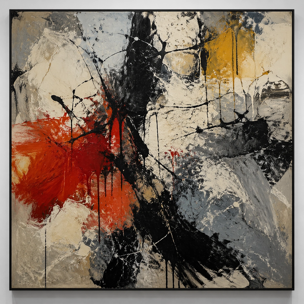
Scene: A square, gallery-ready composition with painterly surfaces, controlled negative space, and a deliberate fine-art presentation. Build the frame around a resolved exhibition-grade work whose internal balance feels complete and intentional. Keep the lighting, camera distance, and spatial organization tuned for a high-signal research image rather than a casual snapshot. The image belongs to the Abstract Expressionism Study theme and should feel immediately legible as a prompt atlas theme for abstract expressionism study, testing style-transfer with gpt image 2.. Subject: Center the study on a resolved exhibition-grade work whose internal balance feels complete and intentional. Translate the theme into a concrete visual statement instead of an abstract mood board: the viewer should understand what kind of image this is, what is being tested, and why the composition is difficult. Use the slug idea of abstract expressionism study as a literal guide for subject matter, materials, and staging. If helpful, borrow the broad visual cues suggested by Pollock, Rothko, de Kooning, Kline, but keep the result original and specific to this study. Important details: Focus on authored mark-making, hierarchy, rhythm, and a visual idea that reads immediately before the viewer inspects the brushwork. Preserve a disciplined square composition, clear focal hierarchy, and enough secondary information to make the image feel complete rather than underspecified. The image should look polished, novel, and exhibition-ready, with topic-specific credibility coming from the way surfaces, structure, and visual language reinforce Abstract Expressionism Study. Avoid generic filler elements that do not serve the main concept. Use case: Abstract Expressionism Study single study 8/8, testing style-transfer through the museum wall hang variation. Constraints: No readable text, no watermark, no logos, preserve exact 1:1 aspect ratio, no direct copy of a known artwork, no comic speech bubbles, no accidental typography, no low-effort doodle energy, no muddy center, no fake museum label.

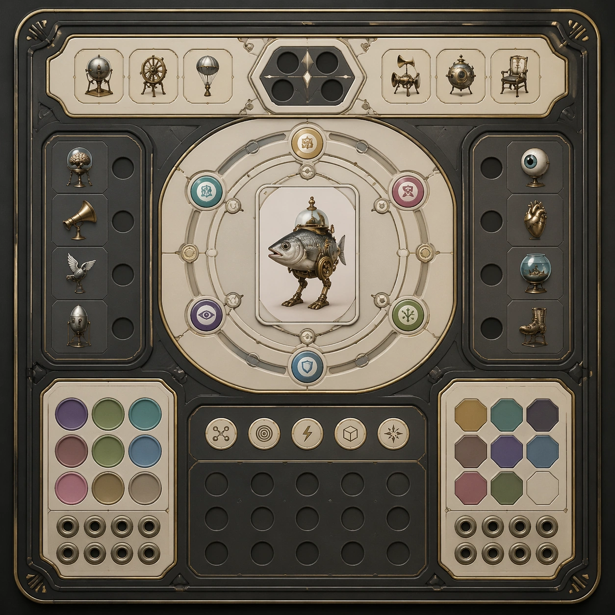
Example generated from “Absurd Object Serious Photo Series — Reference Anchor”
GPT Image 2en

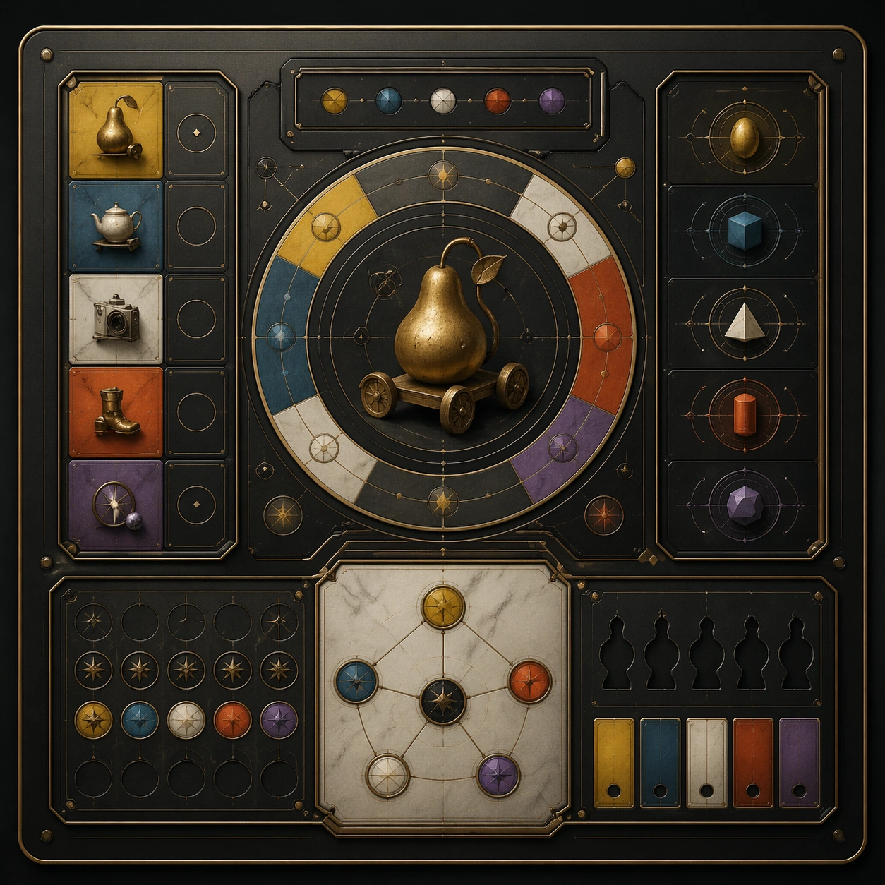
Scene: Create a square reference image for Absurd Object Serious Photo Series. Build a reference anchor establishing the core system with a premium, production-ready finish. Use a polished modular board or campaign surface with clean spacing, premium game-UI finish, and clear focal hierarchy. The composition should feel intentional, clean, and reusable for gallery, research, campaign, or internal handoff contexts. Lighting must support readability first, with the main forms clearly separated from the background and enough breathing room for the system to stay legible at both hero scale and thumbnail scale. Subject: Center a coherent original game-art system built for premium production and marketing surfaces. For this image, focus on reference anchor. Keep the same system logic stable across screenshots, cards, banners, and overview boards. This image is the canonical anchor that later series images must follow. The viewer should immediately understand what role this surface plays inside a cohesive game-production asset pack. Important details: Lock framing, icon grammar, palette blocking, and surface hierarchy so the kit feels production-ready and consistent. Preserve the core silhouette, framing language, and material logic from the reference image while each variation changes function. Keep materials believable, edge hierarchy disciplined, and the visual language consistent with Absurd Objects. Use abstract interface blocks or diagram accents when helpful, but avoid any readable language. The final result should feel like a deliberate production asset rather than a random illustration. Use case: Absurd Object Serious Photo Series series study 1/9, designed as reference anchor within a cohesive asset pack. Constraints: No readable text, no watermark, no logos, preserve exact 1:1 aspect ratio, no unrelated objects, no broken visual hierarchy, no malformed anatomy or broken perspective, no random decorative clutter.

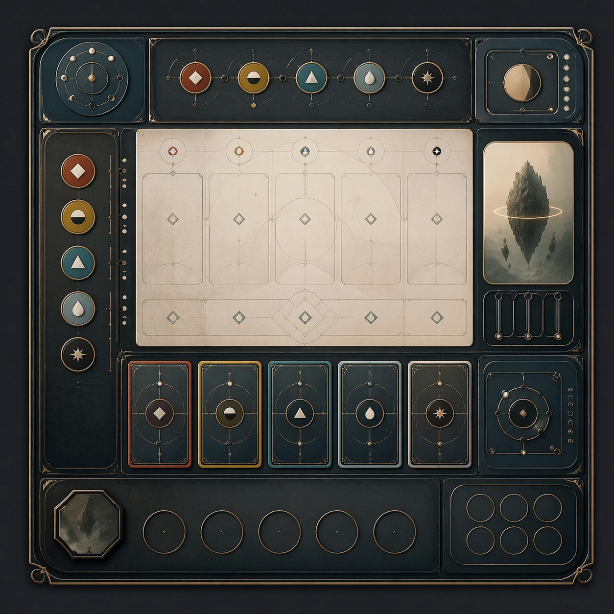
Example generated from “Absurd Object Serious Photo Series — Variant One”
GPT Image 2en

Scene: Create a square dependent image for Absurd Object Serious Photo Series. Build a first controlled variation in the same system with a premium, production-ready finish. Use a polished modular board or campaign surface with clean spacing, premium game-UI finish, and clear focal hierarchy. The composition should feel intentional, clean, and reusable for gallery, research, campaign, or internal handoff contexts. Lighting must support readability first, with the main forms clearly separated from the background and enough breathing room for the system to stay legible at both hero scale and thumbnail scale. Subject: Center a coherent original game-art system built for premium production and marketing surfaces. For this image, focus on the intended support surface. Keep the same system logic stable across screenshots, cards, banners, and overview boards. Preserve exact identity or system logic from the reference image while changing only the intended variation axis. The viewer should immediately understand what role this surface plays inside a cohesive game-production asset pack. Important details: Lock framing, icon grammar, palette blocking, and surface hierarchy so the kit feels production-ready and consistent. Preserve the core silhouette, framing language, and material logic from the reference image while each variation changes function. Keep materials believable, edge hierarchy disciplined, and the visual language consistent with Absurd Objects. Use abstract interface blocks or diagram accents when helpful, but avoid any readable language. The final result should feel like a deliberate production asset rather than a random illustration. Use case: Absurd Object Serious Photo Series series study 2/9, designed as variant one within a cohesive asset pack. Constraints: No readable text, no watermark, no logos, preserve exact 1:1 aspect ratio, no unrelated objects, no broken visual hierarchy, no malformed anatomy or broken perspective, no random decorative clutter.

Example generated from “Absurd Object Serious Photo Series — Variant Two”
GPT Image 2en

Scene: Create a square dependent image for Absurd Object Serious Photo Series. Build a second controlled variation in the same system with a premium, production-ready finish. Use a polished modular board or campaign surface with clean spacing, premium game-UI finish, and clear focal hierarchy. The composition should feel intentional, clean, and reusable for gallery, research, campaign, or internal handoff contexts. Lighting must support readability first, with the main forms clearly separated from the background and enough breathing room for the system to stay legible at both hero scale and thumbnail scale. Subject: Center a coherent original game-art system built for premium production and marketing surfaces. For this image, focus on the intended support surface. Keep the same system logic stable across screenshots, cards, banners, and overview boards. Preserve exact identity or system logic from the reference image while changing only the intended variation axis. The viewer should immediately understand what role this surface plays inside a cohesive game-production asset pack. Important details: Lock framing, icon grammar, palette blocking, and surface hierarchy so the kit feels production-ready and consistent. Preserve the core silhouette, framing language, and material logic from the reference image while each variation changes function. Keep materials believable, edge hierarchy disciplined, and the visual language consistent with Absurd Objects. Use abstract interface blocks or diagram accents when helpful, but avoid any readable language. The final result should feel like a deliberate production asset rather than a random illustration. Use case: Absurd Object Serious Photo Series series study 3/9, designed as variant two within a cohesive asset pack. Constraints: No readable text, no watermark, no logos, preserve exact 1:1 aspect ratio, no unrelated objects, no broken visual hierarchy, no malformed anatomy or broken perspective, no random decorative clutter.

Example generated from “Absurd Object Serious Photo Series — Variant Three”
GPT Image 2en

Scene: Create a square dependent image for Absurd Object Serious Photo Series. Build a third controlled variation in the same system with a premium, production-ready finish. Use a polished modular board or campaign surface with clean spacing, premium game-UI finish, and clear focal hierarchy. The composition should feel intentional, clean, and reusable for gallery, research, campaign, or internal handoff contexts. Lighting must support readability first, with the main forms clearly separated from the background and enough breathing room for the system to stay legible at both hero scale and thumbnail scale. Subject: Center a coherent original game-art system built for premium production and marketing surfaces. For this image, focus on the intended support surface. Keep the same system logic stable across screenshots, cards, banners, and overview boards. Preserve exact identity or system logic from the reference image while changing only the intended variation axis. The viewer should immediately understand what role this surface plays inside a cohesive game-production asset pack. Important details: Lock framing, icon grammar, palette blocking, and surface hierarchy so the kit feels production-ready and consistent. Preserve the core silhouette, framing language, and material logic from the reference image while each variation changes function. Keep materials believable, edge hierarchy disciplined, and the visual language consistent with Absurd Objects. Use abstract interface blocks or diagram accents when helpful, but avoid any readable language. The final result should feel like a deliberate production asset rather than a random illustration. Use case: Absurd Object Serious Photo Series series study 4/9, designed as variant three within a cohesive asset pack. Constraints: No readable text, no watermark, no logos, preserve exact 1:1 aspect ratio, no unrelated objects, no broken visual hierarchy, no malformed anatomy or broken perspective, no random decorative clutter.

Example generated from “Absurd Object Serious Photo Series — Support One”
GPT Image 2en

Scene: Create a square standalone support image for Absurd Object Serious Photo Series. Build a support-surface study with a clear focal hierarchy and a finished professional surface. Use a polished modular board or campaign surface with clean spacing, premium game-UI finish, and clear focal hierarchy. The frame should feel self-contained and polished, with enough structure to explain the system even without the reference series, yet still obviously belonging to the same theme and production world. Subject: Show a coherent original game-art system built for premium production and marketing surfaces in a way that emphasizes the intended support surface. Keep the same system logic stable across screenshots, cards, banners, and overview boards. Even though this image is independent, the viewer should still recognize the same universe, same commercial logic, and same production intent as the core package. Important details: Lock framing, icon grammar, palette blocking, and surface hierarchy so the kit feels production-ready and consistent. Preserve the broader theme language through color, framing, material choices, and modular composition. Use clean panel rhythm, premium asset presentation, and believable detail density. The image should work equally well as a gallery study, research reference, and mock production deliverable. Use case: Absurd Object Serious Photo Series single study 5/9, exploring support one as a support surface. Constraints: No readable text, no watermark, no logos, preserve exact 1:1 aspect ratio, no unrelated objects, no broken visual hierarchy, no visual noise that obscures the main surface, no accidental brand resemblance.

Example generated from “Absurd Object Serious Photo Series — Support Two”
GPT Image 2en

Scene: Create a square standalone support image for Absurd Object Serious Photo Series. Build a second support-surface study with a clear focal hierarchy and a finished professional surface. Use a polished modular board or campaign surface with clean spacing, premium game-UI finish, and clear focal hierarchy. The frame should feel self-contained and polished, with enough structure to explain the system even without the reference series, yet still obviously belonging to the same theme and production world. Subject: Show a coherent original game-art system built for premium production and marketing surfaces in a way that emphasizes the intended support surface. Keep the same system logic stable across screenshots, cards, banners, and overview boards. Even though this image is independent, the viewer should still recognize the same universe, same commercial logic, and same production intent as the core package. Important details: Lock framing, icon grammar, palette blocking, and surface hierarchy so the kit feels production-ready and consistent. Preserve the broader theme language through color, framing, material choices, and modular composition. Use clean panel rhythm, premium asset presentation, and believable detail density. The image should work equally well as a gallery study, research reference, and mock production deliverable. Use case: Absurd Object Serious Photo Series single study 6/9, exploring support two as a support surface. Constraints: No readable text, no watermark, no logos, preserve exact 1:1 aspect ratio, no unrelated objects, no broken visual hierarchy, no visual noise that obscures the main surface, no accidental brand resemblance.

Example generated from “Absurd Object Serious Photo Series — Support Three”
GPT Image 2en

Scene: Create a square standalone support image for Absurd Object Serious Photo Series. Build a third support-surface study with a clear focal hierarchy and a finished professional surface. Use a polished modular board or campaign surface with clean spacing, premium game-UI finish, and clear focal hierarchy. The frame should feel self-contained and polished, with enough structure to explain the system even without the reference series, yet still obviously belonging to the same theme and production world. Subject: Show a coherent original game-art system built for premium production and marketing surfaces in a way that emphasizes the intended support surface. Keep the same system logic stable across screenshots, cards, banners, and overview boards. Even though this image is independent, the viewer should still recognize the same universe, same commercial logic, and same production intent as the core package. Important details: Lock framing, icon grammar, palette blocking, and surface hierarchy so the kit feels production-ready and consistent. Preserve the broader theme language through color, framing, material choices, and modular composition. Use clean panel rhythm, premium asset presentation, and believable detail density. The image should work equally well as a gallery study, research reference, and mock production deliverable. Use case: Absurd Object Serious Photo Series single study 7/9, exploring support three as a support surface. Constraints: No readable text, no watermark, no logos, preserve exact 1:1 aspect ratio, no unrelated objects, no broken visual hierarchy, no visual noise that obscures the main surface, no accidental brand resemblance.

Example generated from “Absurd Object Serious Photo Series — Support Four”
GPT Image 2en

Scene: Create a square standalone support image for Absurd Object Serious Photo Series. Build a fourth support-surface study with a clear focal hierarchy and a finished professional surface. Use a polished modular board or campaign surface with clean spacing, premium game-UI finish, and clear focal hierarchy. The frame should feel self-contained and polished, with enough structure to explain the system even without the reference series, yet still obviously belonging to the same theme and production world. Subject: Show a coherent original game-art system built for premium production and marketing surfaces in a way that emphasizes the intended support surface. Keep the same system logic stable across screenshots, cards, banners, and overview boards. Even though this image is independent, the viewer should still recognize the same universe, same commercial logic, and same production intent as the core package. Important details: Lock framing, icon grammar, palette blocking, and surface hierarchy so the kit feels production-ready and consistent. Preserve the broader theme language through color, framing, material choices, and modular composition. Use clean panel rhythm, premium asset presentation, and believable detail density. The image should work equally well as a gallery study, research reference, and mock production deliverable. Use case: Absurd Object Serious Photo Series single study 8/9, exploring support four as a support surface. Constraints: No readable text, no watermark, no logos, preserve exact 1:1 aspect ratio, no unrelated objects, no broken visual hierarchy, no visual noise that obscures the main surface, no accidental brand resemblance.

Example generated from “Absurd Object Serious Photo Series — Support Five”
GPT Image 2en

Scene: Create a square standalone support image for Absurd Object Serious Photo Series. Build a fifth support-surface study with a clear focal hierarchy and a finished professional surface. Use a polished modular board or campaign surface with clean spacing, premium game-UI finish, and clear focal hierarchy. The frame should feel self-contained and polished, with enough structure to explain the system even without the reference series, yet still obviously belonging to the same theme and production world. Subject: Show a coherent original game-art system built for premium production and marketing surfaces in a way that emphasizes the intended support surface. Keep the same system logic stable across screenshots, cards, banners, and overview boards. Even though this image is independent, the viewer should still recognize the same universe, same commercial logic, and same production intent as the core package. Important details: Lock framing, icon grammar, palette blocking, and surface hierarchy so the kit feels production-ready and consistent. Preserve the broader theme language through color, framing, material choices, and modular composition. Use clean panel rhythm, premium asset presentation, and believable detail density. The image should work equally well as a gallery study, research reference, and mock production deliverable. Use case: Absurd Object Serious Photo Series single study 9/9, exploring support five as a support surface. Constraints: No readable text, no watermark, no logos, preserve exact 1:1 aspect ratio, no unrelated objects, no broken visual hierarchy, no visual noise that obscures the main surface, no accidental brand resemblance.

Example generated from “Abyssal Bioluminescent Ecosystem — Vent Garden Pulse”
GPT Image 2en

Scene: Frame a hydrothermal vent garden from close range, with a mineral chimney rising off-center and cold dark water swallowing the edges of the square. The vent plume should read as warm turbulence inside an otherwise frigid environment, while ringed colonies on nearby rock pulse in synchronized cyan and amber cycles. Build the frame as a square natural history study with disciplined composition, believable lighting, and enough environmental evidence to explain how this organism or system functions without any caption. Keep the image polished, observational, and suitable for a research gallery rather than pulp fantasy spectacle. Subject: Show anchored tube organisms, branching filter fans, and translucent feeder bladders arranged around the vent like a living power grid. Smaller crustacean analogs should cluster where pulse rhythms create temporary safe corridors between stinging tentacles and lure filaments. Show the anatomy, habitat interaction, and scale cues clearly so the viewer can infer locomotion, feeding, reproduction, or ecological role from the visual alone. Every visible structure should feel evolved for a purpose, with layered foreground, midground, and background information that rewards close inspection. Important details: Treat the abyss as a high-pressure ecosystem where light is scarce, energy is expensive, and every glow pattern carries a function such as luring prey, signaling kin, masking silhouette edges, or attracting symbiotic cleaners. Make every colony look adapted to chemical gradients: thicker insulation near hotter surfaces, pale mineral crust on older growth, and organ timing that suggests communication or reproductive signaling. Keep forms novel but internally consistent, avoiding coral clichés or tropical reef color palettes. Favor coherent biology over decorative excess: tissues, shells, membranes, spores, tendrils, fins, silica lattices, or atmospheric sacs should all follow one material logic. Preserve a convincing relationship between the environment and the body plan, use restrained color hierarchy, and make the image feel like a serious speculative field record rather than a random monster concept. Use case: Abyssal Bioluminescent Ecosystem single study 2/9. Constraints: No readable text, no watermark, no logos, preserve exact 1:1 aspect ratio, no reef fish, no tropical coral palette, no magma eruption, no shallow-water plants, no accidental brand resemblance, no direct copy of known terrestrial species, no cartoon simplification.

Example generated from “Abyssal Bioluminescent Ecosystem — Medusa Drift Column”
GPT Image 2en

Scene: Compose the image as a vertical slice of open water above the abyssal floor, with the seabed barely visible at the bottom edge and the upper frame fading into black depth. The lighting should come from drifting medusae whose bell rims emit soft cool light, countered by dim red predator glints in the far field. Build the frame as a square natural history study with disciplined composition, believable lighting, and enough environmental evidence to explain how this organism or system functions without any caption. Keep the image polished, observational, and suitable for a research gallery rather than pulp fantasy spectacle. Subject: Feature several species of floating gelatinous organisms with trailing feeding veils, buoyancy sacs, and bioluminescent lure nodes. Around them, include stealth predators using narrow bands of low-visibility crimson light and tiny scavengers riding the wake of the larger drifters. Show the anatomy, habitat interaction, and scale cues clearly so the viewer can infer locomotion, feeding, reproduction, or ecological role from the visual alone. Every visible structure should feel evolved for a purpose, with layered foreground, midground, and background information that rewards close inspection. Important details: Treat the abyss as a high-pressure ecosystem where light is scarce, energy is expensive, and every glow pattern carries a function such as luring prey, signaling kin, masking silhouette edges, or attracting symbiotic cleaners. Preserve the sensation of suspension and depth through particulate layers, scale falloff, and overlapping transparency. Internal organs should be visible through the bells and membranes, with believable fluid anatomy instead of decorative fantasy swirls. Favor coherent biology over decorative excess: tissues, shells, membranes, spores, tendrils, fins, silica lattices, or atmospheric sacs should all follow one material logic. Preserve a convincing relationship between the environment and the body plan, use restrained color hierarchy, and make the image feel like a serious speculative field record rather than a random monster concept. Use case: Abyssal Bioluminescent Ecosystem single study 3/9. Constraints: No readable text, no watermark, no logos, preserve exact 1:1 aspect ratio, no surface horizon, no tropical jellyfish colors, no bright daylight, no hard scientific labels, no accidental brand resemblance, no direct copy of known terrestrial species, no cartoon simplification.

Example generated from “Abyssal Bioluminescent Ecosystem — Scavenger Pack Trail”
GPT Image 2en

Scene: Set the viewpoint low to the sediment so the audience feels embedded in the abyssal plain. A narrow trail of intermittent green chemical light should snake across fine black mud, leading the eye toward a distant carcass bloom and dim predator silhouettes. Build the frame as a square natural history study with disciplined composition, believable lighting, and enough environmental evidence to explain how this organism or system functions without any caption. Keep the image polished, observational, and suitable for a research gallery rather than pulp fantasy spectacle. Subject: Center the image on a coordinated pack of six-legged scavenger analogs with pressure-flattened bodies, whisker-like chemoceptors, and reflective eye shields. Their feet disturb the sediment while trailing juveniles interpret the glow trail left by microbial partners living in their excreted mucus. Show the anatomy, habitat interaction, and scale cues clearly so the viewer can infer locomotion, feeding, reproduction, or ecological role from the visual alone. Every visible structure should feel evolved for a purpose, with layered foreground, midground, and background information that rewards close inspection. Important details: Treat the abyss as a high-pressure ecosystem where light is scarce, energy is expensive, and every glow pattern carries a function such as luring prey, signaling kin, masking silhouette edges, or attracting symbiotic cleaners. Show behavioral ecology rather than spectacle: cautious spacing, leader and follower roles, and a believable reason for collective movement in the dark. Keep materials wet, cold, and heavy, with light only clinging to slime traces, sensory organs, and microbial mats. Favor coherent biology over decorative excess: tissues, shells, membranes, spores, tendrils, fins, silica lattices, or atmospheric sacs should all follow one material logic. Preserve a convincing relationship between the environment and the body plan, use restrained color hierarchy, and make the image feel like a serious speculative field record rather than a random monster concept. Use case: Abyssal Bioluminescent Ecosystem single study 4/9. Constraints: No readable text, no watermark, no logos, preserve exact 1:1 aspect ratio, no crab copy, no lobster copy, no heroic monster pose, no bright reef background, no accidental brand resemblance, no direct copy of known terrestrial species, no cartoon simplification.

Example generated from “Abyssal Bioluminescent Ecosystem — Nursery Shell Colony”
GPT Image 2en

Scene: Create a sheltered depression in the seafloor where overlapping shell-like organisms form a nursery ring. The square frame should feel intimate and quiet, with milky blue light leaking from seams between plates and reflecting on suspended eggs, detritus flakes, and nearby mud ridges. Build the frame as a square natural history study with disciplined composition, believable lighting, and enough environmental evidence to explain how this organism or system functions without any caption. Keep the image polished, observational, and suitable for a research gallery rather than pulp fantasy spectacle. Subject: Show parental brooders whose calcified outer valves protect soft luminous brood chambers. Inside the ring, larvae at different growth stages should drift or cling to mucus threads while attendant cleaner symbionts groom fungal films and remove parasites. Show the anatomy, habitat interaction, and scale cues clearly so the viewer can infer locomotion, feeding, reproduction, or ecological role from the visual alone. Every visible structure should feel evolved for a purpose, with layered foreground, midground, and background information that rewards close inspection. Important details: Treat the abyss as a high-pressure ecosystem where light is scarce, energy is expensive, and every glow pattern carries a function such as luring prey, signaling kin, masking silhouette edges, or attracting symbiotic cleaners. Communicate lifecycle logic with clear age differences, nesting behavior, and material contrast between hard shell, gelatinous interior, and delicate larvae. The palette should stay subdued and cold, using light to reveal anatomy rather than decorate it. Favor coherent biology over decorative excess: tissues, shells, membranes, spores, tendrils, fins, silica lattices, or atmospheric sacs should all follow one material logic. Preserve a convincing relationship between the environment and the body plan, use restrained color hierarchy, and make the image feel like a serious speculative field record rather than a random monster concept. Use case: Abyssal Bioluminescent Ecosystem single study 5/9. Constraints: No readable text, no watermark, no logos, preserve exact 1:1 aspect ratio, no pearl-jewelry styling, no clam copy, no cute baby-animal sentimentality, no warm tropical sand, no accidental brand resemblance, no direct copy of known terrestrial species, no cartoon simplification.