Documento originale
GPT Image 2 · en
Scene:
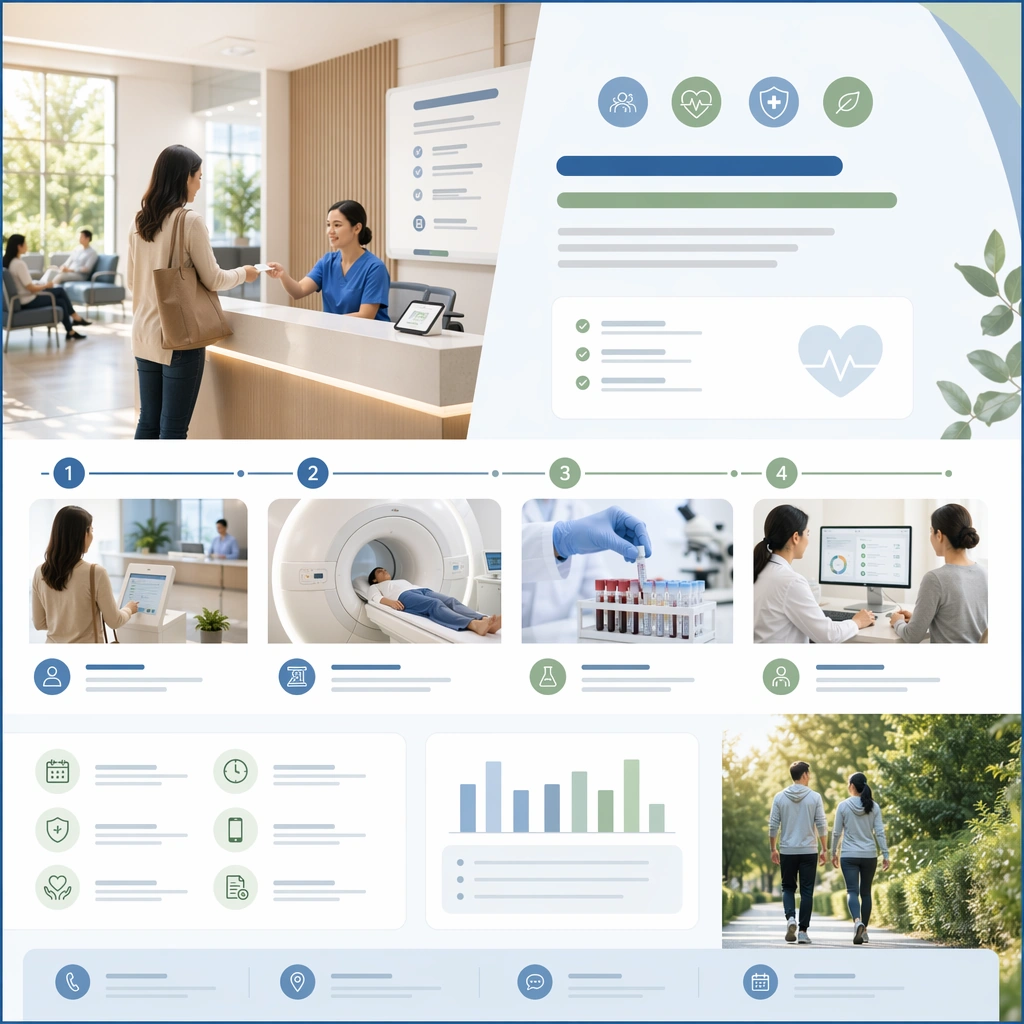
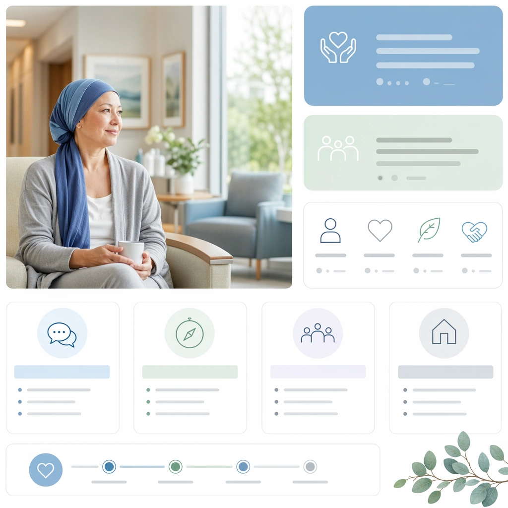
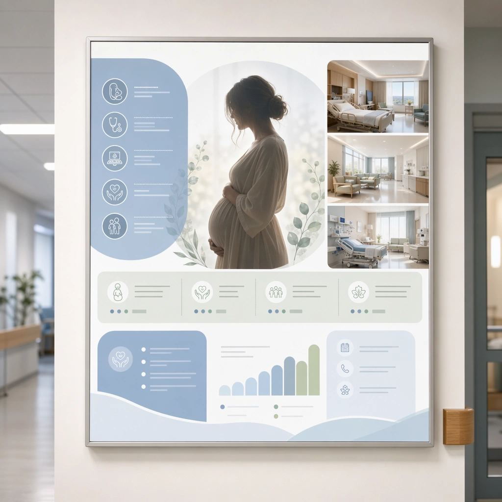
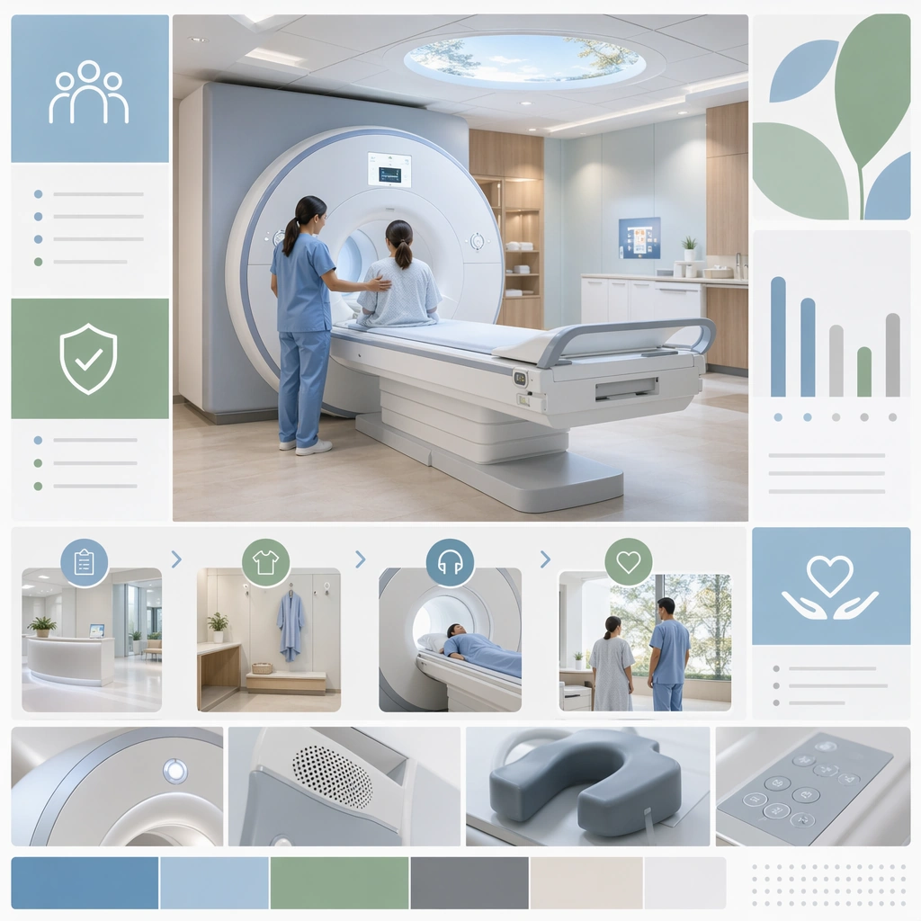
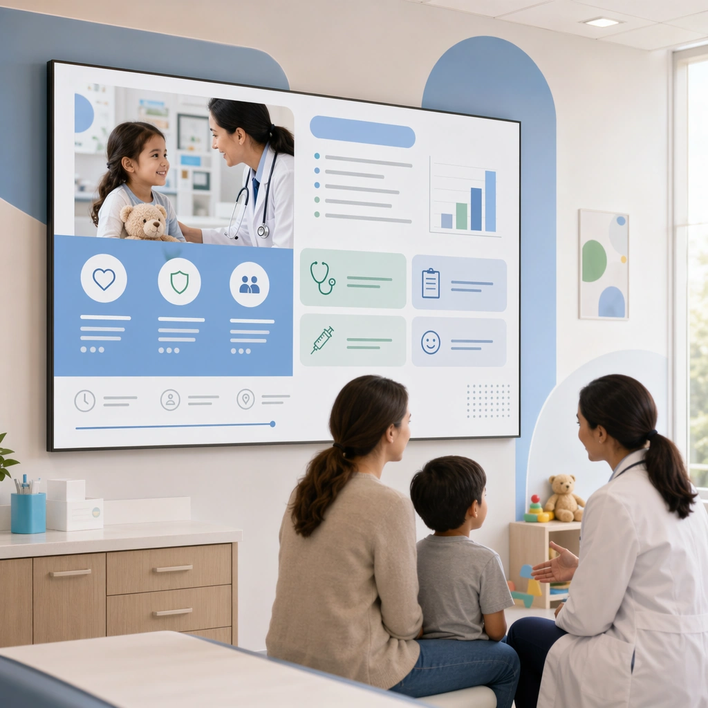
A square pediatrics service banner study for Hospital Department Promo Visuals. Compose it with a child-friendly but orderly layout using soft shapes, waiting-room cues, and a clear hero image. Use a palette of hospital white, powder blue, eucalyptus green, slate gray, and warm daylight neutrals, bright soft institutional lighting balanced with gentle natural highlights, and a mood of public trust, clarity, and inclusive reassurance. The frame should feel like a real healthcare communication asset art-directed for professional delivery, not a stock photo, speculative concept render, or generic corporate template. Keep the camera distance, negative space, and depth cues disciplined so the image reads immediately even at thumbnail size.

Subject:
Center on a pediatric department communication surface with playful geometry, family-friendly exam room imagery, and service-module tiles. Show enough surrounding context that the viewer understands the intended service surface, user situation, and institutional setting. Every object, person, diagram, device crop, or spatial cue should support clarity, trust, and practical use. If people appear, keep them anonymous, natural, privacy-safe, and grounded in believable body language rather than promotional posing.

Important details:
Maintain department-level promotion expressed through clear service scope, accessible hierarchy, calm human presence, and institutionally grounded visual discipline. Keep it cheerful without becoming childish or cartoonish, and preserve hospital-grade cleanliness and trust. Use abstract icon shapes, color blocks, chart bars, interface modules, or non-legible placeholder microcopy whenever information structure is needed, but never readable text. Materials, spacing, lighting, and hierarchy should feel production-ready and healthcare-specific. Avoid generic lifestyle filler, decorative noise, or design gestures that do not reinforce the communication goal.

Use case:
Department Promo single study 2/9 for a pediatrics department landing banner.

Constraints:
No readable text, no watermark, no logos, preserve exact 1:1 aspect ratio, no emergency panic, no sensational disease imagery, no overdesigned advertising theatrics, no cluttered waiting crowds, no mascots, no amusement-park palette explosion.
Come usare
- Copia tutto il prompt originale, inclusi i parametri.
- Adatta soggetto, testo e composizione alle tue esigenze.
- Usa uno strumento esterno compatibile; verifica accesso e risultato.
Prima di iniziare
- Controlla se serve un’immagine di riferimento. La compatibilità non prova il modello usato per l’esempio.
- Verifica nomi, numeri e testi; i risultati cambiano con le versioni del modello.