Documento originale
GPT Image 2 · en
Scene:
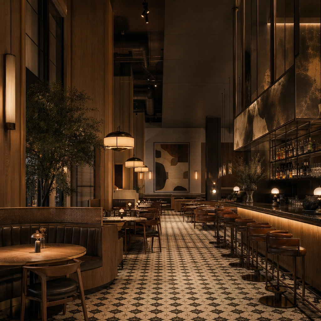
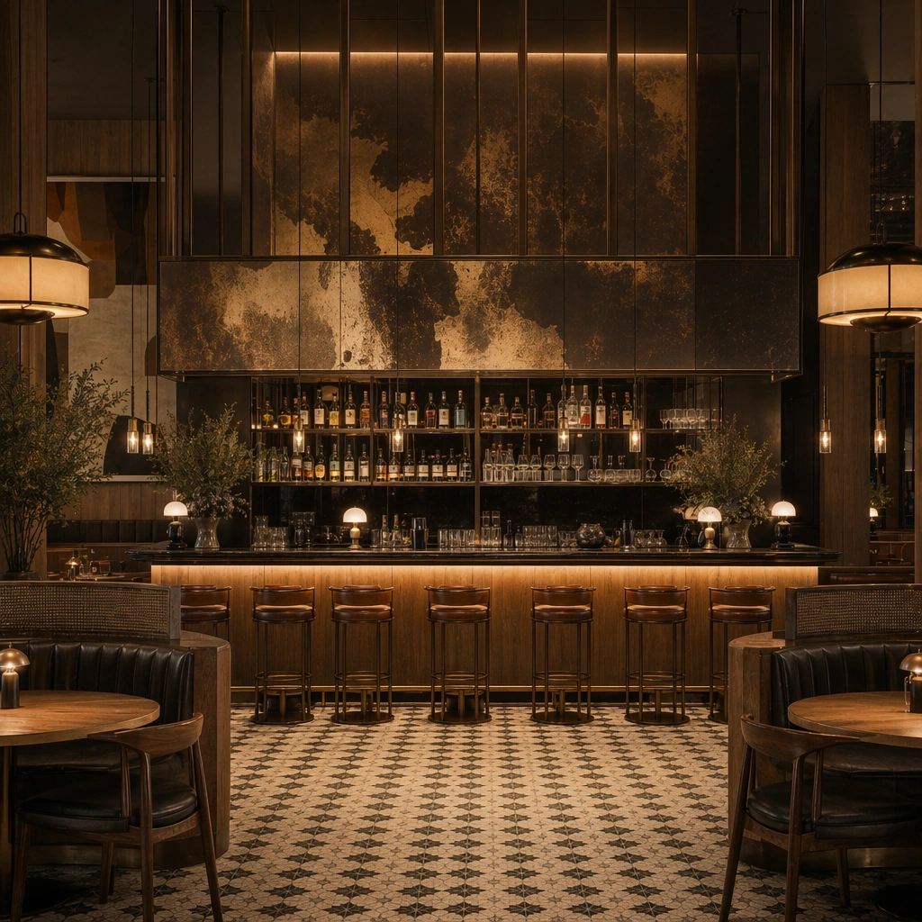
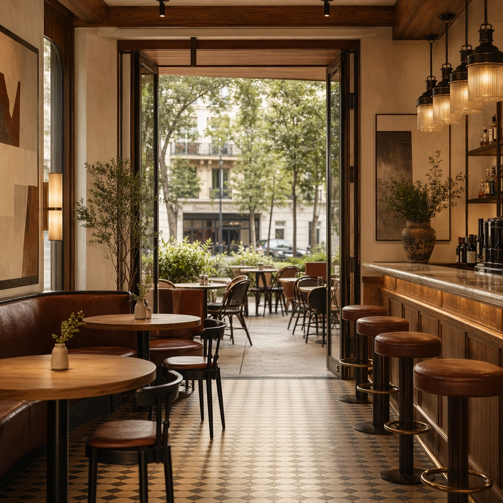
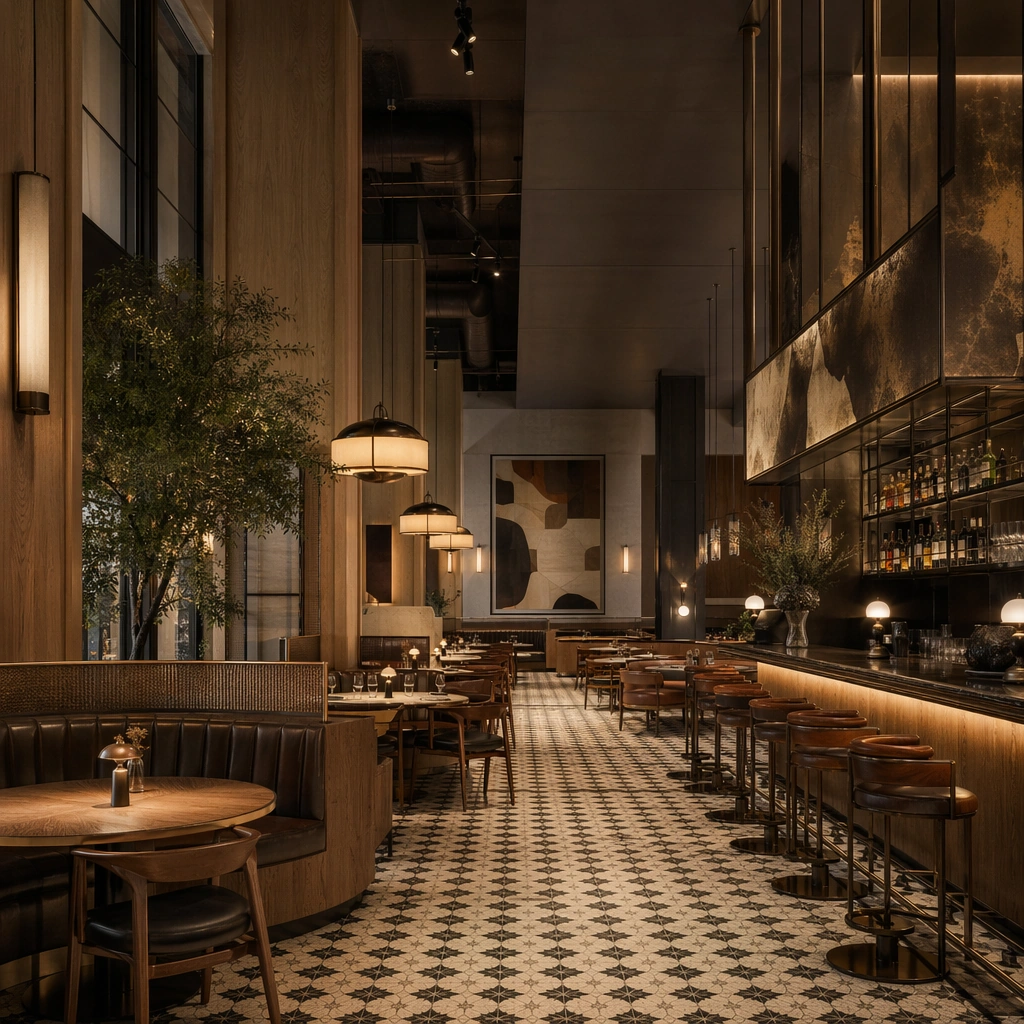
Create a square architectural reference still for Restaurant Cafe Space Brand Integration. Use a square hero view from near the storefront into the full dining room and bar and treat the frame like a premium interior or architecture editorial photograph with disciplined perspective, readable depth from foreground to background, and enough negative space for the spatial hierarchy to breathe. Light the scene so menu atmosphere, furniture authorship, and cohesive food-space branding feel immediate, using toasted oak, espresso brown, muted cream, oxidized brass, and warm tungsten amber as the governing tonal range. The composition must read as a high-end commercial image that could sit inside restaurant launches, cafe campaigns, hospitality editorials, and concept pitch boards.

Subject:
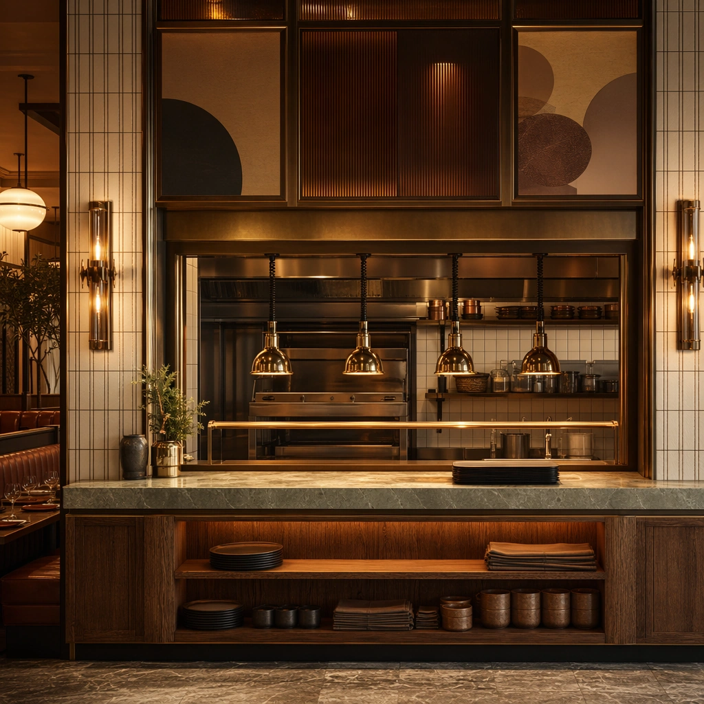
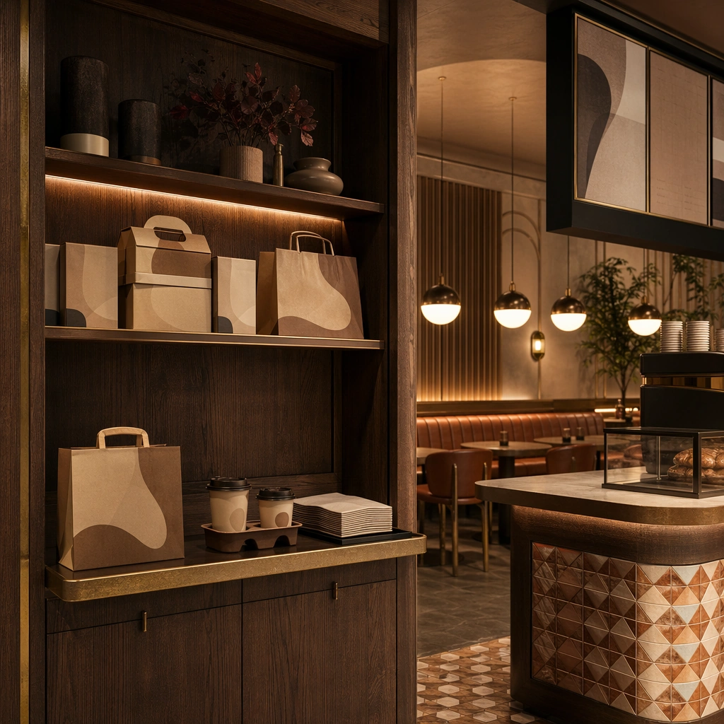
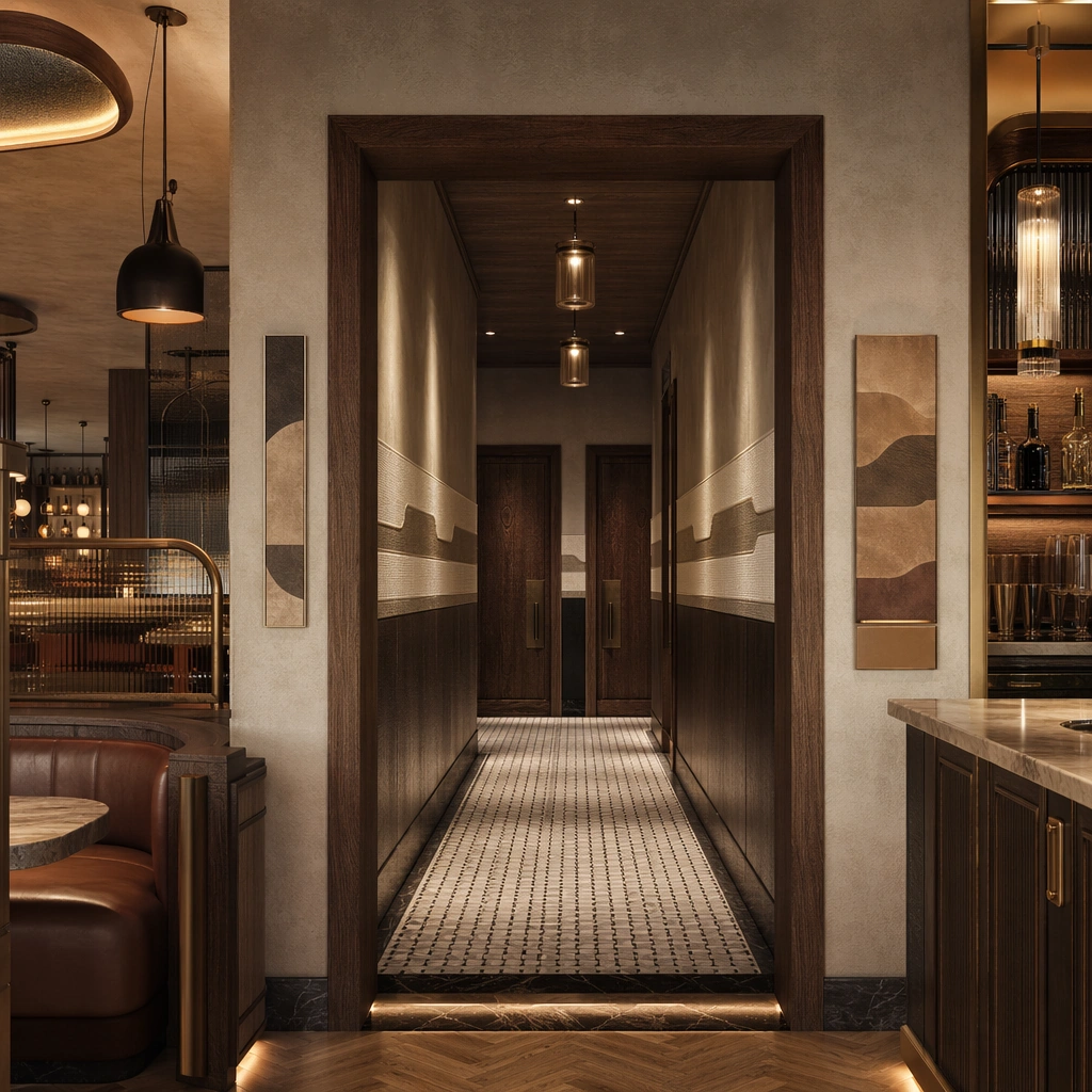
Show a restaurant and cafe interior where oak, oxidized metal, patterned tile, leather banquettes, softly glowing pendants, and abstract menu surfaces feel authored as one brand system. Center the restaurant’s overall brand atmosphere, seating hierarchy, and bar glow. This is the canonical reference image for the package, so the major proportions, material transitions, fixture families, and circulation logic must feel highly specific and internally coherent rather than generic luxury styling. Let the viewer understand how the space is organized within a single glance, with foreground anchors, a clear middle zone, and a resolved background termination.

Important details:
Lock the tile language, oak-and-metal pairings, banquette shapes, bar geometry, pendant rhythm, and abstract menu-display zones. Surfaces should feel tactile and believable: stone veining must stay plausible, metals should have disciplined reflectance, fabrics should show natural weight, and concealed lighting should shape the volume instead of flattening it. Use abstract signage, menu, label, or caption zones only as unreadable graphic hints. The image should feel practical for downstream design reviews and polished enough for public-facing campaign use.

Use case:
Restaurant Cafe Space Brand Integration series study 1/9, establishing the canonical hospitality identity for the series.

Constraints:
No readable text, no watermark, no logos, preserve exact 1:1 aspect ratio, no crowded diners, no readable menus, no food-delivery branding, no messy plates, no random neon slogans, no exterior logos dominating.
Come usare
- Copia tutto il prompt originale, inclusi i parametri.
- Adatta soggetto, testo e composizione alle tue esigenze.
- Usa uno strumento esterno compatibile; verifica accesso e risultato.
Prima di iniziare
- Controlla se serve un’immagine di riferimento. La compatibilità non prova il modello usato per l’esempio.
- Verifica nomi, numeri e testi; i risultati cambiano con le versioni del modello.