Documento originale
GPT Image 2 · en
Scene:
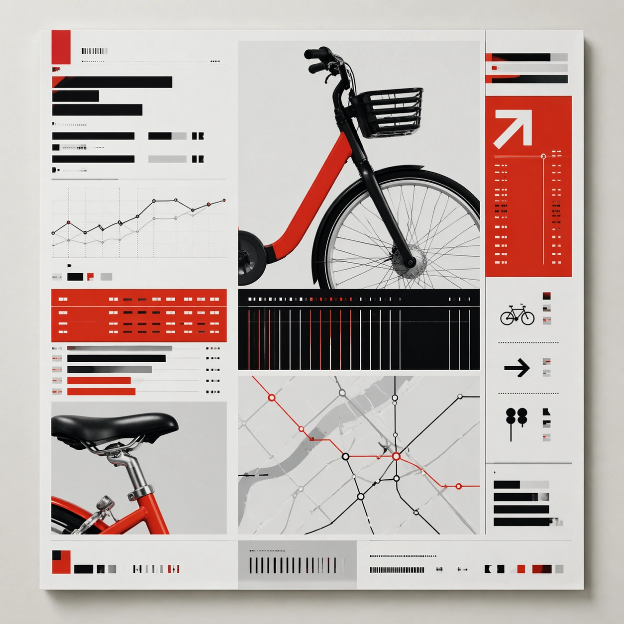
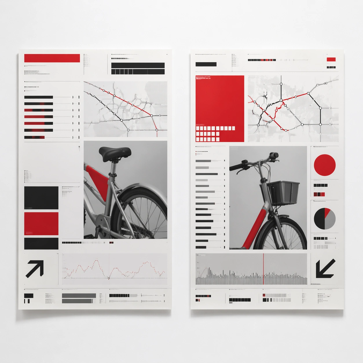
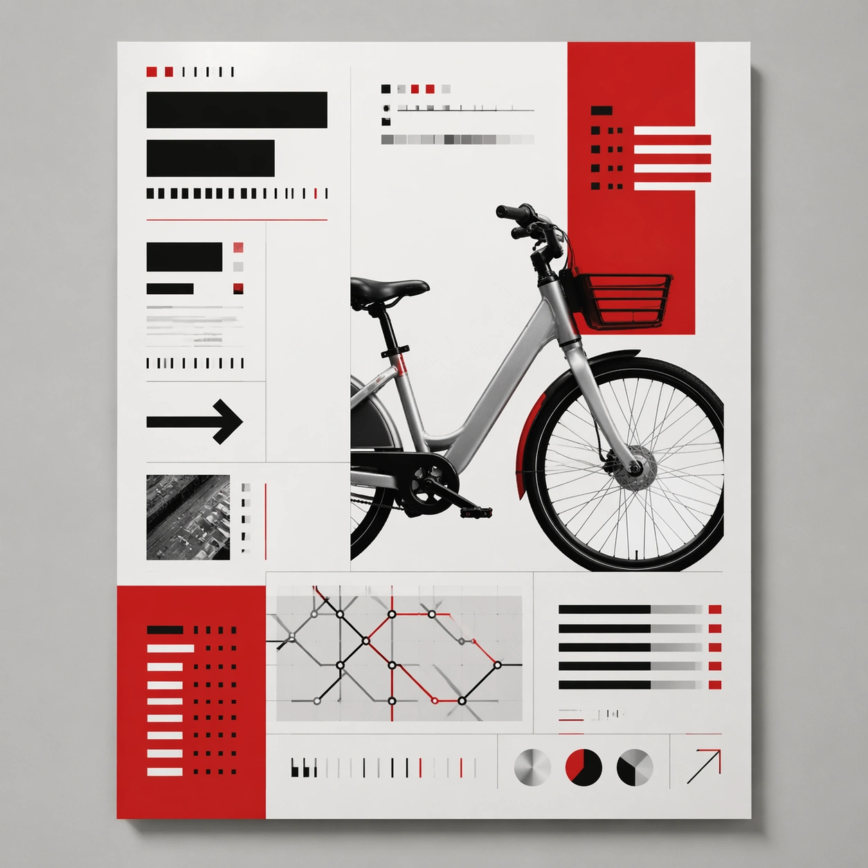
A square straight-on studio view of a pristine poster mounted on a matte wall with even museum lighting, crisp corners, and enough breathing room around the sheet for the full composition to read as an intentional object. The poster should express rigorous Swiss grid design with modular columns, disciplined margins, quiet asymmetry, and large white fields, using red, black, white, graphite gray, and occasional cool silver paper tone and a tactile surface appropriate to the medium.

Subject:
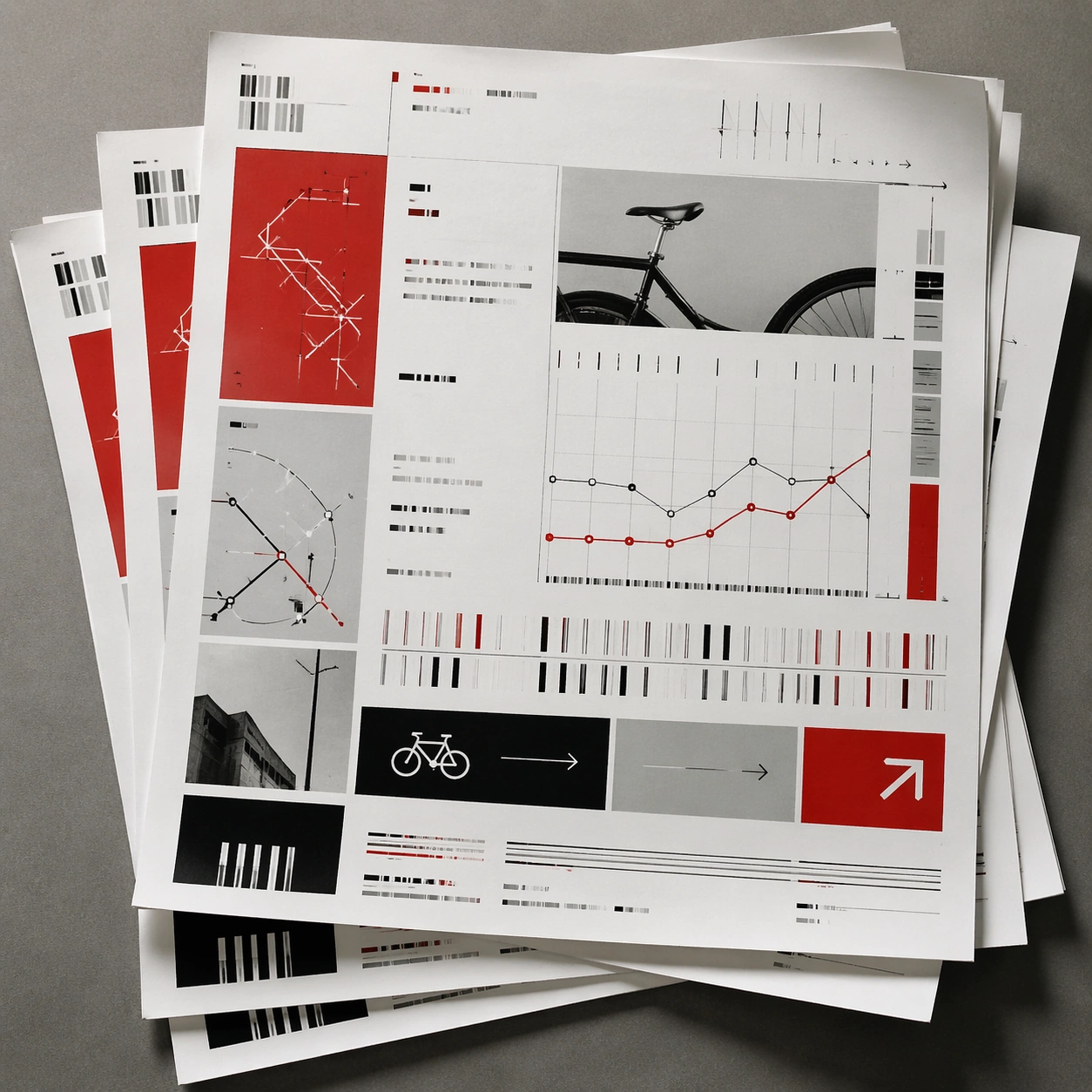
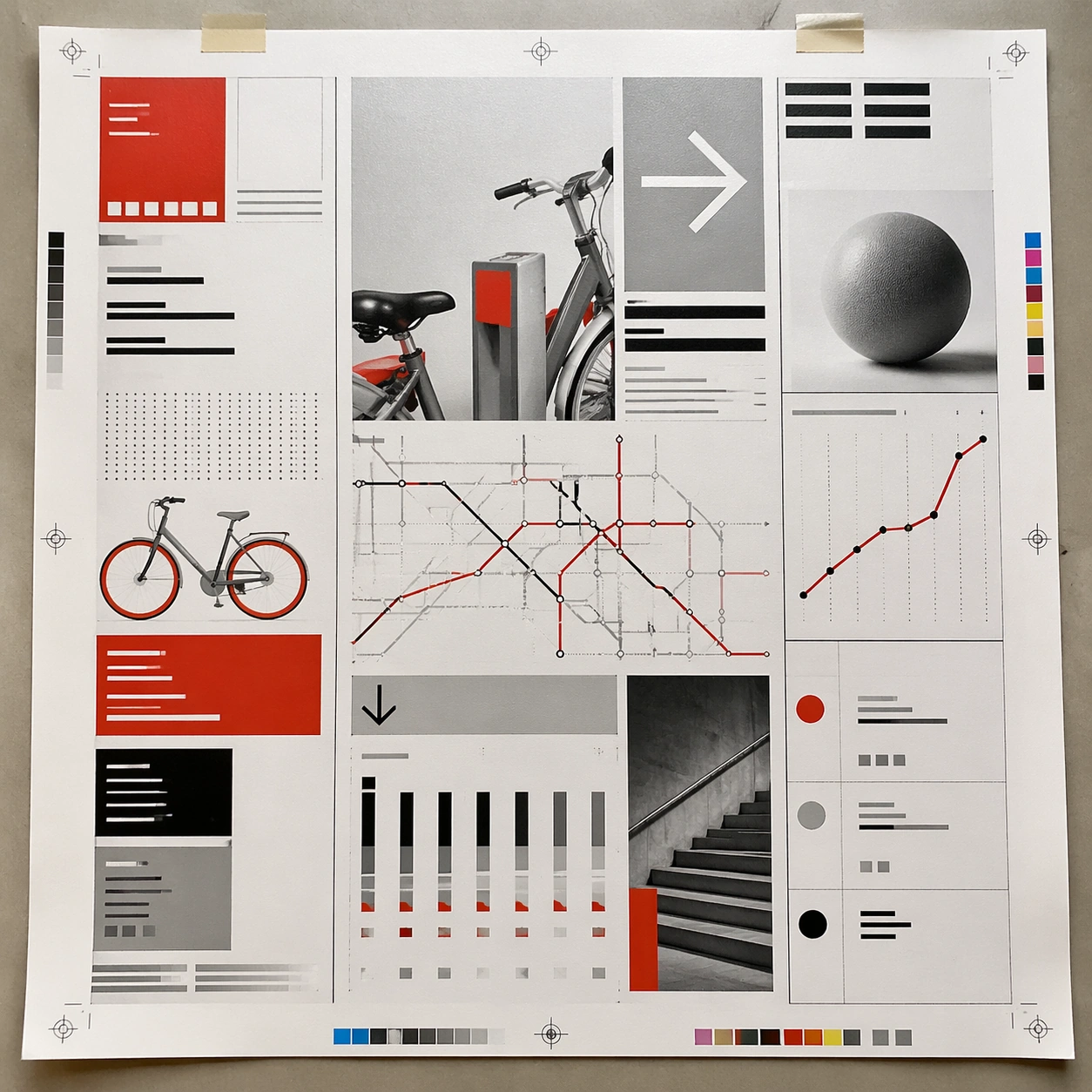
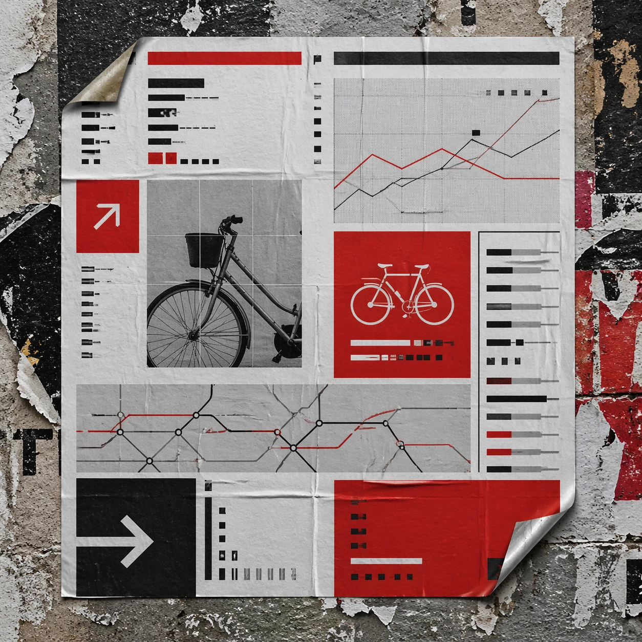
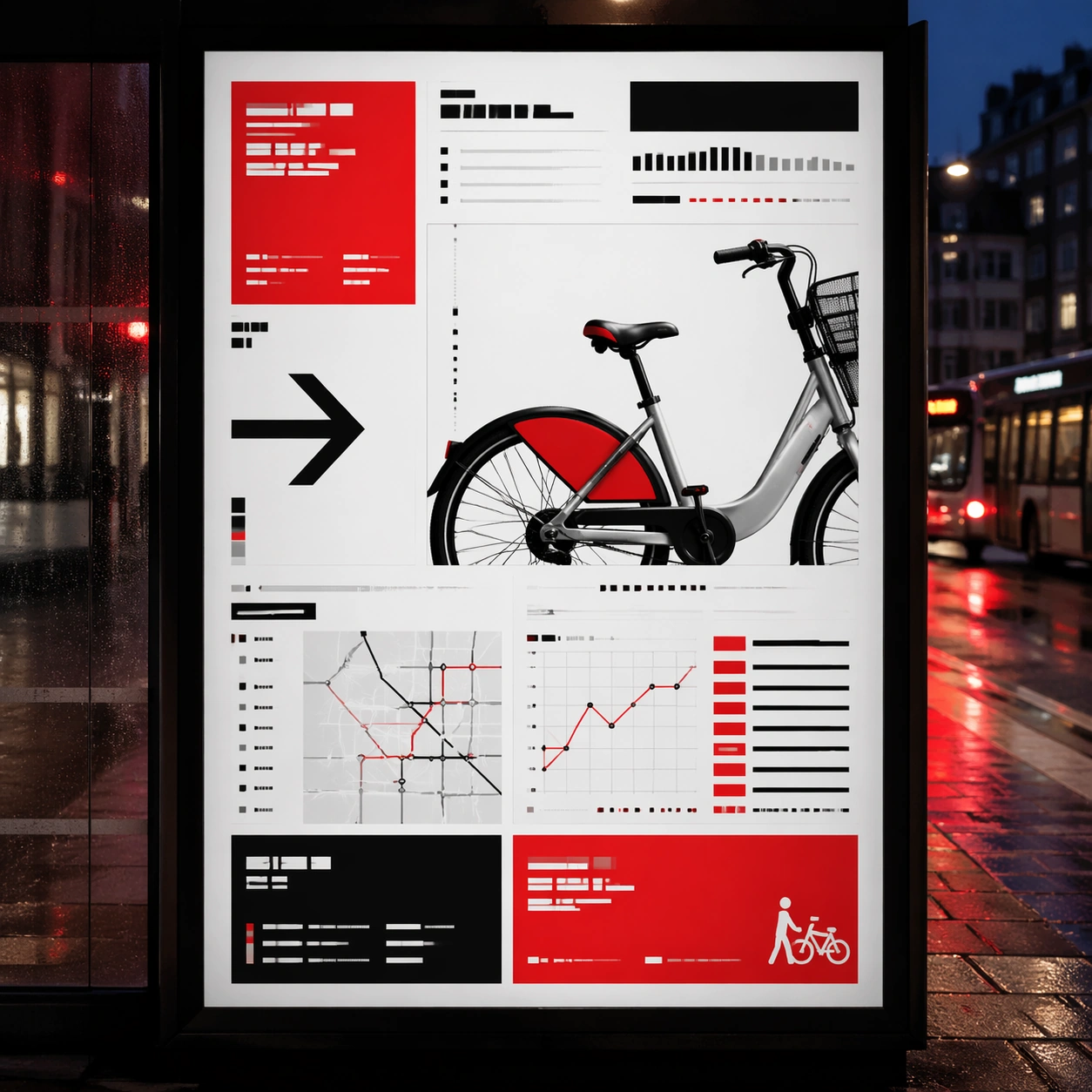
Build the flagship poster statement for this style, with the strongest hierarchy, the clearest subject silhouette, and the most disciplined balance between image field, pseudo-typography, and empty space. Use gallery objects, arrows, cropped still-life fragments, line charts, timetable bars, and alignment guides as the main visual ingredients, and organize them with grotesk typographic blocks, rules, and index markers rendered as non-readable layout forms. For the contemporary-subject axis, thread in shared bicycles, transit maps, and civic information cues reduced into a severe exhibition grid. The poster must feel like an original design object rather than a reproduction of any known work.

Important details:
Treat this as the cleanest thesis image in the set: the paper should look fresh, the inks or paint should feel deliberate, and every formal rule of the style should be easy to study at a glance. Preserve baseline precision, invisible column logic, severe spacing discipline, and crisp edge hierarchy. Keep every letterform abstract and non-readable, as if it were a typographic texture rather than language. Make the style unmistakable through composition, palette, surface behavior, and symbolic compression. no centered symmetry, no distressed paper, no decorative ornament, no playful doodles.

Use case:
Swiss Grid single study 1/9, establishing the cleanest museum-grade poster reading.

Constraints:
No readable text, no watermark, no logos, preserve exact 1:1 aspect ratio, no copyrighted characters, no real brand marks, no QR codes, no interface chrome, no accidental gibberish lettering.
Come usare
- Copia tutto il prompt originale, inclusi i parametri.
- Adatta soggetto, testo e composizione alle tue esigenze.
- Usa uno strumento esterno compatibile; verifica accesso e risultato.
Prima di iniziare
- Controlla se serve un’immagine di riferimento. La compatibilità non prova il modello usato per l’esempio.
- Verifica nomi, numeri e testi; i risultati cambiano con le versioni del modello.