Documento originale
GPT Image 2 · en
Scene:
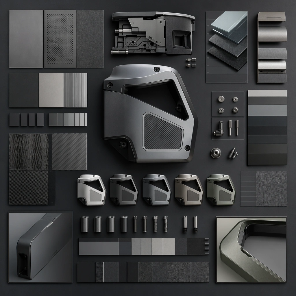
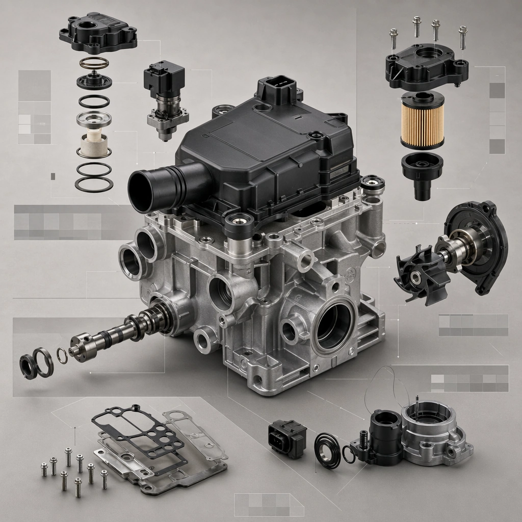
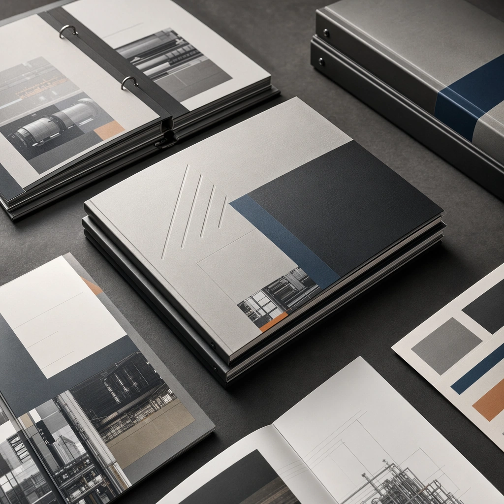
A square comparison setup with repeated product fragments under identical light and strict alignment across finish variants. Compose the frame as a square key visual with disciplined camera placement, premium lighting control, and believable real-world scale. The tonal range should feel polished and intentional, with enough atmosphere to create depth without obscuring form. Keep contrast calibrated for launch, catalog, or research presentation use rather than casual snapshot aesthetics.

Subject:
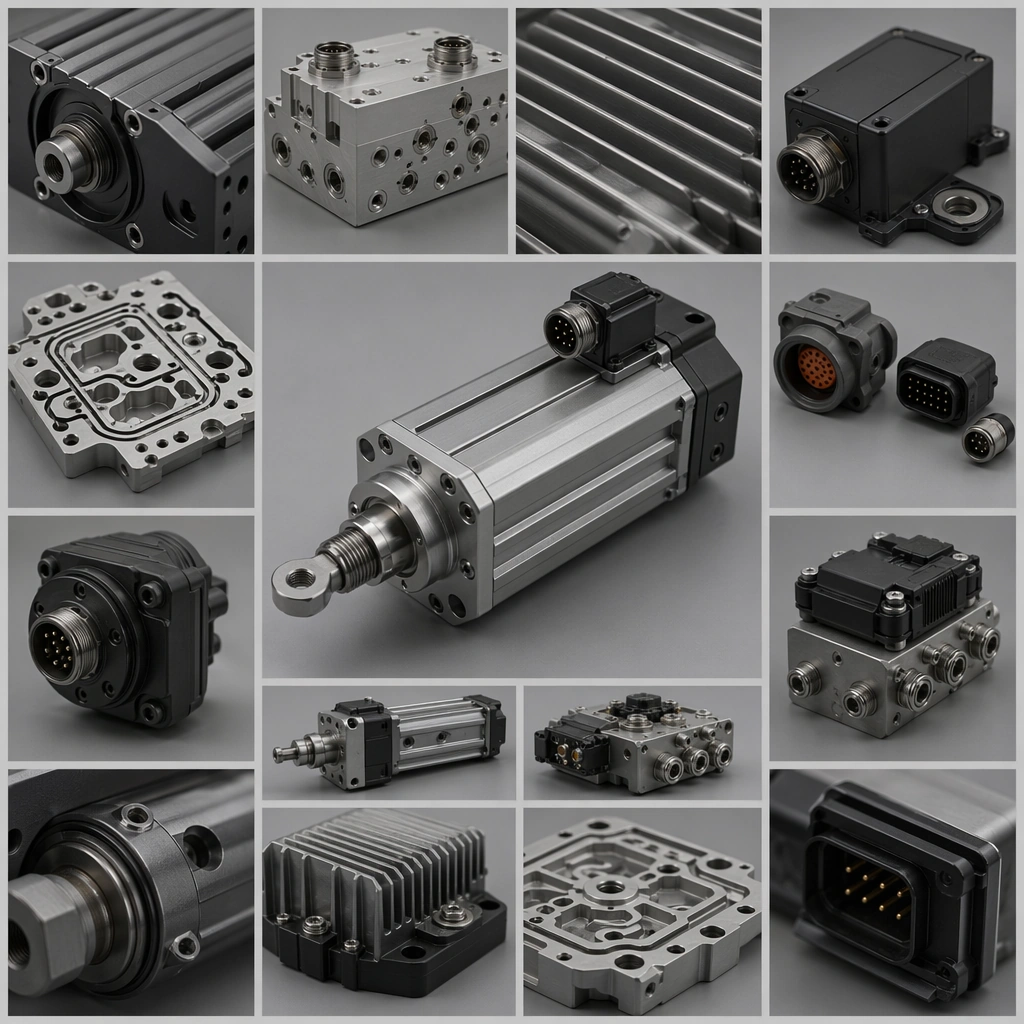
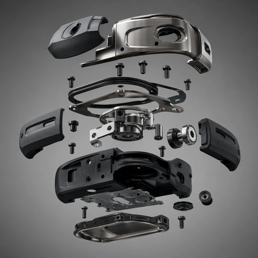
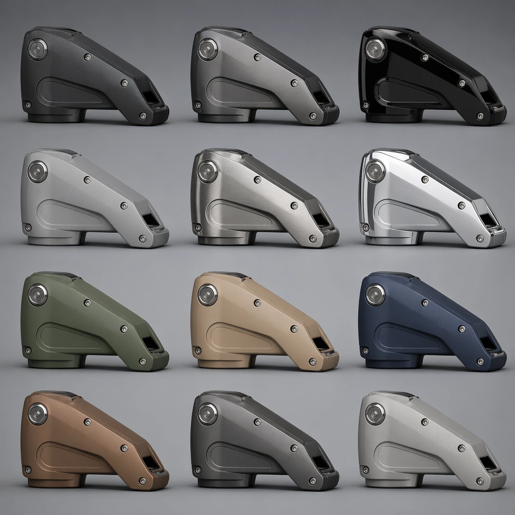
Center one original industrial form repeated in several finish executions with disciplined color and reflectance differences. Make the subject feel original, production-aware, and clearly grounded in Industrial Material Finish Study Board. Treat this as an independent study that must feel complete and coherent without relying on any external reference image. The focal hierarchy should be immediate: primary form first, then material behavior, then supporting environmental cues that clarify use context and difficulty.

Important details:
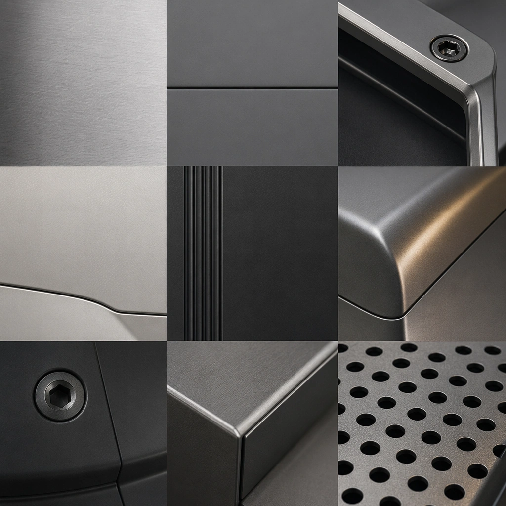
Use comparison logic, not spectacle. The interest should come from subtle but meaningful changes in finish behavior and tactile implication. The visual language should still feel native to Industrial Material Finish Study Board, using disciplined industrial or campaign composition instead of generic stock photography. Use believable materials, engineering logic, and professional composition discipline. Reflections, shadows, edge breaks, texture scale, interface density, and small physical joints must all support realism. Avoid filler props, vague mood-board clutter, or any element that weakens the sense of a purpose-built industrial or automotive image.

Use case:
Material Study single study 8/9 for Industrial Material Finish Study Board, built as image support-four.

Constraints:
No readable text, no watermark, no logos, preserve exact 1:1 aspect ratio, no readable labels, no logos, no decorative lifestyle props, no fantasy texture, no chaotic palettes, no distressed damage.
Come usare
- Copia tutto il prompt originale, inclusi i parametri.
- Adatta soggetto, testo e composizione alle tue esigenze.
- Usa uno strumento esterno compatibile; verifica accesso e risultato.
Prima di iniziare
- Controlla se serve un’immagine di riferimento. La compatibilità non prova il modello usato per l’esempio.
- Verifica nomi, numeri e testi; i risultati cambiano con le versioni del modello.