PROMPT · ESPLORAZIONE CREATIVA

Galleria di prompt

Esplora prompt reali ed esempi generati. Trova ispirazione per la prossima missione creativa e copia gratuitamente il prompt completo.

Esempi
10,974
Modelli
17
Fonti
1277
10.974 esempi di prompt · pagina 20 di 229
Example generated from “Parody Movie Poster Remix — Support Three”
GPT Image 2en

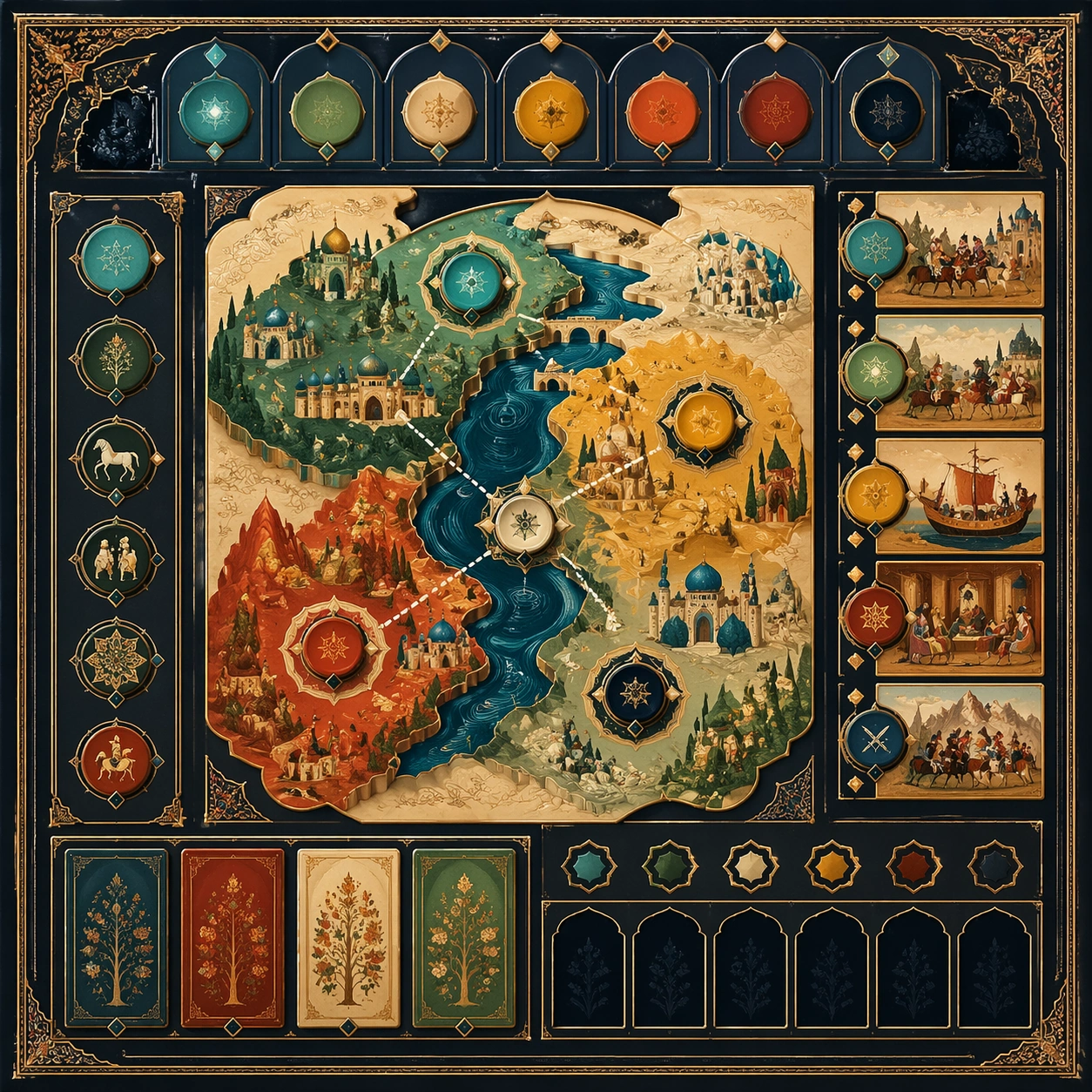
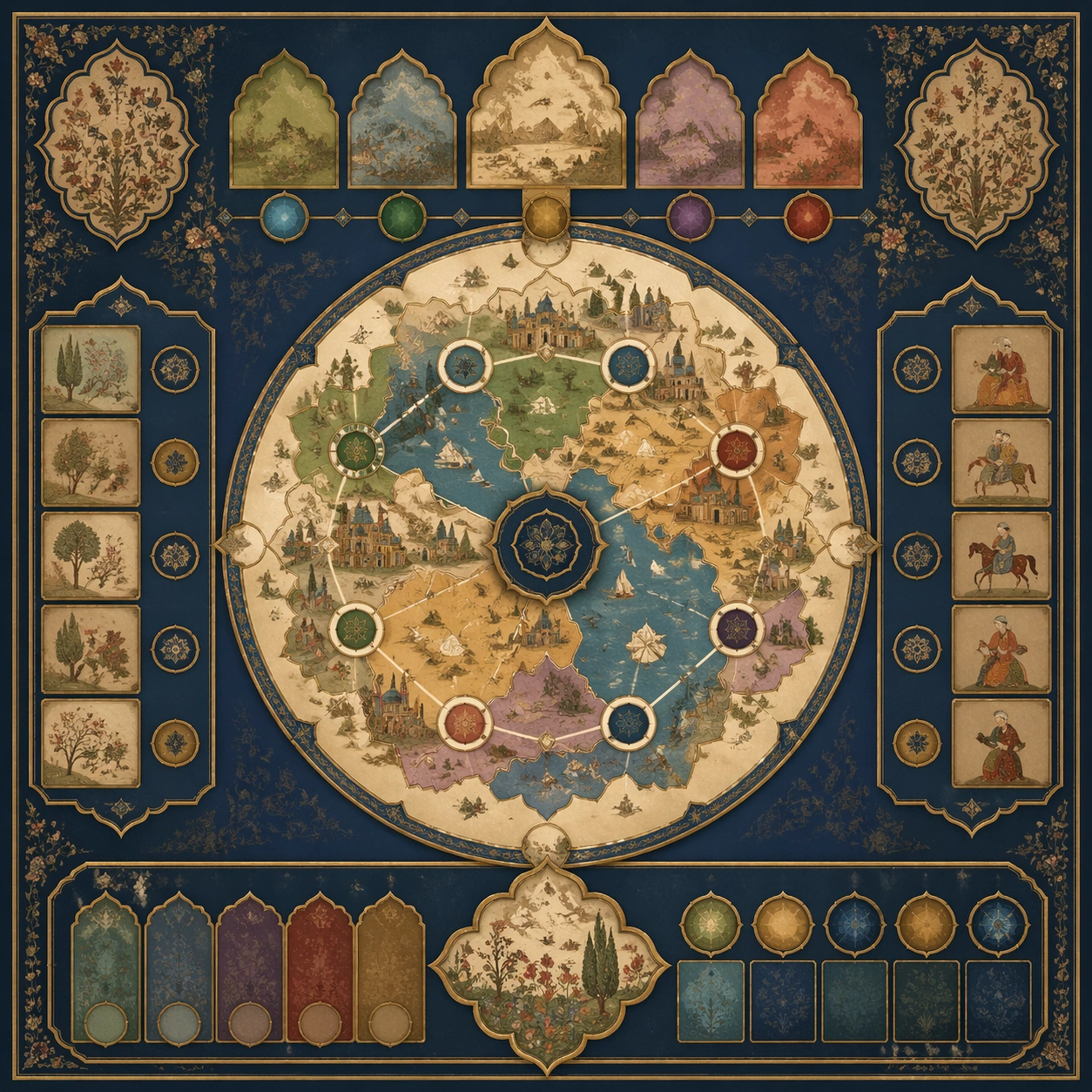
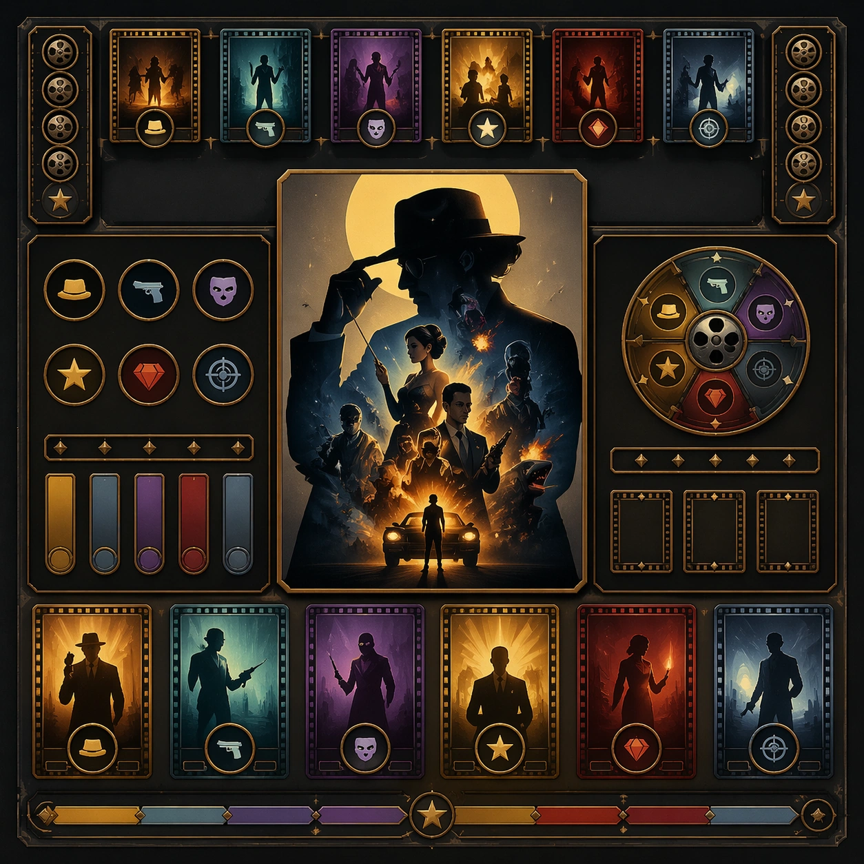
Scene: Create a square standalone support image for Parody Movie Poster Remix. Build a third support-surface study with a clear focal hierarchy and a finished professional surface. Use a polished modular board or campaign surface with clean spacing, premium game-UI finish, and clear focal hierarchy. The frame should feel self-contained and polished, with enough structure to explain the system even without the reference series, yet still obviously belonging to the same theme and production world. Subject: Show a coherent original game-art system built for premium production and marketing surfaces in a way that emphasizes the intended support surface. Keep the same system logic stable across screenshots, cards, banners, and overview boards. Even though this image is independent, the viewer should still recognize the same universe, same commercial logic, and same production intent as the core package. Important details: Lock framing, icon grammar, palette blocking, and surface hierarchy so the kit feels production-ready and consistent. Preserve the broader theme language through color, framing, material choices, and modular composition. Use clean panel rhythm, premium asset presentation, and believable detail density. The image should work equally well as a gallery study, research reference, and mock production deliverable. Use case: Parody Movie Poster Remix single study 7/9, exploring support three as a support surface. Constraints: No readable text, no watermark, no logos, preserve exact 1:1 aspect ratio, no unrelated objects, no broken visual hierarchy, no visual noise that obscures the main surface, no accidental brand resemblance.
Example generated from “Parody Movie Poster Remix — Support Four”
GPT Image 2en

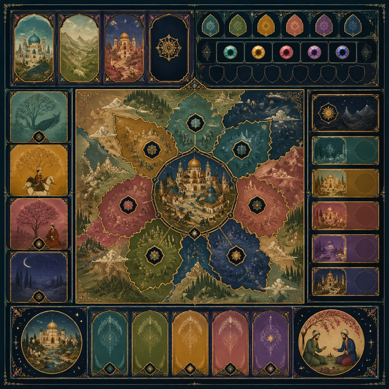
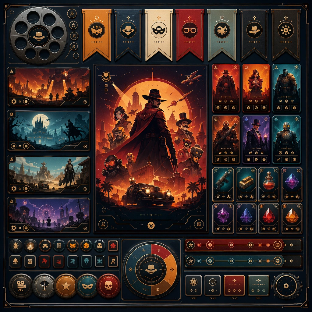
Scene: Create a square standalone support image for Parody Movie Poster Remix. Build a fourth support-surface study with a clear focal hierarchy and a finished professional surface. Use a polished modular board or campaign surface with clean spacing, premium game-UI finish, and clear focal hierarchy. The frame should feel self-contained and polished, with enough structure to explain the system even without the reference series, yet still obviously belonging to the same theme and production world. Subject: Show a coherent original game-art system built for premium production and marketing surfaces in a way that emphasizes the intended support surface. Keep the same system logic stable across screenshots, cards, banners, and overview boards. Even though this image is independent, the viewer should still recognize the same universe, same commercial logic, and same production intent as the core package. Important details: Lock framing, icon grammar, palette blocking, and surface hierarchy so the kit feels production-ready and consistent. Preserve the broader theme language through color, framing, material choices, and modular composition. Use clean panel rhythm, premium asset presentation, and believable detail density. The image should work equally well as a gallery study, research reference, and mock production deliverable. Use case: Parody Movie Poster Remix single study 8/9, exploring support four as a support surface. Constraints: No readable text, no watermark, no logos, preserve exact 1:1 aspect ratio, no unrelated objects, no broken visual hierarchy, no visual noise that obscures the main surface, no accidental brand resemblance.
Example generated from “Parody Movie Poster Remix — Support Five”
GPT Image 2en

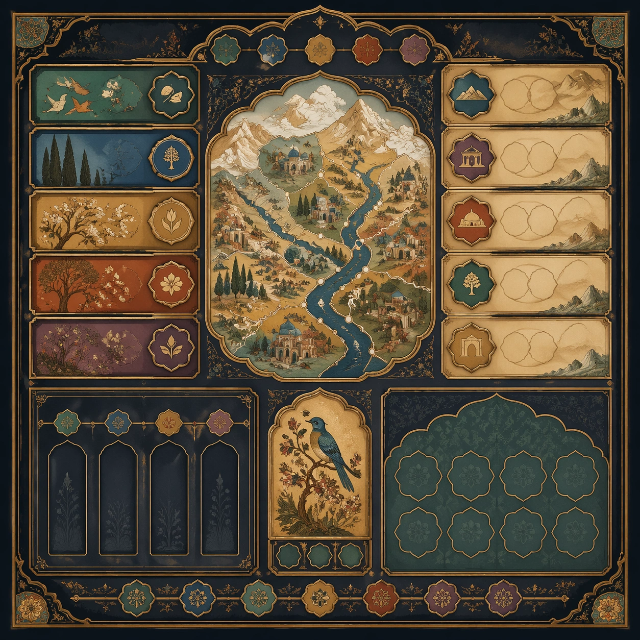
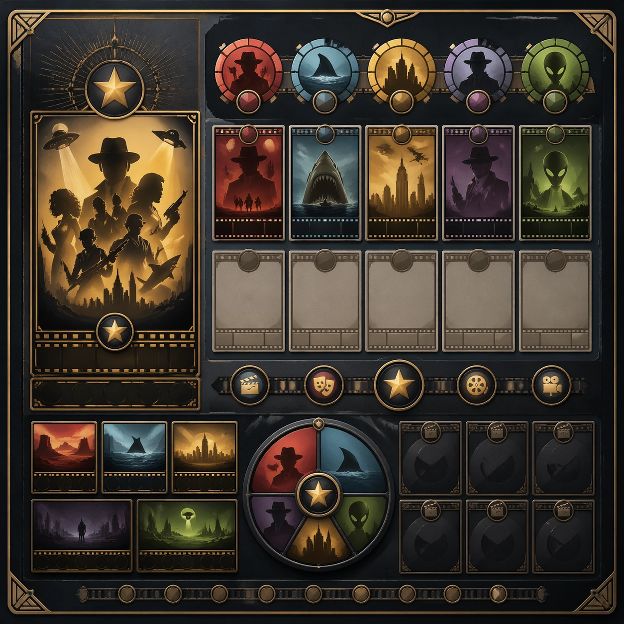
Scene: Create a square standalone support image for Parody Movie Poster Remix. Build a fifth support-surface study with a clear focal hierarchy and a finished professional surface. Use a polished modular board or campaign surface with clean spacing, premium game-UI finish, and clear focal hierarchy. The frame should feel self-contained and polished, with enough structure to explain the system even without the reference series, yet still obviously belonging to the same theme and production world. Subject: Show a coherent original game-art system built for premium production and marketing surfaces in a way that emphasizes the intended support surface. Keep the same system logic stable across screenshots, cards, banners, and overview boards. Even though this image is independent, the viewer should still recognize the same universe, same commercial logic, and same production intent as the core package. Important details: Lock framing, icon grammar, palette blocking, and surface hierarchy so the kit feels production-ready and consistent. Preserve the broader theme language through color, framing, material choices, and modular composition. Use clean panel rhythm, premium asset presentation, and believable detail density. The image should work equally well as a gallery study, research reference, and mock production deliverable. Use case: Parody Movie Poster Remix single study 9/9, exploring support five as a support surface. Constraints: No readable text, no watermark, no logos, preserve exact 1:1 aspect ratio, no unrelated objects, no broken visual hierarchy, no visual noise that obscures the main surface, no accidental brand resemblance.
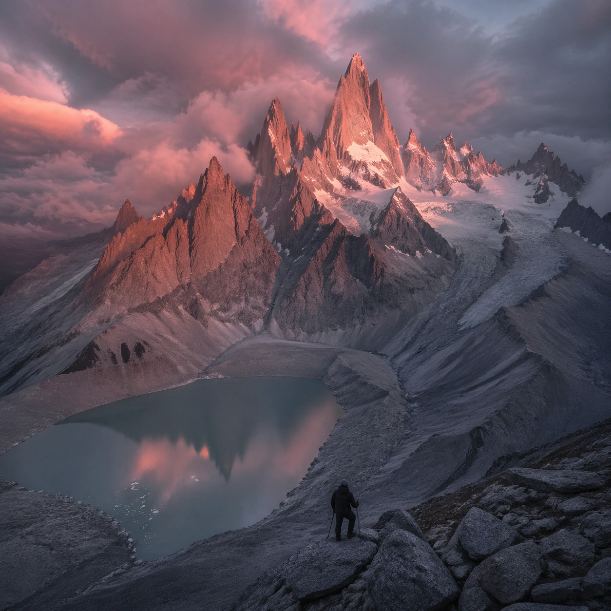
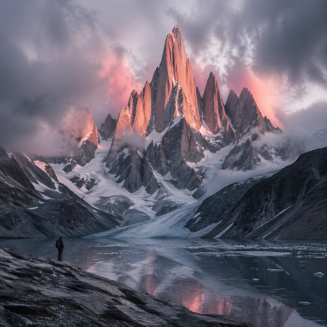
Example generated from “Patagonian Spire Granite — Foreground Path”
GPT Image 2en

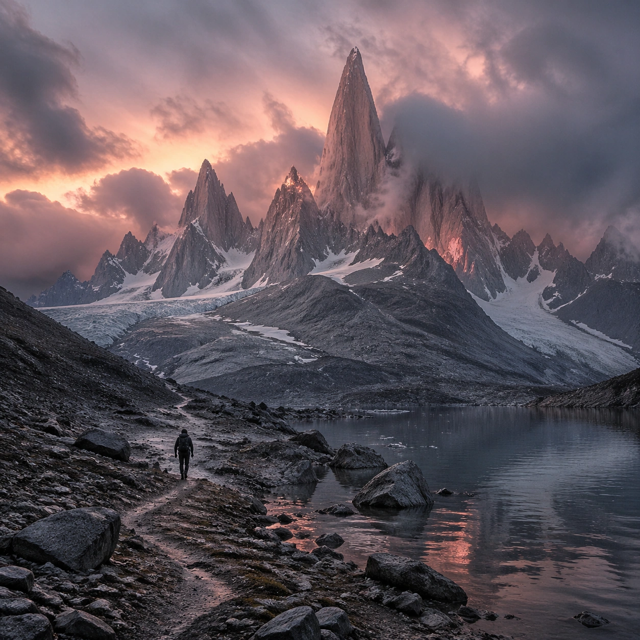
Scene: Create a square, photoreal landscape study of patagonian spire granite. Compose it as a ground-level entry path that pulls the viewer into the terrain, using a lower vantage with a strong foreground element such as a ridge line, shoreline, stream, boot track, or wet surface leading inward. Let the foreground remain tactile and detailed while the distance opens gradually Keep the frame cinematic but disciplined, with a clear foreground, middle distance, and far mass so the viewer can measure real depth. The image should feel like a field photograph made with patience, precision, and sublime restraint rather than a fantasy matte painting. Subject: Show jagged Patagonian granite spires rising through storm clouds, touched by rose dawn light above a glacier lake, with a lone climber silhouette on the approach. This variation should emphasize foreground-led composition. The main landform must dominate the composition, but secondary elements should quietly explain how the place works: water paths, sediment lines, snow bands, surf, ash, wind streaks, stars, or human traces where appropriate. Everything in the image should support the same idea of scale and climate, so the scene reads as one coherent environment rather than a stack of spectacular details. Important details: Preserve serrated granite geometry, storm-driven cloud movement, rose and steel-gray color contrast, glacial water reflection, and a harsh high-wind alpine atmosphere. The image should reward close looking through layered depth cues rather than pure spectacle alone. Keep geology, weather, and atmosphere physically believable. Use subtle micro-texture, tonal separation, and air perspective to reinforce distance. If a human, vehicle, tent, caravan, bird, or boat appears, it must remain tiny and subordinate to the landscape, functioning only as a scale witness. The composition should feel original, severe, and elegant, with no decorative filler and no imitation of any copyrighted visual property. Use case: Patagonian Spire Granite single study 2/9, exploring the foreground-led composition variation. Constraints: No readable text, no watermark, no logos, preserve exact 1:1 aspect ratio, no dense forest foreground, no cable cars, no fantasy castle ruins, no tropical haze, no blocked foreground, no random props, no awkward dead zone in the lower third, no kitsch color grading, no artificial border, no split-panel treatment.

Example generated from “Patagonian Spire Granite — Aerial Geometry”
GPT Image 2en

Scene: Create a square, photoreal landscape study of patagonian spire granite. Compose it as the planform geometry and overall shape logic of the landscape, using an elevated oblique aerial view that still preserves believable scale and natural topography. Let light reveal contour, fracture, and pattern instead of flattening the terrain Keep the frame cinematic but disciplined, with a clear foreground, middle distance, and far mass so the viewer can measure real depth. The image should feel like a field photograph made with patience, precision, and sublime restraint rather than a fantasy matte painting. Subject: Show jagged Patagonian granite spires rising through storm clouds, touched by rose dawn light above a glacier lake, with a lone climber silhouette on the approach. This variation should emphasize aerial scale read. The main landform must dominate the composition, but secondary elements should quietly explain how the place works: water paths, sediment lines, snow bands, surf, ash, wind streaks, stars, or human traces where appropriate. Everything in the image should support the same idea of scale and climate, so the scene reads as one coherent environment rather than a stack of spectacular details. Important details: Preserve serrated granite geometry, storm-driven cloud movement, rose and steel-gray color contrast, glacial water reflection, and a harsh high-wind alpine atmosphere. Emphasize rhythm, repetition, and large-form geometry without losing physical realism. Keep geology, weather, and atmosphere physically believable. Use subtle micro-texture, tonal separation, and air perspective to reinforce distance. If a human, vehicle, tent, caravan, bird, or boat appears, it must remain tiny and subordinate to the landscape, functioning only as a scale witness. The composition should feel original, severe, and elegant, with no decorative filler and no imitation of any copyrighted visual property. Use case: Patagonian Spire Granite single study 3/9, exploring the aerial scale read variation. Constraints: No readable text, no watermark, no logos, preserve exact 1:1 aspect ratio, no dense forest foreground, no cable cars, no fantasy castle ruins, no tropical haze, no map labels, no diagram arrows, no satellite-interface graphics, no kitsch color grading, no artificial border, no split-panel treatment.

Example generated from “Patagonian Spire Granite — Atmosphere Event”
GPT Image 2en

Scene: Create a square, photoreal landscape study of patagonian spire granite. Compose it as the moment when weather, particles, or moving air become the main dramatic agent, using a stable documentary framing that lets the environmental event stay legible. Let the air itself carry visible density through haze, spray, ash, dust, snow, or storm structure Keep the frame cinematic but disciplined, with a clear foreground, middle distance, and far mass so the viewer can measure real depth. The image should feel like a field photograph made with patience, precision, and sublime restraint rather than a fantasy matte painting. Subject: Show jagged Patagonian granite spires rising through storm clouds, touched by rose dawn light above a glacier lake, with a lone climber silhouette on the approach. This variation should emphasize weather-driven study. The main landform must dominate the composition, but secondary elements should quietly explain how the place works: water paths, sediment lines, snow bands, surf, ash, wind streaks, stars, or human traces where appropriate. Everything in the image should support the same idea of scale and climate, so the scene reads as one coherent environment rather than a stack of spectacular details. Important details: Preserve serrated granite geometry, storm-driven cloud movement, rose and steel-gray color contrast, glacial water reflection, and a harsh high-wind alpine atmosphere. The atmosphere must feel physically plausible and tied to terrain, wind direction, temperature, and moisture. Keep geology, weather, and atmosphere physically believable. Use subtle micro-texture, tonal separation, and air perspective to reinforce distance. If a human, vehicle, tent, caravan, bird, or boat appears, it must remain tiny and subordinate to the landscape, functioning only as a scale witness. The composition should feel original, severe, and elegant, with no decorative filler and no imitation of any copyrighted visual property. Use case: Patagonian Spire Granite single study 4/9, exploring the weather-driven study variation. Constraints: No readable text, no watermark, no logos, preserve exact 1:1 aspect ratio, no dense forest foreground, no cable cars, no fantasy castle ruins, no tropical haze, no disaster-movie excess, no impossible lightning clutter, no synthetic smoke plumes, no kitsch color grading, no artificial border, no split-panel treatment.

Example generated from “Patagonian Spire Granite — Light Contrast”
GPT Image 2en

Scene: Create a square, photoreal landscape study of patagonian spire granite. Compose it as directional light carving sharp separation between illuminated and shadowed forms, using a composition built around light falloff, shadow shape, and reflective control rather than camera gimmicks. Let one strong light source create crisp hierarchy and believable color temperature shifts Keep the frame cinematic but disciplined, with a clear foreground, middle distance, and far mass so the viewer can measure real depth. The image should feel like a field photograph made with patience, precision, and sublime restraint rather than a fantasy matte painting. Subject: Show jagged Patagonian granite spires rising through storm clouds, touched by rose dawn light above a glacier lake, with a lone climber silhouette on the approach. This variation should emphasize light-structure study. The main landform must dominate the composition, but secondary elements should quietly explain how the place works: water paths, sediment lines, snow bands, surf, ash, wind streaks, stars, or human traces where appropriate. Everything in the image should support the same idea of scale and climate, so the scene reads as one coherent environment rather than a stack of spectacular details. Important details: Preserve serrated granite geometry, storm-driven cloud movement, rose and steel-gray color contrast, glacial water reflection, and a harsh high-wind alpine atmosphere. Surface brightness, shadow depth, and reflected light should all agree with the material and weather conditions. Keep geology, weather, and atmosphere physically believable. Use subtle micro-texture, tonal separation, and air perspective to reinforce distance. If a human, vehicle, tent, caravan, bird, or boat appears, it must remain tiny and subordinate to the landscape, functioning only as a scale witness. The composition should feel original, severe, and elegant, with no decorative filler and no imitation of any copyrighted visual property. Use case: Patagonian Spire Granite single study 5/9, exploring the light-structure study variation. Constraints: No readable text, no watermark, no logos, preserve exact 1:1 aspect ratio, no dense forest foreground, no cable cars, no fantasy castle ruins, no tropical haze, no blown highlights, no muddy blacks, no theatrical stage lighting, no kitsch color grading, no artificial border, no split-panel treatment.

Example generated from “Patagonian Spire Granite — Material Close”
GPT Image 2en

Scene: Create a square, photoreal landscape study of patagonian spire granite. Compose it as surface texture and material transitions while still keeping the full environment recognizable, using a tighter medium-wide crop that gives more area to texture, fracture, grain, water, ice, lava, salt, or stone. Let texture remain readable without making the scene feel like a macro shot Keep the frame cinematic but disciplined, with a clear foreground, middle distance, and far mass so the viewer can measure real depth. The image should feel like a field photograph made with patience, precision, and sublime restraint rather than a fantasy matte painting. Subject: Show jagged Patagonian granite spires rising through storm clouds, touched by rose dawn light above a glacier lake, with a lone climber silhouette on the approach. This variation should emphasize material realism check. The main landform must dominate the composition, but secondary elements should quietly explain how the place works: water paths, sediment lines, snow bands, surf, ash, wind streaks, stars, or human traces where appropriate. Everything in the image should support the same idea of scale and climate, so the scene reads as one coherent environment rather than a stack of spectacular details. Important details: Preserve serrated granite geometry, storm-driven cloud movement, rose and steel-gray color contrast, glacial water reflection, and a harsh high-wind alpine atmosphere. Micro-texture, edge wear, wetness, frost, dust, foam, or sediment should deepen realism rather than distract from scale. Keep geology, weather, and atmosphere physically believable. Use subtle micro-texture, tonal separation, and air perspective to reinforce distance. If a human, vehicle, tent, caravan, bird, or boat appears, it must remain tiny and subordinate to the landscape, functioning only as a scale witness. The composition should feel original, severe, and elegant, with no decorative filler and no imitation of any copyrighted visual property. Use case: Patagonian Spire Granite single study 6/9, exploring the material realism check variation. Constraints: No readable text, no watermark, no logos, preserve exact 1:1 aspect ratio, no dense forest foreground, no cable cars, no fantasy castle ruins, no tropical haze, no extreme macro abstraction, no plastic-looking surfaces, no shallow depth-of-field blur, no kitsch color grading, no artificial border, no split-panel treatment.

Example generated from “Patagonian Spire Granite — Scale Witness”
GPT Image 2en

Scene: Create a square, photoreal landscape study of patagonian spire granite. Compose it as a tiny human, animal, tent, vehicle, or craft that reveals the vastness of the environment, using a balanced frame where the witness remains small but unmistakable. Let the scale marker stay visible without becoming the true subject Keep the frame cinematic but disciplined, with a clear foreground, middle distance, and far mass so the viewer can measure real depth. The image should feel like a field photograph made with patience, precision, and sublime restraint rather than a fantasy matte painting. Subject: Show jagged Patagonian granite spires rising through storm clouds, touched by rose dawn light above a glacier lake, with a lone climber silhouette on the approach. This variation should emphasize scale comparison. The main landform must dominate the composition, but secondary elements should quietly explain how the place works: water paths, sediment lines, snow bands, surf, ash, wind streaks, stars, or human traces where appropriate. Everything in the image should support the same idea of scale and climate, so the scene reads as one coherent environment rather than a stack of spectacular details. Important details: Preserve serrated granite geometry, storm-driven cloud movement, rose and steel-gray color contrast, glacial water reflection, and a harsh high-wind alpine atmosphere. The viewer should understand the environment first and the witness second, with clean spatial separation between them. Keep geology, weather, and atmosphere physically believable. Use subtle micro-texture, tonal separation, and air perspective to reinforce distance. If a human, vehicle, tent, caravan, bird, or boat appears, it must remain tiny and subordinate to the landscape, functioning only as a scale witness. The composition should feel original, severe, and elegant, with no decorative filler and no imitation of any copyrighted visual property. Use case: Patagonian Spire Granite single study 7/9, exploring the scale comparison variation. Constraints: No readable text, no watermark, no logos, preserve exact 1:1 aspect ratio, no dense forest foreground, no cable cars, no fantasy castle ruins, no tropical haze, no crowd scenes, no heroic close-up character framing, no busy gear pile, no kitsch color grading, no artificial border, no split-panel treatment.

Example generated from “Patagonian Spire Granite — Abstract Rhythm”
GPT Image 2en

Scene: Create a square, photoreal landscape study of patagonian spire granite. Compose it as the near-abstract rhythm of repeated natural forms, lines, and tonal bands, using a disciplined crop that approaches abstraction while remaining unmistakably a real place. Let shape and tonal cadence dominate before small narrative details Keep the frame cinematic but disciplined, with a clear foreground, middle distance, and far mass so the viewer can measure real depth. The image should feel like a field photograph made with patience, precision, and sublime restraint rather than a fantasy matte painting. Subject: Show jagged Patagonian granite spires rising through storm clouds, touched by rose dawn light above a glacier lake, with a lone climber silhouette on the approach. This variation should emphasize formal composition study. The main landform must dominate the composition, but secondary elements should quietly explain how the place works: water paths, sediment lines, snow bands, surf, ash, wind streaks, stars, or human traces where appropriate. Everything in the image should support the same idea of scale and climate, so the scene reads as one coherent environment rather than a stack of spectacular details. Important details: Preserve serrated granite geometry, storm-driven cloud movement, rose and steel-gray color contrast, glacial water reflection, and a harsh high-wind alpine atmosphere. Pattern, repetition, and negative space should feel discovered in nature, not graphically imposed. Keep geology, weather, and atmosphere physically believable. Use subtle micro-texture, tonal separation, and air perspective to reinforce distance. If a human, vehicle, tent, caravan, bird, or boat appears, it must remain tiny and subordinate to the landscape, functioning only as a scale witness. The composition should feel original, severe, and elegant, with no decorative filler and no imitation of any copyrighted visual property. Use case: Patagonian Spire Granite single study 8/9, exploring the formal composition study variation. Constraints: No readable text, no watermark, no logos, preserve exact 1:1 aspect ratio, no dense forest foreground, no cable cars, no fantasy castle ruins, no tropical haze, no graphic overlays, no surreal floating elements, no ornamental symmetry cheats, no kitsch color grading, no artificial border, no split-panel treatment.

Example generated from “Patagonian Spire Granite — Final Iconic”
GPT Image 2en

Scene: Create a square, photoreal landscape study of patagonian spire granite. Compose it as the cleanest, most iconic summary of the whole landscape idea, using a distilled composition with one unforgettable silhouette or mass relationship and generous breathing room. Let the scene resolve into a memorable final image with strong legibility at thumbnail size Keep the frame cinematic but disciplined, with a clear foreground, middle distance, and far mass so the viewer can measure real depth. The image should feel like a field photograph made with patience, precision, and sublime restraint rather than a fantasy matte painting. Subject: Show jagged Patagonian granite spires rising through storm clouds, touched by rose dawn light above a glacier lake, with a lone climber silhouette on the approach. This variation should emphasize iconic final plate. The main landform must dominate the composition, but secondary elements should quietly explain how the place works: water paths, sediment lines, snow bands, surf, ash, wind streaks, stars, or human traces where appropriate. Everything in the image should support the same idea of scale and climate, so the scene reads as one coherent environment rather than a stack of spectacular details. Important details: Preserve serrated granite geometry, storm-driven cloud movement, rose and steel-gray color contrast, glacial water reflection, and a harsh high-wind alpine atmosphere. Keep the frame spare, confident, and monumental, with every element earning its place. Keep geology, weather, and atmosphere physically believable. Use subtle micro-texture, tonal separation, and air perspective to reinforce distance. If a human, vehicle, tent, caravan, bird, or boat appears, it must remain tiny and subordinate to the landscape, functioning only as a scale witness. The composition should feel original, severe, and elegant, with no decorative filler and no imitation of any copyrighted visual property. Use case: Patagonian Spire Granite single study 9/9, exploring the iconic final plate variation. Constraints: No readable text, no watermark, no logos, preserve exact 1:1 aspect ratio, no dense forest foreground, no cable cars, no fantasy castle ruins, no tropical haze, no cluttered edges, no competing focal points, no visual noise in empty space, no kitsch color grading, no artificial border, no split-panel treatment.

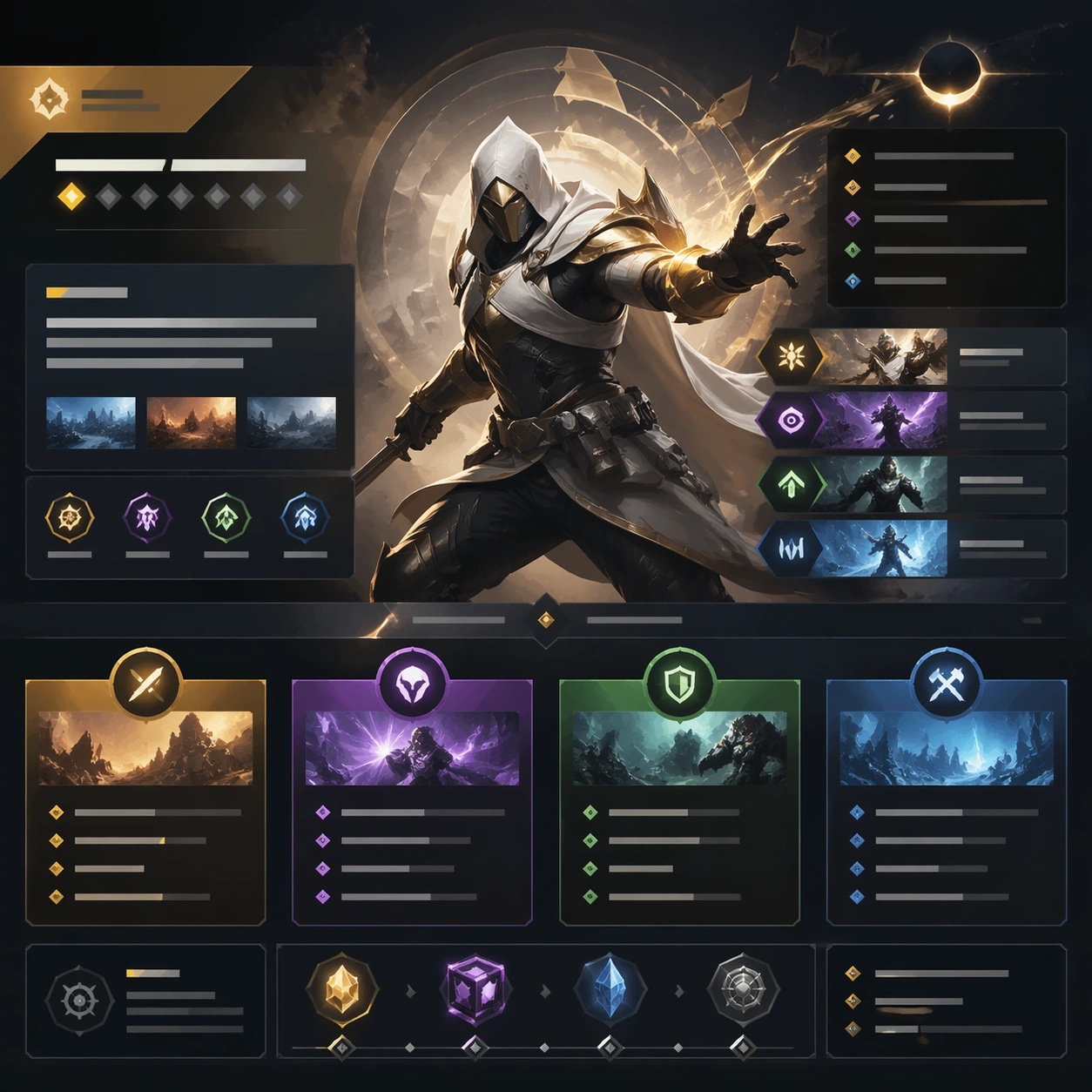
Example generated from “Patch Notes Visual Explainer — Patch Hero Page”
GPT Image 2en

Scene: A square production-ready image designed for a game-art review wall and a commercial gallery at the same time. Frame a flagship patch-notes hero page framed like a polished product update cover with disciplined lighting, clean edge separation, and enough surrounding context to prove how the asset would behave in a real product surface. The camera, crop, and tonal balance should feel intentional rather than generic, with high readability at first glance and convincing material response under closer inspection. Subject: Center the study on a flagship patch-notes hero page framed like a polished product update cover. Translate the topic into a concrete, shippable visual statement instead of a loose mood board. Build layered object relationships, believable surface finish, and strong silhouette grouping so the image reads immediately as part of Patch Notes Visual Explainer. The subject should feel made for a live game pipeline: useful in store, UI, campaign, or art-review contexts, with visual hierarchy strong enough to survive aggressive cropping. Important details: make the page feel informative and spreadable even though all copy remains unreadable. Keep every supporting element subordinate to the main read, and make category separation obvious through form, color zoning, depth, and material logic rather than words. Where panels, cards, badges, or interface blocks appear, they must look professionally structured but remain unreadable. The visual language should feel premium, original, and coherent across this package, with no filler clutter and no accidental resemblance to a specific shipped game IP. Use case: Patch Notes Visual Explainer single study 1/9, focused on patch hero page. Constraints: No readable text, no watermark, no logos, preserve exact 1:1 aspect ratio, no readable version numbers, no logos, no broken hierarchy, no generic stock-photo staging, no accidental UI gibberish.

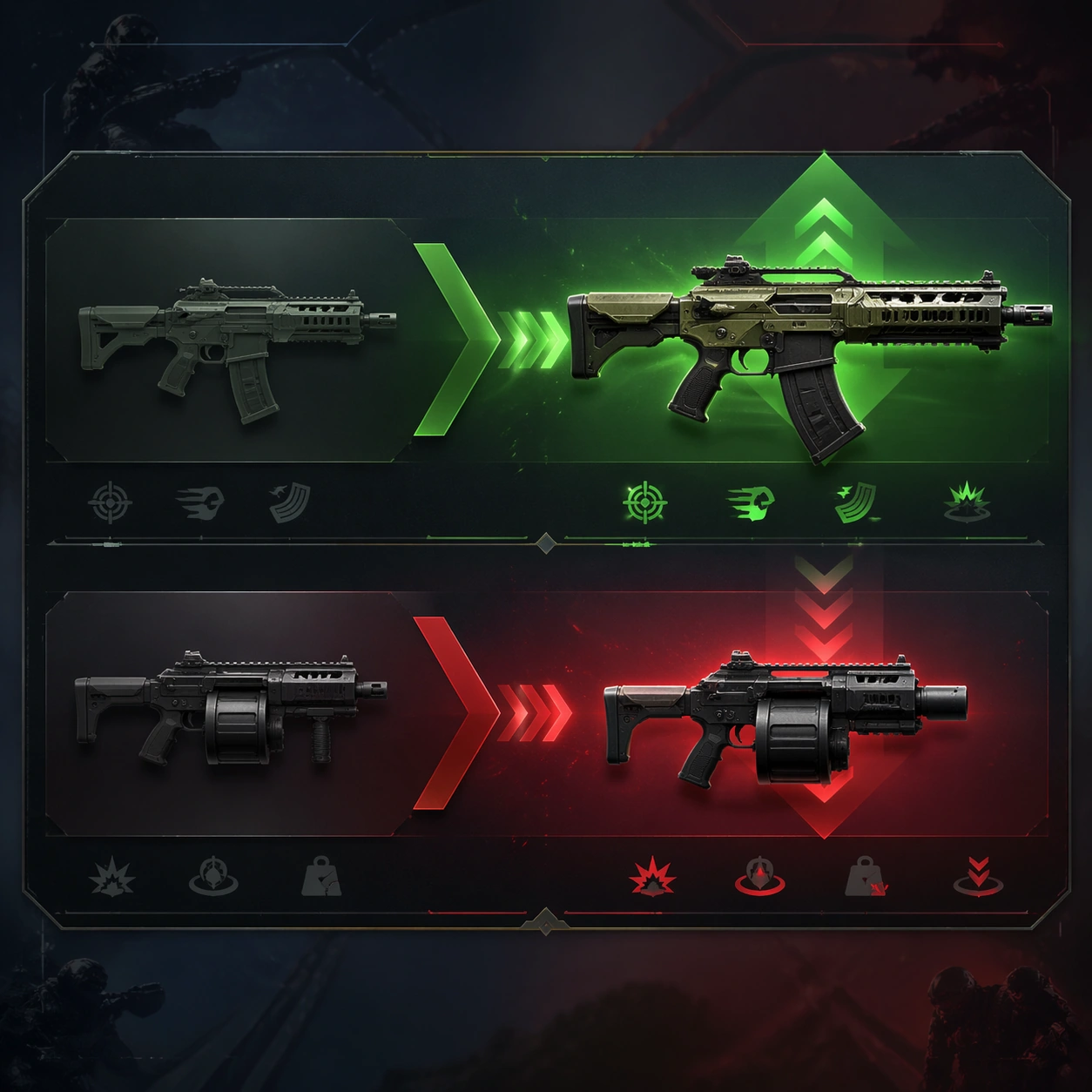
Example generated from “Patch Notes Visual Explainer — Weapon Buff Nerf Strip”
GPT Image 2en

Scene: A square production-ready image designed for a game-art review wall and a commercial gallery at the same time. Frame a comparison strip visualizing one weapon buff and another nerf through silhouettes and arrows-like composition with disciplined lighting, clean edge separation, and enough surrounding context to prove how the asset would behave in a real product surface. The camera, crop, and tonal balance should feel intentional rather than generic, with high readability at first glance and convincing material response under closer inspection. Subject: Center the study on a comparison strip visualizing one weapon buff and another nerf through silhouettes and arrows-like composition. Translate the topic into a concrete, shippable visual statement instead of a loose mood board. Build layered object relationships, believable surface finish, and strong silhouette grouping so the image reads immediately as part of Patch Notes Visual Explainer. The subject should feel made for a live game pipeline: useful in store, UI, campaign, or art-review contexts, with visual hierarchy strong enough to survive aggressive cropping. Important details: balance change should read through graphics and object emphasis rather than text. Keep every supporting element subordinate to the main read, and make category separation obvious through form, color zoning, depth, and material logic rather than words. Where panels, cards, badges, or interface blocks appear, they must look professionally structured but remain unreadable. The visual language should feel premium, original, and coherent across this package, with no filler clutter and no accidental resemblance to a specific shipped game IP. Use case: Patch Notes Visual Explainer single study 2/9, focused on weapon buff nerf strip. Constraints: No readable text, no watermark, no logos, preserve exact 1:1 aspect ratio, no legible numbers, no bars with text, no broken hierarchy, no generic stock-photo staging, no accidental UI gibberish.

Example generated from “Patch Notes Visual Explainer — New Mode Callout”
GPT Image 2en

Scene: A square production-ready image designed for a game-art review wall and a commercial gallery at the same time. Frame a callout surface for a new mode using environment, iconography, and reward mood to imply novelty with disciplined lighting, clean edge separation, and enough surrounding context to prove how the asset would behave in a real product surface. The camera, crop, and tonal balance should feel intentional rather than generic, with high readability at first glance and convincing material response under closer inspection. Subject: Center the study on a callout surface for a new mode using environment, iconography, and reward mood to imply novelty. Translate the topic into a concrete, shippable visual statement instead of a loose mood board. Build layered object relationships, believable surface finish, and strong silhouette grouping so the image reads immediately as part of Patch Notes Visual Explainer. The subject should feel made for a live game pipeline: useful in store, UI, campaign, or art-review contexts, with visual hierarchy strong enough to survive aggressive cropping. Important details: make the feature feel meaningful and polished without banner copy. Keep every supporting element subordinate to the main read, and make category separation obvious through form, color zoning, depth, and material logic rather than words. Where panels, cards, badges, or interface blocks appear, they must look professionally structured but remain unreadable. The visual language should feel premium, original, and coherent across this package, with no filler clutter and no accidental resemblance to a specific shipped game IP. Use case: Patch Notes Visual Explainer single study 3/9, focused on new mode callout. Constraints: No readable text, no watermark, no logos, preserve exact 1:1 aspect ratio, no readable headline, no logo, no broken hierarchy, no generic stock-photo staging, no accidental UI gibberish.

Example generated from “Patch Notes Visual Explainer — Ranked Reset Summary”
GPT Image 2en

Scene: A square production-ready image designed for a game-art review wall and a commercial gallery at the same time. Frame a ranked-reset summary card built from abstract divisions, arrows, and season-end trophies with disciplined lighting, clean edge separation, and enough surrounding context to prove how the asset would behave in a real product surface. The camera, crop, and tonal balance should feel intentional rather than generic, with high readability at first glance and convincing material response under closer inspection. Subject: Center the study on a ranked-reset summary card built from abstract divisions, arrows, and season-end trophies. Translate the topic into a concrete, shippable visual statement instead of a loose mood board. Build layered object relationships, believable surface finish, and strong silhouette grouping so the image reads immediately as part of Patch Notes Visual Explainer. The subject should feel made for a live game pipeline: useful in store, UI, campaign, or art-review contexts, with visual hierarchy strong enough to survive aggressive cropping. Important details: the card should explain a status reset through shape hierarchy and progression cues only. Keep every supporting element subordinate to the main read, and make category separation obvious through form, color zoning, depth, and material logic rather than words. Where panels, cards, badges, or interface blocks appear, they must look professionally structured but remain unreadable. The visual language should feel premium, original, and coherent across this package, with no filler clutter and no accidental resemblance to a specific shipped game IP. Use case: Patch Notes Visual Explainer single study 4/9, focused on ranked reset summary. Constraints: No readable text, no watermark, no logos, preserve exact 1:1 aspect ratio, no readable ranks, no numerals, no broken hierarchy, no generic stock-photo staging, no accidental UI gibberish.

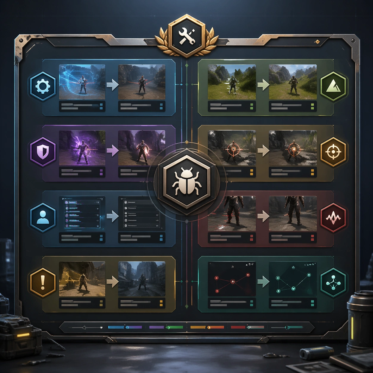
Example generated from “Patch Notes Visual Explainer — Bug Fix Editorial Board”
GPT Image 2en

Scene: A square production-ready image designed for a game-art review wall and a commercial gallery at the same time. Frame an editorial board that turns multiple bug-fix themes into one clean information graphic with disciplined lighting, clean edge separation, and enough surrounding context to prove how the asset would behave in a real product surface. The camera, crop, and tonal balance should feel intentional rather than generic, with high readability at first glance and convincing material response under closer inspection. Subject: Center the study on an editorial board that turns multiple bug-fix themes into one clean information graphic. Translate the topic into a concrete, shippable visual statement instead of a loose mood board. Build layered object relationships, believable surface finish, and strong silhouette grouping so the image reads immediately as part of Patch Notes Visual Explainer. The subject should feel made for a live game pipeline: useful in store, UI, campaign, or art-review contexts, with visual hierarchy strong enough to survive aggressive cropping. Important details: organize improvements clearly while all text blocks stay abstract. Keep every supporting element subordinate to the main read, and make category separation obvious through form, color zoning, depth, and material logic rather than words. Where panels, cards, badges, or interface blocks appear, they must look professionally structured but remain unreadable. The visual language should feel premium, original, and coherent across this package, with no filler clutter and no accidental resemblance to a specific shipped game IP. Use case: Patch Notes Visual Explainer single study 5/9, focused on bug fix editorial board. Constraints: No readable text, no watermark, no logos, preserve exact 1:1 aspect ratio, no readable bullet points, no code blocks, no broken hierarchy, no generic stock-photo staging, no accidental UI gibberish.

Example generated from “Patch Notes Visual Explainer — System Update Panel”
GPT Image 2en

Scene: A square production-ready image designed for a game-art review wall and a commercial gallery at the same time. Frame a systems-focused update panel combining UI windows, item silhouettes, and abstract patch modules with disciplined lighting, clean edge separation, and enough surrounding context to prove how the asset would behave in a real product surface. The camera, crop, and tonal balance should feel intentional rather than generic, with high readability at first glance and convincing material response under closer inspection. Subject: Center the study on a systems-focused update panel combining UI windows, item silhouettes, and abstract patch modules. Translate the topic into a concrete, shippable visual statement instead of a loose mood board. Build layered object relationships, believable surface finish, and strong silhouette grouping so the image reads immediately as part of Patch Notes Visual Explainer. The subject should feel made for a live game pipeline: useful in store, UI, campaign, or art-review contexts, with visual hierarchy strong enough to survive aggressive cropping. Important details: the image should feel dense but ordered, like a polished internal explainer. Keep every supporting element subordinate to the main read, and make category separation obvious through form, color zoning, depth, and material logic rather than words. Where panels, cards, badges, or interface blocks appear, they must look professionally structured but remain unreadable. The visual language should feel premium, original, and coherent across this package, with no filler clutter and no accidental resemblance to a specific shipped game IP. Use case: Patch Notes Visual Explainer single study 6/9, focused on system update panel. Constraints: No readable text, no watermark, no logos, preserve exact 1:1 aspect ratio, no readable labels, no lorem ipsum, no broken hierarchy, no generic stock-photo staging, no accidental UI gibberish.

Example generated from “Patch Notes Visual Explainer — Social Share Tile”
GPT Image 2en

Scene: A square production-ready image designed for a game-art review wall and a commercial gallery at the same time. Frame a compact share tile that packages the patch into an instantly scannable social asset with disciplined lighting, clean edge separation, and enough surrounding context to prove how the asset would behave in a real product surface. The camera, crop, and tonal balance should feel intentional rather than generic, with high readability at first glance and convincing material response under closer inspection. Subject: Center the study on a compact share tile that packages the patch into an instantly scannable social asset. Translate the topic into a concrete, shippable visual statement instead of a loose mood board. Build layered object relationships, believable surface finish, and strong silhouette grouping so the image reads immediately as part of Patch Notes Visual Explainer. The subject should feel made for a live game pipeline: useful in store, UI, campaign, or art-review contexts, with visual hierarchy strong enough to survive aggressive cropping. Important details: it should survive mobile compression and still look premium. Keep every supporting element subordinate to the main read, and make category separation obvious through form, color zoning, depth, and material logic rather than words. Where panels, cards, badges, or interface blocks appear, they must look professionally structured but remain unreadable. The visual language should feel premium, original, and coherent across this package, with no filler clutter and no accidental resemblance to a specific shipped game IP. Use case: Patch Notes Visual Explainer single study 7/9, focused on social share tile. Constraints: No readable text, no watermark, no logos, preserve exact 1:1 aspect ratio, no hashtag text, no handles, no broken hierarchy, no generic stock-photo staging, no accidental UI gibberish.

Example generated from “Patch Notes Visual Explainer — Feature Comparison Board”
GPT Image 2en

Scene: A square production-ready image designed for a game-art review wall and a commercial gallery at the same time. Frame a before-and-after style board showing how a feature changed across the patch with disciplined lighting, clean edge separation, and enough surrounding context to prove how the asset would behave in a real product surface. The camera, crop, and tonal balance should feel intentional rather than generic, with high readability at first glance and convincing material response under closer inspection. Subject: Center the study on a before-and-after style board showing how a feature changed across the patch. Translate the topic into a concrete, shippable visual statement instead of a loose mood board. Build layered object relationships, believable surface finish, and strong silhouette grouping so the image reads immediately as part of Patch Notes Visual Explainer. The subject should feel made for a live game pipeline: useful in store, UI, campaign, or art-review contexts, with visual hierarchy strong enough to survive aggressive cropping. Important details: comparison logic should be evident through layout and object choice without readable annotations. Keep every supporting element subordinate to the main read, and make category separation obvious through form, color zoning, depth, and material logic rather than words. Where panels, cards, badges, or interface blocks appear, they must look professionally structured but remain unreadable. The visual language should feel premium, original, and coherent across this package, with no filler clutter and no accidental resemblance to a specific shipped game IP. Use case: Patch Notes Visual Explainer single study 8/9, focused on feature comparison board. Constraints: No readable text, no watermark, no logos, preserve exact 1:1 aspect ratio, no labels, no arrows with text, no broken hierarchy, no generic stock-photo staging, no accidental UI gibberish.

Example generated from “Patch Notes Visual Explainer — Maintenance Night Poster”
GPT Image 2en

Scene: A square production-ready image designed for a game-art review wall and a commercial gallery at the same time. Frame a poster-like asset that turns maintenance downtime into a calm, trustworthy brand moment with disciplined lighting, clean edge separation, and enough surrounding context to prove how the asset would behave in a real product surface. The camera, crop, and tonal balance should feel intentional rather than generic, with high readability at first glance and convincing material response under closer inspection. Subject: Center the study on a poster-like asset that turns maintenance downtime into a calm, trustworthy brand moment. Translate the topic into a concrete, shippable visual statement instead of a loose mood board. Build layered object relationships, believable surface finish, and strong silhouette grouping so the image reads immediately as part of Patch Notes Visual Explainer. The subject should feel made for a live game pipeline: useful in store, UI, campaign, or art-review contexts, with visual hierarchy strong enough to survive aggressive cropping. Important details: the mood should feel polished and reassuring rather than empty or alarming. Keep every supporting element subordinate to the main read, and make category separation obvious through form, color zoning, depth, and material logic rather than words. Where panels, cards, badges, or interface blocks appear, they must look professionally structured but remain unreadable. The visual language should feel premium, original, and coherent across this package, with no filler clutter and no accidental resemblance to a specific shipped game IP. Use case: Patch Notes Visual Explainer single study 9/9, focused on maintenance night poster. Constraints: No readable text, no watermark, no logos, preserve exact 1:1 aspect ratio, no clock text, no apology copy, no broken hierarchy, no generic stock-photo staging, no accidental UI gibberish.

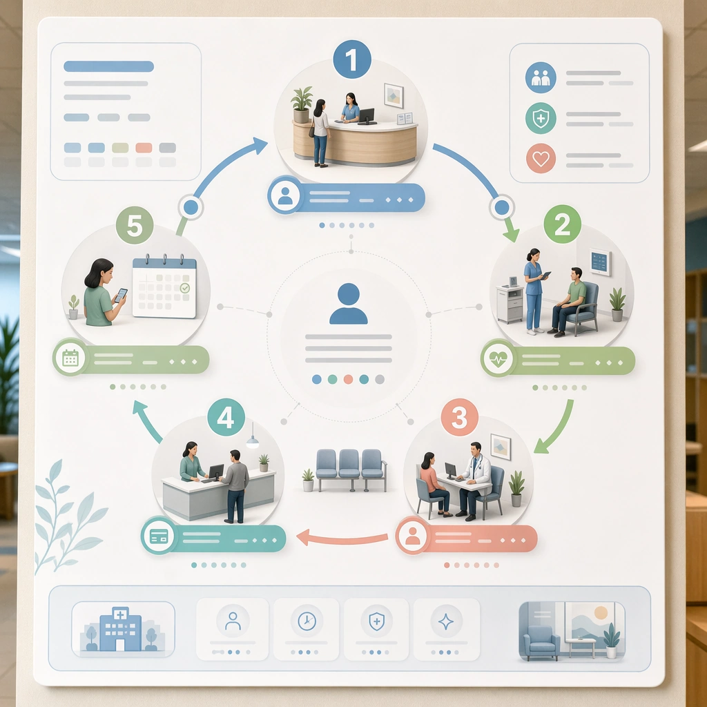
Example generated from “Patient Journey Explainer System — First Visit Pathway Map”
GPT Image 2en

Scene: A square first-visit explainer board for Patient Journey Explainer System. Compose it as a structured map with numbered stages, room icons, and spatial waypoints arranged in a calm clockwise flow. Use a palette of soft white, mist blue, sea-glass green, muted coral accents, and warm neutral grays, even editorial lighting with crisp, low-anxiety contrast, and a mood of clear, supportive, and process-oriented. The frame should feel like a real healthcare communication asset art-directed for professional delivery, not a stock photo, speculative concept render, or generic corporate template. Keep the camera distance, negative space, and depth cues disciplined so the image reads immediately even at thumbnail size. Subject: Center on the journey from arrival and registration through triage, consultation, checkout, and follow-up setup presented as a single patient pathway. Show enough surrounding context that the viewer understands the intended service surface, user situation, and institutional setting. Every object, person, diagram, device crop, or spatial cue should support clarity, trust, and practical use. If people appear, keep them anonymous, natural, privacy-safe, and grounded in believable body language rather than promotional posing. Important details: Maintain patient-journey communication built from sequencing, touchpoint mapping, low-anxiety illustrations, and interface-like clarity without dense textbook complexity. Use human-friendly sequencing, soft environmental miniatures, and clear status markers so the process feels understandable at a glance. Use abstract icon shapes, color blocks, chart bars, interface modules, or non-legible placeholder microcopy whenever information structure is needed, but never readable text. Materials, spacing, lighting, and hierarchy should feel production-ready and healthcare-specific. Avoid generic lifestyle filler, decorative noise, or design gestures that do not reinforce the communication goal. Use case: Patient Journey single study 1/9 for a first-visit patient journey explainer. Constraints: No readable text, no watermark, no logos, preserve exact 1:1 aspect ratio, no graphic medical scenes, no confusing maze compositions, no dark fear-based tone, no overcrowded information walls, no transport-map complexity, no unreadable tiny modules.

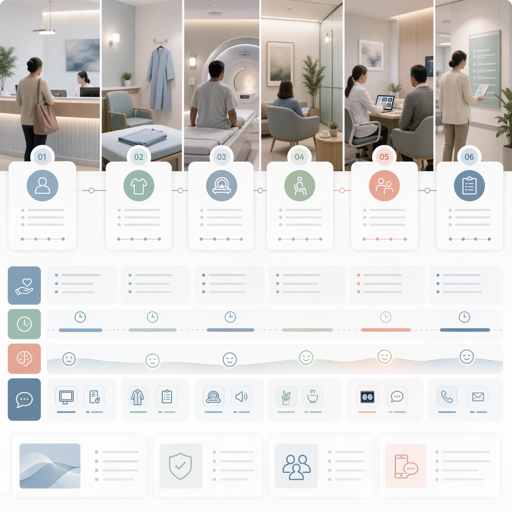
Example generated from “Patient Journey Explainer System — Diagnostic Day Sequence”
GPT Image 2en

Scene: A square diagnostic-day sequence board for Patient Journey Explainer System. Compose it as a sequence of stages laid out from left to right with supportive side notes and room imagery. Use a palette of soft white, mist blue, sea-glass green, muted coral accents, and warm neutral grays, even editorial lighting with crisp, low-anxiety contrast, and a mood of clear, supportive, and process-oriented. The frame should feel like a real healthcare communication asset art-directed for professional delivery, not a stock photo, speculative concept render, or generic corporate template. Keep the camera distance, negative space, and depth cues disciplined so the image reads immediately even at thumbnail size. Subject: Center on a same-day diagnostics journey including arrival, prep, scan, waiting period, results conversation, and next-step guidance. Show enough surrounding context that the viewer understands the intended service surface, user situation, and institutional setting. Every object, person, diagram, device crop, or spatial cue should support clarity, trust, and practical use. If people appear, keep them anonymous, natural, privacy-safe, and grounded in believable body language rather than promotional posing. Important details: Maintain patient-journey communication built from sequencing, touchpoint mapping, low-anxiety illustrations, and interface-like clarity without dense textbook complexity. Communicate timing and emotional pacing through color and spacing rather than through literal text paragraphs. Use abstract icon shapes, color blocks, chart bars, interface modules, or non-legible placeholder microcopy whenever information structure is needed, but never readable text. Materials, spacing, lighting, and hierarchy should feel production-ready and healthcare-specific. Avoid generic lifestyle filler, decorative noise, or design gestures that do not reinforce the communication goal. Use case: Patient Journey single study 2/9 for a diagnostic visit preparation guide. Constraints: No readable text, no watermark, no logos, preserve exact 1:1 aspect ratio, no graphic medical scenes, no confusing maze compositions, no dark fear-based tone, no overcrowded information walls, no intimidating machine dominance, no anxiety-heavy visuals.

Example generated from “Patient Journey Explainer System — Surgery Prep Checklist Board”
GPT Image 2en

Scene: A square pre-procedure checklist board for Patient Journey Explainer System. Compose it as a clean modular system with checklist cards, preparation objects, and timeline blocks. Use a palette of soft white, mist blue, sea-glass green, muted coral accents, and warm neutral grays, even editorial lighting with crisp, low-anxiety contrast, and a mood of clear, supportive, and process-oriented. The frame should feel like a real healthcare communication asset art-directed for professional delivery, not a stock photo, speculative concept render, or generic corporate template. Keep the camera distance, negative space, and depth cues disciplined so the image reads immediately even at thumbnail size. Subject: Center on the days-before and day-of preparation journey for a routine surgery, including fasting, transport, paperwork, arrival, and recovery handoff. Show enough surrounding context that the viewer understands the intended service surface, user situation, and institutional setting. Every object, person, diagram, device crop, or spatial cue should support clarity, trust, and practical use. If people appear, keep them anonymous, natural, privacy-safe, and grounded in believable body language rather than promotional posing. Important details: Maintain patient-journey communication built from sequencing, touchpoint mapping, low-anxiety illustrations, and interface-like clarity without dense textbook complexity. Keep the guide calm and practical, using icons, household objects, and abstract status chips instead of readable body text. Use abstract icon shapes, color blocks, chart bars, interface modules, or non-legible placeholder microcopy whenever information structure is needed, but never readable text. Materials, spacing, lighting, and hierarchy should feel production-ready and healthcare-specific. Avoid generic lifestyle filler, decorative noise, or design gestures that do not reinforce the communication goal. Use case: Patient Journey single study 3/9 for a pre-surgery patient education asset. Constraints: No readable text, no watermark, no logos, preserve exact 1:1 aspect ratio, no graphic medical scenes, no confusing maze compositions, no dark fear-based tone, no overcrowded information walls, no operating-room gore, no stern warning-poster tone.

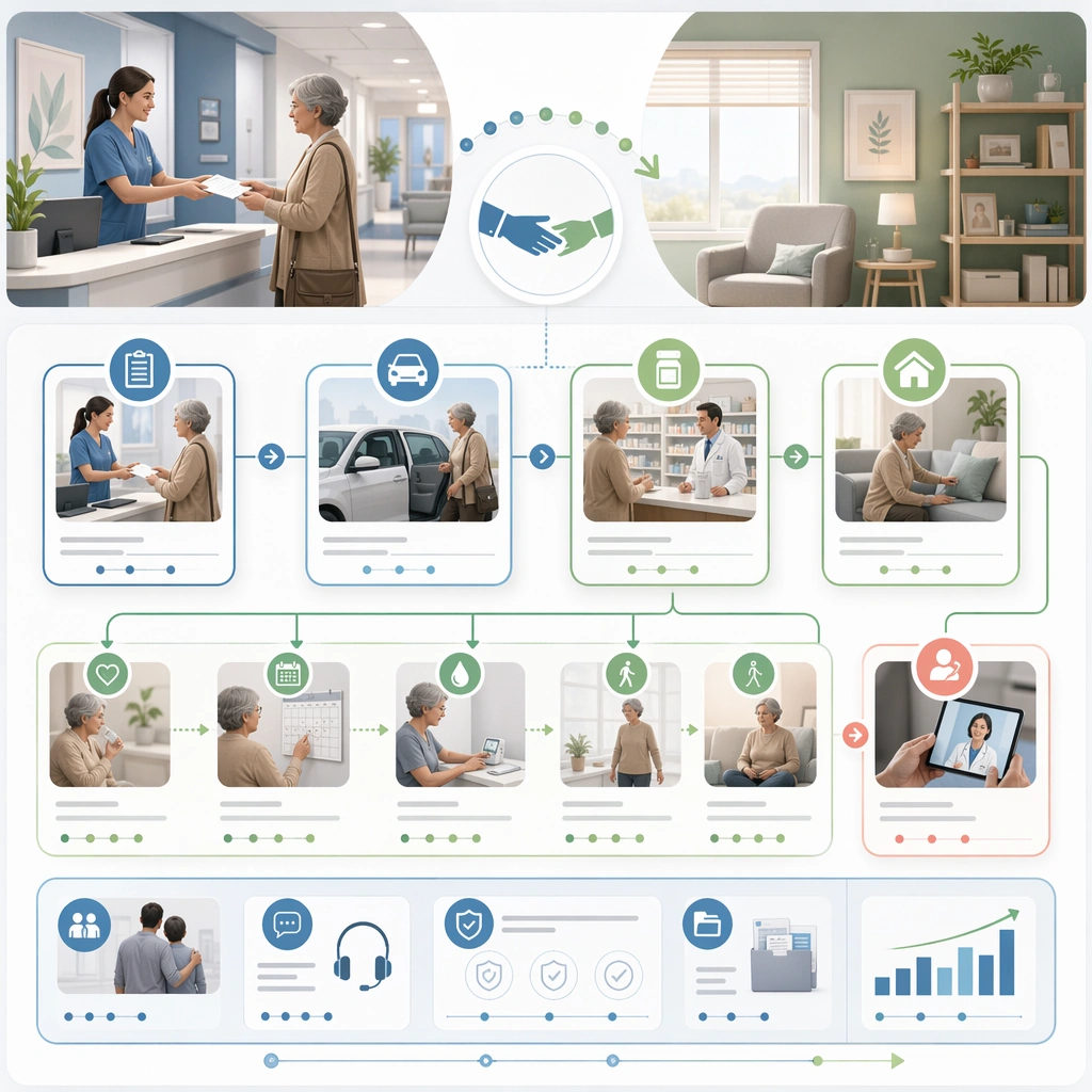
Example generated from “Patient Journey Explainer System — Discharge and Homecare Flow”
GPT Image 2en

Scene: A square discharge explainer system for Patient Journey Explainer System. Compose it as a branching but highly controlled flowchart translated into an editorial square board. Use a palette of soft white, mist blue, sea-glass green, muted coral accents, and warm neutral grays, even editorial lighting with crisp, low-anxiety contrast, and a mood of clear, supportive, and process-oriented. The frame should feel like a real healthcare communication asset art-directed for professional delivery, not a stock photo, speculative concept render, or generic corporate template. Keep the camera distance, negative space, and depth cues disciplined so the image reads immediately even at thumbnail size. Subject: Center on the transition from discharge desk to transportation, medication pickup, home setup, self-care checks, and follow-up contact. Show enough surrounding context that the viewer understands the intended service surface, user situation, and institutional setting. Every object, person, diagram, device crop, or spatial cue should support clarity, trust, and practical use. If people appear, keep them anonymous, natural, privacy-safe, and grounded in believable body language rather than promotional posing. Important details: Maintain patient-journey communication built from sequencing, touchpoint mapping, low-anxiety illustrations, and interface-like clarity without dense textbook complexity. Use environmental cues from home and clinic together so the handoff between settings feels explicit and reassuring. Use abstract icon shapes, color blocks, chart bars, interface modules, or non-legible placeholder microcopy whenever information structure is needed, but never readable text. Materials, spacing, lighting, and hierarchy should feel production-ready and healthcare-specific. Avoid generic lifestyle filler, decorative noise, or design gestures that do not reinforce the communication goal. Use case: Patient Journey single study 4/9 for a discharge and recovery journey guide. Constraints: No readable text, no watermark, no logos, preserve exact 1:1 aspect ratio, no graphic medical scenes, no confusing maze compositions, no dark fear-based tone, no overcrowded information walls, no hospital-maze confusion, no sharp warning colors.

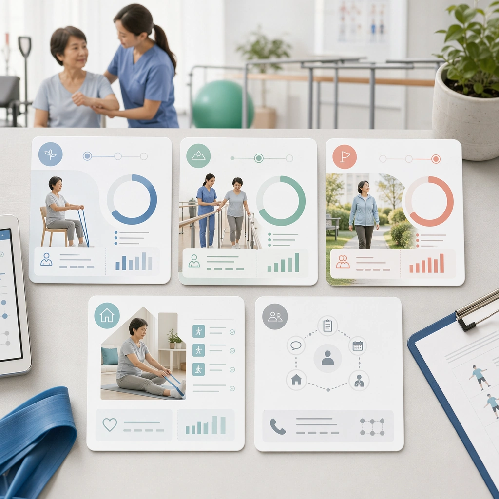
Example generated from “Patient Journey Explainer System — Rehab Milestone Card Set”
GPT Image 2en

Scene: A square rehabilitation milestone card system for Patient Journey Explainer System. Compose it as a family of cards displayed together with progress rings, movement imagery, and support cues. Use a palette of soft white, mist blue, sea-glass green, muted coral accents, and warm neutral grays, even editorial lighting with crisp, low-anxiety contrast, and a mood of clear, supportive, and process-oriented. The frame should feel like a real healthcare communication asset art-directed for professional delivery, not a stock photo, speculative concept render, or generic corporate template. Keep the camera distance, negative space, and depth cues disciplined so the image reads immediately even at thumbnail size. Subject: Center on a rehabilitation journey represented by early, middle, and late-stage milestones with therapist support and home practice moments. Show enough surrounding context that the viewer understands the intended service surface, user situation, and institutional setting. Every object, person, diagram, device crop, or spatial cue should support clarity, trust, and practical use. If people appear, keep them anonymous, natural, privacy-safe, and grounded in believable body language rather than promotional posing. Important details: Maintain patient-journey communication built from sequencing, touchpoint mapping, low-anxiety illustrations, and interface-like clarity without dense textbook complexity. The cards should imply progress and patience without turning the recovery story into a competitive fitness narrative. Use abstract icon shapes, color blocks, chart bars, interface modules, or non-legible placeholder microcopy whenever information structure is needed, but never readable text. Materials, spacing, lighting, and hierarchy should feel production-ready and healthcare-specific. Avoid generic lifestyle filler, decorative noise, or design gestures that do not reinforce the communication goal. Use case: Patient Journey single study 5/9 for a rehab progress explainer card set. Constraints: No readable text, no watermark, no logos, preserve exact 1:1 aspect ratio, no graphic medical scenes, no confusing maze compositions, no dark fear-based tone, no overcrowded information walls, no sports-performance marketing tone, no exaggerated celebration poses.

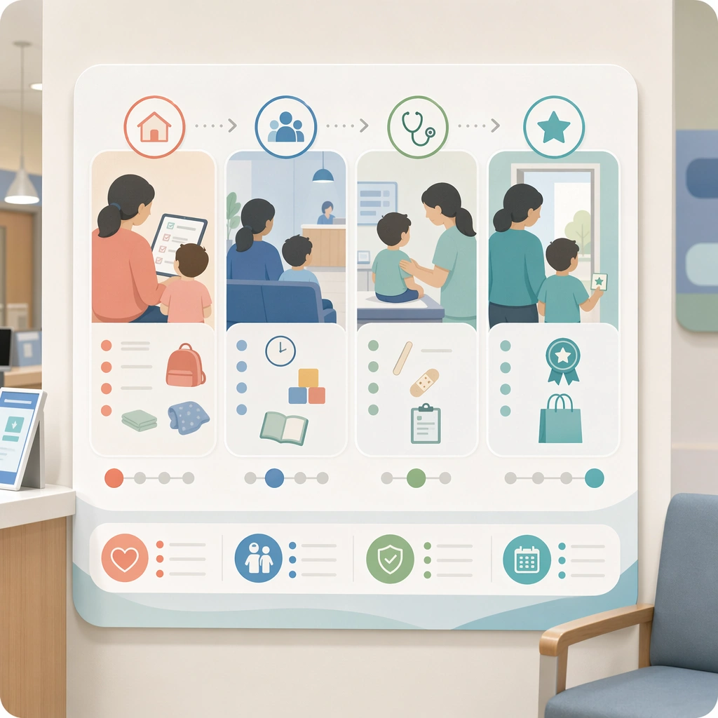
Example generated from “Patient Journey Explainer System — Pediatric Visit Comfort Guide”
GPT Image 2en

Scene: A square pediatric comfort journey board for Patient Journey Explainer System. Compose it with rounded modules, soft animal-free geometry, and a clear sequence from home prep to clinic exit. Use a palette of soft white, mist blue, sea-glass green, muted coral accents, and warm neutral grays, even editorial lighting with crisp, low-anxiety contrast, and a mood of clear, supportive, and process-oriented. The frame should feel like a real healthcare communication asset art-directed for professional delivery, not a stock photo, speculative concept render, or generic corporate template. Keep the camera distance, negative space, and depth cues disciplined so the image reads immediately even at thumbnail size. Subject: Center on a child-friendly visit guide showing parent preparation, waiting room comfort, examination steps, and reward-oriented completion cues. Show enough surrounding context that the viewer understands the intended service surface, user situation, and institutional setting. Every object, person, diagram, device crop, or spatial cue should support clarity, trust, and practical use. If people appear, keep them anonymous, natural, privacy-safe, and grounded in believable body language rather than promotional posing. Important details: Maintain patient-journey communication built from sequencing, touchpoint mapping, low-anxiety illustrations, and interface-like clarity without dense textbook complexity. Reduce anxiety through predictable sequencing, gentle illustration, and parent-child interaction cues rather than through mascots or cartoons. Use abstract icon shapes, color blocks, chart bars, interface modules, or non-legible placeholder microcopy whenever information structure is needed, but never readable text. Materials, spacing, lighting, and hierarchy should feel production-ready and healthcare-specific. Avoid generic lifestyle filler, decorative noise, or design gestures that do not reinforce the communication goal. Use case: Patient Journey single study 6/9 for a pediatric visit comfort explainer. Constraints: No readable text, no watermark, no logos, preserve exact 1:1 aspect ratio, no graphic medical scenes, no confusing maze compositions, no dark fear-based tone, no overcrowded information walls, no cartoon characters, no overbright theme-park colors.

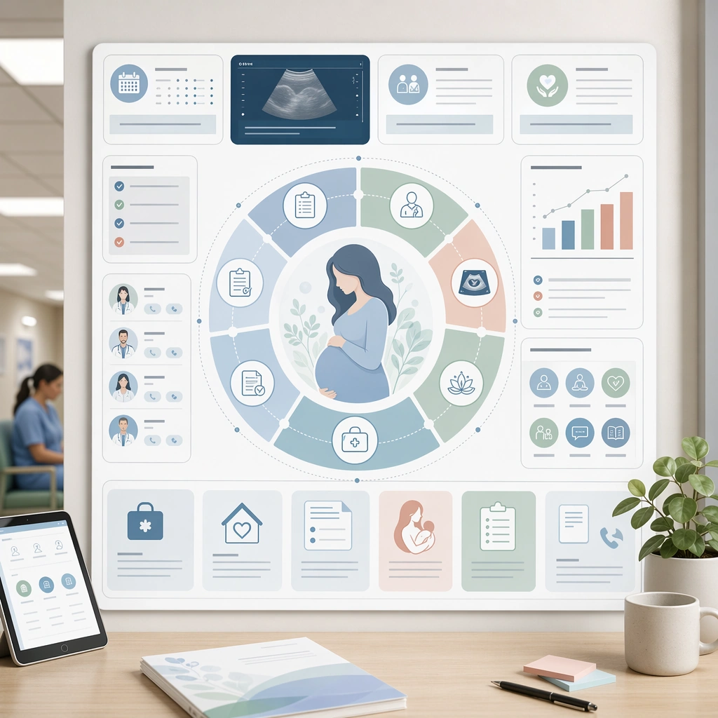
Example generated from “Patient Journey Explainer System — Maternity Care Journey Wheel”
GPT Image 2en

Scene: A square maternity journey wheel and support board for Patient Journey Explainer System. Compose it as a central circular timeline surrounded by appointment, imaging, and support-resource panels. Use a palette of soft white, mist blue, sea-glass green, muted coral accents, and warm neutral grays, even editorial lighting with crisp, low-anxiety contrast, and a mood of clear, supportive, and process-oriented. The frame should feel like a real healthcare communication asset art-directed for professional delivery, not a stock photo, speculative concept render, or generic corporate template. Keep the camera distance, negative space, and depth cues disciplined so the image reads immediately even at thumbnail size. Subject: Center on a maternity care pathway from intake and scans to classes, delivery prep, and postpartum follow-up. Show enough surrounding context that the viewer understands the intended service surface, user situation, and institutional setting. Every object, person, diagram, device crop, or spatial cue should support clarity, trust, and practical use. If people appear, keep them anonymous, natural, privacy-safe, and grounded in believable body language rather than promotional posing. Important details: Maintain patient-journey communication built from sequencing, touchpoint mapping, low-anxiety illustrations, and interface-like clarity without dense textbook complexity. The whole piece should feel nurturing and medically grounded, with soft iconography and realistic care touchpoints. Use abstract icon shapes, color blocks, chart bars, interface modules, or non-legible placeholder microcopy whenever information structure is needed, but never readable text. Materials, spacing, lighting, and hierarchy should feel production-ready and healthcare-specific. Avoid generic lifestyle filler, decorative noise, or design gestures that do not reinforce the communication goal. Use case: Patient Journey single study 7/9 for a maternity care pathway visual. Constraints: No readable text, no watermark, no logos, preserve exact 1:1 aspect ratio, no graphic medical scenes, no confusing maze compositions, no dark fear-based tone, no overcrowded information walls, no baby-brand retail cues, no sentimental overload.

Example generated from “Patient Journey Explainer System — Chronic Care Touchpoint Map”
GPT Image 2en

Scene: A square chronic-care touchpoint map for Patient Journey Explainer System. Compose it as an ecosystem board linking clinic visits, home routines, lab checks, messaging, and coaching touchpoints. Use a palette of soft white, mist blue, sea-glass green, muted coral accents, and warm neutral grays, even editorial lighting with crisp, low-anxiety contrast, and a mood of clear, supportive, and process-oriented. The frame should feel like a real healthcare communication asset art-directed for professional delivery, not a stock photo, speculative concept render, or generic corporate template. Keep the camera distance, negative space, and depth cues disciplined so the image reads immediately even at thumbnail size. Subject: Center on a long-term care management journey represented across digital, physical, and human support moments. Show enough surrounding context that the viewer understands the intended service surface, user situation, and institutional setting. Every object, person, diagram, device crop, or spatial cue should support clarity, trust, and practical use. If people appear, keep them anonymous, natural, privacy-safe, and grounded in believable body language rather than promotional posing. Important details: Maintain patient-journey communication built from sequencing, touchpoint mapping, low-anxiety illustrations, and interface-like clarity without dense textbook complexity. Make continuity and repetition feel manageable through rhythm, recurring symbols, and supportive environment fragments. Use abstract icon shapes, color blocks, chart bars, interface modules, or non-legible placeholder microcopy whenever information structure is needed, but never readable text. Materials, spacing, lighting, and hierarchy should feel production-ready and healthcare-specific. Avoid generic lifestyle filler, decorative noise, or design gestures that do not reinforce the communication goal. Use case: Patient Journey single study 8/9 for a chronic-care patient support map. Constraints: No readable text, no watermark, no logos, preserve exact 1:1 aspect ratio, no graphic medical scenes, no confusing maze compositions, no dark fear-based tone, no overcrowded information walls, no tech-startup app aesthetic, no overwhelming network complexity.

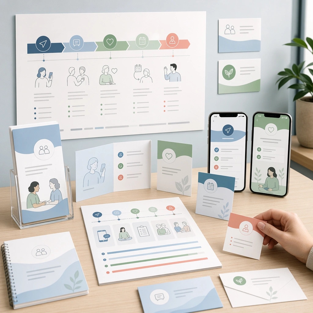
Example generated from “Patient Journey Explainer System — Omnichannel Care Board”
GPT Image 2en

Scene: A square cross-channel patient journey summary board for Patient Journey Explainer System. Compose it as a high-level square toolkit showing print handouts, mobile screens, room signage, and follow-up cards together. Use a palette of soft white, mist blue, sea-glass green, muted coral accents, and warm neutral grays, even editorial lighting with crisp, low-anxiety contrast, and a mood of clear, supportive, and process-oriented. The frame should feel like a real healthcare communication asset art-directed for professional delivery, not a stock photo, speculative concept render, or generic corporate template. Keep the camera distance, negative space, and depth cues disciplined so the image reads immediately even at thumbnail size. Subject: Center on a complete patient journey system translated across multiple care surfaces but unified by one visual language. Show enough surrounding context that the viewer understands the intended service surface, user situation, and institutional setting. Every object, person, diagram, device crop, or spatial cue should support clarity, trust, and practical use. If people appear, keep them anonymous, natural, privacy-safe, and grounded in believable body language rather than promotional posing. Important details: Maintain patient-journey communication built from sequencing, touchpoint mapping, low-anxiety illustrations, and interface-like clarity without dense textbook complexity. The board should prove that one care process can stay coherent across channels without relying on literal body copy. Use abstract icon shapes, color blocks, chart bars, interface modules, or non-legible placeholder microcopy whenever information structure is needed, but never readable text. Materials, spacing, lighting, and hierarchy should feel production-ready and healthcare-specific. Avoid generic lifestyle filler, decorative noise, or design gestures that do not reinforce the communication goal. Use case: Patient Journey single study 9/9 for a full omnichannel care journey system summary. Constraints: No readable text, no watermark, no logos, preserve exact 1:1 aspect ratio, no graphic medical scenes, no confusing maze compositions, no dark fear-based tone, no overcrowded information walls, no random template collage, no inconsistent style shifts.

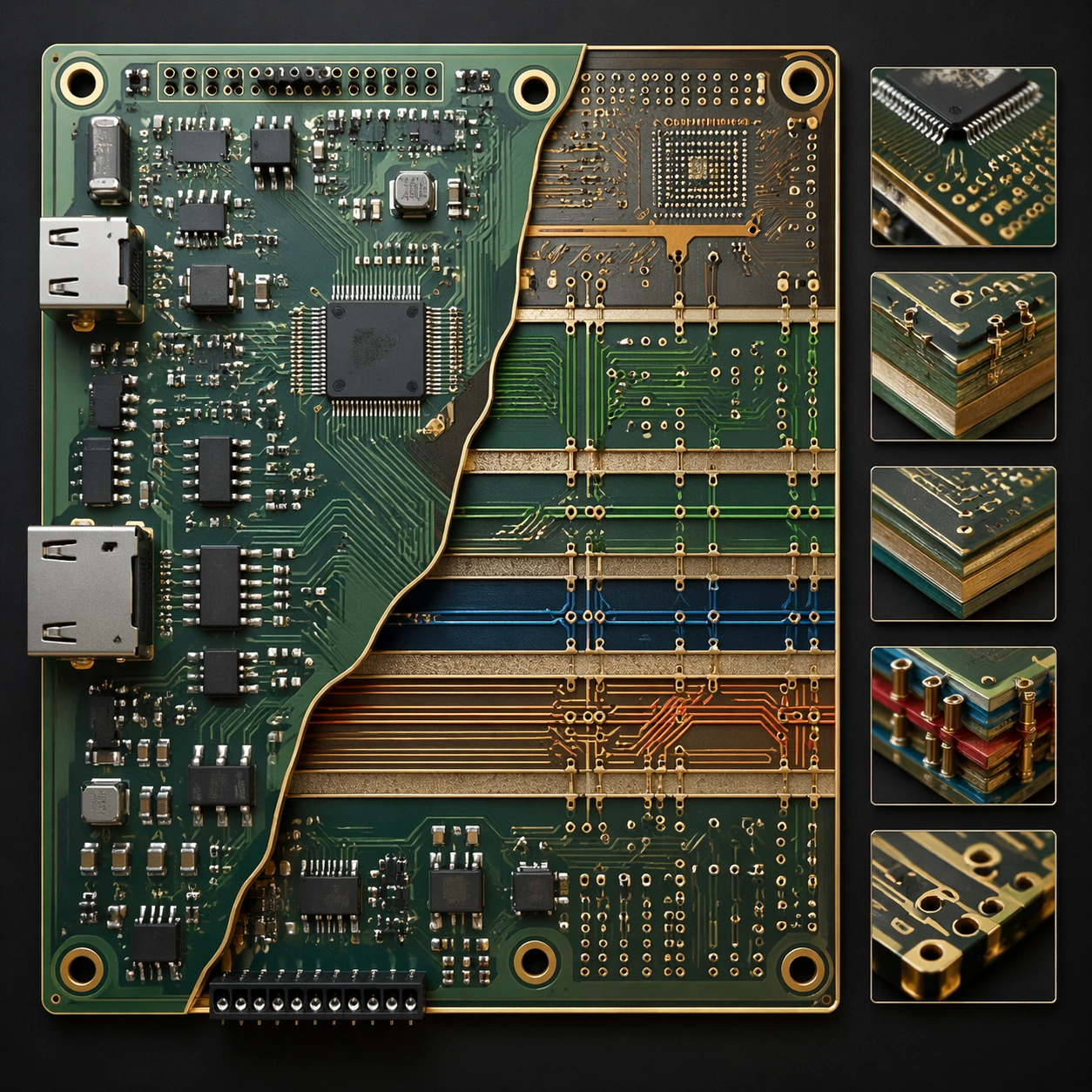
Example generated from “Pcb Board Layout — Cutaway Panel”
GPT Image 2en

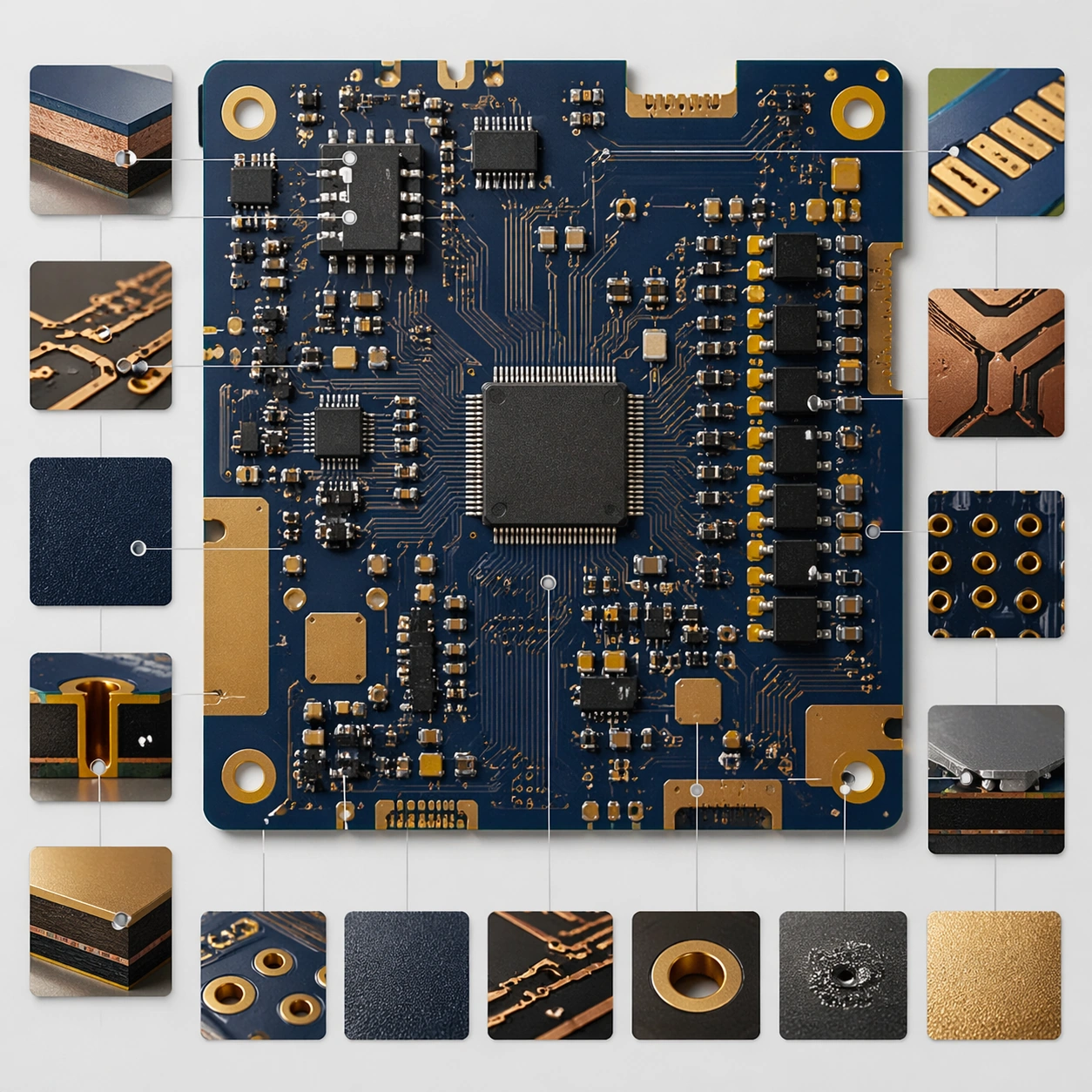
Scene: A square plate or board viewed straight-on, with crisp organization, disciplined spacing, and premium print clarity. Build the frame around a cutaway or sectional treatment that reveals interior logic without sacrificing readability. Keep the lighting, camera distance, and spatial organization tuned for a high-signal research image rather than a casual snapshot. The image belongs to the PCB Board Layout theme and should feel immediately legible as a prompt atlas theme for pcb board layout, testing structured-layout, photorealism, style-transfer, commercial-mockup with gpt image 2.. Subject: Center the study on a cutaway or sectional treatment that reveals interior logic without sacrificing readability. Translate the theme into a concrete visual statement instead of an abstract mood board: the viewer should understand what kind of image this is, what is being tested, and why the composition is difficult. Use the slug idea of pcb board layout as a literal guide for subject matter, materials, and staging. If helpful, borrow the broad visual cues suggested by PCB, schematic, Arduino, but keep the result original and specific to this study. Important details: The image should communicate logic through grouping, hierarchy, callouts, insets, and believable professional layout discipline rather than decorative noise. Preserve a disciplined square composition, clear focal hierarchy, and enough secondary information to make the image feel complete rather than underspecified. The image should look polished, novel, and exhibition-ready, with topic-specific credibility coming from the way surfaces, structure, and visual language reinforce PCB Board Layout. Avoid generic filler elements that do not serve the main concept. Use case: PCB Board Layout single study 2/8, testing structured-layout, photorealism, style-transfer, commercial-mockup through the cutaway panel variation. Constraints: No readable text, no watermark, no logos, preserve exact 1:1 aspect ratio, no readable labels, no messy arrows, no random infographic decoration, no fake UI chrome unless the topic calls for it, no broken alignment, no meaningless clutter.

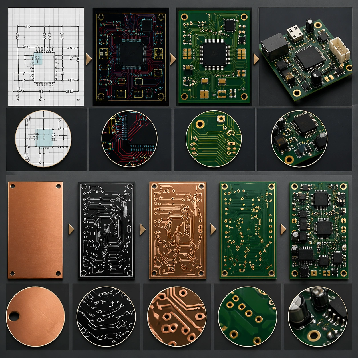
Example generated from “Pcb Board Layout — Process Sequence”
GPT Image 2en

Scene: A square plate or board viewed straight-on, with crisp organization, disciplined spacing, and premium print clarity. Build the frame around a sequence of stages or states arranged in a disciplined progression. Keep the lighting, camera distance, and spatial organization tuned for a high-signal research image rather than a casual snapshot. The image belongs to the PCB Board Layout theme and should feel immediately legible as a prompt atlas theme for pcb board layout, testing structured-layout, photorealism, style-transfer, commercial-mockup with gpt image 2.. Subject: Center the study on a sequence of stages or states arranged in a disciplined progression. Translate the theme into a concrete visual statement instead of an abstract mood board: the viewer should understand what kind of image this is, what is being tested, and why the composition is difficult. Use the slug idea of pcb board layout as a literal guide for subject matter, materials, and staging. If helpful, borrow the broad visual cues suggested by PCB, schematic, Arduino, but keep the result original and specific to this study. Important details: The image should communicate logic through grouping, hierarchy, callouts, insets, and believable professional layout discipline rather than decorative noise. Preserve a disciplined square composition, clear focal hierarchy, and enough secondary information to make the image feel complete rather than underspecified. The image should look polished, novel, and exhibition-ready, with topic-specific credibility coming from the way surfaces, structure, and visual language reinforce PCB Board Layout. Avoid generic filler elements that do not serve the main concept. Use case: PCB Board Layout single study 3/8, testing structured-layout, photorealism, style-transfer, commercial-mockup through the process sequence variation. Constraints: No readable text, no watermark, no logos, preserve exact 1:1 aspect ratio, no readable labels, no messy arrows, no random infographic decoration, no fake UI chrome unless the topic calls for it, no broken alignment, no meaningless clutter.

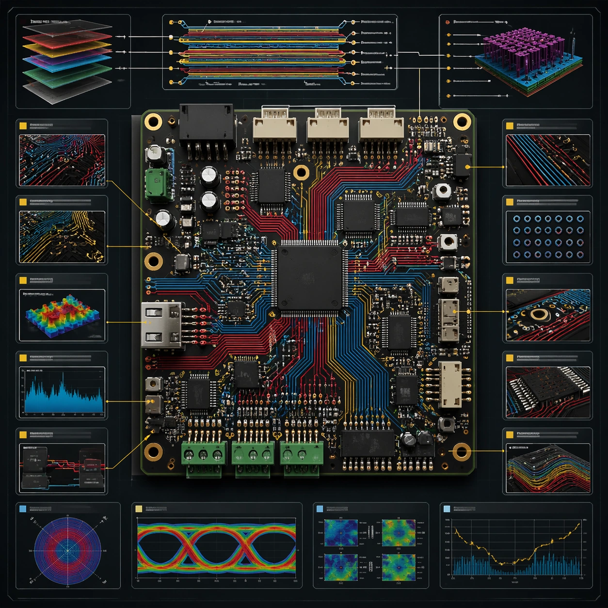
Example generated from “Pcb Board Layout — Annotation Cluster”
GPT Image 2en

Scene: A square plate or board viewed straight-on, with crisp organization, disciplined spacing, and premium print clarity. Build the frame around dense callouts and side insets that feel scholarly while staying unreadable. Keep the lighting, camera distance, and spatial organization tuned for a high-signal research image rather than a casual snapshot. The image belongs to the PCB Board Layout theme and should feel immediately legible as a prompt atlas theme for pcb board layout, testing structured-layout, photorealism, style-transfer, commercial-mockup with gpt image 2.. Subject: Center the study on dense callouts and side insets that feel scholarly while staying unreadable. Translate the theme into a concrete visual statement instead of an abstract mood board: the viewer should understand what kind of image this is, what is being tested, and why the composition is difficult. Use the slug idea of pcb board layout as a literal guide for subject matter, materials, and staging. If helpful, borrow the broad visual cues suggested by PCB, schematic, Arduino, but keep the result original and specific to this study. Important details: The image should communicate logic through grouping, hierarchy, callouts, insets, and believable professional layout discipline rather than decorative noise. Preserve a disciplined square composition, clear focal hierarchy, and enough secondary information to make the image feel complete rather than underspecified. The image should look polished, novel, and exhibition-ready, with topic-specific credibility coming from the way surfaces, structure, and visual language reinforce PCB Board Layout. Avoid generic filler elements that do not serve the main concept. Use case: PCB Board Layout single study 4/8, testing structured-layout, photorealism, style-transfer, commercial-mockup through the annotation cluster variation. Constraints: No readable text, no watermark, no logos, preserve exact 1:1 aspect ratio, no readable labels, no messy arrows, no random infographic decoration, no fake UI chrome unless the topic calls for it, no broken alignment, no meaningless clutter.

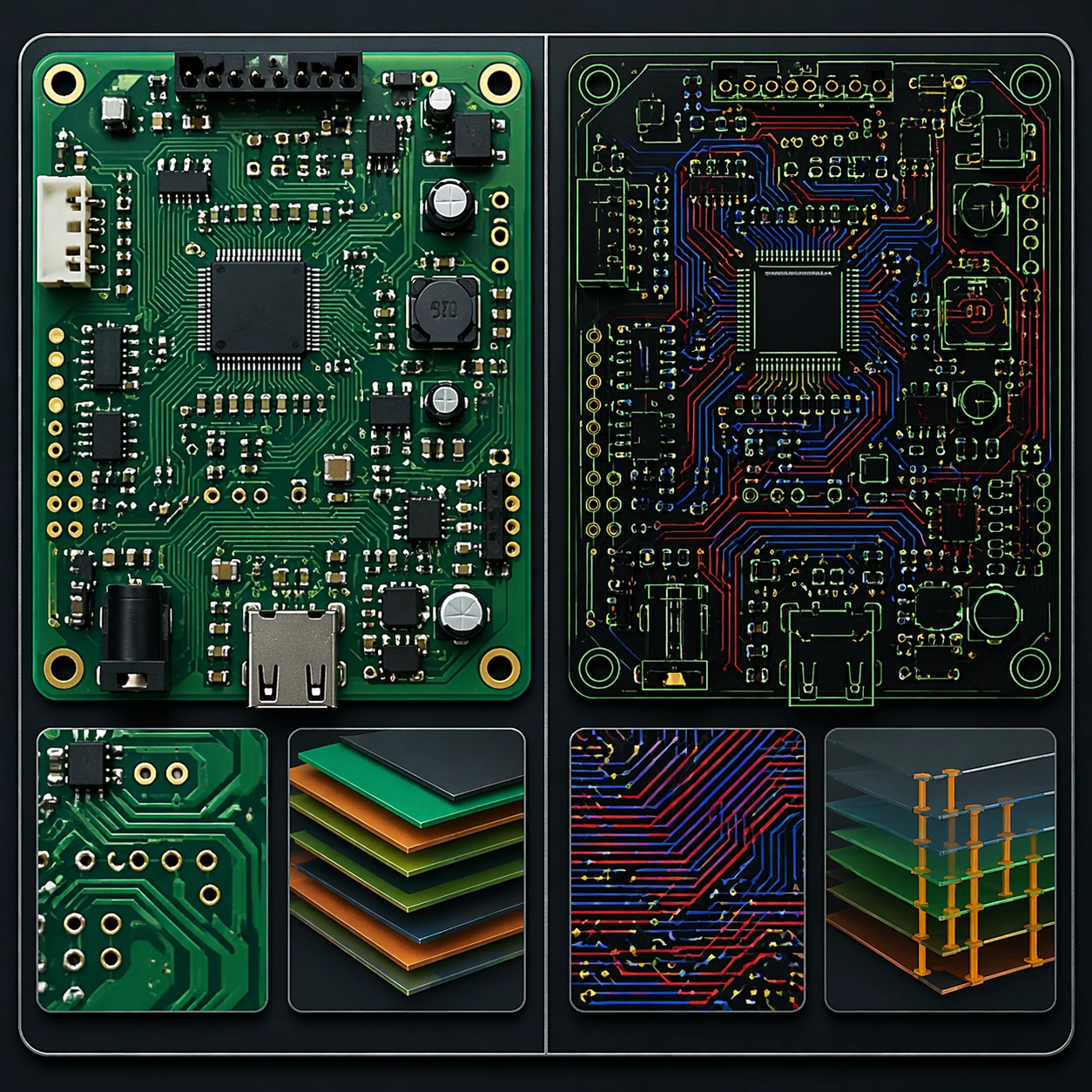
Example generated from “Pcb Board Layout — Comparison Board”
GPT Image 2en

Scene: A square plate or board viewed straight-on, with crisp organization, disciplined spacing, and premium print clarity. Build the frame around a side-by-side comparison structure with strong contrast and equal visual weight. Keep the lighting, camera distance, and spatial organization tuned for a high-signal research image rather than a casual snapshot. The image belongs to the PCB Board Layout theme and should feel immediately legible as a prompt atlas theme for pcb board layout, testing structured-layout, photorealism, style-transfer, commercial-mockup with gpt image 2.. Subject: Center the study on a side-by-side comparison structure with strong contrast and equal visual weight. Translate the theme into a concrete visual statement instead of an abstract mood board: the viewer should understand what kind of image this is, what is being tested, and why the composition is difficult. Use the slug idea of pcb board layout as a literal guide for subject matter, materials, and staging. If helpful, borrow the broad visual cues suggested by PCB, schematic, Arduino, but keep the result original and specific to this study. Important details: The image should communicate logic through grouping, hierarchy, callouts, insets, and believable professional layout discipline rather than decorative noise. Preserve a disciplined square composition, clear focal hierarchy, and enough secondary information to make the image feel complete rather than underspecified. The image should look polished, novel, and exhibition-ready, with topic-specific credibility coming from the way surfaces, structure, and visual language reinforce PCB Board Layout. Avoid generic filler elements that do not serve the main concept. Use case: PCB Board Layout single study 5/8, testing structured-layout, photorealism, style-transfer, commercial-mockup through the comparison board variation. Constraints: No readable text, no watermark, no logos, preserve exact 1:1 aspect ratio, no readable labels, no messy arrows, no random infographic decoration, no fake UI chrome unless the topic calls for it, no broken alignment, no meaningless clutter.

Example generated from “Pcb Board Layout — 材质标注”
GPT Image 2en

Scene: A square plate or board viewed straight-on, with crisp organization, disciplined spacing, and premium print clarity. Build the frame around specific texture or material evidence presented with controlled explanatory framing. Keep the lighting, camera distance, and spatial organization tuned for a high-signal research image rather than a casual snapshot. The image belongs to the PCB Board Layout theme and should feel immediately legible as a prompt atlas theme for pcb board layout, testing structured-layout, photorealism, style-transfer, commercial-mockup with gpt image 2.. Subject: Center the study on specific texture or material evidence presented with controlled explanatory framing. Translate the theme into a concrete visual statement instead of an abstract mood board: the viewer should understand what kind of image this is, what is being tested, and why the composition is difficult. Use the slug idea of pcb board layout as a literal guide for subject matter, materials, and staging. If helpful, borrow the broad visual cues suggested by PCB, schematic, Arduino, but keep the result original and specific to this study. Important details: The image should communicate logic through grouping, hierarchy, callouts, insets, and believable professional layout discipline rather than decorative noise. Preserve a disciplined square composition, clear focal hierarchy, and enough secondary information to make the image feel complete rather than underspecified. The image should look polished, novel, and exhibition-ready, with topic-specific credibility coming from the way surfaces, structure, and visual language reinforce PCB Board Layout. Avoid generic filler elements that do not serve the main concept. Use case: PCB Board Layout single study 6/8, testing structured-layout, photorealism, style-transfer, commercial-mockup through the 材质标注 variation. Constraints: No readable text, no watermark, no logos, preserve exact 1:1 aspect ratio, no readable labels, no messy arrows, no random infographic decoration, no fake UI chrome unless the topic calls for it, no broken alignment, no meaningless clutter.

Example generated from “Pcb Board Layout — Exploded System”
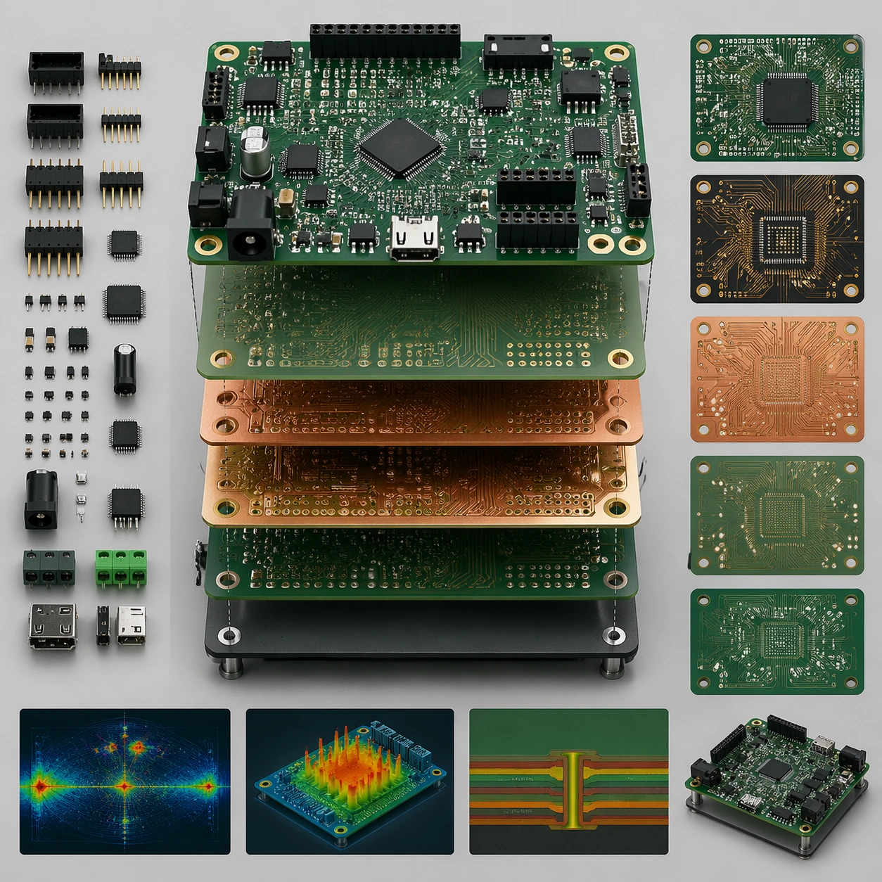
GPT Image 2en

Scene: A square plate or board viewed straight-on, with crisp organization, disciplined spacing, and premium print clarity. Build the frame around components separated clearly enough to reveal construction and dependency. Keep the lighting, camera distance, and spatial organization tuned for a high-signal research image rather than a casual snapshot. The image belongs to the PCB Board Layout theme and should feel immediately legible as a prompt atlas theme for pcb board layout, testing structured-layout, photorealism, style-transfer, commercial-mockup with gpt image 2.. Subject: Center the study on components separated clearly enough to reveal construction and dependency. Translate the theme into a concrete visual statement instead of an abstract mood board: the viewer should understand what kind of image this is, what is being tested, and why the composition is difficult. Use the slug idea of pcb board layout as a literal guide for subject matter, materials, and staging. If helpful, borrow the broad visual cues suggested by PCB, schematic, Arduino, but keep the result original and specific to this study. Important details: The image should communicate logic through grouping, hierarchy, callouts, insets, and believable professional layout discipline rather than decorative noise. Preserve a disciplined square composition, clear focal hierarchy, and enough secondary information to make the image feel complete rather than underspecified. The image should look polished, novel, and exhibition-ready, with topic-specific credibility coming from the way surfaces, structure, and visual language reinforce PCB Board Layout. Avoid generic filler elements that do not serve the main concept. Use case: PCB Board Layout single study 7/8, testing structured-layout, photorealism, style-transfer, commercial-mockup through the exploded system variation. Constraints: No readable text, no watermark, no logos, preserve exact 1:1 aspect ratio, no readable labels, no messy arrows, no random infographic decoration, no fake UI chrome unless the topic calls for it, no broken alignment, no meaningless clutter.

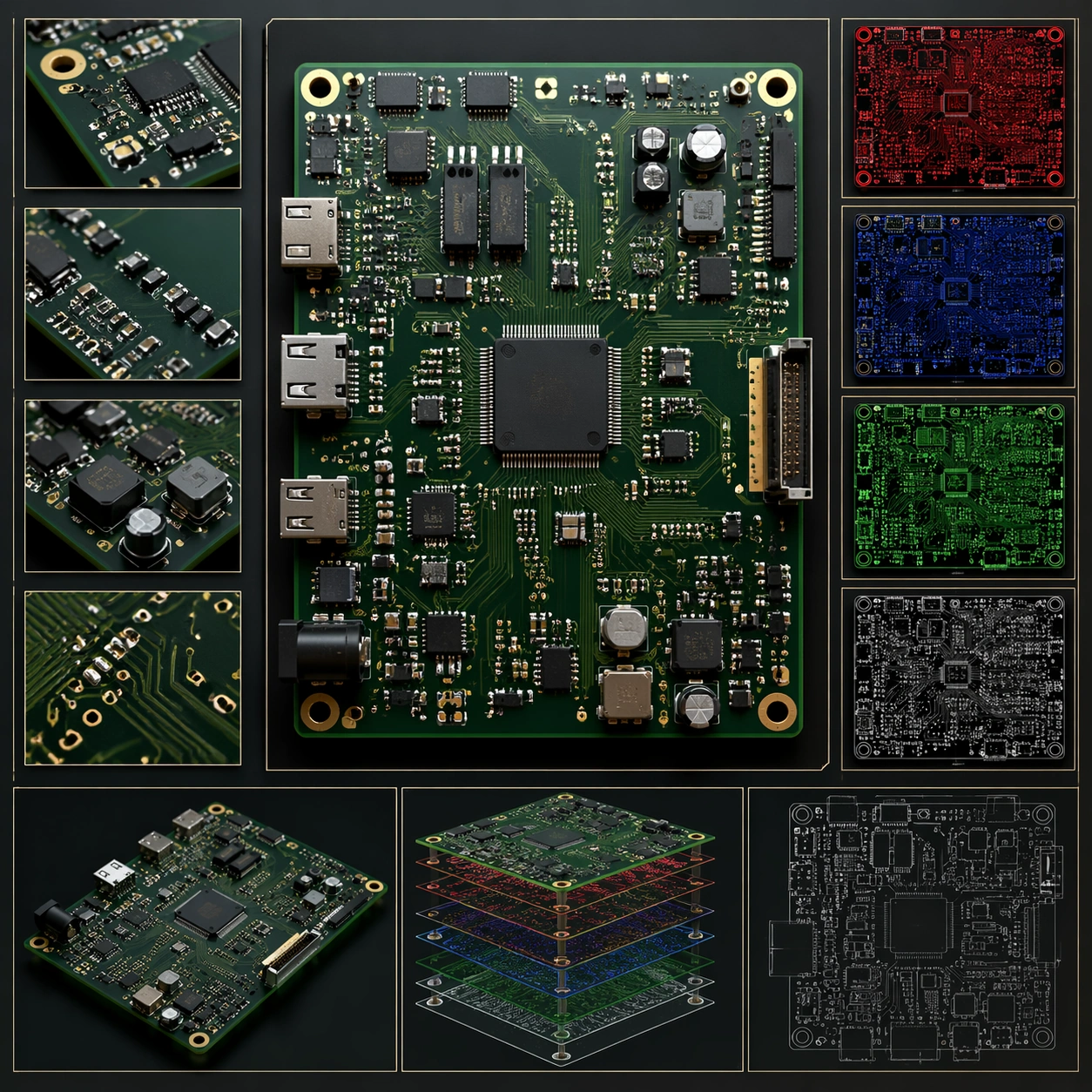
Example generated from “Pcb Board Layout — Final Plate”
GPT Image 2en

Scene: A square plate or board viewed straight-on, with crisp organization, disciplined spacing, and premium print clarity. Build the frame around a polished final technical plate that feels ready for a research deck or exhibition wall. Keep the lighting, camera distance, and spatial organization tuned for a high-signal research image rather than a casual snapshot. The image belongs to the PCB Board Layout theme and should feel immediately legible as a prompt atlas theme for pcb board layout, testing structured-layout, photorealism, style-transfer, commercial-mockup with gpt image 2.. Subject: Center the study on a polished final technical plate that feels ready for a research deck or exhibition wall. Translate the theme into a concrete visual statement instead of an abstract mood board: the viewer should understand what kind of image this is, what is being tested, and why the composition is difficult. Use the slug idea of pcb board layout as a literal guide for subject matter, materials, and staging. If helpful, borrow the broad visual cues suggested by PCB, schematic, Arduino, but keep the result original and specific to this study. Important details: The image should communicate logic through grouping, hierarchy, callouts, insets, and believable professional layout discipline rather than decorative noise. Preserve a disciplined square composition, clear focal hierarchy, and enough secondary information to make the image feel complete rather than underspecified. The image should look polished, novel, and exhibition-ready, with topic-specific credibility coming from the way surfaces, structure, and visual language reinforce PCB Board Layout. Avoid generic filler elements that do not serve the main concept. Use case: PCB Board Layout single study 8/8, testing structured-layout, photorealism, style-transfer, commercial-mockup through the final plate variation. Constraints: No readable text, no watermark, no logos, preserve exact 1:1 aspect ratio, no readable labels, no messy arrows, no random infographic decoration, no fake UI chrome unless the topic calls for it, no broken alignment, no meaningless clutter.

Example generated from “Persian Miniature Editorial Modernization — Reference Anchor”
GPT Image 2en

Scene: Create a square reference image for Persian Miniature Editorial Modernization. Build a reference anchor establishing the core system with a premium, production-ready finish. Use a polished modular board or campaign surface with clean spacing, premium game-UI finish, and clear focal hierarchy. The composition should feel intentional, clean, and reusable for gallery, research, campaign, or internal handoff contexts. Lighting must support readability first, with the main forms clearly separated from the background and enough breathing room for the system to stay legible at both hero scale and thumbnail scale. Subject: Center a coherent original game-art system built for premium production and marketing surfaces. For this image, focus on reference anchor. Keep the same system logic stable across screenshots, cards, banners, and overview boards. This image is the canonical anchor that later series images must follow. The viewer should immediately understand what role this surface plays inside a cohesive game-production asset pack. Important details: Lock framing, icon grammar, palette blocking, and surface hierarchy so the kit feels production-ready and consistent. Preserve the core silhouette, framing language, and material logic from the reference image while each variation changes function. Keep materials believable, edge hierarchy disciplined, and the visual language consistent with Persian Miniature. Use abstract interface blocks or diagram accents when helpful, but avoid any readable language. The final result should feel like a deliberate production asset rather than a random illustration. Use case: Persian Miniature Editorial Modernization series study 1/9, designed as reference anchor within a cohesive asset pack. Constraints: No readable text, no watermark, no logos, preserve exact 1:1 aspect ratio, no unrelated objects, no broken visual hierarchy, no malformed anatomy or broken perspective, no random decorative clutter.

Example generated from “Persian Miniature Editorial Modernization — Variant One”
GPT Image 2en

Scene: Create a square dependent image for Persian Miniature Editorial Modernization. Build a first controlled variation in the same system with a premium, production-ready finish. Use a polished modular board or campaign surface with clean spacing, premium game-UI finish, and clear focal hierarchy. The composition should feel intentional, clean, and reusable for gallery, research, campaign, or internal handoff contexts. Lighting must support readability first, with the main forms clearly separated from the background and enough breathing room for the system to stay legible at both hero scale and thumbnail scale. Subject: Center a coherent original game-art system built for premium production and marketing surfaces. For this image, focus on the intended support surface. Keep the same system logic stable across screenshots, cards, banners, and overview boards. Preserve exact identity or system logic from the reference image while changing only the intended variation axis. The viewer should immediately understand what role this surface plays inside a cohesive game-production asset pack. Important details: Lock framing, icon grammar, palette blocking, and surface hierarchy so the kit feels production-ready and consistent. Preserve the core silhouette, framing language, and material logic from the reference image while each variation changes function. Keep materials believable, edge hierarchy disciplined, and the visual language consistent with Persian Miniature. Use abstract interface blocks or diagram accents when helpful, but avoid any readable language. The final result should feel like a deliberate production asset rather than a random illustration. Use case: Persian Miniature Editorial Modernization series study 2/9, designed as variant one within a cohesive asset pack. Constraints: No readable text, no watermark, no logos, preserve exact 1:1 aspect ratio, no unrelated objects, no broken visual hierarchy, no malformed anatomy or broken perspective, no random decorative clutter.

Example generated from “Persian Miniature Editorial Modernization — Variant Two”
GPT Image 2en

Scene: Create a square dependent image for Persian Miniature Editorial Modernization. Build a second controlled variation in the same system with a premium, production-ready finish. Use a polished modular board or campaign surface with clean spacing, premium game-UI finish, and clear focal hierarchy. The composition should feel intentional, clean, and reusable for gallery, research, campaign, or internal handoff contexts. Lighting must support readability first, with the main forms clearly separated from the background and enough breathing room for the system to stay legible at both hero scale and thumbnail scale. Subject: Center a coherent original game-art system built for premium production and marketing surfaces. For this image, focus on the intended support surface. Keep the same system logic stable across screenshots, cards, banners, and overview boards. Preserve exact identity or system logic from the reference image while changing only the intended variation axis. The viewer should immediately understand what role this surface plays inside a cohesive game-production asset pack. Important details: Lock framing, icon grammar, palette blocking, and surface hierarchy so the kit feels production-ready and consistent. Preserve the core silhouette, framing language, and material logic from the reference image while each variation changes function. Keep materials believable, edge hierarchy disciplined, and the visual language consistent with Persian Miniature. Use abstract interface blocks or diagram accents when helpful, but avoid any readable language. The final result should feel like a deliberate production asset rather than a random illustration. Use case: Persian Miniature Editorial Modernization series study 3/9, designed as variant two within a cohesive asset pack. Constraints: No readable text, no watermark, no logos, preserve exact 1:1 aspect ratio, no unrelated objects, no broken visual hierarchy, no malformed anatomy or broken perspective, no random decorative clutter.

Example generated from “Persian Miniature Editorial Modernization — Variant Three”
GPT Image 2en

Scene: Create a square dependent image for Persian Miniature Editorial Modernization. Build a third controlled variation in the same system with a premium, production-ready finish. Use a polished modular board or campaign surface with clean spacing, premium game-UI finish, and clear focal hierarchy. The composition should feel intentional, clean, and reusable for gallery, research, campaign, or internal handoff contexts. Lighting must support readability first, with the main forms clearly separated from the background and enough breathing room for the system to stay legible at both hero scale and thumbnail scale. Subject: Center a coherent original game-art system built for premium production and marketing surfaces. For this image, focus on the intended support surface. Keep the same system logic stable across screenshots, cards, banners, and overview boards. Preserve exact identity or system logic from the reference image while changing only the intended variation axis. The viewer should immediately understand what role this surface plays inside a cohesive game-production asset pack. Important details: Lock framing, icon grammar, palette blocking, and surface hierarchy so the kit feels production-ready and consistent. Preserve the core silhouette, framing language, and material logic from the reference image while each variation changes function. Keep materials believable, edge hierarchy disciplined, and the visual language consistent with Persian Miniature. Use abstract interface blocks or diagram accents when helpful, but avoid any readable language. The final result should feel like a deliberate production asset rather than a random illustration. Use case: Persian Miniature Editorial Modernization series study 4/9, designed as variant three within a cohesive asset pack. Constraints: No readable text, no watermark, no logos, preserve exact 1:1 aspect ratio, no unrelated objects, no broken visual hierarchy, no malformed anatomy or broken perspective, no random decorative clutter.

Example generated from “Persian Miniature Editorial Modernization — Support One”
GPT Image 2en

Scene: Create a square standalone support image for Persian Miniature Editorial Modernization. Build a support-surface study with a clear focal hierarchy and a finished professional surface. Use a polished modular board or campaign surface with clean spacing, premium game-UI finish, and clear focal hierarchy. The frame should feel self-contained and polished, with enough structure to explain the system even without the reference series, yet still obviously belonging to the same theme and production world. Subject: Show a coherent original game-art system built for premium production and marketing surfaces in a way that emphasizes the intended support surface. Keep the same system logic stable across screenshots, cards, banners, and overview boards. Even though this image is independent, the viewer should still recognize the same universe, same commercial logic, and same production intent as the core package. Important details: Lock framing, icon grammar, palette blocking, and surface hierarchy so the kit feels production-ready and consistent. Preserve the broader theme language through color, framing, material choices, and modular composition. Use clean panel rhythm, premium asset presentation, and believable detail density. The image should work equally well as a gallery study, research reference, and mock production deliverable. Use case: Persian Miniature Editorial Modernization single study 5/9, exploring support one as a support surface. Constraints: No readable text, no watermark, no logos, preserve exact 1:1 aspect ratio, no unrelated objects, no broken visual hierarchy, no visual noise that obscures the main surface, no accidental brand resemblance.
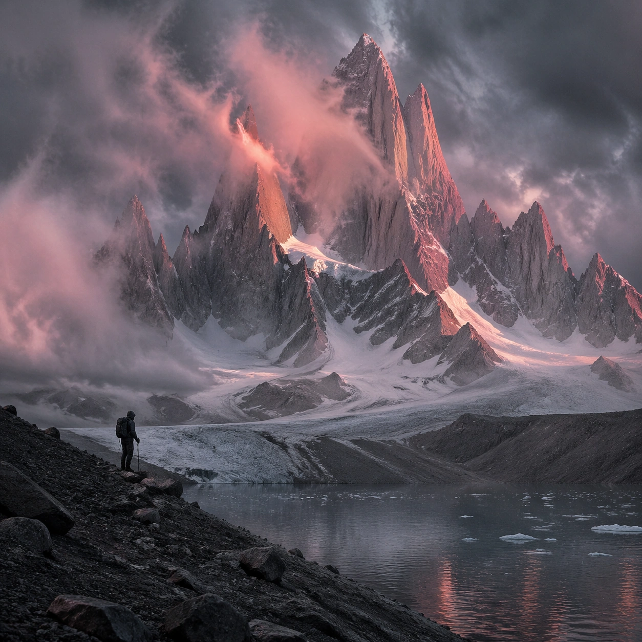
Example generated from “Persian Miniature Editorial Modernization — Support Two”
GPT Image 2en

Scene: Create a square standalone support image for Persian Miniature Editorial Modernization. Build a second support-surface study with a clear focal hierarchy and a finished professional surface. Use a polished modular board or campaign surface with clean spacing, premium game-UI finish, and clear focal hierarchy. The frame should feel self-contained and polished, with enough structure to explain the system even without the reference series, yet still obviously belonging to the same theme and production world. Subject: Show a coherent original game-art system built for premium production and marketing surfaces in a way that emphasizes the intended support surface. Keep the same system logic stable across screenshots, cards, banners, and overview boards. Even though this image is independent, the viewer should still recognize the same universe, same commercial logic, and same production intent as the core package. Important details: Lock framing, icon grammar, palette blocking, and surface hierarchy so the kit feels production-ready and consistent. Preserve the broader theme language through color, framing, material choices, and modular composition. Use clean panel rhythm, premium asset presentation, and believable detail density. The image should work equally well as a gallery study, research reference, and mock production deliverable. Use case: Persian Miniature Editorial Modernization single study 6/9, exploring support two as a support surface. Constraints: No readable text, no watermark, no logos, preserve exact 1:1 aspect ratio, no unrelated objects, no broken visual hierarchy, no visual noise that obscures the main surface, no accidental brand resemblance.
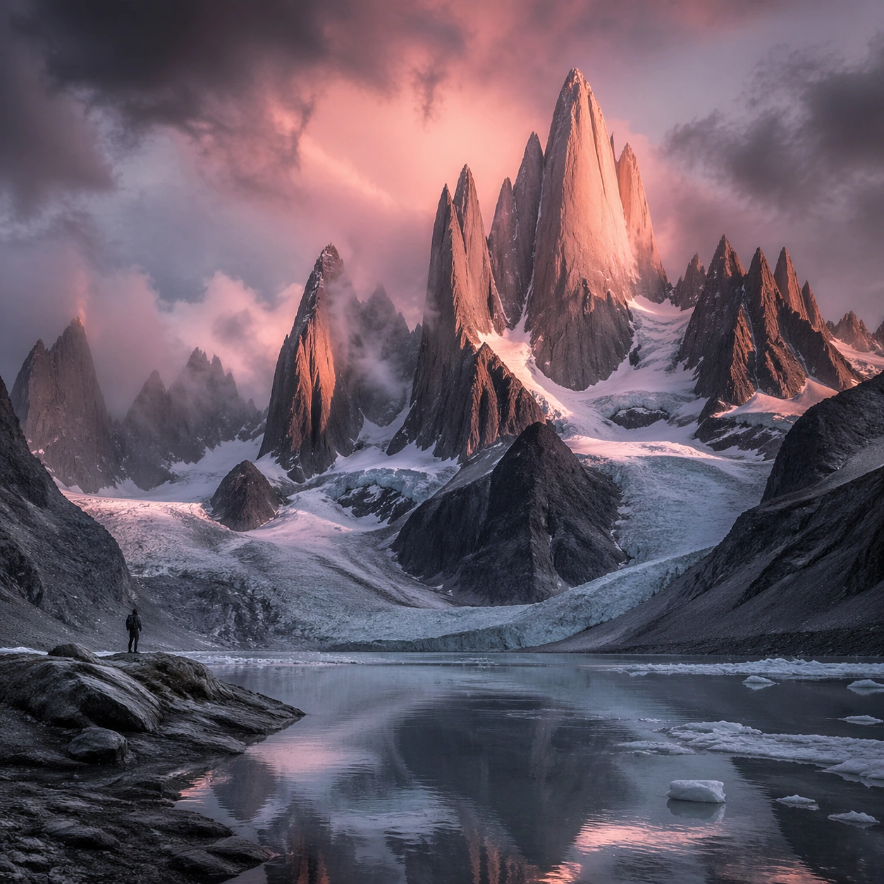
Example generated from “Persian Miniature Editorial Modernization — Support Three”
GPT Image 2en

Scene: Create a square standalone support image for Persian Miniature Editorial Modernization. Build a third support-surface study with a clear focal hierarchy and a finished professional surface. Use a polished modular board or campaign surface with clean spacing, premium game-UI finish, and clear focal hierarchy. The frame should feel self-contained and polished, with enough structure to explain the system even without the reference series, yet still obviously belonging to the same theme and production world. Subject: Show a coherent original game-art system built for premium production and marketing surfaces in a way that emphasizes the intended support surface. Keep the same system logic stable across screenshots, cards, banners, and overview boards. Even though this image is independent, the viewer should still recognize the same universe, same commercial logic, and same production intent as the core package. Important details: Lock framing, icon grammar, palette blocking, and surface hierarchy so the kit feels production-ready and consistent. Preserve the broader theme language through color, framing, material choices, and modular composition. Use clean panel rhythm, premium asset presentation, and believable detail density. The image should work equally well as a gallery study, research reference, and mock production deliverable. Use case: Persian Miniature Editorial Modernization single study 7/9, exploring support three as a support surface. Constraints: No readable text, no watermark, no logos, preserve exact 1:1 aspect ratio, no unrelated objects, no broken visual hierarchy, no visual noise that obscures the main surface, no accidental brand resemblance.
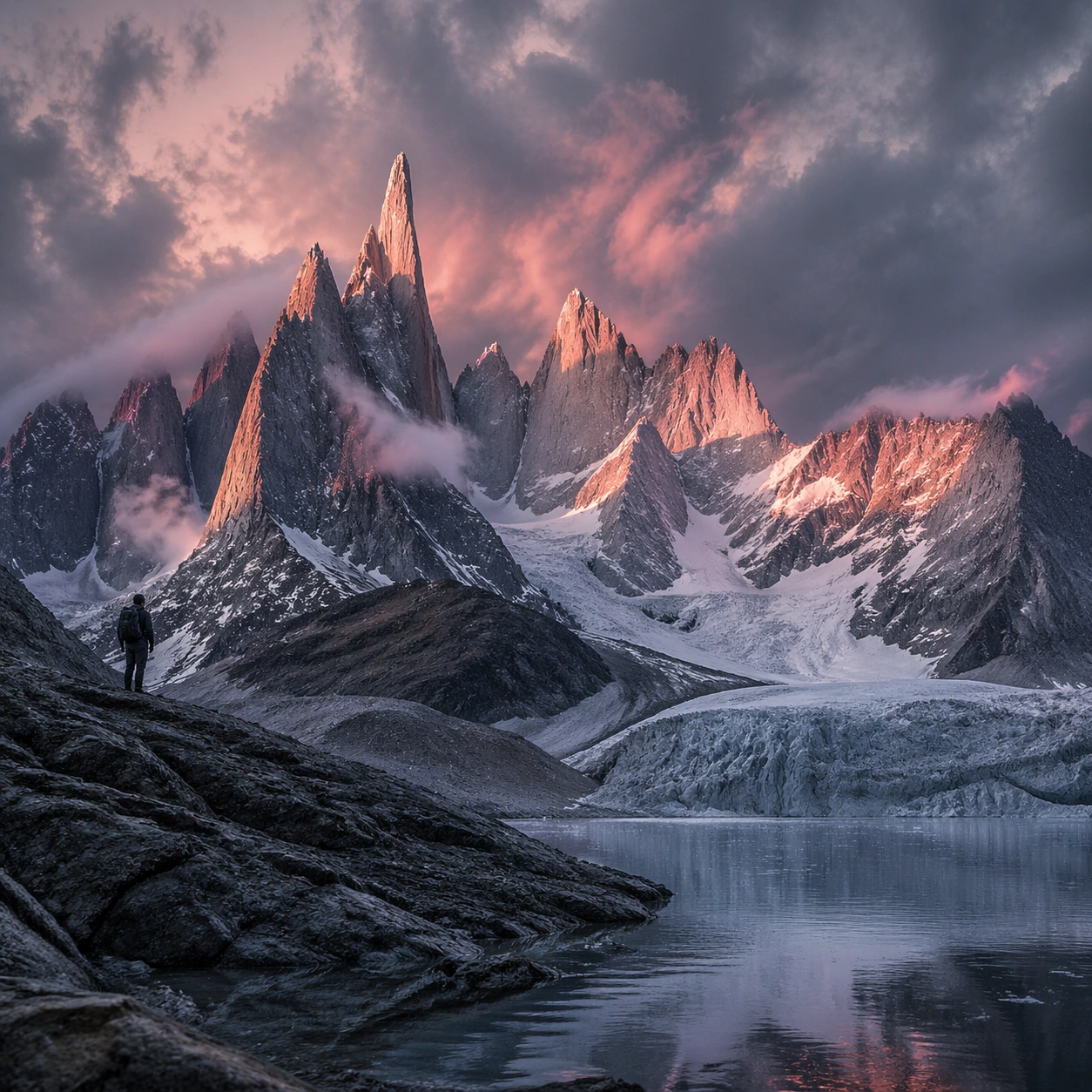
Example generated from “Persian Miniature Editorial Modernization — Support Four”
GPT Image 2en

Scene: Create a square standalone support image for Persian Miniature Editorial Modernization. Build a fourth support-surface study with a clear focal hierarchy and a finished professional surface. Use a polished modular board or campaign surface with clean spacing, premium game-UI finish, and clear focal hierarchy. The frame should feel self-contained and polished, with enough structure to explain the system even without the reference series, yet still obviously belonging to the same theme and production world. Subject: Show a coherent original game-art system built for premium production and marketing surfaces in a way that emphasizes the intended support surface. Keep the same system logic stable across screenshots, cards, banners, and overview boards. Even though this image is independent, the viewer should still recognize the same universe, same commercial logic, and same production intent as the core package. Important details: Lock framing, icon grammar, palette blocking, and surface hierarchy so the kit feels production-ready and consistent. Preserve the broader theme language through color, framing, material choices, and modular composition. Use clean panel rhythm, premium asset presentation, and believable detail density. The image should work equally well as a gallery study, research reference, and mock production deliverable. Use case: Persian Miniature Editorial Modernization single study 8/9, exploring support four as a support surface. Constraints: No readable text, no watermark, no logos, preserve exact 1:1 aspect ratio, no unrelated objects, no broken visual hierarchy, no visual noise that obscures the main surface, no accidental brand resemblance.
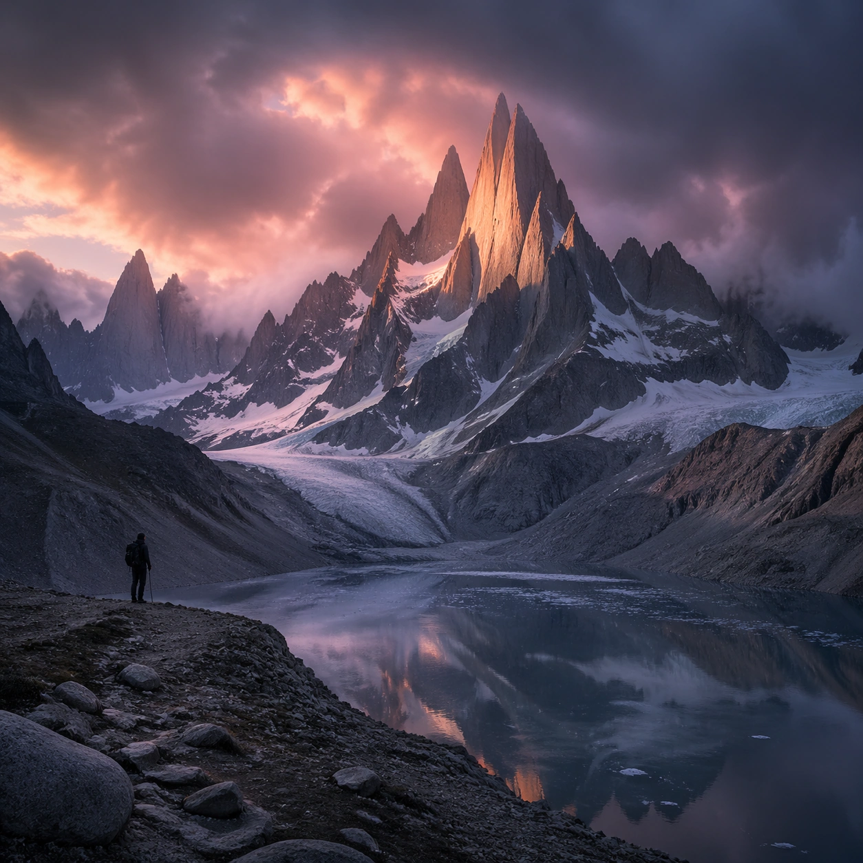
Example generated from “Persian Miniature Editorial Modernization — Support Five”
GPT Image 2en

Scene: Create a square standalone support image for Persian Miniature Editorial Modernization. Build a fifth support-surface study with a clear focal hierarchy and a finished professional surface. Use a polished modular board or campaign surface with clean spacing, premium game-UI finish, and clear focal hierarchy. The frame should feel self-contained and polished, with enough structure to explain the system even without the reference series, yet still obviously belonging to the same theme and production world. Subject: Show a coherent original game-art system built for premium production and marketing surfaces in a way that emphasizes the intended support surface. Keep the same system logic stable across screenshots, cards, banners, and overview boards. Even though this image is independent, the viewer should still recognize the same universe, same commercial logic, and same production intent as the core package. Important details: Lock framing, icon grammar, palette blocking, and surface hierarchy so the kit feels production-ready and consistent. Preserve the broader theme language through color, framing, material choices, and modular composition. Use clean panel rhythm, premium asset presentation, and believable detail density. The image should work equally well as a gallery study, research reference, and mock production deliverable. Use case: Persian Miniature Editorial Modernization single study 9/9, exploring support five as a support surface. Constraints: No readable text, no watermark, no logos, preserve exact 1:1 aspect ratio, no unrelated objects, no broken visual hierarchy, no visual noise that obscures the main surface, no accidental brand resemblance.
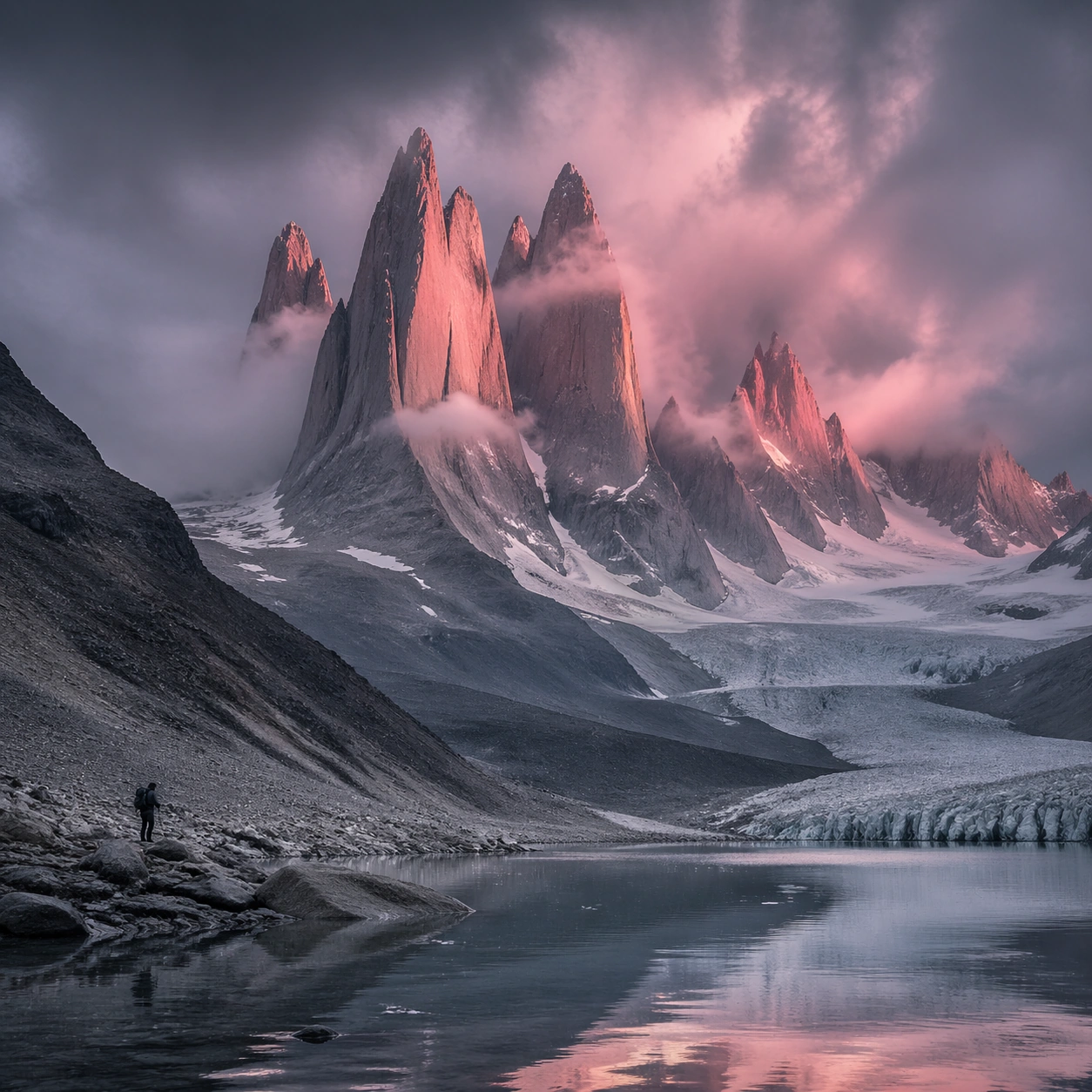
Example generated from “Personal Brand Portrait System — Reference Portrait Anchor”
GPT Image 2en

Scene: Create a square 1:1 portrait image for Personal Brand Portrait System. Use a clean studio anchor with balanced soft light, neutral gray or off-white backdrop, and premium agency-grade framing. The frame should feel like a finished professional deliverable rather than a casual snapshot, with clear lens discipline, believable light falloff, and a palette that directly supports Create a full portrait system for creators, consultants, and public-facing professionals across profile photos, website hero images, and keynote promos.. Keep enough surrounding space and compositional control for gallery, research, campaign, or approval-board reuse while staying photoreal and human-scaled. Subject: Center one creator-founder in their thirties with light brown skin, long dark hair tucked behind one ear, intelligent eyes, and an approachable but polished posture. Establish the exact identity, skin tone family, hair base, and body read that every later image must reuse. Let the styling stay minimal and believable so the series begins from an authoritative baseline. Use the example direction from the brief as grounding context: Create a full portrait system for creators, consultants, and public-facing professionals across profile photos, website hero images, and keynote promos.. Wardrobe, lighting, environment, and pose may shift to serve this variation, but the viewer must immediately understand that the same reference identity is still in front of the camera. Important details: This backlog line is difficult because Create a full portrait system for creators, consultants, and public-facing professionals across profile photos, website hero images, and keynote promos.. Preserve skin tone family, bone structure, eye spacing, nose shape, mouth shape, hairline logic, shoulder width, and overall body read across the entire series. preserve exact face / hair base / body proportions from the reference model. Keep the crop polished, the eye line steady, and the wardrobe simple enough to survive later changes without confusion. Avoid the common failure described in the brief: ordinary image models often lose likeness once styling, lighting, or layout changes enter the frame. Success should feel like the result should feel professionally usable, coherent, and clearly built around one stable human identity. Use case: Personal Brand Portrait System series study 1/9, the neutral baseline portrait proof. Constraints: No readable text, no watermark, no logos, preserve exact 1:1 aspect ratio, preserve exact face / hair base / body proportions from the reference model, no extra people, no hard fashion gimmicks, no exaggerated retouching, no broken eye alignment.

Example generated from “Personal Brand Portrait System — Clean Headshot”
GPT Image 2en

Scene: Create a square 1:1 portrait image for Personal Brand Portrait System. Use a bright but controlled studio setup with crisp catchlights, smooth tonal falloff, and enough margin for usage as profile art. The frame should feel like a finished professional deliverable rather than a casual snapshot, with clear lens discipline, believable light falloff, and a palette that directly supports Create a full portrait system for creators, consultants, and public-facing professionals across profile photos, website hero images, and keynote promos.. Keep enough surrounding space and compositional control for gallery, research, campaign, or approval-board reuse while staying photoreal and human-scaled. Subject: Center one creator-founder in their thirties with light brown skin, long dark hair tucked behind one ear, intelligent eyes, and an approachable but polished posture. Preserve the same face while shifting the posture toward a more direct headshot deliverable. Styling may become slightly sharper, but the result still needs to read as the same person from image 01. Use the example direction from the brief as grounding context: Create a full portrait system for creators, consultants, and public-facing professionals across profile photos, website hero images, and keynote promos.. Wardrobe, lighting, environment, and pose may shift to serve this variation, but the viewer must immediately understand that the same reference identity is still in front of the camera. Important details: This backlog line is difficult because Create a full portrait system for creators, consultants, and public-facing professionals across profile photos, website hero images, and keynote promos.. Preserve skin tone family, bone structure, eye spacing, nose shape, mouth shape, hairline logic, shoulder width, and overall body read across the entire series. preserve exact face / hair base / body proportions from the reference model. This frame should feel reliable, publishable, and easy to crop for agency, website, or PR use. Avoid the common failure described in the brief: ordinary image models often lose likeness once styling, lighting, or layout changes enter the frame. Success should feel like the result should feel professionally usable, coherent, and clearly built around one stable human identity. Use case: Personal Brand Portrait System series study 2/9, a clean corporate or editorial headshot. Constraints: No readable text, no watermark, no logos, preserve exact 1:1 aspect ratio, preserve exact face / hair base / body proportions from the reference model, no drifting age, no different haircut, no over-smoothed skin, no random jewelry clutter.

Example generated from “Personal Brand Portrait System — Three-Quarter Hero”
GPT Image 2en

Scene: Create a square 1:1 portrait image for Personal Brand Portrait System. Use a sculpted key light with subtle shadow modeling, clean negative space, and a slightly wider crop that still favors the face. The frame should feel like a finished professional deliverable rather than a casual snapshot, with clear lens discipline, believable light falloff, and a palette that directly supports Create a full portrait system for creators, consultants, and public-facing professionals across profile photos, website hero images, and keynote promos.. Keep enough surrounding space and compositional control for gallery, research, campaign, or approval-board reuse while staying photoreal and human-scaled. Subject: Center one creator-founder in their thirties with light brown skin, long dark hair tucked behind one ear, intelligent eyes, and an approachable but polished posture. Use the same identity and wardrobe family while introducing stronger body language through shoulders, hands, or a turn of the torso. The viewer should immediately recognize the same subject even though the composition becomes more campaign-like. Use the example direction from the brief as grounding context: Create a full portrait system for creators, consultants, and public-facing professionals across profile photos, website hero images, and keynote promos.. Wardrobe, lighting, environment, and pose may shift to serve this variation, but the viewer must immediately understand that the same reference identity is still in front of the camera. Important details: This backlog line is difficult because Create a full portrait system for creators, consultants, and public-facing professionals across profile photos, website hero images, and keynote promos.. Preserve skin tone family, bone structure, eye spacing, nose shape, mouth shape, hairline logic, shoulder width, and overall body read across the entire series. preserve exact face / hair base / body proportions from the reference model. Keep proportions stable and let the pose feel intentional rather than theatrical. Avoid the common failure described in the brief: ordinary image models often lose likeness once styling, lighting, or layout changes enter the frame. Success should feel like the result should feel professionally usable, coherent, and clearly built around one stable human identity. Use case: Personal Brand Portrait System series study 3/9, a three-quarter portrait hero. Constraints: No readable text, no watermark, no logos, preserve exact 1:1 aspect ratio, preserve exact face / hair base / body proportions from the reference model, no warped arms, no off-model body shape, no new facial hair pattern, no unrelated props.