PROMPT · ESPLORAZIONE CREATIVA

Galleria di prompt

Esplora prompt reali ed esempi generati. Trova ispirazione per la prossima missione creativa e copia gratuitamente il prompt completo.

Esempi
10,974
Modelli
17
Fonti
1277
10.974 esempi di prompt · pagina 34 di 229
Example generated from “Monumental Desert Arrival — Lattice Beacon”
GPT Image 2en

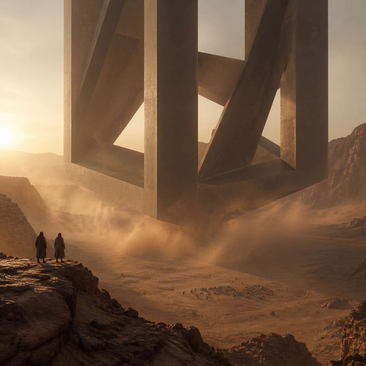
Scene: A square widescale desert image centered on a massive geometric object descending, hovering, or emerging against sand, dust, and low sun. The atmosphere should feel physically dense, with suspended grit, long shadows, and distant heat haze describing the air around the event. Use a giant geometric beacon made of sparse intersecting planes descending into a canyon basin, its interior voids catching dusty sunset light. Subject: The main subject is an immense ship, ring, slab, wedge, or monolith whose scale dwarfs all human observers. People should appear as tiny clustered witnesses in the foreground or along ridgelines, included only to prove size and emotional awe. Two observers stand at a high overlook while a distant camp below appears microscopic beside the structure. Important details: The signature is monumental restraint. Preserve simple geometry, huge negative space, believable dust behavior, and the quiet terror of proportion. Avoid flashy weapons, decorative alien ornament, bright science-fiction colors, or busy action hero staging. The open lattice must still feel monumental, with real shadow complexity and believable sand haze. Use case: Monumental Desert Arrival single study 6/9. Constraints: No readable text, no watermark, no logos, preserve exact 1:1 aspect ratio, no logos, no readable markings on the object, no laser beams, no explosion fireballs, no crowded military hardware, no broken anatomy, no low-detail background, no accidental text fragments.
Example generated from “Monumental Desert Arrival — Dust Corridor”
GPT Image 2en

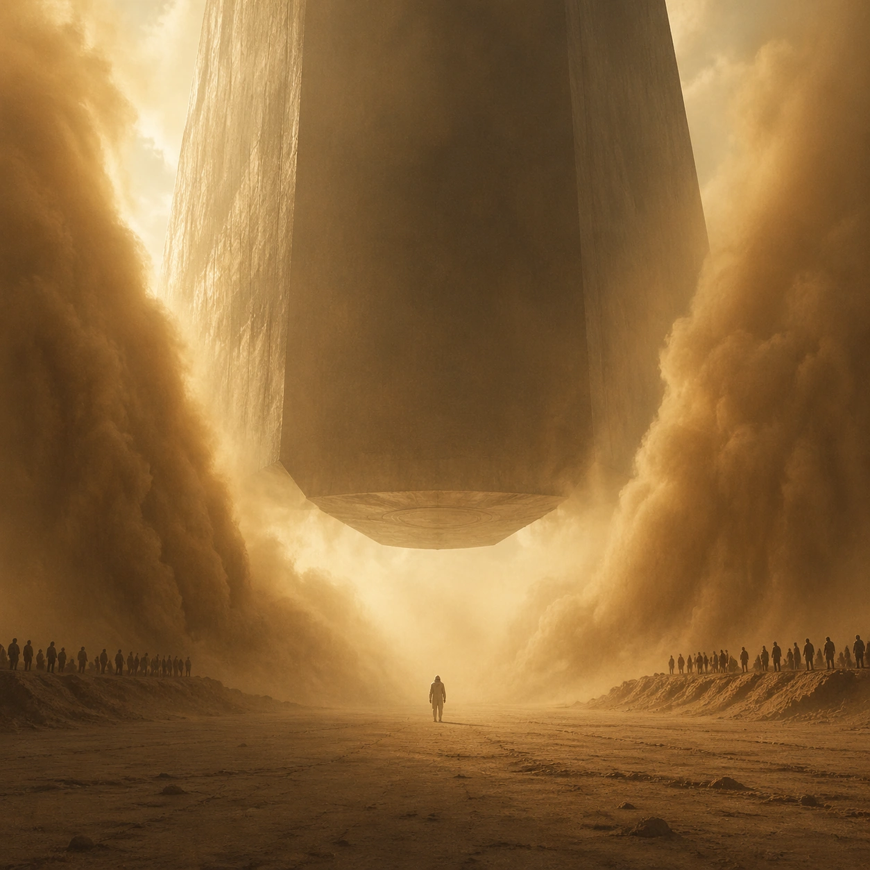
Scene: A square widescale desert image centered on a massive geometric object descending, hovering, or emerging against sand, dust, and low sun. The atmosphere should feel physically dense, with suspended grit, long shadows, and distant heat haze describing the air around the event. Build a scene where a giant hovering object creates two parallel walls of dust, forming a corridor that leads directly toward the viewer. Subject: The main subject is an immense ship, ring, slab, wedge, or monolith whose scale dwarfs all human observers. People should appear as tiny clustered witnesses in the foreground or along ridgelines, included only to prove size and emotional awe. A single scientist in protective hood stands centered in that corridor, nearly swallowed by the atmosphere. Important details: The signature is monumental restraint. Preserve simple geometry, huge negative space, believable dust behavior, and the quiet terror of proportion. Avoid flashy weapons, decorative alien ornament, bright science-fiction colors, or busy action hero staging. The dust should be weighty and sculptural, describing the invisible force of the object without turning into spectacle noise. Use case: Monumental Desert Arrival single study 8/9. Constraints: No readable text, no watermark, no logos, preserve exact 1:1 aspect ratio, no logos, no readable markings on the object, no laser beams, no explosion fireballs, no crowded military hardware, no broken anatomy, no low-detail background, no accidental text fragments.
Example generated from “Monumental Desert Arrival — Eclipse Landing”
GPT Image 2en

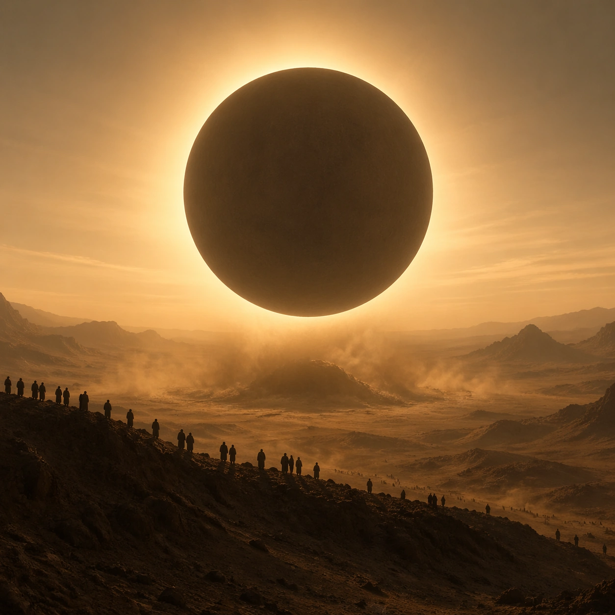
Scene: A square widescale desert image centered on a massive geometric object descending, hovering, or emerging against sand, dust, and low sun. The atmosphere should feel physically dense, with suspended grit, long shadows, and distant heat haze describing the air around the event. End with a circular craft crossing directly in front of the low sun so the arrival reads like an engineered eclipse over the dunes. Subject: The main subject is an immense ship, ring, slab, wedge, or monolith whose scale dwarfs all human observers. People should appear as tiny clustered witnesses in the foreground or along ridgelines, included only to prove size and emotional awe. A ridge of onlookers watches in silhouette while the enormous disk lowers beyond them into drifting dust. Important details: The signature is monumental restraint. Preserve simple geometry, huge negative space, believable dust behavior, and the quiet terror of proportion. Avoid flashy weapons, decorative alien ornament, bright science-fiction colors, or busy action hero staging. Use restraint so the image feels sacred and physical, with the sun halo and dust doing most of the emotional work. Use case: Monumental Desert Arrival single study 9/9. Constraints: No readable text, no watermark, no logos, preserve exact 1:1 aspect ratio, no logos, no readable markings on the object, no laser beams, no explosion fireballs, no crowded military hardware, no broken anatomy, no low-detail background, no accidental text fragments.
Example generated from “Motorsport Livery And Track Promo Set — Grid Hero”
GPT Image 2en

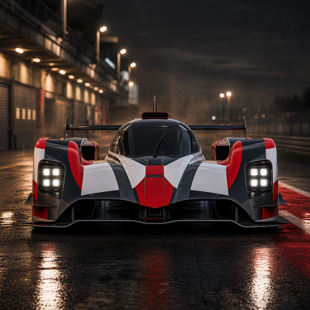
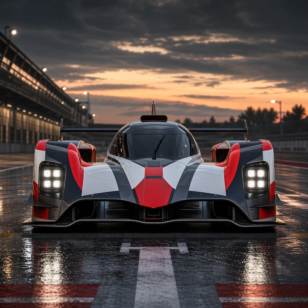
Scene: A square pre-race grid at dusk with controlled pit-lane light, low camera angle, crisp reflections, and tense calm air. Compose the frame as a square key visual with disciplined camera placement, premium lighting control, and believable real-world scale. The tonal range should feel polished and intentional, with enough atmosphere to create depth without obscuring form. Keep contrast calibrated for launch, catalog, or research presentation use rather than casual snapshot aesthetics. Subject: Center an original closed-cockpit endurance race car with a low canopy, wide fenders, center-fin tail, exposed aero surfaces, and a geometric red-white-charcoal livery with no sponsor marks. Make the subject feel original, production-aware, and clearly grounded in Motorsport Livery and Track Promo Set. For this series image, preserve exact core subject identity, proportions, base geometry, and material language from the reference image whenever continuity matters. The focal hierarchy should be immediate: primary form first, then material behavior, then supporting environmental cues that clarify use context and difficulty. Important details: Show the race car planted and highly legible, with aero surfaces, tire texture, body graphics, and subtle atmosphere all organized for promo impact instead of event documentation. Preserve exact car body shape, livery geometry, panel placement, wheel design, and lamp signature across the series. Motion must feel dangerous and precise, yet still readable as campaign imagery rather than chaotic race reportage. Use believable materials, engineering logic, and professional composition discipline. Reflections, shadows, edge breaks, texture scale, interface density, and small physical joints must all support realism. Avoid filler props, vague mood-board clutter, or any element that weakens the sense of a purpose-built industrial or automotive image. Use case: Motorsport Promo series study 1/9 for Motorsport Livery and Track Promo Set, built as image 01-reference-anchor. Constraints: No readable text, no watermark, no logos, preserve exact 1:1 aspect ratio, no sponsor logos, no readable numbers, no real team branding, no crash damage, no podium champagne, no crowd clutter.

Example generated from “Motorsport Livery And Track Promo Set — Rain Sprint”
GPT Image 2en

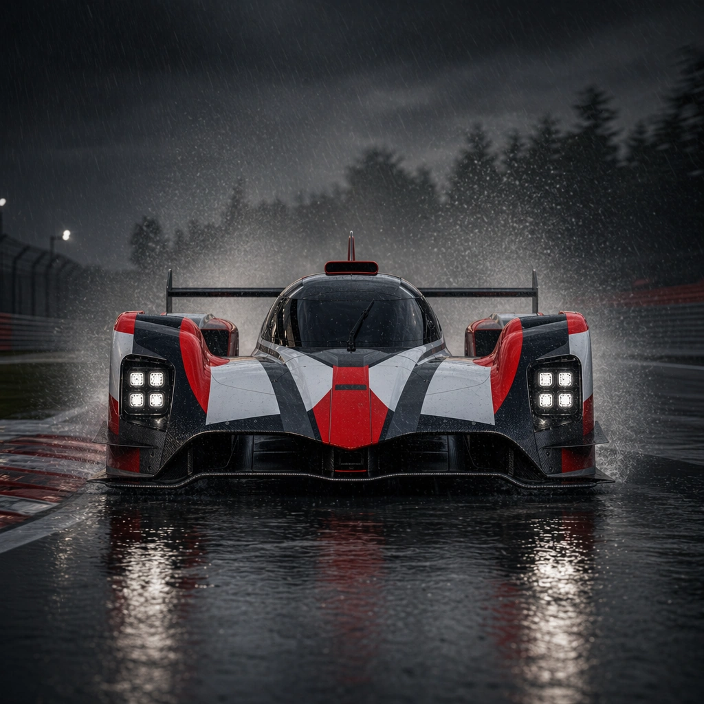
Scene: A square rain-soaked circuit at speed with backlit spray, darker contrast, wet curbing, and disciplined shutter feeling. Compose the frame as a square key visual with disciplined camera placement, premium lighting control, and believable real-world scale. The tonal range should feel polished and intentional, with enough atmosphere to create depth without obscuring form. Keep contrast calibrated for launch, catalog, or research presentation use rather than casual snapshot aesthetics. Subject: Center an original closed-cockpit endurance race car with a low canopy, wide fenders, center-fin tail, exposed aero surfaces, and a geometric red-white-charcoal livery with no sponsor marks. Make the subject feel original, production-aware, and clearly grounded in Motorsport Livery and Track Promo Set. For this series image, preserve exact core subject identity, proportions, base geometry, and material language from the reference image whenever continuity matters. The focal hierarchy should be immediate: primary form first, then material behavior, then supporting environmental cues that clarify use context and difficulty. Important details: Keep the exact car identity clear while emphasizing tire contact, water dispersion, and the contrast between precision body graphics and unstable track conditions. Preserve exact car body shape, livery geometry, panel placement, wheel design, and lamp signature across the series. Motion must feel dangerous and precise, yet still readable as campaign imagery rather than chaotic race reportage. Use believable materials, engineering logic, and professional composition discipline. Reflections, shadows, edge breaks, texture scale, interface density, and small physical joints must all support realism. Avoid filler props, vague mood-board clutter, or any element that weakens the sense of a purpose-built industrial or automotive image. Use case: Motorsport Promo series study 2/9 for Motorsport Livery and Track Promo Set, built as image 02-context-shift. Constraints: No readable text, no watermark, no logos, preserve exact 1:1 aspect ratio, no sponsor logos, no readable numbers, no real team branding, no crash damage, no podium champagne, no crowd clutter.

Example generated from “Motorsport Livery And Track Promo Set — Night Pit Energy”
GPT Image 2en

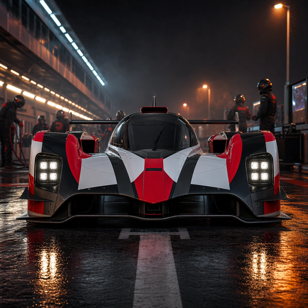
Scene: A square nighttime pit-lane setup with mixed LED and sodium light, hard reflections, compressed depth, and charged atmosphere. Compose the frame as a square key visual with disciplined camera placement, premium lighting control, and believable real-world scale. The tonal range should feel polished and intentional, with enough atmosphere to create depth without obscuring form. Keep contrast calibrated for launch, catalog, or research presentation use rather than casual snapshot aesthetics. Subject: Center an original closed-cockpit endurance race car with a low canopy, wide fenders, center-fin tail, exposed aero surfaces, and a geometric red-white-charcoal livery with no sponsor marks. Make the subject feel original, production-aware, and clearly grounded in Motorsport Livery and Track Promo Set. For this series image, preserve exact core subject identity, proportions, base geometry, and material language from the reference image whenever continuity matters. The focal hierarchy should be immediate: primary form first, then material behavior, then supporting environmental cues that clarify use context and difficulty. Important details: Use crew silhouettes, equipment hints, and lighting contrast as support, while the car remains the unmistakable center of the frame. The scene should feel elite and focused, not cluttered. Preserve exact car body shape, livery geometry, panel placement, wheel design, and lamp signature across the series. Motion must feel dangerous and precise, yet still readable as campaign imagery rather than chaotic race reportage. Use believable materials, engineering logic, and professional composition discipline. Reflections, shadows, edge breaks, texture scale, interface density, and small physical joints must all support realism. Avoid filler props, vague mood-board clutter, or any element that weakens the sense of a purpose-built industrial or automotive image. Use case: Motorsport Promo series study 3/9 for Motorsport Livery and Track Promo Set, built as image 03-surface-study. Constraints: No readable text, no watermark, no logos, preserve exact 1:1 aspect ratio, no sponsor logos, no readable numbers, no real team branding, no crash damage, no podium champagne, no crowd clutter.

Example generated from “Motorsport Livery And Track Promo Set — Cooldown Poster”
GPT Image 2en

Scene: A square post-race paddock edge with warm floodlight, faint brake-heat haze, and quiet but intense empty space around the car. Compose the frame as a square key visual with disciplined camera placement, premium lighting control, and believable real-world scale. The tonal range should feel polished and intentional, with enough atmosphere to create depth without obscuring form. Keep contrast calibrated for launch, catalog, or research presentation use rather than casual snapshot aesthetics. Subject: Center an original closed-cockpit endurance race car with a low canopy, wide fenders, center-fin tail, exposed aero surfaces, and a geometric red-white-charcoal livery with no sponsor marks. Make the subject feel original, production-aware, and clearly grounded in Motorsport Livery and Track Promo Set. For this series image, preserve exact core subject identity, proportions, base geometry, and material language from the reference image whenever continuity matters. The focal hierarchy should be immediate: primary form first, then material behavior, then supporting environmental cues that clarify use context and difficulty. Important details: Show subtle rubber wear and endurance without damage. The result should feel like an approved championship poster frame rather than a documentary pit photo. Preserve exact car body shape, livery geometry, panel placement, wheel design, and lamp signature across the series. Motion must feel dangerous and precise, yet still readable as campaign imagery rather than chaotic race reportage. Use believable materials, engineering logic, and professional composition discipline. Reflections, shadows, edge breaks, texture scale, interface density, and small physical joints must all support realism. Avoid filler props, vague mood-board clutter, or any element that weakens the sense of a purpose-built industrial or automotive image. Use case: Motorsport Promo series study 4/9 for Motorsport Livery and Track Promo Set, built as image 04-presentation-master. Constraints: No readable text, no watermark, no logos, preserve exact 1:1 aspect ratio, no sponsor logos, no readable numbers, no real team branding, no crash damage, no podium champagne, no crowd clutter.

Example generated from “Motorsport Livery And Track Promo Set — Helmet Flatlay”
GPT Image 2en

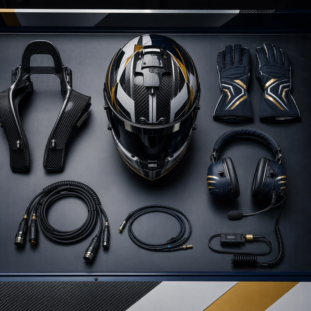
Scene: A square top-down paddock work surface with premium directional light, organized spacing, and restrained technical atmosphere. Compose the frame as a square key visual with disciplined camera placement, premium lighting control, and believable real-world scale. The tonal range should feel polished and intentional, with enough atmosphere to create depth without obscuring form. Keep contrast calibrated for launch, catalog, or research presentation use rather than casual snapshot aesthetics. Subject: Center an original helmet, gloves, headset, cable set, and protective gear arrangement with geometric color cues and race-grade materials. Make the subject feel original, production-aware, and clearly grounded in Motorsport Livery and Track Promo Set. Treat this as an independent study that must feel complete and coherent without relying on any external reference image. The focal hierarchy should be immediate: primary form first, then material behavior, then supporting environmental cues that clarify use context and difficulty. Important details: Keep all markings abstract and non-readable while the materials feel serious, professional, and prepared for competition. The image should read as elite equipment, not costume styling. The visual language should still feel native to Motorsport Livery and Track Promo Set, using disciplined industrial or campaign composition instead of generic stock photography. Use believable materials, engineering logic, and professional composition discipline. Reflections, shadows, edge breaks, texture scale, interface density, and small physical joints must all support realism. Avoid filler props, vague mood-board clutter, or any element that weakens the sense of a purpose-built industrial or automotive image. Use case: Motorsport Promo single study 6/9 for Motorsport Livery and Track Promo Set, built as image support-two. Constraints: No readable text, no watermark, no logos, preserve exact 1:1 aspect ratio, no sponsor logos, no readable digits, no copyrighted circuit signage, no real team branding, no crowd chaos.

Example generated from “Motorsport Livery And Track Promo Set — Track Poster Mockup”
GPT Image 2en

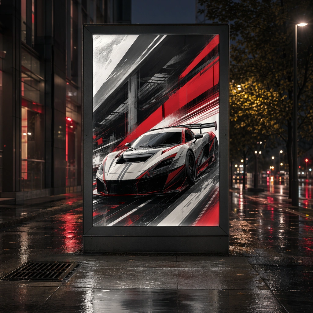
Scene: A square urban poster-site mockup with one illuminated panel, wet pavement reflections, and a sharp night-event atmosphere. Compose the frame as a square key visual with disciplined camera placement, premium lighting control, and believable real-world scale. The tonal range should feel polished and intentional, with enough atmosphere to create depth without obscuring form. Keep contrast calibrated for launch, catalog, or research presentation use rather than casual snapshot aesthetics. Subject: Center an original race-car artwork adapted into an event-promo poster surface placed in a believable public setting. Make the subject feel original, production-aware, and clearly grounded in Motorsport Livery and Track Promo Set. Treat this as an independent study that must feel complete and coherent without relying on any external reference image. The focal hierarchy should be immediate: primary form first, then material behavior, then supporting environmental cues that clarify use context and difficulty. Important details: Poster content must remain non-readable and logo-free while still feeling bold, kinetic, and useful for event communications planning. The visual language should still feel native to Motorsport Livery and Track Promo Set, using disciplined industrial or campaign composition instead of generic stock photography. Use believable materials, engineering logic, and professional composition discipline. Reflections, shadows, edge breaks, texture scale, interface density, and small physical joints must all support realism. Avoid filler props, vague mood-board clutter, or any element that weakens the sense of a purpose-built industrial or automotive image. Use case: Motorsport Promo single study 7/9 for Motorsport Livery and Track Promo Set, built as image support-three. Constraints: No readable text, no watermark, no logos, preserve exact 1:1 aspect ratio, no sponsor logos, no readable digits, no copyrighted circuit signage, no real team branding, no crowd chaos.

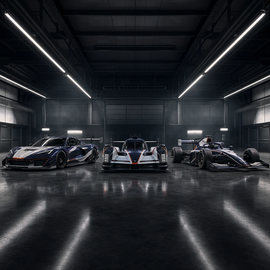
Example generated from “Motorsport Livery And Track Promo Set — Garage Lineup”
GPT Image 2en

Scene: A square garage interior with long overhead fixtures, moody haze, deep perspective, and polished concrete reflections. Compose the frame as a square key visual with disciplined camera placement, premium lighting control, and believable real-world scale. The tonal range should feel polished and intentional, with enough atmosphere to create depth without obscuring form. Keep contrast calibrated for launch, catalog, or research presentation use rather than casual snapshot aesthetics. Subject: Center three original race cars from one team family arranged with strict spacing and consistent body-language rhythm. Make the subject feel original, production-aware, and clearly grounded in Motorsport Livery and Track Promo Set. Treat this as an independent study that must feel complete and coherent without relying on any external reference image. The focal hierarchy should be immediate: primary form first, then material behavior, then supporting environmental cues that clarify use context and difficulty. Important details: The scene should feel elite, organized, and tense rather than crowded. Use repetition, stance, and livery relationships as the primary design language. The visual language should still feel native to Motorsport Livery and Track Promo Set, using disciplined industrial or campaign composition instead of generic stock photography. Use believable materials, engineering logic, and professional composition discipline. Reflections, shadows, edge breaks, texture scale, interface density, and small physical joints must all support realism. Avoid filler props, vague mood-board clutter, or any element that weakens the sense of a purpose-built industrial or automotive image. Use case: Motorsport Promo single study 8/9 for Motorsport Livery and Track Promo Set, built as image support-four. Constraints: No readable text, no watermark, no logos, preserve exact 1:1 aspect ratio, no sponsor logos, no readable digits, no copyrighted circuit signage, no real team branding, no crowd chaos.

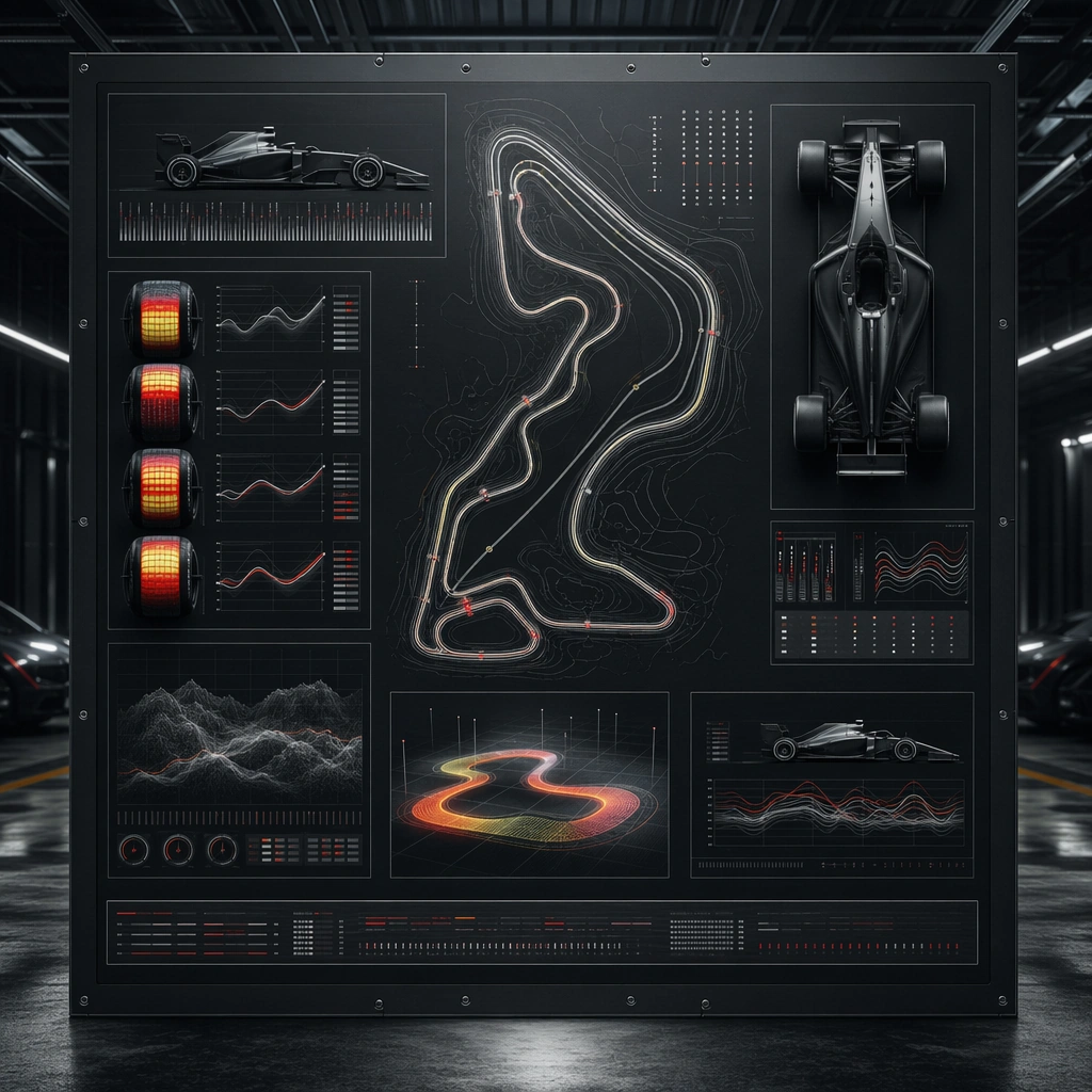
Example generated from “Motorsport Livery And Track Promo Set — Telemetry Style Board”
GPT Image 2en

Scene: A square dark technical board with light panels, non-readable graphs, track-shape abstractions, and clean visual hierarchy. Compose the frame as a square key visual with disciplined camera placement, premium lighting control, and believable real-world scale. The tonal range should feel polished and intentional, with enough atmosphere to create depth without obscuring form. Keep contrast calibrated for launch, catalog, or research presentation use rather than casual snapshot aesthetics. Subject: Center original motorsport data-inspired compositions combining track traces, tire-heat fields, timing bars, and car silhouettes. Make the subject feel original, production-aware, and clearly grounded in Motorsport Livery and Track Promo Set. Treat this as an independent study that must feel complete and coherent without relying on any external reference image. The focal hierarchy should be immediate: primary form first, then material behavior, then supporting environmental cues that clarify use context and difficulty. Important details: Favor professional race-engineering mood without literal readable numbers or labels. The board should feel informative, premium, and rooted in motorsport culture. The visual language should still feel native to Motorsport Livery and Track Promo Set, using disciplined industrial or campaign composition instead of generic stock photography. Use believable materials, engineering logic, and professional composition discipline. Reflections, shadows, edge breaks, texture scale, interface density, and small physical joints must all support realism. Avoid filler props, vague mood-board clutter, or any element that weakens the sense of a purpose-built industrial or automotive image. Use case: Motorsport Promo single study 9/9 for Motorsport Livery and Track Promo Set, built as image support-five. Constraints: No readable text, no watermark, no logos, preserve exact 1:1 aspect ratio, no sponsor logos, no readable digits, no copyrighted circuit signage, no real team branding, no crowd chaos.

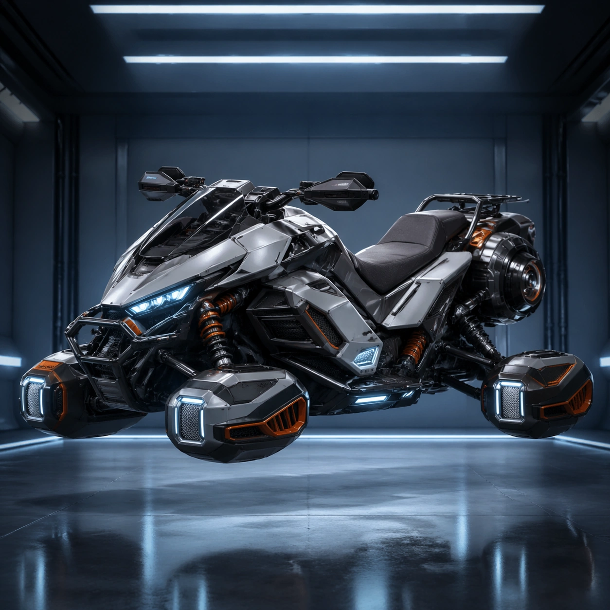
Example generated from “Mount Vehicle Garage Sheet — Reference Garage Hero”
GPT Image 2en

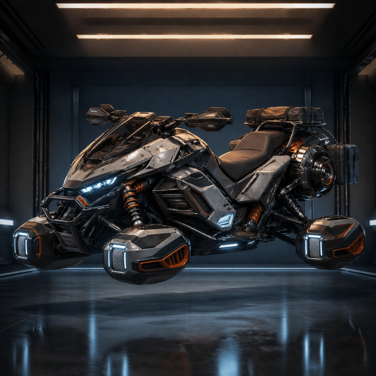
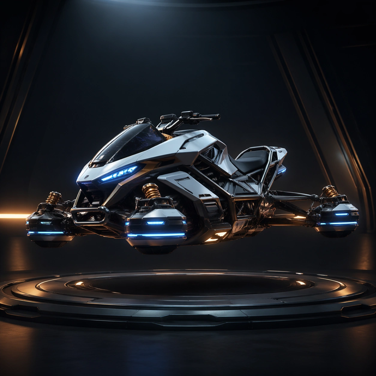
Scene: A square premium garage hero shot of the main vehicle floating in a controlled service bay with cool overhead strips, side kickers, and a clean floor reflection. The camera is a flattering three-quarter angle that reveals front profile, saddle or cockpit area, wheel pods, side fairings, and rear propulsion hardware without distortion. Subject: A high-performance rally hoverbike or compact futuristic mount vehicle shown alone, centered, and fully visible. The chassis should feel genuinely engineered, with believable panel breaks, suspension logic, intake channels, protected lighting units, and a stable silhouette designed for both side-profile readability and store-page desirability. The subject theme is a fictional garage fleet built around a premium rally hoverbike chassis with modular panels, suspension pods, and luminous trim. Important details: This image is the reference anchor for later variants. Lock the exact wheel or hover pod spacing, body shell outline, seat and cockpit proportions, rear propulsion mass, front fairing cut, and lighting placement. Surface treatment should prioritize honest hard materials: painted alloy, matte polymer, rubber tire or anti-grav housings, brushed fasteners, faint scratches, and premium showroom cleanliness. Keep the whole image pure English and image-led, with no readable text anywhere. Use case: Garage Sheet series study 1/9. Constraints: No readable text, no watermark, no logos, preserve exact 1:1 aspect ratio, no rider, no environment clutter, no detached parts, no racing crowd, no unreadable signage, no exaggerated cartoon proportions

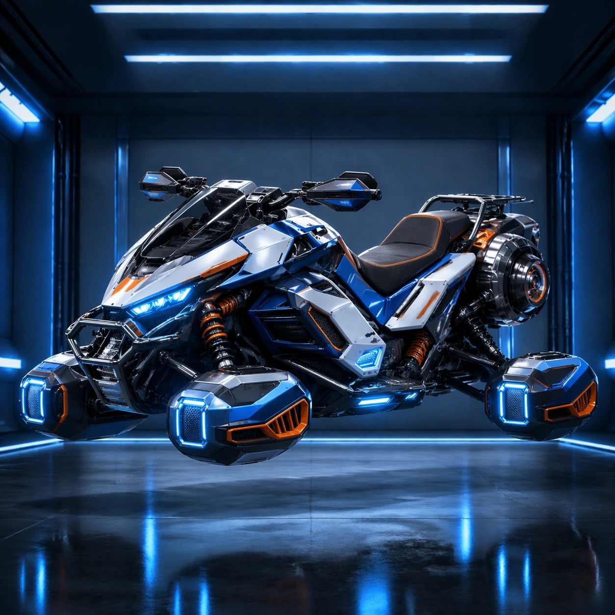
Example generated from “Mount Vehicle Garage Sheet — Rally Livery Upfit”
GPT Image 2en

Scene: A square garage reveal frame using the same camera height and vehicle scale as the reference image, with slightly hotter side lights and a controlled electric accent wash that makes the livery feel aspirational while keeping the space uncluttered and product-focused. Subject: The exact same vehicle chassis from the reference model, upgraded with a rare-tier racing livery, brighter body striping, improved front intake details, cleaner alloy edging, and a more premium seat or cockpit trim. Preserve exact chassis shape, wheelbase, body shell outline, suspension locations, and propulsion geometry from the reference model. The subject theme is a fictional garage fleet built around a premium rally hoverbike chassis with modular panels, suspension pods, and luminous trim. Important details: The upgrade should read as a higher trim level rather than a different vehicle family. Emphasize paint hierarchy, sharper panel contrast, tighter reflections, brighter light bars, and a few competition markings rendered only as abstract shape blocks. Maintain believable engineering, stable proportions, and side-profile recognizability suitable for a garage menu or store card. Keep the whole image pure English and image-led, with no readable text anywhere. Use case: Garage Sheet series study 2/9. Constraints: No readable text, no watermark, no logos, preserve exact 1:1 aspect ratio, preserve exact chassis from the reference model, no rider, no action scene, no flying debris, no oversized spoilers, no readable decals

Example generated from “Mount Vehicle Garage Sheet — Expedition Class Upfit”
GPT Image 2en

Scene: A square industrial garage hero angle with the same framing and vehicle placement as image 01, but under moodier tungsten-blue shop lighting that gives more weight to tires, wheel pods, storage brackets, and weather seals. Subject: The exact same vehicle chassis from the reference model, now adapted into a rugged expedition class. Preserve exact frame, wheelbase, shell outline, propulsion placement, and cockpit proportions from the reference model. Add reinforced cargo rails, sealed side panniers or utility packs, chunkier surface guards, and sand-scuffed finishes that imply long-distance traversal without changing the core silhouette. The subject theme is a fictional garage fleet built around a premium rally hoverbike chassis with modular panels, suspension pods, and luminous trim. Important details: This variant should feel purpose-built for endurance while still belonging to the same product family. Use denser materials, dust-softened highlights, more robust fasteners, and practical hardware mounted flush to the body. Any utility additions must look bolted to existing attachment points rather than floating or mutating the vehicle shape. Keep the whole image pure English and image-led, with no readable text anywhere. Use case: Garage Sheet series study 3/9. Constraints: No readable text, no watermark, no logos, preserve exact 1:1 aspect ratio, preserve exact chassis from the reference model, no driver, no wilderness backdrop, no loose cargo cloud, no creature anatomy, no readable text

Example generated from “Mount Vehicle Garage Sheet — Event Prestige Edition”
GPT Image 2en

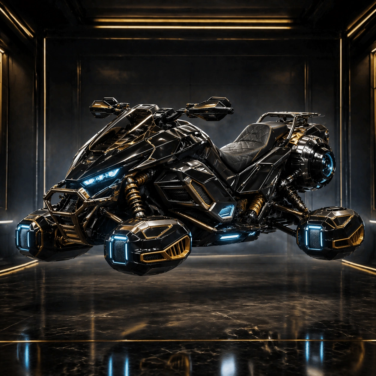
Scene: A square top-tier garage storefront render with the same base angle and silhouette as the reference, lit by elegant gold-cyan contrast, a subtle background haze, and dark architectural framing that leaves the vehicle fully legible. Subject: The exact same vehicle chassis from the reference model presented as a prestige event edition. Preserve exact frame, wheel or hover pod placement, cockpit scale, front fairing, rear propulsion shape, and overall proportions from the reference model. Elevate the finish with obsidian paint, luminous inset strips, polished alloy details, and premium saddle or cockpit materials. The subject theme is a fictional garage fleet built around a premium rally hoverbike chassis with modular panels, suspension pods, and luminous trim. Important details: Prestige should come from disciplined luxury and engineering precision, not from redesigning the machine. Add richer reflections, finer trim lines, flush energy channels, and a few collectible-quality hardware details that still feel manufacturable. The result must work equally as a garage unlock render and a season reward hero asset. Keep the whole image pure English and image-led, with no readable text anywhere. Use case: Garage Sheet series study 4/9. Constraints: No readable text, no watermark, no logos, preserve exact 1:1 aspect ratio, preserve exact chassis from the reference model, no rider, no race explosion, no floating ornaments, no fantasy animal head motifs, no readable branding

Example generated from “Mount Vehicle Garage Sheet — Orthographic Side Sheet”
GPT Image 2en

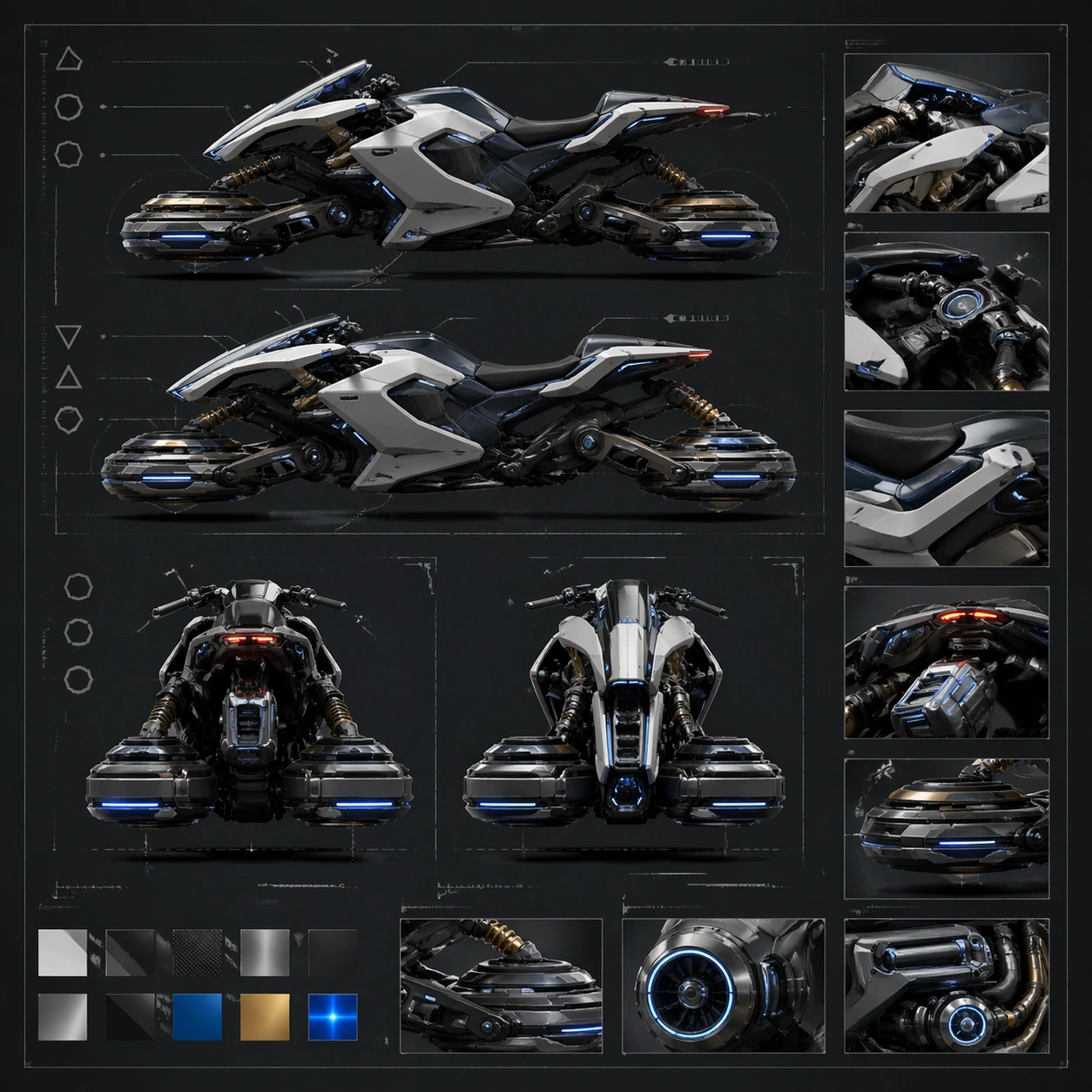
Scene: A square technical garage board on a dark drafting surface with evenly lit side profiles, rear and front silhouettes, and a few detail insets laid out in disciplined rows. Subject: The same vehicle family rendered as clear orthographic garage references, with side elevation, rear read, front symmetry view, and close insets for wheel housings, cockpit trim, and propulsion modules. The subject theme is a fictional garage fleet built around a premium rally hoverbike chassis with modular panels, suspension pods, and luminous trim. Important details: Prioritize side-profile clarity, class readability, and believable manufacturing seams. Use abstract callout lines, shape-based markers, material swatches, and soft drafting textures without any readable annotations. The board should feel suitable for an internal garage bible or patch explainer. Keep the whole image pure English and image-led, with no readable text anywhere. Use case: Garage Sheet single study 5/9. Constraints: No readable text, no watermark, no logos, preserve exact 1:1 aspect ratio, no readable labels, no rider, no warped perspective, no cluttered collage, no random spare parts

Example generated from “Mount Vehicle Garage Sheet — Garage Parts Breakdown”
GPT Image 2en

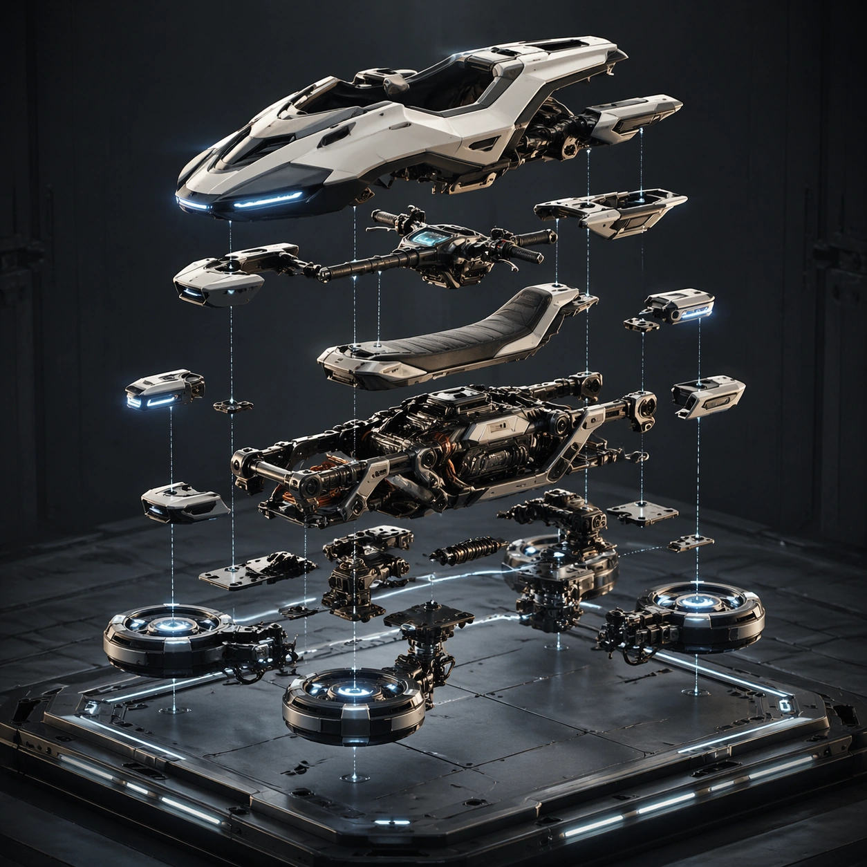
Scene: A square exploded-view support plate suspended over a muted industrial background, lit like a premium product manual image with enough negative space between modules to read every layer. Subject: A believable breakdown of the vehicle into body shell, control cluster, propulsion core, wheel or hover pod assembly, suspension bracket, seat, and lighting units. The subject theme is a fictional garage fleet built around a premium rally hoverbike chassis with modular panels, suspension pods, and luminous trim. Important details: Every part should align mechanically and look ready to be reassembled. Use crisp spacing, ghosted alignment guides, subtle material variation, and restrained technical elegance so the board feels both aspirational and useful. Keep the whole image pure English and image-led, with no readable text anywhere. Use case: Garage Sheet single study 6/9. Constraints: No readable text, no watermark, no logos, preserve exact 1:1 aspect ratio, no readable text, no rider, no scrap heap chaos, no floating magical pieces, no extreme fisheye angle

Example generated from “Mount Vehicle Garage Sheet — Materials Livery Board”
GPT Image 2en

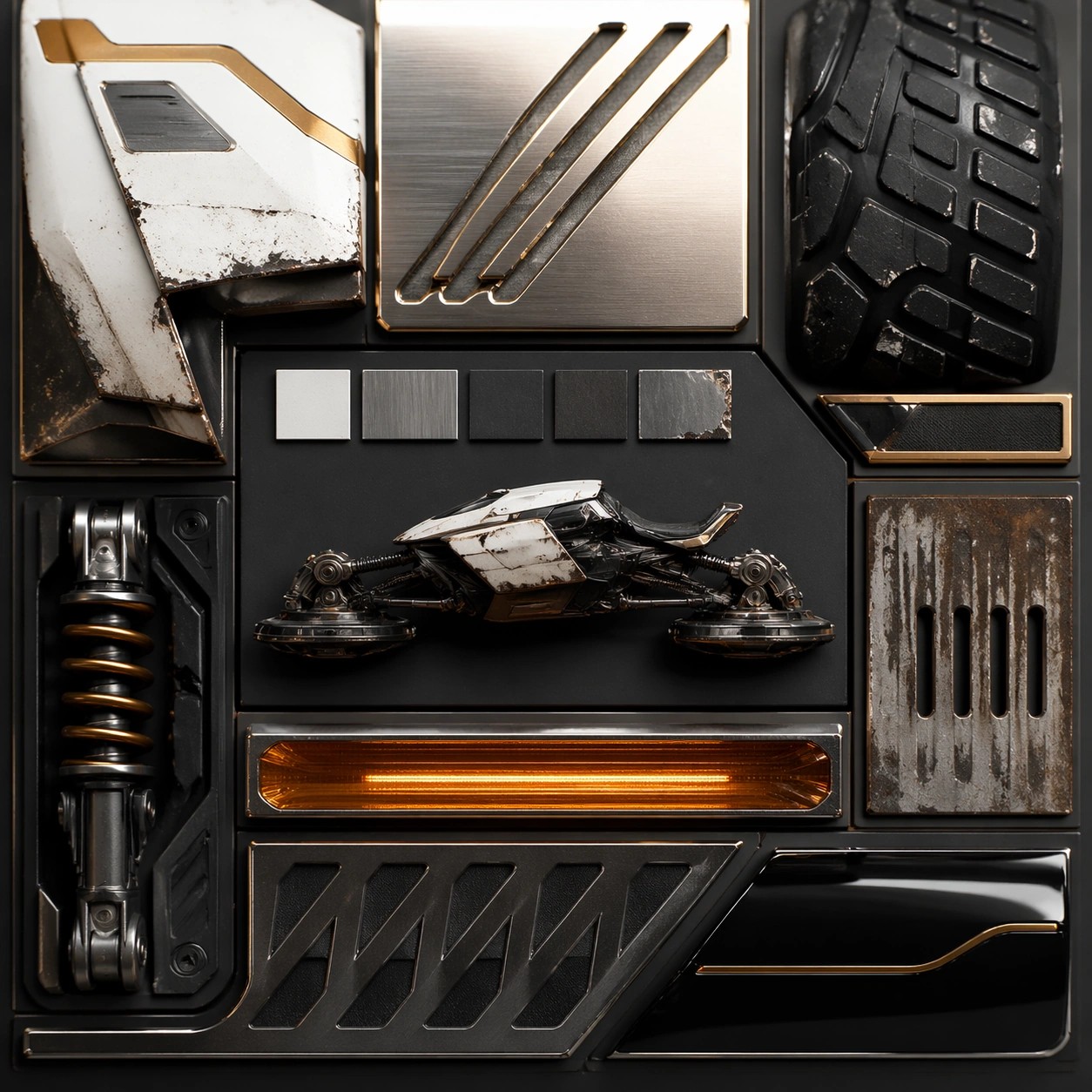
Scene: A square macro material board photographed like a luxury transportation design review, with close-up chips and textures arranged around a small center vehicle silhouette. Subject: Surface samples from the same vehicle system: painted alloy, brushed metal, rubberized tread, translucent light strip, weathered expedition shell, and prestige gloss panels. The subject theme is a fictional garage fleet built around a premium rally hoverbike chassis with modular panels, suspension pods, and luminous trim. Important details: Focus on tactile credibility through machining marks, edge wear, coating depth, molded texture, and controlled reflections. Graphic dividers may appear as clean lines and panels, but no readable labels should exist. Keep the whole image pure English and image-led, with no readable text anywhere. Use case: Garage Sheet single study 7/9. Constraints: No readable text, no watermark, no logos, preserve exact 1:1 aspect ratio, no readable text, no rider, no muddy blur, no random color explosion, no toy-like plastic simplification

Example generated from “Mount Vehicle Garage Sheet — Store Hero Angle”
GPT Image 2en

Scene: A square storefront hero composition with the vehicle floating above a low platform inside a sleek sci-fi garage bay, using elegant key light, rim light, and a dark premium backdrop. Subject: One flagship version of the same vehicle family presented at a conversion-friendly angle with immaculate finish, stable silhouette, and luxury-grade reflections. The subject theme is a fictional garage fleet built around a premium rally hoverbike chassis with modular panels, suspension pods, and luminous trim. Important details: The scene should leave enough breathing room for hypothetical UI crops while keeping the engineering visible. Make it feel exclusive, fast, and premium without relying on action clutter or branding. Keep the whole image pure English and image-led, with no readable text anywhere. Use case: Garage Sheet single study 8/9. Constraints: No readable text, no watermark, no logos, preserve exact 1:1 aspect ratio, no readable text, no rider, no race track, no trophy props, no oversized background structures

Example generated from “Mount Vehicle Garage Sheet — Class Comparison Board”
GPT Image 2en

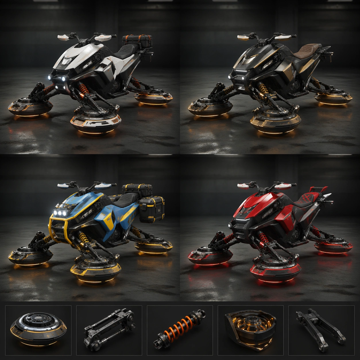
Scene: A square comparison board on a muted garage background with four vehicle variants arranged in a clean grid and one small detail strip for wheel or hover hardware. Subject: A family of related vehicles or trim classes sharing one chassis language while differing in role emphasis, panel density, trim value, and performance attitude. The subject theme is a fictional garage fleet built around a premium rally hoverbike chassis with modular panels, suspension pods, and luminous trim. Important details: Keep the shared DNA obvious through consistent geometry and materials while allowing role differences to read instantly. The board should feel like a garage selection screen concept translated into a polished standalone image. Keep the whole image pure English and image-led, with no readable text anywhere. Use case: Garage Sheet single study 9/9. Constraints: No readable text, no watermark, no logos, preserve exact 1:1 aspect ratio, no readable text, no rider, no chaotic overlap, no mismatched art styles, no broken proportions

Example generated from “Mountain Megascale Poster Vistas — Reference Anchor”
GPT Image 2en

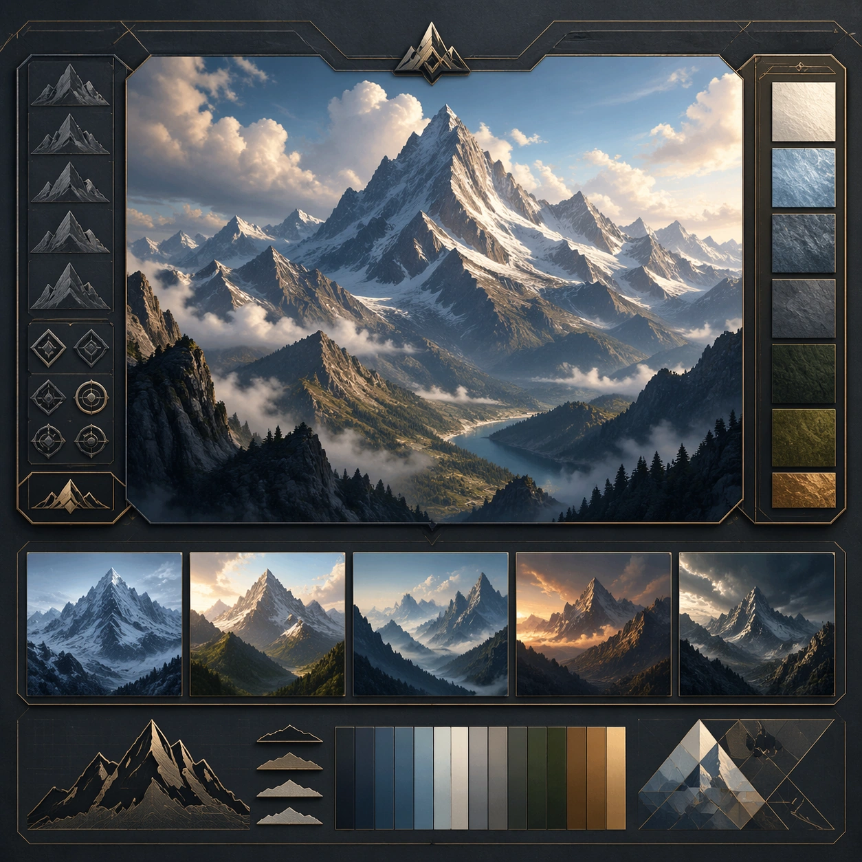
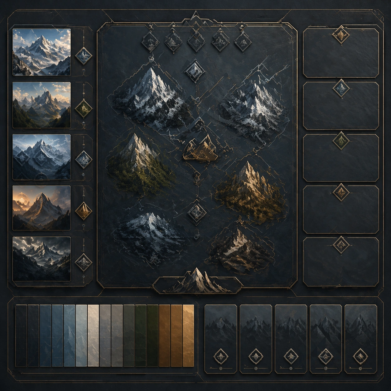
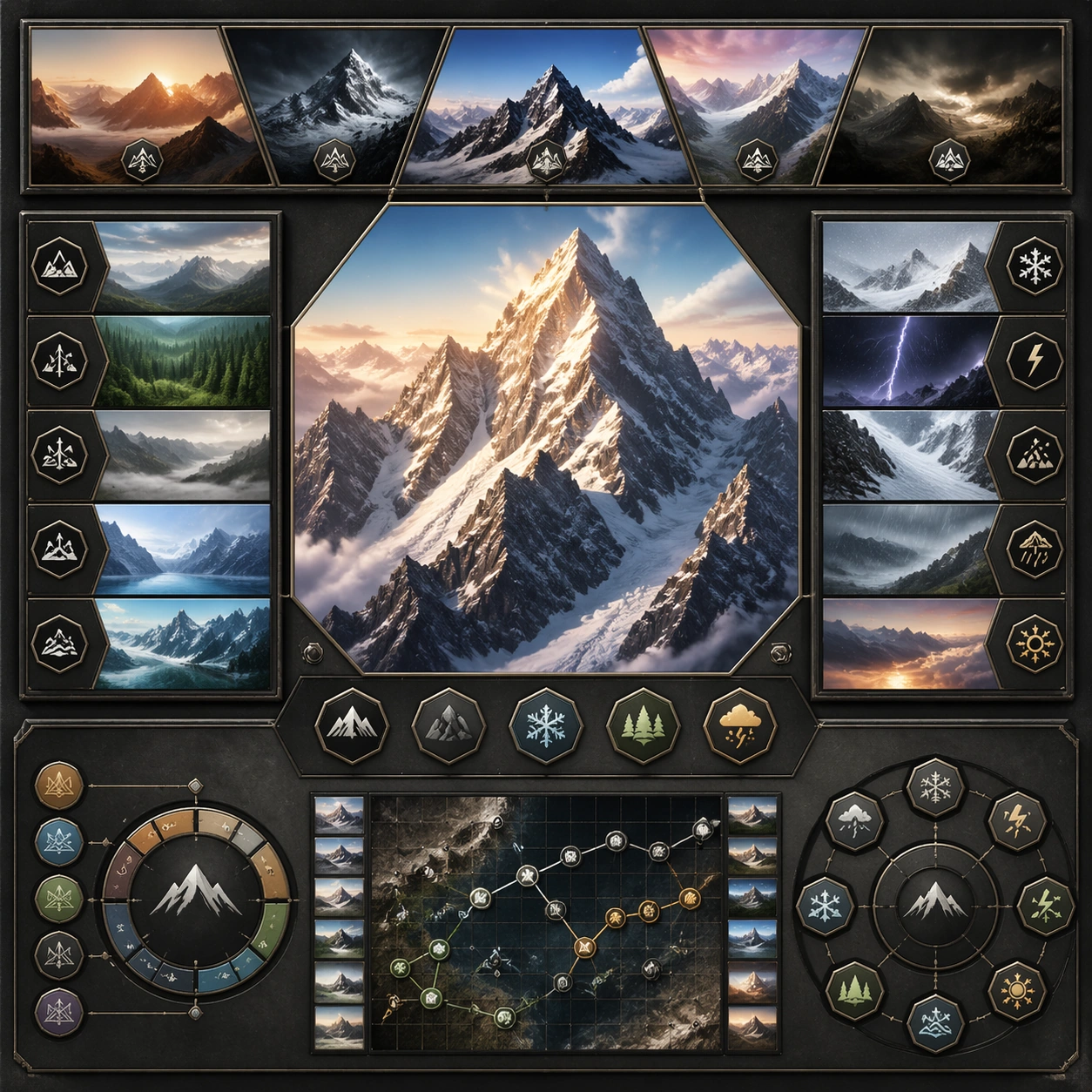
Scene: Create a square reference image for Mountain Megascale Poster Vistas. Build a reference anchor establishing the core system with a premium, production-ready finish. Use a polished modular board or campaign surface with clean spacing, premium game-UI finish, and clear focal hierarchy. The composition should feel intentional, clean, and reusable for gallery, research, campaign, or internal handoff contexts. Lighting must support readability first, with the main forms clearly separated from the background and enough breathing room for the system to stay legible at both hero scale and thumbnail scale. Subject: Center a coherent original game-art system built for premium production and marketing surfaces. For this image, focus on reference anchor. Keep the same system logic stable across screenshots, cards, banners, and overview boards. This image is the canonical anchor that later series images must follow. The viewer should immediately understand what role this surface plays inside a cohesive game-production asset pack. Important details: Lock framing, icon grammar, palette blocking, and surface hierarchy so the kit feels production-ready and consistent. Preserve the core silhouette, framing language, and material logic from the reference image while each variation changes function. Keep materials believable, edge hierarchy disciplined, and the visual language consistent with Mountain Vistas. Use abstract interface blocks or diagram accents when helpful, but avoid any readable language. The final result should feel like a deliberate production asset rather than a random illustration. Use case: Mountain Megascale Poster Vistas series study 1/9, designed as reference anchor within a cohesive asset pack. Constraints: No readable text, no watermark, no logos, preserve exact 1:1 aspect ratio, no unrelated objects, no broken visual hierarchy, no malformed anatomy or broken perspective, no random decorative clutter.

Example generated from “Mountain Megascale Poster Vistas — Variant One”
GPT Image 2en

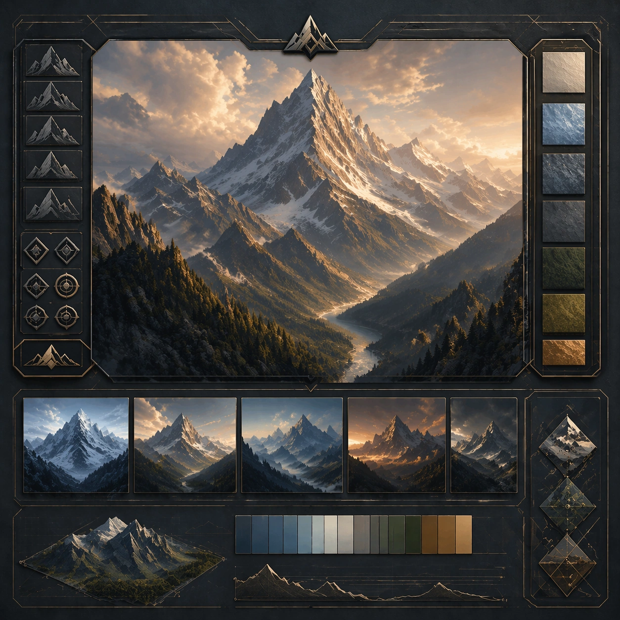
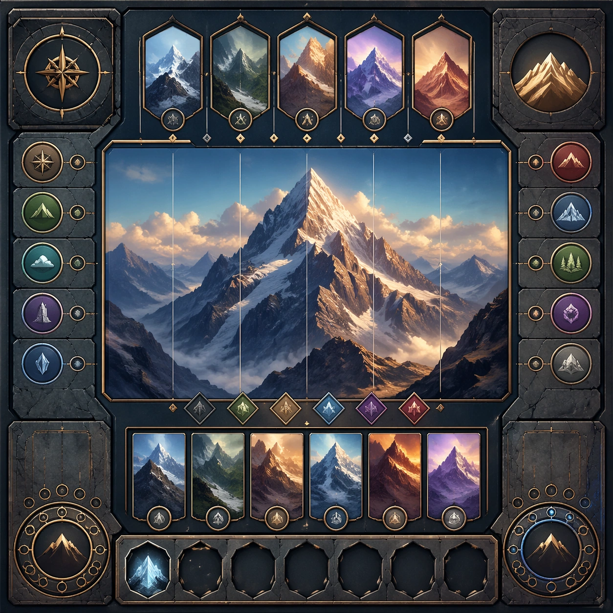
Scene: Create a square dependent image for Mountain Megascale Poster Vistas. Build a first controlled variation in the same system with a premium, production-ready finish. Use a polished modular board or campaign surface with clean spacing, premium game-UI finish, and clear focal hierarchy. The composition should feel intentional, clean, and reusable for gallery, research, campaign, or internal handoff contexts. Lighting must support readability first, with the main forms clearly separated from the background and enough breathing room for the system to stay legible at both hero scale and thumbnail scale. Subject: Center a coherent original game-art system built for premium production and marketing surfaces. For this image, focus on the intended support surface. Keep the same system logic stable across screenshots, cards, banners, and overview boards. Preserve exact identity or system logic from the reference image while changing only the intended variation axis. The viewer should immediately understand what role this surface plays inside a cohesive game-production asset pack. Important details: Lock framing, icon grammar, palette blocking, and surface hierarchy so the kit feels production-ready and consistent. Preserve the core silhouette, framing language, and material logic from the reference image while each variation changes function. Keep materials believable, edge hierarchy disciplined, and the visual language consistent with Mountain Vistas. Use abstract interface blocks or diagram accents when helpful, but avoid any readable language. The final result should feel like a deliberate production asset rather than a random illustration. Use case: Mountain Megascale Poster Vistas series study 2/9, designed as variant one within a cohesive asset pack. Constraints: No readable text, no watermark, no logos, preserve exact 1:1 aspect ratio, no unrelated objects, no broken visual hierarchy, no malformed anatomy or broken perspective, no random decorative clutter.

Example generated from “Mountain Megascale Poster Vistas — Variant Two”
GPT Image 2en

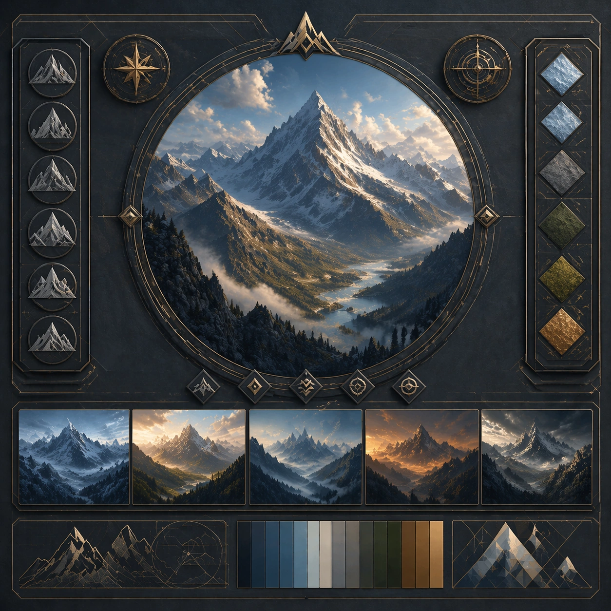
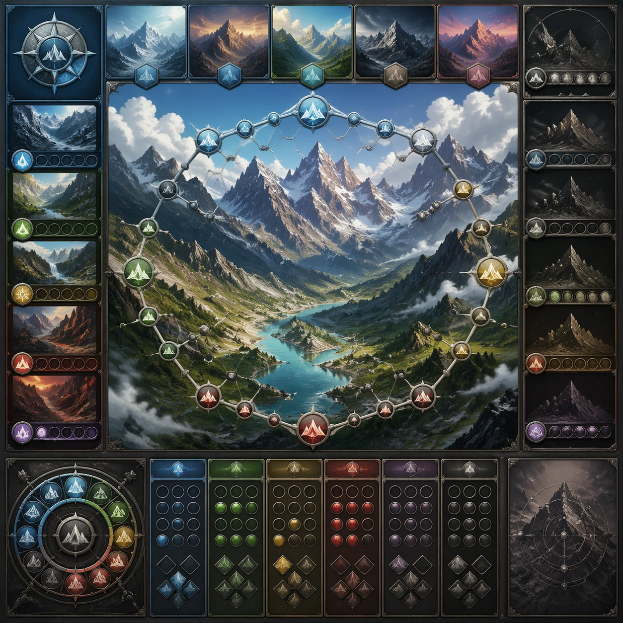
Scene: Create a square dependent image for Mountain Megascale Poster Vistas. Build a second controlled variation in the same system with a premium, production-ready finish. Use a polished modular board or campaign surface with clean spacing, premium game-UI finish, and clear focal hierarchy. The composition should feel intentional, clean, and reusable for gallery, research, campaign, or internal handoff contexts. Lighting must support readability first, with the main forms clearly separated from the background and enough breathing room for the system to stay legible at both hero scale and thumbnail scale. Subject: Center a coherent original game-art system built for premium production and marketing surfaces. For this image, focus on the intended support surface. Keep the same system logic stable across screenshots, cards, banners, and overview boards. Preserve exact identity or system logic from the reference image while changing only the intended variation axis. The viewer should immediately understand what role this surface plays inside a cohesive game-production asset pack. Important details: Lock framing, icon grammar, palette blocking, and surface hierarchy so the kit feels production-ready and consistent. Preserve the core silhouette, framing language, and material logic from the reference image while each variation changes function. Keep materials believable, edge hierarchy disciplined, and the visual language consistent with Mountain Vistas. Use abstract interface blocks or diagram accents when helpful, but avoid any readable language. The final result should feel like a deliberate production asset rather than a random illustration. Use case: Mountain Megascale Poster Vistas series study 3/9, designed as variant two within a cohesive asset pack. Constraints: No readable text, no watermark, no logos, preserve exact 1:1 aspect ratio, no unrelated objects, no broken visual hierarchy, no malformed anatomy or broken perspective, no random decorative clutter.

Example generated from “Mountain Megascale Poster Vistas — Variant Three”
GPT Image 2en

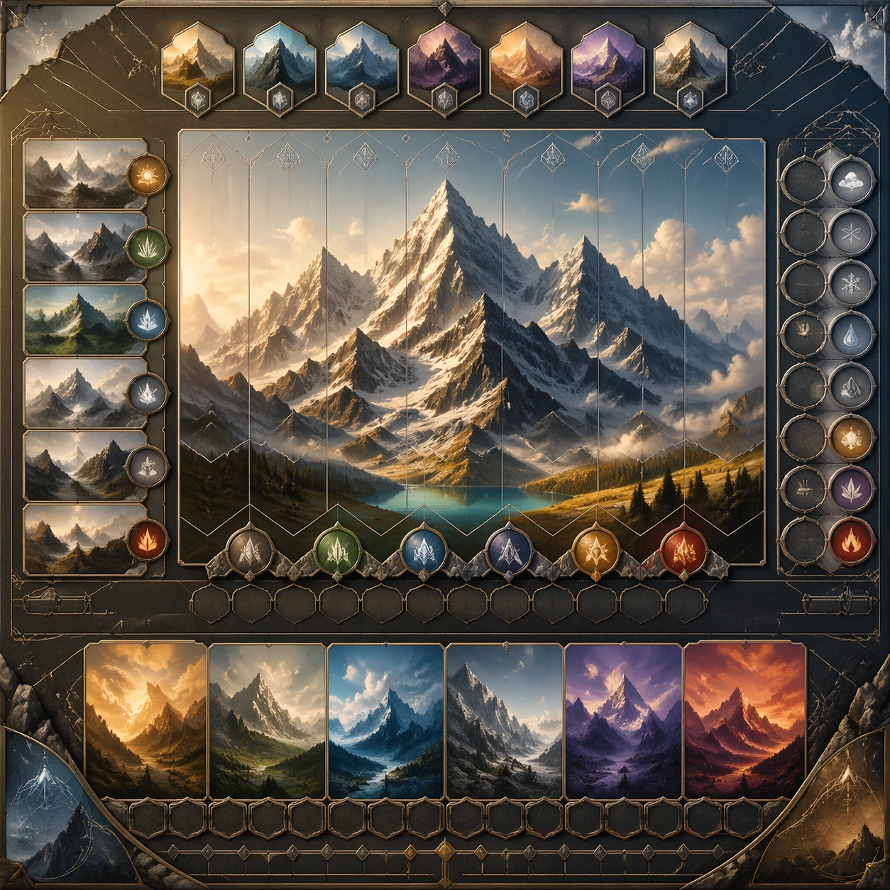
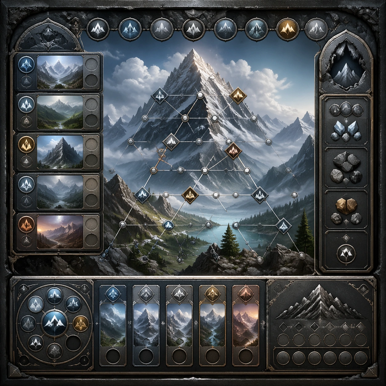
Scene: Create a square dependent image for Mountain Megascale Poster Vistas. Build a third controlled variation in the same system with a premium, production-ready finish. Use a polished modular board or campaign surface with clean spacing, premium game-UI finish, and clear focal hierarchy. The composition should feel intentional, clean, and reusable for gallery, research, campaign, or internal handoff contexts. Lighting must support readability first, with the main forms clearly separated from the background and enough breathing room for the system to stay legible at both hero scale and thumbnail scale. Subject: Center a coherent original game-art system built for premium production and marketing surfaces. For this image, focus on the intended support surface. Keep the same system logic stable across screenshots, cards, banners, and overview boards. Preserve exact identity or system logic from the reference image while changing only the intended variation axis. The viewer should immediately understand what role this surface plays inside a cohesive game-production asset pack. Important details: Lock framing, icon grammar, palette blocking, and surface hierarchy so the kit feels production-ready and consistent. Preserve the core silhouette, framing language, and material logic from the reference image while each variation changes function. Keep materials believable, edge hierarchy disciplined, and the visual language consistent with Mountain Vistas. Use abstract interface blocks or diagram accents when helpful, but avoid any readable language. The final result should feel like a deliberate production asset rather than a random illustration. Use case: Mountain Megascale Poster Vistas series study 4/9, designed as variant three within a cohesive asset pack. Constraints: No readable text, no watermark, no logos, preserve exact 1:1 aspect ratio, no unrelated objects, no broken visual hierarchy, no malformed anatomy or broken perspective, no random decorative clutter.

Example generated from “Mountain Megascale Poster Vistas — Support One”
GPT Image 2en

Scene: Create a square standalone support image for Mountain Megascale Poster Vistas. Build a support-surface study with a clear focal hierarchy and a finished professional surface. Use a polished modular board or campaign surface with clean spacing, premium game-UI finish, and clear focal hierarchy. The frame should feel self-contained and polished, with enough structure to explain the system even without the reference series, yet still obviously belonging to the same theme and production world. Subject: Show a coherent original game-art system built for premium production and marketing surfaces in a way that emphasizes the intended support surface. Keep the same system logic stable across screenshots, cards, banners, and overview boards. Even though this image is independent, the viewer should still recognize the same universe, same commercial logic, and same production intent as the core package. Important details: Lock framing, icon grammar, palette blocking, and surface hierarchy so the kit feels production-ready and consistent. Preserve the broader theme language through color, framing, material choices, and modular composition. Use clean panel rhythm, premium asset presentation, and believable detail density. The image should work equally well as a gallery study, research reference, and mock production deliverable. Use case: Mountain Megascale Poster Vistas single study 5/9, exploring support one as a support surface. Constraints: No readable text, no watermark, no logos, preserve exact 1:1 aspect ratio, no unrelated objects, no broken visual hierarchy, no visual noise that obscures the main surface, no accidental brand resemblance.

Example generated from “Mountain Megascale Poster Vistas — Support Two”
GPT Image 2en

Scene: Create a square standalone support image for Mountain Megascale Poster Vistas. Build a second support-surface study with a clear focal hierarchy and a finished professional surface. Use a polished modular board or campaign surface with clean spacing, premium game-UI finish, and clear focal hierarchy. The frame should feel self-contained and polished, with enough structure to explain the system even without the reference series, yet still obviously belonging to the same theme and production world. Subject: Show a coherent original game-art system built for premium production and marketing surfaces in a way that emphasizes the intended support surface. Keep the same system logic stable across screenshots, cards, banners, and overview boards. Even though this image is independent, the viewer should still recognize the same universe, same commercial logic, and same production intent as the core package. Important details: Lock framing, icon grammar, palette blocking, and surface hierarchy so the kit feels production-ready and consistent. Preserve the broader theme language through color, framing, material choices, and modular composition. Use clean panel rhythm, premium asset presentation, and believable detail density. The image should work equally well as a gallery study, research reference, and mock production deliverable. Use case: Mountain Megascale Poster Vistas single study 6/9, exploring support two as a support surface. Constraints: No readable text, no watermark, no logos, preserve exact 1:1 aspect ratio, no unrelated objects, no broken visual hierarchy, no visual noise that obscures the main surface, no accidental brand resemblance.

Example generated from “Mountain Megascale Poster Vistas — Support Three”
GPT Image 2en

Scene: Create a square standalone support image for Mountain Megascale Poster Vistas. Build a third support-surface study with a clear focal hierarchy and a finished professional surface. Use a polished modular board or campaign surface with clean spacing, premium game-UI finish, and clear focal hierarchy. The frame should feel self-contained and polished, with enough structure to explain the system even without the reference series, yet still obviously belonging to the same theme and production world. Subject: Show a coherent original game-art system built for premium production and marketing surfaces in a way that emphasizes the intended support surface. Keep the same system logic stable across screenshots, cards, banners, and overview boards. Even though this image is independent, the viewer should still recognize the same universe, same commercial logic, and same production intent as the core package. Important details: Lock framing, icon grammar, palette blocking, and surface hierarchy so the kit feels production-ready and consistent. Preserve the broader theme language through color, framing, material choices, and modular composition. Use clean panel rhythm, premium asset presentation, and believable detail density. The image should work equally well as a gallery study, research reference, and mock production deliverable. Use case: Mountain Megascale Poster Vistas single study 7/9, exploring support three as a support surface. Constraints: No readable text, no watermark, no logos, preserve exact 1:1 aspect ratio, no unrelated objects, no broken visual hierarchy, no visual noise that obscures the main surface, no accidental brand resemblance.

Example generated from “Mountain Megascale Poster Vistas — Support Four”
GPT Image 2en

Scene: Create a square standalone support image for Mountain Megascale Poster Vistas. Build a fourth support-surface study with a clear focal hierarchy and a finished professional surface. Use a polished modular board or campaign surface with clean spacing, premium game-UI finish, and clear focal hierarchy. The frame should feel self-contained and polished, with enough structure to explain the system even without the reference series, yet still obviously belonging to the same theme and production world. Subject: Show a coherent original game-art system built for premium production and marketing surfaces in a way that emphasizes the intended support surface. Keep the same system logic stable across screenshots, cards, banners, and overview boards. Even though this image is independent, the viewer should still recognize the same universe, same commercial logic, and same production intent as the core package. Important details: Lock framing, icon grammar, palette blocking, and surface hierarchy so the kit feels production-ready and consistent. Preserve the broader theme language through color, framing, material choices, and modular composition. Use clean panel rhythm, premium asset presentation, and believable detail density. The image should work equally well as a gallery study, research reference, and mock production deliverable. Use case: Mountain Megascale Poster Vistas single study 8/9, exploring support four as a support surface. Constraints: No readable text, no watermark, no logos, preserve exact 1:1 aspect ratio, no unrelated objects, no broken visual hierarchy, no visual noise that obscures the main surface, no accidental brand resemblance.

Example generated from “Mountain Megascale Poster Vistas — Support Five”
GPT Image 2en

Scene: Create a square standalone support image for Mountain Megascale Poster Vistas. Build a fifth support-surface study with a clear focal hierarchy and a finished professional surface. Use a polished modular board or campaign surface with clean spacing, premium game-UI finish, and clear focal hierarchy. The frame should feel self-contained and polished, with enough structure to explain the system even without the reference series, yet still obviously belonging to the same theme and production world. Subject: Show a coherent original game-art system built for premium production and marketing surfaces in a way that emphasizes the intended support surface. Keep the same system logic stable across screenshots, cards, banners, and overview boards. Even though this image is independent, the viewer should still recognize the same universe, same commercial logic, and same production intent as the core package. Important details: Lock framing, icon grammar, palette blocking, and surface hierarchy so the kit feels production-ready and consistent. Preserve the broader theme language through color, framing, material choices, and modular composition. Use clean panel rhythm, premium asset presentation, and believable detail density. The image should work equally well as a gallery study, research reference, and mock production deliverable. Use case: Mountain Megascale Poster Vistas single study 9/9, exploring support five as a support surface. Constraints: No readable text, no watermark, no logos, preserve exact 1:1 aspect ratio, no unrelated objects, no broken visual hierarchy, no visual noise that obscures the main surface, no accidental brand resemblance.

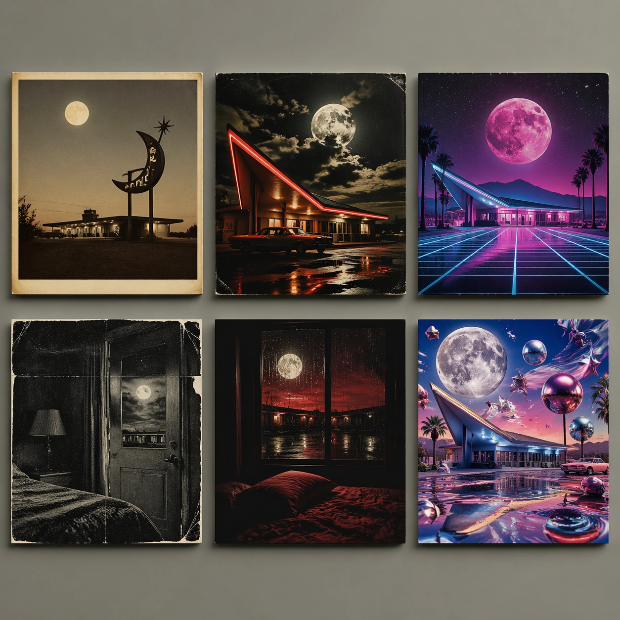
Example generated from “Multi Era Album Covers — Lunar Motel Set”
GPT Image 2en

Scene: A square commercial mockup showing six fictional vinyl album covers arranged in a precise 2 by 3 grid on a neutral studio wall. Each cover is a separate square sleeve with slight paper thickness, realistic print grain, and subtle shadows. The shared concept is Lunar Motel, a lonely roadside motel under a moonlit sky, reinterpreted across six music eras without any readable title text. Subject: Panel 1: 1960s folk, warm muted photograph of a motel sign silhouette, acoustic intimacy, dusty cream border. Panel 2: 1970s rock, high-contrast stage-like motel neon, grainy analog color, dramatic clouds. Panel 3: 1980s synthwave, magenta moon, cyan grid road, chrome motel geometry. Panel 4: 1990s grunge, scratched photocopy texture, desaturated motel room door, torn edges. Panel 5: 2000s emo, rain-streaked window, black-red palette, intimate bedroom framing. Panel 6: 2020s hyperpop, glossy surreal moon-motel collage, saturated candy colors, warped 3D reflections. Important details: All six covers must clearly share the same motel and moon motif while changing era-specific visual language, print process, palette, texture, and composition. Keep them as believable album sleeves, not posters or UI cards. Use cover-like margins, central imagery, and commercial mockup lighting. No actual band names, album titles, labels, stickers, or readable type; let the visual era cues carry the concept. Use case: Multi-Era Album Covers single study 1/8, testing six-era style transfer on one fictional album concept. Constraints: No readable text, no watermark, no logos, preserve exact 1:1 aspect ratio, no real artists, no record label marks, no famous album references, no duplicated panel, no random typography, no UI screenshots, no messy collage outside the six covers.

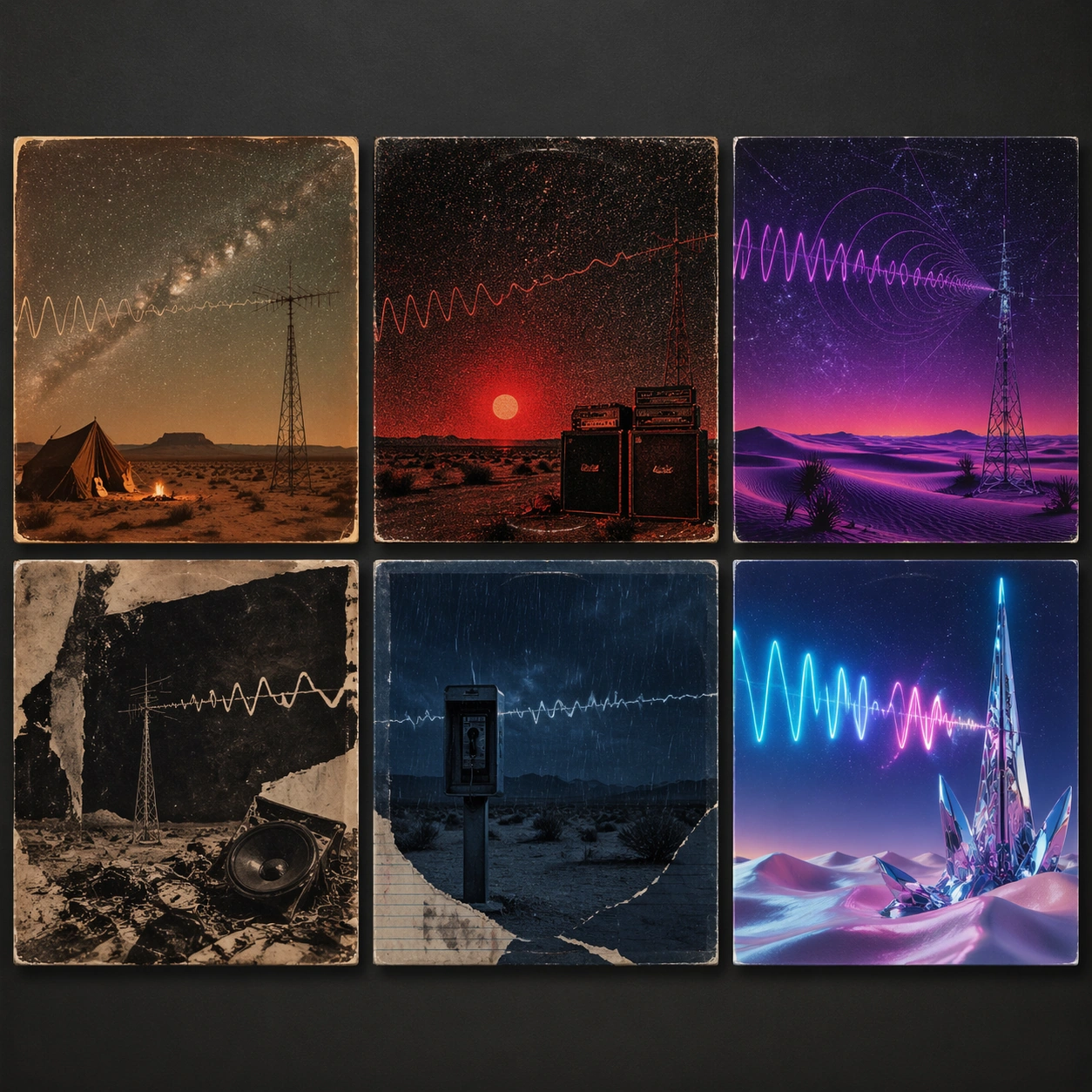
Example generated from “Multi Era Album Covers — Desert Signal Set”
GPT Image 2en

Scene: A square gallery mockup of six fictional album sleeves in a 2 by 3 grid, photographed straight-on with soft even lighting. The common concept is Desert Signal: a mysterious radio transmission crossing an empty desert at night. Each cover should look commercially plausible as a record sleeve from a different era, but none should contain readable text. Subject: The 1960s folk cover uses faded earth tones, a lone antenna beside an acoustic desert camp, and hand-developed photo warmth. The 1970s rock cover uses a low desert horizon, red sun, amplifier stacks, and heavy film grain. The 1980s synthwave cover uses purple dunes, neon waveform arcs, and geometric star grids. The 1990s grunge cover uses distressed xerox texture, broken radio parts, and muddy beige-black contrast. The 2000s emo cover uses a lonely payphone-like silhouette, blue night rain, and torn diary collage texture. The 2020s hyperpop cover uses glossy 3D sand, chrome antenna shards, and electric cyan-pink signal waves. Important details: Six panels must share antenna, desert, night sky, and signal-wave motifs while showing distinct decade design logic. Make era style apparent through color science, print texture, object styling, and composition, not text labels. Keep all covers aligned, equal size, and physically printed with sleeve shadows and paper grain. Use case: Multi-Era Album Covers single study 2/8, testing era-specific music visual language on the Desert Signal concept. Constraints: No readable text, no watermark, no logos, preserve exact 1:1 aspect ratio, no real album art, no famous musicians, no label stickers, no readable waveform labels, no sci-fi movie poster text, no random letters, no repeated identical cover.

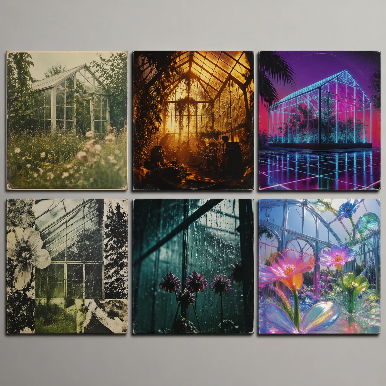
Example generated from “Multi Era Album Covers — Glass Garden Set”
GPT Image 2en

Scene: A square studio presentation of six album-cover mockups laid out as a clean 2 by 3 wall grid. The shared fictional album concept is Glass Garden: plants growing inside transparent architecture. The mockup should feel like a design portfolio spread, with real printed sleeves, slight gloss variation, and consistent cover dimensions. Subject: 1960s folk: soft analog photo of a greenhouse, wildflowers, muted green and cream, handmade quietness. 1970s rock: dramatic backlit conservatory, dense vines, smoky amber stage mood, bold contrast. 1980s synthwave: glass palmhouse rendered as neon wireframe, magenta sky, cyan reflections, geometric floor. 1990s grunge: scratched botanical collage, cracked greenhouse panes, xerox gray-green decay. 2000s emo: rain on glass, wilted flowers, black teal palette, intimate melancholic close-up. 2020s hyperpop: liquid glass blossoms, iridescent greenhouse, glossy 3D petals, saturated digital color. Important details: All six panels must preserve the glass-garden motif while showing clear changes in decade-specific cover design, print texture, palette, and image-making technology. Use no readable text; composition and visual grammar should imply album sleeves. Keep the covers separate, equal, and physically plausible with paper edges, subtle reflections, and shadows. Avoid referencing any real band, album, or label. Use case: Multi-Era Album Covers single study 3/8, testing one botanical-glass concept across six album-design eras. Constraints: No readable text, no watermark, no logos, preserve exact 1:1 aspect ratio, no real album references, no brand marks, no typography fragments, no identical panels, no gallery labels, no random QR codes, no extra covers outside the six-panel grid.

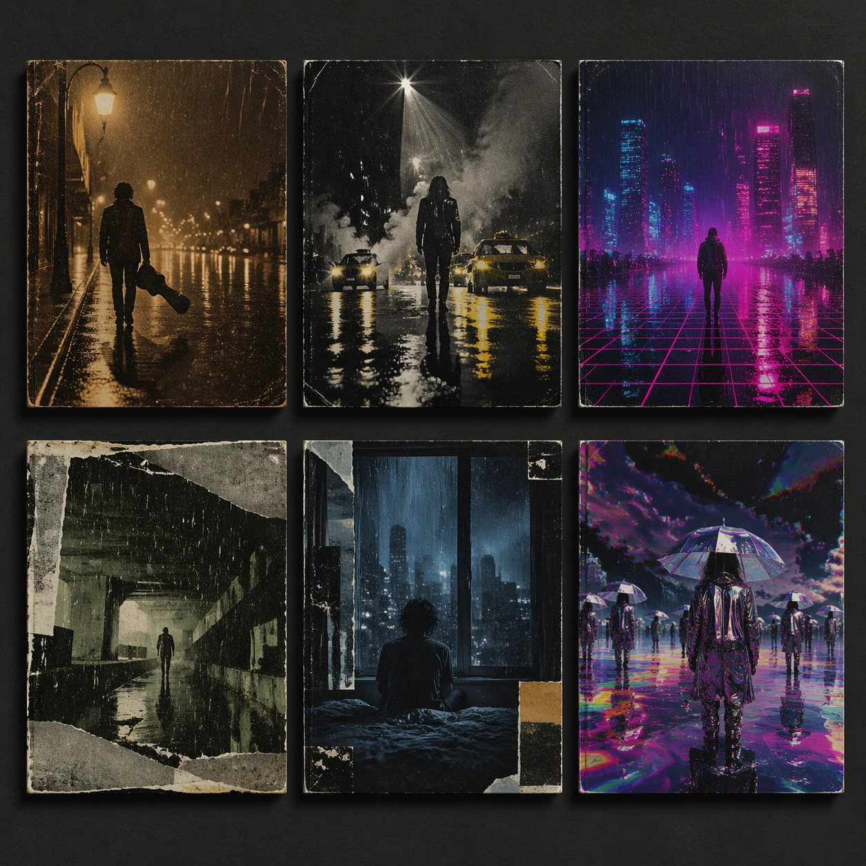
Example generated from “Multi Era Album Covers — City Rain Set”
GPT Image 2en

Scene: A square record-store display mockup with six fictional album covers arranged in a precise 2 by 3 grid on a dark gray wall. The shared concept is City Rain: urban loneliness, reflections, and wet pavement. Each cover has sleeve thickness, print grain, and a believable album-art finish, with no readable text anywhere. Subject: The 1960s folk cover shows a solitary figure with guitar case under a rainy streetlamp, muted brown film warmth. The 1970s rock cover shows wet asphalt, taxi headlights, smoke, and high-contrast stage-poster energy without text. The 1980s synthwave cover shows neon skyscraper reflections, magenta puddles, cyan grid perspective. The 1990s grunge cover shows torn photocopy rain texture, underpass concrete, muddy green-gray palette. The 2000s emo cover shows a bedroom window overlooking rain, black-blue palette, intimate collage edges. The 2020s hyperpop cover shows glossy chrome umbrellas, impossible reflective puddles, saturated glitchy color. Important details: The same visual motif should connect every panel: rain streaks, city reflection, isolation, and wet light. Era differences must appear through photographic texture, color grading, graphic composition, and material finish. Keep covers equally sized and separated by clean gutters. No readable type, no band names, no real cities or famous skyline references; the visual language alone should suggest album covers. Use case: Multi-Era Album Covers single study 4/8, testing urban-rain album art across six music eras. Constraints: No readable text, no watermark, no logos, preserve exact 1:1 aspect ratio, no real artist likeness, no famous album homage, no street signs, no license plates, no random text fragments, no UI panels, no duplicate compositions.

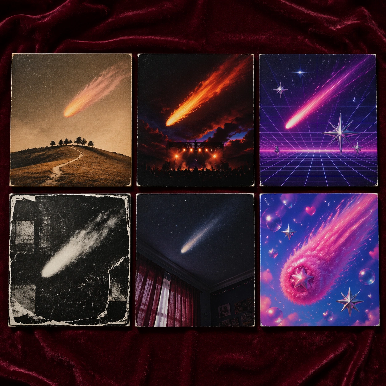
Example generated from “Multi Era Album Covers — Velvet Comet Set”
GPT Image 2en

Scene: A square commercial mockup showing six fictional album sleeves on a velvet-covered tabletop, arranged in two rows of three and photographed from a gentle overhead angle. The shared concept is Velvet Comet: a soft cosmic object crossing an intimate night sky. Each sleeve has its own era-specific print treatment while remaining part of one coherent set. Subject: 1960s folk: hand-tinted comet over a quiet hill, warm sepia, paper softness. 1970s rock: fiery comet above a stage-like horizon, heavy contrast, analog airbrush drama. 1980s synthwave: neon comet trail, violet grid sky, chrome star forms. 1990s grunge: photocopied comet smear, torn black paper, dirty silver textures. 2000s emo: close-up of a bedroom ceiling with comet light through curtains, midnight blue and burgundy. 2020s hyperpop: plush comet made of glossy velvet and digital sparkles, saturated pink-blue, playful surreal 3D. Important details: The comet motif must remain identifiable in all six panels, but each era should use a different production grammar: folk photo warmth, rock drama, synth geometry, grunge damage, emo intimacy, hyperpop gloss. Keep the sleeves physically printed, with paper texture, edges, and shadows. Do not place titles or artist names on the covers; avoid any actual album references. Use case: Multi-Era Album Covers single study 5/8, testing a cosmic album concept through six era-specific visual languages. Constraints: No readable text, no watermark, no logos, preserve exact 1:1 aspect ratio, no real musicians, no record label marks, no famous cover composition, no space agency logos, no readable stickers, no duplicated era, no extra sleeve outside the grid.

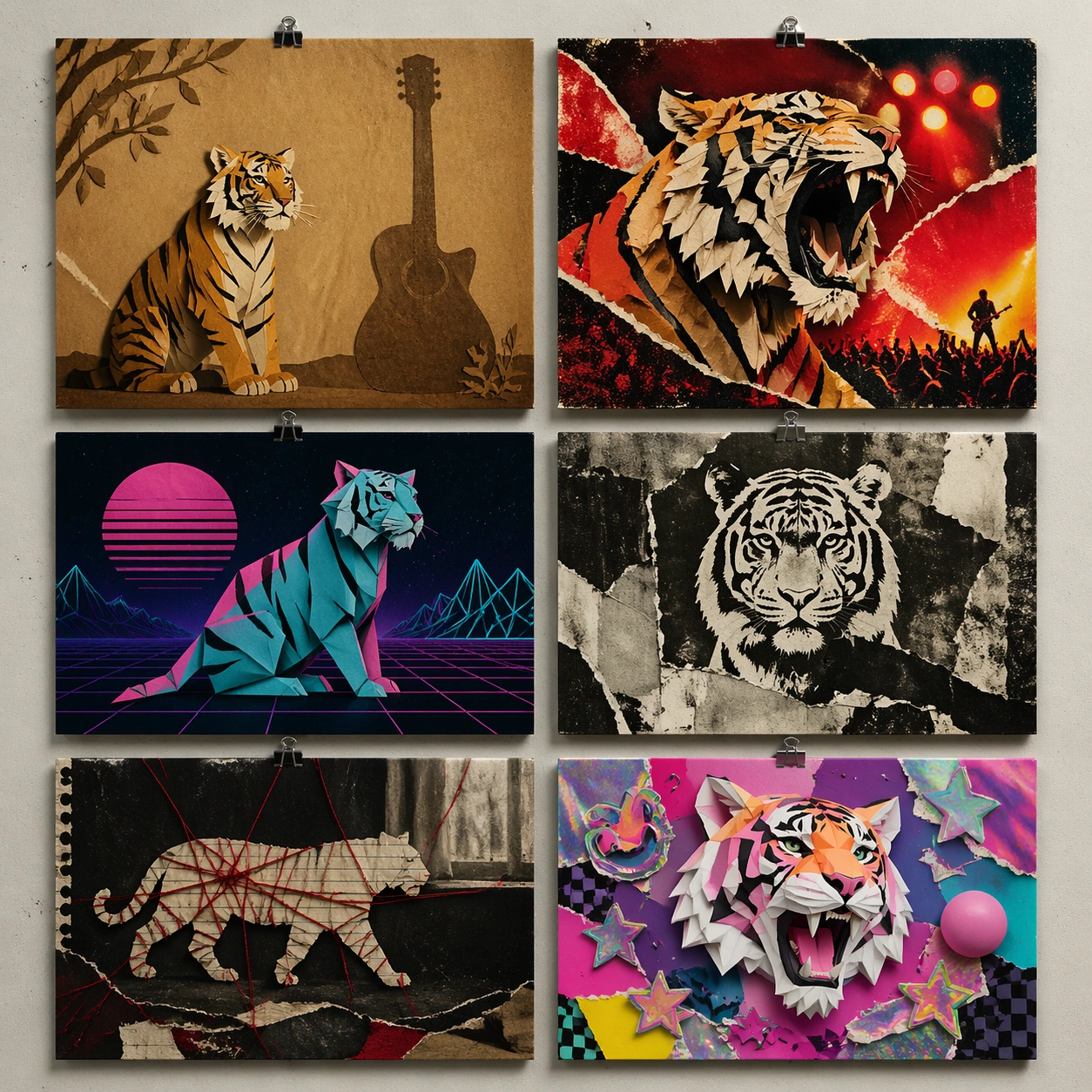
Example generated from “Multi Era Album Covers — Paper Tigers Set”
GPT Image 2en

Scene: A square art-direction board of six fictional album covers in a 2 by 3 grid, mounted with tiny blank clips on a studio wall. The shared concept is Paper Tigers: fragile courage, cut paper animals, and rebellious energy. The covers should look like finished commercial sleeve designs from different music eras, with no readable typography. Subject: 1960s folk: hand-cut paper tiger beside an acoustic guitar shadow, warm craft-paper palette. 1970s rock: roaring torn-paper tiger with stage lights and red-orange collage grit. 1980s synthwave: origami tiger in neon grid space, cyan-magenta paper folds. 1990s grunge: photocopied tiger stencil, ripped newsprint textures without readable words, muddy black-white contrast. 2000s emo: notebook-paper tiger silhouette, dark room, red thread and torn edges. 2020s hyperpop: glossy 3D paper tiger with sticker-like layers, saturated colors, playful glitch shapes. Important details: Maintain the paper tiger motif across all panels while shifting era aesthetics, print texture, and emotional tone. Paper material should stay visible: folds, cuts, torn edges, fibers, shadow layers, and collage seams. The six covers must be equal in size, clearly separated, and physically mounted. Avoid legible newspaper snippets, real band references, or literal album titles. Use case: Multi-Era Album Covers single study 6/8, testing era style transfer on a paper-collage album concept. Constraints: No readable text, no watermark, no logos, preserve exact 1:1 aspect ratio, no real album names, no readable newspaper fragments, no famous tiger logo, no duplicate cover, no extra paper notes, no UI panels, no clutter that hides the six-cover grid.

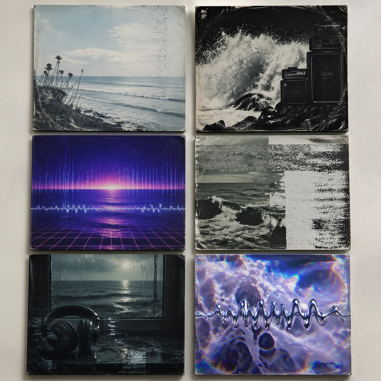
Example generated from “Multi Era Album Covers — Ocean Static Set”
GPT Image 2en

Scene: A square record-label pitch mockup with six fictional album covers placed on a pale tabletop in a precise 2 by 3 grid. The shared concept is Ocean Static: sea foam, radio noise, and distant signals. The physical sleeves should show slight paper warping, matte and glossy finishes, and soft contact shadows. Subject: 1960s folk: quiet shoreline photo, washed-out blue, handmade melancholy. 1970s rock: crashing wave with amplifier-like black shapes, gritty high contrast. 1980s synthwave: neon ocean horizon, waveform grid, violet and cyan glow. 1990s grunge: distorted photocopy surf, scratched tape noise, gray-green decay. 2000s emo: close-up of headphones by a rainy window, ocean reflection, black navy palette. 2020s hyperpop: iridescent foam bubbles, liquid chrome waveforms, saturated digital distortion. Important details: Every panel must share ocean plus static motifs, but each should look native to its decade. Distinguish eras through image texture, palette, composition, sleeve finish, and graphic rhythm. Keep the six covers aligned and commercially plausible. Do not use readable text, band logos, real wave photographs recognizable from known covers, or labels. The 2020s panel may be surreal, but it must still read as an album sleeve. Use case: Multi-Era Album Covers single study 7/8, testing music-era style transfer with sea and signal-noise motifs. Constraints: No readable text, no watermark, no logos, preserve exact 1:1 aspect ratio, no real artist references, no label stickers, no readable waveform numbers, no famous cover homage, no extra covers, no split-screen UI, no muddy panel boundaries.

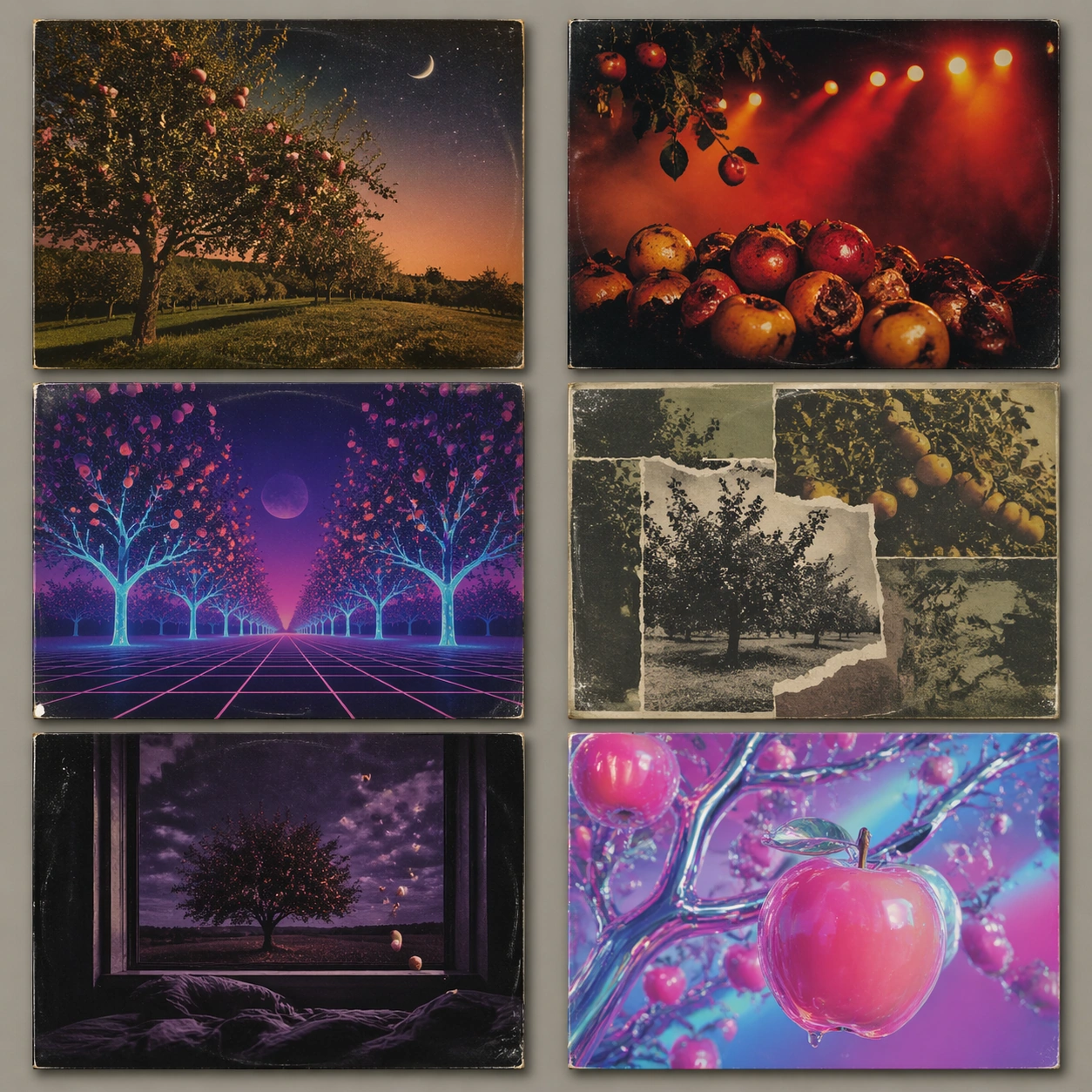
Example generated from “Multi Era Album Covers — Neon Orchard Set”
GPT Image 2en

Scene: A square contemporary design review mockup showing six fictional album covers in a rigid 2 by 3 grid, each printed as a separate sleeve with subtle edge shadows. The shared concept is Neon Orchard: fruit trees, night lights, and synthetic sweetness. The wall and lighting are neutral so the era differences become the focus. Subject: 1960s folk: hand-tinted orchard photograph, warm dusk, acoustic pastoral mood. 1970s rock: overripe fruit under harsh stage lights, smoky reds and oranges, bold analog contrast. 1980s synthwave: neon apple trees on a perspective grid, violet sky, cyan laser-like branches. 1990s grunge: torn orchard photo collage, dirty photocopy texture, muted green-brown palette. 2000s emo: lonely tree outside a bedroom window, black purple night, falling fruit as melancholic symbols. 2020s hyperpop: glossy translucent fruit, chrome branches, candy neon gradients, playful synthetic surfaces. Important details: All six covers must share fruit tree, night light, and synthetic sweetness motifs while translating them into different music-era design languages. Keep the album sleeves equal size, physically printed, and free of readable type. Use era-appropriate print grain, photo treatment, collage damage, geometry, and glossy digital surfaces. Avoid real artist references or logo-like fruit symbols. Use case: Multi-Era Album Covers single study 8/8, testing era shifts for one bright orchard album concept. Constraints: No readable text, no watermark, no logos, preserve exact 1:1 aspect ratio, no real brand fruit icons, no album titles, no artist names, no label marks, no repeated panels, no UI elements, no chaotic layout, no readable stickers.

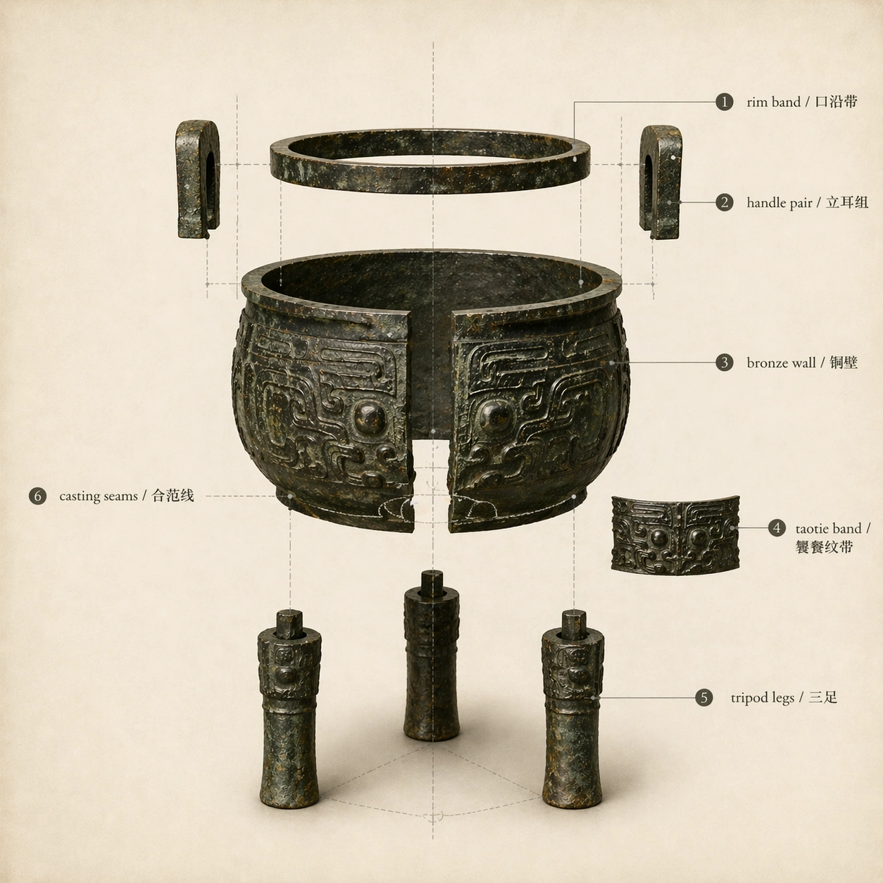
Example generated from “Museum Exploded View — Exploded Ritual Vessel”
GPT Image 2en

Scene: Use the reference image as the fixed artifact source, then convert it into a square museum exploded-view diagram on off-white archival paper. The camera is straight-on and orthographic, with faint construction axes, thin leader lines, and soft shadows below separated parts. Keep the same bronze patina, ornament style, object proportions, and sober museum handbook palette. Subject: Show the bronze ding disassembled into suspended parts while preserving the identity from the reference: rim ring lifted above the body, two upright ears separated symmetrically, the decorated vessel wall opened slightly, three legs pulled downward, and a small ornament band sample floating to one side. Include only these readable bilingual labels: rim band / 口沿带, handle pair / 立耳组, bronze wall / 铜壁, taotie band / 饕餮纹带, tripod legs / 三足, casting seams / 合范线. Use clean numbered dots or leader lines, but no extra written copy. Important details: The exploded spacing must obey believable structure: parts align along the vessel's vertical axis, wall thickness is visible, legs connect to the base logic, and shadows imply distance without looking like a fantasy levitation scene. The diagram should read as museum education plus technical drawing, not product advertising. Labels must stay aligned and not overlap the object. Use case: Museum Exploded View series study 2/8, turning the reference ding into a precise artifact exploded diagram. Constraints: No readable text except the specified bilingual labels, no watermark, no logos, preserve exact 1:1 aspect ratio, no changed artifact identity, no extra weapons or jewels, no random inscriptions, no tangled callouts, no impossible floating fragments.
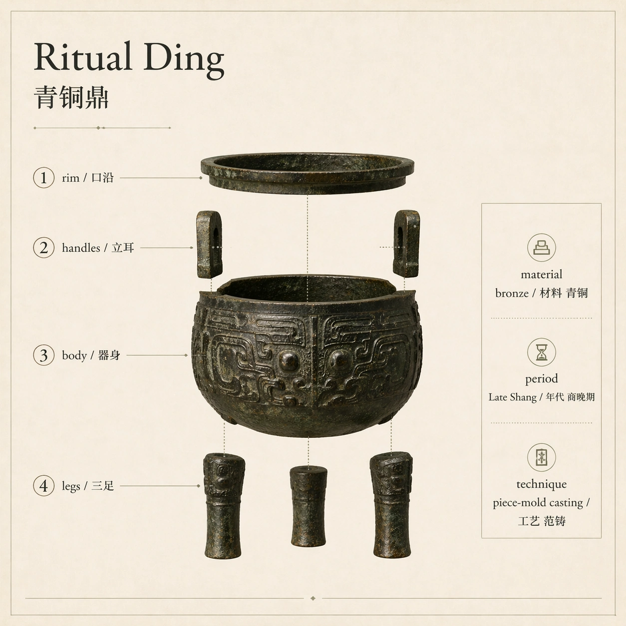
Example generated from “Museum Exploded View — Bilingual Museum Plate”
GPT Image 2en

Scene: Use the reference bronze ding as the source and produce a finished square museum exhibition plate that combines exploded object, conservation notes, and bilingual captions. The layout is precise and calm: object diagram in the center, numbered callout column on the left, material and period panel on the right, and a thin ruled footer. Use warm ivory paper, graphite lines, muted bronze greens, and museum-quality typography. Subject: Show the same bronze ding in a compact exploded presentation with numbered callouts. Include only these readable bilingual labels: 1 rim / 口沿, 2 handles / 立耳, 3 body / 器身, 4 legs / 三足, material bronze / 材料 青铜, period Late Shang / 年代 商晚期, technique piece-mold casting / 工艺 范铸. The layout should make the object, labels, and information panels feel like one finished gallery interpretive graphic. Important details: This image tests complex multi-region composition. Keep numbered markers near the correct parts, preserve the artifact silhouette from image 01, and make the text hierarchy clear: object name largest, callouts medium, material panel smaller but readable. Avoid visual competition between labels and ornament. The diagram must look professionally typeset, not like scattered annotations. Use case: Museum Exploded View series study 4/8, creating a bilingual museum plate from the reference artifact and exploded-view logic. Constraints: No readable text except the specified bilingual labels, no watermark, no logos, preserve exact 1:1 aspect ratio, no fake accession number, no extra paragraphs, no incorrect numbering, no garbled Chinese, no crowded callout collisions.
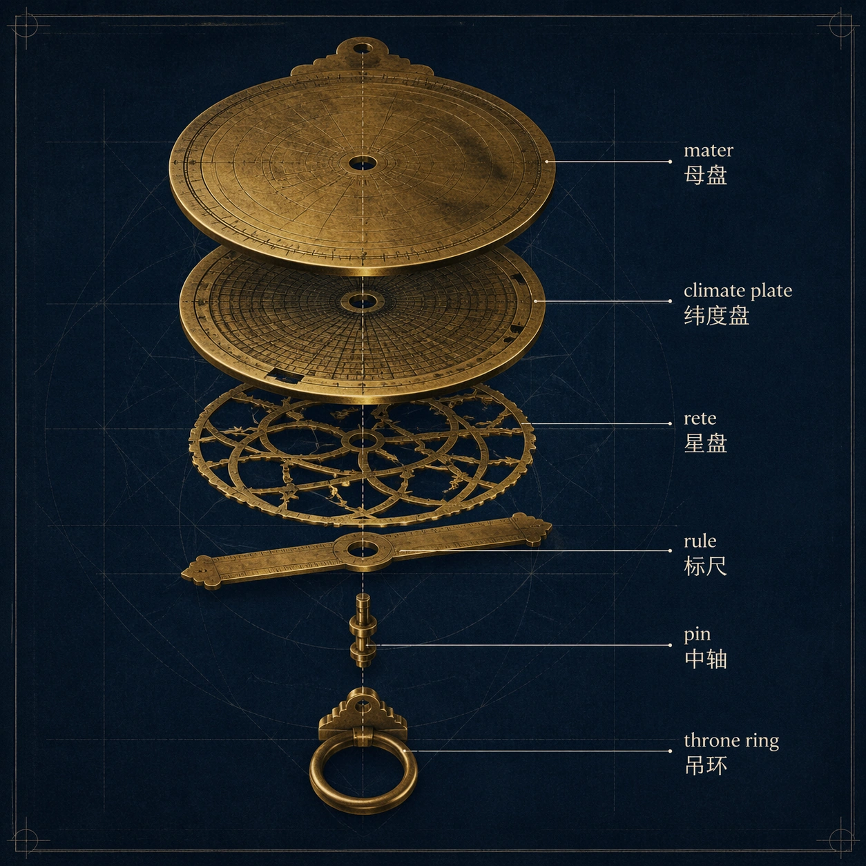
Example generated from “Museum Exploded View — Astrolabe Mechanism”
GPT Image 2en

Scene: A square technical museum diagram of a brass astrolabe on dark blue archival paper, viewed orthographically with a precise exploded stack. Use warm brass highlights, faint engraved geometry, crisp radial construction lines, and small bilingual callouts. The image should feel like a conservation department plate for an astronomical instrument. Subject: Show the astrolabe separated along its central axis: base plate at the back, climate plate, rotating rete, rule, central pin, and hanging ring. Include only these readable bilingual labels: mater / 母盘, climate plate / 纬度盘, rete / 星盘, rule / 标尺, pin / 中轴, throne ring / 吊环. Each part should float in a shallow stack with clear alignment, so the viewer can understand how the layers rotate together. Important details: The diagram must balance scientific realism and museum clarity. Engraved lines can be present as fine non-readable radial marks, but no random paragraphs or invented star names. Brass should look aged, with scratches and darkened recesses. The exploded spacing should reveal the mechanism without losing the circular geometry. Labels should sit outside the disk with orderly leader lines. Use case: Museum Exploded View single study 7/8, testing a technical exploded view of a layered scientific instrument. Constraints: No readable text except the specified bilingual labels, no watermark, no logos, preserve exact 1:1 aspect ratio, no modern screws, no fake brand, no readable star catalog text, no warped circles, no chaotic leader lines.

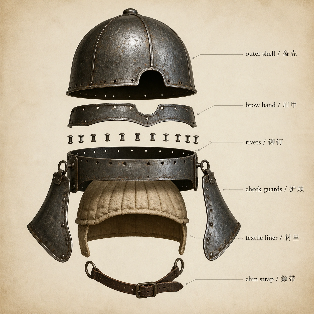
Example generated from “Museum Exploded View — Armored Helmet Layers”
GPT Image 2en

Scene: A square museum armory diagram on neutral parchment paper, rendered with orthographic precision and controlled dramatic light. The central object is an ancient layered helmet presented as an exploded vertical stack, with metal plates, padding, rivets, and cheek guards separated just enough to show construction. Use cool steel, dark leather, linen beige, and graphite annotation lines. Subject: Show a historical helmet broken into readable construction layers: outer shell lifted upward, brow band floating forward, rivet row separated, cheek guards angled outward, textile liner visible inside, and leather chin strap below. Include only these readable bilingual labels: outer shell / 盔壳, brow band / 眉甲, rivets / 铆钉, cheek guards / 护颊, textile liner / 衬里, chin strap / 颏带. The helmet should look museum-preserved, with scratches, oxidation, and believable thickness. Important details: The exploded view must obey physical assembly logic: rivets align with holes, cheek guards hang from side joints, liner follows the inner curve, and the chin strap attaches below. Avoid fantasy armor exaggeration. The diagram should have clear hierarchy, precise leader lines, realistic material contrast, and enough negative space for bilingual labels to remain readable. Use case: Museum Exploded View single study 8/8, testing an armored artifact exploded diagram with metal, textile, and leather material layers. Constraints: No readable text except the specified bilingual labels, no watermark, no logos, preserve exact 1:1 aspect ratio, no fantasy horns, no modern tactical gear, no weapons, no blood, no random heraldry, no cluttered labels.

Example generated from “Music Video Thumbnail And Promo Card Set — Reference Video Thumbnail”
GPT Image 2en

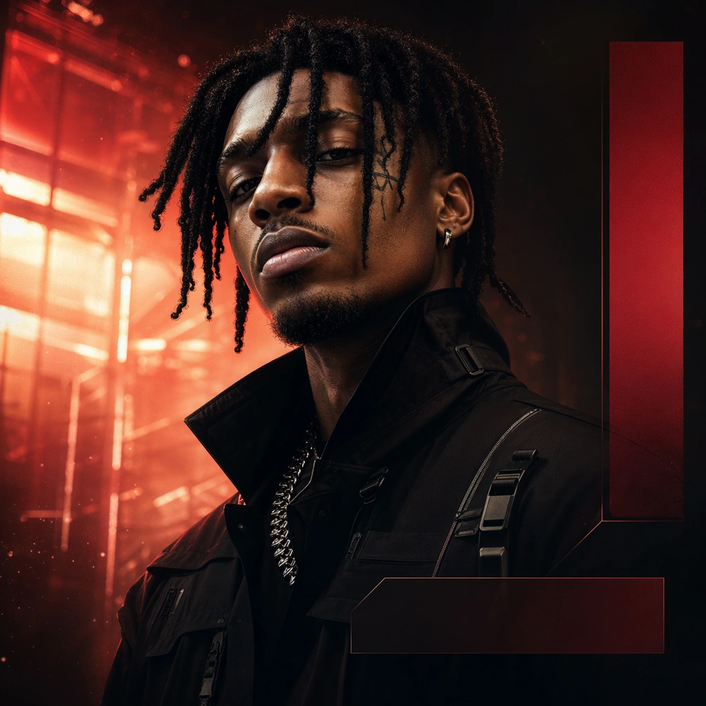
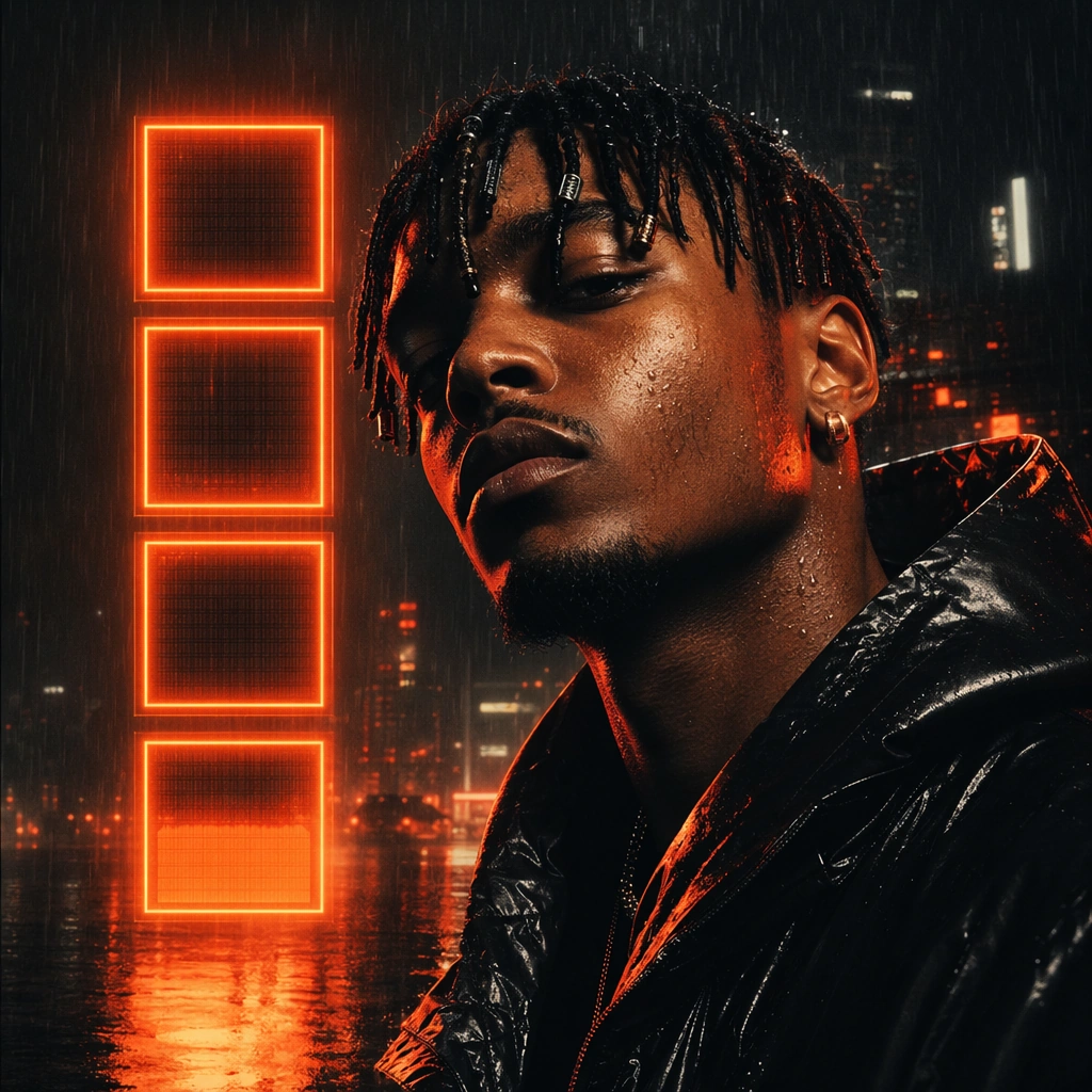
Scene: A square music-video thumbnail frame with dramatic cinematic lighting, a clear foreground performer, and one strong scene hook in the background such as shattered light, rain haze, or industrial glow. The composition should read instantly at small size while still feeling polished enough for a major release promo surface. Subject: An invented musician occupies the foreground with one intense expression, defined face shape, distinctive hair base, and strong directional light. This root image must lock the exact face, hair base, body proportions, wardrobe silhouette, and background-hook grammar that later promo cards preserve across the launch sequence. Important details: Design for thumbnail survival. Keep one dominant face or silhouette, one dramatic background cue, and one set of modular non-readable bars where title or countdown information could live later. The result should feel natively built for music-video launch culture rather than generic cinematic poster art. Use case: MV Promo Cards series study 1/9 for the Music Video Thumbnail and Promo Card Set Prompt Atlas theme. Constraints: No readable text, no watermark, no logos, preserve exact 1:1 aspect ratio, no readable title, no platform logo, no crowd, no extra cast, no thumbnail clickbait arrows, no random collage explosion

Example generated from “Music Video Thumbnail And Promo Card Set — Premiere Card Variant”
GPT Image 2en

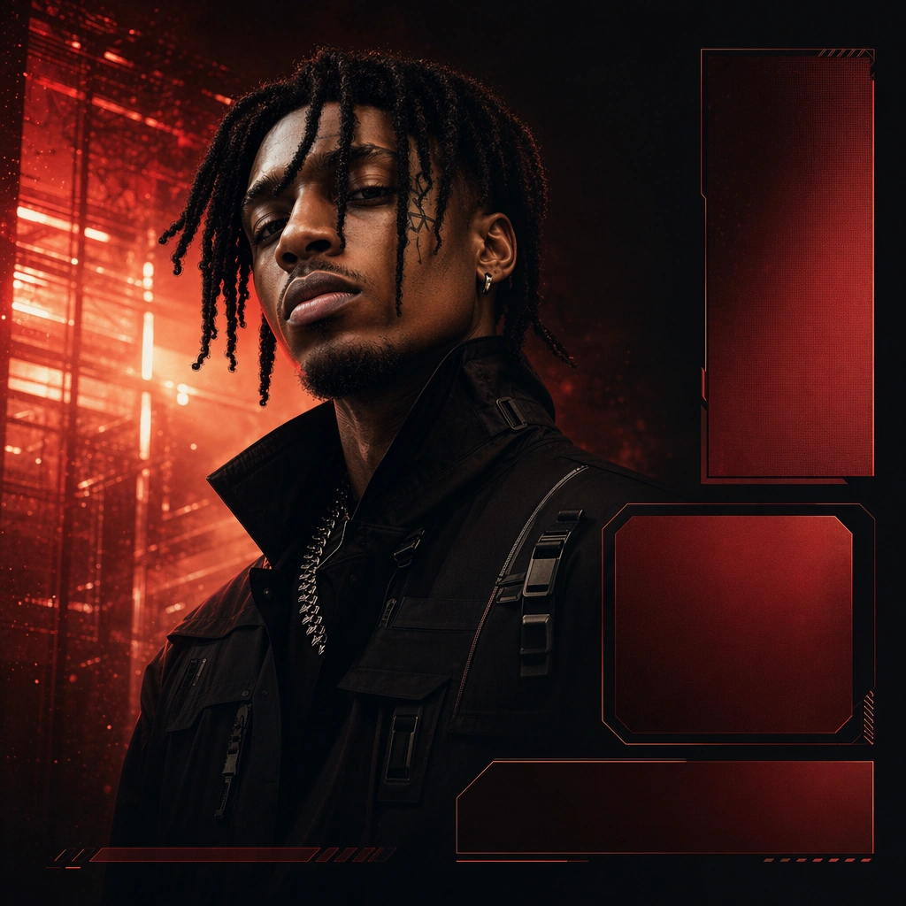
Scene: A square launch card in the same music-video world, with similar dramatic lighting and scene hook but a cleaner area for modular premiere information. The frame should remain instantly linked to the reference thumbnail while feeling slightly more structured and event-oriented. Subject: Preserve the exact same performer from the reference image, including face shape, hair base, body proportions, and wardrobe silhouette. The musician remains the visual anchor, while the background hook and modular promo blocks shift subtly to support a premiere-oriented composition. Important details: This should look like the same release campaign adapting to a different surface. Keep the lighting direction, scene hook, and thumbnail clarity intact, but allow more hierarchy space for non-readable countdown or premiere modules. Identity continuity matters more than novelty. Use case: MV Promo Cards series study 2/9 for the Music Video Thumbnail and Promo Card Set Prompt Atlas theme. Constraints: No readable text, no watermark, no logos, preserve exact 1:1 aspect ratio, preserve the exact reference face, hair base, and body proportions; no readable countdown text, no platform UI, no extra cast, no reaction-face exaggeration, no bright graphic stickers

Example generated from “Music Video Thumbnail And Promo Card Set — Teaser Still Variant”
GPT Image 2en

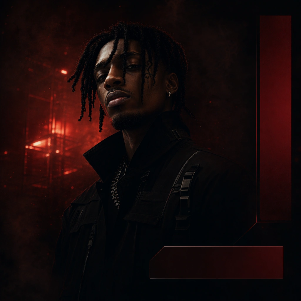
Scene: A square teaser card in the same video world, now darker and more withheld, with slightly reduced light and more negative space around the performer. The scene hook should still remain visible, but the mood should shift toward curiosity and suspense rather than full launch clarity. Subject: Preserve the exact same performer from the reference image with identical face shape, hair base, body proportions, and wardrobe silhouette. The figure appears more partially shadowed, while the background hook remains recognizable enough to maintain campaign continuity. Important details: Use restraint to create teaser momentum. Keep the same cinematic world, same strong face or silhouette, and same modular promo logic, but lower density and reveal. This image should still survive as a thumbnail while clearly behaving like an earlier-stage promo card inside the same video release system. Use case: MV Promo Cards series study 3/9 for the Music Video Thumbnail and Promo Card Set Prompt Atlas theme. Constraints: No readable text, no watermark, no logos, preserve exact 1:1 aspect ratio, preserve the exact reference face, hair base, and body proportions; no readable teaser text, no platform icons, no extra cast, no meme-like reaction composition, no busy special effects

Example generated from “Music Video Thumbnail And Promo Card Set — Clip Drop Variant”
GPT Image 2en

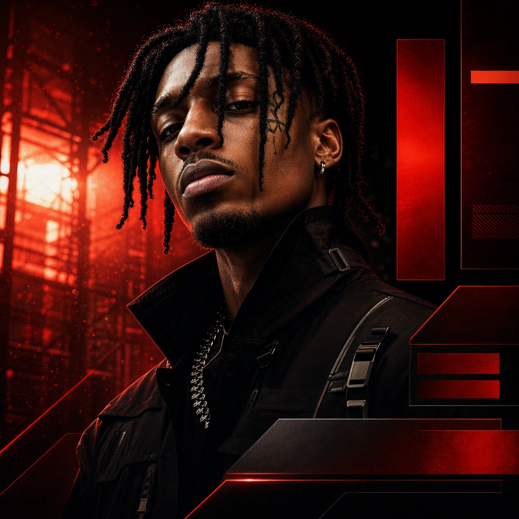
Scene: A square short-form clip promo card in the same music-video world, with higher contrast, sharper edges, and a more modular arrangement of abstract promo blocks. The cinematic background hook and subject should remain consistent while the composition becomes more social-share efficient. Subject: Preserve the exact same performer from the reference image, including face shape, hair base, body proportions, and wardrobe silhouette. The figure remains the primary anchor while the background hook and graphic modules shift into a more clipped, repurposable short-form launch surface. Important details: This should feel like release-week asset reuse done well. Keep continuity strong, preserve instant recognizability, and use modular non-readable bars where short-form promo metadata could live. The card needs high clarity and strong emotion without becoming clickbait or platform-specific. Use case: MV Promo Cards series study 4/9 for the Music Video Thumbnail and Promo Card Set Prompt Atlas theme. Constraints: No readable text, no watermark, no logos, preserve exact 1:1 aspect ratio, preserve the exact reference face, hair base, and body proportions; no readable labels, no platform UI, no extra cast, no meme arrows, no thumbnail border gimmicks

Example generated from “Music Video Thumbnail And Promo Card Set — Countdown Neon Card”
GPT Image 2en

Scene: A square promo card with one strongly lit face in the foreground, neon rain atmosphere behind, and modular non-readable countdown blocks arranged with crisp hierarchy. The frame should feel native to release anticipation and small-screen social sharing. Subject: The subject is one invented performer plus a simple cinematic scene hook, organized for immediate recognition. The card should look like a polished pre-release asset that could carry a countdown, even though no readable numbers or words appear. Important details: Thumbnail clarity and mood are the priority. Use one bright accent color, one dominant portrait or silhouette, and clean block structure. The card should feel urgent and contemporary without relying on platform-specific visual tricks or cheap hype graphics. Use case: MV Promo Cards single study 5/9 for the Music Video Thumbnail and Promo Card Set Prompt Atlas theme. Constraints: No readable text, no watermark, no logos, preserve exact 1:1 aspect ratio, no readable numbers, no platform UI, no extra cast, no clickbait arrows, no overdone glitch collage

Example generated from “Music Video Thumbnail And Promo Card Set — Behind Scenes Card”
GPT Image 2en

Scene: A square behind-the-scenes still from an invented music-video set, with practical lights, equipment silhouettes kept soft, and one strong subject moment in the middle. The frame should feel polished enough for release-week promo, not casual production documentation. Subject: The subject is a musician on set surrounded by hints of production process: light stands blurred in the distance, reflective floor patches, and a half-built scene hook. The image should communicate access and momentum without exposing brand gear or turning into a technical making-of shot. Important details: Keep the set hints subtle and the composition clean. This should still feel like promo art first. Use cinematic light, one clear focal face or silhouette, and controlled modular zones where contextual information could live later without being rendered now. Use case: MV Promo Cards single study 6/9 for the Music Video Thumbnail and Promo Card Set Prompt Atlas theme. Constraints: No readable text, no watermark, no logos, preserve exact 1:1 aspect ratio, no readable slate, no visible brand camera labels, no crowded crew, no platform UI, no messy backstage clutter

Example generated from “Music Video Thumbnail And Promo Card Set — Vertical Clip Card”
GPT Image 2en

Scene: A square card built from vertical-video logic, with one strong center figure and compressed side modules that imply short-form adaptation. The image should feel optimized for clip reposts and social edits while remaining visually rich and publishable. Subject: One performer dominates the center while the surrounding environment and abstract side panels suggest motion, cut points, and teaser framing. The result should read like a high-quality social card derived from a short-form clip moment. Important details: Use composition intelligence to translate vertical energy into a square surface. Keep focus strong, the edges controlled, and the modular fields ready for future overlays. The image should feel release-savvy without looking like a templated social-media preset. Use case: MV Promo Cards single study 7/9 for the Music Video Thumbnail and Promo Card Set Prompt Atlas theme. Constraints: No readable text, no watermark, no logos, preserve exact 1:1 aspect ratio, no readable labels, no phone UI frame, no extra cast, no emoji overlays, no bright engagement-bait graphics