PROMPT · ESPLORAZIONE CREATIVA

Galleria di prompt

Esplora prompt reali ed esempi generati. Trova ispirazione per la prossima missione creativa e copia gratuitamente il prompt completo.

Esempi
10,974
Modelli
17
Fonti
1277
10.974 esempi di prompt · pagina 53 di 229
Example generated from “Engineering Cutaway And Section Poster — Motor Section”
GPT Image 2en

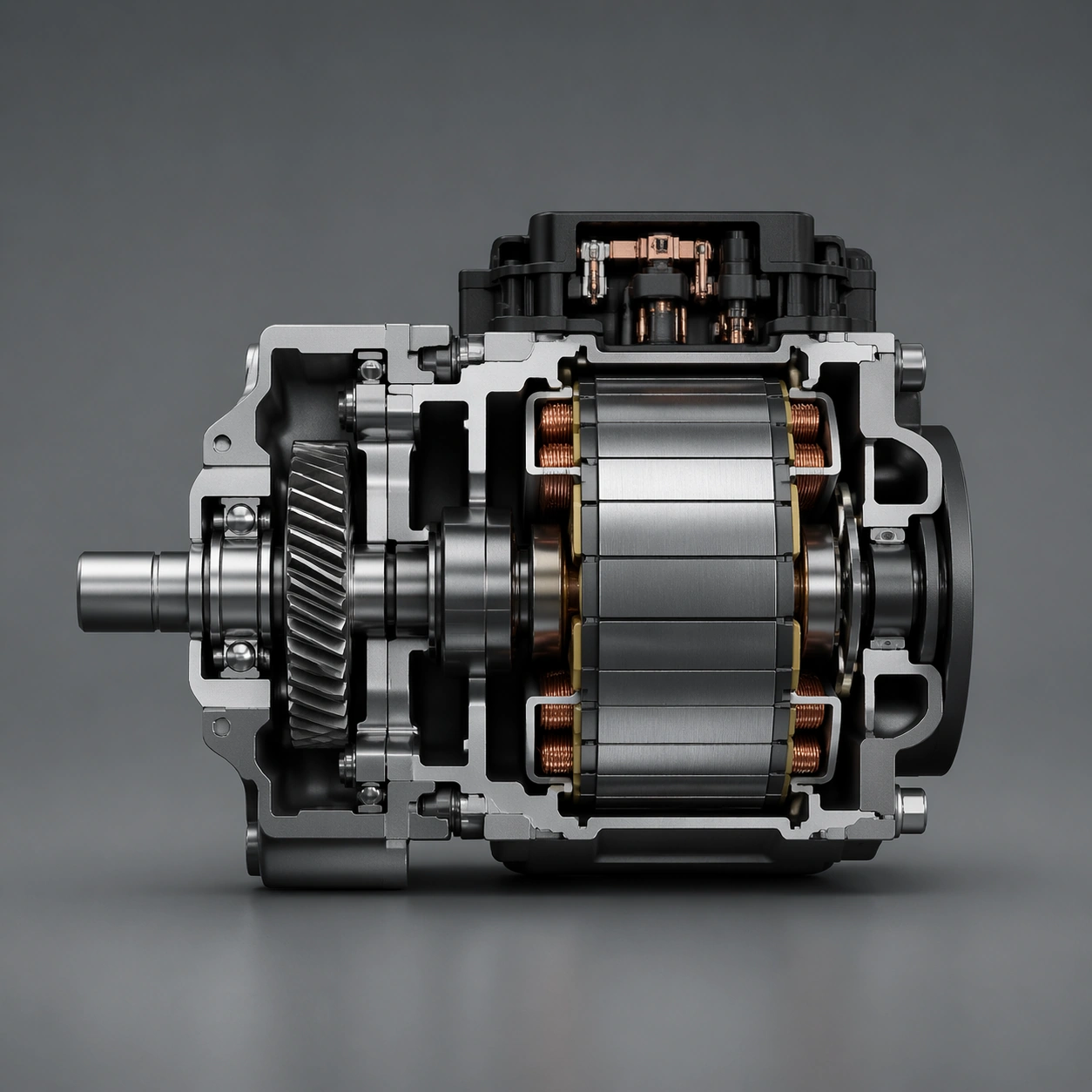
Scene: A square section board with a steel-gray palette, disciplined shadows, and measured part spacing around a clean slice. Compose the frame as a square key visual with disciplined camera placement, premium lighting control, and believable real-world scale. The tonal range should feel polished and intentional, with enough atmosphere to create depth without obscuring form. Keep contrast calibrated for launch, catalog, or research presentation use rather than casual snapshot aesthetics. Subject: Center an original compact motor assembly shown through a carefully controlled sectional cut. Make the subject feel original, production-aware, and clearly grounded in Engineering Cutaway and Section Poster. Treat this as an independent study that must feel complete and coherent without relying on any external reference image. The focal hierarchy should be immediate: primary form first, then material behavior, then supporting environmental cues that clarify use context and difficulty. Important details: Emphasize believable engineering, material honesty, and internal structure. Avoid decorative complexity or impossible internal geometry. The visual language should still feel native to Engineering Cutaway and Section Poster, using disciplined industrial or campaign composition instead of generic stock photography. Use believable materials, engineering logic, and professional composition discipline. Reflections, shadows, edge breaks, texture scale, interface density, and small physical joints must all support realism. Avoid filler props, vague mood-board clutter, or any element that weakens the sense of a purpose-built industrial or automotive image. Use case: Cutaway Poster single study 6/9 for Engineering Cutaway and Section Poster, built as image support-two. Constraints: No readable text, no watermark, no logos, preserve exact 1:1 aspect ratio, no readable labels, no logos, no impossible internals, no chaotic arrows, no random infographic decoration, no fantasy glow.
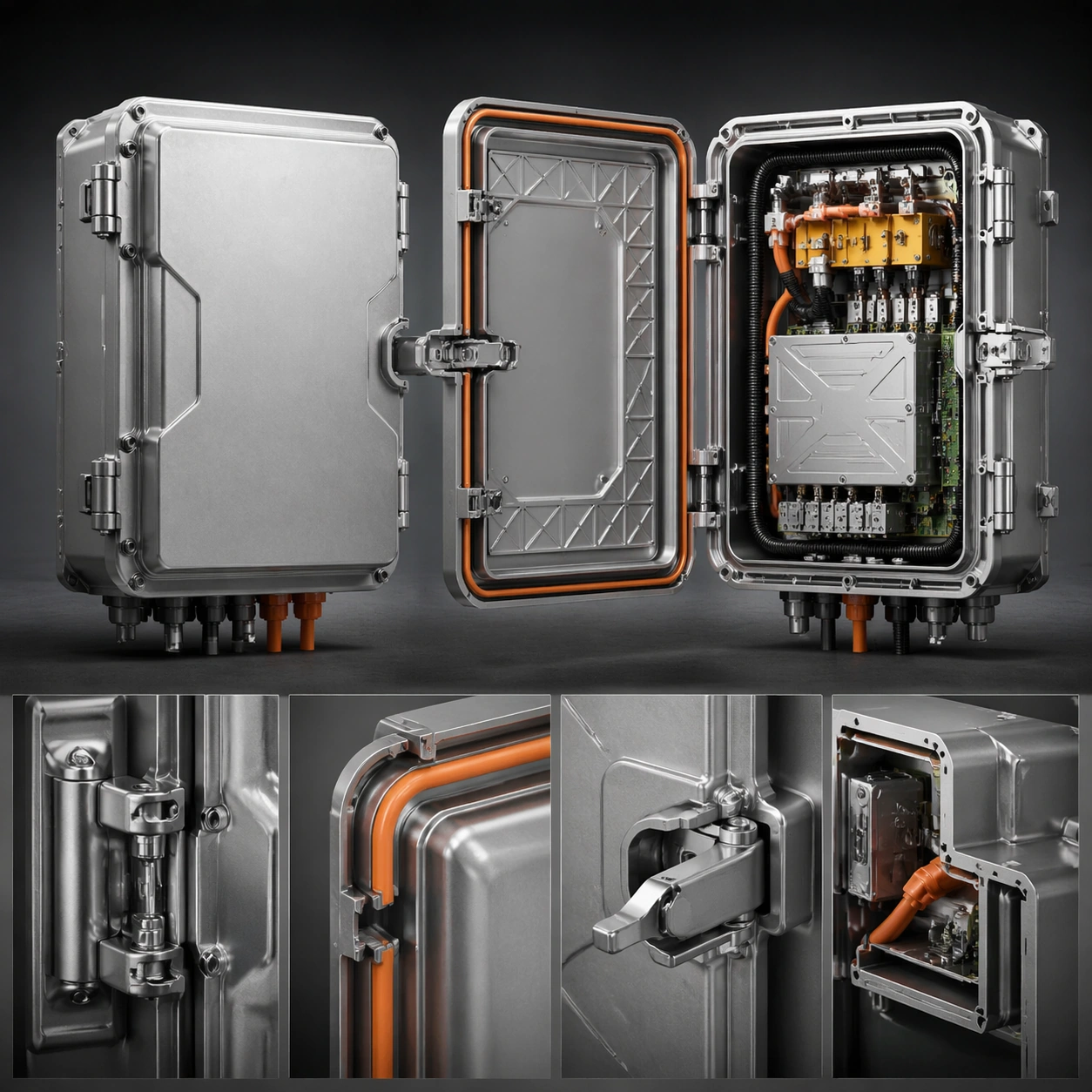

Example generated from “Engineering Cutaway And Section Poster — Service Door Diagram”
GPT Image 2en

Scene: A square diagram board with one object state closed, one state opened, and clear spatial relationships between access parts. Compose the frame as a square key visual with disciplined camera placement, premium lighting control, and believable real-world scale. The tonal range should feel polished and intentional, with enough atmosphere to create depth without obscuring form. Keep contrast calibrated for launch, catalog, or research presentation use rather than casual snapshot aesthetics. Subject: Center an original industrial enclosure showing hinge, latch, seal, and interior modules during a service-open sequence. Make the subject feel original, production-aware, and clearly grounded in Engineering Cutaway and Section Poster. Treat this as an independent study that must feel complete and coherent without relying on any external reference image. The focal hierarchy should be immediate: primary form first, then material behavior, then supporting environmental cues that clarify use context and difficulty. Important details: Keep the process readable without literal labels or text. The value should come from sequence logic, part relationships, and believable maintenance design. The visual language should still feel native to Engineering Cutaway and Section Poster, using disciplined industrial or campaign composition instead of generic stock photography. Use believable materials, engineering logic, and professional composition discipline. Reflections, shadows, edge breaks, texture scale, interface density, and small physical joints must all support realism. Avoid filler props, vague mood-board clutter, or any element that weakens the sense of a purpose-built industrial or automotive image. Use case: Cutaway Poster single study 7/9 for Engineering Cutaway and Section Poster, built as image support-three. Constraints: No readable text, no watermark, no logos, preserve exact 1:1 aspect ratio, no readable labels, no logos, no impossible internals, no chaotic arrows, no random infographic decoration, no fantasy glow.
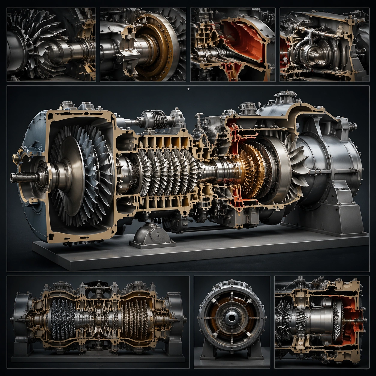
Example generated from “Engineering Cutaway And Section Poster — Flow Path Poster”
GPT Image 2en

Scene: A square dark technical poster with clean translucent flow ribbons, controlled glow, and clear section windows through the object. Compose the frame as a square key visual with disciplined camera placement, premium lighting control, and believable real-world scale. The tonal range should feel polished and intentional, with enough atmosphere to create depth without obscuring form. Keep contrast calibrated for launch, catalog, or research presentation use rather than casual snapshot aesthetics. Subject: Center an original engineered object with visible internal path traces and disciplined sectional reveals. Make the subject feel original, production-aware, and clearly grounded in Engineering Cutaway and Section Poster. Treat this as an independent study that must feel complete and coherent without relying on any external reference image. The focal hierarchy should be immediate: primary form first, then material behavior, then supporting environmental cues that clarify use context and difficulty. Important details: Flow cues must stay subtle, plausible, and non-sci-fi. The image should teach structure through light hierarchy rather than through labels. The visual language should still feel native to Engineering Cutaway and Section Poster, using disciplined industrial or campaign composition instead of generic stock photography. Use believable materials, engineering logic, and professional composition discipline. Reflections, shadows, edge breaks, texture scale, interface density, and small physical joints must all support realism. Avoid filler props, vague mood-board clutter, or any element that weakens the sense of a purpose-built industrial or automotive image. Use case: Cutaway Poster single study 8/9 for Engineering Cutaway and Section Poster, built as image support-four. Constraints: No readable text, no watermark, no logos, preserve exact 1:1 aspect ratio, no readable labels, no logos, no impossible internals, no chaotic arrows, no random infographic decoration, no fantasy glow.

Example generated from “Engineering Cutaway And Section Poster — Museum Tech Board”
GPT Image 2en

Scene: A square exhibition board with a calm dark background, crisp technical lighting, and premium display-like composition. Compose the frame as a square key visual with disciplined camera placement, premium lighting control, and believable real-world scale. The tonal range should feel polished and intentional, with enough atmosphere to create depth without obscuring form. Keep contrast calibrated for launch, catalog, or research presentation use rather than casual snapshot aesthetics. Subject: Center original engineering visuals arranged as if for a science-museum display with no readable explanatory text. Make the subject feel original, production-aware, and clearly grounded in Engineering Cutaway and Section Poster. Treat this as an independent study that must feel complete and coherent without relying on any external reference image. The focal hierarchy should be immediate: primary form first, then material behavior, then supporting environmental cues that clarify use context and difficulty. Important details: Keep it refined, educational, and completely non-readable. The board should feel authoritative, public-facing, and visually coherent. The visual language should still feel native to Engineering Cutaway and Section Poster, using disciplined industrial or campaign composition instead of generic stock photography. Use believable materials, engineering logic, and professional composition discipline. Reflections, shadows, edge breaks, texture scale, interface density, and small physical joints must all support realism. Avoid filler props, vague mood-board clutter, or any element that weakens the sense of a purpose-built industrial or automotive image. Use case: Cutaway Poster single study 9/9 for Engineering Cutaway and Section Poster, built as image support-five. Constraints: No readable text, no watermark, no logos, preserve exact 1:1 aspect ratio, no readable labels, no logos, no impossible internals, no chaotic arrows, no random infographic decoration, no fantasy glow.
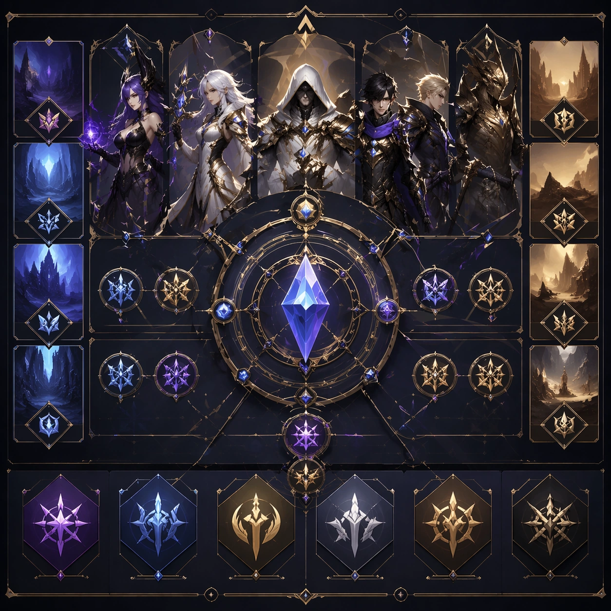
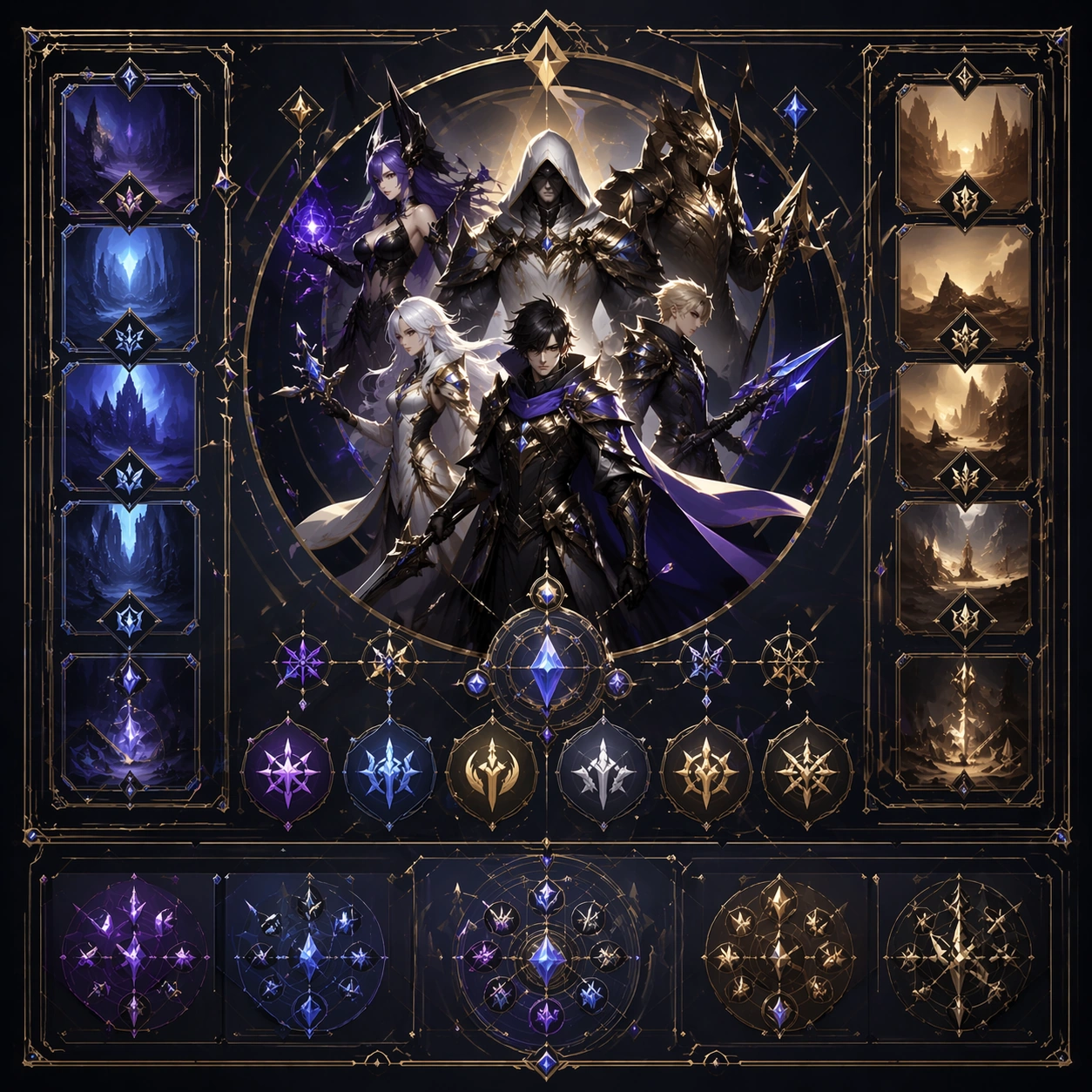
Example generated from “Ensemble Key Visual Poster — Reference Anchor”
GPT Image 2en

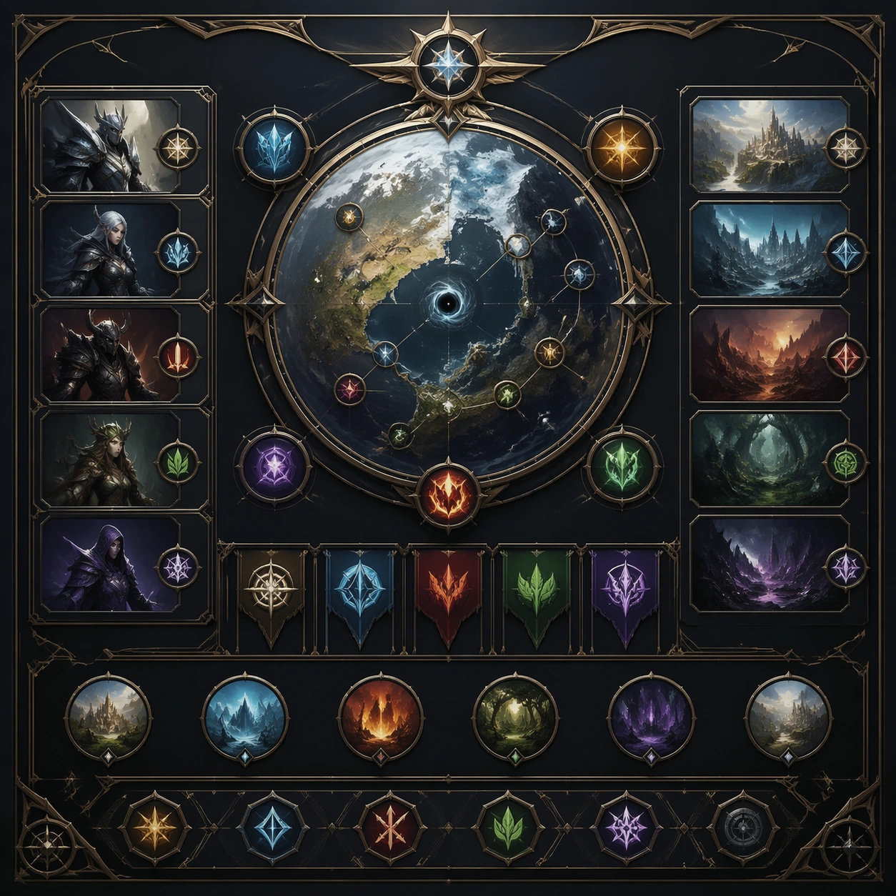
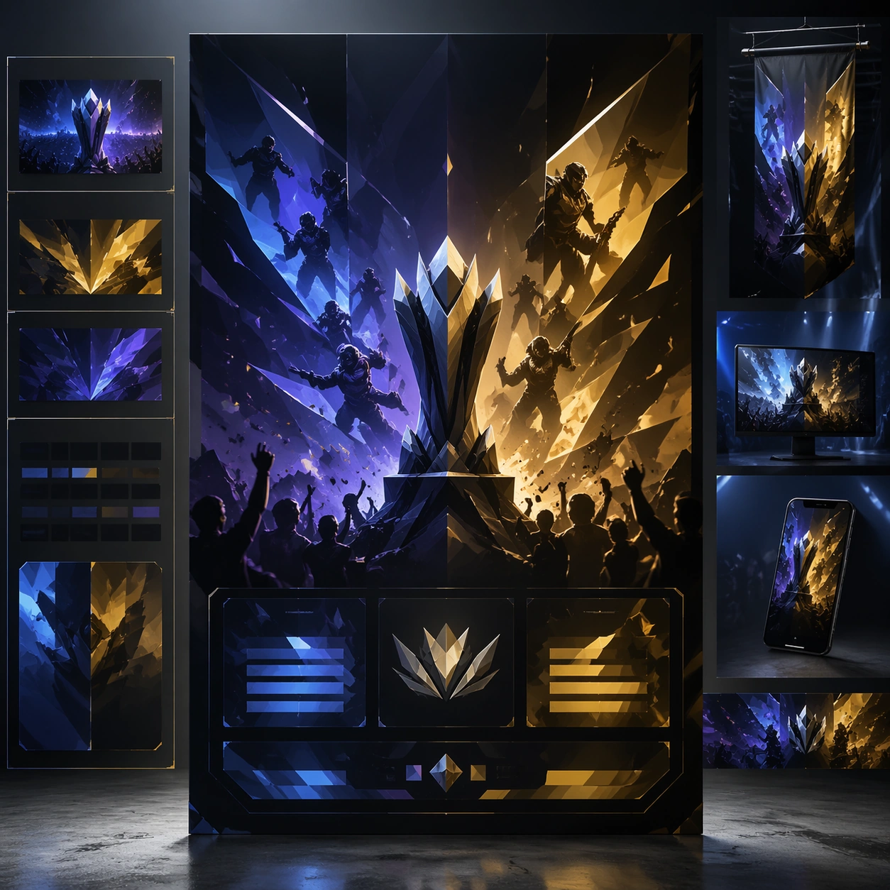
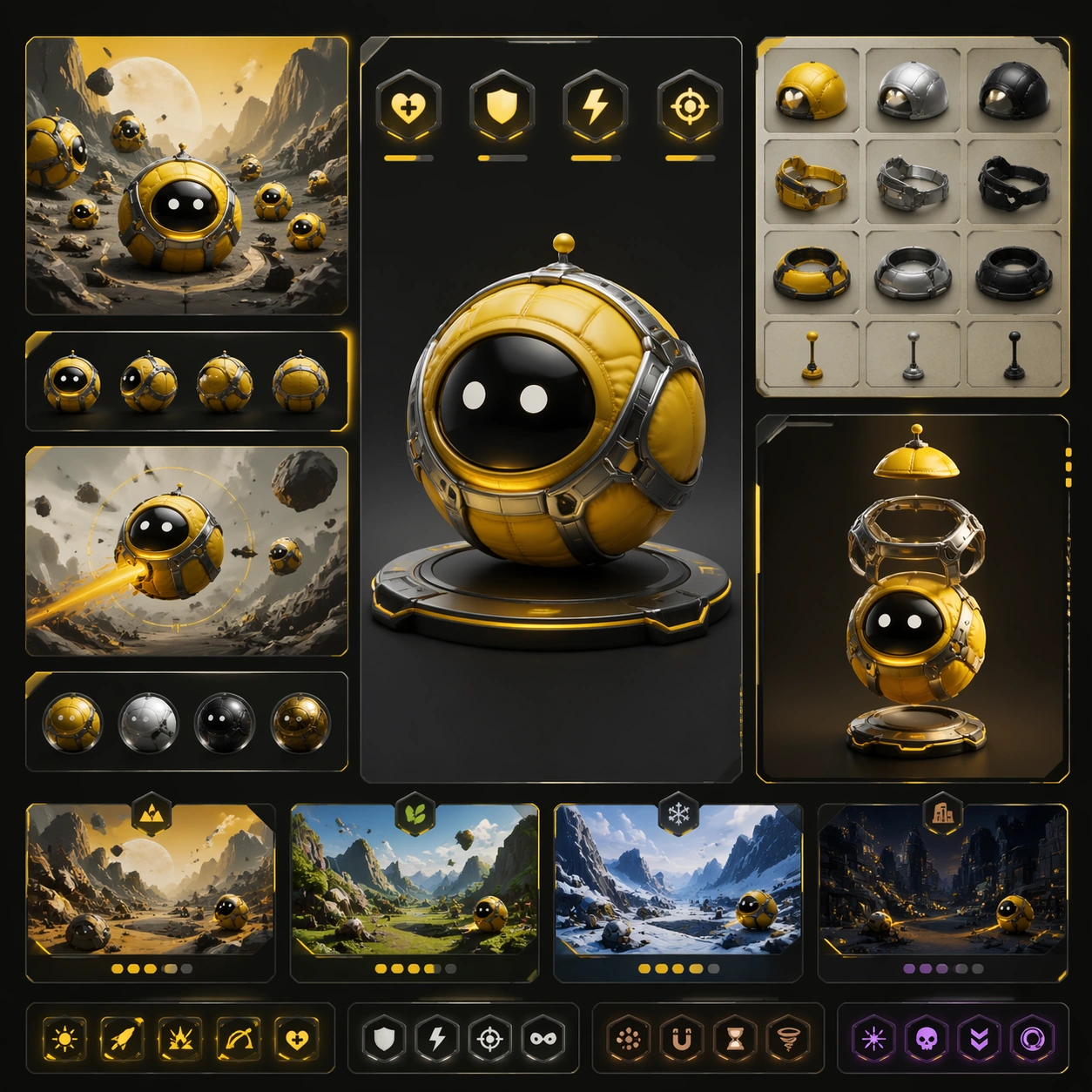
Scene: Create a square reference image for Ensemble Key Visual Poster. Build a reference anchor establishing the core system with a premium, production-ready finish. Use a polished modular board or campaign surface with clean spacing, premium game-UI finish, and clear focal hierarchy. The composition should feel intentional, clean, and reusable for gallery, research, campaign, or internal handoff contexts. Lighting must support readability first, with the main forms clearly separated from the background and enough breathing room for the system to stay legible at both hero scale and thumbnail scale. Subject: Center a coherent original game-art system built for premium production and marketing surfaces. For this image, focus on reference anchor. Keep the same system logic stable across screenshots, cards, banners, and overview boards. This image is the canonical anchor that later series images must follow. The viewer should immediately understand what role this surface plays inside a cohesive game-production asset pack. Important details: Lock framing, icon grammar, palette blocking, and surface hierarchy so the kit feels production-ready and consistent. Preserve the core silhouette, framing language, and material logic from the reference image while each variation changes function. Keep materials believable, edge hierarchy disciplined, and the visual language consistent with Ensemble KV. Use abstract interface blocks or diagram accents when helpful, but avoid any readable language. The final result should feel like a deliberate production asset rather than a random illustration. Use case: Ensemble Key Visual Poster series study 1/9, designed as reference anchor within a cohesive asset pack. Constraints: No readable text, no watermark, no logos, preserve exact 1:1 aspect ratio, no unrelated objects, no broken visual hierarchy, no malformed anatomy or broken perspective, no random decorative clutter.

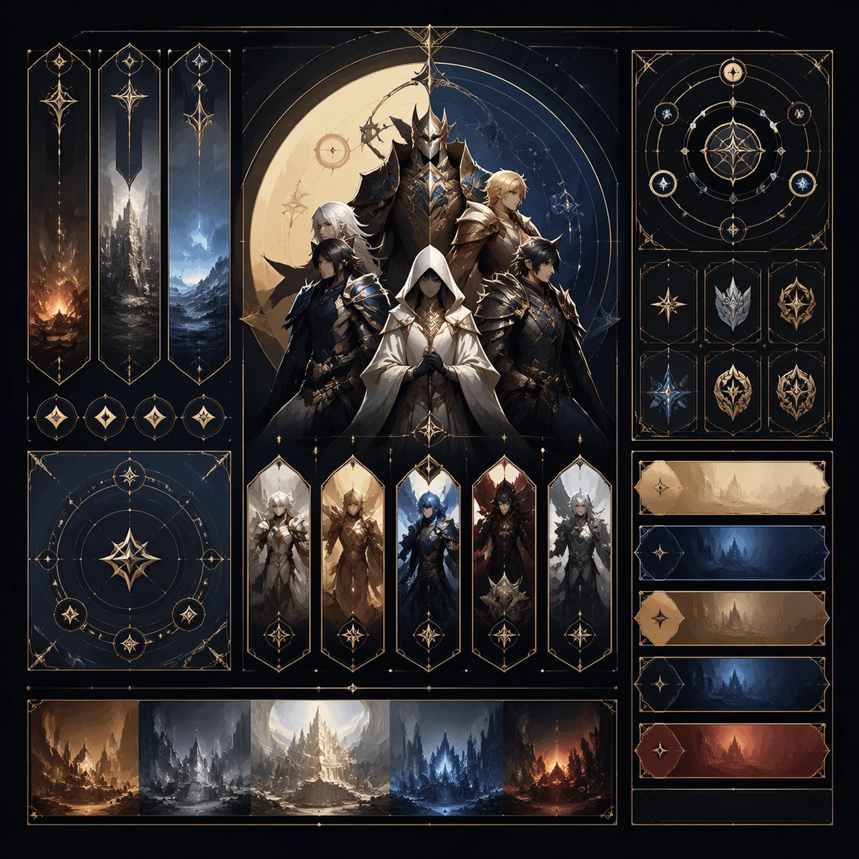
Example generated from “Ensemble Key Visual Poster — Variant One”
GPT Image 2en

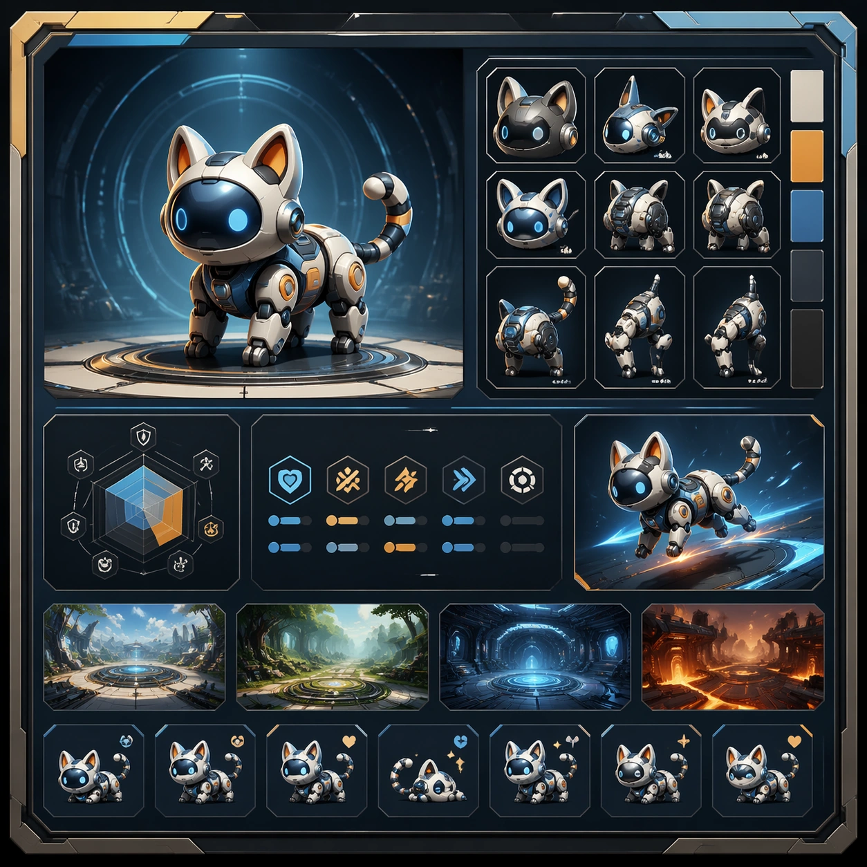
Scene: Create a square dependent image for Ensemble Key Visual Poster. Build a first controlled variation in the same system with a premium, production-ready finish. Use a polished modular board or campaign surface with clean spacing, premium game-UI finish, and clear focal hierarchy. The composition should feel intentional, clean, and reusable for gallery, research, campaign, or internal handoff contexts. Lighting must support readability first, with the main forms clearly separated from the background and enough breathing room for the system to stay legible at both hero scale and thumbnail scale. Subject: Center a coherent original game-art system built for premium production and marketing surfaces. For this image, focus on the intended support surface. Keep the same system logic stable across screenshots, cards, banners, and overview boards. Preserve exact identity or system logic from the reference image while changing only the intended variation axis. The viewer should immediately understand what role this surface plays inside a cohesive game-production asset pack. Important details: Lock framing, icon grammar, palette blocking, and surface hierarchy so the kit feels production-ready and consistent. Preserve the core silhouette, framing language, and material logic from the reference image while each variation changes function. Keep materials believable, edge hierarchy disciplined, and the visual language consistent with Ensemble KV. Use abstract interface blocks or diagram accents when helpful, but avoid any readable language. The final result should feel like a deliberate production asset rather than a random illustration. Use case: Ensemble Key Visual Poster series study 2/9, designed as variant one within a cohesive asset pack. Constraints: No readable text, no watermark, no logos, preserve exact 1:1 aspect ratio, no unrelated objects, no broken visual hierarchy, no malformed anatomy or broken perspective, no random decorative clutter.

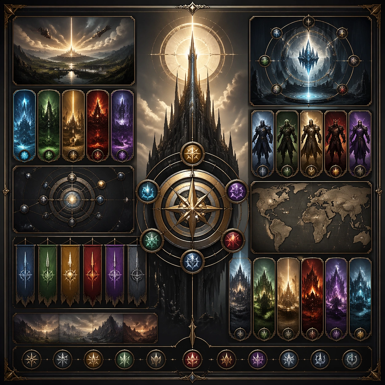
Example generated from “Ensemble Key Visual Poster — Variant Two”
GPT Image 2en

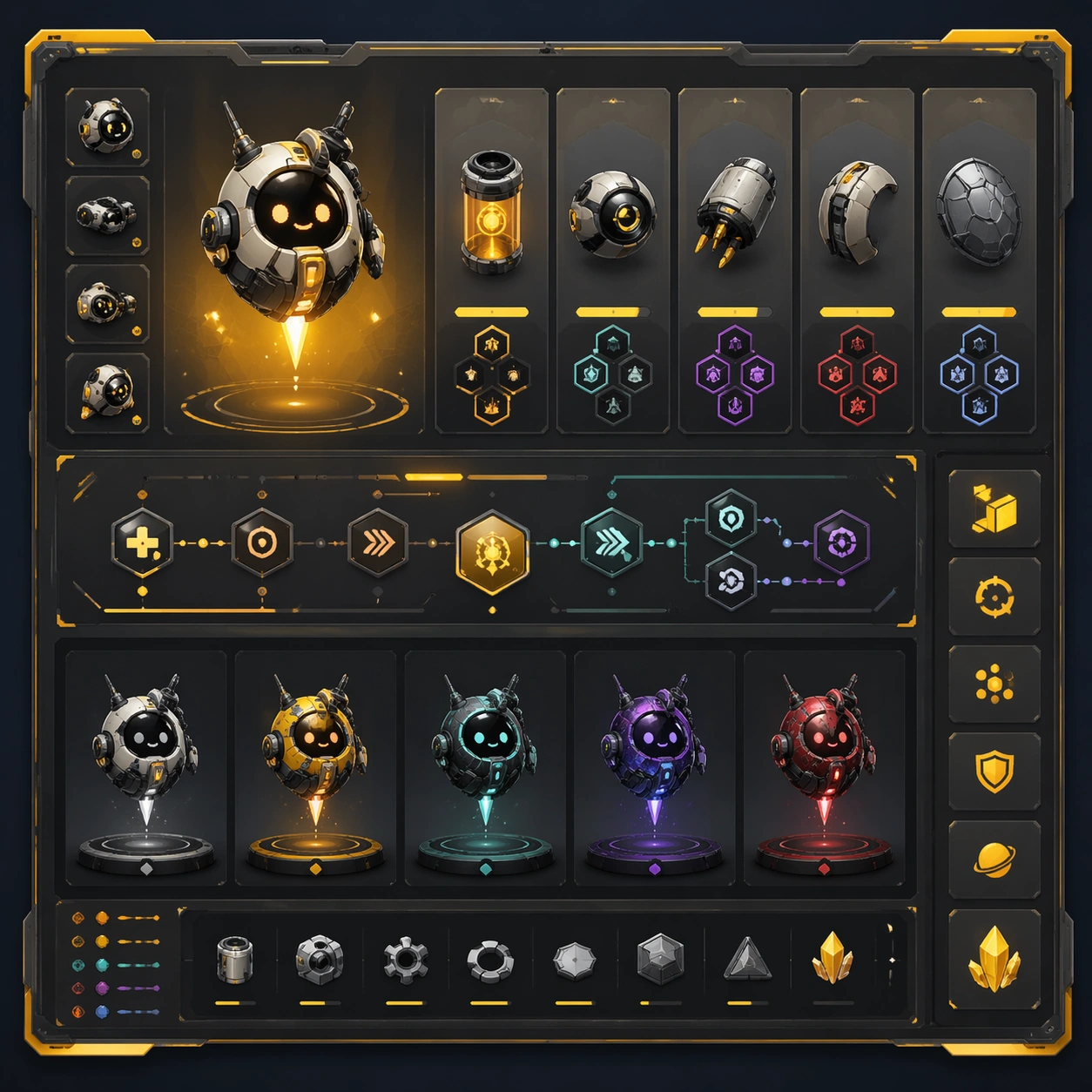
Scene: Create a square dependent image for Ensemble Key Visual Poster. Build a second controlled variation in the same system with a premium, production-ready finish. Use a polished modular board or campaign surface with clean spacing, premium game-UI finish, and clear focal hierarchy. The composition should feel intentional, clean, and reusable for gallery, research, campaign, or internal handoff contexts. Lighting must support readability first, with the main forms clearly separated from the background and enough breathing room for the system to stay legible at both hero scale and thumbnail scale. Subject: Center a coherent original game-art system built for premium production and marketing surfaces. For this image, focus on the intended support surface. Keep the same system logic stable across screenshots, cards, banners, and overview boards. Preserve exact identity or system logic from the reference image while changing only the intended variation axis. The viewer should immediately understand what role this surface plays inside a cohesive game-production asset pack. Important details: Lock framing, icon grammar, palette blocking, and surface hierarchy so the kit feels production-ready and consistent. Preserve the core silhouette, framing language, and material logic from the reference image while each variation changes function. Keep materials believable, edge hierarchy disciplined, and the visual language consistent with Ensemble KV. Use abstract interface blocks or diagram accents when helpful, but avoid any readable language. The final result should feel like a deliberate production asset rather than a random illustration. Use case: Ensemble Key Visual Poster series study 3/9, designed as variant two within a cohesive asset pack. Constraints: No readable text, no watermark, no logos, preserve exact 1:1 aspect ratio, no unrelated objects, no broken visual hierarchy, no malformed anatomy or broken perspective, no random decorative clutter.

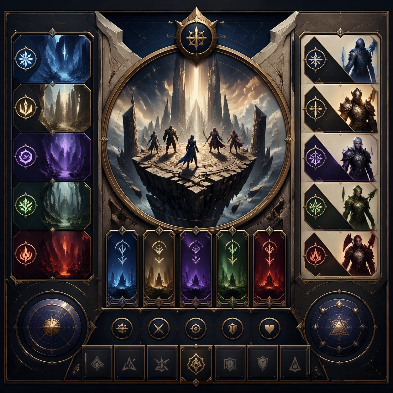
Example generated from “Ensemble Key Visual Poster — Variant Three”
GPT Image 2en

Scene: Create a square dependent image for Ensemble Key Visual Poster. Build a third controlled variation in the same system with a premium, production-ready finish. Use a polished modular board or campaign surface with clean spacing, premium game-UI finish, and clear focal hierarchy. The composition should feel intentional, clean, and reusable for gallery, research, campaign, or internal handoff contexts. Lighting must support readability first, with the main forms clearly separated from the background and enough breathing room for the system to stay legible at both hero scale and thumbnail scale. Subject: Center a coherent original game-art system built for premium production and marketing surfaces. For this image, focus on the intended support surface. Keep the same system logic stable across screenshots, cards, banners, and overview boards. Preserve exact identity or system logic from the reference image while changing only the intended variation axis. The viewer should immediately understand what role this surface plays inside a cohesive game-production asset pack. Important details: Lock framing, icon grammar, palette blocking, and surface hierarchy so the kit feels production-ready and consistent. Preserve the core silhouette, framing language, and material logic from the reference image while each variation changes function. Keep materials believable, edge hierarchy disciplined, and the visual language consistent with Ensemble KV. Use abstract interface blocks or diagram accents when helpful, but avoid any readable language. The final result should feel like a deliberate production asset rather than a random illustration. Use case: Ensemble Key Visual Poster series study 4/9, designed as variant three within a cohesive asset pack. Constraints: No readable text, no watermark, no logos, preserve exact 1:1 aspect ratio, no unrelated objects, no broken visual hierarchy, no malformed anatomy or broken perspective, no random decorative clutter.

Example generated from “Ensemble Key Visual Poster — Support One”
GPT Image 2en

Scene: Create a square standalone support image for Ensemble Key Visual Poster. Build a support-surface study with a clear focal hierarchy and a finished professional surface. Use a polished modular board or campaign surface with clean spacing, premium game-UI finish, and clear focal hierarchy. The frame should feel self-contained and polished, with enough structure to explain the system even without the reference series, yet still obviously belonging to the same theme and production world. Subject: Show a coherent original game-art system built for premium production and marketing surfaces in a way that emphasizes the intended support surface. Keep the same system logic stable across screenshots, cards, banners, and overview boards. Even though this image is independent, the viewer should still recognize the same universe, same commercial logic, and same production intent as the core package. Important details: Lock framing, icon grammar, palette blocking, and surface hierarchy so the kit feels production-ready and consistent. Preserve the broader theme language through color, framing, material choices, and modular composition. Use clean panel rhythm, premium asset presentation, and believable detail density. The image should work equally well as a gallery study, research reference, and mock production deliverable. Use case: Ensemble Key Visual Poster single study 5/9, exploring support one as a support surface. Constraints: No readable text, no watermark, no logos, preserve exact 1:1 aspect ratio, no unrelated objects, no broken visual hierarchy, no visual noise that obscures the main surface, no accidental brand resemblance.

Example generated from “Ensemble Key Visual Poster — Support Two”
GPT Image 2en

Scene: Create a square standalone support image for Ensemble Key Visual Poster. Build a second support-surface study with a clear focal hierarchy and a finished professional surface. Use a polished modular board or campaign surface with clean spacing, premium game-UI finish, and clear focal hierarchy. The frame should feel self-contained and polished, with enough structure to explain the system even without the reference series, yet still obviously belonging to the same theme and production world. Subject: Show a coherent original game-art system built for premium production and marketing surfaces in a way that emphasizes the intended support surface. Keep the same system logic stable across screenshots, cards, banners, and overview boards. Even though this image is independent, the viewer should still recognize the same universe, same commercial logic, and same production intent as the core package. Important details: Lock framing, icon grammar, palette blocking, and surface hierarchy so the kit feels production-ready and consistent. Preserve the broader theme language through color, framing, material choices, and modular composition. Use clean panel rhythm, premium asset presentation, and believable detail density. The image should work equally well as a gallery study, research reference, and mock production deliverable. Use case: Ensemble Key Visual Poster single study 6/9, exploring support two as a support surface. Constraints: No readable text, no watermark, no logos, preserve exact 1:1 aspect ratio, no unrelated objects, no broken visual hierarchy, no visual noise that obscures the main surface, no accidental brand resemblance.

Example generated from “Ensemble Key Visual Poster — Support Three”
GPT Image 2en

Scene: Create a square standalone support image for Ensemble Key Visual Poster. Build a third support-surface study with a clear focal hierarchy and a finished professional surface. Use a polished modular board or campaign surface with clean spacing, premium game-UI finish, and clear focal hierarchy. The frame should feel self-contained and polished, with enough structure to explain the system even without the reference series, yet still obviously belonging to the same theme and production world. Subject: Show a coherent original game-art system built for premium production and marketing surfaces in a way that emphasizes the intended support surface. Keep the same system logic stable across screenshots, cards, banners, and overview boards. Even though this image is independent, the viewer should still recognize the same universe, same commercial logic, and same production intent as the core package. Important details: Lock framing, icon grammar, palette blocking, and surface hierarchy so the kit feels production-ready and consistent. Preserve the broader theme language through color, framing, material choices, and modular composition. Use clean panel rhythm, premium asset presentation, and believable detail density. The image should work equally well as a gallery study, research reference, and mock production deliverable. Use case: Ensemble Key Visual Poster single study 7/9, exploring support three as a support surface. Constraints: No readable text, no watermark, no logos, preserve exact 1:1 aspect ratio, no unrelated objects, no broken visual hierarchy, no visual noise that obscures the main surface, no accidental brand resemblance.

Example generated from “Ensemble Key Visual Poster — Support Four”
GPT Image 2en

Scene: Create a square standalone support image for Ensemble Key Visual Poster. Build a fourth support-surface study with a clear focal hierarchy and a finished professional surface. Use a polished modular board or campaign surface with clean spacing, premium game-UI finish, and clear focal hierarchy. The frame should feel self-contained and polished, with enough structure to explain the system even without the reference series, yet still obviously belonging to the same theme and production world. Subject: Show a coherent original game-art system built for premium production and marketing surfaces in a way that emphasizes the intended support surface. Keep the same system logic stable across screenshots, cards, banners, and overview boards. Even though this image is independent, the viewer should still recognize the same universe, same commercial logic, and same production intent as the core package. Important details: Lock framing, icon grammar, palette blocking, and surface hierarchy so the kit feels production-ready and consistent. Preserve the broader theme language through color, framing, material choices, and modular composition. Use clean panel rhythm, premium asset presentation, and believable detail density. The image should work equally well as a gallery study, research reference, and mock production deliverable. Use case: Ensemble Key Visual Poster single study 8/9, exploring support four as a support surface. Constraints: No readable text, no watermark, no logos, preserve exact 1:1 aspect ratio, no unrelated objects, no broken visual hierarchy, no visual noise that obscures the main surface, no accidental brand resemblance.

Example generated from “Ensemble Key Visual Poster — Support Five”
GPT Image 2en

Scene: Create a square standalone support image for Ensemble Key Visual Poster. Build a fifth support-surface study with a clear focal hierarchy and a finished professional surface. Use a polished modular board or campaign surface with clean spacing, premium game-UI finish, and clear focal hierarchy. The frame should feel self-contained and polished, with enough structure to explain the system even without the reference series, yet still obviously belonging to the same theme and production world. Subject: Show a coherent original game-art system built for premium production and marketing surfaces in a way that emphasizes the intended support surface. Keep the same system logic stable across screenshots, cards, banners, and overview boards. Even though this image is independent, the viewer should still recognize the same universe, same commercial logic, and same production intent as the core package. Important details: Lock framing, icon grammar, palette blocking, and surface hierarchy so the kit feels production-ready and consistent. Preserve the broader theme language through color, framing, material choices, and modular composition. Use clean panel rhythm, premium asset presentation, and believable detail density. The image should work equally well as a gallery study, research reference, and mock production deliverable. Use case: Ensemble Key Visual Poster single study 9/9, exploring support five as a support surface. Constraints: No readable text, no watermark, no logos, preserve exact 1:1 aspect ratio, no unrelated objects, no broken visual hierarchy, no visual noise that obscures the main surface, no accidental brand resemblance.

Example generated from “Esports Matchday Visual Kit — Pre Match Lineup Poster”
GPT Image 2en

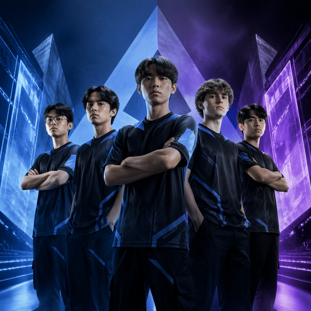
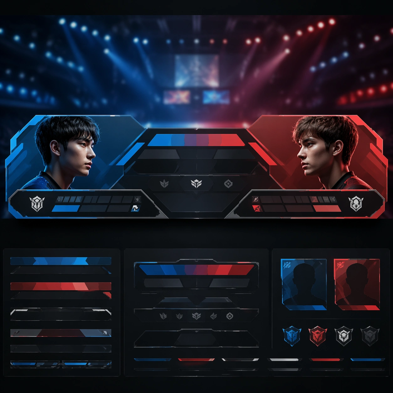
Scene: A square premium key-art frame built for a reference-dependent production series. Stage a flagship pre-match lineup poster for an esports matchday with featured players posed like a broadcast-ready event with controlled lighting, clear silhouette separation, and a camera setup that feels deliberate enough for campaign reuse. The composition should carry strong focal hierarchy, believable depth, and polished surface behavior while still staying stable enough to support downstream dependent variations. Subject: Center the image on a flagship pre-match lineup poster for an esports matchday with featured players posed like a broadcast-ready event. The result should feel like a concrete, shippable asset for Esports Matchday Visual Kit, not a generic fantasy render. Build the subject with layered materials, stable anatomy or engineering logic, and enough specificity that later images can inherit the same underlying identity. This image is the root reference that defines continuity for the rest of the series. The viewer should immediately understand what is being preserved across the sequence and what is changing in this particular beat. Important details: establish the team cast, color hierarchy, and event mood that later assets must preserve. Make continuity explicit through repeatable shape language, proportion control, and a coherent palette system. Changes in pose, angle, mood, rarity, weather, or layout should still feel downstream of one stable source. Avoid clutter that would confuse reference use. Any interface-like blocks or graphic surfaces must remain abstract and unreadable. Keep the image polished, original, and suitable for both gallery display and production review. Use case: Esports Matchday Visual Kit series study 1/4, focused on pre match lineup poster. Constraints: No readable text, no watermark, no logos, preserve exact 1:1 aspect ratio, no sponsor logos, no readable text, no broken continuity, no off-model redesign, no accidental franchise resemblance.

Example generated from “Esports Matchday Visual Kit — Live Cover”
GPT Image 2en

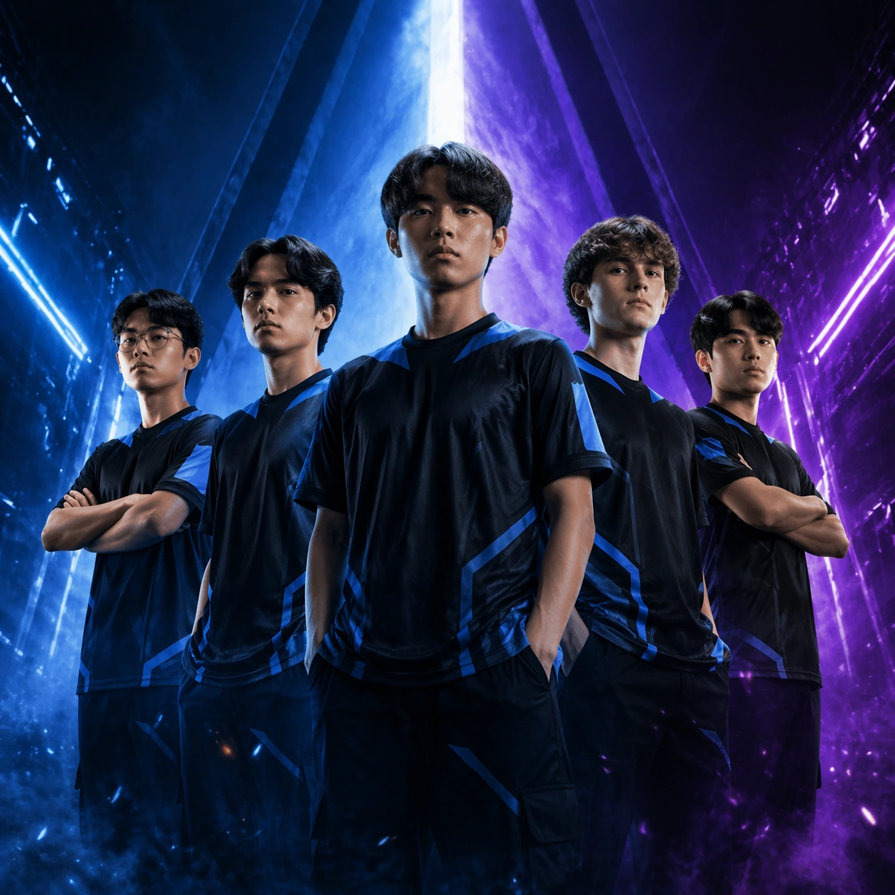
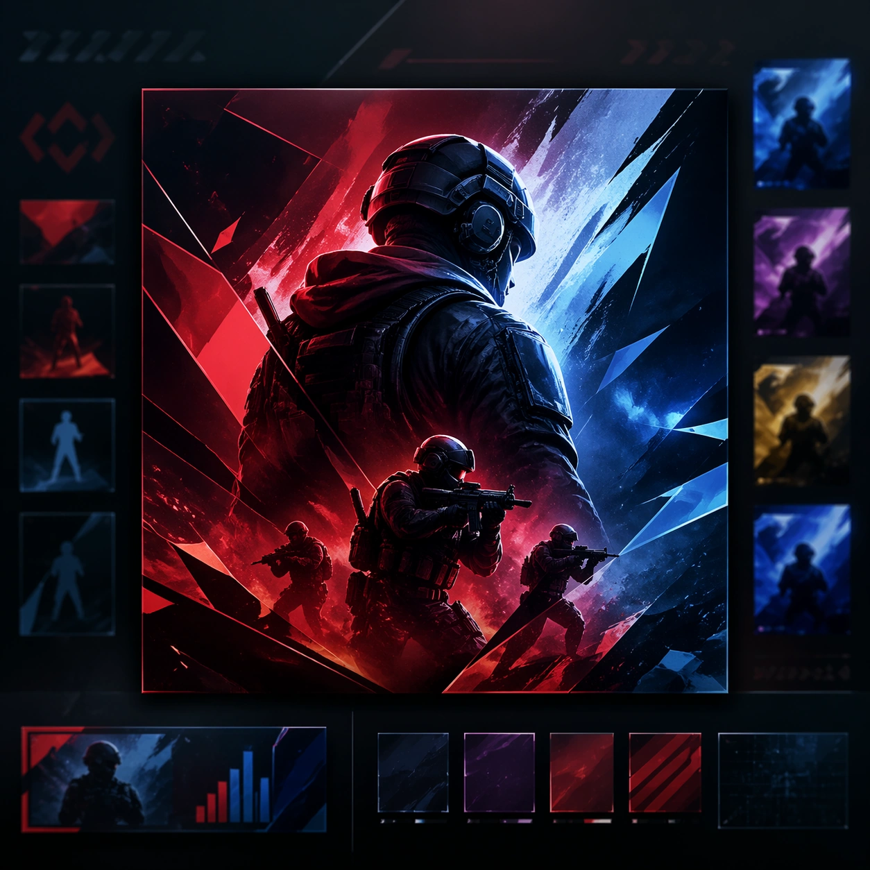
Scene: A square premium key-art frame built for a reference-dependent production series. Stage the same matchday identity adapted into a live-cover surface with tighter urgency and broadcast framing with controlled lighting, clear silhouette separation, and a camera setup that feels deliberate enough for campaign reuse. The composition should carry strong focal hierarchy, believable depth, and polished surface behavior while still staying stable enough to support downstream dependent variations. Subject: Center the image on the same matchday identity adapted into a live-cover surface with tighter urgency and broadcast framing. The result should feel like a concrete, shippable asset for Esports Matchday Visual Kit, not a generic fantasy render. Build the subject with layered materials, stable anatomy or engineering logic, and enough specificity that later images can inherit the same underlying identity. Preserve the same matchday graphic system, team cast styling, color hierarchy, and broadcast mood from the reference poster from the reference image while changing only what this variation needs. The viewer should immediately understand what is being preserved across the sequence and what is changing in this particular beat. Important details: preserve cast recognizability and event branding cues while optimizing for a live card. Make continuity explicit through repeatable shape language, proportion control, and a coherent palette system. Changes in pose, angle, mood, rarity, weather, or layout should still feel downstream of one stable source. Avoid clutter that would confuse reference use. Any interface-like blocks or graphic surfaces must remain abstract and unreadable. Keep the image polished, original, and suitable for both gallery display and production review. Use case: Esports Matchday Visual Kit series study 2/4, focused on live cover. Constraints: No readable text, no watermark, no logos, preserve exact 1:1 aspect ratio, no readable clocks, no logos, no broken continuity, no off-model redesign, no accidental franchise resemblance.

Example generated from “Esports Matchday Visual Kit — Score Update Tile”
GPT Image 2en

Scene: A square premium key-art frame built for a reference-dependent production series. Stage the same matchday graphic system translated into a score-update tile with strong versus energy with controlled lighting, clear silhouette separation, and a camera setup that feels deliberate enough for campaign reuse. The composition should carry strong focal hierarchy, believable depth, and polished surface behavior while still staying stable enough to support downstream dependent variations. Subject: Center the image on the same matchday graphic system translated into a score-update tile with strong versus energy. The result should feel like a concrete, shippable asset for Esports Matchday Visual Kit, not a generic fantasy render. Build the subject with layered materials, stable anatomy or engineering logic, and enough specificity that later images can inherit the same underlying identity. Preserve the same matchday graphic system, team cast styling, color hierarchy, and broadcast mood from the reference poster from the reference image while changing only what this variation needs. The viewer should immediately understand what is being preserved across the sequence and what is changing in this particular beat. Important details: the asset should imply score change and momentum without actual numbers or readable copy. Make continuity explicit through repeatable shape language, proportion control, and a coherent palette system. Changes in pose, angle, mood, rarity, weather, or layout should still feel downstream of one stable source. Avoid clutter that would confuse reference use. Any interface-like blocks or graphic surfaces must remain abstract and unreadable. Keep the image polished, original, and suitable for both gallery display and production review. Use case: Esports Matchday Visual Kit series study 3/4, focused on score update tile. Constraints: No readable text, no watermark, no logos, preserve exact 1:1 aspect ratio, no numerals, no team names, no broken continuity, no off-model redesign, no accidental franchise resemblance.

Example generated from “Esports Matchday Visual Kit — MVP Feature Card”
GPT Image 2en

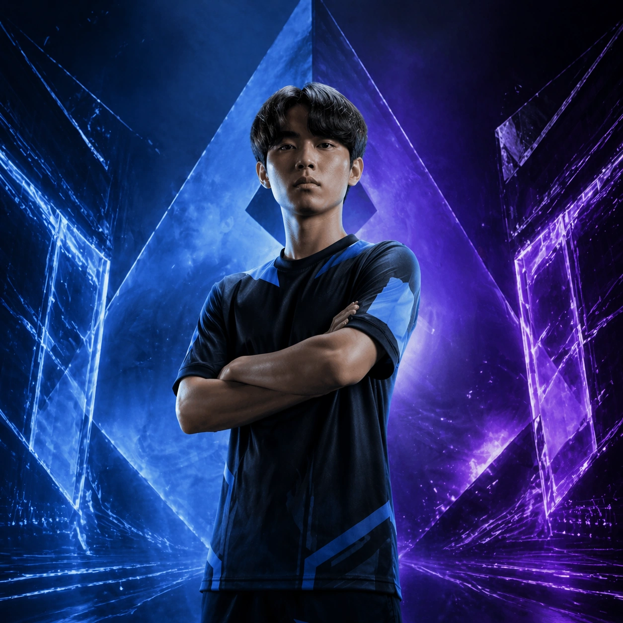
Scene: A square premium key-art frame built for a reference-dependent production series. Stage the same matchday system focused onto one standout player for a feature-card treatment with controlled lighting, clear silhouette separation, and a camera setup that feels deliberate enough for campaign reuse. The composition should carry strong focal hierarchy, believable depth, and polished surface behavior while still staying stable enough to support downstream dependent variations. Subject: Center the image on the same matchday system focused onto one standout player for a feature-card treatment. The result should feel like a concrete, shippable asset for Esports Matchday Visual Kit, not a generic fantasy render. Build the subject with layered materials, stable anatomy or engineering logic, and enough specificity that later images can inherit the same underlying identity. Preserve the same matchday graphic system, team cast styling, color hierarchy, and broadcast mood from the reference poster from the reference image while changing only what this variation needs. The viewer should immediately understand what is being preserved across the sequence and what is changing in this particular beat. Important details: keep the same event identity while spotlighting one player with premium portrait energy. Make continuity explicit through repeatable shape language, proportion control, and a coherent palette system. Changes in pose, angle, mood, rarity, weather, or layout should still feel downstream of one stable source. Avoid clutter that would confuse reference use. Any interface-like blocks or graphic surfaces must remain abstract and unreadable. Keep the image polished, original, and suitable for both gallery display and production review. Use case: Esports Matchday Visual Kit series study 4/4, focused on mvp feature card. Constraints: No readable text, no watermark, no logos, preserve exact 1:1 aspect ratio, no sponsor marks, no readable labels, no broken continuity, no off-model redesign, no accidental franchise resemblance.

Example generated from “Esports Matchday Visual Kit — Broadcast Lower Third Board”
GPT Image 2en

Scene: A square production-ready image designed for a game-art review wall and a commercial gallery at the same time. Frame a lower-third inspired board showing how portraits and match metadata could lock together with disciplined lighting, clean edge separation, and enough surrounding context to prove how the asset would behave in a real product surface. The camera, crop, and tonal balance should feel intentional rather than generic, with high readability at first glance and convincing material response under closer inspection. Subject: Center the study on a lower-third inspired board showing how portraits and match metadata could lock together. Translate the topic into a concrete, shippable visual statement instead of a loose mood board. Build layered object relationships, believable surface finish, and strong silhouette grouping so the image reads immediately as part of Esports Matchday Visual Kit. The subject should feel made for a live game pipeline: useful in store, UI, campaign, or art-review contexts, with visual hierarchy strong enough to survive aggressive cropping. Important details: hierarchy should feel broadcast-real even though every text field stays abstract. Keep every supporting element subordinate to the main read, and make category separation obvious through form, color zoning, depth, and material logic rather than words. Where panels, cards, badges, or interface blocks appear, they must look professionally structured but remain unreadable. The visual language should feel premium, original, and coherent across this package, with no filler clutter and no accidental resemblance to a specific shipped game IP. Use case: Esports Matchday Visual Kit single study 2/5, focused on broadcast lower third board. Constraints: No readable text, no watermark, no logos, preserve exact 1:1 aspect ratio, no readable names, no numerals, no broken hierarchy, no generic stock-photo staging, no accidental UI gibberish.

Example generated from “Esports Matchday Visual Kit — Post Match Recap Poster”
GPT Image 2en

Scene: A square production-ready image designed for a game-art review wall and a commercial gallery at the same time. Frame a recap poster that turns matchday assets into a finished after-event campaign piece with disciplined lighting, clean edge separation, and enough surrounding context to prove how the asset would behave in a real product surface. The camera, crop, and tonal balance should feel intentional rather than generic, with high readability at first glance and convincing material response under closer inspection. Subject: Center the study on a recap poster that turns matchday assets into a finished after-event campaign piece. Translate the topic into a concrete, shippable visual statement instead of a loose mood board. Build layered object relationships, believable surface finish, and strong silhouette grouping so the image reads immediately as part of Esports Matchday Visual Kit. The subject should feel made for a live game pipeline: useful in store, UI, campaign, or art-review contexts, with visual hierarchy strong enough to survive aggressive cropping. Important details: the composition should feel decisive, celebratory, and still tied to the same system. Keep every supporting element subordinate to the main read, and make category separation obvious through form, color zoning, depth, and material logic rather than words. Where panels, cards, badges, or interface blocks appear, they must look professionally structured but remain unreadable. The visual language should feel premium, original, and coherent across this package, with no filler clutter and no accidental resemblance to a specific shipped game IP. Use case: Esports Matchday Visual Kit single study 3/5, focused on post match recap poster. Constraints: No readable text, no watermark, no logos, preserve exact 1:1 aspect ratio, no scores, no logos, no broken hierarchy, no generic stock-photo staging, no accidental UI gibberish.

Example generated from “Esports Matchday Visual Kit — Social Highlight Tile”
GPT Image 2en

Scene: A square production-ready image designed for a game-art review wall and a commercial gallery at the same time. Frame a social tile built for rapid highlight posting during or after a match with disciplined lighting, clean edge separation, and enough surrounding context to prove how the asset would behave in a real product surface. The camera, crop, and tonal balance should feel intentional rather than generic, with high readability at first glance and convincing material response under closer inspection. Subject: Center the study on a social tile built for rapid highlight posting during or after a match. Translate the topic into a concrete, shippable visual statement instead of a loose mood board. Build layered object relationships, believable surface finish, and strong silhouette grouping so the image reads immediately as part of Esports Matchday Visual Kit. The subject should feel made for a live game pipeline: useful in store, UI, campaign, or art-review contexts, with visual hierarchy strong enough to survive aggressive cropping. Important details: compression resilience and strong focal hierarchy matter more than dense detail. Keep every supporting element subordinate to the main read, and make category separation obvious through form, color zoning, depth, and material logic rather than words. Where panels, cards, badges, or interface blocks appear, they must look professionally structured but remain unreadable. The visual language should feel premium, original, and coherent across this package, with no filler clutter and no accidental resemblance to a specific shipped game IP. Use case: Esports Matchday Visual Kit single study 4/5, focused on social highlight tile. Constraints: No readable text, no watermark, no logos, preserve exact 1:1 aspect ratio, no hashtags, no text, no broken hierarchy, no generic stock-photo staging, no accidental UI gibberish.

Example generated from “Esports Matchday Visual Kit — Tournament Gallery Sheet”
GPT Image 2en

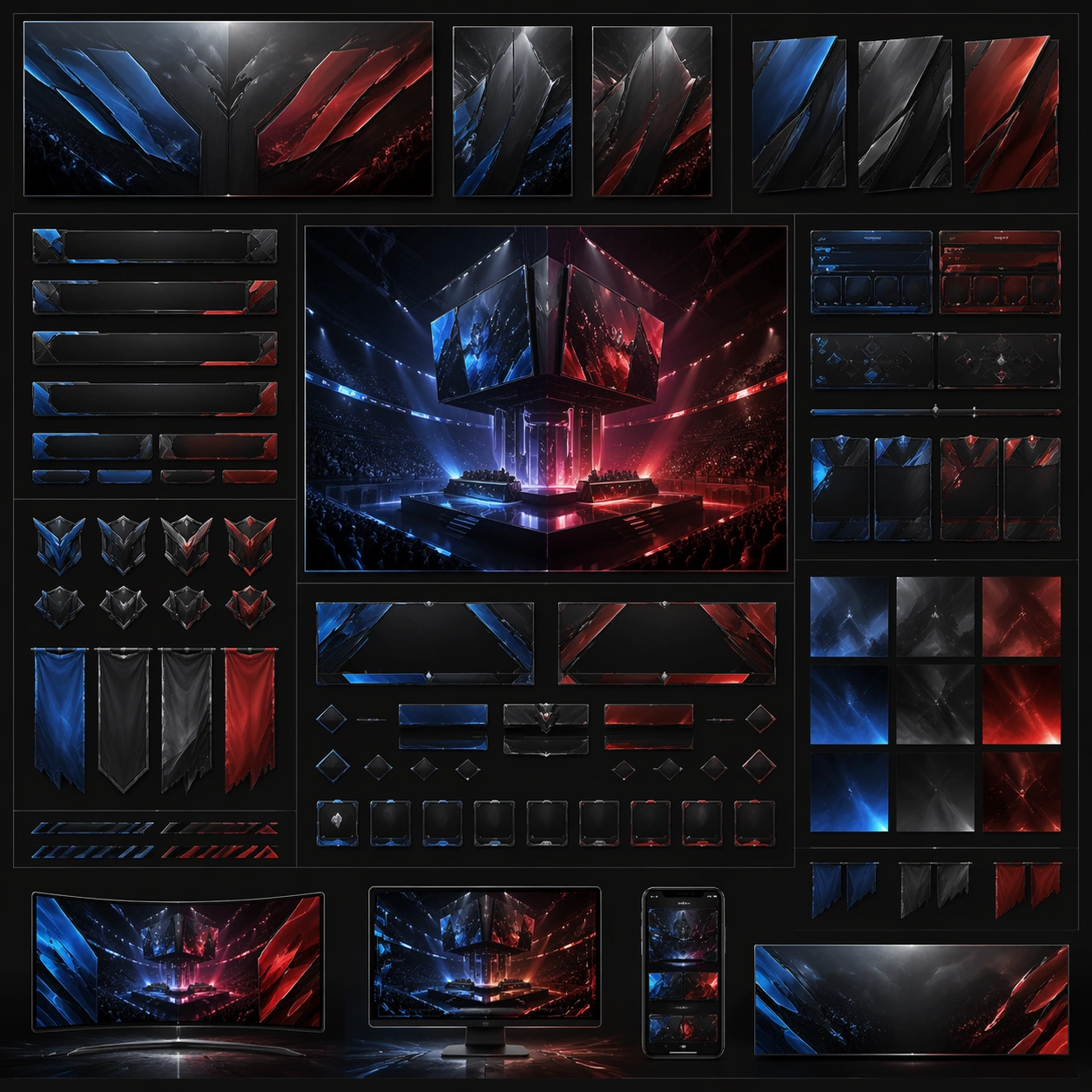
Scene: A square production-ready image designed for a game-art review wall and a commercial gallery at the same time. Frame a gallery sheet that arranges the matchday asset family into one professional event toolkit overview with disciplined lighting, clean edge separation, and enough surrounding context to prove how the asset would behave in a real product surface. The camera, crop, and tonal balance should feel intentional rather than generic, with high readability at first glance and convincing material response under closer inspection. Subject: Center the study on a gallery sheet that arranges the matchday asset family into one professional event toolkit overview. Translate the topic into a concrete, shippable visual statement instead of a loose mood board. Build layered object relationships, believable surface finish, and strong silhouette grouping so the image reads immediately as part of Esports Matchday Visual Kit. The subject should feel made for a live game pipeline: useful in store, UI, campaign, or art-review contexts, with visual hierarchy strong enough to survive aggressive cropping. Important details: make the kit feel flexible, fast, and cohesive across broadcast surfaces. Keep every supporting element subordinate to the main read, and make category separation obvious through form, color zoning, depth, and material logic rather than words. Where panels, cards, badges, or interface blocks appear, they must look professionally structured but remain unreadable. The visual language should feel premium, original, and coherent across this package, with no filler clutter and no accidental resemblance to a specific shipped game IP. Use case: Esports Matchday Visual Kit single study 5/5, focused on tournament gallery sheet. Constraints: No readable text, no watermark, no logos, preserve exact 1:1 aspect ratio, no readable labels, no sponsor grids, no broken hierarchy, no generic stock-photo staging, no accidental UI gibberish.

Example generated from “Executive Dashboard Premium System — Reference Anchor”
GPT Image 2en

Scene: Create a square reference image for Executive Dashboard Premium System. Build a reference anchor establishing the core system with a premium, production-ready finish. Use a polished modular board or campaign surface with clean spacing, premium game-UI finish, and clear focal hierarchy. The composition should feel intentional, clean, and reusable for gallery, research, campaign, or internal handoff contexts. Lighting must support readability first, with the main forms clearly separated from the background and enough breathing room for the system to stay legible at both hero scale and thumbnail scale. Subject: Center a coherent original game-art system built for premium production and marketing surfaces. For this image, focus on reference anchor. Keep the same system logic stable across screenshots, cards, banners, and overview boards. This image is the canonical anchor that later series images must follow. The viewer should immediately understand what role this surface plays inside a cohesive game-production asset pack. Important details: Lock framing, icon grammar, palette blocking, and surface hierarchy so the kit feels production-ready and consistent. Preserve the core silhouette, framing language, and material logic from the reference image while each variation changes function. Keep materials believable, edge hierarchy disciplined, and the visual language consistent with Exec Dashboard. Use abstract interface blocks or diagram accents when helpful, but avoid any readable language. The final result should feel like a deliberate production asset rather than a random illustration. Use case: Executive Dashboard Premium System series study 1/9, designed as reference anchor within a cohesive asset pack. Constraints: No readable text, no watermark, no logos, preserve exact 1:1 aspect ratio, no unrelated objects, no broken visual hierarchy, no malformed anatomy or broken perspective, no random decorative clutter.

Example generated from “Executive Dashboard Premium System — Variant One”
GPT Image 2en

Scene: Create a square dependent image for Executive Dashboard Premium System. Build a first controlled variation in the same system with a premium, production-ready finish. Use a polished modular board or campaign surface with clean spacing, premium game-UI finish, and clear focal hierarchy. The composition should feel intentional, clean, and reusable for gallery, research, campaign, or internal handoff contexts. Lighting must support readability first, with the main forms clearly separated from the background and enough breathing room for the system to stay legible at both hero scale and thumbnail scale. Subject: Center a coherent original game-art system built for premium production and marketing surfaces. For this image, focus on the intended support surface. Keep the same system logic stable across screenshots, cards, banners, and overview boards. Preserve exact identity or system logic from the reference image while changing only the intended variation axis. The viewer should immediately understand what role this surface plays inside a cohesive game-production asset pack. Important details: Lock framing, icon grammar, palette blocking, and surface hierarchy so the kit feels production-ready and consistent. Preserve the core silhouette, framing language, and material logic from the reference image while each variation changes function. Keep materials believable, edge hierarchy disciplined, and the visual language consistent with Exec Dashboard. Use abstract interface blocks or diagram accents when helpful, but avoid any readable language. The final result should feel like a deliberate production asset rather than a random illustration. Use case: Executive Dashboard Premium System series study 2/9, designed as variant one within a cohesive asset pack. Constraints: No readable text, no watermark, no logos, preserve exact 1:1 aspect ratio, no unrelated objects, no broken visual hierarchy, no malformed anatomy or broken perspective, no random decorative clutter.

Example generated from “Executive Dashboard Premium System — Variant Two”
GPT Image 2en

Scene: Create a square dependent image for Executive Dashboard Premium System. Build a second controlled variation in the same system with a premium, production-ready finish. Use a polished modular board or campaign surface with clean spacing, premium game-UI finish, and clear focal hierarchy. The composition should feel intentional, clean, and reusable for gallery, research, campaign, or internal handoff contexts. Lighting must support readability first, with the main forms clearly separated from the background and enough breathing room for the system to stay legible at both hero scale and thumbnail scale. Subject: Center a coherent original game-art system built for premium production and marketing surfaces. For this image, focus on the intended support surface. Keep the same system logic stable across screenshots, cards, banners, and overview boards. Preserve exact identity or system logic from the reference image while changing only the intended variation axis. The viewer should immediately understand what role this surface plays inside a cohesive game-production asset pack. Important details: Lock framing, icon grammar, palette blocking, and surface hierarchy so the kit feels production-ready and consistent. Preserve the core silhouette, framing language, and material logic from the reference image while each variation changes function. Keep materials believable, edge hierarchy disciplined, and the visual language consistent with Exec Dashboard. Use abstract interface blocks or diagram accents when helpful, but avoid any readable language. The final result should feel like a deliberate production asset rather than a random illustration. Use case: Executive Dashboard Premium System series study 3/9, designed as variant two within a cohesive asset pack. Constraints: No readable text, no watermark, no logos, preserve exact 1:1 aspect ratio, no unrelated objects, no broken visual hierarchy, no malformed anatomy or broken perspective, no random decorative clutter.

Example generated from “Executive Dashboard Premium System — Variant Three”
GPT Image 2en

Scene: Create a square dependent image for Executive Dashboard Premium System. Build a third controlled variation in the same system with a premium, production-ready finish. Use a polished modular board or campaign surface with clean spacing, premium game-UI finish, and clear focal hierarchy. The composition should feel intentional, clean, and reusable for gallery, research, campaign, or internal handoff contexts. Lighting must support readability first, with the main forms clearly separated from the background and enough breathing room for the system to stay legible at both hero scale and thumbnail scale. Subject: Center a coherent original game-art system built for premium production and marketing surfaces. For this image, focus on the intended support surface. Keep the same system logic stable across screenshots, cards, banners, and overview boards. Preserve exact identity or system logic from the reference image while changing only the intended variation axis. The viewer should immediately understand what role this surface plays inside a cohesive game-production asset pack. Important details: Lock framing, icon grammar, palette blocking, and surface hierarchy so the kit feels production-ready and consistent. Preserve the core silhouette, framing language, and material logic from the reference image while each variation changes function. Keep materials believable, edge hierarchy disciplined, and the visual language consistent with Exec Dashboard. Use abstract interface blocks or diagram accents when helpful, but avoid any readable language. The final result should feel like a deliberate production asset rather than a random illustration. Use case: Executive Dashboard Premium System series study 4/9, designed as variant three within a cohesive asset pack. Constraints: No readable text, no watermark, no logos, preserve exact 1:1 aspect ratio, no unrelated objects, no broken visual hierarchy, no malformed anatomy or broken perspective, no random decorative clutter.

Example generated from “Executive Dashboard Premium System — Support One”
GPT Image 2en

Scene: Create a square standalone support image for Executive Dashboard Premium System. Build a support-surface study with a clear focal hierarchy and a finished professional surface. Use a polished modular board or campaign surface with clean spacing, premium game-UI finish, and clear focal hierarchy. The frame should feel self-contained and polished, with enough structure to explain the system even without the reference series, yet still obviously belonging to the same theme and production world. Subject: Show a coherent original game-art system built for premium production and marketing surfaces in a way that emphasizes the intended support surface. Keep the same system logic stable across screenshots, cards, banners, and overview boards. Even though this image is independent, the viewer should still recognize the same universe, same commercial logic, and same production intent as the core package. Important details: Lock framing, icon grammar, palette blocking, and surface hierarchy so the kit feels production-ready and consistent. Preserve the broader theme language through color, framing, material choices, and modular composition. Use clean panel rhythm, premium asset presentation, and believable detail density. The image should work equally well as a gallery study, research reference, and mock production deliverable. Use case: Executive Dashboard Premium System single study 5/9, exploring support one as a support surface. Constraints: No readable text, no watermark, no logos, preserve exact 1:1 aspect ratio, no unrelated objects, no broken visual hierarchy, no visual noise that obscures the main surface, no accidental brand resemblance.

Example generated from “Executive Dashboard Premium System — Support Two”
GPT Image 2en

Scene: Create a square standalone support image for Executive Dashboard Premium System. Build a second support-surface study with a clear focal hierarchy and a finished professional surface. Use a polished modular board or campaign surface with clean spacing, premium game-UI finish, and clear focal hierarchy. The frame should feel self-contained and polished, with enough structure to explain the system even without the reference series, yet still obviously belonging to the same theme and production world. Subject: Show a coherent original game-art system built for premium production and marketing surfaces in a way that emphasizes the intended support surface. Keep the same system logic stable across screenshots, cards, banners, and overview boards. Even though this image is independent, the viewer should still recognize the same universe, same commercial logic, and same production intent as the core package. Important details: Lock framing, icon grammar, palette blocking, and surface hierarchy so the kit feels production-ready and consistent. Preserve the broader theme language through color, framing, material choices, and modular composition. Use clean panel rhythm, premium asset presentation, and believable detail density. The image should work equally well as a gallery study, research reference, and mock production deliverable. Use case: Executive Dashboard Premium System single study 6/9, exploring support two as a support surface. Constraints: No readable text, no watermark, no logos, preserve exact 1:1 aspect ratio, no unrelated objects, no broken visual hierarchy, no visual noise that obscures the main surface, no accidental brand resemblance.

Example generated from “Executive Dashboard Premium System — Support Three”
GPT Image 2en

Scene: Create a square standalone support image for Executive Dashboard Premium System. Build a third support-surface study with a clear focal hierarchy and a finished professional surface. Use a polished modular board or campaign surface with clean spacing, premium game-UI finish, and clear focal hierarchy. The frame should feel self-contained and polished, with enough structure to explain the system even without the reference series, yet still obviously belonging to the same theme and production world. Subject: Show a coherent original game-art system built for premium production and marketing surfaces in a way that emphasizes the intended support surface. Keep the same system logic stable across screenshots, cards, banners, and overview boards. Even though this image is independent, the viewer should still recognize the same universe, same commercial logic, and same production intent as the core package. Important details: Lock framing, icon grammar, palette blocking, and surface hierarchy so the kit feels production-ready and consistent. Preserve the broader theme language through color, framing, material choices, and modular composition. Use clean panel rhythm, premium asset presentation, and believable detail density. The image should work equally well as a gallery study, research reference, and mock production deliverable. Use case: Executive Dashboard Premium System single study 7/9, exploring support three as a support surface. Constraints: No readable text, no watermark, no logos, preserve exact 1:1 aspect ratio, no unrelated objects, no broken visual hierarchy, no visual noise that obscures the main surface, no accidental brand resemblance.

Example generated from “Executive Dashboard Premium System — Support Four”
GPT Image 2en

Scene: Create a square standalone support image for Executive Dashboard Premium System. Build a fourth support-surface study with a clear focal hierarchy and a finished professional surface. Use a polished modular board or campaign surface with clean spacing, premium game-UI finish, and clear focal hierarchy. The frame should feel self-contained and polished, with enough structure to explain the system even without the reference series, yet still obviously belonging to the same theme and production world. Subject: Show a coherent original game-art system built for premium production and marketing surfaces in a way that emphasizes the intended support surface. Keep the same system logic stable across screenshots, cards, banners, and overview boards. Even though this image is independent, the viewer should still recognize the same universe, same commercial logic, and same production intent as the core package. Important details: Lock framing, icon grammar, palette blocking, and surface hierarchy so the kit feels production-ready and consistent. Preserve the broader theme language through color, framing, material choices, and modular composition. Use clean panel rhythm, premium asset presentation, and believable detail density. The image should work equally well as a gallery study, research reference, and mock production deliverable. Use case: Executive Dashboard Premium System single study 8/9, exploring support four as a support surface. Constraints: No readable text, no watermark, no logos, preserve exact 1:1 aspect ratio, no unrelated objects, no broken visual hierarchy, no visual noise that obscures the main surface, no accidental brand resemblance.

Example generated from “Executive Dashboard Premium System — Support Five”
GPT Image 2en

Scene: Create a square standalone support image for Executive Dashboard Premium System. Build a fifth support-surface study with a clear focal hierarchy and a finished professional surface. Use a polished modular board or campaign surface with clean spacing, premium game-UI finish, and clear focal hierarchy. The frame should feel self-contained and polished, with enough structure to explain the system even without the reference series, yet still obviously belonging to the same theme and production world. Subject: Show a coherent original game-art system built for premium production and marketing surfaces in a way that emphasizes the intended support surface. Keep the same system logic stable across screenshots, cards, banners, and overview boards. Even though this image is independent, the viewer should still recognize the same universe, same commercial logic, and same production intent as the core package. Important details: Lock framing, icon grammar, palette blocking, and surface hierarchy so the kit feels production-ready and consistent. Preserve the broader theme language through color, framing, material choices, and modular composition. Use clean panel rhythm, premium asset presentation, and believable detail density. The image should work equally well as a gallery study, research reference, and mock production deliverable. Use case: Executive Dashboard Premium System single study 9/9, exploring support five as a support surface. Constraints: No readable text, no watermark, no logos, preserve exact 1:1 aspect ratio, no unrelated objects, no broken visual hierarchy, no visual noise that obscures the main surface, no accidental brand resemblance.

Example generated from “Exoplanet Floating Forest — Root Tendril Rain”
GPT Image 2en

Scene: Frame the image from the ground looking upward through a dense curtain of descending root tendrils, with one major canopy island obscured above by distance and haze. The light should be warm and directional, catching droplets, pollen, and dust spiraling in slow updraft columns. Build the frame as a square natural history study with disciplined composition, believable lighting, and enough environmental evidence to explain how this organism or system functions without any caption. Keep the image polished, observational, and suitable for a research gallery rather than pulp fantasy spectacle. Subject: Focus on the root system as an active interface: thick anchor cords, filamentary feeder roots, moisture bladders, and tiny climber animals using the hanging network as a vertical highway. Ground plants and stones below should provide scale and show how close the roots come to the surface. Show the anatomy, habitat interaction, and scale cues clearly so the viewer can infer locomotion, feeding, reproduction, or ecological role from the visual alone. Every visible structure should feel evolved for a purpose, with layered foreground, midground, and background information that rewards close inspection. Important details: Assume low gravity, persistent updrafts, and buoyant tissues let mature canopy masses hover while root tendrils still harvest minerals and moisture from the ground. Organisms should visibly respond to vertical distance, drifting substrates, and unstable aerial habitat. Treat the roots as living organs adapted for both suspension and nutrient gathering. Tension, branching, and surface texture should suggest constant motion in the air column rather than static hanging vines. Keep the image ecological and tactile. Favor coherent biology over decorative excess: tissues, shells, membranes, spores, tendrils, fins, silica lattices, or atmospheric sacs should all follow one material logic. Preserve a convincing relationship between the environment and the body plan, use restrained color hierarchy, and make the image feel like a serious speculative field record rather than a random monster concept. Use case: Exoplanet Floating Forest single study 2/9. Constraints: No readable text, no watermark, no logos, preserve exact 1:1 aspect ratio, no jungle-vine cliche, no gravity-free tangle, no human ladders, no fantasy glowing runes, no accidental brand resemblance, no direct copy of known terrestrial species, no cartoon simplification.

Example generated from “Exoplanet Floating Forest — Glider Herd Bridge”
GPT Image 2en

Scene: Capture a mid-distance crossing between two nearby canopy islands with open sky occupying most of the square. The atmosphere should feel buoyant and calm, with visible depth, suspended seed fluff, and sunlight streaking through the gap between the islands. Build the frame as a square natural history study with disciplined composition, believable lighting, and enough environmental evidence to explain how this organism or system functions without any caption. Keep the image polished, observational, and suitable for a research gallery rather than pulp fantasy spectacle. Subject: Show several medium-sized herbivore analogs launching from one root shelf and gliding toward another using membrane sails, steering tails, and grasping hind limbs. Their bodies should look evolved for repeated controlled leaps in low gravity rather than powered bird flight. Show the anatomy, habitat interaction, and scale cues clearly so the viewer can infer locomotion, feeding, reproduction, or ecological role from the visual alone. Every visible structure should feel evolved for a purpose, with layered foreground, midground, and background information that rewards close inspection. Important details: Assume low gravity, persistent updrafts, and buoyant tissues let mature canopy masses hover while root tendrils still harvest minerals and moisture from the ground. Organisms should visibly respond to vertical distance, drifting substrates, and unstable aerial habitat. Movement should be believable: stretched membranes, wind orientation, and landing targets must all support the ecology of scattered aerial habitat. The animals should feel native to the floating forest, not like copied bats or flying squirrels. Favor coherent biology over decorative excess: tissues, shells, membranes, spores, tendrils, fins, silica lattices, or atmospheric sacs should all follow one material logic. Preserve a convincing relationship between the environment and the body plan, use restrained color hierarchy, and make the image feel like a serious speculative field record rather than a random monster concept. Use case: Exoplanet Floating Forest single study 3/9. Constraints: No readable text, no watermark, no logos, preserve exact 1:1 aspect ratio, no bird flock, no dragon anatomy, no superhero pose, no roller-coaster action framing, no accidental brand resemblance, no direct copy of known terrestrial species, no cartoon simplification.

Example generated from “Exoplanet Floating Forest — Trunk Pod Pollinators”
GPT Image 2en

Scene: Compose an intimate canopy-level study showing several inflated trunk pods and flowering analog structures clustered along a suspended branch mass. The square crop should feel close, sunlit, and airy, with distant ground far below as a soft scale cue. Build the frame as a square natural history study with disciplined composition, believable lighting, and enough environmental evidence to explain how this organism or system functions without any caption. Keep the image polished, observational, and suitable for a research gallery rather than pulp fantasy spectacle. Subject: Focus on pod surfaces, pollen vents, and agile pollinator creatures that cling, hover briefly, or swim through the air between structures. The reproductive organs should look adapted to low gravity and intermittent wind shear rather than terrestrial flower logic. Show the anatomy, habitat interaction, and scale cues clearly so the viewer can infer locomotion, feeding, reproduction, or ecological role from the visual alone. Every visible structure should feel evolved for a purpose, with layered foreground, midground, and background information that rewards close inspection. Important details: Assume low gravity, persistent updrafts, and buoyant tissues let mature canopy masses hover while root tendrils still harvest minerals and moisture from the ground. Organisms should visibly respond to vertical distance, drifting substrates, and unstable aerial habitat. Keep the visual language botanical but alien: fibrous pod skins, gas-support tissues, and thickened attachment nodes should all feel functional. Pollinator bodies should show clear feeding or carrying adaptations tied to this aerial environment. Favor coherent biology over decorative excess: tissues, shells, membranes, spores, tendrils, fins, silica lattices, or atmospheric sacs should all follow one material logic. Preserve a convincing relationship between the environment and the body plan, use restrained color hierarchy, and make the image feel like a serious speculative field record rather than a random monster concept. Use case: Exoplanet Floating Forest single study 4/9. Constraints: No readable text, no watermark, no logos, preserve exact 1:1 aspect ratio, no Earth flower copy, no butterfly copy, no decorative fairy aesthetic, no saturated candy palette, no accidental brand resemblance, no direct copy of known terrestrial species, no cartoon simplification.

Example generated from “Exoplanet Floating Forest — Forest Floor Updraft”
GPT Image 2en

Scene: Set the viewpoint at ground level beneath a major canopy island, where shifting shade, dust ribbons, and loose seed filaments reveal a constant upward wind. The scene should feel dimmer and cooler than the open sky above, with a strong sense of vertical pull. Build the frame as a square natural history study with disciplined composition, believable lighting, and enough environmental evidence to explain how this organism or system functions without any caption. Keep the image polished, observational, and suitable for a research gallery rather than pulp fantasy spectacle. Subject: Show low vegetation hugging stones, root shadows moving overhead, and small scavenger or climber animals timing their movements with gust cycles. One or two seed bodies should begin lifting off the ground, connecting floor ecology to canopy reproduction. Show the anatomy, habitat interaction, and scale cues clearly so the viewer can infer locomotion, feeding, reproduction, or ecological role from the visual alone. Every visible structure should feel evolved for a purpose, with layered foreground, midground, and background information that rewards close inspection. Important details: Assume low gravity, persistent updrafts, and buoyant tissues let mature canopy masses hover while root tendrils still harvest minerals and moisture from the ground. Organisms should visibly respond to vertical distance, drifting substrates, and unstable aerial habitat. Explain the low-gravity world through subtle physics rather than spectacle. Soil texture, plant posture, and particle flow should all indicate that air movement is a governing force in this biome. Favor coherent biology over decorative excess: tissues, shells, membranes, spores, tendrils, fins, silica lattices, or atmospheric sacs should all follow one material logic. Preserve a convincing relationship between the environment and the body plan, use restrained color hierarchy, and make the image feel like a serious speculative field record rather than a random monster concept. Use case: Exoplanet Floating Forest single study 5/9. Constraints: No readable text, no watermark, no logos, preserve exact 1:1 aspect ratio, no tornado, no magic wind spirals, no human campsite, no heavy Earth forest density, no accidental brand resemblance, no direct copy of known terrestrial species, no cartoon simplification.

Example generated from “Exoplanet Floating Forest — Floating Seed Nursery”
GPT Image 2en

Scene: Build a square composition around a cloud of juvenile seed pods drifting near an established canopy island. The light should be clean and high, with the nursery cluster suspended in a gentle updraft and distant landscape visible far below. Build the frame as a square natural history study with disciplined composition, believable lighting, and enough environmental evidence to explain how this organism or system functions without any caption. Keep the image polished, observational, and suitable for a research gallery rather than pulp fantasy spectacle. Subject: Center on buoyant pods with thin root tassels, translucent nutrient sacs, and protective husk fins that keep the juveniles stable in the air. A few caretaker organisms or symbionts can accompany the nursery cloud, suggesting mutual support or predation pressure. Show the anatomy, habitat interaction, and scale cues clearly so the viewer can infer locomotion, feeding, reproduction, or ecological role from the visual alone. Every visible structure should feel evolved for a purpose, with layered foreground, midground, and background information that rewards close inspection. Important details: Assume low gravity, persistent updrafts, and buoyant tissues let mature canopy masses hover while root tendrils still harvest minerals and moisture from the ground. Organisms should visibly respond to vertical distance, drifting substrates, and unstable aerial habitat. The nursery stage should feel like a true developmental adaptation to low gravity. Keep pod surfaces fleshy and fibrous rather than metallic or balloon-like, and show how they might transition from drifting juveniles into anchored canopy builders. Favor coherent biology over decorative excess: tissues, shells, membranes, spores, tendrils, fins, silica lattices, or atmospheric sacs should all follow one material logic. Preserve a convincing relationship between the environment and the body plan, use restrained color hierarchy, and make the image feel like a serious speculative field record rather than a random monster concept. Use case: Exoplanet Floating Forest single study 6/9. Constraints: No readable text, no watermark, no logos, preserve exact 1:1 aspect ratio, no party-balloon look, no seed fairy tropes, no children-toy forms, no abstract cloud cutout composition, no accidental brand resemblance, no direct copy of known terrestrial species, no cartoon simplification.
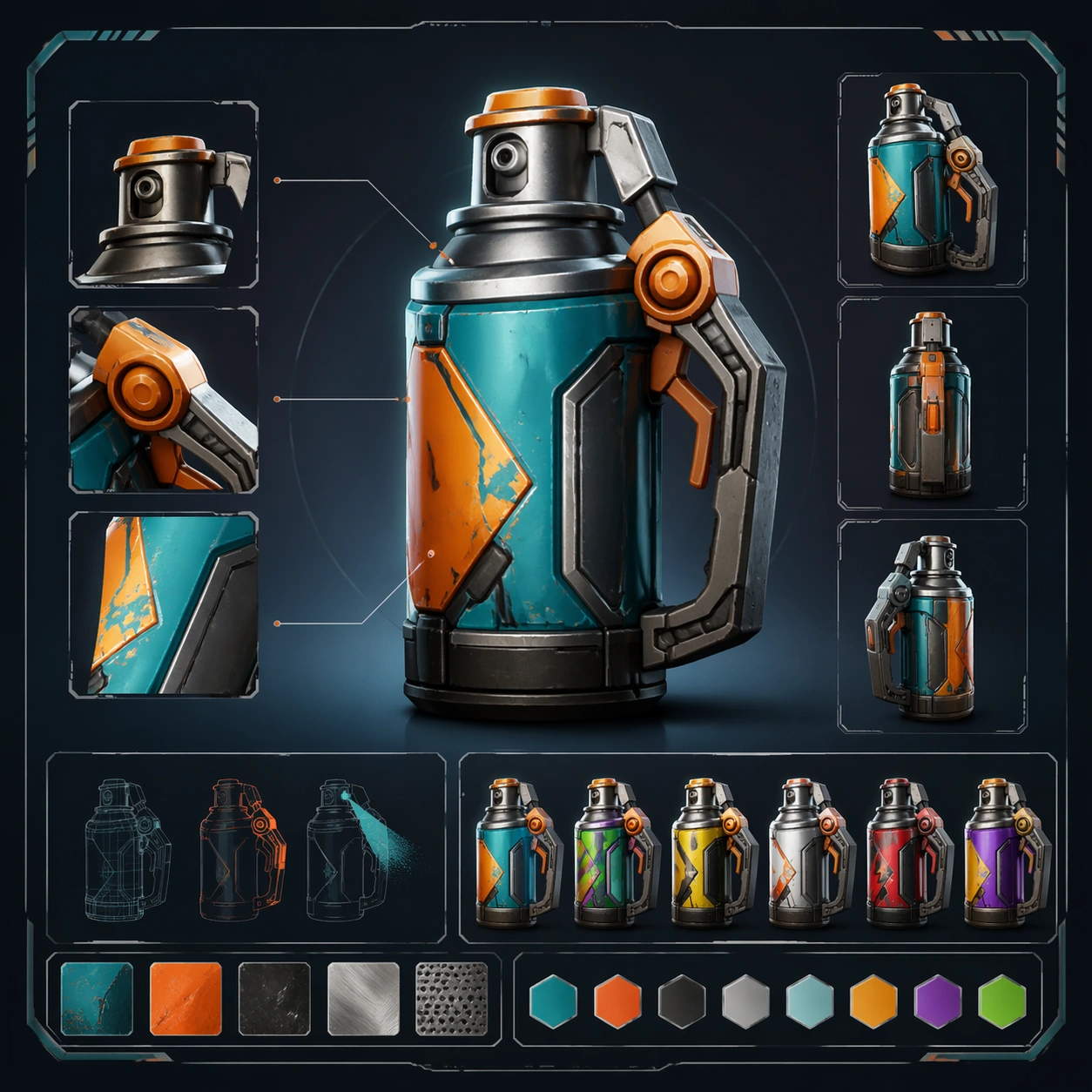
Example generated from “Exoplanet Floating Forest — Cliffside Observer Station”
GPT Image 2en

Scene: Frame the scene from a rocky cliff ledge looking across a valley filled with floating trees at different heights. The square image should feel like a serious expedition photograph with long atmospheric perspective, not a fantasy postcard. Build the frame as a square natural history study with disciplined composition, believable lighting, and enough environmental evidence to explain how this organism or system functions without any caption. Keep the image polished, observational, and suitable for a research gallery rather than pulp fantasy spectacle. Subject: Use the lookout to compare scale, showing root lengths, canopy diameters, and the spacing between islands. Include a few native animals moving through the air or across roots so the forest reads as inhabited rather than static landscape sculpture. Show the anatomy, habitat interaction, and scale cues clearly so the viewer can infer locomotion, feeding, reproduction, or ecological role from the visual alone. Every visible structure should feel evolved for a purpose, with layered foreground, midground, and background information that rewards close inspection. Important details: Assume low gravity, persistent updrafts, and buoyant tissues let mature canopy masses hover while root tendrils still harvest minerals and moisture from the ground. Organisms should visibly respond to vertical distance, drifting substrates, and unstable aerial habitat. Cliffs, air currents, and plant morphology should tell one integrated story about how terrain influences suspension and colonization. Keep geology and biology equally convincing, with no magical shortcuts in how masses hang or move. Favor coherent biology over decorative excess: tissues, shells, membranes, spores, tendrils, fins, silica lattices, or atmospheric sacs should all follow one material logic. Preserve a convincing relationship between the environment and the body plan, use restrained color hierarchy, and make the image feel like a serious speculative field record rather than a random monster concept. Use case: Exoplanet Floating Forest single study 7/9. Constraints: No readable text, no watermark, no logos, preserve exact 1:1 aspect ratio, no human architecture, no fantasy temples, no floating boulders without roots, no oversaturated concept-art haze, no accidental brand resemblance, no direct copy of known terrestrial species, no cartoon simplification.

Example generated from “Exoplanet Floating Forest — Storm Shear Recovery”
GPT Image 2en

Scene: Show a recently storm-damaged canopy island in post-event light, with calmer skies but visible torn root bundles, debris drift, and exposed buoyant tissue. The square frame should feel observational and slightly uneasy, like a field note of ecosystem stress. Build the frame as a square natural history study with disciplined composition, believable lighting, and enough environmental evidence to explain how this organism or system functions without any caption. Keep the image polished, observational, and suitable for a research gallery rather than pulp fantasy spectacle. Subject: Focus on damaged yet surviving structures: sealed trunk chambers, emergency droop roots reaching groundward, and resident animals adapting to the changed geometry. Regrowth buds and scar tissue should suggest an evolved resilience to wind shear. Show the anatomy, habitat interaction, and scale cues clearly so the viewer can infer locomotion, feeding, reproduction, or ecological role from the visual alone. Every visible structure should feel evolved for a purpose, with layered foreground, midground, and background information that rewards close inspection. Important details: Assume low gravity, persistent updrafts, and buoyant tissues let mature canopy masses hover while root tendrils still harvest minerals and moisture from the ground. Organisms should visibly respond to vertical distance, drifting substrates, and unstable aerial habitat. Damage must follow believable material logic. Tears, bends, and weight redistribution should show how a living suspended mass fails and heals under stress, not how a fantasy island breaks for drama. Favor coherent biology over decorative excess: tissues, shells, membranes, spores, tendrils, fins, silica lattices, or atmospheric sacs should all follow one material logic. Preserve a convincing relationship between the environment and the body plan, use restrained color hierarchy, and make the image feel like a serious speculative field record rather than a random monster concept. Use case: Exoplanet Floating Forest single study 8/9. Constraints: No readable text, no watermark, no logos, preserve exact 1:1 aspect ratio, no disaster-movie explosion, no fire, no falling human vehicles, no magical repair glow, no accidental brand resemblance, no direct copy of known terrestrial species, no cartoon simplification.

Example generated from “Exoplanet Floating Forest — Twilight Migration Ribbon”
GPT Image 2en

Scene: Finish with a twilight image where the floating forest becomes a layered corridor of motion under a cooling sky. The square frame should balance fading warm light on canopy tops with cooler shadow below, creating a natural stage for daily migration. Build the frame as a square natural history study with disciplined composition, believable lighting, and enough environmental evidence to explain how this organism or system functions without any caption. Keep the image polished, observational, and suitable for a research gallery rather than pulp fantasy spectacle. Subject: Show several species moving at once: gliders between islands, seed pods rising on late updrafts, and small aerial predators tracing the same corridor. The migration should feel patterned and ecological, not chaotic. Show the anatomy, habitat interaction, and scale cues clearly so the viewer can infer locomotion, feeding, reproduction, or ecological role from the visual alone. Every visible structure should feel evolved for a purpose, with layered foreground, midground, and background information that rewards close inspection. Important details: Assume low gravity, persistent updrafts, and buoyant tissues let mature canopy masses hover while root tendrils still harvest minerals and moisture from the ground. Organisms should visibly respond to vertical distance, drifting substrates, and unstable aerial habitat. Use rhythm and spacing to explain the ecosystem. Distances between islands, light conditions, and movement routes should all reinforce that these organisms evolved around a repeatable daily window in a low-gravity forest sky. Favor coherent biology over decorative excess: tissues, shells, membranes, spores, tendrils, fins, silica lattices, or atmospheric sacs should all follow one material logic. Preserve a convincing relationship between the environment and the body plan, use restrained color hierarchy, and make the image feel like a serious speculative field record rather than a random monster concept. Use case: Exoplanet Floating Forest single study 9/9. Constraints: No readable text, no watermark, no logos, preserve exact 1:1 aspect ratio, no city lights, no spaceship traffic, no fantasy dragon parade, no abstract color field, no accidental brand resemblance, no direct copy of known terrestrial species, no cartoon simplification.

Example generated from “Fake Advertisement Product Satire — Reference Anchor”
GPT Image 2en

Scene: Create a square reference image for Fake Advertisement Product Satire. Build a reference anchor establishing the core system with a premium, production-ready finish. Use a polished modular board or campaign surface with clean spacing, premium game-UI finish, and clear focal hierarchy. The composition should feel intentional, clean, and reusable for gallery, research, campaign, or internal handoff contexts. Lighting must support readability first, with the main forms clearly separated from the background and enough breathing room for the system to stay legible at both hero scale and thumbnail scale. Subject: Center a coherent original game-art system built for premium production and marketing surfaces. For this image, focus on reference anchor. Keep the same system logic stable across screenshots, cards, banners, and overview boards. This image is the canonical anchor that later series images must follow. The viewer should immediately understand what role this surface plays inside a cohesive game-production asset pack. Important details: Lock framing, icon grammar, palette blocking, and surface hierarchy so the kit feels production-ready and consistent. Preserve the core silhouette, framing language, and material logic from the reference image while each variation changes function. Keep materials believable, edge hierarchy disciplined, and the visual language consistent with Fake Ads. Use abstract interface blocks or diagram accents when helpful, but avoid any readable language. The final result should feel like a deliberate production asset rather than a random illustration. Use case: Fake Advertisement Product Satire series study 1/9, designed as reference anchor within a cohesive asset pack. Constraints: No readable text, no watermark, no logos, preserve exact 1:1 aspect ratio, no unrelated objects, no broken visual hierarchy, no malformed anatomy or broken perspective, no random decorative clutter.

Example generated from “Fake Advertisement Product Satire — Variant One”
GPT Image 2en

Scene: Create a square dependent image for Fake Advertisement Product Satire. Build a first controlled variation in the same system with a premium, production-ready finish. Use a polished modular board or campaign surface with clean spacing, premium game-UI finish, and clear focal hierarchy. The composition should feel intentional, clean, and reusable for gallery, research, campaign, or internal handoff contexts. Lighting must support readability first, with the main forms clearly separated from the background and enough breathing room for the system to stay legible at both hero scale and thumbnail scale. Subject: Center a coherent original game-art system built for premium production and marketing surfaces. For this image, focus on the intended support surface. Keep the same system logic stable across screenshots, cards, banners, and overview boards. Preserve exact identity or system logic from the reference image while changing only the intended variation axis. The viewer should immediately understand what role this surface plays inside a cohesive game-production asset pack. Important details: Lock framing, icon grammar, palette blocking, and surface hierarchy so the kit feels production-ready and consistent. Preserve the core silhouette, framing language, and material logic from the reference image while each variation changes function. Keep materials believable, edge hierarchy disciplined, and the visual language consistent with Fake Ads. Use abstract interface blocks or diagram accents when helpful, but avoid any readable language. The final result should feel like a deliberate production asset rather than a random illustration. Use case: Fake Advertisement Product Satire series study 2/9, designed as variant one within a cohesive asset pack. Constraints: No readable text, no watermark, no logos, preserve exact 1:1 aspect ratio, no unrelated objects, no broken visual hierarchy, no malformed anatomy or broken perspective, no random decorative clutter.

Example generated from “Fake Advertisement Product Satire — Variant Two”
GPT Image 2en

Scene: Create a square dependent image for Fake Advertisement Product Satire. Build a second controlled variation in the same system with a premium, production-ready finish. Use a polished modular board or campaign surface with clean spacing, premium game-UI finish, and clear focal hierarchy. The composition should feel intentional, clean, and reusable for gallery, research, campaign, or internal handoff contexts. Lighting must support readability first, with the main forms clearly separated from the background and enough breathing room for the system to stay legible at both hero scale and thumbnail scale. Subject: Center a coherent original game-art system built for premium production and marketing surfaces. For this image, focus on the intended support surface. Keep the same system logic stable across screenshots, cards, banners, and overview boards. Preserve exact identity or system logic from the reference image while changing only the intended variation axis. The viewer should immediately understand what role this surface plays inside a cohesive game-production asset pack. Important details: Lock framing, icon grammar, palette blocking, and surface hierarchy so the kit feels production-ready and consistent. Preserve the core silhouette, framing language, and material logic from the reference image while each variation changes function. Keep materials believable, edge hierarchy disciplined, and the visual language consistent with Fake Ads. Use abstract interface blocks or diagram accents when helpful, but avoid any readable language. The final result should feel like a deliberate production asset rather than a random illustration. Use case: Fake Advertisement Product Satire series study 3/9, designed as variant two within a cohesive asset pack. Constraints: No readable text, no watermark, no logos, preserve exact 1:1 aspect ratio, no unrelated objects, no broken visual hierarchy, no malformed anatomy or broken perspective, no random decorative clutter.

Example generated from “Fake Advertisement Product Satire — Support One”
GPT Image 2en

Scene: Create a square standalone support image for Fake Advertisement Product Satire. Build a support-surface study with a clear focal hierarchy and a finished professional surface. Use a polished modular board or campaign surface with clean spacing, premium game-UI finish, and clear focal hierarchy. The frame should feel self-contained and polished, with enough structure to explain the system even without the reference series, yet still obviously belonging to the same theme and production world. Subject: Show a coherent original game-art system built for premium production and marketing surfaces in a way that emphasizes the intended support surface. Keep the same system logic stable across screenshots, cards, banners, and overview boards. Even though this image is independent, the viewer should still recognize the same universe, same commercial logic, and same production intent as the core package. Important details: Lock framing, icon grammar, palette blocking, and surface hierarchy so the kit feels production-ready and consistent. Preserve the broader theme language through color, framing, material choices, and modular composition. Use clean panel rhythm, premium asset presentation, and believable detail density. The image should work equally well as a gallery study, research reference, and mock production deliverable. Use case: Fake Advertisement Product Satire single study 5/9, exploring support one as a support surface. Constraints: No readable text, no watermark, no logos, preserve exact 1:1 aspect ratio, no unrelated objects, no broken visual hierarchy, no visual noise that obscures the main surface, no accidental brand resemblance.

Example generated from “Fake Advertisement Product Satire — Support Two”
GPT Image 2en

Scene: Create a square standalone support image for Fake Advertisement Product Satire. Build a second support-surface study with a clear focal hierarchy and a finished professional surface. Use a polished modular board or campaign surface with clean spacing, premium game-UI finish, and clear focal hierarchy. The frame should feel self-contained and polished, with enough structure to explain the system even without the reference series, yet still obviously belonging to the same theme and production world. Subject: Show a coherent original game-art system built for premium production and marketing surfaces in a way that emphasizes the intended support surface. Keep the same system logic stable across screenshots, cards, banners, and overview boards. Even though this image is independent, the viewer should still recognize the same universe, same commercial logic, and same production intent as the core package. Important details: Lock framing, icon grammar, palette blocking, and surface hierarchy so the kit feels production-ready and consistent. Preserve the broader theme language through color, framing, material choices, and modular composition. Use clean panel rhythm, premium asset presentation, and believable detail density. The image should work equally well as a gallery study, research reference, and mock production deliverable. Use case: Fake Advertisement Product Satire single study 6/9, exploring support two as a support surface. Constraints: No readable text, no watermark, no logos, preserve exact 1:1 aspect ratio, no unrelated objects, no broken visual hierarchy, no visual noise that obscures the main surface, no accidental brand resemblance.

Example generated from “Fake Advertisement Product Satire — Support Three”
GPT Image 2en

Scene: Create a square standalone support image for Fake Advertisement Product Satire. Build a third support-surface study with a clear focal hierarchy and a finished professional surface. Use a polished modular board or campaign surface with clean spacing, premium game-UI finish, and clear focal hierarchy. The frame should feel self-contained and polished, with enough structure to explain the system even without the reference series, yet still obviously belonging to the same theme and production world. Subject: Show a coherent original game-art system built for premium production and marketing surfaces in a way that emphasizes the intended support surface. Keep the same system logic stable across screenshots, cards, banners, and overview boards. Even though this image is independent, the viewer should still recognize the same universe, same commercial logic, and same production intent as the core package. Important details: Lock framing, icon grammar, palette blocking, and surface hierarchy so the kit feels production-ready and consistent. Preserve the broader theme language through color, framing, material choices, and modular composition. Use clean panel rhythm, premium asset presentation, and believable detail density. The image should work equally well as a gallery study, research reference, and mock production deliverable. Use case: Fake Advertisement Product Satire single study 7/9, exploring support three as a support surface. Constraints: No readable text, no watermark, no logos, preserve exact 1:1 aspect ratio, no unrelated objects, no broken visual hierarchy, no visual noise that obscures the main surface, no accidental brand resemblance.

Example generated from “Fake Advertisement Product Satire — Support Four”
GPT Image 2en

Scene: Create a square standalone support image for Fake Advertisement Product Satire. Build a fourth support-surface study with a clear focal hierarchy and a finished professional surface. Use a polished modular board or campaign surface with clean spacing, premium game-UI finish, and clear focal hierarchy. The frame should feel self-contained and polished, with enough structure to explain the system even without the reference series, yet still obviously belonging to the same theme and production world. Subject: Show a coherent original game-art system built for premium production and marketing surfaces in a way that emphasizes the intended support surface. Keep the same system logic stable across screenshots, cards, banners, and overview boards. Even though this image is independent, the viewer should still recognize the same universe, same commercial logic, and same production intent as the core package. Important details: Lock framing, icon grammar, palette blocking, and surface hierarchy so the kit feels production-ready and consistent. Preserve the broader theme language through color, framing, material choices, and modular composition. Use clean panel rhythm, premium asset presentation, and believable detail density. The image should work equally well as a gallery study, research reference, and mock production deliverable. Use case: Fake Advertisement Product Satire single study 8/9, exploring support four as a support surface. Constraints: No readable text, no watermark, no logos, preserve exact 1:1 aspect ratio, no unrelated objects, no broken visual hierarchy, no visual noise that obscures the main surface, no accidental brand resemblance.

Example generated from “Fake Advertisement Product Satire — Support Five”
GPT Image 2en

Scene: Create a square standalone support image for Fake Advertisement Product Satire. Build a fifth support-surface study with a clear focal hierarchy and a finished professional surface. Use a polished modular board or campaign surface with clean spacing, premium game-UI finish, and clear focal hierarchy. The frame should feel self-contained and polished, with enough structure to explain the system even without the reference series, yet still obviously belonging to the same theme and production world. Subject: Show a coherent original game-art system built for premium production and marketing surfaces in a way that emphasizes the intended support surface. Keep the same system logic stable across screenshots, cards, banners, and overview boards. Even though this image is independent, the viewer should still recognize the same universe, same commercial logic, and same production intent as the core package. Important details: Lock framing, icon grammar, palette blocking, and surface hierarchy so the kit feels production-ready and consistent. Preserve the broader theme language through color, framing, material choices, and modular composition. Use clean panel rhythm, premium asset presentation, and believable detail density. The image should work equally well as a gallery study, research reference, and mock production deliverable. Use case: Fake Advertisement Product Satire single study 9/9, exploring support five as a support surface. Constraints: No readable text, no watermark, no logos, preserve exact 1:1 aspect ratio, no unrelated objects, no broken visual hierarchy, no visual noise that obscures the main surface, no accidental brand resemblance.

Example generated from “Fake News Headline Comedy Graphic — Reference Anchor”
GPT Image 2en

Scene: Create a square reference image for Fake News Headline Comedy Graphic. Build a reference anchor establishing the core system with a premium, production-ready finish. Use a polished modular board or campaign surface with clean spacing, premium game-UI finish, and clear focal hierarchy. The composition should feel intentional, clean, and reusable for gallery, research, campaign, or internal handoff contexts. Lighting must support readability first, with the main forms clearly separated from the background and enough breathing room for the system to stay legible at both hero scale and thumbnail scale. Subject: Center a coherent original game-art system built for premium production and marketing surfaces. For this image, focus on reference anchor. Keep the same system logic stable across screenshots, cards, banners, and overview boards. This image is the canonical anchor that later series images must follow. The viewer should immediately understand what role this surface plays inside a cohesive game-production asset pack. Important details: Lock framing, icon grammar, palette blocking, and surface hierarchy so the kit feels production-ready and consistent. Preserve the core silhouette, framing language, and material logic from the reference image while each variation changes function. Keep materials believable, edge hierarchy disciplined, and the visual language consistent with Fake News Comedy. Use abstract interface blocks or diagram accents when helpful, but avoid any readable language. The final result should feel like a deliberate production asset rather than a random illustration. Use case: Fake News Headline Comedy Graphic series study 1/9, designed as reference anchor within a cohesive asset pack. Constraints: No readable text, no watermark, no logos, preserve exact 1:1 aspect ratio, no unrelated objects, no broken visual hierarchy, no malformed anatomy or broken perspective, no random decorative clutter.

Example generated from “Fake News Headline Comedy Graphic — Variant One”
GPT Image 2en

Scene: Create a square dependent image for Fake News Headline Comedy Graphic. Build a first controlled variation in the same system with a premium, production-ready finish. Use a polished modular board or campaign surface with clean spacing, premium game-UI finish, and clear focal hierarchy. The composition should feel intentional, clean, and reusable for gallery, research, campaign, or internal handoff contexts. Lighting must support readability first, with the main forms clearly separated from the background and enough breathing room for the system to stay legible at both hero scale and thumbnail scale. Subject: Center a coherent original game-art system built for premium production and marketing surfaces. For this image, focus on the intended support surface. Keep the same system logic stable across screenshots, cards, banners, and overview boards. Preserve exact identity or system logic from the reference image while changing only the intended variation axis. The viewer should immediately understand what role this surface plays inside a cohesive game-production asset pack. Important details: Lock framing, icon grammar, palette blocking, and surface hierarchy so the kit feels production-ready and consistent. Preserve the core silhouette, framing language, and material logic from the reference image while each variation changes function. Keep materials believable, edge hierarchy disciplined, and the visual language consistent with Fake News Comedy. Use abstract interface blocks or diagram accents when helpful, but avoid any readable language. The final result should feel like a deliberate production asset rather than a random illustration. Use case: Fake News Headline Comedy Graphic series study 2/9, designed as variant one within a cohesive asset pack. Constraints: No readable text, no watermark, no logos, preserve exact 1:1 aspect ratio, no unrelated objects, no broken visual hierarchy, no malformed anatomy or broken perspective, no random decorative clutter.