PROMPT · ESPLORAZIONE CREATIVA

Galleria di prompt

Esplora prompt reali ed esempi generati. Trova ispirazione per la prossima missione creativa e copia gratuitamente il prompt completo.

Esempi
10,974
Modelli
17
Fonti
1277
10.974 esempi di prompt · pagina 70 di 229
Example generated from “Abyssal Bioluminescent Ecosystem — Siphon Forest Closeup”
GPT Image 2en

Scene: Place the viewer inside a dense thicket of tall siphon organisms rooted in soft sediment, with the camera looking through layered stalks into darkness. Thin ribbons of cyan and pale lime light should run along the fronds, revealing current direction and making the whole grove feel like a breathing electrical forest. Build the frame as a square natural history study with disciplined composition, believable lighting, and enough environmental evidence to explain how this organism or system functions without any caption. Keep the image polished, observational, and suitable for a research gallery rather than pulp fantasy spectacle. Subject: Focus on trunk-like siphon bodies, semi-transparent feeding membranes, and small hitchhiker organisms that shelter in the grooves between structural ribs. A few detached fronds should drift through the current to imply seasonal shedding or reproduction. Show the anatomy, habitat interaction, and scale cues clearly so the viewer can infer locomotion, feeding, reproduction, or ecological role from the visual alone. Every visible structure should feel evolved for a purpose, with layered foreground, midground, and background information that rewards close inspection. Important details: Treat the abyss as a high-pressure ecosystem where light is scarce, energy is expensive, and every glow pattern carries a function such as luring prey, signaling kin, masking silhouette edges, or attracting symbiotic cleaners. Keep the biology plant-like in silhouette but unmistakably animal in tissue, attachment strategy, and feeding behavior. Membranes should look collagenous and wet, not leafy or botanical, and the grove should feel adapted to darkness, pressure, and sparse nutrients. Favor coherent biology over decorative excess: tissues, shells, membranes, spores, tendrils, fins, silica lattices, or atmospheric sacs should all follow one material logic. Preserve a convincing relationship between the environment and the body plan, use restrained color hierarchy, and make the image feel like a serious speculative field record rather than a random monster concept. Use case: Abyssal Bioluminescent Ecosystem single study 6/9. Constraints: No readable text, no watermark, no logos, preserve exact 1:1 aspect ratio, no trees, no terrestrial bark, no flowers, no sunlit kelp-forest look, no accidental brand resemblance, no direct copy of known terrestrial species, no cartoon simplification.


Example generated from “Abyssal Bioluminescent Ecosystem — Predator Lure Ambush”
GPT Image 2en

Scene: Stage the moment just before an ambush on a dim mud plain, with most of the predator hidden against the substrate. A constellation of tiny blue lure lights should float above the body like harmless drifting plankton while the rest of the frame remains almost featureless black. Build the frame as a square natural history study with disciplined composition, believable lighting, and enough environmental evidence to explain how this organism or system functions without any caption. Keep the image polished, observational, and suitable for a research gallery rather than pulp fantasy spectacle. Subject: Reveal a flattened hunter with a hinge jaw, shielding fins, and a network of decoy photophores extending from flexible filaments. One curious grazer should approach the false light cloud, giving scale and narrative tension without turning the scene into action spectacle. Show the anatomy, habitat interaction, and scale cues clearly so the viewer can infer locomotion, feeding, reproduction, or ecological role from the visual alone. Every visible structure should feel evolved for a purpose, with layered foreground, midground, and background information that rewards close inspection. Important details: Treat the abyss as a high-pressure ecosystem where light is scarce, energy is expensive, and every glow pattern carries a function such as luring prey, signaling kin, masking silhouette edges, or attracting symbiotic cleaners. The deception must feel biologically grounded: lure spacing, body camouflage, and attack posture should all support a plausible feeding strategy. Keep the predator alien but elegant, emphasizing stealth, musculature, and sensory adaptation rather than horror tropes. Favor coherent biology over decorative excess: tissues, shells, membranes, spores, tendrils, fins, silica lattices, or atmospheric sacs should all follow one material logic. Preserve a convincing relationship between the environment and the body plan, use restrained color hierarchy, and make the image feel like a serious speculative field record rather than a random monster concept. Use case: Abyssal Bioluminescent Ecosystem single study 7/9. Constraints: No readable text, no watermark, no logos, preserve exact 1:1 aspect ratio, no gore, no jump-scare monster face, no giant teeth closeup, no cartoon menace, no accidental brand resemblance, no direct copy of known terrestrial species, no cartoon simplification.
Example generated from “Abyssal Bioluminescent Ecosystem — Carrion Snow Feeders”
GPT Image 2en

Scene: Build a square composition around a dim carcass remnant on the abyssal floor, with thick marine snow raining through the water column. The image should feel hushed and solemn rather than violent, illuminated by the feeding organisms themselves in faint blues, violets, and smoky white. Build the frame as a square natural history study with disciplined composition, believable lighting, and enough environmental evidence to explain how this organism or system functions without any caption. Keep the image polished, observational, and suitable for a research gallery rather than pulp fantasy spectacle. Subject: Show several specialized feeder guilds at work: scraping grazers on the bones, hovering filter veils collecting drifting particles, and timid opportunists waiting at the edges for safer access. The carcass should be weathered and partially buried, implying a long-duration nutrient event. Show the anatomy, habitat interaction, and scale cues clearly so the viewer can infer locomotion, feeding, reproduction, or ecological role from the visual alone. Every visible structure should feel evolved for a purpose, with layered foreground, midground, and background information that rewards close inspection. Important details: Treat the abyss as a high-pressure ecosystem where light is scarce, energy is expensive, and every glow pattern carries a function such as luring prey, signaling kin, masking silhouette edges, or attracting symbiotic cleaners. Emphasize ecological succession, energy thrift, and the slow choreography of deep-sea feeding. Surfaces should show silt, biofilm, and pressure-softened tissues, while lighting remains local and biological rather than cinematic floodlight. Favor coherent biology over decorative excess: tissues, shells, membranes, spores, tendrils, fins, silica lattices, or atmospheric sacs should all follow one material logic. Preserve a convincing relationship between the environment and the body plan, use restrained color hierarchy, and make the image feel like a serious speculative field record rather than a random monster concept. Use case: Abyssal Bioluminescent Ecosystem single study 8/9. Constraints: No readable text, no watermark, no logos, preserve exact 1:1 aspect ratio, no gore, no shark frenzy, no human corpse, no action-movie violence, no accidental brand resemblance, no direct copy of known terrestrial species, no cartoon simplification.

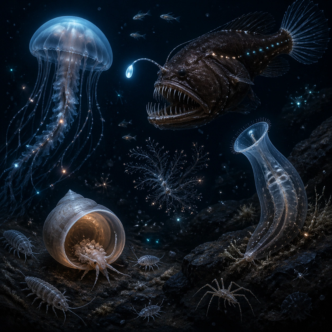
Example generated from “Abyssal Bioluminescent Ecosystem — Survey Plate Assemblage”
GPT Image 2en

Scene: Compose a curated natural history survey plate against a dark neutral background that still feels underwater rather than graphic design. Arrange several representative abyssal species in one coherent square, each at slightly different scale and depth, as if observed through a study window into the deep. Build the frame as a square natural history study with disciplined composition, believable lighting, and enough environmental evidence to explain how this organism or system functions without any caption. Keep the image polished, observational, and suitable for a research gallery rather than pulp fantasy spectacle. Subject: Include a lure predator, a drifting medusa, a siphon grazer, a nursery shell form, and small scavengers, all positioned so their body plans can be compared without labels. The organisms should overlap subtly and share one believable water environment rather than floating as cutouts. Show the anatomy, habitat interaction, and scale cues clearly so the viewer can infer locomotion, feeding, reproduction, or ecological role from the visual alone. Every visible structure should feel evolved for a purpose, with layered foreground, midground, and background information that rewards close inspection. Important details: Treat the abyss as a high-pressure ecosystem where light is scarce, energy is expensive, and every glow pattern carries a function such as luring prey, signaling kin, masking silhouette edges, or attracting symbiotic cleaners. This is a synthesis image, so clarity matters: preserve morphology, material differences, and glow logic while avoiding clutter. The composition should read like a polished field atlas cover that still feels alive and ecological, not like a poster of disconnected assets. Favor coherent biology over decorative excess: tissues, shells, membranes, spores, tendrils, fins, silica lattices, or atmospheric sacs should all follow one material logic. Preserve a convincing relationship between the environment and the body plan, use restrained color hierarchy, and make the image feel like a serious speculative field record rather than a random monster concept. Use case: Abyssal Bioluminescent Ecosystem single study 9/9. Constraints: No readable text, no watermark, no logos, preserve exact 1:1 aspect ratio, no specimen pins, no text labels, no flat collage cutout look, no empty black void, no accidental brand resemblance, no direct copy of known terrestrial species, no cartoon simplification.

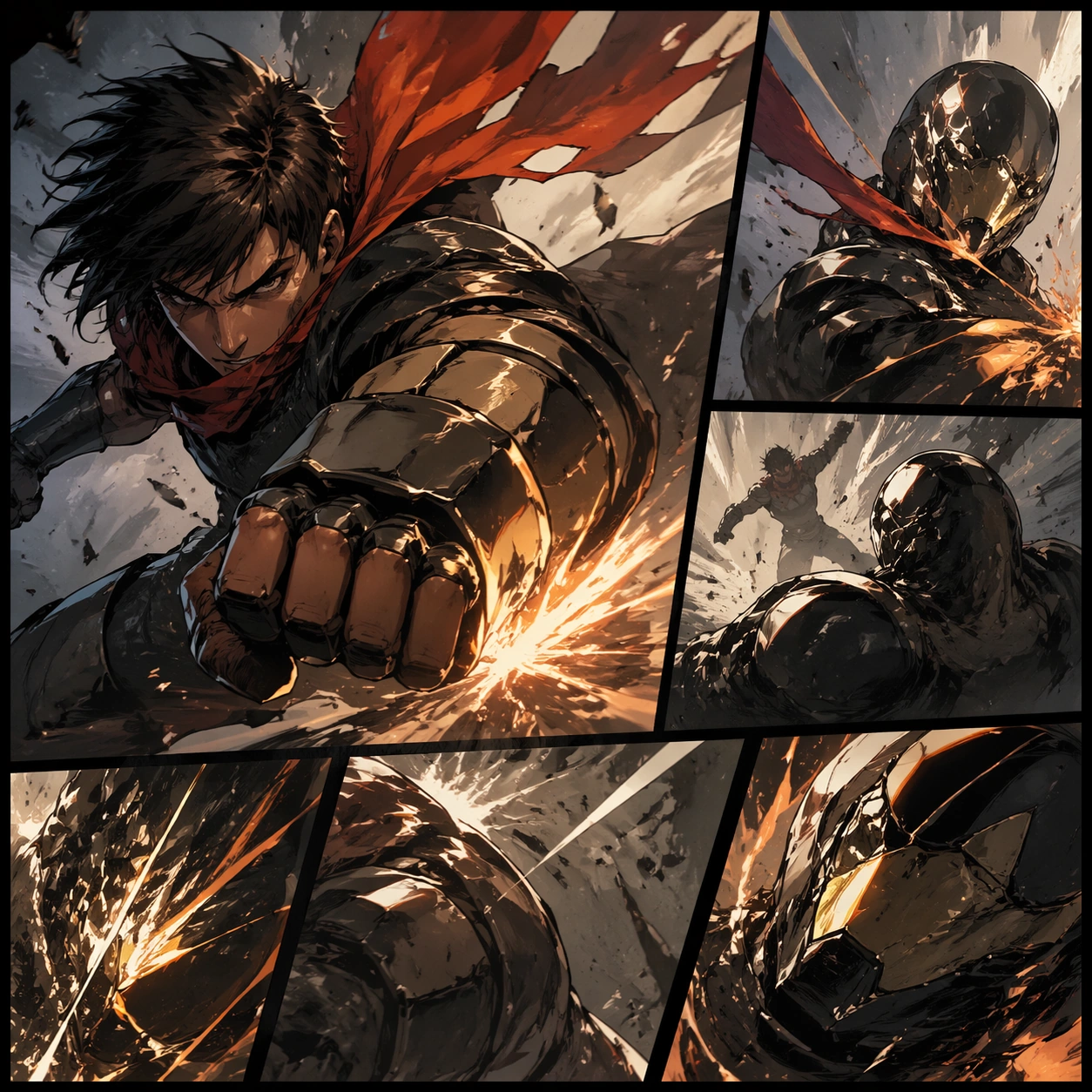
Example generated from “Action Beat Comic Page — Reference Anchor”
GPT Image 2en

Scene: A square premium key-art frame built for a reference-dependent production series. Stage a reference anchor for action beat comic page action beat comic page with one unmistakable core subject and disciplined composition with controlled lighting, clear silhouette separation, and a camera setup that feels deliberate enough for campaign reuse. The composition should carry strong focal hierarchy, believable depth, and polished surface behavior while still staying stable enough to support downstream dependent variations. Subject: Center the image on a reference anchor for action beat comic page action beat comic page with one unmistakable core subject and disciplined composition. The result should feel like a concrete, shippable asset for a action beat comic page action beat comic page visual system, not a generic fantasy render. Build the subject with layered materials, stable anatomy or engineering logic, and enough specificity that later images can inherit the same underlying identity. This image is the root reference that defines continuity for the rest of the series. The viewer should immediately understand what is being preserved across the sequence and what is changing in this particular beat. Important details: establish the base identity, silhouette logic, palette rhythm, and layout system that downstream variations must preserve. Make continuity explicit through repeatable shape language, proportion control, and a coherent palette system. Changes in pose, angle, mood, rarity, weather, or layout should still feel downstream of one stable source. Avoid clutter that would confuse reference use. Any interface-like blocks or graphic surfaces must remain abstract and unreadable. Keep the image polished, original, and suitable for both gallery display and production review. Use case: action beat comic page action beat comic page series study 1/4, focused on reference anchor. Constraints: No readable text, no watermark, no logos, preserve exact 1:1 aspect ratio, no extra subject duplication, no noisy background, no broken continuity, no off-model redesign, no accidental franchise resemblance.

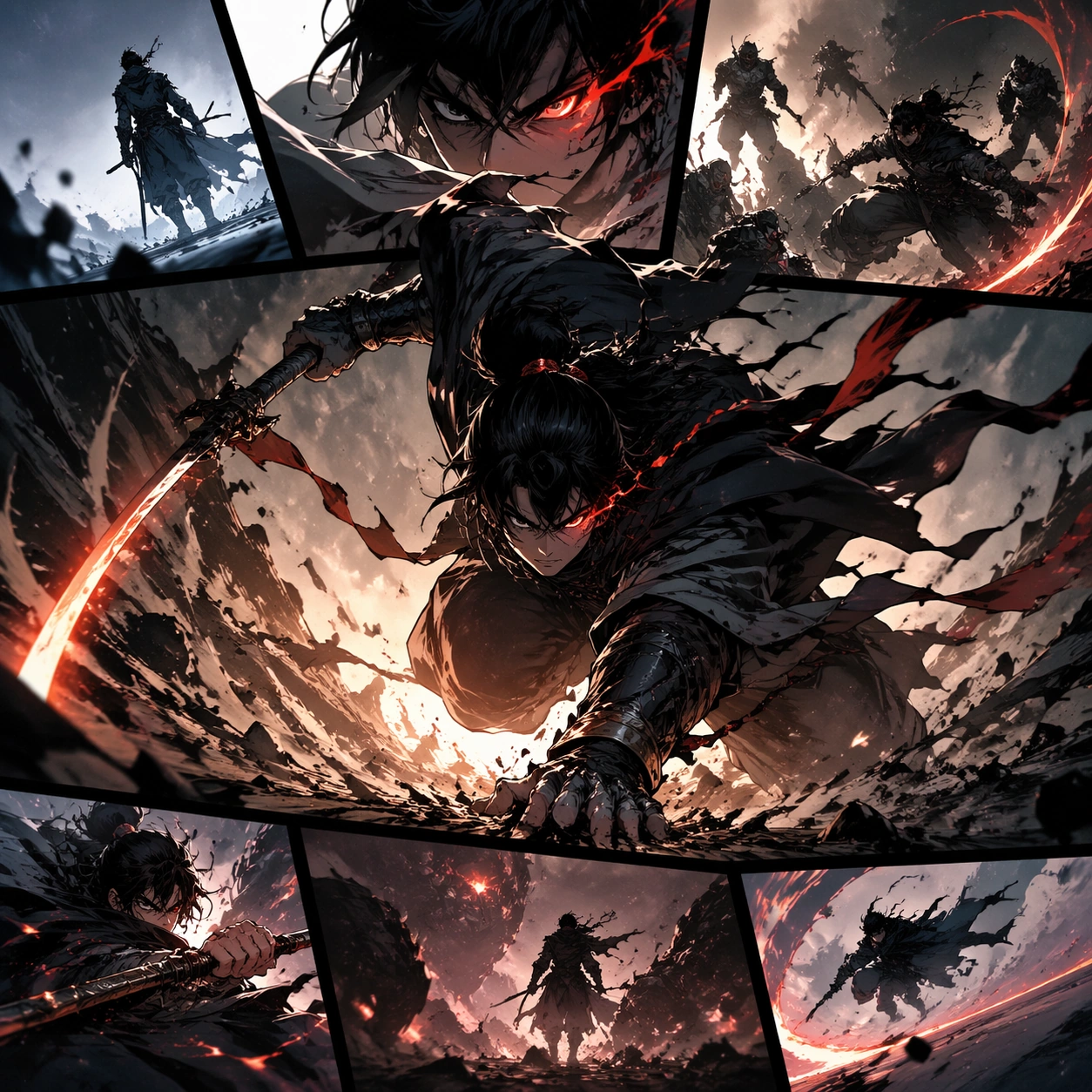
Example generated from “Action Beat Comic Page — Variation One”
GPT Image 2en

Scene: A square premium key-art frame built for a reference-dependent production series. Stage the same core concept reinterpreted through a first controlled variation for action beat comic page action beat comic page with controlled lighting, clear silhouette separation, and a camera setup that feels deliberate enough for campaign reuse. The composition should carry strong focal hierarchy, believable depth, and polished surface behavior while still staying stable enough to support downstream dependent variations. Subject: Center the image on the same core concept reinterpreted through a first controlled variation for action beat comic page action beat comic page. The result should feel like a concrete, shippable asset for a action beat comic page action beat comic page visual system, not a generic fantasy render. Build the subject with layered materials, stable anatomy or engineering logic, and enough specificity that later images can inherit the same underlying identity. Preserve the same core subject identity, silhouette logic, material language, and composition system from the reference image from the reference image while changing only what this variation needs. The viewer should immediately understand what is being preserved across the sequence and what is changing in this particular beat. Important details: change mood, framing, or emphasis while preserving the same underlying visual system and subject continuity. Make continuity explicit through repeatable shape language, proportion control, and a coherent palette system. Changes in pose, angle, mood, rarity, weather, or layout should still feel downstream of one stable source. Avoid clutter that would confuse reference use. Any interface-like blocks or graphic surfaces must remain abstract and unreadable. Keep the image polished, original, and suitable for both gallery display and production review. Use case: action beat comic page action beat comic page series study 2/4, focused on variation one. Constraints: No readable text, no watermark, no logos, preserve exact 1:1 aspect ratio, no unrelated redesign, no continuity drift, no broken continuity, no off-model redesign, no accidental franchise resemblance.

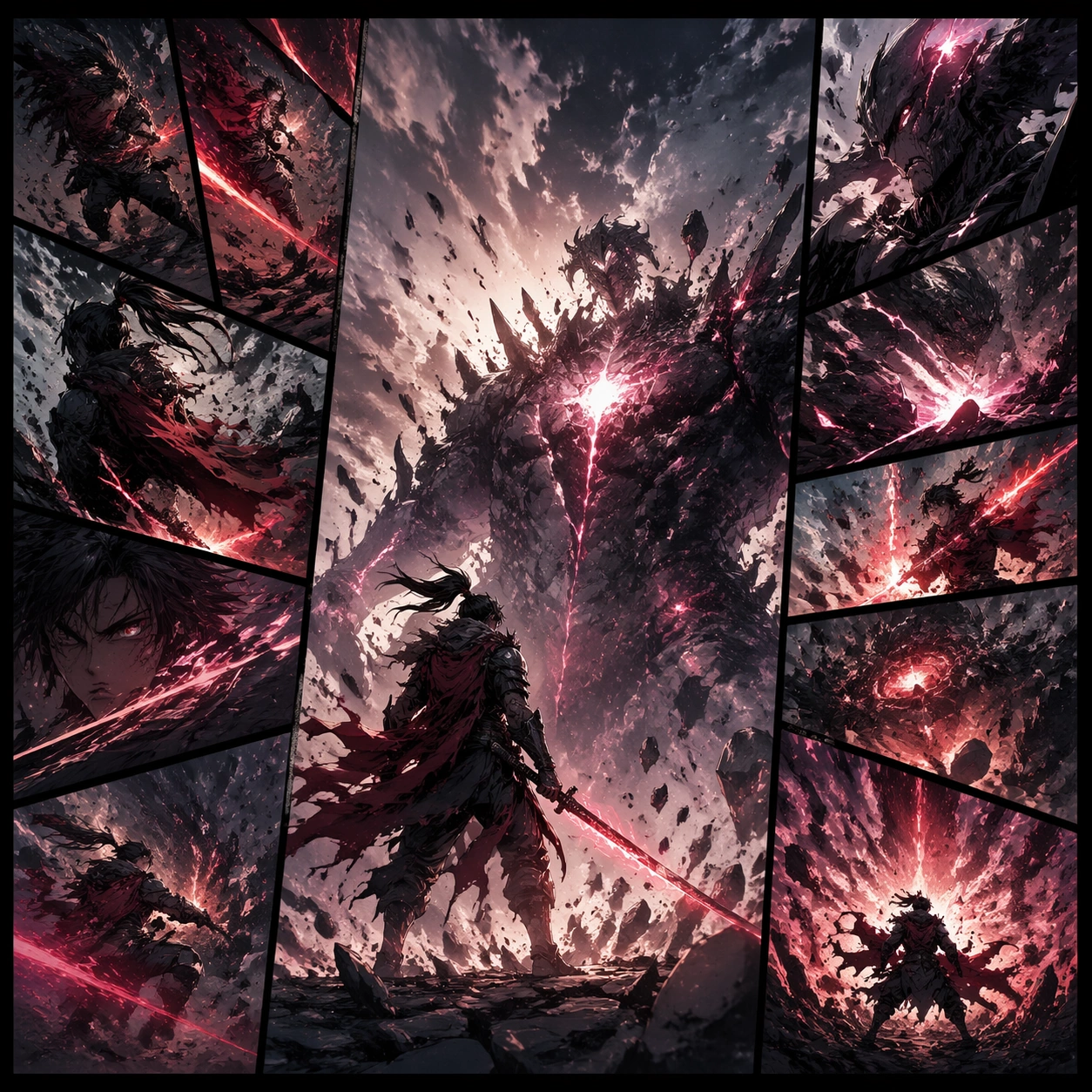
Example generated from “Action Beat Comic Page — Variation Two”
GPT Image 2en

Scene: A square premium key-art frame built for a reference-dependent production series. Stage the same core concept pushed into a second variation with different pacing or surface behavior for action beat comic page action beat comic page with controlled lighting, clear silhouette separation, and a camera setup that feels deliberate enough for campaign reuse. The composition should carry strong focal hierarchy, believable depth, and polished surface behavior while still staying stable enough to support downstream dependent variations. Subject: Center the image on the same core concept pushed into a second variation with different pacing or surface behavior for action beat comic page action beat comic page. The result should feel like a concrete, shippable asset for a action beat comic page action beat comic page visual system, not a generic fantasy render. Build the subject with layered materials, stable anatomy or engineering logic, and enough specificity that later images can inherit the same underlying identity. Preserve the same core subject identity, silhouette logic, material language, and composition system from the reference image from the reference image while changing only what this variation needs. The viewer should immediately understand what is being preserved across the sequence and what is changing in this particular beat. Important details: the viewer should still read one connected family rather than three disconnected ideas. Make continuity explicit through repeatable shape language, proportion control, and a coherent palette system. Changes in pose, angle, mood, rarity, weather, or layout should still feel downstream of one stable source. Avoid clutter that would confuse reference use. Any interface-like blocks or graphic surfaces must remain abstract and unreadable. Keep the image polished, original, and suitable for both gallery display and production review. Use case: action beat comic page action beat comic page series study 3/4, focused on variation two. Constraints: No readable text, no watermark, no logos, preserve exact 1:1 aspect ratio, no random props, no off-model shift, no broken continuity, no off-model redesign, no accidental franchise resemblance.

Example generated from “Action Beat Comic Page — Variation Three”
GPT Image 2en

Scene: A square premium key-art frame built for a reference-dependent production series. Stage the same core concept in a third polished variation that completes the reference-led set for action beat comic page action beat comic page with controlled lighting, clear silhouette separation, and a camera setup that feels deliberate enough for campaign reuse. The composition should carry strong focal hierarchy, believable depth, and polished surface behavior while still staying stable enough to support downstream dependent variations. Subject: Center the image on the same core concept in a third polished variation that completes the reference-led set for action beat comic page action beat comic page. The result should feel like a concrete, shippable asset for a action beat comic page action beat comic page visual system, not a generic fantasy render. Build the subject with layered materials, stable anatomy or engineering logic, and enough specificity that later images can inherit the same underlying identity. Preserve the same core subject identity, silhouette logic, material language, and composition system from the reference image from the reference image while changing only what this variation needs. The viewer should immediately understand what is being preserved across the sequence and what is changing in this particular beat. Important details: keep continuity obvious while introducing a fresh but coherent downstream use case. Make continuity explicit through repeatable shape language, proportion control, and a coherent palette system. Changes in pose, angle, mood, rarity, weather, or layout should still feel downstream of one stable source. Avoid clutter that would confuse reference use. Any interface-like blocks or graphic surfaces must remain abstract and unreadable. Keep the image polished, original, and suitable for both gallery display and production review. Use case: action beat comic page action beat comic page series study 4/4, focused on variation three. Constraints: No readable text, no watermark, no logos, preserve exact 1:1 aspect ratio, no franchise mimicry, no broken hierarchy, no broken continuity, no off-model redesign, no accidental franchise resemblance.

Example generated from “Action Beat Comic Page — Detail Proof”
GPT Image 2en

Scene: A square production-ready image designed for a game-art review wall and a commercial gallery at the same time. Frame a detail-focused proof image for action beat comic page action beat comic page that zooms into the most important material or structural cue with disciplined lighting, clean edge separation, and enough surrounding context to prove how the asset would behave in a real product surface. The camera, crop, and tonal balance should feel intentional rather than generic, with high readability at first glance and convincing material response under closer inspection. Subject: Center the study on a detail-focused proof image for action beat comic page action beat comic page that zooms into the most important material or structural cue. Translate the topic into a concrete, shippable visual statement instead of a loose mood board. Build layered object relationships, believable surface finish, and strong silhouette grouping so the image reads immediately as part of a action beat comic page action beat comic page visual system. The subject should feel made for a live game pipeline: useful in store, UI, campaign, or art-review contexts, with visual hierarchy strong enough to survive aggressive cropping. Important details: micro detail should reinforce credibility without losing the main idea. Keep every supporting element subordinate to the main read, and make category separation obvious through form, color zoning, depth, and material logic rather than words. Where panels, cards, badges, or interface blocks appear, they must look professionally structured but remain unreadable. The visual language should feel premium, original, and coherent across this package, with no filler clutter and no accidental resemblance to a specific shipped game IP. Use case: action beat comic page action beat comic page single study 2/5, focused on detail proof. Constraints: No readable text, no watermark, no logos, preserve exact 1:1 aspect ratio, no unreadable clutter, no measurement text, no broken hierarchy, no generic stock-photo staging, no accidental UI gibberish.

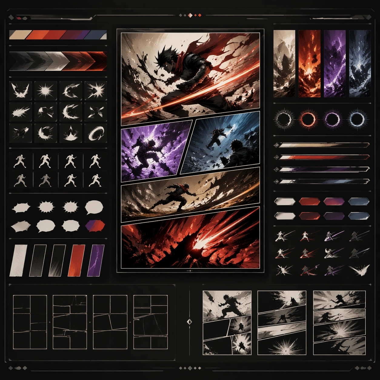
Example generated from “Action Beat Comic Page — System Board”
GPT Image 2en

Scene: A square production-ready image designed for a game-art review wall and a commercial gallery at the same time. Frame a system-board layout for action beat comic page action beat comic page that organizes multiple related elements into one coherent review surface with disciplined lighting, clean edge separation, and enough surrounding context to prove how the asset would behave in a real product surface. The camera, crop, and tonal balance should feel intentional rather than generic, with high readability at first glance and convincing material response under closer inspection. Subject: Center the study on a system-board layout for action beat comic page action beat comic page that organizes multiple related elements into one coherent review surface. Translate the topic into a concrete, shippable visual statement instead of a loose mood board. Build layered object relationships, believable surface finish, and strong silhouette grouping so the image reads immediately as part of a action beat comic page action beat comic page visual system. The subject should feel made for a live game pipeline: useful in store, UI, campaign, or art-review contexts, with visual hierarchy strong enough to survive aggressive cropping. Important details: the board should feel design-ready and structured even though every label remains abstract. Keep every supporting element subordinate to the main read, and make category separation obvious through form, color zoning, depth, and material logic rather than words. Where panels, cards, badges, or interface blocks appear, they must look professionally structured but remain unreadable. The visual language should feel premium, original, and coherent across this package, with no filler clutter and no accidental resemblance to a specific shipped game IP. Use case: action beat comic page action beat comic page single study 3/5, focused on system board. Constraints: No readable text, no watermark, no logos, preserve exact 1:1 aspect ratio, no readable labels, no placeholder lorem ipsum, no broken hierarchy, no generic stock-photo staging, no accidental UI gibberish.

Example generated from “Action Beat Comic Page — Promo Crop”
GPT Image 2en

Scene: A square production-ready image designed for a game-art review wall and a commercial gallery at the same time. Frame a promo-oriented crop for action beat comic page action beat comic page optimized for social, storefront, or poster reuse with disciplined lighting, clean edge separation, and enough surrounding context to prove how the asset would behave in a real product surface. The camera, crop, and tonal balance should feel intentional rather than generic, with high readability at first glance and convincing material response under closer inspection. Subject: Center the study on a promo-oriented crop for action beat comic page action beat comic page optimized for social, storefront, or poster reuse. Translate the topic into a concrete, shippable visual statement instead of a loose mood board. Build layered object relationships, believable surface finish, and strong silhouette grouping so the image reads immediately as part of a action beat comic page action beat comic page visual system. The subject should feel made for a live game pipeline: useful in store, UI, campaign, or art-review contexts, with visual hierarchy strong enough to survive aggressive cropping. Important details: keep strong hierarchy and conversion energy without relying on explicit copy. Keep every supporting element subordinate to the main read, and make category separation obvious through form, color zoning, depth, and material logic rather than words. Where panels, cards, badges, or interface blocks appear, they must look professionally structured but remain unreadable. The visual language should feel premium, original, and coherent across this package, with no filler clutter and no accidental resemblance to a specific shipped game IP. Use case: action beat comic page action beat comic page single study 4/5, focused on promo crop. Constraints: No readable text, no watermark, no logos, preserve exact 1:1 aspect ratio, no slogans, no logos, no broken hierarchy, no generic stock-photo staging, no accidental UI gibberish.

Example generated from “Action Beat Comic Page — Finale Study”
GPT Image 2en

Scene: A square production-ready image designed for a game-art review wall and a commercial gallery at the same time. Frame a finale study for action beat comic page action beat comic page that pushes the topic to its most polished and complete expression with disciplined lighting, clean edge separation, and enough surrounding context to prove how the asset would behave in a real product surface. The camera, crop, and tonal balance should feel intentional rather than generic, with high readability at first glance and convincing material response under closer inspection. Subject: Center the study on a finale study for action beat comic page action beat comic page that pushes the topic to its most polished and complete expression. Translate the topic into a concrete, shippable visual statement instead of a loose mood board. Build layered object relationships, believable surface finish, and strong silhouette grouping so the image reads immediately as part of a action beat comic page action beat comic page visual system. The subject should feel made for a live game pipeline: useful in store, UI, campaign, or art-review contexts, with visual hierarchy strong enough to survive aggressive cropping. Important details: the closing image should feel definitive, high-signal, and suitable for feature placement. Keep every supporting element subordinate to the main read, and make category separation obvious through form, color zoning, depth, and material logic rather than words. Where panels, cards, badges, or interface blocks appear, they must look professionally structured but remain unreadable. The visual language should feel premium, original, and coherent across this package, with no filler clutter and no accidental resemblance to a specific shipped game IP. Use case: action beat comic page action beat comic page single study 5/5, focused on finale study. Constraints: No readable text, no watermark, no logos, preserve exact 1:1 aspect ratio, no text blocks, no derivative character likeness, no broken hierarchy, no generic stock-photo staging, no accidental UI gibberish.

Example generated from “Actor Casting Portrait Sheet — Reference Portrait Anchor”
GPT Image 2en

Scene: Create a square 1:1 portrait image for Actor Casting Portrait Sheet. Use a clean studio anchor with balanced soft light, neutral gray or off-white backdrop, and premium agency-grade framing. The frame should feel like a finished professional deliverable rather than a casual snapshot, with clear lens discipline, believable light falloff, and a palette that directly supports Create casting-ready portrait sheets for actors with clean framing, controlled expressions, minimal styling drift, and believable agency presentation.. Keep enough surrounding space and compositional control for gallery, research, campaign, or approval-board reuse while staying photoreal and human-scaled. Subject: Center one working actor with medium olive skin, short dark curls, straight nose, defined cheekbones, close-trimmed beard, and alert brown eyes. Establish the exact identity, skin tone family, hair base, and body read that every later image must reuse. Let the styling stay minimal and believable so the series begins from an authoritative baseline. Use the example direction from the brief as grounding context: Create casting-ready portrait sheets for actors with clean framing, controlled expressions, minimal styling drift, and believable agency presentation.. Wardrobe, lighting, environment, and pose may shift to serve this variation, but the viewer must immediately understand that the same reference identity is still in front of the camera. Important details: This backlog line is difficult because Create casting-ready portrait sheets for actors with clean framing, controlled expressions, minimal styling drift, and believable agency presentation.. Preserve skin tone family, bone structure, eye spacing, nose shape, mouth shape, hairline logic, shoulder width, and overall body read across the entire series. preserve exact face / hair base / body proportions from the reference model. Keep the crop polished, the eye line steady, and the wardrobe simple enough to survive later changes without confusion. Avoid the common failure described in the brief: ordinary image models often lose likeness once styling, lighting, or layout changes enter the frame. Success should feel like the result should feel professionally usable, coherent, and clearly built around one stable human identity. Use case: Actor Casting Portrait Sheet series study 1/9, the neutral baseline portrait proof. Constraints: No readable text, no watermark, no logos, preserve exact 1:1 aspect ratio, preserve exact face / hair base / body proportions from the reference model, no extra people, no hard fashion gimmicks, no exaggerated retouching, no broken eye alignment.

Example generated from “Actor Casting Portrait Sheet — Clean Headshot”
GPT Image 2en

Scene: Create a square 1:1 portrait image for Actor Casting Portrait Sheet. Use a bright but controlled studio setup with crisp catchlights, smooth tonal falloff, and enough margin for usage as profile art. The frame should feel like a finished professional deliverable rather than a casual snapshot, with clear lens discipline, believable light falloff, and a palette that directly supports Create casting-ready portrait sheets for actors with clean framing, controlled expressions, minimal styling drift, and believable agency presentation.. Keep enough surrounding space and compositional control for gallery, research, campaign, or approval-board reuse while staying photoreal and human-scaled. Subject: Center one working actor with medium olive skin, short dark curls, straight nose, defined cheekbones, close-trimmed beard, and alert brown eyes. Preserve the same face while shifting the posture toward a more direct headshot deliverable. Styling may become slightly sharper, but the result still needs to read as the same person from image 01. Use the example direction from the brief as grounding context: Create casting-ready portrait sheets for actors with clean framing, controlled expressions, minimal styling drift, and believable agency presentation.. Wardrobe, lighting, environment, and pose may shift to serve this variation, but the viewer must immediately understand that the same reference identity is still in front of the camera. Important details: This backlog line is difficult because Create casting-ready portrait sheets for actors with clean framing, controlled expressions, minimal styling drift, and believable agency presentation.. Preserve skin tone family, bone structure, eye spacing, nose shape, mouth shape, hairline logic, shoulder width, and overall body read across the entire series. preserve exact face / hair base / body proportions from the reference model. This frame should feel reliable, publishable, and easy to crop for agency, website, or PR use. Avoid the common failure described in the brief: ordinary image models often lose likeness once styling, lighting, or layout changes enter the frame. Success should feel like the result should feel professionally usable, coherent, and clearly built around one stable human identity. Use case: Actor Casting Portrait Sheet series study 2/9, a clean corporate or editorial headshot. Constraints: No readable text, no watermark, no logos, preserve exact 1:1 aspect ratio, preserve exact face / hair base / body proportions from the reference model, no drifting age, no different haircut, no over-smoothed skin, no random jewelry clutter.

Example generated from “Actor Casting Portrait Sheet — Three-Quarter Hero”
GPT Image 2en

Scene: Create a square 1:1 portrait image for Actor Casting Portrait Sheet. Use a sculpted key light with subtle shadow modeling, clean negative space, and a slightly wider crop that still favors the face. The frame should feel like a finished professional deliverable rather than a casual snapshot, with clear lens discipline, believable light falloff, and a palette that directly supports Create casting-ready portrait sheets for actors with clean framing, controlled expressions, minimal styling drift, and believable agency presentation.. Keep enough surrounding space and compositional control for gallery, research, campaign, or approval-board reuse while staying photoreal and human-scaled. Subject: Center one working actor with medium olive skin, short dark curls, straight nose, defined cheekbones, close-trimmed beard, and alert brown eyes. Use the same identity and wardrobe family while introducing stronger body language through shoulders, hands, or a turn of the torso. The viewer should immediately recognize the same subject even though the composition becomes more campaign-like. Use the example direction from the brief as grounding context: Create casting-ready portrait sheets for actors with clean framing, controlled expressions, minimal styling drift, and believable agency presentation.. Wardrobe, lighting, environment, and pose may shift to serve this variation, but the viewer must immediately understand that the same reference identity is still in front of the camera. Important details: This backlog line is difficult because Create casting-ready portrait sheets for actors with clean framing, controlled expressions, minimal styling drift, and believable agency presentation.. Preserve skin tone family, bone structure, eye spacing, nose shape, mouth shape, hairline logic, shoulder width, and overall body read across the entire series. preserve exact face / hair base / body proportions from the reference model. Keep proportions stable and let the pose feel intentional rather than theatrical. Avoid the common failure described in the brief: ordinary image models often lose likeness once styling, lighting, or layout changes enter the frame. Success should feel like the result should feel professionally usable, coherent, and clearly built around one stable human identity. Use case: Actor Casting Portrait Sheet series study 3/9, a three-quarter portrait hero. Constraints: No readable text, no watermark, no logos, preserve exact 1:1 aspect ratio, preserve exact face / hair base / body proportions from the reference model, no warped arms, no off-model body shape, no new facial hair pattern, no unrelated props.

Example generated from “Actor Casting Portrait Sheet — Profile Study”
GPT Image 2en

Scene: Create a square 1:1 portrait image for Actor Casting Portrait Sheet. Use a disciplined side-light portrait with a smooth background, quiet contrast, and a calm editorial mood. The frame should feel like a finished professional deliverable rather than a casual snapshot, with clear lens discipline, believable light falloff, and a palette that directly supports Create casting-ready portrait sheets for actors with clean framing, controlled expressions, minimal styling drift, and believable agency presentation.. Keep enough surrounding space and compositional control for gallery, research, campaign, or approval-board reuse while staying photoreal and human-scaled. Subject: Center one working actor with medium olive skin, short dark curls, straight nose, defined cheekbones, close-trimmed beard, and alert brown eyes. Rotate the same person into a controlled profile study that proves nose bridge, jawline, ear shape, and hairline remain consistent with the reference model. Use the example direction from the brief as grounding context: Create casting-ready portrait sheets for actors with clean framing, controlled expressions, minimal styling drift, and believable agency presentation.. Wardrobe, lighting, environment, and pose may shift to serve this variation, but the viewer must immediately understand that the same reference identity is still in front of the camera. Important details: This backlog line is difficult because Create casting-ready portrait sheets for actors with clean framing, controlled expressions, minimal styling drift, and believable agency presentation.. Preserve skin tone family, bone structure, eye spacing, nose shape, mouth shape, hairline logic, shoulder width, and overall body read across the entire series. preserve exact face / hair base / body proportions from the reference model. Make the image useful for approval and continuity review, not merely stylistic for style alone. Avoid the common failure described in the brief: ordinary image models often lose likeness once styling, lighting, or layout changes enter the frame. Success should feel like the result should feel professionally usable, coherent, and clearly built around one stable human identity. Use case: Actor Casting Portrait Sheet series study 4/9, a profile or near-profile study. Constraints: No readable text, no watermark, no logos, preserve exact 1:1 aspect ratio, preserve exact face / hair base / body proportions from the reference model, no profile drift, no altered nose length, no ears changing shape, no chaotic flyaway hair.

Example generated from “Actor Casting Portrait Sheet — Approachable Smile”
GPT Image 2en

Scene: Create a square 1:1 portrait image for Actor Casting Portrait Sheet. Use a welcoming light setup with soft highlights, gentle warmth, and subtle environmental mood that still feels premium. The frame should feel like a finished professional deliverable rather than a casual snapshot, with clear lens discipline, believable light falloff, and a palette that directly supports Create casting-ready portrait sheets for actors with clean framing, controlled expressions, minimal styling drift, and believable agency presentation.. Keep enough surrounding space and compositional control for gallery, research, campaign, or approval-board reuse while staying photoreal and human-scaled. Subject: Center one working actor with medium olive skin, short dark curls, straight nose, defined cheekbones, close-trimmed beard, and alert brown eyes. Keep the same face and body proportions, but let the emotional register open up into a believable smile or softer public-facing energy. This should look like the same person relaxing, not a second talent hire. Use the example direction from the brief as grounding context: Create casting-ready portrait sheets for actors with clean framing, controlled expressions, minimal styling drift, and believable agency presentation.. Wardrobe, lighting, environment, and pose may shift to serve this variation, but the viewer must immediately understand that the same reference identity is still in front of the camera. Important details: This backlog line is difficult because Create casting-ready portrait sheets for actors with clean framing, controlled expressions, minimal styling drift, and believable agency presentation.. Preserve skin tone family, bone structure, eye spacing, nose shape, mouth shape, hairline logic, shoulder width, and overall body read across the entire series. preserve exact face / hair base / body proportions from the reference model. Expression change is allowed; identity change is not. Teeth, lips, eye crinkle, and cheeks should still fit the same bone structure. Avoid the common failure described in the brief: ordinary image models often lose likeness once styling, lighting, or layout changes enter the frame. Success should feel like the result should feel professionally usable, coherent, and clearly built around one stable human identity. Use case: Actor Casting Portrait Sheet series study 5/9, a warmer, approachable expression variation. Constraints: No readable text, no watermark, no logos, preserve exact 1:1 aspect ratio, preserve exact face / hair base / body proportions from the reference model, no changed teeth shape, no exaggerated laugh lines, no glamour filter skin, no mismatched eye color.

Example generated from “Actor Casting Portrait Sheet — Dark Backdrop Editorial”
GPT Image 2en

Scene: Create a square 1:1 portrait image for Actor Casting Portrait Sheet. Use a black or charcoal backdrop with controlled rim light, richer shadow depth, and a still-readable face. The frame should feel like a finished professional deliverable rather than a casual snapshot, with clear lens discipline, believable light falloff, and a palette that directly supports Create casting-ready portrait sheets for actors with clean framing, controlled expressions, minimal styling drift, and believable agency presentation.. Keep enough surrounding space and compositional control for gallery, research, campaign, or approval-board reuse while staying photoreal and human-scaled. Subject: Center one working actor with medium olive skin, short dark curls, straight nose, defined cheekbones, close-trimmed beard, and alert brown eyes. Use moodier lighting and slightly bolder styling while maintaining the same face geometry, hairstyle base, and shoulder width from the anchor portrait. Use the example direction from the brief as grounding context: Create casting-ready portrait sheets for actors with clean framing, controlled expressions, minimal styling drift, and believable agency presentation.. Wardrobe, lighting, environment, and pose may shift to serve this variation, but the viewer must immediately understand that the same reference identity is still in front of the camera. Important details: This backlog line is difficult because Create casting-ready portrait sheets for actors with clean framing, controlled expressions, minimal styling drift, and believable agency presentation.. Preserve skin tone family, bone structure, eye spacing, nose shape, mouth shape, hairline logic, shoulder width, and overall body read across the entire series. preserve exact face / hair base / body proportions from the reference model. The image should prove the subject survives a more dramatic public-facing treatment without becoming a different person. Avoid the common failure described in the brief: ordinary image models often lose likeness once styling, lighting, or layout changes enter the frame. Success should feel like the result should feel professionally usable, coherent, and clearly built around one stable human identity. Use case: Actor Casting Portrait Sheet series study 6/9, a darker editorial portrait proof. Constraints: No readable text, no watermark, no logos, preserve exact 1:1 aspect ratio, preserve exact face / hair base / body proportions from the reference model, no crushed blacks, no hidden facial structure, no costume jump that breaks continuity, no dramatic age shift.

Example generated from “Actor Casting Portrait Sheet — Banner Crop Portrait”
GPT Image 2en

Scene: Create a square 1:1 portrait image for Actor Casting Portrait Sheet. Use a square frame that internally feels like a landscape-safe banner crop, with strong side negative space and a stable mid-shot. The frame should feel like a finished professional deliverable rather than a casual snapshot, with clear lens discipline, believable light falloff, and a palette that directly supports Create casting-ready portrait sheets for actors with clean framing, controlled expressions, minimal styling drift, and believable agency presentation.. Keep enough surrounding space and compositional control for gallery, research, campaign, or approval-board reuse while staying photoreal and human-scaled. Subject: Center one working actor with medium olive skin, short dark curls, straight nose, defined cheekbones, close-trimmed beard, and alert brown eyes. Keep the face exact, but compose the body and gaze so the portrait could be repurposed into website hero, interview banner, or campaign cover layouts. Use the example direction from the brief as grounding context: Create casting-ready portrait sheets for actors with clean framing, controlled expressions, minimal styling drift, and believable agency presentation.. Wardrobe, lighting, environment, and pose may shift to serve this variation, but the viewer must immediately understand that the same reference identity is still in front of the camera. Important details: This backlog line is difficult because Create casting-ready portrait sheets for actors with clean framing, controlled expressions, minimal styling drift, and believable agency presentation.. Preserve skin tone family, bone structure, eye spacing, nose shape, mouth shape, hairline logic, shoulder width, and overall body read across the entire series. preserve exact face / hair base / body proportions from the reference model. This image should feel adaptable, confident, and production-safe across multiple crop targets. Avoid the common failure described in the brief: ordinary image models often lose likeness once styling, lighting, or layout changes enter the frame. Success should feel like the result should feel professionally usable, coherent, and clearly built around one stable human identity. Use case: Actor Casting Portrait Sheet series study 7/9, a wider crop meant to survive cover or banner usage. Constraints: No readable text, no watermark, no logos, preserve exact 1:1 aspect ratio, preserve exact face / hair base / body proportions from the reference model, no empty dead space, no floating hands, no distorted shoulders, no fake browser chrome.

Example generated from “Actor Casting Portrait Sheet — Monochrome Alt”
GPT Image 2en

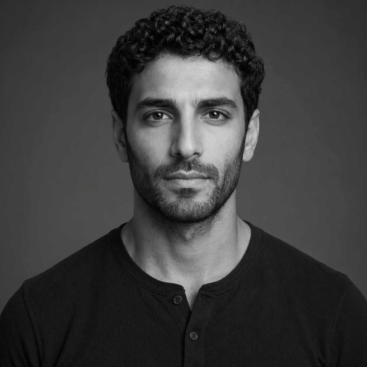
Scene: Create a square 1:1 portrait image for Actor Casting Portrait Sheet. Use a grayscale studio portrait with crisp tonal separation, refined skin rendering, and magazine-ready depth. The frame should feel like a finished professional deliverable rather than a casual snapshot, with clear lens discipline, believable light falloff, and a palette that directly supports Create casting-ready portrait sheets for actors with clean framing, controlled expressions, minimal styling drift, and believable agency presentation.. Keep enough surrounding space and compositional control for gallery, research, campaign, or approval-board reuse while staying photoreal and human-scaled. Subject: Center one working actor with medium olive skin, short dark curls, straight nose, defined cheekbones, close-trimmed beard, and alert brown eyes. Translate the same identity into a black-and-white treatment. The face, hair base, and body proportions must remain exact while color disappears and texture becomes more important. Use the example direction from the brief as grounding context: Create casting-ready portrait sheets for actors with clean framing, controlled expressions, minimal styling drift, and believable agency presentation.. Wardrobe, lighting, environment, and pose may shift to serve this variation, but the viewer must immediately understand that the same reference identity is still in front of the camera. Important details: This backlog line is difficult because Create casting-ready portrait sheets for actors with clean framing, controlled expressions, minimal styling drift, and believable agency presentation.. Preserve skin tone family, bone structure, eye spacing, nose shape, mouth shape, hairline logic, shoulder width, and overall body read across the entire series. preserve exact face / hair base / body proportions from the reference model. Do not let grayscale flatten the likeness; bone structure and micro-contrast must carry recognition. Avoid the common failure described in the brief: ordinary image models often lose likeness once styling, lighting, or layout changes enter the frame. Success should feel like the result should feel professionally usable, coherent, and clearly built around one stable human identity. Use case: Actor Casting Portrait Sheet series study 8/9, a monochrome alternate portrait. Constraints: No readable text, no watermark, no logos, preserve exact 1:1 aspect ratio, preserve exact face / hair base / body proportions from the reference model, no muddy grayscale, no retro film scratches, no blown highlights, no new hairstyle volume.

Example generated from “Actor Casting Portrait Sheet — Approval Sheet Layout”
GPT Image 2en

Scene: Create a square 1:1 portrait image for Actor Casting Portrait Sheet. Use a square layout that still reads as photography first, with restrained panel logic, tidy spacing, and agency-grade presentation cues but no readable text. The frame should feel like a finished professional deliverable rather than a casual snapshot, with clear lens discipline, believable light falloff, and a palette that directly supports Create casting-ready portrait sheets for actors with clean framing, controlled expressions, minimal styling drift, and believable agency presentation.. Keep enough surrounding space and compositional control for gallery, research, campaign, or approval-board reuse while staying photoreal and human-scaled. Subject: Center one working actor with medium olive skin, short dark curls, straight nose, defined cheekbones, close-trimmed beard, and alert brown eyes. Combine the same identity into a structured final board or polished hero frame that implies contact-sheet usability, campaign approval, or press-kit readiness. Keep the subject dominant and recognizable within the layout. Use the example direction from the brief as grounding context: Create casting-ready portrait sheets for actors with clean framing, controlled expressions, minimal styling drift, and believable agency presentation.. Wardrobe, lighting, environment, and pose may shift to serve this variation, but the viewer must immediately understand that the same reference identity is still in front of the camera. Important details: This backlog line is difficult because Create casting-ready portrait sheets for actors with clean framing, controlled expressions, minimal styling drift, and believable agency presentation.. Preserve skin tone family, bone structure, eye spacing, nose shape, mouth shape, hairline logic, shoulder width, and overall body read across the entire series. preserve exact face / hair base / body proportions from the reference model. Structured presentation is allowed, but the face must still be the star. Preserve exact face / hair base / body proportions from the reference model while making the overall page logic convincing. Avoid the common failure described in the brief: ordinary image models often lose likeness once styling, lighting, or layout changes enter the frame. Success should feel like the result should feel professionally usable, coherent, and clearly built around one stable human identity. Use case: Actor Casting Portrait Sheet series study 9/9, a polished approval-sheet or press-sheet finish. Constraints: No readable text, no watermark, no logos, preserve exact 1:1 aspect ratio, preserve exact face / hair base / body proportions from the reference model, no readable names, no slate numbers, no fake logos, no broken grid logic.

Example generated from “Adoption And Rescue Awareness Kit — Foster Day Diary Card”
GPT Image 2en

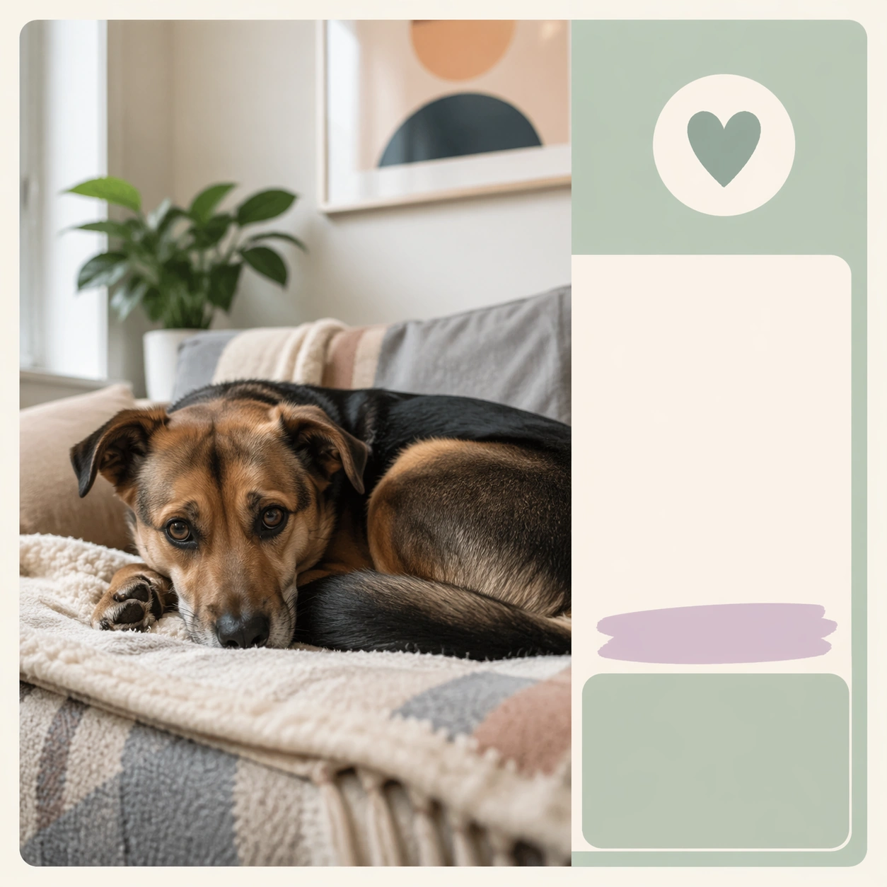
Scene: A square adoption or rescue awareness visual designed for nonprofits, shelters, and community campaigns. Combine documentary style pet portraiture with organized communication layout, placeholder information zones, and enough polish to work across posters, social posts, event promotion, or donor materials. The frame should invite empathy and action without relying on guilt, shock, or clutter. Keep the visual system warm, dignified, and highly reusable. Build a clean apartment corner with daylight, soft textiles, and structured card framing that feels social-native and informative. Subject: Focus on one rescue or adoption story cue: hopeful portrait, foster care, bonded pair, senior pet dignity, volunteer support, event outreach, or successful home placement. Animals must remain central and treated with respect. Human presence can appear when it reinforces care or belonging, but the image should never become generic family advertising. The emotional tone should be humane, honest, and forward looking. Show a foster pet curled on a bed or couch with tentative but relaxed body language that communicates first stages of trust. Important details: Use clean nonprofit design signals such as modular card framing, gentle color blocks, bulletin space, and social-native hierarchy without readable text. Shelter environments should appear tidy and humane, not bleak. Show resilience, companionship, and possibility. The result should feel immediately useful for a real rescue team building an awareness kit, volunteer pack, event series, or donation appeal with credible imagery. The message is progress and care. Make the environment simple, real, and emotionally safe for nonprofit storytelling. Use case: Adoption and Rescue Awareness Kit single study 2/9, foster day diary card for a commercially reusable prompt atlas example. Constraints: No readable text, no watermark, no logos, preserve exact 1:1 aspect ratio, no trauma sensationalism, no chain fence misery clichés, no readable slogans, no disaster exploitation, no cluttered shelter chaos, no pity pose manipulation, no messy apartment, no dominant owner portrait, no scrapbook clutter overload.

Example generated from “Adoption And Rescue Awareness Kit — Bonded Pair Awareness Board”
GPT Image 2en

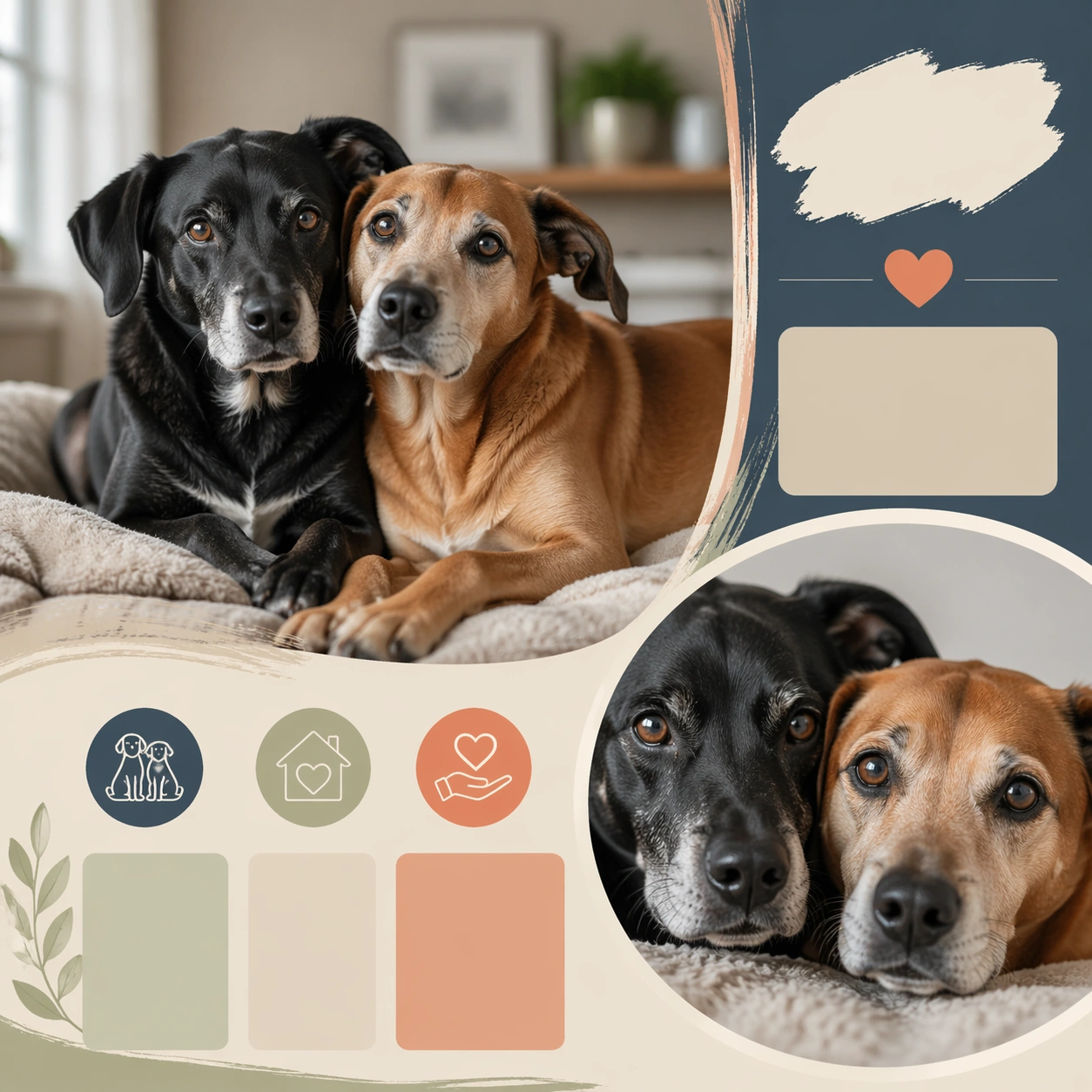
Scene: A square adoption or rescue awareness visual designed for nonprofits, shelters, and community campaigns. Combine documentary style pet portraiture with organized communication layout, placeholder information zones, and enough polish to work across posters, social posts, event promotion, or donor materials. The frame should invite empathy and action without relying on guilt, shock, or clutter. Keep the visual system warm, dignified, and highly reusable. Compose a square board with one shared portrait, a secondary close crop, and warm graphic modules suggesting an informative shelter card. Subject: Focus on one rescue or adoption story cue: hopeful portrait, foster care, bonded pair, senior pet dignity, volunteer support, event outreach, or successful home placement. Animals must remain central and treated with respect. Human presence can appear when it reinforces care or belonging, but the image should never become generic family advertising. The emotional tone should be humane, honest, and forward looking. Feature two animals with visible connection, such as touching shoulders, mirrored posture, or aligned gaze, while keeping each one distinct. Important details: Use clean nonprofit design signals such as modular card framing, gentle color blocks, bulletin space, and social-native hierarchy without readable text. Shelter environments should appear tidy and humane, not bleak. Show resilience, companionship, and possibility. The result should feel immediately useful for a real rescue team building an awareness kit, volunteer pack, event series, or donation appeal with credible imagery. The board should sell the emotional case for keeping the pair together without relying on sentimental overstatement. Use case: Adoption and Rescue Awareness Kit single study 3/9, bonded pair awareness board for a commercially reusable prompt atlas example. Constraints: No readable text, no watermark, no logos, preserve exact 1:1 aspect ratio, no trauma sensationalism, no chain fence misery clichés, no readable slogans, no disaster exploitation, no cluttered shelter chaos, no pity pose manipulation, no costume matching, no overcrowded kennel background, no cute gimmick props.

Example generated from “Adoption And Rescue Awareness Kit — Weekend Adoption Event Promo”
GPT Image 2en

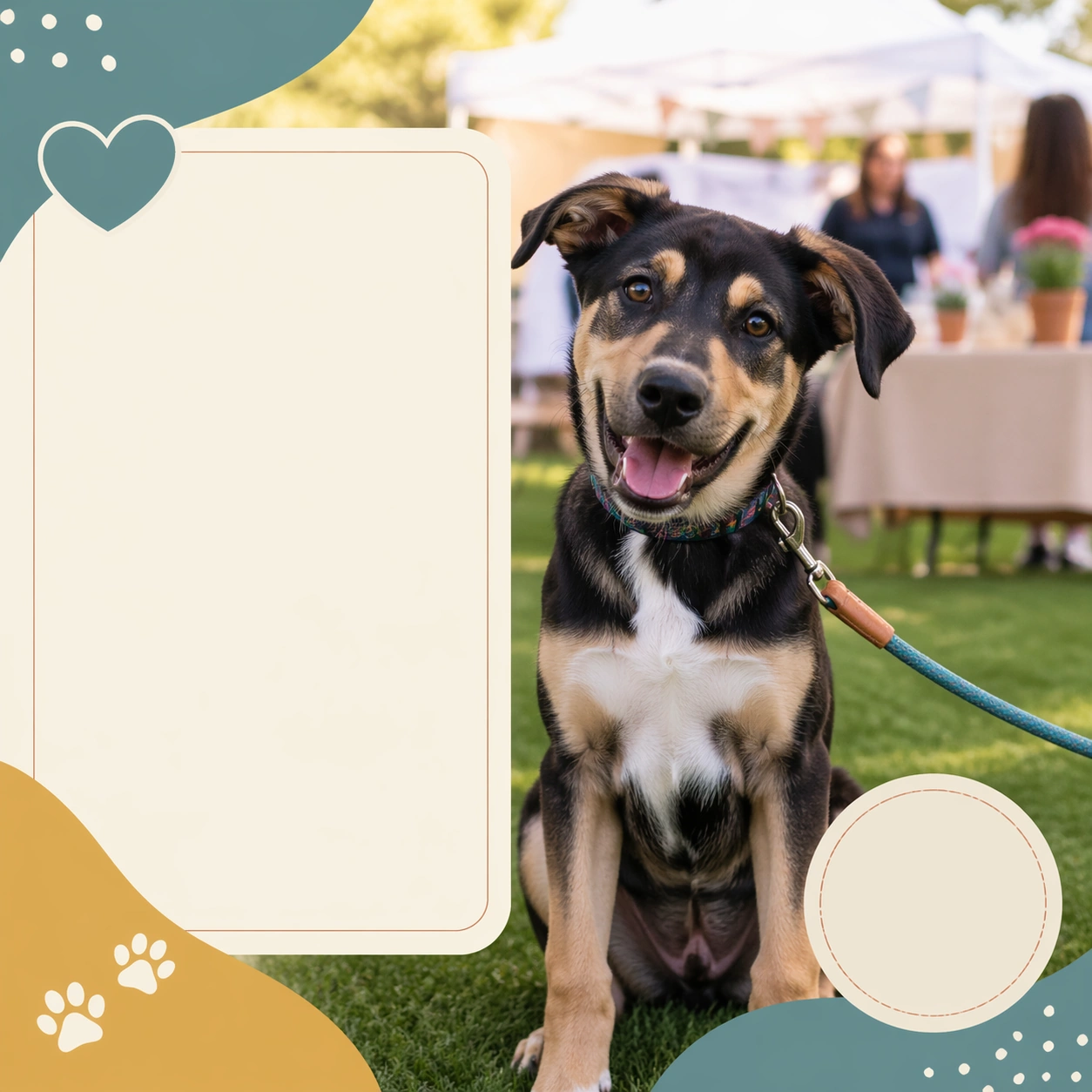
Scene: A square adoption or rescue awareness visual designed for nonprofits, shelters, and community campaigns. Combine documentary style pet portraiture with organized communication layout, placeholder information zones, and enough polish to work across posters, social posts, event promotion, or donor materials. The frame should invite empathy and action without relying on guilt, shock, or clutter. Keep the visual system warm, dignified, and highly reusable. Use an outdoor market or tidy community lawn setting with clean tents or tables softly blurred and structured promo blocks framing the pet. Subject: Focus on one rescue or adoption story cue: hopeful portrait, foster care, bonded pair, senior pet dignity, volunteer support, event outreach, or successful home placement. Animals must remain central and treated with respect. Human presence can appear when it reinforces care or belonging, but the image should never become generic family advertising. The emotional tone should be humane, honest, and forward looking. Show one featured adoptable pet sitting proudly in the foreground, with event atmosphere suggested but not dominant. Important details: Use clean nonprofit design signals such as modular card framing, gentle color blocks, bulletin space, and social-native hierarchy without readable text. Shelter environments should appear tidy and humane, not bleak. Show resilience, companionship, and possibility. The result should feel immediately useful for a real rescue team building an awareness kit, volunteer pack, event series, or donation appeal with credible imagery. The image should feel public facing, friendly, and actionable, suitable for social promotion, flyers, or local outreach kits. Use case: Adoption and Rescue Awareness Kit single study 4/9, weekend adoption event promo for a commercially reusable prompt atlas example. Constraints: No readable text, no watermark, no logos, preserve exact 1:1 aspect ratio, no trauma sensationalism, no chain fence misery clichés, no readable slogans, no disaster exploitation, no cluttered shelter chaos, no pity pose manipulation, no crowd chaos, no readable banners, no carnival aesthetic.

Example generated from “Adoption And Rescue Awareness Kit — Senior Pet Dignity Portrait”
GPT Image 2en

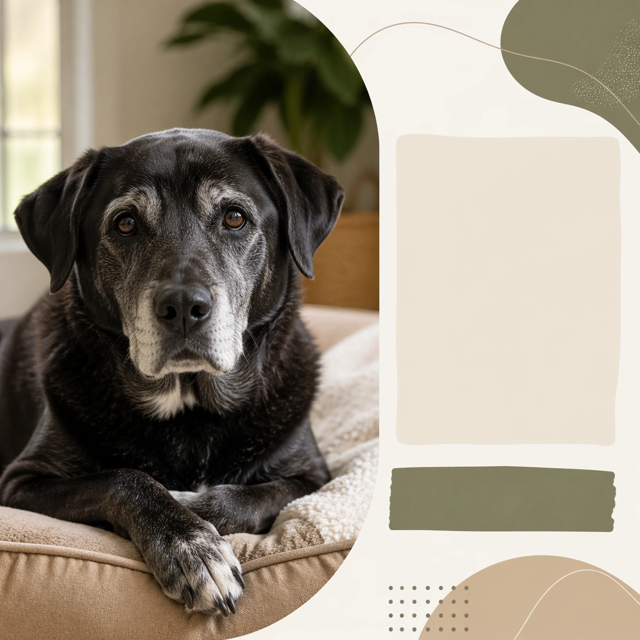
Scene: A square adoption or rescue awareness visual designed for nonprofits, shelters, and community campaigns. Combine documentary style pet portraiture with organized communication layout, placeholder information zones, and enough polish to work across posters, social posts, event promotion, or donor materials. The frame should invite empathy and action without relying on guilt, shock, or clutter. Keep the visual system warm, dignified, and highly reusable. Use quiet natural light and a minimal environment with mature earthy tones that respect the pet's age without turning somber. Subject: Focus on one rescue or adoption story cue: hopeful portrait, foster care, bonded pair, senior pet dignity, volunteer support, event outreach, or successful home placement. Animals must remain central and treated with respect. Human presence can appear when it reinforces care or belonging, but the image should never become generic family advertising. The emotional tone should be humane, honest, and forward looking. Show an older dog or cat with gentle eyes, visible age detail, and composed posture that reads as wisdom and companionship. Important details: Use clean nonprofit design signals such as modular card framing, gentle color blocks, bulletin space, and social-native hierarchy without readable text. Shelter environments should appear tidy and humane, not bleak. Show resilience, companionship, and possibility. The result should feel immediately useful for a real rescue team building an awareness kit, volunteer pack, event series, or donation appeal with credible imagery. Keep the portrait premium and honest. The goal is to reframe age as meaningful, not to beg for sympathy. Use case: Adoption and Rescue Awareness Kit single study 5/9, senior pet dignity portrait for a commercially reusable prompt atlas example. Constraints: No readable text, no watermark, no logos, preserve exact 1:1 aspect ratio, no trauma sensationalism, no chain fence misery clichés, no readable slogans, no disaster exploitation, no cluttered shelter chaos, no pity pose manipulation, no frailty exaggeration, no memorial styling, no neglect cues.

Example generated from “Adoption And Rescue Awareness Kit — Shy Dog Trust Building Card”
GPT Image 2en

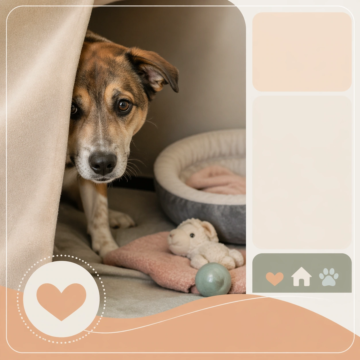
Scene: A square adoption or rescue awareness visual designed for nonprofits, shelters, and community campaigns. Combine documentary style pet portraiture with organized communication layout, placeholder information zones, and enough polish to work across posters, social posts, event promotion, or donor materials. The frame should invite empathy and action without relying on guilt, shock, or clutter. Keep the visual system warm, dignified, and highly reusable. Create a sheltered indoor corner with soft light, calm neutral color, and discreet graphic blocks indicating an educational or update post. Subject: Focus on one rescue or adoption story cue: hopeful portrait, foster care, bonded pair, senior pet dignity, volunteer support, event outreach, or successful home placement. Animals must remain central and treated with respect. Human presence can appear when it reinforces care or belonging, but the image should never become generic family advertising. The emotional tone should be humane, honest, and forward looking. Show a timid dog beginning to relax, perhaps looking from behind a blanket edge or leaning slightly forward with cautious curiosity. Important details: Use clean nonprofit design signals such as modular card framing, gentle color blocks, bulletin space, and social-native hierarchy without readable text. Shelter environments should appear tidy and humane, not bleak. Show resilience, companionship, and possibility. The result should feel immediately useful for a real rescue team building an awareness kit, volunteer pack, event series, or donation appeal with credible imagery. This should feel like a progress update grounded in patience and safety, not a dramatic rescue reveal. Use case: Adoption and Rescue Awareness Kit single study 6/9, shy dog trust building card for a commercially reusable prompt atlas example. Constraints: No readable text, no watermark, no logos, preserve exact 1:1 aspect ratio, no trauma sensationalism, no chain fence misery clichés, no readable slogans, no disaster exploitation, no cluttered shelter chaos, no pity pose manipulation, no fear cowering extremes, no dark grim shelter mood, no intrusive human reaching hands.

Example generated from “Adoption And Rescue Awareness Kit — Volunteer Supply Drive Board”
GPT Image 2en

Scene: A square adoption or rescue awareness visual designed for nonprofits, shelters, and community campaigns. Combine documentary style pet portraiture with organized communication layout, placeholder information zones, and enough polish to work across posters, social posts, event promotion, or donor materials. The frame should invite empathy and action without relying on guilt, shock, or clutter. Keep the visual system warm, dignified, and highly reusable. Arrange clean boxes of blankets, bowls, or food near a calm rescue pet, with square board framing that suggests a call-for-support asset. Subject: Focus on one rescue or adoption story cue: hopeful portrait, foster care, bonded pair, senior pet dignity, volunteer support, event outreach, or successful home placement. Animals must remain central and treated with respect. Human presence can appear when it reinforces care or belonging, but the image should never become generic family advertising. The emotional tone should be humane, honest, and forward looking. The pet should remain central, with supplies acting as evidence of community care and operational reality rather than pure product display. Important details: Use clean nonprofit design signals such as modular card framing, gentle color blocks, bulletin space, and social-native hierarchy without readable text. Shelter environments should appear tidy and humane, not bleak. Show resilience, companionship, and possibility. The result should feel immediately useful for a real rescue team building an awareness kit, volunteer pack, event series, or donation appeal with credible imagery. The board should feel logistical and warm at the same time, useful for volunteer drives, donation asks, and shelter updates. Use case: Adoption and Rescue Awareness Kit single study 7/9, volunteer supply drive board for a commercially reusable prompt atlas example. Constraints: No readable text, no watermark, no logos, preserve exact 1:1 aspect ratio, no trauma sensationalism, no chain fence misery clichés, no readable slogans, no disaster exploitation, no cluttered shelter chaos, no pity pose manipulation, no brand labels, no warehouse clutter, no guilt-heavy donation theatrics.

Example generated from “Adoption And Rescue Awareness Kit — Adoption Success Home Scene”
GPT Image 2en

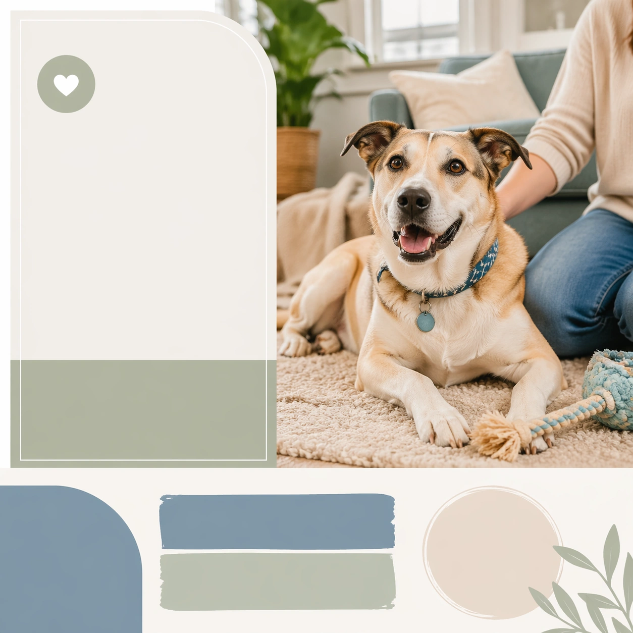
Scene: A square adoption or rescue awareness visual designed for nonprofits, shelters, and community campaigns. Combine documentary style pet portraiture with organized communication layout, placeholder information zones, and enough polish to work across posters, social posts, event promotion, or donor materials. The frame should invite empathy and action without relying on guilt, shock, or clutter. Keep the visual system warm, dignified, and highly reusable. Use a bright but restrained living room or porch scene with clean styling and one or two humans only partially visible as context. Subject: Focus on one rescue or adoption story cue: hopeful portrait, foster care, bonded pair, senior pet dignity, volunteer support, event outreach, or successful home placement. Animals must remain central and treated with respect. Human presence can appear when it reinforces care or belonging, but the image should never become generic family advertising. The emotional tone should be humane, honest, and forward looking. Show the adopted pet relaxed and attached to the new home environment, with belonging expressed through posture rather than overt staged hugs. Important details: Use clean nonprofit design signals such as modular card framing, gentle color blocks, bulletin space, and social-native hierarchy without readable text. Shelter environments should appear tidy and humane, not bleak. Show resilience, companionship, and possibility. The result should feel immediately useful for a real rescue team building an awareness kit, volunteer pack, event series, or donation appeal with credible imagery. The message is stable placement and happy transition. Keep the tone credible, calm, and nonprofit appropriate. Use case: Adoption and Rescue Awareness Kit single study 8/9, adoption success home scene for a commercially reusable prompt atlas example. Constraints: No readable text, no watermark, no logos, preserve exact 1:1 aspect ratio, no trauma sensationalism, no chain fence misery clichés, no readable slogans, no disaster exploitation, no cluttered shelter chaos, no pity pose manipulation, no stock family grin lineup, no oversized moving boxes, no sentimental blur overload.

Example generated from “Adoption And Rescue Awareness Kit — Mobile Rescue Van Awareness”
GPT Image 2en

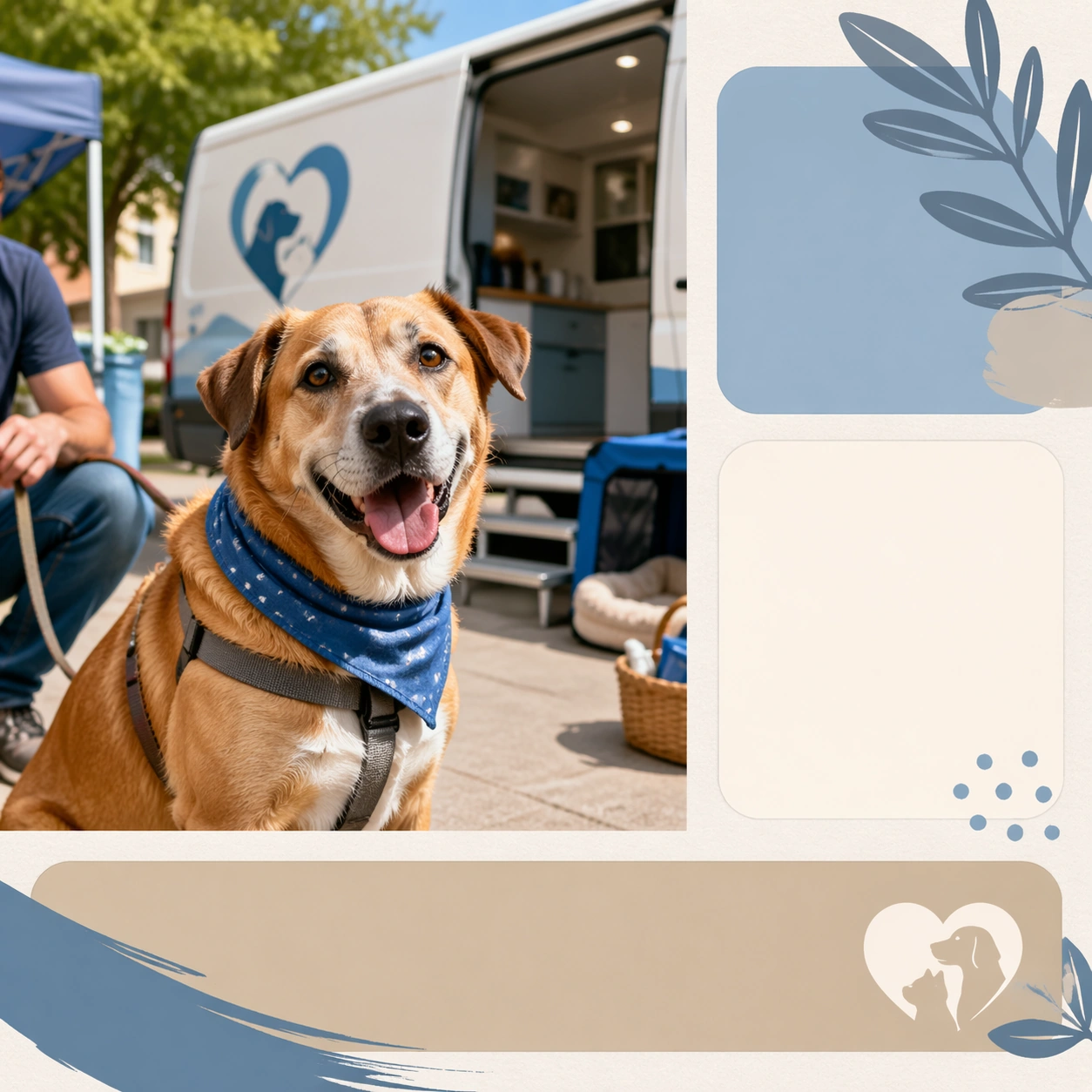
Scene: A square adoption or rescue awareness visual designed for nonprofits, shelters, and community campaigns. Combine documentary style pet portraiture with organized communication layout, placeholder information zones, and enough polish to work across posters, social posts, event promotion, or donor materials. The frame should invite empathy and action without relying on guilt, shock, or clutter. Keep the visual system warm, dignified, and highly reusable. Stage a tidy street or community curbside scene with a rescue vehicle silhouette, portable setup cues, and structured public information blocks. Subject: Focus on one rescue or adoption story cue: hopeful portrait, foster care, bonded pair, senior pet dignity, volunteer support, event outreach, or successful home placement. Animals must remain central and treated with respect. Human presence can appear when it reinforces care or belonging, but the image should never become generic family advertising. The emotional tone should be humane, honest, and forward looking. Feature one rescue pet in the foreground with the mobile support context clearly visible but visually secondary. Important details: Use clean nonprofit design signals such as modular card framing, gentle color blocks, bulletin space, and social-native hierarchy without readable text. Shelter environments should appear tidy and humane, not bleak. Show resilience, companionship, and possibility. The result should feel immediately useful for a real rescue team building an awareness kit, volunteer pack, event series, or donation appeal with credible imagery. The board should feel operational, civic, and hopeful, suitable for awareness campaigns, volunteer recruitment, or public education. Use case: Adoption and Rescue Awareness Kit single study 9/9, mobile rescue van awareness for a commercially reusable prompt atlas example. Constraints: No readable text, no watermark, no logos, preserve exact 1:1 aspect ratio, no trauma sensationalism, no chain fence misery clichés, no readable slogans, no disaster exploitation, no cluttered shelter chaos, no pity pose manipulation, no emergency siren drama, no disaster scene backdrop, no readable vehicle branding.

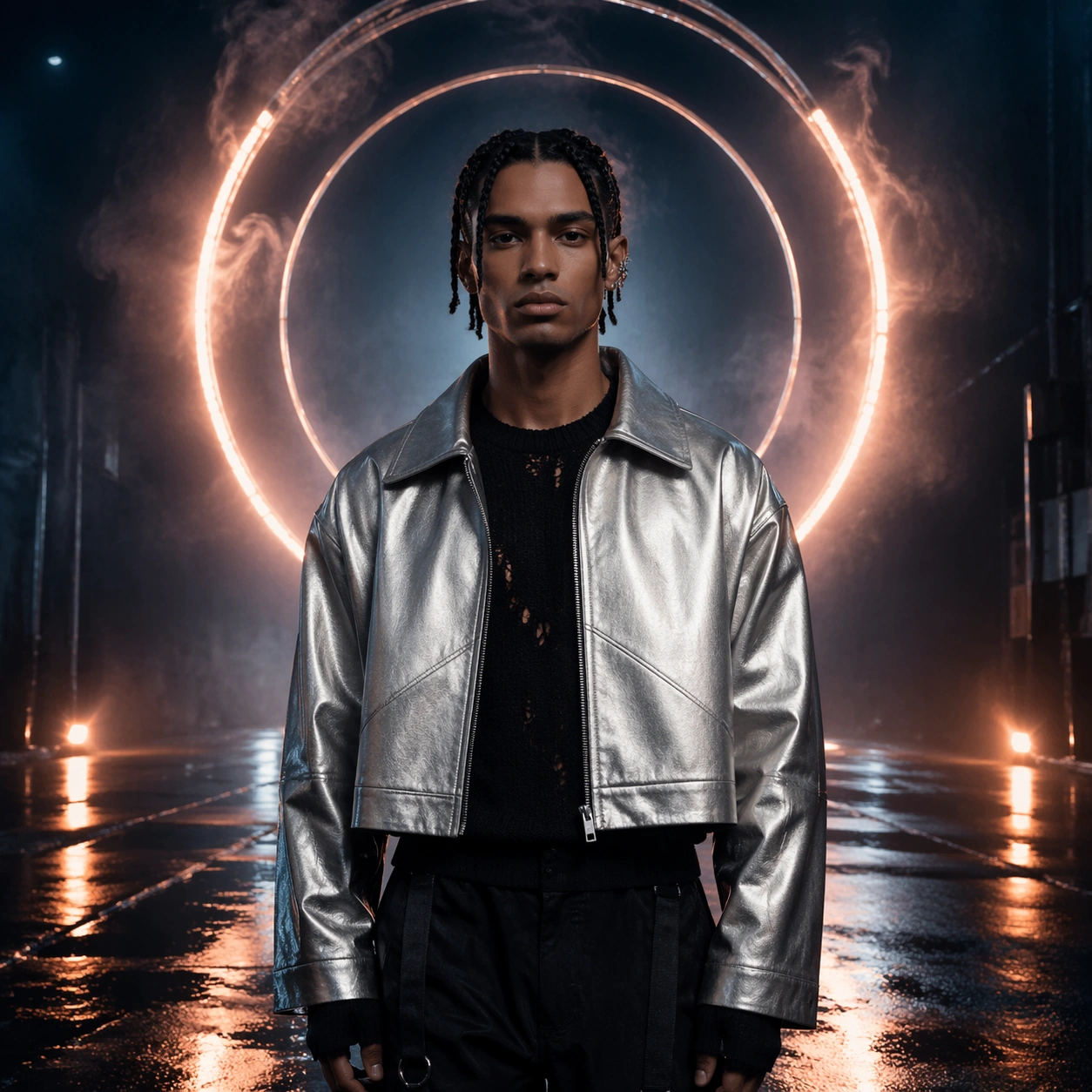
Example generated from “Album Cover And Single Rollout System — Reference Midnight Transmitter”
GPT Image 2en

Scene: A square album-cover hero image staged on a rain-dark street set with reflective pavement, controlled haze, and a luminous circular rig suspended behind the performer. The camera is chest-high and centered, with cobalt shadows, ember highlights, and enough negative space around the figure to feel publishable as a premium release cover rather than a random portrait. Subject: An invented solo musician stands still and frontal in the middle of the frame, wearing a cropped silver jacket over a black knit layer, with dark braided hair, a clean jawline, and a geometric ear cuff. This image must lock the exact face shape, hair base, body proportions, jacket silhouette, and calm stare that later rollout images will inherit. Important details: Treat this as the root identity reference for a full release cycle. Keep the visual language tactile and modern: concentric light rings, diagonal reflections in puddles, soft film grain, restrained fog, and a disciplined cover hierarchy with empty zones where future release metadata could sit. The result should feel like a credible album campaign that could extend into multiple cover variants without losing ownership. Use case: Album Rollout series study 1/9 for the Album Cover and Single Rollout System Prompt Atlas theme. Constraints: No readable text, no watermark, no logos, preserve exact 1:1 aspect ratio, no crowd, no microphone in hand, no collage fragments, no duplicated performer, no extra props blocking the halo motif

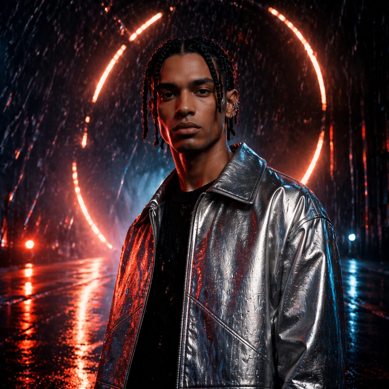
Example generated from “Album Cover And Single Rollout System — Single After Rain”
GPT Image 2en

Scene: A square single-cover frame set in the same release universe, now closer to the performer and surrounded by rain streaks, reflected brake-light color, and a slightly lower camera angle that adds urgency without breaking the premium cover language. The environment should still feel like the same wet-night world established by the reference image, just pushed toward momentum. Subject: Preserve the same performer from the reference image with the exact same face structure, hair base, body proportions, and jacket silhouette. The musician is now turning slightly off-center, catching neon reflections across one cheekbone and shoulder, while the circular rig becomes a broken halo echoed in the puddles below. Important details: This image represents a single release inside the same campaign. Maintain the analog-neon palette, disciplined empty text zones, and cinematic realism from the reference, but introduce faster rain lines, tighter crop energy, and a stronger sense of release-week urgency. The performer must remain unmistakably identical to the reference model, and the campaign symbol system of rings and diagonal cuts must still anchor the composition. Use case: Album Rollout series study 2/9 for the Album Cover and Single Rollout System Prompt Atlas theme. Constraints: No readable text, no watermark, no logos, preserve exact 1:1 aspect ratio, preserve the exact reference face, hair base, and body proportions; no new wardrobe category, no hard daylight, no audience, no busy city signage, no abstract color explosions

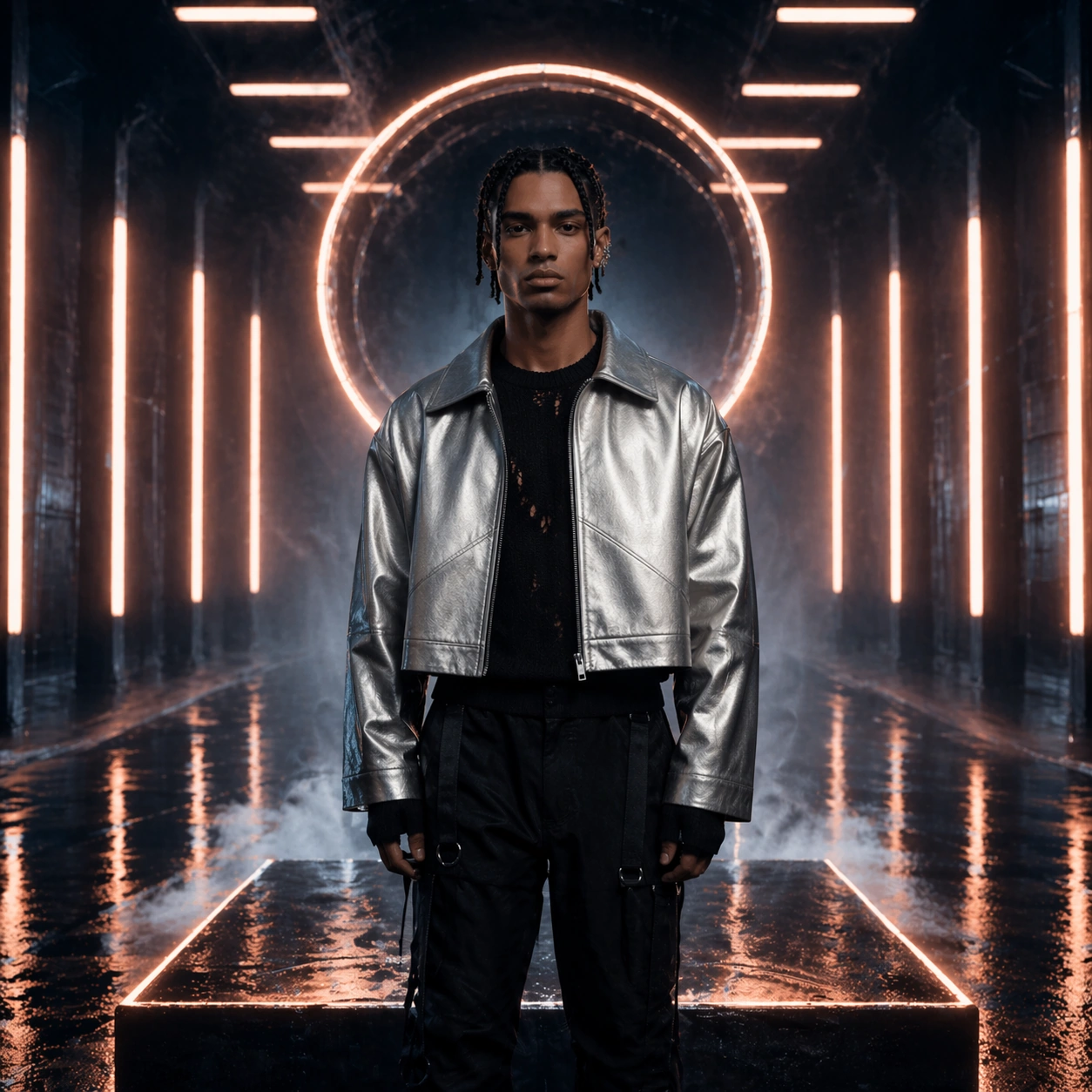
Example generated from “Album Cover And Single Rollout System — EP Strobe Platform”
GPT Image 2en

Scene: A square EP-cover composition unfolding on a glossy transit-platform set with long vanishing floor reflections, suspended light bars, and cool vapor hanging near the ground. The shot stays centered and controlled, but the background geometry feels more architectural and rhythmic than the original street setup. Subject: Preserve the exact same performer from the reference model, including face shape, braided hair base, body proportions, and jacket silhouette. The musician stands on a slightly raised platform between strobing vertical light bars, with one hand relaxed at the side and the same composed stage presence carried forward into a more architectural release mood. Important details: The campaign must still read as one owned visual system rather than a disconnected poster. Keep the same ring-derived motif language, wet reflections, and moody cobalt-to-ember palette, but let the environment shift into platform geometry and pulse-light repetition. This should feel like an EP branch of the same rollout, maintaining exact identity continuity while widening the world-building. Use case: Album Rollout series study 3/9 for the Album Cover and Single Rollout System Prompt Atlas theme. Constraints: No readable text, no watermark, no logos, preserve exact 1:1 aspect ratio, preserve the exact reference face, hair base, and body proportions; no train vehicles, no readable station graphics, no hard costume change, no fisheye distortion, no cluttered background extras

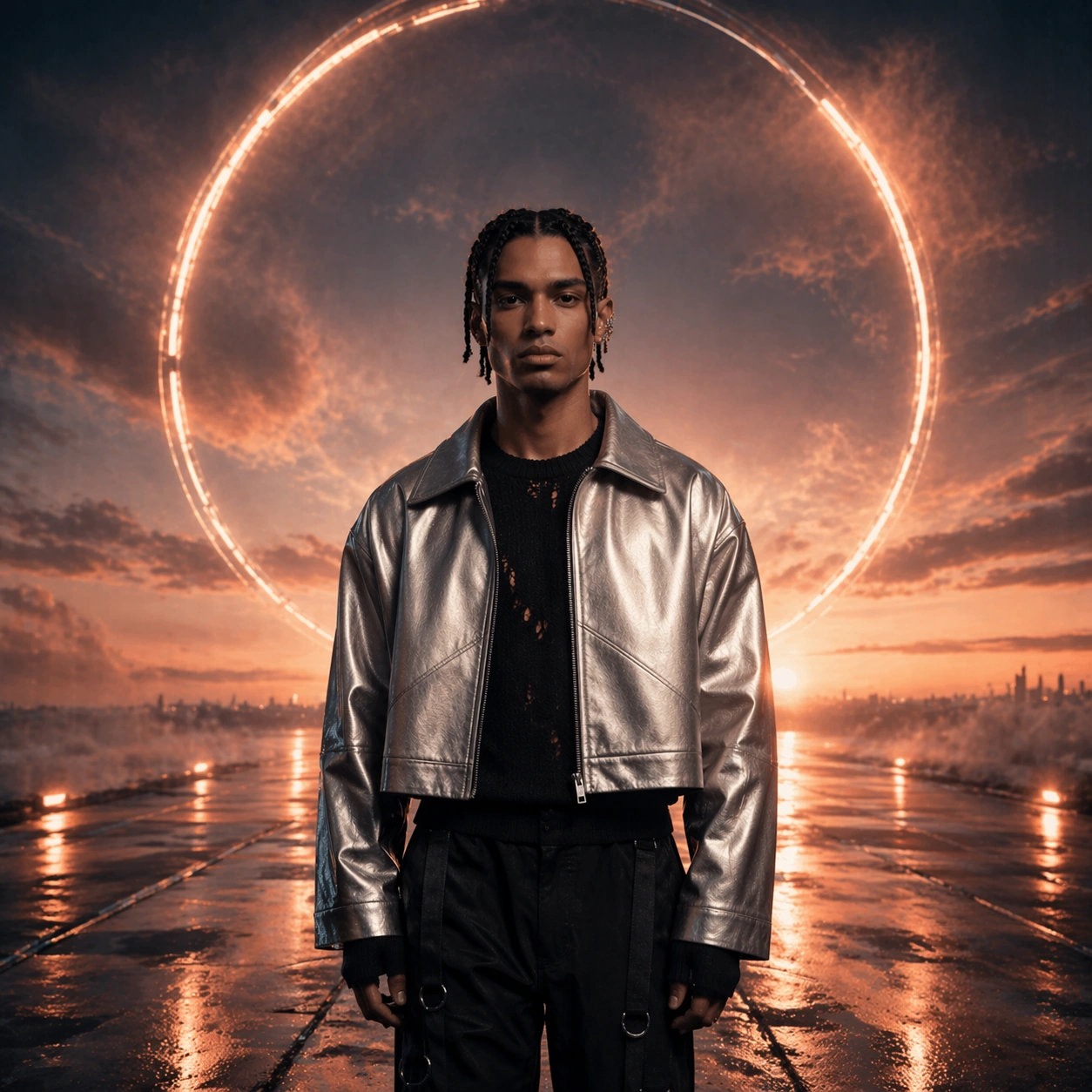
Example generated from “Album Cover And Single Rollout System — Deluxe Dawn Vinyl”
GPT Image 2en

Scene: A square deluxe-edition cover staged at blue-hour tipping into dawn, with the same reflective ground plane now catching warmer copper light, softened fog, and a calmer horizon glow. The frame should feel more expansive and collectible, as if closing the release cycle with a premium edition rather than a debut drop. Subject: Preserve the same performer from the reference image with exact face structure, hair base, body proportions, and jacket silhouette. The musician remains centered and composed, but the lighting wraps more softly around the face and shoulders, while the ring motif opens wider and feels more ceremonial behind the figure. Important details: Maintain the same campaign grammar established by the master cover: restrained symbolism, tactile reflections, and realistic atmospheric polish. The deluxe variation should not invent a new identity; it should feel like the final, elevated chapter of the same release system, with warmer dawn color, richer metallic surfaces, and extra breathing room that suggests a collector release without relying on readable typography. Use case: Album Rollout series study 4/9 for the Album Cover and Single Rollout System Prompt Atlas theme. Constraints: No readable text, no watermark, no logos, preserve exact 1:1 aspect ratio, preserve the exact reference face, hair base, and body proportions; no bright sunrise sky, no extra characters, no vinyl record prop covering the body, no random graphic stickers, no flat studio backdrop

Example generated from “Album Cover And Single Rollout System — Streaming Tile Crop”
GPT Image 2en

Scene: A square promotional tile designed for tiny-size visibility, using a dark field, one strong figure silhouette, sharp edge lighting, and a bold circular glow tucked behind the subject. The frame should read instantly even at small scale, with large shape contrast and a disciplined balance between dead space and focal energy. Subject: A lone invented musician appears as a reduced crop from shoulder to crown, framed by a halo-like light disc and slices of reflective rain. The image should feel like the kind of release-week asset a streaming service would use for a profile row, but without any platform branding or readable metadata. Important details: Prioritize thumbnail legibility, emotional clarity, and campaign coherence. The subject must feel music-industry credible, not generic fashion portraiture. Keep the palette tightly controlled, let the circular light carry the recognition cue, and use one or two high-contrast reflections to imply motion and sound. The composition should clearly reserve space for future overlays without rendering actual words. Use case: Album Rollout single study 6/9 for the Album Cover and Single Rollout System Prompt Atlas theme. Constraints: No readable text, no watermark, no logos, preserve exact 1:1 aspect ratio, no extra people, no detailed city skyline, no collage border, no readable interface text, no busy background texture that breaks small-size clarity

Example generated from “Album Cover And Single Rollout System — Announcement Poster Wall”
GPT Image 2en

Scene: A square documentary-style photograph of an urban wall layered with multiple matching release posters, shot straight-on so the poster grid fills most of the frame. Torn paper edges, damp concrete, and faint night reflections should make the scene tactile, while the posters themselves share one coherent visual identity. Subject: Each poster shows the same invented music-campaign language: one central performer silhouette, circular backlight, and a moody rain-dark palette. The posters should look freshly pasted and slightly wrinkled, creating the sense of a real street rollout for a new record while still avoiding any readable band names or dates. Important details: The point is not gritty chaos but credible campaign deployment. Keep the poster family consistent in crop logic and symbol system, let the environment feel damp and urban, and use repetition to sell ownership. The poster faces can be partially obscured by tears or overlaps, but the release identity must still read clearly from shape, tone, and motif. Use case: Album Rollout single study 7/9 for the Album Cover and Single Rollout System Prompt Atlas theme. Constraints: No readable text, no watermark, no logos, preserve exact 1:1 aspect ratio, no brands on nearby walls, no pedestrians stealing focus, no graffiti text, no daylight, no random unrelated posters in the composition

Example generated from “Album Cover And Single Rollout System — Cassette Flatlay Study”
GPT Image 2en

Scene: A square top-down flat lay on smoked acrylic with a transparent cassette, folded insert cards, metallic foil strip, and soft pooled light that creates moody reflections around the edges. The materials should feel physically believable, with subtle dust, fingerprints, and packaging creases that add realism. Subject: The subject is a complete collector-style analog package for an invented record, organized with careful spacing and a few symbolic visual cues borrowed from the release world: concentric circles, diagonal light cuts, and a cobalt-ember palette. The packaging should feel premium and contemporary rather than nostalgic costume play. Important details: Use material realism and layout discipline to imply a music release with tangible desirability. Every object should look intentionally designed for the same campaign family, but there should be no readable track list or label copy. Favor translucent plastics, reflective foil, matte card stock, and small metallic hardware that catches light in a restrained way. Use case: Album Rollout single study 8/9 for the Album Cover and Single Rollout System Prompt Atlas theme. Constraints: No readable text, no watermark, no logos, preserve exact 1:1 aspect ratio, no vinyl record dominating the frame, no shipping box, no consumer electronics brand cues, no fake price sticker, no clutter outside the packaging system

Example generated from “Album Cover And Single Rollout System — Sticker Sheet Promo”
GPT Image 2en

Scene: A square tabletop promo image showing a die-cut sticker sheet laid on a matte dark surface, lit with soft raking light so the cut contours and satin finish are visible. The sheet should feel contemporary and collectible, like a merch add-on included in a release bundle. Subject: The sticker sheet contains an invented performer portrait, concentric ring fragments, abstract rain slashes, metallic icons, and a few shape-only banners reserved for future metadata. Nothing should be readable, but the arrangement must still feel like a coherent release accessory tied to a specific music campaign. Important details: Keep the composition graphic, clean, and merch-ready. Use die-cut outlines, restrained foil accents, and strong spacing so each sticker reads individually while the whole sheet still feels curated. The imagery should translate the campaign language into smaller collectible units without turning into a childish cartoon product. Use case: Album Rollout single study 9/9 for the Album Cover and Single Rollout System Prompt Atlas theme. Constraints: No readable text, no watermark, no logos, preserve exact 1:1 aspect ratio, no playful mascot style, no handwriting, no notebook props, no rainbow clutter, no extra packaging outside the single sticker sheet

Example generated from “Alien Ecology Field Guide System — Ecology Atlas Anchor”
GPT Image 2en

Scene: Create a square field-guide plate for an alien ecosystem, mixing specimen staging, habitat fragments, and diagrammatic order into one clean composition. The image should feel like a premium scientific editorial board with careful spacing, controlled backgrounds, and enough environmental cues to imply a larger biosphere. Keep the camera or layout disciplined so the viewer can study relationships between species, organs, and habitat layers. Arrange a central habitat panel with specimen insets, root structures, glider organisms, and membrane pools all tied to one teal-violet wetland palette. Subject: Center the image on a strange but internally patterned ecology: organisms, growth forms, spores, membranes, roots, shells, or flying bodies that clearly belong to the same world. Their silhouettes and textures should feel novel, yet their anatomical logic, habitat relationship, and life-cycle clues should read as coherent rather than random fantasy. Establish the reference guide language through one primary flora form, one mid-scale fauna type, one micro-detail window, and one habitat cross-section. Important details: Use scientific realism without readable text. Unlabeled callout lines, scale markers, specimen windows, and sectional insets may appear, but the hierarchy must remain visual. Preserve a disciplined palette tied to one habitat so the package reads as a reusable guide system rather than a collection of unrelated creature paintings. The first image must define spacing, callout style, specimen framing, and the ecosystem color logic for the series. Resolve the anchor rules that later reference-dependent variants must inherit, especially the plate layout, habitat palette, anatomical callout grammar, and specimen scale cues. Use case: Alien Ecology series study 1/4, designed as a reusable core-system image for this topic. Constraints: No readable text, no watermark, no logos, preserve exact 1:1 aspect ratio, no humanoid monsters, no fantasy dragons, no horror gore, no readable labels, no text labels, no museum taxidermy staging.

Example generated from “Alien Ecology Field Guide System — Nocturnal Pollinator Cycle”
GPT Image 2en

Scene: Create a square field-guide plate for an alien ecosystem, mixing specimen staging, habitat fragments, and diagrammatic order into one clean composition. The image should feel like a premium scientific editorial board with careful spacing, controlled backgrounds, and enough environmental cues to imply a larger biosphere. Keep the camera or layout disciplined so the viewer can study relationships between species, organs, and habitat layers. Keep the same board structure but shift the palette into low-light blues and bioluminescent accents as blooms open across a night version of the habitat. Subject: Center the image on a strange but internally patterned ecology: organisms, growth forms, spores, membranes, roots, shells, or flying bodies that clearly belong to the same world. Their silhouettes and textures should feel novel, yet their anatomical logic, habitat relationship, and life-cycle clues should read as coherent rather than random fantasy. Preserve the reference specimen layout while replacing the central protagonist with winged pollinators, bloom organs, and reproductive transfer paths. Important details: Use scientific realism without readable text. Unlabeled callout lines, scale markers, specimen windows, and sectional insets may appear, but the hierarchy must remain visual. Preserve a disciplined palette tied to one habitat so the package reads as a reusable guide system rather than a collection of unrelated creature paintings. Night lighting should remain analytical and readable, using glow only to explain ecological function rather than create fantasy fireworks. Preserve the exact structural language established by the reference image, especially the plate layout, habitat palette, anatomical callout grammar, and specimen scale cues. Use case: Alien Ecology series study 2/4, designed as a reusable core-system image for this topic. Constraints: No readable text, no watermark, no logos, preserve exact 1:1 aspect ratio, no humanoid monsters, no fantasy dragons, no horror gore, no readable labels, no magical fairy swarm.

Example generated from “Alien Ecology Field Guide System — Predator Prey Chain”
GPT Image 2en

Scene: Create a square field-guide plate for an alien ecosystem, mixing specimen staging, habitat fragments, and diagrammatic order into one clean composition. The image should feel like a premium scientific editorial board with careful spacing, controlled backgrounds, and enough environmental cues to imply a larger biosphere. Keep the camera or layout disciplined so the viewer can study relationships between species, organs, and habitat layers. Build the same clean plate around one controlled chase sequence, habitat fragments, digestive anatomy cutaways, and terrain markers within the same biome. Subject: Center the image on a strange but internally patterned ecology: organisms, growth forms, spores, membranes, roots, shells, or flying bodies that clearly belong to the same world. Their silhouettes and textures should feel novel, yet their anatomical logic, habitat relationship, and life-cycle clues should read as coherent rather than random fantasy. Keep specimen windows and habitat grammar consistent while revealing how larger hunters, smaller grazers, and plant defenses lock together. Important details: Use scientific realism without readable text. Unlabeled callout lines, scale markers, specimen windows, and sectional insets may appear, but the hierarchy must remain visual. Preserve a disciplined palette tied to one habitat so the package reads as a reusable guide system rather than a collection of unrelated creature paintings. The board should feel ecological rather than violent, using composition to explain relationships instead of action spectacle. Preserve the exact structural language established by the reference image, especially the plate layout, habitat palette, anatomical callout grammar, and specimen scale cues. Use case: Alien Ecology series study 3/4, designed as a reusable core-system image for this topic. Constraints: No readable text, no watermark, no logos, preserve exact 1:1 aspect ratio, no humanoid monsters, no fantasy dragons, no horror gore, no readable labels, no gore, no monster battle framing.

Example generated from “Alien Ecology Field Guide System — Seasonal Mutation Atlas”
GPT Image 2en

Scene: Create a square field-guide plate for an alien ecosystem, mixing specimen staging, habitat fragments, and diagrammatic order into one clean composition. The image should feel like a premium scientific editorial board with careful spacing, controlled backgrounds, and enough environmental cues to imply a larger biosphere. Keep the camera or layout disciplined so the viewer can study relationships between species, organs, and habitat layers. Retain the same overall layout but divide the square into seasonal habitat states, with specimen windows and growth stages orbiting a stable central terrain profile. Subject: Center the image on a strange but internally patterned ecology: organisms, growth forms, spores, membranes, roots, shells, or flying bodies that clearly belong to the same world. Their silhouettes and textures should feel novel, yet their anatomical logic, habitat relationship, and life-cycle clues should read as coherent rather than random fantasy. Preserve the anchor board grammar while showing how organisms alter color, membrane density, or body shape across environmental cycles. Important details: Use scientific realism without readable text. Unlabeled callout lines, scale markers, specimen windows, and sectional insets may appear, but the hierarchy must remain visual. Preserve a disciplined palette tied to one habitat so the package reads as a reusable guide system rather than a collection of unrelated creature paintings. Variation should feel patterned and evolutionary, not random, with each seasonal change clearly tied back to climate or resource cues. Preserve the exact structural language established by the reference image, especially the plate layout, habitat palette, anatomical callout grammar, and specimen scale cues. Use case: Alien Ecology series study 4/4, designed as a reusable core-system image for this topic. Constraints: No readable text, no watermark, no logos, preserve exact 1:1 aspect ratio, no humanoid monsters, no fantasy dragons, no horror gore, no readable labels, no rainbow chaos, no magical transformation tropes.

Example generated from “Alien Ecology Field Guide System — Basin Microbiome Plate”
GPT Image 2en

Scene: Design a square alien-naturalist board that could live inside a field guide, exhibition panel, or worldbuilding deck. Treat the background and layout as part of the scientific storytelling, not as empty filler. Compose a board where one mineral basin is shown at macro scale and linked visually to translucent microbial colonies, membrane foams, and sediment lattices. Subject: Show one ecosystem component clearly enough to study: species, colony, migration route, terrain patch, or microbiome structure. The organisms should feel biologically integrated with their environment and each other. The main read should be about pattern, growth, and chemical exchange across scales rather than one heroic creature. Important details: Favor specimen clarity, habitat context, and pattern logic over spectacle. Even the strangest form should imply believable growth, feeding, protection, or movement strategies. Use precise textures and disciplined callout hierarchy so the image feels scientific and surprising at once. Preserve biological cause and effect so each ecology study reads as a system rather than an arbitrary monster illustration. Use case: Alien Ecology single study 1/5, designed as a self-contained support image for this topic. Constraints: No readable text, no watermark, no logos, preserve exact 1:1 aspect ratio, no encyclopedic text blocks, no cute cartoon mascots, no violent attack poses, no generic Earth animals with minor edits, no horror petri-dish look.
Example generated from “Alien Ecology Field Guide System — Ridge Herbivore Profile”
GPT Image 2en

Scene: Design a square alien-naturalist board that could live inside a field guide, exhibition panel, or worldbuilding deck. Treat the background and layout as part of the scientific storytelling, not as empty filler. Show a graceful herbivore in profile with hoof analogs, thermal sails, digestive inset views, and ridge vegetation windows surrounding the main specimen. Subject: Show one ecosystem component clearly enough to study: species, colony, migration route, terrain patch, or microbiome structure. The organisms should feel biologically integrated with their environment and each other. The animal should feel plausible for the terrain, diet, and climate, with anatomy and posture tied directly to the habitat. Important details: Favor specimen clarity, habitat context, and pattern logic over spectacle. Even the strangest form should imply believable growth, feeding, protection, or movement strategies. Let adaptation logic lead the design instead of decorative strangeness. Preserve biological cause and effect so each ecology study reads as a system rather than an arbitrary monster illustration. Use case: Alien Ecology single study 2/5, designed as a self-contained support image for this topic. Constraints: No readable text, no watermark, no logos, preserve exact 1:1 aspect ratio, no encyclopedic text blocks, no cute cartoon mascots, no violent attack poses, no generic Earth animals with minor edits, no dinosaur remix clichés.
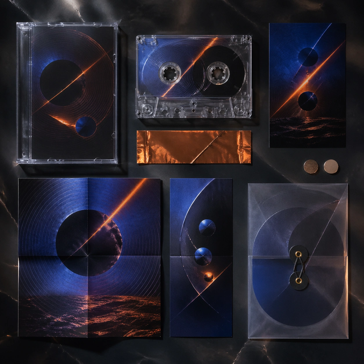
Example generated from “Alien Ecology Field Guide System — Bloom Season Spire Forest”
GPT Image 2en

Scene: Design a square alien-naturalist board that could live inside a field guide, exhibition panel, or worldbuilding deck. Treat the background and layout as part of the scientific storytelling, not as empty filler. Design a square habitat atlas where giant spire plants bloom across a landscape panel while seed dispersal and root symbiosis appear in supporting specimen windows. Subject: Show one ecosystem component clearly enough to study: species, colony, migration route, terrain patch, or microbiome structure. The organisms should feel biologically integrated with their environment and each other. Treat the forest as an ecological machine with linked species, airflow, and nutrient exchange. Important details: Favor specimen clarity, habitat context, and pattern logic over spectacle. Even the strangest form should imply believable growth, feeding, protection, or movement strategies. The board should reward inspection through layered biological relationships rather than pure scenic spectacle. Preserve biological cause and effect so each ecology study reads as a system rather than an arbitrary monster illustration. Use case: Alien Ecology single study 3/5, designed as a self-contained support image for this topic. Constraints: No readable text, no watermark, no logos, preserve exact 1:1 aspect ratio, no encyclopedic text blocks, no cute cartoon mascots, no violent attack poses, no generic Earth animals with minor edits, no fantasy mushroom kingdom tropes.
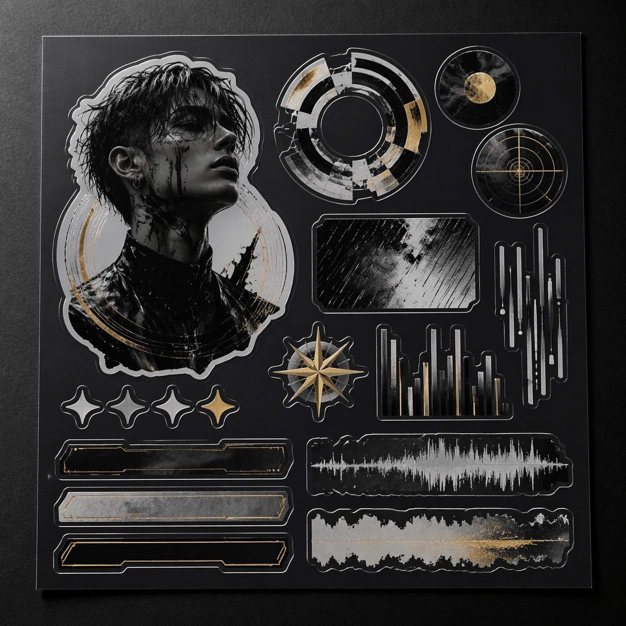
Example generated from “Alien Ecology Field Guide System — Cave Bioluminescent Brood”
GPT Image 2en

Scene: Design a square alien-naturalist board that could live inside a field guide, exhibition panel, or worldbuilding deck. Treat the background and layout as part of the scientific storytelling, not as empty filler. Compose a dim cave system with brood chambers, reflective mineral walls, and structured light organs punctuating the darkness. Subject: Show one ecosystem component clearly enough to study: species, colony, migration route, terrain patch, or microbiome structure. The organisms should feel biologically integrated with their environment and each other. Focus on colony behavior, protective anatomy, and habitat adaptation rather than monster menace. Important details: Favor specimen clarity, habitat context, and pattern logic over spectacle. Even the strangest form should imply believable growth, feeding, protection, or movement strategies. Keep all glow functional and measured so the image remains field-guide clear. Preserve biological cause and effect so each ecology study reads as a system rather than an arbitrary monster illustration. Use case: Alien Ecology single study 4/5, designed as a self-contained support image for this topic. Constraints: No readable text, no watermark, no logos, preserve exact 1:1 aspect ratio, no encyclopedic text blocks, no cute cartoon mascots, no violent attack poses, no generic Earth animals with minor edits, no horror cave crawler mood.
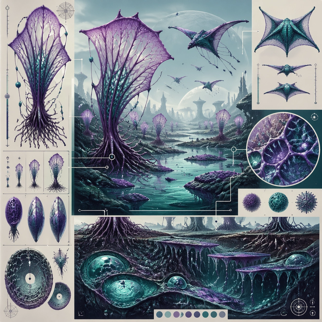
Example generated from “Alien Ecology Field Guide System — Aerial Migration Chart”
GPT Image 2en

Scene: Design a square alien-naturalist board that could live inside a field guide, exhibition panel, or worldbuilding deck. Treat the background and layout as part of the scientific storytelling, not as empty filler. Build a square hybrid between map and specimen plate, using atmospheric layers, migration arcs, stopover habitats, and wing morphology windows. Subject: Show one ecosystem component clearly enough to study: species, colony, migration route, terrain patch, or microbiome structure. The organisms should feel biologically integrated with their environment and each other. The main read should explain movement ecology and route logic rather than one isolated animal portrait. Important details: Favor specimen clarity, habitat context, and pattern logic over spectacle. Even the strangest form should imply believable growth, feeding, protection, or movement strategies. Make route hierarchy and body adaptation equally legible so the board feels like a real naturalist tool. Preserve biological cause and effect so each ecology study reads as a system rather than an arbitrary monster illustration. Use case: Alien Ecology single study 5/5, designed as a self-contained support image for this topic. Constraints: No readable text, no watermark, no logos, preserve exact 1:1 aspect ratio, no encyclopedic text blocks, no cute cartoon mascots, no violent attack poses, no generic Earth animals with minor edits, no readable legend text.
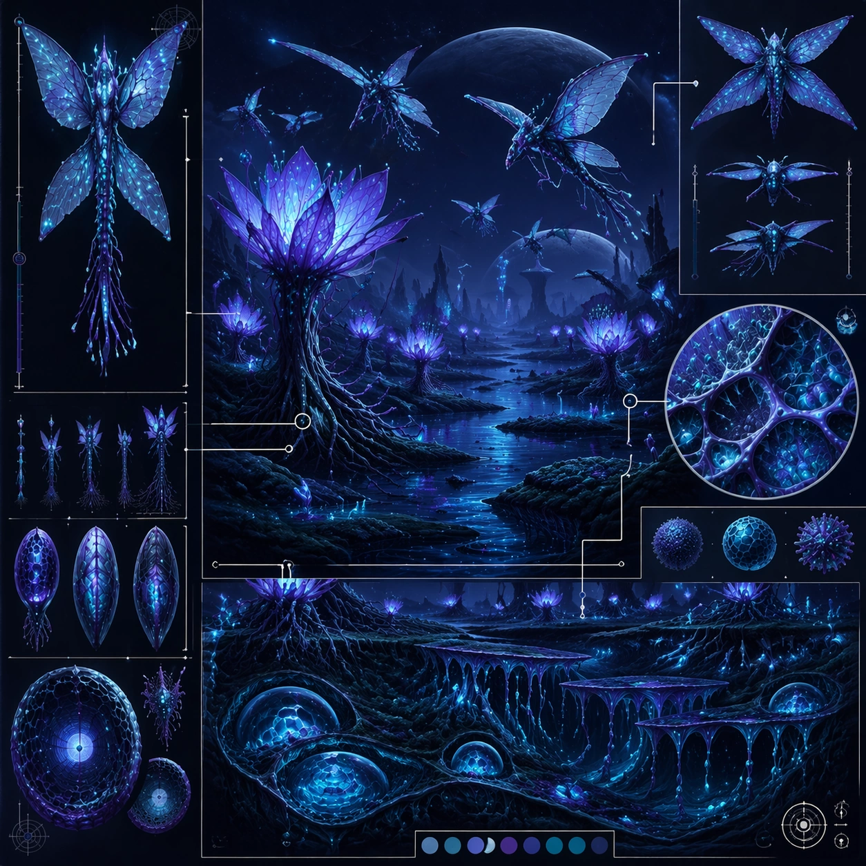
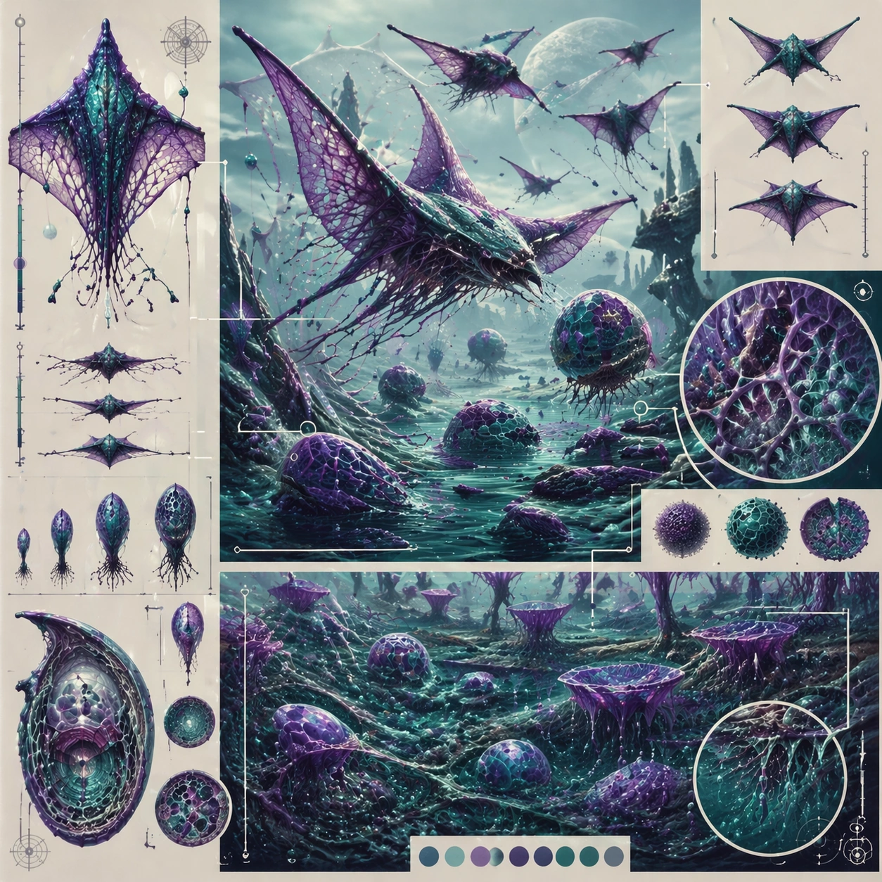
Example generated from “Analytics Storytelling Dashboard Views — Reference Anchor”
GPT Image 2en

Scene: Create a square reference image for Analytics Storytelling Dashboard Views. Build a reference anchor establishing the core system with a premium, production-ready finish. Use a polished modular board or campaign surface with clean spacing, premium game-UI finish, and clear focal hierarchy. The composition should feel intentional, clean, and reusable for gallery, research, campaign, or internal handoff contexts. Lighting must support readability first, with the main forms clearly separated from the background and enough breathing room for the system to stay legible at both hero scale and thumbnail scale. Subject: Center a coherent original game-art system built for premium production and marketing surfaces. For this image, focus on reference anchor. Keep the same system logic stable across screenshots, cards, banners, and overview boards. This image is the canonical anchor that later series images must follow. The viewer should immediately understand what role this surface plays inside a cohesive game-production asset pack. Important details: Lock framing, icon grammar, palette blocking, and surface hierarchy so the kit feels production-ready and consistent. Preserve the core silhouette, framing language, and material logic from the reference image while each variation changes function. Keep materials believable, edge hierarchy disciplined, and the visual language consistent with Analytics Views. Use abstract interface blocks or diagram accents when helpful, but avoid any readable language. The final result should feel like a deliberate production asset rather than a random illustration. Use case: Analytics Storytelling Dashboard Views series study 1/9, designed as reference anchor within a cohesive asset pack. Constraints: No readable text, no watermark, no logos, preserve exact 1:1 aspect ratio, no unrelated objects, no broken visual hierarchy, no malformed anatomy or broken perspective, no random decorative clutter.

Example generated from “Analytics Storytelling Dashboard Views — Variant One”
GPT Image 2en

Scene: Create a square dependent image for Analytics Storytelling Dashboard Views. Build a first controlled variation in the same system with a premium, production-ready finish. Use a polished modular board or campaign surface with clean spacing, premium game-UI finish, and clear focal hierarchy. The composition should feel intentional, clean, and reusable for gallery, research, campaign, or internal handoff contexts. Lighting must support readability first, with the main forms clearly separated from the background and enough breathing room for the system to stay legible at both hero scale and thumbnail scale. Subject: Center a coherent original game-art system built for premium production and marketing surfaces. For this image, focus on the intended support surface. Keep the same system logic stable across screenshots, cards, banners, and overview boards. Preserve exact identity or system logic from the reference image while changing only the intended variation axis. The viewer should immediately understand what role this surface plays inside a cohesive game-production asset pack. Important details: Lock framing, icon grammar, palette blocking, and surface hierarchy so the kit feels production-ready and consistent. Preserve the core silhouette, framing language, and material logic from the reference image while each variation changes function. Keep materials believable, edge hierarchy disciplined, and the visual language consistent with Analytics Views. Use abstract interface blocks or diagram accents when helpful, but avoid any readable language. The final result should feel like a deliberate production asset rather than a random illustration. Use case: Analytics Storytelling Dashboard Views series study 2/9, designed as variant one within a cohesive asset pack. Constraints: No readable text, no watermark, no logos, preserve exact 1:1 aspect ratio, no unrelated objects, no broken visual hierarchy, no malformed anatomy or broken perspective, no random decorative clutter.