原文
GPT Image 2 · en
Scene:
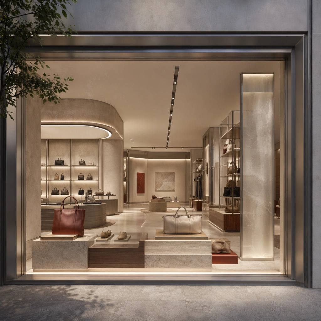
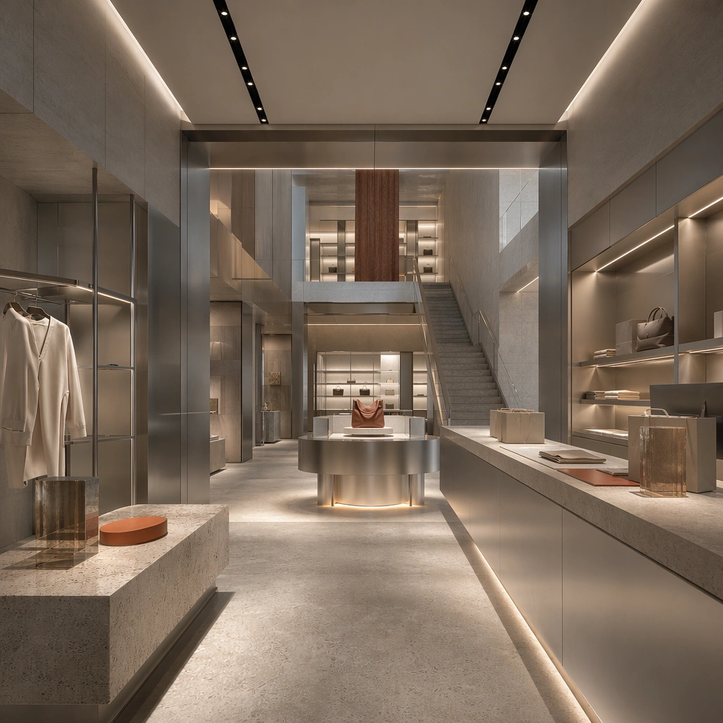
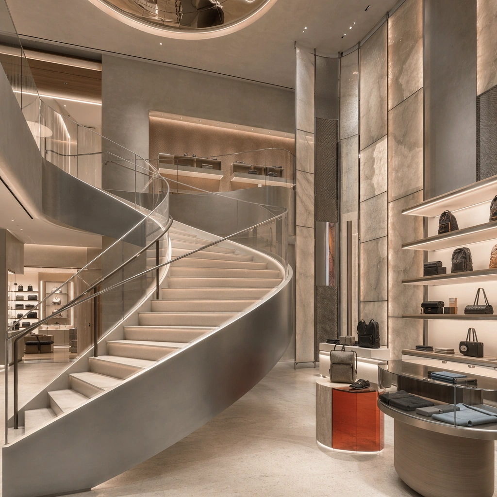
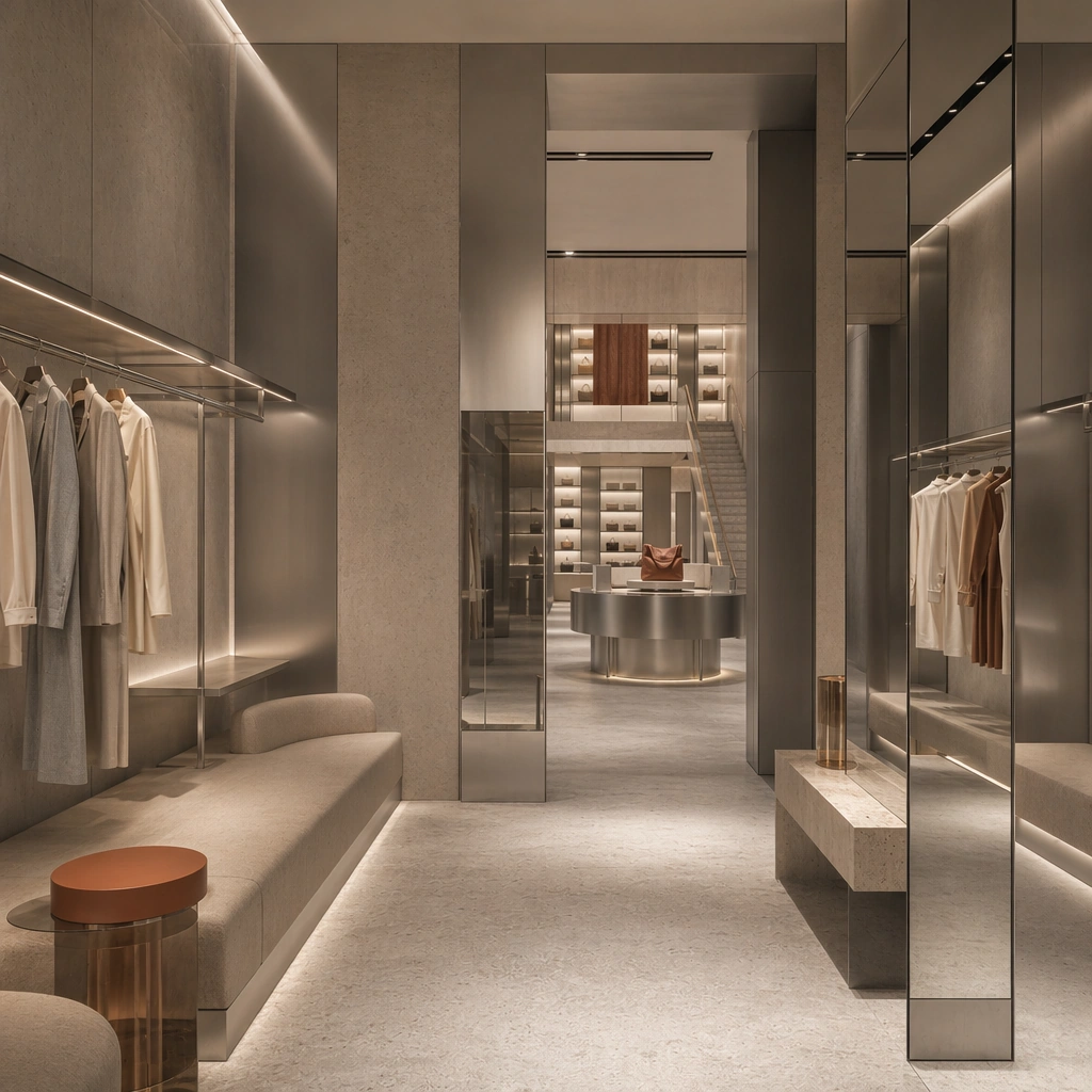
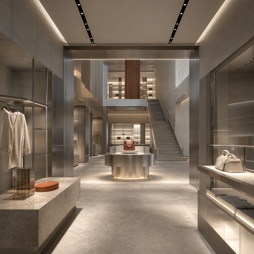
Create a square architectural reference still for Retail Flagship Store Experience System. Use a wide view from the entrance that reveals the main display axis and stair or volume changes and treat the frame like a premium interior or architecture editorial photograph with disciplined perspective, readable depth from foreground to background, and enough negative space for the spatial hierarchy to breathe. Light the scene so circulation, hero display, and immersive branded retail feel immediate, using soft concrete gray, brushed silver, warm white light, muted sand stone, and one restrained accent tone as the governing tonal range. The composition must read as a high-end commercial image that could sit inside retail launch decks, store-design reviews, campaign stills, and experiential pitch boards.

Subject:
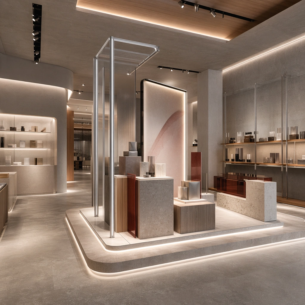
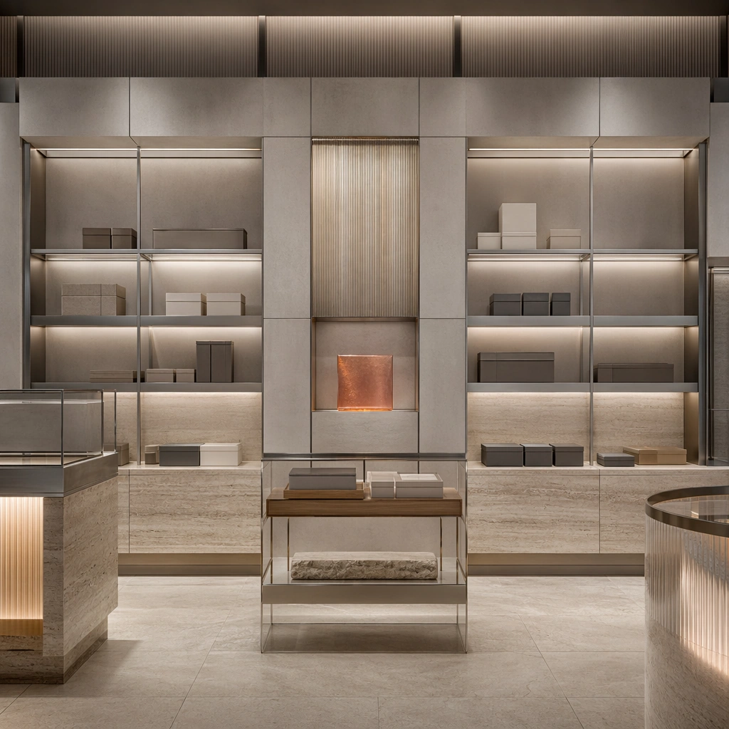
Show a premium flagship retail interior with sculpted display fixtures, integrated light bands, neutral stone floors, brushed aluminum rails, translucent resin accents, and an immersive circulation plan. Center the flagship’s spatial hook, hero product fixture, and overall customer journey. This is the canonical reference image for the package, so the major proportions, material transitions, fixture families, and circulation logic must feel highly specific and internally coherent rather than generic luxury styling. Let the viewer understand how the space is organized within a single glance, with foreground anchors, a clear middle zone, and a resolved background termination.

Important details:
Lock the hero fixture shapes, integrated lighting bands, resin accents, circulation loop, and premium product-display grammar. Surfaces should feel tactile and believable: stone veining must stay plausible, metals should have disciplined reflectance, fabrics should show natural weight, and concealed lighting should shape the volume instead of flattening it. Use abstract signage, menu, label, or caption zones only as unreadable graphic hints. The image should feel practical for downstream design reviews and polished enough for public-facing campaign use.

Use case:
Retail Flagship Store Experience System series study 1/9, establishing the canonical store identity for the package.

Constraints:
No readable text, no watermark, no logos, preserve exact 1:1 aspect ratio, no crowds, no cash-register clutter, no readable price tags, no seasonal sale props, no random mannequins everywhere, no giant storefront text.
使い方
- パラメータを含む元のプロンプト全体をコピーします。
- 被写体、文字、構図を自分の要件に置き換えます。
- 対応する外部ツールで使用し、利用条件と結果を確認します。
開始前の確認
- 参考画像の要否を確認してください。互換モデルの表示は、そのモデルでの生成実績を意味しません。
- 名前、数値、画像内の文字を確認します。モデルの版で結果は変わります。