原文
GPT Image 2 · en
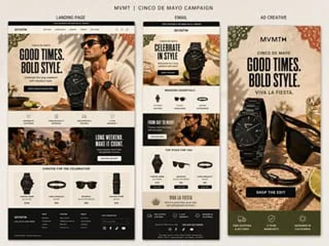
Create a premium presentation-style campaign board for MVMT’s Cinco de Mayo campaign on a soft warm neutral background.

At the top, add the title:
“MVMT | CINCO DE MAYO CAMPAIGN”

Below it, show three clearly labeled vertical panels side by side with subtle shadows:
“LANDING PAGE”
“EMAIL”
“AD CREATIVE”

Overall style:
Clean, premium, masculine-leaning, modern DTC design. The image should feel like a polished creative review board, not a collage. All three panels should clearly belong to the same campaign, with shared typography, colors, product styling, and seasonal details.

Use a warm, elevated palette:
cream, sand, stone, black, charcoal, dark olive, terracotta, muted green, and warm golden accents.

Cinco de Mayo direction:
Tasteful and refined, not cheesy. Use subtle festive touches like papel picado-inspired accents, citrus, warm stone textures, celebratory drinks, and sunlit lifestyle styling.

Shared headline direction:
“GOOD TIMES. BOLD STYLE.”
Optional secondary line:
“VIVA LA FIESTA.”

Panel 1 — Landing Page:
Create the widest and most detailed panel as a tall desktop ecommerce landing page.
Include:
- MVMT site header
- hero with bold headline
- premium black watch as hero product
- stylish male lifestyle model
- CTA button
- icon/value prop row
- supporting lifestyle banner
- curated product grid
- realistic footer

Panel 2 — Email:
Create a slimmer tall ecommerce email mockup.
Include:
- promo bar
- MVMT logo and header
- hero section with same campaign art direction
- curated category or product row
- supporting lifestyle block
- featured products section
- compact footer

Panel 3 — Ad Creative:
Create a bold vertical Facebook ad.
Include:
- strong headline
- premium product composition with black watch, sunglasses, and bracelet
- citrus and celebratory props
- CTA button
- compact benefit strip at the bottom with messages like:
“FREE SHIPPING & RETURNS”
“2 YEAR WARRANTY”
“DESIGNED IN CALIFORNIA”

Important:
- landing page should feel broader and more layered
- email should feel modular and structured
- ad should feel bold, simple, and conversion-focused
- labels above each panel should be clearly visible
- text should be mostly legible
- everything should feel premium, realistic, and cohesive

Avoid:
cheesy fiesta graphics, bright rainbow colors, clutter, generic templates, messy collage styling, or cartoonish holiday visuals.

Output:
A highly realistic single-image campaign board showing a landing page, email, and ad creative for MVMT’s Cinco de Mayo campaign, all clearly labeled and designed as one cohesive system.
使い方
- パラメータを含む元のプロンプト全体をコピーします。
- 被写体、文字、構図を自分の要件に置き換えます。
- 対応する外部ツールで使用し、利用条件と結果を確認します。
開始前の確認
- 参考画像の要否を確認してください。互換モデルの表示は、そのモデルでの生成実績を意味しません。
- 名前、数値、画像内の文字を確認します。モデルの版で結果は変わります。