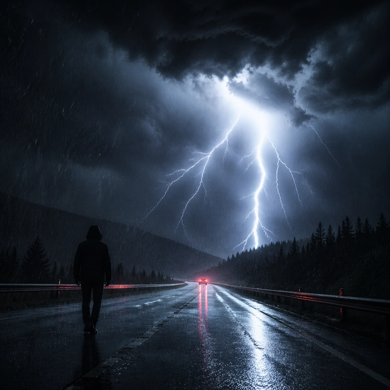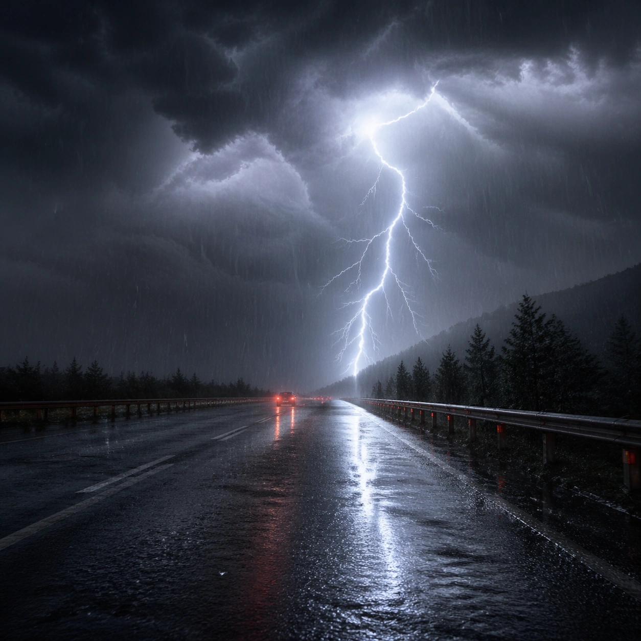
プロンプト · 創作の探索

プロンプトギャラリー

実際のプロンプトと生成例を探索。次の創作に役立つヒントを見つけ、全文を無料でコピーできます。

生成例
10,974
モデル
17
出典
1277
10,974 件のプロンプト例 · ページ 10 / 229
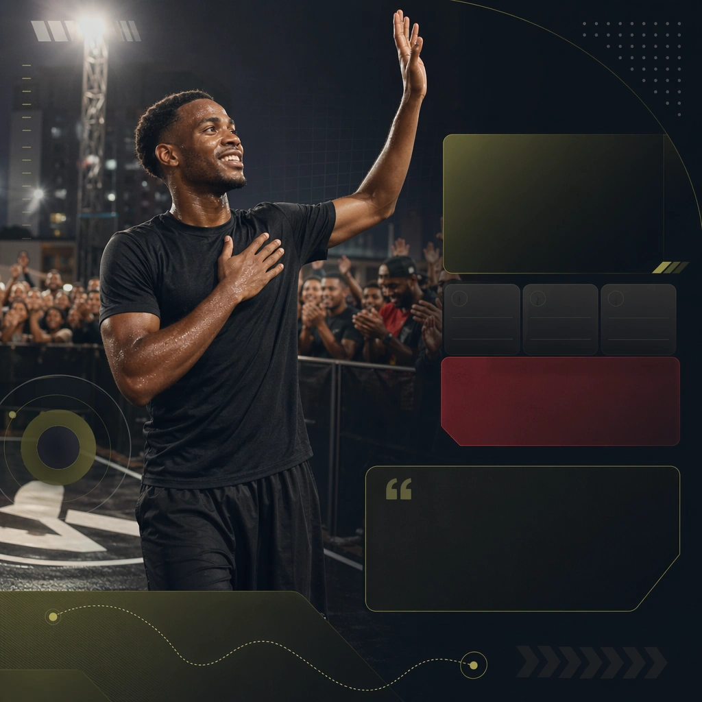
Example generated from “Team Brand And Fan Social Rollout — Community Matchday Recap”
GPT Image 2en

Scene: Create a square community recap tile for Team Rollout, using team-social storytelling driven by supporter texture, urban club identity, and brandless sports-fashion polish. The composition should read as a practical, production-ready sports or fitness surface with a clear hierarchy, premium lighting, and obvious commercial intent. Keep the environment specific enough to feel real, but leave enough control in the layout for non-readable information modules, campaign blocks, or visualized metrics. Aim for a finish that works for a brand, club, app, academy, or event operator. Subject: Build the image around athlete acknowledging supporters. The subject should be original, believable, and free of any real-brand or celebrity cues. Use realistic apparel, safe body mechanics when movement is visible, and environmental props that support the category without clutter. The subject must stay visually dominant so the design still works as a communication asset rather than a pure scene study. Important details: The mood should read as shared pride. Treat layout, light, and supporting graphic structure as part of one polished delivery surface. Any schedule blocks, metric panels, quote zones, badges, or path diagrams must stay abstract and non-readable. Prioritize usefulness, clarity, and category truth over spectacle. The image should feel distinct from the series package while still belonging naturally to the same topic and business use case. Use case: Team Rollout single study 8/9, an independent rollout surface for the topic. Constraints: No readable text, no watermark, no logos, preserve exact 1:1 aspect ratio, no brand marks, no public-figure resemblance, no generic stock layout, no cluttered UI imitation, no accidental copyrighted insignia.
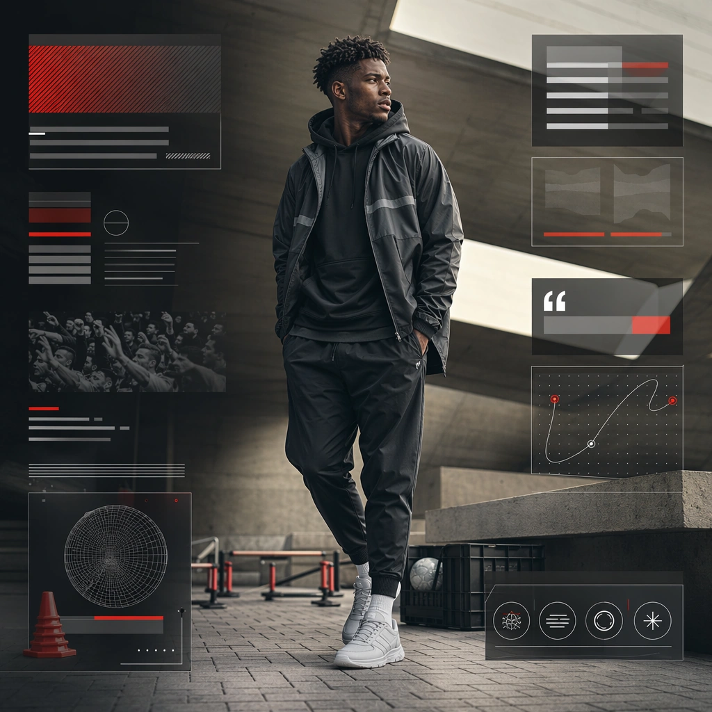

Example generated from “Team Brand And Fan Social Rollout — Street Flag Fashion Board”
GPT Image 2en

Scene: Create a square street-fashion team board for Team Rollout, using team-social storytelling driven by supporter texture, urban club identity, and brandless sports-fashion polish. The composition should read as a practical, production-ready sports or fitness surface with a clear hierarchy, premium lighting, and obvious commercial intent. Keep the environment specific enough to feel real, but leave enough control in the layout for non-readable information modules, campaign blocks, or visualized metrics. Aim for a finish that works for a brand, club, app, academy, or event operator. Subject: Build the image around supporter or athlete in layered outerwear. The subject should be original, believable, and free of any real-brand or celebrity cues. Use realistic apparel, safe body mechanics when movement is visible, and environmental props that support the category without clutter. The subject must stay visually dominant so the design still works as a communication asset rather than a pure scene study. Important details: The mood should read as urban style confidence. Treat layout, light, and supporting graphic structure as part of one polished delivery surface. Any schedule blocks, metric panels, quote zones, badges, or path diagrams must stay abstract and non-readable. Prioritize usefulness, clarity, and category truth over spectacle. The image should feel distinct from the series package while still belonging naturally to the same topic and business use case. Use case: Team Rollout single study 9/9, an independent rollout surface for the topic. Constraints: No readable text, no watermark, no logos, preserve exact 1:1 aspect ratio, no brand marks, no public-figure resemblance, no generic stock layout, no cluttered UI imitation, no accidental copyrighted insignia.

Example generated from “Teaser One Sheet Tension Poster — Reference Anchor”
GPT Image 2en

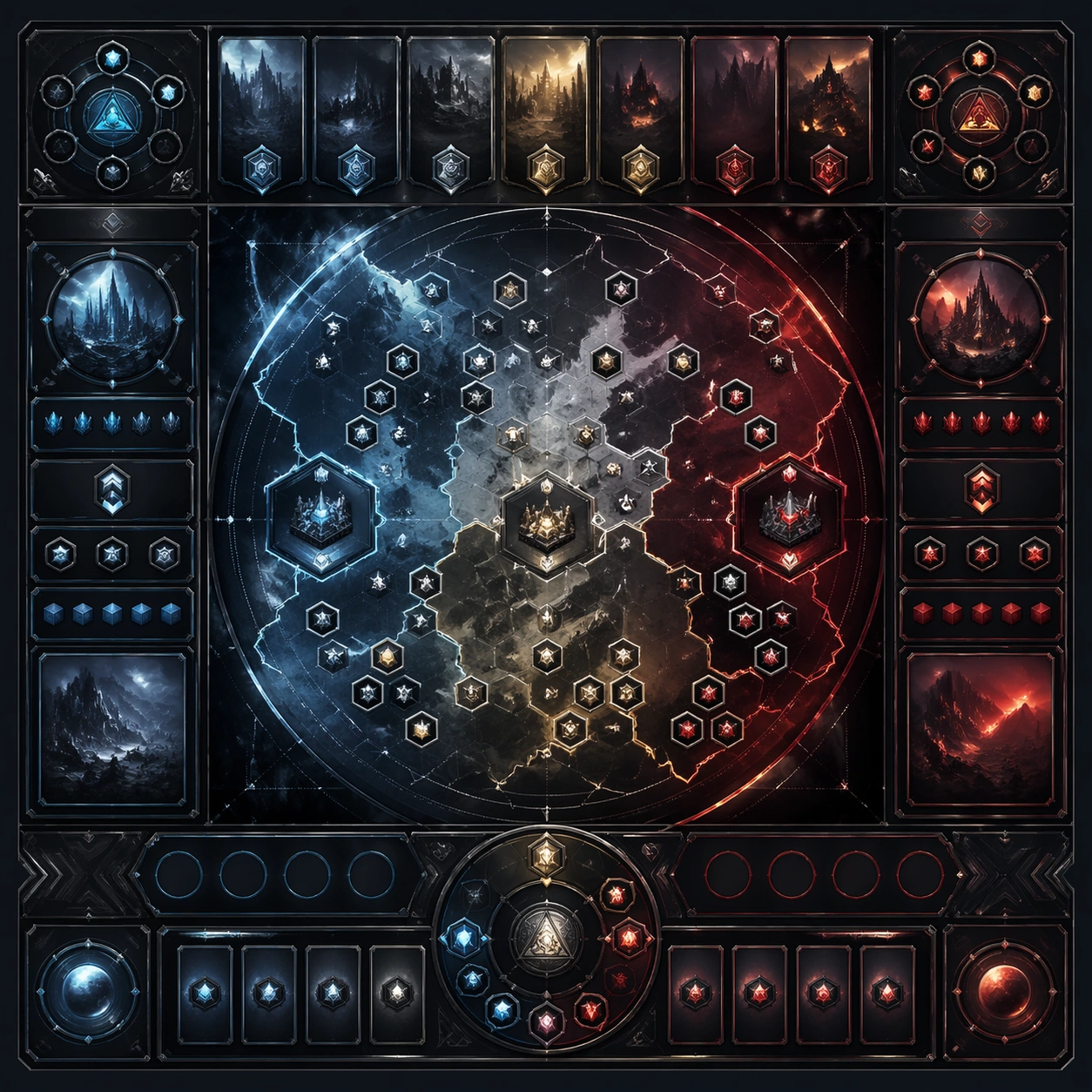
Scene: Create a square reference image for Teaser One-Sheet Tension Poster. Build a reference anchor establishing the core system with a premium, production-ready finish. Use a polished modular board or campaign surface with clean spacing, premium game-UI finish, and clear focal hierarchy. The composition should feel intentional, clean, and reusable for gallery, research, campaign, or internal handoff contexts. Lighting must support readability first, with the main forms clearly separated from the background and enough breathing room for the system to stay legible at both hero scale and thumbnail scale. Subject: Center a coherent original game-art system built for premium production and marketing surfaces. For this image, focus on reference anchor. Keep the same system logic stable across screenshots, cards, banners, and overview boards. This image is the canonical anchor that later series images must follow. The viewer should immediately understand what role this surface plays inside a cohesive game-production asset pack. Important details: Lock framing, icon grammar, palette blocking, and surface hierarchy so the kit feels production-ready and consistent. Preserve the core silhouette, framing language, and material logic from the reference image while each variation changes function. Keep materials believable, edge hierarchy disciplined, and the visual language consistent with Teaser Poster. Use abstract interface blocks or diagram accents when helpful, but avoid any readable language. The final result should feel like a deliberate production asset rather than a random illustration. Use case: Teaser One-Sheet Tension Poster series study 1/9, designed as reference anchor within a cohesive asset pack. Constraints: No readable text, no watermark, no logos, preserve exact 1:1 aspect ratio, no unrelated objects, no broken visual hierarchy, no malformed anatomy or broken perspective, no random decorative clutter.

Example generated from “Teaser One Sheet Tension Poster — Variant One”
GPT Image 2en

Scene: Create a square dependent image for Teaser One-Sheet Tension Poster. Build a first controlled variation in the same system with a premium, production-ready finish. Use a polished modular board or campaign surface with clean spacing, premium game-UI finish, and clear focal hierarchy. The composition should feel intentional, clean, and reusable for gallery, research, campaign, or internal handoff contexts. Lighting must support readability first, with the main forms clearly separated from the background and enough breathing room for the system to stay legible at both hero scale and thumbnail scale. Subject: Center a coherent original game-art system built for premium production and marketing surfaces. For this image, focus on the intended support surface. Keep the same system logic stable across screenshots, cards, banners, and overview boards. Preserve exact identity or system logic from the reference image while changing only the intended variation axis. The viewer should immediately understand what role this surface plays inside a cohesive game-production asset pack. Important details: Lock framing, icon grammar, palette blocking, and surface hierarchy so the kit feels production-ready and consistent. Preserve the core silhouette, framing language, and material logic from the reference image while each variation changes function. Keep materials believable, edge hierarchy disciplined, and the visual language consistent with Teaser Poster. Use abstract interface blocks or diagram accents when helpful, but avoid any readable language. The final result should feel like a deliberate production asset rather than a random illustration. Use case: Teaser One-Sheet Tension Poster series study 2/9, designed as variant one within a cohesive asset pack. Constraints: No readable text, no watermark, no logos, preserve exact 1:1 aspect ratio, no unrelated objects, no broken visual hierarchy, no malformed anatomy or broken perspective, no random decorative clutter.

Example generated from “Teaser One Sheet Tension Poster — Variant Two”
GPT Image 2en

Scene: Create a square dependent image for Teaser One-Sheet Tension Poster. Build a second controlled variation in the same system with a premium, production-ready finish. Use a polished modular board or campaign surface with clean spacing, premium game-UI finish, and clear focal hierarchy. The composition should feel intentional, clean, and reusable for gallery, research, campaign, or internal handoff contexts. Lighting must support readability first, with the main forms clearly separated from the background and enough breathing room for the system to stay legible at both hero scale and thumbnail scale. Subject: Center a coherent original game-art system built for premium production and marketing surfaces. For this image, focus on the intended support surface. Keep the same system logic stable across screenshots, cards, banners, and overview boards. Preserve exact identity or system logic from the reference image while changing only the intended variation axis. The viewer should immediately understand what role this surface plays inside a cohesive game-production asset pack. Important details: Lock framing, icon grammar, palette blocking, and surface hierarchy so the kit feels production-ready and consistent. Preserve the core silhouette, framing language, and material logic from the reference image while each variation changes function. Keep materials believable, edge hierarchy disciplined, and the visual language consistent with Teaser Poster. Use abstract interface blocks or diagram accents when helpful, but avoid any readable language. The final result should feel like a deliberate production asset rather than a random illustration. Use case: Teaser One-Sheet Tension Poster series study 3/9, designed as variant two within a cohesive asset pack. Constraints: No readable text, no watermark, no logos, preserve exact 1:1 aspect ratio, no unrelated objects, no broken visual hierarchy, no malformed anatomy or broken perspective, no random decorative clutter.

Example generated from “Teaser One Sheet Tension Poster — Variant Three”
GPT Image 2en

Scene: Create a square dependent image for Teaser One-Sheet Tension Poster. Build a third controlled variation in the same system with a premium, production-ready finish. Use a polished modular board or campaign surface with clean spacing, premium game-UI finish, and clear focal hierarchy. The composition should feel intentional, clean, and reusable for gallery, research, campaign, or internal handoff contexts. Lighting must support readability first, with the main forms clearly separated from the background and enough breathing room for the system to stay legible at both hero scale and thumbnail scale. Subject: Center a coherent original game-art system built for premium production and marketing surfaces. For this image, focus on the intended support surface. Keep the same system logic stable across screenshots, cards, banners, and overview boards. Preserve exact identity or system logic from the reference image while changing only the intended variation axis. The viewer should immediately understand what role this surface plays inside a cohesive game-production asset pack. Important details: Lock framing, icon grammar, palette blocking, and surface hierarchy so the kit feels production-ready and consistent. Preserve the core silhouette, framing language, and material logic from the reference image while each variation changes function. Keep materials believable, edge hierarchy disciplined, and the visual language consistent with Teaser Poster. Use abstract interface blocks or diagram accents when helpful, but avoid any readable language. The final result should feel like a deliberate production asset rather than a random illustration. Use case: Teaser One-Sheet Tension Poster series study 4/9, designed as variant three within a cohesive asset pack. Constraints: No readable text, no watermark, no logos, preserve exact 1:1 aspect ratio, no unrelated objects, no broken visual hierarchy, no malformed anatomy or broken perspective, no random decorative clutter.

Example generated from “Teaser One Sheet Tension Poster — Support One”
GPT Image 2en

Scene: Create a square standalone support image for Teaser One-Sheet Tension Poster. Build a support-surface study with a clear focal hierarchy and a finished professional surface. Use a polished modular board or campaign surface with clean spacing, premium game-UI finish, and clear focal hierarchy. The frame should feel self-contained and polished, with enough structure to explain the system even without the reference series, yet still obviously belonging to the same theme and production world. Subject: Show a coherent original game-art system built for premium production and marketing surfaces in a way that emphasizes the intended support surface. Keep the same system logic stable across screenshots, cards, banners, and overview boards. Even though this image is independent, the viewer should still recognize the same universe, same commercial logic, and same production intent as the core package. Important details: Lock framing, icon grammar, palette blocking, and surface hierarchy so the kit feels production-ready and consistent. Preserve the broader theme language through color, framing, material choices, and modular composition. Use clean panel rhythm, premium asset presentation, and believable detail density. The image should work equally well as a gallery study, research reference, and mock production deliverable. Use case: Teaser One-Sheet Tension Poster single study 5/9, exploring support one as a support surface. Constraints: No readable text, no watermark, no logos, preserve exact 1:1 aspect ratio, no unrelated objects, no broken visual hierarchy, no visual noise that obscures the main surface, no accidental brand resemblance.

Example generated from “Teaser One Sheet Tension Poster — Support Two”
GPT Image 2en

Scene: Create a square standalone support image for Teaser One-Sheet Tension Poster. Build a second support-surface study with a clear focal hierarchy and a finished professional surface. Use a polished modular board or campaign surface with clean spacing, premium game-UI finish, and clear focal hierarchy. The frame should feel self-contained and polished, with enough structure to explain the system even without the reference series, yet still obviously belonging to the same theme and production world. Subject: Show a coherent original game-art system built for premium production and marketing surfaces in a way that emphasizes the intended support surface. Keep the same system logic stable across screenshots, cards, banners, and overview boards. Even though this image is independent, the viewer should still recognize the same universe, same commercial logic, and same production intent as the core package. Important details: Lock framing, icon grammar, palette blocking, and surface hierarchy so the kit feels production-ready and consistent. Preserve the broader theme language through color, framing, material choices, and modular composition. Use clean panel rhythm, premium asset presentation, and believable detail density. The image should work equally well as a gallery study, research reference, and mock production deliverable. Use case: Teaser One-Sheet Tension Poster single study 6/9, exploring support two as a support surface. Constraints: No readable text, no watermark, no logos, preserve exact 1:1 aspect ratio, no unrelated objects, no broken visual hierarchy, no visual noise that obscures the main surface, no accidental brand resemblance.

Example generated from “Teaser One Sheet Tension Poster — Support Three”
GPT Image 2en

Scene: Create a square standalone support image for Teaser One-Sheet Tension Poster. Build a third support-surface study with a clear focal hierarchy and a finished professional surface. Use a polished modular board or campaign surface with clean spacing, premium game-UI finish, and clear focal hierarchy. The frame should feel self-contained and polished, with enough structure to explain the system even without the reference series, yet still obviously belonging to the same theme and production world. Subject: Show a coherent original game-art system built for premium production and marketing surfaces in a way that emphasizes the intended support surface. Keep the same system logic stable across screenshots, cards, banners, and overview boards. Even though this image is independent, the viewer should still recognize the same universe, same commercial logic, and same production intent as the core package. Important details: Lock framing, icon grammar, palette blocking, and surface hierarchy so the kit feels production-ready and consistent. Preserve the broader theme language through color, framing, material choices, and modular composition. Use clean panel rhythm, premium asset presentation, and believable detail density. The image should work equally well as a gallery study, research reference, and mock production deliverable. Use case: Teaser One-Sheet Tension Poster single study 7/9, exploring support three as a support surface. Constraints: No readable text, no watermark, no logos, preserve exact 1:1 aspect ratio, no unrelated objects, no broken visual hierarchy, no visual noise that obscures the main surface, no accidental brand resemblance.

Example generated from “Teaser One Sheet Tension Poster — Support Four”
GPT Image 2en

Scene: Create a square standalone support image for Teaser One-Sheet Tension Poster. Build a fourth support-surface study with a clear focal hierarchy and a finished professional surface. Use a polished modular board or campaign surface with clean spacing, premium game-UI finish, and clear focal hierarchy. The frame should feel self-contained and polished, with enough structure to explain the system even without the reference series, yet still obviously belonging to the same theme and production world. Subject: Show a coherent original game-art system built for premium production and marketing surfaces in a way that emphasizes the intended support surface. Keep the same system logic stable across screenshots, cards, banners, and overview boards. Even though this image is independent, the viewer should still recognize the same universe, same commercial logic, and same production intent as the core package. Important details: Lock framing, icon grammar, palette blocking, and surface hierarchy so the kit feels production-ready and consistent. Preserve the broader theme language through color, framing, material choices, and modular composition. Use clean panel rhythm, premium asset presentation, and believable detail density. The image should work equally well as a gallery study, research reference, and mock production deliverable. Use case: Teaser One-Sheet Tension Poster single study 8/9, exploring support four as a support surface. Constraints: No readable text, no watermark, no logos, preserve exact 1:1 aspect ratio, no unrelated objects, no broken visual hierarchy, no visual noise that obscures the main surface, no accidental brand resemblance.

Example generated from “Teaser One Sheet Tension Poster — Support Five”
GPT Image 2en

Scene: Create a square standalone support image for Teaser One-Sheet Tension Poster. Build a fifth support-surface study with a clear focal hierarchy and a finished professional surface. Use a polished modular board or campaign surface with clean spacing, premium game-UI finish, and clear focal hierarchy. The frame should feel self-contained and polished, with enough structure to explain the system even without the reference series, yet still obviously belonging to the same theme and production world. Subject: Show a coherent original game-art system built for premium production and marketing surfaces in a way that emphasizes the intended support surface. Keep the same system logic stable across screenshots, cards, banners, and overview boards. Even though this image is independent, the viewer should still recognize the same universe, same commercial logic, and same production intent as the core package. Important details: Lock framing, icon grammar, palette blocking, and surface hierarchy so the kit feels production-ready and consistent. Preserve the broader theme language through color, framing, material choices, and modular composition. Use clean panel rhythm, premium asset presentation, and believable detail density. The image should work equally well as a gallery study, research reference, and mock production deliverable. Use case: Teaser One-Sheet Tension Poster single study 9/9, exploring support five as a support surface. Constraints: No readable text, no watermark, no logos, preserve exact 1:1 aspect ratio, no unrelated objects, no broken visual hierarchy, no visual noise that obscures the main surface, no accidental brand resemblance.

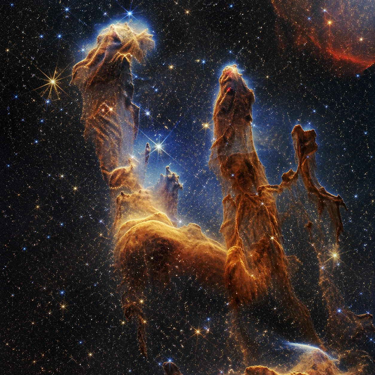
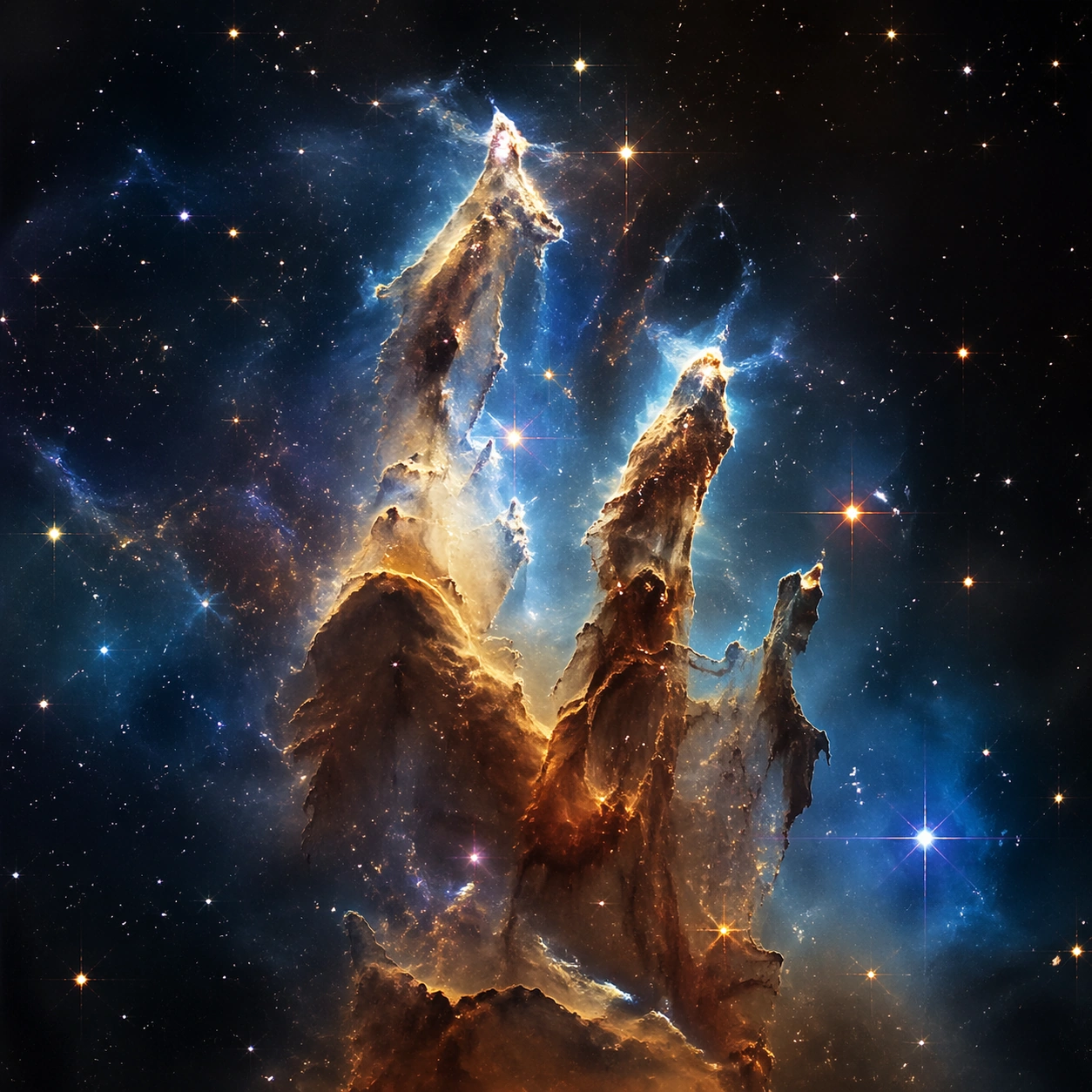
Example generated from “Telescope Nebula Galaxy — Hero Shot”
GPT Image 2en

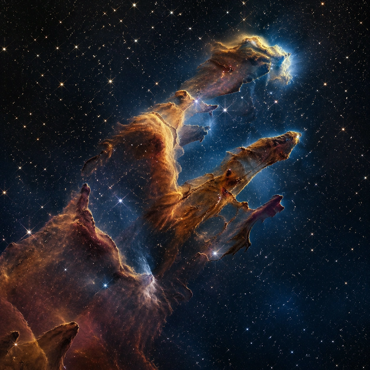
Scene: A square photographic image with intentional lens choice, coherent light, and a subject that feels observed rather than merely decorated. Build the frame around a definitive frame that establishes the subject’s strongest visual identity. Keep the lighting, camera distance, and spatial organization tuned for a high-signal research image rather than a casual snapshot. The image belongs to the Telescope Nebula Galaxy theme and should feel immediately legible as a prompt atlas theme for telescope nebula galaxy, testing photorealism, world-knowledge with gpt image 2.. Subject: Center the study on a definitive frame that establishes the subject’s strongest visual identity. Translate the theme into a concrete visual statement instead of an abstract mood board: the viewer should understand what kind of image this is, what is being tested, and why the composition is difficult. Use the slug idea of telescope nebula galaxy as a literal guide for subject matter, materials, and staging. If helpful, borrow the broad visual cues suggested by Pillars of Creation, JWST, but keep the result original and specific to this study. Important details: The realism should come from timing, optics, and material response: atmosphere, contrast, depth, motion, and tiny physical cues all need to agree. Preserve a disciplined square composition, clear focal hierarchy, and enough secondary information to make the image feel complete rather than underspecified. The image should look polished, novel, and exhibition-ready, with topic-specific credibility coming from the way surfaces, structure, and visual language reinforce Telescope Nebula Galaxy. Avoid generic filler elements that do not serve the main concept. Use case: Telescope Nebula Galaxy single study 1/8, testing photorealism, world-knowledge through the hero shot variation. Constraints: No readable text, no watermark, no logos, preserve exact 1:1 aspect ratio, no watermark, no cheap HDR excess, no unreadable signage, no fake stock-photo posing, no compositing seams, no arbitrary lens flare.

Example generated from “Telescope Nebula Galaxy — Macro Study”
GPT Image 2en

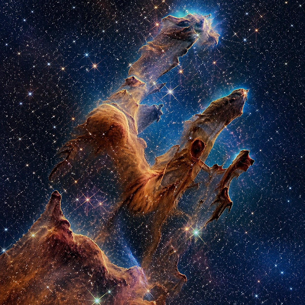
Scene: A square photographic image with intentional lens choice, coherent light, and a subject that feels observed rather than merely decorated. Build the frame around closer observation that reveals fine structure and optical behavior. Keep the lighting, camera distance, and spatial organization tuned for a high-signal research image rather than a casual snapshot. The image belongs to the Telescope Nebula Galaxy theme and should feel immediately legible as a prompt atlas theme for telescope nebula galaxy, testing photorealism, world-knowledge with gpt image 2.. Subject: Center the study on closer observation that reveals fine structure and optical behavior. Translate the theme into a concrete visual statement instead of an abstract mood board: the viewer should understand what kind of image this is, what is being tested, and why the composition is difficult. Use the slug idea of telescope nebula galaxy as a literal guide for subject matter, materials, and staging. If helpful, borrow the broad visual cues suggested by Pillars of Creation, JWST, but keep the result original and specific to this study. Important details: The realism should come from timing, optics, and material response: atmosphere, contrast, depth, motion, and tiny physical cues all need to agree. Preserve a disciplined square composition, clear focal hierarchy, and enough secondary information to make the image feel complete rather than underspecified. The image should look polished, novel, and exhibition-ready, with topic-specific credibility coming from the way surfaces, structure, and visual language reinforce Telescope Nebula Galaxy. Avoid generic filler elements that do not serve the main concept. Use case: Telescope Nebula Galaxy single study 2/8, testing photorealism, world-knowledge through the macro study variation. Constraints: No readable text, no watermark, no logos, preserve exact 1:1 aspect ratio, no watermark, no cheap HDR excess, no unreadable signage, no fake stock-photo posing, no compositing seams, no arbitrary lens flare.

Example generated from “Telescope Nebula Galaxy — Side Light Study”
GPT Image 2en

Scene: A square photographic image with intentional lens choice, coherent light, and a subject that feels observed rather than merely decorated. Build the frame around a directional-light treatment that increases form and drama. Keep the lighting, camera distance, and spatial organization tuned for a high-signal research image rather than a casual snapshot. The image belongs to the Telescope Nebula Galaxy theme and should feel immediately legible as a prompt atlas theme for telescope nebula galaxy, testing photorealism, world-knowledge with gpt image 2.. Subject: Center the study on a directional-light treatment that increases form and drama. Translate the theme into a concrete visual statement instead of an abstract mood board: the viewer should understand what kind of image this is, what is being tested, and why the composition is difficult. Use the slug idea of telescope nebula galaxy as a literal guide for subject matter, materials, and staging. If helpful, borrow the broad visual cues suggested by Pillars of Creation, JWST, but keep the result original and specific to this study. Important details: The realism should come from timing, optics, and material response: atmosphere, contrast, depth, motion, and tiny physical cues all need to agree. Preserve a disciplined square composition, clear focal hierarchy, and enough secondary information to make the image feel complete rather than underspecified. The image should look polished, novel, and exhibition-ready, with topic-specific credibility coming from the way surfaces, structure, and visual language reinforce Telescope Nebula Galaxy. Avoid generic filler elements that do not serve the main concept. Use case: Telescope Nebula Galaxy single study 3/8, testing photorealism, world-knowledge through the side light study variation. Constraints: No readable text, no watermark, no logos, preserve exact 1:1 aspect ratio, no watermark, no cheap HDR excess, no unreadable signage, no fake stock-photo posing, no compositing seams, no arbitrary lens flare.

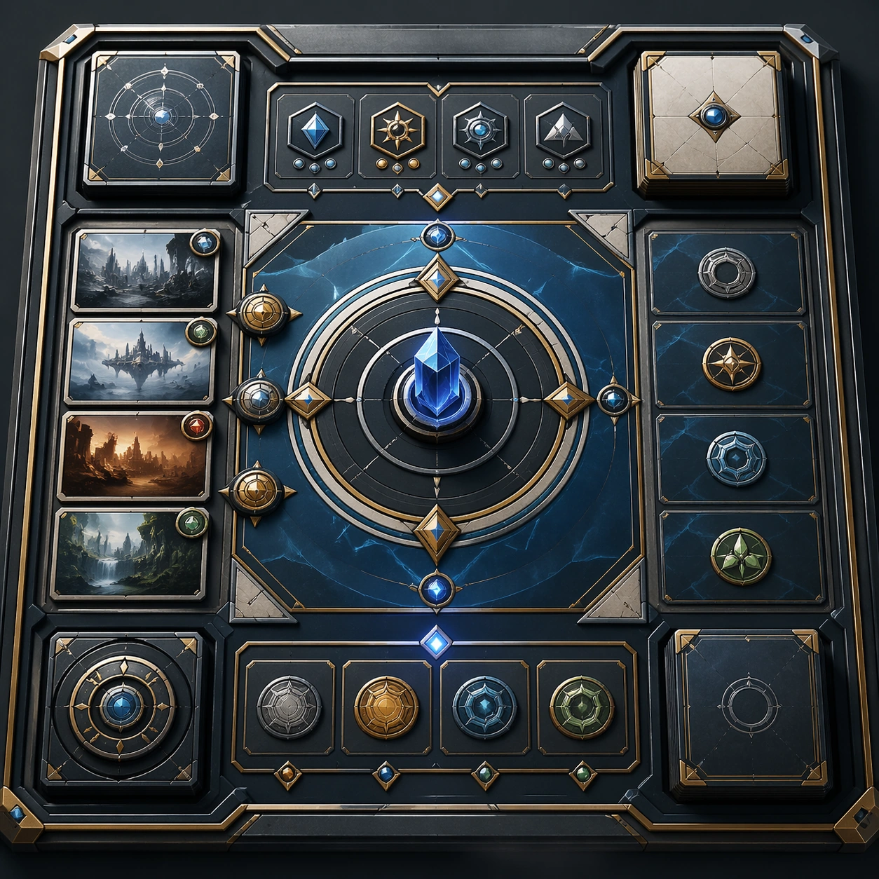
Example generated from “Telescope Nebula Galaxy — Motion Moment”
GPT Image 2en

Scene: A square photographic image with intentional lens choice, coherent light, and a subject that feels observed rather than merely decorated. Build the frame around a time-sensitive or kinetic phenomenon captured at the right instant. Keep the lighting, camera distance, and spatial organization tuned for a high-signal research image rather than a casual snapshot. The image belongs to the Telescope Nebula Galaxy theme and should feel immediately legible as a prompt atlas theme for telescope nebula galaxy, testing photorealism, world-knowledge with gpt image 2.. Subject: Center the study on a time-sensitive or kinetic phenomenon captured at the right instant. Translate the theme into a concrete visual statement instead of an abstract mood board: the viewer should understand what kind of image this is, what is being tested, and why the composition is difficult. Use the slug idea of telescope nebula galaxy as a literal guide for subject matter, materials, and staging. If helpful, borrow the broad visual cues suggested by Pillars of Creation, JWST, but keep the result original and specific to this study. Important details: The realism should come from timing, optics, and material response: atmosphere, contrast, depth, motion, and tiny physical cues all need to agree. Preserve a disciplined square composition, clear focal hierarchy, and enough secondary information to make the image feel complete rather than underspecified. The image should look polished, novel, and exhibition-ready, with topic-specific credibility coming from the way surfaces, structure, and visual language reinforce Telescope Nebula Galaxy. Avoid generic filler elements that do not serve the main concept. Use case: Telescope Nebula Galaxy single study 4/8, testing photorealism, world-knowledge through the motion moment variation. Constraints: No readable text, no watermark, no logos, preserve exact 1:1 aspect ratio, no watermark, no cheap HDR excess, no unreadable signage, no fake stock-photo posing, no compositing seams, no arbitrary lens flare.

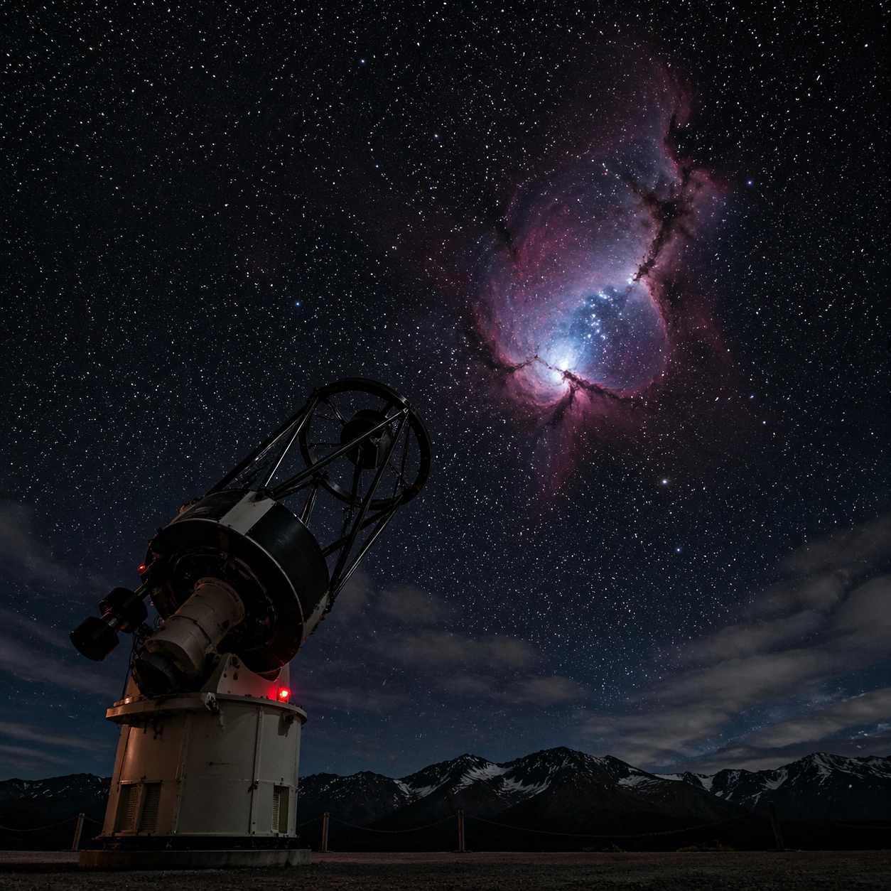
Example generated from “Telescope Nebula Galaxy — Low-Light Atlas”
GPT Image 2en

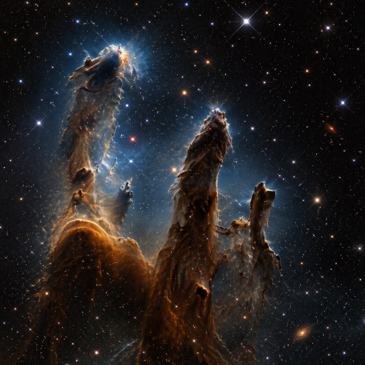
Scene: A square photographic image with intentional lens choice, coherent light, and a subject that feels observed rather than merely decorated. Build the frame around a dusk, night, or low-light frame with disciplined exposure. Keep the lighting, camera distance, and spatial organization tuned for a high-signal research image rather than a casual snapshot. The image belongs to the Telescope Nebula Galaxy theme and should feel immediately legible as a prompt atlas theme for telescope nebula galaxy, testing photorealism, world-knowledge with gpt image 2.. Subject: Center the study on a dusk, night, or low-light frame with disciplined exposure. Translate the theme into a concrete visual statement instead of an abstract mood board: the viewer should understand what kind of image this is, what is being tested, and why the composition is difficult. Use the slug idea of telescope nebula galaxy as a literal guide for subject matter, materials, and staging. If helpful, borrow the broad visual cues suggested by Pillars of Creation, JWST, but keep the result original and specific to this study. Important details: The realism should come from timing, optics, and material response: atmosphere, contrast, depth, motion, and tiny physical cues all need to agree. Preserve a disciplined square composition, clear focal hierarchy, and enough secondary information to make the image feel complete rather than underspecified. The image should look polished, novel, and exhibition-ready, with topic-specific credibility coming from the way surfaces, structure, and visual language reinforce Telescope Nebula Galaxy. Avoid generic filler elements that do not serve the main concept. Use case: Telescope Nebula Galaxy single study 5/8, testing photorealism, world-knowledge through the low-light atlas variation. Constraints: No readable text, no watermark, no logos, preserve exact 1:1 aspect ratio, no watermark, no cheap HDR excess, no unreadable signage, no fake stock-photo posing, no compositing seams, no arbitrary lens flare.

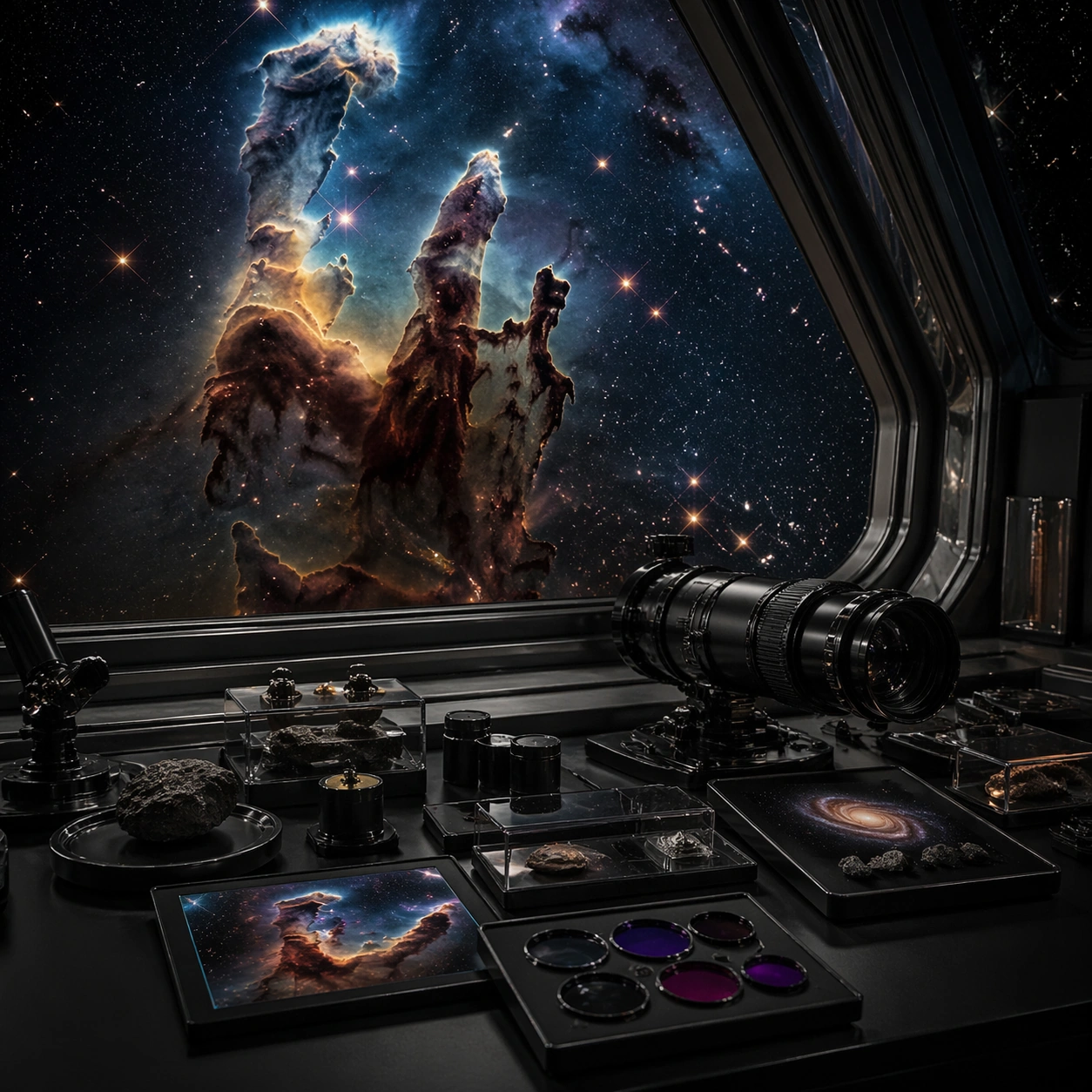
Example generated from “Telescope Nebula Galaxy — Specimen Table”
GPT Image 2en

Scene: A square photographic image with intentional lens choice, coherent light, and a subject that feels observed rather than merely decorated. Build the frame around a carefully arranged or comparative frame that still feels photographic. Keep the lighting, camera distance, and spatial organization tuned for a high-signal research image rather than a casual snapshot. The image belongs to the Telescope Nebula Galaxy theme and should feel immediately legible as a prompt atlas theme for telescope nebula galaxy, testing photorealism, world-knowledge with gpt image 2.. Subject: Center the study on a carefully arranged or comparative frame that still feels photographic. Translate the theme into a concrete visual statement instead of an abstract mood board: the viewer should understand what kind of image this is, what is being tested, and why the composition is difficult. Use the slug idea of telescope nebula galaxy as a literal guide for subject matter, materials, and staging. If helpful, borrow the broad visual cues suggested by Pillars of Creation, JWST, but keep the result original and specific to this study. Important details: The realism should come from timing, optics, and material response: atmosphere, contrast, depth, motion, and tiny physical cues all need to agree. Preserve a disciplined square composition, clear focal hierarchy, and enough secondary information to make the image feel complete rather than underspecified. The image should look polished, novel, and exhibition-ready, with topic-specific credibility coming from the way surfaces, structure, and visual language reinforce Telescope Nebula Galaxy. Avoid generic filler elements that do not serve the main concept. Use case: Telescope Nebula Galaxy single study 6/8, testing photorealism, world-knowledge through the specimen table variation. Constraints: No readable text, no watermark, no logos, preserve exact 1:1 aspect ratio, no watermark, no cheap HDR excess, no unreadable signage, no fake stock-photo posing, no compositing seams, no arbitrary lens flare.

Example generated from “Telescope Nebula Galaxy — Atmospheric View”
GPT Image 2en

Scene: A square photographic image with intentional lens choice, coherent light, and a subject that feels observed rather than merely decorated. Build the frame around weather, haze, or volumetric light used to deepen realism. Keep the lighting, camera distance, and spatial organization tuned for a high-signal research image rather than a casual snapshot. The image belongs to the Telescope Nebula Galaxy theme and should feel immediately legible as a prompt atlas theme for telescope nebula galaxy, testing photorealism, world-knowledge with gpt image 2.. Subject: Center the study on weather, haze, or volumetric light used to deepen realism. Translate the theme into a concrete visual statement instead of an abstract mood board: the viewer should understand what kind of image this is, what is being tested, and why the composition is difficult. Use the slug idea of telescope nebula galaxy as a literal guide for subject matter, materials, and staging. If helpful, borrow the broad visual cues suggested by Pillars of Creation, JWST, but keep the result original and specific to this study. Important details: The realism should come from timing, optics, and material response: atmosphere, contrast, depth, motion, and tiny physical cues all need to agree. Preserve a disciplined square composition, clear focal hierarchy, and enough secondary information to make the image feel complete rather than underspecified. The image should look polished, novel, and exhibition-ready, with topic-specific credibility coming from the way surfaces, structure, and visual language reinforce Telescope Nebula Galaxy. Avoid generic filler elements that do not serve the main concept. Use case: Telescope Nebula Galaxy single study 7/8, testing photorealism, world-knowledge through the atmospheric view variation. Constraints: No readable text, no watermark, no logos, preserve exact 1:1 aspect ratio, no watermark, no cheap HDR excess, no unreadable signage, no fake stock-photo posing, no compositing seams, no arbitrary lens flare.

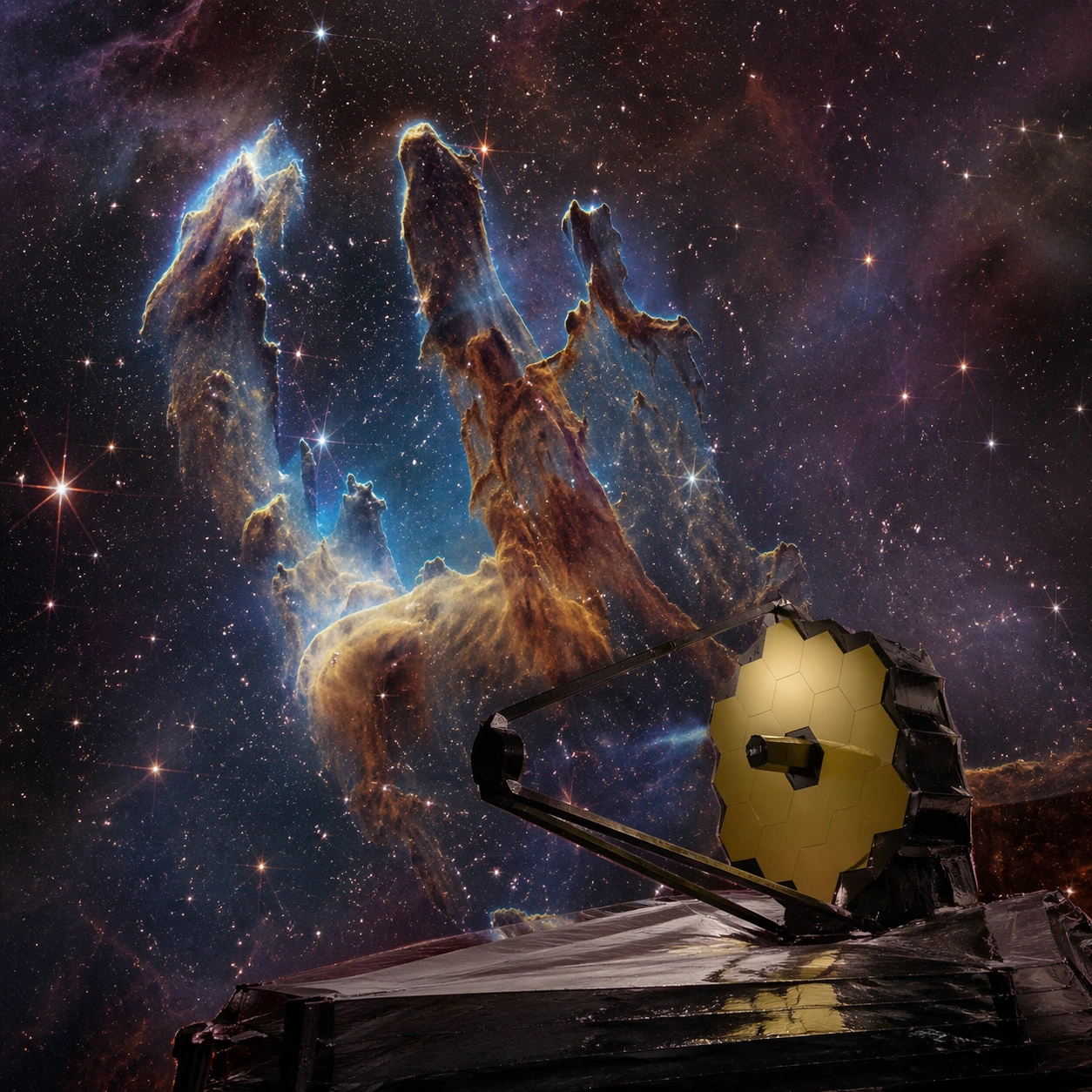
Example generated from “Telescope Nebula Galaxy — Signature Frame”
GPT Image 2en

Scene: A square photographic image with intentional lens choice, coherent light, and a subject that feels observed rather than merely decorated. Build the frame around the most memorable final image for the topic. Keep the lighting, camera distance, and spatial organization tuned for a high-signal research image rather than a casual snapshot. The image belongs to the Telescope Nebula Galaxy theme and should feel immediately legible as a prompt atlas theme for telescope nebula galaxy, testing photorealism, world-knowledge with gpt image 2.. Subject: Center the study on the most memorable final image for the topic. Translate the theme into a concrete visual statement instead of an abstract mood board: the viewer should understand what kind of image this is, what is being tested, and why the composition is difficult. Use the slug idea of telescope nebula galaxy as a literal guide for subject matter, materials, and staging. If helpful, borrow the broad visual cues suggested by Pillars of Creation, JWST, but keep the result original and specific to this study. Important details: The realism should come from timing, optics, and material response: atmosphere, contrast, depth, motion, and tiny physical cues all need to agree. Preserve a disciplined square composition, clear focal hierarchy, and enough secondary information to make the image feel complete rather than underspecified. The image should look polished, novel, and exhibition-ready, with topic-specific credibility coming from the way surfaces, structure, and visual language reinforce Telescope Nebula Galaxy. Avoid generic filler elements that do not serve the main concept. Use case: Telescope Nebula Galaxy single study 8/8, testing photorealism, world-knowledge through the signature frame variation. Constraints: No readable text, no watermark, no logos, preserve exact 1:1 aspect ratio, no watermark, no cheap HDR excess, no unreadable signage, no fake stock-photo posing, no compositing seams, no arbitrary lens flare.

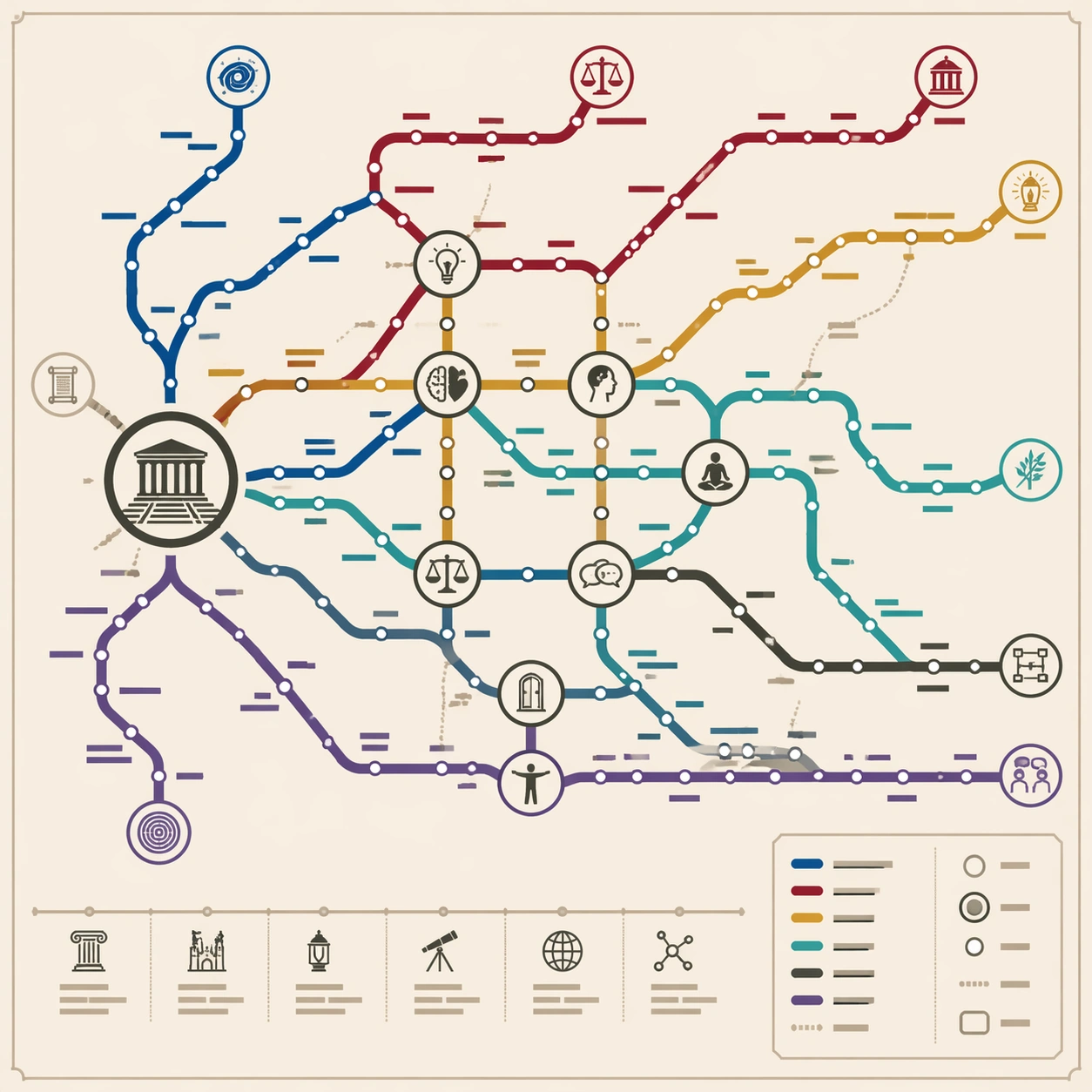
Example generated from “Thematic Subway Map — Philosophy Lineage”
GPT Image 2en

Scene: A square educational wall poster styled as a modern subway system map, printed on matte pale cream stock. The design is front-facing, crisp, and technical, with generous margins and a balanced legend panel in the lower right. Use calm academic colors: deep blue, burgundy, ochre, teal, charcoal, and muted purple. The poster should feel useful for a university hallway or museum shop. Subject: A thematic subway map of philosophy history. Route lines represent major schools and questions: metaphysics, ethics, political thought, empiricism, rationalism, existentialism, analytic logic, and eastern wisdom. The lines branch from an ancient forum-like origin hub, pass through dense medieval and enlightenment transfer zones, and spread into modern debates. Larger circular transfer stations indicate conceptual collisions such as mind-body, virtue, reason, social contract, language, suffering, and freedom. Small icons show scrolls, lamps, scales, dialogue bubbles, and labyrinths. Important details: The map must express lineage and influence without relying on readable names. Use station dots, interchange rings, branching lines, route colors, and section density to show chronology and cross-pollination. Keep all label areas as non-readable short glyph bars, with no actual text. Transit geometry should be disciplined: consistent stroke widths, clean corners, obvious transfer circles, and no accidental tangles. The network should feel like a knowledge graph converted into a professional public-transport diagram. Use case: Thematic Subway Map single study 2/8, testing philosophical lineage abstraction, structured hierarchy, and transfer-based reasoning composition. Constraints: No readable text, no watermark, no logos, preserve exact 1:1 aspect ratio, no real philosopher portraits, no fake university emblem, no random symbols, no illegible paragraph blocks, no chaotic route crossing, no geographic base map.

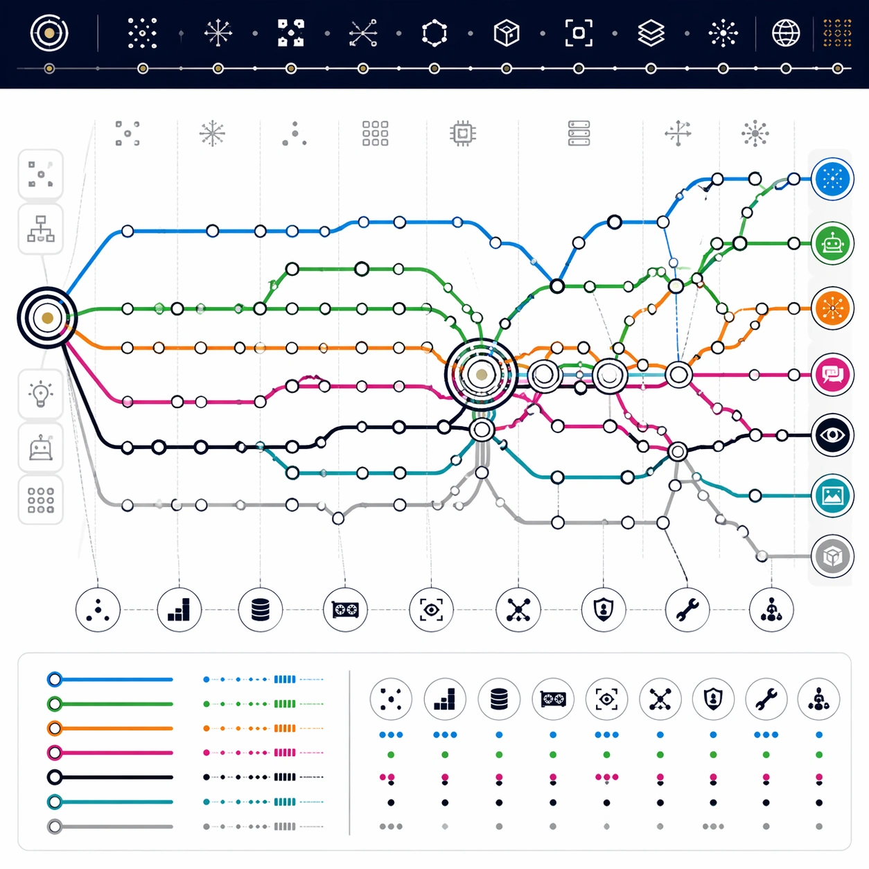
Example generated from “Thematic Subway Map — AI History Rail”
GPT Image 2en

Scene: A square technology exhibition poster designed as a clean subway map on white synthetic paper. The map is straight-on, flat, and highly structured, using crisp digital linework, small station nodes, and a dark navy header band made only of abstract glyph marks. Use a modern palette of electric blue, neural green, orange, magenta, black, and silver gray, but keep the overall design disciplined and not cyberpunk. Subject: A thematic transit diagram of AI development from early symbolic ideas to contemporary multimodal systems. Route lines represent symbolic AI, expert systems, machine learning, neural networks, reinforcement learning, computer vision, language models, and image generation. The network begins at a left-side origin hub, moves through several winter-like sparse sections, thickens around a deep-learning interchange, and expands into a dense modern terminal cluster. Transfer stations mark moments where methods converge: data scale, GPUs, attention, self-supervision, alignment, tools, and multimodal interfaces. Important details: The map should show historical reasoning through topology, not readable dates. Use station density to imply periods of rapid progress, long straight segments for slow eras, and large multi-ring interchanges for breakthroughs. Small icon glyphs may suggest chips, eyes, speech bubbles, robots, and image tiles, but all labels must be non-readable. Keep line crossings clean, route colors consistent, and legend blocks tidy. The poster should feel like a museum-grade technical diagram and commercial educational product. Use case: Thematic Subway Map single study 3/8, testing AI-history abstraction, dense route logic, and clean technical-diagram hierarchy. Constraints: No readable text, no watermark, no logos, preserve exact 1:1 aspect ratio, no real company marks, no actual model names, no readable years, no fake UI screenshots, no chaotic circuit-board background, no messy station labels.

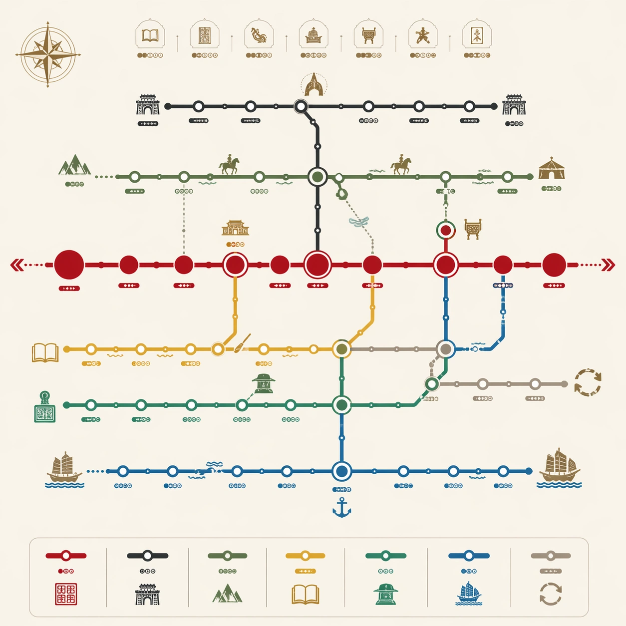
Example generated from “Thematic Subway Map — Chinese Dynasty Network”
GPT Image 2en

Scene: A square museum-shop poster styled as an elegant transit map on warm ivory paper. The design is front-facing, clean, and balanced, combining public-transport diagram language with subtle historical ornament. Use restrained colors inspired by lacquer red, jade green, imperial yellow, ink black, porcelain blue, and bronze gray. Keep the background mostly plain, with no scroll border or aged parchment effects. Subject: A thematic subway map of Chinese dynastic succession and cultural currents. A main chronological trunk line runs across the center, with branch lines for northern regimes, southern courts, frontier states, literary flourishing, trade routes, and administrative reforms. Major transfer hubs represent unification, division, capital shifts, examination culture, maritime exchange, and reform cycles. Station dots vary in size to suggest dynastic weight and transition intensity. Tiny abstract icons show seals, city gates, river bends, books, and bronze vessels. Important details: The map must be a reasoning diagram, not a literal geography map. Use route structure to show continuity, splits, reunification, and parallel developments. Avoid readable dynasty names or dates; represent station labels as small non-readable glyph capsules. Keep line thickness consistent, transfer hubs clear, and routes easy to trace. The historical style should remain subtle and premium, supporting the transit-map clarity rather than overwhelming it with decoration. Use case: Thematic Subway Map single study 4/8, testing dynastic transition abstraction, historical hierarchy, and clean map-like composition. Constraints: No readable text, no watermark, no logos, preserve exact 1:1 aspect ratio, no real national emblem, no portrait illustrations, no battlefield scene, no fake Chinese characters, no overly ornate scroll texture, no random line tangles.

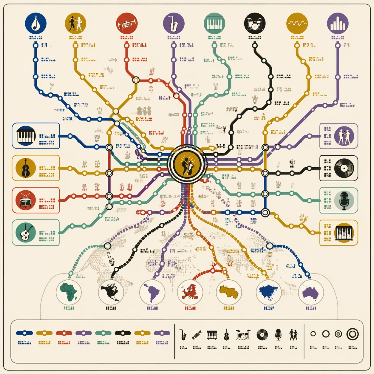
Example generated from “Thematic Subway Map — Jazz Evolution Map”
GPT Image 2en

Scene: A square music-culture poster designed as a metropolitan subway map on matte cream paper. The map is crisp and front-facing, with a subtle record-sleeve sensibility but no album art or artist portraits. Use a lively yet controlled palette: brass gold, deep blue, smoky black, warm red, mint green, and muted violet. The lines should feel rhythmic while still obeying strict transit-diagram geometry. Subject: A thematic subway map of jazz evolution. Route lines represent blues roots, swing, bebop, cool jazz, hard bop, modal, fusion, free jazz, and contemporary scenes. A central improvisation interchange connects many routes, while side branches show rhythm sections, horn language, club culture, recording technology, and global influence. Station dots form syncopated clusters, with larger transfer circles where styles merge. Small non-readable icon marks suggest saxophones, drums, piano keys, vinyl records, microphones, and dancing silhouettes. Important details: The composition must balance musical energy with map clarity. Lines may curve gently like phrasing, but they should still use consistent stroke widths, clear bends, regular station intervals, and readable transfer hubs. Avoid making it look like abstract album-cover scribbles. All label zones should be tiny non-readable glyph blocks; no actual performer names or song titles. Include a clean legend strip with colored route samples, icons, and station symbols, but no legible text. Use case: Thematic Subway Map single study 5/8, testing cultural evolution mapping, rhythmic route composition, and polished music-poster diagram design. Constraints: No readable text, no watermark, no logos, preserve exact 1:1 aspect ratio, no real musician likenesses, no record label marks, no sheet music notation, no nightclub photo background, no chaotic swirls, no fake readable album titles.

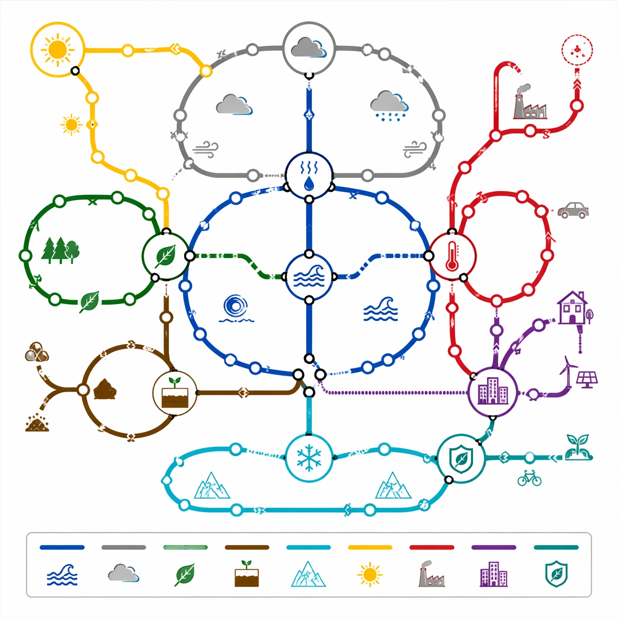
Example generated from “Thematic Subway Map — Climate System Loop”
GPT Image 2en

Scene: A square science communication poster styled as a technical subway map on clean white board stock. Use a calm environmental palette: ocean blue, forest green, cloud gray, solar yellow, heat red, ice cyan, and soil brown. The diagram is front-facing and vector-crisp, with a compact legend panel and small icon system. The design should feel suitable for an exhibition wall or educational product. Subject: A thematic subway map of Earth's climate system. Circular and looping route lines represent atmosphere, ocean circulation, carbon cycle, water cycle, ice-albedo feedback, biosphere, human emissions, and adaptation pathways. Large transfer stations show interaction points: evaporation, cloud formation, heat exchange, photosynthesis, runoff, warming feedback, urban infrastructure, and mitigation. Some lines form closed loops, while others branch outward to show pressures and responses. Tiny icons suggest sun, cloud, leaf, wave, glacier, factory silhouette, city block, and soil layers. Important details: The network should communicate system dynamics through route topology. Feedback loops must be visually distinct from one-way branches; transfer hubs must be clear and not buried under overlapping lines. Use arrows sparingly as small direction markers, but avoid readable labels. Keep station spacing consistent, line weights uniform, and crossings clean. The map should look like a rigorous climate-systems diagram translated into transit language, not a decorative eco poster. Use case: Thematic Subway Map single study 6/8, testing system-loop reasoning, scientific structured layout, and commercial educational map design. Constraints: No readable text, no watermark, no logos, preserve exact 1:1 aspect ratio, no political slogans, no real agency branding, no disaster photo collage, no messy infographic paragraphs, no random arrows, no globe clip art background.

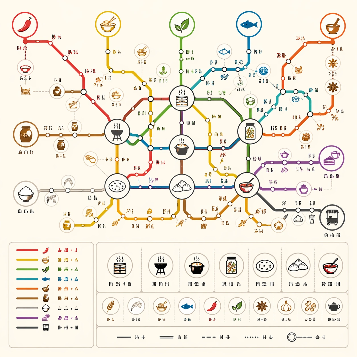
Example generated from “Thematic Subway Map — World Cuisine Lines”
GPT Image 2en

Scene: A square commercial food-culture poster designed as a clean subway map on warm white paper. The style is bright, friendly, and precise, with flat vector lines, circular station dots, and a compact icon legend. Use appetite-friendly but restrained colors: chili red, noodle yellow, herb green, ocean blue, spice orange, rice white, and charcoal. The poster should feel like something sold in a culinary museum shop or used in a food festival exhibit. Subject: A thematic subway map of world cuisine relationships. Route lines represent staple grains, spice routes, fermentation, street food, noodle families, seafood traditions, baking, and tea-and-dessert culture. Transfer hubs show shared techniques such as steaming, grilling, pickling, broth-making, flatbread, dumplings, and chili oil. Station clusters imply regional families without drawing a real geography map. Small icons show bowls, chopsticks, bread, fish, jars, steam, leaves, and clay pots. Important details: The map must show relationship logic without readable cuisine names. Use line colors and transfer hubs to suggest shared ingredients and cooking methods. Keep the station intervals regular, the legend orderly, and the route intersections easy to follow. Avoid food photography; this is a technical-diagram poster with playful culinary icons. All label positions should use short non-readable glyph marks only. The composition should be dense enough to reward inspection but not so crowded that it loses transit-map clarity. Use case: Thematic Subway Map single study 7/8, testing culinary knowledge abstraction, commercial poster appeal, and structured route readability. Constraints: No readable text, no watermark, no logos, preserve exact 1:1 aspect ratio, no real restaurant brands, no national flags, no food photos, no tourist map base, no messy ingredient pile, no fake menu text, no random icon clutter.

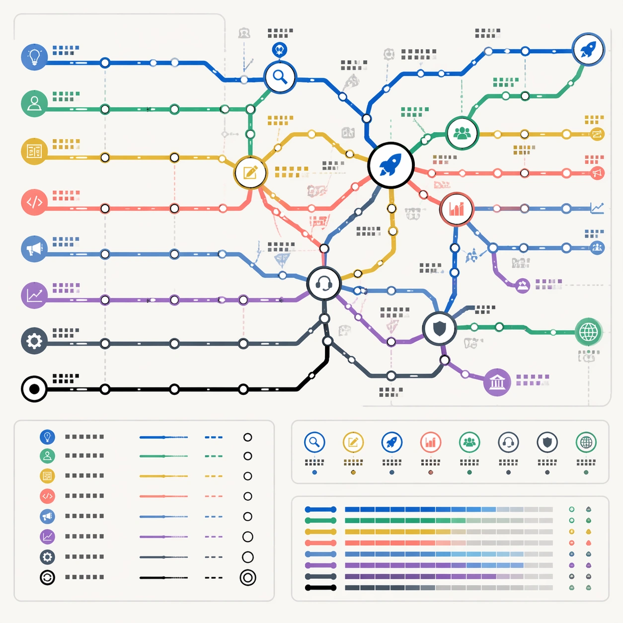
Example generated from “Thematic Subway Map — Startup Growth Transit”
GPT Image 2en

Scene: A square business workshop poster designed as a polished subway route map on light gray-white paper. The map is front-facing, clean, and highly structured, with a restrained SaaS palette: cobalt blue, mint green, amber, coral, slate, violet, and black. It should look like a premium product-strategy canvas or conference wall graphic without using any real company identity. Subject: A thematic subway map of startup growth. Route lines represent idea discovery, customer research, product design, engineering, go-to-market, fundraising, operations, and retention. The network begins at a small origin loop, expands through validation stations, splits at product-market-fit, and becomes denser around scale-up interchanges. Transfer hubs show major decision points: problem clarity, prototype, launch, revenue, hiring, compliance, support, and international expansion. Small icons suggest lightbulbs, users, gears, charts, tickets, shields, rockets, and support headsets. Important details: The map should function like a reasoning diagram for business stages. Use line density and hub size to show complexity increasing over time. Keep all station labels as non-readable glyph blocks, with no actual startup jargon text. Lines must be clean, layered, and traceable; avoid crossing chaos. Include a small legend and a route-status inset using colored bars and station symbols. The result should feel commercially useful, not like a decorative motivational poster. Use case: Thematic Subway Map single study 8/8, testing business-process abstraction, structured-layout control, and commercial transit-map mockup quality. Constraints: No readable text, no watermark, no logos, preserve exact 1:1 aspect ratio, no real company names, no stock-market ticker, no motivational slogan, no messy flowchart arrows, no fake UI dashboard, no random spreadsheet blocks.

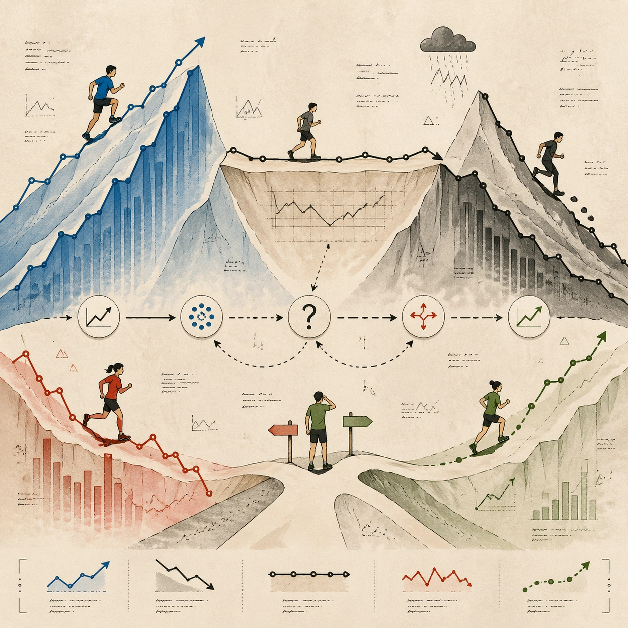
Example generated from “Thinking Mode — Reference Market Mountain”
GPT Image 2en

Scene: A square editorial illustration in a refined magazine style, viewed straight-on like a finished art board. The scene is a stylized mountain range made from layered trend lines, small chart paths, and paper-cut ridges. The background is warm off-white newsprint with subtle ink grain, quiet margins, and a few tiny non-readable hand-drawn annotation marks. Subject: Five small runner characters move across the trend mountains, each representing a different abstract market signal rather than a real company. One runner climbs a steep blue ridge, one slides down a graphite slope, one crosses a flat plateau, one pauses at a fork, and one follows a dotted forecast trail. A central reasoning path connects the runners through cause, uncertainty, and outcome using arrows, dashed lines, and simple icons. Important details: Structured visual reasoning, clear editorial hierarchy, New Yorker-inspired hand-drawn sophistication without copying a specific artist, muted blue, graphite, tomato red, moss green, and cream palette. The image must feel like an intelligent data essay: chart structure, characters, annotations, and visual metaphors are all legible as a system. Use tiny pseudo-writing only; no readable real stock names, numbers, dates, or claims. Use case: Reference image for a Thinking Mode series. Later images should preserve this editorial chart-mountain language, character scale, annotation style, color restraint, and square composition while changing the reasoning layer. Constraints: No readable text, no real company names, no real ticker symbols, no logos, no watermark, no literal financial advice, no photorealistic computer screens, no chaotic infographic clutter, preserve exact 1:1 aspect ratio.

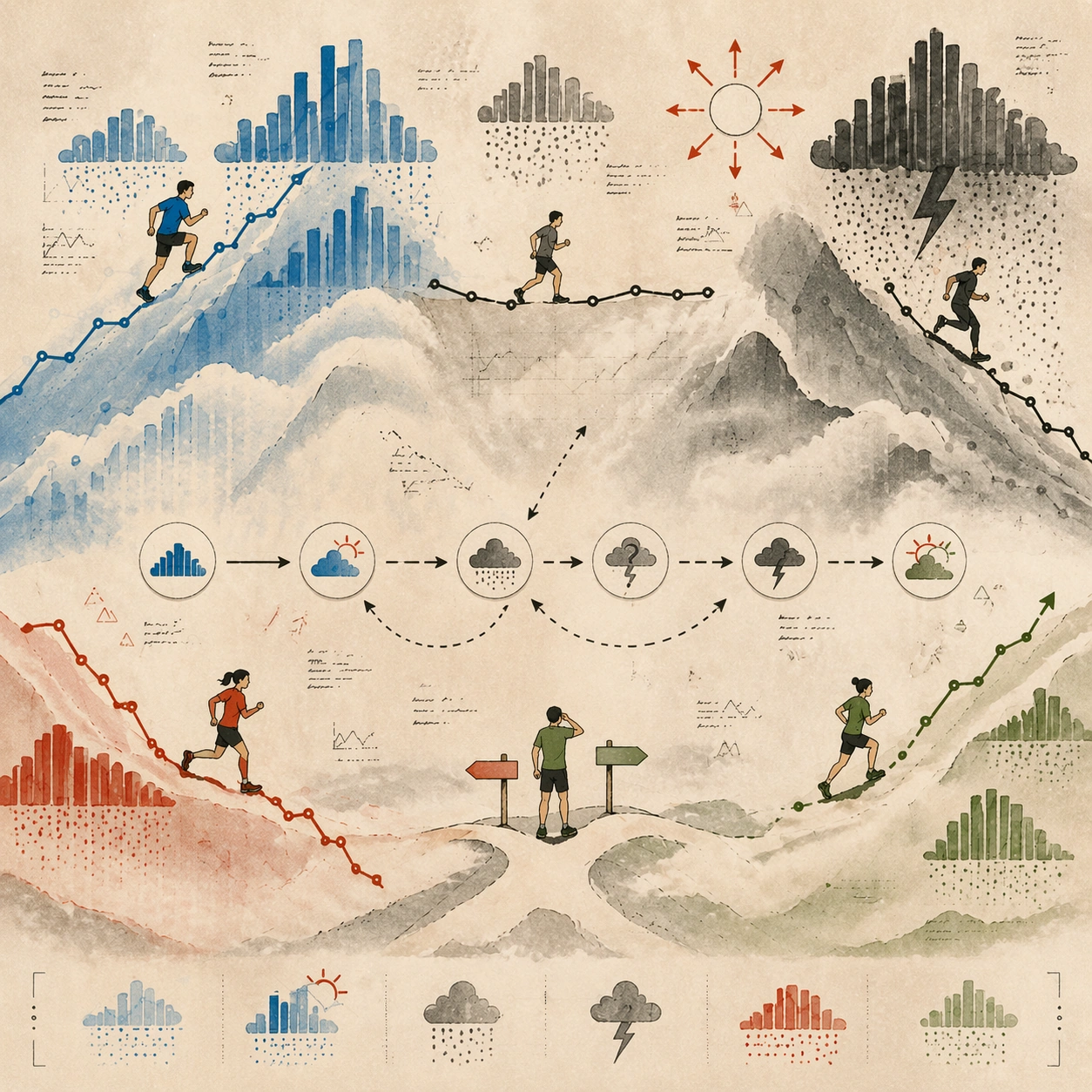
Example generated from “Thinking Mode — Earnings Weather Map”
GPT Image 2en

Scene: Same square editorial art-board composition, warm newsprint background, muted palette, small runner characters, and hand-drawn annotation style as the reference image. Preserve the reference image's chart-mountain language and visual hierarchy. Subject: Transform the market mountain into an earnings weather map. The same abstract runner characters now move under weather systems made from bar-chart clouds, rain made of tiny dots, sunbursts shaped like upward arrows, and fog banks covering uncertain slopes. The central reasoning path should show how signals pass through expectation, surprise, and uncertainty without using readable text. Important details: Maintain the reference style: elegant magazine illustration, structured layout, tiny pseudo-annotations, clean margins, muted blue, graphite, tomato red, moss green, and cream. The image should communicate multi-step analysis through visual metaphors: weather fronts, forecast paths, risk zones, and character decisions. No real data, no ticker symbols, no readable labels. Use case: Second image in a reference-dependent Thinking Mode series, testing whether the same visual reasoning language can express a different analytical frame. Constraints: PRESERVE the reference image's square crop, character scale, editorial line quality, annotation style, and restrained color system. No readable text, no real companies, no logos, no watermark, no literal financial advice, no crowded dashboard UI, preserve exact 1:1 aspect ratio.

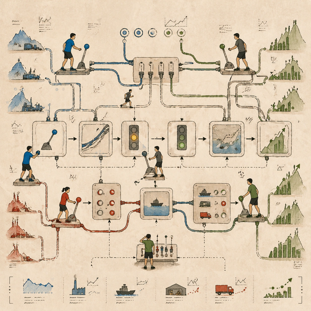
Example generated from “Thinking Mode — Supply Chain Switchboard”
GPT Image 2en

Scene: Same square editorial illustration style as the reference image: warm newsprint background, small characters, restrained colors, thin ink lines, quiet margins, and pseudo-handwritten notes. Keep the same visual grammar but change the reasoning metaphor. Subject: Turn the trend mountains into a supply-chain switchboard. The runner characters now stand at small levers, cables, and signal lights that connect abstract factories, shipping lanes, warehouses, and demand hills. The central reasoning path should show cause and effect moving through the switchboard: one lever changes a cable tension, a signal light changes color, a route opens, and a trend ridge shifts. Important details: Structured cause-and-effect layout, readable flow without readable words, clean arrows, dotted routes, small icons, and hand-drawn editorial charm. Preserve the reference's character scale, visual restraint, and chart-like mountain forms. The image should feel like a model thinking through interconnected variables, not a literal industrial diagram. Use case: Third image in a reference-dependent Thinking Mode series, using the same art direction to visualize supply-chain reasoning and dependency chains. Constraints: PRESERVE the reference image's square crop, annotation style, small runners, muted palette, and editorial hierarchy. No readable text, no real companies, no logos, no watermark, no photorealistic machinery, no dense technical schematic, preserve exact 1:1 aspect ratio.

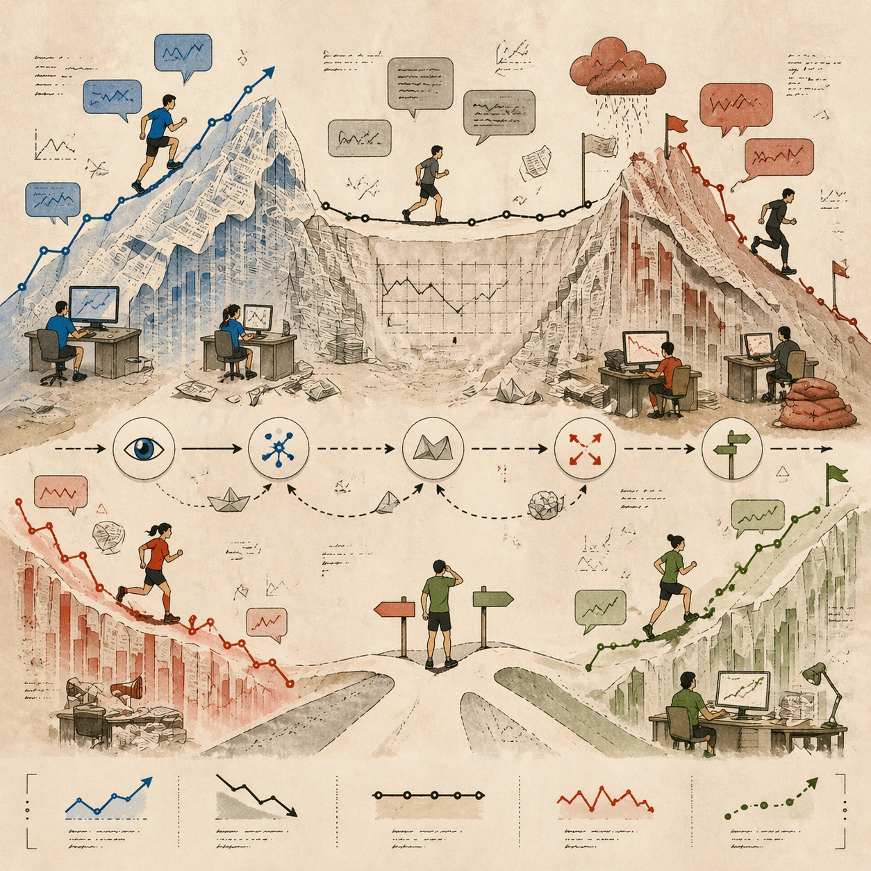
Example generated from “Thinking Mode — Sentiment Newsroom”
GPT Image 2en

Scene: Same square editorial art-board composition as the reference image, with warm newsprint texture, thin ink lines, muted colors, small runner characters, and tiny non-readable handwritten notes. Preserve the reference's calm visual hierarchy and chart-mountain grammar. Subject: Transform the market mountain into a sentiment newsroom. The runners now move through desks, headline-shaped hills, speech-bubble clouds, and signal flags. Some bubbles lift trend ridges upward, others weigh them down like sandbags. A central reasoning route links observation, interpretation, contradiction, and decision using arrows, folded paper markers, and visual symbols without readable text. Important details: Sophisticated editorial illustration, structured reasoning, clear cause-and-effect reading path, and restrained composition. Keep the same abstract market-signal characters and small-scale annotation marks from the reference. The result should look like a visual essay about how narrative sentiment changes interpretation, not a social media dashboard. Use case: Fourth image in a reference-dependent Thinking Mode series, preserving the visual language while showing sentiment and news interpretation as a reasoning layer. Constraints: PRESERVE the reference image's square crop, character scale, muted palette, pseudo-annotations, and editorial chart-mountain language. No readable text, no real news headlines, no real companies, no logos, no watermark, no literal financial advice, no crowded UI, preserve exact 1:1 aspect ratio.

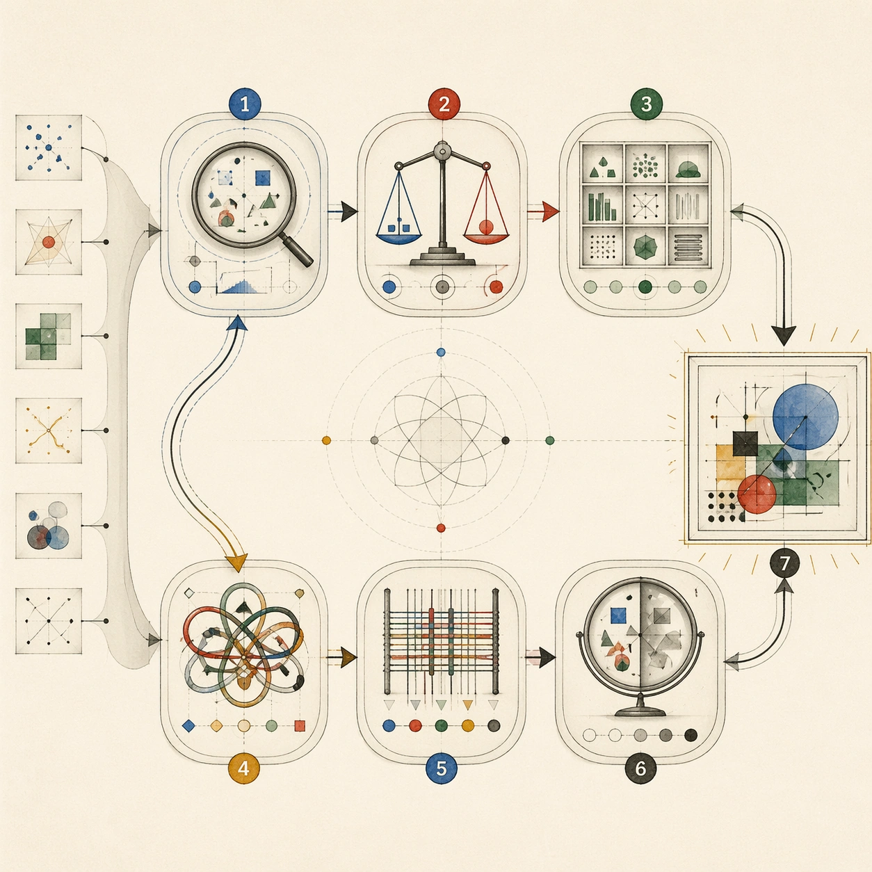
Example generated from “Thinking Mode — Model Thought Trace”
GPT Image 2en

Scene: A square abstract editorial diagram on off-white paper, like a museum-quality print about cognition. The image uses clean modular panels, soft graphite lines, translucent vellum overlays, and a restrained palette of blue, red, green, amber, and black. Subject: A visible thought trace: seven rounded reasoning nodes connected by a looping path, with small evidence fragments entering from the left and a finished visual answer emerging on the right. Each node has a distinct metaphor: observation lens, comparison scales, memory shelf, contradiction knot, synthesis loom, critique mirror, and final composition frame. All marks inside nodes are abstract symbols, not readable text. Important details: The layout must be structured and easy to follow, showing step-by-step reasoning without exposing actual chain-of-thought words. Use arrows, layers, icons, and spatial grouping to imply process. The image should feel precise, calm, and intelligent, with enough visual complexity to reward close inspection while staying clean at thumbnail size. Use case: Independent Thinking Mode single image, demonstrating how a model's multi-step reasoning can be represented as a visual process diagram without literal text. Constraints: No readable text, no code, no real prompt snippets, no private chain-of-thought text, no logos, no watermark, no brain cliché, no sci-fi glow, no chaotic flowchart, preserve exact 1:1 aspect ratio.

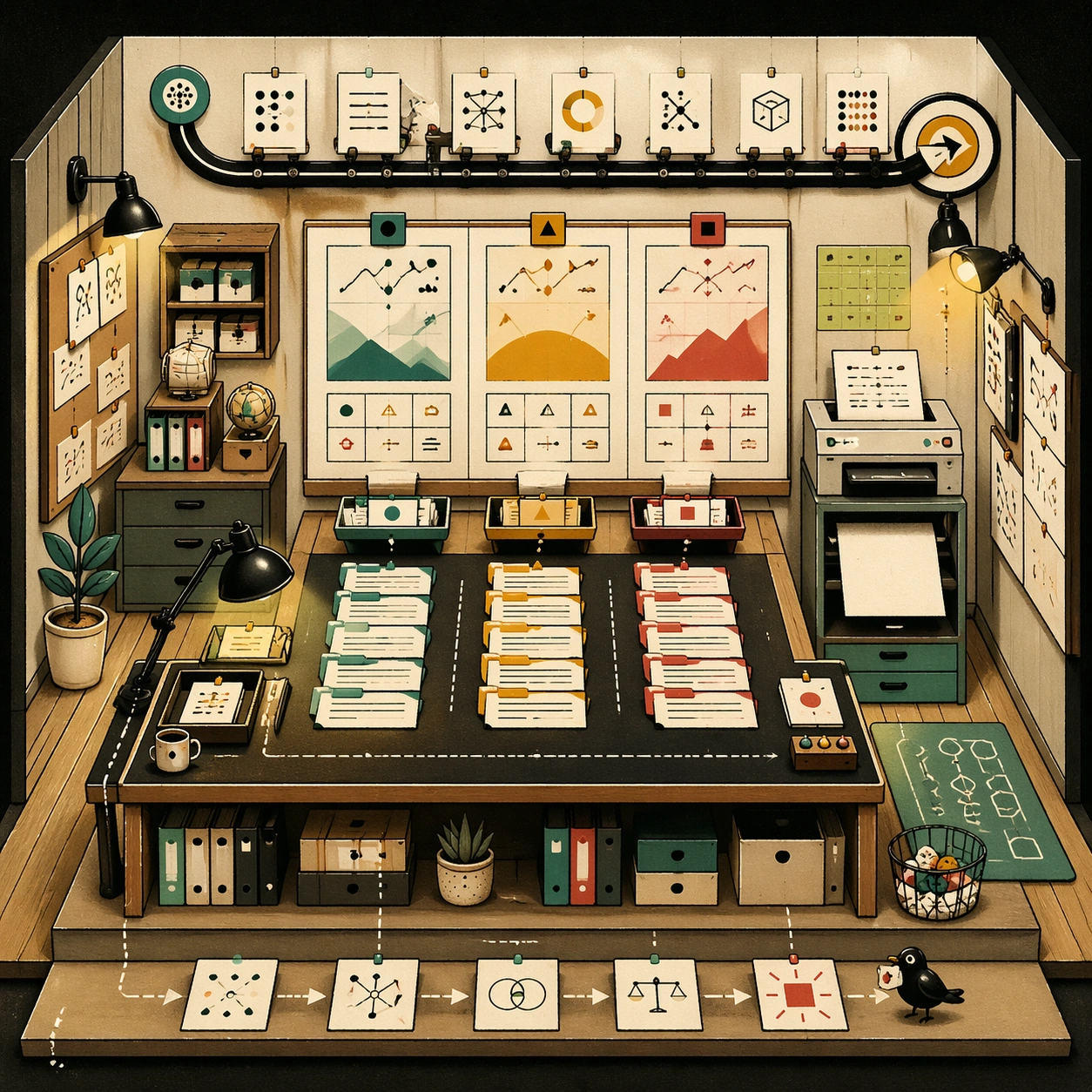
Example generated from “Thinking Mode — Editorial Data Room”
GPT Image 2en

Scene: A square cutaway editorial illustration of a compact data newsroom, seen from a slightly elevated front angle. The room is built like a miniature stage set with tidy desks, wall boards, pinned cards, chart-like murals, and warm overhead lamps. The style is sophisticated magazine illustration with paper texture and restrained color. Subject: A teamless newsroom where objects perform the reasoning: a sorting table groups evidence cards, a wall board compares three abstract scenarios, a small printer releases a blank decision sheet, and an overhead track connects sources to conclusion. No people are visible; the furniture and diagrams imply the thinking process. All notes are pseudo-writing and symbol marks only. Important details: Highly organized layout, readable zones, clear path from inputs to synthesis, subtle humor, tiny icons, chart shapes, and editorial craft. The image should feel like a visual newsroom for analysis: structured, calm, and full of purposeful details. Use cream, ink black, muted teal, warm yellow, and red accent marks. Use case: Independent Thinking Mode single image, testing complex multi-zone composition and reasoning visualization in one coherent scene. Constraints: No readable text, no real news headlines, no real data, no logos, no watermark, no humans, no messy office clutter, no photorealistic computer UI, preserve exact 1:1 aspect ratio.

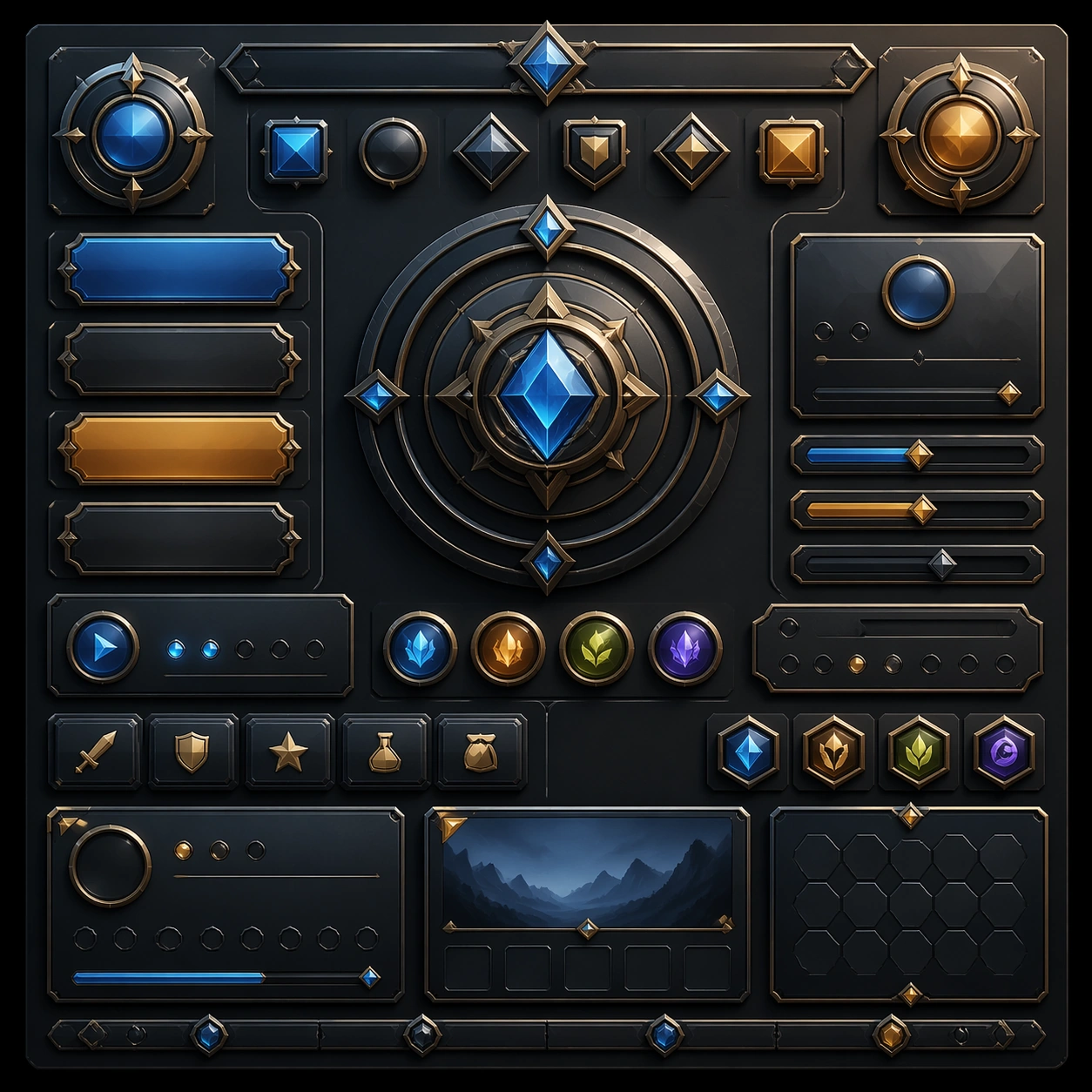
Example generated from “Three Dimensional Product Ui Depth System — Reference Anchor”
GPT Image 2en

Scene: Create a square reference image for Three-Dimensional Product UI Depth System. Build a reference anchor establishing the core system with a premium, production-ready finish. Use a polished modular board or campaign surface with clean spacing, premium game-UI finish, and clear focal hierarchy. The composition should feel intentional, clean, and reusable for gallery, research, campaign, or internal handoff contexts. Lighting must support readability first, with the main forms clearly separated from the background and enough breathing room for the system to stay legible at both hero scale and thumbnail scale. Subject: Center a coherent original game-art system built for premium production and marketing surfaces. For this image, focus on reference anchor. Keep the same system logic stable across screenshots, cards, banners, and overview boards. This image is the canonical anchor that later series images must follow. The viewer should immediately understand what role this surface plays inside a cohesive game-production asset pack. Important details: Lock framing, icon grammar, palette blocking, and surface hierarchy so the kit feels production-ready and consistent. Preserve the core silhouette, framing language, and material logic from the reference image while each variation changes function. Keep materials believable, edge hierarchy disciplined, and the visual language consistent with 3D UI Depth. Use abstract interface blocks or diagram accents when helpful, but avoid any readable language. The final result should feel like a deliberate production asset rather than a random illustration. Use case: Three-Dimensional Product UI Depth System series study 1/9, designed as reference anchor within a cohesive asset pack. Constraints: No readable text, no watermark, no logos, preserve exact 1:1 aspect ratio, no unrelated objects, no broken visual hierarchy, no malformed anatomy or broken perspective, no random decorative clutter.

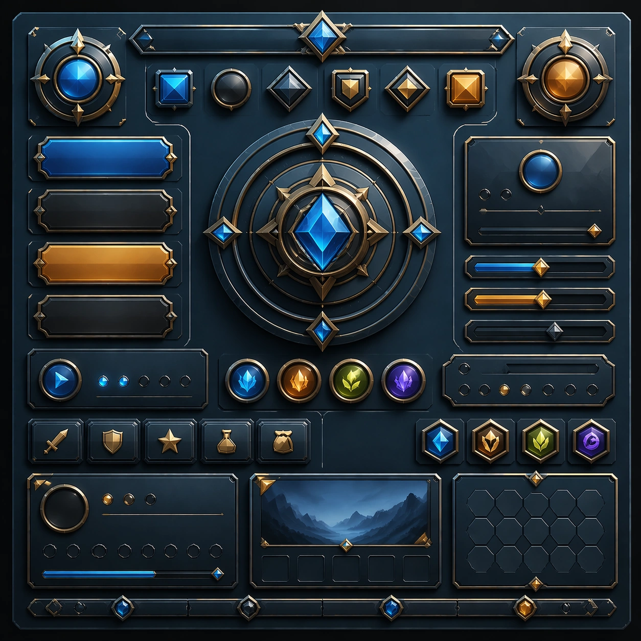
Example generated from “Three Dimensional Product Ui Depth System — Variant One”
GPT Image 2en

Scene: Create a square dependent image for Three-Dimensional Product UI Depth System. Build a first controlled variation in the same system with a premium, production-ready finish. Use a polished modular board or campaign surface with clean spacing, premium game-UI finish, and clear focal hierarchy. The composition should feel intentional, clean, and reusable for gallery, research, campaign, or internal handoff contexts. Lighting must support readability first, with the main forms clearly separated from the background and enough breathing room for the system to stay legible at both hero scale and thumbnail scale. Subject: Center a coherent original game-art system built for premium production and marketing surfaces. For this image, focus on the intended support surface. Keep the same system logic stable across screenshots, cards, banners, and overview boards. Preserve exact identity or system logic from the reference image while changing only the intended variation axis. The viewer should immediately understand what role this surface plays inside a cohesive game-production asset pack. Important details: Lock framing, icon grammar, palette blocking, and surface hierarchy so the kit feels production-ready and consistent. Preserve the core silhouette, framing language, and material logic from the reference image while each variation changes function. Keep materials believable, edge hierarchy disciplined, and the visual language consistent with 3D UI Depth. Use abstract interface blocks or diagram accents when helpful, but avoid any readable language. The final result should feel like a deliberate production asset rather than a random illustration. Use case: Three-Dimensional Product UI Depth System series study 2/9, designed as variant one within a cohesive asset pack. Constraints: No readable text, no watermark, no logos, preserve exact 1:1 aspect ratio, no unrelated objects, no broken visual hierarchy, no malformed anatomy or broken perspective, no random decorative clutter.

Example generated from “Three Dimensional Product Ui Depth System — Variant Two”
GPT Image 2en

Scene: Create a square dependent image for Three-Dimensional Product UI Depth System. Build a second controlled variation in the same system with a premium, production-ready finish. Use a polished modular board or campaign surface with clean spacing, premium game-UI finish, and clear focal hierarchy. The composition should feel intentional, clean, and reusable for gallery, research, campaign, or internal handoff contexts. Lighting must support readability first, with the main forms clearly separated from the background and enough breathing room for the system to stay legible at both hero scale and thumbnail scale. Subject: Center a coherent original game-art system built for premium production and marketing surfaces. For this image, focus on the intended support surface. Keep the same system logic stable across screenshots, cards, banners, and overview boards. Preserve exact identity or system logic from the reference image while changing only the intended variation axis. The viewer should immediately understand what role this surface plays inside a cohesive game-production asset pack. Important details: Lock framing, icon grammar, palette blocking, and surface hierarchy so the kit feels production-ready and consistent. Preserve the core silhouette, framing language, and material logic from the reference image while each variation changes function. Keep materials believable, edge hierarchy disciplined, and the visual language consistent with 3D UI Depth. Use abstract interface blocks or diagram accents when helpful, but avoid any readable language. The final result should feel like a deliberate production asset rather than a random illustration. Use case: Three-Dimensional Product UI Depth System series study 3/9, designed as variant two within a cohesive asset pack. Constraints: No readable text, no watermark, no logos, preserve exact 1:1 aspect ratio, no unrelated objects, no broken visual hierarchy, no malformed anatomy or broken perspective, no random decorative clutter.

Example generated from “Three Dimensional Product Ui Depth System — Variant Three”
GPT Image 2en

Scene: Create a square dependent image for Three-Dimensional Product UI Depth System. Build a third controlled variation in the same system with a premium, production-ready finish. Use a polished modular board or campaign surface with clean spacing, premium game-UI finish, and clear focal hierarchy. The composition should feel intentional, clean, and reusable for gallery, research, campaign, or internal handoff contexts. Lighting must support readability first, with the main forms clearly separated from the background and enough breathing room for the system to stay legible at both hero scale and thumbnail scale. Subject: Center a coherent original game-art system built for premium production and marketing surfaces. For this image, focus on the intended support surface. Keep the same system logic stable across screenshots, cards, banners, and overview boards. Preserve exact identity or system logic from the reference image while changing only the intended variation axis. The viewer should immediately understand what role this surface plays inside a cohesive game-production asset pack. Important details: Lock framing, icon grammar, palette blocking, and surface hierarchy so the kit feels production-ready and consistent. Preserve the core silhouette, framing language, and material logic from the reference image while each variation changes function. Keep materials believable, edge hierarchy disciplined, and the visual language consistent with 3D UI Depth. Use abstract interface blocks or diagram accents when helpful, but avoid any readable language. The final result should feel like a deliberate production asset rather than a random illustration. Use case: Three-Dimensional Product UI Depth System series study 4/9, designed as variant three within a cohesive asset pack. Constraints: No readable text, no watermark, no logos, preserve exact 1:1 aspect ratio, no unrelated objects, no broken visual hierarchy, no malformed anatomy or broken perspective, no random decorative clutter.

Example generated from “Three Dimensional Product Ui Depth System — Support One”
GPT Image 2en

Scene: Create a square standalone support image for Three-Dimensional Product UI Depth System. Build a support-surface study with a clear focal hierarchy and a finished professional surface. Use a polished modular board or campaign surface with clean spacing, premium game-UI finish, and clear focal hierarchy. The frame should feel self-contained and polished, with enough structure to explain the system even without the reference series, yet still obviously belonging to the same theme and production world. Subject: Show a coherent original game-art system built for premium production and marketing surfaces in a way that emphasizes the intended support surface. Keep the same system logic stable across screenshots, cards, banners, and overview boards. Even though this image is independent, the viewer should still recognize the same universe, same commercial logic, and same production intent as the core package. Important details: Lock framing, icon grammar, palette blocking, and surface hierarchy so the kit feels production-ready and consistent. Preserve the broader theme language through color, framing, material choices, and modular composition. Use clean panel rhythm, premium asset presentation, and believable detail density. The image should work equally well as a gallery study, research reference, and mock production deliverable. Use case: Three-Dimensional Product UI Depth System single study 5/9, exploring support one as a support surface. Constraints: No readable text, no watermark, no logos, preserve exact 1:1 aspect ratio, no unrelated objects, no broken visual hierarchy, no visual noise that obscures the main surface, no accidental brand resemblance.

Example generated from “Three Dimensional Product Ui Depth System — Support Two”
GPT Image 2en

Scene: Create a square standalone support image for Three-Dimensional Product UI Depth System. Build a second support-surface study with a clear focal hierarchy and a finished professional surface. Use a polished modular board or campaign surface with clean spacing, premium game-UI finish, and clear focal hierarchy. The frame should feel self-contained and polished, with enough structure to explain the system even without the reference series, yet still obviously belonging to the same theme and production world. Subject: Show a coherent original game-art system built for premium production and marketing surfaces in a way that emphasizes the intended support surface. Keep the same system logic stable across screenshots, cards, banners, and overview boards. Even though this image is independent, the viewer should still recognize the same universe, same commercial logic, and same production intent as the core package. Important details: Lock framing, icon grammar, palette blocking, and surface hierarchy so the kit feels production-ready and consistent. Preserve the broader theme language through color, framing, material choices, and modular composition. Use clean panel rhythm, premium asset presentation, and believable detail density. The image should work equally well as a gallery study, research reference, and mock production deliverable. Use case: Three-Dimensional Product UI Depth System single study 6/9, exploring support two as a support surface. Constraints: No readable text, no watermark, no logos, preserve exact 1:1 aspect ratio, no unrelated objects, no broken visual hierarchy, no visual noise that obscures the main surface, no accidental brand resemblance.

Example generated from “Three Dimensional Product Ui Depth System — Support Three”
GPT Image 2en

Scene: Create a square standalone support image for Three-Dimensional Product UI Depth System. Build a third support-surface study with a clear focal hierarchy and a finished professional surface. Use a polished modular board or campaign surface with clean spacing, premium game-UI finish, and clear focal hierarchy. The frame should feel self-contained and polished, with enough structure to explain the system even without the reference series, yet still obviously belonging to the same theme and production world. Subject: Show a coherent original game-art system built for premium production and marketing surfaces in a way that emphasizes the intended support surface. Keep the same system logic stable across screenshots, cards, banners, and overview boards. Even though this image is independent, the viewer should still recognize the same universe, same commercial logic, and same production intent as the core package. Important details: Lock framing, icon grammar, palette blocking, and surface hierarchy so the kit feels production-ready and consistent. Preserve the broader theme language through color, framing, material choices, and modular composition. Use clean panel rhythm, premium asset presentation, and believable detail density. The image should work equally well as a gallery study, research reference, and mock production deliverable. Use case: Three-Dimensional Product UI Depth System single study 7/9, exploring support three as a support surface. Constraints: No readable text, no watermark, no logos, preserve exact 1:1 aspect ratio, no unrelated objects, no broken visual hierarchy, no visual noise that obscures the main surface, no accidental brand resemblance.

Example generated from “Three Dimensional Product Ui Depth System — Support Four”
GPT Image 2en

Scene: Create a square standalone support image for Three-Dimensional Product UI Depth System. Build a fourth support-surface study with a clear focal hierarchy and a finished professional surface. Use a polished modular board or campaign surface with clean spacing, premium game-UI finish, and clear focal hierarchy. The frame should feel self-contained and polished, with enough structure to explain the system even without the reference series, yet still obviously belonging to the same theme and production world. Subject: Show a coherent original game-art system built for premium production and marketing surfaces in a way that emphasizes the intended support surface. Keep the same system logic stable across screenshots, cards, banners, and overview boards. Even though this image is independent, the viewer should still recognize the same universe, same commercial logic, and same production intent as the core package. Important details: Lock framing, icon grammar, palette blocking, and surface hierarchy so the kit feels production-ready and consistent. Preserve the broader theme language through color, framing, material choices, and modular composition. Use clean panel rhythm, premium asset presentation, and believable detail density. The image should work equally well as a gallery study, research reference, and mock production deliverable. Use case: Three-Dimensional Product UI Depth System single study 8/9, exploring support four as a support surface. Constraints: No readable text, no watermark, no logos, preserve exact 1:1 aspect ratio, no unrelated objects, no broken visual hierarchy, no visual noise that obscures the main surface, no accidental brand resemblance.

Example generated from “Three Dimensional Product Ui Depth System — Support Five”
GPT Image 2en

Scene: Create a square standalone support image for Three-Dimensional Product UI Depth System. Build a fifth support-surface study with a clear focal hierarchy and a finished professional surface. Use a polished modular board or campaign surface with clean spacing, premium game-UI finish, and clear focal hierarchy. The frame should feel self-contained and polished, with enough structure to explain the system even without the reference series, yet still obviously belonging to the same theme and production world. Subject: Show a coherent original game-art system built for premium production and marketing surfaces in a way that emphasizes the intended support surface. Keep the same system logic stable across screenshots, cards, banners, and overview boards. Even though this image is independent, the viewer should still recognize the same universe, same commercial logic, and same production intent as the core package. Important details: Lock framing, icon grammar, palette blocking, and surface hierarchy so the kit feels production-ready and consistent. Preserve the broader theme language through color, framing, material choices, and modular composition. Use clean panel rhythm, premium asset presentation, and believable detail density. The image should work equally well as a gallery study, research reference, and mock production deliverable. Use case: Three-Dimensional Product UI Depth System single study 9/9, exploring support five as a support surface. Constraints: No readable text, no watermark, no logos, preserve exact 1:1 aspect ratio, no unrelated objects, no broken visual hierarchy, no visual noise that obscures the main surface, no accidental brand resemblance.

Example generated from “Thunderstorm Cinematic Strobe — Reference Anchor”
GPT Image 2en

Scene: Create a square cinematic still for Thunderstorm Cinematic Strobe. Use production-grade photoreal lighting, disciplined lens behavior, and a composition that feels like a finished key frame from an original film rather than a casual snapshot. A lonely wet highway at night is split open by a lightning flash, with black storm mass above, slick asphalt reflecting cold light, distant taillight streaks cutting red through the rain, and sheets of water visible in the air. Keep the camera in a disciplined anchor position so the full lighting event and the main spatial structure are immediately legible from edge to edge. Subject: Build a coherent original scene whose emotional center comes from atmosphere, light physics, and spatial clarity. Avoid relying on celebrity likeness, franchise iconography, or stylized illustration shortcuts. The roadway, the lightning event, and one or two vehicles far enough away to remain anonymous should carry the image, with guardrails, lane geometry, and storm cloud depth staying legible under the strobe. This frame should lock the canonical arrangement, scale relationship, and emotional tone that the later dependent images inherit. Important details: Preserve a believable physical world with strong depth layering, careful color separation, and premium image discipline. Balance the feeling of a frozen lightning moment with believable long-exposure traces, crisp raindrops, internal cloud illumination, and directional reflections on the pavement so the weather feels physically dangerous and immediate. Use this image to establish the authoritative direction of light, atmospheric density, and structural silhouette for the package. Use case: Thunderstorm Strobe series study 1/9. Constraints: No readable text, no watermark, no logos, preserve exact 1:1 aspect ratio, no city skyline, no readable road signs, no disaster-movie debris, no fantasy electric colors, no vehicle close-up hero shot.

Example generated from “Thunderstorm Cinematic Strobe — Closer Frame”
GPT Image 2en

Scene: Create a square cinematic still for Thunderstorm Cinematic Strobe. Use production-grade photoreal lighting, disciplined lens behavior, and a composition that feels like a finished key frame from an original film rather than a casual snapshot. A lonely wet highway at night is split open by a lightning flash, with black storm mass above, slick asphalt reflecting cold light, distant taillight streaks cutting red through the rain, and sheets of water visible in the air. Move the camera closer or lower so the viewer feels more embedded inside the atmosphere while the same light direction and environment remain intact. Subject: Build a coherent original scene whose emotional center comes from atmosphere, light physics, and spatial clarity. Avoid relying on celebrity likeness, franchise iconography, or stylized illustration shortcuts. The roadway, the lightning event, and one or two vehicles far enough away to remain anonymous should carry the image, with guardrails, lane geometry, and storm cloud depth staying legible under the strobe. Preserve the same world logic from the reference and let one human-scale or material-scale element become more prominent without stealing focus from the atmosphere. Important details: Preserve a believable physical world with strong depth layering, careful color separation, and premium image discipline. Balance the feeling of a frozen lightning moment with believable long-exposure traces, crisp raindrops, internal cloud illumination, and directional reflections on the pavement so the weather feels physically dangerous and immediate. Keep the palette family, structural read, and light behavior from image 01 while increasing immediacy and tactile presence. Use case: Thunderstorm Strobe series study 2/9. Constraints: No readable text, no watermark, no logos, preserve exact 1:1 aspect ratio, no city skyline, no readable road signs, no disaster-movie debris, no fantasy electric colors, no vehicle close-up hero shot.

Example generated from “Thunderstorm Cinematic Strobe — Spatial Counterpoint”
GPT Image 2en

Scene: Create a square cinematic still for Thunderstorm Cinematic Strobe. Use production-grade photoreal lighting, disciplined lens behavior, and a composition that feels like a finished key frame from an original film rather than a casual snapshot. A lonely wet highway at night is split open by a lightning flash, with black storm mass above, slick asphalt reflecting cold light, distant taillight streaks cutting red through the rain, and sheets of water visible in the air. Shift to an oblique or lateral point of view that reveals different depth layers while staying inside the same place and the same atmospheric event. Subject: Build a coherent original scene whose emotional center comes from atmosphere, light physics, and spatial clarity. Avoid relying on celebrity likeness, franchise iconography, or stylized illustration shortcuts. The roadway, the lightning event, and one or two vehicles far enough away to remain anonymous should carry the image, with guardrails, lane geometry, and storm cloud depth staying legible under the strobe. Hold the reference structure, but use the new angle to show secondary planes, foreground interruption, or a changed distance relationship. Important details: Preserve a believable physical world with strong depth layering, careful color separation, and premium image discipline. Balance the feeling of a frozen lightning moment with believable long-exposure traces, crisp raindrops, internal cloud illumination, and directional reflections on the pavement so the weather feels physically dangerous and immediate. The success condition is continuity with the reference plus a richer sense of depth, not a new location or a new lighting system. Use case: Thunderstorm Strobe series study 3/9. Constraints: No readable text, no watermark, no logos, preserve exact 1:1 aspect ratio, no city skyline, no readable road signs, no disaster-movie debris, no fantasy electric colors, no vehicle close-up hero shot.

Example generated from “Thunderstorm Cinematic Strobe — Climax Frame”
GPT Image 2en

Scene: Create a square cinematic still for Thunderstorm Cinematic Strobe. Use production-grade photoreal lighting, disciplined lens behavior, and a composition that feels like a finished key frame from an original film rather than a casual snapshot. A lonely wet highway at night is split open by a lightning flash, with black storm mass above, slick asphalt reflecting cold light, distant taillight streaks cutting red through the rain, and sheets of water visible in the air. Push the composition toward the emotional peak of the same setup, with the most dramatic balance of brightness, shadow, or atmospheric density inside the established world. Subject: Build a coherent original scene whose emotional center comes from atmosphere, light physics, and spatial clarity. Avoid relying on celebrity likeness, franchise iconography, or stylized illustration shortcuts. The roadway, the lightning event, and one or two vehicles far enough away to remain anonymous should carry the image, with guardrails, lane geometry, and storm cloud depth staying legible under the strobe. Everything should still read as the same location and same event, but framed for maximum narrative force and visual closure. Important details: Preserve a believable physical world with strong depth layering, careful color separation, and premium image discipline. Balance the feeling of a frozen lightning moment with believable long-exposure traces, crisp raindrops, internal cloud illumination, and directional reflections on the pavement so the weather feels physically dangerous and immediate. Make it feel like the strongest hero frame of the sequence without breaking continuity or introducing a new design language. Use case: Thunderstorm Strobe series study 4/9. Constraints: No readable text, no watermark, no logos, preserve exact 1:1 aspect ratio, no city skyline, no readable road signs, no disaster-movie debris, no fantasy electric colors, no vehicle close-up hero shot.

Example generated from “Thunderstorm Cinematic Strobe — Surface Study”
GPT Image 2en

Scene: Create a square cinematic still for Thunderstorm Cinematic Strobe. Use production-grade photoreal lighting, disciplined lens behavior, and a composition that feels like a finished key frame from an original film rather than a casual snapshot. A lonely wet highway at night is split open by a lightning flash, with black storm mass above, slick asphalt reflecting cold light, distant taillight streaks cutting red through the rain, and sheets of water visible in the air. Build an independent square study around the way atmosphere interacts with surfaces, keeping enough environmental context for the image to feel finished rather than cropped at random. Subject: Build a coherent original scene whose emotional center comes from atmosphere, light physics, and spatial clarity. Avoid relying on celebrity likeness, franchise iconography, or stylized illustration shortcuts. The roadway, the lightning event, and one or two vehicles far enough away to remain anonymous should carry the image, with guardrails, lane geometry, and storm cloud depth staying legible under the strobe. Let textures, reflections, residue, moisture, dust, or particulate response become primary, while the broader setting remains clearly implied. Important details: Preserve a believable physical world with strong depth layering, careful color separation, and premium image discipline. Balance the feeling of a frozen lightning moment with believable long-exposure traces, crisp raindrops, internal cloud illumination, and directional reflections on the pavement so the weather feels physically dangerous and immediate. The key is material credibility under dramatic light, with micro-contrast and controlled mood supporting the theme. Use case: Thunderstorm Strobe single study 5/9. Constraints: No readable text, no watermark, no logos, preserve exact 1:1 aspect ratio, no city skyline, no readable road signs, no disaster-movie debris, no fantasy electric colors, no vehicle close-up hero shot.

Example generated from “Thunderstorm Cinematic Strobe — Silhouette Study”
GPT Image 2en

Scene: Create a square cinematic still for Thunderstorm Cinematic Strobe. Use production-grade photoreal lighting, disciplined lens behavior, and a composition that feels like a finished key frame from an original film rather than a casual snapshot. A lonely wet highway at night is split open by a lightning flash, with black storm mass above, slick asphalt reflecting cold light, distant taillight streaks cutting red through the rain, and sheets of water visible in the air. Compose an independent frame where one human, animal, or object silhouette negotiates with the atmospheric light event in a clean, readable way. Subject: Build a coherent original scene whose emotional center comes from atmosphere, light physics, and spatial clarity. Avoid relying on celebrity likeness, franchise iconography, or stylized illustration shortcuts. The roadway, the lightning event, and one or two vehicles far enough away to remain anonymous should carry the image, with guardrails, lane geometry, and storm cloud depth staying legible under the strobe. The silhouette should supply scale and emotional orientation, but the environment still needs to carry most of the storytelling weight. Important details: Preserve a believable physical world with strong depth layering, careful color separation, and premium image discipline. Balance the feeling of a frozen lightning moment with believable long-exposure traces, crisp raindrops, internal cloud illumination, and directional reflections on the pavement so the weather feels physically dangerous and immediate. Keep the silhouette simple and believable, avoiding poster-like graphic flattening while preserving strong contrast. Use case: Thunderstorm Strobe single study 6/9. Constraints: No readable text, no watermark, no logos, preserve exact 1:1 aspect ratio, no city skyline, no readable road signs, no disaster-movie debris, no fantasy electric colors, no vehicle close-up hero shot.

Example generated from “Thunderstorm Cinematic Strobe — Transition Study”
GPT Image 2en

Scene: Create a square cinematic still for Thunderstorm Cinematic Strobe. Use production-grade photoreal lighting, disciplined lens behavior, and a composition that feels like a finished key frame from an original film rather than a casual snapshot. A lonely wet highway at night is split open by a lightning flash, with black storm mass above, slick asphalt reflecting cold light, distant taillight streaks cutting red through the rain, and sheets of water visible in the air. Treat this as an adjacent moment before or after the main event, preserving the same topic language while letting the atmosphere shift slightly in intensity or position. Subject: Build a coherent original scene whose emotional center comes from atmosphere, light physics, and spatial clarity. Avoid relying on celebrity likeness, franchise iconography, or stylized illustration shortcuts. The roadway, the lightning event, and one or two vehicles far enough away to remain anonymous should carry the image, with guardrails, lane geometry, and storm cloud depth staying legible under the strobe. Show the environment in transition, with clear evidence of recent motion, changing weather, or fading light, but without turning it into action spectacle. Important details: Preserve a believable physical world with strong depth layering, careful color separation, and premium image discipline. Balance the feeling of a frozen lightning moment with believable long-exposure traces, crisp raindrops, internal cloud illumination, and directional reflections on the pavement so the weather feels physically dangerous and immediate. Subtle temporal storytelling matters here more than maximal drama, so let traces, gradients, and environmental residue do the work. Use case: Thunderstorm Strobe single study 7/9. Constraints: No readable text, no watermark, no logos, preserve exact 1:1 aspect ratio, no city skyline, no readable road signs, no disaster-movie debris, no fantasy electric colors, no vehicle close-up hero shot.