プロンプト · 創作の探索

プロンプトギャラリー

実際のプロンプトと生成例を探索。次の創作に役立つヒントを見つけ、全文を無料でコピーできます。

生成例
10,974
モデル
17
出典
1277
10,974 件のプロンプト例 · ページ 30 / 229
Example generated from “Macro Real Texture — 氛围场景”
GPT Image 2en

Scene: A square material-focused image where lighting, scale, and surface behavior are the main event. Build the frame around the material placed into a broader environment without losing tactile priority. Keep the lighting, camera distance, and spatial organization tuned for a high-signal research image rather than a casual snapshot. The image belongs to the Macro Real Texture theme and should feel immediately legible as a prompt atlas theme for macro real texture, testing photorealism, physics-materials with gpt image 2.. Subject: Center the study on the material placed into a broader environment without losing tactile priority. Translate the theme into a concrete visual statement instead of an abstract mood board: the viewer should understand what kind of image this is, what is being tested, and why the composition is difficult. Use the slug idea of macro real texture as a literal guide for subject matter, materials, and staging. Important details: Microstructure matters: refraction, fibers, scratches, pores, edge wear, translucency, and dust should all feel physically specific. Preserve a disciplined square composition, clear focal hierarchy, and enough secondary information to make the image feel complete rather than underspecified. The image should look polished, novel, and exhibition-ready, with topic-specific credibility coming from the way surfaces, structure, and visual language reinforce Macro Real Texture. Avoid generic filler elements that do not serve the main concept. Use case: Macro Real Texture single study 6/8, testing photorealism, physics-materials through the 氛围场景 variation. Constraints: No readable text, no watermark, no logos, preserve exact 1:1 aspect ratio, no generic stock macro, no broken scale cues, no plastic-looking texture when it should feel natural, no meaningless blur, no watermark, no fake labels.


Example generated from “Macro Real Texture — Structure Closeup”
GPT Image 2en

Scene: A square material-focused image where lighting, scale, and surface behavior are the main event. Build the frame around the internal or layered structure made legible through detail. Keep the lighting, camera distance, and spatial organization tuned for a high-signal research image rather than a casual snapshot. The image belongs to the Macro Real Texture theme and should feel immediately legible as a prompt atlas theme for macro real texture, testing photorealism, physics-materials with gpt image 2.. Subject: Center the study on the internal or layered structure made legible through detail. Translate the theme into a concrete visual statement instead of an abstract mood board: the viewer should understand what kind of image this is, what is being tested, and why the composition is difficult. Use the slug idea of macro real texture as a literal guide for subject matter, materials, and staging. Important details: Microstructure matters: refraction, fibers, scratches, pores, edge wear, translucency, and dust should all feel physically specific. Preserve a disciplined square composition, clear focal hierarchy, and enough secondary information to make the image feel complete rather than underspecified. The image should look polished, novel, and exhibition-ready, with topic-specific credibility coming from the way surfaces, structure, and visual language reinforce Macro Real Texture. Avoid generic filler elements that do not serve the main concept. Use case: Macro Real Texture single study 7/8, testing photorealism, physics-materials through the structure closeup variation. Constraints: No readable text, no watermark, no logos, preserve exact 1:1 aspect ratio, no generic stock macro, no broken scale cues, no plastic-looking texture when it should feel natural, no meaningless blur, no watermark, no fake labels.
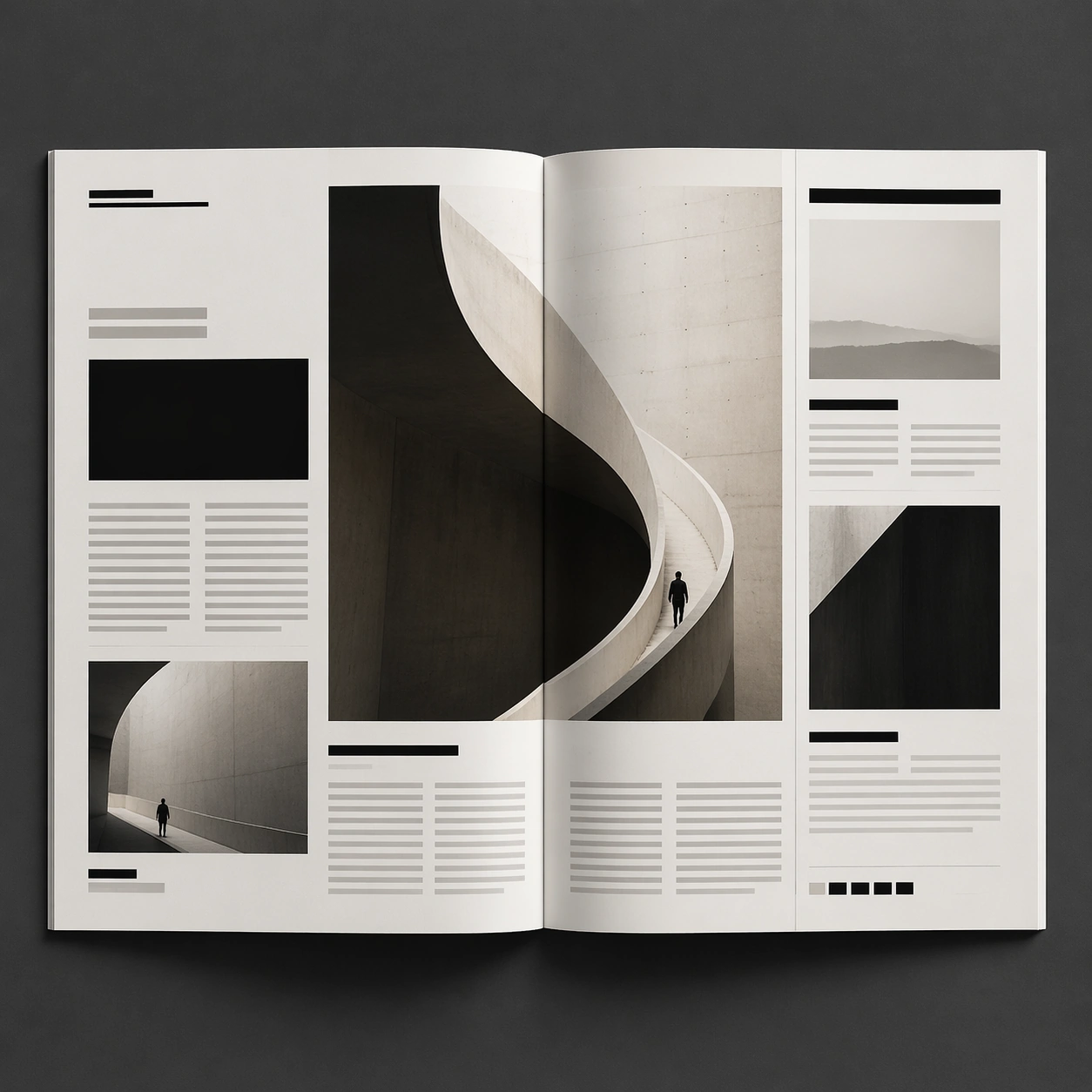
Example generated from “Macro Real Texture — Signature Material”
GPT Image 2en

Scene: A square material-focused image where lighting, scale, and surface behavior are the main event. Build the frame around the most complete and persuasive final material image. Keep the lighting, camera distance, and spatial organization tuned for a high-signal research image rather than a casual snapshot. The image belongs to the Macro Real Texture theme and should feel immediately legible as a prompt atlas theme for macro real texture, testing photorealism, physics-materials with gpt image 2.. Subject: Center the study on the most complete and persuasive final material image. Translate the theme into a concrete visual statement instead of an abstract mood board: the viewer should understand what kind of image this is, what is being tested, and why the composition is difficult. Use the slug idea of macro real texture as a literal guide for subject matter, materials, and staging. Important details: Microstructure matters: refraction, fibers, scratches, pores, edge wear, translucency, and dust should all feel physically specific. Preserve a disciplined square composition, clear focal hierarchy, and enough secondary information to make the image feel complete rather than underspecified. The image should look polished, novel, and exhibition-ready, with topic-specific credibility coming from the way surfaces, structure, and visual language reinforce Macro Real Texture. Avoid generic filler elements that do not serve the main concept. Use case: Macro Real Texture single study 8/8, testing photorealism, physics-materials through the signature material variation. Constraints: No readable text, no watermark, no logos, preserve exact 1:1 aspect ratio, no generic stock macro, no broken scale cues, no plastic-looking texture when it should feel natural, no meaningless blur, no watermark, no fake labels.
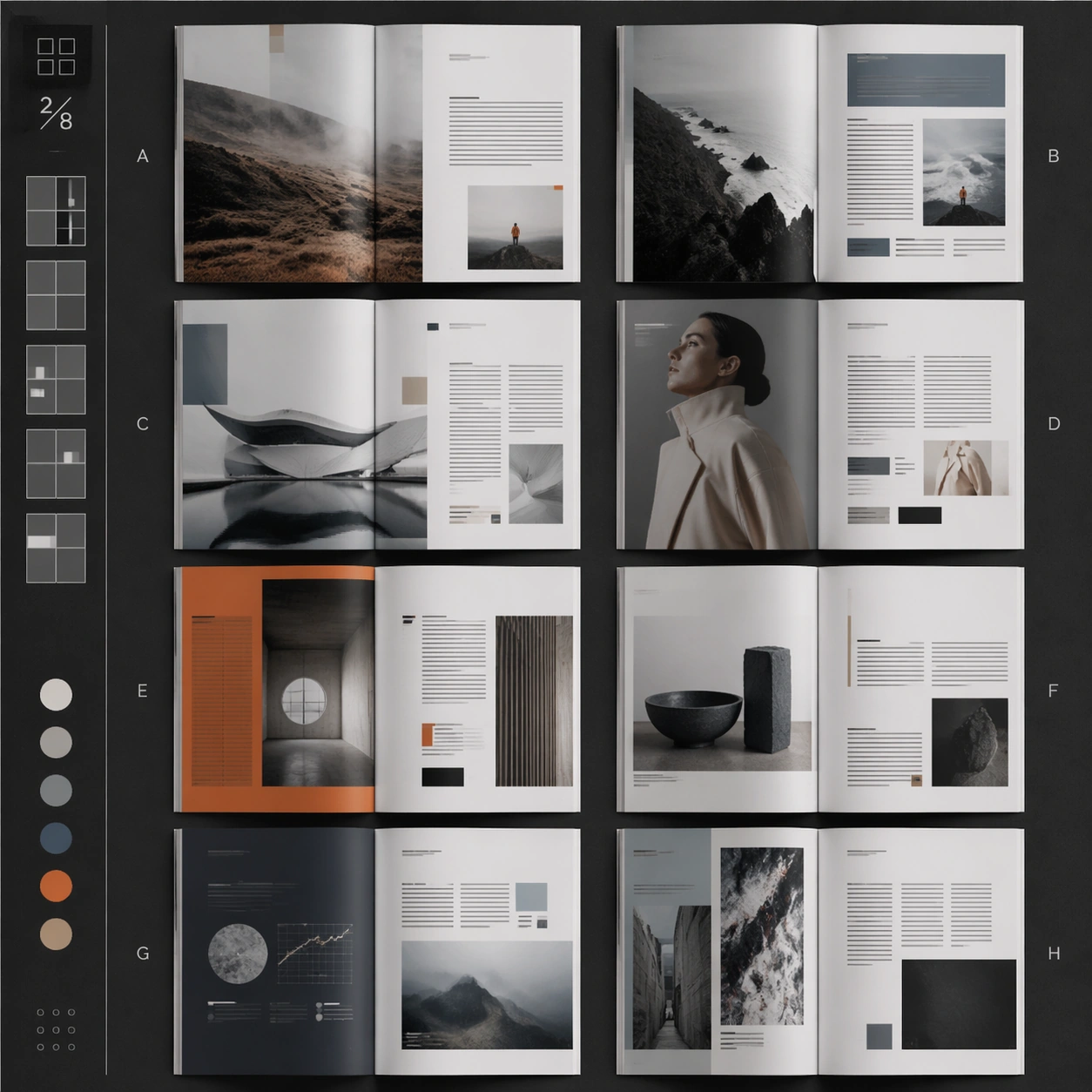
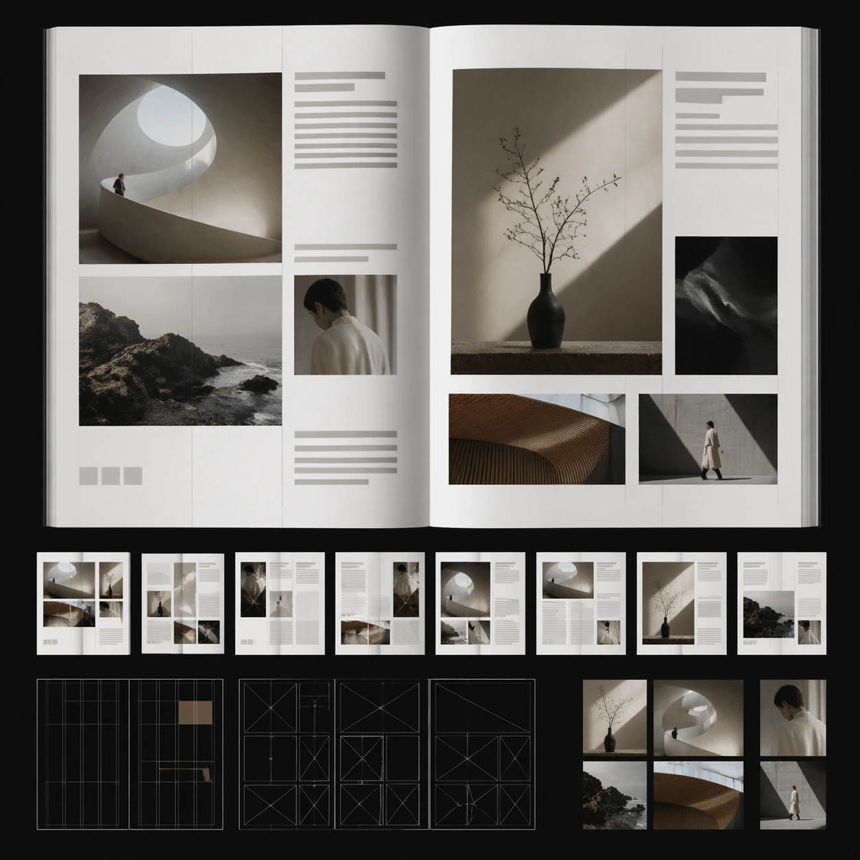
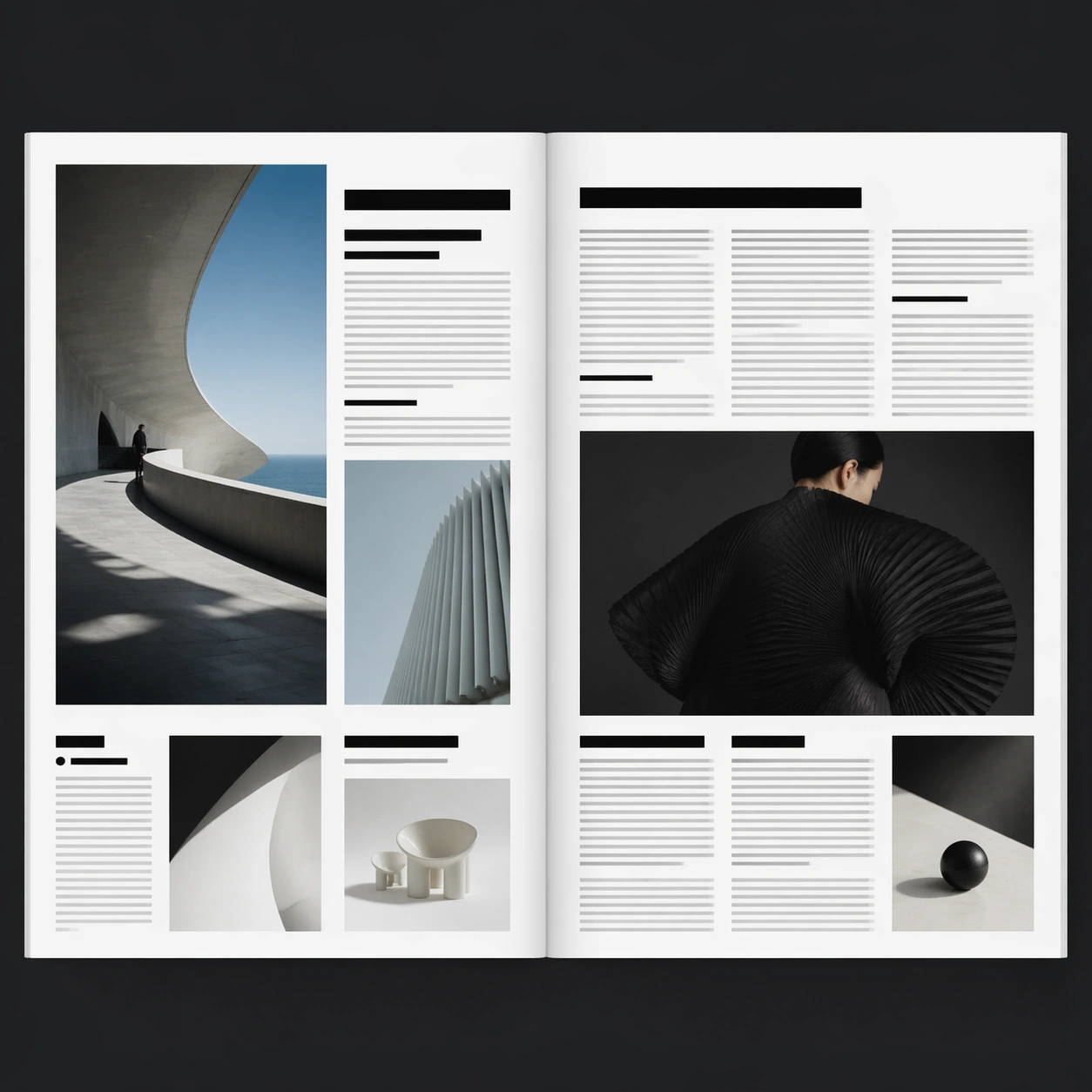
Example generated from “Magazine Spread Layout — Hero Spread”
GPT Image 2en

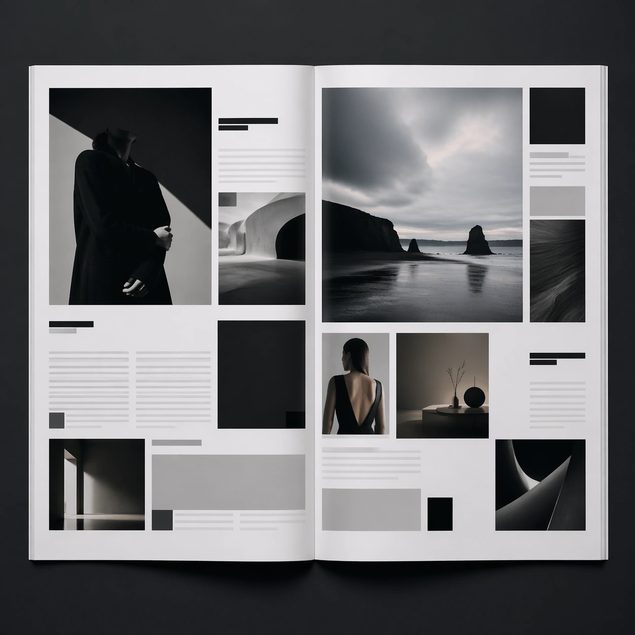
Scene: A square editorial or interface layout study with exact margins, confident grid structure, and premium print or screen presentation. Build the frame around a primary spread or headline surface with immediate hierarchy. Keep the lighting, camera distance, and spatial organization tuned for a high-signal research image rather than a casual snapshot. The image belongs to the Magazine Spread Layout theme and should feel immediately legible as a prompt atlas theme for magazine spread layout, testing multi-image-reference, structured-layout, commercial-mockup with gpt image 2.. Subject: Center the study on a primary spread or headline surface with immediate hierarchy. Translate the theme into a concrete visual statement instead of an abstract mood board: the viewer should understand what kind of image this is, what is being tested, and why the composition is difficult. Use the slug idea of magazine spread layout as a literal guide for subject matter, materials, and staging. If helpful, borrow the broad visual cues suggested by Wired, Vogue, but keep the result original and specific to this study. Important details: Typography fields must stay unreadable, but hierarchy, rhythm, and page architecture should feel convincing enough for design review. Preserve a disciplined square composition, clear focal hierarchy, and enough secondary information to make the image feel complete rather than underspecified. The image should look polished, novel, and exhibition-ready, with topic-specific credibility coming from the way surfaces, structure, and visual language reinforce Magazine Spread Layout. Avoid generic filler elements that do not serve the main concept. Use case: Magazine Spread Layout single study 1/8, testing multi-image-reference, structured-layout, commercial-mockup through the hero spread variation. Constraints: No readable text, no watermark, no logos, preserve exact 1:1 aspect ratio, no readable text, no logo lockups from real brands, no broken grid, no arbitrary poster clutter, no malformed columns, no accidental lorem ipsum.

Example generated from “Magazine Spread Layout — Variant Grid”
GPT Image 2en

Scene: A square editorial or interface layout study with exact margins, confident grid structure, and premium print or screen presentation. Build the frame around multiple aligned variations sharing one disciplined layout system. Keep the lighting, camera distance, and spatial organization tuned for a high-signal research image rather than a casual snapshot. The image belongs to the Magazine Spread Layout theme and should feel immediately legible as a prompt atlas theme for magazine spread layout, testing multi-image-reference, structured-layout, commercial-mockup with gpt image 2.. Subject: Center the study on multiple aligned variations sharing one disciplined layout system. Translate the theme into a concrete visual statement instead of an abstract mood board: the viewer should understand what kind of image this is, what is being tested, and why the composition is difficult. Use the slug idea of magazine spread layout as a literal guide for subject matter, materials, and staging. If helpful, borrow the broad visual cues suggested by Wired, Vogue, but keep the result original and specific to this study. Important details: Typography fields must stay unreadable, but hierarchy, rhythm, and page architecture should feel convincing enough for design review. Preserve a disciplined square composition, clear focal hierarchy, and enough secondary information to make the image feel complete rather than underspecified. The image should look polished, novel, and exhibition-ready, with topic-specific credibility coming from the way surfaces, structure, and visual language reinforce Magazine Spread Layout. Avoid generic filler elements that do not serve the main concept. Use case: Magazine Spread Layout single study 2/8, testing multi-image-reference, structured-layout, commercial-mockup through the variant grid variation. Constraints: No readable text, no watermark, no logos, preserve exact 1:1 aspect ratio, no readable text, no logo lockups from real brands, no broken grid, no arbitrary poster clutter, no malformed columns, no accidental lorem ipsum.

Example generated from “Magazine Spread Layout — Desk Review”
GPT Image 2en

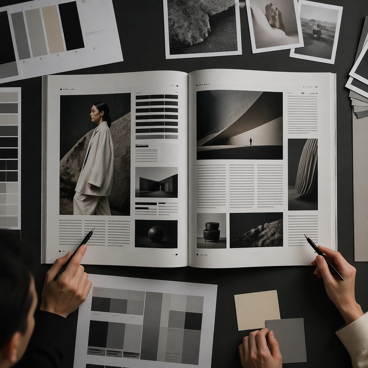
Scene: A square editorial or interface layout study with exact margins, confident grid structure, and premium print or screen presentation. Build the frame around a presentation context that shows the layout as a reviewed design object. Keep the lighting, camera distance, and spatial organization tuned for a high-signal research image rather than a casual snapshot. The image belongs to the Magazine Spread Layout theme and should feel immediately legible as a prompt atlas theme for magazine spread layout, testing multi-image-reference, structured-layout, commercial-mockup with gpt image 2.. Subject: Center the study on a presentation context that shows the layout as a reviewed design object. Translate the theme into a concrete visual statement instead of an abstract mood board: the viewer should understand what kind of image this is, what is being tested, and why the composition is difficult. Use the slug idea of magazine spread layout as a literal guide for subject matter, materials, and staging. If helpful, borrow the broad visual cues suggested by Wired, Vogue, but keep the result original and specific to this study. Important details: Typography fields must stay unreadable, but hierarchy, rhythm, and page architecture should feel convincing enough for design review. Preserve a disciplined square composition, clear focal hierarchy, and enough secondary information to make the image feel complete rather than underspecified. The image should look polished, novel, and exhibition-ready, with topic-specific credibility coming from the way surfaces, structure, and visual language reinforce Magazine Spread Layout. Avoid generic filler elements that do not serve the main concept. Use case: Magazine Spread Layout single study 3/8, testing multi-image-reference, structured-layout, commercial-mockup through the desk review variation. Constraints: No readable text, no watermark, no logos, preserve exact 1:1 aspect ratio, no readable text, no logo lockups from real brands, no broken grid, no arbitrary poster clutter, no malformed columns, no accidental lorem ipsum.

Example generated from “Magazine Spread Layout — Material Closeup”
GPT Image 2en

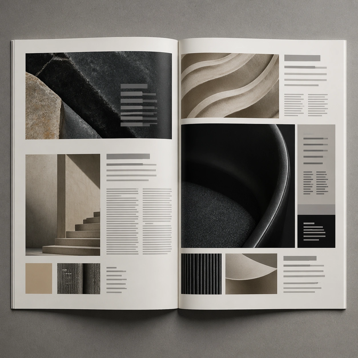
Scene: A square editorial or interface layout study with exact margins, confident grid structure, and premium print or screen presentation. Build the frame around print grain, paper, or screen detail without losing overall composition. Keep the lighting, camera distance, and spatial organization tuned for a high-signal research image rather than a casual snapshot. The image belongs to the Magazine Spread Layout theme and should feel immediately legible as a prompt atlas theme for magazine spread layout, testing multi-image-reference, structured-layout, commercial-mockup with gpt image 2.. Subject: Center the study on print grain, paper, or screen detail without losing overall composition. Translate the theme into a concrete visual statement instead of an abstract mood board: the viewer should understand what kind of image this is, what is being tested, and why the composition is difficult. Use the slug idea of magazine spread layout as a literal guide for subject matter, materials, and staging. If helpful, borrow the broad visual cues suggested by Wired, Vogue, but keep the result original and specific to this study. Important details: Typography fields must stay unreadable, but hierarchy, rhythm, and page architecture should feel convincing enough for design review. Preserve a disciplined square composition, clear focal hierarchy, and enough secondary information to make the image feel complete rather than underspecified. The image should look polished, novel, and exhibition-ready, with topic-specific credibility coming from the way surfaces, structure, and visual language reinforce Magazine Spread Layout. Avoid generic filler elements that do not serve the main concept. Use case: Magazine Spread Layout single study 4/8, testing multi-image-reference, structured-layout, commercial-mockup through the material closeup variation. Constraints: No readable text, no watermark, no logos, preserve exact 1:1 aspect ratio, no readable text, no logo lockups from real brands, no broken grid, no arbitrary poster clutter, no malformed columns, no accidental lorem ipsum.

Example generated from “Magazine Spread Layout — Archive Sheet”
GPT Image 2en

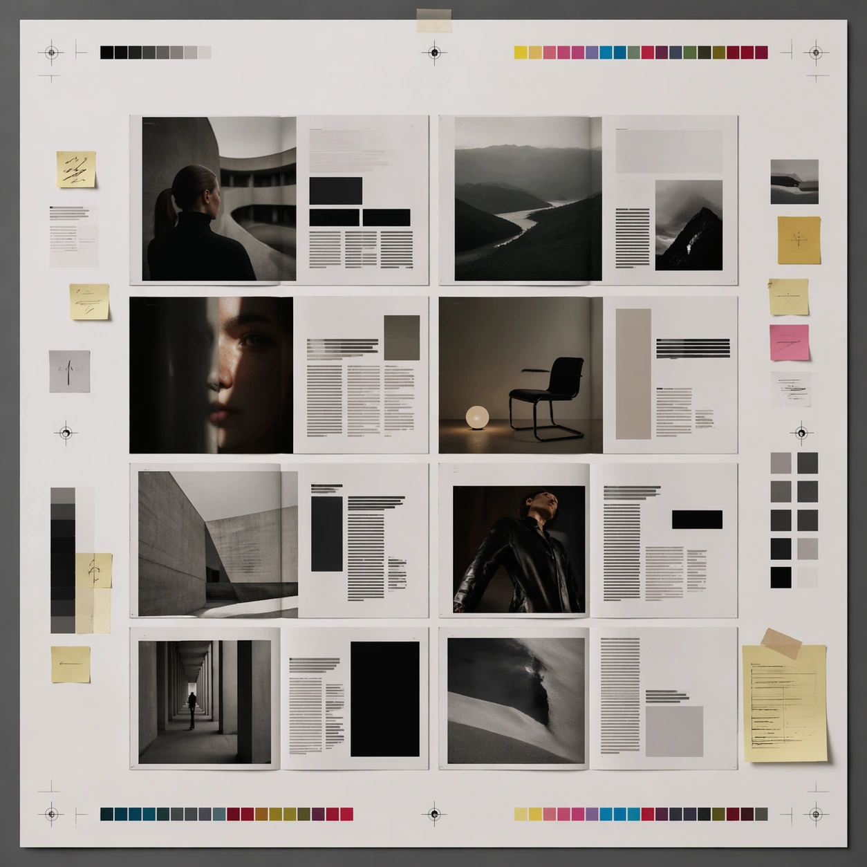
Scene: A square editorial or interface layout study with exact margins, confident grid structure, and premium print or screen presentation. Build the frame around a flat archival or proof-like sheet with modular content blocks. Keep the lighting, camera distance, and spatial organization tuned for a high-signal research image rather than a casual snapshot. The image belongs to the Magazine Spread Layout theme and should feel immediately legible as a prompt atlas theme for magazine spread layout, testing multi-image-reference, structured-layout, commercial-mockup with gpt image 2.. Subject: Center the study on a flat archival or proof-like sheet with modular content blocks. Translate the theme into a concrete visual statement instead of an abstract mood board: the viewer should understand what kind of image this is, what is being tested, and why the composition is difficult. Use the slug idea of magazine spread layout as a literal guide for subject matter, materials, and staging. If helpful, borrow the broad visual cues suggested by Wired, Vogue, but keep the result original and specific to this study. Important details: Typography fields must stay unreadable, but hierarchy, rhythm, and page architecture should feel convincing enough for design review. Preserve a disciplined square composition, clear focal hierarchy, and enough secondary information to make the image feel complete rather than underspecified. The image should look polished, novel, and exhibition-ready, with topic-specific credibility coming from the way surfaces, structure, and visual language reinforce Magazine Spread Layout. Avoid generic filler elements that do not serve the main concept. Use case: Magazine Spread Layout single study 5/8, testing multi-image-reference, structured-layout, commercial-mockup through the archive sheet variation. Constraints: No readable text, no watermark, no logos, preserve exact 1:1 aspect ratio, no readable text, no logo lockups from real brands, no broken grid, no arbitrary poster clutter, no malformed columns, no accidental lorem ipsum.

Example generated from “Magazine Spread Layout — 陈列展示”
GPT Image 2en

Scene: A square editorial or interface layout study with exact margins, confident grid structure, and premium print or screen presentation. Build the frame around a polished display context that still preserves layout logic. Keep the lighting, camera distance, and spatial organization tuned for a high-signal research image rather than a casual snapshot. The image belongs to the Magazine Spread Layout theme and should feel immediately legible as a prompt atlas theme for magazine spread layout, testing multi-image-reference, structured-layout, commercial-mockup with gpt image 2.. Subject: Center the study on a polished display context that still preserves layout logic. Translate the theme into a concrete visual statement instead of an abstract mood board: the viewer should understand what kind of image this is, what is being tested, and why the composition is difficult. Use the slug idea of magazine spread layout as a literal guide for subject matter, materials, and staging. If helpful, borrow the broad visual cues suggested by Wired, Vogue, but keep the result original and specific to this study. Important details: Typography fields must stay unreadable, but hierarchy, rhythm, and page architecture should feel convincing enough for design review. Preserve a disciplined square composition, clear focal hierarchy, and enough secondary information to make the image feel complete rather than underspecified. The image should look polished, novel, and exhibition-ready, with topic-specific credibility coming from the way surfaces, structure, and visual language reinforce Magazine Spread Layout. Avoid generic filler elements that do not serve the main concept. Use case: Magazine Spread Layout single study 6/8, testing multi-image-reference, structured-layout, commercial-mockup through the 陈列展示 variation. Constraints: No readable text, no watermark, no logos, preserve exact 1:1 aspect ratio, no readable text, no logo lockups from real brands, no broken grid, no arbitrary poster clutter, no malformed columns, no accidental lorem ipsum.

Example generated from “Magazine Spread Layout — System Board”
GPT Image 2en

Scene: A square editorial or interface layout study with exact margins, confident grid structure, and premium print or screen presentation. Build the frame around a family of elements organized into a coherent visual language. Keep the lighting, camera distance, and spatial organization tuned for a high-signal research image rather than a casual snapshot. The image belongs to the Magazine Spread Layout theme and should feel immediately legible as a prompt atlas theme for magazine spread layout, testing multi-image-reference, structured-layout, commercial-mockup with gpt image 2.. Subject: Center the study on a family of elements organized into a coherent visual language. Translate the theme into a concrete visual statement instead of an abstract mood board: the viewer should understand what kind of image this is, what is being tested, and why the composition is difficult. Use the slug idea of magazine spread layout as a literal guide for subject matter, materials, and staging. If helpful, borrow the broad visual cues suggested by Wired, Vogue, but keep the result original and specific to this study. Important details: Typography fields must stay unreadable, but hierarchy, rhythm, and page architecture should feel convincing enough for design review. Preserve a disciplined square composition, clear focal hierarchy, and enough secondary information to make the image feel complete rather than underspecified. The image should look polished, novel, and exhibition-ready, with topic-specific credibility coming from the way surfaces, structure, and visual language reinforce Magazine Spread Layout. Avoid generic filler elements that do not serve the main concept. Use case: Magazine Spread Layout single study 7/8, testing multi-image-reference, structured-layout, commercial-mockup through the system board variation. Constraints: No readable text, no watermark, no logos, preserve exact 1:1 aspect ratio, no readable text, no logo lockups from real brands, no broken grid, no arbitrary poster clutter, no malformed columns, no accidental lorem ipsum.

Example generated from “Magazine Spread Layout — Signature Layout”
GPT Image 2en

Scene: A square editorial or interface layout study with exact margins, confident grid structure, and premium print or screen presentation. Build the frame around the most distilled expression of the topic’s layout identity. Keep the lighting, camera distance, and spatial organization tuned for a high-signal research image rather than a casual snapshot. The image belongs to the Magazine Spread Layout theme and should feel immediately legible as a prompt atlas theme for magazine spread layout, testing multi-image-reference, structured-layout, commercial-mockup with gpt image 2.. Subject: Center the study on the most distilled expression of the topic’s layout identity. Translate the theme into a concrete visual statement instead of an abstract mood board: the viewer should understand what kind of image this is, what is being tested, and why the composition is difficult. Use the slug idea of magazine spread layout as a literal guide for subject matter, materials, and staging. If helpful, borrow the broad visual cues suggested by Wired, Vogue, but keep the result original and specific to this study. Important details: Typography fields must stay unreadable, but hierarchy, rhythm, and page architecture should feel convincing enough for design review. Preserve a disciplined square composition, clear focal hierarchy, and enough secondary information to make the image feel complete rather than underspecified. The image should look polished, novel, and exhibition-ready, with topic-specific credibility coming from the way surfaces, structure, and visual language reinforce Magazine Spread Layout. Avoid generic filler elements that do not serve the main concept. Use case: Magazine Spread Layout single study 8/8, testing multi-image-reference, structured-layout, commercial-mockup through the signature layout variation. Constraints: No readable text, no watermark, no logos, preserve exact 1:1 aspect ratio, no readable text, no logo lockups from real brands, no broken grid, no arbitrary poster clutter, no malformed columns, no accidental lorem ipsum.

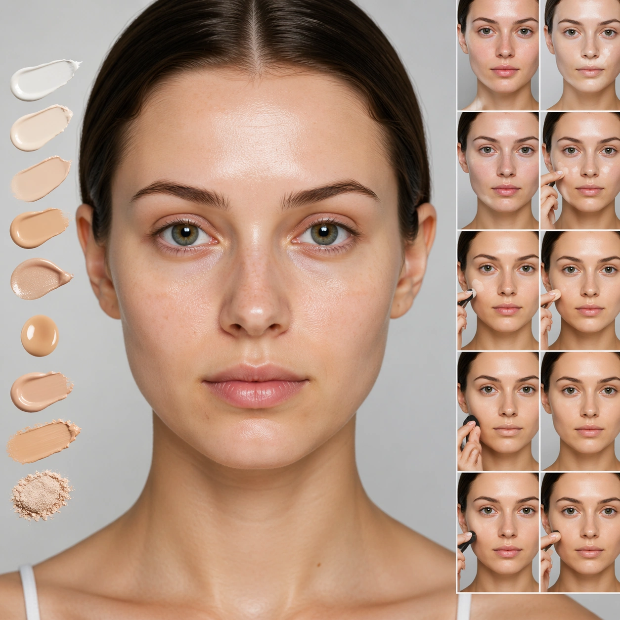
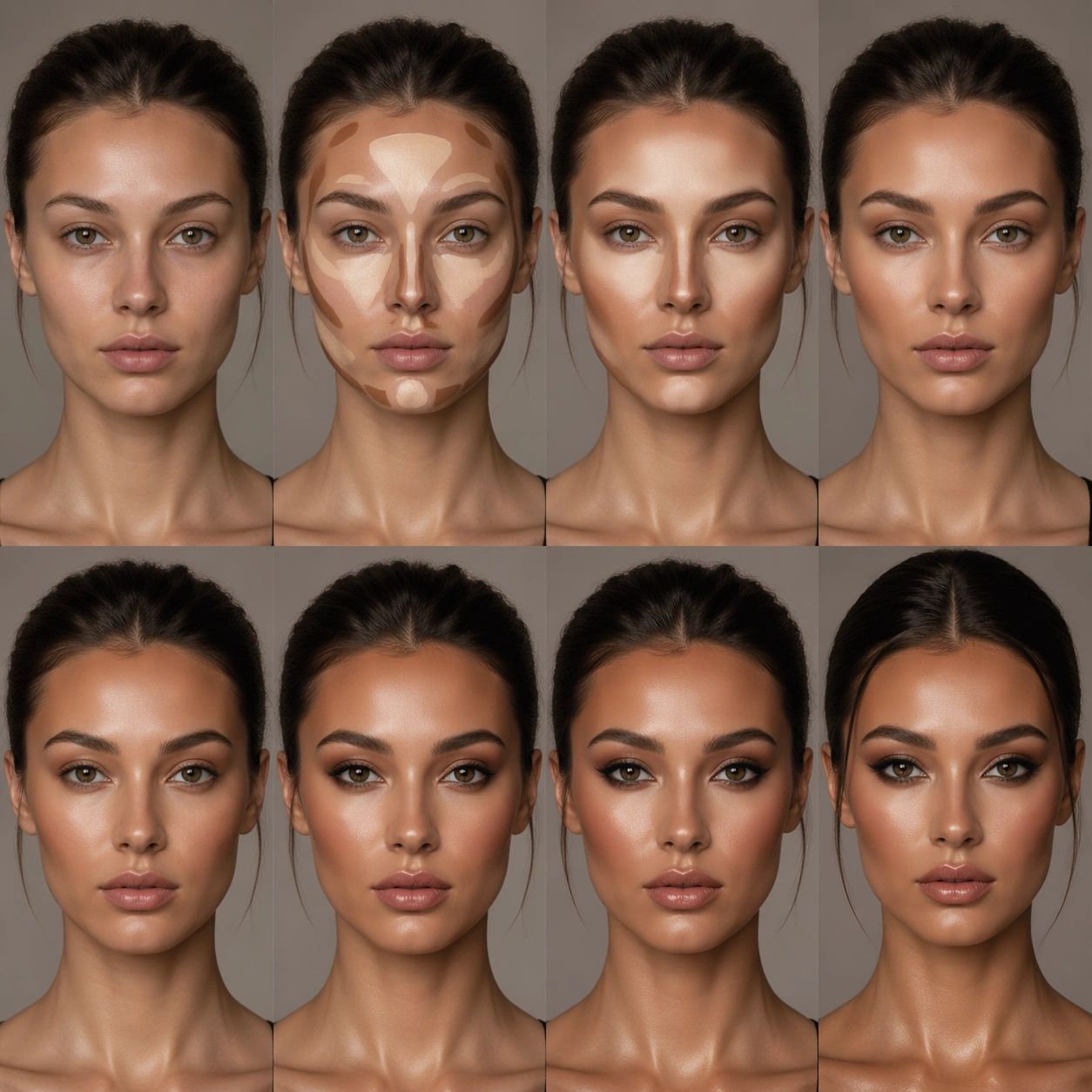
Example generated from “Makeup Stage Evolution — Bare Base Look”
GPT Image 2en

Scene: A square beauty image with controlled skin rendering, editorial lighting, and a clear makeup or styling thesis. Build the frame around a restrained foundational look where structure and skin preparation dominate. Keep the lighting, camera distance, and spatial organization tuned for a high-signal research image rather than a casual snapshot. The image belongs to the Makeup Stage Evolution theme and should feel immediately legible as a prompt atlas theme for makeup stage evolution, testing structured-layout, photorealism, style-transfer, commercial-mockup with gpt image 2.. Subject: Center the study on a restrained foundational look where structure and skin preparation dominate. Translate the theme into a concrete visual statement instead of an abstract mood board: the viewer should understand what kind of image this is, what is being tested, and why the composition is difficult. Use the slug idea of makeup stage evolution as a literal guide for subject matter, materials, and staging. If helpful, borrow the broad visual cues suggested by iPhone, but keep the result original and specific to this study. Important details: The image should show real cosmetic logic through pigment placement, texture transitions, finish control, and believable facial structure instead of random color on skin. Preserve a disciplined square composition, clear focal hierarchy, and enough secondary information to make the image feel complete rather than underspecified. The image should look polished, novel, and exhibition-ready, with topic-specific credibility coming from the way surfaces, structure, and visual language reinforce Makeup Stage Evolution. Avoid generic filler elements that do not serve the main concept. Use case: Makeup Stage Evolution single study 1/8, testing structured-layout, photorealism, style-transfer, commercial-mockup through the bare base look variation. Constraints: No readable text, no watermark, no logos, preserve exact 1:1 aspect ratio, no brand logos, no runway watermark, no unreadable backstage signage, no cosmetic packaging front-and-center, no plastic skin, no generic glamour pose.

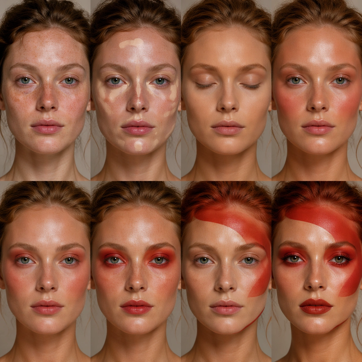
Example generated from “Makeup Stage Evolution — Editorial Pigment”
GPT Image 2en

Scene: A square beauty image with controlled skin rendering, editorial lighting, and a clear makeup or styling thesis. Build the frame around pigment used as a bold but controlled visual statement. Keep the lighting, camera distance, and spatial organization tuned for a high-signal research image rather than a casual snapshot. The image belongs to the Makeup Stage Evolution theme and should feel immediately legible as a prompt atlas theme for makeup stage evolution, testing structured-layout, photorealism, style-transfer, commercial-mockup with gpt image 2.. Subject: Center the study on pigment used as a bold but controlled visual statement. Translate the theme into a concrete visual statement instead of an abstract mood board: the viewer should understand what kind of image this is, what is being tested, and why the composition is difficult. Use the slug idea of makeup stage evolution as a literal guide for subject matter, materials, and staging. If helpful, borrow the broad visual cues suggested by iPhone, but keep the result original and specific to this study. Important details: The image should show real cosmetic logic through pigment placement, texture transitions, finish control, and believable facial structure instead of random color on skin. Preserve a disciplined square composition, clear focal hierarchy, and enough secondary information to make the image feel complete rather than underspecified. The image should look polished, novel, and exhibition-ready, with topic-specific credibility coming from the way surfaces, structure, and visual language reinforce Makeup Stage Evolution. Avoid generic filler elements that do not serve the main concept. Use case: Makeup Stage Evolution single study 2/8, testing structured-layout, photorealism, style-transfer, commercial-mockup through the editorial pigment variation. Constraints: No readable text, no watermark, no logos, preserve exact 1:1 aspect ratio, no brand logos, no runway watermark, no unreadable backstage signage, no cosmetic packaging front-and-center, no plastic skin, no generic glamour pose.

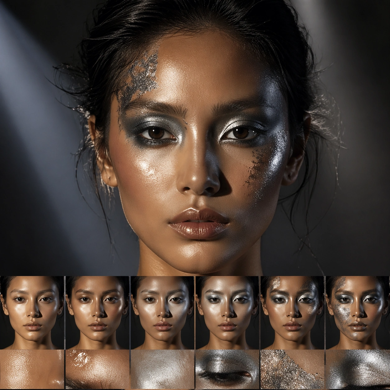
Example generated from “Makeup Stage Evolution — Metallic Stage”
GPT Image 2en

Scene: A square beauty image with controlled skin rendering, editorial lighting, and a clear makeup or styling thesis. Build the frame around reflective texture and theatrical lighting without losing realism. Keep the lighting, camera distance, and spatial organization tuned for a high-signal research image rather than a casual snapshot. The image belongs to the Makeup Stage Evolution theme and should feel immediately legible as a prompt atlas theme for makeup stage evolution, testing structured-layout, photorealism, style-transfer, commercial-mockup with gpt image 2.. Subject: Center the study on reflective texture and theatrical lighting without losing realism. Translate the theme into a concrete visual statement instead of an abstract mood board: the viewer should understand what kind of image this is, what is being tested, and why the composition is difficult. Use the slug idea of makeup stage evolution as a literal guide for subject matter, materials, and staging. If helpful, borrow the broad visual cues suggested by iPhone, but keep the result original and specific to this study. Important details: The image should show real cosmetic logic through pigment placement, texture transitions, finish control, and believable facial structure instead of random color on skin. Preserve a disciplined square composition, clear focal hierarchy, and enough secondary information to make the image feel complete rather than underspecified. The image should look polished, novel, and exhibition-ready, with topic-specific credibility coming from the way surfaces, structure, and visual language reinforce Makeup Stage Evolution. Avoid generic filler elements that do not serve the main concept. Use case: Makeup Stage Evolution single study 3/8, testing structured-layout, photorealism, style-transfer, commercial-mockup through the metallic stage variation. Constraints: No readable text, no watermark, no logos, preserve exact 1:1 aspect ratio, no brand logos, no runway watermark, no unreadable backstage signage, no cosmetic packaging front-and-center, no plastic skin, no generic glamour pose.

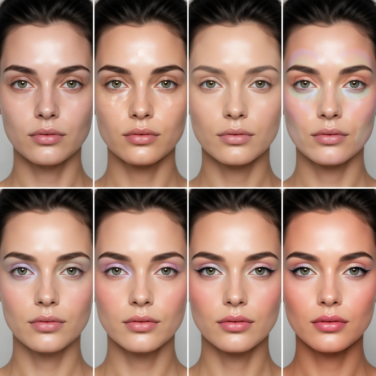
Example generated from “Makeup Stage Evolution — Pastel Wash”
GPT Image 2en

Scene: A square beauty image with controlled skin rendering, editorial lighting, and a clear makeup or styling thesis. Build the frame around soft layered color transitions with deliberate edge control. Keep the lighting, camera distance, and spatial organization tuned for a high-signal research image rather than a casual snapshot. The image belongs to the Makeup Stage Evolution theme and should feel immediately legible as a prompt atlas theme for makeup stage evolution, testing structured-layout, photorealism, style-transfer, commercial-mockup with gpt image 2.. Subject: Center the study on soft layered color transitions with deliberate edge control. Translate the theme into a concrete visual statement instead of an abstract mood board: the viewer should understand what kind of image this is, what is being tested, and why the composition is difficult. Use the slug idea of makeup stage evolution as a literal guide for subject matter, materials, and staging. If helpful, borrow the broad visual cues suggested by iPhone, but keep the result original and specific to this study. Important details: The image should show real cosmetic logic through pigment placement, texture transitions, finish control, and believable facial structure instead of random color on skin. Preserve a disciplined square composition, clear focal hierarchy, and enough secondary information to make the image feel complete rather than underspecified. The image should look polished, novel, and exhibition-ready, with topic-specific credibility coming from the way surfaces, structure, and visual language reinforce Makeup Stage Evolution. Avoid generic filler elements that do not serve the main concept. Use case: Makeup Stage Evolution single study 4/8, testing structured-layout, photorealism, style-transfer, commercial-mockup through the pastel wash variation. Constraints: No readable text, no watermark, no logos, preserve exact 1:1 aspect ratio, no brand logos, no runway watermark, no unreadable backstage signage, no cosmetic packaging front-and-center, no plastic skin, no generic glamour pose.

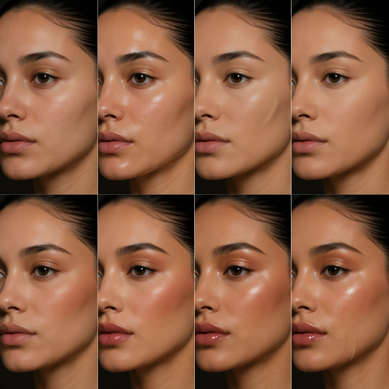
Example generated from “Makeup Stage Evolution — Wet Gloss Transition”
GPT Image 2en

Scene: A square beauty image with controlled skin rendering, editorial lighting, and a clear makeup or styling thesis. Build the frame around wet-to-dry finish contrast handled with precision. Keep the lighting, camera distance, and spatial organization tuned for a high-signal research image rather than a casual snapshot. The image belongs to the Makeup Stage Evolution theme and should feel immediately legible as a prompt atlas theme for makeup stage evolution, testing structured-layout, photorealism, style-transfer, commercial-mockup with gpt image 2.. Subject: Center the study on wet-to-dry finish contrast handled with precision. Translate the theme into a concrete visual statement instead of an abstract mood board: the viewer should understand what kind of image this is, what is being tested, and why the composition is difficult. Use the slug idea of makeup stage evolution as a literal guide for subject matter, materials, and staging. If helpful, borrow the broad visual cues suggested by iPhone, but keep the result original and specific to this study. Important details: The image should show real cosmetic logic through pigment placement, texture transitions, finish control, and believable facial structure instead of random color on skin. Preserve a disciplined square composition, clear focal hierarchy, and enough secondary information to make the image feel complete rather than underspecified. The image should look polished, novel, and exhibition-ready, with topic-specific credibility coming from the way surfaces, structure, and visual language reinforce Makeup Stage Evolution. Avoid generic filler elements that do not serve the main concept. Use case: Makeup Stage Evolution single study 5/8, testing structured-layout, photorealism, style-transfer, commercial-mockup through the wet gloss transition variation. Constraints: No readable text, no watermark, no logos, preserve exact 1:1 aspect ratio, no brand logos, no runway watermark, no unreadable backstage signage, no cosmetic packaging front-and-center, no plastic skin, no generic glamour pose.

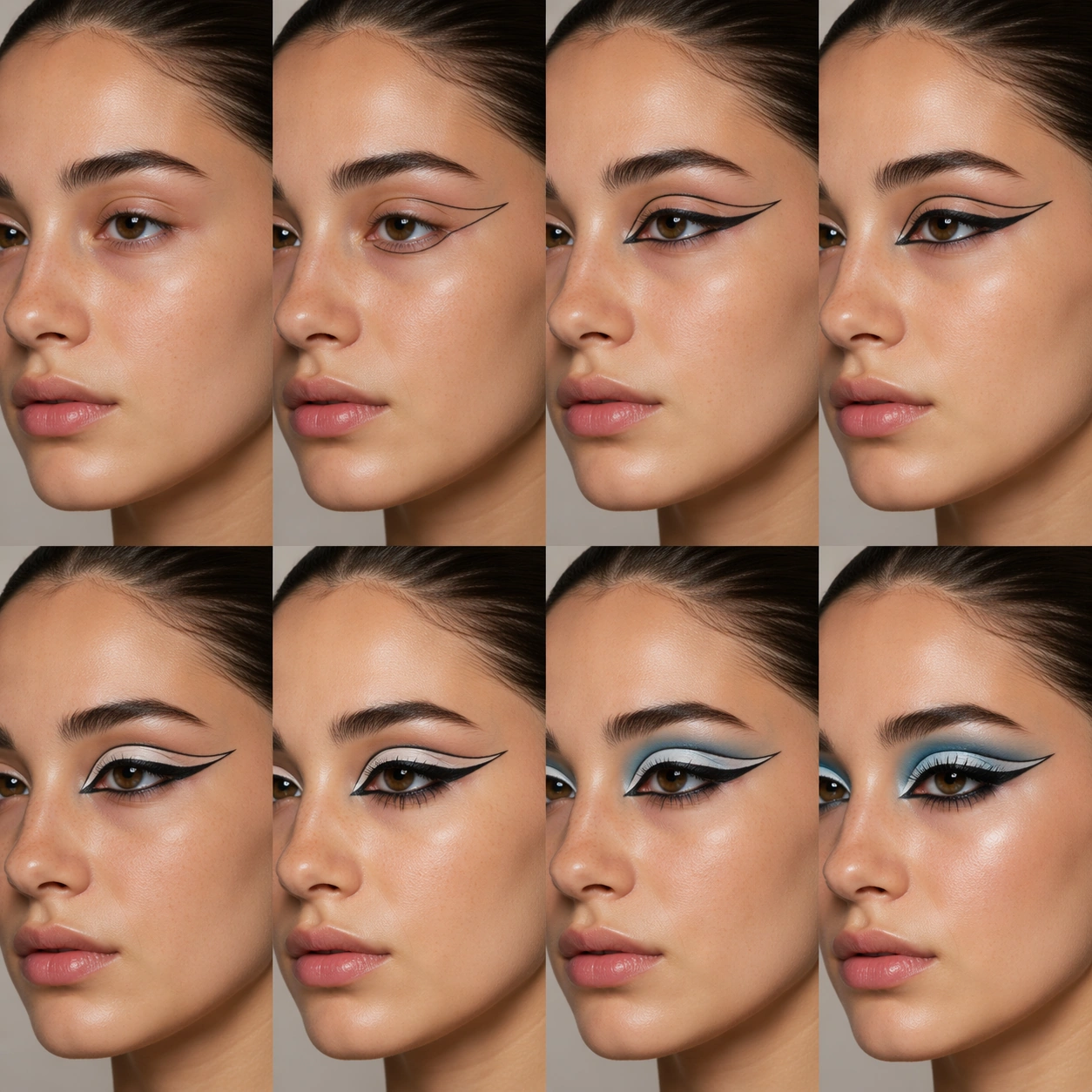
Example generated from “Makeup Stage Evolution — Graphic Liner”
GPT Image 2en

Scene: A square beauty image with controlled skin rendering, editorial lighting, and a clear makeup or styling thesis. Build the frame around sharp graphic shape work balanced against believable skin and lashes. Keep the lighting, camera distance, and spatial organization tuned for a high-signal research image rather than a casual snapshot. The image belongs to the Makeup Stage Evolution theme and should feel immediately legible as a prompt atlas theme for makeup stage evolution, testing structured-layout, photorealism, style-transfer, commercial-mockup with gpt image 2.. Subject: Center the study on sharp graphic shape work balanced against believable skin and lashes. Translate the theme into a concrete visual statement instead of an abstract mood board: the viewer should understand what kind of image this is, what is being tested, and why the composition is difficult. Use the slug idea of makeup stage evolution as a literal guide for subject matter, materials, and staging. If helpful, borrow the broad visual cues suggested by iPhone, but keep the result original and specific to this study. Important details: The image should show real cosmetic logic through pigment placement, texture transitions, finish control, and believable facial structure instead of random color on skin. Preserve a disciplined square composition, clear focal hierarchy, and enough secondary information to make the image feel complete rather than underspecified. The image should look polished, novel, and exhibition-ready, with topic-specific credibility coming from the way surfaces, structure, and visual language reinforce Makeup Stage Evolution. Avoid generic filler elements that do not serve the main concept. Use case: Makeup Stage Evolution single study 6/8, testing structured-layout, photorealism, style-transfer, commercial-mockup through the graphic liner variation. Constraints: No readable text, no watermark, no logos, preserve exact 1:1 aspect ratio, no brand logos, no runway watermark, no unreadable backstage signage, no cosmetic packaging front-and-center, no plastic skin, no generic glamour pose.

Example generated from “Makeup Stage Evolution — Sculpted Finish”
GPT Image 2en

Scene: A square beauty image with controlled skin rendering, editorial lighting, and a clear makeup or styling thesis. Build the frame around form-defining highlight and contour used with editorial restraint. Keep the lighting, camera distance, and spatial organization tuned for a high-signal research image rather than a casual snapshot. The image belongs to the Makeup Stage Evolution theme and should feel immediately legible as a prompt atlas theme for makeup stage evolution, testing structured-layout, photorealism, style-transfer, commercial-mockup with gpt image 2.. Subject: Center the study on form-defining highlight and contour used with editorial restraint. Translate the theme into a concrete visual statement instead of an abstract mood board: the viewer should understand what kind of image this is, what is being tested, and why the composition is difficult. Use the slug idea of makeup stage evolution as a literal guide for subject matter, materials, and staging. If helpful, borrow the broad visual cues suggested by iPhone, but keep the result original and specific to this study. Important details: The image should show real cosmetic logic through pigment placement, texture transitions, finish control, and believable facial structure instead of random color on skin. Preserve a disciplined square composition, clear focal hierarchy, and enough secondary information to make the image feel complete rather than underspecified. The image should look polished, novel, and exhibition-ready, with topic-specific credibility coming from the way surfaces, structure, and visual language reinforce Makeup Stage Evolution. Avoid generic filler elements that do not serve the main concept. Use case: Makeup Stage Evolution single study 7/8, testing structured-layout, photorealism, style-transfer, commercial-mockup through the sculpted finish variation. Constraints: No readable text, no watermark, no logos, preserve exact 1:1 aspect ratio, no brand logos, no runway watermark, no unreadable backstage signage, no cosmetic packaging front-and-center, no plastic skin, no generic glamour pose.

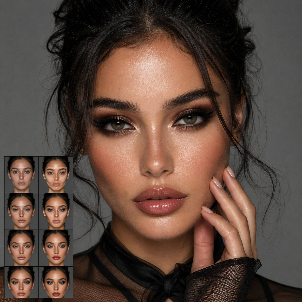
Example generated from “Makeup Stage Evolution — Signature Look”
GPT Image 2en

Scene: A square beauty image with controlled skin rendering, editorial lighting, and a clear makeup or styling thesis. Build the frame around the strongest final stage or transformation image for the topic. Keep the lighting, camera distance, and spatial organization tuned for a high-signal research image rather than a casual snapshot. The image belongs to the Makeup Stage Evolution theme and should feel immediately legible as a prompt atlas theme for makeup stage evolution, testing structured-layout, photorealism, style-transfer, commercial-mockup with gpt image 2.. Subject: Center the study on the strongest final stage or transformation image for the topic. Translate the theme into a concrete visual statement instead of an abstract mood board: the viewer should understand what kind of image this is, what is being tested, and why the composition is difficult. Use the slug idea of makeup stage evolution as a literal guide for subject matter, materials, and staging. If helpful, borrow the broad visual cues suggested by iPhone, but keep the result original and specific to this study. Important details: The image should show real cosmetic logic through pigment placement, texture transitions, finish control, and believable facial structure instead of random color on skin. Preserve a disciplined square composition, clear focal hierarchy, and enough secondary information to make the image feel complete rather than underspecified. The image should look polished, novel, and exhibition-ready, with topic-specific credibility coming from the way surfaces, structure, and visual language reinforce Makeup Stage Evolution. Avoid generic filler elements that do not serve the main concept. Use case: Makeup Stage Evolution single study 8/8, testing structured-layout, photorealism, style-transfer, commercial-mockup through the signature look variation. Constraints: No readable text, no watermark, no logos, preserve exact 1:1 aspect ratio, no brand logos, no runway watermark, no unreadable backstage signage, no cosmetic packaging front-and-center, no plastic skin, no generic glamour pose.

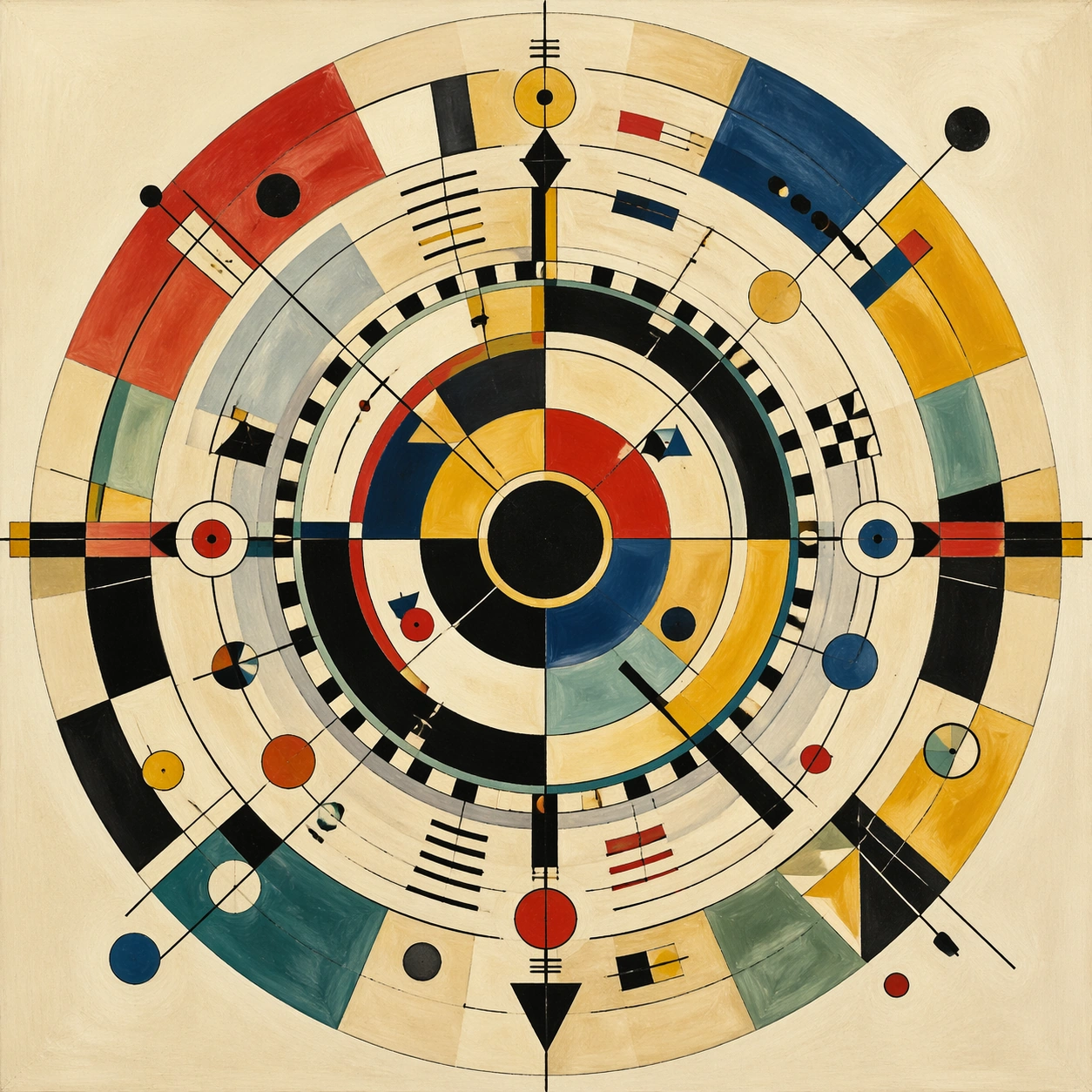
Example generated from “Mandala Precision Geometry — Kandinsky Geometry Wheel”
GPT Image 2en

Scene: A square abstract painting presented frontally as if photographed from a modern art archive, with flat even lighting that preserves paper grain, brush drag, and crisp ink lines. The image should feel like a complete radial composition rather than a poster, with a pale warm ground and highly controlled color intervals around a central circular anchor. Subject: A Kandinsky inspired geometry mandala composed of concentric circles, arcs, black structural lines, small triangles, checker accents, floating dots, color wedges, and balanced asymmetries that still resolve into a stable wheel. The central disk should hold the composition while surrounding sectors introduce reds, cobalt, mustard, ivory, black, and muted teal. Although the design borrows from early twentieth-century abstract painting, it must still read as a mandala: a centered, radiating order where each segment echoes across the circle and every opposing quadrant feels intentionally counterweighted. Important details: The challenge is disciplined abstraction, not chaos. Preserve exact circular centering, visible ring structure, and deliberate relationships between geometric fragments. Brush textures may remain human and slightly imperfect, but the radial logic must be undeniable. Balance dense graphic zones against open breathing space so the image remains elegant from far away and rewarding up close. The abstract shapes should suggest music, motion, and thought without breaking the mandala framework. Use case: Mandala Precision Geometry single study 3/8, testing whether modern abstract language can still obey mandala-like radial precision. Constraints: No readable text, no watermark, no logos, preserve exact 1:1 aspect ratio, no random splatter field, no collage scraps, no off-center composition, no photorealistic objects, no human figure, no frame, no typography, no muddy color blending.

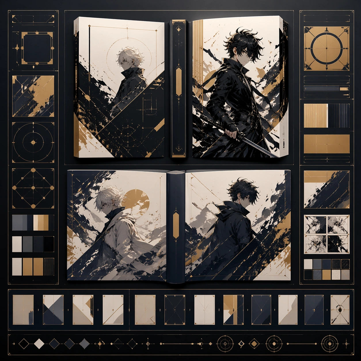
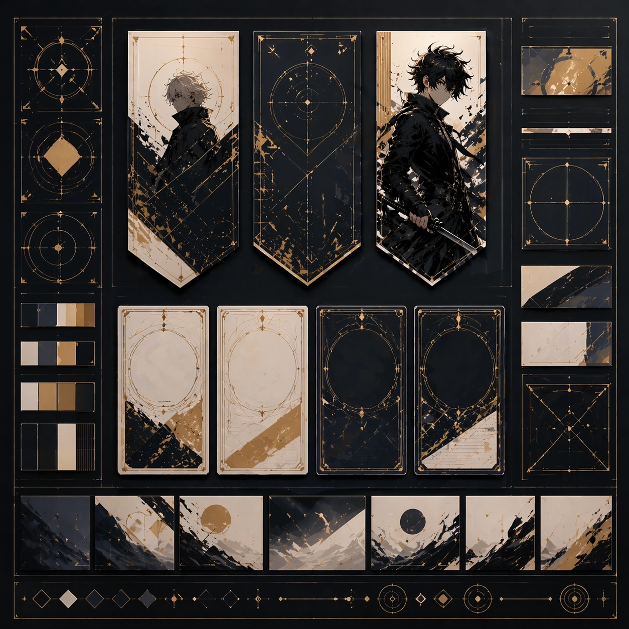
Example generated from “Manga Cover And Spread System — Reference Anchor”
GPT Image 2en

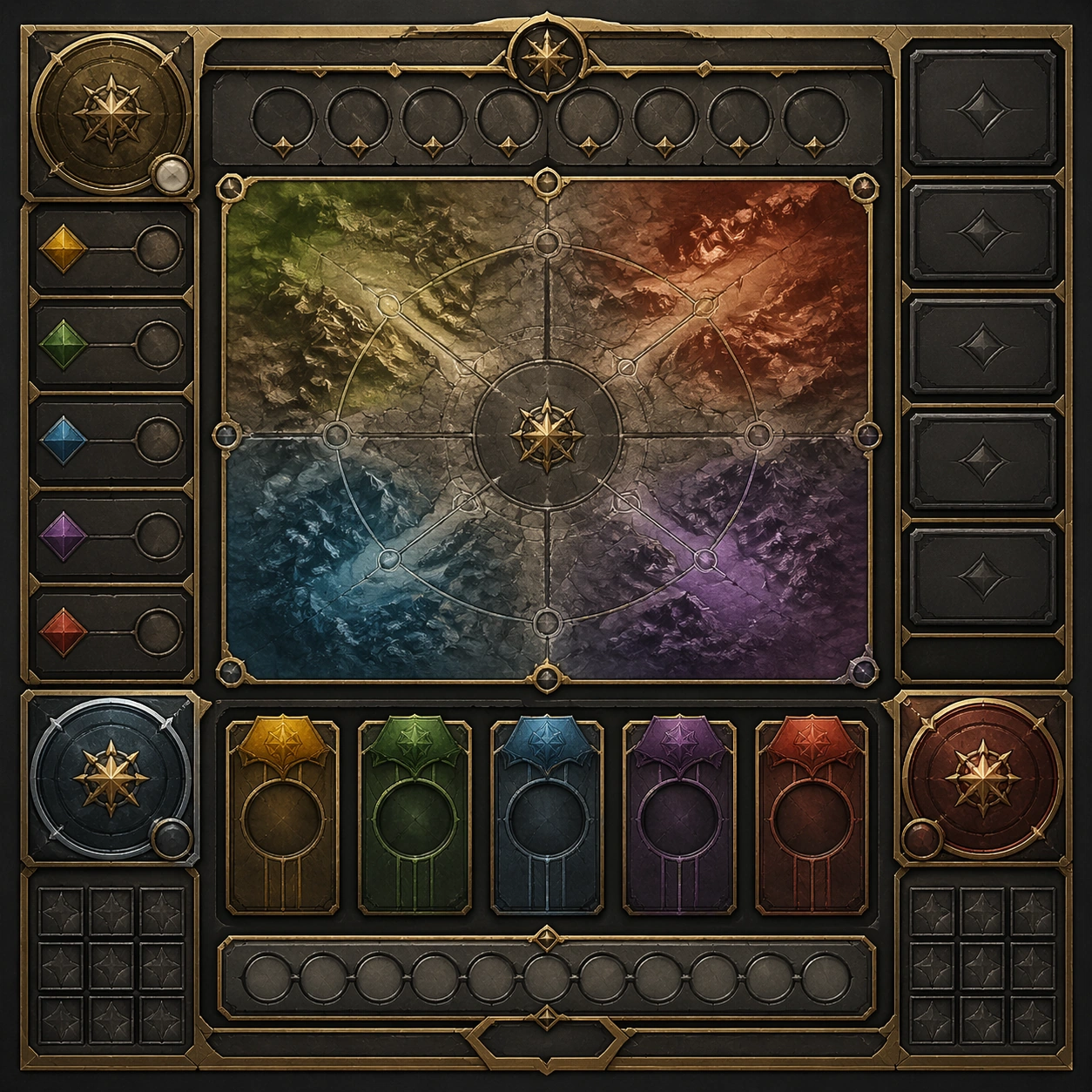
Scene: Create a square reference image for Manga Cover and Spread System. Build a reference anchor establishing the core system with a premium, production-ready finish. Use a polished modular board or campaign surface with clean spacing, premium game-UI finish, and clear focal hierarchy. The composition should feel intentional, clean, and reusable for gallery, research, campaign, or internal handoff contexts. Lighting must support readability first, with the main forms clearly separated from the background and enough breathing room for the system to stay legible at both hero scale and thumbnail scale. Subject: Center a coherent original game-art system built for premium production and marketing surfaces. For this image, focus on reference anchor. Keep the same system logic stable across screenshots, cards, banners, and overview boards. This image is the canonical anchor that later series images must follow. The viewer should immediately understand what role this surface plays inside a cohesive game-production asset pack. Important details: Lock framing, icon grammar, palette blocking, and surface hierarchy so the kit feels production-ready and consistent. Preserve the core silhouette, framing language, and material logic from the reference image while each variation changes function. Keep materials believable, edge hierarchy disciplined, and the visual language consistent with Cover Spread. Use abstract interface blocks or diagram accents when helpful, but avoid any readable language. The final result should feel like a deliberate production asset rather than a random illustration. Use case: Manga Cover and Spread System series study 1/9, designed as reference anchor within a cohesive asset pack. Constraints: No readable text, no watermark, no logos, preserve exact 1:1 aspect ratio, no unrelated objects, no broken visual hierarchy, no malformed anatomy or broken perspective, no random decorative clutter.

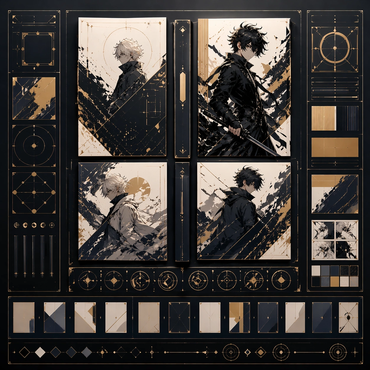
Example generated from “Manga Cover And Spread System — Variant One”
GPT Image 2en

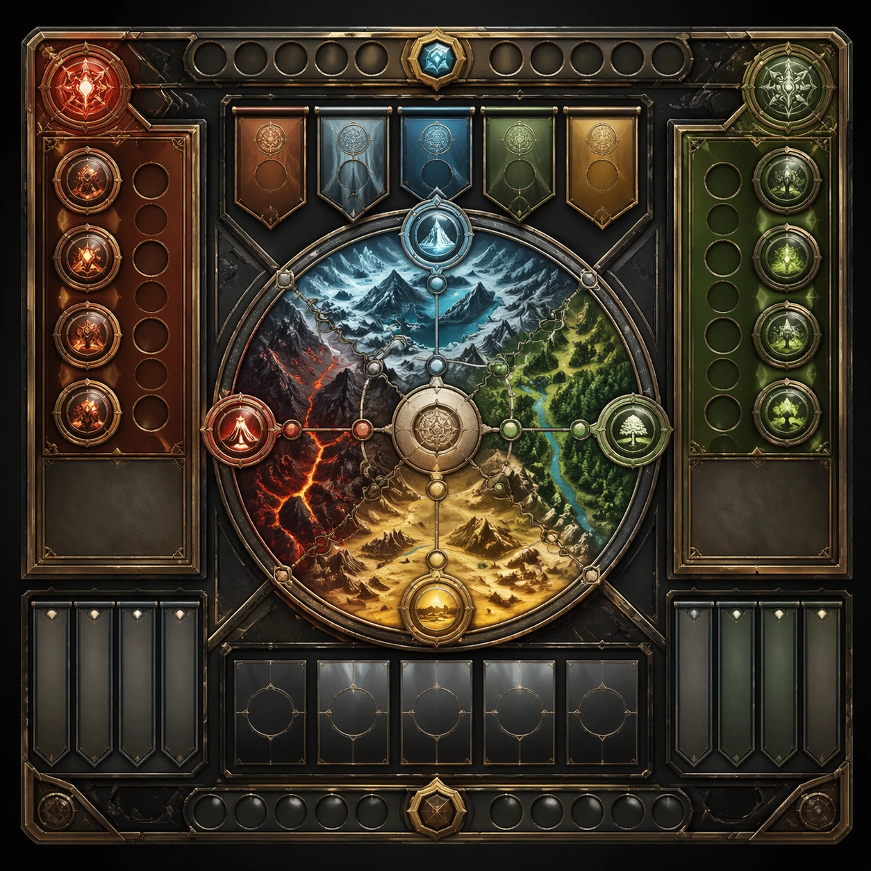
Scene: Create a square dependent image for Manga Cover and Spread System. Build a first controlled variation in the same system with a premium, production-ready finish. Use a polished modular board or campaign surface with clean spacing, premium game-UI finish, and clear focal hierarchy. The composition should feel intentional, clean, and reusable for gallery, research, campaign, or internal handoff contexts. Lighting must support readability first, with the main forms clearly separated from the background and enough breathing room for the system to stay legible at both hero scale and thumbnail scale. Subject: Center a coherent original game-art system built for premium production and marketing surfaces. For this image, focus on the intended support surface. Keep the same system logic stable across screenshots, cards, banners, and overview boards. Preserve exact identity or system logic from the reference image while changing only the intended variation axis. The viewer should immediately understand what role this surface plays inside a cohesive game-production asset pack. Important details: Lock framing, icon grammar, palette blocking, and surface hierarchy so the kit feels production-ready and consistent. Preserve the core silhouette, framing language, and material logic from the reference image while each variation changes function. Keep materials believable, edge hierarchy disciplined, and the visual language consistent with Cover Spread. Use abstract interface blocks or diagram accents when helpful, but avoid any readable language. The final result should feel like a deliberate production asset rather than a random illustration. Use case: Manga Cover and Spread System series study 2/9, designed as variant one within a cohesive asset pack. Constraints: No readable text, no watermark, no logos, preserve exact 1:1 aspect ratio, no unrelated objects, no broken visual hierarchy, no malformed anatomy or broken perspective, no random decorative clutter.

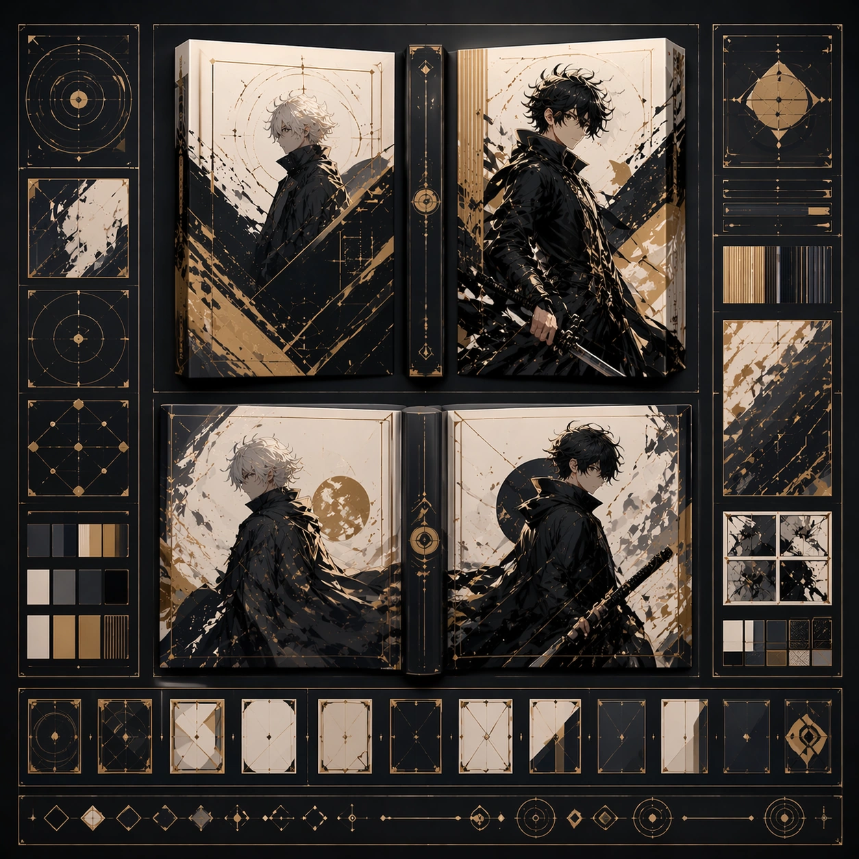
Example generated from “Manga Cover And Spread System — Variant Two”
GPT Image 2en

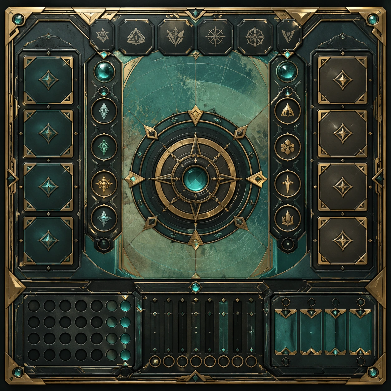
Scene: Create a square dependent image for Manga Cover and Spread System. Build a second controlled variation in the same system with a premium, production-ready finish. Use a polished modular board or campaign surface with clean spacing, premium game-UI finish, and clear focal hierarchy. The composition should feel intentional, clean, and reusable for gallery, research, campaign, or internal handoff contexts. Lighting must support readability first, with the main forms clearly separated from the background and enough breathing room for the system to stay legible at both hero scale and thumbnail scale. Subject: Center a coherent original game-art system built for premium production and marketing surfaces. For this image, focus on the intended support surface. Keep the same system logic stable across screenshots, cards, banners, and overview boards. Preserve exact identity or system logic from the reference image while changing only the intended variation axis. The viewer should immediately understand what role this surface plays inside a cohesive game-production asset pack. Important details: Lock framing, icon grammar, palette blocking, and surface hierarchy so the kit feels production-ready and consistent. Preserve the core silhouette, framing language, and material logic from the reference image while each variation changes function. Keep materials believable, edge hierarchy disciplined, and the visual language consistent with Cover Spread. Use abstract interface blocks or diagram accents when helpful, but avoid any readable language. The final result should feel like a deliberate production asset rather than a random illustration. Use case: Manga Cover and Spread System series study 3/9, designed as variant two within a cohesive asset pack. Constraints: No readable text, no watermark, no logos, preserve exact 1:1 aspect ratio, no unrelated objects, no broken visual hierarchy, no malformed anatomy or broken perspective, no random decorative clutter.

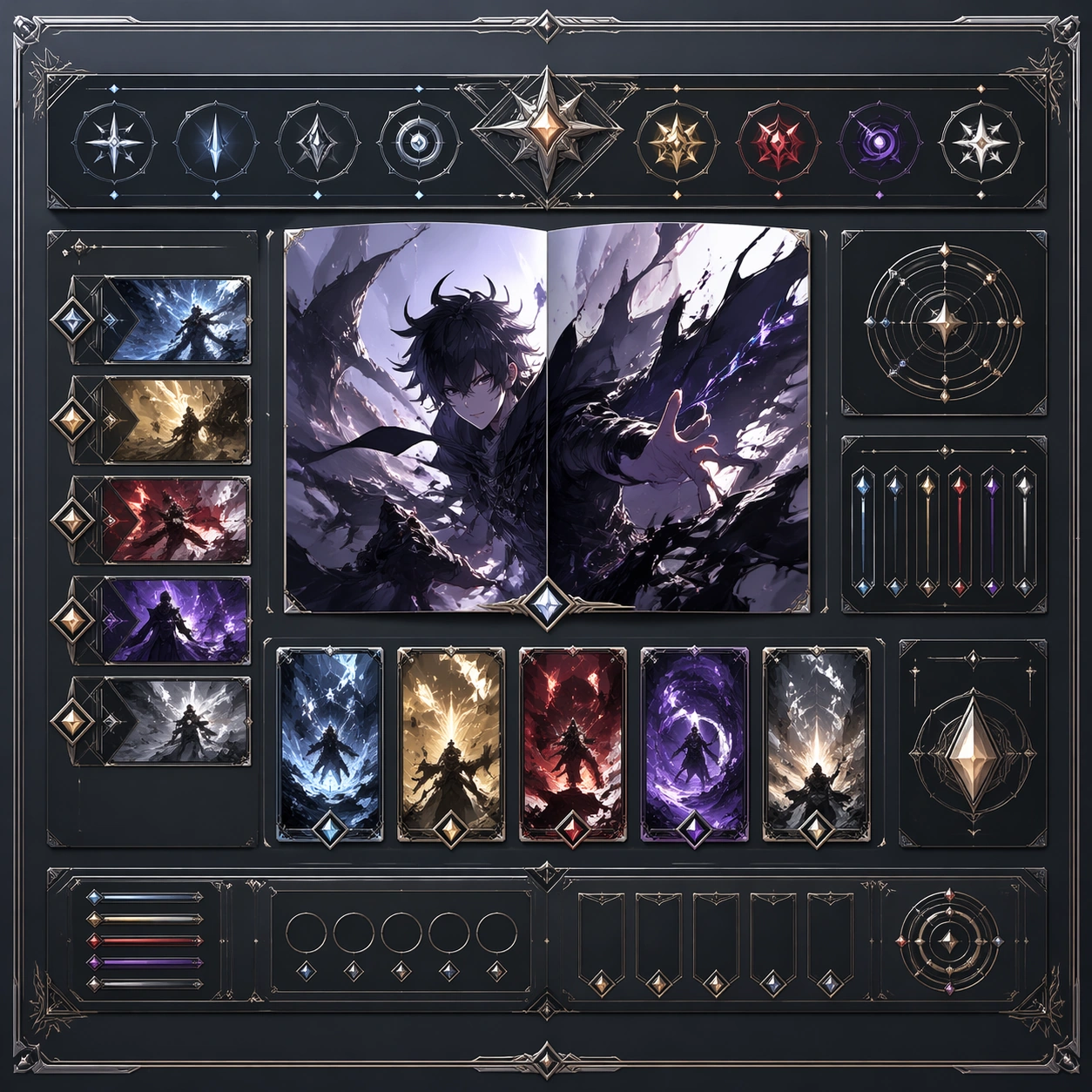
Example generated from “Manga Cover And Spread System — Variant Three”
GPT Image 2en

Scene: Create a square dependent image for Manga Cover and Spread System. Build a third controlled variation in the same system with a premium, production-ready finish. Use a polished modular board or campaign surface with clean spacing, premium game-UI finish, and clear focal hierarchy. The composition should feel intentional, clean, and reusable for gallery, research, campaign, or internal handoff contexts. Lighting must support readability first, with the main forms clearly separated from the background and enough breathing room for the system to stay legible at both hero scale and thumbnail scale. Subject: Center a coherent original game-art system built for premium production and marketing surfaces. For this image, focus on the intended support surface. Keep the same system logic stable across screenshots, cards, banners, and overview boards. Preserve exact identity or system logic from the reference image while changing only the intended variation axis. The viewer should immediately understand what role this surface plays inside a cohesive game-production asset pack. Important details: Lock framing, icon grammar, palette blocking, and surface hierarchy so the kit feels production-ready and consistent. Preserve the core silhouette, framing language, and material logic from the reference image while each variation changes function. Keep materials believable, edge hierarchy disciplined, and the visual language consistent with Cover Spread. Use abstract interface blocks or diagram accents when helpful, but avoid any readable language. The final result should feel like a deliberate production asset rather than a random illustration. Use case: Manga Cover and Spread System series study 4/9, designed as variant three within a cohesive asset pack. Constraints: No readable text, no watermark, no logos, preserve exact 1:1 aspect ratio, no unrelated objects, no broken visual hierarchy, no malformed anatomy or broken perspective, no random decorative clutter.

Example generated from “Manga Cover And Spread System — Support One”
GPT Image 2en

Scene: Create a square standalone support image for Manga Cover and Spread System. Build a support-surface study with a clear focal hierarchy and a finished professional surface. Use a polished modular board or campaign surface with clean spacing, premium game-UI finish, and clear focal hierarchy. The frame should feel self-contained and polished, with enough structure to explain the system even without the reference series, yet still obviously belonging to the same theme and production world. Subject: Show a coherent original game-art system built for premium production and marketing surfaces in a way that emphasizes the intended support surface. Keep the same system logic stable across screenshots, cards, banners, and overview boards. Even though this image is independent, the viewer should still recognize the same universe, same commercial logic, and same production intent as the core package. Important details: Lock framing, icon grammar, palette blocking, and surface hierarchy so the kit feels production-ready and consistent. Preserve the broader theme language through color, framing, material choices, and modular composition. Use clean panel rhythm, premium asset presentation, and believable detail density. The image should work equally well as a gallery study, research reference, and mock production deliverable. Use case: Manga Cover and Spread System single study 5/9, exploring support one as a support surface. Constraints: No readable text, no watermark, no logos, preserve exact 1:1 aspect ratio, no unrelated objects, no broken visual hierarchy, no visual noise that obscures the main surface, no accidental brand resemblance.

Example generated from “Manga Cover And Spread System — Support Two”
GPT Image 2en

Scene: Create a square standalone support image for Manga Cover and Spread System. Build a second support-surface study with a clear focal hierarchy and a finished professional surface. Use a polished modular board or campaign surface with clean spacing, premium game-UI finish, and clear focal hierarchy. The frame should feel self-contained and polished, with enough structure to explain the system even without the reference series, yet still obviously belonging to the same theme and production world. Subject: Show a coherent original game-art system built for premium production and marketing surfaces in a way that emphasizes the intended support surface. Keep the same system logic stable across screenshots, cards, banners, and overview boards. Even though this image is independent, the viewer should still recognize the same universe, same commercial logic, and same production intent as the core package. Important details: Lock framing, icon grammar, palette blocking, and surface hierarchy so the kit feels production-ready and consistent. Preserve the broader theme language through color, framing, material choices, and modular composition. Use clean panel rhythm, premium asset presentation, and believable detail density. The image should work equally well as a gallery study, research reference, and mock production deliverable. Use case: Manga Cover and Spread System single study 6/9, exploring support two as a support surface. Constraints: No readable text, no watermark, no logos, preserve exact 1:1 aspect ratio, no unrelated objects, no broken visual hierarchy, no visual noise that obscures the main surface, no accidental brand resemblance.

Example generated from “Manga Cover And Spread System — Support Three”
GPT Image 2en

Scene: Create a square standalone support image for Manga Cover and Spread System. Build a third support-surface study with a clear focal hierarchy and a finished professional surface. Use a polished modular board or campaign surface with clean spacing, premium game-UI finish, and clear focal hierarchy. The frame should feel self-contained and polished, with enough structure to explain the system even without the reference series, yet still obviously belonging to the same theme and production world. Subject: Show a coherent original game-art system built for premium production and marketing surfaces in a way that emphasizes the intended support surface. Keep the same system logic stable across screenshots, cards, banners, and overview boards. Even though this image is independent, the viewer should still recognize the same universe, same commercial logic, and same production intent as the core package. Important details: Lock framing, icon grammar, palette blocking, and surface hierarchy so the kit feels production-ready and consistent. Preserve the broader theme language through color, framing, material choices, and modular composition. Use clean panel rhythm, premium asset presentation, and believable detail density. The image should work equally well as a gallery study, research reference, and mock production deliverable. Use case: Manga Cover and Spread System single study 7/9, exploring support three as a support surface. Constraints: No readable text, no watermark, no logos, preserve exact 1:1 aspect ratio, no unrelated objects, no broken visual hierarchy, no visual noise that obscures the main surface, no accidental brand resemblance.

Example generated from “Manga Cover And Spread System — Support Four”
GPT Image 2en

Scene: Create a square standalone support image for Manga Cover and Spread System. Build a fourth support-surface study with a clear focal hierarchy and a finished professional surface. Use a polished modular board or campaign surface with clean spacing, premium game-UI finish, and clear focal hierarchy. The frame should feel self-contained and polished, with enough structure to explain the system even without the reference series, yet still obviously belonging to the same theme and production world. Subject: Show a coherent original game-art system built for premium production and marketing surfaces in a way that emphasizes the intended support surface. Keep the same system logic stable across screenshots, cards, banners, and overview boards. Even though this image is independent, the viewer should still recognize the same universe, same commercial logic, and same production intent as the core package. Important details: Lock framing, icon grammar, palette blocking, and surface hierarchy so the kit feels production-ready and consistent. Preserve the broader theme language through color, framing, material choices, and modular composition. Use clean panel rhythm, premium asset presentation, and believable detail density. The image should work equally well as a gallery study, research reference, and mock production deliverable. Use case: Manga Cover and Spread System single study 8/9, exploring support four as a support surface. Constraints: No readable text, no watermark, no logos, preserve exact 1:1 aspect ratio, no unrelated objects, no broken visual hierarchy, no visual noise that obscures the main surface, no accidental brand resemblance.

Example generated from “Manga Cover And Spread System — Support Five”
GPT Image 2en

Scene: Create a square standalone support image for Manga Cover and Spread System. Build a fifth support-surface study with a clear focal hierarchy and a finished professional surface. Use a polished modular board or campaign surface with clean spacing, premium game-UI finish, and clear focal hierarchy. The frame should feel self-contained and polished, with enough structure to explain the system even without the reference series, yet still obviously belonging to the same theme and production world. Subject: Show a coherent original game-art system built for premium production and marketing surfaces in a way that emphasizes the intended support surface. Keep the same system logic stable across screenshots, cards, banners, and overview boards. Even though this image is independent, the viewer should still recognize the same universe, same commercial logic, and same production intent as the core package. Important details: Lock framing, icon grammar, palette blocking, and surface hierarchy so the kit feels production-ready and consistent. Preserve the broader theme language through color, framing, material choices, and modular composition. Use clean panel rhythm, premium asset presentation, and believable detail density. The image should work equally well as a gallery study, research reference, and mock production deliverable. Use case: Manga Cover and Spread System single study 9/9, exploring support five as a support surface. Constraints: No readable text, no watermark, no logos, preserve exact 1:1 aspect ratio, no unrelated objects, no broken visual hierarchy, no visual noise that obscures the main surface, no accidental brand resemblance.

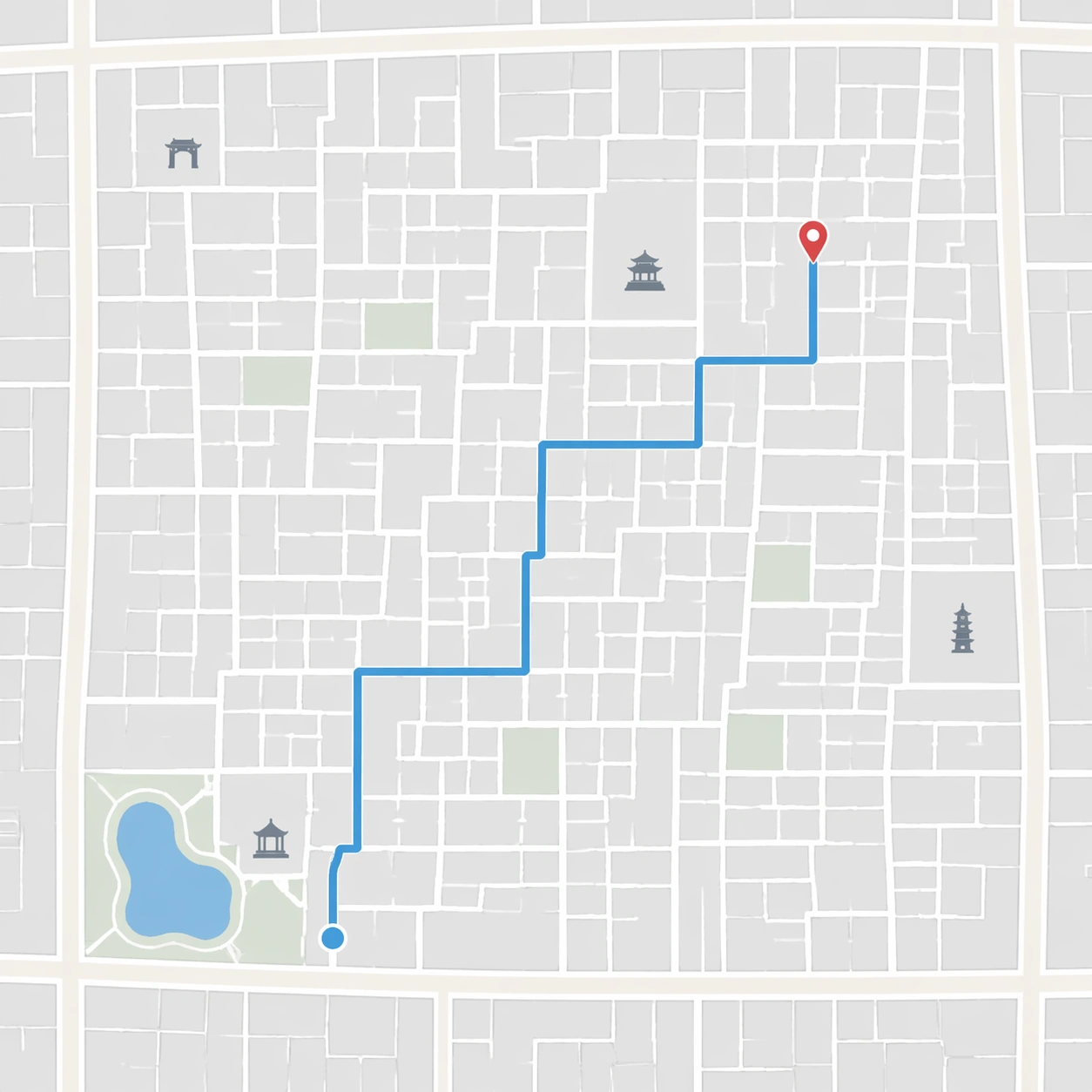
Example generated from “Maps To Treasure Map — Source Hutong Topology”
GPT Image 2en

Scene: A square, clean modern digital map-style view of a dense Beijing hutong neighborhood, shown from directly overhead with no perspective tilt. Use a light gray background, thin white alleys, slightly wider pale roads, a muted blue walking route, and small unlabeled landmark icons. The composition should feel like a map screenshot while remaining entirely non-branded and free of interface elements. Subject: Create a plausible old-city hutong route topology: narrow lanes form irregular rectangular blocks, two wider east-west roads frame the area, a small lake-like blue shape sits near one corner, and the blue route zigzags through six turns before reaching a tiny red destination marker. The network should feel like central Beijing alley structure rather than a generic grid, but do not include exact street names or any service branding. Important details: This is the source reference for a transformation series. The road topology, route turns, marker position, block proportions, water shape, and landmark icon positions must be clear enough for later images to preserve them while changing materials. Keep the view flat, diagrammatic, and readable as modern map data. Avoid decorative aging here; this image should be the modern topology input before the treasure-map conversion. Use case: Maps to Treasure Map series study 1/8, establishing the modern hutong map topology that later parchment variants must preserve. Constraints: No readable text, no watermark, no logos, preserve exact 1:1 aspect ratio, no app controls, no brand colors tied to a real map service, no compass rose, no antique paper texture, no photographic buildings, no randomized maze, no missing route turns.

Example generated from “Maps To Treasure Map — Subway Labyrinth Chart”
GPT Image 2en

Scene: A square antique chart laid flat under museum-case lighting, combining the orderliness of a transit diagram with the tactile age of a medieval manuscript. The map is on yellowed vellum with darkened edges, pinned by small brass weights at the corners. The lighting is cool and controlled, revealing ink grooves, scraped corrections, and subtle vellum waviness. Subject: Transform a modern subway transfer map into a labyrinthine treasure chart. Use colored routes as faded mineral-pigment lines: one red route, one blue route, one green route, and one ochre route crossing at circular transfer nodes. The network must remain legible and connected, like a metro schematic translated into ancient cartography. At one far endpoint, replace the station marker with a small X-shaped treasure target. Do not use station names or numbers. Important details: The image should keep transit-map logic while changing every surface cue into antique material. Lines should be straight or gently angled like schematic routes, transfer nodes should align cleanly, and the treasure endpoint should be reachable through obvious line connections. Add a hand-drawn compass ornament, tiny border monsters, worn pigment, vellum fiber, pin shadows, and slight ink pooling where lines meet. Avoid making it a fantasy maze with dead ends unrelated to the transit structure. Use case: Maps to Treasure Map single study 6/8, testing a subway-style transfer diagram converted into an antique labyrinth treasure chart. Constraints: No readable text, no watermark, no logos, preserve exact 1:1 aspect ratio, no transit agency brand, no station labels, no route numbers, no disconnected line segments, no random maze walls, no glossy modern diagram, no objects hiding transfer nodes.

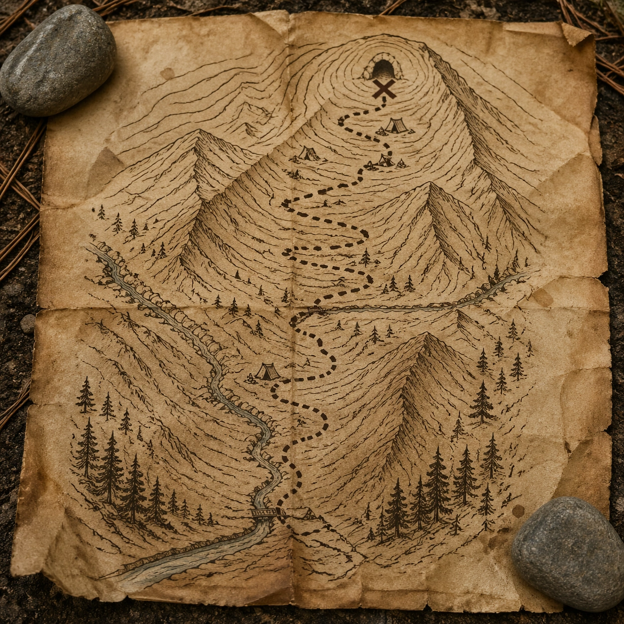
Example generated from “Maps To Treasure Map — Mountain Trail Parchment”
GPT Image 2en

Scene: A square outdoor tabletop photograph of an aged parchment trail map weighted by two river stones, shot in soft overcast mountain light. Pine needles, dust, and faint water spots sit around the paper edges. The map is viewed nearly overhead, with enough surface texture and curled corners to show it is a physical artifact rather than a flat graphic. Subject: Convert a modern GPS hiking route into a treasure-map version. Show a switchback trail climbing from a valley entrance, crossing a stream twice, passing three small campsite icons, and ending at a cave-like X marker near contour lines. The topology must be plausible for mountain terrain: switchbacks follow slope, stream crossings occur at narrow points, and the dotted route stays on the trail. Use antique ink, sepia contour rings, and sketched ridges instead of modern satellite or GPS styling. Important details: This image tests real-world route reasoning and material physics together. The viewer should understand the modern trail data has been translated into parchment without losing terrain logic. Include believable paper fibers, damp staining, ink feathering near water stains, pebble shadows, smudged fold marks, and small hand-drawn pine clusters. Keep the map readable as a navigable route while preserving old treasure-map atmosphere. Use case: Maps to Treasure Map single study 7/8, testing a mountain GPS route converted into a physically believable parchment trail treasure map. Constraints: No readable text, no watermark, no logos, preserve exact 1:1 aspect ratio, no park service brand, no trail names, no elevation numbers, no route crossing cliffs unrealistically, no random pirate island, no missing stream crossings, no glossy laminated map.

Example generated from “Maps To Treasure Map — Food Crawl Island Map”
GPT Image 2en

Scene: A square restaurant-table still life of a parchment treasure map placed beside chopsticks, a blank ceramic sauce dish, and a brass coin-like token. Warm lantern light creates amber shadows, and the paper has oil speckles, folded corners, and hand-inked decorative borders. The camera is overhead with slight depth from the raised table objects. Subject: Convert a modern urban food-crawl map into a whimsical treasure chart. Show four small market-stall icons connected by a dotted walking route around irregular alley blocks and a canal-like water strip, ending at a chest-shaped destination marker. The route must remain plausible for a pedestrian food walk: connected paths, no jumps across water, and clear order from the first stall to the final marker. Do not use readable restaurant names, prices, menus, or city labels. Important details: The conversion should retain route logic while changing the emotional package into a souvenir-worthy treasure map. Use hand-drawn alleys, little bridge symbols, inked waves for the canal, spice-colored stains, paper fibers, soft oil translucency, and shadows from chopsticks and ceramic. The composition should suggest a tourist keepsake or local food tour promotion without any branding or text dependency. Use case: Maps to Treasure Map single study 8/8, testing an urban food-crawl route transformed into a parchment treasure-map souvenir. Constraints: No readable text, no watermark, no logos, preserve exact 1:1 aspect ratio, no restaurant brand, no menu words, no prices, no route crossing water without bridges, no random disconnected stalls, no modern phone UI, no glossy laminated flyer.

Example generated from “Marketplace Main Image System — Reference Anchor”
GPT Image 2en

Scene: Create a square reference image for Marketplace Main Image System. Build a reference anchor establishing the core system with a premium, production-ready finish. Use a polished modular board or campaign surface with clean spacing, premium game-UI finish, and clear focal hierarchy. The composition should feel intentional, clean, and reusable for gallery, research, campaign, or internal handoff contexts. Lighting must support readability first, with the main forms clearly separated from the background and enough breathing room for the system to stay legible at both hero scale and thumbnail scale. Subject: Center a coherent original game-art system built for premium production and marketing surfaces. For this image, focus on reference anchor. Keep the same system logic stable across screenshots, cards, banners, and overview boards. This image is the canonical anchor that later series images must follow. The viewer should immediately understand what role this surface plays inside a cohesive game-production asset pack. Important details: Lock framing, icon grammar, palette blocking, and surface hierarchy so the kit feels production-ready and consistent. Preserve the core silhouette, framing language, and material logic from the reference image while each variation changes function. Keep materials believable, edge hierarchy disciplined, and the visual language consistent with Main Images. Use abstract interface blocks or diagram accents when helpful, but avoid any readable language. The final result should feel like a deliberate production asset rather than a random illustration. Use case: Marketplace Main Image System series study 1/9, designed as reference anchor within a cohesive asset pack. Constraints: No readable text, no watermark, no logos, preserve exact 1:1 aspect ratio, no unrelated objects, no broken visual hierarchy, no malformed anatomy or broken perspective, no random decorative clutter.
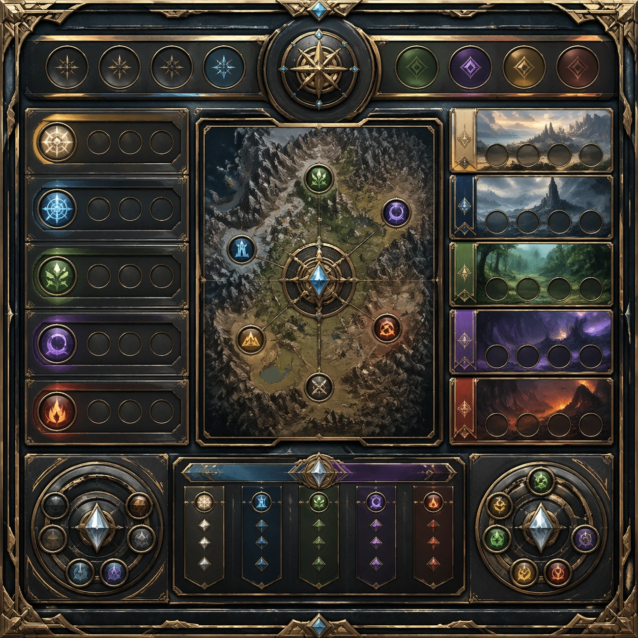
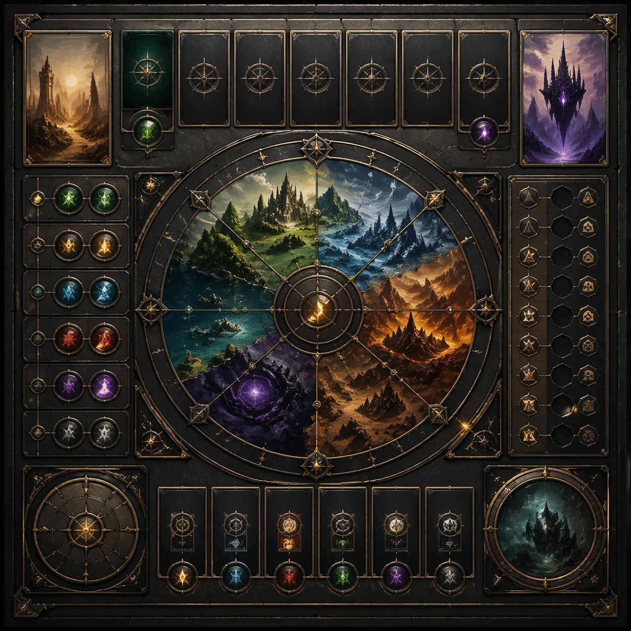
Example generated from “Marketplace Main Image System — Variant One”
GPT Image 2en

Scene: Create a square dependent image for Marketplace Main Image System. Build a first controlled variation in the same system with a premium, production-ready finish. Use a polished modular board or campaign surface with clean spacing, premium game-UI finish, and clear focal hierarchy. The composition should feel intentional, clean, and reusable for gallery, research, campaign, or internal handoff contexts. Lighting must support readability first, with the main forms clearly separated from the background and enough breathing room for the system to stay legible at both hero scale and thumbnail scale. Subject: Center a coherent original game-art system built for premium production and marketing surfaces. For this image, focus on the intended support surface. Keep the same system logic stable across screenshots, cards, banners, and overview boards. Preserve exact identity or system logic from the reference image while changing only the intended variation axis. The viewer should immediately understand what role this surface plays inside a cohesive game-production asset pack. Important details: Lock framing, icon grammar, palette blocking, and surface hierarchy so the kit feels production-ready and consistent. Preserve the core silhouette, framing language, and material logic from the reference image while each variation changes function. Keep materials believable, edge hierarchy disciplined, and the visual language consistent with Main Images. Use abstract interface blocks or diagram accents when helpful, but avoid any readable language. The final result should feel like a deliberate production asset rather than a random illustration. Use case: Marketplace Main Image System series study 2/9, designed as variant one within a cohesive asset pack. Constraints: No readable text, no watermark, no logos, preserve exact 1:1 aspect ratio, no unrelated objects, no broken visual hierarchy, no malformed anatomy or broken perspective, no random decorative clutter.

Example generated from “Marketplace Main Image System — Variant Two”
GPT Image 2en

Scene: Create a square dependent image for Marketplace Main Image System. Build a second controlled variation in the same system with a premium, production-ready finish. Use a polished modular board or campaign surface with clean spacing, premium game-UI finish, and clear focal hierarchy. The composition should feel intentional, clean, and reusable for gallery, research, campaign, or internal handoff contexts. Lighting must support readability first, with the main forms clearly separated from the background and enough breathing room for the system to stay legible at both hero scale and thumbnail scale. Subject: Center a coherent original game-art system built for premium production and marketing surfaces. For this image, focus on the intended support surface. Keep the same system logic stable across screenshots, cards, banners, and overview boards. Preserve exact identity or system logic from the reference image while changing only the intended variation axis. The viewer should immediately understand what role this surface plays inside a cohesive game-production asset pack. Important details: Lock framing, icon grammar, palette blocking, and surface hierarchy so the kit feels production-ready and consistent. Preserve the core silhouette, framing language, and material logic from the reference image while each variation changes function. Keep materials believable, edge hierarchy disciplined, and the visual language consistent with Main Images. Use abstract interface blocks or diagram accents when helpful, but avoid any readable language. The final result should feel like a deliberate production asset rather than a random illustration. Use case: Marketplace Main Image System series study 3/9, designed as variant two within a cohesive asset pack. Constraints: No readable text, no watermark, no logos, preserve exact 1:1 aspect ratio, no unrelated objects, no broken visual hierarchy, no malformed anatomy or broken perspective, no random decorative clutter.

Example generated from “Marketplace Main Image System — Variant Three”
GPT Image 2en

Scene: Create a square dependent image for Marketplace Main Image System. Build a third controlled variation in the same system with a premium, production-ready finish. Use a polished modular board or campaign surface with clean spacing, premium game-UI finish, and clear focal hierarchy. The composition should feel intentional, clean, and reusable for gallery, research, campaign, or internal handoff contexts. Lighting must support readability first, with the main forms clearly separated from the background and enough breathing room for the system to stay legible at both hero scale and thumbnail scale. Subject: Center a coherent original game-art system built for premium production and marketing surfaces. For this image, focus on the intended support surface. Keep the same system logic stable across screenshots, cards, banners, and overview boards. Preserve exact identity or system logic from the reference image while changing only the intended variation axis. The viewer should immediately understand what role this surface plays inside a cohesive game-production asset pack. Important details: Lock framing, icon grammar, palette blocking, and surface hierarchy so the kit feels production-ready and consistent. Preserve the core silhouette, framing language, and material logic from the reference image while each variation changes function. Keep materials believable, edge hierarchy disciplined, and the visual language consistent with Main Images. Use abstract interface blocks or diagram accents when helpful, but avoid any readable language. The final result should feel like a deliberate production asset rather than a random illustration. Use case: Marketplace Main Image System series study 4/9, designed as variant three within a cohesive asset pack. Constraints: No readable text, no watermark, no logos, preserve exact 1:1 aspect ratio, no unrelated objects, no broken visual hierarchy, no malformed anatomy or broken perspective, no random decorative clutter.

Example generated from “Marketplace Main Image System — Support One”
GPT Image 2en

Scene: Create a square standalone support image for Marketplace Main Image System. Build a support-surface study with a clear focal hierarchy and a finished professional surface. Use a polished modular board or campaign surface with clean spacing, premium game-UI finish, and clear focal hierarchy. The frame should feel self-contained and polished, with enough structure to explain the system even without the reference series, yet still obviously belonging to the same theme and production world. Subject: Show a coherent original game-art system built for premium production and marketing surfaces in a way that emphasizes the intended support surface. Keep the same system logic stable across screenshots, cards, banners, and overview boards. Even though this image is independent, the viewer should still recognize the same universe, same commercial logic, and same production intent as the core package. Important details: Lock framing, icon grammar, palette blocking, and surface hierarchy so the kit feels production-ready and consistent. Preserve the broader theme language through color, framing, material choices, and modular composition. Use clean panel rhythm, premium asset presentation, and believable detail density. The image should work equally well as a gallery study, research reference, and mock production deliverable. Use case: Marketplace Main Image System single study 5/9, exploring support one as a support surface. Constraints: No readable text, no watermark, no logos, preserve exact 1:1 aspect ratio, no unrelated objects, no broken visual hierarchy, no visual noise that obscures the main surface, no accidental brand resemblance.

Example generated from “Marketplace Main Image System — Support Two”
GPT Image 2en

Scene: Create a square standalone support image for Marketplace Main Image System. Build a second support-surface study with a clear focal hierarchy and a finished professional surface. Use a polished modular board or campaign surface with clean spacing, premium game-UI finish, and clear focal hierarchy. The frame should feel self-contained and polished, with enough structure to explain the system even without the reference series, yet still obviously belonging to the same theme and production world. Subject: Show a coherent original game-art system built for premium production and marketing surfaces in a way that emphasizes the intended support surface. Keep the same system logic stable across screenshots, cards, banners, and overview boards. Even though this image is independent, the viewer should still recognize the same universe, same commercial logic, and same production intent as the core package. Important details: Lock framing, icon grammar, palette blocking, and surface hierarchy so the kit feels production-ready and consistent. Preserve the broader theme language through color, framing, material choices, and modular composition. Use clean panel rhythm, premium asset presentation, and believable detail density. The image should work equally well as a gallery study, research reference, and mock production deliverable. Use case: Marketplace Main Image System single study 6/9, exploring support two as a support surface. Constraints: No readable text, no watermark, no logos, preserve exact 1:1 aspect ratio, no unrelated objects, no broken visual hierarchy, no visual noise that obscures the main surface, no accidental brand resemblance.

Example generated from “Marketplace Main Image System — Support Three”
GPT Image 2en

Scene: Create a square standalone support image for Marketplace Main Image System. Build a third support-surface study with a clear focal hierarchy and a finished professional surface. Use a polished modular board or campaign surface with clean spacing, premium game-UI finish, and clear focal hierarchy. The frame should feel self-contained and polished, with enough structure to explain the system even without the reference series, yet still obviously belonging to the same theme and production world. Subject: Show a coherent original game-art system built for premium production and marketing surfaces in a way that emphasizes the intended support surface. Keep the same system logic stable across screenshots, cards, banners, and overview boards. Even though this image is independent, the viewer should still recognize the same universe, same commercial logic, and same production intent as the core package. Important details: Lock framing, icon grammar, palette blocking, and surface hierarchy so the kit feels production-ready and consistent. Preserve the broader theme language through color, framing, material choices, and modular composition. Use clean panel rhythm, premium asset presentation, and believable detail density. The image should work equally well as a gallery study, research reference, and mock production deliverable. Use case: Marketplace Main Image System single study 7/9, exploring support three as a support surface. Constraints: No readable text, no watermark, no logos, preserve exact 1:1 aspect ratio, no unrelated objects, no broken visual hierarchy, no visual noise that obscures the main surface, no accidental brand resemblance.

Example generated from “Marketplace Main Image System — Support Four”
GPT Image 2en

Scene: Create a square standalone support image for Marketplace Main Image System. Build a fourth support-surface study with a clear focal hierarchy and a finished professional surface. Use a polished modular board or campaign surface with clean spacing, premium game-UI finish, and clear focal hierarchy. The frame should feel self-contained and polished, with enough structure to explain the system even without the reference series, yet still obviously belonging to the same theme and production world. Subject: Show a coherent original game-art system built for premium production and marketing surfaces in a way that emphasizes the intended support surface. Keep the same system logic stable across screenshots, cards, banners, and overview boards. Even though this image is independent, the viewer should still recognize the same universe, same commercial logic, and same production intent as the core package. Important details: Lock framing, icon grammar, palette blocking, and surface hierarchy so the kit feels production-ready and consistent. Preserve the broader theme language through color, framing, material choices, and modular composition. Use clean panel rhythm, premium asset presentation, and believable detail density. The image should work equally well as a gallery study, research reference, and mock production deliverable. Use case: Marketplace Main Image System single study 8/9, exploring support four as a support surface. Constraints: No readable text, no watermark, no logos, preserve exact 1:1 aspect ratio, no unrelated objects, no broken visual hierarchy, no visual noise that obscures the main surface, no accidental brand resemblance.

Example generated from “Marketplace Main Image System — Support Five”
GPT Image 2en

Scene: Create a square standalone support image for Marketplace Main Image System. Build a fifth support-surface study with a clear focal hierarchy and a finished professional surface. Use a polished modular board or campaign surface with clean spacing, premium game-UI finish, and clear focal hierarchy. The frame should feel self-contained and polished, with enough structure to explain the system even without the reference series, yet still obviously belonging to the same theme and production world. Subject: Show a coherent original game-art system built for premium production and marketing surfaces in a way that emphasizes the intended support surface. Keep the same system logic stable across screenshots, cards, banners, and overview boards. Even though this image is independent, the viewer should still recognize the same universe, same commercial logic, and same production intent as the core package. Important details: Lock framing, icon grammar, palette blocking, and surface hierarchy so the kit feels production-ready and consistent. Preserve the broader theme language through color, framing, material choices, and modular composition. Use clean panel rhythm, premium asset presentation, and believable detail density. The image should work equally well as a gallery study, research reference, and mock production deliverable. Use case: Marketplace Main Image System single study 9/9, exploring support five as a support surface. Constraints: No readable text, no watermark, no logos, preserve exact 1:1 aspect ratio, no unrelated objects, no broken visual hierarchy, no visual noise that obscures the main surface, no accidental brand resemblance.

Example generated from “Mascot Ip Brand Collab — Reference Mascot Pack”
GPT Image 2en

Scene: A square retail-ready campaign visual for Mascot IP Brand Collab, combining cute character appeal with polished commercial presentation. The composition should feel like a high-finish launch board: crisp packaging edges, collectible object staging, clean shelf or poster context, and vivid but controlled color. It should be immediately legible from far away, but still dense with charming small details that reward closer inspection. Subject: Build the image around Reference Mascot Pack, a frame that defines the cute character silhouette, packaging shell, and retail color logic. Translate Imagine premium brand collaborations between mascots and recognizable IP characters, spanning key art, packaging, in-store display, and social promo assets. into one lovable mascot, figure, or product system that feels ready for posters, boxes, stickers, inserts, or point-of-sale material. The result should feel like a fresh research image with clear commercial focus rather than random fan art. The main subject must remain unmistakable even when surrounded by accessories and display pieces. Important details: Charm alone is not enough. Preserve clean silhouette recognition, convincing package construction, reliable prop scale, and structured layout logic so the image feels sellable. This theme studies commercial-mockup, style-transfer, structured-layout, multi-image-reference through a production-ready visual system. Avoid noisy clutter; every secondary element should reinforce collectibility, retail desirability, or explainer clarity. Aim for clear hierarchy, polished craft, and immediately usable campaign logic. Use case: Mascot IP Brand Collab series study 1/4. Constraints: No readable text, no watermark, no logos, preserve exact 1:1 aspect ratio, no horror elements, no brand theft, no malformed packaging edges, no muddy mascot silhouette, no messy retail shelf, no chaotic prop overload.

Example generated from “Mascot Ip Brand Collab — Sticker Burst Variant”
GPT Image 2en

Scene: A square retail-ready campaign visual for Mascot IP Brand Collab, combining cute character appeal with polished commercial presentation. The composition should feel like a high-finish launch board: crisp packaging edges, collectible object staging, clean shelf or poster context, and vivid but controlled color. It should be immediately legible from far away, but still dense with charming small details that reward closer inspection. Subject: Build the image around Sticker Burst Variant, a frame that keeps the same character and package identity while adding collectible sticker energy. Translate Imagine premium brand collaborations between mascots and recognizable IP characters, spanning key art, packaging, in-store display, and social promo assets. into one lovable mascot, figure, or product system that feels ready for posters, boxes, stickers, inserts, or point-of-sale material. The result should feel like a fresh research image with clear commercial focus rather than random fan art. The main subject must remain unmistakable even when surrounded by accessories and display pieces. Important details: Charm alone is not enough. Preserve clean silhouette recognition, convincing package construction, reliable prop scale, and structured layout logic so the image feels sellable. This theme studies commercial-mockup, style-transfer, structured-layout, multi-image-reference through a production-ready visual system. Avoid noisy clutter; every secondary element should reinforce collectibility, retail desirability, or explainer clarity. Aim for clear hierarchy, polished craft, and immediately usable campaign logic. Use case: Mascot IP Brand Collab series study 2/4. Constraints: No readable text, no watermark, no logos, preserve exact 1:1 aspect ratio, no horror elements, no brand theft, no malformed packaging edges, no muddy mascot silhouette, no messy retail shelf, no chaotic prop overload.

Example generated from “Mascot Ip Brand Collab — Shelf Launch Variant”
GPT Image 2en

Scene: A square retail-ready campaign visual for Mascot IP Brand Collab, combining cute character appeal with polished commercial presentation. The composition should feel like a high-finish launch board: crisp packaging edges, collectible object staging, clean shelf or poster context, and vivid but controlled color. It should be immediately legible from far away, but still dense with charming small details that reward closer inspection. Subject: Build the image around Shelf Launch Variant, a frame that translates the same mascot package into a shelf-ready launch composition. Translate Imagine premium brand collaborations between mascots and recognizable IP characters, spanning key art, packaging, in-store display, and social promo assets. into one lovable mascot, figure, or product system that feels ready for posters, boxes, stickers, inserts, or point-of-sale material. The result should feel like a fresh research image with clear commercial focus rather than random fan art. The main subject must remain unmistakable even when surrounded by accessories and display pieces. Important details: Charm alone is not enough. Preserve clean silhouette recognition, convincing package construction, reliable prop scale, and structured layout logic so the image feels sellable. This theme studies commercial-mockup, style-transfer, structured-layout, multi-image-reference through a production-ready visual system. Avoid noisy clutter; every secondary element should reinforce collectibility, retail desirability, or explainer clarity. Aim for clear hierarchy, polished craft, and immediately usable campaign logic. Use case: Mascot IP Brand Collab series study 3/4. Constraints: No readable text, no watermark, no logos, preserve exact 1:1 aspect ratio, no horror elements, no brand theft, no malformed packaging edges, no muddy mascot silhouette, no messy retail shelf, no chaotic prop overload.

Example generated from “Mascot Ip Brand Collab — Premium Collab Box”
GPT Image 2en

Scene: A square retail-ready campaign visual for Mascot IP Brand Collab, combining cute character appeal with polished commercial presentation. The composition should feel like a high-finish launch board: crisp packaging edges, collectible object staging, clean shelf or poster context, and vivid but controlled color. It should be immediately legible from far away, but still dense with charming small details that reward closer inspection. Subject: Build the image around Premium Collab Box, a frame that elevates the same character system into a premium collaboration box visual. Translate Imagine premium brand collaborations between mascots and recognizable IP characters, spanning key art, packaging, in-store display, and social promo assets. into one lovable mascot, figure, or product system that feels ready for posters, boxes, stickers, inserts, or point-of-sale material. The result should feel like a fresh research image with clear commercial focus rather than random fan art. The main subject must remain unmistakable even when surrounded by accessories and display pieces. Important details: Charm alone is not enough. Preserve clean silhouette recognition, convincing package construction, reliable prop scale, and structured layout logic so the image feels sellable. This theme studies commercial-mockup, style-transfer, structured-layout, multi-image-reference through a production-ready visual system. Avoid noisy clutter; every secondary element should reinforce collectibility, retail desirability, or explainer clarity. Aim for clear hierarchy, polished craft, and immediately usable campaign logic. Use case: Mascot IP Brand Collab series study 4/4. Constraints: No readable text, no watermark, no logos, preserve exact 1:1 aspect ratio, no horror elements, no brand theft, no malformed packaging edges, no muddy mascot silhouette, no messy retail shelf, no chaotic prop overload.

Example generated from “Mascot Ip Brand Collab — Explainer Board”
GPT Image 2en

Scene: A square retail-ready campaign visual for Mascot IP Brand Collab, combining cute character appeal with polished commercial presentation. The composition should feel like a high-finish launch board: crisp packaging edges, collectible object staging, clean shelf or poster context, and vivid but controlled color. It should be immediately legible from far away, but still dense with charming small details that reward closer inspection. Subject: Build the image around Explainer Board, a frame that a charming information board that breaks the product or character world into clear visual sections. Translate Imagine premium brand collaborations between mascots and recognizable IP characters, spanning key art, packaging, in-store display, and social promo assets. into one lovable mascot, figure, or product system that feels ready for posters, boxes, stickers, inserts, or point-of-sale material. The result should feel like a fresh research image with clear commercial focus rather than random fan art. The main subject must remain unmistakable even when surrounded by accessories and display pieces. Important details: Charm alone is not enough. Preserve clean silhouette recognition, convincing package construction, reliable prop scale, and structured layout logic so the image feels sellable. This theme studies commercial-mockup, style-transfer, structured-layout, multi-image-reference through a production-ready visual system. Avoid noisy clutter; every secondary element should reinforce collectibility, retail desirability, or explainer clarity. Aim for clear hierarchy, polished craft, and immediately usable campaign logic. Use case: Mascot IP Brand Collab single study 1/5. Constraints: No readable text, no watermark, no logos, preserve exact 1:1 aspect ratio, no horror elements, no brand theft, no malformed packaging edges, no muddy mascot silhouette, no messy retail shelf, no chaotic prop overload.

Example generated from “Mascot Ip Brand Collab — Merch Preview”
GPT Image 2en

Scene: A square retail-ready campaign visual for Mascot IP Brand Collab, combining cute character appeal with polished commercial presentation. The composition should feel like a high-finish launch board: crisp packaging edges, collectible object staging, clean shelf or poster context, and vivid but controlled color. It should be immediately legible from far away, but still dense with charming small details that reward closer inspection. Subject: Build the image around Merch Preview, a frame that a merchandise-forward visual showing accessories, stickers, tags, or bonus items. Translate Imagine premium brand collaborations between mascots and recognizable IP characters, spanning key art, packaging, in-store display, and social promo assets. into one lovable mascot, figure, or product system that feels ready for posters, boxes, stickers, inserts, or point-of-sale material. The result should feel like a fresh research image with clear commercial focus rather than random fan art. The main subject must remain unmistakable even when surrounded by accessories and display pieces. Important details: Charm alone is not enough. Preserve clean silhouette recognition, convincing package construction, reliable prop scale, and structured layout logic so the image feels sellable. This theme studies commercial-mockup, style-transfer, structured-layout, multi-image-reference through a production-ready visual system. Avoid noisy clutter; every secondary element should reinforce collectibility, retail desirability, or explainer clarity. Aim for clear hierarchy, polished craft, and immediately usable campaign logic. Use case: Mascot IP Brand Collab single study 2/5. Constraints: No readable text, no watermark, no logos, preserve exact 1:1 aspect ratio, no horror elements, no brand theft, no malformed packaging edges, no muddy mascot silhouette, no messy retail shelf, no chaotic prop overload.