プロンプト · 創作の探索

プロンプトギャラリー

実際のプロンプトと生成例を探索。次の創作に役立つヒントを見つけ、全文を無料でコピーできます。

生成例
10,974
モデル
17
出典
1277
10,974 件のプロンプト例 · ページ 61 / 229
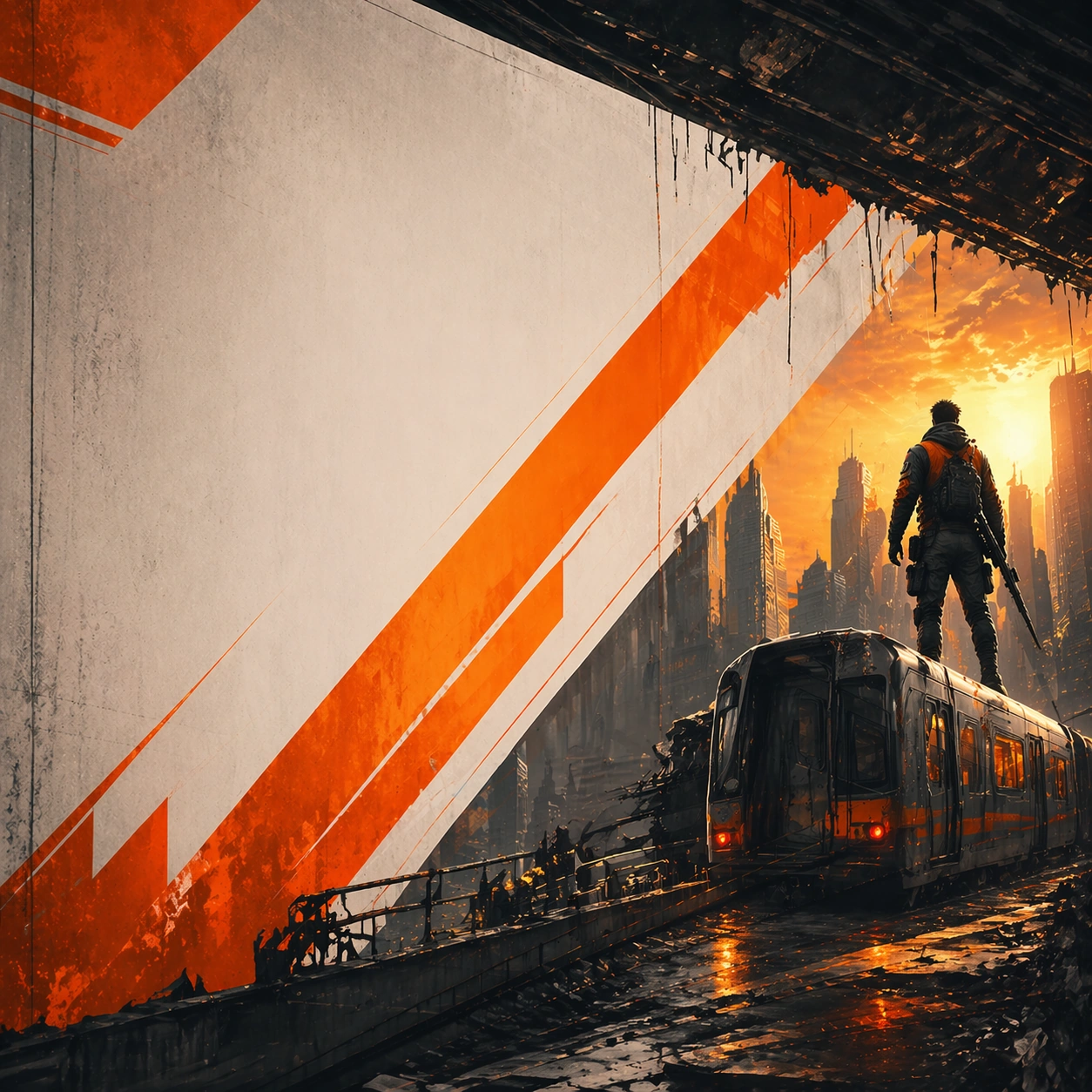
Example generated from “Billboard Transit Takeover Pack — Banner Adaptation”
GPT Image 2en

Scene: A square derived composition designed from the same campaign for broader rollout surfaces. Frame the composition like a premium game-production deliverable rather than generic concept art, with disciplined square balance, controlled highlight placement, and enough negative space to keep the focal structure easy to parse. Use lighting, value grouping, and depth layers to make the scene feel intentional, collectible, and immediately useful for internal review or outward-facing promotion. Subject: Show the same poster language adapted for wider placements. Build the image around one dominant primary read, then support it with clearly organized secondary shapes, props, interface shells, or environment structures that reinforce gameplay context and commercial usefulness. Every object should look original, fully resolved, and designed to survive cropping for store, profile, patch, or gallery surfaces. Important details: Commercial flexibility is the point. Build every image like a campaign-ready poster system with a memorable central thesis, strong negative space for hypothetical typography, and high-value commercial finish. Hook, logo zone, and core image must survive scale changes. The variation may change framing, intensity, or layout emphasis, but it must still feel like a direct continuation of the same design system. Use case: Billboard Transit Takeover Pack series study 4/9. Constraints: No readable text, no watermark, no logos, preserve exact 1:1 aspect ratio, no readable titles, no movie/IP mimicry, no unrelated secondary concepts, no flat stock-poster composition, no brand logos.
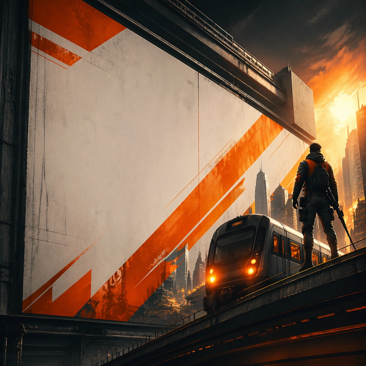
Example generated from “Billboard Transit Takeover Pack — Vertical Campaign Crop”
GPT Image 2en

Scene: A square derived vertical-logic crop that preserves the same hierarchy in a taller-feeling arrangement. Frame the composition like a premium game-production deliverable rather than generic concept art, with disciplined square balance, controlled highlight placement, and enough negative space to keep the focal structure easy to parse. Use lighting, value grouping, and depth layers to make the scene feel intentional, collectible, and immediately useful for internal review or outward-facing promotion. Subject: Show the same campaign repackaged for a more elongated promotional surface. Build the image around one dominant primary read, then support it with clearly organized secondary shapes, props, interface shells, or environment structures that reinforce gameplay context and commercial usefulness. Every object should look original, fully resolved, and designed to survive cropping for store, profile, patch, or gallery surfaces. Important details: The relationship to the anchor should remain direct. Build every image like a campaign-ready poster system with a memorable central thesis, strong negative space for hypothetical typography, and high-value commercial finish. Hook, logo zone, and core image must survive scale changes. The variation may change framing, intensity, or layout emphasis, but it must still feel like a direct continuation of the same design system. Use case: Billboard Transit Takeover Pack series study 5/9. Constraints: No readable text, no watermark, no logos, preserve exact 1:1 aspect ratio, no readable titles, no movie/IP mimicry, no unrelated secondary concepts, no flat stock-poster composition, no brand logos.
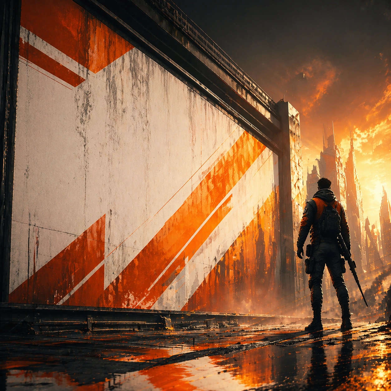
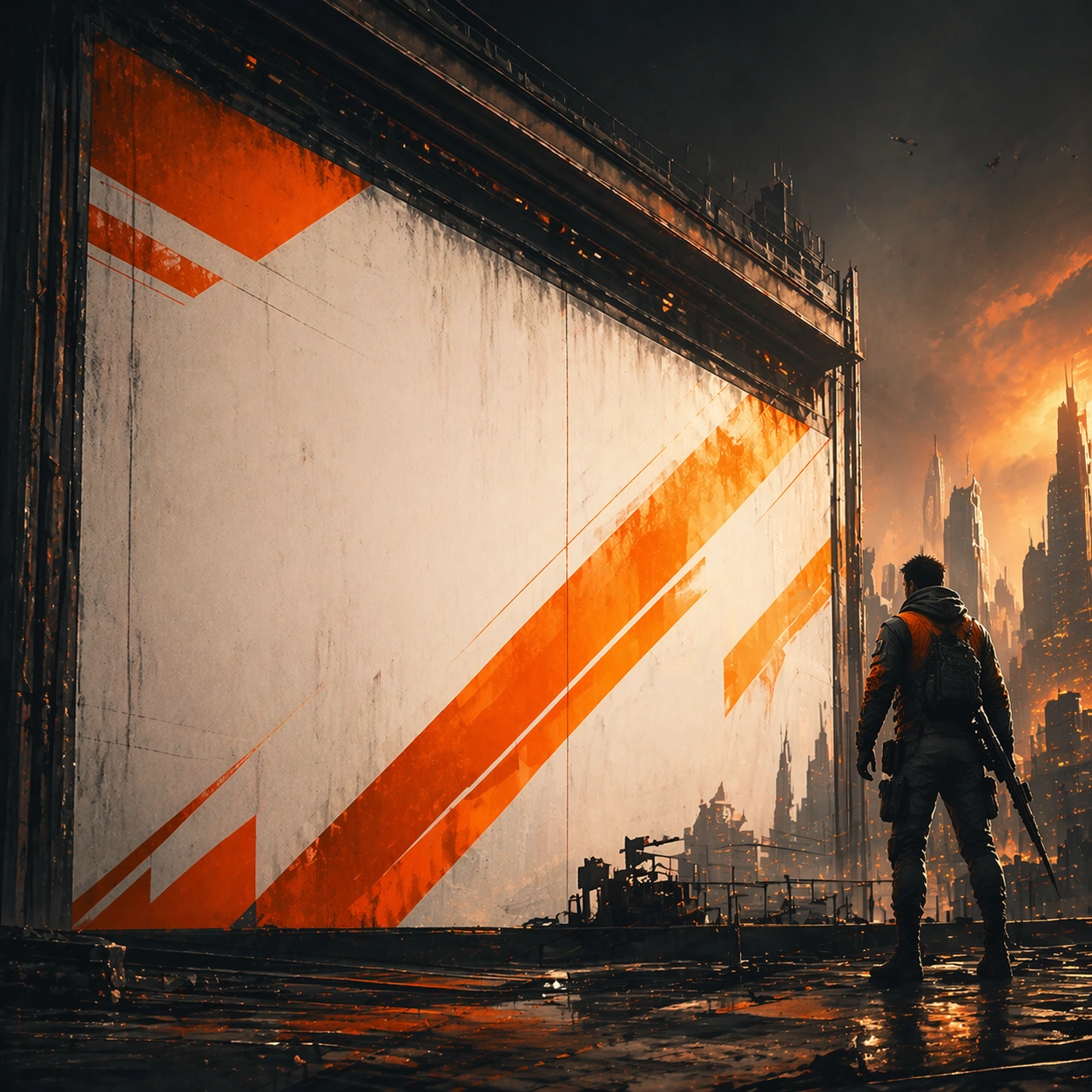
Example generated from “Billboard Transit Takeover Pack — Teaser Tile”
GPT Image 2en

Scene: A square derived teaser tile using the same color language and campaign symbols. Frame the composition like a premium game-production deliverable rather than generic concept art, with disciplined square balance, controlled highlight placement, and enough negative space to keep the focal structure easy to parse. Use lighting, value grouping, and depth layers to make the scene feel intentional, collectible, and immediately useful for internal review or outward-facing promotion. Subject: Show the same campaign in its mystery-driven prelaunch form. Build the image around one dominant primary read, then support it with clearly organized secondary shapes, props, interface shells, or environment structures that reinforce gameplay context and commercial usefulness. Every object should look original, fully resolved, and designed to survive cropping for store, profile, patch, or gallery surfaces. Important details: The tone should build anticipation without disconnecting from the anchor. Build every image like a campaign-ready poster system with a memorable central thesis, strong negative space for hypothetical typography, and high-value commercial finish. Hook, logo zone, and core image must survive scale changes. The variation may change framing, intensity, or layout emphasis, but it must still feel like a direct continuation of the same design system. Use case: Billboard Transit Takeover Pack series study 6/9. Constraints: No readable text, no watermark, no logos, preserve exact 1:1 aspect ratio, no readable titles, no movie/IP mimicry, no unrelated secondary concepts, no flat stock-poster composition, no brand logos.
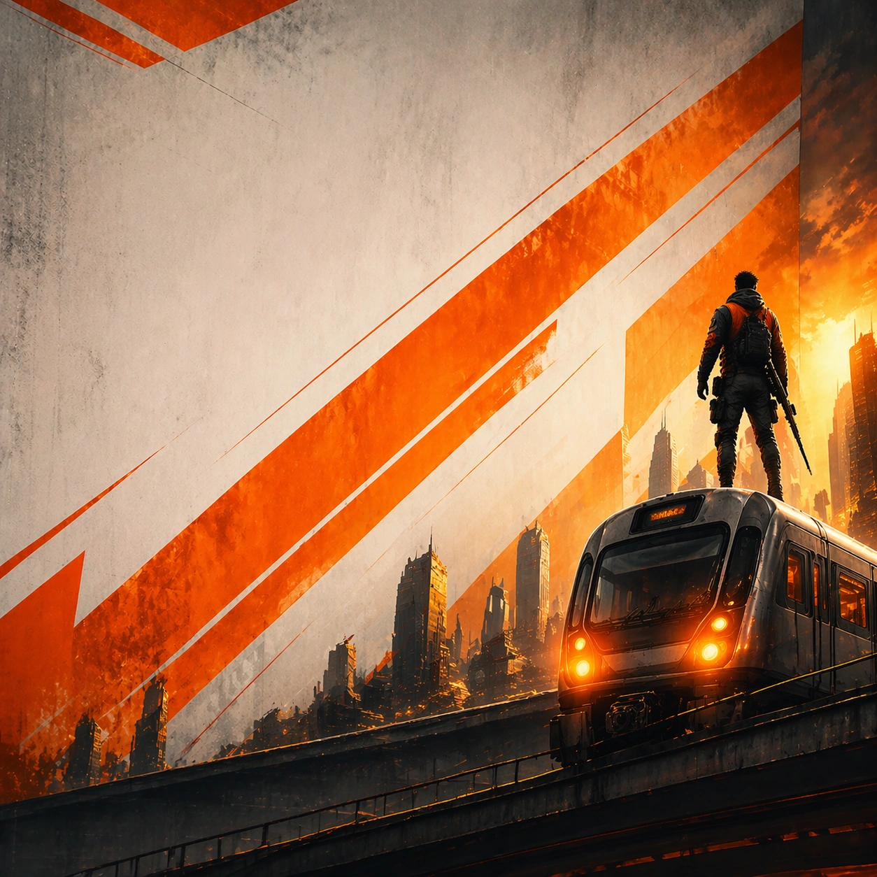
Example generated from “Billboard Transit Takeover Pack — Environment Poster View”
GPT Image 2en

Scene: A square derived poster emphasizing the same world or setting more strongly. Frame the composition like a premium game-production deliverable rather than generic concept art, with disciplined square balance, controlled highlight placement, and enough negative space to keep the focal structure easy to parse. Use lighting, value grouping, and depth layers to make the scene feel intentional, collectible, and immediately useful for internal review or outward-facing promotion. Subject: Show the same campaign identity carried by atmosphere and place. Build the image around one dominant primary read, then support it with clearly organized secondary shapes, props, interface shells, or environment structures that reinforce gameplay context and commercial usefulness. Every object should look original, fully resolved, and designed to survive cropping for store, profile, patch, or gallery surfaces. Important details: The environment should still inherit the same campaign DNA. Build every image like a campaign-ready poster system with a memorable central thesis, strong negative space for hypothetical typography, and high-value commercial finish. Hook, logo zone, and core image must survive scale changes. The variation may change framing, intensity, or layout emphasis, but it must still feel like a direct continuation of the same design system. Use case: Billboard Transit Takeover Pack series study 7/9. Constraints: No readable text, no watermark, no logos, preserve exact 1:1 aspect ratio, no readable titles, no movie/IP mimicry, no unrelated secondary concepts, no flat stock-poster composition, no brand logos.
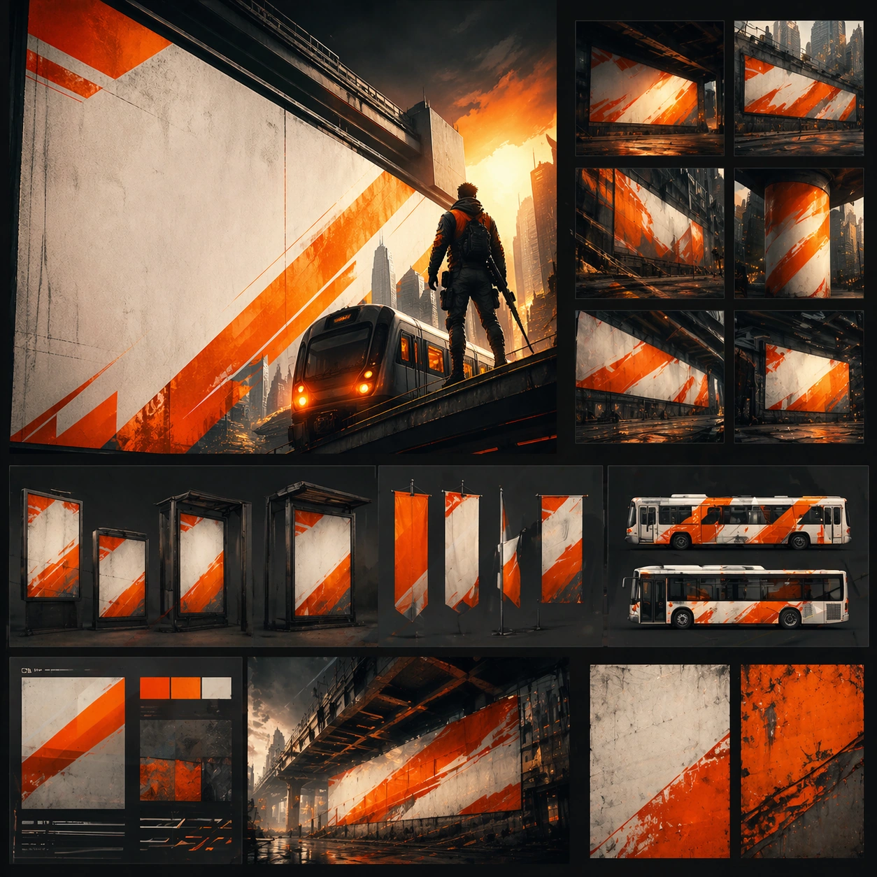
Example generated from “Billboard Transit Takeover Pack — Social Rollout Card”
GPT Image 2en

Scene: A square derived social card made from the same poster system. Frame the composition like a premium game-production deliverable rather than generic concept art, with disciplined square balance, controlled highlight placement, and enough negative space to keep the focal structure easy to parse. Use lighting, value grouping, and depth layers to make the scene feel intentional, collectible, and immediately useful for internal review or outward-facing promotion. Subject: Show the same campaign condensed for social release timing. Build the image around one dominant primary read, then support it with clearly organized secondary shapes, props, interface shells, or environment structures that reinforce gameplay context and commercial usefulness. Every object should look original, fully resolved, and designed to survive cropping for store, profile, patch, or gallery surfaces. Important details: It should still read as part of the same rollout. Build every image like a campaign-ready poster system with a memorable central thesis, strong negative space for hypothetical typography, and high-value commercial finish. Hook, logo zone, and core image must survive scale changes. The variation may change framing, intensity, or layout emphasis, but it must still feel like a direct continuation of the same design system. Use case: Billboard Transit Takeover Pack series study 8/9. Constraints: No readable text, no watermark, no logos, preserve exact 1:1 aspect ratio, no readable titles, no movie/IP mimicry, no unrelated secondary concepts, no flat stock-poster composition, no brand logos.
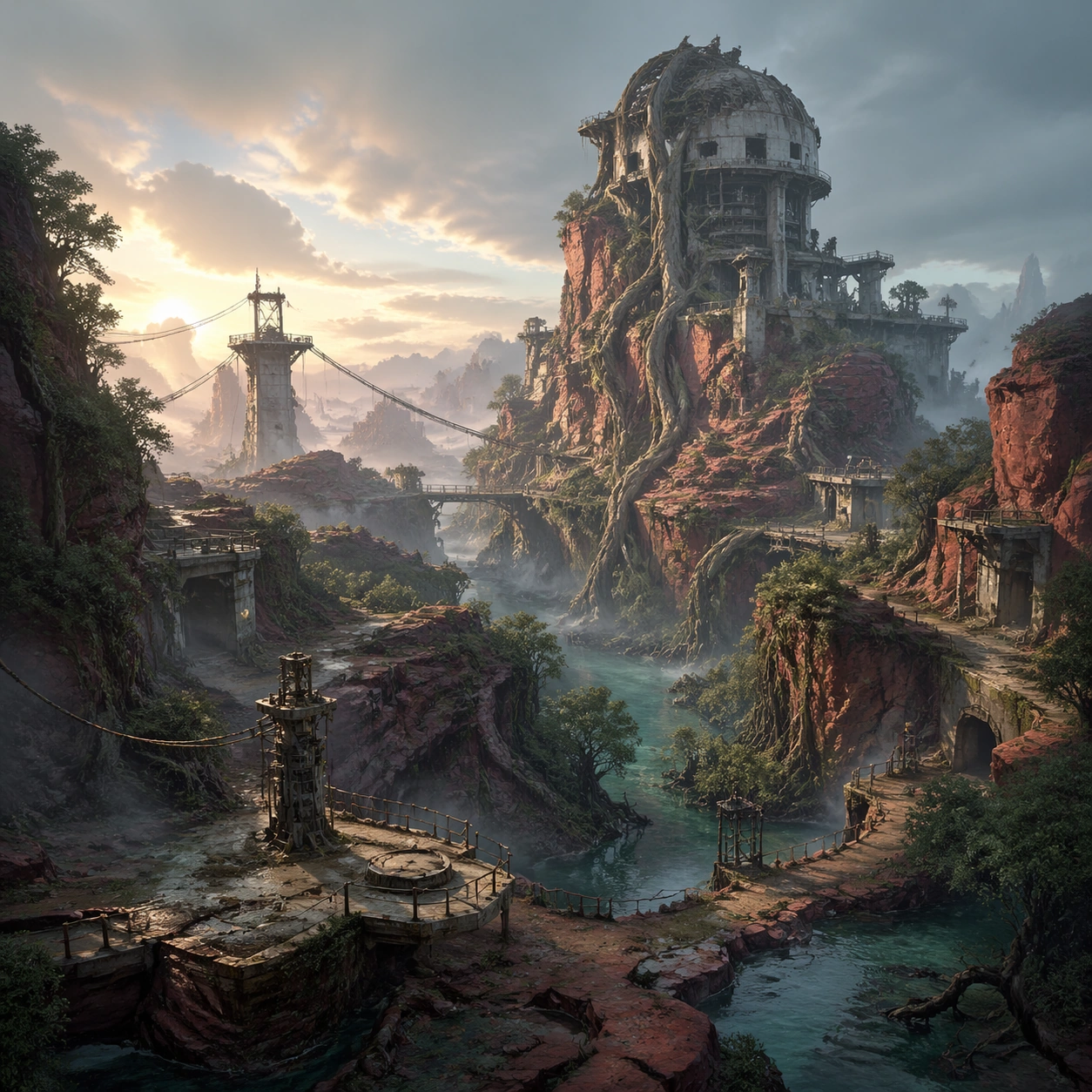
Example generated from “Billboard Transit Takeover Pack — Rollout Master Board”
GPT Image 2en

Scene: A square capstone board combining the full poster rollout family into one polished presentation. Frame the composition like a premium game-production deliverable rather than generic concept art, with disciplined square balance, controlled highlight placement, and enough negative space to keep the focal structure easy to parse. Use lighting, value grouping, and depth layers to make the scene feel intentional, collectible, and immediately useful for internal review or outward-facing promotion. Subject: Show the complete campaign system summarized in a single production-ready board. Build the image around one dominant primary read, then support it with clearly organized secondary shapes, props, interface shells, or environment structures that reinforce gameplay context and commercial usefulness. Every object should look original, fully resolved, and designed to survive cropping for store, profile, patch, or gallery surfaces. Important details: Everything must clearly descend from the anchor poster. Build every image like a campaign-ready poster system with a memorable central thesis, strong negative space for hypothetical typography, and high-value commercial finish. Hook, logo zone, and core image must survive scale changes. The variation may change framing, intensity, or layout emphasis, but it must still feel like a direct continuation of the same design system. Use case: Billboard Transit Takeover Pack series study 9/9. Constraints: No readable text, no watermark, no logos, preserve exact 1:1 aspect ratio, no readable titles, no movie/IP mimicry, no unrelated secondary concepts, no flat stock-poster composition, no brand logos.
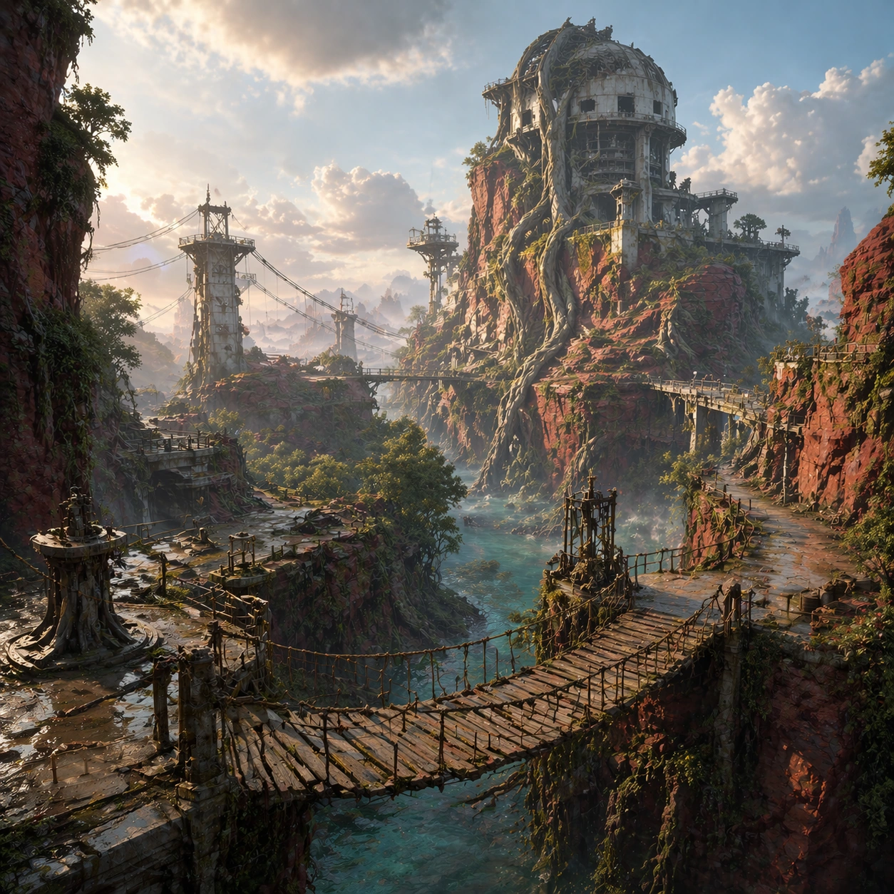
Example generated from “Biome Establishing Scene Pack — Reference Biome Vista”
GPT Image 2en

Scene: A square loading-screen style establishing vista for a fictional game biome, composed as a grand but playable environment painting. The camera looks across a storm-carved mangrove canyon at dawn, with layered cliffs, hanging cable routes, shallow reflective water channels, broken industrial ruins, and one dominant landmark tower rising above the fog. Light is cool in the shadows and warm on the skyline, creating strong depth while preserving navigation clarity. Subject: A believable game-ready biome that feels like a real world entrance rather than a generic landscape matte painting. The space should show walkable ledges, bridges, lift platforms, watch towers, drainage channels, and path logic that players could actually traverse. The dominant landmark is a partly collapsed reactor-observatory fused into red stone and giant roots, giving the region a memorable silhouette. No characters are necessary; the environment itself is the hero subject. Important details: This image is the canonical reference for the series. Lock the landmark positions, canyon profile, root-covered tower silhouette, bridge network, palette of rust red stone, deep teal water, pale mist, and cold metallic structures. The image should sell both exploration mood and gameplay readability, with clear foreground, midground, and background separation. Atmosphere supports scale but must never erase pathing or landmark memory. Use case: Biome Pack series study 1/9, establishing the reference biome view for later atmosphere and route variations. Constraints: No readable text, no watermark, no logos, preserve exact 1:1 aspect ratio, no characters, no vehicles, no unreadable signage, no random fantasy castle clutter, no flat matte-painting emptiness, no oversaturated sky

Example generated from “Biome Establishing Scene Pack — Traversal Bridge Route”
GPT Image 2en

Scene: A square traversal-focused gameplay art frame using the same biome and landmark language as the reference vista, but with the camera lowered closer to the route so hanging bridges, cliff switchbacks, and suspended maintenance platforms become the compositional spine. Lighting is slightly brighter and clearer than image 01, with crisp edge light on ropes, railings, and wet stone. Subject: The exact same mangrove canyon biome from the reference model, preserving the collapsed reactor-observatory tower, canyon walls, root growth, water channels, and bridge architecture. Recompose the space to highlight how a player would move through it: one main bridge crossing in the foreground, secondary catwalks in the midground, and a distant lift platform leading toward the landmark. Important details: Preserve the landmark silhouette, palette, and route logic from the reference image. The goal is to make traversal feel intentional and readable, not cinematic chaos. Show believable handrails, anchor points, support beams, wet stone wear, puddle reflections, and depth cues that clarify where a player could step, climb, or look next. The world language must remain identical to the reference biome. Use case: Biome Pack series study 2/9, using the same biome reference to foreground traversal and path readability. Constraints: No readable text, no watermark, no logos, preserve exact 1:1 aspect ratio, preserve exact landmarks from the reference model, no characters, no combat effects, no broken bridge collapse in progress, no unreadable UI text, no floating islands

Example generated from “Biome Establishing Scene Pack — Stormfront Landmark”
GPT Image 2en

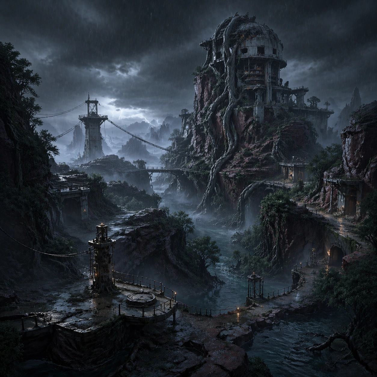
Scene: A square dramatic weather variant of the same biome, framed around the landmark tower under approaching storm clouds, lateral rain bands, and colder metallic highlights. The camera remains wide enough to preserve environment layout, but the sky grows heavier and the water channels darken, making the landmark feel more dangerous and sacred without losing spatial clarity. Subject: The exact same mangrove canyon biome from the reference model, with the same collapsed observatory-reactor, cable routes, cliff forms, root systems, and water network. Shift the weather into an incoming stormfront: brighter lightning far in the distance, stronger wind in banners of mist, and slicker surfaces across rock and metal, while the landmark remains the unmistakable center of the region. Important details: Preserve the reference silhouette and route logic with zero landmark drift. Weather should amplify mood, not hide the level design. Keep bridge positions, canyon profile, and tower anatomy aligned to the reference while increasing contrast between wet stone, cold steel, rain haze, and luminous emergency lights tucked into the architecture. The result should read like a chapter-page hero image for the same playable biome. Use case: Biome Pack series study 3/9, preserving the same biome while transforming the atmosphere into a stormfront showcase. Constraints: No readable text, no watermark, no logos, preserve exact 1:1 aspect ratio, preserve exact landmarks from the reference model, no characters, no tornado spectacle, no unreadable signage, no lightning striking the camera, no muddy blur

Example generated from “Biome Establishing Scene Pack — Night Watchfire State”
GPT Image 2en

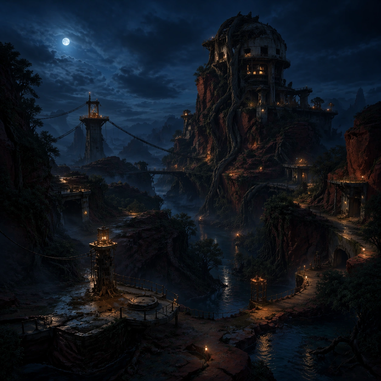
Scene: A square night-time version of the same biome, viewed from a mid-wide angle that still reveals the landmark tower, lower bridges, and water channels while replacing the dawn palette with deep blue darkness, warm watchfire pools, and reflected lantern trails. Fog sits low in the canyon, allowing lights to sketch the route structure without flattening the space. Subject: The exact same mangrove canyon biome from the reference model, with identical landmark placement, bridge rhythm, root-covered tower silhouette, and traversal routes. The scene now depicts an operational night watch state: signal braziers or enclosed work lights along the catwalks, dim service lamps around the tower base, and calm water reflecting the route network. Important details: Preserve the reference geometry and world identity precisely. Night readability depends on disciplined lighting hierarchy, not random glow. Use warm route lights, cool moonlit rock faces, selective reflections, and crisp silhouette edges to keep pathing legible. The scene should feel suitable for a loading screen or chapter backdrop that still belongs unmistakably to the same biome established in image 01. Use case: Biome Pack series study 4/9, preserving the same biome in a readable night-state atmosphere. Constraints: No readable text, no watermark, no logos, preserve exact 1:1 aspect ratio, preserve exact landmarks from the reference model, no characters, no readable signs, no neon city clutter, no star-filled fantasy sky, no overexposed bloom

Example generated from “Biome Establishing Scene Pack — Landmark Interior Threshold”
GPT Image 2en

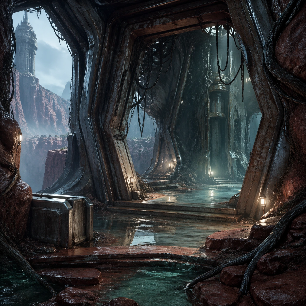
Scene: A square interior-threshold environment frame positioned at the entrance of the landmark tower, looking from a damp exterior platform into a half-open chamber of steel ribs, root intrusion, and misty reflected light. The shot balances interior architecture with glimpses back into the canyon beyond, keeping a sense of place continuity. Subject: The subject is the threshold where exterior biome and interior landmark meet: fractured metal ribs, wet stone steps, root growth through seams, hanging maintenance cables, shallow water, and a distant view back to the canyon. The space should feel like the first room a player reaches after crossing the biome rather than a disconnected concept painting. Important details: Maintain the same palette and material logic as the wider biome: rust-red stone, teal moisture, pale fog, cold steel, and selective warm utility lights. Composition should clearly show door scale, navigable steps, cover elements, and exploratory promise. The image needs to feel immediately usable as a story beat, chapter sub-header, or exploration promo asset. Use case: Biome Pack single study 6/9, extending the biome identity into a landmark interior threshold shot. Constraints: No readable text, no watermark, no logos, preserve exact 1:1 aspect ratio, no readable text, no characters, no combat, no magical portal cliché, no cluttered debris field, no non-square crop

Example generated from “Biome Establishing Scene Pack — Flora and Surface Board”
GPT Image 2en

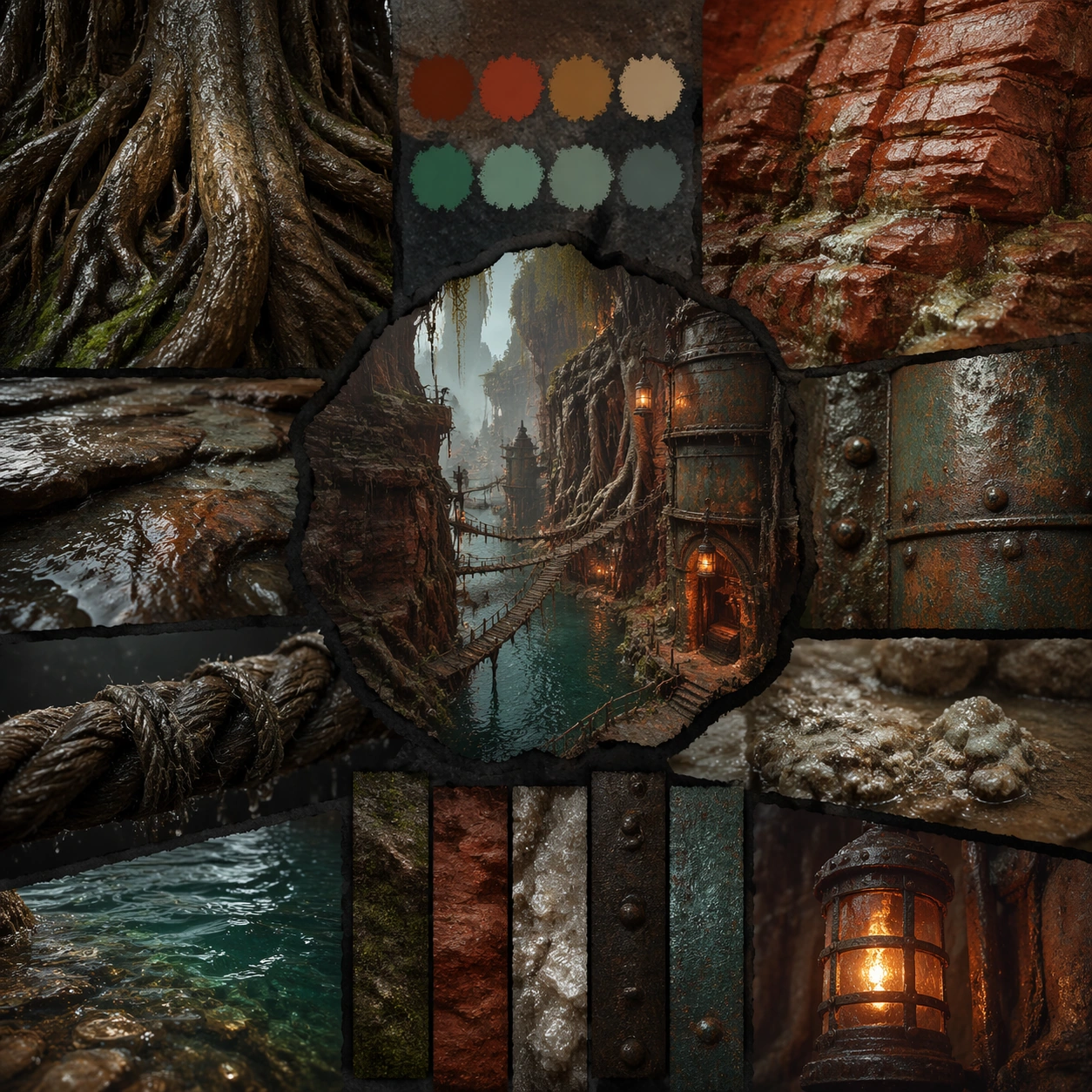
Scene: A square environment material board arranged like a premium art-direction review, with macro close-ups of bark roots, wet stone, corroded metal, shallow water, moss, and rope fibers surrounding one small biome silhouette. Lighting is controlled and descriptive, avoiding harsh glamor in favor of legible texture and palette relationships. Subject: The subject is the tactile language of the canyon biome rather than a full vista. Show giant mangrove bark, red sediment stone, slick steel, mineral crust, damp rope bridges, teal water ripples, and lantern-warmed metal as a family of surfaces that all belong to one environment. Important details: This board should help a viewer understand why the biome feels cohesive. Emphasize scale clues, wear patterns, mineral staining, root invasion, corrosion edges, and moisture behavior. Layout can use abstract dividers and chips but no readable labels. The overall tone should feel like a production surface guide ready for concept, level art, and marketing teams to share. Use case: Biome Pack single study 7/9, summarizing the core flora and material language behind the biome. Constraints: No readable text, no watermark, no logos, preserve exact 1:1 aspect ratio, no readable text, no characters, no random unrelated plants, no plastic-looking surfaces, no overprocessed macro blur, no logo marks

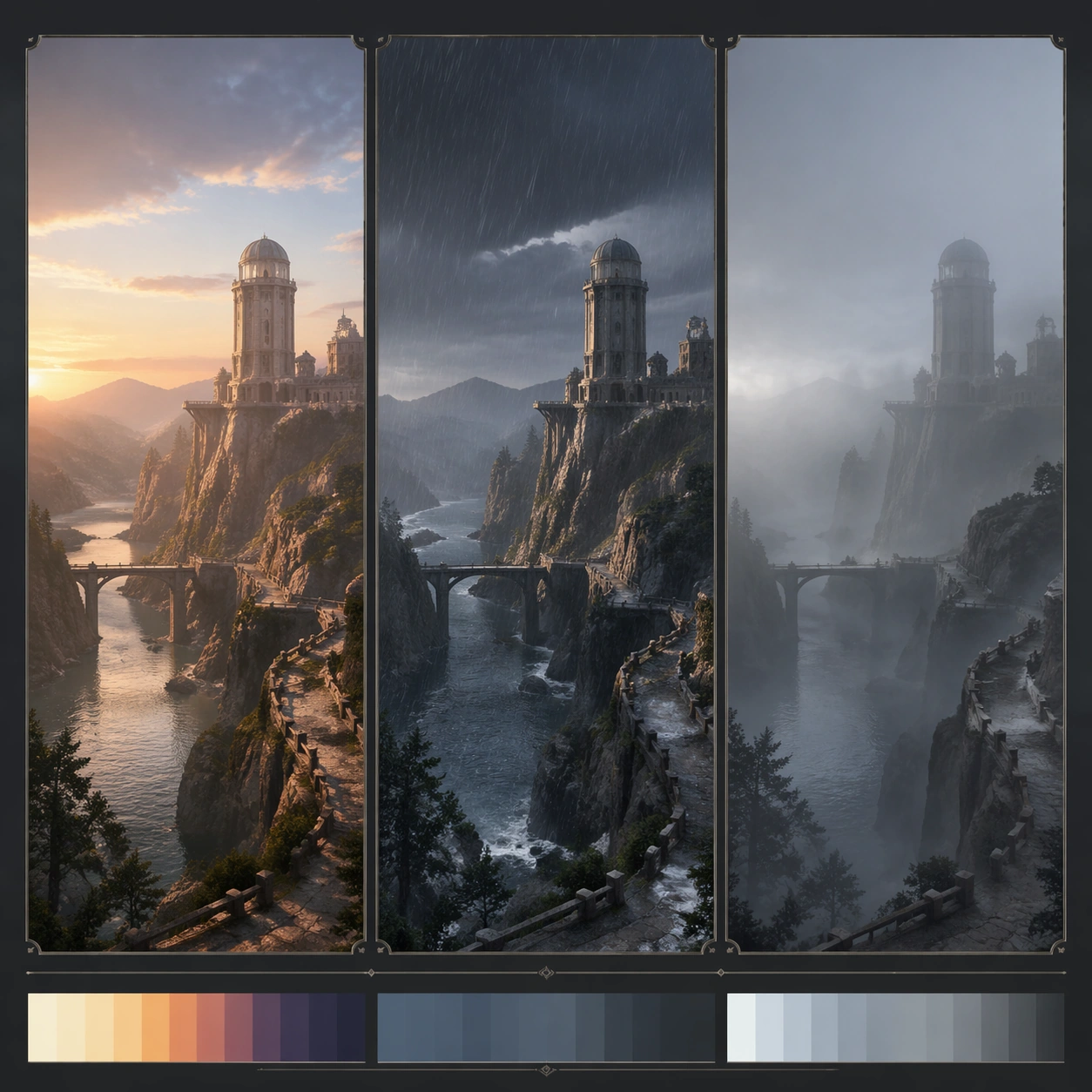
Example generated from “Biome Establishing Scene Pack — Weather Variant Board”
GPT Image 2en

Scene: A square comparison board showing three atmosphere states of the same biome across a disciplined triptych-like layout, with each window focusing on the same landmark zone under clear dawn, hard rain, and dense fog. The background remains quiet and graphic so the environment variations read immediately. Subject: The subject is one consistent landmark composition repeated across multiple weather states, proving that the biome remains recognizable through climate shifts. The observatory tower, bridge route, cliff shape, and water channel should remain constant while visibility, moisture, and light quality change. Important details: Make the comparison logic visual rather than textual. Weather must affect contrast, reflections, surface wetness, fog density, and sky color, but never erase the location identity. The board should feel useful for chapter-page planning, loading-screen art direction, and event variant discussion, while remaining polished enough to stand alone as a gallery image. Use case: Biome Pack single study 8/9, comparing multiple weather states while preserving the same biome identity. Constraints: No readable text, no watermark, no logos, preserve exact 1:1 aspect ratio, no readable text, no character inserts, no chaotic split-screen effects, no landmark drift between states, no poster slogans, no off-topic props

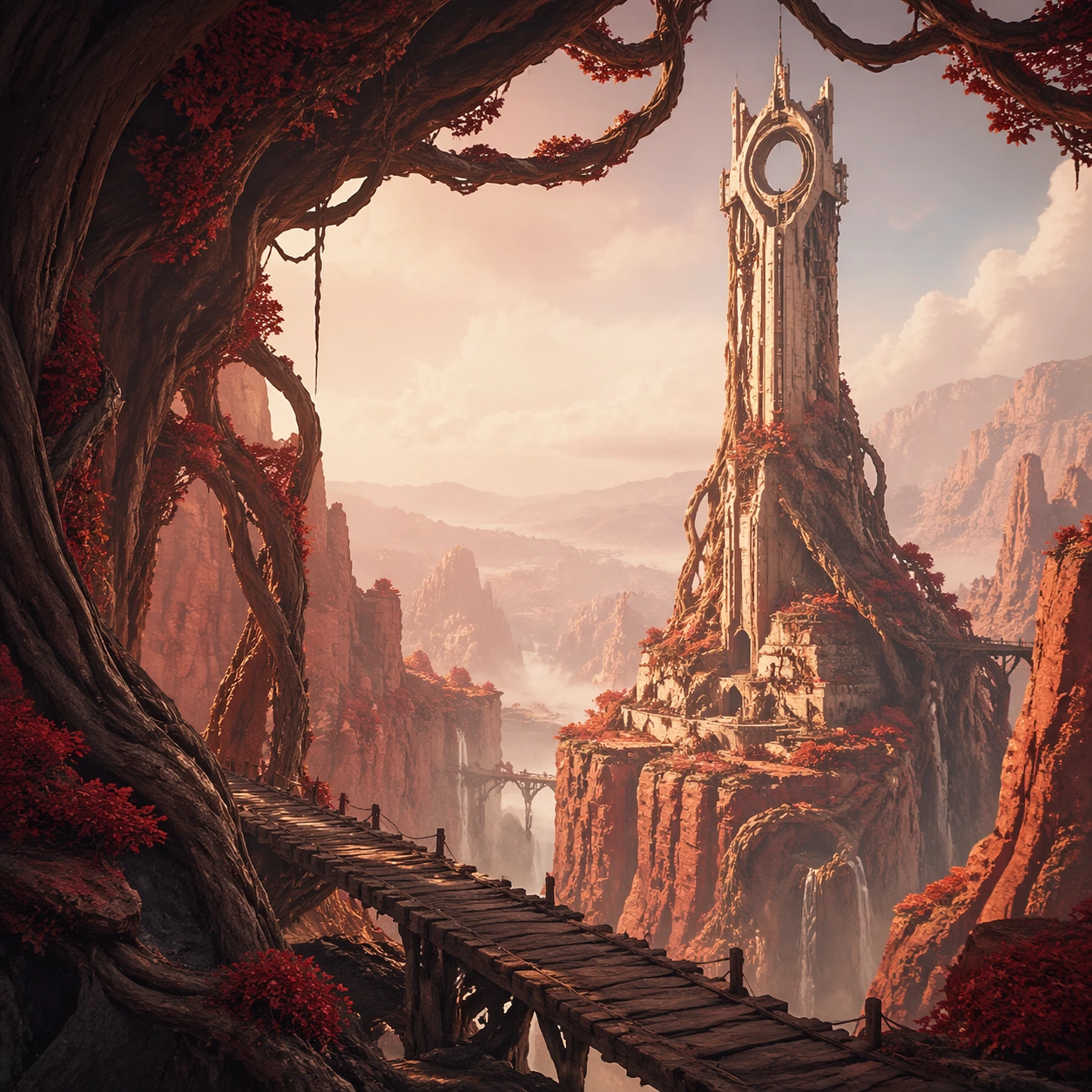
Example generated from “Biome Establishing Scene Pack — Chapter Page Hero Crop”
GPT Image 2en

Scene: A square website-hero style crop for the fictional biome, designed as a clean promotional environment image with bold foreground framing, a strong midground landmark, and enough open space to imply possible UI placement without actually rendering text. Lighting is elegant, atmospheric, and slightly more graphic than the gameplay-focused studies. Subject: The subject remains the same canyon biome and landmark tower, but the composition is optimized for a branded page hero: strong diagonal bridge line in the foreground, tower framed by roots in the midground, and a soft atmospheric depth stack behind it. The environment should feel explorable, memorable, and commercially polished. Important details: Focus on conversion-friendly clarity: one iconic landmark, one clear path cue, one memorable color relationship, and one set of surface materials that instantly identifies the region. Keep the art premium and collectible, suitable for a chapter landing page, event backdrop, or region overview panel without relying on readable text or logos. Use case: Biome Pack single study 9/9, adapting the biome into a polished chapter-page hero crop. Constraints: No readable text, no watermark, no logos, preserve exact 1:1 aspect ratio, no readable text, no characters, no oversized UI panels, no logo shapes, no random fantasy castles, no distorted horizon
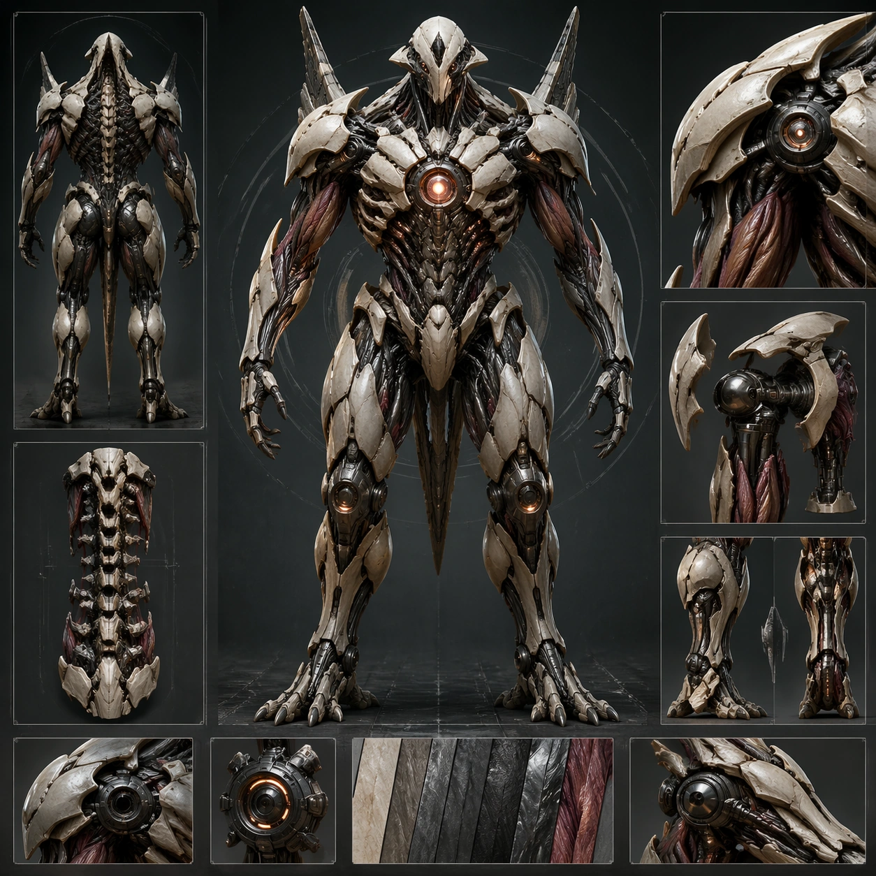
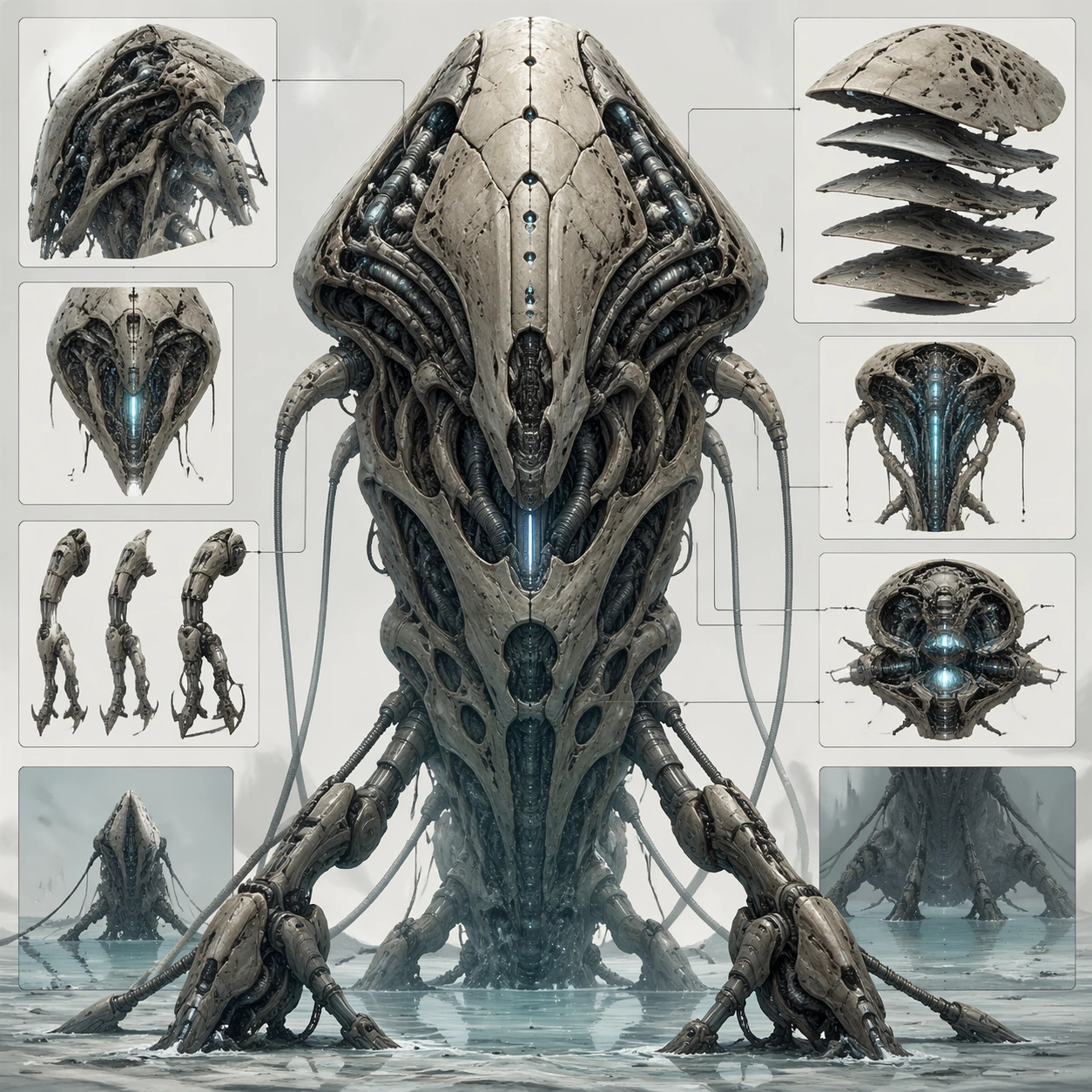
Example generated from “Biomechanical Entity Design Board — Sentinel Frame Anchor”
GPT Image 2en

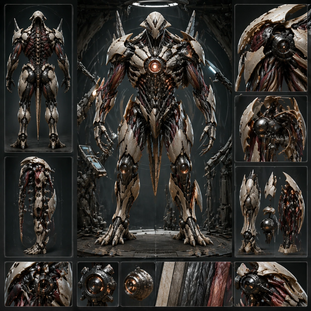
Scene: Create a square concept board for one biomechanical entity, balancing orthographic clarity, material close-ups, and enough dramatic lighting to feel like a finished poster. The layout should feel structured, with a dominant hero view supported by sections, parts, or alternate poses rather than scattered fragments. Build the board around a frontal sentinel stance with support views for the spine, shoulder assemblies, and lower-limb loading points. Subject: Center the image on a coherent organism-machine fusion where anatomy, exoskeletal plating, powered joints, sensors, and functional appendages belong to one design family. The being should feel purposeful, with visible load paths, movement logic, and enough biological cues to avoid looking like a plain robot. Establish one tall guardian-type body with plated musculature, optic nodes, joint sleeves, and a clearly readable chest core. Important details: Control noise aggressively. Use clear mass hierarchy, disciplined materials, and selective cross-section or inset views to explain how organic tissue and mechanical systems cooperate. The board should remain commercially useful for design review, poster, or worldbuilding deck surfaces. The anchor board should lock silhouette, material balance, and inset hierarchy so later variants can preserve the same entity family. Resolve the anchor rules that later reference-dependent variants must inherit, especially the torso silhouette, joint language, plated musculature, and board hierarchy. Use case: Biomech Board series study 1/4, designed as a reusable core-system image for this topic. Constraints: No readable text, no watermark, no logos, preserve exact 1:1 aspect ratio, no gore splatter, no random wires everywhere, no superhero costume cues, no readable labels, no weapon fetish clutter.

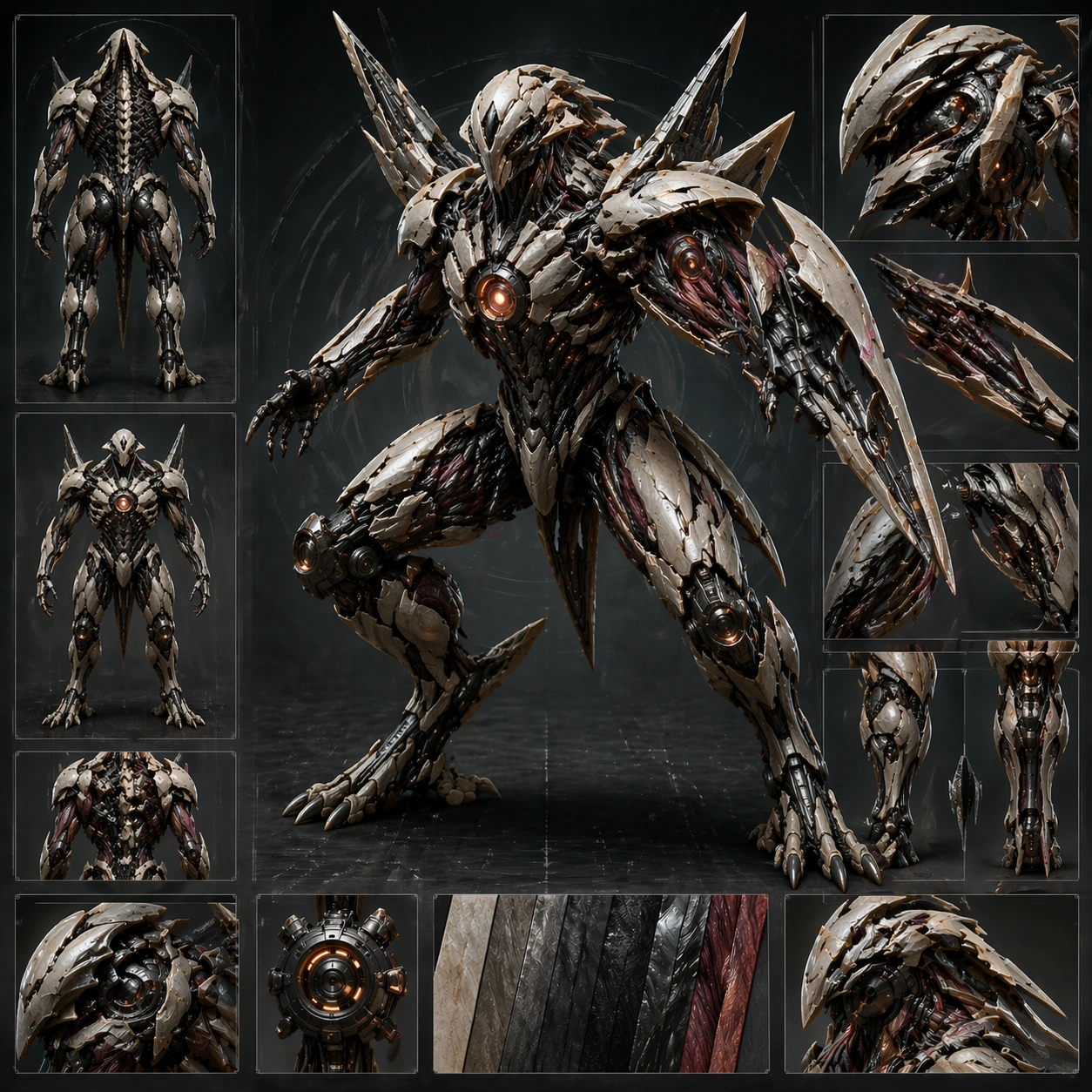
Example generated from “Biomechanical Entity Design Board — Combat Deployment Stance”
GPT Image 2en

Scene: Create a square concept board for one biomechanical entity, balancing orthographic clarity, material close-ups, and enough dramatic lighting to feel like a finished poster. The layout should feel structured, with a dominant hero view supported by sections, parts, or alternate poses rather than scattered fragments. Keep the same board language but rotate the main pose into a dynamic deployment stance with one limb extended and panel articulation exposed. Subject: Center the image on a coherent organism-machine fusion where anatomy, exoskeletal plating, powered joints, sensors, and functional appendages belong to one design family. The being should feel purposeful, with visible load paths, movement logic, and enough biological cues to avoid looking like a plain robot. Preserve the reference torso, limb proportions, and joint design while revealing protective shutters, bracing behavior, and threat posture. Important details: Control noise aggressively. Use clear mass hierarchy, disciplined materials, and selective cross-section or inset views to explain how organic tissue and mechanical systems cooperate. The board should remain commercially useful for design review, poster, or worldbuilding deck surfaces. Action should never overwhelm clarity; the viewer must still read the same original body family immediately. Preserve the exact structural language established by the reference image, especially the torso silhouette, joint language, plated musculature, and board hierarchy. Use case: Biomech Board series study 2/4, designed as a reusable core-system image for this topic. Constraints: No readable text, no watermark, no logos, preserve exact 1:1 aspect ratio, no gore splatter, no random wires everywhere, no superhero costume cues, no readable labels, no superhero jump pose.

Example generated from “Biomechanical Entity Design Board — Medical Repair Access”
GPT Image 2en

Scene: Create a square concept board for one biomechanical entity, balancing orthographic clarity, material close-ups, and enough dramatic lighting to feel like a finished poster. The layout should feel structured, with a dominant hero view supported by sections, parts, or alternate poses rather than scattered fragments. Compose the same board around a restrained maintenance setting with opened service plates, soft examination light, and tissue-meets-machine access points. Subject: Center the image on a coherent organism-machine fusion where anatomy, exoskeletal plating, powered joints, sensors, and functional appendages belong to one design family. The being should feel purposeful, with visible load paths, movement logic, and enough biological cues to avoid looking like a plain robot. Keep the base silhouette intact while making repair logic, modular organs, cable bundles, and regenerative material interfaces more explicit. Important details: Control noise aggressively. Use clear mass hierarchy, disciplined materials, and selective cross-section or inset views to explain how organic tissue and mechanical systems cooperate. The board should remain commercially useful for design review, poster, or worldbuilding deck surfaces. The tone should feel technical and compassionate rather than gruesome, using careful cutaway logic instead of exposed violence. Preserve the exact structural language established by the reference image, especially the torso silhouette, joint language, plated musculature, and board hierarchy. Use case: Biomech Board series study 3/4, designed as a reusable core-system image for this topic. Constraints: No readable text, no watermark, no logos, preserve exact 1:1 aspect ratio, no gore splatter, no random wires everywhere, no superhero costume cues, no readable labels, no surgery gore.

Example generated from “Biomechanical Entity Design Board — Dormant Disassembly View”
GPT Image 2en

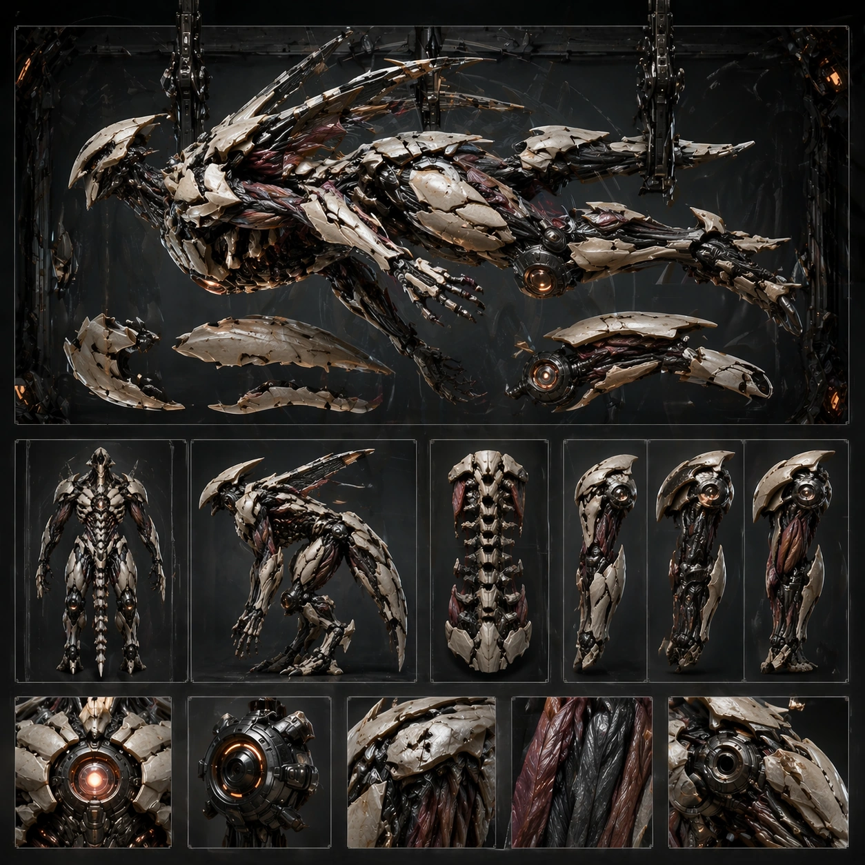
Scene: Create a square concept board for one biomechanical entity, balancing orthographic clarity, material close-ups, and enough dramatic lighting to feel like a finished poster. The layout should feel structured, with a dominant hero view supported by sections, parts, or alternate poses rather than scattered fragments. Stage the board around a horizontal or suspended dormant pose with a few major panels and limbs offset for study. Subject: Center the image on a coherent organism-machine fusion where anatomy, exoskeletal plating, powered joints, sensors, and functional appendages belong to one design family. The being should feel purposeful, with visible load paths, movement logic, and enough biological cues to avoid looking like a plain robot. Preserve the anchor structure while emphasizing fastening logic, modular armor shells, and internal actuator placement. Important details: Control noise aggressively. Use clear mass hierarchy, disciplined materials, and selective cross-section or inset views to explain how organic tissue and mechanical systems cooperate. The board should remain commercially useful for design review, poster, or worldbuilding deck surfaces. Disassembly must feel methodical and informative, never exploded into chaos or detached from the body plan. Preserve the exact structural language established by the reference image, especially the torso silhouette, joint language, plated musculature, and board hierarchy. Use case: Biomech Board series study 4/4, designed as a reusable core-system image for this topic. Constraints: No readable text, no watermark, no logos, preserve exact 1:1 aspect ratio, no gore splatter, no random wires everywhere, no superhero costume cues, no readable labels, no floating random fragments.

Example generated from “Biomechanical Entity Design Board — Aquatic Survey Drone Fauna”
GPT Image 2en

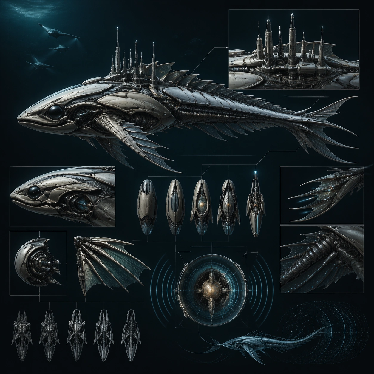
Scene: Design a square biomechanical concept plate that reads clearly from a distance and rewards close inspection. Use one strong main pose or view supported by carefully placed detail windows, component callouts, or environment cues. Show a sleek aquatic entity with side profile, dorsal instrumentation, fin mechanics, and sonar organ insets against a dark water field. Subject: Show a complete biomechanical entity or subsystem with clear task identity: guard, carrier, swimmer, scout, ritual host, or similar. The fusion between body logic and engineering should feel intentional and load-bearing. Blend marine anatomy, observation sensors, and low-disturbance propulsion into one coherent survey specialist. Important details: Favor anatomical structure, movement plausibility, and material discipline over surface noise. The result should feel buildable within its fictional world, not like a random accumulation of tubes and spikes. The result should feel elegant and purposeful, not like a random robot fish. Preserve readable biomechanics so joints, muscles, shells, and machines all seem to cooperate under one functional design logic. Use case: Biomech Board single study 2/5, designed as a self-contained support image for this topic. Constraints: No readable text, no watermark, no logos, preserve exact 1:1 aspect ratio, no horror torture imagery, no generic robot soldier clichés, no comic-book posing, no logo insignia, no submarine cartoon styling.

Example generated from “Biomechanical Entity Design Board — Nursery Grown Scout”
GPT Image 2en

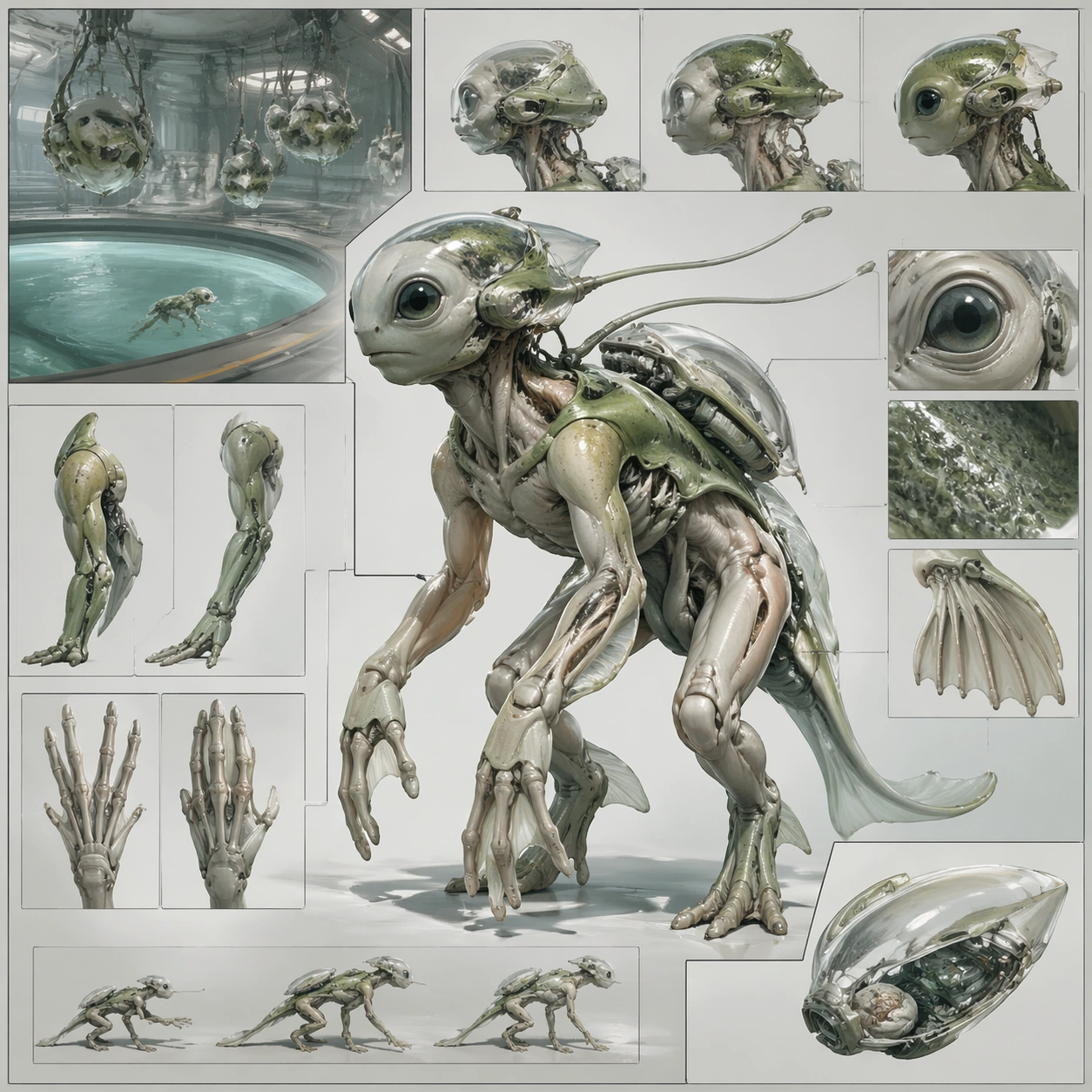
Scene: Design a square biomechanical concept plate that reads clearly from a distance and rewards close inspection. Use one strong main pose or view supported by carefully placed detail windows, component callouts, or environment cues. Build a structured board around a juvenile-scale scout with growth chamber context, limb studies, and sensory anatomy panels. Subject: Show a complete biomechanical entity or subsystem with clear task identity: guard, carrier, swimmer, scout, ritual host, or similar. The fusion between body logic and engineering should feel intentional and load-bearing. Make the entity feel designed for agility, learning, and environmental reading rather than combat. Important details: Favor anatomical structure, movement plausibility, and material discipline over surface noise. The result should feel buildable within its fictional world, not like a random accumulation of tubes and spikes. Use material softness and developmental cues to differentiate it from finished military machines. Preserve readable biomechanics so joints, muscles, shells, and machines all seem to cooperate under one functional design logic. Use case: Biomech Board single study 3/5, designed as a self-contained support image for this topic. Constraints: No readable text, no watermark, no logos, preserve exact 1:1 aspect ratio, no horror torture imagery, no generic robot soldier clichés, no comic-book posing, no logo insignia, no cute mascot look.

Example generated from “Biomechanical Entity Design Board — Siege Carrier Torso Study”
GPT Image 2en

Scene: Design a square biomechanical concept plate that reads clearly from a distance and rewards close inspection. Use one strong main pose or view supported by carefully placed detail windows, component callouts, or environment cues. Compose the square around a monumental torso section with support diagrams of anchor limbs, shell plates, and internal energy routing. Subject: Show a complete biomechanical entity or subsystem with clear task identity: guard, carrier, swimmer, scout, ritual host, or similar. The fusion between body logic and engineering should feel intentional and load-bearing. The protagonist is the body architecture itself, showing how huge mass, shielding, and motive force are coordinated. Important details: Favor anatomical structure, movement plausibility, and material discipline over surface noise. The result should feel buildable within its fictional world, not like a random accumulation of tubes and spikes. Keep the view analytical and imposing without turning it into unreadable armor noise. Preserve readable biomechanics so joints, muscles, shells, and machines all seem to cooperate under one functional design logic. Use case: Biomech Board single study 4/5, designed as a self-contained support image for this topic. Constraints: No readable text, no watermark, no logos, preserve exact 1:1 aspect ratio, no horror torture imagery, no generic robot soldier clichés, no comic-book posing, no logo insignia, no tank-on-legs clichés.

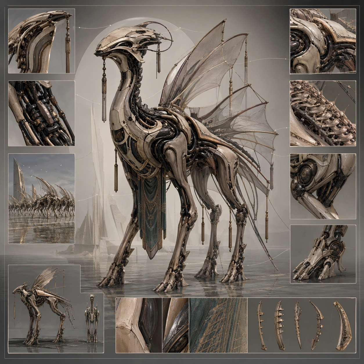
Example generated from “Biomechanical Entity Design Board — Ritual Display Chassis”
GPT Image 2en

Scene: Design a square biomechanical concept plate that reads clearly from a distance and rewards close inspection. Use one strong main pose or view supported by carefully placed detail windows, component callouts, or environment cues. Design a polished concept board for a ceremonial chassis with controlled pose, display appendages, and layered material detail windows. Subject: Show a complete biomechanical entity or subsystem with clear task identity: guard, carrier, swimmer, scout, ritual host, or similar. The fusion between body logic and engineering should feel intentional and load-bearing. The entity should feel built for procession or social meaning, but still obey clear biomechanics and assembly logic. Important details: Favor anatomical structure, movement plausibility, and material discipline over surface noise. The result should feel buildable within its fictional world, not like a random accumulation of tubes and spikes. Use ornament sparingly as a structural extension, not as decorative clutter hiding the body plan. Preserve readable biomechanics so joints, muscles, shells, and machines all seem to cooperate under one functional design logic. Use case: Biomech Board single study 5/5, designed as a self-contained support image for this topic. Constraints: No readable text, no watermark, no logos, preserve exact 1:1 aspect ratio, no horror torture imagery, no generic robot soldier clichés, no comic-book posing, no logo insignia, no crown-and-scepter fantasy royalty.

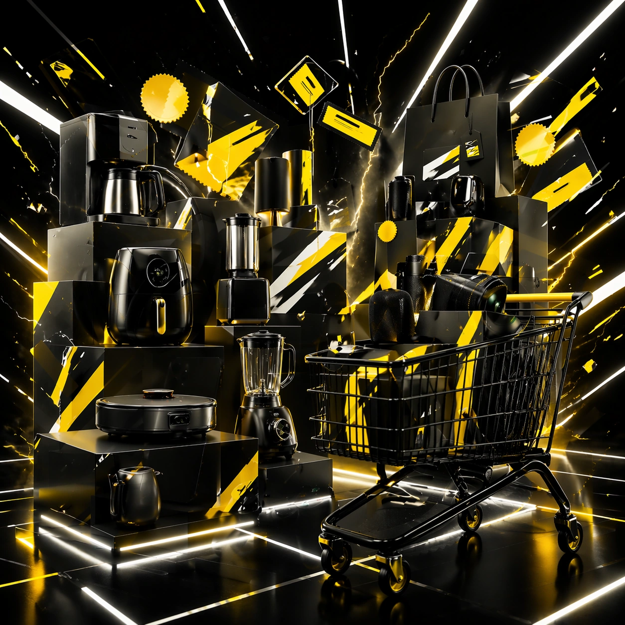
Example generated from “Black Friday And Shopping Frenzy Kit — Midnight Deal Anchor”
GPT Image 2en

Scene: Create a square digital-retail campaign image with a midnight black base, sharp white highlights, acidic yellow accents, and electric edge lighting. The composition should feel like a premium e-commerce hero surface translated into a physical merch world: aggressive, layered, and urgent, yet still controlled enough for a real campaign. Use bold blocks, sale-chip silhouettes, and product staging that imply heavy discount hierarchy without relying on readable typography. Subject: Center a stack of premium consumer products and abstract pricing surfaces arranged into a forceful Black Friday composition. Include cartons, devices or lifestyle goods, glowing panels, sticker-like geometric shapes, and motion cues that suggest countdown urgency and deal density. The subject must feel original and brand-neutral, but instantly legible as a high-pressure sale environment designed for digital retail conversion. Important details: Lock the system here: black field, white contrast bars, yellow urgency accents, metallic reflections, diagonal momentum, and non-legible sale-card geometry. Readability should come from hierarchy, spacing, and scale, not from actual words. The image must feel sharp, tactical, and commercially viable for Black Friday landing pages, promo carousels, and marketplace hero placements. Avoid chaotic bargain-bin mess; make the aggression intentional and premium. Use case: Black Friday series study 1/9. Constraints: No readable text, no watermark, no logos, preserve exact 1:1 aspect ratio, no readable numbers or words, no logos, no random neon rainbow, no crowd stampede, no broken perspective, no cheap clip-art burst shapes, no currency symbols, no generic mall scene.

Example generated from “Black Friday And Shopping Frenzy Kit — Electronics Drop Variation”
GPT Image 2en

Scene: Create a square dependent sale image in the exact same midnight retail world, with the same black field, white hierarchy, yellow urgency accents, and aggressive edge lighting from the reference. Adjust the camera slightly to favor stacked devices and cleaner shelving geometry, but preserve the same visual pressure and campaign polish. The viewer should feel obvious continuity with the anchor image at first glance. Subject: Feature electronics-like product silhouettes, carton structures, charging accessories, and abstract price-chip panels arranged into a powerful deal-drop composition. Preserve the exact sale-chip grammar, panel spacing, light direction, and reflective material logic from the reference image while shifting the category emphasis toward tech. Everything should remain brand-neutral and original while still reading as a major high-demand sale moment. Important details: Preserve exact campaign identity from the reference image: same contrast ratio, same accent placement, same motion diagonals, and the same clean-aggressive digital-retail logic. Product clarity must come from shape and hierarchy, not labels. Keep the scene premium and tightly art-directed, avoiding discount-chaos cliché. The final result should feel like a conversion-focused hero asset for a serious marketplace or electronics retailer. Use case: Black Friday series study 2/9. Constraints: No readable text, no watermark, no logos, preserve exact 1:1 aspect ratio, preserve exact campaign identity from the reference image, no readable product screens, no brand marks, no currency signs, no explosion effects, no crowd, no random cyberpunk elements, no broken device anatomy.

Example generated from “Black Friday And Shopping Frenzy Kit — Beauty Bundle Variation”
GPT Image 2en

Scene: Create a square dependent sale image with the identical midnight-black world, white structural bars, yellow accents, and sharp luminous edges from the reference image, but organize the space into a cleaner product tableau suited to beauty-bundle promotion. Keep the composition clearly connected to the anchor, with the same urgency and conversion pressure, while letting packaging rhythm and repetition create a more curated sale presentation. Subject: Show a bundle of premium beauty-like products, trays, cartons, and abstract promotion chips layered into a dense but disciplined Black Friday layout. Preserve exact spacing logic, high-contrast panel behavior, and lighting direction from the reference model while changing the category emphasis. The viewer should read this as the same sale campaign translated to a different assortment, not a new campaign language. Important details: Keep hierarchy and urgency intact. Sale-readability must come from bold shape contrast, placement, and scale, never from actual words. Product forms should be original, polished, and plausible, with reflective packaging and sharp edges that support the premium-aggressive tone. The overall effect should feel fit for beauty retail, social promo tiles, and e-commerce hero banners under the same Black Friday system. Use case: Black Friday series study 3/9. Constraints: No readable text, no watermark, no logos, preserve exact 1:1 aspect ratio, preserve exact campaign identity from the reference image, no readable labels, no soft pastel drift, no luxury magazine glamour, no logos, no random confetti, no broken packaging, no beauty model.

Example generated from “Black Friday And Shopping Frenzy Kit — Home Tech Cart Variation”
GPT Image 2en

Scene: Create a square dependent campaign image within the same Black Friday world, using the exact black base, stark white bars, yellow sale accents, and crisp reflected light from the reference image, but expand the space to suggest a cart-driven retail scene. The frame should stay graphic and pressure-heavy while introducing more environment cues around stacked goods and checkout movement. Subject: Feature home-tech-like products, boxed appliances or accessories, cart silhouettes, and abstract sale surfaces arranged into a premium frenzy composition. Preserve exact layout logic, accent rhythm, and lighting identity from the reference model while shifting the scene toward basket-building and cart urgency. The imagery must remain original, non-branded, and optimized for campaign usability. Important details: Treat this as the same sale grammar under a new retail use case. Maintain crisp hierarchy, disciplined geometry, and strong thumbnail read. The cart cue should strengthen urgency without turning the image into a literal supermarket shot. Keep reflections, box edges, and accent panels believable and polished. The final asset should feel like a direct extension of the reference campaign, ready for homepage takeovers or app sale promotions. Use case: Black Friday series study 4/9. Constraints: No readable text, no watermark, no logos, preserve exact 1:1 aspect ratio, preserve exact campaign identity from the reference image, no readable checkout screens, no currency symbols, no supermarket aisle clutter, no logo boxes, no human crowd, no random red holiday cues, no low-end bargain-bin mess.

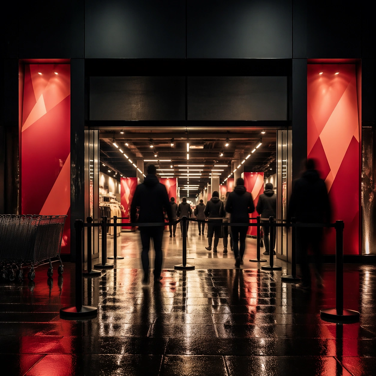
Example generated from “Black Friday And Shopping Frenzy Kit — Midnight Queue Entry”
GPT Image 2en

Scene: Create a square storefront entrance scene at night with bright interior sale lighting, dark exterior surroundings, wet pavement reflections, and a controlled sense of anticipation. The frame should communicate access and urgency without showing chaos or readable signage. Compose it like a premium campaign image for a major sale opening, with strong architecture, clear lines, and a disciplined sense of pressure. Subject: Show a retail entrance with abstract sale panels, stanchions, shopping carts, reflected light, and a few blurred human silhouettes that stay secondary to the store threshold. The composition should imply an opening rush and high-value access without becoming documentary crowd photography. Keep everything brand-neutral and visually centered on the experience of entering a major sale environment. Important details: Make atmosphere persuasive through light, reflection, spacing, and threshold design. Queue energy should come from composition rather than from visible readable text or chaotic people. The result should look suitable for sale-night announcement art, app splash imagery, or event-promo campaign support. Keep the environment believable, premium, and pressure-heavy. Use case: Black Friday single study 6/9. Constraints: No readable text, no watermark, no logos, preserve exact 1:1 aspect ratio, no readable store name, no screaming crowd close-up, no police barrier vibe, no logo bags, no currency graphics, no confetti, no carnival lighting, no celebrity faces.

Example generated from “Black Friday And Shopping Frenzy Kit — Stockroom Parcel Storm”
GPT Image 2en

Scene: Create a square logistics image inside a premium stockroom with dark industrial tones, hard white strip light, yellow safety accents, and orderly parcel density. The frame should feel intense and time-sensitive, but still structured enough for a commercial campaign. Use strong perspective lines, stacked parcels, rolling cages, and controlled motion blur so the image communicates volume and fulfillment pressure without collapsing into chaos. Subject: Center a sorting zone with parcel stacks, carts, taped boxes, gloves, conveyors, and geometric routing surfaces, all brand-neutral and free of readable labels. The scene should tell a fulfillment story: demand is high, the operation is moving fast, and the retailer is under pressure. Keep people minimal or blurred so the logistics environment stays dominant and reusable. Important details: Material realism matters. Cardboard wear, tape sheen, metal rack reflections, concrete floor marks, and directional light should all feel persuasive. Avoid warehouse sloppiness. This is a campaign-ready logistics visual for shipping cutoffs, demand surges, and order-volume storytelling. The composition should read instantly and strongly at both full size and small promo-tile scale. Use case: Black Friday single study 7/9. Constraints: No readable text, no watermark, no logos, preserve exact 1:1 aspect ratio, no readable labels, no delivery company logos, no forklift hazard scene, no messy trash, no visible invoice text, no brand tape, no random holiday decorations, no crowding that destroys hierarchy.
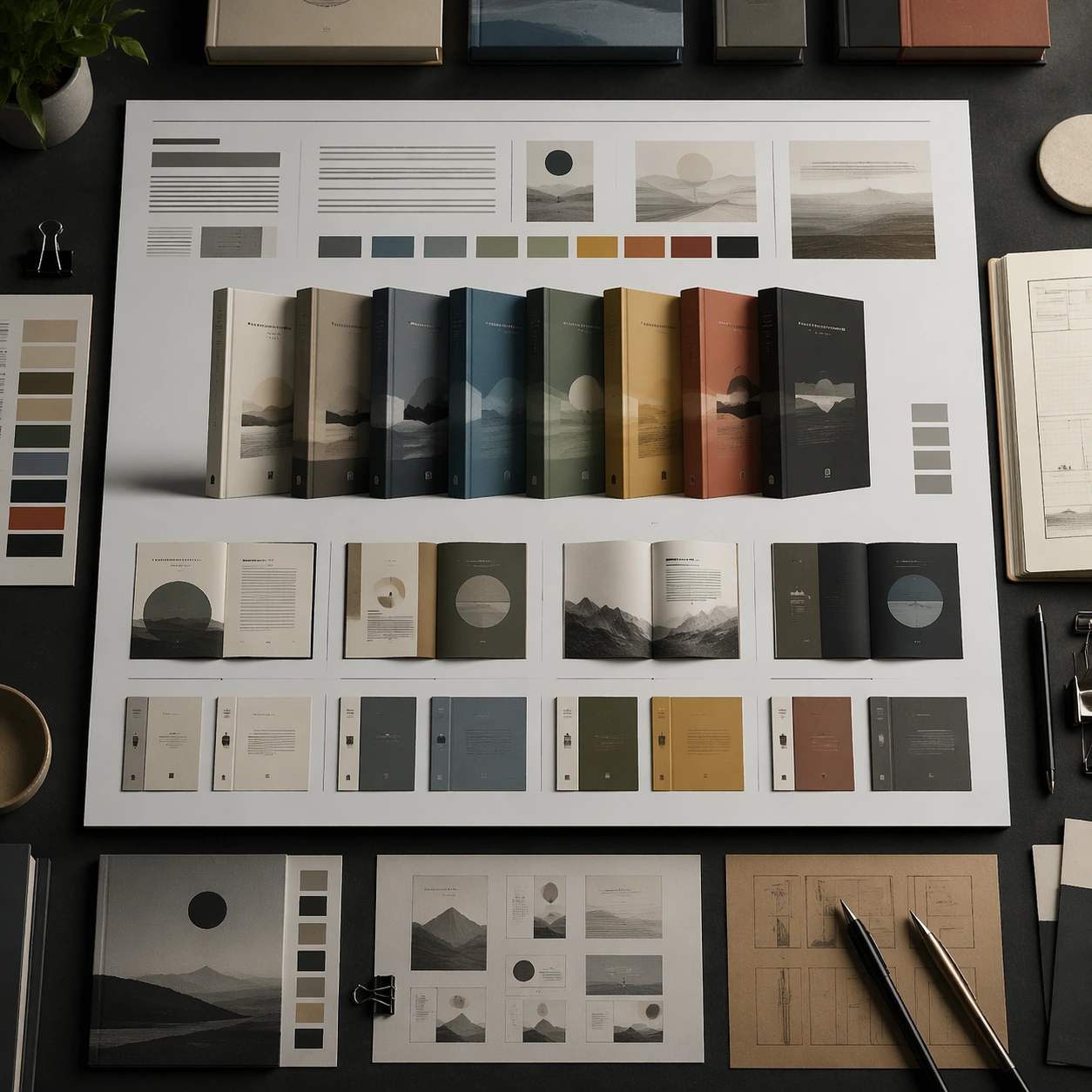
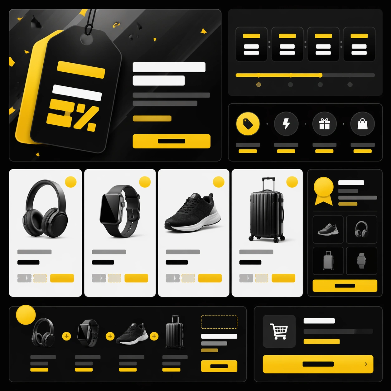
Example generated from “Black Friday And Shopping Frenzy Kit — App Card Promo Board”
GPT Image 2en

Scene: Create a square front-facing promo board with dark UI-like panels, bright white product cards, yellow accent badges, and crisp spacing. The image should look like a premium app campaign translated into a physical concept board, with strong grid logic and a direct thumbnail read. Keep everything non-legible but obviously optimized for discounts, bundles, and rapid browsing behavior. Subject: Build a layered system of cards, chips, tiles, product silhouettes, and checkout cues arranged into one coherent Black Friday visual board. The subject should feel like a high-pressure app surface for major promotions, but rendered as a refined campaign mockup without actual interface text. Use clear hierarchy, card grouping, and a confident retail rhythm that signals urgency and value. Important details: Structured layout is the main challenge. Keep spacing disciplined, contrast strong, and abstract text blocks consistent enough that the eye reads sale information even though nothing is readable. Materials can be semi-gloss panels, matte cards, and subtle reflections. The final frame should be suitable for promo strategy decks, sale-landing hero images, or social countdown creatives. Use case: Black Friday single study 8/9. Constraints: No readable text, no watermark, no logos, preserve exact 1:1 aspect ratio, no readable app text, no currency symbols, no logo icons, no random 3D emoji elements, no broken grid, no pastel drift, no fake screenshots, no cluttered background.

Example generated from “Black Friday And Shopping Frenzy Kit — Parcel Doorburst”
GPT Image 2en

Scene: Create a square doorstep delivery image at dawn or dusk with crisp exterior light, stacked parcel volume, and a strong sense of recent motion. The frame should feel like a campaign visual for shipping success during peak sale season. Use architecture, package placement, and directional shadow to make the image organized and credible, not comedic or messy. Subject: Show a residential or apartment threshold where multiple parcels have just been placed in a tidy but high-volume arrangement. Use varied box sizes, tape, soft weather cues, and subtle motion traces, but keep labels blank and brand-neutral. The subject should communicate the scale of demand and the excitement of arrival without showing faces or readable shipping details. Important details: The story is volume under control. Make cardboard, tape, stone, metal, and ambient light feel real. Keep the scene visually simple enough for campaign use while still conveying a flood of deals arriving at home. Avoid sentimentality. This is about the aftershock of a major sale and the physical evidence of successful fulfillment. Use case: Black Friday single study 9/9. Constraints: No readable text, no watermark, no logos, preserve exact 1:1 aspect ratio, no readable labels, no courier logos, no house-number text, no holiday gift wrapping, no comedic overspill of boxes, no vehicles, no people posing, no damaged parcels.

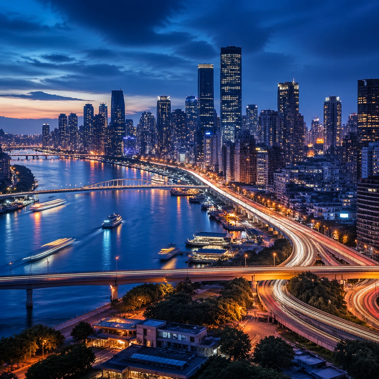
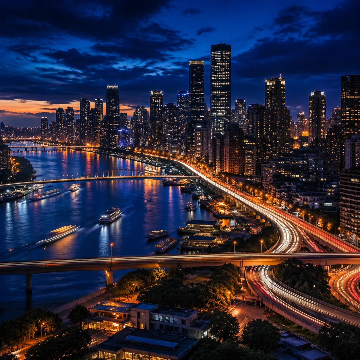
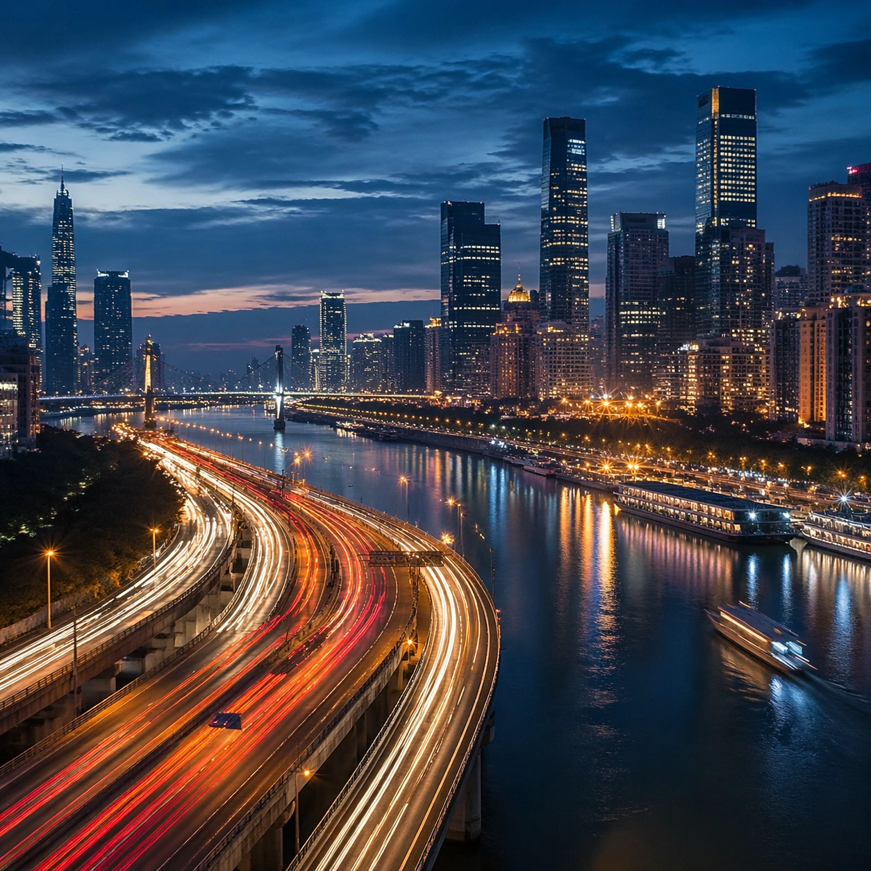
Example generated from “Blue Hour Metropolis — Reference Anchor”
GPT Image 2en

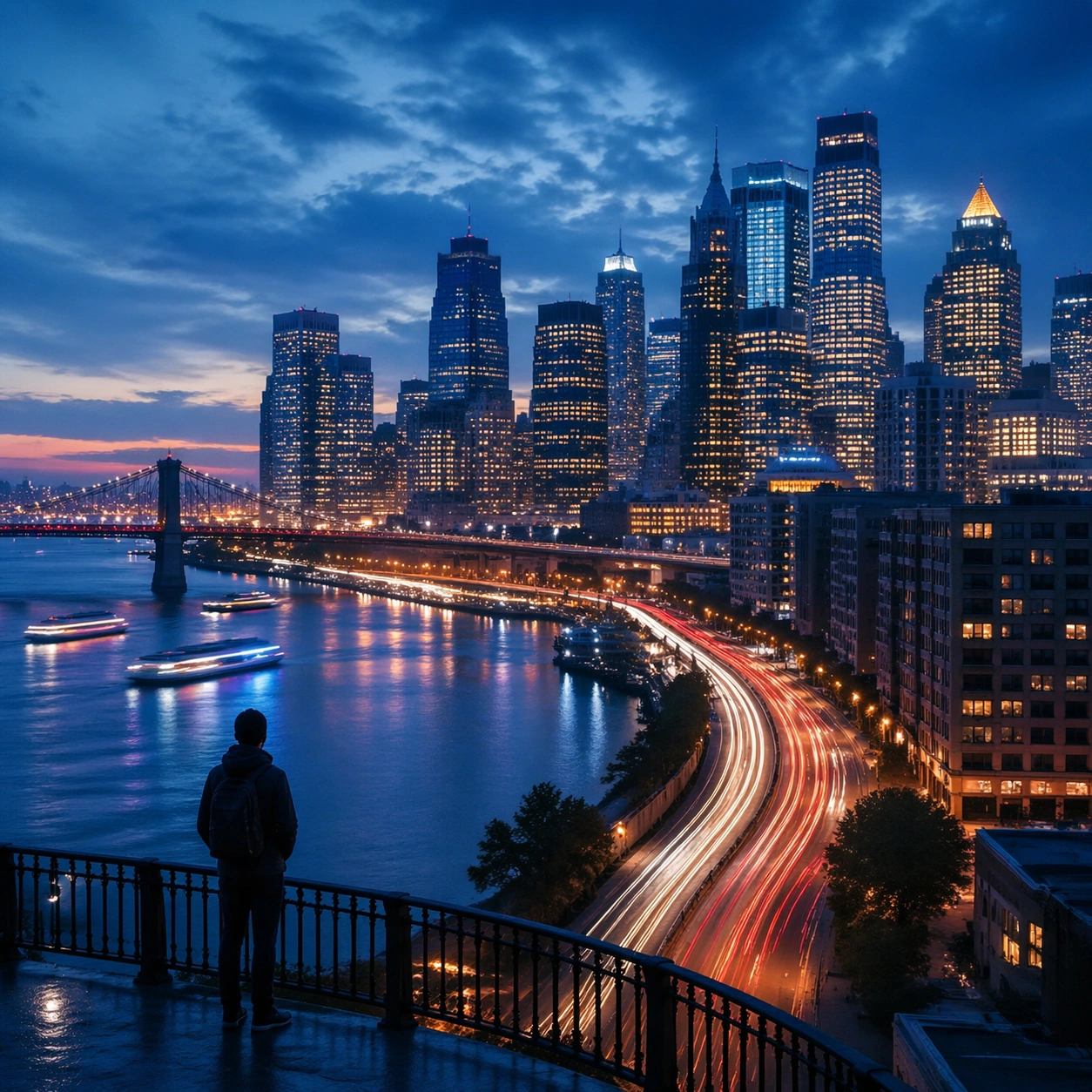
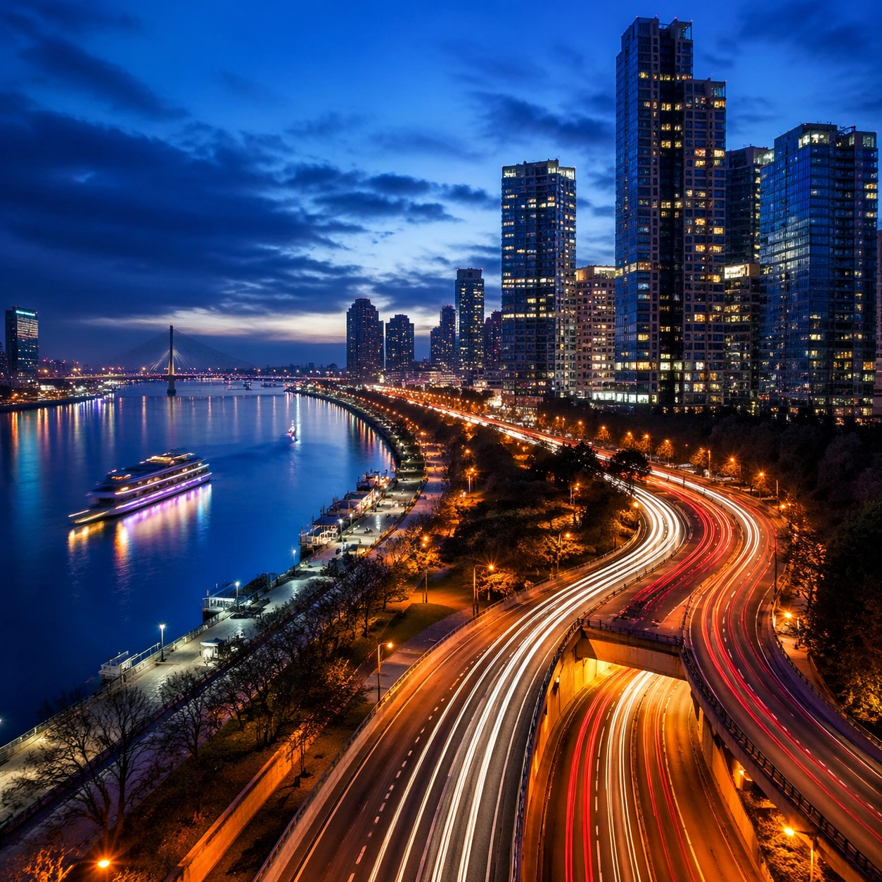
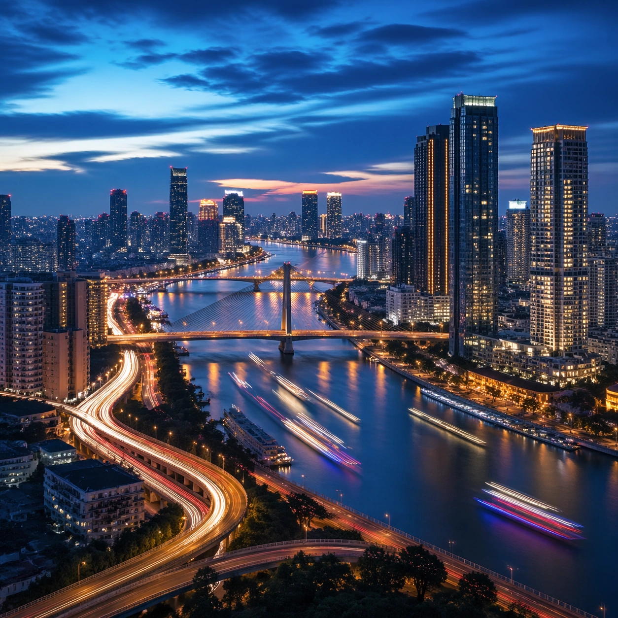
Scene: Create a square cinematic still for Blue Hour Metropolis Long Exposure. Use production-grade photoreal lighting, disciplined lens behavior, and a composition that feels like a finished key frame from an original film rather than a casual snapshot. A dense riverside metropolis is captured at the exact transition of blue hour, where the sky holds deep cobalt, windows begin to glow warm gold, traffic turns into elegant light trails, and water reflects both cool atmosphere and neon accents. Keep the camera in a disciplined anchor position so the full lighting event and the main spatial structure are immediately legible from edge to edge. Subject: Build a coherent original scene whose emotional center comes from atmosphere, light physics, and spatial clarity. Avoid relying on celebrity likeness, franchise iconography, or stylized illustration shortcuts. Skyscrapers, bridges, riverbanks, layered roads, and a few boats or ferries should form a coherent urban rhythm, with architecture believable and anonymous rather than tied to any one landmark identity. This frame should lock the canonical arrangement, scale relationship, and emotional tone that the later dependent images inherit. Important details: Preserve a believable physical world with strong depth layering, careful color separation, and premium image discipline. Control color temperature precisely, keeping the cool ambient sky separate from warm occupancy lights, with long-exposure motion on roads and water that feels polished, metropolitan, and technically disciplined. Use this image to establish the authoritative direction of light, atmospheric density, and structural silhouette for the package. Use case: Blue Hour City series study 1/9. Constraints: No readable text, no watermark, no logos, preserve exact 1:1 aspect ratio, no readable billboards, no famous landmark mimicry, no fireworks, no science-fiction holograms, no empty skyline.

Example generated from “Blue Hour Metropolis — Closer Frame”
GPT Image 2en

Scene: Create a square cinematic still for Blue Hour Metropolis Long Exposure. Use production-grade photoreal lighting, disciplined lens behavior, and a composition that feels like a finished key frame from an original film rather than a casual snapshot. A dense riverside metropolis is captured at the exact transition of blue hour, where the sky holds deep cobalt, windows begin to glow warm gold, traffic turns into elegant light trails, and water reflects both cool atmosphere and neon accents. Move the camera closer or lower so the viewer feels more embedded inside the atmosphere while the same light direction and environment remain intact. Subject: Build a coherent original scene whose emotional center comes from atmosphere, light physics, and spatial clarity. Avoid relying on celebrity likeness, franchise iconography, or stylized illustration shortcuts. Skyscrapers, bridges, riverbanks, layered roads, and a few boats or ferries should form a coherent urban rhythm, with architecture believable and anonymous rather than tied to any one landmark identity. Preserve the same world logic from the reference and let one human-scale or material-scale element become more prominent without stealing focus from the atmosphere. Important details: Preserve a believable physical world with strong depth layering, careful color separation, and premium image discipline. Control color temperature precisely, keeping the cool ambient sky separate from warm occupancy lights, with long-exposure motion on roads and water that feels polished, metropolitan, and technically disciplined. Keep the palette family, structural read, and light behavior from image 01 while increasing immediacy and tactile presence. Use case: Blue Hour City series study 2/9. Constraints: No readable text, no watermark, no logos, preserve exact 1:1 aspect ratio, no readable billboards, no famous landmark mimicry, no fireworks, no science-fiction holograms, no empty skyline.

Example generated from “Blue Hour Metropolis — Spatial Counterpoint”
GPT Image 2en

Scene: Create a square cinematic still for Blue Hour Metropolis Long Exposure. Use production-grade photoreal lighting, disciplined lens behavior, and a composition that feels like a finished key frame from an original film rather than a casual snapshot. A dense riverside metropolis is captured at the exact transition of blue hour, where the sky holds deep cobalt, windows begin to glow warm gold, traffic turns into elegant light trails, and water reflects both cool atmosphere and neon accents. Shift to an oblique or lateral point of view that reveals different depth layers while staying inside the same place and the same atmospheric event. Subject: Build a coherent original scene whose emotional center comes from atmosphere, light physics, and spatial clarity. Avoid relying on celebrity likeness, franchise iconography, or stylized illustration shortcuts. Skyscrapers, bridges, riverbanks, layered roads, and a few boats or ferries should form a coherent urban rhythm, with architecture believable and anonymous rather than tied to any one landmark identity. Hold the reference structure, but use the new angle to show secondary planes, foreground interruption, or a changed distance relationship. Important details: Preserve a believable physical world with strong depth layering, careful color separation, and premium image discipline. Control color temperature precisely, keeping the cool ambient sky separate from warm occupancy lights, with long-exposure motion on roads and water that feels polished, metropolitan, and technically disciplined. The success condition is continuity with the reference plus a richer sense of depth, not a new location or a new lighting system. Use case: Blue Hour City series study 3/9. Constraints: No readable text, no watermark, no logos, preserve exact 1:1 aspect ratio, no readable billboards, no famous landmark mimicry, no fireworks, no science-fiction holograms, no empty skyline.

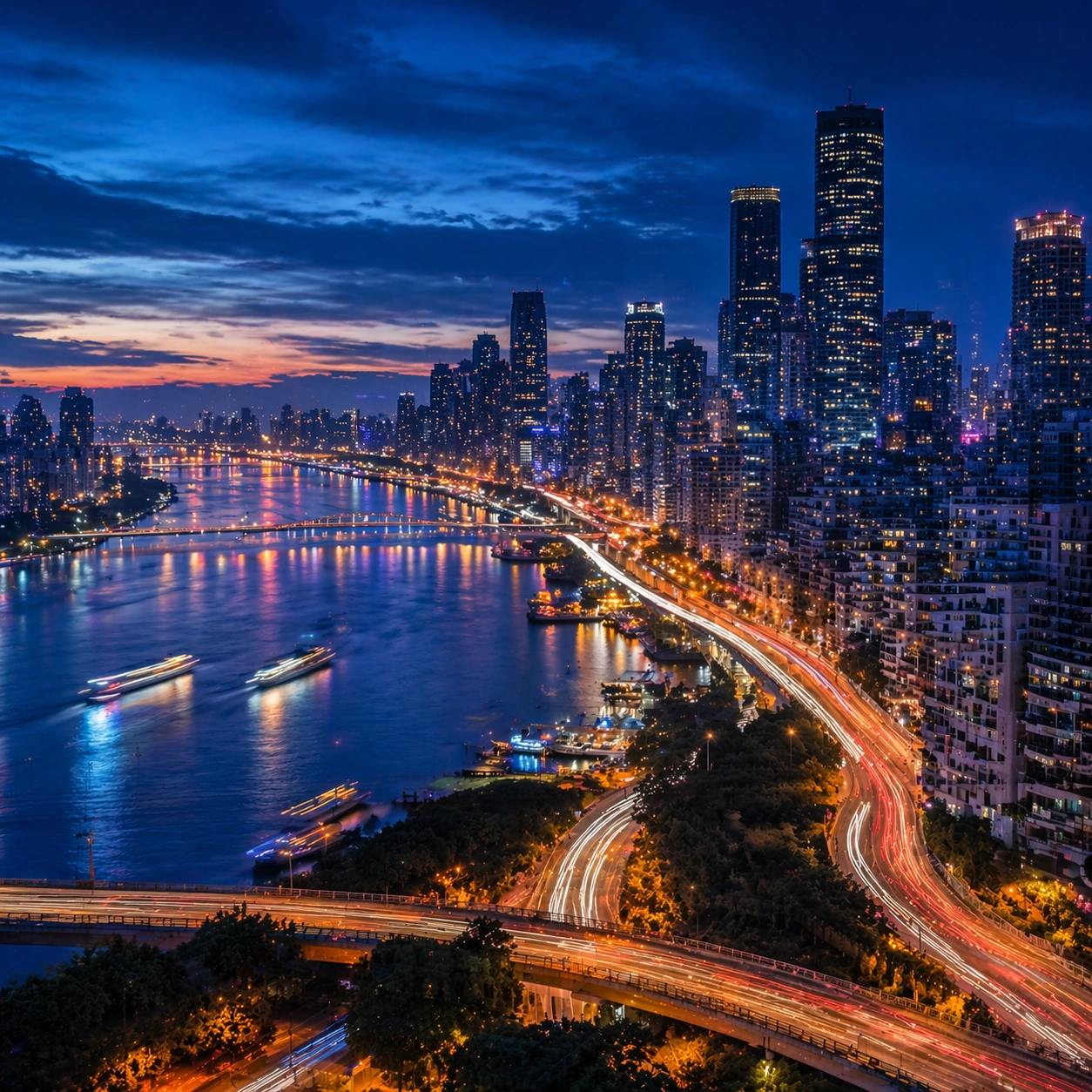
Example generated from “Blue Hour Metropolis — Climax Frame”
GPT Image 2en

Scene: Create a square cinematic still for Blue Hour Metropolis Long Exposure. Use production-grade photoreal lighting, disciplined lens behavior, and a composition that feels like a finished key frame from an original film rather than a casual snapshot. A dense riverside metropolis is captured at the exact transition of blue hour, where the sky holds deep cobalt, windows begin to glow warm gold, traffic turns into elegant light trails, and water reflects both cool atmosphere and neon accents. Push the composition toward the emotional peak of the same setup, with the most dramatic balance of brightness, shadow, or atmospheric density inside the established world. Subject: Build a coherent original scene whose emotional center comes from atmosphere, light physics, and spatial clarity. Avoid relying on celebrity likeness, franchise iconography, or stylized illustration shortcuts. Skyscrapers, bridges, riverbanks, layered roads, and a few boats or ferries should form a coherent urban rhythm, with architecture believable and anonymous rather than tied to any one landmark identity. Everything should still read as the same location and same event, but framed for maximum narrative force and visual closure. Important details: Preserve a believable physical world with strong depth layering, careful color separation, and premium image discipline. Control color temperature precisely, keeping the cool ambient sky separate from warm occupancy lights, with long-exposure motion on roads and water that feels polished, metropolitan, and technically disciplined. Make it feel like the strongest hero frame of the sequence without breaking continuity or introducing a new design language. Use case: Blue Hour City series study 4/9. Constraints: No readable text, no watermark, no logos, preserve exact 1:1 aspect ratio, no readable billboards, no famous landmark mimicry, no fireworks, no science-fiction holograms, no empty skyline.

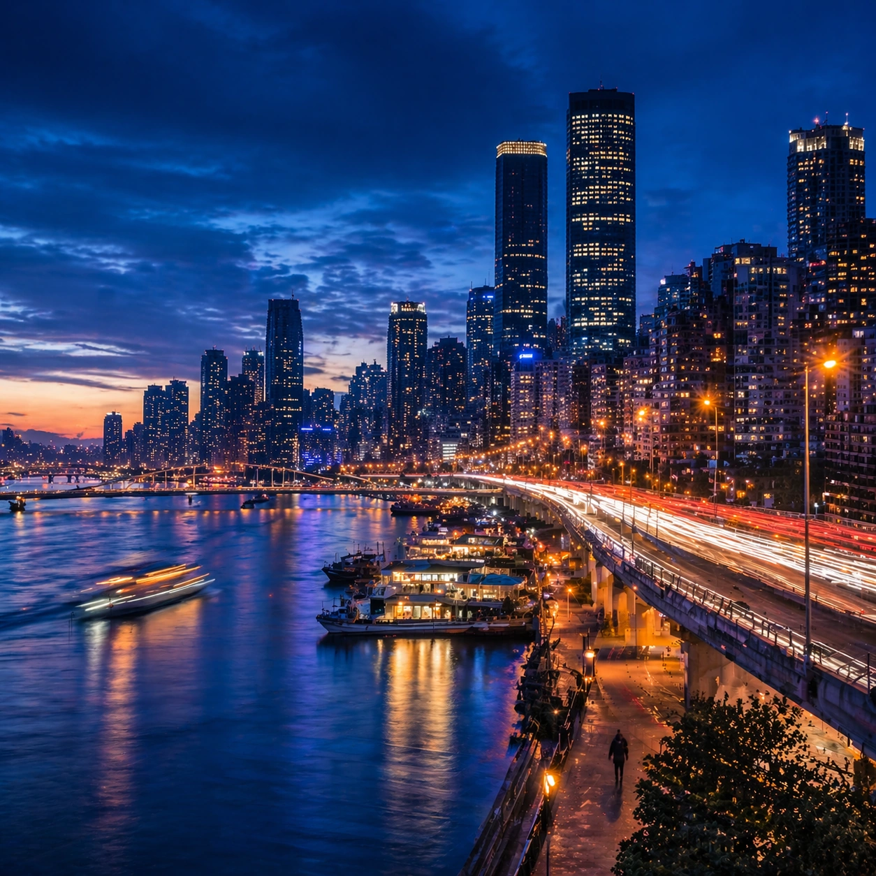
Example generated from “Blue Hour Metropolis — Silhouette Study”
GPT Image 2en

Scene: Create a square cinematic still for Blue Hour Metropolis Long Exposure. Use production-grade photoreal lighting, disciplined lens behavior, and a composition that feels like a finished key frame from an original film rather than a casual snapshot. A dense riverside metropolis is captured at the exact transition of blue hour, where the sky holds deep cobalt, windows begin to glow warm gold, traffic turns into elegant light trails, and water reflects both cool atmosphere and neon accents. Compose an independent frame where one human, animal, or object silhouette negotiates with the atmospheric light event in a clean, readable way. Subject: Build a coherent original scene whose emotional center comes from atmosphere, light physics, and spatial clarity. Avoid relying on celebrity likeness, franchise iconography, or stylized illustration shortcuts. Skyscrapers, bridges, riverbanks, layered roads, and a few boats or ferries should form a coherent urban rhythm, with architecture believable and anonymous rather than tied to any one landmark identity. The silhouette should supply scale and emotional orientation, but the environment still needs to carry most of the storytelling weight. Important details: Preserve a believable physical world with strong depth layering, careful color separation, and premium image discipline. Control color temperature precisely, keeping the cool ambient sky separate from warm occupancy lights, with long-exposure motion on roads and water that feels polished, metropolitan, and technically disciplined. Keep the silhouette simple and believable, avoiding poster-like graphic flattening while preserving strong contrast. Use case: Blue Hour City single study 6/9. Constraints: No readable text, no watermark, no logos, preserve exact 1:1 aspect ratio, no readable billboards, no famous landmark mimicry, no fireworks, no science-fiction holograms, no empty skyline.

Example generated from “Blue Hour Metropolis — Transition Study”
GPT Image 2en

Scene: Create a square cinematic still for Blue Hour Metropolis Long Exposure. Use production-grade photoreal lighting, disciplined lens behavior, and a composition that feels like a finished key frame from an original film rather than a casual snapshot. A dense riverside metropolis is captured at the exact transition of blue hour, where the sky holds deep cobalt, windows begin to glow warm gold, traffic turns into elegant light trails, and water reflects both cool atmosphere and neon accents. Treat this as an adjacent moment before or after the main event, preserving the same topic language while letting the atmosphere shift slightly in intensity or position. Subject: Build a coherent original scene whose emotional center comes from atmosphere, light physics, and spatial clarity. Avoid relying on celebrity likeness, franchise iconography, or stylized illustration shortcuts. Skyscrapers, bridges, riverbanks, layered roads, and a few boats or ferries should form a coherent urban rhythm, with architecture believable and anonymous rather than tied to any one landmark identity. Show the environment in transition, with clear evidence of recent motion, changing weather, or fading light, but without turning it into action spectacle. Important details: Preserve a believable physical world with strong depth layering, careful color separation, and premium image discipline. Control color temperature precisely, keeping the cool ambient sky separate from warm occupancy lights, with long-exposure motion on roads and water that feels polished, metropolitan, and technically disciplined. Subtle temporal storytelling matters here more than maximal drama, so let traces, gradients, and environmental residue do the work. Use case: Blue Hour City single study 7/9. Constraints: No readable text, no watermark, no logos, preserve exact 1:1 aspect ratio, no readable billboards, no famous landmark mimicry, no fireworks, no science-fiction holograms, no empty skyline.

Example generated from “Blue Hour Metropolis — Wide Study”
GPT Image 2en

Scene: Create a square cinematic still for Blue Hour Metropolis Long Exposure. Use production-grade photoreal lighting, disciplined lens behavior, and a composition that feels like a finished key frame from an original film rather than a casual snapshot. A dense riverside metropolis is captured at the exact transition of blue hour, where the sky holds deep cobalt, windows begin to glow warm gold, traffic turns into elegant light trails, and water reflects both cool atmosphere and neon accents. Pull back enough to explain the broader geography or architectural envelope while keeping the square crop intentional and balanced. Subject: Build a coherent original scene whose emotional center comes from atmosphere, light physics, and spatial clarity. Avoid relying on celebrity likeness, franchise iconography, or stylized illustration shortcuts. Skyscrapers, bridges, riverbanks, layered roads, and a few boats or ferries should form a coherent urban rhythm, with architecture believable and anonymous rather than tied to any one landmark identity. The wider frame should reveal how the main light or weather phenomenon organizes the surrounding world and not just the immediate subject. Important details: Preserve a believable physical world with strong depth layering, careful color separation, and premium image discipline. Control color temperature precisely, keeping the cool ambient sky separate from warm occupancy lights, with long-exposure motion on roads and water that feels polished, metropolitan, and technically disciplined. Make scale legible through spacing, horizon control, and foreground-to-background separation rather than through extra props. Use case: Blue Hour City single study 8/9. Constraints: No readable text, no watermark, no logos, preserve exact 1:1 aspect ratio, no readable billboards, no famous landmark mimicry, no fireworks, no science-fiction holograms, no empty skyline.

Example generated from “Blue Hour Metropolis — Afterglow Study”
GPT Image 2en

Scene: Create a square cinematic still for Blue Hour Metropolis Long Exposure. Use production-grade photoreal lighting, disciplined lens behavior, and a composition that feels like a finished key frame from an original film rather than a casual snapshot. A dense riverside metropolis is captured at the exact transition of blue hour, where the sky holds deep cobalt, windows begin to glow warm gold, traffic turns into elegant light trails, and water reflects both cool atmosphere and neon accents. End on a quieter independent image that holds the residue of the topic atmosphere after its loudest moment has passed, while still feeling complete and exhibition-ready. Subject: Build a coherent original scene whose emotional center comes from atmosphere, light physics, and spatial clarity. Avoid relying on celebrity likeness, franchise iconography, or stylized illustration shortcuts. Skyscrapers, bridges, riverbanks, layered roads, and a few boats or ferries should form a coherent urban rhythm, with architecture believable and anonymous rather than tied to any one landmark identity. The frame should suggest memory, aftermath, or lingering presence through environment first and only secondarily through any figure or object. Important details: Preserve a believable physical world with strong depth layering, careful color separation, and premium image discipline. Control color temperature precisely, keeping the cool ambient sky separate from warm occupancy lights, with long-exposure motion on roads and water that feels polished, metropolitan, and technically disciplined. Favor restraint, believable light decay, and subtle narrative closure over spectacle or decorative excess. Use case: Blue Hour City single study 9/9. Constraints: No readable text, no watermark, no logos, preserve exact 1:1 aspect ratio, no readable billboards, no famous landmark mimicry, no fireworks, no science-fiction holograms, no empty skyline.

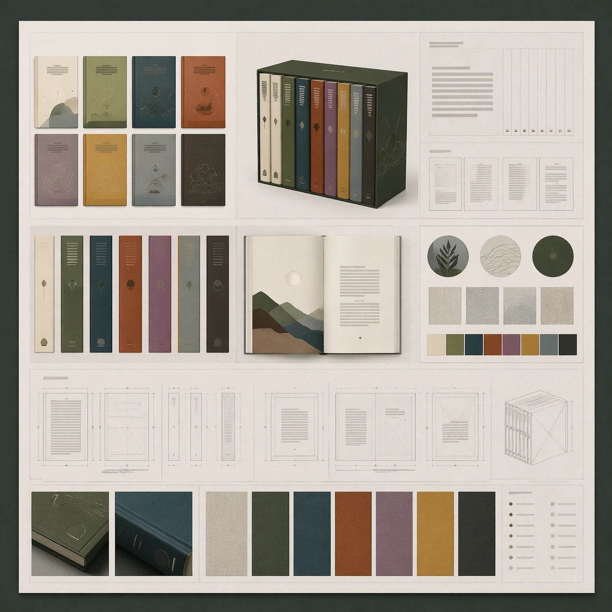
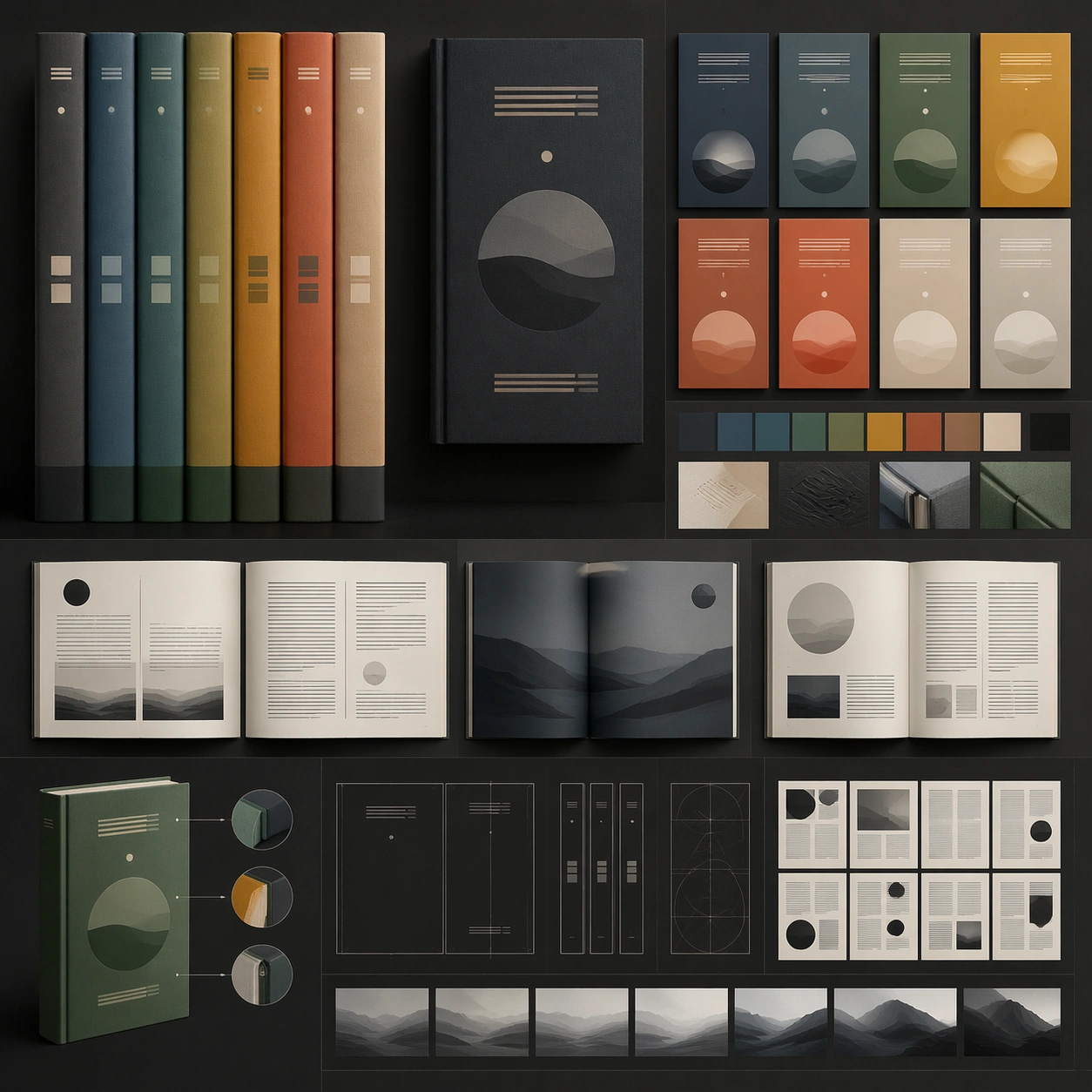
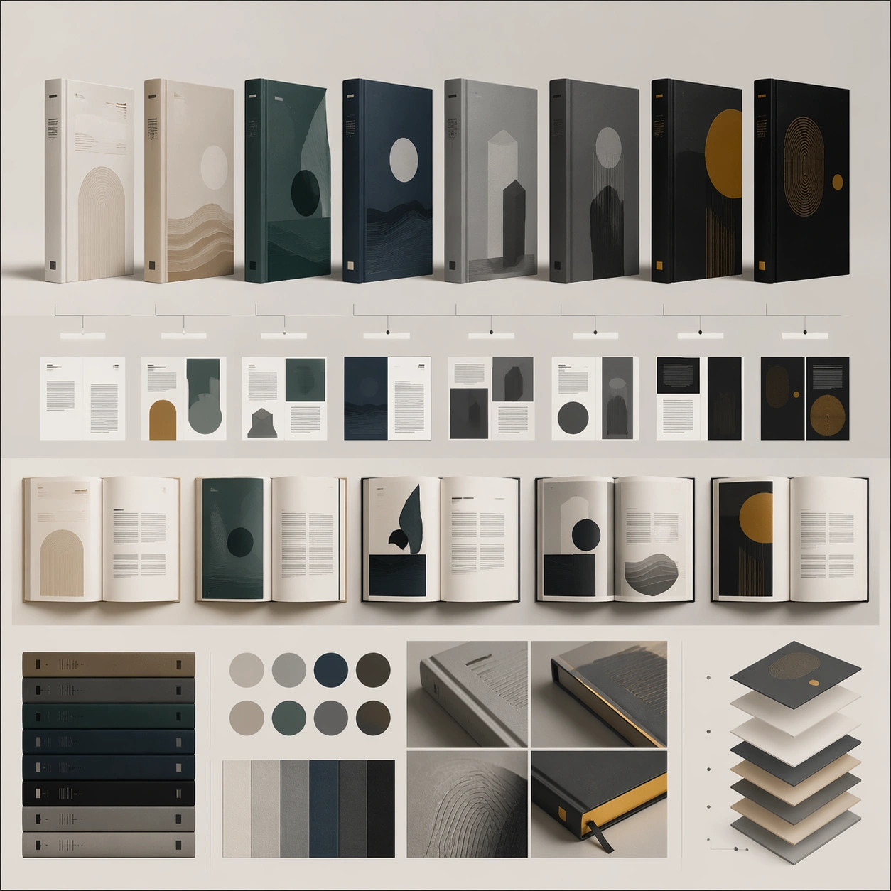
Example generated from “Book Series Design — Variant Grid”
GPT Image 2en

Scene: A square editorial or interface layout study with exact margins, confident grid structure, and premium print or screen presentation. Build the frame around multiple aligned variations sharing one disciplined layout system. Keep the lighting, camera distance, and spatial organization tuned for a high-signal research image rather than a casual snapshot. The image belongs to the Book Series Design theme and should feel immediately legible as a prompt atlas theme for book series design, testing text-rendering, structured-layout, style-transfer, commercial-mockup with gpt image 2.. Subject: Center the study on multiple aligned variations sharing one disciplined layout system. Translate the theme into a concrete visual statement instead of an abstract mood board: the viewer should understand what kind of image this is, what is being tested, and why the composition is difficult. Use the slug idea of book series design as a literal guide for subject matter, materials, and staging. Important details: Typography fields must stay unreadable, but hierarchy, rhythm, and page architecture should feel convincing enough for design review. Preserve a disciplined square composition, clear focal hierarchy, and enough secondary information to make the image feel complete rather than underspecified. The image should look polished, novel, and exhibition-ready, with topic-specific credibility coming from the way surfaces, structure, and visual language reinforce Book Series Design. Avoid generic filler elements that do not serve the main concept. Use case: Book Series Design single study 2/8, testing text-rendering, structured-layout, style-transfer, commercial-mockup through the variant grid variation. Constraints: No readable text, no watermark, no logos, preserve exact 1:1 aspect ratio, no readable text, no logo lockups from real brands, no broken grid, no arbitrary poster clutter, no malformed columns, no accidental lorem ipsum.

Example generated from “Book Series Design — Desk Review”
GPT Image 2en

Scene: A square editorial or interface layout study with exact margins, confident grid structure, and premium print or screen presentation. Build the frame around a presentation context that shows the layout as a reviewed design object. Keep the lighting, camera distance, and spatial organization tuned for a high-signal research image rather than a casual snapshot. The image belongs to the Book Series Design theme and should feel immediately legible as a prompt atlas theme for book series design, testing text-rendering, structured-layout, style-transfer, commercial-mockup with gpt image 2.. Subject: Center the study on a presentation context that shows the layout as a reviewed design object. Translate the theme into a concrete visual statement instead of an abstract mood board: the viewer should understand what kind of image this is, what is being tested, and why the composition is difficult. Use the slug idea of book series design as a literal guide for subject matter, materials, and staging. Important details: Typography fields must stay unreadable, but hierarchy, rhythm, and page architecture should feel convincing enough for design review. Preserve a disciplined square composition, clear focal hierarchy, and enough secondary information to make the image feel complete rather than underspecified. The image should look polished, novel, and exhibition-ready, with topic-specific credibility coming from the way surfaces, structure, and visual language reinforce Book Series Design. Avoid generic filler elements that do not serve the main concept. Use case: Book Series Design single study 3/8, testing text-rendering, structured-layout, style-transfer, commercial-mockup through the desk review variation. Constraints: No readable text, no watermark, no logos, preserve exact 1:1 aspect ratio, no readable text, no logo lockups from real brands, no broken grid, no arbitrary poster clutter, no malformed columns, no accidental lorem ipsum.

Example generated from “Book Series Design — Material Closeup”
GPT Image 2en

Scene: A square editorial or interface layout study with exact margins, confident grid structure, and premium print or screen presentation. Build the frame around print grain, paper, or screen detail without losing overall composition. Keep the lighting, camera distance, and spatial organization tuned for a high-signal research image rather than a casual snapshot. The image belongs to the Book Series Design theme and should feel immediately legible as a prompt atlas theme for book series design, testing text-rendering, structured-layout, style-transfer, commercial-mockup with gpt image 2.. Subject: Center the study on print grain, paper, or screen detail without losing overall composition. Translate the theme into a concrete visual statement instead of an abstract mood board: the viewer should understand what kind of image this is, what is being tested, and why the composition is difficult. Use the slug idea of book series design as a literal guide for subject matter, materials, and staging. Important details: Typography fields must stay unreadable, but hierarchy, rhythm, and page architecture should feel convincing enough for design review. Preserve a disciplined square composition, clear focal hierarchy, and enough secondary information to make the image feel complete rather than underspecified. The image should look polished, novel, and exhibition-ready, with topic-specific credibility coming from the way surfaces, structure, and visual language reinforce Book Series Design. Avoid generic filler elements that do not serve the main concept. Use case: Book Series Design single study 4/8, testing text-rendering, structured-layout, style-transfer, commercial-mockup through the material closeup variation. Constraints: No readable text, no watermark, no logos, preserve exact 1:1 aspect ratio, no readable text, no logo lockups from real brands, no broken grid, no arbitrary poster clutter, no malformed columns, no accidental lorem ipsum.

Example generated from “Book Series Design — Archive Sheet”
GPT Image 2en

Scene: A square editorial or interface layout study with exact margins, confident grid structure, and premium print or screen presentation. Build the frame around a flat archival or proof-like sheet with modular content blocks. Keep the lighting, camera distance, and spatial organization tuned for a high-signal research image rather than a casual snapshot. The image belongs to the Book Series Design theme and should feel immediately legible as a prompt atlas theme for book series design, testing text-rendering, structured-layout, style-transfer, commercial-mockup with gpt image 2.. Subject: Center the study on a flat archival or proof-like sheet with modular content blocks. Translate the theme into a concrete visual statement instead of an abstract mood board: the viewer should understand what kind of image this is, what is being tested, and why the composition is difficult. Use the slug idea of book series design as a literal guide for subject matter, materials, and staging. Important details: Typography fields must stay unreadable, but hierarchy, rhythm, and page architecture should feel convincing enough for design review. Preserve a disciplined square composition, clear focal hierarchy, and enough secondary information to make the image feel complete rather than underspecified. The image should look polished, novel, and exhibition-ready, with topic-specific credibility coming from the way surfaces, structure, and visual language reinforce Book Series Design. Avoid generic filler elements that do not serve the main concept. Use case: Book Series Design single study 5/8, testing text-rendering, structured-layout, style-transfer, commercial-mockup through the archive sheet variation. Constraints: No readable text, no watermark, no logos, preserve exact 1:1 aspect ratio, no readable text, no logo lockups from real brands, no broken grid, no arbitrary poster clutter, no malformed columns, no accidental lorem ipsum.

Example generated from “Book Series Design — 陈列展示”
GPT Image 2en

Scene: A square editorial or interface layout study with exact margins, confident grid structure, and premium print or screen presentation. Build the frame around a polished display context that still preserves layout logic. Keep the lighting, camera distance, and spatial organization tuned for a high-signal research image rather than a casual snapshot. The image belongs to the Book Series Design theme and should feel immediately legible as a prompt atlas theme for book series design, testing text-rendering, structured-layout, style-transfer, commercial-mockup with gpt image 2.. Subject: Center the study on a polished display context that still preserves layout logic. Translate the theme into a concrete visual statement instead of an abstract mood board: the viewer should understand what kind of image this is, what is being tested, and why the composition is difficult. Use the slug idea of book series design as a literal guide for subject matter, materials, and staging. Important details: Typography fields must stay unreadable, but hierarchy, rhythm, and page architecture should feel convincing enough for design review. Preserve a disciplined square composition, clear focal hierarchy, and enough secondary information to make the image feel complete rather than underspecified. The image should look polished, novel, and exhibition-ready, with topic-specific credibility coming from the way surfaces, structure, and visual language reinforce Book Series Design. Avoid generic filler elements that do not serve the main concept. Use case: Book Series Design single study 6/8, testing text-rendering, structured-layout, style-transfer, commercial-mockup through the 陈列展示 variation. Constraints: No readable text, no watermark, no logos, preserve exact 1:1 aspect ratio, no readable text, no logo lockups from real brands, no broken grid, no arbitrary poster clutter, no malformed columns, no accidental lorem ipsum.

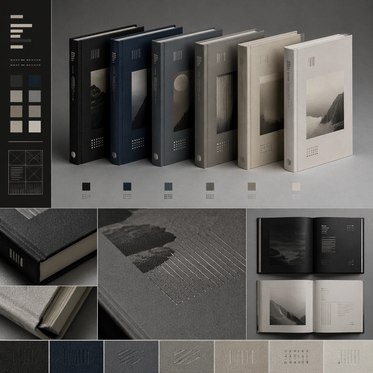
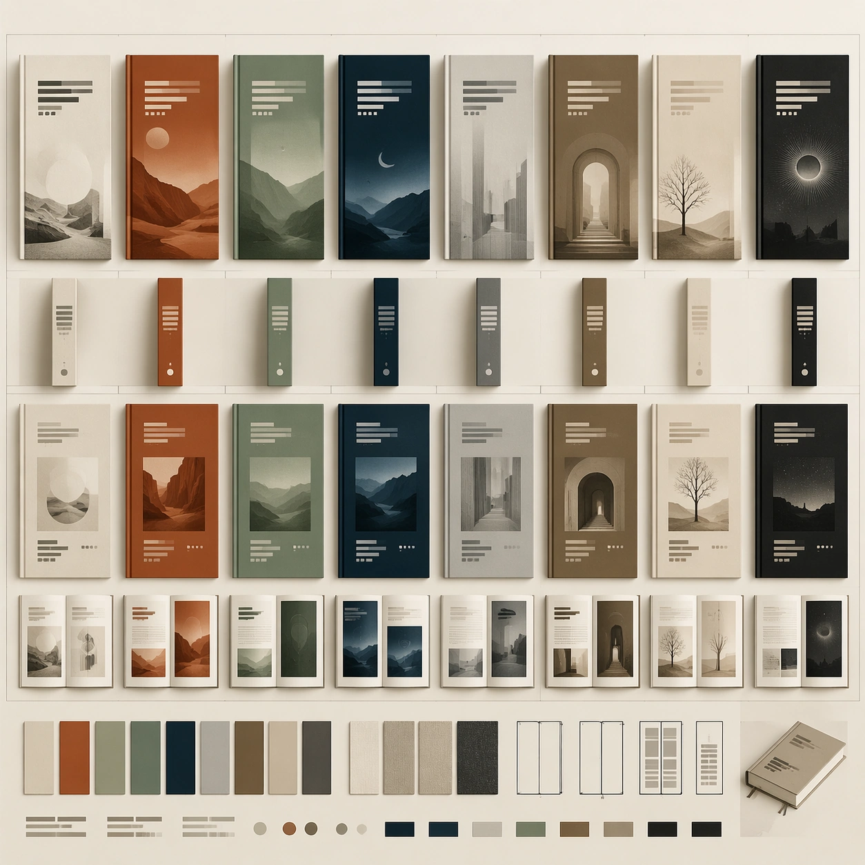
Example generated from “Book Series Design — System Board”
GPT Image 2en

Scene: A square editorial or interface layout study with exact margins, confident grid structure, and premium print or screen presentation. Build the frame around a family of elements organized into a coherent visual language. Keep the lighting, camera distance, and spatial organization tuned for a high-signal research image rather than a casual snapshot. The image belongs to the Book Series Design theme and should feel immediately legible as a prompt atlas theme for book series design, testing text-rendering, structured-layout, style-transfer, commercial-mockup with gpt image 2.. Subject: Center the study on a family of elements organized into a coherent visual language. Translate the theme into a concrete visual statement instead of an abstract mood board: the viewer should understand what kind of image this is, what is being tested, and why the composition is difficult. Use the slug idea of book series design as a literal guide for subject matter, materials, and staging. Important details: Typography fields must stay unreadable, but hierarchy, rhythm, and page architecture should feel convincing enough for design review. Preserve a disciplined square composition, clear focal hierarchy, and enough secondary information to make the image feel complete rather than underspecified. The image should look polished, novel, and exhibition-ready, with topic-specific credibility coming from the way surfaces, structure, and visual language reinforce Book Series Design. Avoid generic filler elements that do not serve the main concept. Use case: Book Series Design single study 7/8, testing text-rendering, structured-layout, style-transfer, commercial-mockup through the system board variation. Constraints: No readable text, no watermark, no logos, preserve exact 1:1 aspect ratio, no readable text, no logo lockups from real brands, no broken grid, no arbitrary poster clutter, no malformed columns, no accidental lorem ipsum.

Example generated from “Book Series Design — Signature Layout”
GPT Image 2en

Scene: A square editorial or interface layout study with exact margins, confident grid structure, and premium print or screen presentation. Build the frame around the most distilled expression of the topic’s layout identity. Keep the lighting, camera distance, and spatial organization tuned for a high-signal research image rather than a casual snapshot. The image belongs to the Book Series Design theme and should feel immediately legible as a prompt atlas theme for book series design, testing text-rendering, structured-layout, style-transfer, commercial-mockup with gpt image 2.. Subject: Center the study on the most distilled expression of the topic’s layout identity. Translate the theme into a concrete visual statement instead of an abstract mood board: the viewer should understand what kind of image this is, what is being tested, and why the composition is difficult. Use the slug idea of book series design as a literal guide for subject matter, materials, and staging. Important details: Typography fields must stay unreadable, but hierarchy, rhythm, and page architecture should feel convincing enough for design review. Preserve a disciplined square composition, clear focal hierarchy, and enough secondary information to make the image feel complete rather than underspecified. The image should look polished, novel, and exhibition-ready, with topic-specific credibility coming from the way surfaces, structure, and visual language reinforce Book Series Design. Avoid generic filler elements that do not serve the main concept. Use case: Book Series Design single study 8/8, testing text-rendering, structured-layout, style-transfer, commercial-mockup through the signature layout variation. Constraints: No readable text, no watermark, no logos, preserve exact 1:1 aspect ratio, no readable text, no logo lockups from real brands, no broken grid, no arbitrary poster clutter, no malformed columns, no accidental lorem ipsum.

Example generated from “Boss Arena Phase Keyframes — Reference Intro Phase”
GPT Image 2en

Scene: A square premium key-art frame built for a reference-dependent production series. Stage a dramatic intro-phase arena keyframe that introduces the boss and readable combat space with controlled lighting, clear silhouette separation, and a camera setup that feels deliberate enough for campaign reuse. The composition should carry strong focal hierarchy, believable depth, and polished surface behavior while still staying stable enough to support downstream dependent variations. Subject: Center the image on a dramatic intro-phase arena keyframe that introduces the boss and readable combat space. The result should feel like a concrete, shippable asset for Boss Arena Phase Keyframes, not a generic fantasy render. Build the subject with layered materials, stable anatomy or engineering logic, and enough specificity that later images can inherit the same underlying identity. This image is the root reference that defines continuity for the rest of the series. The viewer should immediately understand what is being preserved across the sequence and what is changing in this particular beat. Important details: establish floor plan, cover rhythm, hazard zones, and the boss silhouette that later phases must preserve. Make continuity explicit through repeatable shape language, proportion control, and a coherent palette system. Changes in pose, angle, mood, rarity, weather, or layout should still feel downstream of one stable source. Avoid clutter that would confuse reference use. Any interface-like blocks or graphic surfaces must remain abstract and unreadable. Keep the image polished, original, and suitable for both gallery display and production review. Use case: Boss Arena Phase Keyframes series study 1/4, focused on reference intro phase. Constraints: No readable text, no watermark, no logos, preserve exact 1:1 aspect ratio, no UI overlay, no unreadable explosions, no broken continuity, no off-model redesign, no accidental franchise resemblance.

Example generated from “Boss Arena Phase Keyframes — Mechanic Reveal”
GPT Image 2en

Scene: A square premium key-art frame built for a reference-dependent production series. Stage the same arena at the moment a signature mechanic is revealed through light, motion, and floor response with controlled lighting, clear silhouette separation, and a camera setup that feels deliberate enough for campaign reuse. The composition should carry strong focal hierarchy, believable depth, and polished surface behavior while still staying stable enough to support downstream dependent variations. Subject: Center the image on the same arena at the moment a signature mechanic is revealed through light, motion, and floor response. The result should feel like a concrete, shippable asset for Boss Arena Phase Keyframes, not a generic fantasy render. Build the subject with layered materials, stable anatomy or engineering logic, and enough specificity that later images can inherit the same underlying identity. Preserve the same arena layout, boss silhouette, hazard language, and traversal cover logic from the reference keyframe from the reference image while changing only what this variation needs. The viewer should immediately understand what is being preserved across the sequence and what is changing in this particular beat. Important details: keep spatial clarity high enough that players could understand the encounter layout at a glance. Make continuity explicit through repeatable shape language, proportion control, and a coherent palette system. Changes in pose, angle, mood, rarity, weather, or layout should still feel downstream of one stable source. Avoid clutter that would confuse reference use. Any interface-like blocks or graphic surfaces must remain abstract and unreadable. Keep the image polished, original, and suitable for both gallery display and production review. Use case: Boss Arena Phase Keyframes series study 2/4, focused on mechanic reveal. Constraints: No readable text, no watermark, no logos, preserve exact 1:1 aspect ratio, no total particle fog, no abstract chaos, no broken continuity, no off-model redesign, no accidental franchise resemblance.

Example generated from “Boss Arena Phase Keyframes — Phase Two Collapse”
GPT Image 2en

Scene: A square premium key-art frame built for a reference-dependent production series. Stage the same arena partially collapsing or transforming as the encounter escalates with controlled lighting, clear silhouette separation, and a camera setup that feels deliberate enough for campaign reuse. The composition should carry strong focal hierarchy, believable depth, and polished surface behavior while still staying stable enough to support downstream dependent variations. Subject: Center the image on the same arena partially collapsing or transforming as the encounter escalates. The result should feel like a concrete, shippable asset for Boss Arena Phase Keyframes, not a generic fantasy render. Build the subject with layered materials, stable anatomy or engineering logic, and enough specificity that later images can inherit the same underlying identity. Preserve the same arena layout, boss silhouette, hazard language, and traversal cover logic from the reference keyframe from the reference image while changing only what this variation needs. The viewer should immediately understand what is being preserved across the sequence and what is changing in this particular beat. Important details: destruction should feel physically motivated and still preserve the underlying arena identity. Make continuity explicit through repeatable shape language, proportion control, and a coherent palette system. Changes in pose, angle, mood, rarity, weather, or layout should still feel downstream of one stable source. Avoid clutter that would confuse reference use. Any interface-like blocks or graphic surfaces must remain abstract and unreadable. Keep the image polished, original, and suitable for both gallery display and production review. Use case: Boss Arena Phase Keyframes series study 3/4, focused on phase two collapse. Constraints: No readable text, no watermark, no logos, preserve exact 1:1 aspect ratio, no impossible geometry, no full-screen debris, no broken continuity, no off-model redesign, no accidental franchise resemblance.