プロンプト · 創作の探索

プロンプトギャラリー

実際のプロンプトと生成例を探索。次の創作に役立つヒントを見つけ、全文を無料でコピーできます。

生成例
10,974
モデル
17
出典
1277
10,974 件のプロンプト例 · ページ 63 / 229
Example generated from “Bridal Couture Portrait Story — Fabric Detail Hands”
GPT Image 2en

Scene: Create a square 1:1 portrait image for Bridal Couture Portrait Story. Use a closer couture crop where hands, bodice, veil edge, and face coexist in the frame with tactile realism. The frame should feel like a finished professional deliverable rather than a casual snapshot, with clear lens discipline, believable light falloff, and a palette that directly supports Produce bridal and couture portrait stories with refined fabric rendering, emotional elegance, and premium magazine-level bridal photography cues.. Keep enough surrounding space and compositional control for gallery, research, campaign, or approval-board reuse while staying photoreal and human-scaled. Subject: Center one bridal couture model with warm olive skin, wavy dark hair, luminous eyes, refined posture, and graceful hands. Keep the same subject exact while giving more room to fabric handling and gesture. Use the example direction from the brief as grounding context: Produce bridal and couture portrait stories with refined fabric rendering, emotional elegance, and premium magazine-level bridal photography cues.. Wardrobe, lighting, environment, and pose may shift to serve this variation, but the viewer must immediately understand that the same reference identity is still in front of the camera. Important details: This backlog line is difficult because Produce bridal and couture portrait stories with refined fabric rendering, emotional elegance, and premium magazine-level bridal photography cues.. Preserve skin tone family, bone structure, eye spacing, nose shape, mouth shape, hairline logic, shoulder width, and overall body read across the entire series. preserve exact face / hair base / body proportions from the reference model. Hands must stay elegant, anatomical, and connected to the same bride identity. Avoid the common failure described in the brief: ordinary image models often lose likeness once styling, lighting, or layout changes enter the frame. Success should feel like the result should feel professionally usable, coherent, and clearly built around one stable human identity. Use case: Bridal Couture Portrait Story series study 8/9, a fabric and hand-detail crop. Constraints: No readable text, no watermark, no logos, preserve exact 1:1 aspect ratio, preserve exact face / hair base / body proportions from the reference model, no broken fingers, no giant bouquet, no logo clasp, no over-textured fabric noise.


Example generated from “Bridal Couture Portrait Story — Campaign Cover Crop”
GPT Image 2en

Scene: Create a square 1:1 portrait image for Bridal Couture Portrait Story. Use a square portrait-layout hybrid with premium couture-ad polish and graceful negative space. The frame should feel like a finished professional deliverable rather than a casual snapshot, with clear lens discipline, believable light falloff, and a palette that directly supports Produce bridal and couture portrait stories with refined fabric rendering, emotional elegance, and premium magazine-level bridal photography cues.. Keep enough surrounding space and compositional control for gallery, research, campaign, or approval-board reuse while staying photoreal and human-scaled. Subject: Center one bridal couture model with warm olive skin, wavy dark hair, luminous eyes, refined posture, and graceful hands. Resolve the same bride into a finished campaign-ready portrait that feels like couture brand imagery without readable text. Use the example direction from the brief as grounding context: Produce bridal and couture portrait stories with refined fabric rendering, emotional elegance, and premium magazine-level bridal photography cues.. Wardrobe, lighting, environment, and pose may shift to serve this variation, but the viewer must immediately understand that the same reference identity is still in front of the camera. Important details: This backlog line is difficult because Produce bridal and couture portrait stories with refined fabric rendering, emotional elegance, and premium magazine-level bridal photography cues.. Preserve skin tone family, bone structure, eye spacing, nose shape, mouth shape, hairline logic, shoulder width, and overall body read across the entire series. preserve exact face / hair base / body proportions from the reference model. The final image should carry romance, material luxury, and exact identity continuity together. Avoid the common failure described in the brief: ordinary image models often lose likeness once styling, lighting, or layout changes enter the frame. Success should feel like the result should feel professionally usable, coherent, and clearly built around one stable human identity. Use case: Bridal Couture Portrait Story series study 9/9, a final bridal campaign frame. Constraints: No readable text, no watermark, no logos, preserve exact 1:1 aspect ratio, preserve exact face / hair base / body proportions from the reference model, no readable copy, no monograms, no cheesy lens flare, no poster clutter.

Example generated from “Bundle Shop Capsule System — Holiday Bundle Tile”
GPT Image 2en

Scene: A square production-ready image designed for a game-art review wall and a commercial gallery at the same time. Frame a seasonal bundle tile with festive but tasteful event cues and strong premium framing with disciplined lighting, clean edge separation, and enough surrounding context to prove how the asset would behave in a real product surface. The camera, crop, and tonal balance should feel intentional rather than generic, with high readability at first glance and convincing material response under closer inspection. Subject: Center the study on a seasonal bundle tile with festive but tasteful event cues and strong premium framing. Translate the topic into a concrete, shippable visual statement instead of a loose mood board. Build layered object relationships, believable surface finish, and strong silhouette grouping so the image reads immediately as part of Bundle Shop Capsule System. The subject should feel made for a live game pipeline: useful in store, UI, campaign, or art-review contexts, with visual hierarchy strong enough to survive aggressive cropping. Important details: make the offer feel limited and giftable without relying on words. Keep every supporting element subordinate to the main read, and make category separation obvious through form, color zoning, depth, and material logic rather than words. Where panels, cards, badges, or interface blocks appear, they must look professionally structured but remain unreadable. The visual language should feel premium, original, and coherent across this package, with no filler clutter and no accidental resemblance to a specific shipped game IP. Use case: Bundle Shop Capsule System single study 2/9, focused on holiday bundle tile. Constraints: No readable text, no watermark, no logos, preserve exact 1:1 aspect ratio, no holiday logos, no readable text, no broken hierarchy, no generic stock-photo staging, no accidental UI gibberish.

Example generated from “Bundle Shop Capsule System — Currency Bonus Offer”
GPT Image 2en

Scene: A square production-ready image designed for a game-art review wall and a commercial gallery at the same time. Frame a currency bonus offer tile showing stacked value objects and bonus emphasis with disciplined lighting, clean edge separation, and enough surrounding context to prove how the asset would behave in a real product surface. The camera, crop, and tonal balance should feel intentional rather than generic, with high readability at first glance and convincing material response under closer inspection. Subject: Center the study on a currency bonus offer tile showing stacked value objects and bonus emphasis. Translate the topic into a concrete, shippable visual statement instead of a loose mood board. Build layered object relationships, believable surface finish, and strong silhouette grouping so the image reads immediately as part of Bundle Shop Capsule System. The subject should feel made for a live game pipeline: useful in store, UI, campaign, or art-review contexts, with visual hierarchy strong enough to survive aggressive cropping. Important details: the hierarchy should communicate extra value through arrangement and glow, not text. Keep every supporting element subordinate to the main read, and make category separation obvious through form, color zoning, depth, and material logic rather than words. Where panels, cards, badges, or interface blocks appear, they must look professionally structured but remain unreadable. The visual language should feel premium, original, and coherent across this package, with no filler clutter and no accidental resemblance to a specific shipped game IP. Use case: Bundle Shop Capsule System single study 3/9, focused on currency bonus offer. Constraints: No readable text, no watermark, no logos, preserve exact 1:1 aspect ratio, no numbers, no percentages, no broken hierarchy, no generic stock-photo staging, no accidental UI gibberish.

Example generated from “Bundle Shop Capsule System — Premium Monthly Card”
GPT Image 2en

Scene: A square production-ready image designed for a game-art review wall and a commercial gallery at the same time. Frame a premium monthly card visual designed like a stable recurring-value product with disciplined lighting, clean edge separation, and enough surrounding context to prove how the asset would behave in a real product surface. The camera, crop, and tonal balance should feel intentional rather than generic, with high readability at first glance and convincing material response under closer inspection. Subject: Center the study on a premium monthly card visual designed like a stable recurring-value product. Translate the topic into a concrete, shippable visual statement instead of a loose mood board. Build layered object relationships, believable surface finish, and strong silhouette grouping so the image reads immediately as part of Bundle Shop Capsule System. The subject should feel made for a live game pipeline: useful in store, UI, campaign, or art-review contexts, with visual hierarchy strong enough to survive aggressive cropping. Important details: the image should balance prestige with simplicity and repeat-purchase credibility. Keep every supporting element subordinate to the main read, and make category separation obvious through form, color zoning, depth, and material logic rather than words. Where panels, cards, badges, or interface blocks appear, they must look professionally structured but remain unreadable. The visual language should feel premium, original, and coherent across this package, with no filler clutter and no accidental resemblance to a specific shipped game IP. Use case: Bundle Shop Capsule System single study 4/9, focused on premium monthly card. Constraints: No readable text, no watermark, no logos, preserve exact 1:1 aspect ratio, no calendar text, no prices, no broken hierarchy, no generic stock-photo staging, no accidental UI gibberish.

Example generated from “Bundle Shop Capsule System — Bundle Lineup Board”
GPT Image 2en

Scene: A square production-ready image designed for a game-art review wall and a commercial gallery at the same time. Frame a lineup board comparing several store bundles within one clean commercial system with disciplined lighting, clean edge separation, and enough surrounding context to prove how the asset would behave in a real product surface. The camera, crop, and tonal balance should feel intentional rather than generic, with high readability at first glance and convincing material response under closer inspection. Subject: Center the study on a lineup board comparing several store bundles within one clean commercial system. Translate the topic into a concrete, shippable visual statement instead of a loose mood board. Build layered object relationships, believable surface finish, and strong silhouette grouping so the image reads immediately as part of Bundle Shop Capsule System. The subject should feel made for a live game pipeline: useful in store, UI, campaign, or art-review contexts, with visual hierarchy strong enough to survive aggressive cropping. Important details: grouping and differentiation should be obvious without readable labels. Keep every supporting element subordinate to the main read, and make category separation obvious through form, color zoning, depth, and material logic rather than words. Where panels, cards, badges, or interface blocks appear, they must look professionally structured but remain unreadable. The visual language should feel premium, original, and coherent across this package, with no filler clutter and no accidental resemblance to a specific shipped game IP. Use case: Bundle Shop Capsule System single study 5/9, focused on bundle lineup board. Constraints: No readable text, no watermark, no logos, preserve exact 1:1 aspect ratio, no price columns, no UI copy, no broken hierarchy, no generic stock-photo staging, no accidental UI gibberish.

Example generated from “Bundle Shop Capsule System — Capsule Closeup Study”
GPT Image 2en

Scene: A square production-ready image designed for a game-art review wall and a commercial gallery at the same time. Frame a close-up study of packaging materials, ribbons, seals, and reward surfaces inside a bundle capsule with disciplined lighting, clean edge separation, and enough surrounding context to prove how the asset would behave in a real product surface. The camera, crop, and tonal balance should feel intentional rather than generic, with high readability at first glance and convincing material response under closer inspection. Subject: Center the study on a close-up study of packaging materials, ribbons, seals, and reward surfaces inside a bundle capsule. Translate the topic into a concrete, shippable visual statement instead of a loose mood board. Build layered object relationships, believable surface finish, and strong silhouette grouping so the image reads immediately as part of Bundle Shop Capsule System. The subject should feel made for a live game pipeline: useful in store, UI, campaign, or art-review contexts, with visual hierarchy strong enough to survive aggressive cropping. Important details: micro detail should reinforce premium value and seasonal polish. Keep every supporting element subordinate to the main read, and make category separation obvious through form, color zoning, depth, and material logic rather than words. Where panels, cards, badges, or interface blocks appear, they must look professionally structured but remain unreadable. The visual language should feel premium, original, and coherent across this package, with no filler clutter and no accidental resemblance to a specific shipped game IP. Use case: Bundle Shop Capsule System single study 6/9, focused on capsule closeup study. Constraints: No readable text, no watermark, no logos, preserve exact 1:1 aspect ratio, no serial numbers, no logos, no broken hierarchy, no generic stock-photo staging, no accidental UI gibberish.

Example generated from “Bundle Shop Capsule System — Shop Homepage Takeover”
GPT Image 2en

Scene: A square production-ready image designed for a game-art review wall and a commercial gallery at the same time. Frame a homepage takeover-style visual packaging multiple offers into one coordinated commercial splash with disciplined lighting, clean edge separation, and enough surrounding context to prove how the asset would behave in a real product surface. The camera, crop, and tonal balance should feel intentional rather than generic, with high readability at first glance and convincing material response under closer inspection. Subject: Center the study on a homepage takeover-style visual packaging multiple offers into one coordinated commercial splash. Translate the topic into a concrete, shippable visual statement instead of a loose mood board. Build layered object relationships, believable surface finish, and strong silhouette grouping so the image reads immediately as part of Bundle Shop Capsule System. The subject should feel made for a live game pipeline: useful in store, UI, campaign, or art-review contexts, with visual hierarchy strong enough to survive aggressive cropping. Important details: keep hierarchy clean enough for real store use and fast scanning. Keep every supporting element subordinate to the main read, and make category separation obvious through form, color zoning, depth, and material logic rather than words. Where panels, cards, badges, or interface blocks appear, they must look professionally structured but remain unreadable. The visual language should feel premium, original, and coherent across this package, with no filler clutter and no accidental resemblance to a specific shipped game IP. Use case: Bundle Shop Capsule System single study 7/9, focused on shop homepage takeover. Constraints: No readable text, no watermark, no logos, preserve exact 1:1 aspect ratio, no navigation text, no readable tabs, no broken hierarchy, no generic stock-photo staging, no accidental UI gibberish.

Example generated from “Bundle Shop Capsule System — Subscription Reward Board”
GPT Image 2en

Scene: A square production-ready image designed for a game-art review wall and a commercial gallery at the same time. Frame a reward board visualizing a recurring offer and its layered benefits through objects and cadence with disciplined lighting, clean edge separation, and enough surrounding context to prove how the asset would behave in a real product surface. The camera, crop, and tonal balance should feel intentional rather than generic, with high readability at first glance and convincing material response under closer inspection. Subject: Center the study on a reward board visualizing a recurring offer and its layered benefits through objects and cadence. Translate the topic into a concrete, shippable visual statement instead of a loose mood board. Build layered object relationships, believable surface finish, and strong silhouette grouping so the image reads immediately as part of Bundle Shop Capsule System. The subject should feel made for a live game pipeline: useful in store, UI, campaign, or art-review contexts, with visual hierarchy strong enough to survive aggressive cropping. Important details: the structure should imply ongoing value while remaining abstract. Keep every supporting element subordinate to the main read, and make category separation obvious through form, color zoning, depth, and material logic rather than words. Where panels, cards, badges, or interface blocks appear, they must look professionally structured but remain unreadable. The visual language should feel premium, original, and coherent across this package, with no filler clutter and no accidental resemblance to a specific shipped game IP. Use case: Bundle Shop Capsule System single study 8/9, focused on subscription reward board. Constraints: No readable text, no watermark, no logos, preserve exact 1:1 aspect ratio, no calendars, no labels, no broken hierarchy, no generic stock-photo staging, no accidental UI gibberish.

Example generated from “Bundle Shop Capsule System — VIP Offer Poster”
GPT Image 2en

Scene: A square production-ready image designed for a game-art review wall and a commercial gallery at the same time. Frame a premium poster-like asset pushing a high-tier bundle as a prestige purchase with disciplined lighting, clean edge separation, and enough surrounding context to prove how the asset would behave in a real product surface. The camera, crop, and tonal balance should feel intentional rather than generic, with high readability at first glance and convincing material response under closer inspection. Subject: Center the study on a premium poster-like asset pushing a high-tier bundle as a prestige purchase. Translate the topic into a concrete, shippable visual statement instead of a loose mood board. Build layered object relationships, believable surface finish, and strong silhouette grouping so the image reads immediately as part of Bundle Shop Capsule System. The subject should feel made for a live game pipeline: useful in store, UI, campaign, or art-review contexts, with visual hierarchy strong enough to survive aggressive cropping. Important details: make it feel luxurious, finite, and conversion-ready without visible copy. Keep every supporting element subordinate to the main read, and make category separation obvious through form, color zoning, depth, and material logic rather than words. Where panels, cards, badges, or interface blocks appear, they must look professionally structured but remain unreadable. The visual language should feel premium, original, and coherent across this package, with no filler clutter and no accidental resemblance to a specific shipped game IP. Use case: Bundle Shop Capsule System single study 9/9, focused on vip offer poster. Constraints: No readable text, no watermark, no logos, preserve exact 1:1 aspect ratio, no slogans, no logos, no broken hierarchy, no generic stock-photo staging, no accidental UI gibberish.
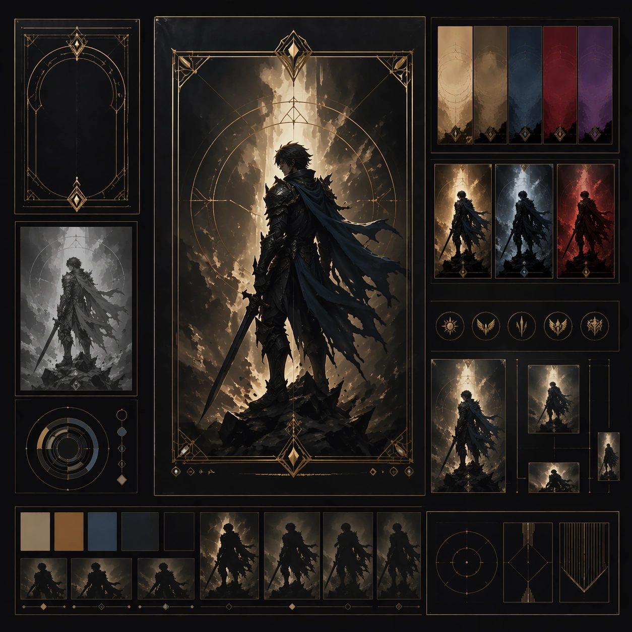
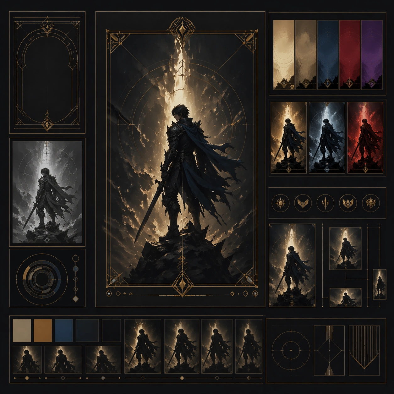
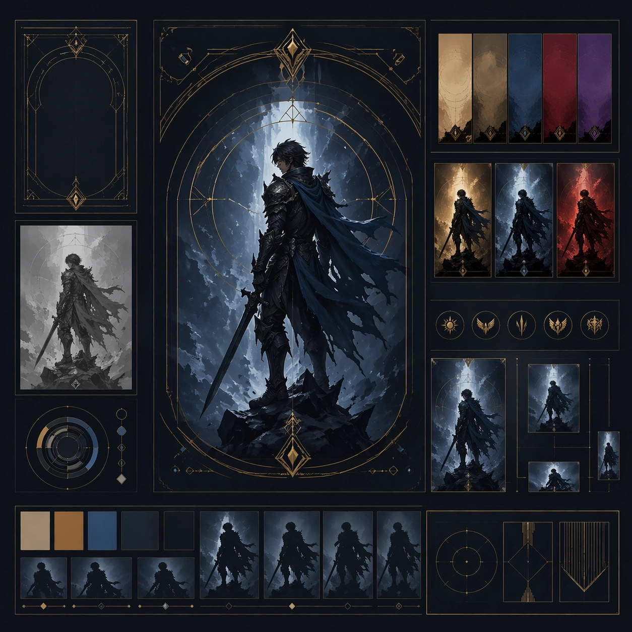
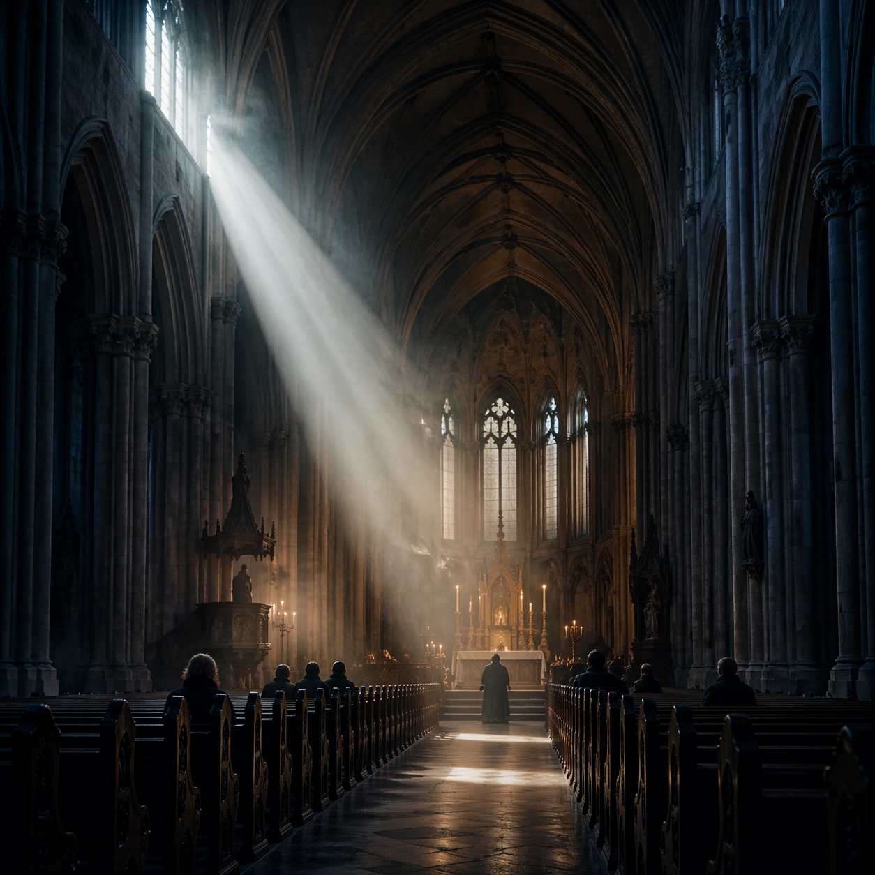
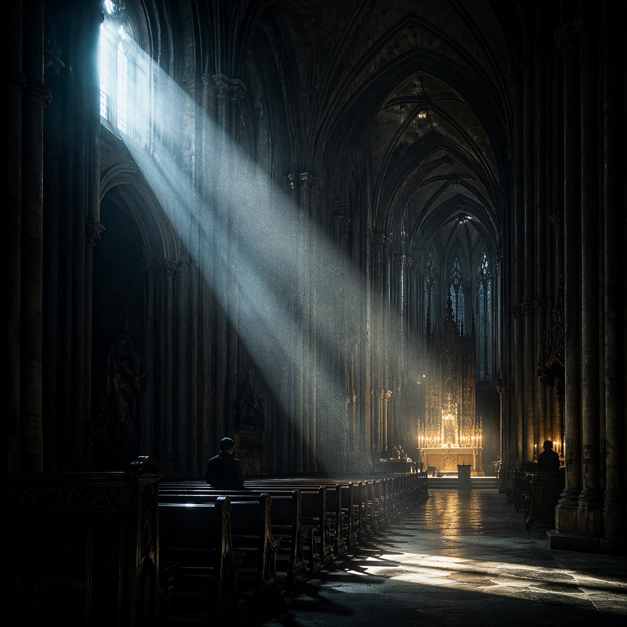
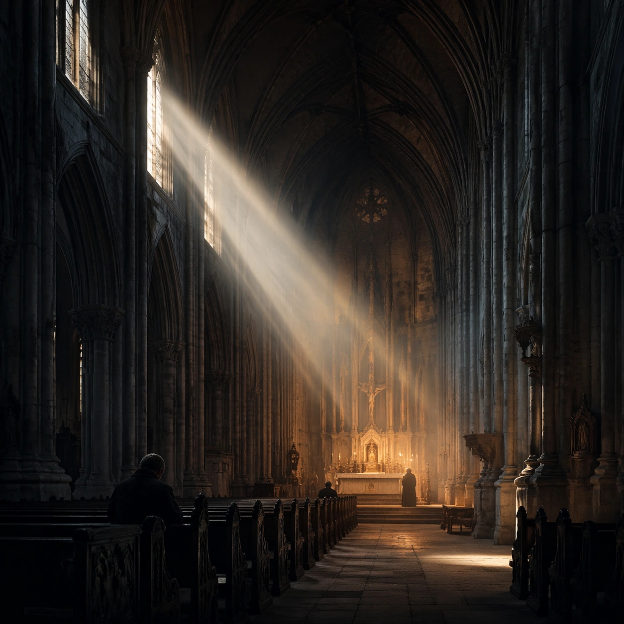
Example generated from “Cathedral Light Beam Worship — Reference Anchor”
GPT Image 2en

Scene: Create a square cinematic still for Cathedral Light Beam of Worship. Use production-grade photoreal lighting, disciplined lens behavior, and a composition that feels like a finished key frame from an original film rather than a casual snapshot. A vast Gothic nave is carved by one sharply defined shaft of early sun entering from high clerestory windows on the left, with cold blue shadows in the aisles, faint amber heat around the altar, and visibly suspended dust or incense in the air. Keep the camera in a disciplined anchor position so the full lighting event and the main spatial structure are immediately legible from edge to edge. Subject: Build a coherent original scene whose emotional center comes from atmosphere, light physics, and spatial clarity. Avoid relying on celebrity likeness, franchise iconography, or stylized illustration shortcuts. Stone columns, ribbed vaults, carved pews, a restrained altar glow, and a few worshippers or attendants in silhouette should define the human scale without turning the image into a crowd scene or ceremony spectacle. This frame should lock the canonical arrangement, scale relationship, and emotional tone that the later dependent images inherit. Important details: Preserve a believable physical world with strong depth layering, careful color separation, and premium image discipline. Treat the volumetric beam as the true protagonist, with physically coherent light falloff, believable bounce on worn stone, clean separation between shadow layers, and a solemn emotional register that feels sacred rather than theatrical. Use this image to establish the authoritative direction of light, atmospheric density, and structural silhouette for the package. Use case: Cathedral Beam series study 1/9. Constraints: No readable text, no watermark, no logos, preserve exact 1:1 aspect ratio, no fantasy creatures, no electric stage lights, no readable scripture, no tourist clutter, no exaggerated stained-glass rainbows.

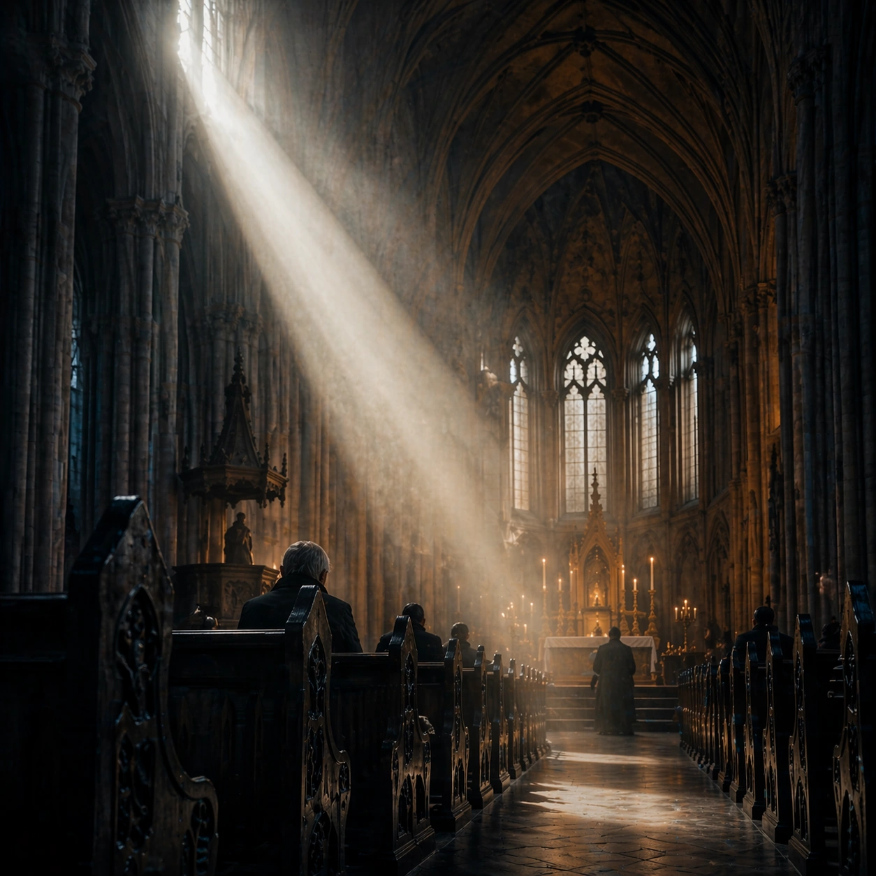
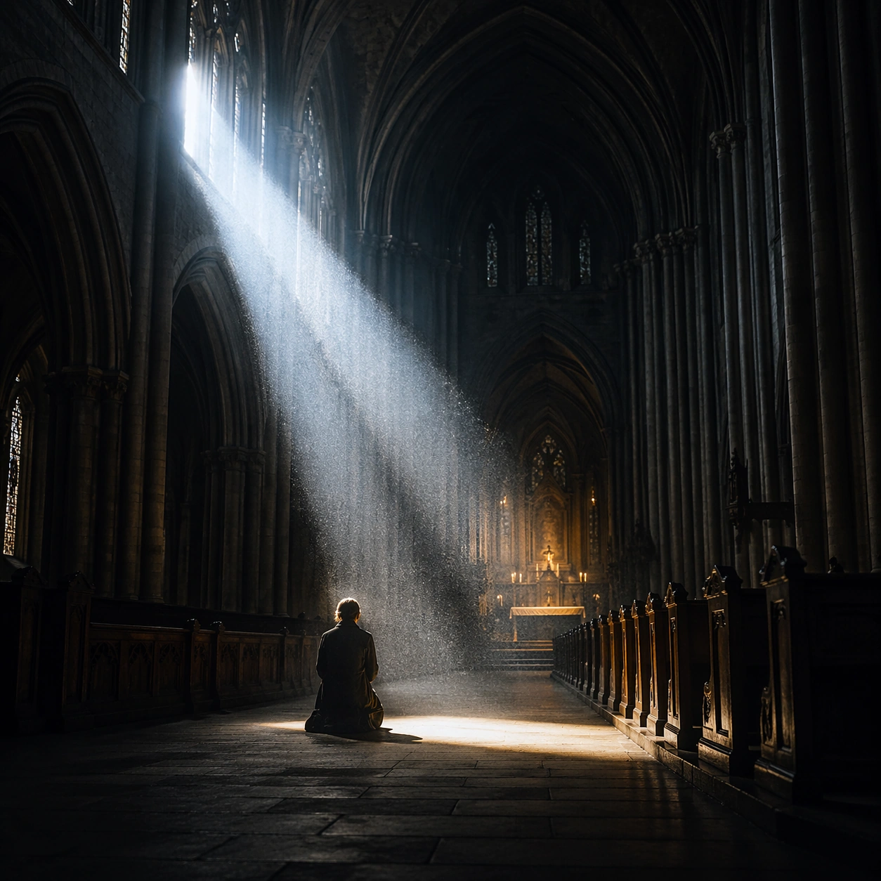
Example generated from “Cathedral Light Beam Worship — Closer Frame”
GPT Image 2en

Scene: Create a square cinematic still for Cathedral Light Beam of Worship. Use production-grade photoreal lighting, disciplined lens behavior, and a composition that feels like a finished key frame from an original film rather than a casual snapshot. A vast Gothic nave is carved by one sharply defined shaft of early sun entering from high clerestory windows on the left, with cold blue shadows in the aisles, faint amber heat around the altar, and visibly suspended dust or incense in the air. Move the camera closer or lower so the viewer feels more embedded inside the atmosphere while the same light direction and environment remain intact. Subject: Build a coherent original scene whose emotional center comes from atmosphere, light physics, and spatial clarity. Avoid relying on celebrity likeness, franchise iconography, or stylized illustration shortcuts. Stone columns, ribbed vaults, carved pews, a restrained altar glow, and a few worshippers or attendants in silhouette should define the human scale without turning the image into a crowd scene or ceremony spectacle. Preserve the same world logic from the reference and let one human-scale or material-scale element become more prominent without stealing focus from the atmosphere. Important details: Preserve a believable physical world with strong depth layering, careful color separation, and premium image discipline. Treat the volumetric beam as the true protagonist, with physically coherent light falloff, believable bounce on worn stone, clean separation between shadow layers, and a solemn emotional register that feels sacred rather than theatrical. Keep the palette family, structural read, and light behavior from image 01 while increasing immediacy and tactile presence. Use case: Cathedral Beam series study 2/9. Constraints: No readable text, no watermark, no logos, preserve exact 1:1 aspect ratio, no fantasy creatures, no electric stage lights, no readable scripture, no tourist clutter, no exaggerated stained-glass rainbows.

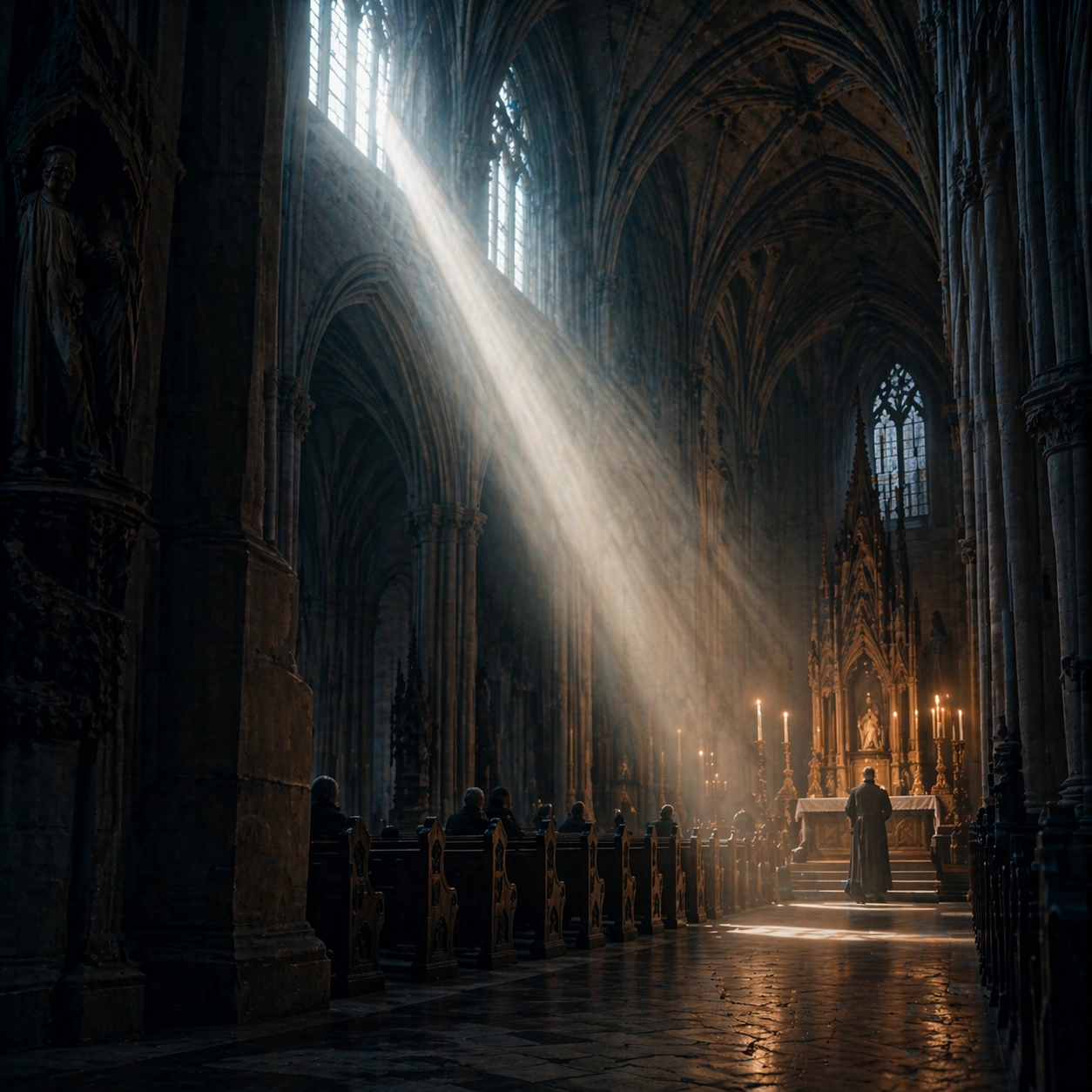
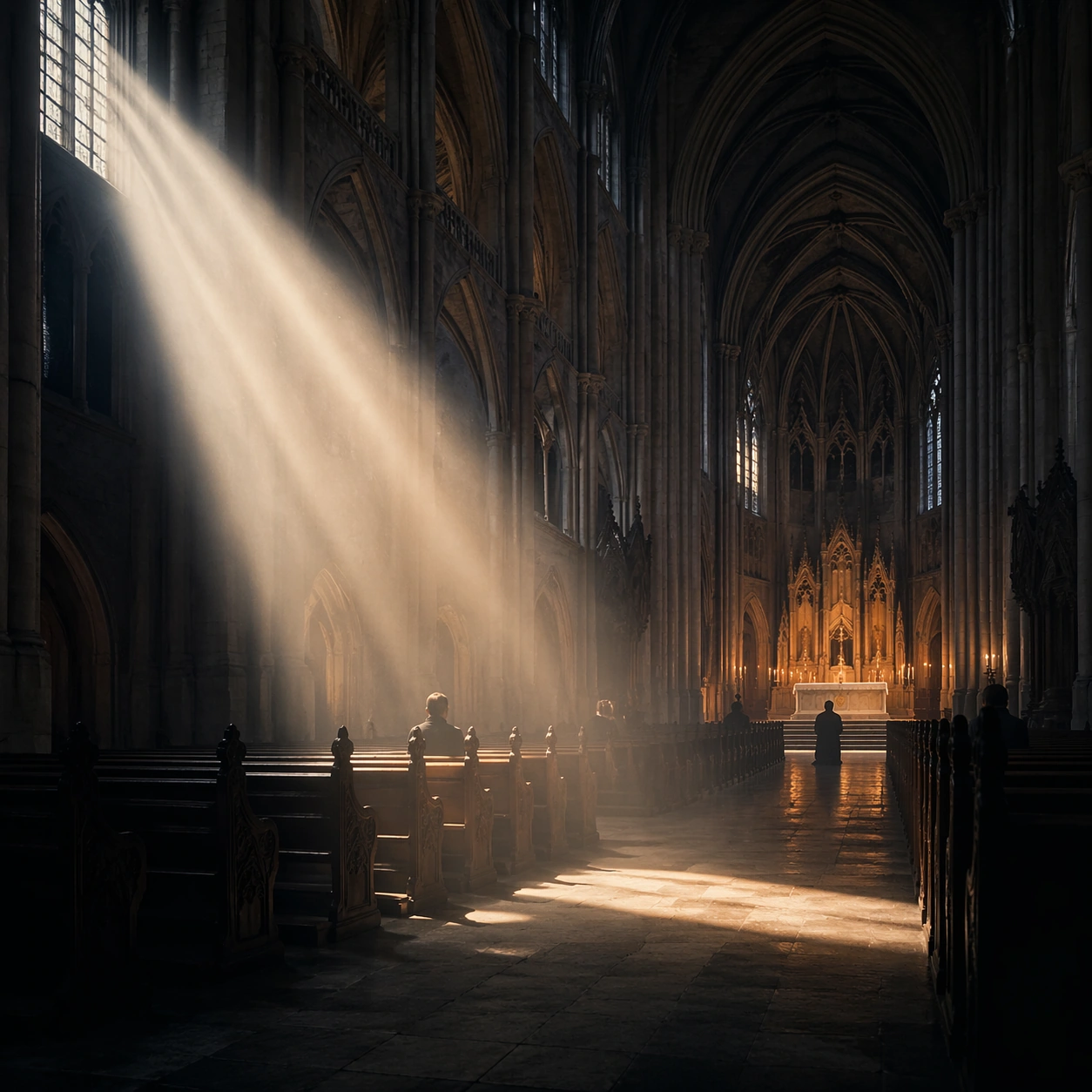
Example generated from “Cathedral Light Beam Worship — Spatial Counterpoint”
GPT Image 2en

Scene: Create a square cinematic still for Cathedral Light Beam of Worship. Use production-grade photoreal lighting, disciplined lens behavior, and a composition that feels like a finished key frame from an original film rather than a casual snapshot. A vast Gothic nave is carved by one sharply defined shaft of early sun entering from high clerestory windows on the left, with cold blue shadows in the aisles, faint amber heat around the altar, and visibly suspended dust or incense in the air. Shift to an oblique or lateral point of view that reveals different depth layers while staying inside the same place and the same atmospheric event. Subject: Build a coherent original scene whose emotional center comes from atmosphere, light physics, and spatial clarity. Avoid relying on celebrity likeness, franchise iconography, or stylized illustration shortcuts. Stone columns, ribbed vaults, carved pews, a restrained altar glow, and a few worshippers or attendants in silhouette should define the human scale without turning the image into a crowd scene or ceremony spectacle. Hold the reference structure, but use the new angle to show secondary planes, foreground interruption, or a changed distance relationship. Important details: Preserve a believable physical world with strong depth layering, careful color separation, and premium image discipline. Treat the volumetric beam as the true protagonist, with physically coherent light falloff, believable bounce on worn stone, clean separation between shadow layers, and a solemn emotional register that feels sacred rather than theatrical. The success condition is continuity with the reference plus a richer sense of depth, not a new location or a new lighting system. Use case: Cathedral Beam series study 3/9. Constraints: No readable text, no watermark, no logos, preserve exact 1:1 aspect ratio, no fantasy creatures, no electric stage lights, no readable scripture, no tourist clutter, no exaggerated stained-glass rainbows.

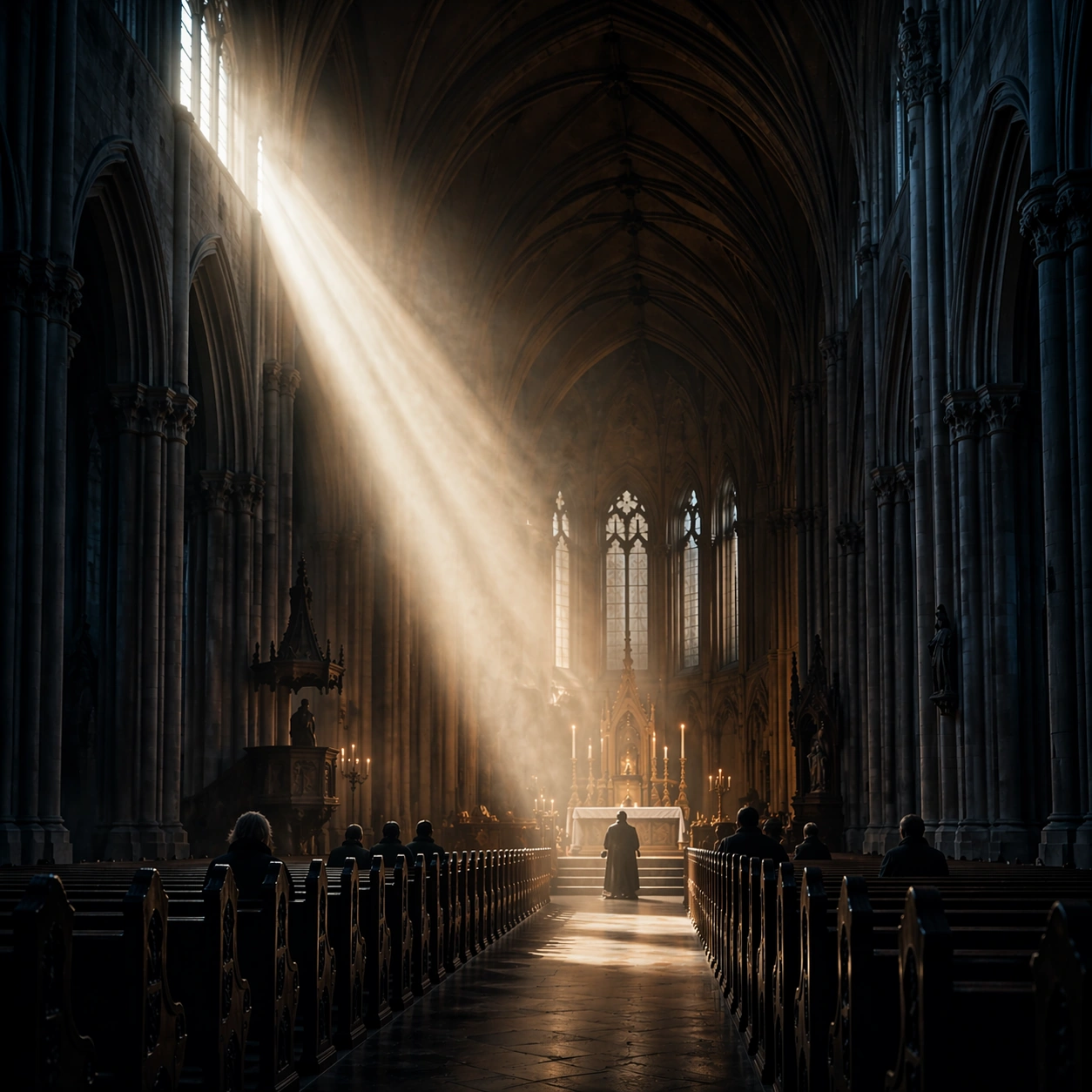
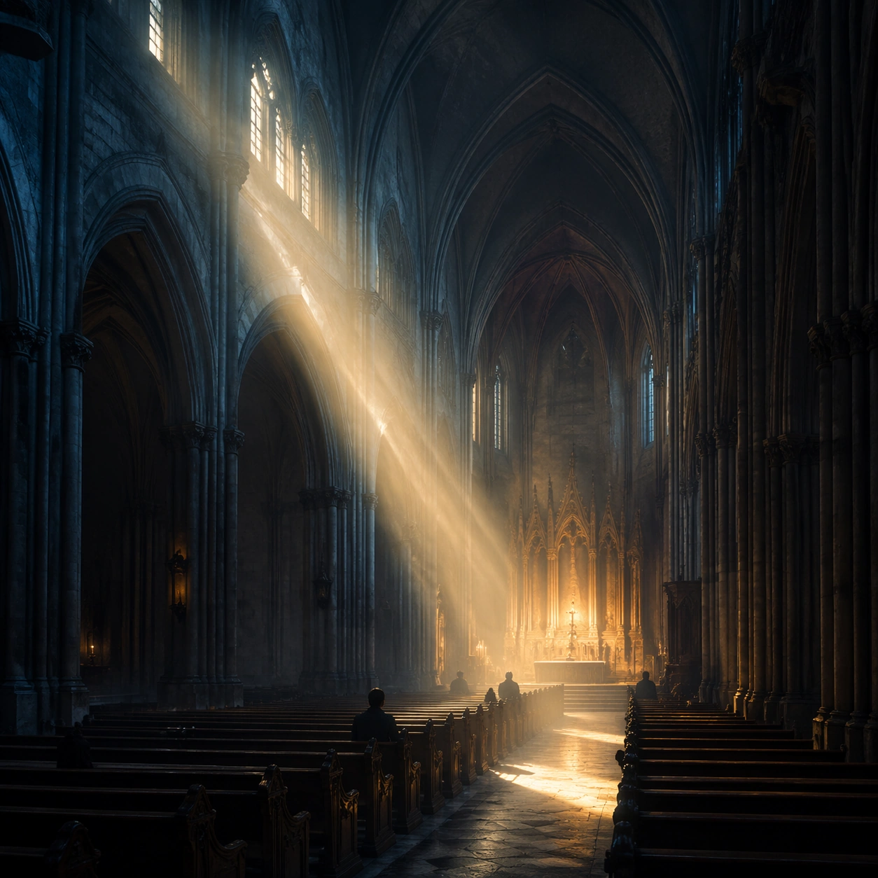
Example generated from “Cathedral Light Beam Worship — Climax Frame”
GPT Image 2en

Scene: Create a square cinematic still for Cathedral Light Beam of Worship. Use production-grade photoreal lighting, disciplined lens behavior, and a composition that feels like a finished key frame from an original film rather than a casual snapshot. A vast Gothic nave is carved by one sharply defined shaft of early sun entering from high clerestory windows on the left, with cold blue shadows in the aisles, faint amber heat around the altar, and visibly suspended dust or incense in the air. Push the composition toward the emotional peak of the same setup, with the most dramatic balance of brightness, shadow, or atmospheric density inside the established world. Subject: Build a coherent original scene whose emotional center comes from atmosphere, light physics, and spatial clarity. Avoid relying on celebrity likeness, franchise iconography, or stylized illustration shortcuts. Stone columns, ribbed vaults, carved pews, a restrained altar glow, and a few worshippers or attendants in silhouette should define the human scale without turning the image into a crowd scene or ceremony spectacle. Everything should still read as the same location and same event, but framed for maximum narrative force and visual closure. Important details: Preserve a believable physical world with strong depth layering, careful color separation, and premium image discipline. Treat the volumetric beam as the true protagonist, with physically coherent light falloff, believable bounce on worn stone, clean separation between shadow layers, and a solemn emotional register that feels sacred rather than theatrical. Make it feel like the strongest hero frame of the sequence without breaking continuity or introducing a new design language. Use case: Cathedral Beam series study 4/9. Constraints: No readable text, no watermark, no logos, preserve exact 1:1 aspect ratio, no fantasy creatures, no electric stage lights, no readable scripture, no tourist clutter, no exaggerated stained-glass rainbows.

Example generated from “Cathedral Light Beam Worship — Surface Study”
GPT Image 2en

Scene: Create a square cinematic still for Cathedral Light Beam of Worship. Use production-grade photoreal lighting, disciplined lens behavior, and a composition that feels like a finished key frame from an original film rather than a casual snapshot. A vast Gothic nave is carved by one sharply defined shaft of early sun entering from high clerestory windows on the left, with cold blue shadows in the aisles, faint amber heat around the altar, and visibly suspended dust or incense in the air. Build an independent square study around the way atmosphere interacts with surfaces, keeping enough environmental context for the image to feel finished rather than cropped at random. Subject: Build a coherent original scene whose emotional center comes from atmosphere, light physics, and spatial clarity. Avoid relying on celebrity likeness, franchise iconography, or stylized illustration shortcuts. Stone columns, ribbed vaults, carved pews, a restrained altar glow, and a few worshippers or attendants in silhouette should define the human scale without turning the image into a crowd scene or ceremony spectacle. Let textures, reflections, residue, moisture, dust, or particulate response become primary, while the broader setting remains clearly implied. Important details: Preserve a believable physical world with strong depth layering, careful color separation, and premium image discipline. Treat the volumetric beam as the true protagonist, with physically coherent light falloff, believable bounce on worn stone, clean separation between shadow layers, and a solemn emotional register that feels sacred rather than theatrical. The key is material credibility under dramatic light, with micro-contrast and controlled mood supporting the theme. Use case: Cathedral Beam single study 5/9. Constraints: No readable text, no watermark, no logos, preserve exact 1:1 aspect ratio, no fantasy creatures, no electric stage lights, no readable scripture, no tourist clutter, no exaggerated stained-glass rainbows.

Example generated from “Cathedral Light Beam Worship — Silhouette Study”
GPT Image 2en

Scene: Create a square cinematic still for Cathedral Light Beam of Worship. Use production-grade photoreal lighting, disciplined lens behavior, and a composition that feels like a finished key frame from an original film rather than a casual snapshot. A vast Gothic nave is carved by one sharply defined shaft of early sun entering from high clerestory windows on the left, with cold blue shadows in the aisles, faint amber heat around the altar, and visibly suspended dust or incense in the air. Compose an independent frame where one human, animal, or object silhouette negotiates with the atmospheric light event in a clean, readable way. Subject: Build a coherent original scene whose emotional center comes from atmosphere, light physics, and spatial clarity. Avoid relying on celebrity likeness, franchise iconography, or stylized illustration shortcuts. Stone columns, ribbed vaults, carved pews, a restrained altar glow, and a few worshippers or attendants in silhouette should define the human scale without turning the image into a crowd scene or ceremony spectacle. The silhouette should supply scale and emotional orientation, but the environment still needs to carry most of the storytelling weight. Important details: Preserve a believable physical world with strong depth layering, careful color separation, and premium image discipline. Treat the volumetric beam as the true protagonist, with physically coherent light falloff, believable bounce on worn stone, clean separation between shadow layers, and a solemn emotional register that feels sacred rather than theatrical. Keep the silhouette simple and believable, avoiding poster-like graphic flattening while preserving strong contrast. Use case: Cathedral Beam single study 6/9. Constraints: No readable text, no watermark, no logos, preserve exact 1:1 aspect ratio, no fantasy creatures, no electric stage lights, no readable scripture, no tourist clutter, no exaggerated stained-glass rainbows.

Example generated from “Cathedral Light Beam Worship — Transition Study”
GPT Image 2en

Scene: Create a square cinematic still for Cathedral Light Beam of Worship. Use production-grade photoreal lighting, disciplined lens behavior, and a composition that feels like a finished key frame from an original film rather than a casual snapshot. A vast Gothic nave is carved by one sharply defined shaft of early sun entering from high clerestory windows on the left, with cold blue shadows in the aisles, faint amber heat around the altar, and visibly suspended dust or incense in the air. Treat this as an adjacent moment before or after the main event, preserving the same topic language while letting the atmosphere shift slightly in intensity or position. Subject: Build a coherent original scene whose emotional center comes from atmosphere, light physics, and spatial clarity. Avoid relying on celebrity likeness, franchise iconography, or stylized illustration shortcuts. Stone columns, ribbed vaults, carved pews, a restrained altar glow, and a few worshippers or attendants in silhouette should define the human scale without turning the image into a crowd scene or ceremony spectacle. Show the environment in transition, with clear evidence of recent motion, changing weather, or fading light, but without turning it into action spectacle. Important details: Preserve a believable physical world with strong depth layering, careful color separation, and premium image discipline. Treat the volumetric beam as the true protagonist, with physically coherent light falloff, believable bounce on worn stone, clean separation between shadow layers, and a solemn emotional register that feels sacred rather than theatrical. Subtle temporal storytelling matters here more than maximal drama, so let traces, gradients, and environmental residue do the work. Use case: Cathedral Beam single study 7/9. Constraints: No readable text, no watermark, no logos, preserve exact 1:1 aspect ratio, no fantasy creatures, no electric stage lights, no readable scripture, no tourist clutter, no exaggerated stained-glass rainbows.

Example generated from “Cathedral Light Beam Worship — Wide Study”
GPT Image 2en

Scene: Create a square cinematic still for Cathedral Light Beam of Worship. Use production-grade photoreal lighting, disciplined lens behavior, and a composition that feels like a finished key frame from an original film rather than a casual snapshot. A vast Gothic nave is carved by one sharply defined shaft of early sun entering from high clerestory windows on the left, with cold blue shadows in the aisles, faint amber heat around the altar, and visibly suspended dust or incense in the air. Pull back enough to explain the broader geography or architectural envelope while keeping the square crop intentional and balanced. Subject: Build a coherent original scene whose emotional center comes from atmosphere, light physics, and spatial clarity. Avoid relying on celebrity likeness, franchise iconography, or stylized illustration shortcuts. Stone columns, ribbed vaults, carved pews, a restrained altar glow, and a few worshippers or attendants in silhouette should define the human scale without turning the image into a crowd scene or ceremony spectacle. The wider frame should reveal how the main light or weather phenomenon organizes the surrounding world and not just the immediate subject. Important details: Preserve a believable physical world with strong depth layering, careful color separation, and premium image discipline. Treat the volumetric beam as the true protagonist, with physically coherent light falloff, believable bounce on worn stone, clean separation between shadow layers, and a solemn emotional register that feels sacred rather than theatrical. Make scale legible through spacing, horizon control, and foreground-to-background separation rather than through extra props. Use case: Cathedral Beam single study 8/9. Constraints: No readable text, no watermark, no logos, preserve exact 1:1 aspect ratio, no fantasy creatures, no electric stage lights, no readable scripture, no tourist clutter, no exaggerated stained-glass rainbows.

Example generated from “Cathedral Light Beam Worship — Afterglow Study”
GPT Image 2en

Scene: Create a square cinematic still for Cathedral Light Beam of Worship. Use production-grade photoreal lighting, disciplined lens behavior, and a composition that feels like a finished key frame from an original film rather than a casual snapshot. A vast Gothic nave is carved by one sharply defined shaft of early sun entering from high clerestory windows on the left, with cold blue shadows in the aisles, faint amber heat around the altar, and visibly suspended dust or incense in the air. End on a quieter independent image that holds the residue of the topic atmosphere after its loudest moment has passed, while still feeling complete and exhibition-ready. Subject: Build a coherent original scene whose emotional center comes from atmosphere, light physics, and spatial clarity. Avoid relying on celebrity likeness, franchise iconography, or stylized illustration shortcuts. Stone columns, ribbed vaults, carved pews, a restrained altar glow, and a few worshippers or attendants in silhouette should define the human scale without turning the image into a crowd scene or ceremony spectacle. The frame should suggest memory, aftermath, or lingering presence through environment first and only secondarily through any figure or object. Important details: Preserve a believable physical world with strong depth layering, careful color separation, and premium image discipline. Treat the volumetric beam as the true protagonist, with physically coherent light falloff, believable bounce on worn stone, clean separation between shadow layers, and a solemn emotional register that feels sacred rather than theatrical. Favor restraint, believable light decay, and subtle narrative closure over spectacle or decorative excess. Use case: Cathedral Beam single study 9/9. Constraints: No readable text, no watermark, no logos, preserve exact 1:1 aspect ratio, no fantasy creatures, no electric stage lights, no readable scripture, no tourist clutter, no exaggerated stained-glass rainbows.

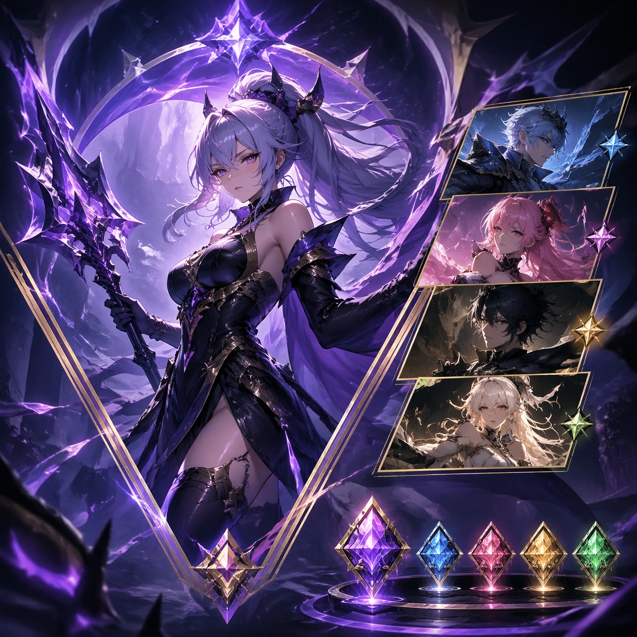
Example generated from “Character Banner Gacha Pool Visuals — Reference Featured Banner”
GPT Image 2en

Scene: A square premium key-art frame built for a reference-dependent production series. Stage a flagship featured-banner composition for one summon pool with high conversion energy with controlled lighting, clear silhouette separation, and a camera setup that feels deliberate enough for campaign reuse. The composition should carry strong focal hierarchy, believable depth, and polished surface behavior while still staying stable enough to support downstream dependent variations. Subject: Center the image on a flagship featured-banner composition for one summon pool with high conversion energy. The result should feel like a concrete, shippable asset for Character Banner Gacha Pool Visuals, not a generic fantasy render. Build the subject with layered materials, stable anatomy or engineering logic, and enough specificity that later images can inherit the same underlying identity. This image is the root reference that defines continuity for the rest of the series. The viewer should immediately understand what is being preserved across the sequence and what is changing in this particular beat. Important details: establish the hero identity, rarity frame language, and pool atmosphere that later assets must keep intact. Make continuity explicit through repeatable shape language, proportion control, and a coherent palette system. Changes in pose, angle, mood, rarity, weather, or layout should still feel downstream of one stable source. Avoid clutter that would confuse reference use. Any interface-like blocks or graphic surfaces must remain abstract and unreadable. Keep the image polished, original, and suitable for both gallery display and production review. Use case: Character Banner Gacha Pool Visuals series study 1/4, focused on reference featured banner. Constraints: No readable text, no watermark, no logos, preserve exact 1:1 aspect ratio, no readable rates, no logo lockups, no broken continuity, no off-model redesign, no accidental franchise resemblance.

Example generated from “Character Banner Gacha Pool Visuals — Rate Up Card Strip”
GPT Image 2en

Scene: A square premium key-art frame built for a reference-dependent production series. Stage the same pool translated into a card-strip style asset featuring the promoted unit in a tighter layout with controlled lighting, clear silhouette separation, and a camera setup that feels deliberate enough for campaign reuse. The composition should carry strong focal hierarchy, believable depth, and polished surface behavior while still staying stable enough to support downstream dependent variations. Subject: Center the image on the same pool translated into a card-strip style asset featuring the promoted unit in a tighter layout. The result should feel like a concrete, shippable asset for Character Banner Gacha Pool Visuals, not a generic fantasy render. Build the subject with layered materials, stable anatomy or engineering logic, and enough specificity that later images can inherit the same underlying identity. Preserve the same featured hero identity, pool theme, rarity framing, and summon color language from the reference banner from the reference image while changing only what this variation needs. The viewer should immediately understand what is being preserved across the sequence and what is changing in this particular beat. Important details: keep the same hero unmistakable while adapting the composition for a denser product surface. Make continuity explicit through repeatable shape language, proportion control, and a coherent palette system. Changes in pose, angle, mood, rarity, weather, or layout should still feel downstream of one stable source. Avoid clutter that would confuse reference use. Any interface-like blocks or graphic surfaces must remain abstract and unreadable. Keep the image polished, original, and suitable for both gallery display and production review. Use case: Character Banner Gacha Pool Visuals series study 2/4, focused on rate up card strip. Constraints: No readable text, no watermark, no logos, preserve exact 1:1 aspect ratio, no percentages, no text labels, no broken continuity, no off-model redesign, no accidental franchise resemblance.

Example generated from “Character Banner Gacha Pool Visuals — Pity Explainer Crop”
GPT Image 2en

Scene: A square premium key-art frame built for a reference-dependent production series. Stage the same summon pool adapted into an explainer-like crop that implies pity or guarantee mechanics without text with controlled lighting, clear silhouette separation, and a camera setup that feels deliberate enough for campaign reuse. The composition should carry strong focal hierarchy, believable depth, and polished surface behavior while still staying stable enough to support downstream dependent variations. Subject: Center the image on the same summon pool adapted into an explainer-like crop that implies pity or guarantee mechanics without text. The result should feel like a concrete, shippable asset for Character Banner Gacha Pool Visuals, not a generic fantasy render. Build the subject with layered materials, stable anatomy or engineering logic, and enough specificity that later images can inherit the same underlying identity. Preserve the same featured hero identity, pool theme, rarity framing, and summon color language from the reference banner from the reference image while changing only what this variation needs. The viewer should immediately understand what is being preserved across the sequence and what is changing in this particular beat. Important details: use abstract progress cues and premium framing without sacrificing hero visibility. Make continuity explicit through repeatable shape language, proportion control, and a coherent palette system. Changes in pose, angle, mood, rarity, weather, or layout should still feel downstream of one stable source. Avoid clutter that would confuse reference use. Any interface-like blocks or graphic surfaces must remain abstract and unreadable. Keep the image polished, original, and suitable for both gallery display and production review. Use case: Character Banner Gacha Pool Visuals series study 3/4, focused on pity explainer crop. Constraints: No readable text, no watermark, no logos, preserve exact 1:1 aspect ratio, no readable UI copy, no numerals, no broken continuity, no off-model redesign, no accidental franchise resemblance.

Example generated from “Character Banner Gacha Pool Visuals — Summon Splash Poster”
GPT Image 2en

Scene: A square premium key-art frame built for a reference-dependent production series. Stage the same pool expanded into a splash poster that heightens desire and spectacle with controlled lighting, clear silhouette separation, and a camera setup that feels deliberate enough for campaign reuse. The composition should carry strong focal hierarchy, believable depth, and polished surface behavior while still staying stable enough to support downstream dependent variations. Subject: Center the image on the same pool expanded into a splash poster that heightens desire and spectacle. The result should feel like a concrete, shippable asset for Character Banner Gacha Pool Visuals, not a generic fantasy render. Build the subject with layered materials, stable anatomy or engineering logic, and enough specificity that later images can inherit the same underlying identity. Preserve the same featured hero identity, pool theme, rarity framing, and summon color language from the reference banner from the reference image while changing only what this variation needs. The viewer should immediately understand what is being preserved across the sequence and what is changing in this particular beat. Important details: make it feel celebratory and rare while preserving the same hero, frame logic, and color identity. Make continuity explicit through repeatable shape language, proportion control, and a coherent palette system. Changes in pose, angle, mood, rarity, weather, or layout should still feel downstream of one stable source. Avoid clutter that would confuse reference use. Any interface-like blocks or graphic surfaces must remain abstract and unreadable. Keep the image polished, original, and suitable for both gallery display and production review. Use case: Character Banner Gacha Pool Visuals series study 4/4, focused on summon splash poster. Constraints: No readable text, no watermark, no logos, preserve exact 1:1 aspect ratio, no jackpot text, no confetti overload, no broken continuity, no off-model redesign, no accidental franchise resemblance.

Example generated from “Character Banner Gacha Pool Visuals — Summon Portal Closeup”
GPT Image 2en

Scene: A square production-ready image designed for a game-art review wall and a commercial gallery at the same time. Frame a close-up asset focused on the summon portal or reveal moment as a premium event texture with disciplined lighting, clean edge separation, and enough surrounding context to prove how the asset would behave in a real product surface. The camera, crop, and tonal balance should feel intentional rather than generic, with high readability at first glance and convincing material response under closer inspection. Subject: Center the study on a close-up asset focused on the summon portal or reveal moment as a premium event texture. Translate the topic into a concrete, shippable visual statement instead of a loose mood board. Build layered object relationships, believable surface finish, and strong silhouette grouping so the image reads immediately as part of Character Banner Gacha Pool Visuals. The subject should feel made for a live game pipeline: useful in store, UI, campaign, or art-review contexts, with visual hierarchy strong enough to survive aggressive cropping. Important details: the effect language should feel tied to the same pool identity rather than generic magic. Keep every supporting element subordinate to the main read, and make category separation obvious through form, color zoning, depth, and material logic rather than words. Where panels, cards, badges, or interface blocks appear, they must look professionally structured but remain unreadable. The visual language should feel premium, original, and coherent across this package, with no filler clutter and no accidental resemblance to a specific shipped game IP. Use case: Character Banner Gacha Pool Visuals single study 2/5, focused on summon portal closeup. Constraints: No readable text, no watermark, no logos, preserve exact 1:1 aspect ratio, no runic text, no logos, no broken hierarchy, no generic stock-photo staging, no accidental UI gibberish.

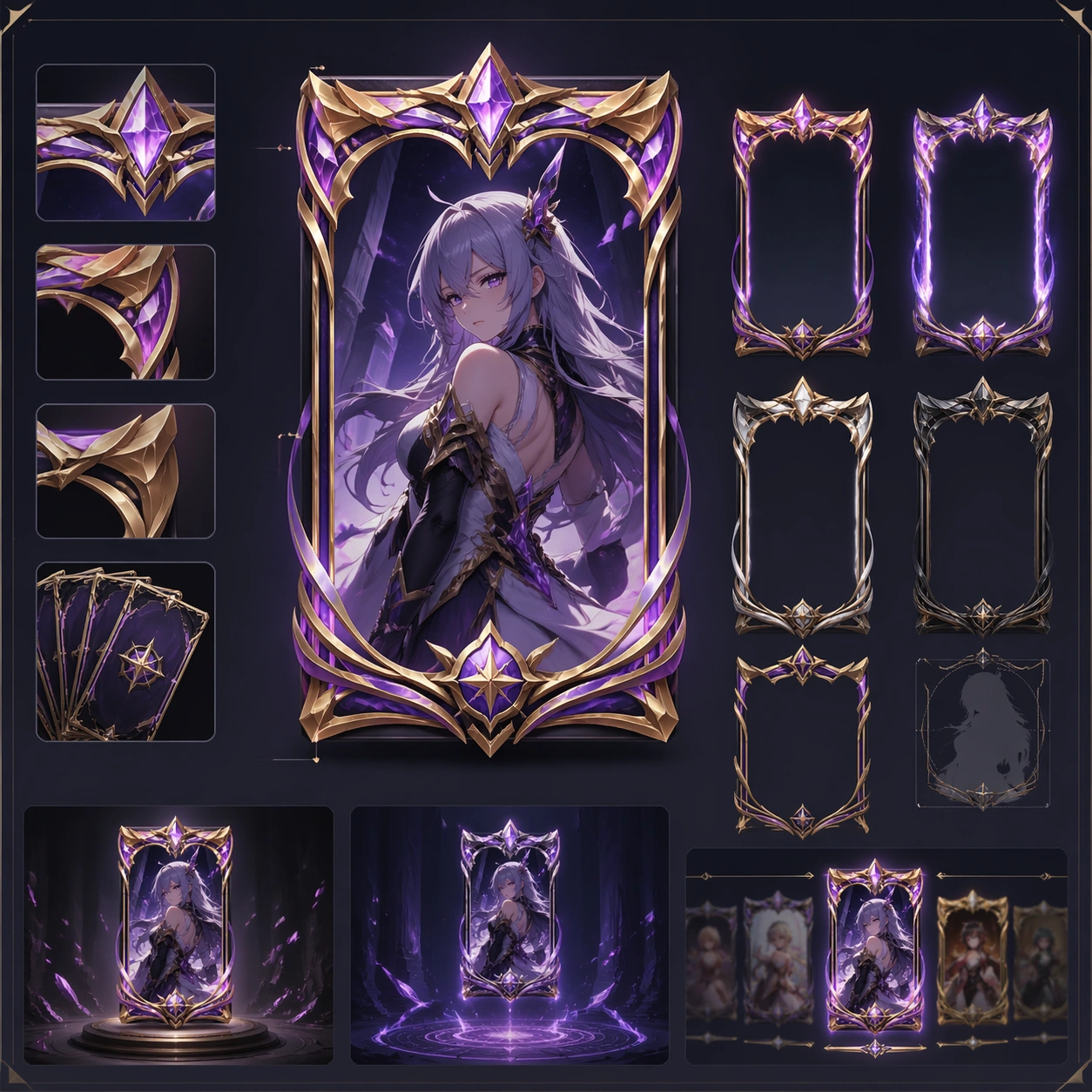
Example generated from “Character Banner Gacha Pool Visuals — Featured Card Frame Study”
GPT Image 2en

Scene: A square production-ready image designed for a game-art review wall and a commercial gallery at the same time. Frame a card-frame study that isolates the promoted rarity frame and character crop system with disciplined lighting, clean edge separation, and enough surrounding context to prove how the asset would behave in a real product surface. The camera, crop, and tonal balance should feel intentional rather than generic, with high readability at first glance and convincing material response under closer inspection. Subject: Center the study on a card-frame study that isolates the promoted rarity frame and character crop system. Translate the topic into a concrete, shippable visual statement instead of a loose mood board. Build layered object relationships, believable surface finish, and strong silhouette grouping so the image reads immediately as part of Character Banner Gacha Pool Visuals. The subject should feel made for a live game pipeline: useful in store, UI, campaign, or art-review contexts, with visual hierarchy strong enough to survive aggressive cropping. Important details: the frame should feel monetizable, collectible, and consistent with the rest of the event. Keep every supporting element subordinate to the main read, and make category separation obvious through form, color zoning, depth, and material logic rather than words. Where panels, cards, badges, or interface blocks appear, they must look professionally structured but remain unreadable. The visual language should feel premium, original, and coherent across this package, with no filler clutter and no accidental resemblance to a specific shipped game IP. Use case: Character Banner Gacha Pool Visuals single study 3/5, focused on featured card frame study. Constraints: No readable text, no watermark, no logos, preserve exact 1:1 aspect ratio, no readable stats, no labels, no broken hierarchy, no generic stock-photo staging, no accidental UI gibberish.

Example generated from “Character Banner Gacha Pool Visuals — Social Promo Square”
GPT Image 2en

Scene: A square production-ready image designed for a game-art review wall and a commercial gallery at the same time. Frame a square social promo tile for the summon pool using the same hero and color system with disciplined lighting, clean edge separation, and enough surrounding context to prove how the asset would behave in a real product surface. The camera, crop, and tonal balance should feel intentional rather than generic, with high readability at first glance and convincing material response under closer inspection. Subject: Center the study on a square social promo tile for the summon pool using the same hero and color system. Translate the topic into a concrete, shippable visual statement instead of a loose mood board. Build layered object relationships, believable surface finish, and strong silhouette grouping so the image reads immediately as part of Character Banner Gacha Pool Visuals. The subject should feel made for a live game pipeline: useful in store, UI, campaign, or art-review contexts, with visual hierarchy strong enough to survive aggressive cropping. Important details: optimize for compression, rapid recognition, and campaign spread. Keep every supporting element subordinate to the main read, and make category separation obvious through form, color zoning, depth, and material logic rather than words. Where panels, cards, badges, or interface blocks appear, they must look professionally structured but remain unreadable. The visual language should feel premium, original, and coherent across this package, with no filler clutter and no accidental resemblance to a specific shipped game IP. Use case: Character Banner Gacha Pool Visuals single study 4/5, focused on social promo square. Constraints: No readable text, no watermark, no logos, preserve exact 1:1 aspect ratio, no hashtag copy, no text, no broken hierarchy, no generic stock-photo staging, no accidental UI gibberish.

Example generated from “Character Banner Gacha Pool Visuals — Reward Reveal Capsule”
GPT Image 2en

Scene: A square production-ready image designed for a game-art review wall and a commercial gallery at the same time. Frame a reveal capsule asset that packages the pool reward fantasy into a compact commercial tile with disciplined lighting, clean edge separation, and enough surrounding context to prove how the asset would behave in a real product surface. The camera, crop, and tonal balance should feel intentional rather than generic, with high readability at first glance and convincing material response under closer inspection. Subject: Center the study on a reveal capsule asset that packages the pool reward fantasy into a compact commercial tile. Translate the topic into a concrete, shippable visual statement instead of a loose mood board. Build layered object relationships, believable surface finish, and strong silhouette grouping so the image reads immediately as part of Character Banner Gacha Pool Visuals. The subject should feel made for a live game pipeline: useful in store, UI, campaign, or art-review contexts, with visual hierarchy strong enough to survive aggressive cropping. Important details: the image should feel high-value and campaign-ready without any explicit pricing or odds. Keep every supporting element subordinate to the main read, and make category separation obvious through form, color zoning, depth, and material logic rather than words. Where panels, cards, badges, or interface blocks appear, they must look professionally structured but remain unreadable. The visual language should feel premium, original, and coherent across this package, with no filler clutter and no accidental resemblance to a specific shipped game IP. Use case: Character Banner Gacha Pool Visuals single study 5/5, focused on reward reveal capsule. Constraints: No readable text, no watermark, no logos, preserve exact 1:1 aspect ratio, no prices, no percentages, no broken hierarchy, no generic stock-photo staging, no accidental UI gibberish.

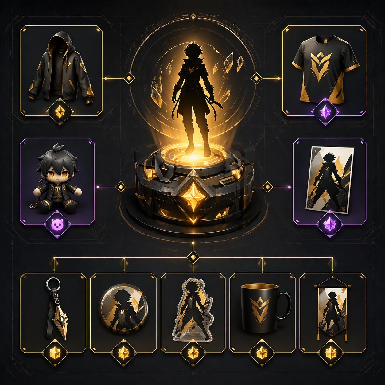
Example generated from “Character Merch Drop System — Reference Anchor”
GPT Image 2en

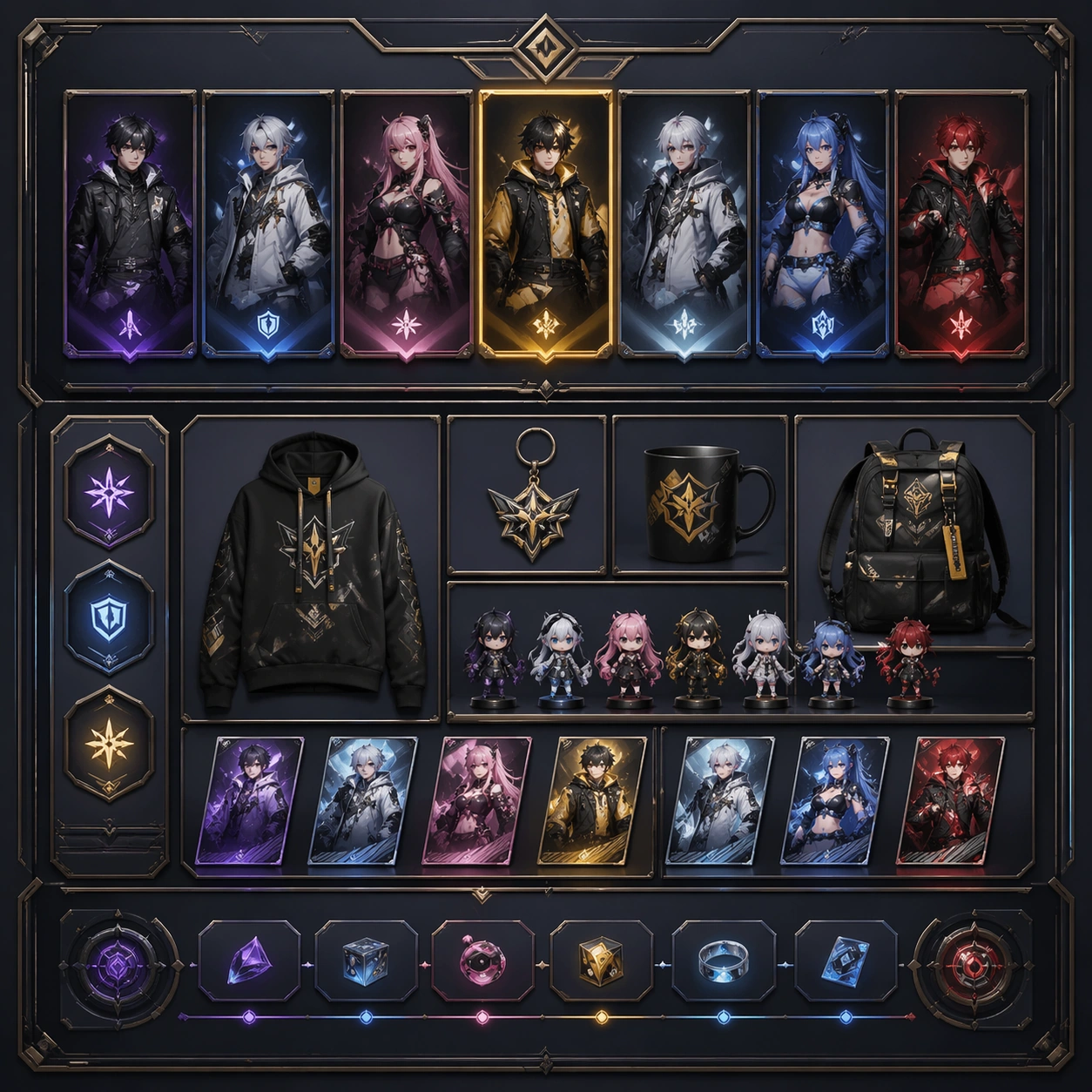
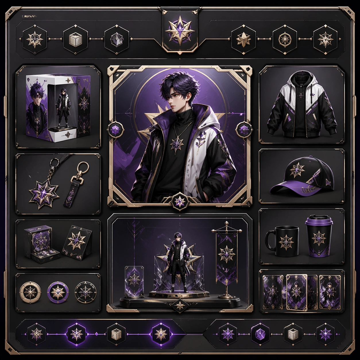
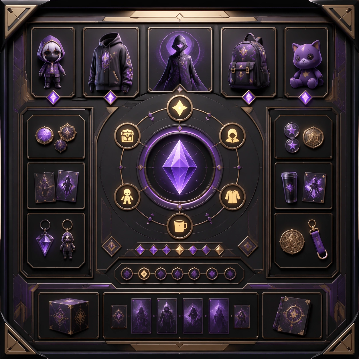
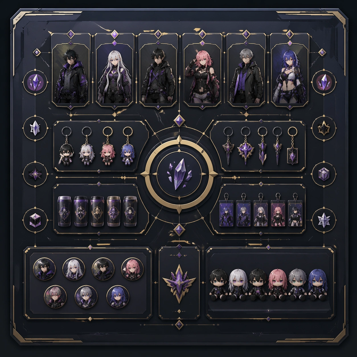
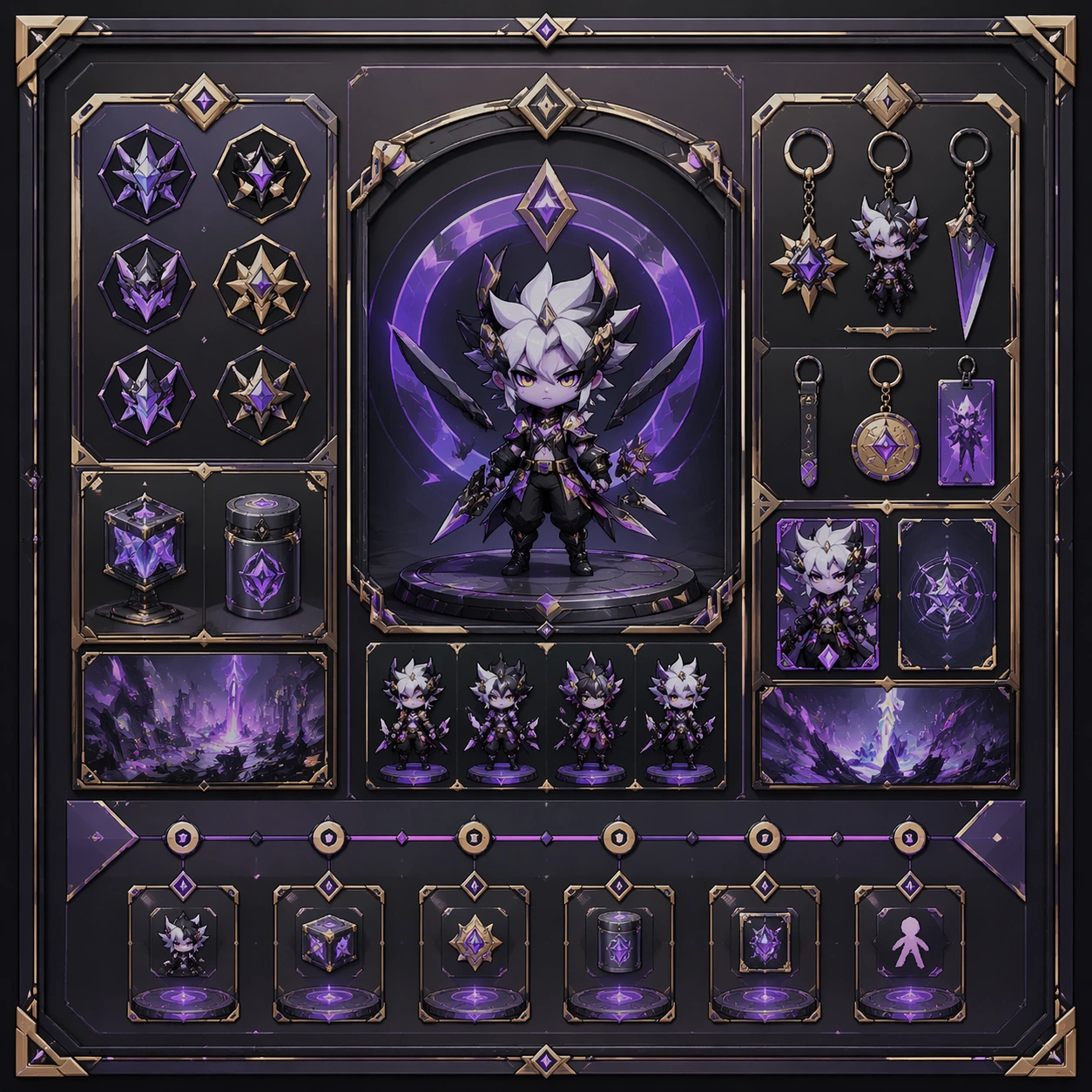
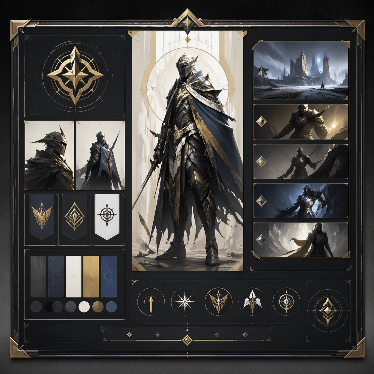
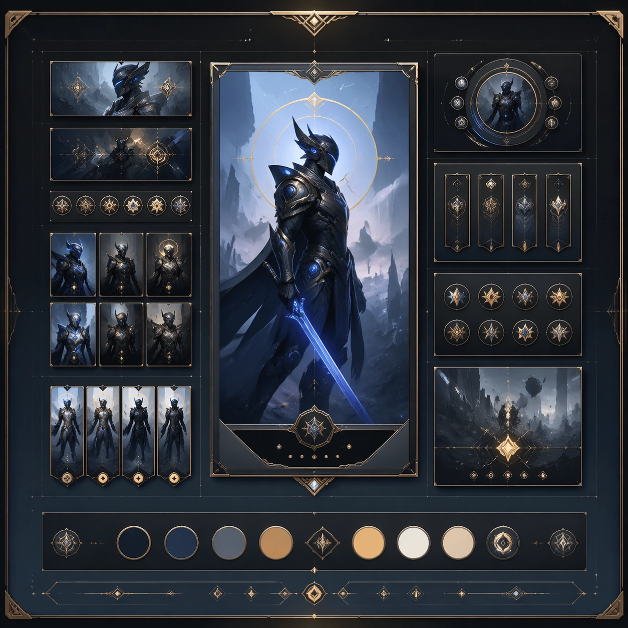
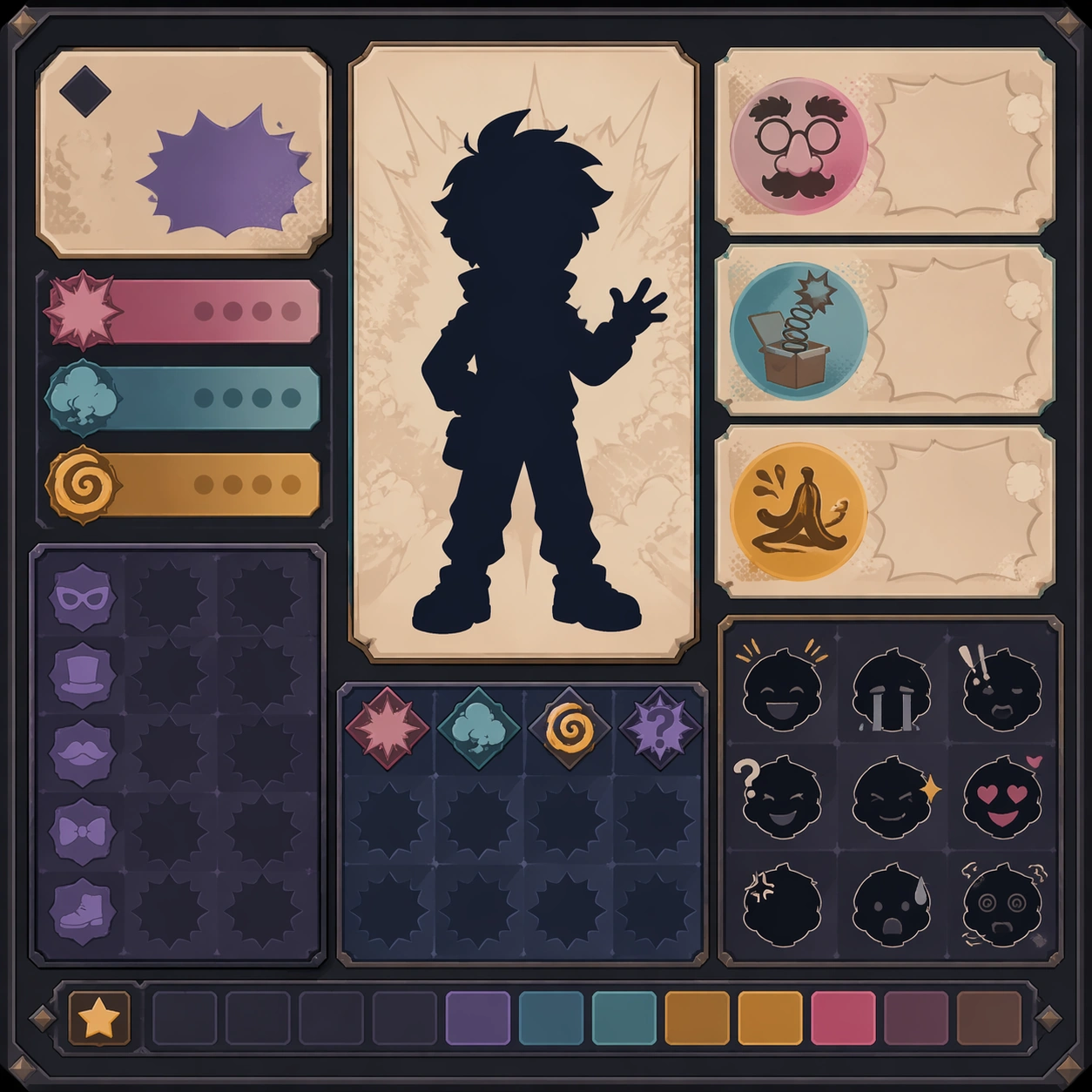
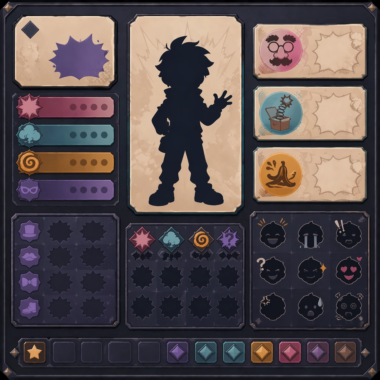
Scene: Create a square reference image for Character Merch Drop System. Build a reference anchor establishing the core system with a premium, production-ready finish. Use a polished modular board or campaign surface with clean spacing, premium game-UI finish, and clear focal hierarchy. The composition should feel intentional, clean, and reusable for gallery, research, campaign, or internal handoff contexts. Lighting must support readability first, with the main forms clearly separated from the background and enough breathing room for the system to stay legible at both hero scale and thumbnail scale. Subject: Center a coherent original game-art system built for premium production and marketing surfaces. For this image, focus on reference anchor. Keep the same system logic stable across screenshots, cards, banners, and overview boards. This image is the canonical anchor that later series images must follow. The viewer should immediately understand what role this surface plays inside a cohesive game-production asset pack. Important details: Lock framing, icon grammar, palette blocking, and surface hierarchy so the kit feels production-ready and consistent. Preserve the core silhouette, framing language, and material logic from the reference image while each variation changes function. Keep materials believable, edge hierarchy disciplined, and the visual language consistent with Merch Drop. Use abstract interface blocks or diagram accents when helpful, but avoid any readable language. The final result should feel like a deliberate production asset rather than a random illustration. Use case: Character Merch Drop System series study 1/9, designed as reference anchor within a cohesive asset pack. Constraints: No readable text, no watermark, no logos, preserve exact 1:1 aspect ratio, no unrelated objects, no broken visual hierarchy, no malformed anatomy or broken perspective, no random decorative clutter.

Example generated from “Character Merch Drop System — Variant One”
GPT Image 2en

Scene: Create a square dependent image for Character Merch Drop System. Build a first controlled variation in the same system with a premium, production-ready finish. Use a polished modular board or campaign surface with clean spacing, premium game-UI finish, and clear focal hierarchy. The composition should feel intentional, clean, and reusable for gallery, research, campaign, or internal handoff contexts. Lighting must support readability first, with the main forms clearly separated from the background and enough breathing room for the system to stay legible at both hero scale and thumbnail scale. Subject: Center a coherent original game-art system built for premium production and marketing surfaces. For this image, focus on the intended support surface. Keep the same system logic stable across screenshots, cards, banners, and overview boards. Preserve exact identity or system logic from the reference image while changing only the intended variation axis. The viewer should immediately understand what role this surface plays inside a cohesive game-production asset pack. Important details: Lock framing, icon grammar, palette blocking, and surface hierarchy so the kit feels production-ready and consistent. Preserve the core silhouette, framing language, and material logic from the reference image while each variation changes function. Keep materials believable, edge hierarchy disciplined, and the visual language consistent with Merch Drop. Use abstract interface blocks or diagram accents when helpful, but avoid any readable language. The final result should feel like a deliberate production asset rather than a random illustration. Use case: Character Merch Drop System series study 2/9, designed as variant one within a cohesive asset pack. Constraints: No readable text, no watermark, no logos, preserve exact 1:1 aspect ratio, no unrelated objects, no broken visual hierarchy, no malformed anatomy or broken perspective, no random decorative clutter.

Example generated from “Character Merch Drop System — Variant Two”
GPT Image 2en

Scene: Create a square dependent image for Character Merch Drop System. Build a second controlled variation in the same system with a premium, production-ready finish. Use a polished modular board or campaign surface with clean spacing, premium game-UI finish, and clear focal hierarchy. The composition should feel intentional, clean, and reusable for gallery, research, campaign, or internal handoff contexts. Lighting must support readability first, with the main forms clearly separated from the background and enough breathing room for the system to stay legible at both hero scale and thumbnail scale. Subject: Center a coherent original game-art system built for premium production and marketing surfaces. For this image, focus on the intended support surface. Keep the same system logic stable across screenshots, cards, banners, and overview boards. Preserve exact identity or system logic from the reference image while changing only the intended variation axis. The viewer should immediately understand what role this surface plays inside a cohesive game-production asset pack. Important details: Lock framing, icon grammar, palette blocking, and surface hierarchy so the kit feels production-ready and consistent. Preserve the core silhouette, framing language, and material logic from the reference image while each variation changes function. Keep materials believable, edge hierarchy disciplined, and the visual language consistent with Merch Drop. Use abstract interface blocks or diagram accents when helpful, but avoid any readable language. The final result should feel like a deliberate production asset rather than a random illustration. Use case: Character Merch Drop System series study 3/9, designed as variant two within a cohesive asset pack. Constraints: No readable text, no watermark, no logos, preserve exact 1:1 aspect ratio, no unrelated objects, no broken visual hierarchy, no malformed anatomy or broken perspective, no random decorative clutter.

Example generated from “Character Merch Drop System — Variant Three”
GPT Image 2en

Scene: Create a square dependent image for Character Merch Drop System. Build a third controlled variation in the same system with a premium, production-ready finish. Use a polished modular board or campaign surface with clean spacing, premium game-UI finish, and clear focal hierarchy. The composition should feel intentional, clean, and reusable for gallery, research, campaign, or internal handoff contexts. Lighting must support readability first, with the main forms clearly separated from the background and enough breathing room for the system to stay legible at both hero scale and thumbnail scale. Subject: Center a coherent original game-art system built for premium production and marketing surfaces. For this image, focus on the intended support surface. Keep the same system logic stable across screenshots, cards, banners, and overview boards. Preserve exact identity or system logic from the reference image while changing only the intended variation axis. The viewer should immediately understand what role this surface plays inside a cohesive game-production asset pack. Important details: Lock framing, icon grammar, palette blocking, and surface hierarchy so the kit feels production-ready and consistent. Preserve the core silhouette, framing language, and material logic from the reference image while each variation changes function. Keep materials believable, edge hierarchy disciplined, and the visual language consistent with Merch Drop. Use abstract interface blocks or diagram accents when helpful, but avoid any readable language. The final result should feel like a deliberate production asset rather than a random illustration. Use case: Character Merch Drop System series study 4/9, designed as variant three within a cohesive asset pack. Constraints: No readable text, no watermark, no logos, preserve exact 1:1 aspect ratio, no unrelated objects, no broken visual hierarchy, no malformed anatomy or broken perspective, no random decorative clutter.

Example generated from “Character Merch Drop System — Support One”
GPT Image 2en

Scene: Create a square standalone support image for Character Merch Drop System. Build a support-surface study with a clear focal hierarchy and a finished professional surface. Use a polished modular board or campaign surface with clean spacing, premium game-UI finish, and clear focal hierarchy. The frame should feel self-contained and polished, with enough structure to explain the system even without the reference series, yet still obviously belonging to the same theme and production world. Subject: Show a coherent original game-art system built for premium production and marketing surfaces in a way that emphasizes the intended support surface. Keep the same system logic stable across screenshots, cards, banners, and overview boards. Even though this image is independent, the viewer should still recognize the same universe, same commercial logic, and same production intent as the core package. Important details: Lock framing, icon grammar, palette blocking, and surface hierarchy so the kit feels production-ready and consistent. Preserve the broader theme language through color, framing, material choices, and modular composition. Use clean panel rhythm, premium asset presentation, and believable detail density. The image should work equally well as a gallery study, research reference, and mock production deliverable. Use case: Character Merch Drop System single study 5/9, exploring support one as a support surface. Constraints: No readable text, no watermark, no logos, preserve exact 1:1 aspect ratio, no unrelated objects, no broken visual hierarchy, no visual noise that obscures the main surface, no accidental brand resemblance.

Example generated from “Character Merch Drop System — Support Two”
GPT Image 2en

Scene: Create a square standalone support image for Character Merch Drop System. Build a second support-surface study with a clear focal hierarchy and a finished professional surface. Use a polished modular board or campaign surface with clean spacing, premium game-UI finish, and clear focal hierarchy. The frame should feel self-contained and polished, with enough structure to explain the system even without the reference series, yet still obviously belonging to the same theme and production world. Subject: Show a coherent original game-art system built for premium production and marketing surfaces in a way that emphasizes the intended support surface. Keep the same system logic stable across screenshots, cards, banners, and overview boards. Even though this image is independent, the viewer should still recognize the same universe, same commercial logic, and same production intent as the core package. Important details: Lock framing, icon grammar, palette blocking, and surface hierarchy so the kit feels production-ready and consistent. Preserve the broader theme language through color, framing, material choices, and modular composition. Use clean panel rhythm, premium asset presentation, and believable detail density. The image should work equally well as a gallery study, research reference, and mock production deliverable. Use case: Character Merch Drop System single study 6/9, exploring support two as a support surface. Constraints: No readable text, no watermark, no logos, preserve exact 1:1 aspect ratio, no unrelated objects, no broken visual hierarchy, no visual noise that obscures the main surface, no accidental brand resemblance.

Example generated from “Character Merch Drop System — Support Three”
GPT Image 2en

Scene: Create a square standalone support image for Character Merch Drop System. Build a third support-surface study with a clear focal hierarchy and a finished professional surface. Use a polished modular board or campaign surface with clean spacing, premium game-UI finish, and clear focal hierarchy. The frame should feel self-contained and polished, with enough structure to explain the system even without the reference series, yet still obviously belonging to the same theme and production world. Subject: Show a coherent original game-art system built for premium production and marketing surfaces in a way that emphasizes the intended support surface. Keep the same system logic stable across screenshots, cards, banners, and overview boards. Even though this image is independent, the viewer should still recognize the same universe, same commercial logic, and same production intent as the core package. Important details: Lock framing, icon grammar, palette blocking, and surface hierarchy so the kit feels production-ready and consistent. Preserve the broader theme language through color, framing, material choices, and modular composition. Use clean panel rhythm, premium asset presentation, and believable detail density. The image should work equally well as a gallery study, research reference, and mock production deliverable. Use case: Character Merch Drop System single study 7/9, exploring support three as a support surface. Constraints: No readable text, no watermark, no logos, preserve exact 1:1 aspect ratio, no unrelated objects, no broken visual hierarchy, no visual noise that obscures the main surface, no accidental brand resemblance.

Example generated from “Character Merch Drop System — Support Four”
GPT Image 2en

Scene: Create a square standalone support image for Character Merch Drop System. Build a fourth support-surface study with a clear focal hierarchy and a finished professional surface. Use a polished modular board or campaign surface with clean spacing, premium game-UI finish, and clear focal hierarchy. The frame should feel self-contained and polished, with enough structure to explain the system even without the reference series, yet still obviously belonging to the same theme and production world. Subject: Show a coherent original game-art system built for premium production and marketing surfaces in a way that emphasizes the intended support surface. Keep the same system logic stable across screenshots, cards, banners, and overview boards. Even though this image is independent, the viewer should still recognize the same universe, same commercial logic, and same production intent as the core package. Important details: Lock framing, icon grammar, palette blocking, and surface hierarchy so the kit feels production-ready and consistent. Preserve the broader theme language through color, framing, material choices, and modular composition. Use clean panel rhythm, premium asset presentation, and believable detail density. The image should work equally well as a gallery study, research reference, and mock production deliverable. Use case: Character Merch Drop System single study 8/9, exploring support four as a support surface. Constraints: No readable text, no watermark, no logos, preserve exact 1:1 aspect ratio, no unrelated objects, no broken visual hierarchy, no visual noise that obscures the main surface, no accidental brand resemblance.

Example generated from “Character Merch Drop System — Support Five”
GPT Image 2en

Scene: Create a square standalone support image for Character Merch Drop System. Build a fifth support-surface study with a clear focal hierarchy and a finished professional surface. Use a polished modular board or campaign surface with clean spacing, premium game-UI finish, and clear focal hierarchy. The frame should feel self-contained and polished, with enough structure to explain the system even without the reference series, yet still obviously belonging to the same theme and production world. Subject: Show a coherent original game-art system built for premium production and marketing surfaces in a way that emphasizes the intended support surface. Keep the same system logic stable across screenshots, cards, banners, and overview boards. Even though this image is independent, the viewer should still recognize the same universe, same commercial logic, and same production intent as the core package. Important details: Lock framing, icon grammar, palette blocking, and surface hierarchy so the kit feels production-ready and consistent. Preserve the broader theme language through color, framing, material choices, and modular composition. Use clean panel rhythm, premium asset presentation, and believable detail density. The image should work equally well as a gallery study, research reference, and mock production deliverable. Use case: Character Merch Drop System single study 9/9, exploring support five as a support surface. Constraints: No readable text, no watermark, no logos, preserve exact 1:1 aspect ratio, no unrelated objects, no broken visual hierarchy, no visual noise that obscures the main surface, no accidental brand resemblance.

Example generated from “Character Poster Rollout System — Reference Anchor”
GPT Image 2en

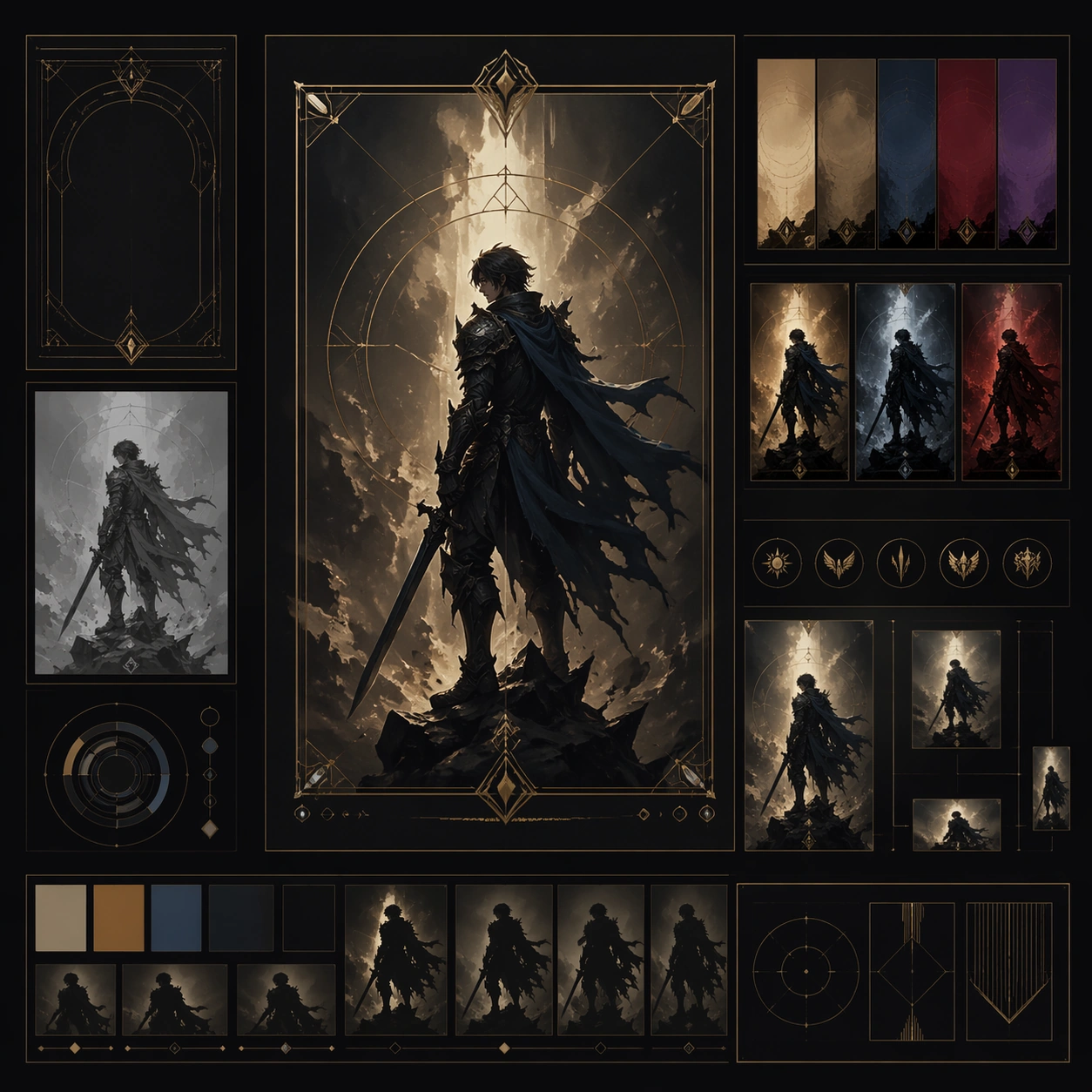
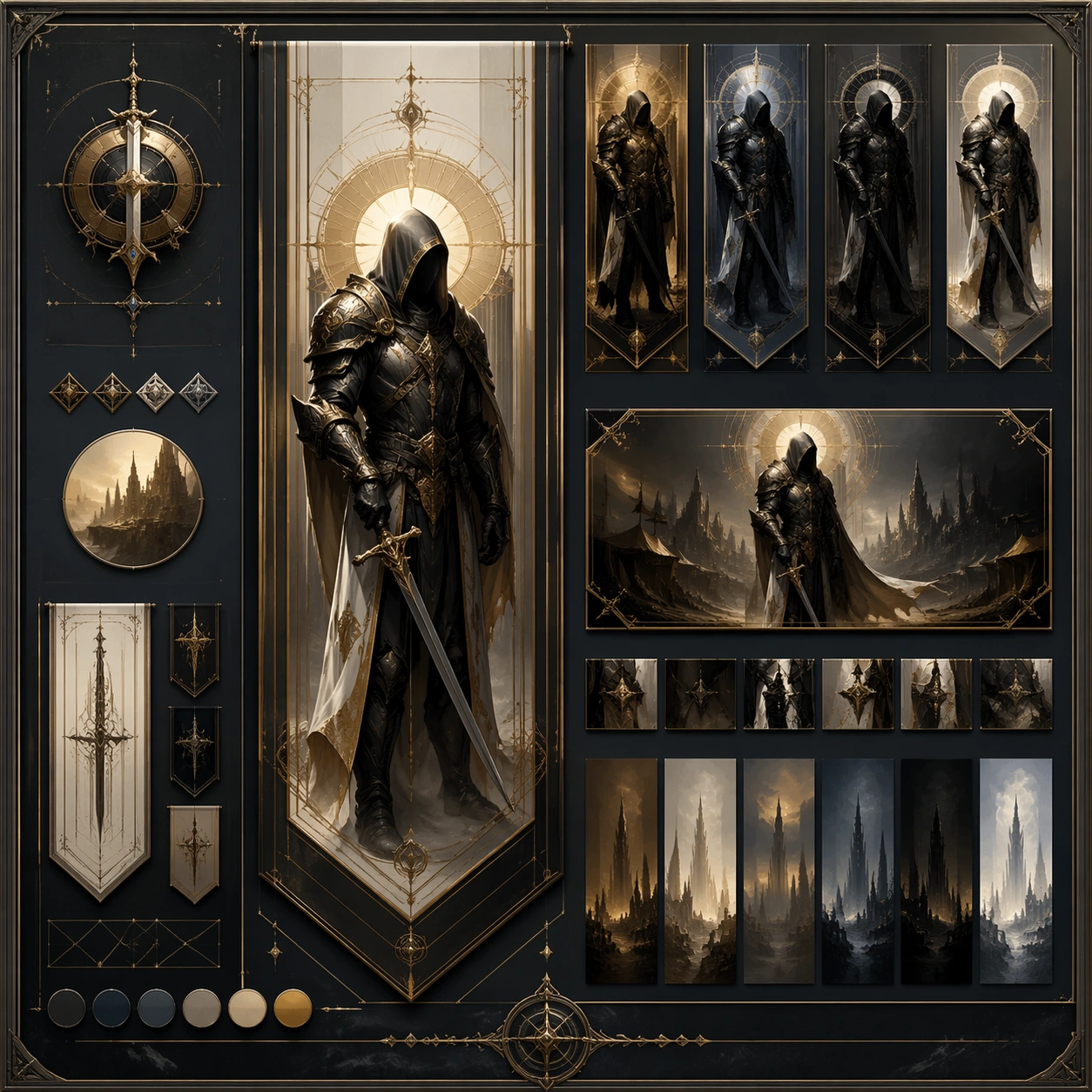
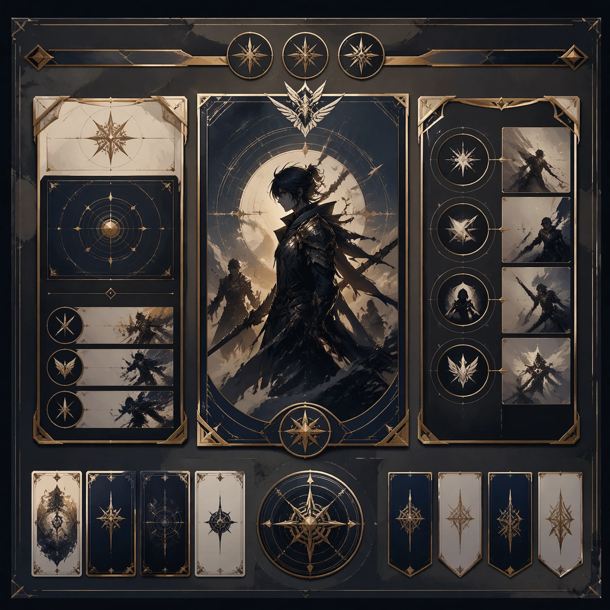
Scene: Create a square reference image for Character Poster Rollout System. Build a reference anchor establishing the core system with a premium, production-ready finish. Use a polished modular board or campaign surface with clean spacing, premium game-UI finish, and clear focal hierarchy. The composition should feel intentional, clean, and reusable for gallery, research, campaign, or internal handoff contexts. Lighting must support readability first, with the main forms clearly separated from the background and enough breathing room for the system to stay legible at both hero scale and thumbnail scale. Subject: Center a coherent original game-art system built for premium production and marketing surfaces. For this image, focus on reference anchor. Keep the same system logic stable across screenshots, cards, banners, and overview boards. This image is the canonical anchor that later series images must follow. The viewer should immediately understand what role this surface plays inside a cohesive game-production asset pack. Important details: Lock framing, icon grammar, palette blocking, and surface hierarchy so the kit feels production-ready and consistent. Preserve the core silhouette, framing language, and material logic from the reference image while each variation changes function. Keep materials believable, edge hierarchy disciplined, and the visual language consistent with Character Posters. Use abstract interface blocks or diagram accents when helpful, but avoid any readable language. The final result should feel like a deliberate production asset rather than a random illustration. Use case: Character Poster Rollout System series study 1/9, designed as reference anchor within a cohesive asset pack. Constraints: No readable text, no watermark, no logos, preserve exact 1:1 aspect ratio, no unrelated objects, no broken visual hierarchy, no malformed anatomy or broken perspective, no random decorative clutter.

Example generated from “Character Poster Rollout System — Variant One”
GPT Image 2en

Scene: Create a square dependent image for Character Poster Rollout System. Build a first controlled variation in the same system with a premium, production-ready finish. Use a polished modular board or campaign surface with clean spacing, premium game-UI finish, and clear focal hierarchy. The composition should feel intentional, clean, and reusable for gallery, research, campaign, or internal handoff contexts. Lighting must support readability first, with the main forms clearly separated from the background and enough breathing room for the system to stay legible at both hero scale and thumbnail scale. Subject: Center a coherent original game-art system built for premium production and marketing surfaces. For this image, focus on the intended support surface. Keep the same system logic stable across screenshots, cards, banners, and overview boards. Preserve exact identity or system logic from the reference image while changing only the intended variation axis. The viewer should immediately understand what role this surface plays inside a cohesive game-production asset pack. Important details: Lock framing, icon grammar, palette blocking, and surface hierarchy so the kit feels production-ready and consistent. Preserve the core silhouette, framing language, and material logic from the reference image while each variation changes function. Keep materials believable, edge hierarchy disciplined, and the visual language consistent with Character Posters. Use abstract interface blocks or diagram accents when helpful, but avoid any readable language. The final result should feel like a deliberate production asset rather than a random illustration. Use case: Character Poster Rollout System series study 2/9, designed as variant one within a cohesive asset pack. Constraints: No readable text, no watermark, no logos, preserve exact 1:1 aspect ratio, no unrelated objects, no broken visual hierarchy, no malformed anatomy or broken perspective, no random decorative clutter.

Example generated from “Character Poster Rollout System — Variant Two”
GPT Image 2en

Scene: Create a square dependent image for Character Poster Rollout System. Build a second controlled variation in the same system with a premium, production-ready finish. Use a polished modular board or campaign surface with clean spacing, premium game-UI finish, and clear focal hierarchy. The composition should feel intentional, clean, and reusable for gallery, research, campaign, or internal handoff contexts. Lighting must support readability first, with the main forms clearly separated from the background and enough breathing room for the system to stay legible at both hero scale and thumbnail scale. Subject: Center a coherent original game-art system built for premium production and marketing surfaces. For this image, focus on the intended support surface. Keep the same system logic stable across screenshots, cards, banners, and overview boards. Preserve exact identity or system logic from the reference image while changing only the intended variation axis. The viewer should immediately understand what role this surface plays inside a cohesive game-production asset pack. Important details: Lock framing, icon grammar, palette blocking, and surface hierarchy so the kit feels production-ready and consistent. Preserve the core silhouette, framing language, and material logic from the reference image while each variation changes function. Keep materials believable, edge hierarchy disciplined, and the visual language consistent with Character Posters. Use abstract interface blocks or diagram accents when helpful, but avoid any readable language. The final result should feel like a deliberate production asset rather than a random illustration. Use case: Character Poster Rollout System series study 3/9, designed as variant two within a cohesive asset pack. Constraints: No readable text, no watermark, no logos, preserve exact 1:1 aspect ratio, no unrelated objects, no broken visual hierarchy, no malformed anatomy or broken perspective, no random decorative clutter.

Example generated from “Character Poster Rollout System — Variant Three”
GPT Image 2en

Scene: Create a square dependent image for Character Poster Rollout System. Build a third controlled variation in the same system with a premium, production-ready finish. Use a polished modular board or campaign surface with clean spacing, premium game-UI finish, and clear focal hierarchy. The composition should feel intentional, clean, and reusable for gallery, research, campaign, or internal handoff contexts. Lighting must support readability first, with the main forms clearly separated from the background and enough breathing room for the system to stay legible at both hero scale and thumbnail scale. Subject: Center a coherent original game-art system built for premium production and marketing surfaces. For this image, focus on the intended support surface. Keep the same system logic stable across screenshots, cards, banners, and overview boards. Preserve exact identity or system logic from the reference image while changing only the intended variation axis. The viewer should immediately understand what role this surface plays inside a cohesive game-production asset pack. Important details: Lock framing, icon grammar, palette blocking, and surface hierarchy so the kit feels production-ready and consistent. Preserve the core silhouette, framing language, and material logic from the reference image while each variation changes function. Keep materials believable, edge hierarchy disciplined, and the visual language consistent with Character Posters. Use abstract interface blocks or diagram accents when helpful, but avoid any readable language. The final result should feel like a deliberate production asset rather than a random illustration. Use case: Character Poster Rollout System series study 4/9, designed as variant three within a cohesive asset pack. Constraints: No readable text, no watermark, no logos, preserve exact 1:1 aspect ratio, no unrelated objects, no broken visual hierarchy, no malformed anatomy or broken perspective, no random decorative clutter.

Example generated from “Character Poster Rollout System — Support One”
GPT Image 2en

Scene: Create a square standalone support image for Character Poster Rollout System. Build a support-surface study with a clear focal hierarchy and a finished professional surface. Use a polished modular board or campaign surface with clean spacing, premium game-UI finish, and clear focal hierarchy. The frame should feel self-contained and polished, with enough structure to explain the system even without the reference series, yet still obviously belonging to the same theme and production world. Subject: Show a coherent original game-art system built for premium production and marketing surfaces in a way that emphasizes the intended support surface. Keep the same system logic stable across screenshots, cards, banners, and overview boards. Even though this image is independent, the viewer should still recognize the same universe, same commercial logic, and same production intent as the core package. Important details: Lock framing, icon grammar, palette blocking, and surface hierarchy so the kit feels production-ready and consistent. Preserve the broader theme language through color, framing, material choices, and modular composition. Use clean panel rhythm, premium asset presentation, and believable detail density. The image should work equally well as a gallery study, research reference, and mock production deliverable. Use case: Character Poster Rollout System single study 5/9, exploring support one as a support surface. Constraints: No readable text, no watermark, no logos, preserve exact 1:1 aspect ratio, no unrelated objects, no broken visual hierarchy, no visual noise that obscures the main surface, no accidental brand resemblance.

Example generated from “Character Poster Rollout System — Support Two”
GPT Image 2en

Scene: Create a square standalone support image for Character Poster Rollout System. Build a second support-surface study with a clear focal hierarchy and a finished professional surface. Use a polished modular board or campaign surface with clean spacing, premium game-UI finish, and clear focal hierarchy. The frame should feel self-contained and polished, with enough structure to explain the system even without the reference series, yet still obviously belonging to the same theme and production world. Subject: Show a coherent original game-art system built for premium production and marketing surfaces in a way that emphasizes the intended support surface. Keep the same system logic stable across screenshots, cards, banners, and overview boards. Even though this image is independent, the viewer should still recognize the same universe, same commercial logic, and same production intent as the core package. Important details: Lock framing, icon grammar, palette blocking, and surface hierarchy so the kit feels production-ready and consistent. Preserve the broader theme language through color, framing, material choices, and modular composition. Use clean panel rhythm, premium asset presentation, and believable detail density. The image should work equally well as a gallery study, research reference, and mock production deliverable. Use case: Character Poster Rollout System single study 6/9, exploring support two as a support surface. Constraints: No readable text, no watermark, no logos, preserve exact 1:1 aspect ratio, no unrelated objects, no broken visual hierarchy, no visual noise that obscures the main surface, no accidental brand resemblance.

Example generated from “Character Poster Rollout System — Support Three”
GPT Image 2en

Scene: Create a square standalone support image for Character Poster Rollout System. Build a third support-surface study with a clear focal hierarchy and a finished professional surface. Use a polished modular board or campaign surface with clean spacing, premium game-UI finish, and clear focal hierarchy. The frame should feel self-contained and polished, with enough structure to explain the system even without the reference series, yet still obviously belonging to the same theme and production world. Subject: Show a coherent original game-art system built for premium production and marketing surfaces in a way that emphasizes the intended support surface. Keep the same system logic stable across screenshots, cards, banners, and overview boards. Even though this image is independent, the viewer should still recognize the same universe, same commercial logic, and same production intent as the core package. Important details: Lock framing, icon grammar, palette blocking, and surface hierarchy so the kit feels production-ready and consistent. Preserve the broader theme language through color, framing, material choices, and modular composition. Use clean panel rhythm, premium asset presentation, and believable detail density. The image should work equally well as a gallery study, research reference, and mock production deliverable. Use case: Character Poster Rollout System single study 7/9, exploring support three as a support surface. Constraints: No readable text, no watermark, no logos, preserve exact 1:1 aspect ratio, no unrelated objects, no broken visual hierarchy, no visual noise that obscures the main surface, no accidental brand resemblance.

Example generated from “Character Poster Rollout System — Support Four”
GPT Image 2en

Scene: Create a square standalone support image for Character Poster Rollout System. Build a fourth support-surface study with a clear focal hierarchy and a finished professional surface. Use a polished modular board or campaign surface with clean spacing, premium game-UI finish, and clear focal hierarchy. The frame should feel self-contained and polished, with enough structure to explain the system even without the reference series, yet still obviously belonging to the same theme and production world. Subject: Show a coherent original game-art system built for premium production and marketing surfaces in a way that emphasizes the intended support surface. Keep the same system logic stable across screenshots, cards, banners, and overview boards. Even though this image is independent, the viewer should still recognize the same universe, same commercial logic, and same production intent as the core package. Important details: Lock framing, icon grammar, palette blocking, and surface hierarchy so the kit feels production-ready and consistent. Preserve the broader theme language through color, framing, material choices, and modular composition. Use clean panel rhythm, premium asset presentation, and believable detail density. The image should work equally well as a gallery study, research reference, and mock production deliverable. Use case: Character Poster Rollout System single study 8/9, exploring support four as a support surface. Constraints: No readable text, no watermark, no logos, preserve exact 1:1 aspect ratio, no unrelated objects, no broken visual hierarchy, no visual noise that obscures the main surface, no accidental brand resemblance.

Example generated from “Character Poster Rollout System — Support Five”
GPT Image 2en

Scene: Create a square standalone support image for Character Poster Rollout System. Build a fifth support-surface study with a clear focal hierarchy and a finished professional surface. Use a polished modular board or campaign surface with clean spacing, premium game-UI finish, and clear focal hierarchy. The frame should feel self-contained and polished, with enough structure to explain the system even without the reference series, yet still obviously belonging to the same theme and production world. Subject: Show a coherent original game-art system built for premium production and marketing surfaces in a way that emphasizes the intended support surface. Keep the same system logic stable across screenshots, cards, banners, and overview boards. Even though this image is independent, the viewer should still recognize the same universe, same commercial logic, and same production intent as the core package. Important details: Lock framing, icon grammar, palette blocking, and surface hierarchy so the kit feels production-ready and consistent. Preserve the broader theme language through color, framing, material choices, and modular composition. Use clean panel rhythm, premium asset presentation, and believable detail density. The image should work equally well as a gallery study, research reference, and mock production deliverable. Use case: Character Poster Rollout System single study 9/9, exploring support five as a support surface. Constraints: No readable text, no watermark, no logos, preserve exact 1:1 aspect ratio, no unrelated objects, no broken visual hierarchy, no visual noise that obscures the main surface, no accidental brand resemblance.

Example generated from “Character Quirk Comedy Sheet — Reference Anchor”
GPT Image 2en

Scene: Create a square reference image for Character Quirk Comedy Sheet. Build a reference anchor establishing the core system with a premium, production-ready finish. Use a polished modular board or campaign surface with clean spacing, premium game-UI finish, and clear focal hierarchy. The composition should feel intentional, clean, and reusable for gallery, research, campaign, or internal handoff contexts. Lighting must support readability first, with the main forms clearly separated from the background and enough breathing room for the system to stay legible at both hero scale and thumbnail scale. Subject: Center a coherent original game-art system built for premium production and marketing surfaces. For this image, focus on reference anchor. Keep the same system logic stable across screenshots, cards, banners, and overview boards. This image is the canonical anchor that later series images must follow. The viewer should immediately understand what role this surface plays inside a cohesive game-production asset pack. Important details: Lock framing, icon grammar, palette blocking, and surface hierarchy so the kit feels production-ready and consistent. Preserve the core silhouette, framing language, and material logic from the reference image while each variation changes function. Keep materials believable, edge hierarchy disciplined, and the visual language consistent with Quirk Sheet. Use abstract interface blocks or diagram accents when helpful, but avoid any readable language. The final result should feel like a deliberate production asset rather than a random illustration. Use case: Character Quirk Comedy Sheet series study 1/9, designed as reference anchor within a cohesive asset pack. Constraints: No readable text, no watermark, no logos, preserve exact 1:1 aspect ratio, no unrelated objects, no broken visual hierarchy, no malformed anatomy or broken perspective, no random decorative clutter.

Example generated from “Character Quirk Comedy Sheet — Variant Two”
GPT Image 2en

Scene: Create a square dependent image for Character Quirk Comedy Sheet. Build a second controlled variation in the same system with a premium, production-ready finish. Use a polished modular board or campaign surface with clean spacing, premium game-UI finish, and clear focal hierarchy. The composition should feel intentional, clean, and reusable for gallery, research, campaign, or internal handoff contexts. Lighting must support readability first, with the main forms clearly separated from the background and enough breathing room for the system to stay legible at both hero scale and thumbnail scale. Subject: Center a coherent original game-art system built for premium production and marketing surfaces. For this image, focus on the intended support surface. Keep the same system logic stable across screenshots, cards, banners, and overview boards. Preserve exact identity or system logic from the reference image while changing only the intended variation axis. The viewer should immediately understand what role this surface plays inside a cohesive game-production asset pack. Important details: Lock framing, icon grammar, palette blocking, and surface hierarchy so the kit feels production-ready and consistent. Preserve the core silhouette, framing language, and material logic from the reference image while each variation changes function. Keep materials believable, edge hierarchy disciplined, and the visual language consistent with Quirk Sheet. Use abstract interface blocks or diagram accents when helpful, but avoid any readable language. The final result should feel like a deliberate production asset rather than a random illustration. Use case: Character Quirk Comedy Sheet series study 3/9, designed as variant two within a cohesive asset pack. Constraints: No readable text, no watermark, no logos, preserve exact 1:1 aspect ratio, no unrelated objects, no broken visual hierarchy, no malformed anatomy or broken perspective, no random decorative clutter.

Example generated from “Character Quirk Comedy Sheet — Support One”
GPT Image 2en

Scene: Create a square standalone support image for Character Quirk Comedy Sheet. Build a support-surface study with a clear focal hierarchy and a finished professional surface. Use a polished modular board or campaign surface with clean spacing, premium game-UI finish, and clear focal hierarchy. The frame should feel self-contained and polished, with enough structure to explain the system even without the reference series, yet still obviously belonging to the same theme and production world. Subject: Show a coherent original game-art system built for premium production and marketing surfaces in a way that emphasizes the intended support surface. Keep the same system logic stable across screenshots, cards, banners, and overview boards. Even though this image is independent, the viewer should still recognize the same universe, same commercial logic, and same production intent as the core package. Important details: Lock framing, icon grammar, palette blocking, and surface hierarchy so the kit feels production-ready and consistent. Preserve the broader theme language through color, framing, material choices, and modular composition. Use clean panel rhythm, premium asset presentation, and believable detail density. The image should work equally well as a gallery study, research reference, and mock production deliverable. Use case: Character Quirk Comedy Sheet single study 5/9, exploring support one as a support surface. Constraints: No readable text, no watermark, no logos, preserve exact 1:1 aspect ratio, no unrelated objects, no broken visual hierarchy, no visual noise that obscures the main surface, no accidental brand resemblance.