プロンプト · 創作の探索

プロンプトギャラリー

実際のプロンプトと生成例を探索。次の創作に役立つヒントを見つけ、全文を無料でコピーできます。

生成例
10,974
モデル
17
出典
1277
10,974 件のプロンプト例 · ページ 65 / 229
Example generated from “Christmas Retail Gifting Campaign — Gift Wrap Flatlay Editorial”
GPT Image 2en

Scene: Create a square overhead editorial flatlay on a warm ivory tabletop with soft winter daylight and subtle directional shadow. Use a polished premium-stationery feeling rather than craft-store mess. The arrangement should feel intentionally art-directed for a holiday gift guide, with enough empty space between objects that every material reads clearly and the composition can work as a social tile, e-commerce story card, or editorial insert. Subject: Arrange premium wrapping paper, velvet ribbon spools, wax seals without letters, blank gift tags, brass scissors, evergreen clippings, matte ornaments, and folded tissue into a coherent Christmas preparation scene. The objects should feel used by a tasteful retailer preparing orders rather than by a hobbyist. Emphasize tactile surfaces, clean geometry, and the relationship between wrapping tools and premium gift presentation. Important details: Keep the styling elegant and commercially useful: cream, pine green, muted cranberry, and brushed brass only. Make every edge crisp enough for catalog reuse, with believable paper grain, ribbon sheen, scissor reflections, and soft evergreen needles. Avoid crowded scrapbook behavior. The image should communicate gift-prep professionalism and seasonal warmth while remaining calm, premium, and highly reusable across campaign support surfaces. Use case: Christmas Retail single study 5/9. Constraints: No readable text, no watermark, no logos, preserve exact 1:1 aspect ratio, no handwritten notes, no readable tags, no logos, no glitter spill, no cheap novelty ornaments, no human hands entering frame, no messy tape scraps, no random bright plastic colors.


Example generated from “Christmas Retail Gifting Campaign — Snow Window Storefront”
GPT Image 2en

Scene: Create a square street-level storefront image at winter dusk with soft snowfall, wet pavement reflections, and a warm inviting interior glow. The scene should read like a premium retail exterior hero rather than a tourism postcard. Use composed architectural framing, disciplined contrast, and a cozy but upscale palette so the storefront can function as a campaign atmosphere image for holiday retail, loyalty messaging, or seasonal landing pages. Subject: Show a boutique storefront dressed for Christmas with curated window gifts, evergreen swags, hanging lights, and glimpses of wrapped products inside. Keep human presence minimal or absent so the merchandising remains central. The door, windows, display plinths, and reflected street surface should all support a believable premium retail story without drifting into fantasy village cliché or theme-park excess. Important details: Emphasize believable retail atmosphere: warm light spilling onto wet stone, careful window composition, tasteful ornament density, and products arranged with commercial clarity. Snow should support mood, not hide detail. Keep the scene highly usable as a retail-brand seasonal image, with realism in glass reflections, moisture, metal hardware, and the depth from exterior cold to interior warmth. Everything should feel sellable and grounded. Use case: Christmas Retail single study 6/9. Constraints: No readable text, no watermark, no logos, preserve exact 1:1 aspect ratio, no readable store sign, no pedestrians blocking the window, no Santa character, no sleigh imagery, no cartoon reindeer, no oversized candy props, no branded shopfront, no excessive snowstorm blur.

Example generated from “Christmas Retail Gifting Campaign — Tabletop Hamper Closeup”
GPT Image 2en

Scene: Create a square close-up tabletop photograph with soft candle-adjacent warmth, shallow but believable depth of field, and rich material contrast. The framing should feel like a premium catalog insert that zooms into gift quality. Keep the crop intimate without becoming abstract, and let the light rake gently across paper fibers, ribbon folds, evergreen needles, and basket weave so the material value is unmistakable. Subject: Focus on a premium Christmas hamper corner with layered wrapping paper, velvet ribbon, woven basket edge, ceramic ornament, and one or two partially visible gift items tucked beneath tissue. The composition should suggest abundance while staying precise and restrained. Every object should support the idea of elevated holiday gifting through craft, care, and tactile refinement rather than through branding or novelty props. Important details: Micro-texture matters here. Make paper grain, ribbon nap, basket fibers, wax glow, and evergreen freshness highly persuasive. Keep the palette controlled and festive without becoming loud. The image should feel like a detail crop from a serious retail campaign, useful for premium PDP headers, social detail tiles, or seasonal editorial storytelling. Avoid vague blur and make every visible surface feel intentionally art-directed and photographically real. Use case: Christmas Retail single study 7/9. Constraints: No readable text, no watermark, no logos, preserve exact 1:1 aspect ratio, no readable labels, no glitter mess, no fingerprints on glossy surfaces, no random food crumbs, no low-end packaging plastic, no color cast shift, no fake macro abstraction.

Example generated from “Christmas Retail Gifting Campaign — Catalog Cocoa Gifting Scene”
GPT Image 2en

Scene: Create a square tabletop lifestyle image with soft morning winter light and a catalog-like editorial polish. The setting should feel domestic but still premium enough for commercial use, with linen, ceramic, and wrapped parcels arranged into a balanced holiday composition. Let warmth come from material choices and steam glow rather than from exaggerated red saturation or cliché cabin décor. Subject: Show a wrapped Christmas gift beside a ceramic mug of cocoa, a small plate of seasonal biscuits, folded textile, and one elegant ornament, all arranged as a believable gifting moment. The objects should suggest an intimate holiday ritual that a retailer could use to connect products with comfort, not merely a food scene. Keep the gift clearly important and integrated into the winter lifestyle story. Important details: Balance softness with commercial clarity. The mug, steam, fabric weave, paper folds, and ornament finish should all read cleanly. Keep the palette understated and premium, with cream, pine, cocoa brown, muted red, and brass highlights. This should feel like a support visual for gift-guide storytelling or seasonal email art, with enough detail to feel rich but enough restraint to remain reusable and sophisticated. Use case: Christmas Retail single study 8/9. Constraints: No readable text, no watermark, no logos, preserve exact 1:1 aspect ratio, no readable mug graphics, no cinnamon-letter decorations, no crowd, no heavy rustic cabin theme, no marshmallow overload, no cheap props, no branded tins, no messy crumbs.

Example generated from “Christmas Retail Gifting Campaign — Doorstep Courier Drop”
GPT Image 2en

Scene: Create a square doorstep delivery scene at early evening with crisp cold air, soft porch lighting, and a premium residential threshold decorated for the holidays. The composition should feel like a finished campaign image about service and gifting convenience, not a candid documentary. Keep architecture tasteful, weather believable, and the package placement organized enough that the viewer reads reliable premium fulfillment at a glance. Subject: Feature two or three wrapped Christmas parcels at a decorated doorstep with evergreen wreath texture, subtle lantern light, and careful packaging details. The courier can be implied through placement and motion traces rather than shown directly. Focus on the parcels, the threshold, and the emotional promise of a well-delivered holiday gift experience rather than on people or branded logistics. Important details: Make the scene feel trustworthy, calm, and upscale. Cardboard, paper wrap, ribbon, stone steps, metal hardware, and evergreen should all have realistic material behavior. Keep the composition balanced and commercially useful for shipping messages, last-mile gifting ads, or service banners. The result should communicate seasonal convenience without slipping into generic stock-photo sentimentality or low-end parcel chaos. Use case: Christmas Retail single study 9/9. Constraints: No readable text, no watermark, no logos, preserve exact 1:1 aspect ratio, no readable shipping labels, no company logos, no visible house numbers, no people taking center stage, no messy cardboard pile, no cartoon snow, no vehicle in frame, no porch sign text.

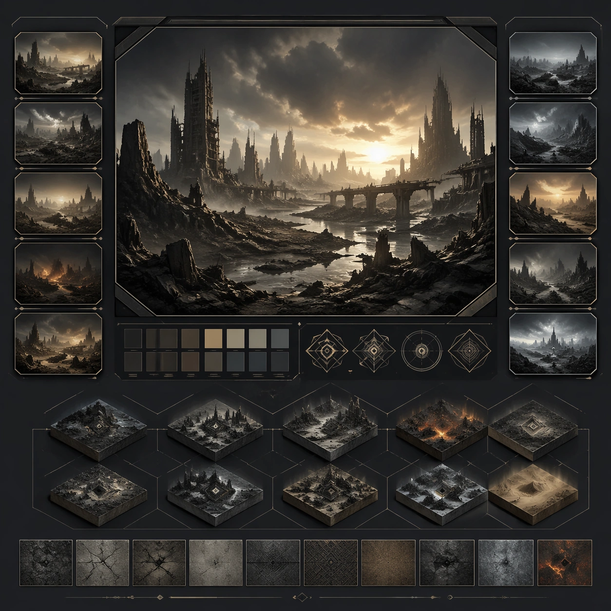
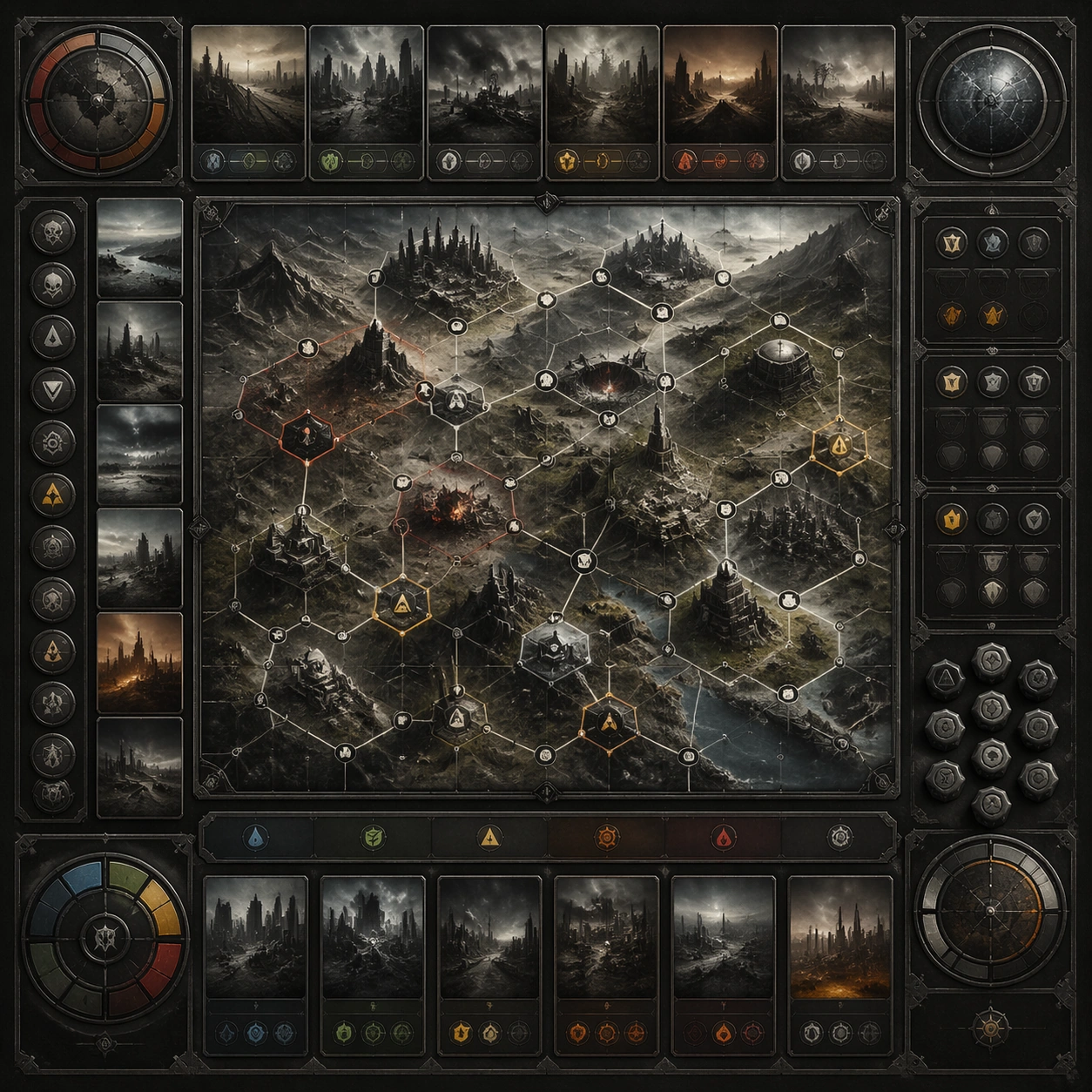
Example generated from “Cinematic End Of World Landscape Set — Reference Anchor”
GPT Image 2en

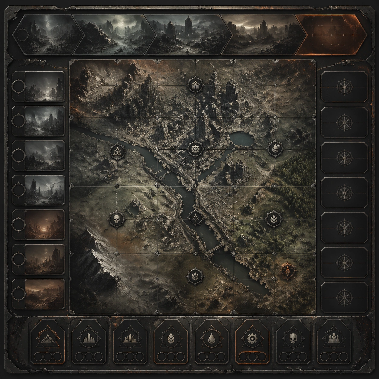
Scene: Create a square reference image for Cinematic End-of-World Landscape Set. Build a reference anchor establishing the core system with a premium, production-ready finish. Use a polished modular board or campaign surface with clean spacing, premium game-UI finish, and clear focal hierarchy. The composition should feel intentional, clean, and reusable for gallery, research, campaign, or internal handoff contexts. Lighting must support readability first, with the main forms clearly separated from the background and enough breathing room for the system to stay legible at both hero scale and thumbnail scale. Subject: Center a coherent original game-art system built for premium production and marketing surfaces. For this image, focus on reference anchor. Keep the same system logic stable across screenshots, cards, banners, and overview boards. This image is the canonical anchor that later series images must follow. The viewer should immediately understand what role this surface plays inside a cohesive game-production asset pack. Important details: Lock framing, icon grammar, palette blocking, and surface hierarchy so the kit feels production-ready and consistent. Preserve the core silhouette, framing language, and material logic from the reference image while each variation changes function. Keep materials believable, edge hierarchy disciplined, and the visual language consistent with Endworld Landscapes. Use abstract interface blocks or diagram accents when helpful, but avoid any readable language. The final result should feel like a deliberate production asset rather than a random illustration. Use case: Cinematic End-of-World Landscape Set series study 1/9, designed as reference anchor within a cohesive asset pack. Constraints: No readable text, no watermark, no logos, preserve exact 1:1 aspect ratio, no unrelated objects, no broken visual hierarchy, no malformed anatomy or broken perspective, no random decorative clutter.

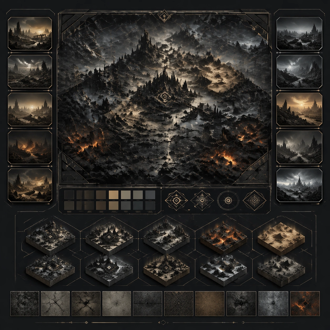
Example generated from “Cinematic End Of World Landscape Set — Variant One”
GPT Image 2en

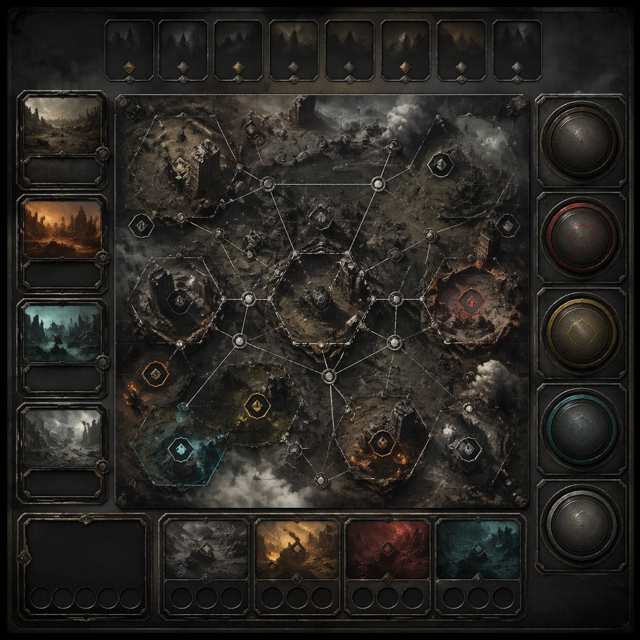
Scene: Create a square dependent image for Cinematic End-of-World Landscape Set. Build a first controlled variation in the same system with a premium, production-ready finish. Use a polished modular board or campaign surface with clean spacing, premium game-UI finish, and clear focal hierarchy. The composition should feel intentional, clean, and reusable for gallery, research, campaign, or internal handoff contexts. Lighting must support readability first, with the main forms clearly separated from the background and enough breathing room for the system to stay legible at both hero scale and thumbnail scale. Subject: Center a coherent original game-art system built for premium production and marketing surfaces. For this image, focus on the intended support surface. Keep the same system logic stable across screenshots, cards, banners, and overview boards. Preserve exact identity or system logic from the reference image while changing only the intended variation axis. The viewer should immediately understand what role this surface plays inside a cohesive game-production asset pack. Important details: Lock framing, icon grammar, palette blocking, and surface hierarchy so the kit feels production-ready and consistent. Preserve the core silhouette, framing language, and material logic from the reference image while each variation changes function. Keep materials believable, edge hierarchy disciplined, and the visual language consistent with Endworld Landscapes. Use abstract interface blocks or diagram accents when helpful, but avoid any readable language. The final result should feel like a deliberate production asset rather than a random illustration. Use case: Cinematic End-of-World Landscape Set series study 2/9, designed as variant one within a cohesive asset pack. Constraints: No readable text, no watermark, no logos, preserve exact 1:1 aspect ratio, no unrelated objects, no broken visual hierarchy, no malformed anatomy or broken perspective, no random decorative clutter.

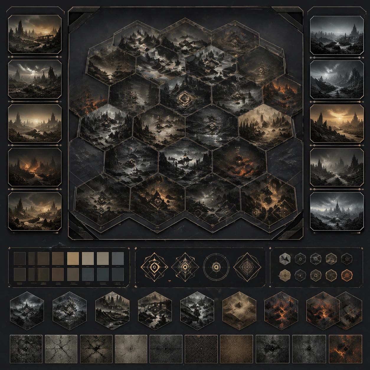
Example generated from “Cinematic End Of World Landscape Set — Variant Two”
GPT Image 2en

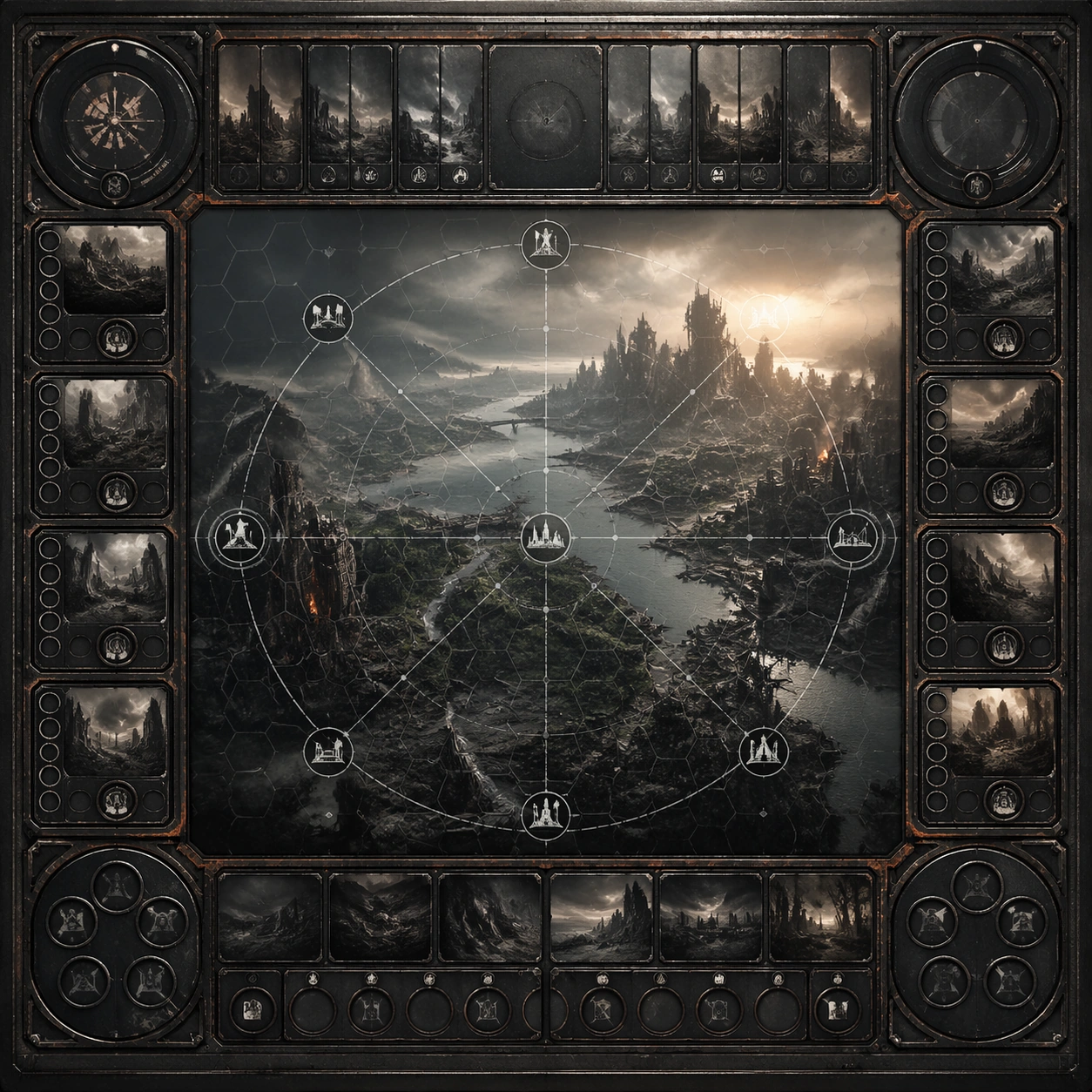
Scene: Create a square dependent image for Cinematic End-of-World Landscape Set. Build a second controlled variation in the same system with a premium, production-ready finish. Use a polished modular board or campaign surface with clean spacing, premium game-UI finish, and clear focal hierarchy. The composition should feel intentional, clean, and reusable for gallery, research, campaign, or internal handoff contexts. Lighting must support readability first, with the main forms clearly separated from the background and enough breathing room for the system to stay legible at both hero scale and thumbnail scale. Subject: Center a coherent original game-art system built for premium production and marketing surfaces. For this image, focus on the intended support surface. Keep the same system logic stable across screenshots, cards, banners, and overview boards. Preserve exact identity or system logic from the reference image while changing only the intended variation axis. The viewer should immediately understand what role this surface plays inside a cohesive game-production asset pack. Important details: Lock framing, icon grammar, palette blocking, and surface hierarchy so the kit feels production-ready and consistent. Preserve the core silhouette, framing language, and material logic from the reference image while each variation changes function. Keep materials believable, edge hierarchy disciplined, and the visual language consistent with Endworld Landscapes. Use abstract interface blocks or diagram accents when helpful, but avoid any readable language. The final result should feel like a deliberate production asset rather than a random illustration. Use case: Cinematic End-of-World Landscape Set series study 3/9, designed as variant two within a cohesive asset pack. Constraints: No readable text, no watermark, no logos, preserve exact 1:1 aspect ratio, no unrelated objects, no broken visual hierarchy, no malformed anatomy or broken perspective, no random decorative clutter.

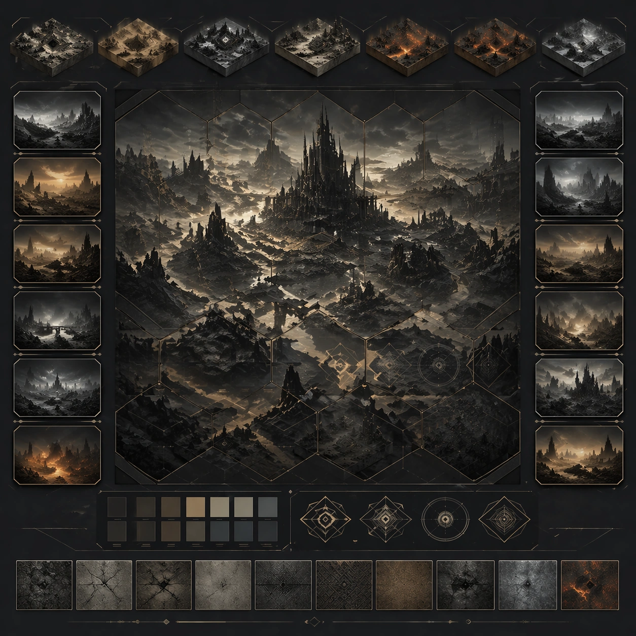
Example generated from “Cinematic End Of World Landscape Set — Variant Three”
GPT Image 2en

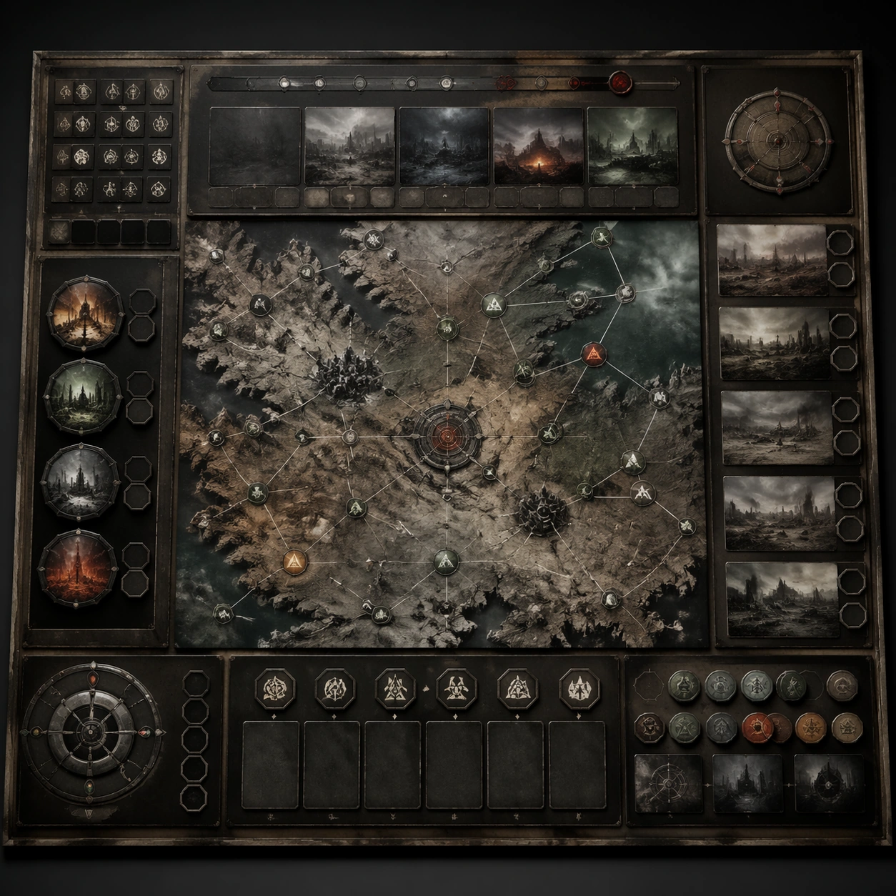
Scene: Create a square dependent image for Cinematic End-of-World Landscape Set. Build a third controlled variation in the same system with a premium, production-ready finish. Use a polished modular board or campaign surface with clean spacing, premium game-UI finish, and clear focal hierarchy. The composition should feel intentional, clean, and reusable for gallery, research, campaign, or internal handoff contexts. Lighting must support readability first, with the main forms clearly separated from the background and enough breathing room for the system to stay legible at both hero scale and thumbnail scale. Subject: Center a coherent original game-art system built for premium production and marketing surfaces. For this image, focus on the intended support surface. Keep the same system logic stable across screenshots, cards, banners, and overview boards. Preserve exact identity or system logic from the reference image while changing only the intended variation axis. The viewer should immediately understand what role this surface plays inside a cohesive game-production asset pack. Important details: Lock framing, icon grammar, palette blocking, and surface hierarchy so the kit feels production-ready and consistent. Preserve the core silhouette, framing language, and material logic from the reference image while each variation changes function. Keep materials believable, edge hierarchy disciplined, and the visual language consistent with Endworld Landscapes. Use abstract interface blocks or diagram accents when helpful, but avoid any readable language. The final result should feel like a deliberate production asset rather than a random illustration. Use case: Cinematic End-of-World Landscape Set series study 4/9, designed as variant three within a cohesive asset pack. Constraints: No readable text, no watermark, no logos, preserve exact 1:1 aspect ratio, no unrelated objects, no broken visual hierarchy, no malformed anatomy or broken perspective, no random decorative clutter.

Example generated from “Cinematic End Of World Landscape Set — Support One”
GPT Image 2en

Scene: Create a square standalone support image for Cinematic End-of-World Landscape Set. Build a support-surface study with a clear focal hierarchy and a finished professional surface. Use a polished modular board or campaign surface with clean spacing, premium game-UI finish, and clear focal hierarchy. The frame should feel self-contained and polished, with enough structure to explain the system even without the reference series, yet still obviously belonging to the same theme and production world. Subject: Show a coherent original game-art system built for premium production and marketing surfaces in a way that emphasizes the intended support surface. Keep the same system logic stable across screenshots, cards, banners, and overview boards. Even though this image is independent, the viewer should still recognize the same universe, same commercial logic, and same production intent as the core package. Important details: Lock framing, icon grammar, palette blocking, and surface hierarchy so the kit feels production-ready and consistent. Preserve the broader theme language through color, framing, material choices, and modular composition. Use clean panel rhythm, premium asset presentation, and believable detail density. The image should work equally well as a gallery study, research reference, and mock production deliverable. Use case: Cinematic End-of-World Landscape Set single study 5/9, exploring support one as a support surface. Constraints: No readable text, no watermark, no logos, preserve exact 1:1 aspect ratio, no unrelated objects, no broken visual hierarchy, no visual noise that obscures the main surface, no accidental brand resemblance.

Example generated from “Cinematic End Of World Landscape Set — Support Two”
GPT Image 2en

Scene: Create a square standalone support image for Cinematic End-of-World Landscape Set. Build a second support-surface study with a clear focal hierarchy and a finished professional surface. Use a polished modular board or campaign surface with clean spacing, premium game-UI finish, and clear focal hierarchy. The frame should feel self-contained and polished, with enough structure to explain the system even without the reference series, yet still obviously belonging to the same theme and production world. Subject: Show a coherent original game-art system built for premium production and marketing surfaces in a way that emphasizes the intended support surface. Keep the same system logic stable across screenshots, cards, banners, and overview boards. Even though this image is independent, the viewer should still recognize the same universe, same commercial logic, and same production intent as the core package. Important details: Lock framing, icon grammar, palette blocking, and surface hierarchy so the kit feels production-ready and consistent. Preserve the broader theme language through color, framing, material choices, and modular composition. Use clean panel rhythm, premium asset presentation, and believable detail density. The image should work equally well as a gallery study, research reference, and mock production deliverable. Use case: Cinematic End-of-World Landscape Set single study 6/9, exploring support two as a support surface. Constraints: No readable text, no watermark, no logos, preserve exact 1:1 aspect ratio, no unrelated objects, no broken visual hierarchy, no visual noise that obscures the main surface, no accidental brand resemblance.

Example generated from “Cinematic End Of World Landscape Set — Support Three”
GPT Image 2en

Scene: Create a square standalone support image for Cinematic End-of-World Landscape Set. Build a third support-surface study with a clear focal hierarchy and a finished professional surface. Use a polished modular board or campaign surface with clean spacing, premium game-UI finish, and clear focal hierarchy. The frame should feel self-contained and polished, with enough structure to explain the system even without the reference series, yet still obviously belonging to the same theme and production world. Subject: Show a coherent original game-art system built for premium production and marketing surfaces in a way that emphasizes the intended support surface. Keep the same system logic stable across screenshots, cards, banners, and overview boards. Even though this image is independent, the viewer should still recognize the same universe, same commercial logic, and same production intent as the core package. Important details: Lock framing, icon grammar, palette blocking, and surface hierarchy so the kit feels production-ready and consistent. Preserve the broader theme language through color, framing, material choices, and modular composition. Use clean panel rhythm, premium asset presentation, and believable detail density. The image should work equally well as a gallery study, research reference, and mock production deliverable. Use case: Cinematic End-of-World Landscape Set single study 7/9, exploring support three as a support surface. Constraints: No readable text, no watermark, no logos, preserve exact 1:1 aspect ratio, no unrelated objects, no broken visual hierarchy, no visual noise that obscures the main surface, no accidental brand resemblance.

Example generated from “Cinematic End Of World Landscape Set — Support Four”
GPT Image 2en

Scene: Create a square standalone support image for Cinematic End-of-World Landscape Set. Build a fourth support-surface study with a clear focal hierarchy and a finished professional surface. Use a polished modular board or campaign surface with clean spacing, premium game-UI finish, and clear focal hierarchy. The frame should feel self-contained and polished, with enough structure to explain the system even without the reference series, yet still obviously belonging to the same theme and production world. Subject: Show a coherent original game-art system built for premium production and marketing surfaces in a way that emphasizes the intended support surface. Keep the same system logic stable across screenshots, cards, banners, and overview boards. Even though this image is independent, the viewer should still recognize the same universe, same commercial logic, and same production intent as the core package. Important details: Lock framing, icon grammar, palette blocking, and surface hierarchy so the kit feels production-ready and consistent. Preserve the broader theme language through color, framing, material choices, and modular composition. Use clean panel rhythm, premium asset presentation, and believable detail density. The image should work equally well as a gallery study, research reference, and mock production deliverable. Use case: Cinematic End-of-World Landscape Set single study 8/9, exploring support four as a support surface. Constraints: No readable text, no watermark, no logos, preserve exact 1:1 aspect ratio, no unrelated objects, no broken visual hierarchy, no visual noise that obscures the main surface, no accidental brand resemblance.

Example generated from “Cinematic End Of World Landscape Set — Support Five”
GPT Image 2en

Scene: Create a square standalone support image for Cinematic End-of-World Landscape Set. Build a fifth support-surface study with a clear focal hierarchy and a finished professional surface. Use a polished modular board or campaign surface with clean spacing, premium game-UI finish, and clear focal hierarchy. The frame should feel self-contained and polished, with enough structure to explain the system even without the reference series, yet still obviously belonging to the same theme and production world. Subject: Show a coherent original game-art system built for premium production and marketing surfaces in a way that emphasizes the intended support surface. Keep the same system logic stable across screenshots, cards, banners, and overview boards. Even though this image is independent, the viewer should still recognize the same universe, same commercial logic, and same production intent as the core package. Important details: Lock framing, icon grammar, palette blocking, and surface hierarchy so the kit feels production-ready and consistent. Preserve the broader theme language through color, framing, material choices, and modular composition. Use clean panel rhythm, premium asset presentation, and believable detail density. The image should work equally well as a gallery study, research reference, and mock production deliverable. Use case: Cinematic End-of-World Landscape Set single study 9/9, exploring support five as a support surface. Constraints: No readable text, no watermark, no logos, preserve exact 1:1 aspect ratio, no unrelated objects, no broken visual hierarchy, no visual noise that obscures the main surface, no accidental brand resemblance.

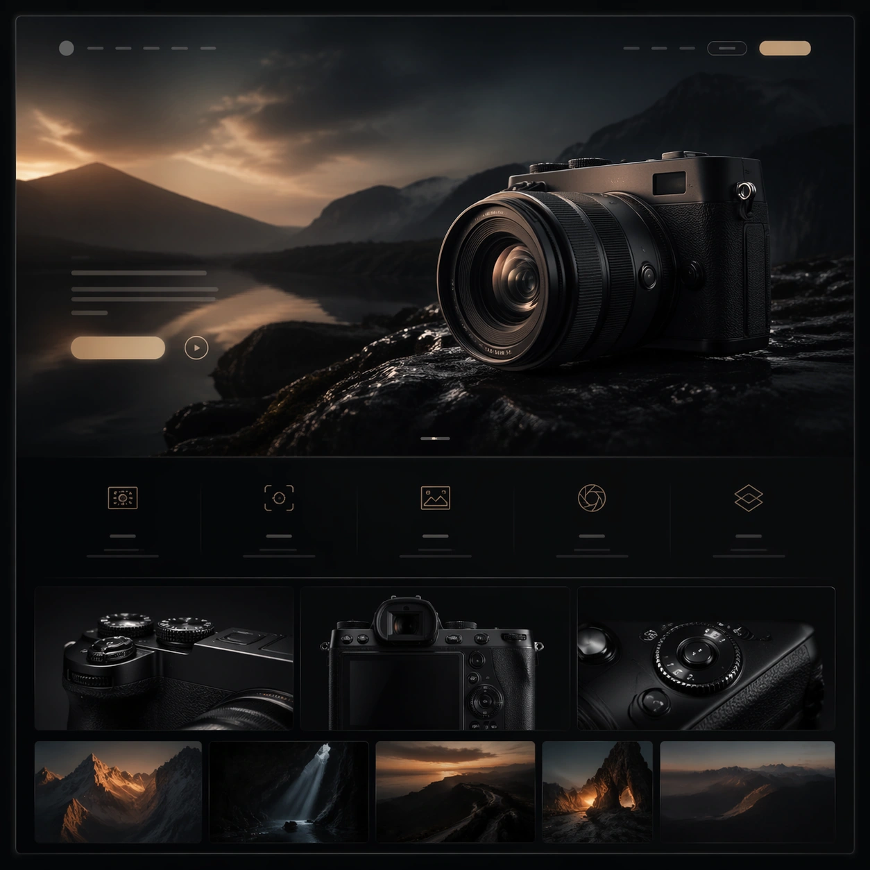
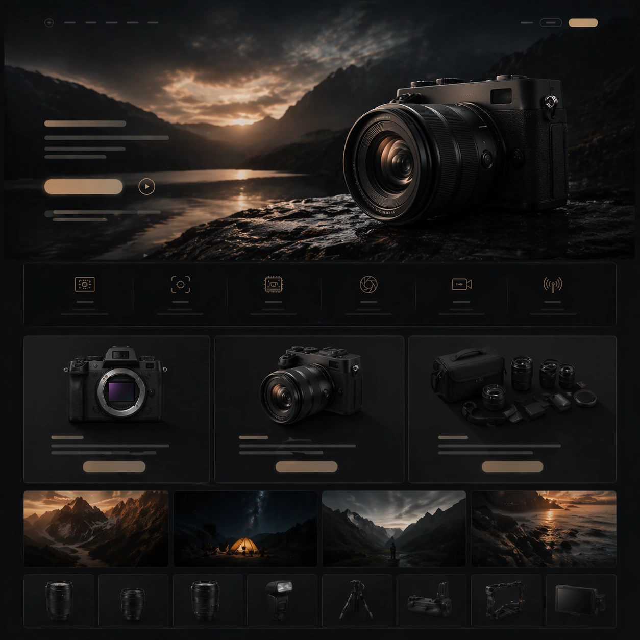
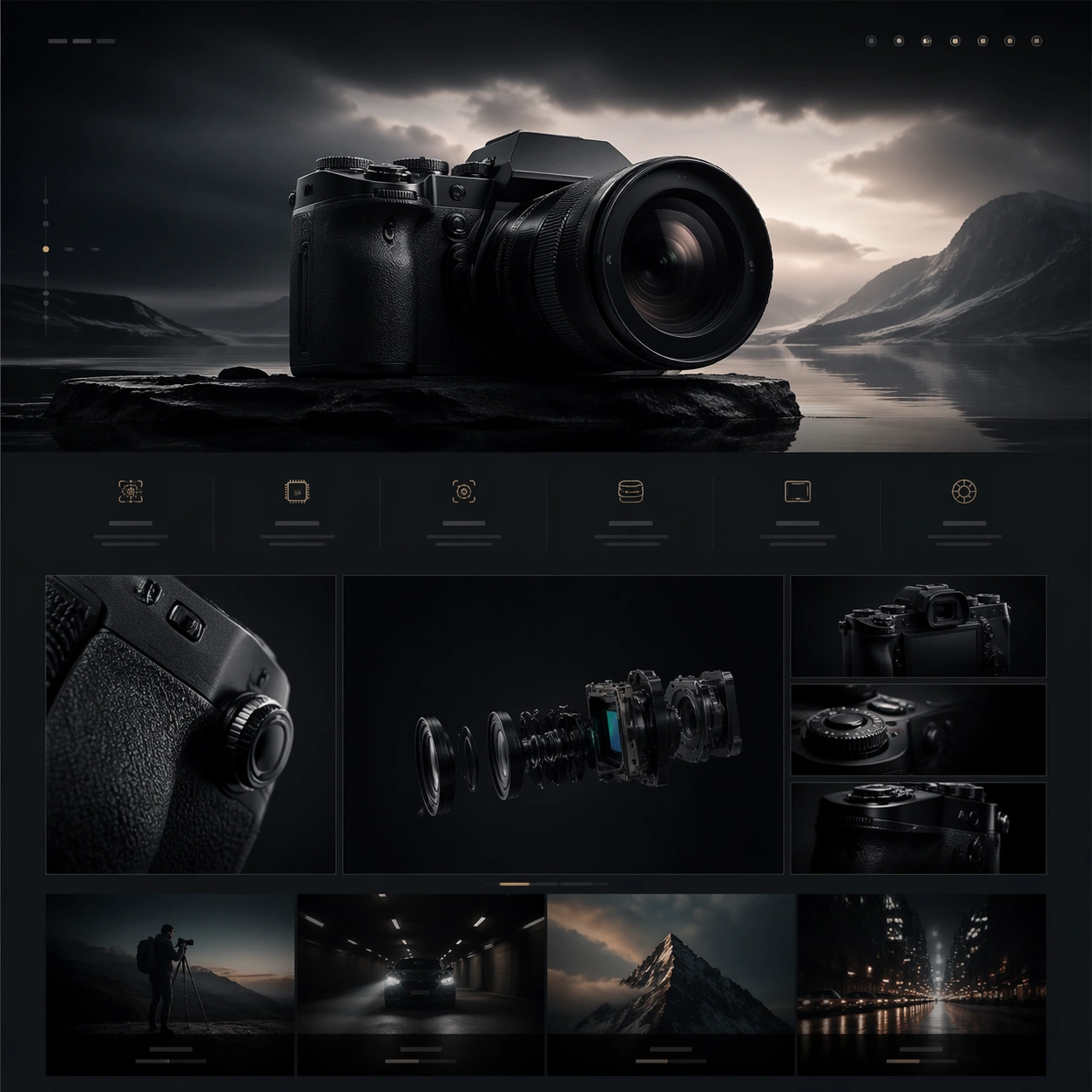
Example generated from “Cinematic Hardware Microsite — Reference Hero Scene”
GPT Image 2en

Scene: A square-framed premium website still designed for Cinematic Hardware Microsite. The image should feel like a cinematic hardware microsite captured at its most polished moment: controlled contrast, glossy but believable materials, deep atmosphere, and a disciplined web-art-direction rhythm. Use the square crop to show a complete webpage moment inside the frame, with clear zones for hero media, quiet non-legible interface rails, and elegant spacing rather than a flat generic UI. Subject: Establish the master visual language for the microsite hero with one flagship hardware object, one immersive environment, and one calm but unmistakable launch-page hierarchy. Draw on this topic direction: Create cinematic microsite visuals for hardware launches, balancing immersive hero storytelling with readable spec sections and conversion modules. Use the theme focus "电影感网页首屏 + 规格模块 + 场景演绎" and the inspiration "掌机、机械键盘、专业相机或桌面音箱新品的长页面网站首屏与内容区组合提案。" as raw material, but render a fictional premium hardware launch rather than referencing any specific brand. Let the main object feel like a plausible camera, handheld console, keyboard, speaker, or audio device, depending on what best serves the composition. Keep the same hero hardware silhouette, lens language, palette, and premium web composition established by the reference frame while redistributing emphasis toward a cinematic landing-page opening. Important details: Honor the topic's core requirement: 比普通 landing page 更强调情绪化场景和硬件美学,但仍要有可读的网页结构。 Preserve premium product-photography realism, clean industrial design cues, layered web hierarchy, and the sense that the page could be sliced into multiple scroll sections. Reflect the frontier claim that ordinary models lose section rhythm and system cohesion in these complex commercial layouts; this image should instead keep the product silhouette, material finish, lighting logic, and module cadence unusually coherent. Success should feel aligned with these goals: 既有高级情绪图,也有真实网页 section 感; 产品外观、材质、配件和使用场景可信; 页面像可以切成多段长图或网页模块; 适合做科技品牌提案或 demo showcase. Use case: Cinematic Hardware Microsite series study 1/4. Constraints: No readable text, no watermark, no logos, preserve exact 1:1 aspect ratio, no browser chrome, no random lorem ipsum, no cheap ecommerce clutter, no floating disconnected UI cards, no distorted product geometry, no extra hands unless the concept requires them.

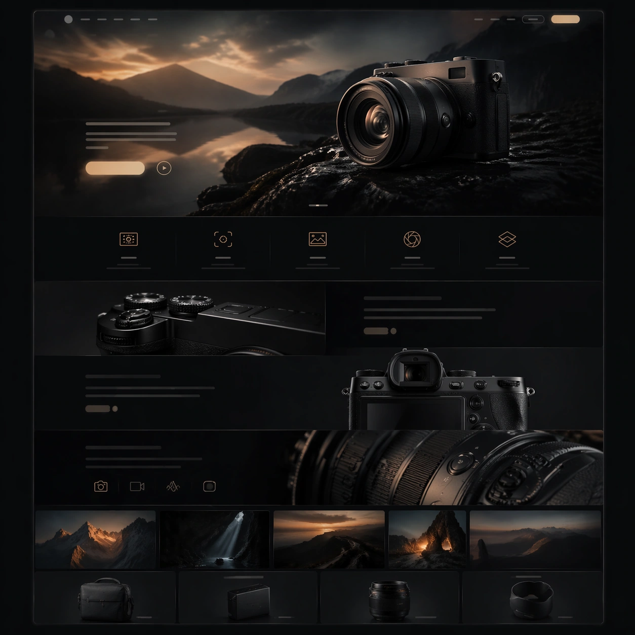
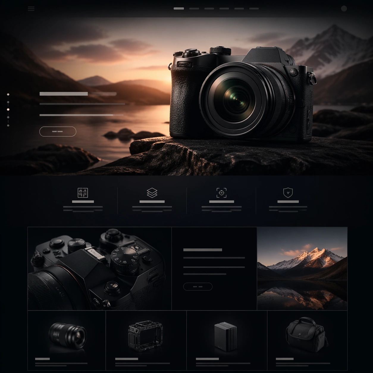
Example generated from “Cinematic Hardware Microsite — Scroll Feature Rhythm”
GPT Image 2en

Scene: A square-framed premium website still designed for Cinematic Hardware Microsite. The image should feel like a cinematic hardware microsite captured at its most polished moment: controlled contrast, glossy but believable materials, deep atmosphere, and a disciplined web-art-direction rhythm. Use the square crop to show a complete webpage moment inside the frame, with clear zones for hero media, quiet non-legible interface rails, and elegant spacing rather than a flat generic UI. Subject: Translate the same visual language into a scroll-like feature stack with alternating close product crops, supporting scene fragments, and restrained interface rails. Draw on this topic direction: Create cinematic microsite visuals for hardware launches, balancing immersive hero storytelling with readable spec sections and conversion modules. Use the theme focus "电影感网页首屏 + 规格模块 + 场景演绎" and the inspiration "掌机、机械键盘、专业相机或桌面音箱新品的长页面网站首屏与内容区组合提案。" as raw material, but render a fictional premium hardware launch rather than referencing any specific brand. Let the main object feel like a plausible camera, handheld console, keyboard, speaker, or audio device, depending on what best serves the composition. Preserve the reference product identity while shifting the composition into a modular narrative section with alternating hero crops and quieter feature reveals. Important details: Honor the topic's core requirement: 比普通 landing page 更强调情绪化场景和硬件美学,但仍要有可读的网页结构。 Preserve premium product-photography realism, clean industrial design cues, layered web hierarchy, and the sense that the page could be sliced into multiple scroll sections. Reflect the frontier claim that ordinary models lose section rhythm and system cohesion in these complex commercial layouts; this image should instead keep the product silhouette, material finish, lighting logic, and module cadence unusually coherent. Success should feel aligned with these goals: 既有高级情绪图,也有真实网页 section 感; 产品外观、材质、配件和使用场景可信; 页面像可以切成多段长图或网页模块; 适合做科技品牌提案或 demo showcase. Use case: Cinematic Hardware Microsite series study 2/4. Constraints: No readable text, no watermark, no logos, preserve exact 1:1 aspect ratio, no browser chrome, no random lorem ipsum, no cheap ecommerce clutter, no floating disconnected UI cards, no distorted product geometry, no extra hands unless the concept requires them.

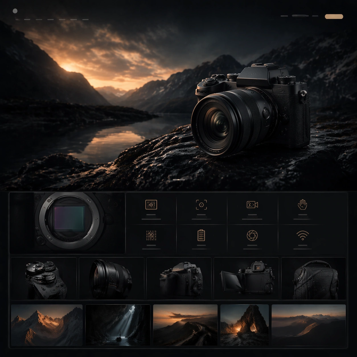
Example generated from “Cinematic Hardware Microsite — Material Spec Closeup”
GPT Image 2en

Scene: A square-framed premium website still designed for Cinematic Hardware Microsite. The image should feel like a cinematic hardware microsite captured at its most polished moment: controlled contrast, glossy but believable materials, deep atmosphere, and a disciplined web-art-direction rhythm. Use the square crop to show a complete webpage moment inside the frame, with clear zones for hero media, quiet non-legible interface rails, and elegant spacing rather than a flat generic UI. Subject: Focus on tactile industrial detail, precision seams, and spec-zone rhythm so the page still feels cinematic while becoming more analytical and conversion-ready. Draw on this topic direction: Create cinematic microsite visuals for hardware launches, balancing immersive hero storytelling with readable spec sections and conversion modules. Use the theme focus "电影感网页首屏 + 规格模块 + 场景演绎" and the inspiration "掌机、机械键盘、专业相机或桌面音箱新品的长页面网站首屏与内容区组合提案。" as raw material, but render a fictional premium hardware launch rather than referencing any specific brand. Let the main object feel like a plausible camera, handheld console, keyboard, speaker, or audio device, depending on what best serves the composition. Preserve the reference hardware finish and lighting logic while compressing the scene into a detail-led section with disciplined spec panels and macro material drama. Important details: Honor the topic's core requirement: 比普通 landing page 更强调情绪化场景和硬件美学,但仍要有可读的网页结构。 Preserve premium product-photography realism, clean industrial design cues, layered web hierarchy, and the sense that the page could be sliced into multiple scroll sections. Reflect the frontier claim that ordinary models lose section rhythm and system cohesion in these complex commercial layouts; this image should instead keep the product silhouette, material finish, lighting logic, and module cadence unusually coherent. Success should feel aligned with these goals: 既有高级情绪图,也有真实网页 section 感; 产品外观、材质、配件和使用场景可信; 页面像可以切成多段长图或网页模块; 适合做科技品牌提案或 demo showcase. Use case: Cinematic Hardware Microsite series study 3/4. Constraints: No readable text, no watermark, no logos, preserve exact 1:1 aspect ratio, no browser chrome, no random lorem ipsum, no cheap ecommerce clutter, no floating disconnected UI cards, no distorted product geometry, no extra hands unless the concept requires them.

Example generated from “Cinematic Hardware Microsite — Conversion Finale Frame”
GPT Image 2en

Scene: A square-framed premium website still designed for Cinematic Hardware Microsite. The image should feel like a cinematic hardware microsite captured at its most polished moment: controlled contrast, glossy but believable materials, deep atmosphere, and a disciplined web-art-direction rhythm. Use the square crop to show a complete webpage moment inside the frame, with clear zones for hero media, quiet non-legible interface rails, and elegant spacing rather than a flat generic UI. Subject: Resolve the launch narrative into a conversion-ready closing section with pricing-zone structure, accessory context, and one final premium hardware beauty shot. Draw on this topic direction: Create cinematic microsite visuals for hardware launches, balancing immersive hero storytelling with readable spec sections and conversion modules. Use the theme focus "电影感网页首屏 + 规格模块 + 场景演绎" and the inspiration "掌机、机械键盘、专业相机或桌面音箱新品的长页面网站首屏与内容区组合提案。" as raw material, but render a fictional premium hardware launch rather than referencing any specific brand. Let the main object feel like a plausible camera, handheld console, keyboard, speaker, or audio device, depending on what best serves the composition. Preserve the reference product identity while reframing it as the decisive finale of the microsite, with stronger CTA hierarchy and cleaner concluding composition. Important details: Honor the topic's core requirement: 比普通 landing page 更强调情绪化场景和硬件美学,但仍要有可读的网页结构。 Preserve premium product-photography realism, clean industrial design cues, layered web hierarchy, and the sense that the page could be sliced into multiple scroll sections. Reflect the frontier claim that ordinary models lose section rhythm and system cohesion in these complex commercial layouts; this image should instead keep the product silhouette, material finish, lighting logic, and module cadence unusually coherent. Success should feel aligned with these goals: 既有高级情绪图,也有真实网页 section 感; 产品外观、材质、配件和使用场景可信; 页面像可以切成多段长图或网页模块; 适合做科技品牌提案或 demo showcase. Use case: Cinematic Hardware Microsite series study 4/4. Constraints: No readable text, no watermark, no logos, preserve exact 1:1 aspect ratio, no browser chrome, no random lorem ipsum, no cheap ecommerce clutter, no floating disconnected UI cards, no distorted product geometry, no extra hands unless the concept requires them.

Example generated from “Cinematic Hardware Microsite — Lifestyle Usage Panel”
GPT Image 2en

Scene: A square-framed premium website still designed for Cinematic Hardware Microsite. The image should feel like a cinematic hardware microsite captured at its most polished moment: controlled contrast, glossy but believable materials, deep atmosphere, and a disciplined web-art-direction rhythm. Use the square crop to show a complete webpage moment inside the frame, with clear zones for hero media, quiet non-legible interface rails, and elegant spacing rather than a flat generic UI. Subject: Stage the hardware in believable use within an environment that feels emotionally rich yet clearly organized for a premium technology microsite. Draw on this topic direction: Create cinematic microsite visuals for hardware launches, balancing immersive hero storytelling with readable spec sections and conversion modules. Use the theme focus "电影感网页首屏 + 规格模块 + 场景演绎" and the inspiration "掌机、机械键盘、专业相机或桌面音箱新品的长页面网站首屏与内容区组合提案。" as raw material, but render a fictional premium hardware launch rather than referencing any specific brand. Let the main object feel like a plausible camera, handheld console, keyboard, speaker, or audio device, depending on what best serves the composition. Make the hardware interaction feel credible and aspirational without turning the image into a generic candid photo or messy editorial spread. Important details: Honor the topic's core requirement: 比普通 landing page 更强调情绪化场景和硬件美学,但仍要有可读的网页结构。 Preserve premium product-photography realism, clean industrial design cues, layered web hierarchy, and the sense that the page could be sliced into multiple scroll sections. Reflect the frontier claim that ordinary models lose section rhythm and system cohesion in these complex commercial layouts; this image should instead keep the product silhouette, material finish, lighting logic, and module cadence unusually coherent. Success should feel aligned with these goals: 既有高级情绪图,也有真实网页 section 感; 产品外观、材质、配件和使用场景可信; 页面像可以切成多段长图或网页模块; 适合做科技品牌提案或 demo showcase. Use case: Cinematic Hardware Microsite single study 2/5. Constraints: No readable text, no watermark, no logos, preserve exact 1:1 aspect ratio, no browser chrome, no random lorem ipsum, no cheap ecommerce clutter, no floating disconnected UI cards, no distorted product geometry, no extra hands unless the concept requires them.

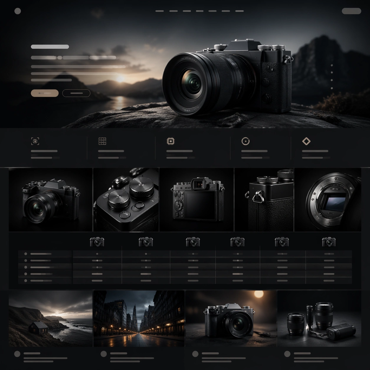
Example generated from “Cinematic Hardware Microsite — Module Comparison Grid”
GPT Image 2en

Scene: A square-framed premium website still designed for Cinematic Hardware Microsite. The image should feel like a cinematic hardware microsite captured at its most polished moment: controlled contrast, glossy but believable materials, deep atmosphere, and a disciplined web-art-direction rhythm. Use the square crop to show a complete webpage moment inside the frame, with clear zones for hero media, quiet non-legible interface rails, and elegant spacing rather than a flat generic UI. Subject: Build a disciplined comparison grid with repeated product angles, cropped details, and non-legible information blocks that still read as a polished web section. Draw on this topic direction: Create cinematic microsite visuals for hardware launches, balancing immersive hero storytelling with readable spec sections and conversion modules. Use the theme focus "电影感网页首屏 + 规格模块 + 场景演绎" and the inspiration "掌机、机械键盘、专业相机或桌面音箱新品的长页面网站首屏与内容区组合提案。" as raw material, but render a fictional premium hardware launch rather than referencing any specific brand. Let the main object feel like a plausible camera, handheld console, keyboard, speaker, or audio device, depending on what best serves the composition. Keep every panel aligned and campaign-like, with no random dashboard clutter and no actual readable typography. Important details: Honor the topic's core requirement: 比普通 landing page 更强调情绪化场景和硬件美学,但仍要有可读的网页结构。 Preserve premium product-photography realism, clean industrial design cues, layered web hierarchy, and the sense that the page could be sliced into multiple scroll sections. Reflect the frontier claim that ordinary models lose section rhythm and system cohesion in these complex commercial layouts; this image should instead keep the product silhouette, material finish, lighting logic, and module cadence unusually coherent. Success should feel aligned with these goals: 既有高级情绪图,也有真实网页 section 感; 产品外观、材质、配件和使用场景可信; 页面像可以切成多段长图或网页模块; 适合做科技品牌提案或 demo showcase. Use case: Cinematic Hardware Microsite single study 3/5. Constraints: No readable text, no watermark, no logos, preserve exact 1:1 aspect ratio, no browser chrome, no random lorem ipsum, no cheap ecommerce clutter, no floating disconnected UI cards, no distorted product geometry, no extra hands unless the concept requires them.

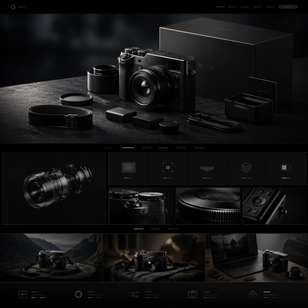
Example generated from “Cinematic Hardware Microsite — Packaging Accessory Card”
GPT Image 2en

Scene: A square-framed premium website still designed for Cinematic Hardware Microsite. The image should feel like a cinematic hardware microsite captured at its most polished moment: controlled contrast, glossy but believable materials, deep atmosphere, and a disciplined web-art-direction rhythm. Use the square crop to show a complete webpage moment inside the frame, with clear zones for hero media, quiet non-legible interface rails, and elegant spacing rather than a flat generic UI. Subject: Show the hardware beside packaging elements, charging parts, and tactile closeups so the page can sell completeness, ritual, and industrial finish. Draw on this topic direction: Create cinematic microsite visuals for hardware launches, balancing immersive hero storytelling with readable spec sections and conversion modules. Use the theme focus "电影感网页首屏 + 规格模块 + 场景演绎" and the inspiration "掌机、机械键盘、专业相机或桌面音箱新品的长页面网站首屏与内容区组合提案。" as raw material, but render a fictional premium hardware launch rather than referencing any specific brand. Let the main object feel like a plausible camera, handheld console, keyboard, speaker, or audio device, depending on what best serves the composition. Emphasize packaging realism and accessory hierarchy without making the layout feel like a crowded marketplace listing. Important details: Honor the topic's core requirement: 比普通 landing page 更强调情绪化场景和硬件美学,但仍要有可读的网页结构。 Preserve premium product-photography realism, clean industrial design cues, layered web hierarchy, and the sense that the page could be sliced into multiple scroll sections. Reflect the frontier claim that ordinary models lose section rhythm and system cohesion in these complex commercial layouts; this image should instead keep the product silhouette, material finish, lighting logic, and module cadence unusually coherent. Success should feel aligned with these goals: 既有高级情绪图,也有真实网页 section 感; 产品外观、材质、配件和使用场景可信; 页面像可以切成多段长图或网页模块; 适合做科技品牌提案或 demo showcase. Use case: Cinematic Hardware Microsite single study 4/5. Constraints: No readable text, no watermark, no logos, preserve exact 1:1 aspect ratio, no browser chrome, no random lorem ipsum, no cheap ecommerce clutter, no floating disconnected UI cards, no distorted product geometry, no extra hands unless the concept requires them.

Example generated from “Cinematic Hardware Microsite — Campaign Cutdown Mockup”
GPT Image 2en

Scene: A square-framed premium website still designed for Cinematic Hardware Microsite. The image should feel like a cinematic hardware microsite captured at its most polished moment: controlled contrast, glossy but believable materials, deep atmosphere, and a disciplined web-art-direction rhythm. Use the square crop to show a complete webpage moment inside the frame, with clear zones for hero media, quiet non-legible interface rails, and elegant spacing rather than a flat generic UI. Subject: Translate the cinematic hardware launch language into a tighter crop suitable for banners, card placements, or social promo tiles while retaining premium clarity. Draw on this topic direction: Create cinematic microsite visuals for hardware launches, balancing immersive hero storytelling with readable spec sections and conversion modules. Use the theme focus "电影感网页首屏 + 规格模块 + 场景演绎" and the inspiration "掌机、机械键盘、专业相机或桌面音箱新品的长页面网站首屏与内容区组合提案。" as raw material, but render a fictional premium hardware launch rather than referencing any specific brand. Let the main object feel like a plausible camera, handheld console, keyboard, speaker, or audio device, depending on what best serves the composition. Keep the image modular, branded, and readable at a glance, but avoid readable text, obvious logos, and noisy interface decoration. Important details: Honor the topic's core requirement: 比普通 landing page 更强调情绪化场景和硬件美学,但仍要有可读的网页结构。 Preserve premium product-photography realism, clean industrial design cues, layered web hierarchy, and the sense that the page could be sliced into multiple scroll sections. Reflect the frontier claim that ordinary models lose section rhythm and system cohesion in these complex commercial layouts; this image should instead keep the product silhouette, material finish, lighting logic, and module cadence unusually coherent. Success should feel aligned with these goals: 既有高级情绪图,也有真实网页 section 感; 产品外观、材质、配件和使用场景可信; 页面像可以切成多段长图或网页模块; 适合做科技品牌提案或 demo showcase. Use case: Cinematic Hardware Microsite single study 5/5. Constraints: No readable text, no watermark, no logos, preserve exact 1:1 aspect ratio, no browser chrome, no random lorem ipsum, no cheap ecommerce clutter, no floating disconnected UI cards, no distorted product geometry, no extra hands unless the concept requires them.

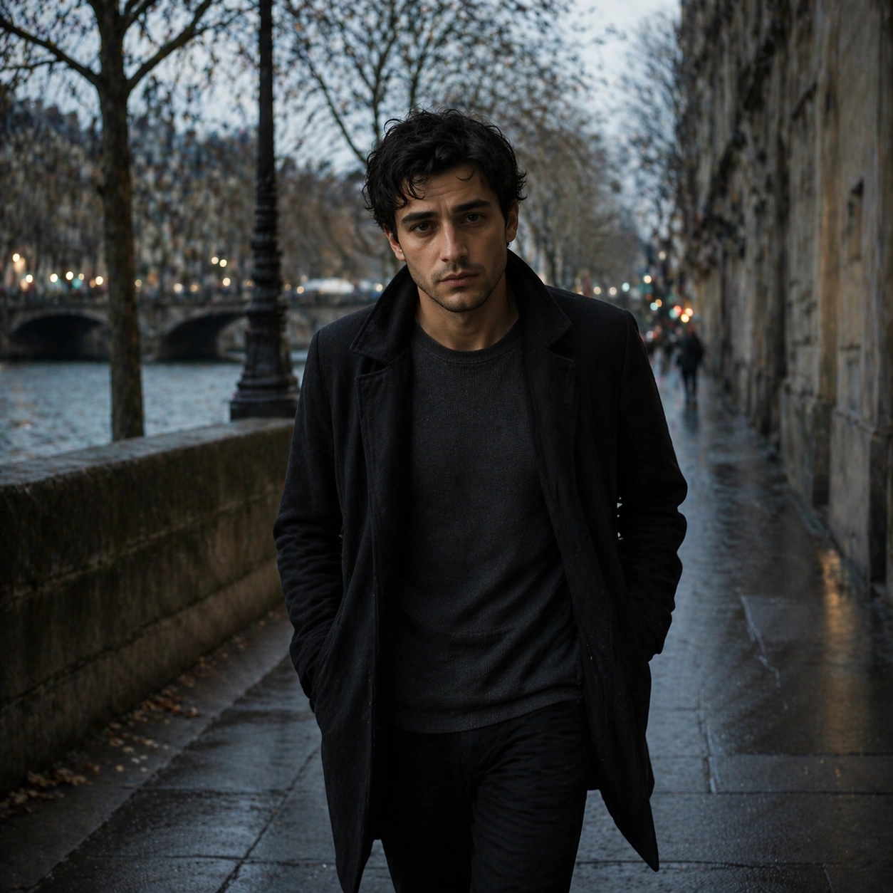
Example generated from “Cinematic Story Portrait Sequence — Reference Character Anchor”
GPT Image 2en

Scene: Create a square 1:1 portrait image for Cinematic Story Portrait Sequence. Use a premium story-led portrait setup with calm atmosphere, cinematic light discipline, and enough detail to define the recurring character. The frame should feel like a finished professional deliverable rather than a casual snapshot, with clear lens discipline, believable light falloff, and a palette that directly supports Build portrait sequences that feel like stills from a character-driven film, with emotional continuity, scene logic, and camera-language variation.. Keep enough surrounding space and compositional control for gallery, research, campaign, or approval-board reuse while staying photoreal and human-scaled. Subject: Center one film protagonist with pale olive skin, tired expressive eyes, slightly tousled dark hair, and a grounded natural build. Establish the exact face, hair base, body proportions, and costume baseline that later story beats must preserve. Use the example direction from the brief as grounding context: Build portrait sequences that feel like stills from a character-driven film, with emotional continuity, scene logic, and camera-language variation.. Wardrobe, lighting, environment, and pose may shift to serve this variation, but the viewer must immediately understand that the same reference identity is still in front of the camera. Important details: This backlog line is difficult because Build portrait sequences that feel like stills from a character-driven film, with emotional continuity, scene logic, and camera-language variation.. Preserve skin tone family, bone structure, eye spacing, nose shape, mouth shape, hairline logic, shoulder width, and overall body read across the entire series. preserve exact face / hair base / body proportions from the reference model. This is the anchor portrait for a narrative sequence, so recognition matters more than spectacle. Avoid the common failure described in the brief: ordinary image models often lose likeness once styling, lighting, or layout changes enter the frame. Success should feel like the result should feel professionally usable, coherent, and clearly built around one stable human identity. Use case: Cinematic Story Portrait Sequence series study 1/9, the baseline character portrait. Constraints: No readable text, no watermark, no logos, preserve exact 1:1 aspect ratio, preserve exact face / hair base / body proportions from the reference model, no crowd, no unreadable poster text, no genre clutter, no face ambiguity.

Example generated from “Cinematic Story Portrait Sequence — Interior Scene”
GPT Image 2en

Scene: Create a square 1:1 portrait image for Cinematic Story Portrait Sequence. Use a carefully staged room or interior with motivated light, layered depth, and one clear emotional focus. The frame should feel like a finished professional deliverable rather than a casual snapshot, with clear lens discipline, believable light falloff, and a palette that directly supports Build portrait sequences that feel like stills from a character-driven film, with emotional continuity, scene logic, and camera-language variation.. Keep enough surrounding space and compositional control for gallery, research, campaign, or approval-board reuse while staying photoreal and human-scaled. Subject: Center one film protagonist with pale olive skin, tired expressive eyes, slightly tousled dark hair, and a grounded natural build. Place the same character into a story situation without changing who they are. Preserve the anchor identity even as costume texture or environment becomes richer. Use the example direction from the brief as grounding context: Build portrait sequences that feel like stills from a character-driven film, with emotional continuity, scene logic, and camera-language variation.. Wardrobe, lighting, environment, and pose may shift to serve this variation, but the viewer must immediately understand that the same reference identity is still in front of the camera. Important details: This backlog line is difficult because Build portrait sequences that feel like stills from a character-driven film, with emotional continuity, scene logic, and camera-language variation.. Preserve skin tone family, bone structure, eye spacing, nose shape, mouth shape, hairline logic, shoulder width, and overall body read across the entire series. preserve exact face / hair base / body proportions from the reference model. The scene may feel cinematic, but likeness still outranks atmosphere. Avoid the common failure described in the brief: ordinary image models often lose likeness once styling, lighting, or layout changes enter the frame. Success should feel like the result should feel professionally usable, coherent, and clearly built around one stable human identity. Use case: Cinematic Story Portrait Sequence series study 2/9, an interior story beat. Constraints: No readable text, no watermark, no logos, preserve exact 1:1 aspect ratio, preserve exact face / hair base / body proportions from the reference model, no extra protagonists, no busy set dressing, no drastic age shift, no unrelated props.

Example generated from “Cinematic Story Portrait Sequence — Transition Pause”
GPT Image 2en

Scene: Create a square 1:1 portrait image for Cinematic Story Portrait Sequence. Use a hallway, alley, corridor, or threshold frame with directional light and clean silhouette control. The frame should feel like a finished professional deliverable rather than a casual snapshot, with clear lens discipline, believable light falloff, and a palette that directly supports Build portrait sequences that feel like stills from a character-driven film, with emotional continuity, scene logic, and camera-language variation.. Keep enough surrounding space and compositional control for gallery, research, campaign, or approval-board reuse while staying photoreal and human-scaled. Subject: Center one film protagonist with pale olive skin, tired expressive eyes, slightly tousled dark hair, and a grounded natural build. Use a transition space to show the same character in motion or pause while preserving exact face / hair base / body proportions from the reference model. Use the example direction from the brief as grounding context: Build portrait sequences that feel like stills from a character-driven film, with emotional continuity, scene logic, and camera-language variation.. Wardrobe, lighting, environment, and pose may shift to serve this variation, but the viewer must immediately understand that the same reference identity is still in front of the camera. Important details: This backlog line is difficult because Build portrait sequences that feel like stills from a character-driven film, with emotional continuity, scene logic, and camera-language variation.. Preserve skin tone family, bone structure, eye spacing, nose shape, mouth shape, hairline logic, shoulder width, and overall body read across the entire series. preserve exact face / hair base / body proportions from the reference model. This image should feel like the next shot in one film, not a new casting choice. Avoid the common failure described in the brief: ordinary image models often lose likeness once styling, lighting, or layout changes enter the frame. Success should feel like the result should feel professionally usable, coherent, and clearly built around one stable human identity. Use case: Cinematic Story Portrait Sequence series study 3/9, a transitional pause portrait. Constraints: No readable text, no watermark, no logos, preserve exact 1:1 aspect ratio, preserve exact face / hair base / body proportions from the reference model, no hidden face, no body warp, no action blur, no background signage.

Example generated from “Cinematic Story Portrait Sequence — Close-up Emotion”
GPT Image 2en

Scene: Create a square 1:1 portrait image for Cinematic Story Portrait Sequence. Use a tighter crop with visible skin texture, lashes, breath, and emotional tension controlled by cinematic light. The frame should feel like a finished professional deliverable rather than a casual snapshot, with clear lens discipline, believable light falloff, and a palette that directly supports Build portrait sequences that feel like stills from a character-driven film, with emotional continuity, scene logic, and camera-language variation.. Keep enough surrounding space and compositional control for gallery, research, campaign, or approval-board reuse while staying photoreal and human-scaled. Subject: Center one film protagonist with pale olive skin, tired expressive eyes, slightly tousled dark hair, and a grounded natural build. Move closer to the same face to test emotional precision without any identity drift. Use the example direction from the brief as grounding context: Build portrait sequences that feel like stills from a character-driven film, with emotional continuity, scene logic, and camera-language variation.. Wardrobe, lighting, environment, and pose may shift to serve this variation, but the viewer must immediately understand that the same reference identity is still in front of the camera. Important details: This backlog line is difficult because Build portrait sequences that feel like stills from a character-driven film, with emotional continuity, scene logic, and camera-language variation.. Preserve skin tone family, bone structure, eye spacing, nose shape, mouth shape, hairline logic, shoulder width, and overall body read across the entire series. preserve exact face / hair base / body proportions from the reference model. Every small facial marker should still match the reference anchor. Avoid the common failure described in the brief: ordinary image models often lose likeness once styling, lighting, or layout changes enter the frame. Success should feel like the result should feel professionally usable, coherent, and clearly built around one stable human identity. Use case: Cinematic Story Portrait Sequence series study 4/9, a close emotional portrait. Constraints: No readable text, no watermark, no logos, preserve exact 1:1 aspect ratio, preserve exact face / hair base / body proportions from the reference model, no tears that melt features, no face reshaping, no extreme beauty retouching, no second person.

Example generated from “Cinematic Story Portrait Sequence — Exterior Walk”
GPT Image 2en

Scene: Create a square 1:1 portrait image for Cinematic Story Portrait Sequence. Use a believable outdoor setup with motivated practical light and enough environment to imply story stakes. The frame should feel like a finished professional deliverable rather than a casual snapshot, with clear lens discipline, believable light falloff, and a palette that directly supports Build portrait sequences that feel like stills from a character-driven film, with emotional continuity, scene logic, and camera-language variation.. Keep enough surrounding space and compositional control for gallery, research, campaign, or approval-board reuse while staying photoreal and human-scaled. Subject: Center one film protagonist with pale olive skin, tired expressive eyes, slightly tousled dark hair, and a grounded natural build. Keep the same character exact while expanding to a wider frame that shows gait, shoulders, and costume silhouette in context. Use the example direction from the brief as grounding context: Build portrait sequences that feel like stills from a character-driven film, with emotional continuity, scene logic, and camera-language variation.. Wardrobe, lighting, environment, and pose may shift to serve this variation, but the viewer must immediately understand that the same reference identity is still in front of the camera. Important details: This backlog line is difficult because Build portrait sequences that feel like stills from a character-driven film, with emotional continuity, scene logic, and camera-language variation.. Preserve skin tone family, bone structure, eye spacing, nose shape, mouth shape, hairline logic, shoulder width, and overall body read across the entire series. preserve exact face / hair base / body proportions from the reference model. Body proportions must stay stable even in motion-aware framing. Avoid the common failure described in the brief: ordinary image models often lose likeness once styling, lighting, or layout changes enter the frame. Success should feel like the result should feel professionally usable, coherent, and clearly built around one stable human identity. Use case: Cinematic Story Portrait Sequence series study 5/9, an exterior walk or movement frame. Constraints: No readable text, no watermark, no logos, preserve exact 1:1 aspect ratio, preserve exact face / hair base / body proportions from the reference model, no action-movie explosion cliche, no giant environment spectacle, no body elongation, no crowd confusion.

Example generated from “Cinematic Story Portrait Sequence — Profile Shadow”
GPT Image 2en

Scene: Create a square 1:1 portrait image for Cinematic Story Portrait Sequence. Use a moody side-light frame with rich shadow design, clean negative space, and readable facial geometry. The frame should feel like a finished professional deliverable rather than a casual snapshot, with clear lens discipline, believable light falloff, and a palette that directly supports Build portrait sequences that feel like stills from a character-driven film, with emotional continuity, scene logic, and camera-language variation.. Keep enough surrounding space and compositional control for gallery, research, campaign, or approval-board reuse while staying photoreal and human-scaled. Subject: Center one film protagonist with pale olive skin, tired expressive eyes, slightly tousled dark hair, and a grounded natural build. Use profile and shadow to deepen mood, but preserve the exact nose bridge, jawline, ear shape, and hair base from the reference. Use the example direction from the brief as grounding context: Build portrait sequences that feel like stills from a character-driven film, with emotional continuity, scene logic, and camera-language variation.. Wardrobe, lighting, environment, and pose may shift to serve this variation, but the viewer must immediately understand that the same reference identity is still in front of the camera. Important details: This backlog line is difficult because Build portrait sequences that feel like stills from a character-driven film, with emotional continuity, scene logic, and camera-language variation.. Preserve skin tone family, bone structure, eye spacing, nose shape, mouth shape, hairline logic, shoulder width, and overall body read across the entire series. preserve exact face / hair base / body proportions from the reference model. This should feel psychologically sharper, not visually inconsistent. Avoid the common failure described in the brief: ordinary image models often lose likeness once styling, lighting, or layout changes enter the frame. Success should feel like the result should feel professionally usable, coherent, and clearly built around one stable human identity. Use case: Cinematic Story Portrait Sequence series study 6/9, a profile or shadow-driven portrait. Constraints: No readable text, no watermark, no logos, preserve exact 1:1 aspect ratio, preserve exact face / hair base / body proportions from the reference model, no crushed shadow mush, no altered profile, no costume reset, no thriller poster text.

Example generated from “Cinematic Story Portrait Sequence — Detail Prop Frame”
GPT Image 2en

Scene: Create a square 1:1 portrait image for Cinematic Story Portrait Sequence. Use a tighter narrative crop that lets one object, garment edge, or environmental clue support the portrait without stealing focus. The frame should feel like a finished professional deliverable rather than a casual snapshot, with clear lens discipline, believable light falloff, and a palette that directly supports Build portrait sequences that feel like stills from a character-driven film, with emotional continuity, scene logic, and camera-language variation.. Keep enough surrounding space and compositional control for gallery, research, campaign, or approval-board reuse while staying photoreal and human-scaled. Subject: Center one film protagonist with pale olive skin, tired expressive eyes, slightly tousled dark hair, and a grounded natural build. Keep the same character identity dominant while allowing one prop or costume detail to strengthen the story world. Use the example direction from the brief as grounding context: Build portrait sequences that feel like stills from a character-driven film, with emotional continuity, scene logic, and camera-language variation.. Wardrobe, lighting, environment, and pose may shift to serve this variation, but the viewer must immediately understand that the same reference identity is still in front of the camera. Important details: This backlog line is difficult because Build portrait sequences that feel like stills from a character-driven film, with emotional continuity, scene logic, and camera-language variation.. Preserve skin tone family, bone structure, eye spacing, nose shape, mouth shape, hairline logic, shoulder width, and overall body read across the entire series. preserve exact face / hair base / body proportions from the reference model. The prop exists to deepen narrative context, not to distract from likeness. Avoid the common failure described in the brief: ordinary image models often lose likeness once styling, lighting, or layout changes enter the frame. Success should feel like the result should feel professionally usable, coherent, and clearly built around one stable human identity. Use case: Cinematic Story Portrait Sequence series study 7/9, a detail frame with one prop or costume clue. Constraints: No readable text, no watermark, no logos, preserve exact 1:1 aspect ratio, preserve exact face / hair base / body proportions from the reference model, no branded props, no unreadable newspaper text, no weapon overload, no broken hands.

Example generated from “Cinematic Story Portrait Sequence — Poster Crop”
GPT Image 2en

Scene: Create a square 1:1 portrait image for Cinematic Story Portrait Sequence. Use a cleaner campaign or one-sheet style portrait with deliberate negative space and clear focal hierarchy. The frame should feel like a finished professional deliverable rather than a casual snapshot, with clear lens discipline, believable light falloff, and a palette that directly supports Build portrait sequences that feel like stills from a character-driven film, with emotional continuity, scene logic, and camera-language variation.. Keep enough surrounding space and compositional control for gallery, research, campaign, or approval-board reuse while staying photoreal and human-scaled. Subject: Center one film protagonist with pale olive skin, tired expressive eyes, slightly tousled dark hair, and a grounded natural build. Turn the same character into a poster-worthy portrait without readable text or identity drift. Use the example direction from the brief as grounding context: Build portrait sequences that feel like stills from a character-driven film, with emotional continuity, scene logic, and camera-language variation.. Wardrobe, lighting, environment, and pose may shift to serve this variation, but the viewer must immediately understand that the same reference identity is still in front of the camera. Important details: This backlog line is difficult because Build portrait sequences that feel like stills from a character-driven film, with emotional continuity, scene logic, and camera-language variation.. Preserve skin tone family, bone structure, eye spacing, nose shape, mouth shape, hairline logic, shoulder width, and overall body read across the entire series. preserve exact face / hair base / body proportions from the reference model. This frame should feel usable for key art while staying true to the reference model. Avoid the common failure described in the brief: ordinary image models often lose likeness once styling, lighting, or layout changes enter the frame. Success should feel like the result should feel professionally usable, coherent, and clearly built around one stable human identity. Use case: Cinematic Story Portrait Sequence series study 8/9, a poster-like hero crop. Constraints: No readable text, no watermark, no logos, preserve exact 1:1 aspect ratio, preserve exact face / hair base / body proportions from the reference model, no fake title text, no logo marks, no giant montage collage, no alternate casting.

Example generated from “Cinematic Story Portrait Sequence — Finale Aftermath”
GPT Image 2en

Scene: Create a square 1:1 portrait image for Cinematic Story Portrait Sequence. Use a quieter cinematic frame with residue, dusk, or emotional calm, still anchored by precise portrait craft. The frame should feel like a finished professional deliverable rather than a casual snapshot, with clear lens discipline, believable light falloff, and a palette that directly supports Build portrait sequences that feel like stills from a character-driven film, with emotional continuity, scene logic, and camera-language variation.. Keep enough surrounding space and compositional control for gallery, research, campaign, or approval-board reuse while staying photoreal and human-scaled. Subject: Center one film protagonist with pale olive skin, tired expressive eyes, slightly tousled dark hair, and a grounded natural build. Close the series on the same character, carrying all previous continuity into a final resolved image that still looks like part of the same story arc. Use the example direction from the brief as grounding context: Build portrait sequences that feel like stills from a character-driven film, with emotional continuity, scene logic, and camera-language variation.. Wardrobe, lighting, environment, and pose may shift to serve this variation, but the viewer must immediately understand that the same reference identity is still in front of the camera. Important details: This backlog line is difficult because Build portrait sequences that feel like stills from a character-driven film, with emotional continuity, scene logic, and camera-language variation.. Preserve skin tone family, bone structure, eye spacing, nose shape, mouth shape, hairline logic, shoulder width, and overall body read across the entire series. preserve exact face / hair base / body proportions from the reference model. Mood may soften or darken, but the same-person read cannot weaken. Avoid the common failure described in the brief: ordinary image models often lose likeness once styling, lighting, or layout changes enter the frame. Success should feel like the result should feel professionally usable, coherent, and clearly built around one stable human identity. Use case: Cinematic Story Portrait Sequence series study 9/9, a resolved final aftermath portrait. Constraints: No readable text, no watermark, no logos, preserve exact 1:1 aspect ratio, preserve exact face / hair base / body proportions from the reference model, no sequel-bait crowd scene, no face drift, no genre jump, no decorative smoke overload.

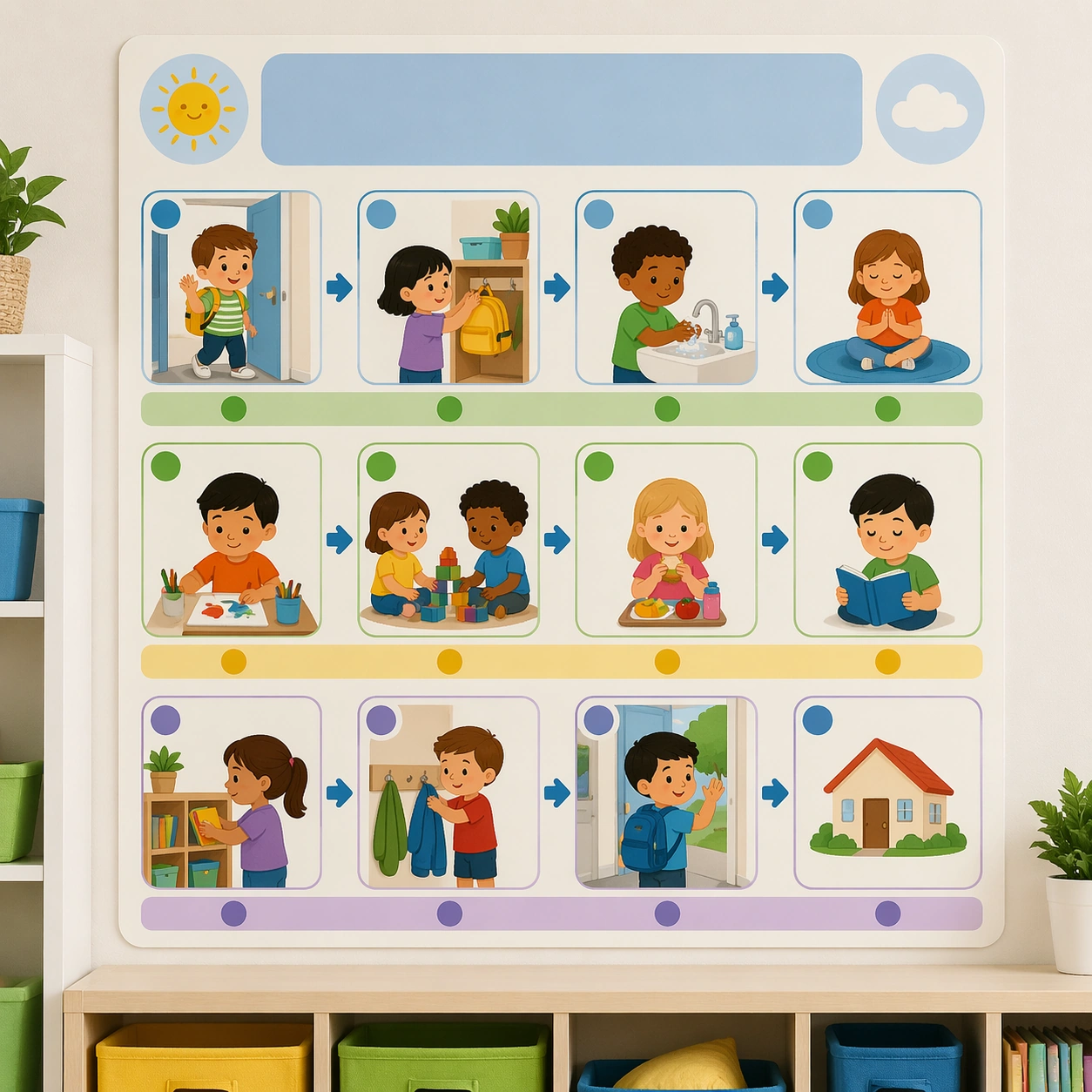
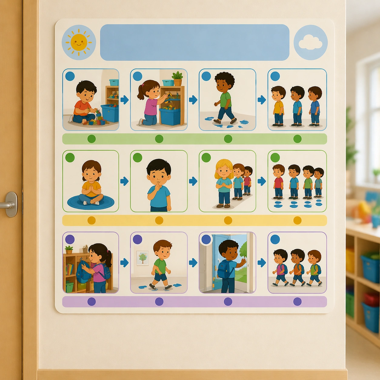
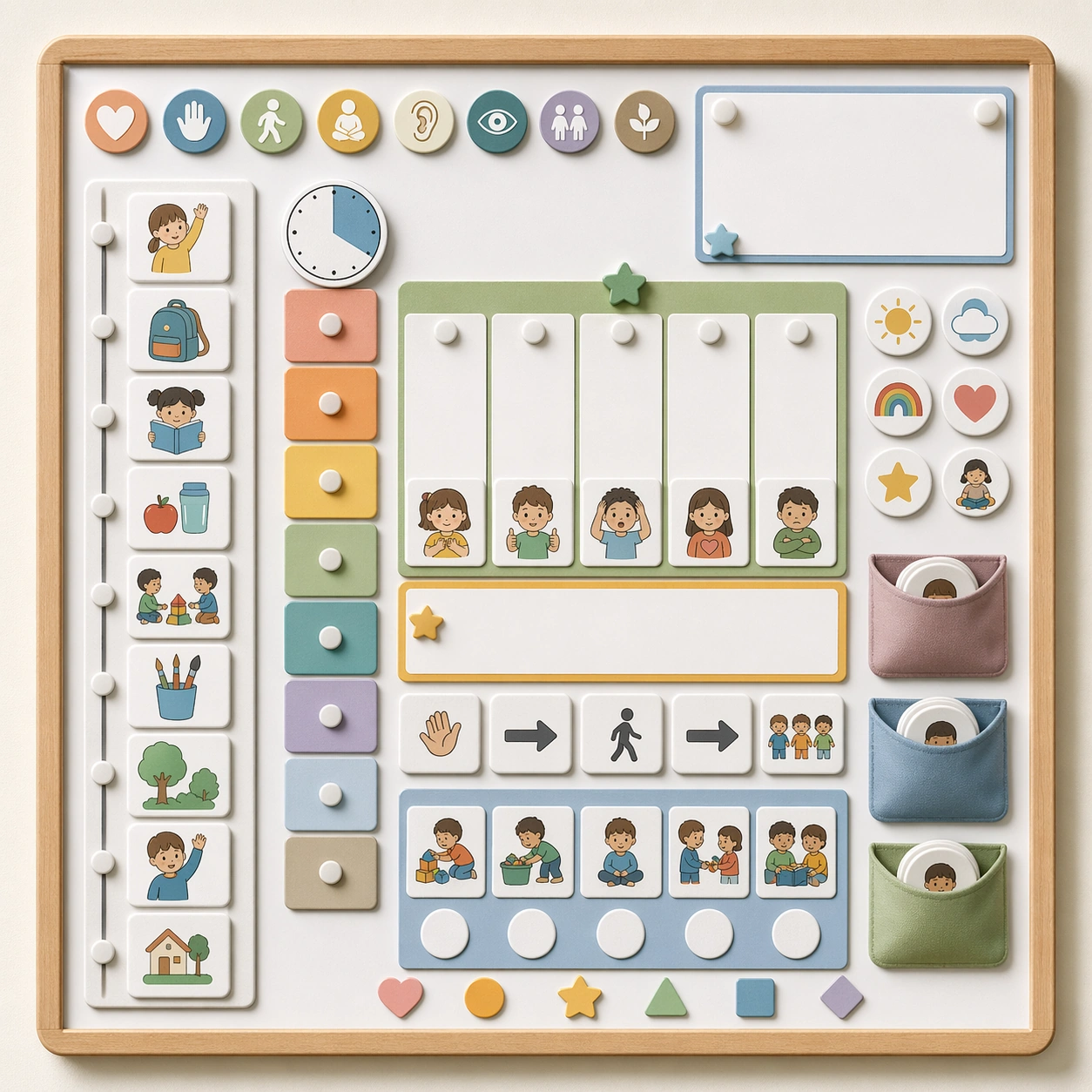
Example generated from “Classroom Routine And Rule Visual Set — Reference Routine Board”
GPT Image 2en

Scene: Create a square straight-on classroom wall poster with clean daylight, matte print texture, and a few soft environmental cues from shelves and cubbies. The asset should feel like a real behavior-support board designed for young children, combining instructional clarity with emotional calm. Keep the square frame balanced, calm, and production-ready so the asset can serve gallery review, research comparison, and real educational delivery at the same time. Subject: Build the poster around a simple daily sequence shown through large pictograms, illustrated children, blank headline zones, and modular step panels. The system should signal transitions, expectations, and order through icons and spacing rather than through strict text rules. The subject matter should feel intentionally selected for a coherent curriculum family rather than like a random decorative assortment. Important details: Keep the tone warm, respectful, and easy to follow. Use rounded blocks, reassuring colors, generous whitespace, and a visual hierarchy that helps children know what comes next at a glance. Preserve the same poster modules, icon scale, blank headline bands, classroom color coding, and pacing rhythm from the reference routine board. Use variation only in the teaching content, supporting props, and scene-specific mood while preserving the core visual system exactly. Use case: Classroom Routine and Rule Visual Set series study 1/4, reference routine board. Constraints: No readable text, no watermark, no logos, preserve exact 1:1 aspect ratio, no readable text, no teacher handwriting, no logos, no cluttered classroom walls, no harsh warning tone, no chaotic sticker overload.

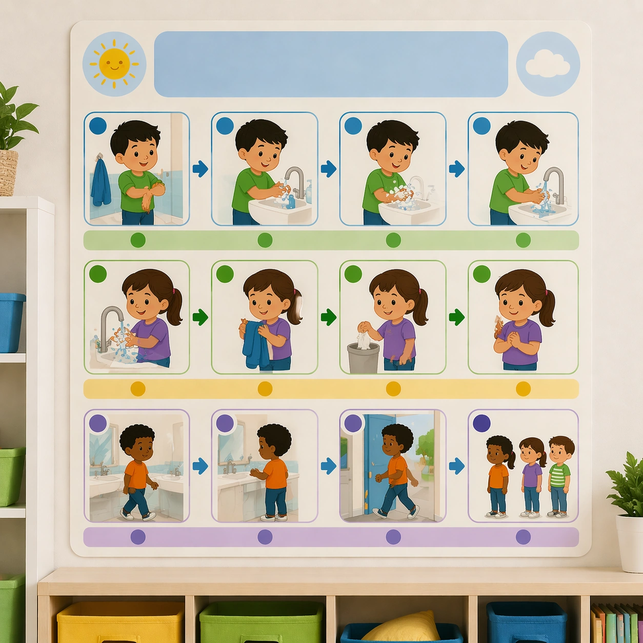
Example generated from “Classroom Routine And Rule Visual Set — Handwashing Sequence Board”
GPT Image 2en

Scene: Keep the same square poster presentation, wall context, daylight softness, and print finish from the reference routine board. The image should read as another coordinated classroom-management asset that belongs in the same elementary or preschool room. Keep the square frame balanced, calm, and production-ready so the asset can serve gallery review, research comparison, and real educational delivery at the same time. Subject: Show the handwashing routine through pictorial steps such as sleeves up, soap, scrub, rinse, dry, and line return, each captured inside the same rounded panel system. Use simple bathroom icons and child-friendly cues, but no real text or numbers. The subject matter should feel intentionally selected for a coherent curriculum family rather than like a random decorative assortment. Important details: Preserve the exact reference layout logic, including icon size, color rhythm, headline bands, and panel spacing. The board should feel actionable and calm rather than corrective or punitive. Preserve the same poster modules, icon scale, blank headline bands, classroom color coding, and pacing rhythm from the reference routine board. Use variation only in the teaching content, supporting props, and scene-specific mood while preserving the core visual system exactly. Use case: Classroom Routine and Rule Visual Set series study 2/4, handwashing sequence board. Constraints: No readable text, no watermark, no logos, preserve exact 1:1 aspect ratio, no readable text, no teacher handwriting, no logos, no cluttered classroom walls, no harsh warning tone, no chaotic sticker overload.

Example generated from “Classroom Routine And Rule Visual Set — Line-Up Transition Board”
GPT Image 2en

Scene: Render the identical square wall-poster mockup again, now situated near a classroom door with soft light and blurred cubbies nearby. The asset should look like a real transition-support poster for moving children from one activity to another smoothly. Keep the square frame balanced, calm, and production-ready so the asset can serve gallery review, research comparison, and real educational delivery at the same time. Subject: Use illustrated children, footprints, waiting icons, quiet-body cues, and a sequence of line-up actions shown visually inside the same poster grid. The structure must make the expected behavior obvious without any written commands. The subject matter should feel intentionally selected for a coherent curriculum family rather than like a random decorative assortment. Important details: Keep the same peaceful discipline as the reference board: rounded panels, stable color codes, and predictable hierarchy. The message should be supportive, concrete, and classroom-ready. Preserve the same poster modules, icon scale, blank headline bands, classroom color coding, and pacing rhythm from the reference routine board. Use variation only in the teaching content, supporting props, and scene-specific mood while preserving the core visual system exactly. Use case: Classroom Routine and Rule Visual Set series study 3/4, line-up transition board. Constraints: No readable text, no watermark, no logos, preserve exact 1:1 aspect ratio, no readable text, no teacher handwriting, no logos, no cluttered classroom walls, no harsh warning tone, no chaotic sticker overload.

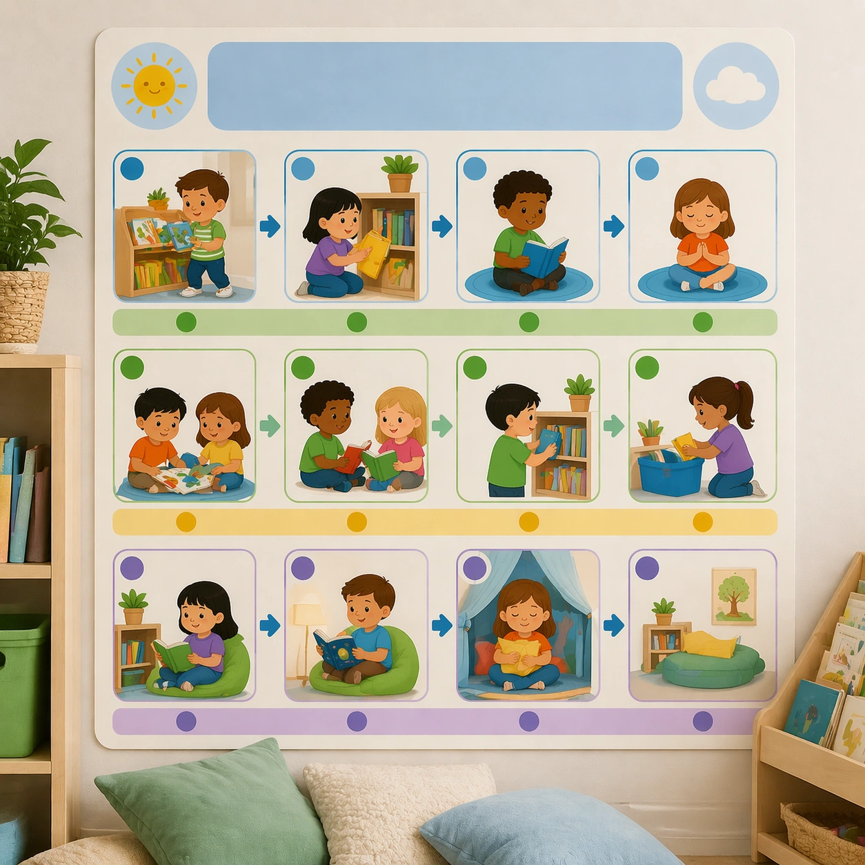
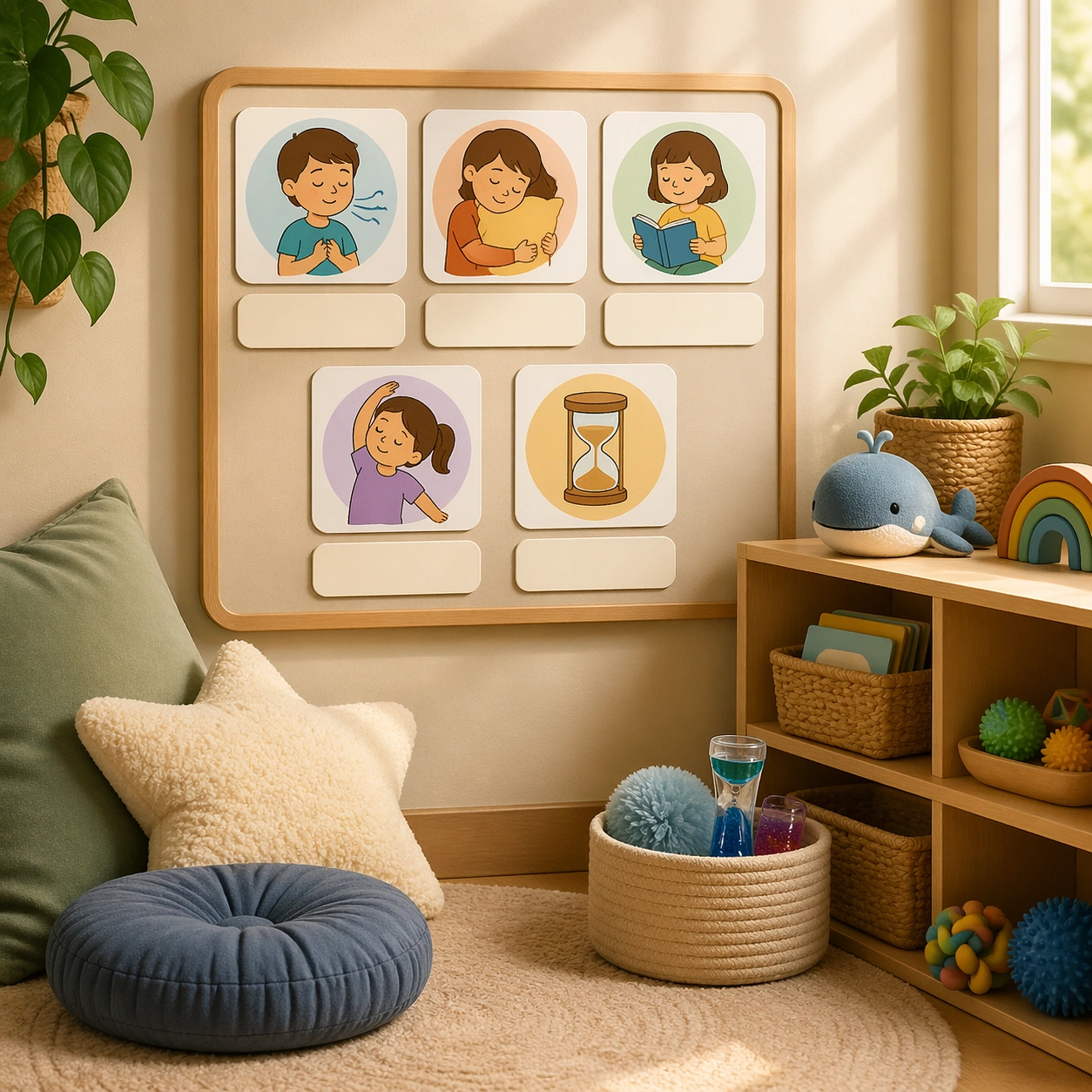
Example generated from “Classroom Routine And Rule Visual Set — Reading Corner Board”
GPT Image 2en

Scene: Return to the same square wall-poster presentation and environmental realism from the reference board, but place the asset near a soft reading nook with cushions and low shelves in the background. The poster should feel like a quiet, literacy-friendly rule board for young readers. Keep the square frame balanced, calm, and production-ready so the asset can serve gallery review, research comparison, and real educational delivery at the same time. Subject: Show expectations for choosing a book, sitting gently, sharing space, returning materials, and quiet reflection through icons, mini scenes, and blank title panels. The visual language should feel consistent with the earlier routine posters while adapting to a calmer reading mood. The subject matter should feel intentionally selected for a coherent curriculum family rather than like a random decorative assortment. Important details: Preserve the full system from the reference board: same panel proportions, icon style, color palette, and whitespace logic. The complete set should read as one coherent classroom-management toolkit. Preserve the same poster modules, icon scale, blank headline bands, classroom color coding, and pacing rhythm from the reference routine board. Use variation only in the teaching content, supporting props, and scene-specific mood while preserving the core visual system exactly. Use case: Classroom Routine and Rule Visual Set series study 4/4, reading corner board. Constraints: No readable text, no watermark, no logos, preserve exact 1:1 aspect ratio, no readable text, no teacher handwriting, no logos, no cluttered classroom walls, no harsh warning tone, no chaotic sticker overload.

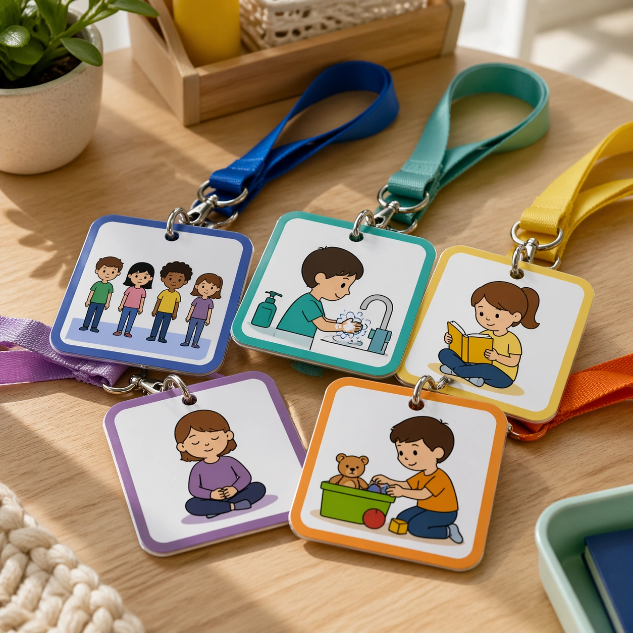
Example generated from “Classroom Routine And Rule Visual Set — Lanyard Mini Cards”
GPT Image 2en

Scene: Create a square product shot of several mini routine cards clipped to lanyards and rings on a teacher table with soft side light. The image should feel like a practical classroom tool launch visual, compact and durable rather than decorative. Keep the square frame balanced, calm, and production-ready so the asset can serve gallery review, research comparison, and real educational delivery at the same time. Subject: The cards should show quick visual cues such as line-up, wash hands, reading, quiet time, and tidy-up using only icons and mini scenes. Keep the pieces clearly coded, sturdy, and easy to scan in a moment of classroom movement. The subject arrangement should feel complete and self-contained, able to stand alone as a real supporting deliverable inside the same education business line. Important details: Favor utility and build quality. Rounded corners, laminated finish, and intuitive color grouping should carry the design, proving the rule system can scale down into portable teacher tools. Keep the visual hierarchy modular, commercially believable, and clearly tied to a real educational use case rather than a generic mood board. Use case: Classroom Routine and Rule Visual Set single study 2/5, lanyard mini cards. Constraints: No readable text, no watermark, no logos, preserve exact 1:1 aspect ratio, no readable text, no logos, no scary warning symbols, no chaotic wall clutter, no generic stock classroom mess, no adult office styling.

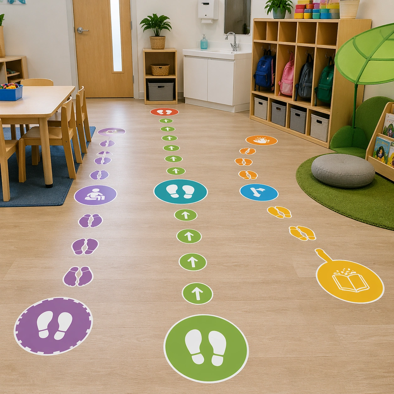
Example generated from “Classroom Routine And Rule Visual Set — Floor Sticker Icons”
GPT Image 2en

Scene: Render a square low-angle classroom-floor scene with neat sticker markers leading between door, sink, cubbies, and reading corner. The image should feel like a practical school-installation photograph used in a facilities or classroom-design guide. Keep the square frame balanced, calm, and production-ready so the asset can serve gallery review, research comparison, and real educational delivery at the same time. Subject: Use footprints, arrows, waiting spots, and station icons in a soft child-friendly palette, sized for actual use in an early-years room. The markers should visually organize movement without turning the room into a loud arcade. The subject arrangement should feel complete and self-contained, able to stand alone as a real supporting deliverable inside the same education business line. Important details: Keep the floor system believable and quietly effective. The asset should communicate classroom choreography and independence through environmental graphics alone. Keep the visual hierarchy modular, commercially believable, and clearly tied to a real educational use case rather than a generic mood board. Use case: Classroom Routine and Rule Visual Set single study 3/5, floor sticker icons. Constraints: No readable text, no watermark, no logos, preserve exact 1:1 aspect ratio, no readable text, no logos, no scary warning symbols, no chaotic wall clutter, no generic stock classroom mess, no adult office styling.

Example generated from “Classroom Routine And Rule Visual Set — Teacher Support Board”
GPT Image 2en

Scene: Create a square editorial board pinned on a neutral wall with mini visual cues, schedule tokens, and magnetic pieces arranged under crisp light. The image should feel like a planning-tool surface from a thoughtfully designed classroom-management system. Keep the square frame balanced, calm, and production-ready so the asset can serve gallery review, research comparison, and real educational delivery at the same time. Subject: Show reusable icons, blank quick-reference panels, transition symbols, and gentle behavior cues that help adults coordinate routines consistently. The design should look specific to early-childhood education, not corporate office planning. The subject arrangement should feel complete and self-contained, able to stand alone as a real supporting deliverable inside the same education business line. Important details: Keep the layout modular, spacious, and genuinely useful. The board should prove the rule system supports adults behind the scenes as well as children in the room. Keep the visual hierarchy modular, commercially believable, and clearly tied to a real educational use case rather than a generic mood board. Use case: Classroom Routine and Rule Visual Set single study 4/5, teacher support board. Constraints: No readable text, no watermark, no logos, preserve exact 1:1 aspect ratio, no readable text, no logos, no scary warning symbols, no chaotic wall clutter, no generic stock classroom mess, no adult office styling.

Example generated from “Classroom Routine And Rule Visual Set — Calm Corner Choice Board”
GPT Image 2en

Scene: Show a square calm-corner setup with one choice board mounted near cushions, sensory tools, and a low shelf under soft afternoon light. The atmosphere should feel reassuring, respectful, and real for an early-childhood classroom. Keep the square frame balanced, calm, and production-ready so the asset can serve gallery review, research comparison, and real educational delivery at the same time. Subject: The board offers visual choices such as breathing, hugging a pillow, reading quietly, stretching, or using a timer, all expressed through icons and blank labels. The scene should support emotional regulation without shame or punishment cues. The subject arrangement should feel complete and self-contained, able to stand alone as a real supporting deliverable inside the same education business line. Important details: Keep the design gentle, spacious, and clearly child-safe. This asset should show that classroom rules can be visualized as support and routine, not just control. Keep the visual hierarchy modular, commercially believable, and clearly tied to a real educational use case rather than a generic mood board. Use case: Classroom Routine and Rule Visual Set single study 5/5, calm corner choice board. Constraints: No readable text, no watermark, no logos, preserve exact 1:1 aspect ratio, no readable text, no logos, no scary warning symbols, no chaotic wall clutter, no generic stock classroom mess, no adult office styling.

Example generated from “Claymation Style — Exploded Arrangement”
GPT Image 2en

Scene: A square CGI or design-visualization frame with calibrated lighting, intentional composition, and premium material rendering. Build the frame around components or accessories separated with clean studio logic. Keep the lighting, camera distance, and spatial organization tuned for a high-signal research image rather than a casual snapshot. The image belongs to the Claymation Style theme and should feel immediately legible as a prompt atlas theme for claymation style, testing multi-image-reference, physics-materials, style-transfer with gpt image 2.. Subject: Center the study on components or accessories separated with clean studio logic. Translate the theme into a concrete visual statement instead of an abstract mood board: the viewer should understand what kind of image this is, what is being tested, and why the composition is difficult. Use the slug idea of claymation style as a literal guide for subject matter, materials, and staging. If helpful, borrow the broad visual cues suggested by stop motion, but keep the result original and specific to this study. Important details: The model must feel engineered or art-directed rather than merely stylized: edges, seams, translucency, reflections, and scale cues should all hold up. Preserve a disciplined square composition, clear focal hierarchy, and enough secondary information to make the image feel complete rather than underspecified. The image should look polished, novel, and exhibition-ready, with topic-specific credibility coming from the way surfaces, structure, and visual language reinforce Claymation Style. Avoid generic filler elements that do not serve the main concept. Use case: Claymation Style single study 2/8, testing multi-image-reference, physics-materials, style-transfer through the exploded arrangement variation. Constraints: No readable text, no watermark, no logos, preserve exact 1:1 aspect ratio, no real brand logos, no low-poly shortcuts, no broken reflections, no muddy materials, no generic showroom clutter, no unreadable UI overlays.

Example generated from “Claymation Style — Material Pass”
GPT Image 2en

Scene: A square CGI or design-visualization frame with calibrated lighting, intentional composition, and premium material rendering. Build the frame around the same design idea pushed through surface richness and shader control. Keep the lighting, camera distance, and spatial organization tuned for a high-signal research image rather than a casual snapshot. The image belongs to the Claymation Style theme and should feel immediately legible as a prompt atlas theme for claymation style, testing multi-image-reference, physics-materials, style-transfer with gpt image 2.. Subject: Center the study on the same design idea pushed through surface richness and shader control. Translate the theme into a concrete visual statement instead of an abstract mood board: the viewer should understand what kind of image this is, what is being tested, and why the composition is difficult. Use the slug idea of claymation style as a literal guide for subject matter, materials, and staging. If helpful, borrow the broad visual cues suggested by stop motion, but keep the result original and specific to this study. Important details: The model must feel engineered or art-directed rather than merely stylized: edges, seams, translucency, reflections, and scale cues should all hold up. Preserve a disciplined square composition, clear focal hierarchy, and enough secondary information to make the image feel complete rather than underspecified. The image should look polished, novel, and exhibition-ready, with topic-specific credibility coming from the way surfaces, structure, and visual language reinforce Claymation Style. Avoid generic filler elements that do not serve the main concept. Use case: Claymation Style single study 3/8, testing multi-image-reference, physics-materials, style-transfer through the material pass variation. Constraints: No readable text, no watermark, no logos, preserve exact 1:1 aspect ratio, no real brand logos, no low-poly shortcuts, no broken reflections, no muddy materials, no generic showroom clutter, no unreadable UI overlays.

Example generated from “Claymation Style — Studio Turn”
GPT Image 2en

Scene: A square CGI or design-visualization frame with calibrated lighting, intentional composition, and premium material rendering. Build the frame around a presentation angle that reveals volume and silhouette clearly. Keep the lighting, camera distance, and spatial organization tuned for a high-signal research image rather than a casual snapshot. The image belongs to the Claymation Style theme and should feel immediately legible as a prompt atlas theme for claymation style, testing multi-image-reference, physics-materials, style-transfer with gpt image 2.. Subject: Center the study on a presentation angle that reveals volume and silhouette clearly. Translate the theme into a concrete visual statement instead of an abstract mood board: the viewer should understand what kind of image this is, what is being tested, and why the composition is difficult. Use the slug idea of claymation style as a literal guide for subject matter, materials, and staging. If helpful, borrow the broad visual cues suggested by stop motion, but keep the result original and specific to this study. Important details: The model must feel engineered or art-directed rather than merely stylized: edges, seams, translucency, reflections, and scale cues should all hold up. Preserve a disciplined square composition, clear focal hierarchy, and enough secondary information to make the image feel complete rather than underspecified. The image should look polished, novel, and exhibition-ready, with topic-specific credibility coming from the way surfaces, structure, and visual language reinforce Claymation Style. Avoid generic filler elements that do not serve the main concept. Use case: Claymation Style single study 4/8, testing multi-image-reference, physics-materials, style-transfer through the studio turn variation. Constraints: No readable text, no watermark, no logos, preserve exact 1:1 aspect ratio, no real brand logos, no low-poly shortcuts, no broken reflections, no muddy materials, no generic showroom clutter, no unreadable UI overlays.

Example generated from “Claymation Style — Scale Comparison”
GPT Image 2en

Scene: A square CGI or design-visualization frame with calibrated lighting, intentional composition, and premium material rendering. Build the frame around supporting context that clarifies proportion and use without becoming literal advertising. Keep the lighting, camera distance, and spatial organization tuned for a high-signal research image rather than a casual snapshot. The image belongs to the Claymation Style theme and should feel immediately legible as a prompt atlas theme for claymation style, testing multi-image-reference, physics-materials, style-transfer with gpt image 2.. Subject: Center the study on supporting context that clarifies proportion and use without becoming literal advertising. Translate the theme into a concrete visual statement instead of an abstract mood board: the viewer should understand what kind of image this is, what is being tested, and why the composition is difficult. Use the slug idea of claymation style as a literal guide for subject matter, materials, and staging. If helpful, borrow the broad visual cues suggested by stop motion, but keep the result original and specific to this study. Important details: The model must feel engineered or art-directed rather than merely stylized: edges, seams, translucency, reflections, and scale cues should all hold up. Preserve a disciplined square composition, clear focal hierarchy, and enough secondary information to make the image feel complete rather than underspecified. The image should look polished, novel, and exhibition-ready, with topic-specific credibility coming from the way surfaces, structure, and visual language reinforce Claymation Style. Avoid generic filler elements that do not serve the main concept. Use case: Claymation Style single study 5/8, testing multi-image-reference, physics-materials, style-transfer through the scale comparison variation. Constraints: No readable text, no watermark, no logos, preserve exact 1:1 aspect ratio, no real brand logos, no low-poly shortcuts, no broken reflections, no muddy materials, no generic showroom clutter, no unreadable UI overlays.

Example generated from “Claymation Style — Detail Closeup”
GPT Image 2en

Scene: A square CGI or design-visualization frame with calibrated lighting, intentional composition, and premium material rendering. Build the frame around macro rendering of joints, textures, or finish transitions. Keep the lighting, camera distance, and spatial organization tuned for a high-signal research image rather than a casual snapshot. The image belongs to the Claymation Style theme and should feel immediately legible as a prompt atlas theme for claymation style, testing multi-image-reference, physics-materials, style-transfer with gpt image 2.. Subject: Center the study on macro rendering of joints, textures, or finish transitions. Translate the theme into a concrete visual statement instead of an abstract mood board: the viewer should understand what kind of image this is, what is being tested, and why the composition is difficult. Use the slug idea of claymation style as a literal guide for subject matter, materials, and staging. If helpful, borrow the broad visual cues suggested by stop motion, but keep the result original and specific to this study. Important details: The model must feel engineered or art-directed rather than merely stylized: edges, seams, translucency, reflections, and scale cues should all hold up. Preserve a disciplined square composition, clear focal hierarchy, and enough secondary information to make the image feel complete rather than underspecified. The image should look polished, novel, and exhibition-ready, with topic-specific credibility coming from the way surfaces, structure, and visual language reinforce Claymation Style. Avoid generic filler elements that do not serve the main concept. Use case: Claymation Style single study 6/8, testing multi-image-reference, physics-materials, style-transfer through the detail closeup variation. Constraints: No readable text, no watermark, no logos, preserve exact 1:1 aspect ratio, no real brand logos, no low-poly shortcuts, no broken reflections, no muddy materials, no generic showroom clutter, no unreadable UI overlays.

Example generated from “Claymation Style — 环境展示”
GPT Image 2en

Scene: A square CGI or design-visualization frame with calibrated lighting, intentional composition, and premium material rendering. Build the frame around the design placed into a context that tests realism and narrative. Keep the lighting, camera distance, and spatial organization tuned for a high-signal research image rather than a casual snapshot. The image belongs to the Claymation Style theme and should feel immediately legible as a prompt atlas theme for claymation style, testing multi-image-reference, physics-materials, style-transfer with gpt image 2.. Subject: Center the study on the design placed into a context that tests realism and narrative. Translate the theme into a concrete visual statement instead of an abstract mood board: the viewer should understand what kind of image this is, what is being tested, and why the composition is difficult. Use the slug idea of claymation style as a literal guide for subject matter, materials, and staging. If helpful, borrow the broad visual cues suggested by stop motion, but keep the result original and specific to this study. Important details: The model must feel engineered or art-directed rather than merely stylized: edges, seams, translucency, reflections, and scale cues should all hold up. Preserve a disciplined square composition, clear focal hierarchy, and enough secondary information to make the image feel complete rather than underspecified. The image should look polished, novel, and exhibition-ready, with topic-specific credibility coming from the way surfaces, structure, and visual language reinforce Claymation Style. Avoid generic filler elements that do not serve the main concept. Use case: Claymation Style single study 7/8, testing multi-image-reference, physics-materials, style-transfer through the 环境展示 variation. Constraints: No readable text, no watermark, no logos, preserve exact 1:1 aspect ratio, no real brand logos, no low-poly shortcuts, no broken reflections, no muddy materials, no generic showroom clutter, no unreadable UI overlays.

Example generated from “Claymation Style — Signature Render”
GPT Image 2en

Scene: A square CGI or design-visualization frame with calibrated lighting, intentional composition, and premium material rendering. Build the frame around the most complete and persuasive final render for the theme. Keep the lighting, camera distance, and spatial organization tuned for a high-signal research image rather than a casual snapshot. The image belongs to the Claymation Style theme and should feel immediately legible as a prompt atlas theme for claymation style, testing multi-image-reference, physics-materials, style-transfer with gpt image 2.. Subject: Center the study on the most complete and persuasive final render for the theme. Translate the theme into a concrete visual statement instead of an abstract mood board: the viewer should understand what kind of image this is, what is being tested, and why the composition is difficult. Use the slug idea of claymation style as a literal guide for subject matter, materials, and staging. If helpful, borrow the broad visual cues suggested by stop motion, but keep the result original and specific to this study. Important details: The model must feel engineered or art-directed rather than merely stylized: edges, seams, translucency, reflections, and scale cues should all hold up. Preserve a disciplined square composition, clear focal hierarchy, and enough secondary information to make the image feel complete rather than underspecified. The image should look polished, novel, and exhibition-ready, with topic-specific credibility coming from the way surfaces, structure, and visual language reinforce Claymation Style. Avoid generic filler elements that do not serve the main concept. Use case: Claymation Style single study 8/8, testing multi-image-reference, physics-materials, style-transfer through the signature render variation. Constraints: No readable text, no watermark, no logos, preserve exact 1:1 aspect ratio, no real brand logos, no low-poly shortcuts, no broken reflections, no muddy materials, no generic showroom clutter, no unreadable UI overlays.

Example generated from “Clinic Brand And Interior Visual System — Reception Lobby Hero”
GPT Image 2en

Scene: A square reception-lobby brand hero for Clinic Brand and Interior Visual System. Compose it at eye level with a welcoming front desk, seating niche, and visible circulation paths. Use a palette of mineral white, muted teal, pale sage, warm oak, and brushed aluminum, soft daylight with clean indirect reflections, and a mood of institutional calm, premium trust, and approachable warmth. The frame should feel like a real healthcare communication asset art-directed for professional delivery, not a stock photo, speculative concept render, or generic corporate template. Keep the camera distance, negative space, and depth cues disciplined so the image reads immediately even at thumbnail size. Subject: Center on a modern specialty clinic lobby with a curved desk, frosted glass partitions, modular seating, a beverage counter, and discreet branded wall graphics. Show enough surrounding context that the viewer understands the intended service surface, user situation, and institutional setting. Every object, person, diagram, device crop, or spatial cue should support clarity, trust, and practical use. If people appear, keep them anonymous, natural, privacy-safe, and grounded in believable body language rather than promotional posing. Important details: Maintain a clinic identity system expressed through rounded geometry, hygienic materials, discreet wayfinding zones, and premium but practical detailing. Make the brand language visible across wall panels, staff uniforms, and packaging accents without relying on any readable typography. Use abstract icon shapes, color blocks, chart bars, interface modules, or non-legible placeholder microcopy whenever information structure is needed, but never readable text. Materials, spacing, lighting, and hierarchy should feel production-ready and healthcare-specific. Avoid generic lifestyle filler, decorative noise, or design gestures that do not reinforce the communication goal. Use case: Clinic Brand single study 1/9 for a clinic website hero and brand overview. Constraints: No readable text, no watermark, no logos, preserve exact 1:1 aspect ratio, no spa cliches, no chaotic emergency scenes, no futuristic medical hardware, no dirty or damaged surfaces, no crowded queue, no empty shell space.

Example generated from “Clinic Brand And Interior Visual System — Facade Signage Mockup”
GPT Image 2en

Scene: A square street-facing facade mockup for Clinic Brand and Interior Visual System. Compose it as a straight-on exterior shot with the entrance, glazing, and signage zone clearly organized. Use a palette of mineral white, muted teal, pale sage, warm oak, and brushed aluminum, soft daylight with clean indirect reflections, and a mood of institutional calm, premium trust, and approachable warmth. The frame should feel like a real healthcare communication asset art-directed for professional delivery, not a stock photo, speculative concept render, or generic corporate template. Keep the camera distance, negative space, and depth cues disciplined so the image reads immediately even at thumbnail size. Subject: Center on a compact urban clinic facade with frosted windows, clean stone cladding, abstract icon signage, subtle lighting, and accessible entry details. Show enough surrounding context that the viewer understands the intended service surface, user situation, and institutional setting. Every object, person, diagram, device crop, or spatial cue should support clarity, trust, and practical use. If people appear, keep them anonymous, natural, privacy-safe, and grounded in believable body language rather than promotional posing. Important details: Maintain a clinic identity system expressed through rounded geometry, hygienic materials, discreet wayfinding zones, and premium but practical detailing. Show how the brand reads from the street through color blocking, material contrast, and clear service cues rather than through logos or literal names. Use abstract icon shapes, color blocks, chart bars, interface modules, or non-legible placeholder microcopy whenever information structure is needed, but never readable text. Materials, spacing, lighting, and hierarchy should feel production-ready and healthcare-specific. Avoid generic lifestyle filler, decorative noise, or design gestures that do not reinforce the communication goal. Use case: Clinic Brand single study 2/9 for a storefront presentation and launch deck cover. Constraints: No readable text, no watermark, no logos, preserve exact 1:1 aspect ratio, no spa cliches, no chaotic emergency scenes, no futuristic medical hardware, no dirty or damaged surfaces, no cars dominating the frame, no retail-shop confusion.