원본 문서
GPT Image 2 · en
Scene:
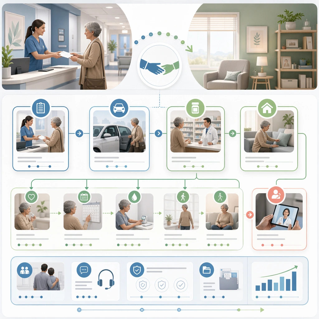
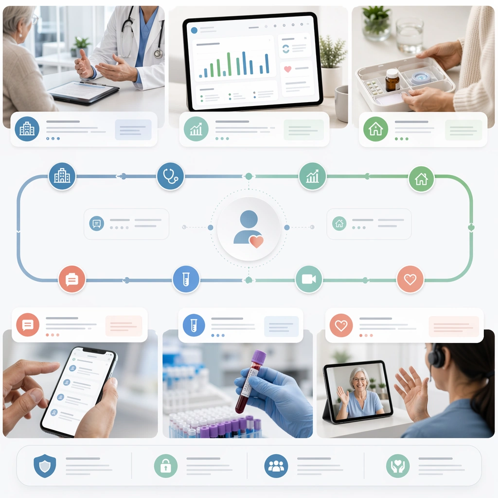
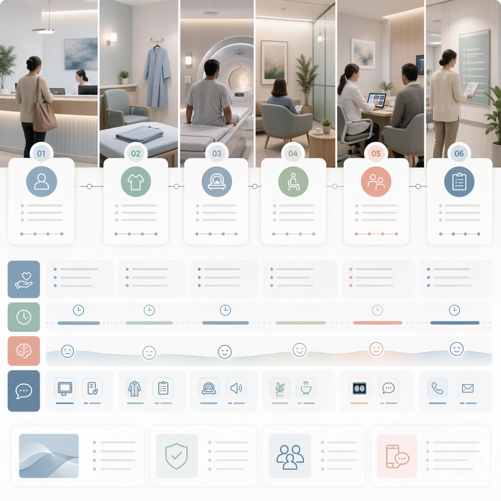
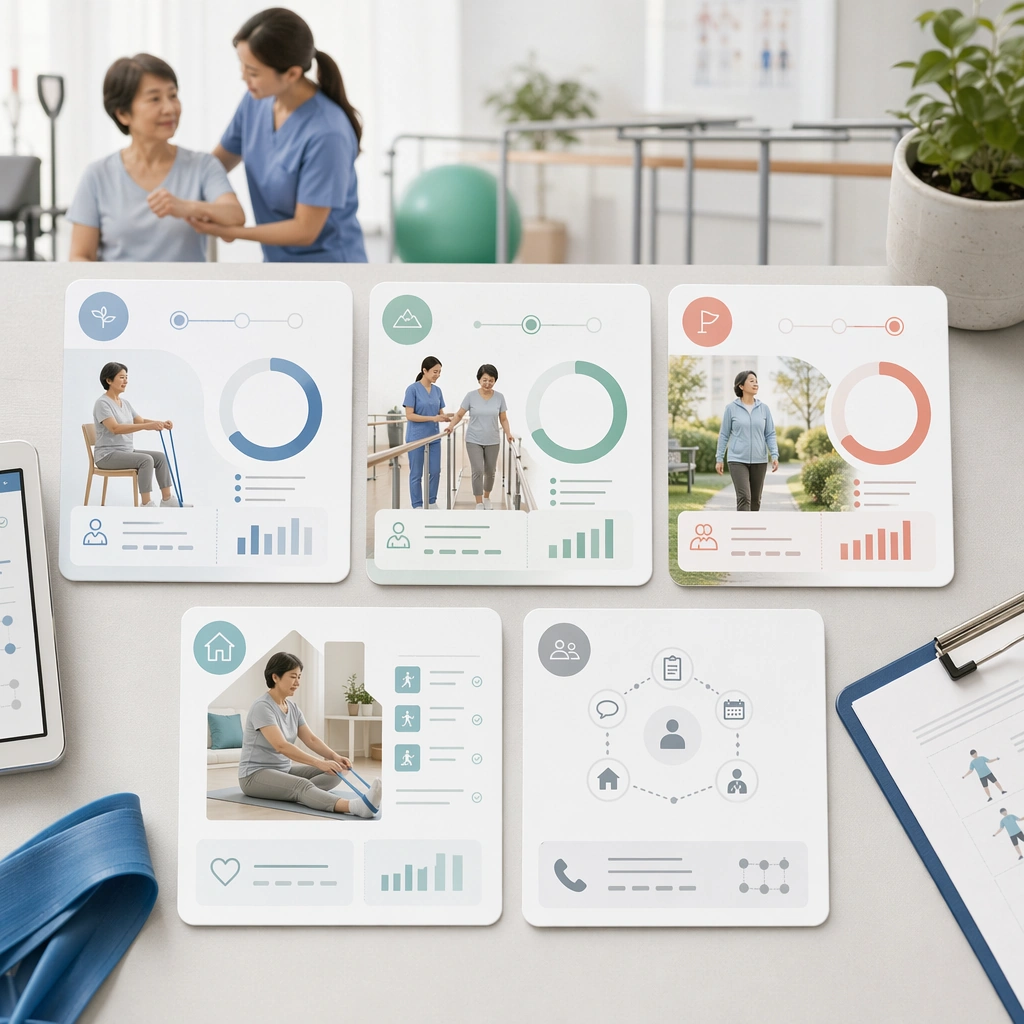
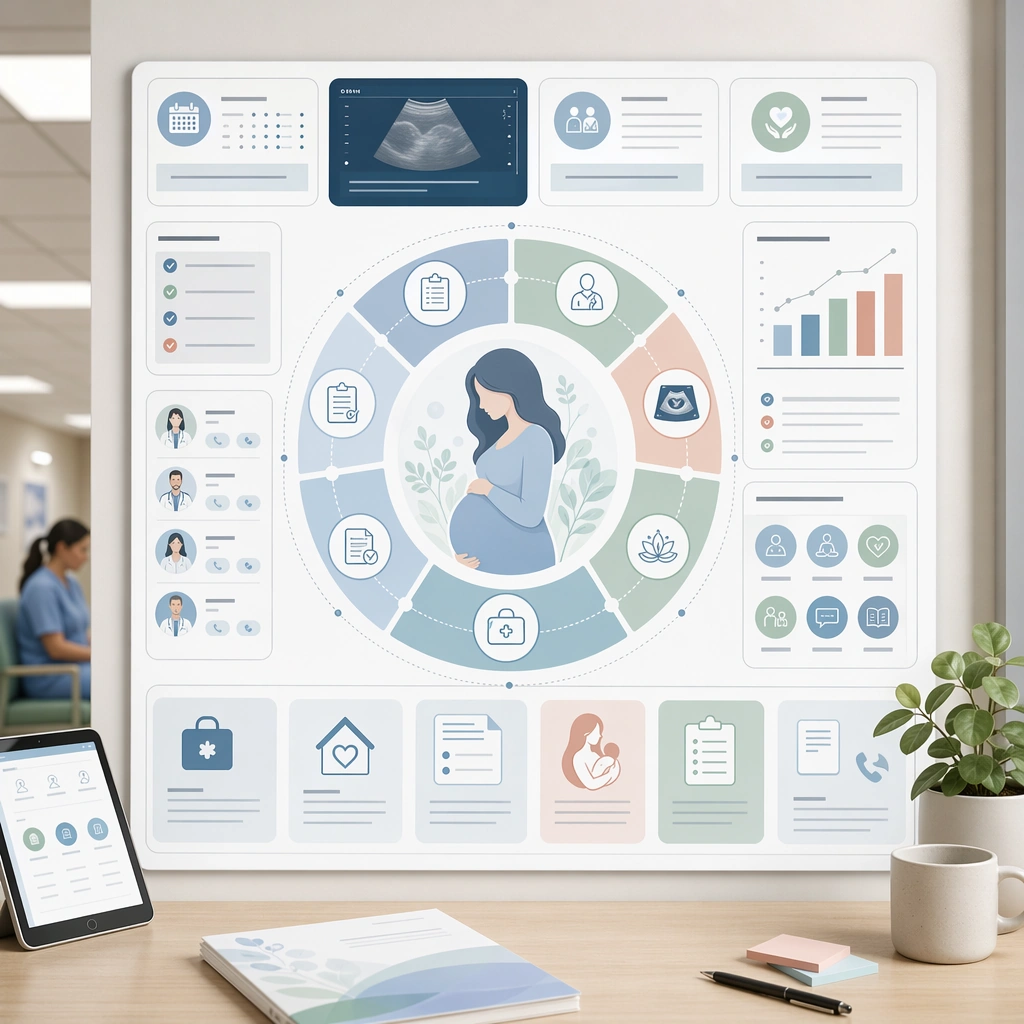
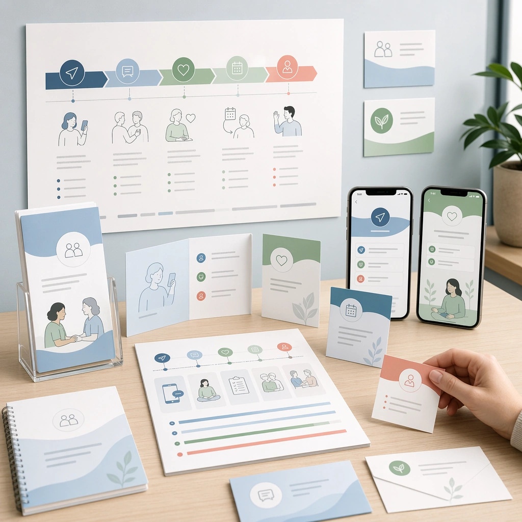
A square cross-channel patient journey summary board for Patient Journey Explainer System. Compose it as a high-level square toolkit showing print handouts, mobile screens, room signage, and follow-up cards together. Use a palette of soft white, mist blue, sea-glass green, muted coral accents, and warm neutral grays, even editorial lighting with crisp, low-anxiety contrast, and a mood of clear, supportive, and process-oriented. The frame should feel like a real healthcare communication asset art-directed for professional delivery, not a stock photo, speculative concept render, or generic corporate template. Keep the camera distance, negative space, and depth cues disciplined so the image reads immediately even at thumbnail size.

Subject:
Center on a complete patient journey system translated across multiple care surfaces but unified by one visual language. Show enough surrounding context that the viewer understands the intended service surface, user situation, and institutional setting. Every object, person, diagram, device crop, or spatial cue should support clarity, trust, and practical use. If people appear, keep them anonymous, natural, privacy-safe, and grounded in believable body language rather than promotional posing.

Important details:
Maintain patient-journey communication built from sequencing, touchpoint mapping, low-anxiety illustrations, and interface-like clarity without dense textbook complexity. The board should prove that one care process can stay coherent across channels without relying on literal body copy. Use abstract icon shapes, color blocks, chart bars, interface modules, or non-legible placeholder microcopy whenever information structure is needed, but never readable text. Materials, spacing, lighting, and hierarchy should feel production-ready and healthcare-specific. Avoid generic lifestyle filler, decorative noise, or design gestures that do not reinforce the communication goal.

Use case:
Patient Journey single study 9/9 for a full omnichannel care journey system summary.

Constraints:
No readable text, no watermark, no logos, preserve exact 1:1 aspect ratio, no graphic medical scenes, no confusing maze compositions, no dark fear-based tone, no overcrowded information walls, no random template collage, no inconsistent style shifts.
사용 방법
- 매개변수를 포함한 전체 원본 프롬프트를 복사하세요.
- 주제, 문구, 구도를 자신의 요구에 맞게 바꾸세요.
- 호환되는 외부 도구에서 사용하고 이용 조건과 결과를 확인하세요.
시작 전 확인
- 참조 이미지가 필요한지 확인하세요. 호환 표시는 해당 모델로 이 예시를 생성했다는 뜻이 아닙니다.
- 이름, 수치, 이미지 속 문구를 확인하세요. 모델 버전에 따라 결과가 다를 수 있습니다.