원본 문서
GPT Image 2 · en
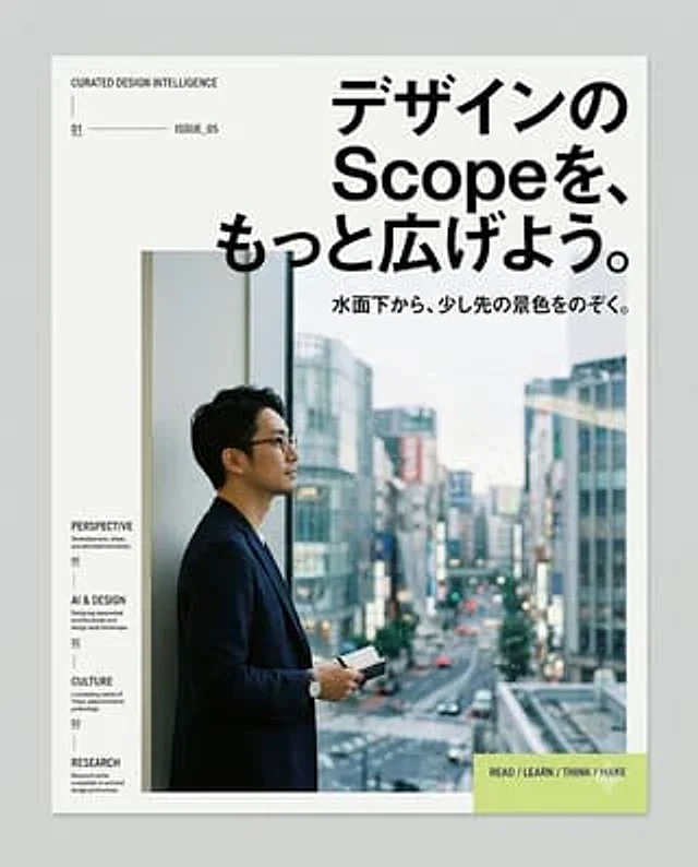
Create a clean editorial magazine poster for a Japanese design-intelligence service. Canvas: portrait poster on a light gray background, with a white page centered and a subtle drop shadow, about 4:5 ratio. Visual style: minimalist modern Swiss/Japanese editorial layout, lots of white space, sharp black typography, thin divider lines, small uppercase English microcopy, high-end design magazine feel. Main headline: large bold black Japanese type in the upper right, reading {argument name="headline text" default="デザインの Scopeを、もっと広げよう。"}, with “Scope” in Latin letters, arranged across 3 stacked lines and overlapping slightly above the photo area. Subheadline: smaller bold Japanese line below the headline, reading {argument name="subheadline text" default="水面下から、少し先の景色をのぞく。"}. Hero image: large rectangular photo occupying the lower center/right, showing {argument name="main subject" default="a Japanese businessman in a dark navy blazer and glasses standing in profile by a tall window, holding a small notebook or phone, looking out over a rainy modern city street with blurred buildings and traffic"}; cool blue-gray city tones, shallow depth of field, realistic photography. Left margin editorial column: at top left, small uppercase text “CURATED DESIGN INTELLIGENCE”, a thin vertical line beneath, then a small issue row with “01”, a long horizontal rule, and “ISSUE_05”. Along the lower left margin, create exactly 4 stacked navigation items with small labels and descriptions: 1) “PERSPECTIVE” with “Stream / culture, urban, and new synthifications.” and number “01”; 2) “AI & DESIGN” with “Designing conversational architectures and design-agent landscape.” and number “02”; 3) “CULTURE” with “Locomoting nation of Tokyo, extensionism, privileges.” and number “03”; 4) “RESEARCH” with “Research unitile evolution in art and design professions.” Use tiny black type with thin vertical separators between items. Bottom right call-to-action: a pale lime rectangle overlaying the lower-right corner of the photo/page, containing bold uppercase text {argument name="call to action" default="READ / LEARN / THINK / MAKE"} and a faint white downward triangle/arrow icon. Constraints: keep the composition simple and premium, use only black, white, gray, cool photo colors, and pale lime accent; no logos, no extra text, no decorative clutter.사용 방법
- 매개변수를 포함한 전체 원본 프롬프트를 복사하세요.
- 주제, 문구, 구도를 자신의 요구에 맞게 바꾸세요.
- 호환되는 외부 도구에서 사용하고 이용 조건과 결과를 확인하세요.
시작 전 확인
- 참조 이미지가 필요한지 확인하세요. 호환 표시는 해당 모델로 이 예시를 생성했다는 뜻이 아닙니다.
- 이름, 수치, 이미지 속 문구를 확인하세요. 모델 버전에 따라 결과가 다를 수 있습니다.