원본 문서
GPT Image 2 · en
{
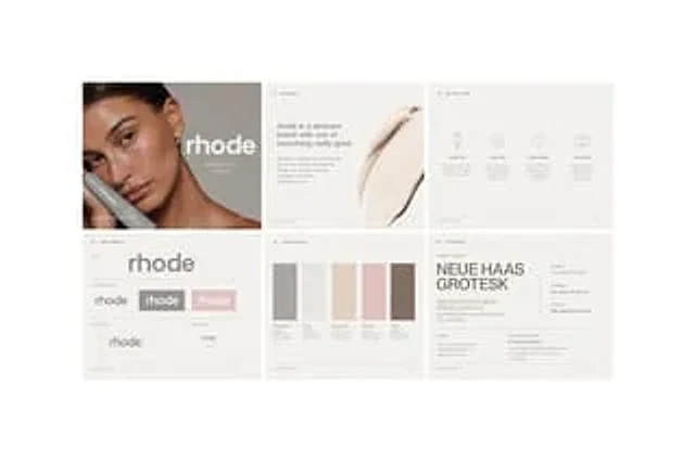
"type": "Minimalist skincare brand manual layout",
"brand": {
"name": "{argument name=\"brand name\" default=\"rhode\"}",
"industry": "skincare",
"style": "Quiet luxury style, clean, editorial feel, minimalism, soft neutral tones"
},
"canvas": {
"background": "Very light warm gray",
"format": "Widescreen landscape presentation project",
"grid": "2 rows x 3 columns",
"count": 6,
"gutters": "Fine white spacing between panels"
},
"layout": {
"sections": [
{
"title": "Cover",
"position": "Top left",
"count": 1,
"elements": [
"A close-up of a woman's hair, styled in a dark, slicked-back style, revealing her ears, neck, and shoulders.",
"Large and small lowercase lettering above the portrait",
"Subheadings display brand guides and seasonal/yearly sections.",
"Soft gray-brown background",
"A large square color block overlay covering the center left side of the face."
]
},
{
"title": "01. Brand Introduction",
"position": "Upper-middle",
"count": 1,
"elements": [
"Top section numbering and heading",
"Left-aligned paragraph block",
"The title declares that the brand is a skincare brand that pursues simplicity and prioritizes quality.",
"Short body text in small light gray font",
"The image on the right shows a large area of creamy skincare product application."
]
},
{
"title": "02. Brand Pillars",
"position": "Top right",
"count": 1,
"elements": [
"Top section numbering and heading",
"4 columns of icons and text",
"Tags: ESSENTIAL, EFFECTIVE, INTENTIONAL, INCLUSIVE",
"Icons: hose, smiley face, heart, interlocking rings",
"Below each pillar is a short descriptive text."
]
},
{
"title": "03. Visual Recognition",
"position": "Bottom left",
"count": 1,
"elements": [
"Top section numbering and heading",
"Central Large Small Character Mark",
"Flag variant row containing 3 variants",
"Auxiliary area labels including logo, logo variations, white space, and minimum size.",
"White space diagram",
"Minimum size example"
]
},
{
"title": "04. Color Scheme",
"position": "Middle to lower",
"count": 1,
"elements": [
"Top section numbering and heading",
"5 vertical rectangular color blocks",
"Tags: PEPTIDE GRAY, GLAZE, VANILLA SKIN, PINK GLAZE, TOAST",
"Below each color block is a thin specification line."
]
},
{
"title": "05. Typography",
"position": "Bottom right",
"count": 1,
"elements": [
"Top section numbering and heading",
"Example text with large main font size",
"The main font name is displayed as{argument name=\"primary typeface\" default=\"NEUE HAAS GROTESK\"}",
"Examples of letters and numbers",
"Three font weight samples, labeled 55 ROMAN, 65 MEDIUM, and 75 BOLD, are provided, along with the sample sentence 'The quick brown fox'.",
"Displays the secondary font line of Georgia Regular.",
"Small usage instructions block"
]
}
],
"footer": "Micro-page markers and brand guide instructions on each panel"
},
"palette": {
"overall": [
"Warm beige",
"Light gray",
"grayish brown",
"Beige",
"blush powder",
"Soft Brown"
]
},
"typography": {
"wordmark": "Bold, rounded, lowercase sans-serif font",
"body": "Small, understated, editorial-style sans-serif font",
"mood": "High-end, restrained, transparent"
},
"rendering": {
"look": "High-end Brand Guide Demonstration Mockup",
"lighting": "Soft and even studio lighting",
"detail": "Clear layout, subtle contrast, and ample white space."
}
}사용 방법
- 매개변수를 포함한 전체 원본 프롬프트를 복사하세요.
- 주제, 문구, 구도를 자신의 요구에 맞게 바꾸세요.
- 호환되는 외부 도구에서 사용하고 이용 조건과 결과를 확인하세요.
시작 전 확인
- 참조 이미지가 필요한지 확인하세요. 호환 표시는 해당 모델로 이 예시를 생성했다는 뜻이 아닙니다.
- 이름, 수치, 이미지 속 문구를 확인하세요. 모델 버전에 따라 결과가 다를 수 있습니다.