Documento original
GPT Image 2 · en
Scene:
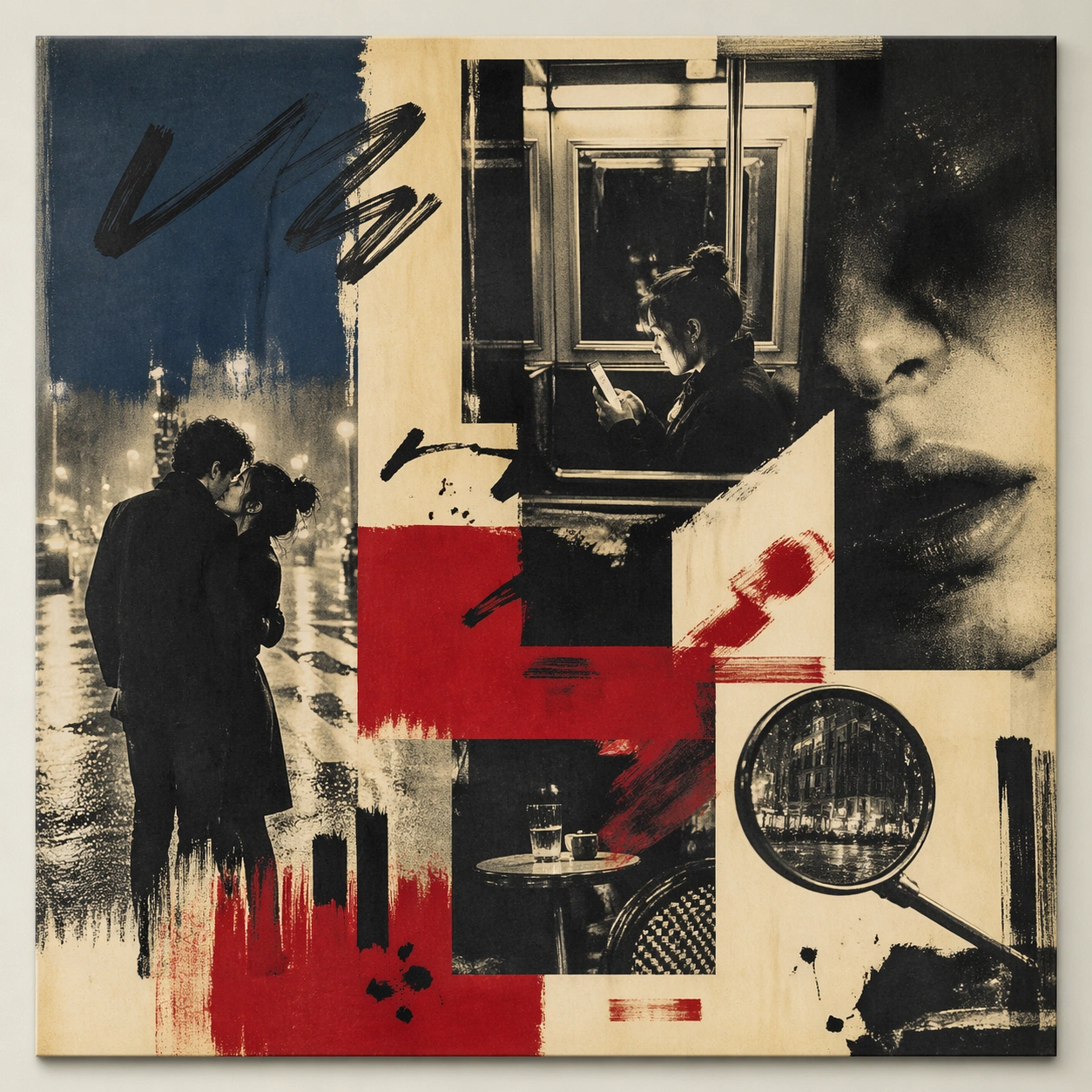
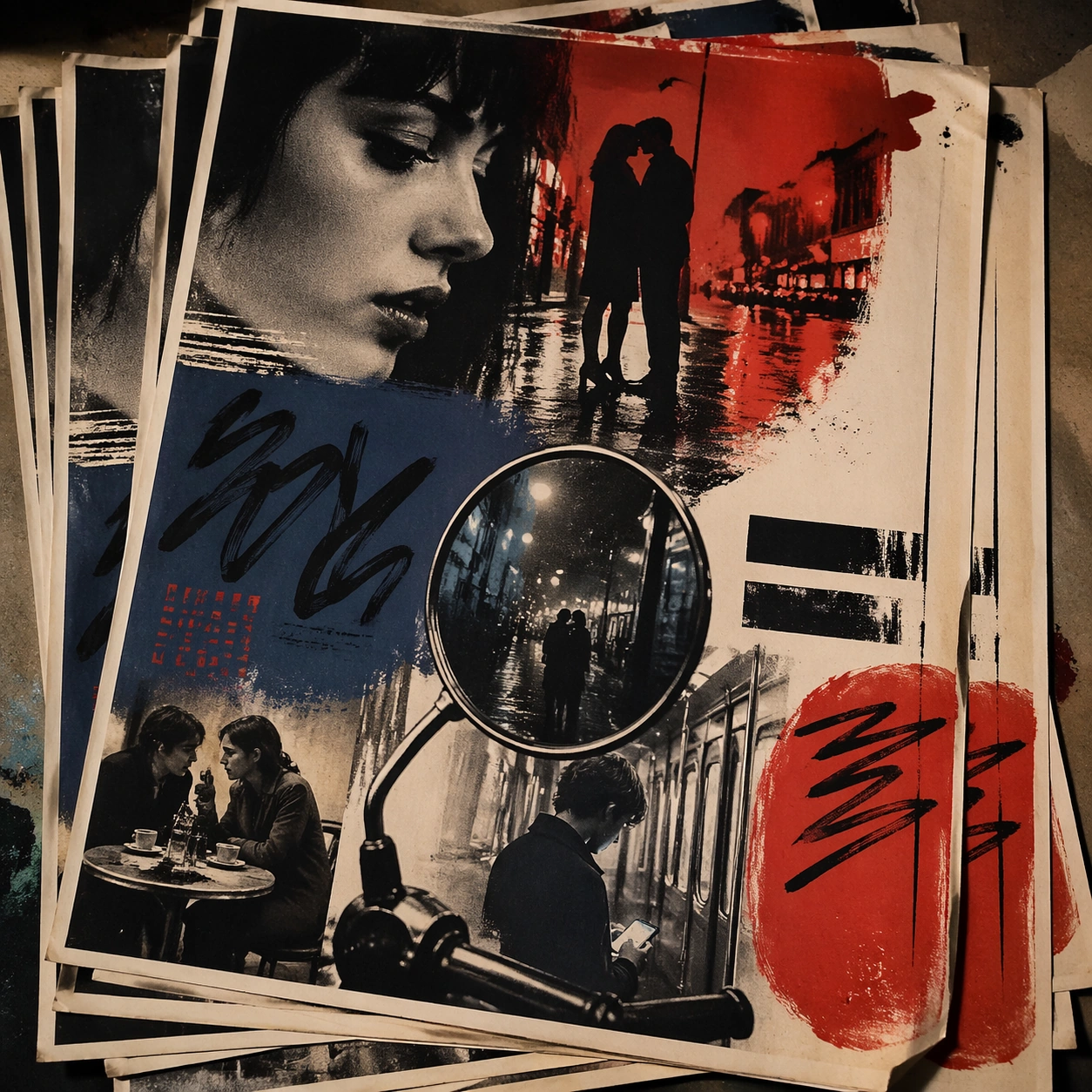
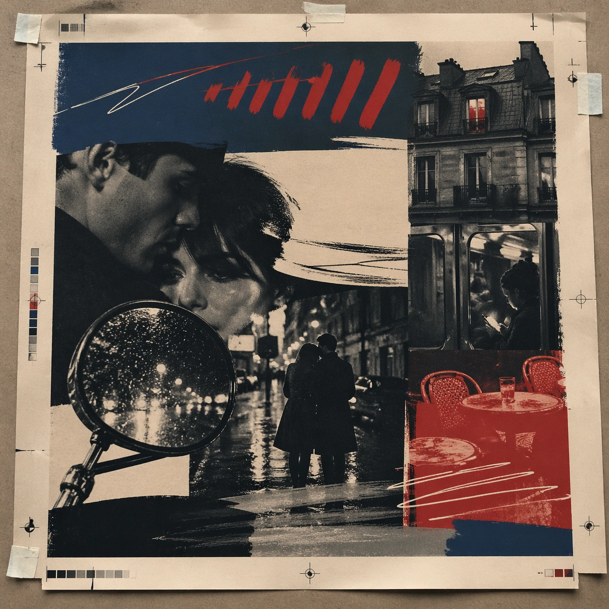
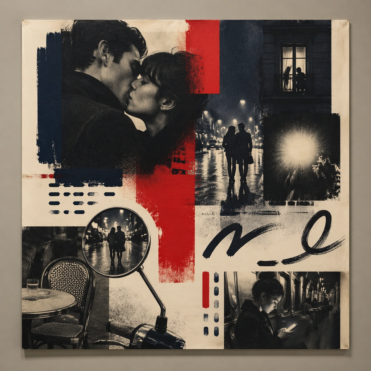
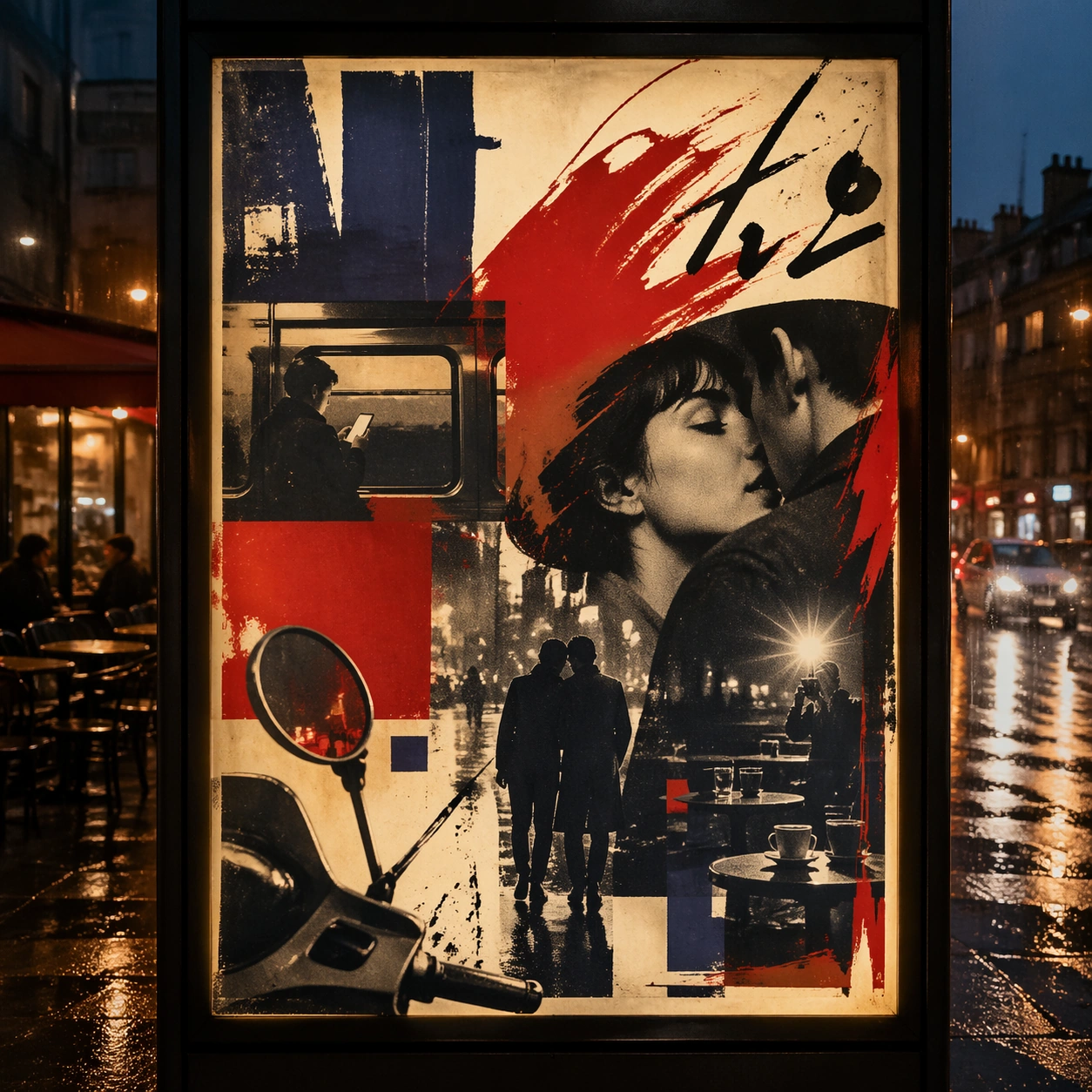
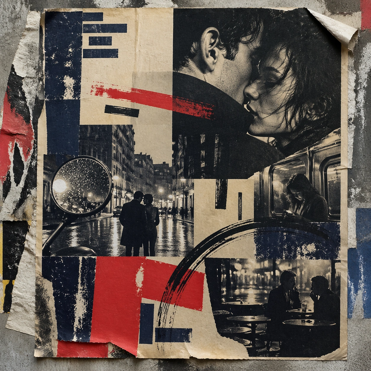
A square urban wall study with the poster pasted onto rough plaster among torn edges and older paper remnants, photographed in soft overcast light so texture, glue bubbles, and surface scars stay visible. The poster should express 1960s art-house poster grammar with radical photo crop, offset grain, hand-painted marks, and emotional empty space, using inky blue, carmine red, warm cream, charcoal, and cigarette-smoke gray and a tactile surface appropriate to the medium.

Subject:
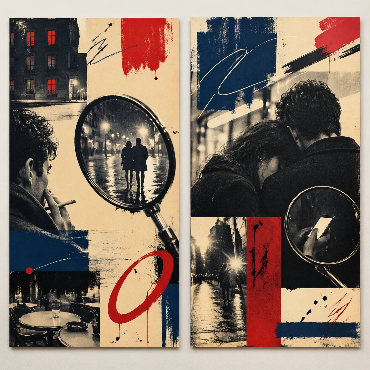
Create a version that feels made for the street, with the poster carrying enough formal force to survive abrasion, layering, and imperfect placement without losing its visual identity. Use street couples, scooter mirrors, apartment windows, rain-slick pavement, camera flash, and cafe tables as the main visual ingredients, and organize them with handwritten sweeps and sans blocks that feel gestural but stay non-readable. For the contemporary-subject axis, thread in a late-night metro ride and smartphone glow transformed into a melancholic art-house romance surface. The poster must feel like an original design object rather than a reproduction of any known work.

Important details:
Keep the main design intact but let the environment add grit: lifted corners, tiny tears, wrinkled paper, and older color fragments around the perimeter should amplify the style rather than dilute it. Preserve abrupt crop decisions, mood ambiguity, rough screen-print texture, and tension between photo and mark-making. Keep every letterform abstract and non-readable, as if it were a typographic texture rather than language. Make the style unmistakable through composition, palette, surface behavior, and symbolic compression. no blockbuster gloss, no readable credits, no hyper-polished skin retouching, no superhero spectacle.

Use case:
French New Wave single study 4/9, testing street-life durability and layered context.

Constraints:
No readable text, no watermark, no logos, preserve exact 1:1 aspect ratio, no copyrighted characters, no real brand marks, no QR codes, no interface chrome, no accidental gibberish lettering.
Como usar
- Copie o prompt original completo, incluindo os parâmetros.
- Adapte o tema, o texto e a composição aos seus requisitos.
- Use uma ferramenta externa compatível; confira o acesso e o resultado.
Antes de começar
- Verifique se é necessária uma imagem de referência. Compatibilidade não comprova qual modelo gerou o exemplo.
- Confira nomes, números e textos; os resultados variam entre versões do modelo.