PROMPTS · EXPLORAÇÃO CRIATIVA

Galeria de prompts

Explore prompts reais e exemplos gerados. Encontre inspiração para sua próxima missão criativa e copie o prompt completo grátis.

Exemplos
10,974
Modelos
17
Fontes
1277
10.974 exemplos de prompts · página 26 de 229
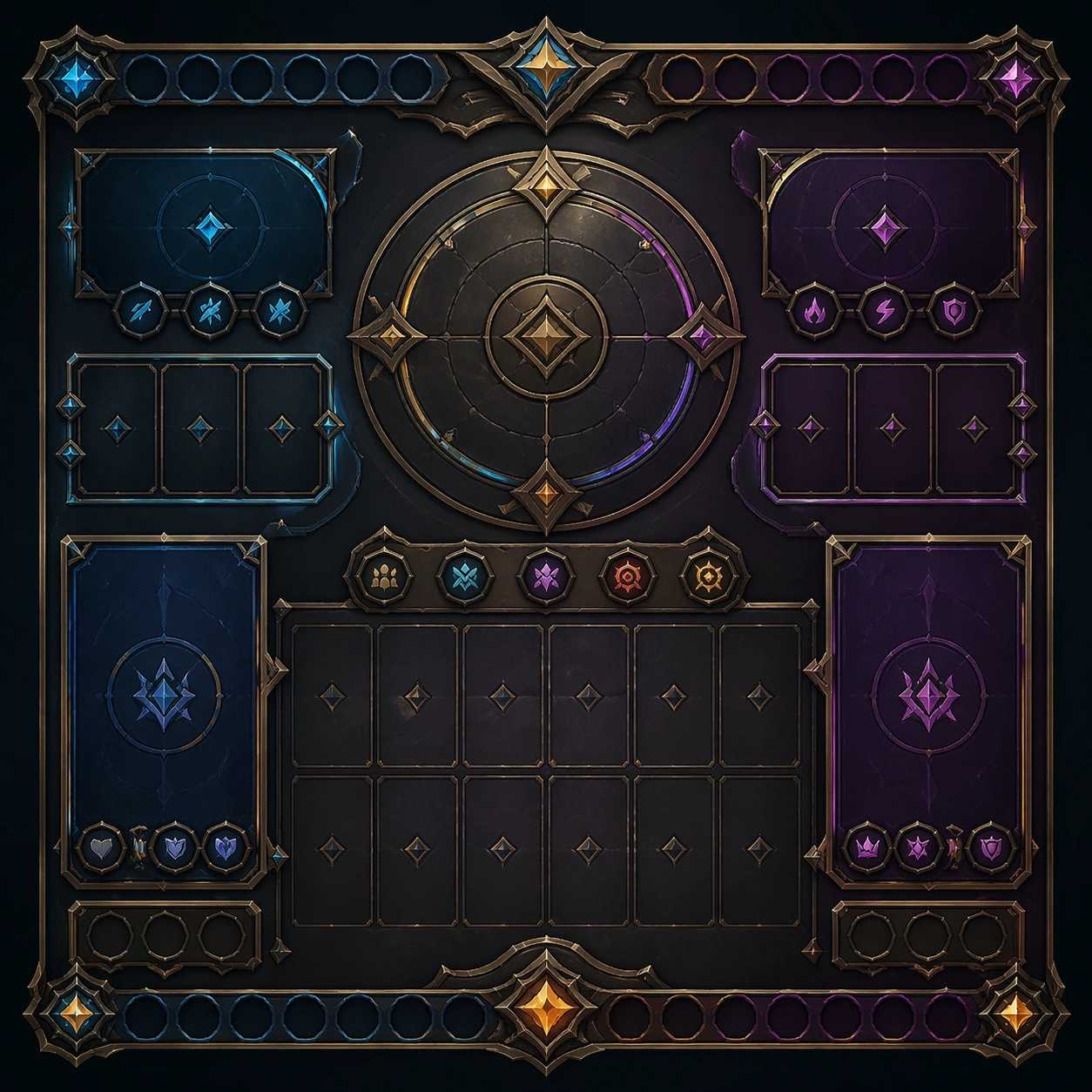
Example generated from “Reaction Meme Still System — Support Five”
GPT Image 2en

Scene: Create a square standalone support image for Reaction Meme Still System. Build a fifth support-surface study with a clear focal hierarchy and a finished professional surface. Use a polished modular board or campaign surface with clean spacing, premium game-UI finish, and clear focal hierarchy. The frame should feel self-contained and polished, with enough structure to explain the system even without the reference series, yet still obviously belonging to the same theme and production world. Subject: Show a coherent original game-art system built for premium production and marketing surfaces in a way that emphasizes the intended support surface. Keep the same system logic stable across screenshots, cards, banners, and overview boards. Even though this image is independent, the viewer should still recognize the same universe, same commercial logic, and same production intent as the core package. Important details: Lock framing, icon grammar, palette blocking, and surface hierarchy so the kit feels production-ready and consistent. Preserve the broader theme language through color, framing, material choices, and modular composition. Use clean panel rhythm, premium asset presentation, and believable detail density. The image should work equally well as a gallery study, research reference, and mock production deliverable. Use case: Reaction Meme Still System single study 9/9, exploring support five as a support surface. Constraints: No readable text, no watermark, no logos, preserve exact 1:1 aspect ratio, no unrelated objects, no broken visual hierarchy, no visual noise that obscures the main surface, no accidental brand resemblance.
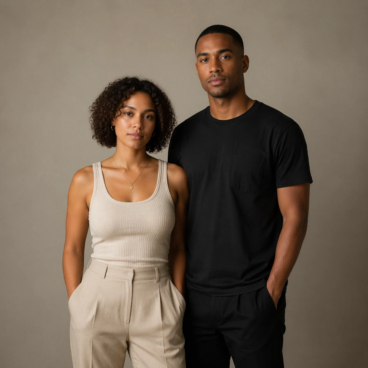

Example generated from “Relationship Portrait Series — Reference Pair Anchor”
GPT Image 2en

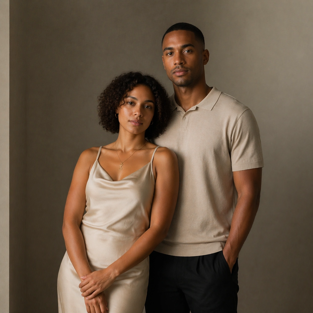
Scene: Create a square 1:1 portrait image for Relationship Portrait Series. Use a clean portrait setup with enough room for two bodies, stable spacing, and honest emotional neutrality. The frame should feel like a finished professional deliverable rather than a casual snapshot, with clear lens discipline, believable light falloff, and a palette that directly supports Photograph pairs or small groups in ways that reveal intimacy, tension, friendship, or shared history through pose, distance, and gaze.. Keep enough surrounding space and compositional control for gallery, research, campaign, or approval-board reuse while staying photoreal and human-scaled. Subject: Center the same recurring pair: a woman with golden-brown skin and a curly bob, and her partner with warm brown skin, cropped hair, and a relaxed upright build. Establish the same recurring pair and especially the same primary reference model so later relationship beats can shift emotion without changing identity. Use the example direction from the brief as grounding context: Photograph pairs or small groups in ways that reveal intimacy, tension, friendship, or shared history through pose, distance, and gaze.. Wardrobe, lighting, environment, and pose may shift to serve this variation, but the viewer must immediately understand that the same reference identity is still in front of the camera. Important details: This backlog line is difficult because Photograph pairs or small groups in ways that reveal intimacy, tension, friendship, or shared history through pose, distance, and gaze.. Preserve skin tone family, bone structure, eye spacing, nose shape, mouth shape, hairline logic, shoulder width, and overall body read across the entire series. preserve exact face / hair base / body proportions from the reference model. The body spacing, height difference, and facial recognition of both people should lock in here. Avoid the common failure described in the brief: ordinary image models often lose likeness once styling, lighting, or layout changes enter the frame. Success should feel like the result should feel professionally usable, coherent, and clearly built around one stable human identity. Use case: Relationship Portrait Series series study 1/9, the baseline pair portrait. Constraints: No readable text, no watermark, no logos, preserve exact 1:1 aspect ratio, preserve exact face / hair base / body proportions from the reference model, no extra friends, no wedding-style decor unless relevant, no readable text, no generic stock smile.

Example generated from “Relationship Portrait Series — Closeness Shot”
GPT Image 2en

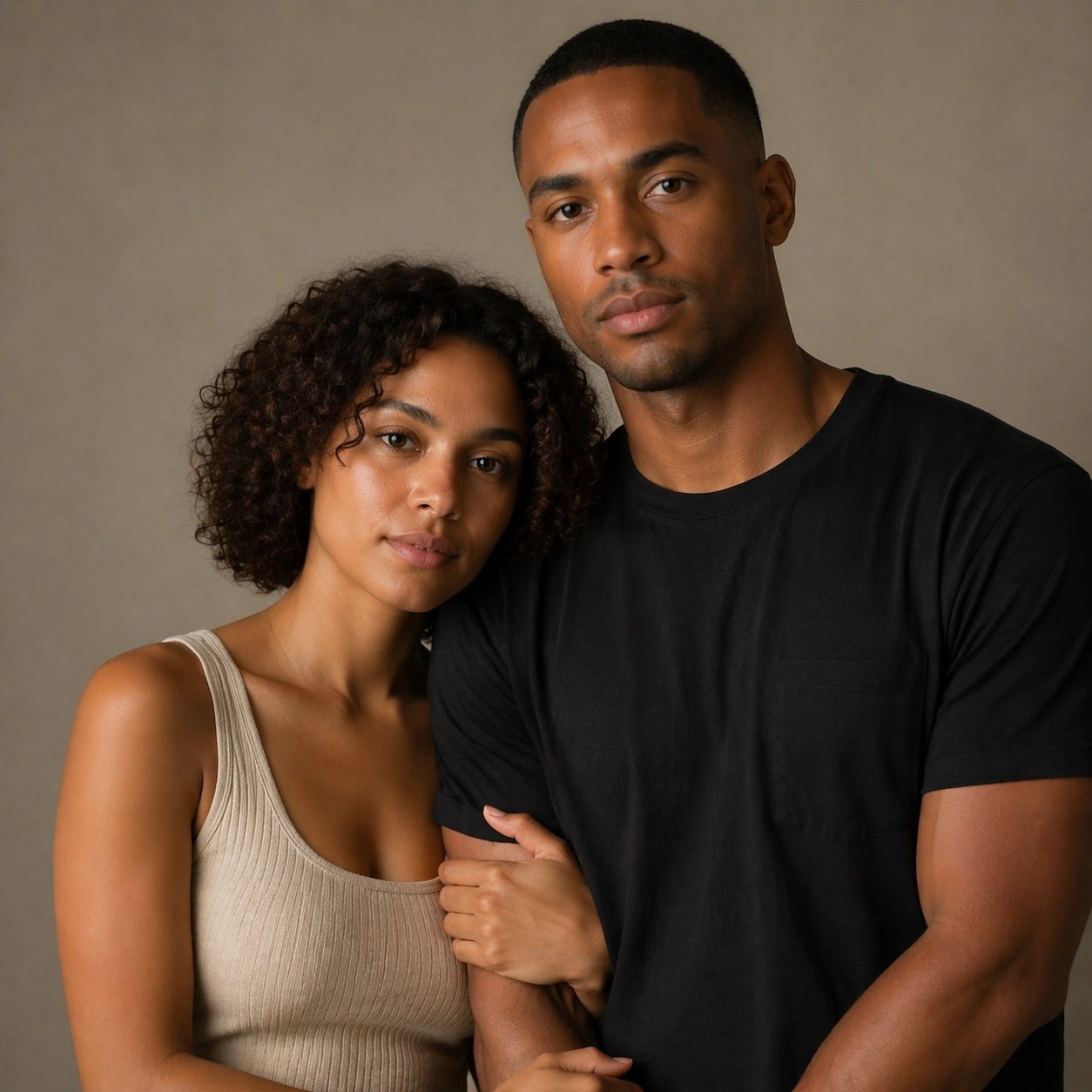
Scene: Create a square 1:1 portrait image for Relationship Portrait Series. Use a warm intimate frame with subtle touch, soft light, and premium but believable portrait craft. The frame should feel like a finished professional deliverable rather than a casual snapshot, with clear lens discipline, believable light falloff, and a palette that directly supports Photograph pairs or small groups in ways that reveal intimacy, tension, friendship, or shared history through pose, distance, and gaze.. Keep enough surrounding space and compositional control for gallery, research, campaign, or approval-board reuse while staying photoreal and human-scaled. Subject: Center the same recurring pair: a woman with golden-brown skin and a curly bob, and her partner with warm brown skin, cropped hair, and a relaxed upright build. Keep the same two people exact while bringing them physically closer and emotionally warmer than the anchor frame. Use the example direction from the brief as grounding context: Photograph pairs or small groups in ways that reveal intimacy, tension, friendship, or shared history through pose, distance, and gaze.. Wardrobe, lighting, environment, and pose may shift to serve this variation, but the viewer must immediately understand that the same reference identity is still in front of the camera. Important details: This backlog line is difficult because Photograph pairs or small groups in ways that reveal intimacy, tension, friendship, or shared history through pose, distance, and gaze.. Preserve skin tone family, bone structure, eye spacing, nose shape, mouth shape, hairline logic, shoulder width, and overall body read across the entire series. preserve exact face / hair base / body proportions from the reference model. Touch and pose can evolve, but both identities must remain stable and recognizable. Avoid the common failure described in the brief: ordinary image models often lose likeness once styling, lighting, or layout changes enter the frame. Success should feel like the result should feel professionally usable, coherent, and clearly built around one stable human identity. Use case: Relationship Portrait Series series study 2/9, a closeness portrait. Constraints: No readable text, no watermark, no logos, preserve exact 1:1 aspect ratio, preserve exact face / hair base / body proportions from the reference model, no merged limbs, no face drift, no melodramatic romance props, no third person.

Example generated from “Relationship Portrait Series — Tension Shot”
GPT Image 2en

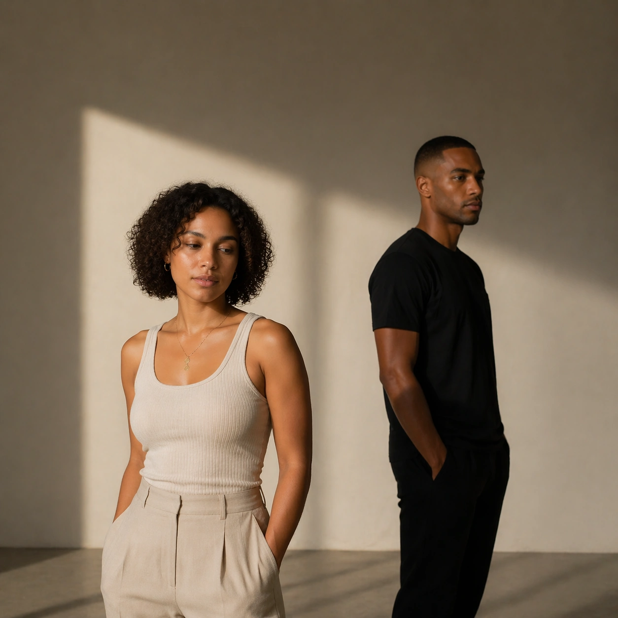
Scene: Create a square 1:1 portrait image for Relationship Portrait Series. Use a cleaner portrait frame with more distance, directional light, and readable emotional friction in body language. The frame should feel like a finished professional deliverable rather than a casual snapshot, with clear lens discipline, believable light falloff, and a palette that directly supports Photograph pairs or small groups in ways that reveal intimacy, tension, friendship, or shared history through pose, distance, and gaze.. Keep enough surrounding space and compositional control for gallery, research, campaign, or approval-board reuse while staying photoreal and human-scaled. Subject: Center the same recurring pair: a woman with golden-brown skin and a curly bob, and her partner with warm brown skin, cropped hair, and a relaxed upright build. Use posture, gaze, and spacing to create tension while preserving the same exact pair from the reference. Use the example direction from the brief as grounding context: Photograph pairs or small groups in ways that reveal intimacy, tension, friendship, or shared history through pose, distance, and gaze.. Wardrobe, lighting, environment, and pose may shift to serve this variation, but the viewer must immediately understand that the same reference identity is still in front of the camera. Important details: This backlog line is difficult because Photograph pairs or small groups in ways that reveal intimacy, tension, friendship, or shared history through pose, distance, and gaze.. Preserve skin tone family, bone structure, eye spacing, nose shape, mouth shape, hairline logic, shoulder width, and overall body read across the entire series. preserve exact face / hair base / body proportions from the reference model. The relationship changes here, not the people. Avoid the common failure described in the brief: ordinary image models often lose likeness once styling, lighting, or layout changes enter the frame. Success should feel like the result should feel professionally usable, coherent, and clearly built around one stable human identity. Use case: Relationship Portrait Series series study 3/9, a tension portrait. Constraints: No readable text, no watermark, no logos, preserve exact 1:1 aspect ratio, preserve exact face / hair base / body proportions from the reference model, no argument theatrics, no screaming faces, no identity swap, no costume reset.

Example generated from “Relationship Portrait Series — Walking Side By Side”
GPT Image 2en

Scene: Create a square 1:1 portrait image for Relationship Portrait Series. Use a square environmental portrait that captures walking or turning together without losing face clarity. The frame should feel like a finished professional deliverable rather than a casual snapshot, with clear lens discipline, believable light falloff, and a palette that directly supports Photograph pairs or small groups in ways that reveal intimacy, tension, friendship, or shared history through pose, distance, and gaze.. Keep enough surrounding space and compositional control for gallery, research, campaign, or approval-board reuse while staying photoreal and human-scaled. Subject: Center the same recurring pair: a woman with golden-brown skin and a curly bob, and her partner with warm brown skin, cropped hair, and a relaxed upright build. Show the same couple in motion while keeping proportions, height difference, and facial markers exact. Use the example direction from the brief as grounding context: Photograph pairs or small groups in ways that reveal intimacy, tension, friendship, or shared history through pose, distance, and gaze.. Wardrobe, lighting, environment, and pose may shift to serve this variation, but the viewer must immediately understand that the same reference identity is still in front of the camera. Important details: This backlog line is difficult because Photograph pairs or small groups in ways that reveal intimacy, tension, friendship, or shared history through pose, distance, and gaze.. Preserve skin tone family, bone structure, eye spacing, nose shape, mouth shape, hairline logic, shoulder width, and overall body read across the entire series. preserve exact face / hair base / body proportions from the reference model. This image should feel candid but still art-directed enough for campaign or editorial use. Avoid the common failure described in the brief: ordinary image models often lose likeness once styling, lighting, or layout changes enter the frame. Success should feel like the result should feel professionally usable, coherent, and clearly built around one stable human identity. Use case: Relationship Portrait Series series study 4/9, a movement-aware pair portrait. Constraints: No readable text, no watermark, no logos, preserve exact 1:1 aspect ratio, preserve exact face / hair base / body proportions from the reference model, no motion blur mush, no duplicated limbs, no crowd, no changed hairstyles.

Example generated from “Relationship Portrait Series — Shared Laugh Candid”
GPT Image 2en

Scene: Create a square 1:1 portrait image for Relationship Portrait Series. Use a natural-light or soft practical-light frame with believable candid energy and controlled composition. The frame should feel like a finished professional deliverable rather than a casual snapshot, with clear lens discipline, believable light falloff, and a palette that directly supports Photograph pairs or small groups in ways that reveal intimacy, tension, friendship, or shared history through pose, distance, and gaze.. Keep enough surrounding space and compositional control for gallery, research, campaign, or approval-board reuse while staying photoreal and human-scaled. Subject: Center the same recurring pair: a woman with golden-brown skin and a curly bob, and her partner with warm brown skin, cropped hair, and a relaxed upright build. Keep the same pair exact while opening the mood into laughter or a lighter candid beat. Use the example direction from the brief as grounding context: Photograph pairs or small groups in ways that reveal intimacy, tension, friendship, or shared history through pose, distance, and gaze.. Wardrobe, lighting, environment, and pose may shift to serve this variation, but the viewer must immediately understand that the same reference identity is still in front of the camera. Important details: This backlog line is difficult because Photograph pairs or small groups in ways that reveal intimacy, tension, friendship, or shared history through pose, distance, and gaze.. Preserve skin tone family, bone structure, eye spacing, nose shape, mouth shape, hairline logic, shoulder width, and overall body read across the entire series. preserve exact face / hair base / body proportions from the reference model. Even candid emotion must not loosen identity consistency. Avoid the common failure described in the brief: ordinary image models often lose likeness once styling, lighting, or layout changes enter the frame. Success should feel like the result should feel professionally usable, coherent, and clearly built around one stable human identity. Use case: Relationship Portrait Series series study 5/9, a candid shared-laugh portrait. Constraints: No readable text, no watermark, no logos, preserve exact 1:1 aspect ratio, preserve exact face / hair base / body proportions from the reference model, no random bystanders, no exaggerated open-mouth distortion, no new wardrobe family, no face drift.

Example generated from “Relationship Portrait Series — Quiet Silence Frame”
GPT Image 2en

Scene: Create a square 1:1 portrait image for Relationship Portrait Series. Use a restrained frame with modest distance, calm background, and emotionally loaded stillness. The frame should feel like a finished professional deliverable rather than a casual snapshot, with clear lens discipline, believable light falloff, and a palette that directly supports Photograph pairs or small groups in ways that reveal intimacy, tension, friendship, or shared history through pose, distance, and gaze.. Keep enough surrounding space and compositional control for gallery, research, campaign, or approval-board reuse while staying photoreal and human-scaled. Subject: Center the same recurring pair: a woman with golden-brown skin and a curly bob, and her partner with warm brown skin, cropped hair, and a relaxed upright build. Preserve the same pair while shifting the scene toward quiet, pause, and emotional ambiguity. Use the example direction from the brief as grounding context: Photograph pairs or small groups in ways that reveal intimacy, tension, friendship, or shared history through pose, distance, and gaze.. Wardrobe, lighting, environment, and pose may shift to serve this variation, but the viewer must immediately understand that the same reference identity is still in front of the camera. Important details: This backlog line is difficult because Photograph pairs or small groups in ways that reveal intimacy, tension, friendship, or shared history through pose, distance, and gaze.. Preserve skin tone family, bone structure, eye spacing, nose shape, mouth shape, hairline logic, shoulder width, and overall body read across the entire series. preserve exact face / hair base / body proportions from the reference model. The relation should deepen through pose and spacing, not through swapping people or costumes. Avoid the common failure described in the brief: ordinary image models often lose likeness once styling, lighting, or layout changes enter the frame. Success should feel like the result should feel professionally usable, coherent, and clearly built around one stable human identity. Use case: Relationship Portrait Series series study 6/9, a quiet stillness portrait. Constraints: No readable text, no watermark, no logos, preserve exact 1:1 aspect ratio, preserve exact face / hair base / body proportions from the reference model, no melodrama, no fake tears, no extra props, no age drift.

Example generated from “Relationship Portrait Series — Hands And Detail”
GPT Image 2en

Scene: Create a square 1:1 portrait image for Relationship Portrait Series. Use a closer frame where hands, shoulder contact, jewelry-free gesture, and face share the composition. The frame should feel like a finished professional deliverable rather than a casual snapshot, with clear lens discipline, believable light falloff, and a palette that directly supports Photograph pairs or small groups in ways that reveal intimacy, tension, friendship, or shared history through pose, distance, and gaze.. Keep enough surrounding space and compositional control for gallery, research, campaign, or approval-board reuse while staying photoreal and human-scaled. Subject: Center the same recurring pair: a woman with golden-brown skin and a curly bob, and her partner with warm brown skin, cropped hair, and a relaxed upright build. Use tactile detail to sell relationship intimacy while preserving exact face / hair base / body proportions from the reference model and keeping the partner stable too. Use the example direction from the brief as grounding context: Photograph pairs or small groups in ways that reveal intimacy, tension, friendship, or shared history through pose, distance, and gaze.. Wardrobe, lighting, environment, and pose may shift to serve this variation, but the viewer must immediately understand that the same reference identity is still in front of the camera. Important details: This backlog line is difficult because Photograph pairs or small groups in ways that reveal intimacy, tension, friendship, or shared history through pose, distance, and gaze.. Preserve skin tone family, bone structure, eye spacing, nose shape, mouth shape, hairline logic, shoulder width, and overall body read across the entire series. preserve exact face / hair base / body proportions from the reference model. Hands must feel connected, intentional, and anatomically correct. Avoid the common failure described in the brief: ordinary image models often lose likeness once styling, lighting, or layout changes enter the frame. Success should feel like the result should feel professionally usable, coherent, and clearly built around one stable human identity. Use case: Relationship Portrait Series series study 7/9, a detail-oriented relationship crop. Constraints: No readable text, no watermark, no logos, preserve exact 1:1 aspect ratio, preserve exact face / hair base / body proportions from the reference model, no broken fingers, no wedding ring logos, no cropped-off faces, no identity confusion.

Example generated from “Relationship Portrait Series — Poster Hero Pair”
GPT Image 2en

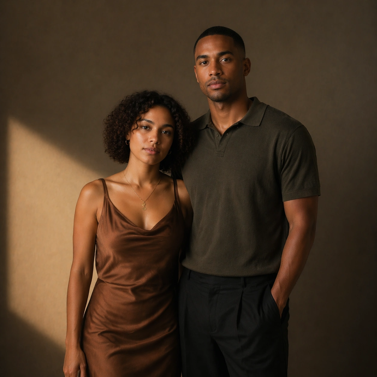
Scene: Create a square 1:1 portrait image for Relationship Portrait Series. Use a cleaner campaign or poster composition with negative space and unmistakable pair hierarchy. The frame should feel like a finished professional deliverable rather than a casual snapshot, with clear lens discipline, believable light falloff, and a palette that directly supports Photograph pairs or small groups in ways that reveal intimacy, tension, friendship, or shared history through pose, distance, and gaze.. Keep enough surrounding space and compositional control for gallery, research, campaign, or approval-board reuse while staying photoreal and human-scaled. Subject: Center the same recurring pair: a woman with golden-brown skin and a curly bob, and her partner with warm brown skin, cropped hair, and a relaxed upright build. Turn the same relationship into a hero portrait that feels publishable as cover art, festival key art, or brand story visual. Use the example direction from the brief as grounding context: Photograph pairs or small groups in ways that reveal intimacy, tension, friendship, or shared history through pose, distance, and gaze.. Wardrobe, lighting, environment, and pose may shift to serve this variation, but the viewer must immediately understand that the same reference identity is still in front of the camera. Important details: This backlog line is difficult because Photograph pairs or small groups in ways that reveal intimacy, tension, friendship, or shared history through pose, distance, and gaze.. Preserve skin tone family, bone structure, eye spacing, nose shape, mouth shape, hairline logic, shoulder width, and overall body read across the entire series. preserve exact face / hair base / body proportions from the reference model. The pair dynamic can intensify, but the exact same people must still lead the frame. Avoid the common failure described in the brief: ordinary image models often lose likeness once styling, lighting, or layout changes enter the frame. Success should feel like the result should feel professionally usable, coherent, and clearly built around one stable human identity. Use case: Relationship Portrait Series series study 8/9, a poster-like pair hero. Constraints: No readable text, no watermark, no logos, preserve exact 1:1 aspect ratio, preserve exact face / hair base / body proportions from the reference model, no fake title text, no montage collage, no extra cast, no costume discontinuity.

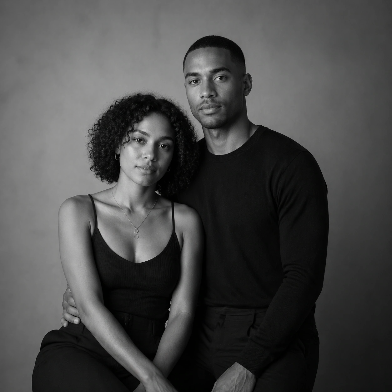
Example generated from “Relationship Portrait Series — Monochrome Afterglow”
GPT Image 2en

Scene: Create a square 1:1 portrait image for Relationship Portrait Series. Use a grayscale intimate frame with refined tonal separation and quietly resolved emotional mood. The frame should feel like a finished professional deliverable rather than a casual snapshot, with clear lens discipline, believable light falloff, and a palette that directly supports Photograph pairs or small groups in ways that reveal intimacy, tension, friendship, or shared history through pose, distance, and gaze.. Keep enough surrounding space and compositional control for gallery, research, campaign, or approval-board reuse while staying photoreal and human-scaled. Subject: Center the same recurring pair: a woman with golden-brown skin and a curly bob, and her partner with warm brown skin, cropped hair, and a relaxed upright build. Close on the same pair in black and white, preserving recognition, proportion, and emotional history from the prior frames. Use the example direction from the brief as grounding context: Photograph pairs or small groups in ways that reveal intimacy, tension, friendship, or shared history through pose, distance, and gaze.. Wardrobe, lighting, environment, and pose may shift to serve this variation, but the viewer must immediately understand that the same reference identity is still in front of the camera. Important details: This backlog line is difficult because Photograph pairs or small groups in ways that reveal intimacy, tension, friendship, or shared history through pose, distance, and gaze.. Preserve skin tone family, bone structure, eye spacing, nose shape, mouth shape, hairline logic, shoulder width, and overall body read across the entire series. preserve exact face / hair base / body proportions from the reference model. This should feel like the last image in a relationship portrait essay. Avoid the common failure described in the brief: ordinary image models often lose likeness once styling, lighting, or layout changes enter the frame. Success should feel like the result should feel professionally usable, coherent, and clearly built around one stable human identity. Use case: Relationship Portrait Series series study 9/9, a monochrome closing portrait. Constraints: No readable text, no watermark, no logos, preserve exact 1:1 aspect ratio, preserve exact face / hair base / body proportions from the reference model, no muddy grayscale, no vintage scratches, no second-couple substitution, no drift in scale.

Example generated from “Relic Artifact Lore Card Set — Royal Tide Seal”
GPT Image 2en

Scene: Create a square collectible lore card with a polished archive layout, pale shell-like highlights, and a formal frame that suggests court provenance. Use a cool marine palette of pearl, indigo, oxidized silver, and muted sea green. The object should sit in the center over layered velvet and parchment shapes, with blank crest plates and subtle ornamental corners that imply rarity without any words. Subject: The relic is a royal tide seal once used to authorize oceanic decrees. It combines a silver signet handle, a flattened oval stamp face made of nacre and dark steel, and a ring of wave-cut inlays around the edge. Salt deposits gather in seams, and one corner carries a tiny fracture filled with blue resin from an old repair. The stamp face should show abstract emblem geometry but no readable heraldry. It must feel ceremonial, administrative, and heavy with the politics of a drowned court. Important details: The seal should communicate rank and history through craft. Make the nacre shimmer softly, the silver feel worn by generations of hands, and the salt residue indicate long burial near water. The card frame must remain unified with the other relic studies, but the object should stand apart through elegant proportions and ocean-derived material language. Keep the composition organized enough for a codex, reward card, or collection page. Avoid generic pirate clichés; this is a state artifact, not a tavern prop. Use case: Relic Artifact Lore Card Set single study 2/9. Constraints: No readable text, no watermark, no logos, preserve exact 1:1 aspect ratio, no crown icon with readable initials, no pirate flags, no modern office stamp, no seashell clutter, no broken symmetry, no cheap jewelry styling.

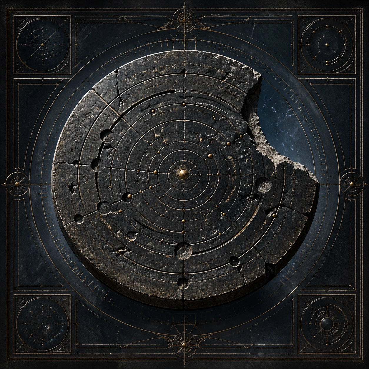
Example generated from “Relic Artifact Lore Card Set — Fallen Observatory Tablet”
GPT Image 2en

Scene: Create a square lore-card composition that feels like an astronomical codex page recovered from ruins. Use a dry midnight palette with desaturated stone, dim gold leaf, and faint star-blue illumination. The card should feature a central broken tablet suspended over a sober frame system with empty diagram panels, thin radial accents, and a muted glow that implies celestial importance without readable labels. Subject: The relic is a fallen observatory tablet carved from dark basalt and inlaid with tiny brass star pins. One corner is snapped away, exposing fresh stone beneath older weathering. The front surface contains circular orbit grooves, eclipse notches, and abstract constellation channels that suggest a predictive instrument rather than decorative carving. Dust lingers in the recesses, and a few hairline fractures cross the outer ring. It should feel like a device scholars used to map the heavens before a catastrophe destroyed the tower that housed it. Important details: The tablet must feel functional and mythic at the same time. Keep the orbital grooves precise, the brass pins subtly reflective, and the missing fragment visually important enough to imply incomplete knowledge. The card frame should support the storytelling with archive-like geometry, but never overpower the object. Make the object read clearly at thumbnail size, with a strong round-to-square contrast between relic and card. Avoid real zodiac symbols, readable star names, or generic sci-fi circuitry. Use case: Relic Artifact Lore Card Set single study 3/9. Constraints: No readable text, no watermark, no logos, preserve exact 1:1 aspect ratio, no real astronomy symbols, no modern circuit board look, no floating magical spellbook pages, no random planets, no cartoon ruin debris, no cracked-screen effect.

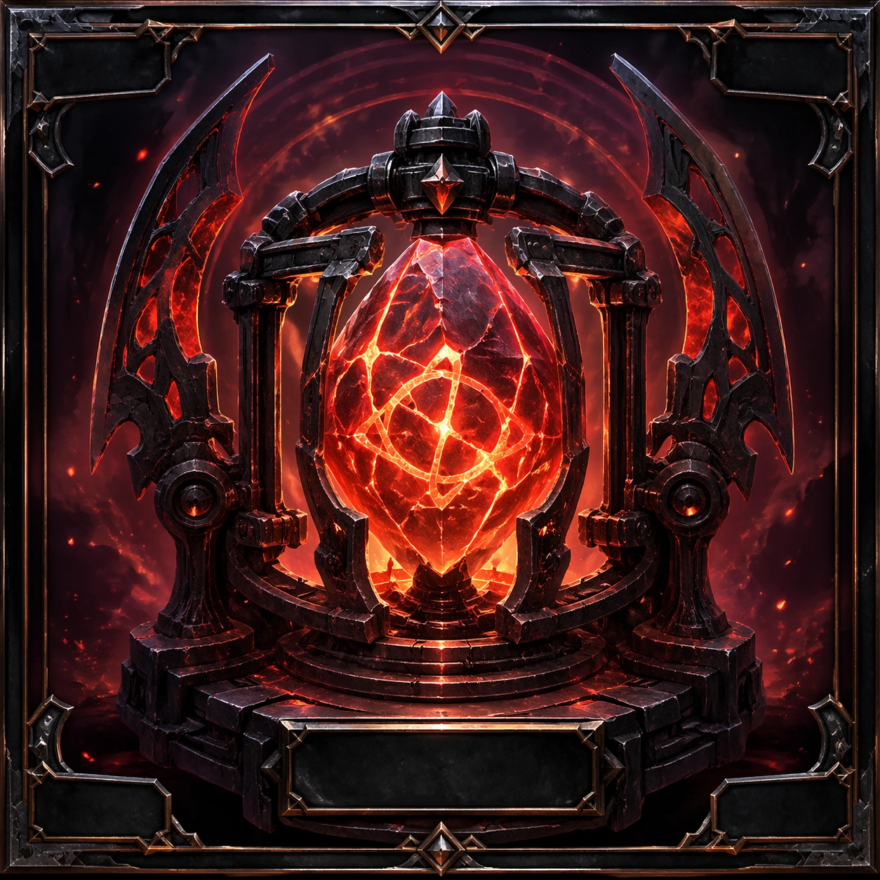
Example generated from “Relic Artifact Lore Card Set — Boss Core Reliquary”
GPT Image 2en

Scene: Create a square reward-card style composition with stronger glow and more dramatic contrast than the previous relics, while keeping the same codex frame language. Use volcanic reds, charred steel, deep plum shadows, and a focused halo around the object. The central relic should sit inside a ceremonial display cradle, surrounded by blank rarity plates and controlled ember particles that never obscure the silhouette. Subject: The relic is a boss core reliquary containing the stabilized heart of a defeated giant construct. At the center floats a cracked crystal core with molten seams and a faint rotating inner geometry. Around it sits a black iron cage with mechanical brackets, heat-scored hinges, and two cooling fins shaped like ritual blades. The relic should feel equal parts trophy, power source, and warning. It belongs in a collection as proof of conquest but still hints that it could awaken again. Important details: Make the crystal core luminous and layered, but keep the materials physically believable. The iron cage should show wear, scale, and heat damage. The card must read as high rarity through composition, color hierarchy, and finish instead of text. Ensure the relic feels engineered for containment rather than randomly floating magic. This image should work for a drop reward card, codex trophy entry, or event unlock surface. Avoid generic loot-chest clichés and keep the object design specific enough to imply encounter history. Use case: Relic Artifact Lore Card Set single study 4/9. Constraints: No readable text, no watermark, no logos, preserve exact 1:1 aspect ratio, no monster corpse, no generic gem on a pedestal, no cartoon fire burst, no sci-fi reactor labels, no extra weapons, no blown-out glow that hides detail.

Example generated from “Relic Artifact Lore Card Set — Memory Shard Rosary”
GPT Image 2en

Scene: Create a square lore card with a contemplative, almost sacred archive tone. Use pale stone, silver-blue haze, and warm candlelike highlights within the same codex frame grammar used across the set. The relic should rest in the center over layered vellum panels and a faint ornamental halo, with empty icon slots and a quiet border that feels collectible but not gaudy. Subject: The relic is a memory shard rosary: a chain of translucent crystal fragments linked by tarnished silver, ending in a small tear-shaped pendant. Each shard holds a different foggy scene within it, like frozen echoes seen through frosted glass. Some fragments are chipped, one link has been repaired with thread, and the pendant carries a tiny sealed cavity holding a curl of hair or parchment fiber. The object should feel intimate and emotionally charged, something pilgrims or mourners would cherish as both relic and burden. Important details: This card should communicate story through material nuance instead of spectacle. Make the crystal fragments semi-opaque and layered, with subtle inner light and hints of trapped imagery that never become readable pictures. The silver should feel old and softly handled, not newly polished. Keep the silhouette elegant and slightly asymmetrical, as if the rosary evolved through use and repair. The collectible card must still feel systematized and ready for a codex or event reward, but the emotional tone should distinguish it from the more martial relics in the set. Use case: Relic Artifact Lore Card Set single study 5/9. Constraints: No readable text, no watermark, no logos, preserve exact 1:1 aspect ratio, no overt religious icon copying, no character hands, no gemstone-jewelry glamour shot, no excessive glow, no cluttered background props, no modern chain hardware.

Example generated from “Relic Artifact Lore Card Set — Frostbound Treaty Ring”
GPT Image 2en

Scene: Create a square collectible relic card with an austere diplomatic mood. Use cold silver light, deep navy shadows, and pale frost texture within a disciplined codex frame. The central object should sit over layered archival paper and velvet forms, surrounded by quiet geometric corners and blank insignia plates that imply ceremonial classification. Keep the presentation elegant, stable, and slightly severe. Subject: The relic is a frostbound treaty ring forged to seal peace between rival winter kingdoms. It is a broad signet ring made of pallid white metal with a translucent ice-blue stone trapped inside the band rather than mounted above it. The metal carries faint stress cracks from repeated freezing and thawing. On the inside edge, there are abstract incisions that remain unreadable but imply formal ritual language. One side of the ring shows a seam where the band was once broken and repaired, suggesting the treaty itself was violated and later renewed. Important details: The ring must feel politically important, not merely luxurious. Emphasize weight, temperature, and restrained symbolism. The ice caught inside the band should feel ancient and impossible, while the metal repair seam adds history. Keep the silhouette bold enough for card readability and the material behavior credible under cold light. The card frame should echo the set's collectible language yet stay quieter than the boss core or lantern card. Avoid modern jewelry advertising, wedding-ring clichés, or glossy fashion styling. Use case: Relic Artifact Lore Card Set single study 6/9. Constraints: No readable text, no watermark, no logos, preserve exact 1:1 aspect ratio, no modern diamond ring design, no luxury brand cues, no snowstorm clutter, no extra crown props, no cartoon ice spikes, no overpolished metal.

Example generated from “Relic Artifact Lore Card Set — Sunken Court Compass”
GPT Image 2en

Scene: Create a square lore card with a maritime navigation mood and a high-end codex frame. Use a moody seabed palette of verdigris, deep teal, pearl gray, and muted gold. The card should feel like a collectible navigation relic recovered from a drowned palace archive: centered object, restrained corner ornaments, empty plaque strips, and a subtle halo that suggests importance without turning into treasure-ad spectacle. Subject: The relic is a sunken court compass with a heavy bronze housing, a cracked crystal cover, and a floating needle shaped like a narrow fin rather than a standard pointer. Instead of cardinal letters, the dial uses abstract tide marks and courtly geometry that remain unreadable. Barnacle scars, velvet algae traces, and a missing hinge pin imply centuries underwater. The compass must feel ceremonial as well as practical, perhaps used by envoys navigating flooded halls or hidden canals rather than open oceans. Important details: Let the materials carry the fiction. Verdigris should bloom around edges, crystal should show stress and salt clouding, and the dial should be precise enough to imply true navigational logic even without readable symbols. Keep the collectible card structure unified with the rest of the package, but let the object's shape, corrosion, and water history make it distinct. This should feel appropriate for a codex entry, rare quest reward, or collection interface. Avoid pirate-map clichés, ship wheel clutter, or generic steampunk gauges. Use case: Relic Artifact Lore Card Set single study 7/9. Constraints: No readable text, no watermark, no logos, preserve exact 1:1 aspect ratio, no modern compass letters, no pirate coins, no anchor icon overload, no fish characters, no ocean splash spectacle, no broken object silhouette.

Example generated from “Relic Artifact Lore Card Set — Pilgrim Bone Flute”
GPT Image 2en

Scene: Create a square relic card with a pilgrim-travel archive mood, using dusty ivory, muted ochre, weathered leather brown, and soft twilight blue. The codex frame should be present but modest: centered object, layered paper and fabric backing, blank relic slots, and fine border markings that support the object instead of dominating it. The overall image should feel personal, portable, and old. Subject: The relic is a pilgrim bone flute carved from a long pale bone segment with wrapped leather grip, tiny inset shell studs, and several uneven finger holes darkened by use. One end is capped with a knotted tassel of faded blue thread and a bead made from smoky glass. The flute should imply ritual travel, mourning songs, or wayfinding hymns rather than battlefield ceremony. It needs to feel humble but deeply significant, as if many hands carried it across deserts, shrines, and borderlands. Important details: Focus on touch history. The bone should show polished areas from fingers, tiny age cracks, and warm tonal variation. The leather wrap should feel repaired more than decorative, and the bead should add a quiet point of color. The card design must still communicate collectible-system value, but the relic itself should look emotionally grounded rather than flashy. Preserve clean silhouette and strong material readability for codex or lore reward use. Avoid real instrument branding, modern concert-flute cues, or overtly horror-coded bone styling. Use case: Relic Artifact Lore Card Set single study 8/9. Constraints: No readable text, no watermark, no logos, preserve exact 1:1 aspect ratio, no skull imagery, no modern metal keys, no extra hands, no campfire scene, no busy travel props, no cartoon fantasy decoration, no oversized tassel clutter.

Example generated from “Relic Artifact Lore Card Set — Eclipse Gate Key”
GPT Image 2en

Scene: Create a square climax-style relic card that still respects the same codex frame language as the rest of the set. Use blackened gold, violet shadow, dim ivory highlights, and a narrow corona of eclipse light behind the object. The card layout should feel authoritative and collectible, with strong central placement, empty plaque bars, subtle corner geometry, and just enough radiant contrast to imply endgame importance. Subject: The relic is an eclipse gate key designed to open a sealed threshold between day and night domains. It has a long stem of dark metal, a circular bow split into light and shadow halves, and a complex bit that resembles nested crescent teeth rather than ordinary cuts. Thin fissures of pale light run through the metal like trapped dawn. One side is polished by use, while the shadow half remains rough and ancient. The key should feel ceremonial, mechanically plausible, and unmistakably tied to a major world event. Important details: This object must feel like a final-tier collectible without becoming generic epic fantasy jewelry. Keep the silhouette iconic and immediately legible. The mixed light-and-shadow material treatment should imply function, not random ornament. Preserve the package's card-frame consistency, but let the eclipse motif elevate the sense of stakes and lore. It should work as a codex highlight, event reward, or unlock banner centerpiece. Avoid real religious symbols, generic skeleton-key clichés, or unreadable magic circles. Use case: Relic Artifact Lore Card Set single study 9/9. Constraints: No readable text, no watermark, no logos, preserve exact 1:1 aspect ratio, no modern key teeth, no giant fantasy castle backdrop, no glowing rune text, no extra hands, no overdesigned filigree mess, no lens flare washing out the silhouette.
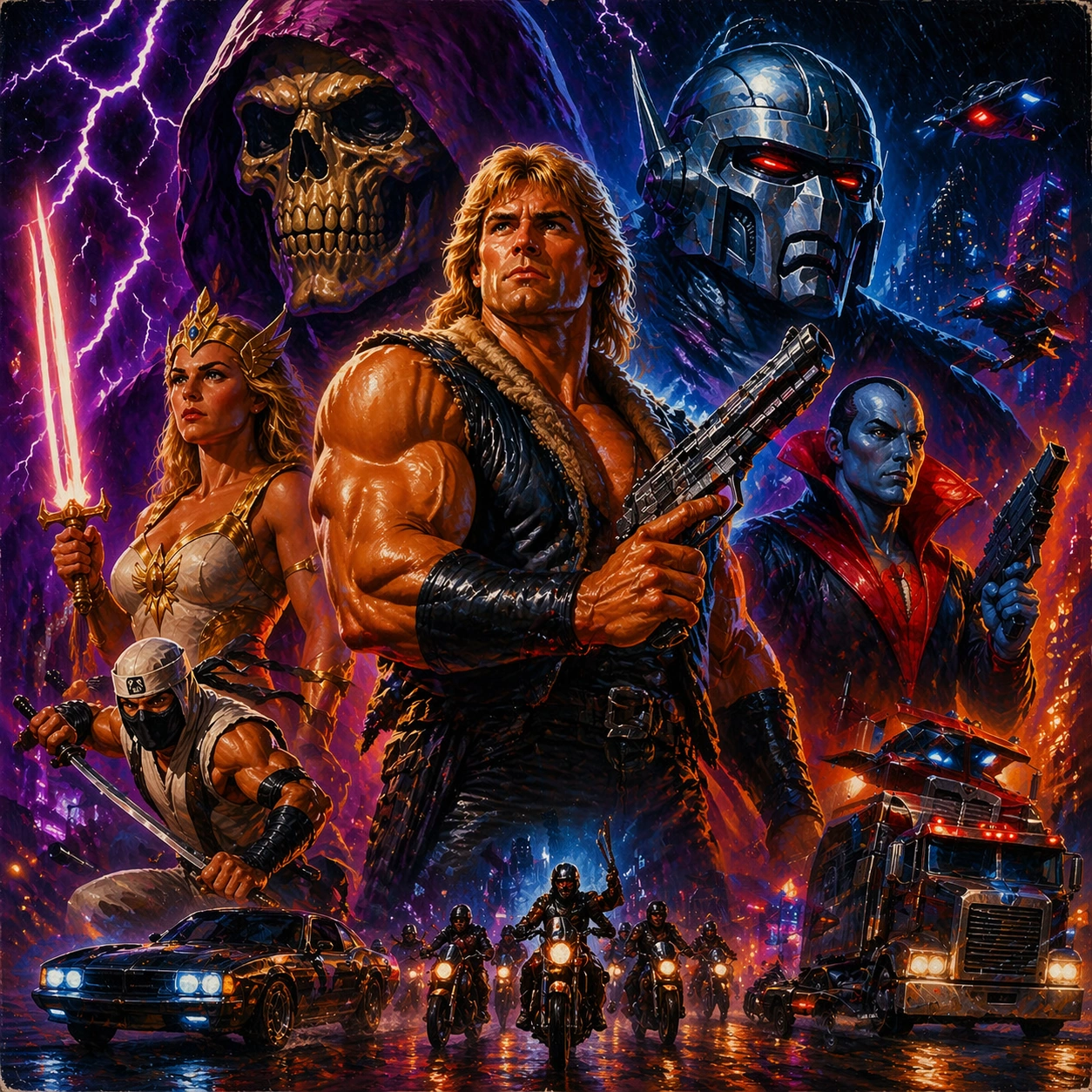


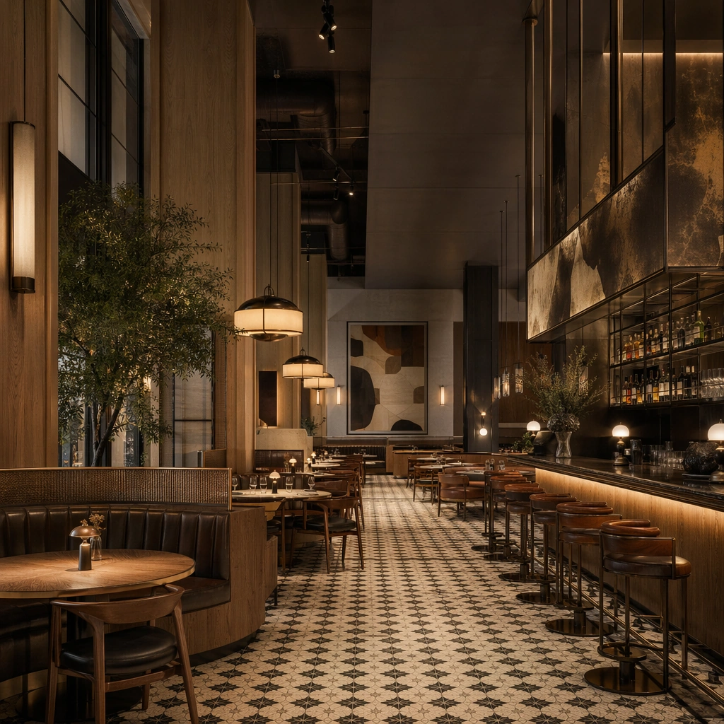
Example generated from “Restaurant Cafe Space Brand Integration — Storefront Interior Anchor”
GPT Image 2en

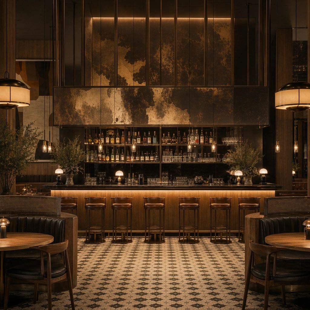
Scene: Create a square architectural reference still for Restaurant Cafe Space Brand Integration. Use a square hero view from near the storefront into the full dining room and bar and treat the frame like a premium interior or architecture editorial photograph with disciplined perspective, readable depth from foreground to background, and enough negative space for the spatial hierarchy to breathe. Light the scene so menu atmosphere, furniture authorship, and cohesive food-space branding feel immediate, using toasted oak, espresso brown, muted cream, oxidized brass, and warm tungsten amber as the governing tonal range. The composition must read as a high-end commercial image that could sit inside restaurant launches, cafe campaigns, hospitality editorials, and concept pitch boards. Subject: Show a restaurant and cafe interior where oak, oxidized metal, patterned tile, leather banquettes, softly glowing pendants, and abstract menu surfaces feel authored as one brand system. Center the restaurant’s overall brand atmosphere, seating hierarchy, and bar glow. This is the canonical reference image for the package, so the major proportions, material transitions, fixture families, and circulation logic must feel highly specific and internally coherent rather than generic luxury styling. Let the viewer understand how the space is organized within a single glance, with foreground anchors, a clear middle zone, and a resolved background termination. Important details: Lock the tile language, oak-and-metal pairings, banquette shapes, bar geometry, pendant rhythm, and abstract menu-display zones. Surfaces should feel tactile and believable: stone veining must stay plausible, metals should have disciplined reflectance, fabrics should show natural weight, and concealed lighting should shape the volume instead of flattening it. Use abstract signage, menu, label, or caption zones only as unreadable graphic hints. The image should feel practical for downstream design reviews and polished enough for public-facing campaign use. Use case: Restaurant Cafe Space Brand Integration series study 1/9, establishing the canonical hospitality identity for the series. Constraints: No readable text, no watermark, no logos, preserve exact 1:1 aspect ratio, no crowded diners, no readable menus, no food-delivery branding, no messy plates, no random neon slogans, no exterior logos dominating.
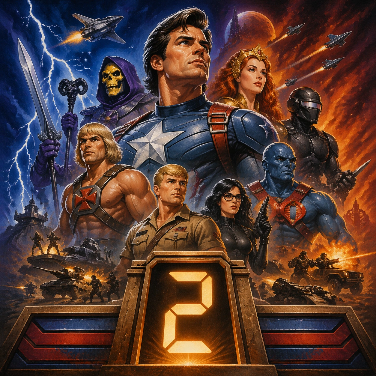
Example generated from “Restaurant Cafe Space Brand Integration — Bar Counter Focus”
GPT Image 2en

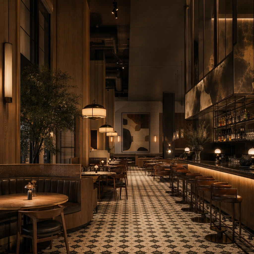
Scene: Create a square reference-dependent architecture still for Restaurant Cafe Space Brand Integration. Use a composition centered on the bar counter, back shelving, and seating edge while keeping the same lens discipline, editorial polish, and material believability established by the reference image. The lighting can shift to support the intended mood, but the space must still feel like the same authored project with a stable viewpoint logic, convincing depth separation, and clean commercial-photography finish. Keep toasted oak, espresso brown, muted cream, oxidized brass, and warm tungsten amber as the governing tonal range even when the emphasis changes. Subject: Show a restaurant and cafe interior where oak, oxidized metal, patterned tile, leather banquettes, softly glowing pendants, and abstract menu surfaces feel authored as one brand system. Focus on the exact same restaurant from the reference image, now emphasizing service theatre, backbar materials, and pendant rhythm. Preserve exact architectural identity, plan logic, material palette, fixture family, and circulation cues from the reference image while changing only the intended emphasis described here. The viewer should immediately recognize the same project, not a loose cousin, with matching silhouette logic, aligned detailing, and consistent brand atmosphere. Important details: Preserve the tile language, oak-and-metal pairings, banquette shapes, bar geometry, pendant rhythm, and abstract menu-display zones. Any abstract wayfinding, menu, wall-label, or packaging zones must stay unreadable and subordinate to the spatial image. Joinery, edges, reflections, and lighting should remain realistic enough for an operator or design team to treat the image as a credible reference. The variation should feel deliberate and commercially useful, proving that one locked spatial language can flex across multiple campaign or editorial surfaces. Use case: Restaurant Cafe Space Brand Integration series study 2/9, extending the bar-as-brand center while preserving the same venue identity. Constraints: No readable text, no watermark, no logos, preserve exact 1:1 aspect ratio, preserve exact architectural identity from the reference image, no crowded diners, no readable menus, no food-delivery branding, no messy plates, no random neon slogans, no bottle labels.

Example generated from “Restaurant Cafe Space Brand Integration — Dining Room Evening”
GPT Image 2en

Scene: Create a square reference-dependent architecture still for Restaurant Cafe Space Brand Integration. Use a warm evening angle through the main dining room with layered banquettes while keeping the same lens discipline, editorial polish, and material believability established by the reference image. The lighting can shift to support the intended mood, but the space must still feel like the same authored project with a stable viewpoint logic, convincing depth separation, and clean commercial-photography finish. Keep toasted oak, espresso brown, muted cream, oxidized brass, and warm tungsten amber as the governing tonal range even when the emphasis changes. Subject: Show a restaurant and cafe interior where oak, oxidized metal, patterned tile, leather banquettes, softly glowing pendants, and abstract menu surfaces feel authored as one brand system. Focus on the exact same restaurant from the reference image, now emphasizing table spacing, pendant pools of light, and intimate hospitality mood. Preserve exact architectural identity, plan logic, material palette, fixture family, and circulation cues from the reference image while changing only the intended emphasis described here. The viewer should immediately recognize the same project, not a loose cousin, with matching silhouette logic, aligned detailing, and consistent brand atmosphere. Important details: Preserve the tile language, oak-and-metal pairings, banquette shapes, bar geometry, pendant rhythm, and abstract menu-display zones. Any abstract wayfinding, menu, wall-label, or packaging zones must stay unreadable and subordinate to the spatial image. Joinery, edges, reflections, and lighting should remain realistic enough for an operator or design team to treat the image as a credible reference. The variation should feel deliberate and commercially useful, proving that one locked spatial language can flex across multiple campaign or editorial surfaces. Use case: Restaurant Cafe Space Brand Integration series study 3/9, extending the dinner atmosphere inside the same branded shell. Constraints: No readable text, no watermark, no logos, preserve exact 1:1 aspect ratio, preserve exact architectural identity from the reference image, no crowded diners, no readable menus, no food-delivery branding, no messy plates, no random neon slogans, no visible diners.

Example generated from “Restaurant Cafe Space Brand Integration — Pastry Display Corner”
GPT Image 2en

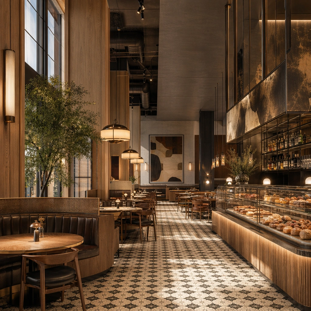
Scene: Create a square reference-dependent architecture still for Restaurant Cafe Space Brand Integration. Use a corner composition linking a display counter to nearby cafe seating while keeping the same lens discipline, editorial polish, and material believability established by the reference image. The lighting can shift to support the intended mood, but the space must still feel like the same authored project with a stable viewpoint logic, convincing depth separation, and clean commercial-photography finish. Keep toasted oak, espresso brown, muted cream, oxidized brass, and warm tungsten amber as the governing tonal range even when the emphasis changes. Subject: Show a restaurant and cafe interior where oak, oxidized metal, patterned tile, leather banquettes, softly glowing pendants, and abstract menu surfaces feel authored as one brand system. Focus on the exact same restaurant from the reference image, now emphasizing display case craftsmanship and daytime retail energy. Preserve exact architectural identity, plan logic, material palette, fixture family, and circulation cues from the reference image while changing only the intended emphasis described here. The viewer should immediately recognize the same project, not a loose cousin, with matching silhouette logic, aligned detailing, and consistent brand atmosphere. Important details: Preserve the tile language, oak-and-metal pairings, banquette shapes, bar geometry, pendant rhythm, and abstract menu-display zones. Any abstract wayfinding, menu, wall-label, or packaging zones must stay unreadable and subordinate to the spatial image. Joinery, edges, reflections, and lighting should remain realistic enough for an operator or design team to treat the image as a credible reference. The variation should feel deliberate and commercially useful, proving that one locked spatial language can flex across multiple campaign or editorial surfaces. Use case: Restaurant Cafe Space Brand Integration series study 4/9, extending the day-service mode of the same hospitality system. Constraints: No readable text, no watermark, no logos, preserve exact 1:1 aspect ratio, preserve exact architectural identity from the reference image, no crowded diners, no readable menus, no food-delivery branding, no messy plates, no random neon slogans, no readable pastry signs.

Example generated from “Restaurant Cafe Space Brand Integration — Takeaway Pickup Station”
GPT Image 2en

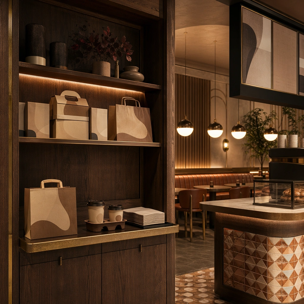
Scene: Create a square standalone support study for Restaurant Cafe Space Brand Integration. Use a compact pickup shelf and counter zone integrated into the venue language and frame it like a premium commercial still or design-editorial crop with clear focal hierarchy, disciplined perspective, and enough breathing room for the materials and objects to read at both thumbnail and full size. Keep toasted oak, espresso brown, muted cream, oxidized brass, and warm tungsten amber as the tonal guide so the image still belongs to the same theme family, and light the scene in a controlled way that emphasizes texture, edge quality, and authored atmosphere over spectacle. Subject: Show a restaurant and cafe interior where oak, oxidized metal, patterned tile, leather banquettes, softly glowing pendants, and abstract menu surfaces feel authored as one brand system. In this support study, focus on operational clarity, packaging forms, and hospitality polish. The image should work independently, yet it must still feel like it belongs to the same broader world of Cafe Space. Make the space, props, and detailing useful for real campaign, editorial, or design-review contexts rather than moodboard abstraction. Important details: Carry forward the broader language of the tile language, oak-and-metal pairings, banquette shapes, bar geometry, pendant rhythm, and abstract menu-display zones, but let this image prove a new support surface or secondary deliverable. Material realism is essential: wood grain, metal sheen, glass edges, textiles, and stone should feel physically plausible and carefully art directed. Any graphic panels, labels, menus, packaging, or captions must stay abstract and unreadable. The overall result should feel reusable for restaurant launches, cafe campaigns, hospitality editorials, and concept pitch boards, with enough structure that a creative or operations team could build on it. Use case: Restaurant Cafe Space Brand Integration single study 6/9, exploring support still for off-premise brand extension. Constraints: No readable text, no watermark, no logos, preserve exact 1:1 aspect ratio, no crowded diners, no readable menus, no food-delivery branding, no messy plates, no random neon slogans, no delivery app logos.

Example generated from “Restaurant Cafe Space Brand Integration — Terrace Seating Layer”
GPT Image 2en

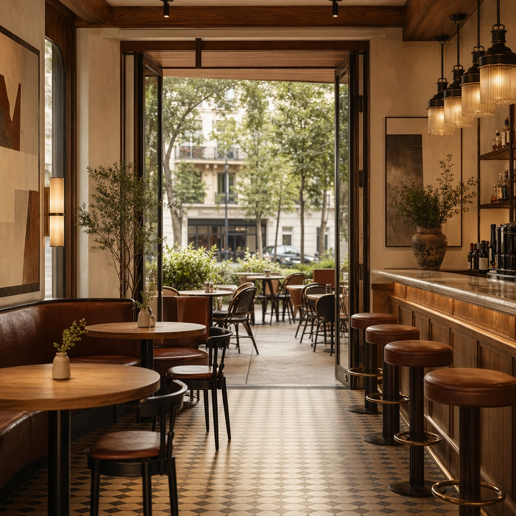
Scene: Create a square standalone support study for Restaurant Cafe Space Brand Integration. Use an indoor-outdoor terrace seating view with cafe chairs and filtered daylight and frame it like a premium commercial still or design-editorial crop with clear focal hierarchy, disciplined perspective, and enough breathing room for the materials and objects to read at both thumbnail and full size. Keep toasted oak, espresso brown, muted cream, oxidized brass, and warm tungsten amber as the tonal guide so the image still belongs to the same theme family, and light the scene in a controlled way that emphasizes texture, edge quality, and authored atmosphere over spectacle. Subject: Show a restaurant and cafe interior where oak, oxidized metal, patterned tile, leather banquettes, softly glowing pendants, and abstract menu surfaces feel authored as one brand system. In this support study, focus on transitional branding, furniture continuity, and street-facing hospitality appeal. The image should work independently, yet it must still feel like it belongs to the same broader world of Cafe Space. Make the space, props, and detailing useful for real campaign, editorial, or design-review contexts rather than moodboard abstraction. Important details: Carry forward the broader language of the tile language, oak-and-metal pairings, banquette shapes, bar geometry, pendant rhythm, and abstract menu-display zones, but let this image prove a new support surface or secondary deliverable. Material realism is essential: wood grain, metal sheen, glass edges, textiles, and stone should feel physically plausible and carefully art directed. Any graphic panels, labels, menus, packaging, or captions must stay abstract and unreadable. The overall result should feel reusable for restaurant launches, cafe campaigns, hospitality editorials, and concept pitch boards, with enough structure that a creative or operations team could build on it. Use case: Restaurant Cafe Space Brand Integration single study 7/9, exploring support imagery for terrace campaigns. Constraints: No readable text, no watermark, no logos, preserve exact 1:1 aspect ratio, no crowded diners, no readable menus, no food-delivery branding, no messy plates, no random neon slogans, no readable awning text.

Example generated from “Restaurant Cafe Space Brand Integration — Restroom Identity Corridor”
GPT Image 2en

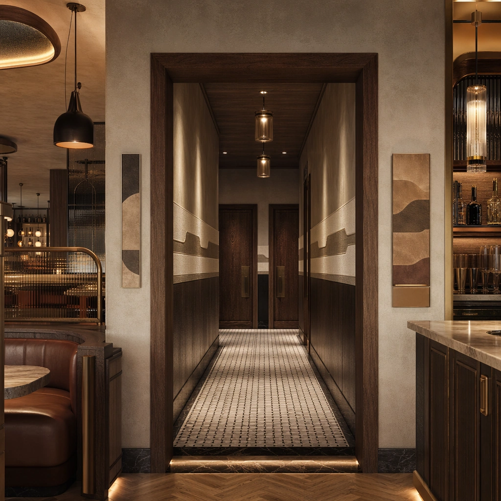
Scene: Create a square standalone support study for Restaurant Cafe Space Brand Integration. Use a corridor leading to restrooms with lighting, wall texture, and abstract graphic bands and frame it like a premium commercial still or design-editorial crop with clear focal hierarchy, disciplined perspective, and enough breathing room for the materials and objects to read at both thumbnail and full size. Keep toasted oak, espresso brown, muted cream, oxidized brass, and warm tungsten amber as the tonal guide so the image still belongs to the same theme family, and light the scene in a controlled way that emphasizes texture, edge quality, and authored atmosphere over spectacle. Subject: Show a restaurant and cafe interior where oak, oxidized metal, patterned tile, leather banquettes, softly glowing pendants, and abstract menu surfaces feel authored as one brand system. In this support study, focus on secondary-space branding, threshold clarity, and elevated utility. The image should work independently, yet it must still feel like it belongs to the same broader world of Cafe Space. Make the space, props, and detailing useful for real campaign, editorial, or design-review contexts rather than moodboard abstraction. Important details: Carry forward the broader language of the tile language, oak-and-metal pairings, banquette shapes, bar geometry, pendant rhythm, and abstract menu-display zones, but let this image prove a new support surface or secondary deliverable. Material realism is essential: wood grain, metal sheen, glass edges, textiles, and stone should feel physically plausible and carefully art directed. Any graphic panels, labels, menus, packaging, or captions must stay abstract and unreadable. The overall result should feel reusable for restaurant launches, cafe campaigns, hospitality editorials, and concept pitch boards, with enough structure that a creative or operations team could build on it. Use case: Restaurant Cafe Space Brand Integration single study 8/9, exploring support study for whole-venue brand consistency. Constraints: No readable text, no watermark, no logos, preserve exact 1:1 aspect ratio, no crowded diners, no readable menus, no food-delivery branding, no messy plates, no random neon slogans, no readable restroom icons.

Example generated from “Restaurant Cafe Space Brand Integration — Open Kitchen Pass”
GPT Image 2en

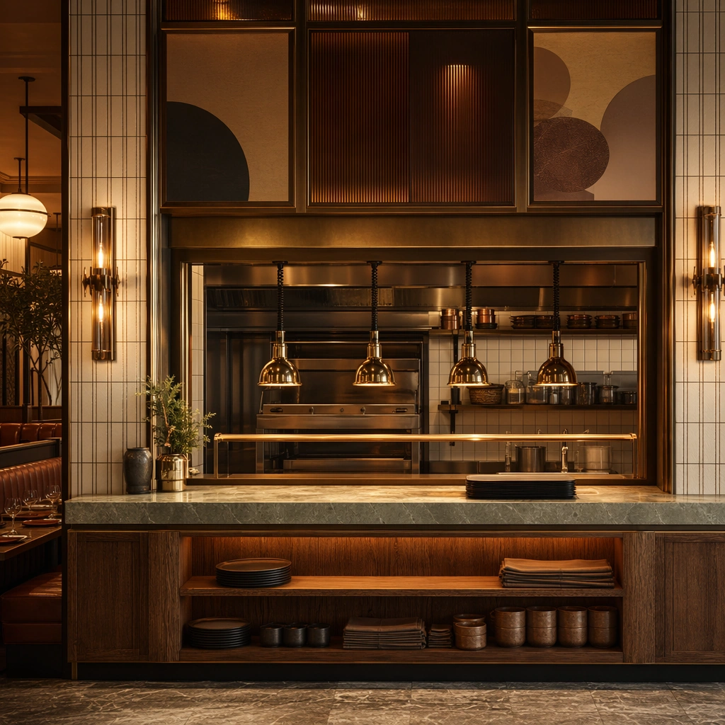
Scene: Create a square standalone support study for Restaurant Cafe Space Brand Integration. Use a composed view of the kitchen pass framed by tile and warm metal and frame it like a premium commercial still or design-editorial crop with clear focal hierarchy, disciplined perspective, and enough breathing room for the materials and objects to read at both thumbnail and full size. Keep toasted oak, espresso brown, muted cream, oxidized brass, and warm tungsten amber as the tonal guide so the image still belongs to the same theme family, and light the scene in a controlled way that emphasizes texture, edge quality, and authored atmosphere over spectacle. Subject: Show a restaurant and cafe interior where oak, oxidized metal, patterned tile, leather banquettes, softly glowing pendants, and abstract menu surfaces feel authored as one brand system. In this support study, focus on food handoff architecture, counter detailing, and operational theatre. The image should work independently, yet it must still feel like it belongs to the same broader world of Cafe Space. Make the space, props, and detailing useful for real campaign, editorial, or design-review contexts rather than moodboard abstraction. Important details: Carry forward the broader language of the tile language, oak-and-metal pairings, banquette shapes, bar geometry, pendant rhythm, and abstract menu-display zones, but let this image prove a new support surface or secondary deliverable. Material realism is essential: wood grain, metal sheen, glass edges, textiles, and stone should feel physically plausible and carefully art directed. Any graphic panels, labels, menus, packaging, or captions must stay abstract and unreadable. The overall result should feel reusable for restaurant launches, cafe campaigns, hospitality editorials, and concept pitch boards, with enough structure that a creative or operations team could build on it. Use case: Restaurant Cafe Space Brand Integration single study 9/9, exploring support still for chef-facing and guest-facing crossover moments. Constraints: No readable text, no watermark, no logos, preserve exact 1:1 aspect ratio, no crowded diners, no readable menus, no food-delivery branding, no messy plates, no random neon slogans, no chefs, no readable tickets.

Example generated from “Retail Flagship Store Experience System — Entry Hero Anchor”
GPT Image 2en

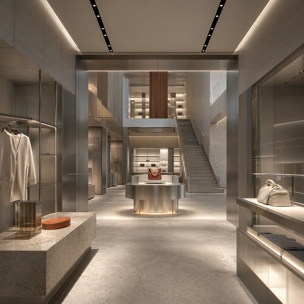
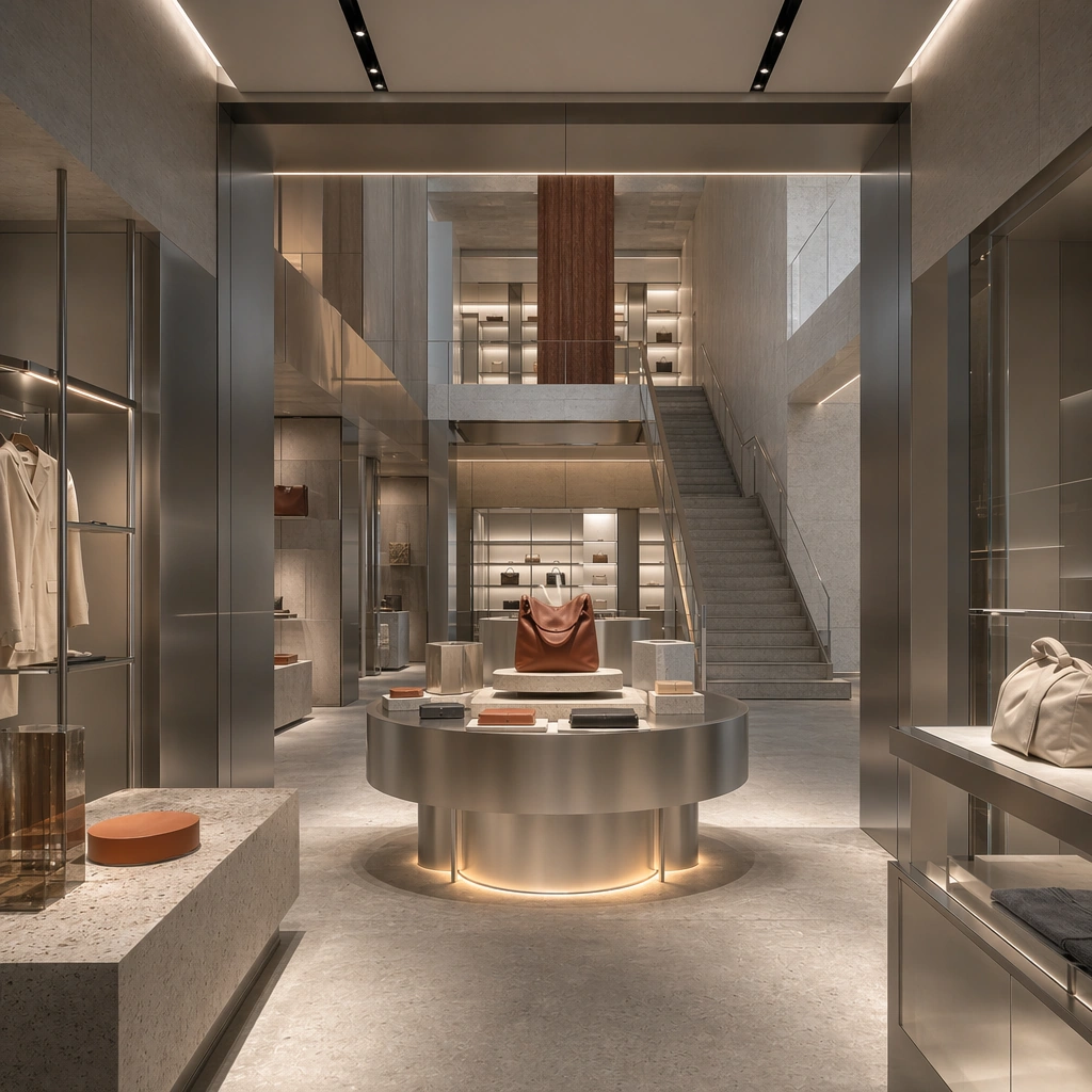
Scene: Create a square architectural reference still for Retail Flagship Store Experience System. Use a wide view from the entrance that reveals the main display axis and stair or volume changes and treat the frame like a premium interior or architecture editorial photograph with disciplined perspective, readable depth from foreground to background, and enough negative space for the spatial hierarchy to breathe. Light the scene so circulation, hero display, and immersive branded retail feel immediate, using soft concrete gray, brushed silver, warm white light, muted sand stone, and one restrained accent tone as the governing tonal range. The composition must read as a high-end commercial image that could sit inside retail launch decks, store-design reviews, campaign stills, and experiential pitch boards. Subject: Show a premium flagship retail interior with sculpted display fixtures, integrated light bands, neutral stone floors, brushed aluminum rails, translucent resin accents, and an immersive circulation plan. Center the flagship’s spatial hook, hero product fixture, and overall customer journey. This is the canonical reference image for the package, so the major proportions, material transitions, fixture families, and circulation logic must feel highly specific and internally coherent rather than generic luxury styling. Let the viewer understand how the space is organized within a single glance, with foreground anchors, a clear middle zone, and a resolved background termination. Important details: Lock the hero fixture shapes, integrated lighting bands, resin accents, circulation loop, and premium product-display grammar. Surfaces should feel tactile and believable: stone veining must stay plausible, metals should have disciplined reflectance, fabrics should show natural weight, and concealed lighting should shape the volume instead of flattening it. Use abstract signage, menu, label, or caption zones only as unreadable graphic hints. The image should feel practical for downstream design reviews and polished enough for public-facing campaign use. Use case: Retail Flagship Store Experience System series study 1/9, establishing the canonical store identity for the package. Constraints: No readable text, no watermark, no logos, preserve exact 1:1 aspect ratio, no crowds, no cash-register clutter, no readable price tags, no seasonal sale props, no random mannequins everywhere, no giant storefront text.

Example generated from “Retail Flagship Store Experience System — Central Fixture Focus”
GPT Image 2en

Scene: Create a square reference-dependent architecture still for Retail Flagship Store Experience System. Use a closer composition centered on the sculptural hero fixture while keeping the same lens discipline, editorial polish, and material believability established by the reference image. The lighting can shift to support the intended mood, but the space must still feel like the same authored project with a stable viewpoint logic, convincing depth separation, and clean commercial-photography finish. Keep soft concrete gray, brushed silver, warm white light, muted sand stone, and one restrained accent tone as the governing tonal range even when the emphasis changes. Subject: Show a premium flagship retail interior with sculpted display fixtures, integrated light bands, neutral stone floors, brushed aluminum rails, translucent resin accents, and an immersive circulation plan. Focus on the exact same flagship from the reference image, now emphasizing merchandising density, fixture craftsmanship, and layered sightlines. Preserve exact architectural identity, plan logic, material palette, fixture family, and circulation cues from the reference image while changing only the intended emphasis described here. The viewer should immediately recognize the same project, not a loose cousin, with matching silhouette logic, aligned detailing, and consistent brand atmosphere. Important details: Preserve the hero fixture shapes, integrated lighting bands, resin accents, circulation loop, and premium product-display grammar. Any abstract wayfinding, menu, wall-label, or packaging zones must stay unreadable and subordinate to the spatial image. Joinery, edges, reflections, and lighting should remain realistic enough for an operator or design team to treat the image as a credible reference. The variation should feel deliberate and commercially useful, proving that one locked spatial language can flex across multiple campaign or editorial surfaces. Use case: Retail Flagship Store Experience System series study 2/9, extending the hero display moment while preserving the same store identity. Constraints: No readable text, no watermark, no logos, preserve exact 1:1 aspect ratio, preserve exact architectural identity from the reference image, no crowds, no cash-register clutter, no readable price tags, no seasonal sale props, no random mannequins everywhere, no overflowing products.

Example generated from “Retail Flagship Store Experience System — Fitting Lounge Sequence”
GPT Image 2en

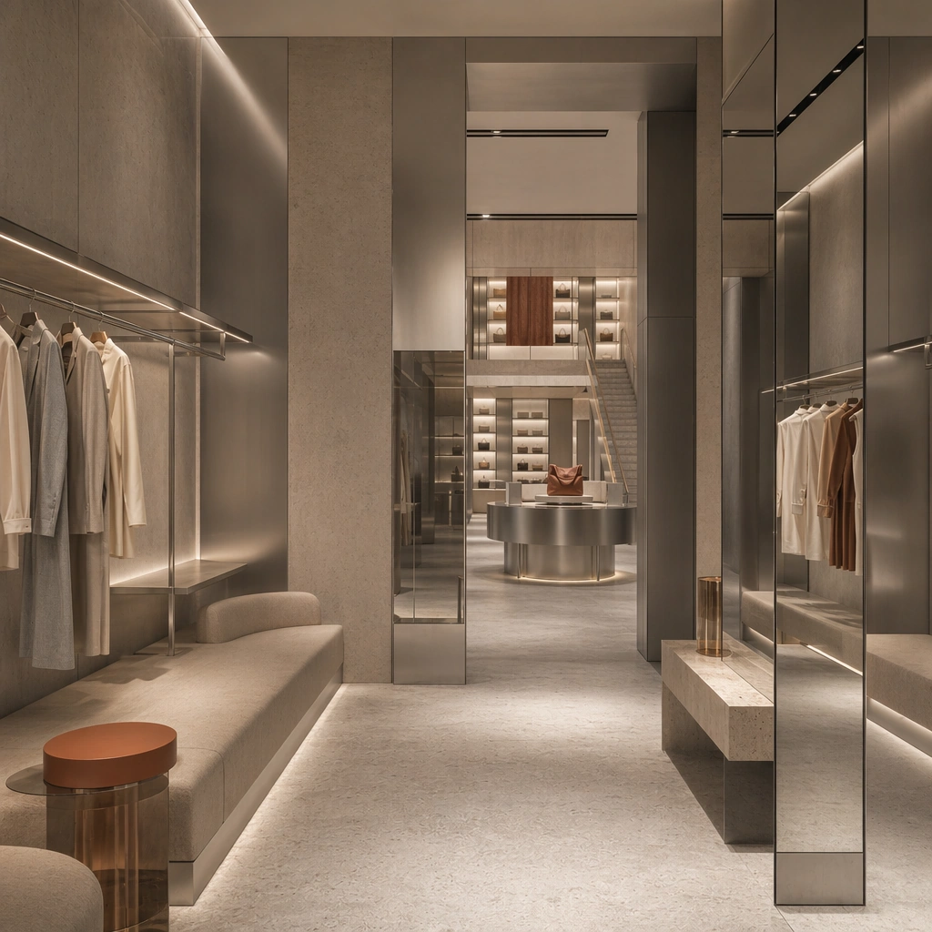
Scene: Create a square reference-dependent architecture still for Retail Flagship Store Experience System. Use a lateral view into a fitting or try-on lounge zone with benches and mirrors while keeping the same lens discipline, editorial polish, and material believability established by the reference image. The lighting can shift to support the intended mood, but the space must still feel like the same authored project with a stable viewpoint logic, convincing depth separation, and clean commercial-photography finish. Keep soft concrete gray, brushed silver, warm white light, muted sand stone, and one restrained accent tone as the governing tonal range even when the emphasis changes. Subject: Show a premium flagship retail interior with sculpted display fixtures, integrated light bands, neutral stone floors, brushed aluminum rails, translucent resin accents, and an immersive circulation plan. Focus on the exact same flagship from the reference image, now emphasizing customer pause points and softer materials. Preserve exact architectural identity, plan logic, material palette, fixture family, and circulation cues from the reference image while changing only the intended emphasis described here. The viewer should immediately recognize the same project, not a loose cousin, with matching silhouette logic, aligned detailing, and consistent brand atmosphere. Important details: Preserve the hero fixture shapes, integrated lighting bands, resin accents, circulation loop, and premium product-display grammar. Any abstract wayfinding, menu, wall-label, or packaging zones must stay unreadable and subordinate to the spatial image. Joinery, edges, reflections, and lighting should remain realistic enough for an operator or design team to treat the image as a credible reference. The variation should feel deliberate and commercially useful, proving that one locked spatial language can flex across multiple campaign or editorial surfaces. Use case: Retail Flagship Store Experience System series study 3/9, extending the intimacy layer of the same branded space. Constraints: No readable text, no watermark, no logos, preserve exact 1:1 aspect ratio, preserve exact architectural identity from the reference image, no crowds, no cash-register clutter, no readable price tags, no seasonal sale props, no random mannequins everywhere, no readable mirror graphics.

Example generated from “Retail Flagship Store Experience System — Checkout Wrap Zone”
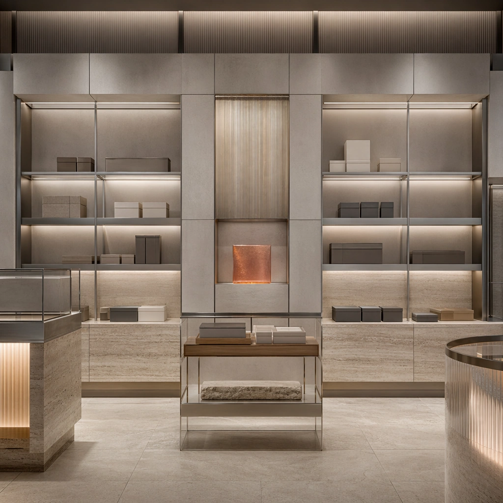
GPT Image 2en

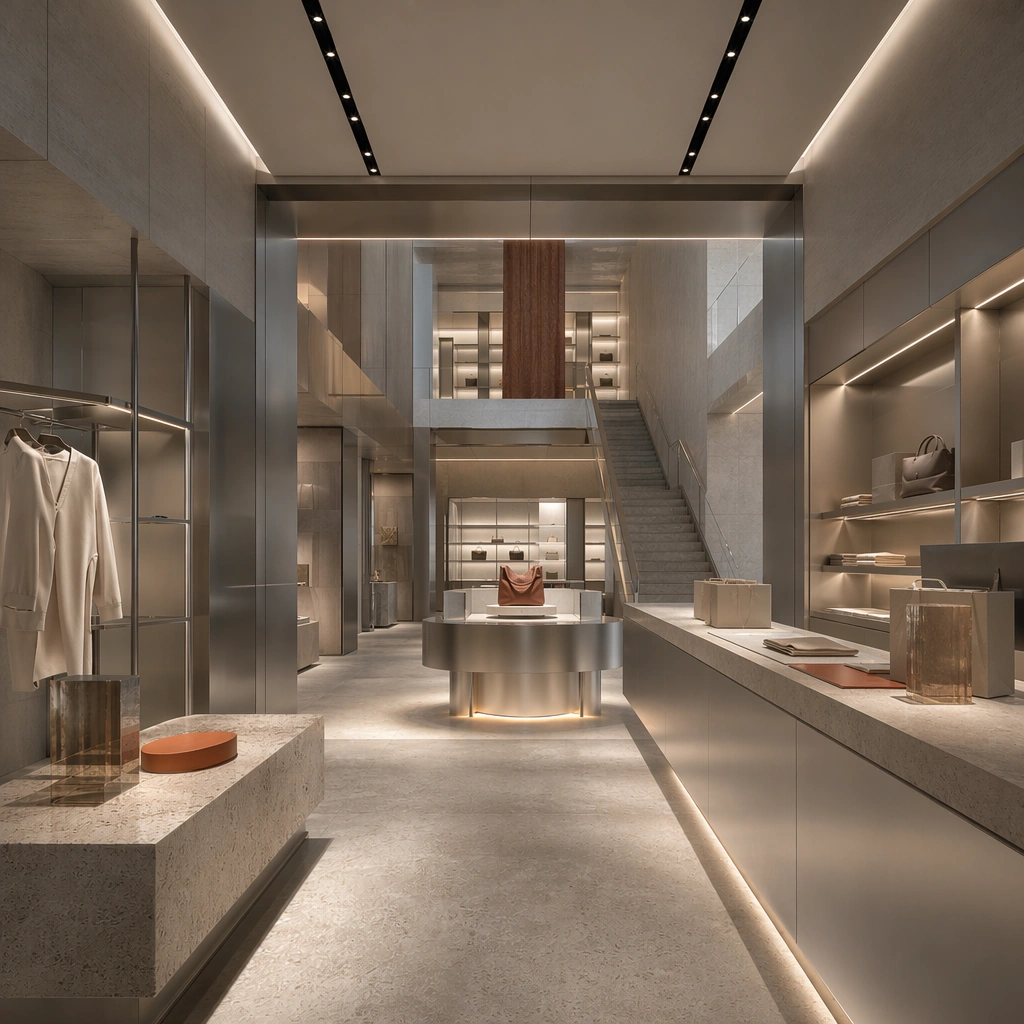
Scene: Create a square reference-dependent architecture still for Retail Flagship Store Experience System. Use a composed view toward the checkout and wrap zone with integrated cabinetry while keeping the same lens discipline, editorial polish, and material believability established by the reference image. The lighting can shift to support the intended mood, but the space must still feel like the same authored project with a stable viewpoint logic, convincing depth separation, and clean commercial-photography finish. Keep soft concrete gray, brushed silver, warm white light, muted sand stone, and one restrained accent tone as the governing tonal range even when the emphasis changes. Subject: Show a premium flagship retail interior with sculpted display fixtures, integrated light bands, neutral stone floors, brushed aluminum rails, translucent resin accents, and an immersive circulation plan. Focus on the exact same flagship from the reference image, now emphasizing final transaction calm and packaging handoff surfaces. Preserve exact architectural identity, plan logic, material palette, fixture family, and circulation cues from the reference image while changing only the intended emphasis described here. The viewer should immediately recognize the same project, not a loose cousin, with matching silhouette logic, aligned detailing, and consistent brand atmosphere. Important details: Preserve the hero fixture shapes, integrated lighting bands, resin accents, circulation loop, and premium product-display grammar. Any abstract wayfinding, menu, wall-label, or packaging zones must stay unreadable and subordinate to the spatial image. Joinery, edges, reflections, and lighting should remain realistic enough for an operator or design team to treat the image as a credible reference. The variation should feel deliberate and commercially useful, proving that one locked spatial language can flex across multiple campaign or editorial surfaces. Use case: Retail Flagship Store Experience System series study 4/9, extending end-of-journey logic inside the same store language. Constraints: No readable text, no watermark, no logos, preserve exact 1:1 aspect ratio, preserve exact architectural identity from the reference image, no crowds, no cash-register clutter, no readable price tags, no seasonal sale props, no random mannequins everywhere, no point-of-sale screens with readable UI.

Example generated from “Retail Flagship Store Experience System — Staircase Moment”
GPT Image 2en

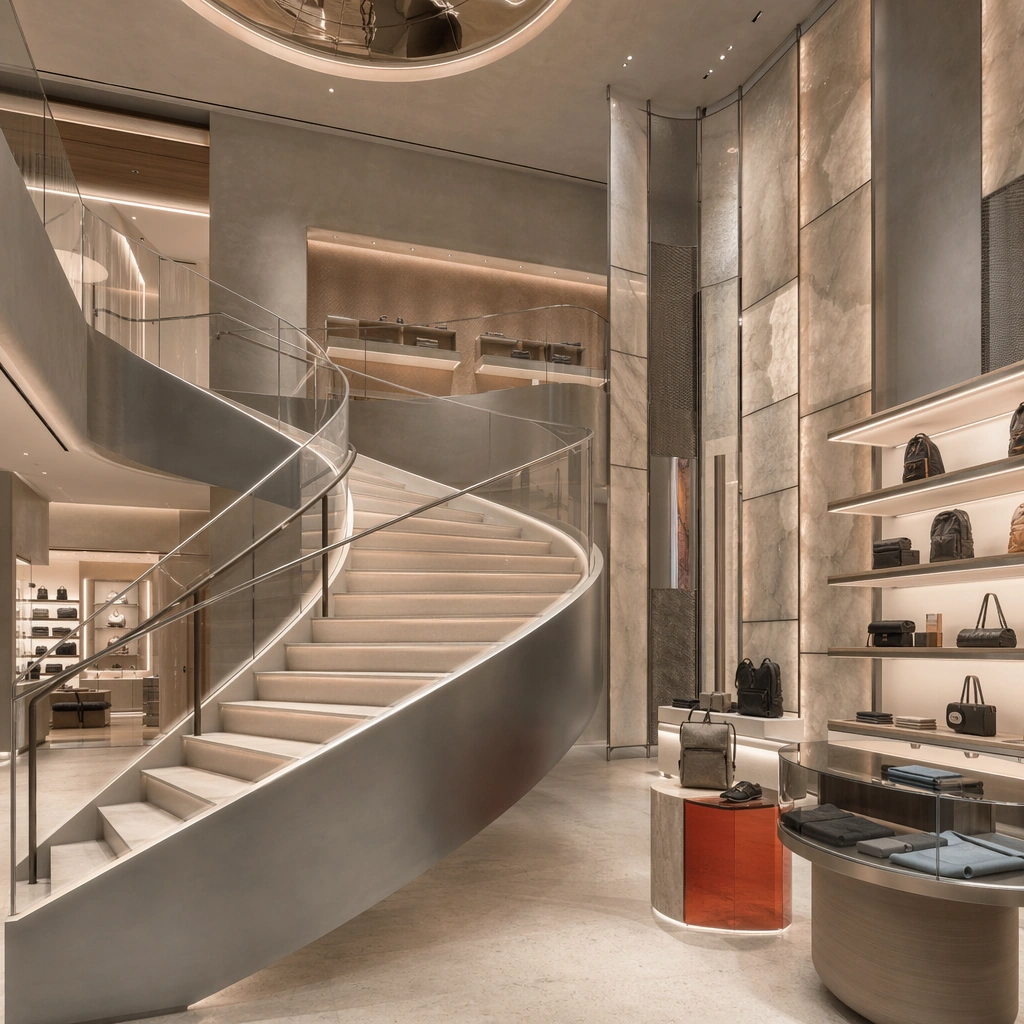
Scene: Create a square standalone support study for Retail Flagship Store Experience System. Use a square interior still centered on the flagship staircase and adjacent display wall and frame it like a premium commercial still or design-editorial crop with clear focal hierarchy, disciplined perspective, and enough breathing room for the materials and objects to read at both thumbnail and full size. Keep soft concrete gray, brushed silver, warm white light, muted sand stone, and one restrained accent tone as the tonal guide so the image still belongs to the same theme family, and light the scene in a controlled way that emphasizes texture, edge quality, and authored atmosphere over spectacle. Subject: Show a premium flagship retail interior with sculpted display fixtures, integrated light bands, neutral stone floors, brushed aluminum rails, translucent resin accents, and an immersive circulation plan. In this support study, focus on circulation drama, railing detail, and vertical brand storytelling. The image should work independently, yet it must still feel like it belongs to the same broader world of Flagship Store. Make the space, props, and detailing useful for real campaign, editorial, or design-review contexts rather than moodboard abstraction. Important details: Carry forward the broader language of the hero fixture shapes, integrated lighting bands, resin accents, circulation loop, and premium product-display grammar, but let this image prove a new support surface or secondary deliverable. Material realism is essential: wood grain, metal sheen, glass edges, textiles, and stone should feel physically plausible and carefully art directed. Any graphic panels, labels, menus, packaging, or captions must stay abstract and unreadable. The overall result should feel reusable for retail launch decks, store-design reviews, campaign stills, and experiential pitch boards, with enough structure that a creative or operations team could build on it. Use case: Retail Flagship Store Experience System single study 6/9, exploring support study for store wayfinding and spatial hierarchy. Constraints: No readable text, no watermark, no logos, preserve exact 1:1 aspect ratio, no crowds, no cash-register clutter, no readable price tags, no seasonal sale props, no random mannequins everywhere, no crowd on stairs.

Example generated from “Retail Flagship Store Experience System — Packaging Wall System”
GPT Image 2en

Scene: Create a square standalone support study for Retail Flagship Store Experience System. Use a front-on packaging wall with abstract box forms, niches, and tonal order and frame it like a premium commercial still or design-editorial crop with clear focal hierarchy, disciplined perspective, and enough breathing room for the materials and objects to read at both thumbnail and full size. Keep soft concrete gray, brushed silver, warm white light, muted sand stone, and one restrained accent tone as the tonal guide so the image still belongs to the same theme family, and light the scene in a controlled way that emphasizes texture, edge quality, and authored atmosphere over spectacle. Subject: Show a premium flagship retail interior with sculpted display fixtures, integrated light bands, neutral stone floors, brushed aluminum rails, translucent resin accents, and an immersive circulation plan. In this support study, focus on inventory display discipline and brand-grade repetition without readable text. The image should work independently, yet it must still feel like it belongs to the same broader world of Flagship Store. Make the space, props, and detailing useful for real campaign, editorial, or design-review contexts rather than moodboard abstraction. Important details: Carry forward the broader language of the hero fixture shapes, integrated lighting bands, resin accents, circulation loop, and premium product-display grammar, but let this image prove a new support surface or secondary deliverable. Material realism is essential: wood grain, metal sheen, glass edges, textiles, and stone should feel physically plausible and carefully art directed. Any graphic panels, labels, menus, packaging, or captions must stay abstract and unreadable. The overall result should feel reusable for retail launch decks, store-design reviews, campaign stills, and experiential pitch boards, with enough structure that a creative or operations team could build on it. Use case: Retail Flagship Store Experience System single study 7/9, exploring support image for packaging-zone design. Constraints: No readable text, no watermark, no logos, preserve exact 1:1 aspect ratio, no crowds, no cash-register clutter, no readable price tags, no seasonal sale props, no random mannequins everywhere, no SKU labels.

Example generated from “Retail Flagship Store Experience System — Window Display from Inside”
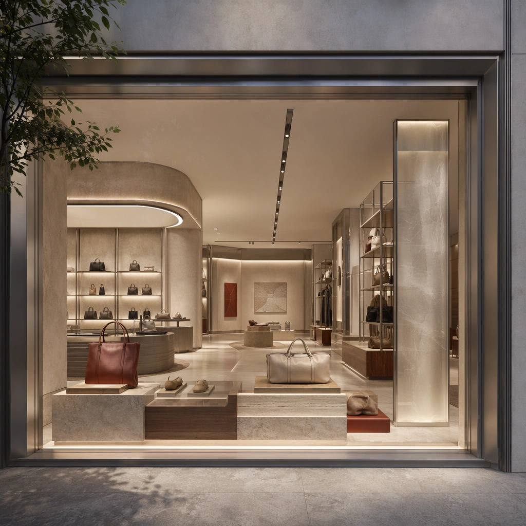
GPT Image 2en

Scene: Create a square standalone support study for Retail Flagship Store Experience System. Use an inside-looking-out composition through the window display frame and frame it like a premium commercial still or design-editorial crop with clear focal hierarchy, disciplined perspective, and enough breathing room for the materials and objects to read at both thumbnail and full size. Keep soft concrete gray, brushed silver, warm white light, muted sand stone, and one restrained accent tone as the tonal guide so the image still belongs to the same theme family, and light the scene in a controlled way that emphasizes texture, edge quality, and authored atmosphere over spectacle. Subject: Show a premium flagship retail interior with sculpted display fixtures, integrated light bands, neutral stone floors, brushed aluminum rails, translucent resin accents, and an immersive circulation plan. In this support study, focus on street visibility, hero prop balance, and retail theatre with minimal clutter. The image should work independently, yet it must still feel like it belongs to the same broader world of Flagship Store. Make the space, props, and detailing useful for real campaign, editorial, or design-review contexts rather than moodboard abstraction. Important details: Carry forward the broader language of the hero fixture shapes, integrated lighting bands, resin accents, circulation loop, and premium product-display grammar, but let this image prove a new support surface or secondary deliverable. Material realism is essential: wood grain, metal sheen, glass edges, textiles, and stone should feel physically plausible and carefully art directed. Any graphic panels, labels, menus, packaging, or captions must stay abstract and unreadable. The overall result should feel reusable for retail launch decks, store-design reviews, campaign stills, and experiential pitch boards, with enough structure that a creative or operations team could build on it. Use case: Retail Flagship Store Experience System single study 8/9, exploring campaign-ready window-display support still. Constraints: No readable text, no watermark, no logos, preserve exact 1:1 aspect ratio, no crowds, no cash-register clutter, no readable price tags, no seasonal sale props, no random mannequins everywhere, no pedestrians pressed against glass.

Example generated from “Retail Flagship Store Experience System — Event Launch Podium”
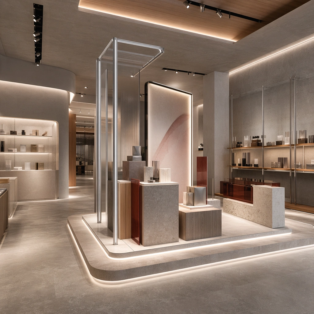
GPT Image 2en

Scene: Create a square standalone support study for Retail Flagship Store Experience System. Use a temporary launch podium integrated into the store volume with lighting and modular staging and frame it like a premium commercial still or design-editorial crop with clear focal hierarchy, disciplined perspective, and enough breathing room for the materials and objects to read at both thumbnail and full size. Keep soft concrete gray, brushed silver, warm white light, muted sand stone, and one restrained accent tone as the tonal guide so the image still belongs to the same theme family, and light the scene in a controlled way that emphasizes texture, edge quality, and authored atmosphere over spectacle. Subject: Show a premium flagship retail interior with sculpted display fixtures, integrated light bands, neutral stone floors, brushed aluminum rails, translucent resin accents, and an immersive circulation plan. In this support study, focus on event-readiness, product reveal energy, and continuity with the flagship materials. The image should work independently, yet it must still feel like it belongs to the same broader world of Flagship Store. Make the space, props, and detailing useful for real campaign, editorial, or design-review contexts rather than moodboard abstraction. Important details: Carry forward the broader language of the hero fixture shapes, integrated lighting bands, resin accents, circulation loop, and premium product-display grammar, but let this image prove a new support surface or secondary deliverable. Material realism is essential: wood grain, metal sheen, glass edges, textiles, and stone should feel physically plausible and carefully art directed. Any graphic panels, labels, menus, packaging, or captions must stay abstract and unreadable. The overall result should feel reusable for retail launch decks, store-design reviews, campaign stills, and experiential pitch boards, with enough structure that a creative or operations team could build on it. Use case: Retail Flagship Store Experience System single study 9/9, exploring support asset for in-store activation planning. Constraints: No readable text, no watermark, no logos, preserve exact 1:1 aspect ratio, no crowds, no cash-register clutter, no readable price tags, no seasonal sale props, no random mannequins everywhere, no branded banners or readable slogans.

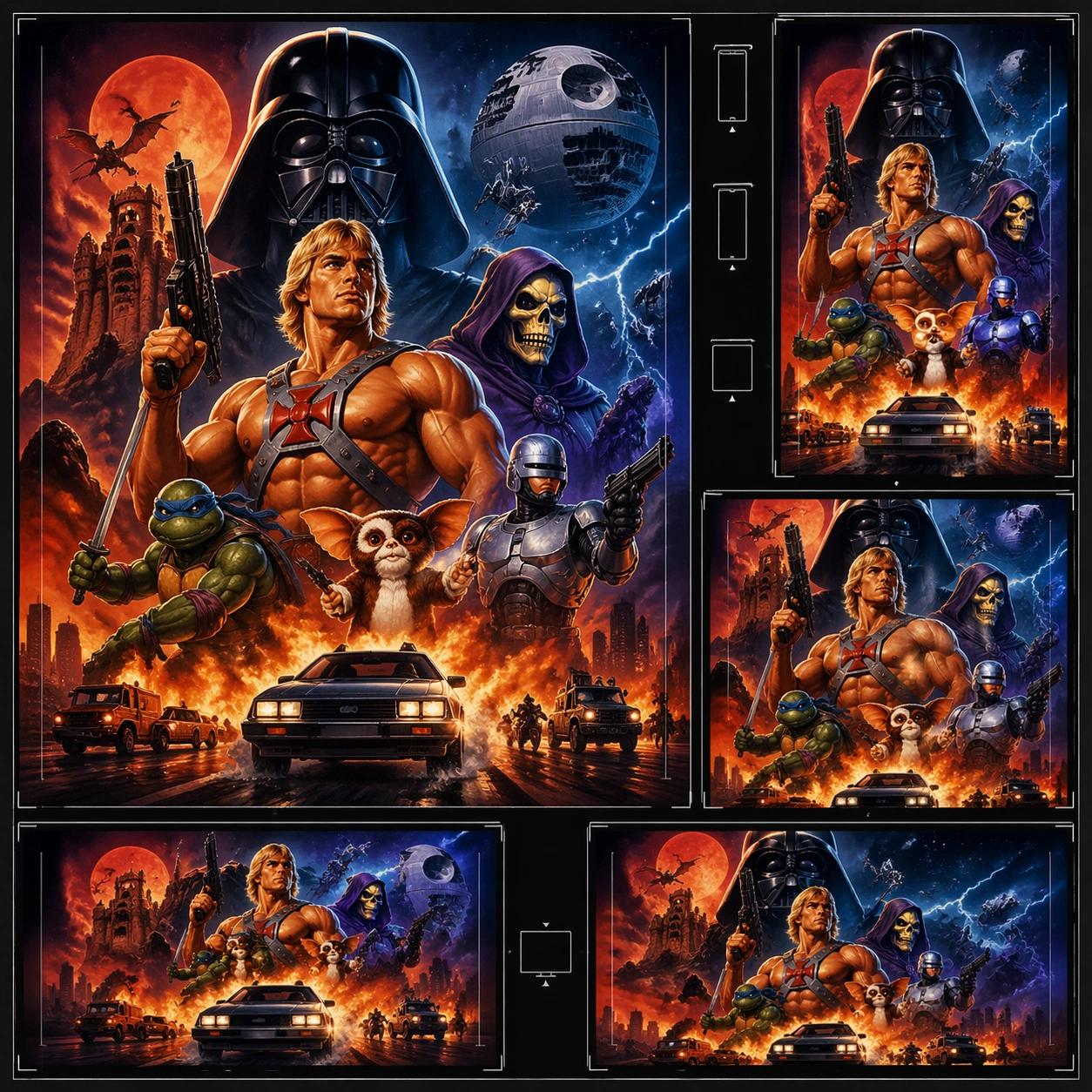
Example generated from “Retro Blockbuster Character Swap — Reference Key Art”
GPT Image 2en

Scene: A square entertainment marketing key visual for Retro Blockbuster Character Swap, designed like a polished campaign asset ready for posters, covers, feeds, or street placement. The composition should have immediate impact from a distance while still carrying layered detail up close. Keep the lighting dramatic, the hierarchy bold, and the framing tight enough to feel like real promotional art instead of a casual illustration. Subject: Center the piece on Reference Key Art, a frame that locks the cast hierarchy, focal rhythm, and signature sales composition for the series. Translate Recreate painted blockbuster poster language from the 1980s and 1990s with alternate IP casts, preserving airbrushed energy, montage structure, and theatrical hype. into a concrete campaign image with clear protagonist hierarchy, supporting world-building cues, and unmistakable promotional intent. The viewer should understand the genre, the ensemble relationships, and the commercial purpose at a glance without relying on readable text or existing brand marks. Important details: The challenge is disciplined hype. Preserve focal hierarchy, readable silhouette separation, strong foreground-background layering, and a convincing balance between character energy and structured layout. This theme studies style-transfer, structured-layout, commercial-mockup, reasoning-composition through a production-ready visual system. Even if typography is unreadable, space for title blocks, badges, or platform framing should feel intentionally designed. Aim for clear hierarchy, polished craft, and immediately usable campaign logic. Use case: Retro Blockbuster Character Swap series study 1/4. Constraints: No readable text, no watermark, no logos, preserve exact 1:1 aspect ratio, no broken anatomy, no unreadable hierarchy collapse, no muddy montage, no accidental real movie logos, no random filler characters, no off-topic props.

Example generated from “Retro Blockbuster Character Swap — Character Surge”
GPT Image 2en

Scene: A square entertainment marketing key visual for Retro Blockbuster Character Swap, designed like a polished campaign asset ready for posters, covers, feeds, or street placement. The composition should have immediate impact from a distance while still carrying layered detail up close. Keep the lighting dramatic, the hierarchy bold, and the framing tight enough to feel like real promotional art instead of a casual illustration. Subject: Center the piece on Character Surge, a frame that pushes the same poster language toward a more aggressive character-first emphasis. Translate Recreate painted blockbuster poster language from the 1980s and 1990s with alternate IP casts, preserving airbrushed energy, montage structure, and theatrical hype. into a concrete campaign image with clear protagonist hierarchy, supporting world-building cues, and unmistakable promotional intent. The viewer should understand the genre, the ensemble relationships, and the commercial purpose at a glance without relying on readable text or existing brand marks. Important details: The challenge is disciplined hype. Preserve focal hierarchy, readable silhouette separation, strong foreground-background layering, and a convincing balance between character energy and structured layout. This theme studies style-transfer, structured-layout, commercial-mockup, reasoning-composition through a production-ready visual system. Even if typography is unreadable, space for title blocks, badges, or platform framing should feel intentionally designed. Aim for clear hierarchy, polished craft, and immediately usable campaign logic. Use case: Retro Blockbuster Character Swap series study 2/4. Constraints: No readable text, no watermark, no logos, preserve exact 1:1 aspect ratio, no broken anatomy, no unreadable hierarchy collapse, no muddy montage, no accidental real movie logos, no random filler characters, no off-topic props.

Example generated from “Retro Blockbuster Character Swap — Genre Pivot”
GPT Image 2en

Scene: A square entertainment marketing key visual for Retro Blockbuster Character Swap, designed like a polished campaign asset ready for posters, covers, feeds, or street placement. The composition should have immediate impact from a distance while still carrying layered detail up close. Keep the lighting dramatic, the hierarchy bold, and the framing tight enough to feel like real promotional art instead of a casual illustration. Subject: Center the piece on Genre Pivot, a frame that keeps the hierarchy but bends color, props, and supporting scenes toward a different subgenre. Translate Recreate painted blockbuster poster language from the 1980s and 1990s with alternate IP casts, preserving airbrushed energy, montage structure, and theatrical hype. into a concrete campaign image with clear protagonist hierarchy, supporting world-building cues, and unmistakable promotional intent. The viewer should understand the genre, the ensemble relationships, and the commercial purpose at a glance without relying on readable text or existing brand marks. Important details: The challenge is disciplined hype. Preserve focal hierarchy, readable silhouette separation, strong foreground-background layering, and a convincing balance between character energy and structured layout. This theme studies style-transfer, structured-layout, commercial-mockup, reasoning-composition through a production-ready visual system. Even if typography is unreadable, space for title blocks, badges, or platform framing should feel intentionally designed. Aim for clear hierarchy, polished craft, and immediately usable campaign logic. Use case: Retro Blockbuster Character Swap series study 3/4. Constraints: No readable text, no watermark, no logos, preserve exact 1:1 aspect ratio, no broken anatomy, no unreadable hierarchy collapse, no muddy montage, no accidental real movie logos, no random filler characters, no off-topic props.

Example generated from “Retro Blockbuster Character Swap — Finale Ensemble”
GPT Image 2en

Scene: A square entertainment marketing key visual for Retro Blockbuster Character Swap, designed like a polished campaign asset ready for posters, covers, feeds, or street placement. The composition should have immediate impact from a distance while still carrying layered detail up close. Keep the lighting dramatic, the hierarchy bold, and the framing tight enough to feel like real promotional art instead of a casual illustration. Subject: Center the piece on Finale Ensemble, a frame that expands the same layout into a climax-heavy ensemble poster without losing readability. Translate Recreate painted blockbuster poster language from the 1980s and 1990s with alternate IP casts, preserving airbrushed energy, montage structure, and theatrical hype. into a concrete campaign image with clear protagonist hierarchy, supporting world-building cues, and unmistakable promotional intent. The viewer should understand the genre, the ensemble relationships, and the commercial purpose at a glance without relying on readable text or existing brand marks. Important details: The challenge is disciplined hype. Preserve focal hierarchy, readable silhouette separation, strong foreground-background layering, and a convincing balance between character energy and structured layout. This theme studies style-transfer, structured-layout, commercial-mockup, reasoning-composition through a production-ready visual system. Even if typography is unreadable, space for title blocks, badges, or platform framing should feel intentionally designed. Aim for clear hierarchy, polished craft, and immediately usable campaign logic. Use case: Retro Blockbuster Character Swap series study 4/4. Constraints: No readable text, no watermark, no logos, preserve exact 1:1 aspect ratio, no broken anatomy, no unreadable hierarchy collapse, no muddy montage, no accidental real movie logos, no random filler characters, no off-topic props.

Example generated from “Retro Blockbuster Character Swap — Teaser Card”
GPT Image 2en

Scene: A square entertainment marketing key visual for Retro Blockbuster Character Swap, designed like a polished campaign asset ready for posters, covers, feeds, or street placement. The composition should have immediate impact from a distance while still carrying layered detail up close. Keep the lighting dramatic, the hierarchy bold, and the framing tight enough to feel like real promotional art instead of a casual illustration. Subject: Center the piece on Teaser Card, a frame that a compact mystery-first promo asset built for anticipation and visual tension. Translate Recreate painted blockbuster poster language from the 1980s and 1990s with alternate IP casts, preserving airbrushed energy, montage structure, and theatrical hype. into a concrete campaign image with clear protagonist hierarchy, supporting world-building cues, and unmistakable promotional intent. The viewer should understand the genre, the ensemble relationships, and the commercial purpose at a glance without relying on readable text or existing brand marks. Important details: The challenge is disciplined hype. Preserve focal hierarchy, readable silhouette separation, strong foreground-background layering, and a convincing balance between character energy and structured layout. This theme studies style-transfer, structured-layout, commercial-mockup, reasoning-composition through a production-ready visual system. Even if typography is unreadable, space for title blocks, badges, or platform framing should feel intentionally designed. Aim for clear hierarchy, polished craft, and immediately usable campaign logic. Use case: Retro Blockbuster Character Swap single study 1/5. Constraints: No readable text, no watermark, no logos, preserve exact 1:1 aspect ratio, no broken anatomy, no unreadable hierarchy collapse, no muddy montage, no accidental real movie logos, no random filler characters, no off-topic props.

Example generated from “Retro Blockbuster Character Swap — Countdown Poster”
GPT Image 2en

Scene: A square entertainment marketing key visual for Retro Blockbuster Character Swap, designed like a polished campaign asset ready for posters, covers, feeds, or street placement. The composition should have immediate impact from a distance while still carrying layered detail up close. Keep the lighting dramatic, the hierarchy bold, and the framing tight enough to feel like real promotional art instead of a casual illustration. Subject: Center the piece on Countdown Poster, a frame that a countdown-ready campaign poster with bold hierarchy and tight emotional framing. Translate Recreate painted blockbuster poster language from the 1980s and 1990s with alternate IP casts, preserving airbrushed energy, montage structure, and theatrical hype. into a concrete campaign image with clear protagonist hierarchy, supporting world-building cues, and unmistakable promotional intent. The viewer should understand the genre, the ensemble relationships, and the commercial purpose at a glance without relying on readable text or existing brand marks. Important details: The challenge is disciplined hype. Preserve focal hierarchy, readable silhouette separation, strong foreground-background layering, and a convincing balance between character energy and structured layout. This theme studies style-transfer, structured-layout, commercial-mockup, reasoning-composition through a production-ready visual system. Even if typography is unreadable, space for title blocks, badges, or platform framing should feel intentionally designed. Aim for clear hierarchy, polished craft, and immediately usable campaign logic. Use case: Retro Blockbuster Character Swap single study 2/5. Constraints: No readable text, no watermark, no logos, preserve exact 1:1 aspect ratio, no broken anatomy, no unreadable hierarchy collapse, no muddy montage, no accidental real movie logos, no random filler characters, no off-topic props.

Example generated from “Retro Blockbuster Character Swap — Platform Crop Board”
GPT Image 2en

Scene: A square entertainment marketing key visual for Retro Blockbuster Character Swap, designed like a polished campaign asset ready for posters, covers, feeds, or street placement. The composition should have immediate impact from a distance while still carrying layered detail up close. Keep the lighting dramatic, the hierarchy bold, and the framing tight enough to feel like real promotional art instead of a casual illustration. Subject: Center the piece on Platform Crop Board, a frame that a preview board showing how one campaign reads across multiple crop logics. Translate Recreate painted blockbuster poster language from the 1980s and 1990s with alternate IP casts, preserving airbrushed energy, montage structure, and theatrical hype. into a concrete campaign image with clear protagonist hierarchy, supporting world-building cues, and unmistakable promotional intent. The viewer should understand the genre, the ensemble relationships, and the commercial purpose at a glance without relying on readable text or existing brand marks. Important details: The challenge is disciplined hype. Preserve focal hierarchy, readable silhouette separation, strong foreground-background layering, and a convincing balance between character energy and structured layout. This theme studies style-transfer, structured-layout, commercial-mockup, reasoning-composition through a production-ready visual system. Even if typography is unreadable, space for title blocks, badges, or platform framing should feel intentionally designed. Aim for clear hierarchy, polished craft, and immediately usable campaign logic. Use case: Retro Blockbuster Character Swap single study 3/5. Constraints: No readable text, no watermark, no logos, preserve exact 1:1 aspect ratio, no broken anatomy, no unreadable hierarchy collapse, no muddy montage, no accidental real movie logos, no random filler characters, no off-topic props.

Example generated from “Retro Blockbuster Character Swap — Street Proof”
GPT Image 2en

Scene: A square entertainment marketing key visual for Retro Blockbuster Character Swap, designed like a polished campaign asset ready for posters, covers, feeds, or street placement. The composition should have immediate impact from a distance while still carrying layered detail up close. Keep the lighting dramatic, the hierarchy bold, and the framing tight enough to feel like real promotional art instead of a casual illustration. Subject: Center the piece on Street Proof, a frame that a public-facing proof image showing the campaign translated into a convincing real-world display. Translate Recreate painted blockbuster poster language from the 1980s and 1990s with alternate IP casts, preserving airbrushed energy, montage structure, and theatrical hype. into a concrete campaign image with clear protagonist hierarchy, supporting world-building cues, and unmistakable promotional intent. The viewer should understand the genre, the ensemble relationships, and the commercial purpose at a glance without relying on readable text or existing brand marks. Important details: The challenge is disciplined hype. Preserve focal hierarchy, readable silhouette separation, strong foreground-background layering, and a convincing balance between character energy and structured layout. This theme studies style-transfer, structured-layout, commercial-mockup, reasoning-composition through a production-ready visual system. Even if typography is unreadable, space for title blocks, badges, or platform framing should feel intentionally designed. Aim for clear hierarchy, polished craft, and immediately usable campaign logic. Use case: Retro Blockbuster Character Swap single study 4/5. Constraints: No readable text, no watermark, no logos, preserve exact 1:1 aspect ratio, no broken anatomy, no unreadable hierarchy collapse, no muddy montage, no accidental real movie logos, no random filler characters, no off-topic props.

Example generated from “Retro Blockbuster Character Swap — Merch Sell Sheet”
GPT Image 2en

Scene: A square entertainment marketing key visual for Retro Blockbuster Character Swap, designed like a polished campaign asset ready for posters, covers, feeds, or street placement. The composition should have immediate impact from a distance while still carrying layered detail up close. Keep the lighting dramatic, the hierarchy bold, and the framing tight enough to feel like real promotional art instead of a casual illustration. Subject: Center the piece on Merch Sell Sheet, a frame that a supporting sell-sheet style visual connecting the campaign to collectible or retail energy. Translate Recreate painted blockbuster poster language from the 1980s and 1990s with alternate IP casts, preserving airbrushed energy, montage structure, and theatrical hype. into a concrete campaign image with clear protagonist hierarchy, supporting world-building cues, and unmistakable promotional intent. The viewer should understand the genre, the ensemble relationships, and the commercial purpose at a glance without relying on readable text or existing brand marks. Important details: The challenge is disciplined hype. Preserve focal hierarchy, readable silhouette separation, strong foreground-background layering, and a convincing balance between character energy and structured layout. This theme studies style-transfer, structured-layout, commercial-mockup, reasoning-composition through a production-ready visual system. Even if typography is unreadable, space for title blocks, badges, or platform framing should feel intentionally designed. Aim for clear hierarchy, polished craft, and immediately usable campaign logic. Use case: Retro Blockbuster Character Swap single study 5/5. Constraints: No readable text, no watermark, no logos, preserve exact 1:1 aspect ratio, no broken anatomy, no unreadable hierarchy collapse, no muddy montage, no accidental real movie logos, no random filler characters, no off-topic props.

Example generated from “Risograph Misprint — Reference Zine Poster”
GPT Image 2en

Scene: A square photorealistic product shot of a Risograph zine poster lying flat on a slightly warm off-white studio table, viewed straight down with soft side light and subtle paper shadows. The print is on uncoated cream paper with visible fibers, deckled tiny edge imperfections, and faint roller pressure marks. The palette is limited to fluorescent pink, cobalt blue, and black ink, with off-white paper as the fourth tone. Subject: A fictional 1980s independent-comic style poster showing a moonlit street corner, a small record shop facade, a bicycle leaning on a pole, angular clouds, and two simplified figures drawn in bold zine linework. The layout has a large central illustration, abstract pseudo-title blocks near the top, small pseudo-caption bars at the bottom, and a few registration cross marks along the margins. All text areas must be unreadable graphic shapes. Important details: Make this image the clean reference print for a fanout series. The composition should be stable, balanced, and easy to preserve later: central shop window, bicycle lower right, clouds upper left, figures midground, pseudo-title band top. Include halftone dots, uneven ink absorption, slight fluorescent pink spread, cobalt blue grain, and black keyline crispness. Registration should be mostly accurate with only tiny natural offset. Use case: Reference image for a Risograph Misprint series. Later images must preserve this same zine poster composition while changing specific plate errors and ink defects. Constraints: No readable text, no watermark, no logos, preserve exact 1:1 aspect ratio, no real band names, no real brand marks, no glossy digital poster, no full-color CMYK, no perfectly clean vector art, no folded magazine mockup, no human hands.

Example generated from “Risograph Misprint — Pink Plate Shift”
GPT Image 2en

Scene: Same square top-down studio product shot as the reference image: the same Risograph zine poster on cream uncoated paper, same table, same paper edges, same soft side lighting, and the same central poster composition. Preserve the reference crop, paper position, zine layout, shop facade, bicycle, clouds, figures, pseudo-title band, and bottom pseudo-caption bars. Subject: Transform the reference print into a deliberate fluorescent-pink plate misregistration study. The same poster remains visible, but the fluorescent pink separation is shifted 1-2mm down and slightly right relative to the cobalt blue and black plates. Pink fills, facial accents, window glow, cloud shadows, and abstract title blocks should visibly float away from the black keyline while the main composition remains recognizable. Important details: Make the misprint physical and believable, not a digital glitch. Show fluorescent ink spreading into paper fibers, tiny pink halos around edges, uneven pressure bands, halftone rosettes, and slight overprint where pink crosses cobalt blue. Keep the black keyline and cobalt plate mostly stable so the pink drift is easy to read. Registration marks along the margins may show the offset as colored crosses that fail to align. Use case: Second image in a reference-dependent Risograph Misprint series, preserving the base poster while isolating fluorescent pink plate drift. Constraints: PRESERVE the reference image composition, paper crop, zine layout, subject placement, and square format. No readable text, no watermark, no logos, preserve exact 1:1 aspect ratio, no real brand marks, no full-color CMYK, no digital RGB glitch, no changed poster subject, no human hands.

Example generated from “Risograph Misprint — Blue Ghost Feed”
GPT Image 2en

Scene: Same square top-down studio product shot as the reference image, with the same cream paper sheet, same table, same soft shadows, and the same zine poster design. Preserve the reference layout exactly: moonlit street corner, record shop facade, bicycle lower right, angular clouds upper left, two simplified figures, pseudo-title band, and bottom pseudo-caption blocks. Subject: Convert the reference into a cobalt-blue double-feed ghosting error. The cobalt blue plate appears twice: one normal blue impression and a faint second ghost impression shifted a few millimeters upward and left, as if the sheet slipped or fed twice during printing. Blue shadows, shop window shapes, cloud fills, bicycle accents, and margin registration crosses all show the ghost duplicate, while black keylines and fluorescent pink remain mostly single-pass. Important details: Keep the print artifact physically plausible. The ghost image should be lighter, grainier, and partially incomplete, with roller fade near one edge and uneven pressure across the sheet. Show halftone dots, paper tooth, ink pooling in darker blue regions, and a few speckled voids where ink skipped. The composition should still read as the same poster, not a new design or motion blur photograph. Use case: Third image in a reference-dependent Risograph Misprint series, preserving the base poster while showing cobalt blue double-feed ghosting. Constraints: PRESERVE the reference image composition, paper crop, zine layout, subject placement, and square format. No readable text, no watermark, no logos, preserve exact 1:1 aspect ratio, no real brand marks, no digital blur filter, no full-color CMYK, no changed poster subject, no human hands.

Example generated from “Risograph Misprint — Botanical Zine Spread”
GPT Image 2en

Scene: A square photorealistic mockup of an open two-page zine spread lying on an unpainted plywood table, viewed from above with soft window light and shallow paper shadows. The pages are cream uncoated stock with visible fibers, staple crease, tiny handling dents, and imperfect trimmed edges. The entire spread is printed in fluorescent pink, cobalt blue, and black Risograph inks only. Subject: A botanical field-guide spread about imaginary greenhouse plants, shown through bold independent-comic linework, leaf silhouettes, seed pods, root diagrams, small specimen boxes, and pseudo-caption bars. The left page has a large plant cutaway; the right page has four smaller panels of leaves and roots. All title and note areas are abstract unreadable marks, not real writing. Important details: The print process is the main subject. Show 1-2mm registration drift between pink fills, cobalt blue shadows, and black keylines. Add coarse halftone shading, uneven ink coverage, roller streaks near the fold, slight ink offset transfer from facing pages, and small misaligned registration crosses in the corners. Keep the spread structured and legible as a designed zine artifact, not a messy collage. Use case: Risograph Misprint single study 5/8, testing a botanical zine spread with realistic paper, ink, and three-color misregistration. Constraints: No readable text, no watermark, no logos, preserve exact 1:1 aspect ratio, no real publication name, no glossy coated paper, no full-color digital print, no clean vector perfection, no human hands, no actual scientific labels.

Example generated from “Risograph Misprint — Cosmic Bike Poster”
GPT Image 2en

Scene: A square photorealistic wall mockup of a single Risograph poster pinned to a cork board with two plain metal clips. The camera is straight-on with slight lens softness, warm room light, and visible paper waviness. The print uses only fluorescent pink, cobalt blue, black ink, and cream paper. Small shadows from the clips and paper curl make the object feel physical. Subject: A fictional cosmic bicycle poster in 1980s zine style: a bicycle silhouette rides across a crescent moon ramp, stars become halftone dots, planets are simplified circles, and angular speed lines cut across the composition. The top and bottom contain bold pseudo-title shapes and small unreadable event blocks, designed as graphic texture rather than readable typography. Important details: Emphasize the Risograph process: 1-2mm color separation drift, cobalt blue slightly offset from black wheel lines, fluorescent pink stars bleeding into paper fibers, black ink thicker on the tire silhouette, and irregular halftone density across the sky. Include margin registration crosses, small crop ticks, and a faint roller stripe. The design should be visually striking but still visibly a printed paper artifact. Use case: Risograph Misprint single study 6/8, testing a cosmic bicycle poster with physical three-color print imperfections. Constraints: No readable text, no watermark, no logos, preserve exact 1:1 aspect ratio, no real event name, no real brand marks, no full-color space art, no glossy poster finish, no digital glitch effect, no human hands, no perfect clean registration.