PROMPTS · EXPLORAÇÃO CRIATIVA

Galeria de prompts

Explore prompts reais e exemplos gerados. Encontre inspiração para sua próxima missão criativa e copie o prompt completo grátis.

Exemplos
10,974
Modelos
17
Fontes
1277
10.974 exemplos de prompts · página 29 de 229
Example generated from “Loot Consumable Icon Family — Thumbnail Readability Grid”
GPT Image 2en

Scene: A square production-ready image designed for a game-art review wall and a commercial gallery at the same time. Frame a micro-size readability grid comparing the same loot icons across several tiny crop contexts with disciplined lighting, clean edge separation, and enough surrounding context to prove how the asset would behave in a real product surface. The camera, crop, and tonal balance should feel intentional rather than generic, with high readability at first glance and convincing material response under closer inspection. Subject: Center the study on a micro-size readability grid comparing the same loot icons across several tiny crop contexts. Translate the topic into a concrete, shippable visual statement instead of a loose mood board. Build layered object relationships, believable surface finish, and strong silhouette grouping so the image reads immediately as part of Loot Consumable Icon Family. The subject should feel made for a live game pipeline: useful in store, UI, campaign, or art-review contexts, with visual hierarchy strong enough to survive aggressive cropping. Important details: prove that silhouettes survive compression, glow reduction, and simplified framing. Keep every supporting element subordinate to the main read, and make category separation obvious through form, color zoning, depth, and material logic rather than words. Where panels, cards, badges, or interface blocks appear, they must look professionally structured but remain unreadable. The visual language should feel premium, original, and coherent across this package, with no filler clutter and no accidental resemblance to a specific shipped game IP. Use case: Loot Consumable Icon Family single study 8/9, focused on thumbnail readability grid. Constraints: No readable text, no watermark, no logos, preserve exact 1:1 aspect ratio, no exact screenshot UI, no pixel mush, no broken hierarchy, no generic stock-photo staging, no accidental UI gibberish.

Example generated from “Loot Consumable Icon Family — Drop Crate Promo Tile”
GPT Image 2en

Scene: A square production-ready image designed for a game-art review wall and a commercial gallery at the same time. Frame a store-ready promo tile that packages the loot icon family around a rewarding drop crate moment with disciplined lighting, clean edge separation, and enough surrounding context to prove how the asset would behave in a real product surface. The camera, crop, and tonal balance should feel intentional rather than generic, with high readability at first glance and convincing material response under closer inspection. Subject: Center the study on a store-ready promo tile that packages the loot icon family around a rewarding drop crate moment. Translate the topic into a concrete, shippable visual statement instead of a loose mood board. Build layered object relationships, believable surface finish, and strong silhouette grouping so the image reads immediately as part of Loot Consumable Icon Family. The subject should feel made for a live game pipeline: useful in store, UI, campaign, or art-review contexts, with visual hierarchy strong enough to survive aggressive cropping. Important details: the tile should feel conversion-ready while still centered on clean item readability. Keep every supporting element subordinate to the main read, and make category separation obvious through form, color zoning, depth, and material logic rather than words. Where panels, cards, badges, or interface blocks appear, they must look professionally structured but remain unreadable. The visual language should feel premium, original, and coherent across this package, with no filler clutter and no accidental resemblance to a specific shipped game IP. Use case: Loot Consumable Icon Family single study 9/9, focused on drop crate promo tile. Constraints: No readable text, no watermark, no logos, preserve exact 1:1 aspect ratio, no fake percentages, no sale text, no broken hierarchy, no generic stock-photo staging, no accidental UI gibberish.
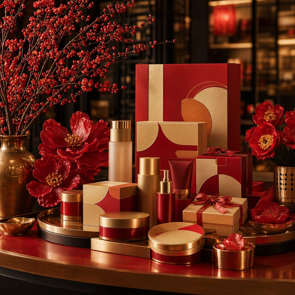
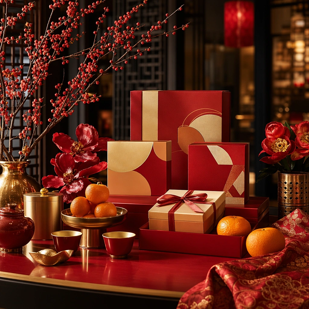
Example generated from “Lunar New Year Festive Brand Rollout — Festive Tray Anchor”
GPT Image 2en

Scene: Create a square premium Lunar New Year campaign image with lacquer red, warm gold, floral freshness, and elegant evening depth. Use a polished interior or retail surface with layered staging that feels celebratory, generous, and brand-ready rather than theatrical. The frame should read as a hero asset for multi-format rollout, with enough breathing room for gifting logic, atmosphere, and merchandising hierarchy to stay legible at both poster scale and social-tile scale. Subject: Center a curated gifting arrangement with trays, wrapped boxes, citrus or blossom accents, textile texture, and refined celebration objects that feel contemporary and brand-neutral. The composition should communicate festive generosity and social warmth through material language and layered depth. Keep the scene commercially flexible enough for retail, dining, beauty, or finance-adjacent seasonal campaigns while staying unmistakably rooted in Lunar New Year energy. Important details: Lock the campaign grammar here: lacquer red, warm gold, premium packaging geometry, fresh botanicals, dark supporting depth, and confident celebratory order. Keep surfaces believable and elegant. Avoid mascot dependence, souvenir-shop clutter, and generic luxury excess. The anchor should feel reusable across social rollout, retail hero art, boutique display, and hospitality campaign surfaces under one cohesive festive system. Use case: LNY Rollout series study 1/9. Constraints: No readable text, no watermark, no logos, preserve exact 1:1 aspect ratio, no readable calligraphy, no logo packets, no zodiac mascot character, no stage-show spectacle, no fireworks, no crowd, no gambling imagery, no cheap paper-cut overload.

Example generated from “Lunar New Year Festive Brand Rollout — Beauty Counter Variation”
GPT Image 2en

Scene: Create a square dependent campaign image in the exact same festive environment, preserving the same lacquer red, warm gold, floral freshness, and premium depth from the reference image, but make the composition cleaner and more retail-counter oriented. The frame should feel obviously related to the anchor while shifting toward a polished beauty or lifestyle merchandising surface suitable for campaign rollout, storefront crops, and social reuse. Subject: Feature premium beauty-like products, trays, gift boxes, blossom accents, and celebratory forms arranged into one coherent Lunar New Year display. Preserve exact palette, lighting direction, packaging geometry, and festive energy from the reference model while changing the assortment emphasis toward counter merchandising. The result should remain luxurious, brand-neutral, and useful for retail hero imagery or high-frequency seasonal tiles. Important details: Preserve exact campaign identity from the reference image. The celebratory energy should come from rich materials, spacing, and color rather than readable slogans. Use product silhouettes, reflective surfaces, and gifting logic to show category specificity. Keep the balance between abundance and elegance disciplined enough that the image reads premium rather than noisy or mass-market generic. Use case: LNY Rollout series study 2/9. Constraints: No readable text, no watermark, no logos, preserve exact 1:1 aspect ratio, preserve exact campaign identity from the reference image, no readable labels, no mascot dolls, no glitter explosion, no fashion model, no logo embossing, no fireworks, no theme-park saturation.

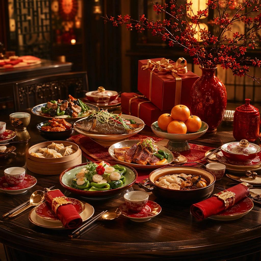
Example generated from “Lunar New Year Festive Brand Rollout — Banquet Table Variation”
GPT Image 2en

Scene: Create a square dependent image within the same festive campaign world, with the identical lacquer-red warmth, gold highlights, and fresh floral energy from the reference image, but widen the frame into a premium dining table composition. The scene should still look like a rollout asset rather than a candid dinner photograph, with strong hierarchy, polished serving surfaces, and enough atmosphere to support hospitality promotion and event-season storytelling. Subject: Show an elegant New Year dining setup with plated food cues, serving pieces, gift elements, citrus, and floral accents integrated into one celebratory table. Preserve exact color balance, lighting, and premium material language from the reference model while changing the category focus toward hospitality and feasting. Keep the setting original, brand-neutral, and free of readable menus or decorative copy. Important details: Maintain the same campaign identity precisely. Let abundance come through depth, serving rhythm, and glowing materials, not through crowding or spectacle. The table should feel hospitable, aspirational, and useful for hotels, restaurants, and brand-event communication under one unified New Year rollout system. Use case: LNY Rollout series study 3/9. Constraints: No readable text, no watermark, no logos, preserve exact 1:1 aspect ratio, preserve exact campaign identity from the reference image, no readable menus, no family portrait pose, no fireworks, no mascot costume, no logo plates, no overcrowded banquet, no red-envelope text.

Example generated from “Lunar New Year Festive Brand Rollout — Premium Bundle Variation”
GPT Image 2en

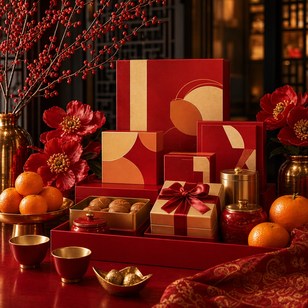
Scene: Create a square dependent campaign image in the same premium New Year environment, keeping the exact lacquer-red palette, gold warmth, floral freshness, and layered celebratory depth from the reference image, but bring the camera closer to a curated premium gift bundle. The frame should remain clearly connected to the anchor while emphasizing packaging refinement, gifting value, and polished merchandising discipline suitable for retail hero crops. Subject: Center a premium New Year bundle composed of stacked gift boxes, tray elements, tea or edible cues, blossom accents, and elegant celebration objects arranged into one cohesive hamper-like presentation. Preserve exact campaign identity from the reference image while shifting emphasis toward the gifting tier and product richness. The bundle should feel commercially real and suitable for upscale seasonal retail and boutique gifting campaigns. Important details: The bundle must inherit the reference world exactly: same light behavior, same packaging mood, same celebratory energy, and the same disciplined abundance. Use material contrast, layered scale, and careful spacing to keep the image premium. The final asset should feel like a direct campaign extension that can support gifting guides, storefronts, and premium social rollout. Use case: LNY Rollout series study 4/9. Constraints: No readable text, no watermark, no logos, preserve exact 1:1 aspect ratio, preserve exact campaign identity from the reference image, no readable gift cards, no logo packs, no mascot toys, no crowd, no confetti storm, no gaudy gold foil overload, no casino aesthetic.

Example generated from “Lunar New Year Festive Brand Rollout — Tabletop Gift Envelope Study”
GPT Image 2en

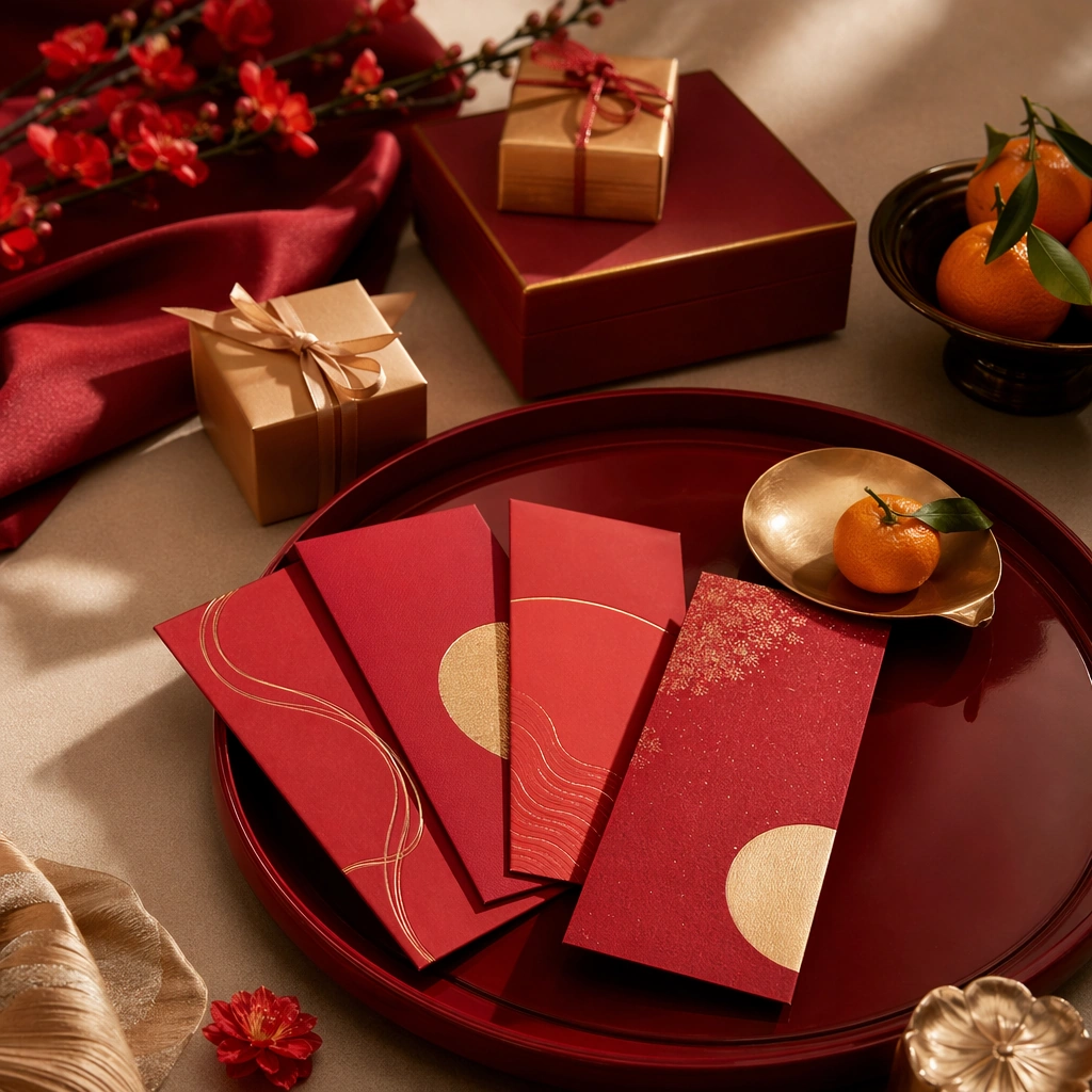
Scene: Create a square tabletop campaign image with warm directional light, lacquer-red and gold tones, and a polished premium presentation. The frame should feel like a refined gifting editorial rather than a stationery shot. Use clean negative space, elegant surfaces, and enough depth to make the arrangement feel fully staged and commercially useful for seasonal gifting communication, retail support, or hospitality promotion. Subject: Arrange premium festive envelopes without readable marks, small gift boxes, citrus or floral accents, folded textile, and tray elements into a coherent New Year gifting scene. The objects should feel contemporary, generous, and culturally aware without relying on obvious mascots or slogans. Focus on material quality, hierarchy, and presentational rhythm so the image works across finance, retail, beauty, or hospitality campaign use. Important details: Keep the styling celebratory but restrained. Envelope color, paper texture, metallic trim, lacquer surfaces, and ambient light should all feel believable. The image should work for multiple sectors that want a polished New Year gifting visual without text overlays. Avoid generic red-and-gold clutter and aim for premium clarity with strong tactile credibility. Use case: LNY Rollout single study 5/9. Constraints: No readable text, no watermark, no logos, preserve exact 1:1 aspect ratio, no readable characters, no logo seals, no mascot figures, no confetti pile, no crowded prop table, no cheap plastic décor, no fireworks, no obvious currency display.

Example generated from “Lunar New Year Festive Brand Rollout — Market Floral Retail Study”
GPT Image 2en

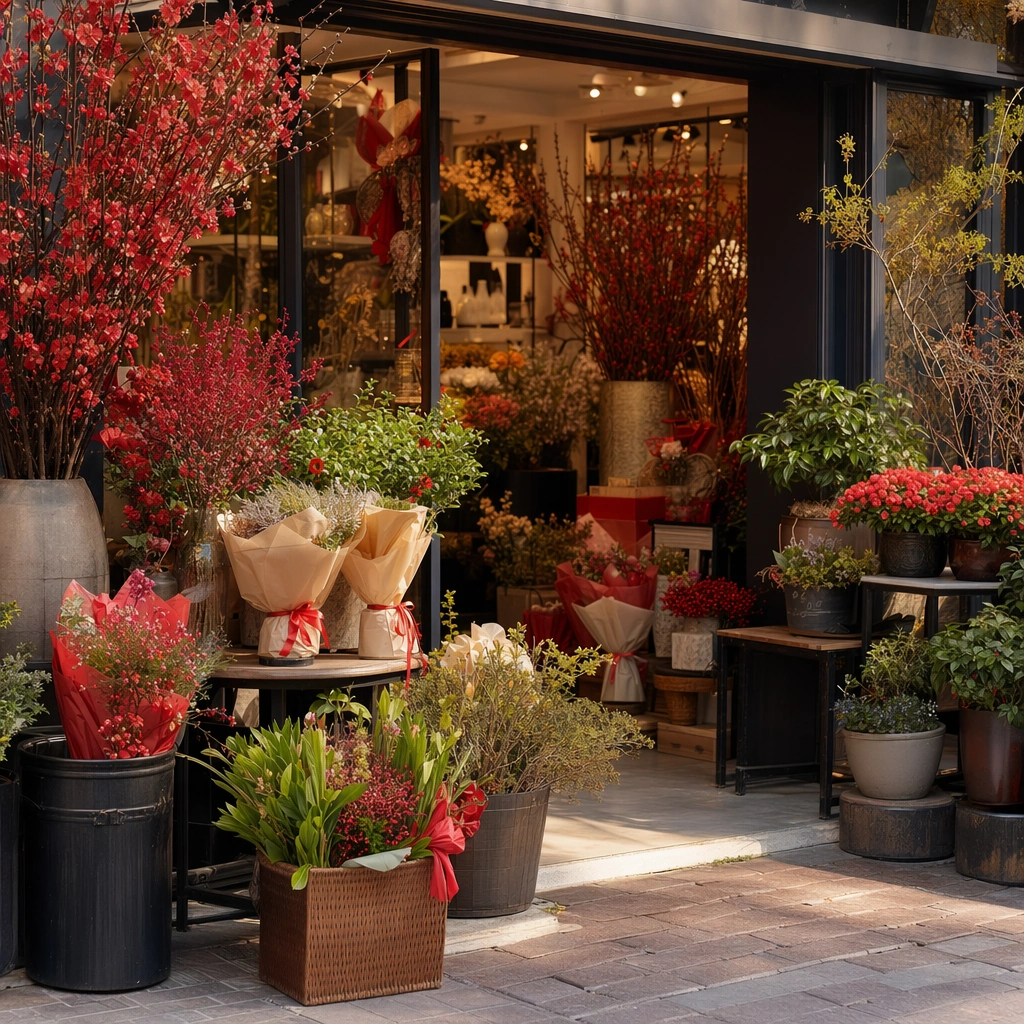
Scene: Create a square market-or-boutique floral image with warm afternoon light, abundant fresh branches, rich red and coral accents, and polished storefront composition. The frame should feel celebratory and alive, but still elevated enough for brand use. Keep the environment clean and art-directed, avoiding documentary chaos while preserving a convincing sense of seasonal abundance and storefront invitation. Subject: Show a premium floral-retail setup with festive branches, potted blooms, wrapped bundles, gift-ready objects, and carefully arranged retail supports. The scene should communicate early-season shopping energy and freshness rather than generic flower-shop romance. Focus on branch structure, wrapping, color layering, and the connection between floral purchase and seasonal celebration. Important details: Freshness and atmosphere matter most. Make petals, leaves, paper wrap, ceramic pots, and storefront surfaces feel vivid and real. Keep the composition commercially focused, with obvious seasonal cues but no readable signage. The result should support retail, mall, hospitality, or lifestyle campaign surfaces during the New Year period. Use case: LNY Rollout single study 6/9. Constraints: No readable text, no watermark, no logos, preserve exact 1:1 aspect ratio, no readable signs, no mascot toys, no logo buckets, no messy street-market chaos, no fireworks, no theme-park décor, no crowd blocking products, no cartoon lantern tunnel.

Example generated from “Lunar New Year Festive Brand Rollout — Travel Return Gifting”
GPT Image 2en

Scene: Create a square transit-adjacent campaign image with warm interior arrival light, polished flooring, luggage textures, and an atmosphere of purposeful return. The composition should feel emotionally resonant and premium, not like a crowded station documentary. Use architecture, baggage placement, and gift packaging to communicate movement toward reunion and gifting during the New Year travel cycle with clean commercial structure. Subject: Feature elegant luggage, gift boxes, travel accessories, and one or two floral or festive accents arranged into a clear return-home gifting story. Keep people minimal or implied. The scene should communicate care, journey, and anticipation through object relationships and spatial direction rather than visible text or transport branding. Important details: Balance travel realism with campaign polish. Luggage materials, packaging finish, flooring reflections, and warm arrival light should all feel believable. The final image should be suitable for airlines, rail, retail, or gifting brands speaking to reunion travel during Lunar New Year. Avoid stressful crowd energy; this is about composed emotional movement and premium readiness. Use case: LNY Rollout single study 7/9. Constraints: No readable text, no watermark, no logos, preserve exact 1:1 aspect ratio, no readable station signs, no airline logos, no passport text, no crowd crush, no mascot décor, no military vibe, no chaotic security scene, no fireworks.

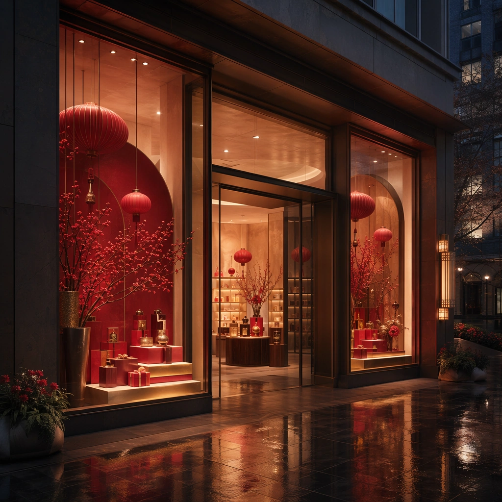
Example generated from “Lunar New Year Festive Brand Rollout — Storefront Lantern Rollout”
GPT Image 2en

Scene: Create a square storefront image at blue hour with warm interior light, rich festive dressing, reflective pavement, and a clear sense of seasonal invitation. The frame should look like a premium retail campaign asset, not travel photography. Use strong architecture, visible display discipline, and a polished threshold between street and interior to communicate seasonal shopping energy with premium calm. Subject: Show a boutique storefront dressed for Lunar New Year with lighting, display plinths, gift boxes, floral accents, and elegant festive forms. Keep human presence minimal. The composition should emphasize merchandising and atmosphere over signage or crowd behavior. Make it feel premium, original, and useful for retail takeover imagery, brand launch moments, or seasonal social rollout. Important details: Light, reflection, and display logic should all be persuasive. Keep festive dressing refined and structured, not excessive or kitsch. The result should work across retail, beauty, or hospitality campaign surfaces. Everything must remain brand-neutral, non-legible, and rooted in a contemporary premium festive language. Use case: LNY Rollout single study 8/9. Constraints: No readable text, no watermark, no logos, preserve exact 1:1 aspect ratio, no readable store signs, no mascot costumes, no logo bags, no carnival overload, no fireworks, no huge crowd, no souvenir-shop cliché, no obvious stage backdrop.

Example generated from “Lunar New Year Festive Brand Rollout — Reunion Feast Support”
GPT Image 2en

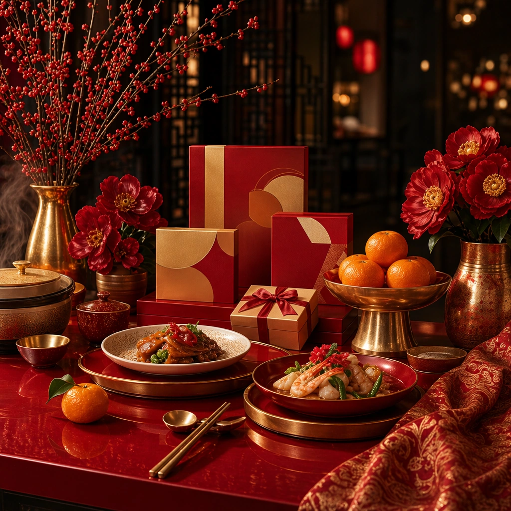
Scene: Create a square dining-support image with warm evening light, lacquer-red accents, glowing tableware, and a clear sense of invitation. The frame should feel celebratory and hospitable without becoming crowded. Use elegant camera framing and polished surfaces so the image reads as a premium restaurant or hotel campaign visual tied to reunion and shared abundance. Subject: Show a refined New Year table with plated dishes, shared serving pieces, fruit or floral accents, and one or two gifting cues integrated near the setting. The table should feel ready for guests rather than mid-meal. Focus on warmth, generosity, and hosting quality through material language and table rhythm rather than through visible people or readable restaurant materials. Important details: Hospitality polish matters. Plate glaze, lacquer or wood surfaces, steam hints, metal detail, and ambient light should all feel real. Keep the celebratory mood rich but controlled. The result should support hospitality, dining, or brand-event campaigns during Lunar New Year with strong cultural specificity and premium usability. Use case: LNY Rollout single study 9/9. Constraints: No readable text, no watermark, no logos, preserve exact 1:1 aspect ratio, no readable menus, no crowd, no mascot décor, no stage performers, no logo plates, no fireworks, no casino or gambling cues, no chaotic banquet clutter.

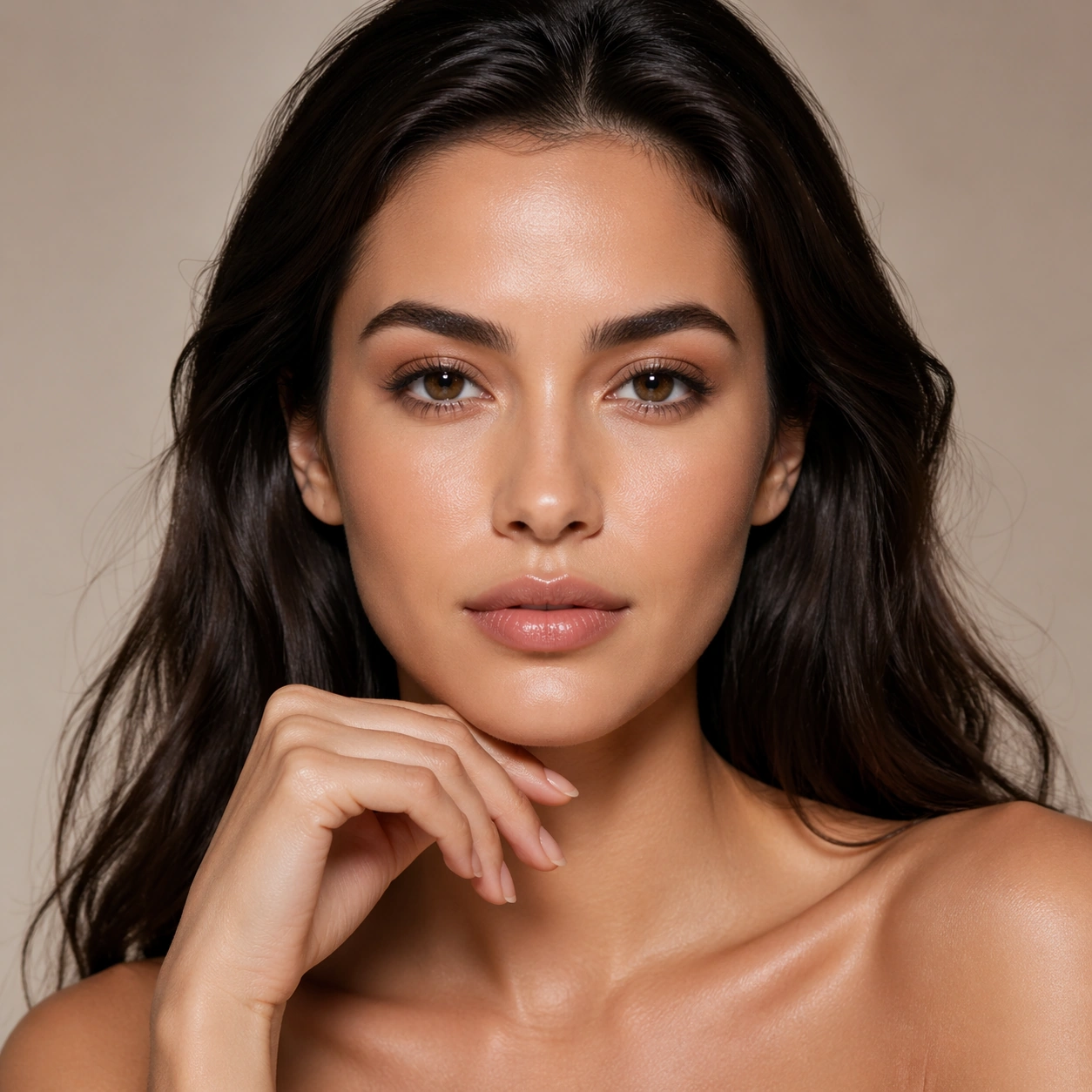
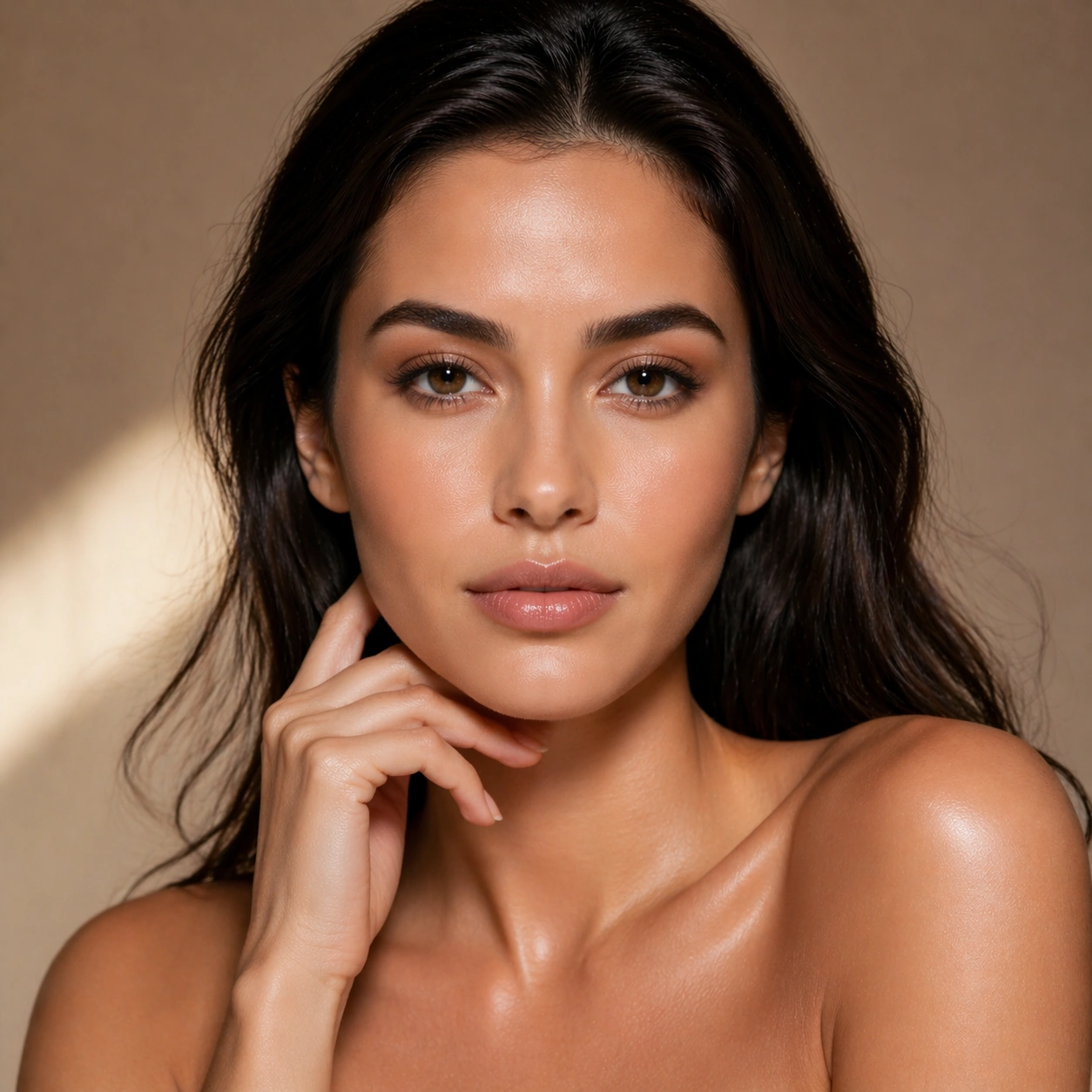
Example generated from “Luxury Beauty Closeup Editorial — Reference Beauty Anchor”
GPT Image 2en

Scene: Create a square 1:1 portrait image for Luxury Beauty Close-Up Editorial. Use a premium beauty-studio setup with luminous skin light, soft neutral backdrop, and elegant magazine-grade calm. The frame should feel like a finished professional deliverable rather than a casual snapshot, with clear lens discipline, believable light falloff, and a palette that directly supports Create high-end beauty close-up editorials with realistic skin, precise makeup textures, controlled catchlights, and premium magazine polish.. Keep enough surrounding space and compositional control for gallery, research, campaign, or approval-board reuse while staying photoreal and human-scaled. Subject: Center one beauty model with warm neutral skin, glossy dark hair, balanced features, refined hands, and pores that remain realistic at close range. Establish the exact face, skin texture, hair base, hand shape, and neck proportions that later close-ups and makeup shifts must preserve. Use the example direction from the brief as grounding context: Create high-end beauty close-up editorials with realistic skin, precise makeup textures, controlled catchlights, and premium magazine polish.. Wardrobe, lighting, environment, and pose may shift to serve this variation, but the viewer must immediately understand that the same reference identity is still in front of the camera. Important details: This backlog line is difficult because Create high-end beauty close-up editorials with realistic skin, precise makeup textures, controlled catchlights, and premium magazine polish.. Preserve skin tone family, bone structure, eye spacing, nose shape, mouth shape, hairline logic, shoulder width, and overall body read across the entire series. preserve exact face / hair base / body proportions from the reference model. This first image should feel expensive, credible, and photoreal at close inspection. Avoid the common failure described in the brief: ordinary image models often lose likeness once styling, lighting, or layout changes enter the frame. Success should feel like the result should feel professionally usable, coherent, and clearly built around one stable human identity. Use case: Luxury Beauty Close-Up Editorial series study 1/9, the clean beauty reference portrait. Constraints: No readable text, no watermark, no logos, preserve exact 1:1 aspect ratio, preserve exact face / hair base / body proportions from the reference model, no airbrushed plastic skin, no fantasy glow, no extra jewelry noise, no readable packaging.

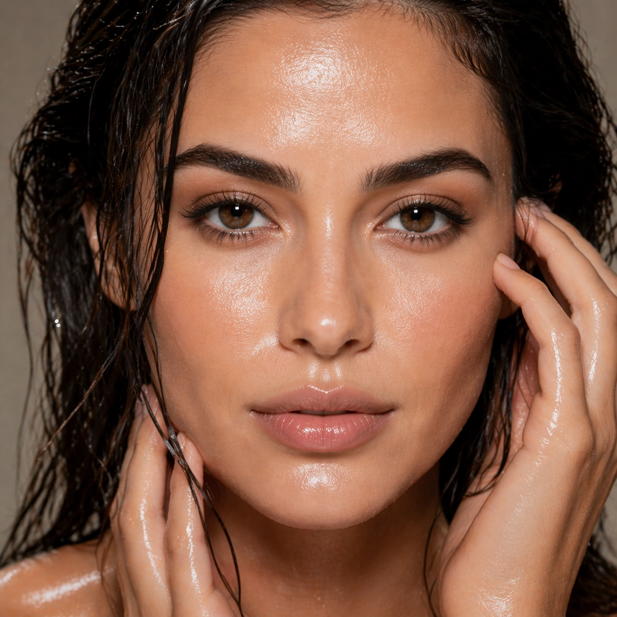
Example generated from “Luxury Beauty Closeup Editorial — Wet Skin Close-up”
GPT Image 2en

Scene: Create a square 1:1 portrait image for Luxury Beauty Close-Up Editorial. Use an extreme beauty crop with glossy specular highlights, controlled moisture on skin, and refined shadow falloff. The frame should feel like a finished professional deliverable rather than a casual snapshot, with clear lens discipline, believable light falloff, and a palette that directly supports Create high-end beauty close-up editorials with realistic skin, precise makeup textures, controlled catchlights, and premium magazine polish.. Keep enough surrounding space and compositional control for gallery, research, campaign, or approval-board reuse while staying photoreal and human-scaled. Subject: Center one beauty model with warm neutral skin, glossy dark hair, balanced features, refined hands, and pores that remain realistic at close range. Push closer into the same face while keeping pore structure, lip volume, eye distance, and hairline consistent with the reference model. Use the example direction from the brief as grounding context: Create high-end beauty close-up editorials with realistic skin, precise makeup textures, controlled catchlights, and premium magazine polish.. Wardrobe, lighting, environment, and pose may shift to serve this variation, but the viewer must immediately understand that the same reference identity is still in front of the camera. Important details: This backlog line is difficult because Create high-end beauty close-up editorials with realistic skin, precise makeup textures, controlled catchlights, and premium magazine polish.. Preserve skin tone family, bone structure, eye spacing, nose shape, mouth shape, hairline logic, shoulder width, and overall body read across the entire series. preserve exact face / hair base / body proportions from the reference model. Wet-skin finish should look luxurious and editorial, not greasy or synthetic. Avoid the common failure described in the brief: ordinary image models often lose likeness once styling, lighting, or layout changes enter the frame. Success should feel like the result should feel professionally usable, coherent, and clearly built around one stable human identity. Use case: Luxury Beauty Close-Up Editorial series study 2/9, a wet-skin close-up. Constraints: No readable text, no watermark, no logos, preserve exact 1:1 aspect ratio, preserve exact face / hair base / body proportions from the reference model, no oily shine overload, no pore erasure, no face shape drift, no surreal droplets.

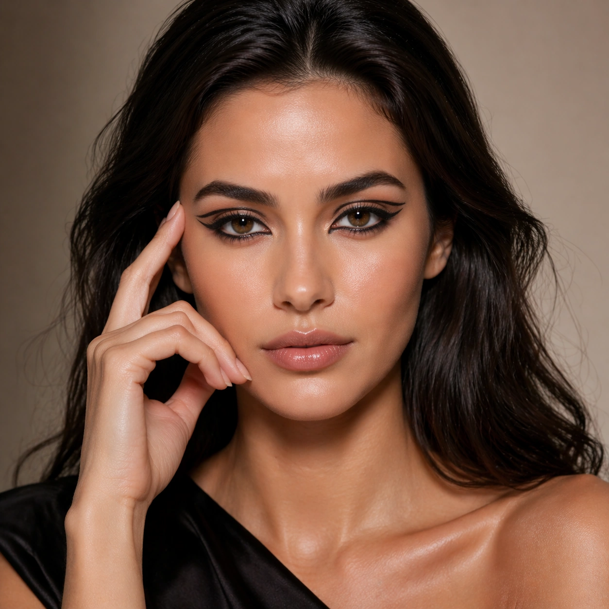
Example generated from “Luxury Beauty Closeup Editorial — Graphic Liner Portrait”
GPT Image 2en

Scene: Create a square 1:1 portrait image for Luxury Beauty Close-Up Editorial. Use a fashion-beauty frame with crisp eyes, precise cosmetic edges, and a strong but uncluttered composition. The frame should feel like a finished professional deliverable rather than a casual snapshot, with clear lens discipline, believable light falloff, and a palette that directly supports Create high-end beauty close-up editorials with realistic skin, precise makeup textures, controlled catchlights, and premium magazine polish.. Keep enough surrounding space and compositional control for gallery, research, campaign, or approval-board reuse while staying photoreal and human-scaled. Subject: Center one beauty model with warm neutral skin, glossy dark hair, balanced features, refined hands, and pores that remain realistic at close range. Apply bolder eye design while preserving the same age read, face proportions, and hair base from image 01. Use the example direction from the brief as grounding context: Create high-end beauty close-up editorials with realistic skin, precise makeup textures, controlled catchlights, and premium magazine polish.. Wardrobe, lighting, environment, and pose may shift to serve this variation, but the viewer must immediately understand that the same reference identity is still in front of the camera. Important details: This backlog line is difficult because Create high-end beauty close-up editorials with realistic skin, precise makeup textures, controlled catchlights, and premium magazine polish.. Preserve skin tone family, bone structure, eye spacing, nose shape, mouth shape, hairline logic, shoulder width, and overall body read across the entire series. preserve exact face / hair base / body proportions from the reference model. The makeup must feel expertly applied and close-range believable rather than painted-on illustration. Avoid the common failure described in the brief: ordinary image models often lose likeness once styling, lighting, or layout changes enter the frame. Success should feel like the result should feel professionally usable, coherent, and clearly built around one stable human identity. Use case: Luxury Beauty Close-Up Editorial series study 3/9, a graphic-liner makeup portrait. Constraints: No readable text, no watermark, no logos, preserve exact 1:1 aspect ratio, preserve exact face / hair base / body proportions from the reference model, no asymmetric eye shape drift, no clown color palette, no changed brow bone, no extra faces.

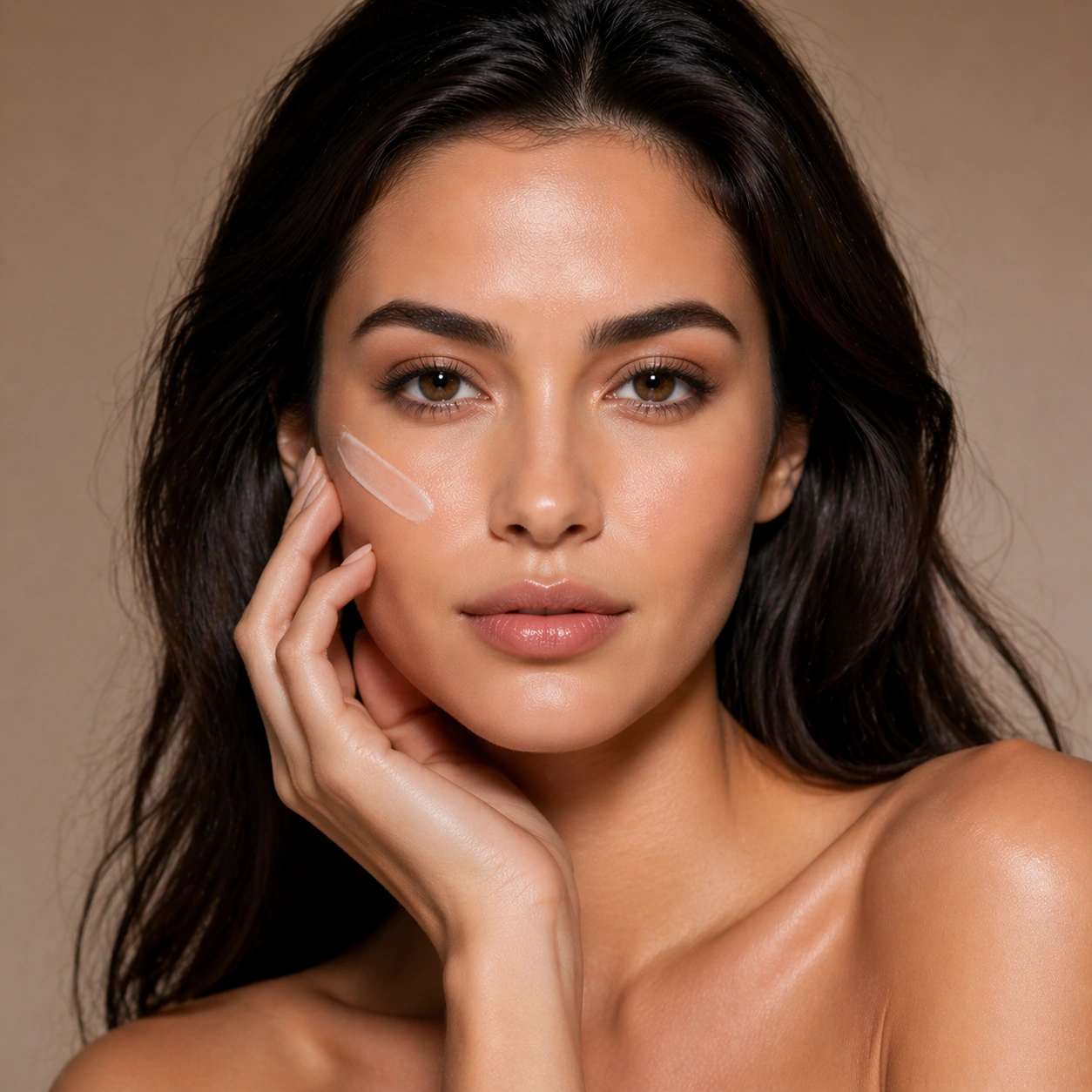
Example generated from “Luxury Beauty Closeup Editorial — Skincare With Hand”
GPT Image 2en

Scene: Create a square 1:1 portrait image for Luxury Beauty Close-Up Editorial. Use a tight campaign setup where one elegant hand, shoulder line, and face share the frame in balanced luxury lighting. The frame should feel like a finished professional deliverable rather than a casual snapshot, with clear lens discipline, believable light falloff, and a palette that directly supports Create high-end beauty close-up editorials with realistic skin, precise makeup textures, controlled catchlights, and premium magazine polish.. Keep enough surrounding space and compositional control for gallery, research, campaign, or approval-board reuse while staying photoreal and human-scaled. Subject: Center one beauty model with warm neutral skin, glossy dark hair, balanced features, refined hands, and pores that remain realistic at close range. Keep the same identity while introducing hand-to-face interaction and beauty-product grammar without readable packaging. Use the example direction from the brief as grounding context: Create high-end beauty close-up editorials with realistic skin, precise makeup textures, controlled catchlights, and premium magazine polish.. Wardrobe, lighting, environment, and pose may shift to serve this variation, but the viewer must immediately understand that the same reference identity is still in front of the camera. Important details: This backlog line is difficult because Create high-end beauty close-up editorials with realistic skin, precise makeup textures, controlled catchlights, and premium magazine polish.. Preserve skin tone family, bone structure, eye spacing, nose shape, mouth shape, hairline logic, shoulder width, and overall body read across the entire series. preserve exact face / hair base / body proportions from the reference model. Hands must look anatomically correct and belong to the same subject, with nails and skin finish remaining refined. Avoid the common failure described in the brief: ordinary image models often lose likeness once styling, lighting, or layout changes enter the frame. Success should feel like the result should feel professionally usable, coherent, and clearly built around one stable human identity. Use case: Luxury Beauty Close-Up Editorial series study 4/9, a skincare campaign crop with hands. Constraints: No readable text, no watermark, no logos, preserve exact 1:1 aspect ratio, preserve exact face / hair base / body proportions from the reference model, no broken fingers, no bottle logos, no fake label text, no disconnected hand anatomy.

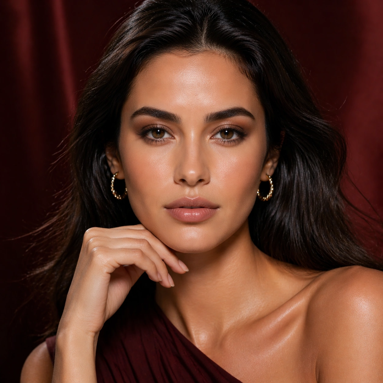
Example generated from “Luxury Beauty Closeup Editorial — Jewel Tone Beauty”
GPT Image 2en

Scene: Create a square 1:1 portrait image for Luxury Beauty Close-Up Editorial. Use a saturated but premium beauty set with controlled color accents and still-realistic skin response. The frame should feel like a finished professional deliverable rather than a casual snapshot, with clear lens discipline, believable light falloff, and a palette that directly supports Create high-end beauty close-up editorials with realistic skin, precise makeup textures, controlled catchlights, and premium magazine polish.. Keep enough surrounding space and compositional control for gallery, research, campaign, or approval-board reuse while staying photoreal and human-scaled. Subject: Center one beauty model with warm neutral skin, glossy dark hair, balanced features, refined hands, and pores that remain realistic at close range. Use a deeper palette and more dramatic color story while holding the same face identity perfectly stable. Use the example direction from the brief as grounding context: Create high-end beauty close-up editorials with realistic skin, precise makeup textures, controlled catchlights, and premium magazine polish.. Wardrobe, lighting, environment, and pose may shift to serve this variation, but the viewer must immediately understand that the same reference identity is still in front of the camera. Important details: This backlog line is difficult because Create high-end beauty close-up editorials with realistic skin, precise makeup textures, controlled catchlights, and premium magazine polish.. Preserve skin tone family, bone structure, eye spacing, nose shape, mouth shape, hairline logic, shoulder width, and overall body read across the entire series. preserve exact face / hair base / body proportions from the reference model. The point is not color spectacle alone; the same woman must remain undeniable even under heavier styling. Avoid the common failure described in the brief: ordinary image models often lose likeness once styling, lighting, or layout changes enter the frame. Success should feel like the result should feel professionally usable, coherent, and clearly built around one stable human identity. Use case: Luxury Beauty Close-Up Editorial series study 5/9, a richer jewel-tone editorial portrait. Constraints: No readable text, no watermark, no logos, preserve exact 1:1 aspect ratio, preserve exact face / hair base / body proportions from the reference model, no color cast that changes ethnicity, no artificial eye enlargement, no glitter overload, no mask-like makeup.

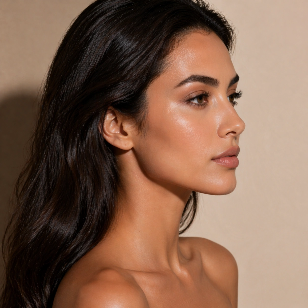
Example generated from “Luxury Beauty Closeup Editorial — Profile Highlight Study”
GPT Image 2en

Scene: Create a square 1:1 portrait image for Luxury Beauty Close-Up Editorial. Use a side-lit portrait where cheekbone highlight, nose bridge, lips, and ear shape remain crisp and elegant. The frame should feel like a finished professional deliverable rather than a casual snapshot, with clear lens discipline, believable light falloff, and a palette that directly supports Create high-end beauty close-up editorials with realistic skin, precise makeup textures, controlled catchlights, and premium magazine polish.. Keep enough surrounding space and compositional control for gallery, research, campaign, or approval-board reuse while staying photoreal and human-scaled. Subject: Center one beauty model with warm neutral skin, glossy dark hair, balanced features, refined hands, and pores that remain realistic at close range. Rotate the same subject into profile while keeping the exact same brow line, jawline, hairline, and neck proportions from the anchor image. Use the example direction from the brief as grounding context: Create high-end beauty close-up editorials with realistic skin, precise makeup textures, controlled catchlights, and premium magazine polish.. Wardrobe, lighting, environment, and pose may shift to serve this variation, but the viewer must immediately understand that the same reference identity is still in front of the camera. Important details: This backlog line is difficult because Create high-end beauty close-up editorials with realistic skin, precise makeup textures, controlled catchlights, and premium magazine polish.. Preserve skin tone family, bone structure, eye spacing, nose shape, mouth shape, hairline logic, shoulder width, and overall body read across the entire series. preserve exact face / hair base / body proportions from the reference model. Beauty lighting should carve form without turning the profile into a new person. Avoid the common failure described in the brief: ordinary image models often lose likeness once styling, lighting, or layout changes enter the frame. Success should feel like the result should feel professionally usable, coherent, and clearly built around one stable human identity. Use case: Luxury Beauty Close-Up Editorial series study 6/9, a profile beauty highlight study. Constraints: No readable text, no watermark, no logos, preserve exact 1:1 aspect ratio, preserve exact face / hair base / body proportions from the reference model, no altered nose bridge, no different ear shape, no melted jawline, no random flyaway wig volume.

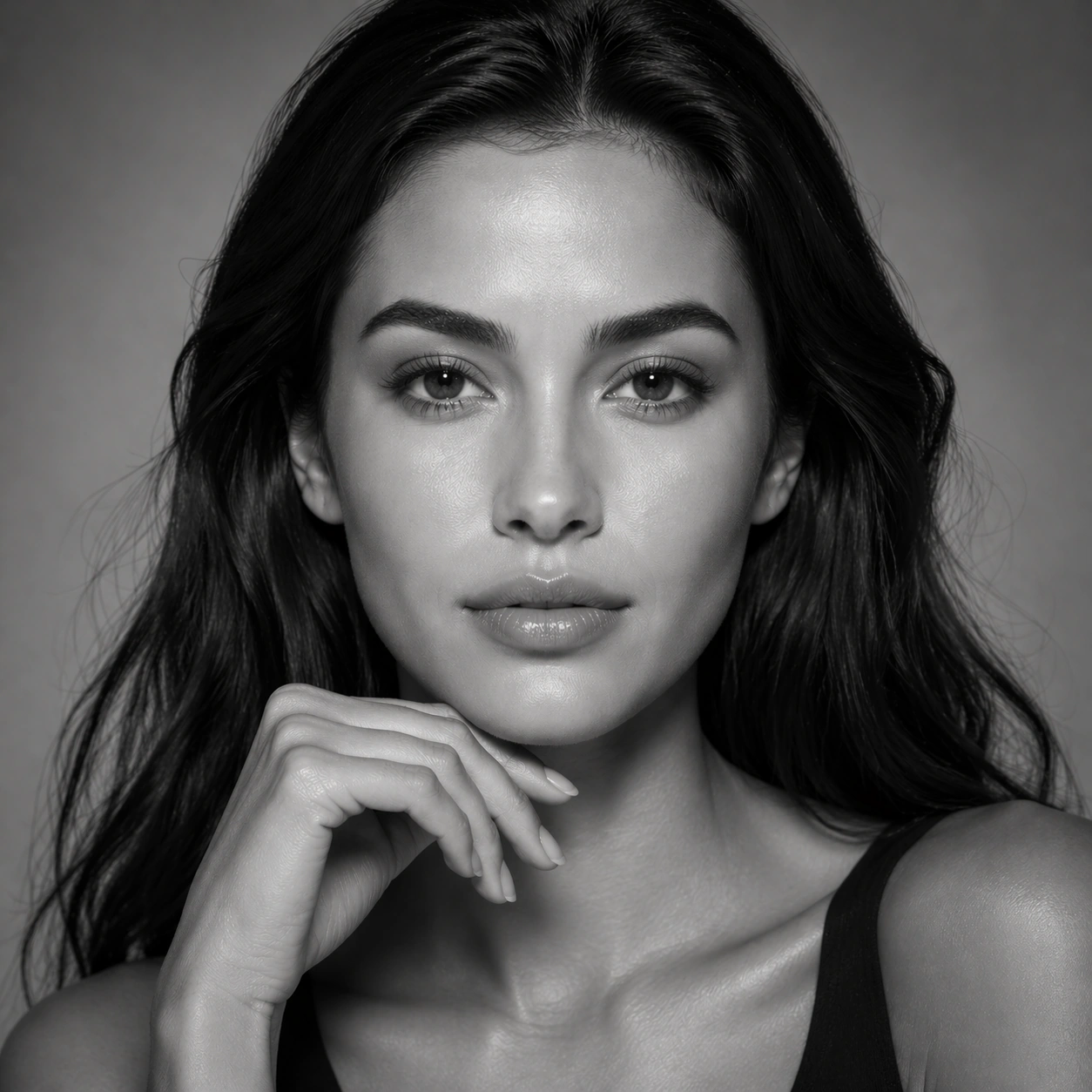
Example generated from “Luxury Beauty Closeup Editorial — Monochrome Skin Texture”
GPT Image 2en

Scene: Create a square 1:1 portrait image for Luxury Beauty Close-Up Editorial. Use a grayscale beauty close-up with rich tonal separation and editorial restraint. The frame should feel like a finished professional deliverable rather than a casual snapshot, with clear lens discipline, believable light falloff, and a palette that directly supports Create high-end beauty close-up editorials with realistic skin, precise makeup textures, controlled catchlights, and premium magazine polish.. Keep enough surrounding space and compositional control for gallery, research, campaign, or approval-board reuse while staying photoreal and human-scaled. Subject: Center one beauty model with warm neutral skin, glossy dark hair, balanced features, refined hands, and pores that remain realistic at close range. Remove color but keep the exact same face, pores, lip structure, and hair base while making skin texture and light the hero. Use the example direction from the brief as grounding context: Create high-end beauty close-up editorials with realistic skin, precise makeup textures, controlled catchlights, and premium magazine polish.. Wardrobe, lighting, environment, and pose may shift to serve this variation, but the viewer must immediately understand that the same reference identity is still in front of the camera. Important details: This backlog line is difficult because Create high-end beauty close-up editorials with realistic skin, precise makeup textures, controlled catchlights, and premium magazine polish.. Preserve skin tone family, bone structure, eye spacing, nose shape, mouth shape, hairline logic, shoulder width, and overall body read across the entire series. preserve exact face / hair base / body proportions from the reference model. This frame should prove the beauty story survives without color gimmicks. Avoid the common failure described in the brief: ordinary image models often lose likeness once styling, lighting, or layout changes enter the frame. Success should feel like the result should feel professionally usable, coherent, and clearly built around one stable human identity. Use case: Luxury Beauty Close-Up Editorial series study 7/9, a monochrome skin-texture portrait. Constraints: No readable text, no watermark, no logos, preserve exact 1:1 aspect ratio, preserve exact face / hair base / body proportions from the reference model, no muddy gray skin, no grainy filter, no softened detail, no changed facial structure.

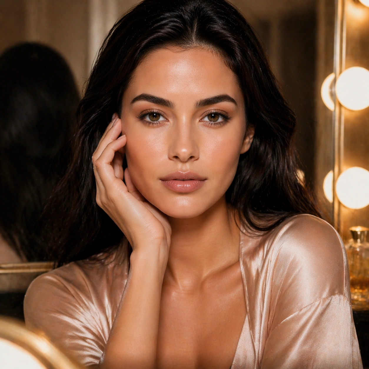
Example generated from “Luxury Beauty Closeup Editorial — Mirror Prep Frame”
GPT Image 2en

Scene: Create a square 1:1 portrait image for Luxury Beauty Close-Up Editorial. Use an intimate but polished beauty setup with mirror cues, vanity light, and minimal luxury backstage context. The frame should feel like a finished professional deliverable rather than a casual snapshot, with clear lens discipline, believable light falloff, and a palette that directly supports Create high-end beauty close-up editorials with realistic skin, precise makeup textures, controlled catchlights, and premium magazine polish.. Keep enough surrounding space and compositional control for gallery, research, campaign, or approval-board reuse while staying photoreal and human-scaled. Subject: Center one beauty model with warm neutral skin, glossy dark hair, balanced features, refined hands, and pores that remain realistic at close range. Place the same face inside a getting-ready moment while preserving the reference identity and keeping the mood controlled and premium. Use the example direction from the brief as grounding context: Create high-end beauty close-up editorials with realistic skin, precise makeup textures, controlled catchlights, and premium magazine polish.. Wardrobe, lighting, environment, and pose may shift to serve this variation, but the viewer must immediately understand that the same reference identity is still in front of the camera. Important details: This backlog line is difficult because Create high-end beauty close-up editorials with realistic skin, precise makeup textures, controlled catchlights, and premium magazine polish.. Preserve skin tone family, bone structure, eye spacing, nose shape, mouth shape, hairline logic, shoulder width, and overall body read across the entire series. preserve exact face / hair base / body proportions from the reference model. The environment may expand slightly, but likeness still outranks atmosphere. Avoid the common failure described in the brief: ordinary image models often lose likeness once styling, lighting, or layout changes enter the frame. Success should feel like the result should feel professionally usable, coherent, and clearly built around one stable human identity. Use case: Luxury Beauty Close-Up Editorial series study 8/9, a mirror-prep or vanity-side frame. Constraints: No readable text, no watermark, no logos, preserve exact 1:1 aspect ratio, preserve exact face / hair base / body proportions from the reference model, no busy dressing room, no other stylists, no readable mirror stickers, no copied magazine cover.

Example generated from “Luxury Beauty Closeup Editorial — Luxury Campaign Crop”
GPT Image 2en

Scene: Create a square 1:1 portrait image for Luxury Beauty Close-Up Editorial. Use a square beauty-ad finish with poised negative space, refined composition, and expensive skincare or cosmetics energy. The frame should feel like a finished professional deliverable rather than a casual snapshot, with clear lens discipline, believable light falloff, and a palette that directly supports Create high-end beauty close-up editorials with realistic skin, precise makeup textures, controlled catchlights, and premium magazine polish.. Keep enough surrounding space and compositional control for gallery, research, campaign, or approval-board reuse while staying photoreal and human-scaled. Subject: Center one beauty model with warm neutral skin, glossy dark hair, balanced features, refined hands, and pores that remain realistic at close range. Resolve the same identity into a finished campaign visual that could anchor a beauty brand launch without any readable copy. Use the example direction from the brief as grounding context: Create high-end beauty close-up editorials with realistic skin, precise makeup textures, controlled catchlights, and premium magazine polish.. Wardrobe, lighting, environment, and pose may shift to serve this variation, but the viewer must immediately understand that the same reference identity is still in front of the camera. Important details: This backlog line is difficult because Create high-end beauty close-up editorials with realistic skin, precise makeup textures, controlled catchlights, and premium magazine polish.. Preserve skin tone family, bone structure, eye spacing, nose shape, mouth shape, hairline logic, shoulder width, and overall body read across the entire series. preserve exact face / hair base / body proportions from the reference model. The image must still look like the exact same model introduced in image 01, even at full campaign polish. Avoid the common failure described in the brief: ordinary image models often lose likeness once styling, lighting, or layout changes enter the frame. Success should feel like the result should feel professionally usable, coherent, and clearly built around one stable human identity. Use case: Luxury Beauty Close-Up Editorial series study 9/9, a final luxury campaign crop. Constraints: No readable text, no watermark, no logos, preserve exact 1:1 aspect ratio, preserve exact face / hair base / body proportions from the reference model, no fake logo copy, no oversized product props, no over-retouched skin, no identity drift.

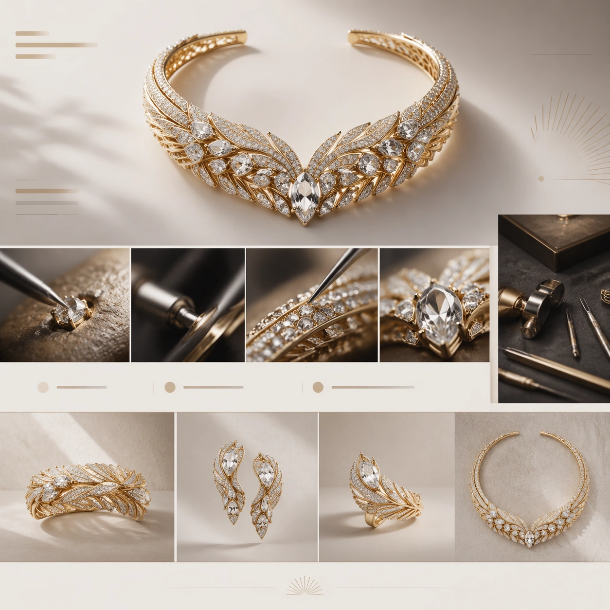
Example generated from “Luxury Brand Story Page — Jewelry Craft Atelier”
GPT Image 2en

Scene: A square luxury brand-story page still for a high-jewelry maison, arranged like a chaptered editorial website. The palette is pearl white, champagne beige, pale gold, and charcoal shadow, with crisp but gentle studio lighting. The frame should suggest a hero chapter at top, an atelier process chapter in the middle, and a refined collection overview near the bottom, all held together by calm negative space and elegant alignment. Subject: Feature a striking necklace or cuff set with luminous stones and fine metalwork, rendered as the hero object on a minimal background. Build the surrounding web-page narrative with abstract headline bars, atelier-detail modules, gemstone macro crops, and chapter bands that imply hand-setting, polishing, and collection curation without readable text. Include one cropped close-up of clasp or prong details and one narrow supporting panel suggesting an artisan workbench through tools, velvet surface, and reflected metal, while keeping the jewel piece as the visual anchor. Important details: The page must communicate high-jewelry prestige and craftsmanship, not bridal catalog commerce. Stone facets, metal polish, pavé texture, and precise settings should feel credible and expensive. The layout rhythm should move from spectacle to craft to collection logic in a refined, editorial way. Use clean chapter breaks, quiet contrast, and exact spacing so the image feels like a real luxury website concept rather than a collage. Use case: Luxury Brand Story Page single study 2/9, testing jewelry craft storytelling with atelier detail and luxury editorial web pacing. Constraints: No readable text, no watermark, no logos, preserve exact 1:1 aspect ratio, no browser chrome, no model portrait, no wedding cliché styling, no floating glitter storm, no crowded gemstone pile, no malformed stone settings.

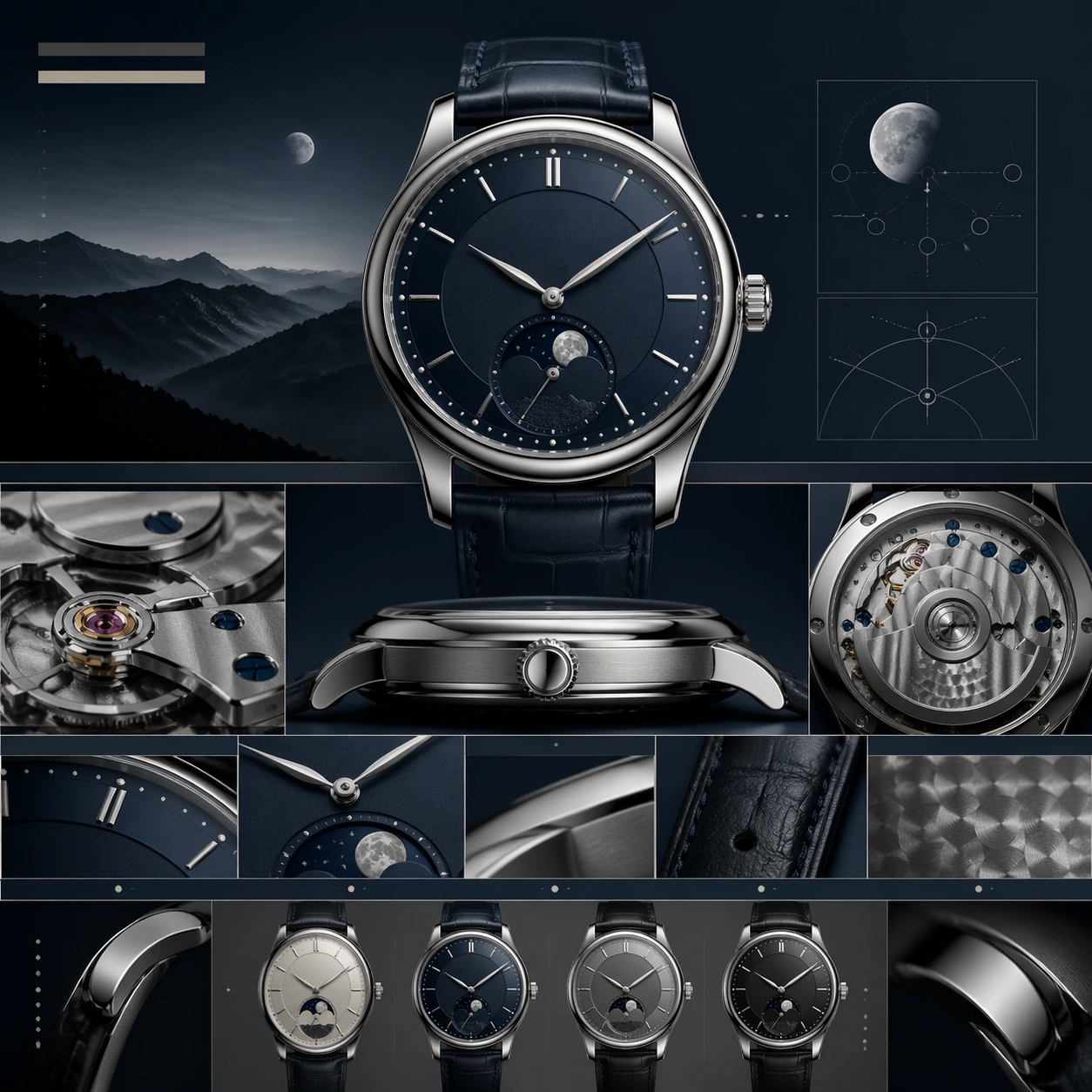
Example generated from “Luxury Brand Story Page — Moonphase Watch Manifesto”
GPT Image 2en

Scene: A square luxury watch brand-story page still, composed like a chapter from an haute horlogerie website. The color language is steel gray, deep navy, soft cream, and restrained silver highlights. The page should feel precise and serene, with a hero chapter at the top, movement and finishing chapters beneath, and a collection-summary band toward the lower edge. Lighting is clean and directional, revealing polished bevels and brushed metal with controlled reflections. Subject: Place a moonphase wristwatch front and center with a carefully proportioned case, elegant dial layers, slender hands, and a refined leather strap. Surround it with a chaptered luxury web composition made from abstract title bars, slim modular rows, macro movement-detail crops, and subtle diagram-like panels showing finishing, complications, and strap craftsmanship without readable words. Include one side-view macro of the crown and case flank, and one supporting module implying the back movement or finishing texture. Important details: The image must feel like watchmaking storytelling rather than direct retail sales. The watch should look plausible in scale, thickness, lugs, and dial construction, with crisp moonphase detailing and premium finishing. The page hierarchy should progress from emotional hero to technical intimacy to collection framing, all through elegant spacing and chapter rhythm. Keep the visual tone restrained, intelligent, and truly luxury. Use case: Luxury Brand Story Page single study 3/9, testing haute-horlogerie storytelling with movement detail, material finish, and chaptered web composition. Constraints: No readable text, no watermark, no logos, preserve exact 1:1 aspect ratio, no browser chrome, no wrist on a model, no cheap chronograph clutter, no oversized lens flare, no sports-watch aggression, no distorted hands or case geometry.

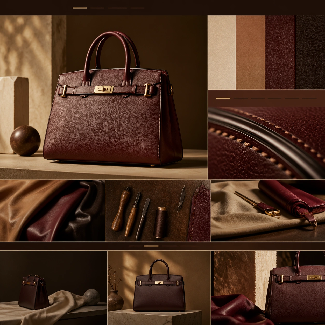
Example generated from “Luxury Brand Story Page — Leather Bag Origin Story”
GPT Image 2en

Scene: A square luxury leather-goods brand-story page still, arranged like a chapter on a fashion maison website. The frame uses warm tan, oxblood, walnut brown, and cream highlights, with soft directional light grazing across surfaces to reveal grain and edge paint. The page should feel like a hero campaign image above a sequence of material, workshop, and styling chapters contained within one elegant square composition. Subject: Feature a structured leather bag with rich grain, sharp silhouette, polished hardware, and carefully finished handles. Around it, build a chaptered webpage from abstract title bars, material swatch-style panels, stitching close-up modules, and lifestyle framing bands that imply the bag's origin story and craftsmanship without readable text. Include one macro crop of edge painting and stitch lines, and one supporting panel with leather hides, tools, or folded dust-cover fabric arranged like a fashion still life. The bag remains the central object. Important details: The design should express leather craft and maison heritage, not trend-led ecommerce. The bag proportions, leather thickness, stitching, and hardware finish must feel luxurious and manufacturable. Structure the page so the eye moves from hero silhouette to material story to making detail to collection framing. Use quiet chapter rhythm, generous spacing, and rich tactile realism to achieve luxury credibility. Use case: Luxury Brand Story Page single study 4/9, testing leather-goods storytelling with tactile craft detail and chaptered fashion-web structure. Constraints: No readable text, no watermark, no logos, preserve exact 1:1 aspect ratio, no browser chrome, no model carrying the bag, no shopping-cart UI, no trend collage clutter, no cheap plastic sheen, no distorted straps or hardware.

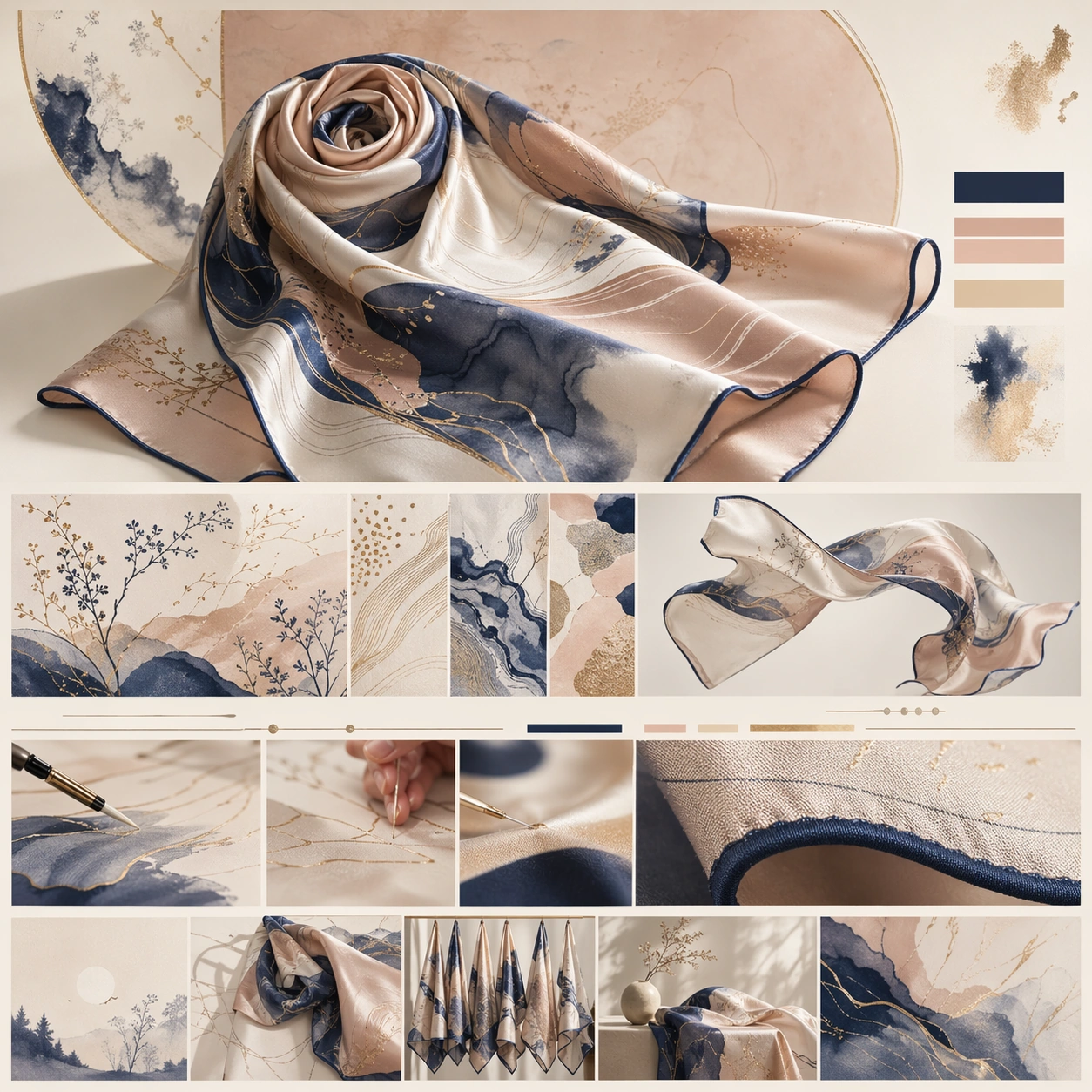
Example generated from “Luxury Brand Story Page — Silk Scarf Print Atlas”
GPT Image 2en

Scene: A square luxury brand-story page still for a silk scarf collection, styled like an editorial chapter on a couture maison website. The page is luminous and airy, using ivory, blush beige, muted ink blue, and gold-sand accents. It should feel like a soft luxury print story with a hero composition at top and successive chapters about pattern, drape, and hand-finishing below, all within a polished square web frame. Subject: Present a silk scarf as the hero object, partially folded and partially unfurled so the print language, rolled edges, and sheen are visible. Around it, construct a chaptered webpage with abstract headline bars, print-detail panels, drape studies, and atelier-style close-ups that imply design process and finishing without readable words. Include one macro crop showing hem stitching and silk texture, plus one supporting panel with the scarf floating or arranged as a sculptural textile form. The scarf should remain central, with the page layout amplifying its pattern system and tactile elegance. Important details: The image must communicate maison-level textile storytelling rather than a simple product sheet. Silk sheen, print registration, edge rolling, and color transitions should feel physically plausible and refined. The page hierarchy should move from emotional print hero to textile detail to atelier chapter to collection context. Use elegant negative space, balanced chapter bands, and a luxurious softness without becoming vague or pastel generic. Use case: Luxury Brand Story Page single study 5/9, testing silk-scarf storytelling with print-system detail, drape studies, and refined editorial chapter layout. Constraints: No readable text, no watermark, no logos, preserve exact 1:1 aspect ratio, no browser chrome, no model portrait, no chaotic fashion collage, no cheap satin shine, no wrinkled discount-retail styling, no distorted print geometry.

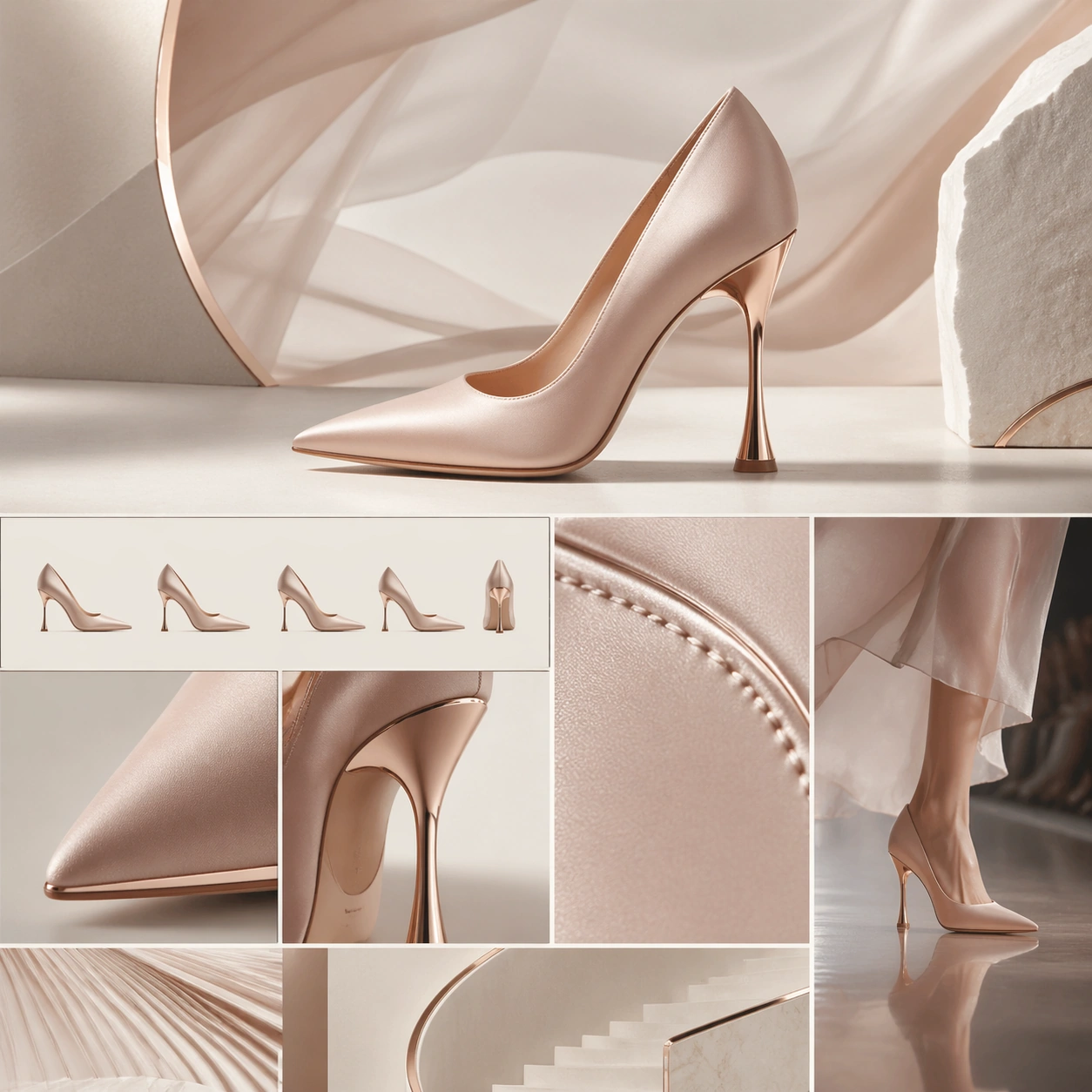
Example generated from “Luxury Brand Story Page — Couture Heel Runway Page”
GPT Image 2en

Scene: A square luxury brand-story page still for a couture heel launch, designed like a fashion maison website chapter. The composition mixes soft runway drama with disciplined web structure: a bone-white background, graphite shadows, blush highlights, and subtle metallic reflections. The top half should read as a statement hero section, while the bottom half breaks into craft, silhouette, and runway-context chapters aligned with clear editorial rhythm. Subject: Center a couture high heel with sculptural lines, immaculate leather or satin surface, elegant heel geometry, and a polished sole edge. Build the surrounding brand-story page with abstract title bars, silhouette comparison panels, heel-detail close-ups, and one narrow runway-context module showing the shoe in motion without a visible model face. Add a macro crop of stitching, edge finishing, or heel attachment so the sense of craftsmanship is tangible. The shoe remains the star, while the surrounding modules imply couture heritage and collection narrative. Important details: This should feel like an expensive fashion-house chapter, not a shoe-store catalog. The shoe's last, toe shape, heel angle, and material finish must look physically credible and refined. The layout should move from spectacle hero to technical beauty to runway story to collection framing. Preserve luxury restraint, elegant whitespace, and precise alignment so the page feels composed, fashion-literate, and art directed. Use case: Luxury Brand Story Page single study 6/9, testing couture footwear storytelling with silhouette precision, craft detail, and runway-inspired chapter layout. Constraints: No readable text, no watermark, no logos, preserve exact 1:1 aspect ratio, no browser chrome, no busy model montage, no cheap ecommerce grid, no cartoon fashion graphics, no glitter overload, no distorted heel proportions.

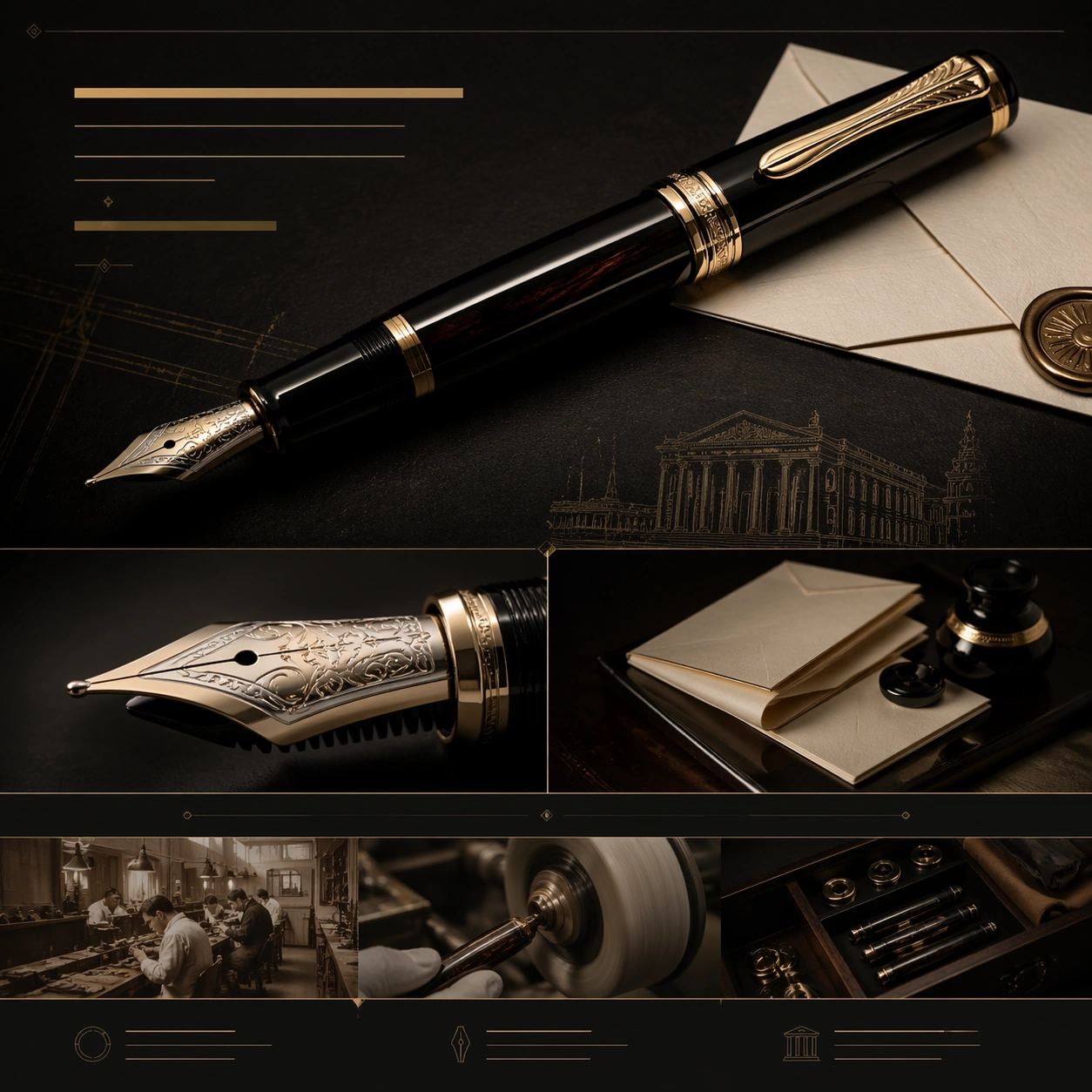
Example generated from “Luxury Brand Story Page — Fountain Pen Heritage Piece”
GPT Image 2en

Scene: A square luxury brand-story page still for a heritage fountain pen launch, laid out like a chapter on a writing-instrument maison website. The palette is deep black, ivory paper, aged brass, and dark lacquer, with directional light that reveals gloss, engraving depth, and polished metal trim. The page should suggest a hero section above chapters about nib craft, material finishing, and lineage, arranged in a refined editorial cadence. Subject: Feature a luxury fountain pen as the hero object, slightly angled to show barrel finish, cap banding, clip design, and nib silhouette. Around it, design a believable brand-story page using abstract title bars, nib-detail modules, craftsmanship panels, and chapter bands suggesting heritage, finishing, and writing ritual without readable copy. Include one macro crop of the nib and feed, plus one supporting module with folded stationery, lacquer reflections, or polishing tools arranged as a quiet still life. Keep the pen central and dignified. Important details: The page must convey heritage luxury, not office-supply retail. Materials such as lacquer, resin, metal trim, and engraved nib detail should feel plausible and exact. The hierarchy should guide the eye from hero object to nib intimacy to making story to archival aura. Use generous whitespace, deliberate chapter breaks, and a sense of quiet prestige. The image should feel like a collector's launch page for connoisseurs. Use case: Luxury Brand Story Page single study 7/9, testing heritage writing-instrument storytelling with nib detail, material finish, and collector-grade web composition. Constraints: No readable text, no watermark, no logos, preserve exact 1:1 aspect ratio, no browser chrome, no handwritten copy, no ink splatter chaos, no school-supply look, no crowded desk clutter, no distorted pen proportions or nib anatomy.

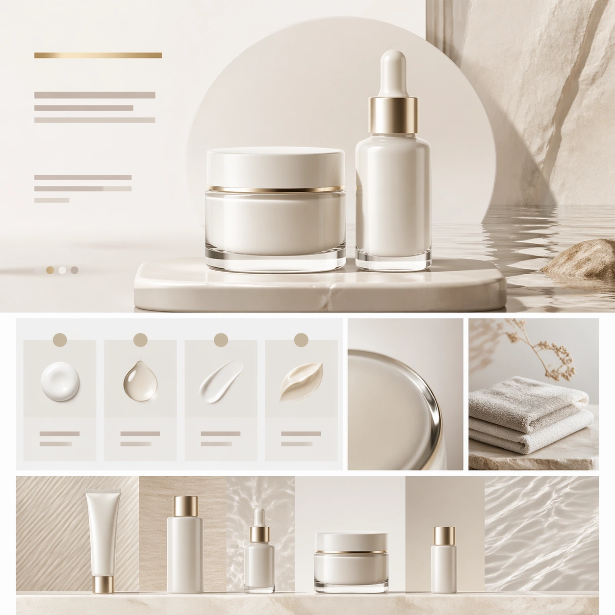
Example generated from “Luxury Brand Story Page — Porcelain Skincare Ritual”
GPT Image 2en

Scene: A square luxury skincare brand-story page still, designed as a calm chapter from a prestige beauty website. The frame uses porcelain white, pale sand, soft taupe, and very restrained metallic accents, with luminous clean lighting that feels spa-like but high fashion. The composition should suggest a hero chapter at top, ritual and ingredient chapters in the middle, and a collection overview band below, all maintained through precise spacing and quiet editorial structure. Subject: Center a porcelain-like skincare jar and serum bottle with refined caps, thick glass or ceramic walls, and minimal sculptural form. Surround them with a believable brand-story page made of abstract headline bars, ritual-step cards, material close-up panels, and collection strips that imply formulation care and sensorial luxury without readable text. Include one macro crop of the jar lid edge or serum dropper detail, and one supporting panel with stone, folded towel, or water reflection arranged as a tactile atmosphere image. Keep the products dominant and serene. Important details: The page should feel like a luxury beauty maison rather than mainstream cosmetics marketing. Surfaces must be immaculate, creamy, and materially believable, while the layout must preserve chapter rhythm from hero object to ritual story to close-up detail to collection framing. Avoid busy ingredient collage language. Use silence, soft contrast, and premium spacing so the whole page feels elevated, restrained, and therapeutic. Use case: Luxury Brand Story Page single study 8/9, testing prestige skincare storytelling with ritual pacing, tactile beauty materials, and calm chaptered web layout. Constraints: No readable text, no watermark, no logos, preserve exact 1:1 aspect ratio, no browser chrome, no smiling model face, no medical infographic style, no floating fruit slices, no discount-beauty clutter, no distorted jars or droppers.

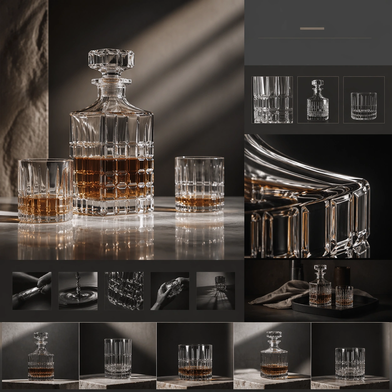
Example generated from “Luxury Brand Story Page — Crystal Decanter Collection”
GPT Image 2en

Scene: A square luxury brand-story page still for a crystal decanter collection, composed like a refined lifestyle-maison web chapter. The palette is smoke gray, warm crystal highlights, pale stone, and deep charcoal, with controlled light refraction and elegant reflections. The frame should feel like a hero chapter above material and collecting chapters, arranged within a highly polished editorial web layout. Subject: Feature a crystal decanter and matching glassware as the hero objects, rendered with believable weight, bevels, liquid reflections, and subtle tinting. Build the surrounding web composition from abstract title bars, collection cards, crystal-detail close-ups, and chapter bands suggesting craftsmanship, ritual, and object curation without readable text. Include one macro crop of the cut crystal edge and one supporting still-life module with tray, fabric, or shadow pattern to imply an intimate collector environment. The crystal objects remain central and luxurious. Important details: The image should communicate collector-grade luxury and object culture, not barware retail. Glass thickness, refraction, stopper fit, and facet geometry must feel plausible and expensive. The page hierarchy should move from spectacle hero to craft detail to lifestyle ritual to collection framing, all through measured spacing and quiet restraint. The overall mood should feel cinematic, tactile, and premium, without becoming flashy. Use case: Luxury Brand Story Page single study 9/9, testing crystal-object storytelling with collector atmosphere, material close-up, and chaptered luxury web rhythm. Constraints: No readable text, no watermark, no logos, preserve exact 1:1 aspect ratio, no browser chrome, no crowded bar scene, no party people, no exaggerated neon reflections, no cheap liquor-ad clichés, no distorted glass refraction or stopper geometry.

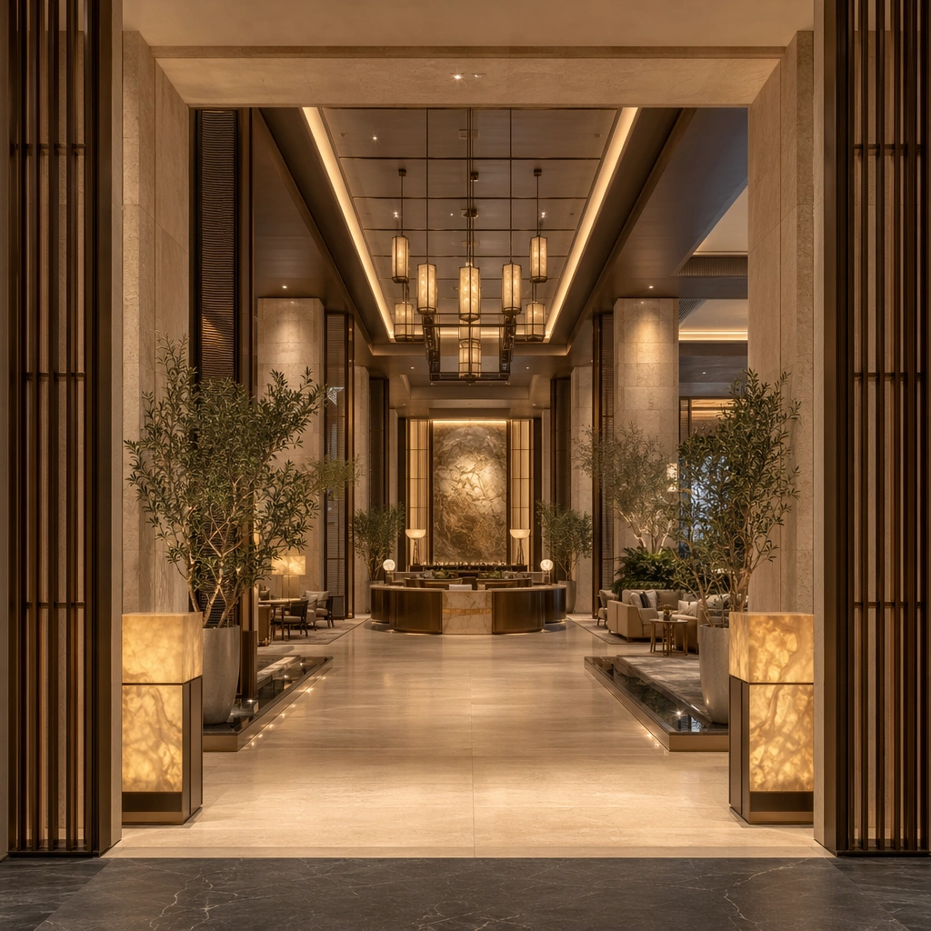
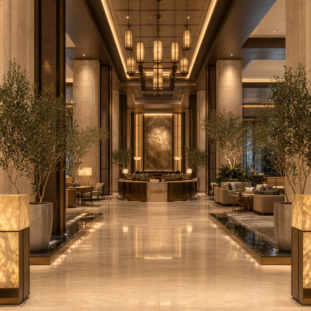
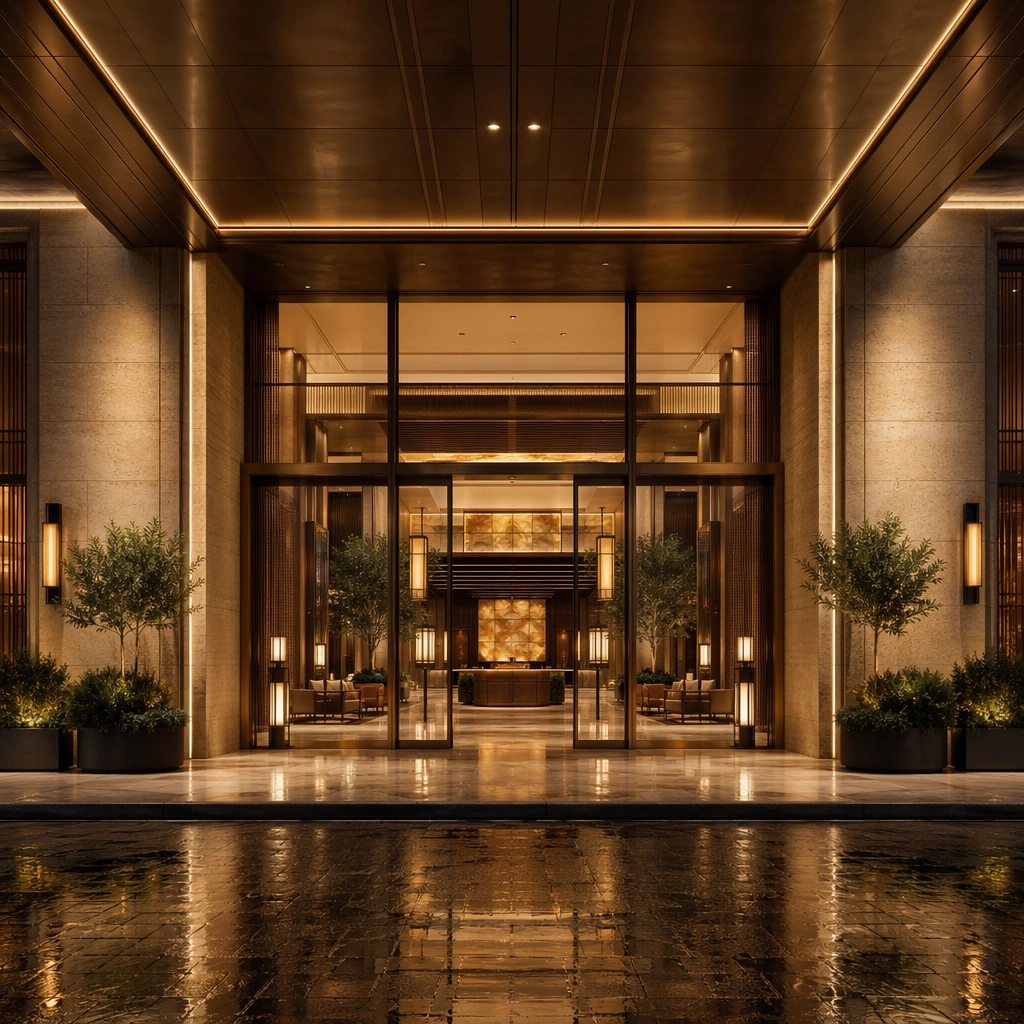
Example generated from “Luxury Hotel Lobby Arrival System — Arrival Portal Wide”
GPT Image 2en

Scene: Create a square architectural reference still for Luxury Hotel Lobby Arrival System. Use a frontal wide view from the drop-off threshold into the full lobby and treat the frame like a premium interior or architecture editorial photograph with disciplined perspective, readable depth from foreground to background, and enough negative space for the spatial hierarchy to breathe. Light the scene so arrival drama, tactile materials, and premium circulation feel immediate, using warm limestone, honey amber, muted bronze, deep olive planting, and soft charcoal shadows as the governing tonal range. The composition must read as a high-end commercial image that could sit inside campaign stills, hospitality editorials, investor decks, and operator handoff boards. Subject: Show a grand luxury hotel lobby with limestone slabs, smoked bronze screens, amber onyx accents, sculpted concierge islands, mirror-still water details, and a calm hospitality atmosphere. Center the first impression of the porte cochere threshold, the long sightline to reception, and the layered lighting depth. This is the canonical reference image for the package, so the major proportions, material transitions, fixture families, and circulation logic must feel highly specific and internally coherent rather than generic luxury styling. Let the viewer understand how the space is organized within a single glance, with foreground anchors, a clear middle zone, and a resolved background termination. Important details: Lock the portal proportions, stone-and-bronze palette, concierge desk geometry, lantern rhythm, seating family, and abstract wayfinding zones. Surfaces should feel tactile and believable: stone veining must stay plausible, metals should have disciplined reflectance, fabrics should show natural weight, and concealed lighting should shape the volume instead of flattening it. Use abstract signage, menu, label, or caption zones only as unreadable graphic hints. The image should feel practical for downstream design reviews and polished enough for public-facing campaign use. Use case: Luxury Hotel Lobby Arrival System series study 1/9, establishing the canonical arrival composition for the whole package. Constraints: No readable text, no watermark, no logos, preserve exact 1:1 aspect ratio, no guests, no staff, no suitcases scattered everywhere, no casino mood, no festive balloons, no parked cars blocking the portal.
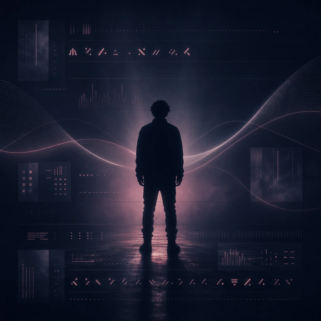

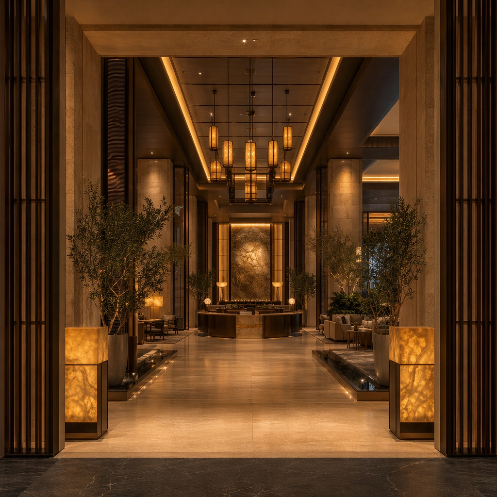
Example generated from “Luxury Hotel Lobby Arrival System — Reception Axis”
GPT Image 2en

Scene: Create a square reference-dependent architecture still for Luxury Hotel Lobby Arrival System. Use a slightly closer camera aligned to the reception axis while keeping the same lens discipline, editorial polish, and material believability established by the reference image. The lighting can shift to support the intended mood, but the space must still feel like the same authored project with a stable viewpoint logic, convincing depth separation, and clean commercial-photography finish. Keep warm limestone, honey amber, muted bronze, deep olive planting, and soft charcoal shadows as the governing tonal range even when the emphasis changes. Subject: Show a grand luxury hotel lobby with limestone slabs, smoked bronze screens, amber onyx accents, sculpted concierge islands, mirror-still water details, and a calm hospitality atmosphere. Focus on the exact same lobby from the reference image, now emphasizing the concierge islands, check-in choreography, and floor reflection. Preserve exact architectural identity, plan logic, material palette, fixture family, and circulation cues from the reference image while changing only the intended emphasis described here. The viewer should immediately recognize the same project, not a loose cousin, with matching silhouette logic, aligned detailing, and consistent brand atmosphere. Important details: Preserve the portal proportions, stone-and-bronze palette, concierge desk geometry, lantern rhythm, seating family, and abstract wayfinding zones. Any abstract wayfinding, menu, wall-label, or packaging zones must stay unreadable and subordinate to the spatial image. Joinery, edges, reflections, and lighting should remain realistic enough for an operator or design team to treat the image as a credible reference. The variation should feel deliberate and commercially useful, proving that one locked spatial language can flex across multiple campaign or editorial surfaces. Use case: Luxury Hotel Lobby Arrival System series study 2/9, extending reception hierarchy and service calm while preserving the reference identity. Constraints: No readable text, no watermark, no logos, preserve exact 1:1 aspect ratio, preserve exact architectural identity from the reference image, no guests, no staff, no suitcases scattered everywhere, no casino mood, no festive balloons, no flower-overload centerpiece.

Example generated from “Luxury Hotel Lobby Arrival System — Lounge Threshold at Dusk”
GPT Image 2en

Scene: Create a square reference-dependent architecture still for Luxury Hotel Lobby Arrival System. Use a dusk angle from the lounge threshold toward the lobby core while keeping the same lens discipline, editorial polish, and material believability established by the reference image. The lighting can shift to support the intended mood, but the space must still feel like the same authored project with a stable viewpoint logic, convincing depth separation, and clean commercial-photography finish. Keep warm limestone, honey amber, muted bronze, deep olive planting, and soft charcoal shadows as the governing tonal range even when the emphasis changes. Subject: Show a grand luxury hotel lobby with limestone slabs, smoked bronze screens, amber onyx accents, sculpted concierge islands, mirror-still water details, and a calm hospitality atmosphere. Focus on the exact same lobby from the reference image, now emphasizing evening glow, lounge grouping, and the transition from arrival to waiting. Preserve exact architectural identity, plan logic, material palette, fixture family, and circulation cues from the reference image while changing only the intended emphasis described here. The viewer should immediately recognize the same project, not a loose cousin, with matching silhouette logic, aligned detailing, and consistent brand atmosphere. Important details: Preserve the portal proportions, stone-and-bronze palette, concierge desk geometry, lantern rhythm, seating family, and abstract wayfinding zones. Any abstract wayfinding, menu, wall-label, or packaging zones must stay unreadable and subordinate to the spatial image. Joinery, edges, reflections, and lighting should remain realistic enough for an operator or design team to treat the image as a credible reference. The variation should feel deliberate and commercially useful, proving that one locked spatial language can flex across multiple campaign or editorial surfaces. Use case: Luxury Hotel Lobby Arrival System series study 3/9, extending the evening hospitality mood without changing the architecture. Constraints: No readable text, no watermark, no logos, preserve exact 1:1 aspect ratio, preserve exact architectural identity from the reference image, no guests, no staff, no suitcases scattered everywhere, no casino mood, no festive balloons, no nightclub neon.

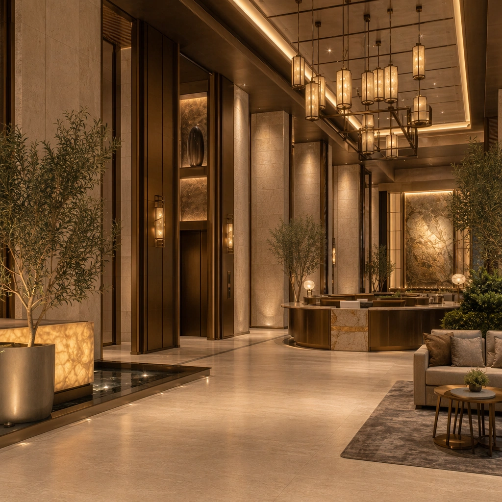
Example generated from “Luxury Hotel Lobby Arrival System — Elevator Vault Corner”
GPT Image 2en

Scene: Create a square reference-dependent architecture still for Luxury Hotel Lobby Arrival System. Use a composed corner view toward the elevator vestibule and bronze portals while keeping the same lens discipline, editorial polish, and material believability established by the reference image. The lighting can shift to support the intended mood, but the space must still feel like the same authored project with a stable viewpoint logic, convincing depth separation, and clean commercial-photography finish. Keep warm limestone, honey amber, muted bronze, deep olive planting, and soft charcoal shadows as the governing tonal range even when the emphasis changes. Subject: Show a grand luxury hotel lobby with limestone slabs, smoked bronze screens, amber onyx accents, sculpted concierge islands, mirror-still water details, and a calm hospitality atmosphere. Focus on the exact same lobby from the reference image, now focusing on the elevator side, sculptural wall niches, and circulation turn. Preserve exact architectural identity, plan logic, material palette, fixture family, and circulation cues from the reference image while changing only the intended emphasis described here. The viewer should immediately recognize the same project, not a loose cousin, with matching silhouette logic, aligned detailing, and consistent brand atmosphere. Important details: Preserve the portal proportions, stone-and-bronze palette, concierge desk geometry, lantern rhythm, seating family, and abstract wayfinding zones. Any abstract wayfinding, menu, wall-label, or packaging zones must stay unreadable and subordinate to the spatial image. Joinery, edges, reflections, and lighting should remain realistic enough for an operator or design team to treat the image as a credible reference. The variation should feel deliberate and commercially useful, proving that one locked spatial language can flex across multiple campaign or editorial surfaces. Use case: Luxury Hotel Lobby Arrival System series study 4/9, extending secondary circulation and vertical-transition logic within the same identity. Constraints: No readable text, no watermark, no logos, preserve exact 1:1 aspect ratio, preserve exact architectural identity from the reference image, no guests, no staff, no suitcases scattered everywhere, no casino mood, no festive balloons, no exposed service doors.

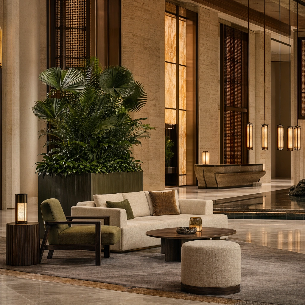
Example generated from “Luxury Hotel Lobby Arrival System — Seating Cluster Editorial”
GPT Image 2en

Scene: Create a square standalone support study for Luxury Hotel Lobby Arrival System. Use a square editorial still centered on a lounge seating cluster beside a tall planter and frame it like a premium commercial still or design-editorial crop with clear focal hierarchy, disciplined perspective, and enough breathing room for the materials and objects to read at both thumbnail and full size. Keep warm limestone, honey amber, muted bronze, deep olive planting, and soft charcoal shadows as the tonal guide so the image still belongs to the same theme family, and light the scene in a controlled way that emphasizes texture, edge quality, and authored atmosphere over spectacle. Subject: Show a grand luxury hotel lobby with limestone slabs, smoked bronze screens, amber onyx accents, sculpted concierge islands, mirror-still water details, and a calm hospitality atmosphere. In this support study, focus on upholstery tone, low table styling, rug geometry, and generous negative space. The image should work independently, yet it must still feel like it belongs to the same broader world of Hotel Lobby. Make the space, props, and detailing useful for real campaign, editorial, or design-review contexts rather than moodboard abstraction. Important details: Carry forward the broader language of the portal proportions, stone-and-bronze palette, concierge desk geometry, lantern rhythm, seating family, and abstract wayfinding zones, but let this image prove a new support surface or secondary deliverable. Material realism is essential: wood grain, metal sheen, glass edges, textiles, and stone should feel physically plausible and carefully art directed. Any graphic panels, labels, menus, packaging, or captions must stay abstract and unreadable. The overall result should feel reusable for campaign stills, hospitality editorials, investor decks, and operator handoff boards, with enough structure that a creative or operations team could build on it. Use case: Luxury Hotel Lobby Arrival System single study 6/9, exploring lobby lounge styling for campaigns and brochures. Constraints: No readable text, no watermark, no logos, preserve exact 1:1 aspect ratio, no guests, no staff, no suitcases scattered everywhere, no casino mood, no festive balloons, no messy magazines.

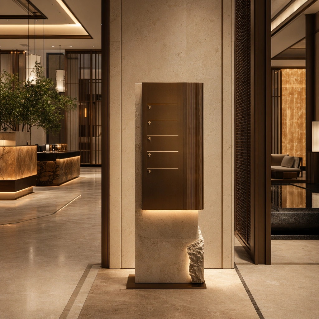
Example generated from “Luxury Hotel Lobby Arrival System — Wayfinding Plinth Study”
GPT Image 2en

Scene: Create a square standalone support study for Luxury Hotel Lobby Arrival System. Use a sculptural wayfinding plinth and corridor junction photographed front-on and frame it like a premium commercial still or design-editorial crop with clear focal hierarchy, disciplined perspective, and enough breathing room for the materials and objects to read at both thumbnail and full size. Keep warm limestone, honey amber, muted bronze, deep olive planting, and soft charcoal shadows as the tonal guide so the image still belongs to the same theme family, and light the scene in a controlled way that emphasizes texture, edge quality, and authored atmosphere over spectacle. Subject: Show a grand luxury hotel lobby with limestone slabs, smoked bronze screens, amber onyx accents, sculpted concierge islands, mirror-still water details, and a calm hospitality atmosphere. In this support study, focus on abstract signage zones, stone plinth proportion, concealed lighting, and threshold clarity. The image should work independently, yet it must still feel like it belongs to the same broader world of Hotel Lobby. Make the space, props, and detailing useful for real campaign, editorial, or design-review contexts rather than moodboard abstraction. Important details: Carry forward the broader language of the portal proportions, stone-and-bronze palette, concierge desk geometry, lantern rhythm, seating family, and abstract wayfinding zones, but let this image prove a new support surface or secondary deliverable. Material realism is essential: wood grain, metal sheen, glass edges, textiles, and stone should feel physically plausible and carefully art directed. Any graphic panels, labels, menus, packaging, or captions must stay abstract and unreadable. The overall result should feel reusable for campaign stills, hospitality editorials, investor decks, and operator handoff boards, with enough structure that a creative or operations team could build on it. Use case: Luxury Hotel Lobby Arrival System single study 7/9, exploring directional branding support without readable language. Constraints: No readable text, no watermark, no logos, preserve exact 1:1 aspect ratio, no guests, no staff, no suitcases scattered everywhere, no casino mood, no festive balloons, no arrows made of text.

Example generated from “Luxury Hotel Lobby Arrival System — Rainy Canopy Night”
GPT Image 2en

Scene: Create a square standalone support study for Luxury Hotel Lobby Arrival System. Use an exterior-to-interior night still under the hotel canopy after rain and frame it like a premium commercial still or design-editorial crop with clear focal hierarchy, disciplined perspective, and enough breathing room for the materials and objects to read at both thumbnail and full size. Keep warm limestone, honey amber, muted bronze, deep olive planting, and soft charcoal shadows as the tonal guide so the image still belongs to the same theme family, and light the scene in a controlled way that emphasizes texture, edge quality, and authored atmosphere over spectacle. Subject: Show a grand luxury hotel lobby with limestone slabs, smoked bronze screens, amber onyx accents, sculpted concierge islands, mirror-still water details, and a calm hospitality atmosphere. In this support study, focus on wet stone reflections, warm interior spill, bronze soffit detail, and premium curb arrival mood. The image should work independently, yet it must still feel like it belongs to the same broader world of Hotel Lobby. Make the space, props, and detailing useful for real campaign, editorial, or design-review contexts rather than moodboard abstraction. Important details: Carry forward the broader language of the portal proportions, stone-and-bronze palette, concierge desk geometry, lantern rhythm, seating family, and abstract wayfinding zones, but let this image prove a new support surface or secondary deliverable. Material realism is essential: wood grain, metal sheen, glass edges, textiles, and stone should feel physically plausible and carefully art directed. Any graphic panels, labels, menus, packaging, or captions must stay abstract and unreadable. The overall result should feel reusable for campaign stills, hospitality editorials, investor decks, and operator handoff boards, with enough structure that a creative or operations team could build on it. Use case: Luxury Hotel Lobby Arrival System single study 8/9, exploring night arrival marketing imagery for the same hotel language. Constraints: No readable text, no watermark, no logos, preserve exact 1:1 aspect ratio, no guests, no staff, no suitcases scattered everywhere, no casino mood, no festive balloons, no taxis or logos.

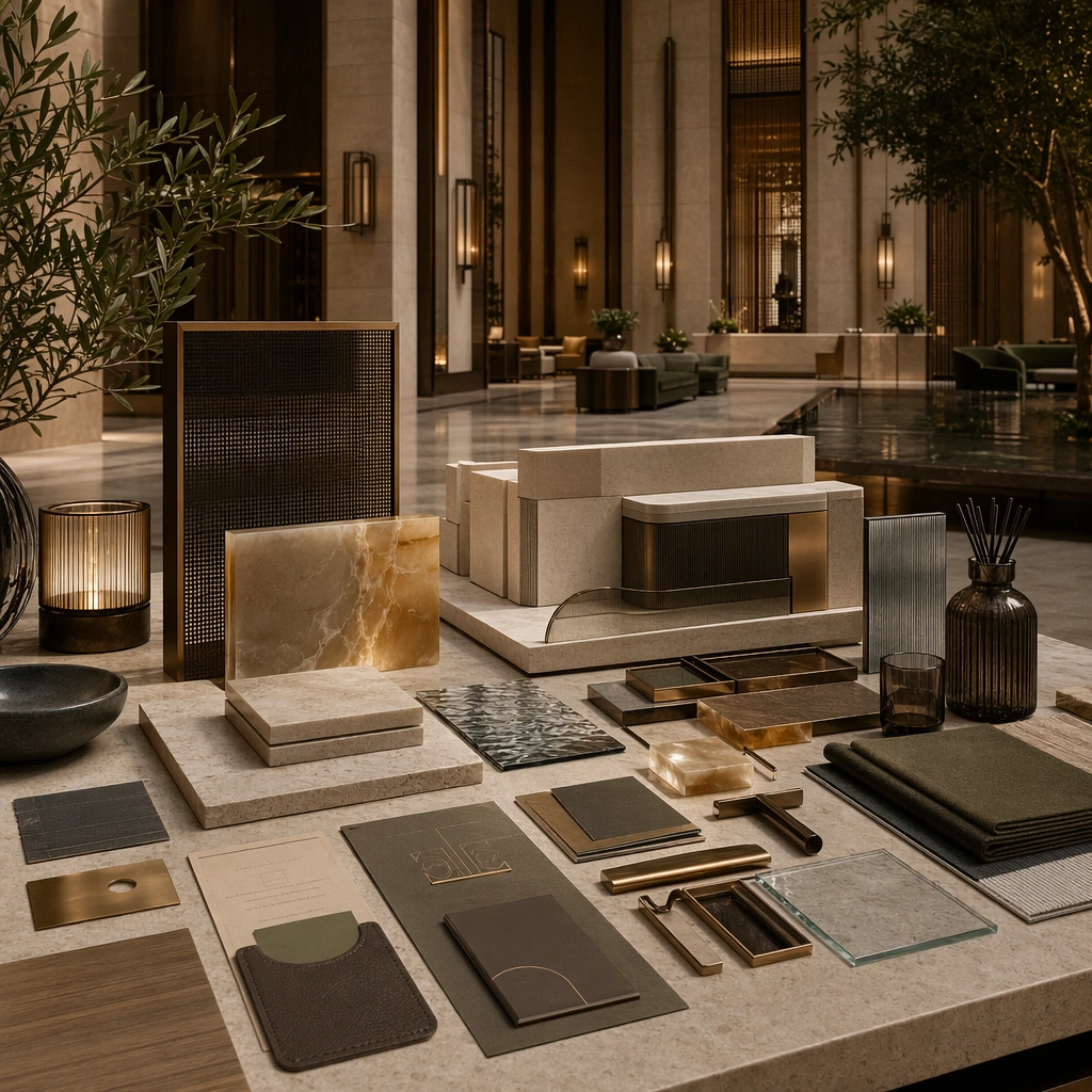
Example generated from “Luxury Hotel Lobby Arrival System — Material and Amenity Board”
GPT Image 2en

Scene: Create a square standalone support study for Luxury Hotel Lobby Arrival System. Use a curated tabletop board of stone, bronze, keycard sleeve forms, linen, and scent objects and frame it like a premium commercial still or design-editorial crop with clear focal hierarchy, disciplined perspective, and enough breathing room for the materials and objects to read at both thumbnail and full size. Keep warm limestone, honey amber, muted bronze, deep olive planting, and soft charcoal shadows as the tonal guide so the image still belongs to the same theme family, and light the scene in a controlled way that emphasizes texture, edge quality, and authored atmosphere over spectacle. Subject: Show a grand luxury hotel lobby with limestone slabs, smoked bronze screens, amber onyx accents, sculpted concierge islands, mirror-still water details, and a calm hospitality atmosphere. In this support study, focus on hospitality material hierarchy arranged like a design review board with tactile realism. The image should work independently, yet it must still feel like it belongs to the same broader world of Hotel Lobby. Make the space, props, and detailing useful for real campaign, editorial, or design-review contexts rather than moodboard abstraction. Important details: Carry forward the broader language of the portal proportions, stone-and-bronze palette, concierge desk geometry, lantern rhythm, seating family, and abstract wayfinding zones, but let this image prove a new support surface or secondary deliverable. Material realism is essential: wood grain, metal sheen, glass edges, textiles, and stone should feel physically plausible and carefully art directed. Any graphic panels, labels, menus, packaging, or captions must stay abstract and unreadable. The overall result should feel reusable for campaign stills, hospitality editorials, investor decks, and operator handoff boards, with enough structure that a creative or operations team could build on it. Use case: Luxury Hotel Lobby Arrival System single study 9/9, exploring support imagery for brand presentations and interior concept approvals. Constraints: No readable text, no watermark, no logos, preserve exact 1:1 aspect ratio, no guests, no staff, no suitcases scattered everywhere, no casino mood, no festive balloons, no readable card text.

Example generated from “Lyric Visualizer Frame Family — Reference Echo Frame”
GPT Image 2en

Scene: A square music-visualizer still suspended between editorial poster and motion-graphics frame, with a dark indigo room, one backlit performer silhouette, fog-softened light beams, and gently curved waveform arcs crossing the composition. The image should feel like a frozen moment from a lyric loop, with room for rhythm, repetition, and future motion. Subject: The core subject is a standing performer silhouette centered within a disciplined frame system of luminous waveform lines, translucent panels, and stacked bands of invented glyph-like marks that suggest lyrics without becoming readable language. This first image must establish the exact composition grammar that later frames depend on: silhouette scale, glyph density, panel placement, and wave curvature. Important details: Treat the pseudo-typographic zones as visual rhythm rather than text. Use glowing bars, abstract marks, and staggered motion echoes that imply sung lines. The frame must look commercially plausible for a lyric visualizer or teaser loop, with clean hierarchy, cinematic atmosphere, and a coherent color world of indigo, silver, and soft rose. It should feel designed, not like a random VJ screen grab. Use case: Lyric Frames series study 1/9 for the Lyric Visualizer Frame Family Prompt Atlas theme. Constraints: No readable text, no watermark, no logos, preserve exact 1:1 aspect ratio, no readable lyrics, no interface chrome, no concert crowd, no giant speaker stacks, no bright rainbow gradients, no literal subtitles

Example generated from “Lyric Visualizer Frame Family — Rainfall Chorus”
GPT Image 2en

Scene: A square visualizer frame set in the same indigo stage world, now crossed by diagonal rain streaks, brighter waveform flares, and a stronger sense of rhythmic impact. The composition should remain recognizably derived from the reference frame, keeping the same panel structure and silhouette scale while adding a more emotional chorus energy. Subject: Preserve the same performer silhouette placement, waveform geometry, panel spacing, and invented glyph density from the reference image. The performer appears mid-breath and slightly lifted by backlight haze, while the lyric bars intensify into layered glowing stacks that still remain completely non-readable. Important details: The purpose is to show how one lyric-visualizer system scales into a chorus frame without losing design control. Keep the same core palette and grid logic, but let rain, flare, and echoing wave lines raise the emotional temperature. The visual rhythm of the pseudo-letterforms must stay coherent with the reference, as if part of the same motion package and song campaign. Use case: Lyric Frames series study 2/9 for the Lyric Visualizer Frame Family Prompt Atlas theme. Constraints: No readable text, no watermark, no logos, preserve exact 1:1 aspect ratio, preserve the core frame grammar from the reference image; no legible words, no interface timeline, no crowd hands, no harsh daylight, no chaotic particle overload

Example generated from “Lyric Visualizer Frame Family — Whisper Bridge”
GPT Image 2en

Scene: A square lyric-visualizer still in the same visual world, now dimmer and more intimate, with fewer waveform arcs, softer haze, and a calmer atmosphere as if the song has entered a reflective bridge. The frame must remain structurally tied to the reference rather than inventing a new system. Subject: Preserve the same performer silhouette scale, panel placement, wave curvature, and non-readable glyph language from the reference image. The performer appears more isolated within the frame, while only a few lyric bars and faint motion echoes remain visible, creating a sense of breath and restraint. Important details: This image should demonstrate dynamic range inside one lyric-visualizer package. Keep the same indigo-silver world, the same disciplined empty zones, and the same non-verbal text rhythm, but reduce density and brightness so the frame feels introspective. The key success factor is continuity: it must clearly belong to the same song system even when the energy drops. Use case: Lyric Frames series study 3/9 for the Lyric Visualizer Frame Family Prompt Atlas theme. Constraints: No readable text, no watermark, no logos, preserve exact 1:1 aspect ratio, preserve the core frame grammar from the reference image; no readable lyrics, no black void emptiness, no unrelated props, no photo-real audience, no oversaturated color swirls

Example generated from “Lyric Visualizer Frame Family — Finale Surge”
GPT Image 2en

Scene: A square finale frame in the same visualizer universe, now fuller and brighter, with expanded waveform arcs, stronger edge light, and cinematic fog catching the light in broad diagonals. The frame should feel like the culminating loop of a lyric visualizer, but still obey the same composition system established by the reference. Subject: Preserve the same performer silhouette position, waveform logic, panel layout, and invented glyph-family from the reference image. The pseudo-lyric bands become denser and taller, surrounding the figure with a sense of emotional build while staying fully non-readable and visually controlled. Important details: This is a system stress test, not a permission to lose discipline. Keep the same grid behavior, same palette family, and same motion package identity while increasing intensity. The result should look like a real music visualizer frame family that could be cut into looped content, social snippets, and launch teasers with consistent ownership. Use case: Lyric Frames series study 4/9 for the Lyric Visualizer Frame Family Prompt Atlas theme. Constraints: No readable text, no watermark, no logos, preserve exact 1:1 aspect ratio, preserve the core frame grammar from the reference image; no readable subtitles, no software UI, no crowd silhouettes, no random lightning bolts, no cartoon effects

Example generated from “Lyric Visualizer Frame Family — Smoke Tunnel Glyphs”
GPT Image 2en

Scene: A square tunnel environment formed by parallel light bars disappearing into smoke, with a static central camera and a strong sense of depth. The scene should feel like a music-video visualizer environment translated into a single clear promo frame. Subject: The subject is the tunnel itself plus a minimal performer silhouette deep in the center, surrounded by floating bands of invented glyph marks and faint waveform scaffolds. The image should suggest lyric pacing and song structure through repetition, distance, and glow rather than literal subtitles. Important details: Use the tunnel geometry to organize the frame, keeping the pseudo-typography secondary but integral. Light should sculpt the smoke, the glyph bands should sit in believable planes, and the whole image should feel ready for looped motion adaptation. It must be emotionally musical, not sci-fi wallpaper. Use case: Lyric Frames single study 6/9 for the Lyric Visualizer Frame Family Prompt Atlas theme. Constraints: No readable text, no watermark, no logos, preserve exact 1:1 aspect ratio, no readable words, no visible stage audience, no spaceship cues, no hard lens distortions, no random multicolor noise

Example generated from “Lyric Visualizer Frame Family — Bedroom Diary Frame”
GPT Image 2en

Scene: A square bedroom scene at night with warm practical lamp light, soft shadows, and a simple bed or chair kept mostly in silhouette. The frame should feel personal and song-specific, as if a lyric visualizer briefly entered a diary-like interior world. Subject: A single figure sits near the bed edge or window, surrounded by suspended bars of non-readable lyric marks and faint glowing line paths that move through the room like memory traces. The layout should remain controlled and graphic despite the softness of the scene. Important details: Make the intimacy believable without becoming lifestyle photography. The pseudo-text should behave like emotional residue, not subtitles. Use the room sparingly, focus on negative space, and let warm light plus a few cool accents create a layered emotional frame that could support a quiet song section or teaser clip. Use case: Lyric Frames single study 7/9 for the Lyric Visualizer Frame Family Prompt Atlas theme. Constraints: No readable text, no watermark, no logos, preserve exact 1:1 aspect ratio, no readable notes on walls, no brand products, no cluttered bedroom mess, no daylight, no literal smartphone interface

Example generated from “Lyric Visualizer Frame Family — Industrial Pulse Frame”
GPT Image 2en

Scene: A square industrial interior with steel beams, wet floor reflections, and a few strong practical lights cutting through haze. The architecture should give the frame pulse and weight while remaining sparse enough for motion graphics and pseudo-lyric elements to breathe. Subject: A compact performer silhouette stands against the architectural grid while stacked bands of invented glyphs, pulse lines, and translucent blocks hang in front and behind them. The image should feel hard-edged and rhythmic, like a visualizer for a percussive track. Important details: Use architecture as tempo. Beam spacing, floor reflections, and light cuts should reinforce the pseudo-typographic rhythm. Keep the frame legible and product-ready, avoiding random texture overload. The song energy should be evident through structure and light rather than through readable titles or explicit interfaces. Use case: Lyric Frames single study 8/9 for the Lyric Visualizer Frame Family Prompt Atlas theme. Constraints: No readable text, no watermark, no logos, preserve exact 1:1 aspect ratio, no factory workers, no safety signage, no readable labels, no orange sparks, no heavy machinery dominating the frame

Example generated from “Lyric Visualizer Frame Family — Waterline Refrain Frame”
GPT Image 2en

Scene: A square reflective waterline scene with shallow standing water, low mist, and soft overhead light turning the floor into a mirror. The frame should feel airy and lyrical, like a visualizer still for a refrain that opens emotionally instead of striking hard. Subject: A lone figure stands near the center while abstract lyric bars and curved wave traces hover above the water, mirrored below in softened reflection. The marks remain fully non-readable, functioning as visual timing cues rather than language. Important details: Keep the palette limited, the reflection realistic, and the glyph rhythm elegant. This image should feel musical, cinematic, and design-led at the same time. The water must support the layout by providing symmetry and echo, not by becoming a special-effects showcase. Use case: Lyric Frames single study 9/9 for the Lyric Visualizer Frame Family Prompt Atlas theme. Constraints: No readable text, no watermark, no logos, preserve exact 1:1 aspect ratio, no readable subtitles, no beach setting, no dramatic storm, no fish or surreal creatures, no multicolor nightclub palette

Example generated from “Macro Real Texture — Macro Study”
GPT Image 2en

Scene: A square material-focused image where lighting, scale, and surface behavior are the main event. Build the frame around extreme close observation of texture, grain, and edge behavior. Keep the lighting, camera distance, and spatial organization tuned for a high-signal research image rather than a casual snapshot. The image belongs to the Macro Real Texture theme and should feel immediately legible as a prompt atlas theme for macro real texture, testing photorealism, physics-materials with gpt image 2.. Subject: Center the study on extreme close observation of texture, grain, and edge behavior. Translate the theme into a concrete visual statement instead of an abstract mood board: the viewer should understand what kind of image this is, what is being tested, and why the composition is difficult. Use the slug idea of macro real texture as a literal guide for subject matter, materials, and staging. Important details: Microstructure matters: refraction, fibers, scratches, pores, edge wear, translucency, and dust should all feel physically specific. Preserve a disciplined square composition, clear focal hierarchy, and enough secondary information to make the image feel complete rather than underspecified. The image should look polished, novel, and exhibition-ready, with topic-specific credibility coming from the way surfaces, structure, and visual language reinforce Macro Real Texture. Avoid generic filler elements that do not serve the main concept. Use case: Macro Real Texture single study 2/8, testing photorealism, physics-materials through the macro study variation. Constraints: No readable text, no watermark, no logos, preserve exact 1:1 aspect ratio, no generic stock macro, no broken scale cues, no plastic-looking texture when it should feel natural, no meaningless blur, no watermark, no fake labels.

Example generated from “Macro Real Texture — Side Light Study”
GPT Image 2en

Scene: A square material-focused image where lighting, scale, and surface behavior are the main event. Build the frame around raking light used to reveal depth and relief. Keep the lighting, camera distance, and spatial organization tuned for a high-signal research image rather than a casual snapshot. The image belongs to the Macro Real Texture theme and should feel immediately legible as a prompt atlas theme for macro real texture, testing photorealism, physics-materials with gpt image 2.. Subject: Center the study on raking light used to reveal depth and relief. Translate the theme into a concrete visual statement instead of an abstract mood board: the viewer should understand what kind of image this is, what is being tested, and why the composition is difficult. Use the slug idea of macro real texture as a literal guide for subject matter, materials, and staging. Important details: Microstructure matters: refraction, fibers, scratches, pores, edge wear, translucency, and dust should all feel physically specific. Preserve a disciplined square composition, clear focal hierarchy, and enough secondary information to make the image feel complete rather than underspecified. The image should look polished, novel, and exhibition-ready, with topic-specific credibility coming from the way surfaces, structure, and visual language reinforce Macro Real Texture. Avoid generic filler elements that do not serve the main concept. Use case: Macro Real Texture single study 3/8, testing photorealism, physics-materials through the side light study variation. Constraints: No readable text, no watermark, no logos, preserve exact 1:1 aspect ratio, no generic stock macro, no broken scale cues, no plastic-looking texture when it should feel natural, no meaningless blur, no watermark, no fake labels.

Example generated from “Macro Real Texture — Process Trace”
GPT Image 2en

Scene: A square material-focused image where lighting, scale, and surface behavior are the main event. Build the frame around evidence of making, wear, or transformation frozen in the surface. Keep the lighting, camera distance, and spatial organization tuned for a high-signal research image rather than a casual snapshot. The image belongs to the Macro Real Texture theme and should feel immediately legible as a prompt atlas theme for macro real texture, testing photorealism, physics-materials with gpt image 2.. Subject: Center the study on evidence of making, wear, or transformation frozen in the surface. Translate the theme into a concrete visual statement instead of an abstract mood board: the viewer should understand what kind of image this is, what is being tested, and why the composition is difficult. Use the slug idea of macro real texture as a literal guide for subject matter, materials, and staging. Important details: Microstructure matters: refraction, fibers, scratches, pores, edge wear, translucency, and dust should all feel physically specific. Preserve a disciplined square composition, clear focal hierarchy, and enough secondary information to make the image feel complete rather than underspecified. The image should look polished, novel, and exhibition-ready, with topic-specific credibility coming from the way surfaces, structure, and visual language reinforce Macro Real Texture. Avoid generic filler elements that do not serve the main concept. Use case: Macro Real Texture single study 4/8, testing photorealism, physics-materials through the process trace variation. Constraints: No readable text, no watermark, no logos, preserve exact 1:1 aspect ratio, no generic stock macro, no broken scale cues, no plastic-looking texture when it should feel natural, no meaningless blur, no watermark, no fake labels.

Example generated from “Macro Real Texture — Specimen Table”
GPT Image 2en

Scene: A square material-focused image where lighting, scale, and surface behavior are the main event. Build the frame around multiple related samples arranged for comparison. Keep the lighting, camera distance, and spatial organization tuned for a high-signal research image rather than a casual snapshot. The image belongs to the Macro Real Texture theme and should feel immediately legible as a prompt atlas theme for macro real texture, testing photorealism, physics-materials with gpt image 2.. Subject: Center the study on multiple related samples arranged for comparison. Translate the theme into a concrete visual statement instead of an abstract mood board: the viewer should understand what kind of image this is, what is being tested, and why the composition is difficult. Use the slug idea of macro real texture as a literal guide for subject matter, materials, and staging. Important details: Microstructure matters: refraction, fibers, scratches, pores, edge wear, translucency, and dust should all feel physically specific. Preserve a disciplined square composition, clear focal hierarchy, and enough secondary information to make the image feel complete rather than underspecified. The image should look polished, novel, and exhibition-ready, with topic-specific credibility coming from the way surfaces, structure, and visual language reinforce Macro Real Texture. Avoid generic filler elements that do not serve the main concept. Use case: Macro Real Texture single study 5/8, testing photorealism, physics-materials through the specimen table variation. Constraints: No readable text, no watermark, no logos, preserve exact 1:1 aspect ratio, no generic stock macro, no broken scale cues, no plastic-looking texture when it should feel natural, no meaningless blur, no watermark, no fake labels.