PROMPTS · EXPLORAÇÃO CRIATIVA

Galeria de prompts

Explore prompts reais e exemplos gerados. Encontre inspiração para sua próxima missão criativa e copie o prompt completo grátis.

Exemplos
10,974
Modelos
17
Fontes
1277
10.974 exemplos de prompts · página 35 de 229
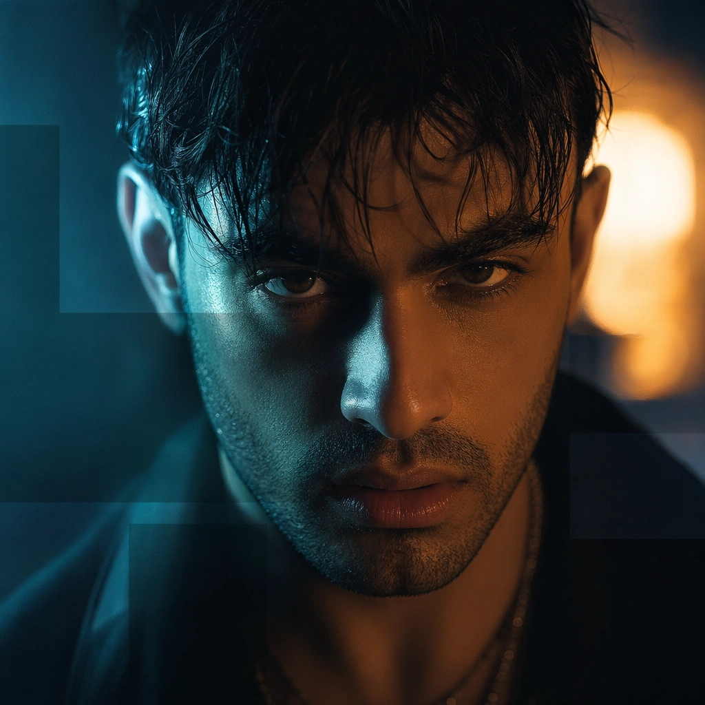
Example generated from “Music Video Thumbnail And Promo Card Set — Reaction Still Card”
GPT Image 2en

Scene: A square promo still with one emotionally intense face in close focus, dramatic side light, and a blurred cinematic hook in the background. The composition should feel instantly clickable in a good way, through expression and atmosphere rather than gimmicks. Subject: The subject is one invented performer caught in a charged emotional beat from a music-video world. The face must remain central and highly legible, while modular non-readable blocks and background atmosphere provide campaign structure. Important details: This is about emotional compression. Use expression, light, and one strong scene cue to create interest. Keep the image refined, contemporary, and native to music-video launch culture, avoiding exaggerated clickbait tropes or meme energy. Use case: MV Promo Cards single study 8/9 for the Music Video Thumbnail and Promo Card Set Prompt Atlas theme. Constraints: No readable text, no watermark, no logos, preserve exact 1:1 aspect ratio, no readable hook text, no platform logos, no arrows, no extra cast, no overexposed flash look

Example generated from “Music Video Thumbnail And Promo Card Set — Premiere Lobby Card”
GPT Image 2en

Scene: A square launch-night promo card with velvet-dark atmosphere, soft spotlight haze, reflective floor hints, and one poised performer silhouette or portrait. The image should feel ceremonial and premiere-oriented without depending on readable event copy. Subject: The subject is the feeling of premiere night translated into a square card: one artist presence, one controlled environmental hook, and elegant modular bars for future event messaging. It should feel serious and cinematic, not like a film festival poster. Important details: Use restraint, negative space, and a premium color palette to create a release-night mood. The image should feel at home across social cards, profile takeovers, and countdown reminders. Keep the hierarchy clean and the visual identity music-specific. Use case: MV Promo Cards single study 9/9 for the Music Video Thumbnail and Promo Card Set Prompt Atlas theme. Constraints: No readable text, no watermark, no logos, preserve exact 1:1 aspect ratio, no readable premiere text, no step-and-repeat logos, no red carpet crowd, no event badges, no generic movie-poster montage

Example generated from “Nabatean Petra Rediscovered — Reference Anchor”
GPT Image 2en

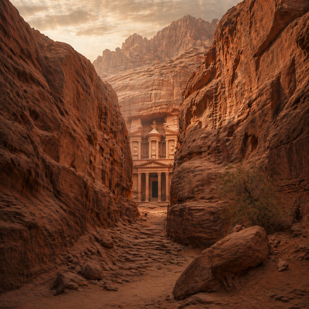
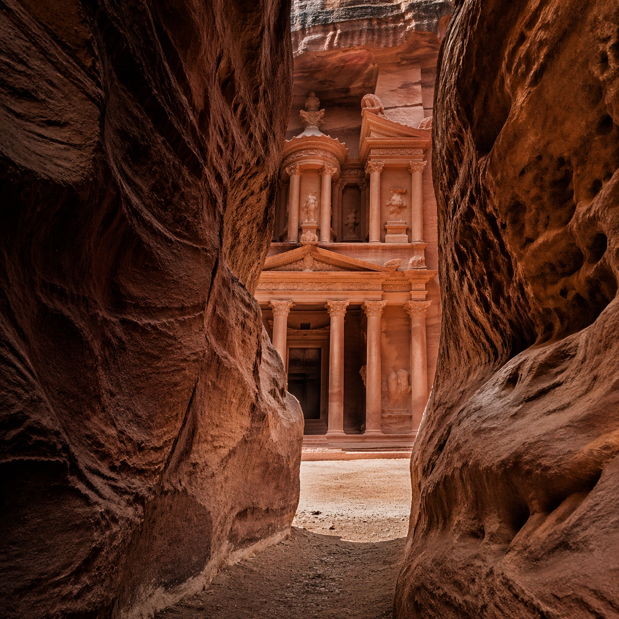
Scene: A square documentary image composed like a premium archaeology magazine feature. Use rose-red sandstone, warm desert amber, cool canyon shadow, and fine airborne dust. Frame the Petra Treasury facade emerging at the end of a narrow siq, with sand drifts at the base and high canyon walls framing the reveal with crisp depth layering, restrained contrast, and subtle atmospheric depth so the scene feels excavated, observed, and historically grounded rather than theatrical or game-like. Keep the light directional but believable, as if captured during a careful field visit. Subject: Center the image on the Petra Treasury facade emerging at the end of a narrow siq, with sand drifts at the base and high canyon walls framing the reveal. Include culturally accurate surface logic, region-specific setting, and believable human-scale cues in stairs, doorways, cut blocks, relief edges, or water depth. Shapes, carvings, masonry joints, and site wear should feel studied from real archaeology, with no generic ancient-world mashup and no ornamental filler borrowed from another civilization. Important details: Keep the monument recognizably Petra, with faceted rock-cut massing, canyon compression, and carved architectural order that feels cut directly from stone rather than assembled from blocks. Emphasize rose sandstone, wind-shaped sand, chisel-cut columns, shadowed canyon walls, and softly weathered Nabataean ornament. Keep inscriptions, painted registers, symbolic motifs, or carved bands visually plausible but not readable. Preserve a museum-grade balance between beauty and evidence: light should reveal relief depth, edge wear, repairs, sediment traces, and excavation context without turning the site into fantasy spectacle. The composition should feel like a definitive reference frame that later variations can inherit exactly. Use case: Nabatean Petra Rediscovered series study 1/9. Constraints: No readable text, no watermark, no logos, preserve exact 1:1 aspect ratio, no modern barriers, no souvenir stalls, no fantasy caravans, no electric lighting, no tourists, no anachronistic props, no collage layout, no exaggerated fantasy lighting.

Example generated from “Nabatean Petra Rediscovered — Human Scale Reveal”
GPT Image 2en

Scene: A square follow-up field image from the same site, slightly closer and lower than the reference anchor, with careful documentary framing and the same material palette. The camera should feel physically present inside the archaeological space, using natural light, soft depth separation, and one clear human figure to explain scale without turning the image into lifestyle photography. Subject: Show the same site identity established in the reference anchor, now with an archaeologist, conservator, or field researcher moving through the scene in practical neutral clothing. The person should be small relative to the monument and clearly secondary to the architecture, water, or painted wall system. Keep the main forms, structural rhythm, and civilizational markers unchanged. Important details: Preserve the exact site identity, base geometry, material behavior, and cultural signatures from the reference model. Only vary vantage, gesture, and scale cues. Keep the monument recognizably Petra, with faceted rock-cut massing, canyon compression, and carved architectural order that feels cut directly from stone rather than assembled from blocks. Human presence should clarify stair height, wall size, carving depth, or spatial compression while respecting conservation protocol and historical seriousness. Keep any tools understated and generic, with no readable labels. The image must still look like a rigorous archaeological record first and a dramatic scene second. Use case: Nabatean Petra Rediscovered series study 2/9. Constraints: No readable text, no watermark, no logos, preserve exact 1:1 aspect ratio, preserve exact site identity from the reference image, no modern barriers, no souvenir stalls, no fantasy caravans, no electric lighting, no fashion editorial styling, no crowd, no cinematic props.

Example generated from “Nabatean Petra Rediscovered — Surface Close Study”
GPT Image 2en

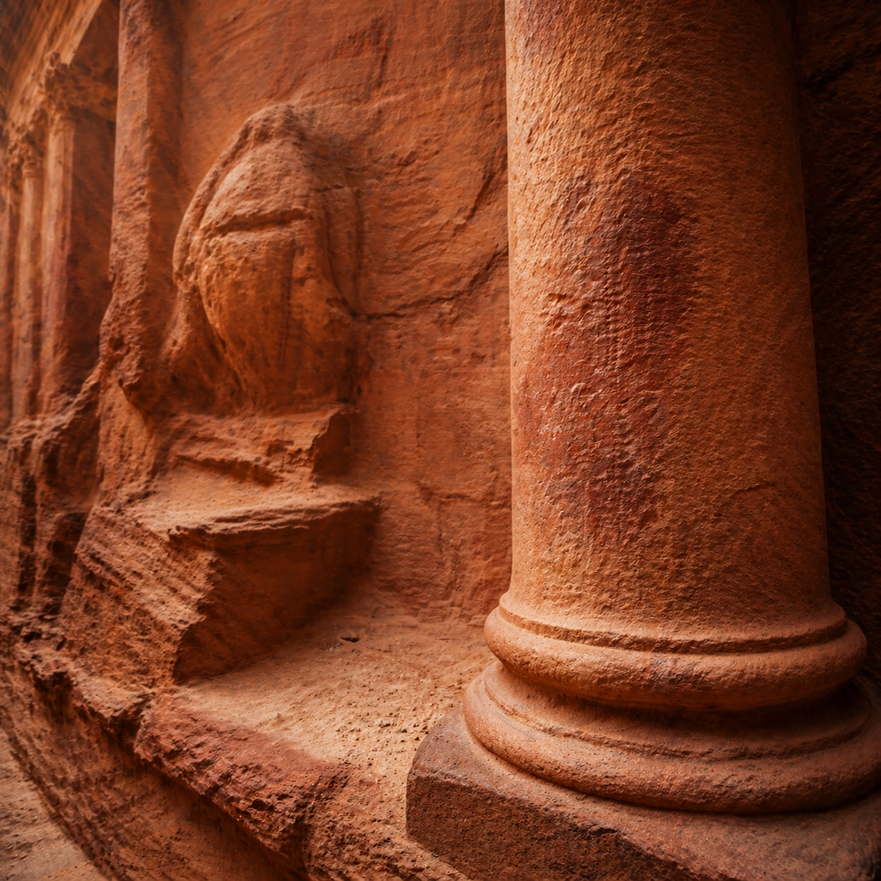
Scene: A square close study framed within the same site established by the reference anchor. Use a tight crop, shallow but believable depth of field, and raking light that reveals tactile evidence in surface relief, pigment, tool marks, moisture, or marine wear. The image should feel like a museum conservation photograph elevated to gallery quality. Subject: Focus on a materially rich portion of the same site: carved edges, painted plaster, fitted stone, root-wrapped masonry, submerged paving, or quarry-cut facial planes depending on the civilization. The composition should remain anchored to the original location and show enough surrounding context that viewers still recognize the parent site rather than mistaking it for an unrelated artifact. Important details: Preserve the exact site identity from the reference model while shifting emphasis to forensic surface evidence. Keep the monument recognizably Petra, with faceted rock-cut massing, canyon compression, and carved architectural order that feels cut directly from stone rather than assembled from blocks. Make micro-texture, fracture lines, pigment retention, water wear, plant interaction, dust, or chisel traces visually persuasive. Avoid decorative clutter. Every mark should feel like evidence of making, weathering, excavation, or conservation. Keep any symbolic marks non-legible and historically appropriate, and make the light reveal depth without flattening the material richness. Use case: Nabatean Petra Rediscovered series study 3/9. Constraints: No readable text, no watermark, no logos, preserve exact 1:1 aspect ratio, preserve exact site identity from the reference image, no modern barriers, no souvenir stalls, no fantasy caravans, no electric lighting, no isolated floating artifact, no studio backdrop, no fake macro abstraction.

Example generated from “Nabatean Petra Rediscovered — Atmospheric Wide Reveal”
GPT Image 2en

Scene: A square wide reveal of the same site under a slightly different environmental condition, with more surrounding geography or architecture visible while keeping the anchor landmark dominant. Use disciplined composition, atmospheric perspective, and natural light behavior so the image feels like a patient field photograph captured after the reference shot rather than a different fantasy set. Subject: Show the same site identity with broader context: approaches, terraces, ring walls, canyon slot, canopy volume, quarry slope, or chamber boundaries depending on the location. The anchor structure must remain instantly recognizable. Environmental scale should deepen understanding of why the site is placed here and how people, water, topography, or vegetation shape the experience of the monument. Important details: Preserve the exact landmark, materials, and civilizational cues from the reference model while allowing wider framing and a different atmospheric emphasis. Keep the monument recognizably Petra, with faceted rock-cut massing, canyon compression, and carved architectural order that feels cut directly from stone rather than assembled from blocks. Use geography and environmental systems to add meaning: drainage, mist, current, valley depth, roots, irrigation, or enclosure logic. The image should feel both beautiful and evidentiary, with no compositional tricks that break continuity with the established site. Use case: Nabatean Petra Rediscovered series study 4/9. Constraints: No readable text, no watermark, no logos, preserve exact 1:1 aspect ratio, preserve exact site identity from the reference image, no modern barriers, no souvenir stalls, no fantasy caravans, no electric lighting, no unrelated landmarks, no speculative mashup architecture, no posterized grading.

Example generated from “Nabatean Petra Rediscovered — Excavation Overview”
GPT Image 2en

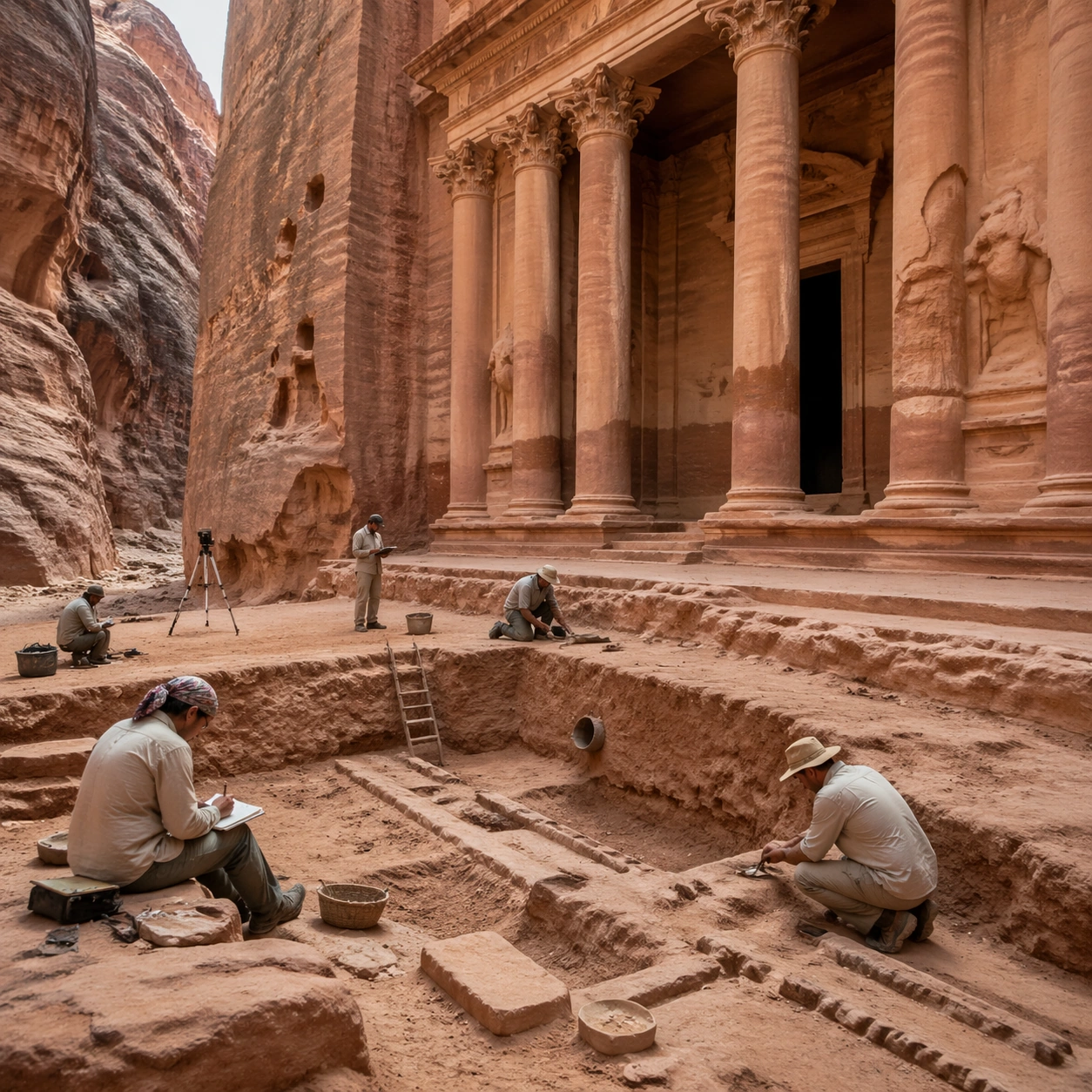
Scene: A square independent archaeology study composed from a slightly elevated fieldwork viewpoint. Use balanced natural light, crisp evidence hierarchy, and practical site organization so the image feels publishable in a museum report and still visually strong enough for a gallery wall. The frame should explain where excavation is happening without relying on readable markers or diagrams. Subject: Show a rediscovery approach scene with survey notes, partially cleared sand at the monument base, and careful inspection of cut channels and facade wear. Include grounded human traces such as ladders, trays, brushes, baskets, light rigs, or measuring tools only when they support archaeological realism and remain visually secondary. The site should stay culturally specific, with architecture, surface treatment, sediment, and environmental context all belonging to the correct civilization rather than a generic dig. Important details: Keep the monument recognizably Petra, with faceted rock-cut massing, canyon compression, and carved architectural order that feels cut directly from stone rather than assembled from blocks. Prioritize evidence relationships: exposed layers, cleaned edges, protected surfaces, loose fragments, and transitions between buried and revealed material. Let color, wear, and composition explain what has just been uncovered. The image must feel methodical rather than adventurous. Keep any site tags, notes, or markers abstract and unreadable. Avoid sensational treasure imagery and keep the atmosphere scholarly, patient, and materially convincing. Use case: Nabatean Petra Rediscovered single study 5/9. Constraints: No readable text, no watermark, no logos, preserve exact 1:1 aspect ratio, no modern barriers, no souvenir stalls, no fantasy caravans, no electric lighting, no treasure-chest clichés, no action-movie posing, no arbitrary props, no infographic overlay.

Example generated from “Nabatean Petra Rediscovered — Artifact Tableau”
GPT Image 2en

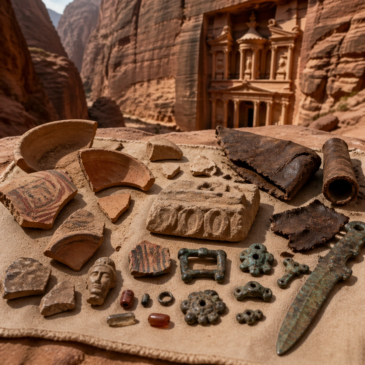
Scene: A square artifact and material study arranged like a high-end conservation photograph. Use soft directional light, controlled shadow falloff, and a neutral work surface so every fragment reads clearly. The image should feel intimate and scientific, but still rich enough to communicate the broader civilization through craft, wear, and material vocabulary alone. Subject: Present sand-coated ceramic fragments, carved stone chips, bronze fittings, leather field tools, and small finds arranged against desert cloth. Arrange the pieces with disciplined spacing and believable conservation handling. Include enough variation in scale, finish, and damage state to suggest excavation reality rather than a perfectly staged luxury still life. Nothing should look modern or decorative for its own sake; every object must feel like evidence tied to the same cultural world as the main topic. Important details: Emphasize tactile surfaces, honest aging, and historically grounded material behavior. Keep the monument recognizably Petra, with faceted rock-cut massing, canyon compression, and carved architectural order that feels cut directly from stone rather than assembled from blocks. Show abrasion, dust, corrosion, cracks, mineral bloom, pigment retention, or edge polish where appropriate. Keep the arrangement orderly but not sterile, as if prepared for a serious cataloging session. No readable labels, no museum placards, and no visual shortcuts that turn the study into product photography detached from archaeology. Use case: Nabatean Petra Rediscovered single study 6/9. Constraints: No readable text, no watermark, no logos, preserve exact 1:1 aspect ratio, no modern barriers, no souvenir stalls, no fantasy caravans, no electric lighting, no luxury advertising gloss, no floating objects, no velvet jewelry styling, no unrelated tools.

Example generated from “Nabatean Petra Rediscovered — Light Shift Study”
GPT Image 2en

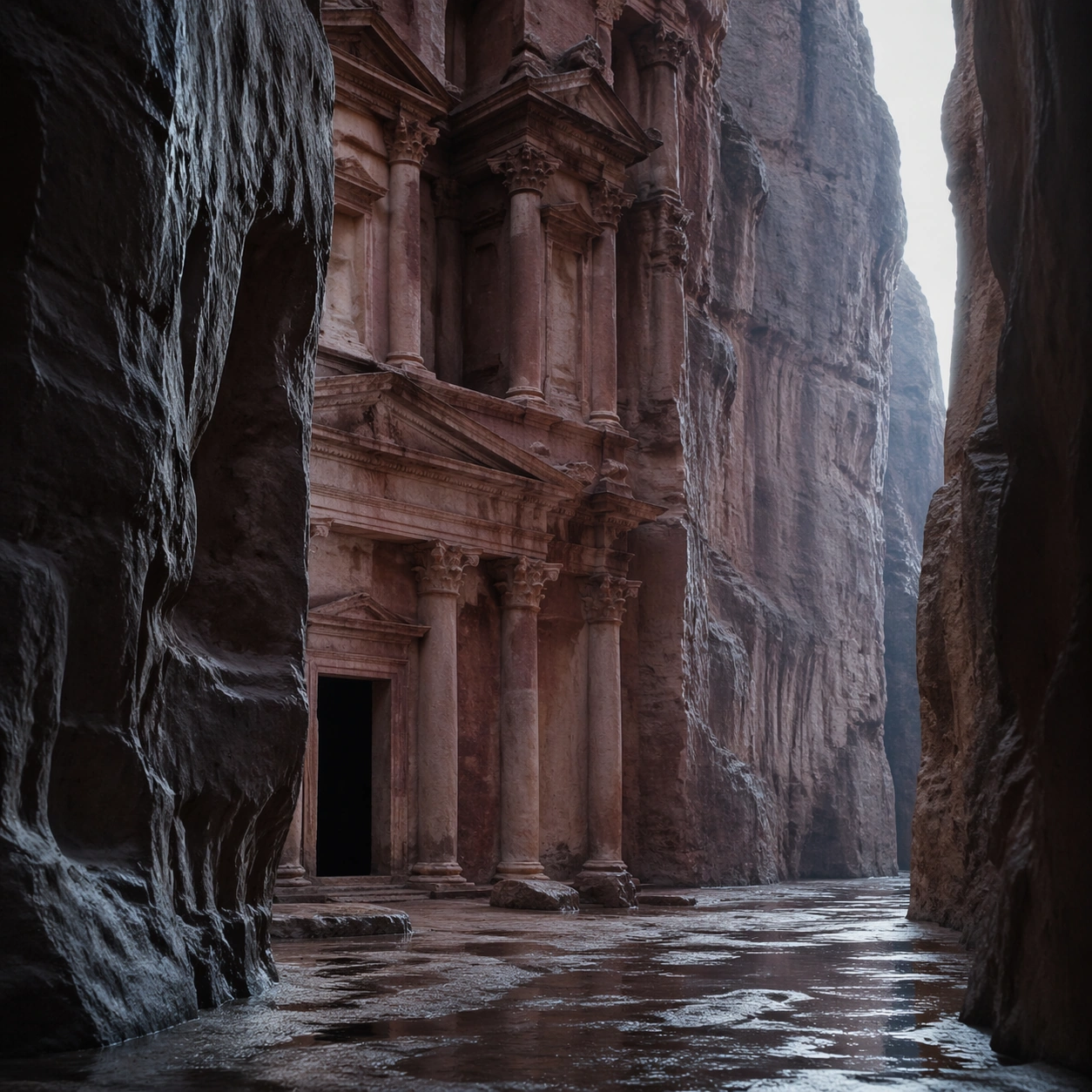
Scene: A square mood variation from the same civilization theme, built around cool dawn canyon light that narrows the visible slit of sky and turns the facade more subdued but still unmistakable. The image should stay grounded in field realism while testing how different illumination changes material reading, atmosphere, and emotional register. Keep the frame self-contained and coherent, as if photographed during a second visit under altered conditions. Subject: Show a culturally accurate site or interior connected to the same world as the main topic, but not as a direct dependency on the series reference. The focus should be on how light transforms relief, color, moisture, water, dust, or vegetation while preserving archaeological credibility. Architectural forms, objects, and setting must still belong to the same civilization with no cross-cultural contamination. Important details: Keep the monument recognizably Petra, with faceted rock-cut massing, canyon compression, and carved architectural order that feels cut directly from stone rather than assembled from blocks. Use the shift in light to reveal different evidence than the other studies: pigment glow, root sheen, caustics, wet stone, canyon shadow, marine haze, terrace depth, or quarry moisture. Keep the result serious and observational rather than romanticized. Non-readable motifs are acceptable, but there should be no signs, captions, or modern display devices. The image should feel like a rigorous visual experiment in historical atmosphere. Use case: Nabatean Petra Rediscovered single study 7/9. Constraints: No readable text, no watermark, no logos, preserve exact 1:1 aspect ratio, no modern barriers, no souvenir stalls, no fantasy caravans, no electric lighting, no theatrical color filters, no supernatural effects, no montage composition, no glossy concept-art exaggeration.

Example generated from “Nabatean Petra Rediscovered — Survey Perspective”
GPT Image 2en

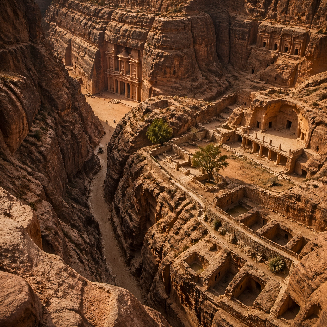
Scene: A square survey-oriented image that explains spatial logic with the clarity of an expert field overview while still reading as a finished artwork. Use a stable elevated vantage, clean depth layering, and enough visible terrain or architecture to make relationships legible without turning the frame into a literal map. The scene should feel analytical and cinematic at the same time. Subject: Show an elevated canyon survey that reveals the siq approach, facade position, sand accumulation, and carved forecourt as one readable site system. Organize the composition so paths, terraces, walls, courtyards, chambers, canals, root systems, or quarry clusters can be read as a coherent system. The image should reveal how the civilization used land, water, elevation, enclosure, or monumentality. Keep all architecture, materials, and environmental details consistent with the correct place and period. Important details: Keep the monument recognizably Petra, with faceted rock-cut massing, canyon compression, and carved architectural order that feels cut directly from stone rather than assembled from blocks. This image should reward close looking by showing infrastructural logic: how stone courses align, how water moves, how rooms connect, how carved masses sit inside geology, or how vegetation interacts with built form. Avoid explicit annotation. Let composition, light, and scale cues do the explanatory work. Keep any measuring elements generic and unreadable, and make the image feel like serious research made visually elegant. Use case: Nabatean Petra Rediscovered single study 8/9. Constraints: No readable text, no watermark, no logos, preserve exact 1:1 aspect ratio, no modern barriers, no souvenir stalls, no fantasy caravans, no electric lighting, no infographic arrows, no split-screen layout, no impossible aerial geometry, no unrelated settlements.

Example generated from “Nabatean Petra Rediscovered — Editorial Reconstruction”
GPT Image 2en

Scene: A square hero image designed for a museum wall graphic or flagship magazine cover, but without any actual typography. Use strong focal hierarchy, refined contrast, and a polished finish that still feels rooted in archaeological evidence. The frame should look complete on its own and communicate why this civilization remains visually unforgettable. Subject: Build the image around an editorial hero image built around the precise emotional shock of the first reveal inside the canyon. Present architecture, artifacts, environment, and atmosphere as one coherent statement. The composition can be more distilled than a field snapshot, but it must remain culturally specific, materially persuasive, and free of fantasy shorthand. Nothing should feel like a movie poster or commercial franchise imitation. Important details: Keep the monument recognizably Petra, with faceted rock-cut massing, canyon compression, and carved architectural order that feels cut directly from stone rather than assembled from blocks. Distill the site or cultural world into one decisive visual argument: place, craft, weathering, engineering, and memory. Use the strongest material signatures from this civilization and let them sit in a believable environment with controlled dramatic weight. Keep any carved or painted symbols non-readable. The result should look like responsible high-end visual storytelling for research and public interpretation, not a spectacle-first matte painting. Use case: Nabatean Petra Rediscovered single study 9/9. Constraints: No readable text, no watermark, no logos, preserve exact 1:1 aspect ratio, no modern barriers, no souvenir stalls, no fantasy caravans, no electric lighting, no movie-poster tropes, no overdesigned framing devices, no collage layout, no brand-like iconography.

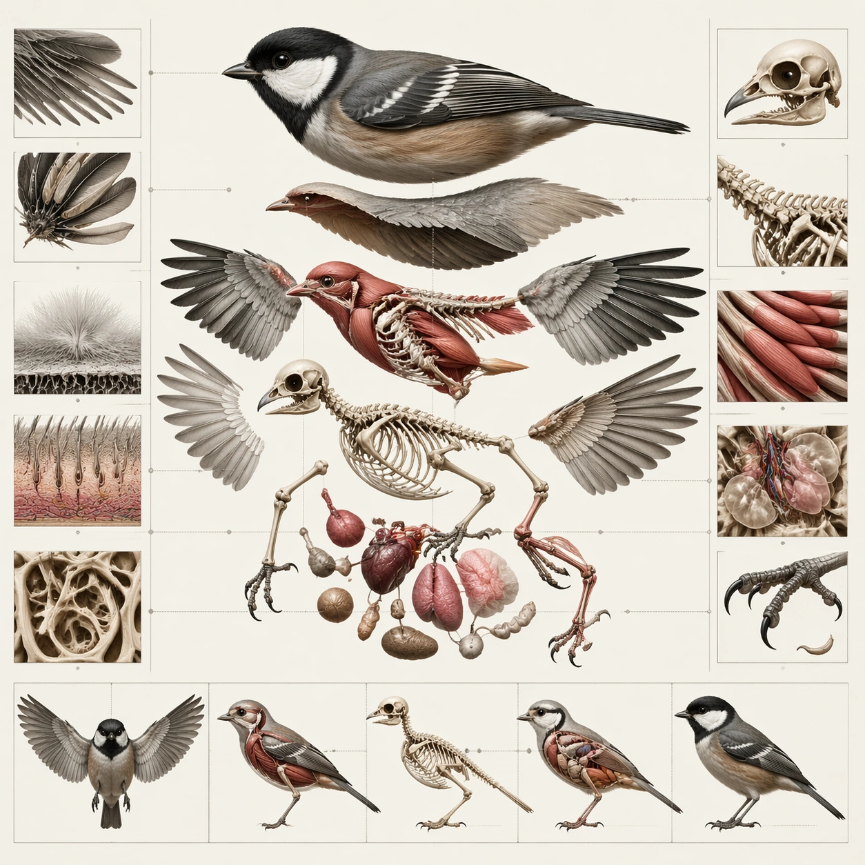
Example generated from “Natural History Infographic — Cutaway Panel”
GPT Image 2en

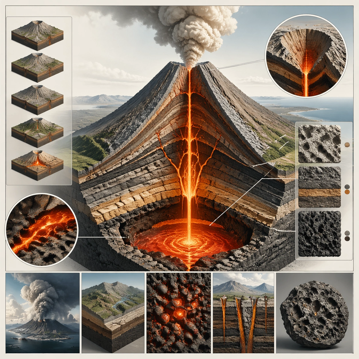
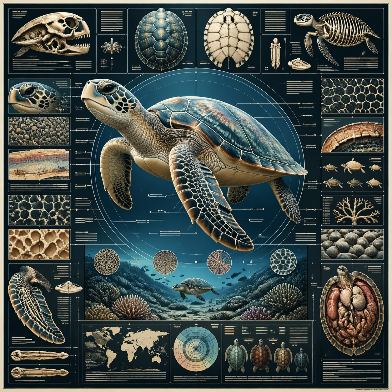
Scene: A square plate or board viewed straight-on, with crisp organization, disciplined spacing, and premium print clarity. Build the frame around a cutaway or sectional treatment that reveals interior logic without sacrificing readability. Keep the lighting, camera distance, and spatial organization tuned for a high-signal research image rather than a casual snapshot. The image belongs to the Natural History Infographic theme and should feel immediately legible as a prompt atlas theme for natural history infographic, testing structured-layout with gpt image 2.. Subject: Center the study on a cutaway or sectional treatment that reveals interior logic without sacrificing readability. Translate the theme into a concrete visual statement instead of an abstract mood board: the viewer should understand what kind of image this is, what is being tested, and why the composition is difficult. Use the slug idea of natural history infographic as a literal guide for subject matter, materials, and staging. Important details: The image should communicate logic through grouping, hierarchy, callouts, insets, and believable professional layout discipline rather than decorative noise. Preserve a disciplined square composition, clear focal hierarchy, and enough secondary information to make the image feel complete rather than underspecified. The image should look polished, novel, and exhibition-ready, with topic-specific credibility coming from the way surfaces, structure, and visual language reinforce Natural History Infographic. Avoid generic filler elements that do not serve the main concept. Use case: Natural History Infographic single study 2/8, testing structured-layout through the cutaway panel variation. Constraints: No readable text, no watermark, no logos, preserve exact 1:1 aspect ratio, no readable labels, no messy arrows, no random infographic decoration, no fake UI chrome unless the topic calls for it, no broken alignment, no meaningless clutter.

Example generated from “Natural History Infographic — Process Sequence”
GPT Image 2en

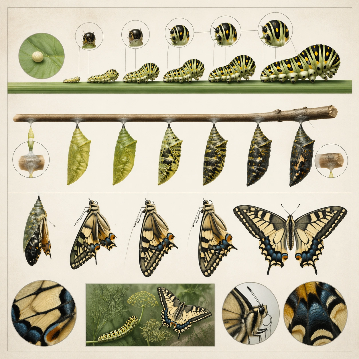
Scene: A square plate or board viewed straight-on, with crisp organization, disciplined spacing, and premium print clarity. Build the frame around a sequence of stages or states arranged in a disciplined progression. Keep the lighting, camera distance, and spatial organization tuned for a high-signal research image rather than a casual snapshot. The image belongs to the Natural History Infographic theme and should feel immediately legible as a prompt atlas theme for natural history infographic, testing structured-layout with gpt image 2.. Subject: Center the study on a sequence of stages or states arranged in a disciplined progression. Translate the theme into a concrete visual statement instead of an abstract mood board: the viewer should understand what kind of image this is, what is being tested, and why the composition is difficult. Use the slug idea of natural history infographic as a literal guide for subject matter, materials, and staging. Important details: The image should communicate logic through grouping, hierarchy, callouts, insets, and believable professional layout discipline rather than decorative noise. Preserve a disciplined square composition, clear focal hierarchy, and enough secondary information to make the image feel complete rather than underspecified. The image should look polished, novel, and exhibition-ready, with topic-specific credibility coming from the way surfaces, structure, and visual language reinforce Natural History Infographic. Avoid generic filler elements that do not serve the main concept. Use case: Natural History Infographic single study 3/8, testing structured-layout through the process sequence variation. Constraints: No readable text, no watermark, no logos, preserve exact 1:1 aspect ratio, no readable labels, no messy arrows, no random infographic decoration, no fake UI chrome unless the topic calls for it, no broken alignment, no meaningless clutter.

Example generated from “Natural History Infographic — Annotation Cluster”
GPT Image 2en

Scene: A square plate or board viewed straight-on, with crisp organization, disciplined spacing, and premium print clarity. Build the frame around dense callouts and side insets that feel scholarly while staying unreadable. Keep the lighting, camera distance, and spatial organization tuned for a high-signal research image rather than a casual snapshot. The image belongs to the Natural History Infographic theme and should feel immediately legible as a prompt atlas theme for natural history infographic, testing structured-layout with gpt image 2.. Subject: Center the study on dense callouts and side insets that feel scholarly while staying unreadable. Translate the theme into a concrete visual statement instead of an abstract mood board: the viewer should understand what kind of image this is, what is being tested, and why the composition is difficult. Use the slug idea of natural history infographic as a literal guide for subject matter, materials, and staging. Important details: The image should communicate logic through grouping, hierarchy, callouts, insets, and believable professional layout discipline rather than decorative noise. Preserve a disciplined square composition, clear focal hierarchy, and enough secondary information to make the image feel complete rather than underspecified. The image should look polished, novel, and exhibition-ready, with topic-specific credibility coming from the way surfaces, structure, and visual language reinforce Natural History Infographic. Avoid generic filler elements that do not serve the main concept. Use case: Natural History Infographic single study 4/8, testing structured-layout through the annotation cluster variation. Constraints: No readable text, no watermark, no logos, preserve exact 1:1 aspect ratio, no readable labels, no messy arrows, no random infographic decoration, no fake UI chrome unless the topic calls for it, no broken alignment, no meaningless clutter.

Example generated from “Natural History Infographic — Comparison Board”
GPT Image 2en

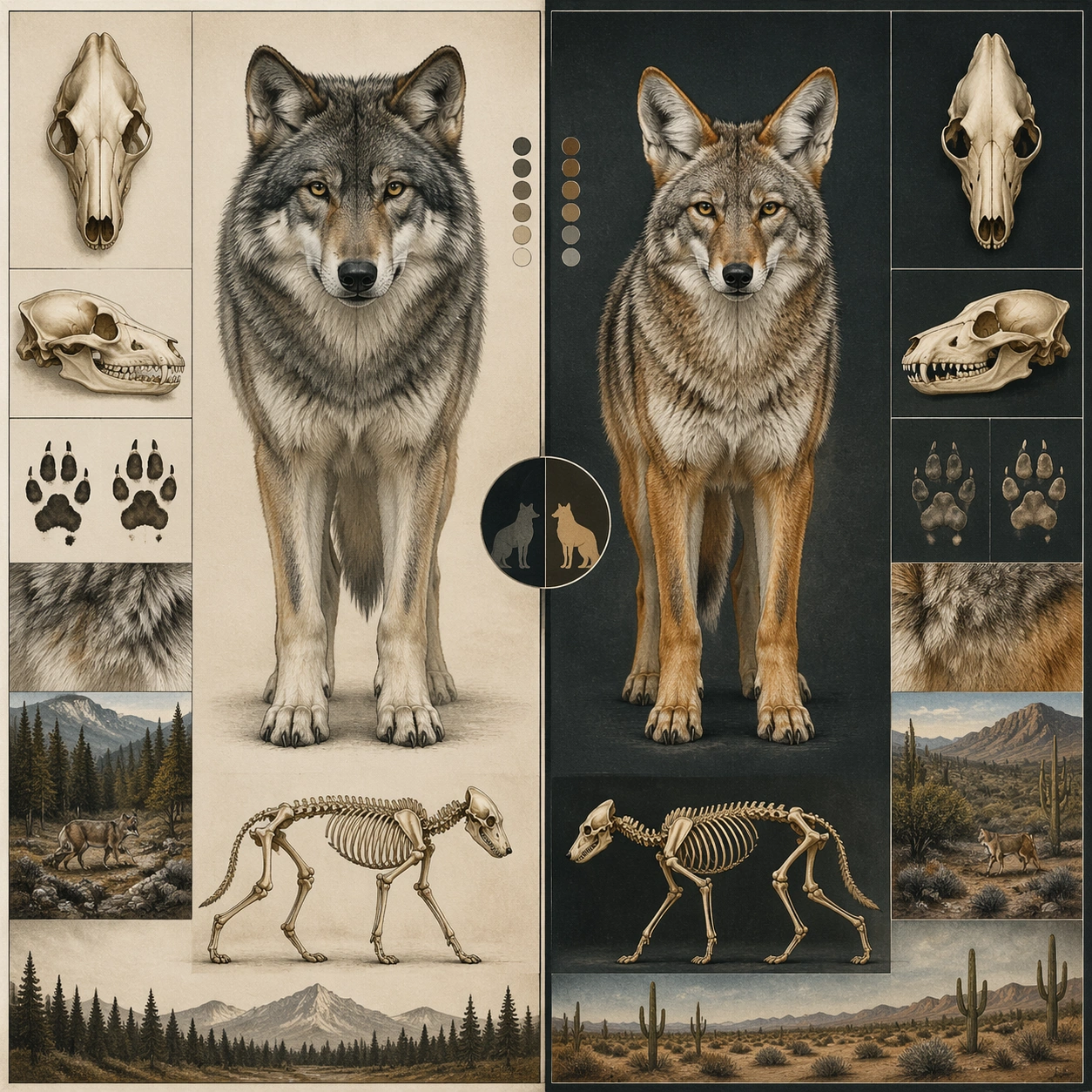
Scene: A square plate or board viewed straight-on, with crisp organization, disciplined spacing, and premium print clarity. Build the frame around a side-by-side comparison structure with strong contrast and equal visual weight. Keep the lighting, camera distance, and spatial organization tuned for a high-signal research image rather than a casual snapshot. The image belongs to the Natural History Infographic theme and should feel immediately legible as a prompt atlas theme for natural history infographic, testing structured-layout with gpt image 2.. Subject: Center the study on a side-by-side comparison structure with strong contrast and equal visual weight. Translate the theme into a concrete visual statement instead of an abstract mood board: the viewer should understand what kind of image this is, what is being tested, and why the composition is difficult. Use the slug idea of natural history infographic as a literal guide for subject matter, materials, and staging. Important details: The image should communicate logic through grouping, hierarchy, callouts, insets, and believable professional layout discipline rather than decorative noise. Preserve a disciplined square composition, clear focal hierarchy, and enough secondary information to make the image feel complete rather than underspecified. The image should look polished, novel, and exhibition-ready, with topic-specific credibility coming from the way surfaces, structure, and visual language reinforce Natural History Infographic. Avoid generic filler elements that do not serve the main concept. Use case: Natural History Infographic single study 5/8, testing structured-layout through the comparison board variation. Constraints: No readable text, no watermark, no logos, preserve exact 1:1 aspect ratio, no readable labels, no messy arrows, no random infographic decoration, no fake UI chrome unless the topic calls for it, no broken alignment, no meaningless clutter.

Example generated from “Natural History Infographic — 材质标注”
GPT Image 2en

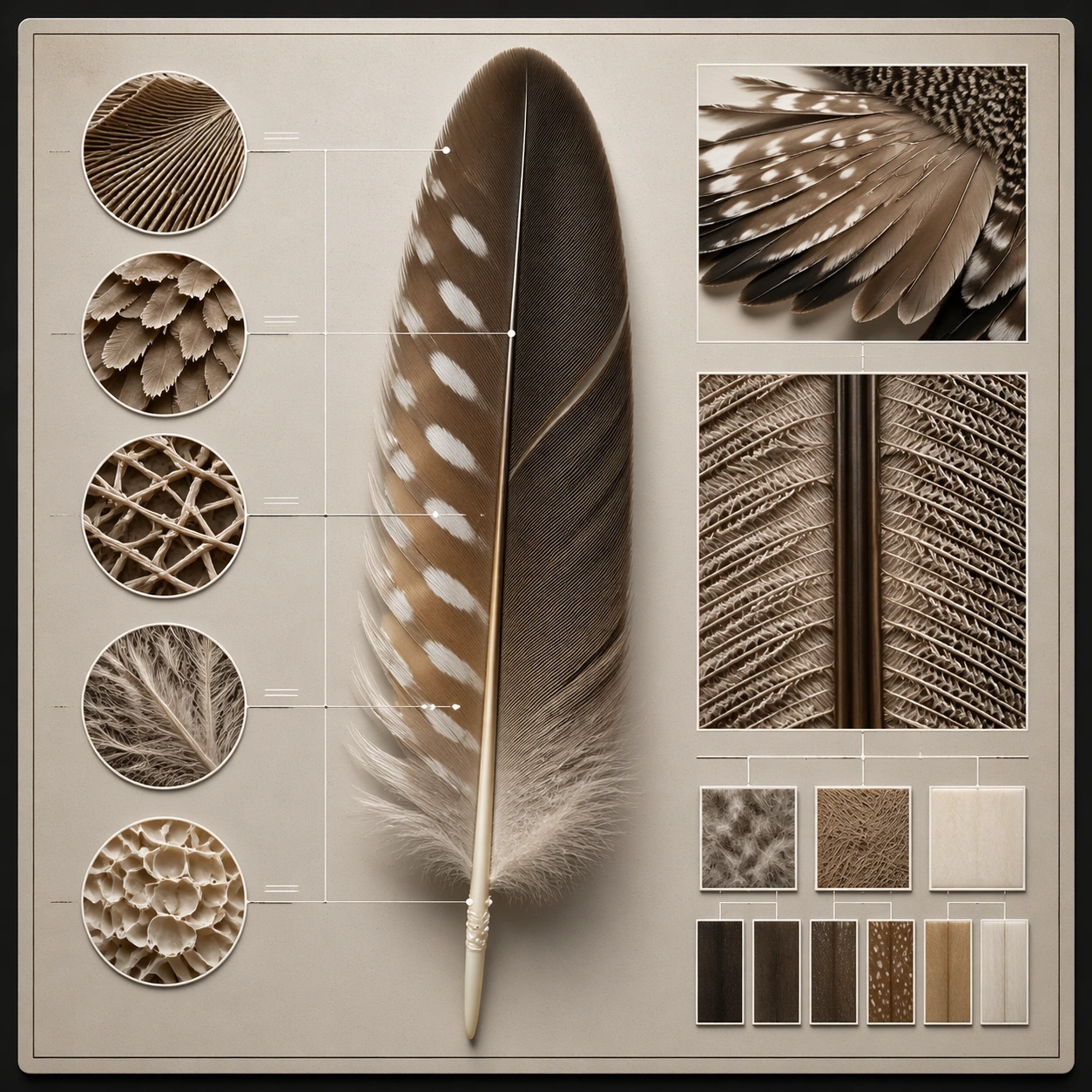
Scene: A square plate or board viewed straight-on, with crisp organization, disciplined spacing, and premium print clarity. Build the frame around specific texture or material evidence presented with controlled explanatory framing. Keep the lighting, camera distance, and spatial organization tuned for a high-signal research image rather than a casual snapshot. The image belongs to the Natural History Infographic theme and should feel immediately legible as a prompt atlas theme for natural history infographic, testing structured-layout with gpt image 2.. Subject: Center the study on specific texture or material evidence presented with controlled explanatory framing. Translate the theme into a concrete visual statement instead of an abstract mood board: the viewer should understand what kind of image this is, what is being tested, and why the composition is difficult. Use the slug idea of natural history infographic as a literal guide for subject matter, materials, and staging. Important details: The image should communicate logic through grouping, hierarchy, callouts, insets, and believable professional layout discipline rather than decorative noise. Preserve a disciplined square composition, clear focal hierarchy, and enough secondary information to make the image feel complete rather than underspecified. The image should look polished, novel, and exhibition-ready, with topic-specific credibility coming from the way surfaces, structure, and visual language reinforce Natural History Infographic. Avoid generic filler elements that do not serve the main concept. Use case: Natural History Infographic single study 6/8, testing structured-layout through the 材质标注 variation. Constraints: No readable text, no watermark, no logos, preserve exact 1:1 aspect ratio, no readable labels, no messy arrows, no random infographic decoration, no fake UI chrome unless the topic calls for it, no broken alignment, no meaningless clutter.

Example generated from “Natural History Infographic — Exploded System”
GPT Image 2en

Scene: A square plate or board viewed straight-on, with crisp organization, disciplined spacing, and premium print clarity. Build the frame around components separated clearly enough to reveal construction and dependency. Keep the lighting, camera distance, and spatial organization tuned for a high-signal research image rather than a casual snapshot. The image belongs to the Natural History Infographic theme and should feel immediately legible as a prompt atlas theme for natural history infographic, testing structured-layout with gpt image 2.. Subject: Center the study on components separated clearly enough to reveal construction and dependency. Translate the theme into a concrete visual statement instead of an abstract mood board: the viewer should understand what kind of image this is, what is being tested, and why the composition is difficult. Use the slug idea of natural history infographic as a literal guide for subject matter, materials, and staging. Important details: The image should communicate logic through grouping, hierarchy, callouts, insets, and believable professional layout discipline rather than decorative noise. Preserve a disciplined square composition, clear focal hierarchy, and enough secondary information to make the image feel complete rather than underspecified. The image should look polished, novel, and exhibition-ready, with topic-specific credibility coming from the way surfaces, structure, and visual language reinforce Natural History Infographic. Avoid generic filler elements that do not serve the main concept. Use case: Natural History Infographic single study 7/8, testing structured-layout through the exploded system variation. Constraints: No readable text, no watermark, no logos, preserve exact 1:1 aspect ratio, no readable labels, no messy arrows, no random infographic decoration, no fake UI chrome unless the topic calls for it, no broken alignment, no meaningless clutter.

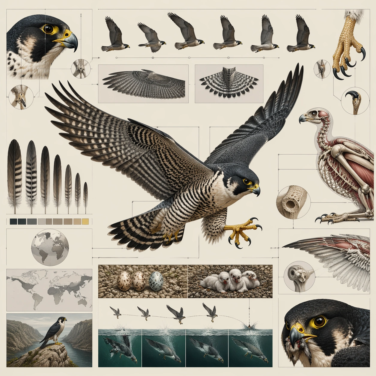
Example generated from “Natural History Infographic — Final Plate”
GPT Image 2en

Scene: A square plate or board viewed straight-on, with crisp organization, disciplined spacing, and premium print clarity. Build the frame around a polished final technical plate that feels ready for a research deck or exhibition wall. Keep the lighting, camera distance, and spatial organization tuned for a high-signal research image rather than a casual snapshot. The image belongs to the Natural History Infographic theme and should feel immediately legible as a prompt atlas theme for natural history infographic, testing structured-layout with gpt image 2.. Subject: Center the study on a polished final technical plate that feels ready for a research deck or exhibition wall. Translate the theme into a concrete visual statement instead of an abstract mood board: the viewer should understand what kind of image this is, what is being tested, and why the composition is difficult. Use the slug idea of natural history infographic as a literal guide for subject matter, materials, and staging. Important details: The image should communicate logic through grouping, hierarchy, callouts, insets, and believable professional layout discipline rather than decorative noise. Preserve a disciplined square composition, clear focal hierarchy, and enough secondary information to make the image feel complete rather than underspecified. The image should look polished, novel, and exhibition-ready, with topic-specific credibility coming from the way surfaces, structure, and visual language reinforce Natural History Infographic. Avoid generic filler elements that do not serve the main concept. Use case: Natural History Infographic single study 8/8, testing structured-layout through the final plate variation. Constraints: No readable text, no watermark, no logos, preserve exact 1:1 aspect ratio, no readable labels, no messy arrows, no random infographic decoration, no fake UI chrome unless the topic calls for it, no broken alignment, no meaningless clutter.

Example generated from “Natural Reverence Magic Hour — Riverbank Reach”
GPT Image 2en

Scene: A square naturalistic frame captured at the exact edge of magic hour, when the sun sits low and turns grass, dust, skin, and hair into luminous gold. Use wide lenses, open air, gentle motion, and a lived-in landscape such as tall wheat, meadow, creek bank, orchard, or open prairie. Use a grassy riverbank in warm evening light, with shallow water catching copper reflections and insects hovering above the surface. Subject: Center on a child or small human figure moving through the landscape with curiosity, wonder, or private joy. The body should feel small inside the world, with the environment carrying as much emotional meaning as the person. A barefoot child crouches to touch the water while reeds bend gently around them in the wind. Important details: The visual rule is reverence through natural light, wind, and tactile surface detail. Preserve lens flare, translucent grasses, skin warmed by sun, and humble earth textures without commercial polish. Avoid heavy stylization, urban intrusions, or artificial studio neatness. Keep the posture tentative and absorbed, emphasizing small gestures and the patient light over spectacle. Use case: Natural Reverence Magic Hour single study 2/9. Constraints: No readable text, no watermark, no logos, preserve exact 1:1 aspect ratio, no readable text, no modern billboards, no synthetic neon color, no posed fashion styling, no fantasy creatures, no broken anatomy, no low-detail background, no accidental text fragments.

Example generated from “Natural Reverence Magic Hour — Tall Grass Pause”
GPT Image 2en

Scene: A square naturalistic frame captured at the exact edge of magic hour, when the sun sits low and turns grass, dust, skin, and hair into luminous gold. Use wide lenses, open air, gentle motion, and a lived-in landscape such as tall wheat, meadow, creek bank, orchard, or open prairie. Frame an open meadow of tall dry grass under a huge glowing sky, with the horizon low and the sun flaring through seed heads. Subject: Center on a child or small human figure moving through the landscape with curiosity, wonder, or private joy. The body should feel small inside the world, with the environment carrying as much emotional meaning as the person. A child stops in profile with hands full of wild stems, listening to something in the distance. Important details: The visual rule is reverence through natural light, wind, and tactile surface detail. Preserve lens flare, translucent grasses, skin warmed by sun, and humble earth textures without commercial polish. Avoid heavy stylization, urban intrusions, or artificial studio neatness. The frame should feel wide, airy, and intimate at once, with the grass carrying most of the visual music. Use case: Natural Reverence Magic Hour single study 3/9. Constraints: No readable text, no watermark, no logos, preserve exact 1:1 aspect ratio, no readable text, no modern billboards, no synthetic neon color, no posed fashion styling, no fantasy creatures, no broken anatomy, no low-detail background, no accidental text fragments.

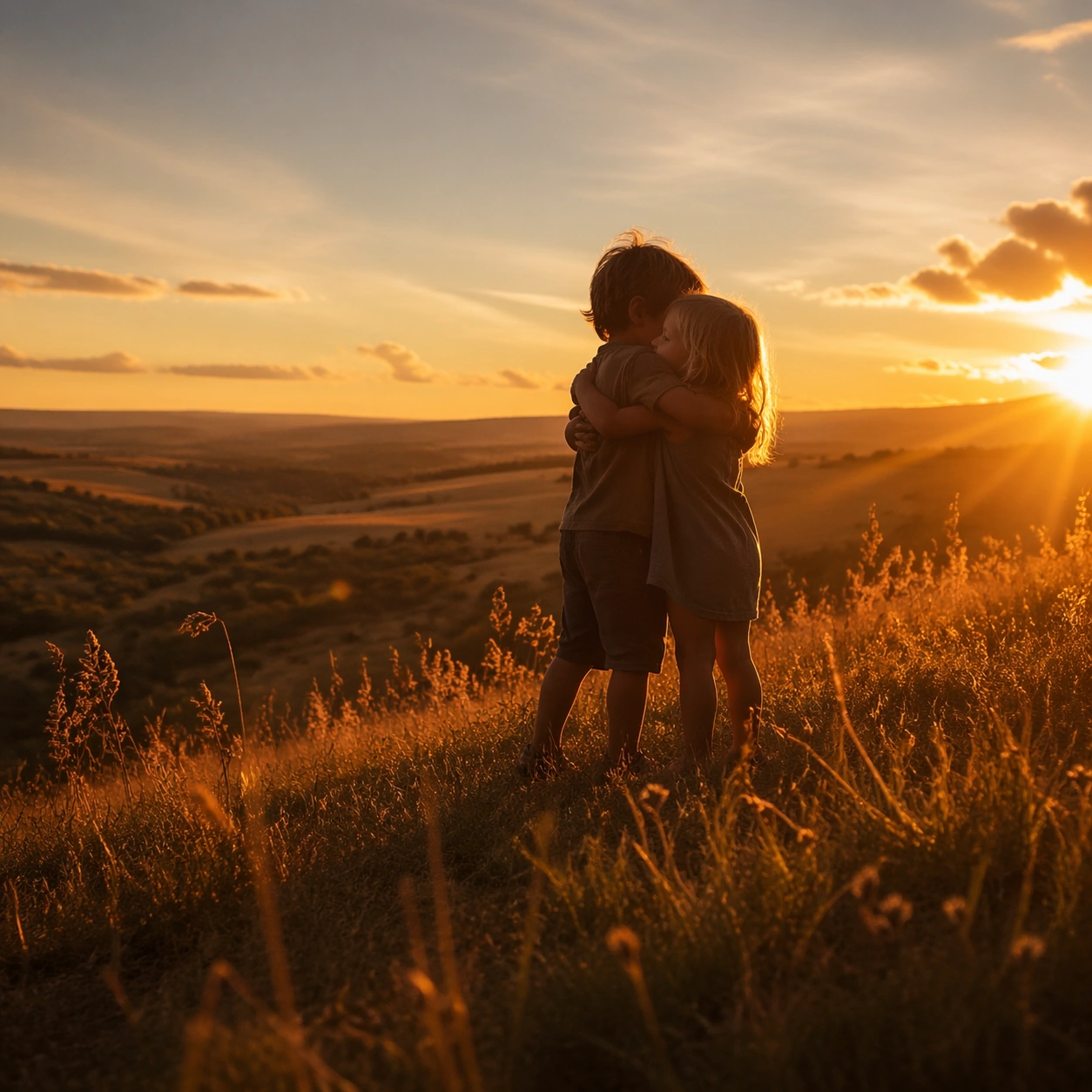
Example generated from “Natural Reverence Magic Hour — Hill Crest Embrace”
GPT Image 2en

Scene: A square naturalistic frame captured at the exact edge of magic hour, when the sun sits low and turns grass, dust, skin, and hair into luminous gold. Use wide lenses, open air, gentle motion, and a lived-in landscape such as tall wheat, meadow, creek bank, orchard, or open prairie. Use a grassy hill crest with the sun skimming the edge of the frame and long blades flashing amber along the ridge. Subject: Center on a child or small human figure moving through the landscape with curiosity, wonder, or private joy. The body should feel small inside the world, with the environment carrying as much emotional meaning as the person. Two siblings meet in a quick embrace near the top of the hill, their bodies silhouetted but still warm with edge light. Important details: The visual rule is reverence through natural light, wind, and tactile surface detail. Preserve lens flare, translucent grasses, skin warmed by sun, and humble earth textures without commercial polish. Avoid heavy stylization, urban intrusions, or artificial studio neatness. Keep the action simple and fleeting, with the hill and sky doing as much emotional work as the figures. Use case: Natural Reverence Magic Hour single study 4/9. Constraints: No readable text, no watermark, no logos, preserve exact 1:1 aspect ratio, no readable text, no modern billboards, no synthetic neon color, no posed fashion styling, no fantasy creatures, no broken anatomy, no low-detail background, no accidental text fragments.

Example generated from “Natural Reverence Magic Hour — Butterfly Chase”
GPT Image 2en

Scene: A square naturalistic frame captured at the exact edge of magic hour, when the sun sits low and turns grass, dust, skin, and hair into luminous gold. Use wide lenses, open air, gentle motion, and a lived-in landscape such as tall wheat, meadow, creek bank, orchard, or open prairie. Set the scene in a meadow seeded with tiny white flowers and drifting insects under a low amber sky. Subject: Center on a child or small human figure moving through the landscape with curiosity, wonder, or private joy. The body should feel small inside the world, with the environment carrying as much emotional meaning as the person. A child reaches forward chasing a single bright butterfly through the grass, feet barely visible in the stems. Important details: The visual rule is reverence through natural light, wind, and tactile surface detail. Preserve lens flare, translucent grasses, skin warmed by sun, and humble earth textures without commercial polish. Avoid heavy stylization, urban intrusions, or artificial studio neatness. The butterfly should remain small and plausible, with the true spectacle coming from light catching flowers, dust, and motion. Use case: Natural Reverence Magic Hour single study 5/9. Constraints: No readable text, no watermark, no logos, preserve exact 1:1 aspect ratio, no readable text, no modern billboards, no synthetic neon color, no posed fashion styling, no fantasy creatures, no broken anatomy, no low-detail background, no accidental text fragments.

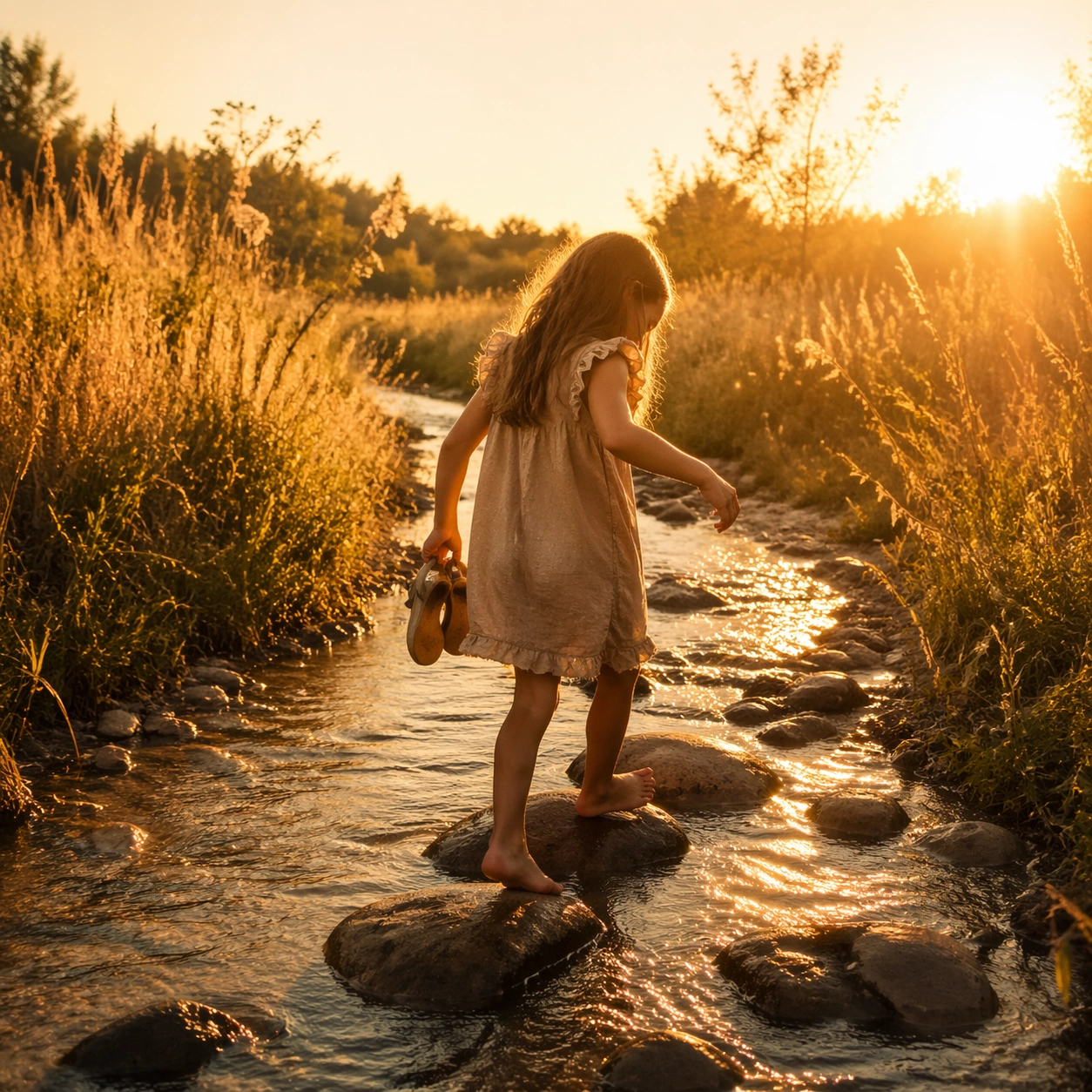
Example generated from “Natural Reverence Magic Hour — Creek Stones”
GPT Image 2en

Scene: A square naturalistic frame captured at the exact edge of magic hour, when the sun sits low and turns grass, dust, skin, and hair into luminous gold. Use wide lenses, open air, gentle motion, and a lived-in landscape such as tall wheat, meadow, creek bank, orchard, or open prairie. Use a shallow creek crossing with rounded stones, wet reflections, and tall grasses on both banks turning amber at day’s end. Subject: Center on a child or small human figure moving through the landscape with curiosity, wonder, or private joy. The body should feel small inside the world, with the environment carrying as much emotional meaning as the person. A child steps carefully from stone to stone carrying shoes in one hand, balancing between play and concentration. Important details: The visual rule is reverence through natural light, wind, and tactile surface detail. Preserve lens flare, translucent grasses, skin warmed by sun, and humble earth textures without commercial polish. Avoid heavy stylization, urban intrusions, or artificial studio neatness. Preserve water sparkle, wet fabric edges, and the small human effort required to move through the landscape. Use case: Natural Reverence Magic Hour single study 6/9. Constraints: No readable text, no watermark, no logos, preserve exact 1:1 aspect ratio, no readable text, no modern billboards, no synthetic neon color, no posed fashion styling, no fantasy creatures, no broken anatomy, no low-detail background, no accidental text fragments.

Example generated from “Natural Reverence Magic Hour — Orchard Spin”
GPT Image 2en

Scene: A square naturalistic frame captured at the exact edge of magic hour, when the sun sits low and turns grass, dust, skin, and hair into luminous gold. Use wide lenses, open air, gentle motion, and a lived-in landscape such as tall wheat, meadow, creek bank, orchard, or open prairie. Show a small orchard with low branches, floating dust, and sunbeams filtering sideways between trunks at the end of the day. Subject: Center on a child or small human figure moving through the landscape with curiosity, wonder, or private joy. The body should feel small inside the world, with the environment carrying as much emotional meaning as the person. A child spins once beneath the trees with arms open, hair and dress edge lit by the low sun. Important details: The visual rule is reverence through natural light, wind, and tactile surface detail. Preserve lens flare, translucent grasses, skin warmed by sun, and humble earth textures without commercial polish. Avoid heavy stylization, urban intrusions, or artificial studio neatness. The orchard should feel ordinary and holy at the same time, with dust and leaves turning the light into something tactile. Use case: Natural Reverence Magic Hour single study 7/9. Constraints: No readable text, no watermark, no logos, preserve exact 1:1 aspect ratio, no readable text, no modern billboards, no synthetic neon color, no posed fashion styling, no fantasy creatures, no broken anatomy, no low-detail background, no accidental text fragments.

Example generated from “Natural Reverence Magic Hour — Open Field Rest”
GPT Image 2en

Scene: A square naturalistic frame captured at the exact edge of magic hour, when the sun sits low and turns grass, dust, skin, and hair into luminous gold. Use wide lenses, open air, gentle motion, and a lived-in landscape such as tall wheat, meadow, creek bank, orchard, or open prairie. Use a broad open field with the horizon stretched wide and the sun dropping behind distant grass ridges. Subject: Center on a child or small human figure moving through the landscape with curiosity, wonder, or private joy. The body should feel small inside the world, with the environment carrying as much emotional meaning as the person. A child lies on their back in the grass looking upward, nearly swallowed by the field and sky. Important details: The visual rule is reverence through natural light, wind, and tactile surface detail. Preserve lens flare, translucent grasses, skin warmed by sun, and humble earth textures without commercial polish. Avoid heavy stylization, urban intrusions, or artificial studio neatness. The mood should be contemplative rather than dramatic, with warm light and scale expressing reverence. Use case: Natural Reverence Magic Hour single study 8/9. Constraints: No readable text, no watermark, no logos, preserve exact 1:1 aspect ratio, no readable text, no modern billboards, no synthetic neon color, no posed fashion styling, no fantasy creatures, no broken anatomy, no low-detail background, no accidental text fragments.

Example generated from “Natural Reverence Magic Hour — Firefly Onset”
GPT Image 2en

Scene: A square naturalistic frame captured at the exact edge of magic hour, when the sun sits low and turns grass, dust, skin, and hair into luminous gold. Use wide lenses, open air, gentle motion, and a lived-in landscape such as tall wheat, meadow, creek bank, orchard, or open prairie. End at the blue-gold boundary just after sunset, with meadow grasses still warm at the tips while the sky cools and the first fireflies appear. Subject: Center on a child or small human figure moving through the landscape with curiosity, wonder, or private joy. The body should feel small inside the world, with the environment carrying as much emotional meaning as the person. A child stands still holding a jar with the lid open, watching the lights rise out of the field instead of catching them. Important details: The visual rule is reverence through natural light, wind, and tactile surface detail. Preserve lens flare, translucent grasses, skin warmed by sun, and humble earth textures without commercial polish. Avoid heavy stylization, urban intrusions, or artificial studio neatness. Keep the fireflies subtle and few, letting the final trace of sunlight remain the dominant emotional force. Use case: Natural Reverence Magic Hour single study 9/9. Constraints: No readable text, no watermark, no logos, preserve exact 1:1 aspect ratio, no readable text, no modern billboards, no synthetic neon color, no posed fashion styling, no fantasy creatures, no broken anatomy, no low-detail background, no accidental text fragments.

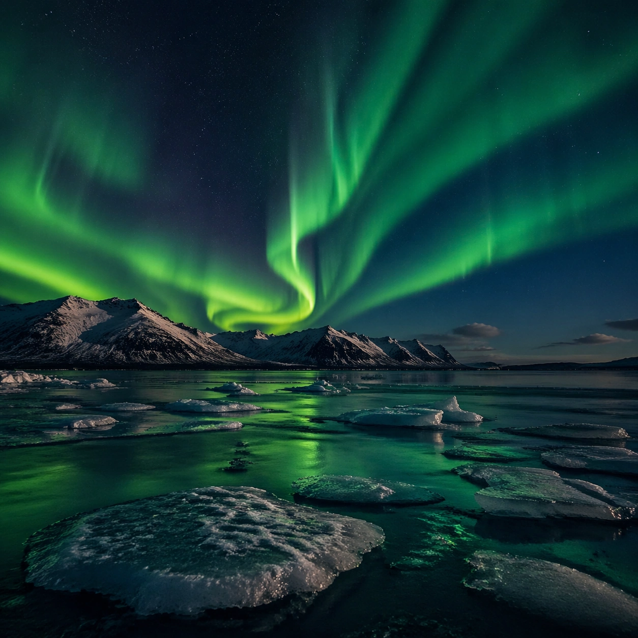
Example generated from “Natural Wonder Photography — Macro Study”
GPT Image 2en

Scene: A square photographic image with intentional lens choice, coherent light, and a subject that feels observed rather than merely decorated. Build the frame around closer observation that reveals fine structure and optical behavior. Keep the lighting, camera distance, and spatial organization tuned for a high-signal research image rather than a casual snapshot. The image belongs to the Natural Wonder Photography theme and should feel immediately legible as a prompt atlas theme for natural wonder photography, testing photorealism with gpt image 2.. Subject: Center the study on closer observation that reveals fine structure and optical behavior. Translate the theme into a concrete visual statement instead of an abstract mood board: the viewer should understand what kind of image this is, what is being tested, and why the composition is difficult. Use the slug idea of natural wonder photography as a literal guide for subject matter, materials, and staging. If helpful, borrow the broad visual cues suggested by Aurora, but keep the result original and specific to this study. Important details: The realism should come from timing, optics, and material response: atmosphere, contrast, depth, motion, and tiny physical cues all need to agree. Preserve a disciplined square composition, clear focal hierarchy, and enough secondary information to make the image feel complete rather than underspecified. The image should look polished, novel, and exhibition-ready, with topic-specific credibility coming from the way surfaces, structure, and visual language reinforce Natural Wonder Photography. Avoid generic filler elements that do not serve the main concept. Use case: Natural Wonder Photography single study 2/8, testing photorealism through the macro study variation. Constraints: No readable text, no watermark, no logos, preserve exact 1:1 aspect ratio, no watermark, no cheap HDR excess, no unreadable signage, no fake stock-photo posing, no compositing seams, no arbitrary lens flare.

Example generated from “Natural Wonder Photography — Side Light Study”
GPT Image 2en

Scene: A square photographic image with intentional lens choice, coherent light, and a subject that feels observed rather than merely decorated. Build the frame around a directional-light treatment that increases form and drama. Keep the lighting, camera distance, and spatial organization tuned for a high-signal research image rather than a casual snapshot. The image belongs to the Natural Wonder Photography theme and should feel immediately legible as a prompt atlas theme for natural wonder photography, testing photorealism with gpt image 2.. Subject: Center the study on a directional-light treatment that increases form and drama. Translate the theme into a concrete visual statement instead of an abstract mood board: the viewer should understand what kind of image this is, what is being tested, and why the composition is difficult. Use the slug idea of natural wonder photography as a literal guide for subject matter, materials, and staging. If helpful, borrow the broad visual cues suggested by Aurora, but keep the result original and specific to this study. Important details: The realism should come from timing, optics, and material response: atmosphere, contrast, depth, motion, and tiny physical cues all need to agree. Preserve a disciplined square composition, clear focal hierarchy, and enough secondary information to make the image feel complete rather than underspecified. The image should look polished, novel, and exhibition-ready, with topic-specific credibility coming from the way surfaces, structure, and visual language reinforce Natural Wonder Photography. Avoid generic filler elements that do not serve the main concept. Use case: Natural Wonder Photography single study 3/8, testing photorealism through the side light study variation. Constraints: No readable text, no watermark, no logos, preserve exact 1:1 aspect ratio, no watermark, no cheap HDR excess, no unreadable signage, no fake stock-photo posing, no compositing seams, no arbitrary lens flare.

Example generated from “Natural Wonder Photography — Motion Moment”
GPT Image 2en

Scene: A square photographic image with intentional lens choice, coherent light, and a subject that feels observed rather than merely decorated. Build the frame around a time-sensitive or kinetic phenomenon captured at the right instant. Keep the lighting, camera distance, and spatial organization tuned for a high-signal research image rather than a casual snapshot. The image belongs to the Natural Wonder Photography theme and should feel immediately legible as a prompt atlas theme for natural wonder photography, testing photorealism with gpt image 2.. Subject: Center the study on a time-sensitive or kinetic phenomenon captured at the right instant. Translate the theme into a concrete visual statement instead of an abstract mood board: the viewer should understand what kind of image this is, what is being tested, and why the composition is difficult. Use the slug idea of natural wonder photography as a literal guide for subject matter, materials, and staging. If helpful, borrow the broad visual cues suggested by Aurora, but keep the result original and specific to this study. Important details: The realism should come from timing, optics, and material response: atmosphere, contrast, depth, motion, and tiny physical cues all need to agree. Preserve a disciplined square composition, clear focal hierarchy, and enough secondary information to make the image feel complete rather than underspecified. The image should look polished, novel, and exhibition-ready, with topic-specific credibility coming from the way surfaces, structure, and visual language reinforce Natural Wonder Photography. Avoid generic filler elements that do not serve the main concept. Use case: Natural Wonder Photography single study 4/8, testing photorealism through the motion moment variation. Constraints: No readable text, no watermark, no logos, preserve exact 1:1 aspect ratio, no watermark, no cheap HDR excess, no unreadable signage, no fake stock-photo posing, no compositing seams, no arbitrary lens flare.

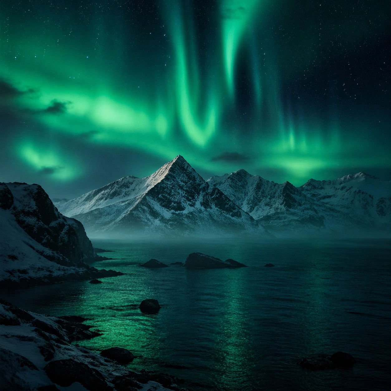
Example generated from “Natural Wonder Photography — Low-Light Atlas”
GPT Image 2en

Scene: A square photographic image with intentional lens choice, coherent light, and a subject that feels observed rather than merely decorated. Build the frame around a dusk, night, or low-light frame with disciplined exposure. Keep the lighting, camera distance, and spatial organization tuned for a high-signal research image rather than a casual snapshot. The image belongs to the Natural Wonder Photography theme and should feel immediately legible as a prompt atlas theme for natural wonder photography, testing photorealism with gpt image 2.. Subject: Center the study on a dusk, night, or low-light frame with disciplined exposure. Translate the theme into a concrete visual statement instead of an abstract mood board: the viewer should understand what kind of image this is, what is being tested, and why the composition is difficult. Use the slug idea of natural wonder photography as a literal guide for subject matter, materials, and staging. If helpful, borrow the broad visual cues suggested by Aurora, but keep the result original and specific to this study. Important details: The realism should come from timing, optics, and material response: atmosphere, contrast, depth, motion, and tiny physical cues all need to agree. Preserve a disciplined square composition, clear focal hierarchy, and enough secondary information to make the image feel complete rather than underspecified. The image should look polished, novel, and exhibition-ready, with topic-specific credibility coming from the way surfaces, structure, and visual language reinforce Natural Wonder Photography. Avoid generic filler elements that do not serve the main concept. Use case: Natural Wonder Photography single study 5/8, testing photorealism through the low-light atlas variation. Constraints: No readable text, no watermark, no logos, preserve exact 1:1 aspect ratio, no watermark, no cheap HDR excess, no unreadable signage, no fake stock-photo posing, no compositing seams, no arbitrary lens flare.

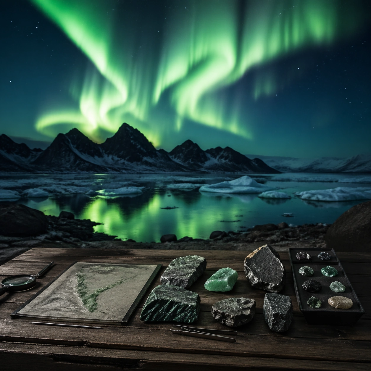
Example generated from “Natural Wonder Photography — Specimen Table”
GPT Image 2en

Scene: A square photographic image with intentional lens choice, coherent light, and a subject that feels observed rather than merely decorated. Build the frame around a carefully arranged or comparative frame that still feels photographic. Keep the lighting, camera distance, and spatial organization tuned for a high-signal research image rather than a casual snapshot. The image belongs to the Natural Wonder Photography theme and should feel immediately legible as a prompt atlas theme for natural wonder photography, testing photorealism with gpt image 2.. Subject: Center the study on a carefully arranged or comparative frame that still feels photographic. Translate the theme into a concrete visual statement instead of an abstract mood board: the viewer should understand what kind of image this is, what is being tested, and why the composition is difficult. Use the slug idea of natural wonder photography as a literal guide for subject matter, materials, and staging. If helpful, borrow the broad visual cues suggested by Aurora, but keep the result original and specific to this study. Important details: The realism should come from timing, optics, and material response: atmosphere, contrast, depth, motion, and tiny physical cues all need to agree. Preserve a disciplined square composition, clear focal hierarchy, and enough secondary information to make the image feel complete rather than underspecified. The image should look polished, novel, and exhibition-ready, with topic-specific credibility coming from the way surfaces, structure, and visual language reinforce Natural Wonder Photography. Avoid generic filler elements that do not serve the main concept. Use case: Natural Wonder Photography single study 6/8, testing photorealism through the specimen table variation. Constraints: No readable text, no watermark, no logos, preserve exact 1:1 aspect ratio, no watermark, no cheap HDR excess, no unreadable signage, no fake stock-photo posing, no compositing seams, no arbitrary lens flare.

Example generated from “Natural Wonder Photography — Atmospheric View”
GPT Image 2en

Scene: A square photographic image with intentional lens choice, coherent light, and a subject that feels observed rather than merely decorated. Build the frame around weather, haze, or volumetric light used to deepen realism. Keep the lighting, camera distance, and spatial organization tuned for a high-signal research image rather than a casual snapshot. The image belongs to the Natural Wonder Photography theme and should feel immediately legible as a prompt atlas theme for natural wonder photography, testing photorealism with gpt image 2.. Subject: Center the study on weather, haze, or volumetric light used to deepen realism. Translate the theme into a concrete visual statement instead of an abstract mood board: the viewer should understand what kind of image this is, what is being tested, and why the composition is difficult. Use the slug idea of natural wonder photography as a literal guide for subject matter, materials, and staging. If helpful, borrow the broad visual cues suggested by Aurora, but keep the result original and specific to this study. Important details: The realism should come from timing, optics, and material response: atmosphere, contrast, depth, motion, and tiny physical cues all need to agree. Preserve a disciplined square composition, clear focal hierarchy, and enough secondary information to make the image feel complete rather than underspecified. The image should look polished, novel, and exhibition-ready, with topic-specific credibility coming from the way surfaces, structure, and visual language reinforce Natural Wonder Photography. Avoid generic filler elements that do not serve the main concept. Use case: Natural Wonder Photography single study 7/8, testing photorealism through the atmospheric view variation. Constraints: No readable text, no watermark, no logos, preserve exact 1:1 aspect ratio, no watermark, no cheap HDR excess, no unreadable signage, no fake stock-photo posing, no compositing seams, no arbitrary lens flare.

Example generated from “Natural Wonder Photography — Signature Frame”
GPT Image 2en

Scene: A square photographic image with intentional lens choice, coherent light, and a subject that feels observed rather than merely decorated. Build the frame around the most memorable final image for the topic. Keep the lighting, camera distance, and spatial organization tuned for a high-signal research image rather than a casual snapshot. The image belongs to the Natural Wonder Photography theme and should feel immediately legible as a prompt atlas theme for natural wonder photography, testing photorealism with gpt image 2.. Subject: Center the study on the most memorable final image for the topic. Translate the theme into a concrete visual statement instead of an abstract mood board: the viewer should understand what kind of image this is, what is being tested, and why the composition is difficult. Use the slug idea of natural wonder photography as a literal guide for subject matter, materials, and staging. If helpful, borrow the broad visual cues suggested by Aurora, but keep the result original and specific to this study. Important details: The realism should come from timing, optics, and material response: atmosphere, contrast, depth, motion, and tiny physical cues all need to agree. Preserve a disciplined square composition, clear focal hierarchy, and enough secondary information to make the image feel complete rather than underspecified. The image should look polished, novel, and exhibition-ready, with topic-specific credibility coming from the way surfaces, structure, and visual language reinforce Natural Wonder Photography. Avoid generic filler elements that do not serve the main concept. Use case: Natural Wonder Photography single study 8/8, testing photorealism through the signature frame variation. Constraints: No readable text, no watermark, no logos, preserve exact 1:1 aspect ratio, no watermark, no cheap HDR excess, no unreadable signage, no fake stock-photo posing, no compositing seams, no arbitrary lens flare.

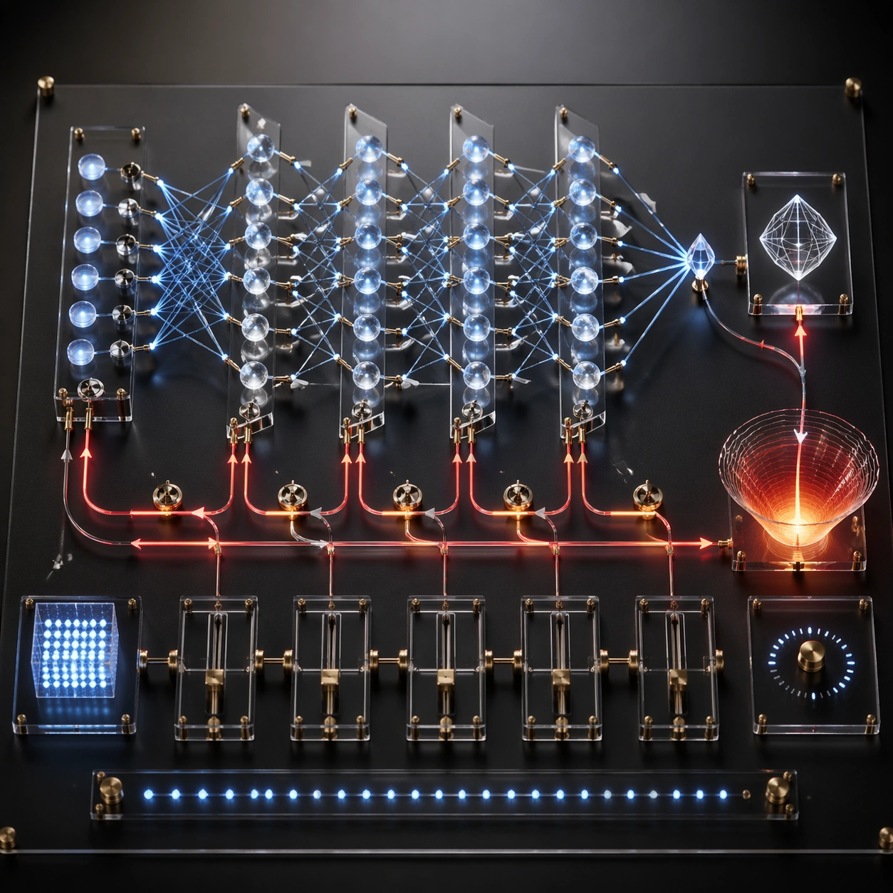
Example generated from “Neural Network Self Explanation — Backpropagation Workbench”
GPT Image 2en

Scene: A square photoreal studio photograph of a technical workbench where a neural network explains how it learns. The surface is matte black with transparent acrylic layers, brass pins, fiber-optic lines, and precise shadows. Use controlled lab lighting, shallow depth of field, and a top-down three-quarter angle that keeps the full training loop visible. Subject: A physical backpropagation diagram built from miniature components. Forward activations travel left to right through stacked glass layers of nodes, producing a small output crystal. A red error signal returns right to left through thinner reverse paths, splitting into gradient arrows that adjust tiny weight dials between layers. Show loss as an abstract glowing basin, parameter updates as calibrated sliders, and learning progress as clean non-readable tick marks. The entire workbench should feel like the model has assembled a tabletop explanation of its own training cycle. Important details: The flow must be directional and coherent: inputs activate layers, output is compared to a target-like abstract shape, error propagates backward, gradients touch weights, and the next forward pass is implied. Use contrasting line styles for forward signal and backward correction. Keep nodes aligned in layers, avoid decorative circuitry, and make the weight adjustments physically attached to connections. The result should look rigorous but visually striking. Use case: Neural Network Self-Explanation single study 2/8, testing backpropagation as a physical workbench with forward activations and backward gradient flow. Constraints: No readable text, no watermark, no logos, preserve exact 1:1 aspect ratio, no real equations, no code, no brand hardware, no random circuit-board texture, no tangled arrows, no private chain-of-thought, no human hands, no disconnected update dials.

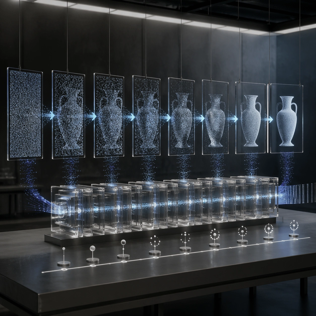
Example generated from “Neural Network Self Explanation — Diffusion Denoising Lab”
GPT Image 2en

Scene: A square photoreal laboratory installation showing a diffusion model explaining its denoising process. The setting is a clean darkroom with soft overhead light, suspended glass plates, mist, and a long illuminated table. The camera faces the table at a shallow angle so a left-to-right sequence is visible in one frame. Subject: A sequence of eight transparent image plates evolves from pure granular noise on the far left into a crisp object silhouette on the far right. Between plates, luminous arrows and particle streams show progressive denoising steps. A central neural module made of layered translucent blocks predicts noise residuals as faint blue specks that peel away from each plate. Abstract timeline ticks and symbolic annotation markers sit below the plates without readable text. The model appears to be demonstrating how it gradually removes noise to reveal structure. Important details: The core logic must be unmistakable: noisy sample, repeated denoising, predicted noise removal, clearer intermediate states, final clean image. Avoid making the sequence look like simple photo editing; it should feel like a generative process with stochastic particles and controlled structure. Use disciplined spacing, consistent plate sizes, and material realism in glass, dust, light beams, and table reflections. Use case: Neural Network Self-Explanation single study 3/8, testing a diffusion denoising process as a photoreal sequence of glass plates and particle flows. Constraints: No readable text, no watermark, no logos, preserve exact 1:1 aspect ratio, no real equations, no code snippets, no brand UI, no private chain-of-thought, no chaotic smoke, no skipped denoising stages, no illegible plate order, no fantasy magic effects.

Example generated from “Neural Network Self Explanation — Token Embedding Observatory”
GPT Image 2en

Scene: A square photoreal observatory-like room where a neural network explains token embeddings as a navigable spatial map. Use dim architectural lighting, a circular floor, brass rails, glass projection surfaces, and a suspended constellation of points. The composition should be elegant, academic, and physically plausible, with a strong central focus. Subject: Thousands of tiny luminous points float in clustered neighborhoods like stars, connected by faint proximity filaments. Small token-like beads enter from a slot at the bottom, then project upward into the embedding constellation, landing near semantically related clusters represented by abstract icons and color regions. Curved distance rings, vector arrows, and similarity bridges show how meanings are positioned relative to one another. Use annotation tablets with only non-readable symbolic marks, dots, and line codes. Important details: The image must communicate mapping from discrete symbols into continuous space. Show before-and-after: raw bead sequence at the edge, projected vectors, clustered geometry, and retrieval of nearby neighbors. Clusters should be visually distinct but not random; use density, color, and distance to show relationships. Avoid literal word labels, planets, or generic galaxy art. The neural network should feel like it is presenting its own coordinate system as a scientific instrument. Use case: Neural Network Self-Explanation single study 4/8, testing token embedding and semantic neighborhood structure as a photoreal observatory map. Constraints: No readable text, no watermark, no logos, preserve exact 1:1 aspect ratio, no real vocabulary labels, no code, no equations, no private chain-of-thought, no astrology look, no random starfield, no disconnected vectors, no illegible cluster hierarchy.

Example generated from “Neural Network Self Explanation — Expert Router Switchboard”
GPT Image 2en

Scene: A square photoreal image of a futuristic but practical control room where a mixture-of-experts network explains routing decisions. Use a wall-sized mechanical switchboard, clean industrial lighting, matte graphite panels, glass relays, and colored fiber paths. The camera is centered and slightly wide, keeping the full routing layout structured and readable. Subject: Input signal packets arrive from the left as small glowing capsules. A central router gate splits them through sparse paths toward eight expert modules arranged in a clean grid. Only a few expert modules light up strongly for each packet, while inactive modules remain dim. The selected experts return processed streams to a merging chamber on the right. Abstract confidence bars, gating weights, and load-balancing indicators appear as non-readable symbols and ticks beside the relays. Important details: The image should make sparse routing obvious. Do not light every expert equally. Show the router choosing, dispatching, processing, and recombining. Expert modules should differ subtly by internal texture, suggesting specialization without labels. Fiber paths must be neat, bundled, and physically attached to sockets. The whole scene should feel like an AI explaining its own routing economy as a rigorous engineering control panel. Use case: Neural Network Self-Explanation single study 5/8, testing mixture-of-experts routing as a photoreal switchboard with sparse activated paths. Constraints: No readable text, no watermark, no logos, preserve exact 1:1 aspect ratio, no real company names, no code, no equations, no private chain-of-thought, no all-experts-on pattern, no tangled cable mess, no random server room noise, no disconnected merge chamber.

Example generated from “Neural Network Self Explanation — Feedback Alignment Studio”
GPT Image 2en

Scene: A square photoreal design studio where an AI system explains preference feedback and alignment as a visual production process. Use a clean white room, wall-mounted translucent panels, paper prototypes, softbox lighting, and precise shadows. The image should feel like a premium editorial shoot of a research workflow, not a corporate dashboard. Subject: Three candidate output sculptures sit on pedestals in the center, each connected to a preference comparison panel made of abstract check marks, ranking beads, and non-readable score marks. A reward-model lens gathers the comparison signals into a glowing evaluation surface, then sends a refined update stream back toward a neural-network lattice on the wall. Show before-and-after behavior as two clean paths: rough outputs on the left, improved output on the right, and a stable central alignment loop. Important details: The composition must explain feedback without showing real text or hidden reasoning. Make comparison, ranking, reward shaping, and update direction visually distinct. Avoid implying perfect moral judgment; this is a technical preference-training diagram. Use disciplined arrows, node spacing, translucent layers, and tactile materials such as paper, glass, steel, and light. The process should be legible from thumbnail scale and detailed on close inspection. Use case: Neural Network Self-Explanation single study 6/8, testing preference-feedback alignment as a photoreal studio workflow with comparison and update loops. Constraints: No readable text, no watermark, no logos, preserve exact 1:1 aspect ratio, no real user data, no chat transcripts, no private chain-of-thought, no code snippets, no brand UI, no moralizing symbols, no chaotic arrows, no human faces.

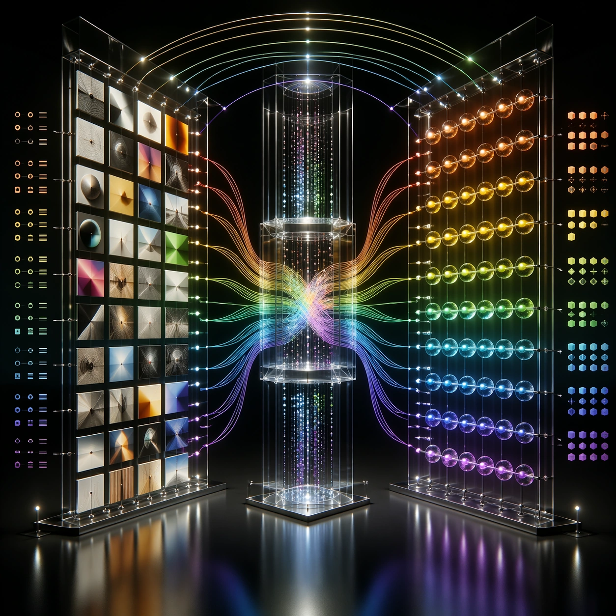
Example generated from “Neural Network Self Explanation — Vision Language Bridge”
GPT Image 2en

Scene: A square photoreal installation in a dark gallery showing how a multimodal neural network connects visual and language-like representations. Use a black reflective floor, suspended image tiles, glass token beads, and luminous bridges between two large transparent towers. The camera is centered and slightly low, giving the scene a monumental but readable structure. Subject: On the left, a grid of small image tiles shows abstract objects, colors, shapes, and scenes without text. On the right, clusters of token beads and symbolic sequence blocks represent language structure without readable words. Between them, cross-modal attention bridges carry light in both directions through a central fusion chamber. Some image regions connect to specific token clusters, while global context lines arc over the top. Add abstract alignment marks, similarity bands, and non-readable annotation ticks. Important details: The image must show grounding and fusion, not just two decorative columns. Visual patches should map to token clusters through distinct colored paths. The central chamber should merge modalities while preserving separate input streams. Keep the diagram clean, symmetric enough to understand, but rich enough for close inspection. Avoid real captions, real object labels, or any suggestion of private thought text. Use case: Neural Network Self-Explanation single study 7/8, testing vision-language cross-attention as a photoreal gallery bridge between image patches and token structures. Constraints: No readable text, no watermark, no logos, preserve exact 1:1 aspect ratio, no brand interface, no code, no equations, no private chain-of-thought, no random sci-fi portal, no disconnected image tiles, no text labels, no cluttered bridge crossings.

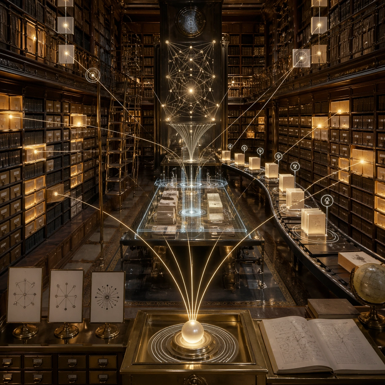
Example generated from “Neural Network Self Explanation — Memory Retrieval Library”
GPT Image 2en

Scene: A square photoreal image of an impossible library where a neural network explains retrieval-augmented memory. Use warm archival lighting, tall shelves, translucent catalog drawers, fiber-optic index lines, and a central glass reading table. The space should feel like a real library merged with a precise technical diagram. Subject: A query sphere enters the scene at the front edge, splits into several search rays, and activates relevant memory shelves as glowing document blocks. A ranking conveyor brings a small set of retrieved blocks to the center table, where they are compressed into context ribbons feeding a neural response lattice at the back. Non-retrieved shelves remain dim. Use abstract citation markers, similarity rings, and symbolic annotation cards without readable text. Important details: The process must distinguish storage, search, retrieval, ranking, context assembly, and answer generation. Do not show every shelf glowing. The retrieved blocks should be visibly selected from a larger archive and then assembled into a compact context bundle. Keep library materials tactile: wood, paper, brass, glass, dust, and warm light. The data-flow overlays should be clean, sparse, and anchored to objects, not floating randomly. Use case: Neural Network Self-Explanation single study 8/8, testing retrieval-augmented generation as a photoreal library with query, search, ranking, and context assembly flows. Constraints: No readable text, no watermark, no logos, preserve exact 1:1 aspect ratio, no real book titles, no citations, no code, no private chain-of-thought, no all-shelves-glowing pattern, no magical fantasy library, no random paper storms, no disconnected response lattice.

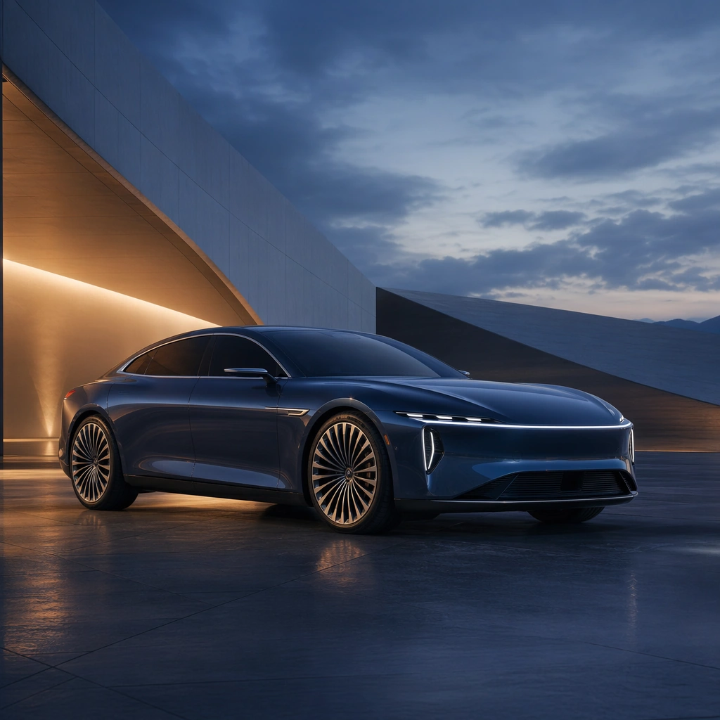
Example generated from “New Car Launch Key Visual System — Reference Anchor”
GPT Image 2en

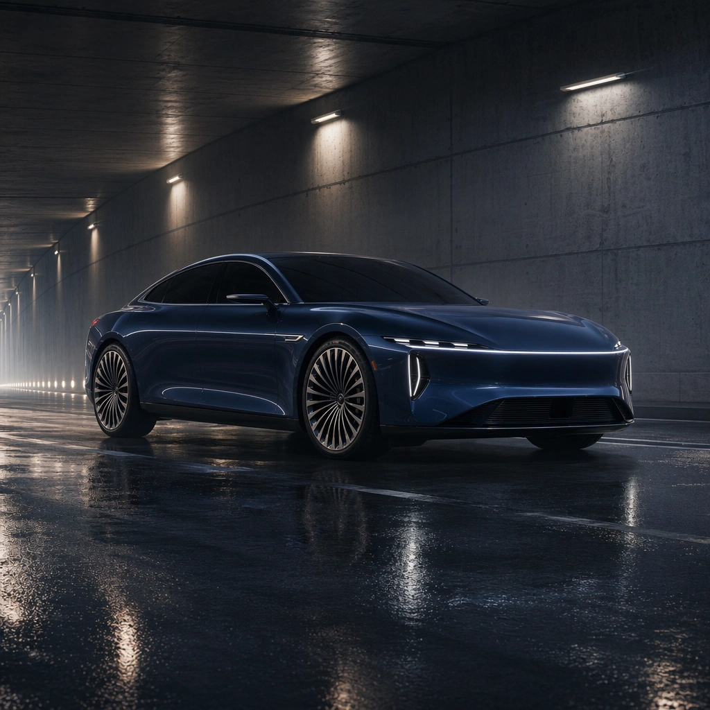
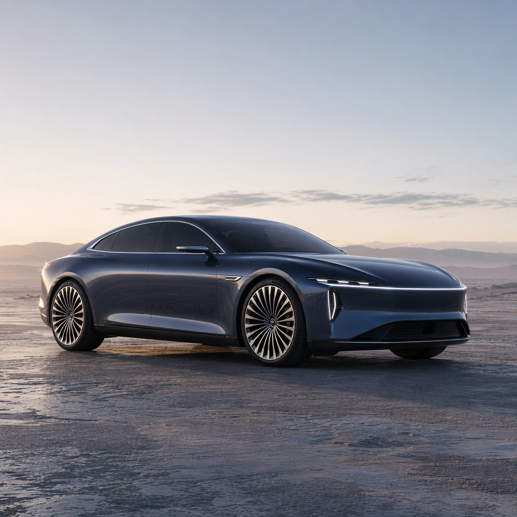
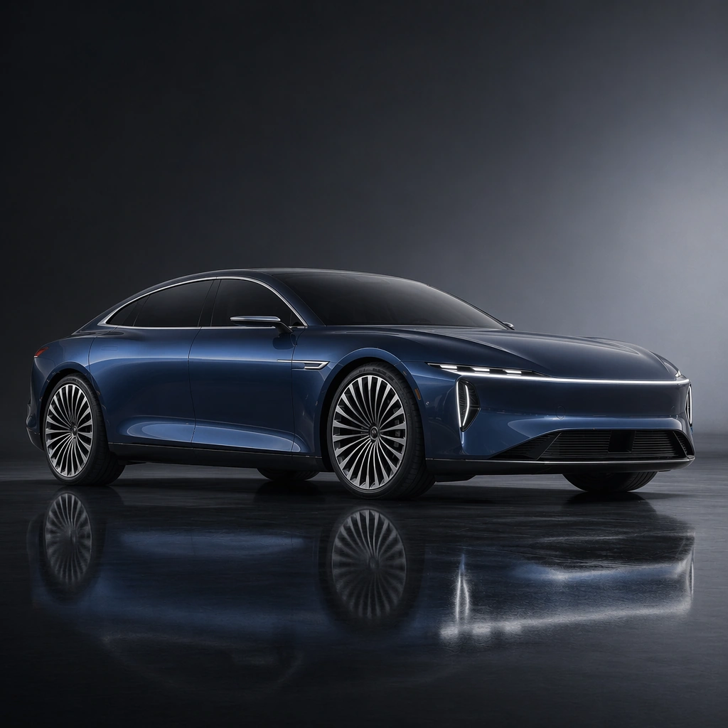
Scene: A square launch-stage composition at blue hour with a low camera, sculptural rim light, controlled haze, and monumental architectural planes reduced to abstract forms. Compose the frame as a square key visual with disciplined camera placement, premium lighting control, and believable real-world scale. The tonal range should feel polished and intentional, with enough atmosphere to create depth without obscuring form. Keep contrast calibrated for launch, catalog, or research presentation use rather than casual snapshot aesthetics. Subject: Center an original premium electric grand tourer with a long wheelbase, flush glazing, crisp shoulder line, turbine wheels, disciplined metallic paint, and an abstract brandless lamp signature. Make the subject feel original, production-aware, and clearly grounded in New Car Launch Key Visual System. For this series image, preserve exact core subject identity, proportions, base geometry, and material language from the reference image whenever continuity matters. The focal hierarchy should be immediate: primary form first, then material behavior, then supporting environmental cues that clarify use context and difficulty. Important details: Show the full vehicle in a front three-quarter hero stance with planted proportions, mirror-clean glazing, sharp surface transitions, disciplined shadow control, and a sense of quiet authority instead of theatrical excess. Preserve the same exact vehicle silhouette, wheel design, greenhouse proportions, body-color family, and lamp signature across the series. Reflections must explain the surfacing cleanly. The images should feel like real launch-campaign assets rather than anonymous stock renders. Use believable materials, engineering logic, and professional composition discipline. Reflections, shadows, edge breaks, texture scale, interface density, and small physical joints must all support realism. Avoid filler props, vague mood-board clutter, or any element that weakens the sense of a purpose-built industrial or automotive image. Use case: Car Launch series study 1/9 for New Car Launch Key Visual System, built as image 01-reference-anchor. Constraints: No readable text, no watermark, no logos, preserve exact 1:1 aspect ratio, no crowd, no dealership clutter, no race decals, no readable plate, no badge lettering, no cheap showroom props.

Example generated from “New Car Launch Key Visual System — Context Shift”
GPT Image 2en

Scene: A square urban tunnel after rain with crisp highlight ribbons, wet pavement reflections, restrained haze, and a controlled sense of forward surge. Compose the frame as a square key visual with disciplined camera placement, premium lighting control, and believable real-world scale. The tonal range should feel polished and intentional, with enough atmosphere to create depth without obscuring form. Keep contrast calibrated for launch, catalog, or research presentation use rather than casual snapshot aesthetics. Subject: Center an original premium electric grand tourer with a long wheelbase, flush glazing, crisp shoulder line, turbine wheels, disciplined metallic paint, and an abstract brandless lamp signature. Make the subject feel original, production-aware, and clearly grounded in New Car Launch Key Visual System. For this series image, preserve exact core subject identity, proportions, base geometry, and material language from the reference image whenever continuity matters. The focal hierarchy should be immediate: primary form first, then material behavior, then supporting environmental cues that clarify use context and difficulty. Important details: Keep the car fully recognizable while using tunnel light, wet ground, and compressed perspective to suggest premium speed. The image should feel cinematic and usable for launch media, not like motorsport reportage. Preserve the same exact vehicle silhouette, wheel design, greenhouse proportions, body-color family, and lamp signature across the series. Reflections must explain the surfacing cleanly. The images should feel like real launch-campaign assets rather than anonymous stock renders. Use believable materials, engineering logic, and professional composition discipline. Reflections, shadows, edge breaks, texture scale, interface density, and small physical joints must all support realism. Avoid filler props, vague mood-board clutter, or any element that weakens the sense of a purpose-built industrial or automotive image. Use case: Car Launch series study 2/9 for New Car Launch Key Visual System, built as image 02-context-shift. Constraints: No readable text, no watermark, no logos, preserve exact 1:1 aspect ratio, no crowd, no dealership clutter, no race decals, no readable plate, no badge lettering, no cheap showroom props.
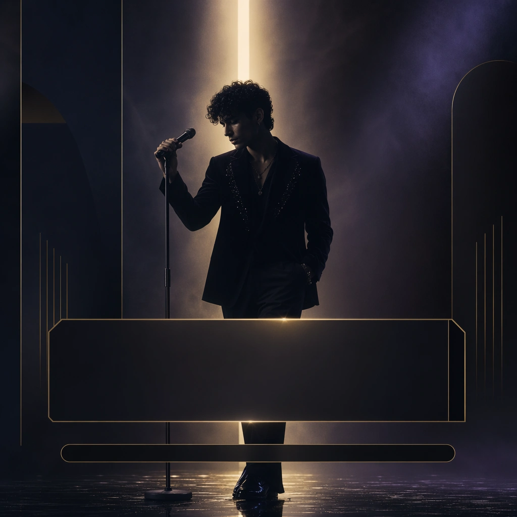
Example generated from “New Car Launch Key Visual System — Surface Study”
GPT Image 2en

Scene: A square first-light landscape on a mineral plateau with long shadows, pale sky gradient, dry air clarity, and minimal environmental noise. Compose the frame as a square key visual with disciplined camera placement, premium lighting control, and believable real-world scale. The tonal range should feel polished and intentional, with enough atmosphere to create depth without obscuring form. Keep contrast calibrated for launch, catalog, or research presentation use rather than casual snapshot aesthetics. Subject: Center an original premium electric grand tourer with a long wheelbase, flush glazing, crisp shoulder line, turbine wheels, disciplined metallic paint, and an abstract brandless lamp signature. Make the subject feel original, production-aware, and clearly grounded in New Car Launch Key Visual System. For this series image, preserve exact core subject identity, proportions, base geometry, and material language from the reference image whenever continuity matters. The focal hierarchy should be immediate: primary form first, then material behavior, then supporting environmental cues that clarify use context and difficulty. Important details: Use the warm dawn condition to reveal hood tension, fender transitions, wheel-arch precision, and panel discipline. The scene should sell craftsmanship and controlled restraint rather than pure spectacle. Preserve the same exact vehicle silhouette, wheel design, greenhouse proportions, body-color family, and lamp signature across the series. Reflections must explain the surfacing cleanly. The images should feel like real launch-campaign assets rather than anonymous stock renders. Use believable materials, engineering logic, and professional composition discipline. Reflections, shadows, edge breaks, texture scale, interface density, and small physical joints must all support realism. Avoid filler props, vague mood-board clutter, or any element that weakens the sense of a purpose-built industrial or automotive image. Use case: Car Launch series study 3/9 for New Car Launch Key Visual System, built as image 03-surface-study. Constraints: No readable text, no watermark, no logos, preserve exact 1:1 aspect ratio, no crowd, no dealership clutter, no race decals, no readable plate, no badge lettering, no cheap showroom props.
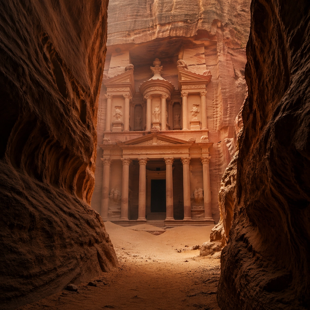
Example generated from “New Car Launch Key Visual System — Presentation Master”
GPT Image 2en

Scene: A square seamless studio with charcoal gradients, soft floor reflection, disciplined top light, and razor-clean premium contrast. Compose the frame as a square key visual with disciplined camera placement, premium lighting control, and believable real-world scale. The tonal range should feel polished and intentional, with enough atmosphere to create depth without obscuring form. Keep contrast calibrated for launch, catalog, or research presentation use rather than casual snapshot aesthetics. Subject: Center an original premium electric grand tourer with a long wheelbase, flush glazing, crisp shoulder line, turbine wheels, disciplined metallic paint, and an abstract brandless lamp signature. Make the subject feel original, production-aware, and clearly grounded in New Car Launch Key Visual System. For this series image, preserve exact core subject identity, proportions, base geometry, and material language from the reference image whenever continuity matters. The focal hierarchy should be immediate: primary form first, then material behavior, then supporting environmental cues that clarify use context and difficulty. Important details: Turn the same car into a master campaign plate with meticulous paint behavior, glass control, wheel clarity, and a polished sense of final approved artwork. Preserve the same exact vehicle silhouette, wheel design, greenhouse proportions, body-color family, and lamp signature across the series. Reflections must explain the surfacing cleanly. The images should feel like real launch-campaign assets rather than anonymous stock renders. Use believable materials, engineering logic, and professional composition discipline. Reflections, shadows, edge breaks, texture scale, interface density, and small physical joints must all support realism. Avoid filler props, vague mood-board clutter, or any element that weakens the sense of a purpose-built industrial or automotive image. Use case: Car Launch series study 4/9 for New Car Launch Key Visual System, built as image 04-presentation-master. Constraints: No readable text, no watermark, no logos, preserve exact 1:1 aspect ratio, no crowd, no dealership clutter, no race decals, no readable plate, no badge lettering, no cheap showroom props.
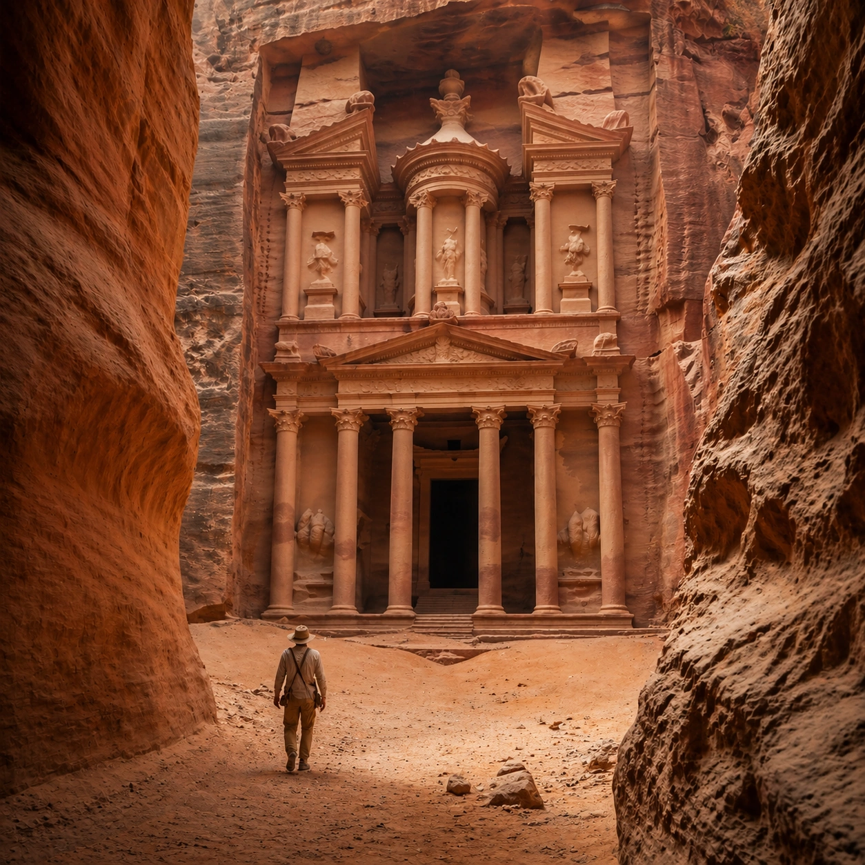
Example generated from “New Car Launch Key Visual System — Color And Trim Board”
GPT Image 2en

Scene: A square design-board setup viewed close to straight-on, with careful spacing, neutral ground, and premium product lighting across arranged samples. Compose the frame as a square key visual with disciplined camera placement, premium lighting control, and believable real-world scale. The tonal range should feel polished and intentional, with enough atmosphere to create depth without obscuring form. Keep contrast calibrated for launch, catalog, or research presentation use rather than casual snapshot aesthetics. Subject: Center original vehicle paint and trim studies arranged with body fragments, wheel inserts, surface swatches, and material chips. Make the subject feel original, production-aware, and clearly grounded in New Car Launch Key Visual System. Treat this as an independent study that must feel complete and coherent without relying on any external reference image. The focal hierarchy should be immediate: primary form first, then material behavior, then supporting environmental cues that clarify use context and difficulty. Important details: Stress realistic paint behavior, coherent industrial-design hierarchy, and catalog-quality organization. The board must feel useful to a launch team rather than decorative lifestyle collage. The visual language should still feel native to New Car Launch Key Visual System, using disciplined industrial or campaign composition instead of generic stock photography. Use believable materials, engineering logic, and professional composition discipline. Reflections, shadows, edge breaks, texture scale, interface density, and small physical joints must all support realism. Avoid filler props, vague mood-board clutter, or any element that weakens the sense of a purpose-built industrial or automotive image. Use case: Car Launch single study 6/9 for New Car Launch Key Visual System, built as image support-two. Constraints: No readable text, no watermark, no logos, preserve exact 1:1 aspect ratio, no readable text, no logos, no badge lettering, no license plate numbers, no unrelated consumer clutter.
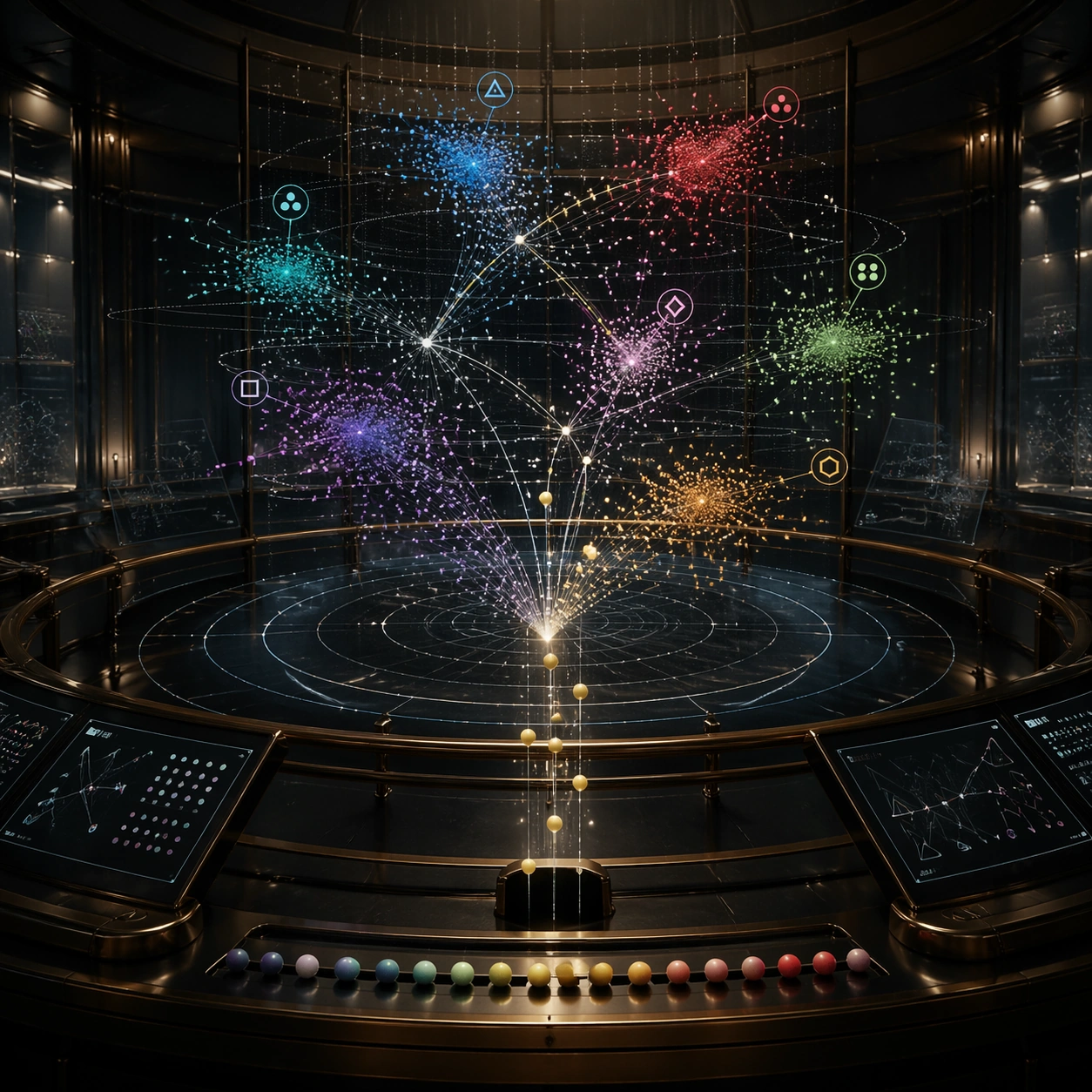
Example generated from “New Car Launch Key Visual System — Hero Detail Macro”
GPT Image 2en

Scene: A square macro studio composition with controlled grazing light, shallow depth, and restrained metallic sparkle kept believable. Compose the frame as a square key visual with disciplined camera placement, premium lighting control, and believable real-world scale. The tonal range should feel polished and intentional, with enough atmosphere to create depth without obscuring form. Keep contrast calibrated for launch, catalog, or research presentation use rather than casual snapshot aesthetics. Subject: Center one original vehicle detail zone such as the headlamp edge, flush handle, fender crease, wheel face, and adjacent painted surfaces. Make the subject feel original, production-aware, and clearly grounded in New Car Launch Key Visual System. Treat this as an independent study that must feel complete and coherent without relying on any external reference image. The focal hierarchy should be immediate: primary form first, then material behavior, then supporting environmental cues that clarify use context and difficulty. Important details: The image must feel tactile and engineered, with subtle micro-scratches, realistic paint flake, clean seals, and highly controlled specular flow. Avoid turning the crop into an abstract texture exercise. The visual language should still feel native to New Car Launch Key Visual System, using disciplined industrial or campaign composition instead of generic stock photography. Use believable materials, engineering logic, and professional composition discipline. Reflections, shadows, edge breaks, texture scale, interface density, and small physical joints must all support realism. Avoid filler props, vague mood-board clutter, or any element that weakens the sense of a purpose-built industrial or automotive image. Use case: Car Launch single study 7/9 for New Car Launch Key Visual System, built as image support-three. Constraints: No readable text, no watermark, no logos, preserve exact 1:1 aspect ratio, no readable text, no logos, no badge lettering, no license plate numbers, no unrelated consumer clutter.
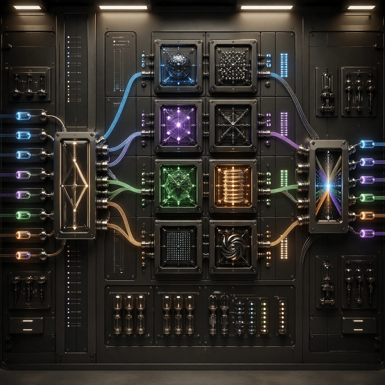
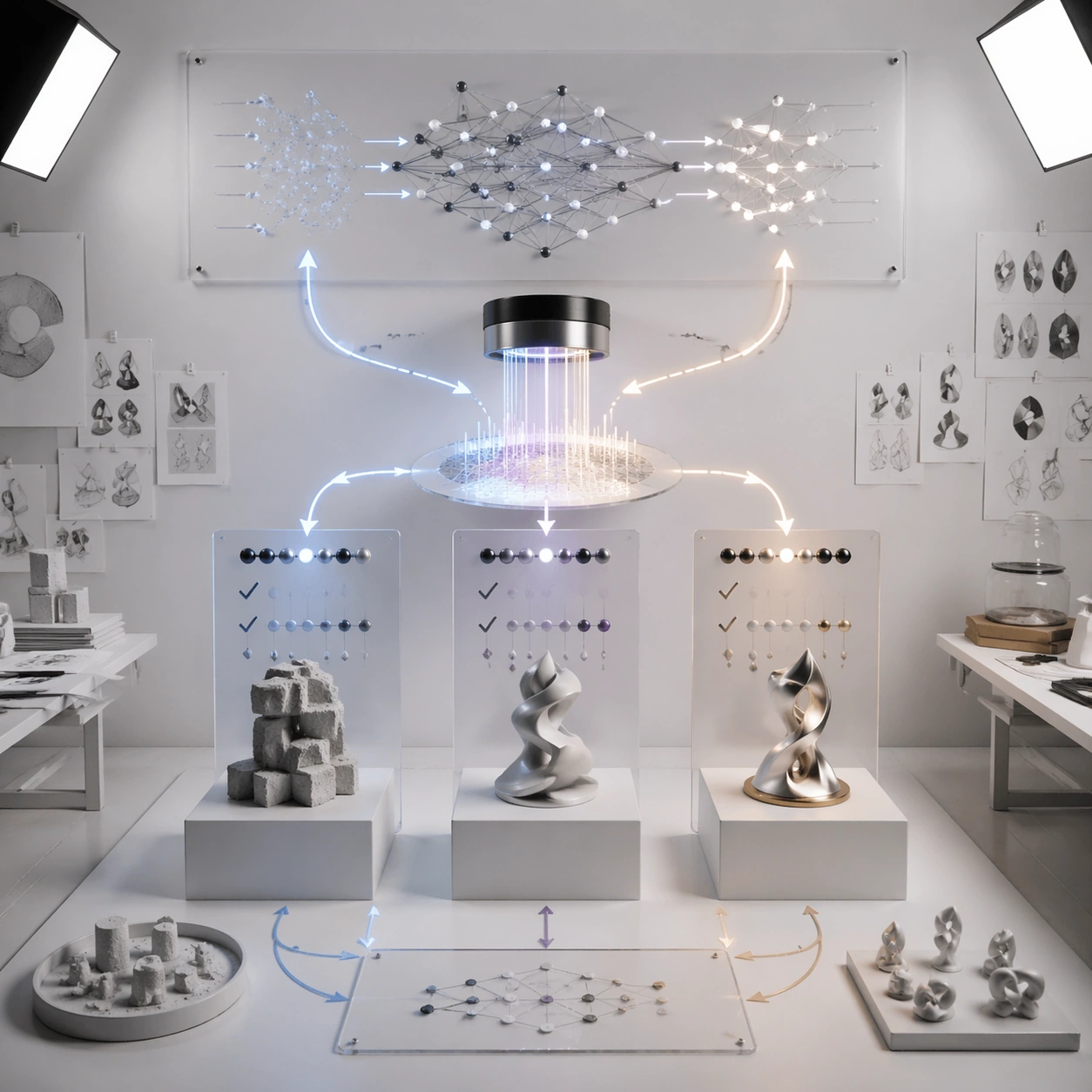
Example generated from “New Car Launch Key Visual System — Arrival Lifestyle Frame”
GPT Image 2en

Scene: A square urban forecourt at dusk with elegant architecture, soft ambient light, faint weather texture, and disciplined curb geometry. Compose the frame as a square key visual with disciplined camera placement, premium lighting control, and believable real-world scale. The tonal range should feel polished and intentional, with enough atmosphere to create depth without obscuring form. Keep contrast calibrated for launch, catalog, or research presentation use rather than casual snapshot aesthetics. Subject: Center an original premium vehicle arriving near a design-forward destination, with one understated human figure secondary to the car. Make the subject feel original, production-aware, and clearly grounded in New Car Launch Key Visual System. Treat this as an independent study that must feel complete and coherent without relying on any external reference image. The focal hierarchy should be immediate: primary form first, then material behavior, then supporting environmental cues that clarify use context and difficulty. Important details: Prioritize believable scale, contextual restraint, and emotional calm over cliché luxury signaling. The image should feel like real premium ownership, not influencer staging. The visual language should still feel native to New Car Launch Key Visual System, using disciplined industrial or campaign composition instead of generic stock photography. Use believable materials, engineering logic, and professional composition discipline. Reflections, shadows, edge breaks, texture scale, interface density, and small physical joints must all support realism. Avoid filler props, vague mood-board clutter, or any element that weakens the sense of a purpose-built industrial or automotive image. Use case: Car Launch single study 8/9 for New Car Launch Key Visual System, built as image support-four. Constraints: No readable text, no watermark, no logos, preserve exact 1:1 aspect ratio, no readable text, no logos, no badge lettering, no license plate numbers, no unrelated consumer clutter.

Example generated from “New Car Launch Key Visual System — Night OOH Mockup”
GPT Image 2en

Scene: A square nighttime streetscape with one large illuminated billboard plane, wet reflections, controlled traffic traces, and premium city contrast. Compose the frame as a square key visual with disciplined camera placement, premium lighting control, and believable real-world scale. The tonal range should feel polished and intentional, with enough atmosphere to create depth without obscuring form. Keep contrast calibrated for launch, catalog, or research presentation use rather than casual snapshot aesthetics. Subject: Center an original vehicle hero artwork adapted onto a physical out-of-home display, plus the surrounding urban site context. Make the subject feel original, production-aware, and clearly grounded in New Car Launch Key Visual System. Treat this as an independent study that must feel complete and coherent without relying on any external reference image. The focal hierarchy should be immediate: primary form first, then material behavior, then supporting environmental cues that clarify use context and difficulty. Important details: Keep billboard content abstract and non-readable while the overall site feels plausible, premium, and useful for campaign planning. The mockup should sell placement quality and visual impact. The visual language should still feel native to New Car Launch Key Visual System, using disciplined industrial or campaign composition instead of generic stock photography. Use believable materials, engineering logic, and professional composition discipline. Reflections, shadows, edge breaks, texture scale, interface density, and small physical joints must all support realism. Avoid filler props, vague mood-board clutter, or any element that weakens the sense of a purpose-built industrial or automotive image. Use case: Car Launch single study 9/9 for New Car Launch Key Visual System, built as image support-five. Constraints: No readable text, no watermark, no logos, preserve exact 1:1 aspect ratio, no readable text, no logos, no badge lettering, no license plate numbers, no unrelated consumer clutter.