原始文档
GPT Image 2 · en
Scene:
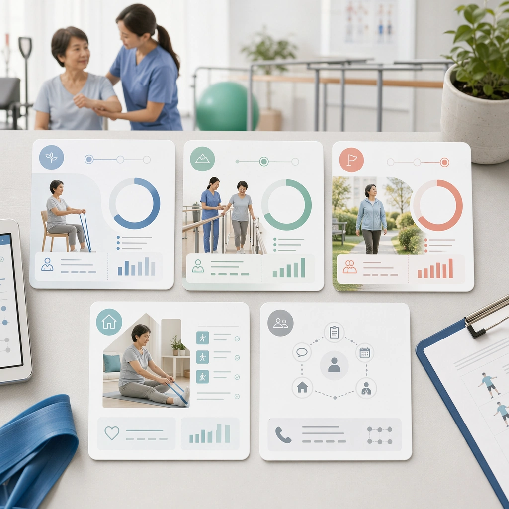
A square rehabilitation milestone card system for Patient Journey Explainer System. Compose it as a family of cards displayed together with progress rings, movement imagery, and support cues. Use a palette of soft white, mist blue, sea-glass green, muted coral accents, and warm neutral grays, even editorial lighting with crisp, low-anxiety contrast, and a mood of clear, supportive, and process-oriented. The frame should feel like a real healthcare communication asset art-directed for professional delivery, not a stock photo, speculative concept render, or generic corporate template. Keep the camera distance, negative space, and depth cues disciplined so the image reads immediately even at thumbnail size.

Subject:
Center on a rehabilitation journey represented by early, middle, and late-stage milestones with therapist support and home practice moments. Show enough surrounding context that the viewer understands the intended service surface, user situation, and institutional setting. Every object, person, diagram, device crop, or spatial cue should support clarity, trust, and practical use. If people appear, keep them anonymous, natural, privacy-safe, and grounded in believable body language rather than promotional posing.

Important details:
Maintain patient-journey communication built from sequencing, touchpoint mapping, low-anxiety illustrations, and interface-like clarity without dense textbook complexity. The cards should imply progress and patience without turning the recovery story into a competitive fitness narrative. Use abstract icon shapes, color blocks, chart bars, interface modules, or non-legible placeholder microcopy whenever information structure is needed, but never readable text. Materials, spacing, lighting, and hierarchy should feel production-ready and healthcare-specific. Avoid generic lifestyle filler, decorative noise, or design gestures that do not reinforce the communication goal.

Use case:
Patient Journey single study 5/9 for a rehab progress explainer card set.

Constraints:
No readable text, no watermark, no logos, preserve exact 1:1 aspect ratio, no graphic medical scenes, no confusing maze compositions, no dark fear-based tone, no overcrowded information walls, no sports-performance marketing tone, no exaggerated celebration poses.
使用方法
- 复制完整原始提示词,并保留其中的参数。
- 按需求替换主体、文字和构图要求。
- 在兼容的外部工具中使用,核对当前使用条件并检查结果。
开始前需了解
- 先确认是否需要参考图。标注兼容模型,不代表该示例由这个模型生成。
- 核对名称、数字与画面文字;不同模型版本的结果可能不同。