提示词库 · 创作探索

提示词库

探索真实提示词和对应生成示例,按任务找到灵感,免费复制完整提示词,开启下一次创作。

示例
10,974
模型
17
来源
1277
10,974 条提示词示例 · 第 56 / 229 页
Example generated from “Fictional Symbol System — Game UI Cipher”
GPT Image 2en

Scene: Square cinematic close-up of a premium game interface artifact projected on smoked glass above a bronze mechanism. The palette is midnight blue, brass, pale cyan, and ember orange. The composition is symmetrical and polished, with shallow depth of field, tiny scratches on glass, and subtle volumetric glow, but it should still look like a physical prop rather than a flat screenshot. Subject: An independent fictional cipher interface for unlocking an ancient machine. The display uses invented glyph tiles, radial slots, aligned cipher strips, and three nested rings of pseudo-script. Symbols are built from broken circles, blade-like stems, tiny paired dots, hinge marks, and triangular locks. Repeated glyphs should appear in different interface zones to imply that the machine recognizes a coherent language. Important details: This is a text-rendering stress test disguised as game concept art. Keep every mark invented, crisp, and consistently styled, with clear spacing and alignment. The layout should communicate a puzzle decoder through visual structure alone: matching glyph tiles, inactive slots, active glowing clusters, and a central mechanism responding to the cipher. Do not include readable UI labels, numbers, menu words, or real alphabets. Use case: Fictional Symbol System single study 8/8, testing invented glyph consistency inside a cinematic game-interface cipher artifact. Constraints: No readable text, no watermark, no logos, preserve exact 1:1 aspect ratio, no Latin letters, no real alphabets, no Arabic numerals, no menu labels, no brand marks, no keyboard keys, no QR-code patterns, no generic sci-fi gibberish.

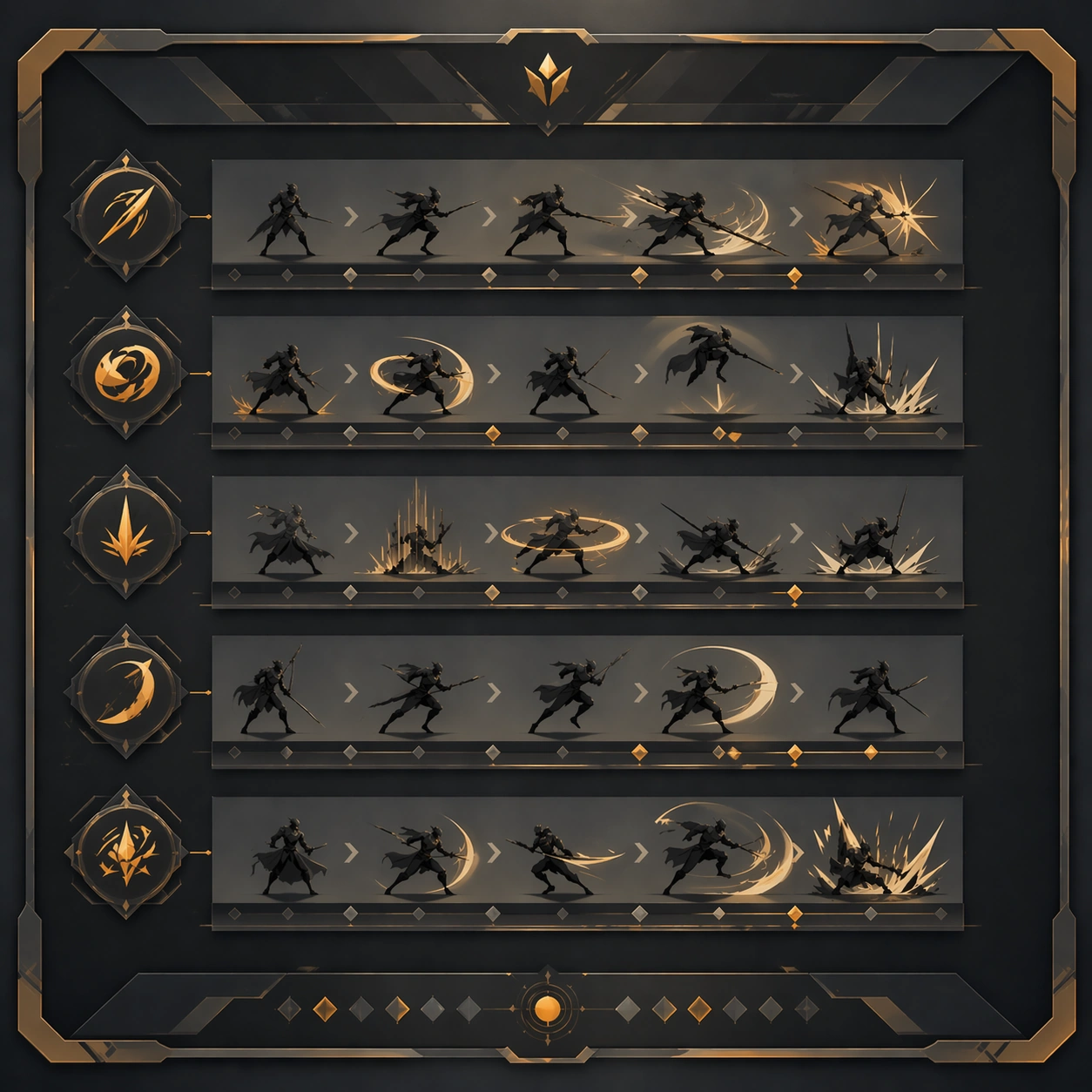
Example generated from “Fight Scene Keyframe Strip — Reference Anchor”
GPT Image 2en

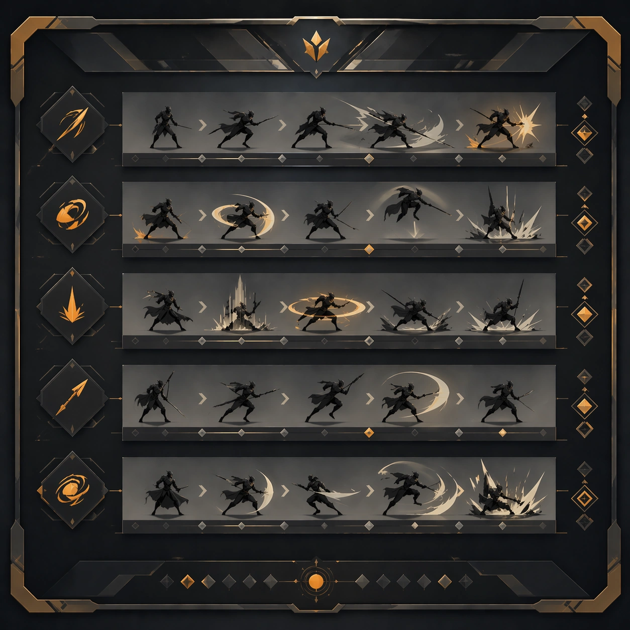
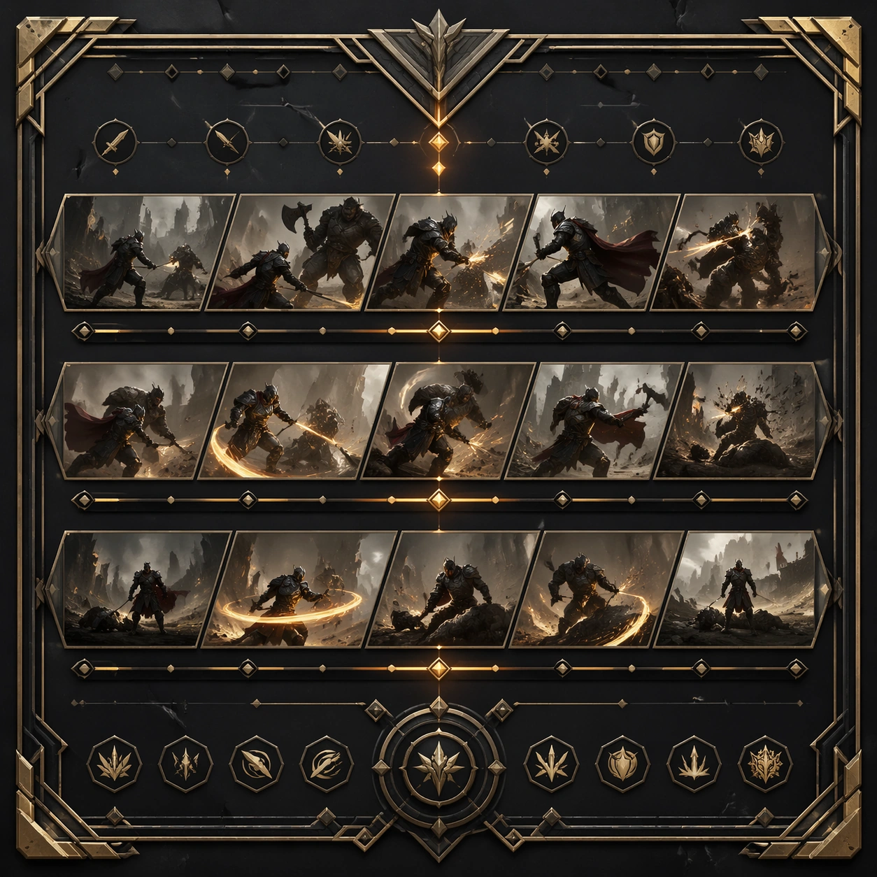
Scene: Create a square reference image for Fight Scene Keyframe Strip. Build a reference anchor establishing the core system with a premium, production-ready finish. Use a polished modular board or campaign surface with clean spacing, premium game-UI finish, and clear focal hierarchy. The composition should feel intentional, clean, and reusable for gallery, research, campaign, or internal handoff contexts. Lighting must support readability first, with the main forms clearly separated from the background and enough breathing room for the system to stay legible at both hero scale and thumbnail scale. Subject: Center a coherent original game-art system built for premium production and marketing surfaces. For this image, focus on reference anchor. Keep the same system logic stable across screenshots, cards, banners, and overview boards. This image is the canonical anchor that later series images must follow. The viewer should immediately understand what role this surface plays inside a cohesive game-production asset pack. Important details: Lock framing, icon grammar, palette blocking, and surface hierarchy so the kit feels production-ready and consistent. Preserve the core silhouette, framing language, and material logic from the reference image while each variation changes function. Keep materials believable, edge hierarchy disciplined, and the visual language consistent with Fight Strip. Use abstract interface blocks or diagram accents when helpful, but avoid any readable language. The final result should feel like a deliberate production asset rather than a random illustration. Use case: Fight Scene Keyframe Strip series study 1/9, designed as reference anchor within a cohesive asset pack. Constraints: No readable text, no watermark, no logos, preserve exact 1:1 aspect ratio, no unrelated objects, no broken visual hierarchy, no malformed anatomy or broken perspective, no random decorative clutter.
Example generated from “Fight Scene Keyframe Strip — Variant One”
GPT Image 2en

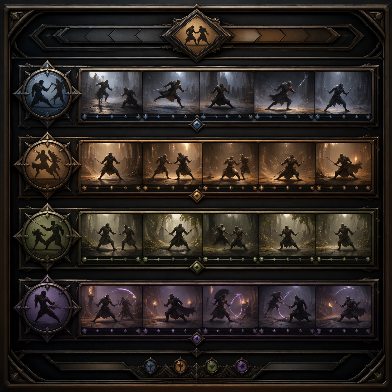
Scene: Create a square dependent image for Fight Scene Keyframe Strip. Build a first controlled variation in the same system with a premium, production-ready finish. Use a polished modular board or campaign surface with clean spacing, premium game-UI finish, and clear focal hierarchy. The composition should feel intentional, clean, and reusable for gallery, research, campaign, or internal handoff contexts. Lighting must support readability first, with the main forms clearly separated from the background and enough breathing room for the system to stay legible at both hero scale and thumbnail scale. Subject: Center a coherent original game-art system built for premium production and marketing surfaces. For this image, focus on the intended support surface. Keep the same system logic stable across screenshots, cards, banners, and overview boards. Preserve exact identity or system logic from the reference image while changing only the intended variation axis. The viewer should immediately understand what role this surface plays inside a cohesive game-production asset pack. Important details: Lock framing, icon grammar, palette blocking, and surface hierarchy so the kit feels production-ready and consistent. Preserve the core silhouette, framing language, and material logic from the reference image while each variation changes function. Keep materials believable, edge hierarchy disciplined, and the visual language consistent with Fight Strip. Use abstract interface blocks or diagram accents when helpful, but avoid any readable language. The final result should feel like a deliberate production asset rather than a random illustration. Use case: Fight Scene Keyframe Strip series study 2/9, designed as variant one within a cohesive asset pack. Constraints: No readable text, no watermark, no logos, preserve exact 1:1 aspect ratio, no unrelated objects, no broken visual hierarchy, no malformed anatomy or broken perspective, no random decorative clutter.

Example generated from “Fight Scene Keyframe Strip — Variant Two”
GPT Image 2en

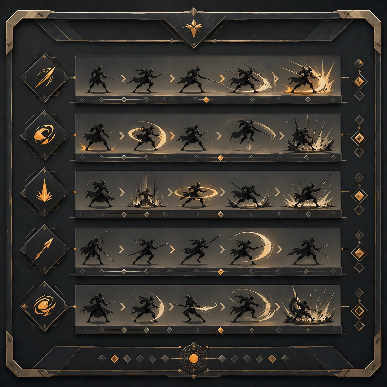
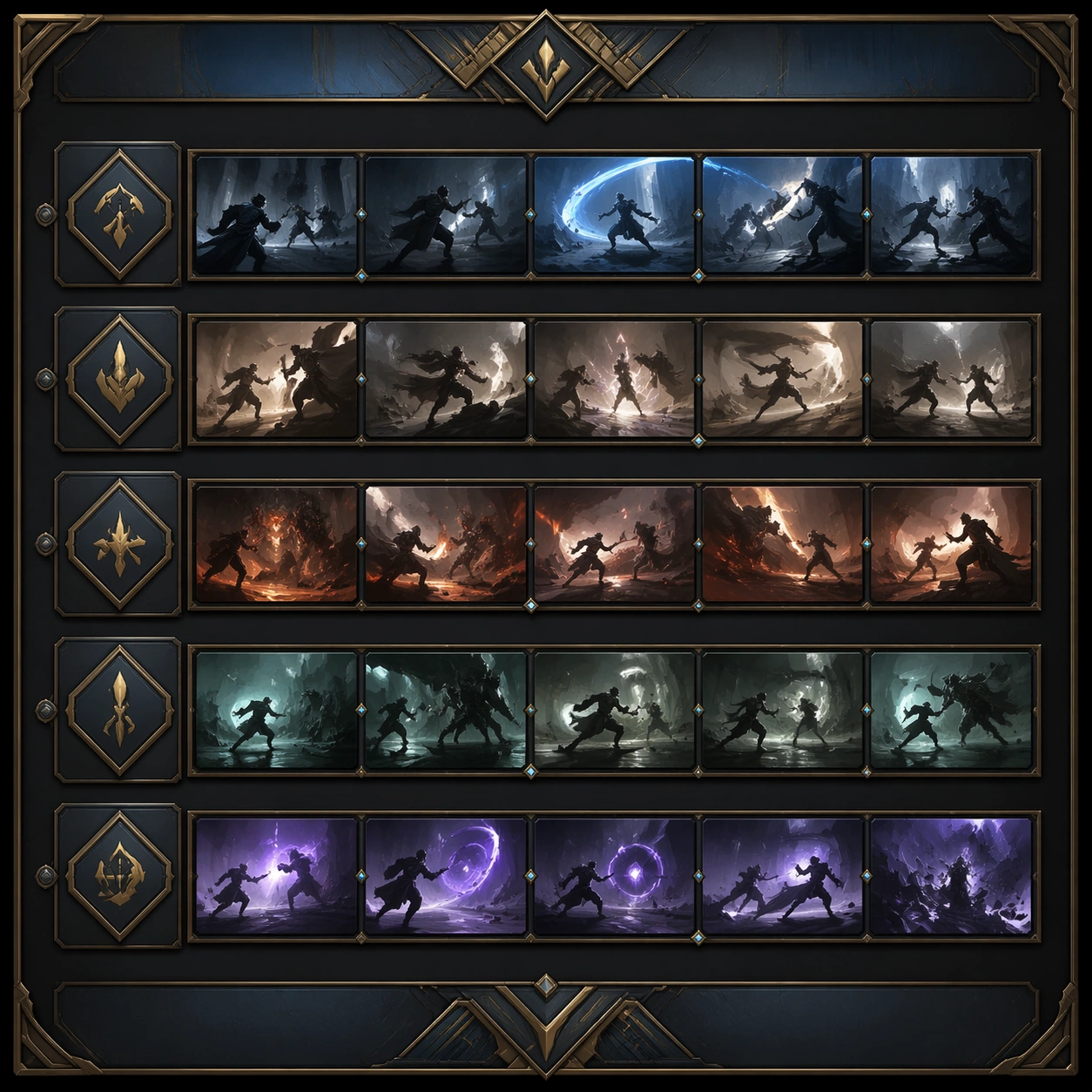
Scene: Create a square dependent image for Fight Scene Keyframe Strip. Build a second controlled variation in the same system with a premium, production-ready finish. Use a polished modular board or campaign surface with clean spacing, premium game-UI finish, and clear focal hierarchy. The composition should feel intentional, clean, and reusable for gallery, research, campaign, or internal handoff contexts. Lighting must support readability first, with the main forms clearly separated from the background and enough breathing room for the system to stay legible at both hero scale and thumbnail scale. Subject: Center a coherent original game-art system built for premium production and marketing surfaces. For this image, focus on the intended support surface. Keep the same system logic stable across screenshots, cards, banners, and overview boards. Preserve exact identity or system logic from the reference image while changing only the intended variation axis. The viewer should immediately understand what role this surface plays inside a cohesive game-production asset pack. Important details: Lock framing, icon grammar, palette blocking, and surface hierarchy so the kit feels production-ready and consistent. Preserve the core silhouette, framing language, and material logic from the reference image while each variation changes function. Keep materials believable, edge hierarchy disciplined, and the visual language consistent with Fight Strip. Use abstract interface blocks or diagram accents when helpful, but avoid any readable language. The final result should feel like a deliberate production asset rather than a random illustration. Use case: Fight Scene Keyframe Strip series study 3/9, designed as variant two within a cohesive asset pack. Constraints: No readable text, no watermark, no logos, preserve exact 1:1 aspect ratio, no unrelated objects, no broken visual hierarchy, no malformed anatomy or broken perspective, no random decorative clutter.

Example generated from “Fight Scene Keyframe Strip — Variant Three”
GPT Image 2en

Scene: Create a square dependent image for Fight Scene Keyframe Strip. Build a third controlled variation in the same system with a premium, production-ready finish. Use a polished modular board or campaign surface with clean spacing, premium game-UI finish, and clear focal hierarchy. The composition should feel intentional, clean, and reusable for gallery, research, campaign, or internal handoff contexts. Lighting must support readability first, with the main forms clearly separated from the background and enough breathing room for the system to stay legible at both hero scale and thumbnail scale. Subject: Center a coherent original game-art system built for premium production and marketing surfaces. For this image, focus on the intended support surface. Keep the same system logic stable across screenshots, cards, banners, and overview boards. Preserve exact identity or system logic from the reference image while changing only the intended variation axis. The viewer should immediately understand what role this surface plays inside a cohesive game-production asset pack. Important details: Lock framing, icon grammar, palette blocking, and surface hierarchy so the kit feels production-ready and consistent. Preserve the core silhouette, framing language, and material logic from the reference image while each variation changes function. Keep materials believable, edge hierarchy disciplined, and the visual language consistent with Fight Strip. Use abstract interface blocks or diagram accents when helpful, but avoid any readable language. The final result should feel like a deliberate production asset rather than a random illustration. Use case: Fight Scene Keyframe Strip series study 4/9, designed as variant three within a cohesive asset pack. Constraints: No readable text, no watermark, no logos, preserve exact 1:1 aspect ratio, no unrelated objects, no broken visual hierarchy, no malformed anatomy or broken perspective, no random decorative clutter.

Example generated from “Fight Scene Keyframe Strip — Support One”
GPT Image 2en

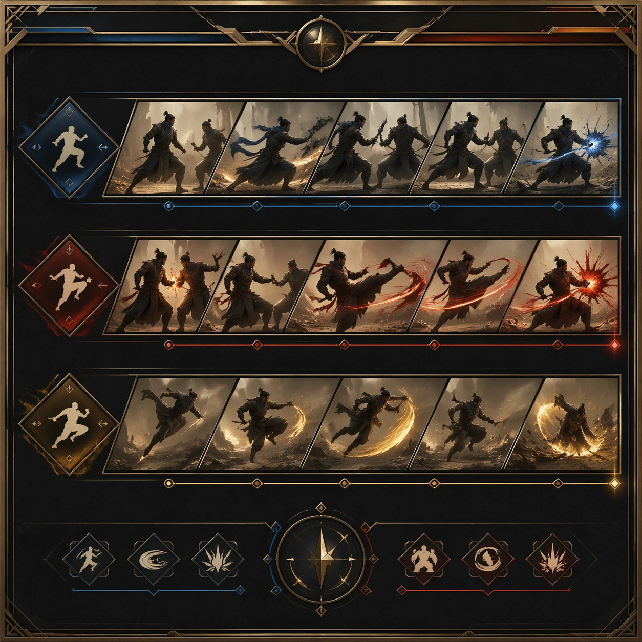
Scene: Create a square standalone support image for Fight Scene Keyframe Strip. Build a support-surface study with a clear focal hierarchy and a finished professional surface. Use a polished modular board or campaign surface with clean spacing, premium game-UI finish, and clear focal hierarchy. The frame should feel self-contained and polished, with enough structure to explain the system even without the reference series, yet still obviously belonging to the same theme and production world. Subject: Show a coherent original game-art system built for premium production and marketing surfaces in a way that emphasizes the intended support surface. Keep the same system logic stable across screenshots, cards, banners, and overview boards. Even though this image is independent, the viewer should still recognize the same universe, same commercial logic, and same production intent as the core package. Important details: Lock framing, icon grammar, palette blocking, and surface hierarchy so the kit feels production-ready and consistent. Preserve the broader theme language through color, framing, material choices, and modular composition. Use clean panel rhythm, premium asset presentation, and believable detail density. The image should work equally well as a gallery study, research reference, and mock production deliverable. Use case: Fight Scene Keyframe Strip single study 5/9, exploring support one as a support surface. Constraints: No readable text, no watermark, no logos, preserve exact 1:1 aspect ratio, no unrelated objects, no broken visual hierarchy, no visual noise that obscures the main surface, no accidental brand resemblance.

Example generated from “Fight Scene Keyframe Strip — Support Two”
GPT Image 2en

Scene: Create a square standalone support image for Fight Scene Keyframe Strip. Build a second support-surface study with a clear focal hierarchy and a finished professional surface. Use a polished modular board or campaign surface with clean spacing, premium game-UI finish, and clear focal hierarchy. The frame should feel self-contained and polished, with enough structure to explain the system even without the reference series, yet still obviously belonging to the same theme and production world. Subject: Show a coherent original game-art system built for premium production and marketing surfaces in a way that emphasizes the intended support surface. Keep the same system logic stable across screenshots, cards, banners, and overview boards. Even though this image is independent, the viewer should still recognize the same universe, same commercial logic, and same production intent as the core package. Important details: Lock framing, icon grammar, palette blocking, and surface hierarchy so the kit feels production-ready and consistent. Preserve the broader theme language through color, framing, material choices, and modular composition. Use clean panel rhythm, premium asset presentation, and believable detail density. The image should work equally well as a gallery study, research reference, and mock production deliverable. Use case: Fight Scene Keyframe Strip single study 6/9, exploring support two as a support surface. Constraints: No readable text, no watermark, no logos, preserve exact 1:1 aspect ratio, no unrelated objects, no broken visual hierarchy, no visual noise that obscures the main surface, no accidental brand resemblance.

Example generated from “Fight Scene Keyframe Strip — Support Three”
GPT Image 2en

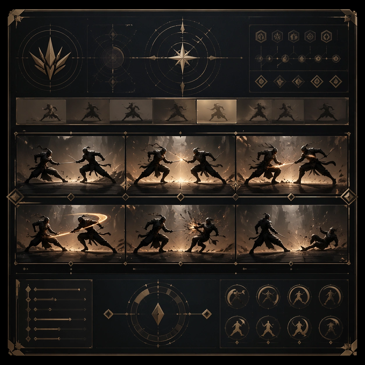
Scene: Create a square standalone support image for Fight Scene Keyframe Strip. Build a third support-surface study with a clear focal hierarchy and a finished professional surface. Use a polished modular board or campaign surface with clean spacing, premium game-UI finish, and clear focal hierarchy. The frame should feel self-contained and polished, with enough structure to explain the system even without the reference series, yet still obviously belonging to the same theme and production world. Subject: Show a coherent original game-art system built for premium production and marketing surfaces in a way that emphasizes the intended support surface. Keep the same system logic stable across screenshots, cards, banners, and overview boards. Even though this image is independent, the viewer should still recognize the same universe, same commercial logic, and same production intent as the core package. Important details: Lock framing, icon grammar, palette blocking, and surface hierarchy so the kit feels production-ready and consistent. Preserve the broader theme language through color, framing, material choices, and modular composition. Use clean panel rhythm, premium asset presentation, and believable detail density. The image should work equally well as a gallery study, research reference, and mock production deliverable. Use case: Fight Scene Keyframe Strip single study 7/9, exploring support three as a support surface. Constraints: No readable text, no watermark, no logos, preserve exact 1:1 aspect ratio, no unrelated objects, no broken visual hierarchy, no visual noise that obscures the main surface, no accidental brand resemblance.

Example generated from “Fight Scene Keyframe Strip — Support Four”
GPT Image 2en

Scene: Create a square standalone support image for Fight Scene Keyframe Strip. Build a fourth support-surface study with a clear focal hierarchy and a finished professional surface. Use a polished modular board or campaign surface with clean spacing, premium game-UI finish, and clear focal hierarchy. The frame should feel self-contained and polished, with enough structure to explain the system even without the reference series, yet still obviously belonging to the same theme and production world. Subject: Show a coherent original game-art system built for premium production and marketing surfaces in a way that emphasizes the intended support surface. Keep the same system logic stable across screenshots, cards, banners, and overview boards. Even though this image is independent, the viewer should still recognize the same universe, same commercial logic, and same production intent as the core package. Important details: Lock framing, icon grammar, palette blocking, and surface hierarchy so the kit feels production-ready and consistent. Preserve the broader theme language through color, framing, material choices, and modular composition. Use clean panel rhythm, premium asset presentation, and believable detail density. The image should work equally well as a gallery study, research reference, and mock production deliverable. Use case: Fight Scene Keyframe Strip single study 8/9, exploring support four as a support surface. Constraints: No readable text, no watermark, no logos, preserve exact 1:1 aspect ratio, no unrelated objects, no broken visual hierarchy, no visual noise that obscures the main surface, no accidental brand resemblance.

Example generated from “Fight Scene Keyframe Strip — Support Five”
GPT Image 2en

Scene: Create a square standalone support image for Fight Scene Keyframe Strip. Build a fifth support-surface study with a clear focal hierarchy and a finished professional surface. Use a polished modular board or campaign surface with clean spacing, premium game-UI finish, and clear focal hierarchy. The frame should feel self-contained and polished, with enough structure to explain the system even without the reference series, yet still obviously belonging to the same theme and production world. Subject: Show a coherent original game-art system built for premium production and marketing surfaces in a way that emphasizes the intended support surface. Keep the same system logic stable across screenshots, cards, banners, and overview boards. Even though this image is independent, the viewer should still recognize the same universe, same commercial logic, and same production intent as the core package. Important details: Lock framing, icon grammar, palette blocking, and surface hierarchy so the kit feels production-ready and consistent. Preserve the broader theme language through color, framing, material choices, and modular composition. Use clean panel rhythm, premium asset presentation, and believable detail density. The image should work equally well as a gallery study, research reference, and mock production deliverable. Use case: Fight Scene Keyframe Strip single study 9/9, exploring support five as a support surface. Constraints: No readable text, no watermark, no logos, preserve exact 1:1 aspect ratio, no unrelated objects, no broken visual hierarchy, no visual noise that obscures the main surface, no accidental brand resemblance.

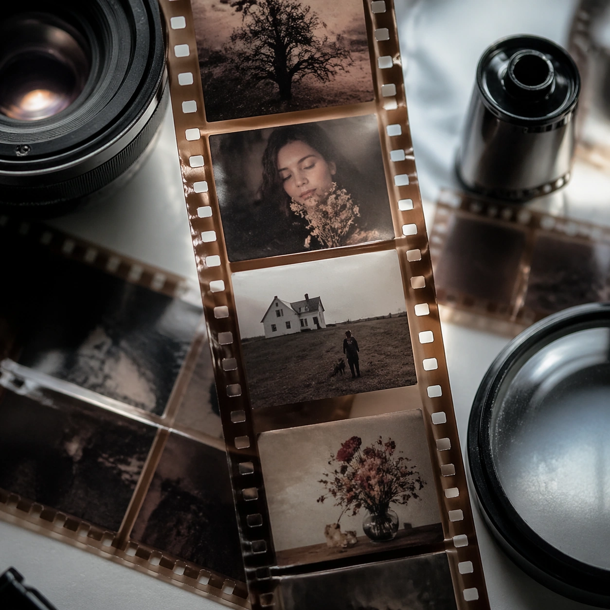
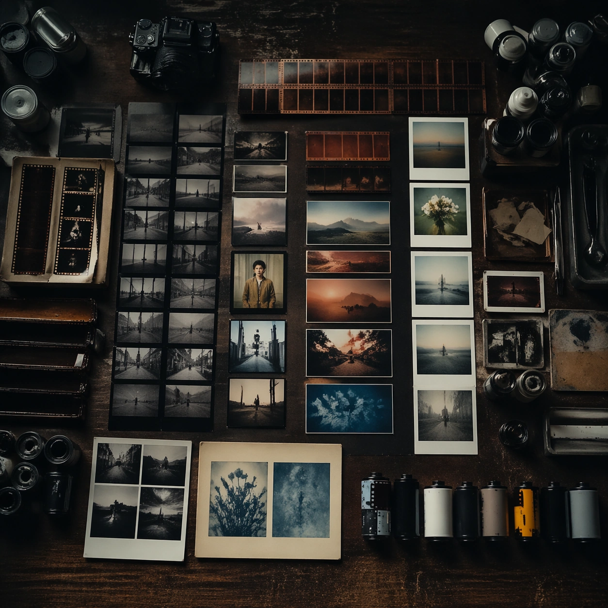
Example generated from “Film Photography Style Atlas — Hero Shot”
GPT Image 2en

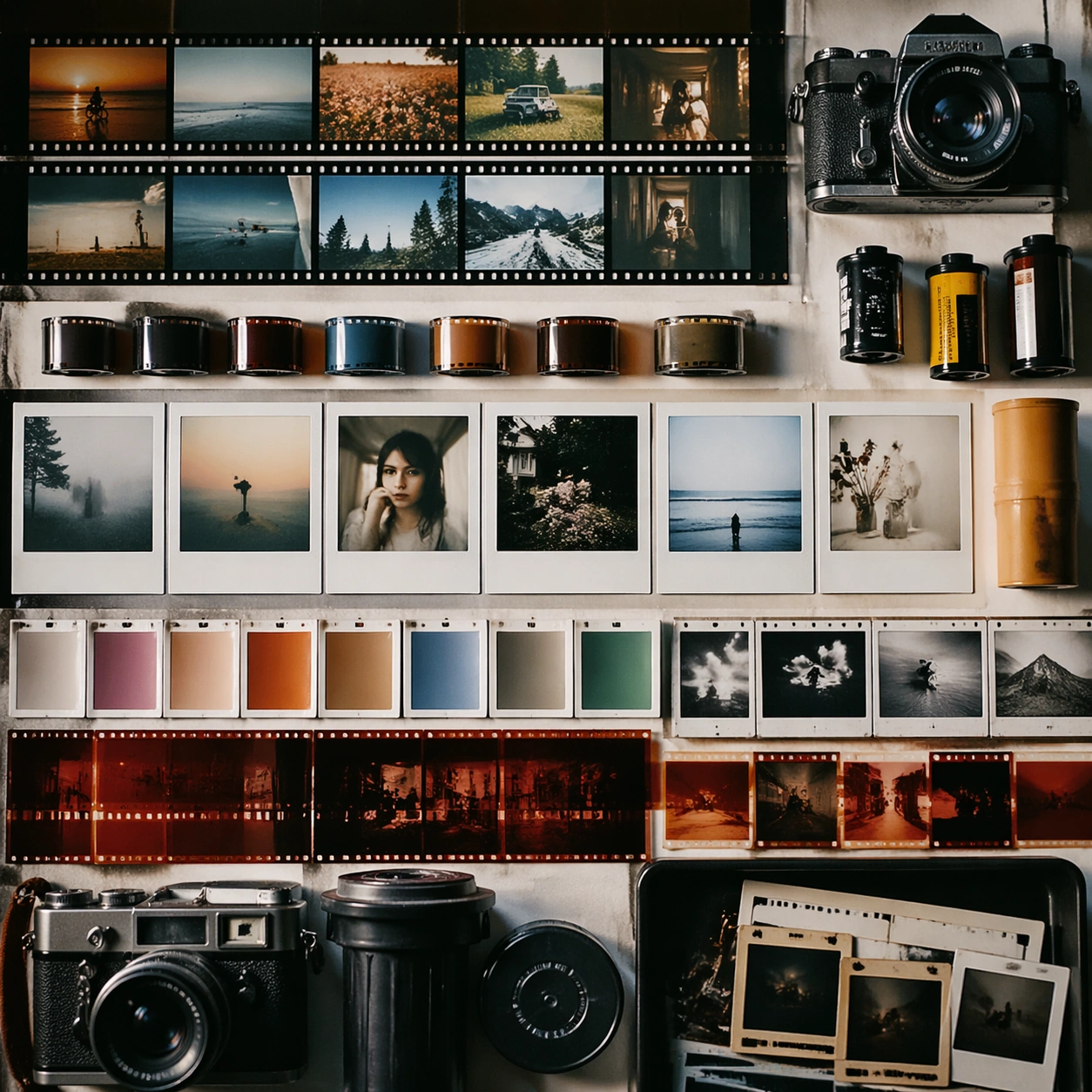
Scene: A square photographic image with intentional lens choice, coherent light, and a subject that feels observed rather than merely decorated. Build the frame around a definitive frame that establishes the subject’s strongest visual identity. Keep the lighting, camera distance, and spatial organization tuned for a high-signal research image rather than a casual snapshot. The image belongs to the Film Photography Style Atlas theme and should feel immediately legible as a prompt atlas theme for film photography style atlas, testing structured-layout, photorealism, style-transfer with gpt image 2.. Subject: Center the study on a definitive frame that establishes the subject’s strongest visual identity. Translate the theme into a concrete visual statement instead of an abstract mood board: the viewer should understand what kind of image this is, what is being tested, and why the composition is difficult. Use the slug idea of film photography style atlas as a literal guide for subject matter, materials, and staging. If helpful, borrow the broad visual cues suggested by mm, Fujifilm Pro, Kodak Portra, CCD, Polaroid, Cyanotype, but keep the result original and specific to this study. Important details: The realism should come from timing, optics, and material response: atmosphere, contrast, depth, motion, and tiny physical cues all need to agree. Preserve a disciplined square composition, clear focal hierarchy, and enough secondary information to make the image feel complete rather than underspecified. The image should look polished, novel, and exhibition-ready, with topic-specific credibility coming from the way surfaces, structure, and visual language reinforce Film Photography Style Atlas. Avoid generic filler elements that do not serve the main concept. Use case: Film Photography Style Atlas single study 1/8, testing structured-layout, photorealism, style-transfer through the hero shot variation. Constraints: No readable text, no watermark, no logos, preserve exact 1:1 aspect ratio, no watermark, no cheap HDR excess, no unreadable signage, no fake stock-photo posing, no compositing seams, no arbitrary lens flare.

Example generated from “Film Photography Style Atlas — Macro Study”
GPT Image 2en

Scene: A square photographic image with intentional lens choice, coherent light, and a subject that feels observed rather than merely decorated. Build the frame around closer observation that reveals fine structure and optical behavior. Keep the lighting, camera distance, and spatial organization tuned for a high-signal research image rather than a casual snapshot. The image belongs to the Film Photography Style Atlas theme and should feel immediately legible as a prompt atlas theme for film photography style atlas, testing structured-layout, photorealism, style-transfer with gpt image 2.. Subject: Center the study on closer observation that reveals fine structure and optical behavior. Translate the theme into a concrete visual statement instead of an abstract mood board: the viewer should understand what kind of image this is, what is being tested, and why the composition is difficult. Use the slug idea of film photography style atlas as a literal guide for subject matter, materials, and staging. If helpful, borrow the broad visual cues suggested by mm, Fujifilm Pro, Kodak Portra, CCD, Polaroid, Cyanotype, but keep the result original and specific to this study. Important details: The realism should come from timing, optics, and material response: atmosphere, contrast, depth, motion, and tiny physical cues all need to agree. Preserve a disciplined square composition, clear focal hierarchy, and enough secondary information to make the image feel complete rather than underspecified. The image should look polished, novel, and exhibition-ready, with topic-specific credibility coming from the way surfaces, structure, and visual language reinforce Film Photography Style Atlas. Avoid generic filler elements that do not serve the main concept. Use case: Film Photography Style Atlas single study 2/8, testing structured-layout, photorealism, style-transfer through the macro study variation. Constraints: No readable text, no watermark, no logos, preserve exact 1:1 aspect ratio, no watermark, no cheap HDR excess, no unreadable signage, no fake stock-photo posing, no compositing seams, no arbitrary lens flare.

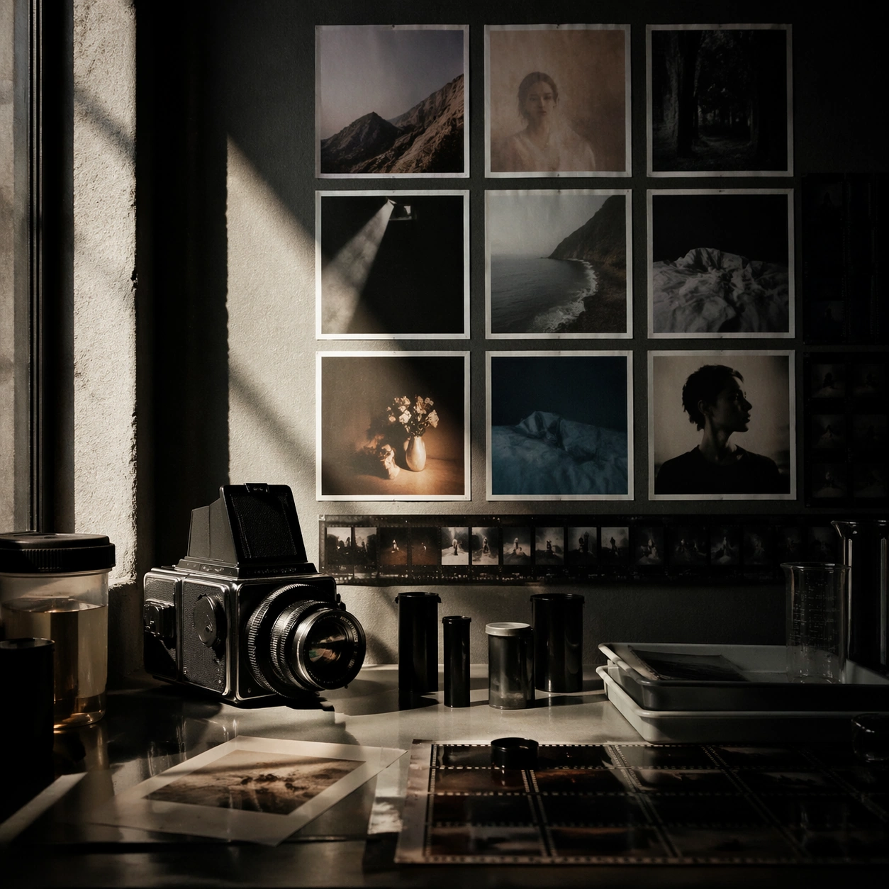
Example generated from “Film Photography Style Atlas — Side Light Study”
GPT Image 2en

Scene: A square photographic image with intentional lens choice, coherent light, and a subject that feels observed rather than merely decorated. Build the frame around a directional-light treatment that increases form and drama. Keep the lighting, camera distance, and spatial organization tuned for a high-signal research image rather than a casual snapshot. The image belongs to the Film Photography Style Atlas theme and should feel immediately legible as a prompt atlas theme for film photography style atlas, testing structured-layout, photorealism, style-transfer with gpt image 2.. Subject: Center the study on a directional-light treatment that increases form and drama. Translate the theme into a concrete visual statement instead of an abstract mood board: the viewer should understand what kind of image this is, what is being tested, and why the composition is difficult. Use the slug idea of film photography style atlas as a literal guide for subject matter, materials, and staging. If helpful, borrow the broad visual cues suggested by mm, Fujifilm Pro, Kodak Portra, CCD, Polaroid, Cyanotype, but keep the result original and specific to this study. Important details: The realism should come from timing, optics, and material response: atmosphere, contrast, depth, motion, and tiny physical cues all need to agree. Preserve a disciplined square composition, clear focal hierarchy, and enough secondary information to make the image feel complete rather than underspecified. The image should look polished, novel, and exhibition-ready, with topic-specific credibility coming from the way surfaces, structure, and visual language reinforce Film Photography Style Atlas. Avoid generic filler elements that do not serve the main concept. Use case: Film Photography Style Atlas single study 3/8, testing structured-layout, photorealism, style-transfer through the side light study variation. Constraints: No readable text, no watermark, no logos, preserve exact 1:1 aspect ratio, no watermark, no cheap HDR excess, no unreadable signage, no fake stock-photo posing, no compositing seams, no arbitrary lens flare.

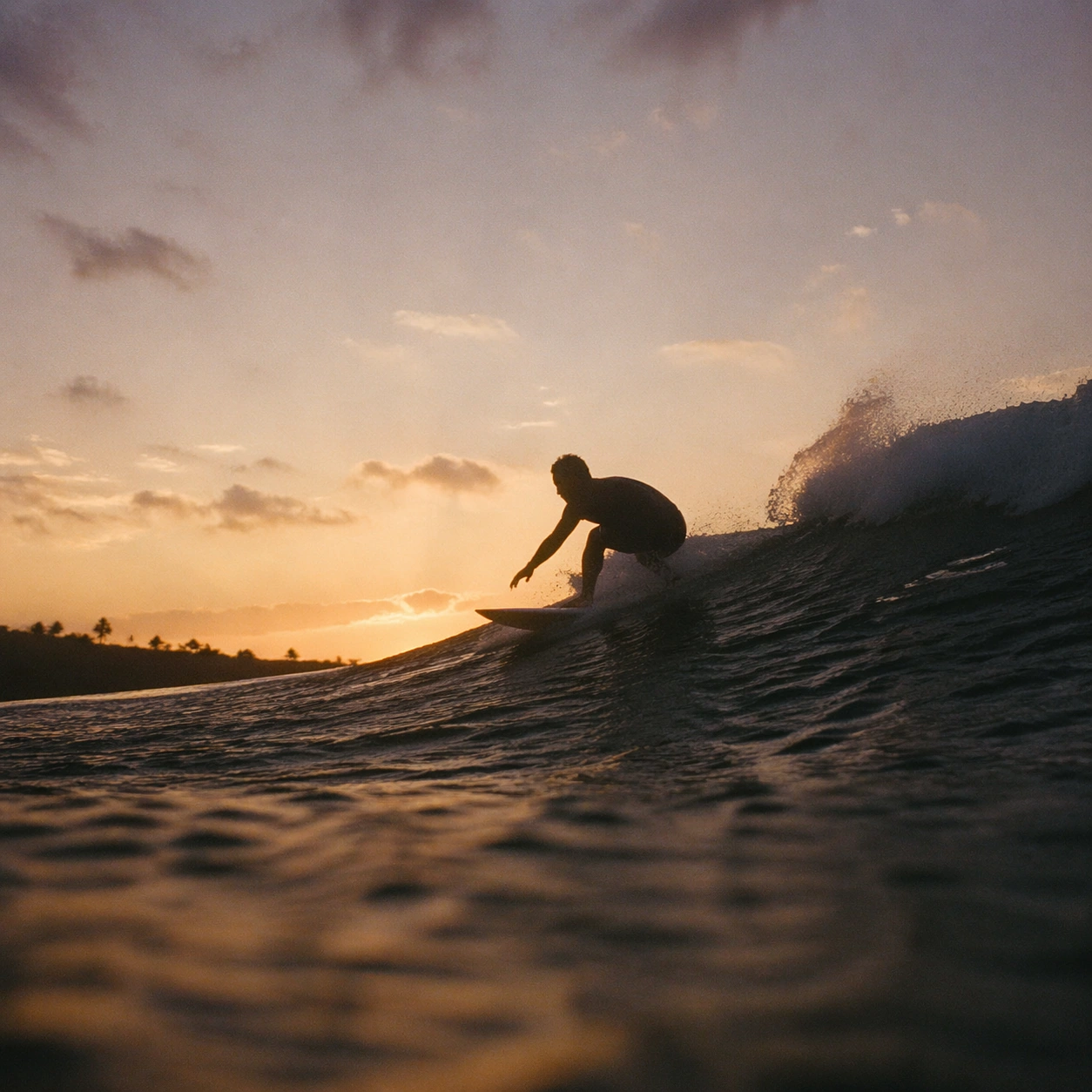
Example generated from “Film Photography Style Atlas — Motion Moment”
GPT Image 2en

Scene: A square photographic image with intentional lens choice, coherent light, and a subject that feels observed rather than merely decorated. Build the frame around a time-sensitive or kinetic phenomenon captured at the right instant. Keep the lighting, camera distance, and spatial organization tuned for a high-signal research image rather than a casual snapshot. The image belongs to the Film Photography Style Atlas theme and should feel immediately legible as a prompt atlas theme for film photography style atlas, testing structured-layout, photorealism, style-transfer with gpt image 2.. Subject: Center the study on a time-sensitive or kinetic phenomenon captured at the right instant. Translate the theme into a concrete visual statement instead of an abstract mood board: the viewer should understand what kind of image this is, what is being tested, and why the composition is difficult. Use the slug idea of film photography style atlas as a literal guide for subject matter, materials, and staging. If helpful, borrow the broad visual cues suggested by mm, Fujifilm Pro, Kodak Portra, CCD, Polaroid, Cyanotype, but keep the result original and specific to this study. Important details: The realism should come from timing, optics, and material response: atmosphere, contrast, depth, motion, and tiny physical cues all need to agree. Preserve a disciplined square composition, clear focal hierarchy, and enough secondary information to make the image feel complete rather than underspecified. The image should look polished, novel, and exhibition-ready, with topic-specific credibility coming from the way surfaces, structure, and visual language reinforce Film Photography Style Atlas. Avoid generic filler elements that do not serve the main concept. Use case: Film Photography Style Atlas single study 4/8, testing structured-layout, photorealism, style-transfer through the motion moment variation. Constraints: No readable text, no watermark, no logos, preserve exact 1:1 aspect ratio, no watermark, no cheap HDR excess, no unreadable signage, no fake stock-photo posing, no compositing seams, no arbitrary lens flare.

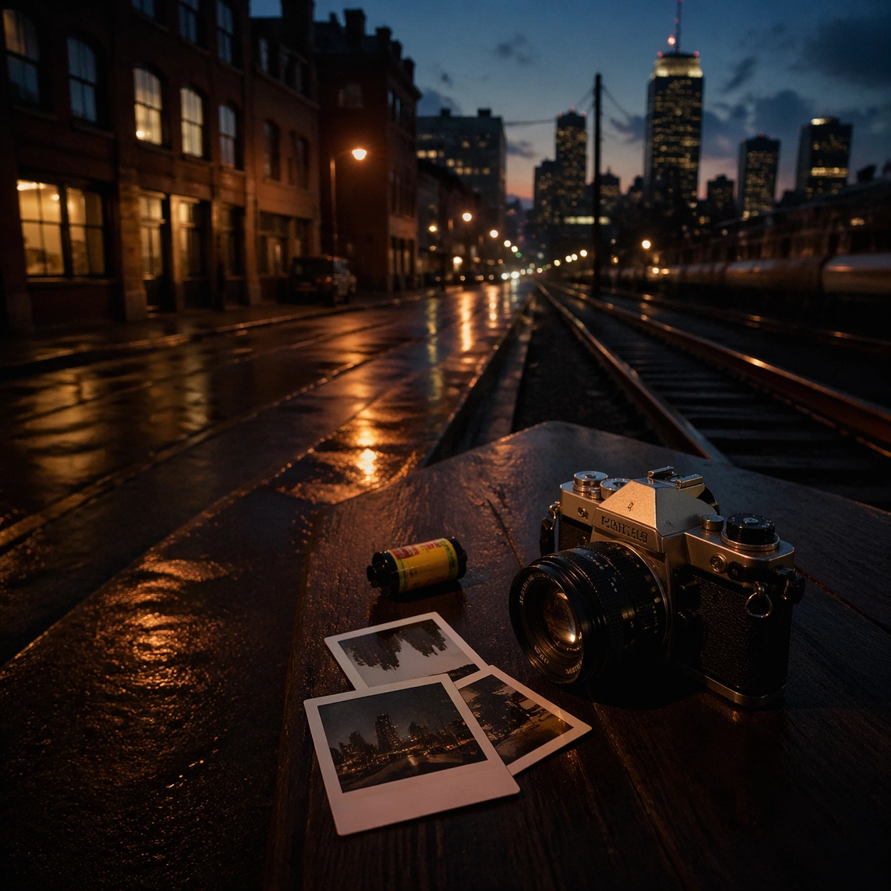
Example generated from “Film Photography Style Atlas — Low-Light Atlas”
GPT Image 2en

Scene: A square photographic image with intentional lens choice, coherent light, and a subject that feels observed rather than merely decorated. Build the frame around a dusk, night, or low-light frame with disciplined exposure. Keep the lighting, camera distance, and spatial organization tuned for a high-signal research image rather than a casual snapshot. The image belongs to the Film Photography Style Atlas theme and should feel immediately legible as a prompt atlas theme for film photography style atlas, testing structured-layout, photorealism, style-transfer with gpt image 2.. Subject: Center the study on a dusk, night, or low-light frame with disciplined exposure. Translate the theme into a concrete visual statement instead of an abstract mood board: the viewer should understand what kind of image this is, what is being tested, and why the composition is difficult. Use the slug idea of film photography style atlas as a literal guide for subject matter, materials, and staging. If helpful, borrow the broad visual cues suggested by mm, Fujifilm Pro, Kodak Portra, CCD, Polaroid, Cyanotype, but keep the result original and specific to this study. Important details: The realism should come from timing, optics, and material response: atmosphere, contrast, depth, motion, and tiny physical cues all need to agree. Preserve a disciplined square composition, clear focal hierarchy, and enough secondary information to make the image feel complete rather than underspecified. The image should look polished, novel, and exhibition-ready, with topic-specific credibility coming from the way surfaces, structure, and visual language reinforce Film Photography Style Atlas. Avoid generic filler elements that do not serve the main concept. Use case: Film Photography Style Atlas single study 5/8, testing structured-layout, photorealism, style-transfer through the low-light atlas variation. Constraints: No readable text, no watermark, no logos, preserve exact 1:1 aspect ratio, no watermark, no cheap HDR excess, no unreadable signage, no fake stock-photo posing, no compositing seams, no arbitrary lens flare.

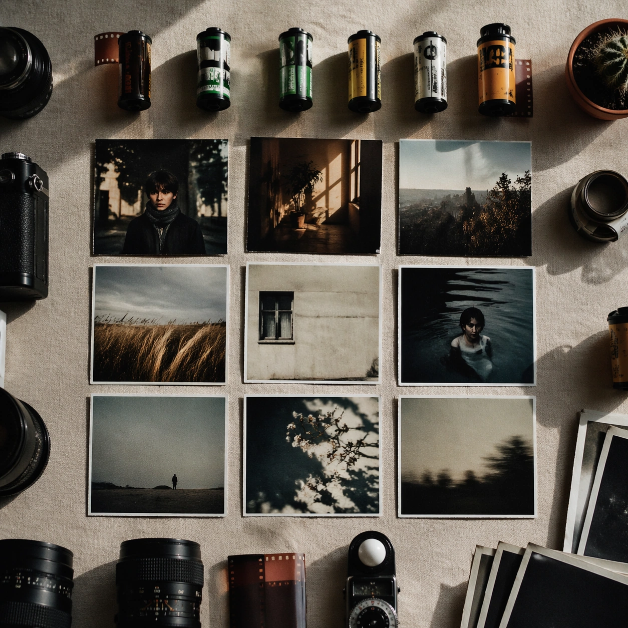
Example generated from “Film Photography Style Atlas — Specimen Table”
GPT Image 2en

Scene: A square photographic image with intentional lens choice, coherent light, and a subject that feels observed rather than merely decorated. Build the frame around a carefully arranged or comparative frame that still feels photographic. Keep the lighting, camera distance, and spatial organization tuned for a high-signal research image rather than a casual snapshot. The image belongs to the Film Photography Style Atlas theme and should feel immediately legible as a prompt atlas theme for film photography style atlas, testing structured-layout, photorealism, style-transfer with gpt image 2.. Subject: Center the study on a carefully arranged or comparative frame that still feels photographic. Translate the theme into a concrete visual statement instead of an abstract mood board: the viewer should understand what kind of image this is, what is being tested, and why the composition is difficult. Use the slug idea of film photography style atlas as a literal guide for subject matter, materials, and staging. If helpful, borrow the broad visual cues suggested by mm, Fujifilm Pro, Kodak Portra, CCD, Polaroid, Cyanotype, but keep the result original and specific to this study. Important details: The realism should come from timing, optics, and material response: atmosphere, contrast, depth, motion, and tiny physical cues all need to agree. Preserve a disciplined square composition, clear focal hierarchy, and enough secondary information to make the image feel complete rather than underspecified. The image should look polished, novel, and exhibition-ready, with topic-specific credibility coming from the way surfaces, structure, and visual language reinforce Film Photography Style Atlas. Avoid generic filler elements that do not serve the main concept. Use case: Film Photography Style Atlas single study 6/8, testing structured-layout, photorealism, style-transfer through the specimen table variation. Constraints: No readable text, no watermark, no logos, preserve exact 1:1 aspect ratio, no watermark, no cheap HDR excess, no unreadable signage, no fake stock-photo posing, no compositing seams, no arbitrary lens flare.

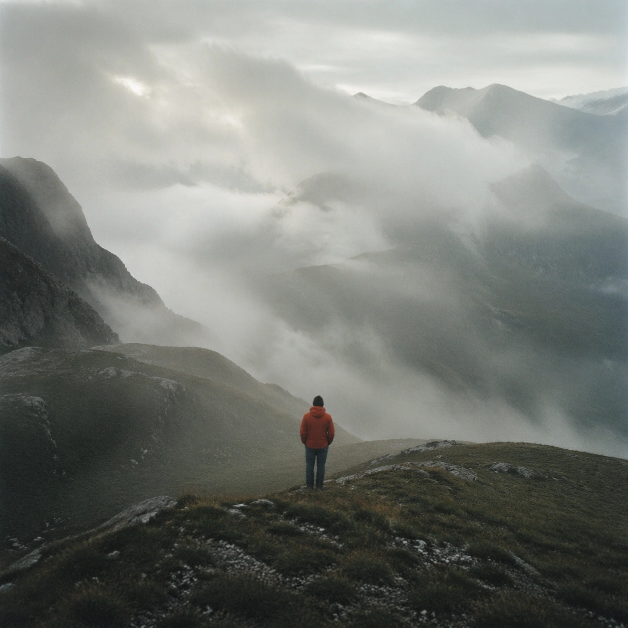
Example generated from “Film Photography Style Atlas — Atmospheric View”
GPT Image 2en

Scene: A square photographic image with intentional lens choice, coherent light, and a subject that feels observed rather than merely decorated. Build the frame around weather, haze, or volumetric light used to deepen realism. Keep the lighting, camera distance, and spatial organization tuned for a high-signal research image rather than a casual snapshot. The image belongs to the Film Photography Style Atlas theme and should feel immediately legible as a prompt atlas theme for film photography style atlas, testing structured-layout, photorealism, style-transfer with gpt image 2.. Subject: Center the study on weather, haze, or volumetric light used to deepen realism. Translate the theme into a concrete visual statement instead of an abstract mood board: the viewer should understand what kind of image this is, what is being tested, and why the composition is difficult. Use the slug idea of film photography style atlas as a literal guide for subject matter, materials, and staging. If helpful, borrow the broad visual cues suggested by mm, Fujifilm Pro, Kodak Portra, CCD, Polaroid, Cyanotype, but keep the result original and specific to this study. Important details: The realism should come from timing, optics, and material response: atmosphere, contrast, depth, motion, and tiny physical cues all need to agree. Preserve a disciplined square composition, clear focal hierarchy, and enough secondary information to make the image feel complete rather than underspecified. The image should look polished, novel, and exhibition-ready, with topic-specific credibility coming from the way surfaces, structure, and visual language reinforce Film Photography Style Atlas. Avoid generic filler elements that do not serve the main concept. Use case: Film Photography Style Atlas single study 7/8, testing structured-layout, photorealism, style-transfer through the atmospheric view variation. Constraints: No readable text, no watermark, no logos, preserve exact 1:1 aspect ratio, no watermark, no cheap HDR excess, no unreadable signage, no fake stock-photo posing, no compositing seams, no arbitrary lens flare.

Example generated from “Film Photography Style Atlas — Signature Frame”
GPT Image 2en

Scene: A square photographic image with intentional lens choice, coherent light, and a subject that feels observed rather than merely decorated. Build the frame around the most memorable final image for the topic. Keep the lighting, camera distance, and spatial organization tuned for a high-signal research image rather than a casual snapshot. The image belongs to the Film Photography Style Atlas theme and should feel immediately legible as a prompt atlas theme for film photography style atlas, testing structured-layout, photorealism, style-transfer with gpt image 2.. Subject: Center the study on the most memorable final image for the topic. Translate the theme into a concrete visual statement instead of an abstract mood board: the viewer should understand what kind of image this is, what is being tested, and why the composition is difficult. Use the slug idea of film photography style atlas as a literal guide for subject matter, materials, and staging. If helpful, borrow the broad visual cues suggested by mm, Fujifilm Pro, Kodak Portra, CCD, Polaroid, Cyanotype, but keep the result original and specific to this study. Important details: The realism should come from timing, optics, and material response: atmosphere, contrast, depth, motion, and tiny physical cues all need to agree. Preserve a disciplined square composition, clear focal hierarchy, and enough secondary information to make the image feel complete rather than underspecified. The image should look polished, novel, and exhibition-ready, with topic-specific credibility coming from the way surfaces, structure, and visual language reinforce Film Photography Style Atlas. Avoid generic filler elements that do not serve the main concept. Use case: Film Photography Style Atlas single study 8/8, testing structured-layout, photorealism, style-transfer through the signature frame variation. Constraints: No readable text, no watermark, no logos, preserve exact 1:1 aspect ratio, no watermark, no cheap HDR excess, no unreadable signage, no fake stock-photo posing, no compositing seams, no arbitrary lens flare.

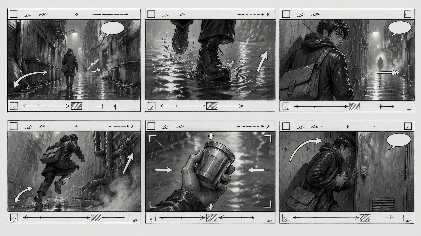
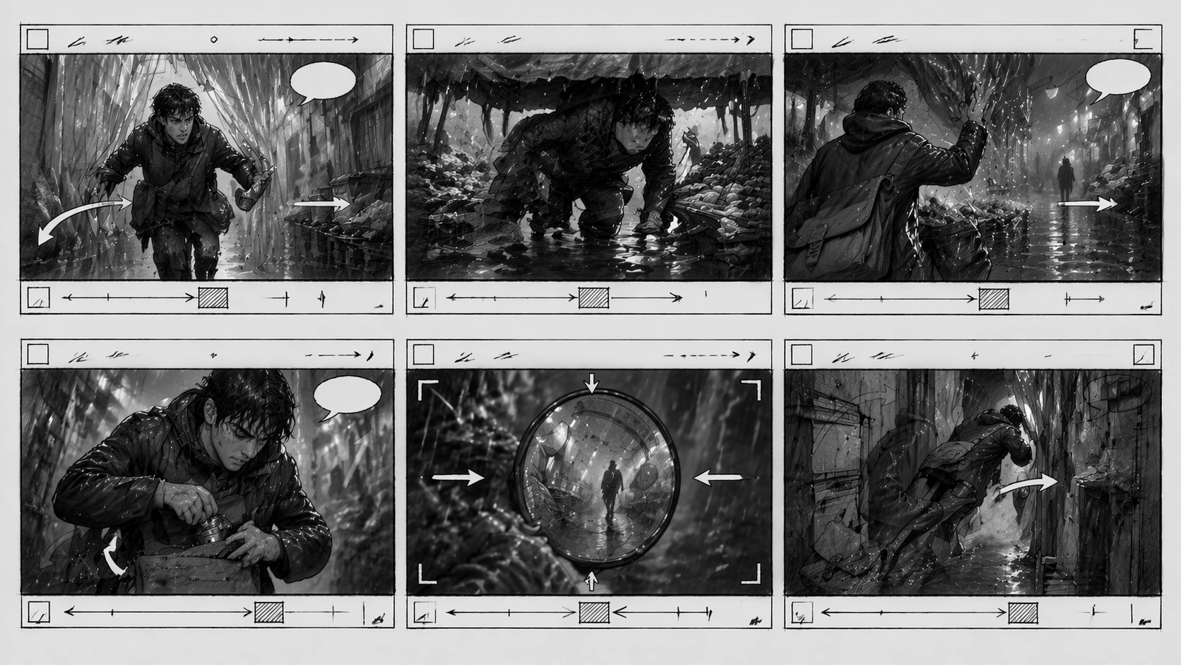
Example generated from “Film Storyboard Sequence — Reference Alley Board”
GPT Image 2en

Scene: A horizontal 16:9 production storyboard sheet drawn in graphite pencil and light gray marker wash, arranged as six equal cinematic panels in a clean 2 by 3 grid. Each panel has a small header strip with unreadable production scribbles, a lower notes band with abstract timing blocks, and clear camera-movement arrows. The page should look like a director's practical handoff board: paper texture, smudged pencil edges, ruler-straight gutters, and no readable words. Subject: A rain-soaked night alley sequence establishes one protagonist: a young courier in a dark hooded coat, messenger bag, wet hair visible under the hood, and a small metal film canister gripped in one hand. Six frames show a coherent beat: wide alley entrance, close-up of boots splashing, over-shoulder glance at a distant silhouette, low-angle sprint past pipes, insert shot of the canister, and final frame where the courier ducks behind a metal door. Rain, reflections, steam, and streetlight halos tie the panels together. Important details: This is the reference image for the series. Establish the protagonist, coat shape, messenger bag, canister, rainy alley geometry, pencil style, panel format, arrows, blank speech balloons, and abstract production notation. Arrows should imply pan, dolly, zoom, tilt, and character movement without readable labels. Keep action continuity believable and materials clear: wet pavement, metal door, cloth coat, water spray, and soft pencil hatching. Use case: Film Storyboard Sequence series study 1/8, establishing the rain-alley character, prop, and six-panel storyboard language. Constraints: No readable text, no watermark, no logos, preserve exact 16:9 horizontal aspect ratio, no printed captions, no legible shot codes, no broken panel grid, no extra main characters, no full-color comic rendering.

Example generated from “Film Storyboard Sequence — Market Pursuit Board”
GPT Image 2en

Scene: A horizontal 16:9 pencil-and-gray-marker storyboard sheet using the same six-panel 2 by 3 grid language as the reference image. The page has crisp gutters, paper grain, abstract header scribbles, blank lower notes bands, camera arrows, movement arrows, and a few empty speech balloons. The setting shifts from the alley into a covered night market under rain tarps, but the production-board style must remain identical. Subject: Use the reference as the primary guide for the same hooded courier, dark coat, messenger bag, wet hair, and small metal film canister. The six frames continue the pursuit: the courier bursts through plastic strip curtains, slides under a vegetable stall awning, knocks water from hanging tarps, hides the canister under the bag flap, spots the distant silhouette in a mirror, and dives into a narrow service passage. Vendors and shoppers appear only as rough background silhouettes, not new main characters. Important details: Preserve the protagonist identity, prop, rain physics, pencil linework, panel structure, arrow style, and unreadable production notation from image 01. The board should show coherent screen direction and camera logic: one panel for tracking movement, one for insert detail, one for reaction, one for overhead blocking, one for obstructed view, and one exit beat. Material behavior matters: wet plastic tarp, puddles, vegetable crates, steam, cloth coat, and metal canister reflections. Use case: Film Storyboard Sequence series study 2/8, testing continuity of character, prop, and storyboard language in a market-pursuit extension. Constraints: No readable text, no watermark, no logos, preserve exact 16:9 horizontal aspect ratio, no legible labels, no brand signs, no broken six-panel grid, no changed protagonist outfit, no full-color comic style.

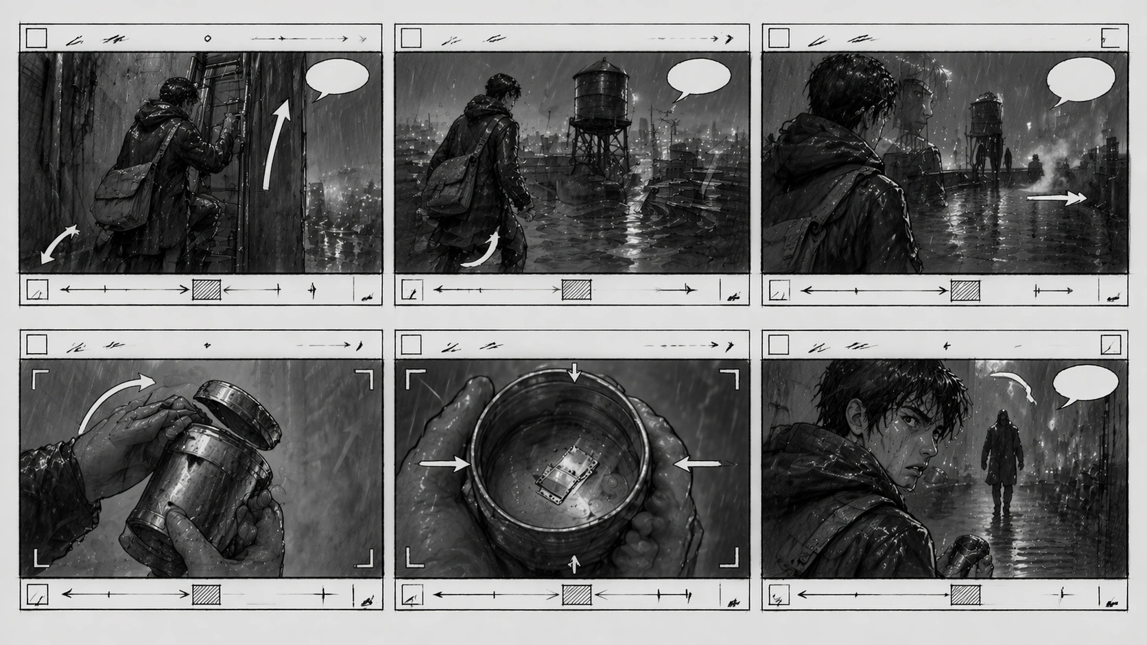
Example generated from “Film Storyboard Sequence — Rooftop Reveal Board”
GPT Image 2en

Scene: A horizontal 16:9 graphite storyboard sheet in the same six-panel 2 by 3 grid format as the reference, with ruler-straight gutters, header strips of unreadable pencil marks, blank notes bands, camera arrows, character-path arrows, and paper texture. The setting moves to a wet rooftop above the alley district, with rainwater tanks, antennas, low parapets, and city glow rendered in monochrome pencil wash. Subject: Use the reference as the primary guide for the same hooded courier, messenger bag, wet coat silhouette, and metal film canister. Six frames show a reveal sequence: the courier climbs a fire ladder, emerges onto the rooftop, sees the distant silhouette waiting near a water tank, opens the canister in a close insert, discovers a tiny reflective strip inside, and realizes the silhouette is closer in the final over-shoulder panel. The antagonist stays a vague recurring silhouette, never a detailed new protagonist. Important details: Preserve visual continuity from image 01: same character design, same pencil storyboard style, same notes bands, same arrow grammar, same rainy material logic. The board should demonstrate professional shot progression: vertical climb, wide establishing rooftop, compressed telephoto reveal, insert of canister, reaction close-up, and suspenseful over-shoulder setup. Rain must behave believably on metal, concrete, cloth, and paper-like pencil shading. Keep notation marks graphic but not readable. Use case: Film Storyboard Sequence series study 3/8, testing continuity and suspense blocking in a rooftop reveal board. Constraints: No readable text, no watermark, no logos, preserve exact 16:9 horizontal aspect ratio, no legible shot codes, no brand signage, no broken panel layout, no changed courier design, no polished full-color frames.

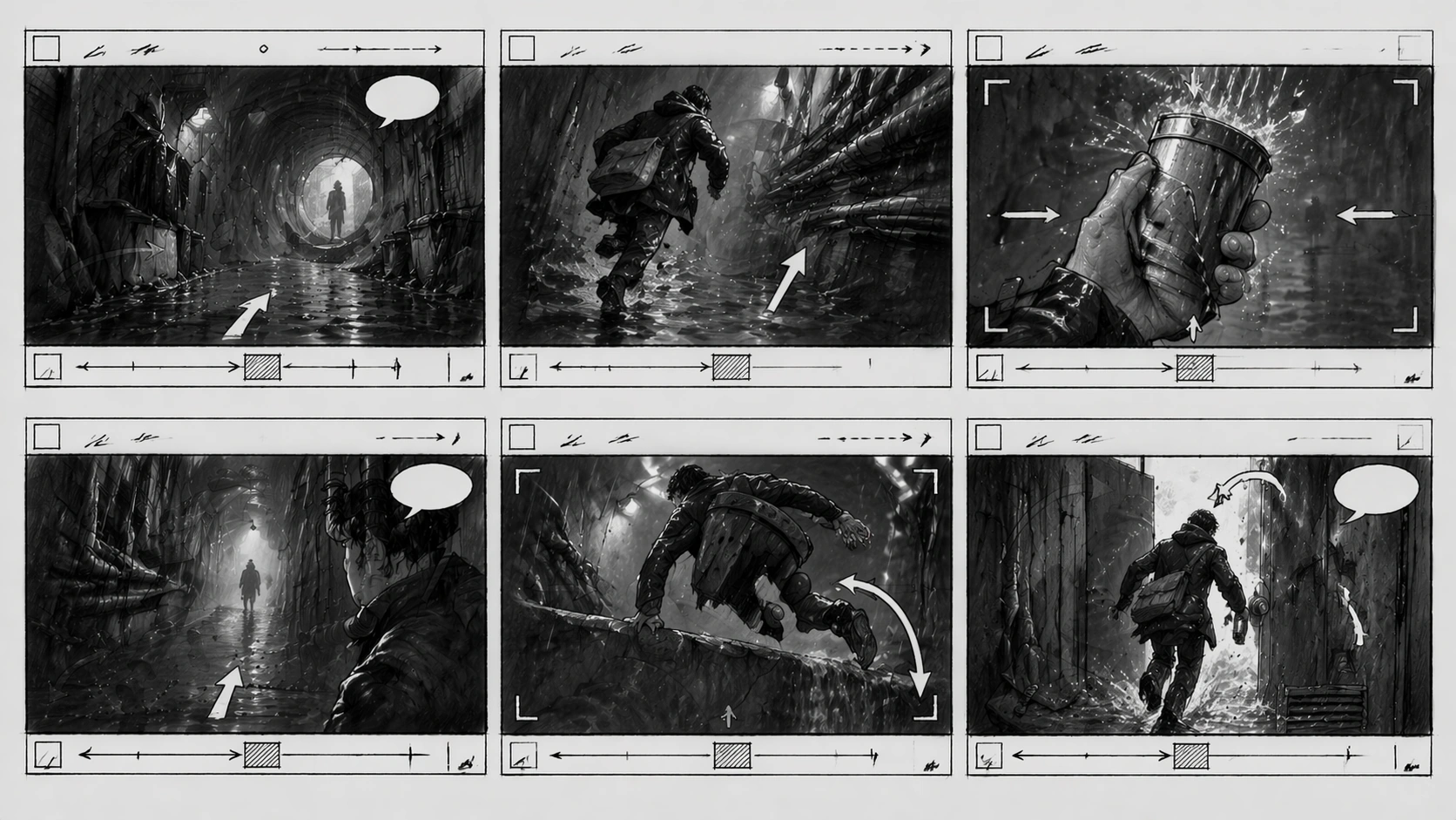
Example generated from “Film Storyboard Sequence — Tunnel Escape Board”
GPT Image 2en

Scene: A horizontal 16:9 production storyboard sheet matching the reference image's six-panel 2 by 3 pencil layout, with straight gutters, gray marker wash, header strips of abstract scribbles, lower notes bands, camera arrows, movement arrows, and blank speech balloons. The sequence moves into a service tunnel below the city, lit by dim maintenance lamps and rainwater runoff, still drawn as rough but professional film-prep art. Subject: Use the reference as the primary guide for the same hooded courier, messenger bag, wet coat, and metal film canister. Six frames complete the escape beat: low wide view of the tunnel entrance, handheld-feeling run along pipes, insert of water splashing over the canister, silhouette blocking the far end, courier vaulting a low barrier, and final frame where a maintenance door swings open into bright backlight. The recurring antagonist remains a shape and shadow, preserving focus on the courier. Important details: Preserve identity, prop, linework, panel sizing, arrow style, and unreadable notes from image 01. The board should clearly communicate camera intent without legible labels: push-in arrow, pan arc, character path, insert frame box, and cutaway emphasis. Material physics should be convincing in pencil: wet concrete, dripping pipes, rubber soles, metal canister, cloth folds, and backlit spray. The six frames must read as one continuous escape, not disconnected illustrations. Use case: Film Storyboard Sequence series study 4/8, testing storyboard continuity through a tunnel escape finale. Constraints: No readable text, no watermark, no logos, preserve exact 16:9 horizontal aspect ratio, no legible production labels, no extra main characters, no broken gutters, no changed courier outfit, no glossy comic coloring.

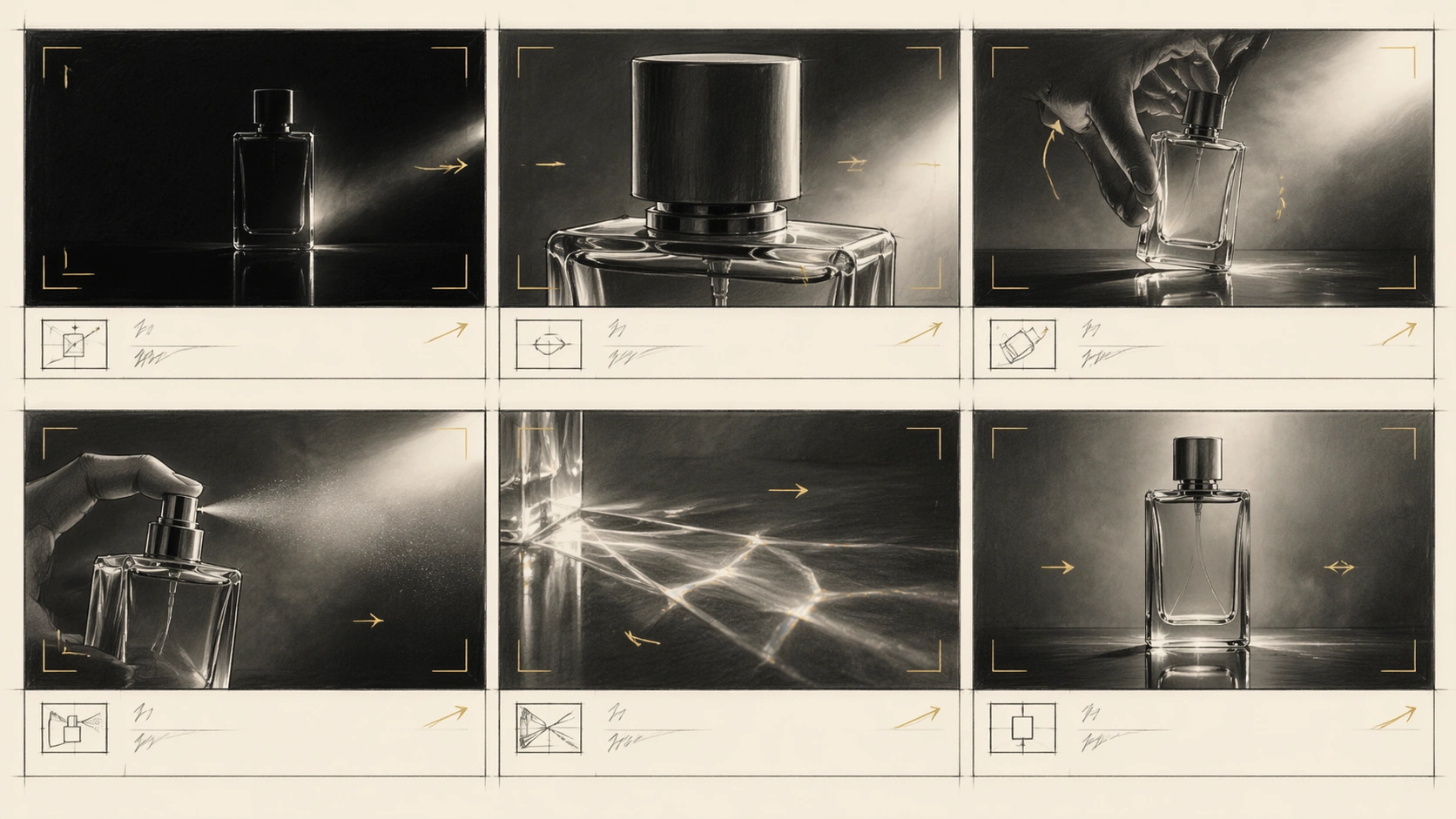
Example generated from “Film Storyboard Sequence — Perfume Caustic Mockup”
GPT Image 2en

Scene: A horizontal 16:9 premium product storyboard sheet in graphite pencil, warm gray marker, and minimal gold wash, arranged as six equal panels with precise gutters. Each cell has camera arrows, lens-framing brackets, blank note bands, and unreadable shorthand marks. The board visualizes a perfume commercial on a dark reflective table with one unbranded glass bottle, hard side light, mist, and optical caustics. Subject: Six frames describe the commercial beat: black frame opening to a rim-lit bottle silhouette, macro push toward the cap, hand lifting the bottle, atomizer mist catching light, prism-like caustic patterns moving across the table, and final hero shot of the bottle centered against soft haze. The bottle is elegant but generic: clear rectangular glass, plain cap, no label, no logo, no readable engraving. The hand model appears only where needed for scale. Important details: The sheet should read as a commercial-mockup storyboard rather than a finished ad. Keep the six-panel sequence coherent, with consistent bottle proportions, light source direction, table reflection, and camera grammar. Camera movement arrows should imply push-in, rack focus, tilt, and light sweep without readable labels. Material accuracy matters: glass thickness, refraction, specular edges, atomized mist, caustic shapes, and reflection falloff. Preserve pencil hand-drawn texture and production-board hierarchy. Use case: Film Storyboard Sequence single study 6/8, an independent product-commercial storyboard testing glass optics and shot planning. Constraints: No readable text, no watermark, no logos, preserve exact 16:9 horizontal aspect ratio, no brand label, no legible bottle engraving, no broken panel gutters, no random extra products, no glossy finished poster style.

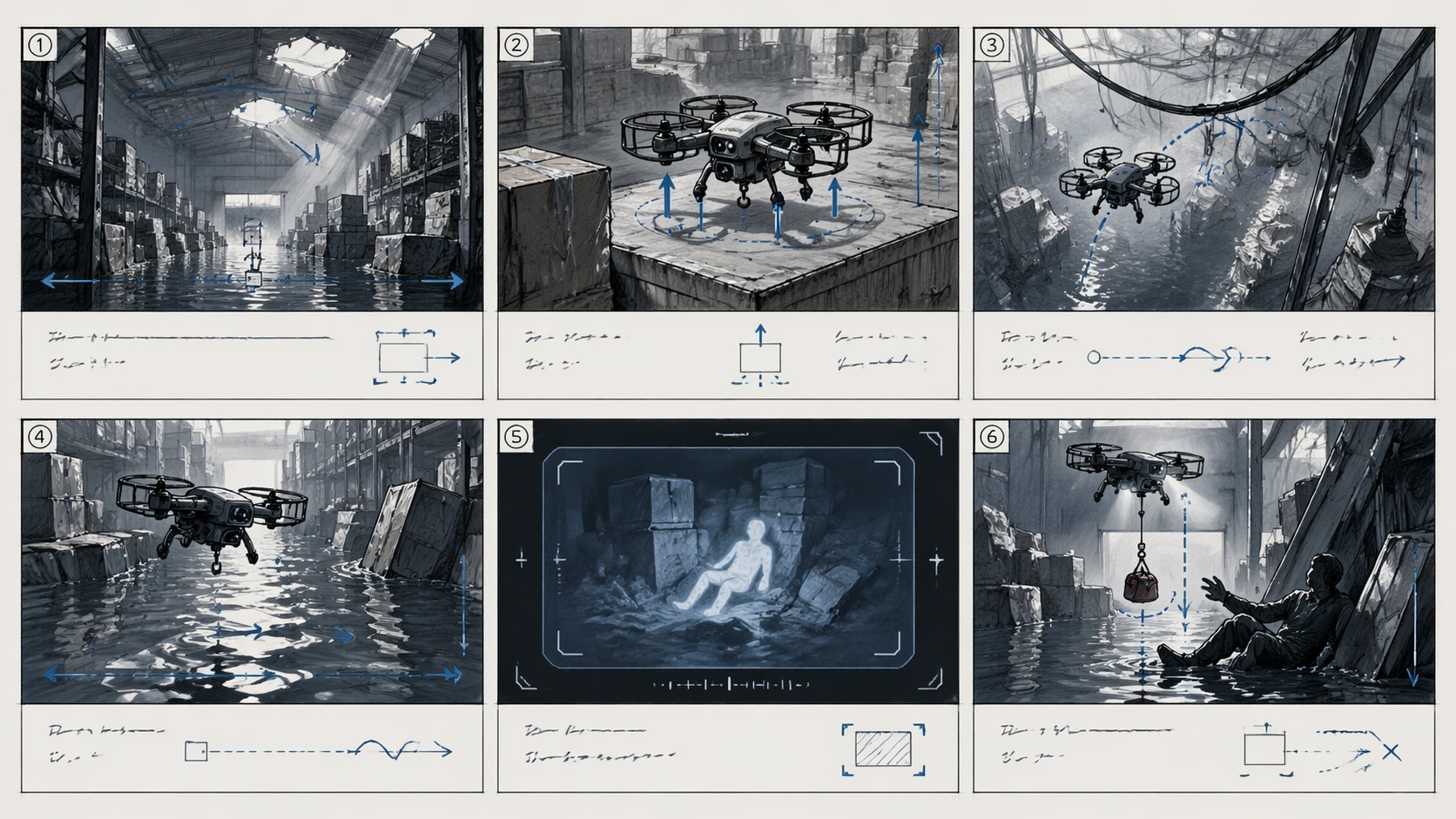
Example generated from “Film Storyboard Sequence — Rescue Drone Warehouse”
GPT Image 2en

Scene: A horizontal 16:9 technical storyboard sheet drawn in pencil, blue-gray marker, and faint construction-line overlays. Six equal panels sit in a 2 by 3 grid with clean gutters, blank note bands, unreadable technical shorthand, camera arrows, altitude arrows, and path arcs. The setting is a dim warehouse after a flood, with stacked crates, shallow water, broken skylight beams, and a small rescue drone navigating the space. Subject: The six panels plan a rescue-drone sequence: wide warehouse establishing shot, drone lifting from a dry platform, overhead path around hanging cables, low tracking shot above floodwater, camera insert showing a heat-signature-like abstract shape with no readable UI, and final panel where the drone drops a small emergency pouch near a trapped worker silhouette. The drone is compact, unbranded, and mechanically plausible, with four rotors, cage guards, sensor pod, and light payload hook. Important details: This board must combine cinematic planning with technical-diagram clarity. Use arrows to show drone movement, camera pan, altitude change, and payload drop, but keep all labels unreadable. Physics and materials matter: rotor wash rippling water, reflected lights, damp cardboard, cable sag, metal shelving, and pouch swing. Maintain consistent drone scale and path logic across all panels. The worker remains a background silhouette; the drone and blocking are the main subject. Use case: Film Storyboard Sequence single study 7/8, an independent technical action storyboard for drone blocking and flood materials. Constraints: No readable text, no watermark, no logos, preserve exact 16:9 horizontal aspect ratio, no brand marks, no legible UI, no broken six-panel grid, no impossible drone scale, no sci-fi weaponry, no extra rescue vehicles.

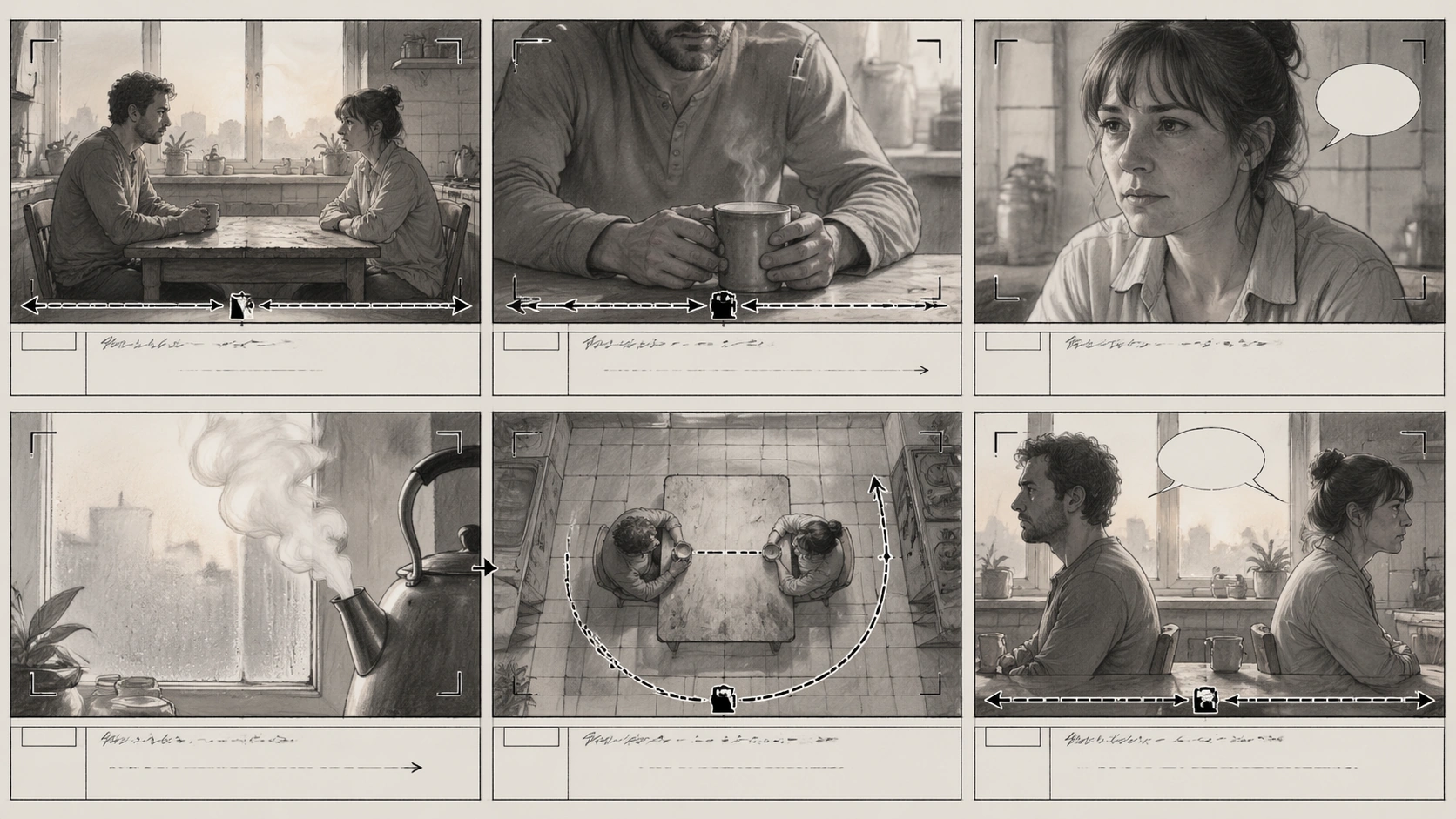
Example generated from “Film Storyboard Sequence — Kitchen Dolly Drama”
GPT Image 2en

Scene: A horizontal 16:9 drama storyboard sheet in soft graphite pencil and warm gray wash, arranged as six equal panels in a strict 2 by 3 grid. Each panel has blank notes bands, unreadable shorthand, camera arrows, focus brackets, and occasional empty dialogue balloons. The setting is a small apartment kitchen at dawn, with window light, tiled backsplash, steam from a kettle, a table, two chairs, and domestic clutter rendered with quiet realism. Subject: Two adult characters are staged for a tense conversation without readable dialogue. The six panels show cinematic blocking: wide two-shot across the table, slow dolly toward one character's hands around a mug, reverse close-up of the other character holding back emotion, insert of steam twisting in window light, overhead diagram-like panel showing chair positions and camera path, and final profile two-shot with emotional distance. The characters remain consistent in clothing, posture, and relative position. Important details: The board should demonstrate production-ready camera language: dolly path, shot-reverse-shot planning, insert timing, overhead blocking, and final composition. Arrows and focus brackets should be clear but not labeled with readable words. Materials should feel believable in pencil: ceramic mug, steam, condensation on window glass, worn table surface, cotton shirt folds, and soft morning shadows. Keep the grid clean and the emotional storytelling legible without text. Use case: Film Storyboard Sequence single study 8/8, an independent kitchen drama board testing shot grammar and restrained production layout. Constraints: No readable text, no watermark, no logos, preserve exact 16:9 horizontal aspect ratio, no legible dialogue, no brand objects, no broken grid, no extra characters, no inconsistent kitchen layout, no glossy comic color.

Example generated from “Finance App Trust And Clarity Interfaces — Reference Anchor”
GPT Image 2en

Scene: Create a square reference image for Finance App Trust and Clarity Interfaces. Build a reference anchor establishing the core system with a premium, production-ready finish. Use a polished modular board or campaign surface with clean spacing, premium game-UI finish, and clear focal hierarchy. The composition should feel intentional, clean, and reusable for gallery, research, campaign, or internal handoff contexts. Lighting must support readability first, with the main forms clearly separated from the background and enough breathing room for the system to stay legible at both hero scale and thumbnail scale. Subject: Center a coherent original game-art system built for premium production and marketing surfaces. For this image, focus on reference anchor. Keep the same system logic stable across screenshots, cards, banners, and overview boards. This image is the canonical anchor that later series images must follow. The viewer should immediately understand what role this surface plays inside a cohesive game-production asset pack. Important details: Lock framing, icon grammar, palette blocking, and surface hierarchy so the kit feels production-ready and consistent. Preserve the core silhouette, framing language, and material logic from the reference image while each variation changes function. Keep materials believable, edge hierarchy disciplined, and the visual language consistent with Finance UI. Use abstract interface blocks or diagram accents when helpful, but avoid any readable language. The final result should feel like a deliberate production asset rather than a random illustration. Use case: Finance App Trust and Clarity Interfaces series study 1/9, designed as reference anchor within a cohesive asset pack. Constraints: No readable text, no watermark, no logos, preserve exact 1:1 aspect ratio, no unrelated objects, no broken visual hierarchy, no malformed anatomy or broken perspective, no random decorative clutter.

Example generated from “Finance App Trust And Clarity Interfaces — Variant One”
GPT Image 2en

Scene: Create a square dependent image for Finance App Trust and Clarity Interfaces. Build a first controlled variation in the same system with a premium, production-ready finish. Use a polished modular board or campaign surface with clean spacing, premium game-UI finish, and clear focal hierarchy. The composition should feel intentional, clean, and reusable for gallery, research, campaign, or internal handoff contexts. Lighting must support readability first, with the main forms clearly separated from the background and enough breathing room for the system to stay legible at both hero scale and thumbnail scale. Subject: Center a coherent original game-art system built for premium production and marketing surfaces. For this image, focus on the intended support surface. Keep the same system logic stable across screenshots, cards, banners, and overview boards. Preserve exact identity or system logic from the reference image while changing only the intended variation axis. The viewer should immediately understand what role this surface plays inside a cohesive game-production asset pack. Important details: Lock framing, icon grammar, palette blocking, and surface hierarchy so the kit feels production-ready and consistent. Preserve the core silhouette, framing language, and material logic from the reference image while each variation changes function. Keep materials believable, edge hierarchy disciplined, and the visual language consistent with Finance UI. Use abstract interface blocks or diagram accents when helpful, but avoid any readable language. The final result should feel like a deliberate production asset rather than a random illustration. Use case: Finance App Trust and Clarity Interfaces series study 2/9, designed as variant one within a cohesive asset pack. Constraints: No readable text, no watermark, no logos, preserve exact 1:1 aspect ratio, no unrelated objects, no broken visual hierarchy, no malformed anatomy or broken perspective, no random decorative clutter.

Example generated from “Finance App Trust And Clarity Interfaces — Variant Two”
GPT Image 2en

Scene: Create a square dependent image for Finance App Trust and Clarity Interfaces. Build a second controlled variation in the same system with a premium, production-ready finish. Use a polished modular board or campaign surface with clean spacing, premium game-UI finish, and clear focal hierarchy. The composition should feel intentional, clean, and reusable for gallery, research, campaign, or internal handoff contexts. Lighting must support readability first, with the main forms clearly separated from the background and enough breathing room for the system to stay legible at both hero scale and thumbnail scale. Subject: Center a coherent original game-art system built for premium production and marketing surfaces. For this image, focus on the intended support surface. Keep the same system logic stable across screenshots, cards, banners, and overview boards. Preserve exact identity or system logic from the reference image while changing only the intended variation axis. The viewer should immediately understand what role this surface plays inside a cohesive game-production asset pack. Important details: Lock framing, icon grammar, palette blocking, and surface hierarchy so the kit feels production-ready and consistent. Preserve the core silhouette, framing language, and material logic from the reference image while each variation changes function. Keep materials believable, edge hierarchy disciplined, and the visual language consistent with Finance UI. Use abstract interface blocks or diagram accents when helpful, but avoid any readable language. The final result should feel like a deliberate production asset rather than a random illustration. Use case: Finance App Trust and Clarity Interfaces series study 3/9, designed as variant two within a cohesive asset pack. Constraints: No readable text, no watermark, no logos, preserve exact 1:1 aspect ratio, no unrelated objects, no broken visual hierarchy, no malformed anatomy or broken perspective, no random decorative clutter.

Example generated from “Finance App Trust And Clarity Interfaces — Variant Three”
GPT Image 2en

Scene: Create a square dependent image for Finance App Trust and Clarity Interfaces. Build a third controlled variation in the same system with a premium, production-ready finish. Use a polished modular board or campaign surface with clean spacing, premium game-UI finish, and clear focal hierarchy. The composition should feel intentional, clean, and reusable for gallery, research, campaign, or internal handoff contexts. Lighting must support readability first, with the main forms clearly separated from the background and enough breathing room for the system to stay legible at both hero scale and thumbnail scale. Subject: Center a coherent original game-art system built for premium production and marketing surfaces. For this image, focus on the intended support surface. Keep the same system logic stable across screenshots, cards, banners, and overview boards. Preserve exact identity or system logic from the reference image while changing only the intended variation axis. The viewer should immediately understand what role this surface plays inside a cohesive game-production asset pack. Important details: Lock framing, icon grammar, palette blocking, and surface hierarchy so the kit feels production-ready and consistent. Preserve the core silhouette, framing language, and material logic from the reference image while each variation changes function. Keep materials believable, edge hierarchy disciplined, and the visual language consistent with Finance UI. Use abstract interface blocks or diagram accents when helpful, but avoid any readable language. The final result should feel like a deliberate production asset rather than a random illustration. Use case: Finance App Trust and Clarity Interfaces series study 4/9, designed as variant three within a cohesive asset pack. Constraints: No readable text, no watermark, no logos, preserve exact 1:1 aspect ratio, no unrelated objects, no broken visual hierarchy, no malformed anatomy or broken perspective, no random decorative clutter.

Example generated from “Finance App Trust And Clarity Interfaces — Support One”
GPT Image 2en

Scene: Create a square standalone support image for Finance App Trust and Clarity Interfaces. Build a support-surface study with a clear focal hierarchy and a finished professional surface. Use a polished modular board or campaign surface with clean spacing, premium game-UI finish, and clear focal hierarchy. The frame should feel self-contained and polished, with enough structure to explain the system even without the reference series, yet still obviously belonging to the same theme and production world. Subject: Show a coherent original game-art system built for premium production and marketing surfaces in a way that emphasizes the intended support surface. Keep the same system logic stable across screenshots, cards, banners, and overview boards. Even though this image is independent, the viewer should still recognize the same universe, same commercial logic, and same production intent as the core package. Important details: Lock framing, icon grammar, palette blocking, and surface hierarchy so the kit feels production-ready and consistent. Preserve the broader theme language through color, framing, material choices, and modular composition. Use clean panel rhythm, premium asset presentation, and believable detail density. The image should work equally well as a gallery study, research reference, and mock production deliverable. Use case: Finance App Trust and Clarity Interfaces single study 5/9, exploring support one as a support surface. Constraints: No readable text, no watermark, no logos, preserve exact 1:1 aspect ratio, no unrelated objects, no broken visual hierarchy, no visual noise that obscures the main surface, no accidental brand resemblance.

Example generated from “Finance App Trust And Clarity Interfaces — Support Two”
GPT Image 2en

Scene: Create a square standalone support image for Finance App Trust and Clarity Interfaces. Build a second support-surface study with a clear focal hierarchy and a finished professional surface. Use a polished modular board or campaign surface with clean spacing, premium game-UI finish, and clear focal hierarchy. The frame should feel self-contained and polished, with enough structure to explain the system even without the reference series, yet still obviously belonging to the same theme and production world. Subject: Show a coherent original game-art system built for premium production and marketing surfaces in a way that emphasizes the intended support surface. Keep the same system logic stable across screenshots, cards, banners, and overview boards. Even though this image is independent, the viewer should still recognize the same universe, same commercial logic, and same production intent as the core package. Important details: Lock framing, icon grammar, palette blocking, and surface hierarchy so the kit feels production-ready and consistent. Preserve the broader theme language through color, framing, material choices, and modular composition. Use clean panel rhythm, premium asset presentation, and believable detail density. The image should work equally well as a gallery study, research reference, and mock production deliverable. Use case: Finance App Trust and Clarity Interfaces single study 6/9, exploring support two as a support surface. Constraints: No readable text, no watermark, no logos, preserve exact 1:1 aspect ratio, no unrelated objects, no broken visual hierarchy, no visual noise that obscures the main surface, no accidental brand resemblance.

Example generated from “Finance App Trust And Clarity Interfaces — Support Three”
GPT Image 2en

Scene: Create a square standalone support image for Finance App Trust and Clarity Interfaces. Build a third support-surface study with a clear focal hierarchy and a finished professional surface. Use a polished modular board or campaign surface with clean spacing, premium game-UI finish, and clear focal hierarchy. The frame should feel self-contained and polished, with enough structure to explain the system even without the reference series, yet still obviously belonging to the same theme and production world. Subject: Show a coherent original game-art system built for premium production and marketing surfaces in a way that emphasizes the intended support surface. Keep the same system logic stable across screenshots, cards, banners, and overview boards. Even though this image is independent, the viewer should still recognize the same universe, same commercial logic, and same production intent as the core package. Important details: Lock framing, icon grammar, palette blocking, and surface hierarchy so the kit feels production-ready and consistent. Preserve the broader theme language through color, framing, material choices, and modular composition. Use clean panel rhythm, premium asset presentation, and believable detail density. The image should work equally well as a gallery study, research reference, and mock production deliverable. Use case: Finance App Trust and Clarity Interfaces single study 7/9, exploring support three as a support surface. Constraints: No readable text, no watermark, no logos, preserve exact 1:1 aspect ratio, no unrelated objects, no broken visual hierarchy, no visual noise that obscures the main surface, no accidental brand resemblance.

Example generated from “Finance App Trust And Clarity Interfaces — Support Four”
GPT Image 2en

Scene: Create a square standalone support image for Finance App Trust and Clarity Interfaces. Build a fourth support-surface study with a clear focal hierarchy and a finished professional surface. Use a polished modular board or campaign surface with clean spacing, premium game-UI finish, and clear focal hierarchy. The frame should feel self-contained and polished, with enough structure to explain the system even without the reference series, yet still obviously belonging to the same theme and production world. Subject: Show a coherent original game-art system built for premium production and marketing surfaces in a way that emphasizes the intended support surface. Keep the same system logic stable across screenshots, cards, banners, and overview boards. Even though this image is independent, the viewer should still recognize the same universe, same commercial logic, and same production intent as the core package. Important details: Lock framing, icon grammar, palette blocking, and surface hierarchy so the kit feels production-ready and consistent. Preserve the broader theme language through color, framing, material choices, and modular composition. Use clean panel rhythm, premium asset presentation, and believable detail density. The image should work equally well as a gallery study, research reference, and mock production deliverable. Use case: Finance App Trust and Clarity Interfaces single study 8/9, exploring support four as a support surface. Constraints: No readable text, no watermark, no logos, preserve exact 1:1 aspect ratio, no unrelated objects, no broken visual hierarchy, no visual noise that obscures the main surface, no accidental brand resemblance.

Example generated from “Finance App Trust And Clarity Interfaces — Support Five”
GPT Image 2en

Scene: Create a square standalone support image for Finance App Trust and Clarity Interfaces. Build a fifth support-surface study with a clear focal hierarchy and a finished professional surface. Use a polished modular board or campaign surface with clean spacing, premium game-UI finish, and clear focal hierarchy. The frame should feel self-contained and polished, with enough structure to explain the system even without the reference series, yet still obviously belonging to the same theme and production world. Subject: Show a coherent original game-art system built for premium production and marketing surfaces in a way that emphasizes the intended support surface. Keep the same system logic stable across screenshots, cards, banners, and overview boards. Even though this image is independent, the viewer should still recognize the same universe, same commercial logic, and same production intent as the core package. Important details: Lock framing, icon grammar, palette blocking, and surface hierarchy so the kit feels production-ready and consistent. Preserve the broader theme language through color, framing, material choices, and modular composition. Use clean panel rhythm, premium asset presentation, and believable detail density. The image should work equally well as a gallery study, research reference, and mock production deliverable. Use case: Finance App Trust and Clarity Interfaces single study 9/9, exploring support five as a support surface. Constraints: No readable text, no watermark, no logos, preserve exact 1:1 aspect ratio, no unrelated objects, no broken visual hierarchy, no visual noise that obscures the main surface, no accidental brand resemblance.

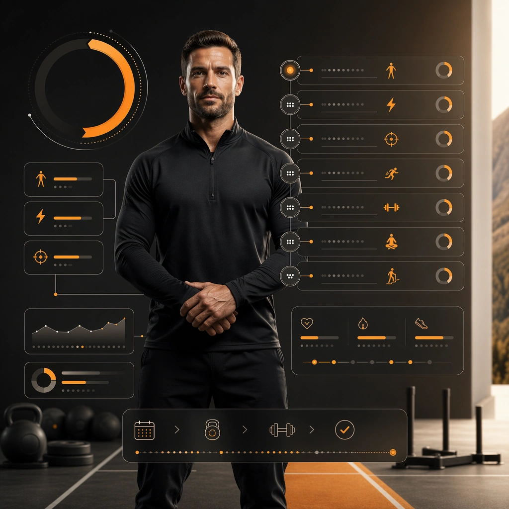
Example generated from “Fitness Program Launch Campaign — Reference Coach Hero”
GPT Image 2en

Scene: Create a square coach-led launch hero for Program Launch, using a clean premium training-studio world with matte blacks, warm whites, one bright accent color, and landing-page polish. The frame should feel commercial, polished, and immediately useful for a real client deliverable rather than a one-off art experiment. Keep the composition readable at thumbnail scale while still rewarding a closer look with layered depth, clean negative space, and strong directional light. Build the image so it clearly supports sports communication, with enough modular structure to imply information architecture without relying on literal words. Subject: Center the image on one original coach with a believable athletic build, calm authority, and brandless premium workout apparel, arranged as coach centered in studio. Treat the subject as original and brandless, with believable apparel construction, realistic body proportions, and strong emotional legibility. Surround the subject with supporting environmental cues that reinforce the category but never overpower the main figure. All secondary objects, props, and background elements should strengthen the same professional sports or fitness context. Important details: This first image must establish the full reference system for later derivatives: conversion-minded panel layout, progress arcs, and non-readable benefit blocks. The emotional tone should read as trustworthy authority. Make the visual language reusable, disciplined, and commercially credible, with clean edges, coherent light behavior, and obvious hierarchy. Abstract panels, diagram bands, or stat-like modules are welcome, but they must remain non-readable and subordinate to the main visual message. The result should feel original, specific, and ready to anchor a larger package. Use case: Program Launch series study 1/9, the reference image for the package. Constraints: No readable text, no watermark, no logos, preserve exact 1:1 aspect ratio, no brand marks, no copied famous team or product identity, no generic stock-photo stiffness, no cluttered background noise, no celebrity likenesses.

Example generated from “Fitness Program Launch Campaign — Transformation Promise Board”
GPT Image 2en

Scene: Build a square transformation promise board derived from the reference image for Program Launch. Preserve the exact world established by the reference image, including the same palette family, lighting direction, environmental logic, and surface finish. The new frame should feel like a deliberate extension of one campaign system, not a separate concept. Shift the hierarchy to suit this use case, but keep the overall composition commercial, polished, and ready for real rollout. Subject: Use the same original subject identity and anchor cues introduced by the reference image, now organized as same coach with progress motifs. Keep faces, hair logic, body proportions, apparel or product construction, and major supporting forms consistent with the reference. Allow only the layout emphasis, pose, crop, and contextual energy to change so the result clearly belongs to the same package. Important details: Continuity is the main challenge. Preserve the exact reference language for color, materials, framing rhythm, and overall brandless campaign grammar while steering the tone toward forward drive. Keep any stat blocks, schedule modules, arrows, badges, or callout panels non-readable. The derivative should prove that the same art direction can handle a different communication task without losing identity or utility. Make it credible for production use, with clean edges, intentional spacing, and no random decorative elements. Use case: Program Launch series study 2/9, a derivative surface linked to 01-reference-coach-hero. Constraints: No readable text, no watermark, no logos, preserve exact 1:1 aspect ratio, no new subject identity, no brand marks, no palette drift, no unrelated props, no collage chaos, no copied public-figure styling.

Example generated from “Fitness Program Launch Campaign — Weekly Plan Poster”
GPT Image 2en

Scene: Build a square weekly plan poster derived from the reference image for Program Launch. Preserve the exact world established by the reference image, including the same palette family, lighting direction, environmental logic, and surface finish. The new frame should feel like a deliberate extension of one campaign system, not a separate concept. Shift the hierarchy to suit this use case, but keep the overall composition commercial, polished, and ready for real rollout. Subject: Use the same original subject identity and anchor cues introduced by the reference image, now organized as same coach with schedule modules. Keep faces, hair logic, body proportions, apparel or product construction, and major supporting forms consistent with the reference. Allow only the layout emphasis, pose, crop, and contextual energy to change so the result clearly belongs to the same package. Important details: Continuity is the main challenge. Preserve the exact reference language for color, materials, framing rhythm, and overall brandless campaign grammar while steering the tone toward organized discipline. Keep any stat blocks, schedule modules, arrows, badges, or callout panels non-readable. The derivative should prove that the same art direction can handle a different communication task without losing identity or utility. Make it credible for production use, with clean edges, intentional spacing, and no random decorative elements. Use case: Program Launch series study 3/9, a derivative surface linked to 01-reference-coach-hero. Constraints: No readable text, no watermark, no logos, preserve exact 1:1 aspect ratio, no new subject identity, no brand marks, no palette drift, no unrelated props, no collage chaos, no copied public-figure styling.

Example generated from “Fitness Program Launch Campaign — Mobile Signup Variant”
GPT Image 2en

Scene: Build a square mobile signup variant derived from the reference image for Program Launch. Preserve the exact world established by the reference image, including the same palette family, lighting direction, environmental logic, and surface finish. The new frame should feel like a deliberate extension of one campaign system, not a separate concept. Shift the hierarchy to suit this use case, but keep the overall composition commercial, polished, and ready for real rollout. Subject: Use the same original subject identity and anchor cues introduced by the reference image, now organized as same coach close to camera. Keep faces, hair logic, body proportions, apparel or product construction, and major supporting forms consistent with the reference. Allow only the layout emphasis, pose, crop, and contextual energy to change so the result clearly belongs to the same package. Important details: Continuity is the main challenge. Preserve the exact reference language for color, materials, framing rhythm, and overall brandless campaign grammar while steering the tone toward compact conversion energy. Keep any stat blocks, schedule modules, arrows, badges, or callout panels non-readable. The derivative should prove that the same art direction can handle a different communication task without losing identity or utility. Make it credible for production use, with clean edges, intentional spacing, and no random decorative elements. Use case: Program Launch series study 4/9, a derivative surface linked to 01-reference-coach-hero. Constraints: No readable text, no watermark, no logos, preserve exact 1:1 aspect ratio, no new subject identity, no brand marks, no palette drift, no unrelated props, no collage chaos, no copied public-figure styling.

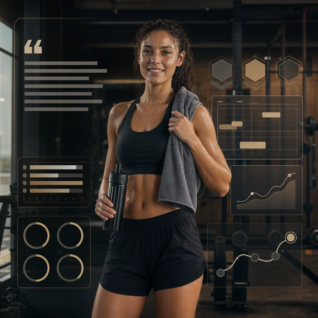
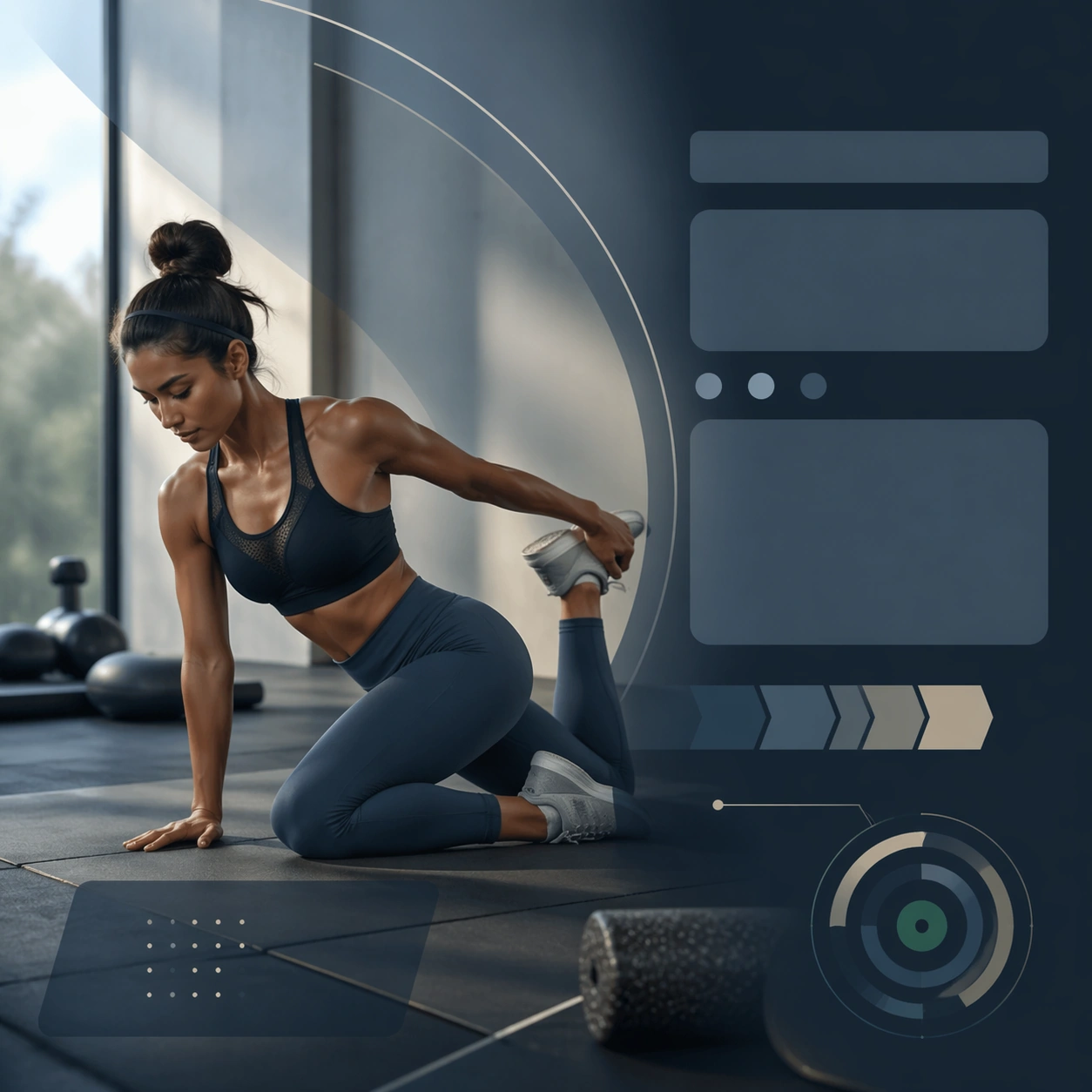
Example generated from “Fitness Program Launch Campaign — Mobility Reset Card”
GPT Image 2en

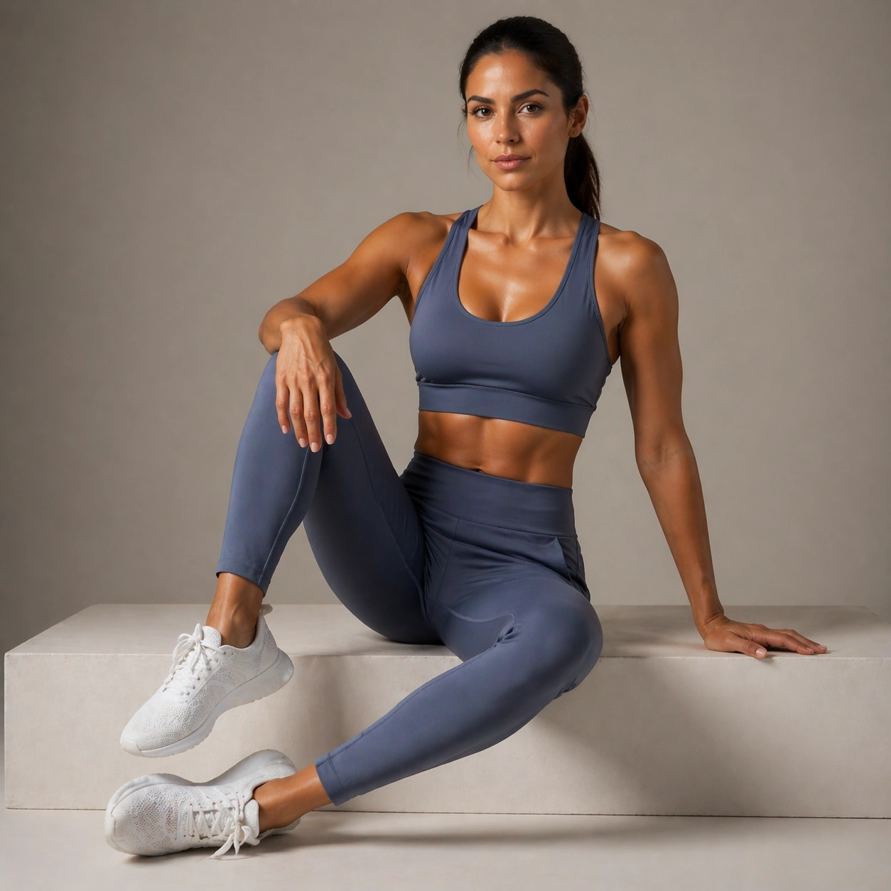
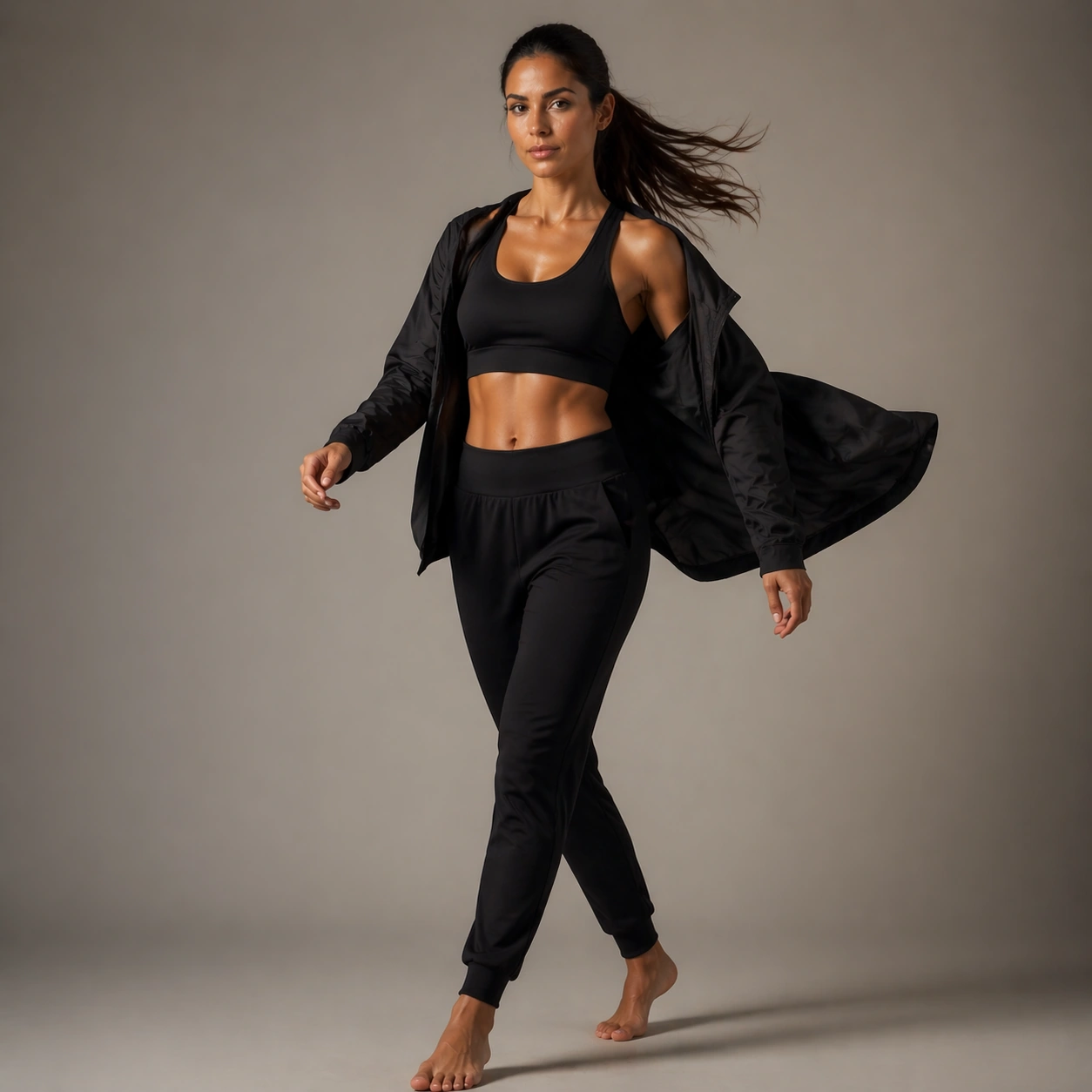
Scene: Create a square mobility reset card for Program Launch, using conversion-friendly fitness marketing with premium training imagery, structured layouts, and trustworthy coaching tone. The composition should read as a practical, production-ready sports or fitness surface with a clear hierarchy, premium lighting, and obvious commercial intent. Keep the environment specific enough to feel real, but leave enough control in the layout for non-readable information modules, campaign blocks, or visualized metrics. Aim for a finish that works for a brand, club, app, academy, or event operator. Subject: Build the image around athlete in precise stretch. The subject should be original, believable, and free of any real-brand or celebrity cues. Use realistic apparel, safe body mechanics when movement is visible, and environmental props that support the category without clutter. The subject must stay visually dominant so the design still works as a communication asset rather than a pure scene study. Important details: The mood should read as balanced calm. Treat layout, light, and supporting graphic structure as part of one polished delivery surface. Any schedule blocks, metric panels, quote zones, badges, or path diagrams must stay abstract and non-readable. Prioritize usefulness, clarity, and category truth over spectacle. The image should feel distinct from the series package while still belonging naturally to the same topic and business use case. Use case: Program Launch single study 6/9, an independent rollout surface for the topic. Constraints: No readable text, no watermark, no logos, preserve exact 1:1 aspect ratio, no brand marks, no public-figure resemblance, no generic stock layout, no cluttered UI imitation, no accidental copyrighted insignia.

Example generated from “Fitness Program Launch Campaign — Endurance Block Cover”
GPT Image 2en

Scene: Create a square endurance block cover for Program Launch, using conversion-friendly fitness marketing with premium training imagery, structured layouts, and trustworthy coaching tone. The composition should read as a practical, production-ready sports or fitness surface with a clear hierarchy, premium lighting, and obvious commercial intent. Keep the environment specific enough to feel real, but leave enough control in the layout for non-readable information modules, campaign blocks, or visualized metrics. Aim for a finish that works for a brand, club, app, academy, or event operator. Subject: Build the image around runner in training context. The subject should be original, believable, and free of any real-brand or celebrity cues. Use realistic apparel, safe body mechanics when movement is visible, and environmental props that support the category without clutter. The subject must stay visually dominant so the design still works as a communication asset rather than a pure scene study. Important details: The mood should read as controlled motion. Treat layout, light, and supporting graphic structure as part of one polished delivery surface. Any schedule blocks, metric panels, quote zones, badges, or path diagrams must stay abstract and non-readable. Prioritize usefulness, clarity, and category truth over spectacle. The image should feel distinct from the series package while still belonging naturally to the same topic and business use case. Use case: Program Launch single study 7/9, an independent rollout surface for the topic. Constraints: No readable text, no watermark, no logos, preserve exact 1:1 aspect ratio, no brand marks, no public-figure resemblance, no generic stock layout, no cluttered UI imitation, no accidental copyrighted insignia.

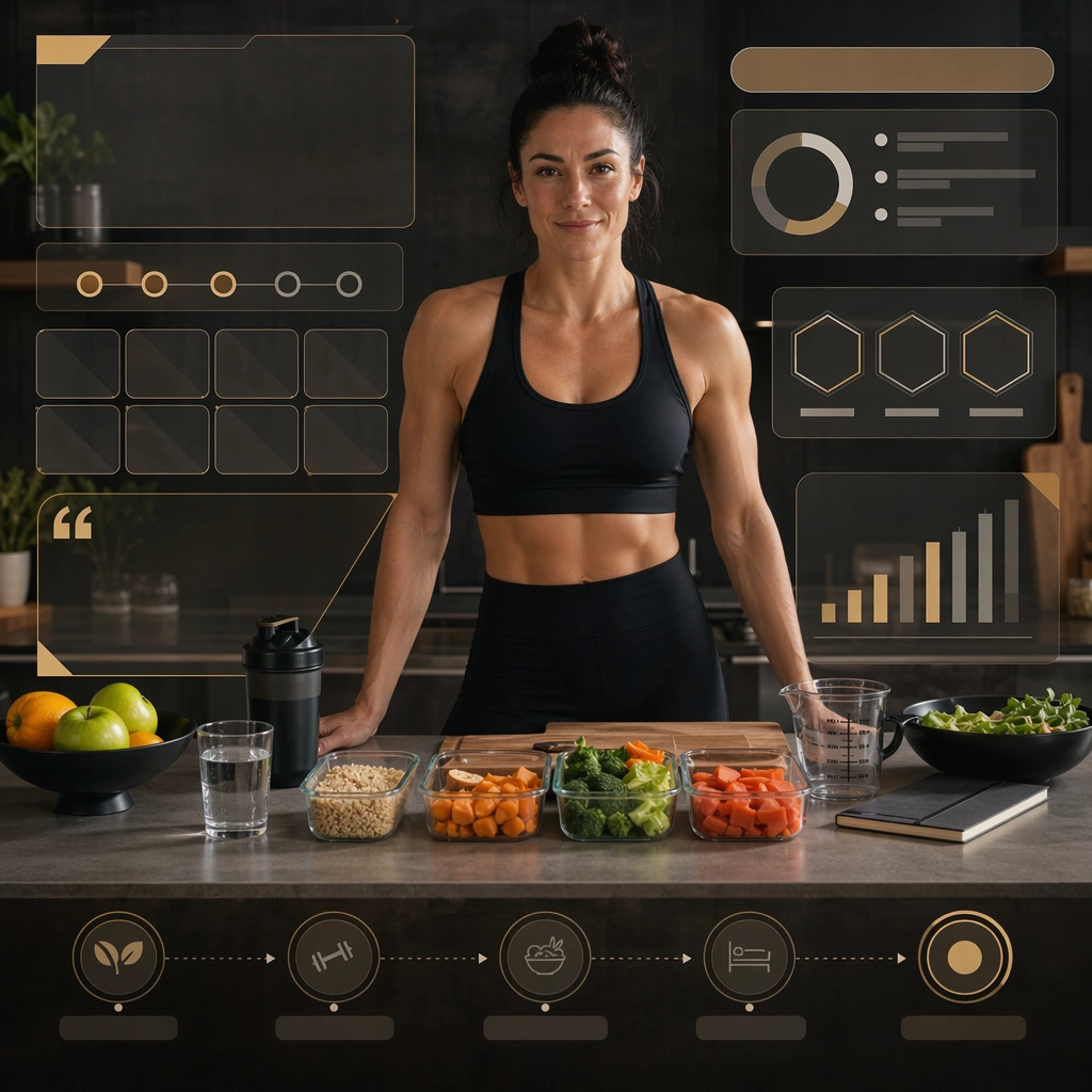
Example generated from “Fitness Program Launch Campaign — Nutrition Rhythm Board”
GPT Image 2en

Scene: Create a square nutrition rhythm board for Program Launch, using conversion-friendly fitness marketing with premium training imagery, structured layouts, and trustworthy coaching tone. The composition should read as a practical, production-ready sports or fitness surface with a clear hierarchy, premium lighting, and obvious commercial intent. Keep the environment specific enough to feel real, but leave enough control in the layout for non-readable information modules, campaign blocks, or visualized metrics. Aim for a finish that works for a brand, club, app, academy, or event operator. Subject: Build the image around coach or athlete near clean prep counter. The subject should be original, believable, and free of any real-brand or celebrity cues. Use realistic apparel, safe body mechanics when movement is visible, and environmental props that support the category without clutter. The subject must stay visually dominant so the design still works as a communication asset rather than a pure scene study. Important details: The mood should read as holistic support. Treat layout, light, and supporting graphic structure as part of one polished delivery surface. Any schedule blocks, metric panels, quote zones, badges, or path diagrams must stay abstract and non-readable. Prioritize usefulness, clarity, and category truth over spectacle. The image should feel distinct from the series package while still belonging naturally to the same topic and business use case. Use case: Program Launch single study 8/9, an independent rollout surface for the topic. Constraints: No readable text, no watermark, no logos, preserve exact 1:1 aspect ratio, no brand marks, no public-figure resemblance, no generic stock layout, no cluttered UI imitation, no accidental copyrighted insignia.

Example generated from “Fitness Program Launch Campaign — Testimonial Energy Layout”
GPT Image 2en

Scene: Create a square testimonial-style support layout for Program Launch, using conversion-friendly fitness marketing with premium training imagery, structured layouts, and trustworthy coaching tone. The composition should read as a practical, production-ready sports or fitness surface with a clear hierarchy, premium lighting, and obvious commercial intent. Keep the environment specific enough to feel real, but leave enough control in the layout for non-readable information modules, campaign blocks, or visualized metrics. Aim for a finish that works for a brand, club, app, academy, or event operator. Subject: Build the image around participant portrait with proof modules. The subject should be original, believable, and free of any real-brand or celebrity cues. Use realistic apparel, safe body mechanics when movement is visible, and environmental props that support the category without clutter. The subject must stay visually dominant so the design still works as a communication asset rather than a pure scene study. Important details: The mood should read as trust and momentum. Treat layout, light, and supporting graphic structure as part of one polished delivery surface. Any schedule blocks, metric panels, quote zones, badges, or path diagrams must stay abstract and non-readable. Prioritize usefulness, clarity, and category truth over spectacle. The image should feel distinct from the series package while still belonging naturally to the same topic and business use case. Use case: Program Launch single study 9/9, an independent rollout surface for the topic. Constraints: No readable text, no watermark, no logos, preserve exact 1:1 aspect ratio, no brand marks, no public-figure resemblance, no generic stock layout, no cluttered UI imitation, no accidental copyrighted insignia.

Example generated from “Fitness Wellness Brand Portraits — Reference Fashion Anchor”
GPT Image 2en

Scene: A square portrait reference for Fitness Wellness Brand Portraits. Build a premium studio-fashion setup with neutral background, elegant lens perspective, and clean full-body-to-three-quarter readability The image should feel like a real high-end commissioned portrait session, with clean camera discipline, believable lens perspective, and enough tonal control that the face, hair texture, and clothing surfaces all read clearly. Keep the background simple, premium, and non-distracting. Subject: Show one believable wellness founder-model in the early thirties with golden olive skin, dark brown eyes, high cheekbones, and long dark hair pulled into a polished low ponytail, wearing a minimal black active-luxe set with clean skin, healthy texture, and poised athletic posture. This first frame should establish the exact identity, age read, haircut base, and body-scale impression that the whole series will depend on. Pose the subject in a calm, commercially usable way so the image can anchor all later variations without ambiguity. Important details: This is the identity anchor for the full series. Preserve the face shape, body proportions, shoulder width, leg length impression, hair base, and skin-tone family while the wardrobe and mood shift. Include realistic pores, stray hairs, fabric texture, and subtle under-eye detail. The result should feel specific, expensive, and usable, not like a generic stock portrait. Later images must preserve exact face / hair base / body proportions from the reference model. Use case: Fitness Wellness Brand Portraits series study 1/9, establishing the identity reference for all later portrait variations. Constraints: No readable text, no watermark, no logos, preserve exact 1:1 aspect ratio, no runway chaos, no giant props, no beauty-filter skin, no duplicate people, no extra limbs, no warped facial symmetry, no plastic skin, no generic stock-photo blandness.

Example generated from “Fitness Wellness Brand Portraits — Campaign Hero Look”
GPT Image 2en

Scene: Use the reference image as the identity source for Fitness Wellness Brand Portraits. Build a flagship fashion-campaign setup with polished studio light and confident negative space Keep the camera logic commercially believable, with stable perspective, square-crop discipline, and light that supports facial recognition before style. The image should feel finished enough for client review, media rollout, or research comparison rather than like an unfinished test frame. Subject: Show the same fashion model as the reference, now wearing a premium wellness-brand hero look with sculpted activewear, confident posture, and polished campaign energy. Preserve the exact recognisable face, haircut base, body read, and age impression from the anchor image while allowing the requested lighting, wardrobe, pose, or environment change to do the storytelling. The variation should clearly connect to the topic brief Produce athletic and wellness-driven portrait campaigns with realistic body proportions, clean skin texture, and premium studio-commercial lighting.. Important details: Preserve exact face / hair base / body proportions from the reference model. Preserve the face shape, body proportions, shoulder width, leg length impression, hair base, and skin-tone family while the wardrobe and mood shift. Keep the skin, hair, garment, and background rendering realistic and production-ready. This frame should feel like a true commissioned variation within one coherent portrait package, not like a new person or a disconnected mood board. Use case: Fitness Wellness Brand Portraits series study 2/9, hero fashion variation using the reference identity. Constraints: No readable text, no watermark, no logos, preserve exact 1:1 aspect ratio, no costume-catalogue stiffness, no face drift, no flattening of garment structure, no duplicate people, no extra fingers, no broken anatomy, no face drift, no oversmoothed skin, no unrelated props.

Example generated from “Fitness Wellness Brand Portraits — Tailored Three-Quarter”
GPT Image 2en

Scene: Use the reference image as the identity source for Fitness Wellness Brand Portraits. Build a controlled three-quarter fashion portrait with space to read cut, lapel, and upper-body layering Keep the camera logic commercially believable, with stable perspective, square-crop discipline, and light that supports facial recognition before style. The image should feel finished enough for client review, media rollout, or research comparison rather than like an unfinished test frame. Subject: Show the same fashion model as the reference, now wearing a sharply tailored or styled second look with a confident three-quarter pose. Preserve the exact recognisable face, haircut base, body read, and age impression from the anchor image while allowing the requested lighting, wardrobe, pose, or environment change to do the storytelling. The variation should clearly connect to the topic brief Produce athletic and wellness-driven portrait campaigns with realistic body proportions, clean skin texture, and premium studio-commercial lighting.. Important details: Preserve exact face / hair base / body proportions from the reference model. Preserve the face shape, body proportions, shoulder width, leg length impression, hair base, and skin-tone family while the wardrobe and mood shift. Keep the skin, hair, garment, and background rendering realistic and production-ready. This frame should feel like a true commissioned variation within one coherent portrait package, not like a new person or a disconnected mood board. Use case: Fitness Wellness Brand Portraits series study 3/9, tailored portrait variation using the reference identity. Constraints: No readable text, no watermark, no logos, preserve exact 1:1 aspect ratio, no awkward elbows, no garment collapse, no cheap e-commerce vibe, no duplicate people, no extra fingers, no broken anatomy, no face drift, no oversmoothed skin, no unrelated props.

Example generated from “Fitness Wellness Brand Portraits — Full-Body Runway”
GPT Image 2en

Scene: Use the reference image as the identity source for Fitness Wellness Brand Portraits. Build a square setup that still allows a convincing full-body fashion read without losing face identity Keep the camera logic commercially believable, with stable perspective, square-crop discipline, and light that supports facial recognition before style. The image should feel finished enough for client review, media rollout, or research comparison rather than like an unfinished test frame. Subject: Show the same fashion model as the reference, now wearing a full look with shoes, hemline, and body silhouette clearly legible. Preserve the exact recognisable face, haircut base, body read, and age impression from the anchor image while allowing the requested lighting, wardrobe, pose, or environment change to do the storytelling. The variation should clearly connect to the topic brief Produce athletic and wellness-driven portrait campaigns with realistic body proportions, clean skin texture, and premium studio-commercial lighting.. Important details: Preserve exact face / hair base / body proportions from the reference model. Preserve the face shape, body proportions, shoulder width, leg length impression, hair base, and skin-tone family while the wardrobe and mood shift. Keep the skin, hair, garment, and background rendering realistic and production-ready. This frame should feel like a true commissioned variation within one coherent portrait package, not like a new person or a disconnected mood board. Use case: Fitness Wellness Brand Portraits series study 4/9, full-body fashion variation using the reference identity. Constraints: No readable text, no watermark, no logos, preserve exact 1:1 aspect ratio, no tiny face, no broken limbs, no cropped feet by accident, no duplicate people, no extra fingers, no broken anatomy, no face drift, no oversmoothed skin, no unrelated props.

Example generated from “Fitness Wellness Brand Portraits — Seated Lookbook Crop”
GPT Image 2en

Scene: Use the reference image as the identity source for Fitness Wellness Brand Portraits. Build a premium seated fashion frame with clean furniture or platform support and readable fabric tension Keep the camera logic commercially believable, with stable perspective, square-crop discipline, and light that supports facial recognition before style. The image should feel finished enough for client review, media rollout, or research comparison rather than like an unfinished test frame. Subject: Show the same fashion model as the reference, now wearing another wardrobe direction that feels lookbook-ready and styled for editorial commerce. Preserve the exact recognisable face, haircut base, body read, and age impression from the anchor image while allowing the requested lighting, wardrobe, pose, or environment change to do the storytelling. The variation should clearly connect to the topic brief Produce athletic and wellness-driven portrait campaigns with realistic body proportions, clean skin texture, and premium studio-commercial lighting.. Important details: Preserve exact face / hair base / body proportions from the reference model. Preserve the face shape, body proportions, shoulder width, leg length impression, hair base, and skin-tone family while the wardrobe and mood shift. Keep the skin, hair, garment, and background rendering realistic and production-ready. This frame should feel like a true commissioned variation within one coherent portrait package, not like a new person or a disconnected mood board. Use case: Fitness Wellness Brand Portraits series study 5/9, seated lookbook variation using the reference identity. Constraints: No readable text, no watermark, no logos, preserve exact 1:1 aspect ratio, no lounge-room clutter, no slouching, no lookbook text, no duplicate people, no extra fingers, no broken anatomy, no face drift, no oversmoothed skin, no unrelated props.

Example generated from “Fitness Wellness Brand Portraits — Movement Editorial”
GPT Image 2en

Scene: Use the reference image as the identity source for Fitness Wellness Brand Portraits. Build a dynamic but controlled fashion setup where slight motion gives life to the outfit and hair Keep the camera logic commercially believable, with stable perspective, square-crop discipline, and light that supports facial recognition before style. The image should feel finished enough for client review, media rollout, or research comparison rather than like an unfinished test frame. Subject: Show the same fashion model as the reference, now wearing a look that benefits from movement, such as coat swing, veil flow, train movement, or athletic energy. Preserve the exact recognisable face, haircut base, body read, and age impression from the anchor image while allowing the requested lighting, wardrobe, pose, or environment change to do the storytelling. The variation should clearly connect to the topic brief Produce athletic and wellness-driven portrait campaigns with realistic body proportions, clean skin texture, and premium studio-commercial lighting.. Important details: Preserve exact face / hair base / body proportions from the reference model. Preserve the face shape, body proportions, shoulder width, leg length impression, hair base, and skin-tone family while the wardrobe and mood shift. Keep the skin, hair, garment, and background rendering realistic and production-ready. This frame should feel like a true commissioned variation within one coherent portrait package, not like a new person or a disconnected mood board. Use case: Fitness Wellness Brand Portraits series study 6/9, movement-editorial variation using the reference identity. Constraints: No readable text, no watermark, no logos, preserve exact 1:1 aspect ratio, no motion blur chaos, no fabric melting, no new body proportions, no duplicate people, no extra fingers, no broken anatomy, no face drift, no oversmoothed skin, no unrelated props.