已验证示例

提示词库

真实提示词与对应生成图片。浏览灵感、查看效果,并复制完整提示词作为创作起点。

图文组合
5,541
模型
6
来源
10
5,541 组已验证提示词与图片 · 第 92 / 116 页
Example generated from “Amira Zairi #414”
Nano Bananaen
Amira Zairi #414

Low-angle fashion campaign photograph of a confident model holding a large [product name] very close to the camera, exaggerated perspective with the hand and product dominating the foreground, full-body pose visible in the background, wide stance, dynamic posture, clean pure white studio background, high-key lighting, sharp focus on product, slight depth of field on the model, bold colorful outfit with strong contrast tones, modern beauty advertising aesthetic, ultra-clean composition, commercial studio photography, glossy packaging detail visible, crisp shadows

Example generated from “Amira Zairi #457”
Nano Bananaen
Amira Zairi #457

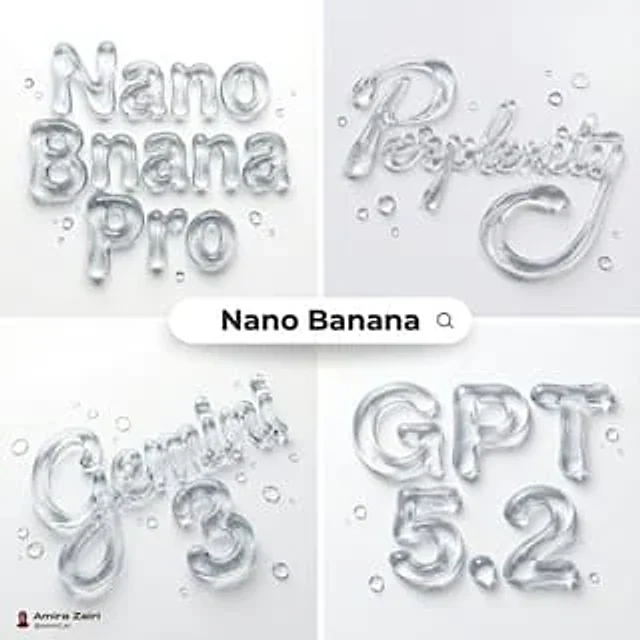
Abstract liquid typography spelling "text", thick transparent water-gel material, hyper realistic refraction and subtle caustics, realistic surface tension, sculpted droplet forms merged into smooth letter curves, glossy highlights, micro bubbles inside the gel, soft contact shadows on a pure white seamless background, scattered water droplets on the surface with sharp specular reflections, studio lighting, crisp photorealistic 3D render, macro detail, sharp focus, 8k, 1:1, no watermark, no extra text

Example generated from “Amira Zairi #485”
Nano Bananaen
Amira Zairi #485

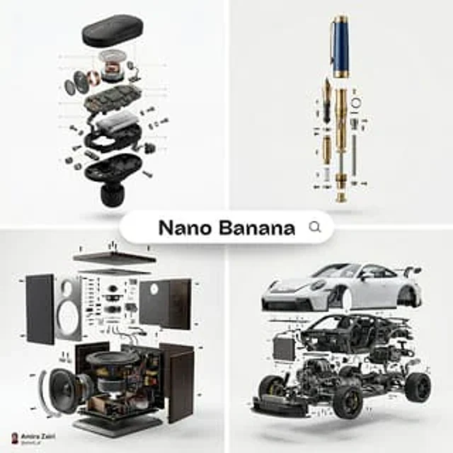
[product], high-end product advertising, white seamless background, exploded view with inner mechanics revealed, outer shell hovering above core, micro screws and components suspended, perfect alignment guides implied, crisp soft shadow, ultra realistic, macro product photography, 100mm lens look, f/8, 8k

Example generated from “Amira Zairi #501”
Nano Bananaen
Amira Zairi #501

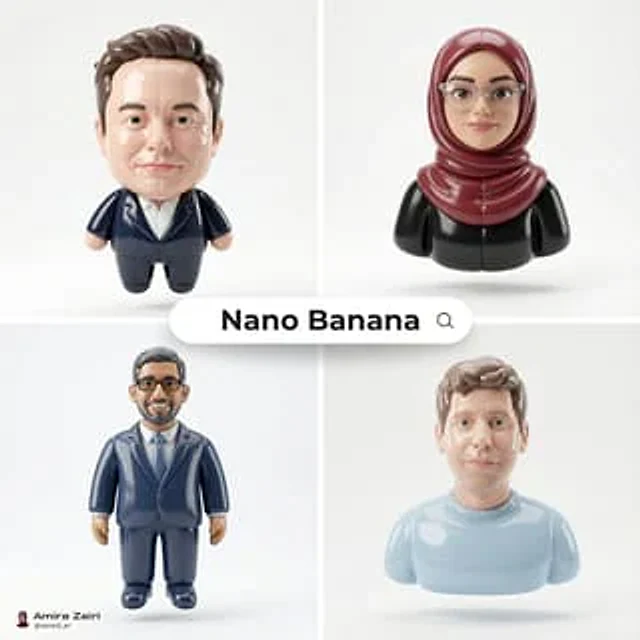
[SUBJECT], ultra realistic 3D render, smooth inflated glossy plastic material, soft pillowy balloon like contours, subtle stitched panel seams and paneling, high specular highlights, clean reflections, soft contact shadows, designer collectible toy aesthetic, cute proportions, premium polished finish, floating centered, plain light gray studio background, soft diffused studio lighting, sharp focus, high resolution, 8k, 1:1, no text, no logo, no watermark

Example generated from “Amira Zairi #527”
Nano Bananaen
Amira Zairi #527

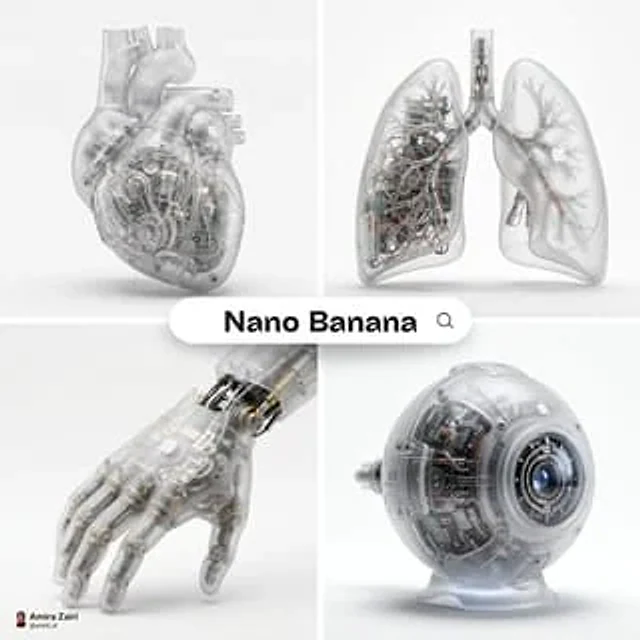
A hyper-realistic 3D anatomical human [organ] made from semi-translucent frosted polycarbonate with a milky matte finish, softly diffusing light. Industrial injection-molded detailing, subtle micro-texture, and rounded edges with precision seams. Inside, intricate mechanical components replace organic tissue, micro gears, pistons, circuitry, and engineered chambers visible but softly blurred through the shell. A subtle white Apple logo is naturally embedded on the surface, minimal and not overly obvious. Soft diffused studio lighting, realistic plastic refraction, subtle shadow beneath, centered composition, pure white background, ultra-detailed futuristic biomechanical render, 1:1 aspect ratio.

Example generated from “Amira Zairi #537”
Nano Bananaen
Amira Zairi #537

[SUBJECT], made of smooth inflated glossy vinyl plastic, ultra-realistic 3D render, soft pillowy contours with subtle stitched panel seams, slightly rounded toy-like proportions, highly polished surface with strong specular highlights, realistic material depth, soft studio lighting creating gentle shadows and clean reflections, floating slightly above a plain light gray background, minimal composition, designer collectible aesthetic, premium art toy finish, high detail, centered composition, 1:1 aspect ratio.

Example generated from “Amira Zairi #538”
Nano Bananaen
Amira Zairi #538

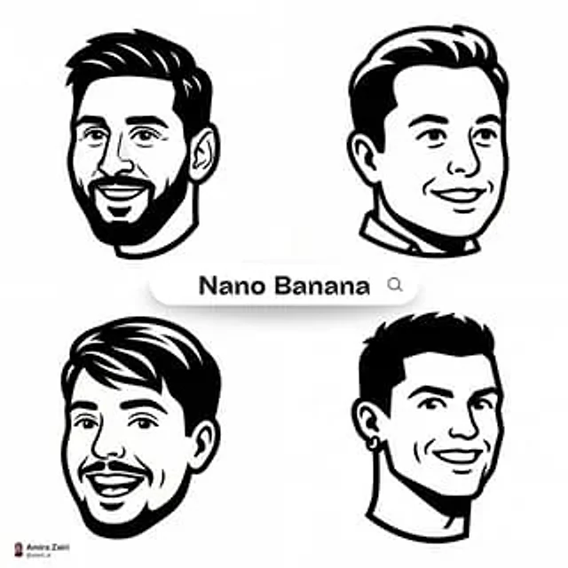
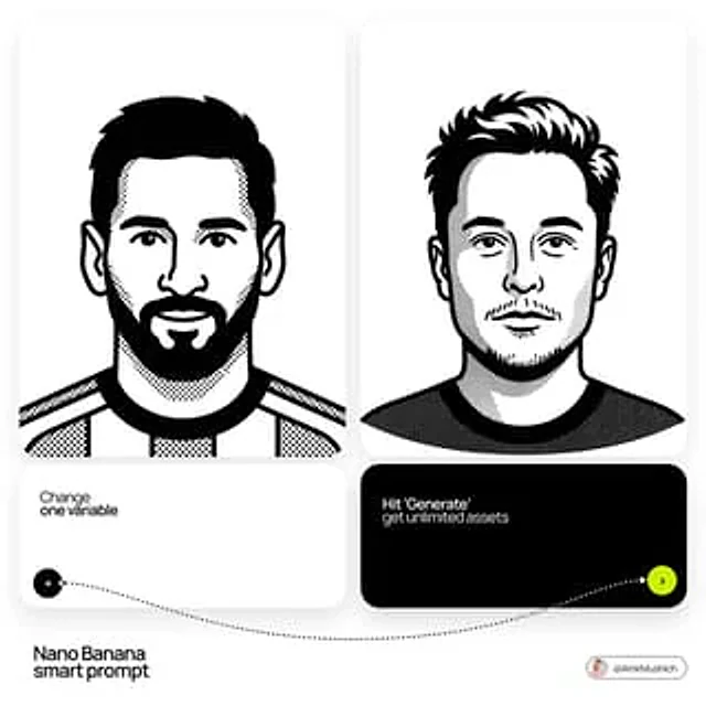
Create a clean high-contrast vector mascot icon in Notion-style artwork based on [person description]. Show only the head in a 3/4 view. Use very thick bold black outer outlines and slightly thinner inner detail lines. Flat monochrome fill. Simplify facial features into strong geometric shapes while preserving recognizable traits such as bald head or hairstyle, beard shape, glasses shape, eyebrows, and smile. Expression should be friendly and slightly exaggerated. Teeth are simplified into clean flat blocks. pure white background. Modern startup mascot logo aesthetic, clean SVG vector look, crisp edges, black and white only, high contrast, symmetrical balance, square composition, 1:1 aspect ratio

Example generated from “Amira Zairi #554”
Nano Bananaen
Amira Zairi #554

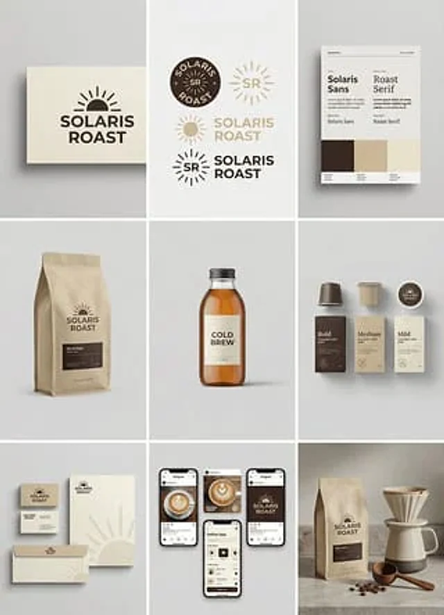
[brand name], complete brand identity grid, 3x3 layout, nine tiles showing a full cohesive brand system, light gray seamless background, soft diffused studio lighting, subtle shadows, clean modern minimal style, consistent color palette of [color1] [color2] [color3], high-end studio mockups, ultra-realistic, 8k, 1:1, tile 1 primary logo lockup on paper card, tile 2 secondary logo mark and monogram variations, tile 3 color palette swatches and typography specimen poster, tile 4 packaging mockup for [product 1], tile 5 hero product photo for [product 2], tile 6 set of three products for [product 3] in different sizes, tile 7 stationery mockups business card letterhead envelope, tile 8 social media post mockups and phone screen UI preview, tile 9 lifestyle scene featuring [product 1] with props matching the brand, no people, no readable real-world brand names, no watermark.

Example generated from “Amira Zairi #558”
Nano Bananaen
Amira Zairi #558

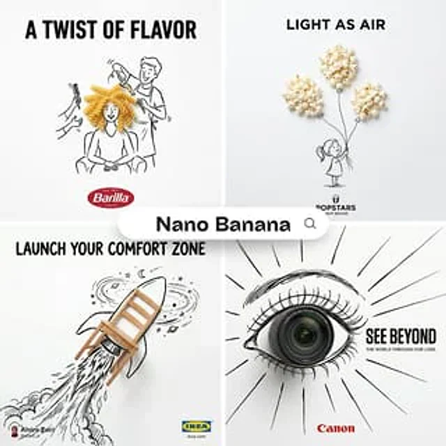
A minimalist and creative advertisement set on a pure white background. A real photographic [Real Object] is integrated into a simple hand-drawn black ink doodle using loose, playful lines. The [Doodle Concept] interacts directly and cleverly with the real object, making the object part of the illustrated scene. Include bold uppercase black “[Ad Copy]” text at the top. Place the official [Brand Logo] clearly centered at the bottom. Clean layout, high contrast between realistic object and flat doodle drawing, lots of negative space, smart visual metaphor, print-ready poster design

Example generated from “Amira Zairi #576”
Nano Bananaen
Amira Zairi #576

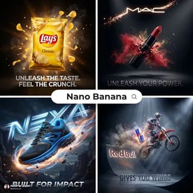
Cinematic 3D action-packed advertisement for [INSERT PRODUCT/BRAND HERE], captured in an intense mid-motion moment with dramatic studio lighting, dynamic particle effects, and high-impact slow-motion energy. Ultra-hyperrealistic rendering, razor-sharp details, glossy commercial finish, atmospheric depth, and powerful contrast. Viral-ready composition with the brand logo seamlessly integrated into the scene and a sleek, modern slogan positioned cleanly beneath. High-end blockbuster commercial aesthetic

Example generated from “Amira Zairi #608”
Nano Bananaen
Amira Zairi #608

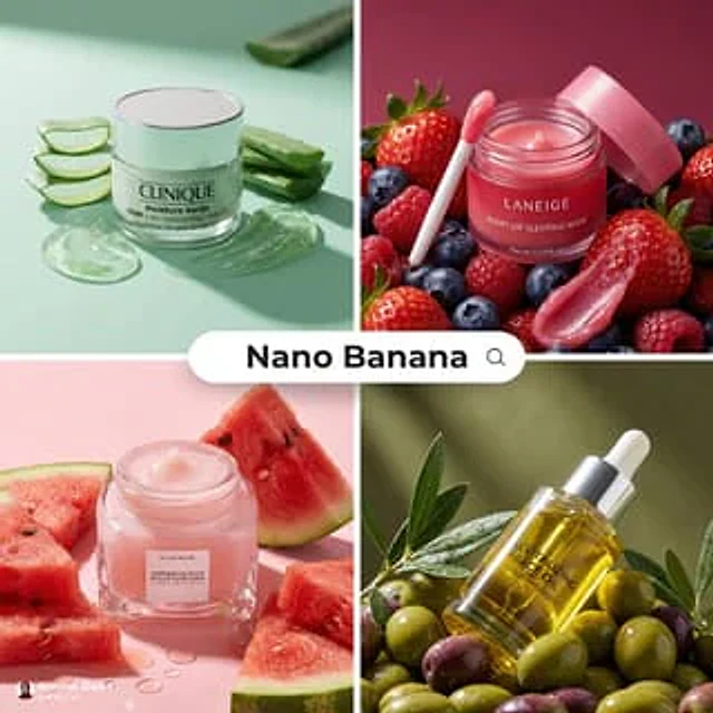
[product], premium skincare product ad, the product placed directly on and surrounded by fresh [fruit_or_vegetable], visual storytelling that the product is made from the ingredient, rich saturated color palette matching the ingredient, juicy realistic textures, visible seeds pulp or slices, glossy highlights, dramatic studio lighting, soft shadows, shallow depth of field, macro product photography look, ultra realistic, editorial commercial style, clean background in matching color tone, 8k, 1:1

Example generated from “Amira Zairi #655”
Nano Bananaen
Amira Zairi #655

studio shot of [PRODUCT], placed on a [background], surrounded by soft shadows and gradient background, high-key lighting, shallow depth of field, ultra-sharp focus on the object, premium product photography, shot on a DSLR, minimal aesthetic, subtle reflections, commercial lighting setup

Example generated from “Amira Zairi #740”
Nano Bananaen
Amira Zairi #740

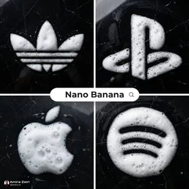
Ultra-realistic top-down photograph of detergent foam forming a precise [subject / logo / symbol / shape] on a polished black marble surface. Thick, airy white foam with realistic bubbles of varying sizes, natural translucency, wet shine, and soft highlights. Foam appears freshly formed, slightly uneven at the edges, physically accurate, volumetric, and naturally settled on the marble. Black marble background with subtle white veining, glossy finish, realistic reflections and moisture marks, high contrast between white foam and dark stone. Clean minimalist composition, centered subject. Soft diffused overhead lighting creating gentle reflections on the marble and delicate shadows within the foam bubbles. Photorealistic texture detail, macro-level realism, high-end commercial photography style, no text overlays, no illustrations, no stylization, no CGI look, ultra-clean aesthetic, sharp focus, 8k resolution, 1:1

Example generated from “Amira Zairi #757”
Nano Bananaen
Amira Zairi #757

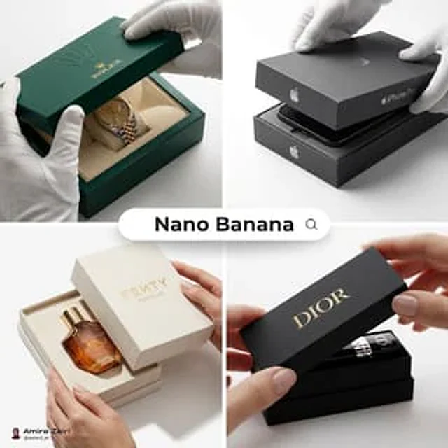
[product], luxury packaging reveal scene, premium unboxing moment, pristine hands partially visible at the edges, delicate interaction with the packaging, lid slightly lifted to reveal the product inside, crisp folds and precise alignment, tactile materials [ ex: matte paper, soft touch coating, embossed details, foil accents], subtle micro texture and dust free finish, clean white background, soft diffused studio lighting, controlled specular highlights, realistic shadows, macro product photography look, shallow depth of field with sharp focus on the product and branding area, high end editorial commercial style, ultra realistic, 4k, 1:1, no watermark, no extra text

Example generated from “Amira Zairi #799”
Nano Bananaen
Amira Zairi #799

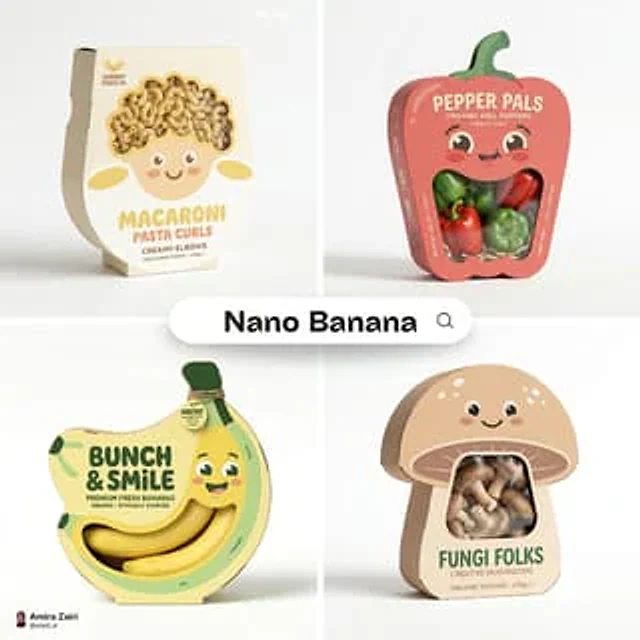
Playful designer packaging for [product name], creative box shaped like the product, integrated cartoon face on the front panel, oversized die-cut window revealing the real contents as part of the character’s expression, smooth matte cardboard material, bold flat graphic design, modern minimalist branding, limited pastel color palette, rounded friendly shapes, clean typography, high-end 3D packaging mockup render, soft studio lighting, pure white background, subtle realistic contact shadow beneath, ultra-detailed, retail-ready presentation, 1:1 aspect ratio.

Example generated from “Amira Zairi #808”
Nano Bananaen
Amira Zairi #808

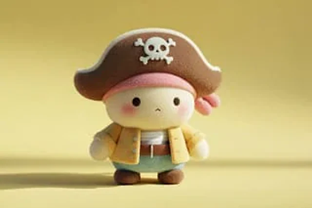
A cute full-body [SUBJECT] plush toy, plush doll art, stylized 3D character design, soft pastel colors, velvety fabric texture, rounded cartoon proportions, minimalist details, clean front-facing composition, centered on a light yellow background, playful kawaii aesthetic, soft studio lighting, subtle shadows, adorable collectible feel, high-resolution render

Example generated from “Amira Zairi #850”
Nano Bananaen
Amira Zairi #850

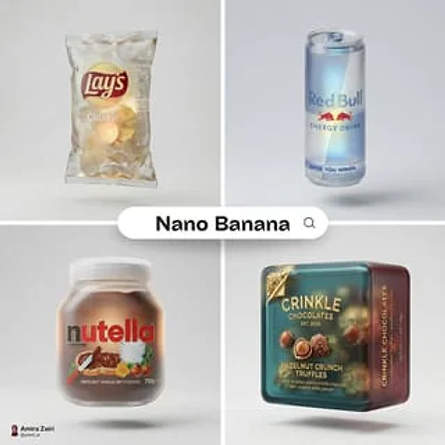
A hyper-detailed 3D frosted translucent glass version of the attached product packaging, maintaining accurate proportions and original colors, semi-transparent material with realistic refraction and soft internal glow, smooth softened corners, subtle surface texture, embossed branding details integrated into the glass, centered on a light gray background, floating gently with a soft shadow below, natural studio lighting, clean minimal layout, high-end product visualization style

Example generated from “Amira Zairi #871”
Nano Bananaen
Amira Zairi #871

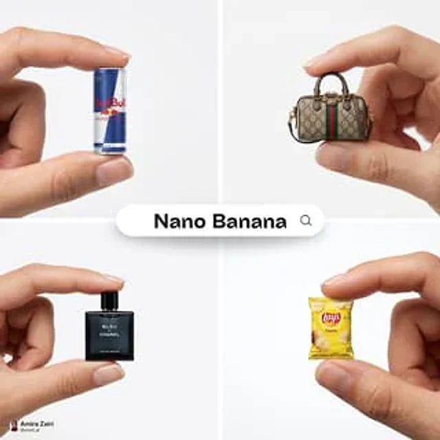
A high-resolution advertising photograph of a realistic, miniature product in the attached image, held delicately between a person's thumb and index finger: clean and white background, studio lighting, soft shadows. The hand is well-groomed, with a natural skin tone, and positioned to highlight the product’s shape and details. The product appears extremely small but hyper-detailed and brand-accurate, centered in the frame with a shallow depth of field. Emulates luxury product photography and minimalist commercial style

Example generated from “Amira Zairi #904”
Nano Bananaen
Amira Zairi #904

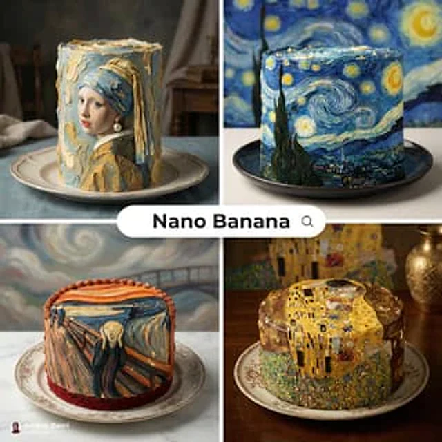
[cake type], hyper realistic food photography, cake decorated to recreate the famous painting [painting name] using buttercream brushstrokes, thick textured piping, impasto frosting swirls, edible gold leaf highlights, color palette matched to the artwork, small painted fondant details, cake on an elegant plate, background set inspired by the same painting, studio lighting with soft shadows, shallow depth of field, ultra detailed, premium patisserie advertising, no text, no watermark, 8k, 1:1

Example generated from “Amira Zairi #959”
Nano Bananaen
Amira Zairi #959

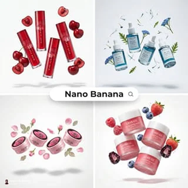
[product], 3–4 identical units of the product floating in mid-air, surrounded by fresh [fruit/vegetable] and sliced pieces that the product is made from, ingredients suspended around the product, dynamic balanced composition, ultra-clean pure white background, no gradients, no color cast, soft studio lighting, realistic soft shadows beneath floating objects, glossy packaging reflections, juicy ingredient textures, premium skincare editorial style, hyper-realistic product photography, macro detail, sharp focus, commercial advertising quality, minimal composition, 8k, 1:1

Example generated from “AmirMušić #1004”
Nano Bananaen
AmirMušić #1004

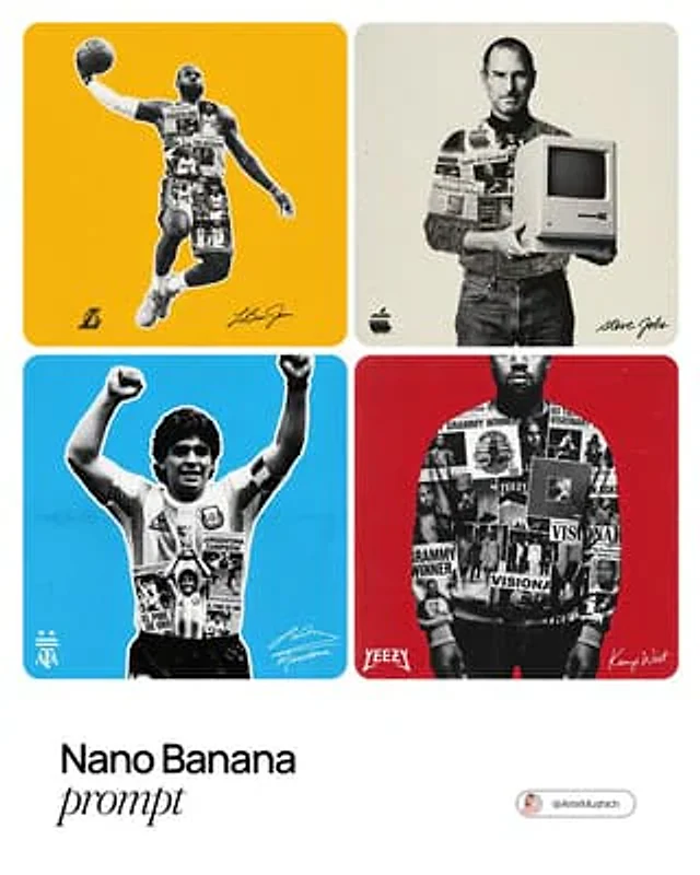
[Lebron James]. Act as a graphic designer specializing in "Modern Vintage" sports and music memorabilia posters. 1. COLOR LOGIC (AUTONOMOUS): Analyze the Subject: Instantly identify the single most iconic color associated with [PERSON / CHARACTER NAME] (e.g., if Michael Jordan -> Chicago Red; if Prince -> Purple; if Spotify CEO -> Vibrant Green). The Background: Fill the entire background with this Solid, Vibrant Brand Color. Texture: Apply a visible Heavy Film Grain overlay to the solid color to kill the digital perfection. 2. CENTRAL COMPOSITION (NARRATIVE SILHOUETTE): The Container: Place a massive, high-contrast Black & White Cut-Out Photo of [PERSON / CHARACTER NAME] in the center. It can slightly breach the top or side borders (dynamic cropping). The "Montage" Fill (CRITICAL): The interior of the subject's clothing or body shadows is NOT solid black. It is filled with a Complex Monochrome Collage. Collage Content: Inside the silhouette, layer smaller, high-contrast photos representing key career milestones, newspaper headlines, famous poses, or relevant machinery/tools associated with them. Visual Effect: This creates a "Double Exposure" effect where the hero's shape tells their story. 3. PRINT AESTHETIC (HALFTONE & NEWSPAPER): Halftone Effect: Apply a distinct "Coarse Halftone Dot Pattern" (Newsprint Screen effect) to the entire central figure and collage. The dots should be visible, creating that retro 90s zine/newspaper aesthetic. Contrast: The image must be strictly Duotone or Tritone (Background Color + Black Ink + White Paper negative space). No full-color photos. 4. FOOTER ELEMENTS (BRANDING): Bottom Left (Logo): Place a specific Logo or Icon relevant to the subject (e.g., team logo, company logo, or personal symbol). Size: Small and discrete (approx 15% of width). Color: High contrast to the background (White or Black). Bottom Right (Signature): Place the subject's Autograph/Signature. Logic: If the signature is public domain, simulate the real one. If fictional, generate a believable handwritten script signature. Color: Same contrast color as the logo. OUTPUT: A raw, textured, vintage-style poster design.

Example generated from “AmirMušić #1011”
Nano Bananaen
AmirMušić #1011

[BRAND NAME] Act as a Senior Street Culture Art Director and Editorial Designer specializing in authentic underground magazine covers and campaign posters that feel documentary rather than commercial. Your reference universe: Thrasher Magazine, i-D, The Face, Dazed — raw, real, typographically bold. BRAND INTELLIGENCE SYSTEM Before executing, resolve: (1) HERO SUBJECT — identify the most authentic human archetype or iconic product moment associated with [BRAND NAME]'s world. Autonomously determine what this looks like based purely on the brand's identity — a person interacting with the brand's hero product in their most natural environment, or the hero product itself as the sole subject if no human archetype is more powerful. The subject must feel like it belongs to this brand's specific world — not borrowed from another brand's cultural universe. Never default to skateboarding, skating, or street sport unless [BRAND NAME] is specifically and primarily a skate brand, (2) ENVIRONMENT — the most iconic real-world location context for [BRAND NAME]'s subject — not a studio, always a real place with atmosphere: a rooftop, a street, a race track, a kitchen, a parking lot, a coastline, a salon, a garage, a runway, (3) BRAND WORDMARK STYLE — identify how [BRAND NAME]'s name would look rendered as a rough hand-painted or chalk brushstroke headline — the texture and character of the lettering must feel native to the brand's specific subculture and communication style, (4) NEON ACCENT COLOR — identify one single neon or highly saturated accent color that feels culturally connected to [BRAND NAME]'s world — this will be used exclusively for the graffiti tag overlay and nowhere else, (5) QUOTE LINE — autonomously generate a short authentic-sounding quote or phrase in [BRAND NAME]'s voice — 4–6 words, raw and real, not corporate, not generic. PHASE 1: PHOTOGRAPHY BASE The entire image is built on a real location photograph — not a studio shot, not a white background, not a cyclorama. The environment resolved in the brand intelligence system is the setting. Natural or available light only — no softboxes, no controlled studio lighting. The light should feel like it was taken at golden hour, overcast day, or in existing ambient conditions. Camera angle: dynamic and committed — low angle looking up for power, or a dramatic dutch tilt for tension, never flat eye-level. The subject is captured at peak energy — the single most alive frame of the action or moment. The photograph fills the entire canvas edge to edge with no padding. Color grade: slightly pushed contrast, natural colors preserved, filmic grain, not over-processed. This photograph must feel like it was taken by a photographer who was actually there — not staged, not art directed to death. PHASE 2: BRAND LOGO BRUSHSTROKE — CRITICAL Autonomously identify [BRAND NAME]'s primary icon mark or logo symbol — the exact recognizable shape that represents this brand visually. Render this logo mark as a large hand-painted brushstroke version — as if a skilled street artist took a wide brush loaded with paint and painted the logo freehand on a wall. The shape must be immediately recognizable as [BRAND NAME]'s actual logo geometry — correct proportions, correct silhouette, correct internal details — but executed in a loose, gestural, brush-painted style with visible bristle marks, paint drips, slightly uneven edges, and areas where the paint is thinner and the surface shows through. This is not a clean vector trace — it is a human hand interpreting a logo with a brush. Size: enormous — spanning 70–85% of canvas width, occupying the upper third of the canvas. Color: white or off-white paint — reading clearly against the photograph behind it. The brushstroke logo sits on top of the photograph as an overlay with natural paint transparency in the thinner areas. PHASE 3: GRAFFITI TAG OVERLAY One single graffiti element in the NEON ACCENT COLOR resolved in the brand intelligence system. This element is a loose hand-drawn tag, throw-up, or marker scrawl — a secondary word, a symbol, an abstract mark, or a stylized brand-relevant word. It sits on top of everything — over the photograph, over the wordmark, over any other element — as if added last and spontaneously, like someone tagged the poster after it was printed. Placement: partially overlapping the brand wordmark in the upper portion of the image with additional marks or drips extending into the mid-section of the canvas. The neon accent color is used nowhere else in the entire composition — this element owns that color exclusively. The graffiti mark adds rawness and authenticity — it breaks the polish and makes the whole thing feel real. PHASE 4: TYPOGRAPHY SYSTEM Four distinct text zones — all small, all restrained, creating an editorial layout grid around the large wordmark and photograph. UPPER LEFT BLOCK: 3–4 lines of very small all-caps or mixed case body text describing [BRAND NAME]'s campaign, collection, or brand context — autonomously generate relevant editorial copy in [BRAND NAME]'s voice. This block sits in the top-left corner, justified left, at footnote scale. TWO LABEL LINES: directly below the upper left block — a campaign name or season on the left, a short descriptor on the right — both in small caps, same scale as body text. RIGHT MID BLOCK: the QUOTE LINE resolved in the brand intelligence system rendered in quotation marks in the right-center area, slightly larger than body text but still small relative to the wordmark. Below the quote: [BRAND NAME] in small caps as attribution. Below that: 3–4 lines of small body copy with [BRAND NAME]'s campaign message — autonomously generate relevant content. LOWER RIGHT DETAIL: a small secondary graffiti-style tag or signature mark in the neon accent color — smaller than the main graffiti element, positioned lower right as a finishing mark. PHASE 5: OVERALL COMPOSITION The visual hierarchy reads in this exact order: (1) the photograph and its energy — the eye enters through the action or subject, (2) the massive brushstroke wordmark — confirms the brand, (3) the neon graffiti tag — adds rawness and surprise, (4) the typography blocks — rewards closer reading. The composition must feel like a real magazine cover or a poster wheat-pasted on a wall — not a social media graphic, not a clean digital mockup. Every element has a reason to exist. Nothing is decorative. The rawness is the design. TECH SPECS Photography: real location, natural light, peak moment, filmic color grade with visible grain. Wordmark: textured brushstroke or chalk — never clean vector. Graffiti: one neon accent color only, hand-drawn quality, sits on top of all layers. Typography: small, editorial, restrained — maximum 4 text blocks. Color palette: natural photograph tones plus one neon accent color only — no additional colors introduced anywhere. No geometric shapes, no illustrated elements, no icons, no additional graphic overlays beyond what is specified. The graphic language is exclusively photography plus typography plus one graffiti accent. Mood: a poster designed by someone who actually lives in this brand's world — not an agency, not a committee, one person with a strong point of view and complete conviction. PHOTOGRAPHY TONE — CRITICAL: the subject must be clean, sharp, and well-lit despite the raw editorial aesthetic. Raw and authentic refers to the composition style and location — NOT to dirt, sweat, mud, or degraded appearance of the subject. The person or product must look aspirational and desirable. No dirt. No sweat. No mud. No torn clothing. No gritty degraded appearance. Editorial rawness means honest and unposed — not physically dirty.

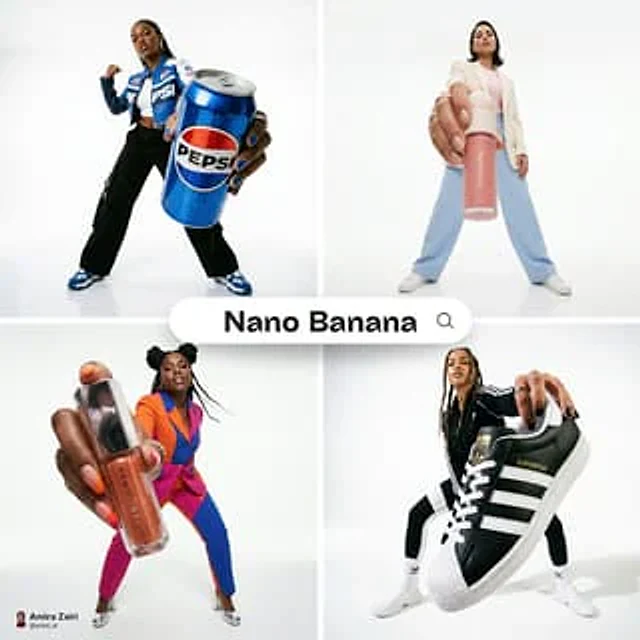
Example generated from “AmirMušić #1068”
Nano Bananaen
AmirMušić #1068

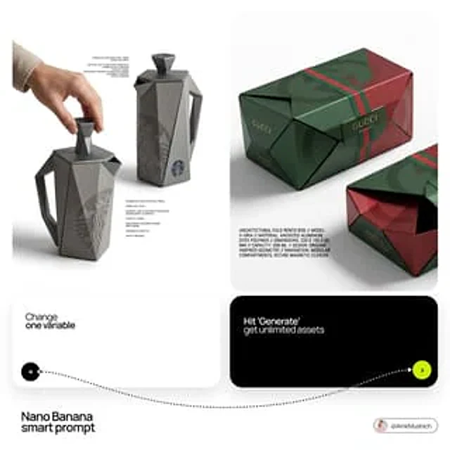
[BRAND NAME]: The core identity. [CATEGORY]: Clothing / Food / Automotive / Lifestyle. Goal: Generate a premium industrial design concept on a PURE WHITE background. 1. INNOVATION & OBJECT - Select one mundane functional object from [CATEGORY]. - Redesign it using unconventional, architectural, or origami-inspired geometry. - The object must look like a high-end designer invention, not a standard product. 2. UNIFIED COMPOSITION - Environment: A seamless, pure white studio background with a flat white floor. - Interaction: A human hand (natural texture) is shown using the object in the foreground, demonstrating its unique ergonomics. - Static Display: Right next to the hand, the same object is placed in a static, perfect pose to show its full silhouette and branding. - Shadows: Soft, realistic grey drop shadows on the white floor to provide depth and ground the objects. 3. BRANDING & TEXT - Identity: Apply the "[BRAND NAME]" logo in a high-contrast dark color (Black or Navy) directly onto the object's surface. - Technical Detail: Add small, elegant blocks of justified "specification text" in the white negative space around the objects for an editorial look. - Pattern: Use a subtle, oversized abstract fragment of the brand's logo as a texture on the object's material. 4. MATERIALS & FINISH - High-quality matte materials only: heavy-duty recycled paper, sandblasted metal, or soft-touch polymer. - Sharp architectural lines and clean, premium craftsmanship.
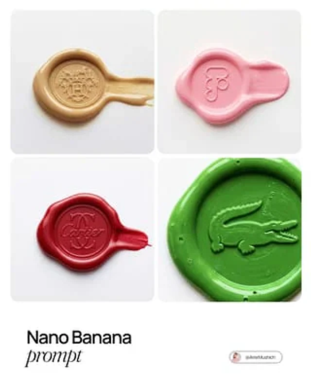
Example generated from “AmirMušić #1123”
Nano Bananaen
AmirMušić #1123

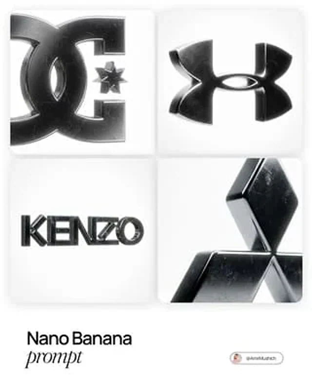
[BRAND NAME], the official trademark logo rendered strictly as a solid 3D object, maintaining the exact original vector shape and proportions without any artistic reinterpretation or distortion. The logo is crafted from dark, highly polished chrome metal with subtle surface micro-scratches and imperfections that break the mirror finish. The object is perfectly centered in a vast, infinite pure white void with no visible background elements or studio equipment. The lighting creates a soft, cinematic bloom (halo effect) along the metallic edges. 50mm lens aesthetic with a shallow depth of field gently blurring the furthest points of the object. A pronounced, visible film grain overlay is applied to the entire image.

Example generated from “AmirMušić #1254”
Nano Bananaen
AmirMušić #1254

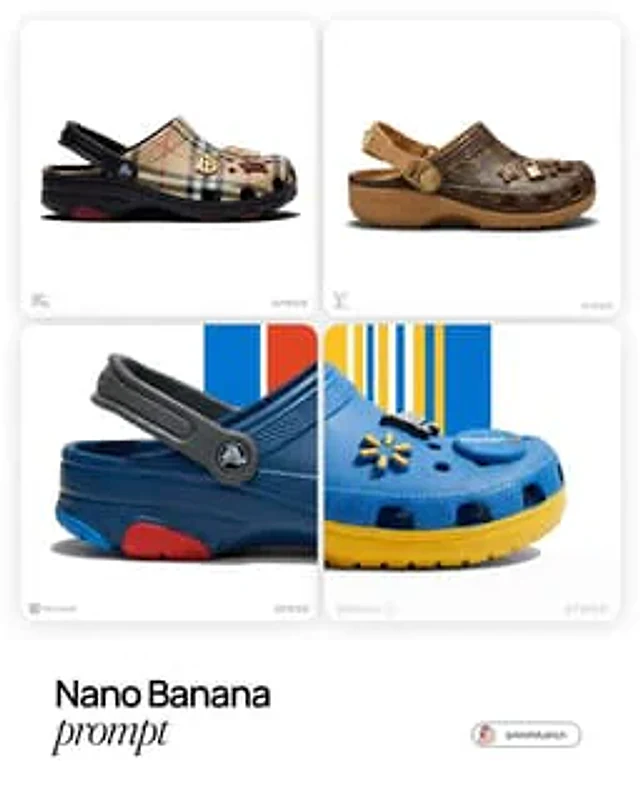
[Louis Vuitton]. Act as a World-Class Footwear Designer and Product Photographer creating a high-end "Crocs Collaboration" campaign image. 1. THE SUBJECT (CUSTOMIZED CROCS CLOG): Generate a photorealistic, high-end customized Crocs Classic Clog inspired by the visual identity of [BRAND NAME]. View: The shoe is positioned in a Strict Side Profile View (facing right), exactly like a product profile shot. It must look grounded and substantial. Color Blocking: Apply [BRAND NAME]'s official color palette intelligently: Body: The main foam upper is the brand's Primary Color. Sole/Strap: Use the Secondary/Accent colors for the thick rubber sole unit and the heel strap to create contrast. Custom Jibbitz (Charms): The shoe is decorated with 3-4 high-quality 3D Jibbitz charms plugged into the ventilation holes. These charms must be iconic symbols or products associated with [BRAND NAME] (e.g., if "Starbucks" -> a tiny frappuccino cup and logo; if "Nike" -> a 3D swoosh). 2. THE BACKGROUND (): The background is a Pure White Studio Space (#FFFFFF). 3. LIGHTING & MATERIALITY (EDITORIAL QUALITY): Lighting: Ultra-realistic High-Key Studio Lighting. Use a large softbox from the top-left to create smooth, glossy highlights on the rubber curves of the Crocs. The lighting is bright, neutral, and expensive. Texture: The material must look like real Croslite foam resin—matte with subtle specular highlights on the edges. The Jibbitz charms should look like hard glossy plastic or rubber. Shadows: A sharp, realistic contact shadow under the shoe to ground it on the white floor. 4. BRANDING & LAYOUT (UI ELEMENTS): Bottom Left Corner: Place a small, discrete, Monochrome Light Grey Logo of [BRAND NAME]. Bottom Right Corner: Place a small, discrete, Monochrome Light Grey "Crocs" Logo. TECH SPECS: Macro product photography, Phase One camera, 100mm lens, razor-sharp focus, 8k resolution, uncompressed, commercial look.

Example generated from “AmirMušić #1266”
Nano Bananaen
AmirMušić #1266

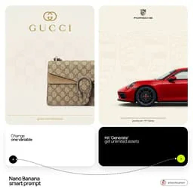
[BRAND NAME] + [PRODUCT] Act as a Senior Luxury Fashion Art Director and Studio Photographer specializing in high-end product key visuals for flagship campaigns, e-commerce editorials, and mobile-first brand content. PHASE 1: FORMAT & CANVAS Vertical format, 9:16 aspect ratio. Canvas background: a single flat field of warm off-white — not pure white, not grey. Target tone: soft ivory cream (#F4EFE6 equivalent), uniform and completely shadowless across the entire background plane. Autonomously determine [BRAND NAME]'s signature background tone — if the brand has a recognized house color for its packaging, tissue paper, or lookbook backgrounds, shift the canvas toward that specific off-white or neutral. The result must feel like an official brand document, not a generic studio. PHASE 2: BACKGROUND PATTERN (WATERMARK LAYER) Autonomously identify [BRAND NAME]'s iconic surface pattern, monogram, or archival motif — examples: a house monogram, toile print, geometric logo repeat, heritage emblem, or signature textile pattern. Render this pattern across the entire background canvas as a ghost watermark: same tone as the background but with a slight value shift (approximately 8–12% darker or lighter than the base). The pattern must be large in scale — individual motifs spanning 15–25% of canvas width. Opacity: 10–18% maximum. No hard edges. The pattern should feel embossed or tone-on-tone woven, not printed. It must recede behind all other elements. PHASE 3: LOGO PLACEMENT Autonomously reproduce [BRAND NAME]'s official logo with complete fidelity — correct letterforms, proportions, secondary marks (emblems, crowns, stars, monogram icons). Place the logo centered horizontally in the upper third of the frame (top 30% of canvas). Scale: the logo should span approximately 40–50% of canvas width — prominent but not overwhelming. Logo rendering: flat 2D, no extrusion, no chrome. Color: autonomously apply [BRAND NAME]'s official logo colorway — the exact brand-standard color(s) used on official packaging and website. If the brand uses a two-tone logo (icon + wordmark in different colors), preserve that hierarchy precisely. Directly below the main logo mark, place the full [BRAND NAME] wordmark in spaced capital letters — clean, geometric sans-serif, tracking: +200 to +300, same brand color, optical size approximately 60% of logo height. No decorative elements between logo and wordmark. PHASE 4: PRODUCT PLACEMENT Render [PRODUCT] as a photorealistic studio object with maximum material fidelity: — Leather: visible grain, pore structure, stitching thread texture, realistic edge paint. — Hardware: gold or silver metal with micro-reflections, not flat. — Canvas/fabric: woven fiber detail, not smooth CG. — All brand-specific surface patterns on the product must be accurate and legible. Placement: the product enters the frame from the bottom-right corner at a natural 25–35 degree angle, as if casually placed or mid-motion. The product is cropped — only 60–75% of the object is visible within the frame. The crop should feel intentional and editorial, not accidental. The product occupies the lower 55–65% of the canvas. The product must feel physically present in the space — not floating. Cast an extremely soft, barely visible contact shadow (opacity 8–12%) on the canvas beneath the nearest edge. No hard drop shadows. PHASE 5: LIGHTING Lighting: simulated large north-facing studio window light. Soft, directional, shadowless on the background. Color temperature: 5500–6000K (neutral daylight, slightly cool). Key light: large softbox equivalent from upper-left, filling the entire product surface evenly with minimal contrast ratio (1.2:1 to 1.5:1 max). Fill light: large bounce from right side, eliminating all harsh shadows. No rim light. No dramatic contrast. The lighting philosophy is: "the product sells itself — light only reveals, never performs." Global Illumination enabled for subtle inter-reflections between product surfaces. No specular hotspots on leather — only on metal hardware. PHASE 6: TYPOGRAPHY & FINISHING Bottom of frame: a thin horizontal rule line (1px, brand color, 80% canvas width, centered). Below the rule: a single line of micro-copy — a social handle, collection name, or campaign label — in the same clean sans-serif, lowercase or small-caps, minimal tracking. Autonomously generate a contextually appropriate label for [BRAND NAME]. TECH SPECS Render engine: photorealistic CGI, Keyshot / Octane product visualization aesthetic. Resolution: 9:16, ultra-high detail. Depth of Field: f/16 equivalent — everything in sharp focus. Zero bokeh. Tack-sharp edges on all product details.Tone mapping: clean, true-to-life. No filmic crush. No vignette. No grain. Color grade: neutral, faithful to real product color. Slight warmth in the ivory background only. No AI-plastic normals on leather or fabric. Microscopic surface imperfection maps required. No reflections on background. No environmental reflections — studio only. Mood reference: Louis Vuitton / Bottega Veneta / Celine official e-commerce and campaign photography standard. Clean enough to be used as a press image.

Example generated from “AmirMušić #1335”
Nano Bananaen
AmirMušić #1335

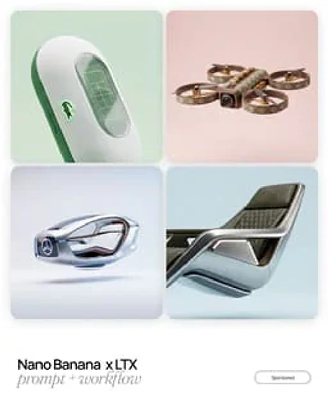
[BRAND NAME] design language, object reimagined as an unexpected flagship product of the brand for the next decade. Crafted from signature materials and textures. Distinctive aesthetics, iconic form factor, embodiment of brand philosophy, high-end industrial design. COMPOSITION & STAGING: The object is floating suspended in mid-air within the studio space (anti-gravity effect). It is positioned strictly dead center in the frame. Negative Space: There is a wide, generous margin of empty space (air) surrounding the object on all sides. Framing: The object is fully contained within the image boundaries with absolutely no cropping. PHOTOGRAPHY: Professional product photography, soft volumetric lighting, clean light pastel background, ultra-detailed.

Example generated from “AmirMušić #301”
Nano Bananaen
AmirMušić #301

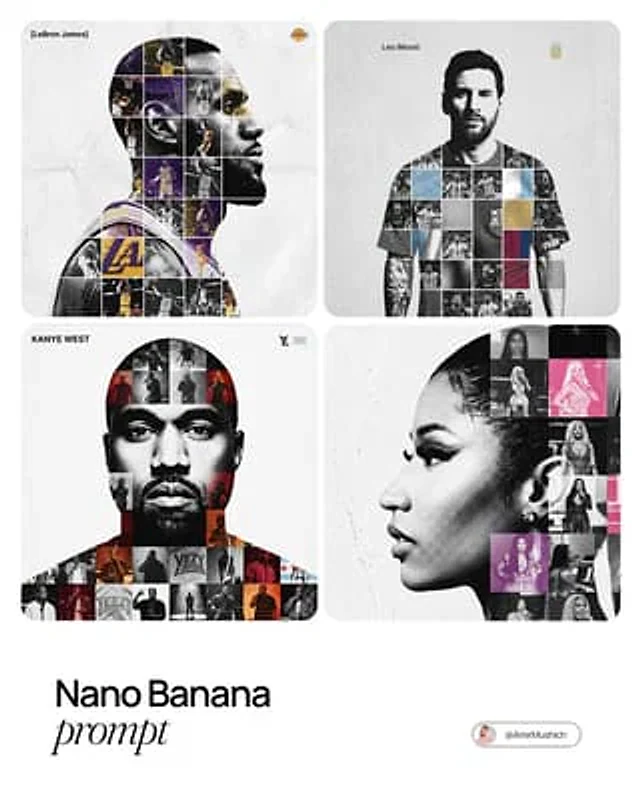
[PERSON NAME]. Act as a high-end sports graphic designer creating a conceptual tribute poster. The style is a complex "dual exposure photo-grid composite" with mixed-media textures. CENTRAL STRUCTURE (THE VESSEL): The central focus is a large-scale, high-contrast black and white portrait silhouette of [PERSON NAME]. This main portrait acts as the container. THE GRID FILL & TEXTURES (MIXED MEDIA): The interior of the silhouette is populated by a dense "photo mosaic grid" of action shots from the person's career. CRITICAL TEXTURE INSTRUCTION: Do not just paste flat photos. Apply artistic textures to various grid cells to create a tactile, collage feel. Use effects like: Halftone Dots: Comic-book style raster patterns on some cells. Fabric/Embroidery: Subtle thread or canvas textures suggesting a jersey or patch. Film Grain: Heavy noise on specific high-contrast action shots. COLOR STRATEGY: The base is Monochrome B&W. Use selective color overlays (relevant to the team/flag) ONLY on specific grid cells to create a rhythm. TYPOGRAPHY & BRANDING (STRICT MICRO-SCALING): Top Left (The Name): Write "[PERSON NAME]" strictly using the font Inter Semibold. Kerning: Tight negative kerning (-4%). Size: SMALL and discreet. It must occupy MAXIMUM 20% of the canvas width. Do NOT make it large or loud. Top Right (The Symbol): Place the primary logo (Team/Brand/Flag). Size: VERY SMALL. It must occupy MAXIMUM 10% of the canvas width. COMPOSITION & BACKGROUND: Background: Off-white or light grey with a visible high-quality paper or concrete texture. It should not be flat digital white. Alignment: Center the figure perfectly. Maintain wide negative space around the object.

Example generated from “AmirMušić #303”
Nano Bananaen
AmirMušić #303

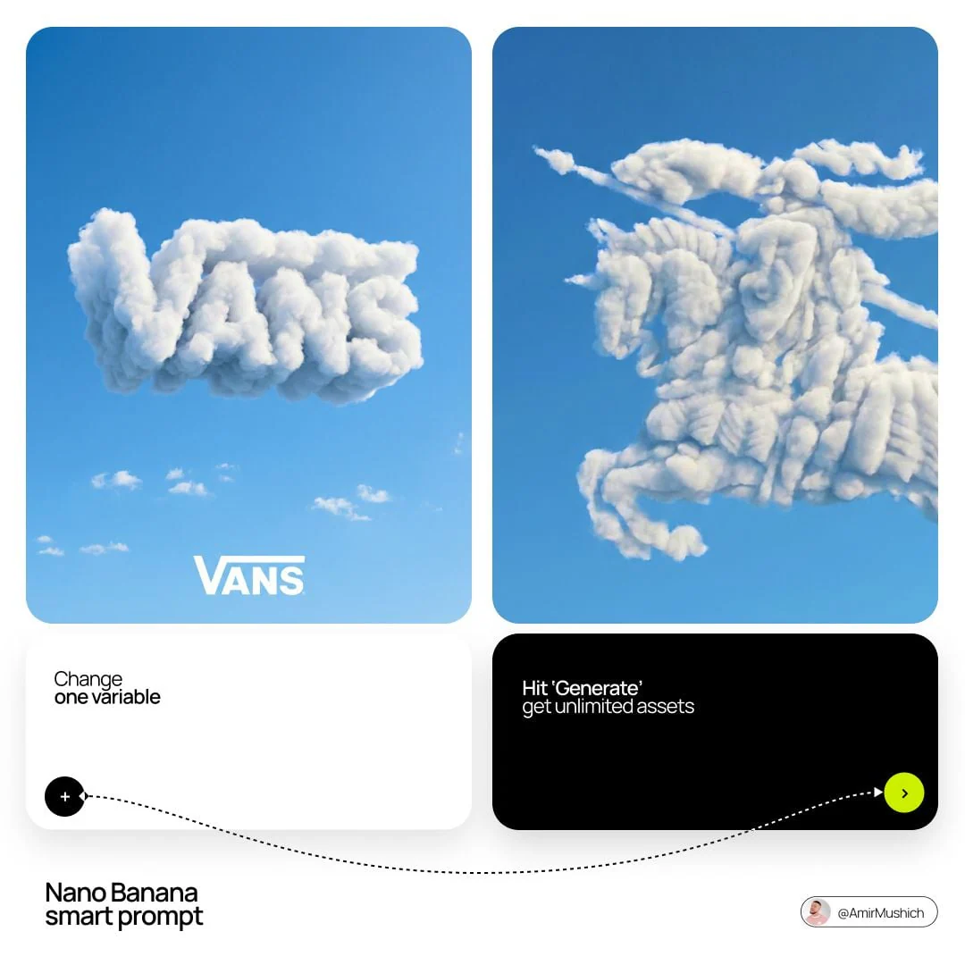
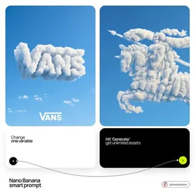
[BRAND NAME]: The name of the brand. Goal: Generate a single, minimalist, and surreal image where a cloud is shaped like the brand's logo. 1. THE LOGO CLOUD - **Subject**: A massive, photorealistic cumulus cloud in the exact geometric shape of the [BRAND NAME] logo. - **Texture**: Puffy, soft, and voluminous with natural sunlight illuminating the edges. - **Volume**: 3D sculptural appearance with realistic shadows within the cloud folds to show depth. 2. ENVIRONMENT & BACKGROUND - **Sky**: A vast, clear, vibrant blue summer sky. - **Secondary Elements**: A few small, wispy, natural clouds scattered far in the background to enhance the sense of scale and realism. - **Lighting**: Bright, direct daylight coming from the side to create high-contrast highlights and shadows. 3. INTEGRATED BRANDING - **Text**: The word "[BRAND NAME]" written in a clean, bold white sans-serif font. - **Icon**: A small, flat white version of the brand's logo placed next to the text. - **Positioning**: The branding (text + logo) is centered at the bottom of the frame, acting as a subtle anchor to the giant cloud above. 4. STYLE - Surrealist photography, ultra-minimalist composition, high resolution, 8k, cinematic look, clean and airy vibe.

Example generated from “AmirMušić #304”
Nano Bananaen
AmirMušić #304

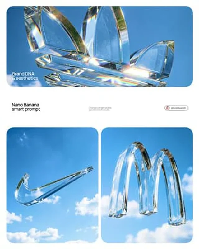
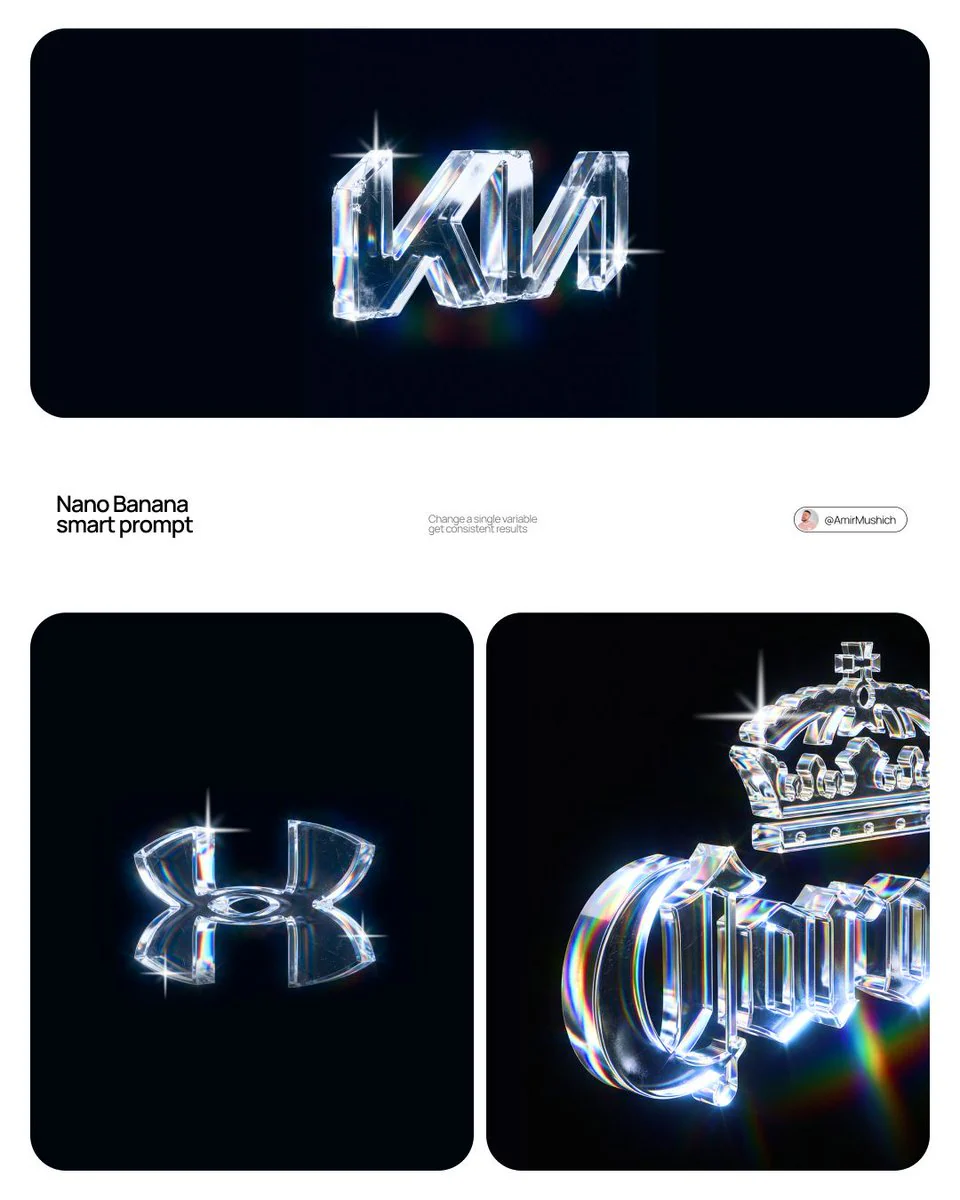
Act as a High-End Product Photographer and CGI Artist. PHASE 1: SUBJECT & LOGIC Generate a massive, perfectly centered, three-dimensional physical sculpture of the official, unaltered corporate logo for [BRAND NAME]. The sculpture must strictly adhere to the brand’s precise logo geometry and proportions (1:1 from brandbook). The sculpture is suspended in mid-air. Autonomously identify the exact official shape and structure of the [BRAND NAME] logo and render it as a single, flawless glass object without any modifications. PHASE 2: MATERIALITY (GLASS) The entire logo is made of hyper-realistic, optical-grade crystal glass (not water, not gel). The material is solid, colorless, and boasts high clarity with a high refractive index. It must look heavy and монолитное (monolithic). The glass structure contains subtle, photorealistic microscopic flaws: fine polished scratches on the surface and minor internal inclusions (dust particles/seed bubbles, very few) to avoid “CGI plastic.” The edges must be precision-beveled and fire-polished. PHASE 3: ENVIRONMENT & CAUSTICS The logo is suspended against a strictly clean, bright blue sky with sparse, naturally defined white cumulus clouds. NO land, NO trees, NO palms. The background is purely atmospheric. The focus is entirely on the glass logo. Critically render hyper-realistic, complex glass caustics: intense, sharp patterns of focused light and color (refractions of the blue sky) cast inside and onto the surface of the glass form due to the sunlight passing through it. TECH SPECS Rendered with Arnold or Octane. Phase One XF, 120mm Macro lens. Aperture f/5.6 for sharp depth across the entire glass sculpture. Intense, direct sunlight (hard lighting) to maximize caustics. Global illumination, ray-traced refractions (double-sided geometry), and chromatic aberration emulation (subtle) for optical realism. Fine grain film emulation (Fujifilm Velvia 50).

Example generated from “AmirMušić #306”
Nano Bananaen
AmirMušić #306

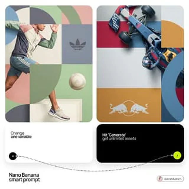
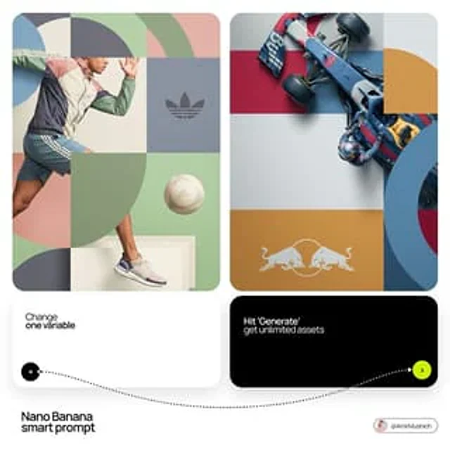
[BRAND NAME]. Act as a World-Class Editorial Designer. PHASE 1: DYNAMIC SUBJECT LOGIC. - Subject Selection: Autonomously analyze [BRAND NAME]. - Layering (The Sandwich Effect): Interweave the subject with background shapes. Some parts of the car/person must be hidden behind geometric blocks, while other parts (wheels, limbs, props) must overlap them to create 3D depth. PHASE 2: GRID & GEOMETRY. - Layout: A clean 2x2 grid composition. - Overlays: Superimpose large, bold geometric arcs and circles over the grid. - Visual Balance: Place one iconic product prop (e.g., a floating key fob for cars or a ball for sports) in a separate quadrant to balance the subject. PHASE 3: SOPHISTICATED MUTED PALETTE. - Color Direction: DO NOT use aggressive neon or oversaturated colors. - Palette: Identify the core colors of [BRAND NAME] and shift them to a "Sophisticated Muted" spectrum. - Tones: Use desaturated, earthy, or "dusty" versions of the brand colors (e.g., instead of hot pink, use dusty rose; instead of bright mint, use sage green; instead of royal blue, use slate blue). - Finish: Matte, flat color blocks with zero gradients. PHASE 4: PHOTOGRAPHY & LIGHTING. - Subject Style: High-end commercial studio photography. - Lighting: Soft, diffused studio lighting with gentle highlights. No harsh shadows. - Integration: The subject must feel physically embedded into the graphic grid. PHASE 5: MINIMALIST BRANDING. - Logo: Place a clean, single-color [BRAND NAME] logo in the center of one background block. No taglines, just the iconic symbol.

Example generated from “AmirMušić #307”
Nano Bananaen
AmirMušić #307

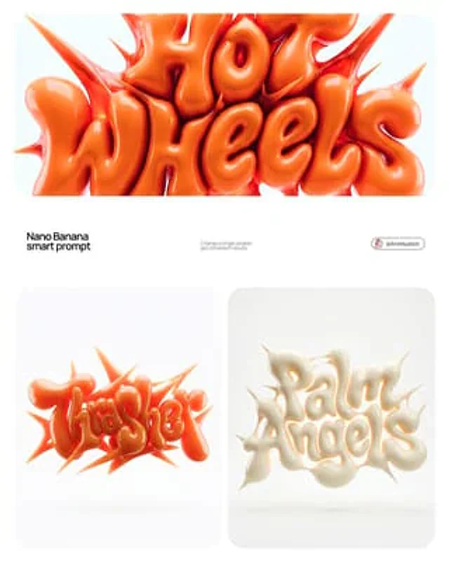
[BRAND NAME] | [COLOR] Act as a 3D Type Designer and CGI Artist working at the intersection of streetwear culture, Y2K aesthetics, and high-end digital sculpture. Your references: Nigo, Futura, Guccimaze, Soulwax art direction. --- PHASE 1: TYPOGRAPHIC CONCEPT Render the word or logotype [BRAND NAME] as a fully 3D sculptural object — not a flat text with extrusion, but a living, inflated, organic type sculpture. Style: Wildstyle graffiti DNA fused with inflatable balloon morphology. Letters are not separate — they flow into each other as one continuous organic mass. Each letterform has: bulbous pneumatic body as if inflated under high pressure from within, stretching the surface taut. Aggressive spike extensions — sharp tapered protrusions erupting between and around letters, directional, asymmetric, energetic, some long and blade-like, others short and thorn-like. Wildstyle overlaps — letters partially occlude each other creating depth layers, classic graffiti ambiguity where readability fights with visual complexity. Organic connective tissue — negative spaces between letters filled with stretched membrane forms, like rubber pulled between two inflated surfaces. --- PHASE 2: MATERIAL & SURFACE Single unified material across the entire sculpture — no color variation between letters. Material type: high-gloss latex / inflated rubber / soft silicone — the surface behaves like a balloon skin stretched to near-bursting point. Subsurface scattering: active — light penetrates slightly into the material, creating a translucent inner glow at thin edges and spike tips. Thinner areas read lighter, denser volumes read darker. Specular highlights: large, soft, slightly elongated — the kind you get on inflated latex, not hard plastic. Multiple secondary highlights in concave zones. Apply [COLOR] as the sole material color of the entire sculpture — this is non-negotiable. [COLOR] defines the pure midtone of the material. Highlights push toward the most luminous near-white version of [COLOR]. Shadow zones and deep crevices push toward the darkest most saturated version of [COLOR]. The entire chromatic range of the sculpture lives within the [COLOR] family — no hue deviation, no neutral grays. --- PHASE 3: COMPOSITION & STAGING Background: pure white (#FFFFFF) — clinical studio isolation. Zero texture, zero gradient. Shadow: none, or absolute minimum contact shadow directly beneath the sculpture — the object appears to float slightly. Orientation: horizontal spread — the sculpture is wider than tall, expanding laterally. Spike elements breach the invisible bounding box on all sides — top spikes reach upward, side extensions push outward. Camera angle: straight-on frontal, slightly elevated 5 to 10° above center — reveals the full typographic mass while showing the 3D depth of overlapping elements. Depth of field: none — sharp from foreground spikes to background letter bodies, every detail in focus. Scale feel: monumental — as if the sculpture is 2 meters wide in physical space, photographed in a white infinity studio. --- PHASE 4: TECH SPECS Render engine: Octane Render or Redshift — physically accurate subsurface scattering mandatory. Global illumination: large soft HDRI dome light, neutral white temperature 5500K. No directional shadows. No rim lights. No background elements. Ray tracing: on — for accurate specular and inter-reflection between letter surfaces. Anti-aliasing: maximum — edges must be razor-clean against white background. Output feel: this is a CGI product render, not AI art. Precision over expressionism. Aspect ratio: 1:1 square — centered composition with breathing room on all four sides.

Example generated from “AmirMušić #309”
Nano Bananaen
AmirMušić #309

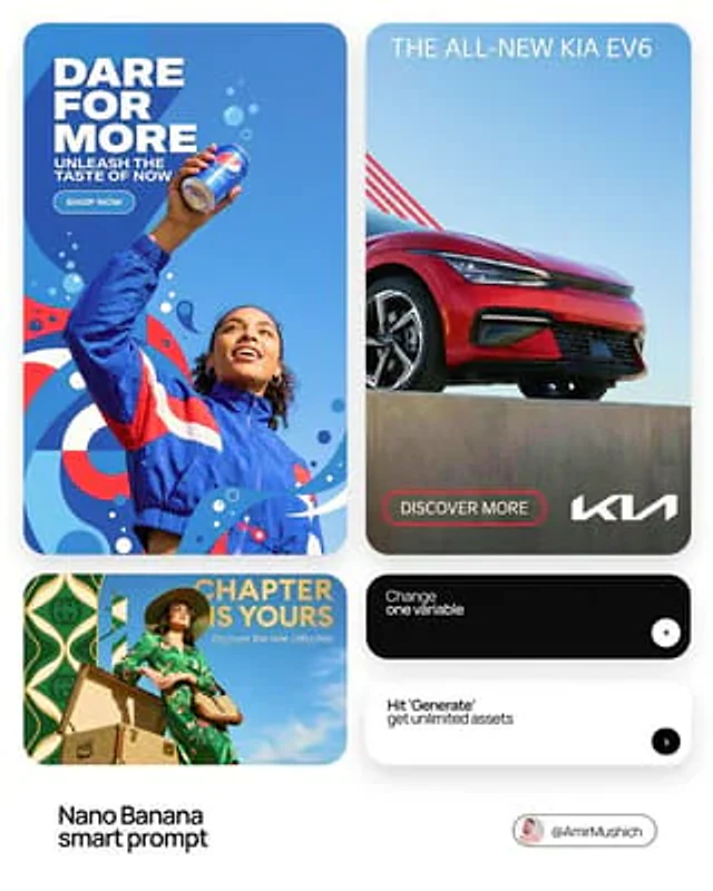
[BRAND NAME] | [HEADLINE] | [SUB-TEXT] | [CTA]. Act as a Senior Art Director. PHASE 1: INTEGRATED COMPOSITION & OVERLAP. - Layout: Seamless fusion of 2D graphics and 3D photography. - Overlap Logic: The subject and their primary "Product Prop" (e.g., a car, a device) must physically overlap the graphic panel to break the "wall" between design and photo. - Unity: Geometric shapes from the graphic side must bleed into the photographic sky area. PHASE 2: BRAND & CATEGORY SIMULATION. Autonomously analyze the [BRAND NAME] and its industry category: - INDUSTRY CONTEXT: * If Automotive: Include the vehicle and a person interacting with it. * If Tech: Include flagship devices/gadgets. * If Fashion/Lifestyle: Focus on editorial poses and premium accessories. - SHAPE SIMULATION: Match shapes to brand identity (e.g., Sharp/Speed for Auto, Minimalist/Grid for Tech). - COLOR SIMULATION: Use the brand's primary signature hue for both the graphic pattern and the subject's outfit/accents. PHASE 3: TYPOGRAPHY & CUSTOM CONTENT. - Headline: Display "[HEADLINE]" in a bold, modern Sans-Serif font. (If [HEADLINE] is empty, generate a high-energy slogan for [BRAND NAME]). - Sub-headline: Display "[SUB-TEXT]" below the headline. - Button: Create a minimalist pill-shaped CTA button with the text: "[CTA]". - Interaction: Text layers should have 3D depth, sitting partially behind the subject or product prop. PHASE 4: PHOTOGRAPHY & SUBJECT. - Perspective: Extreme low-angle (worm’s eye view) looking up. - Subject: A diverse persona reflecting the brand's audience. - Environment: Massive, clear blue sky as the backdrop. - Visual Link: Subject's styling must incorporate the Brand's primary color. PHASE 5: FINAL VISUAL STYLE. High-end commercial aesthetic. Crisp, saturated, professional fusion of flat vector art and realistic photography.

Example generated from “AmirMušić #314”
Nano Bananaen
AmirMušić #314

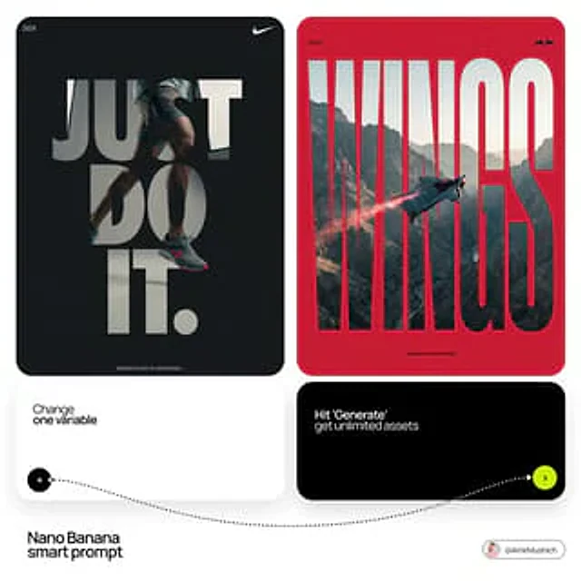
[BRAND NAME]. Act as a Senior Editorial Designer and Typographer. PHASE 1: TYPOGRAPHIC MASK (THE "WINDOW" EFFECT). - Core Element: Use the most iconic slogan or the name of [BRAND NAME] as a massive, ultra-bold, heavy sans-serif typographic mask. - Layout: The letters must be giant, filling the entire vertical frame from edge to edge with tight kerning. - Concept: The text acts as a "cut-out" window. The background is solid white, and the photographic subject is visible ONLY through the letterforms. PHASE 2: DYNAMIC SUBJECT LOGIC. - Subject Selection: - Detail: Ensure a high-contrast element (like a red shoe or a glowing headlight) is visible through one of the letters as a focal point. PHASE 3: SOPHISTICATED MUTED PALETTE. - Atmosphere: Use a "Refined Muted" color scheme. - Tones: Soft slate blues, charcoal greys, and creamy off-whites for the photography inside the mask. - Accent: Identify one sharp, saturated accent color belonging to [BRAND NAME] and apply it to a single key object visible through the text. PHASE 4: PHOTOGRAPHY & LIGHTING. - Lighting: Soft-box studio lighting. Diffused shadows and gentle highlights to create a cinematic, high-end editorial feel. - Finish: Clean, matte texture with zero visual noise. High-definition photographic quality. PHASE 5: MINIMALIST BRANDING. - Accents: Add a tiny minimalist logo and a small vertical tagline in a clean, microscopic sans-serif font near the corners. - Year: Include the year "2026" in a subtle, elegant font to mimic a limited-edition look.

Example generated from “AmirMušić #324”
Nano Bananaen
AmirMušić #324

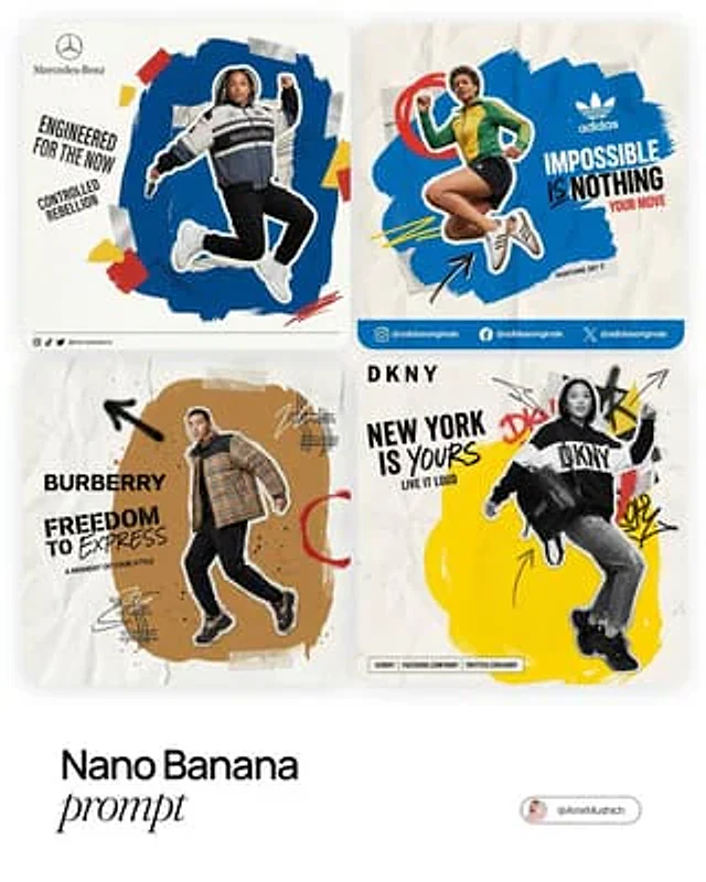
[BRAND NAME]. Act as a Social Media Art Director and Digital Collage Artist specializing in bold, youth-oriented brand content for Instagram and digital campaigns. PHASE 1: CONCEPTUAL FRAMEWORK Create a dynamic digital collage that merges fashion photography with graphic design chaos. This is controlled rebellion – a composition that feels spontaneous and energetic while maintaining brand coherence. The aesthetic is anti-polished: torn edges, layered textures, hand-drawn elements, and bold color blocking that screams confidence and movement. PHASE 2: MODEL & PHOTOGRAPHY - Subject: One model (diverse casting, age 18-30) in a dynamic, confident pose - Pose Energy: 80% attitude, 20% natural – sitting, jumping, mid-motion, or power stance (avoid static standing) - Outfit: Street style/athleisure that aligns with [BRAND NAME] aesthetic – casual but styled - Hero Product: Feature 1 signature [BRAND NAME] product prominently (sneakers, bag, apparel) – this is the visual anchor - Photography Style: Editorial fashion cutout – model extracted from background with clean edges - Camera Angle: Slight low angle to empower subject (hero perspective) - Crop: Full body or 3/4 body showing hero product clearly - Background Removal: Model cut out cleanly for layering over collage elements PHASE 3: COLOR BLOCKING FOUNDATION - Primary Color Blob: Large organic shape (40-60% of composition) in bold, saturated brand color behind/around model - Shape Style: Irregular, hand-painted aesthetic – think Photoshop brush strokes or torn paper texture (NOT perfect geometric shapes) - Color Selection (Autonomous): Choose 1 hero color from [BRAND NAME] palette: - Texture: Visible brush strokes, grain, or subtle noise (15-25% opacity) – avoid flat digital fills - Placement: Blob positioned to frame model without obscuring key product details PHASE 4: GRAPHIC ELEMENTS LAYER Add 3-5 abstract graphic elements scattered across composition: - Element Types: - Color Palette: Use 2-3 accent colors total (main blob color + 1-2 contrasting tones from brand palette) - Placement: Asymmetric scatter – top-left and bottom-right zones primarily (avoid center crowding) - Scale: Mix small (5% of canvas) and medium (15% of canvas) elements – nothing overpowering - Aesthetic: Analog/handmade feel – imperfect circles, rough edges, visible texture PHASE 5: TYPOGRAPHY INTEGRATION - Brand Logo: Clean [BRAND NAME] logo placed in upper-left or upper-right quadrant (10-15% of width) - Slogan/Tagline: If [BRAND NAME] has an iconic slogan, integrate it using: - Supporting Copy: Optional 1-line descriptor (e.g., "A MOMENT OF YOUR STYLE") in smaller uppercase sans-serif - Type Treatment: Mix of aligned and slightly rotated text (2-5° angles) for dynamic energy - Hierarchy: Logo largest → Slogan medium → Copy smallest PHASE 6: TEXTURE & BACKGROUND - Base Layer: Off-white or light gray textured background (NOT pure white) - Texture Options (Autonomous selection): - Color: RGB 245-250 (near-white with warmth) – maintains brightness while adding depth - Treatment: Texture should be felt, not seen – enhances tactility without competing with foreground PHASE 7: COMPOSITION RULES - Layout: Asymmetric balance – model off-center, graphic elements counter-balance - Breathing Room: 15-20% negative space (textured background visible) to prevent claustrophobia - Layering Order: Background texture → Color blob → Graphic elements → Model (cutout) → Typography top layer - Focal Point: Model + hero product = primary focus (60% visual weight), graphics support (40%) - Movement: Diagonal lines and angled elements create directional flow (top-left to bottom-right or vice versa) PHASE 8: BRAND INTELLIGENCE (AUTONOMOUS) Autonomously adapt composition based on [BRAND NAME] personality: - Streetwear/Sportswear (Nike, Adidas, Supreme): - Luxury Streetwear (Balenciaga, Off-White, Gucci): - Beauty/Lifestyle (Glossier, Fenty, Skims): - Tech/Modern (Apple, Tesla, Beats): PHASE 9: SOCIAL MEDIA FOOTER (OPTIONAL) - Bottom Strip: Clean white or light gray bar at bottom 8-10% of frame - Content: Social media handles (Instagram, Facebook, Twitter) in small sans-serif - Layout: Three-column grid with platform icons or text handles - Aesthetic: Minimal and professional – contrast with chaotic collage above TECHNICAL SPECS: - Aspect Ratio: 4:5 (Instagram feed) or 1:1 (square social post) - Resolution: 2400x3000px minimum (high-quality for zoom and detail) - Color Mode: sRGB, vibrant saturation (Instagram-optimized) - File Aesthetic: Digital collage that mimics analog craft (Photoshop + hand-drawn hybrid) - Model Photography: 85mm lens, f/2.8, shallow depth of field on original shoot (before cutout) - Style Reference: Nike social campaigns, Spotify wrapped graphics, Gen Z Instagram aesthetics, Hypebeast x streetwear collabs - Mood: Confident, energetic, youthful, authentic chaos, anti-corporate polish

Example generated from “AmirMušić #325”
Nano Bananaen
AmirMušić #325

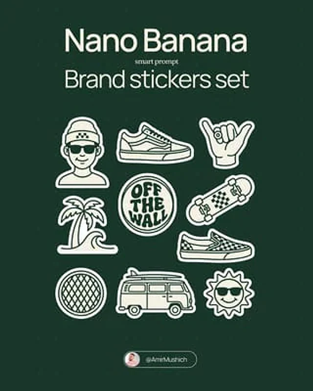
[BRAND NAME]. Act as a vector illustrator designing a trendy, high-end "Sticker Sheet" set. THE TASK: Deconstruct the brand identity of [BRAND NAME] into a playful, cohesive set of approximately 8-10 unique sticker designs arranged on a single sheet. Content Generation: Do not just make logos. Autonomously invent a mix of: Mascots/Characters: Stylized busts of people wearing brand-relevant accessories or expressing emotions. Key Products: Iconic items associated with the brand. Symbols/Objects: Abstract shapes or tools relevant to the brand's lifestyle. VISUAL STYLE (MONOLINE VECTOR): The art style must strictly match "Modern Trendy Line Art." Line Work: Use a THICK, UNIFORM line weight (monoline) for all internal details. The lines should be smooth, rounded, and confident. Coloring: The stickers must be filled with Solid Off-White or Cream, utilizing the line color for details. NO gradients, NO shading, NO 3D effects. Flat 2D vector look. The "Sticker" Effect: Every element must have a thick, distinct White (or Cream) Die-Cut Border surrounding it, separating it from the background. COLOR PALETTE (HIGH CONTRAST): Background: A solid, deep, saturated color to create maximum contrast. Stickers: High-brightness Cream or White fill with Dark (Black or Dark Brown) outlines. COMPOSITION: The stickers are scattered naturally across the sheet (knolling layout) with even spacing. No overlapping.

Example generated from “AmirMušić #328”
Nano Bananaen
AmirMušić #328

[BRAND NAME]. Act as a vector illustrator designing a trendy, high-end "Sticker Sheet" set. THE TASK: Deconstruct the brand identity of [BRAND NAME] into a playful, cohesive set of approximately 8-10 unique sticker designs arranged on a single sheet. Content Generation: Do not just make logos. Autonomously invent a mix of: Mascots/Characters: Stylized busts of people wearing brand-relevant accessories or expressing emotions. Key Products: Iconic items associated with the brand. Symbols/Objects: Abstract shapes or tools relevant to the brand's lifestyle. VISUAL STYLE (MONOLINE VECTOR): The art style must strictly match "Modern Trendy Line Art." Line Work: Use a THICK, UNIFORM line weight (monoline) for all internal details. The lines should be smooth, rounded, and confident. Coloring: The stickers must be filled with Solid Off-White or Cream, utilizing the line color for details. NO gradients, NO shading, NO 3D effects. Flat 2D vector look. The "Sticker" Effect: Every element must have a thick, distinct White (or Cream) Die-Cut Border surrounding it, separating it from the background. COLOR PALETTE (HIGH CONTRAST): Background: A solid, deep, saturated color to create maximum contrast. Stickers: High-brightness Cream or White fill with Dark (Black or Dark Brown) outlines. COMPOSITION: The stickers are scattered naturally across the sheet (knolling layout) with even spacing. No overlapping.

Example generated from “AmirMušić #333”
Nano Bananaen
AmirMušić #333

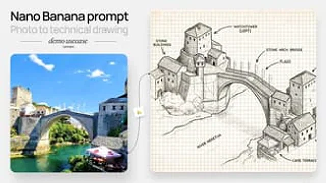
[Create a hand drawn isometric schematic diagram of this street]

Example generated from “AmirMušić #335”
Nano Bananaen
AmirMušić #335

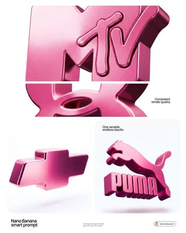
[BRAND NAME]. Act as a 3D Product Visualization Artist. PHASE 1: LOGO TO 3D OBJECT Take the [BRAND NAME] logo and transform it into a thick 3D sculptural form. Simplify to core shape, add rounded edges (8-12mm fillet), make it one solid piece with 40-60mm depth. Keep it recognizable. PHASE 2: PINK METALLIC MATERIAL - Color: Pink metallic (#C85A8E to #8B4A6F range) - Finish: Glossy brushed metal with fine grain - Highlights: Light pink (#E89BB8) - Shadows: Deep plum (#6B3854) - Roughness: 0.2 (shiny but not mirror) - NO copper, NO gold, NO silver PHASE 3: LIGHTING Soft studio lighting from top-left creating smooth gradient across the object. Light pink on highlights, deep plum in shadows. No hard shadows. PHASE 4: BACKGROUND & FLOATING - Pure white background (#FFFFFF) - Object levitating in white void - Soft blurred shadow underneath (90% transparent) - NO pedestals, NO stands, NO supports PHASE 5: CAMERA Slight 3/4 angle, looking down 10°, object centered, filling 60% of frame. TECH SPECS: - High-quality 3D render (Octane/Cycles) - 4K resolution - Full object in focus - Subtle bloom on highlights CRITICAL: - Must be PINK metallic only - Must float in pure white space - Must have thick 3D volume with smooth surfaces - Must look like luxury product photography

Example generated from “AmirMušić #340”
Nano Bananaen
AmirMušić #340

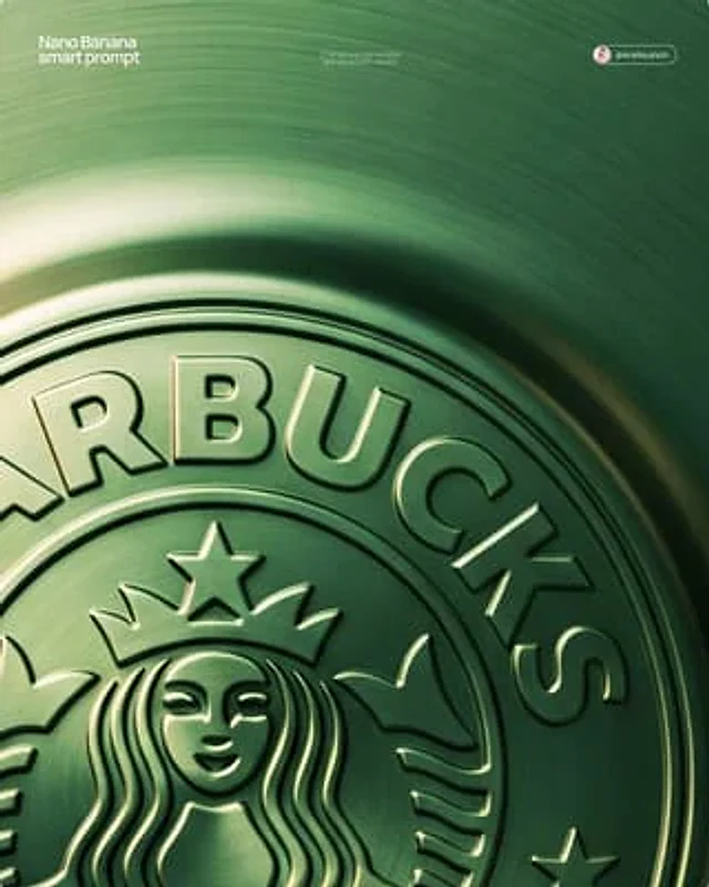
[BRAND NAME] + [METAL COLOR] Act as a Senior CGI Artist and Brand Identity Director specializing in premium logo materializations. Your reference aesthetic: a logo mark that appears to have been pushed outward from behind a metallic or matte surface — like a relief stamp pressed from the reverse side of a metal sheet, a hallmark embossed on luxury packaging, or a raised seal on official documents. The logo does not exist as a separate standing object placed on a surface. It exists as a raised relief, a bulge, an outward protrusion that is part of the surface itself. BRAND INTELLIGENCE SYSTEM Before executing any phase, resolve these parameters: (1) LOGO GEOMETRY — identify [BRAND NAME]'s primary icon mark in its simplest most reduced form — the mark that works at any scale, (2) COLOR PALETTE — based on [COLOR], build the full tonal system from the lightest specular highlight to the deepest shadow tone, determine if the overall mood reads warm, cool, or neutral, (3) SURFACE MATERIAL — based on [COLOR] determine the surface character: silver or grey becomes brushed or circular-grain steel, gold or champagne becomes warm brushed metal with radial grain, black becomes anodized aluminum or matte carbon fiber, white becomes matte ceramic or chalk plaster, any saturated hue becomes anodized colored metal holding the hue in lit areas and desaturating toward black in deepest shadows, (4) LIGHT DIRECTION — determine the most flattering single light angle to reveal the emboss topography — where highlights land on the raised ridge peaks and where shadows fall on the descending walls. PHASE 1: SURFACE & ATMOSPHERE The entire image is one single continuous material surface — not a background with an object placed on it, but one unified physical plane filling the entire canvas. This surface is made of the SURFACE MATERIAL resolved above. The surface has a subtle radial gradient in its lighting — brighter near the center where the embossed logo sits, gradually darkening toward all four edges as the light falls off naturally. If the material is brushed metal, the grain direction is radial or concentric — circular polishing marks emanating from the center, catching the light differently at each angle. Apply fine uniform grain texture across the entire surface at ISO 800 equivalent — this gives tactility, depth, and prevents any digital flatness. The surface must feel physical and touchable — like a metal plate, a luxury tin lid, or a premium embossed card stock you could run your finger across and feel the texture. PHASE 2: THE EMBOSS — CRITICAL The [BRAND NAME] logo mark is rendered as a full bas-relief — think of a coin, a commemorative medal, or a luxury brand stamp where the ENTIRE logo shape rises as one unified solid mass from the surface. Not just the outline. Not just the stroke path. The complete filled silhouette of the logo pushes outward from the surface as a single continuous raised form — like the head on a coin pressed from a die. The interior of the logo is NOT hollow or open. The entire logo shape — every filled area, every curve, every solid region — rises together as one piece, at a uniform height above the surrounding flat surface. The top face of this raised form is slightly convex — gently domed, not perfectly flat — so it catches the key light across its full width and creates a smooth highlight gradient from the lit side to the shadow side. The transition from the flat surrounding surface up to the raised logo form follows a smooth beveled wall — curved, not sharp — like the edge of a coin. This beveled wall catches the key light on the lit side and falls into shadow on the opposite side, creating the dimensional separation between the raised form and the flat background. Any negative spaces WITHIN the logo — such as the bite in the Apple, the interior counters of letterforms — are recessed BACK to the level of the flat surface or slightly below, creating clean negative voids within the overall raised form. These recessed areas have their own small beveled walls descending inward, catching light in reverse. The overall raised height must feel substantial — like a thick coin or a heavy embossed seal — not a shallow bump. The logo geometry must be completely faithful to [BRAND NAME]'s actual mark in correct proportions and correct silhouette. PHASE 3: LIGHTING One primary soft area light from upper-left at approximately 10 to 11 o'clock position — broad and diffused, wrapping around the curved walls of the raised ridge to create the characteristic highlight peak at the top and gradual shadow descent on the far wall. Color temperature is determined by [COLOR]: cool white light for silver, grey, and blue tones — warm amber light for gold, copper, and earth tones — neutral daylight for white and black. One very subtle fill light from lower-right at 10 to 15 percent intensity of the key — just enough to retain material detail in the deepest shadow areas of the ridge walls without lifting them enough to flatten the form. No hard shadows anywhere on the surface. No spotlight pools. No rim light. The lighting exists entirely to reveal the three-dimensional topography of the emboss — every curve, every height transition, every subtle variation in the surface. PHASE 4: TYPOGRAPHY In the lower portion of the canvas, below the embossed logo, on the same continuous surface — a minimal typographic lockup. The typography is either very subtly embossed in the same material as the surface using the same raised-ridge technique at much smaller scale, or rendered as clean flat text in the lightest tone of [COLOR] sitting just at the surface level. Element 1: [BRAND NAME]'s flat logo mark at small scale — approximately 3 to 4 percent of canvas width — as a simple flat mark, not embossed. Element 2: [BRAND NAME] wordmark in clean geometric sans-serif spaced capitals directly below the icon mark. Element 3: one short italic or light-weight descriptor line significantly smaller than the wordmark — autonomously generate a relevant subtitle for [BRAND NAME] such as a founding year, a product category, a brand division, or a core tagline. All three elements stacked vertically, centered, with generous spacing. No decorative elements. No lines or rules. Pure typographic restraint. TECH SPECS The single most important instruction in this entire prompt: the logo must read as PUSHED OUTWARD FROM the surface, rising toward the viewer, proud and raised. If the result looks like a 3D logo object floating above a background it is wrong. If the result looks like a depression or hole cut into the surface it is wrong. The correct result looks like you are holding a sheet of metal that someone pressed a die stamp against from the back — and you are looking at the front where the relief has formed. Ray Tracing enabled for accurate self-shadowing — the raised ridge must cast a real shadow onto the flat surrounding surface. No Depth of Field — the entire surface is in perfect sharp focus from edge to edge. Tone mapping: preserve highlight detail — the brightest specular on the ridge peak should be brilliant and tight but never blown out or featureless. Film grain applied uniformly across the full final render. No chromatic aberration. No lens distortion. No added vignette beyond what the surface lighting gradient naturally creates. Anti-aliasing maximum — the ridge edges must be perfectly clean. Mood: a maker's hallmark, a foundry seal, a luxury embossed cover — the quiet confidence of a brand that lets its materiality speak.

Example generated from “AmirMušić #349”
Nano Bananaen
AmirMušić #349

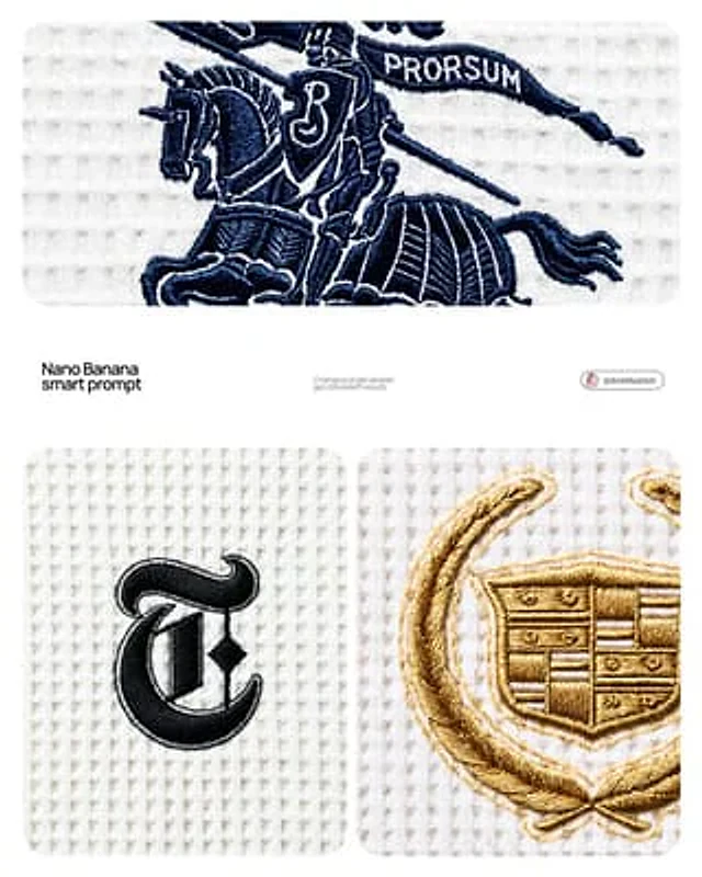
[BRAND NAME] Act as a Macro Product Photographer and Textile Art Director shooting a close-up editorial campaign of a premium embroidered garment. References: Loro Piana fabric campaigns, Brunello Cucinelli texture photography, A.P.C. garment detail shoots, Japanese boro textile documentation. PHASE 0: BRAND LOGO INTELLIGENCE Retrieve the canonical logotype or primary mark of [BRAND NAME] from training data. Identify the core geometric essence of the logo — its fundamental shapes, stroke relationships, and compositional balance. Translate this identity into an embroidery-native form language: sharp geometric elements become satin stitch bars and needle-point spikes, circular elements become dense satin stitch ovals or French knot clusters, complex letterforms are simplified into their most essential strokes while remaining recognizable. The embroidery interpretation must feel like a deliberate premium interpretation of the brand mark — as if [BRAND NAME]'s design team commissioned an embroidery artist to translate their logo into thread. Autonomously determine the thread color most iconic to [BRAND NAME] — this becomes the primary embroidery thread color. If [BRAND NAME] has no dominant single color, default to deep navy #1A2332. PHASE 1: TEXTILE BACKGROUND The background is a premium waffle-knit cotton fabric — the weave structure is a precise geometric grid of raised square cells, each cell approximately 2×2mm equivalent, separated by thin recessed channels running both horizontally and vertically. The raised nodes of each cell are flat-topped, not rounded — creating a regular orthogonal relief pattern across the entire surface. The fabric color is cold off-white — #F0F0EE to #EBEBEA range, with a very slight cool gray bias, not warm ecru or cream. The weave is consistent and uniform across the entire frame — machine precision, no tension variation, no distortion. Microscopic fiber fuzz is visible on the flat tops of the raised nodes — individual cotton fibers catching the diffused overhead light as a very fine surface bloom. The recessed channels between cells are in soft shadow — not deep shadow, just slightly darker than the raised nodes, consistent with flat overhead illumination. PHASE 2: EMBROIDERY CONSTRUCTION SYSTEM The logo mark of [BRAND NAME] rendered as machine or hand embroidery using these specific stitch techniques. Satin stitch: the primary technique for all filled areas and stroke elements — dense parallel threads laid side by side with zero gap, creating a smooth glossy surface. Thread direction follows the long axis of each stroke element — horizontal strokes have horizontal threads, diagonal strokes have diagonal threads. The characteristic sheen of satin stitch is critical: threads catch light along their length creating bright reflective zones on thread-parallel surfaces and darker zones on thread-perpendicular surfaces, creating a directional shimmer across the embroidery surface. Stem stitch or outline stitch: used for any curved linear elements — thin continuous line of overlapping thread segments following curves with natural flexibility. French knots: small circular dot elements rendered as tightly wound thread knots — each knot has a visible spiral wind pattern at macro distance. Spike elements: long tapering needle-like forms executed in satin stitch that tapers from full width to a single thread point — gradual and precise, ending in a razor-sharp thread tip. Edge treatment: every embroidered element has a thin visible backing outline — 1 to 2 thread widths of the base fabric visible between the embroidery and the surrounding textile. This underlay/backing edge is slightly lighter than the main embroidery thread — it outlines every form and confirms the physical layering of embroidery over fabric. Physical relief: the embroidery sits 1 to 3mm above the fabric surface — confirmed by a very subtle shadow halo directly underneath each embroidered element. The shadow is symmetrical around the embroidery perimeter, soft-edged, 1 to 2mm wide — consistent with flat overhead illumination, not directional raking light. PHASE 3: THREAD MATERIAL Primary thread color: autonomously determined brand color from PHASE 0. Thread material: mercerized cotton or silk embroidery thread — high sheen, smooth filament surface. The thread color is never flat — it shifts in value along its length based on light angle. Directly lit zones approach a lighter more luminous version of the base color. Shadow zones approach a deeper more saturated version. The overall embroidery reads as one unified color but contains a full tonal range within that color family. Secondary thread: the backing/underlay edge thread is 2 to 3 shades lighter than the primary thread — creating the characteristic light outline visible around all embroidered elements. PHASE 4: COMPOSITION & CAMERA Camera body: Canon EOS R5 or Nikon Z8 — full frame, 45 megapixel minimum for fabric texture resolution. Lens: Canon RF 100mm f/2.8L Macro IS USM or Nikon Z MC 105mm f/2.8 VR S — used at moderate close-up distance, not at maximum 1:1 magnification. Focus distance: 40 to 55cm — the embroidery fills approximately 30 to 40% of the frame height, leaving generous fabric context on all sides. This is a moderate close-up, not extreme macro — the full embroidery composition is visible with substantial textile surround. Aperture: f/8 to f/11 — deep depth of field, the entire embroidery and all surrounding fabric texture are in crisp simultaneous focus from corner to corner. No visible bokeh anywhere in the frame. Shutter speed: 1/200s with continuous light source. ISO: 100 — base ISO, zero noise, maximum tonal resolution in the subtle gray shadows of the waffle recesses. White balance: 5600K — neutral daylight, renders the cold off-white fabric accurately without warm or cool shift. Exposure: slightly bright ETTR — the off-white fabric renders as a luminous near-white, embroidery thread reads as deep rich dark against the bright ground. Aspect ratio: 4:5 portrait. Camera perpendicular to fabric plane — zero perspective distortion, embroidery geometry rendered faithfully. PHASE 5: LIGHTING Primary light: large diffused overhead source — a 120×120cm softbox or diffusion panel positioned directly above the fabric at 60 to 80cm distance. The light is as close to flat and directionless as possible. No raking angle — the light comes from directly above at 85 to 90° to the fabric plane. This flat overhead lighting creates: uniform brightness across the entire fabric field with no hot spots or falloff. Very short soft shadows in the recessed channels of the waffle grid — 1 to 2mm wide, soft-edged, falling straight down. Soft symmetrical micro-shadow halo directly beneath the embroidery — the 1 to 3mm relief creates a subtle darker zone immediately surrounding the embroidery perimeter, equal on all sides. No directional shadow — the shadow is not cast to one side. Secondary light: none. No fill, no rim, no accent. The single large overhead diffused source is the complete lighting setup. Overall mood: clinical, precise, bright — consistent with product documentation or high-end textile editorial photography where the subject must be seen with maximum clarity and zero atmospheric distraction. PHASE 6: TECH SPECS Render: Octane Render or Redshift with fiber/textile displacement geometry. Thread geometry: actual 3D cylindrical thread strands — each thread strand is a real geometric object casting real shadows on adjacent threads, not texture maps. Fabric weave: real geometric displacement mesh for waffle structure — not normal map. Ray tracing: on — for accurate micro-shadow casting between individual thread strands and between embroidery and fabric surface. Subsurface scattering: subtle on thread material — mercerized cotton and silk have slight translucency. Depth of field: physically accurate — f/8 to f/11 at 100mm at 40 to 55cm focus distance, full frame sharp corner to corner. Anti-aliasing: maximum. Sampling: minimum 2048 samples — zero noise in shadow zones, full tonal resolution in the off-white fabric field. Output feel: this image should be indistinguishable from a photograph taken with a Canon 100mm macro in a textile documentation studio. The viewer must feel the urge to touch the fabric.

Example generated from “AmirMušić #350”
Nano Bananaen
AmirMušić #350

[BRAND NAME]. Act as a World-Class Editorial Designer. PHASE 1: DYNAMIC SUBJECT LOGIC. - Subject Selection: Autonomously analyze [BRAND NAME]. - Layering (The Sandwich Effect): Interweave the subject with background shapes. Some parts of the car/person must be hidden behind geometric blocks, while other parts (wheels, limbs, props) must overlap them to create 3D depth. PHASE 2: GRID & GEOMETRY. - Layout: A clean 2x2 grid composition. - Overlays: Superimpose large, bold geometric arcs and circles over the grid. - Visual Balance: Place one iconic product prop (e.g., a floating key fob for cars or a ball for sports) in a separate quadrant to balance the subject. PHASE 3: SOPHISTICATED MUTED PALETTE. - Color Direction: DO NOT use aggressive neon or oversaturated colors. - Palette: Identify the core colors of [BRAND NAME] and shift them to a "Sophisticated Muted" spectrum. - Tones: Use desaturated, earthy, or "dusty" versions of the brand colors (e.g., instead of hot pink, use dusty rose; instead of bright mint, use sage green; instead of royal blue, use slate blue). - Finish: Matte, flat color blocks with zero gradients. PHASE 4: PHOTOGRAPHY & LIGHTING. - Subject Style: High-end commercial studio photography. - Lighting: Soft, diffused studio lighting with gentle highlights. No harsh shadows. - Integration: The subject must feel physically embedded into the graphic grid. PHASE 5: MINIMALIST BRANDING. - Logo: Place a clean, single-color [BRAND NAME] logo in the center of one background block. No taglines, just the iconic symbol.

Example generated from “AmirMušić #358”
Nano Bananaen
AmirMušić #358

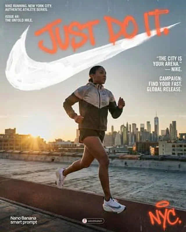
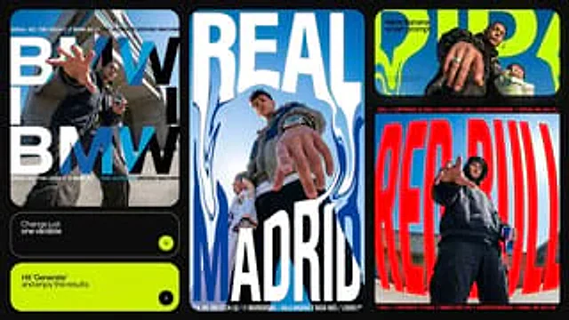
Graphic design smart prompt Generate ad posters in Nano Banana This prompt generates: • POV low-angle photo (pointing at viewer) • Oversized text + brand tagline • Serial numbers, copyright lines, technical callouts • Brand-appropriate color blocking and texture Use case: • social media posting, • influencer collab visuals, • pitch decks. Prompt 👇

Example generated from “AmirMušić #362”
Nano Bananaen
AmirMušić #362

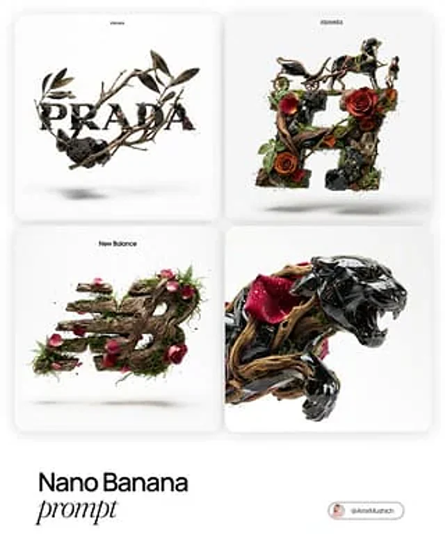
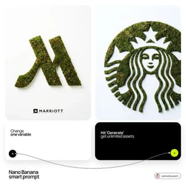
[BRAND NAME]. Act as a Master of Material Science and World-Class 3D Visualizer. PHASE 1: DYNAMIC ELEMENTAL RECONSTRUCTION. The central subject is the iconic logo of [BRAND NAME], physically constructed from ANY raw natural element. CRITICAL: This includes, but is not limited to, botanical elements (flowers, rose petals, thorns, gnarled wood, moss, leaves) and geological/elemental materials (obsidian, crystals, flowing water, ice, volcanic rock). The logo must be medium-sized, levitating, and rotated at a dynamic 3D angle (3/4 view) to showcase its volume. PHASE 2: HYPER-TACTILE TEXTURE & REALISM. The goal is "Sensory Realism" — the viewer should feel they can touch the object. - If BOTANICAL: Render microscopic cellular structures on petals, dew droplets with refraction, and the velvety fuzz on stems. - If MINERAL: Render micro-pores, crystalline inclusions, and razor-sharp edges. Include subtle "imperfections" like dust particles or organic irregularities to break the CG look and achieve 100% photorealism. PHASE 3: COMPOSITION, LIGHTING & BRANDING. - ENVIRONMENT: A pure, clinical, solid white background for a High-Key commercial look. - TYPOGRAPHY: At the top of the frame, place a very small, minimalist [BRAND NAME] text logo in black. - LIGHTING: Precise studio setup with sharp specular highlights (glints) and a soft, realistic contact shadow on the white floor below to ground the levitating object. TECH SPECS: Extreme Macro photography, 100mm lens, f/8, Ray Tracing (Path Tracing), Subsurface Scattering for light depth, 8k resolution, Unreal Engine 5.4 / Octane Render aesthetic.

Example generated from “AmirMušić #379”
Nano Bananaen
AmirMušić #379

[BRAND NAME]: The name of the brand. Goal: Generate a single, minimalist, and surreal image where a cloud is shaped like the brand's logo. 1. THE LOGO CLOUD - **Subject**: A massive, photorealistic cumulus cloud in the exact geometric shape of the [BRAND NAME] logo. - **Texture**: Puffy, soft, and voluminous with natural sunlight illuminating the edges. - **Volume**: 3D sculptural appearance with realistic shadows within the cloud folds to show depth. 2. ENVIRONMENT & BACKGROUND - **Sky**: A vast, clear, vibrant blue summer sky. - **Secondary Elements**: A few small, wispy, natural clouds scattered far in the background to enhance the sense of scale and realism. - **Lighting**: Bright, direct daylight coming from the side to create high-contrast highlights and shadows. 3. INTEGRATED BRANDING - **Text**: The word "[BRAND NAME]" written in a clean, bold white sans-serif font. - **Icon**: A small, flat white version of the brand's logo placed next to the text. - **Positioning**: The branding (text + logo) is centered at the bottom of the frame, acting as a subtle anchor to the giant cloud above. 4. STYLE - Surrealist photography, ultra-minimalist composition, high resolution, 8k, cinematic look, clean and airy vibe.

Example generated from “AmirMušić #388”
Nano Bananaen
AmirMušić #388

[BRAND NAME]: Enter the brand name here. Goal: Generate a minimalist organic image where a stylized logo icon of [BRAND NAME] is transformed into a large moss-textured artifact, with a small brand signature at the bottom. Constraint: NO TEXT inside or immediately near the central moss icon. Only the bottom signature. 1. THE CENTRAL MOSS ICON - Main Subject: A large, geometrically precise symbol, sculpted into the exact form of the [BRAND NAME] logo icon. - Material: The symbol is entirely made of dense, heavily textured, natural green stabilizing moss. The texture is rough and organic with varying shades of green and brown. - Form: The geometric edges are sharp and clean, but filled with the soft, billowy texture of moss. 2. ENVIRONMENT & LAYOUT - View: A top-down, central flat lay view. - Background: A flawless, uniform, matte white studio background. Full minimalist negative space. - Lighting: Bright, soft, diffused studio lighting that emphasizes the tactile moss texture while minimizing harsh shadows. 3. BOTTOM BRAND SIGNATURE (CRITICAL) - Placement: A clean horizontal signature block centered at the bottom, far below the moss icon. - Elements: A tiny, flat, minimalist version of the [BRAND NAME] logo icon on the left. - Text: The word "[BRAND NAME]" in a clean, bold, black sans-serif typeface immediately to the right of the tiny logo. - Scale: The signature must be very small compared to the central moss artifact. 4. AESTHETIC - Biophilic design, premium product photography, clean, fresh, airy, high-end editorial look. 8k resolution.

Example generated from “AmirMušić #394”
Nano Bananaen
AmirMušić #394

A minimalist, black-and-white flat vector illustration portrait of [NAME], rendered in the expressive "Notion avatar" art style. LINE WORK & VIBE: Style: Use THICK, UNIFORM black outlines (monoline weight). The lines should feel organic, smooth, and confident, not rigidly geometric or robotic like generic icons. Vibe: The character should have a distinct personality and a relaxed, cool, or friendly expression. Focus on stylized features, unique hairstyles, and defining accessories to convey character. SELECTIVE BLACK FILLS (CRITICAL): Unlike pure outline icons, utilize Solid Black Fills selectively and strategically. Where to Fill: Use solid black for prominent hair masses, beards, eyebrows, sunglasses, or dark clothing elements. Where to Keep White: The skin, main face area, and lighter elements must remain pure flat white inside the thick outlines. COMPOSITION & TECHNICAL: No shading, no gray tones, no gradients. Only pure Black and pure White. Clean bust or headshot composition centered on a white background. High contrast, clean 2D vector graphics.

Example generated from “AmirMušić #400”
Nano Bananaen
AmirMušić #400

[BRAND NAME] Act as a CGI Optical Physicist and 3D Type Sculptor creating a hero crystal typography visual for a luxury brand campaign. References: James Turrell light installations, optical physics photography, Rick Owens × crystal aesthetics. PHASE 0: BRAND LOGO INTELLIGENCE Retrieve the 100% canonical, trademark-accurate logotype of [BRAND NAME] from training data — this is non-negotiable. Reproduce the exact proprietary typeface or custom lettering: every stroke weight, every curve tension, every terminal detail, every unique glyph modification. Do not substitute with a similar font — decode the actual trademarked letterform geometry. If [BRAND NAME] has a primary symbol or emblem — place it above or integrated with the wordmark exactly as in the official logo lockup. Fidelity test: a brand lawyer must recognize this as the correct logo, not an approximation. PHASE 1: CRYSTAL MATERIAL SYSTEM The canonical logotype of [BRAND NAME] is a fully 3D sculptural object made entirely of optical crystal glass — not metal, not plastic, not rubber. Material: optical borosilicate glass or synthetic crystal, IOR 1.85 to 2.1, maximum dispersion coefficient. The letterforms have physical volume and thickness — cross-section is consistent throughout each stroke, like letters carved from a single block of optical glass. Surface finish: polished to sub-micron smoothness on primary faces — all major faces mirror-flat and fully refractive. Edges between faces are sharp and precise — maximum chromatic dispersion occurs here. The material is optically pure in its core — zero bubbles, zero inclusions in the interior volume. CRITICAL — WEAR & IMPERFECTION SYSTEM: The crystal has been handled — it carries the history of physical existence. Apply these surface imperfections with restraint and realism, never overwhelming the dispersion beauty: micro-scratches — a sparse network of hairline scratches on the front and top faces, depth 0.01 to 0.05mm equivalent, visible only when light catches them at specific angles. They scatter light slightly, creating a faint matte haze in the scratch zone while surrounding surface remains mirror-clean. Scratches follow organic directional patterns — some parallel, some crossing, as if from handling and storage, never uniform or grid-like. Edge chips — 2 to 4 very minor edge micro-chips along the sharpest edges and corners, each no larger than 0.5mm equivalent. These tiny imperfections catch light differently than clean edges — they create micro-flare events, small irregular sparkles where a chip breaks the otherwise perfect edge geometry. Surface haze zones — 1 to 2 small irregular areas of very fine surface abrasion, like the glass has been lightly scuffed by contact with another hard surface. These zones appear as subtle frosted patches, 3 to 8% opacity maximum — barely visible, discovered rather than obvious. They slightly diffuse the refraction beneath them, softening the rainbow bands in that micro-zone only. Fingerprint ghosts — optional, extremely subtle — 1 partial fingerprint trace on one face, visible only as a very faint oily interference pattern when light hits at oblique angle. Adds humanity to the object. All imperfections are surface-level only — the interior crystal volume remains optically perfect. The wear says this object is precious and real, not freshly manufactured. PHASE 2: LIGHT & DISPERSION SYSTEM Single collimated light source entering from upper-left at 35° — focused, high-intensity, like a precision studio spot or filtered sunlight. As light passes through the crystal letterforms it undergoes full chromatic dispersion — splitting into the complete visible spectrum following Snell's law geometry with maximum physical accuracy. Dispersion behavior on faces: each polished face simultaneously reflects and refracts — where light exits or reflects, a full spectrum appears in strict physical order red → orange → yellow → green → blue → violet. Rainbow bands are sharp and laser-clean at their origin edges, softening and widening as they travel across faces. Micro-scratch zones interrupt the rainbow bands locally — creating fine scattered light filaments branching off the main dispersion paths. Internal reflections: light bounces between letter faces creating crossed and layered rainbow patterns inside the volume — letters glow from within, nearly dark at the core, exponentially brighter toward illuminated faces. Multiple internal reflection paths create 3 to 5 distinct rainbow events visible simultaneously inside each major letterform. Edge glow: every sharp edge emits thin intense white-blue luminous line from total internal reflection — edge chips create micro-flare interruptions at their locations, bright irregular sparkles punctuating the otherwise continuous edge glow. Chromatic aberration at all edges: red fringe on one side, blue-violet fringe on the other — physical dispersion, not decorative filter. The 3/4 angle reveals front face and top face simultaneously — each face receives different dispersion patterns, creating layered optical complexity. Top face rainbow pattern and front face rainbow pattern intersect at the top edge of each letterform, creating a zone of maximum spectral density. PHASE 3: BACKGROUND Background: pure absolute black (#000000 to #050505) — a light-absorbing void, no texture, no gradient, no reflected light. The crystal letters float in darkness — no surface beneath, suspended in void. No ambient light reaching the background. The only light in the image exists within and immediately around the letterforms. Dispersed rainbow light creates a very subtle colored haze in the immediate 2 to 4cm radius around each letter — soft spectral glow bleeding into the black void. Beyond that: absolute darkness. The letters are the sole light source in the scene. The micro-scratch haze zones appear as slightly cooler, slightly less luminous areas against the surrounding rainbow glow — their presence is felt rather than explicitly seen. PHASE 4: COMPOSITION CRITICAL — 3/4 ANGLE: The logotype is rotated approximately 5 to 10° on the horizontal axis and elevated 5 to 10° on the vertical axis — a subtle, almost-frontal three-quarter view. The rotation is intentionally minimal — just enough to reveal the physical depth and thickness of the crystal letterforms, suggesting three-dimensionality without dramatically departing from a frontal logo presentation. The logo reads as nearly flat but unmistakably three-dimensional. This angle still reveals the top face of letterforms as a thin luminous sliver — enough to catch a secondary dispersion pattern distinct from the front face, adding optical depth without compositional complexity. Horizontal centering maintained. Logo occupies 60 to 70% of frame width. Full lockup visible if [BRAND NAME] has an emblem above or integrated with the wordmark. Aspect ratio: 1:1 square or 4:5 portrait — autonomously determine best fit for [BRAND NAME] lockup proportions. Full sharp focus across the entire sculpture — no depth of field. Every micro-scratch, every edge chip, every rainbow band in crisp simultaneous focus. Detail resolution: the image must reward close inspection — zooming in 400% should reveal new details not visible at normal viewing distance: individual scratch filaments, micro-chip geometry, secondary internal reflections, fingerprint interference patterns. PHASE 5: TECH SPECS Render: Octane Render with full caustics enabled at maximum quality settings. Ray tracing: minimum 16 bounces — increased from standard to capture all internal reflection events, secondary dispersion paths, and scratch-scattered light filaments. Dispersion: physically accurate wavelength-dependent IOR — full spectral rendering across visible light range 380nm to 700nm, not a color overlay or post-process effect. Scratch rendering: micro-scratches rendered as actual surface geometry displacement, not normal map approximation — true micro-geometry for physically accurate light scattering. Caustics: on at maximum intensity. Subsurface contribution: minimal — glass is not translucent like skin, but edges and thin stroke areas show faint internal light transmission. Anti-aliasing: maximum — every edge, every scratch filament razor clean. Sampling: minimum 2048 samples per pixel — no noise in the blacks, no grain in the rainbow bands. No post-process glow filters, no color grading, no compositing tricks — everything physically rendered from geometry and light. Output feel: the most detailed and physically accurate crystal typography ever rendered. Every imperfection is intentional. Every photon is accounted for.