Marken & Logos

Den vollständigen Original-Prompt einschließlich Parametern kopieren. Motiv, Text und Komposition an die eigenen Anforderungen anpassen. Ein kompatibles externes Werkzeug nutzen; Zugangsbedingungen und Ergebnis prüfen.

Retro Robot Pixel Avatar — API Models · CC BY 4.0
GPT Image 2en

A 36x36 pixel-art avatar of a boxy retro robot with a rounded antenna, a green oscilloscope-line face display showing a smile, and rivet details on its metallic body. Cool palette of steel-gray, lime-green, and orange accents, chunky hard-edge pixels, subtle shading dither, dark-teal background with faint circuit lines, centered square, playful nostalgic 8-bit sci-fi vibe.

Robot Barkeeper Mascot Avatar — API Models · CC BY 4.0
GPT Image 2en

A minimalist mascot avatar of a rounded white service robot with a single glowing cyan eye-screen showing a friendly smile emoticon. A tiny bowtie sits at its neck. Soft matte 3D render, gentle top light, smooth plastic surfaces, subtle ambient occlusion, muted teal background with a soft vignette, perfectly centered square, clean modern brand-mascot feel, calm and helpful personality.

Minimalist Fox Mascot Avatar — API Models · CC BY 4.0
GPT Image 2en

A minimalist mascot avatar of a friendly fox face built from clean geometric shapes. Two triangular ears, a rounded muzzle, and simple dot eyes with a tiny highlight. Flat design with a warm coral body, cream cheek patch, and a single dark accent line for the smile. Solid soft-beige background inside a rounded square, no gradients, bold negative space, perfectly symmetrical, modern app-icon aesthetic, cheerful and clean.

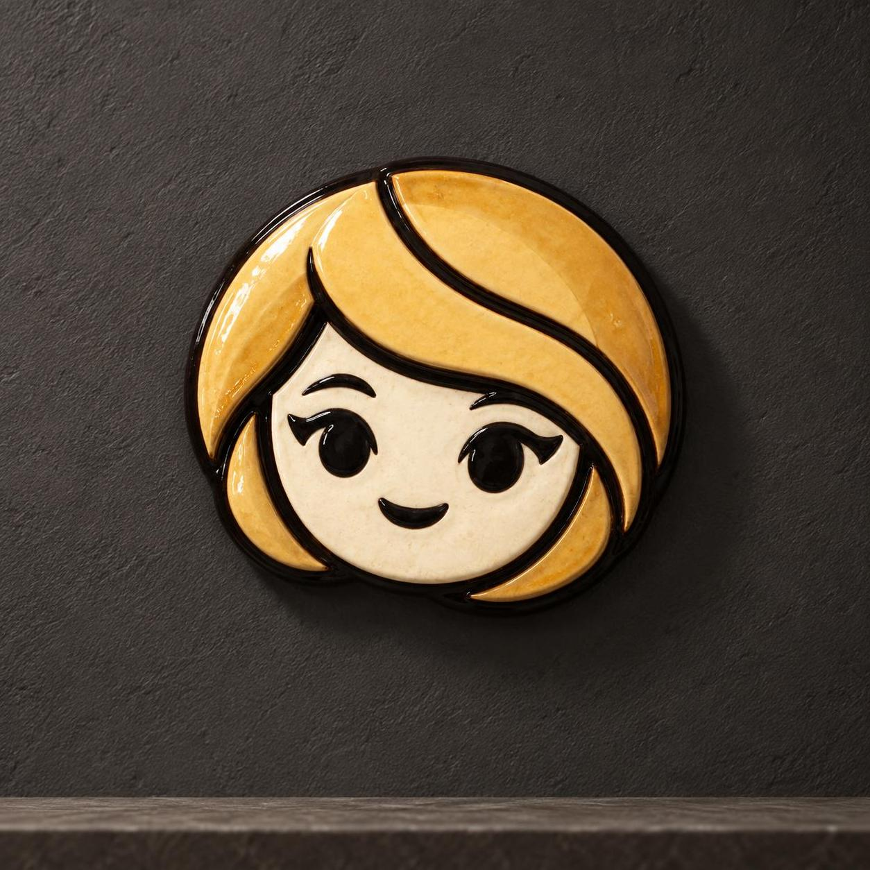
Sema Becomes a Glazed Ceramic Portrait — Alosem · reference required · CC BY 4.0
GPT Image 2.5en

Use case: style-transfer Asset type: identity-across-media campaign hero Primary request: Re-render the exact flat-vector-style Sema head from Images 1 and 2 as a handcrafted glazed ceramic wall portrait photographed as a physical object. Change the medium only; preserve the mascot identity and proportions. Input images: Image 1 is the primary silhouette, viewing-angle, hair-sweep, face-inset, line-placement, and palette anchor. Image 2 is the primary eye, lash, mouth, and expression-language anchor. Scene/backdrop: Warm charcoal mineral-plaster wall, subtle museum plinth edge, no other objects. Subject and load-bearing identity proportions: Exactly one Sema head, no body. Preserve the near-circular horizontal oval silhouette, slightly wider than tall; compact bob ending in two rounded lower side lobes; heavy golden fringe beginning near top-center and sweeping diagonally across the forehead to the lower-right cheek; shorter pointed lock on the left. Preserve the warm-ivory face inset centered low inside the hair mass at roughly two-thirds of total head width, with wide soft cheeks and a small rounded chin. Preserve evenly spaced black oval eyes at mid-face, outer winged lashes, no nose, and a tiny curved approving mouth well below the eyes. Medium/material: Real handmade glazed ceramic in shallow relief, cream face glaze, honey-gold and ochre hair glazes, glossy near-black outlines/features. Slight glaze pooling and kiln variation, but contours remain crisp and readable. Composition/framing: Square studio hero, object fully contained with generous wall margin, slight three-quarter physical depth, no crop. Lighting/mood: Soft directional museum light, gentle physical shadow, refined and tactile. Constraints: Medium translation must not alter identity geometry. No body, neck, ears, nose, extra face, duplicated object, flattened printed illustration, text, labels, logos, watermark, chipped missing features, or cropped silhouette. Avoid: taller egg-shaped head, narrow face inset, centered curtain bangs, reversed hair sweep, oversized eyes, realistic human face, emoji redesign, plastic toy, vector-flat rendering.

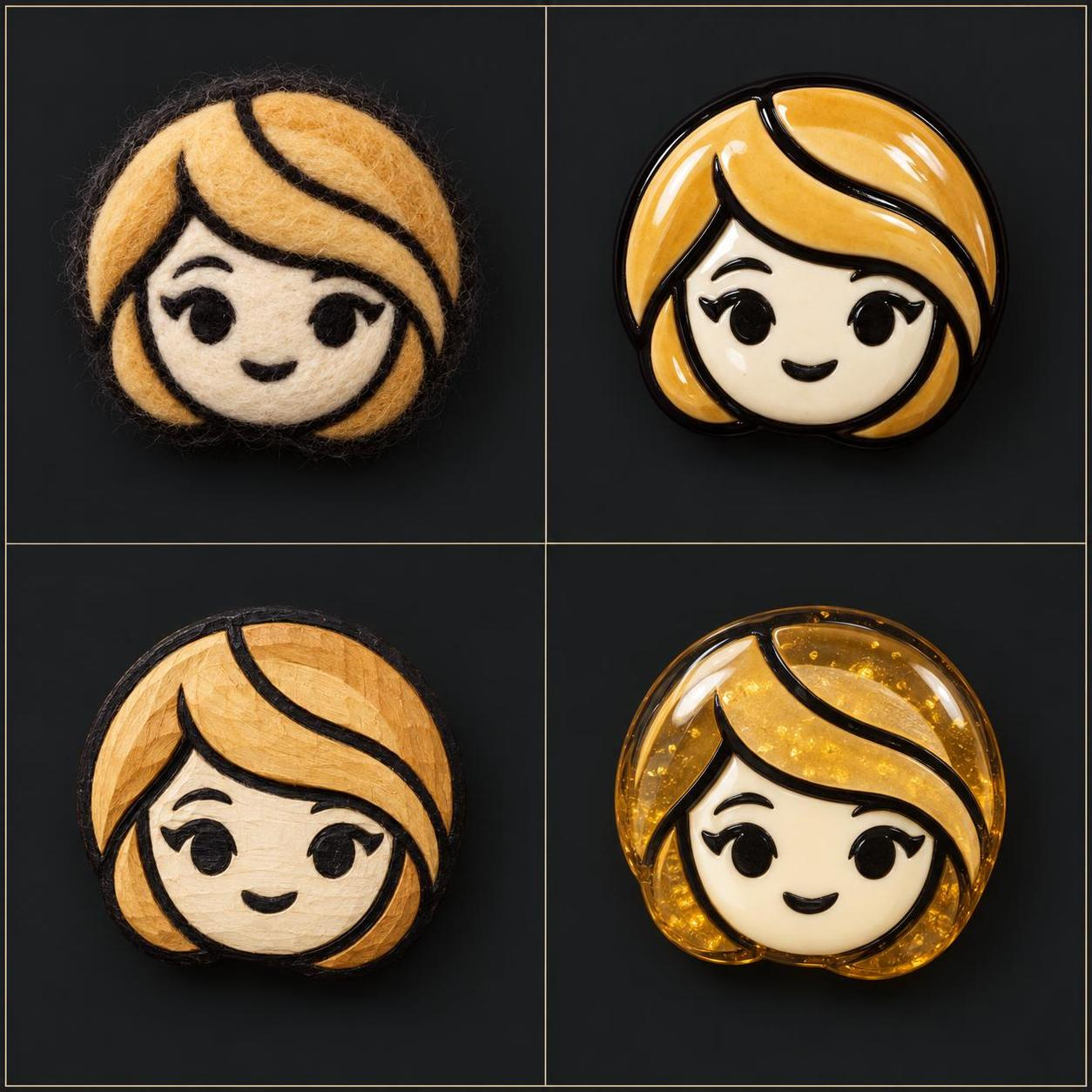
Sema Travels Across Four Crafted Materials — Alosem · reference required · CC BY 4.0
GPT Image 2.5en

Use case: style-transfer Asset type: identity-across-media material study Primary request: Create one polished 2-by-2 study sheet showing the exact same Sema head from Images 1 and 2 physically re-rendered in four unmistakably different media: needle-felted wool, glazed ceramic relief, carved and painted wood, and translucent cast resin. Preserve identity geometry in every cell; change material only. Input images: Image 1 is the primary silhouette, viewing-angle, hair-sweep, face-inset, line-placement, and palette anchor. Image 2 is the primary eye, lash, mouth, and expression-language anchor. Scene/backdrop: Four equal charcoal specimen cells separated by thin warm-gray rules; no labels or captions. Subject and load-bearing identity proportions: The same one Sema head in every cell, no body. Preserve the near-circular horizontal oval silhouette, slightly wider than tall; compact bob ending in two rounded lower side lobes; heavy golden fringe beginning near top-center and sweeping diagonally across the forehead to the lower-right cheek; shorter pointed lock on the left. Preserve the warm-ivory face inset centered low inside the hair mass at roughly two-thirds of total head width, wide soft cheeks, small rounded chin, evenly spaced black oval eyes at mid-face, outer winged lashes, no nose, and tiny curved mouth. Cell media: top-left needle-felted wool with visible fibers and stitched black features; top-right glossy glazed ceramic relief with glaze pooling; bottom-left carved and painted wood with shallow tool marks and visible grain; bottom-right translucent cast resin with suspended golden pigment and embedded opaque face/features. All retain the same cream, gold, ochre, and black palette. Composition/framing: Exact 2-by-2 grid, one fully contained head per cell, matching scale, viewing angle, face placement, and expression, generous padding, no overlap. Lighting/mood: Even museum specimen lighting tailored subtly to reveal each material. Constraints: Identity proportions must match across all four cells and the references. Exactly four heads total. No body, neck, ears, nose, extra face, duplicated cell, text, labels, logos, watermark, cropped silhouette, or medium ambiguity. Avoid: taller oval heads, narrow face insets, reversed or centered fringe, realistic human faces, four color variants of the same material, flat printed vector copies, inconsistent eye spacing or mouth placement.

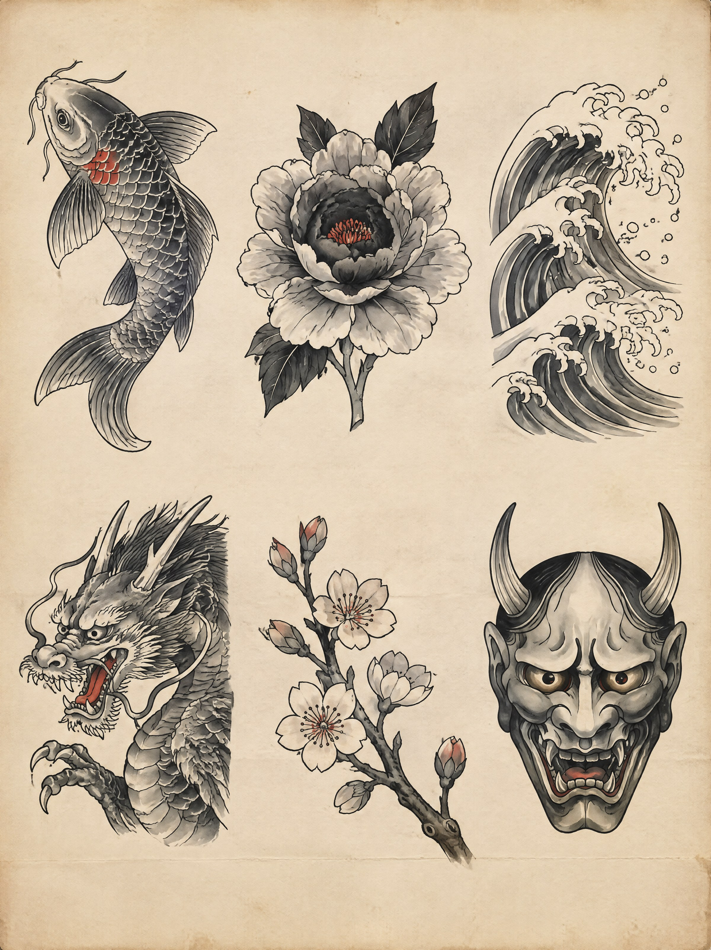
Six-Motif Irezumi Flash Study — Callirra Atlas · CC BY 4.0
GPT Image 2.5en

A traditional Japanese tattoo flash sheet, 3:4 portrait, drawn in black sumi ink with grey wash and one accent colour on a single aged sheet of off-white paper, flat and straight on. SHEET Six motifs arranged in a 3 by 2 grid with wide, even clear space between them and a generous margin on all four sides. Each motif is a finished, self-contained design that could be lifted off the sheet and tattooed as it stands. No boxes, no frames, no dividing rules, no shading behind the motifs. The paper is warm off-white with a faint fibrous tooth, a soft crease across the lower third, and a very slight tea-coloured tone at the edges. THE SIX MOTIFS, top row left to right then bottom row left to right 1. A koi carp swimming upward and to the left, body curved into a strong S, fins spread and filled with fine black lines, a few scales picked out individually near the shoulder and the rest left as graded grey wash. 2. A single open peony, petals layered from a pale outer ring to a dense dark centre, with two leaves behind it and one stem cut off square at the bottom. 3. A breaking wave drawn with clawed white crests in the traditional manner, the interior filled with a fine pattern of parallel curved lines and graded wash, the spray flicked outward at the top right. 4. A coiled dragon head and shoulder only, seen from the front-left, jaws open, whiskers sweeping back, one claw raised; the body is implied and cropped by the drawing's own edge, not by the sheet. 5. A cherry blossom branch entering from the lower right with five open blossoms at different stages and three closed buds, the branch drawn in a single confident stroke with two small knots. 6. A hannya mask, front on, horns curving back, eyes narrowed, mouth open to show pointed teeth, the cheeks graded from pale grey at the temples to near-black at the jaw. INK AND WASH Fine confident black linework with clear variation in weight: heavy on the outer contours, hair-fine on scales, whiskers, petal veins and water lines. Mid-tones are built from even black wash in distinct flat gradations, not smooth gradients — you can see the edges where one wash value meets the next. The only colour on the sheet is a single vermilion accent, used sparingly and identically in each motif: one small area per design, never more than about a tenth of it. Whites are untouched paper and are used as a designed element, not left over. CONSTRAINTS No text anywhere: no labels, no Japanese characters, no signature, no seal, no stamp, no numbers, no brand mark, no watermark. Do not add background: no clouds, no water, no flowers behind the motifs. Do not merge two motifs into one design and do not let one motif run into its neighbour's space. Do not use more than one accent colour, do not fill large areas with it, and do not outline the motifs with a coloured line. Do not render as a 3D illustration, a tattoo on skin, or a photograph of a sheet.

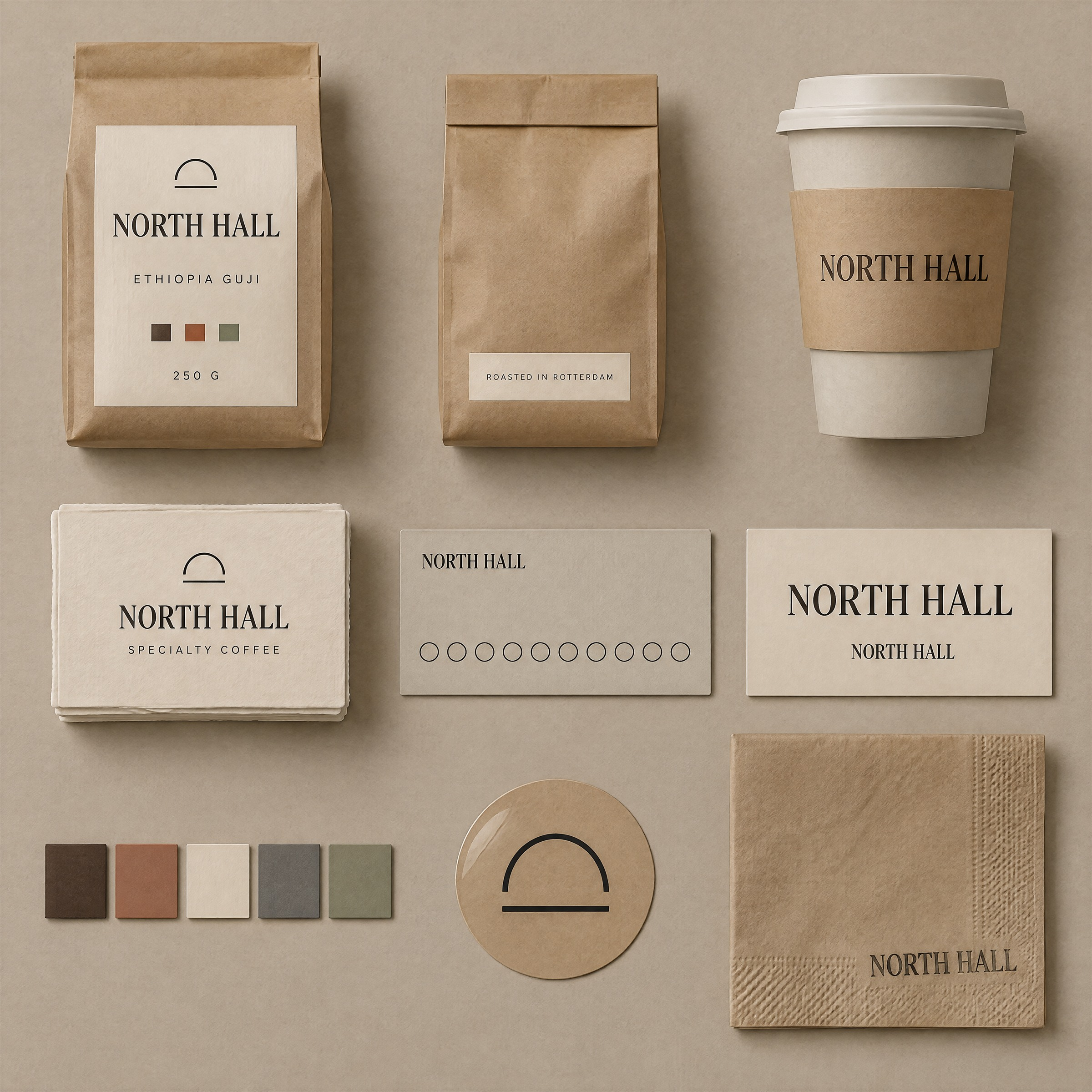
North Hall Coffee Identity Board — Callirra Atlas · CC BY 4.0
GPT Image 2.5en

A brand identity touchpoint board for a specialty coffee roaster, 1:1 square, presented as a studio flat lay photographed from directly above: nine physical items arranged in a 3 by 3 grid on a warm greige paper backdrop, evenly spaced, each item fully inside its own cell with clear air around it. THE BRAND — identical on every item The wordmark is the words "NORTH HALL" set in a single high-contrast serif, all capitals, with the two words on one line separated by a single space, tracked tight. It appears on seven of the nine items and must be letter-for-letter identical on all of them: same typeface, same weight, same letterforms, same proportions, same spacing between the two words, and the same clear space around it equal to the height of the letter H on every side. A small circular emblem — a thin-stroke arch over a horizontal line — sits above the wordmark on packaging only, and is the same size relative to the wordmark wherever it appears. THE NINE ITEMS, reading left to right then top to bottom 1. A 250 g kraft coffee bag, front on, with a cream label panel carrying the wordmark in the upper third and "ETHIOPIA GUJI" in a small wide-spaced sans beneath it, plus a row of three small filled squares at the bottom of the label indicating roast level. 2. The same bag seen from behind, filling less of its cell, showing a plain kraft back with a small cream patch carrying two lines of tiny type and a debossed fold line. 3. A stone-coloured takeaway cup standing with a printed kraft sleeve around its middle; the wordmark runs across the sleeve once, horizontally, at the sleeve's vertical centre. 4. A neat stack of thick cotton-rag business cards, the top card square to the camera, carrying the emblem and the wordmark centred, with "SPECIALTY COFFEE" in small wide-tracked capitals beneath it. 5. A slim loyalty card in the same stone colour, laying flat, with the wordmark small at the top left and a row of ten empty circular stamp positions across its lower half, none of them filled. 6. A type specimen strip: the wordmark set large in the centre of a narrow cream card, and directly beneath it the same wordmark at one third of the size, showing that the letterforms do not change with size. 7. Five colour chips in a row — deep espresso brown, clay terracotta, bone cream, slate grey, and one muted sage — each a small square with a narrow margin between them, no text on any chip. 8. A single die-cut vinyl sticker, cream on kraft, carrying only the emblem at a larger size, with no wordmark. 9. A folded kraft napkin with the wordmark stamped once in the lower right corner in slightly uneven ink, so the stamp's edges are a little soft and one corner of the impression is fainter than the rest. MATERIAL AND LIGHT One large soft source from the upper left, close to the set, so shadows fall down and to the right and are soft and short. Materials must be distinguishable: matte uncoated kraft with visible fibre, thick cotton-rag card stock with a deckled textured edge, matt laminated paper on the sleeve, and a slightly glossy vinyl sticker catching one soft highlight. Slight top-down perspective flattening with no keystone distortion. COLOUR The palette is limited to the five chips: deep espresso, clay terracotta, bone cream, slate grey and muted sage. Kraft brown is the substrate, not a palette colour. CONSTRAINTS The wordmark must be spelled exactly "NORTH HALL" everywhere it appears, with no variation, no alternate spelling, no translated version and no second logo. Render only these five strings and no others: "NORTH HALL", "ETHIOPIA GUJI", "SPECIALTY COFFEE", "ROASTED IN ROTTERDAM", "250 G". Do not add taglines, tasting notes, weights, prices, awards, certifications, recycling symbols, barcodes, QR codes or any other text. Do not add a tenth item, a plant, a cup of coffee, beans, a hand or a prop. Do not repeat an item in two cells. Do not rotate the items: everything is square to the camera. No watermark.

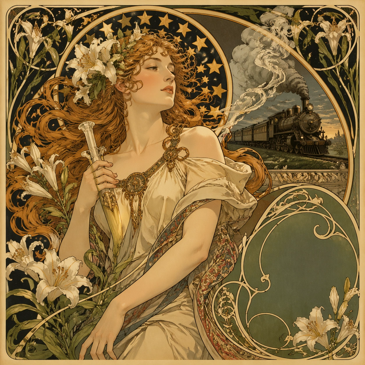
Art Nouveau Railway Poster Study — ChaosRealmsAI · MIT
GPT Image 2en

Scene: A square 1:1 composition designed as a premium Art Nouveau Poster study. Design the frame like a high-end editorial image, with strong hierarchy, controlled cropping, and a composed pace between large shapes and small accents. Use lighting, color, and spatial staging that make the core idea legible in one glance while still rewarding close inspection. The frame should feel display-ready rather than like a rough concept sheet, with balanced brightness, deliberate negative space, and clear separation of foreground, midground, and background layers. Subject: Interpret Art Nouveau Poster through 新艺术运动 · 19 世纪末. Draw from this visual direction: Alphonse Mucha 风 · 飘发女子 + 星形光环 + 百合藤蔓 + 书法 typography · 广告海报(香槟 / 火车 / 烟草). Focus on an interpretation aimed at editorial clarity, symbolism, and immediate readability. Build a primary focal subject, secondary support forms, and a coherent environmental envelope so the scene feels complete and specific. Treat this as an independent study with no continuity requirement beyond the shared theme language. Important details: Carry forward the theme's distinguishing value: 装饰艺术巅峰 · 石版印刷工艺黄金年代 · 现代品牌高级感挪用. Reflect the tested capabilities through visible decisions related to text-rendering, structured-layout, style-transfer, commercial-mockup. 更强图中文字渲染与版式跟随;复杂结构化视觉和多面板构图能力. Aim for these acceptance cues: 一眼能看出这是高难度炫技主题,不像普通模板图; 核心创意和画面结构无需解释即可成立. Keep the image controlled, elegant, and intentionally composed, with no accidental filler elements. Use case: Art Nouveau Poster single study 1/8, exploring the topic as an independent editorial composition. Constraints: No readable text, no watermark, no logos, preserve exact 1:1 aspect ratio, no muddy focal point, no duplicate main subject, no collage seams, no broken margin geometry, no accidental extra text blocks.

Verwendung

  1. Den vollständigen Original-Prompt einschließlich Parametern kopieren.
  2. Motiv, Text und Komposition an die eigenen Anforderungen anpassen.
  3. Ein kompatibles externes Werkzeug nutzen; Zugangsbedingungen und Ergebnis prüfen.

Vor dem Start

  • Prüfen, ob ein Referenzbild nötig ist. Kompatibilität belegt nicht das tatsächlich verwendete Modell.
  • Namen, Zahlen und Bildtexte prüfen; Modellversionen können andere Ergebnisse liefern.

Ausgewählte Sammlungen