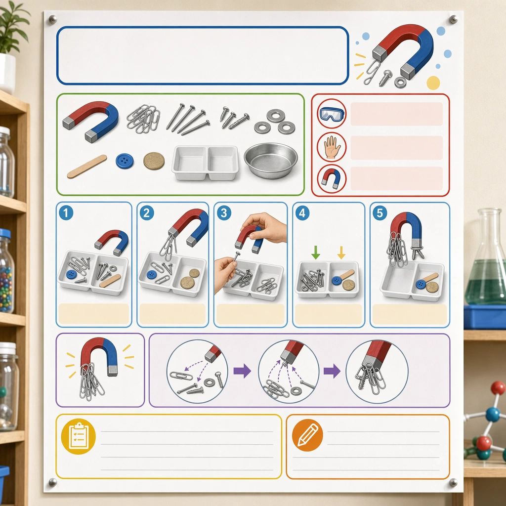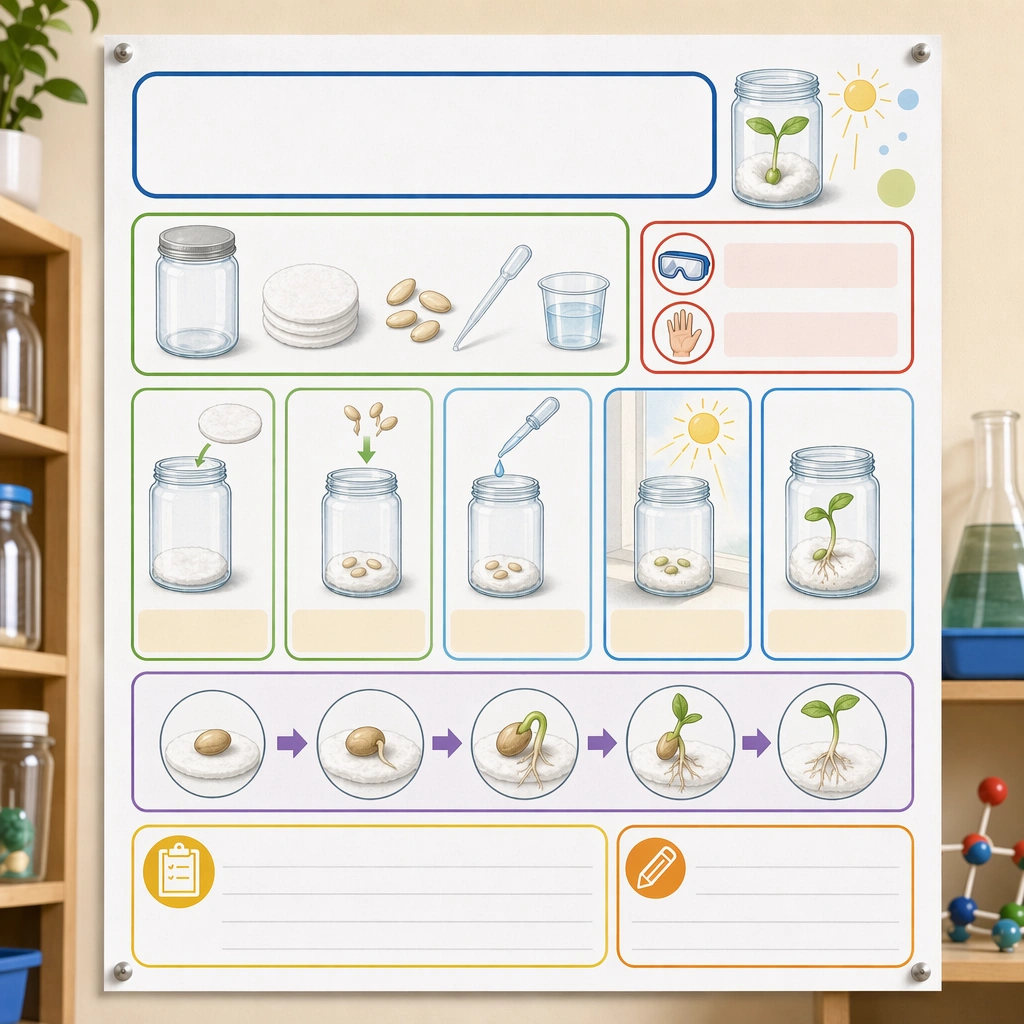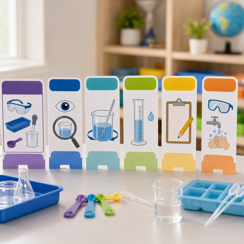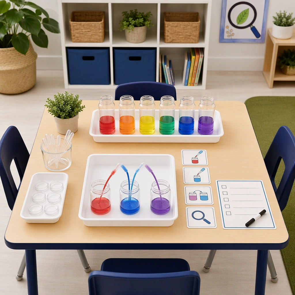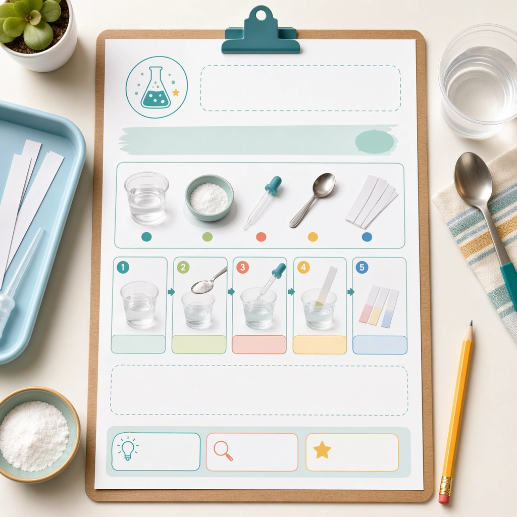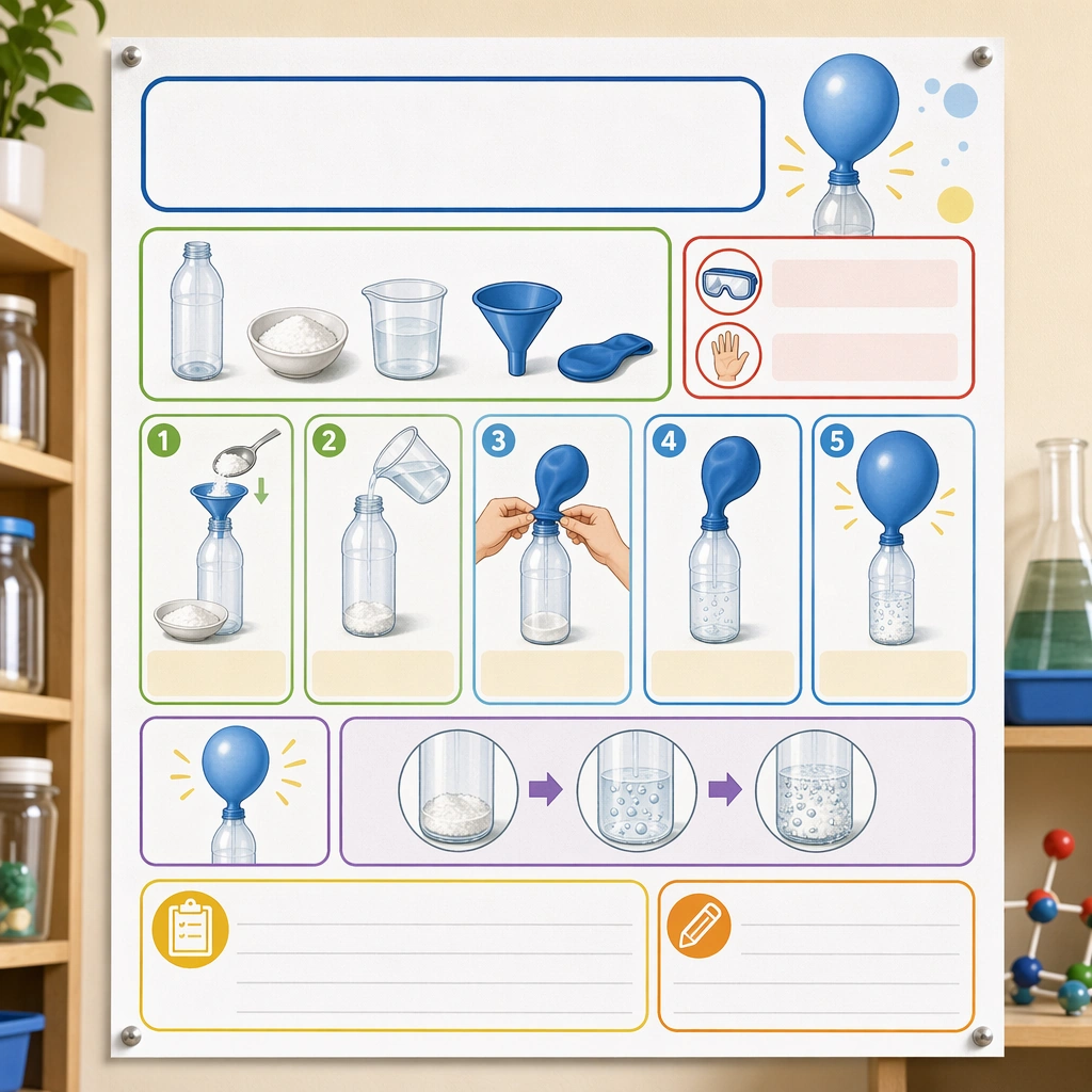
Scene: Create a square straight-on poster mockup pinned on a classroom science wall, lit with bright but soft daylight. The poster should feel like a real educational deliverable, with crisp print texture, clean margins, and enough context from nearby shelves and jars to suggest a science corner without competing for attention. Keep the square frame balanced, calm, and production-ready so the asset can serve gallery review, research comparison, and real educational delivery at the same time. Subject: Design the poster around one simple classroom experiment shown through picture-led setup, step panels, safety icons, material trays, and outcome illustrations. Use a clear visual progression with generous blank title and note areas so the poster feels genuinely teachable and easy to localize later. The subject matter should feel intentionally selected for a coherent curriculum family rather than like a random decorative assortment. Important details: The system should feel safe, lively, and methodical at once: rounded modules, playful but not silly color coding, obvious sequence logic, and illustration cues that children can follow with minimal adult translation. It must read as a scalable poster template for many experiments. Preserve the same poster grid, step-panel proportions, icon weight, blank instruction bars, and safety-callout rhythm from the reference poster. Use variation only in the teaching content, supporting props, and scene-specific mood while preserving the core visual system exactly. Use case: Science Kids Experiment Poster System series study 1/4, reference experiment poster. Constraints: No readable text, no watermark, no logos, preserve exact 1:1 aspect ratio, no readable copy, no chemical formulas, no logos, no dangerous realism, no lab-brand signage, no chaotic clutter.